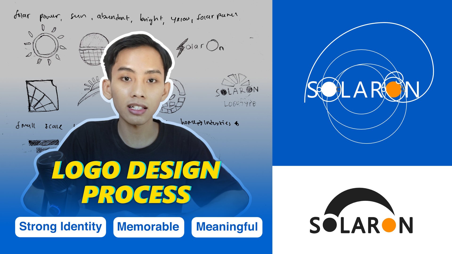
Transcripts
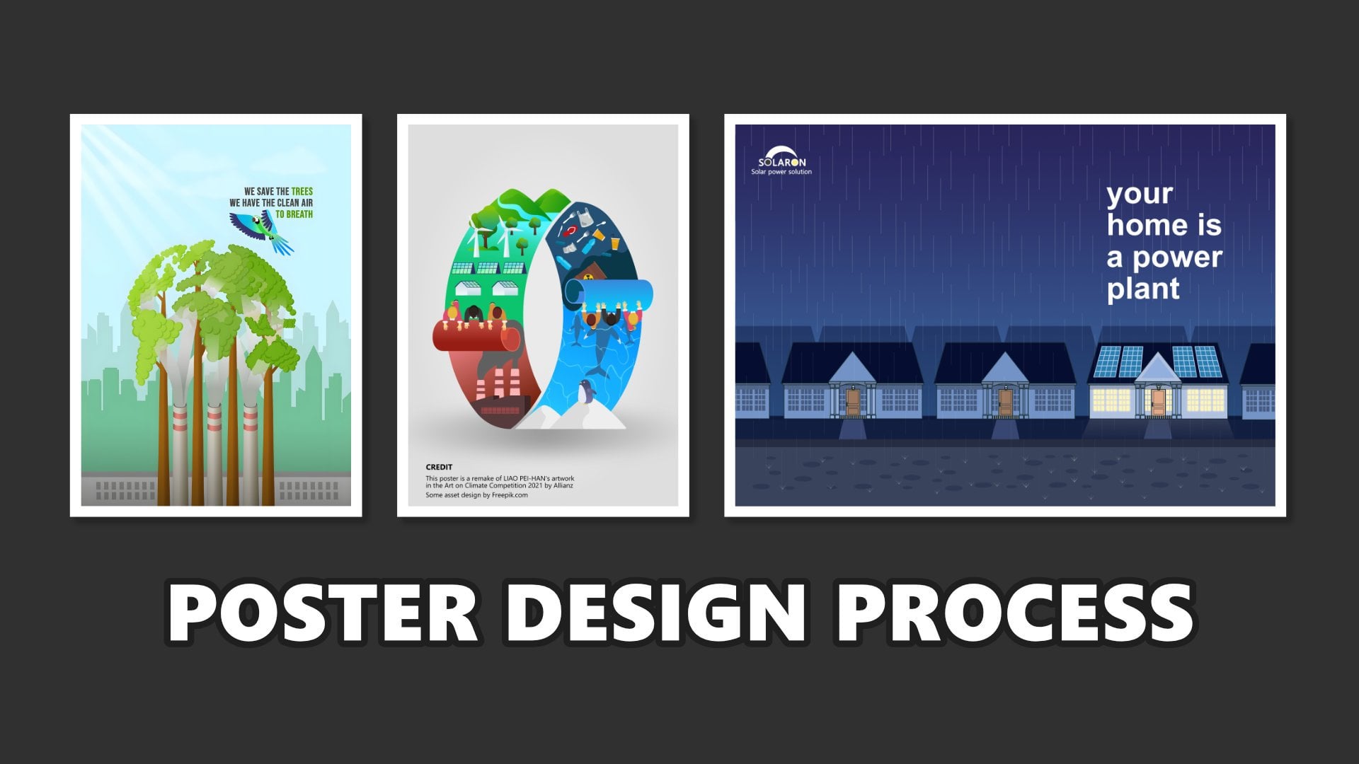
1. Introduction: Now with the Canva, designing has become
much easier to do. Canva is a very appealing option because it offers a user
friendly interface, equipped with various
tools, libraries, and artificial
intelligence technology that simplify the
design process. Canva a solution for
those who want to create attractive and high
quality design quickly and efficiently. Almost all the pictures we
need are already available, including the stock videos, photos, and other
design elements. What you need to do now is use these features to create
design that suits our needs. In this class, we
will learn how to create Rota promotion
design using Canva. This class is specifically for those who want
to create design for social media or print or
for anyone who wants to improve their skills and explore Canvas
feature more deeply. So what do we learn
in this class? First, we will study the characteristic of
promotional design so we can determine
the materials and assets that need to be prepared. Each design has its own characteristic and
material requirements. Second, we will explore Canva features which are comparable to other
editing software. Canva provides many assets and integrated with AI that
makes designing easier. Third, we will learn about
composition and layout. Composition help us arrange the elements within the design. Well layout helps organize
objects and elements, so the design looks
appealing and easy to view. Our we will practice creating
product promotion design. We will exercise together to sharpen our design
skills and instinct, while also learning how to
use Canvas features directly. This class is perfect for
those working in marketing, graphic design, or any
visual related work. It's also suitable for anyone who wants to
learn design in Canva. And I have tried
to make this class to be easy to understand
and systematic. You're also welcome to check out my other class that related
to designing in Canva. The core of this class is
learning how to create a good and attractive design
in easy way using Canva. I'm Fathoni Ashari, thank you and see you in
the next session.
2. Key Characteristics of Promotional Product Design: Hello, everyone. Thank you
for chaining this class. I'm happy to see you again. In this class, allow me
to share the material first so we can have a shared understanding
when designing, especially in the design
we're working on. We were creating a design
to promote a product. So it's important to understand the characteristic of
promotional design. And let's start
breakdown one by one. First, if we look at
the example design, the most noticeable element is the image of the
product being promoted. In this design, the product
shown is match a ring. And packaged in a
plastic cup and present it with an
attractive visual. The size of this cup, the size of the cup
or min object becomes the center of attention. When this design is posted
on social media or printed, the protac immediately becomes the focal point
for the audience. If we observe closely, the main object
doesn't stand alone. There are supporting
objects that have standout, usually refers to as a variation so the main object
doesn't appear isolated. This supporting object
include ice cubes, placed in a pole and leaves that seems to act as a pace
for the other elements. And in the promotional poster, the mind protact
is the focus but supporting elements help
strengthen the visual impact. Additionally, around the cup, they are floating tea leaves. There is also considered variation elements that make
the design more interesting. Since the background
uses tea leaves, since the pron
uses T plantation, so the presence of
floating leaves become relevant and reinforces
the visual theme. The second characteristic is the use of nature
theme background. More specifically, a tea plantation landscape
with a blue sky above. This Bicron is very fitting and aligned with the
product being promoted. Macha metal from T Lips, and you don't need to worry because Canva provides a
wide range of stock photos. Just enter the right keyword to find the Baron image unit. There are many
alternative Pagron you can use, not just photos. You can also manipulate several
photos into one image or manipulate photo into a new Bron or use combination of colors, patterns and other elements. In essence, there are many methods to create
a suitable background. This help audience immediately understand that design is
promoting a Macha product. Along the headline, there's a line that read from the fresh of natural laps to accompany
your daily activities here, which serves as a
copyright thing. This copywriting aims to invite the audience to image in the sensation of consuming
or using the product. Just by looking at the image, the audience can already image in the experience
through the text. If you look closely at the top, there's a header containing the company logo
or print identity. This serves to validate that the design is official
and legitimate. At the bottom, there's a footer with contact information
or social media links. There's also additional
information such as product pricing so
that the audience isn't only influenced p the copywriting but also
receive complete details. The next important point is learning about
composition and layout. On this, you can refer
to the preview class. I put the link in
the descriptions, such as click and ton the class. In that class, I explain composition and layout
in more detail, which help us better understanding the upcoming
practice session. By learning about
composition and layout, we will know what materials
to prepare and how to arrange objects
proportionally. After this, we will move to the practical session of
designing a product promotion. We will begin with our
first design exercise. So see you in the next session.
3. Practice 1: Setting Up the Background and Main Object: Hello, everyone.
In this session, we're going to create the social media post social
media design promotion to promote coffee drink
product with Canva. Let's move to the Canva. Friends, because we want to create for social
media promotion, we will use Aspect
Ratio 4:5 Aspect Rratio. And doing that, we can click Create and click social media
and click Instagram post, Instagram post, 4:5 Aspect ratio, 1080:1350
pixel in a resolution. Friends, you can also open the link that I have provided
into the project section. The link is contained
Canva template, and then the inside of
the Canva template, I put all of the material
that needed in this class. So you just open the Canva and then the
material we need it, I include it in the template. So don't worry about in the
mid of tutorial mid of class. Feel difficult to
find the right object because the right object or
the material that we needed, I upload in the template. So you can open while you can following step by step that I have provided
in this class. So because we want to create a design promotion
for coffee drink, this is the design number one. We want to create two design. But in this session,
we're going to create the first design
design coffee drink with nuance of coffee. So like usual, the
first we want to create is a background and
find the main object. So let's find out
what the background I want to use. We click the photo. This is the photo library. We will find the
right background for this design because
the product is a coffee. I think I will choose the nuance with brown vibe
with brown color. Tends to brown color
in the material, almost in all material. So I will put
material background. Right. Maybe this one. Or Or this one. Or this one. Nope. Which
one? Oh, this one. I think it's more
dramatic dramatic vibe. Dont worry, guys, if you feel
hard to find the object, I will include in the template
that I have uploaded into the link in the description
in the project, right? I think it's like more
dramatic color like this. And I will bring the I will
use combination the image, and I will type
wooden Brown pepper. This one. But it's too it's not dramatic. This one is too bright. This one. It's too thin. Maybe I will this one.
I will use this one. And click background
remover and put in here. Let me mi. I think this table should
be on here too, up to here. So I think I will copy. I will duplicate this table. And as if this table continuing to make this
table more wider, like this. We can adjust in this position, maybe make it little wider, can and like this in this this table, also make little wide just like this. Just like this. Yeah.
Okay. The next. Okay, I will type
wooden table with clothes on what a crowd right? I will use this picture.
So I have researched before previously for this image because to find this
material is really hard, but you don't have to worry
because you just copy and paste the material on the link that I provided in
the project section. So I will aground
remover and I put this what do you call it Burlap cloth or soup I
think I will put in here. And here, this is as a background. So we need to synchronize
the color, right? It's a really important
for the color. Usually, especially
for so I need to synchronize the color or make
it color adjustment to make this more synchronize
between this background, this cloth and this table. For this cloth, I will edit, click adjust and I will reduce. This I will reduce, you know, like black Oh, no. Maybe saturation.
No. vibrance? No. What should I do? Brightness. Rightness, contrast, Shadow, Shadow, and color edit. This one, I will too Maybe saturation. No, saturation. It
doesn't affect it. brightness? brightness, maybe
brightness. Temperature? Oh, right, temperature. Temperature, yup, and redness. Sometimes also contrast,
little bit contrast. I'd like shadow, vibrance. Oh, that was so good. Vibrant, saturation. Ooh, nice. Vibrant
saturation. Brightness. Yeah, we're working
with temperature. These temperatures really give the impactful and brightness
temperature and brightness. Sometimes you will
experiment with the contrast atlas, shade
to white and black. And the point that
this, you know, shack sacks or burlap, this cloth is to
change the color, we use the temperature, of course, the
brightness, right? And sometimes also adding
little bit contrast. And fibrins or giving the
more saturated color vibrance. And yeah, saturation is
also really affected. Sharpen clarity Vignett is not. And the table also edit a little bit edit and
adjust in the color. A little bit warm and also pink. Oh, yeah, I don't know
what they call it. And then brightness,
I will reduce and also the vibrant I also
increase like this. So I think the color
is more synchronized. And for this clothes, I will Oh, this is
the difference. And this the result
of difference before add color adjustment and after add color adjustment. So because rather than
we re edit the color, like in this table, I would choose to delete this
and duplicate again, right? Duplicate again, the table
that we have adjust the color. And in this bottom layer, I will a little bit make
it to the top like this. Yep. Like this and bring
back the clothes. Like this. Okay, right. So this
is in the background. And the next we will find the right object,
the main object. The main object, we will promote
the coffee, iced coffee. And also iced coffee
and hot coffee. But what the object
we want to use? Ice coffee. drink ring with cream
cream, for example. Mm. This one, maybe, right? And also. Actually, I will use
this material, ice latte in a plastic cup. This one because this is also similar to the
coffee coffee drink. Yeah, I will use this material. Next, I will also use the hot coffee hot
coffee with pin. Okay. Which one? This looks good, actually. But we need to find the
alternative. Which one? Oh, this is good. But
we save it later. Okay. Next. Oh, this is the same. The same Oh, similar, similar. So I will use this product. Oh, this is the coffee. Like this. Oh, nice. But I think the angle is not synchronized with this cup. I will use this coffee instead. So we just
click background removal to remove the background
and adjust the size. Adjust the size. Let's adjust the size. Maybe increase the size, little bit, increase the size
a little bit. All right. Nice. And nice. Oh, nice. Okay. Okay, guys, this is we
have created the background. We have find the main object. The main object is the I think it's coffee coffee
milk or cramel coffee? Yeah, we will name it later. And this is the main object. And the next we will put some supporting
object and make it, you know, add some effect like
drop shadow and lighting. So see you in the next session.
4. Adding Secondary Objects and Applying Effects: A Okay, I guess,
in this session, we will add some object, the secondary object and also
the effect for the object. So I will add the
secondary object first. The secondary object, I
will put in here and in here and sometimes also in
the corner this corner, this corner and this corner. So Coffee and Brown coffee Let's find in the alternative
object. This one. Okay, I think I
will delete this one. I will put this one in here. Yeah, I will use this
one. I will cult this. In a position, I will bring this above the cloth, like this. And also, I think
it will be awesome if this one Yep. I think it's also
too big for size. And the secondary
objeck in this area, I will ripe brown sugar, maybe. Brown sucker. I will use this. Let's find the
alternative object. Okay, but bit more dramatic
because the color is brown. Here, I will scale down
or reduce the size. I will put position under this like this more or less. Next, I will also put some
supporting object here, like leaf, coffee
leaf, coffee leaf. Plant. I think I will calculate the cut outs only
with the result. This how about you put here? This coffee leaves or this. I think will be more
represent the real coffee. Like this. And I also copy this leaf to this
part like this. And then I also add
coffee bean, coffee bean. I think. Oh, this one that was so cool. I will put in here. And this
one I will put in here. Yeah. Yeah. Yeah. Next, I will because this is there's
a space area, I will put. So because this is still
empty space, I will type. Granular organ brown
pulm sugar. Yep. This one. I click background remover.
And put in here. So in the space doesn't
feel empty like this. Again, coffee beans. More coffee bins and more leaves. The next step, we want to add the effect. The effect is the drop shadow and the drop shadow will apply in this object in this object. So in this object, we
will add the drop shadow. As you can see, if you pay
attention closely in this cup, the hot coffee cup, this image include a shadow
drop shadow here. But this is not a not
synchronized with the background, and it can be edited
in the shadow. So we need to remove first. We need to click background remover to
remove the drop shadow. Yeah. After that, click here, hot coffee cup, click Edit, click click shadow, and
click drop shadow like this. And we adjust the angle. I think the angle will be like
this or will be like this. Yep. And then it amount. And then distance. I
think it's enough. And the color, we changed the
color to little bit brown, dark brown, like this. So in other that
syncron to the peple. And so we also apply the shadow the drop shadow for this
brown sugar Oh, no. This sugar, click,
drop shadow, shadow and drop shadow. Yeah, I think like
this, we changed the color drop shadow
to dark dark chocolate, dark brown, like this. And for distance. Yeah, I think it's enough
like this or like this. So for this little bowl, I also add the drop shadow shadow and drop shadow like this. The change color to brown brown color. And then we also
put aside first, we need to add the shadow
in this cup, drop shadow. Still using the drop shadow
and adjust the angle, reduce the distance,
change the color. I think increase the intensity. And we also doing the
same with this cup, click Edit, click Shadow. Click Shadow and click
drop and Shadow. Again, don't forget to
change the color like this. So we put back the cup
of coffee. Like this. And we also want to add the
drop shadow for this leaf. Click edit. Click shadow. So maybe if the drop shadow
is not really suit, I think we will try to another
shadow like back drop, and we change the direction. Oh. How about the curve? Distance. Curve, angle. Yeah, I think it's okay, we choose the angle shadow, angled shadow, and
don't forget to change the color and maybe reduce the intensity a
little bit and here. We also add the shadow on this coffee bin A
using the angle. Like this. Don't forget to change
the color like this. Maybe a little bit bigger here. And I think I will make
a little bit bigger. Yeah. Oh, don't forget. This leaf also need to give the shadow. I
will use the angle. Click rotation like this and click Change the
color like this, like this. This one? Yeah. Also need to give the shadow. Rotation. Like this, change
the color like this This one also add the the drop shadow too. Like this, I will
increase the size.
5. Why Layout Matters in Organizing Design Elements: Alright, guys. I will utilize the guideline. So we don't have guideline. We need to use we need
to make a guideline to, you know, like to
rearrange the layout, rearrange the layout
and resize the layout. So I will click a new page. I will use the tool shape tool and using the rectangle tool
to create the guideline. So the guideline, what I mean is the line that divided the
workspace into eight part. This rectangle I will
add the stroke with one. And for the color, I remove the color.
I remove the color. And click. After this, we click Duplicate
Duplicate and put in here. Duplicate and then
duplicate again. Duplicate. So I have four boxes,
four rectangle. I block for all of them, and I copy piece or duplicate. And the total is
eight part, one, two, three, four, five,
six, seven, eight. So I will drag stretch
to the most bottom. So we have one, two, three, four, five, six, seven, eight. We have eight part. We have eight part. Maybe we can click Group
and click position, click this layer and click
Copy or we just click here, Copy, CTRL+C,
and move to the page one and pace in
here, CTRL+V. And click position,
we bring the line in front of in front of
table like this. And because the background
is a dark, brown dark. So maybe we can
change the, you know, like the stroke this layer, this guideline, we change
the stroke to white. So or we increase the weight. Right. So there's a line that divided this work
space into eight part. So let's we rearrange
or re layout the, you know, the object. Because this cup, this
is the area for footer, so I still have a lot
of space in here. So I will maybe bring
back down this cup. We can increase the
size for this part. We can increase the size
a little bit bigger. Like this a little bit bigger. And is this a little bit bigger. A little bit bigger We still has a lot
of space in here. So don't worry, but we can still make it
bigger like this. And this brown sugar, we can also increase the
size and put in here for this rug burn this sack
or burlap or clothes. We also bring back a little bit down and this brown sugar. I think it also I need to
make it a little bit smaller. Bring back down. Remember,
we still have Area in here. And this one also
little bit down. Oh, remember, in this coffee
powder and coffee bean, this part doesn't has drop shadow so we need to
add in the drop shadow. Drops to angle. Right, click here. Click here. Click edit. Oh, no. Here. So this little bowl when we pay attention
closely for the color, it doesn't suit with this color
with this cup of coffee. So I will little bit adjust doing adjustment
in the color for this pl click Edit,
click adjust. Temperature, I will
reduce the temperature more cold to blue tends
to blue like this. And the tint tend to Oh, no, no, it doesn't need. So like this. Or maybe it's too
much, little bit. And then a little bit, reduce the brightness
or increasing the size like this because the hot coffee
become the main object, one of the main
object like this. And a little bit
make separation. So in this clothes, this burlap or this sack doesn't
has drop shadow. I will add the drop shadow click a drop shadow like this and increase the
decrease the distance, increase the
intensity, like this. Or increase the
distance and change the color to Increase the color
to dark brown. Yep. Blur amount, you know, angle, distance intensity to 100. Yeah. So I think I will make a little bit little bit
adjustment for this drop shadow two because this is on the
front page of front object. I think I will increase
the intensity and the color a little bit darker. I like this. Like this. All right. Okay, after we
satisfy about the result, we bring back the guideline to pack up to under
the background. Okay, the next step I will put some additional
additional, you know, additional object
like coffee bean in this area in this area,
also leave again, additional object or supporting object like this coffee bean, this coffee bean or
leaf in here or in here to make it
more a flying object. So I will find the auto object. I will type the coffee bean. And I click this, you know, the setting and I will
checklist the cut outs only. So the result will be like this. I will choose this one
and I will put here. I will choose which one? This one, maybe. Yeah.
And I will put here. So the key is I will
make sometimes we will arrange the objeck a diagonal from here
and here to here. So it's like diagonal like this. It's not diagonal but it's like one line. We also using one line, this one and this
one and this one. Coffee leaves or leaf, like this. In this part, I will
put in here, right? And also, I will use
I will use this leaf, and I will put in here. Sometimes I think I
will need one more. This one, maybe. I will put under the cup like this like this. So I think the object, supporting object is enough. We need to synchronize
the color from this one, this one, and the leaf, this one, this one, too. In order that the
coffee beans is on the same nuance on the
same vibe of color. So we click this coffee
bean, click edit. Click coffee bean, click
Edit, and click adjust. And I think I will
increase the redness and I will increase the
temperature, like here. And for the saturation. This is also click in here. Click adjust and increase
the temperature like this. Yeah, I think from
the brightness is well, has synchronize, little bit or maybe just
increase a little bit. Yeah. This one, too, increase
the temperature. Yes. This one. Also click at it, click adjust
increasing the temperature. And this one, increasing
the brightness first like this and
increasing the temperature. Alright, so I want to make
one of coffee bean blur Or, I think I will
make this one, this one, and this one blur. Just click edit. Click blur, click whole Image, right? If we just click Brush, we just blur on the area
that we brush like this. But we not use that. We choose whole image
and click intensity. We can slide to 60
like this. Like this. We also blur this part, click edit, click adjust click, no, no, no, click
blur right here and slide the effect and
the intensity to 60. And that's the point. And the picture and the leaf. As you click it, click blur, increase the intensity to 60. And like this. This one, too, click
Edit, click Blur, whole image, 60, like this. Oh, I think the result
become a little bit dark. We need to adjust and
increasing the brightness. This one, too, increasing
the brightness. Okay. After that, after that, we will put the
copywriting in this area, like the price, also the name of menu and header,
and also footer. So see you in the next session.
6. Writing Effective Copy: Headlines and Descriptions: In this session, we're going
to put the copywriting, the description, footer and
header for this design. So let's start with
the headline or title. Click add a textbook
I will put in here. I will increase the size first
for maybe 100, oh, 50. I will type coffee. I will type coffee. Fine. I will change
the color to white, and I will change the size
to 100 maybe like this. And I will change the font too. I will type I type
like this coffe time. And I will increase the size. 21 to 20. Like this. And I will add the textbox again here to
create the copywriting. The copywriting is
I will type taste tastes so good fuels your mood like this. This is the copywriting
to provoke the audience. And I will use font. You can type this Hangyaboly like this and increase the
size to 36 and a little bit. Rotate the decrease the object. The copywriting, a
little bit rotate. Taste so good fills your mood. I think a little bit over here. And I will add some variation. I will uncheck the cutouts only. Oh, no, no, I will
use the element. So the next, I will add
some variation in here. Click the element, I
will type through line. Yeah, like this. I will use this one. I will change to white
and rotate and I think increase reduce the size and put in here like this. Coffee time tastes so
good fuels your mood. Or if we feel that this
is too much rotate, maybe minus three
degrees for the title. Okay, the next we will
add the name of menu. I will add text, add a textbox. I will type here, put in here. I will type coffee milk. Coffee milk, and type. Change the font to Fredoka You can find the font, type in the font in the Canva. And then, uh, I will
change the color to brown like this and add the
effects add the outline and change the color
outline to white and thickness the 100. If there is no space, maybe we can bring
this one little bit higher or we just bring
a little bit lower. Coffee milk like this. And I will add a textbook again, click the price for the price. I will type three dollars. I will increase the size. I think I need a big size, maybe 40 or 50, 50 50, 55. Put in here. Change the font to I want to
make this font different. I will use poppin. No, this one, poppin. And I will use bold here and change the
text color to white. Yeah, I think it's not bold. It's too much if I just bold
So semi bold like this. Then I will click element, click a row row, row. Yeah, I think I will go I will go with this one
on this one. This one. Yep. Is one. And I will copy this. Three of them bring to here. Bring here and flip. For this draw row, I will flip to Horizontal. I will change this
menu to caramel. Caramel macchiato. And I will reduce the
line spacing to 1.1. A little bit lower
for giving the space. This caramel macchiato. coffee milk, caramel
macchiato, for $3. The space, this one, I will a little bit bring
closer this one and this one. This one. Yep. Coffee milk. A little bit lower.
Yeah, I agree. Bring little bit
down and this one, too, little bit down. Yeah, caramel macchiato,
and coffee milk for $3. Next, we are going to create
the header and the footer.
7. Placing Headers and Footers Strategically: Okay, the next, we will
put the header and footer. For header, we
will use the logo, the logo from the company or from the cafe or from
the rest restaurant. And for the header is maybe social media account
or contact person. So let's do it. For the header, I will put the logo. Again, a let's say this is
like special promotion. I colaboration between the
cafe and a marketplace, marketplace, you know, who provide the platform
to selling online. I will use element here. I will find the shopee
food logo Like this, I will use this. I will put in here. And I will also create the logo. So what looks like in the logo, I will using
combination from text, logotype and object Logograms
not logogram though. Wordmark. Yeah, I think I will using
the combination Logo. I will use from let's say
the name of cafe is KOFI. KOFI. KOFI. Is I will increase the size
to 60 maybe 70, 60, 70, 60 and change the color to change the font to lo LOVELO. This one, KOFI, and I will
change the color to white. So I will utilize this
you know, this O letter, it comes as if
represent the coffee, you know, like the
coffee from top a few. To doing that, I will add shape rounded what it call it oval
round round shape here, circle circle shape,
and put in here. Let's say like this, and I
will change the color to orange or a little bit
brighter like this. And I will copy the circle, little circle, and I change
the color to white like this. And I will copy and paste
again, make it more little. Is coffee. This is the logo or coffee
and the market platform, marketplace or food
delivery platform food. And I will make the
separation in this area. I will use, again, using tools using
shape, shape or line. Oh, this one,
repeat the process, line and click
this and automatically, this line will appear
on the workspace. Just adjust the line like this. Maybe a little bit closer. Let's make sure that the line doesn't tend to tend or bend. The line must be
striped like this. If we feel that the logo
is too much too big, we can reduce the
size like this. And we can also
reduce the size for these two and put
in here like this. Like this. And I will block this logo
and this marketplace logo, and this coffee logo, I will block this logo and marketplace logo. And for this one, I will make it center to
the workspace, like this. And for this area, I will put social
media account using, again, the same
using the rectangle. Just a stretch to down
and make like this, change the color to white and
bent the corner to corner rounding this and
maybe make it shorten, so we can adjust this length. And I will add the logo, the logo for social media
like Instagram logo. I will use this logo for the Instagram logo
and then put in here. Like this. We can zoom in to more easy to precise
to put in this logo. And I will add
text at a textbox, put in here and put in here. I will type kofi.id. Let's say this is the
username kofi. No. Kofi.id. Scar. Underscore, underscore. kofi_id And for the font, maybe I would go with Fredoka in order to synchron
with the description Fredoka. Fredoka kofi_id. Like this. Little bit center. And I will copy this
rectangle, right, in put inside of this coffee.id and I will add the WhatsAp
logo or contact person. So, all I will use this logo. And what in here like Instagram logo,
a little bit smaller. And I will add textbox here. I will type the number
like zero, 8171 945800 And I will reduce the size, and I will change
font to fredoka I will increase to another. Oh, I think I will go with I think fredoka doesn't
suit well for the footer. Maybe go with poppins. Yep. kofi_id. And I will block all of
them, like all of them, click group and make it
center where center. Yep, like this. Again, I will
bring back the guidline. The guideline I will bring
back the guideline to evaluate the position or
the layout space like this, a little bit across
the line a little bit. I will go just like this. And this coffee milk. I think it not be a problem, and I will make it
here a little bit higher. And for the header, I will make it a
bit lower down. Just like this, after
we evaluate the layout, we can hide this
guideline again. So I will open this
three of them. Coffee milk, price and
arrow coffee and paste and bring it here here. And for this price
is really special. I will add because
this color is, you know, like overlapping
overlapping colour. So I will use the tools tools rectangle tools. I repeat. Click Shapes, click Rectangle right
here and click here. And in a position, we
bring back of milk, back of this one. Which one? Coffee milk, this
one? Yeah. Yeah. Bring under the
three dollar and add the corner rounded corner
this and change the color. Change the color. So we can shorten the title
area and click this one, this rectangle color, and click I think little bit
little bit maybe darker, more darker than this. Brown, darker, like this. Brown, darker, like this. Yep. Americano like this. And bring back in the above. And for alignment,
I will use left align and decrease the
line spacing to 1.2. Okay, for the align, I think I would go with
center at Americano for $3. I want to add shadow
for this Background. Additional effect
for this background, I will type this element for white shadow white lighting
or white white lighting. Lighting. Like this see all and
find the lighting. If we feel difficult to
see the lighting is, maybe we can switch the theme to white theme or dark theme. Like this. Sued, klick element try to find the suitable
light. This one. I will bring this lighting to
this above the background, and I click Edit. I click maybe filter, right, change to bronze. And for the transparency, I reduce maybe a
little bit to 50, 51. Yep. I think it's more I don't know how to say
it, but more awesome. Yep. But the lighting here
is more dramatic. Right? Yeah. And if we
satisfied with the result, we can change the theme
back to light like this. All right. So this is the first design
that we create for promoting iced coffee and hot coffee
from KOFI, designed to promoting
iced coffee and hot coffee from coffee
collaborating coffee, collaborating KOFI
with Shopee food. And here, this is the header, Shopee food. And then coffee. And this is the coffee time, the title or headline. And the copywriting tastes
so good fills your mood. And it consists of
coffee milk for $3, Caramel Machiato for $3, and hot American
for three Tolar. And this is the
Instagram account and contact person to, you know, maybe to order or maybe to
ask question more further. This is the design, the first
design we want to make. Yeah, I think sometimes
and if we need to little bit adjustment like this, and this is the first design, and we move to the second
design in this class. Still promoting coffee, but a different style and
different purpose.
8. Practice 2: Refining Backgrounds and Choosing the Right Objects: Hello, everyone. So
in the previous session, we have created design number one, design project number one to promote iced coffee
and hot coffee. So in this session, we're going to create the design
project number two, still promoting iced
coffee and hot coffee, but in different style
and different purpose. So let's move to the Canva to create project
number one number two. So this is design that we
had created previously. So we click create here and choose Instagram
post like previously. And then this is the workspace, the area that we can the area that we want to create design. Like always, the first thing we want to create is a background and also find the right object. The background I want to use
background from line background. Click see all, and you
can scroll down, and I will use this one. This line background, but we still be able to change
the color, right? And I also using the tools
and create rectangle. So I will combine the
rectangle with line background. Here in the position,
the line background, and I will move to the top, and this is the rectangle one. I will change the
color to orange, for example, orange like this. And we want to change
the color or the background to this I think it's too bright. You need change the color a
little bit orange, like this. Like this, little bit
orange. Like this. And I will work
in with this one. the rectangle. the rectangle,
I will change the color to I think add a new color, and I will click gradient and I will
click in this, you know, this red color, I will change the color to orange. Orange. Which one? Like this. And I will use this
one or this one. This one. This one.
I will use this one. So in the top layer is more contrast than
the bottom layer. But I want to
change the position the color position, this one. This more brighter and this
more target like this. All right. More or less, I will use the prone like this, right? And the next. And the next, I will create
the combination of shape to create the background the
object object combination of shape to create a new shape. I mean, I will create
the so I will create trapezoid shape as
a object background. To create trapezoid, I will
utilize the rectangle. I will change the color
to white first like this, and I will use the
trapezoid this one. Yes. I will change the shape
to white like this. I will rotate this
trapezoid to 90 degrees and I will stretch like this, I will make it center or maybe a little bit shorten like this. And this rectangle, I also
make the length the same as a trapezoid and combine
it into one like this. So this is the trapezoid
I want to create. So I will make
another trapezoid. But I will just copy this both of rectangle
and trapezoid. I selected both of them, and I click duplicate
like this, right? But I will rotate to 280
degrees like this, -180. So I have two trapezoid but I will add the corner corner
rounded in each corner. To doing that, just click in here and click Corner
rounding and add the corner to 30 like this
and to make it easier to access the this rectangle, we can use we can use
the layer like this, click layer and click
corner and click corner rounding to 30, 30 point. And we also do it with this one, two, click in here. Click corner rounding to
30 like this and click position, click this rectangle and
also corner like this. So we have the trapezoid with corner round
it two of them. So the next I will
find the object. I want to promote I want to
promote the hot coffee here, hot coffee and sandwich. Let's find one by one. I will type a cup
late coffee for example, hot latte coffee. Mm. This one. As This one. Oh, this is same.
The same image. The same asset. And this one. Okay. Okay, I will use this. both this photo. I will click a backgrond remover
and this one, too. So after we click
Background remover, maybe it will be safe
if we just click here, make it the area more
smaller or maybe we can crop the area that we need because sometimes
the object is in here, but the file the picture is still cover a
lot of So in other to easy in edit, maybe we can crop here, just area need So I will put the coffee in here and put the coffee, this one in here. So I will add the sandwich. We will find the sandwich to
accompany the coffee menu. Maybe I will type
toast sandwich. This one, I think
it's pretty good. And this one is similar, right? Okay. For this, sandwich, I will put under this brown
color brown coffee like this or I think like this. And like this, And this one, I will put in here and change the position
under this one. Coffee like this and I will take this maybe a little bit bigger for this
cup and a little bit lower. Oh, this is too big, like this. This one, too, this one, also. So in this area will be placed
to put the information. And this area is to will be pleased to put
the information. So I will change this background white background, the
trapezoid trapezoid. I will change this
color to little bit, you know, like cream. Wait. A little bit. Oh, text color. I'm sorry. click color to cream like this. Oh stupid I think I need more
brighter like this, right. So it will also happen in this shape, the
rectangle shape. I will click this color. And also happen with the bottom trapezoid and
for this one, also. It's like suitable and
synchronize with the background. I will also add a little
bit in this area, a little bit in the bottom area. I will add a menu. It's
still using the tools, utilize this rectangle like this and put the rectangle
in here and make it, you know, stretch the
rectangle like this. Maybe a little bit longer this. And I will copy like this
put in the side in the side, and copy paste again put like this and stretch like
exactly the same length. So with this rectangle, three of them, I will add a
corner rounding to 30 same. So I will also include
some menu in here. Small menu. Like
click photo photo. I I will type like.
I will use this one. Yep. I will click background
remover like this. And I will put in here. Or the alternative
is maybe this one. Oh, no, because you know, this cup is similar to this. Yeah, I think it will
be good or the picture. And remember, we can little bit crop as big as the
image like this. Next, I will find the obeject ice latte this one? Maybe I will go with this one or this one. Yep. Okay. All right. So don't forget if you feel difficult to open the
material because I have uploaded all of
the material into a link and you can
open the link that I also included in the project section or
description session. So you just open
the link and I will include the material
on the template Canva. So on the Canva document. So Ice latte coffee. Iced coffee. in plastic cup. Like this? Yeah. Background remover
and also put in here the same as this glass. All right. So we have
created the background. We have created the main object like this, the main object, and also the next we
will using the headline to readjust the
layout and also put the drop shadow or the shadow effect and also
synchronize for the color. And the last is we will put all of the copywriting,
all of the material, of the description, price, and also the last, we will create the header
and also the footer. So see you in the next session.
9. Structuring Layout and Composition with Guidelines: I in the previous session, we have created this
background and all of these object we need
for this design. Next, we will rearrange
the layout of this object in order to be more proportional from the
size and also from the layout. So we will create the guideline. We add the new page,
page two, right? And then we will use
the Rectangle shape, again, a rectangle shape, and also stretch from the edge to edge a little bit
stretch until it here. And click click, maybe
and remove the color. But add strike to
maybe one or two. One. Yes. So like this. So we have one rectangle,
I will duplicate. We have two rectangle. And, you know, horizontally from left
to right, we have two. I will select both of them
and also duplicate again, and now we have four. And I select the four, this rectangle, and
I click Duplicate. I click and duplicate. And then we have eight
total of rectangle. I select all of them and
stretch until the bottom. So we have eighth
part of rectangle. I select the eighth of this part and I
click Group I copy. Maybe we can click position. This one, I will copy and bring to the page
one and paste here. And I adjust the position, bring under the background
above the background. So here we will rearrange the. Remember, the most
bottom is for footer, and I think this is the
right position, right? And this one and this one
still need improvement. So I will bring this object accept this object. From here, you can
block here object, little bit bring a
little bit down. So just bring down
carefully, like this. Remember, this area is for footer, this
area for heater. Maybe I just a little bit
like this, like this. Or if you bring this object, a little bit done, it's not
problem, though, actually. Like this. It's fine, I think. And this one, too. It's fine. All right. After we
satisfy about the result, we will hide the guideline. We just bring under the background to
hide the guideline, and we will use the
guideline letter. Next, we will add the
effect, shadow effect. This one, this coffee
cup need add shadow. To add shadow, just click
Edit, add a shadow. Click drop shadow like this. And then we adjust the
outline the angle. Reduce the distance. Reduce the distance and
reds the intensity, maybe. And also, don't forget
to change the color from black to a
little bit orange, a little bit cream or
dark cream or yellow. Dark dark yellow. Orange, dark orange. Like this. And this one also click Drop
Shadow and click angle. Yes, I think the angle is
good and reduce the distance. Like this and change the
color to orange like this. So if we feel that
the drop shadow for this sandwich is not good, we can click here and click Background remover and remove
the drop shadow, right? And we will recreate
the drop shadow like this distance intensity. blur amount like this distance and change the color from
orange become black orange. This, and this one too, click edit, click shadow, click drop shadow and
change the color to round orange dark like
this and maybe a little bit, change the angle like this. All right
10. The Role of Headlines and Descriptions in Visual Communication: Next, we will put the description price and
also headline headline. On the headline, I
will type promo. Promo like this and
increase the size, maybe increase the size. How many? I think 100 maybe. 100 more. 100 is too much. 110. Here, change the font type to I will use maybe I
will use helvetica. helvetica now black
helvetica world. Just slightly different. Yes, have helvetica now
and click Black. And in this advance setting, I will reduce the
letter spacing. Maybe -40. -50. Like this. promo, I will
change the color to white. promo. Coffee and sandwich. I will add a textbox, click paragraph
text, put in here, and I type coffee and like this. And increase the size. Oh 40, maybe 45. Like this, and click
the Helfatica now, click change the color to white, coffee, and we'll duplicate. This, bring a little bit
down and type sandwich. Promo coffee and sandwich. Like this. I think I will a little bit
make it bigger one under 13. 113 like this. Next, I will put or write the
description in this area, in this area and
also in this area. To put the description, I will type this
I will type here. I will type breakfast 1 So just the package one, like breakfast one, using
the helvetica maybe? Alphatka now. Or I think using this
Canva sans also good. And click Copy,
click Duplicate and also click Duplicate
here and put in here. I will type Cappuccino
Cappuccino. Let's say the name of
this coffee is cappuccino and cappuccino and toast sandwich. Toast sandwich. And I'm going to change
this one size to maybe 30. 30. Cappuccino and
toast sandwich. Uh, where is the Canva Sans. Here, medium, bolt. Yeah, we choose
bold, cappuccino. Toast sandwich. So in this area, I will put sort
description for this menu. So let's do it add a textbox. I will put in here. I will
type aromatic cappuccino, cappuccino and freshly sandwich. A delicious to fuel
aromatic cappuccino and a fresles sandwich to
fuel your morning to fuel your morning
or brighten your break. Or your break. Like this, I will
reduce the size, the font size, and I will make alignment to the left like this. Aromatic cappuccino
and a freshly sandwich to feel your morning or
bread on your break. Maybe a little I
will reduce Yep. And for this area, I will make this template or
maybe like this description. So I will use at a
textbox at paragraph text, I will change to breakfast two. And I will put here and
also I will add a textbox. I can put in here. I will type and add a textbox. toast sandwich 32. I will change to helvetica now. I will reduce the
size and change the helvetica to bold or black. I think black would be perfect. 28. Coffee latte and toast sandwich. This one, too, I will change
the type helvetica now. I mean, black but
reduce the size to 20 28 or 27. 27 breakfast two, coffee
latte, and toast sandwich. And for the description, I will add a textbox bring here. And I will type.
Maybe I will type. What I will type smooth. Smooth, creamy, caffe latte. paired with a warm
toast sandwich. Perfect. For breakfast or meal on the go. This. I will change this on to helvetica now right with 17 size. helvetica now, 17. Yep. All right. I think I will change the
color for this one to brown like this and this one
to orange like this. Breakfast one, breakfast two. I will also put the
menu name in here. I will add textbook,
put in here. black coffee. Coffee. Here, reducing the line spacing. 1.4, 1.2. black coffee. helvetica now now bold. black coffee. and I also copy
and paste bring here. Ice latte. Or like this. Ice ate. And also, I will copy
and paste ring here. America I American. Americano Like this. So after I write the
description, right. So I think it little bit
bring a little bit down. So after I write
the description, maybe I will miss
about the price, so I will put the
price for each menu. For the price, I will just click write price in Element section
and see all in a graphics. And maybe I will use this one. And I put here put
here like this. Change the color to
brown like this. And I will add text,
add a textbox. bring in here, and I will
write six dollar. Right, increase the size to 35 or change the font
first to Helvetica black, using 30 35 35 size and
change the color. Like this. Or, if not black, using bold. Yes, like this. $6.
And click Copy. Oh, no, no. And I
will also click this price label and
this price number, click copy and paste and
bring down to this part. On this part here, here. And I will type also six dollar, but I will change the
color from brown to orange or to orange to orange. Orange. Yes, like this. And I will also put the
price in here, also in here. So I will add a
textbook, bring here. Here, I will type $3
dollar. Which one? Which one keyboard
Oh, this one, $3. Increase the size. I
will use maybe 35. And this is also 35 35
like this put in here, change the font to helvetica, Helvetica bold and change
the color to white. Or I don't know, maybe black. What if we using black? Yes, I think it's no
problem in black. Copy and paste, bring it here, and copy and paste
again and put in here. Like this. Or if Black is not suit, we will change the color
to white like this.
11. Final Touches: Header, Footer, and Effects: Okay, guys, the next step, I will put the header on top of this page and also footer
in the bottom here. So the header, I will just copy and paste for
the previous project. You know, like this
previous project, maybe I will give the name Kofi
design promotion. Promotion one. And
I will click here, the footer copy and
paste here like this. Because the font, the color of this logo is
similar to the backgrround. We can change because this is just for the example, right? Maybe I will change
to this and for this, I will change to wrap this. Coffee. And for the footer, I also copy this footer like this and paste
here. Like this. And we need to
using the guideline to rearrange this layout. We bring back the
guideline here, the guideline, put in here. And now we maybe I will bring a little bit little bit to
the top layer like this. And I think I will a little bit to bring plus this one. Oh. And I think little tit
bring to the top. This one. Oh. And little bit on the top. Uh, select this area and
a little bit on the top. Will be side. Like this. And for this, also a little
bit top bring to the top. Oh. We select this menu breakfast
to all of this area. Don't forget to exclude this kit line and also a little bit by gradually bring a little
bit to the top like this. And with this menu, also a little bit to the Yes. Yes. After we satisfied
with the result, we had back, hide again, and I will increase the size of the Title promo and reduce the letter space to -70. I think like this. Like this. Hello, everyone. So this is the final result of
design number two. We have created two design. The first design
is like this is to promote iced coffee and hot
coffee in a brown vibe in, you know, like, more focusing
on the product image, protac and combined with
several additional object. And then the second design,
we will create this, promotion design for
promoting, you know, like package menu for combining
the coffee and sandwich. So this is the headline. This is the menu,
description, copywriting. And also, this is the additional menu and this
heater and this footer. So this final results
for dessert number two. So don't forget to upload your project into
the project section and also give a review a left
review for this class. It will really helpful as a teacher and also
as other student. So again, if you don't mind, please leave a review
for this class. See you, we will move
to the conclusion. I will recap our journey from the beginning to this session. So see you in the conclusion.
12. Conclusion: Everyone, we have no reached
the conclusion session. Here, I'll try to summarize
everything we have learned from the beginning
to the practical session. First, if we want to
create a design to promote a protact make sure we have necessary material
as product photos. You can do a photoshop to get the high quality images
because the visual of the product strongly influences the audience impression
of what's being promoted. Then when entering the
editing session in Canva, the first thing to do is
create the background. We can use photo assets
pattern combination or color gradients, and what's important is ensuring harmony between the
object and the background, meaning they should
support each other. For the example in the
coffee promotion design, both the object and background
share a brown tone, using a sack or
cloth fabric patron, often used to wrap
a coffee beans. The background also serves
as the base for the main object as if the
product is placed on a table. There are many ways to create
a suitable background. Once the background is done, the next focus is
the main object, the product being promoted. You can use the
product photo you have taken earlier or search for photo asset in canva which offers a wide range
of stock images. Just search according
to your needs. And keep in mind that in
a promotional design, the product should be the
most prominent element. Try to make it the
center of attention. You can also add supporting
or secondary objects to make the design more varied
and visual appealing. In the example we created, there are variation like coffee, powder, a brown sugar
and floating elements, such as leaves and coffee beans. The goal is to ensure the main object
doesn't stand alone, but still remains
the primary focus. The parting object should
not be larger than the main object and only serve
as a visual complements. Next from the headline,
you can write a title that fits the product. For the copywriting, feel free to be as
creative as you like, as long as the text sparks
the audience imagination. Writing copy isn't always easy. It requires a brainstorming
and careful consideration of word choice,
rhythm, and meaning. For example, the taste
so good fills your mood. Another important point is
object arrangement or layout. We have learned about guidelines which divide the workspace
into eight section. So I believe this help a lot in a pleasing
object proportionally. Top section can be used for the header and the
bottom for the footer. For content layout, feel
free to experiment. You can also look for
a layout reference online for variation. Layout, don't have to
follow the example exactly. Feel free to explore
based on your needs. I think those are the key point I can
summarize from this class. Please don't forget to leave
a rating for this class. It really helps me evaluate
and improve future class. Also, don't forget to upload your design practice in
the project section, so I can provide feedback
and tips as best as I can. Design you upload can
also inspire others. I'm confident you can
create excellent design, even better than
example I've provided. Fathoni Ashari, thank you and
see you in the next class.
 Fathoni Ashari, Design and Content