Transcripts
1. Introduction: Hi, I'm Cali, a landscape
artist based in Cumbria, which is in the
northwest of England. In this Skillshare course, we're going to be
looking at painting a calla lily using
acrylic paint. Most of this course is
going to be all about the drawing and the painting
of the lily itself. And then briefly at the end, we're going to talk about
choosing background colors. I've chosen the calla lily
because it's such a lovely, easy shape to draw
with the nice curls, but some very simple lines. So we'll go through the drawing of that and the measuring. Then at the end
for your project, if you could upload your
completed painting, I will get back to you with
some feedback on that. Really, we're looking
at the shadows and the highlights and those
simple elegant lines of this beautiful flower.
2. Measuring: Different artists and
different teachers all have different
methods of measuring. When I'm doing my own work, I really don't do
too much measuring. I do it by eye, and then if something's looking wrong,
I correct it later. Again, that's very easy
to do with acrylics, because you can alter things. If you prefer to be very structured from the start and make sure you've got
that drawing correct, you can do some more
accurate measurements. And you can either
do that by doing the exact measurements with
a ruler of this photograph, or you can make comparisons. So look at how wide it is in comparison to how long it is, et cetera, and where
things line up. So there are lots of
ways of doing measuring, but lining things up
and comparing them to each other is one of
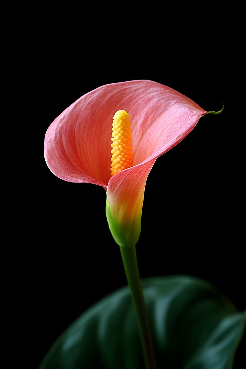
the easiest ways. So if we look at the width of this flower compared
to the length, so if we measure
from the top of the petal down to the base
where it meets the stem, and then we look at that measurement and compare it to the measurement across, it's almost the
same if you exclude that last little bit of the petal where the little
tail bit goes out. So we've got those two
measurements pretty much the same. So this shape of this
flower is going to fit into a square box there because we've got those
two measurements. And then we can measure the
center part in comparison to stem the bottom part of the stem where it's curled over. So let's have a look at that. And again, they're not far off being the same measurement, slightly longer
on the stem piece with that piece of petal
that's hiding the stem there. So by doing that, that's going to give us an idea. And then, of course, we
can do a lot with our eye. So if we look at the stem
itself, where that goes down, that's slightly thinner than the yellow bit in the middle. So all those comparisons, and then look at
the gap at the top. So the gap between
the top of where the yellow finishes to
the top of the petal, it's probably about half
or just less than half of the actual width of the
yellow piece itself. So once you've got all
those measurements to mind, we can start and put some
of those down on the paper.
3. Surface: Great thing about acrylic
paints is that you can use them on all sorts
of different surfaces, and they needn't be
too expensive either. Today, I'm using a piece of canvas paper that I've
taken from a pad, but you could use
whatever you like. So there are all
sorts of things we can paint on with acrylics, so we can paint on board, we can paint on canvas, canvas paper, a nice
heavy ordinary paper, or a mixed media paper, and also heavy card. I quite often paint on card. So if you're very new to painting and you've not
got too many materials, you've probably got
something around the home that you can paint on. If that's just a piece of cardboard, that's
absolutely fine, but you perhaps want to paint it a background color
before you start. So I've taped mine down. That's not always
necessary with acrylics. It's just force of habit, and it's nice for me to work on a nice flat surface on my wooden board
that I've got there. But don't worry if you've
not got that or the tape. As long as you've got
something nice and heavy, to put that paint on
a nice heavy card, heavy paper, canvas or board. And then for this first
section of the drawing, all you need is
something to draw with, so that could be charcoal. You could draw with
paint with your brush. If you're using paint,
use a mid tone. So nothing too
light or too dark. If you use a very dark color
to do your drawing with, with paint, it's quite difficult to cover
it up afterwards. So a mid tone, if you can, if you're using paint
to do your drawing. I'm going to use a pencil
because that's easy to hand. We've all got pencils around
if we've got nothing else. Or you could, like I
said, use charcoal. And of course, the
other great thing about acrylics is
we can paint over. So if our drawing goes
wrong, it's not a problem. We can paint over it, start
again, correct our drawing. So it's a very forgiving medium. Unlike watercolors, I
think it's much easier for beginners because you can make those corrections very easily. So get yourself comfortable, get whatever you're working on and your pencil or charcoal, and we'll go ahead and have a
look at doing this drawing.
4. Drawing: It comes to doing
the drawing itself, don't forget this
is a natural thing. It's a flower. So
if things aren't just exactly spot on
with your drawing, it's not going to
matter too much. The main thing is that it
looks like a calla lily. So it's going to look
like a calla lily, not like a daisy,
not like a rose. We're getting the
essence of this particular flower
and this variety. So don't put too
much pressure on yourself to have it
absolutely bob on. Now, the eagle eyed
amongst you will see that I've actually done it once
and then rubbed it out. That's the other thing.
We can start again. That's not a problem, but
also you can paint over. So it's a very forgiving
medium in acrylics. Now, to begin with,
I want to position the flower and it's
at a slight angle. So I'm going to put it, you know, give yourself
plenty of space. Don't go right to the
edges of your paper. Then you've got plenty
of space to work with. So it's at an angle, but it's not a massive angle. And about halfway up, so just move that
out of the way. About halfway up, this line is where the base
of the flower is. We discussed that before
this measurement here and this one here pretty similar to the top
of the flower there. So when you've decided
where your midway point is, then we can put this
stem in, like I said, it's a bit narrower
than further up. And then half of this
is about where so half of this line here is where
the petal crosses over. And then after
that, you've got up to about two thirds is
where the yellow is. So think of making a
dome shape at the top here and then bringing it
down to where that petal is, and then you can erase that line if you want to of the center. So you've got that yellow there. Now, I've made the
same mistake I made with my initial drawing
because I've followed this line exactly of the stem. What's happening, actually, is this is much more
upright, isn't it, if we have a look so the flower itself is
looking more upright, whereas the stems
going off to an angle. And by getting that right,
we're going to have it a bit more movement, a bit more of an
interesting shape. Okay, so let's get rid of. This is, of course, the same
height we're coming to. So that was just an angle thing. The measurements are the same. We've got half, half and
about a third there. And then the hardest well,
not the hardest line, but the next line to put in is going to be
this sweeping one. So when you're
drawing, don't try and draw in one long line. Draw in lots of little
lines like this, and it's much easier
to get that shape. As you come across,
you want to be more or less lining up
with the top of here. So well as measuring things, we're also lining things up, so we can see that
lines up with there. So if you had this point
down here, up here, down here, it would be wrong.
So just look at those. Now, this goes up in quite a
line here and down and out, you've got that extra bit
poking out off to the side. Just a little thin bit there with a nice
flick at the end, which we can get in
with the paint later. And then we're coming
quite steeply down. Out and around. And like I said before,
this width here across from this point
is similar to this. So we need to measure
that, measure across to see where
we come out to. Down and around. Slightly up. And then the last
line that we need to put in is this one here. And then we can get rid
of these extra lines. Some of this shape
here around here, where we feel it's sweeping
right round and up like this is made with the highlight
on the edge of the petal. So it's not really
so much the drawing but it's the painting that's
going to make that shape. Similarly here, we've got
a curve over a bit of a lip and all that
can go in later. Again, here where it bends
over, it's going like that. We can put a lot of that
in later with the paint. Doesn't have to be put in with
the pencil at this stage. So all I want you
really to do for this first drawing stage is to get the line of the
stem, this shape. So this cup shape here
where the stem is meeting. And this nice swirl
off to the side, you line around here, and then this one down here. Okay, so just a few lines, but it makes it a calla lily and not a different flower. Okay?
5. Colours: About this particular drawing, painting is that we don't
need too many colors. So you just need your
three primaries of red, yellow, and blue,
and some white. We obviously need that white
there to get that pink and those lighter
yellows and greens. So don't worry about having the same red yellows
and blues as me as long as you've
got those three colors. I'm using that zarine,
cadmium and cobalt. But if you've not got those
available, don't worry. You can use something
different and, of course, plenty of
white for that pink.
6. Shadow colours: Start by looking at the
darkest areas first where those shadows are falling on
the flower, not on the stem. And so for that, we need a red, a little touch of
blue to get the dark and some of the white
because it is still pink. So although it's dark,
it's really dark. It's not completely black. It still wants to
look quite pink. Might look quite
different to this depending what red you've used. Looking at the picture here, I'm going to pop a little bit
of the yellow in as well. So just keep looking back,
thinking how you want it. But like I've said all along, it is a flower. It's
a natural thing. If you've not got
exactly the right pink, it's not going to
be a big problem. So it's just getting
that little bit of yellow in as well,
slightly warmer. Make it a little bit darker. And this is where you
can spend a lot of time It's like mixing a cake until you're happy
with what you've got. And then we're going to go
ahead and put that in some of those shadowy areas,
darker areas. And at this stage, look at where your absolutely darkest area is. So to me, the darkest area
of this flower is here, where the shadow isn't getting into this little corner here. So keep that in mind
for later when we're coming on to doing our
finishing touches, where you want that shadow to be the darkest, it's
going to be in there. So at the moment, you're
not thinking about detail. We're just looking in
general where those shades are because this
is all going to be painted over with more layers of light and shade and detail
of the shape of the flower. And, of course, we
want to go over that pencil line to
start covering that up. So it's shadow really
right up to here, isn't it, if we look at that. So we're just
blocking in a shade, a tone of color to start
building up that shape. Like I said, this is standing
nice and straight up. So keep that nice
straight line there. You'll see I'm
using a flat brush. With a flat brush, it's easy to get these nice straight lines. Use whatever brushes
you've got available. Don't worry about going out and spending a
fortune on new brushes. Acrylics do have a tendency to spoil your brushes over time, so I don't think it's worth really spending a
fortune on them. So if we look, we've got shadow
coming down here as well. And again, this can be gone
over later in the top here. And some of this is
where you're going to get your shapes of these the way the petals turning over on itself by getting the light and the
shade in the right place. So think about that. Think about where the light's
hitting the petal and where the light can't get
to where the shadows are. I got a nice dark line
coming down here. So I think we've got
quite a lot of that dark in where it needs to be. And then, of course, under here. So all the time, keep looking
backwards and forwards to the photograph and look at where that light isn't
hitting the flower. And at this stage, whilst
you've got those on there, just get your brush, add
a little bit more blue, a little bit more red, and
make a really nice dark color. It's not black. It's
not dark, dark, dark because we do have
light on this flower. And just emphasize that there where it is
absolutely the darkest. The thing about acrylics is they dry a lot quicker
than other paints. So if you like to do blending, you've got to work
quite quickly. You can buy different mediums to help it dry less quickly, and it does depend on
the brand as well. But don't worry if
it's drying quickly. Again, we can come over and
do alterations as we go. So again, I'm going to make
a little bit darker there. Zarin and blue make
some nice darks. Just going in to that
corner and nowhere else, because that needs to be darker than everywhere else. Okay.
7. Layers: Go along, keep giving your
brush a nice clean out. And what I'm going
to do is rather than waste this colour I've got on here, I've got all that there. I'm going to now start
adding some white into it. I'm hoping you can
still see that. So adding the white into
that color that's already there to make a lighter
version of the same color. And then we can start and put some of those lighter areas on. This isn't your highlights. This isn't finishing off at
the end of the painting. This is just starting
to build up. A and if you want, you can start and flick some of those light bits in that are going down there
that's making that shape. You notice how I'm barely
touching the paper there. I'm just blending it in because as they
don't blend, you know, that's already dry
by going over with a fairly dry brush
and just flicking the wrist and gently brushing
glancing across the paper, it kind of looks like
it's blended in, even though it isn't even though it's just lying
on the top there. And we all develop our
own style over time. So, you know, you still have
that shadow underneath, but by just flicking across, you're starting to
build up some of that shape that you've got. Carefully go around the shapes
so we've got that there. So that's going to be
easy to pop in later on. How much paint you
need on your brush and how easily it comes off your
brush and onto the paper, it's going to depend
on a lot of things. Depends on your
brushes, the amount of water your brush
has picked up, which you really shouldn't be working with a wet wet brush. You shouldn't be adding
water to your acrylics. You should be just using
the paint, not water. It's not like watercolor. You don't want to be
introducing water to the paper. So dry it off after
you've rinsed it. Get that paint on. But also the surface,
can you see the paper? Because I've got a
texture in there, it's taking more coverage. If you've got a
very smooth paper, it might need less paint on. So all these things will alter the overall finished thing depending on your surface
that you're using, the paints that you're using, and the brushes
that you're using. So we're not all going to have the same results at
the end of the day. So at the moment, we're just
reinforcing that drawing. We're looking at where
the lights and darks are, and we're starting to build
up some of that shape.
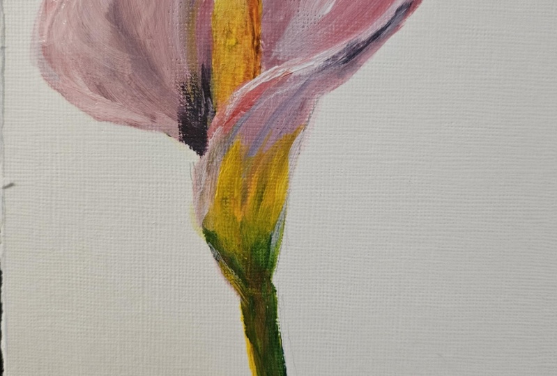
8. Layers 2: My apologies. I do think
I missed a little bit of the filming there when I was talking about the pinks up here. But you'll see what I mean when I added the yellow
and the green, what we're doing is starting off with the darker
colors and then coming on top or coming
with the lighter colors. Now, you'll notice
when I did the yellow, I didn't just put the yellow on. I did actually put
a touch of red in there because if
you look carefully, there is a more
orange tone to that. And in here, there's
some oranges. So the more you look at a
subject, the more you see, and then that brings you
on to put in more detail and color so how
detailed you go, how much color you put in, whether you're going to do
those little bobbly things on here or not, I don't know. That's very, very
detailed, isn't it? But it really depends. It's up to you how much you want to carry on with putting
all that detail on. So with the green, I added the blue and the yellow, but I did put a touch of red
in there to make it a bit more natural with
a lighter green, So once you get a few colors on, you can start just
lighting them, darkening them by adding
that extra bit of white. And if we look here,
that comes down. The side there needs to be lighter still,
doesn't it, that really? Got quite a highlight
going on there, but none of these highlights
so far are white. We don't want to be
adding too much white. At this stage. So I've used
plenty of white paint, but it's all mixed in
with the other colors. Now, it's quite blended
here, how it comes down. It's got that dark
pink coming down into So this is going to take time to keep looking
and deciding just how much colour
you want in there. And then we're going
to a lighter mid pink. But by putting it
on really lightly just glancing off the paper, you're still letting
that yellow and that green show through to an extent. So they're all matching each
other, blending in there. And none of this area here
is as light as up here. So although we have lighter and darker areas within that area, it's not light
compared to up here. Obviously, the
light's coming from above and hitting
the flower up here. I I've cleaned my brush off. Do keep cleaning your
brush off as you go along so that I
can have some nice, pure yellow with nothing
else in it because I'm liking this bit of light that we're seeing
on the edge there. And, of course, petals are transparent and the
lights shining through. And it's also gone too
heavy there with that. It's also kind of
shining across here. So you can put a bit of a
glaze of yellow across there, just lightly kiss it
with some yellow. And if you're not happy with it, and you want to come back to
it and add that pink back, leave it to dry, and then
come back afterwards. We need more of a distinction where the bottom of
the stem is here. So it does go all
the way around. And you'll see it went
over the line there. That's not a problem.
If it's still wet, you can just tidy that
up with a damp brush. If it's dried, again,
it's not a problem. You can come over it later on. So it still need to be a
bit more distinct there. So I'm going to carry on
and do more detail in this. Come onto the yellow, put more detail on there. But really what you're doing is just looking back at the
photograph all the time. Keep going away,
keep coming back, and then you'll see
things with a fresh eye. But one thing I want you to think about whilst you're doing this is the shape of the flower. It's not a two D flat object. It's a three D object, and it's curving out and it's
growing and it's moving. So really think about following that line with your brush. So imagine your brush is going around the flower,
around the petal. Imagine you've got the
flower in front of you, your brush is on it, and
it's going around the petal. And that's going to help
you to form this shape. So I'm going to carry on now. We need more dark
down here, don't we? This side of this
is much darker. We need to get a
bit darker on here, and we need to get a bit pinker and lighter on some
of these areas, and I'll come back at the end
and talk about that detail.
9. Highlights: So, like I said,
you've going to have a lot more time than me to
just keep going with this, get some more detail, keep looking back at those light and shade and getting
that shaping. I'm going to leave it here, but I'm just going to finish
off with some pure white. So give your brush a nice clean before you get your white on it. And to finish off, I'm going
to look at exactly where the very lightest areas
are, and they are here. I'm not going to overdo it. And here, perhaps let's put
a bit of white on here. And that's just going to help
make that jump out to you. And the shape there of that.
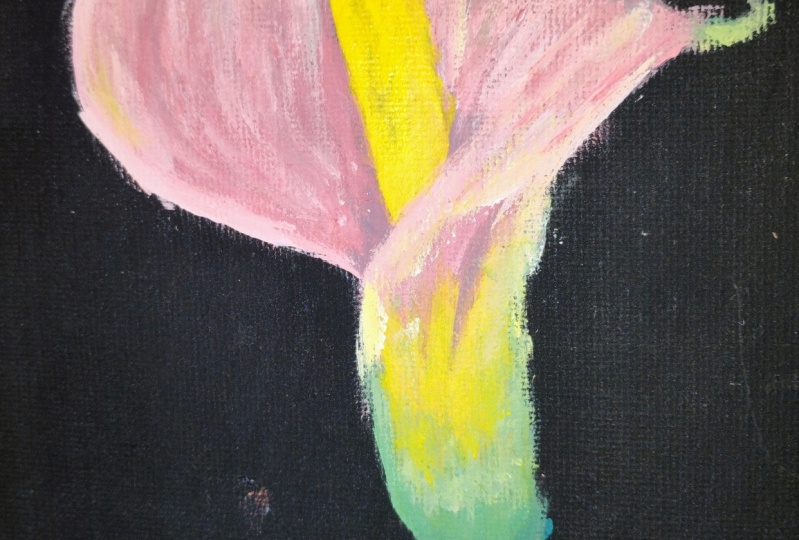
10. Project & Background: Going to start fiddling
and leave it there, so you can see we've made a
lot of different shades and tones with just those three
colors and the white. So with a lot of paintings, all you really need is your three primary colors and white, and your pinks are going to
look quite different to mine, depending on which red
you choose to start with. So like I said, I've got
that lazarin Might have been nicer with
something I don't know, a bit more rosy maybe
more of a rose color. So you have a look at
what reds you've got and have a bit of play and see
what pinks you can make. Once this has
dried, perhaps need a little bit more of a glaze
of yellow again down here. And actually, I can see a little bit of the
yellow in there. Now I'm looking at it. So I'm
just going to do that now. So with a damp brush, I'm going to put a tiny bit of this yellowy orange that
we had for the center. But then more or less
brush it off my brush, so I've got a tiny bit on there and then just
put a glaze over, like the lights catching there. I think I'm a bit happier with that to make that
a little bit warmer because what's happening is the light's hitting
that yellow there, and then that's reflecting
on on the pink. So when that's nice and dry, you can put glazes over. You can add more detail. Okay, so but I think I need to stop fiddling with it and
stop talking, really. So what your project is to
do is to do this flower. And if you want, there's the other photographs
to work from as well. Some of those are some
beautiful shapes. And the reason I chose
these photographs to work from was because they were on that black
background because it really leaves it open to what backgrounds
we could choose. So I'm not going to talk through the backgrounds for you today, but one thing I am going to do is take a photograph of this, and then we've got all
sorts of apps and things now where we can just
remove the background, and then we can try putting
it on different colors to see which background
works the best. They look really nice and
striking on the black, but it might be nice against a green background or
a blue for the sky. Or even a texture background. So you can have a
play with your image on the computer after
you've done it. So take a photograph
with your smartphone, remove the background, have a go on some of these apps
and see what you think. And then you could use
this very simple shape for something like a greetings
card if you wanted to, just by adding a background. And if you find a color for your background
that you really like, then you can use
the paint to do it. So you can either do it on the computer or you can come back to your painting
afterwards and think, the blue look really
good with it, so I'm going to do. So you might want a
completely contrasting background to your pink, something green to contrast
with those reds or you might want to make it more
harmonious and put more pinks in as if you've
got more flowers behind. So there are different
ways of doing it, and you can leave it white
or you can leave it black. So we'll have a play with
that, but your main project really is to do these flowers as they
are to get an essence of the calla lily and to get those shapes and that
rhythm and that movement, those nice curls, it's
such an easy shape to draw once you've done one
or two with flowers. We've got to think about
how they've grown. So they've grown
out of the stem. This is nice and fastened here. Everything comes from
this central point. And it's grown up and out. And this is fastened
underneath to here as well. So, though the petal is
disguising that fact, you've got that anchor there. So if it's convincing where
everything's growing, then it's going to
look like the flower. Okay, so I look forward
to seeing your projects, and you can upload those, and
don't forget you can find these beautiful photographs
in the reference section.
11. Backgrounds: It is just an additional part for those of you
that are interested. I used Canva to play around
with the background colors, and you can see the the yellow. I really liked the yellow. It works well with the
yellow and the black. Some of the other
colors, not so much. So it's a really good
exercise is this. And of course, we all
have our own preferences. So with canvas, you can easily
remove the backgrounds. I've got the
professional version, but you can get a free version, which is just as much fun. So remove the background and then try lots of
different colors. You know, it just takes a few
minutes and it's good fun. So like I said, you could
make this into a card. You could download these images, or you could just use them as a guide to choose
that color paint. I really like the
quite golden color. I think it sets off the
center of the flower, and I didn't particularly like these pinks that I
chose at the end. It looks nice on white,
it looks nice on black. But like I say, it's all
objective. See what you think.
12. Conclusion: Conclude, I really
enjoy painting that. I think because we've got those very simple
lines to begin with, very basic shape and
very elegant lines, putting the paint on afterwards was the easy part, in a way, because you're just following those lines of your drawing, following that
lovely curve round. So if you do have
time, do have a go at the other photographs that I've attached in the
reference section, and I do look forward to
seeing those projects, and I will get back to you with feedback on them when
you do upload them. Whilst you're going along,
if you do have any questions for me about the process
itself, please do ask. I'm always happy to help, and you can ask either here
on Skillshare or you can ask me on Instagram using
the messenger service there. So I will get back
to you when I can. So it's all about
that very simple line of the calla lily and just
putting those few colours in, making some nice
color mixes just from your primary
colors and adding that little bit of white for the highlights and then having a look at
those backgrounds. So that's just an additional
thing at the end. You could put a completely
different background in. You might want to
put more flowers behind some more
impressionistic flowers. Whatever you want to do,
it'd be lovely to see. And if you do share
your work on Instagram, do tag me in that as well, because I really like
seeing everybody's work. So thank you very
much for joining me on this course. I
hope you've enjoyed it. I hope you've got a
little bit out of it, whatever stage you're
at with your painting, whether you're a beginner
or intermediate. I hope you've got something from it that you can go ahead with and carry on in the future with some more lovely
flower paintings. And I'll be back again soon
with another tutorial. In the meantime,
you really enjoy your painting and
drawing. Bye bye for now.
 Cally Lawson, “Paint like no one is watching"