Transcripts
1. Introduction: Hello, and welcome
to building up experiment with custom brushes in Procreate's Brush Studio. The second part of the Procreate Bush Studio Mini classes series. I'm Emily, and I will
be your guide in these next steps into your
brush creating journey. In this class, we take what we learned in the
first class and build our skills up by creating our own images
for shape and grain. If you have not watched
Part one of the series, I invite you to do
so now because I'm not going to repeat the
steps we took to get here. Instead, we are going to
dive right into creating your own images to modify an existing brush from the
Procreate brush studio. The link to the first
class of this series is in the class description in the about tab
underneath this video. Ready? Let's dive in.
2. Your Project: So you have now
learned how to choose an existing brush from the
Procreate brush studio and tweak its shape and grain attributes to modify it without changing
anything else. Picking up where we left off. In the last class, we
are going to build up on that and do the
exact same thing, but we are going to use our own photos instead of the
Procreate library images. Sounds exciting.
I believe it is. Your project for this
class is quite simple. First, you are going to create your own brush shape
and your own texture. Then you will take pictures that you will tweak directly
and procreate. Next, you will
import set photos to the brush studio to modify the shape and grain
of an existing brush. And lastly, you will create a brush sample of your
newly customized brush. For the class you will
need your iPad with Procreate installed and a
working knowledge of the app. A few pieces of ordinary
paper, a big dark marker. I don't have a black
marker on hand right now, so I'll use an old
violet alcohol marker. Remember that this class
is part two of a series, and you should really have
watched P one before taking this class because I will not be repeating the steps
from part one here. We are simply adding
to them instead. As always, feel free to upload the steps to
the project's gallery. It's always fun to share the process with
fellow students, and I would love
to see what you've been working on for the class. Meet me in the next
lesson to start working on your
images. See you there.
3. Working On Your Drawings: Hal, good to see you here. In this lesson, we'll
work on the images that will become the shape
and grain of our brush. I'll show you one method, but remember that once you
know the principles behind it, you will be able to play around
and try different things. Let's start with the shape. The brush shape is described in the Procreate handbook as the container for the
texture of a brush, and I like to keep this in mind while I work on my shapes. Something that works
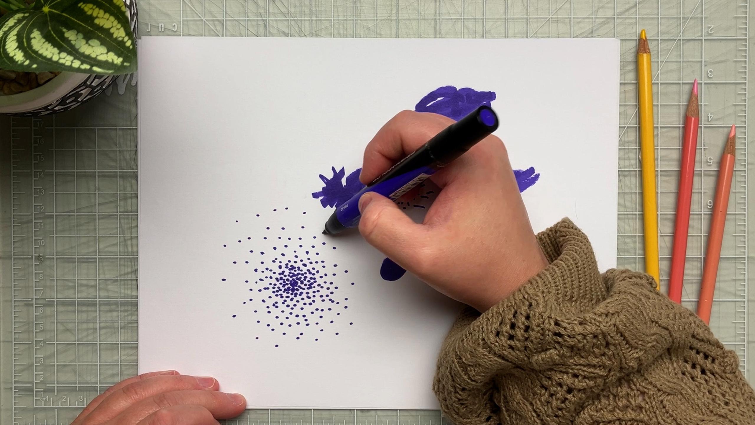
really well for me is making marks on white
paper with a dark marker. So that's what I'll
demonstrate here. Be paint or any other
material, really. But one good guideline
is to have contrast. It will come in handy later on when we'll edit the image
for the brush studio. Don't be afraid to
have some texture and leave areas untouched in the shape because
these quirks will look great and give personality
to your brush. Also, don't forget that when you will have
done a few of these, you'll have a better sense of
when a contained shape will work best or when scattered
marks might work better. Here's an idea. You could work
on a few different shapes, as I am doing now, edit them all and choose
what works best later on. In any case, do not
judge the result. We're just playing here. Once your shape or
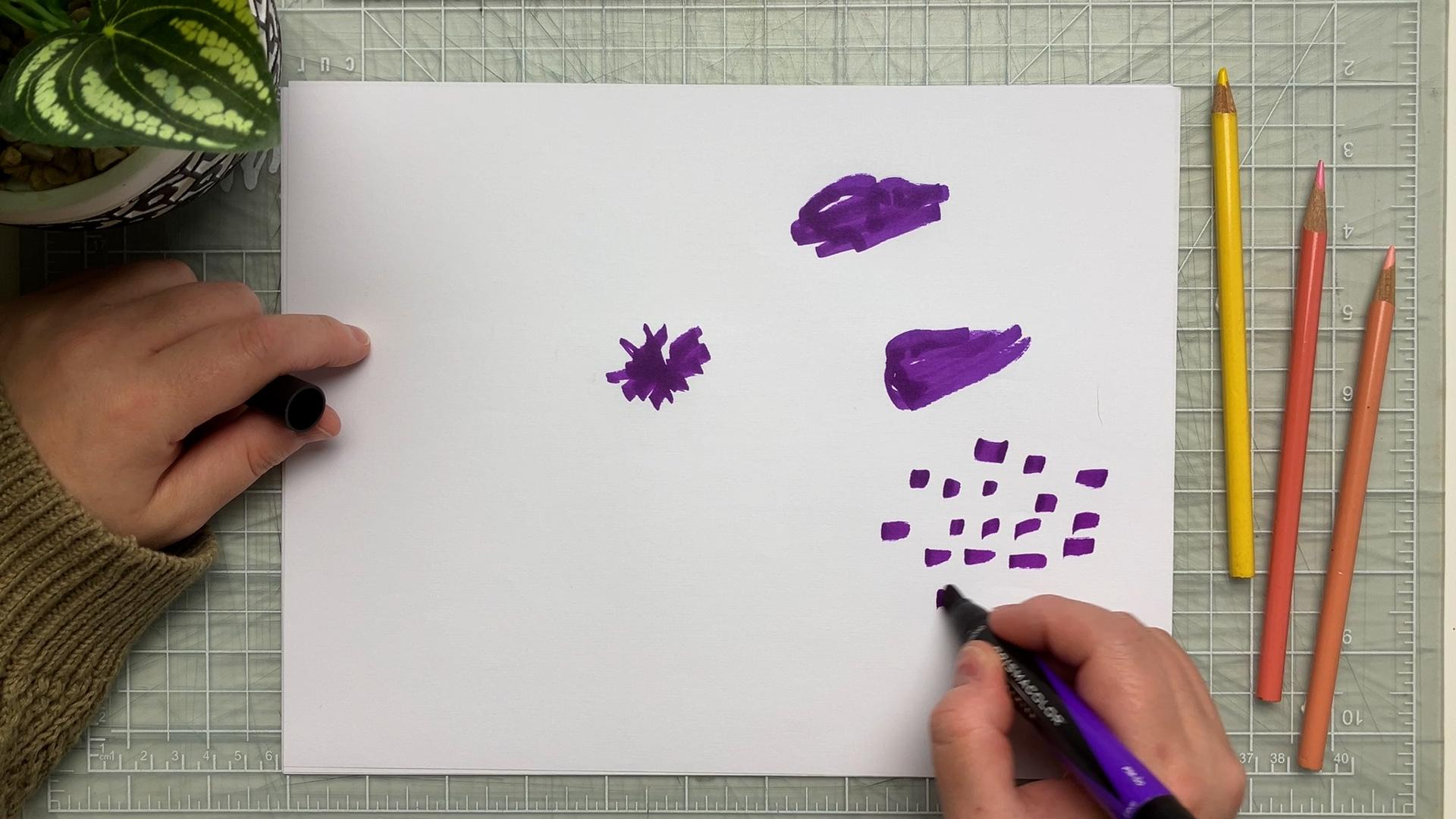
shapes are created, it's time to take a photo. For simplicity, I'll take the photos with
the iPad directly. I try my best to have a bright even lighting of my paper to make things
as simple as possible. Also, I'm careful to
have a neutral angle, meaning there is as
little distortion as possible in my image. For this, try to have
the lens of your iPad directly over the shape you are shooting parallel to the paper. Now we can move on
to the texture. Texture can come from
anything, really. As long as you keep in
mind that it's easier to work with a regular
pattern and that again, lots of contrast in your
image will be helpful later. You could use paper or fabric
that has a marked texture. It could be a drawing
or even food, such as grains of salt on
contrasting background. For this example, I'll keep on working with markers
on white paper. I work in a square format
that I roughly mark on my paper and fill the square
by making random marks. The only restriction
is to create an all over relatively
regular pattern. When this is done, it's
time to take a photo. Earlier, I mentioned that
it was best to have a good even lighting for
the photo of the shape. But let me stress that it is crucial when taking a
picture of your texture. If you don't have even lighting, it will cause you
quite the headache when you get to
the brush studio, especially if
you're working with an organic texture
such as fabric. But also, don't forget that
we learn from our mistakes. So don't be afraid
to try things out, readjust, and try again. Here, I have the
ideal situation, because my texture has
high contrast already. So even if my photo
isn't perfect, it's going to work
great later on. I really encourage you to
try this method first. And when you understand the principles better
and are more at ease, then switch to more
complicated textures. In the next lesson, we are
going to edit the images. See you there.
4. Editing Your Images: Hello, back. Let's keep
going by editing our images. Now that the pictures are taken, let's switch to
Procreate and create a square document of three
by 3 " at 1,200 DPI. This will ensure good
resolution for our brush shape, especially if we need to
zoom in the image later. In this document, we
import the shape photos. Take a moment to adjust the size and center the image
as much as you can. If you don't want your photo to get warped and
keep its ratio, don't forget to tap the uniform setting in the Transform tool. We now need to edit
our photo to tell Procreate which part of the image will print
and which will not. For this, we need a
black and white image in which white means on and will
put color to the canvas, and black means off or
nothing will print. Remember this as it will guide your process
for the future. Okay? Alright. Also, note the following steps
because they will be the same when we get to
the grain of the brush, and I will not go
over them again. Because we worked with
dark marks on white paper, what we need to do is
reverse the image. Why? Well, remember
2 seconds ago when I said that white means on and
black means off, that's it. We want the shape
that we trace to be on and everything
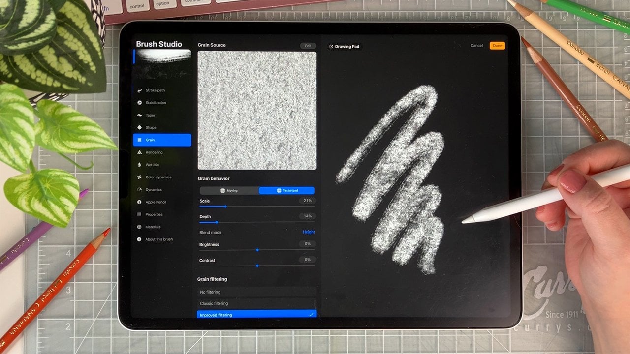
around it to be off. So we need to reverse the image. In the adjustments menu,
choose gradient map. You may have different
gradients set up here, so we'll create a new one with the little plus
sign on the right. By default, it should be a
black and white gradient, but if it isn't, no
worries, we'll change it. Just tap the first color on
the left and make it white, and now the color on the
right, we make it black. The result we are
looking for in the image is a black background
and a white shape. So whatever you
do, aim for this. I want perfect
contrast in my image. So what I need to do here is grab the black
square and drag it a little towards the center until all of
the background is black. If your shape isn't pale
enough at this point, grab the white square and drag
it towards the center too. What this does is it gives
your image less tones between the white and black parts,
creating more contrast. You can experiment with
this as much as you like. And when you have
just enough detail and you are satisfied
with the results, tap the adjustment icon
to accept changes. You can always go back with a two finger tap anyway,
so don't fret it. Okay, now we are going to
export this as a photo. Go to the Actions menu, tap Share and JPEG. The easiest from here
is simply to save the image as a photo in
your gallery right here. Now, we fall back to what we
learned in the first class, starting with a
brush that you like, access the brush studio and go right to the shape attribute. Tap edit, and here
comes the difference. When tapping Import,
you will import a photo instead of importing
from the source library. The image you have just
exported should be right here. Tap done, and now you
can test out the result. If you're satisfied, tap
done again, and what up? The editing steps are the
same for the texture. The difference
really is that you should aim for regularity
and the pattern. I'll import my own photo
here and see what I can do. Remember that the possibilities are endless and with the
same shape and grain, you could get many
different brushes by using different settings. But let's not get
too much into that. Just know that when
working on your texture, you can fiddle with the
settings as much as you like, either in the auto repeat tab or in the grain behavior tab. Try them out one by one, like I'm doing now and see what works for
what you have in mind, or just what you
like in the moment. For example, you could
scale up the grain and move the image to a
part that looks more even. I like to use a very
intuitive approach, and I encourage you to do the same because we're just playing. When you're satisfied, tap done and test out your texture. The only thing left
to do is to make your sample card and post it
to the project's gallery, just like we did in
the first class. I cannot wait to see
what you come up with. Thank you so much for joining me in this super short
and sweet class. If you have questions, don't hesitate to post them, and I will answer to the best of my knowledge, always. See ya.
 Amélie-Maude Bergeron, Graphic designer | Artist | Illustrator