Transcripts
1. Introduction: Have you ever wondered if you could draw from observation, but then got intimidated because you really didn't
know where to start. I'm a freelance
graphic designer, illustrator, and visual artists living in the beautiful
province of gibbons. I have a bachelor's
degree in art education and have worked for a few
years as a photographer. There's always too many
projects on my mind. But one thing that never changes is my love for the
art of drawing. In this class, we
are going to work on our observational drawing skills by taking a specific angles. We are going to talk
about negative space. But they are why they're
important and how we can first perceive them and then use them to get
better at drawing. This class is all about
training your perception. I'm really excited to teach about this
subject because for me, perceiving negative space
changed the way I perceive the world and it transformed my practice as an
artist many years ago. If you are intimidated by
observational drawing, you are at the right place. We'll set the ideal conditions for your perception
skills to grow. This class is for
intermediate level. But I think when you need
most recent interest in drawing and a wish to
work on your skills. I created a class
workbook that you can use either on an iPad or
as a printed document. For the final project, you will need drawing
paper. As a medium. I suggest either
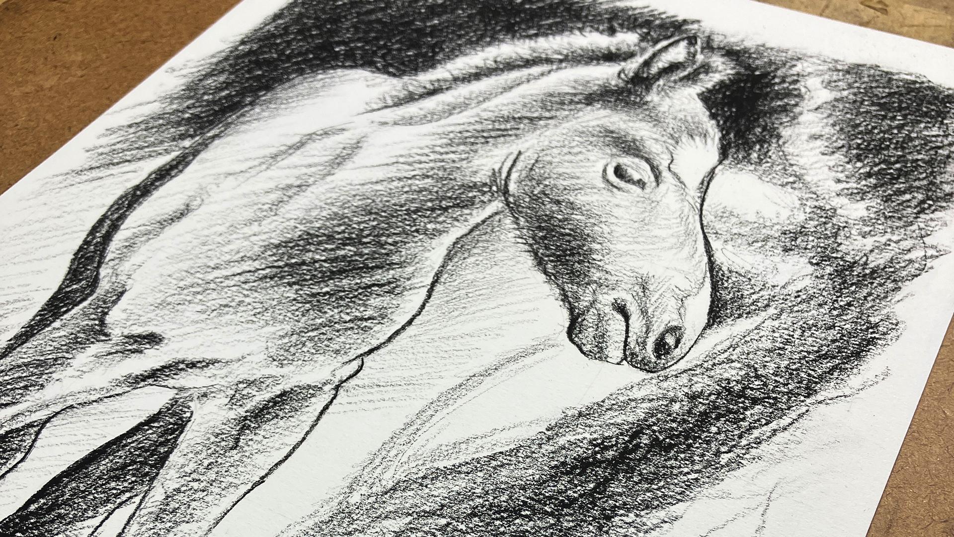
graphite pencils, sound walk county pencils, or a black soft pastel, depending on your preference. The project for the cost is a horse portrait
drawn from observing a photo to get their keys start by discussing what
is negative space, why it's important and how you can use it to simplify drawing. Then we consolidate the
knowledge with two exercises. We discussed how space and shapes are in relationship
with each other, and how negative space and
composition are related. I also give you tools
to be successful with the cost projects as we
work on it together, a few notions on value and to shading
techniques for drawing. Last week, well, look
at the importance of evaluating your
work and that's it. Let's go.
2. Your Project: Hey everyone, so glad to be spending some
time with you today. Today we are working on our observational
drawing skills and together we are going to
be working on a drawing, more specifically on an eight
by 10 " horse portrait. I chose this project
for mainly two reasons. First, I'm very passionate
about drawing in general, and I'm currently working on an exhibit featuring
my horse drawings. While working on the exhibit, I realized I was really always going back to the notion
of negative space. And it's sort of click that this would be an
awesome way to work on negative space as a means to strengthen perception
and composition skills. Second reason is that horses, while being beautiful
creatures to which I really have a
special attachment, are kind of weird
and awkward to draw. And I really want
to show you that if you work on your perception, you can draw difficult and
weird and complex subjects. We will be working
from a photo and there are very specific
reasons for that, but we'll discuss them in
the following lessons. The steps you will need
to take to complete the project or as simple
and pretty straightforward. First, we'll explore the
concept of negative space, learn the what and the why
behind its importance. Then we will put theory to
practice with two exercises designed specifically
to consolidate your understanding
of the concept. Next, we will already be
working on your project. After choosing our
reference image, we are going to frame
your final composition, working with a grid, putting your new
knowledge to the test. You are then going to sketch
your horses silhouette. Add a few details until you are satisfied to give more
realism to your work will explore a few simple
shading techniques that you are going to
apply to your piece. Lastly, we'll take a
moment to self-evaluate, add the last details, and take note of which areas would like to
work on in the future. Here's the material
you will need. Either an iPad with a note-taking app and
the procreate app. Or you can also
print the workbook, either the whole thing or the specific pages
that you need. Drawing paper for your project, make sure it's a little larger
than your final artwork. I suggest you to
work in an eight by 10 " final format
to make it easier. But of course, you can
work bigger or smaller as long as you keep the
same ratio overall. For the medium, I
suggest either graphite, sound walk county pencil, or a black soft pastel. But if you'd like to
try something else, you can just know
that we'll be working monochrome and that it would be nice to have some contrast. The mediums I suggest
are also quite forgiving in the sense that if there's a line you
wish you hadn't drawn, you can change it. And kneaded eraser would
also be nice and useful, but not essential in this spirit of learning new
skills and sharing them. I would love to see your artworks in the
projects gallery. Discussing projects
is a great way to learn from each other. And I will absolutely look
and calm and everything that is posted there and give
feedback if you want me to. Don't hesitate to ask
questions either. Alright. Now that you know where
we're headed today, I invite you to
download the workbook. Everything you need to know
about this class is in there. Up next, we'll discuss the
concept of negative space. See you there.
3. Negative Space: What And Why?: Let's start things off with the concept of negative space. What is it? Why is it important and how can it be used to help
you draw what you see? When I say negative space, what I mean is this space
around a subject or the space around an area of
interests in an artwork. If you were to
look at a painting about an apple on a
green background, the space around the apple
would be your negative space. Another classic example is
the space around a chair. And in-between the rungs. In graphic design. It's this space around your design or
in-between the elements. Sometimes it's referred
to as whitespace, but it's not always white. Okay, simple enough. But why am I? You ask, is it such a
fundamental concept? First, it's always present. There is no forgetting about it, because whatever you do, it's there just like the
world is around you. In graphic design,
this space will let your design
live and breathe, give it balance and importance. If you use it in
a clever manner, you can make wonderful things. Have you ever seen
the FedEx logo? Pay close attention to it. Do you see it yet? The arrow between
the E and the X. We could spend an hour on this, but let's jump to the
art side of things. In art, negative space is
closely related to composition. Mastering the concept gives you tools to reinforce composition. It will help you create a mood, lead the eye of the viewer, and make the whole thing
pleasant and balanced. Actually, it will help
you make the work whole. Learning to draw
from observation. We can use negative space in a specific way that will
help us draw accurately, but also build up our
perception skills. Understanding and
seeing negative space simplifies the task
of drawing from observation because it
helps our brains figure out what we're seeing instead of what we
think we are seeing. When you see negative
space as big shapes, you start being able to draw complex subjects like
the foreshortening of fingers or legs, e.g. it is often easier
to draw what is in there in order to make
a subject appear. Studying negative space works up your visual perception skills. Drawing from observation is closely related to perception. There's an art educator that I admire a lot who's
named Betty Edwards, who says that negative
spaces are easier to draw because you have no
name for these shapes. Your brain has not
translated them into a symbol already and
will not mix them up. They are just shapes. On a more personal level. Seeing and understanding
negative space has changed the way I draw the
day I was thought about it, I started analyzing my
surroundings like crazy. It's fascinating. I felt like I could see another
dimension or something. I also had a teacher
in university who encouraged us to paint
the negative space first, to activate them and make for a more
interesting painting. This was also a game changer. Negative space should
not be uninteresting. It's part of the artwork. Now that we have looked at what negative space is and
why it's important. Let's take this further
to learn how to use it when drawing
from observation. See you in the next lesson.
4. Training Your Eyes For Negative Space: First Exercise: Welcome back. In this lesson,
we'll start training your eyes to see negative
space in action. Let's dive into it right away. They can look at the
workbook at page four to clarify things and see how
it works in real life. In this photo of a statue
against a blue sky, It's pretty easy to find the negative space around the statue because
it will be blue. Everything around and the spaces here and between the
body and the arm. And also here in between
the horse crown. Yes, it's a horse grown. All of this is negative space. Now, imagine if
you were to trace these spaces and fill them in, you would be left with
a pretty good head start for your
observational drawing. You would have a silhouette for your subject with the
right proportions. Without having any
real knowledge of anatomical proportions. It feels like chipping
away at the subject and removing parts around
it to make it appear. Let's take this further with this cute little dog over here. Say you were to draw this, you could first chip away at the dog by drawing the space
around his head and body. Instead of drawing
each part of the dog by itself and trying
to make things work. Draw width isn't
there as big shapes. And this is where it
gets interesting. See the complex
space in the ears. Would you know how to draw that? Not really, but not a problem because it's just
another negative space. If you focus on it as a shape. The glasses, the nose, same. They are just shapes interlocking with the
shapes around them, like a big puzzle. You want to draw the glasses. Don't draw the glasses, draw what's around them. At this point, we need
to agree on something. When there is an edge or a line that separates
two shapes. In this case the subject and the negative
space around it. We need to agree
on the fact that this line is a shared edge. And this is important
for one reason. If an edge is shared, it means that two shapes
are in a relationship. Shapes affect one another. And it also means that if
you draw negative space, you are automatically
making the positive form, aka your subject, appear. Just keep that in mind for now. I have given you
three more images and I suggest that you take a few minutes to analyze them with your new
perception notions. You can pause me. I'm not going anywhere. Why don't you take a moment to start analyzing
your surroundings? Isn't it fascinating or what? To solidify this new knowledge, we are going to
draw negative space directly onto a photograph. You can either work on your tablet or your
computer if you like. Or you can print
page number six of the workbook if you've printed the whole
thing even simpler. Here's a photo of a
chair, a classic example. I did not just reinvent
the wheel here. What I would like you
to try is drawing the negative space
around this chair. Like I'll be doing myself. It's like tracing a puzzle, as I mentioned earlier. In this photo, you
can also notice the perspective and the
object receding in space. But when I'm working
with negative space, it doesn't matter as much if your perspective notions aren't fully up-to-date or if they
are far back in your mind. Of course, I encourage you
to learn about all of it. But for now, if you just
focus on these shapes, nothing else matters much. Here's our wrap-up of what
we've seen in this lesson. When drawing from observation, you can draw the negative space and it will make
your subject appear. Because negative space and
positive form share edges. Drawing one makes
the other appear. Working like this simplifies the task of drawing
complex shapes, and it simplifies dealing with proportion and perspective. In the next lesson, we are building on
that to achieve the second exercise
in the class. See you there.
5. Training Your Eyes For Negative Space: Second Exercise: Now is the time to try
and fly on your own. But before that, let me
introduce the reason why we are working from
photos and this class. With reason, you might
be wondering why, since it's technically a
drawing from observation class. First, drawing from a photo is still drawing
from observation. You are still drawing
what you see with one slight difference when
drawing from real life. I mean, for all we know, we might be in the matrix, but that's not the point. We are actually
translating what we see in three-dimensions
on a 2D surface. This, right, there is one of the biggest challenges in
drawing from observation. It's the reason why it's hard to draw foreshortened
legs or fingers. It's the reason why we have
theory on perspective. It's also the reason why when
you watch an artist draw, they will often have
one eye closed. What? Yes. Because with both eyes open,
we see three-dimensionality. With one eye closed, we don't, and it makes the translation easier when working
with pictures, we take away the very
challenging task of translating three-dimensionality
to a flat surface. Today, I really wanted us to
concentrate on perceiving negative space for all the
reasons mentioned earlier. So I took care of a few
difficulties and advance. Now that this has been
discussed, here's another thing. When drawing
something, anything, we decide how to
frame the subject. This is how we
create composition. How is this related to
perceiving negative space? Well, remember when we
talked about how lines are shared edges and that shapes are in relationship
with each other. That's it. If your friend, my
subject differently, you are automatically
changing the big shapes of the negative space
around your subject, therefore, directly
affecting composition. Here's an example
that I've included in your workbook on page seven. Same subject, different framing, then negative space are different and
Effects composition. The point of view that we
take changes everything. This is why mastering
the concepts of negative space will reinforce
composition skills. You may not see how all of
this is related right now. But I'm planting seeds
in your brain with the hope that they will become
beautiful trees with time. But enough theory, let's jump
to this second exercise. In your workbook on page eight, I've chosen another chair. In the empty frame next to
the image of the chair, draw the negative space around this chair as
accurately as possible. You will notice that I have framed the chair in
a way that makes the space is quite characteristic
to make it easier. Keep in mind that there's
no magic trick here. If it's your first
time doing this, it probably won't be easy. But practice makes progress. Also keep in mind
that this class does not show you how to
measure proportions. Know that it's another skill to acquire when you wish to
draw from observation. This means this exercise will not be perfect either,
and that's fine. I'll be giving you
another tool for the last project in
order to make up for it. And for now, we are working in the same size from
reference to drawing. So as not to get
sidetracked by this. Also notice that the floor in the image helps figure
out this space. You can divide your
negative space using the baseline of the floor. Concentrate on
replicating the shapes as accurately as you can. I encourage you to replicate this exercise as many
times as you can. I've given you a few
images in the workbook, but you can also choose
images that you deem appropriate and try
it on your own. Remember, it will be easier if your reference and your
drawing are the same size. But you could also try to change the size of your drawing. Always keep this same ratio from the reference to the format
of your drawing though, or else the proportions
will not work. To wrap things up. Here's a look at what we've
discussed in this lesson. Drawing from observation
can be done from a photo. And this technique
simplifies the task of translating a 3D environment
to a 2D surface. It's a good place to start. Mastering the concept of
negative space will reinforce your composition skills because
the format of your work, the way you frame your subject, and then negative spaces around
it are all interrelated. To consolidate what
we've discussed. We've also drawn
negative space from observation to try
and our perception. Up next, we are going to decide on a composition for
the final project. See you there.
6. Starting Your Project: Format And Grid: Hello back. So glad to see you're
still with me, ready to finally take
on your project. In this lesson, we'll
choose a reference image and frame it to compose
our final artwork. Paying attention to the
negative space we are creating. When we're done doing that, I will show you how
to use a grid to make it easier to
see the big shapes. This is the tool I mentioned
in the previous lesson. The tool that will
help with proportions. Your final project will really be like putting a
puzzle together, because when using a grid, you are really
subdividing the space, either negative space
or positive form. And it gives you a
regular spatial reference to keep proportions
and check this way. You don't have to
measure while drawing. I still encourage you to
pursue your learning beyond. But as discussed
earlier in this class, it's not our focus. My goal is for you to be
successful with your project. And I give you this tool to try. You absolutely don't have to use it if it
doesn't work for you. Let's start. I'll choose my image and then
show you how I frame it. And then you can
do it on your own. I'm using my iPad and Procreate. But you can do this
a number of ways, including simply tracing a frame and a grid onto a printed image. The upside of working from a printed image is that if you
print it at its real size, it will be even
easier to recreate. Note that if you don't want to frame this object yourself, I've pre framed a few
images in the workbook, pages 12 to 17, already at the right format with the grid already in place. I've looked at many
images and here are the ones that
I liked the most. You can choose one of those or you can look up
for one of your own. The images I'm
giving you are from pexels.com and you are free
to use them as reference. I've linked all the references at the end of the workbook. Let's take a look at
them for a few seconds. It always helps to choose
a subject that you connect with or else you'll get
tired of analyzing it. I think the one I would
prefer working with for now is this full right here. There will be many
challenges with this image, but I think it's perfect
to show you how I use negative space
as a drawing tool. That's important. This in Procreate and frame it. I will create my art board in an eight by ten
format at 300 DPI. It doesn't really matter as
I will not be printing this. It's just for reference. Now, let's import the image. Alright. I have what
I want right here. Pleasing negative space,
a balanced composition. Interesting shapes all in all. Now let's add a grid
in the parameters. Go to the Canvas menu. I'm sorry, my procreate
is in French. Activate drawing guides
and modify the guide. In the grid size tab, we are going to
choose a 2 " grid. This means that are
a little squares are going to be two-by-two. This is perfect because
they are going to align precisely with the horizontal and vertical
limits of our formats. Now, you see this
little blue dot here. We are going to slide it down one of the corners
of the art board, so our grid aligns
perfectly with it. You can also play
with the opacity and the width of
the grid lines to make it more or less
visible. Press okay? And you are all set. Remember, you can
also print an image, trace your eight by ten for
amides directly onto it, and trace your own two-by-two
grid on the image. It will work just the same. You can also use one of the
images in the workbook. I'm giving you options here to make this project
more accessible. If we take a moment to analyze
the image and the grid, we can easily see that by dividing the space
of our reference, it will be easier to divide
the negative space even more. Let's think this area under
the fool's head here. Without the grid, we have a bigger section of negative
space to deal with. With the grid. We are dealing with smaller
sections because we can rely on the grid to
create smaller shapes. As your eyes and your brain get more used to perceiving space. And as you learn to
measure proportions, the grid becomes less necessary. Now, it's time to take
out your drawing paper, your ruler, and your pencil. We are going to draw the
eight by ten Fermat on paper. Let's meet at the drawing table. The paper I will be using for this project is
Fabriano drawing paper. But any drawing paper will do. When you start drawing, as with anything else, you develop your
preferences and you should concentrate
on that instead. If you don't have
special drawing paper, you can even work with ordinary letter
sized printer paper. It will not resist as much, but we are working
on skills here. We don't need anything
to be perfect. I'll use two H pencils
for the format and grid. And I will not be pushing hard. So as not to mark
the paper much, I will erase those
lines at the end. Here's how I like to
draw my own formats. I like to figure out the
size of the sheet of paper, find the middle of it, and then draw the final size. From the middle.
I need to have 4 " on each side of
the vertical line. And from the horizontal
middle line, I need 5 " up and down. I tried to align
with the size of the sheet to get
90 degrees angles. But if your sheet isn't
cut at a right angle, you might have angled problems. Alright? Now for the grid, it is
pretty straightforward. I need to mark my frame every
2 " and connect the lines. That was a very
technical lesson, but we made it through. If you have questions
at any step, do not hesitate to reach out. I'm here to support you and answer any interrogation
you may have. Also, don't forget to share your progress in the
project gallery. I cannot wait to see
what you're up to. Let's wrap things up before
we get into the next lesson. Here's what we've done
in the last few minutes. We've chosen a reference
image and we have framed it. We have also seen how adding a grid to your reference
makes it easier to detect negative
space and space in general by dividing bigger
areas into smaller pieces. We have also seen how to
draw a final format to paper and how to draw
your grid on your paper. Up. Next, we'll start
drawing our subject. See you there.
7. Perceiving The Space And Tracing Your Subject: Welcome back everybody. Glad to see you're
still following along. Great job for making it here. In this lesson, we
are going to trace the subject of our drawing using our perception of negative
space and the grid we have just created as
guides for accuracy. At this point. With the exercises that
we have done until now, you will probably be good to go, even if you're a little
nervous about it. This is normal. I suggest you trace
very lightly with your palest pencil and
without too much pressure. So you can make
adjustments along the way. Grab your reference image, you're drawing paper and
your palest pencils. And let's me that
the drawing table. Now, there is one optional
step that you can do here. If you're unsure where to start. If you like, working
directly on your reference, you can trace your subject
if you need to analyze things a little before tracing
on your drawing paper. Here's what I like to do. I look at my reference
image and notice where the negative space is and
the big shapes it creates. On my drawing paper. I take a moment to mark where the shapes
intersect with my grid. Then I really just have to jump in and start tracing the shapes. The neat thing about
having the grid is that at any moment, you can use it to make your life easier by dividing shapes that are too big or more complex.
Here's what I mean. See the big space
here that starts at the bottom left of my
full and goes around, touches on the branch
down to its nose. This is going to give me a
hard time and I know it. I'm going to use the grid and divide this big shape
in smaller sections. Let's trace the bottom part. Now that I have this section, I'll analyze what I just drew and compare it
to my reference. I find it easier than
comparing huge sections. You can also copy a big
shape like this one, for instance, under
the horse's head. I'll trace this big shape, but it's not very
precise, is it? Now I can go in and take
it in smaller sections using the grid as
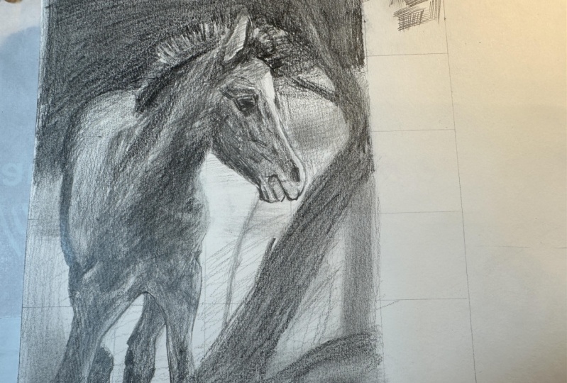
reference and refine it, adjusted until it makes sense. By focusing on drawing
the negative space, the positive form of your
subject appears by default. Take your time,
tweak the silhouette it creates until
you are satisfied. And then we're going
to meet back at the drawing table and go inside the silhouette
to add details. You can pause this
video here if you like. I'm not going anywhere. Are we good? Are you done drying
your silhouette? Okay, let's move on. Now that we have a silhouette, will go in and see if we
can use the same logic of finding big shapes to
add to our drawing, still keeping our
tracing very light. To me, this step feels
like making a map. Look at your reference and look for the edges
that you can add, the shapes you can divide to
push your drawing a little. Let's take a look
at my reference and I like to focus on
what is the most striking. I will definitely
want to make the legs on my full distinct
from one another. By adding these lines here. I will want to add
certain lines on the body to the fluffy main. The line on the mouth. Now comes the tricky parts. Nose, eyes, and ears. There's no denying it. They are tricky and weird. But with practice,
like anything else, we get better at it. Here's my suggestion. Try seeing these parts not as the parts that
I've just named. See them like the rest as big shapes that you will
recreate on your drawing paper. It's the secret for accuracy. Zoom in on the nose. What do I see? I see a very dark shape that becomes less dark and that part, and this is what I'm going
to trace on my paper. Another difficult part, getting the place
and the size right, try your best and use
the grid as a reference. Let's try it with the eye. Let's zoom in on my reference to analyze. I don't see an i. I see a big dark shape. I see a small shape that
is in fact a highlight. A few dark shapes around here. There you go. Take your
time to complete this step, adding as much or as
little detail as you like, keeping your lines very pale. The last thing I recommend is
to look at the whole thing. And if you feel like your lines are a
little disconnected, taking a more global
approach and add a few lines to make the base of the drawing a little more solid. Now, let's recap this lesson before moving on to the next. In this lesson,
we have perceived negative space using the grid as a guide to trace
big shapes on paper. To make the silhouette
of our subject appear. We have added some lines and more shapes inside
the silhouette. To make em up. We have learned to use the
same big shapes logic to add the more complex traits of our subjects and to
make it complete. In the next lesson, we'll get creative with
shading. See you there.
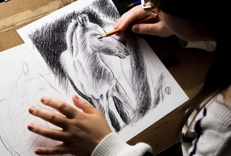
8. Getting Creative With Shading: In this lesson, we are going
to talk about value and see a few methods for
shading or drawing in order to add realism
to the artwork. Up until now, the class
has been quite technical. And I have to say drawing from observation can be tedious. And it's not always
creative per se. But as you get more
comfortable with it, it does become creative
because you will start to interpret what you see
and make it your own. Also, drawing or painting
from observation, you still have your
creative freedom and you will have to use it to decide what to include or not in your drawing or painting. Just because we are drawing
from observation does not mean we have to include
everything we see in our work. You also have to decide the level of details
you wish to add, the style of your drawing, the contrast you
want to convey, etc. All of this, the decision-making makes the activity creative. I'd like you to
keep that in mind. Because in a few moments, we'll go back to the
drawing table and start adding value
to our artwork. And we are going to have to make some creative choices
along the way. But first, let's introduce
the notion of value. Value is the lightness
or darkness of an image. It is relative,
and in my opinion, much easier to see
in black and white. There is a lot of
theory behind value. But in this class we are
going to focus on value as being lights and
shadows in an image. Value adds depth,
three-dimensionality, volume. It also affects the mood and
composition of an image. In drawing, I find
it adds realism. In this spirit of seeing
negative space as big shapes. We are going to keep
the same principle to perceive lights
and shadows as such. There is this neat little trick that one of my
teachers gave me at some point to see the areas
of lights and shadows better. You can squint your eyes. I can't really tell you
why it works, but it does. I've also discovered
that in my case, taking off my glasses
does the trick. Let's take a look at
my reference image. Now, if you squint your eyes, it will help you see the
values as big shapes. Here. You can see the lightest area. Then these in the background. On the falls back. You can see here at the
top of the image there on the branch that these areas are very dark compared to the rest. Now, if you concentrate
on the foal, see the back leg, the neck area, in the eye, the main There are
many dark areas. They're in-between. These very light and very
dark areas are the mid-tones. You can include as much or as little of
these as you like, depending on your taste, your ability to perceive them, or the style you wish
to give your drawing. The technical way in
which you will go from dark areas to lighter
areas is also up to you. This is how I like
to tackle this part. I look for the lightest
and darkest areas first, and then I decide how I
deal with the mid-tone. Note that one
technique and drawing consists in starting on a paper that you would
have shaded with a median value before
beginning to draw. I don't like it much, but it's a possibility. The biggest difference
is that when starting on a tone paper, you erase the highlights. When starting on a white paper. Everything is a highlight
at the beginning. I also like working
in high contrast, and this means I don't
deal with midtones much, but this does not
have to be your case. So it's good to know. Also note that if
you really have trouble detecting the
values in your reference, it can help to
convert your image to black and white and to
adjust the contrast. Just another tool you can use to make things easier
while you learn. Now let's go back to
the drawing table to place her lights and shadows and to look into
a few shading techniques. It will be timed to use your creativity and decide how to translate the
different values to your drawing using
the same principle of big shapes that we have used from the start of this class. Let's place our lights and
shadows onto the drawing. We're still working with very light traits to
complete the map. You should mark your lights
and shadows in a way that speaks to you and
will not confuse you. For the next steps. You don't have to
do exactly as I do. This is just a way
that speaks to me the most and that I
understand the most. Also note that this is a fake version of
my drawing and I'm pushing really
hard on the pencil so I can show you what I do. But I have another
ongoing version of the drawing that
I will be working with for the final artwork. Now that this is done, let's look at two
shading techniques that you can use to
work on your drawing. Note that we are going over
these notions quickly. And if you are interested in learning more on the subject, I do have a class on creative line work that has
a cool section on shading. You can now take your
darker graphite pencils, your soft black pastels, your content pencils, or the medium you chose
for your final drawing. Alright, on another piece
of paper, try this with me. The first technique
is very graphic. It's called hatching and
there's also crosshatching. You can see this a
lot in printmaking. Here's an example. This image is called peasant with his hands behind his back, created by around brand. It's an etching, but it shows really well
the effect you get with hatching and crosshatching
using lines and pressure, you create the
values and you leave the lighter areas
of the paper bear. Hatching is when using parallel lines that are
going in the same direction. While crosshatching is
drawing cross marks. Try it on your other paper to get the feel of it a little. You can, of course makes
the two techniques. Now, let's look at a smoother
technique called blending. With this technique, you can go from dark to light smoothly, like in this example. This is part of a drawing I've been working on for an exhibit. Going back to your paper, you can try it. Know that some people
use a Tertullian, also called a blending
stump to blend their value. But I prefer using a
mix of playing with the pressure on my pencil and
blending with my fingers. Using a Tertullian horrifies me for some reason
and I just can't. You can try it on your own paper to see if it works for you. Instead of a Tertullian, you could also use paper towels. By the way, you don't have
to stick to one technique. Do what feels natural for you. You will end up developing
your own technique. Most probably. I think mine is a
mix of these two. I like working in a
graphic expressive way. But sometimes I
like to play with this softness of blending, like in this image right here. Time to translate this
into your drawing. Remember that you are the one deciding what to draw or not. The range of tones that
you wish to include, the techniques you use. The only advice I
really wish you to retain for this is to
do what feels natural. Here's me working on
my final artwork. I've accelerated my
process by like 1,000%. And even though I
don't like to do that, I wanted to give you
an idea of how I work. One thing you can
note in my process is that our work in layers. I often mark where my darkest shadows
are in the beginning, but I will come back to them
later to accentuate them. I also don't have a specific
order in which I work, meaning that I go back and forth between the different
parts of the drawing. I think that this way of working helps me find a balance
in the contrast. By no mean do you have
to copy my process? You really have to find
out what works for you. And I want to emphasize that what really helps me to achieve a certain
level of realism is, as I've mentioned before, to see the elements of
the photo as big shapes. And you should not
feel like you need to perceive everything
right away either. Some parts become clearer to
me as I work on my piece. Like the eyes, the
nose, and the ears. I add shadows little by little. And there's always a moment when I finally get to where
I want it to be. I suggest you
practice, practice, practice, until you
find that sweet spot. Also note that I don't give much attention to the
different textures in this particular drawing. I've said this earlier. You are the one choosing the level of details
you wish to convey. You are your own
creative director. Towards the end of the process, you can see that I like to add a few graphic lines and adjust the contrast to make things pop. You can try it if you like. But once again, I encourage you to experiment
and see what works for you. Alright, last detail,
your signature. You worked hard and
it should be known. Take all the time you need
to work on your drawing. There's no competition as to
how fast you should draw, but you should really
enjoy the process, at least I hope you do. To conclude this
lesson, let's recap. We have learned that value is the relative darkness or
lightness in an image. We have also looked
at how to see the different tones as big shapes by squinting
your eyes a little. We've also reviewed to
shading techniques and apply all of this to
our drawing projects. See you in the next lesson
for the last details of the class project and
your self-evaluation.
9. Adding The Last Details And Self-Evaluating: Hello back everyone. Welcome to the last step
in today's project. The first thing
we're going to do right now is to
look at our drawing as a whole and see if we
want to add more details, more contrast,
adjust the shading and Lidl or draw more
expressive lines. Whatever you think your piece
is lacking to be complete. Now is the time. Here comes the last step. This is a step that I've
added in the last month in my own practice to make a conscious planet
working on my skills. I confess that I'm a
recovering perfectionist, and this means I'm rarely satisfied with the
work I accomplish. At one point, I
decided that it's important to be able to
look at the work I do, either in design and
art or illustration, and see it for what it is. It's easy to look at
our work and think that it's all crop
for me at least. But I now prefer a nuanced approach in
which I can recognize what works well and which areas need working
on in the future. So here's my suggestion. Let's look at your drawing and take a specific angle to start. What were you really trying to work on with this exercise? See if you think
you achieved that. The rest is kind of a bonus. Also, try to see if you
think you did better than the last time you worked
on these specific skills, if there was a last time. Now, try to look at the
drawing as a whole. What do you think
is working well? What can you work on specifically
the next time you draw? Another thing? You still can add a rectifier
drawing at this step, adjust what you want, and can adjust and make a mental note for the
rest for next time. On the other hand, overworking a piece is a thing, it happens. So be mindful of that. You'll know when it happens. Not the end of the
world, but frustrating. And nonetheless, with this, we are done. Great job. I'm so glad you made it here. Up next. The conclusion. See you there.
10. Conclusion: Wow, we are done. Good job, everyone. Thank you so, so much for
spending this time with me. I feel honored that you chose to invest this
time in my class. Here's a little reminder of what we have accomplished today. We have worked on our
observational drawing skills by talking about what
is negative space, why it's important,
and how it can simplify drawing
from observation. We've learned to see
negative space as big shapes to drive and
make a subject appear. We have also tested this
knowledge with two exercises. We have discussed how shapes are in relationship
with one another, like a puzzle, and how negative space
Effects composition. We've also touched
upon the importance of the format for the
composition of an artwork. We've looked at how
to use a grid and composing our final projects to help us perceive the
different spaces and shapes more easily
to recreate them. We have also gained a
few notions on value, picked up a few
tricks to perceive the different
values of an image, tried out to shading techniques and apply them to our project. Lastly, we have looked at
the work we have done, reviewed the areas we
thought were well done, and noted the ones we thought could use more work next time. That was a lot. I hope you had fun learning
or reviewing all of this. I especially hope you have
a better notion of how negative space can work for you when drawing
from observation. And I can't wait
to know if you're analyzing all of the
space around you. Here's one last
reminder to publish your process and your drawings
in the project gallery. I'd love to see what you
were able to accomplish. I will of course, give feedback if you want me to answer any question
you may have. On that same note, if you
could fees review this class, it would be a great help. I really wish to make each
class better than the last. So any constructive
criticism is welcome. You can follow me mainly on
Instagram for the time being. And you can also follow
me here on Skillshare. I would love to connect. Thank you so much
once again for taking the time and I will see
you in another class.
 Amélie-Maude Bergeron, Graphic designer | Artist | Illustrator