Transcripts
1. What you will learn & Build: Hey, everyone. Welcome.
My name is Flutter Sense, and in this class,
we're going to build a simple image
gallery app in flutter. This project is perfect for beginners who want
to practice layouts, navigation, assets, and theming all in one
small hands on build. By the end of this class, you will know how to create a new flutter project and
structure it properly. Add and manage
local image assets, display images in a
responsive grid layout, navigate to a full screen
image viewer on tab, use flutters hero
animation to create smooth transitions
and theme switching like dark mode and light
mode using provider. This class is short, beginner friendly, and
entirely project focused. No long theory, just building. As for your class project, your task is to add your own
set of images to the app. Display them in a gallery grid, test the full screen
ever and theme Togo and share a screenshot or a quick screen recording
of your final app. You can also add your own
twist like different colors, grid sizes, rounded corners or animations that
makes it yours. Let's build your image
galleries step by step. So what are you waiting
for? Let's get started.
2. Setup Theme Switching: All right. Let's start
building our project. Let's go to our terminal. Let's navigate to desktop and navigate inside
our flutter projects. Here we'll create a new
flutter project, flutter, create simple gallery,
and hit Enter. Now let's navigate inside that. That is CD simple gallery, and let's open that in code. Now, let's close our terminal. Let's expand our code. Before you write any UI, we want the theme
switching to be a part of our gallery app. For that, we will use
the Provider package. Open your Pubspec dot YAML, scroll down to dependencies
here we'll add Provider. Save that. Once that is done,
let's close this. Let's open the lip folder, main dot dart, and let's get rid of everything
that we have here. We're going to start writing
everything from scratch. Now, first thing, let's import
package, flutter material. Then we'll import
package provider. Then we'll write our
void main Run app. And inside this, we will need to add change notifier provider. And this one, we're going to
set that to them provider. Then we'll add a child for that. That's the const simple gallery. The first thing, let's
create the theme provider. It's class. Them
provider extends, change notifier, and we're
going to set a bullion here, call this as is dark. I'm going to set that
by default to false. Then we're going to create
a getter, G is dark. I'm going to assign
that to is dark. Next, we'll create
a toggle function. We'll call this as toggle theme. And then we'll say Es dark
is not equal to East dark. So basically, this
is going to toggle. Then we'll notify the listeners. So once that is done, the
next thing we have to do is create our
simple gallery app. So here, we'll say class, simple gallery, extends
stateless rigid. And inside this, we want to
say const, simple gallery. Super dot K. Then we'll say, all right, build, and this is where we will have to
create our variable. So we'll say final
say them provider, which is the provider dot
of the theme provider. Okay. So next, we will add
the return material app. And inside that material
app, we'll say title. I'm going to call this
as simple gallery. I'm going to remove
the Debe banner. Then we'll create our
theme that is theme data. So use material three is true, and then we're going to choose the color scheme from seed. Color is dot blue, and the brightness is
going to be light. We'll do the same thing
for the dark theme. So all we have to do
now is the dark theme, and just copy this entire
thing, page it here. And what we can do now is
just change this to dark. And now we need to
add the theme mode. That is theme
provider dot is dark. We're going to change
the theme mode to dark or theme mode to light. Now let's call the home, say home const, I'm going to
call this as Home screen. Let's save that and done. Our base project is now ready. Provider is configured,
team switching is wired up, and the app routes
to the home screen. In the next lesson,
we will build a home screen where the
gallery UI will actually live.
3. Creating HomeScreen, Image Assets, Theme Toggle: Now that our main
setup is complete, let's build our home screen. Inside the lip folder, let's create a folder
called screens. And inside that we'll
create a new file. I'm going to call this as home
underscore screen dot dot. And here, we're going
to impart package, flutter, material dot dot, and let's create the homescreen. Then you can say extends
State full widget. It's going to be const, home screen, super doot key. Then we can say at
or we create state. This is the home screen stays. Let's get rid of all
of this stuff here. Underscore home screen state. And I'll create this
private function. I'll say class, home screen
state extends state, which is the home screen. Here we'll say, all right, build, and then now we
can return a scaffold. Now here, we need to create that variable for
them switching. We'll say final theme provider. I set that to provider dot off. Context, and I'm going to
get the theme provider here. All right, now let's
get back to the main, and let's import
our home screen. It's package, simple gallery, screens, home screen. Save that. And now let's run the app. Great. Everything
is wired up and now we are seeing a blank
screen with no errors. So let's go ahead and
align this properly. And let's this like this.
Let's collapse this one. Now, before we build
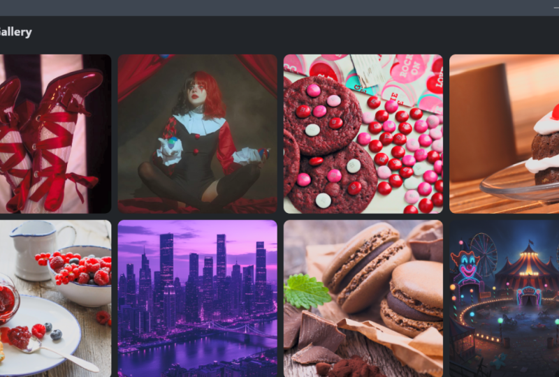
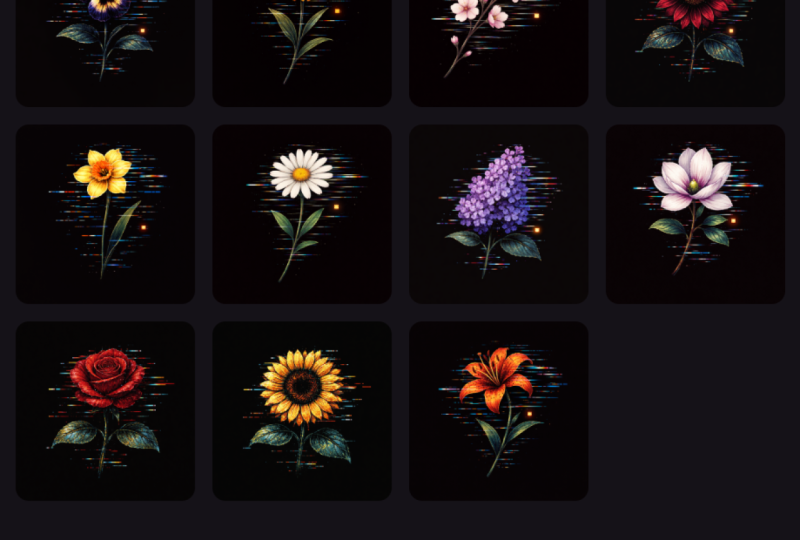
the gallery UY, we need some images to display. You can download free
images from pixels.com, or you can use your own photos. For now, I'm going
to use pixels.com. So let's go to the browser. And let's go to pixels.com. And from here, I'm going
to look for nature. And let's find some
really good images. I'm going to add ten images. That's one, two,
three, four, five, six, seven, eight, nine and ten. So let's go ahead and
download this download image. I'm going to save this
inside freer projects. Same p the gallery,
I'm going to create a folder here called assets. Inside that folder,
I'm going to create another folder called images. And here we will save
this as Photo one. Okay. So now let's save
this second image. I'm going to save
this as Photo two. And finally, photo ten. Now, the browser job is done, S just going to close that. Now, if you open the
project folder here, you can see we have assets and
inside that images folder, we have ten images showing up. Now, go to your popspec dot AML and it can scroll
down to flutter here. And here, the first
thing that we need to do is we will need to add assets. And inside the assets, we're going to add assets, and then we'll add the
images folder. Save that. So now the images are added officially to
your flutter wrap. Once that is done, let me
just move this over here. Now, once that is done, you can get back to
your home screen. And now let's go ahead and add the app bar to our scaffold. So here, I'm going to
call this appr appr. I'm going to add a title here
with a const called text. And here we'll call
this as simple gallery. Then I'm going to add some
actions with an icon button. On pressed, we want the theme provider to
toggle this theme. And for icons, we're
going to use an icon, and we're going to check
them provider if it is dark. So we'll say is dark we're going to say
icons, dot, Light mode. Else, we're going to say
icons, dot, dark mode. Let's save that you should see the app bar with
the toggle theme working. This gives us a clean top bar with working light
and dark mode. Perfect. We now have
the home screen. Our assets folder is set up and we can toggle themes
directly from the UI. In the next lesson, we'll
start displaying real images in our grid. Okay
4. Creating Details Screen & Image List: Now it's time to bring
our images into the app. We will use two screens, a screen that shows
the grid of images, a screen that displays a
single image in full view. To build the detail view, let's start with
the second screen. Now, inside the Screens folder, we're going to
create a new file. I'm going to call this as detail screen dot dark.
Let's collapse this. And here, I'll say import, package, flutter,
material dot dot. And here, I'm going to
say class, detail screen, say extends stateless, widget. And inside this, we'll
say const, detail screen. Super dot K. Then we'll
say, Alright, build. I'm going to get rid of
all these things here. Let's say return scaffold. Let's close this terminal here. And inside the scaffold, we're going to say
appr with an appr, let's say title, const the
text which says photo a. Let's save that. And
then we will add a body. This will have a center jet, and this will have a
child called hero. Now, you can see
here, the heroiget takes in two things
the tag and a child. So we need these two things. The first thing, what we're
going to do is you're going to add in a variable here. We'll call this as final string. Image path. And then we need to
call it over here. So we'll say required this
dot image path. Save that. Now, in the hero, we're going to take this tag, and then we're going
to say image path is going to be an image, dot asset of that image path. So save that. So this is going
to be our detail screen. So let's close this. And now let's get back to our
home screen here. And then we're going to
import that detail screen. I'll say package, simple
gallery, screens, detail screen. And inside the state here, we're going to add a final list, which is going to be a string. And the name for this
is going to be images. And it's going to hold the images that we actually
downloaded from pixels.com. So that's inside assets. Images, 41 dot JPG, right? So let's duplicate
that ten times. That is one, two, three, four, five, six, seven,
eight, nine, ten. So there's going to
be two, and then ten. Let's save that. Now the app knows where the
images is located, and the detail screen
is ready to show them. Perfect. Now our
detail screen exists. Our image list is ready, and we imported
everything we need. In the next lesson,
we will display these images inside
a grid ave on the home screen and we'll make each image clickable so that
it opens in a full weave.
5. Displaying Images in Grid: Now it's time to show our images in the app using a
grid Wave dot Builder. In the home screen
dot dot inside the body that is over here, we will add a Grid
Wave dot Builder. You can see it takes
in a lot of things. The first thing
that we're going to need is the length of the grid. So here we'll say item
count is images dot length. Now, what you need
to remember is that Grid Wave dot Builder works just like the
List Wave dot Builder, except it arranges items in a grid instead
of a vertical list. Now that we have
got the item count, we need a grid delegate to
define how the grid looks. So here in the grid delegate, hold Control and space bar, and you will find this. This is sliver grid delegate
with fixed cross axis count. That's a lot of big stuff tooth. S, but you will see
how this works. So the first thing is we
have cross axis count. I set the cross axis count
to four and let's save that. And then we need to
basically what this does is it will display four
grid, like the four columns. And now we need the spacing
between these columns. So if you hit Control
and space but again, you'll see there
are two spacing. One is cross axis spacing, and there is main axis spacing. Let's add the cross axis one, and we'll set that to 12. And now let's add
the next one that is the main axis.
I'll set that to two. Now, inside the item builder, we get each image to
make it tappable. To do that, let's
remove this and hold Control and space bagin you will see we
get Context index. So let's open up that
one, and inside this, we create a variable
called image. Path. Now, if you remember, we did create this in
the detail screen. That was for the detail screen. Now, this is for the grid. So here we're going
to get the images, and then we're going to
get the index of that. The next thing is we're going to return a gesture detector. This is for the tapping part. So here inside this on tap, what we want to do is we want to push this so that it can
go to the detail screen. We'll say navigator dot push, and the route here is going
to be material page route and the builder is going to
be the detail screen. Now, as you can see,
it already took the image path because we
gave the variable here. The next thing is we need
to display those images. So after this, we're
going to say child, and we're going to add a hero. Now remember, what comes inside
the tag, the image path. And for the child, we will say, image dot acid is image path. I'll save that. Now you can see all the
images that we used. Also, you can see that it is actually going to the very edge, we need to give
some padding here. Here for the body inside
the Grid wave Builder, we will add a padding
with 16 pixels. So that's going to give
some padding there. Now, these images are uneven, but first let's see if it works. If I tap on this, you can see
it opens in the photo ever. If I tap on the second image, that too opens in
the photo ever. The functionality is working, but the images are uneven,
so we need to fix that. Now to do that, these images are actually loading from the
child, which is over here. What we can do is we can
actually cut this entire thing. Then we can say
clip or rectangle, and this will have a child, and we're going to paste
this hero over here. Now, this clip or rectangle
does have a border radius. I'm going to set
the border radius to circular, which is over here. I'm going to set this
one to 12, save that. And you'll see that
nothing actually happened. That is because we need to
fit that inside that max. So right after this image here, we're going to say fit, and then we'll say
box fit dot cover. Save that. Now you will see all the images are fit
inside that rectangle box. Now, the spacing looks there
pretty close to each other. So that is where
this part comes in. So we can set that to 16, 16, save that, and you will
see the spacing grows. Now if I tap on this one, it opens up in a photo viewer. If I open this one,
that also open that in Photo viewer.
And that's it. Now we're displaying the
images in clean grid. Each image opens up in a full screen with a
smooth hero animation. Grid is padded, evenly
spaced, and looks polished. And the best part, the
theme switching works.
6. Recap & Class Project: We have reached the end
of our mini project. Let's take a moment to recap everything we
built in this class. We created a brand
new flutter project, added the provider package
for them management, built a theme provider to
toggle Light and Dog them, connected everything
inside the main dot dot with the change
notifier provider, created a clean project
structure and separate screens, added assets to
pubspec dot YAML, and loaded images into the app. Build a responsive grid
view for displaying photos, added tab detection and navigation to a full
screen detail screen, implemented a smooth
hero animation, styled each item using clip or wrecked spacing and padding. By the end, we had a fully working simple
image gallery with them switching and full
screen image view. Now it's your turn. Pick your own set of images, add them to your assets folder, display them in the gallery, share the screenshot or a short screen
recording of your app. Upload your final result
to the project section. I would love to see how
your gallery turns out. Every version will look unique depending on
the images you choose. Thank you for
joining this class. I will see you in
the next one where we'll build something
even more exciting.
 Flutter Sensei, Teaching Flutter from Scratch