Transcripts
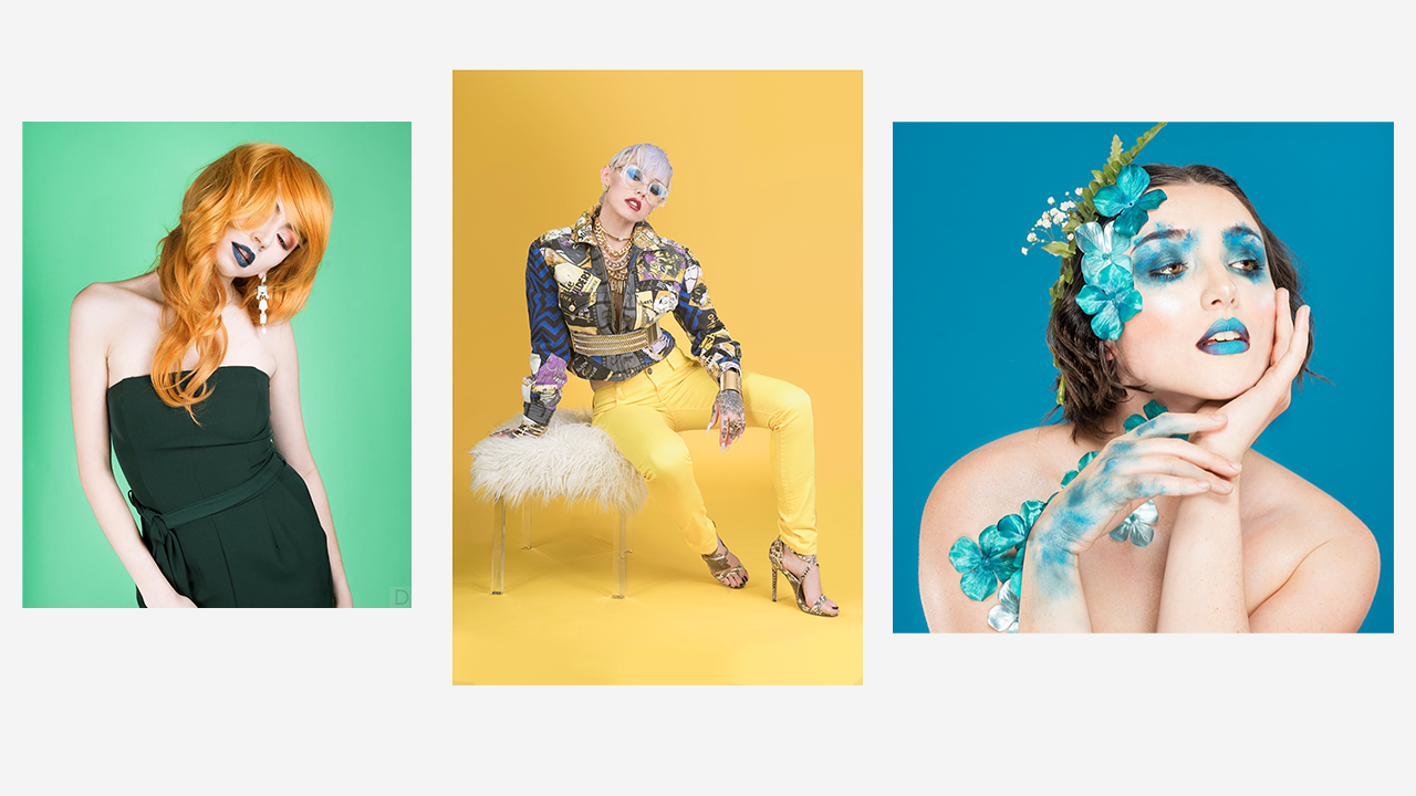
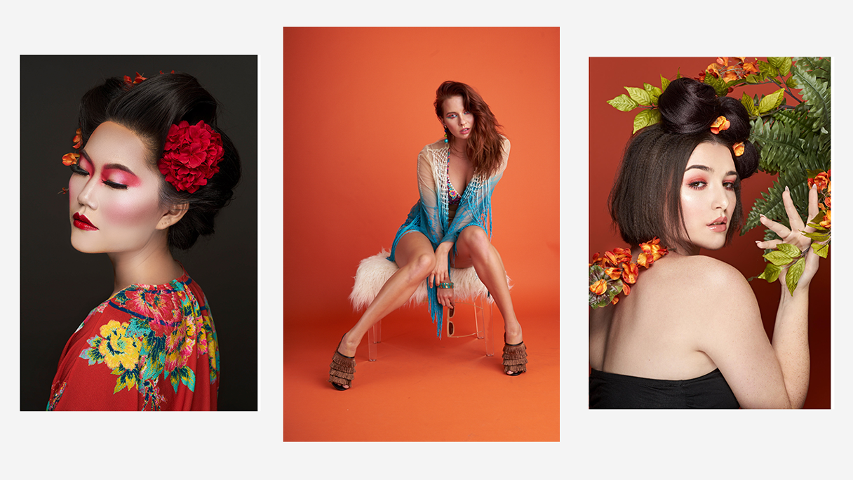
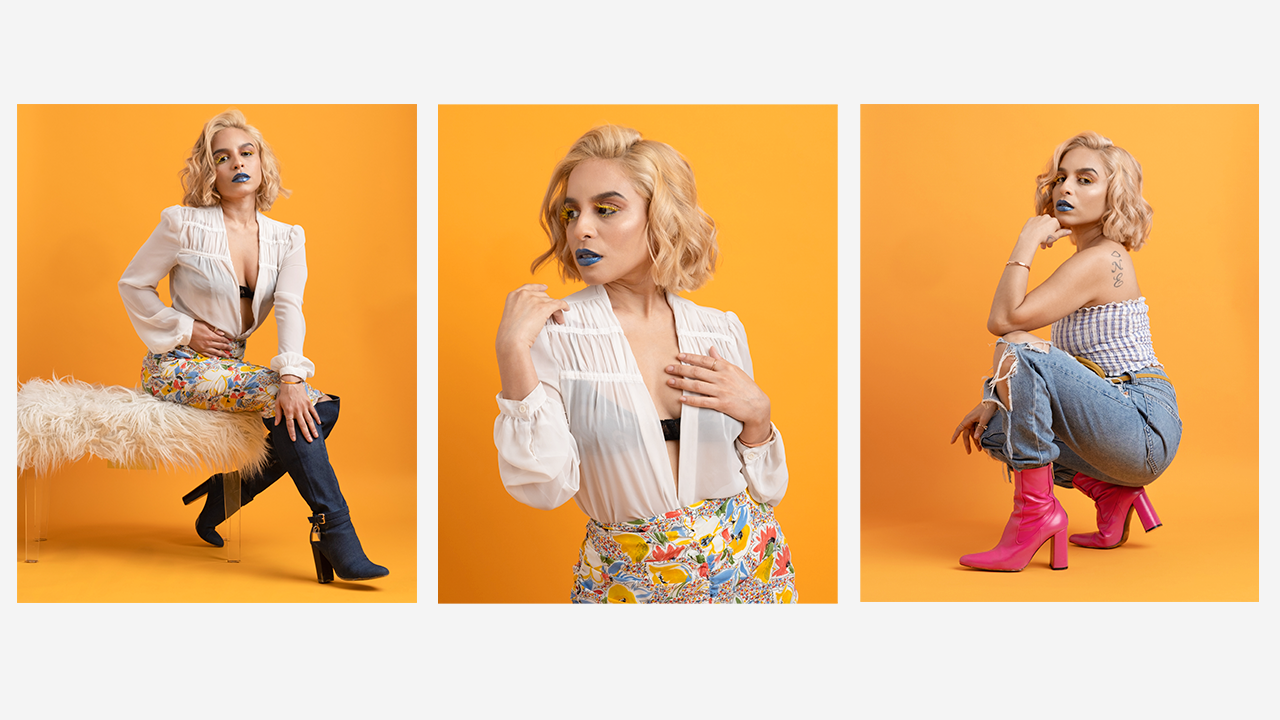
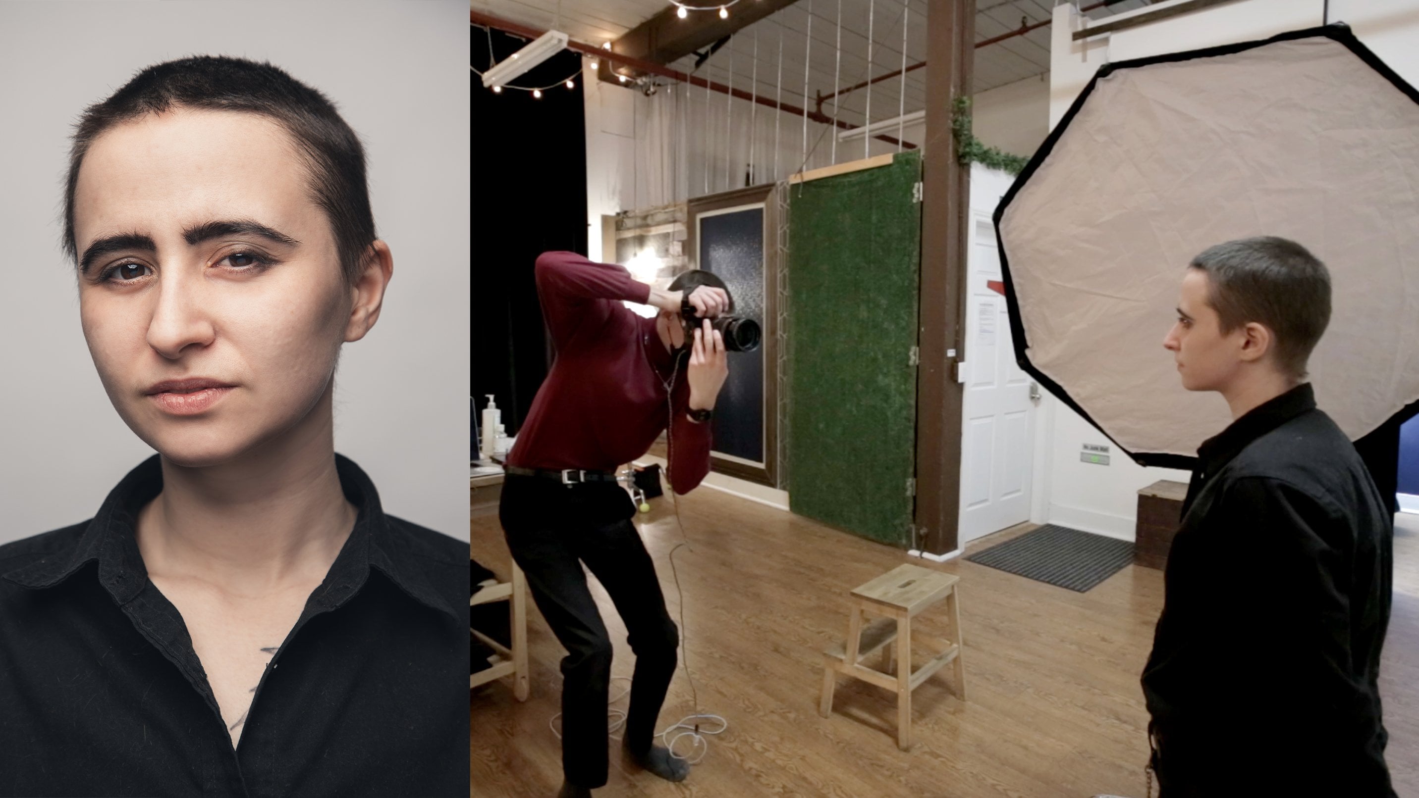
1. Introduction: Hello my friends, Devaun
Lennox here and welcome to budget friendly fashion
photography at home. I'm a fashion and beauty photographer based
in Las Vegas and the co-founder of Photography
PX, and pxpresets.com. On screen, I'll show you some of my most recent work to get an idea of my
photographic style. I've been working now as a professional
photographer since 2018, going full-time in
the fall of 2020. This Skillshare
class is all about showing you the
behind the scenes of capturing these kind of
images at home comfortably. Throughout this
class, I'll teach you the fundamental skills and techniques needed to capture
magazine quality images. We'll deconstruct an
effective one light setup, cover the necessary gear, the entire
post-processing workflow, all in an effort to get
you results immediately. We'll also touch on several important considerations to know when shooting at home and
tips to get the best results. By the end, you'll be
well-equipped to replicate fashion editorials from
publications like Vogue, Elle, Harper's Bazaar, Glamour, and InStyle. To keep things simple though, I've broken the course
into three sections. The first section covers the prerequisites like
gear and the tools needed. We'll also cover considerations about your shooting space, like the total square footage
and your walls colors. The second section
explores and covers the lighting and
camera setup and other considerations to make
during the shoot itself. Lastly, the final section explores the
post-production techniques and the entire
workflow needed to enhance and finalize
your images. By the end of this course, you'll have a proven
strategy and workflow to capture this style of
portraiture with confidence. You'll also be able to do so with a little
financial investment. I've aimed this particular class towards intermediate
photographers who have a basic understanding of exposure and focal length. But I'll also go
through everything in great detail with easy
to understand terms. If you're a beginner, you shouldn't feel overwhelmed. If you are a beginner, this class will help give you the proper understanding
of fashion photography while avoiding some of the necessary pitfalls
along this road, namely spending unnecessary
amounts of money on gear. But either way,
the skills you'll learn in this class
will catapult you into the fashion
scene and help you start developing a
unique portfolio. I've also included
a class project at the end of this course, where you will execute an
at-home fashion editorial yourself and you'll share
between one and three images from the shoot to the
project gallery so we can all learn from your experience and give constructive feedback. During that project I also want you to write a
brief description explaining your thinking
about the shoot and a bit of context
about the shoot itself. With that said, I hope
to see you inside and let's get started creating
our next front cover image.
2. Studio Space: Hello, my friends. Devuan
Linux here, and welcome. I'm excited to see you're
here. Let's get started. In this lesson, we'll cover
the considerations you'll want to think about
for your studio space. Shooting a fashion editorial
image that's full length, meaning a photo that captures the subject from head to toe, requires a lot of
working distance. Your shooting space or studio must be sufficiently
large enough to accommodate. Thankfully, you can replicate most of the effect at home, especially if you have
an apartment with a combined living room
and dining room space. Over the last four years, I've shot about 100
different subjects in this very fashion, where most of the
models heights have ranged from five
feet two inches, to six foot five inches, and I've also moved to three separate apartments
during this time. Even so, the lighting
setup we'll cover later has remained rock
solid and reliable. But that's primarily
because all of these spaces offer the
same general dimensions. The dimensions I'm about to
list are the minimums I feel are necessary to achieve
this type of image at home. That is, unless you use
a smaller background, then your total width can decrease slightly by
about three feet. Otherwise, these
are the minimums. Take some time right now to measure your space
using a tape measure, so you can find the
appropriate area to set everything up. These dimensions are as follows. A width of 10 feet, a length, or depth of 20 feet, and a ceiling height
of about eight feet. If your house apartment or studio space offers
these dimensions, you are clear to capture your subjects at
full length at home. However, if you're shooting
in a smaller room or space, you'll only be able to capture the subject at
three-quarters length, and you may not find that
sufficient long-term. At the same time though, spaces larger than
described will offer you greater flexibility in the lens or focal length
that you can use. In that case, you have
quite an advantage. But outside of space,
let alone though, you'll also want to consider the color of your home's walls. Ideally, you want the walls painted with a
flattened neutral gray, so it's entirely free
of color casts and doesn't bounce the light
back onto the subject. But for most of us, especially those living in apartments, that's
not realistic. The next best option
is a neutral white, which is usually
standard in most homes. Now if you have the white walls, they'll likely act as a reflector and fill in
light on the subject, reducing contrasts, but for this style of portraiture that
shouldn't be problematic. Instead, those who had painted walls or walls with
vinyl wrapping, will need to be worrying. The colors on these walls will
change the photo's color, altering the appearance of both clothing and
the subject skin. It will also affect your camera's white
balance negatively, so you want to remove
that vinyl wrapping or paint the wall
long-term, if possible. If that's not possible or that's just simply
too impractical, you can flag or
box in the subject using a double-sided
poster board on each side. We'll cover this particular
tool in a future lesson, but it will effectively
serve as its own wall and remove any unwanted
color casts in the process. It also doubles as a
light shaping tool, which is also helpful. But, perfect, now you're aware of the
two main considerations for your studio space. Let's discuss the camera and lighting equipment
that's necessary.
3. Lighting & Camera Equipment: Hello, my friends. Davon
Linux here and welcome back. In this lesson, we'll cover the lighting and
camera equipment you'll need to accomplish
these types of images at home. Let's first start with
the lighting equipment. At a minimum, you'll
want a monolight, also known as a strobe, with a flash output power
of 150 watts or higher. With 150 watts, you'll have enough power to capture images at higher apertures
like F8 or F11, letting you capture the entire
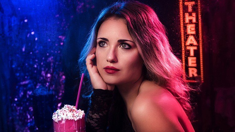
subject in sharp detail. The particular unit I use
for the headlining image for this course is the
Neewer or Godox SK 300, a 150-watt equivalent
daylight balanced strobe. You'll also want a trigger for this light or the light
you plan on using, be it a flash sync cable connected directly
to the camera, or a wireless system that connects to the hot
shoe of your camera. In this case, I use
the RT16 student flash triggers which connect
to the camera talk to you and connect to the
light right about here. Next, we'll want a
sturdy light stand, I recommend spending
a bit more here in opting for heavy duty
aluminum light stand, such as the one from
impact or photo deoxy. These offer more
rugged knobs which don't break after only
six months of use, and they also have a
higher payload rating to attach more
equipment to them. They're only marginally
more expensive, but they are a
better investment. From there, you'll
need a softbox to modify and soften the light. In this case, I use a 60-inch umbrella with a white interior,
and from experience, 48-60 inches is the perfect
size for this medium, where the light is
just soft enough and wraps around the subject. A 60-inch umbrella is
manageable in size and doesn't dominate the room like a larger six or eight-foot umbrella. In total for lighting equipment, we're looking at just
around $200 USD. As far as camera
equipment though, use the camera you already have, but if you don't already have a 50-millimeter F1.8
equivalent lens, then getting one is a must. The 50-millimeter is usually
the go to upgrade over the standard
855-millimeter kit lens and it will noticeably
improve your image quality, particularly in
central sharpness, Boca, and low-light performance. For most manufacturers, the 50-millimeter
F1.8 averages around $100 - $150 USD so
it's very affordable. But understandably, if you want to skip this
particular expense, you can use a kit
lens instead and you can capture largely similar
images with the kit lens. You may also want to consider a backdrop or a background
support system, and a colored seamless paper. This will increase the
total by about $100 USD. Something to consider
depending on your budget, but mounting an 86-inch paper, then rolling it out, we'll deliver a truly
professional result. Otherwise, you can skip this
purchase as well and use a well-iron bed sheet or similar fabric clamped
to the window sill. This method will require more editing and
post-processing though, but at least it's
a starting point. Ultimately, the lighting
kit is the most important. In either way, we're looking at a highly affordable entry point into fashion editorial
of photography, and one that's unlikely to be unapproachable even for the newest
photographers out there. But great, now that we've covered the
necessary equipment, let's discuss how you
position the light.
4. Lighting Setup: Hello my friends. Devaun
Lennox here, and welcome back. In this lesson, we'll cover the lighting setup and how
to position your strobe. I'll show you a rendering of the lighting setup
on screen right now, and we'll cover the distances
and heights sequentially. Let's first start by
talking about the position of the model relative
to the background. If your studio space meets the dimensions we
covered in Lesson 1, then place the model so they're five feet away
from the background. Doing so will allow us to place the light further away
from the background, reducing the amount of
light that reaches it, and this separation lets it fall off to a more subtle color rather than remain fully
colored and likely overexposed. I'll show you the
difference between having the model stand
directly next to the background and five feet away from the
background Right now. As you can see, there is a noticeable difference between these images and the
photo's aesthetic. Next, let's discuss the
positioning of the strobe. You'll want to
place the stroke at a 45-degree angle to the flattering side
of the model's face, and you'll position it
about three to five feet away from them. For example, if my right
side is my good side, you'd put the light on my
left side or camera right. Doing so forces my head to
turn left towards the light and will help you capture my good side in
every single photo. This is a subtle technique, but one that prevents
the models from disliking future images
that you show them. From there, adjust the light
stand so that the bottom of the umbrella sits around
five feet tall in height. This is a rough value, not an exact measure, but generally, five feet is high enough
for most subjects to get the catchlight
positioned correctly in the top third of the eye. That position also means that the light coming from the strobe falls correctly on their
face without causing harsh, unflattering shadows,
particularly here and here. I want to note something
important here as well. When we set up the
light like this, the model only has
about a foot of room to maneuver before the light
changes dramatically, so there's some
flexibility here, but there's not much. Keep that in mind
while you're shooting. The final variable
and something to also experiment with is
feathering the light. You can either point the umbrella directly
at the subject, making the light somewhat more directional and
harsh by contrast. Or you can feather
it by turning it slightly away from them,
softening its effect. It's a small variable, but one that changes the
photo's aesthetic. But congratulations. From here you have the
complete lighting setup. Position yourself a
few feet away and start experimenting
with the competition. Now that we've covered
the lighting setup, let's talk about camera settings and how you'll set
up your camera.
5. Camera Setup: Hello, my friends, Davon
Linux here and welcome back. In this lesson, we'll cover
your camera settings and some pointers on getting
the best results. First, let's start
with camera settings. Since we're shooting indoors
in a studio setting, our exposure will be
dictated primarily by our aperture
and ISO settings. Shutter speed will only
come into play to sync with our flash and remove any potential handshake
while shooting. But otherwise, it doesn't play the same role as other
forms of photography. Now, since we have complete
control over the flash, out the power or the amount of light
reaching our subject, it's best to set our
camera to its base ISO. At the base ISO we'll capture
the highest quality images with the best dynamic range
and least amount of noise. For most cameras, this value
will be ISO 100 or 200. When you're ready to shoot, start by setting your camera
to one of these values. Next, our aperture setting, which determines our
depth of field and how much of our subject
is in sharp focus. For this type of photography, an aperture setting
of F8 - F11 is best as these values provide
enough depth of field to capture subject from head to
toe and they'll also leave some working room
for the subject to move to capture their
motion as well. Note you're welcome to explore other aperture settings
that are lower in value, such as F5.6 or F4 and these settings
will merely create a more out-of-focus background. They can also be
helpful to reduce any fine details on the model skin and
high blemishes though, which makes the post-production
process easier. But in general, F8 is an excellent starting
point for this medium. So when you're ready to shoot, start by setting your lens
to an aperture of F8. Lastly, our shutter speed, which is the least
important aspect of exposure in this
form of photography. Generally, a shutter
speed of one, one-twenty-fifth of a second is an excellent starting
point in most situations. It's a value that's
fast enough to remove any camera shake when
shooting handheld. But it's also a value
that's supported by most strobes for their
maximum flash sync speed. Note, you're also welcome
to experiment here by using slower shutter speeds
if you want to capture motion blur
in your images. Great, now that we've
covered the camera settings, let's cover some pointers on
getting the best results. If your camera supports
face or eye detection, enable that feature and set the auto-focusing area to
the top third of the frame. The reasoning to put
the auto-focus point here is that we will be mainly shooting
portrait images from head to toe or full length. You'll usually be
holding the camera in portrait orientation
rather than landscape, so setting the focus
area or AF point to the top third of the frame will speed up how fast
your camera focuses, reducing its focus
acquisition time and it's a small tip that'll
help you capture more consistently
in-focus images. Next, if your camera has accurate and reliable continuous
auto-focusing or AFC, you're welcome to
use that feature. Otherwise, using face or eye
detection with single-shot auto-focusing or AFS will
give you the best results. Next, let's talk
about white-balance. Auto white-balance will provide a close enough result
for newer cameras to avoid any extravagant color
correction requirements in post-processing. But for old cameras, mostly those manufactured
before 2018, use the flash white-balance
preset instead. Alternatively, you can manually
dial in a value between 4,500 and 5,600 Kelvin
using the Kelvin setting, if you know your lights
manufactured color temperature, and doing so will give
you a more precise color. From there, you'll want to take a test shot of your subject, then evaluate the rear LCD to look at the exposure
and you'll also want to double-check the exposure
on the histogram as well and make sure you're not clipping the highlights
specifically. In this form of photography, it's best to shoot
underexposed by about a third of a stop and avoid blowing
up the highlights, especially on the
subject's face since you can't recover these
details in post-processing. However, you can always increase the exposure and lift the
shadows after the fact. But with that said, those are the
camera settings and the general tips on how you
can capture the best images. In the following
lesson, we will discuss other onset considerations and then head into the
post-production workflow.
6. Other considerations: Hello my friends, Davon
Linux here and welcome back. In this lesson we'll cover
two final considerations. Those are whether you should use a reflector to help reduce contrast or should you tether to review
images while shooting? For the course image,
I did choose to add a reflector opposite of the model to help
fill in the shadows. I ended up using 236 by 48 inch poster boards taped together to stand 8 feet
tall when unfolded. I positioned two of these
next to the model to act as what we in the
industry call V flats. Using this kind of
poster board is what I was referring to in
a previous lesson when I talked about boxing in the model if you
have colored walls. But instead of trying to
remove any color cast, I'm using these poster boards to reflect light back
onto the model. These poster boards serve as a gentle light source of their own on the cameras left side to fill in any
of the shadows. On screen right now I'll
show you the effect of adding these reflectors
compared to removing them, so you can see the difference. It's important to
mention though, you don't have to use these
reflectors or a reflector. It's an optional
step that depends on the type of aesthetic
you're going for. If you want an image that's
more moody and dramatic, skipping and the reflector is the ideal way to
get that effect. Otherwise if you want
something that only has a bit of
contouring and shadow, this reflector will help offset the shadows caused by
our lighting itself. Alternatively, if
you don't want to set up a reflector
at all you can position the model and the backdrop to be
closer to your wall. That is if you
have a white wall. Having the model stand 3 to 4 feet away from the wall will function identically
to a reflector and it will fill in the shadows. Next you may want to
consider connecting your camera to your
computer if you have a laptop so
you can transfer the photos in real-time to
view them on larger display. This process is known
as tethering and it's an excellent means to assess
fine details and clothing, makeup, hair, or
even your lighting. It's also the perfect
tool for seeing the adjustments you're
making in real time such as fine tuning the angle
of the light or showing your model the amazing images
you're capturing so far. If you want to set
up this workflow, you can find plenty of resources online that discuss
how to get this configured with Adobe
Lightroom using a hot folder but setting that up in detail is outside the
scope of this class. Either way though, those are the two final considerations you'll want to make
while shooting. Now that you're fully
equipped to start capturing fashion
editorial images at home. In the next section
we'll dive into the post-production
workflow from start to finish so you can enhance
the images you've captured and take them
to a professional level.
7. Fixing Exposure: Hello my friends, Davon
Linux here. Welcome back. In this lesson, we'll start the post processing workflow to enhance and finalize our image. I've included this raw DNG or Digital Negative File in
the course materials. Feel free to follow along with the following lessons if
you have Adobe Photoshop. With that said
though, let's move into the first steps
of the workflow, which is refining our exposure. Here we are in Adobe Photoshop, we're working with a DNG file. Opening the image will prompt the Camera Raw dialog
window in Photoshop. This is our first
starting point. In Camera Raw we're
going to focus our attention on the basic tab. Here, we're greeted with several parameters
focused on exposure, color, and detail control. However, we'll only adjust the middle group of settings
to refine our exposure. For this image, I captured
the photo slightly underexposed by
about a half a stop, and I did so to help preserve the texture
and the folds of the shirt here and
her hair here, to avoid these areas
specifically from overexposing and losing detail. But now it's time to correct the exposure for the
remainder of the image. We'll do this by
adjusting the highlights, shadow and exposure sliders. I'll first start with the
Exposure slider and use the up and down keys on the
keyboard to adjust its value. While I do this, I pay
particularly close attention to the top right RGB
graph and read out. These values indicate
the brightness of the colors present in the image. When adjusting the highlights, I want to make sure the
brightest area of the photo, which is right here, doesn't go past 250
across the red, green, and blue spectrums. If it does, you'll get a
printed image that has strictly white paper in that
area and no fine detail. It's something to watch
out for while doing this. While we do this
particular step, have your cursor over the
brightest section of the photo, then adjust the slider
bit by bit until that area reaches a maximum
of 250 across the board. Important to note here, you can also toggle the clipping indication in this histogram by tapping
the two up arrows, which will make it
easier to judge areas close to losing detail. When I toggle the topmost
clipping indication, you notice that
Photoshop presents red highlights on the
background of the photo. This red highlights
shows where the image is overexposed beyond
255 across the red, green, or blue channels
and now losing detail. I'm going to keep these areas in mind and we'll
come back later in the post processing
workflow to adjust this particular problem and the background
exposure separately. I have no fear about that. But for the time being, let's focus our attention
on the model and ensure both her skin and the
clothing are detailed. I find that a value of plus
35 works well for this image, bringing up the
overall exposure, but not so far to blow out the highlight areas
on the subject. Great. Now since
the highlights are quite bright as
is on this image, I'm going to skip that
slider altogether. But do know that adjusting
the highlight slider for some images will be necessary to achieve
the correct exposure. With that said though,
let's adjust the shadows. The Shadows slider
will help lift the exposure of
the shadow areas, but it also reduces the
contrast of the image. We'll have to come back and add contrast to correct
this later on. But here again, while
adjusting this setting, I also pay particular
attention to the RGB readout. Thankfully adjusting this
slider doesn't affect our problem areas in the
background specifically, so no issues there. Instead it only lists the
dark areas on our model. I find that a value of plus 35 here as well is also perfect. Lastly, I'll reduce the color
temperature slightly from 5,900 Kelvin to 5,600 Kelvin. For this particular image, I did set a custom white balance using a white piece of paper. However, since that isn't
a true neutral gray card, it's generally a few
hundred Kelvin degrees off, but it does get cold enough, especially regarding the
tint or hue of the light. I will reduce some of
the yellow and cool the photo down slightly to
my lights color temperature, which is 5,600 Kelvin
or daylight balanced. Now by pressing the eye icon, we can toggle back and forth
to review our changes. Great, we're finished adjusting the exposure of our image. Now hit open in the bottom
right corner to open the file. In the next lesson we'll crop the photo and clean
up the background.
8. Cropping & Background Cleaning: Hello my friends Devon Lennox
here and welcome back. In this lesson, we will
crop the image and clean up the distractions
in the background. To crop the photo head over into the Tools Panel and select the crop tool or use the keyboard shortcut
C. In the crop tool, we'll see our
aspect ratio in the top-left along with some
options for straightening, grids, and deleting crop pixels. Know if you're planning on
cropping an image specifically to upload on Instagram or
other social media platforms, I've found that using a custom
aspect ratio works best. That ratio is as
follows, 8.5 by 10.7. You can enter these values by selecting Ratio in
the drop-down menu, then filling in the
adjacent fields here. From here, I will adjust
the crop slightly to remove some of the unwanted
space around the model. Then once you have the
desired framing for the crop, hit the check mark icon in the top panel to
commit the changes. Now, we could call it good
from here and move on. For many of your images, you don't need to do much else. But I'm going to
quickly show you how to remove reflectors and other unwanted items from the background that you can see here on the left-hand side. This technique I'll demonstrate
now is also perfect for making a one-to-one ratio
or square photograph. Let's undo a crop by using
the command or Windows Z key. Now the easiest
technique to do this is selecting a good area
of the background, then resizing it using the Transform function to
fill in the distracting area. Let me show you that now. In the Tools Panel, click the rectangular
marquee tool or use the keyboard shortcut M. Now select the bottom of
section of the background, then drag to the top. Careful not to choose the model or the part of the background
you want to remove. Once we have that selected, select ''Edit'' and then
Free Transform or use the keyboard shortcut
command or Windows T. Now using the
transform points, click and hold the
outermost edge, then hold the Shift key and drag towards the outside
of the background. Doing this warps the
background's pixels, elongating them and
effectively copies that area to the selection
we want to remove. Note, you can see these warped
and stretched pixels on some backgrounds if you
zoom in at 100% or more. But in most situations, this technique is virtually unnoticeable and I found
it from experience. It's the easiest way to
extend a background by far. Once you're happy with
how the transform looks, click the checkmark icon in the top panel to
commit the changes. Now let's de-select the area by clicking Select, then de-select, or using the keyboard
shortcut command or Windows D. Great, quick and easy way to
solve that problem. Now let's remove the scuff marks on the background itself. I'll zoom into the scuff marks
on the floor now, these. To remove them will use the Clone Stamp tool to
select the Clone Stamp tool, head to the Tools Panel, then select the Clone
Stamp tool or use the keyboard shortcut S. Now, adjust the brush size
to slightly larger than the problem area
using the bracket keys, then use the Alt or
Option key to select an area to sample and paint
over the problem area. Great problem solved. Now let's re-sample and fix
all of the remaining scuffs. Perfect. You may also
notice a few spots on the top of the background with strain circles of
the darker exposure. Here and here. These blemishes are
usually caused by dust on the sensor or a strange fold
and a seamless paper itself. We can fix these easily by using the Patch tool or the
Content-Aware Fill action. For some blemishes, the Patch
tool will work perfectly, but it doesn't always work. However, for this top blemish
here, it will work great. Let's use it here
in the Tools Panel, select the Patch tool or use
the keyboard shortcut J. Now, draw a circle
around the problem area, then click hold and drag
to replace the selection. Great. Now, to remove
these last two areas, we'll want to fill them with
their surrounding pixels. To do that, we'll use the
Content-Aware Fill action. First, make a selection of the problem area
using the Lasso tool, which you can find in
the Tools Panel or using the keyboard shortcut L. Once
you have a rough selection, select ''Edit'', then
Content-Aware Fill. Now, press ''Okay'' in the
following dialogue box. Perfect, problem-solved. Now let's repeat that process to remove the other blemish. Done. There we have it. We've now cropped the image and cleaned up the background. In the next lesson, we'll tackle cleaning up blemishes
on the skin.
9. Skin Cleaning (Healing Brush): Hello, my friends [inaudible]
here and welcome back. In this lesson, we'll clean up any unwanted blemishes
on the model's skin. We'll do this with
a single tool, in this case the
healing brush tool. But before we do, I'm
going to merge all of our layers into
a new top layer. Doing this will let us quickly
review the changes and also give us a fail-safe
if we go too far. To do this, unlock
the background layer. Now select each of
the remaining layers by holding Command
or the Windows key. Once selected, hold
the Alt or Option key, then press the Hamburger
icon in the right. Then click 'Merge layers". Perfect. Now we can
perform the skin clean up. Select the healing
brush by clicking its icon in the tools panel or using the
keyboard shortcut J. Know if you use the shortcut, Photoshop defaults to opening the spot healing brush,
which works differently. Select the healing
brush manually. If you find this next step,
it behaves differently. Now anytime you
press the shortcut, it'll correctly select
the healing brush rather than the
spot healing brush. Let's first start
by tackling some of the blemishes on
our model's face. First, adjust the brush
size to be slightly larger than problem area
by using the Bracket keys. Then use the Alt or Option
key to select an area to sample and click and hold to
paint over the problem area. Great. Blemish removed. Now we'll repeat the sample
and painting technique for the rest of the blemishes. I'll now toggle the layer on and off so you can see
the changes so far. Now that we've taken
care of those areas, let's zoom out and
evaluate the changes. Looks good. Let's
tackle the next area. Press and hold the Space
bar to temporarily select the hand tool to
move around the canvas. Let's go ahead and
remove some of these small blemishes
on her arms. Great. Let's zoom out and
reevaluate the changes. Looks natural. Let's
move down to the knees, legs, and shoes. Great. Now let's zoom back out and give the image
of final look over. Perfect. Everything
looks good and I'm not noticing anything else
that needs addressing. Our model has great skin, so we don't need
to do very much. But the sample and painting
process I showed in this video is the
general workflow to remove most blemishes. We could use other more
advanced techniques, but I find that this one is
simple enough for beginners, and enthusiast
photographers to grasp, and it's unlikely to
overwhelm you as well. Now that we've completed
the skin clean up, let's move into dodge and burn.
10. Dodge & Burn: Hello my friends, Devon
Linux here and welcome back. In this lesson, we'll
dodge and burn the image. If you're not familiar
with dodge and burn, this is a retouching
technique where you selectively paint and
highlights or shadows. Dodging refers to painting
and highlights or lightening an area while burning refers to painting and shadows
or darkening an area. Dodge and burn is an
excellent tool to correct any mistakes with
lighting as you're learning, or to even replicate
multiple light setups. But it's also an
excellent way to add contrast to a
photo selectively. Will be doing a combination
of both for this image. Let's first start by dodging or lightening some of
the problem areas. For me, those are the
dark patch on her arms, the shadows on her face, and it'd be nice to contour
the shoes slightly. Let's do this by selecting
the dodge tool in the tools panel or using
the keyboard shortcut O. In the topmost panel, you'll see some settings
to adjust the dodge brush, like its range and
exposure amount. These settings are
perfect as is, so no need to change them. But let's go ahead and
duplicate our background layer, which will help us adjust the opacity of this
effect later on, you can duplicate a
layer by clicking it and holding it and then dragging it down towards the plus icon. Alternatively, you can
right-click the layer, then select duplicate layer. I'll rename this layer to dodge so it's more clear as
we go along as well. I'm also going to change this layer blend mode from
normal to luminosity. The reason for this
small change is to avoid the dodge brush from altering the saturation of the
areas we paint in. In some cases, or situations, especially like this image, it can increase the
saturation slightly, but that's not the effect that
we're going for so if you find that increases the
saturation at any point, changing the blend mode
will solve that problem. But that said, let's
go ahead and paint over the various problem
areas on the image. To do that, we can paint on the duplicate layer
we created earlier, then adjust the brush size
as needed then paint. Don't worry about
painting over the edges it won't be noticeable
once we finalize it. You may also think this
looks heavy handed right now as is
and you're right, but no worries we will reduce this effect after painting
in the appropriate areas. Now that we've
applied the effect, let's tone it down and
make it more subtle. To do that, we'll adjust
the opacity amount in layers tab I find that a value around 50 percent leaves
the shadow areas, but not so much so that
it looks artificial. Let me toggle this
layer on and off so you can see the before
and after effect. It's a small change, but one that's noticeable
and it really helps. Perfect. Now let's do
the opposite effect by using the burn
tool on the image. Here we'll burn the bright
areas of the background, the hand, and add some
contouring to the image as well. To select the burn tool, and navigate to the tools panel, then select the burn tool. You can also use
the shortcut key O after selecting it to
engage it immediately. Now, let's duplicate our base or bottom-most layer and using the same process as before and now I'll rename
this layer to burn. For this effect, we want to
accentuate shadow areas or selectively pulled down highlight areas close
to overexposing. Let's start with the hair and paint around the shadow areas. I'm also going to change this layer blend mode from
normal to luminosity. I'm going to accentuate
the shadows on her cheek next,
essentially contouring it. Now I'm moving down
towards the arm. Here I'm focusing on reducing
some of the highlights I remember being close to or exposing before in
the first lesson. Now let's tackle the background. Great. Those are the
main areas to darken. Let's add these effects
to a group so we can toggle the entire change
together at once. To do that, select
both layers by holding the Shift key
and clicking them, then click on the group icon. Now that we've
applied the effect, let's tone it down and
make it more subtle. Now you can see the effect
as I toggle it on and off. It's a huge change that
evens out the lighting and adds more definition
to our model. But that's the basic premise of using the dodge and
burn technique. It's a powerful tool to
adjust the exposure of an image and you can really change the lighting
as you see fit. But now that we've completed dodging and burning the image, let's move on to
color correction.
11. Color Correction: Hello, my friends. Devaun
Linux here. Welcome back. In this lesson, we're going to correct the colors of our image. Depending on your monitor or the device you're viewing
this tutorial on, you may not notice that there's a yellow cast over
the entire photo. It's subtle, but if
you look closely, you'll eventually see it. We're going to fix that
particular problem. We'll do this by applying a threshold adjustment
layer over the image. You can find that
particular function in the Adjustments Layer menu
at the bottom of the list. In the threshold window we'll
adjust the threshold level slider downwards and stop just before the image goes
completely white, I find that a level of
14 works perfectly here. Now in the tools panel, select the "Color Sampler Tool" or use the keyboard
shortcut "I". With this tool selected zoom into one of the black areas in the image at a pixel level and click to place
a sample point. We're doing this step here to sample the darkest
area of the photo, which we we'll use shortly
to set our black point. It's important to select
the darkest location of the image correctly as it determines our
color correction and eventual curve settings. Now that we sampled the
black point of the photo, let's do the opposite and
select the white point. Note for some images, especially those that are
moodier or more low-key, you may not find a white
point in that photo so skip the step and don't use the model's teeth or
a specular highlight, say a light reflecting off
metal as your white point, this technique won't work
for those samples since the color needs to be
detailed and perfectly white. With that said, let's
zoom out and get back to our threshold
adjustment layer. Adjust the threshold
level slider upwards, now stop just before the
image goes completely dark. Don't go all the way to the
top here to a value of 255, doing that will likely cause
issues since you'll be sampling a specular
highlight at that point, I find that a threshold value of 247 works perfectly for
this image instead. Now select the "Color
Sampler Tool" again, then zoom into the image and click to place
a sample point. Here now we're sampling the
lightest area of the photo, which we will use shortly
to set our white point. Great, we sampled our black and white
points in the photo. Now let's zoom out and head
back into the "Layer Panel". Now we can delete this threshold adjustment
layer by dragging it to the trash icon since we don't need this particular
adjustment anymore. Now with these points set, we can use them as our basis
for black and white values. To do that, let's add a
"Curves Adjustment Layer" and you can find
that function in the "Adjustment Layer" menu. In the curves adjustment
layer on the left side, you'll see some
eyedropper-style icons. These are the sample
selection functions to set either the black, gray or white points. Let's first select our
black point though. We'll do this by clicking the
topmost "Eyedropper Icon". Then we'll click the first
point we marked on the image. That point is located
in the pants. Note it's important to
zoom in to a pixel level here to ensure you're selecting
these points correctly. If you're even a few pixels off, the effect could be different. Great. Let's select
the white point by clicking the bottom
"Eyedropper Tool". Now let me toggle the
changes on and off and you can see both the effect on
color and the final exposure. As you can see doing this lifted the yellow
haze on the image, neutralizing the color and also refined our exposure
slightly, but crucially, it refined the contrast
of the photo as well now making it
pop and stand out. Perfect, we are now finished
color-correcting the photo. In the next lesson,
we'll sharpen the image and accentuate
those fine details.
12. Sharpening: Hello my friends. Davon
Linux here. Welcome back. In this lesson, we're
going to sharpen our image and add
that last bit of pop. There are many ways to sharpen
our photos in Photoshop, but for this workflow, I'll focus on using the unsharpened mask which
works well for most in general sharpening and needs to
apply the unsharpened mask will first want to merge our
layers into a new top layer. To do this, select
each of the layers by holding the Command
or Windows key. Once selected, hold
the Alt or Option key, then press the hamburger
icon on the right, then click "Merge Layers." This will create a
single merged layer of all of our selected
layers from before. Now select that merged layer. Then in the top panel
select "Filter, " "Sharpen, " and
"Unsharpened mask." I'll zoom into the image
slightly at 50% view and reposition the window to
focus on the model's face. Now, in the unsharpened
mass dialog window, set the amount to 500% and the
radius one and two pixels. Then adjust the threshold
level just high enough to focus the sharpening on
the eyes, lips, and hair. I find that a radius of 1.2 and a threshold of 22 works
perfectly for this image. Once you're happy
with the settings, hit "OK" to commit the changes. Now navigate to the
top panel, select "Edit" and Fade
Unsharpened Mask. In the fade dialogue window, change the blend mode from
normal to luminosity. The reasoning behind
this step is to remove any magenta color cast
from the sharpening halos. For some images, the
unsharpened mass filter can have an unwanted color cast, so by doing this, we remove that color
cast altogether. Great, hit, "Okay" in the dialog window to
commit the changes. Now let's duplicate
the sharpened image by dragging the layer down
towards the plus icon. Now I'm going to group
both of these layers so we can adjust the sharpening
globally after the fact. To do that, hold the Shift
key and click both layers, then press the Group icon. Note, you don't have to group these layers
but it gives you more control over this process and the sharpening as a whole. If you do though,
unpack the group, here, we're going to change
the blend mode of each of these layers. The first layer
I'll set to lighten and the second darken. Now we can adjust the opacity of the dark areas of the images and the light ones separately. I find that an opacity
of about 80% for the lightened layer and 50% for the darkened
layer works perfectly. But we can also reduce
the opacity of both together by adjusting
the groups opacity. Granted 100% works great for this image and really
makes our model pop. Great, we've finished
sharpening our image. In the next lesson,
we'll export it for delivery and uploading
to social media.
13. Exporting: Hello, my friends. [inaudible]
here, welcome back. In this lesson, we'll export
our image for print and also cover how to export
it for social media. Let's first export the image for printing or archiving
in our photo library. To export the image go to
the top panel then File, Export, and Save for Web Legacy. We do it this way to prevent any color miscalculations
between what we see in Adobe Photoshop and how the final JPEG
file is encoded. Exporting As sometimes causes miscalculations so this is a way to prevent
that from happening. In the Save for Web dialog
window that appears change the quality to 100 percent and check Embed Color profile, now hit "Save" and select the
destination for the image. Photoshop will now export the image to the
selected folder. Great, we saved our
high-resolution JPEG file for printing or archiving
in our libraries. Now, let's export
the file that will upload to social
media in the web. We navigate to the top panel, then File, Export, and Save for Web Legacy. Here in the Save for
Web dialog window, change the file type
from JPEG to PNG 24, then adjust the
percent value here so the final file size
is under 1 megabyte. I find that a value
of 28 percent is perfect for this image. Now hit "Save" and select the
destination for the image, and there we have it. There are our completed
images ready for print or ready to
showcase to the world.
14. Closing thoughts: There you have it my friends. There's budget friendly
fashion photography at home, broken down from
start to finish. I want to say thank
you for taking the time to watch this class. I hope the techniques and
skills I showcased throughout this class have helped
you meaningfully, and I hope they've
demystified how any of us can capture magazine or
the images at home. Of course, there's plenty
of value in renting or purchasing a commercial
studio space but the reality is that you can
replicate the results at home without forking out another
mortgage in the process. There's also no reason
why you have to use the highest end gear for this
form of photography either. Anyone can do this, it's
just a matter of knowing the basic techniques needed and having a confident workflow. From there, find good
models and collaborate with a solid team of hair
and makeup artist. But now you're
fully equipped with the techniques and the
workflow necessary. We covered the necessary tools like lights and
your camera setup, then how to use them, what to consider both
onset and beforehand, and the full
post-processing workflow. It's up to you to take
the baton from here and go forth and show
your vision to the world. Speaking of showing your
vision to the world, your class project is to upload your very own fashion editorial. I encourage you to get creative and also not to be
a perfectionist, especially if this is your
first attempt at this medium. I also welcome you
to post any works in progress or even fully
completed projects of prior. Either way, the goal is for us to learn and grow together. If you have any feedback or
follow-up questions though, for us regarding this class, please let me know by
reaching out through YouTube or email
via our website. Those are our most
active platforms. But I've been your host Devaun Lennox,
photographypx.com. We'll see you next time.
 Devaun Lennox