Transcripts
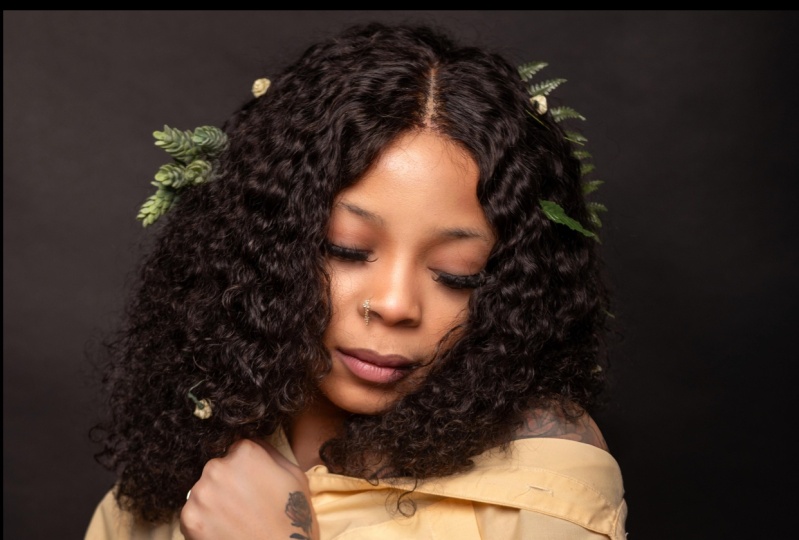
1. Introduction: Hello my friends.
I'm Devon Lennox. I'm a fashion and beauty photographer based in
Las Vegas, Nevada, and I've been a
professional photographer since 2018 going full-time, the fall of 2020. On screen right
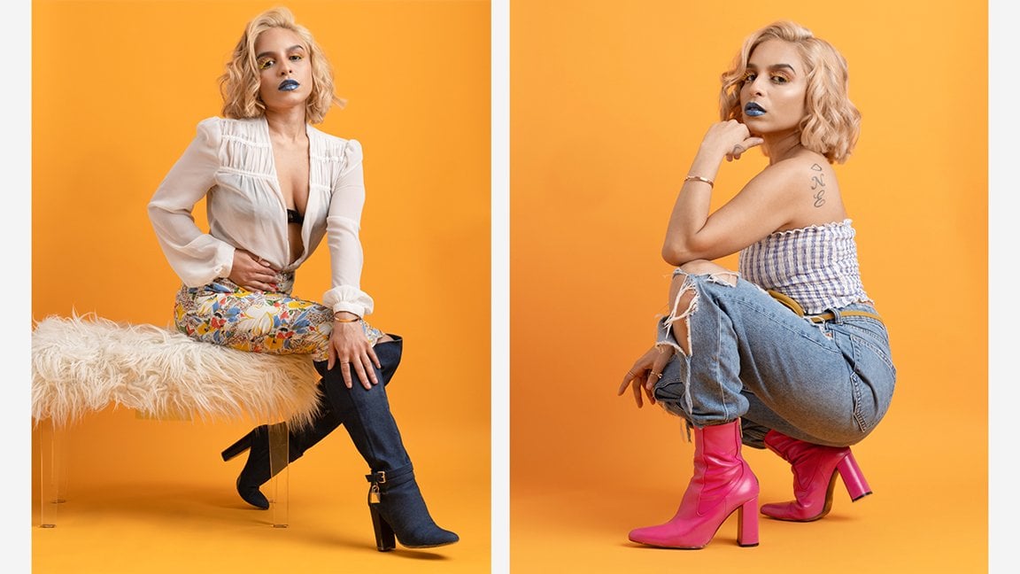
now I'll show you a sample and collection of my most recent images that said, I want to take a deep
dive into departure for more fashion editorial
photography, to beauty photography. With this Skillshare course, I'm going to show you the full behind the scenes
of how to capture these images at home on
budget very comfortably. With this Skillshare
course, we're going to go behind the scenes. I'm going to show you the full workflow that you will need. That includes the
tools, the techniques, your space, and also the
equipment that you'll need. Then we're going to
capture our images. From there we're going
to take that image into post-production
for retouching, finalizing it, and perfecting
it to a commercial level. I've aim this course at intermediate photographers
who already have a basic understanding of their camera operation
and focal length. That said if you are a beginner, I will be explaining
everything in great depth with
easy to understand terms so you won't get lost and you'll still
be able to gain valuable knowledge and insight throughout the duration
of this course. The ultimate aim of this
Skillshare course is to give you the tools and
techniques necessary for you to accomplish these
results for yourselves at home and replicate your own and beauty photography
images from popular editorials like Vogue, L and N style, to name a few. I've also included
a class project to go along with this course, which will be for you to
upload between one and three of your very own beauty
photography at home images. From there, I want
you to include a short description explaining
your thinking and what you've learned from the
shoot and then upload those images and the description
to the classic gallery. From there, we can give
you constructive feedback and we can all grow together. With that said,
I'm excited to be your instructor for the
duration of this course and will see you on the inside.
2. Studio Space: Hello my friends, Davon
Lenix here, and welcome. Excited to have you
here. Let's get started. In this lesson, I would
love to discuss arguably the most important aspect of replicating these
images at home, which is going to be your
shooting environment and the considerations you want to make about your
impromptu studio space. Shooting a beauty editorial
at home doesn't require much space since
these images are often taken at chest
level or higher. But despite having such a
tight crop on subjects, this type of photography
does still require some space and working distance between you and the model. It's important to make
sure your shooting space or studio is large
enough to accommodate. Thankfully, for most of us, even those in one-bedroom
or even studio apartments, we still have ample room to replicate these
images at home, particularly if you have a combined living in
a dining room setup, but even most
dedicated living rooms and separate dining rooms
by themselves will work. In fact, over the
last four years, I've shot several dozen
beauty photography editorials in my living room in
this very fashion. I can't confirm that the
lighting setup will cover later in this course
works and is rock solid. But it's primarily because
all of the apartments, even actual studio
apartments I've lived in, offered very similar dimensions, and the dimensions that I'm
about to list here are what I feel are the minimums
to accomplish this type of
photography at home. I encourage you to take some
time right now to measure your space with a tape measure to confirm that
it'll be sufficient. Otherwise, look for
somewhere else in your home to find the necessary space
to set everything up. Those dimensions are as follows, a width of 6 feet, a length or depth of 10 feet, and a ceiling height
of about 8 feet. Now, if your space meets
these minimum dimensions, you're clear to capture beauty photography
images at home, and you'll be able to do so comfortably without any issues. However, if you're shooting a
smaller room than describe, you'll find it tricky to capture these
images comfortably. It won't be impossible
by any means, but maneuvering your
camera equipment and lighting setup
will be tricky, and you might find that this becomes
insufficient long-term. At the same time
though, if you have a larger space than described, you will have more
flexibility to choose a longer focal lens or
vary your lens selection, and in that case, you
have quite an advantage. That said, there's other
things to consider outside of the space or your
dimensions alone though. You're also going to need
to consider the color of your home's walls as it will
affect your final image. Ideally, you want the walls painted with a
flat, neutral gray, so it's entirely free
of color casts and doesn't affect your
camera's white balance. But for most of us, especially those of us
that live in apartments, having such a color
is not possible. Instead, most homes and apartments will
have white walls. Thankfully, this
also works great. The only downside
is that white walls will act as a reflector
in this case, filling in on both sides of your subject if you're
in a truly small space. In this instance, you will
find it difficult to control the lighting to create a more moody beauty
photography image, since the light will
spill onto both sides of the subject and fill in the
shadows, reducing contrast. For that, you'll want to add a flag or a grid to
your main light. But this makes things
more complicated than the scope of this particular
Skillshare course. That said though, for most instances of
beauty photography, having white walls on
both sides could be an advantage and create a
more bright and airy photo, which looks refreshing and clean and it usually
adds to these images. However, I want to point out
one important thing here, and that is your home doesn't
have white walls at all, instead, they're colored, that's where we'll
run into a problem. If you have colored walls or a wall wrapped with
vinyl or wallpaper, the color of the wall will
change your photo's color. In this case, it will directly affect your camera's
white balance, the model's, complexion, the color of your background, and the appearance
of the clothing your model's wearing in
a negative way. You'll want to remove that vinyl rapping or wallpaper or paint the wall in a more neutral color long-term if
that's possible. However, if that's not possible or that's simply
too impractical, you can box in your model using a
double-sided poster board. In this case, it can
effectively serve as its own wall and flag off any colored walls that
you have in your home, thus removing all of
those color cast issues. But perfect, now you're aware of the main considerations
about your shooting space. Let's now discuss the camera
and lighting equipment we'll need to get started.
3. Lighting & Camera Equipment: So hello my friends, Devaun Lennox here
and welcome back. In this video, we'll talk about the lighting and camera
equipment you'll need to accomplish these
kinds of images at home. But first, let's kick things off by talking about the
lighting equipment. At a minimum, you'll
want a stroke, also known as a Monolight, with a flash output power
of 150 watts or higher. With 150 watts,
you'll be able to shoot at higher
apertures like F8 or 11, letting you capture
excellent detail on your model in sharp focus. Some of these details
could include the nuances and their
lipstick or gloss, fine gradations in color in
their makeup or eye shadow, or even the dewiness
of their skin. The particular unit I use
for the headline image for this course was the
pause Buff Einstein stroke, an 8641 daylight-balanced
strobe. You'll also want a trigger for this light or the lamp you
plan on using for your shoot. To trigger these
kinds of lights, you can either use
a wired system, which uses a wired
flash cable that connects directly to the PC
Sync terminal on your camera. Or you can use a wireless
system that transmits by connecting directly to
the hot shoe of your camera. Either will work perfectly
fine, but for my shoot, I use the cyber sink wireless
studio flash triggers, which is the wireless
transmission system that policy buffer
recommends for this product. Next, you'll want a
sturdy light stand, but more importantly,
you'll want one that offers a boom arm. With a boom arm, you can offset the light from the legs
of the light stand, which lets you should directly below the light
without any hassles. Of course, you can use a traditional light
stand and offset it by changing the angle slightly and you can still shoot
straight onto your model. But having a boom
arm for this type of photography will prove
invaluable long term since it will offer you the
most shooting space in your entire environment and the flexibility when moving
around your model. Either way, I
recommend opting for a more heavy-duty aluminum
light stand here, such as those manufactured
by photo deoxy or impact. These light stands offer more rugged knobs that
won't break after only six months of use and they also support a higher
payload rating, which would be
helpful since you may also use them with a boom
arm to offset your light. Plus, these products
are only marginally more expensive than their
cheaper alternatives, so they're definitely
worth the investment. From there, you'll also
want a soft box to modify and soften the
light from your strobe. In this aspect, you have
many options which are only going to be limited
based on your shooting space. You can use compacts soft boxes, or umbrellas as large
as eight feet here. But to keep things simple
and cost-effective, the best option is opting for a 48-inch Okta Box or a beauty dish for the
headlining image, I used the policy Buff
white beauty dish. But you can easily replicate this identical lighting
setup with a much cheaper, newer 48-inch Okta Box, which is also collapsible, offers both interior
and exterior diffusion to soften the light
and diffuse it more. For the price, the
build quality, and the general functionality
of that product for this medium is
absolutely invaluable. In total, you can replicate the identical setup that I use, albeit to a slightly less build quality for just $200 USD. But I can guarantee you that the results between both of
these setups are identical. So absolutely no need for
the price of the equipment, especially if you're a beginner. Now with lighting covered, let's talk about your
camera equipment. I can't stress enough, use the camera and lens
setup that you already have, but if you're really
looking to hone your skills and do this
medium exclusively, getting an 85-millimeter F1.8 lens will eventually
become a must while the 50-millimeter F1.8
lens is usually the go to upgrade for
most photographers wanting to hone their skills. For this medium, the
85-millimeter focal length is the industry standard. Not only will you notice
better image quality, particularly in
central sharpness and low light performance with
an 85 millimeter F1.8 lens, you'll also get more
flattering images since the characteristics of this lens tend to narrow
the models' facial features, and that almost always makes the models look
more attractive. For most manufacturers, the 85-millimeter F1
point lens or its equivalent is usually
quite cost-effective as well and less than $300 USD. But understandably,
if you want to skip this particular expense and
you already have a kit lens, you can use that instead, especially if you have
a 28-70 millimeter or equivalent kit lens. The focal lens of kit lens
does vary quite a bit. But there are some models
that are longer than 50 millimeters and close enough
to 85 or 90 millimeters, so if your lens
already fits the bill, no need to buy another lens. It'll work perfectly fine, as is for this kind
of photography. Next, you may also
want to consider a backdrop or background
support system and you may also want to consider a
colored seamless paper to add some more interest
and theme to your images. However, if you shoot
on a white wall and it's sufficiently far
enough away, say, five or six feet, you can skip this
particular expense as well if you want just
a white background. Alternatively, you can mount a well-ironed bed sheet
or similar fabric, clamped or draped
over a window sill. That would also work, granted, both of these methods will
require some post-processing to remove any distractions or unevenness in the background. But it's still a
good starting point. That said, if you do want
more flexibility and control over the colors and
the type of background, a dedicated backdrop
support system will only increase your
total by $100 USD. It's fair to say that a white seamless paper or
fashion grade seamless paper delivers a truly professional
result that'll make your images on par with
anyone else in the industry, so it's an expense that's
definitely worth it. Ultimately though,
the lighting kit is the most important aspect of the equipment you need for
this type of photography. And considering this type of photography only
requires minimal gear, i.e a single light, we're looking at a very
affordable entry point into beauty photography that even the newest photographers
can accomplish. But great, now
that we've covered the necessary lighting
and camera equipment, let's talk about the
position of your lighting.
4. Lighting Setup: Hello my friends, Devaun
Lennox here and welcome back. In this lesson, we'll talk about the lighting setup and how
you'll position your light. First, let me show you a rendering on-screen
of the lighting setup right now so you can get an idea of how things
will look like. But let's cover the
setup in more detail, starting with the distances in general positioning of
your light in your space. Ideally, you want your
model to be between 3-5 feet away from
your background. Doing so will mean that less
light hits the background, letting the background
fall off to a medium gray, rather than stay as
an uneven white. I'll show you the
difference between a positioning of the
model 5 feet away from the background and directly in front of the background
on screen right now. As you can see, there's a noticeable
difference between how bright the background is
in these two renderings. It's not a dramatic
difference though, but it's definitely
something to take note of. But generally having
the background directly behind the model
accentuates its textures, since we're usually shooting at higher aperture values of f8 or higher and this usually becomes a distraction in
this type of photo. I would suggest
experimenting with this aspect though for yourself to see if it's
a deal breaker though, as it may or may not be depending on your
style of photography. With the general distance and positioning of the
space covered, let's now talk about the
more specific details on where you'll put your light
in relation to your model. For beauty photography, we
want lighting that is even, flattering and proportionate
as we can get. That inevitably means
that we will want to position the light directly
in front of our model, so all aspects of their face, neck and shoulders
are lit the same. We'll also want to get
our light as close to our model's face
and shoulders as feasible so we can create the softest and most
flattering light possible. I find that putting
the light 2-3 feet away is the perfect
distance for this medium, as it's close enough to create a soft even light on our model, but not so close to the model that the light itself encroaches their personal space and becomes somewhat
uncomfortable to our model. Now, as far as the
height of our light, you'll want to position
the light so that the bottom of your softbox
or the beauty dish, if you're using one, is just
above eye of your model. In most cases, that will be
somewhere around 5-6 feet, depending if they're
standing or sitting. Putting it at this height
will mean two things. One, it will be just
high enough for you to shoot directly
underneath it and straight onto your model and that means you'll capture the model's face without adding any distortion that comes
from tilting your camera, which can add foreshortening
and usually doesn't help to make people look
attractive and second, it also means that
the light will be focused on your subject's
face and shoulders, which is exactly where
we want it to be, rather than being too high and then focused on their hair, or too low and
hitting their chest, neither of which
is where we want our viewers to be seeing first. From here, you can
experiment with the angle or tilt of
your softbox and light. By tilting the light
downwards, say 45 degrees, you're creating
slightly more shadows and contouring on
your model's face, particularly underneath
their nose and around their cheekbones
and underneath the neck. In this positioning
with the light, you'll create what's known
as butterfly lighting, which works well for
beauty photography if you want something slightly
more angular and bold. But if you want
something more soft, even and flattering, then leaving your light
at a 90 degree or pointed directly straight
forward angle will flatten the image and create the most pleasing light on your subject. On screen, I'll show you a rendering of the
difference between these two types of angle
positions right now. As you can see, there is a difference between
both of them, but the results are subtle
and it's not dramatic. However, you're going to notice this becoming a major difference once you finalize and retouch the image later
in post-processing. Still, ultimately, each of these options does come down to personal preference
and the style of beauty photography
you're going after. That said, it's an element worth experimenting with and to see which is going to suit your particular photography
style the best. The last and final
variable will be whether to add a reflector underneath
your model's neck and chin. This is an optional step, but something to
experiment with as well. If you're looking to
flatten your image and reduce the contrast and make
it more pleasing overall, this addition will create an even more flattering light
as it will reduce contrast, which is particularly
helpful if you're doing a photography
style that's more soft and doesn't have as
much contrast and hardness. On-screen I'll show you the
difference between adding a reflector versus
leaving it out. For the headlining
image for this course, I did use a reflector
underneath the model to bounce more lighting
back onto the subject. Doing so does reduce contrast
and fill in the shadows. But in retrospect,
it may have been a better option to go without the reflector for
this particular shot, since the image already had a dark mood and
is graphic as is, so this kind of
lighting would have brought the theme together more. But as it stands, it
does work as it is. However, congratulations, from here you have the
complete lighting setup, so position yourself
a few feet away and start experimenting
with your composition. Now that we've covered the
complete lighting setup, let's discuss the
camera settings and how you set up your camera.
5. Camera Setup: Hello, my friends, Devaun Lennox here, and welcome back. In this lesson, we'll talk about your camera settings and
getting the best results. First, let's start
with camera settings. Since we're shooting indoors under controlled
lighting conditions, our exposure will be dictated by our aperture
and ISO settings. Shutter speed only comes
into play as a basic setting to sync with our a term
called flash sync, and to make sure we avoid getting blurred by
shooting handheld. But otherwise, it doesn't play the same role as other
forms of photography, so don't worry too much about
that particular setting. Now, since we have complete control over
how much light is in our environment by adjusting our flash output power to change how much light
is hitting our subject, it's best to set our
camera to their base, ISO. At the base ISO, our cameras will capture the
most dynamic range, least amount of noise, and the best image
quality possible. For most cameras on the market, the base ISO is either 100, 160, or 200, so when you're
ready to start shooting, first set your camera
to its base ISO. Next, our aperture setting. This will determine our
depth of field and how much of our subject
is in sharp focus. For this type of photography, you have many options, and this setting will
likely come down to the style of
image you prefer. But it's generally
best to start with an aperture setting
of F/8 or F/11, as these values will provide
enough depth of the field to capture all of the details
on your model's face. But you're welcome to test a lower aperture
setting like F/4, or F/2.8, and these
aperture settings will result in a more
shallow depth of field. That could be a great
option if you want to blur any blemishes
on your model's skin, making the
post-processing easier. Or you can only focus on some aspects of the
model, like their eyes, and have everything else
fall out and focus, which creates a more impactful
photo in a lot of cases. Either way, when you're
ready to start shooting, switch your aperture
setting to F/8, and use that as a starting
point from there. Lastly, our shutter speed, which in this type
of photography is the least important
aspect of exposure, but when it comes
to shutter speed, there are still some notes
that we want to keep in mind. Generally, a shutter
speed of 1/125. Second, is a great
starting point for this type of
photography as it offers enough speed to prevent any blur when shooting handheld, but it's also a safe
value that syncs with most commercial flash units and the transmitters
that are available. At this value, you won't
have any issues sinking with your flash unit and hitting
its maximum flash sync speed. Like Aperture, you're
also welcome to explore slower shutter speeds
than 1/1/250 per second, and these slower values could be an excellent means to add
more creative effects to your photos by
purposely introducing motion blur to create
a ghosting effect. Perfect. Now that we've covered the basic
camera settings, let's cover some pointers on
getting the best results. If your cameras supports
face and eye detection, enable this feature and set the focusing area to the
top third of the LCD. Now, the reason for
setting the auto-focus to the top third of the LCD is that we often shoot in
portrait orientation rather than landscape for
this form of photography, and setting your
auto-focus point to the top third rather than the center will reduce how often you have to focus
and recompose an image, saving you time while shooting. But more importantly,
it also speeds up your camera's
focusing in general, reducing its focus
acquisition time, and that'll decrease how
often it hunts for focus, so in the end, it will ultimately
mean you create more consistently
in-focus images. Next, if your camera has accurate and reliable
continuous audit focusing called the CAF
or continuous autofocus, you're welcome to
use this feature. However, if you find
you're focusing system is often hit or miss using AFS or single-shot
autofocus with face and eyes detection will definitely
give you the best results. Next, let's talk
about white balance. Our white balance on later
generation cameras say those manufactured after
2018 will provide an auto white balance that's close enough to accurate
for this type of situation and you shouldn't
find the colors are so distracting and off
that they're going to require enormous color
adjustments to post-processing, but if you have an
older camera that was manufactured before 2018, using the flash white balance
setting will give you a more consistent
color to your image and be more accurate than
using auto-white balance. Alternatively, you can dial in a custom white balance setting using the Kelvin
mode on your camera, and you'll likely
dominant value somewhere between 5000 and 5600 Kelvin, depending on what your
color flash output is, but you have to know your manufacturer's
color temperature. Still doing this
manually will give you even more accurate colors and more accurate white balance than using the flash setting, so it's a better option. From here you want to take a
test shot of your subject, now evaluate the image on the rear LCD to
check the exposure. Then double-check the exposure using the histogram
to make sure you're not overexposing or clipping in the highlights, specifically. In this format of photography, it's better to underexpose your image by a third of a stop, then bring up the exposure
in post-processing. Since we will be
shooting a model's faces primarily and if
their skin is wet, Dewey, or oily, it will reflect even
more light than normal. If you overexposed those
particular highlights, you won't be able to recover those details and
post-processing, and in general, that
can ruin images. Great though, now
that we've covered your camera setup and some of the tips to capture the
best images possible, let's wrap up with some
final considerations you'll want to make
on the shoot itself.
6. Other Considerations: Hello, my friends. Devaun
Lennox here and welcome back. In this lesson, we'll cover the final two considerations you want to make on the shoot. Those are going to be
whether you should use a reflector to reduce
contrasts and to fill in the shadows or
should you consider tethering while shooting
to review your images. For the course image, I did use a reflector underneath the model's chin
to fill in the shadows. In this case, I use a four-foot silver reflector positioned just
below chest level. On screen right
now, I'll show you the effect of adding a reflector underneath the model's chin for this type of photography
versus removing them. It's important, I note that you don't have to use a reflector, especially if you're going
for an image that has more contrast or you
want something more bold in those situations, adding a reflector will only serve to go against your idea. Skipping it is best. That said, if you
want an image with only minor contrast
and contouring, using a reflector is a perfect way to achieve
that particular effect. Next, you may want to consider connecting your camera
to your computer so you can transfer the photos and review them in real-time
as you're shooting. This process is known as tethering and it's a
great workflow to be able to assess fine details that are difficult to see on
the camera's LCD, such as the model's make-up, hairstyle, or even the
effects of your lighting. It's also an excellent
way to be able to see the adjustments you're
making in real-time, such as changing the angle
of your light or it's simply a great option to show the model
you're working with, the amazing images
you're capturing. If you want to find detailed
information about how to set this up before your
camera and software setup you can do a quick online
search and find plenty of information but setting that up specifically is outside of
the scope of this course. Great now that we've covered the two final considerations, you now know how to capture beauty photography
images at home. Let's head over to the
post-production workflow to refine and finish up our images so we
can take what we've captured so far to a
professional level.
7. Fixing Exposure: So hello my friends, Devon Lennox here
and welcome back. In this lesson,
we're going to start the post-production
workflow to take the images that you've captured to a truly professional level. I want to make an important
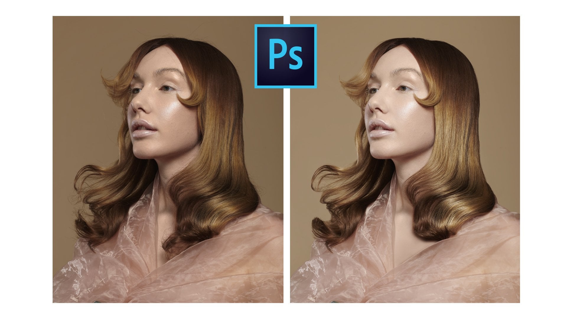
note here as far as software, I'm not using Adobe
Photoshop or Light room for the
post-production workflow. I have a course already on Skill share detailing how to do exactly the same workflow
that I'm about to cover here in Affinity
Photo on iOS or iPad. You can check out that
Skill share course if you want,and specific
details on how to do this in Adobe Photoshop. But with that said, let's get over into post-production
workflow. So here we are on iOS, this is the DNG photo
I will be supplying as a part of the resources for this particular
Skill share course, so you're welcome to
download this image to follow along in a more
step-by-step fashion, unless you just want to watch, just to see the techniques
in the workflow. Now, let's open up Affinity
Photo and open up our image. So now we're here in
Affinity Photo by default, Affinity Photo will open up
its developed persona and in the developed persona
is where we're going to be able to make some of
the basic adjustments, which is the first
step of our workflow. Here will open up
the basics panel and we're prompted with several important aspects of what we're going to be
looking for namely, in the top right-hand corner here is going to
be the histogram, followed by our
exposure spiders, followed by some enhancements,
namely contrast, saturation vibrance or
white balance selection, and then our shadows
and highlights for this particular image and for all images regardless
of its Adobe Photoshop, Lightroom, or even here
in Affinity Photo. The first thing is to
evaluate the histogram, so we can see if we can maximize our camera's dynamic
range by pushing the outermost layers
of our histogram, both the highlights
and shadows to their maximum values before they start clipping
and losing detail. The easiest way to
do this is first by adjusting the
exposure slider, which is going to adjust the exposure of the
entire image as a whole, I find that a value
somewhere around 0.15 is sufficient to just bring up the general exposure of
the image and start to push the highlights on the right-hand side
of this red channel. It's starting to clip here, but it's not
actually a clipping. From there, you have a couple of options you can adjust
your black point, which is going to
basically reduce the shadows and the mid-tones. But more importantly, an
easier way to do this is actually by just decreasing
the shadow slider, which is just going to
specifically focus on the shadows rather than shadows and the blacks and
some of the mid-tones. Here what I'm doing is
adjusting the shadows slider to push the histogram up here as far to the left as possible
before losing detail and I find that a value of negative 100 is
completely sufficient. If you also want to
add more contrast, you can also increase the
black point to a value of 5% and that will also increase
the shadows and the darks. But that's going a
little bit too far so the value of 3% is getting
me the dynamic range where I'm pushing the blacks and the shadows all the way to the left and I'm pushing the
highlights all the way up. You're also welcome to increase the highlights slider if you want even more
punch in contrast, I would probably
say a maximum of 10% for this image
would be as far as I'd go because after
that point we're starting to click too
many of the whites. And now we can use
the before and after to see the added contrast. We've crunched up the
blacks a little bit. We added more contrast
to the overall image. The exposure on her face is about the same as
what it was before, but we've just fundamentally
increased the contrast. The only other
adjustments I would make is just
potentially coming down into the lens
correction slider here and turning on distortion and then turning on
distortion for your lens. As you can see that fixed some barrel distortion since I was using a 35-millimeter F2, a 50-millimeter equivalent lens, and F50 millimeters
shooting this close, I'm going to have
some distortion. So if you're in that situation, you're shooting this close
to your subject and you're using a 50 millimeter
or shorter lens, then you will have
some barrel distortion and possibly even yay, which you can fix by
going into detail setting and Adobe Lightroom or the details setting
and Adobe Photoshop, or here in the lens correction
panel for Affinity Photo. You're also welcome to remove any vignette if it's applicable. For this image,
it's not applicable so I'm not going to enable that. But with that said, we can hit the check mark to develop our image
and we can start to move into the next part of the post-production workflow. In the next lesson,
we're going to cover the next set of steps, so I'll see you there.
8. Cropping & Background Cleanup: Hello my friends Devaun
Lennox here and welcome back. In this lesson we're going
to crop the photo and clean up any blemishes
on our background and remove any major
distractions before we go into the more detailed
oriented retouching process. For this, the first step that I would naturally go about doing is in Affinity Photo by
using the crop tool, do a couple of options
when it comes to the mode, you can do original
ratio or custom ratio. For the most part, original
ratio will be great. However, you can use
a custom ratio and set this to 8 by 10 high. If you're uploading specifically to Instagram or
other social media, as this is one of the maximum portrait
length requirements. Alternatively, you
can tap in 10 by 10, which is going to be the
covalent one-by-one square. If you would also like to do a one-by-one square for this particular image
I'm going to do an 8 by 10 rather than leave the
original aspect ratio and then we can just go in
and we can do our crop. I'll go in here and
I'll resize this to the appropriate level
and I will go in and put that third and move that over and we can
call that crop finished. Now, for most of your images, once you cropped to the
necessary aspect ratio, you could call it
good here and just move on to the next
steps of the workflow. However, for this image
is specifically I would like to show you an
additional technique and that's going to
be how to quickly remove distracting elements like large reflectors
from your images so you can maintain your original aspect ratio without
having a crop. Specifically, what
I'm talking about is down here I have a
silver reflector. I'm going to show you in
a very short technique and workflow here how
you can remove that without having to painstakingly
go through and do frequency separation in
painting or clone stamping, patch tool, these things there's an easier
way to do this. An Affinity Photo and you can do also do this in
Photoshop as well. You're going to basically
do a selection of the surrounding area using
the rectangular marquee tool. You're going to select both the subject and the background, careful not to actually select the object
you're trying to remove then what you're going
to do it here in Affinity Photo is go back
to our normal photo mode. You're going to
use the move tool, select your object
here that we just did, and we're going to drag it down. Now this is going to cause
a little bit of distortion, particularly maybe
slightly noticeable on your models hand
here, if you have that. But this is an easy fix
that we can come back to later if necessary if
you find it distracting. But besides that, and that is
the easiest way to fix it, you're going to come back
here to selections persona, come up here and de-select. They're in a matter of basically 10 seconds
you can go and you can remove that entire
area and it fell swoop. The only other thing to note is that if you zoom in closely, you can start to see this
faint gray line here of where we made our selection using the rectangular
marquee tool. This is a very easy fix
and something you may not even need to fix depending on the type of image that
you're going after. Especially what the
viewing distance is, because if you're looking
at the photo here, no one's ever going
to notice it, so you don't have to fix it. But if someone's
going to be zooming into the photo in great detail, you will start to notice
it at some point. Very easy fix that we can
come back to later if you find it distracting but
for the time being, I just want to point that out, but you probably won't
have to worry about it. The last step of this workflow
is going to be cleaning up any distractions in
the remaining areas of the background namely, that's going to be
unevenness in terms of texture and your
background or in this case, I have some sensor dust right here that I would
like to remove. I'm going to go back over
to the photos persona. This is a very easy fix so I'm
going to just come here to the clone stamp and come out and use the
inpainting brush. Pick a reasonable
width here and I'm just going to just come
in and just paint that. The inpainting tool
basically functions the same way as the spot healing or healing brush a
clone stamp as hybrid. You can just painting
and it samples, the surrounding color texture, and tone to basically
get rid of blemishes. But with that said, those are the only distractions I'm seeing here and we can start to move into the next part of the post-production workflow. In the next lesson,
we're going to cover the next set of steps
so I'll see you there.
9. Skin Cleanup: Hello, my friends Devaun
Linux here and welcome back. In this particular
lesson we're going to go through and do our
skin clean up, which is specifically
going to be removing any blemishes and uneven
texture in our model skin. There are many ways to do
this particular technique. However, for this particular
Skillshare course, I'm going to keep
things very simple and show you the easiest
and fastest, and most effective tool, which in this case
is going to be using the inpainting tool
here in Affinity Photo, which is a rough equivalent to the spot healing brush
in Adobe Photoshop, and it's a mixture between a healing brush
and a clone stamp. Essentially what this
tool is going to do, it's going to sample
both the texture and tone of the area
that we paint in. It's going to analyze
that selection and try to replicate in blend in that painted area with the surrounding pixels to make that area look
a little more, I suppose the best
word I would say, make it look a little
bit more cohesive and even to actually find
the impainting brush, we're going to go over
here into our tools panel. Under the clone brush, we have the end painting
brush right here. The easiest way to
actually apply this effect is just going to
be just painting over the blemishes that
you want to remove. However, I would suggest
that you make a duplicate of your background layer
so that you can adjust the opacity
of this effect, so you're not applying it directly to your
background layer. To do that, we can just hit our three icons here
and hit Duplicate. Now that we have a duplicate,
our background layer, we're safe to apply this effect and we can just paint
over the blemishes. Now for this particular shoot, our model does have great
skin and she also did an amazing job on her
makeup by adding a lot of concealer and blush
and just really just blending in her
overall makeup very well. There's not really going to be that much for us to do here, but I'm just going to show
you the basic effect. Essentially what you want
to do with this brush, you're going to
set the source to current layer rather than
current layer and below. Because you want the effect
to just be applied to the current layer
and its sampling just to be on the current layer. As far as settings,
you're going to adjust the brush width to
just be slightly larger than the blemish
you're trying to remove for example for this
blemish right here, which is going to just
be like an age line, or just make it 20 to 40 pixels. Opacity and flow, you can leave those both at 100 percent, and hardness is going
to be 0 percent. Because we want a very soft
edge and soft transition. Then you're just going to
zoom in and try to stay at less than a one-to-one
zoom so that you can just really
apply the effect on a very specific small level and that you're not
zooming out all the way to here and then applying it
with larger brushstrokes, because unfortunately,
doing this technique, it does tend to
remove the texture, and you can actually
get this texture back by using techniques such
as frequency separation. You can also add noise later in the post-production
workflow to actually get this texture back before this particular
Skillshare course, I'm not going to get into some of these more advanced
beauty retouching. I'm going to leave that for
a more advanced course. But just know that by using
this particular technique, just like using the
Spot Healing Brush in Adobe Photoshop, you will absolutely be losing
a little bit of texture. There are things that we can do to get that texture back, so it's not a deal breaker, but I'm just pointing
that out so that you're going to be losing
a little bit of texture, and it's going to be smoothing
out some of these areas. Unless you're zooming in at the same zoom level that
I'm using right now, you're not going to notice
the smudginess or the lack of texture that we're
doing by actually applying this
particular technique. But that said, there,
if you are going to, someone's going to be viewing
your image this close, you are going to notice
that's just like smudginess. But with that said, all we're going to do is basically
just paint over anything that we find to be
a little bit distraction. As far as textures is concerned. There are other tools that
you can use to do this, but I find that the
inpainting brush here in Affinity Photo is by far the best tool you could use the patch tool, you can use the clone brush. I can use the healing brush. All these other tools
definitely do work. But in painting is by far the most superior
brushing technique and workflow without a question about is absolutely
the best unless you're going to use specifically
frequency separation and then go through that. But basically, I'm going to just stay at the zoom level so I can just go around the canvas and just fix any of these areas I think that
are potentially not permanent texture on
our model's skin. Or it could be something that you want to just remove
from aesthetic purposes, and then just get rid of
some of these lines here, clear up some of that. But it's as simple as
just painting over. And since we're zoomed in
so much and we're just keeping our brush very
small and localized, the changes aren't
going to be super, super notice when you zoom out. But if you zoom out
and then you use a larger brush like I
was mentioning before, one the inpainting is
going to take a while, but then also it usually
messes with the texture, and then you can
start to notice that there's repeating
patterns in the texture, or the texture just
looks a little bit soft, and it doesn't look right and you actually will be able
to notice that difference. By just keeping your Zoom
really tight and then keeping your brush in
the 20-40-pixel range, you can easily go
around the entire face. It shouldn't be noticeable
that you're losing texture. But like I said,
if you know that, that's a problem,
there are ways to get that texture packets, really
not the end of the world. Now, I've completed the vast
majority of the face here. You're also welcome to
do the same technique on other aspects of your photo, on your model's skin that
would include their hands. You can also do it on the
garment and the clothing. But that's pretty
much the premise for this section
of the workflow, and this is the general idea
of what you're going to do in this particular
step of the workflow. Just using the inpainting tool, you can get very far. You're going to remove
a lot of blemishes and you can really
clear up the texture. As matter of fact,
let me just show you the before and after. It's not going to be a gigantic difference because this photo, like I was mentioning before, she has great skin
already and she did an amazing job
with her makeup, so there wasn't really much
to retouching impaint here. But if you are shooting a model and you're doing
beauty photography, and the model didn't really do a great job with the makeup or you didn't have a makeup
artist in your shoot, that's when you're going
to really be able to notice a bigger
difference in terms of removing blemishes and
acne and that thing. But that's the fundamental step for this part of the workflow, and we can start to move into the next part of the
post-production workflow. In the next lesson,
we're going to cover the next set of steps,
so I'll see you there.
10. Dodge & Burn: Hello my friends, Davon
Linux here and welcome back. In this lesson, I want
to cover and show you a technique in the industry
known as Dodge and Burn. If you're unfamiliar with the
Dodge and Burn technique, essentially it's a technique
that you use to add contrast locally in your image so that effectively
means that you're adding more brightness to
the bright areas and you're darkening the
dark areas of the photo, but you're able to paint in
the effect rather than use a contrast slider
or an exposure or a black point and highlight
slider that you can find in Photoshop Lightroom or here in Affinity Photo in the exposure
adjustment basic tabs, those effect the image globally. With Dodge and Burn
you're actually applying a similar
effect but you're doing it in a very localized
and very specific area, which allows you to add
more contouring in contrast to more specific areas that you want to
exaggerate your photo. Effectively it also allows you to maybe add highlights
that don't exist, add shadows that don't exist. You can also contour different musculature
and facial jaw features. Nose, the bridge of the nose. You can make people's
their jaw lines more angular or make them a
little bit more round. You could also relate
subjects and add a two or three point lighting setup with
dodging and burning. Overall, it's very
effective and it's also a great way for you to fix any lighting mistakes
that you've made onset, which in this case, I pointed my light slightly off
to the right here. The model's hands is
as bright as her face, and I find that distracting. That's the basic
premise of what Dodge and Burn is if you're
unfamiliar with it. With that said, there's a lot of different techniques on how you can actually apply
Dodge and Burn locally. But the specific way that I'm going to show
you right now is the easiest way that you
can do this in photoshop, Lightroom, Capture one in
here and at Affinity Photo. There are more advanced
ways to do this. There are also other
dedicated brushes to do this as well but I find that this technique
is the easiest and it works across all of
these applications. Effectively what we're
going to do is we're going to use a curves
adjustment layer. We're going to set one to brighten the exposure
of the image. We're going to set another
one to darken the exposure of the image and then we're
going to set both of those layers to the
luminosity mode. I'll explain why we
do that later on. Then we're going to
paint on a mask and we're going to apply the
effect in certain areas. To get that setup
in Affinity Photo here we're going to go over
to our adjustments slider. We're going to go
down until we hit curves we then come down
here to the spline. We're going to tap in the middle and we're
going to put that off right here
towards the middle. Those are the settings 0.38, 0.62 if you want to copy those, then I'm going to come
back over to layers. I'm going to add a new
layer, pixel layer. Come over here to the
curves again and we're going to go back down to
spline and we're going to go down towards the middle, 0.64, 0.34, the opposite
of what we had before. I'm going to come back
over here to Layers panel. I'm just going to delete
that empty layer. Now what we're going
to do with both of these layers that we have here, we're going to go over into our blend curves
adjustment options and change our blend mode
from normal to luminosity. The reason that we're
going to change our blend mode from normal to Luminosity is to make sure that this effect only affects
tone and it doesn't also simultaneously affect
the saturation or color of your image. Sometimes when you add a
curves adjustment layer, it can also increase
the saturation or decrease the
saturation so we don't want that effect to be applied right now because
we're going to come back in a later section of
this workflow to actually do color correction. If we don't set this blend
mode to luminosity here, basically we're going
to add more work to a later stage in your workflow and it's going to slow you down, in an effort not to have
to add more work later on, just set the blend mode to luminosity so we can
avoid any changes. Now you may notice that
the image looks crazy. What we're going to
do, we're going to add an empty mask to this layer and
we're going to add an empty mask to the
bottom layer as well. You're also welcome to group both of these layers
if you want to adjust the effects of them
simultaneously and I'm about to go
ahead and do that. I can show you guys the
before and after and we can also make the overall
effect a lot more subtle. First things first, we're
gonna go to our bottom layer, which is going to be our dodge. Dodging is going to be referred
to basically the idea of dodging is that you're
adding more exposure to the highlights to accentuate
the highlights in an image. In this case, where
I want to add more highlights or specifically going to be accentuating
the models eyes, we're moving some
of the bags and shadows that are
underneath her eyes. Adding a little bit
more of a highlights to her nose, her forehead, adding a little bit of contour
to her jaw and cheeks, and then adding a little
bit of shimmering to her lips here. Let's go ahead and select the
mask and then we're going to go over to our brush
tool or regular paintbrush. Our settings are going
to be as follows. 100 percent opacity,
100 percent flow, 2 percent hardness and we're
going to just basically set the brush size to something large and then we can
just paint in the effect. First and foremost, let's just add a little bit highlight. This can be very heavy
handed right now, but I'm going to
adjust the opacity. Later on, I'm going to open up this shadow
underneath her eyes, above her eyes to
remove those bags. I'm going to add a
little bit more here. I'm going to come
in, drop this down, add a little bit of
highlight there to the eyes. Eyes. Open those up, add a little bit of
highlight underneath the eyebrows and then add a little bit of a
touch of a highlight just to the forehead here, bring the forehead out, come back down, make
the brush smaller, add a little bit here, a little bit to the
lips themselves. I'm going to add a little
bit underneath here, accentuate that and then
just the cheeks right here. I'm going to add
some to the cheeks, get a little bit of that. Then I'm going to come
up to the hair add a little bit to the hair. Make this a lot smaller. then we're going to come in and we're going to add some
strokes to the hair. Give that some more detail. then let's drop the opacity of this to make this look a
little bit more realistic. Let's go down to zoom out. You can already see how
much of a difference that's making its opening
up the model's eyes. It's giving you that
are a little bit more angularity to her face. Where let's say 20%. And now we're gonna
go to the burn, which is gonna be the
opposite top layer. Make sure we have
the mask selected and using our
paintbrush on white, we're going to add more
contouring and shadows. Let me make my brush
a little bit bigger. Add some there. Add some right here. I'm going to add some
to the eyebrows, darken the eyebrows
a little bit. Come in here and add some to our eyelids here
underneath as well. Maybe make the pupil
here a little bit darker and then maybe this line just above
this fold on the eye. Do that. Come in add
some to the hair, darken up the hair, and then darken up
this area as well. Now let's do the nose, a little bit contouring
to the nose here. Underneath a little
bit to the lip here. Underneath the lip as well and
then hit the cheeks again. Of course that's still looks
incredibly heavy handed. Just need to be able
to see the effect. Then we're going to just
drop down the opacity. Probably going to end up doing
20 percent as well here. Okay? Now we can turn off
the effect on and off. Now another note here, I'm actually going to use
the burner to actually reduce the exposure
on the model's hands. Paintbrush. Select that just
to reduce this area as well. Just because I was
finding this highlight a little bit bright
and distracting, so we'll do that. Okay, and that brought
that highlight down a little bit
as well so it's not focusing most lighting on that we have here
on model space. You're also welcome to
do the same technique on the clothing as well if
you find some areas of the clothing to be
bright and distracting and if you wanted to bring
out like another area, or you can also use this
effect on the background, for example if you wanted to add a little bit of
lighting to the background, you're welcome to do it
there as well and that will help even out some of the
shadows on the background. You can do as many layers as
you want then you can use a eraser or a soft brush to blend in these two areas so that the
transition is better. I mean that just kind of even out the background
a little bit. You're welcome to play
around with that if you, if you don't want
the background to be a certain exposure, obviously that's
going to make the background a little bit
brighter down there and bring your viewers
eye down there. You may or may not
want that effect, but you can't use
Dodge and Burn to also accentuate details
in the background. It doesn't have to
just be for the face and the clothing that's
going to be in your shop. But fundamentally that is the
dodge and burn technique. It's a great way to add local contrast and also fix the exposure of certain
areas in your photo. It's a great technique
for you to be able to also relate your image if you made some mistake
with your lighting, or you want to add additional lighting
effects like a rim light or a different kind of two
or three-point lighting. You can also color dodge and
burn if you wanted to do. Those are more advanced
techniques that I'll probably show in another
Skillshare course, but just give me a heads up. Those are possible as well. With this technique,
we can start to move into the next part of the
post-production workflow. In the next lesson,
we're going to cover the next set of step
I'll see you there.
11. Color Correction: Hello, my friends. Devaun
Lennox here and welcome back. In this lesson, we're going
to cover the color correction and the final color grading
part of our workflow. Now, this is typically where you would do the equivalent of doing a white and black point setting those using a threshold
in Photoshop, but for this particular
workflow in Affinity Photo, that doesn't really
work quite as well, so you have to go through a more DIY approach
of just doing color correction using your
eyes rather than using the info panel and then
setting your colors by number. There's a lot of different
ways for you to color correct your images and finalize your white balance
and you may have noticed I didn't do the
white balance when we first did the basics
exposures when I first opened up the image
in Affinity Photo. It's at the point in
the workflow where I do those final color corrections
in getting the image, the color grade and color that I'm looking for,
rather than the beginning. The way that I shot this, I shot this at a very flat
white balance to begin with, so I didn't really need to make that adjustment to warm it
up or anything like that. I was going to just come back to that later in the workflow, but you're welcome to set your white balance
earlier in the workflow, but I think right now
when you're getting to finalizing your
image and you're doing the final color correction
and your final color grading is a perfect time for you to actually do the color aspect. Now, like I was saying before, there's a lot of ways that
you can correct color, especially in Affinity Photo, but I find that the easiest
way is by just using the color balance and then
just adding various cyan, magenta, or yellow colors to your mid-tones in your
highlights or your shadows. For me, I just find that the mid-tones which is going to
compose mostly of the skin, it's just a little bit cold, so I'm going to add a
little bit more red. I'm not going to go
too far on the red, but I find that it was
a little bit cold, so I'm going to add maybe 15 on there and then it was a
little green as well, so I'm just going to add maybe a minus 5 and I'll show
you the before and after. Just warm that up a little bit, which is a little bit green. I just wanted to add a little
bit more life to the skin, which is a little bit green and a little bit discolored there. Then for the shadows, you're welcome to add a
coloration to the shadows. If you wanted to add more of
a blue and give your image more of a coloration effect. I'm going to do a
little bit of that, but I'm going to add
mostly more of a magenta, reddish purplish
vibe and then just the effect globally afterwards. I'm going to give it
something like that. Now this is just doing general color grading and I'm just going to drop the
opacity of this layer down. I don't want to be
quite that obvious, but I want it to
be a little bit of a subtle coloration in there. We add a little bit more of a magenta-reddish finish here. Now, in this section as well, I would be going
through and I'll do my final skin color
corrections as well. I'm going to show you the
techniques on how to color correct skin if you have
to color correct skin. The way I shot this image, and the fact that I
use a beauty dish, the lighting was very even
and there weren't really a lot of hues in the different colors
that were in the room, so I don't really need to really fix that many
colors specifically, but the basic premise is
that you're going to open up a new layer in your
editing program. You're going to change
the blend mode to color, you're also welcome to
use average as well. Average, I'll show you
that here shortly, but average will also take the surrounding area
exposure and then also use that as part of its adjustment for
color as well, and then you're going to sample a certain area
using the paintbrush, make sure your
paintbrush is selected, sample a nice mid-tone value, and then you're
going to paint in the other areas
that you find that are distracting from
the color standpoint. Then what you're
going to do is you're going to just adjust
the opacity until you find a nice blend between the original skin
color that you think is the best color for the model skin and
then the problem area. That's basically what
you're going to do. The only area in this photo that I would see that
would be potentially a problem is just the model's
mouth area right here, it's just a little bit green. I'll go on this and I'll just show you what I'm
talking about here. In this case, I
want something more saturated and then I would
paint over this area to warm up this whole area
and get rid of that greenish hue from this area and I'm
effectively just adding more saturation and now, if I go a lot higher, you can see what I'm
talking about here. I go to like 30% and I'll show
you the before and after. It just added a little
bit of warmth and it got rid of that green
tone that was there, but there's another technique
that I want to show you. This is something I would do at this part of the workflow, is using a average
blend mode layer to even out more tones. For this, you're going
to create a new layer. You're going to go up here,
change your blend mode from normal to average,
which is right here. Average also is like
the color layer, but it also takes
the exposure of the area that you've
selected and it uses that as a baseline and it's a
great way for you to finalize the exposure of a
certain area and it's a little bit more localized
than using dodge and burn. That's part of the
reason why I do it here. You'll see what I'm
talking about here. It will basically add exposure and color to these
areas of the hands. Not only does it even out
that area in terms of tone, but it also adds the same color. It's a really
interesting shortcut to do two things in one. You can fix an area and make it look a lot more seamless in
terms of color and tone. You'll notice that it was
darker there and then it also filled in the color. The color from way down here is very similar
to the color up here. It's fixing both of
those issues for you at once. It's a
great little hack. This is actually
something that I would do to fix the background, which is what I'm
going to do right now. I'm going to go back here, set that from normal to average, and I'm actually going
to fix the background to average out the background. This is actually
something I would do at this stage of the
workflow as well and just paint the background to even out the
entire background. Now I'm going to do
this really quickly, but it would be a good idea for you to
spend some time on this. I'm going to go back. I just want to just change
the exposure at the bottom. You can do the entire
background this way if you want the background as
a whole to be very, very even and this will give you a very professional
looking background if you go about
doing it this way. You don't have to do
the whole background. I'm just going to
do the bottom just to get rid of this vignette down here and you'll notice
the before and after, it just got rid of
all of that and it also evens out the color of the background as
well and it makes it more similar to the background
that I sampled up here. That's a nice easy
hack there for you to get in and do
multiple things at once. Let me group the
changes that we just made so you can see
the before and after. That's before and that's after, and then let's come
into the face. We just evened up the
tone of the hands there and then we
evened up the face. But that's what I would
do in this section of the workflow when it comes to your final color management, add a little bit
of a color grade. I would then also make sure that the model's face doesn't
have uneven colors. Everything is nice and even and then I would make sure if
there's hands or clothing, any distractions from
the color on the hands, you can go ahead
and fix that with the color technique that
I showed you before. At this point too, if you wanted to fix up
the backdrop or use the average technique to fix up your exposure and your
colors simultaneously, this is also an excellent time in the workflow to
do that before we finalize and we add our
sharpening and then we export our image for
the web or for print. We can start to move into the next part of the
post-production workflow. In the next lesson,
we're going to cover the next set of steps, so I'll see you there.
12. Sharpening : Hello my friends
and welcome back. In this video, we're
going to sharpen our photo to get it
ready for exporting. Now, there's a lot
of ways to sharpen your images when it comes
to Adobe Photoshop, Lightroom, and here
in Affinity Photo. But I find that the
easiest way by far is going to be using
the unsharpen mask. That's going to allow you to
have a lot of flexibility in terms of where you're
applying the sharpening, but then also your
threshold and the settings of the sharpening that you're
applying to your image. I'm going to show you how to set that particular
function up. But like I said, there
are many other ways that you can sharpen
your images. First, what you have to do
is basically select all of your images and you're going
to create a new layer. Because these filters that
we're going to apply can only work on a rasterize
flattened layer. They don't work on
multiple layers, they have to be flattened
and rasterized. Also, you're going to select all the layers here
in Affinity Photo, come up here and then we're
going to hit "Merge Visible". That's going to create
a new top layer of all the layers that
we selected below it. Then we're going to come
over to our filters tab. We're going to scroll down
and hit "Unsharp Mask". Now, what you're going to
do is set your factor, which is the equivalent of the amount slider
in Adobe Photoshop. You're going to set
that to 50 percent and then use a radius between
one and two pixels. I'm just going to just
set it to two pixels, but you can set it
to one if you want a more subtle sharpen effect. Then what you're going to
do is adjust the threshold, so that it just adds the sharpening just
to the model's eyes, eyebrows, and a little
bit of the hair. Because this is going to be
some of the elements that are going to be the furthest, I guess, towards
the camera's plane. They're going to be fasten out. You're going to just adjust
the sharpening until we're just starting
to get the lid there. You can use it before
and after to make this easier to see what's
happening here. You don't want to be sharpening
too much of the hair, but at same time you
want to make sure it's sharpening the
eyes and the lips. I'm probably going to go
back down to about 15, where it's adding an effect. Maybe I can go down a little bit further and make it a
little bit more powerful. Maybe 12, it's definitely
adding effect on that. You can see it right over
here on the eyelashes. Then we're going to hit "Apply" and that's fundamentally
all you have to do. Now the only other
thing of note, you may want to change this from a normal blend mode
to luminosity. Sometimes when you apply
these sharpening effects, sometimes they can
also add coloration, usually a purple fringing to the halos and it causes
discoloration to the sharpening. If you want to avoid that
or you're noticing that by using the Unsharp Mask
in your application, you should change the
blend mode to luminosity. It only applies basically
in exposure change, exposure and a color change. But that's fundamentally
all we're going to do to sharpen our image. We can start to move into the next part of the
post-production workflow. In the next lesson
we're going to cover the next set of steps.
I'll see you there.
13. Exporting: Hello my friends. Devon
Lennox here and welcome to our final lesson in the
post-production workflow. Now we're going to
export our image both as a high resolution
JPEG for our archives, and as a web ready image that we could post
up on social media. The easiest way to export an Affinity Photo is
going to be going up here to our main menu
and hitting ''Export.'' Now, you have a lot
of settings and file formats that
you could export to. However, the best file format to export out of Affinity
Photo that's going to maximize both image
quality and then also reduce the final file size, so you'll get an image
file that's 25, 30, or 100 megabytes
in size or larger, is going to be a JPEG. You could use a PNG, but
they get pretty large. You could use a TIFF, but they also get pretty large as well, and then there's not really
gigantic benefit on this. You're going to go into
Photoshop or Illustrator to use any of these
other formats they're very much for exporting
to other applications. But since we're just
exporting just to save the image for
our own archives, all you've to have to do is hit the JPEG option right here. I'll leave the dimensions
as set from your camera, which should be around
4,000 by 6,000 pixels. Image quality, I'm
going to leave that maximized at 100%. Now you're welcome to play
around with the ICC profile, which is going to be
your color profile. I would suggest just
leaving it as sRGB, which is one of the
options that you could select when you set up your canvas in the beginning. You are welcome to
put it to Adobe RGB if you have a monitor that's
calibrated for Adobe RGB, or if you want to
just use DCI-P3 if you have an Apple device
that supports that format. However, for most of us, sRGB is going to be the best option. Then once you select
that Affinity will provide your final
file size and all you've to do is hit ''Okay,''
and you can save it to any location on your iPad. I'll just set it in here, and I'll just put it in
procreate for the time being. You can just save it
there, and replace. Then boom, now we have
our exported JPEG image that's ready for our backup. Now, how do you export
for social media? Same processes as before. Go to main menu at export, then we're going to make
sure JPEG is selected. The only difference here is
that you're going to adjust this quality slider until
you get the final file size down here by generating
preview to be below one megabytes in size. That's going to be around 50%. Let's go to 49. We're going to just make
sure that file size is less than one megabyte, so 950 kilobytes should be fine. Then we're going to hit ''Okay,''
and we can save that in the same folder as before. I'm just going to come
over here and just type in one and hit
''Save.'' There you are. Now you've exported both
your high resolution JPEG for your backup in
archival purposes, but you've also exported
a high-quality JPEG that is smaller in
file size that's great for sharing on the web. That now concludes our full
post-production workflow, and you now have all
the steps on how to finalize your image and take it to a truly professional level.
14. Closing Thoughts: There you have it my friends. There's budget friendly
beauty photography at home broken down from
start to finish. I want to say thank you for taking the time to
watch this class. I hope the techniques
and skills I showcase throughout this class have
helped you meaningfully, and I hope they've proven that any of us can capture
magazine worthy images. Of course, there's still
plenty of value in renting or purchasing a
commercial studio space. But the reality is that you can replicate
these results at home without forking out another
mortgage in the process. There's also no reason
why you have to use the highest quality equipment or gear for this form of
photography either. Anyone can do this. It's just a matter of knowing the basic techniques and
having a confident workflow. From there find a good
models and practice. But either way, you're now fully equipped to tackle this medium. We covered the necessary
tools like lights, your camera setup, the
best practices with them, what to consider both
on set and beforehand, and the full
post-processing workflow. It's up to you to take
the baton from here and go forth and show
your vision to the world. Speaking of showing your
vision to the world, your class project is to upload your own beauty editorial shoot. I encourage you to get creative and also not
to be a perfectionist, especially if this is your
first attempt at this medium. I also welcome you to post
any works in progress or even a fully completed
projects from years prior. Either way, the goal is for us to learn and grow together. If you have any
feedback or follow-up questions though for us
regarding this class, please let me know by reaching out here through Skillshare. I look forward to
publishing more courses on this platform and continue helping you create your vision. With that said though,
I've been your host Devaun Lennox and I'll
see you next time.