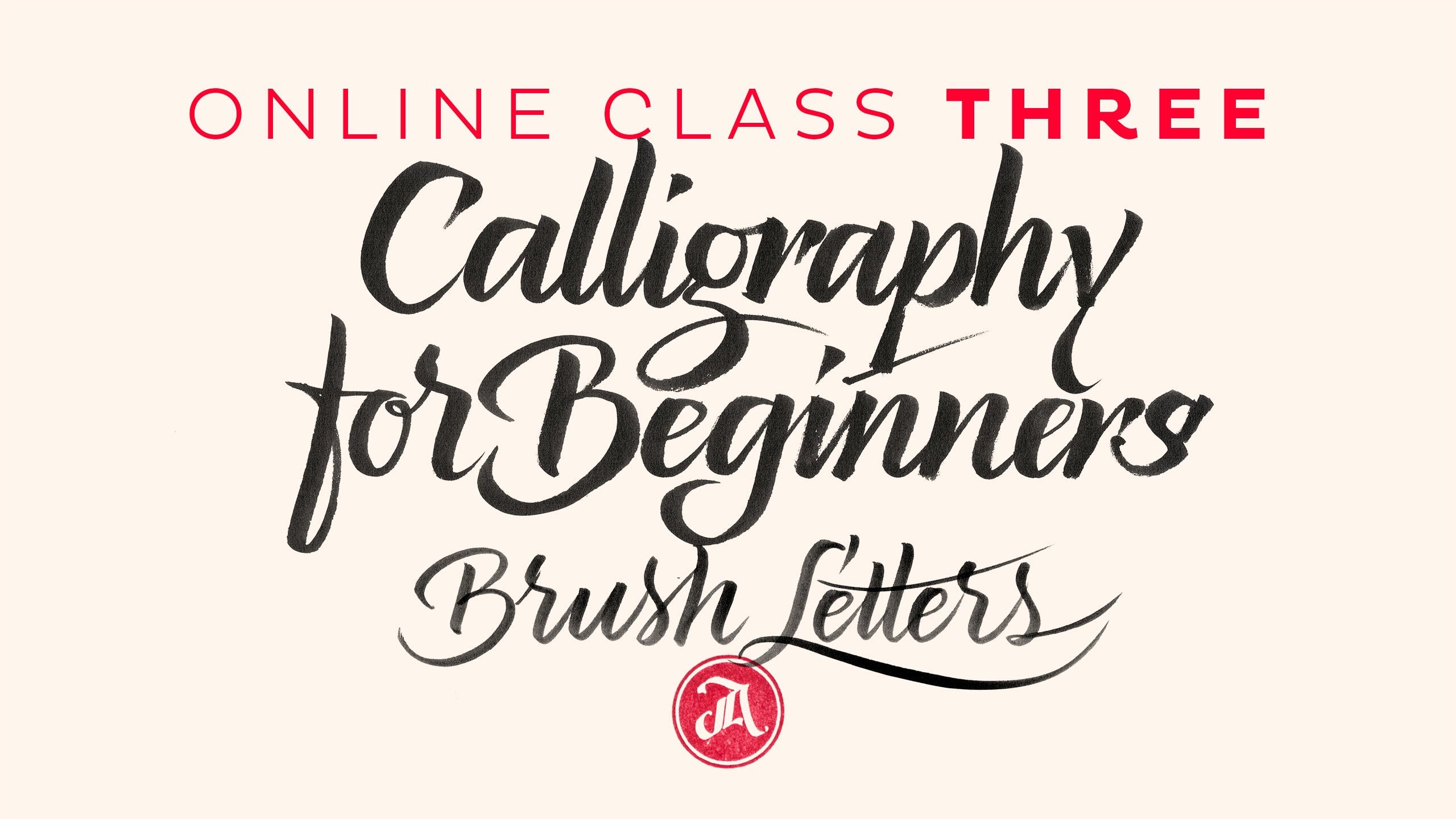
Transcripts
1. Episode 1: Project Intro: In this class, I hope to teach you my process in achieving a lettering style/signature logo. I'm a self-taught graphic designer, so these techniques are techniques that I've taught myself over many years of putting my head down and trying to work it out. I don't think this is the hardest thing in the world to learn, but it does require a lot of practice. This class will be a mix of teaching you basic calligraphy, and lettering techniques, along with logo design execution on the computer. So I'll run through the tools. I'll give you live demonstrations of different pens and the different results that they get. I'll also explain how you don't really need fancy brush pens, or the skills to wield them, if you want to create a fine lettering logo. I'll show a few practicing techniques with the tools in particular for lefties, I'll give you a few little bits of information that may help you achieve the same results as righties practicing, and building muscle memory with the signature name, identifying motives and ligature explorations, bringing it to the computer, vectoring the logo, and applying a mark and a tagline to the logo. So with any luck, hopefully, I'll be able to teach you a thing or three along the way.
2. Episode 2: Personal Intro: Hi, I'm Matt Vergotis and I'm from the Gold Coast, Australia. I'm passionate about three things in life and that's my girls that make-up my little family, my obsession with surfing, and for work of being a graphic designer now for over 20 years, and the last eight, I've been self-employed specializing in corporate identity. Corporate identity is the overall image of a company. It is the visual component to a company's brand, and part of that visual component comes the logo. It plays a pretty important role as the front man as he takes center stage. It's been my passion over the years to design logos and the supporting assets that make up the visual language for a company's corporate identity. Over the years, I've really tried to hone my skills in the area of topography, since it play such an integral role at communicating values, emotions, and personality. This all started when I found it a lot more enjoyable and sometimes easier to actually build a taut face for a logo taut from the ground up and fusing those values rather than sourcing ready-made fonts. Another very important area of typography is calligraphy and lettering. Calligraphy being the art of writing your letter fonts, and topography being the art of illustrating your letter fonts. So for anyone that's interested in specializing in logo design, it's really important to have a good understanding of typography. It's also a great skill asset to have in your bag of tricks to be able to execute a beautifully written, hand-drawn style logo, or to be able to create your own tout face for a logo tout, plus it's a stack upon.
3. Episode 3: My Tools: Let's kick things off with my tools, all the things that I like to use. I've got stacks and stacks of pens, but these are really my essential tools that I use on a regular basis and I probably couldn't live without these days. I've just whittled it down to a select few. Of course, you need paper to begin with, just normal paper. Reams of paper is fine for only sketching and whatnot. But when it comes to brush pen lettering and using the inks, I like to use A3 Bleedproof Canson paper. Can be any brand but with the bleedproof, it preserves the long life of your pens because the ink doesn't bleed out through the paper and it also helps aid with transitions. Often with this paper, you'll get textured results. With the bleedproof paper, it's a lot smoother. It's really nice to use those brush pens with. I use graph paper for scamping logos. Basically, I just do thumbnail sketches on this. It's nice to have that grid. It's not essential, but it's nice, especially if you're doing geometric style logos and you want those grids to help you assist with your lines and lining things up, so that's all good. Tracing paper. Tracing paper is fantastic for when you want to do refinements. Sometimes I'll sketch a logo hundreds of times and I'll pick the best bits. I'll run through this process later, but I use the tracing paper for over crafting. I'll go into over crafting a bit later on too. So the tools here. Basically, everything I like to start off with the pencils. I've got a few clutch pencils and normal pencils and some of these. These are formal finer drawing, I've got them in a couple of different weights and they just helps me get a consistency. Often with these pencils, they blunt a little bit and you get varied strokes throughout a sketch. These ones just keep it nice and consistent. These pens here, the Micron's, they're fantastic for fine-tuning, sketching or doing illustrations. They come in different weights. They're very black and in a good way to think. I do like getting these in a variety of weights. They're fantastic. Anyone that's familiar with my work will know that these are my favorite pens as far as a brush pen goes. These are the Zebra, hard tip, fine Disposable Brush Pen. They've got a hard tip as opposed to a soft tip, which I will show you in a second. But for learning, these are great pens and even the extra fine, it even better because the tip is harder. The reason for this is, basically, when you're doing brush pen lettering, when you've got a had tip, it gives you a lot of resistance and that steadies the hand through your transition. So it enables you to write a lot smoother without having to worry about that pressure when writing. I really love these. They do super thick and super fine strokes, so you get a lot of contrast with those strokes. These are my new favorite brush pens and they're very similar to the Tombow's, they come in a variety of colors and they've got a very similar felt tip to the Tombow's and they grind. I'll do demonstrations with all of these later, but I'm just running through them now. I get all these at jetpens.com, which is great. These are really cheap. They're all reasonably priced. This is the most expensive one. This is a Kuretake number 13. Kuretake do great pens. This is a soft tip pen. What you do is, it doesn't have that hard resistance like the other ones, it's a softer tip. Later I'm going to show you, you'll see that you get a bit of texture, three strokes, and when you've got a steady hand, they do give you different transitions which are great. I want to character in these pens. Then we have the Pilot Parallel pens. You get different nips sizes for these and you can get lots of the disposable ink cartridges and you get different colors. These are fantastic. I don't use them traditionally for calligraphy style writing, I use them for more expressive style where I lean on the shoulder of the pen and get different weights and different textures. I'll show a few examples later and you'll see what I'm mean, but these are definitely one of my favorite pens. To the last one, the little ruling pen. Now, this is a fantastic little gritty, grubby little pen that I like. Basically, you dip it into ink. I use a permanent ink, black, but you can use anything. You can actually dip it into a high concentrated coffee mixed with water and you get a nice piece of tone, but that this is a fantastic pen. I like this for the same reason I like these Pilot Parallel pens that you can actually write really quick and get good, greedy personality infused styled topography with this, but that depends on your own stye. All of these pens, these are the ones that work for me. Some of them might not work for you. Every single pen is different. Some people love these pens, some people don't connect with them, but they're the ones that work for me. Sometimes I can get a new pen and I don't really like it straight away, but I might revisit it later on and change my approach to using it and all of a sudden I love it and I get different results. Opening up your strokes for certain pens work better than, say, drawing really small size. You've just got to really experiment with your tools. Look, to be honest, I could get rid of all of these and just point out these two, swap them away, I won't do that, I want to see if it could go anywhere. But for the first couple of years when I was doing lettering style logos, these were the only two things that I used and whatever paper I could get my hands on. I illustrated all of my typography and sketched everything out and I created dozens of logos with just these things. These all came later when I wanted to try and get the results more organically. But if you guys don't have any of these tools, don't worry, you don't need them. This is all you need. I'm planning on teaching you how to get the results both ways. Don't stress out if you don't have these pens. That's it.
4. Episode 4: It all Starts with Cursive Writing: Fantastic. Let's get started. The first thing I want to explain to you is pretty much we all know how to do this. We've been taught how to do cursive writing since right in our grade 3, grade 4 at school. So what do I do really, essentially, it's just tapping into that and finessing it a bit. Somewhere along the way though, we learned bad habits. I know I did and I'm going to show you now. I'm going to give a demonstration of how I normally write the cursive writing that always taught at school, which isn't very desirable. But just to illustrate that's what it all stems from. So just with a little bit of effort and a little bit of practice you can take your own cursive writing style and finesse it a little bit. So let's go. So this is how I normally write when I'm taking notes. This is how I would draw it, say, how I was taught, I guess, when I was at school to do a cursive writing. Here we go. So the DNA of cursive writing really is stemming from what we were taught back at school. So what we're going to do now is just translate that to a brush ping quickly, but just focus on being a little bit smoother through those transitions. I don't expect everyone to be able to just pick up a brush paint now and do the stride away, but what I would like you to do is practice. Just writing cursive writing, just like I did just then. Just think about that fluid motion of connecting letters. Just getting back in touch with what you were taught at school. So you're not going back to your old habits or whatever you habits have crept in over the years, like in my first example, where I'm writing in capital letters and I'm shuffling in everyone. So this is basically a brush pen. This is the Zebra one that I quite enjoy. So I'll just write cursive writing now which is an extension to that cursive writing that I just demonstrated. So as you can see, the differences is I'm applying thick strokes on the way down and light thin one's on the way up. Just adding a little bit more attention to what you're doing, and focusing on the thick strokes going down and the thin strokes going up. There we go.
5. Episode 5: Practicing Drills: What we'll do now is we'll do a few drills to help you get a feeling of the brush pen that will help you build that muscle memory and get that experience by repetition. What we're going to do first is just concentrate on getting that down, thick stroke and then the up, thin stroke. We're just going to do an arm there at the tittle just over and over again. I'm placing the pen down, and I'm applying pressure, and then I'm flicking up. You can see there's a nice curve and transition there. Now, not everyone will be able to get that straight away, but I'll try and talk you through what I'm doing. What I'm doing is, when I apply my down pressure, I stop to think about the up stroke around here, just before I'm coming up, so you don't go thick all the way down to here, it's this little transition just here, where you stop to lift the pen, and that helps you roll that brush pen over. That's the first stroke. I suggest you do that over, and over, and over, and over, and over, and over, and over again because that's a great one just to really bring it back to the basics. Because all of the other letters, it is variations of that. I'll go through another couple of drills. We'll do the over and over because that gets the hand used to going round and round. The purpose of this one really is to get your hand familiar with making a starting point and coming back to that very same spot again. It's just building that little bit of awareness of what your pen's doing. Of course, there's the thick coming down and the thin going up. I'm doing it steady at the start. But as you get a little bit more confident, you can speed it up. Another one is e's. Now, this is a pretty important letter. I see a common mistake when people write double e's. What I'll do is I'll show you the correct way to do it first. Then I'll show you the incorrect way. Well, not so much incorrect, but there's a desirability and aesthetic towards doing it one way. I find when you do it the other way, which you'll see in a second, the results aren't as nice. What you would have noticed is I lift my pen, or at least I start my transition to the next letter by stopping and then starting again and changing direction. I'll just do that slowly. I start from here, come up, and then come down, and then stop there, and then come out. Now, the reason why I do that is because the form of the e stays in shape. If I do it what I consider the incorrect way, you'll see what happens. I start to go back on myself, and plus, it looks like a telephone cord, an old school one. It's very hard also to keep the spacing between. It's not really what an e looks like. If you compare the two, you can say that this holds its shape and it's better balanced. Same thing goes for an l. You have the starting point, you come up nice and thin. Thick down, stop, and start again. Stop. Start again. They are just a few drills that you can do to practice. Fill pages and pages full of it until you start to feel confident that you're starting to get that transition from thick to thin. Then that's going to help you for what we're going to do later on.
6. Episode 6: Tool Demos: All right. Hopefully you haven't developed RSI from writing that sign pattern over and over and over and over again. What we're going to do is, we're going to apply it to a real word this time, a real word that really suits practicing the thicks and the thins which is minimum. Another great word is aluminum. So what I'm going to do is, I'm going to write just a typical script, cursive writing style minimum. Just a few different types and I'm going to introduce a few different pins this time as well, just so you can start to see how they give varied results. So again, with the zebra. It's easy to forget where you are with the word but you get the point. There's a lot of repetition in those stripes. So that's one typical script star. So what we'll do is, I'll shake it up and I'll do a little bit more of a single stroke star. There's a few tips that I'm going to introduce to lefties about doing this star little bit later on. One thing you can do, post writing something is you can grab one of these macrons, and it's specifically for this star and you can fill in some of the transitions down the bottom, which replicates using a brush pen that's really heavy in ink that fills in those little ink gaps. So I'll show you what I do sometimes when I'm post editing some of my lettering. So you can see here, this wasn't the most perfect example, but I can touch it up and fill in some of those areas. But what I was just talking about was these parts here, you can round them off, fill in a little bit more ink and what starts to happen is the word takes on a little bit more of a casual side of script writing. It's just a little bit of editing to your time. Just give it a little bit of a different personality. Sometimes your natural handwriting style won't give you those exact transitions that you're trying to go for. I mean, sometimes that takes beyond nice anyway but it looks a little bit more casual now. This time, it's one of these Cutex and it's very similar to Tombow on the tip. I like this again, it's a little bit more of a quicker handwriting style. So I've given an example of how this looks in comparison to the zebra. So you can see it is a similar style to the one before, but I have to open up the gestural strokes to allow for the thicker brush pen and that can be a lot of fun. When we do the real example of the named item, you'll see how it will have made open up a little bit of freedom with the strokes.
7. Episode 7: Tips for Lefties: All right. Fellow our lefties, we can do this. There are two different types of lefties, there is an over the top, and then there's the approach from underneath. I go slightly from the top, which means that the side of my hand travels along the top of the writing that I'm doing so I don't smudge. It's a little more difficult for the underneath approach, so hopefully, I don't know, it might be easier for you to even just practice coming from around the top, just to see if that's easy to adopt that style then hover your hand. When getting started, the first thing I like to do is take everything off my hand. Devoid of distractions, that why your watch doesn't catch on the paper. That's not coming off that one, but keep your hand as free as possible. That works for me. Basically, a righty comes from this angle, and a lefty over the top comes from this angle. You can see here the nibs have the same angle. That's why coming from over the top enables you to get similar transitions through your stroke transitions. If you can do it that way that's fantastic. If you're an underneath lefty, you can see you get completely different results. That shows when you're making those transitions. A tip that I have for you is one, I always like to be pretty straight on, but sometimes I do end up writing a little bit on an angle, but if you can try I mean, it works differently for everyone but maybe just try being pretty flush to the page. One of the tips that I wanted to show you lefties is, and you would've noticed this when I was writing the word minimum over and over, especially in that casual script star is, normally when you are writing, you like the pen to constantly be down on the paper. But I find this often situations where I do move the pen, and in particular with the letter M. What I do is I do my thick down stroke, then up stroke, I shift my pen tip over, and then come down. Shift it over, and then you come down. That's how I do my M. Now, if I was to do it in one continual stroke, come down, come up, and then I've got nowhere to go because that's where I apply my down pressure, all the ink falls to the left and up from the thin stroke. So you want it to come from here. This is how it looks if you do it wrong, which backs on to that thin abstract. It's just a simple matter, just shift it a little bit. That's how you get your M. That's one tip and that obviously applies to other letters like an H, come up, shift it and in. That's just one tip for lefties. Rule number 1, if you can come a little bit from over the top, you're not going to smudge as much, because it enables your palm to rest on the paper, and for those transitions on Ms, Ns and Hs, just lift your pen so you can start that thick stroke again.
8. Episode 8: Starting the Logo: Let's get started on what we came here to do, and that is to do a signature style logo. Now, for this exercise, I thought it'd be a great idea that you pick your first name since that's the name that you've written the most out of any words in your entire life. That muscle memory should work a lot easier and as such should free up the movement in your strokes. For me, I was going to choose Matthew. If you don't want to write your own name, you can keep following what I'm doing and use my name to continue on with. But if you can use your name or if it's too long, shorten it off, because what we want to try and do is we want to try and get something that's quite aesthetic to look at from a logo perspective. So if it is way too long, then I don't know, maybe shorten it. It's up to you. Let's crack on. What we're going to do to get started, with any logo project that I work on, always use a pencil first. Whenever I'm doing scriptwriting, I just do little thumbnails of just practice writing the name. Everyone's going to have their own different styles, but what we're doing is we're going back to where we tapped into cursive writing, and we're just writing it over and over again, and we're going to start to feel what it's like to write that name, and then once you start to feel comfortable in certain areas, just push it out a little bit further. I'll do some examples just to show you what I'm talking about. It doesn't matter if these results are undesirable straightaway, we're going to push and massage this into place as we go along. As I'm going along, what tends to happen is when you start writing it, you start to notice little areas that maybe you can develop ligatures. In this case, I'll just write that last version. For my next version, I might see what it looks like to make that t crossbar connect to the h. Just keep experimenting over and over. For this, I'd like you to fill up pages of it. Just keep trying and trying it because you might push one way for a certain a while and start to get happy with it, but then you might shake it up and do something a little bit different, you might like the result. Often finding what you're looking for happens by accident, or just by pushing yourself a little bit further and experimenting a bit. What I did here, I just found something at the end of the w flicking up. But then this strike here doesn't really work. What I'm going to try and do is create a little bit of symmetry by changing this strike here. So let's try something different. I don't mind that, that almost creates a little consistency. When you're doing these things, you want little consistencies through different areas of the word. They add just a little bit of character, and in this case, it feels like it's bookmarking it. Not bookmarking it, bookending it like brackets almost. Now what to do with the crossbar of the t. Let's try that through from the h. That's causing a little bit of visual tension. I might see what I can do with the crossbar of the t but continue on with that style for the rest of the letters. So what other options? Maybe something like that could work. Curving it, there's a symmetry in that as well. Going through this drag and then back up to the h. That could be a starting point. With the logo, what we're going to do is, later on, we're going to attach perhaps a mark to it or what industry you want to put underneath it, in my case I'm going to write topography. Just to give you a very rough example now, I might do a little brush pen, paintbrush. I'll just do it very rough. This is just scampings and a little pencil here. That might go there like that, and then I could write typography underneath it like that. There's a very rough idea of something that could work, but I'm not finished there, I haven't done nearly enough pencil sketches. What I want everyone to do is just crack on, spend heaps of time just writing your name over and over, and over, different styles, and then try and find something that you might be able to identify as being desirable enough to then expand into a logo. I'm going to keep going. All right. Basically, I decided that I'm pretty comfortable with a certain style and I really want to expand on that. Hopefully, you've found something else. If you've been following my name, then I'll show you which style that we're going to push on with. Just quickly, I'll show you a few other examples. I decided that what I wanted to do, you'll notice sometimes I write on an angle and up. That works really nice for some logotypes that I have designed that particularly have anywhere between, say 3-7 letters, very small, one-word logotypes, but Matthew has a few extra letters. In fact, I mean one more. I think for this style, I would like it to be following a horizontal baseline. We're going to show off those ones. Here are a few more that I wrote, a couple of more upright styles. I didn't mind that, that had something, but then legibility can also be an issue when doing this style so I wanted mine to be legible. Some clients, it doesn't matter, and in this case, if yours isn't eligible then that's fine. Push it, see how far you can take it. But yeah, sometimes it is an issue with some clients that it has to be really legible, especially in some countries where cursive writing isn't the format that much, or English isn't their first language. Here's a few more that I did, and here you can see I've circled this M. I like this M rather than some of the M's that I was doing [inaudible]. First strike was up here. I liked the way it created these mountains of different angles. There are a few more. You can see I was trying to push that and it just wasn't really working. Again, it's just writing it over and over until you find something that you're happy with. In this case, we're going to do something here with that. I mentioned consistencies early on and I'll probably go into more detail when we're vectoring. But I can see some more areas of improvement for this logotype to have a few more consistencies, and if you notice here, you've got three rather tall vertical down strikes, and I've just noticed that we have three just here. Maybe there can be a relationship that's similar, and consistent between these ones and these ones. I'll just see if I can do it quickly here, and we might do that when I'm actually using the brush pen, we'll go into more detail with it. What I want to do is I want this one, this letter here to be similar to this one, and then second t up on the same height as that, and then the h just to see what it looks like. Just not looking too fleshed there, but again, in the vectoring process, this will be a lot easier and we still haven't even touched the brush pens yet, so I'll practice it when I'm doing it with the brush pens. It works. You can see, I just need to practice it and [inaudible].
9. Episode 9: Brushpenning the Logo & Identifying Strongest Concepts: all right, now that we have a stop off, my God, let's try to plot to brush pains. Okay? I know pretty much that I feel comfortable with these two, So I'm going to start off using these on. I'm going to apply what I did with pencil sketch to these and see how we go. So let's get started. - All right, so that's a first attempt with the brush. What I'm gonna do is I'm gonna write it over and over and over again until I really build up that muscle memory and feel I feel a connection with hats, all working and then, you know, hopefully try and executed in one guy perfectly. This isn't perfect, but, you know, it's a starting point. Or just explain a couple of things that I can see here as mentioned Window. What is explaining the pencil strikes? I'm trying to book market trying to book end it with these, Yes, washes these finishing strikes and beginning strikes to give it that sort of that balance. And I'm trying to make a little bit of a ligature here with the cross bar of the tea all the way back up to the stroke off the H send up. Um, so you'll notice that I stopped at a and then came back for this? There's another consistency there where that strike, his mimicking this struck here. So that was the point of that. I might explore that a little bit further, so you can sort of it's a little bit more noticeable. But what I'm gonna do now, because I'm just gonna crack on and just pump out as many examples as I can until I feel like I've got, you know, either one solid one or enough motives from some of the letters that I can sort of marry up a little bit later and make a perfect composition. So let's get started. So as I go along, what I'll do is if I notice one strike that's, you know, I feel really happy with just market out just so I could go back to it if I don't get it right. One complete cut. Like I said, I could do that composition where Aiken scanning certain elements and they bring it in together. But we'll get onto that limit. - But I hope you had heaps of fun writing your name over and over and over again and actually got some not so results out of that that we can sort of bring together to give an example of what I would typically do when I'm designing a signature style, like a type. I would write the name sometimes hundreds of times, sometimes not electric time that I have. But he is a few examples may just riding. I find it therapeutic, good color, a little obsessive, but yeah, you know, these are the ones that I kind of started off with, and now they're a bit scratchy. They're not. You know what? I can see the denies there, but I wasn't tired perfectly happy with, um that sort of, you know, I started getting a rhythm and and, you know, I like to sort of Mark which attempts that are quite like in this case, was quite happy with that mind. I was happy with a from a hole hate, but I found And this is the reason why I like to try different pins when I'm designing something whilst the zebra is, you know, you know, one of the pains that are often used in this case. I got the best results with mark your take. And as you can see here, I think this is an example where I started to rot, you know, the other assets that are gonna make up Look up. But he I was really happy with this. A So, And he have obviously, you know, that beginning struck. I was really happy with that instruct here. So just writing it helps you get the results that you want. All right, so we're not, you know, I've touched by something is a little bit, but I'll just go over it again. Some of things that we're looking for with the style of designing, whether tops is one the consistencies, but also, um, balancing off the positive and the negative space, it's really important to sort of get that way. Uh, correct, so on. But I mean by that is these want me to you? That's the negative spice. And it's getting unless visual alignment between the two and not having anything to craft up, I can see that it gets a little cramped up around here. There's a little bit too much positive space there which are fixing vectoring stage and do a few techniques to sort of get that right. But you can see for the best part there's a nice you know, sort of spacing between. Well, let us Nothing's too cramped up. So that's really important when doing these things, that's a better example about one. But, you know, back to that consistency part I can't stress enough that, you know, I think about some of my favorite topography is what they really get brought his getting those certain motives consistent with that weather types. And in this example, when I was explaining it when we're doing the pencil sketches, it was this area here. It was this strike. He's from the EMS, marrying up with these ones here. So you can see I could probably over way this letter with here, and you would get, you know, pretty much carbon copy off. His mother said, You know, it just it it God's theon. And it creates this visual tension because, you know, there are few letters there, and when you have those consistencies, it helps. It helps the Iron Brand digest it all. Um, at least that's what I think. Anyway, So I think we're gonna crack on with this. We will take this to the victory in stage. But I would like to show you how you can change these results without, um using the brush pain because the brush pens, you know, not everyone can get the straight away. And for the purpose of this exercise, I'm gonna be able to teach people that you don't actually need brush up in adult to get thes results. So for the very first, Logan and I designed this star. I sketched it, and probably for about a year doing this, you know, there's probably a dozen or solar goes in that time I did. I only used to excellent pencil. So let's let's show you how you can do it on and you have when you don't have to worry about the temperamental brush big and you can get the same results. That's crackle
10. Episode 10: Making a Composition from the Strongest Concepts (Photoshop): So what we're going to do now is take the best parts of what I wrote over and over again and make a composition on the computer, so we can see what it looks like when in Photoshop, scanning all in, and just type the best parts and marry it up. Let's move to the computer. All righty, guys. So if all has gone to plan, we have executed a whole heap of super sexy lettering brush, pen work, or we've sketched out our own version. What I'd like to do now is if you've written your name a hundred tons like I have, you probably would have noticed some letters were better than others, but you might not have executed it perfectly into one go. What we're going to do is we're going to identify which ones are the best ones, the best bits, and we're going to make a composition. Here I've created, here I've scanned in. I'm a favorite little bits. I'll just show you here. I was really happy here with the best part of the M, the ATTH. Not the E, and then the W I was pretty happy with, and up here I have my favorite A, and with this one, I'd like the finishing stroke of this W. I'll close them off. I went like this, a full-on Photoshop tutorial and how I went about making the composition. I'm assuming a lot of you have some basic knowledge in Photoshop, but here you can see all of those pictures into one, and up here on the right, we have the composition. I'll just toggle through some of those layers. It's an unnecessary layers, so you can see. Here you can see the majority of the letters here in the background with my favorite bits, that I've copied and pasted, and just put over the top. Now, this just has to be rough because the purpose of this is we're going to print it out and then we're either going to use it for the vectoring stage, where we vector over the top of this, or where we fine tune it with the macrons and we resketch it, and just to make it really refined version. You can see there's the layers. Basically, what I did then was simply straightened it up, and made it grayscale, and lot ended up a bit. When I printed it, it was nice. I could then try to savor it. So anyway, I'm going to show you those stages now. Let's let's keep moving forward.
11. Episode 11: Refining the Logo: Now that we have the perfect composition, I want to talk about where you can go from here. Now, in a client world, in a real-life world sometimes I don't have all the time in the world to over craft. It's fun over crafting. By over crafting, I mean refining a sketch, so it's as close as I can get it to the real thing. I often do it, but sometimes like I said, you've got to consider how much time you have in a day working with other projects. If I don't, I back my vectoring skills to be able to get that job done quicker. Sometimes it's a little self-indulgent when I take it to the next step, but still a lot of people like to do it. I'll just guide through over crafting, or crafting it to the next level I guess. Like before, we went into the computer and we made the pivot compensation, and this is a printed result of it. This is the logo. Now let's trace the logo and try, and get it as close to the real thing as we can get. This is fun to do. It also makes nice Instagram shots. But like I said, it's optional, this part of the process. But it's where I'd like to introduce the microns, this are fantastic pen. They displays really nice black ink that doesn't fade. They come in different nip sizes, so right from a very small number one. They even get thicker than these, but then you get some thick ones so you don't wear out your thin ones. It's just a matter of really laying the tracing paper down and trying to get those curves, and steady with your hand as possible. I don't tape my tracing paper down, I like to have it loose. If I decide some of the coding isn't perfect, I can then move the paper easily. It just enables you to do it that way. During this process, you might decide to make some refinements to transitions or perfect. This finishing strike here, comes out like that so I might be able to just perfect it a little bit more, just tidy it up. This is what it looks like when you've indulged in getting the fills out and illustrated it to as close to how you want it. Because I was really happy with my brush pen attempts, in these case, I wouldn't have bothered doing this or we don't strike to victory. But like I said, I do this all the time where I did get the tracing paper out. I've got certain character forms that aren't as conducive to the brush pen or I feel like tidying up and getting the results better. You might have found that you weren't happy with your brush pen results, but you are happy with the DNA of it, the structure of it, the burns of it, and taking you through this stage enabled you to find [inaudible]. You might not have transition what terminals the end of the letters, you might not get that perfect angle that you want, this is the perfect opportunity to resolve that. Anyway, now that we have this, let's jump on to the equally important vectoring stage.
12. Episode 12: Sketching instead of using a Brushpen: All right. Like I've explain a couple of times now, you don't need all these fancy tools. When I started, I just used a 2H pencil and fancy free paper. So basically it's just sketching, it's illustrating. Once you've identified that whole thick-thin scenario, it's about replicating that with the pencil. So yeah, when I first started I simply just started sketching. So I'll just draw the outlines of the thins, of the thicks. I'm trying to replicate that whole brushpen style. Didn't always look fantastic first go but that's the beauty about sketching with a pencil and a rubber. Rub it out and start again. But just to continue on, this is how I would have done it when I first started out and there are little bit of types that I still do with this style. If I'm illustrating letters, not all the time, it's sort of the brushpen look. It might look like it's brushpen, but there's a slight difference in the results that I don't naturally get with the brushpen. So I often illustrate my type. Just like that and this guys. There's so much inspiration out there, there's so much typography everywhere, and if you're stuck on a letter, you're not sure how it goes, just have a look around. Follow designers that do this professionally and see how they approach things and then apply it in your own way. So I'm just writing Matt here just to show that illustrating it is also fine. I mean that's not the greatest one but you get the point. Often we've been stuck on these letters for a while with the B, which is one of my favorite letters. I love illustrating this letter. So the important part is making sure you start to get those thicks and thins in the right areas and in this case, it's in the thins up there as the brush would naturally have transitioned through that stroke. Look at that, there's a B, sketched. I mean I've got new tools now that would have made that a lot cleaner, but the important thing to know is, if you can't get the results with the brushpens because it does take quite some time to start to get desirable results from them. Don't worry, sketch it, sketch it good. There you go, there's a B.
13. Episode 13: Vectorising the Logo Part 1 (Illustrator): We are here in the computer. Let's get this vectoring on the road. What we'll do is we'll kick start things by opening Illustrator up and creating a new document. File New, or Command New. Let's ignore all of this information and just get the canvas up on our screen. I like to work really big with my type. The first step is to zoom back so you can see the parameters of the art board. Well, actually it's not the art board, it's the paste board behind. What I do is I go to this tool here, which is Shift O, click on that, hold the option key down, stretch it out. Stretched it out. This is just the way how I do things. I'm sure other people handle things a lot more differently, but let's continue on. The reason why I like to work at a really large scale is I like to use my arrow keys, and I like to toggle my anchor points and my nodes to the smallest degree to get those silky, sexy, smooth paths. It's those small little shifts that make the difference and it's a lot more manageable if you're working on a really large size, rather than small and you toggle on it and the anchor point jumps ahead. Let's place our finished sketch, the one that we're most happy with. Except in this case, I'm going to use not the most refined sketch, but I'm going to use the sketch that honored the brush pen. Not the refined version where I did the macro and felt tip. I wanted to show you that you can bypass that step sometimes. It's a great step to indulge in and sometimes the results end up better, but if you time poor, you can just use your brush pen attempt. Anyway, what I did just then was, I just enlarged it up, held my Option and my Shift key down and scaled it up. That's huge, that would be fun. So now that we've placed our artwork, let's keep this layer. Let me close off a few of these because we don't need them. Not for now anyway. We may use Pathfinder at some point down the track, but we're going to be using a lot of layers. Let's just label this Layer sketch. I'm a bit lazy sometimes and I don't always call my layers, label my layers. It's a bad habit, but it's good with certain jobs to always keep tabs of what layers I want. But anyway, we're going to walk this version now, and I won't to be able to touch that. I want to keep it locked away, and I want to add a new layer. This is the layer that's going to start everything off. Next step is I just hit Command, and show the rules. I find the base line. Now, I'm going to find the point that's sort the highest point, I didn't realize I had actually moved up and down the baseline so much when I was writing this for this logo, I want to keep all the letters exactly on the base line. So that's about halfway between, say this one and down here. We'll use that a little bit later on. One thing that I try and teach students is that there is a process with vectoring, and if I draw a circle quickly, this will illustrate it perfectly. Bump up the points size so we can see this, bring the white back down. Now, here we have a circle. Have a look at where the anchor points are placed. They are placed here on the most northern, southern, eastern, and western parameters. Another thing I'll just hide the guides, so we can see. If the nodes are all equal. Keep in mind this when you create any vectors for letters because what we're going to do is we're going to follow the same principles. We're going to place all our rank points on the most northern, eastern, southern, and western extremities of our letter forms. Sometimes, you can sort of bypass some of those points and continue on with your paths. But by having them on those extremities, it makes it a lot more manageable in adjusting your paths, rather than having them at odd places. It really is something that makes it easier to manipulate your paths without having to go through a follow-on effect in changing [inaudible] down the track. So I'm just going to get started and I'll talk my right through it, as I'm going along. That actually might be too big. Oh, computer, taking a moment to catch up. Sorry about that. I'm not going to start off with this point here, I'm just going to start off with the M, and you'll see that there are consistencies throughout this letter, and we'll be able to copy and paste some of these motifs. This stroke here is pretty much this stroke there, which is this stroke here. It slightly changes here with the terminal change. We got a shorter version here, but it's repeating throughout the whole process. The nature of my name, it's not going to be the longest time consuming job because we'll be able to duplicate some of these motifs. It is nice to change them and modify them slightly, which I'll go into later as we do it, so it doesn't look robotic. I'm going to start at the most northern part of this stroke, which will be here. I'm just going to approximate, at this stage, where the notes go, and I'll adjust them later. Now this is the most western point. Again, just approximating, and I'll do this part rough. I'll just quickly change the stroke color to a real bright cyan, so we can see what we're doing. In fact, I'll drag it out just a little bit so I can still control these anchor points. Now I'm going to Shift and hold this one down. So I'm constraining all of my nodes to be horizontal and vertical. I don't want to be doing any of these. I want to keep it all horizontal and vertical at this stage. Except when I come to this point because if I have this vertical, when I come up to this point here, which then is my next end point, and I keep that horizontal, it's not working for me. There are instances when you can break free from this ruling, and in this case, it will be here. We're going to do so much refine down the tracks. At this stage, I just want to get a rough outline of what we're working with. Now you can see I'm toggling with my arrows and this is the reason why we work large. You can see a tiny moving very small, so I'll just enlarge this up. You can see a tiny moving small increments. I'll just show you quickly. If I have created this really small, I'll just move this here, bring this right down. Let's make it one point. If I'd have just worked to a small scale and then I wanted to toggle and use my arrows, it jumps up too much for my liking. I like it to be a lot more subtle, so that's why I work really large. I'm just going to spend a little time of getting these terminals exactly how I want them because we are going to be repeating this. At this stage, it's honoring the sketch a bit, but I'm just gonna do a little bit of nudging around and finding an aesthetic that I'm happy with. Sometimes you can't explain exactly what it is that I'm looking for, I just tells you, and that just comes with experience of working with parts. Now, I'm going to change the vertical constraint of this path, and I want to square it off a little bit more. All right. I'm pretty happy with how that's looking. What we'll do next is we'll take this and we'll move it here. Now, I don't want this to be exactly, but rather than go through that whole process of creating that shape, it is so much easier, just pick these points up. Basically, I'm on the A tool and that's the V tool. The V tool would've selected the whole shape, whereas the A tool only selects those anchor points. Now I'm going to move it over. Now, we do want to keep a little bit of consistency in the angles and all of that. Once we move on, I'll start using my eye to work out that harmony between it all, but at this side that's okay, I want to move that in a bit and onto the sketch. We have this section here. Really we're only going to be using this part here for this version so I'm going to delete these anchor points and start drawing this part here. We're right on that western edge. I'm not going to use the baseline here first, I'm going to shift everything right at the end. I just want to get these letters down first, these shapes and strokes. Bring that up into here. Now, I like to do it in segments and I'll show you why. I'll just do this here. Now, here, rather than use the southern point, I'm going to constrain it at a 45-degree angle, and you'll see this in a second. Then I'm holding my option key down. Now again, that's created a silky smooth path. I could have put an anchor point here and a midpoint there and drawn that, but sometimes you can bypass it. Given the nature of the italic script, having it constrained at that 45-degree angle works really nicely. Then it's just a matter of changing this. I wanted to just explain these connecting curves here. The nature of a brush is, it starts here, comes down here, and then flicks up here. Now, the difference between the thicks and the thins is the pressure. What I like to do, once I've got my thicks down and then I start to do my upstroke thins, is I like to start it at this point here, and then I like to finish it there because that's where the brush has come down for the thick. I hit my option key just to get rid of that node, and then I like to come up to this point up here. I hold out my option key and my shift key to keep it all constrained, and then I'll come down to this point here. It should snap to it. I hold the option key down. That's given me a rather thick stroke key but that's okay. Now I highlight that one with the A too. I'll bring in my nodes. You can see that you follow the thick all the way down to here and it goes thin. Thick and then thin. The anchor points are placed so it still honors the same. I could have it up here and all of that and do that or have it here. But for me, it's a nice reference point to show where the pen traveled. If it doesn't look right, we can change it later on. But that's pretty much where I like to work out where I put my anchor points. If I just highlight all of this, you can see. They're over the top of the other one. Here you've got the thin stroke and here you've got the thick stroke. Anyway, look, I'm going to go through and I'm just going to do all the letters at this stage because there's so much refining to do, after I've done this stage, that I will catch up with you at that point. I've just come to a point. I'll just go back a couple of steps. I'm going to hide some of these guides because we don't need them. Remember when I was talking about finding consistencies in your letter forms, which creates just a nice visual harmony? Basically, we had this M structure here, with the top of these strokes, and I found that we could repeat that through here. What I've done is grab this here and I've just elongated it so it follows that, and then duplicated this over. Now, I don't want them to be exactly the same height so I'm going to drop this one down. Because, again, there'll be nothing worse than seeing complete, repeated motives for the same letters. In this case what we're doing with the M moving over to the second T and the H, that will be all right, and we will change them subtly, but to see two Ts side by side that are carbon copies, it breaks the illusion that something is hand-drawn. It's a real pet hate of mine when I see two carbon copy letters. If you're creating, say, a typeface that's not so much a signature style or that is a little bit more polished, then it's okay because they become letter forms. It's hard to explain, but certain looks, certain styles, it's okay to do. When it's a real hand-drawn style, big no-no. Pretty much, that's the sketch vectored. I keep every component different and separate devices, so it's just easy to move things around. We'll unite it later, but it's so much easier playing with your kerning and balancing your negative space and your positive space when you've got each stroke as a separate component. So this is what it looks like, I'll apply the guides. That's what it looks like. Now we're going to create another layout. This time we're going to create it beneath, actually I will leave it there. I like to keep my layer colors just blue and red, it's easy to see your paths with those colors. There's some horrible colors like the yellows and stuff, the contrast isn't enough. So we've just created another layer. I'm going to hide these layers and what we're going to do now is create a great, big, black square in the background. Then we're going to lock that layer. Then we're going to duplicate this layer, the outline layer, and we're going to move it above the black layer. I know you can't see it because we're not viewing it yet, so I'll just "View" it, and there it is. You can already see some pretty smooth curves there, but why do I show you this? This is the moment of truth. Let's grab all that and reverse it. Now, that's it there. Now, you might be thinking, "Oh yeah, that looks pretty cool, that's the sketch," but there's so much work now that needs to be done. This really is where all the time goes into, just changing the smallest details. Because what I want to try and do now is tidy this up and it's the little details that will make this come to life. At the end, I'll show you the difference between this version and the one that we perfect. So what I'll do is, I'll just get started. We've locked those layers off, and what I'm going to do now is view the guides, and I'm going to start positioning things around to line up with the baseline, and I'm going to find an X hot when we start tidying things up. I'll just quickly fix this here, which is annoying me, but seriously, I can spend hours upon hours now adjusting these curves. The reason why I reversed it out of black and white, because this gives me a much better feel for the negative and the positive spaces; really makes the negative spaces pop out. Every lettering logo, process that I got through, I work reverse and it just helps me. Then right at the end, once I feel like I've really finessed everything, that's when I'll make it positive and then see if I need to make any more refinements. So let's get into refining mode. I've chosen that as the baseline, so I'm just going to move everything up. I might actually have the bottom of the end deep below the baseline, actually, because it's a capital letter. Because I think I remember from my sketch, I had the finishing stroke also dipping beneath. I need to lock this one. Now I've started to establish a point where these transitions happen. I'm going to drop that down, make a little guideline, so I've got a point of reference. Just to make sure they not all carbon copies, I mean, they're all going to be lined up horizontally, I make several changes. I've just spent a little bit of time tidying up a few areas, and I thought I'd stop at this point here just to show you, there's a bit of a visual tension going on here with the negative and the positive space here. What I'd like is to create a flow through this area here, a flow through here. With pretty much equal negative space from the t crossbar and the top of the ball of outside the a. So what I'm going to do is, I'm just going to move things around a bit. You can see that's starting to flow through there a bit better, and there's almost this connection here through here. I don't know if I'll be able to achieve that perfectly because that m does bend around a bit and I can't change the integrity of that because that will flow on elsewhere, but I'll just keep pushing on here and move things around a little bit more. Sometimes you have to go back to you sketch because you can lose your way a little bit, so I'll open the sketch up again, have a look. You can't see that, so I'll just give a stroke. Now I'm just making a mental note of what I need to do. Let's go back. In this point here, I can spend quite a bit of time here filling around and get this unsightly kink up. But I'm just going to try something, a lot of the time it's trial and error. So I've deleted that anchor point, breaking free of the horizontal constraints and bang, that's already looking a lot smoother through there. Whilst there are tips and techniques, it's okay to break them if it works. Your eye has final say on everything, always. If you can get those results without doing the techniques, you don't want to be held back by techniques sometimes, I guess that's what I'm trying to say. It's starting to get to where I want it. It's not perfect, but starting to get there. You can see that flow through here. I've spent, I don't know, roughly half an hour to an hour, might not have even been that long but I've spent a fair bit of time adjusting those points and anchor points and try to smooth out some of those paths to get them more nice and silky and a few arrangements. I'm still not happy with it yet, like 100 percent, but it's starting to get there. One thing that I've noticed time and time again is you've got to step away from this attention to detail, you got to walk away, come back to it. So I am going to leave it at this stage and I'm sure when we catch up next, I'll have seen so much more than what I'm seeing now that I need to fix, but that's where it's at now, and I will see you again shortly.
14. Episode 14: Vectorising the Logo Part 2 (Illustrator): I'm back. That wasn't much of a short break. I just pretty much took a step back and I could see a whole heap of things that needed changing straight up, and I'm just going to start doing them, then I'm going to undo my steps and then redo them. Well, there we go. Basically, I just did a few small changes with this M, I moved this baseline back up, because I wasn't too happy with the way it was dropping down. Makes sense for this to drop beneath, this stroke key to drop beneath the baseline, because this one here, this is our starting points. There's no exact science to this, it's just doing what looks right. Now one thing I haven't been doing, which I normally do all the time, I guess, I've just been focusing on pushing on what this is. Whenever I make significant changes, I make another copy of my layer, then I hide that one, lock it just to be sure, and then start working from this one. That way, I can go back and see previous attempts if I push something too far. Sometimes you can push something too far or you can go down a path, it doesn't really work out. When you make duplicates of your layers, it gives you a little bit of history to go back and change the exact look. Something that I'm noticing straight away is a couple of these abstracts well, mainly towards the end here, the E and the W here, they're much thicker than these other strokes. I'm going to just give that a bit of attention now. I'm going to continue playing around with this e to get it exactly where I want it. It's not quite there, but I am happy with that inner curve through there, through the contour and through the abstract. That's a lot smoother. That's what we're going for, and that's what this process is all about. Is finding those things that you don't see straight away, but then when you look at them from a micro point of view, there are areas where you can fix it. I'm going to continue on and keep doing that. Back later. Let's make another layer. We're back again in this obsessive compulsive stage of creating a signature style logo. I just thought I'd stop here because I would probably call this the half wide point. I've spent quite a bit of time finessing these curves, but what I wanted to do is just show you where we've come from. All right, guys. If we go back to where we were, we had the sketch. Then we did our basic vector, which pretty much on the sketch, except for a few little things. Here we have the two versions. The very first one that we did is down at the bottom and after spending, I don't know an hour or so, [inaudible] the paths, we have the top one. Now I hope it is obvious that the top one is looking heaps nicer. Some people who might not pick up on much, but the more you do this, the more you start to notice the differences, and I can already see straight away that the top one is starting to look nicer. Well, at least I hope you guys think that anyway. I'm going to keep at it, I'm going to keep pushing these vectors, I'm still not 100 percent happy with it, but I'm getting there. It's a slow process, but it's worth it in the end. Okay, cracking on. Another little thing that I just thought of then is, what I was looking at was the thicknesses of the abstracts. One little technique that you can use, just to measure them, is grab a blue circle or whatever color you like, and then you can see that one's a little bit thinner, but that's okay. I'm only looking for huge differences, because again, I don't want it to be absolutely identical. I've done enough shifting of all of these nodes and around that, even the parts that I have duplicated, they're different. They're subtle, it's only subtle, but they're different enough. All right, so I'm just going to go through and just check some of these, to make sure it's all pretty consistent. This one I could say straight away it was a bit thicker. You can see that is enough space, either side there. I'll zoom right in so you can see, compared to say this one. Yeah. Again, it helps to really zoom in and have a look at your work. I can see that needs to come in a bit. I'm going to pick up this point here. Maybe just a little more. Zoom back, have a look. It's much better. Let's go back in, perfect. It's a little thicker. I can live with it, but I'll just change it a little. Bang on. Again, this is just another little technique that you can use and the same goes for the thicknesses as well. I'll just finish up these abstracts then we'll move on to the thicknesses. This one is still quite a bit thicker. Visually, you can see that. I'm okay with this one being thicker because it was a finishing stroke, and something I'd like to point out as well. A nice little duplication of motifs, if you call it that is, if you have a look in the contour of the e, the sharp section here. I'll match it up. This is pretty much a mirror image just through here. That's another nice little find that helps create those. Those nice consistencies. All right, let's have a look at thicknesses. Now, this is going to be harder to judge, but I think I've started from a rather thick one. Why don't we go straight back to our starting point which was here. Let's just drag things. Yeah, that's a bit thicker. I'm looking for really bad bits, that are really obviously thicker. This h, I can see it's a bit thicker. That's great, because we've got quite a tight area where we come up with the abstract. Just in here, it's really tight. Now that I can say that letter is thicker, rather than come from this edge here, or come from up here, and that will give us a little bit more negative space, breathing room. Beautiful. That's the way I'll go. Then what happens then. That's all right. This e is an interesting little thick spots. Let's have a look. I've [inaudible] bit of direction, that's all right. W is definitely a bit thicker. Like I've said, I'm not being really precise because we are working in a very large scale here. That's a bit thinner. Let's move that down a bit. I'm not too bothered about the finishing stroke, but what I'm going to do is I'm going to zoom back and use my eye for that. I'm starting to like it. I'm starting to feel a happy place with this. It's amazing what you find. I've just noticed this terminal here, it bends down quite a bit more than that, it needs a little bit more curves. I'm going to go through and fix that. I want to dip in beneath this one here. I'm just going to bend that down a little bit. See there's that consistency, and that's a nice flow. The way it starts off small and it grows as it reaches the stem of the h. Me again. Well, if you add another stage, we've been working in reverse for quite some time now. I'm starting to get there, I'm starting to like the movement and the flow. What we'll do now is that I just made another layout, I'm making another one. It's working positive for a while. Black and White. I had that locked. See how things look already. Checking this out in positive, I can see a few things straight up. Whilst I was happy with that finishing stripe being a bit thicker, I like it when it's positive. I'm going to drop this down, maybe somewhere in between. Another technique some people use, I don't tend to do it, but it is a technique. As you look at things upside down, you look at them flipped. What happens is you're just seeing the flow through the letters that balance, and the positive and the negative space. Sometimes when you've been staring at something for a long time, you need to see it with a different perspective. Sometimes you can just see heavy areas that you might not have picked up before. I'm pretty happy at this stage. What we're going to do now is add the bar line or the industry tagline, that goes underneath Matthew, and we're going to add a couple of icons up the top like we sketched earlier. I am going to bring all this right back down. Let's start off with writing topography curved underneath. What we'll do is we'll find the center point. This center point may not visually look right because we do have the squashes at the end, starting and finishing strikes, but just as a starting point, let's get some guides in to find the center point. What we're going to do is create a circle. Let's create a circle for word typography is going to nestle underneath. It's got to follow a path. Now, one nice thing that you can do, where to choose your curve that's going to work. We can play around with this ladder. What I'm going to try and do first is, I'm going to try and find a center point where I think the mark is going to go. I think the mark is roughly going to sit here. Right there, nestled. I'll just do replacement of another circle. That's roughly where I think the mark is going to go. That's going to sit above, nice and snug in there. I'm going to base this circle off the center point, and push out the diameter. We don't actually need these points up here, so let's get rid of them. Let's use the top tool. It's really small because I have not reduced this down, so I'll just bring this up, a lot. There you go. What we're waiting for when we've got the top tool is for the little icon to change from the top tool in the square to the top tool with a swirly line through it. Once we have that, we can click. Now we can start typing. You can't see it because it's so big. I'll just write topography, I'll highlight it, and let's just smash the point size up. Let's go 500. It's got to be huge. That's not too bad. The sizing might need to come down a little bit, 450. It would have helped if I actually had reduced this down a bit, but that's okay because I'm still going to make changes to these lettering knowing me. Now, let's choose a font. This is an important stage, but what I want to do is I want to honor the sketch that looked like it was hand-drawn, but let me show you a little technique or something that will give us something that doesn't look straight hot aged type. I'm going to choose Maven Pro, which is a great font, it's a little bit of a fallback font for me, it's a fantastic font designed by Joe Prince and I have always really admired his font work. He's created some fantastic fonts. Let's use Maven Pro bald. That'll do make. We need to center this. This can be tricky sometimes. I always find it really tedious, and again, we're going to reduce this down a bit. See how my mass just changed? It's so small, it's very hard to see. Let's make another layer. It's always good to have heaps of layers. Let's unlock all the guides as well, and let's bring this right down. Let's bring down 20%. When we go scale of 100%, that's it there. That's pretty much perfect for what we're doing. My computer might work a little quick in there too. You can see these handlebars here. It's aligned left at the moment. If I want it aligned right, command Shift right, it would have taken it up to this line here. I want to center it, command Shift C, but these aligns aren't in the right spot, so I just wait to my mouse, clicks over it. Click down, hold, and move it all the way up. This one all the way up. That should be centered. Perfect. We're going to use this one here. Tracking is the overall spacing between the letters. Kerning is when you're spacing out just individual letters side-by-side. We're going to do the whole thing, that's tracking. Two hundred, getting there, 250, we zoom back. That's not working for me. I think we need a bigger diameter. I've been working on this too long. That's starting to get to what I want. Now that we have that, let's make a layout, very important, because if I outline this now and then I realize that I made a spelling mistake, which happens all the time, it's nuisance. You've got to go through that whole process again. Let's make a layer, or I might want to change the font. Now we've got that layer. It's local ways. Now, command Shift O, which is outline. That would have just been on the top. Create outlines. There you go. Now, we're going to round off all of these edges, and illustrator has a fantastic U tool, since a couple of versions back it was introduced. See these little circles within circles, dots within circles? I'm just going to click on one of them and drag it out, then I'm going to double-click on them and I'm going to change that symbol to that symbol. I'll show you why you'll notice the difference between that is on the Ys. If I change that back to that one, just constraints and a little bit more and it pulls it back in towards the apex. That little technique just makes it look like it's an anonymous letter, pressed and a little bit of ink spilled into the spots. Let's create the little cross up the pencil and the paintbrush. I don't have the scanned version of where I illustrated it, so I'm just going to create it from scratch here now. Normally, I would sketch these things and use it and go have a bit, I pretty much know what I'm doing here. Let's go for it. Let's start off with a pencil, which will be the easiest. It's pretty much just a rectangle. Okay. I've now just duplicate it, then we're going to do the tip of the pencil. I'm just going to haul at those anchor points, bring it in. Command+Option J, which will bring those two points to the center. Now because there are two points there, if I click, drag, that's ugly, doesn't help me. So what I do is I just unite it, and now it's just one point, so that's a nice and easy way of creating a triangle from a square. There's pretty much my pencil. Again, I just use those rounded corner edges and brought it in, nice and easy. But what I am going to do, because we've gone to the effort of rounding off the top down here, it would look really silly if this was all sharp edged, so I'm just going to round off these, 1.45. It's time for a computer upgrade. So here, if I double-click on that and I use that one, it will sharpen it a little bit. Pardon the pun. I'm going to move these back out, I'm going to make this sharper again, sorry, again. I'm only going to make this 1.45. This one I'm going to handle manually. I'll do another class some other day of more illustrated techniques at this stage. That's the center point there. It's starting to come together. In fact, what I'll do is I'll duplicate this one for the paintbrush or just get rid of all those rounded corners, so we're just working with straight edges. Basically I'm going to bring that up to there, delete that one. I'm going back to the pen tool here so I'm creating a paintbrush. What I'll do is I'll hold the Option key down, changes the tool, and I'm going to click there and bring it out. I've got an unnecessary path here. What have I done, I've done something wrong. Let's get rid of it. Again, we'll go back. Grab the pen tool, hold the Option key down, click and drag and hold it out, and then I'm going to grab this point and I'm going to like that, bring it down that way. I'll hold this one out like that, I'm going to bring this point in, and bring this point in and I'm just doing this by eye at this stage. Might look silly when I finished. Now rather than do that all over again, I'm going to grab the center point here, grab my ruler, make a guide. Delete that. I've got my guide here, so I'm going to hit the reflect tool. Click there, hold my Option key down, then I'm going to join these. That might look really wrong, and it does. That's okay, now I can see what I'm doing. So now what I'm going to do is give a little kink, a little wave in this, so I hold my Option key down. I'm only doing this really roughly at the moment. I'm just trying to get some of that loosely represents a brush head. Of course, we want to sharpen that off a little bit. Now look, this little things, these execution things, that's another class. But just for now, just to get this thing going, I might come back to this and I'll show you how I execute it later. Well, let's whack that in here. With any luck there, roughly the same height because we copied them from the other. There we go, starting to come together. Not just enlarge it, just a smidgen. All the time I use I for this sort of things, there is geometry that you can use in other logo building examples. That's still the center point that we created for the arching topography. That's starting to get there, but it's still not executed perfectly. Just quickly, what I'm going to do is I'm going to create a box and rotate it 45 degrees, and I'm just going to put it in here. I'm going to create a little shadow cut and I'm going to make another layer. So I made that layer because I want to change this and we've done quite a bit since the last version, so make another layer. Now I'm going to minus front, so it makes these two bits, two pieces. Then I can round off these corners a bit. I'm also going to unite this two. Click on this little symbol here, then again, around those corners. That's starting to get there. So what I'm going to do now is I'm going to go back to the reverse mode and have a look at it now. Voila, there we have something that's starting to resemble what I said out to achieve right from the start. Now we did spend a lot of time in the vectoring process finessing it, but I'm starting to get happy with how that script is working with the mark, with the word topography, there's a nice little balance there. But I just want to try one little thing. Because we went to the trouble of rounding all of this off, sometimes, not all the time, I like to round off this sharp little bits here and we use the same tool. So what we'll do is, we'll highlight it, and it's only going to let me do it to the next point, so I will bring that in. That's all we need to do. I think it was 1.45 before, that's 0.6. I don't want to do it as much to this, but what's important is we don't want them to be completely rounded like that. Again, we double click and that will make all the difference, but there you can see how it ends up looking. Fantastic, I hope you've enjoyed.
15. Episode 15: Outro & Thanks: All right. That should bring us to a close. Thanks for taking the time to do my class. I hope you learn a couple of things along the way. It really is one of those things where you just put in a little bit of time every day, and you'll see that your skill level will just skyrocket. In no time, you'll be producing beautiful typography. In the meantime, you can follow me on Instagram and you can checked out who I'm following. Plenty of awesome typographers that I'm following there, and you'll be able to follow their work and seen what other people are doing, and how they're approaching things. Thanks again. I had a stack of fun teaching this, and I hope to teach a few more classes in the future. So stay tuned for that. Happy lettering.
 Matt Vergotis, Typography | Brand Identity