Transcripts
1. Introduction: Hi everyone. I'm Denise love, and in this class, we will be embarking on a
journey through time as we delve into the color palettes
of historical textiles. Drawing inspiration from
the beautiful colors and patterns that have adorned
textiles for centuries. As we explore, you can
select the shades and colors that resonate most
deeply with your artistic soul. Guided by your
individual inspirations, will assemble a carefully curated
collection of arcs Supplies. It reflect the essence of your
chosen historical palette. Discover the freedom of creating Abstract Art as you unleash your creativity and
breathe life into your unique interpretations of the historical color palettes. So let's get started.
2. Inspiration For This Class: To get started in this class, Let's talk a little
bit about where my inspiration came
from to do this class. I love working with
color palettes. I'm kind of obsessed with them. I have color palette cards, I have color palettes I've
created for my own photos. I have color palette
challenges that I do. I've done the master
study class where we talked about using color pallets from the masters paintings. I came across this book called Spectrum heritage
patterns and colors. This is right up my
alley for coming up with colors and color pallets
from things in history, which is where the
masters color palettes is so exciting because
you can go back through the centuries and see what
different types of art there were and what inspired color palettes and what
was available then. And the same with
tapestries and fabrics. And textiles. We can go through the
centuries and see what were the different colors that inspired different time periods. So this book is super cool
because it gives tapestries and textiles from every century, starting from about the 1800s. So that you can see, you know, what was created and the colors. And then I try to keep in mind that something
that's, you know, from the 1800s, it could
have faded over time. And so the colors could
be slightly different, but it is gonna be the
closest that we might get. Two color palettes
that were used, you know, 567800 years ago. And so this book is so
amazing because it goes through the centuries
here we have the 1800s and then
we'd go to the 50s, 60s, look at these
bright colors. And then we've got muted colors. And then we've got like golds
and tones that fit in that, which that fits up my
alley pretty good. I like golds. And so in this with the color
palette of yellow, I might substitute like a shiny gold in there because
I can see golden this. Then we move into the 1600s
and we get to see how the color palettes and patterns changed and what
they looked like. And this book is so exciting if we just take a little flip through all the
different centuries. And what I liked
about this book in particular is it gave us the color palettes right
beside it that we could possibly work from super cool. So this is the thing that
inspired this whole class. I loved the different
options here. So we're going to take some
of these color palettes and we can create
some abstract art. It doesn't have to be in the style of what
we were looking at, where we're wanting to create abstract art and our own style. But maybe in this
particular color palette like this right here, blues and greens,
right up my alley. This is from 1,797.17 98. So this book is called spectrum, and it's put out by the
Victorian Albert Museum, heritage patterns and colors
by themes and Hudson. So we'll be doing a couple
of pilots out of this book. But I also have created for us some color palettes
that a PDF from antique tapestries
and textiles that I found that I could then use and create a palette
in Photoshop for us. So this PDF is
available for you to download in your
projects and resources. I'll put this pdf
over there for you. And we may be creating a project or to
using one of these. And I'll also give you the Photoshop file that
I created this from, where I put the picture and I pick the colors out
of the pictures. I'll give you that
PSD file and you can create some of your
own color palettes to then create from. If you use historical tapestries
are fabrics or designs, I'd really love to see the color palette that
you created from it. If you're using
something different than what I've got
here in class. But I've got a nice variety
of colors and designs. And so surely there's
something to interest everybody from the very
bright to the very muted. So I love all of the
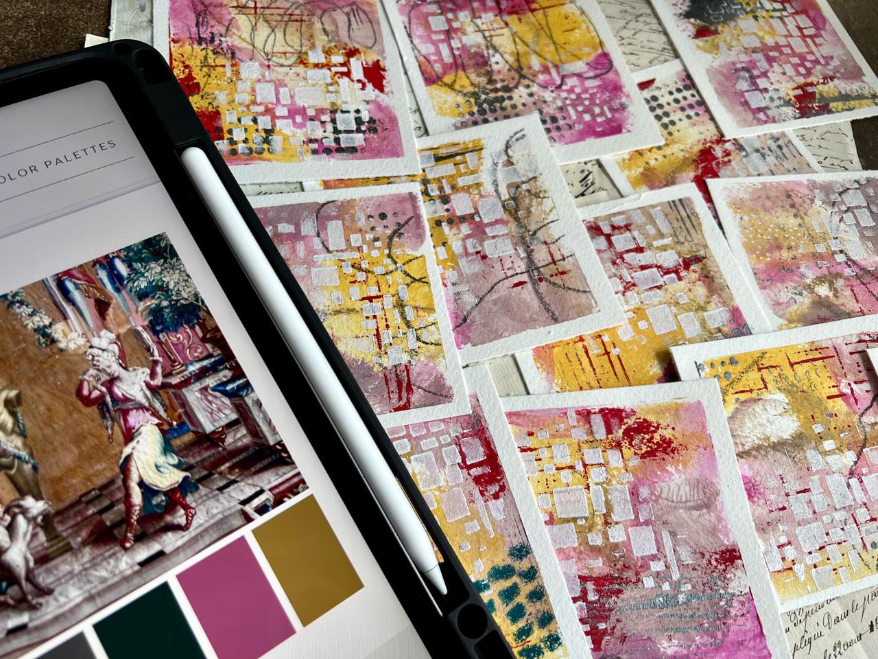
range of options. And I did 18 different
color palettes just to kind of get us started. So this is a document that
you can print and holding your hand or you
can look at it on an iPad or an iPhone like I am. And these are color palettes
where I have picked up the tapestry or the fabric. And then I have just
selected colors out of that piece to be
the color palette. So these are gonna be fun to
experiment and work with, and I hope you enjoy
playing in some of those, but this is where the original
inspiration came from. And I wanted you to get excited about possibly looking
at those are coming up with some of your own
color palettes in here from what I've
given you in the PDF. So I can't wait to get started. So let's get going.
3. Class Project: Your class project is
to Choose a tapestry or fabric from a specific era or
culture that speaks to you. And based on that,
tapestry's colors, curate a unique color palette for your abstract
painting project, you can choose to include
the original colors or adapt them to suit
your artistic vision. Once your abstract
work is complete, take a moment to reflect on how the historical tapestry's colors influenced your
creative process. And definitely come back and
share what you've created. I can't wait to
see what you made
4. Creating Your Own Color Palette: In this video, I'm going
to show you how to use the color palette
template that I've included with your class. So in your Class Dashboard, if you'll come down here to the Projects and Resources page, you'll find some resources
over here to the right. And you'll have to access
this from a computer. You can't generally see this
on the app, I don't believe. And over here you'll
find a couple of files. You'll find a color
palette Template, that PDF of inspiration, this color palette guide here. You'll find the
template that I created for you and you'll find your
mark-making ideas guide. You'll download this template, you'll unzip that file, and then you will find this
document inside the file. This is a PSD file. It's compatible with Photoshop
and Photoshop Elements. And we will use this document just to kinda
show how you can pull colors out of a resource file in your PDF of the ones
that have already made, you'll find under each picture, I've listed what that piece of fabric was called
and I've given you a link to that file and
where I got it from, and I got quite a few off
of Wikimedia Commons. You can also Google vintage
tapestry's fabrics, whatever it is that
you're interested in, you can Google specific
designer names like William Morris or some
other historical name. You could probably find several different
types of books for textiles in addition to the Spectrum Book that
I'm using in class. And this gives you
Downloads and tells you copyright information if it's available to be used in say, something like we're
using it here, or if it needs to be
licensed or what have you. But most of the time
we're looking at this to be inspired
by the colors. So simply looking at the file itself on the computer
would be sufficient. You can look at
this and say, Okay, I want some type of red
that looks like this bill. Maybe a brown, maybe a cream, maybe two shades of blue. We've got some yellow over here, so we have a lot of
colors that we can pick from and use for our source. So you don't have to download
and make these templates. I'm just giving you some ideas and things that you can do. Then what we're gonna do, let's just pull one of our
sources into our document. So I just have several in here. I'm just going to pull one in. And basically all you have to do is just pull it in and
fill up the space. So I have gray
boxes here for you. And you'll want to
notice that there are several layers over here
in the Layers panel. And so I want that photo to
be right on top of that box, right there, that top gray box. And so if I kinda
put it right here, click that layer over here in the layer panel and
create a clipping mask. I can clip that picture right to that gray box that I created. And you don't have to do that. It just makes it pretty
and it makes it where you could print it on
your home printer and maybe have one to
hold in your hand. It just makes it easier. Then I'm gonna
come over here and just select this first box. I'm going to pick my
paint can because I'm going to flood that
box with the color I pick. I'm going to pick
the color boxes down here on the lower left. And I'm gonna come over here and decide where do I want to start? Maybe I want to
start with this red. And then I close that
box and I can put the paint box right on top of
this square and fill it in. So how often is that? So now I'm going to want
to pick the next layer up. And maybe I want to
go with this yellow. It's kinda like a pretty ocher. And you can select
it by the layer. If I select it by
the paintbrush, I would be painting
in each square of the same color and I
don't wanna do that. So Command Z, I could come back up here
and pick the picker, pick the move tool up there, and select the next box. Pick the paint can, and then pick the next color. Just seems like a lot of
extra moving around there. So I just come
right over and pick the layer of the right box
that I'm trying to next. Fill in. Just a couple of different
ways to look at this. And a couple of colors I caught myself kind of picking colors
that were too similar. So like if I pick this color
right here and put that in, is that really enough variation? The color palette? Probably not. And so I will go back
in and re-select to something that is different
enough that I'm like, Oh, okay, That is enough of
a difference for me to kinda keep on looking and Picking and seeing
what else I can get. Maybe I want some
of these greens. And also another thing see this is why you want
to pick the box that you're trying to
color in because otherwise you're going to
fill in the whole frame. So let's pick the next box
up and then we'll pick that last box and you can
Control Z or if you're on a PC, it's Command Z just to backup. If you accidentally do that. And you can pick five
colors if you only see five in this range that
you want to work with. But I think picking six in the long run gives
you more options. And it doesn't really
matter the order of the colors unless
you're looking at it, thinking, I want it to
go from light to dark. You could do that. I do want a range of
colors from light to dark. So like here I wanted a very, very dark spot and I wanted
something fairly light, as light as it could
get in that picture. Because I want there to
be a range of values and addition to a range of colors when I'm picking
out a color palette, This here is the color
palette that I would then file save as a JPEG. And I'd say that as my
color palette number one, for instance, I hope you
enjoy using this template. I've tried to make it easy, as easy as I could for you. It's a 2000 by 2000
pixel file, 300 DPI. So you could easily print it. And it's about a little
more than two-thirds of picture and a little less
than a third of colors, or just trying to make
something easy for you. I hope you enjoy using this and I'll see you back in class.
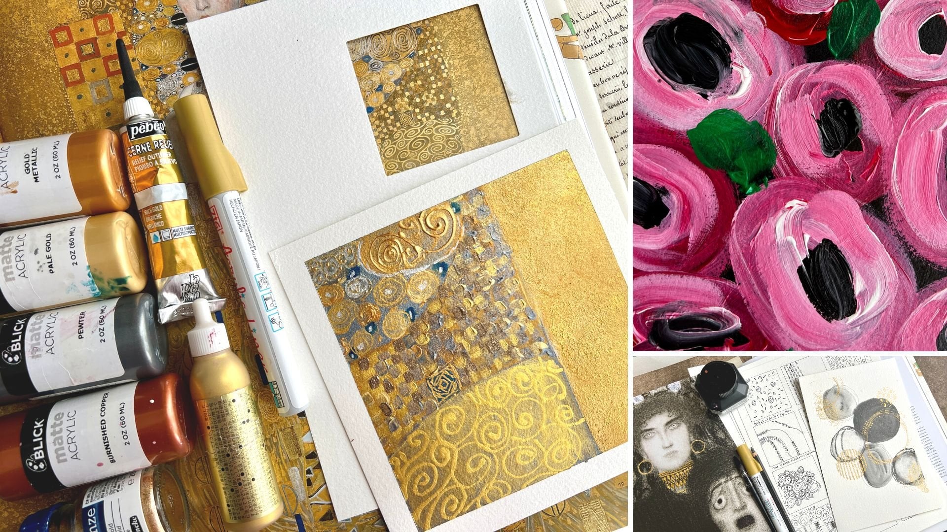
5. Supplies: Let's talk about
Supplies for this class. So this truly is a class
where I want you to try to work with
everything that you have in your Art Supply
arsenal currently. Just to kinda give
yourself some practice with all the Art supplies
that you might already have. And then if you see
something I'm using that your ally who
had a super-duper, cool, then maybe get one or two the supplies
that you see me using. But my goal here
isn't to have you go buy a ton of Art Supplies. My goal here is to get you to play and experiment and learn the tools that you've
already got at your fingertips and how to use those in some
different ways. So these projects that
we're gonna be doing in class are gonna be
truly Mixed Media. They're going to
start off with say, acrylic paint or watercolor. And then we will pile some
other goodies on top of that. And I want you to get
out and be creative with as many different Supplies
on each project that you can and just kinda push
yourself in some new ways. So I will be referencing
this Spectrum Book, heritage patterns and colors by the Victorian Albert Museum, Thomas and themes and Hudson. And the reason why
I'm referencing this book is because
I got it and got so inspired by the concepts that kinda came to me as I
was looking through at the historical patterns and the color palettes that they've pulled out of these patterns. And you certainly
don't have to have this book to do this class. I just wanted you to see where my inspiration came from and what I was thinking as I was flipping through the book
and getting super excited. So I will be referencing a couple of color palettes out of here to do some projects. And then I pulled some vintage tapestries and fabrics for us
together in a PDF. And I pulled the
color palette out of these tapestries and
I'll show you how to create your own
color palette. Square like I have
here where you have the photo and then some
colors pulled out below it. So you'll have a video for
that because I've given you this template
that I created. But these are very easy to make. You could use your own
fabrics that you photograph. You could use your own photos. You could do this
with your own photos. I have some of those that
I've created and printed. You could do antique
tapestries and fabrics that you find in different sources that
you can just kinda Create and look at and make
some palettes for yourself. And you don't have to
separate the colors out. You can certainly just
look at a pattern on, say, a museum site or
something and think, let me just pull some of
these colors together that I'm seeing and use the
color palette that way. I just thought for
class purposes, it would be easy to take a look at some of the
colors that I selected. So this PDF that I created for you is available in your
projects and resources. It's a download for you there. You can print it,
use it on your iPad. I personally like things to
be able to hold in my end. So printing is a nice option. So I'm, I'm using a ton
of things in class. So the staples are obviously
your paper. In class. I'm using this stonehenge
Aqua Coldpress. It's a 12 by 16 inch sheet of paper pad and you
can use any paper. I just happened to have
gotten this because I had some black paper of by this company that I
liked and I thought, oh, let me try the white paper. So it was sitting
beside my desk when I sat down to start
doing projects. And I'm like, okay,
let's use this one. So any paper is fine. The Canson XL paper
is a good one if you want something more on
the less expensive range. The Canson Heritage, the Aqua Coldpress here
by Stonehenge, Arches. Any of the hundred
percent cotton papers are excellent to work on. The reason why I tend to work on nicer papers now is
because he need to practice on whatever paper you consider to be the good paper
because you don't want to be creating things on inexpensive paper and figuring
out how that paperwork. So now everything looks
good on that paper. And then think, I'm ready to
make a nice piece of Art. Let me go get the good paper. And then you go to use it. And it doesn't work the
way you thought you can't accomplish your painting
like you thought you could, because you haven't practice on it and the properties
are different. So whatever paper is
the good paper to you, if you get larger sheets, the larger the sheet, the cheaper it is
really and you can cut that into smaller sheets. I want you to start
practicing or whatever paper it is
that you wanna do. Nice projects on
when you're working. So just thought I'd
mentioned that. And then I'm using
painter's tape in class. You can use painter's
tape or Art tape to tape things down. I love taping things down. And just to give you some ideas of some of the things that will
pull out in class. And I'll try to give you
a complete list with each projects on
your project page. Acrylic paints. You can do student paints like our teaser and Liquitex basics. You can use nicer acrylic paints like charvin and Holbein, anything, golden,
Winsor and Newton. I mean, the choices are, you have 1 million choices. I also like different
things for mark-making. So the Neocolor, two crayons or one of my favorite
go-to sources. Chunky Charcoal and graphite,
another favorite source. I also love oil pastels. I've become obsessed with oil pastels lately
because they add a different texture
and dimension to the piece and they give
it some, some deaths. I love that. Any of your watercolors
or fine to use, I really like these
Curate talky Colors. I'm for creating
things with lately, that's my new obsession. You can use Daniel Smith, you can use Artists colors, you can use student colors. Really, the goal here is
to play in Color Palettes. It's not necessarily to play in all the supplies that
you're sitting on my table. Also like to have just so
when I'm doing Acrylic paint, the gesso makes the paint blend double and different ways, which I really love. And it also makes the paint
really gritty so that you can layer some of these other mark-making
things on top of the paint. And I always have
clear gesso and white gesso by Liquitex available on our table for
when I'm ready to use them. The other thing that I want to talk about is
Finishing your pieces. You know, a lot of times
I don't actually finish my artwork depending
on what's on it. If it's just got like acrylic paints on it and
maybe some Neocolor, two crayons and maybe
some posca pen. So there's things
that aren't going to really ruin or anything
if somebody touches it, I generally will store
those in an Art sleeve. And I'm not going to add
any other finished to it. If it's got a powder to it, like any kind of soft pastel
or one of your chalk, you're kinda surfaces
like soft pastels. I will be using some soft
pastels on a project. These are the sennelier,
they'll have sticks. I love using those. If I use a soft
pastel on a project, I'm going to use the
sennelier Fixative for soft pastels on that, usually at the top,
just a light Spray of one or two coats of that. And that'll make
that powder stay. It's not going to like
adhere it so that you can't smear it probably
you could probably still smear it around
because it's powder. There's nothing you're really going to be able
to do about that. But this will add a
nice thin film on top that then keeps the powder from moving around dramatically. So it is a good way to fix it and keep it in place for you
as you continue to work it. The other thing that I
might use to fix something is this vanilla Oil
Pastel, Pastel Fixative? Because the oil pastels, they never really seem to dry. They stay creamy
and you can smudge, I'm pretty easily this
stuff kind of makes the top of it Create a hard surface
like it's dried and fixed. So I do generally use that
if I'm doing a lot of powder things and
I want something to fix everything to
keep going on top of it, I'll use a workable, fixative. And then if it's a piece that
I'm done and finished with, I might finish it
with a varnish. I prefer Matte varnish is. So you just have to decide
if you want shinier matte, but I kinda prefer Matte varnish is so just depending
on what you can get. And I like them are
archival kind of finishes. And this one, this UV archival actually has some UV qualities in it so that they're
not going to fade with the sunlight and it's Matte, but I don't know that
they make this anymore. So you might have
to get a shiny, but that's only if you
absolutely have to. I personally don't finish
things unless they've got the Pastels on it and then I'll just use a
Fixative so that, that stuff kinda sets up
and doesn't keep shedding. So I hope this gives
you an idea I really wanted because I use so many different
things in each project. I'm going to list each
projects supplies that I used out separately in case you see something
that grabs you. But I just wanted to
give you an idea, look at all of the
things that you have. I might even used Acrylic
Ink in one of the Projects. I forget. I've done several projects
before I got to this, but Acrylic Ink is another
option that's fine. And gold. If you've got gold
ink, gold paste, any of those kind of options, I consider white-black, gold, and silver to be neutral items. So I'll use a color palette and then those are my neutrals. If I want to add
some other contrast or extra element to it, I consider those
four colors neutral. So I hope this
gives you an idea. Look around all your
different supplies. You don't have to pull
every color out in a paint. Maybe some of the colors in your palette or a
paint in some of the colors are a Pastel
or a pencil or Neocolor, two crayon or whatever it is, you have that maybe you can
come closest to a color. I want you to be creative in the things that you pull
out to create today. Alright, so let's get started.
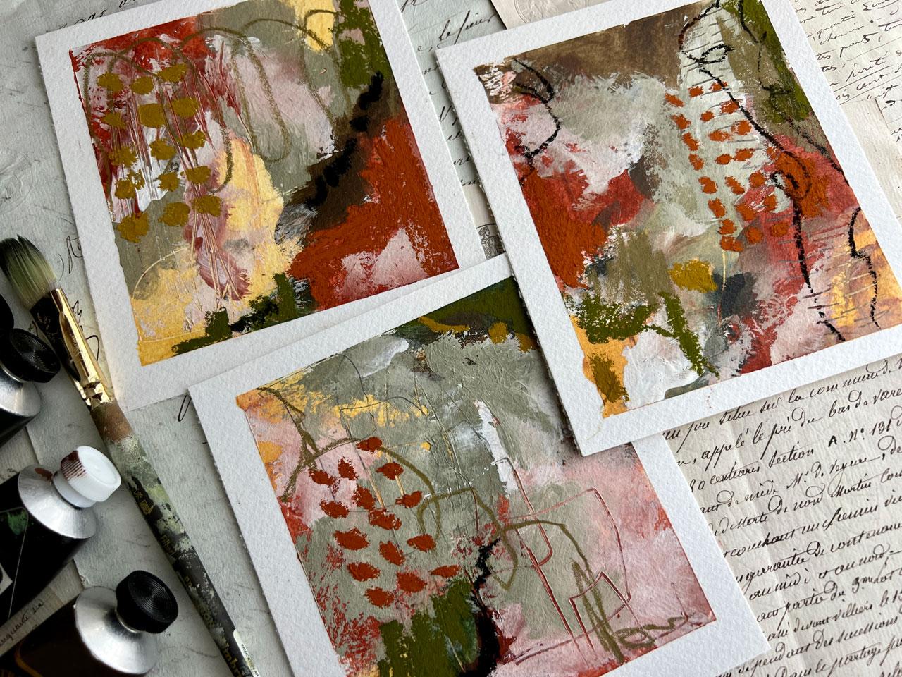
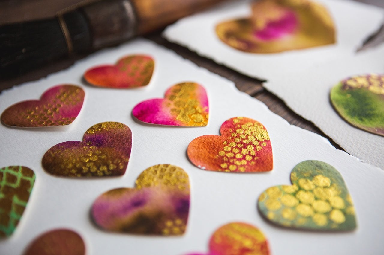
6. Tapestry Inspiration From Kronborg Castle: Alright, I have pulled out
some colors I'm going to use. I have taped down
a piece of 12 by 16 Stonehenge Aqua
cold press paper. To do this project on
as a cotton paper, you can use any paper for
this kind of project. This is something I'm just
recently obsessed with and I thought we'd go ahead and
do this on one of these. I'm taped it down with a one-inch painter's
tape on the edge, half-inch painter's
tape to make my boxes. Because it's 12 by 16. I marked him at 4,444.4. So I've got little squares
and when I peel the tape, I can come apart and have
12 delightful little minis. And here's our inspiration
color palette. I'm using whichever page this isn't here with
the people dancing. It's called a crown
board castle tapestry. This is from about the 1800s. So I think that's pretty cool. And as with all
the color palettes that I tend to experiment with, my goal is usually not
to be exactly exactly. My goal is to just
be close and work within a color palette that
I'd never pulled together. And it's really cool
that this would be a historical kind
of combination. So I'm just mostly getting
as close as I could. If your thing is learning to
mix color and doing color mixing and getting
really deep diving into a project like this. And you want to take
it to the next level, then definitely, you know, print these out and use them
as a guide for mixing colors and doing some further
work in your study, my goal is to create
fun the pilots play, see where I get with that
combination and see if it's something that I might
want to use later in my work. I have pulled out
a mix of supplies. I'm a mixed media fans, so I like to do lots
of different things. So I've pulled out a lot of
these Liquitex basics because they have a lot of colors that I can pick from
without having to mix. And this one is not bulk. Naphtha Carmen,
Carmen. So it's a red. And then this color here
is a very light lavender. And so I've pulled out sharpen ash violet because
magically that looks like about that color
and I happened to have it pull whatever you've
got to work for them. You don't have to have the same paints that
I'm working with. Definitely. I would prefer you use
whatever you've got on hand to pull your colors from and
just experiment and play. I've also taken this dark
gray in this color palette. And I have pulled up cuter, so it's a slight metallic, which is kinda fun. So that's the Blick Matte
Acrylic in the Peter. Again, pull from
whatever you've got. This is Liquitex basics green,
green, deep, permanent. And then I've got magenta, medium magenta,
Naples, yellow hue. For this yellow, I've
also kinda pulled out my underwent extra-large
charcoals because I liked the yellow in
here as part of that yellow maybe is something that
I could use to mark make. Also pulled Neil color twos. I pulled malachite green. And this one is sepia because it kinda fit
within I thought it was gray, but I pulled CPO. Well, that's close enough. I'm going to leave that
kinda sitting to the side. Also like doing stencil work
on top of these lately, just my own personal thing that I'm kind of obsessed with. So a lot of times I
will paint on here and then come back with
little stencils on top. And it just kinda
moves the abstract to the next level sometimes and you can make
your own stencils. I've got my own class here on Skillshare for
making your own stencils. So don't feel like
you have to buy any. They're very easy to make. And I'll put out some of
our colors and we're going to just start playing. It's not about worrying about
getting anything exact. I'm not trying to create any kind of little
masterpiece here, although when I'm done with
these, usually it's magic. You cannot do come out like little masterpieces.
It's amazing. And I use this for ideas and
composition ideas later, all kinds of neat stuff. These little color
palettes have, like this one had
six colors on it. But if you want to pick, say, five colors out of that
grouping and leave a color out. You certainly could do that if that's how you want to set
up your own challenge. I consider these
like art challenges. I like to deep dive into an idea and challenge
myself to see like, what can I come up
with if I'm using these colors and I'm
doing this format, you know, what can we get? And then always consider white, black, gold, and silver
to be neutral colors. So I do, this is clear gesso. I do reserve the right to use white-black, gold, and silver. So I like to just so out here because I like to mix the Jess. So in my paints because acrylic
paints kind of plasticky. And I like the gesso to mix
with the acrylic paint. It makes it makes
easier and it makes it gritty so I can
draw stuff on top. And to get started with this, if you're looking at
this kind of blank page, you're like, Oh, where
do I even get started? Um, you know, pick
something like a pencil or a chalky thing like I've
picked out or a pastel, looks like I got
Gesso on that paper. It doesn't matter. I'm not
worried about any drips or anything that I've done at
this point. I'm just playing. And then with this I actually sometimes we'll take
a paintbrush and start kinda wedding these and seeing like what can I can
read if I move this around? So that's kinda fun just to see like where we
can get started. And now we have gotten
rid of our white page. So it's already messed up. We don't have to get
stuck with creating. I like to dive right in by
doing something like that. So probably going to
use my Princeton, Umbria filbert, this a
five ancient filbert to just start laying down
color and experimenting. Just see where we can get. So now you might look at
these colors and think, okay, what do I want the
dominant color to be? Like? What is my goal here? And I might not
have a goal really, but I'm kinda dig
in this ash violet with that yummy Ochre. We'll call that ochre because that's what that looks like. And sometimes too, I'll treat this piece like one great
big giant painting. And then I just kinda
pretend the tapes not there. And then when we're done, you'll be amazed when
we pull that tape, what it ends up like super fond. Just relax. Play some music. Start moving this paint
around and just seeing like, what, what are we
going to end up with? C Now that right there already, just want to leave
it right there. Oh, my goodness. I don't
want to go any further. Let's get the yellow because
we know we liked the yellow. Because what if you take the
colors that you like the best and you make those
the most dominant. And then if there's a color
in here that you're like, Whoa, kinda hate that color. Let it be like a little touch. Just a little dip your toe in. Just so it's there. You can say you used it. But it doesn't necessarily
have to be like the most dominant color
that you see in your piece. That's super fun
because you can take this experience and work this into how you work
with your pieces. Let me put some more paint atoms will keep on painting here. Another way you could do this is because we have 12 pieces here. You could take whatever your least favorite is and say, okay, let me throw this in on this one that I don t think I love
and just see what I get. And instead of doing 12
with all that color on it, you can do one of that color
and decide if you like it. Just so just really let
you mix that color around. It makes the paint
pan of gritty, makes it a little more matte. I love declared just
so when I'm working on these thinker might do is pick one of these colors
and pick a palette knife. And maybe palette knife, one of the colors
on here maybe read. I could work with something like that instead
of a paintbrush. Don't be scared to get out
some different materials and start kinda putting those paints on with something other
than a paintbrush. Tell you right now,
you can almost figure out what's my not favorite
color of this palette. And I love gray
because, you know, I'm all about graphite from old graphite ones that
classes I've done. So what color do you think
I'm avoiding here on this color palette? But green Get to creating and you're like, Oh, I just can't
stomach that color. Tried on at least
one of your squares. Before you give up on it, you have to try at least once. And then you can say, Okay, I tried it and now I know I didn't like it.
But you tried it. It's kinda like
try everything on your plate once before you give up on eating that broccoli or whatever
it is that you don't love. And at this point to, I could start doing some
stencil work in here. I don't have to do
them all the same. What if I wanted
something like this? This is the crafters were the crafters
workshop, I believe. Yeah. The crafters workshop.com. And this is stencil. Let me get my magnifying
glass. Oh, my goodness. This is T CW 456fs, as in Sam. I think it's sketch lines
might be what this is called. But what if, let's take
some of this red and we do some red sketch lines
instead of root there. Oh my goodness. Okay. Hahaha. Totally, totally made everything
exactly like I wanted. So I should have started with the instill a little sooner. Oh, my goodness. That totally just made
my day right there. So I'm just going
to work this into a few we don't have to
have them all the same. I do like them being like
similar because then, you know, when you've got similar things, they've got cohesive like that. You've made a
collection like they kind of fit together.
We're pulling it together. What color definitely. But we could also
pull it together with marks and different
decisions that we've made. Oh, I love this little red. Yeah. And if you can't
find the particular stencils that I'm using because, you know, these I may
have had this for awhile. They might not
still be out there. Look around and see what
stencils look good for you. I like everything that
looks a little bit grungy. Sketchy. Line marks aren't perfect. I like it to look worn. Dude. This is okay, let's
put the red up. Alright, also like I'm
still avoiding that green. What can we do with the green? Gotta use it once. One of my favorite thing is this Tim Holtz,
half-tones circles. Alright, let's do the
half-tones circles. Let's try green one. Which one do we not like? I like them all he okay,
let's try this one. This one. This one is less. A little bit less. Okay. That's okay. We'll say I tried it. I avoided green for a reason. What if okay, let's, let's, let's push this. I'm just going to push
that gray right into here. And let's use some of
these half-tones, circles. Super fun. Oh my gosh. Really in
that color palette, our inspiration piece, I don't even know where that
green came out of there. It might've came out of like
the undertone of the skirt. I don't feel by leaving it out that I have strayed too far from this color pallet of this
tapestry, some steel, actually. Very happy that I'm
staying true to the colors that I've
got going on here. I think the gray probably comes out of the background too. So you could look at
these pieces and think, Okay, what's the
most dominant color? Let me use that the most. What's the least dominant color? And let me use that
as the accents. That's another way that you can look at some of doing this. Look that either so
Fun Home, My gosh. Oh me, So good, so good, so good. We could do little circles and half-tones and
other colors too. You don't have to pick
just the one color. But man, I'm loving it. I'm getting a little ghosting underneath too.
That's pretty fun. What if we just turned
it over and tapped it? Okay. Just a grungy kind of look. There might not
have enough paint on there to really
pull that out, but it did look a little grungy. They're tiny bit in the corners. All right. Love, loving that, loving that We can also come back in here with our Neil
color to crayons. Put that sponge in the water. You put this paint brush in the water. You know
what we could do? I'm sitting here thinking
a little bit out loud. We could take like an old
credit card or an old card and dip that in some paint
and come back in here with some lines. Oh yes, he looked
that super fun. Could do that with
a catalyst wedge to that might be a good
choice to do this with two. And if you don't want
to use any stencils, you certainly don't have to, but definitely making stencils. Making stencils, it's super fun. I use UP paper for that and basically draw my
pattern on the PO paper. And I've got a map that
I can cut things on. And he's my little
exact dough knife and I just cut the
pattern out that I drew on paper. And then I've got a
stencil that I can use over and over
and over again. So we could also take this
and use it like we did our palette knife and kinda
drag a color onto our piece. That could be fun. Just kinda thinking of
some different ideas with you here. Alright. Super fun. Okay, so we could
do some drawing. I could do some. What I want to do. Let's
think about this. So I could do some just
random little scribbling. If your marks and your lines are too perfect and you're like, Oh, I wanted to be a
little more organic. You could do that with
your non-dominant hand. Look at that. Oh, I like the little circles. Let's see. Let's do that right here. See, I could kinda go from
one to the other. We don't even have to have
those on all the same one. We can just have it
when we peel that tape, it's two pieces that kinda
were buy-side each other. So I like doing that. I like things that
kinda come out of you don't know where
they started and ended. Kind of allows your eyes to move off that and imagine
what the rest is. Keeps as it keeps going. Like What would that have
been if you had kept going, it gives your mind
that impression, that thing keeps going. It gives a distance
and alright, again, no, I don't know about this, but actually I do like
it better as this crayon than I did as the
bright green paint. So because I pulled it out, I did use it once. I actually didn't mind
that. Let's go over here. And you can use anything you can do mixed media like this. You can use watercolors, you can use soft pastels.
Okay, I didn't like that. Let's put that pencil back up. What if we do some
stencils on top and white? Because again, white,
keep white and reserve. Why does also a nice way to push some of the color
back if you're like, whew, I got way too
much going on and I need to push some of that
back. How can I do it? Something white on top, preferably dry because
I just made it pink. Again, it gives your background a little more dominance because the background was
white and you're pushing some of that back. I like that. He liked it. When I'm using a stencil, I'm not going edge to edge. I'm being kind of organic
around this tensile, but I'm not trying to get
edge to edge on the stencil, just my own preference
and the way to use it, but I feel it looks a bit more organic and it kind of
looks less perfect. My goal for abstract is usually the imperfections or
what's so exciting. So I don't want
it super perfect. Got some layers go in here. These are probably some of the craziest types of
little paintings that I do. The sum, when you peel
them, they're amazing. And what can you do with these? People were like, What
do you do with these? You can make these
into gift tags. You can make them
into micro pieces of art that you can frame up and make very
exciting framed. You can use them as color swatches for
future pieces of art. I use them also for ideas, for compositions,
for larger pieces. I've got green paint on my
hands where that come from. All right, so let's just
see what we even have here. Do we want to do
anything else to it? Is it dry? Does it need
any sparkle on top? Did you want to add some gold? If you want to do
some gold on top, here is the time to do that. We could also do posca. If we need some posca pen, if you feel like you
need more pattern than you already got going on. But I feel pretty
patterned up here. I could do some over here though So mark-making, just
pull out all the stops. Experiment play. Don't even hold yourself back. Just be like Okay, I'm going for it. Alright, let me hold this
hand up a little bit. All right. Let me let me just get
my paint stick out here. I want to put my hand so this is my paint stick through
Micah stir stick to stir. A five-gallon bucket of paint. But I like to use it as
a hand rest when I'm getting out here and they're
still wet paint going on. Because now I can
secure my hand and I actually do exactly what
I wanted to create, like dots or something.
I can do that. Like that. Oh, I do like the
dots on that one. Do I need dots anywhere else? These other ones
are kind of busy. I feel like that one
was like a one-off. So yeah, I keep all the stuff that I make but you
could sell these. You can make little
less peel tape and see what we even got. Peeling tape reveals what
you've got when you're done. Now if your tape is
tearing your paper, then use your heat craft gun and see how that peeled
off really easy. And there's no paper
on my tape here. So use that will heat gun if
you're tearing your paper. So I'm going to peel these. Alright, got all the
tape off, the heat gun, just let that adhesive release. And this is my
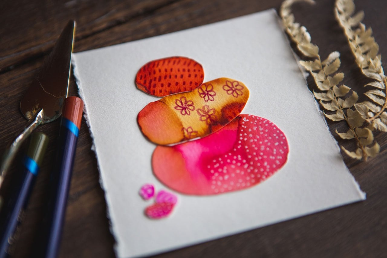
whiskers paper cutter. Then I'm going to cut these into little squares and then I can kinda look at
it and evaluate, what do I have? What do I love? What do I want to take
forward in my art practice? You can just kinda, I like companies where they have that little bit of a white edge. These are so delightful what a super fond color palette that this created
like for reals. Look at this. We've now
peeled these apart. They've been magically turned into amazing little
compositions. Look how good these look. Holy cow. Like these two right here. Total gorgeous set. Love it. And peel and tape and cutting
it is definitely magic. Like for real, for real. And then you can
kinda turn and seek. Do you see I like it
that way right there. These are amazing. I was doubting it
there for a bit. Now, I didn't doubt
this quite as much as some of the other ones
I've done like this, but this color palette, that green in there, I don't know where I
pulled that out of there. But for this, I'm glad I didn't make it a
dominant element, so I'm glad I took the
other five colors. Look at these. Oh my gosh, these are amazing. Alright, let's check
out what we got. These are definitely
something I would take forward for compositions. And I can turn them
around and look at that. I like this little set of lines coming in from
the side on that one. I like it coming in that way. Which one do we have? I like it this way. I like these little lines
that we did over here. Oh, I love see how this kinda comes in and
makes you wonder like, what is out here,
what did the rest do? Give your mind and your
eyes something to look at, contemplate and
think about these. Look how good these
are. Oh my gosh. Look at these super
fun color palette. This is what working in color palettes outside
of your comfort zone. I really liked this one a lot. I almost like it because
of the simplicity of it. Let's go this way. Because it a little
simpler almost then, or maybe it's less
vivid or bold. I don't know. I love this one. I like that these are
coming in and they're just doing some fun stuff. So I like working
with things that are way outside of
my comfort zone. I never would've
pulled I definitely would have pulled
ocher and pink. Those are colors I like. But what I have paired
that with dark gray, kind of a light lavender
and this red, Probably not. I would have kind
of gone with these and maybe the gray
like graphite, but I never would've pulled these pups have other colors in. But look with the
pops of other colors. Do I mean that pop of
red in there totally gave it some interesting
contrasts that it probably would've been
lacking Superfund. How did we do next to our color
palette inspiration here, I think we did pretty good. So I'm looking forward to seeing what you do with
that color palette. And I'll see you in
the next project.
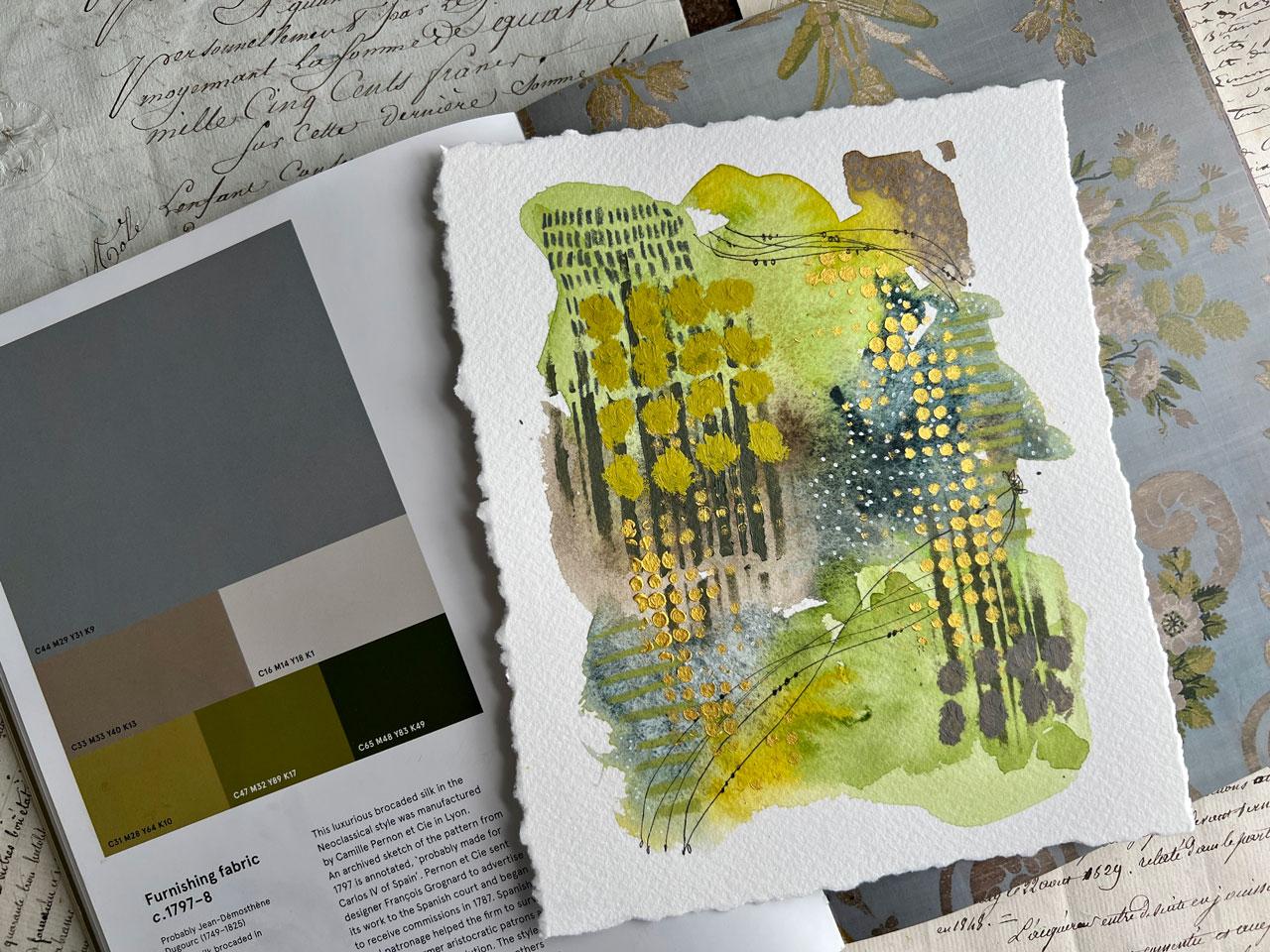
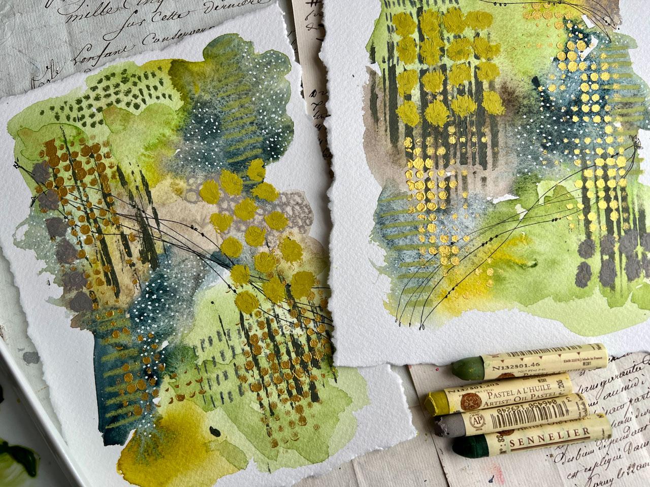
7. 1797 Blue/Green Palette Picking Colors: In this project, I'm going to be working out of this
spectrum heritage book. I thought I would do
this green, bluish, grayish palette that looks so delicious and
I really love it. And so along with some other things that I do
Palette Inspiration From, my goal is to get as close as I can and work within
this color palette. But I don't just limit myself
to being exactly, exactly. And if you're wanting to
just be right on the money, definitely use this as a moment to experiment with
color mixing and stuff. But my goal is to get close to a color palette work within a range that I might not
normally have thought of. And to see what can
I create that day, then I usually
consider white-black, gold, and silver
neutrals that I can then add into any piece
that I'm creating. But I'm gonna try to
stay fairly close to this color palette and maybe consider white and
black will see. And I might do mark-making
in white or black pen, that's always fine option. So what I've done is pulled out my color sample swatch book. And he loved these books. This is the painters Diary,
painters Color Diary. And what I do is I mark what I have swatch down in this book
and I'll swatch them out. And what I like about it
is in-between each page, is this like a wax
paper separators so you don't get anything on
the back of your other page. And I love these. And so what I've done is just looked here, I'm gonna be working in Daniel
Smith watercolors today. I thought I would just
do different types of abstracts that I enjoy
doing for these projects. And I've kinda matched up my colors to Serpentine Genuine, which is this color
and I think that kinda matches this color
over here on the end. Sorry, Serpentine, Genuine, the middle color is
what this one matches. Then I've pulled
Rich Green Gold, which is very similar
to this color here. And then I've also
pulled Sap Green, which is my third Green
here in this palette. And then I have pulled
Blue Apatite Genuine, which is this color
and the lightest in that shade is very similar
to this grayish blue. And I thought I could add in possibly a little bit of Buff Titanium to get
it right over there. And the Buff Titanium could
maybe be this lighter shade. And I pulled Sepia
and Buff Titanium to maybe make this kind
of medium taupe color. So that's the colors that I have put out on
my palette today. And I've put them in that order. I've got the Sap green
and then the serpentine green and the Rich Green Gold and that Blue Apatite Genuine. And the Sepia, the Sepia
and the Buff tightened. So that's the colors
I'm working in. I also pulled out
because I like them. Some oil pastels to just
mark-making on top. Maybe. I've also going to possibly
be using white or black pen. So I've got posca pen, I've got like a Kings Art pen or you could use like
a pigma Micron pen. I've got a couple of
black Pens I might use. And then we'll just, we're just kinda paint
intuitively and just see what we can come up
with as we're going. But in these Sennelier, I have pulled out
several colors that just kinda matched what
I had going on there. So I've gotten number 15 because I don't see
a name on these. Have gotten number 46,
number 206, and number 88. So that's the four
I've pulled out that kinda fits within
my color palette. And I'm working in
smooth this to the side. I'm gonna be working on a
large piece of 12 by 16 paper. So I've already just
taped it down and then cut it in
half with my tape. And this is the stonehenge
Aqua Coldpress paper that I'm using here. Because I had it near
my table and I thought, Yeah, let's use that. So let's 12 by 16. So that would be like
eight by 12 bias. 88 by 12 would be
the final size. But I'm probably going
to work in the middle. And I'm a cut these
down at the end. So let's take one last look at our color palette
and then we'll jump in and just see what
we can create here. So I'm going to set
the book to the side. And then we'll pull that back
out and see how we're doing I've got a number for
Princeton Neptune. So I'm gonna get started just by laying down some
of these colors. And I'm working on
all cotton paper. What I like about
the cotton papers is the water seems to
not immediately like soak in as fast like it almost repelled that first bit of color that I was
putting on there. So I added more water and then gives you a little
bit longer dry time. And it works completely different than regular
wood pulp paper. So I'm just going to go in with each color
here to get started. Not really thinking
about anything. Look at that. Those two colors almost
look the same, don't they? Well, that was very
interesting observation there. That there was not a big difference in the two
greens that I picked out. I mean, there's a little
tiny bit different. So we may see a variation in granulation because I already see that granulating a little. That wasn't quite
what I thought. I thought I'd really get a
bigger difference there. I love making these
discoveries as we're painting. I'm just things you
didn't expect and you're like things that make you go. So I'm just painting
kind of intuitively what feels good where
I want to put these. And then we'll just
see where we end up. Alright, moving over
here to the blue, I'm kinda a little offscreen. Let me just move these
over so you can see me dip it into this
pretty bluish color. I love that one. That one. Kinda save the day
there, didn't it? I liked that. I'm just putting
it in some areas that might blend in with the colors by it and it could take on some
of those properties. So that's very funny
and interesting. Watercolor is very
transparent or, you know, if you use it really thick, it can be a lot more solid
and give you pretty contrast. I love that about it. And I tend to use it
a little thicker. Alright, so I'm mixing
these Sepia and the Buff Titanium over here
to get a lighter shade. Let's just see
what we get there. See this is definitely work your way outside my comfort zone here
with these colors. This is not quite
in my mind what I was thinking. What about you? I totally like went Whoa, as I'm doing this, like, I don't know. That completely. It looks different in
that picture because I'm using it in
different quantities. But how interesting
what colors do? Like, I mean, like while. Let's just come back in here
and dip some of this blue. I'm using it in a very heavy, darker scenario than our
original inspiration piece, but that's okay. The goal here is to step
outside my comfort zone, work with color
palettes that I never would have pulled otherwise. And just see what can I get. And then at the end we'll
see how good we did work in with historical palette. Just how close or how
far away did we stray? Super fond though.
These are crazy. And this Rich Green Gold, that one just pops off, like I didn't even expect there. That was kinda
crazy, wouldn't it? I'm just now lay in some
other back in here just to see and just kinda give me some texture and
some variations here. I like it when I
can see variations. And some different little interesting areas
and the watercolor, because then you've got
places to mark-making. You've got some different areas that are light will do and
some different things. I love that. So if we compare this right now, it's our Inspiration Palette. I know the book is a
little bit dollar than the paint with Paints not dry. But how interesting is that I think we've got
good color going in there in different ratios than what we had
an original piece. But still pretty darn cool. So I'm actually
kinda loving this. I'm going to let this
paint kinda dry. But before we do that, now is the time to go
back and lay in texture so I could come back with
some water and where the any, anywhere where the
paint is damp. You can then kinda
repel and make blooms in the watercolor so you can make some
good texture that way. Once it's dry,
you're kinda gonna just make a splotch with a circle around
it because you're reactivating watercolor that
was basically already dry. But we can come back in here and get it to do pretty blooms if I catch it while it's
still damp, not too wet, still kinda shiny and damp like you can
still see it's not completely dry then that water will do some
pretty spreads. We could do some
mark-making in watercolor. I can let this dry
and come back on top with some extra
marks and watercolor. Or I could do true Mixed Media, which is what I enjoy doing
and do other things on top. So think I'm going to let this dry and we'll be right back.
8. 1797 Blue/Green Palette Adding Marks: Alright, I've let this completely
dry and now we need to decide what do we want to mark
make on top of this width? And I think I'm going to
mark make on top with different paints and maybe
maybe some stencils have gotten where lately I
love using stencils because it's a way to really quickly add some of
your favorite marks. And if you want to make some of your own stencils,
you can do that. I've got a class on making
stencils here on Skillshare. You can also use
purchased insoles. It's just your preference there. But I'm kinda feeling like
we need some movement. We need some pattern. So I want to pull out some of my favorite patterns that
I like to use in my mind. And just to give you an idea, there is another
class on Skillshare where we do a pattern
page like this. And it hangs up on
my wall behind me. If you don't know what patterns and doodles and things that you like to add to
your mixed media work. Start collecting some
ideas and stuff. And I will put this
pattern guide for us under your projects and
resources so you can grab a copy of my pattern
guide that I like. And these are just
patterns I drew on a piece of paper
and then cut out of a pretty stamp with
a pretty stamp and stuck them to this
paper so I can add to it, I can make some more pages. I can just have some fun, but it just gives us
some ideas of what might we continue to
add to our piece. I like dots, I like vines. I like lines with
little pearls on them. I like little hash marks. So I like a lot of
different things. And that just kinda is
a little guide that you could look up and
get some ideas, some I said this over
here to the side. And maybe I'll start with, actually maybe we'll start
with some color on top. Perhaps. I really liked some of these
crafters workshop stencils. This one's corrugated cardboard. This one's Cubist. I like this one. I think
this one is sketch lines. And then Tim Holtz, this one is half-tones circles, this one of my favorites. So I might grab some
acrylic paints. I've got quite a few over here in my drawer beside us
that I'm sitting beside. And I'm almost wondering what I want some
white on top of this, or do we want this
to be in a color? Or would we want to be gold? So many choices? So, you know what
I might do as I'm, I'm just brainstorming
with you right now. Here's all the
different things that you could possibly
think of doing. That's my goal here, is doing some brainstorming. We could also do, should have pulled these out. Can also do some neo
color to crayons. Try not to get anything
on my painting. I'm terrible about that. So we could pick out
some colors of neo to color crayons also, that's one of my
favorite things to do. So who do? We got so many choices. So let's pull a few of
these out that are in a similar color palette as
what we've already pulled out. So I'm thinking this one, it's kind of a
bluey gray though, so maybe that one. And we've got these
yummy greens. And we could pull our book
up here to get real close, even closer, but that's okay. We're getting we're
getting pretty close. I want like that sap green. Let's use that one. So now I've pulled
out light olive. This one is dark gray. This one's beige. So I've kinda pulled
some of these out. These are fun because they're water-soluble so you could
mix it with water on top. And I gotta be real careful. I'm real bad about getting something on my paper
that I didn't intend. Let's see what is this. Let me get a little.
There we go. Make sure terrible
about doing that. So I like these little
neo color to crayons because now I can come and draw like that. Alright, so we're
gonna, There we go. We've jumped right in. I'm making almost like a
ladder of lines there in a contrasting color than
what I've put down. Oh, yeah. There we go. Got it started. And then I could come back in. Maybe we got some circles. And some of these are gonna be so subtle that you're going to not even see it til you get up close and then you'll be like, oh, look at that
cool detail that I didn't even notice till I
got really close and looked. And some of them you
could do on a contrast the colors so that they
definitely show up right away. Your choice there. I just like having some
surprises as you get close and some pops
as you're far away And when you lay the color,
if you're thinking, oh, I don't know about this
as a hot mess, man. I think that every single time, if it's not good enough or you don't like
it and it's not there yet. Add more layers. It's all about the layers
with something like this. Let's do this dark gray. Let's see. Maybe we could have done
this in like graphite to, but I couldn't do maybe just some fine lines,
little hash marks. These are lines that I usually
like to do with pencils. So that's another choice. You could do these with pencil, which now that I've thought
of that I might still get a pencil out because
it's a pretty gray. The line is a little finer
than using a pastel. The layers on these abstracts that give it the
interests though. If it's not good enough yet, maybe you don't have
enough layers yet. Keep on, pile on
the layers on and adding colors that you like
and colors that you're like. Oh, I didn't even expect that. Another way you can think
of these colors too. I just started at one end
and went down the line. But let's say the blue
is your favorite color, like your favorite color, the most dominant color
in this scenario. So blue is your favorite
color in this palette. Start with the blue and
make it more dominant. I just kind of started with one direction and went with it. But what I should've done is
picked my favorite color. Let's do some posca dots. I should have just
picked my favorite color and started with that. Again, just throwing some
ideas out there for you. Things to consider
as you're going. Little white dots
are just magical. I do a little white dots
through kind of magical. I also like pretty black lines. That pin is not the one
I wanted. Let's see. Maybe this one. And I
like intertwining lines. So that's kinda fun. Something like that. And you can kinda tie
a ribbon at one end to make it have a good reason
to have a little start. Put like a little loop
on the other end maybe. And then I can do
a little pearls or I could do little leaves and make
it pretty little vines. The hat. That is so pretty. Let's do that over here. Wish I had not looped that one, but that's all right. All right. Those are pretty now we could do unlike some stencil work, maybe some of these
yummy lines here. And I'm almost feeling like maybe I want these in a color. And I've got some
random fusion paints. They're just these little
mineral furniture paints. But I'm almost thinking
like something like this dark color would be a pretty contrast
with this dark color. And you can pick
whatever kind of paint that you want when
you're doing these. I just happen to have
a bunch of these. So use what you have on hand. Don't go get a lot of paint to do different
projects with, unless you're just absolutely gaga over some of the stuff. I want you to kinda pull colors that you already
have on hand and different materials so that
you can layer and see, you know, what am I
going to get if I use this on top of
this or what have you, Let's take a look for. That's what I wanted. This is a stencil girl products didn't sell actually S two to seven. And it's called
corrugated cardboard. So you could use cardboard
to which I thought of that. Aussie, that looks fantastic. Now that I thought about
it, that I do have some corrugated cardboard right here We could brush this right on it and see what that looks like. I'll see now, more paint isn't
definitely needed there. Oh, very interesting. So definitely more paint. A little bit different
than the stencil, but I want to give
you some options. But I want to give you
some options here. I want you to be able to grab some things that maybe
you could just have on hand. Super fun. Okay, so corrugated
cardboard, I like it. And then the little sponge I'm using is just an artist sponge. And there is just a
little round sponge that I've cut it into quarters. And I just thought water
until I'm ready to wash it off and then I just keep
reusing those same sponges. Okay. So I really like that. I also feel like these could
do with a touch of goals. So I feel gold and our future. And I want to do
that in the circles. So Let's just do it. Let's just do, let me get. So I'm going to use
my favorite gold, Micah paste this as the
cure talk ego. Micah pace. Sometimes it's easy to get and sometimes it's hard
to get depending on how many people have watched
a class and then want it. But you can use any
kind of gold paint. I've got lots of different
gold paint options, including just like some
metallic acrylic paints. So your choice there? I like this particular one personally because it's
such a pretty shine. Another gold paint that
has an extreme amount of shine is the Jaccard
Kenyatta alcohol ink, gold. So that's a good option too, if you happen to
have some of that. So let me just grab
a sponge and I like to kind of rub the stencil, but you can dab the since the paint did this
tensile, your choice there. And I use a sponge dry and it works better
with thicker paint, not the real thin ink. Just some just some
observations that I have discovered as I have done quite a bit of
stints willing this year, I never use the pencils before. And I was using them in some other videos that I was doing just to save
some time basically. And then all of a
sudden, you know, in these pencils I've
had for years and years, all sudden, I'm like super obsessed with stencils because
it does speed stuff up. And all of a sudden
I can get like 1 million things more
done a lot faster. And I love that. So I've made some of my
own stencils and I buy stencils and sometimes I use
them and sometimes I don't, but I do like the versatility and when
I'm using a stencil, I'm not using the whole
square part of the stencil. I'm kind of using bits
and pieces of it, so it's a lot more organic in the feel of what you create. More natural. I like these are getting
better and better. And then let's pop this off with some pastels.
What do we think? I'm kinda feeling like? I really like this
green gold color. And I feel like I could
use some type of yes. And you know, these ones, they are very creamy. It's like drawing basically
with some lipstick. The only thing about oil pastels is they never really
seem to like dry. So a lot of the pieces
I don't finish. I kinda, you know, put it
in a plastic sleeve like this and I'd let it live in
the sleeve until I framed it. But if I'm using an oil pastel
or something like that, I would use this Emilia
oil pastel fixative on it because it then has some additive in there
that hardens that pastel up so that it's more permanent.
Look at that though. I'm loving this mark on top. I like the texture
that you get with oil pastels because it's
very three-dimensional. I like the color. I liked the feel, I just like the extra
element on top. Just my preference there. That's super fun. I liked that a lot. When you come back with
some more for thinking, what else could we do? Maybe some down here. Maybe I don't like that as much. But we'll just go with it. Or maybe I do. Sometimes I'll come back and look at
something and think, oh, I love that way more
than I thought I did. Just a way to get another layer in there to add that interests. What do you like that
a lot right there. That was nice. Yeah. I think out so for this one
right here is my favorite. He usually and this
is why I like doing more than one at a
time because one is usually my very favorite
and one is usually Mike. This one is definitely
a favorite. And almost feel
like because I have this black line down here and now I'm going to be
drawing over pastel, so it might not work as good, but I'm almost feeling like I kind of needed
some more of that up here to balance it. Whereas this one went
through the whole piece. This one's looking
for some balance. So let me put some little
pearls on that one. And then we'll take
a look at these and think, how did we do? There we go. Look
how pretty that is. And if I'm shining it in
the light a little bit, if I'm shining a
light a little bit, you can kinda see how that
gold pops off of there. It gives me that
little bit in there. I love that
9. 1797 Blue Green Palette Finishing: So now what I'm gonna
do is peel the tape, then this cotton paper is kinda soft and I don't want
to tear the page. I'm going to cut these in half. But if you start
peeling tape and you notice any paper coming
off on your tape, gets your craft gun and peel
the tape. What to craft gun. Look at this gorgeous. Okay. Let me cut this in half and then we'll
pull our book blackout and just see how
did we do working with our inspiration
color palette. And I do emphasize inspiration. It wasn't inspiration,
it wasn't. Let's make it exact. But if you want your project to be exact and I'm just kinda measuring over to halfway
across the paper here to see, actually think this has got
a ruler that comes out. I guess I could do that. Let me get the paint out of the way because I'm
going to get paint all over a piece that
I didn't intend to because I actually love
these now that they're done. I mean, I loved level. Amazing how that happens. There we go. All right. So this was 16 by 12, so I'm gonna go ahead and
catch that directly in half. This is my fiskars paper cutter. I really love it. And I can see that I can cut a little bit off the
top or the bottom or, or check this out. We could do Deckle Edge on this. And I, you can even do
it with a plane ruler. But my very favorite way
to do it is with this, with this dual Edge
Ripper. So Ripper ruler. And so you might do
this on say like your least favorite first and then do it on your favorite. And I would probably go
ahead and Spray your piece with this newly eight he's in and let that
dry for a few days. Let's do it on this one first. And let me get a
piece of wax paper. Because I'm going to
tear it upside down and the wax paper will protect anything I'm leaning
on from that, it getting on there. So what am I do? It's kinda measure up. I want to tear it
from the back side. And so I might just measure
up how far do I want to be? Maybe an inch and a half? Yes. So let's do this first Edge
at her inch and-a-half. So we can mark it on the back just so that we kinda know
where we're at there. And then the Ripper or has
a straight corner on here. I can line it up with that
right there if I wanted to. Then you just tear the paper
up and towards the ruler. And the reason why
I'm doing it from the backside is because this will have an edge on it on one side that you
tear it up towards. But if you flip it over, it's got a smooth torn edge
without that lip on it, which is kinda what I love. So that's what I'm going for. Okay, so let's see
if I flip this over. You know, I've got a
good half inch there. So if I want that
half inch there, I need to tear this at say just a quarter of an
inch over on this side. So eyeball that will
get about right there. Then had to be exactly, exactly. But I do want it close and
I need enough to grip. So half inch Here's can still have enough
paper there to grip. It's less than that. You're gonna be really
hard tearing these papers. Actually, I've got the
wrong edge on this side. There's two edges on this
ruler and I just used the other edge.
Doesn't matter though. Just is more terror
than this one. But let's look at
the difference. Now that I've done
that spawned to do tests and see what
do you like better. So that's the bigger torn edge and see if you do
make that mistake. And you use one that's not as
Torno one that's very torn. It still looks good. You might not even be able
to tell that you did that. So I don't want you
to get upset if you accidentally tear
and Edge wrong. But if you do that, then
do the extra movement over here and then
do the plane went over there like it
was all on purpose. See, you can fix anything. So again, about a
half-inch over. So I want that to be about an inch and-a-half like
I did on the other side. I'm just going to mark that with a pencil that I've got a
spot to look at. All right? So we want the extra, the Extra on that one. So let's just do
that right there. And I'm just eyeballing
it to make sure I like where that paper
is going to tear. If you have anything like this where you're like, oh, too much. Right there, we can just flip it over and we could just tear it down if you needed to fix
something like that. So looking pretty good. Got a little more white
over here than over there, but I don't even care. I like it. I like it. And kinda gives you an idea on your rip ruler how to use it. So an inch, inch
and a half fish. Let's do right there. And I'm
back to the smoother edge. Just to kinda eyeball on it. There we go. Rip ruler, favorite
little gadget. And then uh huh. Okay. So it wasn't as
good on my sizing on that side and that
side, but that's okay. I just wanted to give
you an idea on how you can do a pretty Deckle Edge. And then I'm going to Deckle
the edge of this other one. So I have to Deckle the edges. And let's say you did
that and you're like, whoa, no, how do I fix that? Because look, I got right
up on the edge of this one. You can just come back
with your rip ruler. And we've got enough there
to rip a little more. I don't want to be ribbon
right onto my Art, but I'm just saying Look, here's how we can fix
that if we did it, It's not the end of the world. See. And then we
get a lot closer. So we can mount it like this, but I actually think it
looks better like this. So let's just take a tiny
bit more off this edge here. We'll do this other side here, tiny bit more off here. We'll just get it closer. And you can be a lot more exact and the way
that your mark in it, I'm just trying to be in a hurry because I'm filming this, but you can definitely
take your time, measure exact and get that
right where you want it. But I wanted to show you how
fund the Ripper ruler is. Ha-ha. There we go. Okay. Then I'd sign it somewhere. I would take it outside. This way. I'd take it outside and spray it with the
sennelier Fixative Spray, and then I'd be ready to call that one finished superfund lake at the two pieces that
we created today, I actually kinda doubted when
I got those greens on there because that's not necessarily
my favorite color palette. But check it out. There's our finished pieces and here's our inspiration
color palette. So how super fund is
that to be inspired by the color palette that
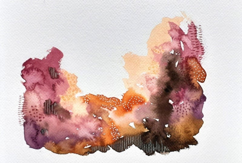
was made in 1,797.17, 98. And this is a furnishing fabric. It was a luxurious
relocated silk in the neoclassical style that was manufactured by Camille parent, parent, parent on, in C In Leon. It's an archive sketch of
the pattern from 17, 97. And it's a noted probably
made for Carlos, Carlos the fourth of Spain. So how cool is that? Totally different style. But I think it was super FUN to work in a Historical
Color Palette. So I hope you enjoy testing out this project and have Vonn
with maybe these colors. And I'll see you back in class
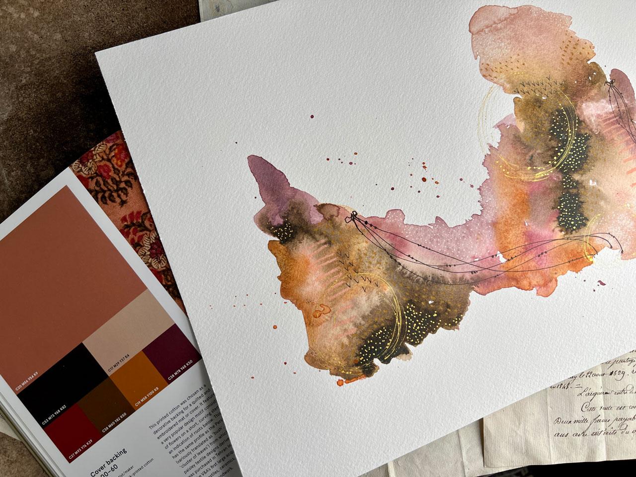
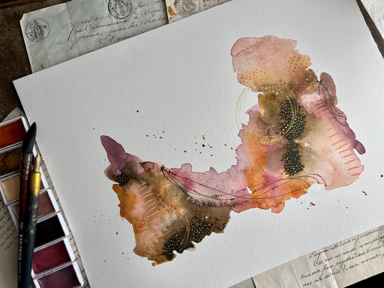
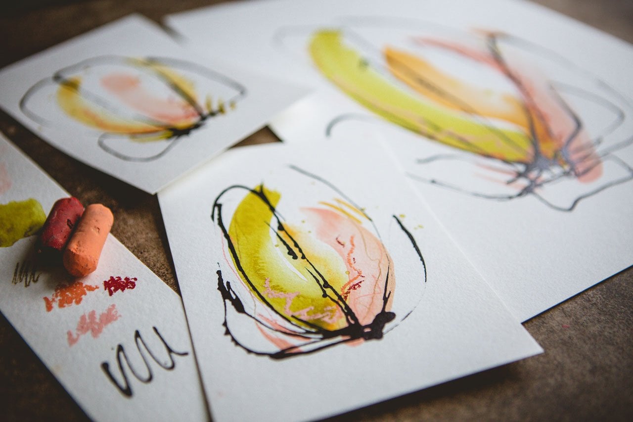
10. Block Print 1800-1860 Picking Colors: For this project, I think
I'm going to be inspired by this yummy cover backing
from 1700s to 18 60. It's the plain weave block
printed cotton from iran. And it was chosen as
a decorative backing for a quilted and
embroidered Matte or cover. If features are
very popular motif consisting of flowers and a short curved stem with an
indication of roots below. This motif has the same
profile as the Persian Botha, a variation of Bush, shrub or cluster of
leaves from which Western Paisley textile
designs are derived. This piece was purchased in
Tehran in 18 73 as part of the Victorian Albert's
first large acquisition of Iranian textiles, ceramics, metal works,
and inlaid woodwork. So how super cool is that? This is a color palette
that I have never actually put all
together myself. So I love working
outside my comfort zone. So I have pulled out my
Curate talky watercolors. I have the 48 piece set and Art Nouveau set that
I'm pulling from today. Some of my very
favorite watercolors to play in because the colors
are just so fantastic. And they're made with a
little different binder than Western watercolors
are made in Japan. And it gives more of a
mix kind of look between like a gouache and watercolor. It's kinda like a cool mixture. So I have pulled out number 19, potters pink, and I've pulled
out number 12, rows beige. And number 47, raw, umber deep, and 304
Alizarin crimson. And 49 yellowish brown. And for O2, mars, yellow and 303 Moff, taupe. And I think that's
pretty darn close, just pulling straight
watercolors out. And then I also pulled out
some Neocolor, two crayons. I've got Carmine,
I've got ocher. I've got salmon. I've got Van **** brown. And what is this? This one is where's
the color on this one? Crimson. Our isn't
Owls are in crimson. So very similar color wise, a little tiny bit different
because it's in a wax medium versus a watercolor medium,
but it's very close. And then I have my white posca pen and
my little black Pens. Any black Pens are good. I like these Micron pens a lot, so I use those a lot. Also get some of these Kings Art pins that I've been using
lately because I got them in one of my Art boxes
that I get monthly from the subscription
that I get. And then I got to posca pen. And I'm just going to work
in this color palette. And I am again using one piece
of that stonehenge paper. Let me let out just because this is the pad of paper I had beside my desk. So this is what has been
using for these projects. Stonehenge, Aqua Coldpress. This is the large piece
in the 12 by 16 Size, which I thought it'd be fine
if we did a bigger one. Let's just do the 12 by 16
and see what we can get. So I'm going to activate
these Watercolors. Got them over here on the side. I'm going to zoom out some
so I'll be right back. And then you can see my color
is off here to the side. I'm just going to activate these with some water
to get them ready. And I'm gonna do
another big kind of abstract watercolor that just happens to be what I'm
obsessed with lately. You could do abstracts
and acrylics and watercolors and
whatever happens to, strike your fancy, I
like the Mixed Media and I've been obsessed
with these watercolors. And so what I'm
gonna do is think, because I'm working
on one big piece. What I want that
composition to look like. I want to think
about my paper in thirds so that I don't put anything directly
in the center. Maybe I want to
come from the edge. Maybe I want to make you, maybe I want to have
a large piece here, but maybe some dominant pieces
kind of off to the sides. I'm just always in my
mind kinda keeping some of that kind of
in my mind like where, where am I wanna put that? And then I'm just going to
start laying down some colors. It's all about what feels good. Not really thinking super hard about all the stuff I just talked about because
the longer you do it, the more it kinda comes a little more naturally
like you just start thinking and off to the sides and moving
things more to the third, you just start kinda thinking
in those directions. And I think it helps to that
I did photography for so long because I just
automatically offset things And I'm just going to start
laying these colors in here. And then the further
we get along, the more we'll start to see where maybe
the pieces headed. I don't start off with a clear idea of what I'm
planning on creating. I, I'm kinda let the piece guide me and where
it wants to go. This time I did start
with the colors I liked the best
instead of going down the line like in
the other two that unlike in the one
that was more green, I thought wish I had started with that
blue this time I am. So I did kinda start with the colors that I
loved and I'm going to come back in and use the
other colors as we go. So far though, look how
super fund this is. Alright, let's come back in
with whatever this brown is. And just see if you don't lay it in a
little bit and think, do you like that? If you don't like it, then just use it a
little like let it be a little tiny punch of color. If you love it, then
use it a bunch. Let's see what this orange does because I really do
love pink and orange. So maybe a little orange
splash would be real pretty. I don't know. Do we like the orange? Oh, okay. So I still got brown. I want to get all the
colors in here and then I might start laying some others. Might start doing some
more other stuff. We'll see. And I picked all the colors
in watercolor to start with, but we didn't have to do
that if you only liked a few of the colors and
you wanted to say, now that I've thought
about it, Oh, come back with some Acrylic Ink. I've got a whole bunch of
acrylic inks back here. The Sepia would have been absolutely gorgeous
and given me a really nice deep,
Let's just do it. It'll give me a really nice
deep contrast in there that the watercolor
kind of gifts me but maybe isn't as dominant. But just check it out.
We're gonna make it really, we're gonna give it some
some rural pizzazz. And again, I'm still
not being super specific about where
I lay the color. I'm kind of working
intuitively here. I do like those pops that gave such a pretty contrast that
I'm looking at thinking, Oh, isn't that beautiful? While son of this is damped, we could come back in here
and create some water blooms. While it's damp, not
dry, not sopping wet. But once it gets kinda dam, we can come and tap
some water back in here and let that
kinda bloom out. Which is really pretty. And we can put salt
on it if you're a watercolor and salt lover, that might be a FUN
texture to add on here. If you'd like granulation, you can add some
granulation medium. Let's sum them up. That's super FUN, which I think could be
basically saltwater. But this Winsor Newton
granulation medium creates pretty granulating
in the watercolor. So just strategically running back in here, adding
some texture. And then is there any color in here that you're really
loved and you thought, oh, I didn't get enough of that. Now could be the time to
add some more back in here. Or you could do it on top after you've
let everything dry. So you just kinda wanna think
of the different layers and what we need to dry before
we add more back on top. So I'm just a little
more water in here to spread that out a tiny bit. Account pretty well. So pretty much prettier
than I was thinking. It's gonna be different shape
than I was even thinking. Super cool. Alright, so I'm going
to let this dry and then we'll come back
and mark-making on top
11. Block Print 1800-1860 Adding Marks & Finishing: Alright, this is almost
completely dry and I cannot even explain how obsessed I am with how beautiful these colors came out
and meshed together. Look at that most beautiful
color combination. Totally unexpected. Just kinda, let's just revisit our color palette inspiration. And I say inspiration because that's exactly
what these are, were being inspired by color palettes that have
been used in the past. Look how gorgeous that is
Amin in sanely beautiful, totally a color palette. Just looking at it on
that piece of fabric is not one that I would have thought was gonna give me this. So I'm also wondering if we
had some splatter out here. If I would like some splatter. So I'll put some water and a little bit of color
on our PR piece here. And I'm just gonna
do a tiny bit of splatter out on the
edges in that pink. And maybe like, how
about this orange? How about the orange? And I don't want it to
be like overwhelming. But I do want it to
be looking at that. Oh my gosh. So pretty. Okay. So while we've got that
little bit of splatter going, I just wanted to touch
didn't have to be a lot. I'm going to scoot
our watercolors over. Those are perfect for
this type of project. And let's pull our little neo
color crayons and our pins and do some mark
making and stuff because now I'm
kinda filling it. Like this is really beautiful. And I might even do
oil pastels on top. I'm just obsessed with my oil pastels and I didn't pull any out
for this project. We could do stencils
too if we wanted. I mean, all the options, holy cow, all the options. I do have some
different pastels, you know what, now I think
I'll pull those out. These are the Neo, these are
the Karen dash Neo pastels. Like the number one is basically because these are the
Neo colored pastels. Number two. The number two
or more like a crayon, like Crayola crayon kinda. But they're water-soluble. The colors are beautiful. The number ones are
the oil pastels. And a little different
than this an LEA, they're not quite as creamy, but look at these yummy colors
like I can already see. This is very close to the ocher, so I can definitely kinda match up some of these
colors to the ones I've already identified
and pulled out as ones that will work
in this color palette. So I love that. So let's use the Karen dash
ones because we got them. And I'm looking for maybe a maroon because
I liked this maroon. Okay, we'll just set
this to the side. Just wanted to introduce those because they are
kinda new to me. I haven't had him very long. And now let's just do
some yummy mark-making. And again, if you're
kind of like what Kent, what Marx can, I do, don't forget to refer to our yummy PDF of ideas that
I've already started for us. And then I want you to continue
making marks and ideas. You can have yourself
a mark-making book that would be ideal. So you can kinda look at
that and get some ideas. I'm just going to start
making some yummy marks. I like lines that looked a
little bit like a ladder line. So I'm gonna do some of those. I'm gonna be real careful not to hit my splatters hopefully. Who were like
You're right there. He what do we want? I want before I get
too much on here, maybe some of those yummy lines. I like maybe a circle and gold. Okay, so this might be the
time to get the gold ink out. Also because I consider gold and silver and white and
black kinda neutrally, neutrally options, but definitely feeling
maybe some gold. And maybe I could do, let's do some mark that
we've never done before. So maybe, maybe we
could do like the V's, like they look like
little birds almost. So we might put some
little birds in here. And this is that micron O5 pen. And I might just
pick a little swash of a watercolor that's
got a transition in it, but kinda gives me a very
nice stopping starting spot to do that little pattern. Look how pretty that
is. Look at that All such a good mark. Okay, I'm liking that one. Alright, so here we go. Let's keep on going. I like that enough to use
it somewhere else. So maybe right over here. Yeah, hahaha. I love that. He then I could come in with some little
maybe I'll maybe a line. I like the lines. I think I'm gonna do the
lines in the king's art that, I've got one that
looks like a brush. Pull all your black
pens out and just pull the one who see now this
one's a cure talkie. I'm kinda like a
really fine brush pen. I really like this one. This one came in and
art box that I get, But I haven't been
able to find more. So this one may
not be available. Pick your favorite pen. No, But this one of my favorites,
so I'm going to use it. And I'm kind of thinking, maybe my fun little, little lines like this. And I could do a little
leaves are a little pearls. Kinda ended off. I could do like a little loop at the end to kind
of be like, Look, it's ended with like
a little do lolly. Started off with a
little do lollies. So it didn't just
come out of the air. And I think I'll do a
little pearls on here, but I've also done
it where I've done little leaves which
I really love. And in this instance, we could pick a second spot to do some of those
if you feel like, oh, it needs more, we could
pick another spot to do it. I think I'm gonna do something
too wet right there. Let me get my handy-dandy five-gallon paint
bucket paint stirrer from the paint store. I like to use this
to rest my hand to hold it up off the
paper with my other hand. And it gives me somewhere
to rest my hand. That's not directly
on wet paint. Look how pretty and girly
these little bubbles of black do it makes it
look like a bracelet. I like bracelets. That's what that gives
me a little pretty feminine feel though
with that, I love that. I mean, almost feel like I need another one just like
right over here. So I'm going to start a
little rib, anything? And we'll just have
a little bitty one, just as like a second
little focal spot. So it wasn't
floating out here by itself and you're
thinking that element doesn't match or go or
feels like it's out there, kinda lonely by itself. This is how we can, if we'll put it somewhere else. So you can kind of prevent some of those moments
where you're like, I feel like it's not finished. What did it need? Maybe that's what it needed. An extra little
decoration over there. Look how pretty this is
already he super pretty. Okay. I'm actually not
wanting to do too much to it because
man, I'm loving it. I didn't wanna do a gold. This is my cure talk
ego, Micah paste. It is pretty easy
to get on Amazon. I'm sorry, go Micah ink. The ink is much easier
to get than the pace, but the paste is
one of my favorite. And you can put this
on with a dip pen. I've got irregular dip pen
that I like to use sometimes, but I also have my
favorite dip pen, which I'm high, which
is hiding from me. Here we go. This is my cat, Gomorrah
brass nib and it Scott, um, it's unique for a dip pen because it lets you
do circles and stuff. But you can use a
regular dip pen. You can get a little paintbrush
to do a little patterns. But in my mind,
I'm kinda thinking we get a piece of
scrap paper over here. Kinda thinking I want to get
it started and do like a, some circles. I like circles. And I just like to kinda
start it on piece of paper rather than my
piece of art first, just to make sure not gonna drop a big dab onto my piece
before I got it going. And then I just moved the
pin a little bit back and forth as I'm creating
these little circles. This is the prettiest piece. I think I want a third
one like right over here. And they're very subtle
like you might not even see them from far
back, but trust me, when you get up close or
the light hits these, you can totally see them. Shimmer or our love it. When I come back
and I start doing some dots on these little things just like I did on that black. Just something very delicate. I mean, it's a delicate pink. It's very pretty in here. I feel like these colors can handle the yummy
delicate details like we're heading or not
this super pretty. And then I might come in with some more gold dots
about the piece, just like I did with
the white dots. A lot of times, I come in with gold dots. So this is like a
signature thing that I really love doing. And the more art you create, you'll find these little
signature details that you're going to love doing. Just takes playing and creating. You'll get there. So what if we do some gold
dots out here in this brown? So you can see how
you could use like a really tiny paintbrush and you can make gold dots
with little tiny paintbrush. I say that because this
node is kind of pricey, but to me it was totally worth the investment
because it's my very favorite art-making tool besides all my other
favorite things. But man, I have just used
the tar out of this thing and it has totally paid for itself over and over
and over again. And when you get new
brass nibs or dip pens, they come with an oil on
it from the manufacturer, like from just creating it
and they have oils on them. And you'll want to
wash that nib off with like an old toothbrush and some toothpaste
will do good. Sometimes dawn soap is good. You could jab it into a potato. Let it sit for about 20
min, and that's good. I'm just kind of
releases the oils off of your nib and let your nib then be ready to hold
ink because otherwise, soon as you get it, the
ink slides right out. And you're like, why is
this not holding the ink? Because this net is really cool. It holds ink longer
than a normal dip pen. And man, I like inks like this that we can dip our
pin into because you just get colors and
mixes that maybe you don't have available in
a paint. I just love it. That's again, that's one of my own little signature
things that I like. Let's put this up here. In this. I liked, I liked
that we're doing the gold in this
little brown area, really sets that off. And then to wash these, I just in some, in some water really good. And then I've got my
microfiber cloth that I keep here at my table
that I absolutely love. You've never tried the
microfiber cloth seat or cleaning cloth in your art room. They're just amazing, so
valuable to me. Okay. Now I'm feeling
like we're getting somewhere loving what
we have going on. Could come back with some of our other things or
other, Let's see mark-making. Let's see what do we want to do? It's so pretty like it is. If you get to a point
where you're like, okay, I don't know
what else to do. You feel like I'm about to ruin it if I make the next step, set it to the side. There's nothing saying
that you have to finish every piece the day
that you sat down. Let's use this gold over here, this kind of yellow ocher. You could, you could
set this to the side, live with it for awhile
because, you know, it could be done
like right here. In my mind. It could be done. But I don't want to give you some ideas of things
that you might, could do or think about
or consider inspire you. So you don't have to have any of the supplies that I'm using. You could have
substituted anything in your art room for everything
that I just did today. And I want you to
look around and start thinking, what do I have? What can I use? What can I create today with these five tools
that I've pulled out? Like I did, I like pulling
stuff out and then saying, all right, here's what
I'm going to use today. Then I reserve the right to add, like when I thought it needs the gold, it needs that black. I reserve that
right to add and be creative and make
those decisions as I'm creating the art. But it doesn't have
to be all today. Like I could set this to the side until I'm more
comfortable or more confident about the marks
that I feel like it needs. Or maybe I've got a new
supply that I'm like, haha, this is what that needed. I definitely want you to wait. If you just feel stuck, live with it for a bit. I like how that
yellow just added a little touch into
the lighter browns. You're not even
going to know it's there and unless you get real close almost
nose to nose with it. But it added an extra
little depth and dimension to that color. And I'm always looking for ways to really make that color more complicated and interesting.
A couple of you that is Now one nice thing about Neil, color to pastels versus
the oil pastels. If you don't have the
big glob of oil pastel, that never seems to drive that. You definitely need to
use a finishing spray on. I could just leave
these not without any finishing spray
and it'd be fine. So that is one advantage. If you get one or
the other, get this. The 2s, the neo color twos. They are the most
versatile art supply. And they come in so
many yummy colors. Alright, that is
super duper yummy. And I think at the moment before add, anything
else to add? I think I'm actually
very happy with where this piece has landed. Look how pretty that is. And it's not often
that I do pieces this large for you in a class. And so it's kinda fun to
go a little bit bigger. And so you might just
look at these and think, okay, I think I'm feeling
pretty good at this point. And I might call this
one done for the day. And then I could
revisit this one later. We could have had drippy paint. We could have had other
supplies if I found something else that I
thought was interesting, but I actually think
this one is done. I like that it's
not overwhelming. That it's kinda soft and pretty. But as you get closer, there's all these yummy details. I do feel like I could have
done a white posca pen, but we can continue
adding things at later points in time as we
get secure and thinking like, Oh yeah, that's exactly
what we needed. Like now that I'm
even saying that. Let's just do it. Because sometimes you'll be looking at stuff and thinking, all wish I had done this
or maybe I could do this, but let's just go back before up fully
pull that tape off. Let's just add some
whimsical white dots to it. Oh, yeah, I see. It did kinda need that. All right. That's what I wanted. Ads, just such whimsical
little touches when you have sweet little dots. That's beautiful. Now at this point, look
how pretty that is. And you can see the little
shine in the light. This piece is beautiful. But we can also turn
it around and think, who do we like it this
way, a little better? Or this way? Or this way? Because it is kinda fun
in other directions. Some actually really, really loving it the way I painted it. And I really like it this way. So very interesting here on changing directions
as to what we get. And let's compare that to
our inspiration palette. In our book over here, we can kinda see how did we do compared to what we were
inspired to create with. And I never would have
guessed until I did this. This might be one of my favorite color palettes that I've used. Look how gorgeous that is. And I never would have done
that without this challenge. So that was a super
fun challenge. And I loved the piece
that we created. So I hope you had fun with this piece and I'll
see you back in class.
12. Holy Grail Tapestry C1890 Picking Colors: In this project, let's do one of the color pallets from
the PDF that I gave you. It's under your projects and resources if you didn't
download that already. But I thought this will be fun. This is a tapestry called the
goal holy grail tapestry, the arming and departure
of the nights. It's from circa 18, 90. And the color palette
really spoke to me. So I want to encourage you use whatever you have, pull-out, a color or mixed colors in whatever you have in
your art room already. I'm just pulling out
things that kinda matched that were fairly easy to play within this color palette without deep diving
into color mixing. So I have pulled out sharpen raw umber for
this first color. And then I've pulled
out sharpened and sap green for this green color. I've got Holbein lamp
black for this black. This green actually randomly
had a fusion paint, which this is like
furniture, mineral paints. So you probably have that
and you can mix the color. But if you do have these, these are super fun
and the colors are beautiful and it was
that perfect shade of green right there
on that piece. I was really excited to pull that out and we're
gonna be using it. I also pulled out liquid texts, basic red oxide, and
this is a flesh color. So I pulled out Naples yellow, which is a little more
yellow than this flesh tone, but I'm gonna, I'm
gonna go with it. And again, my goal is
not to be 100% exact. And if your goal is
to be 100% exact, definitely make that a
challenge of your project. My project is too, at least work within a color
palette and just see like what can I create
with this set of colors that I might
never have put together? Otherwise, I'm going to set
that right there to the side. I've already put our paints
out here on our paper. So we'll move these over and
got the fusion paint here. I'm not going to forget that
it's such a pretty color. Also will pull out some other
mark-making for the top, maybe mark-making
for underneath. I really like these, create a color,
chunky charcoals. And so it might be fun just
to get our page started. And I've put down a
piece of our Stonehenge, Aqua cold press
watercolor paper again, because that's what
I've used throughout the whole class and I've
just taped it off into six equal sections
to do this with. And I might come back on top and do some more mark-making. It's just very interesting to
just put the paper started. Sometimes I treat this
as one big piece. Sometimes I treated
as six little pieces. Doesn't really matter. It's
just fun to get started. And I'm not thinking
too hard about composition and
things like that. At this point. At this
point I'm thinking, let's just paint
and have some fun. Alright, let me set
those to the side. And I keep microfiber cloth
handy here in my art room. It allows me to get
chalky stuff off my fingers without
going to wash my hands. And now I'm not going
to be scared that I'm putting red stuff everywhere
that I didn't intend. Now another fun aspect of doing something like the
charcoal underneath, just to show you is
they're water-soluble. So I could just come
back with my paintbrush and kind of switch that
around to do some more stuff. It's really pretty when
you do it that way, it's like a mark within
some watercolor, almost, but it's just
really delightful to do a little bit of
smearing with some water. There we go, like that. Okay, so I'm gonna be
using my filbert, Umbria, five-eighths inch
Princeton brush probably for a lot of this
because I like it. You open that green. And then I'm just
going to look and see like where do I want
to get started? What's my favorite colors? What's my least favorite color? So whichever one is
your least favorite, maybe use that last or in the smallest quantity
that you can. Or, you know, we
could treat these as six different pieces and let a different color be
dominant on each. We could treat this
as one big piece and just paint all over it and then see what we get when
we peel the tape. Where we could do like
a little collection of all similar pieces in
the same colorway. Lots of different options
for you there in how you approach painting
the split up pieces. And I'm just trying to move some paint out of the way there. Okay. So kinda fill in like the green is
my least favorite. Maybe if it were a green black, not just black because extra, after I pull the
colors together, we're free to play. We can just go whatever
way we want to go. Now, what I have off
here to the side of this is clear gesso. And I like mixing the paint with Jesse because number one, it makes it makes easier
number to it makes it gritty so that you
can mark make on top. So I like the I like that And each one you might start
off a little different, like maybe in the edges, maybe this coming from
the centers and just see, you know, when we're
finished, what compositions did you really like? The best? So that's kinda fun to experiment there
with composition and where you lay
the paint down. Then you start
getting really good with how you like doing
your little abstracts. Because then you might get into who I like starting
on the edges, which this is where I tend to like starting so that you do see me probably do that a lot because it kind
of I don't know, it starts you off not centered, which I like that because putting your subject directly in the center of your paper is not very interesting
for a composition. You see how it is clear. Gesso just makes that paint go. I didn't love it.
It makes it maps, so it's not super shiny.
Hello, that about it. I like matte paint. Yeah,
just start playing. Get that first color
laid on there. You might have a couple
of paint brushes handy if you want to still use
that color some more. I'm going to draw
that out and we'll just come in here
with some yellow. And you don't have to cover
up what we did underneath. Like see this is
shining through. I love, I love that
it's shining through. I want to see that maybe we
did something underneath. There wasn't my intention to put that down and then completely covered
up and never see it. I don't mind if we get shine through bits of what
we painted underneath. That's what it's there for. It's to add the layers, the dimension to it. It got us past our
white page paralysis, which is the main goal. But it's also marks that
look interesting stuff. And I like doing more
than one at a time. So this is why you always
see me work in multiples. Because when you just paint one, if that one was
terrible the whole day, it was a terrible paint day. But if you paint many
at the same time, then that day was a fantastic paint day
because a couple of these are going to be amazing and a couple of these are
going to be terrible. And you're not
gonna be stuck with the terrible ones because you had some amazing
ones in there. Okay, So I did mix the
green and the black. We kinda combined those. It's going to be my dark
contrast in here, I think. And whatever color it is,
that's your favorite. Use the most of it. Least favorite, use less of it. But you know what? You never know the colors
that I thought were my least favorite and
some other pieces ended up making the whole piece. So I want you to at least double the colors in every one
of your pieces today, just to say you did it, even if it's the
tiniest little mark, put a little bit in every
single one of these. And I'm I'm not
worried about it. I'm just going to get
what I'm going to get. Don't really care
where I end up, which is how I like to paint. I like to be spontaneous. I like to just kinda think, you know, where are
we going to go? It's not a big deal to me. I'm not getting stuck. Look at that mineral
paint completely different. Look and feel. I like that because it's
true mixed media that I end up doing when I paint
with different mediums, which you never know it could
completely ruin your piece. But if you start off with the, where am I going to end up? Attitude, not knowing what
you're going to end up with. Nothing has really ruined. You're just like, oh, I didn't expect this. That was a fun surprise. That's what I like.
Delightful surprises. And never know where
I'm going to end up with when I sit
down to paint. It's not my purpose. It's not my goal
to paint something specific and end up
in a specific place. That's just not
the way I create. Let's take a pencil and make some marks
through this wet paint. And I do it with the lead out so that if the paint is wet, it just kinda drags the paint. But if the paint is dry, then it leaves pencil mark. And I like pencil mark. So I do like scraping
through paint, but I also like
leaving pencil mark. And again, this
is just giving me some interesting layers to the piece as we look at it and we think
what's going on there. All right, I like that. Alright, what are we not use? We have not used the brown, so let's come back in
here and put some brown. It's like puppy brown **** brown. And it's acrylic paint
so I could come back and paint on top of here. It's not like this is
our final, final, final. I really is like a puppy brown. Alright, now, now let's
take a look at this. Let me put out some
more clear just so if it's not so
hot mess right now, if you're not in a space
where you're thinking, who I love that or who is
good enough, I love it. Let's, let's call this finished. If you're not in that place yet, maybe you don't have enough
layers and you can come back and add more to
the top of your pieces. Also kinda, you know what, now that I've done some of this, also want some white. I'm gonna go ahead and make that white be the white gesso. Because just so it was basically acrylic
paint with grit in it. And what if we
come back on here? Oh, look at that. What if we come back
on the top with white? I consider white, black, silver, and gold neutrals. So don't be afraid to tweak your color
palettes as you're working. The goal is to get you
started in an antique, vintage, yummy color palette. But it's not necessarily where
you have to live and stay. Let's just go back in
here with some more. I love this. It's to just get you outside
of that comfort zone. That's place where
sometimes you get stuck. I just want you
experimenting and kinda growing what you'd like to do and your skills and the tools
that you're using to do it. And play in some color palettes
that you just never even imagined you would ever even like or consider.
That's my goal. I want you to have
fun and experiment. And this was just
a starting place with these color palettes that we found in
historical fabrics. But if you want to stay true to the challenge and
do the color is exactly definitely do that too. It's all about your own art
practice and experimenting. Kinda. We've got some hot messes
go and now I agree. Say, Oh my goodness, all right, let's get
some of this green. We don't wanna do this with
the green and the white. Oh, look at that. Let's do that again.
Actually liked that. Green mixed in with the white. Just so awesome. I'm with you here.
It's a hot mess. I start every painting thinking, am I going to pull it off? This video, ever see
the light of day? And somehow magically we do it. I don't know how it's amazing. Just be brave. Keep adding layers. Let's see where we can end up. Alright, some of these
are kinda crazy. And I do want to put some
stuff on top so we can draw on top with whatever it is that you'd like to
draw on top width, whether that be neo
color to crayons. Mike come back in here with
some more pencil marks. What did I do with my
little handy-dandy pencil? Here we go. We can come back in
here with some pastels, soft pastels or oil pastels. Let's just come back through
here and start doing some mark-making while we've got
wet paint to work with. And then we can think
about what's next. Oh, it's these lines and things that you dragged through the paint showing
underneath paint. That's super cool.
I get some more. Out there we go. Oh yes, see, this just
makes it when you have these extra interesting places to look at and
think, what is that? Like that I like circles. Let's do some
circles on this one. I like it. Alright, we got
dashes, we've got circles. What else do we want? Maybe some interlocking
squares. How about that? Oh, super fun. I like that right there. Oh, that's super cool. Alright, we need to let
this dry for a moment. Then we can see what do we
want to put on top of this?
13. Holy Grail Tapestry C1890 Mark Making & Finishing: Alright, these are 98% dry. And I just wanted to revisit
our color palettes so we can see how did we do working within this
color palette so far. And I know there are a hot mess. We're just going to add some
more layers on top of that. But I wanted to just revisit the color palette for a
moment and kind of thing. How did we do? And I think
we did pretty good trying all the colors and staying fairly close in
the color palette. I love that. So now it's time to
Marke make on top. You can do that with any
of your mark-making stuff. But I'm thinking in my mind, maybe I wanna do it
with some pastels. And I'm going to try
to pull some pastels out that still stay
within our color palette. And just let me mark and
play on top of this. And then when you
use a soft pastel or any chalky stick like the
charcoal or whatever. I do seal these with the Pastel Fixative on
Acrylic paintings like this. You don't have to, but it
could continue to smear. So even like one
light coating on it would lock those in
a little bit better. And then I store these in
clear plastic sleeves with maybe a piece of wax paper on top of it just to keep
it from being damaged. So just giving you ideas,
they don't Finishing. And then when I'm working
with the chalky things, I keep the microfiber
cloth around to keep my fingers fairly clean. So I'm going to start pulling a few of these colors out and remove
these paints out of the way. So I can set this a
little more to the side. These are all Sennelier pastels. They were from the Half, the Half Stick box
that you can get. And you can put them on. You can wet them with water. You can smear him with
your finger there, just so versatile on top
of something like this. We could also do, let's just pull it out while
I'm thinking about it. Let me finish using
that on this one. You could do something
different on all of these. I think it's just find
a play and experiment. We go, we could also use
the Neocolor two crayons. You don't have to use soft pastels or anything
that I'm using. You can use whatever you want. Like let's just pull out. Let's see which one's
kinda that Sam, any color that we have one
into your kinda like that. They're all let's see. What do we have? What
about that Green? I don't see that Green. Oh, this is kinda close. Let's do this. This is all of Brown's kind of green in there. Let's just see if we wanted to, what the difference would be. Drawing on a piece with
one versus the other. So there's a definite
difference in intensity. These are a lot more intense and bright and vivid than these are. These you don't have
to seal though, so there isn't
advantage to that. So I thought that was
definitely interesting to just try and see
what would we like. And I'm doing like
a color block. You could do splotches of color, you could do mark-making. You could draw in this piece. Like maybe I want to have some interesting lines
and marks like that. I loved that actually. I like that enough
to do that again. So these are perfect for picking a color and doing
some lines and marks. Super fund. And you see because we use that, just so we got enough grit that paint to hold onto any color we're trying
to put on top of it, which normally you
wouldn't have that. The paint is acrylic,
paint is plasticky, so it wouldn't give you
that that Grid lossless. Look at this one. We're all yummy, yummy color. I think I wanna do some more of that green out here though. Maybe I want to
do some overhear. If you've got any that
you've kinda lost a color in there
or maybe it didn't show up because we
mixed black and green. You know, this might be the time to add that
back in there with the Pastel and get that
color that maybe you missed. And Pastels go everywhere. So keep that in mind as
you're having Pastel, don't blow the Pastel and everything that
you've got going. Wait until you've got all your Pastel kinda
marked on your piece. And then pick the
piece up and tap it and you can put like a
paper towel down and tap all that dust down
and that will keep it from contaminating
your whole desk area. There was some class that I did. Somebody's like you didn't
make it clear enough. You didn't really hone that in. So I want you to hear
me when I say this, anything that's a powder It can go everywhere and it will contaminate
your workspace. And you want to try to
avoid that if you can. But yeah, I got cracked up at their comment because
they were like, I know you said this but I
guess I didn't believe you. I just started laughing the way they phrased
that it was hilarious. I'm loving the green. But I didn't love it as because I was painting and not
funny how when you use it as a different material
is suddenly starts to take on a new significance
and you're like, Oh, I love in that. So this is a way to
emphasize some color. It's also a way to
do some mark-making. Maybe some pattern. Look at that. Look at that totally made
the piece right there. Oh my goodness. What butt right there. You knew I'm crazy. Just go with it. You gotta have some FUN
while you're painting. This is the way that I like
to paint and have FUN. Different artists have
different little styles. Mine, my style is all
about experimenting and playing and having some
fine and just being a nut. One of my videos, somebody
made a comment of, oh, I love seeing your experiments, but let's see your real Art. And I thought this
is my real Art. Experiments is my style. Even when I did
photography workshops, I decided on a personal
project that I wanted to do. And then I created a whole workshop around me
doing that personal project. And I just dragged you along on the personal project of whatever I want it
to deep dive into. Sometimes that was flowers
or macro or still-life. And so even my photography, it was all about experimenting with different subjects
and different lenses. And I have brought that
into all my Art Workshops. It's about experimenting
with supplies, which I've always been
addicted to Art Supplies. And now I'm using all of them way more than
I ever did before. Because I like to experiment. And if I say okay, here's a color palette that
I want to work within. Let's pull out
colors that we can make did in this color palette. Then I'm truly getting into a Mixed Media kinda
feel I like watercolor, I like acrylic paint. I like pastels. I like, you know, different markers and paste and gold and you name
it, it's out there. Look at this one was the most exciting
out of those I loved it. What else do we got
here in our Pastels? While we got the Pastels out. We could come back
with some black. If we wanted to
really hone in some, some darkness, we could
go ahead and do that. Some people are like, Oh, it's not a piece of Art till
it has a spot your black. And I'm like, so limiting
don't be, don't be like that. But we can get kinda do
a little tiny touch of black and give it a little
contrast and vocal in here. If we wanted to. Kinda
wondering this one, let's make it a Marke. Look at that. That was actually a pretty
your Marke than I intended. Kinda wanted. Yeah. Let's just go with
Pat and I was so good. Such a surprise. But let's just go with
it very pretty. Okay. Maybe some some
darkness over here. And the only reason why
I pulled the blackout is because it is in
our color palette. So we're in or color
palettes still I'm not using it as a neutral because white and black and gold and silver thinking all
these are kinda neutrals. This was actually
enter color palette. So yay for us for sticking
in our color palette. I'll see, you know, I'm kinda feeling
like all the way up. Just go with the flow. No worry about what you're
going to end up with. And then every day
is a good paint day. I used to sit at my painting
table and I get so mad because I'd want to masterpiece and I couldn't
figure out how to get there. And I had that white
page paralysis and I'd get stuck and I put a little color down
and then it wouldn't be what I imagined in my
mind, it should have been. And then I got up angry
and I left my table angry. And you don't know how many
years that actually happened? And I don't know at what point I decided that I
love to cut up Art Might've been some random
project that I did. And I'm like, Oh my God,
I love this so much that then that became a
staple of my creating. And then node, no Paint day was a bad day because I can cut it up and do
other things with it, especially like collaged
pieces and stuff. It's the perfect way
to get collage stuff. I've got several collage
classes on Skillshare. If you want to dive into that, because I start all my Art now with the thought
of I can cut this up. So it doesn't matter
if it's something amazing when we're done or not. I kinda feel like I want some of this dot
action right there. So what color is going to work
best to give me some dots. What about what about
this crazy almost yellow that we were using like the ocher who see
now broke that. Okay, So let me show
you real quick how we're gonna get
this Pastels off of here without making a
mess of everything. I've got some shop towels. I'm gonna go ahead. And because I broke that
Pastel on my piece, and we'll go ahead and tap all
these Pastels off of here. And basically, I
pick the piece up, just get real close, tap the tape, and
then leave it alone. Of course, I'm
getting it all over my table here, so hang on. A little messier when I'm
talking at the same time. But now we can then get
all of our pieces off. I can clean the table
with a wet wipe. But now I have a surface where I'm not
blowing lots of powder. And so let's try not to do that again with the yellow
because I broke it all off, but I'm feeling
definitely yellow dots. Hahaha, totally what I wanted. And you can take it outside and blow it off good after you're
finished, if you need to. I really loved this
color in here. I'm kinda wondering if I
would just love it a little bit on the yellow
that's over here. Now that's slightly veering
from our inspiration piece. But once you're creating, go where it takes you, it's alright if you deviate
super Bon, oh my gosh. Bce. This is, this is some super fond stuff
like that, like it is. Okay. So now we definitely
got a hot mess. Is there anything else
that we wanna do to these? Feel like I didn't have
enough going on up there or did I I don't know. You can always cut these apart and decide later if
you need to add more to it. Because I just did
that yellow on there. I could take it
outside and blow it, but I could also do one last
little tap off the pastels. And then I would definitely
finish this with the Finishing Spray because I'm I Pastels everywhere
if I didn't. There we go. Excellent. At this point. Kinda thinking, how would
we do watercolor palette? I'm loving where we're at. I want to peel the
tape and see what I got and maybe cut these apart. So I definitely want all
the Pastel off my fingers. And if you start peeling tape, the tape terrors your paper, get your craft run out because the heat will release
that adhesive. You look at these, never judge the
piece until you peel the tape off. Oh my gosh. Crazy good. These are crazy good. Like I'm not even expecting what we got
and they're crazy good. Let's cut these
apart because I want to see him with a little
white frame around. Oh my gosh. These have turned out way better than I
was even thinking. Like fantastic paint day. Holy cow. Look at this
one. Look at that one. I love the light pink that we pulled in when I mix that
with that darker red. And we can turn them and see which direction do
we really love them? I love that. Oh, this one. These two, really the one I thought was gonna be my
favorite probably isn't. And these that I
thought hot mess. Oh, no, look at that. Totally got color
where I didn't intend. So that is the drawback
to stuff like this. But let me show you. If you get something on one
that you're like, love, love, blow it off, get all this stuff
off your fingers. Get one of these that kneaded erasers, these artists erasers. And you may be able to just erase that bit that
you didn't like. That slipped out on their lookup lose and
you can have them move. I didn't mean to do that.
And you can have them framed right up to the color. And then you won't
see this white part. But I do like seeing it framed out with the white around it because it makes it look like a finished actual piece of Art. This one is gorgeous. This one is gorgeous. Look at those pretty
scrolling lines that I didn't intend to make. So pretty and scrolling
totally made that piece. Look at this one. Totally love this line that
wanders lazily through there. And it kinda goes off. Keeps going like
you wonder like, Oh, what's out there?
It kept going. Love that one. This
one, super cool. I don't know if it's finished
with this section here. And I can turn it
different directions to see kinda like it this way. So that one I could revisit
and add some more mark-making to this one I thought was
gonna be my favorite. And funny enough, these
three are my favorite, and this one's not the
favorite I thought it was going to be,
but I do love it. Again. Last piece. I like these pieces that
come through here and they kinda go off the
frame and you're kinda thinking what's
going on out there. So I have three
pieces that I'm like, Okay, I like them but
I don't love them. And I got three
pieces that I love. Like I would frame
these three right here. And check out how we did
with our color palette. Always FUN to
double-check, to see. Did we stay true to the colors that we were originally
working with? Two, we kinda veer off of it. And what do we create? And these are, just
actually think these 3-state better in
that color palette and he's got a little darker, but I love him anyway. Hope you had Fine applying in another color palette
here from the PDF. Can't wait to see what
you're creating with these. And I'll see you back in class.
14. Final Thoughts: Throughout artistic
journey in this class, we have delved into the world
of historical textiles, uncovering the rich tapestry of colors that have adorned
textiles for centuries. As we come to the end
of this creative class, Let's take a moment
to reflect on the remarkable artworks
we've created, the connections we've forged between the past
and the present. Each abstract painting is a
testament of the power of inspiration drawn from the
tapestry's of bygone errors. Your unique color palettes and brushstrokes have breathe
new life into history as the emotions and
impressions evoked by the ancient masterpieces
find expression on Canvas. I'm so proud of each and every
one to you for embracing this journey with an open
heart and a curious mind. Your dedication and
artistic courage have made this class a truly
enriching experience for all. Thank you for being part of this extraordinary
exploration into Art History and
abstract expression.
 DENISE LOVE, Artist & Creative Educator