Transcripts
1. Introduction: Making abstract art is one of my own particular
favorite ways to create. And today I've come to you with another project that I think you're going
to really enjoy. We're going to start off by
exploring our areas outside, whether that be your yard
or your neighborhood, or maybe you take a trip over
to the botanical gardens. And I want you to be inspired
and taking pictures and observing different
flowers, flower shapes, colors, and different
botanical items that might inspire some yummy floral
abstracts in your class. I'm Denise love and
I'm an artist and photographer out of
Atlanta, Georgia. And in today's class, That's exactly what I did. I went outside. I got inspired by the
magnolias that are blooming in the magnolia
tree in my neighborhood. I got inspired by
different roses. I have some dried flowers
here in my studio that I took a color palette
directly from. I want you to look around at the different elements that you might pull from color wise. Because a lot of time
sitting down and figuring out color
palettes is kind of hard. If you're just trying to pull from your mind what
colors might you like and maybe you're not to the point where you have
a favorite palette. We're going to pull
from real things. We could also pull from color palette photos that
maybe you find on Pinterest. Or maybe you take some
of your own photos and you pull a color
palette out of that. We're going to
take very specific color palettes that we pull from different sources and
create projects with those. And see how does that get us to color palettes that
are kinda unexpected because I had a nice
unexpected color palette come out of my
dried flowers that ended up being one of my favorite color palettes that I experimented with today. And I want you to have those same surprises and delights when you're
experimenting with new color palettes and different supplies that maybe
you don't always pull out. I want you to sit in your table and relax
into the process. And just enjoy combining
some of these colors. Pencils, pastels,
crayons, paints. You can get very creative, pull together some
specific items in a particular color palette that's going to work
for that series. Then let's create a series. So I hope you enjoy the different
elements that we've pulled together in class today. I know you're going
to have some fun creating some abstract florals. And I want to see some of
those when you're done, come back and share what you've
been working on as you've gone through class because
I can't wait to see those. So let's get started.
2. Class Project: Your class project is to
come back and share with me any of the projects that
you tried in class today. I'd love to see the colorways
that you experimented with. I'd love to see the
different ways that you changed up each piece
within the same colorway. I'd love to see if you
tried to put the ink on top or if you opted to
leave the ink off the top. I'm excited to see the
different things that you experiment with on these
abstract flower projects. And it can't wait to see the little one that
inspired the big one. So if you do a big one, come back and share that and
show me the inspiration. The pieces that you
did prior to that, that led to the bigger piece. And I hope you have
fun today in class. So come back and
share something that you created. I'd love to see it. That is the most
exciting thing is to log into my account and
see that somebody has posted a project
that I can then go check out the comeback
and share stuff with me. Don't be shy. And I'll
see you back in class.
3. Supplies: In this video, let's talk
about the supplies that will be possibly using
throughout your projects. I'm gonna give you
some different ideas. But I started off the
class by kind of thinking, I want to do flower abstracts. And so I need to go out
and look around and see what flowers might
be in the neighborhood, take a few photos. So I kinda started out by taking a few photos from out
in the neighborhood. And I don't want them all
of them to be perfect. I want some ideas on ways, the different ways that
the petals droop and lay. And I also have some
dried flowers that I collected from different
sheets that I've done. I've kinda saved them. I like some of these because the colors and the shapes
and the way that they dried. So I'm going to take
inspiration from some of these. My walk around outside and some random things that
maybe I have in my house. And you might even get like a little bouquet of flowers from the store and just have them on your desk for
some inspiration. So what I started off doing is I want a sketchbook
because I want to be able to just make some little notes of shapes and such that I might
be thinking of. So I just have one
of my sketchbooks. This is the mole
skin sketchbook. Any sketchbook is fine. I just picked one up that
had pages available in it. What I like about the mole
skin book is that you can then do work in these and different color studies
and different things. Because the paper is
watercolor paper, it's a £110 and it's
really nice and sturdy. But it's also great
for just getting some ideas and shapes
and thoughts on paper. So I do start off with
my little sketch book. And as you're walking your neighborhood or your
garden and you're looking at the things that you're
finding inspiring draw one of those shapes and make some notes about what
you liked about it. So the paper that I will
be using in class is going to be the Canson
XL watercolor paper. I like this paper over some other papers
because I did do. These are by no means great. These are just
early experiments. But I like doing these
on different papers because I tried rough paper. And as I sat the piece down, it didn't easily soak up
what I was putting on it. And so there was enough
paint that it spread. And this is some of like
a dirtier colored paper, more like a drawing paper. And it was okay. This was a mixed media paper. Is okay. But my very favorite, this is a nicer cotton paper. That the nicer cotton papers are great for
techniques like this, but they do take
the paint a little differently than say the, the, the random standard
watercolor paper. So I'm using the Canson because
I liked the way my paint reacted as I was painting
different designs on there. It's soaked up my watercolor in my acrylics in the perfect
way for this project. So that's what I'm using. I'm using the Canson, but I do encourage you. And this happens to be about 12 pad and I'm
just cutting pieces up. I may grab a larger pad and cut larger squares because
this is about the size. You get out of that
size and I may want a little bigger and
sometimes I like using larger pads because It's cheaper than buying a little bitty pads
and tearing the paper. And you get the big pad and
you cut the pieces into smaller shapes and it's cheaper than buying
the smaller pads. Also have some disposable
palette paper here. I have a few of my
favorite paint brushes. And then as you're using them, you might think, oh, I don't like the marks that
one's making versus another. And you may narrow
down your selection or grabbed some others that you
really like or want to try. So just grab your favorite little
selection of paint brushes. I've got a palette
knife just in case. I've got a catalyst silicone
wage, just in case. I like choices with
something like this. So few of your favorite
mark-making and paint tools. I'm gonna be playing in
possibly some watercolors. I just have some pilots
with random watercolor out. Or you can pick some of your favorite watercolors that you want to try these widths. So I do have watercolors
sitting over here. My new favorite color
happens to be indigo. I like the richness
of the Indigo and how it's slightly different
than the Payne's gray. So I have a new little
tube of that to play with. I'm also going to be playing
with medium flow acrylics. You can play with any acrylics
with this type project. You could use the high
flow, the medium flow, the very thick stuff, whichever ones you have that
are your favorite color. This project is
pretty forgiving and easy to use the different
things. I'm going to use. Probably some of these basics because I'm still playing in that big 48 little tub of colors that I got recently
because I wanted to try all the liquid texts colors without buying all
the big tubes. And then as I empty
out particular color, I'm gonna know, okay, Now I need a big one of
this color because that's my favorite saw like using these basically little
sampler pots because I got lots of colors and it
wasn't very much on Amazon. And I do have a
few bigger colors that already just
had in my stash of just ones that I
thought who I love these colors and I
had already had them. May use some of those. I'm also going to possibly
use some acrylic inks because I do particularly
love how vivid, dramatic, how strong the Incas as like a top little
layer of mark-making. It's my own personal preference. And after early tests
with different colors, I don't love some of the
colored inks for my projects. As well as I did. These yummy kind of deep black, purple, black, blue
kind of shades. So I'm going to stick
to deep purple. This is a dioxazine purple. This is deep violet. This is Payne's gray,
this is indigo. I'm going to stick with
those deep colors. I've got the dealer
rounding and Liquitex. Really, if you just have one, if I can only pick one of
these as my go-to color, I'd pick the Payne's gray
because it's not quite black. And it's really deep,
super dramatic. And so that does tend to be my favorite top layer
on doing some of these. Um, I also want some random
fun mark-making items, so that could be a pencil. So I have some pencil in my sketchbook that could be some graphite,
anything like that. Also like neo color crayons and maybe even a few colored
pencils, doesn't matter. What you use. I'm experimenting with these Darwin's color soft
pencils because they're soft. They give you some
really beautiful range of color with it not
being a hard tip, like a hard lead basically. Um, so I'm experimenting
with some of these colors, soft pencils, you can
experiment with any of them. The ink tint pencils
would be great. Just regular. Colored pencils would be fine. Watercolor pencils
would be great. The Neo colors
would be fantastic. As mark-making, another
favorite mark-making item of mine that I will be pulling
out is my soft pastels. I have all my little
soft pastels in my favorite antique little
drawer divider here. And this is like one of
my favorite possessions. It's just so beautifully happy. Just looking at the colors. So I'll be pulling these out. These are half
pieces of senility, a soft chalk pastels. I don't know the colors in here because in that
package of pastels, they don't come with the labels. And then if I've used any colors or I particularly
love any colors, then I go back and
buy a stick of it. And so those are the only ones
that have a label on them. So I will be randomly pulling from my Sennelier
a soft pastels. But I won't be able to tell you the colors because they're just random after you
pull it out of the box. So how fun it owes. I have decided I
really loved the way the soft pastels look on top with the acrylics
and the watercolors. Okay, So I know that was a lot of fun stuff that
we just talked about. There may pull something else randomly out, but
I don't think I will. I think that's pretty much
the supplies that we're going to stick with
and experiment with. So pull together some of your own supplies and then
go take a walk around your neighborhood and
start making notes and thinking and being
inspired by color. And then we'll get started.
4. Gathering Inspiration: One of the first
things I want you to consider doing is to go out and walk your neighborhood and take some photos of some flowers and some other pretty things
that happen to be out and about in your yard or around your neighborhood that you
think we will look at that. Let me just take a
photo of that so that I then have some
inspiration to pull from. When I come back
to my sketch book, or take your sketchbook out and start drawing some
shapes kinda simplified. I don't want to be
super detailed here because remember
for the most part we're thinking abstracts. And if I were to, for instance, take that photo
of this magnolia. I'm kinda looking at that
thinking great big shapes. I want to think overall, what is the overall
shape of that? And this one has kinda great big petals that are just kinda
out doing their thing. And I just want to kind of
eyeball what it's loosely doing and maybe coming
up with a random, very abstract, not trying
to get exact details here. I want great big overall
shapes of the petal. I don't want lots of details in the petals are the shapes. For instance, if I were to
draw a picture of this rose, one of these roses, some of these I've had
for a very long time, so they are as dry
as they can get. But let's say I'm
looking at this rose. I love the colors in this rose. I want to pull perhaps
from the ochre and the pink family to duplicate kind of something
in this coloring. But let's say that I want
to get an overall shape. I've kind of got
up going this way. Maybe I've got some this way and some of these
leaves are curling. Then it's actually
kinda, kinda going up. And then I've got this leaf, this pedal kinda in
here doing this. And I've got this one over here doing this and it's
kinda curling. And then this one's
kind of curling. And that's pretty much
we've got as a shape there. So a little bit different. If I'm looking at that, thinking abstractly,
I might think, oh, let's kind of go up. And then maybe
I'll come up here. And then maybe I'll come over here, maybe something there. And I was really, really
simplify those lines and colors rather than
so much detail. I even have like a
leaf coming up here. So that could be some extra
mark-making in there. I'm kinda looking at that, trying to simplify it down
to the least amount of lines to create a shape and a color basically is
what I'm thinking. That's really nice right there. I'm going to have the
dried flowers up here. Because I do find all the different shapes in these flowers to be inspiring. I love the colors. This one's like a light
pink and an ivory. So these were all
really, really pretty. And this one, this one has kinda some orange and some maroon and maybe some ivory in there. See how we can take
our color inspiration from actual elements that we're pulling our
inspiration from. And then we can simplify it to the most basic lines
and see what we get. So why you start off looking for flowers that
you find interesting? You can get real
flowers, a bouquet. You can have dried flowers. You can go take some photos and the neighborhood like I've done. And that's what we're
going to start getting our inspiration from for
our abstract pieces. So go be inspired.
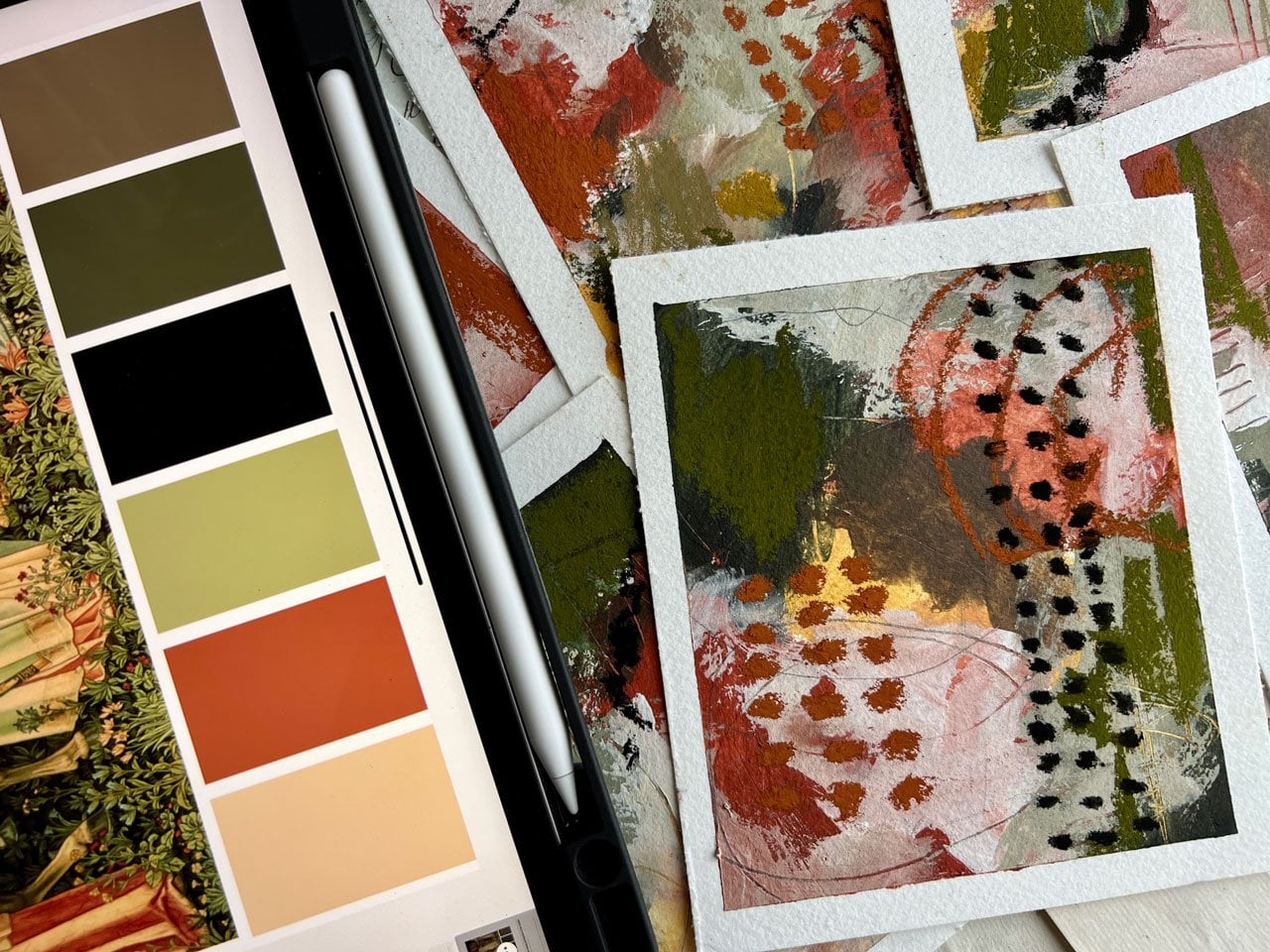
5. Creating Color Palettes: So I just want to think about color to start with
because it's kinda like, Oh no, what am I going to like? What colors don't want to use? So I know I'm going to
want to use an ink. So I've got my
indigo, Payne's gray, my deep purples just kinda
sitting up here because I like that final strong ness that the ink gives you
don't have to do that. That's my own
personal preference. I'm also kind of thinking I have some of these
watercolors out on my palette. And then I also
have my Sennelier, a pilot kind of over here
with these colors already. Kind of spirits with
some watercolor, spirits with some watercolor
spritz it with some water. Just to activate them. And I just want to get a feel for which direction
I want to go. So if I'm thinking of doing, say some of these
roses that have this really pretty pink
and ivory and ocher, you know, then I might
consider a little bit of ocher over here on
my color palette. So I'm just going to
throw this out here. I also am feeling like that is such a
pretty color of pink. And I have one of
these in the acrylic. So wouldn't that
be possibly fun? Over here on my
disposable palette paper, I can put a little
bit of that pink. This is a light
pink by Liquitex. And then I could also say, okay, I love this pink. Oh, look at that. There's also a brownish
kind of green in here. Very much like I don't know, like a, like a moss green
or a kind of a dead green. And over here in this
annuli, there's this brown, pink color That's kind of a I don't know if more like it or not,
but let's just see. We'll look at that. That is that exact color. Look at that. That is pretty much what
we're looking at right there. I like it. So I'm definitely
feeling like this brown, pink, this acrylic pink, light pink and this ocher. And this ocher happens
to be this Naples yellow deep by OK,
corral an LEA. So that's probably in
my container there too, with the dry colors. So this is actually Naples, yellow, ocher, but
ochres fine too. I've done like that right
there is the color way we're gonna go for on one
of our projects. Or at least I'm going for
and one of my projects. Now I'm also thinking what
mark-making elements do. I want to go with this. And as I'm making some
of these decisions, I want to write these down. I don't want to forget
what I've done. And I want to be
able to come back over and over and do this again. So this is watercolor. Naples yellow,
acrylic, light pink, watercolor brown, pink,
nilly a familia, a Liquitex. Okay. So now I've got my little
color started here. Also filling like perhaps we want maybe something in
this brownish stem color, could be our mark-making tools. So I could either use
pencils or I could use C because she's
pick a pencil here. I could either do
something like a brown. I've got this color here, That's pretty cool
called like in green. This is mid brown. Let's just see, liking, liking green is fun. This is mid brown.
That's pretty cool. I do like the way that these colors are a
little bit wider. More like a, like a bold
pencil than a hard pencil like if you've got the H
pencils versus the B pencils, these would be more
like the B pencils. I like the kind of
line that makes That's pretty also elicit
these over here. So I don't forget
what those are. Also might consider. Some of our pastels as a
mark-making element in here. I'm really feeling that, that mark-making could be
one of these colors here. And there's this pretty kind of cell many color look at that. We could also consider an ochre. Also this kind of, this kind of a fun color. Don't think I want that
though. Let's see. How about this light pink, which apparently like only
have a little piece of it. Oh, nice, nice. I'm loving that. Now the thing with pastels, if you're going to use the
pastels, look at this color. Let's just see. Oh, cool. If you've gotta use the
pastels, do them last. They get all over your fingers. And you want to be really
careful about where you touch your artwork once you
get this on your fingers. So I'm using a microfiber
cleaning cloth. I love these and this is the best thing for
getting as much of that off your
finger while you're working without having
to go wash your hands. So these microfiber cleaning
cloths are like magic. Okay, So got us a
little color palette. Let's set this back over here. I'm also thinking
Payne's gray as maybe a very topper as my mark-making element possibly could come back with
a brown if I wanted. I'm really feeling this
color palette right here. So I'm going to definitely
put this one as a guess. And I'm just going
to look around at some other color
palette options. I do like combining the
watercolor and the acrylic. You could do this
in all watercolor. You could do this in all
acrylic, your choice. But I like the differences in the texture and what we get. When we have like a few streaks in one material versus another, I like that element of difference that we get with
the different types of paint. So I'm going to combine the two. But just be aware, you could do it
all in watercolor. You could do it all
in acrylic paint. Add your mark-making and
your final pop of contrast. And that's fine too. So for the first one, I took my actual inspiration from an actual item
that I had here. Another thing that we could
do is we could totally disregard any real illness or any true newness of color from the item
that we're considering. And we could just go
crazy with our colors. For instance, I like blues. I'm kinda feeling
like, you know, if we did this in a blue series, that might be a lot of fun. So let's just pick out
the same elements, but maybe in some blues. So I really love this indigo. I liked the Payne's
gray also lie. Also like this cobalt. Some kind of feeling like what if we did
cobalt and indigo? So this is cobalt, I've already got some out here. This is cobalt. This is very light, so I probably squeeze it
fresh out of the tube. I've got that in a tube. And then let's just squeeze
a little bit indigo, I forget which one
is indigo on here. Squeeze a tiny bit out. Indigo is a really cool color. It's not quite as,
oh look at that. It's not quite as black key
grayish as the Payne's gray. So this is cobalt. That's indigo. And then if we pick an acrylic
color to go with that, we could pick, say, a
complementing color. Maybe we want an ivory. Maybe we want, oh, maybe we want a yellow. Don't want to go. So maybe we want an ivory to
complement that. I'm thinking, yeah, maybe we want an orange
to complement that. Blue and orange are kind of
opposites on the color wheel. And I do particularly like a
blue and orange color way, but let's do, let's do ivory. It's technically called,
I'm bleached titanium. So this is acrylic. Then we might think, okay, do we want our complimentary
colors coming in there? So maybe I want
an orange choice. So I've got bright orange, and orange is right there. Oh, I see. Now I really love
both of those. That's nice. We could also set these up here. We can also pull
something out of power. Who look at this like dark blue. Oh yeah, that's nice. We could also pull
some type of orange. That's pretty got
this devotee orange. How about this one that's
got a little deeper orange. Look at that. All right. So we've got those. Then. Let's go ahead and say Payne's gray is
our complementing ink. Alright, so now we've got
that yummy color way. Alright, so we've now done
something from a real item. We've now done something
out of our mind, just thinking about
the color wheel. And so another way
I like to go with colors is color palettes. So you can do color pallets. You can find these on Pinterest
search color palettes, and you will find where there's some colors pulled
out of a photo. You can do this from
your own photos, which I do this a lot. I take a lot of photos, so I'll make my own
color palettes. You could also randomly
get color palette books. Possibly. These are
some color flow books that IV Newport created. And I like to refer to these
because they're convenient. They're right here in
the art room with me. So let's just pick a really
fun color palette and create one of these as another way to come
up with fun colors. Like look at this one. This is pretty cool here. I like this kind of orange, kinda pink, kinda gray. We've got our dark. So this is a pretty
color palette. Let's just pick one and
create one of these. Will scoot my little
color palettes over while they're drying. We'll put that right there. So now we've got kind of
a pinkish color in here. You can mix colors if
you want to mix colors. For this particular project, I'm probably not going to
mix a bunch of colors. So let's just see
what we got here. Oh, yes, see now
that's really nice. So that is Rouge Venice. And that pulls right from probably this
orangey color here. We got that kinda
feel like that. Not trying to be exact, I'm just trying to
take some inspiration. We also have burnt sienna. We've got this gold ocher. Gold ocher is kinda nice. Let's see what that is. Oh yeah, that's pretty cool. That's really
pretty, that's kinda been my favorite color palettes. So now we might pick
out a third color, which could be like this
grayish color that's in here. I don't want to save this
color here to be the ink. So we're gonna, we're
gonna see here. So I really want to pull
out of all these colors. Maybe a gray. All right, got a gray here. Let's just this one's called
neutral gray number five. Put a little gray on our palate. Oh, look at that. Neutral gray. Number
five is pretty color. We could also now we could definitely pull in the indigo is our dark shade here, like that. And now we can also pull
from our neo color crayons or our pencils or whatever
mark making tool you love. Like I've got this
pretty raw sienna. Oh, yeah, look at that. Raw sienna is a good color. Color is not quite in it, but it could represent green leaves. So I'm going to
throw that in there. I've got lots of Neo colors. I don't have very many on
my table at the moment. You've also got
this deeper gray. This is the Payne's
gray like that. So now we have a, another color palette that
we took his inspiration from a color source like Pinterest or own photos to now come
up with a series. So I'm going to work with
these color palettes. I don't know how it's going
to end up in the end. And I might come up with
some new color palettes. I like having some
of this thought out beforehand before I'm
actually working on things, but you could fly by the seat of your pants either way that's going to work with you there. But look how fun. That is kinda making some of these decisions before we
ever put paint to paper. Super cool. Alright, so I'm gonna
write my titles on here and then we'll get started.
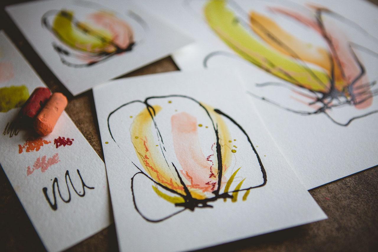
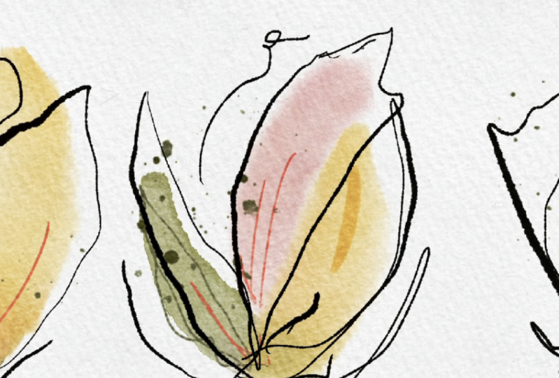
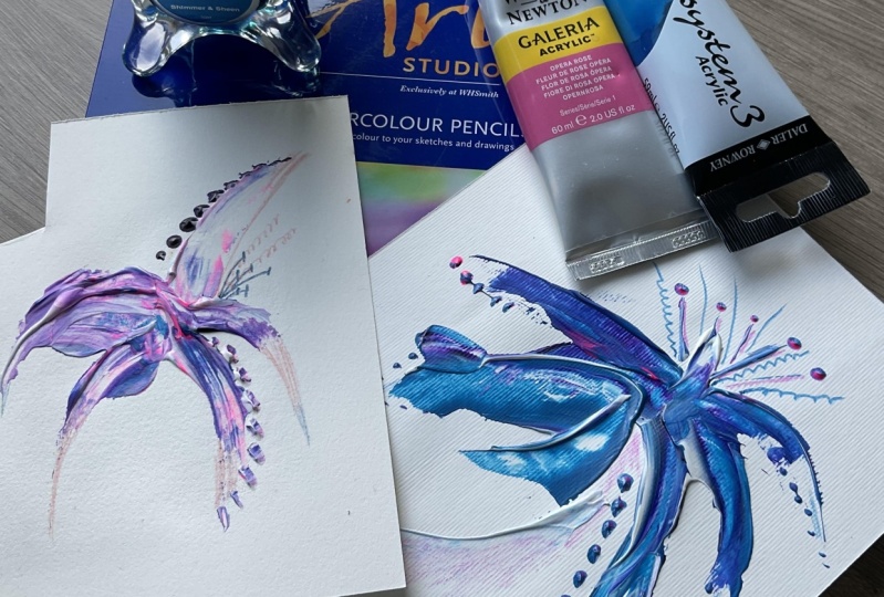
6. Pink & Green Color Palette: Alright, so I was thinking
for our first one, we're going to take
the inspiration of the rows that
we were looking at and kinda pulling colors from for one of our color
sample swatches here. So I'm going to go for
something going up, probably kinda like a
rose tulip flower shape. Just see what we can get. And I'm going to, I've
got all my colors here. I've got the light pink, I've got right here. The Naples yellow is right here. And then we've got
our green or brown, green, brown, pink
technically is what it called over here to the side. And we'll set it right
there for a moment. So I'm gonna put a little
bit of our pink out. We've got that ready. Brush with some water. And what I want you to do
on each one of these is to change each one up
just a little bit. So if you start with
yellow on this one, then maybe start
with the pink on this one and maybe the
brown pink on this one. I want each one of these
to be slightly different. I don't want any of
them to be identical. Unless you love it so
much that you're like, oh my goodness, I
need two of these. I want you to try to make
each one slightly different. I'm going to try the same. Even though I may love them so much that I want to do the same. I want you to try
something different on every single one of them. So let's just get started. So I've got some pink. Let's just start with the pink. And you could use
the same color. You can go ahead and
put the color down, but I want you to do
something different on every single one
who look at that. So maybe on this one we do
one stripe of the pink. Maybe on this one we do to
maybe on this third one. We go ahead and use
this brown, pink color. I've got some of it
on my palette now, and that's got too much water. See, this is why we do a bunch. Because maybe let's
do the two there. Maybe one will come out and maybe even three won't come out. But you're not going to
know until you're going. So let's try the yellow. Who I like that. Okay, so now
I'm at least got six going. I know for sure that
I'm just not gonna be happy with this and I'm
going to trade it out. And we'll try again. And I'm just gonna
throw it on the floor. And let's try this again. Oh yeah, I like that better. Alright, So maybe I want to
come back and work backwards. Maybe on this one. I want a pink detail. Look at that. And maybe this one maybe
I'll do a pink detail it. Oh, see now like this. So definitely try. Now this is combined and so
I haven't let the paint dry. That's very interesting. And then try some extra marks off to one side or the other. Super fun. We'll go ahead and
get some pink. And this one, maybe I want
a double mark on the side. So I want you to
kinda be thinking of some of these
mark-making options. So let's go back with
some of this green. Really love and that one there, I don't like how the
color is booming. So pretty look at that. Maybe on this I want the
yellow in the center. So let's come back
with some yellow. You don't have to do the
same thing I'm doing. I'm just kind of
going with the flow. Seeing what feels
good. Seeing what. Maybe I want to do this or
maybe I want to do that. What's, what feels good? Maybe on this one, this green is some leaves or some stems or who I really loved that
particular mark there. Oh yeah, I like that. Look at that. He
having some fun, just kind of experimenting. Maybe some yellow right in
the center of this one. Maybe some yellow streaks
at the top possibly. So let's see if we
get any plus go. Oh, look at that. Pretty, pretty. Alright. Do we have a little
bit of every color? No, we don't have the
green and this one. Alright, so let's come
back with some of this. I'm calling it green, but
it's the brown, pink. It looks green to me. Look at that one. Let me tell you the more
of these you do, the better they get. So I definitely want
you to start off with a minimum of six and change up where you stick
each your elements and your colors so that they're
all slightly different, but they're all a series. Before I got to the
point where I'm like, oh yeah, I'm really
loving some of these. I did probably 30 that I hated. And I've shown you a few
of them where I was color experimenting earlier on in our color video and they're
okay. They're fine. I could definitely probably
frame some of those, but they're not my favorite. Now. I'm getting to
some of my favorites. Okay, so I'm still working
in this color palette. So my point is don't get discouraged when you get
started and you're like, oh, if these don't look
like hers, well, practice. And when you do 50 of them, then come back and say, Okay, I'm not getting it. But if you've only done
one and you're like, oh, not working, you
haven't done enough and you need to not even
judge what you've done. And you need to keep on and
do another 40 or 50 or a 100 before you can then
judge what you've done. And I just realized there's
no yellow in this one. So let's grab that yellow. Just give a little hint. Doesn't have to be dramatic. And we can even come back in. And after you've
got some of these, go in and think, Oh, I want a little more here, a little more there
I want something. I think I like it like it
is though Rob loving this, some kinda talking a little bit, letting these dry
because before we get to the last
part with the inks, these have to be dry. So you could either
walk away for a moment, go to the bathroom, get
something to drink. You could get your heat gun out. I kinda resist using a heat gun a lot of
times because I kind of want these watercolor is to
do what they're gonna do. I want that interests in here, so I don't want to rush
the dry process sometimes. Then I liked doing
like a whole set because early on,
you do a whole set. Maybe you'll get one that you like and five
that you don't like, but you're still happy
because you're like, Oh, I love this one. And it makes me happy. So for that whole thing, I was actually using
just my Raphael 0 brush, the soft aqua brush. I do have other brush
choices in here, so don't just feel like you
have to stick with one brush. You can experiment with the different brushes
as you create these. So in here I had two different pencils that
I kind of set to the side. So I'm going to pull those
out and maybe do some mark-making light scribbling
with the pencils possibly. I really like this one
that looks like that. Brown, pink, this like in green. And I'm just, I'm just gonna
do some mark-making in here. Doesn't have to be a lot. It's just a little tiny
extra element in here. Play, experiment, see what feels good and what
really works for you. If I wanted to do some mark-making in something
other than this color, I could I could come back with
mark-making in this pink. I could come back My or fight. We can pull some of the pink. Let's see what what
color does that kinda feel like? Let's
go with this one. This one is adding
another color. This is blush pink. And I could come back in with a few of a second color
that feels pretty good. Just what feels
good as you go and just see if you like paint pins. You might consider mark
making with your paint pens. If you whatever it is that
feels good as you're going. White dots are always a
fun favorite of mine. So you could definitely. Add some white dots in here. And I'm kinda for this one, keeping with my initial
thought of the flower shape. You don't have to,
you can spread out your preference there. I'm filling the blush pink, so might just come back on
here with a few extra lines. Then hopefully, we've
chatted and talked enough that we are
mostly dry. I love this. We could also before
we add the ink. And I want to do most of
these steps before the ink. Because the ink takes
the longest to dry, really is the heaviest layer. If you want to do any splatter, this could be the opportunity
to do that splatter. So I really love the brown, pink and I have a
little over here on my palette, the watercolor. So what if look how
pretty that is. One of those people
that no matter how many classes that you watch, no matter how many
times I do a project, there's always gonna
be a moment where I like surprise myself
and I'm like, whoa, whoa, whoa, this
could be that moment. And, you know, I'm
always gonna be like surprised at the end
project that I created, that I'm always gonna have
that element of serendipity, the love of the surprise. I kinda surprised
myself sometimes that I created this or I created
that and I'm kind of amazed. Sometimes I'll look at
this later and think, how did I do that? And have it make an art
for a long time. I'm old. Okay. So we're actually
going to have to let this completely dry before we
consider adding ink on top. If you get to this
point and you're like, I'm in love with one of these pieces and I don't want to change it or add
anything else to it. Stop there, That's
perfectly fine. If you want to go
to the next step, then you got to let
everything dry first. And then on top of
that last ink step, now that I'm thinking out loud, we could also add in a
touch of our pastels. And remember I tried
out a couple of colors of pastels and
our color palette. And I'm going to
come back on here. I've got these three colors
and a pink or that pink go. Here we go. Alright, so I've got
these three colors. Now's the time to add
the pastels on here. If we want some pastel marks, be very careful not to
touch all over your papers so that you don't
ruin the paper. I do that so many times. I loved this little
extra paint detail. Look at that. Alright, we got a little
orange or do we want to, let's see, maybe I'll put
a little orange in some. Who, yeah, they're
pretty, pretty. If you do an element
and you think, oh, that's not working, then
don't do it on the next one. Trying to keep everyone
tiny bit different. So keep that in mind
as you're going. If you put a spot right
here on the next one, put it to the other side. If you go along
next one, go short. Maybe if you do lines, maybe on the next one do dots. So try to, try to vary up. If you're doing
something straight, maybe do something circular. Try to vary up the pieces that you're doing
there as you're going. Okay, so now I got to
stop and let these dry and we'll come back
and do some ink on top because everything's
gotta be dry. Or the ankle r1. And I'm going to wash the
pastels off my finger before I touch
everything and ruin it. So I'll be right back.
7. Adding Finishing Touches: Alright, so these have dried and they are so
beautiful at this point. We can look at this
and say, Okay, I love one of these and I don't want to add anything else to it. And we certainly could
just stop right there. Like look how pretty that
is, just like it is. Or we could go ahead. We could like pick two and say, let's stop to at this point. And that could be the pair. And then the other four, I could continue
to add stuff too. So what to do? We love the best. This is my favorite.
I don't know. Maybe I just loved that
one as my favorite. I love this one. So we could do those two, and that could be a
stopping point for those. Let's do that. Then the other four, Let's add some ink to or if you add ink to
one and you're like, Oh no, This ain't going to work. Because actually these three are pretty Do I like those
three like that? I don't know. Let's add the ink
and let's just see. So if I think I love these three and I'm questioning whether
I wanted to add ink on top, then I would add it
to the ones that weren't my very favorite first. And then if that made
them even more favorite, then I would move on to
my next favorite ones. I'm gonna kinda work
in a way that I'm not touching these hopefully. Well, let me just
put this where I can. Let's start with this one. So with the ink, my
mind is thinking petals kind of
loopy loop pedals. You could do lines
just kinda that way. You could do swirls, you could do anything
that really inspires you. But in my mind, I'm
thinking petals, I'm thinking loop the loop. So I'm thinking up,
down, maybe a start. And maybe I want
some kind of petals. And I'm just using the
Doppler from the ink itself. There's you can squeeze
ink up into it and you can lightly squeeze
the dog or as you need to. Who? I like that. And then we get really
the flower field and the abstract color field
coming from underneath it. So success on that one. The inks not perfect, but that's not my goal. My goal is not perfect ink, my goal is just interesting. Abstract shapes. And on this I'm kinda feeling like these are bigger petals, a little bit more like the Magnolia blossom
rather than the rows. So I was kinda fill
in that better shape, that bigger shape their
way to vary your shapes. I want you to experiment
until you're like, Aha, this is me, this is the one I love. This is what I'm feeling. So on this one, what if we kind of go
little more like this? Oh, look at that. Okay, so now three very
different feel on our petals. And then when you
get to where you're like, okay, this shape, this feel, this
direction, feels like me. You'll know, you'll feel it. And I'm just gonna kinda, you know, what feels good
as I'm doing each piece. This one's a little
more magnolia shaped. Be, whoa, look at that. Oh, I love that. So I want to actually
do the last two. And at the same time I love them so much that I'm going to stop there just
for this project. So I can say here's some
width here, some without. But I love the two that
I've got with alpha ink and I am loving the four
with the extra drama. So I want you to feel
your pieces out. I want you to do a
different ink petal shape on each flower
that you're doing. Kinda feel it out. Practice on another piece
of paper if you think, oh, I don't want to start off
on my, my good piece. Pick a junk piece
and start off there. And try different shapes for each one and don't
try to be perfect. And if you're trying too
hard with your right hand, come back with your left
hand and see if you can really get that more abstract, little less perfect kind
of shape and form there. But I love what comes through on these and I can't wait
for the ink to dry. So I'm going to set these
on the floor and let these dry before I consider doing
anything else with these. And then I'm ready to kinda start on the next set of colors. So I'll see you in
the next video.
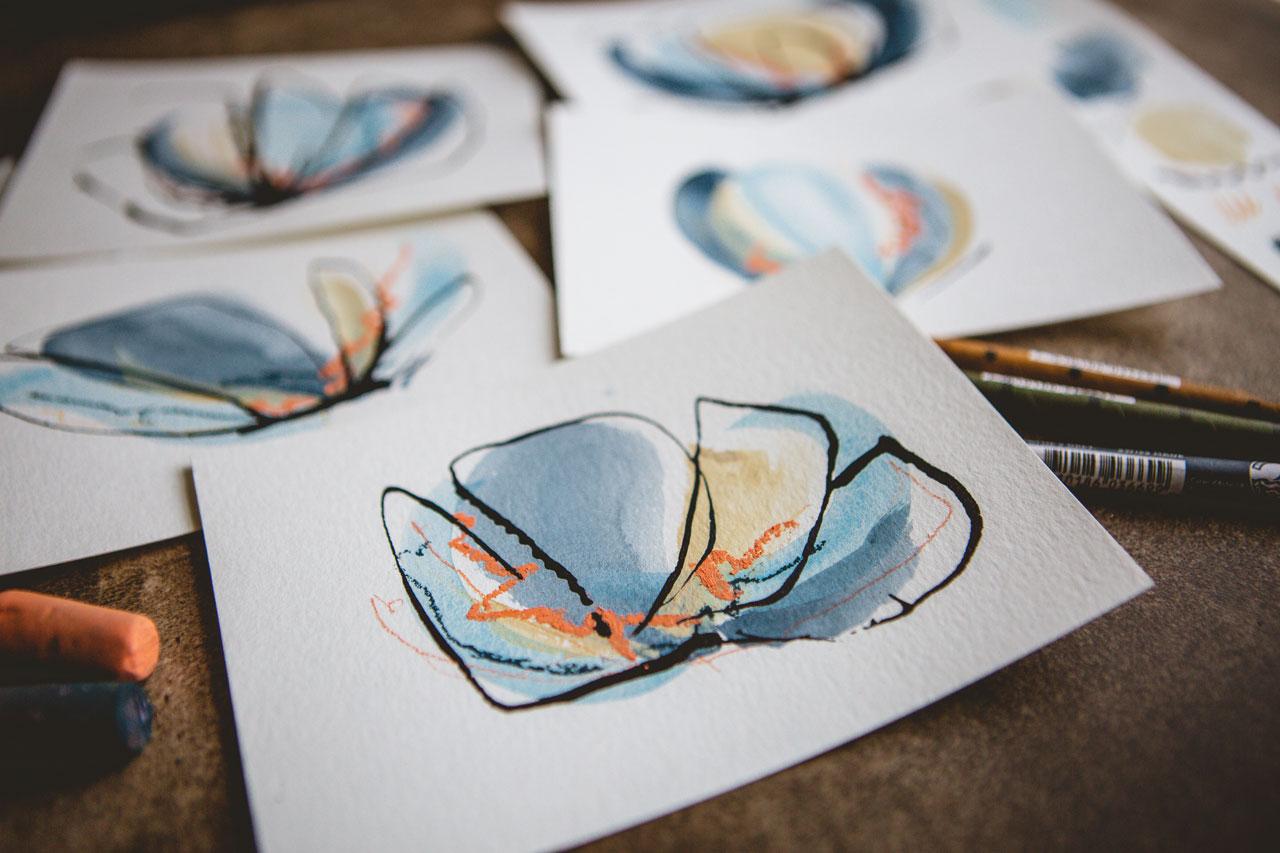
8. Blue Color Palette: Alright, let's do
our next color way. And I've set these in
the opposite direction. And this is of course just my
nine by 12 cut into pieces, cut into half and half again. I got six here that
we're gonna be using. So these are about
4.5 by six in size. I thought since we
did the first project in the portrait mode, let's do these in
the landscape mode. And we still have color choices here that
we haven't used yet. So I'm kinda feeling
like I want to do something that looks a
little more like a magnolia. So kinda spread out because
the roses are kinda up. These are kinda spread
out with the Magnolia. So let's do something spread
a little further out. And I think I want to play with the blues and the
little bit of orange. So that's what I'm gonna do. So I've got my titanium
white and then we've got our cobalt blue, which now that I'm
looking at these, I called it cobalt and I have the cobalt in
the cilia here. I actually think that this
may be the cerulean blue that I have over here
on my little palette. I'm going to put some fresh
down and we'll take a look. Oh yeah, that actually is
I wrote cobol on my paper, but I'll need to change that. That's actually
the cerulean blue. This is a common color, which is a Winsor Newton. And then the other shade in
here is that yummy indigo, which is also a Winsor
Newton Cotman color. I just picked these
up at the Michel's, this one the other day because
I wanted to play with it. And the other one
I've had forever. We've got those. I've got my ink up here. I've also got my pencils, and we have our little pastels and there's a blue and
that little pastel. So I might just grab that
blue and have it handy. So let's just put that little containers and
now I've got that there. So now we have all
of our colors ready. Let's put this down. And I really like working
in a fashion that's this organized because things
go a little nicer. Sometimes I don't do
planning when I make art. Sometimes I do do planning. The planning is sometimes
really fun and beautiful. And let's start with the
surrealism. Surrealism. Yes. So let's start with this blue. I'm just picking some of this
up off of my palette here. And that color is
a little thicker, so I'm adding some
extra water in there. And just like with
the first project, I want you to do different marks in different places
on each one of these. I don't want them
all to look the same unless you're
specifically practicing a specific technique
that you're trying to master. In this one? Maybe I'm trying to master
a specific technique of whatever it is I'm doing, but at the same time, maybe I'm just trying to
do something different. So let's just see, Let's just see what
we end up with. I might not like any of
these, might love them all. We'll see. And I'm thinking, you know,
wide spread them out because this is the magnolia
that I'm doing. So I might come back up here
closer to the middle again. I might switch up my brushes. Let's try a different brush. I don't know that I'm
loving any of these yet. All right. So this
brush does not hold the water like
the other brush does. That's very good to know. Alright, let's try
a different one. This one is almost too pointy, but let's try it anyway. Oh, look at that
though. We do get a nice shape out of this. While I'm trying to do most
of these in one stroke, there's nothing saying
that you can't come back and like, you know, fix a stroke or get something going really in the direction
that you want it to go. So don't be afraid to tweak
things as you're going. What if we do some
really fat leaves? Great. There maybe something really
rounded a little fatter. Super fun, little different. I don't mind repeating elements. Like you can definitely repeat the elements that you're doing, but move them around to different places on
your page so that everything you do doesn't
look exactly the same unless you're practicing
a specific technique you're trying to master. Yeah, I like that one there. So these two bottom
ones maybe my favorite. I don't know. If you hear the thunder outside, it is decided to thunderstorm. Kinda fun being in your art room while it's thunder
storming outside. Alright, super fun. I don't know about those
top two. We'll see. All right, maybe we want
some extra marks here. Who I like some of that. All right. So we also have, don't forget, I could
have done this earlier. If we take a bigger brush, let's experiment with
a great big brush. And I have the and we could also experiment
with a palette knife. So let's just see,
I've got the titanium. And maybe we'll just do some
different stuff in here. Just practice, see what we got. This brush is really
less controllable. Let's put it that way. So that's kinda interesting, but I'm having a hard time
actually controlling it. Look how big that is and how it just kinda does its own thing. Also have a bigger one that's
got like this angle washes, try that for a second. See, I don't know, Let's see. Let's do this right in here. Look at that, this big
angle E, one's kind of fun. Oh yeah, I like that. Big angle brushes a plus. And like on that one I just did like a big kind of
push it out there. It didn't even look
like a leaf as we were going, but that's okay. I like the differences
that we're getting here. I might want to come
back with the indigo. Maybe kind of do
some fine lines. Look at that. That's really pretty. I want you to get brave. And start thinking a little
outside the box and think, oh, what else could I add
to this for some interest? Okay, that's different. Like that. Maybe
we'd like some dots. Maybe we want some other
color at this point. We could at this point say maybe time for
some pencil work. So let me pull. We've got our two oranges. This was the one from before. Let's try the oranges. Yeah, I like that a lot. Kinda coming up here
in the whitespace. That orange kind
of shine through. Yeah, let's do this
one over here too. You know, and that could
represent stamens, it could represent pollen, it could represent
lots of stuff. Pretty, pretty, okay. And then also on here we've got pastels and
we could do dots, do we want dots? I added splatter to the last
ones and I really liked it. But we don't have to do the
splatter if we don't want. I really think maybe a
little bit of this blue. That's pretty, I liked the blue. Trying not to use this with both hands because we know
pastels get everywhere. Oh, that's pretty I'm kinda doing like,
you know, organic. You look in lines if you
want to do shapes or dots, or you're feeling
compelled to do some other type of
mark-making in your pieces. Go for it. I don't want to Him you in
on what you're allowed to or not to do. I like that. It's like don't, don't get real rigid with your
art and get stuck. I don't want to. I'm definitely love in the blue and the orange. We need to have some fun, like be less serious, will come to your art room
with a specific goal in mind. I think that's why continually
surprised myself when I do these projects
because they don't come anymore with a
specific expect notation. I'm not trying to sit down
and paint in masterpiece, just trying to play with my
surprise supplies and think, okay, what can I create today? What am I going to make? It's gonna be amazing. Alright, so let's see, I've got some ink here. I've chatted long enough where I think these are mostly dry. And I do want to ink these. I think I want to
start on the big one because if I were going to pick one to not Inc
think it would be this one. So save one was no ink
on top of it and say, okay, this one's not
getting the ink. Unless more than anything,
you loved the ink. Like I love these
two right here. So we can say those two
if I had to pick two. But if you ink it and think No, Everything needs ink, go for it. But I am loving those
two right there. I'm gonna start the
ink on this one. And I kinda want to do my little kinda
magnolia flower field. Who look at that, just gives it that
extra oomph that I'm looking forward gives it that
contrast, that boldness. Beautiful. Like the unevenness of these, like they're not
completely rounded. These are more like
a, I don't know, some kinda almost
rectangular but rounded, rectangular, loving that one. K I'm getting excited,
being really careful, trying to keep the
extra powdery stuff The off of my fingers. I don't want to touch these
where I didn't intend. I'm still filling, you know, kinda Magnolia wide out. What can I do to kinda get my, my leaves and everything to kind of spread out
into interesting stuff. Look at that. This one looks
like a butterfly to me. So when you're all done,
if you don't want to call these flowers and you want
to call them butterflies. That looks like a butterfly. Him almost loving this
one just like it is. Do we love that one like that? Almost more so even than this one like I loved
those two right there. So I think I'm going to
keep that one like it is and ink up this
one. So let's do that. How about four
inks in two weeks? Just because then if you're always starting on the
left side with your petals, come back and start on the
right and go the other way. So if you're always
starting this away, come back on one and
come the other way because it will
change the direction, the feel, and the way
that you put your ankle. And depending on changing up
something that you normally do and if you're getting
too precious with it, do it with your left hand. So maybe on the next set
will do on the left hand. So I hope you enjoy trying out. Let's go wide instead of tall. And then again, playing in a different color way
than the original one. So I'm going to let these dry. I'm going to set these
on the floor and let these inks really do
their thing and dry up. And I'll see you in
the next project.
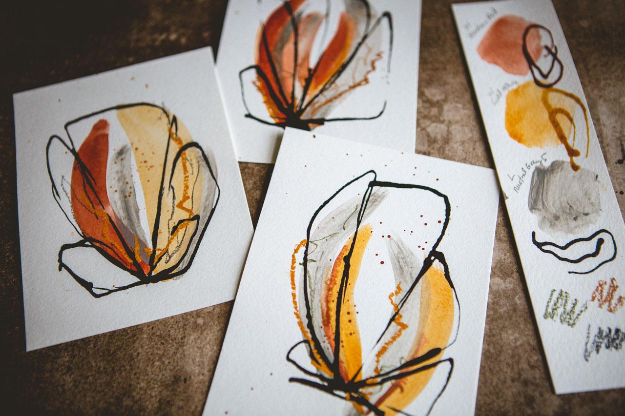
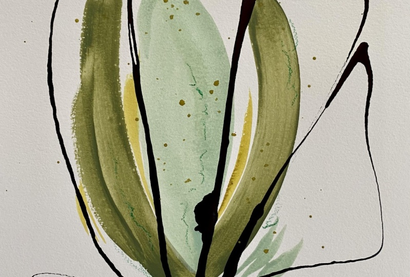
9. Rust & Gray palette: Alright, let's take a look
at our third color, white, because I thought this would be really fun to do a couple of different color ways before
we do a larger piece. So let's take a look
at that third colorway that we created with
the Venetian red, the gold ocher,
this neutral gray, and a couple of pencils. And we've got some pastels. If we want to pull the pastel, then those might've
been pastels. I don't know. Let's see, Let's just go ahead. And I'm gonna do these tall. And I want you to
encourage you to still do something different. On each one. I'm feeling a little
more like rose bud. Instead of rows out, maybe rose in like a bud. Taken some inspiration from the roses that are sitting here. They're kind of in a little bit, maybe a little more rose bud. But you could take inspiration from anything that catches
your heart's desire. Let's do this. Pretty OK or here. Loving the ocher. Maybe
I want to do one. Let's do some singles here. With a little more
paint on our brush. We'll look at that. Well, maybe we'll start the last two with
this pretty gray. And I'm offsetting
them a little bit just because I think
that's interesting. You could do that differently. If you feel like you've got
to a shape in your mind, you could definitely come back a little different
on your shaping. And maybe fat and narrow. So again, try to
bury up each color. Try to vary up each
mark in that color. And then we'll come back
and start adding in. So maybe in this one
I want a big thing of yellow. Look at that. Not quite the same as shape, color or spot as the other ones. I like that. More like a banana. Just go with it. Just go with it. Just know these are
our initial marks. And it's not gonna
be our final rodeo. And if you get one
that you're like, okay, absolutely hate it. Do like I did in that first
that and swap that page out and create a
different sixth one. You don't have to do everything. The same. Like I don't know, maybe I just messed that one up. Mostly. We will
see Let's go back with some ocher on one of these. Yeah. Maybe some red Let's see. I like that one. All right. Let's come back with
some gray over here. Let's do some gray on this one. Yeah, I like that one. That's different. We just feel that right in
the legs drawn here. Let's see, I don't have
any red here on this one. Let's come back with
a different brush. Maybe we'll come back
with this angle and just little touches in there. Oh, I don't have any
yellow on this one. If you want to leave a
color off of one of them, Bill free if you get to
that and you're like, oh, I love it, then
don't add the color. I'm gonna go ahead
and throw a little. Well, I love how that was a
little bit more like a line, so that's a fun
little angle brush. This is the chisel tip type
brush. I'm still on that. So I don't know. I don't know. I'm not sure about that one. Okay. So we have now com
I like this green. Well, yeah, these are the
Neo colors that I tried. So let's do the Neo colors. That's what these are. So let's go ahead and do some. Mark making in some scribble, I like that on this one
we're doing not the pencils, but the Neo colors and kind of changing things
up a little there. And I keep saying, Hey, if you're getting too consistent or too straight or
two curved or to whatever, use your other hand, use your non-dominant hand. And just see, does that gets you a more organic thinking
outside the box kind of shape. It's kinda hard to use
in your extra hand. So you want to practice that. But I do like how it's
kind of uncontrolled. Not as easy as it is
using your dominant hand. And sometimes when
I'm making marks, I get to matching
matches or I get stuck in a particular groove. And this is a good way to get yourself out
of that groove. And when I'm
coloring with these, I'm turning my crayon
back and forth, so I'm not keeping it nice and smooth and straight
in one direction. So be sure you're turning
it like that to get, to really get the organic feel. Super cool. Now I do like, and this is where you're like, Okay, I'm sticking
to my color way. And at the same time on
changing it up a hair, I do like the way that the pastels have
a different texture. So this is just an ocher color. Maybe we'll come back and see. Just texture wise. Do I like the texture? Sure, I loved that color. Let's try this kind of ocher, kind of an orange kinda looks
like this gold ocher shade. Oh, yeah. Look at that. See now that I can
see it's brown. I couldn't really see. Who has I drop it. And this is the
chance to to dots. Do you want other things in like this one I might want
some red or some pink. I didn't quite have Hu, that's pretty did not quite have as much vivid
color in this one. So don't want to
come back with, say, maybe my chisel brush and that red and do I need to
add some more red in here? Who looked bad? Definitely. I added some more in
there, didn't it? And maybe a little more. This ocher and be more vivid
about it. That's fine. And then maybe do I
want some dots? Okay. And on the earlier one? Oh, yeah. Totally one of those dots. On the earlier one I was using all the same
color for the dots. So in this one I want you to try some different colors and the dots don't do
all the same color. Try if you're doing
this ocher and read, try some in the ocher, trust them and the red, try some in the gray. This was so vivid, but let's just go ahead
and do it in the gray. Since I said that. Oh, yeah. I'm digging the grid. Let's come back on this
first one and do some gray. Yeah. Alright, So now you
know the drill. Finish all your
mark-making at this point. And then we got to let
these dry and we'll come back and add
some ink on top. So I'll be back. Alright, these are,
I'd say 99% dry. They're close enough to
draw that I can ink it now. And while I, on the first set, we were kinda doing
different petals for each one of these
different petal shapes. For the second set, we were doing kinda wide
magnolia leaf shapes. I told you these were kind
of a little bit like a, like a rose bud kinda feel. So I was coming up
and come and tight. And I think what I wanna do on some of these is use the ink alike and try
different color inks. And I tried different colorings before and I can't say
that I loved them, but I didn't try these. So I'm going to encourage
you in your pieces. Pick your favorites, and do
the ink you're going to love. And then pick your
lease favorites and try a different color
ink just so that you can be like I stepped
outside the box. So on our little
color thing here, I'm going to add
some little samples here of whatever color I'm considering and just
see what it looks like on my sample before Inc., a piece of art that
I want to love. And then if we're like Okay, I think I like that. See like this one right
here. Kind of fill in that. I kinda like both of those. So it might be interesting. Do one or two of these in
the different color ink. And not just the
ink. I know I love. So this one is really dark and I feel like it
needs the dark ink, whereas this one
is really light. And I think that it would survive one of our
two lighter inks. And so kinda feeling like
maybe this one we could try this Liquitex,
transparent raw sienna. So that'll be very interesting, seeing a transparent color versus the solid, deeper colors. So let's go ahead and just do some
weird shapes on that. I don't think I'm going
to like that one at all. Okay. And so this one was
kind of the medium. I really liked this one though. I love this one. Almost looks like a heart. This one might not
be my favorite. Let's see. I do, I do mostly loved
the other four. This one might not
be my favorite, So that's the one
I'm going to try. This other ankle. Let's get some ink in there. Okay. This is very interesting. All right, we'll do that
right there. I love it. I do encourage you to close
your lids on your inks. You don't know how
many times I've accidentally left the lid open, can die and knocked the
ink over on my table. Okay, let's try list all. Okay, so these are kinda
doing very heavy on the ink. So that may be much
heavier than I intended. I might've been my favorite one. Shoot, I should
have done it last. C, We all do things like this. Alright, let's try this one. Sounds fun. Oh
yeah, I like that. Okay, I like that.
Let's go for this. This is why it's fun. If you practice on some before you actually get into
like your yummy, great, big giant piece that you're expecting.
I like that one. Very butterfly. I like things that
look like butterflies. But practice a few so that
you kind of get flow of ink. You kinda get a shape going that you're
thinking that you like. So that when you get too
heavy on your favorite piece, you're not so upset
because you've already practiced and
you won't do that. I like that one too. Okay. There we go. So here we go. We started off rose
buddy and went back with some random abstract. Maybe pedal, he kind of shapes, maybe more butterfly
kind of shapes. We tried different color inks are a different color contrast, ie something on a piece or two. So step outside the
comfort box there and then see what you think of the different things
that you've tried. This is how we figure
out what we love, what we don't love, and what we might want
to try going forward. So I can tell you this is not my favorite color way out of the ones that I picked today. The other two are my favorites. And we're building up
to a bigger projects. So it's kinda important
that we had coupled different color
things to pick from. But that being said, I do actually really
loved this one. And I do really love this one. So I do have some in here
that I really loved. These two could be my pair
that I loved out of the six. How would call that a success? Alright, so let's move
on to the next project.
10. Going Larger: All right, So let's go bigger. I love going bigger. And because out of the three
projects that we did today, and I do even though I said I don't love
that third color way. Actually, when it's
sitting down with all of these on the floor,
I do love it. So I might come back
tomorrow and think, Oh my god is the greatest
ever. What was I thinking? It's so funny when I
think about a project. I'm, when I'm finished with versus when I come back
and look at it later, I always love things later
that I didn't love initially. And I think what was I thinking? It's amazing. So I
want to go bigger. I want to use one of these is my inspiration to go bigger. I'm really feeling this brown, pink, light pink,
yellow color way. So I think for today and I want you to do bigger and every
color way that you do. And I certainly
might come back to the blue for myself for later. But for class, I'm gonna do bigger in this pink color way. I'm going to set this
one back here behind me as my inspiration. Because I'm kind of feeling
that one like I want to go ahead and maybe mimic
this with the brown pink, the light pink and the
ocher with some ocher and pink lines and what I've got going and then
maybe the ink on top. I'm kinda wanting to duplicate, duplicate, but use that one specifically as my inspiration. I have my color card
right here also, so I can easily look
up and refer to that. So let's go ahead. A little pink going. And usually when you go bigger, usually I say you might want
to try a bigger paintbrush. But the big paintbrush, which I still got in
my water over here, it's a little harder to
control, but you know what? Let's just go big or go home. Let's try it. Can always
grab another piece of paper from right
over here beside me. So let's just see,
here's the brown, pink. And looking at my
inspiration piece, it kinda went up this
way. Look at that. And I might even come
a little fatter, so I might do a
second little swipe. And then Good job. Good job. I'm crazy. I know it. Okay. Now this one I start a little bit below
and came up this way. So that's what we're
gonna do here. Let's try that. Look how beautiful that is. Okay, I'm not gonna
touch it. I love it. And we also had the ocher, so let's just get some
ocher here. All right. Let's just see what we got here. And we'll kinda come up
through the middle here. Oh, yeah. Oh, I love that. Got a couple of yummy
lines over here. I've got a couple
of pink lines down here that I did and right
there was the yellow. Let's do some pink lines. Let's come back with
a smaller brush. Feel like I'm pushing my luck
with that gigantic brush, but look how beautiful
those strokes are. And we've got a couple
of little streaks here. Oh yeah, look at that. Kinda wish I had done those
yellow ones with this brush. Let's just come back
on top of those. Like I'm a little
more deliberate. Yeah. Like that. And we
also have green splatter. So let's go ahead and splatter. Look at that party splatter or we could have let that paint dry before I did that splatter, but that's okay.
That's still pretty. Now we have some of
these little pencils. So R2 pencil colors
were mid brown. Unlike in green. It gets the likened green
that I liked so much. I also came back in or
the surprise pink shade. It looks like these are not supposed to be
so outstanding, met. That's all you see.
There are more of a surprise as you get
closer and you're like, Oh, look at the yummy
details in there. Okay, and then I have
some of this blush pink. I think that's the
blush pink in there. So that's what
we're going to use. Oh yeah, that's pretty. We also have our
little pass bills like this pink and I went
right up in the green. You don't have to duplicate. I'm just using this
as my inspiration and because I liked it
so much, I like Why not? It's a really nice exercise in how close can you get it to your inspiration piece.
Yeah, super foreign. Oh yeah, I'm liking that. Okay. So this, I need to let dry. We're almost there and
we can add our ink. And you can see when
you really get going, these are pretty fast, especially if you've already
determined your colors, you played with your samples, you've narrowed down what
it is that you want to use. And then we're going to come
back with the black ink. So let me make sure
this is good and dry. I'll be right back. Alright, so now we are
ready for some ink. Right? So, okay, so here we go, commit. Oh, super cool. Look at that. Now we have like kind
of a little cross between our roses
and our Magnolia. So this may be the magnolia
that has an unfolded yet, but look how pretty that is. Alright, here's our inspiration. Are a little bit larger
piece, super-duper fun. So I hope you enjoy taken one of your smaller pieces
and making it larger. I'm probably going to go
ahead and do a blue one. And I don't know if I'll
do that third one or not, but I definitely love the blues, It's a color I would
certainly try to enlarge. I do love this size. So even if you only
stick to this size, these are beautiful for framing. Gifting cards. You could easily make
these the card fronts, Happy Birthday,
hand letter stuff. These are fast enough and
beautiful enough that you can get these quite easily. So bigger project,
little project, even if you don't love your big one, and I
do love my big one, but even if you don't
love your big one, I want you to try one
or two larger just to see the challenges of
making something go bigger. Because it is a different, a little different technique than when we're
doing smaller the, the how do you get it to go larger and to look
like you want it to look and some of that is
in using a larger tool. So in this case, maybe like a larger brush. Some way to at least try a few larger even if you don't
continue in that way. I do love the small ones. And I will see you
back in class.
11. Finishing Spray: Wanted to mention in
this video how you would fix your pieces if you're
using the soft pastels. So most of what I used
in class wouldn't need to be fixed if you're
using the watercolor, the acrylic paint, the pencils, the neo color
crayons, or the ink. The acrylic ink, you don't
have to fix any of that. But if you're using
pastels in your piece, you have chalky bits that can be smeared every time you touch it. And if you're working with a
lot of pieces, especially, you'll want to fix those so that you're not just ruining all the pieces
that you touch. And to do that, usually
you use a pastel fixative. And this is a soft
pastel fixative. And I like this
annealing a brand. It is one of the
more popular ones. And it has less of a
tendency to change your piece because usually
when you spray stuff on top of a pastel, you could change your piece. So if you're working
with pastels, do consider fixing a piece. I would try one of your samples before you fixed it on
permanent peace that you loved. So if you take, say
like your sample, your color sheet here and maybe fix one of the
colors and just see or do a junk piece that maybe the inks ran and
you didn't love it. Go outside and fix the
jump piece and then see, are you okay with what the fixative does and how it looks? Or do you just need to take extra care at this
point in storing these? And so I would store these
in their own plastic sleeve. Or I would store
these with a piece of wax paper or parchment
paper in-between each one and then
not move things are smear things around
before you give them, sell them, frame
them or whatever. If you're just
going to frame it, you can take this straight to
the framer for sticking in a frame that you got from
your local crafts shop. Then just be super careful not
to touch anything that has that pastel on it and go ahead
and frame it, your choice. But this is the
fixative that I would fix if I used
pastel on my piece.
12. Final Thoughts: Hope you enjoyed hanging out at your art table playing
in some new color ways, some different supplies that maybe you don't normally pull out to combine together
in your abstracts. And I'm really
looking forward to seeing how you translate something that inspired you
from outside your yard. Some flowers she took photos of maybe some dried
flowers that you had in your house like I did. Because some of my
favorite pieces are the very first ones I did, inspired by the dried roses that I have sitting
in my studio. Who knew that that was
gonna be my favorite. It's surprising when you
go out looking around for inspiration and then how you interpret that
into a project. It's surprising which
ones are your favorite when you're done because that wasn't going
to be my favorite, my my blue set in my mind because I
already thought I'm gonna do a blue set. I thought in my mind that was going to be my favorite
because some of the projects that I've done for other classes and other
projects and things. I've always tended towards
the blues sometime, or the orange and the pinks, or the blues and the greens. And today it got to be the ones inspired by
the dried flowers, though more of a
greenish Goldie color and the bright peachy tone. And so I was pleasantly surprised what ended up
being my favorite today. So I hope you have some of these discoveries for yourself. I want you to just give
yourself over to the process. Walk outside, take photos, be inspired, see
what's out there. Looking at shapes,
look at colors. Look at the different types of flowers you have in
your environment. And then how can
we interpret that? Simplify it down to color and super simple shapes
without a lot of detail and create
an abstract with those thoughts and feelings
and inspirations in mind. So I hope you love
giving these a try out. I really loved having
you in class today. I can't wait to
see your projects. So definitely come back and
share some of those with me. And I'll see you next time.
 DENISE LOVE, Artist & Creative Educator