Transcripts
1. Introduction: Hello and welcome to this. Gosh, I class. My name is Liz. I am a digital creative from Melbourne and I'm going to be a teacher for today in this class, we're going to be learning how to create brilliant the tentacles in per crate on the iPad. I'm using a iPad Pro 12.9 inch with my pencil. If you don't have a stylus or an Apple pencil, that's fine. Just as long as you've got an iPad, your finger, and procreate up for a class project. We're going to be creating our own botanical illustrations on procreate. You can choose your own adventure with this class so you can make it simple, detailed. It's up to you whatever you prefer. This class is for people at all levels. You don't need any experience with procreate app to get started. If you are a beginner, I would recommend that you start off with this simple illustration. We will be starting with the basic kind of idea of the illustration and then building up with detail. So if you feel comfortable adding more and more details, you very feel free. If you want to just keep it at a simple kind of illustration style, that's totally fine. Ok, T, at the end of each lesson you can add to your an illustration based on what we've learnt during that segment. Then by the end of the class, you will have your own finalized product that you can share in the project description Tumblr, which would be really wonderful to see what you create. So grab your iPad, grew up your pencil or your finger, and let's get started.
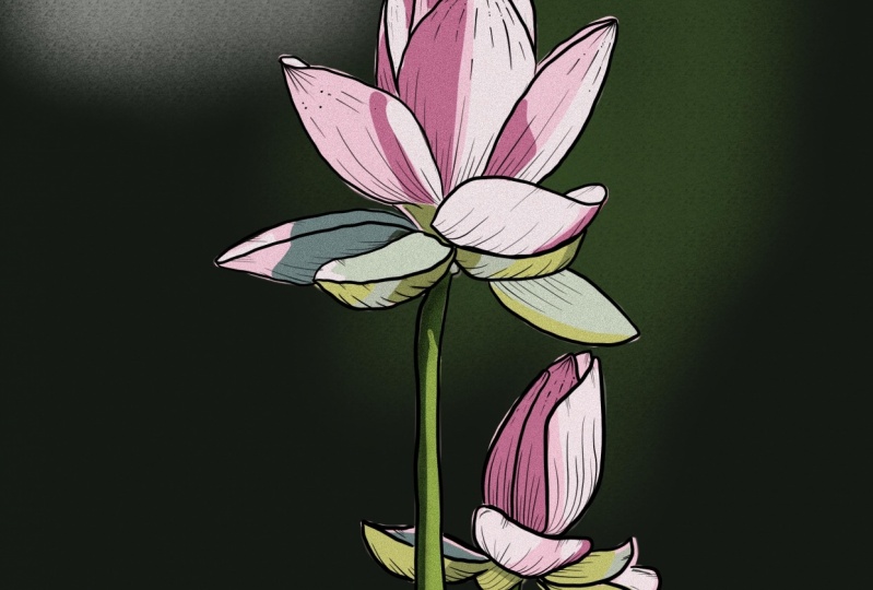
2. Finding a Reference Image: In this class we will be working directly from a further. So you don't need any experience whatsoever. You can find free images on websites such as on splash all pixels bays are really great because they have royalty free images that you can use. And you don't have to worry about taking someone's copyright or anything. It's all free for personal and commercial use. Ferry here, I'm just showing you what on special clack and I'll put a link in the description under the class so that you can easily get to that website. Here I'm showing you pixels. So similar sort of website at similar idea, just different conferences and they've got yes, sir. You can find links to these two websites, gambler, I'm gonna use a further that I've taken myself. It's a picture of these beautiful somebody else that I took a couple years ago. So feel free to just peruse your camera roll, jump outside if you want, take your inverter or if you don't feel like doing them, you can't just jump on one of these free websites and use one of those. You didn't have to draw a sunflower. If you don't want to, you can choose your favorite floral, yo, favorite plant. I like Stero. I've got this really nice piece later became you could do something like that. It's all the same process. But I'm just going with somebody because they have my favorites or pulls his claws. Go. Find your further that you're going to use. You can download the one that I'm using in the project resources gambler or just pure find urine. And we'll get started annex, we're going to set up our canvas on procreate and lend kind of the basic skills that you need if you've been using procreate and you kinda near the basics of this up, feel free to skip this part. We're just going to input our freighter and kinda let a bit about clipping mosques and elbow up and things like that. So feel free to skip that if you already know all that stuff and get started, let's go.
3. Setting up the canvas + basic skills: So I'm gonna make a new canvas in procreate now. And we're going to do is press the little plus at the top right corner. And you can create whatever size you want under the depresses little one in the top right again. And we're going to go 2160 by 2700 pixels cert minds already inputed that 300 API and is whatever maxillae is you'll iPad will allow. I think that depends on the storage and the size of your iPad and also the newness of it. I guess mine is a iPad profession. Say not sure if it'll differ from you to there create. Now it's going to open up. All right, so I'm just gonna give you a quick little to offer. Great. So you've got the wrench up the top, that's the actions petal. And then what's a little tabs along here. So we've got cropped NBA size in the Canvas section you can turn on during guide, which is just like up and down and left and right limes that help you draw. You can add things, sir, inciting a file or a further adding text and stuff. The Share tab lets you share the artwork and it's way you would guard to export when you're done. So you got PNG or JPEG or whatever you wanna do. Video, sorry, procreate will screen record your entire illustration process, which is really cool, sir, the time-lapse that we'll show you the whole thing when done pretty much just like special, which is really cool. You've got prefs say this is what you change it to the light interface like mine, where you can keep it as black if you want it. And you can change with the bar on the left hand side is search unit on the red, you just click that one and get this just little settings that you can play with. And then if you need help, you can click the Help button, which is handy. So your next we've got the adjustments panel. And that's just lets you alter the layout that you're working on so you can change the hue, saturation, and brightness of the columns in that layout. You can change the collarbones. You can add noise, shopping, bloom, this is all with procreate 5X, the bloom glut, Shofar and chromatic aberration. They're all new with the new update. So if you don't have authors, don't worry, I'm not going to be using them in this class. They're just called play with MSAA Selection Tool. Sir. If I draw something, if I draw a little line here and I get the selection tool, I can select proud of that line. And then click the Move tool, which is the little arrow at the top. And you can move around that chunk. And yeah, that's pretty cool. That's really handy for he need to move the position of being school, stuff like apps or just use two fingers and just tap an undue. Briefing is tapped to redo. Sorry. Yep. Then we put the brushes pedal, which is really cool. This is where we join utensils up. So I like to use technical pen which I've edited to suit my needs. So things like streamline, I've turned up to 80% and that just makes your strokes nice and clean and Smith, without it. That's what it would look like without it, sir. Very clunky. Not as nice. I like to have it got 80. And the typer I've just set to about there, which just means the ends or tape it and not fully thick at the ends. And these are all the cool brushes that come free with procreate, sir. You can play around with the brushes, See what you like. You can find technical pen, the one I'm using in the inking section. So that comes with procreate. You don't have to worry about buying a brush or anything that is cost yet. So there's heaps are really cool ones that you can play with. I'm just gonna go with my handmade technical pen, which I had edited. Sigma needs. So then we've also got these smudge tool, which just smudges things. Which is kinda cool. I don't really use it because that's not my style. I like the flat design kind of look. We've also got the Eraser tool, which can help you mindset to eight pencil right now. So you can see it's like not erasing the full thing. If you change the brush that it is set to, sorry mindset to technical pen now, it'll remove, it'll erase it with that same pin, which is pretty cool. So it'll have that crisp line like I like say, Yeah, you can change the brushes full. The Eraser tool. And this MAN showed, Alright, let's just three fingers and you just swipe like that. And that'll clear Canvas. Right. Now we've got the lightest panel, which is really cool because you can organize all your layers and put things underneath other things and still be able to move them around. It's really handy. Laser, very standard in these sort of things. Yes. So you can just have something above and blur an object and still be up to edit them and move them around, which is really cool. That's the really cool thing about digital up. So now you've got the colour panel, which is just where you keep all your colors and you can change the here, here. This is the classic one. You can change the saturation or the brightness. And you can also just draw on top of it. And, and then you can also make pallets, which I've just got a bunch of random ones yet. And you can just select a color and a reverse rate to the Opera School. And then there's also a disc that you can use if you prefer that kinda visual representation, harmony. So he need like two different colors. Pretty cool value. You can get the exact pecks code and use that. But yeah, just keep it to blackcurrant now, sorry, on the left you can change the brush size at the top and then the capacity at the bottom. And if you hold down this little square, it'll automatically turn into an eraser, which is really handy. So you don't have to keep clicking the brush button and the Earth above. So now I'm gonna show you how to use alpha luck. Just going to draw a circle and fill it in by grabbing the circle of the cola and just dropping it. So this is my cool little circle that I've got here and I might want to add to some detail on top of it without going off the shape. So what you can do is you can go until the layers and use two fingers and swipe it across. And that'll alpha lambda. You can say it by there is little checkerboard pattern behind it. Or you can click on the layer and then your alpha look. And then you can draw on top the shape. And only the lines that you draw up constricted to that actual section where the pixels are on that Lyle. Because that kinda makes sense. So it kinda look everything outside the layout. And you can only draw on top of where you've already drawn before you have a look, which is cool if you want to add like shading or something on top. But what this does, it'll destruct the whale sounds pretty scary, but anyway, it, this will edit the actual pixels on the layer. If you wanna do this in a non-destructive way, you can use a clipping mask, which is what I prefer. So I'm going to press undo. So just two fingers tap, I'm gonna make a new layer and then draw the same ones. And then if you click on that layer that you just drew the lines linking your clipping mask, it will confine it to the lab alert. So that's called the base layer, this black one here. It will combine the new layout to the blur and you can tell it's clipping lost by this little downwards are here. That's a non-destructive way. And then now I can just turn it off and I can't see it anymore. And then ten. And yes, that's a good way to like add things to the labeler without editing the layer itself. So that's a clicking OSC and alpha lock someone, we actually change the pixels on the layer, which I don't usually use. Alright, so now we're gonna import our further. I'm going to import it as a private further, which means it weren't sharp on the time-lapse, which is really cool because then you can see the actual illustration process offering a dont say, go to the Add section in the actions panel. And we're going to swipe into further to the right and click on instead of private further. Now find you further. It's going to be the very bottom. There it is. And I would come up like that. You can zoom out, fit it to the page. Just place it wherever you want it to be. And they said, now my footer is imported. So now you can go have a play with the software and get a feel for what the different things. Ah, so you have a plate with alpha law complaint with clipping box, see what the kind of differences and then delete overlays and inside a private further so that we can get started on the actual illustration pop up. Next we will go through how to do the basic shapes of the illustration and gets dotted joining.
4. Illustrating the Basic Shapes: Okay, so in this lesson we're going to be learning how to do the basic shapes of the illustration. It's really easy. All you gotta do is outline what AC on the fighter and just fill it in college octal. Sorry. Really simple, really easy. Yeah, we'll just get started. So the first thing you need to make sure of is that you're on a layer above the photo itself, not on the actual further Laius. So then you can turn off the very way and you can see the illustration that you create a zoom-in. Describe any color from the illustration. Just press and hold on to the harder to do that. And that'll pick up any color that you need. Make sure on your layer above target, just hold, drag it up and down, release it what you want it to. Just start by outlining the petals of a flower. And if you're having trouble seeing way aligns all what you can do is you can click on the end, on the inside an image Leo, and just turn down your capacity so you can see what you're up to. Make sure you selected on the right layer. And it will just, going, touring around doesn't have to be perfect, doesn't, it doesn't have to be exactly like the further, this is your autistic impression. So you can make the petals any kind of shape you want. If you don't want me looking like that exactly. That's fine. If you want them to be more spiky, more soft, and rounded up to you. You show all your lines are overlapping because otherwise when you incurred a fill in the column, it'll just spill out onto the whole canvas. Sorry, my charts old guy, nice and good. All right. And now what you gonna do to fill in McCullough is just scrap the circle at the top where the college robustness and just drag it in. And then you've got your petals all done making a layer above it to him near past any of the harder back-up. Make sure you're on the New Layout and select a brown color for the inside of the flower. And the need is trace around that. So that one's filled in. You can turn back on the pedals to see what they look like together. And they're looking very nice. So we'll move on to the leaves now. So on the last panel I'm just gonna select the image while and press the plus so that we make a layer above the image but bowler the pedals, if that makes sense. So I keeping things organized in terms of what you can see in hierarchy of foreground to background kind of thing in the actual verdict. So now I'm going to do the heat leaks and I'm gonna do the top leaves Fest. And then another way I blur, it will be b believes in the background and I will have a stem at the very back. Assert her becoming sense. We're just gonna be working in like layers based on where things are in the folder. So let's do that. Just grab a green color. So that seems to be all the leaves on this layout. So I'm going to click on the image color and make it so that it's alert. Currently. Choose a slightly different color so that I know that it's on a separate layout. And now just do the next slide down. Hello. Things like going to mimic me, lay off the learner to the darker color. And I'm going to add in the stem. So I've just done off the layer of the image and it's looking really good right now. I'm really lacking how it's kinda coming to life with all the different colors that we're using on the different lands. Now I'm just gonna make a group with o phase so that sunflower one is by itself. So are you gonna do is grab a pencil and just drag to the right with one of the latest selected distract next onto the red group. And I'm just going to rename this to some file one, just so you can be organized. Then again, thanking you, layer on to lap and we'll just do the same thing on the elephant loud. So if you've got just one flower, don't worry about doing this step found you can group them if you want, but you didn't have to because it's just the one image and one file that you're using. So that's up to you. But since I've got two, I'm going to keep them separate and organized in this way. Sums gonna chew the yellow and stop on the pedals. Make sure I'm on the right layer. And we'll just start on the ground. So this the pedals on that one. And now I'm gonna do the middle of cloud and the rest of leaves and stuff. And then we'll get going on to the next lesson. So there's some leaves on a stem as well that would be behind the fast sunflower. But I drew sir, I'm just gonna kinda like the second sunflower like overlapping because as different layers to the fighters that's going to be surroundings. And you can see on the last panel it'll be surrounding. If that kinda makes sense. So this one might have its own group, but it will be a separate file, which hopefully that'll make sense and leaves a note. Alright, so you've got out to some files now, basically drawn the inlet joining the basic shapes. So they look really cool and very interesting him, pause this lesson now and gradual, basic shapes TO procreate file. If you need a re-watch anything for free. And next up we will stop to add some dimension with some slight shading and highlights.
5. Simple Shading: So we're going to start adding some highlights and shadows to the illustration now that we've got all the basic shapes done. So what I'm gonna do is I'm going to grab some file one's group and select the Pedals layer which I'm going to be using. And I'm just going to turn on the further below, choose the color of the petals that you are going to use. And now I'm going to choose a lighter color just by dragging the little color across. And yeah, I'm just going to find all of the highlights sections by using the photo below. So make a new layer above your pedals. And then we're going to turn off the pedals and all the leaves blur that I'll kind of overlapping with. The further we go. That's good. Make sure you're on the right layer. And I'm just going to stop like drawing around the actual highlights. Don't worry about overlapping because we're gonna use a clipping loss to confine all of the new pixels that we're drawing onto the label or where the weight true like the outline of the petals. That kinda makes sense. So just go round and find all the highlights. And this is really easy to do. Okay? Okay. Now that I've got some highlights on there, I'm just going to turn my base layer back on and you can see that it's kind of turned out really cool. But we've got a lot of lines like over here and stuff like overlapping and making it look widths or tap on that layer 15 that I've got that where you've put your highlights, anger clipping mask. And that will confine all the new pixels onto the base layer, which is the petals. That makes sense, sorry, there's all of it confined socially without and with a clipping mask. So it will just confine everything to the lay of leverage is really cool. And that's literally the entire process for making highlights and shatters. I like to do the shutters blurred. Sorry, on a layer underneath the highlights, but with the highlights still visible, if that makes sense. So just turn off the clicking Moscow that now, since I've got the highlights up, I'll be able to draw the shutters. Biller healing this currently say that because it is the same color but yeah. Kind of like below like that so that you can kind of keep an eye on where everything is and make everything look nice and neat. But yes, so now I'm going to add shutters to this pedal section. It's really simple. Just follow the main steps and we'll get going. Okay, so now you've got the shutters in, and I'm just noticing that the shutter is a very orange compared to the yellow of B, like highlights envy other main pedal column. So I'm just going to make it all a bit more orange because that's the actual color of the flower blurry view. See you when I turn off, the orange fits in a lot more than the bright white highlights. So I'm just going to turn off that layout. Select this kinda like golden orangey color kind of icon. And then I'm just going to drag and drop on top of it. And that'll just change the whole color. And then what you can do is you can use two fingers swipe and that'll alpha log of this layer. Click on it. Anger, feel like, oh, we're going to select just a slightly brighter color with the highlights to change to serve off locked and fill layout. And that'll just change that. For now. I'm just going to turn on the clipping mask. And you can see how beautiful illustration looks. So I'm going to turn old believes. And that's on the left. We can see without E1 on the right, we can say with the subtle highlights and shading, and it's looking at what mooc Three-dimensional and interesting. So we're going to jump off camera and just did the rest of the illustration with highlights and shutters. Coastal scrotum called a T can just flip through if you want to see how I'm doing it for everything else. And so just using one highlight shade and one Shutter shade highlights from top shadows blurb, but birth above the main layout. And yeah, that's pretty much it. Very easy, very simple. And then we'll get going. Mm-hm. Yeah. Okay. Okay. Yeah. Okay. Mm-hm. I'm sorry. Okay. Okay. No.
6. Additional Detail: Now we put the basic shapes and some simple shading and it's something really cool I really like and not staying out thought we can add some extra details to think a bit more realistic and more like the Friday. Or you can add some autistic clarity or choice. A, He provided that you can see up at the Furda, hey, just as like a reference and all of my lays out organized really neatly, nicely so I know where everything is. So I'm just going to go to the petals on the middle section. Here on the left one, just tend to bet on. You can say that that's a lot less detail than the actual further. Sir, what we can do is we can open up that group, make a new layer above. And I'm going to start adding some of these dissections, as you can see, is in the footer. So you're just going to grab co founders gonna startling dotting around. You can only say it at the moment, but like, I'm just basically like doing this. But I'm going to raise up, yeah, just start like adding some dots of color to kinda Glick, fade into the middle section. If that makes sense. You can do as many as you want and keep it as clean as you want only if it is misused. You wants to you. And now, here, now I'm gonna make a layer below that and choose this orangeish color. And just do the same thing. Jerry might do another one, just play that one. Because a topical for Maddie, sir, now town the other layers in that section. And that's looking like really cool stirring via email. I play around a bit. I'm just going to make all these a clipping mask to the one at the bottom. The group, just so that they are all confined, downturn recommends petals. And yeah, that's looking really cool, oscillate. And I might just add some more of these yellow ones at the top to surround the sections layer. It's like blending. Just to add a bit more of a blend does not say gosh, that looks really come up. I like how it's turning out. Say I'm just going to add some more for the peace of the light yellow in color. Just really building up those layers and making it more interesting. Current Coke. So I'll turn back on the rest of the flower here. And yeah, there's extra details and making it look really interesting and cool. So really, but like that. And I'm gonna do the same thing on this somehow. Sir, just turning on the middle section. To me, I'm just going to turn off that base layout and choose one of these Elaine colors. And just do the same thing. I already said. Turn that Milbank, recall, it's looking pretty cool. I might just add some wheeler to the top part just to make it a bit more cohesive or at coat. Sorry about something like kinda Also I'm not going to lie. It's making it more realistic and interesting. So here, actually I'm gonna clipping mask size because I forgot to do that. It's just that's the orange ones to blend in the pedals on this one. Somehow one. I'm just going to make a new layer underneath the fast shading section. Going to select that foreign key coa, and I'm gonna make it darker. And then I'm just going to guard hoops. Make it above that lump. Sorry. I'm just going to trace around makes me kind of at smaller trace around this outlet section. And just kind of add in these shutters to make the blend between the middle of the flower and the shading that I've done. A bit more cohesive and kinda gradual. Just to get a bit more depth in the flour. Thinking I might just make it a bit more orangey termed. Try that out. Yeah, that's looking at Google. So I left now. I'm just gonna do the same thing to this one. Just doc and end up in the middle. Yeah, I'm just gonna talk in that one up a bit. Cool. Cool. Sounds a bit darker in the middle, then it's kinda making more of a gradual change in color. It's gonna make sure I get the right coef here. Alright, that looks cool. Sorry if I turn off the back pain. That's looking a lot nicer with the details. And yeah, you can go and add some extra details to it now if you want, wherever you want, doesn't really matter. I'm going to leave it that if you want to add some things to beliefs and stuff, feel free. It's totally cool. So right now I'm going to ask you to add some additional details, whatever you like. Yeah, up next we're going to be adding some text shot and little final details to the illustration after we'd done the main body of the illustration, if I like sensor. Yeah, keep on watching and we'll get to the end.
7. Final Details: Now I'm going to add some final details and some texture and stuff to the illustration to just finish it off. And yet so let's get into it. So what I'm gonna do first is changed the background color, SIR, which can go to my pellets and find a nice colon I might like. But you don't have to turn off the fertile land. Sorry. I'm liking that one, but I might like this. Yeah, thinking maybe this one. Alright, cope, sir. Now I'm gonna make a layer above everything, and this is going to be full, the texture, grainy texture that I'm gonna put on top. So I'm gonna make it nice and grainy and interesting. So I'm gonna go 0 height, 0, S, M, and 50% base or 50% black. Pretty much. Drag it into the new layout, make sure it's above everything else. There are two adjustments and then we're gonna bring noise on land and just drag it up a bit. Doesn't have to be too intense. And then you can play with the settings to see what you like and then apply. And then we're going to set this latitude or Valais. And that'll maintain all the same colors in the illustration, but over just at this grainy texture on top, which is really cool. And I really liked that kind of way it looks in its too much and too bold VD can just turn down the opacity of it. And that'll help make it more subtle. But yeah, that's a really cool kind of texture to the outlet, which makes it a bit more opaque alike, which is cool. You can also, instead of doing that, you can do well. And we can find some really cool brushes in. He'll see me like an art which I'm brush. You won't really reach play around with the different ones that they have. I like some of the texture brushes, this grunt one, pretty cool. Yeah, I'm, I grow the grunge one. But all I'm gonna do is go to edit the brush. And then I'm going to make the dynamics on properties maximum size, big, mimic it really big. So that now when we draw on top, let's not do it in that big, maybe. It was at the texture a lot easier. So just drop everything. And then I'm going to do the same thing but by making it or belay. And yeah, you currently see that SART. Instead, I'm gonna make this into multiply, turndown letter prosity. And I might just choose a woman. Turn, sir. Alpha luck. Company Leah anger, alpha logo. You can select the two fingers towards the right. And I'm just going to choose a slightly more return calls, maybe this brown. And yeah, that's kinda cool. Cert it's 10 million breastfeeding as well. And we've got this cool like texture in the background and also oeuvre of the illustration. And you can move it to the very back if you want, if you want it to be at the bottom. Group didn't mean to make an agreement. That's finding. Yeah. So you could have that as the background if you want more, you can play around with some different textures that you can overlay on top, we're using multiply, which basically just makes it Dakpo then whatever is below it. Or you can do like our Philae, which will just are highlighted in that kinda makes sense. And then you can play with the opacity and stuff like that. So yeah, those are just some small ways that you can add some. Flat, you're out weck. There's another thing that I might like to do, which is to make some sort of like shiny, sparkly kind of things to do that just to make it look like it's glowing a little bit. I'm gonna go to my ticking Copernican. And just also the highlight layers. Choose a white-collar. Wherever you want to use. Random spots really can add some little details to the illustration showing with which direction the leaves, the petals are going. You could say that's just good for this demonstration. So there's some little lines that I've just added in. I'm going to duplicate this layout. And on the bottom one, there are adjustments and guard Gaussian blur layout. And then we're gonna just slightly pull it up a little bit, not too far because he will lose it. If I zoom in hopes you can kind of see what it's doing there. It's adding like this blurb behind it. Yeah. You get to there and spoke. So you'd say it's like adding the school or behind the illustration, behind the white lines. And it looks really cool. So you're going to ask except the maybe just with this on, you tell me a prosity bit. So it's not so intense. And yeah, that's a cool way to add some sort of like glowing elements, tear out what he can do it on the highlights. Or you can do it just like if you wanted to do it with a star brush, that's really cool to do, true. So I'll show you how to do that. If you go to the plus button on the brush library, you can make your own brush. So we're gonna go to shape edit, impo, source library. And down the bottom, there's one called style. So that's there to stop. Yep, go down. Then we're gonna go to spacing a 100%. And and you can turn up the rotation if you want to now the or capacity to 0. And also you can use stamp review on the properties. Many that'll just make the brush look like this. So I made a couple of, yeah, just as little examples. So now if you wanted to add some little stalls, tear out what he can do, sir. You can change the size of them. Didn't make it a two crazy, but I like them. So maybe I will. And that's another cool way to, I'd like some little interesting elements to your out. Like you don't have to do it like that, but just adding them wherever. Alright, so we've added some textual, we've added some little illustrations and things like brightness and stuff if you want to, you don't have to. So now I'm gonna exploit it. So just calling the wrench and girls share, think are P and G, and then you can just save it and exploit it. Very simple, very easy. And yeah, so feel free to add your final details, any textures and things that you wanna do, you're just play around with it and see what you luck. Yeah, that's pretty much it. Thank you so much for watching. And I'm just going to say thanks again in the next lesson. But yeah, until it, by.
8. Thank You + Conclusion: Thank you so much for watching this class. I really hope that you enjoyed it and that you learnt something new. If you did, please leave me a review down below and let me know what you thought. I'd love to hear your opinion and any feedback that you've got now you will have a brilliant botanical that you can share in the project gallery blurry if you've been following along with me and I'd love for you to show me what you've created. Yeah, and you can also share your work on Instagram and tag me Atlas dot creations as well. And I'd love to see what you create. Again, pause this class now and you're agile project into the project gallery below a colleague to see what you've created. And yeah, thanks so much and I'll see you next time. Bye bye.
 Liz Morrell, Graphic Designer and Digital Artist