Transcripts
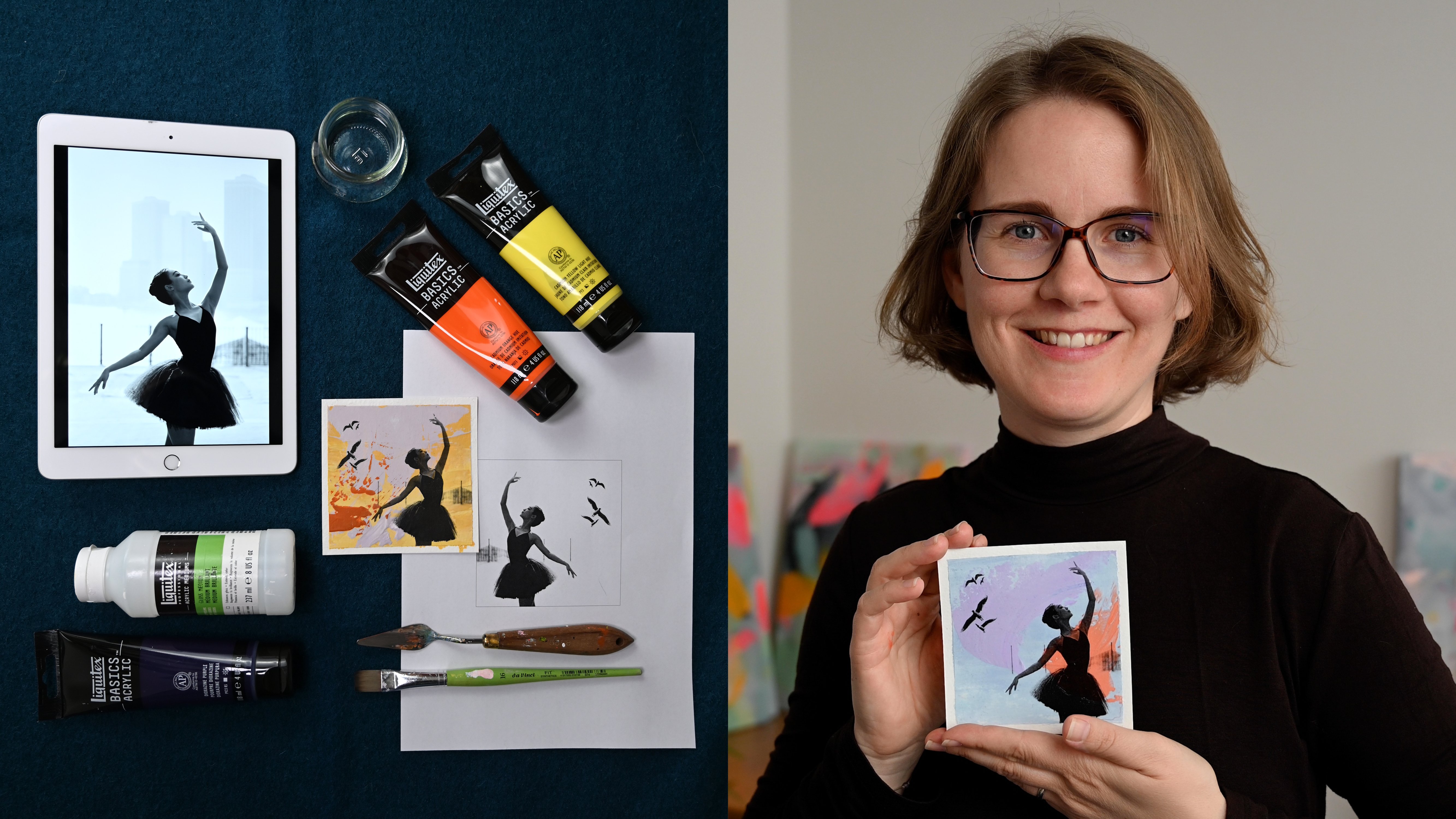
1. Introduction: Do you also photograph
flowers all the time? If your camera role is
basically a floral wonderland, get ready to
transform your images into captivating mixed
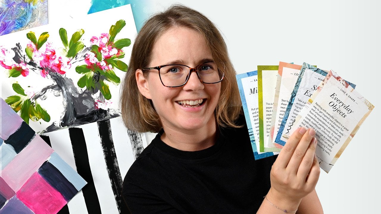
media works of art. I'm Connelia, a
visual artist and abstract painter from Austria with a background
in graphic design. I love to explore different
media and recently started to enjoy bringing together
analog and digital workflows. In this class will fuse the timeless charm of
vintage botanical prints, black and white photography, and the vibrant world of pop art to create
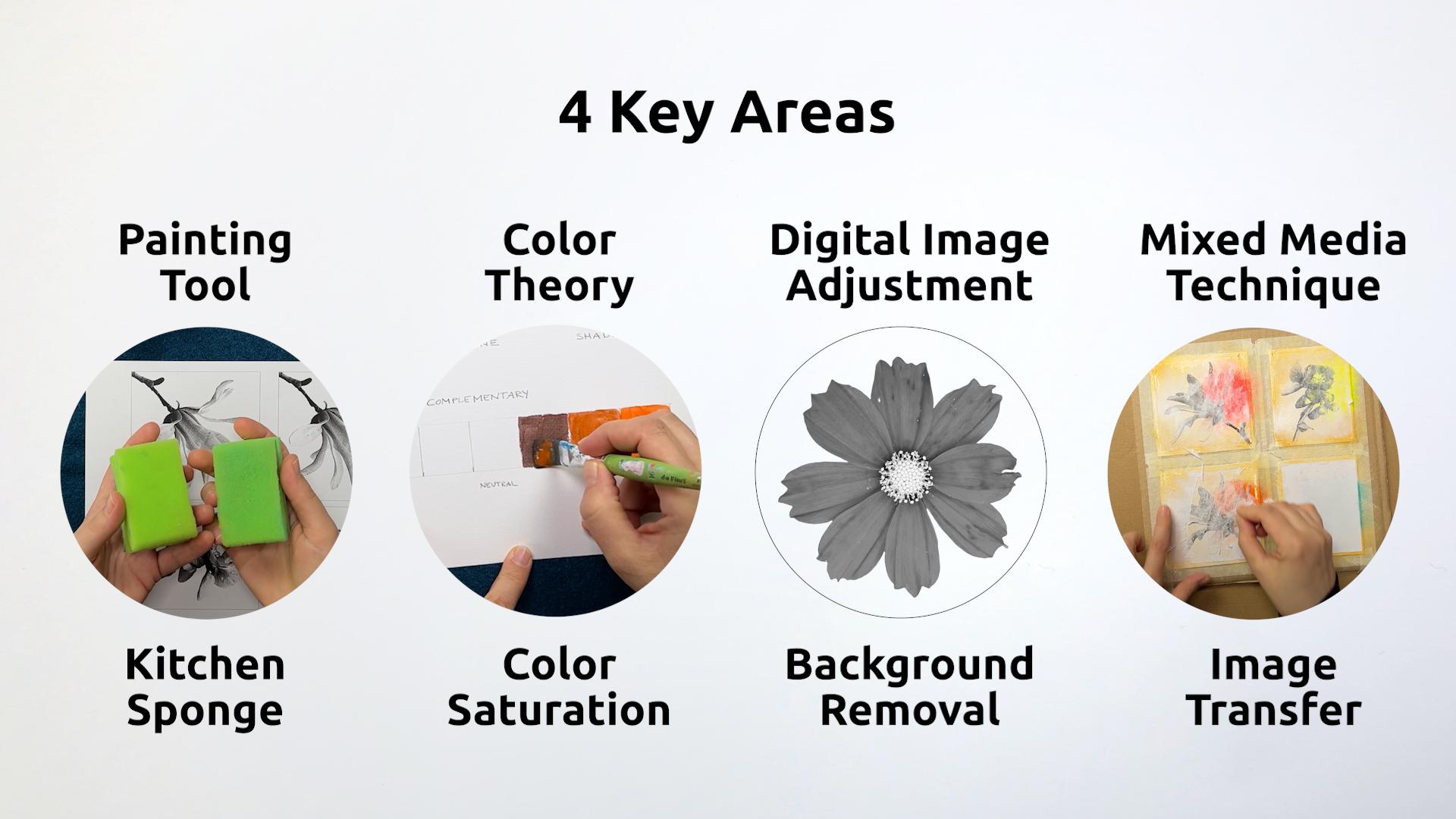
enchanting works of art. From your floral photos, we'll focus on four key areas. First, we'll use
ordinary kitchen sponges with acrylic paints to create gradients and soft edges that look like they've
been spray painted. Then we'll dive
into color theory, understanding how
saturation contrast gives your colors
that extra pop. I'll show you how to remove backgrounds from
your photos using a free online tool and create black and white
imagery right on your phone. Finally, you will
learn how to combine your printed floral image with your painted background through an image transfer technique. To follow along, you need
acrylic painting supplies, a smartphone or tablet, and access to a laser printer
or photocopy machine. This course is suitable for beginners who are interested
in acrylic painting, but also for those who
want to combine analog and digital in a
mixed media workflow. You'll leave this class with a range new painting and
mixed media techniques and a deep understanding of color
saturation and all that will help you to enhance any
of your future art projects. By the end of this course, you'll have a collection of
artwork that bridges the gap between vintage flora and
the bold spirit of pop art. These paintings make great gifts or help beautify
your personal space. Are you ready to let
your creativity bloom? Then let's get started. I can't wait to
see you in class.
2. Class Project & Overview: Hello and welcome
to this course. Are you excited to turn
your flower photos into charming little
mixed media artworks? I know I am. Let's get started. As an artist, I love
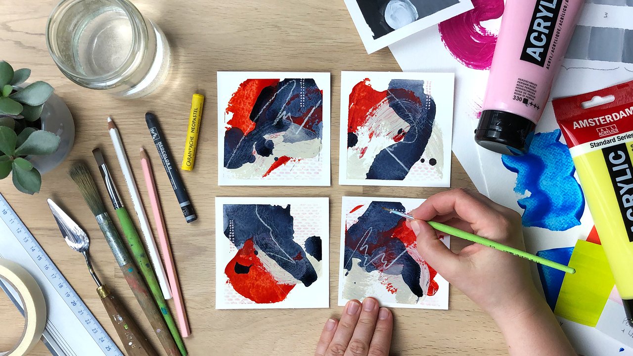
to use contrasts. In this class, we'll
use a couple of different contrasts it
comes to color and style. First, we'll build
contrast between the muted vintage
look background and a bold splash of color that
looks like it was sprayed on. Then we'll create even
more saturation contrast through the completely desaturated
black and white photo. Another contrast is between
the blurred background with soft edges and the exactness
and detail of the photo. Let me give you a short
overview of the process. First, we prepare
our materials and practice different ways to
use a sponge when painting. Then we choose the image
we want to transfer, remove the background, and
set it to black and white. Now we need to
determine the size of the painting and
prepare our papers. Next we'll look at color theory, specifically
color saturation. I'll show you how to create a desaturated background color that looks like aged paper. Then we paint our vintage
looking background and add a variety of highly saturated
colors for contrast. While our background dries, we have time to practice the image transfer
technique once we are confident that we transfer our selected
image to the artwork. Finally, we add a
protective layer of medium. Remove the tapes,
and touch up areas that are maybe torn by now. You should have a series of beautiful mixed media
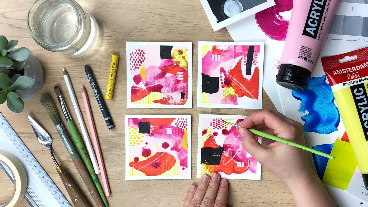
paintings to be proud of. I recommend for
you to work small because that way you
can practice a lot and repeatedly that will help you to make the most progress in
a short amount of time. A great way to hold
yourself accountable and implement what you learn is
by starting a class project. And you don't have to wait
until you're completely done. You can do that right after
a lesson four and started by uploading your sponge
technique practice sheet. I look forward to seeing it. In the next lesson, we
will take a look at the materials you need to get started. I'll see you there.
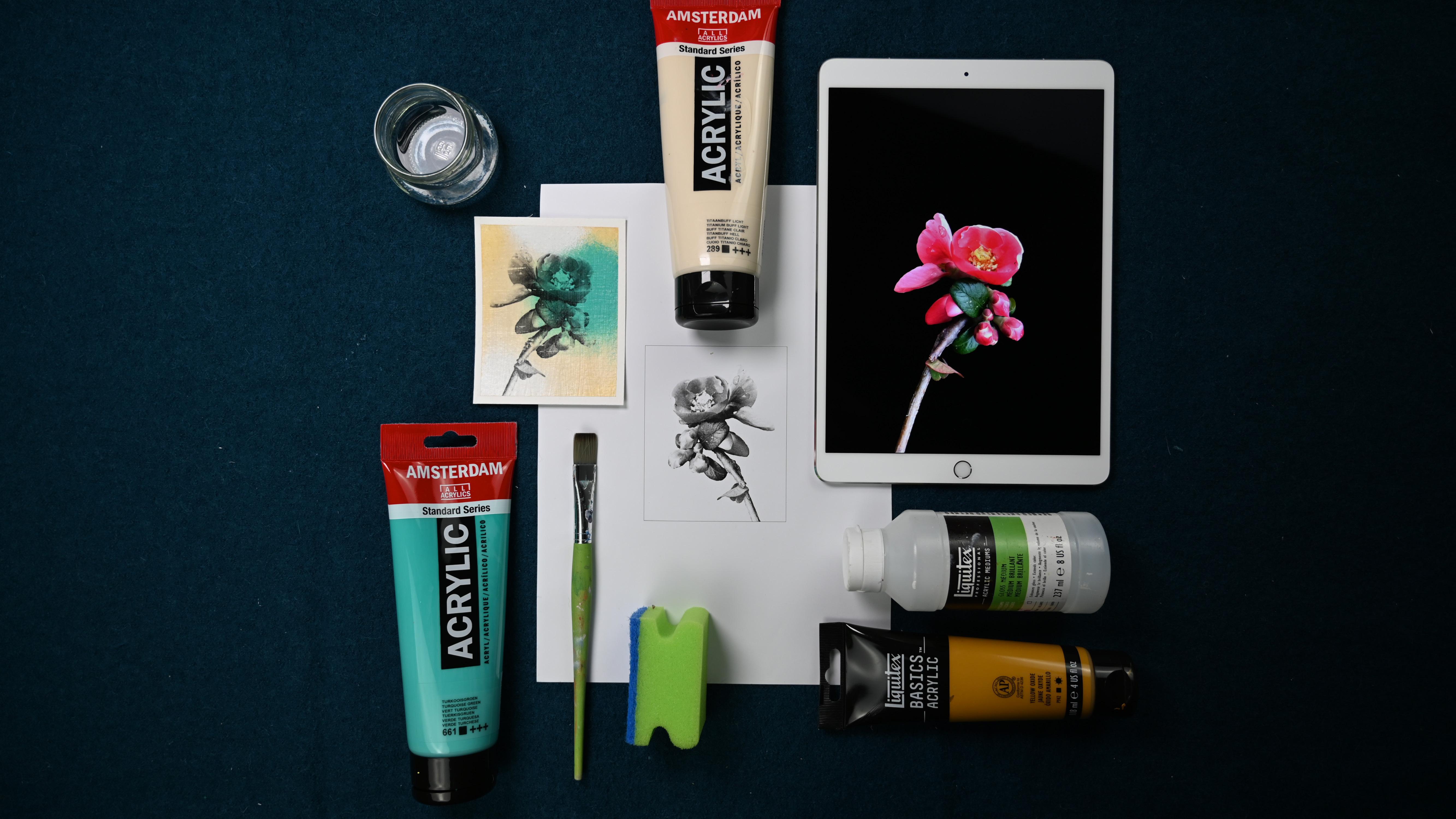
3. Gather Your Art Supplies: Let's take a look at what
you need for this class. First of all, what are
we going to paint on? I'm going to use paper, but you could also
use this technique on canvas or on wooden boards. When working on paper, you want to use thicker paper. You can use mixed media
paper like this one. This is 250 FM and
it's pretty smooth. Or you can use hoops. You can use acrylic paper like
I have here, it's 400 GSM. It's really sturdy separate
sheet, I think it's below. We're going to work small
because then we can experiment a lot and therefore we will need to cut up the
sheet of paper. I like to use a cutting mat, a metal ruler, and a
hobby knife to do that. Then when I have my
small pieces of paper, I tape them to a piece
of sturdy cardboard. Like this is the
one that comes with the big boxes that
go through mail. I use a regular painters tape to tape the paper
to the cardboard. This prevents it
from buckling and also from sliding away
while I'm painting. Then you need acrylic paints. You can use any acrylic paint, then you can use basic studio. You don't need artist
grade like anything goes. Now we're doing an
image transfer. We want to transfer a printed image onto
a painted surface. How do we do that? We use acrylic medium, that's
something you need. You can use gloss
medium or mat medium. You could even use, this is heavy gel medium. I would only use this
if I have nothing else. Because you want something
that is very easy to spread evenly because that is
important to spread the medium, you will need a brush. A flat brush works
well for this. You can use either a bristle
brush or a synthetic brush. Yeah, I would just go
with an inexpensive one. Because once the medium
dries on the brush, like the brush is ruined. You also want to
have a container ready where you can
stick in your brush. If you don't use
it for a second, you want to have a
second water container that has clear water in it where that's what
you're going to use then for the transfer and you want to keep
it really clean. You also need a laser print. You need a print of an image that you
want to transfer onto your painting and this has to be a Tono based print,
not an ink chet. You can use laser printers
or photocopy machines, they are usually tono based. I will show you how to prepare the images, how to adjust them, or you can use the
templates that I've provided for our background. We're going to use regular
sponges from the kitchen. I usually cut them up a little bit because
they are so big. That's going to be our
painting tool for this class. It's also useful
to have a piece of kitchen paper because you
needed to wipe off your, a painting knife and
also your fingers. Then we will also need, you don't need that, you
just need your finger. But you have to do
a little bit of rubbing if you're sensitive. And also if you use your finger, like to unlock your phone, you don't want to rub
off all your skin. So you might want to
use a piece of cloth to go over the tip of your finger and then you
can remove the paper. I will show you the
technique later on. What else do we need? Yeah, we need the pallet
to mix paints on and you can use the tear off pallet that is coated paper that you can even reuse
because you can peel off the dried acrylic paint
or What I like to do is I make my own pat just
using a plastic folder, putting a sheet of white paper inside so that I have
a white background, and then I mix my
paints on top of that.
4. Blending Acrylics With a Sponge: Let's take a look at a cool tool that you can
find in your kitchen. It's just a regular
kitchen sponge and you can use it to pat. What I forgot to mention in the materials is
that you want to have a small container or a plate with a little
bit of water in it. Because if you don't immediately
wash out your sponge, okay, you want to stick it into the water
so it doesn't dry. Because as you know,
acrylic paints are not water soluble, went dry, so you won't
get them off again. It's not that bad, but it happens that when you're using the sponge
again for another project, some small particles of a darker paint
maybe can come off. And you have them on your new project and you
don't want to have that. I still have some paints left
from a previous project. I'm going to use that up. There are two ways that
you can use a sponge. Probably there are more, but
I'm going to show you two. First of all, you want to spread out the
paint a little bit. You don't want to
have too much on it. Just a little bit, you
can on your palette. Then you can go onto your paper and you can
make a very fine texture. Depending on how much paint
you have on your sponge, you can make a very
smooth transition, but it takes some practice. I can now make a transition
from this orange, maybe not to the blue, let's make it to the bag, from the base maybe
to the neon red. You can make very soft corners, but it takes some practice. You don't have to press hard, because when you press hard, you really can't control it. If there's more paint
in one section, then you have this
big blotch of paints. But you can spread it
out as long as it's not. You can spread it out. You want to go in circles. Once it's a little bit more dry, you want to stop because there's this moment where
you're actually going to pick up
some pain again. You can see that here. I would want to add a
little bit more pain in here and spread it out a
little bit, then let it dry. Like with this technique, you can go over it
again and again, you just let it dry, then you can continue working. The other technique is going
to use the other side, is that you are
like not dabbing, but you're actually moving, you're just using the
sponge like a brush. You pick up the pain and you
massage it into the canvvas. It's not a canvas, it's a paper. But into onto your substrate, Whatever it is, I don't have a it's a
little bit too little. You can also put the paint directly onto your paper
and then you spread it out. You want to make sure
that you don't have any dust on your sponge. Then while it's still wet, you can actually use
another color and blend it. But as acrylic
paint strikes fast, this is really tricky to do. You have to work fast. That's why we're working small, because as you can see, I've already almost
covered the size of our final class project.
I'm going to be fine. This gives you a smooth, this can be if you just use one color, it's pretty smooth. If you use more than one color, it gives you still a
more brushy appearance. And this gives you more like this airbrush appearance then when this is dry and this
is already starting to dry, nobody tells you
that you cannot go in with the other technique and add more darkness or lightness depending
on what you need. This is exactly what we are
going to do for our class Ps. I'm going to add a highlights,
a little bit of white. I'm going to take a new sponge. I want this to be really white. I'm going to highlight
a little bit here. I'm starting in
the middle when I have a lot of paint
on my sponge. Then I'm moving out, getting a little bit larger with every move and you can
get a very smooth plant. These are the two techniques that I want you to practice for our class project using the
like this and using it to. I'm going to see you
in the next lesson. Where we're going to select
an image to work with. Then we will decide
on the colors we're going to use for
the class project. See you there.
5. Select & Adjust Images for Printing: For this course, you need
a cropped image of flower. That is, we need the image
without the background. It has to be transparent. We will remove it digitally. Doing that is much easier
when you keep a few things in mind when selecting or even
when creating your photos. When you follow my advice, you will not need any
technical knowledge about image editing whatsoever. Let me show you what I mean. One way is to use images
with a very calm background, such as a sky or a wall, or even put a piece of paper or cardboard
behind your motif. A sided with this
1 second option is to go for depth of field. That means a very
sharply defined subject against a blurred background. This will help you achieve a good result even
if the background is very busy to remove the
background of your image. I have found a very cool
function in a tool by Adobe. It's called Adobe
Express and it's an online graphic design
tool, just like Canva. At the time of this recording, the function for removing
the background is for free. You don't need any technical
knowledge as I promised, and it works like magic. I'm using an incognitive
window in Google Chrome. I can show you what it
looks like when you're not locked in as an Adobe
user like I am. Go ahead and search
for Adobe Express. Remove Background. Now click on the Link Free
Image Background Remover, and upload your photo. You can either drag
and drop it into this area or search
your heart disc. The image must be
Jpeg or PNG file with less than 17 megabytes and less than 6,000 pixels
in width or height. And that should work for most
pictures from your phone. Now all you have to do is wait and let the
program do its magic. If you're not locked in
with an Adobe User account, a pop up window will appear. As soon as you click on
the download button, it will ask you to register,
but it's for free. And then you will be able
to save the image to your hard disk and it will be saved in your downloads folder. Here I have another example. In this image, the background
is not very calm either. The contrast is not very high
in some areas like here. But the image has a
decent depth of field, which means the
background is much more blurred than my
magnolia blossom. That's important. Let's try it out and see how
the tool handles it. Again, it did a really good job. It's perfect for what? We need to complete
this process. We now need to convert that
image to black and white. A good place to do that
is your phone photo app. Because you have
a lot of control there and you can tweak
brightness and contrast. Go ahead and send that image over to your phone via e mail. Or if you use Apple devices, you can use air drop. And then we'll continue there. On your phone or your tablet, you open up the image, always start by duplicating
it as a back up, now we can take a close look. As you can see, it's a P and G, and that means it has a
transparent background. Now you can see that the
tool didn't work perfectly. Here is a section
where it didn't go in, but that's absolutely
fine for what we need. Now when you're in
this in your photo, you can find a button
that says Edit there. You will find all the
options if you use, you will also have this option to edit and also have a menu. Here it is, icons. And the one below means crop. This is filters, and this is a. And you have the
same on Android. There are two ways to make
your image black and white. The first one is to go to filters and then scroll
all the way to the back. And here you can see there are three that look like
black and white. I usually use the
one that's called mono because it doesn't have
a color cast like this one. It's a bit yellowish. You can choose either one if you just have a black
and white printer. It wouldn't matter
anyway when you printed. That's one option. But I will not do that right now because I want to show a second one. And that's in the
chest menu here. You would need to
find saturation. Saturation is a color
filter actually, but it lowers
saturation of a color. If a color is
completely desaturated, it's black and white. If you lower saturation to -100 you will get a
gray scale image. Now you can go ahead and play
a little bit with contrast. You probably wouldn't want
to lower the contrast, but make it a little
bit stronger so that the lights get lighter
and the docks get darker. Another way to do this is by using highlights and shadows, which does just the same. But now you can influence
the highlights, the lights separately and
also the shadows separately. Usually, I just set
this again to zero. I will just use a
little bit of contrast. You just have to play
with the sliders because I very often go
into the wrong direction. Now I would click Done. Then I want to duplicate again, because there's
another thing that we can do now, and that's crop. We can now go ahead
and crop this image. By sliding these edges, we can also move the image, at least on the apple. There's this option
where you can also pick square, for example. Then the aspect ratio of
the side is fixed and you can adjust it
to fit your image. That's okay for me.
I just want to make sure that I don't have this
little tiny thing here. Okay. Then I want to
click done again. One more thing that I maybe want to show you is if you want this image to show up that way so that the flower
looks in this direction, before you print it, you
need to mirror the image. Because the image transfer
will mirror it as well. It will mirror it back. You can go into crop and there you also have the
option to mirror it. Then you would print
it this way and have it the right way
on your image again. Now all you have to do is print this out in your desired size, and then cut the paper that you want to work on
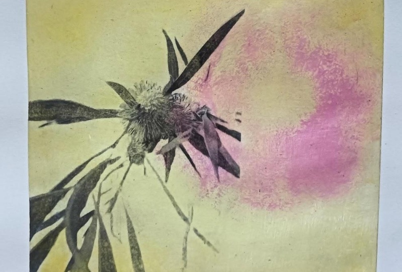
to that size as well. When we are transferring
this image, the white paper will be removed. You will be able to
see the background, the blacks will stay black, they will cover the background, and the grays will
be semi transparent. You will be able to see the background color a
little bit through it. I will see you in
the next lesson, where we will cut our paper
and mount it on cardboard.
6. Cut & Mount Your Paper: Now that you have chosen your image and you
know the size that you are going to print it or the size you want
to have your artwork. We can cut up the
paper. Let's do this. I know that I want to have my artwork in the size of
ten times 10 centimeters. But I need a little bit of space around the paper so
that I can tape it. So I will cut 11
times 11 centimeters. Here we go. I have two different sizes, one is portrait format
and one is square. Now I'm going to take it
to a piece of cardboard. This helps to drive flat again. If by chance, when you're using wet paint or too much wet paint, the paper will bend
a little bit and it will also keep it in place. I will go over the edge, I will about 5
millimeters and I just, but the reason why I'm doing many is that you have the
possibility to practice a lot. Because if you just have
one piece doesn't work out, this is really frustrating, that if you have
several chances, the chances are really
good that you will get one piece that
you really like. When you have small formats, you don't need large like tool. You can work with
regular brushes and small painting knives. The last reason why a small size is really
useful when you're learning image transfer is that you
have to do a lot of rubbing. You have to rub off the paper. The larger the area, the longer it takes you're
ready to get started. So in the next lesson, we can take a look at colors. And then we're mixing colors. And we have this already prepared so that when we
get a color that we like, we can get started
on the background. See you in the next lesson.
7. Add Color Contrast With Saturation: Before we can talk about
saturation contrast, we have to define what
color saturation is. Color saturation refers to the intensity and
purity of a color. Like how close it is to the colors of a
prism or a rainbow, or the outside of a color wheel. You will also see that
saturation is relative. How saturated a color appears depends on
its surroundings. The same color can look
more or less saturated. Let's dive in when we pick
a fully saturated color, that is the top
level, so to speak. And we can't make it
any more saturated, but there are four ways
to desaturate a color. And we'll do a little
exercise to explore that. You can download this worksheet
in the resources section, but you could also
quickly make your own with thicker paper. I've used a 200 M
watercolor paper. To start, we'll need a
fully saturated color. And I've picked this magenta, but you can use any color from the outermost circle
of a color wheel. Then you also need
white and black. Here we have the fully
saturated color. And this is a semi
transparent color, it's not completely opaque. Now, the first way to desaturate
it is by using white. We'll just mix in some white. Obviously, the more
white you mix in, the more desaturated it becomes. The second way is to use gray, which is white and black. I make this gray. Now I
need to wash out my brush, because I need to
get out the white. The third way to do it
is by adding black. Here we can see the first three ways
to desaturate a color. By adding white
to create a tint, by adding gray to create a tone, and by adding black
to create a shade. If you take out saturation
completely from a color, you will get black and white
or gray scale, so to say. Let's take a look at the fourth way of
desaturating a color. That is by adding
its complement. The first thing I want to do, I want to put them
in on this scale. Here I have my few of flu and on the other
side I have the orange. Now when I add a little bit
of blue into my orange, you can see that it becomes
a little bit muted. We wanted this to
be still an orange, but not a very bright one. Now when I add more blue into that orange mix, don't
have enough of it. I will get something that's
called a chromatic gray. It's almost gray,
but it has color cast to it has this
orangey reddish. Now let's do the opposite. We have the blue. We add a little bit of
orange just to break it. It's not as saturated
and not as pure anymore, but we still want this
to be a blue already. You can see that blue has a stronger tinting
strength than orange. Have to add more orange to really get a little
bit of a difference. What a beautiful
blue that is like the sky when a thunderstorm
is approaching. Now we'll add even more orange, but we still want this
to be a bit bluish. This is now the
chromatic gray that has a slightly blue tint. What I want to try now,
which is pretty hard, is finding the right middle
tone that's neither blue, orange To see if it's neutral, it still has a color cast. It's sometimes
easier to see once you add white and you make
it a little bit lighter, I'll see if this
is neutral gray. Yeah, I think we're pretty good. We have created a gray
with blue and orange. Who would have thought you
don't need black and white? Well, you need white
to make it that light. But actually, I like
the basic color. I've just used orange and blue. As I've mentioned
in the beginning, color saturation is relative. This blue, which is
fully saturated, is more saturated than this one. But this one is still a lot
more saturated than this one. It always depends on the colors
you put next to a color, if one is considered
more saturated or not. When you make a
saturation contrast, it's really about
putting things next to each other with a
difference in saturation. Our vintage look background, we need a dirty,
brownish yellow color. If you refer to a
color as being dirty, that's always a sign that you need to
desaturate something. A muddy color is a
desaturated color, basically. Yeah, For this vintage paper, look, as you can see, not
all papers are the same. This is a little
bit more darker. This is more lighter.
There's a variety which was want to practice mixing those neutral colors. It can be a little bit tricky. The easiest thing obviously to do is to use a
pre mixed color and in this titanium buff
light to be very fitting. And also the yellow oak
side or yellow ochre. I will use that later on
for the class project so that I don't have any
troubles mixing the color. This is the titanium buff. We will lighten it
up a little bit. We will also make it a little bit darker with
the yellow ochre. If you just have a yellow
ochre, that's fine. You would like want to mix this with a little bit of white. Then you can do the same. We can lighten it
up a little bit more and make it darker
a little bit more. I think we're pretty good with those colors depending on
what kind of paper you have, like the middle tone, the titanium buff is pretty much the same
color as this paper. If you don't have
those special colors, you can also mix a color like
this with your primaries. I've already put out
a maenterulian blue, that's almost a sion. Then I don't have
a primary yellow. I do have a cadmium
yellow light, which is a little bit too
cold for primary yellow. And I have a cadmium yellow P, which is maybe a little bit too warm for a primary yellow. A primary yellow would
be somewhere in between. Let's just go ahead and
mix those two together. Now, we'll go ahead
and start from there. We have this yellow, we will lighten
it up with white. Now, it's already a
little bit desaturated, but of course as you can
see it is too yellowish. We need to break that
color a little bit. How could we break that color
other than by adding white? We could add black, but that is usually a very bad
idea with yellow, because when you mix yellow
and black, you get green. I will not add black. The other way to
desaturate it is to use complimentary colors. The complementary of
a yellow is a violet. Violet is a mix of
Motenta and Yen, we need to add both of
those into our yellow mix. Now it's really tricky to get the right mix. Let
me give it a try. Once we add blue, it will
get a little bit greenish. Just have to find the right mix. Here we have a super
duper desaturated base. Let's see if this
is what do we need? Let's add a lot of white to it, better see the
color cast it has. It's okay because this is
a little bit too dark. It is a little bit
too yellowish. I think it could use
a little bit more of that magenta, too cool. I think it's a little bit
too greenish actually. Here we go though. I'd say that would be a good
paper color like this one. Maybe this is even more reddish. So I could add a little
bit more of that. Okay. But don't worry about it. If you don't get it completely, nobody will come with a piece
of vintage paper and say, oh, you didn't get
the right um, color. So this is just a
great exercise to explore those subtle,
neutral, desaturated colors.
8. Create a Vintage Style Background: Let's get started on the background for
our class project. I have squeezed out
a generous amount of titanium buff light. And also yellow oxide, which is also often
called yellow ocher. But you can of course,
use any color you want. Now let's start by
just spreading out paint generally on the paper. We can already
want it still wet. Use the second color and
blend it in a little bit of the corners as to get
that age vintage look. Remember you can always, with the sponge
technique later on, right now we're just
getting this started. You can also b this, but for the first layer, this really would
take a lot of time. I just like spread it like this. Then you can finish it
off by dabbing so that you get a more math surface. Without the brush strokes, this is almost already up here, so I can continue
with the abbing. My sponge is a little bit humid. You know why? I think I will use a piece
of kitchen paper and just squeezed it dry because we want to have the colors
very dry and not too wet. Because when it's wet,
you'll get splotches. Remember, you can always go
back in if it's not enough, But it's always
better to start with little paint because you
can always make it darker. The better you spread
it on your pet, the more reliable the results
will be on the paper. Because as soon as you have like this tiny bit of color where there is a
thick piece of color, like a lot of color, like a big amount, then
you have a sludge. I will put this one now
into a little bit of water. It doesn't dry on me,
just like soak it up. I will add some more highlights
Now when it happens, like here, that you have made a spot with a lot of
color, you just blend it. You could also wash it off. If the layer below is dry, you could actually wipe it
off with a ge piece of cloth. But since I haven't
waited, I can't do that. I'm pretty happy with
my age background. I'm going to try
just a little bit. Then I'm going to add
the contrast color. Because remember, we are
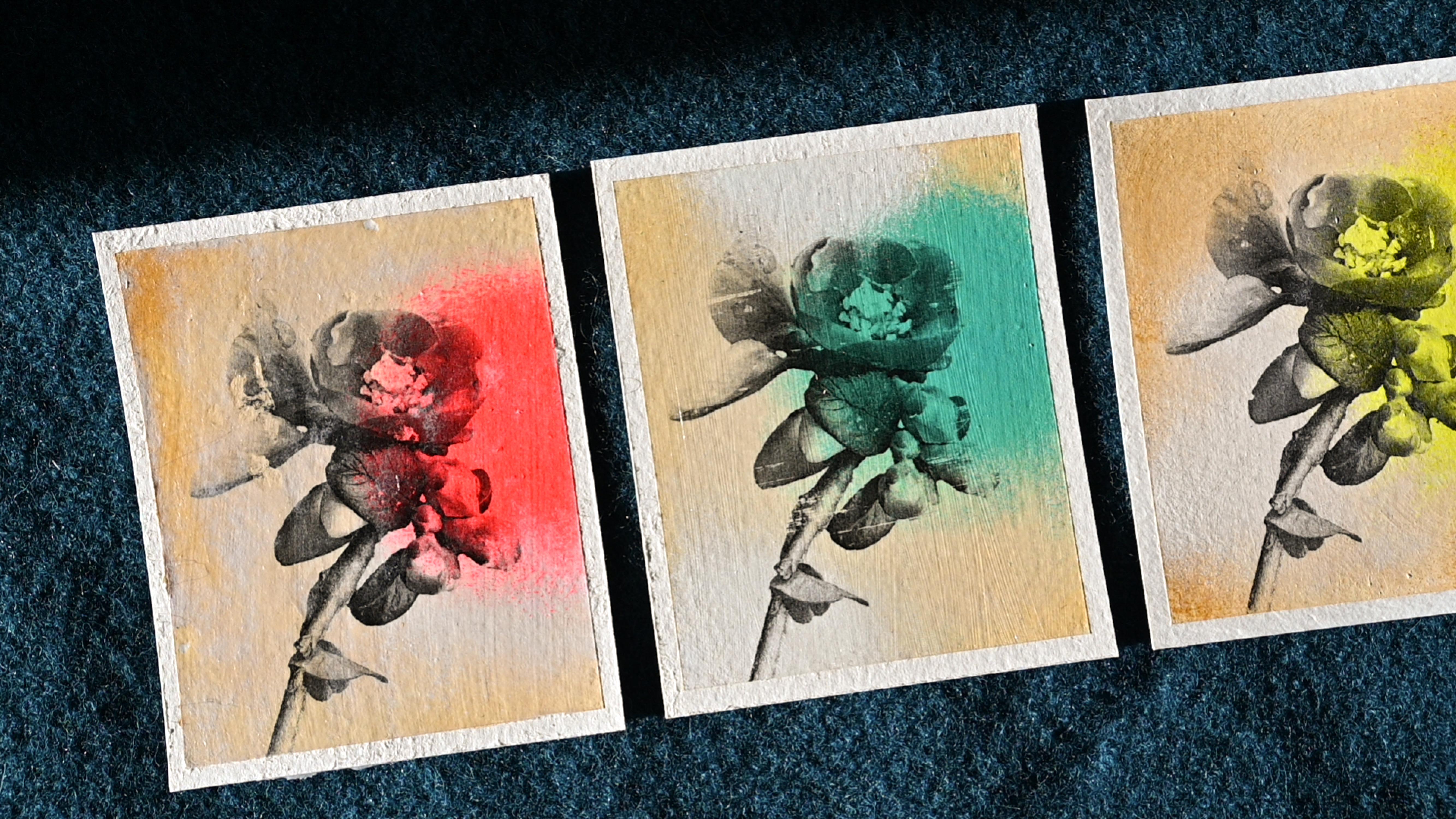
doing contrast here. That is a contrast
of saturation. We are using desaturated colors against highly
saturated pure color. Now, this has dried
a little bit, and I'm ready to go in
with my contrasting color. I have put out neon red, neon yellow, orange,
and turquoise. I've also prepared a new sponge, because I don't want to use
the washed out humid one. I want this to be
really dry again. There's this moment
actually where you want to stop because now I'm
picking up color again. It's still a little bit wet. This also has to do with the paper not being
completely dry. If it would be completely dry, it would work a little
bit differently, but right now it's
not completely dry. I have to go in again. I'm ready for today. I'm going to leave
this to dry overnight because I want to have this really for the image transfer. You don't want to have any
humidity coming from below. Just let it sit overnight. That's the best solution. Tomorrow we will
put on the image. I'll see you in the next lesson.
9. Practice Image Transfer Technique: Let's start to practice
image transfer. I have printed out a flower on two different
kinds of paper. This one is 80 GSM and
this one is 100 GSM. Generally is easier if you use a thinner paper because
it's easier to remove. But I find that
sometimes the quality of the paper and thus the print
can influence the outcome. You want to cover the paper with a thin layer of acrylic medium. It should be evenly spread. It should be still wet when
you put your print on top. Once it's on top,
you want to use something to press
it into the paper. If you use a plastic card,
you have to clean it. Every time you swipe it over the paper that like any excess
medium that you push out, it doesn't get on top
of your transfer paper. I will do that now.
For all four flowers. I've made two of those
sections with a little bit of acrylic paint because I want to see if and how that will
affect the outcome. I will leave this
to dry overnight. Am I will remove the paper? Some people take the paper off immediately after only a minute
and a half to 3 minutes. But I find that this carries some risk and works
relatively unreliably For me, I tend to wait overnight and then remove the paper
on the next day. Now the medium has dried
thoroughly overnight. Now we can wet the
paper already. See that the thin paper gets
translucent pretty soon. Why do you think of paper? Takes a little bit longer
to soak up the border, you want to let the sit. Once it has reached the
right level of dampness, you can try to get it off starting from the edges
or from the sides. Normally, I wouldn't like start from the sides but go
from the inside out. But in the beginning, obviously, you don't have that much choice. You can try to pull it
across at a 45 degree angle. Once you have done that,
you can go ahead in a circular motion or
in a linear motion, whatever seems to
work best for you. Now, this is a small area, but if you have a larger area, your finger might get sore. You could use a piece
of soft cloth to wrap around your finger and
then rub with that. Now you want to be
a little bit more careful because you don't
have as much feeling now in your fingertips as
you have with your finger. Like without the cloth, of course, in areas where
there's no transfer, you can rub a little
bit harder when you feel that hardly anything
comes off anymore. You want to re wet it again. Now when it's too wet, you are just like sliding
around with your finger and not getting off any paper. But either you can blot
off excess water or you just wait a little
bit and then you can go ahead When it's wet, you don't want to stay on
the same image for too long because you could get
that turner moving again. Sometimes when it's almost dry. I also use all of my fingers
together to get more done. I do this very lightly, not applying
pressure whatsoever. I'm just like like as if I put my hand down on the table
and then I just move it. I don't press on it, I just put it down
and move it around. Now, nothing else comes off. I'm going to let this sit now while I work
on the other ones. If you have the right dampness, you might be able to get
off large pieces of paper. Again, working from
the inside out, especially if the image comes up to the
edge of the paper, You don't want to go from
the outside in as you would remove some to very easily. Okay, here I did rewet it
again and made a second round. But here I didn't yet, I will do that now. Now we can already check
if this gets translucent, like the white of the paper
completely disappears. If that happens, you don't have to keep rubbing, but in my case, I can still see a lot
of paper residues. I will just keep doing this. Once this has dried, you can see that
there is still paper on there and it's a
little bit whitish. But you can check if those disappear when you
wet them again. It becomes darker. This is fine. If you are
happy with that result, then you're fine to
seal it for that. I will use glass
medium, acrylic medium. When we do that,
we don't want to have any puddles of water so we can blot off
that excess water. We just need our images
to be humid and to look like full strength
without the gray sheen. Now we'll make it thin and
even layer of acrylic medium. Top of this, I hope you can
see it trying to tilt this so that it shines in areas
where the paper transfer was. The paper is more matt than around where the pure
medium is still. By applying another layer of
medium over the whole thing, we can get a more even look. I usually do two
layers of medium. You want to do this
very lightly and go across linear strokes, because with the glass medium, you might see the
brush strokes if you have thicker areas. I've used the hair dryer to
speed up the drying process. It's still not evenly shiny. I will apply a second layer now never forget to
put your brush into water because that
medium will make it very stiff and basically ruin
it, as you can see. Now here on the left side, we have the thin paper here. I've used the thicker
quality paper, but actually the paper
didn't make any difference. In this case, it worked
better on the painted paper. Like on the painted
substrate paper, I had problems with both the thin and thick paper
directly on this paper. This is a little bit
of a loading process. It's really important that
you try this out with your materials like your
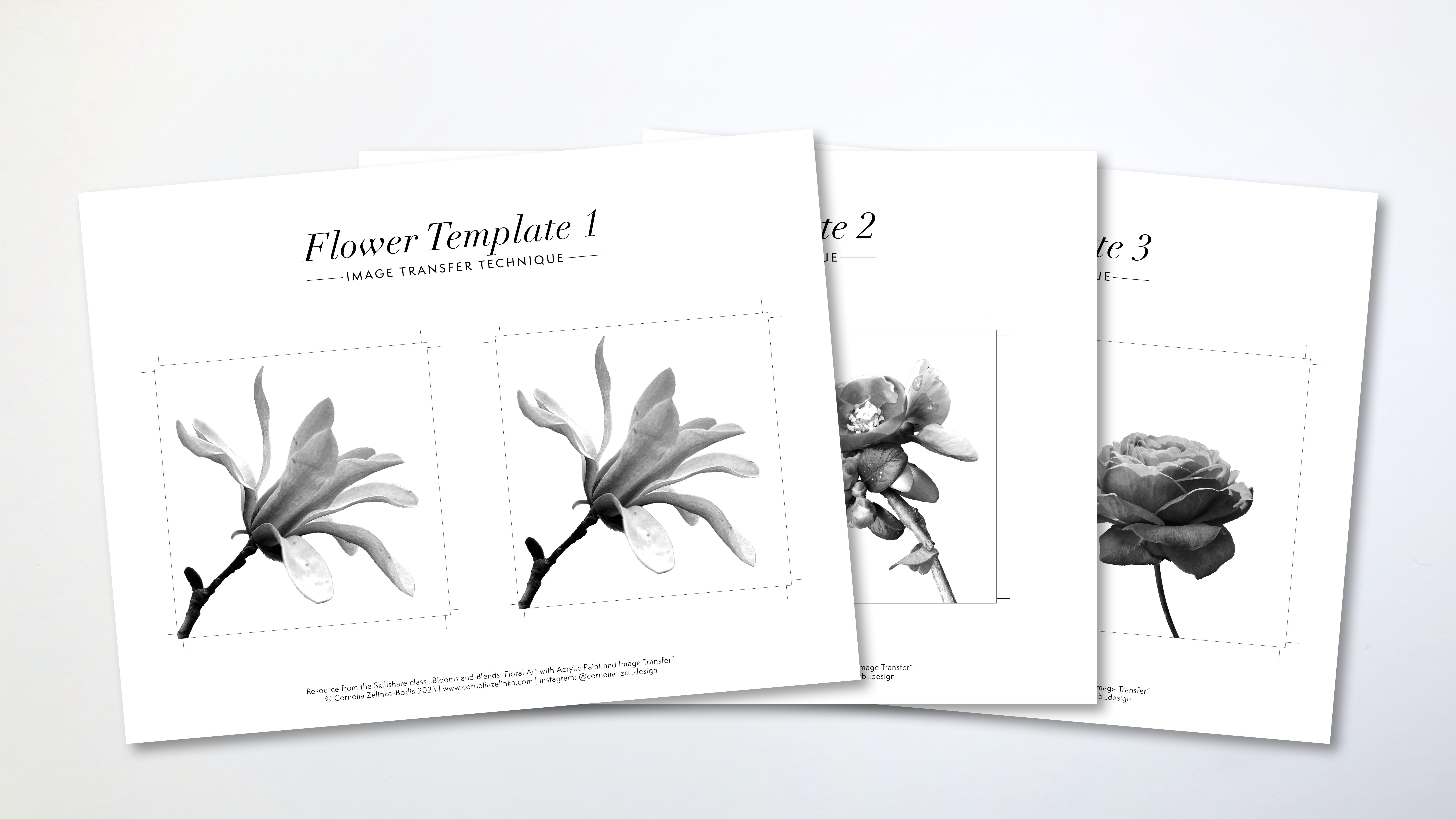
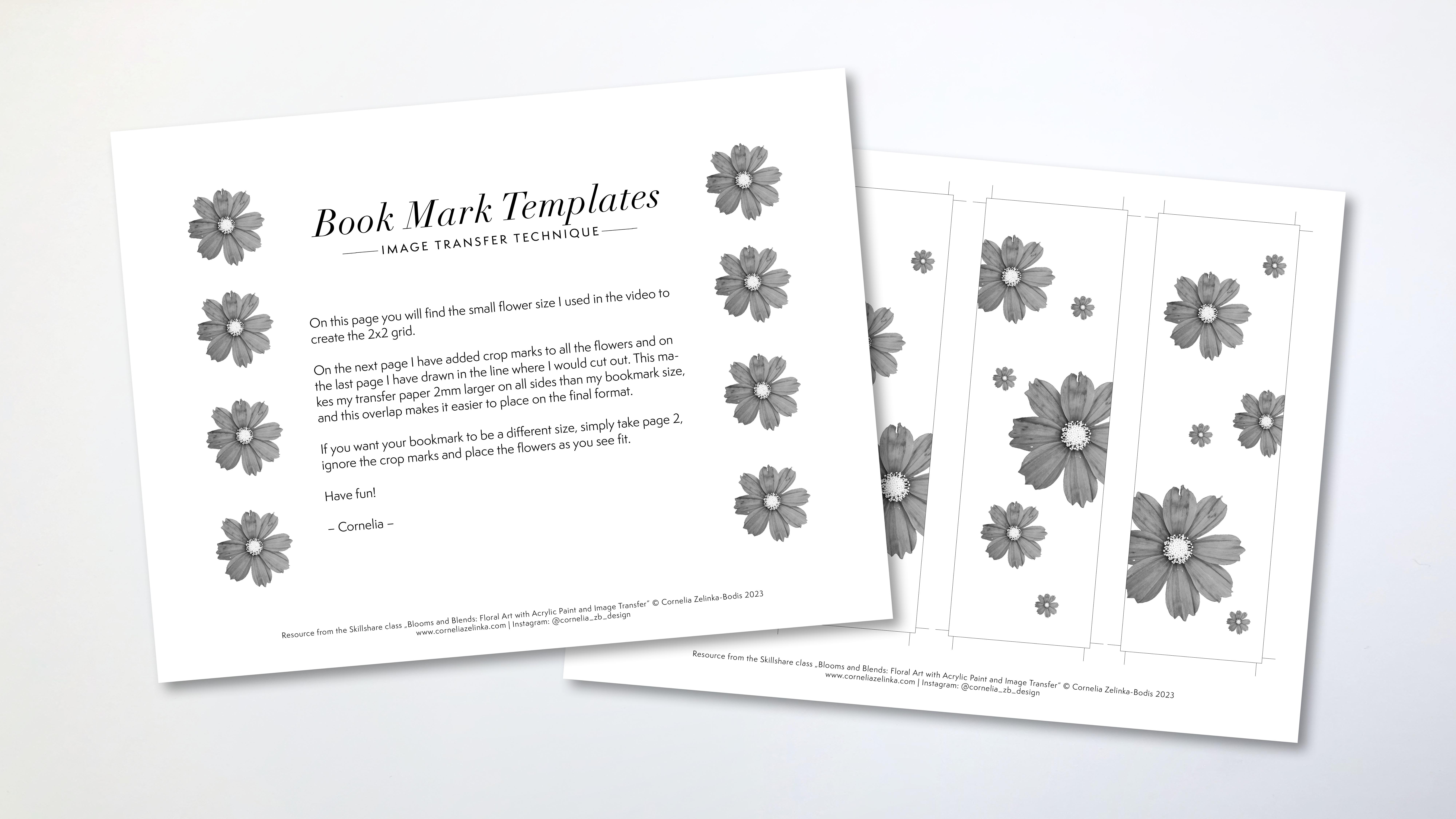
substrate paper, your print, your medium, and your paints, so that you get a feeling for how those materials interact. I have provided for you a template with a flower that
I've used in our practice. I've also arranged
these flowers in a way that you could
use it for a bookmark, for example, as a
little site project. Next lesson, we'll put what you've learned to practice and transfer your floral print to your painted background.
I'll see you there.
10. Transfer the Printed Flower Photos: Now my paper has
spread completely overnight and we're ready
to transfer our prints. For this, I will
need acrylic medium, a brush, a water container, and a clean water container for the cleaning of the paper. Later on, you want to apply the medium generously
in the beginning. You want to cover the
surface very well. But you don't want
to have riches. You don't want to have texture. You want to have
it evenly spread. Because if you don't have that, it will have a different
drying time and that can be tricky when I apply. I'm doing already a second
layer because it starts to feel sticky as the paper
takes a bit of the medium. I really want to have my
brush glide over the surface. Well, everywhere. Once I have done that, I'm pretty well covered. Yeah, I can put the print on top
and I've printed it a little bit larger
than my paper. I'm going over the edges. What you want to do now is
either put a sheet of plastic on top or you just
work without it. But you have to be
careful when you go over the edges
that you clean off your spatula in case you have squeezed out some of
the media and picked it up with the card that you don't reapply it on the
surface of your paper. You want to push
really hard to remove any air bubbles and any excess medium and
merry the papers together. Now, we can wait
for about a minute. While I do this, I will
apply the next one, then we can start to peel off the first layer of the paper. Depending on the medium you use, that the overall humidity, It can take between
a minute and a half, 3 minutes till like
the glue has stuck, you can tear off a
bit of the paper. We're now at a
minute and a half. Let's try to peel this off. I'm starting from the edge and you want to peel diagonally. And here you can already
see in the edges, it didn't really stick yet. But here you see
that the paper has stuck since my image
is only starting here. I think I'm fine here. It has stuck, I think I'm going to wait a
little bit longer. In the meantime, I will
apply another layer here. Let's see, I don't want
to start here again. Here, we'll just take
a peek down here. You can see it hasn't
really worked already. Let me show you.
Okay, here we are. Picking up paint as well, not really to be peeled off. Let's try this one. Okay, This is how it should be. You're just like getting rid of the upper layer of the paper. That just makes it easier later on when you have to
remove the whole paper. But this is really something that doesn't
work so well all the time. And if you want to
be on the safe side, you can let this sit overnight. Okay. That was a lucky pull. That hardly happens for me. Okay. Here, I took off
some paint as well. I think I'm going to leave
this overnight with this one. When you have it
pulled like that, you don't have to wait
necessarily overnight, but you have to like wait for half an hour or
an hour until you continue with this one
because it's still humid and the incast
really settled, like connected with the paper.
11. Rub off the Transfer Paper: This is right overnight. Now, we can continue
removing the paper. First of all, we have a
lot of paper on these two. I will need to wet them
thoroughly to get that off. You want to apply a
generous amount of water until the paper
gets see through. We also do it here where there's a lot
of paper still now. We just want to let it
sit for a second or a minute and then we can
try to peel off the paper. When you add the water, you don't want to
have it soaking wet. You just want to have, you don't want to have
a puddle like this. It's really wet, but we'll see
if it's getting soaked up. I can also move
this around a bit. What works the best for me is to go from the inside out
and not from the edges. Because when you work
from the edges like here, you tend to pick up
the paint more easily. I like to be really careful
when the painting goes to, the transfer goes to edge, then I tend to go like this
and like this on this one, we have already
gotten rid of most of the paper and it's just a
thin layer that is left here. I think I might need to
add some more water. When you add more water, you probably don't get off
like large chunks of paper. You want to find the right
amount of humidity so that you are able to peel off
the paper like this. This has not soaking wet. It's just a bit humid. But when it's just a bit humid, sometimes you are able to pull
off large pieces of paper, which is like the process
that we would have done if we would have removed it
immediately after the transfer. But we're just doing
it the day later. Now, I'm not going to show you the whole process
with all of those four. Let's just continue with this one when it's
still very soaking wet. It doesn't really work so well. The B, you need a certain
kind of humidity, have to be really, we can go with bit
of a little bit, it's less humid then you can, you can go circular. Or you can go up and
down left and right. Just like the best, I think the best
way is circular. You want to ruptly when you go over the image because
you don't want to get the ink of the print but you can Rp where there's
no transfer. I'd like to have a
tray or something next to me because it
really makes a big mess. If you have all those
paper pieces around, you don't want to wrap
too hard on one area, just move around a
bit here a bit there. Maybe even work on
a second piece in between apart from this
area and a little bit here. This is an exceptionally good transfer in
this one as well. I have had worse results sometimes you just don't
know why it doesn't work. That's why I like to
work in series so that I have more versions
and more of them. If one doesn't work out, it doesn't matter because I
can choose from the rest. Now, when it starts to dry, I can see the areas that need
a little bit of more work. I also can test my finger, dip it into the water,
and go over those areas. Now, I want to go really softly. In the end, your
finger is like the best can feel the best if there is still
some paper fibers. If there are still
some paper fibers, I want to do is get rid of all those little paper pieces and don't let them
dry on the surface. Again, when the
image is like that, when it's a little
bit humid but it looks like almost
perfectly dark, then you can stop
because then you can put T medium on top while
it's still humid. I will show you that
in the next lesson. But that's enough. You don't have to keep rubbing because you might really
get to the ink right now. You really want to brush
it off very thoroughly so that it's clean. And then you can continue
with your other ones. And I will show you how to finish the afternoon
next lesson.
12. Finish & Seal Your Artworks: We want to seal this in. Some of them still look a bit like they have this
white chin on them. That's okay. Once you
add a little bit of water and it turns black, then you're fine. Then you can seal it.
I wouldn't show you. And here's still white areas. Let's see if this will disappear when I wait
it and if it does, I'm fine to believe
it like that. Yeah, it has disappeared. I want to go over my whole
image and make it humid. I will do this with all of them. I have seen people do this without making
the image humid. First, it worked for them that the image cleared up when they
applied the medium, but it didn't work for me. I really don't want
to have it too wet. I'm removing any access, taking a look if I don't have any paper residues like one of those rolls of
paper on the image. Because now when I put
the cloth medium on top, I would seal it in as you will be able to
see the brush throes. You want to make sure
it's very well spread, You just have little
pressure on your brush. You just let it
glide very softly, then you will hardly see any brush throes if you
use a synthetic brush. If you use a Breust brush,
this is harder to do. Okay, I'm going to let this dry now and then when
it's completed dry, we can either like add another
layer of glass medium if the coverage is not uniform or we can already
remove the tapes. Here I have added a second
layer of glass medium, and now we have a
pretty uniform machine. This has dried overnight. Now we are ready to
remove the tapes. Now when you remove the tape, you want to pull away from the image and not
towards the image in case some like pain has gone over the edge and
sticks together really well. You don't tear into the paper. You want to tear a little bit upwards but a little
bit outwards as well. You go very slowly,
usually. Okay? Now if that happens, you start again from
the other side. Usually you will ruin
the paper a little bit. It, when it sticks for a couple of days just
doesn't come off. Now we have that example that it has torn from both edges. From both sides. So you
want to go up like this, then again, pull away from
the image if it doesn't work. Okay, I've pulled it away. It left a little bit here. What do you want to do? This has to do with too much pain. To show how you can, you want
to go over that edge and slide your knife
very lightly over that area and then pick it up again and sometimes
when it tears. The reason is that there's
a lot of paint going over the tape if you think that you have
too much paint, which In this case, it's
probably not too much. But anyways, I can
show you what I do. I will use my ruler and
a hobby knife and just slide very lightly over the surface so that I
cut through the paint. This helps for it to be
more easily removed. Now I have a second from
the other image on top. It's not coming up
like that. Let's see. In our case, it can not only be the paint that
goes over the tape, but it could also
be that we have some paper residues from
the transfer that go over the edges and make it hard
to remove the tape here. I already feel that it's
getting stuck and I also see slightly that there is some paper residue before
it starts tearing. I'll just slide a
little bit over it with my knife and then continue on. You have to do this for all the, I think this is very
satisfying to do. Don't worry about the paper
tearing a little bit below. This just happens when you
leave on the tape overnight, even over a couple of days, then it's really sticky. Now we have all our pieces,
like how cool is that? Now we want to take a
look at those edges. The paper has torn
a little bit and there are these rough
edges. We want to fix that. We will use medium to do that. I will use medium because I like the difference between
the shiny and the mat. Now I will just go over this
and try to flatten it down, really pushing down the fibers again so that they connect
with the paper surface. If there's a tear like here, you want to get a
little bit of medium below and then you
flatten it down again. Sometimes you have to try a little bit in which
direction you want to go so that the fibers
flatten down again. It has to do with the
way the paper was made and in which direction
they are actually aligned. You just what works best. That's it. In the next lesson,
I'm going to show you a few more examples
of how you can like present them and we'll just take a short recap
of what you have learned. I'll see you there.
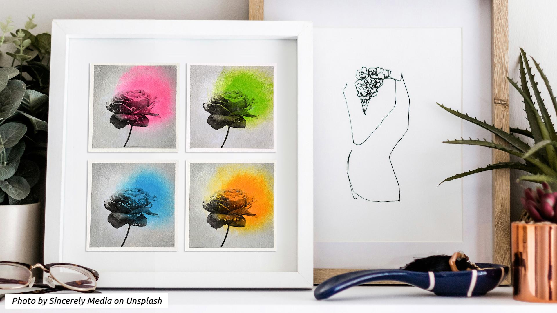
13. Final Thoughts & Recap: Congratulations on
finishing the course. I'm so glad you've joined me
on this creative adventure. Let's do a short recap. During the course, we
focus on four areas. Learned how to use a
kitchen sponge to make gradients and soft edges
with acrylic paints. We explored a bit of color
theory and learned how to use saturation contrast to give
your colors that extra kick. Then we used it will be express to remove the
backgrounds from your photos and your phone to create a black and white version
of your flower image. Finally, we combined
the print of this black and white image with the painted background using
an image transfer technique, creating a series
of small artworks that are a mix of vintage
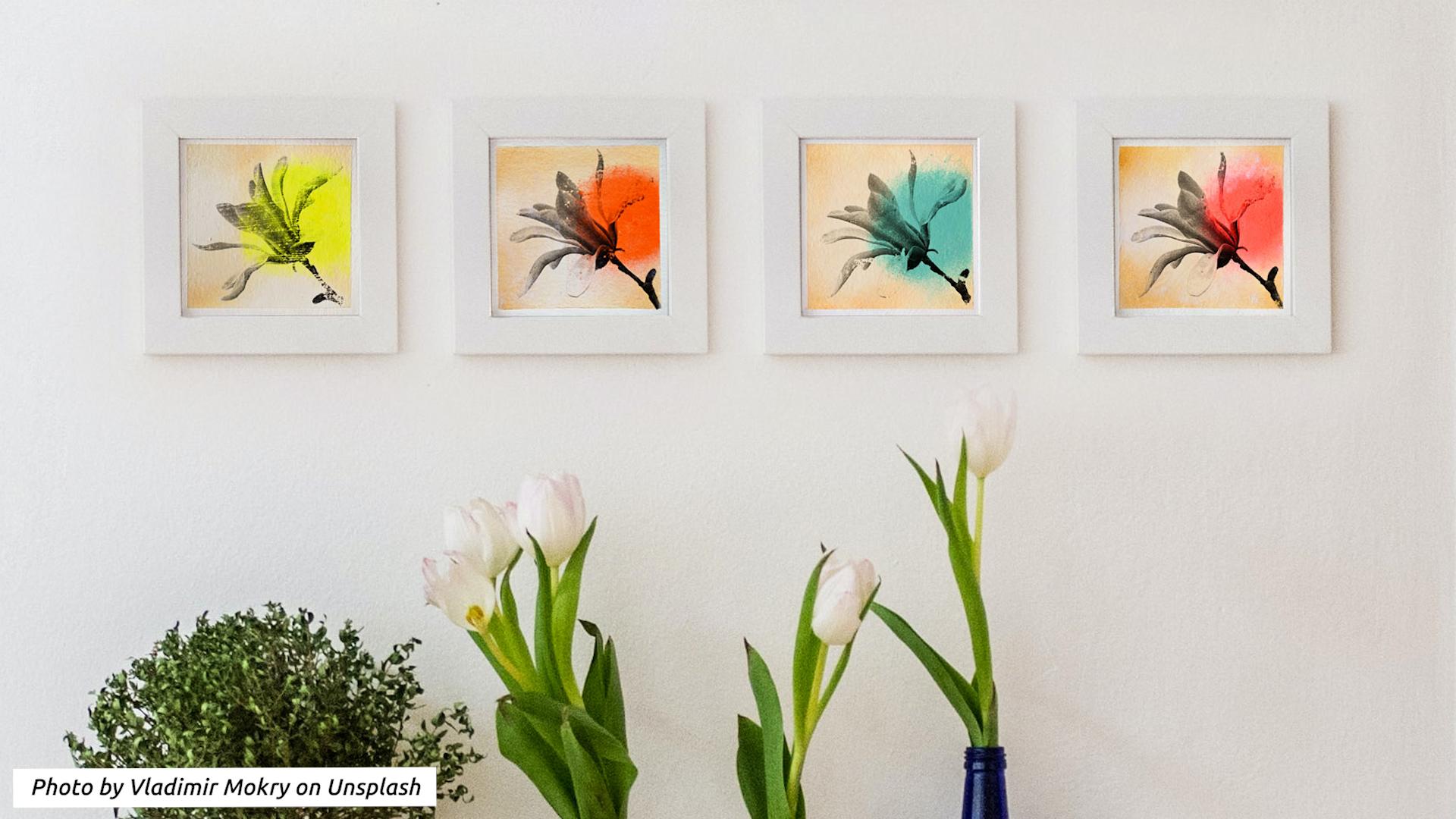
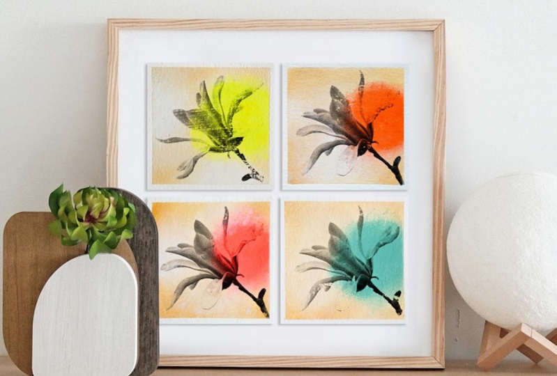
and pop art style. The great thing about
working in a series is that the artworks are
a great eye catcher. When you arrange
them all together in one frame or place them next to each other in four separate frames
with image transfer, it doesn't always work the way you want it
to or you expect. Remember, it's an
abrasive technique. It's only natural
that the result can look a little bit
aged or distressed. But in our case,
that only enhances the visual effects that
we are aiming for, like that vintage look. Also, if there's one thing
that I want you to take away is that there is beauty
in imperfection. Still, if there's any questions or issues that you
would like to discuss, don't hesitate to get in touch. You can pose a
question either in the discussion section or
in your class project. If you like this class, please take the time
to leave a review. This is not only very
valuable feedback for myself, but it also helps
other students to find out if this class is
the right fit for them. How can this be taken further? Image transfer is definitely
not limited to using photos. You can transfer illustrations,
drawings, graphics, text. Just make sure that
you printed on a tone based printer or copy it on a tone based copy
machine and then you're fine. Also, never forget
if you use text, especially that you need to
mirror it before printing. If you had fun learning
about acrolic painting, I recommend for you
to take a look at my more comprehensive
acrolic painting class. Or take a peek into my other image transfer class
called Moving Memories, where you learn about using a painting knife
and color harmony. And please don't forget
to implement what you have learned and start
a class project. Right now. I can wait to see
when you create lets a rap. Thanks again for joining.
See you next time.
 Cornelia Zelinka-Bodis, Mixed Media Artist