Transcripts
1. Intro: [MUSIC] I'd love to be able to paint but I can't
even get a straight line. I've had that so many
times before, in fact, many beginner classes focus
on realistic painting and if the painting then
doesn't look like the real thing, you
get frustrated. Abstract painting silence your inner critic and
it's so much fun. My name is Cornelia and I'm
an artist and designer. I've been working as
an art director in advertising for about 20 years. What I often missed in this
job is the freedom to create my own rules and that
we're painting comes in. Abstract painting is
my creative playground where I can experiment
and just have fun, I then enjoy sharing my
discoveries in my classes. This beginner friendly
acrylic painting class has three sections: basic
material knowledge, design theory and class project. We'll start with the
basic properties of acrylic paint and mixing colors. You'll learn about the
tonal value and how to use it to guide the viewer's
eyes through your painting. We'll take a quick look at color theory and put
together a color palette. Then we're ready to
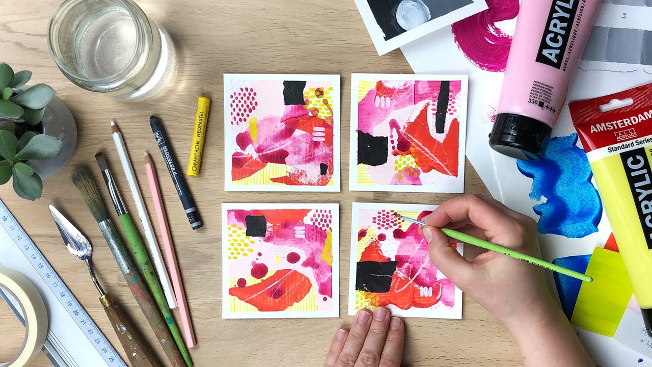
start the class project, a series of four small
abstract artworks. The paintings are built
from five to six layers and for each one you'll use
a different type of mark, color consistency or tool. We'll create
interesting contrasts through expressive strokes, delicate patterns, gestural
lines and collage. This class is great for beginners who have never
painted with acrylics, for advanced students
who want to get started with abstract painting but also for people who are just looking for a relaxed
painting project. No previous knowledge
is necessary and we are using the
simple painting materials. You will learn to
work intuitively and focus on the
creative process. At the end of this class, you will have four unique
artworks that you can hang, sends as greeting cards
or post on social media. Let's get started [MUSIC].
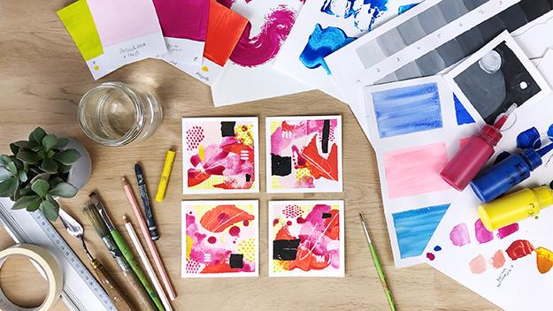
2. Overview & Class Project: [MUSIC] Welcome, good
to have you here. This class is well-suited
for beginners because we'll start
with the very basics. There will be a lot of hands-on
exercises so that you can practice working
with your paints and applying the design
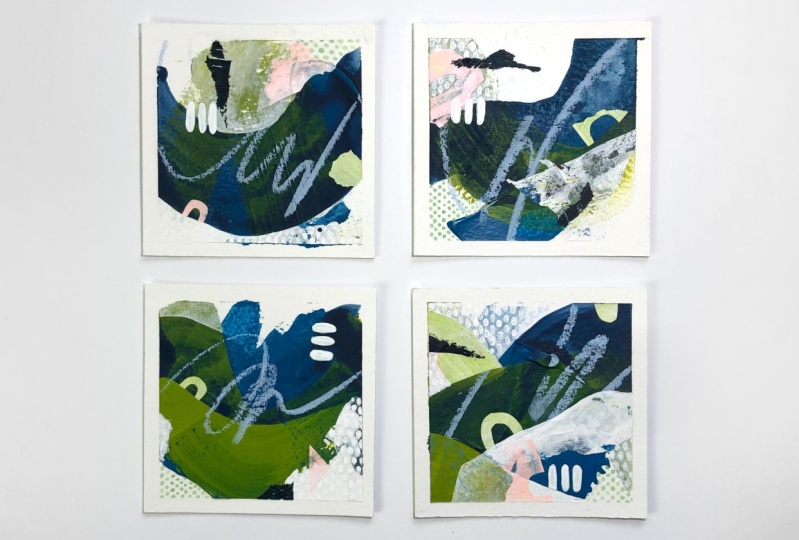
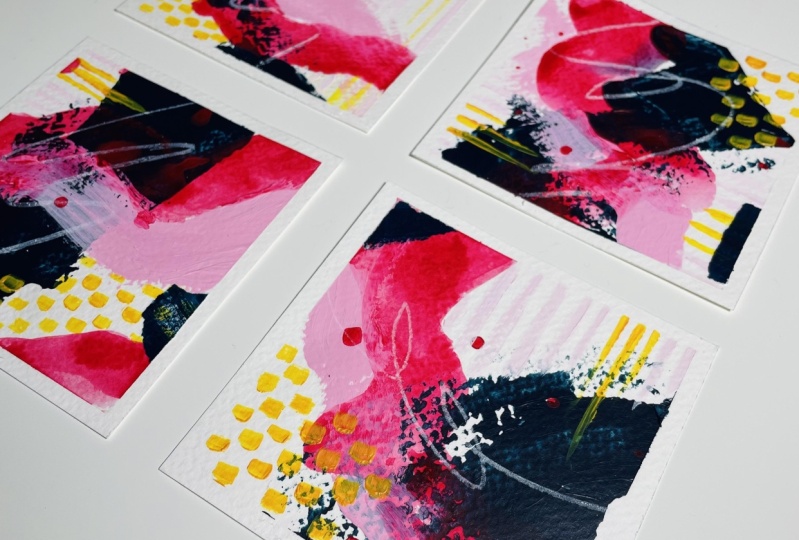
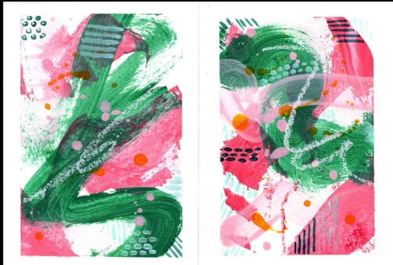
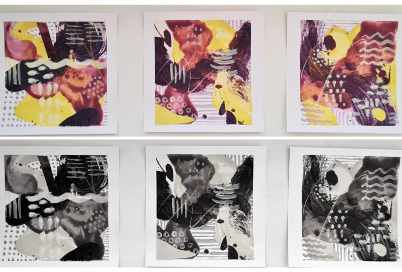
principles that I teach. The class project will
then be a series of small abstract paintings like
the ones you see behind me. Let me give you an overview. We'll start with the basic
properties of acrylic paints and an exercise where we use them in different consistencies. Then you'll learn how to
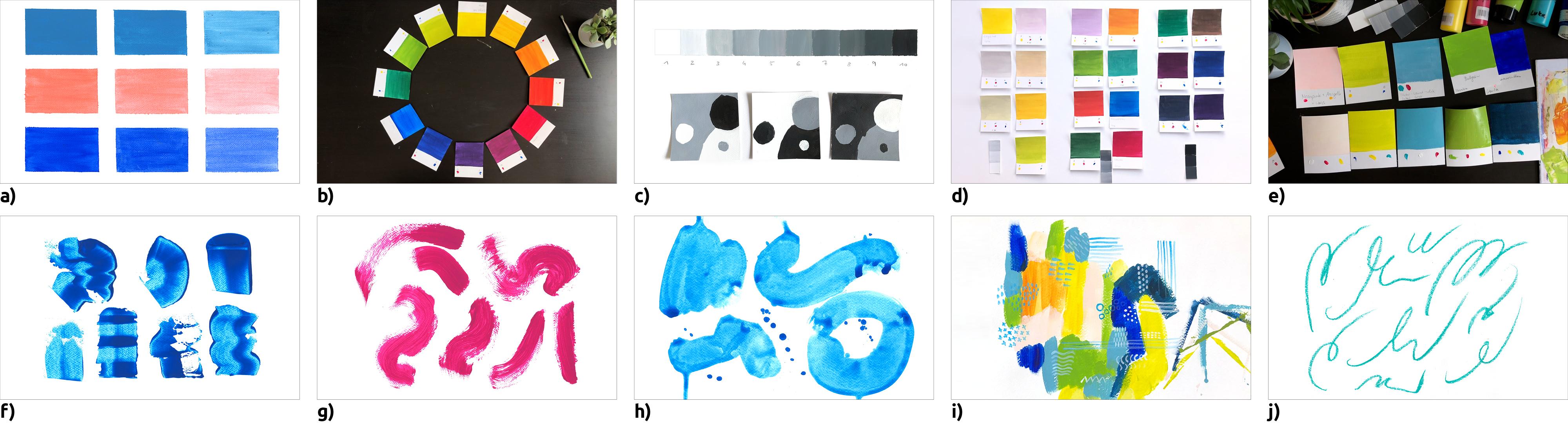
mix all the colors of the color wheel from
just three basic colors. In the next section, we'll tackle tonal value, the shades of gray
from white to black. As an exercise, we will be
painting a value scale. Then we'll talk about
contrast and do another exercise using
different proportions of light, medium, and dark values. Next, we'll practice identifying the lightness or darkness, that is the value of colors. We'll use the color swatches
which we painted for the color wheel
exercise and sort them according to their tonal
value from light to dark. Finally, we'll use all of that knowledge to create
a color palette for your class project and we'll try it out on
the practice sheet. Then we'll get ready
for the class project. First, we'll prepare our paper, talk about using
a viewfinder and the benefits of
painting in series. The next lesson is about how free abstract
painting enhances your creativity
and how limitation and imitation can help
with the learning process. You don't have to get everything right the first time either, because acrylic paints dry quickly and are
easy to paint over. Finally, it's time for
your class project, four mini abstract paintings. We're going to
work small because the small size makes the
blank page less intimidating. You only need a small
workspace and it keeps material costs to
the minimum and that helps you to be more
bold and feel less. The paintings are built
up from 5-6 layers. For each of them, you will first practice the stroke and
techniques you will need and then immediately apply what you've learned
to your class project. We'll start the first layer
with a painting knife or a plastic card and experiment
with paint application. Next, we'll create the
second and third layer with bold expressive brush strokes using two different
paint viscosity. Then we'll focus on delicate, almost meditative
patterns and train our fine motor skills and
brush control on the way. It's time to get
more lively again. We'll draw an impulsive
line that conveys emotion and brings
movement into the image. Finally, we'll
analyze our pictures and put the finishing
touches on our composition. Collage is a great
option for this, as you can work with
trial and error. Since the project consists of several layers and some
of them need drying time. It would be ideal if
you could prepare a little space for
yourself where you could leave your
painting materials. That way, you don't have to
overcome that barrier of getting things ready and putting them away each and every time, and you can get started painting whenever you
have some spare time. For the class project, please document your progress by taking a picture of each
layer and uploading it. To create a Class Project, select the menu, "Projects & Resources" and
click on the green button. You can upload a cover image
and enter a project title. Then you can add more images
and the description of your work or ask for feedback
in the window below. Finally, you click on "Publish". You can edit and add to your project at any
time in the future. It's up to you to decide how comprehensive you want to
make your class project. The minimum requirement
though is to take one picture of the finished
artworks and upload it. However, it would be amazing if you've documented the process of creating them by taking
a picture of each layer. Last but not least,
I'd be happy to see some of your
exercise sheets. In the next lesson, I'll give you an overview of
the materials you will need. After that, you can already get out your paints for some
practical exercises. See you there. [MUSIC]
3. The Materials You Need: [MUSIC] Hi and welcome back. Now, let's take a look at the materials you will
need for this class. Most of them are definitely artist materials like
these paints, for example. Some things can be substituted
by everyday objects. For example, you could use a plastic card instead
of a palette knife. Though let's get started
with acrylic paints. [MUSIC] Acrylic paints
are extremely versatile, readily available,
and most brands have an affordable line of paints
with a decent quality. You can use them thick like oil paint or thin
like watercolor. They are great for working
in layers because they dry quickly and are water
resistant when dry. That means you won't reactivate the previous layer
when painting over it, that's going happen with
watercolor or gouache. If you already have some acrylic
paints at home, perfect, use those, but if you
have to buy them, here are two tips. To start out, you only need the three primary
colors and white. I like to work with
cyan, magenta, yellow, and titanium white, which
is an opaque bright white. With primary colors,
you are very flexible because
you can basically mix all the colors
of the color wheel, enlighten them by adding white. All primary colors mix together, create a very dark gray. The real black is, of
course, much darker, and if you want to use it as
a pure color in your image, or to mix with other colors to create darker muted colors, it is, of course, useful to
have a tube of that as well. I'm going to use black for our practical exercise
on tonal value, but if you don't have black, you can use any dark color. If you have a favorite color that you'd like to
use all the time, or if you'd like to work with
neon or metallic colors, it's definitely
worth investing in an extra tube of
these colors as well. Acrylic paints are available
in two different qualities, artist grade and studio grade. Often this cheaper paints also go under the names
student grade, standard, or basic. The difference is that
artist grade paints contain more pigments and are
therefore more expensive. For our purposes, I recommend
using studio grade paints from a well known brand or the private label
of your art store. They are less expensive
and I don't like to have that cost factor in mind
when I use a lot of paint. [MUSIC] There's special paper available for acrylic painting, it's pretty heavy and
has about 400 GSM. Watercolor paper or mixed
media paper works as well, just make sure that you
use at least 250 GSM, better get 300 or more. For the exercises
and color swatches, I use inexpensive 200
gram watercolor paper from the private labels of
two different art stores. The types of paper I
use for painting are 400 gram acrylic painting
papers by Canson and Fabriano. The Fabriano Pittura
Acrylic Painting Paper is pure white and has a
slightly ripped texture. I bought this paper
in large sheets, but it's also available
in paper pads. The Canson Acrylic
Paper is natural white and it's grains reminds
me of watercolor paper. [MUSIC] For acrylic painting, it's best to use synthetic or bristle brushes because they are
quite inexpensive, have a good firmness, and are easy to care for. I wouldn't use
expansive natural hair brushes like watercolor brushes, because the acrylic
paint tends to dry near the feral and starts
to push the bristles apart, and sooner or later the
brush will be ruined. For this class, I use
three types of brushes, a Flat Brush Number 10 for the color swatches
and the exercises, a smaller Round Brush
Number 2 for the patterns, and the Big Round Bristle
Brush for the bold strokes. If you don't have
a brush like this, you can also use a
larger flat brush, a thick round bristle brush, or a painter's brush
from the hardware store. I also use a painting
knife for mixing my paints and to create
expressive marks. If you don't have one an old credit card or any
plastic card will do. [MUSIC] For the textural marks, you can use a variety of
pens and drawing tools. I recently discovered these
very cool squeeze tubes of heavy body acrylic
paint from Sennelier. I bought two cost to try them out and I really
love the effect. They have a very fine tip
and you can use them to make delicate three-dimensional
lines like I did in this piece. Other options are
acrylic markers or pastels, pencils, or crayons. Keep in mind though that
water-soluble materials can smear if you apply another
wet layer on top of them. [MUSIC] I use all
things as a palette, sometimes I use plastic
plates like this one, and I also have a
tear-off palette, which is made of coded
sheets of paper. I really like to use
just plastic foil like these document sleeves
that are open on two sides or these
ring binder pockets. To have a white background, I just put a sheet
of paper inside, and then I can mix the
colors right on them. Here I have a sleeve that I've cut open and used many times, and therefore, it's covered
with some paint residues. If I have some leftover
paint on this palette, I just put a sheet
of tissue paper over it and make
a monotype print. For this, the pain
must still be wet. Once the paper is
completely dry, you can peel it off to reveal your hand
printed collage paper. To add paper elements
to your images, you obviously need some glue. I use matte medium or glossy medium and as the names imply, they dry with either and
matte or a glossy surface. Alternatively, you can use
a craft glue or white glue, it's relatively thick but can be diluted with water and
applied with a brush, it dries clear and shiny. The advantage of making
your own collage paper is that you can match it exactly
to your color palette, and you only need regular
tissue paper for it. Of course, you can also use any other colored
or textured paper and sometimes I even
use the pellet dirt, that is pieces of
dried acrylic paint. [MUSIC] To cut the paper, you'll need a cutting
mat or a piece of sturdy card stock as a base, also a ruler, ideally one
that is made of metal, a utility knife, and a pencil. To stick my paper pieces to
the corrugated cardboard, my cutting mat, or the table, I like to use masking
tape or painter's tape. Try to find a tape that
doesn't stick too much. Alternatively, you can
also try washi tape. That was a lot of
information, but don't worry, you can download the
materials list from the projects and
resources section. In the next lesson, we'll take a close look at our paint tubes. With most brands, you can find information about the
opacity, light fastness, and the pigment
on the packaging, and knowing about
that can help to avoid frustration later
on when using the paints. See you in the next lesson. [MUSIC]
4. Acrylic Paints: Basics: [MUSIC] Let's take a closer look at the properties
of acrylic paints and find out about
lightfastness, opacity, and pigments. Acrylic paints are
made of pigment, water, and binder. The binder is basically the glue that holds
the pigments together, and also makes them
stick to the surface. It's made from acrylic
resins and water, and it's white as
long as it's wet. Acrylic paints are water-soluble and can therefore be
diluted with water. You can clean your brushes with just soap and water as well. There are brush cleaning
soaps for this, but admittedly, I use regular
hand soap most of the time. After I have removed most of the paint and washed
out the brush, I lather it one or two times and move the
bristles back and forth to get out the paint residues which
usually settle neutrophil. Acrylic paints dry
pretty quickly. While thick layers of paint
take a few hours to dry, thin layers dry in
just a few minutes. Here I've set my timer
for five minutes and my guess turned out
to be pretty accurate. Once the water evaporates, the resin particles
in the binder fuse together and the paint
becomes water resistant. Acrylic paint holds
especially well on fabric, so it's better if you don't
wear your favorite shirt. The binder is also
responsible for one of the paints
specific qualities. Acrylic paints are
relatively elastic. You can even pull off the dried paint from
your palette like a foil or bend your paper or canvas without
cracking the paint. It's also good to know that acrylic paints dry
a little darker, this has to do with the binder having a whitish
color when it's wet, making the colors
appear lighter. However, when it's dry, it becomes clear and translucent and the colors look
a little darker. Now, if I were to ask you to
paint an evenly opaque area of color with no
visible brush strokes, and you end up with
this, what has happened? Let's take a look
at our paint tubes. Have you ever noticed those little square symbols
on the paint tubes, they indicate
whether the paint is opaque, semi-opaque
or transparent. Paints that have a
completely filled black square are opaque, and it's easy to paint a
flat even area of color. If there's only an
outline square, the colors are transparent, which you'll notice
when painting. Paints with a
half-filled square lies somewhere in-between when
it comes to opacity. Cheap paints often have a bad opacity as well,
but some pigments, such as ultramarine blue, for example, are more
transparent by nature. How can you make such
colors more opaque? First, you can apply a
second layer of paint, sometimes this is not an option, for example, with
these brush strokes, because a second layer would change the look of
the stroke a lot. If you know your color is very transparent and you
don't want it to be, you can add a tiny bit of white, this will change the tonal
value slightly, that is, the color will be lighter, but it will also
make it more opaque. Lightfastness indicates
how resistance the color is to fading
when exposed to light. It's often indicated by
plus or asterisks symbols. The more plus signs, the longer the color lasts. Neon colors always have
very poor lightfastness, so not even one plus sign. That means they fade over time. With other colors it varies. On the tubes, you
can sometimes find abbreviations for the
pigments that were used. If a color is mono-pigmented
like this one, it contains only one pigment. Other colors like
this royal blue are mixtures of
several pigments. For example, this
blue contains PW6, which is titanium white, and PB15, fellow blue. Next time I'll probably
won't buy this tube, but the pure fellow blue, because mixing something
with white is very easy. By now, you probably know more about acrylic paints
than most people. Especially the knowledge about opacity is hugely important. When you are aware that not all pigments
are equally opaque, you can save yourself a lot
of frustration later on. In the next lesson, we'll take a look
at paint viscosity. See you there. [MUSIC]
5. How To Dilute Acrylic Paints: [MUSIC] Water-based
acrylic paints have only been
developed in the 1950s, so they are relatively young. But there are a
lot of products on the market and the
main difference is often the viscosity. We will only be using basic acrylic paints because we will use water to
change the viscosity. But it's good to know what
all those terms mean anyway. There's a short overview. [MUSIC] Heavy body
acrylic paints have a high viscosity
that is a stiff, buttery consistency that retains the brush strokes very well. Basic paints or studio
quality paints have a medium viscosity
and lies somewhere between heavy body
and soft body paint. Soft body are paints with a low viscosity and
creamy consistency. They create a flat
paint surface where you can hardly see
any brushstrokes. Fluid acrylic paints have a
consistency like heavy cream. They can be painted, poured, or sprayed. High flow acrylic paints are, for example, acrylic inks. They have both a
watery consistency and high pigmentation. To make your paints thicker, you would have to add
some medium heavy gel. But to make them thinner, you could just add water. But why are there so many liquid paints
on the market then? These are the reasons. To create an opaque layer without a great deal of texture, it's convenient if the paint has the right consistency
out of the tube. Soft body paints are easy to spread and you hardly
see brush marks. By diluting the paint, you reduce the pigment
concentration. The colors become lighter, less intense, and less opaque. Liquid acrylic paints have a thinner consistency and a
high pigment concentration. If you thin your paint with
a lot of water, the binder, that is the glue that holds the pigments together and also to the surface can't
work properly. This can supposedly result
in some problems like flaking or cracking and
it's called under-binding. Paint manufacturers
therefore recommend diluting acrylic paints with 30
percent of water at most, that is two parts paint
to warm part water. [MUSIC] I tried to cause
under-binding on purpose. It said to happen only
on prime surfaces. For my experiment,
I painted a sheet of watercolor paper with primer. On the right side, I have the unprimed
watercolor paper, where the pigments
are additionally held by the fibers of the paper. I started with pure
color and then repeatedly added a
portion of water until I went from a ratio of one to one colored water to an
approximate ratio of one to six. For each mixture,
I applied a lot of paint on the top and a
thin layer underneath. At the end I also added a little airbrush
medium to the one to six mixture to see if
that made a difference. Then I did the same on the
unprimed watercolor paper. [MUSIC] The result was a very minimal abrasion
of color with an eraser, regardless of the thinning
ratio or the addition of medium on both the primed
and unprimed paper. Just using my finger, I couldn't get any
paint off at all. Other than that, I noticed that the binder left shiny spots
where the paint had pulled. The issue of color
intensities and other thing. If this is my normal
paint and I thin it, it gets lighter
and less vibrant. Where there was a
puddle of paint, there's still more pigment, but in the thin layer, you can see a strong difference. In comparison, here I
used watercolor ink and although it was just as
watery as my diluted paint, it has the same
color intensity as the pure undiluted
acrylic paint. The bottom line
is that you don't need to worry about
under-binding for this class because cheaper
acrylic paints seem to contain so much binder
in relation to pigments, that dilution is not
so much of a problem. However, if you have encountered flaking or cracking
acrylics before, I'd love to hear about that. Just drop me a comment in the discussion section or in your class project and tell me what kind of products you use. We'll now be using our acrylic paints in three
different viscosities. First, directly from a tube. Here we usually have a medium viscosity
for studio paints. Second, diluted with
a little water, like a soft by acrylic paint. Third, diluted with a
lot of water as a glaze. [MUSIC] For this exercise, I'll use an opaque,
semi-transparent, and a transparent color in
three different consistencies. I masked off nine fields on
a sheet of watercolor paper. For the first segment, I will always use a dry brush. You can notice that with
the rough watercolor paper, you can see bright spots because the color doesn't run
into the hollows. But when you brush gently
back and forth a few times, you'll get an even coverage. For my second segment, I wet the brush before I pick up new paint and mix it to
a creamy consistency. Now, the brush collides
over the paper a lot better and the
paint is easy to spread. But you can already
see some brush strokes and slide transparencies
in a few places. I'm smoothing out
the paint by letting the brush glide gently
back and forth. For my third color patch, I'll use my brush to
add water until I have a small puddle with
liquid color and now, you can see the brush
strokes quite strongly. The paint is very
quick and easy to apply and you have a
watercolor-like effect. Next, I'll do the same with my semi-transparent and
transparent paint. Let's fast forward, so it doesn't take that long. You can now see that
in the first field, there are no brush marks at all. In the second, we see a few, and in the third we already have this watercolor effect with
lots of visible brush marks. Here, the transparency and brush marks are already
similar to this field. It gets more transparent as we go and we have brush
marks in all fields. Here again, we are more
transparent to begin with. It looks almost like this
area here and consequently, we have brush marks
in all fields. [MUSIC] As you can see, there is no magic formula when
it comes to adding water. The paints' viscosity
differs from brand to brand and sometimes
even from color to color. The best option is to try out your paints and get to
know their properties. Now, that we've already practiced painting
with single colors, in the next lesson, we'll use multiple
colors and learn about the basics of color mixing
using primary colors. See you there. [MUSIC]
6. How to Mix Acrylic Paints: [MUSIC] Now that we've taken a close look at our pen tips and tried
different viscosities. Let's move on to mixing colors. For the class project, you don't actually have to
know how to mix colors, but it will make you more flexible and also save
you a lot of money. [MUSIC] You can mix all colors of the color wheel from the three primary colors, cyan, magenta, and yellow. You'll save money because you don't have to buy
so many colors. It's fascinating to watch how the colors mix and a
new one is created. By experimenting, you'll
find new color combinations, and a great benefit
is that mixed colors based on the same three
colors harmonize very well. [MUSIC] The color wheel is
a tool from color theory. It shows which colors have to be mixed together to
create another color and also helps you to find matching harmonious
color combinations. To paint a color wheel you
need the three primary colors. Primary colors are
often described as the colors that can mix
all the other colors. This is a very
simplified definition because it's definitely
impossible to mix all colors that you can see with just three primary
color pigments. Originally, red,
yellow, and blue, were perceived as the
perfect primary colors. But this theory was based
on light and not pigments. With the invention of synthetic pigments,
color photography, and color printing, these three colors were
replaced by yellow, magenta, and cyan. With cyan, magenta, and yellow, you can cover a
wider color range and mix brighter colors
like this green here. If you don't have cyan, magenta, and yellow, you can still make the color wheel with any
other of those colors. Because cyan is just a specific blue and magenta which
has a certain red. [MUSIC] Instead of making a classic color wheel
with the compass, we'll paint color swatches, which we can arrange
in a circle as well. The advantage is that we
can use the color swatches later when we create
our color palette. We'll also do an
exercise where we sort colors by their tonal
value from light to dark. That's what a color cards
also come in handy. For my color wheel, I use true yellow, wine red, and cobalt blue from a very economic brand
called Goya Cretan. The colors actually
look very similar to the magenta and cyan
from other brands. For the sake of simplicity, I will now call them
cyan and magenta. You'll need at least
12 blank cards for your color wheel, though, I always cut a
little more so that I have enough in case I want to repaint a card or create
additional swatches. Inexpensive watercolor
paper works great for this. My cards, are eight
times 10 centimeters. The exact size doesn't
really matter, but having a decent
dimension is useful as it's easier to judge a color
if you see more of it. I always leave three
centimeters of empty space underneath where
I write down the colors, names, and sometimes even make small dabs of paint of
the colors I've used. Let's start with the transition
from yellow to magenta. I always start with the lighter color
because it's easier to darken a light color than
to lighten a dark one, you wouldn't need a lot of
lighter color for that. I add a small amount of
magenta to my yellow. I want to get a
yellow-orange first, then an orange, and
finally a red-orange. Maybe it's easier for you
to mix the secondary color, the orange first and then
the tertiary colors, yellow orange, and red-orange. When painting the color cards, I make sure that the
paint is applied as evenly and
opaquely as possible. This makes it easier to see the tonal value of
the color later. If you always wipe the brush thoroughly before
you rinse it out, your water will stay
clean for a longer time. Rinsing will be faster
and it's better for the environment,
and the sewers. Sometimes I also use a second water container to clean the brushes really well. This is very important
now because we can't have any magenta in
our yellow cyan mix. When transitioning
from yellow to cyan, its hugely important
to start with the lighter color that is yellow and add just
a smudge of blue. Blue has such a high
tinting strength. This time, I paint my
color swatch right away. But as I continue mixing, I quickly realize that my
yellow-green is too yellow. Then comes a nice grass green. For the blue-green, I wipe the brush first because I want very little
yellow in this mix. By the way, take
care that you mix enough color because it's very annoying if you
have too little. Here, I've almost run short. I quite like the gradation
from the blue to the green, but I didn't hit the
yellow-green so well. That's the beauty
of color swatches. I can just paint myself a
new one, and swap them out. For the transition
from cyan and magenta, I'm taking a fresh brush
because my water is already too dirty to clean
out the use brush thoroughly. I started with my magenta, and slowly add blue. First, I mix red-violet
then violet, and finally dark blue. With the dark blue, you have to try out how
much purple you can mix in without it
becoming purple, but as dark blue as possible. I always paint my color
swatches right over the edge by not having
a white border. I can later on, better
check how the colors match, because I can have them
right next to each other. Here we have the
full color wheel. Now I can try to
mix color black. This is really a matter of practice because you have to get the right ratio between
the three primary colors. This time it took me quite a
long time to get it right. I make additional swatches with the remaining paint
and now I'm mixing all three primary colors
with each other and with white to get muted
and pastel colors. If you have other
tubes of paint, now's a good time to make
color cards of those as well. It's very important to write down the names of the colors you use on the color swatch so you can remix them again later, especially if you use three
pigments or other colors than the primary
cause it will be really difficult if
you don't remember. Sometimes I also like to make smudges of the colors I
used as a visual reminder. Color mixing is such
a great exercise to warm up and get loose. It's playful and fun and there's always something
new to discover. I'm looking forward to
seeing your color wheel. Please take a picture and upload it to your class project. In the next lesson, we'll talk about an
extremely important element of design, tonal value. You will need your color
swatches again though, in the lesson after that, where we will be talking about
the tonal value of colors. See you there. [MUSIC]
7. From Black to White: Tonal Value: [MUSIC] Welcome to the
second part of this class. In the next three lessons, you'll learn about some
useful principles. First, we will disregard
color completely and just look at black and white
to learn about tonal value. Then in the next
lesson we'll find out how value and color relate, and after that, we'll
use that knowledge to create a color palette
for our class project. So first of all, what is value? Value defines the lightness
or darkness of an element or area of an image on a
scale from white to black. White represents
the lightest value and black the darkest value. [MUSIC] Value is responsible for contrast, shape and depth. Our eyes are attracted to the areas of strongest
value contrast. These are the areas where light and dark are right
next to each other. That's where we look and we
can take advantage of this to guide the viewer's
eyes to focal points. So we can make sure to deliberately include
high-value contrast at several places in
the image to create focal points and guide the
viewer through the artwork. In complete darkness, we
can't make out any shapes. As soon as light comes
into play, values appear, creating a three-dimensional
impression and informing us about the
texture of the object. Value is important for
spatial depth perception. Things in the distance
have less contrast and more similar values
because there's already a lot of
atmosphere in-between. That is, similar values make
things look more distant. Strong contrast,
on the other hand, makes things appear closer. [MUSIC] Yes. Although we might not focus
on an exact reproduction of a form or a realistic
impression of spatial depth, as for example, in a
landscape painting, the value has its own
right and importance. It gives the abstract image just as much structure
and depth and directs the viewer's
case through the picture with the help of value contrast. [MUSIC] We'll now paint a value scale from white
to black in 10 increments. It's not that easy to get even gradation since acrylic
paints dry a bit darker, so it's an excellent
exercise in mixing paints. As a guide, I'm going to set up my first attempt in front of me, and for you, I've prepared
a template to print out. I taped off two strips of 10 squares each because I
want to try it two times. First I start with the pure white color and add
just a teeny bit of black. Black has a very high
tinting strength, so you have to be very careful not to go too dark right away. When you get close to black, you might have to wipe the brush a little
bit so that there's not so much white in it and
you can get darker colors. Then I try it again, but this time going
from black to white. You'll notice that it
takes more light color to lighten a dark color
than the other way around. Now it's time for
another brush swap because mine's already so full of color that it's hard to get the light values right. If one patch doesn't turn
out quite the way it should, just paint over it again. You can now divide the
values into three groups. Light values, medium
values, and dark values. [MUSIC] If you feel like your image lacks
this certain something, it often has to do with
the value distribution. You can see that we
have a large area here with very
similar mid-tones. Now, I've structured the
mid-tone area using collage, darkens the darkest
color even more and added contrasting
elements in other places. Now let's look at
the resulting color. You can see that
the value contrast is more important
than the color. Because even though I had a strong color contrast between
the complimentary colors, orange and blue in
the first image, the image was quite boring. [MUSIC] Apart from value contrast, there are many other types
of contrast as well. Contrast, after all, is by definition, a strong difference. It creates variation
in our image and makes it more complex
and interesting. We can also hold the
viewer's attention longer because there's
just more to discover. [MUSIC] Now we're talking
about a quantity contrast. Sixty to 30-10 is design
principle that is, for example, used in interior design when
it comes to color. But we can also apply this principle to
adjust the proportions of our three value groups to make the design
more exciting. Note that the percentages
are not setting stone, but rather a guideline to
create strong differences. For example, we can use
mainly light values, some dark values, and very
little medium values. To get a feeling for the
principle of value proportion, we will now create
three small pictures. In each piece we'll use
a very light value, a medium value,
and a dark value. I've made a couple of
sketches for this, and I'm going to
transfer one of them three times on my
watercolor paper. The paper is taped to
my cutting mat and I've divided it into
equal-sized squares. The composition
should be relatively simple as this is not
a drawing challenge. You can work with the circles, stripes, or other
geometric shapes. However, it's useful if you use similar shapes so that we're not distracted by the
shape contrast. Concerning the
distribution of the areas, I've tried to stick
to the principle of most to some to very little. I use white as the
lightest value, black as my darkest value, and a mid value, gray. As it turns out later, it's better to use
a very light gray for the lightest value
and not pure white. I've already made
sure in the drawings that the areas have
different sizes, and now I will distribute the tonal values
differently in each image. For example, I'll
start by making the largest area medium
gray in the first image. Then in the second, I'll use the gray color
for the medium-sized area, and in the third image, I'll use it for
the smallest area, then I do the same thing
with the other two colors. This is not about painting the areas as exactly
as possible, but we also don't want any
gradients at the edges. I've had to cut out
my pictures because I use pure white for
the lightest value, and without the tape, you couldn't see any difference
to the rest of the paper. Now, you can observe
where you look first. Is there a single
point of focus? Or does your eye move
around in the image? In general, one can
say that you first look at the area with the
highest value contrast, and then at the less
contrasted areas. You can also get a
feeling of depth, such as in this image here, which reminds me of outer
space with planets that are closer and further away
appearing illuminated or not, and you can notice
how the basic mood of the image changes due to the different tonal
value distribution. [MUSIC] Hopefully, these
exercises have shown you the importance of value
and how you can use it to change the mood of the image
and direct the viewer's eye. In the next lesson, we'll discover how
value and color relate. See you in a bit. [MUSIC]
8. How Value & Color Relate: [MUSIC] In the last lesson, we have spoken
about tonal value. When you're just looking at
different shades of gray, it's relatively clear what's a light and what a darker value. But when it comes to color, it's not so easy anymore. Basically, every color
has a tonal value. Most people would recognize
this blue as a color with a dark value and this yellow as a color
with a light value. But with other colors, it's not so clear anymore. Seeing the value of
a color is something that you learn with
time and practice. But for now, let's
start by defining a few terms that we need
when talking about color. Hue, saturation, and brightness. Hue refers to the pure color
at it's highest saturation. It's what we mean
when we say color, for example, red,
yellow, or green. Saturation refers to the
intensity of a color. A completely desaturated
color appears gray. We desaturate a color
by mixing it with a complimentary color
or a neutral color, like white, gray, or black. That makes the color
more muted or dull. The value refers to the lightness
or darkness of a color. You can change the
value of a color by creating tints,
shades, and tones. A tint is a color that has
been mixed with white. Tints have a lighter value
than the pure color. A shade is a color that
has been mixed with black. Shades have a darker value
than the pure color. A tone is a color that has been mixed with white and black, that is with gray. Depending on the
proportions of white, black and the original
color tones can have a lighter or darker value
than the original color. Tones are desaturated,
more subtle colors that can be easily
combined with other colors. Now, let's take another
look at the color wheel. This time in grayscale. You can see the colors
have different values, but you can also see that different colors can
have the same value. Here, for example,
green and orange. [MUSIC] As a matter of fact, we first look at the area
of highest value contrast. Regardless of the color
or the subject matter, color is less strong than value. Although these colors look
quite different here, the tonal values of beta and green are identical
and the neon, red, and gray are
also very similar. This area is at first
glance actually only perceived as
one thick stroke. Let's take another
look at contrast, form, and depth, now in terms of color. Neon red and neon pink have a similar value and are almost
perceived as one stroke. Such combinations have their
own appeal, of course. But if everything's the
same, it gets boring. In black and white, he's definitely not seen much. What really stands
out is this stroke. This is where we look
first, these edges here. This is where we wander along. At first, we're not
going to look in here, these strips here, they are also
interesting because there's value
contrast for those, the shape and size contrast. [MUSIC] In the last lesson, we've already established
the tonal values important for perceiving form. If we use the same
value for all sides of a three-colored cube on
a colored background, the cube will blend right into the background when
we remove the color. However, if we adjust the tonal values using
tints and shades, the shape is still visible
in black and white. [MUSIC] Tonal gradations are important when it comes
to spatial depth. By assigning different
tonal ranges, light, medium, or dark
to your foreground, middle ground, and background, you create a sense of depth on your
two-dimensional surface. Pay attention to the tonal
value of your color. [MUSIC] It's time for
a little exercise. For this, we'll need
the color swatches we made for the color wheel. I'll use additional
mixed colors from the primary colors
and white as well. You can also use the
grayscale we made in lesson 7 to help determine the
tonal values of the colors. To do this, just hold
it right next to your color and compare
the brightness. Now, you need an evenly
bright non-sunny spot and a white background that won't distract from the cards. The color swatches should all be dry because you remember, acrylic paints dry
a little darker. Now, arrange the cards
from light to dark according to their
presumed tonal value. When you're done,
take a picture, convert the picture to black and white on your
phone or computer. This way you can
see the values of the colors and check if you
have guessed correctly. The menu probably looks a bit
different on your device. I select the ''Image'', go to Edit and tap
on this little icon with three circles
that stands for color. Then I have to scroll up
to get to the option, black and white medium. Make sure to use a color
conversion that is as normal as possible and doesn't lighten light areas or
darken dark areas. Now switch around the swatches
and take a photo again. Check the values in black
and white until you find the right order from the
lightest to the darkest value. You can keep the last photo
for future reference. Now, divide the color
swatches into three groups, light, medium, and dark values. Again, you can take
another reference picture for later use. [MUSIC] I use this method quite often when I'm putting
together a color palette. I want to make sure that I
choose colors with light, medium, and dark values. But also during painting when deciding which
color to use next, and I want to make sure that the next color has
a different value. [MUSIC] In the next lesson, we're going to choose colors from each of the
three value ranges, lights, mediums, and darks, to create a color palette
for your class project. Don't worry, if you have lots of swatches with medium
and dark values. There are very few pure colors that have a light value
right out of the tube. But as you know, you can lighten the value of
the color by adding white, that is by mixing tints. See you in the next lesson. [MUSIC]
9. Create a Color Palette: Hello again. By now, you can determine the
value of a color, you know about the importance
of value contrast. Let's talk a bit about color theory and how
to harmonize colors. Then we'll put together
a color palette. There are no universal rules. Our cultural and
personal background influences how we
perceive color. A color that triggers certain feelings or
evokes memories for you, can have a completely different
effect on another person. What we perceive as
old-fashioned, retro, or modern, is simply based on our
visual experience, that is what we see
in everyday life. For example, when I was a kid, it was unthinkable to wear
pink and red together. That has definitely changed. In short, there's
no right or wrong when it comes to
color combinations. Even though there isn't
a right or wrong, you can use color theory in specific color harmonies to find matching visually appealing
color combinations that have a nice contrast. These color harmonies
are especially helpful when putting
together a color palette, but they can also help you when you take stock of
the colors that you already use in your
piece and you're looking for a color
that matches well. The monochromatic
color scheme uses only one color and it's mixed with white,
gray, and black. In the complementary
color scheme, you use colors that are
opposite to each other. Complimentary colors are
the most different colors and therefore have
a high contrast. They neutralize each other. You can use them to mix
muted colors or even gray. The split-complementary
color scheme is a variation of the
complementary color scheme. Here, you use one color and then the two colors that are
next to the opposite color. For example, yellow, dark
blue, and red-violet. In the analogous color scheme, you use 3-5 colors that are
right next to each other. The triadic color scheme uses three colors that are equally spaced out on the color wheel. For example, cyan,
magenta, and yellow. The tetradic color scheme
uses two complimentary pairs. For example, yellow,
green and red, violet, and orange, and cyan. I like to approach color intuitively and playfully
through trial and error. This allows me to find color combinations that
I might not necessarily have come up with if I had just used the mentioned
color schemes. Colors that go well together are related in some way as are, for example, analogous colors. However, there's a
trick that turns any color combination into a matching color palette,
harmonizing colors. There are two ways
to harmonize colors. First, with a mother color. To visually connect any color, you can mix a small
part of one color, in this case, pink, into all the other
colors you use. Second, with a mud color
or a chromatic black. For this method, you mix
all colors of your palette together to create a dark
gray-brown muddish color. Then you add this color
to all the other colors. No matter which of the
two methods you choose, you get colors that have
something in common and that makes them
very harmonious. Here are a few tips
for choosing colors. Using colors you like at the
moment is never a mistake. A few colors are easier to
handle than a large number. Neutral or muted
colors pair well with saturated ones and make the
bold colors pop even more. You can, for example, paint 60% of your
image in similar hues, use neutral colors
for another 30%, and excellent colors such as a complementary color
for the last 10%. I often find my
color combinations by chance on an untidy desk, in nature or while
folding laundry. Just keep your
eyes open and take a picture when you see
an exciting color combo. [MUSIC] For your color palette choose 4-6 colors from
your color swatches. Look at them in black and
white with the help of a digital device to make
sure that you have light, medium and dark values. I have two lights here, three mid-tones that are
pretty much identical, and this is my darkest value. My color swatches are mixed from a variety of different colors. To make them match better, I'm going to re-mix the colors, but now I'm using as few different paint
tubes as possible. The new colors will, of course, look a bit different
from the ones on the original color swatches because I'm using
different base colors, but remixing them exactly
it's not the point. It's important that
they match well. To see how the colors work
together in a painting, I paint samples of
color on a sheet of paper and make sure that all the colors butt up
against each other. I find that sometimes I really like my selected color swatches, but then it just doesn't
work in the painting. I really like this color
combination right now. I'm not so sure
about the orange. The yellow-green doesn't touch
the ultramarine blue yet. I want to see how that
goes with it too. I'm using my dirty brush and the blue to harmonize it
with the other colors. I like that even better now. Now I'm making new
swatches of mixed colors. Since my green is
the only pure color, I add a bit of
magenta and yellow to harmonize it with the
other colors as well. Now my color palette is ready. Above, you can see
the original colors, and below the harmonized ones. I didn't exactly stick to one of the mentioned methods
for color harmonization, but the important
thing is that all of the colors also had some of
the other colors in them. You don't have to make color
harmonizing a science, and you don't have
to do it at all. It's just good to notice method so that you can use it
whenever you need it. I often approach color very intuitively and don't care
for any concepts at all. Sometimes I like the result
and sometimes I don't. Either way, I've
learned something. Also with acrylic painting, there's always the option of painting over it
and starting again. In the next lesson, we'll discuss paper size, the advantages of
working in series, and we'll prepare our paper. See you. [MUSIC]
10. Preparations: [MUSIC] Welcome to the
third part of this class. First we'll prepare our paper. Then I will show you what a viewfinder is and
how you can use it. Finally, we'll talk about why working in theories
is so helpful. By the way, the starting
point for this class, we're 10 centimeter
wide paper scraps that almost ended
in a wastepaper. But that would
have been a shame. I started doing small paintings. As it turned out, the combination of
the small size and the feeling of not using
valuable material, we're quite essential for
the success of the pieces. I hope this works
for you as well. [MUSIC]. Here I have the
format I like to work with 10 times 10 centimeters. Of course you can
work a bit larger, but doubling the side length
from 10 times 10 to 20 times 20 centimeters means
quadrupling the surface area. I've made some pieces
with a painted area of 13 times 13 centimeters and it worked with
the same brushes, but it was already a bit at the upper limit for this style. Larger brushes
wouldn't have hurt. [MUSIC] As I mentioned earlier, I like to take the paper to a piece of corrugated cardboard. That way I have clean borders, which on the one
hand looks nice, but it also reduces buckling
when thinner paper gets wet. As we're using thicker paper, it's more important
to keep the paper from sliding around
when you paint, depending on how much white
margin I want to have. I overlap the tape between 1 centimeter and 5 millimeters. You end up with a
painted area of 8 to 9 centimeters side length. Now, place the
pieces in a group of four on a piece of cardboard
and tape them down. Make sure that the overlap
of paper and tape, it's about the
same on all sides. Gently brush down the tape
with your finger to keep the paint from getting
underneath as much as possible. [MUSIC] Once you know
your final format, you can make a viewfinder. For that, you will
need a sheet of paper in a neutral color. While painting,
you can use it to cover the surrounding area and the strokes that go
over the edge and look at your painting as
if it was in a frame. This helps you to determine where you
could add some elements. I'm going to make another
viewfinder of white paper. I use a triangular ruler to draw a square in the
middle of the paper make it a tad smaller than the taped format so that I won't to see any
tape in my cutout. If I have nine centimeters
from tape to tape, I make the cut out with 8.5
centimeters side length done. Let's try that right now. Fits perfectly. [MUSIC] One advantage
of working in series is that you stay
loose because you're not so focused on getting the
one image perfect. After all, you have
several attempts. Working in series speeds
up your learning process because you get visual
feedback after each stroke. For example, if your
stroke is too wide, you can make it less wide
in the next painting. Series also makes sense from
the viewer's perspective. The images are connected
to each other and our variations on a
theme similar to music. That way the viewer doesn't have to constantly engage
with something entirely new and can find out what he or she
likes more easily. Is it the shapes or the colors, or the arrangement
of the elements? I usually work on 3-4 of these
series at the same time. Because on the one hand, I'm quite impatient
and I like to use the drying time and
work on something else. But on the other hand, the series also influence each
other and I get new ideas. Lastly, I would like to add that quantity leads to quality. It's simply unrealistic
to believe that you do one painting and immediately
end up with a masterpiece. But the chances that you end up with one piece
that you really like are much higher if you
paint four simultaneously. In the next lesson, we'll talk about the
benefits of working in layers above limitations
and imitation. [MUSIC] See you there
11. Painting in Layers: [MUSIC] Painting in layers
is exciting because there is transparency and
overlaps and you can create visual depth and play with
showing and hiding things. It also reduces the
pressure of getting it perfect and boost
your creativity. What's so beautiful
about acrylic painting is that you can have as
many layers as you want. You don't have to get everything
right the first time. If it just doesn't work
out you can cover it up and start all over
again as I did here. The texture that has already built up doesn't hurt at all, instead makes the painting
even more interesting. By not having a specific
end result in mind, you can boost your creativity
with every brush stroke, with every new layer, you create a new starting point. You constantly need to
decide how you want to go on and where you want to
place your next mark. Sometimes things just don't
work out as intended. The stroke is not loose
enough, not well-placed. All the colors as in this
case too transparent. Here there's this greenish
color that's created by the overlapping of yellow and blue and I don't like it at all. At first you might think ouch, now I messed it up. But then you just keep going because those are the
moments when you can really practice creative
problem-solving because now you have nothing to lose. You can leave your comfort
zone and try something new. [MUSIC] The process
I will show you in the upcoming lessons involves
a specific sequence of steps in terms of paint
application and tools. There are countless other
possible combinations but it really pays off to stick to these guidelines at least once. Restrictions not only reduce
the feeling of overwhelm but can happen when you
are confronted with an abundance of possibilities. Limitations also stimulate
your creativity because you have to explore the possibilities
within these limits. In the beginning when you're
learning something new, it's very helpful to imitate
someone else's process, to follow in someone
else's footsteps to make faster progress. Then you can adapt the process to your
needs and your star. Because often we
better know what we don't want rather than
what we actually want. You could for example change
the order of the layers, use different painting
tools or try another size. That's it as far as layers, imitation and limitation
are concerned. In the next lesson
we're going to start the class project. We're using a painting
knife or a plastic card to create the first layer
of expressive marks. I'm looking forward to it. Let's go. [MUSIC]
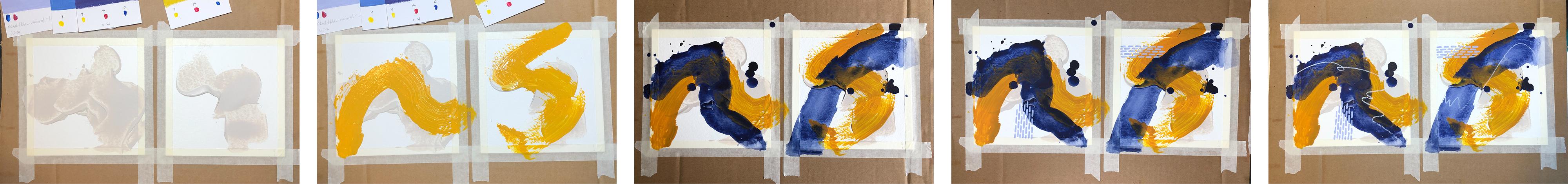
12. Expressive Marks: Painting Knife: Are you ready for
your class project? Finally, we're getting started. For the first layer, we're going to use
a palette knife or a plastic card to create
strong expressive marks. But before we do that
on our final artworks, let's do a little warm-up
exercise to get a feeling for the tools and the
marks they can make. [MUSIC] We'll use
undiluted paint straight from the tube and
we need a good amount, 200 gram watercolor paper
works great as a base, but you could also use old
paper bags, for example. Let's start with the
painting knife and test how different pressure
affects the marks. You can press down the Spatula
hard and pull it down. This will give you
transparent areas, but also thicker
ones at the edges. You can also let it
glide gently over the paper for a layer
of thick paint, this works especially well if you tilt the
palette knife towards the paper so that you can spread the paint with the surface
of the palette knife. You can switch between
one and the other. That is press down hard, reduce pressure, and
then build it up again. This way you can vary the
transparency of your marks. You can move the spatula very slowly or fast and impulsively, you can make straight
lines or curves. I can start straight, make a curve, change direction, go back the other way, and then turn until I
have a mark I like. I can also go back in
and add some paint. Yes, now I have a
pretty complex mark. As you can see, I can also
build up a ridge of pain by pushing the spatula than
to squeeze the paint add. Now this will have
to dry overnight. Let's do a second page, this time with the plastic card. The narrow side of my card has about the same side length
as my painting knife. I'll use that one. Pick up some paint and do
the same exercise as before. Press down heavily,
slide it lightly. Obviously, my card
is a little bent so the paint applications and
even vary the pressure, move quickly with
a lot of paint, make curves, and
random combinations. When it comes to
handling and marks, the card is very similar
to the painting knife, and you can also cut
it in half to make smaller marks. Let's recap. [MUSIC] You can experiment with pressures, speed, and direction. [MUSIC] For the first layer of your class project, pick a color from the color palette you
created in Lesson 9. It doesn't matter if your
first color has light, medium, or dark value. I've already mixed my color and now I make my marks
quite quickly. That's it already.
Here's another example. With this layer, it's
important to mix plenty of paint so that you have enough
to make thicker layers. Before I put the
palette knife down, I sometimes visualize
the stroke and let my hand hover
over the paper. I also tried to get a
little variation in it. If I don't like a mark, I tried to do it
differently next time. Because this is a larger format, I use a plastic card instead
of my small painting knife. Here we go. A quick
tip on composition. Don't unintentionally
place your mark exactly in the center or symmetrically
across the page, that would draw a
lot of attention. You could hardly look elsewhere. You can, of course, go
over the mark again, add some paint and
change it around. But I have to say
from my experience, it usually doesn't
get any better. Here I really feel like
I've all worked it. I'll better leave
that alone for now. Depending on how thick
you apply the paint, it can take up to a few hours until the paint is
completely dry. Making the first mark on
a blank page is really amazing because everything is still full of possibilities. Mixing the paints usually
takes the longest at this stage because making
the marks is so fast. My advice is to not change the marks too
much in the beginning because then you lose that spontaneity and you just
get a big blotch of color. It also doesn't really matter if you like the marks or not. This is mainly about
getting started and having something to work
with or work against. That's what we'll be
doing in the next lesson. Before you continue though, please take a picture of this layer and upload it
to your class project. See you soon. [MUSIC]
13. Bold Brushstrokes: In this lesson, we're
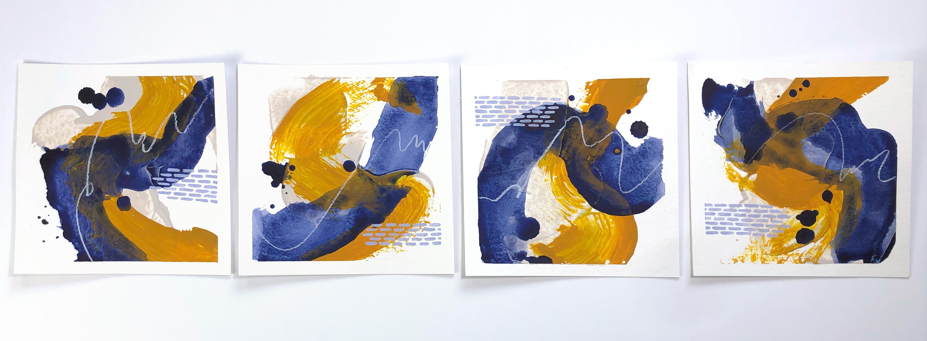
going to create two layers using a large brush. For the warm-up exercise, you can use any
paper like packing paper or watercolor paper. We'll start with pure paint and a relatively dry brush to create opaque brush strokes
with rough edges. As a contrast will
use highly diluted, watery paint in the next layer. For this exercise, you'll
need a large brush like this flat brush, or this painters brush from
the hardware store, or a bristle brush
like this one. You can dip the brush
in water before using it to prevent the paint
from drying near the ferrule. Use some cloth or kitchen
paper to get out most of the water because we need
the brush relatively dry. If your paint has a creamy
consistency like this one, you can use it straight
out of the tube. If it's too thick or sticky, you can add some water.
Then make your mark. We're aiming for a pretty
opaque stroke with rough edges. Depending on how much paint
you've got on your brush, you will either get a
solid or a rougher stroke. You can vary the
way you are holding your brush to make your
strokes look differently. If you hold it very
close to the bristles, you have a lot of control. If you hold it further back, you have less control and that way you can create
wobbly strokes on purpose. You can hold the brush
like a pencil or from above so that the brush
handle is under your palm. Also, you can rotate
the brush and make all sorts of movements to
create interesting marks. By the way, I'm doing
this standing up because it allows me to move
my arm more freely and I can also see
better what I'm doing. You can drag the brush slowly
to make solid strokes, or you can move it fast to create rougher marks. Let's try another brush. It's always good to use a very
inexpensive brush because then you can do all the things you normally wouldn't
do with a brush. You can, for example, press down heavily so
that the bristles are spread apart and
then twist and turn. You can make very
energetic lines or set the brush down hard and
just smear the paint. If I have leftover paint, I spread it on my palette
and place tissue paper with the shiny side into the
paint while it's still wet. The paint can soak
through the paper a bit, so if you want to avoid
getting your fingertips dirty, you can put a spare
sheet of paper on top while smoothing it out. And that's what the back-side
looks like. When it's dry, you can just peel
it off to reveal your own handmade collage paper. To sum this up: You can
experiment with speed, movement and brush grip. Once you have a good feeling
for your brushstrokes, you can tackle the second
layer of your class project. I'm using this green
color here because it contrasts well with
the dark blue And I'm trying to do strokes
that change direction. To protect the environment and keep your paint water cleaner
for a longer time, first, wipe off your
brush thoroughly, then dip it in water and wipe it again before washing
it out properly. Here, I again select a color that provides a good value
contrast to the one below. Since this pink would be
too similar in value, I'll use the very light pink.
Compared to my color swatch, the mixed paint
looks a bit lighter, but since acrylic paints
dry darker, it's perfect. Then I load the brush
with plenty of paint. I take care not to repeat the same curve or the direction
of the previous stroke. So I try to start from a different side and follow
a different direction. If too little paint
gets onto the paper, you can go over it again. My paint is a little too
sticky and I definitely need to add some water. To avoid
hesitant brushstrokes I practice the movement holding my hand slightly over the paper before I make the mark. And only then I put the brush down
and actually make it. Unfortunately, my paint
is still too thick, so I go over this
several times here, but usually it doesn't get
any better when you do that, though, sometimes I
just can't help it. Make sure to not cover the
previous layer completely. All layers should be partly
visible until you finished. That way you keep all the
tonal values you chose in your color palette and create spatial depth. For
our next layer, we want to make a glaze, that is a transparent
layer of watery paint. I start by adding water to my container with my
dropper tool and then I just use the
leftover paint that is still in my brush.
At the beginning it's better to use very
little water so that you get a smooth mixture
without lumps of paint. And then you can add
water little by little until the mixture
drips from the brush. Load your brush with as
much paint as possible. The goal is to get different transparencies.
This is perfect. There's a transparent
area in the middle and at the edges the paint runs
together and it's more opaque. You can draw your lines
however you want. And as you can see,
unlike the last layer, this time the edges are smooth. You don't have to paint perfectly curved
lines, of course. You can also do spots
like this or any lines. And I can also add more paint as long as it's wet to
create darker areas. Another option is to let the
paint drip onto the paper. You can spread some of it
and then add more drips. Of course, you can also
do quick strokes again or experiment with your brush grip and create fun blobs of color. Be careful when lifting the
paper because the paint is very runny and goes
right over the edges. Also keep in mind that a highly diluted color naturally becomes lighter and
more transparent. That's not so noticeable where
the paint pools together, but when it's applied
in a thin layer, you can see the
paper background or the layers of color that
are underneath very well. You can of course,
add more paint in certain areas to
achieve more coverage. But basically transparency is the characteristic
of this layer. To summarize this:
You can experiment with the amount of
paint, drips and speed. I've already mixed
my next color and now I'm adding
water with a brush. Since this is a light color that already has a
thinner consistency, one brush load of
water is quite enough. Be sure to deliberately overlap strokes and avoid
marks that almost touch. These areas where marks almost touch attract
a lot of attention. If you work loose, like we do, this can happen unintentionally, but don't worry, since
we work in layers, we can later on fix
it if necessary. In this case, I
haven't harmonized my magenta with the
other colors yet. So I add a small dab of red and also paint
a new color swatch. Here I'm putting
down a few drops and not making my
mark in one stroke. Here, I let the stroke
run out a little thinner. I catch myself tracing
the light pink line just-in-time and quickly
change the direction. After all, I want to see parts of each of my layers till the end, so I'd better not
cover everything. Finally, I add additional
paint in some places, have more variation
in transparency. I just love those
impulsive brushstrokes. They add so much fun and you get a result that looks
cool pretty quickly. Don't forget to
take a picture of each layer and upload it
to your class project. I think it's so interesting to document the process of
creating an artwork, and I'm really looking forward
to seeing your progress. In the next lesson, we're going to take it
a little bit easier and add some delicate patterns.
See you in a bit!
14. Delicate Patterns & Brush Control: [MUSIC] After all that
expressive mark-making, let's slow down a bit. We're doing delicate patterns to create contrast to
the bold strokes. This contrast really adds much to the appeal
of the paintings. At the same time, drawing those graphic
patterns with a fine brush is a great exercise for your fine motor skills
and your brush control. You might even be able to relax, and get into the flow
state while painting. [MUSIC] Since this
can take a while, and we're working with a
small amount of paint, it helps to spray the
palette with water, every now and then so the
paint doesn't dry up. Proper paint consistency is
very important for this. I add a little bit of
water to my paint. It should be thin enough to
go off the brush very well, but not yet too transparent. If it's too thick or there's a glob of paint on your brush, you can't draw fine even lines. [MUSIC] For thin lines, you need a fine brush tip. It helps to roll the brush
on your palette like this to remove excess paint
that has been pushed back towards the feral. Now, you can pick up a
tiny amount of paint with the tip of your brush and
draw another fine line. You'll need to repeat
this process very often. There are all kinds of patterns. You can try small lines that are directly
underneath each other, or you can offset them a bit. You can make dots, and for that, you touch the paper
very lightly, but you can also press the brush down and make such marks. For short lines, you can make the movement
just from the wrist, but that only works up
to a certain length. It's much better to move the whole arm and keep the
hand and wrist steady. You can also try which
direction is easier for you. Maybe it's more comfortable for you to slide your
arm to the side. But whether to the side or
to your body, either way, you can draw longer
straighter lines than if you just use
your hand and wrist. Wash out your brush frequently, so that the paint doesn't
dry up near the feral. There, it would push
the bristles apart and ruin the brush
faster than necessary. In addition to parallel lines, zigzag lines or waves are also good practice for your
fine motor skills. If the lines become too thick, you are either pushing
down the brush too hard, or you have too
much paint on it. In this case, rinse it out thoroughly and wipe
off excess water. If you want to
draw longer lines, it's better to hold the
brush further back. That way, it's more
angled towards the paper, you can make a more
fluid movement, and you can also see
better what you are doing. However, when I'm painting
small circles, for example, it's easier for me
to make thin lines when the brush is more
upright and for that, I hold it closer to
the feral again. To get a better feeling for the transparency of your colors, you could paint on
top of other colors, for example, on your color
palette practice sheet. If the color is a
bit transparent, you can apply a second layer of paint over the dried paint, but maybe it's okay
if it's transparent. They're on the rules. [MUSIC] The flow state, also known as being
in this zone, is a mental state where you are completely immersed
in an activity, in showing the process and sometimes even losing
your sense of time. Painting patterns is a
great way to get into the flow state because it offers just the right
amount of challenge. You need to focus
on the task at hand but it's not
overwhelmingly difficult. It's that balance between
being under-challenged and over-challenged
that's important to achieving the flow state. Go ahead and make some patterns. I'm looking forward to
seeing your practice sheet. [MUSIC] You can experiment with paint viscosity
and opacity, brush grip and arm movement, patterns, and parallel lines. As for patterns, you have
a couple of options. You can use just one pattern
and leave white areas blank, or use several patterns in different colors and fill
in all the white areas. The patterns can
look like they're behind or in front of
the brush strokes. Since I don't have any oil
pastel in this turquoise, I will use this color
for the pattern, and this cream white
for the chest to align. I'm using a new brush here
that has never been used, and it's quite stiff. You have to first
soak it in water and then the protective
layer comes off, and the bristles become
soft and flexible. I'm going to start with
some stripes here. I like when the stripes look as if they were behind
the brushstroke. I'm drawing them as if they were made of one continuous line. These lines are still short enough to do out of your wrist and it also helps to keep
away from coffee beforehand. For the next section, I change the direction of
my lines by 90 degrees, and then I use the paint a little thicker to
make small dots. I'm starting to think that the turquoise might be too dark, so I mix a lighter version. In the other two pictures, I've used the stripe
pattern like this. Because I don't
like the light and dark dots in the
first one so much, I apply the new pattern
to this picture as well by connecting two dots at a
time to make short lines. This is a great example of
how artworks in series can influence and push
each other forward. You don't have to make
a large patterned area, sometimes just three brush marks like this can be totally enough. Here, I've already worked with two different
yellow patterns, but I think this piece
could use another color. As I don't want to add a
completely different color, I mix a pink that is in-between my light
pink and my magenta. It turns out to be too dark, so I try to damp
some of the color off while it's still wet
by adding a little water. It doesn't work so well, but I quite liked the effect. I continued to use this
emergency solution on purpose, and depth or patterns
after painting. Here, I'm still missing
a bit of contrast, so I keep adding
dark marks until I'm satisfied with the
amount and shape of them. Next, I add lighter
brush strokes in areas of similar dark values, to create interesting
focal points here as well. Finished. I just love
the first three layers, because they are so impulsive and I always need
some time to get into painting the patterns
but once I'm immersed, time just flies by. It's really that contrast between the fast
spontaneous strokes and the slow thoughtful
patterns that you can feel in the paintings
that adds to their charm. What did it feel like for you? Do you prefer the
impulsive strokes, or are you more at home
with the control patterns? You can write about
your experience in your class project, and don't forget to add
a picture of this layer. In the next lesson, we're going to take a
more loose approach again and add gestural lines. [MUSIC] See you there.
15. Spark Emotions: Gestural Lines: [MUSIC] Look at what you've accomplished
so far by now your paintings already
have four layers. Now we're going to
add a gestural line, that's a line where you can see the movement the artists made. They are very spontaneous
and gray to convey emotion. However it's a bit risky and if I already like the
painting very much, I'm often afraid to ruin it and it happens that I'm not
happy with the result. But on the other hand, these lines can become a
very important element of the image and add so much interests that it's
really worth the risk. Besides, we still
have the collage in our back pocket and we
can fix a lot of things, so let's be courageous. Our paintings live
from contrast. There's not only value contrast, but also the contrast between the different
strokes well, we've been slow and
deliberate with the patterns, we can now put strength and
emotion into our lines. The line can create a strong contrast with the background or it
can be more subtle. Sometimes the effect isn't
as strong as expected. Here for example, I wanted some yellow color
in the picture, but the line turned
out rather subtle, then collage is a
great option for adding more elements
of the same color. One thing to consider
when choosing a drawing tool is
your color scheme. Sometimes I deliberately add a color to my color
scheme because I want to use a particular material like the 3D liner here after all, I'm a little more limited with my drawing tools because
I can mix colors. If I didn't plan it, and there are only two colors
left for my color scheme, the first thing I do
is take a look at my drawing tools to
see what colors I have available and choose the
color for my chest or line and the color for
my pattern accordingly, for this exercise, chest grab some
drawing materials and regular copy paper or a sheet of watercolor paper and try to make different kinds of lines. For example, I have
these acrylic markers, I can make big sweeping
movements or small ones, I can draw squiggles
or zigzag lines. If you want to make
pretty bold quick marks, you're better off not
using fine liners. They might not
survive going over the textured surface
of your painting at high-speed when
using brush pens, you have to be more careful
with the tip as well. Also makes sure that the
colors are light fast, otherwise they will fade after
a short time in the light. Colored pencils are
great to play with, you can apply
different pressure to create light or dark lines. Pencils are also excellent. I use a relatively
soft one in six B, you can make both
delicate and bold lines or something that looks
like a signature. I also like to use
these 3D liners. First, you squeeze them until
the color comes out and then you can make amazing
lines by squeezing constantly. Finally there are wax
crayons or oil pastels. I feel very comfortable
with these, I like the texture of the lines and they come
in different qualities. For example, this is a
very soft oil pastel called new pastel and
it makes very rich, thick lines and you can also
smudge them if you like to. You don't always have to make big lines in your painting, you might just want to add
little doodles like this, or you're getting patients
quickly and go like this. I'm really excited about seeing your chest roll lines because I think it's like handwriting. Everyone's looks
a bit different, so please post your practice
sheet in the class project, you can experiment with
thickness and shape, density and pressure,
texture and speed.[MUSIC] I only have two colors to choose
from that are leftover from my color palette. I didn't love the orange in my color palette exercise sheet, but I take a photo and
look at the values anyway. But as I've already
noticed in less than nine, the orange has a
very similar value as the green and
the turquoise so it doesn't make sense to use it for the textural lines over
exactly these colors, therefore I decided
to use baige. Before I put the lines on paper, I visualize them and practice
a few times in the air, then I take a deep
breath and just do it. I tried to go mainly over the dark areas of the
image where you can see the baige very well to find the best
place for my lines, I first take a picture and
switch it to black and white. I already have a pretty
good value distribution but especially in the middle
of the first picture, everything is pretty much
the same medium gray. That's where a light
line would look good. Originally I was planning
to use black on my line, but I wouldn't get a very
good contrast in many places, so instead I'll use white
to add an interesting line in the red pink area and save
the black for the collage. I visualize and practice the line in the air
again and then I put down the mark on paper and if the direction
doesn't feel so good, I just rotate my paper so I
can make it fluid motion. Although this line
is very subtle, I like it quite a bit. Did everything go well? These lines are often
good for surprises. I'm looking forward to
seeing your result anyway, so please take a picture of this layer and upload it
to your class project. In the next lesson, we're going to analyze
our paintings in terms of value contrast and see
if we can improve them. [MUSIC]
16. Collage & Composition: We have created a lot of
visual interests by now, and that comes mainly from
playing with contrast. Contrast between
impulsive and controlled, between rough edges
and clear edges, big and small, many and few,
transparent and opaque. Adding collage elements
is completely optional. You could just as well add a pattern or more paint
with your palette knife. Maybe your paintings
are already finished and then you can skip
this step completely. It's also good to
know when to stop. [MUSIC] When I already
like painting quite a bit, I become more cautious
with each layer. Sometimes a sudden
insecurity comes up. The fear of making a wrong
decision that I can't undo. Collage is a great way to combat that fear of making a mistake, because as long as you haven't glued it down, it's not final, and you can move elements
around and try what looks good and what doesn't [MUSIC]. Now let's take a step back and look at each of the pieces. I use my viewfinder to have a calm area around them
and my phone or tablet to take a picture and
look at the values in black and white [MUSIC]. Now I pay attention
to where my eye goes and how it moves
through the image. These are the areas of
highest value contrast. I can add lighter
or darker elements where my eyes didn't go so much. If I'm going to put
this little arch here, the eye will be drawn
to this spot [MUSIC]. Now before I show you how
I continue on my project, I want to share with
you three questions to help you analyze
your art works. Do you have several areas
with good value contrast? Do you want to add or
rather cover something? What size or shape are
you not using yet? I still haven't quite
given up on the orange, and so I'm trying some
small pieces of paper here. It's pretty subjective,
but I just don't like it. I think the image
needs something dark over strong value contrast, and this dark-blue collage
paper might do it. Sometimes, you have
to change your plan because it doesn't
work out as expected. Yes, I like it much
better this way. You can also use the collage
elements to cover up areas like this heavily
textured area here. To determine where I
could add something else, I'm looking for high
contrast areas first. My eyes go here, here, here, and here, so really everywhere
except maybe here. I think something would
look good in this area. I'm placing my collage
paper here and moving it around until
I like the position. Now, it's time to
glue everything down. If your brush has been in water, you should dry it off first so you don't water
down the medium. I like to hold the
paper piece down with a finger on one
side, lift it up, spread some matte
medium under it, let it fall back and cover it with matte medium on
the surface as well. Then I do the same
with the other half. Of course, you can do
that with smaller pieces. Then you have to try to place the collage paper exactly
where you want it, because it's hard
to move it once it has touched the matte
or gloss medium. I also use the matte
medium as a finish over my oil pastels so they
don't smear anymore. Be careful though, when
using water soluble crayons. Then you have to tap the medium on very carefully and quickly, because the moisture in
it will activate the pain and smear it [MUSIC]. When you're done, it's time
to peel off the tapes. It's best to do
this very slowly. But even if you're careful, very often, you'll lift up
some of the paper surface. If the collage paper
goes over the tape, you have to be extra careful. When it's thin enough, you can tear it very slowly. But it also doesn't
hurt to use a ruler and press down firmly while
you pull the tape off. That way, you can avoid
tearing into the picture. If the paint is a
little thicker, I wouldn't try to tear it. That just doesn't work very
well with elastic paints. In such areas, it's better
to work with a ruler and a utility knife and carefully cut a little bit into the paint. Here it works great. If the tape tears or the
paper starts to tear, I start again from
the other side. That usually helps to avoid
larger damage [MUSIC]. It's hard to avoid
tears completely, but there's one thing
that helps that medium. It makes an excellent
paper here. You simply brush it under
the tear and then with light pressure over it so that the paper layer stick
together again. You can also press it over any other area where paper fibers have been
slightly lifted up. Try to find out in which
direction you have to move the brush to best
move down the fibers. When it's dry, you will
see almost nothing. Congratulations, you did it. I hope you are happy
with your art works and I'm looking forward
to seeing them so much. Please share a picture with
me and the other students. If you haven't created
a class project yet, it's a great time to do so now. You can also ask questions there or comment on other
student's work. In the next lesson, I will give you a short summary, some ideas on what
you can do with your art works and how
to continue learning. See you there [MUSIC].
17. Final Thoughts: [MUSIC] I hope you have enjoyed this class and
learned a great deal from it. We have covered a lot of ground from the first step to
the finished artwork. Let's recap. The first part of the class was
about the basics. We took an in-depth look at our working material,
Acrylic paints, studied their properties, used them in different
viscosities, and learned the basics
of color mixing. In the second part, we focused on the
concept of value. You learned what tonal value is, how to recognize it in colors, and how important
value contrasts are for a successful image. Finally, you used
this knowledge to create a color palette
for your class project. The third part of the class was dedicated to the class project. In the beginning, we
prepared our paper, talked about working in series
and painting in layers. Then we looked into
the variety of marks we can make with
different painting tools. You practiced each
of those marks and worked through your class
project layer by layer. In the process, you brought a lot of contrast
to the paintings, on the one hand by the
use of tonal value, on the other hand, through the marks and the
tools you used. Finally, we analyzed our
artworks in terms of value contrast and finished off the design with
collage elements. [MUSIC] In this class, you have acquired a lot
of basic knowledge. What I've shown you is a good starting point
for further experiments. You could try multicolored
strokes and gradients, colored backgrounds,
different collage papers, or even everyday objects like sponges,
packaging materials, or kitchen tools
to make marks and patterns as I show in
another one of my classes. If you like this class, you might also enjoy
these classes. Feel free to click on my name, and this is my profile. Also, don't forget to hit
that "Follow" button so that you'll be notified
when I publish a new class. If you have any questions, you can post them in
the Discussion section, I'll do my best to answer them. What do I do with my artworks? The paintings look
especially good when they get a passport
too and the frame. Whether in the
bookshelf, on the wall, or at the workplace, these small works of art
always make a great eye. You can also add
inspirational quotes to them or use them
as greeting cards, maybe they even inspire you
to do a lot of work of art, or you really dig
into it and make it a 100-day project that you share on social
media like I did. The most important
thing you should take away from this class is the joy of painting and
playful experimentation. Play is so important
for creativity. When you're playing, you
don't have a result in mind, you don't put
pressure on yourself, and you're open for the
abundance of possibilities. I hope you've enjoyed this
class and it made you want to create your own
abstract artworks. If you liked it, I would love for you to leave
a review and also don't forget to upload
your class projects so that we all can
admire your work. If you share your
project on social media, you could tag me at
cornelia_zb_design. I'm glad you've joined me. Thanks for watching
and participating. See you next time. [MUSIC]
 Cornelia Zelinka-Bodis, Mixed Media Artist