Transcripts
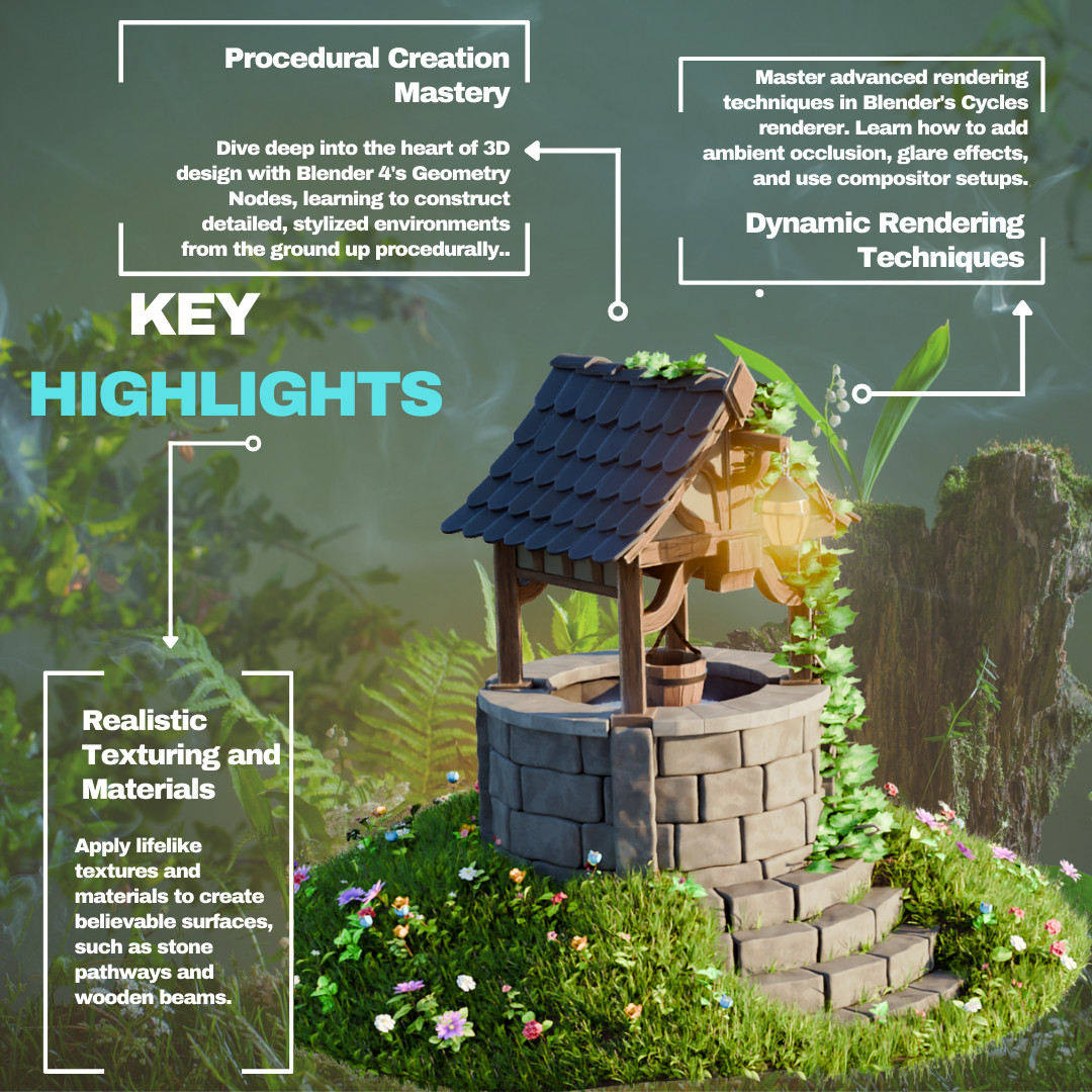
1. Blender 4 Creating Stylized Environments: Welcome to an incredible
journey into the heart of free D design and
creativity with our course, stylized environments,
with pleno fore, genes. Imagine being able to craft breathtaking model that
captivate and inspire. This is your gateway
to mastering the art of free D
design with Blend four, transforming your creative
visions into stunning reality. In this comprehensive tutorial, we dive deep into the
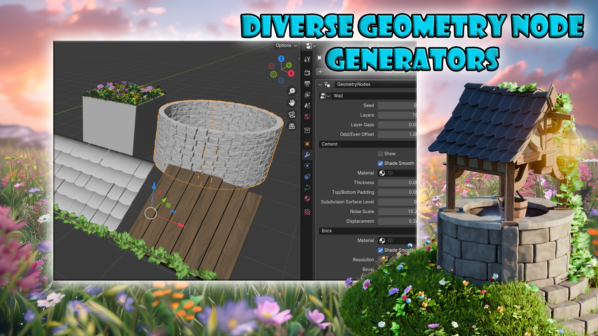
world of meti notes, a powerful feature
of blender four that revolutionizes how we
approach free modeling. From the lushness
of grass meadows to the rustic charms of roof
tiles and brick walls. You learn how to bring
intricate patterns and textures to life with unprecedented
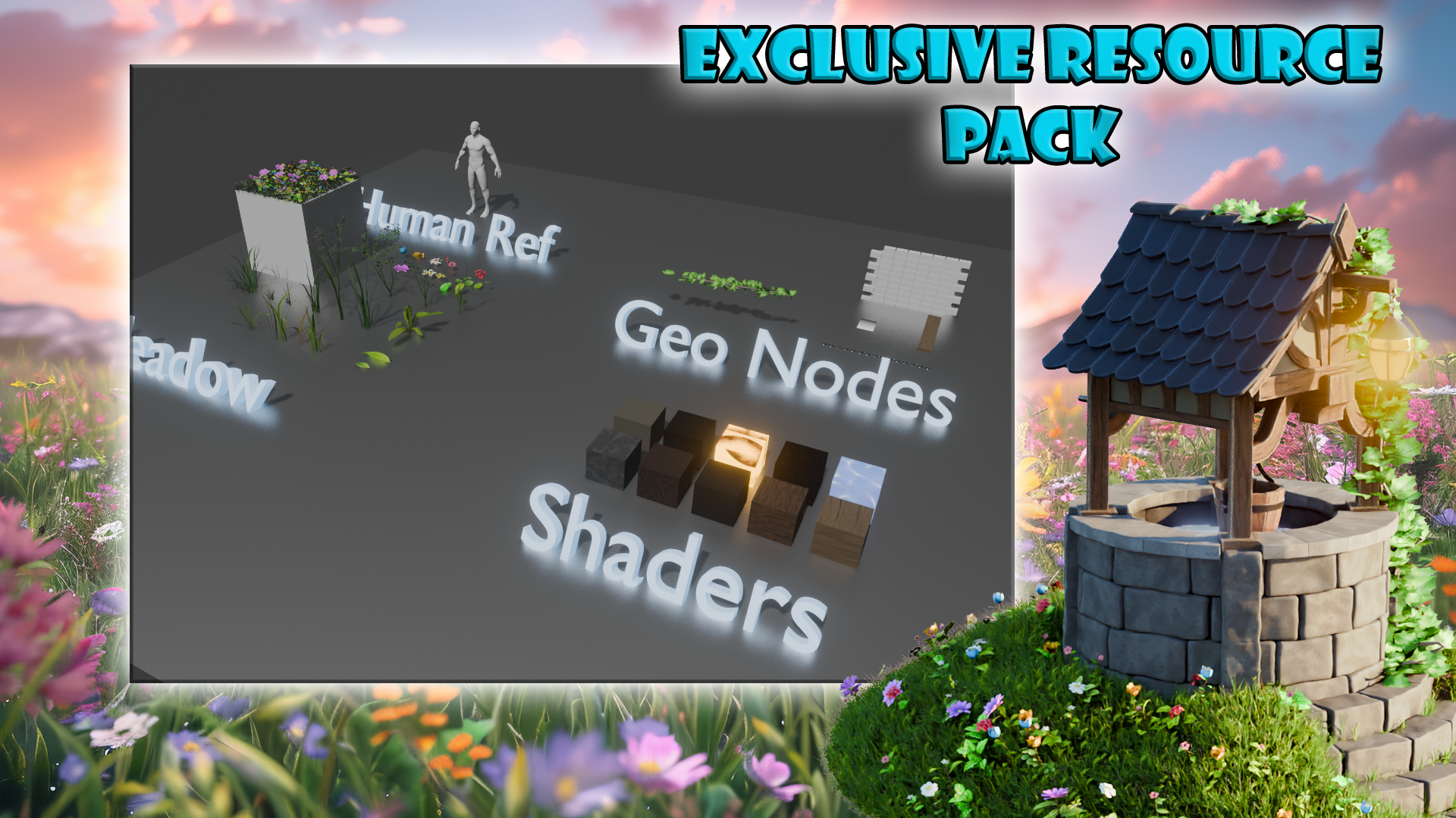
ease and efficiency. But that's just the beginning. Our exclusive resource pack
tailored specifically for this course provides you with everything you need to jump start to your creative process. This includes a human
reference model, six specialized geometry nodes, and ten advanced
material shaded setups. Imagine having the tools to model a stunning
will environment, craft detailed stones, labs, and create dynamic
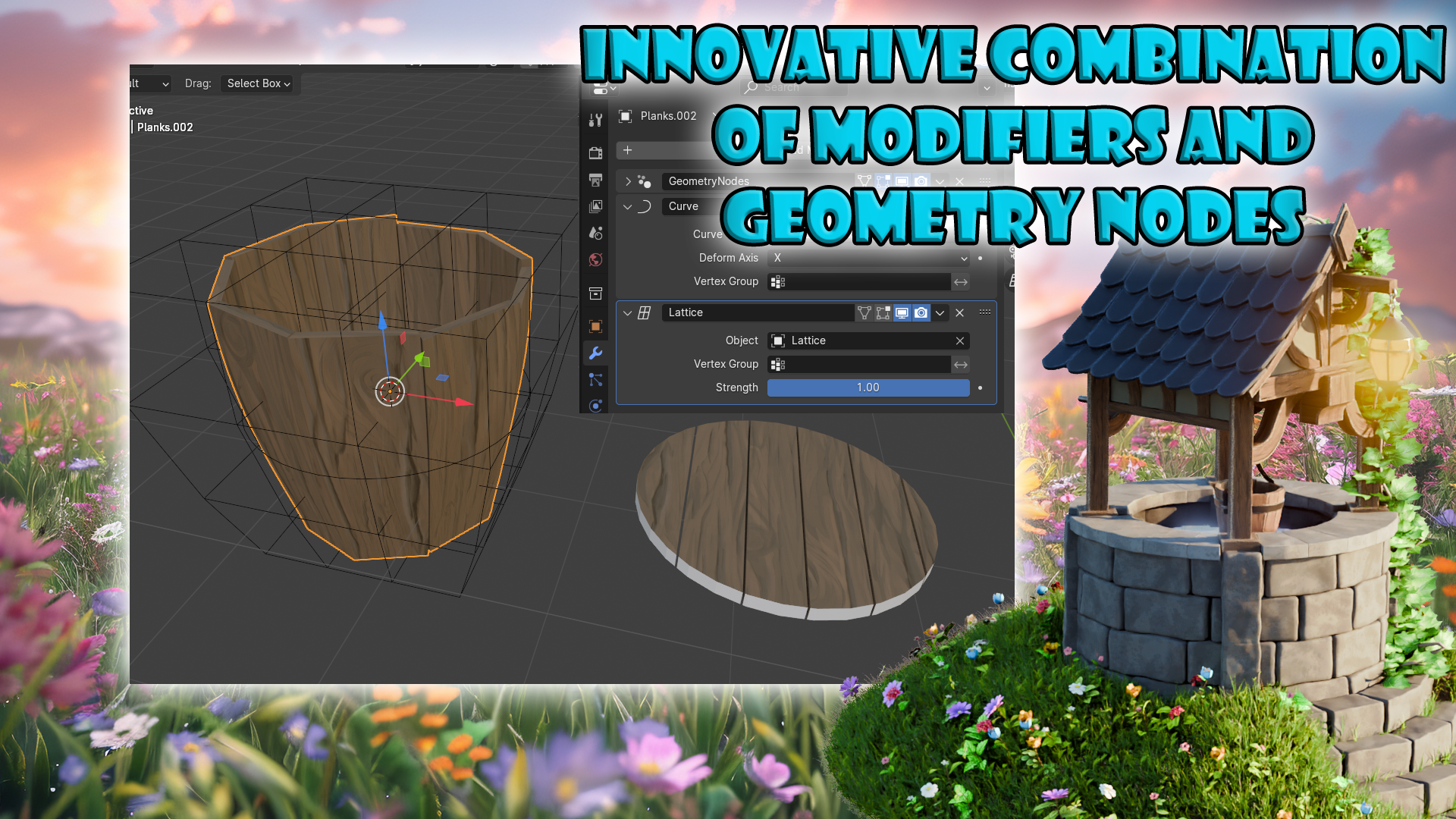
roof structures, all at your fingertips. As we guide you through
creating support of wooden beams, sculpting terrain, and optimizing your
scene for rendering, you'll discover the
secrets to achieving realism and vibrancy
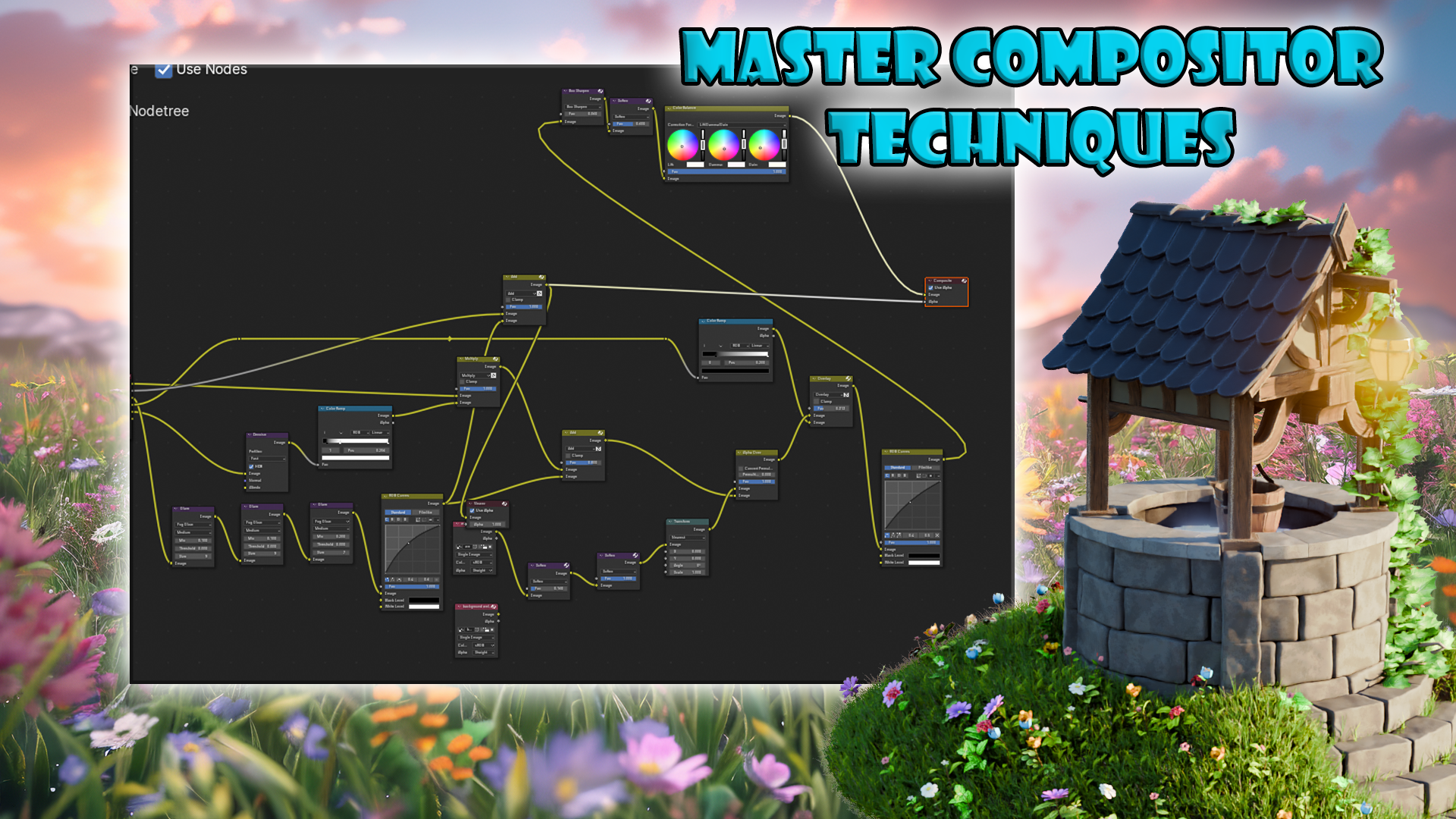
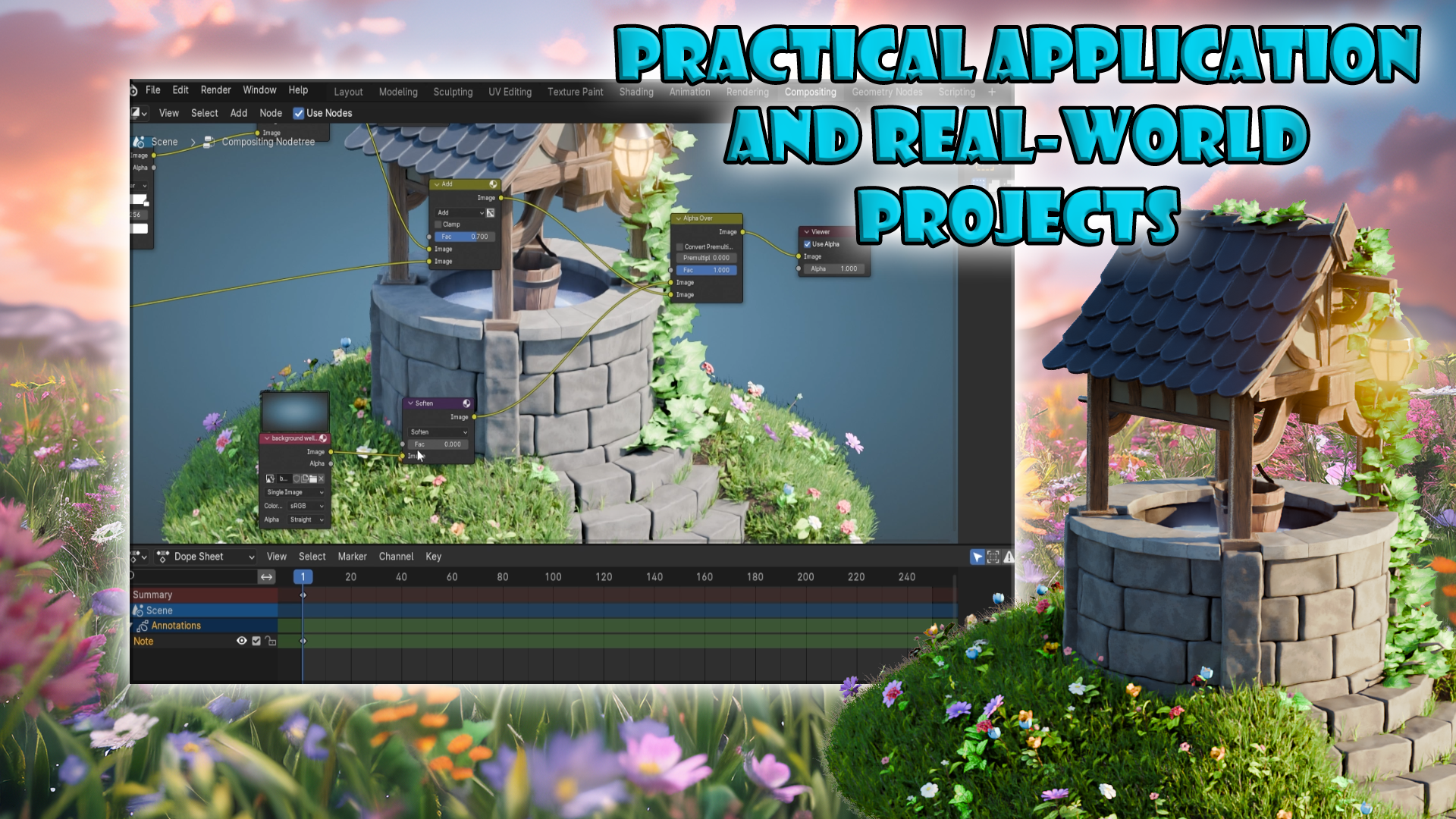
in your work. Learn how to use
blender cycle render and composite to add depth and ambience making
your creations pop with live. This course isn't
just about learning. It's about applying. Though
practical real or projects, you'll not only reinforce
your knowledge, but also build a portfolio that showcases your newfound skills. Whether you're season
artist or just starting. Our step by step instructions are designed to provide you with the skills and confidence to create visually
stunning environments. Why choose this course?
Well, it's simple. We offer an unparallel blend
of innovative techniques, exclusive resource and
practical application. From mastering
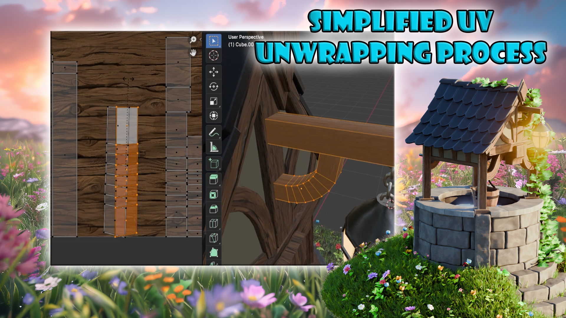
composite techniques to simplifying the UV
wrapping process, every aspect of this course
is designed to elevate your pre D modeling skills
and streamline your workflow. So are you ready to unlock the full potential of
your artistic vision? Join us in stylized
environments with plenty for mgy nodes and start your
creative journey today. Whether you're enhancing
your current skill set or embarking on a new
career in freed design. This course is your
comprehensive hands on guide to mastering the art of creating visually studying
stylized environments.
2. Navigating Blender's Viewport A Beginner's Guide: Hello and welcome everyone to stylized environments with
Blender four Jome nodes. And we're going to start off
by firstly learning about the viewport controls and actually how to move
around within Blender. So I'm going to play a quick
video in regards to that. And then in the next lesson, we're going to go
ahead and go over the resource pack itself and what
we're going to do with it. So that's going to
be from this lesson. Thank you so much for watching, and I will be seeing you a bit. Welcome everyone to the
basics of Blender navigation. Now, before we begin, it's
important to understand how the axises work
within Blender. So we can see at the moment, we've got a green
line going this way and a red line
going this way. This is called the y axis, and this one is
called the x axis. We also have one
that is the Z axis, which we can't see right now. It doesn't actually come in with blender viewport as default. But if you want to
actually set it on, you just come up to the
top right hand side, where these two
interlocking balls are, and just click the Z axis, and now we can
actually see that. So how do we actually move
around the blended viewport. There's a number of
ways of doing this. One of them is over on
the right hand side here. You can see if Aarver over here, it's the zoom in and zoom out. I can actually left
click and move these up and down then to
zoom in and zoom out. Or I can use the actual
mouse to actually zoom in and zoom out using
the actual scroll wheel. There's also another thing
you can do with Zoom, which is holding control shift and pressing the middle mouse, and you'll see you have
a lot more control over zooming in and zooming out. Now, the next thing you
want to discuss is actually rotating around an object.
So how to do that? First of all, we'll
bring in a cube, we shift A, bring in a cube. Now, if I press the
middle mouse button and move my mouse left to right, you can see we can
actually rotate around. Unfortunately, though,
we're not actually rotating around this cube. So to actually fix that, we need to center our view
onto the actual cube. We basically want to focus our view onto this actual cube. So to do that, we're
just going to press the little dot button on
the actual number pad, and then you'll see that we
actually zoom in to the cube. Now, if I scroll my
mouse wheel out, you will see now if I hold the middle mouse boron
and turn left and right, we're actually rotating
then around the cube. And this is important because if actually bring in another cube, so I duplicate this
cube with shift D, Move it over, so bring
in my move Gizmo. And now you'll see if I
rotate around this cube, I'm not rotating
around this one. So that's fixed side,
just press the doubt. Again, zoom out, and now I can actually rotate around
this cube as well. Now let's look at
something called panning, which means that we're actually going to move left and right, and we do this by holding the ship bar, holding
the middle mouse, and then we can actually
scroll left and right around our
actual viewport. So now we've actually
discovered how to zoom in and the different
ways we can actually do that. How to rotate around an object
and how to actually pan. We can also come up to
the top right hand side here and use these
buttons, see it. So again, remember, we're
looking at the y axis, the x axis, and the Z axis. If we come to our y
axis and click that on, you will see now that you've got a front view of the y axis. If you click the x axis, then we can change it
to that red x axis, and finally, the Z axis as well. Now, there are
other ways as well that we can actually look
around the viewport, and these involve using
the actual number pad. So if I press one
on the number pad, it's going to tap me into
that y axis or front view. If I press two, it's going to actually rotate
that slightly. And if I press two again, it's going to rotate
it slightly more. Now, if I press
the eight, it will rotate it the other way as well. Now, to go into the side
view or the x axis, we can also press three
on the number pad, and that will give
us that effect. We can also press seven to
go over the top as well. Now, what about if we actually want to go to the opposite? So instead of going from
the bird side view, we want to come to the
underside of our model. Well, that's actually
quite easy as well. All you need to do is
press Control seven, and that then will take you to the bottom view of
our actual model. We can also do the
same inside view and on the x axis and y axis. So, for instance,
if I press one, I'm going to be going
into the y axis. If I press Control one, I'm going to be going into the opposite side on
the actual y axis. Now you can also find
these options just in case you forget at the top left
hand side of it under view. So if I go down to view and
go across the viewport, you can see here that this actually tells me exactly what I need to press to
get the viewpoint that I've just
actually explained. Now, we also have the button on the number pad, which
is number five. And number five button
in Blender toggles between perspective and
orthographic views. Perspective view offers a more natural and realistic
viewpoint with objects appearing smaller as they get further away, mimicking
human vision. Orthographic view removes
perspective distortion, making all objects appear at their true size
regardless of distance. Useful for precision
modeling and technical work. The other thing that number
five does, for instance, if I come to my cube, at the moment, I am able to
actually zoom into the cube. However, if I press number five, I will not be able to
actually zoom into this cube, no matter how far I zoom in. I'll still be able
to move around it by pressing a little
dot button, like so. But if I actually
want to actually work on the inside of an object, I can quickly press number five, and then I can
actually go in and work around the inside as well. If you're working on a laptop or something like
that or a table, and it doesn't actually
have a number pad, you can also use
if I press five, the actual squiggle key, which is under the escape board on the left hand side
of your keyboard, and that then will
give you pretty much the same options
as we had before. So we can click the right view. We can actually
click the back view. And we can click the left view, for instance, the opposite
to what we had before. So instead of pressing
one and three, we just press the
little squiggle line, and then we can actually view
whichever side we need to. Now, we're nearly at the end
of this short introduction. There are a couple more things
that you can actually do. If you come over to
the right hand side and you see here where we've actually got the name of the actual parts
within our scene, we can also grab them from here and then press the little
dot born to zoom in. So I can grab this one,
press a little dot dot born, and that then we zoom us in. The other great thing
about this is we can also come in, shift
select them both. Press the little dot button
and then we're able to actually rotate around
both of these cubes. All right, everyone,
so I hope you enjoyed the short introduction to the
navigation within Blender, and I hope from now on, it won't be a struggle
navigating around the viewport. Thanks a lot, everyone. Cheers.
3. Unlocking Blender's Resource Pack for Stylized Design: Hello, welcome back,
Evon to styles environments with
plenty for gum nodes. And right now, we're
going to go ahead and talk a little bit about
the resource pack itself. Once you extract
the resource pack, you get yourself
a folder that has a blend file as well as
a couple of folders. So let's go ahead and
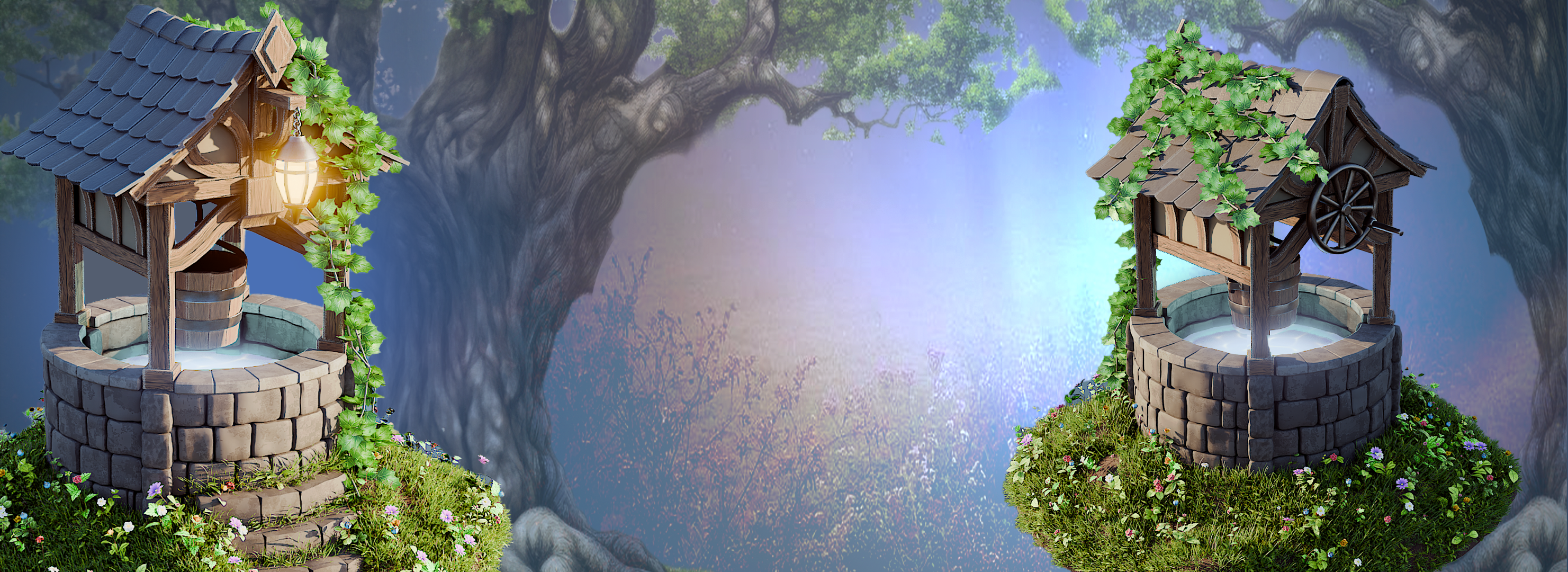
go right over them. So the reference folder is going to give you a nice references. So these are AI
generated images, but they're really
good for referencing whenever you want
to have more ideas. So, for example, if you open one of them up,
They're not perfect. But they helped you
get some nice ideas over textures over the design, for example, over the
scale and whatnot. So for example, this bucket over here might be a
little bit too big, but something like that might be a little bit more interesting to do helped out to create the
overall style for the well. And I do recommend you going
over them if you want to get some ideas for the overall style that you want to
get within blender. So then afterwards,
after the references, we have ourselves the
compositor background. At the end of Blender setup, after we set ourselves up
with a nice environment, we're going to need
to make sure we render it out in a nice image. So we actually have two
variations of the background. We're going to start with
the basic one over here. That's a nice gradient to get. But we also gave you a custom one to make use of and that's
going to allow you to put any piece basically within blender itself
as a background, and it actually
works quite well, you'll see in a moment,
you'll see by the end of it. And you can make use out of
these two backgrounds in any type of environment you want pretty much if you'd like. Feel free to use that.
Then afterwards, we got ourselves stylized well resource pack
the blender pile. Let's go ahead and go
over that real quick. Once you open up,
it's going to load. This is a blender version 4.1, but you can use blender blender 4.2 or anything above as
well that's going to work. We just need to wait a
little bit for it to load. You can see all the
material starts to load. Let's go ahead and talk a little bit in regards to
the whole set up. To start off at
the very top left, we have ourselves
a human reference. Okay. The human reference is really good for
scaling and making sure that all of the pieces
are actually properly scaled up and the
whole environment has nice proportions within it. It's a good reference
to make use of. Then we have the geometry nodes. You'll notice that the
meadow is separated, although it also is a gemtry
node over here you can see, but I did separate because it's slightly
set up differently. Let's talk a little bit
in regards to those. Okay. The brick we have over
here is going to be all of them are basically
separate geometry nodes like so we have a brick, wood planks, we have
a stylized tile. Although right now
it's only one, we can always
increase the amount to see how it looks like
this section over here. We're going to go over
all of the functionality, all of the features of
it within the lessons. For now, though, all
we need to know is that all of these
are going to help us out to speed up our workflow in regards to setting
up the environment. They're nicely set up
to be ease of use. This part over
here, you'll notice that we have a grass and the grass has all of
these parts on the side. These parts on the side are actually set up within
a collection over here. So if we open up a
meadow collection on the top right hand side, we'll see that we have grass, flower and leaf collection. So basically, these are
all the parts that are required to be placing for
the grass geometry none. So we're going to make sure
we make use out of that. Then we have ourselves
the geometry nodes. Sorry, not the geometry
nodes. These are shaders. These shaders are set up with nice materials, PBR materials, a little bit of stylized setup over here to exaggerate
certain looks. Some of them have
emission to make it glow. Some of them have some
more generative type of a setup to make a nice stylized setup of
something like a stone, for example, because some of them have things like
Edgeware and whatnot. But again, we're going to
go over each and every single shader
throughout the course. So, yeah, that's all it is
in regards to the setup. It's a nice compact
blender project that will allow you to basically make use of it and grab all the pieces to just a
nice environment overall. We're now going to go ahead and start the actual
model ate process. We're going to start
creating the well. We're going to make
use out of all of these parts for the lessons. That is going to be it from me. So thank you so
much for watching, and I will be seeing
you in a bit.
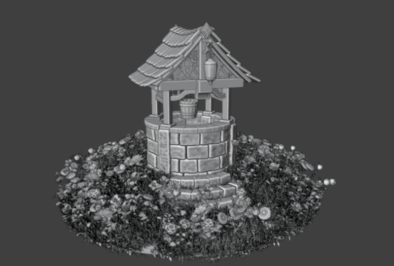
4. Blender Modeling Basics for Enchanting Environments: Hello, and welcome back in from the stylist environments
with Blender for omic Nodes. In the last lesson, we went over the overall resource pack, and now we're going
to create a gray box. But before doing that,
I'd like to go over another basics
video in which you will learn how to go over
basics of modeling in Blender. So without let's
get right into it. Welcome everyone to the basics
of modeling in blender. And this is a short
introduction just to get you started on a few of the
basics in modeling. So the first thing I want to
do is bring in a primitive. So the way that we're
going to bring into primitive is press Shift and A, and then what we're going
to do is open up a menu. And you can see that
we've got all of these things along this
actual primitive menu. But the one we want to focus
on is the actual mesh. And from here, you can
see we can bring in many, many things like cylinders, cubes, planes, and the
one we want to bring in just now is going
to be our cube. Now that we brought our cube. The next thing I want to discuss
is object and edit mode. And you can see at the moment, over the left hand side, we're actually in something
called object mode, and this means basically we can manipulate this whole object. So if I press G, I can actually move it around
my viewport light, so. If I press S, the scale, I can actually scale the
whole off the object in. But the thing is we
don't really want to work in object mode necessarily, and a lot of the time, we're actually going to be
working in edit mode. So we can come up to
the top left hand side and put this in edit mode, or we can actually press the tabbon and jump into
edit mode that way. You will notice once we've
actually gone into Edit mode, we have a lot more
options to use, and more importantly,
we have a lot of the topology now to
play around with. So the first thing you'll notice the difference being is that we have now these three options up to the top left hand side. And if you have over them, it will say vertex
edges and faces. Now, vertex is going to be
these little points here. The edges is going to be these edges of my cubes
or any of the edges. And finally, we've
got the faces, which is actually the
whole polygon face. Now, you can also instead
of clicking on these, press one on the keyboard, and that them will jump
you into vertex select. If you press two, you
can go into edges, and three is going to
take you into faces. And from here, we can actually manipulate any of these parts. So you will notice
at the moment, I've got gizmo here. Now, if you don't have
the Gizmo available, coming over to the
left hand side, and you'll have this little
born here that says move, or you can press Shift space bar and bring in your
move tool like so. So now, because I'm on faces, I can actually pull
out this face like so. If I go to edges, I
can actually grab one of the edges and pull
this out like so. And if we're on vertexes, I can grab this vertex or grab the second vertex
with Shift select, and then pull this out like so. Really, really easy to actually
manipulate things once you know how to select
each of these parts. Now, before we go too
much in the weeds with actually modeling in
this actual edit mode, let's just jump back into
object mode for now. What I want to show
you is how we can actually move this
actual cube around. So, as well as moving it
with the actual gizmo here, we can also press G and actually free move
this object around, or we can press G, and Y two, let's put it along
the y axis, move it around, or the x axis, for instance, and move it this
way, or even the dead axis and move
it up and down. To drop it back
where we started, let's just right click like so. So that's actually moving the location of it's
not a cube anymore, but let's just say it's a cube. We can also scale this in
as well with the S bond so we can scale it in or
scale it out like so. Now, we can also
press the S button, hold the shift button,
and then we have a lot more finesse
on actual scaling. We can also scale this up by
let's say a factor of two, S two, enter, and there we go. And of course, we can scale
it down pretty small as well. Now, the next thing I want
to discuss is rotating, because if we rotate it with
r and just rotate it around, we haven't got a lot of
control over how this rotates. So what I want to do instead is, I always want to press R, then attach it to an axis, which might be the white, so the green one, and then
rotate it either by free hand, or by actually inputting the
value on our number pad. So if I want to rotate it, let's say, by nine zero degrees, press the end born and now rotated this round
by 90 degrees. Now, if I want to
rotate it back, I can press y, the little minus born
on the number pad, 90, and then we can
rotate it back. Now, there is something
else that you need to know. We also want to reset
our transformations, and this is one of the most important things within Blender, because if you don't reset
your transformations, Blender still
considers this a cube, even though it's not
really a cube anymore. So what we want to do to
reset the transformations is press control, A,
all transforms, Then you'll notice that
the orientation has moved over here because it will always move to the
center of the world. From there, then we
want to actually reset orientation as well. So we want to right click, set origin to geometry, and then it's going to
put the origin right back in the center
of this object. Now, it's also important to know resetting the
transformations will also impact things like UV mapping, things
like modifiers. Basically, if you ever
have a problem in blender, always make sure that you
reset the transformations, and then most of
those problems will definitely go away. All right. The next thing about reset
in our transformations, it makes it really
easy then to get something back to how
we add it before. In other words, if I press
S and scale this down, And then let's press r and Z and rotate it round this way. Because before this, I
actually reset my rotations, what I can now do is press alternS and put it back to the scale
that it was before I did anything and then lnR and actually reset that
rotation as well. So really, really handy, once you've actually reset your transformations in
what you can actually do. Now, moving on,
we're actually going to be looking now
at duplication. So if I come round here, I'm able to actually
duplicate this. If I press Shift D and
then press the enter born, It's now a duplication, and I can move this over
to the right hand side. So now we have
actually two objects. Now, what if you want these two objects actually combined, and you didn't mean to actually duplicate it in object mode, for instance. Well, that's easy. We can just shift
select the other one and press Control J, and now they both actually
join together, as you can see. So if I press tab now, we're able to come
in and actually work on them both
at the same time. Now, what happens if we want
to actually split them off, so we don't want the
objects to actually be together. That's also easy. Just make sure that you
select one of them first. And then all you're
going to do is press L, just to select everything. So all of these faces, then you're going
to press P. Come down to way to say selection, and now, if I press tab, they're both actually split off. Now, of course, using
the same command. If I press tab, I can
actually come in, grab a face, for instance, press Shift D. I
can actually also duplicate things with
inside edit mode as well. So we might want to duplicate
all three of these Shift D? I can actually come in then and actually duplicate them like so. What it also means,
though, is that these, when you duplicate
them in edit mode will be part of the
same object, of course, because in edit mode, they're not actually
claster as an object, they're claster the
same actual part. Now, for the next
part, I'm going to bring in a brand new cube, and I'm just going
to show you some of the basic modeling
techniques within blender and go through
a few of the options. So here we have a
brand new cube. And the first one I'm
going to show you is, if we come into Edit mode, we'll always be working in edit mode to show you these things. Just make sure
you're in edit mode. I'm going to grab the top face. And what I'm going
to do is press, and that then is going
to extrude this out. Now, sometimes you will need
to extrude something out, and it will need to be
along a axis, for instance. So all I'm going to do is go to Edge elect, grab this edge, and then what I'm
going to do is press, and you can see because
it's not tied to an axis, it's floating around everywhere. However, if I press the x born, you can see now it extrudes out following along
that actual axis, which then makes it really, really easy to manipulate it where I actually
need it to go. The next one we're
going to look at is something called beveling. And then all I need
to do is come in, and I'm going to grab my edge. So I'm going to press
two on the keyboard, grab an edge like
so, and then I'm just going to press
control B like so. And you'll notice now it's actually beveled off that side. You'll also notice down on
the left hand side here. We have something called
an operator panel. It will be closed. Just open it up, and from here then with the actual bevel, we're able then to
turn the bevels down, for instance, turn them up, move how the shape of the actual bevel is going to be and all that
other good stuff. Now, pretty much
anything you do in Blender is going to give you
an operator panel like this. We're not going to go
too much into this, but basically the
moment that you press tab button to
come out of edit mode, this is going to disappear, and then you locked in
with the actual shape that you've chosen or the
insert or the extrusion. So just bear that in mind. So the moment I press tab
that actually disappears. Now, what about if
we want to bevel off vertices and not edges. So, for instance, if I come to a vertice like this
and vertice like this, press control B, you'll see
that it bevels off like this. But if I come to one that are the
opposites of each other, press control B, you'll see
nothing actually happens. However, if I press
control shift and B, then we're actually
able to bevel off the actual vertices like so. So that's another handy
tip for actually beveling. Now, the next modeling
technique we want to discuss is
actually edge loops. So how do we get more
geometry onto this? So, for instance, I want to
bring some edges on here. I can press control, and that then will bring me
one edge in here. If I left click then, you can see that I can put this either this side or this side. But let's say I want it
right in the center. I'm just going to right
click on the mouse, and that then is going to
put it right in the center. Now, the other
thing I can do with the operator panel
again is then come in and turn all of these up to give me more
actual edge loops, and I can even move
them to the left. And the right. Now, I can also, if I press control,
come in, press control. I can actually scroll up on the mouse wheel to give me as many edge loops
as I actually want. Or if I want a little
bit more finesse, I can actually type it out
on the actual number part, so I can type out
120, for instance, and a 120 edge loops. To cancel it at any time,
just press the escape board, and then that will
cancel it out. Now, the next modeling
technique I want to show you requires two actual blocks
or two cubes like this. And all I'm going to do
is I'm going to come in, and I'm going to select
opposing faces like so. And then I want to actually join these together,
for instance. So all I'm going to do,
I've selected them both. I'm going to right
click and come down to what it
says bridge faces. And now you can see I can
actually join those together. Now, if fire press controls that and just go back a minute, you can also do this
by coming in and let's say grabbing this
edge, And this edge, and what I'm going
to do instead is, I'm going to press
the F born like so, and come down to
the bottom as well, and then grab both of these
and press the F born like so. Sometimes bridge will
not work because Bridge has to work with two edges
and nothing in between. In other words, nothing
selected there. If I come into this
one now and try right click and come down to what
it says Bridge edge loops, you will see select at
least two edge loops. So we can't actually
join it from there, and that is when
it's a good idea to use the F borne instead. And now, the final
modeling technique that I actually want to show you
is something called insert. So what I'm going to do is I'm going to grab this face here. I'm going to press the i born, and then you can see you can actually insert this face in. And from there, you can actually extrude it out if you want to. You can also then
press Control B and bevel it off if you want to. And you can see now
it's really easy to use all of those techniques that have actually showed you. Now, lastly, the
last thing I want to show you is the insert again. But this time,
we're going to grab this base and this base, and if I press I,
it's true you can actually insert them
both at the same time. Now, the best thing
though about insert is if I press the i and
then press I again, we can actually insert them separately from
each other like so. Now, I see a lot of
renders on Facebook and other social media that kind of look really,
really blocky. And for instance, if I press tab now and going
into object mode, you will see this actually
looks pretty blocky. But there's a really
easy fix for this, so it doesn't actually
have to look like that. All you need to do is once you've actually
finished, right click, come up and where it
says, shade auto smooth, and that then will shade it off based on the actual angle. So really, really easy
to either shade flat, shade completely smooth like so, or shade Autosmoth like so. If you actually are struggling
and you actually want it to shade it a little bit
smoother than what it is, you can come over
to the right side where this little triangle is. Go down and open up the
normal, and from there, you can actually increase
this and shade it even more smooth based
on a higher angle. The default is always set to 30. Just make sure you say it to 30 in case you
actually overdo it. Now, the last thing I
want to show you in this introduction is the actual cursor because
I think it's very, very important to
actually modeling. So what I'm going to
do with the moons, I'm going to make another
cube with Shift D, and then I want this cube on top of this
que, for instance. Now, if I move my
cursor over here, so shift right click, and then what I can do is
I can press Shift and I'm going to go selection
to cursor, keep offset, and that then is going to move the exact center of this cube, or the orientation
to my actual cursor. Now, how would it get this
then on top of this cube? I would literally
grab this cube. I would first of all right
click and set the origin to geometry just to make sure that origin is right
in the center light. So I would then press Shift D, cursor to selected, and that then is going to put my
cursor right in the center. And then I would grab this cube. And from there, I'm able to go Shift D, selections cursor, keep offset, and now that cube is right next to this
actual cube here. From here then, I can
actually bring this up, and let's actually
just have a quick play around of everything
that we've learned. So you can see now
if I pull this up, I'm going to join them both
together then with Control J. And then the first thing
I'm going to do is come in, grab this face, and this face. I'm going to right
click then I'm going to come down
to bridge faces. And then we're going to
bring in some edge loops. So let's bring in two
or three edge loops. Left click, right click. And then what I'm going
to do is I'm going to press Alt Shift and
click just to select all of this edge going
around here and press the S born and pull
it out like so. From there, then, what
I'm going to do is I'm going to level off
both of these tops. So I'm going to grab this top, shifts like this top. I'm going to press control B and actually level them off like so. From there, then, I'm going
to bring in an insert, so I'm going to grab
the front of here. I'm going to insert this with
the eye button, like so. And then from there, I'm
actually going to extrude out. So I'm going to extrude
this out like so. Now, let's say I
want a bigger piece on the next bit. I'm
going to press Shift D. Pull it out, so this is a
duplicate of this face. I'm going to press the S bond to make it a little bit bigger, and then I'm going to press and pull that out along that axis. Finally, then what
I'm going to do is grab this one and this one. I'm going to right click then
and bridge faces like so. And you can see just
how easy this really is now to actually start
building out some really, really complex models with everything that
you've just learned. All right, everyone, so
I hope you enjoyed that, and I'll see on the
next one cheers.
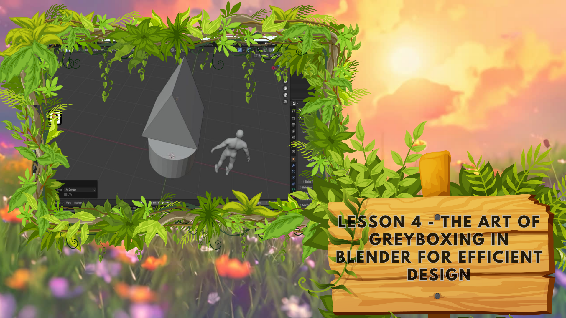
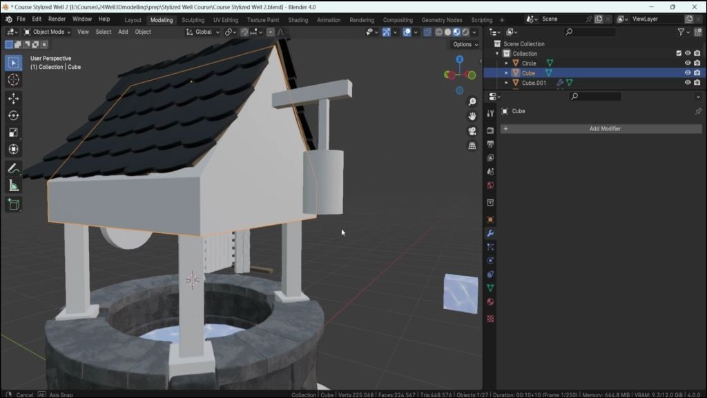
5. The Art of Greyboxing in Blender for Efficient Design: Hello, welcome back everyone to stylized environments with
blender for geom nodes. In the last lesson, we went over the basics of modeling itself, and now I'm going
to start off by grabbing myself a new
project for blender. I still have the
resource pack opened up since we're going to be
using it forgot the course. But this is going to be a
brand new blender file. So what I'm going
to do and formot is going to click Control and
S to save out my project, and this will prompt where we want to save out the project. I'm just going to go ahead
and create myself a new file. Click Save Blender file. Now, after we do it the first time now when we
click Control and S, we're going to save
out the blend we can see at the bottom
says save file. That's what we want. All we're doing is just saving
out the project in case it crashes or we want to close down a project and
continue on in the next time, we can go ahead and do so. All right. So now that
we have it sorted, we're going to go
ahead and start off by deleting the cube over here. Like, since we don't
really need it, we also are going to
delete the camera. So let's go ahead and delete
it and the lighting as well. Since for now, we're just going to start off
with the gray box. The first thing that we need to do is actually think about the scaling of our entire scene. What we're going to do is
we're going to go back to the resource pack
We're going to find ourselves the human
reference over here. The easiest way for
us to actually grab this human reference and put it onto a new blend file is
actually quite simple. All we have to do is just click Control C to copy
the selected object. Then we can go back onto
our brand new project, click Control V, and that's going to paste it in
within the scene. Now we can go ahead
and start doing some basic modeling
using primitive shapes. So we're going to
click Shift and A. We're going to select mesh, and we're going to start
off with cylinder. The cylinder doesn't
need to be too high in regards to this
polygon topology count. It's going to be using by default perty two,
which is all right. I'm going to go
ahead and then click one just so we can see
how it looks like. And what we want is
we want this human to be basically the well to
be next to its waste. That's what we're going to
do. I'm going to select this. I'm going to click S
and scale it down. G said and maybe put it
something like this. And I'm quite happy
with this top, but the bottom is a little bit going underneath this red line. The red line is basically where the t axis is set at zero, and this is the origin point
of the world, basically. So we ideally want to keep this environment within
the center of that. Now we're going to just grab this bottom piece and
just bring it upwards. So I'm going to hit a tab, go on to edit mode, hit pre to go onto
face selection, select the bottom, click
G Z and just move it up until we touch and barely
skim through the base. Like so. All right. So now that we have
the base of the well set with in
regards to its height, we need to think in
regards to its width. So how wide does
this have to be? Well, let's grab the
human G y put it closer to the section and just
pink off the overall wip. Since we are making it stylized, ideally, I'd want to keep
it a little bit wider. So let's go ahead and click tab go on to edit mode
within the face selection. We're going to face select
the entire edge loop. Whilst holding old,
we're going to tap on the face like so. Because we taped it on the right side of
this face over here. Going to basically select
this entire edge loop. Now we can click Alton
S and just expand it so I want to be maybe
a little bit smaller. I think something like
this is going to be quite all right. I'm
quite happy with this. Now we need to think about in
regards to the roof itself, let's go ahead and decide
how tall we want this to be. We want the roof to be going
just underneath its head. If we go onto the reference, we can see that basically
this side of the roof. We just want to be able
to lean in a little bit and cover the head of the human. That's what
we're going to do. So for that, we're going
to hit shift and A. We're going to grab
ourselves a cube. We're going to scale
down the cube, so it would be to the size
of the well more or less, a little bit smaller
perhaps like so, and I'm going to drag it
all the way up like so. Then what we're going to do
is we're going to select the top by hitting tab
and going onto edit mode. We're going to hit two to go
onto edge selection mode. So now we can select
this edge over here. And because the way the edge
selection works is because we're selecting this
edge is actually also selecting these
vertices over here. This one and this one whilst
we are in the edge mode. What we're going to do is we're going to make
use out of it. So whilst we have this
edge selection selected, we can click and
merge at center. This way, it'll merge both of these vertices in
the center piece, and we're going to do this same on our side as well to
get this kind of roof. Now we're going to select
this top piece and click GZ to just lower it down to
get this kind of an angle. Like so. I think that's
actually quite right. The only thing that
we need to worry now is in regards to. Actually, I will go ahead and select this object
in object mode. Going to scale it down just
a little bit more like so. Now we're going to
go on to edit mode, go click three and go
onto the a selection, select the bottom piece, click to just extend it and
extrude it downwards like. We're not going to
do it too much. Just something like this amount. This piece is going to be mainly the frame because otherwise it's going to look a
little bit too fixed, she'll just going to extend it a little bit more select this. Going to click GZ bring
it upwards like so. Now when we click two, we can see that the
human is going to be right in the nei I think that's going
to be quite right. I do think that this has
to be a little bit larger. Let me actually
extend a little bit, so this is going to be
just a little bit larger. I'm quite happy
with this. Now, we need to consider how this
is going to be set up. So for example, these
parts over here, they're going to be mainly set up with the framework over here. So instead of just using a plane like this and
the plane at the end, we're going to break up
overall surface a little bit. But for us to do
that, we just need to for now think about
the overall scaling. So going back to the
primitive shapes, Although this looks a
little bit too chunky, overall, keep in mind
that this piece, for example, is not
going to be there. So if we were to delete this, it's actually going to be
closer looking like this instead as the upper
ends are going to be covered whilst this
piece is going to be just a couple of frames
supporting the top. And now we need to consider something at the bottom as well. I'm going to click Shift and A, going to hit a cube, and I'm going to just scale
this downwards like so. Click one, G, bring it upwards to be sitting right at the top of the well like so. Then we can click G x, put it off to the side like so. I'm going to actually scale
it even more like so. I think this is a nice value. Let's go ahead and click G Z, put it at the bottom,
and we're going to select on the top pace
with the pace selection. We're going to click GZ, bring this upward chest will be
sitting right at the top. Now we don't need to worry about the symmetry for the moment. We're just making sure that the overall scale is going
to be quite nicely set up. But we do have an issue in which we created
this in edit mode. If we are in the edit
mode and click Shift A, we're still going to add meshes, but when we are mode
and click Shift A, we allow ourselves
to create measures, but that's going to be
as a separate entity. We actually do need to
split this piece off. The easiest way for us to
do that is if we hit tab, select this piece, so
click L, selected. We can click P to
separate by selection, and that's going to
give us a new object. So when we are in object mode, you can see these two
are separate entities. That way, we can just click free and go onto the object
to the side view. Click GZ, put it off
to the side like. Okay. I think that's going
to be quite all right. G maybe a little bit closer. I'm going to go ahead and
click a duplicate real quick. Actually, before doing that, I'd like to fix the transformation because
when we split this off, it still keeps the origin point, which we're going to
be talking about in the future as the
main object piece. We don't want this to happen. What we're going to do is we're going to click Control and A and then just simply
apply all transformations. Okay. Right click and
set origin to geometry. This just resets everything
and make sure it's a complete reset
object as a piece. Then we can click one and
then click Shift D to duplicate G x to move
it in x direction, and we can just put
it off to the side. We don't need to
worry about accuracy for this particular case because we're just making sure that the overall height
and the thickness, the overall proportions
are set up properly. The symmetry is we're not
so much worried as much as we're worried about
the scaling of this. For example, if
these are too bulky, if these are too
thin, that's what we're looking for in
this particular case. So I'm just making sure we
duplicate both of them again, so have them with
shift selected, have them both
selected, hit Shift D, and duplicate off to the side. And this is what
we're going to get. So, for now, that's
going to be all right. We are going to continue off with this in the next lesson. So thank you so
much for watching, and I will be seeing
you in a bit.
6. Advanced Cavity Shading Techniques in Blender: Hello, and welcome back front
to Stylist environments. We've plan to four
geometry nodes. In the last lesson, we
left ourselves off by creating this basic gray
box using primitive shapes, and now we're going
to enhance it a little bit and also turn on cavity so we could see so we could have a better
look at our design. So firstly, I'd like to actually load this roof
a little bit downwards. If we click one, we can see that it's a little
bit too high off. So I'm going to hit a tab. Go to click two and
then click on this top. Then click Get and just
move it downwards so. There we go. Something like
that is looking pretty good. All right. So now we can go
ahead and actually think about in regards to the
setup of the ground. So we're going to
hit Shift and A, we're going to go onto mesh. Whilst we are in object mode, we're going to hit
Shift and A mesh. Then go onto circle, select the circle, and now this is what
we're going to get. This is not a filled up circle. So what we're going
to do is we're going to hit tab right away. We're going to hit F,
and that's going to fill it in and it's going
to give us a nice plane. The plane that we
want is going to be scaled up a
little bit like so. We don't want this
to be too big, but we want to encompass certain aspects like staircase
a little bit and whatnot. So Okay. I would say something like this
is quite all right. We don't want this
too big, though, because if we start
just making it too big, it's just going to be looking to empty and isolated as a piece. So that's why we're making
it around maybe this big. I think that's going
to be quite all right. So now that we have it like so. We can go ahead
and start thinking about the cameras
and perspectives. So for example, we're
not going to have any camera angles from
the bottom, like so. So we don't need to worry about this piece being filled up, but we do need to worry
about the overall angle. So we don't want
this to be flat. We want this to be a little bit going like a small
hill and whatnot. That's going to make it
look like a nicer platform. So for that, we're
going to go ahead and go into mode for this. We're going to click on
free to go into face mode, select the phase itself. We're then going to inset
a phase by clicking, in setting it like so, right
underneath it like so. Then what we can do is we
can go ahead and click two. We can go ahead and select this entire edge loop by holding Alt G s and then
dragging it downwards. I think that's quite all
right for the height. Doesn't have to be too steep, but something like this is
going to be quite all right. Okay, now we need to think in regards to the overall setup. So for CAs, we can see all of this topology which doesn't
exactly help for us. So we're going to make sure that we actually
smoothing this out. We can either do this by by either using click and
clicking on Shades move, which smooths out
the entire mesh and just makes it
look nice and smooth. Or alternatively, for
something like this cylinder where we want edges only
to be smoothed out. We can select using
right mouse button, we can select shade tos move. By clicking on shade to move, we're going to get
ourselves an angle and the fault is going
to be working quite well as it shades
smooths the edges, but it's going to
keep this corner over here as default one. Now that we have
it like so, we can actually go ahead and
turn on our cavities. Turning on our cavities is actually going to
be quite simple. We're going to make sure
that we are in solid mode, so make sure that you have this selected top
right hand corner. Then we're going to hit
this arrow over here, which will allow us
to turn on cavity. Cavity is quite
useful to getting understanding of
the shape and form. As you can see it highlights
basically the edges, so before and after
looks so much different in regards to just
highlighting the edges. Now that we have it
like so, we can go ahead and start talking
about in regards to how we can break up
the shape a little bit for the form for
the overall design. So what I mean by that is at the bottom
at the very least, is going to look quite
plain if we have it just a cylindrical setup. Although we're planning
to add a grass, which is going to help us
break down the surface. So for example, if we look into the reference that
we have over here, we're going to see that
we actually have at the bottom some
staircase over here, which breaks down
that surface like so, and that just helps us
to get a nicer piece. We also have something
at the top over here. So that's this diamond
shape at the top, helps to break down
the overall type of a surface for the roof. And we also have a piece that's coming out of
the roof as a lantern. At the backside, though,
we have something similar. So we have instead of a lantern, we have this cog
wheel that turns the rope that allows you to
move the bucket up and down. Again, it's not just going to be not going to be a
plain type of setup. In this particular
case, you can see that because it's
actually a back side, we don't need another staircase, but the upper side does
not need the staircase, since the front side
would be the one that was the main shot. The side would be mainly
used, for example, in something like a
turntable where it would be just a quick turntable
for the camera. Anyway, the final
bits that we need to include in regards
to the setup for the gray box is going to be just where the location
of the lantern would be, also where the location of that back side would be
as well for the jack. So let's go ahead
and add these in. So I'm just going to
go ahead and real quick add in a
cylinder over here. Go to click G y moved
off to the side, x 90, and then S y and
then scale this down. So this is going to
be for the backside. Okay. So the sort. Let's make sure we
have the right scaling in regards to the
reference of the human. I'm going to go
ahead and actually, I'm going to click
one or in this case, if you click Control one, it's going to do the back side, not the front side, so it's going to give us
the opposite angle. I think this is actually
just the right amount. Let's go ahead and keep
it going to just attach it Gtach it to the end. We're going to be adjusting
it whilst modeling. The only thing that we need is going to be Lantern over here. For the laantern we're
going to go ahead and just simply I say we can use a simple placeholder
for the cylinder. Let's go ahead and move it
nicely off to the side. We can also make use out of the move tool over
here to get a Gizmo. This way, we can
just easily make some nicer adjustments I think something like this
scale will be quite nice. Moving it off a little bit to the side, I think that's
going to be quite. Let's go ahead and make a quick attachments to where we want it to be I'm just going
to use a cube, S y, just make it a
little bit extruded, like so now that's going
to be quite all right. Hit ship x 90, scale it down a little bit, Gy and something of the sort. I think that's going
to be quite all right. Let's have a look
from a distance in regards to the scale. Ideally, I'd like this
to be a little bit higher up like so. We click one, we can see it's right in the scale
of the human head. And that's pretty much it for the base setup
of the gray boxing. We don't need much.
All we need to do is just understand the
proportions and how they work. Even when we are working
with a stylized scene, we need to get the
proportions down. And once we do, we get a better understanding
of the overall scale. And then when we
are actually doing modeling and we are getting
into small details, we're not actually
in the need of worrying for having
oversized certain parts. So I think all in all, this is going to be
quite all right. Maybe add a couple of parts at the front as well or
where the stairs would be. A quick indication for that. I think that's going
to be quite all right. So something of the sort. I think that's going
to be quite all right, although I probably going to lower down even more actually. I do want to have a
couple of extra steps. But we can worry about
that later down the line. We just need to make sure that the overall size or
where we want to place the stairs and the scale for them would be
something along that line. We can worry about the
overall proportions for the stairs once we are actually going to
be adding them in. Okay. Since we are going to be needing to sculpt down
this terrain first in order to actually understand
how we're going to be placing it down
alongside the terrain. And yeah, that's going to
be it from this video. Thank you so much for watching, and I will be seeing
you in a bit.
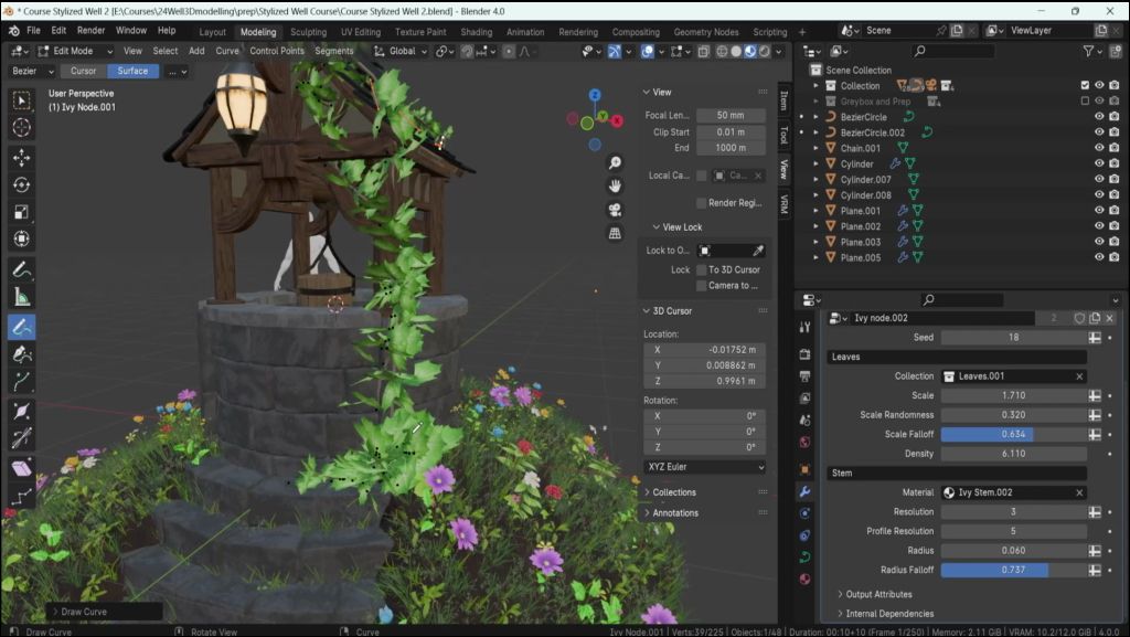
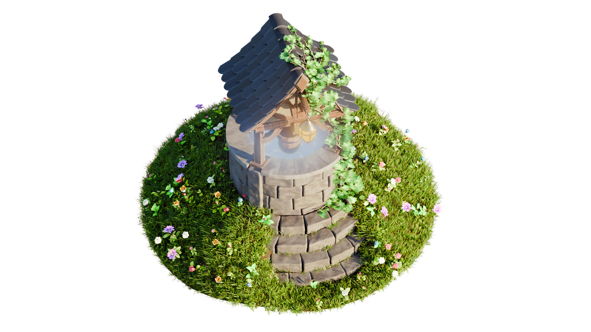
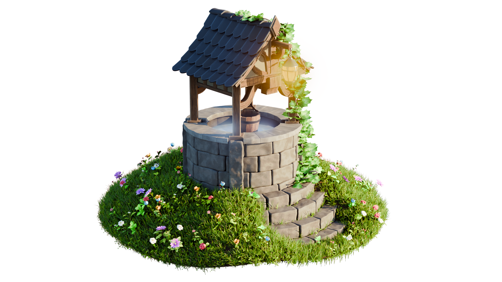
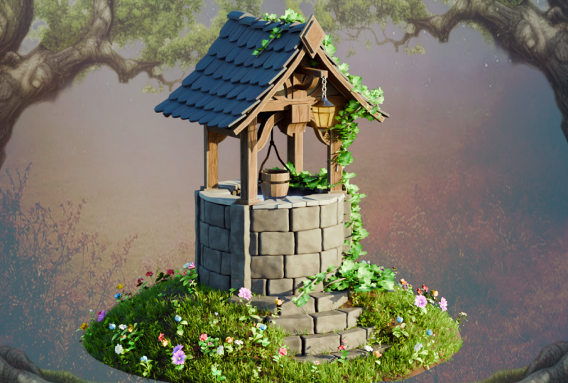
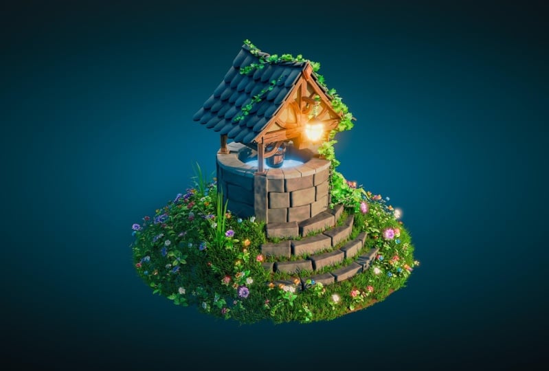
7. Mastering Brick Textures with Blender's Geometry Nodes: Hello, and welcome
back everyone to stylized environments with
Blender four geometry nodes. In the last lesson,
we left ourselves off by completing our
quick gray box, which we're now
going to be using to actually set ourselves
up with a nice well. We're going to start off with
creating the well itself, the foundation using
the resource pack by making use out
of the reference. The ones that we're going
to be making use of are going to be the start of
the bricks over here. So by the fault, these
bricks, as you can see, they're not really set up in a nice stylized medieval kind of way. They're more modern. They have a cement on the side. And that's
not what we want. So we're going to
need to fix that. But before doing that,
let's go ahead and actually get these
into our scene. There are multiple
ways of getting geometry notes into
your scene using things like asset manager or just appending it through
the project itself. My personal favorite,
especially when I'm not really sure what type
of geometry note I'm using, and I'm just having
experimentation phase. My personal favorite is
just to simply grab it and do it pretty much the same way as we did with the
human over here. By having it selected, we can click Control
C to copy it. It says, copied one
selected object. That's exactly what we want. Then we can go back onto our project and hit
Control B over here, and that's going to bring our geometry node
over here like so. Now that we have it like so, I'm going to actually just
keep the default one. I'm going to hit
Shift D and move it off to the side, just like that. This, we're going
to start off by actually creating
the entire setup. So what we need to
firstly find is how this brick generator
actually works, how it is being behaved. And I'm going to go ahead and select this brick generator. And then because it's
using ometry node, we can go to modifiers as it is. Ometry node is a
type of a modifier, and we can see all the
settings over here. So these are all the settings that we're going to be using. Some of them we might not need. So for example, things like
cement, we don't really need. We can just take off a show, and this should get rid
of the cement, like so. And in regards to the
parameters themselves, I do recommend you whenever you have a new geometry
node opened up, just to experiment with them, just go through
every single one of the setup and just for
example, change up to C, the layers, what each
one of them will do, and just see which
option does what. By taking it up to
a higher value, lowering down to
a minimum value, seeing how each one
of them are behaving is a really good way of
seeing what they do. Also, another thing that I need to mention is whilst holding shift and clicking and holding on one of
those parameters, then dragging it right and left, it's going to basically
lower down the intensity. If if you were to
do it normally, just clicking and holding
on this parameters, dragging left or right, it's going to be
quite more intense. Holding shift is just
going to lower down the value change whilst doing that motion left and
right, whilst holding it. The other thing that
I should mention is, although I did say to experiment
with all the parameters, there are a couple
of parameters, which you should be very
careful whilst changing. Bings four parameters like
subdivision or resolution, in this case,
resolution over here. They're going to be extremely dense if you are
increasing the value. So what I mean by density
is the mesh itself, this is what controls the
density of the entire setup, and we can actually go onto wire frame to see
how it looks like. By the fold, this is what it's going to look like
for the bricks. If a b to increase
the resolution, you can see that the
density for these are growing exponentially. We
don't want this to happen. We want to make sure
that It's actually not too high in resolution
or subdivision. So even though I
do recommend you experimenting the parameters
with all of them, ignore resolution or subdivision or use the value sparingly, so don't overdo it more than
a value of let's say six. After that, you can see that the memory increase is going
quite heavy over here. Bottom right hand side,
we have memory option. If we are increasing
it by the way, we can see that it's expanding and after turning after four, you can see that basically
doubles every time or more or less so we
don't want this to happen. If you want to see
the memory usage, by the way, you can do so. I do recommend you making use of within edit mode preferences. Over here, you can go to
system and not the system, it's going to be
under interference. There's something
called a status bar. I just enabled all of them. We can see the blender version, memory usage on the bottom
right hand corner and whatnot. Also, things like triangle count and faces
for the geometry. It's very useful all of that. Even though it looks a
little bit confusing, it's a nice thing
to get used to, especially when working with
environments in blender. Okay. All right. So I'm going
to turn off the wireframe. I'm going to go back to
the modeling shader go. Now we can go ahead and actually talk about the
brick setup itself. So what we need to
understand in regards to the modifiers is the
placement of them. We haven't talked
about that actually. And if we were to hit tab, we can understand what it's using in regards to the setup. Sometimes geometry
nodes don't use anything in regards
to the original mesh. Sometimes you're able to place geometry note
on top of the mesh, an existing mesh,
and it just adds the geometry or any
value of the sort. And in this case, it
is using curvature. Curvature is nice because you're able to control
these points over here. Even now, when
we're extending it, for example, I can
select the last one, click G x and just
extend it and we can see that it actually grows
or geometry or bricks. That's actually
especially useful when we're want to
control shape of them. For example, I can click seven, I can click G and
then move it off to the side and we can
see it moving around. It's actually very nice and
simple to make use of atom. With that in mind, what
we can do is there are multiple shapes of the presets
of curvature, for example, instead of just using the default one that
we have over here, I do recommend you just
grab in this entire section and we can just make a new
one fresh from the start. If you were to delete this now, click Delete vertices, you can see it being removed
the entire brick. And although this is removed, notice how on the modifier stab, we still have the
geometry set up. So it's basically
this brick setup is making use out
of the curvature, and right now it's not
detecting anything, any curvature of the sort. So it's going to give us a blank a fresh
empty type of setup. But if we look into
the scene collection, we can still see that
we have the wall. Because we're in edit mode, we're not deleting
the entire curvature, we're just deleting its points. So we can create fresh
points from the start. We can click Shift and A. We can select circle
in this case before, by the way, it was pass,
just a straight line. But using circle, It's just
going to give us this setup. It's already because
it's in the middle, it's already going to give
us this kind of setup. I am going to click
next to shift. There's a question mark
and sort of a slash, this kind of symbol over here. That's going to
basically allow us to isolate or go out
of isolation mode. It's not hiding anything. It's just basically
taking the selection that we have and isolating
the entire section. If I were to go to object mode, I can select multiple
parts and I can click this isolation button
and it's going to isolate our selection. Again, going back to this, I'm
going to select this wall. I'm going to isolate it like so, going to go back onto tab. Talk a bit about
this kind of a set. What we have over here
is just basically four points and each one
of those points have a control additional controls the way they interact with
each individual points. If we to move those points
next to the main ones, next to the vertices, we can see it changing the
shape of our eta. We don't want this to
happen at this point, but it is nice to know that basically these are
the four main points, and when we select them, we have additional
controls over the way they interpolate the information for these bricks for
the geometry node. So going back to the breaks, we are going to be going ahead and actually working with them, making sure that we
have the right setup. But we are running out of time, so I reckon we can start with that fresh in the next lesson. So thank you so
much for watching, and I will be seeing
you in a bit.
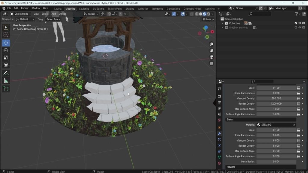
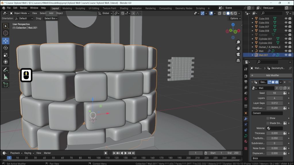
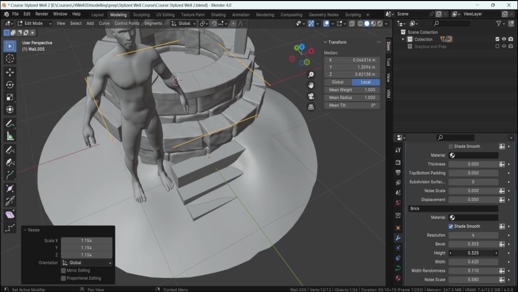
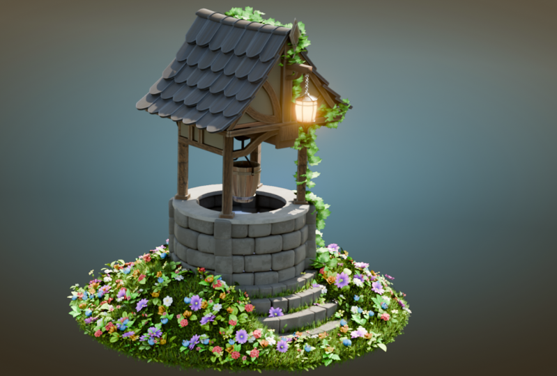
8. Constructing Detailed 3D Wells with Blender Geometry Nodes: Hello and welcome
back ever room to stylized environments with
blend of four geometry nodes. In the last lesson, we
talked a little bit in regards to the setup
of this geometry node, and we did set ourselves up with a new shape that allows
us a circular design. I'm just going to go
out of my focus mode. This is how it
looks like so far, and we need to make sure
that it's the right size. What I'm going to do first
is I'm going to hit a tab, I'm going to go onto
the object mode, and I'm going to
check real quick. The thing is right now that I have is this origin point
is off on the side. We are going to talk a lot
a little bit in regards to that in the future
for the frame setup. But for now, what we
need to know is that we just need to reset this.
Let's go ahead and do that. All we need to do right
now is simply click a shift or control and A
and hit all transform. We're applying all these
transformations like so. Then I'm going to
go ahead and hit S and just scale this
down a little bit, or actually before doing that, let's go ahead and
decide how many bricks we're going
to have first. We can do so at the
very top layers. We can just scale
this down until we get let's say four great number. Then we're going to lower
down the gaps like so. Now we can actually
start working with them. I'm going to go ahead and
just increase it like so, higher up this setup. Then just scale it up
until we get this result. I think that's a good start.
That seems to be all right. Now let's go ahead and actually work with this overall setup. Actually lower this
down a little bit more. I'm going to now go into
tab into the edit mode, going to hit a if we were
to scale this entire setup, we can see that these bricks
actually change the radius of the setup because
of these four points. Now we can just scale
this down a little bit to something like
this of a value. And I would say that we should probably increase this a little bit in
regards to the size. We do have a brick
size over here, I reckon, the height.
There you go. We can even just make use out of this and increase it like so. And this seems to be all right. So I'm quite happy
with this result and we are having the right setup. So what I'm going to
do right now is I'm going to go back to object
mode by hitting tab, select this cylinder, and so
it wouldn't get in our way. I'm going to hit H and just check how this
looks like so far. I think that's going
to be good so far. I'm going to go now
and hit isolate mode. So we can actually isolate this entire setup and start
working with the bricks. So layers, let's go ahead and actually think
in regards to that. And I don't yeah, I think having an extra brick in here would be quite
nice, or maybe not. I will actually
keep this as four, and then when we're working
with the supports in the bit, we're going to add a
bit of an extra brick. For these bricks, what we
need to do is, well, firstly, we need to change the
sharpness of them. They're too sharp,
they're too modern. Let's go ahead and find
the solution for that. This is either going
to be over here or if it's scrolled down
within a brick setup, it's going to be I think bevels. Let's go ahead and increase it, see what it does,
and it is belts. I'm going to right now
just change this value to something of 0.5 for now,
that's going to be good. I'm going to increase
the resolution because I do want to
have some displacement, changing it to four,
going to go onto the wireframe just
to see the density, and I think that's
quite all right. Go to go back onto
the modeling mode like so, onto modeling shader. The other thing
that we need to is make sure that we
should probably not have all of this
view for the brick. Right now, it's a
little bit too Yeah. I do think that it
is a little bit too. We need to basically remove
each visual topology. So we can just
enable shades move. This is going to
enable the shades move we talked about in
regards to the terrain. That's what we're
going to get for now. Now we can start
working in regards to the setup if I
were to scroll down. So we have height, we have W I think we should
increase it a bit. Let's go ahead and
actually lower this down. The thing is that we need to work with is with randomness. Randomness is going to
basically increase big, how small the bricks are in regards to just
each individual brick. To make this more organic, we need to increase its
value to quite a bit, although not too much. With randomness, let's go ahead and change this to
something more manageable. I'd say while it's
holding shift, I'm going to just
lower this down. You go something of
a value of 0.06. I think that's quite
all right. Then we can work with the whip itself. So the bricks should be
this amount and Okay. Actually, we should probably make this well a
little bit bigger. We'll go ahead and do that.
I'm going to go ahead and select it now that we
have all of these bricks. It does seem to be quite thin in regards
for stylized well. I'm going to go ahead and
select it all, click S, and just increase it
just a little bit like we might need to
adjust everything else, but I think that's
quite all right. I think that's going to work
quite nice for us actually. I'm going to just move the staircase a little
bit to the front, so we wouldn't lose
the visualization. Let's go back on these bricks. The other thing
that we now need to fix is going to be these gaps. These massive gaps, we
definitely need to fix. I think that's going
to be not layer gaps. Okay. That's going
to be on second, we need to actually work
with or even first actually. What we want for this is
just slide offset every once in a while a little bit. We don't want it to be on half because that's going to be
looking like a pattern, we want the stone to be looking a little bit
offset and whatnot. So it's just slight variation, 0.3, it's going to be
quite all right for us. Okay. Other thing that we talked about is going to
be these gaps over here. Let's go ahead and have a look where we can find these gaps. Layer gaps is going
to be between layers. We don't want this,
we want to scroll down until we find the bricks. That's probably
going to be with. Let's go ahead, no.
That's not with. That's not height
ever. Let's go ahead. By the way, I'm clicking
Control Z whenever I adjust them just to go
back to the default state. That's how I do it. And brick gaps. I
think that's the one. Yeah, there we go. We
want to make sure that they are actually
touching here, like so. The issue with this will be a little bit if we look
at the inside that they start touching way
faster than the ones outside. If we look at the inside ones and look when they start
touching over here, whilst the ones outside are not touching. But I think
that's all right. We just need to focus
on the ones outside because when they are
starting to touch over here, these ones inside are actually
going to be quite right. Now we have an issue
where the bricks, themselves, those stones are
a little bit too smooth. So we're going to start adding
some, some displacement. We do have a couple of
parameters with that. We have noise scale and
noise displacement. If you start just
adding noise, actually, I'm going to make
this a little bit bigger so we can
read what it is. There you go, noise
scale and displacement. If you start upscaling
displacement on its own, we can see that does some
weird bizarre stuff. The reason being is if I were to make this quite a high value, and start increasing
the noise scale. We can see that it
starts deforming. When it was by
default set at zero, it was just giving
us just one value, it wasn't giving us
the right results. But now that we
start scaling this, we can start seeing the results. What we want actually right now, it's barely understandable
what's happening. I'm going to lower the
displacement by quite a bit to the value of 0.05 for now and start working
with the scale. We can now understand what
it actually is doing. Noise scale, let's
keep increasing it until we get this result. Say 5.5 is quite. There we go. Now displacement itself
is a little bit too much. Let's go ahead and while
it's holding shift. We're going to lower
this down until we get something of
a value of 0.02. That's quite all
right. There we go. All right, I'm quite
happy with this result. Although now, I think that the beveling is a
little bit too much, and I do realize that there
are gaps in the bindle. Let's go ahead and
fix these gaps. I think that's going to
be at the top odd offset. That's not it.
Actually, that's going to be within the
bricks themselves. So probably height,
nope that's going to be think with randomness. No layer gaps. There we go. I'm going
to lower this down to that's a little bit too much to really small
value actually 0.001. I think that's going
to be quite all right. I'm just going to go
ahead and actually click Old h to unhide everything and I realize that this is a
little bit now too short. I'm going to actually increase
the height of the brakes. Holding shift just
slightly increase it to the desired result. I'm going to check it again
to the waist just like that. I can go ahead and select
the cylinder back, click H to hide it
out of the way. Let's go ahead and do
final touches for this. I think I this critical case, again, we don't need
to touch cement. Let's go ahead and go
through the brick setup, so resolution is all right. Beveling Beveling I
think we can lower this down by quite a bit to
get the right results. I'm going to lower it down to a value
that's more manageable. Something like this, I
think looks quite nice. Although now that I see it, we can probably get away
with lowering the gap, making the gaps a
little bit better. I do want to have
more randomness, less uniform type of a look in regards to
the craftsmanship. Let's go ahead and do that. I think that wasn't whip. If it was brick gaps, there we go, I'm going
to lower this down. Holding shift, I'm
going to lower this down to a value that's
more reasonable. 0.4. I think that's
going to be quite nice. We have some small gaps over here that's looking quite nice. I think we have some gaps randomized. That's
actually quite good. We're going to whole shift and slightly increase
it a little bit. Just a little bit 0.015
is looking quite nice. We do have rotation randomness. Those are the ones that
are we're looking for to make it a little
bit more chaotic, a little bit more random. Pull randomness is going to basically offset
these bricks like so. We wanted to offset it
inwards, actually this time. Okay. It would go inwards. So we wouldn't be creating
additional gaps if we were to do pull
randomness outwards. We can see that the
gaps that it starts creating are going to be
larger like the gap over here. We're going to do
the opposite of that slight amount.
Not too much. Let's go ahead and look
how this looks like. I think that's looking
quite all right actually. Rotation y rotation, it's going to be basically
the bricks over here. The offset, I'm going
to hold shift and just slightly add in 0.05, both. 0.005 that is. Just a little bit small offset. It's going to look quite
nice whilst keeping this well looking like it's
not about to fall over. Yeah, I think that's
pretty much it in regards to the setup
for this well. We do have a nice setup
over here for the bricks. We're now going to
be starting to work on the foundation of the roof, for the supports,
and get ourselves some additional supports of the stone to make sure that
we also break off the edges. But we're going to talk about
this in the next lesson. Thank you so much for watching, and I will be seeing
you in a bit.
9. Adding Structural Integrity with Stone Supports in Blender: Hello, and welcome
back everyone to stylized environment with
blender four geometry nodes. In the last lesson, we
let ourselves by creating a nice brick type of
a setup for the well, but we're still not
quite done there. We still have a
bit of work to do. If we look at it
from a distance, it's going to look quite bland. The reason being is that it's just a plain looking
type of brick, although we did have
some offset and whatnot. If we look at the reference
within the setup, we do have a little
bit of a difference, and that being is going to
be these parts over here. We want to make sure that we
support the roof on the top. And for that, we want to
make sure that we have a bit of a difference in
the bricks that we have. So you see even at the back, we have a little bit
of a difference. And that small kind
of a detail does add up to making this well look
a little bit more stylized, a little bit more unique. Whilst at the same
time, it makes it look manageable for the overall
support for the weight, and whatnot, how the well itself just basically
sits on the ground. Okay. So let's go ahead
and get right into it. We're going to
create these bricks. But for us to create
these bricks, we actually need to decide where the supports
are going to be. We did make this a little
bit bigger just to make sure that it looks a little bit
nicer overall from a distance, but we now need to decide how these placements
are going to be set. So for us to do that, we're
going to actually go ahead and start off by selecting one of them
in the back leg so, and then we're going to
just go use modifier, we're going to add
a modifier mirror. So the mirror is a very
nice function that will allow us to basically
mirror one side to the other. But actually the way
the mirror works, it's actually quite
interesting because you see this.in the middle
for the object, this is an origin point. This is what
controls the mirror. If we try to move
the origin point, basically, it'll start
mirroring off based on that. Right now, even if we
have this selected, it doesn't look like
it's doing anything. And the reason being
is that it basically mirrors one side
to the other side, and it doesn't really change
anything in regards to that. We need to make
sure it mirrors it based on the center
of this well. So what we're going to do is, we're just going to make use of this free Dcursor that's set up at the centerpiece of
this object of this world. So we can just in case you have misclicked or have this
free Dcursor somewhere else, we're going to hit Shift ten S, like so, and then we're going to select cursor
to world origin. Then we're going to have
this object selected. We're going to right
click, and we're going to click Set origin
to free de cursor. This way, we have it
right in the middle and we can see that it's
starting to do something. Now if we go with
the mirror tool, if we go on to edit mode like so and have this object
selected, so we can click A, we can see that
this is selected, we can click G x and move
it off to the side and we can see it moving it off
onto the other side as well. We can also select y, so mirrors x and y, both at the same time, and we're going to get this result. I'm actually going to go out of the object mode
for now, sorry, out of the edit mode
onto object mode and select these
individual parts, like so, delete them. So we only have this one object with the mirror tool enabled. Now I'm going to go
back onto edit mode. Again, with this selected,
I'm going to click G and x and just
position it nicely. W is to be ideally in the exact location for where
one quarter is going to be. The best way the easiest way for us to do that is going to be if you click RZ and select 45, we write that down,
it's going to be perfectly diagonal like so. Now we can simply just
tune up the location. I'm going to go onto
the object move tool, and we're going to use this
blue square over here just to move it off to the side
where we want it to be. I think that looks quite nice. All right, I'm quite
happy with this result. Let's go ahead now and talk about in regards to the support. So the support
itself is going to have this wooden part over here, that's going to be covering
most of the section. I'm not sure if it's visible within a video, but basically, if we have this part over here, it's going to be basically having a foundation
of over rocks. It's going to be slightly going outwards from the
support over here. That's what we want
to do the support itself is going to be over here at same or similar with the bricks that we just
set it up for a cylinder. So I think we can start off by instead of
just working on the whip, we just want to find a location, which we did, and I think
that looks quite nice. We now need to work
on in regards to the bricks themselves that are going to be
placed over here. I'm going to actually just select these bricks
over here because we already have very nice
type of brick setup. And this time, we're
going to duplicate it, so ship DGX, we already have all of the parameters that we already set up already for us. Now we're going to need to
actually set ourselves up with the right style with the right setup. The way
we're going to do it, We're going to go to
object mode, hit A, delete all of these vertices, all of the curve
vertices that is. We're going to hit shift and A, we're going to select path, and then we're going
to get ourselves straight line. That's
exactly what we want. Now we're going to just move
it a little bit to the back, going to reset the origins
of set origin to geometry. We need to think on how
we're going to set this up. The layers, we can
just set up as two bricks In this
particular case, Okay. We want these bricks to
basically be vertical. I think that's going
to be quite all right. Let's go ahead and do that. First to set it up vertically, so we could actually just place it in regards to the height. We're going to first
go onto the edit mode. We're going to delete these
last points over here. Let's go ahead and
delete the vertices. We only have two left, like so, and then we're going
to make sure that the layer offset is set to zero. So it's actually
placed nicely across. We're going to extend
this last point, gx over here, so we're
getting more bricks across. Now we can actually start
working in regards to them. Okay. So what we did basically is we removed
the additional vertices. We only have two points
now to be working with, and we took off the GAP
offset, and I think. We can set up the layer
gaps to be zero actually. Seed, we can just keep it as zero or a bit of
a different one. We just want to make sure
that we have a little bit of a different difference in
regards to these main bricks, and I think that's
quite all right. Now, we're simply going
to click r y and 90. We're going to get
this kind of a setup. I think we have a width
of randomness as well, which we do want to
lower this down. W randomness, I think
that's there we go. The reason being is that we
want the top to be more or less similar to what we
had, which it is now. That's quite nice. Okay, four bricks is going
to be quite all right. Let's go ahead and actually
set it up properly. I'm going to click GZ,
maybe four bricks. I'm going to set origin
to a geometry like so. Click one, put it
off to the side, click Z, make it the
right size. Just like so. We're making sure that
the bottom and the top is nicely placed like so. I'm going to place
it right in here. What I will do right now
is I will actually just go and place this off to
the side just like that. Now we're going to set it up diagonally to be going in
the same rotation as this. We're going to select
these bricks, Rs 45. It's going the wrong way, so we're going to
add a minus sign, so it's going to be -45, as you can see over here, and that's exactly what we want. I'm now going to
use this move tool to just set it up nicely. I'm picking about the
thickness of it itself. I do want the beveling to
be a little bit sharper, so we'll go actually and holding shift lowers down a little bit. Not sure by how much. Me
by something like this. That's look square nice
actually quite like this. We do want the thickness
to be much bigger, so I'm just going to check
the whip. That's not it. The height, P height is
the one that's doing it, but it's actually affecting
the overall height, which is not what I want to do. I'm going to go ahead
and check the set. I don't think that's
going to do anything, so it's not the type
of change that I want. In this particular
case, what I will do is I will actually scale
it in a local axis, and if we were to select, change this from
global to local, we can now see that
the Gizmo changes and it basically paces instead
of the world position, I pass local position based on the rotation
of this object. Now we can click S and y and just scale it
upwards like so. I do want to scale it a
little bit upwards or actually maybe just move it
upwards and drive scale it. This time, to scale it upwards, instead of using Z, we
can see that this is red. If we look at the Gizmo
on the top right, we can actually see
the world gizmo. Before it was Z that was going top nows x because
of the rotation. I'm going to click S x
and scale it upwards a little bit to make sure it goes above
these bricks over here. I think I'm quite
happy with the result. I'm quite happy the
way it turned out. So that looks
pretty good for us. We now need to make
sure that we actually mirror this across
to the other sides, the same way as we
have or the geometry. The reason being is
that because it's using the curvature to
generate those bricks, even if we were to add a
mirror modify over here, it's not going to give
us the right result, even if we were to at the
origin points in the center. So what I recommend you doing is we just need to
convert this mesh, and It's actually better to do it by having a
duplicate out of this. The reason being is in
case we want to make some adjustments or something
of the sort in the future, we have an option to do so. By default, if we were
to do it right away, we're going to lose all the
options for the emt nodes, and although I'm quite
happy with the result, it's still better to
keep it just in case. The way we're going to do
it is we're going to hit ship to make a duplicate
and then hit Enter, so it's going to make us a duplicate and we can
just hide this out of the way by clicking h or just selecting this and just
clicking this button over here. If you don't want this
to be rendered as well, we can just click on this
render icon over here as well. That's going to completely
hide it out of our side. And now we're just left with
the duplicate for this. It still set the show nodes, so let's go ahead and convert
this to a normal mesh. The way we do this is if
we have this selected, we can go to object, we can hit, convert, convert to mesh, and that's just going
to apply everything and it's going to give us the nice result that
we're looking for. All right. So now
we have it like so. We can finally go to Modify. Search for a mirror like so, and it's not going to give us the right result right away for the mirroring because we need
to reset the origin point. But before doing that,
I'd like to actually scale it outwards a little
bit more just bricks, just to get a bit more
of that gap over here. Let's go ahead and do
that. We're going to hit with the local selected. We're going to hit
S and X. Sorry, Y. Okay. Actually is. There we go. That's what we're looking
for, and we're just going to scale it
outwards like so. And you can see there's
issues over here. This is because
of the mirroring, so we can just ignore that. And I'm going to slightly try it upwards like so to make
sure there's no issue. Okay, I'm quite happy
with the result. Let's go ahead and enable x and y axis is not going to
give us the right result. The reason being is
that we need to make sure that the origin
is set over here. We also need to make sure that the rotation is also applied. So we can do that all
at once by hitting control at A, resetting
all transformations, and that's going
to put our origin point right in the center, which is exactly what
we're looking for, and that's going to give
us the right result. And yeah, I'm quite
happy to result. Let's go ahead and move on
and in the next lesson, we're going to start working on upper section of this well. So thank you so
much for watching, and I will be seeing
you in a bit.
10. Crafting Stone Slabs in Blender for Stylized Environments: Okay. Hello, and welcome back everyone to stylized
environments with blender four Geometri notes. In the last lesson, we
set ourselves up with a nice setup or these
bricks over here. We're just going to
leave them as is, we can apply the
mirror for the moment, but I prefer to keep it until the very last second until I'm sure that everything
is working out nicely. Let's go ahead and
just leave it as is. Now the next thing that we
want to do is make sure we get some nice tiles or slabs
going across the well. This part is going to
be a modeling section, a little bit more
of that instead of just doing omet notes. But it is actually going
to be quite simple. But before doing that,
we actually need to determine what is going
to be the base of these parts over here of the supports because we
want to make sure that the slabs are actually touching the sides of these supports. Let's go ahead and
determine that. Just looking at this, the width of these seem to be all right. If we want to change the
width overall, we can do so. We can go onto edit mode. We can make a selection going
across for the edge loop. By clicking free and then holding and tapping on the side, we should be able to just
select only the edges. We can check even by
isolating the view, and we can see that the top and the bottom are not selected, and with that, we can click AltenS and then scale it
up and down a little bit. Although I think this
a scale is all right. Now we can do some extra
supports for the bottom. Let's go ahead and do that.
I'm going to click Control R, which will allow us to give us a nice edge mode edge
loop creation, basically. We can tap and hold on our
left mouse button and then drag it down until we get
to this part over here. Then I'm just going to click
left mouse button again. And that's what
we're going to get a nice edge loop going across. So we can now make use out of this edge loop and actually
add an extrusion over here. We're going to click three to go onto the edge sorry,
face selection. We can hold old tap on
the side of the face. Click, click Enter right away. Since we want to make sure we
expand it using inflation, which we can do so
using old and S, and then we are just
expanding it afterwards, since this is being kept
with the same selection. So basically we
create an extrusion, and then we straightaway
press enter, so it wouldn't actually extrude
it in any unwanted way. It would just keep the
extrusion on top of the mesh, and then we're going to use old S to basically
expand this selection. I want the selection
to be just a little bit outside of
these bricks over here. Holding old S. I'm just
going to expand it like so. I'm going to select this bottom
since I can see that it's actually being applied a bit. I want it to be going a
little bit downwards. I'm going to actually isolate
this entire selection. So isolating the view,
selecting the bottom. This time, we can
click Control Plus, which will increase
basically the selection, and this will select
this entire base so just from this single square. Now we can click GSD or
actually before doing that, let's go out of the
isolation mode. We can click we can click
out of the isolation mode. GSD and going down a little bit. Think that's going to be une. So this is what we're
going to get for now, and I think it's
looking quite right. Okay. I'm quite happy
with the result. Let's go ahead and add
a bit of a beveling. So we're going to use
a modifier for that, which will basically
soften out the edges. So in the future, we
don't have to do that. Let's go ahead and add a
modifier, search for bevel. And that's what we're
going to get by default. It's going to add it right
underneath the mirror, so we can just scroll with a mouse button while severing
over these modifiers. And I'm going to hold shift
and just lower this down. Until we get a
reasonable amount. So 0.003 seems to give
us a nice amount. I think I'm quite happy
with that. All right. What we need to do now
is we need to determine this type of edge over
here for the slabs. We can actually
click AltenH and we still have this nice
cylinder over here. So we can actually
make use out of it. Let's go ahead and
do that actually. It's going to make our
lives much easier. I'm just thinking if I should
make a duplicate out of it just in case and I think. I think I will make a
duplicate since I want to keep the gray box for now just yet. Just in case, I'm
going to hit ship D, make a duplicate, and
then I'm going to hit escape to make sure it's
placed in the same position. So, I'm then going to
click H to hide this out of the way and
then we're left with the original cylinder. Now we can go onto
edit mode like so. I can isolate this
entire selection. I can select the bottom pace, click Control Plus to basically
increase the selection, and now we're going to click delete basis and we're left
with this at the very top. We can now go out
of isolation mode. Now what we're going
to do is we're going to let's see the
passes way to do this, would probably be to just simply increase this
entire selection, like so just a little bit. Um, I think, yeah, a little bit underneath
the bricks themselves. We don't want it to be
going outwards too much, but it's going to give
us a nice overhang, so that's going to be
the maximum point. And then we can click while
staving this pace selected we can click and shrink
it down for this. I think that's going
to be quite all right. We can actually just
hit delete faces, and that's what
we're going to get. Now we can click two
to go into selection, holding old, select
this entire selection, and we can actually just click S and actually
just scale it down, and I'm thinking There we go. Something like this.
Again, it's just going to be right before this
main foundation bricks. I think that's going
to be quite right. I'm quite happy to
result with the result. Now, this is the part
where we want to decide how many slabs we
actually want to get. I'm thinking of getting just
five slabs be like one, two, three, and
actually or five. But it's not looking
quite right, so I'm going to actually
just select this entire p, click Art and just
rotate it a little bit, so we fit it in like so. Okay. I think that's
a little bit better. Let's have a look, one, two, three, and we do want
to have more slabs. So what would be the
best way of doing it? So each slab should
be a separate phase. That would make our
lives so much easier. And I think that's exactly what we're going
to do right here. So actually, let me just
think how many slabs. I think setting it up five by five by five is going
to be quite right. So what I'm going to
do in this particular case is just simply going to grab one of one of this, that's going
to be quite all right. Yeah, that looks all right. Just do a quick duplicate. Ship G or click scape, then G, and there we go, we're going to have
ourselves a separate tile. Which now we're going
to make use out of, and that's going to
be quite all right. I do want to split this
off from the main object, so let's go ahead and do that. P separate by selection, and that's going to give
us this separate tile. Now, this style we can
just make use array and just go around in this section. I think that's the best way
of making the tiles here. Let's go ahead and do that add
modifier search for array. So and we want to make sure that it actually
is rotating around. Let's go ahead and
increase the tile count to six for this moment. So it's going all the way to the side, which is all right. We want to make sure that it is actually the factor over here, it's set to zero, and we want to make sure we
are rotating it instead. I'm just looking for rotation. Okay. And for that, we actually do need to grab
or selves an object offset. Let's go ahead and do that. The object offset
will allow us to basically rotate the
setup in a nice way. What I'm going to do for
this case is I'm going to hit Shift and A,
create an empty, like so, and we can create a
simple plane axis like this. We're just looking for
this to make sure we're getting basically the
controls over the rotation. I'm actually just going to
drag it upwards like so, and I will reset
the transformation. So click Control A, reset all transformation, so
it will be at the center. I'm going to select
this part over here. Going to do the same
thing, actually, reset all transformation. So it's actually going
to be at the center. Basically, these two
where did I miss it. G. Actually, this applies the transformation back with the origin point. I'm just going to move it
upwards so making sure it's still centered because we're
only using x rotation. Anyway, going back to this, we need to select object offset. We're going to select
this object like so, and it should give us
this empty selection. Now, when we rotate this R we should see
ourselves some rotation. This seems to want to go off
and that's the reason why. We're basically offsetting
it based on the axis. What we're going
to do, actually. I just want to make sure we
see this empty over here, but we don't
necessarily have to. We can just rotate
the transformation and it would work in
exactly the same way. But instead, what I prefer
doing is just real quick. I'm going to set our
fredcursor to this point. Ship cursor to active, just going to raise
it up, like so. Now I'm going to
select this then right click set origin to
freecursor there we go. That's exactly what we're
getting, exactly what we want. But it's not quite there
because the factors need to be set as
zero, and there we go. We're going to get ourselves
this type of a setup. Now we need to make
sure that we have the right type of tile set. Again, we wanted to
make sure it's set to five in across each one of these gaps. Let's
go ahead and do that. We're just going to grab
this set count to five. Grab this empty and now make
this something like so. We now need to make sure
that the scaling is actually a little bit thinner, so let's go ahead and grab this. I'm actually going to grab Okay. Now all that we
need to do is make sure that we are
aligning them properly. I think now we can
just delete this part over here and fix it afterwards. So I'm just going to go ahead
and delete this pace so. Now we're getting this a setup and it's getting closer
to what we want, but it's going to give us
a gap at the very end. What we're going to do is, we're just going to extend
it a little bit like so and the gap
is still there. Let's go ahead and
fix it right away. The way I'm going to
fix it is firstly just click on the
MT that we created. Click Z, move it off to
the distance, like so. Okay. And have it halfway
through just like that, something of the sort. I
think that's quite all right. We can now go ahead and fix up these and make
sure that these are actually a bit closer to
what we want to the edges. Now this part is actually getting much closer to
the desired result. I think that's quite
all right. There we go. I think that's going to be
looking much nicer overall. All right. So we got ourselves
this type of result. Now I'm going to create an bar edge loop
actually in the middle since I don't want them to
be just completely plain, I'm going to add an edge loop. Control top left mouse button right mouse button, and that's
what we're going to get. I'm going to select this,
I'm going to just do a bit of an inward selection
and select this. Use this blue square to
make it go outwards, just like that. That's
what we're going to get. Slightly tweaking it,
slightly adjusting it, making sure that properly
sitting is sitting. So I think that's
looking quite nice. All right, now that
we have it like so. Let's go ahead and add
a bit of thickness. I think the easiest way for us to do that would be to just add a new modifier using
something called solidify, there we go, within the
generate called solidify. Let's go ahead and add it in. For the thickness,
we're going to hold shift and just add a
bit of an extra thickness. I think that's going
to be quite all right. Let's have a look
from a distance, how this looks like, and I
think that's quite fine. And we are running out of time, so I think we're actually
going to leave it here. And in the next lesson, we're going to continue
on and actually make it a little bit more
organic looking of stone slabs. So thank you so
much for watching, and I will be seeing
you in a bit.
11. Refining Stone Tile Textures in Blender for Enhanced Realism: Hello and welcome back ever into stylized environments with
Blender four geometry nodes. In the last lesson, we let
ourselves off with a couple of slabs going across this
section of the well, and it's looking quite nice, but we still need
some work to be done. I will actually hide this
circle out of the way. I'm going to select it click H just to hide it
out of the way. And now, let's go
ahead and actually add a little bit more
of a natural type look. The first thing that we
want to do is actually, I'm just going to go
ahead and click on these buttons over here
to hide the modifiers. It'll make our lives a little bit easier since
we're done with them. And I will actually go back to the solidify and increase the fitness just a
little bit more. There we go. I think that's
a little bit better. Okay. And afterwards,
by the way, we can click GSD and
just move it up or down. I just realized that it's going to be based on this setup, so now we're not
going to touch it. We are going to be
changing it afterwards. Or we can do it right
away, actually. If we select both the
slab and the empty, we can now click
GSD and move it up and down to reposition
it the way we wanted to. I think setting it up like
this is quite all right. Anyways, going back to this, let's go ahead and get ourselves a nice
organic type of a look. The first thing that
we're going to add is going to be searching for level. Like holding shift,
we're going to lower the amount to a
value of 0.0 free. By the way, if you're not getting the right
results with the bevel, I do recommend you just switching over to just
changing the angle over here. You might also want
to click Control and A and apply rotation and scale, which will give you a
better type of a result in regards to maybe if you had
wrong scaling and whatnot, it should give you a
better result overall. But for this particular case, it seems to be working
quite well for me. Okay. Going to lower this down, add a numifier and I'm going to search
for a displacement. Let's go ahead and do
that. There we go. We got to self way to
big of a displacement. We now need to make sure
we set it up properly, so we're going to
click on new texture we're going to lower
the strength down actually quite a bit for now. Going to lower down
to 0.02 for now. Now for the texture itself, we do need to make some changes. Let's go down all the way down until there is a
texture properties. We're going to open this up. In here, we're going to change the type to be a musk grave. There we go. We're going
to change the size. This is going to
affect basically the noise over here. We
can see the preview. We're just changing this up so we can get a nicer displacement. We're going to change
this to a value of 0.17 to get this result. We don't really need to
touch anything else. We can go back to
the displacement and change up the strength a
little bit, holding shift. I'm just going to make
it just a little bit. Actually, now realize that we also need a bit more
in regards to this, and we need more
topology to work with to make sure that displacement is actually being
affected properly. So what I'm going to do is
I'm going to add a modifier. I'm going to add a subdivision. Subdivision surface.
There we go. We're going to make sure
that this is set as simple, and we're going to set both of them to free in the
viewport and in render, we're going to get
the same result. Now we're going
to make sure that this subdivision is right above
the displacement texture. We can do so by clicking and holding and dragging it upwards like so on these dots over here, because it's based on hierarchy, it's going to subdivide it
and then apply displacement, which is exactly what we want. This particular setup is going
to be visible right away. Although right now, I probably want to
lower the strength. Holding Shift, I'm going to
lower this down even more. Actually 00.005 or 0.001. Maybe two. In this
particular case, I'm just writing the values
down because we even need more control in
this particular case. 0.003. Okay. Something like
this might be quite right. Yeah, I'm quite happy
with the result actually. Let's go ahead and
make use out of that. Now we just need to make sure we basically mirror this around. I do want to increase the fickness looking
from a distance. It does look like the
thickness is not enough. I will go ahead and add
a thickness over here. Holding shift, I will just
increase it just like that, and I'm quite happy
with the result. Now I'm thinking how we
can add to this end. There are multiple
ways of doing that. One way would be to
simply apply all of these modifiers and
then just duplicate it, rotate it and that would
give us a nice setup. But I do want to
keep the control over the modifiers until
the very last second. So now I be have these
properly set up. Let's go ahead and
have a look if they need additional
adjustments and whatnot. So for example, solidify, I still want to make it a little bit figer looking
from a distance. They don't seem
to be fig enough. I'm going to go ahead
and hold shift, extrude it just a
little bit more. Okay. There we go. I'm quite happy with
this quite much happier. Go to click one actually, holding control at one. Tapping one, there we go. Just looking distance
Is going to look like. Now we can finally just set it up to be added on to
all the other parts. We could do it within a way that's set up as an array mesh. We're now going to go
ahead and apply an array onto this to make sure it wraps all the way around. Let's
go ahead and do that. Yeah, let's go ahead and add
a modifier, are four array. Again, so we are going to
actually go ahead and make a new empty object instead
of using this so we can do pretty much the same rotation but have more control over it. Let's go ahead and do that.
We're going to hit Shift A, select a sphere this
time. I will say this. We should probably
make sure that the origin point is actually
in the same location. So we'll actually select
this object over here. I'm going to hit Shift ins. We're going to now select
a cursor to selected, so we're going to go
back onto the sphere. Click right click simply snap to the cursor selection to
cursor there you go. Now that's just going
to make sure that we are in exactly
the same location. We can now go back onto our object. We still
have the array. We can increase
the count to four. Turn off the relative offset. We're going to use
offset instead. Select the object and that's
going to be the sphere. This line over here.
Now, once we select the sphere and rotate it should give us
the right rotation. We can just rotate it like so. I think I'm going
to set the angle, it's set to 88, so I'm going to set it to 90, should give us the
exact rotation as we want. I'm
actually going to. What's happening
right now is I just realized that the front and the back have the
exact proportions, but the ones on the sides, you can see that they're
actually overlapping over here. We need to fix that.
The best way to fix that would probably be Yeah, the way we're going
to do it is going to be if we were to go back
onto the object over here. We're going to drag this array all the way to the top like so. Basically, we're applying
both of these arrays first, and then everything
else afterwards. We want to make sure now that we are applying
these arrays, so we're just going to
click on this R over here. Click apply, or we can use
control an A, give away works. We're applying both
of these modifiers. Now we can actually see
what it looks like. We can go ahead and
go on to edit mode, and this is what it looks like. We can turn off all
of these modifiers to be not visible in edit mode by clicking on
this button over here. Everything now is turned off, and this is the default
that we're getting, so we're looking pretty good except for these
parts over here. What I'm going to do is
I'm going to go ahead and select these parts over here. We'll actually turn off the
normal selected to global. So I will just slightly adjust it to make sure we're
not overlapping. Actually, this was, all right. We need to select
this one over here. Let's go ahead and select it. Just going to make it a
little bit smaller, like so. Make this more centered,
just like that. Going to do the same thing
on this part as well. So just like that.
Essentially, we're making sure that whenever
we have a proper setup, these tiles are
going to be smaller, so they are actually
going to be fitting right before this
part over here. If we were to go out
of edit mode because we have this still set up, we still should be
seeing it within the real time and that's the outcome that we're going to get. I think that's
looking quite right. We just need to fix
upversit as well. Let's go ahead and
do that. And we're just going to move it out
a little bit to the side. We position this so doesn't need to be perfect
because they stone tiles. We just need to make sure that they're looking nice overall, being attached next to it. Again, this one over here.
Let's go ahead and do that. We should get ourselves a really nice result
for the slabs. This might have been a bit
complex overall. Okay. But when working with
modifiers and whatnot, if you have additional bit of control for
tweaking and whatnot. Afterwards, it's really nice and simple to just make
adjustments afterwards. So what I mean by that is now we can have control for solidify, bevel and all of that
displacement stuff. We can still have
control over that. And even after all that work, we can still go into this
and control the styles, these labs, how D interact
with for one another. So for example,
this one over here, I don't quite like
this, so let's go ahead and simply fix it. Okay. Like so. Now we can go out of edit mode just to see
how it looks like. I don't like this
middle part over here. Let's go ahead and
fix it. There we go. See how this looks like, and I'm much happier
with the result. Yeah. That will do. I'm really happy with
the overall result that we're getting
for these tiles. Now, we're pretty much done
with the base of the well. We're going to be moving
in regards to the setup, of course, but that's going
to be with the next lessons. Thank you so much for watching and I will be seeing
you in a bit.
12. Seamless Seams and Sharp Edges Texturing in Blender: Hello, and welcome brown to stylized environments with
Blender four Geometry Nodes. Last lesson, we did a
bit of modeling for the top section of the slabs, and now we're going to go ahead and continue
on with the course. Ideally, I prefer to do
modeling all in one, go and then work on texturing to make sure
we get the right shapes. But just to make
sure that we have this course a little bit more spread out in
regards to information, I'm going to go ahead and start the process for texturing. For us to do that, we're
going to go ahead and go over the basics of seams and sharps to
help us understand how to better UV
unwrap such an asset. Then we're going to
actually start with the UV. Part of the course. So thank
you so much for watching, and I will be seeing
you in the bin. Welcome everyone to the
short introduction to marking seams and sharps
part of the course. So before I give you examples of what I'm actually
talking about, let me just briefly
explain what they are. Seams you can think of like
seams on a piece of clothing, like a shirt or a
pair of trousers. The main job of seams
is to make sure the texture that
you're trying to place on your mesh
goes on correctly, but more importantly, gives you control of how that
texture will look. Sharps are marked like seams, but serve an entirely
different purpose. We use sharps to
give us control of how sharp and soft angles
are on our measures. This makes them look realistic. It is also important we do this not only for
rendering in blender, but also sharps carry on through to other software
or games engines, we want to use, like substance painter or
real engine as an example. With all that said,
let's get started. So here we are in blender
with our starting ue. Now, if I click on my cube
and go to my UV editing, you'll see that the Que is basically unwrapped
in this actual way. So basically, it
unwraps like a present. Now, if I come across and I grab this cube and
I press Shift D, and then we press Shift
spacebar to bring in our gizmo and we move it across. And now, let's say I want to alter this
cube a little bit. So what I'm going to do is I'm going to press the tab button. I'm going to go interface elect, click the top face Shift space bar to bring
in the move tool, bring it up like so. Now, let's say I
want to unwrap this. Now, if I grab this
with L just to grab everything and I press
the U button for unwrap, you'll see that it unwraps
exactly the same way. Even if I reset the
transformations of this, it will still unwrap
exactly the same way. Now, let's mark some
seams and see how that has an actual effect
on our actual um wrap. So let's grab the top and
we'll come down to the bottom. And what we're going to do is we're going to press control. And then come down to
where it says, Mark seams. Now, it's important
to remember that it's control leap to mark
seams in face select. But if for instance,
we're in Edge select, so if we come to this edge, if we press Control leap, you will get this option
up as well, mark seams. But you can also
right click in Edge select and you can also see we can mark seam this way as well. So for now though I'm not going to actually
mark this scene. What I'm going to do
is I'm going to grab the whole thing with L, like so, and now I'm going to
press Unwrap and you can see it unwraps
completely different. Now, let's bring
in some textures so you can see what
exactly I'm talking about. So if I press tab, I'll come up to my
materials panel up here, and I'm going to
give this material. So I'm going to come across
to the right hand side, click on my material button. So let's now bring the material
I've already prepared. So if I come across
this little down arrow, come on down, you
can see I've got one here called wood, and
let's click that on. Now you can see what's happened. We've actually applied our
material to this object, but you can see it's
pretty much a mess. The top of it looks fine, but the bit going around the
side is all bent and skewed. So if I zoom out and
I press tab now, you can see that the reason is that it's not actually
UV unwrapped correctly. So how do we fix that? If
we come up to edge select, I'm going to grab
this edge, and now I'm going to do is I'm
going to right click. Come down to mark seams, and now grab the
whole thing again. I'm going to press, Unwrap, and now you'll see it
unwraps absolutely fine. You can see that
woods looking really, really nice actually
on this mesh now. So what this does, the seams do is actually gives you control of how this actual texture
is placed on this mesh. You also need to take
into account that this is basically
an infinite loop. So if I come round and I look
at this face and this face, you can see that
they're going round. If we have no seam, when I
talk about infinite loops, it's basically going
round and round and Blender doesn't actually
understand how to unwrap it. So you'll end up with
that mess we had before. Now, the other
thing to take into account is if I turn
this wood around, for instance, so
I'm going to do it. I'm going to come over
to the left hand side, the viewport of my UV editing, press A to grab everything
90, spin it round. Now, the other thing
I want to show you is that where we join
these actual seams up is also really
important because you'll never ever get
it perfect on here, where there's an actual seam. So let me exaggerate
this a little bit. So what I'm going to do is
I'm going to press tab. I'm going to make
this a lot smaller, and I'm going to move it into
the center of my UV map, and then I'm going to press tab. Now you can see that
these edges don't line up whatsoever against
this other side. So this texture here doesn't
line up with this texture. And the reason is because
we've got a scene down there, and that is the actual
break in the texture. Yet if we come
round to this side, and I spin this round. So if I grab it or Z 90 and now go to this
one where we can see, you can see that these
line up perfectly. And the reason is
because obviously, there's no seam there. The seam is here. So you need to take that
into account on your own measures and
objects that when you're applying textures and materials, try and put seams where
you're not going to see them. So if it's on a door
handle, for instance, try and put them on the inside where no one's actually
going to see them. So always bear that in mind when you're actually
marking your seams. So now, let's discuss sharps. So if I bring in
a new primitive, so if I press shift A, I'm going to go across the mesh, I'm going to bring
in a cylinder. Now, you'll notice
that this cylinder has all these little
edges around there, and let's say you want to
make a cup or something. The last thing that you want is all these hard edge
faces in there. Now, there are things we
can do to sort this out. So the first one we can do is we'll bring in
another cylinder. So I'm just going to move
this one out of the way. So shift space bar, bring in Mgzmo move it out of the way. Shift A, bring in a
another cylinder. And this time, I'm going to
come down to where it says, add cylinder and turn
up the vertices to 100. And now, you'll notice that
we do have a round edge. But the problem is
that we've brought in 100 vertices to
actually achieve that, and that's not
something we want. We want to use as
few polygons as possible while still getting
a really good looking mesh. So how do we achieve that? Well, there are a number
of things we can do. First of all, we can come
across to this right hand side, what we can do now
is come to where it says normals and
click on Auto smooth. Then we can right click on the viewport and
click Shad smoot. Now you'll notice it's
actually been smoothed off. But the problem with this is, if I turn up my auto smooth, you can see if I turn
it up all the way, it goes really, really funky. And that is because
at 170 degrees, Blender decides that these edges along here need moving off. So it doesn't give
us a lot of control. If we do this on the other one, so grab this one, right click, shapes, move, Autos move on. You can see again, even with
lower amounts of polygons, we're still able
to smooth it off. But if we turn this off, we're still going to end up with the same problem as
what we had before. So how do we solve that? Well, if we come in now,
press the tab button, come to the top, grab the top, shifts
like the bottom. Press control because
we are in face select, and we'll come in
and mark a shot. And now you'll notice
if I press tab, that now's got hard
edges on there. This gives us control. So this is why we
actually use shops. No matter what I turn
this up to 180 degrees, which is the highest it goes, it will not get rid of
those shops that we mark. We can also mark shops
around the edges as well, sea grab this one and this one. And now we're in edge select. We can right click.
Come down, mark a shop. Press the tab and now you'll see you've got hard
edges on there. So it's very important
that you mark sharps, where you're going to
actually want hard edges. It's also important
that you get into the habit of making sharps, when you're actually
marking seams. And then what happens is
when you join two objects together and you turn up
the auto smooth if needed, you're not going to end up
with some measures like this. Okay, for one, so I hope you enjoyed that
introduction to marking scenes and sharps and as
they say, on with the show.
13. Efficient UV Unwrapping for Complex Environmental Designs in Blender: Hello and welcome
back everyone to stylist environments with
blender four Gem nodes. In the last lesson, we went over the basics of sceams and
charps and now we're going to actually set ourselves
up with the asset for the UVs to make sure we get the right set up
for our materials. So, for us to do that,
we're going to go ahead and actually start off by
converting this mesh. Before doing that, I
just realized that there is for some reason
an additional bit of information over
here that we made it as a duplicate to
keep it just in case, and I can just either delete it or move it out of the way. In case we want to
reuse these parameters, we still have it on the side
leg for the rest of it, I'm just going to see if
everything else is fine, nothing else is overlapping and everything seems
to be all right. We can go ahead and just convert this entire setup to mesh. We would have basically
all of these applied, we wouldn't have any
additional parameters that will affect
the UV coordinates. Okay. Whilst we're
working with it all. And yeah, for us to do that, we can just simply select each one of the pieces
or all of them at once, actually, we can
do that as well. We can select it like so. We can go to object, convert and convert mesh. In this way, all of them should have
everything converted. Now we can delete those emptss we're not using them anymore. We don't have anything modifiers on these parts over here. And I'm quite happy
with the result. Now, let's go ahead and actually sort of ourselves
up with the UVs. For us to do that,
we're going to go ahead and actually start
up with the slabs. Probably, that's the
easiest one to do. Since it is set
with a nice angle, sharp angles at the corners. We should be able to
just make use out of the automatic UVN wrap to get the right setup for our UVs. Let's go
ahead and do that. I will go onto the
UV editing mode over here onto getting
ourselves a new tab, which will now allow us to
get this kind of perspective. And before actually
doing anything, I would like to actually go
onto material mode instead. Even though the cavities are I think cavities
are quite nice to see, they would be better to
be visible in material. If we're not seeing
the material tab, you can see it hidden over here. All we need to do is just
simply scroll or mouse button. Once we have over with our mouse on the top
right hand side, we can scroll to actually
unhide basically whatever is on those corners within the tab
for the render view port, and we're just going
to go ahead and select this material
tab over here. We're going to be
seeing this a set up. Now we're going to go ahead and select this go onto
our edit mode, select all by clicking A, and we're going to click for wrapping and then
select Mart TV project. This should give us this menu, which will allow us to
select angle limit. By increasing the angle limit, we will get ourselves less
amount of pieces to be unwrap increase this
or if we lower this, we're going to get more pieces, but more accurate
data for the warping, it's going to give
us less warping, but at the same time, it's
going to give us more seams. Seams will just make the texture parts visible where they connect with one
another within two d space. I prefer to increase this
to a value of 80 or 81, and it's going to give
us better results. Everything else should
be quite right. And we can just go
ahead and click on Rap. Or actually before doing on rap, I would like to increase
the island margin as well. So changing this to 0.03 will give us a bit of
an extra space on the side between
each of the islands. If we were to click, we can
see what it actually does. And this is the type of
setup that we're getting, and I just realized that the
type of option that we set ourselves up with is
actually a little bit too big for the gaps. So we can actually go back onto this menu over
here at the bottom. And we can see that
there is island margin. If we were to change
this from 0.03 to 0.03, two zero that is. We can go ahead and click Enter, and that's what
we're going to get. This is more like
it. We're going to get a better result overall. I'm just going to see if we have any issues with overlapping
UVs or anything of the sort, and everything seems
to be all right. So I'm quite happy
with the result, we can go ahead
and keep it as is. You'll notice that there
are some small parts that are being
left on their own. But for this particular case, because it's stone type of noise the texture is going to be quite right if we were
to keep it as is, as it won't actually be quite as visible within this kind of
a pattern for the stone. It's actually quite forgiving if we were to leave it as is. That's pretty much done
with the tiles at the top. Now, if we were to go down, we're going to have a bit
of a different issue. Actually, I'm
thinking if we should do the pillars to that side. Now let's go ahead
and continue on with this could show you a bit of
an interesting technique. With this particular case, the way the UVN wrap works is actually projects from
different angles, from top right and the front. It gives us different projection basically based on angle, then it cuts off the pieces. But because this is set
up in a round of way, if I was to do that
with UVM wrap, you'll notice that I'm
not sure if it's visible. Actually, it's giving us a
very bizarre type of result. I'm trying to figure out
why that was a case, so I will Go ahead and do that again. There
we go. That's more like. I'm not sure why that was
the case in the first one. This is giving us
quite a nice result, but if we look at it, some of them might be a little
bit more distorted than others based on an angle,
especially over here, we can see the
difference in density or topology in between
because this for example, brick might have been more at an angle when
it was projected, so it's not going to
give us as good result. In this partical case, what
I'd like to do is make a seam based on sharpness of an
angle and then unwrap it, which will give us
the right result. So for us to do
that, we're going to go ahead and go on to edge. Actually, we'll need
to go on to select and then go on to
select sharp edges. This will give us an
option to select. All of these are edges
based on sharpness of it, and we can increase
or lower them. If we start lowering, you can see that it's
being increased. But let's go ahead
and try to lower it or increase it to
as much as we can. Let's say we're
going to increase it to something like 30 31, we're actually keeping
it as firt quite right. We want to make sure
that basically each of the faces is being selected. We will get those small
cuts over here or the parts that do have a bit
more of a sharper angle. But in this particular case, it doesn't really affect us. Again, we're going to
use a stone texture. So if you want to, for example, we could manually clean
it up the selection. But again, in this
particular case, it doesn't matter because
once we apply the material, you'll notice that it's
actually quite difficult to tell which parts are
what in the UPN wrap. And Yeah. All in all, I'm quite happy
with the selection. So setting as an angle of
30 is quite all right. We just need to
make sure that this entire for example
face at the front is being set up as its own
independent selections. So for example, this part over here does not have a selection. We might make a
selection over here. And I'm just looking making sure that there's no
mistake with other ones. It really depends on the sharpness of
your personal angle, the one that you
use for beveling. But basically, we want a little bit more rather than less. Maybe setting it to 29 might
have been even better. I'm just going all
the way around just seeing, for example, over here again, it is not
an angle that was selected. And the rest seem
to be all right. Okay. Now that we're happy
with the overall selection. We can go ahead and right click and then simply select Mark Sam. This will mark a seam. Which as you can see, there is a bit of a mess, for example, over here and some extra parts, but all in all, it's
quite nicely set up. With this in mind, let's
go ahead and actually set ourselves up with
proper UPA wrap. Let's select it by clicking A. We can now go ahead
and click and click on P T should give us a nice
setup. So let's have a look. It is giving us a nice set up, but as you can see over here, some of them are
actually not split up. So I'm actually going to go ahead and redo
this part real quick. Again, within the
edge selection, going to go to select and select sharp edges,
set this to 29. Hopefully, this
time, all of them are going to be selected
as I wanted to. In this case, it seems to
be a little bit better. There is an edge over
here, for example, but let's see how it goes
in regards to the wrap. So we'll actually
with the selection, Or, actually, I will want to increase just a
little bit more. Let me go ahead and go on to select select sharp
edges, set it to 28. Make sure it's the selected
first. Select sharp edges. So 28 is not going to do it. Going to start lowering until
we get a nicer connection. Over here, there is
a better connection. Sorry to actually connect
the edges that we want to, and that's actually going to be working much better for us. All right. I'm going to mark. Let's going to hopefully
fix our issues. Let's go ahead and
select it all. Click on wrap, and let's see how it goes,
and there we go. We're going to get this setup. We're still getting
these parts over here. Okay. And actually, this is
going to be quite all right. We just need to make
sure that all of them have proportional setup, and each one of them
are properly unwrapped. These parts over here,
we could split them up if we have it selected
to the face selection. We could make a selection
like so, just like that. Okay. Just like that. Then after clicking y
and you can see that it actually splits it up if we now click G and move it
off to the side. It actually does
split it off for us. But in this particular
case, again, because we're using stone and we will be using seamless textures, we are going to be
basically upscaling this entire section when
we bring in our materials. So we don't really need to
worry about the overall setup. We just need to make sure
that they are not stretching our UVs and I think that's
going to be quite all right. We can't fix it going back if we see that we are having some issues with the
materials themselves. Final part is going to
be these ones over here. I think we can go ahead
and just select them all, a click V smart project. Let's go ahead and see
how it looks like. Okay. And actually, this
one turned out quite right. I'm quite happy
with the results. Smart UB project seems to work quite nicely
for this part. Even if they're
faced at an angle pink It's going to
be quite all right. Since they're just
being basically bricks that they're not bending
or anything of the sort. Yeah, they're going to be quite
nicely set up. All right. So we're done with the UBN wrapping parts for
the base of the well. We're now going to go ahead and move on to the tturing parts. So, that's going to be in the next lesson and thank
you so much for watching, and I will be seeing
you in a bit.
14. Material Shaders in Blender Bringing Environments to Life: Hello, and welcome back everyone to stylized environments. We plan the four geometry nodes. In the last lesson, we
left ourselves up with nice UV setup or the well, and now we're going to
actually make use out of them to get ourselves
some stone texture. But before we get into it, I'd like to play a quick introduction video
to the shaders so we'd better understand how the material setup
is going to work. So we're going to
go ahead and move with Ingsa well in
the next lesson. Do. Thank you so
much for watching, and I will be seeing
you in a bit. Welcome everyone to the blender shading and texting
introduction. And you can see here within my scene I have
actually brought in a few shaders just to kind of explain how
they actually work. So first of all, what
is an actual shader? A blender shader is a
type of material that can be applied to three D
models within blender. Shaders define the
way surface of objects appear under various
lighting conditions, simulating a wide range of materials and effects
such as metals, glass, plastics, wood, and more. Essentially, shaders tell
blender how to render the surface of an object based on its
properties like color, transparency, shyness,
texture, and reflection. So within Blender,
we use actually a no based system for creating
and customizing shaders, particularly within its
powerful rendering engines like cycles and the newer
EV render engine. Now, it's important to note
that the actual shaders within Blender react differently to each of those shaders. So at the moment, you can see that I've actually
got this on EV. But the moment I
put this to cycles, these actual shaders, some of them at least, will
react differently. So now you can see
that our emission here that we had
that was glowing, doesn't glow anymore,
and that's what happens in typically
in blender cycles. Also, the glass now, we can actually see
through the glass and see this is actually
a glass shader. So it's important
to know straight off the get go that some shaders will work in EV and
some in cycles. Now, next of all,
we need to look at the different types of
shaders within blender. So some are created entirely in blender
through node systems, which we're going to look
at in just 1 minute, and the others are
created through textures. Generally, these will
be PBR text Now, a PBR texture is a physically
based rendered texture, and it's a texture map
designed to mimic the way light interacts with
surfaces in the real world, based on physically
accurate models. These textures ensure
that materials react to lighting conditions in
a realistic manner, making them essential
for creating life like three D models and
environments within blender. So now, enough of all the
back story on textures. Let's actually go up then. And first of all, we want
to bring in an add on. Now, this add on is in
bill within blender. In other words, it
comes with blender. I wish they would
actually turn this on a standard, but so far, you have to actually enable it, but trust me want
to say it's one of the best add ons that
Blender ever produced. So let's go up to edit. What we're going to do
is come to preferences. We're going to go
over to add ons, and the add on we want is called the node wrangler. Type in node. Make sure the node
wrangler is turned on, and then all you need to do
is just close this down. Next of all, we're going to
go over to our shading panel, which is this one over here. And then what we're
going to do, we're going to click on this cube, which at the moment,
doesn't actually have a shader on it
or any material. We know that because if we come over to the
right and the side, where our material
panel is here, you can see this is
completely empty. Also, in the shader panel, you can also see if I zoom out, this is also completely empty. If you do happen to
have a shader in here, and then there's
nothing in here, just zoom out as far as you can, and then you'll find
all of the nodes. Now, what I'm going
to do, first of all, is adding a new shader and
what we'll do is we'll double click it and we'll
call it wood. Like so. And now you can see
here is actually set something up within blender, just a basic principle BSDF. Now, this basically
is the super node. It's where all of the
texture maps will plug into. This is the main node that
you will be using. All right. So now what I want
to do is, I just want to click on this node. And what I'm going
to do is I'm going to press control, shift, and T. And what then that
will enable me to do is open up my actual
computer file. And from there, I just
want to find my textures. So here are my textures that I'm going to use as an example. And you can see here
we've got wood grain. And you can also check out
what these actually look like by coming over to the right hand side here
and clicking this on, and now you have a good idea of what these are actually
going to look like. We can also make them larger
as well if we need to, so you can see here at the
moment the size is 128, and we can just bring that
up to actually make them bigger and see exactly
what textures they are. Now, to bring them in, all I need to do is select
the first one. Shift, select the last one, so we've got a more selected
and click principle texture. And what Blenders going to do from there is is
actually going to bring them all in and set
them up for us like so. So you can see now because
of the node wrangler, everything is set up for us. Now, within our actual
shade in panel, you will see over
the left hand side, we actually have a UV map here, and it's not actually showing
anything at the moment. But if we come on
over and we select one of these actual
textures like so, you will see if
zoo we've actually selected this actual
metallic shader. I can also come down and select the roughness,
for instance, I can select normal, or I can select the actual
image texture like so. So just remember, if
it's on the wrong one, it's probably because
you've got one of the textures or the wrong
texture actually selected, and I generally want to
have it on the base color. Now, with blender four, comes a new principled BSDF And now, a lot of the options
are actually hidden behind these
little tabs here. So emission, for instance, is now hidden behind here, so I can turn this
up, as you can see, bring it down and change the
color of it if I sell one. So just remember that some of them might actually be hidden. Now, because this
is a basic video, we're just going to
go through a few of the actual options that we normally get within
our actual textures. So a PBR setup
normally consists of a base color known as the
albedo or cut just a color map, a metallic map, a roughness
map and a normal map. There are more maps, but they take a
little bit of work to actually set them
up within blender, and this is the basics video, so we won't be going into those, but we will be going into
those later on in the course. So the first one, which
is the albedo map, is just defines
the basic color of the material without any
lighting or shading effects. It represents how the material looks under natural lighting. If we go to the next
one, we've got metallic, and this map defines
which parts of the texture are metallic
and which are not. Influencing how the
material reflects light. Metals have a high reflectivity and distinct coloration
in their reflections. Now, you will notice if
I click on this one, it's completely black because this wood has
absolutely no metallic. If this was completely white, all of this wood would
be completely metallic. And if it has kind
of graze in there, that then is defined
the roughness of the actual metallic. In other words, those
little spots that you see when you shine
light on something. The next one is roughness, and this isn't to
be confused with metallic because roughness
is how shiny something is, and metallic is obviously
how metallic something is. Generally, as well
with metallic, either something is
metallic or it isn't. You don't really get in the
real world half and half. So the roughness map
controls how rough or smooth the surface of
the material appears, affecting how sharp or
blurred the reflections are. A lower value results in a smoother surface with
sharp reflections. Why a higher value leads to rough surface with
diffused reflections. Now, when I'm talking
about values, I'm talking about
these values here. So the more sharp this is or
the more blurred this is, or the more darker
these little spots are, that will give you the result that you actually looking for. And finally, we're going to
go now to the normal map, perhaps, one of the
most important maps, and the normal map simulate
small surface details and textures without
actually changing the geometry of
the three D model. It affects the way light
pounds off the surface, creating the illusion
of depth and detail. And this is used
a lot in games to actually look as though there's more geometry than
what there is. Now, let me show you
how that works, then. So if I come down to this
strength at the moment, you can see that we've
got our wood here, and it's kind of defined. So if we look from here, it
kind of looks like it's, you know, three D and these
little grooves are going in. But if we turn this
all the way up now, you can see that's the
effect we actually get. So you can see now it looks as though it's much more
ripply along the edges. We can see big groups
going down there, and this is what the
normal map actually does. Now, at the moment with
our actual cube here, you can see we've only got
one actual material on there. And what about if
you want to put multiple materials
onto an actual object. So what I'm going to do is, I'm just going to
click the plus button. I'm going to click
the down arrow, and I'm just going
to choose one glass. I want to click the
plus button again. Click the down arrow,
and this time, I'll choose one that says stone. Now, if I go into my cube and press the tab button
in actual edit mode, come over, select
one of these faces. It only works on faces. By the way, you can't select an edge and apply a
material on there. You have to select a
face or multiple faces. So what I'm going to do
then is come down to glass. And finally, then I'll
click a sign like Soap. Then I'll come around
to the other side. I'll click this
face and this face. And what I'll do
is I'll come down, click the Stone
and click a sign. And there we go. Now
we've actually got stone, we've got wood, and
we've got glass. And if we put this on
our render view now, you can see exactly how
that's going to look, and you can see how the light is interacting with all
of these surfaces. If I come over just to
the right hand side quickly and turn around
my sun rotation, we can get a clearer view of
what we're talking about. If I come even further around and bring it to the front light, so you can actually
see that glass then is actually starting
to be see through, and you can also see
that actual normal map working on the
inside of this cube. Now, let's quickly
go back to our wood. So to do that, what I'm
going to do at the moment, you can see that we're
probably on the stone in this one in this
shade of view here. It says, actually stone here, I can actually come down
and click on my wood, for instance, and
then it will take me and put the wood
on there as well. So that's another way
to actually apply them. Instead of the stone,
it's actually just put on wood instead,
as you can see. Now, what I do want
to do is I want to come in to my actual wood. So that's the one that
we actually brought in this one here
and just show you, for instance, we can actually interact with all of
these texture maps. Now, there's thousands of
nodes available in blender. And the way that you
put them all together, it can become
extremely complex with huge hundred node
maps and shaders. So I'm just going to
show you something of the basics just
to get you started, and that will be an RGB curve. So an RGB curve as those
of you may know who use photoshop changes basically how the actual image
is actually lit, darker spots, lighter
spots, things like this. So if I come in and press
shift day search RGB, and you can see I've
got an RGB curve here. Now, just before we do that, if you do press shift
day, you can come down. You can just get a flavor of how many nodes there are
actually within blender, and you can see also how many shaders there
are within blender. Let's discuss that after. But first of all, we're
going to go with RGB curves. Bring that in and drop
that down like so. And from here now, you can see
that I can actually affect the color of this actual wood on the fly in real
time, like so. We can also put this onto the metallic onto the
roughness and even onto the normal to get
different effects and different ways that the metallic or roughness actually work. Now, the next thing is we want to discuss is just shaders. So as I said, this is the
main shade within blender. This is like the one
ring of shaders. And basically, this will be the main one that
you actually use. But of course, there's
plenty of shades. So depending on what you want
to do, if you come down, you can see, we've got diffuse, we've got emission shaders. We've got glass glossy
and a whole range of other shaders that you can
actually try out and use. Now that we've discussed that, let's actually come over. Two are actual shaders that
I've got to set up here. Now, you can see
with this glass one, it's just a very
simple shader of glass and got some roughness on, and of course, an IOR value. Next of all, then, we've
got an emission shader, and you can see now this
is using texture maps, and it's slightly more complex, and you can see how all
of these things plug in. In other words, what
I'm showing you is that Shaders can be very, very simple or get
to be very complex. So the next one is the metal, and you can see this
gets even more complex. The next 1 stone, and
you can see again, this is slightly more complex, and the final one is wood, and you can see
things like this. So we can see that
we've actually got some edgewre on this wood, and all of this is actually
done with in blender again, with quite a big
setup for the nodes. But it's unbelievable
really what you can actually do
with these shaders. Once you've actually
got your head around how to set up
the node systems. Now, we really are just
scratching the surface in this blender shaders and
texturing introduction. And even on the right
hand side here, you can see you've got
all of these options as well to play around with, as well as the fact
that you can actually put these into your
asset manager as well. But this is just a
basic introduction just to get you started. All right, everyone, so I hope you learned a lot from that, and I'll see you
on the next one. Thanks a lot. Cheers.
15. Applying Realistic Materials to 3D Models in Blender: Hello, and welcome back everyone
to stylist environments. We planer for Jodes. In the last lesson, we went over the basics of material shades. We went over the setup and the usual PBR materials
that we have. Now we're actually going to
go onto our resource pack to grab ourselves the stone
needed for this well. So by default, the default
material that we're going to have if we were to go back onto the solid mode, see it as gray. The reason being is
that that's actually a default material
for a solid mode, so it actually just shows
no material at all whilst the material mode
shows what's on it because it has no
texture by default, it's just going to show a
white solid chunk of a mesh. We need to go ahead
and fix that. We're going to go onto our
material geometry nodes. Section next to it, we should find
ourselves shaders. These are the shaders
that we're going to make use of within our setup. All we need to do
is just firstly, we're going to make use out of the stone over here.
It's a nice setup. Let's just grab it to our scene and actually see
how it looks like. We're going to go ahead and
select it, click Control C, then go back onto our omet well that we
set ourselves up with. We can click Control
V, and we should paste it next to the well that
we have. There we go. We can now go ahead and go on to shading tab and actually
see what it looks like. This is just a simple
stone type of material. It has a bit of a mix
and the reason being is that it mixes up nice texture. For a tile set. If we zoom in, we can see it being
nicely stylized. Basically, what it's doing
is is grabbing a material, which we have it set up,
simple concrete material. It then applies a bit of a
noise for the base color. This is what this is, and
increases darbG curves with the color ramp to make
sure it adjusts the noise overall, which then afterwards, takes the entire set up
onto a principle BS DF, which is basically a
PBR material shader and the basic for the blender, the most common
one commonly used. This is actually mixed up with another shader over
here at the top, which simply just
adjusts the texture. This is basically taking
geometry and applying different variations for color per island off the geometry. So each one of the
bricks will have slight miation that mixes
it up back onto the shader. And that's what
we're going to get. Right away, we can just simply apply it onto these brick walls, and we can simply select
these brick walls over here, go onto the material tab
through this section. Then click on this
button and select stone. Since we already have it
in the project, this cube, it will automatically give us
the stone material with it, and this is what
we're going to get. So we can see it like so. I'm just wondering
if we should make it actually a bit darker. And actually, let's
go ahead and apply to the rest of the parts and see if we need to
darken this up. Let's go ahead and just
apply the stone over here. We're going to apply
also the stone onto the tiles slick right away, I can see that these stone slabs want to be a little
bit brighter. For that, we should be able to adjust
these parts over here. We're not going to do it
right away with these. The reason being
is if we were to change this with the stone
material that we have, it'll change everything
else at the same time. We want to make
sure that we only are changing it for the tiles. So for us to do
that, we're going to click on this useful
button over here, which will make a copy out of the material
that we already have. Let's go ahead and do that.
I'll call it stone 0.001. We can just call it stone light. Okay. So, we can just simply click on this
part over here and rename it. Then afterwards, we can play with the RGB curves over here. So for example, make it darker or make it brighter, like so. I think this is actually going to be quite
all right for the setup. Now, we just need to think
if we need to do the bricks these bricks over
here on the side also as a different material. I don't think we actually need that looking from a distance, just rotating around,
making sure it nicely blends in from different angles. I think it's quite all right. We only changing in this type of brightness for the tiles. Okay. And yeah, that's
pretty much it for the base. I think we got a nice setup. We can now even add
water at the bottom, which we can do so by going back to our stylized
resource back. Grabbing this water over here, we can click Control C, again, we can go back onto the well, hit Control B, and this is
what we're going to get. Let's go onto the
shade of for it. And we should find or
selves something like this. This shade is a
little bit set up differently in regards
to the overall setup, and it's actually using
if we have a look. We have the alpha, which
is basically caustics, ripples in the water
and some slight tweaks afterwards with
the noise texture to give us this kind of result. Although this is
not the pal result, the reason being is that
we are mixing these up with some color variations. These color variations are actually getting the position of the sharpness of the
bevel within our texture, and that's going to give
us a nice variation on the edges of the
water within the well. So it's actually quite an interesting setup or
the water shader, but it's not going to be
visible in a normal material. If we do actually turn
on a different renderer, so we can actually go on to viewport shading render
preview over here, we're going to see
a different result. Well, not with ve, we are going to
go from material, we're going to go
to the render view, and we're going to change
the render engine to cycles. Make sure to also enable
the noiser here as well. To make sure that
it doesn't give us a noisy texture within a view poort that's where
we're going to get basically. This is how it's going to
render out within the renderer, we're going to be talking about the render itself in a bit. But for now though, I
just want to show how the water is going to
look in a final shot. That's exactly how it's
going to look like. It's set up for a cube, but we can set up for
a cylinder as well. It's going to make use out of
the edges of the cylinder. If I were to create a new mesh, shift in A, creating a
mesh, cylinder, like so. And then I'm going to go
back to the material view, so, so we can actually
see what's going on. Then we can use the cylinder and actually apply the texture. I'm going to click G
Z to move it upwards so we could actually see how
this material looks like, and we're going to go
onto the material. We're going to apply the water. And finally, we're
going to now go to the render view and you
can see that this is what's going to give
us nice edges going around the seams
of the cylinder. We are going to get
these kind of artifacts. The reason being is that
it's not smooth shaded yet. We need to right click and set shade to smoo should
give us a nicer result. So shade to move material. Let's go ahead and see
how it looks like. So they're not quite as important because this
is for a stylized scene. This is not a
transparent material. It's meant to hide what's
underneath the well. So that's exactly what's
going to be used. I'm going to just
simply click S Z make this smaller G Z and put it into the location.
So just like that. Now we've got to decide
the height or the water. I'd like to ideally see
two layers of the bricks. G and I'm going to see just the top section
of the second layer. So now we can go
ahead and open this up and we can see that this
is what we're going to get. It has a slight emission just
to make sure it fits within a stylized themed type
of an environment. All in all, I think it's
looking pretty nice already. That's all we needed
to do in order to get this sort of a water. Act I did say that's
all we need to do, but we do actually
need to sort out the amount of caustics
that we have on the top. The easiest way for us
to do that is going to be if you click on UV editing, we can actually select this entire setup by
clicking a for the cylinder, are the type of UVs that
we're going to get. We're not going to click A
on the UVs themselves and click S and then scale it
upwards by dragging it right. Something of this sort is
going to look quite nice, maybe a little bit smaller, so we get larger caustics. Yeah, I think I'm quite
happy with this result. Let's go ahead and go into renderer to see
how it looks like, and this looks quite
nice. All right. We can also do the same for the bricks, by
the way, as well. Although I think it
looks quite nice. We can change them
up a little bit. So for example, if
we want more noise over these bricks over
here, we can select them. We can hit tab, select A, so we get all of the UVs on the left hand side and
then upscale them like so, and see how this looks like. Maybe I've scaled
them even more, and we can see the noise
being much, much larger. I'm just going to
have scale it by two. I think that's going
to be quite right. And we're going to
get much noisier type of texture for these bricks, and I'm quite happy with
the overall result. These tiles at the top, they're not needed
to be changed. I think it's quite right
because it doesn't have as many of UV chunks. They don't need to be upscaled. It's going to give us
the right set of noise. And yeah, that's
pretty much it for the base setup of the material. And in the next lesson, we're going to continue
on working with the upper section with
this roof over here. So yeah, that's going to
be it for this lesson. Thank you so much for watching, and I will be seeing
you in a bit.
16. Crafting Wooden Planks and Tiles for Roofs in Blender: H. Hello, and welcome back
everyone to stylize the environments with
Plano four Gomes. In the last lesson, we
last ourselves off by creating a nice material
both the water and the well. And now we're going to continue on with the roof
modeling section. So to start off, I recommend you that instead
of just creating a base, we're going to start off by creating the tiles
and then we're going to basically get
everything around it. So for us to do that,
we're going to get ourselves a foundation
for the wood planks, and then we're going
to generate the tiles. And let's go to the
Resource pad that we have. We're going to have
the geometry node for the planks and
the tile over here. We're going to use
the plank over here. Let's check if there we go, we have a geometry node set. Let's go ahead and
hit Control C. Go to the main project file hit
Control B to paste it in. Now I'm going to actually
just duplicate it ship DGX, put it off to the
side, and we can start working with the
geometry node itself. How many layers, how
many planks do we need? This actually is
not controlling. I think I'm actually working on a different setup because
it says wall cement. So I might just click Control
Z to undo it real quick. And there we go. We have the plank selected now. So yeah, I wasn't sure
why that was the case, but the reason being is that
I had two of them selected, and the one that's
actually highlighted in orange is actually
our main selection. So that's what's going to
show us for the modifier. We need to make
sure that we only select this plank over here. Then we're going to
increase the count. We're going to
increase it to account of let's say eight or nine. I think that's going
to be quite all right. Let's go ahead and click seven. G position it like
so next or well, R is said 90, like so, then we
can move it off and actually position the plan
G put it off to the side. L so I think we're
having a nice start. Now we're going to work
with a random randomness, the thickness, and we're
going to increase at this so we can see what it's actually saying. Thickness randomizer. I think that's what
we need to actually start because I do
want to have a bit more of variation in planks or actually
maybe the opposite way, minus can actually have minus, so I'm going to increase these and lower this holding shift. Holding shift, going to lower
this down a little bit, and we're going to get
ourselves nice planks. We're going to make this
a little bit smaller, G y position it like so, and we're going to work with
the length and rotation. First of all, we're
going to find ourselves the length
randomness actually. We're going to increase
this while holding shift, we're going to increase
this to a value of 0.03. I think that's going
to be quite nice. If, for example, right now, I quite like this
overall design. But the issue here, that we have is for some reason, the planks, some of them a
project in a different way. And the reason being is that
because for some reason, it's being randomized,
just to fix that, I'm going to change the seed, which is going to randomize
the parameters that I have, and it's going to give
us a nice result. So we go all of these planks. All of the wood now is going in the right direction,
which I'm happy about. Yeah. Let's go ahead and
now adjust the deformation. Let's see what each
one of them does. Minimum and maximum for bending, I think that's going to basically give us
a random bending. We actually want
them to be more or less in the same
kind of position. So let's go ahead and
set them both to 0.2. Let's see how it looks like we are getting a nice rotation. Now, for rotation
randomness. Let's see. This one is x, this one is Z. Go to click Control Z once
I saw what they're doing. The x, I'll do like
some bit of randomness. The curvature itself,
we don't need this, we can keep it as zero. Noise scale, we don't
need it either. This placement, we're
going to keep it as because it's
only for the base. We don't really need to
mess with it too much. I think I'm quite
happy with the result. Random rotation though is a
little bit too much, I think. I'm going to lower
it down to 0.02. Now that we have this bent, I can see that this is actually
a little bit too fake. Let's go ahead and
actually lower the thickness randomizer
to 0.03 as well. There we go much happier with this result. The gaps in here, I'm not sure if we
should have them. The reason being is that
we don't really need to see the light
coming through it. We need to make sure that
when we're rendering it, it's not going to give
us a random light gaps, some bits that are
looking like artifacts. We're actually going to
go ahead and fix that. I think it's going to be
the width and it's not. Let's go ahead and see
which one it would be. Length is not going to be it. Gaps. That's going to be it. Let's go ahead and just
turn this to 0.030 0.003. There we go. It's going to be
a very small type of gaps. Light is not going to
pass through that, but it's still going to give us the organic look that we're
looking for. All right. Now I'm pretty happy
with the setup. We're going to go ahead
and just simply click r y and just rotate it into
the section that we want. I'm going to click one so
we could actually position it in the exact location, and there we go now play around
with the length overall. Increase the length a
little bit just like that. The bend is now a
little bit too much. I'm going to change this 2.1 on both ends since we
increase the length, we're going to get ourselves
a different result. Actually, I think the bend
itself was quite all right. Maybe I can just bend it
off like this a little bit. We're not trying
to make this to be an actual straight triangle, we do want to have a
bit of a curvature. So I think something
like that is going to be working quite nicely
for us, actually. Okay. I'm quite happy with this. I'm just going to click S and y, just to increase it and
we do have some bits of gaps again in
regards to the texture. The texture is not
going the right way. So why I'm going to change
the seed. There we go. Actually, that's going to give
us again the right setup. I'm not sure why
that's happening. I think it's a glitch, but changing the seed seems to give us the right
result. All right. I'm going to just simply
duplicate this to the upper end. The way I'm going to do it
is I'm going to click seven, going to hit ship Dar, one 80, like so, and then move it off
back to the inside. Change up the seed.
Okay. We want, and that's going to give us a completely unique
type of a look on this bar side because
it's going to look differently based on the seed on the randomness
that we're giving it. I'm quite happy with
the overall result. Let's go ahead now and actually set ourselves
up with the tiles. The tiles that we
have are going to be in the resource pa.
This is a tile. It's just a simple cube
on the first glance, but we do need to set it
up for the actual well. Let's go ahead and
hit control C. Let's go onto the well hit
control B over here, going to hit Shift
to make a duplicate. And actually start
working with this. By default, this is what
it's going to look like. We have certain controls. The material that is being used is actually going
to look like this. The reason being is
that we don't have the setup just yet
for the material. We can actually do that. We have the controls on
the geometry node. Let's go ahead and
actually do that. We're going to go back
onto the resource back. We're going to find
the one for the tiles, so it's ever this or this. Let's go ahead and find it. This one is called
metal. This one is called roof. This
is what we want. Let's go ahead and
hit Control C. Go back onto the project control, and now we're going to basically apply this onto the tile. So let's go ahead and
within the modifier stab, let's find ourselves
the roof material. Let's go ahead and just
simply select it through here through its geometry node, and that's what
we're going to get. It's a nice simple tile. Let's go ahead and
increase the count. Okay. And for now, let's go ahead and increase
it to a seven and count. We can increase it to
something like eight, like so. And that's the basis
of our tile setup. We do have a lot, sorry, we do have a lot of tweaking left to do to
apply it onto this roof. So let's go ahead and continue on with this in the next lesson. Thank you so much for watching, and I will be seeing
you in a bit.
17. Perfecting Roof Tile Details with Geometry Nodes in Blender: Hello and welcome
back ever round to stylist environments with
Blender four geometry nodes. In the last lesson,
we left ourselves off by creating the top
section of the roof, and we have some
tiles over here, but we're still not
quite done with that. We did add the material
for the tiles, but the style itself and the overall setup is
still not quite done. So let's go ahead and grab ourselves this tile set
and start working with it. Okay. Actually, for
this particular part, I will go back to modeling part instead of
just keeping it up within the UV section just so we could see it more clearly,
what we're doing, what we're dealing
with, that is, I'm going to extend this
a little bit as well, so we could see the
overall geometry setup. The first thing that we want
to do is if you go on to the reference is have a look
how the tile is set up. Instead of just square ones, which is a more modern
type of a look. What we want to do is
we want to make sure we have a bit of a
curve at the bottom, which we can do using this type of umde we
also need to make sure that we have
a bit of an offset for the gaps basically
at the bottom, so it will be more visible as in these parts where the
upper tiles go underneath. Going to be having a
bit more of a gap. So if we have a look at
it what it is right now, it's quite there, but we
want to make sure that it's slightly rotated upwards,
just a little bit more. And before doing that,
we should probably place this overall setup
on the roof itself so we could actually understand
how it's going to behave. I'm going to click seven, to
go ahead and click RZ 90. Think that's the right way. Actually, yeah, it
is. There you go. G is Z, going to move
it off to the side, and again, move it up. Do this kind of a setup. So now, it's going to be quite all right because
we now need to work with this overall
setup. Bottom bending. That's what's going
to actually give us this nice type of a
setup for the tiles. We're going to increase
this a little bit. I would say we can keep
it to a value of 1.3. I'd say that's quite nice. Then we're going to
work with the rotation. Rotation is what's going to
give us this entire rotation so I'm going to go ahead
and set up to a -45. That's going to give us a nice
base for us to work with. And the amount of tiles
is a little bit too much for the amount
that we're going for. So I'm going to lower this down. I think that's count vertical. There we go. And it's
going to right away, going to give us
this kind of setup. Now we need to make
sure that it's actually bending
in the right way. So let's go ahead and see which type of a
setup that would be. I think that's going
to be roof angle bend. There are two roof angle bends. Let's go ahead and see which
one we're looking for. This is going to give
us for extreme melees. It's going to bend
in the center, which I think is
exactly what we want. Let's go ahead and see
what this is doing. This is a roof angle bend again. Let's go ahead and see the
extreme males of both of them, and This is how it's going to look like
with the first one and the upper one is also
going to give us. I think this one is
a little bit lower, which is exactly what we want. That's what we're going to use actually for this
particular case. Let's go ahead and click one, reposition this a little
bit and bend this a little bit and also rotate
this inwards like so. I'm just wondering, we need
to definitely put it upwards and increase the thickness a
little bit of these tiles. Let's go ahead and
do that. I do think I actually made the bend
a little bit too much. Let me just go ahead
and low it this down. We're not too worried
about the top section because we are going
to hide this away. We're just making sure that this bottom section
is nicely set up, which is what I'm trying
to get at the moment. I think that's quite all right. Let me just go ahead
and do so like that. Okay. The bend is still
a little bit too much. I'll just lower it
just a little bit down again to the value of 16. I think that's perfect.
Actually, it looks really nice. Now we need to make sure
we make it more natural. We need to make sure
that it doesn't look as just a simple cookie
co type of a shape. We're going to go
ahead and look for randomness and random size. Let's go ahead and see how it looks like with the maximum, and I can see what it's doing. I think for this particular one, I'm going to lower this
down to a value of 0.98. That's going to give us slight
differences in its scale. Okay. Length random. That's what's going to give us for the length
randomness and we can just keep it at 2.1 give
us a bit more randomness, not too much though
because these are going to be only
a couple of tiles. We don't want them
to be looking just distorted and we want
to actually make it look like it's been made by normal craftsman
shift for actually making sure that there's
no condomination from the rain going
in and whatnot, or just giving us a
nice roof overall. Random shape. Let's see
what this is doing. It seems that this is actually
giving us the thickness. Okay. That's actually
what we want. I'm going to make
sure we have it as 1.2 randomness width. That's the one we're looking
for to actually give us a nice randomization in
regards to its width, and 0.98 is actually going
to be quite all right. I am looking for a randomness
in regards to there we go, randomness for the
tile rotation. So that's what we're looking for to make sure
that we actually have some breakage in
these gaps over here. That's going to look
much better overall. Increasing it to the value of, let's see, this one
is behaving like so. I'm going to see what other
one is behaving like. This one is basically giving us more control over
the randomness. So these are different
tiles working. I think we can just
use this one over here to slightly increase
it so value of 0.05, is going to give
us a nice result. Let's go ahead and see this one. This one is going
to give us this. I think if you set this to one value and this over
one to another value, so it's basically going to go between the range
of 1.3 and 0.9, and some of them are
going to be rotated in one way and others are going
to be rotated in over way. Let me just go ahead and see. Yeah, that seems to be
the case. All right. Now, we're just going to go
ahead and make use of these two to basically rotate. I'm going to set this
both 20.1 and -0.1 -0.1. Let's see how this looks like. Maybe even more actually. Just a little bit giving
us a very nice result. In regards to rotation, we can also play around
with that 0.1 -0.1. A little bit of an
extra rotation. It's going to give us
such a nicer look. If you want to randomize it, we can also click on
the seed just to get a bit of a different offset and that's looking quite nice. Now let's go into material mode just to see how this looks like, or the material because
we do have our UV scales. Actually, by default,
I think it's looking quite nice
for the tiles. I'm quite happy with the result. The only thing I would
say is we are missing. All in all, it's
looking quite nice, but we might need to
increase subdivision a little bit just to make sure we're not seeing any of the
angles. It's quite all right. Let's have a look
at the wire frame, and for the wire frame, it's also looking quite nice. The thing that we
need to do is just put it up to the
upper side as well. Let's go ahead and
do that actually. I think the easiest way for
us to do that would be. Let's go ahead and just
simply duplicate it, we'll actually just
have a quick check. We need to make sure we move this a little bit
more to the back. G y, moving it to the
back a little bit. Part of it will be slightly
extended on both ends, and I think that's quite nice. Let's go ahead and now
actually duplicate it. Seven, Shift D, G and 90, Oh, sorry, G. We need to click
RSD 90 or sorry, R one 80. There we go. All right. G x, and then we're
going to just slide it off just like that
to the other side. And like that went a little bit off to the
back for some reason. Let me just go ahead
and just redo it. Shift D, R z one 80 G x and
move it off to the side. There we go. Now we have
ourselves this type of a setup. To make it a little
bit different. We can go ahead and
just select up side. We can go ahead and change the seed and that's
going to give us a nice variation to make it look a little bit more
unique, like so. We're pretty much
done with this roof. We can go ahead and check
it within the material. We do have an option to make it a little bit more beveled
in regards to the edges. Okay. But I don't think it's actually going to work
for this particular case. The reason being is
well, for sides. In some cases, the geometry mode will not allow us to
make nice beveled edges. So what we need to do well, first of all, let's go ahead
and actually check it. We're going to add
a bevel modifier, like so, and this should
add it right underneath it. We can check how this is
going to look like over here and I'm going to
go back to modeling. Even if I were to
start lowering it, it just doesn't want to
bevel itself properly. Okay. It's going to give us a really bizarre type of bevels. Let's go ahead and actually apply the geometry node first. I'm going to go ahead and
just apply it like so. Now we should get ourselves. It still doesn't want to give
us the bevel functionality. I'm trying to figure
out what to do here. Alternative version would be to just simply do it manually. Let's go ahead and try
that. I'm going to just remove the bevel on itself. Go to go ahead and go to the edge selection,
select sharp edges. It's going to give
us nice selection. If it's 25-40 degrees, should give us this a selection. Now let's go ahead
and actually clear controlled B and try
to bevel it ourselves. B doesn't want to do it. I think the issue
might be something to do with the way the
normals are facing. Let's go ahead and
actually have a look. Face orientation. There we go. We're going to have
an issue with that. It's actually quite
an easy fix to do. All we got to do is simply
go onto the edit mode, hit free to go to face
selection, hit A, select it all, right
click or actually, sorry. Let's go ahead and
click Shift and, and that's going to
recalculate the normals. We're going to go
ahead and do the same to this outside as well. Going to go ahead and apply and going to go into the mode, hit free for face mode, hit A, then shift and, and then we're going to have
this fixed setup. Now we can go ahead and actually
add the bevel modifier. I'm going to go out of the
space orientation mode to actually see this setup. Bevel holding Shift,
low it is down like so. And we're going to
get sell set up. I'm actually just going to
go ahead and copy this. The copy modifiers is
actually quite nice as well. We select one and then holding
shift, select per one. We need to make sure
that the main one is selected that's going
to be copied from. So this orange selection
is the main selection. Then we can just simply
click Control an L, copy modifiers, and it's going to put it to the
upper side as well. So there we go. We're going
to get the right setup. I think it's a different scale, so it's giving us
the different setup, going to hit control in a rotation and scale,
and there we go. Now we can right click,
shade Auto moove, right click shade Autos moove. We can go to the material mode and see how
this looks like, and I think that looks
quite nice. All right. So we're done with
the tiles for here. We need to set ourselves up
with something at the top. We can do that in
next lesson, though. Thank you so much for watching, and I will be seeing
you in a bit.
18. Modeling and Deforming Tiles for Dynamic Roofs in Blender: Okay. Hello, and welcome back Ebron to styles
environments, we plan the for geometry nodes. In the last lesson, we finalized our tiles to go on the roof, and now we're going
to go ahead and actually get this
gap sorted as well. If we leave it as
it's not going to look quite right since the gap itself is going to make the rainfall in unwanted
area in the middle. So we need to go
ahead and sort it. And instead of just using geometry node for tiles,
in this particular case, I recommend you to just
do the modeling normally as we'll have more control over the deformation of how
we want the tiles to be. So we're going to
start off by actually getting ourselves a simple cube. Let's go ahead and hit Shift A. Get ourselves a cube, and we're going to actually
make it quite a bit smaller, click G Z, drag it
upwards like so. And I will go onto solid shading like so we could just see the modeling aspect
of this setup. We're going to go ahead now and make this quite
a bit smaller. We're going to click SZ
and just make it smaller like so a bit picker Z, and we're going to click
GZ, drag it downwards. Click S. Make it
quite a bit smaller. Now we're going to bring it
all the way to the front over here and we're going to
do so by clicking G y. Bring it to the front. Now we
want it actually to deform. We don't want this to be plain. The way we're going to do it is we're going to go
onto editing mode. We're going to hit
control and r. We're going to grab
ourselves and edge loop, left mouse button,
right mouse button, just to get one in
the middle, like so. We're going to now click G Z
to bring it upwards like so. Okay. On this amount. I reckon that's going
to be quite all right. We're now going to go
ahead and click Control B, and we're going to make an, an extrusion develing operation. We don't want it to be too
much, something like this. We're now going to go ahead
and increase the segments. We can just do it using this menu over here
on the bottom left. If you're not seeing it,
just make sure you click on this tab to open it
up and we can just increase the amount and setting it to four
is going to be good. Just in case I'm going
to set it to five, just to make sure we have
enough amount to work with. I'm going to now right click
and set shade to tos move, and I will increase
the angle like so. That seems to be
quite all right. Now we'll also add a modifier. Let's go ahead and add
ourselves a bevel. Okay. Like so, and
we're going to hold shift and just track down
a little bit. Like so. It seems to be not giving
us the right setup. I will go ahead and
actually right click, go back to shape flat just to see what's going
on with this amount. It seems that because it's picking up those
angles at the top, it's not giving us
the right value, so I'm going to start
increasing the angle until we get this
kind of amount. So value that's close to 90 85 is going to
be quite right, 84 in this particular case. Also, I just realized
that we did scale this down so we do need
to reset the scaling. Otherwise the beveling is
not going to work properly. Let's go ahead and
click Control and A, and we're going to use
a rotation and scale, and that's going to
fix it. There we go. We now need to readjust
this a little bit. Holding Shift, I'm just
going to drag it like so, and that's what
we're going to get. That's exactly what I want
actually. That's quite nice. Let's go ahead and
keep it. We'll lower the angle a little bit actually 97 95. There we go. 59. So we could actually get these bits at the
corner over here, making sure the
top is not getting picked up, which is not. So I'm quite happy
with the result. Let's go ahead now and
right click shade tos Move. And this is what
we're going to get a nice tile to work
with. All right. So now, we're going
to go ahead and make sure that we are tying
this across the roof, and we're going to do so
by hitting a modifier. Actually, before doing that, I'd like to make this
a little bit bigger. We're going to hit a
tab, go on t mode, hit a press S y, scale it outwards a little bit. There we go. It's a bit wider. I like the shape a
little bit more. Let's go ahead and add a
modifier search for array. Nice usability will be
to just drag it across. Let's go ahead and do that.
We're going to make sure it's not going in x and
instead it's going in y. Let's go ahead and
switch this up. Now we're going to
increase the count by quite a bit by six, and we are going to just
shrink it back down because we want it to be actually overlapping
with one another. This is going to
be shrunk down to a value going to hold shift
for this and to value off. Let's see. Okay. Something like that.
I will need to increase this a
little bit actually. Let me just go
ahead and do that. G increase it a little bit. There we go. We are using a
relative offset in this case which will end up
affecting the way it works when we're changing
the overall shape. So if I'm changing
this, the offset is going to be
behaving differently. If we want it to be acting
the constant offset, we can turn this off and we can go to constant offset over here, and that's going to give
us a better result. Let's go ahead and
actually use this instead. So we're going to
make it going right. Right up to this point,
basically, holding shift, I'm just going to
make it like so. I think that's quite
nice. There we go. It's going to go a
little bit outwards, which I quite like. I'm going to hit Tab GZ and just drag it downwards a little
bit as well. There we go. Now that we are using constant offset instead
of relative onset, if we were to
select this all and actually I might
have made a mistake. Let me just go ahead and check. I'm going to hit Z to
see, and yes, I did. I did not select all of the
vertices whilst doing that. The reason being is
if we were to make a selection with just a
normal selection like so, we're going to have
an issue where the topology sometimes is
not going to get picked up. For example, if I do it
from this angle over here, you can see that
these bottom vertices are not going to get picked up. So we need to make sure we do it within the wireframe mode. And by clicking Alton Z, we can just go ahead and go
into the wireframe mode, which will allow
us to now select all the vertices that pass through the selection
box like so. I'm going to click S y zero, just to make sure that
all of them are leveled. And now I'm going to click Alton Z and actually talk a a little bit in regards
to the constant offset. Now when we click G y, we can move it out and move
it outwards off the object, and you can see the offset itself is not actually
going to be affected. So that's exactly what we want. I want to just slightly
bring it outwards like so, and I think I'm quite
happy with this result. Although the front, I can
just go ahead and select it. Old and select it and old back to see the
normal solid wireframe. I think it's a little
bit too much plus this at the front is not going
to be quite as visible. We want to cover it up a little bit with a decoration,
which we're going to do. I'm going to click G y, bring it back like so. And, I'm quite happy
with this result. I think this looks quite nice. Let's go ahead and
actually make sure that we are setting ourselves up
with a bit of elevation. So these tiles are actually just overlaid on
top of one another. The way we're going
to do it is we'll firstly need to
add some topology. So it's not going to when
we raise this like so. It's not going to just
be looking vertical. We want to have a bit more
of variation in curvature, instead of just straight lines. So what we're going
to do is we're going to hit Control
R. We're going to use our mouse wheel
to scroll it up. Until we get free edge lines. Then we're going to click left mouse button, right
mouse button, and that's how we're
going to get ourselves nice edge loops to get
a better topology. So now we're going to hit Old Z. We're going to select these at the front hit ldZ again
just to go out of it. And this time,
we're going to use something called
proportional editing. If we were to click
proportional editing over here, we can click G Z and you'll see that everything is moving
in a bit of an odd way. The reason it's looking
like that is because it's actually being affected
by a proportional brush. Now if we were to scroll down, or sorry, if we
were to scroll up, We're going to see this
circle coming onto our view, and this circle is basically what controls how
it's being affected. Right now, small the circle, the less is going to have
over radius affected, so we can visualize how it's
going to be affecting it. We want it to be going
slightly outwards like so, and I think that's
quite all right. I'm going to just
nicely place it on top of one another in
regards to the tiles like so, and we're going to get ourselves a nicely curved base on
the top of the tiles. I think that actually looks
quite nice. There we go. All right. We're pretty much done with
the tiles for the top. We now just need to
apply a texture. Let's go back onto
our material view. And for this particular case, let's go ahead and
actually just simply automatically UV and
wrap, see how that works. I'm going to hit Control on a first to reset a
rotation and scale. Just in case it had some
additional appliances upon it. Now we're going to go onto
the UV editing mode, like so. Going to find these tiles. We're now going to
apply the array. The reason being is
that if we were not to apply the ray whilst
TVM wrapping. It's actually going to
give us an issue where every single tile is
going to be exactly looking the same in
regards to the textures. Let's go ahead and just
simply select the array. Let's click apply, and
now we're going to have each one of those pieces
as individual meshes, which is exactly what we want. Now we're going to
finally add the texture. So let's go ahead and go
onto material tab over here. Let's search for a
roof and there we go. A nice tile texture. We now need to just
simply make sure that we have a nice texture alight. I'm just going to zoom right in, like so, so we can
see all the noise. I'm going to hit a tab to go
onto editing mode, select A, selecting all by clicking A, clicking U, and
smart UV project. By doing this, we're going to
get ourselves a nice setup. Let's hit tab to see the noise in comparison
to the over tiles. I think the noise is a
little bit too small, so I'm going to go
ahead and select all by clicking A
in an edit mode, then hit S within the UVs and
just scale it down as well. And before we forget, I will turn off the
proportional editing. Let's let's make sure we
don't forget to do that. Otherwise, it's going
to cause us an issue we're modeling something and
trying to move something, and it starts moving
everything all at once. So UV editing and the viewport both share the
same proportional editing. So just make sure you
have this tick top. Now we can go back onto modeling and see
how it looks like. And yeah, we're pretty much set with in regard to the tile. So let's go ahead and move on
with the rest of the roof. So thank you so
much for watching, and I will be seeing
you in a bed. Okay.
19. Sculpting the Top of Roofs in Blender for Enhanced Realism: And and welcome back everyone to stylist environments with
plan of four geometry nodes. In the last lesson, we left
ourselves off by creating some nice tiles across the
top section of the roof. And now we need to talk
a little bit in regards to the overall
overlay of the frame. And the top of the roof, if we were to just add
a couple of flags over here and then drag
downwards le So it's going to look a little
bit too flat for cars and also might not
structurally sound. So what I mean by that
is if we were to go back on to our setup for the plan. We're going to basically have the main beam going across so. That's going to be supported by the vertical wooden beams. Then if we were to just add the one that's on the
top and the sides, that's going to make
the base of the frame. Then afterwards, we need to
decide how it's going to make it seem more structurally sound with additional framework. By that, I mean, The
one on the middle. You can see that's going
to be a little bit wider, that's going to help it be less looking like
it's less voles. And then we're going to add another frame going
horizontally over here. And usually normally
you'd have a type of framework that's
going to be just simple vertical like this. But in this particular case
to make it more stylized, we decided to go for we're going to be going basically
with more curved types, so it's going to be
slightly more curved like that's going
to help it sell in regards to how the
overall style of the roof looks like the slanted look of the overall roof
is already here, which we're going
to actually deform it a little bit to
make it a little bit going inwards
instead of just having it flat
straight line like so. And in regards to the bottom, usually you would have things
to make it less vobly. You'd have also another supports like this going across like so. In this particular case, again, we're going to go for a more curved type of
wood on here as well. So we're going to make sure it's slightly curved on these edges. And in regards to the back side, we can see we have
some work as well. To be done, we're going to add a nice structural
beam over here. And to be honest, we
could leave it as is. If not, we wanted to make sure it's a little bit more
covered up for the well. So for that, we're going to add a wall on these sides over here. And just to make it
look less plain, we're going to add some small
wooden beams going across, which will also make it look a little bit more
structurally sound. Whilst at the same time
it help us break up that wall to make it a little bit more
decorative basically. And with that in mind, we're going to start working basically on the overall setup. So let's go ahead and
get right into it. We're going to start
off by getting ourselves done with
these beams over here. So then we're going to start
moving upwards and just kind of connect basically everything with wooden supports. So this particular
part is actually going to be quite simple. I did mention that we're going to slightly adjust
the roof itself, which I think it's about time
that we're going to do it. The reason being is that, let's go ahead and
start with the roof. If we were to click on three. There we go, we're
going to see that the roof is completely straight. We don't want this to
happen. We want to have some bit of variation in
regards to its height. One way to do it would be to either use proportional
editing and just slightly drag it downwards with both the selected and we have a
selection in the middle. The alternative way is
to use deformation. Formation for the lettuce, I believe it's called, and that's going to give
us a nice set up. But before doing that, let's
go ahead and actually apply the beveling on these
edges or actually. I'm thinking if we even should. I think both of them,
Okay. Yeah, both of them should use
the same variation. Let's go ahead and actually grab both of them and
click Control J. And what you'll
notice is that this actually beveled
slightly changes. The reason being is that both of these had the same level, but the amount of the bevel was a little bit
smaller for the top, which in this case, it
actually works out. Basically, from the
main selection, it gets applied onto
the top and it gives us the modifiers from
one object to another. That's why while before joining, it's actually usually better to make sure we apply
the modifiers before and get ourselves just
non modified version of the mesh when we join, it's going to be looking
exactly as it looked before. Anyway, it's going
back to the setup, we're going to now actually
minimize this level. We're going to find ourselves a deformer called mesh deform, I believe, called lattice. This one is going to give us a control over the
overall shape. But for us to actually use that If you'll notice at the lattice, it says object selection, we do need to create
or sell a new object to have control over this roof. Let's go ahead and do that. We're going to hit shift in A, we're going to find ourselves
some e called lattice. And once we add it in, we can see that we have
something like a box. We can click G Z and
see how it looks like, and this is what
we're going to get. We're going to actually
upscale this a little bit. Let's go
ahead and do that. We need to make sure that it
encompasses the entire roof, we can click SZ make
it smaller, like so, and we do need to control in regards to its
subdivision level. So what I mean by that is if we were to go to the
data over here, we have resolution for
each one of these points. So UV and WD are
basically X Y and Z. We can just go ahead
and increase it and see which one
is affecting what? So we actually need to
increase the d over here. I'm going to just
do it five times, so we can see we get extra
edge loops over here. And now, once we go
back to our roof, and I just realized that this other side is not
actually joined, so let me just go ahead
and actually join it up, so this entire roof now
is properly joined, and now we're going
to go back onto the modifier and actually add the lettuce
again because again, when I was joining, It was the one side that
wasn't selected, actually, did not
have a lettuce, so I'm just needing
to re add it like so. Once we have lettuce, we're just simply going to click on
this pi pad over here, select lete object like so. Now, once we go back onto the object,
actually, let me check. The strength has
to be set as one. Once we go back
onto this object, we can now select these
vertices over here like so and you can see us
when we raise these, it's actually going to be
deforming the roof itself. That's exactly what we want to straight really
a little amount just lower it down like so. Maybe raise the u one of the back a little
bit, just like that, and we're going to get just
a slight bit of curve, but it's going to be
enough to make it look much nicer, more stylized. I'm going to now go ahead
and apply this lettuce, going to remove this lettue box, and it's now going
to be nicely curved. You can click free and we can see a slight bit of a curve, which is exactly what we want. Okay. Okay. So now we can actually start working on
these setups over here. This part is going
to be rather simple. All we need to do is just
add bit of texture to it. I do think looking
back at the reference, we do actually need to increase the beam
length over here. You can see it's actually
going all the way to the top section of where
the triangle begins. We need to make sure
we raise this up. If I were to go onto edit mode, we can click A Z, by the way, just to see what it
looks like actually, this is the part that
we need to raise it up, so we can now click G
Z and move it upwards to where it actually
starts with the triangle. Okay. So like so, and it's going to
be quite all right. Now we're going to go ahead and actually set ourselves up. Okay. Let me just go ahead
and check real quick. Yeah, I think
that's quite right. Now we're going to go ahead
and actually set ourselves up with the texture for it. So
let's go ahead and do that. I'm going to go ahead and
click Al ten A rotation and scale reset or apply
that in this case. And yeah, that's going
to be quite right. And actually, it is
done with the roof. Now, we have a nice deformer. We are going to continue on with the framework
in the next lesson. I reckon that's going to
be for the best of us, and it's going to be a rather
short lesson in this case. So yeah, this is it
from this lesson. Thank you so much for watching, and I will be seeing
you in a bit.
20. Texturing Wood Frames for Stylized Environments in Blender: Hello, and welcome back. On
the stylist environments with Blender for Joe MH Nodes. In the last lesson, and
we left ourselves off with the top of the roof
being slightly deformed, and we ended the lesson there. Now we're going to continue
on with these parts over for the section
of the framework. We're going to actually
grabs the resource pack. We're going to find ourselves
this wood over here. And we're going to hit
shiro C to copy it, going to go back onto our pack. Onto our course file, we're
going to hit Control V to paste it in and
we're going to get ourselves this wood set up. This wood setup is quite nice because if we were to go to shading, we
can see how it looks like, and I'm going to go
ahead and select it so we can see it being used with the normal PVR pack with the normal PBR materials, and then afterwards,
it's actually applying a bit of a lighter
edge on the bevels. These bevels are not going to be visible by default
because they're actually being used
with the renderer, it's only going to be
visible in render. If we were to go
onto render view, it's actually going
to be quite dark. The reason being is that we
did not set up the lighting. The color that we had on
water looked pretty nice, but here, it's not
quite there yet. So what we need to
do is actually, we need to set ourselves
up with a bit of lighting. The easiest way to
do that is actually going to be throughout
using the shader. And the best way
that I like to do at the very start is just quickly
grab ourselves the sky. And for us to do
that, we're going to go from the object mode
to the world mode. In the shading, like so. Within here, you'll see a
basic setup or the background, so that's what's
controlling basically the color of the setup, and we can see we can
change the color, but we're not going to use that. We're going to go
ahead and delete it. Instead, what we're going to use is if we were to
click Shift and A, we're going to search for
sky texture. There we go. This is going to be a very nice, very basic type of setup
that will allow us to get a quick lighting
onto our scene. Now we can actually see
what it looks like. It has a couple of controls for the sun size, for
example, if you zoom out, we can see there is a section
for where, for example, the sun gradient looks like, we can control that overall. We also have sun intensity. If for example, we see that it's a little bit too intense, we can change that up. But I think by default, we can leave it as I'm going to go ahead
and set this 2.3. I think that's quite all
right. Sun elevation is going to be basically
how high the sun is. We can control the
height of the sun. We actually can see
for the shadows over here, how it's
going to look like. But if you were to increase
it to a value of 90, it's going to be right
above us basically. That's how it works.
I'm going to go ahead and set this to
something like 45 degrees. That usually works, gives
us a nice diagonal angle, and the rotation is going to be basically the zero is
going to be backside. The right side is
going to be 90. Okay. And if we were
to set this to one 80, it's going to be
right in front of us. And two 70, I believe, is going to be to
the left of us. Value between is going
to obviously give us the sun to be in
the angles in between. So for this particular case, we can set this up to
be Something like 145. At this particular case,
it doesn't really matter. It's only for the preview, and let's go back to quickly to talk about the
render engine as well. Again, this is just
for a preview, so we're not going to
spend too much time on this chest yet. We're going to make sure
that we are in cycles, and we are going
to make sure that noise threshold is ticked on
for both viewport and Dis, and that's going to give
us a much nicer preview overall when it's rendering. It's not going to be as noisy. Okay. Now when we zoom in, we can actually see those edgeware pieces over
here on the cube. And that's where
we're going to get basically with each
part of the framework. That's exactly what
we want to get. If we were to go
back to modeling, we can see that it's
not actually going to show us anything
in regards to that. So yeah, it doesn't really matter at this point because we only
need to apply it, and then based on the
angle of the edge, it's going to give us
that kind of edgeware. So going back to this, we're going to now actually
add in the material. We're going to set ourselves
up with the texture. If we look at the reference, we'll notice that
this actual wood beam goes all the way to the top
of where the roof starts. And the reason for it is because this is a bit more
of an open piece. So we need to make sure
that it's quite visible that's basically supporting the main
section of the weight, which is going to be
the upper section. So I think we'll
need to fix that first and we can actually I'm thinking if we
should actually remove this part over here. We're going to
leave this part and we can't actually
just select this. We're going to edit
mode. We're going to locate which section
we're going to have. This is the one that we're going to be manipulating basically. We're now going to hit old Z, and that way we're
going to be able to see through the parts of the mesh. We're going to hit three, which will allow us to
select the face. We're just going to select
the top of the face. We're going to click
one, and we're going to just click G Z drag it upwards so until we reach the
triangle spot. There we go. We got to selves a nice height. So now we need to
think in regards to the mirror modifier itself. If we were to apply the
texture right away, which I think we can
actually do that. We're going to see that
they look identical. Actually, let's go
ahead and do that. We're going to go
onto material mode. We're going to select
wood from here, and we're going to
see that right now, we do need to fix
the wood itself, but all of them, all of
the frame look identical. Because it's such
an open section. They're going to
be quite obviously duplicated looking like duplicates, so we
need to fix that. And for that, we're going to go ahead and go back
onto modifiers. We're going to apply the
mirror modifier like so. Now we're going to
go onto V editing. We're going to find
these poles over here. We're going to hit tab, click A, click U, and now Smart V project. Actually, let's see
how this looks like. By default, it's actually
looking quite nice except. The bottom parts. The smart UV and
wrap by default, it should give us a longest
parts going vertically, and that's what we're
seeing over here. Ignore the piece on the preview
over here for the image. It's going horizontally. The reason being is
actually in the shading. We did end up rotating if we were to go
back onto object and we just turn the
material back to make it faster to make it go faster. If we were to check
this over here, we did rotate the scale, the UVs over here by 90, which is not going to be visible within the UV preview itself. So this is looking like
it's going horizontal. But in reality, you need to imagine that they're
going vertically. So that's why it's going to be behaving
like that, basically. Now we're going to go
ahead and select it all. We're going to see
how it looks like. All of them look quite nice except I don't like
these pieces over here. Because of the UV
automatic UV projection, the way it behaves is each one of those pieces
are based on an angle. Just detects all those
four pieces over here, as just one piece and it
just cannot rotate anything. We need to, of course,
go ahead and fix that. For us to actually fix that, we're going to go ahead
and select it all. We're now going to go ahead and click on this button over here, a very useful button
because once we click it, we can actually deselect it, and it's still going to keep
us with all the UV space. So before, if we were to select it and now
click A to select it, once we make a deselection over here on the UV coordinates, it's actually going
to just deselect it and it's not going to allow us to make as much of
a control basically. So if we have this deselected without this button over here, it's just not going to show
all the UV coordinates. So there is that. We're just going to
basically select each one of those pieces like so in the square,
just like that, you should have something
similar though it's automatic and you should
have those kind of squares, we're just going to select each one of those squares over here. Like so. And that's
quite all right. There we go. We're
going to click G, and now we're going to be
able to move it outwards. We're going to click rs and
then 90 and just put it back. It doesn't matter if
it's overlapping for this particular case because
we're not baking anything, we're not applying any of the upper textures for video games or anything of the sort. It's okay to just
overlay them like so. Now we can see that this
is actually is this right? I think it is
right. There we go. We can see that this wood
piece now is going in the way that we wanted
to, which is great. And if we zoom in, we can see that the beveling is now actually being affected. The reason being is that we've
not applied the beveling. But for this particular case, when we have small bevels, it's actually quite okay to just make use of them as it is, it simplifies our process because we don't have as
much topology to work with. Now we can go on to review
to see how it looks like, and that's the result
we're going to get. Nicely set up. The edgewre and
whatnot, all is good. And yeah, we're
pretty much done with the main structure
with the main wood. Now we're going to continue on moving on to the upper
section over here. We're going to continue doing this in the next lesson though. So thank you so
much for watching, and I will be seeing
you in a bit.
21. Constructing Wooden Frameworks for Roof Tiles in Blender: Hello, welcome back on to stylized environments with
Blender for omg nodes. In our last lesson,
we left ourselves off with these nice wood frames, which we're now going
to continue making use of and actually create a nice support for the
triangulated section of this roof. So to start off, we're
going to actually Yeah, we're going to simply
create ourselves a new mesh to make use out of. We're going to hit Shift and A. We're going to find
ourselves a plane, now we're going to
make use out of it to drag it across the
side of this roof. Let's go ahead and do that. I am going to right away though, go into the edit mode. So we'd keep the same
origin point as we had for this predecursor basically
in the center of the world. Now we're going to go
onto edit mode for that. We're going to go onto
modeling mode first, so we could have a larger
screen to work with. We're going to hit, we're going to click seven to go
to the top down view. We're going to move it like so, and move it this to the side. We're going to start
off with just following along the side of
this roof over here. For that, we're going to pick G y to make sure we are having
it up front a little bit, G y to shorten this
down a little bit. Now we can select it all, click a click one, and we're going to
position it like so. And the first piece that
I'd like to do is we're going to click one to go
onto the vertex selection. We're going to select
these ones at the end. We're going to click one again. We're going to now go and put it all the way
to the top like so. Now we're going to just
get some edge loops, basically that follow
along this side. So control, Okay. Actually, it's not going
to be quite as visible. We need to make sure we are
within this view over here. Control R, and we're going to add let's say this
amount of edge loops. So five number of cuts
right in the middle. Now we can go ahead
and edit them out. I'm going to make
sure I click Alt and Z to make sure we are
within a transparent mode. And I'm not sure if we
are in transparent mode. Let me just go ahead
and check. So Okay. We are. Okay. Now that we
are in a transparent mode, we can click one and we
can just simply adjust these to be going
alongside the roof. The reason we're doing
this is basically we can turn this into an actual
mesh simple plane. For us to do that,
we're going to go on to add modifier and
search for solidify. So solidify will allow us to
get a bit of this thickness. If we were to hold
shift and increase it, we can see it moving like so. I will change this back
to a solid viewport mode, so we wouldn't be
seeing the textures. It'll be easier for
us to work with. Click A Z and see
how this looks like. Okay. The type of wood that we need to make
is a little bit thicker. I'm going to hold shift and drag it to a negative value of -0.05. It's going to give
us this thickness. I think that's a quite nice
base for us to work with. Go to click, go on to edit mode, select it all, click G,
move it to the side. Like so, and I'm thinking
how far I want it to be in. I think this bar
is quite enough. Now, this wood over here is
going to be overlapping, which I think is okay because we can just select these
last pieces like so. Click G, move it upwards,
and there we go. We're going to get
ourselves a nice piece. Something like that. I think
that's quite all right. There we go. For this
particular piece, we want to make sure that it is actually placed
right underneath. These would blocks.
I'm going to again, click one, go on to edit mode. Make sure we are
selected with Alden Z, click one, and now we're going
to slightly readjust it. To make sure it's not actually
overlapping these planks, not plank story tiles,
something like that. We want to make sure
that the change in the way the angle is
being basically curved. It's not two extremes for
example, something over here. It's not quite right.
I'm going to click gx and a little bit of so. It's actually consistent
with the overall curve. I'm quite happy with
this result. All right. Now we have it like so
we can go ahead and add a couple of options. We'll start off with mirror. Right away, it's
going to mirror on x to the up side, which
is great for us. The end is going
to be over here. We're going to go
ahead and do that. We're going to click mirror x
y as well, and there we go. Although in this
particular case, I think it is a
little too much out, which is totally okay because we are going to be
changing it right away. We are going to start off by let's go ahead and add a
bevel actually right away. Bevel and I'm going to make sure we have the scaling
properly set up. Clicking control at A, rotating and scaling
reset like so. Now, find ourselves the bevel, holding shift, lower this
down by quite a bit. Okay. Value of 0.04. I think that's quite right. I'm quit happy with this result. In this particular case,
what we need to do is basically we need to apply
everything except for Bevel. The reason we need to do
that is for solidify. If we're not applying solidify, we're not going to get
ourselves the textures. It's going to not give us
the option to UPN Raptus. For the mirror, we
need to make sure that we have some variation
in both ends. In this particular case,
we also need to move this a little bit back
onto the roof itself. Let's go ahead and
actually do that. We're going to simply started off by let me think
for a second. We're going to just click Control A on solidify and
control an A on mirror. A of them are going
to be nicely applied. Then we're going to go
back onto Edit mode, click OZ to make it C
through select this back, click G Y, and there we go
nicely hidden out of the site. I think that's quite
nice. All right. That is looking quite nice. For this top section
is going to look quite empty unless we add
something on top of it. But we can do that right
after we finish this off. What is, let's go
ahead and hit the tab. Click AZ to go out
of the C free mode, select it all by
clicking A. Click UV and smart TV project. Click Okay. Also,
let's apply wood, so we could actually
see what it looks like. Click wood. There we go.
That's looking like. Okay. Already it's looking
quite nice although I reckon, the wood is a little
bit too small grained, we're going to go to UV
projection UV editing. We're going to select it
all with an edit mode. We're going to select
it all. We're going to upscale it a
little bit like so. I am thinking if we should change this to be
straightened up a little bit, which I think we're going to do. Yeah, let's go
ahead and do that. For us to actually change
this to be strengthened up a little bit because
if we look at the UVs, they're actually a
little bit curved, which causes the
whole grain to be curved as well for
something like wood, sorry, stone, it was a
neutral type of a noise. So it was totally
okay to have a bit of that sort of things
on edges and whatnot. But over here, we definitely
need to fix that. So for us to do that, we're going to do a
quick neat trick for it. If we were to select one
of one of the parts, we can click L, which will
select this entire chunk. We can now, by the way, I'm
still using this over here. Since this is honestly
my personal preference, I quite like using
the UVC selection. Anyways, going back to
the selection itself, let's click L, select one
of which, one of the parts. We're going to hold
shift and select it wise on the part in the middle.
So either this or this. Notice how the first
time we click, it's going to basically
deselect it, but holding shift. The second time we click,
it's going to select it, but it's going to
keep that gray color. That means it's the
main selection. With the main selection, we can unwrap it based on
that selection. By clicking, we can do something called pol acto
quads and length of average. If we were to click, it's
going to basically straighten everything out based
on this single square. That's exactly what
we're going to do for each and every
single one of them. Let's go ahead and
actually just select this. Again, I'm just selecting
the piece in the middle, double clicking shift
twice, plow acto quads, hit, and just going
to go ahead and do that for every single
one. There we go. Making sure that
this is grayed out. Okay. And we can actually
just select it first, click L, and then it's going
to select the entire section whilst keeping this active
still in the middle. There we go. Nice and easy
way of straighten things out. We're going to see a
much better result. Now we need to just simply
think about the overall scale. I'm going to scale it
down a little bit, so we could have that grain actually visible
from a distance. It's going to look
super nice like so. Yeah, we're pretty
much done with this. We now need to add a bit of
a wooden beam at the top. Let's go ahead and actually
do that going to add a cube, make it smaller, click one and actually
just reposition it, going to go onto
modeling mode actually, making sure that we are in
a solid viewpoint display. Clicking one, G bringing it upwards like so it's going to look so nice when
we add this in. Although it's not going to be visible for most of the time, it is going to be useful for us. And the reason being
is that because we can hide those unnecessary
parts. So, Bringing it in just like that. It's quite nice. There we go just making sure that
nowhere else is visible. I'm not sure what this is. We have a bit of
an issue over here where these tiles are
overlapping slightly. That's okay. We
can fix it easily. I'm going to go ahead and
just select these parts over here and just manually
drag them up. Selecting these a little bit. G I missed one. G Y. There we go. We hit
them out of the way. Although this looked a little
bit like it's glitching, that's still okay because
we managed to fix it. Okay. And to finish it off, we're going to either
make this a little bit thicker or not. Let's
decide on that. I do think that we need
to make it bicker. Let's go ahead and go
back to edit mode. Click free, hold old and just select this edge over here,
basically for the phase. Going to give us a nice edge loop going all the way around. Hit old upscale. This seems slightly offset. The reason being
is that the tile itself has variation
for the offset. So it's not actually offset
in that kind of way. But all in all, that's
quite all right. Okay. We can go ahead and
just select the cube. Click old Control A, rotation scale to apply
the rotation scale. Go back to modifiers, parch for Bevel, apply this, make sure that the amount is
set to quite a low amount, 0.0 I think 0.04 in this case, to make
it more leveled out. Go to bring this a little bit more to the front. Just like so. There we go, looking quite nice. Actually, I will bring
this back to 0.03. That's looking much better. Let's go back on to UVs. Real quick, we're going to just select it all
within edit mode. Click, Smart UV project, click Okay, and let's
see how this looks like. Within modeling mode, we can just go back
to the material. Of course, we need
to make sure that we select the wood material itself, and that's what we're
going to look like to get. Um, I'd like to change this at the back to be facing the way. I think I'm going to
go ahead and do that. I'll also need to
make sure that this is tracked all the
way to the front. It's actually more visible. Although we are going to have a nice decoration
at the top, just to make sure we
break up the surface a little bit in regards
to the aesthetics. But this part, yeah, this is definitely
going to be visible. We're going to go
ahead and select it, go to the UVs and click R 90 over here and so
have switched over. There we go. It has switched
it over. That's good. And yeah, we're
pretty much done with the section for adding the
framework for the roof. We're now going to move on with adding
additional framework, and we're going to
stabilize this section. So we can see that it's just
still floating in the air. We'll need to fix
that. We'll need to make sure that it's properly
connected to the well. So we're going to continue on with this in the next lesson. Thank you so much for watching, and I will be seeing
you in a bit.
22. Creating Supportive Roof Frameworks and Well Mechanisms in Blender: Hello, and welcome back on the stylized environments with Blender four geometry nodes. In the last lesson, we left ourselves off with a nice setup for the wood going to
the side of the roof, and it's going to give us
a better support overall. We're now going to
continue on moving with the setup and grab our elves
a nice beam going across. Then we're going to start
thinking in regards to more in regards to the walls. So, let's go ahead
and actually grab ourselves a piece of wood
to go across this section. And yeah, we can just go ahead
and grab our elves a cube, make it smaller G Y G, and use that to move
it or actually use this Gizmo move tool to
move it to the side. This way, we'll get a much
better and easier control. S x, let's go ahead
and move it across. Still notice that it's
still in the center, so it's easy to scale up
outwards on both directions. And we got to decide how
it's going to look like in regards to this supporting
the board on the side. For this particular
case, I think it's going a little
bit too much inwards. We're going to click
S x and go like so. Actually, I'm going
to hide this out of the way and see
how this looks like. Overall, this looks quite nice. And I'm quite happy
with the way this is interacting with the framework. So I think that's
quite all right. Let's go ahead and actually
move on with that. Okay, let's go ahead and add wood texture so we can actually see
how this looks like. We're going to go to the
modifiers, add a level. Set to 0.003, which should
be quite all right. Let's click Control and A, reset rotation and scale. That's going to give
us the right level. Now we can go ahead and
just simply click tab. A, and smart V project. Click with the angle
limit that we always use. There we go, we're going to
get ourselves a nice set. Although the grain is
a little bit too thin. It's going to more It's not going to give us that rough look that we're looking
for basically. Let's go ahead and actually
go onto UV editing. Let's find ourselves this log. We can click the dot on the
numpad to find it like so. And I'm going to go into
edit mode, select it all, click S, and then scale it down until we get
the right results. Something like that is actually
going to look quite nice. Quite happy with
this. Now we need to consider how everything else
is going to be joined up, so can in this out of the way, and you can see that this needs
a bit of support as well. For that, I'm going to
go ahead and select this same section over
here, it's the same cube. Actually. Looking at this. Yeah, we're going to go ahead and make this a little bit wide, a little bit ficker just
to make sure it's not looking like this
framework is wider. This needs to be quite
a bit chunk here. I'm going to go ahead and hold, select all of these pieces, click Alt, upscale it. The texture should
still be the same. I'm going to go
back onto modeling mode just to see how this looks like and quite
happy with the result, although, let's go ahead
and bring it back, so it would be hidden
by these sections over here, nice and easy. There we go. We now need to bring one to the back as well, which we can do so I think
by either using the mirror. Yeah, let's go ahead
and use the mirror. I'm going to actually
click Control A, apply all transform reset the origin point back to
this section over here, and click the mirror, so we can instead of x
axis, we can use y. It's going to give
us this nice set up. Looking at this, we might We need to bring
it back a little bit, so we're going to go
ahead and do that. I'm going to hit control
and A to apply the mirror. We're going to go
back and select this. Click L to select
this entire section, click G and y and bring
it inwards like so. So now we have them
properly sitting. Now, we just need some vertical
beams going over here. To make sure we are supporting
this overall structure, Let's go ahead and
actually select this all. We're going to hit ship D. Ray said 90 and there
we go straightaway, we're going to get
this a result, which I'm almost
happy but not quite. I'd like to firstly
bring them upwards so we sit right underneath
on top of this. We're also going to check if
they're not overlapping too much with the upper parts.
I don't think the R. They're looking quite nice.
On both ends, I hope. This part is not actually
being placed properly. So what I'm going to do is
for this particular case. I'm going to select
this one end basically. So this part over here
going to delete it. Going to reapply the mirror. So just to make
sure that we have it properly mirrored
on both ends. Now they're perfectly mirrored. That's good for us, and I will actually make
them a little bit wider so we'd have a
nice overall set up. Okay. Actually, looking at them. I would like this to, I would like this to be
going a little bit more downwards and closer to
the bottom of these pieces. The reason being is
that these pieces are meant to look like
they're supporting. We are going to if
you click Alton H, we are going to have them closer to the wall
bits over here. Okay. Going to be going outwards a little bit more.
Let's go ahead and do that. We're going to go
ahead and select this. Go back to edit mode, whichever one it
is, going to hit A, G, bring them back. G, G x, something closer
to this actually. I think that's going
to be much better. Also, we're going to select
this piece and click G x, move it to the
back a little bit. Just thinking how much to
the back we need to move it. I think this is quite enough. Go to select this piece
at the top and G, make them look a
little bit thinner. I think that's looking
really nice actually. It's actually nicely sitting
at these frames over here. But I'm wondering if we should move them a little
bit more down or if we should make them
look like they're going into these
parts over here. Let me just think for a second. Which way we should do it. Yeah, we're going to go ahead and move them inwards like so, and then I'm going to
look much, much nicer. We just need to make sure that they're not looking too thin, but it is chunks, which
I don't think they are. I did bring them
outwards over here. It's going to look
like it's a nice seam. Maybe I can just even wrap
both of them over here, click G Z drag them
out a little bit. We need to make sure we
do it too much because we unwrap them and we
don't want them to be messing up
with our textures. So I just brought them
down a little bit just a tiny bit
to make sure that we have a little
bit chunkier side over here doesn't look
like it's going to just break off at any piece and it
has a nice overall support. And quite happy with
the result over here, So this part is quite nice. This part over here needs to be going inwards quite a bit. G y let's bring them
inwards, like so. There we go. Now they're sitting nicely on
top of one another. We got ourselves a
nice frame that's already should be supporting
all of these parts. And now we actually before
starting up with the wall, we need to think about how this is going to actually
behave as a well. So normally with wells, we'd have a sort of if actually bring back
this piece over here. We'd have a support. That's going in here. This section would actually
be holding a structure, a cylinder of a sort
that would allow you to bring the bucket down
and up whenever we want to. We need to actually
implement this into our rooftop to make sure it's actually
being nicely supported. This is what this
thick chunk of wood is actually also going to
be supporting as well. Let's go ahead and actually
create that piece. We're going to go ahead
and grab or selves a nice cylinder over here. We're going to lower
the amount of vertices. This is too much for
such a cylinder. We can set this up to a value of 12. It's
going to be much better. We're going to now click
S and scale it down. G. Then Gx 90 to rotate
it basically this way. We can now click S y
and upscale it now. We can think about how
we're actually going to attach this Ideally, I'd like to have
some roof planks covering this section over here. It's going to basically be
covered up this triangle. This should go right
underneath it over here and where the wheel is going to be
positioned basically. I'm thinking how it has to be. This has to be a
little bit higher up, and this has to be a
little bit thinner. Let's go ahead and
scale it down. To something even
finer actually. Keep in mind, this is going
to be a stylized setup, so we don't want
to make it to fin. This is I think
perfect actually. Let's go ahead and
make sure that it actually is
touching both ends, so I'm going to click free. Going to make sure
I click S y and bring it to the section like so. Okay. And this is
looking quite nice. Front is going to
be less going out. This piece needs to be going in accordance to
this wheel over here. I'm going to bring this up just to make sure
I don't forget, and I'm going to bring this all the way to touch the wheel. Now that we have this support
the cylinder that will be basically bringing
the bucket up and down. We need to find a way to
actually support its weight. So we're going to work
with more structure. That's going to happen
actually in the next lesson. So Yeah, that's going to
be it from this lesson. Thank you so much for watching, and I will be seeing
you in a bed.
23. Modeling the Base of Stylized Roofs in Blender: Hello, and welcome back round the styles environments with
blender for geometry nodes. In the last lesson,
we left ourselves off by getting a nice setup for the rotation or where the bucket would be placed for it going
inside of the well. We're going to go ahead now and actually get ourselves
a nice setup for the framework that's going to go to support this weight. So for that, we're going to start off by actually
getting ourselves a nice cube to be placed right at the front.
Let's go ahead and do that. This will be just
to make sure that we're hiding this
cylinder away to make sure that it actually
looks like it belongs in this location, supported by a piece
of chunk of wood. And yeah, that that looks
about right for the size. Okay, that's okay. I think we might even raise
this a little bit more. I do want this to be basically placed in a way that's going
to be above half point of this whilst at the
same time not going too far out because this would otherwise look like it
would about to break. It would look like it would not support the weight off the roof. So let's go ahead and
have a look at this. To make this actual shape
instead of just a cue, we're going to make use of the bevel functionality.
We're going to hit tab. We're going to select this edge by clicking two and
selecting the edge, and we're going to hit Control
B to drag it out like so. But this is going to level out
in this kind of direction. We want to make sure
that it goes inwards. So for that, we're going
to change the shape. If we set it up as zero, it's going to give us
this kind of setup, and it's looking much nicer. Although it's a
little bit too much, so let's go ahead and lower
the width a little bit. Well, the segment
amount of keeping it as five is going to be okay. So maybe let's see if we can get away with six actually. It's
not going to be too much. I think six is actually better. Let's go ahead and keep it. And this p itself, this cube has to go a
little bit more inwards. It's sticking out way too much. Let's go
ahead and do that. Okay. I do actually
want this to be lower down with the selection but
the face selected over here. I'm going to turn on the
proportional editing. I'm going to click GZ and
just slightly move it downwards with the size of
the proportional editing, set around this amount,
so it will be longer. Then that looks a
little bit better. I'm going to grab the
upward side over here. It's a little bit too thick. Let's go ahead and click G
and y and move it inwards. So make sure that proportion
editing is actually turned off for this part we want
something like this. I think that's
going to be looking quite nice, going inwards. Like so. Let's have a
look from a distance. Yeah. I think this looks
very nice actually. We're going to bring these
upwards a little bit like so. We need to make sure
that we now actually set ourselves up with
the planks to cover this upper section or
the middle section of the roof that is going to
look so much nicer overall. Let's go ahead and find the planks that
we're looking for. And we do have a jump node
over here for the planks. Go to get Shift D, G. Put it up to the side. Increase the count a little bit. And I think we should probably lower the whip
a little bit as well. Or maybe increase it actually. Let's go ahead and place it on the roof itself and see
how this looks like. I'm going to select
the top of the roof, click H and just hide
everything out of the way. So we'll actually see how
it's being covered up. I'm going to click GSD
to move it upwards. I will actually just
rotate it around itself. Let's go ahead and click RS 90 would be going in
this direction. The reason I want
this direction is because the one underneath
this cylinder over here is going to look a little bit odd if it's
going in everything is going in the same direction. But just having this going
in this direction instead, the opposite direction
of the cylinder. It's going to I think look much nicer if we look at it from
the bottom, for example. So we don't actually
need that many counts, seven might be quite right. That's looking quite
nice actually. I'm going to click GD
move it downwards. And we don't need
to do too much. Maybe to take off the
gaps a little bit. Holding shift, I'm just going to lower this to a value of 0.00. Eight, that looks
quite nice, I think. We don't really need
to touch it too much. Again, the reason being is that this is going to be
hidden underneath, but we just wanted
to cover it up, and that's going to look
pretty nice overall. I'm happy with the
overall setup. Maybe just drag it outwards. Actually, I'm going to take
off the count and increase the width a little
bit, and there we go. That's going to give
us real nice setup. Now we can actually have a look on how this is
going to look like, and I'm going to grab this. Those three pieces that
is, lower it down. I'd be slightly
hanging underneath. So we'd have some space
for our rope actually. Something like this.
Actually, there you go. We do need quite a bit of space. We'll actually raise
these up a little bit, click Z and just squish
them down actually. We don't need them with
this fi again, too much. There we go.
Something like that. We'll increase the
length of a little bit. Okay. Something like this will be touching the
borders over here. They're not going to be visible on the corners themselves, but we do want from the bottom to see that there's no gaps. Over here, they don't just
look like they're floating. The texture itself, we can leave it as is from the bottom, it's going to be
quite all right. Let's go ahead and keep this. Then we're going to start
working on actually, let's go ahead and
double check if this is going to be
enough for the rope. If we want to increase
this height a little bit, so it would be sitting
in the middle section, just a bit middle section
like so. And there we go. There we go. I'm quite
happy with this result. Let's go ahead and click
AltnHide everything. I'm just thinking
if we should keep these or not but this
particular part. But now I'm still
going to keep it, but I'll show you a way
to hide the saddle away. I did realize that we do have
this part still visible. So G said, this is not
necessary anymore. We can go ahead and
delete it like so. We don't need to
worry about that. Now go into this part. Let's go ahead and
hide the roof. Let's grab this, right click shade tomoth this piece is
needing to have a level. I'm going to click control
and a rotation at scale to apply that hold shift,
lower the amount. To quite a small amount like so. Right click shade auto smooth. It's not looking quite as nice, wondering why that is
the case because it's triangulating this part
and this part is not actually this is an angle and
it's trying to bevel it and it's going to give us this type of a setup, as you can see. It's giving us a bit
of a narrative fact. So in this particular case
because we're beveling, it's messing ourselves
It's messing our setup. It's going to be actually
quite visible in the renderer. So let's go ahead and
actually fix that real quick. We're going to select
both ends like so, click and triangulate
faces. And basically. This will take this gon, which is essentially a polygon that has more than four phases. Something like this
is a normal topology. It's a simple quad, but
something like here. It was just a lot of
vertices surrounding it, and when it was beveling,
it didn't know what to do. I'm actually going to make sure that we have this
selection back on. Then once we tranclated, let's let's go ahead and see, and we should have gotten rid
of the issue that we had. To make it a little
bit nicer looking, we can actually go ahead and fix it a little bit, at least. We can right click
and we can set it up to tritquads which will remove the triangulated parts as much as they can
to a quad version. They're not going
to be end goons, but they're going
to be a looking a little bit better with
less overall vertices, vertices edges that
are connected. Okay. So yeah, I'm quite
happy with this result. Let's go ahead now and well, add the wood to the setup. We're going to now go on to
UV editing. There we go. Go to click A to make sure
that we select this chunk, click U, Smart UV project. Let's see how this
wood looks like. I don't like this
rotation actually. I'm going to go ahead
and click R 90. There we go, and I'm going
to make it a much smaller. Something like this.
Big bulky chunky piece. Just wondering what's
going on with this part. This part, you can see
that there is a seam. I really don't want
this to be visible. I'm going to go ahead and find where these pieces
are basically. Go to actually Okay. Just select this like so. I'm not going to select the
top only this part over here. Now we can go ahead and click. Actually we can make use of of Smart UV project. Let's
go ahead and do that. We're going to actually
increase the angle limit, which should fix it for us. Let's go ahead and have a look. It doesn't fix it for us. Smart UV project. Does
it fix it for us? It does because the angle does not reach high than 89 degrees. It's going to give
us the right setup. I'm going to just
lower down this. To make sure that we have a more of a grain or this setup. I'm quite happy with the result. Now for the roof itself, or actually before
doing the roof, I'd like to add wood
texture to this as well. You might as well do it
since we're at UV editing. Let's go ahead and
simply add a wood. So I think we're going to
use the same wood again. There's no reason
why we shouldn't. And it's already looking
pretty nice actually. I'm just thinking if we should
do something else to it. Actually, I'm going to go
ahead and select it all. And here, in this
particular part, the UVs are stretching. Not sure if it's
visible quite enough. I'm actually going to
click isolation button, so we'd see it a
little bit better. So the wood is
actually stretching over here because we
stretch out the cylinder. I think it's actually
working quite well for us because it's moving
out the overall grain. If the grain has jagged edges, it just goes up and
down a little bit. Once we stretch it out, it
goes more horizontally. What I mean by that
is if we select this, we can click S and y, and then increase it, we can see that these lines that
were stretched out. Now they go up a little
bit down a little bit. But for this particular case, Having it stretched out might
actually work in our favor. I will lower the
resolution a little bit, so we get this sort of a look. And I'm quite happy with the
overall result actually. This looks quite nice. So yeah, let's go ahead
and leave it as it is. We're going to go out of
isolation mode back to modeling. And now we're left with the
upper section of this roof. So we're going to continue on with this in the next lesson. Thank you so much for watching, and I will be seeing
you in a bit.
24. Organizing and Refining Greybox Sets for Roofs in Blender: And, and welcome back everyone
to stylized environments. We've plan the four Joe nodes. In the last lesson, we
left ourselves off by creating this piece at
the bottom of the wood. We also made sure that we lower
this hanger a little bit, so we'd have more space
for the rope itself. And now we're going to continue on with this, and actually, I'm just going to
check Bevel if's, which it is quite
happy with this. We're going to
continue on with this. We're going to click AltenH
to unhide everything. I'm still going to hide
this out of the way. And Actually before doing that, I'm going to click AltnH. What we can do with
gray box parts as well. We can also move all of them
to a different collection. So they would be
treated differently, even if we unhide them, they're not going to be hidden. They're not going to be visible basically even if we
unhide certain parts. So for example, this over here, I don't really want to see it, and I'm going to go
ahead and actually hide these parts over here as well, might
as well do that. Going to select
them all basically. Okay. And just simply basically put them in a
number of collections. So at the top right hand corner, we see there is collection, they're treated as
sort of folders, and everything at
the moment is just in one collection that's
within the sin collection. S collection itself,
it's only going to be you can keep it
like one per project. It's what the project
is basically. But inside of it, you can
have multiple collections. So with this selected,
we could, for example, top right, create a
new collection and then drag them all
into that collection. Or a quick shortcut
would be if we were to hover over scene
collection itself, we can click M,
which is for merge in regards to vertices, if you're doing
editing or something. So it's a nice shortcut
always to have. We can click new
collection over here, and then we can call
this gray box and prep. So gray box in preparation, we can go ahead and
then click OK. And then these are going to be moved
into another section. So if we just untick
this icon over here, exclude from view layer, we're just going to
exclude everything. And now if we click old age, it's not going to be visible regardless of what
we do with it. So it's quite nice to just
hide it out of the way every once in a while just to
make sure it's not there. Then we can go back
onto collection and see all these cube and
circle cylinder planks, roof, all of these messes
that we created so far. Although it looks quite messy, it's actually quite
easy to work with, especially if you have
a three D viewport, you can just click
through them and have whichever ones selected. If you're working with
larger projects, of course, you'd want to maybe put them
in different categories, collections, have them
slightly renamed and whatnot. But for now for our purposes because we're making
small environment. This is totally
acceptable and it's often seen whilst doing
free die artwork. So going back to this roof. Let's go ahead and see
how this looks like. We have holes in
here. Let's go ahead and find a way for us to fix it. Easiest way to fix
that would be to actually make use out of
this strangle over here, if we isolate it, to
just grab the strangle basically and then
replace it in that hole. And I think that's easiest
way for us to do that. So let's actually do that. I am going to I am going to just simply click y and then G y and we can see
it being split off. We can click P.
Separate by selection, and now we only have
this selection. We can go out of isolation mode. We can hide this main
chunk out of the way, and we're going to be
left with only this. I'm going to click one now, and I'm going to
just readjust it. So going to edit mode. I'm going to hit Alt and Z. So we could actually select
these and see where they are. Click G Z and just
slightly move it. So it would look
something like this. Now you can see because
this roof is curved, it's not actually going to
behave in that kind of way as it might start going off
from the size and whatnot. We'll add a couple of
topology bits over here. The best way to do that
would be to just click K, which will enable
our knife tool, and then We're just going
to place one over here. If we hold shift, we can
put it in the center. We can do the same
thing while it's holding shift on the
other end as well, and we're going to get ourselves a line that's right
in the middle. We can right click to
basically stop the knife tool, and there we go. We're
going to get ourselves. I'm going to hit X K because they clicked
off on the side, and then we can go
on to move tool, select vertices, which actually, I just made a mistake. Sorry about that. Let me
go back on to edit mode. Holding Shift, basically
clicking on both ends, clicking Enter and there we go. Clicking Enter, we
apply the knife tool, and now we can just go ahead
and select these both edges. Slightly sharing them
inwards like so, and that's going to work
really well for us. There we go. All right, we do need a wall
texture for this though. Let's go back onto
our resource pack. Let's find the wall texture, which is going to be this
little cube over here. Wall texture, let's go
ahead and hit Control C, and go back onto our
well, hit Control B. That's what we're going to get. I'm going to right
away, move this into our gray box collection, hit M, move this to
the gray box and prep, and there we go out of the way. But we're still going to
have ourselves detection. So let's go ahead and
grab this wallpiece, make sure we are
within the material, select the wall,
and there we go. Just to make sure that we
are having the right noise, we're going to go
onto edit mode, select all, click, Smart
V project, and click. This should give us, should give us a nice set up overall. So I think I'm quite
happy with that. Okay. We're still left with quite a lot actually in regards to
the framework setup. Let's go ahead and
get right onto it. We're going to create a main beam over here to
make sure it's properly set. Let's go ahead and shift an A, grab or sells a cube. Make it smaller, G, G. G. We're making sure that
we're not using x axis, so it will be right
in the middle. Okay. And for this, I'm going to actually
click S y as well, make it quite a bit smaller. There we go. That
looks quite all right. Now, I like the placement
for the bottom piece, but I'm not happy with
the upper section. So let's go ahead and go onto edit mode. We're
going to hit free. I'm going to hit Alt and Z to go out of the wireframe mode, select the upper section, bring it all the way up, and let's see how
this looks like. I think it's a little
bit too thick. I don't want to
change overall scale. I'm going to select
both of these parts, going to hit S and X. Okay. Shrink it
down a little bit. How does this look. I it
looks pretty well actually. I'm quite happy with the result. I am looking at this,
checking if it has bubble. It does have bubble.
That's okay. All right, so we
have this setup. It's going to work quite well
with this hanging piece, which we're still going to be setting up the
Lantern over here. But before doing
that, of course, we need to make sure that we have some
framework over here. For that. We're going
to go ahead and firstly we set up the
texture for this part. Select it all, select
A, with an edit mode. Smart v project.
I will lower this down to the previous value, which was around 40. Let's say. We're going
to get this set up. I'm going to also go
onto object mode, click Control A, apply
rotation and scale, and add a bevel. So holding shift, we're
going to lower this down. To a value of 0.03. It's usually quite nice
as a starting point. Sometimes we need
to increase it. Sometimes we need to lower it, but all in all, it's going
to give us a nice piece. I'm going to check it and
render how it looks like, and it looks much brighter with the edge wear and whatnot. I'm happy with this result. Let's go ahead and
move on. All right. So the front piece. Let's go ahead and actually grab these parts and for now
move them out of the way. I'm going to actually just click M and move this to
the gray box as well. So we can now have a proper
visual representation of how the front is
going to look like. This piece needs to
be slightly curved. We talked a little bit
in regards to that. I'm going to bring out the
visuals again. There we go. I'm going to just remind you all that we are just curving
it a little bit. This will give us
overall composition a nice set up because it's
not just a simple support. And all in all, the reason
for this is just to have a playful setup of shapes. And most of the shapes that
we're having are quite round, especially the well
itself. It is a cylinder. The stairs are going
to be bit rounded as well in regards to
deforming to the well. So the roof itself has a
bit of a curve as well, and All in all, we're working mainly
with those round shapes. So to keep the
aesthetic consistency, we're going to make sure
that we are setting this up those same rules. And for this particular case,
we're going to hit Shift A. We're going to
grab ourselves AQ. It doesn't matter what actual primitive
we're going to use. You'll see y in a second. We're going to
bring it outwards. We're going to actually just
hit tab to go on it mode. Click one to go
onto vertice mode, and we're going to
select only one vertic. We're going to hit
control and I. Which is actually going to inverse this
selection like so, and now we can just
go ahead and delete, delete vertices and only we're left with this little
dot over here. So that's exactly what we want. I'm going to
actually right click and I'm going to set
origin to geometry, which is going to put it
exactly where this dot is. Now we can go ahead
and just move this dot to where
we want it to be, over here, I'm going to
bring it inwards like so. I'm now going to go ahead
and simply click one, and I'm going to hit to extrude, and then I'm going to
get basically two lines, two vertices and a
line in the middle. So that's actually quite nice
for us as a starting point. And For that, I would actually
like this to be over here. We're looking at where the
curve the main curve area, the average out section is. So if we look at the
curve over here, the way we want it to be is it starts over here
ends over here, and the curve, the main curve is somewhere around this
section over here. So that's where we're
aiming to have this line, and actually the bottom piece should be going
downwards over here. To give us something
like this. There we go. I'm going to hit again,
going to place it like so. Now when we have this
kind of a setup, what we can do is we can add a modifier something
called skin. If we add skin, this right
away is going to give us this a setup and it's
actually a little bit too big. I'm going to go back
onto object code, click one and just
make this quite a bit smaller actually
to start it off, and I'm going to
find the vertices and just reposition
it still too big, so I'm going to make it
even smaller like so. And let's have a look.
What this looks like. I think it's still
a little too big. Let me lower this down. There we go. That's quite a nice fakness
maybe a little bit bigger. I'm going to click Alt and Z
just to see these vertices, reposition them back in. Maybe I should have
another vertice over here. I'm going to click G,
move the saltive upwards, and We're going to have
this sort of a result. And we're still not quite done with the overall
setup for skinning. We need to make sure
that the frame is actually beveled
off a little bit. We actually need
to make sure that this section has not
as sharp as a quarter, which all of that stuff, we're going to make sure we
sort out in the next lesson. So thank you so
much for watching, and I will be seeing
you in a bit.
25. Utilizing Skin Modifiers for Realistic Wood Supports in Blender: And, and welcome back
ever on to stylist environments with plan
the four geometry nodes. In the last lesson,
we finished up by getting this log piece over here using simple setup of
the vertices and edges, combination of bob and just
applying a skin modifier. And we talked a little bit
in regards to the scaling. I showed you how we can simply scale the entire
thing all at once. But we've not touched in
regards to how we can scale it within the
editor mode itself. So if we were to select
one of the edges, we can click Control and A, and that will allow us to scale it up and down or we
can actually select all of it by clicking
A and then control an A and then scale it up
and down like so as well. So with that in mind, we have a reasonable control
for the overall setup. I'm going to go ahead and just tweak these parts over here so we can get ourselves
a nice design, and I'm going to
actually just move this inwards a little
bit, so as well. I'm quite happy
with this result. I think this is
looking quite nice. All right. Let's go
ahead now and add a bevel modifier. Let's
go ahead and do that. So Bevel Let's hold
shift and lower the amount to a value
of 0.03 or 0.05, maybe. We actually in this
case, thinking a little bit more
is okay as well. The thing that I want to do is actually make
sure that we have a nice bend going through
both of these ends. So what we can do is we can hit Control B or
sorry, not control B. Usually, for beveling, it's
going to be controlled B, but in this case, it's
going to be control and B. And that will allow us to if we were to do it
properly with this selection. Control A and B, or sorry, maybe control shift and B. There we go. Control Shift and B will give us the
beveling option. We have our previous option, so let's go ahead
and lower this down. The shape, it's going
to be by default 0.5, the width, we can control it and get
ourselves in a nice shape. Segments. It's a
little bit too much. Let's go ahead and lower this
down to four, there we go. We're going to get
ourselves a very, very nice type of a curve. We can also just simply duplicate it to the other side and work our way from there. So let's go ahead and do that. I'm going to go
ahead and hit Shift and D, move it off to the side. I'm actually going to do a
bit of a flip in regards to, I want to have a
curvature going in the opposite way basically
towards this part. So if we were to rotate it, we can see that it's
only going this way. What we can do is we can just
simply click S x minus one, and that's just going
to flip it overall, and we can position it nicely
to this kind of a set up. I'm going to bring this
a little bit inwards. So we have this plank over here to be supporting
it basically. And I think Okay. Let's
go ahead and click one. I do want this to be a
little bit more curved. I think I'm going to
select this again. I'm going to just
select this part, and I'm going to take on
the proportional editing. Then I'm going to click R
and we can just rotate it a little bit like so it's
going to be quite nice. There we go, and maybe rotate
it a little bit as well. Something like this. Maybe
a little bit too much. Maybe I'll just
grab this as well, pull it off a little bit to the side. Just slight variation. What we basically is we want
to have both of them going nicely in the
direction basically. I'm just going to
turn this off and slightly tweak this
to have a nice curve. I think that looks very nice. I'm actually going to go ahead
and delete psi d on here, G b to the side. S x minus one. Then bring this downwards, so we have identical
on this side as well. When we're using it in front
view when clicking one, we can just click r
and then it's going to rotate it in y completely. If we're doing it from here
from a different angle, it's going to just rotate
based on the perspective, so you can see
that it's rotating diagonally a little
bit outwards as well. That's not what we
want. By clicking one, I'm basically making sure that we are set in the
right direction. So I'd like this setup. I really do, but I don't
like this very bottom piece. I pick I'm going to go
ahead and select this, grab this downwards like so
and get something like this. I think that's actually looks. Yeah, that looks quite nice. I quite happy with
this overall result. Let's go ahead and just bring it inwards, just a little bit. Here we go. Let's go ahead and duplicate this and put
it onto the upper side. We can go ahead and
do that let me. We can either do it by mirroring
or just duplicating it. And I think in this
case, I'm going to go ahead and keep it as is. Since we do want to mirror it to the side as well to make
it easier for ourselves. I'm going to make it super
simple for us actually. And We also need to add UV coordinates to make sure
that we have normal textures. Yeah, we're going to make it super simple for us. We're
going to go to object. We're going to
convert it to mesh. That way we remove
all the modifiers, apply it directly on this. I'm going to right click also to make sure we have
shade to smooth, to make sure we don't
see that topology. That is very nice. Now we can go ahead and add a wood texture that would
look very nice on both. Wo text there we go. We're
going to select both of them. Hit tab, select the
mole and click, Smart TV project, click Okay, and we need to fix them.
Let's go ahead and do that. We're going to have ourselves
this type of a setup, and it's looking quite nice. We might need to make it
a little bit smaller to have a larger grain on wood. Then we need to fix these parts. We already fixed it in the previous section
over here on the curves, we're going to do
the same exact que. We're going to pick
the one that has the straightest of the
curves of the section, and we're going to just click L, and then we're going to
click and follow active ads. There we go. Straighten them up. Just like that, selecting one, clicking L, follow
active chords. There we go. All right. Now we have a nice setup. Let's go ahead and actually duplicate this to
the upper part. I'm going to actually
select both of them, click Control J to join them up. Go to select this wood
piece, right in the middle. I'm going to hit Shift and S
and select cursor to active. This way, it's actually right in the centerpiece of the roof. We can now select
this, right click Set origin to free D cursor, and we can make use of this origin point to mirror.
Let's go ahead and do that. Mirror and that's going
to be wrong side. We need to actually reset the scale and rotation.
Let's go ahead and do that. Now we should we go find ourselves with the x axis
to be going the right way. I'm just wondering
if it's actually looking quite right
or if we should bring it a little
bit backwards so G backwards while we still can. Just a little bit not too much. G there we go. All right. I'm going to go into render view real quick just to
see how it looks like because we have those
edgewares going to be way more visible where they
actually combine connect. And so I'm happy with
the overall result. So we have these parts set up. We can actually go
ahead and select the mole and duplicate
it to the other side. I'm just going to check
this part as well. I do want to duplicate
this part as well. So I'm going to select
all of these parts. What we're selecting
is basically this, which is what we
need to duplicate. I'm going to click actually
before doing that. Controls that. Make sure we
have this entire selection, going to go back onto modeling. And before doing anything, I want to make sure
that everything on modifiers are set up
because on some of them, I might resemble in this, I don't have a bevel
whilst on this. I have mirror, and on
this, I have bevel. Some of them have
different variations basically on different setups. Just making sure we have
this kind of a selection. And yeah, we need to
basically convert this to mesh to apply
all the modifiers. And now we have it
properly sorted. We can now click Control J
to join it all together. We have a nice
piece to work with, which we can now mirror to the side. Let's go
ahead and do that. I'm going to actually let me think select this
water over here, click ship and
cursor to selected, then go ahead and over here, then set the origin
to free the cursor, and we can mirror to the side, so on Y axis. So based on this, Origin, is going to mirror
in wide direction. We can see on the
gizmo outer side, and it's already
looking pretty nice. This part over here, we
don't really need to worry about it just yet because we are going to make a section metal prop that allows us to turn
this overall cogwheel. But we're not worried
about this yet because we're still needing
to work on this roof, we need to make sure that the roof has sections at
the bottom over here. If we look at the reference, We're going to have those
supports on the side, but we're pretty much done with the overall
section at the front. We still also need
these, by the way, which we can actually do as
part of the next lesson. So that's going to be
it for this lesson. Thank you so much for watching, and I will be seeing
you in a bit.
26. Crafting Curved Frames with Skin Modifiers in Blender: Okay. Hello, and welcome back. Run to stylized environments
with GlenderFur Go Nodes. In the last lesson,
we slapped ourselves off by creating this
nice front roof. And now we're going to
continue on with the setup and make sure we actually
have a bit of a more support for this section. But before doing this,
I'd like to firstly go over how long or how much down the sides
need to go so we can actually know where to place
the support for the front. So for that, we're going to
I'm actually just going to click ANH just to
see this roof piece. We're going to just grab
this section over here. And make ourselves a nice setup. I'm going to hit y, and then we can go
ahead and click onto edit mode that is within an edited mode,
we're going to click P. We're going to break
it off by selection, and that within object mode will give us a separate piece. We can go ahead now and
hide this back. And Okay. This is the height that
we want to go for, but we want to make
sure that it actually goes within the normal section. I'm going to right click.
Set origin to geometry. Now I'm going to click S y, lower this a little bit and
bring this inwards so we actually go within this
section for the supports. So, I'm quite happy with this
with the way this looks. Now, let's go ahead and grab a nice plank to go underneath. I think I can just use
this one over here. Okay. Let's go ahead
and actually select it. It already has beveling and
mirroring, so all is good. Go to hit ship D, G Z, and move it downwards
until we get to this part. Go to go ahead and select it. I don't know which
one is actually real. I'm going to go ahead and click, set origin to geometry, and I know that this because we had a mirror, it's
not going to work. I'm going to hit Control
Z. I will need to edit this position in
within the dit mode. Let's go ahead and hit tab. Now we can go ahead and
hit A to select it all. To move this off to
the side, and let's go ahead and click S to
slightly lower this. Bring this back a little bit, to make sure it nicely
fits within this section. I'm going to see how
this looks like. For the front, what we want to do is we want
to make sure that. I'm actually going to click AD to make sure we are outside
of the y frame mode. For the front, we want to
make sure that it goes right before this section
over here, this corner. Let's go ahead and
just start bringing it back all the way to this part. I think that's quite all right.
And it looks quite nice. Let's go back and go move this wall a little
bit to the back. This is looking quite nice. Now we need to make
sure that this side is also properly set up,
something like this. I'm actually going to select
it all, clicking A, S, and y and just make
sure that it's outsides that's actually
visible on e of the sides. This is actually quite nice. I do need to bring this
even more back I reckon. Something like
this. There we go. Do we have enough place to work with over here? I think we do. Okay. So we can keep this. We're now going to go
ahead with this setup. We're now going to
add a wall texture. Let's go ahead and
find the wall. Let's go ahead and
go to edit mode, A, Smart TV project, should give us a nice setup. We're going to select the
bottom piece a little bit, drag it upwards is to make sure it's not visible and
it's looking quite nice. Now we need to make sure we add those supports we were
talking about before. So for a So we're going to use exactly the same technique as we used for these front
bits over here. We're going to hit Shift
A Shift A mesh cube, going to select one
of the vertices. So going to edit
mode, clicking one, selecting one, vertice
clicking Control and I, selecting only the opposite basically inverted
selection, deleting, and we only have this one
vertice going to tab, right clicks at
origin to geometry. Now we're going to click
one. Go to position this to be right
underneath over here. In this section, right next to the wall, and that's
quite all right. And now we're going
to go ahead and add actually before
adding a skin, modifier, I'm going to
go ahead and click one. Go on to edit mode, hit, and extrude this outwards. So I think one
should go this way, and one should go this way, and we should get a sort
of almost an S shape. So this way, we're
going to get ourselves a very nice Decorative support. That's not only just going to
be going in arc or whatnot. Still going to give us a nice constructive
construction type of a design, and it's going to be quite nice. Let's go ahead and add
skin. There we go. We're going to go with an added
mode, we're going to hit, ten control and A, and we're going to make this quite a
bit smaller. There we go. All right. Now let's go
ahead and click one. We're going to hit Alt
and select these bits, and we're going to hit
the control shift B, and we're going to
move in it off. The question is, how much do you want this
to be smoothed off? That is a good question. I think something like
this is quite nice. So it's just slide curvature. I think it's looking
very nice actually. Let's go ahead and adjust
this a little bit. I think I'm going to go
ahead and go to object mode, move this a little
bit more to the back. Now we need to a little
bit more actually. Now we need to determine how we're actually going
to attach this. Ideally, I want
this to be within the wood itself right in
the middle over here. Doesn't have to be perfect, but something like this is
going to be quite nice. I'm also going to right click, shades move, and that's not
actually going to work. I'm a bit unfortunate because of the modifier. That's right. We are going to make sure
that we position this to be closer to this
part over here. I'm just thinking
whether or not I want to move this
entire section over here a little bit more
to the back. Or not. That is a great question. I think I'd rather move
this beam to the front. That will give us
a very nice setup. Let's go ahead and select this, going to go onto the
proportional editing, and just using the
proportional editing, I'm just going to
extend this a bit. Let's go ahead and see
how this looks like. I'm not quite happy
with this result. Instead, what we're going to
do is actually quite simple. We're going to bring
this entire section, at least the bottom bit,
a little bit to the back. Let's go ahead and fine. If I were to click
AlnZFin this part, I'm going to click Control
and plus to make sure we also include these level sections since we already applied them. I'm just going to
bring this, turn off the proportional editing. Let's make sure that we
do that. Just going to bring this a little bit to
the back just like this. Then I'm going to bring this
a little bit to the front, just like this and
they're nicely connected now a little bit more
would be quite nice. Something like this is, I'm quite happy
with this result. We just need to
make sure that this at the front is actually
nicely connected. Let's go ahead and click Old zed to see these
vertices. There you go. In edit mode, we're going to go ahead and just
slightly move this. I'm thinking this
is a little bit if this is too thick or not? Okay. This is actually
not fk enough, I think. I'm going to go ahead
and go on edit mode, going to hit Control A,
sorry, select it all. Control A going to increase the thickness to
a nice amount there we go. Now, we'll move this a little bit to the
back, just like that. Let's go ahead and see
how this looks like. This looks quite nice over here. Should go all the
way to the top, so we can go ahead and do that. To hit one, dZ, and we're not seeing anything. What we're going to do in this particular case is I'm going to select this over here, click H. Click H over here as
well. There we go. We can now go ahead and just
move this all the way to top and we're going to turn on
the solid mode so we can actually see what we're
doing, and there we go. All right. This is going to be touching
the upper section, which is exactly what we want. I'm quite happy with the result. It might look like this
is actually going to be grinding against this if
it's rotating and whatnot. So We need to decide
whether or not we wanted to be resting on this or if we want to add an
additional support. But in this particular case, if I was to just have a look from this
distance from the setup, I might just want
to bring this up a little bit more just
doing it like this, it's going to be
quite all right. It's actually going to be
sitting at the top section, nicely positioned And I think it's actually going
to look much nicer overall. So yeah, I'm happy
with this result. Let's go back and
actually set ourselves up or am I happy
with this result? That is a big question.
I'm not really happy. The reason being is that
this S is now not being seen as quite an S. I'm going to select this
part over here. I'm going to make sure we have proportional
editing on and just slightly slightly
increase this a little bit. Okay. There we go. That's going to give
us a nice shape when looking from this angle. Let's go ahead and add a betel. Like, so low it amount holding
shift to a value of 0.0 0.006. That's a
little bit too much. Let's go and go on to 0.04. There we go. All right. I'm happy with this result. Now because we're adding bevel, this is going to be visible. Let's go ahead and
select this a little bit and move it a
little bit to the side. I'm actually having
proportionality, going to have this
turned off. There we go. Now this is looking very nice. Now let's go ahead and actually
move this to the side, mirror it and to the
same for the back side. We are going to
simply select this. We're going to Okay. Actually, let me think. We're going to apply
the skin modify. The reason being is that
we're going to need to set up the material for it. Let's go ahead and
do that right away. We're going to hit control and A once we're happy with
the overall shape. Now we can go ahead
and add a mirror. Let's go ahead and do that. Mirror from the free Dcursor. Let's go ahead and right click. Set origin, predecursor.
There we go. We're going to do the same thing on the
upper side as well. Z we've got to
selves a nice setup. I go to move the side of the way real quick just to see
how this looks like. Okay. And there we go. Now we need to simply
apply the material. Let's go ahead and
go to material mode. This top out of the
way or this time, I think we can even
just remove it entirely or move it to
the gray box collection. Let's go ahead and
click M. Click Gray box and preparation. That's what we're going to
get. I'm going to right click Shader smooth because we
applied the skin modifier. Go to just select it
all, click and wrap. This time, I'm going
to smart to be project with the mirror setup. The reason being
is that it's going to speed up our workflow. This is quite curved if we were to do it for every
single one of them, it's going to take us a time. So what I'm going
to do in this case, I'm going to select the one that's at least
stretched out, probably this one over
here, or actually this one, even if it is going sideways, it's still going to
be all right because we're just looking for
the straightest one. We're going to go
ahead and click L, select it all, then unwrap
follow active quads. There we go. And we're
going to get this. We're now going to
rotate it a little bit and do the same for
this up one as well. Low active quads. There we go. Nicely straight. We can
now see the material. Actually, we need to
apply the material first. Let's go ahead and
apply this wood. We're going to get
something like this, which is looking very nice for us. But it's not quite there. The reason being is that some of these parts are actually
not properly set up. Let's go ahead and
select this all. I'm going to isolate the view. And I just realize the mirror
modifier for some reason, it's also applying for Z.
I'm going to take this off. Let's go ahead and now grab
this entire section like so. Holding control, we can just grab the first piece
and holding control, we can grab the last piece. Then it's going to basically make a selection
between those two. Now we can just click,
Smart UV project, increased angle limit, click, click Okay, and it's going
to give us the right setup. I going to do the same
for the bottom piece. Smart UV project with a
nice high angle limit. Now we can go ahead
and select it all and lower this amount
to get this chunky. Okay. Would texture frame. There we go. Quite like
this overall design. Now we can finally apply the mirror over here
and go ahead and just simply grab
these ones over here, or actually grab one by one, going to select it
like so by clicking L. Then I'm going to
click G on the UV editor, which you can see that it
starts actually moving these outwards because
now everything is duplicated onto this one piece. You can see this selection making selection for
all three of them now. I'm going to basically
select the ones at the back. Click G, move it
off to the side. Okay. Clicking L
again to select land. Actually, let's make sure we select the previous selection. We can click double A and to select everything,
by the way. And we can click L on
this island of a mesh. We can click G and move
it off to the side. So every single one of them is going to look
completely different, which is exactly what we want. And all in all, this is shaping up to be
looking pretty nicely. We now need some
bits at the back, actually, and we're going to be pretty much done
with the roof. We're going to be able to
move on to other pieces. So we are running out of time. We're going to continue on
with this in the next lesson. Thank you so much for watching, and I will be seeing
you in a bit.
27. Designing Side Walls for Stylized Wells in Blender: Hello, and welcome
back every room to stylized environments with
Blender for get nodes. In the last lesson,
we left ourselves off with a nice setup
for the support. We're going to continue on
and actually add a bit of that extra parts for the
framework over here. I'm going to go
onto modeling mode, going to go on to
the solid mode. And this way, we can see
better the model itself. We're going to go ahead
and actually work with a nice setup
for the framework. As you can see, if we slow
a physomin over here. It's not just going
straight upwards. It's actually slightly
going outwards as it gets higher up to complement the overall shape of
this tangle over here. So it's not just
simply going upwards, it's going a little bit. In regards to a diamond shape. We're going to be adding that diamond shape
over here as well, by the way, which is going
to be a nice type of detail. And again, consistency
is the key in regards to overall shapes for the
silhouette and whatnot. Doing that we'll definitely make this overall setup look
a little bit better. We do have quite a bit
of thickness over here. I'm just wondering if that's actually all right or if we need to bring this a little
bit more to the back. I think we do need to
bring this a little bit just a little bit
more to the inside. Let's go ahead and
hit edit mode. Let's hit A to select it all. Bring it just a little bit back. There we go. I think
that's there we go. That looks much nicer overall. I'm not sure about this
thickness over here then because it doesn't
look quite as nice. I'm going to go
ahead and select it, hit S x, bring it
in just like that. And that's going to make
it look much better. Okay. And yeah, this
definitely looks much better. Okay. This part, quite
an easy thing to do. We're going to go ahead
and start with a cube. We're going to make a
tiny cube over here and put it off to the
side, just like that. Right away, we're going to
make it even smaller actually. We're going to bring this to
either this end or that end. We're going to grab
ourselves an array. Okay. Array is
always nice for us. I'm actually before making
use out of the array. I'm going to go ahead and hit controlling a
rotation and scale, just to make sure that we
have the right consistency. Then I'm going to take
off the relative offset, going to use concert offset, and it's going to be going. I think it's going in
the wrong direction. Let's go ahead and
just go over here. We're going to increase
the amount and low this. If we look at the reference, in this case, I just used three, so it's okay if we were
to use free like this, set it off in the
center, just like that. Value of -200.26 is going to
be giving us a nice result. Now, let's talk about in
regards to this wall over here. This wall, if we look
at it is actually just a single plane
or a blender, that's going to be
quite all right. But if we look at it in
regards to the pace rotation, the backside is actually red, meaning that if we were to
be using it somewhere else, if we want to export
it and whatnot, we would encounter issues that from the other side is
not going to be visible. Personally, I prefer to get a habit of always making a bit of
thickness for the walls. Let's go ahead and select it, going to hit a selected and just click to extrude it
outwards like so, and we're going to get
this type of a setup. That's just going to give us a nice if we look at the
pace rotation over here. It's actually. We did
it the opposite way. We brought it backwards. This is going to be the
entire thing is red. I'm going to go on to edit mode, hit A, hit control and N.
Sorry not controlling. Shift an N. There we go. We're going to go ahead
and fix it like so. Looking at this, just seeing it that we also have
an issue over here. I'm going to go ahead
and select it all, going to hit L L on this end, and this is mirrored, so
I'm going to hit Shift an N and both of them
are going to be fixed. So it's not really a matter of visibility for the renderer. Most of the cases is
going to be right. Although with a recent
renderer for Blender, I noticed that especially with
foliage that has cutouts, it does give certain issues
with the face orientation. So it just basically
saying which way the topology is facing towards the blue is always
going to be facing, meaning that's going to
be facing towards us. So that's what we're
facing over here. Again, this is basically going to be now just a
small wall over here. The sides, by the way, no,
they're going to be all right. The sides are going to be
stretched out for the UVs, but we're not going
to be seeing that, so we don't really need
to worry about that. The small edges I mean
those sides over here. They're not going to
be visible or toll, so we don't need to
worry about that. I'm going to start off by just simply dragging it
inwards over here. Going to go onto pace mode, bring this inwards as well. Now I'm going to go
ahead and just bring this all the way to the
top, just like that. I think that's
going to be quiet. Like this top section, I do want to actually
bring this even more back. Should I do that? Should
we do that actually? No. We're going to
leave it as is. Although this is looking quite
like a thick type of wood, it's actually helping us to get a nice elevation from this now. Let's go ahead and actually
make you sat down. Go to bring this all
the way to the top. Go to now, let's have a look. Go to now make sure
that we're using it properly in regards to how
we're setting this up. What I mean by that we're
going to make a nice curve. The easiest way
for us to do that is if we add an edge
loop over here. Adding one edge loop over here. Then this part is
going to be actually, we're going to add
another edge loop. If when using edge
loop, so control R, if we were to use it with
a left mouse button, whilst holding
left mouse button, we can actually drag it upwards, and we want it to be closer
to the top over here like so. So now we can actually go to face selection, select the top, and we can just drag it outwards like so to a reasonable amount. Now we can just select this
and drag it wherever we want. With this, we basically
created this a shape where the top section has a nice square edge
loop going around it. Whilst this edge loop
is going to help us to get a nicer shape
using the beveling. Let's go ahead and
click Control B and simply get this shape. We can now click Shade Atomook this is
what we're going to get. Now we need to think whether
or not this is thick enough. Let's go ahead and have a look. I think we need a bit more
thickness on this end. The reason being is because if we look at it
from a distance, it's going to look
too plain, too basic. I'm going to actually drag this outside so quiet a bit actually. Then we need to decide what we need to do about
this wood over here. Actually, the alternative way
instead of dragging these, we can drag this wall a little bit more to the back
because this is way too much of an open space. We can actually just
make this smaller, but we mainly worry about
this outside over here. Now we have much
bigger overall setup. We're going to go
ahead and add vel. We're going to make
sure that this bevel is properly small like always. 0.00. Three, and I think that looks pretty
good. All right. Let's go ahead and apply both of the modifiers are
actually just an array. So we'd have unique UVs. We're going to go
onto edit mode, select it all, and
hit Smart UV project. Angle limit, highest possible, but not highest possible, 84 85, it's going to
be quite all right. As long as we don't go over 90, basically, that's
going to be good. I don't think it even
lets us to go over 90. There we go. Um, let's go
ahead and add ourselves, wood. Wood is going to
be nicely set up. Although the grain is too small, we need to make sure that
it's properly set up. Going to UVs, going
to edit mode, selecting it by hitting A, and then scaling
it down down down. Until we get to this amount, down down down until
we get to this amount. There we go. All right. Nice and chunky pieces, although in this case, maybe we need to offset
it a little bit. We can click G to get ourselves a different result
of the way the grain works. I didn't like the knot
that was on this edge. It was slightly on the corner. I didn't like that, so
I switched it up and now it looks nice and
bulky chunky type of wood. Excellent for our well. From a distance,
we're we're going to have a nice set up just
going to have a quick check in this kind default
lighting for the renders pretty nice. It looks really nice actually. I'm quite happy with that. All right. We're
done with this part. Let's go ahead and
actually select it and just simply mirror
it to the upper end. I'm not sure if how
much I moved this part. This one is mirrored, still is. This one is also mirrored, which is fine for us. All we need to do is just make sure we have both
of these grabbed. We're going to let's think. The wall does not have bevel, but do we really need
bevel on this part or not? Just to make it easier for me, I will just join the wall
and the supports over here, which will attach bevel because it's selected
as the last object. When we have a look
at it with the object I make selection on the
wall, then holding ship, I make selection on the frame, and this will select the
frame as last piece. We can see it having orange instead of darker
orange for the wall, and I'll show the modifier
of these frames as well, which means that now if
I press control and J, still going to have
this bevel applied. That means that this wall is also going to have
a bevel applied, which doesn't
actually matter for us because we're not
seeing this wall. The reason being we're
doing this is because we new at a mirror modifier. Mor modifier is going
to help us too, just put it on the upper side. We're going to just set it
up within a predecursor. Let's go ahead and hit
right mouse button, set origin, predecursor.
There we go. Nice and simple easy set up
for the sides of the walls. Going to check if both
ends look the right way and they seem to be
doing a test fi Okay. So we have the setup over here. We're going to be working
on small details now. We're going to be
adding actually instead of working
on smaller details, we still need a lot more work in regards to the
terrain itself. I think at this point, we should be starting
to work on that. So even though we
still need a lantern, we still need a bucket
at the bottom over here. We can work on that
later down line once we get a nicer terrain. The overall shape off the well, is quite finished, so we still need the wheel
over here as well. So, yeah, we still have a
lot of work to be done, but we're going to continue on with this in the next lesson. Thank you so much for watching, and I will be seeing
you in a bit.
28. Dynamic Terrain Sculpting for Stylized Environments in Blender: Hello, welcome back, Ever
on to stylist environments. We plan the four geometry nodes. And in this lesson, we're
going to continue on by actually getting ourselves
the terrain set up. Before doing that, let's go
back on to modeling mode, and I'm just going to
check the mesh real quick. And there is a slight issue, quick issue to fix. These are going to be
the frames over here. All I'm going to do is
because this is joined in, is going to give off these
smoothing off edges. So all I'm going
to do is I'm going to right click shade to smooth, and I'm just going to
lower this value down. Until we remove these parts over here that were too soft
looking basically. It was moving out the
edges, the unwanted edges. Even over here, for example,
it's moving it out, just take it down a little bit, there you go to a 34 value. It's going to be
pretty good for us. We're going to do the
same thing over here, and the default value
of 44 that we used before is going to work
really nicely for us. Now, if we go back on to
rendering, for example, we can see that it's actually looking much nicer
overall. Okay. Actually, let's go back and
start the terrain process. What we need to do is
firstly decide on its shape, and let's go ahead and think a little bit in regards
to overall setup. We'd like to have
some stairs that are going to be going a
little bit more curved, so going outwards like this. They should be more
larger, I reckon. We can still have a
look at the human size, for example, they by default, were a little bit too small. Let's go ahead and increase that I'd like to have
them a little bit go in extra downwards, so a couple of extra steps. We'll need to account
for that in our terrain. I'm going to go ahead and
actually just grab both of these and hit shift in D GY. Move them downwards like so. Now we can go ahead and actually
work with this terrain. I'm going to grab
this over here. I'm going to scale it
up a little bit, G, move it downwards until
we get this shape, a little bit too
much. There we go. I think this is going
to be perfect for us. Let's go ahead and now set
ourselves up with a nice mesh. So for us to do that,
we are going to actually increase the
topology over here, and then we're going to decimate it to kind of get ourselves a nicer mesh using
the brush itself. So right now, we're
just going to go ahead and add extra topology. So it would allow the mesh itself to be connected
nicely with the Okay each of the
polygons, basically. Let's go ahead and click
Control and r and scroll up a little bit until we get
this a shape or actually, we're going to set
it up like so. We're going to
left mouse button, right mouse button, and
four amount of cuts. It's going to give us
a reasonable amount, but we want a little
more actually. We're going to select it all.
We're going to right click, we're going to subdivide it, and we're going to do
it a couple of times. So we get this amount. That is looking much better. We're also going to make sure it at the
smoothness of one, we want it to be really nicely
smoothed it out, like so. And it's already looking
quite nice for us. The only issue right now
might be that these edges on the outside are going to be
a little bit too jaggered. If we look at it, they still
contain that low topology. What we're going to do is we're
going to select it within an edge loop holding
as an edge loop, we're going to click
one and that's going to give us the
vertices over here. We're going to right click
and then we're going to just select a smooth vertices. So if we were to
select this over here, we can increase the repeat time, and you can see that actually smooths out everything
it relaxes, the vertices and actually age averages out
the overall setup, so we're going to get
ourselves that nice circle. So that's the operation that's similar to
subdivision, for example. They also smoothing
out the overall shape, but in this case, it doesn't
actually add topology. It's pretty nice for us. Now we're going to actually make use of the sculpting mode. It is a very nice and interesting tool to
make use of if we were to go from edit mode on
the upper left hand corner, we can select scalp mode. This option will have a
lot of tools over here, but we don't really need to
use every single one of them. We don't need to overwhelm
our selves with them. All we're going to be using
is going to be simple draw, and then we're going
to use smooth tool, which is going to be I'm not
actually sure which one. Basically, if we were to hold shift whilst using a scalp tool, it will give us the go the
smooth tool over here. So start off, if we were to
use left mouse button, it's going to raise
this terrain like so, and if we were to hold control
and left mouse button, it's going to love this
down just like that. To fix this mess, we can hold shift and use the smooth
tool as we just mentioned. That's how we can erase
this extra detail. Additional option would
be using the brackets, the squared brackets to make this size larger and smaller, which you can control through the upper section
over here as well. Yeah, just using these tools, we can just simply switch
out the overall shape, and we can just slightly tap tap tap on the setup to
get more interesting shape. I'm going to hold ship to actually smooth it
out a little bit. We just want it to be a
little bit more interesting. We just want to break down
the shape just like that. Something like so. Holding
left mouse button, tapping tapping a little bit, and holding shift to
smoothing it out. It's going to give us a very nice and unique type of shape. We can also go towards the
edges a little bit just to help us break down this
overall cylindrical look, make it look a little
bit more organic. Doing it like so, it's going
to give us a nice setup. Maybe this is a
little bit too much. If you feel like the strength is a little bit too much, Like, so we can simply lower down
the strength over here, and this will make it just
more softer type of a touch. Alternatively, if we if we were to increase the
strength all the way, it's going to give
us an extreme value. With that in mind,
we can actually have nice control over the setup. Now we can start
talking about in regards to the topology itself. So the topology
that we have over here is still going to
be if I were to hit T, actually, I should be
able to go to edit mode. So it's still going
to be quite simple. If we want to have
even further control, we can do so by going
on the skip mode, and there is a nice option
called dynamic topology. This dynamic
topology is going to basically re
topologize your mesh. Every single time
you're using a brush. So whilst you're sculpting, you're going to
get more topology or less topology depending on how far away the brush
is basically from the mesh. So if I were to click Okay, select this basically Teton. Now, if I were to
start adding the mesh, you can maybe not see the
type of a difference, but if we were to hit tab,
you can see that it's actually right now
repologizing this entire mesh. So that's what it's
doing. In this case, it's actually quite
useful because we can add a bit of
an extra detail, so if we were to
zoom in quite a lot, quite a lot and works to
increase the strength. We can see that
we actually start adding this topology that
we previously couldn't. If I were to make, make sure to have this dynamic
topology turned on. Now if I start doing it, you
can see that it actually is giving us some real
nice control overall. With this in mind, if I
were to actually zoom out, you can actually
lower this amount. If I tap it, you can see that actually lower topology and it cannot sustain itself, the size the overall shape. So if we want, for example, to have even more of
the mesh density, we can either lower
the brush down, which is going to give us actually will turn
on the ira mode, which is going to give
us this kind of a mesh. And if we were to increase the scale is going to Actually, I think it's going to
give us the same amount. But if we were to for
example, zoom out, we can see that it's
changing like so. If we were to zoom in,
it's going to basically change based on the scale
that's shown within the screen. If we want to have
more topology, we can change the detail size. If we were to lower
this, it's going to make the mesh even denser. I recommend you to
keep this default to default value of 12
just to make sure it's not being overly used because it can be quite performance
heavy on your computer. I recommend you just making sure you're
careful with that. And what we're going to do right now in regards to
the shape itself, we've talked a lot
about the tool, but we need to talk
about the shape itself. What we want the shape to be is, we want it to be well, organic. We want to make sure that
it's going up towards the well to make sure that it is looking like a small hill. And we do want to have a bit
more of a hump over here. I'm just going to add the hump and just lower it like this. It's going to give us a
nice setup for the stairs. Okay. But we need to make sure it looks a
little bit more organic. Basically, towards the stairs is going to have
more of a slope, and outwards, it's just
going to ease off like this. It's going to look like
it's been just walked over in the stairs based
on their weight, kind just lower
down a little bit, and it is a wet damp area since there is a lot
of water inside. So the ground itself is
going to be rabbit off. Based on that, before we actually continue
on with this setup, I do recommend that we actually go ahead and set ourselves up
with the staircase. So we'll just go ahead and just add a bit more detail like so to the overall setup.
That's quite right. We don't need to touch it
too much. At the moment. Again, we need to now
work on the stairs. So in the next lesson, we are going to be
setting ourselves up with these staircases over here. And then based on that,
we can actually determine how the ground is going to be
affected by the staircase. So that's going to be
it from this lesson. Thank you so much for watching, and I will be seeing
you in a bed.
29. Integrating Staircases into Stylized Environments in Blender: Hello, and welcome back
over on to stylist environments with Plano
four Geometry nodes. In the last lesson,
we talked a little bit in regards to the
sculpting terrain, and now we're going to
continue on with the process. But before doing
that, we do need to set ourselves up
with this staircase. So let's go ahead and actually
look into what we can do. We're going to go back on the object and see what we have. And I think we have the gray box and preparation
folder still on. So I'm going to enable it and
we should have it within it a staircase over here
that we set ourselves up with or these bricks. I think we can actually
make use out of it to have the same style, basically, since this is
already converted as a mesh. Let's go ahead and grab this. Hit Ship DGX, move
it off to the side, and I'm going to click and I'm going to move
this to a collection. This way is actually going
to be located over here. Over here, instead of the
usual setup that we had, I'm going to actually minimize this by clicking
on the stick over here to actually take
it off from the scene, and now we have this setup. Let's go ahead and
click Alt and r, which will basically
clear the rotation. If you're wondering how it
kept the entire information, we can click N and on the right hand side, we
have transformation. When we are rotating something, it's going to keep
that information over here unless we
click control and A and apply the
rotation or location, basically, which is
these values over here. If I was to click Alten Rs
going to reset the value. If I was to click Alt and it's
going to reset the scale. In this particular case, we want the scale to be the same as we had for these
bricks over here. That's going to be
quite right for us, and we do actually want
this to be the same as well to make sure we
have a right circle. I actually is deforming
around the well itself. For us to do that,
we're going to actually do the same exact operation
as we did for the well, and then we're going to
pick a couple of bricks to use for the staircase.
Let's go ahead and do that. We're going to hit tab, we're going to go
onto edit mode. We're going to hit A to select all, delete the divertices. We're going to hit Shift
and A and add a circle. This should give us this
nice circle over here. We can click S to
scale it up and down, and I do realize I do
think that we need to make these stairs a
little bit bigger. I think they need to be
a little bit bigger, but all in all, post of scale, let's go ahead and play around with these
bricks a little bit. We're going to find
the brick over here. I think it's the whip that we need to worry about
a little bit more. Over here, what
about the height? The height itself, I'm
wondering if you should make it like fin or f. I think we're going to go
with a fier version. The reason being is that
if it goes in the ground, we'd rather have some of that
brick going underneath it instead of having the brick look like it's floating.
That's basically it. This is looking like
a pretty nice set up, although I'm not
sure about the whip. I'm happy about the with itself, but I do want to w randomness
a little bit more. I'm going to increase that
just quite a little bit more. Now I can lower down
this with amount. There we go,
something like that. Although holding shift, I'm
going to lower down the with randomness since I see some
crazy and extreme values. We're now going
to go all the way up and lower down
the layers to one. We just need one layer
so we can actually just duplicate this
over and over. Finally, I'm wondering about
the the gaps themselves. The gaps themselves can be
increased a little bit. Is this the one layer
gaps? No, that's not it. I'm going to make sure layer gaps doesn't
matter for this case. We can keep it zero. I'm looking for gaps
over here in the bricks. So where would that
be? Let's have a look. Brick gaps there we go. We're going to slightly make it a bit better
with that regard. There we go. That's
looking pretty nice. The bevel, we can
hold shift and just lower it down by a little bit. 0.04 Maybe 0.0 0.35. There we go. They're going to be a little bit more
sharper on edges, and we can actually just move it out these parts over here. The ones that are looking
like they're being walked on. It's going to give us
a very nice set up. Pre gaps. We should
definitely work on that. I'm going to go back on D mode and see what is
happening with these. Precas we definitely
need to make sure that they're not overlapping
too much over here. Then let's go ahead and find So the whip the height level, I think all of it is
looking quite nice for us. I do want to find the
to find it even offset. No, that's going to
be for layers again. And I think actually, I'm just going to
click on the CC if I can get a better result. There we go something like that. It's actually giving
us a nice setup. The height for these
bricks are a little bit too much going
to lower this down. It's actually changing
the entire setup scale. So not only for the height, it's also for the whip
itself of the brick. If I was to make it super somal, we can see them finning down. So we want to make sure that we're not overdoing
with the height. And going to decrease the scale actually for this just to see how it looks
like for the height. This kind of a setup
is looking quite nice. I'm happy with the setup. The the wi I will hold and lower this down a little bit to
the value of 0.7. There we go. Yeah, I'm really
happy with this result. The gaps now need to
be slightly lower. Let's lower it down. Okay. Even if they're overlapping,
we can fix that. Now that we're done with this, we can go ahead
and actually move this all the way to
the ground like so. I'm going to go ahead and I'm going to go ahead and
hide this out of the way, collecting them
before doing that, I will click Control J to join them so we
wouldn't have to have a hassle of working
with multiple objects. Let's go ahead and
just move them out. Okay. Now we have
something like this. I will perhaps hide the
ground itself as well. We can actually see
what we're doing with these bricks and we're going
to have one layer like so. I'm going to hit Shift D, G Z, and it's actually
not going to work. The reason being is that we need to set ourselves up
with this new object. Let's go ahead and
go onto object mode. We're going to hit Shift D, G Z, move it downwards to
this layer like so, and then go back on more, click S and upscale
it like this. This is looking like
real nice staircase and we can grab a couple of those bricks basically to
get ourselves a nice setup. Again, we're going
to continue on doing this until we get
ourselves a nice setup. So and final one. Just like that. All right. Now we've got ourselves
nice staircase, but they look a little
bit same, too identical. We're for each one of them, we're going to change
up the seed to get ourselves a bit more
of a unique look. Something like this,
and we can rotate it actually Z and it should. It's not rotating. It's
rotating based on origin point. I'm going to right click and I'm going to actually
select all of them, right click set origin point to free Dcursor which
was in the center. Now we can go ahead and just slightly offset
each one of them. Think about each bricks
that we want to take. For example, over here, I do want to have these
four bricks of one, two, three, four, right in the center piece,
more towards this. I want to make sure that
this part of the brick and this part of the brick are
slightly touching outside. Then this, let's think
about how we want it to be, and I'm going to
rotate it quite a bit and do something like this, probably where these bricks
a little bit going outwards, actually There we go,
something like this. Maybe. Now we'll go ahead and
keep it as is and this one, we're going to actually go ahead and just move it a
little bit off to the side. There we go. I think that
looks very nice actually. A couple of bricks,
a couple of bricks, and we can keep this
as large bricks. I think that's looking
really nice actually. We're only focusing on these
front bricks over here. We're not really caring about
anything else in the back. These bricks are because
of the variation. If we having some
issues at the front, make sure to lower
the with randomness. Okay. So anyways, now we can go ahead
and select them all, go to object and
hit convert mesh. Then we can go ahead and select
them all. We can hit tab. And because we had
them all selected, all of them are going to
give us the edit mode. And even though they're
separate object, we can still edit
them all at once. I'm going to hit free to
go onto the base mode, I'm going to hit Alt and
are actually a fought. I was in the transparency
mode of not. It's just quite a dense mesh. I'm going to go ahead and
Then find the right bricks. These bricks over
here, I want to take these bricks over here, I want to take these
bricks over here, and finally, these
bricks over here. Once we have bricks like
this, we can hit control, we can select the
rest of the bricks, everything except for the front, click the lead vertices,
and there we go. We're going to get ourselves
a nice path to make us. Question is though, is it actually going to be
okay with the rotation? We can still selected and slightly rotated,
tweak it, for example, if you want to. There we go. Now we can go ahead and click Alt H. There
we go, unhide it. We're going to grab these steps, we're going to click
M, we're going to put it onto the gray box, so
it doesn't actually boer. And now we can work
with this terrain. So yeah, in the next lesson, we're actually going
to start deforming this to the terrain. Half of it is hidden away. We still need to
decide how much of it is going to be seen
through the terrain, through the entire
mesh for the steps. So we're going to continue on with this in the next lesson. Thank you so much for watching, and I will be seeing
you in a bit.
30. Adapting Staircases for Dynamic Environments in Blender: Hello, and welcome back
Evern stylized environments with plenty four geometry nodes. In the last lesson,
we left ourselves off with making this
staircase over here, and we can adjust it. We can make it a
little bit better. So for example, these parts
over here are overlapping. We're going to go ahead
and real quick fix that. So let's go ahead and
see how we can do that. For Sys, we can hit a tab. We can go onto this part,
and we can hit one. We can select one
of the vertices. Go onto proportionally editing, and I'm just going
to check real quick. To make sure there we go. We have something
called connected only. If we were to move it, clicking
GD and moving it upwards, we can see that
based on the radio, it's actually going to
move everything at once. If we have this option
ton connected only, we can click GD and
upscale like so. This way, we can
actually just control how these bricks are
layered up together. That way, I think
I'm just going to go ahead and move them like so. We're just making sure
that we don't have any clitches or
artifacts in between them and I'm not really interested in how they're
actually touching, for example, they might be slightly overlapping over here. But the main thing
that I'm looking is going to be simply just making sure that they're
not we have a look. They're not having
any artifacts. This one over here, for example, I do want to move it actually. If I can, I will move it and I will fix this part
a little bit over here. We want to make sure
it doesn't look like it's made out of
clay or something. They are actually stone pieces, so they still need to have that keep consistent rigid look. Over here, it's quite a bit of a mess. Let's go
ahead and fix it. Just a little bit over here, just a little bit over
here, nothing too much. We want to make as
minimal changes as possible because
most of the work is already done for us
by the Geometri node. Let's go ahead and
just move this actually entire set
up just like this. And it's quite all right. This one over here,
maybe we can move it. This part just a little bit. This part over
here is definitely needed to have it fixed. And if you notice, I'm only using this blue
section over here. This blue square will basically
allow us to move it in the y and x axis and not
in axis, which is upwards. So I'm only moving
it horizontally basically or we can
even click seven, for example, and do the same
movement from over here. There's multiple ways
of doing it basically. And if we have a problem, there's always a way that
we can fly to fix it. All right. Let's think if this is going to be
sufficient for us. We have this option over here. I don't like this brick. I don't like the way it's
interacting with this setup. I'm going to go ahead
and move it slightly. I'm going to even
rotate it like so and move this a little bit just
like that. Is this better? I'm not sure. I'll need to slightly adjust this,
I think as well. Maybe this cap over here. Make sure it's a little bit more straight looking. There we go. It's something I
like. All right. So let's go ahead and
click Alton H. We can now go onto the process
of terrain setup. So let's think about how
we're going to do it. Clearly we can see
that the stairs are going much, much lower. We don't want this hill to be too slopey in
regards to the slope. We want to make sure that it's covering the entire stair
Ace whilst at the same time, the angle of this
hill is not too big. So if we were to click
and Z, for example, this angle, is a little bit too much. It
is a little bit too much. What I'm going to do is in
order to fix this actually, I'm going to scale
this up actually. I will click, scale it up, make sure it covers
this entire setup. Then click SZ lower
it down a little bit. Readjust it, and
now we can go ahead and actually make use
out of this shape. To grab ourselves a nicer
setup for the staircase. I'm wondering, looking
from a distance, always make sure to look from a distance every once
in a while to check if, for example, something
like this terrain is not going to be too large. And although this right
now looks quite plain, we are going to have a lot
of grass patches over here. I do think it's actually
quite all right. Looking at the human reference, for example, it's not going
to be too bad. All right. So let's go ahead and actually start doing
this sculpting. Holding control, I'm just going to lower this down quite a bit, getting all of these pieces
out, just like that. Here we go. I think this
is a little bit too much. We don't need to unhide
the entire setup. So even if some parts
are hidden away, that's going to be
totally acceptable. But we do need to
make sure that I don't overdo it in regards
to its angle variations. For example, over here, I want to make sure that we
have some of them covered. And over here, maybe
something like this. Maybe we can even cover
even more of that. So something like this, even, that would be totally okay. It really is up to your
personal preference. So how we're going
to set this up. If we want to instead of just having this kind of
popping and whatnot, we can use something called, if we were to look for it,
something called grab. Grab is a very nice tool to use when we want to
slightly adjust it the way it works is basically using the normal modeling mode where we use Gizmo
to drag it up. Based on our camera, we
can just drag this up by clicking and holding and
dragging it up Alternatively, if we were to hold control, it's going to be based on the normal. If I was to click on
something like over here. It's going to start
scaling it up from the face of the mesh. It's going to be basically if I was to select
something like this, it's going to be probably
going straight upwards, but something more at an angle, it's going to be going
from that angle. With that in mind, let's
go ahead and slightly readjust this perhaps
going to hit shift. Slightly fix this over here. I think All in all, this
is quite all right. I'm going to hold
shift, actually remove a little bit
more detail over here. We don't need to have this much, and I'm going to go ahead and just scale this
up a little bit. Hold control, move it upwards. Just a little bit. It's not going to be looking quite
a large slope at the back. So it is actually going to
look something like this. We now need to go
ahead and add grass actually onto this
to make sure we understand how it dacts with the overall
setup for this mesh. For that, I would say that we're going to leave
it for the next lesson. We're going to basically grab ourselves the grass that we
have in the resource pack. I am going to go ahead and click Control S to save
out the project. Let's make sure we
don't forget to do that otherwise if it crashes. It's going to be an issue. So going back to this, we're going to set ourselves
up with the grass. We're going to think about how the grass interacts
with the objects. For example, over
here, not only does it interact with the
terrain itself. You can also see small parts
of grass coming out of it. And the way we're going to do it is actually
going to be quite interesting because we're going to apply it as a separate mesh. All of that is going to be
done in the next lesson. So let's go ahead and go
on to the next lesson. Thank you so much
for watching. And I will be seeing you in a bit.
31. Implementing Lush Grass with Geometry Nodes in Blender: Hello, and welcome back onto stylist environments with
Blender for geometry nodes. In the last lesson, we
left ourselves off with the deformation of staircase a little bit with the terrain, making sure we have a nice setup overall for the base
of the terrain, which we're now going to make
use of to apply some grass. So let's go ahead and have a
look on how we can do that. We're going to go onto
the resource back. We're going to find
grass resource node. You can see the way this is
set up is quite interesting. So We have a cube, and we have a couple
of measures over here. All we need to do is
just select the cube, the one that has
the geometry node. We're going to hit Control
C. We're going to go back onto the stylized well. We're going to go back
and click Control B, and that's going
to actually bring the entire setup with
all the objects. Everything that geometry node is using is going to
be brought up here. We can actually just move
it off to the side of Gx and I'm going to
click M. Going to put it off onto the Let's go ahead and put it onto the gray box
preparation, like so. And now let's have a look
on how we can set this up. So by default, it
has no texture. So let's go ahead and actually
add a texture as well. We're going to go back
onto the resource back. We're going to find
the dirt over here. We're going to hit Control
C, go back to the well, Control V, and
we're going to have ourselves the texture
for the terrain. Let's go ahead and
select the strain and apply this material real quick. We're going to go ahead and
simply go onto material tab, select this material,
select dirt, and we're going to have
this bit of a mess. The reason being
is that we need to UV wrap it. Let's hit A. Let's go back and select
it all by clicking a tab A and then, Smart TV project, and
then we can click. Let's see how this looks like. There we go. It
looks much better. We need to think about in
regards to how it's set up. Although it's not going
to be quite as visible, we're still going
to have a bit of patches seen through it. Let's actually decide how
big this needs to be. I think by default, actually, let's go ahead and just
play around with it. If we were to go
to the end of you, it's going to should be
shown as much lighter, so keep that in mind, and that's because of the applied
shading that we have. We have a look at dirt. To find it if we're
not seeing it. We can just zoom out and there we go,
we're going to see it. Basically, it's just making sure that's being
applied with RGB curves, and because of the lighting, it's going to do the rest. It's actually quite
a simple setup. Let's go back and go
on to EB editing. For this case,
let's go ahead and click and just scale it Okay. Should we go inwards
or outwards? That is a good question. I think scaling it down is going to give us a
better resolution. We're still going to keep
that nice resolution, I think quite enough. I think
that's quite all right. But I think it might be I'm worried that they might be stretching it out a little bit. I'm not sure if that's the case. Let me go ahead and check it
within the render review. That seems to be
quite right. Okay. Yeah, that seems all
right. Let's go ahead and now add the grass that
we previously had. Let's go onto modeling mode
for this particular case, the easiest way to add grass
is actually quite simple. All we need to do is instead of just creating a
new mesh and whatnot, there is another way of
applying a geometry node. Since we already have the
geometry node in the scene. So the grass is already
added into our project, we can actually go on to
well, select the terrain. We can go onto modifiers and add modifier geometry
note as a modifier. If we were to click on this, we can select whether
it's new or we can click on this button over
here to select meadow. If we select meadow, we're going to get this
kind of result, and I'm actually looking if
it's going to be all right. There is a difference there's
a lot of options over here, but at the top, we have a difference of viewport
and render density. And I'm just looking
if we should have it added beforehand
or afterwards. That's one way of doing it,
but it's not I just want to make sure that I'm
actually getting the same parameters as we
had over here for the grass. This one over here
if we go to render We can actually
see that actually not giving us the right results. I'm just wondering
why that is the case, I think I did make a
mistake, actually. Yeah, I didn't make a
mistake. All right. So what is happening over here. The biggest mistake that
I've done is the fact that this collection includes
grass, flower and leaves. So each one of these parts
when we dragged it out, they had the collection set
up for this geometry node, which you can see over
here. They're being used. So grass, flower collection, leaf collection, they
all had their own uses. Because we added up just moving all of this collection to
the gray box, like so. It gave us this
kind of an error. Let's go ahead and
actually reimport it. I'm going to go ahead and
select it all, delete it. And this time, I'm going to make sure I have
the gray box selected. I'm going to go back
onto the grass, select the cube over here, hit Control C. Now go
back onto the selection. So we have it selected
onto the gray box, hit Control B, and this
should There we go. This will bring it onto
the gray box collection. So we don't need to move
each one of those folders, each one of those collections individually from
collection folder, onto the gray box and
preparation folder. We can now simply
just hide it out of the way and it's going
to work quite well. This hand, let's go
ahead and just remove it and see if we can
just add it in like so, and if it works, I think
this time is going to be meadow 001 because we
copied it, and there we go. We're going to get
this sort of a result. So already we're getting
a real nice setup. I will, however, go back and
see this result instead. And I will actually, I think
just copy this parameter. I think it'll give us nicely
scaled setup over here. Let me just go ahead and
see if we can do that. Basically, that's one way
of adding um you know. The way that I'd like to
show you and I really quite like it is going to be if I
was to select this over here. Just copy all of this omit node onto the section over
here for the terrain. All we need to do is just select the terrain and select
this cube over here. We already talked about in
regards to the selection, the one that's going
to be an orange, lighter orange is going
to be the main selection. It's going to is going to show the modifiers that
it has everything applied for that one object. It's not going to
show the upper one. This Jome node, we can copy it onto this terrain by clicking Control on L and then
selecting copy modifiers. Just like that, we're
going to get this set up. Although I can see that it's not quite there just
yet with the terrain. Let's go ahead and just
simply tick off the gray box. We don't need it anymore. I'm going to actually
apply the scaling first, I'm going to click
Control and A, rotation and scale, apply and there we go, we have it six. Basically, what happened was
I had this terrain upscaled, because it was upscaled
it was actually giving us a larger mesh, basically a larger foliage. So now that we
have it like this, we are going to be actually setting it up as
a different mesh. But before doing that, ideally would like to actually have some time to
talk in regards to this set. You can see that it is
chugging on my computer, and it's quite performance v. The reason being
is that we have a couple of options
with things like folage or things that
spawn a lot of items. Often, you would
find in Jump notes, something called viewport
density and render density. Veport density is what
we see over here. That's exactly how it's
going to look like. Render density is when we go to the render or when we are
actually rendering it out. Because it's going
to be rendered out, frame by frame or whatnot, it is going to be much different in comparison to
what we're going to get. For viewport, when we're
doing modeling and whatnot, I do recommend you
to low this down to quite a large amount or quite
a small amount actually. Setting up to
something like 100, for example, you're going to see a much better performance. Although this is set to 100, if we were to go back
onto the render view, we can see everything
or actually Actually, it is not going to give us that. Sorry about that.
But when we are rendering it out on our camera, it's still going to give
us all the density back. So just keep in mind basically when you're
doing a final product, you can set a viewpoint
density to a low value just to have that performance back and when we're rendering
it back out. We are going to get a much
better result. There we go. Now, in regards to
the scale itself, I will actually change the
density to something more reasonable for the
grass or actually. I just realized that
this is just the grass. Let me just go ahead and see if the grass and the grass itself
is being stayed the same. So I'm going to change it
to something like 300. I think that's
better. SMs. We can also have that same change. So VP density, something like ten 15 of this case is okay. And I think that's
quite all right. Flowers, we have all
of these options. In regards to options,
how do we have it? Seat at the very top,
usually at the very top, the randomize the
parameter basically. If we start clicking through it, we're going to just
randomize it through. We also have the collection. Everything that's within this
grass over here is going to be shown basically
how it's set up. So This grass, what we have over here because
it's being placed, it's going to be
affecting how it's going to be populated
within this field. So if we change, for
example, the scale, everything for the grass is
going to change its scale. So even if we have flowers or anything of our
custom meshes, it's going to be
applied as grass, and we can change the random random well angle and whatnot. All of that good stuff. STEM is an interesting one. It's the one that actually
generates a mesh and not our way around where just placing the
already existing mesh. Let's talk a little bit
in regards to that. We have these brown
meshes over here. We can change the
material through this part over here or
we can access the mesh. For the SM if we were
to go to shading, we can actually, let me
go ahead and have a look. We can select The
measure that we have, we just need to make sure
that we select everything. Otherwise, it's going to
select the unwanted results. Double click A, to make sure
everything is selected. We can then go ahead
and select what was it? Let me go ahead and actually
go back real quick. Modifiers, and that was SMs. Double click A, to make sure
everything is selected. SMs. I'm just going
to type it in stem, there we go, and there we go. If we're going to get
ourselves the terrain changed don't really
like the way it behaves. But basically, if you zoom out, all it is is a simple
material node, which we can change
the color over here, and that would change
the stems as well. Right now it's
changing the terrain because of the
previous selection. If you don't want this to
happen, I do recommend you. I'm going to click
controls that a couple of times to go back to the
normal terrain that we had. I do recommend you
to just create a quick cube like so then
select stem over here, and you can just grab
the stem like so and should be
changing the color, I think it's actually
because we made a duplicate, it's going to give
us a different stem. I will select stem
001. There we go. If we change it now, We
should find ourselves. There we go. We have
ourselves interesting stems. So with this, we can actually
create our own materials, the textures, and
whatnot for these stems. But for this particular case, because it is a styles scene, we're going to be
quite all right. I'm going to click control
that, to make sure we have a default value
for the texture. Going to go back to modeling, and now we're going to be actually applying this
properly because you can see that this is being applied
on to the staircase is actually being applied
inside the well as well, which is going to be
overlapping with these parts. So we want to make sure
we fix all of that. So, yeah, that's what we're going to do in the next lesson. Going to go ahead and
delete this cube. And yeah, thank you
so much for watching, and I will be seeing
you in a bit.
32. Advanced Grass Application Techniques in Blender for Realistic Environments: Hello and welcome back veran to stylized environments with
blender four Geometry nodes. In the last lesson, we left
ourselves off by talking a little bit of the setup
for this geometry node, and it's quite a nice setup
that populates the section of me that has this geometry
node with the parts, basically, that has
the flowers and grass, leaves, and all of
that good stuff. And now we're going
to go ahead and actually make use of this setup. And I just realize, I'm going to make sure
this is hidden. I'd like this human to actually maybe be side of the gray books. I will keep the human around,
actually It's quite nice. For this, we're going to
go ahead and actually set ourselves up with a bit
of a terrain basically. So what we need to
do in order to have control over this mesh
over the way it's being populated
with the grass is we can simply hit Shift D, click Enter, and then it's
going to have a duplicate. I'm going to hit H to
hide this out of the way. I'm going to select
this and actually remove this geometry node. So it's only going to be dirt. For this part, then I'm
going to hit Alton h, and we're going
to have basically a duplicate version that
has this geometry node. For this part, what we want
to do is we want to make sure that it does not
have any of the material. So we're going to go ahead
and remove this material. So We're going to
make sure that this also has a new material applied. So we can just call
it transparent. Transparent, basically,
we'll make use of this mesh to apply this
grass on top of it. We just need to make sure
that Alpha is set to zero, so it's completely invisible. Once we do that,
this Alpha makes it invisible and we still have the grass, we still
have this mesh. If we click on the
mesh over here, we can still see that there
should be two duplicates. We can click G Z
and move it above, we can see that it's being a duplicate like we wanted
to, which is great. With that in mind, we can
actually make use of it and just delete parts
of the mesh that we don't want flowers to be on. And that way we're going to
get ourselves a nice set up. Let's go ahead and think about the sections that we don't
want the grass to be on. I'm going to actually just
select the well over here, the grass itself, the
well and the stairs. There we go. Now when
we click isolate, it's just going to
be this single mesh and the base of the well. This way we're able
to nicely work and identify the issues
basically with the set up. Okay. But this particular case, I do recommend you to take the viewpoint density
to the desired result. So something for a grass. And if I were to look Yeah. Something for grass
back to 3,000. It's going to be
actually quite dense. I don't want this
to be the case, 600 going to go ahead and
just keep it as this. The reason we're doing this is basically so we can actually see the exact areas for where we don't
want foliage to be. Grass is okay flowers and leaves going to
be okay as well. We did have an
alternative version. There we go for the stems. For the stems, if I
were to set this to ft I think that's going
to be quite all right. Yeah, let's go ahead and
actually work on this. For, we're going to hit the tab, to go on the edit mode. We're going to have
ourselves this setup. I'm going to go on
the ira mode as well. That way, we're able to see
the exact issues that we're having and basically the
mesh that we want to delete. We can click C on
our keyboard to have this nice radial selection and using what is
it, the mouse wheel. We can scroll up and down
to change the scale. Whilst holding
left mouse button, we can actually
make a selection, whilst holding
right mouse button, we can deselect it whilst
holding right mouse button. We can hold control,
there we go. We can tap or
middle mouse button to actually make a deselection. There we go. Most button, select middle mouse button
to the select. There we go. We're going to select the
area where we have this path, create the right mouse button, right most button to selection,
something like that. If we were to go
back on to well, click A Z to make
sure we remove that, we can click Delete vertices, and by deleting vertices, we can have this sle look, which changes where the
flowers are located. Basically, we want to remove the parts here from the
front of the steps, we still want to have
this part over here. In regards to the
area around the well, we want to make sure that we're removing it super close to it, but not close enough, so parts will be overlapping. Let's go ahead and
do that. We'll go ahead and actually click control because I did remove
this part over here. Hold clicking C and holding middle mouse button
and I'm going to make sure we have
this part still done. I think I'm going to go
ahead and click the lead. Something like that is
actually quite nice, maybe a little bit more. I'm going to just make sure we have a little bit more
in regards to this part. Something like
this. That's quite nice and maybe a part over here. There we go. This is
shaped up nicely. We don't need to worry
about it too much anymore. I think that's quite all right. Let's go ahead and think
about the well itself. I'm going to hit all said. I'm going to just hit seven
actually, seven, there we go. From the top down
view, I'm going to select around the
well just like that. There we go. I think that's
going to be quite nice. Make sure we have it in the
middle, delete as well. Let's go ahead and have a look. If we're having
issues with the gaps, we can always just select
individual vertices, make sure that we have the
proportional editing and just move these a little
bit inwards like so, and we're going to get
ourselves a really nice result. Just like that. We're basically
tightening up the mesh. This might have been a
little bit too much, but I think it's all right. There we go. This
part over here. We can do the same
thing, by the way, with the staircase as well. Go to the staircase, just
slightly adjusting this tweaks. Maybe this part over
here is a little bit, needs to be going a bit closer. There we go something like this. Yeah, all we're
doing is just we're tightening this
mesh a little bit, and it might look like
we're going to have a bit of an issue when we're
overlapping the main mesh. But actually, let's have a look. No, I'm going to
click control sad. I think I click
something on dimensions. Let's have a look. This part over here, I
don't really like it, so I'm going to just
move it slightly out. There we go. Quite
happy with this result. Let's go ahead and go
click the isolation mode. So the dash or a question mark, and we're going to
get this result. So this is looking quite nice. We can see that these are
not overlapping anymore. If this part is
overlapping slightly. But I think if you
click on the material, we can see that it is
actually looking quite right. I'm quite happy
with this result. This mesh over here on its own. I think it's actually
showing up as black. The reason is black, by the way because we need to go
onto the material mode. We need to scroll all the
way down onto part display, and there's something called
blend mode and shadow mode. If we were to just set this as alpha clip and this as none. Okay. We're just going to get ourselves a
transparent material. Let me just go ahead
and have a look. If it is actually transparent, which it is, I'm quite
happy with this. Let me go onto the render
review and see if it actually behaves the way I wanted
to. Which it does. I was worried a bit because it was showed me some black spots, black patches and material
mode for some reason. But when I'm in here, it's
actually not being shown. So that's quite all right. Okay. The only thing that we
need to do now is make sure we have a bit more of control over the staircase over here. And I'm just wondering
if we have enough time. It's already 9 minutes off. We're going to leave this
on for the next lesson. Thank you so much for watching and then
in the next lesson, we're going to learn how we can actually set it up
for the staircase, a bit of grass,
patches of grass. So that's going to be it for me. Thank you so much for watching, and I will be seeing
you in a bit.
33. Optimizing Terrain with Grass Modifiers in Blender: Allon, welcome back over on the stylized environments
with Blender pore Joe Nodes. In last lesson, we set ourselves
up with a nice type of a setup for the mesh to have a bit of extra
flowers on top of it. Now we're going to work on the entire setup to
make sure we have some grass and bit of flowers to be next to these
stairs over here in between. Actually, for us to do that, we're going to firstly, we're going to decide the amount of flowers and grass
we actually have. The reason being is that we need to determine
the consistency of how it's going to be applied onto our terrain basically. Let's go ahead and go onto the modifiers and see
what we're working with. So we're going to go ahead
and go for the overall setup. Density, we're going
to actually start by, let's go and lower the
stems to zero on the port, so actually we can
see only the grass. That way we can
actually determine how much of grass we want. In this case, I think changing this to
something like 1,200. Okay. Be quite right. Now need to determine whether
or not we we want this to be more chunk here or
not with the max angles. For example, set some ten, and that's going to third,
this is not the one. Max surface angle is
the one that's going to basically determine if
the angle is too much. It's not going to spawn
any grass on top of it. So for example, if I was to add some grass on
top of this well, it's not going to put it
on the side of the walls. And the one that we're looking for is going to
be surface angle, if I were to extend this
a little bit actually, I'm going to click and
by the way to close down this tab and extend
this a little bit. Surface angle randomss
we sit this to tens going to be a
little bit too much, but you can see the type
of patcht that we're going to get if we
were to go to render, we can see the difference
that it makes. Actually, this seems to be I'm just wondering
what's going on over here. I'm going to go
back to the end of just to see why this
is set up as black. So let's go ahead
and actually think I might have done it
differently for this. So I'm going to check
Alpha blend and clip. This should be quite all right. I'm going to take
this to Alpha hash, should also change it up. Because if we look at the setup
of the Alpha set to zero. I'm wondering why
that's the case, I did have it that's
right to zero, and For some reason still
showing me this as black. So I'm just wondering
why that is the case. Perhaps it is because I'm actually just going to go
ahead and hide the main mesh. It's not showing up
as black over here. I'm going to go to render. So it's not actually visible, but when I unhide
this entire setup, I might need to actually just
raise it up there we go. What was happening is
because the mesh was right overlaid on top of one another
in exactly the same spot, it was giving us some errors. By slightly raising it up, it's going to be barely
visible, but at the same time, the offset is going to
make sure that we're not getting those patches
or errors in the grass. I'm quite happy to
result with the result. Going back to this, we're
going to work on the angle. So right now we set this up
to a max angle of ten it's going to give us some
interesting hatches, actually. So it's quite nice. But we don't need to be that
much, to be honest. We can set this to five. I think that's going
to be quite all right and maybe even set it to
lower, set it to free, we go a bit of extra
patches and whatnot, in areas where we
want them to be, I might need to drag this
grass a little bit more off to the side or lower this dirt. We'll see that in a bit though. Let's go ahead and now
work on the scale. For the scale of the grass, I'd like to slightly
increase it perhaps. I'm going to change the
render density for this to 1,200 just to make sure that
when we are rendering it, it's going to keep
that same consistency. Now for the grass
itself, the scale, we can side it to 0.15, just a little bit higher up there we go as what
we're looking for. That is looking much nicer
overall scale randomness. I think we're going
to increase it just a little bit zero six, just a little bit
more, from a side we have more of breaking
points for this platform. It's going to look quite nice. Now we're left with the stems, the stems for the
flowers, basically. And we're going to increase
this two five to start off. We're going to change this to
eight Something like this, but the scale of these
are a little bit too big. So let's go ahead and
lower this down to 0.05. If you're interested again
with the geometry nodes, if we're interested in what
each one of them does, I recommend you to just
go back and setting the scales or the parameters to maximum and minimum value, not too much, something over
here to 0.01, for example, We can see how it behaves, the overall setup or 0.1, for example, we can
see or ten even. We can see how it
works basically, and it just basically elevates this entire stem to
a reasonable amount. We can make them look like
some vines coming out or like a very long
type of flowers, you know, so that's quite interesting if you're looking
for that kind of effect. For this particular case,
we're going to set it up to something like, 0.2, let's say, scale randomness, we can set it up to be
a little bit higher. 0.08. There we go. We're getting that nice
variation, and viewpoint density, we can slightly change
it to actually, let's go ahead and look at the to check the
Max angle surface. Again, where they're
going to be spawning on surface angle randomness. Okay. We can increase
this 20.1, I reckon 0.5. There we go. So 0.3 is
going to be in between, and we're going to get
ourselves ts result. Then we're going to go ahead
and actually mesh radius. We need to decide mesh radius. 00.002 is going
to be not enough. So this is what's
controlling basically radius of these stems over here. If I said this to
one, it might not be quite obvious but there you go, you can see the
way it's changing. And we're going to change
it to a reasonable amount. We don't want it
to be too skinny, but at the same time, this is looking like a chunk of tree. We don't want this to happen. So a value of,
again, you can see, I'm just playing around
with the values, seeing how they look like,
especially from a distance. So I think 0.004, is going to give
us a nice result. Yeah, that is quite nice. All right. The next
thing is we need to worry about the scale
of the flowers. Let's go ahead and
change this to one. Let's see what it
does and 0.10 0.01. These are the petals basically. How big do we want them to be? If we zoom out and
have the reference of a human and just look
at it from a distance, we can just work out
exactly what we want. 0.02, maybe, that's
a little bit too little 0.8. There we go. So it's going to
be enough to make it look quite large
whilst at the same time, not overwhelm the entire setup. And Yeah, I'm quite
happy with this result. Leaves. We can work on
leaves a little bit as well. Leaves are a little bit
too big personally. I think they're a
little bit too big, we can just make them
in half a little bit or a little bit more even. There we go. I think
that's looking quite nice. Now that we change the scale, I think I'm going to go
back onto the stems, changes to one to five, just to lower down the
overall height of the stem, and I'm happy with the result. Now, now that we have
ourselves a nice setup. I'm going to also make sure that the viewport density is photograph is set to
something like 300. Render is going to
be kept the same. Then the stems are
going to be for SEMs I'm going to keep it as eight for both
viewport and render, and that's going to
spawn nice flowers. Okay. So now that we
have it up like this. We can now that we have a
reasonable performance because two grass is not just overly populating and spawning
on this section. We can finally just place some grass alongside the
corners of these edges. So how we're going to do it? Well, the easiest way
for us to do that would simply be to grab
some mesh planes. We're going to get
ourselves a plane. And actually, we're going
to start off with just a, we're just going to start
with just a single vertice. Let's go ahead and do that. We're going to
select one vertice. We're going to
click Control and. Verted and delete
these vertices. This way, we can work with just this single
vertice over here. I'm going to actually
go back on to object mode click set
origin to geometry, just so the origin of geometry could be just set over here. I'm going to just lower this down onto the first
part of the section. I'm going to take off
proportional editing, by the way, because it's just getting in my way to be honest. Now I'm going to go ahead and We can hold control
and we can right click and then it creates basically a
new vertice over here with a simple line attaching
it basically. Now I'm going to go
ahead and actually just reposition them
a little bit more. Going to go ahead and
just simply do it like Holding control and tapping right most button will give
us this sort of a line. I'm now going to
select them all, going to click and I'm
going to click G Y and then drag them out or
G. There we go. All right. Then I'm going to hit G Z, hit them off to the side, and that looks like a nice base. So I'm going to go
ahead and now copy the grass from one
mesh to another. Again, the main selection
is going to be the grass, click Control L copy modifiers. And this should have a grass. What's going on? Why are
we not having the grass? First of all, I'm
going to go ahead and click Control and A, rotation and scale, reset that. Then I'm going to think
about the density. Okay. For some reason, this is not showing up on. We can see that when
we click on this, we do have a meadow grass this time, but it's
not showing up. So I'm going to
increase this to 1,200, see if it actually
behaves differently and it's not behaving
differently. What's going on? Maybe I need to extend
them even further. What is going on here? I'm just thinking a little bit. And maybe the seed
because it set to one, nope, it's not. Okay. Maybe this needs to
be in the collection. And it's not the case.
So what is going on? Quick problem solving? Let's go ahead and
see what's happening. I'm going to quickly create a new mesh going to go ahead and just copy
modifier onto it. We can see that this
is working here. Why is it not working over here? Is that's a good question? Well, I'm going to go
ahead and extend this, make it larger even. Let's see what's
going on. We're going to actually remove the som node. Again, I'm going to go
ahead and add it in. So let's see if that fixes it. That still not fixes it. So what is going on over here. Okay. We have to click control, is that to bring this mesh
back in to our desired shape? Okay. Let us see
what's going on. And for this particular case, I will try maybe
going to object, converting it to a mesh. That's not going to do anything. I'm going to actually add a cube over here just off
to the side within. Oh, sorry, that's object mode. I'm going to select this
part, go to edit mode, make a that's part of this mesh, and I'm going to go ahead and attach the modify the
modifier is working. So what is going on over here? That is a great question and perhaps maybe it's
liking vertice amount. Now it's working, interesting. For some reason,
this wasn't working, and I wasn't sure why. But when I added a bit
of extra topology, let's see if this will
work, it's not working. I'm not sure why, but for this particular
place, it's not working. So all I did is
just select it all, click and then extrude it
out a little bit in words. I'm not sure this
ends up working, but there you go. It does work. And Now, actually, let me go ahead and try to just
select the upper section. I'm going to isolate this view, going to hide it out
of my editor mode. So if we were to click
on this buttons, we've not talked about
these buttons, by the way. So these buttons are
allowing you to hide the geometry node or modifiers in regards to
where we're looking. For example, if we are within edit mode and we
have this disabled, we can go on to edit mode, and this is not
going to be visible because we have this
button disabled. This upper button is real time. So when we are within
the render review, we can actually sorry not render review when we
are in object mode. We can have this disabled, and it's not going
to be visible. Other one, the render
view is going to be basically when it's rendered
out, when it's rendering. If you have the sticked
off, it's not going to be shown as a geometry node
or another modifier. Going back to this, let's
see what's going on. Actually, I'm going
to go ahead and just select them all real quick, sorry, going to be inverted and delete the faces.
Now it's working. That's an interesting reason. All it did was just
extrude the mesh and then delete to set it back to
plane, and now it's working. I really have no idea why it was doing that,
but there you go. Extruding it seems
to have worked, which is an interesting
solution, but hey ho. We'll go ahead and now delete
this edge loop over here. Delete edges, sorry,
dissolve edges there you go. Now we're going to get
ourselves this type of setup. And how let's think in regards
to how much grass we want. We don't want any
of the flowers. Let's go ahead and
remove the flowers, and that's going to be zero, zero on V port and density. We're going to have
this a nice section, I'm going to select Let me
go ahead and hold control, select this edge loop, bring this a little bit
inwards like so. Maybe a little bit more even. It might have been
actually because of the angle of the setup. That might have been the case. I'm going to go ahead
and right click, set the origin geometry, to make sure we have this ism a little bit closer to
where we want them to be. There we go. That's what
we're going to get. That's what we're
looking for. All right. Now I'm going to go
ahead and just duplicate this across to the
other stairs as well. Of course, we need to
go ahead and fix them. Since we need to
lower this down, so we can lower this over
here and this part over here. To make sure they're a
bit more randomized, I'm going to change
the seed for both. And there we go.
Nice and pretty type of staircase with a bit of
grass coming out of it. We might want to increase
them out of grass if we do. We can actually do so by we'll
go out of the render mode. We can select them all, like so. Okay. And we can just
simply change the density. V density. No, that's for stems for
grass, Vpot density, we can change this to 600 and we want to see this
200 is a little bit too much 400. Maybe 500. There we go. 500 is nice. We're going to change the
500 to render as well, and I'm going to
go ahead and click Control L. Copy modifiers, that's going to
change up the seed. Let's go ahead and
just quickly fix that. Se back to the usual. There we go. A nice setup. I'm going to click
r and x a little bit just to make them
go in direction. So when we're rotating
it in object mode, it's going to be switching
the entire rotation which is beneficial to us because we are able to make it a little
bit more position, make it look like it's coming out in an angle,
that's pretty nice. Now, that's pretty much it
in regards to the setup. We might need to
bring these back in a little bit. Like so. I think I'm happy
with this result. I'm not happy with this though, so let's go ahead
and quickly fix it. We're running out
of time though, so let's make sure we speed
this up a little bit. Actually, I'm going to
use the next lesson a little bit at the
start to finish this up. So that's going to be
it for this lesson. Thank you so much for watching, and I will be seeing
you in a bit.
34. Finalizing the Terrain with Detailed Touches in Blender: Okay. Hello, and welcome back En to stylized environment with Blender four Jo nodes. In the last lesson, we left
ourselves off by doing a bit of problem solving
with a couple of errors, a couple of black
patches, for example, or adding grass to the edge, and it's not being actually
applied onto this mesh. So we're pretty much done
with the setup for the grass. Except I do want to fix up
this a little part over here. Also, if we look at the texture, we don't have any
texture for the stairs, and we don't have
the texture or we do have a texture for
these planes over here. Let's go ahead and
fix it actually. We're going to go ahead
and simply attach for these planes transparency that we set ourselves up
with previously. That's going to just
make sure that we don't see the planes basically. I don't think it's
quite as visible. I'm just wondering, we did lower it a little
bit into the ground, so that's all right, but just in case might as well just put it on in
case we see the gap. For example over here,
we were able to see it. We don't want this to
happen. We're going to lower this down and now it's going
to be looking really nice. For this, I do want to actually think about how
we can sort this out. I do want more
grass in this part. And well, we got to make sure that
we remember that we have rendered density set as 1,200 so it's going to be way different
when it's rendered out. I'm actually going to go ahead
and check that real quick. Let's see. There we go. So that's how it's
going to look like, and it's looking real nice, but we need to make
sure that we add it in a little bit
off to the sides. So for us to do that, we're going to actually
bring these both planes out. I think that's quite a
reasonable decision. And I think, yeah, we will need to adjust a
little bit this parameter. I do want to cover
it up with dirt on both ends and have some
grass over these edges. I'm going to select both
the terrain and the grass. I'm going to go
on the edit mode, going to go onto
modeling mode, like so. And I will click actually Old Z just so we can
see what we're doing. Go to select with an edit mode, going to select just
a couple of points alongside the edge on both ends. Z, we can see that I selected three points
going in like so. I will go ahead and enable
proportional editing. Let's make sure that
it's not selected as connected only because we need to adjust two plays at one. I will go on to, we'll just click
GZ, raise it up a little bit. Nice and easy. A little bit more,
something like that. I'm quite happy
with this result. Now, let's say we want to grab more grass
over to the side. The easiest way for us
to do that would be to just position our camera
a little bit like this. When we click G, it's going to be based on
the camera angle. It's actually quite nice for
us to adjust overall grass, spring it inwards, like so. There we go. I might need
to cover this step as well. I don't want this
to be as visible. But if we go to review, we're going to see that
this grass is now floating. So we're going to go
back onto this terrain. I'm going to select
one of the patches, one of the grass bits and
just bring this outwards like so and maybe hide this out
of the way for the patch. Something like this
looks quite nice. Maybe now I'll go
back to the grass, select one of the parts, and just bring out this
rest of the grass. Let me have a look how it
looks like from a distance. I might need to just Okay. Go back and just readjust
it just a little bit. Making sure it's not just floating or anything
of the sort, which I don't think it is. I actually has a lot more
underneath. There we go. There we go. That's
what we're looking for. Nicely hidden stairs
in the setup. Now this is looking much better, but I don't like this
part over here actually. I'm going to go ahead and
just love this down for both. Like so Like this. There we go. This
part over here, I don't like it, so
let's go ahead and just slightly get rid of it. Small twigs like that really
makes a big difference, especially when we want
to control the shape. When we're looking
from a distance, we want to make sure that
the overall setup is not the shape itself is rather pleasing from this environment. Mean by that is when we
look, well, this angle, we can see that right now
it's just going straight and this one is going
slightly inwards even. We want it to be maybe going outwards a little bit
or just making sure that the noisiness of it is going in more consistent
pace for the setup. I'm actually going to go ahead
and delete, there we go. What I mean by
that is over here, this one goes in too
fast for the stair, it's going straight straight, nice and straight and
then just off itself. So we either want to hide
away this bit of a stair, so it would be like
more jagged looking. So this is a little bit higher. This is a little bit higher, but these two would be shorter. Or alternatively,
we want to just shorten this bit basically and it'll look like it's
slightly curved, but at the same time, it goes
back to the normal size. I think I'm just
going to do that. I'm going to go ahead
and just pick this up, G, move it out. There we go, nice and easy. Do the same progress probably GX g slightly outwards
we go. All right. I'm liking this result a lot. I think this looks quite nice. This part on the other hand, I think this is actually. I think I'll just go ahead
and move this out of the way. For the terrain, going to
open it up a little bit, and we have grass this
little bit floating, going to low it is down. Low it is down. There we go. Nice and simple setup as a nice direction for the staircase leading up
to our main centerpiece. All right, so we now need to just simply texture
these staircase. Let's go ahead and
do that because we need to figure out how it's going to look like when it's actually going to
have stone applied. Okay. We are going to just grab the stairs and we're probably going to
join them in actually. Or I will show you before
joining them in how we can easily We're simply going to
select all of these stairs. Hold shift, select
the base of the well. We're going to go onto material, just to check if it's
actually set up properly with n. We're now going to go
ahead and click Control L, and we're going to
link materials. By doing this, we're
going to basically apply material for every
single one of them, like so, which is pretty nice. It looks obviously
not UV wrapped. So let's go ahead and
do that. We're going to make sure we
have the selection. We're going to go click
A to make sure that the selection is applied on
to the entire edit mode. We're going to now click U Smart v project
and click Okay. Let's see if it actually
works with this angle limit. And I'm going to hit a tab to make sure we see
what it looks like. And I think that's
actually quite all right. Let's go on to render review to see if it actually
looks nice. Okay. So let's wait it out and it does look
really nice actually. I'm quite happy with
the overall result. If we want to, we can actually just play around a little bit more
with the vertices, but all in all, I
think it looks nice. Actually, I will go
to the modeling mode. I might want to
grab this brick and maybe place it a little bit
more sideways or something. It looks a little bit
frontal too uniform. Sorry. We can turn off the
proportional editing first, click Rs and just slightly
bring it outwards. R and G, and then put it. I don't like the way this brick is being interacting
with this dirt. I will just grab this point. Just a small point G said, bring it upwards here we go. Now it looks a lot more
smoother of a transition. Let's go on to material at the render review to
see how it looks like, and I think that looks nice. And we are going to be adding
vines on this part as well. Let's not forget about
that. All in Ato, I think it's looking
really nice. The things that we now can focus on actually is
modeling the small props, small items that are actually going to be enhancing
the overall look. So for example, over here, when we're looking at
this type of a well. It's already looking nice, but it's not quite
clear that it's a well. We do need a bucket. It's always shown that there's like a bucket nearby next to the well
just to grab the water, make sure we add
that in somewhere. We can add it in the middle.
We can add it on the side. And both of these
ways, to be honest, I personally think that would
enhance a nice visual look. The other thing that
we need to think is the lantern on the front. And this wheel over
here at the back. I did actually hide this
gray box out of the way. I'm going to bring this back in, I'm going to select this
and I'm going to click Mm. Move this back to collection, so I can just hide out
the gray box and Okay. Did I do it, right? I'm not
sure. Let's go ahead and see. So click M. Bring it to collection and just collection
itself, there we go. And now all of it
has been moved. I can just hide this
out of the way. This cube over here is dirt. I'm going to click
M and put it in the gray box. There we go. All right. So now we have
ourselves up with this. We're going to move on
with the smaller prop. Thank you so much
for watching, and I will be seeing you in a bed.
35. Crafting Decorative Elements for Stylized Environments in Blender: Okay. Hell, welcome back on the stylized environments
with blender four o nodes. In the last lesson, we finished up the grass section over here, and we have a really nice setup. But now let's go ahead and
go back onto the well and actually start off with the
front section of the roof. So for us to do that, I'd ideally like to
start it off with this diamond shape over
here at the very top, just to cover it up this gap
over here for cars secondly, just to make sure that it's
a little bit more stylized, a little bit more
unique looking. So for us to do that, we're actually going to
keep it simple. We're going to start
with a plane like so. If you'd like, I
do recommend you to experiment with shape
yourself a little bit, just to get a more
unique, maybe shape, like maybe like a hard shape or something of the
sort. You can do that. All we're going to do for
now is we're going to click seven to go to
the top down view. We're going to click isolation
button just to ignore everything and just start
working with this single plane. So we can either do this a
couple of ways actually. And I will show you actually less bit of a less
efficient way, mainly for the sake
of encouraging you to do it your own way. So we could either just
rotate this around, squish both of these
sides and just make it into a diamond shape
or alternatively, we can have the selected
with an edit mode, we can hit K and
we can just hold shift and to grab basically
pieces in the middle. Left mouse button,
and then we can just draw out whatever
shape we want. In this particular case,
I'm just going to go ahead and draw it something like I'm going
to go ahead and just hold shift and do it all the
way to the side like so. To finish it, I'm
going to click here, enter, and we're going to
get this type of a shape. If you want to have a completely symmetrical type of a setup, you can do that. If I was to draw a part
right in the middle. I'm going to get
this only shape. I can then just click Control and to invert
this entire selection, delete everything
else except for this. Then I can play a little bit
more with the shape itself and basically make
whatever shape we want. And then afterwards,
let's say we want to make this kind of a
diamond shape, like so. We can go on to modifiers. We can hit a modifier
and look for a mirror, like so on trust mirror. Make sure that the clipping
is enabled and merge is set. This way, even if you
are going over here, is going to keep these setup properly for the
basically attachments. So We can see that it's not actually
going out of the sides. And we want a nice
diamond shape, basically. Something like that.
We can now hit control A to apply the mirror. Oh, it doesn't seem
to want to apply. Just wondering why
that's the case. We need to be an object mode. There we go, mirror applied. We can now go ahead and go into this diamond shape.
We can select it all. We can click to extrude
it a little bit. We can then click again, extrude it one more time. I'm going to click free to go
on the pay selection mode. Hold Alt and then select that
doesn't select right away. Hold Alt, select the
very edge of the side, so it's going to go all the
way around in this direction. Click, click Enter,
which will apply extrusion and not going to change anything in
regards to its motion. Click Alt and S and just
drag it outwards like so. Let's go ahead and see
how it looks like. If you're having a bit of
an issue, for example, over here where the sides are a bit more wider than
they need to be, we can click on something
called even offset. Even offset, we'll
make sure that every single border will
have the same thickness. Maybe I can show you if I
have it's thicker over here, this is more of
an extreme angle, we can see that it's
actually a little bit offset more than
it needs to be. But hopefully, that
makes sense overall. Once we have
something like this, let's go ahead and
start thinking about the beveling itself. I think we can just
add bevel over here. Hold shift and
just lower down to this amount and right
click shade to move. Is that going to do it well enough for us? I
don't think it did. So let's go ahead and
increase it a little bit. Maybe something this amount. Let's go ahead and see
how this looks like. Or alternatively, we
can click smooth. Sorry, Shao smooth if
we increase the angle. We can select manually which parts we want to keep
shaded and which not. So for example, in this case, I want to have the angle. I will take it off
from editing mode, so we don't see the beble in editing mode, and I will go to Selection, hold, select
this part, hold old, select this part, and
just make sure basically the top and the
bottom are selected and maybe this one
over here as well. So all of these
parts are selected. We can now right click, mark sharp now if
we go out of it, we can see that actually sharpens up those
edges over here, which looks very nice actually. That's one way of
controlling it, if you'd like to
sharpen up some edges. Okay. Keep in mind it will
not affect the bevel itself, so we can still
do this beveling. But basically what it does is
it keeps those edges sharp. And because this is
splitting at those edges, both of these edges, one
at the upper angle and one at the bottom angle are
going to be sharpened up. Although this is not quite
as visible over here. But that's the gist of it. All right, so we can go
out of isolation mode. We can now properly position
this in the right area. And I just realize the collection is
completely hidden off. So let me just go ahead
and re enable this. I'm going to click seven,
I'm going to click G Y. Put it up to the side Rx 90. So, click one and then position
this Z in the right area. So G Y. Let's think if
it's actually big enough. I think we can make it
a little bit smaller. So I do want to make
sure that this is hidden in the way this tile over here. There we go. Something
like this. We can actually squish it
down if you want to. We can just click, squish it down a little bit.
That's also an option. Keep in mind that because we're squishing it down in this angle, it's actually going to
affect the bevel over here. S you can see the bevel actually being
shrunken down as well. If you want to squish it down with hot effect in the bevel, my recommendation is to hit tab, select it all and then S and then squish it down over here. This way, this bevel
is not going to be squished down as well. So that's something
worth noting. All right. Now, let's go ahead and
apply this or wood. We're going to just grab
ourselves a simple wood texture. Let's go ahead and apply it. We need to unwrap it, obviously. We need to go ahead and smart
to be projected for now, let's go ahead and keep
the angle as it is, and let's see how
this looks like. We do need a lot of work
actually on this one. Let's go ahead and
sort this out. So although it's a simple shape, we want to make sure
that because it's a simple shape, it's done right. So for example, the
angle over here, the angle over here,
they're not right. Let's go ahead and fix that. We can go ahead and go
into the UV and wrap. If we have this selected at
the upper left hand corner. So even if we delect parts, we can still easily have everything properly used up
over here in the UV section. All we want to do right now is just select the parts
that don't look right. These parts over here are going to be just simply changed up, so we can click G, move
it off to the way. Again, with this
button tick ton, so this one over here,
we can just move them off to the side and they're going to be naturally detached. I'm going to go ahead
and click R and 90 and actually maybe reposition them a little bit. There we go. The middle part, I do want
it to be going straight. So let's go ahead
and just rotate it manually like
so. There we go. All right. I'm quite
happy with this result. Let's go ahead and
go to the backside to see how this looks like. And again, the backside is
going to give us an issue. Because this is a
separate chunk, we can click L on
this entire setup. We can click R, move it up. To the side, and there we go. Go to have ourselves a nice set up. Let's go to modeling mode. Let's go to the interview, and let's see how
this looks like. This is looking raven
ice. All right. I do think I made
a mistake though. For this grass, I'm
going to go back and just lower down
the viewport density. Ve port density will just
make sure that we are having proper performance
like so, and there we go. All right. Now, let's go ahead and think about
the lantern in front. Although we're
running out of time, I would like to talk a little
bit in regards to that. So the way the lantern is set
up is usually going to be. At the front, we have
a sort of a pole, either it's a wooden
pole or metal pole, something sticking out like so, and then it needs a
sort of a support. It can be from the top, like a support that
attaches again, so it can also be
from the bottom. In this case, we're going to
only use one at the bottom. The reason being is that well, firstly, we have this
decoration over here. And secondly, we want to
make sure that it's well, it looks a little
bit nicely attached. Logically speaking, you
wouldn't technically need it. If we are dragging
this pole all the way to the back or
something and actually attaching it at the
very back inside. It could be on its own, but because it's
a stylized piece, we want to make sure we keep consistency with the framework, so nice curvy framework. That's the reason
why we're choosing this kind of curviness
over here as well. If you notice the
lantern itself is also shaped up a bit curvy. We're going to keep up with
those lines to make sure that overall consistency
in regards to aesthetics is being
kept the same. So hopefully that explains a little bit in regards
to the modeling. We're going to continue on
with this in the next lesson. Thank you so much for watching, and I will be seeing
you in a bit.
36. Modeling Support Structures for Lanterns in Blender: And, and welcome
back everyone of the stylized environments with plenty four geometry nodes. In the last lesson, we talked
a little bit in regards to the lantern set up and how the front is going
to be looking like. And now let's go
ahead and actually start adding up those shapes. So, for us to do that, we can simply could actually just make a duplicate out
of this actually. I'm wondering if
we should do that. And just to make it
easier for ourselves, I am going to just
duplicate it shift D. We can just duplicate it
G sad a little bit. Start thinking about how
we're going to attach this. I'm going to click and
add it to the collection, just the normal collection, so we can actually hide
this out of the way in BID. Actually, we can hide
this right now, probably. We can now let me have a look. This part, we're going to be just putting it into
the gray box itself. I think it's going
to be quite right. Yeah, let's go
ahead and do that. We're going to click, put it
onto the gray box, like so. For this, we can start by
slightly extending it. I reckon that's going
to be quite right, or I will just bring this back a little
bit just a little bit, so it wouldn't look as long. Now, We're going to grab our selves a new mesh that's going to be
placed right underneath. The easiest way for us to do that would be to hit Shift D, GZ, move it downwards. Then we're going to hit the tab. Go on it mode, select only
one vertice or actually, we're going to select
this entire edge, so we could have
the same pickness. We're going to hit
control and eye verte. We're going to delete
edges like so, and we're going to be
left with this edge, which should have just
two vertices at at. Now click one or sorry, three to go to the edge view. We're now going to attach this on to the side
just like that. So we're going to have
it nicely set up so GY, put it right into the
setup. Click free. Click, and we're
going to decide if we wanted to curve
this way or this way. Honestly, it depends
on an angle. For example, if we
look at it from top down view, a nicer, I reckon a nicer way would
have to be going outwards. So this kind of a curve. If we do it from the top, then it might look a bit better if we're having this
kind of an angle. Since it actually follows up nicely to the lantern itself, which would be over here, and it would give us a nice
breaking point in between the well and the attachment and the lantern itself, that is. So Anyways, because the main camera we're focusing, we're going
to have it like this. I reckon it's going
to look much better if we have it set up like this. So a nice attachment, we're
going to hit Z, click one. Select all of these
vertices over here, click free, and from the side, we can click Control Shift and B to give ourselves a nice edge, which I'm not sure what's
going on over here. So let's have a look actually. This is not going the right way. So I'm going to actually just
select this edge over here. I'm going to click B. O. So what happened before, is I actually just added up leveling both of these
vertices individually. Clicking Control Shift
and B just levels these vertices and we want to make sure that we only
do it for the edge. Make sure to have
this edge selected. And before doing the bevel, I'm going to go ahead and
go on to object mode, going to click Control and A and select rotation and scale. Now we can go back
onto this, click free, click Control B, and it's going to bevel actually
properly for us. We need to decide now how
it's going to look like. I think if we start
leveling it like so, we can increase the angle
a little bit and I'd like the top to actually be
going more inwards. Something like this, I reckon. There we go. That is going to look very nice
as a piece of wood. I'm going to now
click electoral, click enter and then l and that's going to
give us a nice setup. This can be nicely positioned, so I'm going to go
ahead and do that. I'm going to just drag this
upwards a little bit like so. Okay. Onto the wood. I'm going to select
this top, just in case, I'm going to bring it
inwards onto itself. I'm going to select
this as well. And keep in mind that I am in the i frame mode so
we can see through this setup so I can just
have this selection done. I can bring this in a
little bit, like so. And now we need to think about in regards to the
thickness of it. By default, the thickness
is a little bit too much, so it's the right size, the right thickness
for this setup, but we need to determine
whether or not we want it to be going a little
bit more inwards. Actually, before doing that, I would like this to be
going a bit more back. So I'm going to go ahead
and just select this. Holding control. I'm going to just click on
the upper point, and that's going to
select this entire setup. I'm going to click
Al TNS and just Picking this up. I'm going to
select this upper section, I'm going to click S zero, which will make sure that
this is straightened out. Now I'm going to think
in regards to the setup. So looking from a distance, this looks like it's a
little bit too far out. I'm going to bring this inwards
and that's going to give us enough length for the chain. So the chain is going to
be attached over here. We don't need to
worry about that. We can now go ahead and simply, we can now right click shades move click shades
move for both of them. Like both of them, and I'm going to actually join them in. So let's go ahead and join. And I'm going to go
on to edit mode. Click Alden st actually to make sure it's
not transparent. Click L and then
click S and X and then make it a little bit
a little bit shorter, so it would actually go into it. That is a reckon,
quite all right. We can also always come back to it and adjust it,
tweak it a little bit. If we want to btnado, let's go ahead and add a bevel nice little bevel
like so. Old shift. Low it is down to a nice value. Make sure shades momoth
with a lower angle. To make sure you something
like this, perhaps. Yeah. That looks quite
nice. All right. So I'm happy with this result. Now we're going to start talking about in regards to the chain. So the chain itself, how are we going to do it? Well, luckily, for us, it's actually quite easy. All we need to do is grab
ourselves resource pack. Find ourselves the chain, and this little guy will help us create a nice
chain on our scene. Let's go ahead and just
copy it to another project, selected hit Control C, bring it to this project, hit Control B and we
have it over here. I am going to actually
let me think. I do want to put it in
the gray box itself, so we could just hide it away. But for now, I can just
duplicate it and there we go. We have a duplicate of it. We can click M, put this
in a gray box like so. Now I'm going to click seven and talk a little bit in
regards to this chain. The chain itself is quite a
simple looking control setup. All we have is resolution, chain link distance, chain
radius, and so forth. But it's actually really useful when we want
to have more control. If we hit tab, we can see
that this is similar to the, for example, the stone. It's also using curvature. So we can control it
in any way we want. We can move it up and
down and whatnot, and it's going to just give
us really, really nice setup. I'm going to click
Control Z to undo it, but all in all, it's really nice to make use. We
can just select it all. Click R y 90, and I am going to
go ahead and just delete under the lower
curvature points. Like, so so we only have two. We don't need any more
to be honest than this. Going to click one,
put it up to the side, I'm going to click
three, and now we got to decide how it's
going to be attached. So ideally, I want to first point to be starting
with this chain over here. Or actually before doing that, we should talk a little bit more about the
parameters themselves. Resolution. The resolution
is going to give us basically the
roundness of the setup. If we start increasing it, it's going to turn
more and more into a circular type of a
shape if you lower it, it's actually going to give us a more triangulated
quadrangulated, like a square type of a look. It's really good
for low topology, especially this kind of setup. But fondo, do you recommend you to keep it to a
reasonable amount. Something like six or seven is pretty great
for such an environment. If it's a higher type of
realism looking setup, we might want to increase
it all the way to ten. That's going to be plenty more than enough for
most of the setup. So keeping this to actually, now that I looked at the ones, I do want to increase it
a little bit up to eight. That's going to look quite nice. So the next thing is going to
be the chain link distance. This is what's
controlled, basically. You can see over here, how
they're going to be attached, and we can see that
they're moving in between and we want to make sure that we are attaching it,
basically holding shift. We are touching the tips. Basically, we're getting
ourselves this type of a setup. The other thing is chain radius. Chain radius is the
thickness of it, basically how wide we
want these rings to be. Okay. Actually, we
cannot do this. So holding control. I'm going to just reset
this a little bit. Chain fickness is the
one we're looking for. We want this to be quite
thick, to be honest. And we do want this
Let me have a look. We do want this to be quite
a bit smaller, actually. This is too large of a chain. So these I'd like to ideally
have them quite thick. But at the same time,
I don't want them to look just to big, too big. It's not holding anything heavy, just a single metallic lantern, which for this particular case is going to be quite right. Also, we need to
start considering how the upper section is
going to be connected. So whether we want
this first one to be connected like
this or we can click RZ 90 and have this
starting as vertically one. So I think we're going to start vertically and have it connected
to something like this. We can also go back to
this later down the line and just set ourselves up
with the custom setup. And for now though, let's go ahead and just make
it even smaller. I'm going to right click,
set origin to geometry, just to make my life
a little bit easier, so we can actually
just lower this down and think about how many chains we
want this to have. So I'd say we can have it
six six is a good amount. So we can actually go
back to the edit mode. We can click GD and start
lowering this down and you can see actually
gets rid of that chain. So setting it up to
six is really nice. W that's right. We can change up holding shift in the
distance a little bit. I just want it to be just a
little bit smaller, maybe. Just thinking where or
not, this is right. Okay. And seems to be so it's whether or not I wanted this
or this kind of way. I think personally I prefer this setup. That's
quite all right. Even if it's slightly
overlapping. For a distance, it
does look very nice. Okay. So, now that we
have it like this. We can actually go ahead and
actually, sorry about that. One more thing. That's the
one we're looking for. Chain stretch. We're going to increase it to a
little bit more, and now we're going to
change the chain distance. The reason we're doing it is we don't really want
the circular setup, and we have so many
curvatures and whatnot. We wanted to have
a little bit of that within this
section as well. So all in all, I think this
is looking quite nice. We might even one less
chain at the bottom, but we can always adjust that. And the next lesson, we're going to start actually
doing the lantern. So we'll show you
how to do that. Hank you so much for watching, and I will be seeing
you in the bed.
37. Creating Stylized Lanterns in Blender for Atmospheric Lighting: Hello, and welcome back in to stylized environments with
blend of for Geovgy nodes. In the last lesson, we
left ourselves off with Polls nice support that is going to give us a nice
hanging beam for the lantern. We're now going to keep this as is for now in regards
to the chain, we're going to
adjust it in a bit once we have ourselves
a nice lantern set up. So for the lantern itself, we're going to hit Shift and A. We're going to grab
ourselves a basic cylinder. And in this particular case, it is very important that we have the right
amount of vertices. The right amount of vertices
will be based on how we want it to be in regards to the
cage of the laantern itself. What I mean by that is
we need to figure out how basically the windows in between the frame
we want to have. I'm thinking if we
set it up to 12, we can have six frames, and we can have the
windows in between, so we can have those frames by making use out of the edges. Having 12 vertices is going to be great
for us in this case. Let's go ahead and
make use out of that. Okay. Now we can actually go ahead and isolate
the entire view. I'm going to just click the dh over here to get
this sort of result. And I will just right away go ahead and work on the shape. I think it's going
to be best if we click one to go
onto the side view. We're going to click tab, and actually before that, we need to go ahead
and click three. Select the base,
and now let's go ahead and work on
this entire shape. So we're going to click G ZED and move this upwards like so. We're going to select
the top actually. We're going to click one again. We're going to click S, and we're going to grab or
sells this type of a shape. So it's going to be
squished up at the top. We're now going to go ahead
and select the bottom, click one and click. We're going to extrude
this downwards like so. This one is going to be
slightly squished up. We don't need to
worry about the edge here, we're going
to be fixing it. Now, we're worried about
just the overall main shape. We're going to also click. Again, we're going
to squish this up, and we want to
have a nice pinch. I'm going to also click
GZ to make sure we're always centered in this regard. Again, we're going to
have a nice pinched up hadn't pinched up
a section like so. Go to click S to have
it nicely set up. Now let's go ahead and actually think about this entire setup. So once we have it like so, we can actually scale
this ring over here. I'm going to use old
and left mask button across this most of the time, so we get a nice selection
for the edge loops. And With that in mind, I'm going to go ahead
and actually add a nice edge loop over here. So I'm going to hit control
and B and do it like so. Going to lower the
segments to one. So it's going to give us
this kind of a result. And this is actually
a nice base to have. Let's go ahead and hold Alt and click Control and B for
this part over here. We're going to increase the
segments to this amount. We're going to increase
the width as well. Something like this, going to decrease the amount
again for the segments. This looks quite nice, although I'd like it to be stretched out a little bit more. What I'm going to
do is I'm going to hold Alt and Z to make sure
we are in transparent mode. Now we can click one
and select all of these vertices and it
will pass through. Now I'm going to go
ahead and click, squish it outwards like so, and it will basically just give us a and more
elegated shape. Okay. That's looking quite nice for. For this partical part, I do want to have a more
of a circular setup. I'm going to actually
click Control and r, going to add a nice
edge loop cut, going to click S, and I'm going to just extrude it outwards like by scaling it outwards. Then we can click
let's have a look. Let me we can click Alt actually to make sure it's
not transparent anymore. So it'll be easily selected
basically, we can click free. We can hold old and select this. Then click. Enter and Alt and S. That way we are inflating
it nicely outwards, like so. I do think it's actually
going downwards a little bit, so we can slightly readjust it. We can click G and Z and
slightly readjust it like so. Now, let's think if we need
to add anything extra. And for example, in
this particular case, I do want a bit of an extra edge loop going
outwards from here. So what I'm going to do in
this particular case is I'm going to go
ahead and hold Alt, select this edge loop
over here at the top, and I'm going to click G twice, like so, and this will allow
us to slide it over like so. That's actually what
is particular part. I'm going to slide it upwards. Actually, that's not going
to work quite as well. We want to make sure we
slide it properly upwards. So I'm going to go ahead and select only this
edge loop over here. It might work a
little bit better. Basically, double tapping G
will allow you to move it along the vertices and we want this to be upwards
a little bit like so, so we don't actually mess
up this overall shape. And then I'm going
to go ahead and select this edge loop over here. Click G Z this time
and have it like so. Actually, I'm going to select this edge loop at the bottom, G slightly, like so, so it's going to give
us a nice setup. The reason we want to
do it like this or the bottom is because we can now add an edge loop like this. We can clickree add a nice
edge selection over here. We can click Enter lens and we can add a nice
edge loop like so. I'm going to zoom
out to see that this is actually a
little bit too thin. Let me go ahead and
fix that actually. I'm going to go ahead
and actually this time. Let's see what the best
way would be to fix it. I'll just go ahead and
select this and holding, basically selecting
the edge loop. Then holding alt and shift. We can select second edge
loop like so and I'm going to click G and and slightly
move it outwards like so. I don't think it's
going to affect the edge loop too well too much. I'm going to set this
to a shade ts move. Let's see how this looks like. I think it looks quite
right, actually. Let's go ahead and now
work on the top section, since we need to make sure
that it looks quite nice. So for this section over here, we need to figure
out how we're going to have a nicely set, we're going to have a
nicely set upper section. We're going to go
onto edit mode, click Control R,
tap this over here. A left mouse button, right mouse button to get a
loop cut. Like so. We're now going to have
ourselves a nice edge loop, which we can make use
of to get more detail. So I think we'll also add a
second edge loop over here. So again, control r, actually, we're going to click it off real quick. There we go. Control R. Left left
click, right click, and this one is going to
be basically scaled in. Like so. And actually,
Okay. There you go. I had the point
and medium point. I'm going to go ahead
and scale this down. I'm going to now for
the top section, I'm going to select this,
click to inst the face, click, to extrude it in, and we're going to get ourselves a nice setup over
here. All right. So let's go ahead and have
a look out this looks like we have ourselves
at the base over here. We have ourselves at the top, but the top itself does not
look quite right, just yet. The reason being
is that we need to actually extrude this out. And Let's go ahead
and do it this way. We're going to simply
click right mouse button, left click and hold it upwards, like so, and I'm just going
to bring this to this amount, going to right mouse button. Oh, sorry about that. I'm
going to click Control R, bring this up left mouse button. Then I'm going to select this
edge loop, click Control E. Sorry, click Enter, and then
Allens to scale it outwards, like so. There we go. We're going to get our
self as a nice roof and even just adjust it, so ANS, resemble put this
a little bit to go so that looks quite nice. I want this to be a
little bit upwards to actually have a
nice shape for us. G bring this down. I think that looks quite nice. I don't like this being
actually too much. I'm going to bring this inwards, just a little bit even more. Okay. Let's go ahead and see how it looks
like from a distance. I do want this to
be higher a bit. This just a little bit
higher. There we go. And this to be
inwards, a little bit. Gee you can see I'm slightly just changing up the
shape just a little bit, just so it could get a
little bit nicer shape. I'm going to right click
on this and mark sharp. This way, we should
get ourselves a nice edge s going
along the side of here, which would have been
smoothed off otherwise. Okay. Now, we can actually start working on
these parts over here. So what we're going
to do for this part, we're going to just
select this sol. We're going to hit ship
D, and we're going to just right mouse button to make sure that it's
in the same position. So now we can go ahead and
click troll and P. Sorry, we're just going to click P. We're going to break
off the selection, and we're going to have
ourselves two parts, basically, one for the lantern and one for the glass that we're going
to set ourselves up with. And for now, that's going
to be hit for this lesson, we're going to continue on with the lantern in the next lesson. Thank you so much for watching, and I will be seeing
you in a bit.
38. Utilizing the Magic UV Addon in Blender for Efficient Texturing: H. Hello, and welcome back. You're on the
stylized environments with Plano four o nodes. In the last lesson,
we left ourselves off with this type of a setup, and it's already
looking pretty nice, but we can still work in
regards to the overall shape. The way we're going
to do it is we already split off
this piece over here. We can go back on this and for now we can just
hide it out of the way. So if we were to select
this, we can click H. Notice when we click AltenH everything back
doesn't come back. The reason being is
that we still have that focus mode with the selection so we
have the selected, we can click out of focus mode, and we should bring the
whole well back. Okay. There we go, and I'm
going to go back onto focus mode and just select
this part in the middle, click H, or sorry,
the opposite of that. Select this part and click
H. We only have this. We're now going to be working actually a little bit more
with the overall shape. I think that's a
fair thing to do. We're going to click Control R, make an edge loop over here. Go to click Alton S, extrude it a little bit, then I'm going to make
another edge loop over here. I think that's quite enough. The one NAV is going to
help us with the shape, make it a little bit
more curvy looking. The one that's above it, we're going to make use of
to make a frame type of framework work to just hold down the lantern, the glass
for it, that is. Let's go ahead and now
select holding t and shift every vertical edge loop, and you'll see why in a second. So if we were to do
it just like that, we're going to get ourselves basically every second selected. That's already pretty nice. Now, what we're
going to do is we're going to hit control and B, and we're going to
start extruding it. We're going to lower
the segments town to one to get this setup, and I'm going to actually lower the whip while
holding shift. To get this result. I'm quite happy
with this. We can click free to go
into the face mode. We can hit E and we can
actually hit Enter. We can then click A ten S and
extra this out of the way, and that's what
we're going to get. Now what I do recommend
you is clicking Control plus,
selecting it like so, and now we're going to hit
four make it easier for cells, we're going to go on
to edge selection, and there is a very neat trick. If we have this
selection already done, like I have over here. So basically, after
extruding it, we inflated the
entire selection, then we click Control plus to expand our selection all
the way to these edges over here where the
glass plane starts basically and the
metal frame meets, we're going to go ahead
now and click Select. We're going to find ourselves
a very nice option. So I think there you go, it's going to be in select loops, and there is called something called select boundary loop. If we were to select this, it's going to select
basically everything outside of the selection
or the whole edge, basically, we can now
go ahead and click, and we can finally find
ourselves Mark Sam. So Mark Sam is actually quite
useful for UBN wrapping, but it's also quite useful for when we want to
make a quick selection. And what I mean by
that is if I were to click free to go on
the face selection, we can now click L
onto this frame, and if it is selected on the limit as a Sam at the
bottom left hand corner, We're going to have
this nice selection, so that is very nice for us. For this, we can later
make use of it to make a nice and simple framework
for the entire lantern. I'm going to go ahead
and click Allen H now to get this lantern
out of the way. Then we can start thinking
about in regards to the setup of this glass. One way to do it is We can actually we'll work with
the shape first, actually. I'm going to go ahead and select both of these objects over here. I'm going to make it
a little bit longer. I do want to make it
a little bit longer. I think that's a little bit too little. Let's go
ahead and do that. I'm going to go onto tab mode, going to hit Alton Z to make sure everything
is transparent, so we can select both sides. Then I'm going to go
ahead and select one, going to just drag
it across like so, and I'm going to make this
a little bit smaller. G Z a little bit higher. I think that's a nice setup. Also, we can probably
extend it a little bit. Extending it just a
little bit like so. G Z There we go. All right. As for the
bottom is this all right? I think we can make this actually quite a bit smaller.
Let's go ahead and do that. Like so and S and Z I'm going to make this
a bit wider over here. I don't want this
to be super sharp, so I'm going to
extend this a little bit and make it like so. And this is the type of
shape that I'm getting. Is this shape all right?
Let's have a look. I do want these to be
a little bit lower. Just a little bit there we go. Keep in mind that whilst
we're doing it like this, instead of just grabbing
this poping and clicking S Z and just extending it, this
wouldn't look good. The reason being is that these frames over here, for example, they would be not affected, but the frames that
go horizontally, would be much bigger. We don't want this to
happen. We want to make sure that we adjust
them part by part, and that's exactly what we did. I'm going to click one just
to see how this looks like. And I'm quite happy with
the overall result, although I will say that I want the top and the
bottom just a little bit, longer, like so and this can probably actually be scaled
down just a little bit. So it would actually
be going inward, so it would make a
start of a nice curve. And like this, we got
ourselves a nice setup. In regards to the
entire setup inside, I sometimes prefer
to make use out of this separately for emission, for example, if I just have a simple texture emission
or a material emission, just a solid color,
which is quite viable. But for this particular reason, we're going to go
ahead and delete it. The reason being
is that if I was to actually click
Alt H, there we go, The reason being is that we
have within the resource pack a real nice setup
already or our material. This looks a little bit janky. So let's talk in regards
to what this is. I'm going to hit control
and C to copy this. I'm going to go back
onto the lantern hit Control B to paste it in, which even though everything
is in focus mode, it's still going to be visible. Let's go ahead and talk a little bit in regards to this texture. Let's go onto UV editing and see what's actually
going on with it. If we load this up, actually, everything is going
to be loaded back in, doesn't matter to us. If we hit a tap on this cube, we can see that this
is what we're getting. So what is going on with it? Well, this is something
called a texture atlas. And without getting too much
in depth in regards to it. What we can do is instead of just a seamless
section where we have multiple texture detail that we can just go across
DZV coordinates. We have a lot of detail, a lot of items that are added, and we can just overlay
the overall setup for our glass for the
laantern that is. So for us to do that, we are going to make use of this and grab o cells
nice glass plane. So you can see over here, because, for example,
these parts are square. They're going to give
us a very nice type of detail on the edges as a grunge. Let's go ahead and actually go back and make use out of those. We're going to go to modeling. We're going to go ahead and select this lantern over here. There are multiple
ways of doing this, but we're going
to make sure that we're just keeping it simple. So we're going to hit Alt and Z. One reason for keeping this separate is that
it also helps us to BM wrap it nicely
together the entire setup. Let's go ahead and
do that. I'm going to go ahead and select it all. And I will actually go
back onto editing mode. Going to find this
lantern over here, see what is going on with this, or actually we'll make sure
to grab both of them pieces, isolate the view, and now we can have a proper look
on what we're doing. All right. So we're going to
go ahead and select the sol. We're going to
smart to be project as an angle limit on 75, that's going to be
quite all right. Let's go ahead and
see what we get. These are the parts
that we're getting. Some parts are
just like crosses. The reason being
that they're not being raped properly,
that's fine. Over parts are going
to be if I were to click this upper left hand
corner, this icon over here. The parts are going
to be like this. This part is going
to be over here, and I'm just wondering what
happened with these parts. The glass, I think it actually
kept us a nice shape, and I'm just wondering what
is going on with this part. I'm not sure what's
going on with this part. It's quite odd actually. I'm going to unwrap this
on their own basically. Just make them
smaller, basically. I click L to select this play section
just using the seams. And then afterwards,
I click T wrap, which unwraps only the selection,
and that gives us this. We don't need to worry
about the size just yet because we're going
to go ahead and fix it. I'm just looking where we
get those planes over here. I'm not sure why that happens. I think it's based on an angle. That's why it's trying
to split them up. So we're going to
manually fix those parts up and we're going to get
ourselves a nice setup. I am going to find these
two as well where this is. There we go. I think all of
them are nicely now set up. So we have basically similar parts for the
bottom over here, as you can see, and we have the upper section that
are squares of two, squares of four and squares of two basically for
the glass planes. Let's go ahead and
actually make use of them. We're going to actually
stack them up. Before doing that,
I do recommend you Fixing some parts. So, we're going to actually
select all of the pieces. We're going to go to U V, and we're going to get something called average island scale. This will make sure
that everything is scaled on average size, and we're going to get
everything nicely averaged out. So now we're going to go
ahead and select all of these four by two
by two for squares. I think that's all of them. This one is missing as well. There we got all of them. We can now clear UV. We can now select Pa islands, and there is something
called merge, where is it Yeah. We can basically just click G
and move it off to the side for a bit because I'd like to use something
called if we click, there's something
called Magic UV. This will give us
a lot of options. If you're not seeing this tab, you need to go on to edit preferences and
with an add on tab, you need to search for Magic UV. This will allow you to get additional options for
UPN wrapping and whatnot. In this particular case,
we want to basically make use of it out of the
copy pav functionality. We're going to select one of the islands by clicking
L, selecting it like so. We're going to copy
island like so. Now we're going to select the
rest and hit Paste island. Sorry, it seems like there
was a bit one error. Let me just try this again. Copy Island, select the rest, like so and paste. There we go. I'm not sure why it wasn't work
in the first time. We're just doing it
again, seems to work it. All it's doing is basically
overlapping everything onto one edge and you'll
see why we're doing this. It's actually quite helpful. We're going to go ahead
and do this to these ones, the upper section. We're
going to select them all. G, move it off to the side, so we can actually see what
we're doing with them. Select one of them,
click L, Copy Island, select ones, paste islands. Oh, there seems to be
one. I'm not sure why. Okay. Okay. I'm going to
check this real quick. What is going on over here. It seems to be one overlapping. So what is going on with this? Let me just go ahead and
check what is going on with this. I'm not sure why. Let me see which
side this is on. I'm going to click L. Oh, it seems like I
missed one square. Let me just go ahead and quickly P wrap this again, actually. I'm going to click rap. Let's get it down a little
bit just for our sake. Now I'm going to go ahead and
select one of the islands. Going to hit Copy Island and select these parts over here. So Patlan, and there we go. We go to sell a nice setup. Now what we can do is we can
create ourselves a couple of materials or actually
assign the materials. We're going to need a metal first to make our
lives a little easier. Let's crab from the
resource back a metal. Let's search for
metal real quick. This is the metal that
we're going to make use of. We're going to hit
the Control C, go back onto our project, Control V. We're going to grab ourselves a nice cube over here, which we're now going to apply onto this section of the antern. Let's go ahead and search for metal. Apply this over here. And the reason we're applying this metal is because it'll make our life so much easier
when we make a selection. So right now, when we have
this entire section over here, we can just simply with the
upper left selection on, by the way, we can just
simply drag and drop, not drag, drag and select all of these windows
over here for this selection. We can now go ahead and add a new material using
this plus symbol, adding a new material slot. And for this new material slot, we can search for glass. So we should have
already glass over here. Then we can simply click a sign, and we should get
something like this. We're basically using metal for everything except for the glass. We might as well just add
metal over here while we're added to get ourselves a nice metal for both
the top and the bottom. We're going to write
away actually UBN rapid. Let's go ahead and select
this Up smart project. There we go. That's going to be
quite all right for a basic noise of a metal. So going back to this, let's have a look
how we can do it. Well, for cars, let's go ahead and just get rid
of everything else. That's not needed. We're going to actually drag it across like so
for the windows. We're going to click this
upper left hand button, and we're just going to be
left with this selection. Now, even if you
select over here, you can see the selection is
still being kept over here. So all we did is just make
sure we keep the selection for the windows and we can have an isolated
view to work with. I'm actually going to click and because this was
getting in the way the stab and now we can just work with these parts over here. So if I was to move this like so to get upper
type of a section, and that's going to
you can see it's giving us those nice
gradient grudges. I will actually click S and y, S and X to get griges
at the sides as well. I might as well
just grab click one and grab these vertices
at the bottom, and then I can click S and X and just extend it
a little bit like so. So it's a little bit
slight cheating in a way, but it is going to give us these nice gringes that's
quite nice for us. But this part, we can upscale it and put it
off onto the side. If we want variation, let's go ahead and well, finish this up real
quick. There we go. Nice grunge on all sides. I
think that's quite all right. If we want to have
some variation, we can do so easily
actually quite easily. We can click free to go
into the face selection, we can click L. If it's
only one selected, it's just going, we
can move it off to the side and that's all we need to maybe
slightly adjusted. Click L or actually double click A to deselect everything. Click L, move this
to another one, and double click A, click L,
move this to another one. Doesn't need to be for every single one of them, actually, but it does give us does
give us a nice variation. So really, it's up to you how much you want
the detail to be, how much the grunch you
want it to be seen. But all in all, We're just scattering them
around, basically. We can overlap them,
for example, this one, can go over seems I made a
mistake with the selection. There we go. We can
put it over here, and I think that's
quite all right. Okay, so we go to sell nice bit of detail going
all the way across. We can go to modeling over here. We can check the renderer
to see how it looks like, and that's what we're
getting beautiful work. That's looking
pretty good for us. Now, we need to think
about the overall setup. From a distance, if that's actually going to be
a quite right or not, I think it's going to
be quite all right. So we have in material mode, I'm just going to
go ahead and check. We have a bit of an alpha
to show the transparency. But in certain cases, we can just lightly increase
it to hide what's inside. So for example, if were
to set this to one, we're not going to see what's
anything, what's inside. So that's one way of doing it, but just having a bit of alpha, that bit of transparency
to have a bit of a silhouette of those
frames go behind it. It does really help to sell
the dimension overall. We might even. We will be adding a bit of a light source
for the overall lantern. I think that's going
to be quite right. But all in all, that's pretty much it for the setup
of this lantern. We are running out
of time, so we will be finishing this
in the next lesson. Thank you so much
for watching, and I will be seeing you in a bit.
39. Attaching Lanterns to Chains with Realism in Blender: Hello, and welcome back and run the stylist environments
with Glenda four Jo Nodes. In the last lesson,
we last ourselves off with this nice
Lantern over here. I'm going to grab these boxes
over here for the texture, I'm going to click M and
just simply move this to the gray box and
preparation collection. So now we got ourselves
a nice piece. We can actually start finally
heading this to our scene. Before doing that, I'd like
to combine the bottom piece. The top and the bottom that is combine it to
the middle section. I'm going to go ahead
and select both of them. I'm going to then
click Control J, which is going to make
it into a single object. And then I'm going to simply
go out of isolation u. Let's go ahead and
have this loaded up. There we go. All right. So now we have the
material setup and everything for the lantern. All we need to do now is
attach it to the top pole. I'm going to click one
to go to the front view. I'm going to then select the height that I
want this to be in. Okay. And in regards
to its size, we need to decide how
big this has to be. Actually, you can see by scaling this it's going to be scaling from the centerpiece. What I personally
prefer to do is move this origin point
to the top so we can actually just scale it within this section over here without
actually moving the part, so it would still be
sticking to the chain. For us to do that, we're
going to go ahead and simply go to edit
mode, go to selection, select the upper face like so, hit Shift and S. Select
the cursor to active, and now we're going
to hit the tab. We're going to click. We're going to select origin, origin to geometry or sorry, origin to free Dcursor so. Now when we scale it is
going to be scaled it up and down in regards to
this fixed position. So let's go ahead and have a look at it from
a bit of a distance, how big we want this to be. I think this is the right size. I think this is
looking quite nice. Overall, we can now
think about how this is going to be attaching
to the chain inside. I'm actually just
going to have a look. Is it really the
right size for us? It looks about right. I'm quite happy
with this result. Okay. Maybe a little bit bigger, a little bit there
we go. All right. A small tweaks. So right now we need to consider how it's
going to be attached to the chain and
how the chain is going to be attached
to the pole itself. So now we're going to make it
just a little bit smaller. I'm going to drag it outwards. I'm going to select both of them actually. I'm going
to bring it back. So we have this chain
actually going into. Okay. The pole itself, like so. Maybe select them both
and drag them upwards, just a little bit, like so. I'm happy with the chain. That's looking pretty nice. Maybe we need to slightly move this a little
bit to the back, so it would be right
where the chain is. If you want, we can still
go on to modify and change, for example, chain thickness, holding shift, and be lower
the stand just a little bit, so it would better fit
this overall design. So I'm happy with this setup. If you're done with setting
out the chain and whatnot, you can make some additional
adjustments for it. And the main one would
be, for example, to make sure that this chain at the top is a little bit
bigger than the rest, to make sure that it holds a nice foundation for the
wood supportable here. So what I personally prefer
to do is go onto object mode. Quickly convert this
to a mesh it would be just a simple mesh
then go to edit mode. Click L on this upper
type of a chain and hold, select lens. Tap lens, and then scale
this up a little bit, so just a tiny bit. So I think that
looks pretty nice. I'm going to select
vertice inside as well, going to go ahead and select proportional editing and
select connected only. This way, I can just slightly work to scale this
upwards, I think. There we go. Now
I'm seeing this. We can go ahead
and just slightly scale this upwards like so. It's actually going to look a
lot nicer overall, I think. The bottom piece,
the bottom chain, we can go ahead and select
these parts over here. I'm going to select like this, basically holding, selecting the edge loops,
while holding shift. I'm going to then turn off actually this connected
only proportional editing. Going to click G Z and slightly track this
downwards like so. We're going to be
looking like it's actually attached to
this particular part. Finally, I just want to slightly maybe tweak this a little bit so it actually looks like
it's in the center piece. Now, we just need to apply some wood tecture over here.
Let's go ahead and do that. We're going to search for wood. I'm going to apply ourselves
a nice wood piece. I'm going to hit the
tab, select it all, and V wrap with this
type of an angle limit. Let's go ahead and see
how this looks like. We definitely need to adjust scale and especially
this curve over here. Let's go ahead and do that.
Let's go on to UV Editing. I'm going to go out of focus mode over here as well,
since that's how it was. Go to now select this all piece. Go to select one of them, like so click L, click and follow active quads. Do the same for this as well. Follow active
quads. There we go. Rotate nicely now. So, it should be going
in the right direction. All right. I'm happy with that. Now we just need to
make sure we select it all and scale it
down a little bit, so we could get nice grain, so maybe move it
off to the side. I'm happy with this result. Okay, so we're pretty
much with this. We have completed attaching
the overall setup, and I'm just looking
at the final piece for example over here. I don't really like how
this is going inwards. I prefer this to
be going sideways. I'm going to go ahead and actually select this real quick, click L and then just rotate it. R 90. There we go. A nice quick fix. I'm more happy about
this result over here. Maybe. Thinking
about overall setup. I would prefer to have
them a little bit thicker. It's just a perf
personal preference because it is
working quite nice. But now that I look
at the lantern, so I'm going to a 1
second. Let me check. It does have a mirror, actually, it makes it a little bit
easier for actually. Yeah, it does make it easier because we only need
to change this. The reason I'm changing it, although it looks
quite nice, actually, I will go back to
modeling mode to see a little bit better
of the viewport. Although this is going
quite nicely, actually, you might consider this
inside would have a bit of a fin a piece that goes inwards and it would look overall nice. Will make this a
little bit thicker. The main reason is when we look at it from a
distance in comparison to this overall thick
type of a lantern. It's going to look maybe
a little bit too thin. So we need to make sure we slightly extended
a little bit. Small twigs like
that, it's often really good just
to go in and out a little bit and adjust
it to make sure the overall composition
setup is nice. So this is quite nice
looking already. We can now go ahead
and go to the back. We can add a wheel over here, and then we can start
finally modeling the bucket or where it's
going to go in the well. So, yeah, that's going to
be it from this lesson. Thank you so much for watching, and I will be seeing
you in a bit.
40. Designing Turning Wheels for Wells in Blender: Okay. Hello and welcome back ever on the
stylized environments with plenty four geometry nodes. In the last lesson, we
left ourselves off with a nice lantern hanging on the side of the
front of the wheel. And now we're going to continue
on with this setup and get ourselves a nice type
of contraption at the back. We need to make sure that
we add ourselves a wheel to get ourselves an overall, basically nice setup for the contraption to being more realistic, basically,
more believable. Let's go ahead and
do that. We're going to grab ourselves
this piece over here, and To start off, I'd say, we can just
simply go ahead and set ourselves up with a nice free de cursor
position over here. Let's go ahead and do that.
We're going to hit Shift and S. We're going to say
cursor to Active. This way, when we
create new assets, we can go ahead and just simply basically get ourselves
right in the right position. I want to make sure that
we have a nice setup. I'm going to click Alt Control and one to get
ourselves the backside. I'm going to click Alt and it's not actually
available in this mode. I'm going to go
ahead and actually just select this and then click what was it Control
one. There we go. I'm going to just make
sure that we have it set in the right area. So we want to be actually properly set up in the
centerpiece of this setup. This part over here, which is simply quickly added
to make sure we get an overall u position of what
we're going to add here. So instead of having the
free de cursor over here, we're going to go ahead and
select this piece over here. We're going to
click Control one. We're going to hit Shift and S. We're going to click
cursor to Active. So it's actually positioned
at the centerpiece of this. We can now go ahead
and click Shift and A and add ourselves. Let's go ahead and see
what we're going to add. We're going to add ourselves. Yeah, let's go ahead and add
ourselves another cylinder. The reason we're adding
another cylinder is, let's go ahead and zoom
out a little bit is because we want to play
on with the vertisct. What we want to do
is we want to make use of this in regards to the setup of the support
itself going inwards. Okay. We need to think how
we're going to split that up. And I want nine pieces, nine sort of cylindrical
sticks to be going inwards. But I want them to be slightly separated by additional polygon. So we need not nine. We need 18 pieces for that. So let's go ahead and do that. So basically, every
other one will be used for a creation of a support
that goes towards the inside. Now that we have this kind of a cylinder, it's way too large. Let's go ahead and
make it smaller. It was a little bit
overwhelming for this piece. I'm going to click R x 90, so we have it facing front, and now we can just bring
it outwards like so. I will just click S y to make
it smaller and scale it up, and let's go ahead and just
fit it in the right position. Something like
that, and we can go ahead and just hide the out out of the way or just click M, put it onto the gray box, and that's out. All right. Now for this piece, we can
just bring it outwards, and think about how
this is going to be added up. All right. Let's go ahead and
make this maybe a little bit thicker or
before doing that, let's go ahead and make
it a little bit bicker. Now let's go ahead and
simply click onto dit mode, select the front and the back
faces and click the lead. This way, we only
have this selection. What we're going to do is
we're going to select it all. We're going to hit
and then enter and then alternS and then
bring it inward like this. And now we're finally going to work in regards to
the overall setup. So we want to make it metallic. We want to have some
smooth enough edges, a bit more circular setup. Instead of just having
this and just baling off the edges and whatnot and complicating our
lives like that, what we are going to do is
we're going to go to modifies and we're going to search for something
called subdivision. Subdivision surface,
will basically add topology like so, as
you can see over here. And I'll give us a
more roundish setup. If we grab ourselves
to two by two. Basically, we'll see
two subdivisions and two subdivisions and render, we're going to get exactly the same result when
we're renting it out. We're seeing the
topology at this moment, I'm going to right
click shade Oto Moove. Now we can start actually
working on this. I can see the edge over here. I think I'm going to
go ahead and increase this actually lower this down. Still seeing this
edge over here. I'm not sure why. Maybe
that's not the edge. Maybe that's just a lighting. So I'm just going to
go ahead and keep it as 45. All right. Now that we have it
like this, we can actually just make use of the slow topology and get ourselves a really nice setup. And for that, we're
just going to go ahead and select basically
every other one. I'm going to click on
this button over here to make sure that when
we are in edit mode, we're not seeing
this subdivision. It's easier to get our
selection like that like this. We have the selection of
this entire edge flow, we can go on to select and we
can have Checker D select. Checker de select will allow us to just simply select every one, which is very nice when
we want to now add ourselves an input that
goes towards the center. I'm going to now click I and
click click the second time. So actually, we have
the I think it's Okay. I don't think it
actually matters. Basically, it just splits off the circles if we were to
have them all selected. All of these would be split off into a separate individual. Okay. This is for the inset. But once we have it like this,
we can slightly tweak it. I'm going to click
Allen S just slightly. Actually, that's not
going to work because we need to do it based
on normal, I believe. We're going to go to
the upper section and get ourselves
normal transformations, and we're going to get
ourselves individual origins. Now if we click AltenS it's still not working
the right way. I'm trying to think what the
best way for this would be. I think if you click S and y, we can squish it down like this. Now if we click S
and X. There we go. We're going to get ourselves
nicely squished it up. And that's exactly what we want. We basically want some
placeholders over here. And when working
with subdivision, I personally prefer to have
an edge loop around it. So basically, we're going
to insert another section. Click Let's go ahead and click. Insert it like so.
Let's click S and y. Again, just slightly go
inwards, just like that. We're going to get
this type of a result. Now if we were to hit tab, we can see that
we're not getting quite circular shape anymore. We're getting some bits that are kind of deforming
based on this topology. We can click Enter AltenS and bring this in words like so, and right away, we're going
to get ourselves nice result. Now we need to think
about in regards to how it's going to behave
within subdivision. Let's go ahead and hit the tab, and that's what
we're going to get. We're going to also click
AltenS even more like so. Then what I'm going to do is once it starts overlapping it, like so, I'm going
to hit and enter. The reason I do that it
basically add an extrusion. Now, once we go on
out of tab mode, we can see that they actually go onto this piece over here. So that's exactly what we want. We want to make
sure that basically the subdivision when we have those extra edges
at this piece over here doesn't actually
shrink down on this part. We want to make sure that
we have nice cylindrical, same width type of a set up, and they look nicely
deformed to one another. If we don't, for example, like how they being so
close if we want them to be deforming more towards the overall cylindrical
shape. We can do that. Let me think how
we would do that. The easiest way would
be to simply hold, select this entire
section over here. And then we should be
able to go to selection, select similar and
select similar length. No, that's not it. Let me go ahead and just That doesn't
seem to want to work. What I'm going to do is
I'm going to actually click Control one to
go to the back view. I'm going to select
them also Old Z to make sure that we
have the transparency on. Then I'm going to go ahead and just strike it
across like so, to click Control plus to add it in and Control plus again. Now I'm going to
click Al and Z to go out of the transparency. With this selection,
I'm going to click two to go onto the edge mode, and we can now go on to
select select all by trait, select boundary loop, like so. And there we go. We're
going to get ourselves a nice selection just
like we previously. Now we can go back on to
the normal selection. We're going to make sure
that we have these still on. Now when we have the
selection back on, so we can actually preview
it in the subdivision level. We can now click S and
X and just slightly, it's not quite as visible. S and X should be
giving us a nice setup. S and X and doesn't seem to want to work like
this individually, I think, but if we were to
click S, just normal scale, we can control it
like so, for example, if I were to get it
closer to the edges, we can go back on the edit
mode and see that it actually gives us a bit nicer of a
bend towards these parts. That's looking nicer, but the quarts in the edges
are going to be sharper. I'm going to actually
just bring this inwards. Okay. So I'm quite
happy with this result. All we need to do is
sort out the handle, as well as a part in the middle. Let's go ahead and
do that real quick. For this piece in the
middle over here, all we need to do is just add a simple cylinder. Let's
go ahead and do that. We can just keep this
to something low ten, maybe 12 up to
you, to be honest. But for this particular
part, because it's small, it's not going to be
quite as visible. I'm going to actually
make it smaller. Bring this in outwards like
Sx 90 to spin it around. I'm going to actually p
this as a main piece, the Then I'm going to select
this part in the middle. I'm going to make
sure that this is set to global and medium point, so this is the default set up global and medium point
over here at the top. Now we can actually
just make sure we don't worry about the way
the normals are facing, and it's not going to affect the way we're setting
up the model. What do we want is
just slide level in inwards click shade autos move, we're going
to get this result. I want this part
to be creased off, so let's right click
and mark Sharp. So there we go. We're going
to get this type of a result. It's looking quite nice. We might need to bring this a little bit outwards like so. And for the back, I'd prefer to grab this
piece over here, and then maybe bring this outwards like
so, hit I inwards, and then click and then
extrude it out like so, and that's going to look
like it's part of the setup. Maybe we can even
just do this and then click enter and then
scale it upwards, then click again and that
is the way to do it. This way, it's going
to look like it's actually being
supported a little bit more and even make it
a little bit extra, going to add a bit of a bevel, like so, and that's going
to give us a nice result. All right, so I'm
happy with this. Now we need to add
a bit of a handle, but I just realized that we
are right ahead of time, so we will continue on with this setup in
the next lesson. Thank you so much for watching, and I will be seeing
you in a bit.
41. Adjusting and Refining Cog Wheels in Blender for Dynamic Interaction: Hello, and welcome back on to stylized environments with
blend of four omg nodes. In the last lesson, we
left ourselves off with this nice setup of a cog wheel that's going
to turn ourselves, turn the entire section
over here to the back. But we're still not
quite there yet. We need to get ourselves
a nice handle. So what can we do about it? Well, the easiest way is to set ourselves up with a
nice piece over here. And the way we can do it is if we firstly create a bit
of an extra support. So it would look
like it actually slid into this
section over here, and it'll get a bit more of a stronger foundation
for the handle. We can do so by clicking
simply Control and I or sorry. I'm going to go ahead
and click Control Z. That's not what I want to do.
I'm going to click Alton Z to turn off the
transparency mode and take off this
part over here. Now we can go ahead and work
a little bit with this. I'm going to click
Control and r, and I'm going to
click do it twice, like so, or actually. Yeah, I will go ahead
and do it twice. I will click left mouse button,
the right mouse button, and I'm going to make
sure that the smoothness is set to one. This way, when we go and
actually enable the subdivision, it's still going to keep
this similar shape. Actually, it's a
little bit too much. Let's go ahead and increase it. So we get basically the
same shape over here. Now we can go ahead and
actually work with this. If this was not
smoothed off at all, those topology
parts are going to make this look a little bit too straight and
compared to the rest. So that's why. Doing it like so. Again, control R, adding two topology pieces left mouse button, right
mouse button. Turning off this movements
just a little bit, so we get this nice
of a form like so. Then we're going to actually take off the shades
move over here. I'm going to select
one edge like this, going to click G twice. It's actually going to be
sliding it across like so, and I'm going to
slide it over here. Go to select this summer one, G twice, slide it
over here like so. Now we can select this piece
all the way going around it. Like so, and we can
click Enter lns, scale it up just a
little bit like so. We can even just bring these
pieces a little bit inwards. The way we can do it
is if we were to make use of the normals
transformation orientation. S and X, a little
bit inwards like so. We should get ourselves
this a piece. This is exactly what
we're looking for. And we might even put an edge loop going all the way around this piece over here, maybe a bit closer to here. Actually, instead of doing that, I want an edge loop
going over here. So on one end and
then end, like so. Now we're going to get
ourselves this look. It's really nice. We're going
to inst a pace over here. I inset we want to slightly
tweak these values over here. I'm going to just make
sure it looks more like a square to get more
cylindrical shape. I'm going to clear g twice
and we can slightly offset it just like that,
select this twice. Maybe this is actually
a little bit too much. I'm going to click
Control to do it like so, and I'm going to select both
of them just like that. I'm going to click S and
y and just bring them inward just a
little bit there we go. Now we can select this. We can click to get a nice
edge loop beforehand, can click and extrude it, and let's see how this actually
looks like. There we go. We've got ourselves
a nice setup. We need to maybe bring this
outwards a little bit more. Then we can click
again and that's going to give us a nice
edge loop basically. Let's see if this handle is actually reasonable
from the distance, just looking from a
distance, you know. We might make it just a just a little bit
ficker actually. Maybe it's not thick enough. Let's go ahead and do that. I'm going to take off the
subdivision from the edit mode. Going to select
this control plus a couple of times until
we get to this part. Now, we're going to
click Alt and S, and we should be able to doesn't seem to want
to scale over here. I'm not sure why. Oh,
it's based on normals. Let's go ahead and actually just go back to
transformations for global. This should give
us a nice result, doesn't seem to want to work. What I will do
actually is I'm going to select this edge
loop at the bottom. This edge loop over here, going to click Shift and
S cursor to active and Okay. That doesn't
seem to want to do it. Control S cursor to selected. There we go. It's
right in the middle. The reason we're
doing this is simple. We want to make sure
that we upscale the entire setup
based on this point. I'm going to go ahead
and select this all now. I'm going to then change the transform pivot
point to free de cursor. Now when we do it, we can
scale it outwards like so, and we can see that this handle is now
quite a bit larger. So it looks quite nice. I think the chunk here
section is a bit needed, maybe a little bit smaller, like so. All right. I'm quite happy
with this result. Let's go ahead and
actually apply the material metal that we want. Okay. And for that, I think we already have a metal. Let's go ahead and see. Metal,
we only have chain metal, we have a normal metal. We do. Let's go ahead and add it in. I'm going to add a metal
over here as well. Metal. We can
select all of them, select them all, click, SmartV project, click, and that should be
more than enough. We don't want to overdo it, but something like this is quite okay we are
having issues actually. Issues with subdivision. Let's go ahead and talk a
little bit in regards to that. If we have the
modifier not applied, it's going to give
us stretch out parts in areas where it's actually creating or
smoothing off the edges. Over here, we only had
this edge loop so. That's why it's
stretching it out. If I was to add an edge loop
over here a little bit, which sharpens this
part over here, see if I can grab an edge
loop all the way to the end, it's going to basically
make the super sharp and that's quite nice. But it's a little
bit too much maybe, so I'm going to do it like so, and if I were to
leave it like this, it's basically going
to give me this setup. Before it was stretching out because the subdivision
was not applied, ideally, I want to
avoid applying it. We can do appliance and
then you be wrapping. But then if we do it, it's not going to give
us that setup anymore. In regards to just basically having us control
over this topology, nice and clean topology. So Just to avoid it
adding an edge loop over here still allows us to
make use of the UVs. Whilst at the same time, we can just make some adjustments. For example, right now, maybe I want this handle
to be slightly inwards. So that's a little bit better. It looks like a one handed
type of a setup, that's okay. In this part over here,
I want to level off. The reason being is it looked
a little bit too sharp. I think that's quite all right. Part of the front
is okay though. And yeah, I'm happy
with the result. Let's go ahead and now move
on to the final piece, which is going to be
the bucket hanging from this section over here. Or we can use a bucket to
place it somewhere else, for example, to be honest. So yeah, let's go ahead
and leave this lesson. And then in the next lesson, we're going to continue
on with the final pieces. Thank you so much for watching, and I will be seeing
you in a bit.
42. Creating Realistic Buckets with Geometry Nodes and Modifiers in Blender: Hello and welcome
back ever on to stylist environments
with PlenaFGomgdes. In the last lesson, we had a nice setup for the
back side over here, and now we're going
to continue on and actually finalize the
piece on this part. So I'm going to go ahead
and quickly select all of these pieces,
so the backside, the front side, and the
part in the middle, going to hit ShiftinH which is going to hide everything
except for these parts. Reason I'm doing this is
then we can actually work in these in relation to overall scale while
saving the setup. Now we need to determine
basically if we want this to be a little
bit thinner or not. Finally, we have to figure
out how the rope is going to wrap around
and how it's going to be attached to the
bucket as well. To start off, I
reckon what we can do is we can actually just start
off with a normal bucket, and the best way
that we can do it is probably going to be using
the planks, actually. We're going to make
use of the planks, and that's going to give
us a nice control overall. All right. In regards
to the planks, let's go ahead and actually make use of the geometry node, and then we can figure out
what we're going to do. I'm going to enable
the gray box to find ourselves this plank over here, going to hit Shift and D,
move it off to the side. Tick M, move it to the
normal collection, like so, and then I'm going
to go ahead and go and turn off the rest, basically turn off the gray box. We have this setup. Now
I'm going to actually let me think I should probably
do a duplicate again. I want to make sure that we have the bucket set up nicely. So basically, if we look
at the bucket over here, we want to have the
sides over here that go and wrap around
the bucket itself. We want to have something
at the bottom as well. So it would have a nice piece. So the water basically
doesn't leak out, which we're going to be
sorting out as well. But it's not overly complex. We just need to have two
variations of planks. So for that, we're
going to start off by actually creating
the cylindrical shape. Let's go ahead and Okay. Yeah, we're going to
increase the count step over here on these planks, we're going to make them
quite a bit thinner. We're going to go onto
the I think that's whip. No, that's not it. We're
going to have a length. Nope, and that's going to be thickness there
we go holding ship. We're going to lower this
down to this amount. That's going to look quite nice. We also have something
something called gaps. We're going to
change this two zero or a very low value 00.001, just to have a bit of some gaps, but not something that will
give us any trouble overall. Something like this is
already looking pretty nice. We're going to now go ahead
and make use out of it. I'm going to just right click
set origin to geometry. Go to click Control and A and
actually before doing that, I want to actually rotate
this to be vertical. I'm going to click R x 90, and it's using this, we had freed cursor setup, so I'm going to go back
onto the median point to get this set up lick so, so we actually know
what we're doing. All right. So with this,
let's go ahead and think how we can wrap it
in around itself. The easiest way for
us to do that is going to be making
use another modifier. There is something called
I believe curve deform. Let's go ahead and
search for it. Curve deform curve. There we go. With this deform curve, it's actually really
nice and useful to make use out of and allow you to curve to
any shape that we want, for example, if I was to make
a curve busier over here, we can actually
make use out of it and I will just
select this first. I'm going to hit Shift and
S. Um cursor to active, going to select
this and then shift an S selection to cursor, just to make sure that we
have it on the same area. Now, for this section, we basically want to
select the curve object, which is going to be
this one over here, and we already see that it's
already looking quite nice. That's all we need to
do in order to get ourselves the deformer
when we are moving this, you can see that it actually is deforming based on the
setup of the curve. So for words to make this, for example, G Y. Moving this off to
the side, you can see it actually deforms nicely. This deform curve is actually not the right one.
Let's go ahead and delete it. So we're going to
hit Shift and S, create a circle of one, like so, and we're going to make this quite
a bit smaller. We need to think about how many planks we
want to fit it in. So this is looking quite nice. All we need to do is just
go back to the curvature, increase the count, like so, couple extra, and
maybe one more, and it's a little
bit overlapping. But all in all, I think
it's looking really nice. Maybe we can add a bit
of an extra actually. I think that's going
to be quite all right. So if we do want more planks, we can just increase
the count like so, and then we can go back
onto the bezier curve, go onto edit mode, increase the scaling, we can see that this is what
we're going to get. I'm going to
slightly tweak this, so the gap would actually be
nicely closed off over here. Just like that. There we go. All right. So this is looking
really nice, actually. I'm quite happy with the result. Now we need to also think in regards to how we
can squish it down. We don't want this to
be cylindrical shape. How can we do it in order to actually get ourselves
a nicer shape? Well, we're going to
use another modifier, which we used
previously in the past. Something called lettuce. We're going to make
sure that it's set within the same
box over here. Okay. Going to make
sure that the latisk as a bit more resolution in
regards to for us to find it, I'm going to make sure we
have prospective mode. We want more resolution
in this and W, also U and V, and we have
something like this. Keep it simple, doesn't
need to be overly complex. Now let's go back on to
the set for the planks. We're going to go and
add another modifier, something called, I
think it's lettuce. There you go, deform lettuce. Let's go ahead and dit, select our object. That's a lettuce. Let's go ahead and go
on to edit mode for the lettuce and select all
of these at the bottom, click S, and we
can scale it down. So I'm just wondering if this
is the right setup or not. It's a little maybe it's
a little bit too much we're going to go ahead and
increase the top instead, just a little bit like so. And maybe middle a little bit as well so we
could get a nice shape. The bottom piece like it to be a little bit
wider, something like this. I think this is a really
nice type of a boot. Let's go ahead and think about the I think it was length
randomness. There we go. If we're to change, we can get really interesting shapes we just need to figure out if we
actually want those shapes. I think the top we do,
but for the bottom. We don't have controls for
the top and the bottom, so we need to figure out
whether or not we should do it this way or another way. Let me just think for a second. I think, let's go ahead and actually increase the
length randomness to a little bit like this. I'm going to just go onto seed to get more unique
type of a shape. It's a little bit too
much holding shift. I'm going to lower
down the randomness. Something like this is
looking really nice. But the bucket itself is
a little bit too fit. So at this point,
we can increase the if we were to find
it thickness over here. Let's go ahead and increase
it a little bit, there we go. Now we're getting a really
nice set up for this bucket. And yeah, that's pretty much it. Let's go ahead and just
simply select the bucket. Once we're happy
with overall shape. And apply this as an object. Actually, before doing that, I'm going to go ahead and
duplicate it Shift D, just duplicate it
off to the side. I just realized that it's still being used with a deformer. I'm going to take
off the deformers like The reason we're doing this is we want to have a
similar setup for the base. I'm just basically duplicating
the mesh and take it off of a deformerce other
than the omit node. So now that we have it like so. Let's go ahead and actually
select this bucket over here. Click object, Convert,
mesh, and there we go. We can now go ahead and delete the lettuce and the curvature. That should be over
here, like so. And yeah, if we want to, we can also go back onto
this bucket, by the way, we can click ten Z to
see the transparency, select the base like so, and we can turn on the
What is it proportionate? Just simply increase this and just slightly
tweak it, for example, if we want to just slight bit of tweak is also quite okay. So as long as we
don't do it too much because thethickness
of these planks would be too extreme. The main shape itself
should be done beforehand. For this part, let's go ahead and see what we can do about it. Well, we can start off by
just adding this to the base. I don't want any gaps
on this whatsoever, because for the previous one
for these ones over here, they were a little bit curved, and so these gaps
were not as visible, although they are still visible, so I am going to go
ahead and fix that. Selecting this all in edit mode, we can go ahead and
click AltnS and just slightly there we go to increase it a little bit
until they're touching. The front and the back
should still have those edges over here,
which is very nice. I really need to be water tight basically to make sure
that no water is escaping. So gaps is zero. But we're not seeing
anymore those planks, and they're looking too similar. What we can do is we
can add thickness for random thickness basically. This way, we can have no
gaps, and at the same time, we can have those planks to
be more visible basically. I think this is quite nice. For this particular part, let's go ahead and add
ourselves a mesh, a new mesh. We'll see soon why. We
can basically make use of this mesh to cut out a hole
where we want it to be. I'm just making sure that we are setting it up to be like so, to be a cylindrical
basically right at the centerpiece of this bucket. Then I'm going to
go onto the planks. I'm going to actually add
a modifier called bullion. Bolin is very nice when you
want to cut out shapes or when you want to just
get a real nice setup, for example, this
part over here. I don't want to be a square, I want it to be cylindrical. I'm going to make use of of
the cylinder with the ban. I'm going to make sure solver is set to pass
since it is faster, and for things like this, for simplistic perimeter shapes, especially, it's actually
going to work much better. I'm going to go
ahead and use the Pete select the
cylinder over here. If I was to click H and hide it, you can see that it
actually makes a hole. We don't want to
hole. We want to make sure that it
actually intersects. I think it's actually going
to be there we go intersect. We can now click on cylinder click H and we can see
it actually intersect. Now, I'm going to let
me think for a second. Click Old sd and we
should, it's not visible. Why is it not visible? X ray is available in
the current mode. I'm going to select
this entire thing. There we go. I'm just going
to basically select the base. Which we can either do it by just selecting the
cylinder selecting H, and there we go, we
can select the base. Now we can go ahead and apply this as a mesh convert to mesh, nice base like this.
And we should. We can see some
bit of edges still showing I'm just going to click
S and just scale it down, and we need to scale it
down for the centerpiece. I'm going to m I'm going to click R Control and
A and or sorry, right click Set
origin to geometry. There we go. Now
it's centerpiece, to scale it down a little bit, so it's not visible.
There we go. Maybe put it down a little bit. Just like that. There we go. Something like
this, it's going to be very nice for a bucket. So for this particular setup, we already have a
nice piece of wood. We have, I think, still the setup
for the cylinder. Or was it last cylinder,
I believe. There we go. So I'm just going to
basically delete this. It doesn't really matter
for this particular case. If you unhide everything, you can still see the cylinder, so we can just delete
it afterwards as well. And we need to think about the overall setup of
reinforcement of this bucket, so we need to add some metal
metal rings around it. But we are running out of time, so we're going to continue on with this in the next lesson. We're almost done
with the bucket, and then we're going to move
on onto the rendering part. So thank you so much for
watching and I will be seeing you in a bit. Okay.
43. Adding Intricate Details to Buckets in Blender for Enhanced Realism: Hello, and welcome
back and run to stylized environments with
Plano for geometry nodes. In the last lesson, we got
ourselves a nice bucket. The shape of it is
looking really nice. We made it out of planks and nl is already
looking really good. But we still need to
support the overall shape. We need to give yourself
some metal rings. Actually, before doing that, I noticed that the
bottom is not flat. So, for example, if we were to try to put this
on the ground, It might not be
quite well adjusted. We're going to actually
flatten it out a little bit. It's actually quite
simple to do. We're going to select
this side edge over here. We're going to hit
tab, go onto D mode, select the vertices
and click one. Make sure you are
within X ray mode, so clicking All ten s. Now I'm going to go ahead
and just simply select the bottom piece like so, and I think I selected
them mole, which I did. Then I can click S and S
and just slightly. Oh. What's going on over here? Oh, I do have myself the
proportional scaling turned on. I'm going to turn that off. Then I'm going to click S and Z, and we can just
slightly tweak it. I'm not going to
do it perfectly, since I still want to
have some bit of offset, but it's already
looking much better. So imagine the more you place
it on the ground and stuff, the more it's being
used, it actually kind of equalizes itself. I straightens it out a
little bit on its own. And the bottom, yeah, definitely needs to be a little bit more
straighter like that. Okay, so in regards to the
rings, what can we do? Well, the easiest way for
us to do that is firstly, we're going to make sure
that the free Dcursor is centered out in here. I'm going to go ahead and
select this piece over here. I'm going to click Shift
and cursor to active, going to click Shift and A and create a selves
a nice cylinder. In regards to the
cylinder itself, we can increase the amount
here to something like 24. That's going to be much better. I'm going to go to edit mode, select the upper section. I'm going to click
Alt and Z to make sure that we don't have
that nice wireframe mode. I'm going to delete the
upper and the bottom piece. Then we can click S and going to select it
all and the S is, scale it down, put
it off like this, and we can just Nicely
tweak it off like this. Then we can also go to
modify, select solidify. It's going to give us
a set up over here. Going to make the offset go
to positive end over here, whole shift and upscale
it a little bit. All in all, this is
looking quite nice. We can also even add another
modifier for beveling. There we go. Holding
shift and we're just going to lower
the, that's not it. That seems to be just
thickness. There we go. That's going to be the
amount for the beveling. Going to make it a
little bit like so. Now we can just adjust
it a little bit. I'm going to grab the
bottom pieces as well. So we can go to
edit dZ, click one, select the bottom vertices
and scale them inwards. The reason being
is that it's not actually completely
straight going downwards, does have that bit
of a shape like so. We're just adjusting
it a little bit. This is looking pretty nice. We can click Shift D, GZ, move it downwards, and I will I think I will
just go to edit mode, click a, click Alt and
S and scale it down. The reason we're doing it like this instead of just scaling it so because the wip
of this would be, if I click, you said, would
be completely different. You can see the
difference over here. That is why we are using
just an edit mode, Alt and S to basically shrink
itself to this amount, and I think the bottom piece
is quite all right as well. You can maybe select this bottom piece a little
bit adjust it, but I'll know. I'm quite happy
with this result. Now we are going to actually let me just
say this a little bit. I'll select this actually, click Alton and just bring
it inwards on its own, so there we go. Select both of
them, right click, shades moth, and we're going to get ourselves
a nice result. All right. Now let's go
ahead and select them. Click Object Convert mesh. Now we can actually
select it all, Smarty Vw project and
apply this with a metal. Let's go ahead and
grab ourselves a metal piece for this
piece as well. Metal. Metal. There we go. Nice bucket. Ready to
be used. Very nice. Now we can actually
look at the bucket in regards to the scale for
this section over here. And I'm just thinking
whether or not we should, we could just merge this up
right away and then check it afterwards just to
see how it looks. Let's go. Finally, grab it. Go click Control J to join it up and
something is going on. Okay. I think what happened here is I'm going to click control
to see what's going on. So we had wood with another
material, basically. I'm going to make sure
that this default material at the top is
actually minus out. Now I'm going to go
ahead and select the click Control
J, and there we go. We also are going to make sure that the
shades move that we set up is set nicely
for the metal. I'm going to lower this down
to a reasonable amount. There we go. Setting it to firty seems to work quite
nicely for the metal. Yeah, that is pretty much it. We're going to now
scale it down. Put it in this
section over here. To see how it looks like. We can turn on the gray box real quick, so I could actually see
what the human looks like. Where is the human
reference that we have. I think we actually have this. I think we actually have
this in collection. I am going to then click Alt
H to just unhide everything. Now we can see that the human
reference is quite nice. The bucket, we need to decide
the size for the bucket. I think this is a
reasonable size. If the person is holding a bucket with a handle or
something of the sort, that would be
looking reasonably. We also got to consider
that it is a stylized well, whether or not this needs, for example, be a little
bit bigger like this, for example, to be
able to highlight the it seems like I went to
another preview of material. So if we want to
highlight the shape a little bit off the bucket,
we could just for example, increase it a little
bit just to make sure that it's seen
from the distance if it's next to well or being hung around the
inside of the well. But all in all, I think
this size is a bit smaller. Something like this, that's going to work well
enough for us. I'm going to go ahead
and select the front, going to select the bucket
and the beam in the middle. That's quite all right.
Maybe this is well. Going to isolate, collect
the isolate button. Now we can actually start
working with the row part. So yeah, having a bucket being hang around
in this section is going to be looking
quite nice for us. So, yeah, that's going to
be in the next lesson. We're going to end this
lesson quite short since I do want
to just make sure we spend a full lesson just
getting the rope positioned, looking really nice
within go well itself. So yeah. Thank you so
much for watching, and I will be seeing
you in a bit.
44. Integrating Buckets into Stylized Wells in Blender: Okay. Hello, and welcome back everyone to
stylized environments with blend of four o nodes. In the last lesson,
we created ourselves, finalized parts of the bucket, and now we have it nicely under the section of this entire part. I will recommend you
though to go back and maybe adjust the
height real quick, the final time just
to be able to have a nice overall section
where you want it to be since we're going
to be designing a rope that goes towards
the upper section. Once you do so, you can go back and grab yourselves
all of these parts, isolated view, and now we can finally work on
the rope itself. So, in regards to
our, we're going to select this beam over here. We're going to hit Shen
S, cursor to selected, so we could actually spawn ourselves something called
a curvature circle, which we often use
throughout the course. We're going to click
Sx and x x and 80, for some reason you did that. Sorry, R x and 90. There we go. I'm not sure
why went with scaling. Okay. That's what we want. We can now basically go onto
the bezier curve options, which has a lot of interesting and nice options to
make use out of. But all we're going
to do is go to the geometry and we're
going to extrude. Extruding it, we'll give
you this actually, sorry, it's not going to be extrude.
There is another option. Extrude, we'll just
give you stripes, which at the moment,
we don't want. We just want to make sure
it's a circular type of a cylinder basically that
gives us a donut shape. For that, we're going to go
onto the section over here. But increase in the depth
will give you this. Basically, circular
shape, nice and easy. We're going to make sure
we are in edit mode. We're going to
scale this down to the exact proportions
of this this part, and I'm wondering if whether or not we need
to make this inner. Looking at the
bucket, looking at the overall setup of the beams, we should probably
select it all, click Alton S, and
scale it down. S Y. Maybe something like this. I think it's going
to work much better. There we go like
this overall shape. Let's go back now and go
back on to the depth, which will allow you to
make nice size of a rope. We now need to decide how big
the rope we want it to be, how thick the rope
is going to be. Value of 0.08, I think it's going to
be quite a nice amount. It's quite thick but
not thick enough and it's going to be just right, I think for the style set up. We can then straight away, just go to material mode, actually, we can apply rope or actually, we
don't have the rope. Let's go back actually
onto our resource back and find or selves this little cube over here, this
one in right here. We're going to hit Control
S. Control C, that is. We're going to go back onto
the floors and paste it in. We can click M and put
it onto the gray box. Now we can select this rope. Click new and sorry,
not click new. We're going to just surf a
rope over here, add it in, so we're going to get ourselves a better understanding of the overall lighting
for this rope. This kind of scale I think is going to be a little too small actually now that
I look at the texture. I'm going to go back
onto the depth and increase it 20.09 value. That's going to be much better. We're going to go onto
edit mode and scale down to the shape of the set up. Now we need to talk
about it in regards to the resolution because
it's such a small setup, the resolution is going to be
maybe a little bit too big. The resolution basically affects how much topology we're going to get if we look
at the art frame mode, we can see how it
actually behaves. And just setting it to a two is going to be more than enough
for something like rope. So I do recommend you
having a resolution of two. So, keeping the resolution two is going to be
good enough for us. And now we need to actually figure out how it's
going to be rolling around the base of
this wooden frame. So what we need to consider is the fact that
it's actually going to be when you imagine the fact that this bucket is going to be hanging from this rolled up, and it's going to have an
access of rope basically, so it could actually lower
itself down into the water. You need to consider how this is actually going to
be wrapping around. Uh, for that, you don't
actually need to have an actual bpe that goes
all the way around. We can just sort of fake it. So what I mean by that
is if you click free, we can go to the side down view. And then we can click ship DG and y and then move
it off to the side. And if we do it a
couple of times, like so we can then slightly rotate this
a little bit as well. Okay. Just like that, and just by
doing it so it looks like this whole rope is actually set up in regards to just
wrapping around. We just need to make
sure that there is a section where it does look like it's
leaving the overall rope. The rope itself, right
now, let's have a look. It does. It's not quite there. So what we can also do is
I'm going to click free. We can also just
duplicate another one, G y and I'm going to
go on to edit mode, click a to select role, click S and upscale
this entire curve. Okay. So it's going to be
nicely sitting at the top. And that way, we can now
have another basically rope. I'm going to actually just do rotation in edit
mode, so this way. I can make finer adjustments,
selecting it all. Maybe this part is going
to be going this way. This part is going to be all right to maybe adjust it
a little bit like so. And one more, just
for a good measure. I think that's going
to be quite all right. Once we have it like
so, it definitely looks like there's a bunch of
rope wrapped around it. Now we can actually
make use out of one. I'm going to hit Shift D, G, move this downwards, go into edit mode electrol
deleted the vertices. I'm going to hit Shift A
and grab our elves a path. Then we can just make this
quite a bit smaller G R y 19, just like that, and
we're going to get ourselves a nice bit
of rope to work with. When we're scaling this
down in edit mode, we'll see that it's only
scaling just the overall shape. That's exactly what
we want because it's just a curvature mode. That's why it's so nice
working with the curvature. This particle case, we
want to make sure that we have it play
somewhere like so. I'm going to click once just to put it off to the
side, just like that, and hide this out
of the way actually somewhere like this
into the section, maybe something like this. Doesn't need to be too much. But just by doing
it a little bit, it's going to make
it look like it's actually again
wrapped around this. But this critical part though, I can see that bucket is
not going to be very light. Test matter for this
because we are going to be fixing that in a bit shortly. I'm going to duplicate this
because we now need to figure out how it's going to be
hanging in regs overall set. I want the parts to be hanging on this and
at the other end. Keep in mind that
the overall section is going to be
looking like this. I do want the rope to be shown a little bit from
this angle over here. I think it's going
to be quite nice. Actually, because I hit, I'm going to go ahead and
just select them all. And what's the best
way of doing that? I'm going to just
position it like so, select it all this, and make sure we have
the rope selected. Hide everything out of the way. Now we can actually go back to work in regards to this rope. Let's go ahead and
duplicate this, G we're going to actually delete all the
vertices except or two. We can now actually
just click seven, move this off to the
side. There we go. Now we're going to finally
just click G Z on one of them, move this downwards, and this is going to be quite all
right. So, go to click. Put it off over here, G y like that. And now, let's go
ahead and think about how to tweak
it a little bit, how to make it a
little bit better. So for starts, let's put
it on the outer side. I'm going to hit shift
en D then R z one 80, just to move it to the up end, then just slightly
tweak this back into the right position and
move these to the back. So I had proportional
editing on accident. And this seems to be
looking quite nice. The reason I'm not mirroring
this is because I want to make it seem a little
bit more organic. And I think This is looking
quite a bit organic. I made a slight mistake in
regards to adjusting the rope. I want to make sure I'm only
adjusting in one direction. Something like this. This is also same mistake,
slightly tweaking it. I do want this to be
going upwards, higher up. I'm going to just select
both of these ropes like so. Going to grab these parts, going to click on the
proportional editing, G and just drag it
upwards like so. Okay. That's quite all right. This side, maybe
slightly tweak this, going to select this actually. That will help me to readjust it so it wouldn't actually
just go in a wide direction. L we go. Just a little bit of adjustment. I'm happy with this shape I'm
not really happy with this. Let me just go ahead and
fix it up real quick. There we go. I think this is a nice
shape for a rope. How do we combine this
and this part over here. Well, we could do
it multiple ways. The easiest way would
be to just simply well, select the bucket, shift in as, put the cursor over
here and grab ourselves a simple cylinder.
So scale it down. Actually, before doing
that. Let's create a cylinder and make sure that
we lower the resolution. We don't need 32 vertices. You just leave it at
something like 12 or nice not looking set up over
here. Just like that. I'm going to straightaway,
just apply rope rope. Maybe the rope
itself is a little bit too high in resolution, but we can fix that later. I do want to have the upper and the bottom to be beveled
off, just like that. A little bit like
so. A nice setup. I am going to select
one of the vertices, just slightly tweak this
off just like this. Okay. Just to make sure we have a
bit more of a random shape, all in all, this is
looking really well. There we go. All right. These parts, what do we
do about these parts? Well, the easiest way for
us to fix that or to get the setup for these would be
to just select the bucket, click Alt and Z, and select
this part on one end, select part on the other end. Click int a phase, click, and then enter right away and I
actually made a mistake. So let me check
Proposal editing off. I'm checking basically right now I do have that extrusion,
which I made a mistake with. I'm going to click Enter and then lens and then slightly
extrude this outwards, grab these faces over
here, these edges. Lens. I think something
like this will the tray. Maybe bring this
inwards a little bit. So I don't need to be too
harsh with the setup. But we want to make sure
that actually looks like something is being held down basically
over these parts. Let me think. We can actually select these parts,
both on both ends. Go to edge selection, click Control B, and just get it nicely pebbled
off over here. The middle part is
going to be bled, which is actually
going to be all right for this particular case. Maybe not. Actually, maybe not. Sorry. We're going to
go back out of this. We're going to make
nice selection around it without middle
selection, just like this. A quick selection, control B, ability of segments, just one. There we go, much
better. All right. Now we can actually look
at what we've done. With regards to the
bucket. Before doing that. Real quick. Final part is the thing is that the rope
at the end over here, it's not going to have
any gaps filling in. We need to actually
go to the bevel and scroll down onto
the go bevel part. There's something
called fill gaps. This will just fill in the gap. It doesn't need to
be anything complex. We just need to make sure that it doesn't become transparent. All in all, that's
pretty much it. Let's go ahead and
just go out of isolation mode just to
see how this looks like. And if the bucket is
low or high enough. Okay. And maybe we should put it
a little bit to the front. I'd like to have this kind
of a setup over here, and the bucket should
be going a little bit more to the front.
Let's go ahead and do that. If we want to control
this, we can go ahead and make a
quick selection. So we can click M. We
can go to collection, make a new collection
within that collection, and call it a bucket
just like that. Now we can go onto this collection over here
and select the bucket. T should have
everything within it, that we can make selection
and drag it forwards and maybe have a nicer setup
from this angle over here. So yeah, I'm quite happy
with the overall result. Let's go ahead and
maybe slightly through this bucket
just a little bit. So R y, a little bit. Sorry, R x. Just a little bit like so. I think that's
quite all right. Okay, now that we're
done with this, we're going to finally move on to the setup of the
rendering view. So that's going to be
it for this lesson. Thank you so much for watching. And I will be seeing
you in a bit.
45. Setting Up Cameras and Skies in Blender for Dynamic Renders: Hello. Welcome back,
verano Stylist environments with plan
the four geometry nodes. In the last lesson, we
left ourselves up with a nice setup for the
well for the scene. And now we're going
to continue on with the overall progression in regards to finalizing
composition, getting the camera just right. So we're going to start off by going actually into
the random review, and we're going to
actually work with the shader just a little
bit to get the right setup. So Go back onto the shading
on the shading tab, going to the world
setup over here and getting the render
set up on the top. We can talk a little bit in
regards to the sky texture. We talked about the size, the intensity, sun
elevation and rotation. There are a couple
of other options. There is altitude,
air, dust, and ozone. This will affect the
overall gradient. Basically, the altitude
will affect how high, for example, section is. If it's like 1,000 meters above, it's going to look like it's
in the sky or something because it'll blown up the
overall shift of the hue. Also, you can see
the gradient be going quite much lower like
this. This is what it does. I usually tend to keep it at
zero and it looks all right. The air and a dust is going to basically again affect the color basically and the gradient on how it interacts
with this environment. Leaving this for now at zero, at one, is going to
give us an pal setup. Always on the other end, It's going to give you
that blue nice shift. Instead of just
touching altitude, what I prefer to do is just increase this sometimes to get a nice stylized look for the entire scene to
get a nicer lighting. Again, just to let you know, we did touch it in the past
in regards to the renderer, but we do use the
renderer cycles. I will tell you what
render cycles is. I will actually play basics
video in the next lesson. But now though, all you need to do is just simply make sure that cycles to render engine
is set to cycles, and the noiser is enabled. The noiser will just help you
to just remove that noise. And for now, that's
all we need to know. So again, going back to zone, we can leave this at
a value of 55.65 0.7, I think it's going to
be quite all right. There we go. We're going to
get ourselves that nice blue shift in the scene,
which are quite light. Now, in regards to
the camera itself, we now need to consider
the exact angle that we want to have
the scene set up. For that, I recommend you
going to just a normal view, like so and grabbing
ourselves a brand new camera. Let's go ahead and
click Shift and A, and there is something
called camera component. This is what it's
going to look like. We're going to see it like so, and it's going to be
pointing this way over here. We can click zero to see exactly what it's
saying and this, for some reason, it's
looking very, very bizarre. So let's see what's
going on with this. I think Let's see the focal length is
what's causing this. I'm going to increase it to 90. That's usually a
really nice setup, and you can see the difference. Before it was just like this, it's actually making it look
more like just a high FOB. But yeah, 9,220 is pretty
standard for a camera view, and it's going to give
us this kind of view. We can click zero
to go out of it, and now we can see that
the shape actually is based in regards
to the focal view. We're also making sure that
it's set as perspective. Then we can drag it off to the side and grab
ourselves a nice set up. And what we're going to also do in regards to the
set of the camera. The easiest way to set
up is if you click zero, we can see the frame basically
what the camera is seeing. If you're not seeing
the same frame, you can go onto this section over here onto
the output resolution. Make sure it's 1920 by ten 80. This is the default format that you usually
see in the cameras to get video format, basically, a wide screen type of
an image that's most common on Internet to
upload and stuff like that, especially for videos. You
make sure to have that. We can also zoom in, by the way, so we can have a frame to be more in regards to
our entire viewport. And now the front part. We can click. We can go onto something cold
for to find it. With the camera selected, that is, we can click on view, and there's something
called lock 23d cursor, or sorry, Log to camera view. That's the one we're
going to select. Now with this selected,
we can zoom out and you can see that this
frame is not scaling. The reason being is
that we're actually, we can now move it around
and see that we're getting a real nice type of a
setup for the camera. We can click zero,
and we can see that we actually just
move the camera. So by simply clicking zero and having this option ticked on, we can move our camera,
whichever way we want and have ourselves
in ice composition. Something like this, I reckon is going to
be quiet, all right. Yeah. There we go.
Something like that. We can go into render
view just to see just to check if it's
actually looking all right. And yeah, I'm quite happy
with this result. All right. So now we can do final touches in regards to the composition. We set ourselves up
with the camera. We go sells a nice
lighting already. I'm going to just double
check if something like at the back is nice as well. Okay. And yeah, it is
quite nice. All right. So, that looks pretty good. I was thinking whether
or not we should include some back
lighting over here, but going to focus on one shot. And I just realized we are missing some bins
going over here. Luckily, it's super fast
super easy thing to do. But I do think that splitting up the lessons into two smaller lessons is
going to be better. So we're going to
leave this lesson as is and then in
the next lesson, we're going to include
the bin geometry. And then afterwards,
we're going to finalize it with
composition and rendering. So thank you so
much for watching, and I will be seeing
you in a bit.
46. Enhancing Environments with Ivy Geometry Nodes in Blender: Hello and welcome
back ever on to stylized environments with
Blender four geometry nodes. In the last lesson, we lapped ourselves off with
a nice setup for the camera composition
and just getting ourselves a nicer type of
a look out of the sky. Now we still have one more
last part to actually do, and that is to add
another Geometry node. File That is very
simple and easy to do. I'm going to show you after all of these geometry node uses. This one is going to be quite
nice to make use out of. Let's go ahead and go ahead and click Control C. Go back to the normal blender
mode and go ahead and click Control
B to load this in. We are going to right away I think I'm going to make
a duplicate out of this, actually, to select
these parts over here. Move the gray box selection. Th, I made a mistake. Again, this is going to be, it's going to be part of the
leaves section over here. Okay. So what I'm going
to do is I'm going to which way would be the
best way of doing it. I am going to go
ahead and delete this actually and just
redo it real quick. I'm going to make sure that
we have a selection for the gray box ticked on,
so, have it selected, click Control B, and this should paste it in directly into, there we go into the
section for the gray box. Go to move off to the side, click Shift D to
make a duplicate, click M and move it to
the main collection. Now we can hide back the gray box out of
the way, just like so. Now we can start actually
making use out of it. This, if you go onto edit mode, we'll see that it is set with a nice setup or the curvature. So let's go ahead and right
away, start working with it. We can go on to geometry note for it to see what
it looks like. We have scaling,
which if we touch it, we can see that it does scale up the leaves. Very nice setup. Scale randomness, nice
way of making it varied. So back and forth,
we can do that. We can click control and set. And actually, that's
not going to do it. I'm going to just
set this value up to a value of 1.3. That's
going to be quite right. Scale follow. That's
an interesting one. Let's go ahead and
increase it and see that. Basically, at the end
of each one of those, it's going to lower down
the scale of the leaves, which is very nice.
Very simple to do. Dnsity is going to affect
how many leaves we have, which we can play around later, and then we have the stem,
the stem resolution. We don't need that
big of a resolution. I don't think we can
lower this down to free, and we can see what it
looks like actually. Do we see. If we take off
the density of the leaves, we can see the
resolution over here. This is basically
just doing it in regards to the curvature. We don't need this too high,
we can set it to free. It should be giving
us a right result. What else profile resolution? That is going to be
basically affecting the overall radius
of this curve. We can lower this down
to something like five, and that's going
to give us still great results whilst keeping
it at low performance. Radius, that's going to be
the thickness of this setup, and radius fall off, again, is just going to be how thin at the very end
it's going to be. So we want it to be maybe 0.7. Something like that
is going to be great. And actually, this is going
to be quite nice now. Let's go ahead and actually delete this entire curve because what we're going to use is
going to be called draw. Draw is very nice when
using it on a setup. We need to make sure that it is actually a set up surface
that should work. Once we just click and
hold and then draw it on the surface like
so we can see that it actually draws on surface, attaches itself nicely
onto an object. It is exactly what
we want in order to grab ourselves nice attention to the Nice detail that is to the overall
surface of the well. We already set ourselves
up with the camera. We can always go back to this
and see how it looks like, and I just made a mistake. I'm going to click Control Z. That's not going
to actually do it. I'm going to reset the
camera real quick to this not make the mistake
of moving this camera, going to make sure that this
lock is turned off, like so. Now we can just
move it around and go back in and out
of the curvature. Sorry, out of this camera. We can now go ahead and start working with the
curvature that is. So to start off,
we're going to grab ourselves some nice
vines going to the top, like so, and I'm thinking whether or not we need
to change the tolerance. We do need to slylyly
tweak this overall setup. Which I'm going to
do it in a bit. But now though, I
do want to have multiple basically wins
coming out this way, like so, and it's
looking quite nice. So you can see that just
drawing it like this is going to give us a
nice setup over here. Not sure why this is not
giving me there we go. A nice curvature. And this is actually, I think, being placed on
the grass itself. I don't want this to happen. Just one bit of some
curvature over here. Let's go ahead and see
how this looks like. Just by doing it a little bit, you can see it's giving
us really nice detail. We can make some nice
extra setup over here. We will need to offset
it a little bit, but we're going to
do it in a bit. You just need to get the
right shape overall. I do want to actually
Paper start, reduce minimum maximum
off there we go. We should get ourselves the
offset if we set it to one. We should we go get this offset basically to
be placed on the top, and that's going to be
a little bit better for us whilst working with this. So just moving it like so, we're going to get ourselves
nice stretching out. The mentality behind
the way the IV grows, basically, it's going to
start at the very bottom. It's going to start off from
the grass and then slightly tries to grow out and see
where it can start growing, so for example, tried
going towards the stairs, but it was seeing
that it was not finding any places
to hang around. And then it was just going on top of this
section a little bit. So the base was ficked out more. I'm going to lower down the
leaves actually a little bit. The base was ficked out more while until it found
this section over here, a nice pole to climb on top. Afterwards, it was
climbing over here, it was climbing a little bit on the top section over here. Until it found its
way to the top. The top itself, the
roof was giving a nice amount of
sun for the plant. So we're just spreading
like crazy in this section. I was just branching
out like this, and we can have even
more branch over here. Maybe that's a
little bit too much. But you see, hopefully,
it looks like. And just a bit of an extra
stretching out like this. I think that's quite nice. You can even have it like sou So I'm just wondering if it's not too
much if it is too much, we can go back to
normal mode and just select this control plus until we select
this entire setup, delete it, and there we go. I think this one was
all right. Not sure. But I think it's a
little bit too much. I'm not sure. There we go. Something like this, maybe
grab it for the top. And we'll actually
make another one, just a tiny one
coming from here. There we go.
Something like this. I like this setup. And this is looking pretty nice. We can increase the
density or actually. Let's go ahead and fix
it real quick with in regards to this
mess over here. I'm going to select one of them. I'm going to enable the
proportion editing, and I'm just going to
slightly offset it over here. Okay. Make sure that
we have a nice setup. This one is acting a
little bit strangely. It is acting a little bit
strangely going way off. I'm going to go ahead
and just delete these vertices over here, and we can have
it nicely placed. Is going nicely to the side. Just like that, maybe
a little bit off to the center off to the side it is. Go ahead
and do it like so. I'm going to click R to
just slightly offset this. Small tweaks, nice adjustments, making sure it's climbing over all of these sections over here. I don't know what's going
on here though. Let's see. Oh, I see. It's actually
trying to climb up from here, but that's all right
because we do have one in that's going to be climbing
through this section like so. Or is it actually
is there we go. That's what we're looking
for. Just a little bit more. I'm going to click Alt actually going to going to
go to y frame mode. And that's not going
to show there you go. And Find all of the vertices
that I'm working with. So this over here, going to be quite all right.
This over here. Maybe we just need to rotate it a little bit. There we go. So I'm seeing that this
part is being moved, but I'm not sure what's
going on over here. Just going to offset
it a little bit. There we go. It was just giving
us some bizarre results. Slightly moved it off to the end to the end and just
gave me nice results. Let's go and actually
go and work with the material mode to actually
get the right setup. This part is actually, it's a little bit to offset. Going to place it a
little bit back like so, and we're going to
get a nice result. This part, I'm not sure
what's happening with this. I think it's actually
being placed from the bottom of this
section over here. I'm just going to
slightly move it outwards so I think
that's quite right. It looks like it's
going out of crack, but this part over here
don't really like. I'm not sure what's going on with what is going
on with this part? It's moving outwards. And then, I see this part is
being separate. This part is being
nicely set up. And this, what is
going on with this. I'm going to isolate the view, see what is going
on with this part. Oh, I see. There we go. We're just going to bring
this back in like so, and we should get
ourselves a nice setup. Maybe isolate it again. We just a bit higher.
So this part over here. No. It was this part, I hope. Maybe
something like this. What is causing this part to be going inwards? I'm
not quite sure. Let's go ahead and see
what is going on over here. Mm hmm. Mm hm. There we go. There we go. Found the right by to
make use out of this. I'm going to now attach
them all nicely to one another and wrap myself
this type of a setup. This is a little
bit too high up. Let's go ahead and move them. I'm going to make sure I turn off the proportionate
thing over here. Just move them all a little
bit nicely downwards, hide them behind the leaves, and there we go. This part is way too high up. Let's go ahead and
low it down. Like so. Slight movement adjustment,
going to maybe even delete some of them to make sure we
don't get extreme values. L so. Okay. There we go. Slight adjustments, slight
weeks. That's all it takes. We get ourselves a nice setup. Making sure that everything
looks like it's connected, going for every single branch. I think that's pretty much it. I think we're done. I'm
quite happy with the result. Let's click zero to
see how it looks like. Yeah we have a nice buying collection going all the way up. It did take us a whole
lesson to do this. Slide slight adjustments, but it is personally my favorite
part of this course. I do enjoy adding a bit of that nature design nature onto the projects.
Just like that. It's Personally, quite relaxing. Other than the fact
that we had a lot of vertices on this end over here, I couldn't find
how to get it out. Once you do get it right, I think it looks just really
nice overall for the scene. So yeah, that's going to be it for this lesson. Thank
you so much for watching. And then in the next lesson, we're going to start
learning about composite and actually how to set ourselves up with
a nice render shot. So thank you so
much for watching, and I will be seeing
you in a bit.
47. Fundamentals of Rendering in Blender for Stylized Scenes: Hello, and welcome back in from the stylized environments with plenty four geometry nodes. In the last lesson, we left ourselves off with a nice setup for the IV to be going to
give us more greenery, a bit of an extra organic
look to this overall setup. We're going to continue
on with this and finally get ourselves the render
for our stylized scene. I'm going to hide Makin now. We don't really need this guy, going to put this in
a gray box, like so. And all we need to do is set ourselves up with a
bit of compositor, a nice render view. And before doing that, I'd
like to go over the basics of what cycles is and what's
different about it from a real time
renderer called Eve. So I will play a quick introductionory
video that hopefully will explain a little bit more in regards to the
renderer setup itself. And then afterwards, we will look into the
composite and how to enhance the visuals of
this type of a scene. So That's going to be it for me. Thanks so much for
watching, and I will be seeing you in
the next lesson. Welcome everyone to the EV in
cycles part of the course, and this is a full guide on both the EV and the
cycles renderer. So the first one we're going to approach is the actual EV. And you can see the moment I have a scene set up like this, and I'll be using this to go
through the various options, and after which you can
give it a try yourself. So, the first thing at
the moment is we're on actual shading object mode, and we want to be
on the EV renderer. So I'm going to click that on. Now, you will notice at
the moment, I have a son, and I have a aerial light over here as well for
the other demonstration. So first of all, let's come
to this actual object here. And what I want to do is
I want to first of all, go over it to the
right hand side where the render options are, and you'll see this is
actually on v. Now, the first thing I want to
discuss is not the sampling. We'll come back to
that in a minute. It's actually the
ambient occlusion. If we turn our
ambient occlusion on, you will see that able then
to actually make much, much bear shadows within
our actual scene. So, for instance, this actual
here, if I turn it off, you'll see that all of
those shadows disappear, and if I turn it on,
enhances the shadows. We're also able
to go in as well, and we're able to
come over to where the distances and
turn that down zero, and you'll see that makes
them all disappear. And as we turn it off, we end up with more and
more actual shadows on there up to a certain
point, as you can see. But you can see now
turn it off and on, makes a real difference to how your scenes
actually going to look. Basically what I'm discussing
here is the setup of EV, and then we're
actually going to go over and actually
render that out. Now, let's move on to the next part of
this demonstration. And what we're
going to talk about now is the actual samples. So if I come up and
open this menu up, you can see at the moment
that we have render on 64 samples and
the viewport on 16. Now, not only does this give you a better quality
of image but also the main reason is that
we can actually get a lot more definition on
these actual shadows. You can see if I zoom in here, these shadows are
kind of pixlated, But if I come in and let's
say put this to 300, you will see now it makes a real difference in
how the shadows look. It makes a much more
realistic and much fair when you actually
come to render this. So now we're actually going to discuss the other
powerful thing with v, which is screen
space reflections. So at the moment, if I turn that on and I come to my
ground plane here, let's actually mess around
with the actual roughness. If I turn this down, you can see we end up with
loads of reflection on here. If I come then over and turn off screen
space reflections, you can see that all of those reflections don't actually reflect on this
ground plane anymore. So this is why this
is so powerful, especially if you're
doing things like really, really shiny objects or metal, you really want on screen
space reflections. Now, let's just go back to my ground plane
now and just turn it back down on the
actual roughness. So let's turn it up a
little bit, like so. And then we've got
some reflections, and let's move over
to the next part. So we can see at the
moment we have this light, but it doesn't look very
good at the moment. We can see it has got a bluish
tinge reflection to it. But if we come back over to EV now and what we can do is we
can actually turn on bloom. And now you can see that
we've got some really, really nice light and also the reflections
enhanced as well. We can also open up the bloom, and the best thing
about the bloom is, we can actually control how much this is going
to actually bloom, how much fogginess is
going to have to it. You can see the range that
we can put on there as well. And you can also see
that we can turn up this intensity all from
within the actual EV options. Now, there are a load
of options within EV, and to go through all of them, honestly, would be like
doing another course. But what I want to show you is just one more thing within EV, which is where we have shadows. If we open this up,
we will see that these shadows actually come with their own resolution map. And at the moment, they're
on 512. The higher turn The better the actual
shadows are going to be. So if I put both
of these on 4,096, you will see now that when I actually come to
render this out, these shadows are going
to look even better. They even look bare in
the actual viewport. So now all I've done is brought an actual
camera in place, and I just want to show
you one more thing before we hit that render b. If we come back to our monkey
and we click on our light. So let's click on
our light here. You can also come over
to the right hand side, and you'll have something
that says shadows. Just open that up and
click on contact shadows. And you will see now
just how much nicer, especially around these eyelids, how that looks, so you can see the difference and
how that looks. So all these things together, including the ambient occlusion, the bloom and the screen
space reflections can make for a really,
really nice render. Now, it's important
to remember, though, That V is designed as
a real time renderer. So something like in a game, like real engine or unity. That is where a real time
renderer will be used. Where a cycle, on
the other hand, is not actually meant for that. It's meant for getting really, really high quality
images or animations. It's not meant for
actual real time. So now what we can do is we can actually go over and
hit that render b. So it's just render
image, And with EV, it's not like cycles where
it builds up and up and up, and then actually get
your final render. It actually is just there. So 1 minute it's not
the next minute is. Now, depending on how many
samples you actually ask EV to actually render out is how long it's actually
going to take. So you can see at
the moment, this has took around 3 seconds, and this is another
reason why you might want to use EV
because it's very, very fast at
rendering things out. So let's close this down now, and let's move on over to
our cycles render engine. The first thing
to know is when I actually turn this
over to cycles, it's going to be
much higher demand on your actual system, especially when we're
in the viewport view. You'll also notice as well that it's pretty
grainy at the moment, and this is because
we just need to turn on the viewport de noising, although this requires a lot of performance
from your machine. But you can see straight
off the bat that this is looking really,
really nice already. The only thing is
whenever we turn around, because it's not a
real time render it, it's going to take a little
bit of work to get to a certain level of samples
that you might be happy with. Now, the other thing
is at the moment, you can see on the cycles, we also have a
device, and this is basically telling Blender
what device to use. So it can be your
CPU or your GPU. I do recommend that you use
your GPU rather than CPU, if available because your GPU is much better at
handling rendering. So now, before we go into any of the options in the
cycles render engine, what we first need to do
is come over to edit, go down to preferences. And what we first need to do is go up to where
it says system. And from there, we can actually change the options for cycles. So what I'm going to
do is I'm going to come over to where
it says Optics x, You might not be able to
actually click this on. It might be down to da. This Optics x is the
cycles x render engine, so we do have a new version of cycles in Blender
for onwards, and it's called cycles X, as well as come in with a
host of different features which will increase the
quality of your renders. It's also much, much faster
than the old cycles. Now, if these options are
actually grade out for you, that means that you
just haven't got a graphic chord that
actually supports it. I do know that da, I think, is anything from Nvidia
second series and the Optic x is anything from the high end of
the second series, and certainly on
the third series of EnVdia I'm not sure about
the other graphics chords. So you just have to pick whichever one you can,
the highest one you can, and unfortunately, if
you can't pick any, then you'll just have to
have the basic cycles. You need to do to
enable that is again, just put it on optics x
and take both of these on. I'd like to take both of
these on just in case Blender can use both of them together to
speed up performance. Once you've got those ton, or you've got your Kuba tick on, then what you can do
is close that down, and then you can come
over to where it says CPU and put it onto GPU compute and you'll see just how much faster
that actually is. If I now move around, you can see how fast
this actually speeds up, and that is because
we're now using our GPU. Alright, so now, let's go
through a few of the options. So you will see
under light paths. We've got a lot of options here. Now, all of these options will change the way that you
scene actually looks like. We won't go through these, but these are where all of the light options will actually be from the transparency to the glossiness of
the actual scene. So you're free to mess
around with these. Just be aware the
higher you put these the more performance is
actually going to take. The other thing you
need to know is that sometimes when we're dealing with certain
shaders within blender, they won't be able to
be rendered out in V, and it's normally down
to the ray tracing power of cycles that will actually be able
to render them out. A lot of times when
we're dealing with something that has a transparency
in it, for instance, or something that
has displacement, and it's built through
the actual shader, so it's a material built
through the shader, you will have to actually
use blender cycles. So now what we're going
to do is I'm going to come down and just go through the performance options because performance on actual
cycles is very important. Now, depending on if
you're using your CPU or your GPU is how important it is to get
the right tile size. The higher the tile size, it is, the better it is
for your graphics code. The lower the tile size, the better it is for your CPU
or your computer processor. So, whichever one you're
using to render out, whether it be your CPU or GPU, just take these into account. So again, CPU, lower tile size. So something like 64, and GPU, higher tile size,
something like 2048. The next thing we want to look at is this use spatial splits, and you can see what it says, longer build times
faster render. So make sure that you
tick this on because what we're also going to tick
on is persistent data. Once we've ticked these two on, what it basically means is, it's going to take
longer to actually build out the scene than
it is to render. If you don't tick this
on, it's going to take a certain length
for each one to do. Finally, the next thing
we want to discuss now, we've gone through that is
the actual color management, and you will have this
within EV as well. I've just saved it two cycles. Now, if you use in Blender four, you will have a view
transform that says AG x, and this is the new
actual view transform. This one is supposed to
be the most realistic. If you're using older
versions of blender, we'll have something
called filmic, but I recommend with
the new one using AGX. Now, you've also got a look which you can
actually change, which is really
handy, especially if you're doing stylized scenes, and you can change this look to something like very
high contrast, or you can change
anything in between, so you can have base contrast or let's actually let's
put it back on AGX. Let's put it on something like
a medium, where's medium. So medium high contrast, and you can see now this scene is looking really, really nice. Now, you can also see
a few other problems with blender cycles. One of them being we don't actually have any
ambient occlusion. We don't actually
have any bloom. So although everything looks
better in blender cycles, not only are you going to lose all that
straight off the bat, But also, you have to then come in and set it up
in the composite. So this is why you
really need to think when you're
rendering out a scene, whether you want to render
it out in EV or cycles. EV is much, much faster, and everything is there
straight off the get go. Cycles is much, much slower. Needs a lot more
performance from your machine, and
on the back end, we also have to go
into the compositor to get a really,
really nice image. Before we finish and
actually render this out, it's also very important
with blender cycles, how many samples you're
actually going to work with. So you can see here
where it says render, not the viewport one,
where the render one is. You want to set this
pretty low to start with. It is set as default at 4,096. I recommend saying this at 200. What will happen is then it's got a noise threshold on there. I'll hit near that 200, and then the noise
threshold will kick in and basically denise
your actual image. In other words, get rid of all those fly flies
and things like that. Now, if we come up and
what we're going to do before hitting
the render born, I also recommend if you're
working in cycles that you put this onto wireframe because then it's going to
save on performance, and it's not going to be rendering it out
in the viewport, as well as trying to
rendering it out. In the actual render. So
let's put this on wireframe. What we're going to do then
is come over to render, render image, and here we go. Now, you can see it's
very, very different from our actual EV works. You can see it builds up,
builds up, builds up. You can see on here,
the samples going up, and then you'll see
it actually finishes, and we can see it
took 12 seconds, which is around six times
longer than what EV took. But you can see it's a really,
really beautiful image. There's just no
ambient occlusion or contact shadows and
things like that on here. That's the difference, everyone. Now, the final thing
before I finishes, I want to show you just one
more thing that's important that you can do with both
EV or blender cycles. And if I come to my camera, and all I want to do is
just hit camera to view, and I just want to put my actual camera in this position just so I can
see the background here. And then all I'm going to
do is I'm just going to come down to where it says film, open that up, and you will see one that you've got here
that says transparent. And this is how you create an image with a
transparent background. If I go to render out my image, you can see now it comes with
a transparent background. You can also see because we've got that persistent data on now, it's a little bit faster
than what it was before, and it's just under 8 seconds
instead of 12.5 seconds. All right, everyone, so
I hope you enjoyed that. I hope you learned
a lot from it. We will go into a
lot more detail about this as we're working
through the course, whether we're working in
EV or blender cycles. Thanks, everyone, cheers.
48. Advanced Compositing Techniques in Blender for Dynamic Scenes: Okay. Hello, and welcome back everyone to
stylized environments with PlanderFG nodes. In the last lesson, we
finished up by getting a nice setup overall
for the vines, and now we're going to finalize the overall setup with
in regard to the render. If you click zero, we still have this camera set on the scene. Now, we just need to make
sure that it actually brings forth all the detail necessary when it's rendering. And to do that, we're going to make use of the compositor. So if we were to click on the
compositor tab over here, we're going to get
this type of a setup. Which is not going
to give us anything. The reason being is that
we've not rendered anything. And so to start
off, we're going to make ourselves a
nice first render. We're going to do that by firstly going
downwards over here. Okay. So from this
tab to render, we're going to make
sure that firstly, we're going to open
up the render tab, and the max samples that
we're going to set is just going to be something
like a small value. So value of ten is going to be more than
enough for a preview. Make sure that the the
noiser is also ticked on, and once we have
that we can click F 12 on our keyboard
to start rendering. You'll notice that the
max sample because we set it as a ten, is just going to
render ten samples, and we are having some
issues over here. You can see the
stairs are missing. Let's see what's happening. I'll just let it finish
ten samples over here. It's going to finalize it, denoise everything, and it's going to give us a nice setup. It's a good preview start. But again, the
stairs are missing. Let's go ahead and fix
that. So the reason the stairs are missing
is quite simple. If we were to just
select the stairs, we can hover over the
outliner over here. We can click the dot to locate these objects
and we can see that. Next is objects,
this icon over here, the camera icon is actually missing on all four
of those stairs. I'm just going to go
ahead and enable this, making sure that it is
not missing anymore. I'm also going to
check the water because if I were to click zero, it's not actually quite
as visible to water, not as high up as
I wanted it to be. Maybe I want to just
raise it up a little bit. So I don't want to spark
it to be touching it. I think something like this
is actually quite all right. If you click zero,
we can still see a bit of water and
that's more than enough. If a little bit more
actually. There we go. Yeah, this looks much better. Full water type of a well
looks really great for us. All right. Go back
to the compositor. Now if we were to go
back to the compositor, we actually, we're not
going to see anything. We need to click something
over here called use nodes. Once we click use nodes, we're going to get
this render layers. This is what's been rendered. You can see the
preview over here, and we have no stairs. That's why we're not
seeing that yet. But before making an now render, I'd like to enable a
couple of options. Those options are going to
be in the sorry, view layer. The view layer will allow
us to enable a couple of additional render for
additional information that we're going to
be able to combine. The ones that we want
is if we scroll down, we'll want to make sure that
the combined is ticked on. And I think for this one, we only want to combine so
this is the main image. Then we're going
to make use out of the other lighting passes. We're going to make
sure that we have emission environment
and am occlusion. So as you can see
enables it over here. We've not rendered
them yet, so it's not going to give us
anything at the moment. Emission will basically show us where the emissive setup is. In which case, in our case, it is going to be
this light over here. So this light has those emissive
setup for the textures. That's what's going
to be showing. Abidclusion is basically going to whenever it's going into crevices and sharper angles of combination between objects. It's going to darken
those bits out. It's going to look like it's
more part of the scene. All of the pieces
basically put together. So it's going to actually also help us to highlight some of that conter Then We
had a environment. The environment will
basically give us a nicer overall color setup, which we're going
to be able to make use of for our glare. That's pretty much why
we're enabling this. Let's go ahead and render this out again and see
how this looks like. Compositor, I'm
going to click F 12 and just leave it
until it renders out. All right. There we go.
If you're wondering why it's cropping out
top and the bottom, we can actually just zoom
out and we can see that the actual image frame
is a lot larger, so it's not cropping
out anything like that. Now we can go ahead and actually work on some
of those settings. Let's go ahead and
see what we have. I'm going to go ahead and
just close this down, and I'm going to
move the composite onto the right side a little bit more so we can actually start
working with it basically. The first thing
we're going to do is we're going to just
preview the image, we can click and hold
Control and Shift and just simply tap
on the render layers. This will give us
the viewer node, which we'll show it to the background basically
for the setup. This is what we're
seeing for the image. It's a nice little feature
to make use out of. Again, control and
shift and then tapping on e one of the nodes. Now because we're just
clicking through it, it's going to click through all of them and see what we have. This is the emitter. It's going to show us in
the Lantern as well as lighting for the water since we are going through
the stylized team. This is the environment.
And finally, B declusion. So these are all the types of basically setups that we're
going to make use out of. And yeah, let's go ahead and make use out of the
first one B declusion. So the B declusion if we've noticed is actually
quite noisy by default, so we need to go
ahead and fix that. We're going to in
order to fix it to actually make use out of
it on a photo itself, we need to just drag
it and search for a noiser D noise like so. And we're going to get
ourselves this type of setup. Put this entire
setup this lesson, if you are missing out a node or if you misclick something. You can also just simply
redo the reroute basically. You can hold control and you can just take it off
and that's going to basically take off
this link just like that. In case you have that an
issue, you can do so. Anyways. Now that we
have this the noiser we can have a look at how this looks like and It
should load up. There we go. That's
what we're going to get. It's very nice. For the pre filter, but now we can just
use a fast one. The reason being is that
it's going to just speed up the overall setup whilst he still giving us
some nice results. This way, we can actually
set ourselves up with a nice combination for the
image and the multiplier. For the image and
the amber occlusion, using something
called multiplier. Now, if we were to go
ahead and click Shift and A and search for
a mix color node, this will allow us to basically combine our two images
in any way that we want. Let's go ahead and just simply tap it in this line over here, and it'll naturally
combine those lines, those rear route
dots onto the node. And now we can go ahead
and just simply mix it up. If we were to just
simply attach the image, the main render image and the noser that gives
us the Mm occlusion, we can go ahead and click Control Shift and
just tap on a mix. We can see how it
looks like by default, it's not going to
look great because it's basically set with
the factor of one. One is basically controlling how much it's overlaying
the image with the mix. If we set it to zero,
it's going to be giving us the original
image like so. Setting it to one is going to
give us that at occlusion. But we don't really want to
be overlaid with this setup. We want to make sure
that we overlay it only it darkens certain
parts of our image. For us to do that,
we'll change the mix to multiply which now, if we have a look at it,
will basically darken everything that's been darkened
in am occlusion parts. That's actually
really nice set up. The only thing is though, that it's a little bit too much. What we're going to do is for this particular part
is we're going to make use out of
something very nice and useful called color ramp. Color Ramp will
allow us to if we attach it onto the
noiser will allow us to basically control how
much we want to set up to to be using of
the information. We can see how it
works if we click control shift and just
tap on a color ramp. We can see the effect
that it's giving us. So if we were to simply
drag this bottom line, we can see two lines
basically one, like a black arrow over here, and the other one
is a white arrow. And if we drag one of
them, towards the, we can see that it actually is being whitened out
this entire image. The reason being is that this is basically saying that everywhere that was gray before is
now going to be white. The area over here that
would look gray before, is going to be washed
out, vice versa, if we start increasing
this black, is going to start darkening
even more of that gray area. That's how it works. And
we want to basically darken darken it
up a little bit, so we could actually
have darker spots to get that better contrast. Then we want to make that use of that white arrow and just
bring it more to the centum. But instead of just
bringing it out, so we can just click
on this plus symbol to add a new arrow, which we're also going
to set up as white. The reason being is that
it gives us nicer control. Now we can have this white
arrow all the way at the back whilst having a bit of a nicer control for the
section over here. We want to have something
like This, I believe. Let me just have a lot.
Something like that. Basically, we have some bit of sharpness coming out of
these parts over here, especially over the crevices, over the edges, but it's not going to overwhelm
the overall setup. It's just going to give us nicer defining edges
for the image. We can have a look how it
looks like by clicking control shift and clicking on multiply and seeing
how it looks. Before, if we said it
is two factor zero, so it's only going to give
us the original image, we're going to get
this kind of a look. So, but now if you
said this to one, we can see all of these
once it's unloading. We can see all of these
parts sharpen it up and actually giving us a much
more refined shapes. So it's already looking
pretty nice overall. Now we just simply need to work on the rest of the
stuff in regards to mission environment and just simply overlaying the overall composition a little bit better. But we're running out
of time, so we're going to continue on with this
in the next lesson. Thank you so much for watching, and I will be seeing
you in a bit.
49. Fine Tuning Your Renders with Glare and Background Adjustments in Blender: Hello, and welcome back in
the stylized environment with plan of four Jumch Node. In the last lesson,
we left ourselves off with a nice set up
for ambit clusion that highlights the overall
composition and refined some of those
shapes out of this setup. Now we're going to go ahead and get even more detail,
extra detail, especially making use of the Lantern setup over
here to get a bit of a glaring effect to make sure that looks like
it's actually being lit up in regards to this
entire setup for the lantern. So for us to do
that, we're going to make use of something called, let me have a look, emission. This is the color information
that we're looking for. We're just going to basically make use out of it to
give us a glaring effect. For us to do that, I'm going to actually just move this out
of the way a little bit, so it wouldn't be as confusing. For us to do that,
we're going to just drag this on from emission, like so, and we're going to
search for some called glare. So glare, if we just
keep it as default, we can click Control
Shift and tap over here, we can see that this is
the effect we're getting. So already, it's
looking quite nice, but this is not the type of a setup that
we're looking for. What we're looking for
is something called, if we look at the
options that we have, something called fog globe. Fog globe will allow us to
give us that soft lighting and nice setup already, it's going to give
us just a good look for the glare effect. If we were to increase the mix, we can see what it gives us
basically the mix basically just mixes up the original
one and the effect, the extreme values are
quite a bit too much. If we were to keep this
at 0.1 default value, it should be looking quite nice. The threshold is going to
be basically affecting how much of brightness
affects the glare. So for example, how much
emissiveness is affecting it. If something is more emissive,
we can, for example, target that particular part to make use of the glare effect. And if something is
not emissive enough, that the threshold will
simply ignore it. So Okay. For this reason, we're
going to set it up to zero because we want
both of these glows, both the fountain a little bit, the water that is and the lantern to be glowing
slightly with their emissions. We can also increase the size, which will basically
show us how much it is overall affecting
it, which is quite nice. And what's nice about this
is that we can actually just simply if it was to
scroll down a little bit. We can make a duplicate
out of this glare and that would simply
amplify the overall result. For us to click
Shift and D and make a duplicate simply put
it back onto this setup, we can get just a much,
much better effect. Although we can do that
same thing with the size, sometimes I prefer
to just multiply it overlay so that just amplifies the overall
effect quite nicely and quite simply
works really well. So now that we have
ourselves a nice glare. Let's go ahead and actually
add it onto our setup. And that is literally, we're going to be adding it
onto the image by using a, again, something called
mixed color, like so. Then from the already set
up ambient occlusion, we're going to add onto
the image like so, and then selecting from instead
of mix, adding the color. So this will basically
add the values Basically, everything that's bright
is going to brighten up even more and all of those values are
going to be added in. The areas where it's black, so it's just going to
add a value of zero, which is black, basically in
regards to the RGB values. It's not going to affect
anything that's black, but those areas over here is just going to amplify
the overall setup. Let me show you how
exactly it looks like actually by just adding
this image over here, clicking control shift and tapping on the node.
And there we go. You can see that it's
a nice nice glare. Maybe it's a little
bit too much, so we can just lower
this down and we can see how it looks like
with a smaller amount. I can even set this to zero, and that's going
to give us a non, but if I increase it, I can
get a nice bit of a glare. Set this value to 0.7 value is going to give us a
nice soft type of a glow, which quite keen on
and I quite like it. And now we can actually start thinking about the
background itself. If you notice well, if we look at the image, we have a completely
black background. The reason being is that
we've not had anything added to the
background itself. And Think. Yeah, the viewer itself
is using Alpha by default. If we were to un tik this Alpha, use Alpha, it should give
us a different result. But it's not giving us
a different result, so I'm not sure why way, we need to go ahead
and fix that. We need to change what's
inside of this background. Let's go ahead and go
onto our resource pack. This time we're
going to actually go onto the folder itself, something called
composite or background, and there is a very nice image. What I'm going to do is
just I'm going to locate it within this folder over here, and I can simply Actually, the easiest way
would be for me to just if I have a folder open, I can click and hold and then
drag it onto the composite and that's going to just bring the node with that image inside. Just like that,
we're going to get ourselves this
background image. Okay. And all we need to do now is
set ourselves up with it. If we were to click Control Shift and just tap
on the screen, that's how it's
going to look like. And we can also now go ahead and simply add it within our
setup using something called, if I were to search for
something called Alpha over. Alpha over will allow
us to just simply add this onto our image. So the default image that
we had was over here, and this is the final result
that we currently have. Let's go ahead and add this onto the image at the
bottom, basically. Okay. And the one at the top
is actually going to be. Well, let's go ahead
and see how it looks like by clicking control
shift and tapping. This is how it's going
to look like by default. If we were to add
the image on top, so, we can composite it and
nothing is going to work. The reason being is that
we actually need to turn on a small functionality
within the blender itself. Although it says
something like use Alpha over here and
use Alpha over here, it's not actually using Alpha. The reason being is
that if we were to go onto our render options, we have something
called for have a look at the setup.
Something called film. Let's go ahead and open
it up and there is a small tick called transparent. If we were to tick
on transparency, it's going to give us the
transparency with Alpha over. But we need now to re
render this image. Let's go ahead and click
F 12. And there we go. We see that the background is already giving us
that transparency, so the black and white
type of squares, indicating that it is
in fact transparent. So let's go ahead and
give it some weight. And there we go. All right. Now we can close this down. We can see that this
has in fact been updated because we
enabled Alpha right now. This is actually working
with Alpha over. So right away, we're going to get ourselves a
nice background. Let's talk about in regards
to the background itself, though, just a little bit
adjustment and tweaking. Although the background
itself is looking quite nice, we can add a bit of
an extra detail. We can click Shift and A,
we can search for soften. So not soften it's going to
be called I believe filter. Okay. That's the one filter, soften, and it's going to
give us this type of cet. Soften itself, what it does
is basically it just gives us a well blurred out
effect before and after. Actually I will go ahead and go onto the noisy
real quick and change to maybe just go ahead
and have a look. To none. The reason being is that
this is actually going to give us a much
faster compositor, and then at the very end,
we're going to change this accurate for the noiser
for the ambient occlusion. But for now though,
let's go ahead and just talk about the soften over here. So basically softens out, blurs out a little
bit of those values, so we get ourselves a
nice gradient basically. I'm actually just
going to duplicate it because it's not
enough for me and I'm going to simply add a bit of that extra over here
and there we go. That's looking quite
nice. Additional thing that we can do is something
called transform. Transform is a nice tool to make use of when we
want to offset something. For example over
here, if I was to set this value to
something like 11, which is going to
start compositing, you can see that
the entire setup is moving upwards,
basically, like so. Based on that, we
can control where the gradient we want
is going to be set up. I want this to belly
slightly higher maybe, so we can even scale
this up a little bit. So for example, if you
set to something to ten, it's actually going to. Okay. I'm not sure
if it's visible, but actually it's going
to zoom in to the image. Or if I set this 2.1, it's actually going to make
the image not visible for us. Let me show you there we go. That's the image
I'm talking about. Setting it 2.5, is actually
going to minimize it, but scaling it upwards
sometimes is useful when we want to have that zoom in effect a little
bit on the image. In this case, I'd say we can just zoom in
just a little bit. 1.2 is going to give
us a great result, just slightly zooming
in so you can see version before
and version after, that's how it's
going to look like. And yeah, we're pretty much done with the background itself. We got ourselves a nice set up. We still need to do
some color corrections, some bit with the
if I were to go back with the environment
itself as well. But we're going to continue on with this in the next lesson. Thank you so much for watching, and I will be seeing
you in a bit.
50. Applying Color Correction and Contrast Controls in Blender: Hello, and welcome back on the styles environments
with plan four Jomon Nodes. In the last lesson,
we left ourselves over with a nice setup
for the background. We got ourselves a nice
blue type of grading. Now, let's go ahead and actually set ourselves up
with the rest of color grading and additional
information that we can make use out of basically. So what we're going
to use is going to be this environment over here. No, that's the emission
environment over here. We're going to
basically set it up with an overlay from
the Alpha over. Let's go ahead and
click Shift and A and search Alpha. Sorry. That's my bad color mix. We're going to make color mix, and we're going
to set it up with a nice thing called Overlay. So we're going to attach this to the top to the main image, and then we're going to just simply grab or sells this
environment over here. We're going to drag it all the way onto the back, like so. I think we can hold shift
and just drag it across, there we go an additional bit of information holding
shift and dragging it right mouse
button across one of those lines is going to give you something called
reroute node. These reroute nodes
will allow you to basically get the points that you can move
around and make sure that it doesn't look overly complex with
overall setup. So right now, I can even select both of these
points over here, click S y zero, to make sure that
they're straightened up, and that's going to give
us a nice bit of control basically over the line so it wouldn't actually
overlap one another. This overlapping line is
actually from the viewer, if I was to just delete
this for example. Okay. I'm not going to
be seeing that anymore. That's that. Let me just
have a look composite. We left the composite
way at the back. Let's go ahead and just
move this to the front so going back to this mixer. Let's go ahead and
click Control Shift and tapping on the setup. We don't need the
mixer. We actually need something called overlay. The overlay, if we
were to select it, you can see the difference
basically is going to darken up the
bits at the top. Well, let's go ahead and
have a look back onto the environment image to
understand what's happening. It's basically going
to darken up the parts at the top or brighten them up and overlay in a way that's going to give
us a nicer image. So with that in mind, we can actually just make use of this overlay with the already
existing setup that we have and we can just lower
down the value to value 0.3. I reckon that's going
to be quite right. Something like that.
It's looking quite nice. The only thing that
we need to do is play around with the values themselves in regards
to the setup. Let's go ahead and click Shift and A and search for color. Color, going to attach it
right before the overlay. I'm going to click Control Shift and see how it looks like. What we want is we want to
darken this up a little bit in regards to the setup.
Just a little bit more. Before it was looking like this, but we want to basically
have it barely visible. So something like this is
going to be quite all right. Let's go ahead and keep it. Actually, a little bit more, and you go barely visible. So There is that. Although, also,
keep in mind that we can also just scroll
up a little bit. Is it going to be visible?
It's not going to be visible. Basically, the image itself is going to be zoomed
in quite a bit, and we don't see the full frame. So I'm going to just move it all the way to
a value of 0.2. That's going to give
us a nice result. Let's go back on the overlay. Let's see how it looks like, and there we go. That's
what we're getting. Now we can actually control
some of the colors. We can set ourselves up with some nicer bit of basically
color correction. So once we have the final image, we can click Shift and A, we can search for something
called RGB curves. G curse is a really nice type of a tool that allows you
to control the contrast as well just as overall
levels of the colors, the brightness, the
darkness and whatnot. So one at the bottom left is
going to be the darkness, and value of zero basically, and the one on top
is going to be value of white complete brightness
basically in the image. If I was to, for example, increase this black
dot over here, you can see the type of difference that
we're going to get, it's just going to start
washing everything out. It's turning everything
that was black into a white or more grayish tint for all the colors and whatnot. But basically, it's really
nice type of setup, especially when we want to,
for example, add a new dot. By clicking our
left mouse button on area, we can add new dot. And then if we click
and hold and then drag the same dot over to the corner,
it's going to remove it. Using this knowledge, we can add a.in the middle that's going to help us get a more
lower saturated color. If we were to make use out of it like this
where the curve is going excavating
type of a curvature. It's going to give us a really
sharp type of a contrast. So by lowering this down, it's going to give
us low low contrast exactly what we want
out of the set up. Something like this is going to I think that's going
to look quite nice. Let's go ahead now and
continue working with this. So after RGB curves, I'm going to move
this composite way over into the left side, and I'm just going to go ahead
and hold control and just untick the image since we're going to be working
with that in a bit. So after RGB curve, what we can do is we can
sharpen it up a little bit, although we want to
have lower contrast. It actually kind
of doesn't give us that nice sharpness
over all of the shapes. So there's something
called box sharpen. I was to find it. Maybe
we should just look for sharpen and made
a mistake again. It's not going to
be sharpen it's going to be another
filter, basically. So filter image. Let's
go ahead and add it in. And within this filter, there's going to be called box sharp that's what
we're looking for. Let's go ahead and add it in, and what basically does just going to sharpen
everything like this. You can see that's the stylized effect
that we're getting. We don't want this
extreme type of value. We want this to be
just small amount. So value of 0.1 is
going to give us that bit of an extra
sharpen up image like so, a nice stylized effect. Afterwards, let's go ahead and actually do
some color grading. We're going to search
for color balance. Color balance image. And that's going to give us all the necessary controls
for needed for the image. So we have something called
lift gamma and gain, and these are different
slight variations. We set this is
something like green, for example, we can see the
difference is going to make. It's going to give us
this nice green tint. Of course, we don't want this. We want it to be slightly
just slightly towards orange, just a little bit,
just to kind help us get that nice
bit of variation. Gamma is going to be
on the bright side. So for example, if you
change this to green, everything that's more brighter. Okay. Actually going
to get greener tint, and we want this to be towards a little bit more
red type of variation. Maybe something
like this. I think that's going to be
quite all right. Maybe a little bit more. This is a small type of tweaks, but it's actually going to
work really well overall. Finally, we have ourselves gain. Gain is just going to give us I believe the overall type
of a color variation. So we can see what it's doing basically if we darkens down. Everything is going
to be darkened down. Another thing that I did
forget to mention is this at the left hand corner
is not only we can control the color
with the circle. We can also control the
brightness and whatnot. Okay. Of the gain gamma and lift using the values
on the right hand side. What do we want with this is just a bit more
greenish yellow tint, and that's going to give us that nice warm type of effect. Basically, it's going
slightly towards orange, towards red, and then
towards bit more greenish. Maybe this is a little
bit too much greenish. I'm going to just bring this
back a little bit like so. See how this looks
like. Okay. And yeah, I'm quite happy with
the result. All right. So now that we have ourselves
this type of setup. Let's go ahead and attach this to the final
composite over here. And like so, we
can now click F 12 and re render this overall setup just to see the final image. There we go. We got ourselves a nice preview of the render. And we're running out of time. So I reckon in the next lesson, we can continue on with this. Make some small tweaks now
that we have ourselves a full visual representation and actually get everything sorted in regards to the render. Thank you so much for watching and I will be seeing
you in a bin.
51. The Final Touches Rendering Adjustments for Perfect Presentation: Hell, welcome back over
the stylist environments. We plan the four om nodes. In the last lesson, we left ourselves up with a nice render, but we're still not
there just yet. We got ourselves a
nice composite done, but we want to have
a bit more control over the overall render. And for us to do that, let's go ahead and just have a quick look at the color
balance, the final result. And I'm going to actually real quick
render this out again. Just like that. And
now we can talk a little bit in regards to
the image setup itself. So what we need to do is we'll firstly need to
adjust the leaf size just a little bit just
to make sure that we have ourselves a
nicer type of shape. In comparison to the grass, it's a little bit too big. We also need to look at
the reflection itself. It's a little to
reflect in my opinion, it just gives us
this white washed out color. So we're
going to fix that. And for that right away, I'm just going to actually
move this to the screen, since we don't need
it for a moment. We're going to go
ahead and fix it. So for that, we're going to select these
leaves over here. We're going to go
to the modifier, and we're going to
adjust the scale of the leaves to a value of 1.2. Instead, maybe 1.15
even just a little bit. I'm going to click zero just
to see how it looks like. And Yeah, this is looking
much much better. All right. Another thing that we need
to talk about is going to be if we go onto
the render view, is going to be something within. Actually, I will go
out of render view, since it's a little
bit slower on my end. It's going to be
within the render tab. If we scroll all the way down, there is something
called color management. Although we already
did color management, this is a nice feature
to make use of whatever we want quick
additional to the setup. For example, right
now, we can see that the image itself is a little bit perhaps
way too washed out. Although we added a
bit of a contrast, it's looking nice and
all This typo setup is going to give us a nicer quick adjustment fix in
regards to the look. If we change this look
to medium high contrast, we're going to get ourselves
the overall difference. You can see none or
a bit washed out, but medium high contrast is going to sharpen up those colors just a little bit to give us a better result when
we render this out. Then we can also slightly
tweak the front over here. But before doing
that, the y leaves. Let the B. Let's go ahead and slightly adjust the roughness
value overall. We're going to select these we're going to go onto shading and we're going
to change this to object set up like
The roughness, if we select this, we should see this is actually
set up as IV stem. I do need to go onto I think gray box preparation to see the IV this
one over here. We want to select this, and we want to change the
roughness over here. It's already having a roughness. I'm going to hit Shift
and A. I'm going to add ourselves to the curve. Okay. R GP curves, we can add it in and just add a bit of a lower tier
for the higher value. So this is basically
just lowering this down or actually
hold on a second. Is the opposite. We need to increase
this. So basically the darkest place is
going to be wider, which is going to change
the roughness over here. As you can see the darker areas is going to be more
reflective to the color. But by us increasing
this section over here, it's going to brighten
everything up, which in turn will make it
less reflective overall. So a quick adjustment, a quick tweak, if you will, and that's going to give
us a way different result for these vine leaves. So just like that, we get more vibrance
out of those IV. The other thing
that I don't really like is going to be
this section over here. It's a little bit too roundish. So it's quite visible
within the rend Vw itself. I was hoping that the density
is going to hide this away, but it still is
just a single line. I don't really like that. So a quick adjustment
is going to be just select one of
those edges over here. I'm going to click G and then
just move it in like this, make sure that we have a
bit more of a jagged look. Just like that. I'm going to click zero to see
how it looks like. There we go. A much nicer way of breaking down these edges. The rest though, I
think they're okay. I can just select them
at random, like so. Just like that, I can click S and just scale it
down a little bit. So this way it's
just not complete circle, just like that. And all of it is
looking quite nice. Now we can also adjust the lighting itself if we
were to go to render view. Let's go ahead and see
how this looks like. Yeah, we can adjust
the lighting. Let's go ahead and
find ourselves the lighting within
the world view. This lighting over here. We will go on to where
is the sun elevation. We're going to actually
lower this down now and lowering it should
give us there we go, the sun is going down, and that's going to give us nice shadows overall
for the setup. Slide tweaks like this is
actually quite useful. So rotation, we can
also rotate it a little bit, just like that. So making sure we have a bit of a darker edge over
here that shadows are going to make the overall
view look much nicer. I think that's already
looking much better. We can now go ahead and click F 12 and see how it looks like. All right, final compositing.
Let's just give it away. There we go. That's
what we're getting. It's already looking real nice. If we zoom in, we can see the
edges are a bit too sharp. The reason for this is going
to be for box sharpen. If we were to go
back to composite, we can fix that up a little bit, this box sharpen is a
little bit too much. I think for this, we can
lower it down to a value of zero point s 0.06. That's going to give us there
we go nice edges around it. The other thing that
we need to consider is going to be afterwards. So basically, right now, it's giving us a bit
lesser amount of sharpen. But we still need to I'm
actually just going to leave this render over here so we can zoom in and see it a
little bit better on. So we can see it a little bit
better on the video itself. And yeah, box sharpen is great. I also like to mix this up
with soften afterwards filter. This way, we get
ourselves a nice, if I wish to just
attach it over here. Afterwards. And
again, small amount, same amount 0.6 is
going to do quite well. So as you can see, This is going to slightly blur those
box sharpen effects, which is going to
sharpen up the edges, but at the same time,
keep them somewhat soft. It's not going to overly add to the overall contrast and all in all. Let me
just have a look. Final results, basically, now I can start zooming
in for the render, see what I missed, what
I want to do extra. And maybe, for example,
going to modeling, I want to add a bit of an extra foliage to be
seen at the top over here. So we can just slightly
slightly mess around with this, for example, a
little bit, like so. And that will give us that's
moving everything down. I think I made a mistake and
I had a proportion heath. That's why I was
doing some we set up. Let me just go ahead and
move this There we go. Now we are moving it
a little bit better. Let's make sure it's
not just floating in the sky. Quick fixes. Okay. So let's see how it
looks like from a distance, there we go a bit of a
greenery on the top, it's going to look quite nice. All right. So we're quite
done with this setup. Let's have a final
look at the render. And I think the only
thing that I want now is add a bit of
that glare effect over a little bit of that
extra to make it look like it's actually
glowing quite a bit more. For us to do that, we can go
back on to the compositor. We can find ourselves the compositor over
here, the glare. I'm going to click Control
and Shift tap on this, and that's going to
give us the preview. I'm going to increase the
amount to quite a bit more, so something like 12. I don't think I can
actually do that. I'm going to just dupulate
glare again even more, and that's going to give
us a bit more of a value. Let me just go ahead
and have a look. There we go. That's
what we want. But now it's actually
turning this to white, a little bit too
white as a setup, and we'll actually
lower this down. And this is a bit too much. Let me lower down the size. Two seven. There we go. The only thing I want is add a bit maybe of a yellow tint, add a bit more of
an extra color. We can actually make use of
the RGB curves over here. We can actually just
change this up to be just a little bit
softer in contrast. Changing this should give us there we go a much
more nicer bloom. There we go. I think that's
going to look much better. Let's have a look after
the final result, it's going to look like and there we go. That's
what we're looking at. It's looking quite nice. Maybe even if we go to go to where is a bloom
glare there we go. We might even add it a little bit of an extra, so
we set it to 0.8. Instead, there we go a
bit of an extra glow. That's going to look nicer. So I think I'm quite happy
with the final result. All we need to do is just
give it a final render. The way we're going to
do it is we're going to finalize it by firstly going to the noiser making
sure it's set to accurate to give us
a way better result. Then we're going to
go onto the render itself where it says the
render settings, Max samples. We're going to set it to
something a bit higher. Setting it to 30 or
50 even is going to give us a really nice
type of a result. And that is pretty much it. We now have ourselves a
nice setup and we can even go ahead and
change the background. If you remember correctly,
within the resource back, we had a composite background, and there are two variations, so there is a well
background as well. And this one is going
to be pretty nice. We're just a different
bit of a variance, you know, It's going to
give us a nicer setup. So this gradient is a nice
neutral type of a look. But if we want to have
a more nature design, we can go ahead and do that. So all I'm going to do is just
grab this well background, drop it in here and just
replace it like so. Then we should get ourselves
a nice set up overall. The soften should still work quite nicely
with the design. Reckon. Let's go ahead and
see how it looks like. And we might need to zoom out a little bit scale right
now is set to 1.2. We can set it to one, co
has a bit of a nicer look. I think I'll even set
this up to a zero. We went basically all the way through from scratch
to design the well. We got ourselves a nice setup
for the base of the well. We then went ahead and added
a nice terrain for it. A well, we added a
bit of a staircase, all of it using geometry nodes
to speed up our workflow. Then we went ahead and
added a nice roof. We added a lantern. We got ourselves a nice bucket hanging on within the
middle of the well, we finished it up by getting ourselves a nice
render for the scene. That's going to be it for me. Thank you so much for watching. I really hope you enjoyed
this learning experience and I hope to be
seeing you soon.
 3D Tudor, Bestselling Blender Author & 3D Educator