Transcripts
1. Introduction: I Have you ever looked up at the night
sky and wondered what's up there? I know I have. Things like black holes and nebula and asteroid belts
have always fascinated me, so I wanted to recreate some
of this wonder and Blender. Hello, and welcome to this
cosmic Blender class. I'm Harry, a seasoned three D artist with over a decade of professional experience
and the privilege of being recognized as a top
teacher on Skillshare, specializing in
Blender tutorials. In this class, we'll be creating a subtle space
animation complete with sound effects of a black hole surrounded by a nebula
and an asteroid belt. While I can't promise
that this animation will be scientifically accurate, I can promise that it
looks pretty awesome, and it's easier to
create than you think. Better yet, we'll be
creating this animation and adding sound effects
entirely within Blender. No additional software needed. Whether you're brand new
to stylized rendering or you followed some of
my previous classes, there should be something
for everyone to learn. You'll find my classes
are easy to follow due to my focus on relaxed pacing and crystal clear instructions. This has made them popular with both beginner and
intermediate artists alike. We'll start our animation
from scratch with some optional models to import if you'd like to
follow along with me. I'm also providing all
the video assets and sound effects that you'll need
to complete the animation. Please note that Blender
version 5.0 or later is required to access the provided Blender files and follow along. You can download the
latest version of Blender completely free
from their website. By the end of this class,
you'll be amazed at how easily you can create these mind
blowing cosmic objects. So if you're ready, I invite
you to join me in class. Let's jump into our
first lesson together.
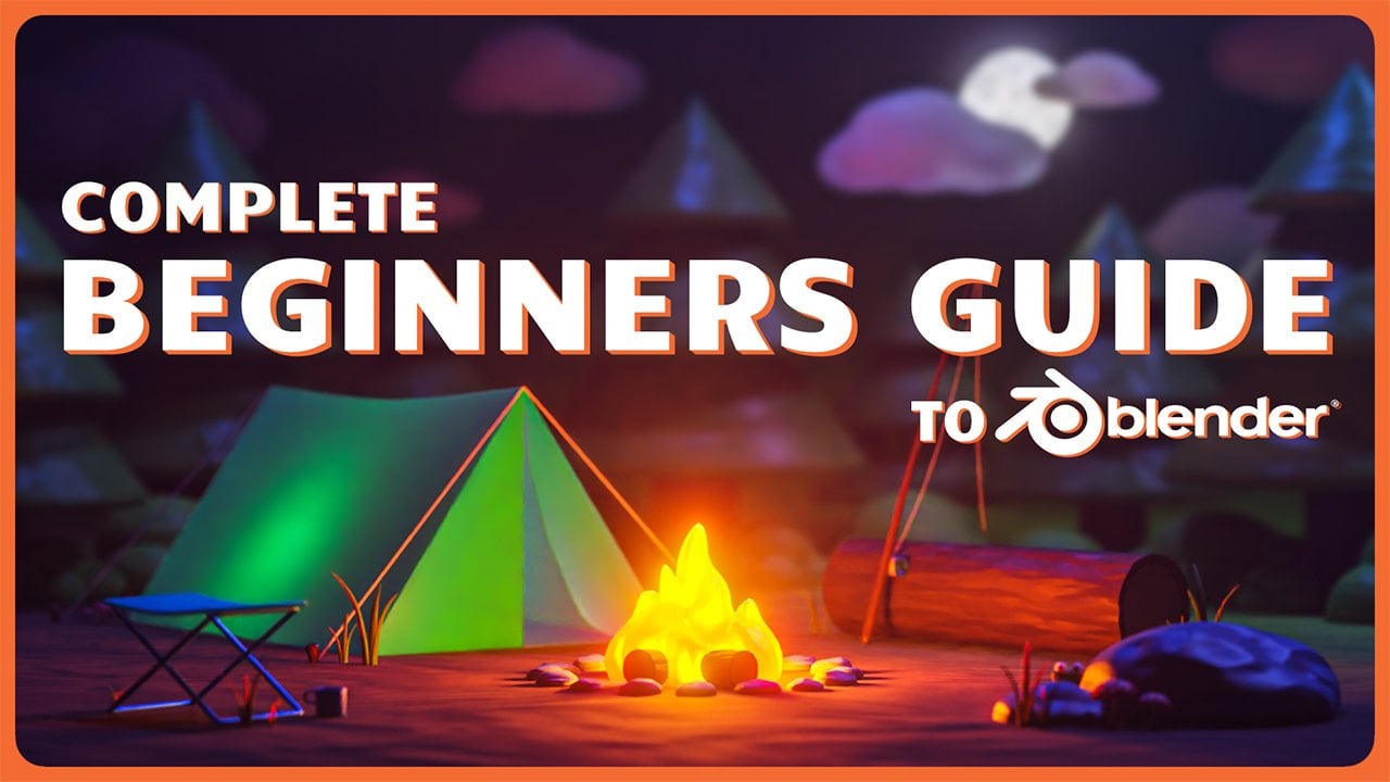
2. Setting Up the File: No In this lesson, we'll begin the class by
setting up our Blender file. Let's begin. If this is your first time
taking a Blender class, I'd highly recommend
you start with my complete beginners
guide to Blender first. This class was designed for the absolute beginner to Blender and three
D art in general. We cover every single
necessary topic in order to get you up to
speed and running and Blender. We'll accomplish this with
short and focused lessons that cover each topic from
a beginner's perspective, utilizing a well
organized starter file. We end the class with an
easy project where you set up and customize your
very own cozy campsite. With that out of the way, let's
continue with the lesson. While it might not seem
like it at first glance. This animation is actually
pretty simple and doesn't require too many
different objects or complex render settings. We're going to start the
class by getting the file set up so that we have some of the basic settings
out of the way, and then we can focus
on the more fun parts. Before doing anything
inside Blender, though, we do need to make sure that we have all the necessary files downloaded and unzipped on our computer in a logical
place that we can find later. I typically recommend
a folder somewhere on your desktop or
in your documents folder if you aren't
sure where to put them. Most important thing though,
is that you don't leave these files inside your
downloads folder as we don't want to forget that
the project is in there and then delete it a month from
now when we forgot about it. You can find all the
files that you'll need inside the project
resources for this class. After downloading the
class assets dot zip file and the Blender
cheatsheet dot zip file, we need to unzip the folders. On a Windows computer, you
can simply right click on the folder and choose
extract all like this. Just right click and
then choose extract all. If you're following
along on a Mac, however, you might need to use
a program such as the unarchiver if the default extract
doesn't work for you. Now I can choose extract
A and then I'll do that one more time over here
for the Blender cheat sheet. Then before we look at the class assets folder that
we just unzipped, I did want to point
out that we have a Blender cheat
sheet right here, which just has some key
binds on it that you might find useful if you're
not familiar with Blender. Feel free to use this throughout the class
if you'd like to. Otherwise, you can just
leave it in the folder. Is just an additional
supplement if you'd like to print it out and leave it on
your desk if you'd like to. But I won't be skipping
any of these keybind, so you don't worry
about having to print this out if
you don't want to. Now if we go back to
the class Assets folder that we just unzipped here, we'll see that it includes
a few different files that we'll need
throughout the class, as well as a final file that has the entire
project done for you. This file is primarily
meant just if you want to open up a
completed version of the project and check your work to the project that you're
working on during the class. Sometimes it helps to
see the entire project completed if you get
stuck at any point. With our files extracted, we're ready to move
on to Blender. This class is built
specifically with Blender 5.0 or newer in mind, which means if you're working
in Blender 4.5 or earlier, you're going to find it hard
to follow along with some of these steps as we'll be using things that are unique
to Blender 5.0. I highly recommend that you download Blender 5.0 or newer, whatever the current version is when you follow along
with this class. With that disclaimer
out of the way, once you open up Blender 5.0, we're going to choose
the general file type found here on the left side. Believe it or not,
we're actually going to be using all three of
these starting objects, including the default cube. Speaking of the default cube, let's get it set up and
ready for the next lesson. So first, make sure
you have the cube selected by just
left clicking on it, and then hit S to start
scaling and then type in 10 to scale it up ten times
larger than it was before. By default, it's
a two meter cube. Now that we've scaled
it up ten times, it's a 20 meter cube. You can also use your
mouse wheel now to zoom out a bit so you can
see the whole cube again. Let's also name this object something a bit
more descriptive. Over here in the outliner
list at the top right, we're going to double
click on the word cube and then rename it nebula, space, C, underscore foggy
FoggY then head answer. This name will make more sense
in the following lessons. Now let's head over to
the Render Properties tab and adjust some
settings there. We can find that down
here by clicking on this tab that looks like
the backside of a camera. First adjustment
will be to increase the quality of the volumes
in the scene slightly. Let's scroll down until we see the word volumes found here. Then we'll click on
this arrow to twirl down those settings
and then we'll change this resolution from one d
eight to instead one to four. You won't notice any changes in your scene as we haven't
added any volumes yet. Don't worry if you're unfamiliar
with the term volumes. We'll be explaining them
in the very next lesson. All you need to know is
that this setting improves the quality of the volumes by
increasing the resolution. Next, we're going to adjust the contrast of the render and the viewport by changing the
color management settings. We can find these settings
at the very bottom of this list down here where
it says color management. So we'll twirl those open now and then scroll down
a little further. Before we make any changes to these settings
over here, first, let's change this
viewport so we can see what the setting is
doing a little bit better. So we'll go over here
to the very top right, and we're going to click
this far right button here to switch the viewport
to the rendered mode. Will get us a bit
better look at how this color management
setting affects the image. Now again, back down here
at the bottom right, we're going to change
this look drop down. We're going to switch
it from none to very high contrast right
here on this list. You'll notice right away that
the viewport looks a lot darker and higher contrast
thanks to this adjustment. When you think about
it, outer space is really a realm of extremes, extreme darkness, extreme light, extreme hot, extreme cold. There's no room for a washed out and muted image in space. So we're going to set up
our color management to a very high setting to mimic
this extreme in our image. One last change in this
color management area is adjusting the exposure value. We can find that here just below the very high contrast setting. We'll click on this
and then type in 0.5 and then hit Enter. By increasing the exposure, we'll uniformly increase the brightness of
the entire scene. This is a useful tool
to make sure that you don't need to use
super high values for your lights and
materials to make sure everything is bright enough on the screen to be seen. With that last render
setting changed, now let's head over to the
output properties tab. We can find that here just
below the render properties, and it looks like a printer
printing out a photo. Let's scroll up to the very top so we can see the first setting. Be leaving the resolution for our animation at a
standard full HD, which is 1920 by 1080. I'd recommend that you do the same as you follow along for now as it makes it a bit easier for you to
match what I'm doing. This is something that you could change later on when we're done with the class for your own custom
animation, though. Next, we'll adjust
the frame rate found here 24-30 instead. This will add a few more
images per second of animation and it makes the
motion feel a bit smoother. Just below this, we're going
to change the end value 250-240 instead, just ten less. Will make our total animation
8 seconds long overall. This is because 30 frames per second times 8 seconds
equals to 40 frames. We'll adjust these
output settings down here in a later lesson. For now, you can leave
them as they are. Lastly, let's save our file, so Blender remembers all of these adjustments that we
made if we close the file. To do this, we can go
over here to file. Then choose Save or
you can hit Controls. Now in this new option window, navigate to the
location that you saved all the class assets we
downloaded and unzipped earlier. This will make the
file easier to find if you lose
it in the future. Down here at the bottom
center, we can name the file. Let's name it Black Hole, nebula NEB ULA, underscore
animation, underscore 01. Or you can name it
something else as long as you know what the
file is in the future. Just make sure that you don't
leave the file untitled and then not know what it is a month from now if
you want to come back. Underscore 01 we added
to the end allows you to create new versions of the file without overwriting
the old ones. All you need to do
is save the file again and increase
the number by one, such as underscore 02 to differentiate it from
the previous versions. Once you have your
name set up down here, we can just click Save
Blender File. All right. That's the last of the
preliminary changes that we needed to make before we
start on the fun stuff. And the next lesson,
we'll start creating the first nebula material for our animation. I'll
see you there.
3. Material: Foggy Nebula: In this lesson,
we'll start creating the first nebula material
for our animation. Let's begin. Before we
begin working in our file, let's do a quick rundown of
what volumes are in Blender. This is an important concept, as the nebula we create will be entirely
built out of volumes. Without getting into all
the technical aspects, you can think of volumes
within Blender as fog. Fog on its own has
a visual presence. It becomes really
obvious, though, when we see it illuminated
by a light source. While the nebula
isn't physically similar to the fog that
we find here on Earth, it does bear a similar
visual appearance if you imagine it as
being fog in space, being illuminated
by colorful stars. We'll be using this
visual similarity to mimic a colorful
nebula in Blender, utilizing volumes,
essentially just fog and colorful lights. Another difference
between volumes and a typical three D
material is that they inhabit the space inside of an object rather than
just its surface. A typical material such
as brick or fabric, sits on the surface of
the model and leaves the inside of the model
essentially a hollow shell. Volumes, however, have
an opposite approach where they will instead
fill the object with fog while making the
surface of the object effectively invisible so you
can see the fog within it. This is why we only
need a simple cube to apply our nebula
materials to, as we don't really need to have a complex shape to
fill with this fog. We just need a container
for it, so to speak. The camera within our scene
will look through this cube of fog to replicate the
look of a cloudy nebula. With that quick explainer
out of the way, let's get to making
our first material. First, we're going to swap to the shading workspace
found here at the top. Now at the top right
of this viewport, we're going to go
over here and select the far right button found here to turn it to
the rendered mode. We can also zoom
out this viewport a little bit so we can see
the entire cube. All right. Now we're ready to begin
creating the material. One thing to note is,
I won't be covering every single aspect of creating
materials in this lesson. However, you should
be able to follow along just fine if
you're unfamiliar. I won't be skipping any steps
during my explanations. I just won't be going
over every single detail of every setting as we go. I will explain any
settings that we use, though, so don't
worry about that. If you'd like to learn
more about the ins and outs of material
creation and Blender, I'd highly recommend my magic of materials class
found on Skillshare. Over all the basics of material
creation and Blender from a complete beginner's
perspective while texturing a premade
wizard study file. With that out of the
way, let's begin. Our first step is to select the cube up here
in the viewport, just by of clicking on it. You should see an
orange highlight around it to let you know
that you have it selected. Now down here in the
bottom viewport, you can see the word material
here at the top center, and that's the name
of this material. We're going to rename it to
something a bit more obvious. We're going to call this nebula, space, foggy, just to give it a name that's a bit more accurate to
what it actually is. Now we can navigate around in this bottom editor by
using our mouse wheel. We can scroll it up and down
to zoom in and out and we can also click it in to slide
the view back and forth. Our first step here is to select this principled BSDF node, this large green square, and then we're just
going to delete it. We won't need it,
so we can just hit the delete button to
remove this node. We're not making a
normal material, so that node won't
serve us any purpose. Now with our mouse hovering
over this bottom editor, we're going to hit Shift and
A to bring up the ad menu. Then we'll click
Search. This time, we'll type in volume VOL. And then once you type
in those three letters, you should start
seeing a list below. We want to choose
principled volume here, the third option from
the top in my case. So we'll just click
this, drag it over here and place it to the left
of this material output. Now we're going to
click and drag on this volume green dot next to
the word here on the right, and then we'll drag it
down here to connect it to the volume here on
the material output. And just like that, we can
already see that the cube is now essentially made
of a really thick fog. We can even see this light
that's inside this cube, illuminating it from the inside. Now that we have our basic
volume material set up, ready to begin customizing it. First step is to
adjust the color of the fog and make it white. Right now, it's set
to a very light gray, but it'll react to
the light a little bit better if we make
it completely white. We can go down here to this
principled volume node. Click on this block of color
next to the word color, and then we can make it pure
white by dragging this value slider all the way over to the right to make it pure white. Or we could also use
this slider here on the top right and slide
it up to the very top. The next setting that we'll
adjust is the density. Here on the third
option below the color. The density does exactly
what it sounds like. It changes the density or
how opaque the fog is. You notice if you
just click and drag this density slider to the
left and make it lower, that the fog becomes much, much thinner and the edges of the fog become harder
to distinguish. We won't be using just a simple number for
our nebula, though, as you can actually use an image to control the density instead. This will allow us
to make the fog cloudy and swirly just like a. First step is to
add two new nodes. We're going to add a noise
texture and a color ramp. So first, over here
on the bottom left, we'll hit Shift
and A to bring up our ad menu again, click Search. We'll type in color, COLOR, space R to start the word ramp, and then we're going to choose
color ramp from this list. We'll place that
here to the left. One more time, shift
and A, search. This time, we'll
type in noise NOIs and choose noise texture. Make sure you choose
noise texture and not white noise texturing as those
are two different things. So we're going to choose
just noise texture and then place that here to
the left of the color ramp. Now let's connect
these nodes together. So first, we'll drag
from the color socket here to the bottom
of the color ramp, attaching it to the factor, and then we're
going to drag from color here on the
color ramp down onto the density slider down here to replace that number
instead with this image. The moment, it's a pretty
subtle difference, but we can start to
see some variation in the thickness of the
fog in certain areas. This has started
to give this cube a bit of a soft, cloudy look. We can now see areas
on this cube where the fog is a bit thicker
and a bit thinner, depending on where
you look on the cube. This has started to give
us a bit of a swirly, cloudy look that we're after. We need to make some
adjustments to these new nodes that we just added before
we see a strong effect, though. So let's start that now. We're going to adjust
the color ramp first as it'll make these changes to
the noise texture a bit more. The way these nodes down
here work is that nodes pass their attributes from
the left towards the right. So we can adjust the look of this noise texture
here on the left by first passing it through this color ramp node to
affect its properties. Then we'll output these
new properties to the density slider over here
on the principled volume. That's how pretty much
all of these nodes work. They move from left to right, and then you add effects between them to change their look. Let's zoom into this color ramp, which we'll be adjusting first. Our goal with the color
ramp is to increase the contrast of the noise
texture to the left. The way this density
attribute works, the way this density property
here works when we're using an image is pure black on the
image will be zero density, which means it's
perfectly see through, and pure white will be completely opaque,
so full density. Any gray value in between will be somewhere
in a value 0-1. By increasing the contrast of the noise texture using this color ramp will
make the cloudiness of the fog more obvious due to a larger gap between the black and the white
parts of the texture. We'll have more areas
that are really opaque and more
areas that are also really making the whole effect a little less subtle
and more punchy. To do this, we
simply need to move the black slider on
the left to the right. And as we do this, we'll be increasing the amount of
black in this texture. So we'll see as we move
it to the right that this cloudiness becomes
a lot more apparent. And that's because we're
adding more black and more white to the texture and
limiting the amount of grays. So to adjust the
specific slider, you have the option to either slide it back and forth like this on this bar or we can
use these controls down here. So when it's set to zero,
that's the leftmost slider. And if we change
it to one, it'll select the right most slider. So instead, we're going
to set it back to zero, so we're selecting
the the position, we can actually manually type
in a number that we want. So we'll type in 0.4, nine, and then hit Enter. This will move this black slider almost exactly in the middle, just a little bit to
the left of middle. We can now see that this
cloudy texture of the fog is a lot more obvious just
with this simple change. Now let's move to
the noise texture and begin adjusting
these settings. First go through and
change a bunch of these settings and then I'll explain what we actually did. First, we'll set
the detail to 2.5, and then enter, we'll set the roughness to
one, the lacinarty. We're going to set this to 9.9, and then the distortion
at the very bottom, we'll set this to five. These changes that
we made have given the noise texture a swirly,
almost gaseous look. This is perfect for our nebula. If you're unfamiliar with the sliders that we just adjusted, here's a really
simplified rundown. The scale value changes the
size of the noise pattern, so it makes it either
bigger or smaller. The detail slider adjusts how complex the
noise pattern is. Can think of this as more or
less swirls in this case. The roughness slider adjust how grainy the noise pattern is. A very low roughness value
will make very smooth swirls, whereas a very high
roughness value in our case, will make very tight and defined somewhat noisy or
statiy looking swirls. The acinarty slider adjusts a secondary smaller scale
for the noise pattern. And then lastly, the distortion slider stretches and distorts the noise pattern into
the swirls that we see here rather than the
default cloudy look. That's why we're seeing
a lot of these sort of stretched out lines
of highlights and shadows within this fog rather than just puffy
circular cloudy shapes. We need to add a few more nodes. These nodes will be
meant exclusively for stretching and distorting this basic swirly fog pattern into something a bit more
interesting and nebula like. We'll start by adding
all three nodes, and then we'll hook them up before adjusting their settings. So first let's zoom
out a little bit. And then over here to the
left of the noise texture, we're going to hit
Shift and A, search, and then type in VOR O and
choose Voronoi texture. Place that to the
left. Then shift in A, search, type in color ramp, choose color ramp from the list, place that to the left, and then one last time
shift in A, search, and we'll type in noise again
and choose noise texture, and then place that
here to the left. Now we can go through here and connect all these
nodes together. So first, we'll drag from the color socket on the noise texture that we
just added to the left. Put that down here
into the factor at the bottom of
this color ramp, then we'll go from the
color socket here and drag it down to the
vector on this Voronois. So we're going to drag it to
this purple one down here. And then we're going
to drag from position, this purple socket here to the vector on the noise texture that we just adjusted earlier. As soon as we connect
this last node, we can already see
that we've made some adjustments to
the look of this fog. Cloudy look that we had before is a bit more
subtle than it was. But it'll be back after we make just a few more adjustments
to these nodes. The main takeaway here from these new nodes is that we'll
be using other textures to dictate how the
original noise texture is distorted and displayed
within this cube. So we're using these three
nodes here to stretch and distort the look of this
original noise texture. Now let's begin adjusting
these new nodes. So we'll zoom in first
to this Voronoi texture. We're going to set
the scale to two, the detail to 15, the roughness to 0.5, six, the lacinarty to ten. We'll leave the
randomness set to one. These settings that we
changed here change virtually the exact
same things on this Voronoi texture as they did on this
first noise texture. The only difference
between the Voronoi and the noise texture is the look of the pattern that
they're adjusting. Voronoi has a
cellular appearance, while noise has a
cloudy appearance. As a quick tip
throughout this class, if you don't notice
the changes you're making displayed in this
three D viewport above, give it a moment and then
use your mouse wheel to zoom in and out to
update the viewport, or you can simply click in your middle mouse button and
then pan it back and forth. Update the view as
well. This will force Blender to
update the view and show your new adjustments
if it's taking a little bit too much time
to show them by default. Now let's move to
the color ramp to the left of this Vornoi texture. We're only going to be adjusting the white slider here
on the right side. So first, we're going
to set this slider down here to one so we select
the right slider, and then we're going to
type in for the position 0.997 and then had enter. Color ramp has the
exact same purpose as the previous color ramp. It's meant to
increase the contrast of the texture to
the left of it, in this case, the noise texture. Due to this color
ramp's location within this material network, any adjustment we make
to this color ramp is a lot more sensitive
than the first one. So we only need to make
this really tiny adjustment here to have an effect
on this left image. Then lastly, let's adjust this noise texture
here on the far left. So first, we're going
to switch it from three D to four D instead, and then we'll move
down this list. We'll set the scale to one. We'll set the detail to 15, the roughness to one, the lacinarty to 0.5, and then the distortion to ten. The main difference between
this noise texture and the previous one is
that we switched it from three D to four D instead. The four D version
of this texture adds a new slider called
W here at the top. We won't be adjusting
this slider just yet, but this is the slider that
will allow us to animate the Nebula's movement
later on in this class. After all of these adjustments, we can now see the final
effect of this nebula. So we can zoom in here
and then spin around our view to get a better
look at what this did. We have areas of dense fog with swirl patterns
in it that also has voids in the fog where it's significantly thinner
than other places. So anywhere where
you see it's darker, that means that it actually
has less fog in that area. That we have the look of
the fog that we want, we have one last change to make before we move on to the
lighting in the next lesson. While the fog looks
pretty cool right now, this isn't the only fog that we're going to
have in our scene. So we need to make sure that
it's a lot more subtle. This will ensure
that when we have all three layers of
our nebula created, they won't completely block out all the light
within the scene. We're going to lower
the overall density of this fog using a math node on the far right
side of the system. So down here in the bottom,
we're going to zoom. Move over here to
the right and then we'll hit Shift and A. Go to search, and
we'll type in math, MATH, and choose
math from the top. Now if we hover over
the line connecting this color ramp to the
principled volume node, we can click and place it here, and it will automatically
connect it for us as well as space out these
nodes to make room for it. Now let's zoom in down
here to this node, and then we can
begin adjusting it. First, we're going
to switch it from add to multiply instead, and then we're going to
adjust this value down here to change which number
it's being multiplied. We left this set to one, we wouldn't have any adjustment to the look of the fog because one times anything is
just the original thing. However, if we want to lower the opacity of this and
make it more subtle, we need to multiply it by
a smaller number than one. In our case, we're
going to set it to 0.03 to make this fog significantly more subtle
than it was before. Now if we zoom out and
pan around this cube, you can see that we can
still see the fog but it's only really located
around this light source. Eventually, once we
add all of our lights, this fog will be a lot more
visible than it is now, but it's important that we lower its overall opacity so that when we have two other nebula laying directly on top of it, they're not all competing and completely blocking
out the light. With our first nebula
material finished, we're ready to move on
to some basic lighting. In the next lesson, we'll add some basic colorful lighting to our world. I'll
see you there.
4. Basic Lighting: In this lesson, we'll add some basic colorful lighting
to our world. Let's begin. A large portion of the colors in our animation will be
thanks to the lighting, rather than the color
of the nebula itself. This makes the
scene's color palette really customizable as all you need to do is
adjust the lighting to change the mood
of your animation. To start with,
we'll swap back to the layout workspace if
you're not there already. You can find it over
here on the top left. Now let's switch
this view port to the rendered mode found over
here on the right side. Our first step is going
to be removing all of the ambient lighting
that we have from the world,
at least for now. If you haven't noticed already, Blender has a soft
ambient lighting across the entire
world by default. This is useful for making sure your scene isn't
completely dark, but it doesn't do your
lighting any favors as it tends to make everything
look really washed out. By removing this
lighting entirely, we ensure that the only light in the scene is what
we placed manually. This gives us a better idea where our highlights and shadows are and what we need to add
more light to or less light. To remove this lighting,
we're going to head over to the World Properties tab
found here on the right side. It looks a bit like
a globe in red. Now over here on the right
underneath the surface, we're going to choose color, andn we'll just click on this color block
here to the right. We're going to take
this value slider here and drag it all the way to
the left and set it to zero. We're going to leave this
strength set to one and change the color to black
instead to remove the lighting. This strength will be valuable later on when we
add a new texture. But as far as Blender
is concerned, if we set the color of
the light to black, it's essentially as if we set
the light to zero anyway. You'll notice that
the viewport is much darker now thanks to this
missing ambient light, but the grid on the
viewport is also a lot more distracting on
this dark background. Luckily, this is a pretty
easy thing to turn off. So we can go over here
to the top right, and we're going to click
on this drop down menu here next to the viewport
overlays button. Now we're going to go over
here and turn off floor. So we'll just uncheck
this box here, and that will remove this grid, but it'll still leave
behind these axes to help orient
ourselves in the view. All right, now it's
time for some lighting. We're going to
start by adjusting the light that we already
have in the scene. Then we'll add two more lights. So first, we'll go
over here and just select the light from the
list in the top right. Then we can go down to
this light bulb icon for the object data properties. And this is where we can adjust the settings
for this light. As I mentioned before, the
lighting in the scene is what primarily dictates the
colors in our animation. I'll be walking you through the colors that I thought
looked nice together. But if you really want to
change the colors, feel free. You want to follow along
with me now during the class and then change
them later after the class, that also works fine too. We're going to make
this first light a vibrant pink color. To do this, we'll
just go over here to this color block and then
click on this white box. You can adjust the settings. You have a few different
ways you can adjust the color of a light or any
of these colors, really. So if you wanted to just pick a color that you
like in general, you can use this color wheel
at the top by clicking and dragging this circle and then moving it anywhere on this
wheel that you'd like. So you can find a color that
you like and then adjust the darkness over here to
make it darker or lighter. Or you have the option
to manually type in these numbers if you know the
exact value that you want. In my case, I know the
exact pink that I want, so I'm just going to
type in values here. So for the hue, I'm going
to set that to 0.84. The saturation will
set that to 0.2, six, and then I'll leave the value set to one to make
it as bright as possible. Now we have our color chosen, so we can zoom in
here to see what the color looks like
here inside the nebula. We won't need to
adjust the power or the brightness of this light, as there will be plenty
of other illumination in the scene when we finish
setting out the other lights. So for now, we'll just
leave this set to 1,000, which is the default value. Then lastly, we're going
to name this light, so it's more obvious what it is. So we'll just
double click on the word light and then hit space, put a dash, another space, and we'll name it pink. That way we know what
color this light is without having to select it
to see what color it is. We have our color
set up, we're also going to change the
position of this light. As usual, this placement
isn't mandatory, but I would recommend
that you follow along with me for the
rest of this class. Then you can customize
it after we finished. So with our light
still selected, we're going to hover over
this view port and then hit N to bring up
this side menu. Now we can switch to the item
tab found here at the top. Then this will allow us to
manually type in values. We'll just go down the line here for the X, the Y, and the Z. For the X, we'll type
in negative 1.5. For the Y, we'll type in 5.3, and then for the Z,
we'll type in 4.2. As usual, if it seems
like your viewport didn't update properly after
typing in these new values, you can just mouse around in your viewport a little
bit and move the view, and it should update the view. Now that this light is placed, we can duplicate it and
choose a new color. So first, make sure you have
the light still selected, then hit Shift and D at the same time to
duplicate the light. We can just move it
over here to the left for now and place it away
anywhere you'd like. So I'll just place mine here. For this new light,
we're going to change it to a warm orange color. So again, we'll go over here to the right side with this
new light selected. We'll click on the
color and then we'll change the hue to 0.05, and then the saturation we'll
set to 0.63, then it enter. Again, just like the last light, we won't be adjusting the power. We will, however,
change the name from light pink to light
orange instead. Let's get this new orange
light into position. In this side menu again, we'll change the X
to negative 80.75, the Y to negative 1.7, and then the Z to two. And then we can just
wiggle this view around a little bit
to have it update. Alright, so we have just
one more light to add. With this orange light selected, we'll hit Shift and D to make a duplicate and then just move it down here to
the bottom center. And we're going to
make this new light a bluish green color. So we'll go over here to
the color bar, click this, set the hue to 0.42 and
the saturation to 0.6. We'll leave the power as it is, and then we'll change the
name to light green instead. Then lastly, we'll get it
placed in the right location. We'll set the X to negative 1.5, the Y to 1.75, and the Z to negative 1.5. Then if we spin
around in our view, we can now see the colors all
on their correct locations. Assuming you follow along with
my colors and placements, you should notice
that each light has its own distinct area of influence or it's
showing its specific color. But there's also
these areas here in the middle where these colors
kind of blend together. So we have an area
here where the green blends into the orange. The orange into the pink. And then there's an area
here in the center where they all kind of blend
together in general. Our last task for this
lesson will be to customize our viewport slightly and get
our camera set up in place. First, we're going to
add a second viewport to this layout workspace. This will allow us to
have a view of our world, as well as a view
through the camera. To add this second viewport, we're going to move
our mouse up here to the very top right
of this viewport. So we can see as we get
to the corner here, it turns into a plus sign. Once it turns into a plus sign, we can click and drag it and
move it here to the left, and eventually it'll
snap here to the center. So we can see here it'll
kind of click to the middle. Gets to the center, we can
just let go of the click, and that'll split this view. Now let's hover over
this left viewport and hit hen on our keyboard
to hide the side menu. And then we're going
to click on this small camera icon here in the left viewport to force our view to be looking
through this camera. This is the camera that started in our scene over
here on the list. In the right viewport,
we're going to switch this view to the wireframe mode. This will make objects
in our scene a lot more visible
inside the nebula. However, you won't
likely be able to see the viewport shading buttons anymore after we've
split this view. To reveal these buttons again, you'll have to hover
your mouse over top of this option bar
here at the top and then click in your
middle mouse button. So click in the mouse wheel, and that allows you to drag this bar and slide
it to the left. After doing that,
you'll see that now you've revealed
these buttons again. So to set it to the
wireframe mode, we're going to click this
far left button here, which is a circle with
these lines across it. This converts all the objects in the scene into just
their wireframe, which is kind of like showing
the skeleton of the object. Now we can see right
through this cube, and we can see the position of these lights as well as the
camera within the scene. Our last step is to move
the camera into position. So first, select
your camera over here on the right
side from this list, and then we're going to adjust
it here in this side menu. So first, we'll set
up the location. For the X, we'll set
it to negative 12.25. For the Y, we'll set
that to negative 7.7, and then for the Z,
we'll set that to 6.7. Can ignore the
rotation values below as we'll be overriding
them in just a moment. We can see in both of these
viewports that our camera is kind of just pointing out into space and not really
seeing anything. That's because we'll be using a different method to rotate our camera rather than just typing in the value over here. To start, let's add
a new empty object. Over here in the right viewport, we're going to hit Shift and
A to bring up the ad menu. Then we can go down
here to empty and we'll choose plain axis
here at the very top. Going to tell our
camera to always face this new empty object
that we just added, regardless of where we move it. First, let's rename
this empty object so we don't forget
what it's for. Just double click this
and then we'll hit space dash camera, target. Now let's change where
this empty object is located within the world. We'll do that over
here on the side menu. We'll set the location
to negative 0.5, the Y to 5.8, and then the Z to 0.5. All that's left is
to tell our camera to always face
this empty object. So first, we need to
select our camera. Then we're going to go down
here to this constraints tab, which is this blue icon here, which looks like two wheels
with a belt around it. Now we can go up here and
click Add Object Constraint. And we're going to choose
the option Track two, which is in this third column
here at the very bottom. Now all we need to do is tell
our camera what to target. So we're just going to click on this word here where
it says objects in the target options
and then choose from this list empty camera
target. And that's it. We'll see right away that
this camera now is forced to look at this empty axis
that we added earlier. Can also see this updated
here in this left view. And then you'll notice just
for the sake of example here, you don't need to follow along, but if I select my camera
and then I move it around, the camera always points
towards this point in space. Doesn't matter where I move it, it's always forced to
look at that object. Same is true if I select this camera target and
I move that around. Now the camera will
stay in place, but it's forced to look at
wherever this object moves. One final change that
we need to make for a later lesson is to adjust
the clip range of our camera. So first, make sure you
have the camera selected. Go down here to the
camera properties, which is this camera icon, and then we'll adjust
the clip settings. And we're going to
set the end clip to 1,000 meters instead of
100, which is the default. Will extend the clip range from just 100 meters all the
way out to 1,000 meters. This ensures that we don't cut off any of our hard work later on just because the camera doesn't have the
ability to display it. This means the camera can
now see objects up to 1,000 meters away rather than
just 100 meters away. And that's it for this lesson. Now it's time to get the remaining nebula
materials created. In the next lesson, we'll create the wispy nebula material.
I'll see you there.
5. Material: Wispy Nebula: In this lesson, we'll create the wispy nebula
material. Let's begin. It's time to make the
nebula look a bit more complex by adding a new nebula material on
top of the first one. This process will be largely similar to the last material, using most of the
same nodes with different values applied
to them to get a new look. Let's swap over to the shading workspace if you're
not there already. Find that here at the very top. Now we can set this
top view port to the rendered mode by clicking this button
here on the far right. And we also want to click this
button here to switch into the camera view so
we can see through the camera that we placed at
the end of the last lesson. Alright, now it's time
to make the new nebula. First, over here on the
right side in this list, we're going to scroll
down until we see nebula, C, foggy, and we're going
to select that object. Now we can move our mouse over here on top of the top viewport, and then we'll hit Shift and D at the same time to
duplicate this object. And then we're going
to right click on our mouse to place it directly
on top of the other one. We don't want them to be
offset from each other. We want them to be directly
on top of each other. And by right clicking,
after duplicating, we're telling Blender to
just drop this object directly on top of where
the old original was. Now before we do anything else, let's go back over
here to this list. And we're going to
rename this new object, the one that has the
0.001 at the end of it. We'll double click on this name, change the letter to nebula B and then change
it from foggy to wispy, WISPY and then head enter. Now that we've duplicated
the nebula object, the next really
important step is to duplicate the
material as well. This is a necessary step as this new nebula object uses the exact same material
as the first object. Make any changes to
this second object, it's also going to change
the first object as well, which is why we need to make two different versions
of this material. So first, make sure you have this nebula B wispy object selected here on the right side. Now we can go down here
to the bottom view port where it says nebula foggy. And we're going to click on this little two next to the name. This two next to this
name tells us that this exact material is applied to two different
objects in the scene. However, if we
click this number, we'll see that
after clicking it, the number disappears,
but also the name of this material has changed
and it's been made unique. Blender has added this 0.001 to the end of the name to let us know that this is a
separate material from the original nebula
foggy material. Now we can rename this material. So nebula wispy instead, WIS PY, and then ad enter. Now we have two different
nebula objects, and we also have two
different nebula materials. So affecting this one
won't affect the original. As I mentioned before,
this new nebula material will be very similar
to the first one, just with different
values for the settings. It's actually so similar
that we'll just be adjusting this new duplicated
material rather than starting from scratch
to save ourselves some time. Let's start by
removing the only node that we won't need
from this material. We're going to select
this noise texture here, the one directly
next to the Vinoy. We can just hit
delete to remove it. This new material
won't need this node, so we can just get
rid of it for now. We need to reconnect these
nodes back to the system. First, let's drag
select over the top of these three nodes and move them over to the right to
close up this gap. Now we can zoom in a
bit and then this time, we're going to connect
from the distance on this Voronoi down
here to the factor. We'll notice right
now that the nebula doesn't look all that
great at the moment, that's going to change
in a few minutes when we have all the
settings dialed. Start on the right
side of this material and then work our way left. We'll start with the principled volume here on the far right. Our only change here is
going to be the color. We'll be making this wispy
nebula a little bit pink. This won't make the
entire scene pink. I'll just add a little
bit of warmth to the world and make this nebula feel a bit different
from the first. To do this, we'll just select on this color block here on the
top next to the word color, and we're going to
set the saturation 2.24, and then hit Enter. With that small change here, we can now see we have a light pink color for this nebula. Now working our way left, we're going to work
on this multiply. Going to set this
value to 0.08 instead. This tebula is going to have the most
interesting pattern. So we're going to increase
its opacity by making the math node value a little bit higher
than the first one. Now we can move to
the left over here to the color ramp with this
black slider selected, also set to zero down
here on the bottom. Going to change the
position to 0.36. This change won't make a
whole lot of difference yet, but it will help see the
future changes by making the contrast of the texture
a little less intense. Now before we make
any more adjustments, let's hide the influence
of the last two nodes. So we can zoom out a bit. We're going to drag
select over top of these two nodes
here on the far left, and then we can hit M on our keyboard to
mute these nodes, making them not affect
this overall material, but not having to
delete them either, because we will be
using them later. Now let's adjust
this Bornoi texture. As usual, we'll go through here, change the settings, and then we'll go back and
explain what we did. First, we'll check on the
normalized checkbox here. We'll set the scale to five, the roughness to 0.04, the lacinarty to zero, and then we'll leave the
randomness set to one. The main difference between
this finoidt exture and the previous nebula material is that we checked on
this normalized box. This normalized checkbox forces the values below to produce a texture that outputs a black and white image
clamped to zero to one. In simple terms, this
checkbox typically makes the contrast of a texture
significantly higher. This will work well for our
wispy nebula material as we want defined bands of
fog in this material, making the wisps
that we're after. Now we can drag select over these nodes again if you
have them deselected, we're going to hit M
to unmute these nodes. We can adjust this color ramp. So our first change is going to be changing the one slider, in this case, white
to a new position. We're going to set that to
0.61 and then it enter, and then we're going to
set it to the zero slider or the black slider, and we'll set this
position to 0.066. Now, this color
ramp has increased the contrast of this noise
texture to the left. Now, lastly, let's adjust
this noise texture. So first, we're
going to uncheck, normalize on this texture. Now we can scroll down and
we'll set the scale to three, the detail to two, we'll leave the
ruspiness set to one, the lacinarty set to 2.1, and then the
distortion set to two. Again, we changed the
normalized checkbox, but this time we unchecked it. In this case,
unchecking this box has the opposite
effect of the Voronoi. Unchecking this
checkbox actually increases the contrast
of our noise texture, making the effect stronger. And now with this
final change done, we can see the overall
effect of our wispy nebula. We're getting some really
great wispy tendrils of fog have a lot of visual texture and
interest to our image. We also learned how
utilizing our past work can save us a lot of time and effort when creating
similar materials. This material followed
the same logic as the previous nebula, so it made sense to
use that as our base. It's simply a volume node
with a texture plugged into the density slider here to control its density and give
it a more cloudy appearance. And then that original
texture, in this case, Vornoi texture is
distorted and warped into these thin and wispy
lines that resemble the hot ashes tendrils of
a nebula in deep space. We have just one more nebula material to create
for our scene. In the next lesson,
we'll finish creating the nebula materials with the cloudy nebula.
See you there.
6. Material: Cloudy Nebula: In this lesson, we'll
finish creating the nebula materials with the
cloudy nebula. Let's begin. As with the last material, this process will be
largely the same thing with different
values and settings. So let's jump right in. First, swap to the
shading workspace if you're not there already
found here at the top. Next, make sure that this
top view port is set to the rendered mode by clicking this button here
on the far right. Then lastly, make sure
you're seeing through the camera view by clicking on this camera button found here. It's time to make
our nebula object. First, make sure you
have the nebula B object selected here on the
list on the right. Now in this top viewport, mouse over the viewport
and then hit Shift and D at the same time
to begin duplicating. Then we can right
click our mouse to place it directly on
top of the original. Let's rename this new object
that we just created to nebula A cloudy CLOUDY. Just like the last lesson, we do need to duplicate this material. So we can go down here where
we see the number two. We're going to click on that
to duplicate the material, and then we'll change
this name from wispy to cloudy and then enter. And now it's time to work
on our new material. This nebula is going
to be a bit less complex than the previous
two nebula materials. So we can start off by deleting
these far to left nodes. So we can just drag
select over these two then hit Delete
to remove them. Now we can begin adjusting these nodes from right to left. We'll start over here with
the principled volume. Our first change will be
to adjust this color. We can click on
this color block. We'll set this hue to 0.52 and then set the saturation
all the way up to one. Create this really
bright blue color. Nebula material won't be quite as prevalent
as the previous two. So let's give it a really
bright accent color so that it stands out in the
areas where you can see it. Now we can move over
here to the multiply, and we're going to set this
value to 0.1 and then enter. For the same reason as
the brighter color, we're going to increase
the density of this cloudy nebula slightly as it won't take up
as much of the view, so we can allow it to
be a bit more opaque. Moving left, we'll start
adjusting the color ramp. So first, we'll adjust this
zero slider or the black one. We're going to set
the position to 0.41. And now we can select the
one slider or the white. We're going to set the position
to 0.56 and then enter. Due to these sliders now
being so close to each other, we're significantly
increasing the contrast of the texture connected to it. In this case, the
Voronoi texture. This means we're going
to have areas of strong density such as this, while also having areas
where it's almost completely invisible like this area here
in the top right corner. Works pretty well for our more cloudy appearance
that we're going for. Now let's adjust
the Vornoi texture over here on the far left. We'll be going through
quite a few settings here. First, let's go through
all the changes and then we'll go back
and explain what we did. Just a word of caution,
this node tends to slow down the computer for a moment as you're adjusting
the settings. If you're worried about
this, you can either give it a few moments between
typing in each value or you can swap the top view
port into the solid view while we work and
make our changes and then swap back
once you're done. If you wanted to switch
to the solid view, you would just click
this button here, this fully filled in circle. It will appear gray while
you make these adjustments, and then you can swap back
to see the full effect. Going to leave mine
set to rendered, and then I'll just edit out
anytime where it slows down. So our first change is
going to be setting this to four D up
here at the top. Now we'll switch it from
F one to smooth F one. Then we'll change it
from Euclidean to Minkowski at the
bottom of this list. Now we'll set the scale to 6.48, the detail to 2.2, the roughness to 0.46, the lacinarty to 5.8, the smoothness to zero, and then finally,
the exponent to 2.7. Now we can see the final
effect of these changes here with these soft puffy
blue clouds in space. The softness of these clouds
and the blue axin color is a nice balance to the
sharper and warmer look of the overall previous nebula. Before we continue, though, let's touch on some
of the new settings in this forenoid texture. I won't cover any of the
settings that we've already previously explained in other lessons to save
ourselves some time. So the first important
change is up here, and it's the smooth F one. This drop down shows us
the feature outputs. Each of the options in this
list changes the look of the Varanoi pattern and changes the options that you have
available to you to adjust. F one is to default when you create a brand
new Voronoi texture. The smooth F one
setting that we chose simply adds this smoothness slider that we have down here. This allows you to
control the smoothness of the edges between black
and white in the texture. For our purposes, we set this to zero to make the edges as sharp as possible to give our clouds a somewhat
defined edge. If you wanted softer clouds
with less defined edges, you could increase this
smoothness value to do so. Just below this smooth F one, have the Minkowski setting
that we chose here, which is part of the
distance metric settings. This drop down menu features a few different options that change the way the
texture is generated. Generally, you can
just pick the option that provides the best
look for your material. But one important
thing to note is that the Minkowski option
that we chose is essentially a
universal option that has all the other
options baked into it. What I mean by this is that
the Minkowski options allow us to adjust the exponent slider down here near the bottom. Each of these other options
here in this list has a hidden version
of this exponent slider that you
just can't change. This means for us is that we can swap Tim and kowski
and then type in a specific number to achieve the identical look of each
of these other options, or we can have
something in between. For an example, the
exponent value of two is identical to
the Euclidean option, which is the default when
you create this node, and an exponent value of one is identical to the Manhattan
option just below it. A value of 2.7, which
is what we typed in, is somewhere between
the Euclidean and the Chebyshev options, but it's closer to Euclidean. You'll notice that if you
adjust this exponent value, it makes the clouds
dissipate or expand. So if we type in three, we'll see that the
clouds are a bit bigger. Or if we type in two, we'll see that the clouds
get a lot smaller. For us, we're going
to set this back to 2.7, and that's it. Our last nebula is complete. It's really interesting
to see how each of these different approaches
to a nebula material combine together and
complement each other in not only their visual texture,
but also their colors. In the next lesson, we'll add distant stars beyond our
nebula. I'll see you there.
7. Adding Stars: Yeah. In this lesson, we'll add distant stars
beyond our nebula. Let's begin. Let's take a quick break from
creating materials and instead focus on adding some randomized stars
in the distance. We'll be learning
a little bit about a new and improved
array modifier as we make these
new stars as well. First up, we'll want to be in the layout workspace for the
first part of this lesson. We can find the layout
workspace here at the top left. Now let's set our
left viewport to the rendered view by clicking this button here
on the far right. As a reminder, if you can't see these render mode buttons, you likely need to click in your middle mouse button
on this option bar here at the top and slide it to the side so that you
can see these buttons. Right viewport should be set to the wireframe mode found
here on the far left, just to make sure that
we have a clean view. Okay. So now let's create
the first star that we'll use as a base for the rest of the
stars in the scene. In our right viewport, we're going to hit Shift and
A to bring our ad menu up. Then we'll go to mesh, and we'll choose ICO
sphere found here. Before clicking
anywhere or doing anything else after
making the ICO sphere, go down here to the bottom left and twirl open
these options. We're going to leave the
subdivisions set to two, and then we'll have the
radius set to 0.0 825. Don't need very many
faces on these stars as they're going to be quite
small and in the distance. So the default of two
subdivisions works just fine. If you're worried
that your computer might struggle
with this project, you might want to drop
down the subdivisions to one instead to make your star
a little bit more jagged. As long as you keep
your stars far from the camera like I show
you in this class, I highly doubt
that you'll notice the difference
between one or two. My example, I'm just going
to leave mine set to two. If you're worried that your computer might
struggle with this as we'll be making close
to 1,000 of these stars, you might want to set
this down to one. We've also made our sphere
significantly smaller. We want these stars
to be distant points of lights of different sizes. Now that we have our
settings dialed in, we can zoom into
the star and then right click and
choose Shade Smooth. Will remove the
angular appearance from the surface and smooth out the shading just in case you notice it in
the closest stars. You're not going to
notice any change in the right viewport as we're
set to the wireframe mode, and as such, we don't really see the surface, just the skeleton. But over here in the left
viewport, if we zoom in, we'll notice that the surface of the star looks
relatively smooth, even though the
perimeter looks angular. So, before we go any further, let's rename this object
so we know what it is. We can double click over here on this name and then type in stars underscore array, ARR AY. Now it's time to add
the new array modifier to this new star model. So with the stars
still selected, you can go down here
to the modifier panel and click on this
blue wrench icon. Then we'll go to add modifier
and in the search bar, we'll type in array, ARR, and then we have two
different options. We want to make sure
that we're choosing the array option,
not array legacy. So we want this one here
with this logo next to it. It's very important
that you choose the array modifier without
the word legacy behind it. This option will only
appear if you're using Blender five
point oh or newer. This is one of the main
reasons that we needed to use Blender 5.0 or
newer for this class. As the legacy version of this array and the previous
versions of Blender, we'll be missing many of the
options we're about to use. So with that said,
we're going to select this first option here, array. Array modifier will
allow us to add many, many copies of this
original star. Then we can use the
randomization settings to make the positions and
scales of the stars random. These settings combined
will allow us to create a huge field of random stars to fill the background
of our animation. We're going to start
by going through these settings from
top to bottom. First, we're going to adjust the count settings
found here at the top. We're going to set
our account to 1,000, so 10, zero, zero,
and then enter. Now if we zoom out a bit
on the right viewport, we can see that we have a
line of 1,000 stars in a row. This might seem like quite
a lot of stars right now. These stars will be
really far away from the camera and want to have a lot of them to
fill the background. So we're going to
need this many stars to accomplish this goal. Our next adjustment is
down here on the X offset. We're going to set this to 0.75. By lowering this value, we'll move the stars
closer to each other and make them
a bit more dense. So if we zoom in down here and then rotate
our view slightly, we'll notice that these
stars are actually overlapping each other
slightly on this X axis. This won't matter
in just a minute once we space them out
vertically as well. Now it's time to turn on
the randomization settings. Is where the field
of stars effect really starts to take shape. So first, we'll go over
here to the right, and we're going to
check on randomize, and then we'll twirl open
these options by clicking this arrow next to them and then scroll down so
that we can see them. We're going to start
with these offset randomizations here
found at the top. We'll set the X to 1.2, the Y to 35.5. Then the Z to 28
and then hit Enter. Now if we zoom out,
we can see that all those stars that
were lined up perfectly in line have now been scattered into this kind
of rectangular shape. So each one of these
little orange dots were originally lined
up perfectly in line. But with these offset values, we've told them to be
randomized in both the X, the Y, and the Z directions
in terms of their location. So we haven't changed
their size or their rotation or
anything at this point. We've only moved
them in location, so just their positions. This is already looking a lot
better than it was before. These values that we typed
in here are actually the maximum amount of movement that they
can be randomized. Higher values allow
the objects to extend farther past
their original location, but still choose a random value between zero and
whatever you typed. So in our case, we
told the X value, so the X distance here this way to only have
a choice 0-1 0.2. So not a whole lot of
randomization, really. But we've told the Y,
the left and right, this way to be quite randomized. So they can choose anywhere between not moving at all from this original line or up to
35.5 units left or right. And then, lastly, the
same thing with the Z, which is the up and down, just slightly less random
than the Y was. Next setting is down
here, which is the scale. And we're going to
set the scale to 0.75 and then hit Enter. The scale randomizer that
we just set to 0.75 will tell the stars to either not change at all and
remain at 100%, which is the original
size that they were, or they can be as small as
25% of their original size. Values on this scale slider will allow them to get
smaller and smaller. We don't want them
to be too small, as we still want to be
able to see the stars. So 0.75 will cap the smallest size down to
25% of their original size. This change is relatively
small on such small objects as a percentage of
their overall size isn't really all that different, but it does add to
a bit of realism and variation for
the overall stars. The last change we have
for our stars is getting the position correctly for our camera view over
here on the left side. So to do this, we're
going to be using this side menu on
the right viewport. If you don't see this side menu, you can hit N to bring it
back up on your keyboard. You also want to be here in
this item tab on the top. Now with our stars
still selected, we can adjust this location. We'll type in for the X value
negative 0.75 for the Y, 75.5 for the Z, negative 16.8. And then finally,
for the rotation, we're only going
to adjust the Z. We're going to set that to
negative 41 and then enter. With these changes made, we
can see that the star field here is perfectly centered
within the view of our camera, allowing our camera to
move around a little bit, but still always see
stars regardless of where it looks as long as it's
looking this direction. With our star
objects in position, we're ready to add a
glowing material to them complete with randomized
colors and brightness. To do this, we're going
to need to swap back to the shading workspace
found here at the top. Next, make sure that
your top view port is set to the rendered mode
by clicking this button, and then also make
sure you're set to the camera view by clicking this camera button here
on the right side. Our stars still selected, we can go down here and click on the New button to create
a brand new material. Let's rename this
material to stars. Now we can start adding some
new nodes to our material. So we can hit Shift and A
to bring up the ad menu. Then go to search,
type in Color Ramp. Choose color ramp from the list, place that here, and
then one more time, shift and A, search, type in Voronoi VORO and choose Voronoi texture
and place that to the left. We're going to
connect the color on the Voronoi down
here to the factor, and then we'll connect
the color from the color ramp to
the base color. And then for
something new, we're going to add a reroute node. Before we do that,
we need to twirl open the emission settings, which is what's going to
give our material a glow, find those down
here at the bottom. And then we're
going to hold Shift on our keyboard and then hold in our right click on our mouse
and drag across this line. We can see we're drawing
this little white line, and then when we let
go, we're going to create a new.in the
middle of this line. Now we can drag from this
dot that we just created down here into the color of the emission
slider down here. This reroute node
has done for us has allowed us to clean
up the view by having both of these nodes power
both the base color as well as the color for the omission with just
a simple line here, rather than having
to drag a line from over here
down here as well. This isn't necessary. It's
just a way to clean up the view for your materials and make them look
a little bit nicer. You can reposition these nodes if they're
out of position. And then if you'd like to
move this reroute node here, you're going to have to
drag select over top of this dot and then hit G on
your keyboard to move it. You won't be able to move
it like you normally can where you can just
click and drag on a node. If you do that,
it's just going to try to drag out another wire. Let's continue adding
some new nodes before we make any adjustments. We're going to select the Voronoi texture here
on the left side, and then we'll hit
Control and T at the same time on our keyboard
to create two new nodes, the texture coordinate
and the mapping node. These two new nodes that
we just created change how this vornoi texture is
displayed on our object, in this case, the stars. Then one last node for now, we're going to hit Shift and A, bring up the search menu, and then type in Hue HE, and we're going to choose hue, saturation, and value, the
second option in the list. Then we can drag this new node
on top of the line between the color ramp and
the reroute node that we just added,
this little dot. We'll hover it over
here until the line turns white and then
click to place it and we'll see that Blender will
automatically connect it and also slide the nodes to the right to
make room for it. Now we're ready to begin
customizing our nodes. We're going to start over
here on the right side by adjusting the
principled BSDF node. The only change that we're
going to make for now is setting the emission strength
down here at the bottom. To one. This will
make these stars glow slightly and allow us to see the next changes a bit better. Now we can zoom out, and we're going to go all
the way over here to the left side and then start adjusting the nodes
from left to right. Our first adjustment is to
the texture coordinate. We're going to drag
from object down here to vector and replace this connection
from generated. Each of the options on
this texture coordinate node changes how the textures are displayed across your model. They all have their
purposes, but for our case, the object mode found
here displays the texture the most evenly across the stars, so we're
going to use that. We don't have any changes
here for this mapping. This node is created
by default when we use the Control T shortcut that we use to create
both of these nodes. This node often goes unused unless you have
a reason to adjust it. Its primary use is to
adjust the location, the rotation, or the
scale of your textures. If you have no reason
to adjust those things, then you usually just
don't touch this node. And now for the Vornoi texture. As usual, let's make
our adjustments, and then we'll talk about them. So first, we're going to adjust the normalize by checking it on, and then we'll set the scale
to two. And now let's zoom. Main thing to note
about this Voronoi node is that we have outputting the color channel rather than the distance channel
that we used previously. This fundamentally
changes how the Voronoi looks by utilizing different
data to generate the image. These larger fields of color work perfectly
for making our stars have random colors
based on where they fall within this
Voronoi texture. The softer, more
cellular look of the distance version wouldn't
be nearly as useful for us. Important thing
to note, however, is that you won't notice any of these colors on your stars due to the color
ramp that we have this Vornoi texture
plugged into. This black and white color ramp is forcing all of
these colors to just be shades of gray instead of the vibrant colors that
you see in the example. Let's fix this now by adjusting the colors
on our color ramp. Our first step is to switch
the gradient type of this color ramp
from linear found here on the right.
Constant instead. The constant gradient
type removes all blending between colors and instead makes hard breaks between them. This allows you to make a few distinct color bands
in your gradient without having to worry
about the blended colors between affecting the look. Now we can begin adjusting
this color ramp. We'll start by adding a few more sliders to our color ramp. First, let's set it
to the one slider or in this case,
the white slider, and then we'll go over here
to this plus button and hit this two times to
add two new sliders. Now we can go back
down here to the left, and we're going to set this 23, which is now the new
furthest right slider, and we'll adjust
this position to 0.75, and then hit enter. We have four equally
spaced bands of color, even if in this
case, we only have one that's white and then
three that are black. But we'll be
adjusting that soon. Our last step is to adjust
that color of each of these sliders to determine
the color of our stars. These colors could be
anything that you'd like. But if you're looking for a slightly more
realistic result, I'd follow along with the
colors that I show you here. So we're going to start
with slider three. In this case, the
far right slider. You can click on
this color band, and we'll set the hue to 0.85
and the saturation 20.15. Which you would create a nice
sort of pinky purple color. Now we can go down
to slider two. Set the hue to 0.52, the saturation 2.78, and then set the value
all the way up to one, which gives us a really
bright blue color. Next, slider one, click
on the color bar, set the hue to 0.12,
the saturation 20.66. Then again, the value
all the way up to one. Bright yellow color, which
is similar to our own sun. Then lastly, slider zero. Click on the color
bar, Hue 20.01, saturation 20.77, and then the value all
the way up to one, which gives us a really
bright, fiery orange color. Now we can see that if we zoom into our stars
here in the scene, that each of these stars has
one of these four colors. See some red, some
yellow, some blue. There's a few pink around here. But you may also
notice that some of these stars show more
than one of these colors. So in this case, here, we have a yellow star that
also has red on it. This is a byproduct of the stars existing on the border of
the colors in three D space. So this star exists right
on the border between the yellow block here and
then the red block here. This really won't be noticeable
in the final product, so I wouldn't worry about these
somewhat rare situations. Not too many of these stars
that share two colors, so the predominantly each star
is mostly just one color. At the distance that
we're seeing them, these stars that have two
different colors will simply appear as a mixture
of these two colors, meaning that this is going to be kind of a yellowy
orange rather than a pure yellow or a pure orange. It'll be a mixture of the two. And that's completely fine. It just adds a little
bit more randomization to the colors of our stars. We have one last adjustment
before we add some new nodes. We'll be adjusting the
saturation found over here on this last node in the
system on the right side. We're going to set
this saturation to 0.65, and then enter, which is just going
to desaturate the colors that
we set up here in the color ramp a little
bit to make them a bit less vibrant and more
realistic overall. This is a choice for
the sake of realism, but if you prefer a more
vibrant or colorful render, feel free to leave
this saturation value closer to one or even set
all the way back to one, if you'd like to have
these colors unadjusted. In my case, I'm going
to set it back down to 0.65 to mute these colors
just a little bit. Now we're ready to
adjust the brightness of our stars and give them a
bit of randomness, as well. Our first step is to duplicate this color ramp that
we just customized. So we can zoom out a bit,
then we can select it, hit Shift and to duplicate it, and we're just going to move
it down here, just below it. Next, we'll drag from
the color socket here down to the factor on the
bottom of this new color ramp. So we're just having
the same thing put into both of these sockets. And then finally, we'll
drag from the color on this new color ramp to the
strength in the omission. We've already set up
this colorful gradient, so we might as well just use it to control the
brightness as well. Our next step is to
change this color ramp into shades of gray rather than the colors that they show. We'll start with
the zero slider, in this case, the orange. So we're just going to click on this color bar here
at the bottom, set the saturation down to zero, the hue to zero, and then the value 0.2, five, and then hit Enter. Now we can hover our mouse over this gray bar
at the bottom. Hit Control and C
to copy this color. Then we're going to go to
slider one, which is yellow, hover over the yellow
bar at the bottom, and hit Control and V to paste this gray color
into this one as well. Now we can click
on this gray bar, and then we're just going
to change the value to 0.5. Then hit Enter. This
saves us a little bit of work of having to adjust the hue and saturation every time. Next, we'll go to slider two, hit Control and V while hovering over this
blue bar at the bottom, to paste the original
dark color in there. Click on this color bar,
and then set the value to 0.75, hit Enter. And then lastly, we'll
set it to slider one, hover over the pink
bar at the bottom, Control V to paste it. Click on this bar and then set the value to one,
making it white. Now if we zoom into our stars, we'll notice that they
each have varying brightness depending on
what color they are. So if we zoom out
here, any star that is orange is going to have
a darker brightness, so it's just going to
be dimmer in general, and any star that's pink is going to have
maximum brightness. The yellow and the blue stars will exist somewhere between. Our last step is to increase the contrast of this new
black and white gradient that we created e to increase the separation between these
values a little bit more. So we'll hit Shift
and A on the bottom. Go to search and then type in brightness and then choose
brightness contrast. We're going to place
this on this line here to the right
of this color ramp. Now if we zoom in
here, we're going to adjust the brightness
and set it to nine, making them a lot brighter and then adjusting the contrast to 15 to make the contrast between these shades of gray here
significantly higher. May notice now after
all these changes that our stars appear
to be white again, rather than having the colors
that we determined before. While they do appear
white in the V port, they are still casting light
of their unique colors. So even though they
seem to be white here, the light they're emitting is actually one of
these four colors. This will become significantly
more apparent later in the class when we add glare and lens flares to our render. The lens flares will take
on the color of the star, while the small.in
the middle will appear mainly can think of this almost like the way that a neon sign appears
to have white tubes, while the light
cast from it onto the wall is still
the correct color, such as pink or yellow or blue. If you're a Star Wars fan, this is also how light sabers are shown to an extent, as well. The light saber itself
will be mostly white, and then the glow surrounding the light saber will
be green or red. And that's it for our stars. We're ready to carry on
now to the black hole. And the next lesson, we'll explore the
black hole model with a brief explanation before importing it into our
scene. I'll see you there.
8. Black Hole Model Exploration: In this lesson, we'll be
importing the Black Hole model into our scene and explaining a little bit about how it works. Well, we won't be
building this black hole model from
scratch in this class. I did want to give
you a quick look at the logic behind
how it was created. Our first step is to import the model from the class assets. To begin with, let's head
over to the layout workspace. We can find that
here, the top left. Now we can set the
left view port to the rendered mode here and we'll set the right view port to the solid view with
this button here. It's time to actually import
the Black Hole model. To do this, we're going
to go over here to the top left and click on File, now go down to append, navigate to the location
where you saved all of our class assets in
the beginning of this class. Then we're going to
choose Black Hole, underscore, append. Now we can either click
the append button or we can simply double
click on this file. Then we'll go to the
object folder found here. Then lastly, we're going to drag select over both
of these objects, the Black Hole and the
Black Hole accretion disk. And then we'll finally click this append button down
here at the bottom right. Now we can zoom
in on this object in either of these viewports. And we'll notice that it looks a little bit odd right now, and that's because
we need to set up some constraints for
it to look correct. So let's start by just
deselecting this, and then we'll find it in
the list over here and make sure we have just the
black hole selected first. Now we can go down here
to the constraints menu, which is this blue icon with the two wheels and
the belt around it. And this object already has
the track to constraint. It. However, it doesn't
know what to look at. So all we need to do is click on this dark box next to target, and then from this list,
we're going to choose camera. This is going to force
the black hole to always face the camera regardless
of where we move the camera. This is the exact
same constraint that we used for the camera to point at the empty camera target object in a
previous lesson. We're just using it for a
different purpose here. Now we can select the
black hole accretion disk, which is the object
just below it. And again, we'll see that it already has the
constraint applied. We just need to
choose the object. We'll click on an object here and then choose camera again. One thing to note about
this accretion object that you're seeing
here is that I intentionally
rotated the model at a slight angle simply to give it a slightly
more interesting look. Still faces the camera directly regardless of the slight
artistic tilt that I gave it. This just looks a little
bit more interesting, having it rotated
at a slight angle rather than having it
perfectly horizontal. Before we end this short lesson, let's go over this
model quickly so we understand what each
of these pieces are for. In your right viewport, zoom into the model so you can
get a better look at it. You can also hide
this side menu here by hitting N on your
keyboard to remove it. So first up, we'll notice that this black hole has a sphere
here in the center of it. You can see it on the
back side as well. The sphere at the center
of this object is the black hole of
the black hole. This is a visual representation
of the singularity or the center of the
black hole where all the light and matter
are being pulled into. This large sort of
half doughnut shape that you're seeing surrounding the sphere in the middle is a representation of light and space warping around this
singularity in the middle. The warping effect of this
large funnel area will become much more obvious once we apply our materials to it
in the next lesson. Both the sphere and
this funnel shape around it were attached together just to make the
process a little bit more easy facing them
towards the camera. The second object is here, and that's the accretion disc. Ring like object is a
visual representation of the superheated
matter being drawn and compressed into the
center of the black hole. As matter is accumulated and pulled towards the center
of this black hole, it's compressed and continues to heat up until it glows
brightly and then eventually is swallowed
up by the center of the black hole when it
eventually reaches the center. We'll be adding a
glowing, banded, cloudy ring material to this
object in a later lesson. This secretion disc
also isn't typically depicted as a perfectly circular ring around
the black hole, and it often flares out
on the sides like this, showing how far it reaches, and that's it for
this short lesson. With our black hole model
set up, we're ready to move. In the next lesson, we'll create the first two black hole
materials. I'll see you there.
9. Material: Black Hole (Part 1): Yeah. In this lesson, we'll create the first
two Black Hole materials. Let's begin. With the Black Hole model
imported into our scene, we're ready to apply
materials to it. Let's head over to the shading
workspace to begin with. First, make sure you have
this top view port set to the rendered mode by clicking this button here
on the far right. You also want to make sure
that you're looking through the camera view by clicking
on this camera button here. Now we need to select
the black hole object in either the viewport or the outliner list at the top right. So if you're using the list, we can scroll all the
way up to the top, and then we're going
to choose Black Hole, not the Black Hole
accretion disk. We're going to be doing
that in a different lesson. So with just the
black hole selected, we can now go down here and click on new to add
a new material. Before we make any
adjustments to this material, we're going to go over here
to where it says slot one. Click on this drop down menu, and then we can click
this small plus button here to add a new slot
to this material. With this new second
slot selected, we can click on the
new button to add a new material into
this slot two. We're going to start with the interior black
hole material, which we're going to
build in slot two. But first, we need to tell
Blender which part of the model that the slot two
material is applied to. To do this, we're going to
go up to this top viewport, then hit Tab to
enter our edit mode, then hit three on your keyboard, to enter the face mode. Next, we're just going to drag select off the side of
this model without having anything selected
just to make sure we don't have any faces we
don't want selected. Now we're going to
hover our mouse over the sphere here in
the very center, and we're going to hit L on our keyboard to select
all linked faces. In our case, it selects the entire sphere because
it's all one linked mesh. Now with the sphere
still selected, we're going to go down
here towards a lot two, twirl it open, and
then click a sign. Won't notice any
changes just yet, but we've applied this slot two material to the
sphere in the middle. Now we can go back up
to this top view port and we can hit tab
text at our edit mode. Our first step is to
rename the material. We'll name it black
hole, dash, interior. Our goal for the center of
the black hole is to make a pure black sphere with a thin glowing line around
the border of the edge. This will simulate
the last glimpse of light that we
see from the matter being pulled into the center just before it disappears
from existence. Our first step is to set
the color to pure black. You can do that down here on
this principled BSDF just by clicking on this
color bar and then setting the value all
the way down to zero. Center of a black hole has such high gravity that not
even light can escape it. So we're going to make it
pure black to represent that. We'll also need to
remove all reflections from the surface of the sphere. To do this, we're going to set the roughness all
the way up to one and the IOR just below it,
all the way down to one. This orb at the center isn't a true surface as far as
our render is concerned. It's simply the
absence of light. So we don't want the surface of the orb to appear
reflective at all. You may notice that the orb doesn't look completely black, but that's simply because
there's a cloudy nebula between us and the black hole
overlapping our view of it. This won't be an issue for
our final render. All right. So now we need to add
that thin glowing ring around the edge of the sphere
that I mentioned earlier. We're going to need two
new nodes for this effect. So first, we're
going to zoom out, so we can make a bit of
room over here on the left. Next, you'll want to twirl open the emission
settings down here. This is how we're
going to make it glow. Now we're going to hit
Shift and A, go to search, and then search for color ramp, COLOR, and then
choose color ramp, place that here to the left. Then one more node,
shift and A, search. And this time we're
looking for layer weight, LAYER, then choose layer weight and place that here to the left. We're going to start by
connecting these nodes together. So first, we'll connect from the Fneel this top
bubble here down to the factor and then
from the color here over here to the
color on the emission. We can also zoom in here on our black hole at the center
to get a better look. Let's start by changing the emission strength found
here on the right side. So we'll set this
strength to just 0.5. We want this thin ring to glow, but we don't want
it to compete with the other glowing elements
that we add later. So a value of 0.5
works just fine. We can adjust this layer
weight node here on the left. This node allows us
to isolate the faces that angle away from the
camera in two different ways. We'll be using the Fornell mode, but facing mode does a similar thing with a
slightly different look. The reason this node is useful is it allows us to easily target just the edge of
the sphere while leaving the middle
relatively untouched. This will make creating the ring around the center really easy. We can see an example of
this effect here by how much brighter the edge of the
sphere is than the center. So the center is a dark gray, whereas the edge is a
pretty bright white. Let's change this blend
value down here first. So we're going to set blend
to 0.94 and then enter. Blend value changes how far into the center
of the object, the white part of
the texture reaches. We can see now that
while the edge is slightly brighter
than the center, it's basically all just white. This is due to the really high
blend value that we used. A lower blend value would
have an opposite effect, making the center
of this orb really dark and leaving the white
just along the edges. We're going to be using
this color ramp node down here to further limit the
reach of these colors. Right now we just want to make
sure that most of this orb is even though this whole
sphere looks white right now, Blender still knows
that the white originated from the
edges and moves inward. So we're going to be
able to use that data in just a moment to create the
ring around just the edge. Now let's go down here
and edit this color ramp. Our first step is to add one
more slider to our gradient. So first, we're going
to select slider one by clicking this over
until it says one here, and then we can hit the plus to add a new slider
here in the center. Let's adjust the position of the sliders and then we'll go
back and adjust the colors. We're going to be
moving these sliders slightly out of order
to make sure that they don't cross
over each other and make things more confusing
than they need to be. So first, we're going
to set slider one, which we have
currently selected to position 0.68 at Enter. Then we'll go to slider zero, and we'll set this
position to 0.66. And then, lastly,
we'll go to slider two and set this
position to 0.7. The position of these
sliders is what determines where the ring
will exist on this sphere. Now, all we need to do is adjust the colors to complete
the look of the ring. We're going to set
slider two to pure black just by pulling this all the way down or setting
the value to zero. We're going to
leave slider zero, also set the black,
and then slider one, we're going to make a
light orange color. So we'll set the hue to 0.09, the saturation to 0.45
and the value up to one. With these last changes made, we can now see this
bright orange ring that hovers just along the
edges of the sphere. As I mentioned before, this is our last glimpse of light
just before all this matter eventually disappears
from what we know is existence into the
center of this black hole. We're going to be
seeing a lot more of this light orange color
that we just use down here, as this will be the primary color scheme for the black hole to help differentiate it from the nebulae and
the stars nearby. And that's it for the
interior of the black hole. Now we're ready to
swap over to slot one. We can begin creating
the exterior material. To do this, we'll
just go over here to where it says slot
two, and instead, we're going to
select this top one, which is currently
just called material, and that'll take us
over to slot one. First up, we're going to
rename this material. We'll call this black
holes exterior. We won't need to
apply this material in slot one to the
rest of the model. As Blender already has done that for us when we first
applied the material. All right, so now
we're ready to begin. This material is going
to be a little bit more complicated than
the previous material. There are quite a few
moving parts that go into this warping space
effect that we want. We're going to
start by adjusting the principled BSDF node. So first up, we're
going to make sure that this color is set to pure white. We can do that by
dragging this slider here to the top or
setting the value to one. Next, we'll set this roughness
all the way down to zero. The IOR, we're going
to set to 1.1. Now moving down this list, we can twirl open transmission. We'll set that all
the way up to one. Now we can twirl open coat. And we'll set the weight to one, the roughness to 0.085. And then, lastly,
we're just going to twirl open the emission
settings for now. We won't be adjusting
anything just yet. Okay, so let's run through
some of these changes that we just made so we
understand why we did them. First up the base color. We changed this color
to pure white so that the transparent
effect that we added with the transmission letter is completely see through and
not tinted by any color. We'll discuss the transmission
slater in just a moment. The roughness letter down
here, we set to zero. Slider controls how blurry the reflections when your
objects surface are, but it also controls how blurry the transparent
effect is, as well. Higher values would
make the see through effect appear like
frosted glass. So we set Rs to zero
to prevent any blur. Next, we have the IOR
blow the roughness. This is another dual use slider when your materials see through. This slider controls
how reflective your material surface is, but it also controls how distorted the see
through effect is. The way we've constructed
this outer portion of the black hole can cause
a lot of distortion. So a smaller value limits this distortion slightly and makes it more
aesthetically pleasing. Further down the list, we have the transmission
setting found here. This slider is used to make
our model transparent. By setting it to one, we've
told Blender to allow all light to pass through the object so that we can
see right through it. You may have noticed, however, that we don't actually
see the stars on the other side of
the black hole, though. This is because we're
choosing not to use the ray tracing setting
for this render. Ray tracing is a setting that we can enable in our
render settings. This makes transmission
more accurate, but it also affects reflections. Its effect on
reflections, however, makes the black hole actually look a lot worse, in my opinion. We'll be using a
different method to allow the stars beyond to show
through in this clear area. The last setting to
discuss before we add some new nodes is
the coat settings. You can find those down here at the very bottom
below transmission. You can think of these
settings as a layer of clear coat on the
surface of your model. Similar to how a car
has a colored paint under a layer of clear
glossy paint on top of it. If you've been using
Blender for a few years, you probably already
know that this setting used to be called clear
Cat and not just coat. We're using this coat setting to add some colorful
reflections around the interior funnel shape of this large disc surrounding
the center of the black hole. If we zoom out a bit here, you can see that we have these colorful pink
and orange and green reflections circling the
center of this black hole. While these reflections aren't
scientifically accurate, we aren't really using
them as reflections, per se, and I view
them more as light of a star being sucked into the
center of this black hole. It's an artistic touch
that makes the visuals a bit more appealing without
being too distracting. Ultimately, this is a piece of art rather than a
scientific simulation. So sometimes we do things
just because they look cool. Basic settings explained,
let's start finalizing the alternative see through effect that I mentioned earlier. We're going to be
using the Alpha setting to achieve this effect. The Alpha slider is similar
to the transmission, but it does differ from
it in one key way. While transmission does allow us to see through an object, it also distorts the view
through that object, similar to glass or water. Alpha setting is different
from transmission, however, as it lets us see through the model by making it
completely invisible. It doesn't distort the
view through the object. It simply makes it completely invisible as if it
wasn't even there. We'll be using a
few different nodes to make the black hole slightly see through near the middle and then completely see
through at the edges. But first, we're going
to need a few new nodes. So let's add those now. So we'll start by adding a color ramp, by adding Shift and A, Search, color ramp, place that
here to the left. Then again, shift and A, search. We'll type in gradient GRA D
and choose gradient texture. Place that here to the left. And then one more
shift and A, search. This time, we'll type value VL and choose value
from the top. Now select this gradient
texture and hit Control T on your keyboard to automatically create the texture coordinate and the mapping node. Now we can move this value node from underneath these nodes and plug this value into the scale
down here at the bottom. Lastly, we'll
connect the color on the gradient texture
down here to the factor, and then the color
from the color ramp to the Alpha over here on the
principled BSDF near the top. All right. So now we're going to start adjusting these nodes in somewhat of a scattered order to better show their
effects as we work. We're going to start
with this value node over here on the left side. We're going to do
is set this value 0-1 0.3 and then hit enter. This change won't make a whole lot of sense
at the moment, but all this value node
is doing is changing the overall size of this
gradient texture to the right. Technically, you
don't really need this value node to
make the scale change. However, it does simplify
things by making the scale a single number to adjust rather than having
to adjust the X, the Y, and the Z
scale independently. So by plugging this value in
here and then typing in 1.3, connecting it to the scale, we're just saying that the X, the Y, and the Z are all
using this exact same number. Now let's move over here
to the gradient texture. Going to switch this from
linear to spherical instead. This is probably the
most important part of this small node system
that we just created. This node creates a black and white gradient across the model. By switching it to
spherical, though, we've changed the gradient from a left right gradient instead to a white circle on
a black background. We can get a quick
glimpse of what this actually looks
like by connecting this color socket
here over here on the surface socket of
the material output, bypassing the other two nodes. So now if we zoom,
see that we have a black background here and then a white spot here
on the bottom right. Currently, this white
circle is being distorted and pushed down to the bottom right
side of this model. Our goal is to center
this circular gradient in the middle of the model
so that we can use it to control the
Alpha of the material. We'll leave this
gradient texture connected directly to the
material output for now. Now let's move over
to our mapping node so that we can center this
circle more appropriately. So for the X location, we're going to type
in negative 0.65, then enter, and then for the Y, we'll also do the
same thing, negative 0.65 and then it enter. Mapping node simply
allows us to slide around any texture it's connected to in any of these
three directions. In our case, we moved it to
the left and we moved it up. Now that we've moved
this circular gradient to the center of the black hole, we can begin adjusting
the black and white areas using the color ramp node
over here to the right. First, let's make
sure that we can actually see the effect of this color ramp by connecting the color socket on the color. Into the surface socket
over here instead. Now we can zoom back into this color ramp and
begin adjusting it. First, we're going to change the type of gradient
that we're using. By default, it's using
a linear gradient. We're going to
instead change it to the B spline option below that. The B spline gradient
type is generally much smoother and softer than the default linear
gradient type. It also has the side effect of making sure that
neither the black nor the white slider on
the far right or far left actually reach pure
black or pure white. You can see that here
on this gradient. How the edge of this, it says it's a black slider
here on the left side, but it's actually just kind
of a medium to dark gray. Then the same thing over here on the right side, it's
not actually pure. Some situations, this
side effect of not reaching pure black or pure white is kind of an annoyance. But in our specific case, this actually helps by making
sure that the white part of the gradient is actually
a very light gray. The white parts of the
alpha tell Blender to make sure that these areas
are completely visible, while the black parts tell it
to be completely invisible. A very light gray
will make it very, very slightly see through. To show stars
through the entirety of the material at
least slightly. Now let's add one more
slider to this gradient. Then we can change
the position of the handles before
we recolor them. First, we're going
to select slider one here on the far right and then we can click
the plus button to add a new slider
here in the middle. Now we can reposition
the sliders. First, we'll start
with slider zero. We're going to set the
position to 0.063. We'll change slider
one to position 0.175, and then slider two, we'll
change the position to 0.41. Then the last step is to adjust the colors used for
each of these sliders. Slider zero on the far left, we can leave pure black. Slider one, we're
also going to set to pure black just by pulling this value all the
way down to zero. You'll notice that
even though we made these far left
sliders both black, there is still a soft gray
transition between the two. If we look at this gradient
on the black hole model, we'll see that there's
a soft transition that creates a blurred edge along
the circular gradient, while still leaving
the far edge all the way here at the edge of
the model, pure black. Center of our gradient
appears almost pure white. However, it's actually a
very, very light gray, which means that we will let a little bit of the
star light through it. And our last step is to
connect this principled PSDF back into the surface socket so we can see the full
effect of these changes. And now with our Alpha
adjustments done, we can now see our stars through the edges
of the black hole. A relatively subtle effect, but the stars near the very
edge of the black hole are slightly more visible than
the stars near the center. The distortion effect of this overall material will become a lot more
apparent later on when we add the Milky Way
background material as it will have more detail to bend and warp along
its surfaces. In the next lesson, we'll finalize the black hole
materials by adding new glow effects
on the funnel and the accretion disc objects.
I'll see you there.
10. Material: Black Hole (Part 2): In this lesson, we'll finalize the black hole materials by adding new glow effects on the funnel and the
accretion disk. We've got a good
bit of work ahead of us, so let's jump right in. First, make sure that you're in the shading workspace
found here at the top. Next, set the top view port to the rendered mode using this
button on the far right. Then lastly, make
sure that you're in the camera view over
here on the right side. Select the black hole object if it's not already selected. We'll be working on the
accretion disc next, but for now, make sure it's
just the black hole selected. And then also double check to make sure that
you're set to slot one so that we're working on the black hole
exterior material. Now we're ready to start adding some new nodes to the material. Let's start by making
some room for them. So first, we'll just drag select over every node here
on the left side, can zoom out a bit and then move them up to make room below. Now we'll be copying these
nodes that we already have selected as it's going
to save us a lot of work. So with all of these nodes
still selected on the left, we can hit Shift and D and
then move them down here to make a duplicate of all of place these over a
little bit to the left. Let's add one more node before we start
customizing anything. So we can click
Shift and A, search, and then we'll type in mix MX, space C, and we'll
choose mix color. We can place that here between these nodes. Now let's zoom in. And we're going to
drag from the color on the color ramp to the
factor on this mix node, and then we'll drag from result to the color over
here on the emission. Start by editing these
nodes from right to left. We're going to start with
the emission strength. Let's set the emission
strength up to 75, so 75 and then hed enter. This might seem like
a really high value. Given the last time that we used this setting, we set it to 0.5, but the glow effect
that we're about to add needs to be a fair bit more impactful than the small glowing ring that
we added last time. Ultimate impact of this emission strength won't be nearly this bright because we'll be heavily limiting it with
textures and gradients. But this gives us a
good place to start. Now let's zoom into this
mixed node to the left. We're going to click on
this color bar next to A, and we're going to set
this to pure black by setting the
value down to zero. All the nodes that we duplicated above have been plugged into this factor socket here on
this new mixed color node. This factor socket serves as a way to mask or
limit the blending of the two different colors or textures that we have
plugged into A or B. We won't be using this A
socket for this system. So we're going to
set it to black, telling the Blender to remove
the glow from these areas. Black emission is the same as no emission as far as
Blender is concerned. So these areas just
won't glow at all. Now let's adjust this color
ramp directly to the left. Let's start with slider two. And we're going to set slider
two to a position of 0.8. Now we can move to slide one. We'll change that
position to 0.76. And then, lastly, slider zero. We'll set this
position to point. Six, eight. By adjusting these sliders on
this color ramp, the circle gradient has been limited to the center
part of the black hole. However, we'll also notice
that the white part of the gradient doesn't extend all the way to the center
and it stops short. We're going to remedy
this issue by using the UV mode over here on
the texture coordinate. If we zoom in here,
we can drag from UV to vector instead and
replace this connection. Or for this connection to work, your model does need to
be unwrapped already. Due to this black hole being imported already
completely finished, I've already unwrapped
this for you. It's really just a simple projection from
this view, though. If you're unfamiliar
with unwrapping, I'll leave you to
explore that on your own as it's beyond the
scope of this lesson. Okay, so at this point, we've told Blender where we want to see the glowing effect. Haven't made it anything more interesting than just
this white circle. So let's fix that now.
We are going to need some new nodes to accomplish
this effect, though. So first, let's
zoom out so we can see this entire section
down here below. Now we can add all of our
new nodes and link them up. Then we'll go through each
one of them one by one, explain what they do and
how to customize them. So first, we'll shift and
A and add a color ramp. We've seen this
before, so COLOR, space R, choose color ramp. Next, shift and A, search, we'll choose layer weight.
Place that to the left. Shift and A, search
noise texture. Place that to the
left. Let's zoom into this noise texture. We can click on here,
and then hit Control and T to create the mapping and
texture coordinate nodes. Now let's connect all
these nodes together. First, we'll connect
from the color on the noise texture to the
normal on the layer weight, then we'll connect
from Fornell to the factor on the bottom
of the color ramp. And then finally, connect
from the color on the color ramp to the B socket here at the bottom
of this mixed color. It's time to customize
these nodes to make the globe effect a
lot more interesting. We'll start with
this color ramp. First, we need to
add another slider so we can select
the first slider, number one, hit the plus
button to add a new one. And now let's go to slider zero. We're going to leave the
position where it's at, but we are going to
change this to pure white by setting the value
all the way up to one. Now we'll go to slider one. We'll set this position
to 0.04 for the color, and we're going to use that same light orange color
we saw before. Set the hue to 0.09, saturation to 0.4, five, and then the value to one. Then lastly, we'll
set the two slider to a position of 0.78, and we'll change the
color to pure black, setting the value all
the way down to zero. These color ramp
settings give the glow a bright white center
where it's the hottest, and then it cools to a warm
orange near the edges. The following effects
are going to help accentuate the orange
color a bit more, so it's not quite so pale. So for this layer weight, we're going to set the
blend to 0.94 again, and we'll see right
away that this made a pretty big difference. So we can zoom in here
to see a bit more. It higher blend value on the
layer wig node will force the glow to remain closer to the inside of
the funnel shape, making the glow a
bit less prevalent, but also making it a lot
more visually interesting. Also going to increase
the amount of orange in the glow due to how it stretches the
gradient and causes the orange to extend further
out from the center. Now let's adjust
this noise texture. You may have noticed
that we plug this noise texture into the normal socket for
the layer weight. This is because just
like the nebula, we're going to be using
this noise texture to distort and warp the color ramp gradient that's being ran through
this layer weight. This is how we're
going to achieve a cloudy look for this glow. So first, we're going to
switch this noise texture from three D to four D to
add this new W slider. Now we'll set the scale
to 8.7 the detail to 15. The roughness to 0.65. We'll leave the lacinarty at two and we'll set the
distortion to 0.2. The main setting of note for
this noise texture was us switching it to a four D rather than a three
D noise texture. This has no effect
on the still image, but it does give us the
W slider to animate later on when we start animating the elements
in our scene. And that's it for the
black hole exterior. We're ready to finish
the last part of the black hole materials by
tackling the accretion disk. First, we need to select the black hole
accretion disc object from here on the right side. Next, we'll click
the new button to create a new material
and then rename the material Black
hole accretion disk. And then it enter. Let's start by adjusting
some of the settings over here on the
principled PSDF note. First, we'll adjust
the base color. Again, we'll use
the same orange, 0.09 for the hue, 0.45 for the saturation, and then the value set to one. Next, we'll set the roughness
all the way up to one. Now we can scroll down here
to the emissions settings. And then to avoid having to type this orange color in again, we can simply hover
over this color, hit Control and see to copy. And then mouse over the
color for the omission and hit Control
and V to paste it. Now we'll set the
strength to ten. Alright, so now we have a basic glowing disc surrounding
the black hole. So now we can use a
custom image texture to make it look even
more interesting. First, let's start by
adding a few nodes, and then I'll explain
what our goal is. Let's zoom out a little bit so we can see more of this area. So let's start with shift and A, search, type and mix, color. That here to the right,
then shift and A, search, type in image IMAG, choose image texture.
Place that here. Now, select the image texture
node that we just placed, hit Control and T to make the mapping and
texture coordinate nodes. Again, shift and A, search, type in value, and then place
that here to the bottom. Then two more nodes. Shift
and a search color ramp. Place that below
the image texture, and then one more
shift and a search. We'll search for a layer weight. Click that and then place
it here to the left. Now let's go through and attach
all these nodes together. So first, the value gets attached to the scale
just like usual. The image texture
gets attached from the color socket to the A
socket on this mixed color. Moving down, we'll attach
the layer weight facing. So the bottom option this time to the factor
on the color ramp. Then the color from
the color ramp to the B socket, and then finally, the result from
the mixed color to the Alpha socket here
on the principled BSDF. With everything
hooked up, let's get some of these initial
settings out of the way. First, the value over
here on the left side, we're going to set that to 1.5. Then moving to the mapping
directly next to it, we're going to switch this
from type point to texture instead and then set the Y
location to negative 0.5. The texture type for
the mapping node simply changes the method
of manipulating the image. Most times when using
a texture image, it's easier to manipulate when using the texture
mode for this node. One of the primary
differences when switching to the texture type is that the scale having a higher value makes the
texture image larger, whereas having it set
to the point type, having a larger scale actually
makes the image smaller. So for this reason, we're
going to set this to the texture type because we'll
be using an image texture. Now we're ready to attach the custom image texture that I created for the
accretion disc. To do this, we'll just click on this open button here on
the image texture node. Then navigate to
your class assets, go into the Textures folder, and then choose the
accretion disc mask dot JPG, and then click Open Image. This image that I created
for you is pretty simple. It's simply a
seamless texture of cloudy looking
horizontal stripes. A seamless texture means that
it repeats infinitely both horizontally and
vertically without a noticeable seam between
the image repeating. This is a very, very common
technique in three D art. We can zoom in here
on the accretion disc to see this image
applied to the disk. These stripes help mimic the different densities and
concentrations of matter being sucked into the center of the black hole as it's
superheated and falls inward. You'll also notice after
zooming in on the viewport, that we can see
that the material, which was once just a
purely opaque disk is now made up of a much more interesting
bands of glowing dust. The reason we're seeing
this slight variation in the transparency of the disc is because
we've plugged all these images into
this Alpha slot. Remember from the
previous lesson that the Alpha channel controls the visibility of the material by using a black
and white image. In the previous example, we used a pretty simple gradient to adjust the visibility. This time, we're just using a slightly more interesting
black and white image to achieve a more
interesting effect. Let's adjust the
remaining nodes now. First, we're going to go down
here to this mixed color, and we're going to switch
it from the mix mode to this screen mode instead, and then we're going
to set the factor from five up to 0.75 instead. The mixed color node
allows us to mix two different images
into one complete image. The screen mode that we
just switched to will overlay only the white parts
of the image in socket B, making the image
overall brighter. Then this factor slider gives us more opacity to either
the A or the B image. By setting it to 0.75, we've made the image
in the B socket slightly more impactful
than the A socket. So we're weighting
it slightly heavier to this image rather
than this image. Now let's zoom out
a little bit so we can see more of the
accretion disk. You'll notice that the
accretion disc has visible bands up here
on the upper side, but the lower half appears to
be more like a solid color. This is actually an
intended effect, and we're going to be adjusting
its influence right now. The reason we want
the bottom half of this disc to be more
of a solid color is because we want the
area to look like the glowing matter is
visually overlapping, and as such, appear
a bit more opaque. This will make the disc significantly brighter
in this area, which is made even more
impactful by the fact that it's overlapping the pure black
part of the black hole. Now let's zoom out so we can
see the bottom two nodes. We're going to be using
these two remaining nodes to make this effect a bit
sharper and less soft. First, we'll adjust
the layer weight note, and we're going to set
the blend to 0.68. We're using the facing mode this time instead
of the Fneel as it accomplishes a similar goal of highlighting the faces turned
away from the camera view, while being a bit sharper and less blurry than
the Fneel mode. Ti blend slider simply pushes the effect forward or
backward like before, and allows us to have
some fine tuned placement of where the white versus the
black part of the texture. Is what's determining
where this hard edge is, where it goes from showing the lines to being more opaque. The last adjustment is
fine tuning the gradient responsible for defining this brighter and
more opaque area. So in this color ramp,
we're going to switch from the linear mode to the
B spline mode again. We've used this mode
before, but as a refresher, this is simply a softer and more subtle gradient pattern
for the color ramp. This effect is going
to be pretty sharp. So setting it to B
spline will help blend the edges of the
gradient a little bit better. Select the first slider
down here and then hit the plus button to add a
new slider in the middle. Now select slider zero, set the position to 0.28. We can leave this
color set to black. Select slider one, set
the position to 0.59. We'll also set this
slider to black. Then lastly, slider two, we'll set that position to 0.93. Now with these adjustments made, we can see a sharp break between the part
of the disc that angles towards the camera and then the part of the
disc that angles away. This brighter segment here at the bottom of the
disc will be a lot more impactful later on when we add a glowing
effect to the render. Lastly, we need to change a setting in the
material properties tab. Find that over here on the right side by
clicking this tab that looks like a red circle with a checkerboard pattern on top. You might have noticed
by now that the edge of the secretion disc material
looks kind of grainy. This is due to the
way that Blender is interpreting the Alpha
channel for the material. This is what gives
us the striped cloud look with the transparent
areas in between. We only need to make one change for this material to fix this. So over here on the right side, we're going to scroll
down to the very bottom. Then underneath
the settings area, if we go down further,
we'll see render method. We're going to switch it from
diered to blended instead, and we'll notice right
away that the edges of our accretion disc are a lot smoother and a lot less grainy. This is simply because
Blender is now interpreting this Alpha
channel in a different way, and in our case, it's giving
us a much better result. This looks a lot
more like the image that we input, and that's it. That's the final material
for our black hole. We're ready to move on to
the larger environment now. And the next lesson,
we'll be adding a milky way material to the
sky. I'll see you there.
11. Material: Milky Way: Yeah. In this lesson, we'll add a Milky Way
material to the sky. Let's begin. It
might seem like we already have plenty of stars in the background of our render, but space is huge and
there's never enough stars. Joking aside, if you've ever seen deep space photography from either the Hubble
Space Telescope or the James Webb
Space Telescope, you'll know that there are
seemingly infinite spots of light showing the countless
stars in our universe. We're aiming to capture just a fraction of this effect with a Milky Way material applied to the world environment
of our scene. To start this process, we'll need to be in the shading workspace if you're
not there already. You can find that here
on the shading tab. We also need to set our top view port to the rendered mode, clicking this button
here on the far right. Then lastly, make
sure you're set to your camera view by making sure that you click on this camera here so that we see a
full view of our scene. Our goal for this
lesson is to add a material to the
world environment. This is different than applying
a material to an object, as there isn't really
an object to select. We're essentially
applying a material to the sky of the scene, which isn't represented
by a selectable object. Affect this material,
we'll need to switch to the world shader type found down here with
this drop down. Currently, it's set to object. We're going to switch
it instead to world. This world shader is
actually something we adjusted earlier
in this class. We'll notice that if
we zoom in down here, this background node has
its color set to black. We did this a few lessons ago on World tab to eliminate the
ambient light in the scene. That change was made over here by changing this
color here to black. These settings here
are essentially the same settings as we
see here at the left. Now our goal is to plug in
an image of the Milky Way into this color socket to make the background a
lot more interest. Luckily for us, we have an easy shortcut to add this image. First, make sure you
have the background node selected here on the left
side, just by clicking on it. Then we'll hit Control
and Now if we zoom out, we'll see that Blender has
made three new nodes for us. It's made the texture coordinate node and the mapping node
that we typically see, but it's also added an
environment texture here. You may have also noticed that our scene has turned
entirely pink, and that's because this
environment texture doesn't have an image
plugged into it. So this is Blender
warning us that we have an empty image texture. So let's fix that now
by adding our image. We can do that by
just clicking on the open button here on
this environment texture. Now navigate to the class
assets that we downloaded at the very beginning of this class and then go into the
Textures folder, and there you'll see Milky
Way underscore color. So we'll select this image
and then click Open Image. The effect of this
image is pretty subtle, but that's all we really wanted. Now if we zoom into
our image here, we'll notice that between these really bright points of light, we can also see an
image back here that also has its own little stars plugged into
the background. Just adds a little bit more
visual texture to our image. It makes space not
feel quite so empty. We can further
customize this look by adjusting the Z rotation
for this image. We'll be doing that down
here on the mapping node. First, you can just drag select over top of
this Z and just drag it back and
forth and see what this image is actually
doing as we move it around. You can see wherever
you move it, the stars will move
with the background. Some of these stars
are pretty large, so we want to try
to avoid having these really bright
stars in the image as we don't want them
to compete too much with the three D stars
we already added. So we want to find a
spot in this image that doesn't have too
many large stars, but still adds a little
bit of interest. We'll also notice that as we drag this image back and forth, we can see around the
edge of our black hole, these stars are
kind of warping and reflecting off of this
warping effect that we added. This is another benefit of
adding this Milky Way image. I know that based on
my previous testing, a value of 220 for the z rotation looks
pretty good for our image. I'm going to type that in now. This angle gives us
a nice assortment of stars in the background, and it helps accentuate this warping effect
around the black hole. And before we finish
this short lesson, let's not forget to swap back to the object shader type now that we're done
with the world. So we're just going to
switch back to object, and now we're back to how
we're used to it working, where we can just
click on an object and see the material
applied to it. And the next lesson will create a floating asteroid belt
surrounding the black hole. I'll see you there.
12. Creating the Asteroid Belt: In this lesson, we'll create a floating asteroid belt
surrounding the black hole. Let's begin. The black
hole we've crafted over the last few lessons makes for a great focal point
of the animation. However, we still need
some visual interest to fill in the open areas. This is where the rocky
asteroid belt comes in. We'll be using a few new tools to create the asteroid belt. Our first step is to
enable an add one to help us create
the asteroid models. To do this, we'll
go over here to edit then down to preferences. Next, go to the add ons
tab here on the left. Sure that you have
enabled only unchecked. You do not want this checked on. Now we'll search extra mesh. Then down here, you should
see extra mesh objects, and you want to have
this checked on. This add on will give
us a few new objects when we use the
add Objects menu, one of which will
be quite useful. After you have this
checked on, we can just close this window. Now we're going to head
to the layout workspace. We'll set this left view port to the rendered mode by clicking
this far right button. Also, as usual, make sure
you're looking through your camera by clicking
this camera button here. Now over here on the right side, I'm just going to zoom
out a little bit. And now again in
the right viewport, we're going to hit Shift and A, then we'll go to mesh, then we'll go over
here down to extras, and we're going to
choose Rock generator. If you already had this addon installed and it's not
as up to date as mine, you might see rock generator outside of this extras option. So if you see Rock generator in this list here, you
can choose it there. Otherwise, it will
be under extras, and then you can choose
it from this list. Let's choose rock generator. Sure you have your
right view port set to the solid mode by clicking
this button here. And then we're
going to zoom into these rocks so we can
see them a bit better. So our first step
is going to be to customize this rock using these settings here on the left. If you don't see this settings, it's probably because
it's collapsed. So you can just
click on this box here and it'll pop it open. After we adjust our settings, I'll go through and
explain what we did. So the first and most
important setting, changing this preset and we're going to set this to asteroid, which is pretty convenient. We can see right away just
by switching this preset, it automatically kind of
looks like an asteroid. Now we're going to set
the X scale to four, so we're going to change
the five to four instead. We're going to change the
Y scale from 54 as well. And then same thing for the Z, we're going to set the
five down to a four. Now at the bottom of this list, we're going to set
the detail viewport 3-2 just by clicking
left on this viewport. Now at the bottom of our list, we're going to set this 3-2
for the detail viewport, and then we'll set render
all the way down to one. And then probably the
most important setting here in terms of making sure your stuff looks like mine is by unchecking random seed, and then we're going to
set our seed to two. And before we explain
any of these settings, let's set the number of rocks
up to five instead of one. Make it a little harder to see what these rocks look like, but it's basically making five random rocks sitting on top of each other that
we can spread out later. Okay, so what did these
settings actually do? So first off, the asteroid
preset is just a preset that comes with this add on that will change some of the settings
behind the scenes, basically the textures
that it's using to create these rocks and make them look a lot more
like an asteroid. There are a few other
options here that if you needed them for different
projects you could use, but obviously
asteroid is what we. Of rocks we've already covered. This one's pretty explanatory. It just changes the number
of rocks in the scene. So we're telling it to
make five different rocks. By lowering the scale on
each of these values 5-4, we just told this add on to make our rocks a little bit
smaller on average. Two settings that
we didn't change, but you might want
to know what they do are deformation and roughness. The asteroid preset already handled these for
us, but in general, they both just changed
the hidden texture responsible for the
look of the rocks. Higher deformation
makes the rock a lot more irregular in
shape and less round. Higher roughness
makes the rock have a rougher surface
texture while leaving the overall shape of the
rock relatively unaffected. Detail view port and detail
render here at the bottom, these settings determine how
high resolution your meshes. We'll be making a ton
of these asteroids, so we need to make these
values pretty low to avoid making the scene
too high poly overall. In general, you're going to want to use as little faces as possible to achieve the look that you're after
for your renders. And this becomes especially important when working
on animations as they require hundreds of
individual renders to so a single still
image that takes 20, 30 seconds to render
isn't too bad. But if you have to
render that 32nd image 1,000 times, that
really adds up. A value of two for the
viewport works just fine, and the render value will be unimportant in just a moment, so we can leave that set to one. And then lastly, the random seed down here at
the very bottom. This is actually a pretty
important setting. Without turning
this checkbox off, every time you adjust any
one of these sliders, it's going to
randomize the rock. Is good if you're just in
the experimenting stage and trying to find
the right look. But once you're happy with
the general look of the rock, you're going to want
to fine tune it, and it becomes really annoying
having the rock constantly change and move around as you're adjusting any
one of these settings. I generally find it a lot
easier to turn this checkbox off and then adjust the seed value to one that
I can determine myself. This means that as I
adjust these settings, the rocks aren't
constantly randomizing. I'm seeing the actual
rocks that I'm looking at update based on
these settings. Also how we're all able to
use the exact same rock. I can tell you just to turn off the random seed and then set
the seed manually to two. If you'd like a different
look for your rocks, simply just choose a
different seed here. I found seed two to have a pretty good mixture
of different types. All right. So now that we
understand what we did, let's move our rocks over
here to the right side and then get them off of each other so they're
not all stacked up. First we'll switch
to our move tool, and we can zoom out here
and then just move them in the Y direction back behind the camera. That
way, they're not visible. They don't need to
be super far away, but they should be
far enough back that your camera won't see
them off the side. Now we can zoom in a bit
and then we're going to separate them so we can
see each individual rock. Simple way to do this is
just to look over here in our list where we
can see rock one through, in this case, four. It's actually five
total rocks, though. We're just going to
select one rock, push it to the right,
select the other rock, and then just keep
pushing them down the line until we don't have any rocks sitting
on top of each other. Our first step is
to collapse all of these modifiers applied to these asteroids by
the rock generator. This is going to give
us a clean slate to begin lowering the
face count even more. So you're aware
what's going on here, if I select one of these rocks, and then I go over here
to the modifiers panel, we'll see that this rock
actually has a whole bunch of different modifiers applied
to it to give it this look. We don't really want all of
these different modifiers affecting everything
we're doing afterwards. So we're going to
collapse all these modifiers down so that it's just a regular mesh
with no modifiers applied. The easiest way to
do this for all of these rocks is to drag select
over all five of them. And one thing you do want to
be careful of here is that you don't accidentally
select the stars as well. So we can see here
I have stars array. I don't want to collapse these. So if that happens,
just adjust your view. And drag select again and make sure you don't have
your stars selected. You just want the rocks. Now we can right click and then go to Convert to and then choose mesh. We'll
see after doing that. Now if I select on any
one of these rocks, we'll see we don't have
any modifiers applied, but the rocks still
look the same. This has just made
these modifier effects permanently applied
to the rocks. Now we're going to
use a modifier called decimate to lower the face
count in each of these rocks. So we'll select this first
rock here on the left, now make sure you're on the modifier panel
here on the right, and then we're going
to click Add Modifier. Then from the search
bar, we can just type in decimate DEC and we'll choose
decimate here at the top. This modifier gives us a few different methods for lowering the face
count on an object. We're going to be
using the option unsubdivide around
here in the middle. So first, let's zoom into this rock so we can see
what it looks like. The modifier below
the iterations, we can see the face count
currently is 1,536. 1,536 doesn't seem like a
whole lot at the moment, but when we duplicate this rock 1,000 times, that
really adds up. Now we can lower this by setting the iterations to just one, so we're just going to
click it up one time. And now, if we look at the
face count, it's only 786. So we've halved the face count, and the rock really doesn't
look all that different. I has a bit less detail, but the silhouette of the
rock and the way it catches the light on the larger
is pretty much the same. This works really well
for our purposes. Now that we've applied our
modifier to this one rock, we can quickly duplicate
it to the other four without having to go
through the same steps. Our first step is to
deselect all the rocks just by clicking off to the side so we have nothing selected. Now drag select over the four rocks that we
didn't do anything on yet. Then hold your
shift key and then click the rock that we did
already apply the modifier to, which is this rock
here on the left. Selecting this rock last
makes it the active object. We can tell it's
the active object, one, because we
selected at last, which means it has to be two, the object outline here is
a little different color. This is more of a
yellowy orange and then the other four have
more of a red orange. Now that we have our objects selected in the correct order, we can hit Control and
L at the same time on our keyboard and then
we'll go down here and choose copy modifiers. This will copy the
modifier, in this case, the decimate modifier from the active object to the
other four objects selected. Now if we click on each of
these objects individually, we can see that each one has the exact same decimate modifier applied might also notice that not all these objects
have the same face count. In this case, the last object has a higher face count
than the first four. This really isn't an issue, but if you're worried about it, you could increase
the iterations on just this high
poly rock here, the fifth rock and
set that to two, and that will lower
the face count even lower than the others. And it really doesn't change the look all that much either. So for my case, I'll leave this rock here with an
iteration set to two. Our last step is to drag
select over all these rocks, right click and then
choose convert to mesh, and that will collapse
this decimate modifier onto each
of these rocks. Before we start the process
of making our asteroid belt, let's get the file organized
a little better than it is now because
everything is kind of just thrown into one big folder. This is going to be important in just a moment when we start
making the asteroid belt. Let's organize the
asteroids first. So first, let's drag select over all of these
asteroids here, and then in this viewport
on the right side, we're just going to
hit M on our keyboard. This brings up the move
to collection interface. In our case, we want
a new collection. We're going to click
this, and then we can give this new
collection a name. Let's call asteroids
ASTROIDS then hit Create. This places all of the
selected objects, in our case, the asteroids into a new
collection called asteroids. These collections that
we're creating here in this right list help keep
your file organized. It allows you to name objects as to what they are and
then place them into individual folders that
can then be collapsed so that it's a
little bit cleaner looking over here
on the right side. Let's organize the remaining
objects in our scene. First, over here on the
object list on the right, we're going to click
on the camera, then we'll hold Shift
and click on Light pink, and that we'll select all
these objects between. In this case, it's
selected the camera, the camera target, as
well as the three lights. If you didn't name your lights and everything exactly as I did, your list will not be
in the same order. If that's the case,
you'll have to select these objects
individually. If you select then hold Control. You can select objects in
any order that you'd like. So if you wanted to skip this object in the middle, you could. But in my case, I'd like
to have all five of these objects selected,
so we'll do that now. With the correct
objects selected, we can just hit on our keyboard
while hovering over here. Click New collection,
and we'll call this camera and Lights. And our last change is to just rename the
original collection. We can do that just by double clicking on the word collection, and we're just going
to call this models, as it's somewhat of a
miscellaneous folder just containing the rest of
the models in the scene. And now it's time to
create our asteroid belt. We'll be using a brand
new modifier called scatter on surface to
create the asteroid belt. Effect was technically
possible before Blender 5.0, but it required a lot more
work than a simple modifier. Our first step is
to make the surface that will scatter
these asteroids on. Over here in our right viewport, let's zoom out a bit so we
can see more of the scene. Now we can hit Shift and A, go to mesh, and then we'll
choose circle for the mesh. Down here in the settings, we're going to change
the radius to 30, so it's much larger
and then we'll change the fill type from nothing
to N gone instead. We'll see after doing
that, it will now make a circle mesh instead of
just the outline of it. Now with our circle made, now we need to cut
out the middle of this circle to turn
it into a ring. First, we're going to
hit tab or Edit mode can also zoom in a bit. Now hit three on your
keyboard to enter face mode, though you're likely
there already, and we can see our modes
up here on this toolbar. Next, make sure you
have this large face in the middle selected
just by clicking on it. Now we can hit I on our
keyboard for inset. So we'll click I first, and then we can just move our
mouse just a little bit. It doesn't really matter
where you move it because we'll be changing the
setting in just a moment. So just move it to
somewhere around here and then we can
left click to apply. Now we can set the exact amount of thickness that
we want down here. In this case, we want
5.5 for the thickness. That we have the middle inset, we can hit delete on our
keyboard to remove the face, so we delete and
then choose faces. And then we also want to delete the back half of this ring.
You'll see why later. In this case, we want
to delete the side of the ring that has the
black hole on it. So we're going to delete
everything on this side of this red line
towards the black hole. To do this, we can just drag select over top of
all of these faces. Then again, hit Delete
and then choose faces. With that done, we can hit
Tab to exit our Edit mode. With this half ring
object created, let's go over here
and rename it. We'll double click
on this circle, then type in asteroid
belt, space front. So we have our surface created. Now we just need to scatter these asteroids on the surface. Then position the asteroid belt so that it fits the camera view. Let's start by scattering
the asteroids. So make sure you have your
rings still selected. Then go over here to
the modifiers tab, which is this blue wrench icon. Go to add Modifier, and then we're going to
click Search and type in scatter SCA TT, then choose scatter on surface. I mentioned with some
previous modifiers, this modifier is
new to Blender 5.0. So you do need to be
working on Blender 5.0 or newer for this modifier
to even show up in the list. Now let's zoom into our ring, and we can already
see the effect that this modifier is
having on the model. These tiny placeholder cubes have been randomly scattered
along the surface, creating an object that already looks a little bit
like an asteroid belt. Let's go through a few of
these initial settings here to get the
asteroid belt set up. Then we'll dive into the
randomization settings. The most impactful setting
that we can adjust is choosing which object should be scattered onto the surface. Doing that down here where
it says instance type, underneath the
instancing settings, and we're going to
switch it from object to collection instead. So the difference between
these is basically object will allow you to choose one singular
object to be scattered, whereas collection will allow you to choose a collection of objects to be scattered so multiple different versions
of that same object. Now we can go down here to
where it says collection, and we're going to choose
the asteroids collection, which will scatter all five of these different asteroids
across this surface. This reliance on collections is the main reason
that we had to organize this and put all of the asteroids into one
singular collection. One issue that we're going to notice right away,
though, is one, these are no longer applied
to the ring, and two, it's choosing the
exact same rock for each one of
these placements. What's actually
happening, though, is rather than choosing
one of the five asteroids to scatter on each
of those placeholder cubes that we saw earlier, it's instead placing
all five asteroids on top of each of those cubes. So it looks like it's the exact same asteroid on every one, but it's actually
all five asteroids sitting on top of every
one of those cubes. Is obviously not what we
want, so let's fix that now. We can fix this by clicking the Pick instance
button down here. Then we can twirtl
open these settings. Now we can zoom back
out to our ring, and we can see it's fixed
the placement of these, and that's because it
has reset transform one, which is basically telling it
to not use the transform of these original objects and instead use them
on per instances. So if we turn this
off, we'll see that they just jump right
back to where they were. So we need that we can also
choose the instance seed. In our case, an instance seed of one just changes the way
it's randomizing them, and one worked pretty
well on my testing. So we're going to leave
the seed set to one. Now that we have our
correct objects in place and they're actually
attached to this belt, we can begin adjusting the
distribution found up here. As usual, let's go through
and change the settings, and then we'll go through and explain what each of these did. So first, we're going to change the distribution method
to Poisson disc. Then we'll change
the density to two, the minimum distance to 0.1. Then lastly, we're going
to uncheck keep surface. Okay, so what do these
settings actually do? So first up, we have the
distribution method. We switched it from
random to Poisson disk. These methods are
relatively similar except Poisson disc has
one key difference. It allows us to
control whether or not these objects will
overlap and by how much. This is controlled by the
minimum distance down here. If you have a higher
minimum distance, it puts, kind of
like a force field, you can think of it around
each of these rocks and prevents any rock from
entering that force field. For the sake of example, if we increase this minimum distance, it's going to make
a lot less rocks. Because this minimum distance
is essentially controlling, you could think
of it as a bubble around each of these rocks. So the larger that bubble is, we're giving the rock
more personal space, meaning that no rock
is allowed to be within this distance
next to this rock. If it gets too
close to the rock, it'll just remove
that rock instead. So with a value of 1.73, we've made a 1.73 meter bubble around
each of these rocks. We don't need it to
be nearly this big, so we're going to set
it back down to 0.1. This overlap prevention
that we just added isn't noticeable just yet. As the asteroids
are way bigger than the final product will
be in just a moment. Next we have the density. This one's pretty obvious. By increasing the density, we're just making more rocks. Higher numbers mean more rocks, less numbers mean less rocks. And then, lastly, we
unchecked keep surface. This tells Blender to
either keep the visual of the surface that we attach these rocks to or to remove it. By unchecking it, we told
it to hide that plane, so the half ring
that we had around it so that we can't see
it in the final render. If we check this on,
you can barely see it, but we'll see down here, this corner stays on when
we have keep surfaces on. If we uncheck it, it
hides that surface. We don't want to
have a cool looking asteroid belt floating in space with a thin gray ring floating inside. We're going
to turn this off. Okay, so now it's time to adjust the randomization and sizing
of this asteroid belt. We'll be doing that down here underneath the
transform settings, so we'll have to
twirl these open. So first, we're going
to be adjusting the scale of each
of these rocks. We're going to change
each of these values here to just 0.2. So you can go through
each one of them and type in 0.2, if you want. Or you can make it a little
faster by clicking and dragging from the top one
down to the bottom one, and that'll allow you to
change all of them at the same time and
just type in 0.2. Has decreased the size
of each of these rocks down to 20% of what
they were before. Now we're ready to
randomize these asteroids and basically every
transform possible. We'll go through each of
these segments one by one to see how they
affect the asteroid belt. To begin with, we need to
turn on randomize down here, then we can twirl open these settings so we can
see each of them. Let's start with the offset. We'll set the X to two, the Y to three, and then the Z to 50. Each one of these settings
simply tells Blender to scatter the asteroids of
random value between zero, not moving at all, and the max value that
we just typed in. The X and Y are small adjustments to add just
a little bit of randomness, but the Z is significantly
higher to create a huge amount of variation
between each asteroid. And we can see that here by the fact that our ring is much taller than it was before thanks to this much
higher Z value. Almost looks like
a wall right now, which works well for
blocking the view, but it doesn't look the
most like an asteroid belt. So let's adjust that now. The next setting
is the rotation. So again, we're going to
click on the top one here and then drag to the bottom
one to highlight all three, we're just going to type in 360, setting each of
these values to 360. This is another situation
where we're giving Blender a maximum value that it can change
the rotation by. When set to 360, it means that basically any
rotation value is available, giving us the most
randomization possible. Thing to note, however,
is that this rotation is actually based on
the original location, not the local rotation of it. This means that as we
adjust these values, they sort of hinge around a point in space that
we no longer see. So rather than just rotating in place on top of themselves, they move through space
due to this rotation, which actually plays
into our benefit. With this rotation adjustment, the asteroid belt is already
looking a lot more natural. Now let's give each asteroid a random size so they
aren't so uniform. Do that down here
with the scale value. We're going to set this
all the way up to one. The scale slider is a little
bit counterintuitive. A value of one makes the
scale as random as possible. It allows each of the
asteroids to range anywhere between
100% and nearly 0%. They'll never fully
disappear, which is nice, but they will get really, really small. You can see that here. Some of these are basically
just points in space, whereas other ones are
relatively large rocks. Next up, we have flipping. This is another
situation where we're going to click and
drag on the top value, go down to the bottom,
and then type in 0.5 to make them all the same. Setting changes how
likely an asteroid is to mirror itself on any
of these three axes. So what this means is any
one of these asteroids has a 50% chance to mirror
itself either left or right, up and down or front and back. This just helps vary
their silhouettes and make them feel more unique. That way, if we do have two of the same asteroids
next to each other, as long as they're flipped
vertically or horizontally, it might not be as obvious. The last setting
that we might end up changing in a
moment is the seed. This setting will
re randomize all of the values and produce a new
look for the asteroid belt. This is only necessary
if we don't like what we see once we
have the belt in place. Let's get the asteroid belt placed so that we know how
it looks from the camera. So first, we'll
hit N to bring up the side menu over here
on the right viewport, and then we're going to type
in some specific values. So for the location,
we're going to go to the Y and set that to 21, the Z to negative 3.4. Then the rotation,
we're only going to change the
rotation for the X. We'll set that to negative 15.5. Now if we zoom out here
on the right viewport, we can see this asteroid
belt is basically centered around the black hole with it being a little offset. Another thing we'll notice is that, like I mentioned before, we're probably going
to need to adjust this seed because this rock
here is right in our face. This is where the seed
value is helpful. Based on my experimenting
previously, I found that seed 42. So down here at
the bottom right, we type in 42 and
then hit enter. It gets the rocks
out of our face but still has them relatively
close to the camera. It also prevents any
of these larger rocks from obscuring the black
hole, which is our focal. I'm sure by now that
you've noticed that our asteroid belt isn't
really a full ring, so it's not technically a belt. It doesn't surround
the black hole on all sides. It's empty back here. This was an intentional
choice to make it as customizable as possible. First, we're going to duplicate this half ring that we have here so that we can rotate it and place it on the
back side as well. With your asteroid
belt selected, we can hit Shift and D to make a duplicate and before left clicking to place it
anywhere in the scene, instead, we're going
to right click to place it directly on
top of where it was. Now we have two
versions. They're just sitting directly on
top of each other. Over here in our list,
we're going to scroll up, and we're going to
change the name for this one from asteroid belt front instead to
asteroid belt back. So then we know it's
for the backside. Now, in our side menu that
we still have up over here, we're going to change the
position and the rotation. So we'll set our Z
location to negative 9.5. We're going to change
the rotation for the X to just positive 15.5, so just remove the
negative from that. We'll set the Z to 155. Now if we zoom in
on our scene here, we can see that we have
a basically full ring, even though it's
slightly offset. We didn't rotate the ring a full 180 degrees to make
it a complete circle, as we won't really
see the left side of the ring after we
animate the camera. For that reason, we're going to favor the right
side of the frame, having a little
bit more asteroids and making it a bit more dense. We've also broken the
ring slightly by making the back half of it slightly
lower than the front half. Did this to help fill
out the composition a bit better and
to make sure that the warping area around the black hole interacts with the view of
the asteroid belt, making it even more obvious. We can see that here
on the left side. The backside of
this asteroid belt is near the bottom of the view, and it's going directly behind
where this black hole is. Having the ring split into
two parts means that we can just easily adjust this
backside wherever we'd like. Now for our last
change to this lesson, let's add a little bit of
depth of field to our scene. Now one thing I do want
to point out is that this isn't a strictly
realistic setting to enable for space due to the absolutely massive
distances in space. But we're the artist and we get to choose what
makes it look good. Depth the field improves
the look of our animation. So we're going to use it anyway. So our first step is
to go over here to the outliner list on the top
right and select the camera. Now we'll go down
here and select the object data properties by clicking on this
green camera icon. Then we can check
on depth of field. Now let's twirl
open these options. And we only really have
two settings to change. So first, we're going to choose an object for it to focus on, so we can click on
the word object here, and then we can just choose
black hole from the list. And then, lastly, we're going
to change the F stop from 2.8 down to 1.5 instead. The focus on object
setting allows us to choose an automatic focal
distance for the camera, determining what remains
in focus at all times. In our case, we chose the black hole as it's the
focal point of our animation. So it should also be the focal point of our depth of field. The F stop that we
change down here determines how blurry the
foreground and the background. Foreground and background
are determined by what is not the focal point, in this case, the black hole. So if we zoom in
here, we'll notice that these rocks here
much closer to us, have a blurry edge, whereas the black hole has
a nice sharp edge. You can change the
amount that the blur occurs by lowering this
value or raising the value. Smaller F stop
values such as 0.5, will make the scene have
a lot more blur in it, and then higher values such as five I'm sure that the scene
has hardly any blur at all. We're gonna leave it set to 1.5 as it's a nice balance
for our scene. This step to field simply
helps focus our attention on the black hole and reinforce the distance between
these objects. In the next lesson, we'll
add some accent lighting to the world so that we can
actually see this asteroid belt. And we're going to make a
material for the asteroids, as well. I'll see you there.
13. Material: Asteroid Belt: In this lesson, we'll add some accent lighting to the
world so we can better see the asteroid belt and we'll make a new material for the
asteroids. Let's begin. Got the asteroid belt in place, but it's pretty
hard to see right now because it's not receiving a whole lot of illumination from the lights
currently on the scene. We're going to add two
more lights specifically to illuminate the asteroid
belt so it's more visible. First, make sure that you're in the layout workspace found
here at the top left. Next, set your left viewport to the rendered mode by clicking this button here
on the far right. Now let's begin making
some new lights. Our first step is to select the light dash green object here from the list
on the right side. Now we're going to duplicate this light by hitting
Shift and D on our keyboard to make a
duplicate and then we're just going to right click to place it directly
where it was before. Before we go any further, let's rename this light so
we know what it is. So we can double click
on this new name. We're going to call this
light blue space front, and then hit Enter. Before we adjust the color of this light, let's get
it in place first. Over here in the right viewport, we're going to hit N to
bring up the side menu. And then for the location,
we're going to set the X to negative 19, the Y to negative eight, and then the Z to 11. We can see in both
of these views that this light has
now moved behind the camera and it's now illuminating the backside
of these asteroids. With this light in position,
now we can adjust the color. So first, make sure you're in the object data properties
tab found here on the right. It looks like a little
green light bulb icon. Now we can click
this color bar and we'll set the hue to 0.52, the saturation to 0.68. And then the last thing we need to do is change the power, which controls the brightness. We're going to set that to
2002 000 and then hit enter. Blue light might seem a
bit bright at the moment, but we haven't applied
the material to the asteroid yet, so
they're basically white. When the asteroids have
their darker material, the light won't be
nearly as impactful. Now let's create one
more blue light to illuminate the back half
of the asteroid belt. So with our blue
light still selected, we're going to hit Shift
and D to duplicate it. Then again, we can
just right click to place it back
where it was before. Let's rename this light to
light blue back instead. And now we can get
the position correct. So for the X location up
here in the side menu, we'll set it to 29, the Y location set to 47, and the Z location set
to negative three. And lastly, we are
going to need to increase the brightness
on this light because it's much further away from the asteroids that it's
trying to illuminate. So we'll set this power to 5,000 just by switching
this two to a five. Now if we zoom in
on our render here, we can see all
these asteroids in the back that were
basically invisible before, now have a nice amount of lighting on the
top side of them. So we can really
see this asteroid belt surrounding
this black hole. Okay. We've successfully
illuminated the asteroids, so all that's left is to
add the material to them. Let's head over to the
shading workspace now. We can find that here
at the top center. Next, we'll set this
top view port to the rendered mode by clicking
this far right button. Now head over here to the outliner list on the right side, and we're going to scroll
down until we find the asteroids collection
that we made earlier. You may or may not
need to twirl it open. If so, just click on
this little arrow. Now we're going to select
the very first rock in this list just called rock
with no number behind it. Go down to the bottom
center viewport and click on the new button
to add a new material. Let's name this
asteroid, ASTE ROID. Let's apply this asteroid
material that we just created on this rock to
the other four rocks. We'll notice if
we click on them, they don't actually have this
material applied to them. If you wanted to do
it the manual way, you could go through and select
each one of these rocks, click on this drop down,
and then choose asteroid. But you'd have to
do that for each one of these rocks individually. Your other option is using the ability to link
the materials. So to do this, we're going
to select the rock 001, which is the first rock that doesn't have a material on it. Then we'll hold Shift, select the last
rock in the list, and now we're going to
hold Control and select the very first rock making
this the active object. Also notice that these
four rocks on the bottom here are a slightly darker
orange than the top rock. Letting us know
that this top rock here is the active object. Now if we hover our
mouse over the viewport, we can hit Control
and L to bring up the Link menu and we'll
choose link materials. After doing that, we can now notice that each
one of these rocks, if we select them individually, they all have the exact
same material applied to. Can also tell that it's actually the exact same material and not a duplicate of that material because this material here
has a five next to it, letting us know that
this asteroid material is applied to five
different objects. In our case, the five
different rocks. So if I make a change
to the material in any one of these rocks, it's going to change
it for all of them. It doesn't really
matter which rock you have selected, but
for this case, I'm just going to
select the first rock and now we can begin
adjusting this material. Our goal with this
material is to make a dark craggy rock with sharp edges and slight
variations in color. Material will largely use
nodes that we've seen before, just in different
configurations. So let's jump right
in. First, let's zoom in down here to the
principled BSDF. Our first step is to
change the roughness. We're going to set this to 0.75. Make the material have a bit
less of a sharp reflection, and it'll make it look a
little bit more dusty. Now let's add a few new
nodes to the system. First, we'll start by hitting Shift and A over here
on the left side. Go to search, type
in color space R, and then choose color ramp. We're going to move
this a little bit to the left to make some room here. Now we can hit Shift
and A, go to search, type in Voronoi, VR, and then choose Voronoi. Place that here to the left. Then lastly, shift and a search, type in bump, BUMP. Click this and then
place it between the color ramp and
the principle BSDF. Then one more step, select the Voronoi texture and then hit Control and T to make the texture coordinate
and the mapping node. Now let's get
everything hooked up. So first, we're going to
drag from the distance on the Voronoi down here to the
factor on the color ramp, then from the color ramp, we're going to drag
from the color to the height down
here on the bump. Then we'll connect
the normal socket on the bump to the normal socket
here directly to the right, and then finally,
connect from the color again over here to the base
color on the principled BSDF. Our first change is over
here on the left side. That's going to be switching
from the generated to the object mode for
the texture coordinate just by dragging this
wire here to the vector. Again, there are many different modes with different purposes. However, the object
mode is often a good default as it looks
good in most situations, especially when creating
procedurally generated materials like we've been doing
throughout this class. Next up, we have the
Voronoi over here. Let's go through and
change all these settings, and then we'll go back
and talk about them. So first, we're
going to switch from the F one mode to F two instead. Next, we'll click on the
normalized checkbox. Then we'll set the scale to two, the detail to 0.4, the roughness down to zero, the lacinarty down to zero, and then we'll leave the
randomness set to one. Settings really aren't
anything that we haven't adjusted in
previous lessons, so I'm not going to go into extreme detail on any of them. A few of the more
important settings though, are the switch from
F two rather than F one and the normalized
checkbox being enabled. F two changes the pattern
of the noise to a sharper, more gem like pattern, rather than the softer cell like pattern that the
F one setting has. This works well for the craggy rock texture that we're after. And then the normalized
checkbox makes the texture overall
higher contrast, making stronger peaks and valleys and the visual patterns. It's further increase
the contrast to the Vinoi texture using the color ramp node that
we added to the right. So our first change
is for slider zero. We're going to set the
position to 0.095, and then for slider
one on the right side, we're going to set
the position to 0.8. This is a relatively
subtle change overall, but it does help make sure that the overall material is a bit darker and it deepens the visual craters
on the asteroids. We can see that here
with these dark spots. We haven't interacted with a
bump node yet in this class, so let's move on to that now. If you've never seen
a bump node before, it converts a black
and white image into a colorful texture that Blender can read as bumpiness
of a material. Bumpiness doesn't actually move the faces of the model, though. It's entirely a magic
trick, so to speak, to trick the viewer into thinking that a
surface is rough or bumpy by warping
the light across it rather than an
otherwise smooth surface. This is a very, very common trick in three D
rendering to limit the required faces on a model while still providing a
high level of detail. It's not a Zoom in
down here on the bump. Only setting that we're going
to change is the distance. As this distance value goes up, it makes the texture more bumpy, increasing the distance between
the highs and the lows. So if we drag this
slider to the right, you can see we can make
really, really bumpy rocks or we can set it to
something more realistic. In our case, we're going to
use 0.05 and then it enter. And now we notice
that we have just a little bit of definition here, having some shadows cast here, as well as some highlights
caught by the light. This has to right here
at the bottom right is a good example of what this
bump node is doing for us. Now we have one
last node to add to our material. Let's
zoom out a bit. Then we're going to hit
Shift and a search, and then we're going
to type in color ramp. Again, we're just making
another color ramp, and this time we're going
to place it between the other color ramp and
the principled BSDF. If we hover over this line, we'll see that it turns white. We can click to
place it and it'll automatically connect it for us. Now let's zoom into
this color ramp, and we'll be using
this color ramp to adjust the base color
of the material while allowing the bump node below to use the original
black and white version. Is mainly because the
bump node works best when being used with a
black and white image rather than a color image. So for our first adjustment
on this top color ramp, we'll change the position
on slider zero to 0.1, and then we'll adjust this color by clicking on this black bar, and we're just going to set
it to 0.21 for the value. So just making it a gray color. Next, we'll switch to slider
one over here on the right, set the position to 0.79, and then we'll adjust
this color here by changing the value to 0.54. So just a brighter gray. These color changes make the base color of the asteroid a lot less contrasty and give
it a more gray color. And now we can see why the
really bright blue lights that we had earlier in the lesson weren't really an issue at all. This darker rocky
material doesn't illuminate nearly as well
as the default white. So those lights needed
to be pretty bright to accomplish the
illumination that we wanted. At this point, the scene
is feature complete, meaning every object and
material has been created, and now we're ready to begin the animation and
compositing process to make the world come to life. In the next lesson, we'll
start the animation process by animating the camera's
movement. I'll see you there.
14. Animate: Camera Movement: In this lesson, we'll start
the animation process by animating the cameras
movement. Let's begin. Each of the following
animation lessons will focus on one particular
object in the scene, adding movement to the object or the materials applied to it. This is the process
by which we'll be adding a life to our world. Breaking the animation down into short lessons will
also allow you to reference these steps
in the future if you want to apply it to your
own personal projects. With that briefing out of the
way, let's jump right in. So first, we're going
to head back to the layout workspace found
here at the top left. You also want to set your left view port to the rendered mode if it's not there already by using this button here
on the far right. Also, importantly,
for this lesson that your view is
through the camera. So make sure that when
you click this button, you're actually seeing through
the view of the camera. You should see a dotted line here showing you the
edges of the frame. Now select the camera from the list here on the right side. Before we do any
animation in the scene, let's make the timeline at the bottom a little bit taller. To do this, just go
down here and click on the border between
any of these viewpoints. We'll see an up and down arrow, and we're just going
to click and drag and drag it up to
make it taller. Isn't strictly necessary, but it does make our
life a bit easier. Now that we're set
up and ready to go, what's the goal for
our camera movement? We want to have a pretty subtle camera movement in our scene, as anything too fast
will be jarring to the viewer over such
a short time frame. Our whole animation is
only 8 seconds long, so we have to keep that in mind when planning our movement. With that being said, we'll be making our camera drift
slowly to the right, while also pushing
forward slightly. This movement will be
subtle enough to not be distracting while still being interesting enough to
keep our attention. Start by locking the
camera in place where it is now for the beginning
of the animation. First, make sure that the
playhead on the animation is set to frame zero over
here on the far left. Now let's head over here to
the object properties tab, this orange box icon, and then with the
camera still selected, we're going to be
placing a keyframe on each of the location values. We can do that by clicking this white dot next to each
of these three values. So we'll click on each of these, and we'll see that it
turns to a diamond, and it also turns yellow. Process has told Blender
that at frame zero, this camera needs to be
at this exact location. Now that we've told Blender
where our camera starts, let's tell it where it ends. So let's go down here and drag this playhead to frame 240, which is the last frame, and now we're going to change
some of these values. So for the X location, we're going to set
this to negative 10.3, the Y location to negative six, and the Z location to 5.6. And then with these
values changed, we have to remember to click on these icons here to
place new keyframes. Otherwise, Blender will forget the values that we just typed in and default back to the
ones that it knew previously. Now we have two
different options to see the movement
for our camera. We can just click and
drag this playhead back and forth to see what
it looks like manually, or we can click on this play button here at the
bottom center. Now our camera slowly
drifts to the right while it also pushes forward
towards the black hole, almost as if we're being pulled into it by its intense gravity. We also avoid all
of the asteroids in front of us as we
drift between them. This provides another source
of depth and scale as these asteroids overlap and pass by each other in our view. One last change that
we have is to make the animation linear
rather than bezier. Default, Blender creates
Bezier keyframes, which generally is
the right choice when you're starting
in animation as it provides a smooth
and slow start and finish to the movements. You'll notice that the camera
begins its movement slowly, then speeds up in the middle before coming to a
slow stop at the end. Due to the editing effects that we'll be adding near
the end of the class, we want this movement
to appear as a constant speed from
start to finish, which means that
we want keyframes to be linear instead of bezier. Before we move on to
adjusting these keyframes, I did want to mention
that this animation is not currently playing
at its full speed. You'll notice up at
the top left corner we see a red FPS indicator. This is showing us how fast
the animation is actually playing to us right now versus
what it's supposed to be. So in my case, it's playing at around 18 to 16 FPS,
somewhere in between there. But we'll remember from the very beginning
of this lesson, this should be
playing at 30 FPS. FBS stands for
frames per second. So if it's playing at
16 frames per second, that's basically
half of what 30 is. So it's playing at half speed. When we render our animation, this won't be an issue
as it'll rendered out correctly and we'll be able to play it back at its full speed. But because this is
playing in real time, it's struggling to keep up, so it's playing it
as slower speed. This is one important
thing to keep in mind when you're timing
your animations. So this animation is
only 8 seconds long, but it might feel
significantly longer. In my case, it's closer
to 16 seconds long. We render out our final render, it's going to be an actual
eight second long animation. So this movement is
going to be much faster. Let's go back and
adjust these keyframes. So we're going to
stop the animation. Then we'll hover our mouse over this timeline
at the bottom and hit A on our keyboard to
select all keyframes. Then we can hit T on our keyboard to bring out
the interpolation options, and we're going
to choose linear. Now if we bring the
playhead back to the first frame, frame zero, and then hit play, we'll notice that the speed of this
animation doesn't change. It's the same speed all
the way throughout. It's just as fast at the
beginning as it is at the end. This is exactly what
we were looking for. We have all of our
motion set up. If you'd like to see
what this animation looks like at closer
to its normal speed, we can pause the
animation and then go up here and switch this
viewport mode on the left. If we switch it to the wireframe
mode and then hit Play, we're not going to see
anything too pretty over here, but we will notice that
it's playing at 30 FPS. So it's playing at
its actual speed, so you get a better sense of how fast everything is
actually moving. At this point, our camera
is fully animated, and we're ready to move
on to the next object. In the next lesson, we'll animate the materials
on the black hole. I'll see you there.
15. Animate: Black Hole Materials: In this lesson, we'll animate the materials on the
black hole. Let's begin. Our goal in this
lesson is to bring the black hole to
life by animating the glow around the center and the movement of the
accretion disc material. We'll start with the main black
hole material as it'll be the most impactful on the look
of the black hole overall. So first, we'll head over here
to the shading workspace. Next, make sure you have
your top view port set to the rendered mode by clicking this button here
on the right side. We'll also need to
add a timeline to this workspace so
we can actually see the keyframes
that we're adding. To add the timeline, we can
go down here to the bottom. Then hover over this
bottom left corner until your mouse turns
into a plus sign. Once it's a plus sign, we can click and drag and
then drag it up, and we'll see it splits
this view into two. So we'll drag it
up to about here, and then we're going to
click on this menu here on the left side that looks
like a little circle. And then from this menu,
we're going to be choosing the timeline found here on the second column,
second from the top. And now with our timeline made, feel free to adjust the
position wherever you'd like. Now let's select the
black hole object and we can do that over here on the right side by
scrolling up to the top and then
selecting BlackHle. Only material that we're
going to be animating is this glow around
the outside edge, which is the exterior material. This interior material is basically just black with
a thin glowing line. There's not really
anything to animate there. With that being said, make
sure you're set to slot one so that we can see the black
hole exterior material. Next, make sure that
your playhead is set to frame zero down here
in the bottom left, and then we're going
to be selecting this noise texture down here at the bottom
of the material. So this node here,
let's zoom in, and then we can
select this node. One important
aspect of animating materials is you need to select the specific node
that you're animating in order to see the key
frames in the timeline. You don't have the
animated node selected, you won't see any keyframes
on the timeline below. So unlike the camera where we can just select
the camera from the list and then see any of the keyframes we have
here at the bottom, that won't work for the black
hole because we're actually animating individual
nodes on its materials. So in order to see
these animations, you actually have to select the node that you're animating. Is an important thing
to remember when you're working on your own
personal projects. If you apply it in animation, and then later on you select
it and you don't see it, it's probably because you don't have the correct node selected. Now let's place our
first keyframe. So let's zoom in on
this noise texture so we can see it a bit better. And with our playhead
set to zero, we're just going to hover
over this W value and then hit I on our keyboard
to place our keyframe. The I key is a shortcut to
place a keyframe on a setting. In this case, it's the W value. And we can tell that
we've placed our keyframe successfully by the fact that
this W value is now yellow, and we can also see a keyframe
down here on the left. The W value is a setting
that we added when we switch the noise texture to
four D earlier on. Four D, in this case,
means four dimensions. And you can think
of this W value as this fourth dimension,
which would be time. So as we animate the W value, you're essentially animating
the time of the texture. So let's drag our playhead over here to the end
of the animation, which is frame 240. Then we're going
to set W to 0.2, hit Enter, and then we have
to remember to hover over it again and hit I to
place a new keyframe. Now if we slide this
playhead back and forth, we can see that this texture moves as it passes through time, and that's because we
animated this W value. Last parameter that we're
going to change for this material is the rotation
on the mapping node. Our goal is to have
this noise pattern slowly rotate around the center as the clouds also move around
in change phase. So let's go back to frame
zero on the timeline, and then on this mapping
node directly to the left, we're just going to
hover over any one of these rotation
values and then hit I on our keyboard to
place our keyframes. This is going to
place a keyframe on all three of these
values at once. And then, again, we
can drag our playhead down here to the end, frame 240, and we're going to change
the X rotation to 15, and we're also going to change the Z rotation to 15, as well. And then with these
changes made, we have to hit I again
to place our keyframe. Now if we drag our
playhead back and forth, we'll notice that
there's a really subtle rotation to these clouds. So it's a little bit more
obvious if you just play it. But we can see here that
these clouds aren't just moving outwards
from the center. They're moving out,
but they're also hovering around and
moving around the center. Is a subtle change, but it
does make a difference. Our last step for this
portion is to set both of these new animations to linear key frames rather than
the default bezier. This is because we
want this pulsing and swirling to look like it's
going at a constant speed, not stopping and
then starting up and moving really fast and then
stopping again at the end. So first, we're going to
select the noise texture. If it's not already,
hover over this timeline, hit A to select
all the keyframes, then hit T to bring out the interpolation
and choose linear. And then one more time,
select the mapping node, hover over the timeline, hit A, then hit T and choose linear. Now, this animation is the same speed all the
way throughout. It doesn't start out
slow and then speed up. Okay, we have just
one more material to animate for this lesson. So over here on the right side, we're going to select the
black hole accretion disc. Now let's zoom out. And the only node that
we're going to be animating is this mapping node
here on the far left. All we want to do with
this material is to make these cloudy rings appear to circle around the
disc as they move. Almost as if these
cloudy particles are orbiting the black hole. This is going to
be a really subtle effect in the final animation, but these subtle details
add up across the entirety of the scene and give it a sense of realism
and complexity. So a lot of times, even if you don't really notice
the movement, you do kind of feel the
movement, so to speak. So our first step is
to go to frame zero, then we'll select
our mapping node, which is this purple
one here on the left. We'll hover over the
location settings here at the top and then hit
I to place our keyframe. Now we'll go to frame
240, the very last one. And we're going to set
the X location to two, and then hit Enter,
and then don't forget to hit I again to
place your keyframe. And then before we
play this animation, let's just get the keyframe
set up here at the bottom by hitting A to select
all the keyframes, then T and then choose linear. Now if we zoom out a little bit, and then we drag our
playhead back and forth, we'll notice that this
texture on the rings, you can follow some of
these darker spots. We'll see that they move along
the distance of the ring. So it's as if these bands of dust are moving around this ring and orbiting this black hole before eventually being
sucked into the center. This is also adding together with the animation we just did previously of all this dust swirling around
the edges as well. So these add together to give the black hole a lot more life. At this point,
we're halfway done animating the objects
in our scene already. In the next lesson,
we'll animate nebulae, so they float subtly through
space. I'll see you there.
16. Animate: Nebulae: And this lesson we'll animate the nebulae so they float
subtly through space. Let's begin. This process will be pretty similar to
the previous lessons, so let's not waste any time. First, make sure you're in the shading workspace
found here, set your top view port to the
rendered mode found here, and then make sure that
you're in the camera view. We've already set up the
timeline in the previous lesson, so we can start placing
keyframes right away. Have three separate
nebulae to animate. And we're going to start
with the nebula A Cloudy. We can find that over here on
the right side in our list, and we'll just select it
here, nebula A cloudy. Now, let's zoom into
this material and select the Voronoi texture
here on the far left. Go to frame zero, which I'm currently at
now with the playhead. We can zoom into the W value on this Voronoi texture and then hit I to place our keyframe. Now go to frame 240,
the last keyframe, and we're going to set the W
to 0.008 and then hit Enter. And then finally, place
your keyframe by hitting I. 0.008 might seem like a very
tiny number, and it is. But our goal with these nebulae animation is to simply make them drift through space
slowly as the animation plays. The bulk of the
motion in our scene is contained in the camera, black hole, and later
the asteroid belt. The slow drifting of the
nebulae just adds some layer of complexity to the scene to make it feel a
little less static. This amount of change in the W gives the blue clouds
and the nebulae some subtle shifting movements
that make it feel as if the black hole or
the asteroid belt is pushing this cosmic
dust around in space. Before we move on, let's set
these keyframes to linear. We can do that by
going down here, hovering over the timeline, and hitting A to select
all the keyframes, then hit T to bring up the interpolation and
then choose linear. Now, if we drag back and forth, we'll notice that
these blue clouds here subtly change
shape as they move. It's a relatively subtle change, as I mentioned, but all these
movements really add up. With this first nebula animated, we just have two more left. Now we can go over here and
select nebula B, wispy, then we're going to zoom
out on this material, and we're going to choose this noise texture here
on the far left. We can go to frame
zero on the playhead, hover over this W value, hit I to place our keyframe, go to frame 240, set this W value to 0.015, hit Enter, and then again, hit I to place our keyframe. Now go down to the timeline, hit A to select all
of the keyframes, T to bring up the interpolation
and choose linear. Now we can drag our
playhead back and forth and see that
these wispy lines here, especially on the bottom left, where it's orange, begin to move around and
drift through space. So we can see here that they're
not just moving past us, they're actually moving
within themselves as well. It's also noticeable down here at the bottom,
where the green is. Now we have just one
more nebula left, and that is nebula C, foggy, which we can select
here from the list. Again, let's zoom
out, and then we can select this noise texture
here on the far left. Let's go to frame
zero on the timeline, hover over the W value, and hit I to place our keyframe. Now go to frame 240, set this W value to 0.03, it enter, then hover
over it again, hit I to place the keyframe. Hover over the timeline, hit A, then T, and choose linear. This nebula animation is one of the more
subtle movements, as this nebula is really only the soft background
fog in the scene. But as I mentioned
before, every little bit helps to add life to our scene. Might not be able
to notice this one, but it is moving
in the background, and that's it for the
nebula animations. We're nearly done with the animation portion
of this class, one more object left. And the next lesson
we'll animate the asteroid belt floating through space. I'll
see you there.
17. Animate: Asteroid Belt: In this lesson, we'll animate the asteroid belt
floating through space. Let's begin. Our
last animation for this class is the asteroid
belt circling the black hole. Currently, the asteroids remain motionless as the camera
moves through the scene. Our goal with this
short lesson is to add a subtle drifting motion to the asteroids so they
don't feel quite as lifeless as the rest of the
world moves around them. We're going to head
back to the layout workspace for this lesson. Make sure your left viewport
is set to the rendered mode, clicking this button
here on the far right, and then also make
sure that you're looking through the
camera in this case, as the asteroids do tend
to block the camera, so we want to make sure
that we're not blocking it. You can get into the camera view by clicking this
camera button here. Let's select the asteroid belt underscare front object from
the outliner, the top right. So if we zoom up to
the top of the list, we can see it here
asteroid belt front. We'll be animating
the scatter on surface modifier to achieve the drifting effect for
this asteroid belt. So we'll need to go down
here to the modifiers tab, which is this blue wrench. Now let's scroll down
to the very bottom to the randomization
settings found here. The easiest way for us
to give our asteroids randomized drifting movements is to animate the rotation values. This method works for us because the asteroid rotations
are randomized around their original
starting positions rather than simply
rotating in place. Means that the asteroids sort of orbit around an invisible
point in space. We can see a quick
example of this by adjusting the
Z rotation here. So if we make this value less, we'll notice that
these asteroids just kind of move through space. The ring as a whole stays
pretty much where it was at, but each asteroid seems to have its own momentum as if
it was bumped into by another asteroid
and is now drifting slightly through space
within this ring. Now let's add our keyframes. We're going to go to frame
zero on the timeline below, and we'll set the Z rotation in the randomized
settings back to 360, then we can just click
this dot here next to it on the right to
place our first keyframe. Now go to frame 240, change this value
from 360 down to 330, then again, click on this keyframe button to
place a keyframe. And then our last step is to set these keyframes to
linear like usual. So we'll hover
over the timeline, hit A, to select all keyframes, hit T, to bring up the
interpolation menus, and then choose linear. You can either hit the play
button or just simply drag it back and forth to see the
movement of these asteroids. Mentioned before,
it just kind of looks like maybe
they've bumped into each other over time and have their own momentum in
different directions, being pushed around in space, but still remaining
generally within this ring. This extra bit of movement
really adds a lot of life to the animation,
especially in the foreground. Our asteroid belt is made
of two separate pieces, so we're going to
have to replicate this animation on the back
half of the belt as well. So let's go over
here to the list, select asteroid belt back, go to frame zero, go back to the randomized settings
for the z rotation, place our keyframe
with it set to 360, then go to frame 240, set the Z rotation to 330, place our keyframe by
clicking this button. Hover over the timeline, hit A to select, T to bring up the interpolation, and then choose linear. Now that we have the
asteroid belt animated, you may want to
change the seed value of the front asteroid
belt object. So if we select the front
asteroid belt object here, this is the seed value
that I'm referring to. The very last setting
here in the randomize. Only necessary if you don't
like how the asteroids drift in front of the camera due to their starting position. So if you don't like
how these asteroids here move close to the black hole or if they make areas where it's really
sparse near the end, this is where the seed
value can come into play. If you're looking for a slightly different look for your scene, we can try seed 164. This is one that I've tried in the past that looks pretty good. So we can see here
that no asteroid passes in front of
the black hole, and it still has a relatively dense population of
asteroids nearby. Or you could also try seed 199. This one also looks pretty good. So now if we drag
it back and forth, we can see that
we have asteroids pretty dense throughout
the entire animation. Thing passes too close in
front of the black hole, and it also doesn't thin
out too much by the end. Just for the sake of change, I think I'll leave my
file set to seed 199, but feel free to leave
yours set to Sed 42 or whatever layout that
you'd like, and that's it. Our scene is fully animated, so we can click this play button down here to see
what it looks like. We're not quite
done yet, though. We still have a lot of post
processing effects that we can add to our scene
to make it more colorful, higher contrast, and
even more realistic. In the next lesson, we'll
add compositing effects to make our render look even
better. I'll see you there.
18. Compositing Effects: And this lesson will add compositing effects to make
our render look even better. Let's begin. Now that
our scene is modeled, textured, lit, and animated, all that's left is compositing. Compositing effects
can do simple things like making your render
brighter or more colorful, but they can also add
brand new visual effects like glow, blur, or static. Our goal by the
end of this lesson is to make our image
appear like it's a live camera feed from a space probe passing by the
black hole to gather data. This means we'll be
adding effects that make the image look a
little distorted by things like static
or lens flares while also maintaining a really eye
catching and vibrant look. This will make the video and
sound effects that we add to the final animation make more sense and feel
more purposeful. So now let's jump
right in by heading to the compositing workspace
found here on the top. This compositing workspace
will work pretty similar to the shading workspace that we've used in previous lessons. But first, let's
get it customized so that it fits our
needs a bit better. First, let's hover
over this top viewport and hit N to hide the side menu. We won't need that.
Now let's make this timeline at the
bottom a bit smaller. We're going to drag this
down by grabbing on this border between
the two and just pull it down so it's
just around here. Lastly, we're going
to need an area on the right side to see the
render that we're working on. To make this new view port, we're going to go over
here to the top right of this viewport until our mouse
turns into a plus sign, then we're going
to click and drag until it snaps here
to the middle, you'll notice that it kind
of clicks and snaps there. Once you get to that point,
you can just let go. Now let's click
this drop down menu here and this new view port, and we're going to choose
Image Editor right here. In this new viewport,
we can go over here to this drop down next
to this new button. We're going to click on this
and then choose viewer node. Now let's head back
to the left viewport, and we're going to click
on this new button here to add our new
compositing nodes. The first step to compositing will always be
rendering your image. Compositing effects are applied on top of the base
rendered image. An image to effect, we won't really be able to see
any of our changes. So down on our timeline here, we're going to go to frame zero. If you're not there
already, you can just click and drag this playhead
and go to zero. Now we're going to go
up here to the top left where it says render, click this and then
choose render image. You could also hit F 12 on your keyboard
instead if you'd like. It shouldn't take too long for your image to
finish rendering, as we're using the much faster EV render engine
for this animation. After it finishes, though, you'll see that we
have our render twice, once on the left side
below these nodes, and then again on the right side in the new viewport
that we created. We specifically created
this right viewport to avoid having the image
here on the left side. You'll notice that if you zoom in and out on the
left side here, the image doesn't change Zoom. I personally find this pretty
annoying to work with, which is why we
added a dedicated image viewer here
on the right side. Because if we zoom in
and out over here, we can actually zoom in to
certain parts of the image, and it works as we expect. To turn this image
off on the left side, all we have to do
is go over here and click on this backdrop button, and that will hide
the image. All right. So how do we add
these new effects that I've been hyping
up this whole lesson? As I mentioned before,
this workspace works very similarly to this shader editor that we've
used previously. So all we need to do is add new nodes and then connect
them to the system. Let's start this process by
adding our first new node. We'll actually be using
one of these new presets found down here that were
added in Blender 5.0. We'll be using this
left one here called sensor noise, the
second from the left. So we can just click and drag on this and then drag it over here into this window and then let go and it'll create a new node. This is actually a somewhat
complicated preset that Blender actually built for us so that we can
use it right away, rather than having to build
this effect for ourselves. Notice that if you zoom in here, this node actually has a couple of different lines behind it showing that there's
more than one node creating this effect. This is actually a
grouping of nodes. We won't be getting into
exactly how any of this works. I just wanted to let
you know that this isn't a normal effect. This is a preset grouping provided by Blender to make
our lives a bit easier, and we can see other effects down here that we'll
be using later. With the center
noise node added, we're just going to click
and drag it and place it on top of this line here so that
it automatically connects. The center noise
effect that we just added does pretty much
exactly what it sounds like. It adds noise to our image. You can also think of this as
a static across the image. Effect helps break
up a little of the super smooth and perfect
look that we have now. It also helps add a bit
of realism to the render, as videos recorded in
low light areas tend to feature a lot of static and noise in the darker
areas of the image. We can still adjust these
noise effects though, by changing the settings
here on the node. So first, let's find a
place on our image to zoom into so that way we
can see what we're doing. Just zoom in here
near the black hole, we can see here on
the right side, we have a lot of this kind
of static across our image, and that's because of
the sensor noise here. Let's go through and adjust
some of these settings now. We're going to set the
luminance noise to 0.03 and the chroma
noise to 0.02, and then we're going to
check on animated here. The luminance controls the noise present and the lightness
and darkness of the image. So just as the sake
of example here, if I make this much higher, you'll notice that
we have a lot of black and white noise
on top of our image. Because it's affecting only the lightness and the darkness. So if I undo that, now we
can go to the chroma noise, which is affecting the colorful noise present in the image. So if I turn this up, you'll
notice that this noise here is most prevalent here
in the colorful areas, and it's also not
just black and white. We can see greens and yellows
and purples and pinks. So let's undo that.
And then finally, the animated check
box down here causes the noise pattern to
randomize each frame rather than remaining motionless the entire an this
animated noise is particularly important for us as we're creating a video. So each frame of our animation Blender is going to
randomize this noise. It won't make it any darker
or lighter or more colorful. It's just going to
change the position of these dots and make it feel more realistic to how noise is typically
presented in video. If you'd like to
see what this image looks like without
this static over it, all you need to do is select this sensor noise node
that we have here, and then we can hit M on our
keyboard to mute this node, and we can see the
effect without it. You can see it's a
relatively subtle effect. So this is without the effect, and then if I hit M again, we can see with the effect. It's just adding a little
bit of visual texture to the image to break up some of the perfect smooth
gradients that we had. Now let's add our next effect. Before we do this,
though, let's create some extra room
between these nodes. That way we can fit
more in the system. So let's zoom mount.
I'm going to drag select over these two nodes
plus this small dot here. So you want to get this dot
here, that way it's selected, and then we can hit G and then X to move it only
in the X direction, and we're just going to
move it way out here. We just want to make
a bunch of room here, and then we can move these
back once we're done. We just want to make
sure we don't have to fight with them
while we're working. Let's use another one of these presets found
here at the bottom. This time we're going
to use the vignette. We're going to click
and drag this, drag it over here
towards the left side. Now we can zoom
in and then click again to drag and place
it on top of this line. Over here on the right
side, let's zoom out so we can see what
it's doing to the image. So to begin with, let's
just select this and hit M to mute it so we can see
what it looked like before it. So we can see what this is doing is darkening the
edges of the frame. This darkening helps pull our attention to the
center of the image, it also increases the contrast
between the light and the dark in the
render as it makes these really dark
areas on the outside, and then relatively bright
areas here in the middle. The moment, though,
the effect is a bit strong, so
let's adjust that. So over here on the
left, we're going to zoom into the vignette. We're going to set the factor to 0.3 and the feather to 0.75. This factor slider determines how dark the shadow
is along the edges, so higher numbers will
make for a darker shadow. The feather slider
changes how sharp or blurry this shadowing
effect is along the edges. The changes we just made
made the shadow a lot less dark and made the edges of the shadow a lot
blurrier and softer. This has made the effect
significantly more subtle, but it's still there helping to pull our attention
to the middle. And again, we can
select this, hit M, to see what it looks
like without it, and then M again to see
what it looks like with it. Let's make the stars in
our render look a lot more interesting by adding pointed
lens flares on top of them. This time we're going to
be adding a regular node, so we won't be using
one of these presets. So let's zoom out a bit. Hit Shift and A, go to search
and then type in glare, G, LAR, then we can
see here glare. Then again, we're
just going to drag this on top of this yellow line. And right away,
you should notice the effect that this
has had on our image. We have a ton of small
four pointed stars dotted across our image, focused on the brightest
parts of the render. While the effect right now
is a little heavy handed, we can adjust that by
changing the settings. We're going to go
through and change a bunch of these settings here, and then we'll go back
and explain what we did. Changes we're about to
make will significantly diminish the lens flares effect. However, later changes
will make it a bit stronger than it appears
after these changes. So first, we're going to go
down here and we're going to adjust this strength all
the way down to 0.03. Now we can go down
further down the list. We'll change these
streaks to six, the streak angle to 30. And then the rest of these
settings we can leave as is. Let's now zoom into
one of these stars. I'm going to choose
this one here as it's relatively bright. So our first change was
up here was the strength. This basically just changes
how bright these lens flares. Significantly lowered this
to make them a lot more dim. The streaks value down here changes the number of
points on these stars. So if we change the number, it just has that many points. This number can be
whatever you'd like, but I specifically chose
six because that's what the James Webb Space
Telescope has in real life. The streaks angle simply rotates the streaks
around the star. So if I change this angle, you can see here that
these streaks move around. If we set it back to 30, we'll see here that these
points are vertically aligned. It just look a
little bit better. One other important setting that we didn't change is the fade. So we zoom out a bit here. You can see as we
adjust the fade, these streaks get a lot
longer and more prominent. So higher numbers will
make for longer streaks, lower numbers will make
for shorter streaks. We're going to lead
this set to 0.9. I've also noticed that at
the top of this glare node, there's a drop down here that
has a few different modes. The streaks mode
here is the default, but there are other useful
options here as well. Our next two effects for
the image will simply be different modes of
this glare node to add new effects
to the render. So to begin with, we're going to have this glare node selected, and we can zoom out,
and then we can hit Shift and D to duplicate. We'll drag it over
here to the right and just place it directly on
top of this line again. Again, let's go through
these adjustments here, and then we'll go back
and explain what we did. So first, we're going
to zoom in here on this new glare node on
the right and change it from streaks to fog
glow found just below it. Next, we'll twirl open the highlights option and
set the threshold to 0.01. Now we'll adjust the
strength and set it to 0.5. And then, lastly,
here at the bottom, we'll set the
glares size to one. Now let's zoom out so we can
see a bit more of the image. The overall effect of this
new node is to soften the image with a glow across the brightest
parts of the image. It also brightens the
brightest parts of the image, like the black hole
and the larger stars even more by accentuating
these areas with glow. So what do these settings
that we changed affect? First up is fog glow, which was in this type dropdown. This is the main
thing that makes this glarinde different
from the first one where the streaks mode place stars on the brightest
parts of the image. The fog glow mode instead places a soft glow around
these bright parts. This is how we're creating
the appearance of this overwhelming brightness
from the brightest parts. The threshold slider here
near the top determines what Blender thinks is bright enough to have a
glow applied to it. Lower values like 0.01,
which is what we're using, make Blender see dimmer
and dimmer areas bright enough to have
a glow placed on. Higher values for the
threshold would make Blender more picky about what's bright enough
to have a glow. So if you want a lot
of glow on your image, you need a lower number here. By lowering this
value significantly, we've told Blender to place a soft glow across
nearly the entire image, while making the brightest parts of the image even stronger. This isn't typically how you'd use this
threshold slidter, but due to the cosmic and other worldly nature
of our render, having the glow a little heavy handed doesn't
look too bad. Next, we have the
strength slider. We've covered this
before, but this changes how bright
the glow effect is. And then lastly, the
size here at the bottom. This slider makes the
glow extend farther out from the brightest pixel
that generated the glow. Higher value helps
make the glow, cover more the image, and also softens it. Alright, so we have one
more glare node dad. So let's zoom out a bit. Select this glare node, hit
shift in D to duplicate it, place it to the right, and then place it on top of this line. As usual, let's go through and change the settings, and
then we'll talk about them. So first, we're
going to change from fog glow to sunbeams
here at the bottom. Then set the threshold
all the way up to one, change the strength to 0.02, and then further down the list, adjust the size to 0.2, and then lastly, change the sun position to
0.3, three, five. Alright, so let's go through
and talk about these. The overall effect of this
glare mode creates streaks of light that all point towards a specific point on your image. We've told these
points of light to all point towards the
center of the black hole, making it feel as if this light itself is being pulled
into the singularity. And we'll notice
effects like here, where the starlight here
kind of trails off towards the right side as
it looks like it's being pulled inward
towards this direction. And you'll notice as you
move around the image that these effects here are being
pulled this direction. All pulling towards this point. This effect is caused by the sunbeams mode that
we chose here. This is what's creating
these streaks of light. The strength, again, just adjust how bright this effect is. We used a really low numbers we don't want these lines
to be too distracting. Besize for the same reason, we lowered quite low
because we don't want these streaks to
be too long, either. Then lastly, the sun
position is what's responsible for choosing which direction these
lines all point. This top value here controls
the left and right, and then the bottom value
controls the up and down. Black hole is pretty
much in the center, if you look at it up and down, but it is off to the
left a little bit. So we move this value down to pull this center
towards the left. And now we have just
two more effects to add before we can
call our image done. So let's zoom out a bit.
Pulled Shift and A. Search. This time, we'll type in lens LEN and choose
lens distortion. And again, place it on the
line here to the right. Lens distortion node does
a few different things, but we'll mainly be using it
for the dispersion effect. Let's zoom in here so we can
see the node a bit better. The dispersion slider
here splits the colors of the edge of the image and
adds a rainbow blur effect. So if we increase
this value here, we're going to start
seeing a really intense, in this case, rainbow blur
effect along the edge. You'll notice, though,
is no matter how high you increase this
dispersion value, so you can increase it
really, really high and have it pretty much
unintelligible at the edges. It never affects the
middle, the image. So this all looks
pretty much normal. But if you start moving
towards the side, it gets really strong
and really blurry. It's also warping the image so that you can't see it
on the corners anymore. It's actually bending the image. So this is the hole
in our image here. Obviously, for our render, we're going to be using
a much lower value. So the value we'll be using
for dispersion is 0.03, much, much tinier value. So now if we zoom
into the image, we'll see we do have this
rainbow blur effect, but it's much more subtle and more realistic in this case. Notice that even with
this small value, though, we do still have this kind of hole at the
bottom of our image. To fix this, we're
going to check on the fit checkbox
here at the bottom, and that will scale
the image up just until the point that
that hole is removed. Since we're using such
a small value here, it didn't really have to
scale it up very much. And now it's time
for the last effect, but arguably probably one
of the most important ones. This last effect is
going to use one of these presets down
here at the bottom. In this case, we'll
be using tune Image, which is the third
from the right. So we'll drag this
over here, zoom out. And then we'll drag
this onto the line. This tune image node here is a multi purpose node that contains a lot of
different changes. So let's zoom in here so we
can see it a bit better. You can think of
this node almost as an Instagram filter
for your render as it allows you to fine tune common adjustments like
contrast and saturation. Let's go through each
of these sliders one by one and
explain their effect. So first up, we have
the contrast slider. This is the only slider
that we won't be adjusting, mostly because we'll be handling the contrast with a
different slider below. But this slider does
exactly what it says. It increases the contrast
of your image by making the darker parts darker and
the lighter parts lighter. We'll notice that
as we increase it, though, it's a pretty
strong effect. Find it a bit heavy handed and prefer using different
methods below. So I'm going to set
this back down to zero. Next, we have the
color boost slider. This slider affects
the saturation of your image by making it
a lot more colorful. So if we increase this value, we'll notice that our image is going to get a lot
more colorful. The value that we'll
be using is 0.4, and this will make
our image a lot more vibrant and colorful thanks
to this color boost. It primarily seems to saturate the mid
tones of your image, similar to the vibrance effect in Photoshop, if you're
familiar with that. Our next effect is
here called clarity. This is the slider
that we'll be using as a replacement for the
contrast slider above. So as we increase
this, we'll notice that the contrast of
the image goes up. So the dark areas get darker, the light areas get brighter, and if we keep going, it
gets more and more intense. But you also notice that even
at this really high value, it's not nearly as intense
as the contrast was before, and it also does a better job of retaining the color
of your image. To have a pretty
high effect here, but we'll still have
it lower than this. So we're going to set it to 0.6. In general, I much
prefer the look of the clarity slider over
the contrast slider. After this, we have
the detail slider. This slider will sharpen the smallest details
of your image, such as the censor noise
that we added earlier or the small differences
in this wispy nebula. We increase this value, it's going to make
defect more pronounced. So with a really high
value like this, it's really picking out
all the smallest details. So we zoom in here a bit
and then lower the value, we'll notice that the image gets a little bit more blurry. If we increase it, it
gets a bit sharper. We're going to set
this detail to 0.5 to help accentuate areas like the clouds around
the black hole, the asteroids, as well as
these wisps within the nebula. And then, lastly, we have
the sharpened slider below. This slider is very similar to the relationship between
contrast and clarity. The detail slider
we just adjusted is a more complex version of the sharpened slider,
in my opinion. Sharpen will slightly
increase the sharpness on the entire image
in a uniform pattern, whereas the detail
slider is a bit more isolated and works better in the lighter and darker areas. So if we increase the sharpen, we'll notice that
the whole image just gets a blanket sharpening. It doesn't seem to pick
out any specific area. This is still a useful effect, so we're going to
set ours down to 0.1 just to have a
subtle sharpening. Then finally, we won't
be adjusting this, but this preserved color
checkbox here, if we uncheck it, we'll notice that
this effect here does a worse job at maintaining the original intended
colors that we had. But if we check it on, it does a better job
of retaining what that color originally looked like before we made
all these adjustments. In general, you're
going to want to leave this on and that's it. The final look for our
image is finished. Before we close out this lesson, let's zoom out a bit
and bring these notes here to the right back
closer to the left. I'm going to drag select over, hit G, then X, and then move them closer to the left and then you can
reposition them if you'd like. All of these effects
that we added together create a render that is significantly more vibrant and high
contrast than the original while
also incorporating distortion and visual
artifacts that make it feel like it's a video
signal sent back to Earth from some distant
location in our galaxy. The lens distortion,
sensor noise, and high level of
sharpening really help sell this idea of it being a degraded video signal
from a distance. This is the exact effect
that we were after, and the next lesson we'll
render the animation as an image sequence.
I'll see you there.
19. Rendering the Image Sequence: In this lesson we'll
render the animation as an image sequence.
Let's begin. The time has come to actually
render our animation. We've got the final look
for the three D portion of our animation completed. So all that's left is
to render the animation so we can add extra
video effects and sound. There are two main ways to render an animation and Blender. You can render the
animation directly to a video file that you
can watch immediately, or you can render each frame of the animation as a still image. Then use Blender or another
video editing software to stitch these images together into a video that
you can watch later. You might be curious
why anyone would go through the hassle of
rendering a sequence of still images that require
extra work to turn into a video rather than
just rendering a video directly. That's
a great question. Main reason you'd want to
do it this way is that it allows you to stop your
animation in the middle, then pick it back up from the frame that you stopped on later. It also saves you a lot
of extra render time if your Blender file crashes in
the middle of a long render. If you stop or crash the render during a
direct to video output, you have to start over
from the very beginning as Blender can't save
half of a video file. The majority of the classes I teach and the animations that I create are quite short and
at a low risk of crashing, so I tend to export
directly to a video. But for the sake of a
learning opportunity, this class will use the
image sequence option just so you're
aware how it works. This will give us the opportunity to
learn how to assemble these separate image files into a video with the built
in Blender video editor, while also adding some extra
visuals and sound effects. Our first step for this process is to head to the
rendering workspace. We can find that up here at the very top next
to compositing. Now let's double
check that our render looks correct before we
render our animation. My case, I've already
rendered this frame, so we can see here
that it looks fine. But if you haven't
rendered a steel frame yet and you just see a
blank screen right now, you should go up here
to render and then choose render Image or hit F 12. Render finished,
everything looks good, so we're ready to double
check our output settings. We can find the output settings over here on the top right by clicking on this
icon that looks a bit like a printer
printing out a photo. Now, just to prevent any
issues in the near future, let's give our basic
settings a quick once over. For our resolution,
we have 1920 for the X and then 1080 for the Y. Our frame rate is set to 30 FPS. The frame start is set to one, and the frame end is set to 240. Now the last settings
to set up are the output settings down
here at the bottom. First, let's set up
the output location so that we can tell Blender where to save all these images. First, we'll click
on this white folder here to bring up the navigation. Now navigate to the location that you have your
Blender file saved. Next, we're going to
create a new folder by clicking this button
here at the top. We'll call this new
folder image sequence. The reason we need this new
folder is we'll be rendering 240 individual pictures
in just a moment. So we really don't want them
to be all output directly into the same folder with all of our other important files. Makes for a really
messy organization for the files and generally makes our lives more difficult
than they need to be. Now let's double click on
this image sequence folder, and now inside this folder, we're going to
create a new folder by clicking this button again. We're going to call this V one, which stands for version one. It's good practice to create obvious naming conventions for your renders to keep
things tidy and organized. If we decide to
render this animation again in the future
with any changes, all we need to do is create
a V two folder here, and then we can render
into that without removing the old files
if we wanted to keep. Let's double click on
this V one folder, and then down here, we need to decide the name for our images. I'm going to name mine
Black, whole animation, underscore V one, and then end it again
with another underscore. The underscore at the end of the filename is important
as Blender will automatically add
the numbers for the current frame to the
end of each file name. Without the extra
underscore at the bottom, these numbers would run
right into the V one that we placed at the end
of the file name and make things more confusing. After you have your name set, we can go over here
and just click except. All right. We have one last
setting to double check. Here for our media type, it should be set to image. Our file format
should be set to PNG. The color, we're
going to switch from RGBA to RGB instead. The color depth
will leave at eight and the compression
will leave at 15%. The only change that
we made here was changing from RGBA to RGB. The A stands for Alpha, which is the transparent
part of our image. Our render doesn't
have any transparent parts in the image itself, only the material is
contained within, so we don't need to add
this extra file data. All of these other
settings can be left on their default values as they work just fine
for our purposes. And that's all of the
settings we need to adjust before rendering
our animation. I do have one word of caution here before we hit
the render button. While rendering each frame, you may notice that some of
these seem to be missing all the compositing effects that we added in
the last lesson. This is just blenders skipping the preview for these
effects while rendering, but it is still adding
them to each of the frames as it
outputs. Isn't a bug. It's just Blender
choosing not to show us the work it's doing to
save itself some time. You can safely let it
continue to render if you notice that at
the end of each frame, it's not showing the
compositing effects. It's only showing them on a few of them. This
isn't an issue. It's all good. All right. Without delay, it's
time to render. You don't need to worry about putting your playhead on frame zero as Blender already knows where it's
supposed to start. Can go over here to render and then choose render animation. Each of these renders only takes a few seconds to
create on average. So the whole
animation should only take about 15 minutes
or so to finish, depending on how powerful
your computer is. Go ahead and pause this
video while all of your frames finish rendering and maybe grab a
snack and a drink. You won't need to watch Blender while it renders the animation, so you're free to get up and stretch your
legs if you'd like. I'll see you in just a moment
when my render finishes. Alright, my animation is finished, and the
frames look great. You can double check that all of your frames rendered
out properly by navigating to the V one folder that we
save the images in. You should see all 240
images in this folder, and that's it for the
rendering process. Now we're ready to
compile these images into a video file and add visual and sound effects.
I'll see you there.
20. Compiling and Adding Effects: Yeah. In this lesson, we'll assemble the
animation images into a video file and add
additional effects. Let's begin. Now that
we have the frames of our animation rendered
as individual images, known as an image sequence, it's time to compile them
into a playable video file. We'll actually be
doing this process in a brand new Blender file
rather than the original file. This will help keep the
individual settings for each file separate from each other with no risk of messing up each file. First, let's make
sure that we've saved our original three D scene as it exists now after we've
rendered the image sequence. So we'll just go
over here to file, and then choose Save. Now let's open up a brand
new instance of Blender. We can do that over
here, going to File New, and then we're going to
choose video editing. This new file option will
open a fresh instance of Blender and it'll set up the workspace specifically
for video editing. This workspace is perfect for assembling our video
and adding new effects. With our new file open,
let's get some of the initial settings dialed in before we import
our image sequence. First, we're going
to save this new file so we don't lose our work. Also, don't forget to save
this file again once we finish the lesson to save all the work we're
doing in the lesson. So we'll go over
here to File, Save, and we'll be saving this
new Blender file in the same location as the
three D Blender file. So once you found that location, we can go down here to the name, and I'm going to name
mine BlackHle animation, underscore video
editor, underscore 01. And now we can hit
Save Blender File. Let's go over here to
the output settings. This icon here looks like a
printer printing out a photo, and we're going to
change the frame rate to 30 FPS like the
other file was, and we're going to
set the end frame to 240 so that it matches
the other animation. Now we're ready to import
our image sequence. We're going to hover our
mouse down here over this bottom viewport and
then hit Shift and A, then go to image sequence. Now we'll navigate to the folder that we saved all
of our images into. So we'll go to image
sequence, then V one. Now I'm going to select
the very first image, so zero, zero, 01. Groll all the way down to
the bottom of the list, hold Shift, and then select
the very last image. So I should have every
single image selected here. With everything
selected, we can go down here and hit Add Image strip. Upon importing it, you'll notice that it's
attached to our mouse, so we're just going to move this over here to the far left, and we're going to snap it so we can see here on
the right side, it's snapping to the line there. We can see that
white line showing us that it's snapping
to the far right. We're going to click to
place it on channel three. So we want it to be
on channel three, and we wanted it snapped
to the right side. Another way to tell if
it's in the right spot is if you click and drag
it to move it around. You notice at the very
beginning of the clip, it says one at the
bottom left corner, and the far right, the bottom
right corner, it says 240. So we know that it's placed
on the correct frame. We have our video imported, and it starts on frame zero
and ends on frame 240, just like our three
D animation did. We placed the video
on Channel three to allow room below it
for the sound effects. This technically
isn't necessary, but if you've ever worked in a video editing software before, this is how almost all
software formats it as well. Sound is typically
on the bottom, and video is
typically on the top. So we'll follow this standard
within Blender, as well. Before we go any
further, let's see what our animation looks like in motion now that it's
fully rendered. We can do that just by
going down here and clicking on the Play
button on the right side. We can see our animation
in full motion at the correct speed, 30 FPS. It's really cool to see
everything move all at once now. We can see the black hole has the clouds that orbit around it, the asteroids drift
slightly through space, the nebula change shape
as we move through. There's really a lot going on here in just a short
amount of time. Now we can pause our animation, and the first new thing
that we're going to add is the static effect that helps hide the
repeat of the video. We notice that as we
hit the play button, our animation looks great, but it has a sudden
jump at the end of the video where it starts
again at the beginning. We're going to add a
static effect that hides this jump back to the
beginning of the animation. Also helps make
it feel more like a video transmission
that is cut out and is replaying the clip over and over again as
if stuck in a loop. Can add the static video effect in a similar way to
the image sequence. So we're just going
to hit Shift and a while hovering
over this timeline. And then this time, we're
going to choose movie instead. Now navigate to the
video assets folder that we downloaded at the
beginning of this class. Once you've gotten
there, we're going to go into the video assets folder, and then we'll
choose sticvideo.p4 and then click Add Movie Strip. Again, this clip will be
attached to our mouse, so we're going to drag it
over here to the left, and then we want to snap it
to the left side this time. And again, we'll see at the
bottom left, it says one, but then this time on the
bottom right, it says 30, showing us that this clip
is exactly 1 second long. After you have it in place,
we can just click to play. This is going to be
placed on Channel four above the animation. Before we adjust the length of this clip or anything else, let's adjust the
visual so we don't need to double up our
work quite as much. First, we're going to darken the static effect using a brightness slash
contrast modifier. The static effect is already
quite impactful on its own, so we don't need it to be even more jarring by
being too bright. With this clip still selected, we're going to go over here
to the modifiers panel, which is a blue wrench icon. Then click the add modifier and choose brightness
slash contrast. We'll be using this modifier to dim the static video a bit. We're going to set the
brightness down to negative 80, so
significantly darker. The contrast to negative 60 helping brighten it up
just a little bit more. We can still clearly
see the static. However, it's just a lot
softer and less bright. We'll be seeing the
static quite often, so we don't want it to
be too distracting. Now we need to split this
clip into two halves. That way we can have
it at the beginning and the end of the animation. First, we're going to
duplicate this clip. So with our clip still selected, we can hit Shift and D
to make a duplicate, and we're going to place it
directly above the old one. Make sure that it is snapped
like it was to the others. So you should see one and 30
at the bottom of this clip. We want to trim the
front half of one of the clips and the back
half on the other clip. To make our lives a
little bit easier, let's move our
playhead to frame 16. So we'll just drag it
to UC plus 16 here. And then we're going
to click and drag on the bottom clip here. We're going to drag
just on the edge here. We can see our mouse turns
into a different symbol. So we're going to
drag just this side here until it snaps
to the playhead. So you should see 16 and 30 now on the bottom of that clip. Then for the top clip, we're going to do the exact opposite. We're going to drag
from the right and then drag it over here
to the playhead. So now you should see one and 15 on the bottom of that clip. Now we have two halves
of the same video. Just one is the beginning
and one is the end. Our next step is
to place them at the beginning and the
end of the video. We're going to
take this top clip here so the beginning of
this static animation, and we're going to
place it all the way here at the very end, so you'll see 226 and then 240 at the
bottom of that clip. And then we're going to take
the remaining static clip and move it over
here to the left, so we see one and 15. Now let's drag our
playhead back to zero and then play
the animation again. Now as we play the video, the two halves of the static video play seamlessly
into each other, successfully hiding the part of the animation where it jumps
back to the beginning. The static effect
looks pretty good, but we can make the effect
a lot less abrupt by fading the static in and out rather than a hard
cut as it has now. Let's pause our video, and we'll start with the
first static clip. So select this clip, right click on it, and then
choose fade, fade out. Now let's go to the other
clip, the last one. We can right click, fade. And this time, we'll
choose fade in. Now we can notice that
each one of these clips has a sort of sloped
darker area on it. So this one slopes downward, and then this one slopes upward. This shows the direction
that they fade in or out as the
animation plays. The animation again to
see what this looks like. Now we get the benefit of the static hiding the
animation starting over, also being a lot more gradual
and polished looking. It's not nearly as abrupt and
jarring as it was before. This is thanks to the slow fade in and fade out
that each clip has. Now we can pause our video, and the video portion of
this lesson is now finished. So let's move on to the audio. The real benefit of working
with our video after it's been rendered is that we can add things like sound effects. In our case, we'll be adding
a subtle static sound at the beginning and
the end of the video to pair with the static
video that we added. We'll also be adding a spacey, droning noise that sounds like distant asteroids
bumping together as dust brushes by the camera. I know, I know space
doesn't really have a sound as we know it due to
the lack of an atmosphere, but it does make for a
more interesting video, so we're going to
suspend our disbelief. Let's start with the
static sound effect. So we'll go down here
to the bottom viewport, hit Shift and A, and
then choose sound. It should have automatically
placed you into the video assets folder that we pulled
the static video from, but if not, you want to
navigate there again. Then we're going to choose the staticsund.p3 and
click Add Sound Strip. We'll move this over here
to the very beginning of the animation and snap
it here to the left. Just like the static video clip, our first step is to
make some changes to it before we split
it into two parts. The main thing that
we want to do is make it a lot quieter than it is now. Just like the brightness
of the static, we'll be hearing this
sound quite often, so we don't want it
to be too annoying. So first, make sure you have the static sound clip
still selected. Then we'll go over
here and click on this Strip properties icon, which is just three white
bars on top of each other. And we're going to set
this volume slider here to 0.1 and then enter. Changes made the static sound just 10% of its original volume, which is much more appropriate
for this subtle effect. The next step is to cut
this sound clip in half, just like we did with
the static video. So let's move our
playhead over here and we're going to set
the playhead to 17, which is half of this clip. And then this time, I'm going
to show you a new tool to do the same splitting action
that we did on the video. It's just a different
way to do it. So over here on the left side, we'll notice three
different tools. Currently, we have the
selection tool enabled. But we also have access
to this blade tool below that allows us to cut
a clip into two pieces. So let's select that tool now. Over here on our
timeline, let's hover our mouse directly on
top of this blue line. This is the area where we
want to cut the video. Once you have your
mouse lined up with the left side of this blade
icon, we can just click. I will notice that it's now split this clip into two pieces. This blue line is not
strictly necessary. It's just a way for us
to guide where we're cutting it and find a
good halfway point. Now with this clip
cut into two pieces, we can switch back to
the selection tool, and that allows us to
move these clips around. Going to click on the
left static sound clip here to the left side, and we're going to drag
this one to the end because this is the beginning
of the static sound, which matches up with the
beginning of the static effect. And then we'll take
this remaining clip and then snap this
one to the beginning. And with that step
done, let's play our video to see it synced
up with the sound effect. So we'll drag it to frame zero, and then we can go down
here and play the video. We can see that
these sound effects really make the
static feel live. If you'd prefer that the static effects were a little quieter, we can always change
the volume afterwards. So if you find that
these are a little bit too loud for
your preference, can pause, select one clip, go over here to volume, and then maybe we'll have it, set it to 0.05, hit Enter, and then remember to do the same thing for
the other clip. We'll set that one to 0.05, hit Enter, and then we can start playing it from here at the end. And now we can see that the
effect is a bit quieter. So that's really up
to your preference. And now we have just
one last sound to add. So we're going to hit
Shift and A, go to sound, and then we'll choose
space drone sound and click Add Sound Strip. Let's drag this over
here to the left, and we're going to snap
it to the far left side. We won't need to split
this clip in half, but we are going
to shorten it so that it fits the end
of the timeline. Notice over here
that it's actually a little bit longer
than the timeline is. So to do this, just click
on the right side of this clip and then drag it until it snaps
with all the others. And then the last
step is to lower the volume just like
the other clips. So it's a lot more subtle, to make sure you have
your clip selected. Go over here to the
strip properties, and then we can
adjust the volume. We want this to be a
pretty quiet sound. So we're going to set this
relatively low down to 0.03 and see how that sounds. Because this is just basically the background droning noise. It doesn't need to be very loud. Let's test out a clip
here in the middle. I think that sounds pretty good. It's not too loud,
but it still has a bit of presence
in the animation. As always, feel free to adjust the volume
to your preference. Now let's head back
to the beginning of the animation
and give it a play. These small additions have
really brought the world to life and made the animation
a lot more interesting. Our last step is to render
this image sequence in sound effects into a video file that can be shared online. Let's head over here
to the output tab to begin adjusting
these settings. Let's scroll down
to the very bottom. Now we can choose an output
location for the file. So we'll start by clicking
on this white folder. Now I'd recommend that
you save this video file and the main folder along
with your Blender files, just so it's easy to find. This is just going
to be a single file, so we don't need to
be worrying about making a new folder for it. Let's give this video a name so we can click
down here and call this black whole animation
underscore zero, one, then we can click except. Our last step is to adjust the settings for the
video file itself. Our only adjustment
will be found over here underneath the
encoding settings, so we'll twirl this open now. Ly, the file type is
set to MPEG four, also known as an MP four, which is a very
universal file type, so it should work just fine. Our video codec is h.264, which is also, in this case, the default and also
very universal. It should work just
fine for our purposes. The one setting we
will be adjusting, though, is the output quality. We're going to change
it from medium quality to perceptually
lossless near the top. We'll ensure our video
file is as high quality as possible while not making a
really, really large file. So it's basically the
best you can get without making a huge video file
that's hard to share. And that's it. We're ready
to render the video file, including the sound effects. We'll render this video file in the exact same
way that we rendered the three D animation
just by going over here and clicking Render
and then Render Image. Time, however, the
animation will render significantly
faster because it's just rendering image
sequences and sound effects rather than calculating the complex three D
lighting and materials. It should really only take
a minute or so to finish. It'll be much, much faster
than the first render. I'll see you in just a
moment when this finishes. Now if we check our
output location, we should have a video
file that we can play, including all the sound effects and visual effects we added. Also notice that I
forgot to tell us to put a underscore at the end of the filename, so you can
see here what it did. So it's underscore 01, but then it immediately put
the filename right after it. So I'm just going to rename
this by clicking on it, and then manually place this underscore here
and then hit Enter. This is an optional step. I just don't really
like how it runs directly into our
version number. We can double click on the
video and play our animation. The animation looks
and sounds great. We can make this animation
even more sharable, though, by converting it
into an animated gift. Even if it does mean that the sound effects will
be lost when we do so. We'll always have the video
file to share, though, so we have the
option of choosing the right format for
the right platform. In the next lesson,
we'll convert the video file into an animated
GIF. I'll see you there.
21. Creating an Animated GIF: Yeah. In this lesson, we'll convert the video
file into an animated GIF. Let's begin. Our video
file has been rendered, but we can make it
even more universal by converting it into
an animated gift. Animated gifts are a
really useful file format for platforms that don't let you upload a video file directly. Platforms like Skillshare
don't allow you to upload a video file directly to
your class project yet. However, you can upload an animated GIF with
no issue at all. The first thing we
need to do, though, is to go to this free
converter website. We'll be using the website, easygif.com slash MR
to create our gifts. It's a really simple
and free way to convert our video file into
an animated GIF file. We'll start by clicking on the Choose Files button found here. Now navigate to
wherever you save your video file from
the last lesson. After you've found
it, we can select it here and then click Open. With our file chosen, we can go down here and click
Upload Files. This process might take a
minute or two to complete. I'll see you in just a moment
when the video is uploaded. With our video now uploaded, we can change some of the
settings for the gift. So we're going to scroll down this list here until
we see these settings. Let's start by
changing the size. So we're going to
change it from original up to 800 instead
to 500 by Auto. Will make the gift
500 pixels wide, and then however tall
it needs to be in order to maintain the
same aspect ratio. We're going to change
the FPS to 15, which is half of 30. This will make the GIF a
little bit more choppy, but it should reduce
the file size, and you won't notice it too
much in the smaller format. With these settings
changed, we can go down here and just click
Convert to GIF. Again, this might take a moment, but we can see as
soon as it's done, it pops up the GIF down here. If this gift seems
a little bit extra choppy or it's playing
a little too slow, let it play through one time and then after that first play, it'll have cached
some of this data and then it should be playing
at its correct speed. One particularly important
bit of information we can see below this GIF and that's
here, the file size. Right now, mine is at 8.36, so a little bit
over 8 megabytes. Some platforms have a maximum
size for uploaded images. In the case of
Skillshare, the image needs to be smaller
than 8 megabytes, which ours is currently over. Luckily, this site also
has a very easy to use optimized feature that can help us shrink the file
size of our GIF. We can get to the
optimized settings by going to here where it says optimize the GIF or by going down here and clicking
this optimized button. Main way you'll be adjusting the file size is by adjusting
this compression level. Larger compression
levels will make the file size smaller
after the loss of quality, whereas a smaller
compression level will make the file size
a little less small, so it won't be quite as
big of an adjustment, but it also won't mess with
the quality quite as much. For this particular gift, we're already very
close to 8 megabytes, which is our goal. So we don't really
need to have a very high compression level. File size, however, depends
pretty heavily on how the colors are in your image or how big your image is overall, the length of the animation. So this can be pretty variable depending on the person
that's doing it. So if this is your
own personal project or even if you just change
some of the colors, you might notice a
different file size. So your compression
level might need to be higher or lower
depending on what you're. My case, I'm going
to leave this at 15 and then click Optimize GIF. We can always change this later. After clicking this button
and waiting a moment, we can scroll down and
now see the new GIF, as well as its new size. The quality of this gift isn't all that different
than the first one. So I'm pretty happy with
this level of compression. If the level of
compression that you used either wasn't enough
or it was too much, you can always go back up
here and change this number. Because I have so much more room before it hits 8 megabytes, I might lower this
compression value. So I'm going to lower this down to eight, so roughly half. And then after typing
eight and hitting Enter, it'll immediately
start reprocessing it. So that really didn't make
a whole lot of difference. The image looks
pretty much the same, and the file size is
also pretty similar. So let's lower this all the way down to something like five. For this type of compression, five is actually the
lowest value you can use, so it can't go any
lower than this. We can see after a level
of five compression, it does look a
little bit better, and our file size is
still below 8 megabytes, which works perfect for us. You're happy with
how your GIF looks, we can right click on
the image and then just choose Save Image As
and save our GIF. I'd recommend you save this GIF in the same place that you save the original
video animation as well as the Blender file, just so everything
is all together. Down here, we can
name this GIF file. I'll just call this
Black hoole animation, underscore GIF. It'll be in the file type, but I find it easier just to
have it in the name as well, and then I'll do underscore 01 in case I want
to version this. Now with our name set,
we can just click Save. And that's it.
We're done. You can now upload this animated GIF as though it were a
regular image file on many different platforms. Example, if you're uploading
a project to Skillshare, choose the image
upload rather than the video upload when adding
media to your class project. Don't forget to add it
to your textbox, though. If you only add it
to your cover image, it'll be cropped and the
animation won't play. One important thing
to note about animated gifts before
we end, though. Due to this being
an image format, it doesn't contain any sound. If you want to
share a version of your animation with sound, you'll need to actually share the video file that we created. For those of you sharing
your projects on Skillshare, I'd recommend uploading
your video to YouTube, then sharing a link
to that video. And the next lesson, we'll learn some ways
you can customize your animation to make it
unique to you and your style. I'll see you there. We
22. Class Project Examples: In this lesson, we'll discuss
the class project and learn some useful tips that customize
your render. Let's begin. Now that we have the example
from class completed, we're ready to learn some
tips that we can use to make our renders more unique to
our own personal style. These changes don't need
to be super complicated to have a profound impact on the look and feel
of your render. We'll focus on easily
attainable changes in this lesson while touching on some of the more
ambitious things that you could tackle near the
end of this lesson. First step is to make
sure that you have the three D file open that we worked on throughout
most of this class. Now with the three D file, not the video editing file open, we're going to go over here and make sure that we're set to the layout workspace found
here at the top left. Then we'll set our
left view port to the rendered mode,
clicking this button here. And then we'll also make sure that we're in the camera view, seeing these little dotted lines here showing the
frame of the camera. If you're not in
the camera view, just click this button here. Before we start making
any changes to this file, we're going to want
to branch it out into its own unique version. This will allow us
to have the example from class saved
while also having a new class project version
of the file that we can edit without having
to worry about effecting the original version. First, let's make
sure that you have this original file saved
at its current progress. This will be our final version
for the class example. So we'll just go over here
and click File and then save. We need to save a class
project version of this file. Again, we'll go back
up here to file, and then this time
we'll choose Save As. Now we just need to change the name to something different. Down here in the filename
where it's red right now, showing us that it's using
the exact same filename. We're going to go
to the beginning of the name and just type in class project underscore. It's very obvious that this
is a different version. With the name changed, we can go over here and click Save As. All right, we've successfully
branched this file, and Blender has already opened up the class project
version for us. We don't need to
open it up again. So right now we're currently in the class project version. We have a new version of
this file that we can edit without fear of messing up
our hard work from the class. Before we begin
our first change, I do want to emphasize that this lesson is
entirely meant to give you ideas for how you could change your own scene to
make it look how you want. Feel free to follow
along with what I do just to get comfortable, but the end goal of this
lesson is to give you the tools that you need to make a version of the
scene that you like. You can experiment
while you watch this lesson and choose
different settings, or you can wait until the
end after we've gone through all the tips and then go back and customize your
scene further. Either way, have fun
and don't stress out too much about matching
exactly what I do. This lesson will be a
bit more free form for that exact reason. All
right, let's begin. Over here on the left viewport, over here in the left viewport, let's enable a setting that will give us a rough preview of the compositing effects
that we added to the render right inside
this three D viewport. This will be useful for getting a better idea of what the final render actually looks like. We can do that over
here at the top, right next to this render button that we've
been switching to. We're going to click on
this dropdown button, and then at the very
bottom of this list, we can see here compositing. Right now it's set to disabled. We're going to choose camera. And now, right away, we can see our image looks a lot more similar to the final render rather than the
original version, I didn't have all the
other compositing effects. So we're going to leave
it set to camera. Is important to
note that this is just a preview of the
compositing effects. For that reason, some
of the effects will behave a little incorrectly
in the viewport, even if they look correct
in the final render. The Sunbeam glare effect, in particular, has some
trouble in the viewport. As the center, the
render is constantly changing as we zoom in and
out and pan on the viewpoint. So if over here, we zoom in a little bit
and we pan around, we'll see that these
lines here kind of follow where the center is now rather
than where it should be. So it's important to
know that this is just kind of a rough preview in the actual render these
will be correctly facing. The first and easiest adjustment will be to the
colors in the scene. We'll remember from
the very beginning of the class that a large
portion of the color found in the nebulae surrounding the black hole is the color
of the lights that we placed. Changing the colors
of these lights is the easiest way to adjust the
color palette of the scene. So first, let's change
the orange light. We'll find that over
here in our list, and we're going to scroll
down to the bottom and then find light orange
and just select it. Now we'll go down here to
the object data properties, clicking on this green
light bulb icon. Mycene example, I'm
going to make all of my lights cool colors
like purples and blues. So let's select this
color bar here, and we're just going to change
this to kind of a violet, sort of lilac color. Somewhere around this kind
of purply blue color, maybe a little bit more blue. Somewhere around here
looks fine for mycene. If you'd like to follow along, just pick a purply blue color. Don't worry about getting
these numbers exact. And if you don't
want to follow along exactly with this purple color, you could choose a green or a yellow or teal,
whatever you'd like. Just choose the color that
you think looks cool. Can see how just changing
this one singular light in this scene has really
changed the look of the render. By making the colors largely dependent on the
lighting in the scene, we've made it really easy
for ourselves to completely change the look of the scene just with a few simple changes. Before we make any
other changes, let's adjust the
name on this light so it better matches
what it actually is. So we'll get rid of
the word orange, and I'm just going
to call this purple. Now let's go through
and adjust any light that doesn't match the look
that we want for our scene. So I'm going to
select this green light here from the list, and I'll make this one instead, maybe a bright blue color. Somewhere around here
looks pretty good. Again, don't worry about
these exact numbers. Just pick a blue color or whatever color you
think looks nice. Let's change the name of this
light to light dash blue. I'll leave the original
pink light as it is, as that color
matches the new look that I'd like for
my scene anyway, but feel free to change it
for yours if you'd like. And then, lastly, I'm going
to change these blue front and blue back lights to a
really bright pinkish color, maybe a little pinkish red to provide a bit more
contrast to the scene. So we'll start with the front
light, select this one, blue front, and then adjust this color to
somewhere down here. Looks pretty cool, so
we'll leave it there. I'll also make this
light brighter because this red doesn't
stand out quite as much. So I'll set this to 4,000 for the power just to
brighten it up a bit. Let's rename this light from light blue front to
light red front. And then before we
select the other light, I'll just hover over this color, hit Control C to copy it. And now we can select
light blue back, hover over the
color, hit Control V to paste that exact same
pinkish red color in there. And then we'll also double
the power of this light to 10,000 100, zero, zero. And then finally rename
this to light red back. With those few
very easy changes, we have a very different
looking render with a little bit of
effort on our part. It's also pretty easy to change the color of the
black hole as well. Let's head over to
the shading workspace now found here at the top. We'll set the top view to the rendered mode and
then also click on this drop down menu here and then change it to
compositing camera. Now at the top
right in our list, we're going to select
the black hole object, and then we'll
start by adjusting the material on slot one, so the exterior material. Now let's zoom out a bit.
Then we can see here that the only thing
really adjusting the color that
we're seeing here, this orange color is this color ramp note
here at the bottom. That's all we need to adjust. So I'll zoom in down here
to this bottom color ramp, and then we're going
to select slider one, which is the orange slider. Click on this color bar, and then I'm going to pick a blue, green, minty color for this. Maybe something a
little closer to green. Right around here
looks pretty good. This color stands out
pretty nicely with all the pinks and blues
in the background. Always, though, choose the color that you think looks
cool for your scene. Now we need to adjust the
interior of the black hole, which is this little orange line that goes
around the center. Before we do that, let's hover over this
color to copy it. Control C, and then
we can switch to slot two for the interior
black hole material. And then in my
case, I was pretty much zoomed in exactly
where I needed to be, but it's right here
at the bottom. We'll zoom in down
here, make sure we have the slider one selected, and then hover over
this color bar, hit Control and V to paste it, and then I'll change
the color right away. And then, lastly, we'll adjust the accretion disc material found over here by selecting the black hole accretion disc. Now, let's zoom out on
the material editor. And in this case, we have
two different places that we need to
adjust the color. Both over here on
the principled BSDF. I'm just going to hover over this base color
here at the top of the principled SDF and hit Control V to paste that exact
same blue color in there. Then again, one more
time down here in the emission control and V
on top of this color bar, and that'll change the color of this entire accretion
disc for us. That's it for the black
hole color adjustments. It's that easy. Again, we'll
see how simple changes like the color completely transform the look and feel
of your render. There are definitely
other materials in here that you could
adjust within the scene, such as the stars
or the asteroids, but I'll allow you to explore
those areas on your own. Now let's move on to
our next adjustment. Let's head back to the layout workspace found here at the top. For this adjustment, let's change the size of
the black hole to make it significantly larger and more impactful
within our view. So first, we'll go over here to our list, scroll up to the top, and then we're going to select the black hole and then hold Shift and select Black
Hole accretion disk. So we have both parts selected. Now, over here in
our left view port, we can just hit S on our
keyboard to start scaling, and we can scale this up
significantly larger than it was before to really make
it impactful in the view. Somewhere around here is fine. New larger size really dominates the view and showcases
all of its fine details. So we can really
get a look here at the accretion disc and the bands in it as well as the
cloudy appearance around the outside
of the black hole. The cost of this
increased detail, though, is the loss of the
surrounding areas being obscured by
the black hole. This is a choice you'll
have to make for your own render,
but for my example, I think it looks
pretty cool having the black hole so much
larger in the view. For our next change,
let's head over to the compositing workspace
found here at the top. First, you'll need
to render your image if you haven't done so recently. So we can just go over here
to render render image. Now we have the option
to customize some of the existing effects
or add new ones. Let's start by adjusting
an existing effect. With this really
large black hole, we might expect to see more
distortion in the image. Let's zoom in down here to the lens distortion node
near the end of the chain, and we can adjust this
dispersion value here, the bottom slider to make
the distortion even more powerful because the black hole is so much closer to the view. So let's let this dispersion to 0.1 instead and see
how that looks. This increased dispersion value makes the larger
black hole feel like it's tearing apart the light as it's being pulled into
the center of it. Can see it over
here. It's really starting to stretch
these areas out. So I think that
looks pretty cool. If you wanted to, you
could also adjust this distortion value here, and then I'll actually
bend your image, making it either push inward
or push outward towards you. So if you make it a lower
number, it'll go inward. If you make it a higher number,
it'll come towards you. And this can really
change the look of it. For my case, I'm just
going to leave this set to zero because I think
it looks fine without it. So what about adding a new
effect? What could be? Maybe you want to
make your image even more stylized
for your animation, giving it almost painterly look. If that's the case,
we can zoom out here, go to the end of this list, hit Shift and A to
bring up our ad menu, go to search, and then
we'll type in posterize. POST and then choose
posterize here at the top. Then we'll just drag this
up here and place it on the small segment of
wire here to the left. That'll connected in,
so it's between these. This posterize
effect will simplify the soft gradients and render into sharper, more
banded gradients. Has a pretty interesting effect on our image due to how much of the image relies on
subtle gradients between similar colors. So we can zoom in here
on this node here and see that right now
it's set to eight steps. So it's breaking our image
into eight different bands. Obviously, that pretty severely degrades the image because
it's not enough colors. So let's set it to
a higher value like 40 and we'll get a lot more
colors back into our image, and it looks more similar
to how it did before. But it does add this
really interesting painterly effect to the image. So if this is a look
that you're after, this might be a
useful node for you. As always, these
compositing changes we just made are optional, feel free to change them for
your render as you see fit. After applying this
posterized note here, you don't like it, could simply just bypass it and leave it there for later if
you want to come back to it, or you can just delete it
entirely. It's up to you. For my case, just for
the sake of example, I'm going to leave
it on the image just so it has a little
bit of a different look. For our last change,
let's head back to the layout workspace found
here at the top left. The animation of
our camera plays a big role in the overall
look of our final video. Let's adjust the
camera's animation to change up the overall look
and feel of the animation. For the sake of example, I'll
make my camera's movement a bit more extreme just so we can get an idea of
how this might look. So first, let's go
over here to the list, scroll down to the bottom and then choose the
camera from the list. Now in our timeline,
we're going to go down here to frame 240, and now we're going
to use a new tool to adjust the placement
of our camera. So over here in
our left viewport, we're going to click on
this little lock eye just below the camera icon. This button allows us to change the position
of our camera simply by adjusting
its perspective directly in the viewport. This means that we can navigate
around in this viewport, and we'll see here
that it's actually moving the camera with it. You don't need to manually move the camera around and
rotate it and position it. You can just jump into
the camera over here with this lock icon one and position it exactly
where you'd like it. For this example,
I'm going to zoom in a little bit and then
position the camera a little bit further to
the right just to make the push in a little bit
more drastic for the video. Probably go a little
bit higher as well. Somewhere around there,
I think, looks fine. Now that we've moved the camera, we do need to update
the keyframes to make sure Blender
saves the movement, so we can go over here to
the object properties tab, and then we'll hover
our mouse over top of the location
values that are in orange and then hit I on our keyboard to place a new keyframe and
update the old one. Now if we go down here and slide the playhead
back and forth, you can see how much
more our camera moves towards the black
hole than it did before. It gets a lot closer
to these asteroids, as well, which is pretty cool. With our camera
movement updated, we can go over here and then
click on this lock icon to turn ability to move the
camera from withinside of it. It's pretty easy to forget
that you have that checked on, and then you'll try to
zoom into your image and then realize you accidentally
moved your camera. So try to remember to turn this off when
you're done with it. If you want to adjust your
camera angle even further, you could animate
the position of the camera target object
over time, as well. So we can go over
here and select the camera target object,
which is an empty. Then we can go down
here to frame zero. Can choose to move the camera
target before we place our keyframe or we can just leave it in place
where it's at now. For my example, I'll just
leave it where it's at now. So over here in the
object properties tab, we're just going to hover
over the location and then hit I to place
our keyframe. Now go to frame 240 very
end of the animation, and then we'll move
our mouse over here to the left viewport and hit
G to move this object. Let's move it over here so that the black hole is
right in the center of the view just to give it a bit of a difference
from the original. After you found the
location you like, just left click to place it. With our change made,
let's go over here and hit I on top of these location
values to update the keyframe. We'll also want to adjust these keyframes to be linear like the rest of the animation. So hover over the
timeline at the bottom, hit A to select
all the keyframes, then T to bring up
the interpolation, and then choose linear. Now if we drag our
playhead back and forth, you can see just how
much more movement we've gotten in our animation just
with a few easy changes. So this is a lot more dynamic. And now we've reached the end of the tips that I have
for this lesson. But that doesn't mean that
this is the extent of what you can achieve on
your own personal projects. You could tackle more
ambitious changes, such as adding new models, like a spaceship or a comet
flying through space, or you could show an
asteroid succumbing to the overwhelming gravity of the black hole and being
sucked into the center. You could also change
the sound effects or visuals that we added in
the video at the next step. Maybe you could even add
some cinematic music to really increase the drama
of the on screen visuals. Ultimately, you're the creator
of this little universe, so you can do whatever
you think looks cool. Don't let the fear
of making something perfect stop you from creating something
that looks awesome. Experiment and have fun. Try not to stress out
about the little details, and just do your best
to express yourself and learn some new tricks along the way as you try new things. I can't wait to see
what you come up with. Done with your personalized
version of the animation, simply follow the steps found
in the previous lessons to render the animation with a new name so you don't
overrate the original one, then load it into the video editing Blender file
that we had before, and render the final animation. The steps are pretty
much identical, so I know that you'll be able to figure it out on your own. Good luck with
your own projects, please don't hesitate to ask me any questions big or small
if you run into any issues. I'm more than happy to help. In the last lesson,
we'll end the class with some conclusions and
farewells. I'll see you there.
23. Conclusion: Congratulations on reaching
the end of our class. I wanted to take
a moment to thank each and every one of
you for taking my class. Your participation
and excitement for learning is incredibly
rewarding for me as a teacher, and I can't thank you enough. I hope you've had fun
learning how to create this awe inspiring Black
Hole animation and Blender. It's been a pleasure
guiding you, and I hope you found the class both enjoyable and valuable. Now that you've got these awesome new
skills under your belt, I can't wait to see where
your creativity takes you. I wish you the best
of luck in creating your own awesome
animations and Blender. If you like this class, let other students know by
leaving your review. Your feedback really helps me understand what you found
most valuable in the class. You can leave a review easily
by going to the Reviews tab just below this video and clicking the leave
of Review button. I appreciate the support. After leaving a
review, you might want to follow me here
on Skillshare, as well. You can follow me at any time by clicking the Follow button above this video or by going into my teacher profile and clicking
the follow button there. Following me is the best
way to get notified when I release a new class or make
important announcements. Don't forget to check
out my teacher profile for more classes just like this. You might find something
else that interests you. Lastly, I wanted to thank you all again so much for taking my class and supporting me by participating in
the class project. I can't wait to see what
you all come up with. Well for now, and I hope to see you in
another class soon.
 Harry Helps, Professional 3d Artist