Transcripts
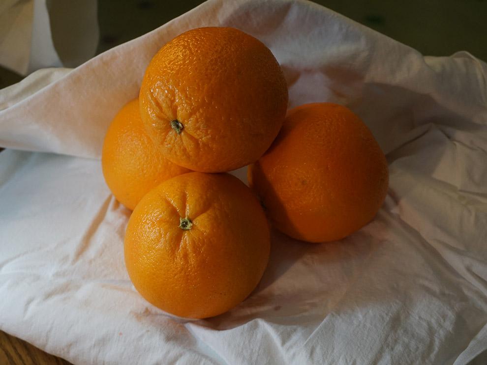
1. Believable Orange Still Life using only 4 colors!| Intermediate : The low skill share, I am Suzy on blade. I am an artist here in Arizona. Today we'll be doing a watercolor of Porches. I have four oranges ready to go for the painting that we'll be doing. If for some reason you don't have any oranges in your refrigerator? I have provided a photo of the oranges that I have and I'll be using paint with. So go ahead and get your paint brushes will be using four colors. And it's going to be a lovely limited color palette and I'll be using today. So get your paint brushes, get your paper, get your water, and we'll get started with our little still-life of oranges. And the best thing about any still life with effort to eat it.
2. Art Supplies: Okay.
3. Under Sketch: First things first for the orange is still life. We're going to go ahead and use our pencil and sketch it in real quick. These are just four oranges stacked on top of each other. And then once that sketches done, we'll move on to painting it. So let's go ahead and do the top orange first. Trying to decide how big to make it. Now they don't have to be perfect circles because oranges are not perfect circles. These aren't tennis balls or are working with. Some oranges have very funny shapes to them. Just like those lemons. And go ahead and sketch in some of this folding fabric behind it. And there we are. And there's our orange sketch. Another orange sketches complete. We'll go ahead and move on to painting it. Orange.
4. Orange for the Oranges: And now that these sketches done for the oranges, we're gonna go ahead and get our paint brushes and painted orange. And as usual, go ahead and dip your brush into the water first, wipe off the excess. I always start off by getting the paintbrush wet before putting it into the paint just because it's easier to soak up paint itself that way. So if you don't have an actual orange color or orange to the paint, then you can always mix up your own version of orange by using red and yellow cadmium yellow, probably a cadmium red as well. And you could also do the same thing with a magenta in a yellow. But I think the cadmium work better together. It's more of a bright orange versus a muted orange. Alright, here we go. Now since they are touching, I'm going to see how it looks. If I know, I am going to do them separately, okay? I always think of a plan of attack when you're doing watercolors. Because if you don't know what you're doing before you put down your paint brush, you might mess it up. It's very cerebral way to pay. Unlike oils where you can just keep messing with it. Watercolor, you get one, maybe two chances before it's messed up, you have to start over cell. Know what you're doing before you put down your paintbrush. And then remember when you're making some of those beautiful textures of the orange itself, you can scramble it. Where are you taking the flat side of the brush. And he's kind of scrape it across the surface. And by doing that, you're using the texture of the paper to create the shine. That's army weren't. Okay, and now that is covered with the color orange and I put a little bit more on there, so it's a little bit more vibrant. While it's still wet, that you want to do this while it's too wet. If it's already dry, don't do it. And since it is covered, we can also wipe off the excess from our precious. I'm gonna take a little bit more off and see if I can get this burnt umber, which will act as the shadow for this version of the orange. So the light is coming from this direction. So once again, and we'll be doing the shadow on the right side. And you're going to use the water to your advantage. Alright, so let's see how it's pulling here. I'm gonna go ahead and put soak some of that up. So go ahead and wipe off like actually squeeze the bristles back into the water. That way you can soak this up, watch this. Ha, it's like erasing a little bit. And I also want to get a little bit more color in there. So what I'm gonna do here, so it takes some of this magenta and I think there's just a little bit of that color on the top, so use some of that and there to just break up the orange and brown shadow. Now there's also a reflecting shine from the cloth and also the orange underneath it where it's coming up underneath. So I'm gonna see if I can suck up a little bit more of this edge here. Maybe put a little bit more orange so that it pushes away at that colour. There we are. So now we have more of a 3D effect. And once that's dry, we can go ahead and move on to each orange and I'll speed up that process because it's relatively the same. And then we'll do that background f that right, so I'm just gonna do the same thing I did with this orange pretty much on every single one of these. I'm just going to speed up the process so you don't have to wait for me to do it all because you've already learned everything vital on this one. So I'll speed it up for you and then we can go on to the next part of the tutorial. Here. Yeah. No no rhyme or reason of paper. Well, the water is so the papers so thick it doesn't He has a 140 pound paper. So if I were using computer paper, totally would need break the paper and everything. Yeah. All right. So now that all three oranges are painted and we're gonna go ahead and let those dry. And then we can move on to the shadows on the background. So all that fabric that it's sitting on. Once that's done, we can do a few more shadows and details on the oranges themselves that way they can pop. And then we'll be finished.
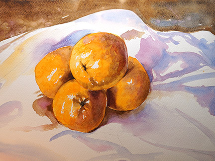
5. Background Shadows: Alright, so the oranges are dry. We're gonna go ahead and move on to the background, the cloth Seth is silica sitting on. And I've been thinking while it's been drawing with a plan of attack. And I think what I'm going to do is a mixture of the ultramarine blue and the magenta for the shadows. So go ahead and grab your brushes. I've been using this weasel For calligraphy brush just because it's my favorite brush for this size. But if you don't have one, this is about an 88 size. Round would do one that's pointed would probably be better because we're gonna be getting into some of those corners between the two oranges are the three oranges for oranges that we have. And you wanna make sure you get those shadows into those little corners. Magenta and ultramarine for the shadows. So go ahead and let your brush. If your water is orange, that is OK. It just looks orange, but when it's on the paper, as you can see, it's still there's no pigment. All right, go ahead and wipe off the excess. I'm gonna go ahead and start with, I'm going to start with the magenta, because the magenta is going to be closer to the oranges. So the classes, it's white, will be, have some ambient effect with the colors. The orange is going to be splashing some of that's light, that's reflected off its shininess onto the cloth. And I'm gonna do just a simple dry brush technique and do that. So if you can see I'm going to use some of this ultra marine further away from the oranges to indicate that it's not as lit up by the light reflecting off the oranges. And I haven't practiced cloth as much as I probably should have. But its ok. This is more about a study on the oranges themselves. So if you're not too familiar with how to do folds on cloth, that's I might have to get to that 200 other tutorial after I've practised myself. So if it's not perfect, don't worry. C And there's a shadow underneath this orange. Ooh, I should have used a different color. I should have used the magenta. And then there's a shadow right here. Well, the shadow turn purple. Yea. And in the picture I'm going to have of the picture reference, I'm going to offer you guys, the shadow kind of fades away. So what you can do is you have that stark color here, but then you can use just water to have it slowly fade away just like this. So that's a nice technique if you want to have a nice gradual Schadt. And I also want to see if I can get what looks almost like a reflection of the orange itself in the shadows. But don't use orange because orange and ultramarine blue do not mix very well. And so what you want to use instead is something that's like orange but darker because it's in shadow. Use that same color we used before, which is the burnt umber as the reflection of the orange onto the cloth but in shadow. And then you'll make it look like, oh, there's some orange being reflected onto the cloth. How about that? And it looks pretty good. Now if I had a detail brush, that's what I'll be doing for these corners and I might clean that up later. But for right now, don't worry about it. Here we go. It looks pretty good. Let's go ahead and move on to another shadow somewhere. There is a shadow under here that looks to be reflecting a little bit. And now I'm going to break that up with some magenta on the top. Right, there's some shadows underneath this orange over here. So I'm gonna go again with the magenta further in. And so when you have a dark next to a light, it really helps make it pop. And I'm going to use that burnt umber here on the edge to imply the edge. It's reflecting that orange again. And strangely enough, there's a blue shadow right here. And to get a little bit more of that magenta towards the edge here, 2p too dark. So if you happen to have something that's a little too dark and you want to soften it, go ahead and get all the water off of your brush and you can kind of skip it up just like that. So I have water pulled off right here onto my fingers. Brush is mostly dry. Look at that. I probably shouldn't even erase that. It was spreading so nicely. See, I'm going to use just a smidge of this burnt umber here when trying to make it very light. You'd a lot of water here because I really wanna do a beautiful wet on wet technique. Right here. The cloth is kinda fold it inward towards the oranges. So there is a little bit of a reflection. So feel free to use some of this orange just a little bit and the water will distribute it evenly for you. And I don't want to have too much because you don't want it to be distracting from the oranges, the actual oranges in the piece. So just use a little. There we go. See how beautiful it's already had some gradation there. And right here into a shadow. Because I want to. Get that nice edge. Oops, that's still wet there. Thankfully, it's mostly dry site in smudge it. Now it's kind of doing a bloom effect right here, but I kinda like it. So I'm just gonna go ahead and leave that and connect this piece here. We still have that nice edge and that section, so that's nice. And I think it was just a little too dark, so I'm gonna take some of that paint up. And so I kind of flattened the brush here, son, I have a more of a point and it's easier to get it in the direction I want to go. And if you're not, if you don't have perfect edges here, we can always go back in with the detail brush and make those corners between the oranges and the cloth more defined. I'm gonna see if I can do it. Defining edge up here between the cloth in the background, separate it from the cloth. I'm gonna do a darker burnt umber. And I don't want the whole background to be nothing but Brown. So I'm gonna pull in some of this other colors here. Maybe a little bit of magenta on this side. If you want to have a neat effect, go ahead and dip your finger into the magenta Washington that napkin. And if you happen to get a splatter there, I would recommend a napkin more than a tissue, but this was all I had on hand. It still looks pretty nice. I know this looks too bright right here, so I'm going to tone that down. Here we go. I'm doing a wet on wet technique over here. Use some blue tiny bit in magenta. Now these folds don't exist in, in the reference what I'm providing, however, you can always make some up because we're not gonna go forward perfection. And I think that's it for the background. For now. We might have some more darker shadows towards the center here and you're the oranges, but I'll figure it out after we put the dark sin for the final oranges.
6. Shadows on Oranges: So for the shadows on the origins themselves, we're going to use r to finer brushes, just more like a small four or five. Just so it's a little bit easier to handle than the eight that we were using before. And also, this is a rigor brush. If you get it wet, again, comes to a very nice fine point. Let's see if I get that there. Definitely you can see it comes to a nice fine point. It's usually used for rigging on ships, but it's good for other details as well. If you don't have a pointer rush in. Once again, I decided just to use this one instead. Go ahead and use the larger 1 first and then we'll clean up the edges with the pointer brush. So for the shadows, go ahead and get your brushes wet. For the shadows were going to go ahead and use the magenta mixed with the ultramarine blue. These two colors, 12. And we're going to mix these two almost to a black. So normally people use black, if they don't have actual black, they'll mix together a ultramarine blue with the burnt umber. But since the ultra marine, we'll look terrible on a Orange, we're going to use the magenta and the burnt umber instead, and it comes out almost as dark, if not better, especially with the orange. Now there is a shadow that this one is casting on to this orange. So we're gonna do that first. And it's hard to see, but there is just a little bit that's not in shadow right here in this corner. So I'm not going to paint that. And then so there's all this, it's still wet. Go ahead and wet down your brush, wipe off all of it and kind of make sure it's damp but you don't want it sopping. And we're gonna go ahead and get the paint wet and we're going to soften the edge. You've done this before and my other tutorials, if you've done other ones. And it's not behaving. But that's okay. We go. It's actually coming more of this angle. So I'm gonna try that again. And I'm going to try softening the edge again. And there we are. That looks better. So now you have that edge. And there is just a little bit of reflection. So I'm going to wipe up some of this corner right here, look at that next. And then we're gonna do the same thing with the other shadows. So there's also a very sharp shadow right here. So go ahead and do that one thing again, mix the magenta and the burnt umber. I have just discovered while painting that it's probably better to have 60-70 percent. Of the burnt umber with the magenta. So just a little magenta and mostly the burnt umber. So that's the corner of that shadow. But then it quickly dissipates because the curve of the orange, I almost said mushroom, This is not a mushroom, This is an orange. Now if you are not as practiced with brushes as I am, and you can always use the rigor brush or your pointer brush to get this really fine edge. And I'm gonna go ahead and use that edge anyway. And there you go. So there's that. So this orange is pretty much taken care of. I'm going to go ahead and move on to this one. There is a shadow underneath this orange casting on top of this one. So we do the same thing right here. Here's a beautiful shadow being cast right here. Now there is also the reflection of this orange casting on to this one. So you don't wanna go all the way to the edge. So you want to go more like right here. And we're gonna do the same thing. We're going to soften the edge. C, u, that just keep pulling it down. You don't want to go to the edge over here. You just want to pull down and maybe grab a little bit more of that burnt umber. Kind of pull it across because I want this to be a little bit more shadow than I was earlier after it dried. And there we go. I might actually use a tiny bit of the ultramarine down here. And then I'm going to do another little shadow right here. Just because I can. And now there seems to be a tiny bit more orange right here. So I'm gonna go back in with the pure orange, this one. And just do it right here. You can always put more orange in after the fact to make your orange pineapple a bit more. No shame and going in a second time, adding a little bit more vibrancy to your piece. And I'm gonna put a little bit more down here. And right here. I'm not gonna smooth those edges because it kind of like how it looks, where it's a little bit more sharp on that orange. So now we're gonna go on to the, the leftmost orange on the piece. There's one up here on top, and then there's this corner right here. I'm gonna go ahead and use the rigor brush for this corner just because it seems to be little bit more difficult than the other ones. And to get the general shape of the corner. And then I'm going to soften the edge. Now my paint isn't spreading as well as it normally does because this time around I'm using a different paper. If you have arches or a 100% cotton paper of another brand, they behave a little bit differently per brand. I prefer arches just because I had been working with it longer. But for this time around I've been using I think Bridgestone is the name. Alright, so just to make sure that this edge is nice and clean, really well-defined. Use my rigor brush and get this really sharp corner. They're putting in corners like this. Nice sharp lines really helps draw the eye for anybody who's actually looking at the piece. And I'm going to use some more pure orange right here. Because I feel like it needs to be drawn out a little bit more. I'm using my rigor brush right here because it carries really well, but I probably should be using this one. And I'm going to use a little bit more magenta, pure magenta and this corner and soften the edge. Now something I haven't done yet is the dimpled effect of the oranges themselves. There is the texture on the paper itself. You can just say that is the texture of the oranges. Or it can go in purposely and create some dots for the dimples on the oranges, which is what I should have been doing from the start, but I could never too late to add it.
7. Add Vibrance: So I'm going to have a couple of those symbols. Usually putting dimples or details like that on the edges of shadows sometimes helps make it more realistic because anything in shadow doesn't have as much detail. Anything that is on the edge of light or in light has more detail. And then you don't need to have the entire orange covered in dots. You can imply that that's covered in dots by having them in a few key places. So pick a couple spots on the orange, you want some symbols and then leave the rest to the viewer's imagination. Sometimes details implied, and it's not necessarily drawn in all the time. I think I want some more orange right here. So to go ahead and get that cadmium orange, put in a little bit more so that it really pops more. Yea. And I'm going to get some of this burnt umber. This is pure burnt umber. I don't want to put the magenta on this one right here, just because that's what I feel like doing. And then we're going to soften that edge because this shadow is not as dark as this one. This one is lighter. And symbols and a little too dark. And now for the topmost orange, there's some beautiful details right here that we're gonna go ahead and do. There's lot more shadow on this piece then what I have been putting in, I think the best way to carry this shadow over is actually just to improve the colour contrasts. So grab more of that beautiful cadmium orange. And we're gonna put it right here and put in some nibbles. We're not going to soften the edges this time around. Because I think that dibble effect will be really pretty. And I want this top orange to be the centerpiece. And everything else will just support it. A little bit more. Here we go. And there's some creases here for the orange. And I want to do a little bit more there. And here. There we go. Now it's really starting to pop. Now we'll see you later. If this stays as bright as it is, we can always try to increase that vibrancy by adding even more pigment to this top section, which I think would look really good. And I want to make this symbol here is creases a little bit more defined. So I'm gonna put a little bit more burnt umber there. And I want a little bit more orange here. So I'm going to get that increase. More orange here, right here along this edge. Sometimes color really pops more if it's right next to where the shadows are. And bowls implementable. Put a more over here. The more colour that you have on a piece, the more likely it is to attract the IF someone who was passing by looking at the piece, especially if you want to sell it. Still lifes are actually very popular, specially for kitchens. They sell very well.
8. Final Details: Alright, so final details, we are at the end. So get your fine lined brush. We're going to go ahead and do those little attachments where the orange is on the tree. But then he stuck to that twig and we're going to twist it off and pull it off. That's what that little connections are that we're going to paint in those little connection points on the tops of the oranges, the are on the green side. But since we're doing a limited palette, instead of using a yellow with the blue, we can just use that bright KVM orange with the blue and it will kind of get a greenish sort of look. Or it can use a green if you really want to. Either option is fine. And it didn't really turn out green. So maybe I will have turned purple. I had some purple over here. Okay, so we have those details. And I think I want to define this edge a little bit more. This is a point where we can stop. We don't have to do any more. However, the professional and media saying there's a tiny bit more, you can push it and that's specifically the shadows underneath the oranges. They're good. You can stop, but it's possible to push it just a little bit more. So we're gonna go ahead and take that smaller brush and we're going to use that detail brush to get the fine line corners. And we're gonna go in and just one more time and see if we can push it just a little bit more. So underneath the orange, let's see, I'm going to go ahead and use this burnt umber again and see if I can just get it a little bit darker. And now we're not gonna go everywhere. I just want a couple of these corners to be a little bit more defined. So that was burnt umber I just used, I'm using a little bit more of this magenta. I'm going to soften that edge because we want it to be right up close to the orange. We want that to be defined. Okay? And now I want this right here to be a little bit more defined. So use your pointer brush or your rigor brush, and we're just going to clean up that little corner and make it look like it's really tight in underneath the orange. And I want to clean up that edge right there. Right here. It's a little too. There we are. Okay, so there's that edge. And let's see where else is another little corner that I want to make sure pops just a little bit more. Right here. It's a little bit darker. And then there's also more right over here. Couple little touches. And then I'm gonna go in with again. Burnt umber. Soften that. And there's a lot of pink underneath it, oddly. So I'm gonna see if I can do a little bit more pink. Soften it. Actually there's a bunch right there to just want to make sure it pops a little bit more. And I'm going to bring it around this edge here just because I can get that nice defined edge. And I think we're done. Now. There's one more over here. Always double-check your piece. There's always some little detail that you could add in. Another point. Our work is never truly finished. I'm going to do it right? Alright, here. I think I used too much in one color right here because now it's matching. So maybe to make sure it doesn't match this color here, I'm going to use that ultramarine blue to make it pop a little bit more stand out for that definition. Detail brush. Make sure I got that nice line. And there we are. Okay, I'm going to put a little bit more detail right here. Darkest, dark needs to be in the corner. There we go. Now it's better. Course. I've seen one more thing I can. I'm going to do a little bit more magenta on this bottom orange because the shadow is a lot bigger than what I originally put. Yeah. It's so easy to keep going and just keep going with the painting. But you also have to know as an artist that sometimes it's better to look to let it go and move on to the next piece because if you work on it too much, it will be overworked and you'll hurt yourself emotionally because you'll be like, oh no, I reran the VCE. So always pick a spot to finish signing a piece and we're done.
9. Thank you: All right. Skill share. Thank you so much for joining me today. I'm practicing oranges, practicing your colors, your shadows, and I hope that you grew artistically. Feel free to share your pieces in the project section, I would love to see what else you have painted. If you decide to go with a different composition, maybe just one orange, or if you've cited x2 o for, I hope to see you again on other skill share tutorials such as the lemons or maybe even a landscape that I have provided. Thank you once again for joining me and I hope to see you next time.
 Suzy Paint N Simple, Watercolorist