Transcripts
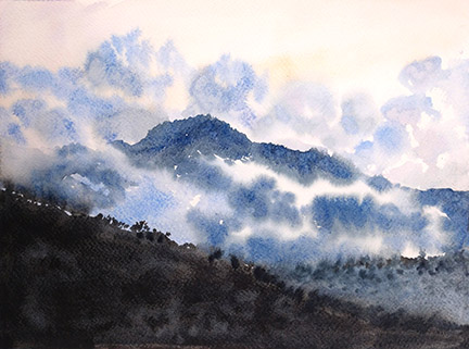
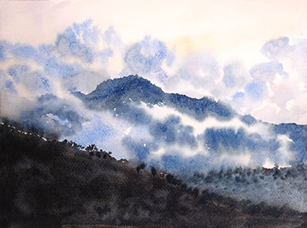
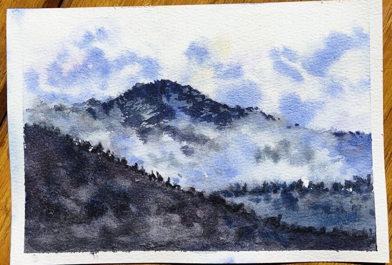
1. Paint a Moody landscape in watercolor | Misty Mountains: Hello Skillshare, I'm Susie on blade, I'm a watercolor is space in Arizona. Today we're gonna learn how to paint mountains, hiding behind clouds. So if you'd like to create a moody scene like this one, go ahead and follow along on the short tutorial, and we'll learn how to use just four colors, a limited color palette to create a smooth seem. So different.
2. Mixing Your Colors: So when mixing up your colors for your palette, you're going to want to put the paint on the side of your well, not in it that we can control how much pigment you have in your water. So if it's on the side on the top, you can actually take your brush and drag it down. And as you go you can see more and more pigment drawn into the water. That way you can get the consistency that you want. And just keep doing the same idea with the paint on the side of your palate versus in the well that we can continue dragging in your paint and do this for every single color. And once you're happy with the consistency, which should be kind of like tea or a milk sort of consistency for your paints, I recommend more of a milk kind of consistency. Select 2% or whole milk versus more of a teeth. If it's T, Then you can kinda see through it. But milk, you can't really see the bottom of the palette and that's when, you know, it's the right amount of pigment to the water as far as the ratio goes. So just go ahead and keep mixing. And if you want, what I recommend is that you mix each of those colors for up to 30 seconds. That way, you know, there's no granulation going on or little bits of paint stuck in your brush or granules of paint still stuck at the bottom of your palette. That way when you take your brush and you stroke it onto your paper, that you don't have any streaks left behind is just a good even amount of paint on your brush. And then that way you can have a nice clean application. So go ahead and mix all your colors for about 30 seconds each. You're only using about four colors here. Yeah, do this for every single color. And once you have those all mixed up 30 seconds each, then we can move on to the actual painting. But before we paint, will have to sketch in the basic outline of the mountain. And then we can go from there.
3. Sketch: Now before you start any watercolor, especially if you're not used to painting directly onto the paper. I highly recommend starting with a pencil. I just use a normal mechanical number two pencil. And I very lightly draw in the outlines of the ridges and the hills and then the mountain in the background. I don't draw it hard. I don't use a thick pencil. I use very light lines because the more graphite that's on there, the more likely it is to smudge. Now we're dealing with typically speaking more dark tones in this piece, but I don't like to have too much smudging when it comes to the pencil marks. So really this is just a bunch of quick sketch guidelines to know where I'm putting each color and where to put each brushstroke. So go ahead and put those pencil marks in. You're just doing one hill to hill and then the mountain in the background. And then you're probably good to go. So sketch those in, and then we'll get to the painting part.
4. Clouds: Now for my painting, when I'm putting in a large area, I like to use a one inch flat. This is a mimic Kolinsky that I'm using. You don't have to use a mimic Linsky. They cost 50 bucks, but this is the one that I have. So if you have any flat brush or a mop brush, though they're good to use for covering a large area. This is a nine by 12 piece of paper I'm working with. So I like to use a one-inch flat for anything that's 11 by 14 and smaller to cover a large area. So just get the whole thing wet and we'll work from there after getting it wet with water on the paper. So just cover the whole paper with a wash of just water, nice clean water. And then we'll go in with the colors after that is done. So the first color I'm going to use is a purple. This is going to be going up into the sky. And I'll also be using a yellow ocher just to give a kind of a warmth to the sky because most of the colors that are in here are going to be the cool of the mountains and the clouds and the hills. So just putting a little bit of warmth in the sky helps make it not look too moody. This is a moody painting that we're doing, but I wanted to have a little warmth in there. So right here, the purple I'm using is a purple mauve. Feel free to mix up your own purple if you don't have that. Violet would be good too. I know this most purples tend to look really good with a yellow ocher. They're complimentary colors on the color wheel. And then having a yellow ocher, it's not like it's a cadmium yellow, which would be very overpowering and make it look more like a sunset. This is more like a, just before it gets to be, it's dusk. It's a dust sort of painting. So just adding a little bit of warmth to the sky helps it up, bring out that mood. So I'm having a purple MAF and my yellow ocher as complimentary colors. We're going to take these two colors, put them in the sky, and then we're gonna go in with this blue, which is what I'm using. But another good one is a cobalt blue. These would be great for the cloud. So I'm just using a number eight round right here to drop in some clouds in the sky. And you want to have your painting with a slight tilt, I recommend at least 10 percent. I just put a paint tube underneath my paper so that it would have that slight tilt because I want the water to kind of go down instead of spreading out in all directions. So if you want it to be pointing more towards the bottom of the piece, having a slight tilt really helps. So just keep dropping in some random clouds into the area. The clouds, in this case, are going to be dark, a darker color compared to the sky behind it. The sky is going to be that purpley color with the yellow ocher. The clouds are going to be more of a darker color. So this is that cobalt blue we're using. So just keep dropping that in and the water will do the work. You don't have to keep messing with each area. So just go ahead and drop it in. This all the paint, all the entire surface is still wet. That yellow and the purple that's still wet. So just drop in your blues on top of that. And the yellow ocher is great because it doesn't turn into a green when the blue is dropped on top of it. So don't be afraid of it turning green. And my turn tiny bit green, but it's really not that noticeable overall. So just keep going in, dropping in these pretty blue colors for the clouds and let the water do the work. Don't keep messing with each single Cloud for minutes on it and you just want to drop in your color and move on. If one brushstroke touches another breaststroke, that's okay because the water will help mix those two and soften those edges so it doesn't look like it's hard. Now again, these surface right now is still wet. That means that all these colors will blend together and they'll create a very soft kind of look.
5. Clouds part 2: The harder edges are going to be, are going to belong to the mountains. So the clouds or soft the mountains are more hard on the tops of the edges. The mountain tops are having more of a hard edge and it's slightly dry where I'm going to be putting down the darker tones for the mountains, but we'll get to that in just a bit. Now here I'm using a indigo HU for some of the darker shadows on the clouds. You, if you don't have an indigo hue, a ultramarine blue would work just as well. You might want to mix it a little bit with a burnt umber to kind of gray it out a little bit because the ultramarine blue is more of a cold blue. So it's kinda close to the purple side of the blue tones. So if you want to warm it up a little bit or grade up a little bit, add a little bit of burnt umber, and it'll turn it into more of a gray blue versus a bright blue. And that's, I'm dropping in the clouds that are in front of my mountain. We're doing the clouds first. That way. When that is closer to being dry, then we can add in the darks of the mountains. Trust me, you'll see what I mean in just a bit. So right now it's just the clouds. Sometimes you can put a damp, wet brush stroke onto the canvas or the paper wherever you want it to be. And then you can add pigment on top of that. If you want to create more of a feathered sort of look, if you want it to be blurred out. And remember, not all of these blues, not all of these blues are completely blue. There's some gray blue and there's some purply blue. So feel free to add in some of those purples you used back when we did it, the yellow ocher and the purple, you can drop some of those purples and a darker tone on top of these clouds because what is Clouds? Water, What does water do? It reflects. So clouds automatically reflect what's around it. So if it's a sunset, obviously there's going to be some reflection of those warmer tones. So it's just in small amounts on these blue clouds, the r in front of that sunset behind it. But I wanted to add some of that purple into the blue clouds so that it looks more cohesive overall. Okay, Now since the foreground is going to be so dark, don't be afraid to drop in a whole bunch of blue to the entire foreground. The reason being is because, well, I mean, you're going to have a dark anyway, right? So you can just paint over it. Watercolor is transparent. You can always go darker, but you can't go lighter. So all the whites of the page, the lights of the page, you want to keep light. But everything that will be in darkness, all in shadow, the foreground and the, those hills, the mountain in the foreground, those will be darker. So feel free to paint there and get that first layer of blue in, so it'll be cohesive overall.
6. Mountains: So now we have the whole piece covered with the light tones and the medium tones. Now the next part is the harder part. For most watercolors, we tend to stick around the medium tones and the light tones. But this piece is all about going from light to dark. So go ahead and mix up more of a darker tone in your piece. This gives me a dark blue. So use mostly the cobalt and maybe add a little bit of that indigo hue if you have it or some of that ultramarine. Now, you want to have a thicker consistency. So what we had before was probably like 2% milk. What you want here is more like a whole milk. So for the consistency, so see how dark that is. Now if you have a test or piece of paper, use a test herpes and make sure it's that dark when you put it in. Now, see right there that gray that I have, the watercolor spread into the cloud that had put down before. Now this is what we want. We want the mountain to look like. It's peaking out from the clouds. Now what are clouds? Soft on their edges? They are very soft and cotton ball like. So it's okay if it touches the edges of those clouds. Now the top part where I'm putting in the mountain That's more dry. I did that on purpose. I did those background mountains first, so you'd have time to dry. But then the mountain, the clouds that are closer towards where the mountains are, those are still partially wet, so it's okay if it blends in. And now I pre-planned that. I was hoping that you'd be following along that way so that the clouds can be nice and soft right to the edges of these clouds. So see, there it goes again. It's bleeding into the Cloud. This is what you want. You want it to be nice and soft. You don't want to have a harsh Cloud in front of this mountain. It's far away and it's soft, and I want it to look like missed. The title of this piece is misty mountains. So that's what we're going for. Sometimes when a cloud has in front of a mountain, it looks Misty because you're closer to it when you actually go through a cloud. If you've ever driven through one, it just looks like fog. It's not really a solid thing. It's all water vapor in the air. So keep adding in all this area in front where I'm putting it now where as it's white though it looks like a white cloud. I'm putting in some of those darks of the mountain so that it looks like some of this mist is in front of the mountain. And it's okay if you don't get this correct on the first try, it took a little while to understand how to let the water do the work for you to know the dry times. This is something that will take some practice, but you'll get there if you keep trying. One way to help get that faded effect now if you didn't put some water down before or certain section got dry, you can take your brush that has a whole bunch of pigment on it, make that mark. And then it can take a clean brush that's wet. And then you can kind of touch it in there. You can just lay down a clean brush stroke with no pigment. And then you touch the edges of that brushstroke with just water to the stroke you did with some pigment that can fade it out. Now down here I'm putting in some more pigment of that dark blue for the mountain to continue that effect of the mountain peeking through some of these misty clouds and just keep dropping in more pigment. Now this is not the darkest dark with that we're going to be doing. This is a medium dark because the mountains further away, therefore, it's not as dark as something would be in the foreground. Now for atmospheric perspective, there's more water vapor in the air. So the further away something gets, the more blue toned it will be just because of the air, has water in it. For atmospheric perspective, things that are further away will have less contrast and less vibrancy. So it's further away. Something is the less color contrast. So there'll be, and the less value contrast they'll be. Now here's that technique again where I put in a dark tone and that I use a clean damp brush or clean wet brush to soften the edges of a dark mark that I made. And then he can go ahead and go on top of that with some more color like I just did. So grab some more paint, add in some more tones where you think it needs to be. I'm adding in some more edges to this mountain because I feel like it just needs a little bit more mountain tops on this piece. And I had a little bit more blooming here that I first intended. So I'm just adding in some more pigment. And then I'm adding kind of a jagged edge to the top of the mountain because there are supposed to be in my head more trees on top of that mountain. So obviously won't be a perfect sharp line the mountain, I think in this picture. And then also if you were to be there in person, you'd see you'd be just close enough to see that there's trees on the mountain, but you'd be far enough away where you won't be able to see each individual tree. Right now we're implying.
7. Middle & Foreground: So now we have the mountain pretty much complete. Now we're going to move on to the foreground. So there's the background with the mountain. There's a middle ground to the bottom-right of a hill. And then there's also that long diagonal towards us, the front, the foreground. Were there good darkest dark is going to be. I'm using a number eight round brush. This has lots of pigment in it. I'm trying to go in with a darker tone than the mountain. The first wash, however, kinda came out more so the same tone as the mountain in the background, but that's okay. Darks can go on top of other darks. So I'm just doing a first wash. I'm going to use that hill and the foreground hill with darker towns ope c there, I added some more pigment. Now that will be darker in the future, but I'm spreading that out for now. And I'm going to join it with the foreground hill that we see right here. That's a long diagonal. So just cover that whole area with a darker tone. Remember this is all in shadow. And here, I don't know if you saw it, but I did mix up a whole bunch of colors together. I used a burnt umber, the cobalt, and my indigo hue. Again, if you don't have indigo here, you can use your ultramarine blue or any other dark blue. You can even use a dark purple if you wish. So if you mix a purple and a burnt umber or a blue Phoenix all those colors together you can get something that's very indicative, very close in value to a black. Now, I don't like using a black from the tube. I like to mix my own just because a black that's from the tube has only one color to it. And your eyes can pick that up if you're there in person. But if you mix up a dark, if you mix up your own black, then it will come out with some other colors here and there and create more interest for the eye. So how you do that again, is a burnt umber mixed with your blue or a burnt umber mixed with a purple and a couple other colors, does keep mixing it until you get to very dark consistency. Now this would be more akin to almost like espresso. As far as the consistency, it's not like a whole milk. It's it's much more pigment to water ratio. So test it out on a spare piece of paper and you'll be able to see how dark it is there if you want to test it out. Now again, if you want to test out straight on the page, that's fine because it's the foreground. This is all in shadow. Therefore, you can continue adding darks on top of it. So here are the clouds in the background are still somewhat wet. So you can actually paint in some trees on those edges and the kind of fade out. So some of these trees are more in focus at some of them kind of blurred out. I'm kind of guessing that the foreground is still somewhat in a misty sort of area. So only some of the trees are really sticking out. And that's okay. Now when these darks dry or when they get closer to being dry, you can always add more darks on top of it. The hill in the background kind of faded away and became part of that background mountains. So I will be going in with that almost black that I can mix it up. And I'll be putting those dark colors back into the hill and the rest of the background. Now I'm putting this kinda like spotted. So look like There's bushes on this background hill because I didn't want to have a solid color and the background. I wanted to have some interests. So I'm kind of creating some dabbled paint brush strokes to make it look like it's implying that there's some bushes or some trees way in the distance there darker towards the top of that hill and they fade away to the bottom because I wanted to make it look like again, that there's some mist between you and that hill and miss tends to hang low. They tend to go down below the hill. So here is your final piece. So when you're finished, I would love to see how you did. Let me see your work. So remember lights to darks, but you want to go from light consistency to your paints. So it's more like t. And then work your way from like 2% milk to a whole milk kind of consistency. And there may be an espresso in case you wanted to do some darks. So light to dark, add more pigment to your water for darker color or brighter colors. And there you are.
8. Thanks: Hello Skillshare. Thank you so much for joining me on this tutorial for painting this moody scene of mountains behind clouds. I hope that you enjoyed the tutorial on using a limited color palette. Show me what you worked on the project section. I would love to see what you did. If you'd like to have a little critique, I'll be happy to do so and usually reply on any comments or projects that people post. So post your work, I'll comment and hopefully I'll see you on the next tutorial. And all the tutorials I'll be doing in the future will be pretty nice short, sweet, leonard. So thank you for joining me and I'll see you on the next tutorial.
 Suzy Paint N Simple, Watercolorist