Transcripts
1. Welcome!: Hello. Welcome to my
beginning Acrylic series. My name is Bridgette Miller, and I'm a decorative
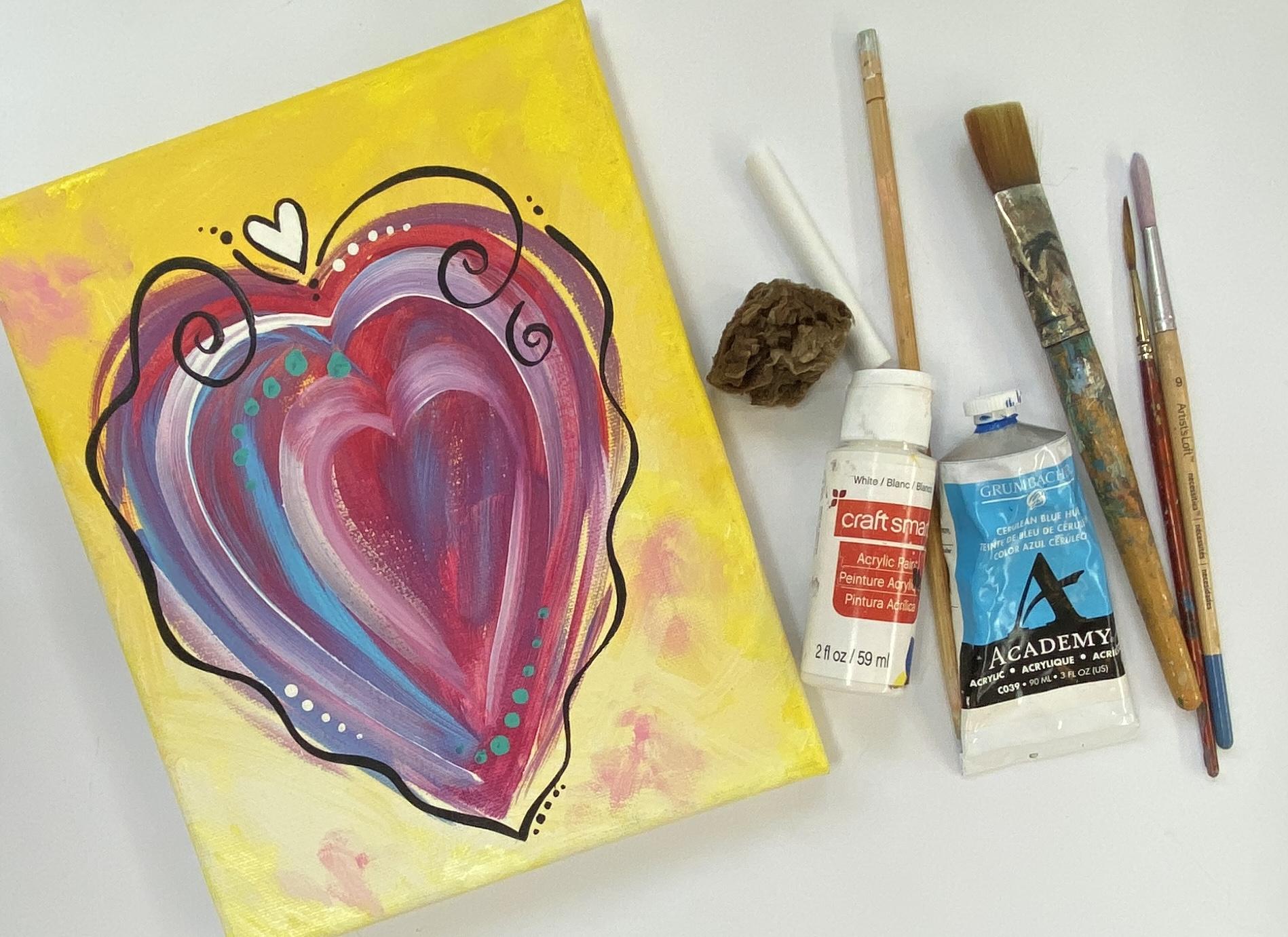
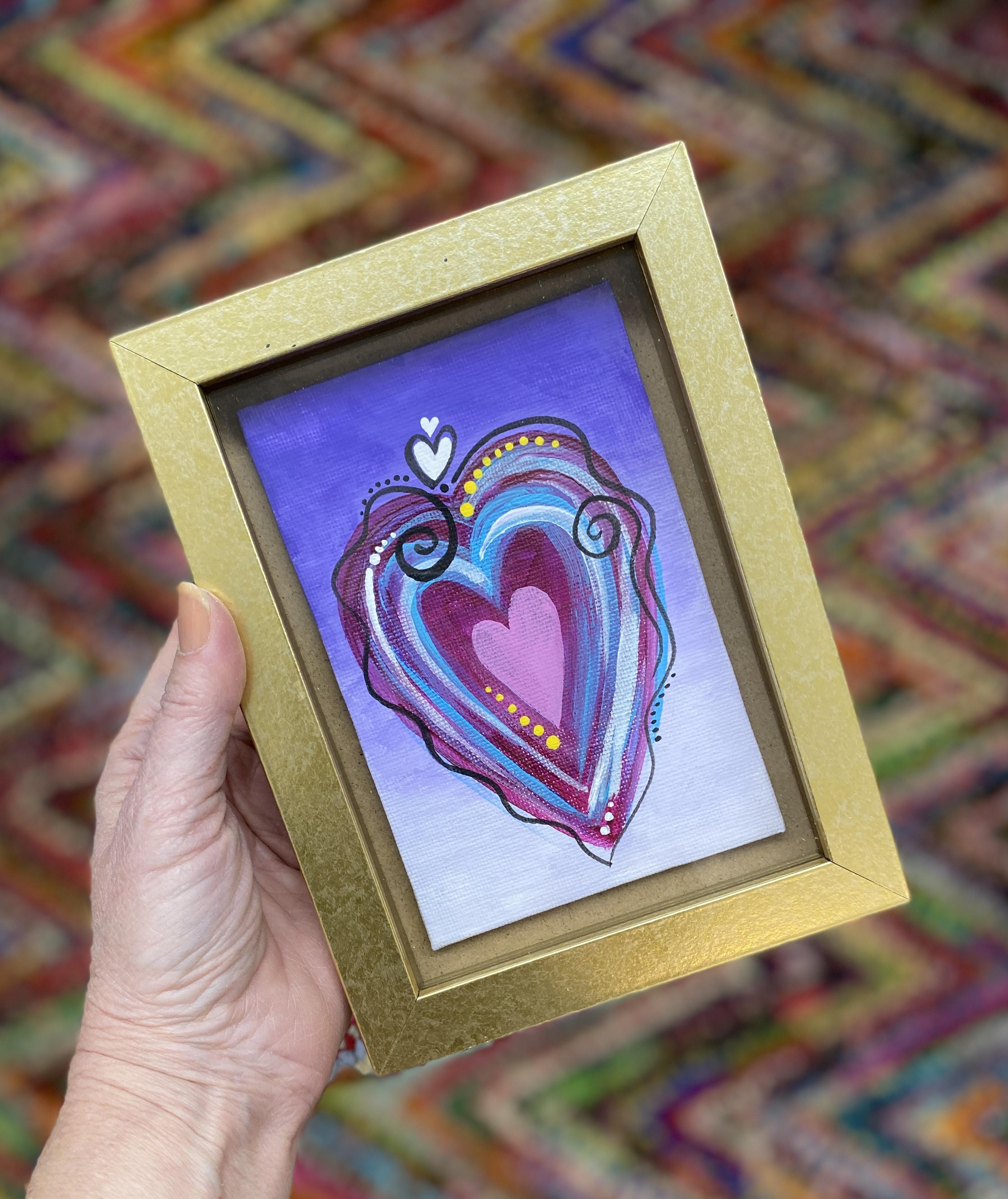
painter by trade. And in this class, I'll
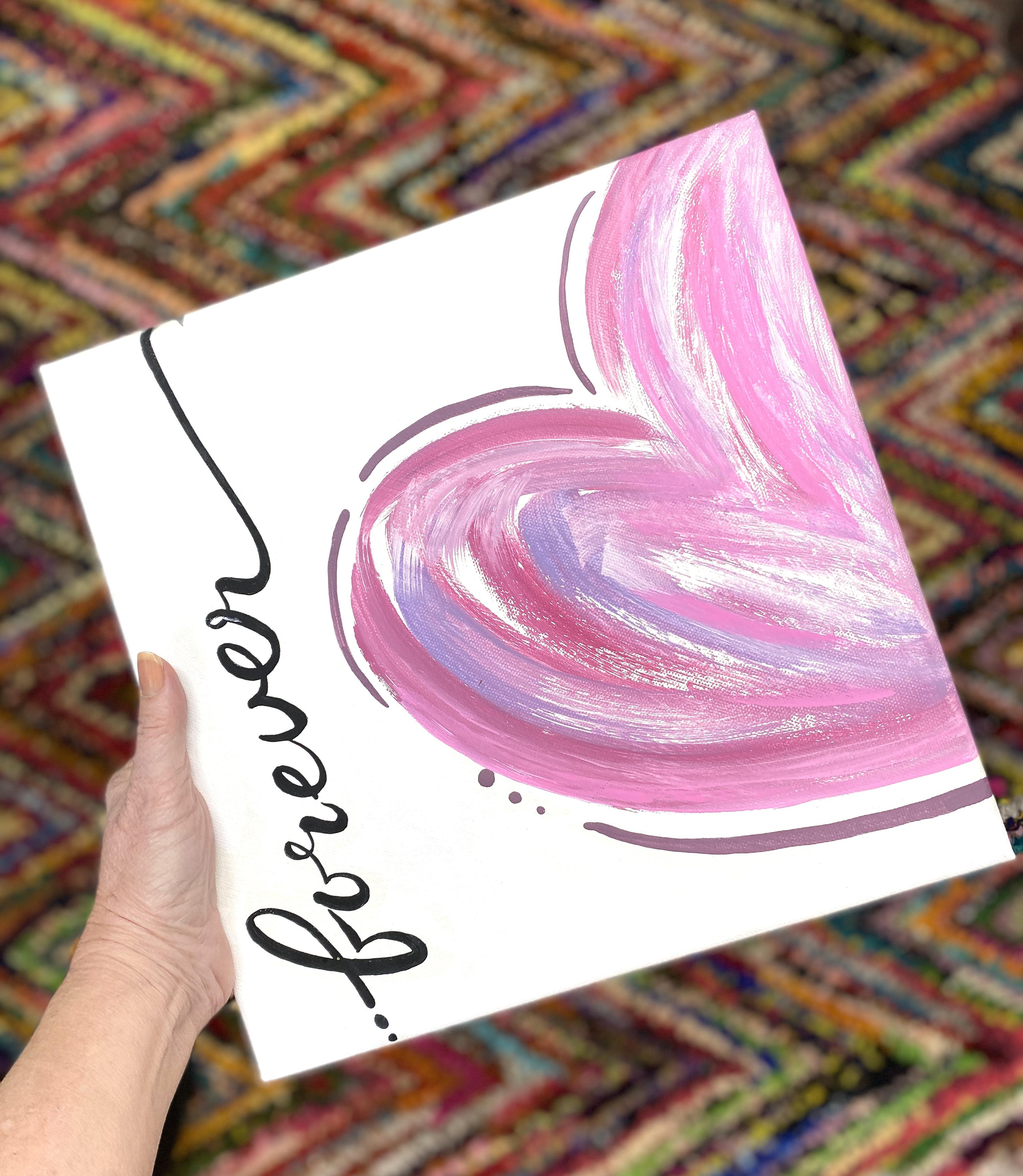
be demonstrating how to paint these fun,
whimsical heart designs, introducing you through
this step by step project, many techniques used
in acrylic painting. I'll show you how
to create a wet on wet gradient by changing
your colors values. I'll demonstrate how to
use several brushes and some other techniques to make your paintings uniquely yours. Whether you're a
beginner, wanting to start learning the basics of acrylic painting or you're
a more seasoned painter, looking for a fun, creative
activity to boost your mood. This class would
be great for you. I hope you join me today. It'll be fun to paint together. In the next lesson, I'll go over the class project in more
detail. See you there.
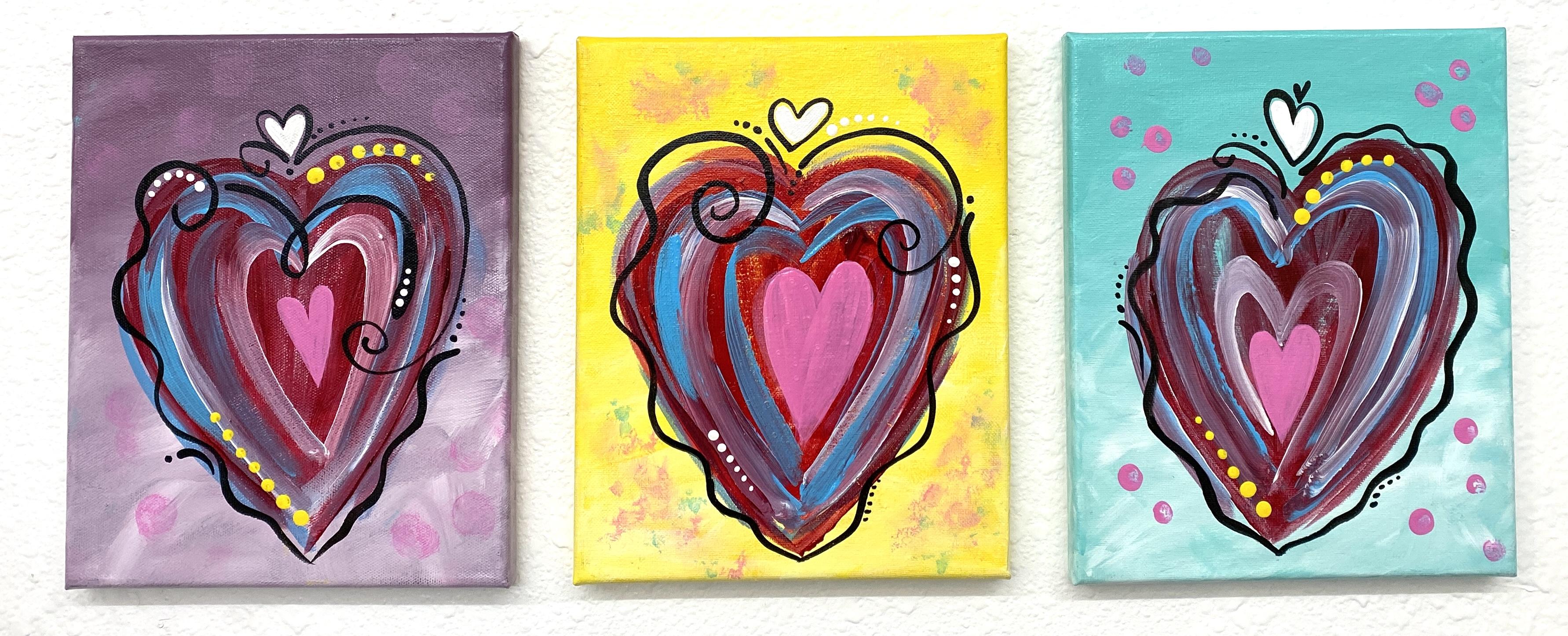
2. Class Project: For the class project,
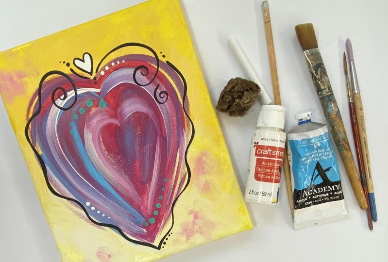
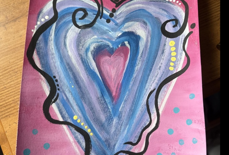
I'll have you paint at least three of these splashy
whimsical heart designs, learning acrylic painting
techniques as they demonstrate step by step,
and you follow along. You can view the entire class
and then paint on your own, or follow along with me and pause the video anytime
you need extra time. Once you finish your paintings, I'll then ask you
to snap a photo and upload your class project
photos to the project gallery. It's there, you'll be able to see other class projects and comment on them and get valuable feedback on yours as well. If you have specific questions, you can ask them in that area, or you can go to the
discussions area below this video
and ask them there. Posting your project and viewing other people's projects is the best part of the class,
and you'll learn a lot. You'll also get great
encouragement and motivation to keep growing
your skills with this medium. In the next lesson, I'll go over the materials you'll need
for the class project. See you there. Okay.
3. Materials: In this lesson, I'll go over the materials you'll need to
complete the class project. For your convenience, I've also made this information
available as a downloadable PDF under the Projects and Resources
tab below this video. For the class project, if you choose to do three
of the arts designs, you'll need three
services to paint on. I'll be using stretch Canvas. But you're welcome to
use watercolor paper, acrylic paper, or canvas
paper or even canvas boards. If you choose paper
rather than canvas, you'll need to tape
down your paper to your work surface until you're finished and it's
completely dry, as this will minimize buckling. Also, I recommend a
watercolor paper that is 140 pound or heavier weight. So it would be more durable. 140 pound watercolor paper
is probably the most common, so you'll be able to find it
at most art supply stores. For paint, you'll need three different colors
for your backgrounds. I chose Delta brand in wisteria, which is a purple
or violet color. And I also found some
craft smart brand in bright yellow and
native turquoise. If these colors are
not to your liking, choose your own colors, make sure they're not too dark and not too light in value. The other paints that I'll
be using are liquitex brand. It's actually Liquitex basics in quinacridone magenta and
light blue permanent. And I also found a tube
of titanium white, which happens to be
the Grumbacher brand. The acrylics in tubes are
thicker and the colors are usually more vibrant than the acrylic craft
paints in bottles. But you can use all
craft paints or you can use all artist
quality paints in tubes. It's entirely up to you. I just want to make sure you
know what I used. That way, if you want
to use exactly what I used, you have that option. The last two colors
I'll be using are craft mark brand craft paint
in black and paint blast. You'll also need a palette
to hold your paint. I'll be using paper plates. I also use these to practice techniques before adding
them to my final project. So having a few on hand would be a good idea unless you prefer to practice on watercolor paper or acrylic paper or
another surface. You'll need four brushes, and here again, you do not have to use the exact
ones that I'm using. So if you already
have brushes or your local art supply
doesn't have the exact ones, just try to have
something close. I'll be demonstrating with
a three quarter inch flat, a half inch or number 12 flat, a number eight round, and a
number three liner brush. In addition to the brushes, I'll also show you
different techniques using a sea sponge and a
round sponge brush. For sketching, I'll use
some sidewalk chalk, but you could substitute charcoal or chalk pencil
instead, if you'd like. For another technique, I'll be showing you
how to make dots, and there's lots of tools
you can use for dot making. I would say look around the house and see
what you can bind. In the demo, you'll see me using the liner
brush for small dots and the wood handle end of the three quarter
inch flat brush for a little larger dots. But you could also use
a wood dowel dipped in paint or the eraser end
of a brand new pencil. Sometimes I have brushes
where the bristle end has fallen off or worn out. So I use the handle
to make dots. You could also purchase a
dot making tool set where each tool makes two
different sizes of perfectly round dots. You'll see me using the end of a new chokstick in the demo. It's good for larger spots. You could also use the
sponge brush wood end. Look around and
see what you have. It'll be fun to
see what you find. For protecting your
finished artworks, I'll be using Liquitex
gloss medium. It also comes in a mat
or a non gloss finish. I also like Dura Clare's
gloss varnish from deco art. There are many Clare
Coat products. I recommend one that
is non yellowing and one that protects against
UV to prevent fading. Throughout the
course, I'll be using my trusty old hair dryer to
speed the paints drying time. I'm proud to say I've had
this one since the 80s. For some techniques, as we
go through the process, you'll need the service
to be completely dry, and this works great to
keep things moving along. You may need a ruler close by in case you need it to steady your hand and a
spray bottle with water to keep your paints moist throughout the painting session. Lastly, the only other
supplies you'll need is a water container with
water for rinsing your brushes and paper
towels or a cloth. Once you've gathered
all your materials, you're ready to begin. So meet me in the
next section and I'll get you started.
It'll be fun.
4. Backgrounds: The first step in
the class project is to paint the backgrounds. For this, you'll need your
canvas or paper to start. Remember, if you're using paper, you'll need to tape it down
to minimize the buckling. You'll also need three
different paint colors. I'll be using the purple, yellow and green or more specifically the
wisteria by Delta and the bright
yellow by Craftsmart and the native turquoise
also by Craftsmart. But please choose
what you like and just keep them about
the same value. Remember, value is how
light or dark a color is. These are all medium values. They're not super dark, but they're not pastels either.
They're in the mid range. To start, using the three
quarter inch flat brush, paint the entire canvas
with this solid color. I'm using Wistaria or
lavender to start. Don't be too concerned
with it being streaky, because we're going
to add another layer to cover it completely. Just make it as
even as possible. I would also include the edges if you're using a
stretched canvas like I am unless you plan to frame it and you know the frame
will hide the edges. Once you've covered
it completely, then dry it thoroughly. You can speed up the drying time by using hair dryer or wait until it's air dried
for about 30 minutes depending on your climate. Next, add white to your palette and using the three quarter
inch brush again, I paint with the same
color about one or 2 ", starting at the
bottom of the canvas. Then without cleaning
my brush first, I dip into white and a
little of the lavender, and moving up from
where I just painted, I sweep my brush across
the wet paint I have down and keep brushing until the purple becomes
lighter in value. I do this again and again, continuing to move up my canvas, using all the paint in
my brush each time. If you like a soft blended look, work the paint back and forth
until it's blended softly. You'll need to work fairly quickly as acrylics
dry very fast. If you find that the
blending is difficult, you can use a little water, or you can use a product
called flow release or extender or slow
dry blending medium. When this is added
to your paint, it'll take quite a
bit longer to dry, allowing you to work the
paint to your desired blend. What we're going for here is a gradual value change from dark to light for an ombre
effect or a gradient. Now, you can leave it
softly blended or you can add some expressive bold strokes for a more painterly look. That's for you to
decide. For those that like a more painterly look, dip into white once more and play with your brush
strokes this way and that until you see something
that looks good to you. Leaving a lot of
your brush strokes show or I guess you could say blending it less gives it a very lively and
expressive feel. Have fun experimenting until you get it
where you like it. Then dry it thoroughly again
and begin your next surface, doing the exact same thing with your next color and
your next canvas. From my next canvas, I'll be using the
native turquoise. Again, I paint the
entire surface using the three quarter
inch flat brush. It goes a lot faster
the second time. Again, I add white
to my palette. But this time, I'm
going to work from light to dark rather
than dark to light. You can still do it like
we did the Lavender one, but I just want to
show you you can also work from light to dark. Now, there's another
softly blended gradient or ombre effect. For a livelier look. Add some more white
while it's still wet and don't blend as much. Don't forget to paint the edges if you think they'll show. It gives it a much
more finished look. Once again, allow it to dry for 30 minutes or thoroughly
dry it with a hair dryer. Now for the third
background, I'll use yellow. I always shake them up and
get that polymer mixed with the pigment before I squish
them out onto the palette. Again, I'm painting the entire
canvas with solid color, and then I'll give
it a quick dry for a few minutes using
the hair dryer. Then either painting from light
to dark or dark to light. Do the same technique
painting wet into wet until you see
the ombre effect. Once again, if you'd like it more painterly and expressive, add a few more strokes of white and refrain from
blending it as much. Now that you have your
backgrounds, in the next lesson, I'll demonstrate some
brush work to add the main heart shape.
See you there.
5. Brushwork Hearts: In this lesson, we'll be
painting the main heart shape. You'll need the quinaqudon
magenta and light blue permanent in the
liquitex and the white. You could use the Grumbach
or titanium white, or you could also
use the craft paint. I'll start with the
lavender background first with the darker value
at the top of the canvas. You could do it the other
way around if you like. It's six of 1.5 dozen of the other on that. Both
ways work fine. With the sidewalk
chalk or charcoal, sketch a heart shape in
the middle of the canvas, leaving about a 1.5 inch area on the sides
and the bottom area and about two or 2.5
" away from the top. There'll be a smaller
heart at the top, and you'll want to leave a
little bit of room for that. You can sketch that in too. Es. Next, following your sketch, use the three quarter
inch flat brush with magenta and
paint in the shape. I start on the edge and turn the brush on the flat side as I curve around the right half of the heart shape.
I keep it loose. I'm not concerned
with being perfect. Just a fairly even filled
in heart shape is my aim. There'll be a lot of other
designs over the top. This is just the foundation, and it doesn't need
to be perfectly opaque and streak free. In fact, in my opinion, it will add to the whimsy of the design if it's more
loose and streaky. If your edges are
a little wobbly, take it slow and
continue to go over the same stroke while it's still wet until you get it
where you like it. The more you practice this
stroke, the easier it becomes, so be patient with yourself
and enjoy just seeing the paint transform the canvas without perfection in mind. Once you have the heart
shape fully painted, set it aside to dry and do it all over again on one of
your other backgrounds. Repetition is your friend
in learning a new skill. I'll get easier and easier
each time you do it. Now, if it's easier for you, you could also paint the
sides of the heart with two strokes instead
of just one stroke. Start by using the
brush on the very edge, starting your stroke just
after the curve at the top. Then using the edge again, come back in at the
top of that stroke and curve the stroke for
the top of the heart. Then fill the heart
in from there. For the point of the
heard at the bottom, I use the brush's flat
shape to fill in. Then I brush out any hard edges or lines that need
to be softened. Once finished, I set it aside and start the last
background, my yellow one. H. Once you've finished all the hearts on all three canvases and they look similar, grab your lavender one and switch to a half
inch flat brush, also known as a number 12, and add some of the
same strokes just inside your heart shape
with blue and white paint. If it's not completely
dried, that's okay. When the colors
mix on the canvas, it'll look painterly
and add more interest. Adding these strokes to your
heart shapes will give them more dimension and add to the lively and whimsical
nature of the design. If you'd like, you could
also add a few strokes outside the main heart shape using the edge of your brush. Next, I rinse my brush
and then dip it into white and make just a
couple more strokes to highlight what
I've already done. It'll mix if your
paint is still wet, so it'll change from white to pink if it's near the magenta, and if your stroke is brushed through both the blue
and the magenta, you'll get some lovely lavenders
as they mix wet on wet. Repeat the blue and
white brush work on your turquoise and yellow
backgrounds as well. This will give you
a lot of practice. Each time I do these, they come out a little different,
and that's fine with me. I like how free and
forgiving the design is. It's really low stress because perfection will actually
suppress its spontaneity. So just go for it and get comfortable with
the brush work, not forcing it too much. This last one, I added a few more magenta strokes to even up the color
with the first two. You may not need to do that. Just look at all three of them together and see where you need to kind of make
some adjustments. Once they all look
about like this one, dry them completely
and join me in the next lesson to add some
of the embellishments. I think you'll really
like this part.
6. Embellishments: During this lesson,
we'll be using the liner brush, a
number eight round, and any tools you
have to make dots, a dowel, the wood end of
a paint brush, et cetera. Like I talked about in lesson three when I went over
the materials needed. You'll also need black, yellow and white craft paint or three different
colors of your choosing, one dark, one medium, and one very light in value. Starting with the number eight round and some black paint, practice making
flourishing strokes to get a feel for creating
thick and thin lines. I use paper plates
for practicing, but you could also
use watercolor or acrylic paper to practice. To get a feel for the brush, try continuous lines
with curves and experimenting with pressure and the angle of the
brush as you scroll. Make shapes and
strokes to get used to the feel of the brush in
your hand as you experiment. You'll find that when
you press down with the bristles of the brush
bending or flaring out, you'll get a heavier stroke. And when you ease up and
lightly touch the surface, you'll get a thinner stroke. After you've practiced
quite a bit, you should start to see
some marks that you like. If you don't care for the
thickness of this brush, try the liner brush and do the exact same thing
experimenting with curves and scrolling and pressure and how
you hold the brush, and even how your arm moves. Practicing with the liner brush is similar to the number
eight round brush, but you'll get longer
and thinner lines out of one stroke because
the bristles are longer, but it'll seem a little more
awkward for the same reason. The longer bristles bend more, and that can feel more
difficult to control. If your strokes are
wobbly and or jagged, try adding a little
water for better flow. A good consistency would
be like heavy cream. Try straight lines,
squiggly lines, paying attention to
what adjustments you need to make to
get the look you want. Anytime you're learning
something new, it'll take practice,
lots of practice. So be patient with yourself and put the time
in, you'll improve. If the strokes are getting too contrived and don't look smooth, take a moment to relax
and shake out your hand. It could be that you're tensing up as you're concentrating. It should glide easily
and not feel forced. You want the brush
to do the work. If I feel like my hand is shaky, using a stick or a ruler to brace my hand on can help a lot. Sometimes changing
the position of your surface can also
help putting your hand in the best position to make
the stroke where it feels comfortable and effortless
instead of awkward and wonky. Once you feel more
comfortable with the brush and you're relatively
pleased with your marks, you can move to your class
project and give it a go. I always keep a
moist cloth handy and make sure the background
is completely dry. So if I bobble a stroke
and want to try again, I can quickly wipe it off, dry the surface completely,
and then begin again. After I load my brush, I sometimes rehearse the stroke before I actually place it. This helps me know where I'm
headed and get a feel of the emotion with my hand
before I add the paint. If it helps, you
could also sketch out your strokes
with chalk first. Here I ran out of paint before I was finished
with the stroke. So with that, I just
reload and trace over into the wet paint and then continue
the stroke through. No one will ever know
that I had to add that. I like to add curly cue like strokes at the end of
my squiggly outlines, and then a few dots
here and there by tapping on the
color with the very, very tip of the brush. Before I continue, I see a little dot I didn't
intend for here. So I'll give it a
quick wipe off and then add the smaller heart
flourish at the top. I thought I'd use the
ruler to brace my hand, but I guess I didn't
really need it this time. Once your heart design
is outlined all the way around with
flourishes and dots, you can move to the
next canvas and do some more line work
in the same manner, keeping the same thickness
and the amount of strokes, but maybe varying the curly
cues and dots a little bit. Here's a little loop de do. And I'll end that in a
large teardrop shape. All three will have the
little heart added. On this one, I'll connect it
to one of the flourishes. I hope you're getting
a feel for this. It's fun to change the
designs a little and try different things.
Experiment a lot. It's a great way to
make discoveries. And when you discover something, feel free to share
when you upload your project so we can all
benefit from your experience. For a tiny heart, add a dot and pull down to make
a teardrop shape, and then next to that, pull another dot to the same point, and you'll have a tiny heart. For larger dots and a
whimsical burst of color, grab a dot maker and yellow or white paint to add a line of dots
graduating in size. I'm using the wood end of my three quarter
inch flat brush. I dip the back of the brush into the paint and then tap
it onto the canvas, holding it perpendicular to get an even distribution of
paint onto the surface. I tap using lighter
and lighter pressure to graduate from larger
to smaller dots. You could add them
in any color that contrasts well with
the background area. On the lavender piece, I'll add some white dots
with the wood end of my number eight round brush. The smaller brush handle
yields a smaller dot. I add the dots to the curls and scrolls wherever I think
they'll add to the piece. Add as many or a few as you
like, and see what happens. Remember, as long as the
background is completely dry, you can always remove them immediately with a damp
cloth or a kitchen towel. A with the number eight round brush, I also fill in all the little heart
flourishes with white, which really makes them pop. At this point, you're finished. But if you want to add a
little more to the background, meet me in the next lesson, and I'll show you a few options
just for the fun of it.
7. Extra Techniques: In this lesson, I'd
like to show you a few other optional
painting techniques and details to give you
some other choices and ideas to make your class
project unique to you. The first technique is sponging. For this, you can use
a wadded paper towel or cloth that's been moistened, or you can use a moistened
natural sea sponge. I'll show you both methods. I first dab paint onto the canvas here and
there with my brush, and then with the
moistened paper towel, I lightly wipe in the paint
to the desired texture. In a similar technique, you can get a little
more texture on your background with
the moisten sea sponge. With this method, I add
paint directly onto the sponge and then remove a
little onto a paper towel. Then I transfer the paint onto the canvas by dabbing until I
see the effect that I want. I want to add interest, but I want it to be subtle so it doesn't compete too much
with the main design. You can add two or three colors or just leave it one color. For the lavender canvas, I'll demonstrate a
stamping technique using the round pounce sponge brush that's been moistened slightly. With this, again, I would
like it to be subtle. So after I dip it
into the paint, I wipe a little bit of it off, I lightly stamp holding the tool perpendicular
to the surface. My goal is to give
the background some texture and interest, so I keep the dots
transparent and subtle so they don't fight
with my heart design. If it's too bold, I lightly blot the dots with a
paper towel or cloth, removing some of
the paint until I see the amount of
transparency that I desire. For the last
background technique, I'll add some large
dots with the end of a brand new chokestick
for a poka dotted look. Now, before I add
the last detail, I'd like to add just a
couple more blue strokes to make them stand out more. I find that with craft paints, I often need to add two coats to get the opacity that I like. Okay, now I think that looks like it has a
nice balance of color. Here, for the final detail, I'll add a heart
shape in the middle with pink using the
number eight round brush. Once this is dry, I'll add another coat
to make it more opaque. After I add a heart to all three and they're
completely dry, I add another coat
and dry them again. Okay, I'll call this done. If you happen to add
something else to yours, let us know in the
discussion area or when you upload your project. It'll be fun to see all
the variations in design. The next lesson,
I'll demonstrate how to protect your
artwork. Met you there.
8. Clear Coat: To protect your
artwork from dust, scratches and direct sunlight, consider coating your pieces
with an acrylic clear coat. They come an aerosol and a liquid that can be
applied with a brush. They both work great, but I prefer the
liquitex because I have better
application control, and I think it's a more versatile product
all the way around. You can use it as
an adhesive for collage and even use it
with glazing techniques. Whereas the spray, you need
a well ventilated area, and sometimes the
nozzle gets clogged, and it takes about three coats versus two coats for
a good coverage. If you're wanting
to prevent fading, make sure to purchase a product that features UV resistance. Acrylics do fade quite a
lot in direct sunlight. The aerosol clear coat version is applied just like you
would for spray paint, and the liquid is applied
with a brush like paint. But with the liquid one, you need to apply it slowly
so you don't get bubbling, and you don't want
to go over it too much or it can become cloudy. Clear coating not only protects your piece from the
destined scratches, but it also enhances the depth of the
colors in your piece, and it gives it a
very uniform sheen, creating a beautiful
finish to your artwork. I usually apply two
to three coats, giving it about an hour to
dry between each application. Once all three of your
paintings are coated, set aside to dry for a full 2
hours before handling them. Meanwhile, remember to rinse
out your brush thoroughly. Next, meet me in
the last section for the wrap up of the
class. See you there.
9. Conclusion: I hope you enjoyed learning
some of the ins and outs of acrylic painting all the while completing a lovely project. To wrap up, in this class, you learned how to
create gradients or the ombre effect by tinting your color and using
the wet on wet technique. You also experienced using several different
brushes to create expressive strokes and whimsical scroll
work and flourishes. In addition, I introduced
you to dotting, sponging, stamping and dabbing to add interest and
texture to your project. Then I demonstrated how
to protect your work with a clear coat and why
that's a good idea. Every class in this
beginning acrylic series, we'll go over techniques
used in acrylic painting, and we'll have a unique
class project for you to get hands on
experience using this medium. After you put the final
details on your project, upload it to the project
gallery for all to see. I really look forward to seeing
your take on this lesson. For me, it's the best
part of Skillshare, where we get to know
each other through our shared interest in painting. If you'd like to take
more classes from me, please follow me by clicking
the Green follow by my name. Doing this will help
us stay connected. Each time I post another class, add a bonus, create a
contest or have a giveaway. Also, I'd love to hear your
thoughts about this class. So if you have an
extra couple minutes, press the review below this video and share
here on Skillshare. This is immensely
helpful to me as an instructor and anyone interested in taking
my classes as well. Well, this wraps it
up for the class. I hope you learned a lot, made numerous discoveries,
and most of all, feel motivated to keep learning and growing with this fun
and versatile medium. Painting is good for you. Thanks for taking the class, and I hope to see
you again here soon.
 Brigitte Miller, Artist | Creatively B