Transcripts
1. Introduction: Flowers are a great subject
matter for painters. And in this class, I'd like
to present you've been loose, painterly approach to creating beautiful blooms in
the acrylic medium. My course is great
for beginners. Just starting out in
acrylic painting, or more seasoned painter
is looking to loosen up or explore another style
different from their own. Hello there. If we haven't met before, my name is Brigitte Miller and I'm a decorative
painter by trade. I started my career way
back in high school, painting holiday
Windows, storefronts. And as time went by, I added signs and
furniture, murals, stage backdrops, Art panels, and Fine Art commissions
to my creative repertoire. Now through YouTube, Zoom, and here on Skillshare, I'm sharing my knowledge online. Youtube can enjoy learning
to paint with acrylics. In this beginning
acrylics course, I'll introduce a very
basic process to achieving 3D florals that you can use
for a variety of projects. I'll demonstrate step-by-step
my techniques and then show you how you can apply this approach for
this class Project. The acrylic medium is very versatile and can adhere
to most services. They are water-soluble,
which makes for easy cleanup
and no toxic fumes. There also a relatively
inexpensive medium, especially the craft paints that will be using
in this course. As you take the
course, you can paint along with me pausing as needed. Or you can play
through the lessons and then practice
what you've learned. After. Once you've
completed the course, you can upload your
process photos to the project gallery and receive valuable feedback from me and others taking the course. You'll also be able to see others projects and encourage each other in the
comments section. Have you been wanting
to learn more about acrylic painting? And you loved this class
would be a great fit for you. Let's get started.
In the next section, I'll give you some
more details about the class Project for the
course. Meet you there
2. Class Project Details: For the class project, we'll paint this beautiful
Floral Painting step-by-step. Each lesson within this course will build your painting skills further with painting exercises that you can do along with me. Or you can watch through
and then paint on your own. Similar to the way of florist
creates a floral bouquet. I'll help you build a floral arrangement using paint and specific brushstrokes. I'll first show you how to
create the main flowers, which in this class are Roses. Then I'll demonstrate a
variety of Filler Flowers that you could choose to fill in the gaps if
you're arrangement. I'll also show you how to mix
some interesting Greens for foliage and demonstrate
different brushwork you can use. For several types of greenery. You'll learn how to
paint many Flowers and paint them together with complimentary
greenery to achieve many different combinations
of painted florals. Just like a florist, by using paint instead
of real flowers. At the end. After you do all the
Painting exercises, you'll be ready to paint
the final exercise, which is the class project. I'll take you step-by-step
using skills you learn from the previous lessons to
paint this lovely Art piece, to hang on your wall,
or to give as a gift. After you've completed
the class project, you'll snap a photo of it and upload that to the
project gallery using the green Create
Project button under the Projects and
Resources tab below. You can include comments and
add process photos as well. The Projects gallery,
you'll be able to see other students projects. And you'll be able to comment on their projects as they will
be able to comment on yours. This is very helpful
for everyone taking the course and it's helpful for me as an instructor as well. It's a great way for
us to get to know each other through our shared
interests as painters. So I hope you take advantage of this valuable resource to help you grow in your
painting journey while taking this course, if you have any questions about the class or the class Project, you can let me know under
the Discussions tab. Also, if you'd like to leave
a review of the class, you can do that after completing every lesson in the course. But really appreciate
hearing your thoughts and ideas that you may have
for future classes. Next step, I'll go over the materials you'll
need for this class. See you in the next lesson.
3. Materials: For this class, in a nutshell, you'll need paint, brushes, water, and a surface
to paint on. For the paint, you'll need regular craft paint that
comes in little bottles. I usually use a large set
that comes in a tray. You can also purchase them
individually as well. Specifically, you'll
need the basic colors. Red, blue, yellow, orange green, purple, black and white. In addition, I'll be
using cream, burgundy, Apple greening, also
sometimes called bright green and pink
and bright pink. You do not need the
exact colors or brand that I used
to take this class. The last grouping of colors are optional because these can be mixed from your basic colors. For brushes, you'll need a
three-quarter inch flat brush, a half-inch filbert brush, a quarter-inch filbert brush. The number one, number three, number four round brush. Here again, you don't
need the exact sizes and brands I'm using to
achieve similar results. For services to practice, you'll need canvas boards, Acrylic paper or heavy
watercolor paper. Canvas boards need to be
pre primed with gesso. And they usually come pre-programmed when
you purchase them. If you use watercolor paper, it can be absorbing. Co2 of Jesse would
prepare that nicely. If you choose to
use acrylic paper, it's perfect for practice and
doesn't need any problem. It's very sturdy and you can
even practice on both sides. I'll be using these canvas
boards for my demonstrations. Sometimes I like to pick up my surface to get
a better angle. So these boards work
really great for me. You'll need some water to
rinse your brushes in. Some paper towels or a cloth to blot excess water from
your brushes, etc. and you'll need some kind
of palette for your paint. I like palette paper
that comes in a PAD. However, you can also use a paper plate or recycled container if
you have one handy. If you own a hairdryer, this is an optional supply, but it comes in handy
when you want to speed up the drying
time if you're paint. Also, if you have a ruler at the very end in the class
project, I'll share it. Tip on how you can use this to steady your hand while
you sign your work. I have a Supply List for this class and the
Resources area. And you can download
that if you'd like. The only other Supply you'll need is for the class project. If you choose to frame
your class project, you'll need an 11 by
14 ready-made frame. This covers everything
you'll need for the class. Once you have that ready, we can begin painting, made me in the next lesson for our first painting exercise, where we'll paint
a one-color Rose using one color plus white. See you soon.
4. Exercise 1 - Rose using White: In this lesson, I'll show you
how to paint a flower using one color with white and just a few brush
strokes to add shape. If you'll be painting along
with me during this lesson, you'll need a piece
of watercolor or acrylic paper and something
to mix paints on. I'll be using sheet
of palette paper. You could also use
a paper plate. I'll be demonstrating
how to paint a Red Rose. Red paint, and white paint will be what I'm using
for this first lesson. Let me start by explaining that for an object to look
three-dimensional, you must use values. Values are how light
or dark a color is. If you take a look at this
reference photo of a Red Rose, the Roses, one color, it's red. But you can see that in the dark areas where
there's a shadow, It's a darker red. And the lighter areas where the light source is
highlighting the petals, it makes the red appear
brighter or lighter. The play of light
changes the color. So when we paint, we changed the values to represent Art
subject accurately. To demonstrate the concept. I've got my red paint
and my white paint, and I've got a filbert brush and I'm going to go ahead
and paint a Red Rose. So I'll dip into the red first. And I'll go ahead and
make some blobs of color, some different sizes. They don't have to be
completely and perfectly round, just blobs of color. The big ones can be like full open Roses and then the smaller ones
can be like a bug. I'm using the paint liberally because I want to
work wet on wet. Now I'm gonna mix a
little red with my white and make a medium colors. So I've got my dark red. The white, and mixing
them together, mix kind of an in-between color. And now that I have that color, I'm going to swing it around
the circle using the side of my brush to indicate
where petals might be. Look at my reference photo and I just kinda look at
the shape of the rose. And I look at where
the petals are opening and overlapping
and what they look like. And I tried to indicate
where the petals are. After I put that
medium color down, then I'd look at where the light be highlighting
some of the petals. And then I'd take straight
white and on just a few here and there
on the very edge. And I use, use a very
light touch with my brush. Add the highlight color. I've only got three shades, dark, medium, and light. But as you can see
it immediately, even after just one shade, it starts to look 3D. Because when you
have that contrast, it makes an object look 3D. Now working wet on wet gives me more than three values because when it mixes with the
colors on the sheet, it will start to
make other values. So the more you work
at on the paper, the more it will mix. So I actually try not to do very many strokes just enough to be able to see
the rose come through. When you're working loosely, less strokes is better
because the more you work at, the more it blends and then
you won't have your contrast. There. They are very messy. But there's no denying
that those are Roses. Let's do a more pastel pink rose will still use
that same color. But instead of starting
with the dark red, we'll start with the
medium that we made. That will be our dark. Once I have that medium color, I'll do just like I
did the Red Rose, and I'll add some
blobs of color in different sizes onto
my sheet of paper. And I'll use my reference
photo to observe where the petals lineup with each
other. And with Roses. It's in obviously
a circular way. They make a circular design. And these don't have
as much contrast because there's not as much Difference in the dark
color and the light color. So you can add a little bit
of dark like in the center to make it look deeper.
I'll do that here. Just grab a little bit dark. It doesn't have to
be the full red, but just a little darker red. And just add it to the middle. It'll deepen the rose
and make it look like it has a little deeper center
because it's darker. That'll be the shadow color. Then I'll just put a
few petals around that. Again, using the brush on its side will give
me a thinner line. And that will look more like
the edges of the petals. Then I line with that brush, I just line some of the
petals that I made. In the second step. There is a lighter rose. Now, because I work wet on wet, I get a lot of different values. And I can work very quickly
with this technique. Recently I did a
theater backdrop and they wanted a
wallpaper look. So I did these Roses on what look like maybe a
Parisian wallpaper. And from far you just see Roses. But if you look up real close, they are just the same
Roses I just showed you. Now we can also do
this in Lavender. Do the same exact
technique that I just showed you for the Red
Rose and the pink rose. But change your color entirely or your hue to a
different color. In this case, purple or violet. And then I also use white again. And I just do the exact
same thing again. I use my filbert brush, I dip into the
darkest color first. Mixing the dark with the white
will make my medium value. Starting with my darkest value, I'll again make some
rounded shapes. Then I use the
medium color again to establish where
I want the petals. This one I want
facing to the right. So I make more petals on
one side than the other. This one I want
facing to the left. So I'll make more petals
on the right side. And the bud. Just the idea of the bud. It's a smaller version of the rose and the
petals are less open. And then I highlight the edges of the petals that I just made. What's great about these is they don't have to be perfect. Once you get the hang of
it, they'll look more and more and more realistic. You want a deeper center
to make it look more 3D. Just add a little
dark in the middle. Now this is how to make
a flower using White to change the hues values. In the next section, I'm going to change
things up and I'll demonstrate how to use black or dark color to
change the colors values. Meet me in the next section,
we'll give that a go.
5. Exercise 2 - Rose Using Black: As with the last lesson, you'll need acrylic paper or watercolor paper
for this practice. On a piece of palette paper or a paper plate to
hold your paint. You'll also need
a filbert brush. In the last demonstration, I used white to lighten
the hue or color, and it changed the
values of my color. This time, I'll use black
to change my use value. And this will result in a
deeper or darker flower. I'll be using three values. Once again, Black will be my darkest value
for this flower. Red will be my lightest value. For the mid value, I'm going to use
a deep burgundy. Now you can mix that
Burgundy by mixing the black and the red together that will
make a deep Burgundy. But I have it in a bottle, so I'm just going to use that. Just like the last lesson. I'm using my filbert
brush again. And this time my darkest
color or value is black. So I'm going to
start with Black. I'm painting a few different
sized circular shapes. That'll be the
background to my flower. After washing the black
thoroughly from my brush, I'll pick up my medium
color and add this. I use my brush on
its side to give me a slightly narrower stroke. And using as little
strokes as possible, I paint in a circular, overlapping way to show the petals as they go
around the flower. Here again, refer to
your reference photo for accuracy as to the
Flowers shape and design. You need to mimic it loosely. You just need the gist of it. That way it'll keep it
very impressionistic, but it will still
look like a rose. If you paint over too
much of your darks, you can go in and add them later to create more depth
to your flower. The key is to be at ease and experiment to see
what works for you. This is just my process. You may want more detail or
less detail, more petals. Maybe you prefer a
peony or in patients, a different flower altogether. This process can work
for most flowers. Just study the basic shape and characteristics and try to emulate those with
your brush techniques. The bright red is
my lightest color. So I use it to indicate
where the light is hitting the edges
of the flowers petals. What emerges is a 3D flower on a 2D surface,
It's like magic. Practice these flowers as much as needed to
get the hang of it. And feel free to upload any of these practice lessons as
your project for this class. In the next lesson,
I'll demonstrate a Tri-Color Rose using all the
same steps and techniques. But this time I'll use three
different cues or colors. See you in the next lesson.
6. Exercise 3 - Tri-Color Roses: For this lesson, you'll
need another piece of acrylic paper or
watercolor paper. And a palette like a paper plate or palette paper
like I'm using here. Like the other lessons, we're going to paint
using values to help make our subject
look three-dimensional. Only this time I'm using three
different hues or colors. Let's start by
painting this Rose, I call a sunset Rose. You'll need red,
orange and yellow. Red is my dark value, oranges my medium value, and yellow is my lightest value. Just like in lessons 1.2, you'll start with
the darkest value and end with our lightest value, painting with as few strokes as possible using the
wet-on-wet technique. Once again, I'm using my
trusty filbert brush, placing my first color down in randomly placed circles that
are not too perfectly round. Next I dip into my
orange, the medium color, and I place a brush stroke everywhere that I want a pedal, slightly curving the
stroke with the side of my filbert brush in the shape of the petal
in my reference photo. You'll notice when
working wet on wet, you may have to reload
your brush on every stroke because you'll end up picking
up the color place before. Lastly, I grab some
yellow, my lightest you. And I'll place that as I see yellow on my
reference photo, making sure that I'm
not covering too much my previously
placed strokes. You'll also do not want to
work the paint too much on the surface as this will cause more blending
of the values. And you'll lose a lot
of the contrast that these values contribute to the Flowers three-dimensional
appearance. This technique takes practice. And the more you play, the more you'll learn what
this medium can do. I've been trying out different
color combinations and different brushes until you
find out what works for you. We're all different
and we see differently and have different opinions
about what looks the best. Art is open to your
interpretation. So enjoy yourself.
There's no wrong here. Just fine. Your happy place. If you end up with less contrast and it
starts to not look 3D, you can go back to the
darkest value and add more and just back-and-forth until you get the desired results. Sometimes I even dry
it completely and then add more of my darks
if I need more contrast. If you're wanting more practice, Let's try a different
color combination and experiments more. However, if you're
ready to press on, feel free to skip
to the next lesson. For these lavender Roses, I'll use purple or violet, red and bright pink
with a little White to. I'm still using
my filbert brush. In this lesson, I'm going
to switch things up a bit and mix some of
my colors beforehand. Use these to experiment with. I'm still referring to my
reference photo to observe the shape of my subject and to see where my
values need to be. However, this time, I'm not
going to be as consistent about starting with
the dark value and ending with the light value. I'm going to just
play with it a bit and demonstrate for you
that you can still get great results as long as
you're aware of the fact that values are needed to give a
subject form and dimension You can leave the rows
here just like this. Or you can add a
little White for an extra highlight
on the petals. These are pretty as is, but I wanted to see
what will happen if I darken the
center of my Roses, as dark as my rose and
the reference photo. If you'd like to give this a go, grab some black paint. Place, some black
in the middle of each of your Roses to show that racist area of your flower. Here's a practice
sheet of flowers I did awhile back for
an in-person class. I use the plaque and even added some additional colors to show the interesting insight
Details of a flower. You can see that not
all these flowers at the same exact color
on each blossom, but using different
cues can result in a beautiful complimentary
look when you use a little of each of the hues in different
amounts in each flower. I think here I'd like to add
more purple to get them to look a little bit more like the color in my reference photo. The, I hope after this lesson, you're getting down
this technique. If you did this last
lesson with me, feel free to snap a
photo and upload it for your Class Project
and then set it aside because we'll come
back to this later in the course for when we'll
add a Reverse Background. However, in the next lesson, I'd like to show you how
to paint White Roses with subtle value
changes. Meet you there
7. Exercise 4 - White Roses: Painting a white
flower, a white dog, or a white wedding dress can be tricky
because it's not as obvious which colors are
dark, medium, and light. Here again, Reference
Photos are a must. Observe carefully
where the shadows and recessed areas of these blossoms are and steady the color. I see a little greenish, yellow. And then maybe also on
the outer shadow areas, I see a little violet gray. If you refer to the color wheel, you'll see this
color right here. And opposite that color is its complimentary
color, which is purple. When you mix a color with
its complimentary color, you'll get the best you
for the shadow color. It's a much better color than choosing black or blue or red. It's a much more accurate color, especially when you're trying
to paint realistically. It works for all the hues. It's just a little
trick when you can't figure out a
good shade color, just use the hues
complimentary color, which is right across
the color wheel from it. In this case, it's
purple or violet. So you'll need that purple
to mix with yellow. And you'll get the
exact greenish-yellow you need for these
Roses shadow color. In addition, you'll also leave
a little cream and white. Now if you don't have cream, you could use yellow mixed with a lot of white and a tiny, tiny amount of purple that will make a
creamy looking white. Just like any other lessons, I will be using
my filbert brush. This time I'm using
a green background. The white flowers
will show up better. There'll be more
contrast and you'll be able to see what I'm
doing a little easier. My first step is to mix my darkest color in
these White Roses, which will be the
complimentary color, or the shadow color,
which is my purple, mixed with my yellow. This will give you the color on the color wheel
that I showed you. Just like the other lessons, I'll add this color in random circular
places on my surface. And then I'll build up
the rose from there. For my medium color
or my mid value. I'm going to use the cream. And just like before
and the other lessons, I'm going to swing my brush around, overlapping the petals. Just trying to get the
basic shape of a rose. All the time referring
to my reference photo. I'm also in this step making
sure that I don't cover all the darks that I've put
down in the previous step. Now from my lightest value. And the highlight, I'm going
to add straight white. This will make the
darks look darker and the mediums also look darker. And then again, I'm just going
to come around the flower and can be used the edge of my brush
for a thinner stroke. And the full side of the
brush for thicker strokes. At this stage, you could call it done and
leave them like this. Or you could add more white. You could let them
dry completely and then add pure white. Or do a little bit more
violet here and there. Just to add a little
more interest. Play with your strokes
and experiment with the colors to see what
works best for you. If you're not seeing it,
try something different. Art is about experimenting
a lot and trial and error. And what works for me
may not work for you. Just because we see
things differently. So try it the way I did it. But also try some things
that you might think work. Then when you're done, upload it and show me what
you came up with. I'd love to see
your take on these. There's no completely
correct way. It's just what works for you and what you'd
like to look at. You like them a little looser? Or do you want them
a little tighter, a little more realistic? I kinda like an in-between. I want him to look
exactly like a rose. I don't want it to
be so spelled out, but it's a photo
somewhere in between. I liked I liked to make it
look more like a painting. I don't want it to be so
built up that it looked, that it makes me stressful. I think looser. It makes me feel freer. But again, it's
personal preference. So do what works for you. Here and there. I like to add a pop of pure
purple and yellow color. This will make the Roses more interesting to look at to me. I think it also will allow the viewer to mix the
colors in their own I, when they view the flowers. I think it also
gives the Painting more movement and play like the impressionists did during that magical time and
the history of painting. This is yet another thing you can experiment with on your own. Bind your style,
see what you like. Okay, there you
have White Roses. Now for the next lesson, I'm going to show you how
to mix Greens for foliage
8. Exercise 5 - Mixing Greens: I probably could easily create an entire course
on Mixing Greens. However, for this class, I just want to insert
a quick demonstration here to get you started mixing colors so that you
have more options for Greens. There's a lot of
foliage in nature, and that means there's
plenty of variations on Greens that you may want to create when painting
these loose florals. This lesson only
scratches the surface. You can experiment and work with your own paint and create
a lot more colors. For some, Mixing paint
is a magical process, and for others, it's
just a means to an end. I love mixing paint
and I love being able to create the exact
color that I need. But for this course, you could purchase the
exact colors that you want. But I just want to
make sure you're aware that you could also mix to create even more colors with just the basic
set of colors. For this lesson, you'll need
a surface to mix paints on. I'll be using a piece
of palette paper. You'll also need a palette
knife or a brush to mix the colors. I'm using. Black, blue, green, yellow, green, or sometimes
they call it apple green and bright yellow paint. For the first color,
Let's mix green with black to get a darker
shade of green. If you're doing
this along with me, rinse out your brush
in-between each color change. Next, I'll mix blue and green to get a blue,
green or teal. If you don't have yellow-green
or lime in your set, you can mix your basic
green with yellow, and that gives you a green, yellow or line color. It's almost identical to
the lime green I have here. Make this even lighter. You can add more yellow. Here's a mix that
may surprise you. If you mix your
yellow with black. You'll also get a green. To make tents or a lighter
version of each of these. Mix them with white. This will give them
a lighter value. My tenth. I can then add my original
colors to change those. Here I'm adding a
little yellow to my darker green tint mixture. In this tint, It's a mixture
of blue and green and white. And if I want more
blue or more green, I just pick up more of
the original two colors. Now, if you don't like how
bright these colors are, you can desaturate them by adding the
complimentary color, which is opposite
the color wheel from the color you're using, or by adding gray. In the previous lesson, I introduced you to
the complementaries to explain how they make
great colors for shading. Here, the Greens,
complimentary color or opposite color on
the color wheel is red and it's a great color to give you a more realistic
or desaturated color. Or some people say, it's a great way to
tone down a color. Here, I'll show you a few
other colors with a little red added and you'll see how
much it changes the color. There's a plethora of
Greens you can mix, starting with just about five
colors, black and white. And then all the
variations in between, when you add a
little more of this, more of that color have
been with this exercise. And if you have any questions or want to share any
of your discoveries, feel free to do that in
the discussions area or type it in when you
upload your class project. If you'd like more
information on Mixing Colors. I have a lesson from one
of my classes also in this beginning acrylics series called Introduction to Acrylics. And in Lesson five
of that course, you will find another
exercise on mixing paint. You can find a link in the
description for this class, or you could go to my profile page and you'll
see my other courses there. In this next lesson. I'm going to have you use some of these Greens that you've mixed to make various foliage for our Flowers. See you there.
9. Exercise 6 - Foliage/Greenery: To accompany our loose florals, just like in a real
Floral arrangement, will need some greenery. For this lesson, I'll be using the same basic colors
from the previous lesson. Blue, red, yellow, basic
green, white, and black. And we'll mix these as we go. Now you're welcome to
use any Greens that you have on hand if
you prefer not to mix. I'm mainly demonstrating some brush techniques
for different kinds of foliage that you can use in your projects to
complement your Florals. Every flower has a stem
and leaf and it's good to observe and study them
along with your flowers. You can accurately depict
years, the object. Depending on my project. Sometimes I want to be very accurate to the
blossoms foliage. And sometimes I just want
the suggestion of greenery and it doesn't have to be
the actual Flowers, foliage. To start. In addition to your craft paint, for this lesson, you'll
need a service to paint on. I'll be using a pre
primed canvas board. And you'll also need
the filbert brush. I'm gonna start with a classic firm like
frond, like this one. I'll use a mix of basic green and black to
get a dark green. Using my filbert
brush on its edge, I'll add some tapered strokes in a triangular shape to give
the idea of a fern or palm. If you wanted to chalk out a little sketch first
of the basic shape, you could, but I like to
keep these really loose. So I look at the shape in my reference photo
and just go for it. To Guinea pointed
end on your stroke, bring your brush up. As you go out. I work more from my elbow
out rather than my wrist. So do what works for you. I've find it easier to stand up and use my whole arm rather
than just the wrist. Here's another common foliage used in floral arrangements. For that, I'll just
use dark green again. And I press on my surface, twist it a little bit, and then come off the surface as I'm pulling forward
and it will taper. Your stroke. Takes
a little practice, but after awhile, if you do
the same thing over and over, it'll start feeling
more natural to you. And you'll get a rhythm to
it and it'll get easier. You'll also get what's
referred to as muscle memory. Where your body
actually remember certain motor skills
with a lot of practice and will eventually perform them without as
much conscious effort. Here's a variation
of a fern frond, smaller, and I'm using
a brighter green. For this brush technique. Hold the brush diagonally and on its side and flick it
up and off the surface, creating shorter
tapered strokes. I line them up the same
way I did the larger firm, but closer together and smaller. Another variation would be to start on the outer
edge and pull in, tapering it in towards the stem. Here I'm adding lighter greens by tinting my colors with white. And adding some leaves over the top of the
previous leaves. Just to add a little
more dimension and to make them look more 3D. Using the same brush. Experiment by going faster. Tipping your brush
and different angles. Using less pressure. Using more pressure Or twisting and spinning your brush and a
different direction. It's amazing what you
can do with a brush, which is one brush
and a few colors. Here, I've created a olive green with a black
and yellow mixture. And I'm making round leaves that look a little like
eucalyptus leaves. Here. I'm going to
create a longer, fuller leaf by pressing down and extending my
whole arm outward. And up. Spoke of variation to this
would be to press down, come away and up and curve. That makes it yet another
different kind of leaf. One idea that is helpful is
to go out and your yard and clips and various foliage from
the plants that you have, bring them in and
paint what you see. Observing from real
life is probably the best way to
study your subject. When I'm in nature, I often
study the various colors, the shapes of leaves, the form and structure
from which they grow, and the interesting patterns
in the colors and textures. Greenery is really
fascinating and such a beautiful
complement to flowers. Every plant has different
foliage and it will help you as an artist to observe in nature
or in Reference Photos. If you ever need to know what a specific flowers
leaves look like, you could do an online search. And there's also many photo
sites like pexels.com and Unsplash that have
copyright photos that you can use in your work. I'm going to demonstrate some more leaves to give you
more ideas for practice. You're welcome after
this lesson to upload a photo of this foliage lesson
for your class project. I'd love to see your practice
on another canvas board. I'll make a tint
of my dark green and try a eucalyptus
stem like this. For this stroke,
I press my brush down and move it from side-to-side to get
around us shape. Remember when painting loosely, not to get to exact. You really just want
the gist of it. Just enough information to give you the idea of what it is. Now, I'll switch gears and
make another fern frond. Maybe this one a little fancier. I mixed black with my
basic green to get green. This time, I'll start with a long stem and then
work from there. I'll start from
the stem and then wiggle my stroke outward
and up to taper. This will give me
a serrated look or a serrated edge to the
individual leaves. The entire leaf structure is shaped similar to
a Christmas tree. For this greenery,
I'm drawing from a beautiful Daphnia
Dora bush that is growing near my front
door in the spring. It has fragrant pink blossoms. But right now it's just
a beautiful green bush. I pushed down for
the white part and then lift my brush and
twist for the taper. Here I'm mixing a yellow green to make another kind of leaf. I'm using my imagination
just to experiment and play, to make interesting foliage with different shapes and
different brush strokes. Just trying out
different things, just to see if it works. I'd like to encourage
you to do the same. When you experiment and play, you make discoveries
and become more comfortable with your
brush and Mixing Colors. This will help you to grow as an artist even more than
watching someone else. I've picked up some color from my dark green fern
frond accidentally, and it's now Mixing with
this leaves bright green. I really liked the variegation and colors within
List, same leaf. This leaf, I'd like to try
something that looks like maybe a classic rose leaf. I'll grab a little green mixed with maybe a
little bit of black. And then just when I
want to make this leaf, I'm going to wiggle it as I make the sides to give it a slight
serration to the edges. The overall shape is kind of maybe a little bit
wider than an almond. Lastly, I'll mix a little blue, green, and white together
to make a light teal. I'm going to make classic
tapered leaf-shaped by tapping and flicking up
with my brush rapidly. Then I'm going to fill in all the blank areas on my
practice canvas with these. I hope you're getting a
feel for this greenery. In the next lesson, you'll get to marry some
foliage to your flowers after I show you how to paint
in a Reverse Background, Nietzsche in the next lesson.
10. Exercise 7 - Reverse Background: Exercise three, I showed you how to paint a Tri-Color rose. And I'm going to use that
same board to show you in this lesson how to
add a background and foliage. For this lesson. In addition to
that canvas board, for materials you'll need Black, basic green and
yellow craft paint. And to brushes. A three-quarter inch flat brush and a half inch or
quarter-inch filbert brush. Later for the flowers, if you want to use the
same colors I'm using, you'll need a bright pink, white, and a little black. The first step is to
mix basic green with a little black to
get a dark green. Then with your three-quarter
inch flat brush, paint, all the white
areas with this color. In the corners, I added a little yellow just to vary
the green color. So it's not all uniform. As you can see, I'm not too
concerned about being exact. If a little white is showing
through here and there, it will be covered
in the next layers. Also, if you'd like to use a green that's a little
more realistic, you can adjust your
colors by adding the complimentary color
for green, which is red. You could add a little gray. I use my brush on the
edge when I want to paint in-between in
the narrower areas. And I use the flat side
to cover large areas. You may be tempted to
switch to a smaller brush. However, for painting loosely, it's best to use as large
of a brushes possible, as large as you can handle to
keep it looking Painterly. Also paint the very
edges of the canvas. That way they don't show us White depending on
how I frame it. Me show. And so I'd like a
more finished look. After all the white
of the canvas has been covered
with green paint. I dry it completely with my hairdryer or allow it to
sit for about a half an hour. For the next step, I add another coat of
paint using dark green. Unlikely. Don't fret about
getting too close to your Roses because we'll touch
those up in a later step. Craft paint is not as opaque
as artist quality acrylics. So often it takes
two coats to cover. Well, it's still wet. I add even more
paint this time with more intentional
brushwork to indicate or hint at foliage where
its light green. I add dark green strokes
and where it's dark. I add a few light strokes. Next up for the flowers. I add bright pink and
white to my palette. And using the same
techniques I demonstrate it for you in the
first four exercises, I switched to my
filbert brush to add more petals to
refine my Flowers. Refer to your Reference
Photos for guidance. Here and there I pick
up a little green from my background
that's still wet. And I'm okay with this. If you don't like
this, look though, dry completely before you
start refining your flowers. Now that I have a
dark background, I want to lighten my
Flowers for more contrast. So I'm going over
my previous work, making sure that it keep the dark recessed areas of
my Roses to show depth. But on the outer petals, I'm changing them
to a lighter pink, so they'll have more impact
against my green background. I'm also going to add
black to the very centers to receive them even deeper
in the middle of the Roses. To add texture, pattern
and more interest. Instead of adding the
black with my brush, I turn it around and
dip the handle into the paint and add
small uniform dots. Sometimes when a Rose has
been open for a little while, you can see inside
toward the stamens are you could use a green dot, blue dot, purple dot, white dot or any combination. It's still looks
really interesting, Fun, and sometimes
even whimsical. For the last step
in this lesson, mix my black and green to get a very dark shade of green and use this to
create my foliage. Using the brush techniques
from our last lesson. I talked leaf-like
shapes in and around the Roses as if they're peeking from where the Roses
have emerged to blossom. Here in there where
it makes sense to me. I also paint the foliage
completely off the canvas. I also vary the size of the leafy strokes
and try to place them as if they're attached
to the flower stems, pointing them in the direction that I think they might grow. In this Painterly Approach. I don't get too worked up
about the composition, Vocalpoint, and other
elements of good design. I want the painting to look
spontaneous and more random. That being said,
there's nothing wrong with putting a little more
thought into the composition. However, with this approach, It's more about painting them as if that's where
nature placed them. Okay, that wraps up this lesson. Now for the next lesson, I'll show you how to add
extra Filler Flowers as if in a garden setting or a professional Floral
arrangement. I'll see you there.
11. Exercise 8 - Filler Flowers Part 1: If you were to purchase Flowers for a real Floral arrangement, you might choose one main flower only for a minimalistic look, or choose some other flowers
to go with your main flowers and complement with
added greenery and other Filler Flowers. Just the same when
painting florals, you have these same options. And in this lesson,
I'll introduce a few medium-sized flowers
that you can add to any large painted flower to complement and fill in bouquet. There's so many out
there to choose from. I had a difficult time
narrowing down my choices. So I chose the ones that would complement the Flowers
from the previous lessons. You can feel free to change the colors and size
to suit your tastes. I really just want to give you ideas so you can jump
off from here and go crazy with all
the possibilities for florals in your
own paintings. I'll add these Filler
Flowers to some of the practice flowers from
the previous exercises. And the process
will be the same. Working our colors from dark to light in value and varying the brushstrokes
to match the shape and structure of each
individual Flower. For these next exercises,
you'll need yellow, white, purple, and bright
pink on your palette. I'll also use a
little bit of green. And just like the
other exercises, you can use palette paper or paper plate, whatever
your preference. For brushes, I'll be using a quarter-inch filbert
brush and a number three. Or you could use a
number four round brush. For the first flower up, you'll need a
three-quarter inch flat. The first flower I chose for a Filler flower is a
medium-sized flower, like an ostium area, or you could just
as easily create a yellow iris or a
daily life flower. I just want a yellow type
flower to fill in around my main flower as if I was
creating a real bouquet. I'll use the red Roses from
the first exercise here, and I'll add some yellow
and white to my palette. You could also use
cream if you haven't. With my three-quarter
inch flat brush, I dip into the yellow and while holding my
brush at an angle, I swipe paint onto the surface. The overall shape, kind of
being more of a triangle. Then I add cream for
my next strokes. I add them beside or near
my previous strokes. If you cream, you could
also mix your yellow with your white to get your mid value, and
this will work fine. This indicates where
the petals are. Lastly, I add white to highlight placing it over some of
the previous strokes, making sure not to cover all the previous
layers completely. Each layer I add less and less. I only want the, just what
the flower looks like because that'll keep them
from looking tight and fuzzy. There'll be more light and
free. Painterly that way. I use white to show
where the sudden might be hitting the petals and
making them brighter. Okay, there we have some
yellow Filler Flowers. Now let's move on
to another one. I love purple and
yellow together. For the next flower, I chose an aster, which is a daisy type of flower. I'll use a quarter-inch filbert for this sweet little flower. I'll put them all around
here and there to fill in the gaps in
what I have so far. After a dip into my purple, I use my filbert
brush on its edge. And the stroke starts
on the outside and is pulled into the middle with
a quick controlled swipe, pulling up at the end,
so it will taper. I'll slow down the video
for you to see it better. I make some of the
flowers facing full-out and others
I turn an imagined, maybe more of a side view. Use your reference
images for accuracy. For a side view of
one of the Flowers. Make the petals
shorter on one side, and that will look like
the flower is turned. Asters have a lot of petals. So you'll get a lot of
practice on this stroke. After I have as many as
I think look pleasing, I wash my brush
out thoroughly and dip into some yellow
paint. To do the Centers. For these, I load my brush with yellow and they're really
just one tap of the brush. And I load the paint each time. I finished by adding some
additional petals in purple, overlapping the center in some
areas to make it appear as if the petals are obscuring
the center on some. As an option. If you'd prefer to use
the back of your brush, you could add the centers
this way. Instead. You just want a nice pop of yellow in the center
of each flower. Using the would end of my brush. I loaded and tap a few times until it looks like the
center of an asteroid to me, for added dimension, you
could even add some, a few dots of orange
to the middle as well. Okay, there you have
your main flower with added Filler Flowers
for a complete bouquet. In the next lesson, I'll introduce some
more Filler Flowers for more practice
using my process. I'll be adding them to some
of your previous exercises. So meet me there for some
more flower painting
12. Exercise 9 - Filler Flowers Part 2: We painted these violet Roses
and an earlier exercise. And I'll go ahead and use them to show you how
to add Filler Flowers. Just as another option, a different type
of Filler flower, which are fairly Roses. I'll add some bright pink and
a soft paint to my palette. I'll be using the number
three round brush. If you don't have soft pink, you can mix bright
pink with white. And that'll work just as well. This flower is a tiny version
of the lavender Roses. And the blossoms structure
is more of a cluster. There's different varieties. So do some research and gather some photos so you'll
know the look of them. Studying your
subject will lend to the accuracy of your painting. Even if you're painting a very loose version of your flower. Just like when I'm
painting the larger Roses, I add the darkest value first, which in this case
is the bright pink. Because these are a smaller rose than the main violet Rose. I switched to a number three
round for the pedal strokes. Then I add the light pink, making sure to let some of
the dark still show through. Then I add the highlight
which is White, to just some of the petals. If you end up adding too much white and they look
a little flat, you can go back in and
add your darkest value, and then it'll give you
back here dimension. The more contrast, the
more 3D they look. I'm concentrating
on how the blossoms grow and trying to emulate the flower with as few
strokes as possible. Picture doing this
on one wall of a bedroom or painting the
front of a cabinet with these. That would be really pretty. Next, Let's paint a little smaller flower
like this daisy. This is really the
same technique that I used, purple asters. However, the petals on the daisy are a little
wider and maybe shorter. And I'm using a
number four round, starting on the
outside and pulling in to the middle of where
I want my flower to be. Again, if I want one
towards the side, I just shortened the petals on one side and it will
look as if it's turned. Then I like to put them
random here and there. I don't want them
lined up perfectly. So I just tuck them in-between the ferry Roses,
the lavender Roses. I chose these daisies
with the green centers. But you could just as
easily use a daisy with a yellow center or orange
or brown centers as well. I mix my green with a little yellow to make a yellow green. And like the asters, I just tap my brush
and each center. And the only difference this time is I'm using a
number three round. You could also use a
quarter-inch filbert. Use the brush that
feels right for you. I would suggest as a beginner, to try a lot of different
things to find what you like. Alright, now you've
learned how to do some daisies and very Roses. Now Let's advance
to trying our hand at some Tri-Color
snap dragons and violet status to learn a
few other Filler Flowers to add to our White Roses that we created in
an earlier lesson. Snap dragons are a
favorite of mine and they look beautiful in real
flower arrangements. They come in a variety
of colors and you could add your favorite or
one of each color. They come in if you'd like. For this demonstration, I'll be painting the ones that
are pink, orange, and yellow because
they're my favorite and they'll look fantastic
with my White Roses. And the violet status. Per my rendition of this flower, I'll be using a
quarter-inch filbert and craft paint in
bright pink and yellow. I'll start by mixing my pink and yellow to make a
peachy orange color. Then I'll use these
three colors to form the basic structure
of my Snapdragon. Dabbing pink or orange
on the canvas first, then adding yellow to highlight. As the flower grows, its shape tapers where more
buds will eventually blue. So I mimic this
with dabs of paint, graduating to smaller dabs as
I move up the blossom until the individual Flowers become just one dot of color
added with my brush. I also add a little
of the yellow green for the just of where the foliage is
holding each blossom. And you could add maybe a stock or a stem and that same color
if you'd like, or even some of maybe
a few of the leaves. It's just up to you. Next up, I'll show you
how to add violet status. Another common flower that lasts well in arrangement and fills the gaps with an addition of beautiful color and a
complimentary texture as well. For these, I'll
use a quarter inch filbert brush and I just dipped into my purple and tap
everywhere I want the status. And I refer to my photo to look at the shape
of status flowers. With these, you can
double load your brush with dark purple and then
maybe a little White. And just dab the canvas with the two values on your brush. Or you can use the three value method of starting with the dark
and ending with white. Just like in a real
flower arrangement. Tuck the status in-between
the other flowers, overlapping here and there. Just to make it look
like some of them are more forward
and some of them are more back to as many as you need
to fill the spaces and that's why they call
them Filler Flowers. Now you can leave it like this. Or for a little added dimension. You can add yellow and white
to make a light yellow. And just tap here and there to highlight the snap dragons. Further. It'll pull them
into the foreground visually and make the entire arrangement appear
more three-dimensional. Okay, you've learned
a few Filler Flowers. I hope you're enjoying the
process and you've got a bazillion ideas of other flowers that
you'd like to paint. In the next lesson,
I'll show you some smaller Filler
blossoms that will also add a special
touch to your florals, like a cherry on top of a
sundae. Meet you there?
13. Exercise 10 - Filler Flowers Part 3: Hello again. In this lesson, I'll demonstrate a couple of smaller flowers
that look great in real floral arrangements
and can fill in any other gaps you have in your painted floral composition. That's the first one is
classic babies breath. If you're painting
along with me, like the other exercises, you'll need some craft paint, a palette, and brushes. I'll be using White, yellow, bright pink, and Burgundy. Just using palette paper to
hold my paint this time. And I'll use two
brushes in this lesson, a number three,
number four round. For the first exercise
in this lesson, you may use either brush. I'll be using my number
three round brush to tap paint onto my canvas. This is just dots
of pure white paint tapped onto the canvas and
clusters that are not uniform. And the blossoms vary
in size as well as amount per each structure
that you create. They grow on a stem
with bunches of flowers branching out
from a main branch. I usually placed them on outer edges of my
floral arrangement. They have a very
sweet look to them. And they are
traditionally used in wedding flower
arrangements because they are a symbol of
everlasting love. I think they enhance a
bouquet like lace on a tablecloth and are a classic. Next, I'll show you
another tiny flower to use as a Filler in
a painted bouquet. Pink wax flowers. They are a very common
flower, a florist, and they also come
in a variety of oranges and purples as well. To create these, I'll add bright pink and
yellow to my palette, and a little White colors. I'll use to round brushes. Firstly, I'll use the
number four for the petals. Then I'll switch to the
number three for this enters. Using my number
four round brush, I'll start mixing my two colors, yellow and pink to create
a nice salmon Miller. I then tap and pull towards
the center of each flower I'm creating five or six petals. Looks good to me. Basically, I believe they have
five petals though. Hear all slowed down the
video so you can see exactly how I formed the flower. I place them in bunches or clusters of anywhere
4-6 Flowers. I also make sure the flowers are not too uniform
in color or form. This will give the illusion
of some flowers being more forward and some flowers
being further back. Here is real-time. And I've added a little
more yellow to my mixture. Sometimes I turn my camera is completely around to give me a better angle in which
to place my flowers. Sometimes I just add one or two dots instead
of the whole flower. This might be just a few bugs or places where you can
see the entire flower. I think it just adds to the, to the look of the cluster
or the way the flower grows. For the next step, I
add a deep Burgundy, which is red mixed with
black if you don't color. And I add this color to each of the centers of my
little Flowers. One tap by the number
three brush usually works for me as long as I've loaded my brush
with enough paint. I also add a few extra lone
dots as if they're buds. As soon as I have all the
flowers I would like, I add a little White to tint or lighten the value
of my main color. I use this, the highlights,
some of the petals. This is optional, but I do this to make them look a
little more dimensional. I do not highlight every petal, just the ones I want to
stand out a little bit more. So here's the sweet, lovely bouquet bursting
from your canvas, ready to be framed. So now you've completed
all the lessons. Great job. Feel free to upload any of your exercises per part
of your Class Project, or just choose your
favorite to share. I'd love to see any
or all of your work. In the next lesson, I'll take you through
your final exercise, which is the official
class project. You'll be able to apply many of your new skills from
this class is exercises. And once you complete it, you'll have a delightful
painting to hang on your wall or to give to a
special someone in your life. Join me in the next
section and we'll start the class project that
I call Forever Flowers
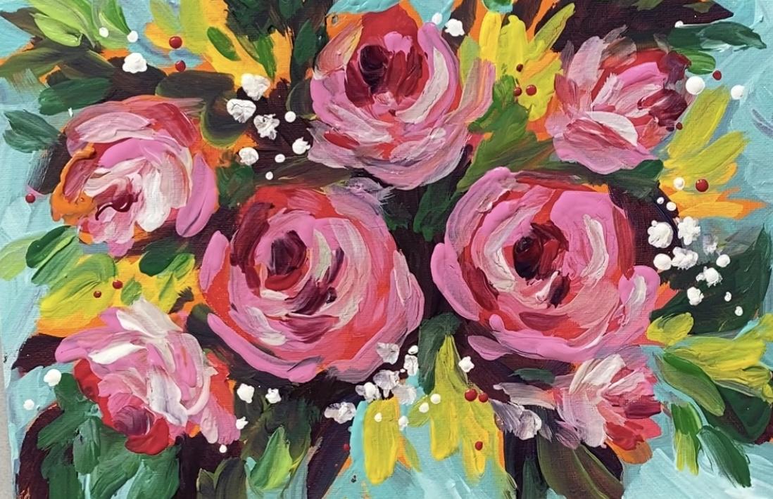
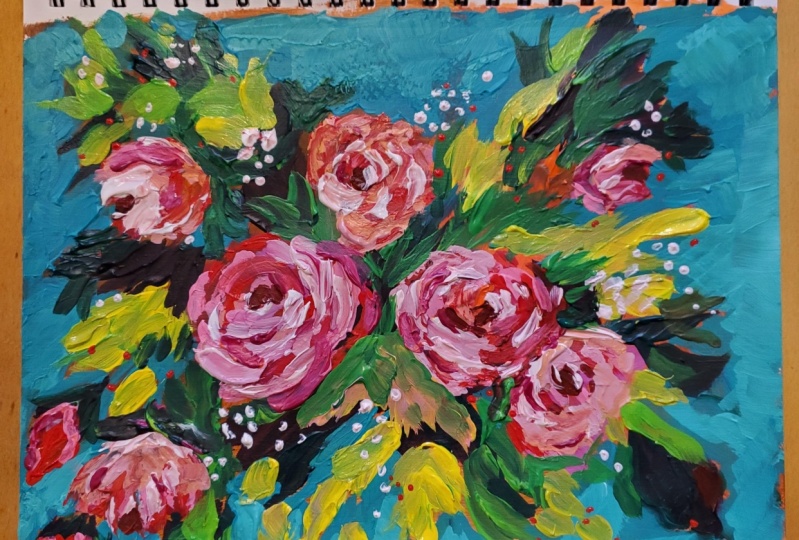
14. Class Project: Congratulations
on completing all of your exercises
within this class. You are now ready for
your final exercise, finale, your Class Project. I'm calling this project
Forever Flowers. Once you bring these to
life with your skills, you'll never need to water, fertilize, trim,
divide, whatever. I don't have a green thumb, so these are perfect for me. These will live forever
happily on your Canvas. For you and others to enjoy. To start this project, you'll need nine colors. I've listed them in
order of appearance. Orange, bright
red, pink, yellow, dark purple, green,
bright green, aqua blue, and white. You'll also need three brushes. A three-quarter inch flat, a half inch filbert brush, and a number one round brush. If you want to frame your
project when you're finished, you'll need a
ready-made photo frame, preferably with a mat. And if you'd like
to sign your work, you'll need a ruler. Feel free to switch
up the colors to suit your taste or decor. Don't be afraid to try a different combination of
colors or a different brush. Experimenting and
making mistakes is key to the learning process. So have FUN being
courageous and curious. In addition to the materials
I've already mentioned, you'll need something to
hold and mix your paints in. I'm going to use this a garden. You could use palette paper or an old dish or a paper plate to. You'll also need a pre
primed canvas board that you can get it your local Art Supply store or online. A container to hold water
for washing your brushes out between colors and paper towels or watch
tablecloth for blotting your brush or removing
paint or wiping your hands. I typed out everything
you need for this project and included it as a PDF file under the Resources
tab for your convenience. Once you have everything ready, you can begin the project. The first step in your
project is to paint the entire canvas orange using your three-quarter
inch flat brush. This background color will be the color that peaks through any areas that are not
covered with the next layers. So instead of your white
canvas showing through, if you miss a spot, you'll
have this beautiful orange. Instead. Don't fret about brushstrokes showing most
of this will be covered. However, I would paint the sides because
those little edges may show depending
on how you frame it. After you're finished
painting the entire canvas. Orange. Blow it dry
with a hairdryer. Or wait 30 min for it
to completely dry. For the next step, you'll need your happened filbert brush. Dip into your bright red and add rounded shapes where you'd
like your main flowers to be. I'm painting loose
Roses like those in the very first lesson.
This will be a review. Next, I'll add pink, and this will be my mid-value. Before I paint the finishing
touches on my Roses, I'll add some Filler Flowers. Hello. I'm still using my half
inch filbert brush. Next I'll tip into a
little green and dark purple and add this
realm I flowers. This is part of my
Reverse Background. I'm using my three-quarter
inch flat brush. Remember to use the edge of your three-quarter brush
to get into tighter spots. Now without washing my brush, I'll dip into straight green
and add some leaf-like, very loose brushwork to indicate
where foliage might be. You can be more
detailed if you like. But I want a very loose
look for this piece. I enjoy mixing wet on
wet on the canvas. So where the purple
mixes with the green. While I'm doing my brushwork
looks very pleasing to me. Here. I'm mixing green and
yellow for my next color. It's a bright green if you have that handy, just use that. If you don't, just
mix green and yellow I'm using this bright
green to highlight some of the foliage like leaves
that I've added. Now after washing my
brush out thoroughly, I've added the light
aqua to my brush and I'm going to continue my
Reverse Background with this lighter color. I'm painting all the areas that have not been
covered with paint yet. And as you can see, I don't mind a little of
that orange peaks through. I love this brush
because you can use the flat area to
cover larger areas. And then with the edge you can cut into those thinner areas. And then you can
also use the corner. And this will be
easier with practice, but don't worry about
getting everything exactly. Remember, this is supposed
to be loose and free. I also use this step to
define some of my foliage. I can kinda paint around the leaves to shape
them up a little more. Finished my Reverse Background, I'll make a lighter version of that aqua blue color by tinting it with white and
add that as well. It'll give the background
a little more dimension. I'm adding this just
to be outer edges. For the next step, I'll
move back to my Roses and mix a light pink by
adding white to my bank. I've switched to my
filbert brush now. I'll warm up my pink
with a little yellow. But you could use it
just as light pink. Add the colors that you like. Once you've mixed the
color that you like, use this color to
highlight your Roses. Remember from the exercises
that you just need three distinct values to
give you a Roses dimension. Remember to use your
reference photos to keep your Flowers accurate. I also use straight pink
to add some more petals. Next, I'll mix white, yellow, and green to make a
light bright green. And this I'll highlight
my foliage web. Next, I'll go back in and add a few more of the yellow
Filler Flowers. They got a little lost when I
did the Reverse Background. I'm just going to add
them in a little bit here and there to
fill up the space. In this next step, I'm mixing my light pink with
a little White. And I'm going to use this to
highlight my rose petals. For this step, I'm adding a
little bit of Filler flower, like maybe babies breath with the corner of
my filbert brush. To add more babies breath,
but smaller flowers. I'll turn my brush
over and use it to dot some more white paint onto my
canvas in little clusters. Don't forget to clean the end of your brush when you're finished. Now with my filbert brush, I'm going into some of the recessed areas and adding
a little more foliage. Just some leaf-like strokes
to fill in the gaps. For this next step by mixed a little purple with
my bright red. And I just made a
darker purpley color, kind of a fuchsia purple
just for the center of my Roses to make them look
more recessed in the middle. I think it looks good the way it is. I'm very happy with it. I'm gonna leave it to dry. And it will take about 30 min. If you'd like to dry. It faster. Just hit it with a hairdryer and it will
drive within a few minutes. While I was drawing it. I've thought a few red
dots would be pretty. I'm adding those with the
would end of my filbert brush. I just dip into the red paint and touch the canvas
where I want each dot. Now to sign your work. For this, I used a number
one Princeton brush. I use a ruler to steady my hand. It keeps it above the canvas just enough so I can sign
without being wiggly. You'll need to then you're
paint a little bit with water. This will allow it to flow
off your brush more freely. Keep your brush perpendicular to your canvas as you write. It takes practice, and
I've done this a lot, but I still have a moist
cloth or paper towel handy in case it
doesn't turn out. So I can quickly wipe
it off and give it another try until I get
it exactly like I prefer. It's very finished. Dry it completely, and meet me in the next lesson, where I'll show you an
affordable framing option.
15. Framing Demonstration: For this framing Demonstration, if you're finishing
your Class Project with a ready-made
frame like I did. You'll need the frame
with a mountain included a sturdy screwdriver,
lint free cloth, some glass cleaner, and some petty two-sided
tape or glue gun. To begin, take apart the
ready-made frame using a screwdriver to
carefully bend the middle tabs up to
free the inert. I separate the pieces and set aside the mat and backboard. Then using glass cleaner
and a free cloth, I cleaned both
sides of glass very carefully as the
sides are very sharp. Then I placed the
glass back into the wood frame and set those aside to the mat board
included with the frame. I use putty double-sided tape or glue gun to a
fixed my painting. I like using the putty the best because if
you want to adjust it or change out your painting altogether for
another piece of Art. At a later date, the putty is removable and will
not mar the mat. Double-sided tape and glue gun, or a more permanent choices. But they all work. Whatever I use, I just put it on the four corners like this. And then press my painting down firmly and it holds
it very well. I like it perfectly centered. And I adjust it after
I press it down because when the putty is
still warm from your hands, it can be adjusted. So I just eyeball and I
don't measure anything. Now I can place it back in
the frame with the glass, but the backing back on, making sure that the comb for hanging is where it needs to be. This brain will protect
your artwork and dust and scratches and give your work the finished touch it deserves. Can't wait to see yours.
What a great finished. Meet me in the next lesson. We'll wrap everything up
to conclude this class
16. Conclusion: Thank you so much for
taking this class. I hope you enjoyed it as much
as I enjoyed showing you. Let me know how you did by uploading your project
to the project gallery. I'm looking forward to
meeting you through your Art. I hope you learned
a lot and you find many uses for these
Painterly Florals. Each class and this
acrylic painting series, we'll go over some at
the same brushstrokes and techniques and color mixes, and I'll introduce
you to more as well. Follow me here on
Skillshare to be the first to know when I
publish a new class. You can also find me on YouTube channels
called creatively be. I'm also on Instagram
and Facebook. The links are on my
Skillshare profile page. When you upload
your class project, let me know if you'd like
me to critique your work, I'd be happy to help you
become proficient at this practice as much as you can and you will see
improvement, I promise. You can also let
me know how I did as an instructor by
leaving a review. This really helps
me learn to become the best teacher I can
be and meet your needs. As a beginning painter. I look forward to seeing your project and meeting
you through your Art. Thanks so much. See you again soon.
17. Time-Lapse BONUS - Part 1: D. A D.
18. Time-Lapse BONUS - Part 2: That O. 00 that Da
 Brigitte Miller, Artist | Creatively B