Transcripts
1. Hey There!: Hey there and welcome. Did
you know that Procreate is the number one graphic
design on the ipad and it gain its reputation and
user friendly interface, making it the most favorite
among digital artists, illustrators and
graphic designer. However, it's not always
easy to get started. So I created this
class and to help you get started on your
graphic design journey. Hi, my name is Brian. I'm a graphic designer
living in Montreal and most of my work is designing
marketing materials, social media posts,
and video editing. I've been using Procreate
since 2018 and it has become my go to tool
all my creative projects. All right, so this
is the breakdown of what the class is all about. We will talk about
optimizing your gallery. Being organized
is a key and I'll share my tips that I
pick up along the way. I'm also going to talk about transform tools,
selection and adjustment. These tools are the
bread and butter of creating your
project and procreate. We're also going to talk about the actual tools
and how to optimize your project and to make your workflow smoother,
more precise. The hand gestures and basic shortcuts to
speed up your workflow. And lastly, we're adding text on your projects, saving
your projects. And I'll share my
best practices to ensure your work is ready
for the world to see. Hey, since we're learning about graphic design using
appropriate app, we'll be making cool
poster that you can share on social
media or print out. And guess what, whatever
you learn here is totally going to help you
rocket in real life projects. Let's put those skills
together and we'll see you on next
video. See you there.
2. The Class Project: For your project,
you'll be creating a poster from scratch together. We're going to be making
this beautiful poster. Starting from the sketch all the way through the
advanced details. Then on your own, taking everything
that you've learned, I want you to create
your own poster. Be sure to post your projects down below in the
project section, and I can wait to see
them. Let's get started.
3. The Gallery: Hello Ron. Brian here, and in today's video, I will just show you some of the Beginner's guide
of Procreate App. Procrepp is actually just available on the ipad
or an Apple store. It's actually currently
number one as a graphic design tool and it's very popular with digital arts, but it's not just
limited to digital art. You can actually do some
photo editing here, you can do collage and all that. Once you download it, you can
just open it right there. I'm already here
in my procreate, so the icon, a procrit
is this one right here. All right, so this
is the gallery, this is where you can find
all your previous artwork for your work previously and
currently you're working. So it's going to
be automatically saved once you created one. So let's go in this part
of the the interface. So if you click this one, you could see the
version you're in. On the other top right
part of the screen, you could see the Select select, pretty much that
you want to select. You can see I did some kind
of pattern in the past, so I could just group
them just like that and in a separate group.
And you can rename them. Just click the name and you
can rename it as you wish, Just like that. And
you're good to go. And if you want to ungroup it, you can just go back
select, do this one. And you click the pattern the right here and you can
just put it right there. Import is just importing from your ipad or in the
cloud procreate file that you download
from the Internet. And then the photo right here. You can straight up
access your gallery from your ipad and
you can just put it, take note that when you do that, the dimension of the canvas will be based on
the image itself. So just be careful on that one. You don't want to
do some effort and you realize that the
canvas size is too small. On the plus icon right
here, this is square. You want to customize
or you want to create your canvas to starter. I would recommend
to just go with the screen size. Let's
just take a look. Screen size is just the
exact size of your ipad. Screen. Pinch it,
just like this. Yeah, you can just play
around, but let's go back. There's a pretty much built
in canvas sizes in here. So like square especially
this is for social media or Instagram post or
any square canvas. You can also
customize your canvas by clicking this plus
sign again here. Dimensions or your units here? I usually use inches. I do. You can do pixels as well and all the units here, but
I want to print it out. I usually go for 300 DPI, but if you want to, just like a simple digital R,
it could go 150. Or you can also go for, if you're making like
a web based images, you could go 72. The higher the DPIs, actually the file size
is a little bit larger. Higher DPI or larger
canvas size layers, max layers will decrease significantly. Be
careful on that. Yeah, you Carl profile,
you have it here. So RGB is for screens, just the difference is RGB has a larger color gamut or color
range compared to CMYK. Well, depending on the printer or you have a specific printer, they usually tell you
what type of profile. So you can just select
this one right here. I just should go with the
generic CMYK profile. Unless I know you can also
use RGB for printing. Nowadays, printers
just use RGB as well. I'm just going to
go cancel here, and I'm just going
to use screen size here. And here we go. We have our screen size here. We're going to discuss
the central tools here appropriate on the
next video, L s there.
4. Brushes, Colors and Layers: Hello guys, welcome back. In this part of the video, we're going to talk about
some essential here. I'm going to briefly explain them the best of my abilities, how I understand them correctly. But yeah, we're
going to start here. So if you want to go back to your gallery or to see
some of your old artwork, you can just click
this one, the gallery. And if you want to go
back to your artwork, any of these, you can just click them. That's
pretty much it. Let's take a look at
this part of the tools. So these are the brushes. All the brushes
appropriate comes with the pre built brushes
that you could use. The brushes I usually
use are online and mostly the sketching and the
calligraphy and airbrushing. These are the most common
brushes I use when I was starting because I was trying to figure out
what's best for it. But on the later part
of what I'm doing, I actually started buying some interesting
brushes I saw online. So you might want
to do that too. But first of all,
I just have to, you know, I learn
what you want to do. But these are all the
brushes you can find. So much is like in between. So it does not paint. It does not just blend. Your, your paint brushes or any images actually just
blending and all that. I don't really use them, but it's there for you
to use if you want to. The eraser technically
is definitely a eraser. You can customize them, actually even the
smudge tool here, You can customize
it to your liking. You can use different
brushes to a. It might give you some
interesting stuff or interesting results. You can play around with it. And the layer here, the
layer is kind of a lot here, but we'll try it piece by piece. The layer, you can rename your layer by just
doing this right here. So you can rename it
to like first layer. This is when you're working
with a lot of layers, you might want to rename them. Also, one trick that
I want to show you is you can rename it using
your ipad right here, but to do that you can
actually go to your setting. Apple pencil right here.
You want to go scribble. You can just turn on the
scribble right here, layer. You can rename your
layer just like this. So you want to name it, label. It should go label just like. You can erase it,
just like this. You could just put it
whatever you want. She but I don't
really use it because it's kind of like I don't
really like to use it, go back to setting and then I'm going to just turn it off. I like to use it just, you know, keyboard right here, but it's when you
want to use it. Yeah, right here. Besides renaming, you
can click this part or any part actually
this part right here. You can rename, select, Clear the layer, just like this. You can alpha lock
mask, invert reference. If you click the end right here, it's actually the blending mode. So the first one is the opacity, so you can reduce
the transparency or the opacity of this will give you some
good results as well. These are all the blending mode. This is not a beginner's guide, but is there for you
to play with it, learn with it, but
that's pretty much it. To add layer, you can just
click this one right here. You can add as much as you can, depending on the layers that you saw when you were
creating your canvas. You can select layers by
swiping to the right. You can group them by
this here you can delete. Also, you can merge them
by pinching like this. Let's just do some
real example here. I'm going to delete all
the layers just like that. I'm going to just
create a circle. I'm going to do this, Let's, I put some branch right here. I'm going to make a
new layer, just here. If I got to combine them, because I'm running
out of layers, I can just pinch
them right here. I can delete them,
duplicate them, or lock them if I want to. Also the background color, you can select your
background color here. It's easy way to change
your background here. You can also tuggle
to different colors, but that's the background
color right there. You cannot delete this,
you can disable it. But you cannot really do it. It's not a layer,
but it's just there forever for the color palette. This is interesting thing here, this is the disc, like a color wheel you
could play around. So this is the hue. You can
change the hue right here. And once you change the hue, it changes the tint or the saturation and all that
good stuff right here. That's just pretty much it. You can also get your previous color here if
you want to change that. And then you went to
a different color, just like this, you
go back to color. You can always go
back just like that. And you have your history here. You can clear that
out and you can, yeah, these are your palette. Let's go here. Before I explain the palette, if you want to go classic, this is just the hue here. You change the color. This is the saturation. It just goes like this to
unsaturated saturated. This is the lightness. It goes to the brightest
and to the darkest mode. So that's pretty much it. Harmony is where
you find a good, interesting contrast
of the color. If you want to go complementary, this is usually the
one that I usually use because they always go hand
in hand with the color. They have a good contrast
with each other. So I just use complementary. But you can change the
mode to analogous. They have pretty
much similar tones. If you want to go here,
this is a warm tone. If you want to go here, this is like the colder tone colors. That's pretty much you
can do experiment here. If you have a good red, I just go with the
complimentary most of the time. And then for the value, you can pretty much have
the value if you have a specific color from
like specific projects. I usually get the hex code
here, It's pretty easy. You can just tap and paste. Compared to when
you have your RGB, you have to input all of
it at about one by one. I just get the hex
code and I'm good to go for the palette. This is interesting. You could create your new
palette right here. You can also get the cars here. It gives you some name. Procreate names. It, yeah, for the compact, I usually create my own palette right here. Create new palettes. If you want to use this here, you can, you can
stop right here. You could pretty much
add anything basically, and then you could share,
duplicate, or delete them. Just delete this one
just for a show. Another one here is you can get some interesting
color palette. Hold on 1 second.
Let's say example. You have your camera right here. I'm going to take this,
actually I'm going to get this plant right
here and I'm going to get some interesting
color palette just by topping from
this plant right here. So I can just, you know, top and it goes
directly right there. That's just one of
the nice features. Procreate. This is a
update or recent features that they just put in,
which is pretty nice. You can also get
it from a photo, maybe this one right here. It gives you also all
the color palettes. It's pretty auto generated, it's freak me out. Sometimes it's there for you
to use it if you want to. That's pretty much
the tool right here. Yeah, let's end the video
here, but on the next part, I'm going to explain this part right here, the adjustment, the selection, and
some of the actions or these tools on the
left side of procreate. I'll see you guys
there and thanks.
5. Transform, Selection and Adjustments: Hello guys, welcome back. In this part of the video, we're just going to
talk the left side of the procreate app. Let's use the mono
line brush here. So I'm going to create
some circle right here. So if you hold just like this, it will just do a
perfect ellipse. And if you tap one
of your finger here, you're just going to get
into like full circle. And that's a good shape, you can just trap a
color right here. And sometimes you encounter
kind of this one right here that you have those lines
there that you don't want. And to fix that, let me get another
circle right here. Yeah, just like this
one right here. To fix that, you can just
drop a color right here. Don't let go. Just you can see that the color drop
threshold right there. So this is the original one. You can still see once you
increase the threshold, it gives you a good result. There's no more like the
weird lines in there. So that's just how to fix that. Okay, so let's take
the circle again, let's make it perfect circle. Let's use some of
this one right here. Since we're on the first layer, we can use the transform here. This tool right here, especially this
three right here, it just affect per layer.
Use this one right here. This is actually called
transform tool or moving tool. You can move around with this, you can do free form it. Yeah, you control how it is. But if you want to uniform it, this is usually the one that I use just to make sure that
the proportion is good, it's not weird and all that, especially for circle
and square objects. If you want to distort it, you can just play
around with it. This is actually good
if you're drawing, doing some different tree
D dimensional and stuff. So you can do the distort. You can also use warp to change
it to interesting shape. Yeah, you can even change the color of
this one right here. You get interesting
abstract flow, I guess. Flow shape. Now you
have a abstract stuff. You can also flip
it horizontally. Also use the advanced mentraight here to just do some stuff. Get some good example.
We'll get back to that. But this one right here, since I'm working with this one, I'm going to get to the
layer first which I want to target to maybe extend it to flowing leave. I can also the advanced mesh could make it a little
bit more control. Just know that it exists
just right there. Let's go back to our main
specimen right here. I'm going to get rid of that. I'm going to just move
this one right here, so you can use your
fingers or your pencil. Okay, one side note here. Also by default, you can also draw with your
fingers right here. And sometimes it's annoying, especially where you want to be precise with you're drawing. And then you do
this run right here because everything like skin it register into your canvas. So if you want to be like precise and doesn't
have this annoying, you know, extra pains in
here, usually it's off. But if that happens to you, you can just go to the ranch. Here you go to preference, you go to gesture control. Make sure that you
disable touch action. And that should make
your life a little bit better because you don't want your hands to also paint also. Everyone can just paint around so it's not
really that good. Okay, to best demonstrate
the selection because usually it's good for
selection, for images. If I'm doing like collage, I could just use
the selection here. This is going to be
a combination of layers and all the
transform tools. So I'm just going to pack it in. So I'm going to do
selection here. I could definitely use
automatic for this one. But if the colors are not
even or not the same, I usually use free hand. I can just free hand this one
right here, just like this. I could move it with this one
right here, just like this. Or I can do uniform. I can move them around Ops, even to go to my layer here. And I'm going to select
this thumbnail here. I'm going to go mask
and everything will go. So that's just a
quick way to get rid of the background by
using the selection. But since I use mask, I can always disable the mask and it should
always, you know, I still have the
copy mask is one of the powerful tool here in
appropriate because it's just kind of like non
destructive way on working on some of like images or
object that you're working on. Let's say I want
to get this part as well but kind of like smoother that blends
with the art, the image. I can just do this
one right here. I can go feather it out. It has a smoother blending. It has a smoother edges. I can just copy paste. And I'm going to go
to the transform tool and it should give me a nicer result because it's like feather
out, do rectangle. Maybe you want to
get this part right here, copy and paste. And you can want to
move around here also, mixing it with the selection and the adjustment selection first. And then let's go automatic, just there's just a yellow. And then you could just go adjustment and
then you could change the saturation of the
yellow that was selected. This is one way if you want to work pretty fast,
want to change color, especially if you're
just hitting yellow, That's something like
this color balance. Let's say you want to
change the color of yellow. You can go specific with this. You can go for the shadow. Shadow is like the darkest
part of the image. You can just do that
something here. You get a good result as well. With this one, you
can play around, you can look at this
image right here. Let's go check out the
adjustment right here. For the adjustment, you can
use the liquefied tool, especially I use this for photos if you want to
do something else. So this is like experiment. If you want to use this, you want to try it
for front first, I'm going to use the push. I want to push the lips right
here. You can go crazy. Make the lips a little
bigger, probably like that. This is a way to do retouch of your photo. Make sure you do it correctly, but that's just a good
way you can also expand, probably expand some eyes right here if you want
to do some good stuff. Something like this. This is a fun way to experiment around. That's the power of liquefy. Sorry Olivia. Another good thing about this adjustment here
is let's say example. I'm working with this
image right here. I could just select this part right here, adjustment here. I could change the brightness or the saturation of the
color of the image. This is a fun way to change
the color of some image, It just gives you a good result. This part right here, before
we get to the ranch here, this one right here is your
control of your brushes. You could just go,
probably like that. But you could decrease or increase the
brushes right here. This is just the opacity
of your brushes, the lower the opacity. And this one is the undo. I don't really use this one
right here because I use my fingers to undo
and then redo. Two fingers for undo. The three fingers for redo. That's one of the trick as well. You can also use your fingers
here to put the sel color. Let's say, let's see. Let's get some image right here. Let's, you want this
color right here? Just do this one
tap and then press, you see this color wheel here that gives you
all the colors. That's good and it will register in here as
well in your history. Then this one here, use it. And it will register
directly here as well. You can clear it out and
then you can start over. It will just give you the history of your color.
That's pretty much it. I will continue in the
next video while we explore the actions.
I'll see you there.
6. Actions: Hello guy. Still here. Brian, you're going
to go to Ranch. Like this is kind
of like the file or the settings of
the procreate app. You can darken your
canvas right here, which I don't really like
to use during the day. I usually use this lighter
interface during the day. But if I go to the bed
and do some stuff, I just use the dark mode. If you're left handed, you can just turn this pretty. If you click Add right here, you can pretty much insert
file photo and all that. You can add text
right here which will get into later on this video. So for the canvas here, you can pretty much
do crop and resize. So if you want to
change your setting, like if you want to go
a lower DPI because you're running out of layers, you can always
decrease your DPI. You can resize it
pretty much like this or from the setting, pretty much Animation insists. This is actually one of the interesting features
of procreate recently because now you can do some minimal animation
earlier or frame by frame. So if you want to
add more frame, you can just do
this run right here and you can create another one. Let's just do it a
couple of times, probably a frame, so you can
see the possibility here. Now you can do the setting. I probably do slight
frame by frame and you can start playing it and you have a good animation
just like this. You can get created with this. But it's going to
be layer per layer. It's there for you to try. Let's just clear this out. See, it gives you a created
couple of layers here. If you're working on
this, if animation, make sure that your DPI is very low and you have
a lower canvasize, You can maximize all the
layers or the frames. Let's just do that.
I never use pages, but drawing guide I did use, this is pretty interesting. It gives you all this
grid right here. If you're working on
like a building or you're working on a
perspective drawing, you can use the drawing guide. You can customize it, change the color here, make the capacity
opaque and visible. But I usually use
probably like that, but you can use that. You can also use the grid size if you want
to make it specific. With a grid you can go, I usually go inches, probably five, and
you get a division. So you can use this
probably if you're making stickers you can
there for you to use. So another thing with the drawing guide is you can
get creative with probably Symmetry Radio because
this is one of the kind of like therapeutic way to do
some creative stuff as well. So I can go done, make sure that it is
drawing assist is turn on. If you click on the layer, you can now do some interesting
a pattern stuff here. You can get created with this. And yeah, it's there
for you to try. One of the good thing
about procreate is they added this reference
feature right here. If you click the reference here, enable it, just stay there. You can actually import an
image right here, probably. We're going to do
this one right here. You have a reference here. Do some drawing here. I don't know, this is
not a good you draw, you could drop colors
right there and you can select the color
as well from there. So you can just do the
color picker here, You get the idea that, and you could probably
mess around with it and all that crazy
stuff and you can always clip it so it just goes on the main image if you want
to share it to the world. Let's say I'm going
to go back to my gallery and I'm going to share this one pretty much
here. This one right here. If I want to share
it, I'm going to go back to that trench or action, I'm going to share it actually, there's a lot of format here. Do that also as PSD
is in Photoshop. Definitely the standard one. Png or Jpeg and all that good stuff right
there. Screw you the video. And also for the action, you could see Procreate
record your artwork. Sorry guys, I'm going
to end this video now. But hopefully you pick up some new tips and tricks so far. And I hope you're
enjoying this video. And I'll see you on
the next one for more.
7. Hand Gestures and Basic Shortcuts: Hello guys, thank
you for tuning in. I'm just going to
address some of basic procreate
shortcut and gesture. I'm going to create
a new file here. Let's say I'm going
to go draw some, let's say the circle right here. I'm going to add a shape circle that duplicate this
one, new one here. This is supposed to be Sherry, but there's a couple
of layers here. If you want to merge
these two layer just like this can just do
that right there. If you want to zoom in, you can just do this
one right here. If you want to undo your action, you can just do your two fingers like this and it
gives you the undo. And then if you want to go
back to your latest work, you can just do 23
fingers, just like that. If you want to erase
or clear the layer, let's say I want to clear
the first layer here. I can just 23 fingers
and just scrub it. And it should delete it, but you can always undo it. Yeah, pretty much that. If you want to go, let's
say you're doing this here, here and you want to
make sure that you have the exact size of the screen. You can just pinch
it, just like that. Pinch and let go. And you get the full screen or the size of the actual size
of your canvas. And if you want to
have a full screen, like just for a show, let's say example and done with my artwork like
this one right here, I want to make sure that I want to show it
in a full screen. I can just do four fingers and I can just do this
and it just, you know, blows all of the extra menus here except for this
one right here, but it's not that visible. You want to show all
the menus and tools, you just do the same thing. So four fingers and then
that's pretty much it. And if you want to cut, copy and paste, you can
your three fingers here, you can swipe down and
you get all the cup, copy and paste Again, if you want to
merge your layers, you can just slick all of it and then you can
pinch just like that. I'm going to explain Alpha
lock in a quick way. All two fingers right here, you can swipe it and
you can see this like a checkered board up
behind the artwork. So you can just undo it. Do Alpha lock is a way to, let's get some color right here. It's a way to draw without, you know, not spilling
the paints all over. Because if it's not alpha lock, you get all the color spill. Let's say here you get
color spill all over the art board or the canvas
if you want to alpha lock it. I'm just going to go back. Let's say, let's say in
this layer right here, I want to alpha lock it. So I'm going to
swipe two fingers. It's not going to spill
all over the artwork. So I'm just going
to merge this one. So it's not going to spill everywhere compared to if it's not alpha lock, it's
just going to spill. So it's a quick way
to do it if you want to precise or if you're doing some shadows
and good stuff. That's how it works
with this one. Also, do it here awful lot. It's everything that
we learned today. Hopefully, I covered
it out, everything. And I'll see you guys
on the next video.
8. Mixing it up, Using Texts and Finishing: Hello guys, thank
you for tuning in. And we're going to create
a new canvas right here. I'm going to go for square. And that's pretty good. I want to show you some of
the tricks that I learned. If you want to have
like a split screen here and you want to have like a reference
on the other side, I'm just going to
use my thumb here. Slide it in, browser here. It should give you
this like a box here. You want to put it on
this side right here. Let go, and you get
all this split screen. You can use this border right here and you can to
the way you like. So I'm just going to
do this right here. I guess that's the
minimum, Minimum size. If you want to draw, get
this one right here, top it, and then save image. And you should have the
image in your gallery. So you can just
import it right here. Add, and you have
the strawberry here. Just like this reference. I'm going to go, I get
the reference here. I'm going to put it here. And now you can close this one since you
don't need it anymore. But if you want to
leave it there, it's kind of nice
to leave it there. And you just have
to go here and you can do some other stuff here. You want to check your
e mail and stuff, but that might distract. Let's get to example here. I'm going to create a new layer. I'm going to get the
brush right here. I'm going to do some
sketching here, because I want to sketch
the strawberry probably. I'm going to use the
model line for this one. I'm going to get the color. I'm going to sample
the color right here. I'm just going to trace
it just like this. And I'm going to fill up
with color just like that. Then I'm going to
create a layer. I'm going to get another
sample of color right here. I'm going to do
abstract drawing here, since that will
be easier for me. I'm just going to
do this like this. I could turn off my
sketch right now and I just trace it and draw it at the same time go to one of the
projects I was working on. I'm just going to group
this one here so I could actually move them pretty
easy. I'm going to group them. When you group them, you can
move them all over the place just once instead of just
moving piece by piece. That will be not the greatest. Okay, let's go, let's
add some texts as well. Say banana, banana leaf. And there you go. There's a text, it says
text layer right here. If you see like a, if you
want to add your text, you can just go to
your layer right here. Or you can just click
this one right here. You can select, you can change your front
size right here. It customize it to your liking, especially if you have
probably two lines of text. That's where this goes. More interesting I'm, you can also change
the letting here, the base if you want,
and the opacity. You can change the attributes
or the alignment to here, you can put under, but this is not a good font, Celso aerial, you can
select all of it. Select all there. You
can underline them. Doesn't seem to work. You can outline also your text here. You can also text vertical
here. Never use them. If the font has, let's go back. It's a line. Let's go back. If you want to make
all your betters in a capital or capital mode, in the capital letters, you can always turn
it on just like here. Instead of deleting and putting
it into capital letter, you can do some
interesting stuff with the letters or the type. If you rasterized a text, you could pretty much
do anything with this, liquefy it something like this. You can even twirl it like this. You have this good
effect in the banana. You can just pretty much do it. You can also, let's say select and then color
fill with this one. Just one way of doing this. Color something like this. All right guys, this
is the end of this. Beginners got to procreate. I hope you learn something.
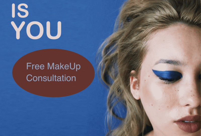
9. Project One: The King: Hey guys, thank
you for tuning in. And in this part of the video, we're going to create
our content right here. I'm going to be using
landscape right here. Since we're going to put a
little bit of images text, I think it's best for us to use the landscape
mode for today. I'm going to do a custom
new canvas right here. As you can see, I click this plus icon on the right
upper part of the screen. And then the same thing, the right upper
part, right here. As you can see, it's
supposed to be 1080 by 566 and I'm
going to go 96 DPI. You can go like maybe 150 here, so you have more
definition. But we'll see. Well, we'll use that for now. Okay, so we don't
need this anymore. So I'm going to just close it. And as you can see, you have all the canvas here
that you can play with. Our target today is to create
a post for popular brand. It's called Burger King. If you're familiar, I'm pretty sure you're
familiar with it. Create them a social media post that is very Burger Kingish. In terms of branding
imagery and style. I'm going to go ahead and
create early out right here. So I'm going to go
for the ranch icon. I'm going to go for canvas. I'm going to go
drawing guide, Edit. Drawing guide.
We're just going to make like a margin right here. I'm going to increase the
capacity so you can see it. These are the places that
you cannot do anything, especially with text images. I think it's okay, but unless you're aiming for offset text. But I'm going to go done and
then we'll start putting our images right here and we'll start the
actual creation. I'm going to go
ranch icon at photo. I'll be using this background
right here. This one. I got it from
Unsplash.com and you can search for barbecue grill. And I'm going to be inserting
another photo right here, but as you can see, there's a little bit of
problem right here. We might need to fill it up
with the same color this. But as you can see, this image is pretty much no
details at all. I don't think we can
have this pixilated. I'm being creative here. I'm going to go for
selection rectangle. I'm going to get this
part right here. I'm going to go for
copy and paste. Then I'm going to
go for free form. As you can see when as
I hit a copy and paste, it created a new
layer right here, I'm going to go
for free form and then I'm just going to
stretch it just like this. I don't see any
difference actually here the transition
is pretty seamless. I'll be putting text
right here so you can see I think I'm going to change the color of my drawing guide because it doesn't look like
it's showing pretty much. I'm going to go for maybe white. I'm just going to
drag it right here. White it is. Don't
worry about the lines. It's not going to be
printed or visible. Once we export this, I'm going to get another
image right here. I'm looking for burger. All right, so I got this image right here from splash as well. So you can just put for burger and this will definitely appear. If not, you can go
pixels or Pizza Bay. We're going to cut the burger. I'm going to go for freehand. I just went to
selection freehand. I'm just going to start doing it pretty much
everywhere you can. Start slowly tracing
it, just like this. Don't have to be
perfect with this. But I'm just going to go
roughly something like this. You don't have to
get all the details. We can always modify
this as well. I'm going to go for the layer, once still selected, I'm
going to go for mask. And as you can
see, I was able to cut the burger just right there. We're going to move it pretty sure here to fit
into the canvas. We're just going to
put it right here, just sitting, just
being delicious. It's pretty good with the
contrast and all that. What I'm trying to do here, I'm going to put some
text right here. I'm going to create a new layer. I'm just going to put beer way
is Burger King's tag line. We're going to put that and then we're going to put the logo here and maybe the year that
was founded or something. And then we could put
like 100% beef here. Just put arrow and that's it. Pose it as it is, and that's
one of the content as basic, but it gives you the strong
branding of Burger King. I'm going to hide this,
create a new layer. I'm going to insert text. We will put the beer way, don't worry about the text. Since we're going to modify it, make it all caps, I'm going to go left
a line right here. We can start
positioning right here, make sure that it doesn't
go out from our margin. We will design it
letter by letter. I'm going to be just like this. I'm going to go fix the leading
right here, just enough. I'm going to modify
the way as well. Fix the leading right here. Actually forgot. I'm going to change
the font to Nonito, I downloaded it in Google Font. You can just do that as well. I'm just going to make
this a little bit bigger. Okay, we'll make the way
again a little bit bigger. It occupies the thing right
here that I'm aiming. We could duplicate it. I'm going to insert the
logo of Burger King. I can get the color of Burger King from their
logo color from here. As you can see, the
history is there. Once we apply this color here, we can actually
select color fill. We could do some
magic right here. Maybe this is enough.
Put it right here. I'm going to make it a
little bit bigger for sure. I'm going to get the
logo right here. Tone it down a little
bit just like this. You can read it in a
little bit more contrast. I'm probably going to make the burger a little bit bigger. Right here on 100%
beef right here, it has a little bit
more personality. I'm going to handwrite it to see if it's a
little bit better. I'm going to use maybe,
let's try it out. Let me put 100% beef, something like this probably will make this a
little bit bigger. Yeah, I think it's very simple. Capture your audience. You have your
burglar right here. Fun fact, your burger
logo and your way. I think this is a good
way to exercise and we were able to get into a
little bit of typography, a little bit of masking, getting to get images, a little bit of text right here, putting logos and all that. Export this one first
and I'm going to share, I'm going to go for PNG because it's a little bit
higher quality. Save image right here.
10. Project Two: Order Now: We're going to make a
little bit of animation to the social media posts or social media content
we'll be creating. I'm going to utilize
the square feature. The one that I'm going to be using is if you go to canvas, you can see it's 2040. By 2040, I will go directly
to drawing guide and then we're going to make a new alignment and all
that for the capacity. We're going to go to
different color right here. I'm going to be utilizing
the same concept here, but we're going to add a
little bit more functionality. This is going to
be another photo, a bit of text right here to put a call to action right here in a little
bit of fine print. So we're going to deal with food again because it's
more engaging. If we talk about
food and all that, I'm going to disable
the layer right here. We're going to insert our first picture or
image right here. So I'm going to go through
the range. Insert photo. I got my new photo right here, so I'm just going to
position it right here. That usually is the most
frequently used format. To make sure that
it eclipse or it gets into the ural I created, I'm going to make a
background color, maybe something like
this one right here, teal blue and orange or yellow. Since we get all the
colors from here, it will match pretty much. I'm going to get our text right here, Something catchy here. Not too long, but just enough. Get five meal as usual. We're going to use the line to the left because
that's easier to read. Another line break right here. I'm going to make this all caps. I'm going to make it
a little bit bigger. Fix the leading right here. I think we're going
to change the font to something a little bit
different, something standard. Maybe I'll use area, rounded, empty ball right here. Think it's too big. So I'm just going to
put it right here. We're going to add cl
actions right here. Add a new layer and I'm going to use probably
model line and we'll get, I'm going to get this color
right here for cal to action. I'm going to just
maybe like this, maybe rectangle and I think
that's good enough for me. I'm just going to reposition it. You can do free format if you
want it uniformly scale it. Think I'm good to go with this. I'm going to fill it up and
I'm going to add a new text. I'm going to just put, try now. I'll change the color of the
text to something white. I'll put it right here. I
think this is good enough. I'll make sure
that it's snapped. We're going to put a little
bit of text right here. Just a little bit of fine print. I will just paste
and select all. I'm going to just remove, change the areal to italic, and put it right here. Something like this. I'll
put it all the way down. It doesn't stand up. We're going to go offset
the text right here. The get five meal. We're going to change the color. This one right here. We're going to put the color
palette that we used. We're going to move
the orange to here. Something like this. I think
we're good to go here. I think this is a
good pose as well. All we have to do now is to make sure that
we animate this. We're going to set some
settings right here first. While we're going to achieve
this one right here, the one that blinks and
you get some attention. What I'm going to do here, I am just probably group
this one right here. We're going to go for canvas
animation as is turn on. Then we're just
going to set this as a background, this
one right here. We're going to turn
that off first. And then we'll get a
new frame and turn it on and we are going ping pong. And then we will decrease
the frames per second. It doesn't look overwhelming,
probably like three. Play out full screen. We're going to remove
the drawing guide. First I'm going to play it. I'm going to go for Share animated Jeff actually
for Instagram. They don't accept
Jeff. We're going to go for animated P four. And we're just going to
export it right here safe. We'll get into another lesson. It's just a little bit
of more functionality. But we'll get into the final project and I'll see you there.
11. Project Three: Just Do It!: We're going to get
into another example of how I create some
social media content. It's going to be another
brand that is very popular. It's going to be a shoe brand
which is called Converse. Create them a post, something similar to what they're posting. I'm going to go ahead this time. We're going to get into
different layouts. We're going to get
a text right here, something like 50% off
or something like that. I'm going to get something. Shoes, right here, different
shoes, something like that. It's circle out and it's going
to move circular pattern. Probably put some call
to action here like so now we're going to put a skateboard platform as a background on the
entire canvas right here. We're going to mix things up a little bit and I'm
excited to do it. I will turn this off. We're going to add a new photo right
here as a background, but before that actually
we're going to go canvas drawing guide to make
sure that we're on point. We're going to just create a little bit of
alignment right here. Yeah, that's it. Oops, done. Okay. I'm going to go quickly
to Splash.com and then I'm going to go to
Skateboard Arena. Let's see if we can find
something interesting here. We can go to Pexels
Skateboard Arena. We're going to use this.
I think I'm going to be okay with this one.
Add the photos. I'm just going to open
up the procreate app. Insert Photo. Let's see
if it's going to work. What I'm going to
do here, I'm going to go and insert text. First 50% of, actually
I'm going to put it one word and then of probably going to use
this font right here. I'm going to fix the
letting right here, they are not that far. And make it bold perhaps. Okay, we're going to 50%
off something like this. I'm still going to tweak it because every time
I change size, it just goes off. I
think this is good. I might need to change
the color to I think black converse usually
use black color. Something like this is good. It's a little bit off. We're going to change
the color of the image. We're going to go to the
adjustment right here. We're going to do
hue and saturation. We're going to go desaturated to almost like it looks
like black and white. Increase the
brightness right here, the 50% off pop a little bit. We're going to need some shoes from Converse and
their logo as well. Okay, I'm going to get to
Converse shoes right here. Let's get some of
their famous ones. We'll probably going to
go P and G right here. It speeds up our workflow. Maybe this one right here, I'm going to go
back to procreate. Probably I'm going to insert
their logo first. Let's see. You can see that it's
black and white. I'm going to put it on top, the center part of the screen. And I'm probably
going to make the 50% off a little bit smaller
and a little bit here. I just want to center
it out quite a bit. Okay, so we have a shoe right here that is pretty much cut. And we could start,
put it right here, and we can actually
duplicate them, or actually make it
bigger a little bit. Then we can duplicate them
here maybe four times. I'm going to
duplicate, duplicate. And then we're going
to put it right here. This one right here. We're going to recolor
each one by one. I'm going to go hue
saturation, we'll see. We're going to go
for blue. This one. For this one right here, we're going to go another color. Just going to hue
saturation and brightness. You can change the color to
any color that you'd like. Something like this. I
think this is pretty good. I'm going to saturate it, actually, make it
a little bit dry. That's good enough, so I'm
going to just hide it for now. I'm going to put like
circle in the center here. I'm going to use white colors. Or actually red,
I'm still white. Okay, I'm going to
put it like this. I'm going to put all
our shoes right here. I'm going to make sure that probably I'm going to
go something like this. Since we have our guidelines, we know where to put the shoes. I'm going to go for
this one right here. I'm going to go
pretty much the same. Okay, something like this. I'll make sure that
they're on the circle. It looks good. I'm going to go for
the green hoops. I think I'm going
to go something like this. I think that's good. Finally, the last one, I'm just going to put
it a bit like this. That circle really helps
with the alignment. Actually, it's quite big. I'm going to make it
a little bit smaller. I just selected all of them. And then we can just do
something like this. We could just align it
pretty well, just like this. If it's too big, I think this is quite
enough for now. I'm going to group
them together. Group, I'm going to
duplicate it four times. I'm going to just
rename this one as 123.4 I know which one is which. I'm going to delete this so
it doesn't look that bad. I'm going to group this as well. I will hide this all for now. I'm going to go for the
canvas animation assist. I'm going to duplicate this and put this
all the way down. I'm going to merge this
group right here right now. It doesn't give you the
background options right there. To fix this, you just have to disable the background
color right here. Okay, we're going to enable as a background we could started animation right now we're going to reveal the first
frame right here. Everything is actually on
the same frame right now. We're going to add a new frame. Procreate animate
is frame by frame. Since we define this as a
background, this won't go. Anyway, this is
the second frame. We want to animate this as something like
this or two times. Then we're going to go third. We're going to animate it, 1234. Then this four right here, we're going to
animate it, 12345. Think, let's take a look. It's quite fast right
now, but it's working. We're going to decrease
the animation to maybe 4% something like that. It looks like it's going to
be okay for our animation. Let's actually play it again. As you can see, it looks great. It gives you the
50% off as well, and it's like circulating
a little bit. I think I'm going to add
a little bit of a frame, but I forgot to add
halo action right here. I'm going to put a
little bit of rectangle. Added shape rectangle. I'm going to fill up with color. I'm just going to
add a text here. I'm going to put shop. Now, I'm going to select all and make it
all capital letters. Oops, all capital letters. And make sure that it's white. It blends perfectly right here. I'm going to remove the
magnetics, something like this. Okay, let's try it out and make sure that you
combine everything here. Also, it won't mess up with
your animation right now. I think I'm good right here. Let's remove the drawing guide
to see the full potential. As you can see, it's quite okay. We probably need to
fix some stuff here, cleaning up the
logo and all that. Maybe we could move this
a little bit higher. Let's try again. We're
going to save it for now. Animated MP four. We're going to just export it. Just like that. We're
going to save it. We're just, there you go, simple animation for our
social media post right here. There's a little bit of
improvement that I could make, make the 50% up a
little bit higher. But it looks great. You get the idea, and thank
you for watching guys. I can wait to see
what you come up with and I'll see you
on the next video.
12. Project Four: Plants Are us: Hey guys. Thank you, Virginian. We're going to get
into another piece of social media inspiration
that you can create and put your brand or
put your personality to it. This time we're going
to go for a square. We're going to lay out
interesting pictures and some text in there.
Let's get started. We're going to put some,
our images right here. I think we're going to use one, but before that we're going
to go to here, the action. We're going to go
for canvas as usual. We're going to go
edit, drawing guide, and we're going to put
some margin right here. We're going to put
some engaging photo here on the other side. Just pretty much text
right here with some text. And then we'll put
something here as well, like a little bit of text
cut into half but that's our wire frame and
go to hide it. And we're going to just
serve photo right here. I'll be using this
photo right here. I will put it on this part. We still have our
guidelines right here. We're just going to
position it just like this. I think this is quite good. Get some interesting
color palette to apply to this half
of our canvas. A new layer right here, pressure here, and I'm going
to get the money line. And I'm just going to put
some division right here. If you go like hold
it and navigate it, it's going to give you
some good straight line. But if you like press it with
your one finger right here, it's going to make
a straight line and it does increments
15 degrees. I think we're going to put a little bit of
shade right here, but I think we're going to get into this color right here. Probably we'll put
that right there, but I think I'm going to get for some darker version,
something like this. Yeah, this is what
I'm looking for. We're going to just put
some text right here. Probably we could maybe
mask this one right here, get them on the line, and see if we could delete this and just show
this part right here. It looks like it's seamless. We're going to go back to our layer and we're
going to go white. It looks like it's seamless. Just a little bit of detail. Yes. Going to put
a text right here. Actually, I'm going to recolor this right here with
probably white. It stands out quite a bit. I'll put plans on us. And I'm going to modify
the text right here, The styling, because
it looks like it needs a little
bit of letting. I'm going to put it right here. We're going to fix the leading right now because it's still a little bit off. I
think this is good. We can make it a little bit
bigger, just like this. I like the way it's overlap, but I change the gill songs. I'm going to fix the letting even the kerning because they look like the letters
are too close, like this plants are. I think that's a good statement. If it's too big, you can
always modify the text. I can put it right here. You can put a little
bit of logo right here. I think I have a couple of
logos here For plants company. I'm going to put the
logo right here, but I'm going to put it
in this part right here. I think that's okay. Plants, I think
too big right now. I'm going to just
modify it again if you want to precisely with your alignment,
you can go snapping, and magnetics, and snapping, actually just snap to the
alignment that you create. So I'm going to make it
a little bit bigger. Right here could put a little
bit of fine details here. Tiny text right here,
for hierarchy sake, I can change the text
to light italic. And a little bit like this, limited time, maybe something
like that, 20% off. I'm going to put it right here. I'm going to change the color of the drawing guide so you can see the alignment
that I'm going for. I think this is quite good. We can change this
one right here. Something a little
bit like this. I think this is quite okay. We could turn off
the drawing guide, see the result of what we made. This is just one of the
ways that you can plant. Actually, I'm going to fix
the grammar issue here. Plants, plants are. And they have a good alignment. Good, the plant is here to stay, and it has a clear
message, branding here. All we need to do is to
save it to share PNG. And I'm going to save
it as like that. And then we're going to go
to our Instagram and we're going to add a new,
this one here. Very simple,
everything is there. All you need to do is to put
your descriptions in here. See you on the next video for another more complex tutorial on how to create another
content. So see you there.
13. Closing: Thank you: Hey guys, Welcome back. This is actually the end of
the class and thank you so much for spending the time with me and watching this class. I really appreciate it and I hope that you learn
something new. And learn the basic of
graphic design using the procreate that and I can't wait to see what
you come up with. And I'll be happy to
see Beautiful Project. And if you have any
questions and clarification, feel free to send me a message on the discussion
panel down below. And for sure I'll get
back to you and I'll see you on the next
class. See you there.
 Bryan C'ngan, Graphic | Web Designer