Transcripts
1. Exploring Colour, Contrast & Pattern Part 2: Hello and welcome
back to part two of exploring color,
contrast and pattern. I'm done. I'm an
artist and a designer. And for over 25 years
I've been teaching others and helping them to unlock their own
creative potential. It doesn't matter if
you didn't do part one. You can still just come in and do this class straightaway. But it might be useful for
you to just going to take a peek and see what
we actually did. In part one, we covered
a lot about color. We looked at the different
color combinations and how they work well together in today's
class In this part two, what we're going to be
focusing a lot more on pattern and how we can use that pattern and the color together to make
decorative papers. We're going to look
at how to create the background color as the basis for your
decorative papers. And then look at two different techniques
for adding pattern. One is using block
printing and the other is hand-drawn
or hand painted. Giving you two very different
results as you can see. So let's have a look in
the project to overview, to see the different processes. I'll see you in
the next session.
2. Project Overview : The project for today's class is to make decorative papers. And you can then use them
in whatever way you like. Here you can see that I've used them to cover journals and sketchbooks using the
block printed sheets. And I've also used the hand painted sheets for turning
into wrapping paper. We'll look at how to build up the design using
your block prints, whichever you decide to go
with silicon or handmade, and the printing inks to
get your overall design. I'll show you the process
of how to look at each segment to see what you
want to fill in with it. And to make sure that you're happy with the overall design, whether you feel you've got
enough contrast in it or not. We'll then look at adding extra details with
the posca pens. Building that up until you're happy with the
final composition. We'll then take a
look at how to start the hand decorated paper using the posca pens
and the fine liners. We go with each segment
again and give it a different pattern in
much the same way that we did with the block printing. We keep adding extra
detail as we go along. Again in the same way, building up the different areas. We also take a look at
when you get a bit stuck, maybe because you're not sure what pattern to put on there. It's good to have your resource
book at hand or any of your old patterns that you
may have done in part one, which you can then
use as a reference and just keep building up the detail more
and more and more until you're happy
with the final result. So let's have a look at what materials you're going to need.
3. Materials : Because we're using pens that
can bleed through paper, it's a good idea to
put some kind of protective layer on top of the surface that
you're working on. I use a small piece of
plastic sheeting here. And I'm also going to be using just a couple of
pieces of A4 paper, um, sell at it together here. Because when I'm working
with such colorful things, I like to have a white
background to it. The paper that I've
used for this, this is the original
design for drawing the original
background design on. I actually used lettre set, which is a bleed proof
marker pad paper. It's very thin. It's only 70 g, but it doesn't actually bleed through
to the surface underneath. Although when you look at it, it looks as if it has bled
through it, it hasn't. Um, so you don't end
up Mark in the paper. If you don't have
that, It's fine. You can just use copy paper. This one here that
I've got a slightly better quality at 120 g. You will find though that
it will bleed through. So it is best to
put some kind of protective layer down over the surface that
you're working on. What do we need to create the
lovely hand painted papers? Well, these were created
using the posca pens, which is the acrylic paint. I've got a gold here
in the size 5M. I've got an ivory in 5M. I've got a black one in a 3M. And then I've got a white
fine one and a gold find one. And they are the size
of those is one. Mr. I've got my two
trustee black fine liners, and then I've got five of the PRO marker ink pens
in varying colors. Now, I'm also thinking
out of the box. And if you didn't
join us for part one, the chances are that
you might not even have these materials
in your box. I would say just go with Go for it with whatever you've
got in your art supplies. You can use acrylic
paint, watercolor, pen, go Ashe, wax,
crayons, pencil cranes. And if you've got
felt-tip pens to add some extra detail on
top, then that's great. So don't be put off
if you don't have these particular
supplies because you can still create
some really lovely, gorgeous peppers, probably with whatever art supplies
you've got in your kit. Just go for it. If
you'd like to have a go at making decorative papers using the block printing. Then you're going to
need something in addition to your
posca pens and your, um, pro markers, you're going to need
some little ink pads. These come in all sorts
of different colors, although I would recommend
that you go with dark ones. Otherwise they wouldn't really
show up on your patterns. And you'll need some
kind of PAD thinking. Now, you can either
use a ready-made 11 that you've created yourself, that you've carved yourself
from lineup cut material. You can buy them readymade as little silicone stamps that
you usually get in a pack. If you're going to go
with the silicon stamps, you also need a little
clear acrylic block to mount them onto. You can easily buy these printing supplies that
you local hobby craft shop, or perhaps your art supply shop. And of course, many
suppliers sell them online. It doesn't matter which
brand of ink you go with. The all give a similar result. I'll see you in the next
session where we look at how to create the
background design.
4. Drawing the background design: So I've looked through my book and the colors that I've decided to go with a
based on this one here, they're not exactly the same. But as you can see, then
really not far off. So the colors I'm
choosing here are maroon, turquoise, leaf green,
and molten red. Put that to one side a moment. So I like to draw freehand. I just think it gives
a, I don't know, I think it gives a kind of more organic feel
to it if you like, but if you don't feel
confident drawing free hand, it's absolutely fine. You can use a plate to draw
around the edges of a plate. I am going to use this as well to draw some
little circles into it. But to start with, I'm just
going to draw some lines. I'm not overthinking it. I'm just going with what
comes to me in that moment. Now what I'm going to do here is turn that little candle out and just draw around
that very lightly. I'm probably another
one just there, that looks quite nice. Then I'm going to
take the big one. Oops. Didn't expect that. We're going to take the big one and just draw around there. And where else
might I want to do? I think I'd like another circle actually overlapping that one. There we go. What I'm gonna do here is just
where the circles overlap. I'm just going to rub that. Oh, no, actually,
no, I'll leave that. I'll leave that I'll just
rub it out there where it, uh, it went over the edge. Now that's going to create
quite a nice pattern actually. So I will, I will in fact leave that didn't really draw around them very
well, did I actually? Anyway, let's see. I'll
pop that back on there. Just to draw around
there a little bit more. There we go. That's fine. About those extra bits. Pencil lines will show
through the ink markers. But that's okay because, um, we will be covering the edges up with lots of
other things anyway. So you don't have to
worry about that. I'm going to start now. And using these four colors, begin just coloring in
some of these areas. And let's see what
happens with it. Actually, I want to just take
off a little bit of that. And I want to just take a
bit more off of that there. And I'm quite happy with that. Although actually
that's beginning to look a little bit messy. So now I'm going to
move that one out and just think what else. But basically, these shapes here are a little bit too big. I want smaller shapes in it. So I'm just wondering how I just divide that up a little bit and that's
all I needed to do. So now we're ready to
start adding the color. So I'll see you in
the next session.
5. Adding colour: So I'm going to start
off with the green. I'm going from light to dark. Not that that makes
any difference at all. It really doesn't. And again, I've got no
design here in mind. I'm just choosing a shape. Drawing around the outside. I really don't want you to worry about going over
the edges because all the edges get covered
up with something else. So I'm using the fine tip
there just to outline that. And then I'm going in
with the thicker nib. I'm going to choose
another piece to color. Again. I'm not thinking it
through particularly. I'm just doing it randomly. I'm coloring in
about having fun. Remember, whoops, see, I've even gone
over the edge there. That's okay. It really doesn't matter. Let's do, let's do
this one down here. I do like to do the colors
in odd numbers if I can. It visually makes
it more appealing. I mentioned that in part one. You know, it's a rule that
florists have as well. They always put an
and gardeners the plant in odd numbers
rather than even numbers. Now again, can you see here is creating a little
bit of texture. That's absolutely fine
because it will just add to what's going on. So don't try and make it a particularly flat matte
color. You don't have to. Whoops, there we go. See
how quickly I'm doing this. And I think we'll have that
right up in the corner. We'll have that green as well. It might be that
I do green again, but just for the moment, I'm just going to keep it to these five shapes I've chosen. And we'll just see how
the piece develops. Next, I'm going to use this
gorgeous maroon color. It's so yummy. So let's go with this one here. Now, when the ink marker comes into contact
with the other color, as it inevitably will, as you're coloring in, you'll get a different color happening as well as
the two colors mix. And again, please
don't worry about that because it all just
adds to the mix. I really like this combination of the pink and green together. I think it just really pops. I'm going to carry
on doing it in the corner down here and then continue to color in until I've got five
shapes or colored in. And then you can see
what it looks like. When the five shapes are done. That's five shapes colored in with the lovely maroon color. I'm going to go with this
gorgeous and molten red now and do five more again. And then use the turquoise and see where we
end up with that. Again, rather than
you having to watch me color all these in. I'll just do it. And then show you where
I've got with it. As you can see, that's the
red added there as well. And now I'm going to bring
in this gorgeous turquoise. Just taking each
shape as I come, not having an overall plan, but just going with my
instincts and intuition. And again, I'll do five
more fill-ins with this. And then we'll stop
and have a look at the overall design to see where else I need
to add the color. This is the stage where it's worth looking to see if you want to introduce
another color or not. And I've decided to
bring in another green. This is a slightly more subdued green because we've got a fairly bright
one going on here. And of course, the
turquoise is fairly bright. The reason that you would bring another coloring at
this point is we've just done the
overall color scheme there with those four colors. So e.g. if I look at this
square here or this shape here, I can't use that color. I could use the turquoise again. I can't use that Colonna,
can't use that color. So by introducing a
fifth color there, that gets away
with that problem. So that's what
we're going to do. We're going to bring in
this green right here. And it's contrasting enough with the green that's
already there. For it to work. It's not, it's not so similar
that it won't work with it. And that's rather
lovely actually. That kind of gives the whole color scheme a bit
more gravitas. Don't you love that
word gravitas? Yes, that's nice. I'm going to introduce that
again in another five places and then see what I've got left and what colors we'll
add to it then. I want to add something here, but I don't want to put
all of that into green. So this is where
it's useful if you need to just add another shape. So I'm going to add that
to there like that. And then I'm going to call
this bit with the green. I think by not planning
it out to carefully. That's what brings the fun
element to it in a way because you sort of look
at it and think, goodness, I've run out of shapes
here or I can't put two colors together because
they're already together. So you have to get
inventive then and decide what else
you can do instead. So I'm gonna finish this off now in terms of coloring it in. So those are the five
colors that I've chosen. And I obviously want to
fill in the rest of it. If I find that I've
got I can't put some colors together
because it's like I can't put the
red next to that one, but I can put it there. So then I can put the
purple back there. I'll just keep working
my way around that. And if I need to add
in a little circle or something like that to
give me an extra shapes. So I've still got enough colors. I'll do so what I'm
gonna do here though, is do them now into threes. So I've started off with fives, five shapes, call
it in one color. Now I'm going to
go down to 3s and eventually I'll obviously
get down to one. So here we have
the finished piece with all the different
colors in it. As you can see, I have
gone over the edges in certain parts as it's
gonna get covered over. Like I said earlier, it
really isn't an issue at all. So I'm going to show you how
we go from that to this. This is one technique
we're going to be using, which is all hand done. You can see the
difference there. And then we're going to have
a look at another technique whereby we start to use
some printing blocks. This is the original
pattern that I did using the marker pens and
the bleed proof paper. But I'm not going to put
the pattern onto that. I've actually taken photocopies
here, as you can see. And I'm gonna do my patterning
on top of the photocopies. Now, the great
thing about this is that you can take as
many photocopies of your original as you like and then do completely different designs in terms of the patterns
on top of it. So that's what we're
gonna do here. I'm going to photocopied it. And these photocopies are gonna be what I work on
doing the hand painted, the hand-drawn version, and
also using the block prints. So let's get started.
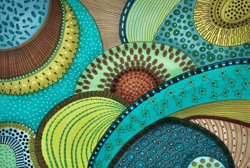
6. Creating pattern with small printing blocks: We're going to have
a look at how we use the printing blocks and
the printing inks on this. But I'm going to follow
this into first of all, and just cutting out the middle. Partly because it's quite a
complex way to add pattern. And doing the whole sheet might just feel a
bit overwhelming. I'm going to put that to
one side for the moment. And we'll just have to
work on this one here. So I've got three
different colors here and they're all
quite dark ones. I'm using diversifying
Claire range of the Sue Nicole suit clinical
sorry. A range here. And this one's warm
breeze shady lane. And then I've got black. And the reason that I'm choosing those dark colors is
because you need something fairly dark to be able to see on this very
colorful pattern. This is one sheet, if you like, of silicon
stamps that I've bought. So I'm just going to use
the ones on that sheet. I use different ones. I use lots of
different ones on here when I was doing this
one for a bit of fun, just because I wanted to see
what it turned out like. So we're going to see now what happens when we
just use the one here. So I'm going to start off by putting that onto my little acrylic block.
That's all it is. An acrylic block. You don't need any
glue or anything. It just sticks on rather
nicely like that. And I'm going to use
the warm breeze. Now, what I find easier
is to put the income top like this so that you can see that it's
getting an even coverage. You can do it that way as well. But it's just my preference
to do it this way. There's no right or wrong way, so just go with it wherever. And I'm going to choose
this little circle here and pop that into there. Isn't that magic.
I just love it. I really love it. I get really excited
about things like that. I don't whether that's a
good thing or a bad thing, but it doesn't really
matter, does it? So that's really sweet. I'm gonna do that one there. I'm going to choose
one of the leaves now. I'm still sticking
with this color here. Turn that around minute. Just still sticking
with that color. I'm going to follow that
curve that's going on there. So which way shall we do it? Let's do it this way round. So I'm going to start
that one like that. And just follow that one. Follow that curve
all the way around. With these. Now, I end up going over
the edge of the curve and that's okay. It doesn't matter. I know I say this a lot, but I really, really want you to just have fun
and play with it. Don't get too uptight. And thinking that it's got to be absolutely perfect
because truly it does not have to be
absolutely perfect at all. And I'm just going to, whoops, I can see there that I didn't
have enough incarnate. I'm just going to follow that one through to the edge there. And it'll come off the
edge of the pattern. When you're not using your ink, put your lid back on because
then that stops it from drying out an
in-between stamping. I like to get a piece
of kitchen roll, just take off any excess. And that's really the
easiest way to clean it. So let's have a look. What next? Let's go for that
little one there. No. Yeah, let's let's go
for that one there. Now, if you're not sure
which one you want to use, then just do a quick test on your paper and see
what it looks like. You might like the look of
it when it's on the sheet, but you might decide
that actually you want something
a bit different. Note that's quite nice is that so I'm going
to stick with that. I'm going to bring that one
all the way around here. Excuse me. I keep thinking in-between
as you can see. I'm stein that in the middle, that well, not quite
in the middle, but not at the edge as it were, because I'm just going to
now that's going to go into that one there if you can see by the time I
get around there. And that's absolutely fine. Don't mind a bit of crossover. Or if I don't want
it to cross over, Let's try something
different actually. Let's instead take
that to there. And we'll do another one that's
fairly well spaced apart. Round here so that I do in fact end up crossing
over with that. You see, I'm moving the
paper around as I need to. Then I think we'll do is let's just clean
that off a little bit. I'm going to put that one back. I'm going to take this
lovely pattern here. Can get the black one. And I'm just going to push that in-between those like that. Well, that's rather nice. Now obviously, you don't need to keep stamping it every time, um, when you're doing it, but just let me
demonstrate on here. So that's it with
the full black on. And that's it with less. So obviously you can
get different shades. Just depends what
a result you want. So I'm going to do that
to get a different shade. I'm going to add that one there. And I'm just making this
up as I'm going along, literally just seeing
what I like the look of. And then I'm going to go
over that middle bit there with the paella one with the, you know, it'll come
out gray if you like. There we go. So it gives me a
little bit of pattern. Now, I'd like to do the
same around here as well, so I'm going to just use
that somewhere else. Let's just use it all. I've used it on
this one actually. Let's do it over
that circle there. Then that gives me
another gray bit. So we'll just put
the gray bit there. And then I'll do a test on here. And then use the
extra grab it there. So you're getting
a sense now of how this is beginning to shape up. Actually, I want to do a
darker one on there as well. So let's just give that one more before I take that
off the block. That's good. I'm just going to carry on
playing with this, with these stamps
that I've got here. I do actually want a smaller
one to come in there. So I am going to pinch a
couple of little stamps from a different
collection that I've got that just like some smaller circles to
go with this as well. And I'm keeping it with
circles and leaves because I'm just keeping it as one kind of theme going on on this one. Whereas as you can
see on here, well, it was mainly circles and leaves and a couple
of flowers as well. So let's just see how
this one turned out. So that's as much printing as I want to do on top of this now, I needed to create some contrast back to that contrast like
we discussed in part one, with these other circles
here that are a lot darker and bolder, bolder shape. This slot here is quite
delicate as you can see. So I needed something that
would bring in a bolder, more contrasting element to it. I've also added
these circles here, which because I know
that we're going to be adding posca pen to it. I know that these will work well with what I want to do
with the Posca pen. So that's it for the printing. So now we want to be going on to adding extra detail
with the posca pens.
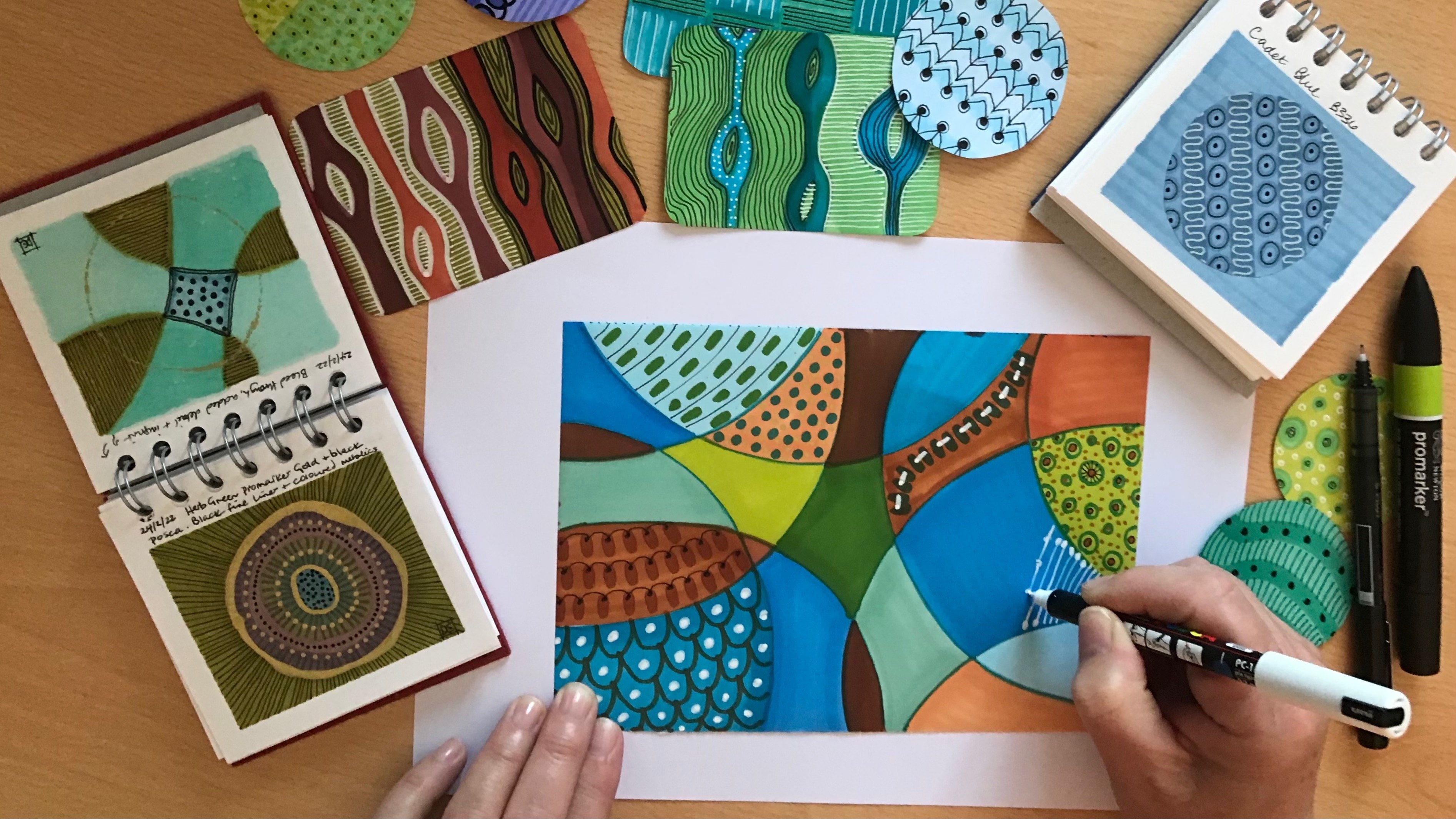
7. Adding extra detail: I'm going to start off by looking at the patterns
that I've already created in it and just deciding what I want
to add to those. Now, earlier on, I did actually use a black Posca pen just to add some little
black dots to these. But I'm going to use a really fine white liner now to add some detail
to these leaves. Now, if you remember in
part one that we did, um, I'm just going to
remind you again to always test your posca pen
out on a piece of paper. Otherwise you might
end up with blobs. So I'm just going to go
down the left-hand side of these leaves and just
add a little bit of detail onto some of
the veins if you like. And then again on
the right-hand side. And of course, depending on what color they've been printed on. So this is on the pink. Although it's all in white, it just give a slightly
different effect. Now you don't have to do
exactly the same on each leaf. You can decide which
firms you want to go through to make it
more interesting. Then the last one. I also feel that I want to add little white
dots into this here, where it's naturally
got some dots. And I want to give this a little bit more definition around the outside here as well. Now you can see that scenario
there where the pens, the different marker
pens crossed over. And so they produced a
very different color. And this is what I mean
by not worrying about, you know, getting the lines
not crossing over each other because they get covered
up with something else. So slowly but surely, I'm going to be using
these four different pens. The black, the gold. I've got an ivory one there. I've got my usual
Trustee fine liner that you can see there
and in in black that is. And then I've got my
fine liner in white. And I'm going to be using all of those to add detail
here and there. So using the thicker
ivory posca pen, this is a PC 5M size. It's got quiet a thick nib
on it. As you can see. I've added some details into the black circles
as you can see. And I've added some details into these leaves here as well. So I've got the fine
liner on those leaves, but then I've added the ivory
thicker one onto these. Now, I don't want to put too
much black into this one. I'd quite like to leave this
slightly more white looking. So I'm gonna go back
to this fine liner, the white fine liner. And again, I kinda
wanna keep it in circles and dots with that kind of flavor
to it on this one. So I'm just going to
do some tiny dots now around the edges of these little cogwheel
and leaf shapes on here. And partly that's because
as I photocopied this, the color has come out slightly duller than what it
did on the original. So I just want to brighten
that up a little bit. And again, I guess depending on what kind of
printing you've got. Um, it might well affect how your color
comes out as well. And you might decide not
to do a photocopy of it, but just do this straight
onto your original, which is also absolutely fine. Just means you don't have
the same flexibility of playing around with it. To change your mind,
do different patterns, try out different
different things. And I'll, Because of the class project that we're going to do as well. I actually want to
do more than one. Well, I'll start again. I'll do photocopies,
even of the photocopies. And I'll explain that
to you why later. I'm going to do a similar thing to what I've done there and just add some white into these
little stripy bits here. Because I think they just lift that whole delicate
silicon stamp shape. I think we lift it up and just make it a bit more varied
and gives it more depth. And again, we can see
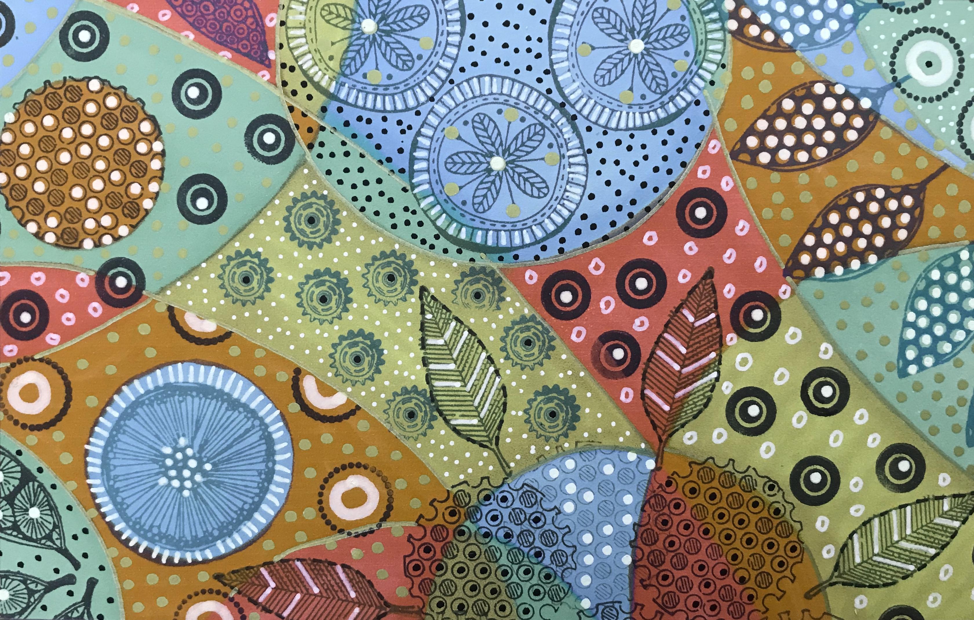
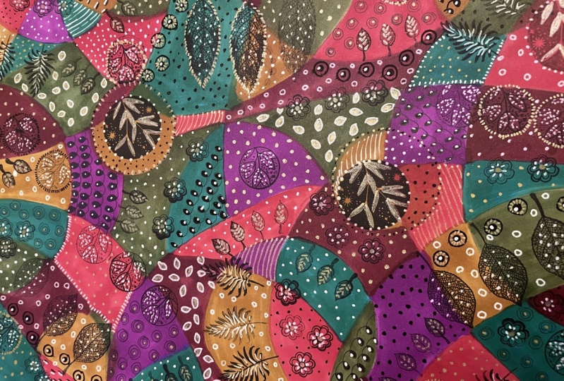
back to that contrast. It creates the contrast again. So as you can see, I've completed the
little white circles that I said going
around the edges. I've added some gold
in the middle of it, and I've also added some gold
dots around here as well. Because I feel that it sort of brings in this lovely mustard, a yellowy green color on
the photocopied version. So that's quite nice
and I'm going to do just the same as well. Let's test that out. I'm going to do that
also on this bit up here and just add
that so that it starts making the whole thing a little bit more
cohesive and connected. I do love dots, as you will remember
from part one. I really, really do
love with love dots. Let's take it all
the way up there. And through here. And
finish off around there. I'll carry on working with this and take it
to its conclusion. And then you can see what
else I've added to it. And hopefully this has
given you an idea now as to how you get these
lovely patterns with the printing blocks. And how by adding
the posca pens, you can get even more detail. Unlike the other two, I actually did put a
little bit of gold outlining just around
some of these areas, just to give it a tiny
bit more definition. And that's how to add lovely pattern to your
basic colorway that you did using the printing
stamps and the printing inks. In the next session,
I'll show you how I used one of these papers
to cover a journal.
8. Decorating a journal or notebook: So now I'm going to
cut this piece down to size and using a Pritt Stick. I'm going to glue
it to my sketchbook Stroke Journal and then bind to the edges
with washi tape. So that's it glued
onto the journal. And I'm just putting two
layers of washi tape around the edge just to finish it off and give
it a bit of a border. Just neaten that
up a little bit. A tiny bit too much on there. Let's take it off
and start again. So I put a darker
one to start with. And now I'm just following it
through with a bit more of a kind of would you call
this a mulberry color? Perhaps. Let's go right off and
then I can pick it up. Bit tricky to do with this, but you'll get the, you'll get the gist of it
as you go along. We go that's better. And could to that side. Then along the bottom edge. And there we have the
finished covered journal. And it's so nice
to be able to put your own patent paper onto
you, onto your sketchbooks. This is one of my patent books. So it feels really appropriate to be
able to cover it with my design as well.
I really like that. I'm really pleased with that. And I think just
putting the washi tape around the edge of it just finishes it off
really nicely as well. And also, because I'll be
using this sketch book a lot, it'll get a lot of
wear and tear being open and shut like
this all the time. So it's good because it will
just keep it nicely binded. I'm nicely bound onto
the edge of the, almost onto the edge
of the sketchbook. And there we have it. Let's take a look now at how we create
the hand-drawn pen and paper.
9. Creating hand drawn patterns: So here you can see the hand decorated one where I've added the pattern using the pro
markers and the gold pen, the posca pens, and
the fine liner. I'm going to take another
photocopied version of the original colors and do a slightly different
pattern on this one here so that you can
see the process. I'm sure you've
worked it out by now, how we get to that stage anyway. But let me share with
you the process. I'll keep doing
what I did before. Show you a little bit. Stop the video, fill
in a little bit more. Show you again. Otherwise you'll be here
watching me for hours. What I'm actually going to
do with this one though, is work on it that way around. And we'll just see if that inspires me to do it
in a different way. As always. I'm not thinking this through. I'm just going with
the flow with it. Adding some detail. Starting off, as you can see, very simply by just
doing some stripes. Now I may go back into that and work on it with
some extra detail, but I'm just going to leave it like that just for
the time being. I'm going to come down
to this corner now. And I'm going to swap my pen actually go with a
fine white liner, testing it out again. And what I noticed in the other the other design
that I did was that because the photocopy came out slightly duller
than the original. It needs this white pen really, to give this a little bit more
detail on this color here. So I'm going to do what we would call in our textile world. If we were doing this
on a sewing machine, I'm going to do what's called a vermicelli stitch on here. I'm basically it's
like wiggly spaghetti. And you just keep wiggling
your pen around and around until you've covered
most of the surface. Just keep going backwards
and forwards with it. Until you really covered all
the space that you wanted. Try not to do it
just up and down. Try and be a bit more creative and going
from side-to-side, up and down, so that it really looks like
vermicelli spaghetti. Here you can see
I've already done some more detail on
that section up there. I've done very, very bold with that big circle
in the middle. And I'm probably going to do
something very similar here. And at the moment, I'm just
working on the circles. And this small curved down here. I've done a spiral in
this one here using the same color as what was originally used
for the background. It gives it a little bit
of detail and then I've added more detail by using the black Posca pen
and going back in and using the ivory one again. And I just want to
show you how this is, how I add detail on
detail on detail. Now, as you can see
here in this section here, this was greened. Start off with that
green color there. I've used the maroon pen to then give me these stripes here. I've added some black dots. And now I'm going to
go in even more and add some stripes here. So this is how it becomes
very rich because you just keep adding detail
onto detail, onto detail. And that's what makes
the pattern very, very rich and very complex. Of course, you can decide how rich and complex
you want to go. You might not want to do
it just as much as I do. You might feel that that is a little bit too much for
you as I said earlier on. Or you might like to just go for it and see how it feels for you. No right or wrong. I'm always saying that until
no right or wrong way. Just your way. And in this case just my way. So this shows you again how
we're adding that extra, extra detail to that. And I'm going to also just
turn that around there because I'm going to add some little white dots in-between these
black ones as well. Just to make that
circle really show up. I'm going to carry on working on the circles and then I'll
bring you back in again. Don't be too nervous
about outlining something and using black because black can really give
definitions something. Now this is a big
curve to outline here. So I'm turning the
page round as I go. And then I'm gonna
stop, uh, two loops. I'm going to stop at a junction and carry on a bit further. Stop at the next junction. When I said junction, I mean
the meeting of the colors. And take that round to there. It's a bit of a
balance between not going so slow that you
wobble like I did there, but not going so
fast that you end up not being in control of it. I'm also going to
give this one here, definition like that because that's just the way the
pieces going right now. And I'm rather enjoying it. It's, as I said, very different. So the last one that I did, always make sure when
you've got a pen like this that you can see in
front of where you're going. Otherwise you'll end up taking
the pen somewhere else. What do I mean by that? Well, let's have a look here. If I was to outline that e.g. I. Reach a stage here now where the pen is actually
in front of my eye vision. So I'm having to guess now and I've already got I've already made
the mistake there. Look where I couldn't
see where I was going. So it's always worth
turning your piece around so that you can you can see whereabouts
you're out with it. If you're not sure about the
marks that you're making, you can just try it out on the spare bit of
paper that you've got there and see whether or not that's the kind of shape
that you're after. Don't be afraid to experiment. That's what this is all about. Always about experimenting and seeing where your
creativity takes. You. Mean that so simple, but it's so effective. I'll go into that in
a little while with some white pen just to
highlight those areas as well. But let's take a look in the next session at
the final stages.
10. Wrapping it up: I've gone to one of my
pattern books here. And as you well know, I've got lots of
different pattern books. This one here is largely to
do with flowers and circles. So I'm coming back into
this just to remind myself of what are the patterns
I've done in the past. And here I've got lots of
different things which I can now start using for here. This one now I've just done this line here because
of course I've, I've picked that one up
there, which is great. You know, there's all sorts
here that I can refer to. So I'm going to
use this one here, particularly in this bit. So I'm going to add another
color in the middle there. In fact, I'm going
to add the pink. No, I'm not going to add the
green pro-market to that. And I'm just going
to go in like that. And then color the
middle of that. Which changes that
circled completely. And then I'm going to get
my black plural marker. And I'm going to copy
this pattern that I've got here in my reference book. And so this is where
it really helps again, that if you've got your
reference book Ni, if you've got your pattern
resource book knee, then you can dip into it when you have a bit of
a block and you think, I'm not really sure
what I want to do here. So there we have a
new pattern made. That, to be honest, I wouldn't have
thought of today. But going into my resource
book there, I can see it. I might do it slightly
differently to what's in the
resource book, e.g. I'm just going to outline
that in white. There we go. That's better. And I think I'm going to outline this bit
in white as well, or little dashes
around the edge of it. When you've only got a few
minutes to play each day, get your little sketchbook out, your little pattern book or whatever it is
that you've created. And even if you wanna do
a couple of circles are a couple of shapes. In 10 min. It's there and it's there for you to use as a
reference at a later date, which is really great. I'm just going to
keep going with this. I've already added some spokes of the wheel into this one here. So actually let's get that
lovely big thick pen there and bring that into
that one as well. So you can see here
that I'm treating this patent paper quite a bit differently to the
first one I did. That was hand done
in the sense that instead of giving each shape a completely
different pattern, I'm actually repeating
some of the patterns. And that's really my attempt
to keep it a bit simpler. But when I looked it
actually it's probably not no simpler tool
really, is it? That's probably just my wishful thinking because
it's still is quiet, a complex pattern
when I look at it. And that's how it's ended up. As I said earlier, I didn't have any idea in mind as to
how this was going to be. And this is what's always
the fun element for me to just let go and see what's
going to come out of it. So I'm almost done here. The question now is, do I want to give these
black outlines as well? I think I probably do actually, because I think that will
just finish it off nicely. And then we can compare this version to the
original version that I did and see how much they differ in whether they
differ enough in the sense that that was my
intention to try and make it a little bit
different from the first one. So here you can see the
two finished designs. And although they have
the same original colors, before we start putting
any any patent on it. I think the fact that I've
treated it differently, I've defined the areas in
quite a different way, I think does show a fair bit of difference in the
two papers there. If I take that section there, which is the same section there, you can see that
it's been treated in a very different way. If I put it together, that gives you an
even better idea. So it's possible to get quite a few different looks from the same base color pattern. Um, once you've started
putting in your extra details, I like them both as much. They're quite different. And obviously, I've
used this one here. I'm as wrapping
paper and wrapped up this small little book. I think it looks really nice. And to be able to add
a little gift card and a bit of ribbon and
give that to somebody knowing that you've created
that wrapping paper. You've actually designed it and you've done it for somebody, I think is really rather nice. I mean, it's only an A4 size, so you could only perhaps get a small book or a
CD in that size. But nevertheless, you know, you might even have
a printer that prints up to where three sides, in which case you
could print it bigger. Or you could even get in
touch with your local printer and see if they would be
able to print it a bit, a bit bigger for
you if you so wish. So that's what I've
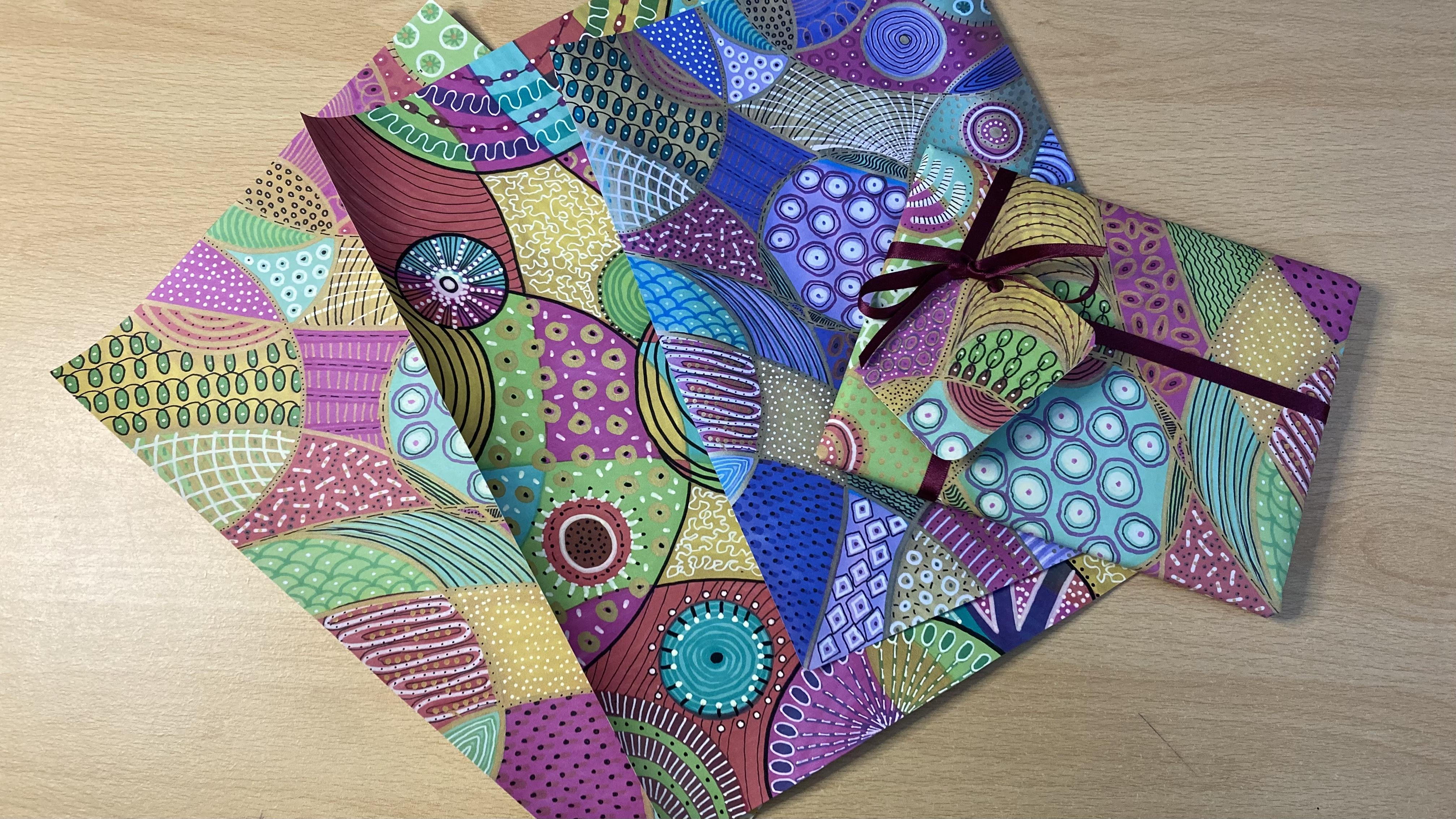
used these for here, these these wrapping paper CFO. Just to show you a
different colorway as well. On this one. What I did here was I took a photo of that
sheet there on my iPad. It's linked to my MacBook, so it automatically comes
up onto my photo feed. And my photo, I'm program on the Mac has an editing section to it and editing ability to it. So to be able to go into the editing software and
just change the color. I'm by just playing around with the saturation and the hue is, I could come up with
this colorway as well. So again, that's
another way in which you can play with
the same design. So one design, couple
of photocopies, try different patterns on it. Go back into your design
software if you've got any on your PC or your laptop and see what else you can
come up and play with. I'd like to show
you one more thing that I have also done
with this paper here. Just as a little extra.
11. A little extra: At different points in the year, a friend and I get together to create well-being workshops. The day usually consists of some kind of body
movement in the morning. Whether it'd be yoga or sacred dance or a
combination of the two, which we then follow
with a really lovely, nutritious lunch and
show people how they can make really, really
nutritious recipes. And then we follow
that through in the afternoon by having this really nice art activity where people make
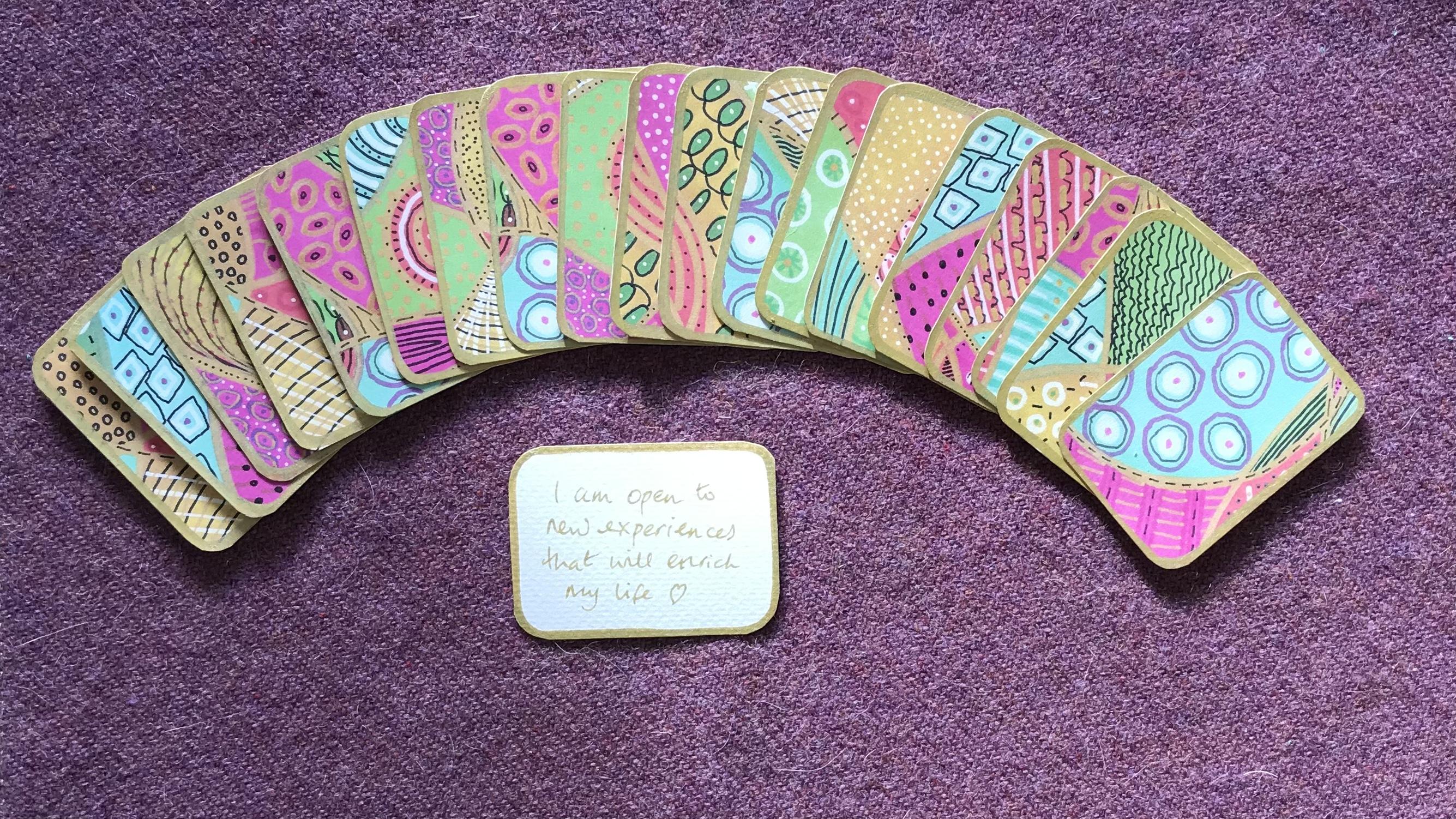
their own card deck. And it's a card deck that
is for affirmations. Now, because it would take too long for the participants to create their own
decorative papers in the time that we have, we give them ready-made papers. But this is what I like
to use my purpose for. So I've got quite a few of these card decks in
one form or another. And it's just become a part
of my weekly practice. I don't necessarily
do it every day, but I specifically like
to do it at the end of a busy day or at the beginning of a day when I know I've got
some time to do it, to just set the
tone for the day. And I like to put my
affirmation cards around the candle that I've just lit and just be
still for a moment. Come into my on-center, feel balanced and then intuitively
draw one of the cards. Here. This one says, I am open to new experiences
that will enrich my life. This is such a lovely thing
to bring into your week, to have because it's your
space and your time for you. Which is really important
actually because we often are giving so much of
ourselves to those around, is that it's really
important that we give ourselves some time
for us as well to feel nourished and to also increase our own
levels of well-being. If this is something that you're interested in learning
a little bit more about how to make them and also what kind of
affirmations to use. Then watch out in
the next few weeks for a short class that I'm
gonna be running on this. In the meantime, I'd
like to leave you with just a few final thoughts.
12. A few final thoughts: So why am I so
fascinated with pattern? There's something
about pattern that really touches me deeply. It connects me to something
that's larger than myself. I've only got to look at
this gorgeous book by Lori barely Cunningham
patents of the universe to just see how
abundantly nature provides us with pattern. If only we can stop and take
the moment to have a look. This is what I
mean about feeling connected to something
greater than myself. I think that's it in a nutshell. That's why I love
patents so much, because it just shows me when I look at
these photos, e.g. how connected everything is. You might already know this
for those of you that don't, color has its own
frequency and vibration, just like a musical note does. So in the same way
that you can listen to a piece of music and find it either uplifting
or jolly well, irritating. Color can also have the
same effect on here. Some colors at the higher
end of the spectrum vibrate faster than colors at the lower end
of the spectrum. So reds and oranges, e.g. they vibrate at a
much slower rate. And the colors up at the
higher end of the spectrum, such as violent and indigo, they vibrate at a
higher frequency. Now, depending on what mood
you're in any given time, these will have a
different effect on you. E.g. if you're not feeling great or you're feeling
already irritated, and you end up immersing
yourself in the color red. That will just
make you feel even more irritated and
possibly even angry. On the other hand, if you're
feeling very low in energy, very tired and sluggish, then wearing something red, e.g. are playing with
the color red can actually have an
energizing effect on you. This is how important
color is in our lives, whether we're conscious
of it or not. So I hope that's given you a little bit of
food for thought. You know what? Because I don't
get to see you in person and really be there
with you, encouraging you. All along the way. I'd love
to see your class projects because that's the
way that I get to see how you're doing. Please leave me any comments or any discussion do
you want to have? Because I will answer them. And i'd, I'd just
really like to see how you play with color
and pattern yourself. Do press the Follow button
at the top if you want to just keep up to date
with it which classes is coming up next. And until then, I hope you stay well. And
I'll see you soon.
 Dawn Cawthra, Artist, Designer, Holistic Educator