Transcripts
1. Introduction: Lending can be one of
the most difficult and daunting techniques
in watercolors. But it doesn't have to be
some basic knowledge about color theory and some
basic techniques can really level up
your watercolor game. That is exactly what we will be doing in this
skillshare class. We will be making some stunning pieces that
you will be proud of. Hi, I'm Serb Sati. I'm an Indian watercolor
artist based in the UK. I started painting
with watercolors almost two decades
ago in school. But I gave it up
back then because I found it so difficult
to work with. I picked it up again
almost three years ago and I haven't looked
back ever since. I have been documenting
my watercolor journey on my Instagram
page, Aquarelbyerb. In this skillshare class, I will be covering three main
topics around watercolor. Firstly, what colors
work well together. Secondly, how to paint pre sketched leaf in vibrant
colors with gold accents. Thirdly, how to make your composition
more interesting by adding geometrical figures. The project of this
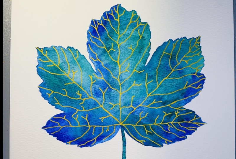
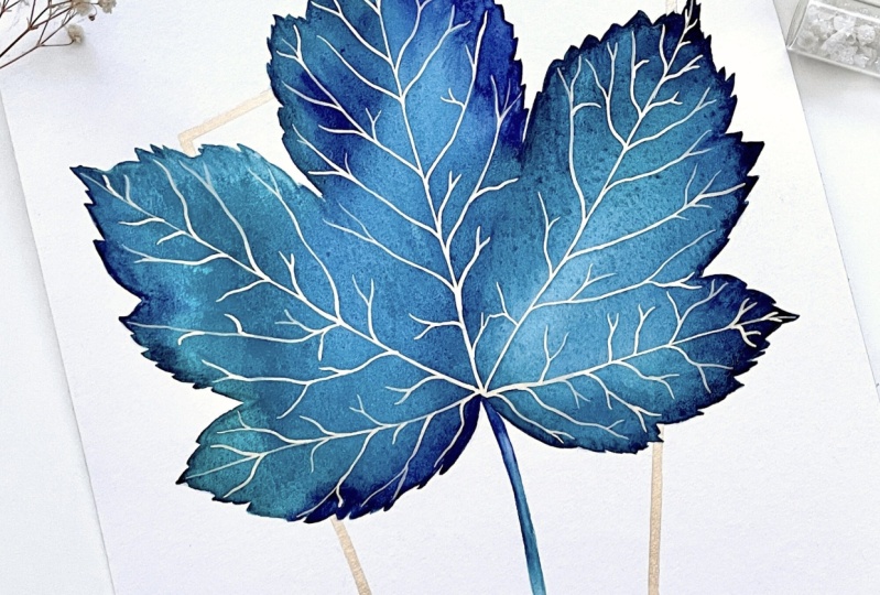
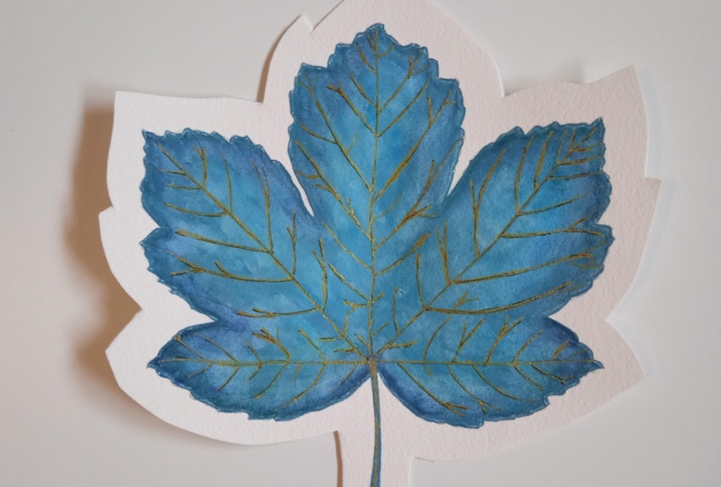
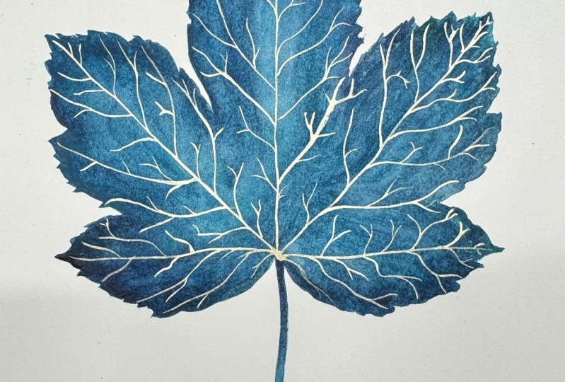
class will be to paint a pre sketched cleaf
in analogous colors. We will then be adding
gold accents to this leaf. And then we will complete
the composition by adding a geometrical metallic
figure to our composition. Now before you start painting, I would highly
recommend that you watch all the lessons
beforehand once, and then you paint along
with me the second time. This way nothing will
catch you by surprise. I'm so excited to teach
this class and I hope I will be able to answer all
your questions that I had. As a beginner, we color artist, watch out for all the tips and tricks throughout the class. I'm so happy you're
here. Let's get started.
2. Class Orientation: The project of this
class will be to sketch and paint a leaf using
analogous colors, and then finishing leaf with some gold veins using
metallic gold watercolors. We will finally add a gold geometrical figure to add interest to the composition. We will be working with
a reference sketch, which I have already provided in the resources section
of this class. I chose this project because when I started painting
with watercolors, I just could not
blend them well. It was extremely frustrating
and demotivating for me. But with experience, I have
come up with some tips and tricks that lead to
flawless blending each time.
3. Supplies: Okay, so now the most
important thing, what hole do we need for
this skillshare class? For the very first lesson, we are going to need a loose
sheet of cellulose paper, a ceramic palette,
a color wheel. If you have one, all
your water colors, some kitchen towel and a brush. The next step will be transferring a sketch
onto what color paper. For this step, we're going
to need what color paper I will be using the Han Muller anniversary edition
watercolor paper, which is 425 grams. This is not 100% cotton paper, but for what I use it for, it seems to work really well. We will be using
watercolor paper. Then we will need the sketch that we will be transferring onto
our watercolor paper. We will then need
some washy tape to stick the sketch onto
the watercolor paper. We're then going to need some
crece down transfer paper. In this case, I will be
using race down by frisk. Finally, we are going
to need a color pencil or a regular pencil
for the next step, which is going to be
our first technique, the wet on wet technique. We're going to need a watercolor paper with the sketch on it. We will need two jars of clean
water, a ceramic palette, a kitchen towel, a mixing brush, a size ten round brush. I have the silver black velvet
and our water color pants. The watercolor pans,
I will be using our turquoise green halo, green, deep halo, turquoise,
and danthrine blue. And all these paints
are by Senellier. The next step is going to
be our second technique, which is going to be the
wet on dry technique. And all the materials
used in that lesson are going to be exactly the same
as in the previous lesson, except we're also going to
take a size two round brush. In this case, I have a
Princeton heritage size two pointed round brush. The next step in
our class will be adding gold veins to the
leaf using metallic paint. For that, we're going to need a separate jar of water
metallic gold paint. This is Moon gold by Colera
Colors or Fine Tech. A separate ceramic palette
for a metallic paints. A separate mixing brush and a size double zero
point round brush. The final stage of our
class is going to be adding a geometrical figure
to our final composition. For that, we're also
going to need gold paint, the ceramic palette,
the mixing brush, the size double zero brush. In addition to that,
we're going to need a size one brush
as well a ruler, an eraser, and a pencil. It is very important to start off with good quality
watercolor products. Because when you start off, if you're starting off with bad quality or student quality, not bad, but student
quality products, you will see a big
difference in the results. You might think, oh, is it me? And you'll probably
start believing after some time that it's probably you thus making the mistakes, or you're not able to
do watercolor painting. But in reality it's not. It's actually the
watercolor products. My biggest suggestion is
going to be to invest in some professional quality
artist grade watercolors to make sure you have a ceramic palette to
mix your paints. Have a separate
mixing brush always. This can be a low quality, a student grade quality brush. Invest in some good
quality brushes that you will realize
make a big difference. My favorite brushes
to use are silver, black velvet and Princeton
heritage brushes. As for the paper, in this particular lesson I will
be using cellulose paper, but 100% cotton paper, the results are
completely different. It is a lot easier to work with, it's a lot easier to blend
water colors on that paper. So if you are able to
afford 100% cotton paper, then start off with
100% cotton paper. That was all about
the materials. I will see you in
the next lesson.
4. Color Harmony: Hello and welcome to this
class on color harmony. I decided to do this lesson because when I first
started painting, I always had this question
at the back of my mind. How do I know what colors
work well together? How and where can I learn it? I spent hours, days, weeks trying to learn
the color wheel, but I didn't really learn. Because a color wheel at
the end of the day is something very theoretical
and I'm very person, I learn better by doing. So you can see here that
is exactly what I did. I practiced, I swatched, and I finally had a better idea of what colors were
well together. The idea of color harmony
is how we can combine two or more colors to make it look aesthetically
pleasing to the eye. What analogous colors are, are basically three
or four colors next to each other
on the color wheel, when you put them
on paper together. When you blend them, they will blend
perfectly together. The next thing we will be seeing are
complementary colors. Complementary colors are here. We've got red. The complimentary color
for that is green. We know that red and green
are complementary colors, and complementary colors are
also aesthetically facing. The only problem is mixing
these two colors on paper. Blending these two
colors is not going to yield the same result as
blending analogous colors. And we'll do a
little exercise to see what happens when we mix complementary colors on paper. I am going to take
really due yellow first. What we're doing
is we're going to switch and blend the
analogous colors together. The next color I'm
going to take is going to be my lemon yellow. You can see how well it
blends into each other. The next color we
will take will be a light orange or a yellowish orange as
some also call it golden. Then we will be putting in
some more reddish orange. This one is Quinacridone orange. Then the last one we will do, it's going to be over 1 million, which is also still
orange but also red. This is one set of
analogous colors. You can add more if you want. You can keep adding colors
until you are satisfied. Those are analogous colors. Analogous colors are good
to blend into each other. But always in the correct step, I wouldn't mix the
green directly with the blue because it
not mix well together. And we'll do a few exercises
to see that as well. We'll be doing the
complimentary colors now. Complimentary colors are also, they look good together on
paper, but not blended. These are all blended
into each other, but complementary colors
are not good for blending. We'll see a few examples here. We can see that
turquoise and orange, these two colors are
complimentary colors. Now I'm going to take
a little bit of that. Turquoise, yeah, and the orange. Now you can see these two colors look really nice together. But what happens when we
blend these two colors? They're good on a composition, so you can have
like orange flowers with turquoise foliage. But the moment we mix
these two colors, you notice you got this kind of weird dirty brown color there. It doesn't that
well to each other. Let's look at a
yellow and a purple. We'll take lemon yellow, lemon yellow, and warm. Now again, these two colors look beautiful next to each
other in a composition. It'll be amazing, very pretty. But the moment we
mix these colors, I'm just going to take a wet
brush and just mix it in. It's not that nice anymore. It makes, it gives
a dirty red color, which is also a nice color. But in combination
with these two, it's not aesthetically pleasing. The last one we'll
do is from here. Like I said, when
we're blending colors, you always have to go
in the right order. If I makes this green
with the indigo, we'll see what happens. It's nice blended as well, but it gives you this
dirty green in between, which does not really go with, basically doesn't blend
well into each other. But again, there's
nothing right or wrong. If you like the color
combination, please do. Go ahead and use it. There's no right or
wrong, it's just theory. At the end of the
day, we paint what we enjoy looking at and
what looks good to us. It's always handy to
have a Swatch book in which you can test
out what colors work well together
and what doesn't. If you haven't done this with
me, it's your turn to go. I will leave a
picture of this in the resources so you can basically see what colors
are opposite each other. And experiment with this and
create your own Swatchbook.
5. Tracing the sketch: In this class we will
be painting a let. This one and this sketch
is actually my E book, has 20 leaf sketches. And the link, or
you can purchase, I will leave the link in
the resource section. Our main goal in this class
is to be able to blend colors on the paper without having to learn any
expert techniques. If you've just started
painting with watercolors, my biggest advice to you will be to concentrate on
one thing at a time. So if you've never
sketched before, don't add that to
the mix as well. Consider what is
the most important to you sketching or painting. And then just stick to one
until you become better at it. And the other things
will come slowly. If you're not so
good at sketching, the sketching will come once you get well worsed
with painting. But just concentrate on
one thing at a time. Now, for this particular one, I've got the sketch ready. Like I said, it's in the book. All we need to do is
transfer this sketch to our watercolor paper over here. I have this sketch, I've put
it on my watercolor paper. The first thing I'm going to
do is use some washi tape. I'm going to stick
it in three corners. We're going to stick
this, I'm going to stick this here
first in one corner, then we'll stick another
one in the bottom corner. The most important thing
we will be using for this lesson is trace down paper. Now, trace down
paper is basically, there are two ways
of doing this. You can either use
tracing paper, just regular tracing paper. You take your tracing
paper, you put it on top, You trace it first on
the tracing paper, and then you transfer it
onto your water color paper. The easier way this is the
frisk, trace down paper. It's water soluble,
it's wax free, and it can be easily erased. This is a game changer to transfer sketches
to water color paper. What we are going to do and
it's reusable, use it once, then you can reuse it until the graphite at
the bottom runs out. I've got one here. You can see one side is darker
than the other. This is where the graphite is. I just keep reusing this. I'm going to slide this in
through the top slide pen. Another good tape here is
basically with your pencil, you just mark exactly
where the tape is very lightly in case
something does go wrong. And we remove the tape, we know exactly where
to put it back, so we're going to
start praising. And if you miss it slightly, it's fine. It's not a big deal. You can just join it, it's not going to make
a big difference. Like I said, don't worry if
you've missed out anything. You can omit stuff, add stuff, it's fine as long as it looks similar to the direction
where it should be going. Okay. And that's star. Now, before you remove
the washi tape, I recommend that you remove one side first so we can
remove the trace down paper. That's done, you don't
need it anymore. We are going to lift
this up from one corner first, just to check. It's all been transferred. All the corners, all the ins, I mean, it doesn't have
to be all of them, but it should look kind of
like this complete, so to say. If you're sure that
it's looking fine, then just the wash tape gently and that's our sketch. This one had been
left out of it, but we covered it. Now that we're done
with the sketch, the next step is going
to be the painting, which is my favorite
part to keep in mind the three tips for tracing your leaf or your sketches
onto watercolor paper. First things first,
stick the print out on watercolor
paper on three sides, leaving one side empty so that the trace down
paper can slide in. Secondly, press the
pencil really hard to ensure that the graphite works. Thirdly, while tracing, use a different color
pencil to ensure there is no confusion
whether you've gone over it, whether you've not gone over it. I've faced that issue a lot because I do
like sharp lines. It happens very often that
when I'm transferring it with just regular
mechanical pencil, I don't know half of the things I have
already transferred. Lastly, slightly remove
the tracing paper to check that all the
corners are there, all the veins are there, or it looks complete And only
then remove it completely. Like I also said, it's also helpful to put these
marks of the wash tape. We need to put it back down in case we do
need to put it back. We know exactly where
the co is like that, you know exactly where this
corner is going to be, so that we'll have 99% the
same position of the sleep, if that is a lot easier
with pacing paper. And I will see you
in the next lesson.
6. Painting the Leaf - Technique 1: We're going to start with
the wet on wet technique. For that, I've got all
the colors ready here. All I'm going to do is
with a clean brush, I'm going to loosen
these paints a bit. My aim is just to have the paints vivid but
also quite watery. So when you leave
it, you shouldn't see the white of
the plate too much. And I'm going to do this for all the colors, That's
all we're going to do. And even if you get a
little watery color, it doesn't matter too much. We're now going to start
by putting the water down. I'm going to use the same water with which I've just
washed my brushes. So it's going to
be slightly blue, but only so that you're able to see where I'm putting
the water down. I will be using a silver
black velvet size eight brush because it has a pointed tip under the really fat belly so
it holds a lot of water. When I'm putting the water down, my aim is to just put it very loosely and not
take it to the edges. Okay, now that that's done, we're going to start
putting the color down. I'm going to start
with the light color and then go on to the dark ones. Let's start off with
the cobalt turquoise. And I'm going to
put that color down here very loosely. There
is no rule to this. Put it wherever you want,
take the Taylor queen, put the color down
wherever you want. If you do go to the edges, then make sure you
use the tip of the brush to take
it to the corners. What I'm doing now,
basically is following the direction of the veins
to put the color down. And I'm darkening
it a bit as I go. I'm going to start with my helo turquoise again
at the top here. I'm going to start
doing the edges. Now slightly all I'm doing
is taking the paint. So I'm taking my helo turquoise and taking it to the edges. Making the tip of the brush
do all the work like that. And I do want to
add a little bit of my indanthreine blue to
change the color up slightly. So I'm just going to drop
that color in right there. Take a little bit of
the, the of turquoise again to change up
the color slightly. I'm going to take a
little bit of ind, the blue added to the edges wash my brush because it doesn't look
very well blended. I'm just going to pull
it down like that. That's all too much
technique involved there. Then I'll take a little bit of the Taylor crane and the cobalt turquoise and
put some opine down here. And then Taylor
turquoise on the edges. Betterfin danthine blow
to change it up a bit. That's pretty much it. What I'm going to do is because
the edges look, um, well, not blended well. I'm just going to take it here and in the
direction of the veins, just pull it back in. Now another way of blending, if you feel like there are too many lines and you don't
like the look of this, it does look quite natural, but if you don't like it, take a little bit of water, drop it in where you feel like
it's not blended properly. If you feel like you
need more color, you can add more color as well. For example, I'll take a
little bit of to turquoise. I'll add Taylor turquoise here. Take some Taylor Green, add some to green
there to turquoise. Maybe add it there. There's a little bit of
change in color maybe. Right? How do I blend this? Now I'm going to pick up my sketch book and
just blend like this. Make sure it doesn't
drip off the edge. All you're trying
to do is blend it. Take some clean water, add
a bit of water there till, till you feel like
you have a chi, achieved the kind of
blending you're looking for. Okay, so this is
not completely dry, but I can't start doing
this stem already. And what I'm going to do is I'll take my indanthrine blue. First for this step, I'm using my Princeton
Heritage size free brush, and I'm going to start here
with my indanthrine blue. I'm going to wash my
brush, tap it dry, and I'll pull this
color up top because I don't want blending
too much into the lead and the helter cos down here. And then we'll wash my brush it, use some cobolter Cois. That's all for the leaf we will return to add some gold
veins to this leaf.
7. Painting the Leaf - Technique 2: Hi and welcome back. Now, for this
particular technique, I, I've got another leaf
sketched out already. The leaf is also from my e book. We have got the
turquoise green here, and I've added a touch of lemon yellow to make
it slightly greener. Now, the trick for this particular painting is that the paints have to
be quite pigmented. It's quite a creamy mixture,
but it's still pigmented. You can't see the
base of your palette. I'm going to wet
my brush properly. And I'm going to start
with the lightest color, which is my turquoise
green or cobalt turquoise with a little bit
of lemon yellow. And I'm going to start
painting at the tip here. Now the trick for this particular technique is
that wherever you leave off, you add enough water which
means it's not going to dry up quite water. Tree, as you can see, pick up some more pigment
and you can add, it's almost like
the wet on wet bit, also a lot quicker. This is my favorite technique. Now as you can see we still
have these lines here. It doesn't look
very well blended. My advice for that is going
to be a wash your brush. And while it's still wet, add a little drop of water. Just move your painting. Just move it, we're
going to take some more Water Needs to
be quite work everywhere. You need it to
blend a bit more at the water and it around, you'll see it's starting
to blend already. Don't do need to learn anything
specifically for this. The only thing is in some
places I'm going to add some more water
where I can see it's drying. This area drying. Going to wash my brush. Pick up some dense and blow up some more
with a little water. I'm then I'm going to move it. You need to make sure
that if the paint reaches one side quite quickly that it's not going
to drip off the edge. That's all like if
there's a big puddle, for example, a big puddle
forms right there. I need to make sure that
it doesn't accumulate so it just falls off because it's going to stay in the paper. Then this draw top. So this is, drawing top is way to make the stem. I'm going to be taking
my size two round brush. What I'm going to do is where
it's already wet still, I'm going to dip my brush
into a bit of water. Just moving this paint here, We don't want any harsh
edges that we're going to start moving this paint, just correcting
the sole as I go. It's still wet, right? So we don't want harsh edges. We're going to just add the stem as well and I'm going to
take the lightest color, which is the turquoise green. Or in your case it could
be cobol turquoise. The things you need to keep in mind while painting any ing, a ready sketched out in
the wet to dry technique, you add enough water
wherever you leave off. We did at the beginning. Wherever we were leaving off, you were adding enough
waters that didn't paint. Has to be water,
yet very pigmented. We mix the colors in situate. You can see the base
of the palette, but it should have enough
water that it's easy to flow. Thirdly, use the tip
of the brush to get into the nooks and
crannies of the leaf. If your painting is not
looking blended enough, then add a of water, two or three drops of water, and just move your
painting from left to right until the paint gets
blended on the paper. I will let this try and I will be back in the
next lesson where we will be painting
the gold veins and we will complete the leaf.
8. Adding Gold Veins: Hello and welcome back. In this lesson, I will be adding the gold paints to the sleeve. The leaf is completely dry and the stem
is completely dry. Now for this particular part, I'm going to be using
my metallic gold color. This is fine tech or
cholero colors. Moon bold. I've got a separate mixing brush for my metallic colors and I have got a separate jar of clean water for my
metallic brushes. And what I'm going to do is I'm going to take a little bit of the water and add it here. And we need to wait
for it to activate. Once it's activated,
you will notice that metallic paints soak up water really, really quickly. Let it sit for about 30 to
45 seconds to a minute. Then we will transfer it
to a ceramic palette. We can somewhat see
where the veins are. It's not important
to be able to see everything because at
the end of the day, all we're trying to
do is we're trying to cover up what we
can already see. Because the transfer
paper we used had basically the graphite
and it was water soluble. You may not be able
to see everything, but that's not a big deal
because we're only going to put gold where we
actually can see the veins. If you do want to get it
accurately like in our sketch, then I would suggest
just putting the sketch somewhere nearby so you can keep
looking back at it, keep referring to it. And that's all you need to do because we won't complicate it. You could if you wanted put back down and you already
have the marks here, you can put it down again
and transfer it again, but it's not really needed. We're just going to eyeball it and just do whatever
we can actually see. I've got the gold over here. I'm going to take my size
00 round brush for this. I'm mixing the color one
more time just to make sure it's not the water in any
it's well mixed. Yeah. Then obviously we'll just tap
out and remove the excess. Then we start at the bottom. But if you're right handed, always go left to right because you can put your
hand on it and ruin it. Otherwise, I am going to
tilt my paper like that. I'm going to also in, I'm going to start here. This is the bottom left. If you start running
out of paint, keep going back in, mix it slightly,
and then come back. Now you can see it looks
like different shades, So just blend it slightly. One of them is right here. I can see it slightly
here as well. And then another one is you. Now, at this point,
if you feel like something looks a bit odd
or doesn't look complete, if something is looking amiss, you can fix it now. Now, for example, to me, this particular vein is
looking a bit incomplete. So I'm just going to add
a little shape right there that then these ones, they're looking
quite old as well because they're not like
meeting up properly. So I'm going to blend this line. I'm just adding more gold. Just blending it, it doesn't look like
it's been attached. That's it for the gold paint. Raver tips, you need
to keep in mind, first things first, don't
worry about the pencil lines. Gold paint is opaque and it
will cover your pencil marks. That also means that
if in case you see pencil marks on the outside
that you're not happy with, you could give the leave
a gold out as well. Secondly, metallic
paints are tricky. Always take it out on a separate ceramic palette
and dilute as needed. Because you will notice if you try to paint
directly from here, it's going to be next to
impossible because it sucks up so much water that it's
just going to keep drying up every time you go to it and you will
struggle with it. Always take it out on a
separate palette, dilute it, make it into a creamy texture, and then you can keep
going back to it. Thirdly, a make
sure that you have a separate brush and a
separate water jar for your metallic paints to avoid specks of glitter getting
into your mate pieces. Fourthly, if you're
right handed, work from left to right. If you're left handed, work from right to left. That's all for this lesson. I will see you in
the next lesson, in which we will complete
the composition by adding some gold geometrical figures.
See you in the next class.
9. Drawing & Painting the Geometrical Figure: Hello, and welcome back. Now we have the
final piece here, but to me, it somehow still
feels a little bit empty. It look like it's incomplete. For that purpose,
I'm going to add a random geometrical
shape, this composition. How I usually do that
is with a ruler. This basically is going
to serve two purposes. In this particular case, while drawing, I got
this little mark here. Because this is thalo turquoise. It's quite highly staining, so I wasn't able to
remove it completely. But that's one thing you can do with these
geometrical figures. You try and make the
geometrical figure in such a way that you
cover everything here. I have a big ruler here. 12 inch ruler or a
30 centimeter ruler, because sheet is quite big, I could use a smaller one, but if I use a smaller one, I will just be doing this
forever, making lines. And then going further up, what I'm going to do is
take this big ruler. We will try to cover
up this little mark. What I want to do
is draw a line. Very light, not too dark. Make sure you leave, leave gaps, maybe
a little bit more. Make sure it's very light Go. And then the next line, I want to cover this
little mark over here. And there's no rule to this, I just want to cover up
more space on the sheet that said there's no
other rule or logic to making these lines, Okay? Then maybe like that. I also want to make
sure that I don't go way outside the margin in case I want to mount this
and frame this painting, okay? And then I usually
make parallel lines, so I'll make a really thin line again so that it basically, I can fill it in
with my gold paint. You could just make one line and carefully just put down the paint like we
did for the veins. Just put down the gold
paint on this line. But or you could do what I'm
doing and make another line. Just make another parallel line. There's no measurement required. Just eyeball it. I'm going to start again. We'll go left, right? So I'm going to start
with this art here. Just painting between the
lines. That's all I'm doing. I like doing it in strokes. Once I know what
my brush is doing, how take the strokes are. I mean, this is a
round brush but it's not completely rounds, slightly square or it's got like it's not
pointed basically, so I can easily make lines
with the side of the rush. And that is our
final piece done. Now the only thing remaining is to wait for this
to dry completely. Once dry, you can remove the pencil marks for the
gold geometrical figures. The things to keep in mind
are, first and foremost, make sure that you have given enough margin space in case you want to mount
and frame this picture. Secondly, always
paint the gold lines, the geometrical figures. Once your painting is completely dry, that means the base, including the veins, everything
should be dry so that you don't smudge anything by
putting your hand on it. Thirdly, always put
your gold paint on a separate ceramic palette. Don't use it directly from the paint pan or any
metallic paint that matter. And just have fun
while painting. Okay, now I just want to put
some finishing touches to this piece just to make
sure it's all finished. So the first thing I'm going
to do is I'm going to erase all the pencil marks from
the lines we made earlier.
10. Conclusion: Congratulations, you
have successfully completed the skillshare class. In this class, I
briefly went over analogous and
complimentary colors to help decide our
color decisions. To achieve color harmony, we learn two techniques
of blending water colors. The wet on wet and the
wet on dry technique. We learn to use
metallic watercolors to add veins to the final piece. We then learn my signature
technique of adding go, geometrical figures to
the final composition. I hope that after
taking this class, you're able to blend
watercolors more easily. It would also be lovely
to see you play with different color combinations and step out of your comfort zone. Don't forget to upload
your final project, and if you're sharing
it on social media, don't forget to
tag me once again. Thank you for completing
this class and I will see you in the
sequel to this class. Bye.
 Surbhi Sethi, Aquarelle by Surbhi | Watercolour Artist