Transcripts
1. Introduction: Hello, I'm Jennifer Nichols of Layland post studio. I'm an artist teacher and a fabric designer. Today I have a really fun beginner character illustration course for you and guess what? You don't have to know how to draw. I'm providing multiple options for hair, eyes, noses, and so on. I'll show you how to assemble a character from these bits and pieces. And then the main focus of this class will be completing an illustration. We will all have our own uniquely assembled characters and colors, and I'll walk you through my process for adding color, how to manage your layers at textures and more. You'll learn about clipping, mask, layer masks, blend modes, paper textures and so on. I'll provide you with everything you need to create adorable textured characters. I can't wait to see what you make.
2. Downloads: To get to the download. So you're gonna go to the projects and resources section. Make sure you're not in the app, you're in the browser on your iPad and it's in landscape mode like this. And then they'll be here on the right. So there's, and you might have to tap see more. And there's a brush set, a dot procreate file. So that will go right into the very first spot of your gallery. The brush set will go right to the very top of your brushes. Then there's three dots watches, which is your pallets, and those go to the very bottom of your palettes list. And then there's a JPEG. So make sure you get all of those before you start class. If you have taken my typography class, you do not need to get the swatch called 20-20 one pellet B, that's the same one. To post a class project, you're gonna go to this tab right here. This first image is for the cover image and it's going to crop to a rectangle. So and it needs to be fairly small. So make sure you follow those directions. And then within you'll make a title. And then within the project description, you can write, tell people about what you did. And then you can add images and you can add multiple images within this. And you can also come back and edit to add more later. So if you add more characters later, you can come in, add more. I don't know, Fit notifies me when you make edits, bet. But it's still fun. You can't do more than one project per class. So you can just keep adding to the one project. When you open a J peg, it should go right to your camera roll. When you open the palettes, the dot swatches, they'll go to the bottom of this list here. When you look at it in this view, your brushes will go to the top of this list. And your procreate file, we'll go to the very top spot here. If you're in a stack, you'll have to leave the stack and come out to the very first spot in your gallery. And that's where you will find this procreate file right here that we'll use in class. See you in class.
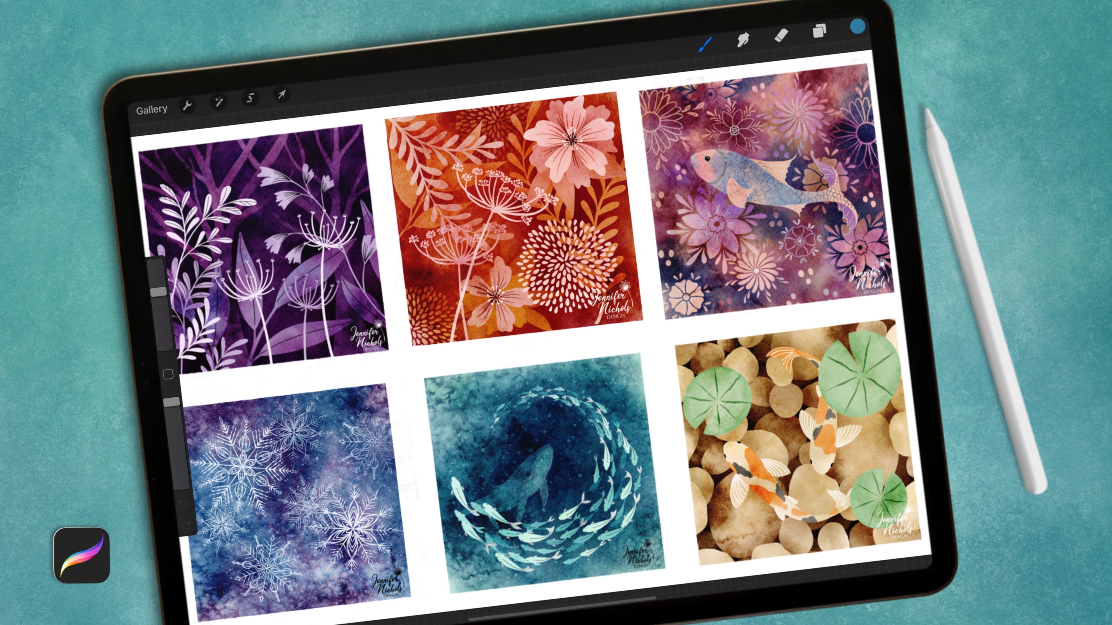
3. Canvas & Brushes: Alright, let's get started with a canvas, and I've been making mine eight by ten. So go ahead and tap the plus sign and then this plus sign unless you already have a good eight by ten. So the width would be eight, the height would be ten, and then that would be inches. So obviously, if you're not used to using inches, just try to figure that out approximately. And 300 dpi. And if you're thinking about just posting to Instagram, you can do a square. And if you want to print on a card, you can do maybe a five by seven, I would do it double that size. If you have an iPad that can handle IT. Greeting cards are like five by seven. Unfortunately, I think in another class I said eight by ten. But hopefully everybody's figured that out. And so maybe do ten by 14 and double the size. So you can have some flexibility with what you wanna do for printing. For this iPad. Eight by ten at 300 DPI gives me 70 layers. That'll be different depending on your iPad. This project is a little bit heavy on the layers. So if you're just practicing, I would go to a smaller size. So you have a lot of layers. You don't need 70, but you might need like, I don't know, 30 or 40. So then for color profile, I've been sticking with this very first SRGB just below the P3. The P3 is much more saturated and not great for printing. This is great for spin flour and things like that. So I'm just kind of defaulting to that lately. Cmyk, there's a whole bunch of information out there on which color profile you should use. So depending on what your plans are with it, you'll need to look into that. And also, depending on any different print on demand site, they all have their own little preference. So for now, just for practice, don't worry about it. All right, and then press Create. Now we have an eight by ten. So let's explore the brushes a little bit. I have this palette in is the same palette as in the topography class. And because it's a really great color palette and it is some trendy colors for 2021. So depending on when you're watching this class, you might want to look at different trending colors. I looked at paint websites. So in America, Behr Paint, Benjamin more pain. These are very popular paint brands. They do this. They do come out with these trending colors and there's other ways to look at trending colors. And you can vary from this, of course, and come up with an entirely different color palette as well if you'd like. And then of course I have one more color palette in class as well. So let's just pick, I mean, they pick a nice bright color to explore our brushes. And I just created called it character process. If I know a lot of people have struggles with managing older brushes. I have a category called gems phase. And I have this category called scout slash clover, and this is the category I use for my characters and clovers. The guinea pig and scout is the little girl. And that way I can have some consistency with my illustrations. So I have my brushes in there that I prefer to use for her. So even though this is the class category name, you can move those around and make a favorites folder, all sorts of different things. So that's up to you. But for now let's just go through my 6B no tape or some of these are common in some other classes of mine. This is a nice textured brush that takes no pressure at all and it a consistent width. So no taper. It's basically like a textured monoline brush. Smooth pencil two is a little bit, it needs some pressure and it can get really dark if you, once you press 6B is a sketchy just like this, but it does have pressure sensitivity. It's a little darker, this is a little smoother and this is a little bit more textured. My favorite is my wide pencil stroke. So that is also a pressure sensitive brush. I like it for. The texture gives in here and the textured edge it gives. So we'll play around with that in class. Jens dry ink because a variation of procreates dry ink, psi just made some changes. My milky chalky Lara Pena is one of my favorites. You can do some tapping and smearing then all sorts of fun stuff with that, it gives this really cool texture. If you tap lightly with it, that right there. I like it. Damp brush is a fun one and this is an oldie but goodie that I made. I don't know if procreate still has their default damp brush. I didn't care for the texture that it gave. It kind of showed like a concrete wall underneath. So I change it up a little bit. This one gets pretty big and you can do just like my milky chalky La Pena. I do a lot of tap and smear. So it's great for backgrounds, especially my wash. Opaque gosh, just means it's just a very solid color. There's no fading in and out. I have a color changing Wash. It's not great for this particular class. This one we'll use for me. I just used it for blocking out my color preferences at the beginning. This I call, this is a brand new brush. So, so far none of these are brand new. And now we're coming into some brand new brushes for this class. Greenie pale shader. And I wanted a shader that had a bit of a nice edge for getting around those chimps and things like that, but that has this grain to it. So when you get to a bigger size, it, it's really kind of a chunky green. And then the smaller sizes is a little more past stele pensively. It'll it comes in handy quite a bit if you like texture. This is from my mid-century class. A nice skin shader. This is a new brush, sandy skin. I hate naming brushes. You can I'd I'd like to be able to know what it's gonna look like based on the name. I called it skin because I'm shading skin with it in this class, but it is a nice sandy texture. This one is Sandy, but it's more sparse. So it's, this one gives you a lot more cycles at once. Scratchy stamp, I use a lot for backgrounds. I, I don't know if it's in a class. So it's a nice textured background brush and you can set different blend modes on that. And then I made two new pattern brushes for some backgrounds. In this class. You can pick up your pencil and put it back down. And it'll pick up as long as you don't change the size or rotate your Canvas, it will keep going without being weird. And then this Paisley one. So these two are paper textures. And I'll just show you those when we get started. And show you what we do with those NADH is how I get a great texture overall on my characters. All right, let's get started.
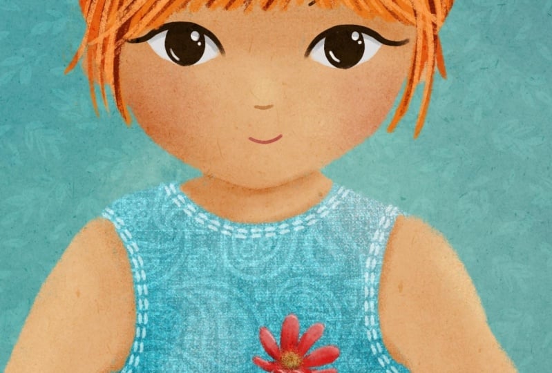
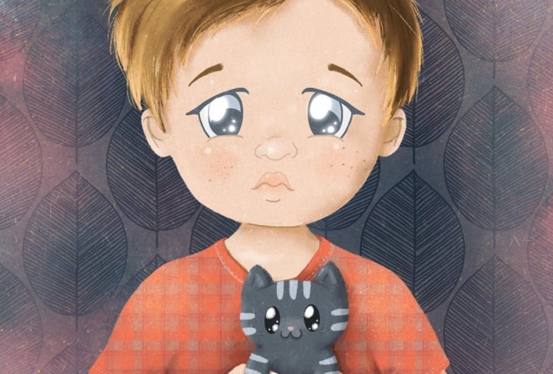
4. Assemble Your Character: In the downloads, there is a JPEG with these face proportions, and this is for a realistic face and we're going for a more stylized face. So you don't need to pay attention to super close details here, but look at how this is split in half here and the eyes are right in the middle and everything is below that. And that's something that when you're sketching a face, we probably never do. We put eyes up higher and so on. I wanted to provide that just to kinda give you an idea. And then the, the width of the head and where the eyes go, that's all kind of out the window if you're going for a stylized look. But I wanted you to have this, this is from my mid-century class too. I do go into more details on a face drawing in that class. So if you want to check that out. And I provided a procreate file with a whole bunch of bits and pieces to assemble a character. So you can just start by copying and pasting over to your Canvas. So the reason I did this is because this class is about the coloring part, not the actual sketching part. So this isn't a class on all the specifics of how to draw faces and things like that. So here's a few different head styles. And I wanted everybody to have a different character by the end of class. So let's all choose different pieces. So try not to choose all the same things. It's okay if you do some of the same things, but let's do different colors and different items from this and assemble a character. So select when three fingers site down, copy. And we can go over to your eight by ten and paste. It's always going to paste on to a new layer. So I'm gonna go through and do this in fast-forward, selecting one thing at a time. Alright, we had everything in here now and it's time to assemble. So we're just gonna start with turning everything off maybe except for the head and the body. Have uniform on. Start figuring out how big you want it to be. Head size is going to be personal preference. A more realistic head size would be smaller. A more cartoony, stylized head size would be bigger. Gb dolls have quite a large head. So it all depends on the look you're going for. Placement is also something to think about. If you have it lower, it's going to be like her head is pointing down. So if you want her to be looking down later when you draw her, put her face on. And if you want her looking down at what she's holding, you can put it lower and then erase these little sections. The hair is going to come a little bit above the head itself. Where it whenever you decide to wherever you decide to place, that makes sure this one that looks like a little off and then I'm going to turn off, put it to free form and just bring the sides in a little bit. And then once you have that place, you can erase the Head parts that are covered under the hair because that will just decrease our confusion later. Alright, that's cute. And the flower. My dog is snorting in the background. Oh, I still had free form on make your flower or your item that you chose as big as you want. I'm having her pinching it, holding it there between her finger and thumb. Sam, just making sure it's placed over there. That's kinda cute too. I haven't done that before. In my practices. Alright. I'm going to erase anything that's should be behind the fingers. And now the face. So if you look at that chart and we think about loops, we think about halfway between the top of the head, not the top of the hair but the top of the head, which was right about here, the eyes would be about halfway. I'm going to want them to be a little bit bigger. And just realized I can't see the nose. Where's the nose? Oh, there it is down there. Right down here. And let's select the nose and the mouth. You can put these all on separate layers and then be able to move them around separately. And for now I'm just gonna do it this way. But then you're going to want to move them around. And I want you to pause the video and really start plane with placement. This is a pretty important part. It's going to change the overall look just by where you have these things placed. So play around quite a bit. I mean, a fast forward. I'm going to select when I at a time in the eyebrow. And then once the selection is made, you can turn on Magnetics. And then I can slide it directly sideways watching that blue line and make sure they're directly across from each other, still. Zoom out. I'll probably change that knows style a little bit when we actually draw it. And I'm also looking at making sure that the nose and mouth are somewhat centered to the eyes. If you tap it in edges to some a little bit, zoom out and take a look scene back in. And let's draw those ears on there. This ears have the hair tucked behind it. Once you're happy, merge earlier layers. So you have one sketch. Now this is just a sketch. So I made that other file that we're copying and pasting from in a 150 dpi so that it would work on most iPads. So this is just really sketch quality. All right, and I'm just fine tuning. What I'm noticing is we're going to have hair all the way back here. So I just want to make sure I remember that. I just drew those lines, but I'm gonna take those away. And then I can make sure that I have the hair going. Back. To finalize. I like making my sketches quite accurate. Alright, and then of course you're going to be doing the same kind of cute loose hairs and things like that. So this is very helmet hair like, but it's going to be different. This is just kind of a shape for you. Alright, spent a bunch of time figuring this part out, and then start your next video.
5. Deciding On Colors: Alright, so I have these spoon flower 20-20 one trend colors, the skin and hair tones. And this 20-20 one pallet. It's pellet B because in the topography class I had a pellet a as well. Go explore and find some color palettes that you love. And look on some paint websites, or just if you already have some favorite pallets, it would be wonderful if we all came up with some different color ideas for what we're about to do. So all of the class projects, they're already going to have this same body shape. But then maybe everything else will be a little bit different. We have our sketch and I'm gonna put it up on top. And I like to turn it to multiply. And I'm not going to turn the opacity down until we start our final that I want to start figuring out what may colors are going to be. And I'm duplicating my sketch because I'm going to end up needing to, but I'll just turn one off and down here and open a few layers. And I'm just gonna go to my painting. It's a fun time to use this painting squash. I really like to decide what the background color is going to be before I do anything else. So let's do that. So it's especially important if you're gonna go with a darker color to know what it is before you start choosing your other colors. I'm not changing this main background color because this is going to end up being just one color layer when we merge everything in the end. And you can't really merge with the background itself. Alright, so maybe hair color next. Maybe she's a brunette. So I'm under this sketch Layer and I'm just not even staying in the lines and just put in some color. You could even go on another layer underneath. We're going to just merge all these later anyways. In all her skin. When you decide on a skin color, you could do multiple of these and then compare them side-by-side and really decide which one you want to do. Another thing you could be doing is creating a color palette. An entirely separate color palette with the colors you've chosen. I need to merge my hair and skin color layer and then look at the dress color. Since it's such a dark background, I'm gonna go with that bright dress color. And I'm gonna go on a layer under these hands. So I don't have to try to draw this colour in between all of that. I might clean up those hands a little bit right here. Here we go. And I don't really have a bright pink. So let's just find a nice pink color for the flower. Or maybe, you know, what might work better is this cream color right here. So it really stands out, right? Zoom out and decide if you're happy with that or if you wanted to make a hair color change and you could even sketch, do a clipping mask on top of the dress. And think about little things you wanna do on the dress. Maybe with a break green. Do a little pattern, little stripes, or even better, a pattern brush. Figure out what color you might wanna do for that. I only provided to pattern rushes in class. However, my mid-century class has a ton of pattern brushes. And I have a class on how to make pattern brushes like this. So you can make your own. And it's really fun in addicting. And so I intentionally didn't provide a whole bunch here. But it is fun to do a pattern on the clothing. And let me show you an example of that. So here's an example of the pattern brush from mid-century class that I did on her, her dress. And this is a pattern brush from the cactus class. I have a couple really great brushes that are intended to be used on the little terracotta pots. And then of course, you can design your own clothing. I just sketched out some lines here on her dress using the palette that I stuck with for the whole illustration. Okay. So once you have those all figured out, you can merge that into one layer. Now that doesn't have the sketch layer on it. And that's why I wanted to have to sketch layers because now I'm going to merge those as well. And now I have that all in one layer. And they have a sketch layer which I really need to have separately for when we get started, right? Spend a bunch of time figuring out your colors, and then come back for the next class. And I'll show you how we make really awesome textured and simple illustrations.
6. Paper Texture & Base Colors: So we have our little sketch layer full of color and then we have our regular sketch. So this one we can just try to kind of reference like if we don't remember which color we selected for the background, and we can come back and reference that. So let's go ahead and change that background. I believe it shows that tail right there. And we're gonna get started. So the very first thing that I like to do is get my background color and then get my texture layers. So I add a few layers and I go to the top. I don't need my little rough drafts here included, so I'm just going below those and I'm gonna select a gray. So go to your desk and just kinda go straight across. And this is something that you can play with. What shade of gray is going to work the best on lighter background colors, a darker gray will work better. And then we're gonna go down to your paper. So the pulpy paper is the one you've been seen in the examples. And you're just going to do when brush stroke over the whole thing. And then, so hopefully you can see that. And then you're going to turn it to Color Burn. And color burn is a nice one where you're gonna get that texture to show up even on the lighter colors. You can play around with Blend Modes and make it look entirely different depending on your preference to. So that is, I mean, a brighten this background a little bit just for while we're illustrating for class here. So that is something that you're always going to want to work under. You can also change the opacity of it, and it does change your final colors. So let me show you an example of that. I'm gonna set this one to the default, and I'm going to choose my wide pencil stroke. Let's choose this kind of paler yellow here. And let's see how about this medium teal here. And then the purple, just get a couple of examples on there. Maybe even a really light example. But you can't really see the texture too much on that one. And then turn this texture layer on and off. So that doesn't change the color too much, but it is darkening it and it's making it more rich. And then the other thing you can do is you can add another texture layer. So if you want to try the cotton paper and turn that one to Color Burn. Now you've dark and it quite a bit, but you can also change the opacity. And let's see what we've got now. So that's with just the pulpy paper, and that's with the cotton paper as well. Maybe you can just choose one or the other. It just depends on the lucky 1.5. I would recommend duplicating one of these brushes going in to the Brush itself and going to grain an edit import source library and choose a different texture. There are some pastel paper, oil pastel. There's a raw canvas down here. And you can tap two-finger top to invert it to be light or dark. That will make a difference here and here. Let's set that to Color Burn. And now you have this canvas, you texture. So play around with those. I'm gonna go ahead and delete that. You should be able, once you make your new brush, you should be able to go in and rename it here. Let me know though, because I'm not quite sure if it's going to lock it into my name or not. But I think you should be able to edit this since you made changes and then call it your own. Alright, so it is important to figure out your texture layers before you get started. I'm just doing the pulpy layer. And I want to lock that layer so I don't accidentally draw on it. And now you decide what color you want everything to be. You already have your ideas here. And what layer, of course you can make changes. Of course, what layer everything should be on. So you're going to block everything out on a different layer. And whatever texture brush you want to use, I use white pencil stroke. It really depends on how much texture you want to have showing at the edges. You are going to turn your opacity down on your sketch layer so you can really see what you're doing. Trying to remember what color I chose for this again, and since I don't quite remember, I'm gonna come here and I'm going to select it during the color selection on layers that are under this texture layer are not going to give you an accurate color so you can turn the texture layer off in that case. So if I wanted to select this teal, I would need to turn the texture layer off first so I can select it more accurately. Alright, so I have that skin color. Alright, where do where do we put the skin layer? So the skin is under her dress here, but the skin is over her dress here. So ideally, you might have it nice and easy where the skin is under the dresses, over the flower is over that, and so on. But we don't have that in most cases. So I'm just gonna go to kind of a middle layer here. I'm on wide pencil. Dry ink works really well with a nice rough edge. Sorry for my dogs and routine. And I am going to make the decision to put the skin on top of the dress. And that means where the skin meets the address. I need to have it meet in an orderly fashion. So we can't just hide the dress isn't going to be able to hide this edge. This is the edge that we are going to be looking at. So I'm going to come around here and here and make it nice and clean here may be dropped my size, I can get a nice corners a little bit better. Just where it's meeting the dress is where we need to be more precise. And now we can draw this skin layer on top of the address layer, which is going to be much easier in the end. We only have it because we won't have to deal with the fingers. We only have these three simple areas to deal with. A fast forward and fill in all of her skin. So we're just doing a base color. We're not doing any shadowing, highlighting methane. Just get it when a solid color down. So you can see I went above the hairline so that I'm I know the hair is gonna go on top. So that's okay. Can they her We'll cover that. And that way I have a little more flexibility on a layer below the skin. I'm gonna do the dress and a did that in that brighter yellow. Choose a different color. Remember? So I am a low monolayer, lower than the skin, so I can just color it all over the whole thing here. I can even turn my brush size at higher. I don't typically do the drag and drop. You can do that. And we'll still have this texture layer and the hair. So the hare is another tricky one because we have hair on top of the skin and hair below the skin. So I'm going to draw it very accurately down here, but I am going to go on top of this skin. So going up earlier and let's see, what color did I choose? And I'm sticking with this same brush. You can do any of the brushes, play around with other brushes as well. Go into the artistic section. Is SASA Fraass brushes really fun? You do not have to stick with the brushes that we're doing in class. The main thing you're going to look for is having a textured edge. I'm going to come back and do the details. The head here, they're getting close to her face here. After I fill it up here, when I go to a smaller size, I can have a little bit more accuracy without such a rough, rough, rough edge. Maybe you want a rough edge though. Alright, so now we can start playing with where exactly do we want this hair? It's okay if it veers from your sketch a little bit. I'm gonna go to a small size and get really close here. Maybe this lack of here comes on top of her shoulder a little bit. And just like we did down here, does get right up to the edge of the skin. It might help to turn the sketch layer off or does turn it way down. You can overlap the skin a little bit if you're still keeping the shape that you want for the face. And I am trying to hide most but not all of the TLA. You can see a little bit of that background, teal. And at this point I'm gonna make the decision to make the hair look a little bit more swooped right here coming down and then tucking up and over the ear. And the same over here. At this point too. I can see it in her foreheads a little too tall. You can start making the little decisions for making little loose hairs. It's kinda nice to have some loose hair so you're look isn't super blocky. But that is just a style choice. Maybe even up here. So the tulip is just needing to be under the skin, but it needs to be above the address. So you could have it above this skin as well. And then we'll use a Layer Mask. So that's something that you can decide based on the layers that you have available. I have a lot of layers so I can put the two Le Bon its own entire layer. I could also go ahead and put it on this hair layer, which means it'll be above the skin. But then I can use a Layer Mask later and I think I'll go ahead and do that so that I can show you how to use layer masks. So it was this cream color. And we'll just block out the whole thing in one color for now. I'm gonna get that green, but I'm going to dark in it. You don't have to stick with the exact whew. And I think I'm gonna go ahead and keep it all in one layer. Get a little bit of a lump there and then come down. And when a skinnier stem. So I'm gonna show you layer masks really, really quick. I need to hide the stem here and here where the overlapping the skin. So I select the layer that the stem is on. And I tap mask. Now if I am selecting this mass Clare and I go to black, then it's almost like erasing. So I can go ahead and get rid of, and they might turn my sketch layer off for this part, I can get rid of just those two areas that are on top of the finger. And now it looks like it's behind this fingers. Now. The reason I did that is because if I come back like right now this fingers looking like a funny shape which I couldn't quite tell when I had my, my outline layer on. But if I want to come back and change the shape of that skin right there, say I want to go ahead and erase some of this bulky part. Now look what I have. I have this gap here. I have a gap down here. And I need my stem back. So I can go back to my stem mask and go to white. And that's going to add back what I erased. Can add back what I did there. So it gives you some flexibility. You could just simply erase the stem. Alright, see you in the next lesson.
7. Face Details: Alright, let's get her face on. So let's turn our sketch later on and we're just going to come above, well, above the skin under the hair. Because sometimes the eyebrows might be under the hair a little bit. And that will make it so that that happens and pick your colors. I'm going to turn my sketch later down much, much more. Hopefully you can still see that in the video. And I like to go to a smoother brush. So you choose one that works for you. I'm gonna go to smooth pencil too. And I'm just gonna go to plaque. Now I think I might go to a dark brown. I'd like to put a little loops, a little kind of ear shaped there inside the ear. And I like to have darker for the eyebrows, darker than the hair color. And then I'll go even darker for the eyes, but not quite black black. One trick is to just do when I and then duplicate it. So let's do that. So spend all your time on the why. I if you want some of the white in the background of the people, you can go to a layer underneath and choose kind of a grayish white and just lightly ad similar way under there. If you're using a different eye shape that doesn't show any white. That's great to do it dark. And you can merge that. And then I do a little glimmer on top too. Okay. Now I'm going to just select this. I three finger swipe down and duplicate it. Flip it, makes your magnetic says on and slide it over. This kinda look in and making sure that the eyes are lined up with the eyebrows. And then I'm going to merge for the nose. I'm gonna go back to just to kind of, you can choose the skin color and then go a little darker. Lots of different ways you can do the nose. I'm just gonna do a little nostril here. Can turn the sketch later off to see what it really looks like, like that. And then any color you want for the lips. I'd like to do. Not a bright color, but still somewhat of a pinkish color. If you're doing the set of lips that actually has lips like that, I would be really careful not to make it look like lipstick. So maybe a Very, very like skin color, but a little bit darker and a little bit more reddish pink. Let's turn this sketch layer off. That's so cute. I like that. Be careful about the eyes. If you put a bunch of eyelashes and things like that, it will look like they have a lot of makeup on. So it just depends on the look you're going for and the age that you're going for. Right? Next step, we're going to add our details.
8. Clothing Details: So the details are all about personal preference. Of course, I like to add a clipping mask above the layer I'm working on. And a lot of times I add more than one. So for example, on this duress layer I might add when that is on a Multiply blend mode. And I'll go ahead and just choose the dress Layer Color. And because it's an multiply, it's going to look darker. That's simply because it's on multiply. If it were a normal, you wouldn't be able to see it at all. But because it's an multiply, it's darker. So this is a nice way to just kind of make some shadows under the hands where her her hands would be kind of sticking out. So there'll be some shadowing there. Maybe shadows under the armpit. You can use all sorts of texture brushes for this part. I'm seeing that this color is actually getting pretty close to her hair color and I don't know if I want that. So I might dark in her hair color or lightened her hair color, but I think I like the look of this dress. So I'll leave the dress, I'll keep going with that and make a decision about hair color later. The other thing you can do is come down to one of the sandy or this scratchy and this pale, grainy, pale shader, that damp brush. You can really, and, and maybe dark in this a little bit. You can really have fun playing around with textures. And since you're on a clipping mask, it's going to stay all on your address. This would be a good time to add pattern brush to your dress if you're going to do that, I would go under any shading that you've already done. And I'll go ahead and choose a brush that comes with class. I'm going to choose a gray. I like to start out with greys for my pattern brushes and then play with blend modes. And then sometimes I'll go into a hue, saturation and brightness and play around with the darkness. So play around with blend modes here. So I'm an overlay and I'm going to come over to hue saturation brightness. You can see how you can play around with that. And if you're not sure if you like it, you can tap and tap reset and it'll go back to how you had it. So I think maybe I'll just leave it on an overlay. It's a nice yellow color. It's not too close to the skin color. So in like that. And then you can add some highlights. You can't do that on a multiplayer layer. So you need yet another clipping mask on new address. So you can see how this is a layer heavy project here. Then go to a lighter color, maybe this sandy skin and get some speckles on. There doesn't have to be a really logical reason for the choices that you make. It see a speckles. Maybe you want to go to 6B on a small size and put some little stitch lines, little details like that, add up. They really add up quickly. And I'll show you that in one example here. So here I have a little detail of this light line around here. And I have this grid on here. But I also have this almost little knitted look with just the lines and the little dashes. And it's barely visible, but it's still makes a big difference. Here. I just added a little straight lines or solid lines. All right. I think HER dresses done. I might I might do a little more shading on that Multiplayer layer. May be with a different texture, maybe with the sandy skin. So go down to the multiply layer where things are darkening and just get some if you think about where the light is coming, that will help you later with where to put the lighter side versus the darker side of things. So of course under her armpit will be darker no matter what. And then under her arms. So texture is going to give you a less digital look. And crisp, clean edges with no texture is going to give you a more digital or yes, a more digital look. Let's see what we have so far with out our texture layer. So as you can see, even without our texture layer, if that pulpy paper texture, we have quite a bit of texture on the dress. We haven't done anything else over here and over here yet. So that's still just plain in solid. And look at her hair. Alright, next we'll do her skin.
9. Skin Details: And we're doing similar things for the skin. So I'm staying under the facial features. I don't want all my shadowing and textures to be on the facial features themselves. So those are right here. So I am just directly above the skin layer and I'm going to turn it into a clipping mask. And I'm going to turn it to multiply. And I'm going to just start with that skin color ish. I know I didn't turn my texture layer off to select that properly because it's not needing to be super accurate for this. Alright, I'm gonna choose this grainy pale shader. And on a fairly big size, I'm at 52%. And I'm just gonna do some shading below. On the underside of things. This is a fairly 2D, just a little bit 3D style. So I'm not being super accurate with shadowing. We're just keeping things super simple. We're gonna get some shadowing under the arms and around where the dresses. And I went my sketch later turned back on because I went to see exactly where her chin is. I'm gonna darken under the chin and bring that down on the darker side. So we have our light coming from over here. And I can blend that edge a little bit. Any blending you do is fine. It just makes it more smooth and less textured. So just be careful. And that step right there made a big difference for getting up face to pop out from the neck. Just go realm and add some shadows. I like to shadow underneath the hair quite a bit. And then I like to shadow like the side of the face. This is where this skin Shader would come in handy. I would put it on a pretty big size and kinda do one side like this. Or you can use the sandy skin. All depends on the texture you want. You can do some shading on both sides, but think about what sides should be darker depending on where your lightest. And the other thing you can do is texture, eyes, the whole face, even though we have that texture layer, you can texture of the skin. And then still have some darker areas. And then another layer for some highlights. So now we're gonna go up a little bit more yellow and brighter. Smaller size and just get some highlights. The tops of her arms. Probably not so much on this side. That's kinda the darker side. Maybe some bigger areas on the face. Be careful you're not going to lighten things too much if you're doing some Asian skin colors or some African American or any darker skin colors, you don't wanna brighten them too much. You want them to be not looking Caucasian if they're not supposed to be Caucasian. So be very careful about highlights. I'm gonna go back down to my multiplayer layer and I'm going to a detail brush, so like my 6B or even my smooth pencil. And i'm going to go back down to a darker color, turn my sketch later on and start getting some of these details like this. And especially here in the fingers, you really don't need a lot of work down here. I know hands are scary. They're scary for me too. I would make sure I go around the tip, at least on the underside of this finger. So you can see that it does overlap that hand. I'd like to go on the underside of these fingers that are exposed to, it's easy to go right in between the, the ones that are lined up, but come down on the underside of these ones that don't have anything under them. If that makes sense. Just kind of shadow shadows the underside of the fingers as well. Don't forget the thumb. I've been forgetting the thumb a lot. I've been forgiven to draw the sum entirely. So you can always come back and then turn that sketch layer off and see if you have enough line. Do, do you like how it looks with just a skinny line? Do you want to go thicker, ADD more, and maybe even highlight the tops of the each of these fingers to make them look more round. But I'm going for a very flat look here. And next up we're going to do, oh, we forgot her cheeks. So I'm just going to pick this pink hair. It's a nice warm pink that will go well with her skin and hair. And I like this sandy skin or this mid-century skin. There's a lot you can do. I am on a layer that I have all the dark shading on. But I want my own layer for their cheeks because I might want to smudge them and do different things. So to pick a different layer, o, go under your Multiply layer. So that, oops, I just turned it off so that you can darken. It will automatically dark in that cheek. And then decide where do you want your cheeks? Do you want them to be? A little rosy cheek right here? It's not quite rosie enough for me to brighten it a little bit. So do you want them to be little rosy cheeks? Rosy cheeks like this? Do you want her to have freckles? Do you want her to have rosy cheeks like this? Just don't overdo it. And it's just class, so you're just practicing it so you don't have to make a final decision about character design and how all of your future characters are gonna look. Do you want them all to have a certain dial of Cheek and you need to make that decision right this second. No, you don't. So just pick a cute look. And then if you want some freckles, pick a darker brown. I would go to the facial features and add a couple little freckles. And one more thing. I'm going to go back down to my multiplayer. And I'm going to show you and probably not going to keep it this way. But I'm gonna show you how you can get some CRISPR edges. So you can use a brush like this x b. And you can really go around and do some nice outlining in certain areas. So that was very slight. But it gives a nice distinction between the neck and the chin. And you can come around, induce some darker shadowing that way with a sharper edge pencil. Alright, next step is hair.
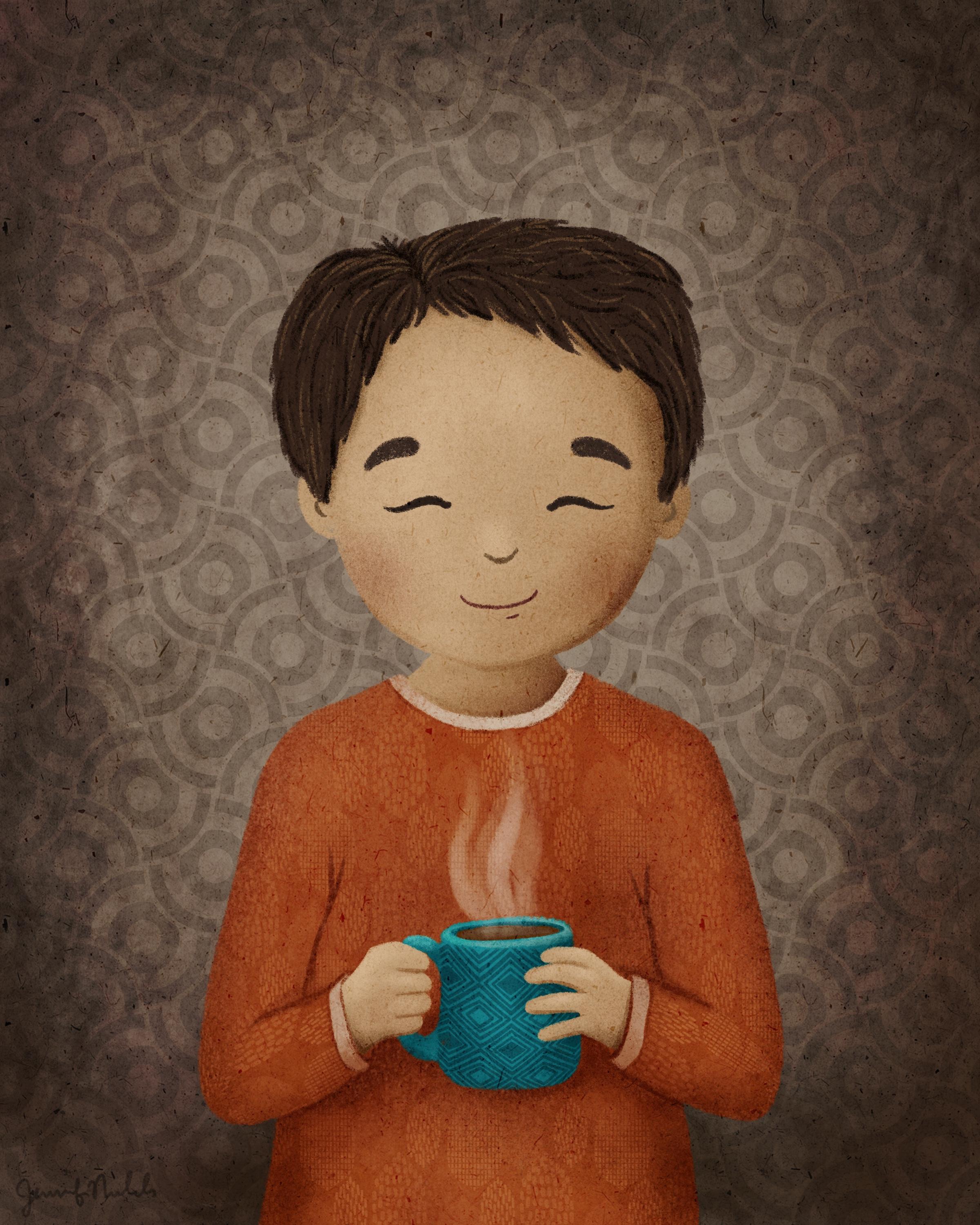
10. Hair: So I was thinking that things were looking a little too blended with similar hair color with dress color, but I I think I like it, so I'm going to keep the hair color the same. And I'm going to select that layer. Remember My flower is on that same layer, which we were able to do because it's not touching the hair. So we can deal with those separately and add a clipping mask. Even though it has a Layer Mask, there's still can just be a regular clipping mask above it. And now you're going to spend basically lake two layers doing some streaks of highlights and some darker areas. So if you want to do multiply for the darker areas, you can select this color and then go even darker. You can maybe just go to a different type of brush entirely and get some darker areas spec here by the neck where it's really shadowed from her face and head. And depending on the hairstyle you choose, if you have a curly hair style, you're going to do dark in the swoops, in light in the bumps. So let me show you that. So here you go. Lighter where its site coming up and out and then darker where it goes in. And that just helps give it that loop de loop. That's my technical artistic term. Here I did the same thing. So you can see just a wavy hair. They have these lighter lines here and here. And on the top of the head. And darker lines. I still have darker lines going throughout, but I do have no light lines down in here, but I have even more dark lines. Can see couple tunes there. So this part, you can kind of get some overall kind of shadowing before you do all your little lines. And then get a more detailed brush, 6B or wide pencil. I'm going to, I know my part is right here, so I'm just kinda eyeballing it. I don't need to turn my sketch layer back on. And this part is really personal preference. How many lines do you want? What do you want those lines to look like? Do you want them to be thick? Then? You do want them to kind of flow with the same curvature of the hair. So think about that. I like to start with dark and then highlight on top of the dark. So I always get some dark lines on first. And the other thing I like to do is where the part is. I like to have a lot of dark coming at both directions from the part. So some going that way and even maybe switch back to my milky chalky Lara Puna. Even do some overall dark there. Some thicker, some thinner. You don't have to make it look like you've drawn every single strand of hair. Strand of hair. You could also give her a little look of the skin color showing in part. Because of course that happens when you don't have super-duper thick hair. Right? So some of this is going to be covered up by my lighter strokes cell. I'm not worrying too much about details right now. And now a new layer because I'm on multiply and need a new layer, clipping mask for a lighter color. Money go towards yellow a little bit and lighter. Remember my light is coming from this side over here, so I'm going to probably have a lot more strokes that are highlighted over here. And then not too many down here under the hair, under the head here, it's all dark. And this can be as messy or as clean as you want. This is all about your own personal style and not really happy with her part. So I'm going to come back to the dark, go back to my dark color. And I'm gonna just draw a line here. There. I like that better. And I still want to go to my light layer, my lighter colour and get some highlights that go all the way into the part. Just not as many. She looks like she's just been to the salon. She's looking like a little redhead almost. Alright. And now for the flower, we're on the same clipping masks weren't clicking masks that apply to that flower as well. So I can do on the multiply layer, I can go to a green and it'll look darker. So if I just go right on top, I can do a dark side of it. I'm not doing a bunch of details, so I really just kind of adding another color. So it's not just one color. And on the White, I might go to the normal layer and choose maybe a little bit of a pinky color. Maybe actually some of this teal color. Let's just play around with some color ideas here. I think I like that a little too dark. So Flowers can just be totally made up. They don't need to be something realistic looking like that, as simple as that. We're gonna go ahead and finish the background. Her her overall appearance is finished.
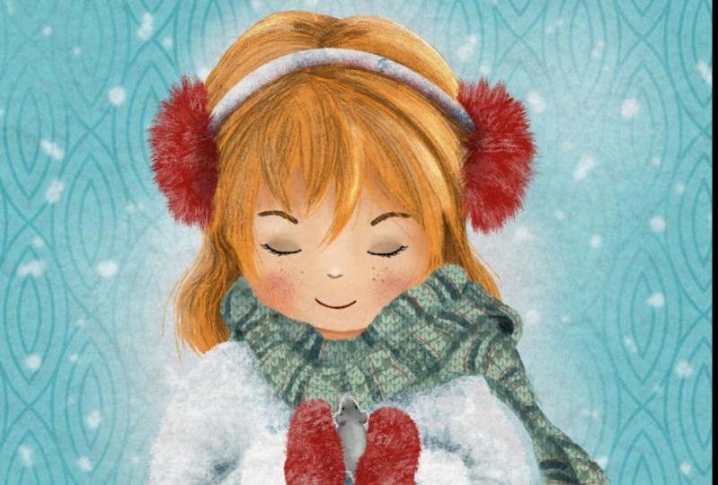
11. Background: And now we want to play around with backgrounds. We're going to add a couple of layers. I'm gonna go to the lowest when go to damp brash or milky chalky Lyapunov and go to a color that you might want to just kinda have some changes to it. You're just going to have some differences happening. So if you want her to be lighter, if you want the top to be lighter, and just start playing around with having some more color and just kinda smearing it around. Maybe you want some darker down here. Maybe you want to change colors entirely and get some purples in there. I'm not sure purple would go well with these colors, but maybe they would with the colors you are choosing. And have fun. Don't worry too much about this background. Zoom out and look at it. Do you want it to be even and have this kind of a halo of light around her or more random. And then let's do another pattern. So I am going to cheat and I'm going to use a brush you guys don't have. You can go get it in my classes. And I might just do this leafy background. And let's actually choose a good, a good color. I like to choose gray and then play around with blend modes. Migraine was too dark, so I'm going to put it on overlay. I think I am and then discriminate, lighten it up this way where dark and I think I like it darker. So I can darken it. And then it can also play with opacity. And then I can also erase some of it. So maybe I want to erase with my sandy texture and just erase some of that levy layer and get some texture added by erasing, I'm gonna go to the sandy skin. And that can actually turn the opacity back up now. So there's all sorts of things you can do. And then the girls that I have with flowers and leaves here I have another background texture, but I also just drew some leads in the background. This one I have the pulpy paper texture, but I also have that scratchy brush, this scratchy stamp. I did some dark and some white with it. Here I drew a whole bunch of details on her scarf, not a lot of details in her hair. She's very summary. I really like this. I think I want to add some lighter and also play around with D18, that texture layer under that other layer that you've been working on. Nope, I like it better on top. So this is the basic way that I illustrate my characters. And you of course, want it to find your own way of doing that. I wanted to mostly show you how to work with all the layers and clipping masks in Blend Modes. And, and, and just kind of the process.
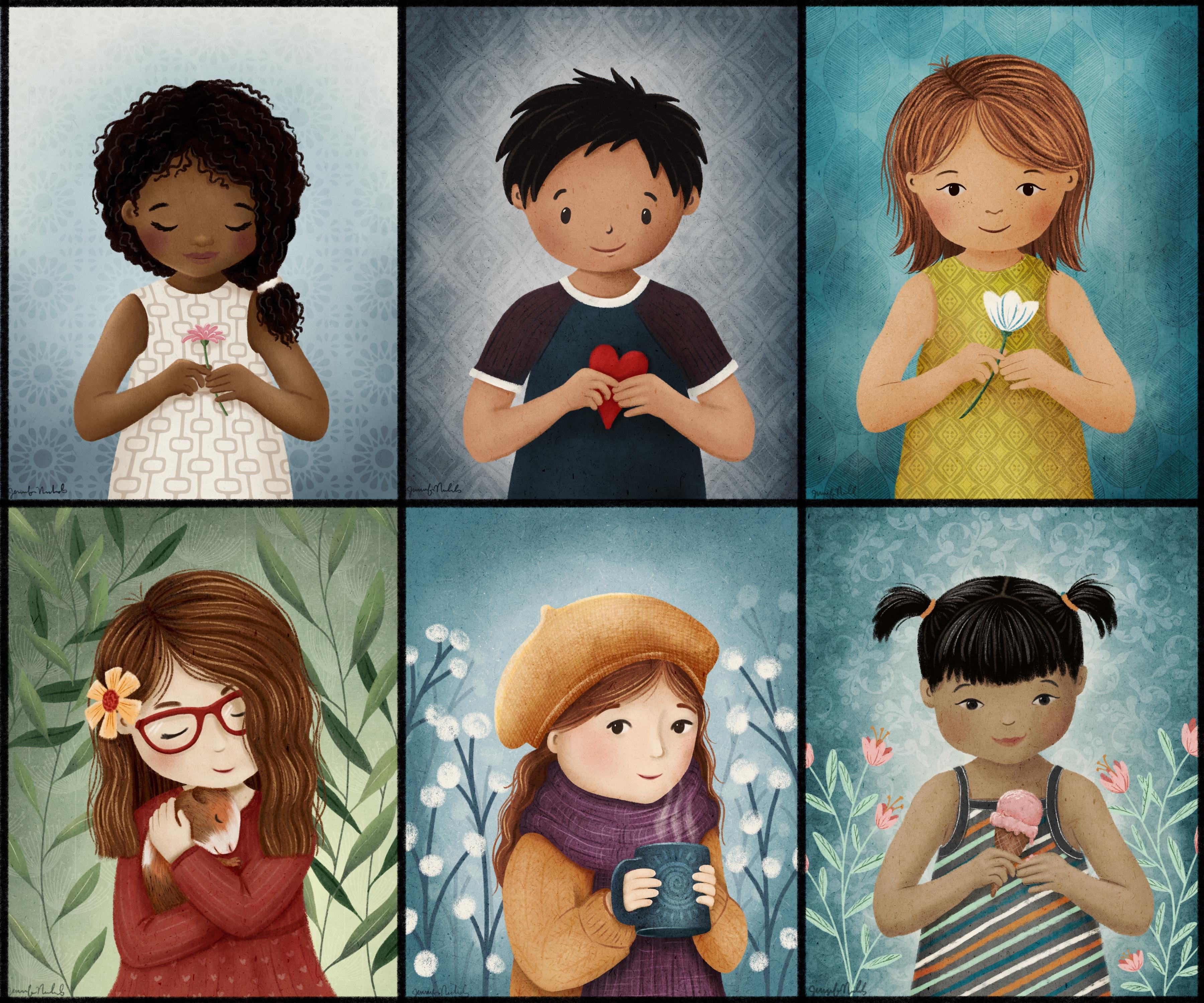
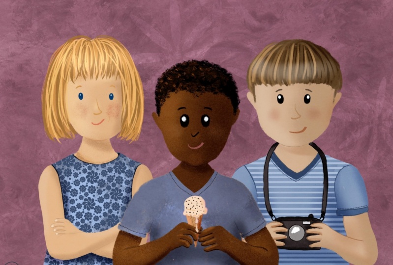
12. More Examples & Class Project: I wanted to come back and show you a couple of things I did really quickly. I actually darkened the pulpy texture layer, so I came up here and unlocked it, swiping in analog. And then I went to hue saturation brightness and played around with the brightness. So it shows more texture. And I also desaturated her skin color, this base layer of skin color. I went ahead and went into hue, saturation, brightness, and just desaturated it a little bit. It was two orange. So that was something and I darkened it. So if you did the brightness a little lower and the saturation a little lower. And I didn't have to mess with the other layers. So that worked out well. I want to make sure everybody signs their work. So I like to go on top of everything and pick a nice dark color that starker than what you've got here, and pick your favorite way to do a signature. I just do my down here. I tried to do it for the small. Sometimes if it's a little too big or too dark since it's on its own layer, I can just, you know, turn the opacity down, change the size, and share shy. I would love for all of you guys to share in the class projects. Of course, your class project is to make when you can make a little boy, a little girl. All the different hairstyles I provided should help with the decisions for that. And oh, I changed her hair a little bit right here was all little short ends. So I kinda made some lung swoopy are ones here. And sharing your projects. And I am so excited to see the colors you choose. The outfit teaches the hair and the eyes and the face. I know that we're all going to have this little same pose, but that's just one of the things that will be similar with everybody's project. Unless you went to venture out to your own little sketch for the hams and do something entirely different and more excited to see the textures and the colors and the patterns that you choose. Remember to go grab my mid-century patterns. And gosh, I have so many brushes and other classes, I can't remember which ones are which, but go check out my classes and get those brushes and have lots of fun or make your own patterns with my pattern-making class. It's, it's truly addicting and you can, you can make so many different patterns. Here's a lot of my mid-century ones here. And here's a bunch from, these ones are from the cactus class. Here's some that I made my own. Some plaid we did, Ooh, you know, at the seamless repeat pattern class has some as well. I just remembered. So if you want some diagonals and plants, I think we did that in that seamless repeat pattern class and the Chevron as well. Here are several examples I just put together and wanted to talk through each one. So with this, let her nice dark skin. I made sure I didn't highlight too much. I feel like I need to do some more highlights so she's not so flat. But i, for the hair, I use them wide pencil brush and got this beautiful texture. And then I did some lighter curls is well, just to give it some highlights there, I like that a lot. And everything else I think I talked about in class. For him, I did a very simple iss o for her eyes cited news, the closed eyes, that one of the options in the download for him I did. And they spiky short haircut and just kind of had it going over and around his ears. And did simple dot eyes that are a little bit angled in this way. So that's another thing you can play with. And I did the t-shirt body design here. But then I added some details to the t-shirt like colored sleeves and then the little rooms here. And he's holding a hurt. Look. I changed her dress color already, so she's a little bit more green. All I did was change that base color of the dress. This one is this background brush is a procreate brush in the textures, textures, I think, category. So that's kinda fun. And it behaves a little bit differently than my brushes. So you have to make sure you do it all in one stroke without picking up your pencil. And I did an ice cream cone in this hand. I showed you her a little bit in class. I showed you the, the clothing Here. You can see her lips are just just barely colored in, so they're not really dark. And I did try to give a bit of a look of having her scalp show here because it really does show in the original image. It didn't finish coloring that I changed it from Teal to orange. All right. And then let's see. We talked about this one a little bit. We talked about this lens hair a little bit, but I wanted to show you the glasses. I just drew these little reflections to make it look like there's glass there. And I also drew these little shadows underneath here and here as if the light was coming down this way a little bit and a little bit of the shadowed knows there. So that's another thing to think about if you wanna do glasses. So these guys have the same eyes. And this one has an eye style that I'm used to using that's more just like a half circle on top with the pupil. This is another draw, this in your style. So I just was kind of drawing what somebody else had already drawn and making it more my own. And I did a lot of texture on her sweater. And then what I did for the body is I took any of the body options that you have and I drew an outline that was bulkier than the skin. So her bare arms in the options that I've given you are much thinner than what you see here. So I made it a bulkier look. So it looks more like a fluffy sweater. It so you can really do anything with those options that I have given you in class. And you don't have to keep yourself limited to those the same ham style here. And then for the hare here, I did it in two sections. I did it in this top section, and then I did it in this bottom section. So they're two separate sets of layers with their own clipping masks. This one is behind all the clothing and this lens in front of the face. So that's an option if you have a lot of layers, that's an easy option. And then to have consistency, what you would do is to hop back and forth. So the base layer on this say made it a certain color and then I came and did the same exact color to this. And then the clipping mask for the dark lines I did in a certain color and then I came to the clipping mask on this one and I did the same thing and the same with the highlights. So then you are consistent. You don't have to try to remember what color did I use for these little strokes? I can do the same thing down here. Alright, and then we already talked about the wavy hair. These little flowers are fun. They're just the 6B pencil edges can have circle, circle, circle. So that's all I wanted to do is just kind of go through some different options for her. I did the here're all on one layer as well. So even though goes back behind and up here, I have it on top. So all of this that's on top of her face over here. And right here is just do what you want, just draw it how you want it to look. But then down here, and over here, and the ears and the neck, you have to draw it right up to the skin just like we did in class. So I find that to be the easiest way then, rather than having multiple layers of hair. But you'll find your own way of doing things. It takes a lot of practice. And you can look at I distance in eye height compared to ears like his ears are a little higher than his eyes. And her ears are actually a little bit higher than her eyes as well, but not quite as high as those. Her ears are lower. She also looks much older. Her head is tilted. That's another option you can do is tilt the head and she has a point to your chin and that puffier cheeks. And these guys don't have that pointy chin at all. She's got a point teach-in. So all the different head shapes, it's more, most noticeable down here. And you'll get lots of different looks, overall licks. And if you're trying to develop a type of character that you actually want to keep going with. You'll want to practice different facial expressions as well. So there's a lot of classes out there and it takes a lot of practice. I'll show you when I do. So here is my character scout, and there's lot of different expressions of emotions that are suggested for practicing. But I narrowed it down to nine more common ones and decided to just practice those. So you can kind of look at a very simple i and how you can make it look different ways. And depending on the emotion and of course, the whole face is involved with that. So it takes a lot of practice and don't get discouraged, you can do it. Another thing that you'll want to practice is different angles. So we've been doing this straight on view. And you can do three quarter turn or complete profile sideways. You can do this front view with her looking down or up. The three-quarter view down and up, and the side view down and up, and the neck comes into play, the neck position. I talk about a little bit of this in the mid-century illustration class. So I did talk about this in class. How when you look down, the ears are higher. So the mouth and everything comes down. And when he look up, the ears look lower and the mouth and everything else is higher. The other differences are when you're looking up, you don't see very much of the part. When you came down, you see a lot of the part because you're seeing a lot of the top of the head. Alright, I hope that helps you get started on your character journey. Have loads of fun. I can't wait to see what you do. And I was getting at, let's see, it's going to say make sure you share in the skill share class projects. There's a ton of people and skill share that aren't on the other platforms. And then that way you guys can see each other's work. Leave a review. I'd love to hear what you thought of class and I'll see you next time.
 Jennifer Nichols, Artist & Teacher, Procreate