Transcripts
1. Introduction and Project Overview: Hello, and welcome to this
class B color confident. It really is about
unlocking that magic that happens when you
start to mix colors. Whether you're a
complete beginner and you'd like to have
a little go making your own recipes or whether you have already got more
experience with color. But you'd like to go back to basics and actually
just play again, then there's something
in this class for all of you. I'm Don Cord. I'm an artist, designer, teacher, and well
being practitioner, and it's a delight for
me to be sharing some of my color mixing techniques
with you in this class. As usual, it's going to be
very relaxed and very easy. We're not going to
get really scientific about it and get into proportions and
scientific stuff. We're going to use our
instincts and intuition a bit more because that's
what color is all about. It's a very instinctive thing. You either like a color or
you don't like a color. By going through the processes that we're
going to go through in this class and experimenting, giving yourself permission, play and just see what colors you like and
what colors you don't like, that's really worth its
weight in gold because it can have an effect in
other areas of your life. You might decide to change
your interiors a little bit. You might decide
to actually change your wardrobe around
a bit. Who knows? There's something in this class there that I'm hoping, in fact, I'm certain will really
inspire you as you get to understand color
more and you get to deepen your own
relationship with it. Just using blue, yellow and red plus a little bit of white
and a little bit of black. You'll be absolutely amazed at what colors you can achieve, you'll really begin to unlock
that magic of color mixing. We're going to go
through the whole process of how to do that, how to get so many
different tints, shades and tones, just by adding those three primary colors with a little bit of black and
a little bit of white. It's lovely to see all
the different colors coming out and you really don't need to
have a huge color palette to get all these colors. Those three colors will
do it all for you. You can create as many color
palettes as you want to. In fact, it can be a
little bit addictive after a while actually
because really, there's no limit to how many different shades and tones and tints that
you can create. I'll share with
you the process of three different color palettes
that I've gone through. We'll take a look at how to
find some inspiration for you to maybe have a go at doing a small composition of your own. You don't have to if
you don't want to. You can just play
with the colors. That's all you need to
do play with the colors. But if you want to create
a little composition, then feel free to do so as well. Have a look through
some magazines. This is how I got the ideas
for my two compositions, also, I'm going to show you my painting process during those two compositions as well. There were parts of the
paintings that were very successful and parts of
them that were less so. However, I was very happy at the end with the
results that I got. So I do hope you'll join me,
where we have a bit of fun. It's always about
having a bit of fun. And yeah, just having a play, as always, just having a play. So let's get started.
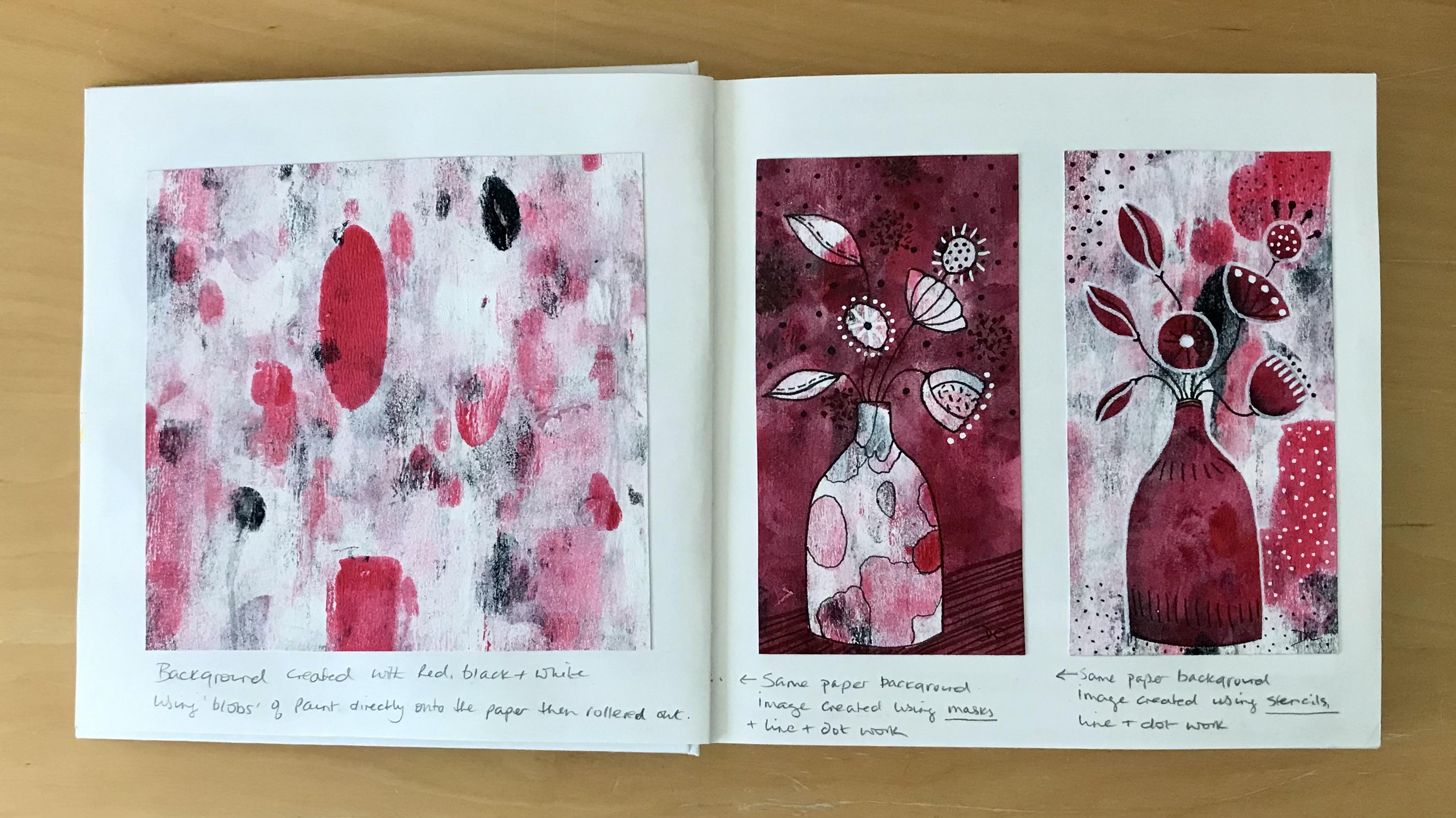
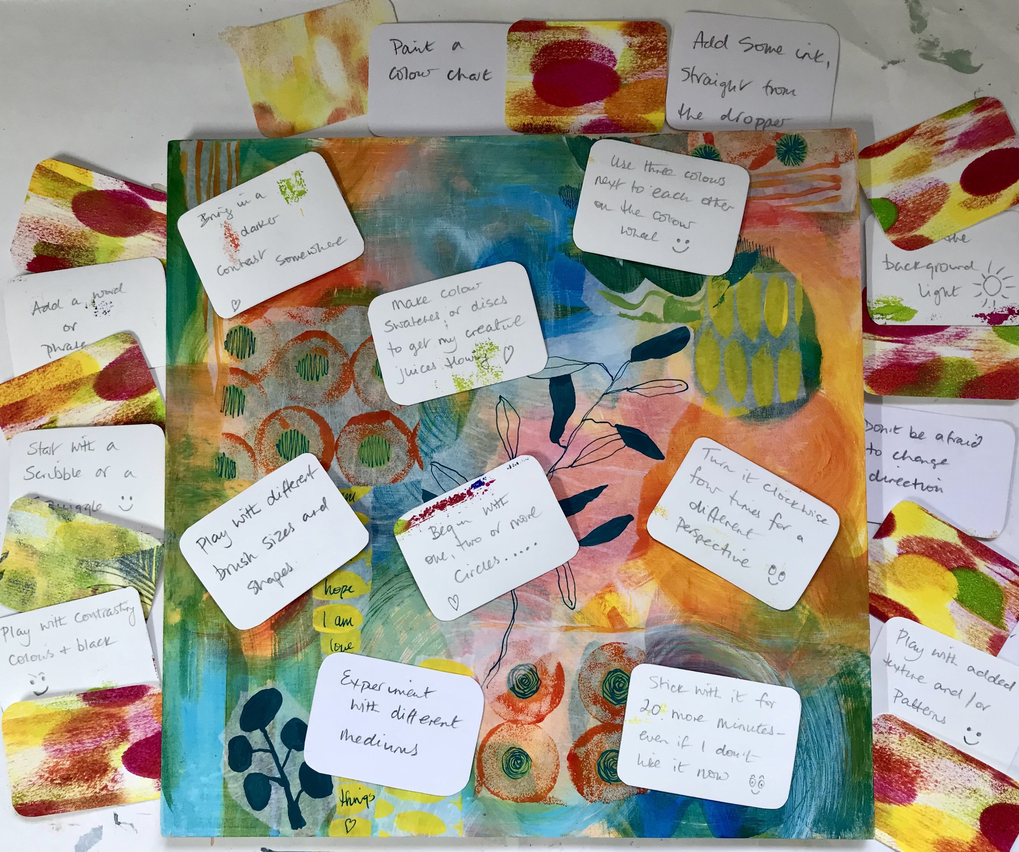
2. Composition & Materials: So I just want to chat to you
briefly about composition. I don't want you to get
all worried about doing something perfectly or creating a really gorgeous
picture or whatever. It's really about you learning how to mix colors
and seeing what magic you can create through
using the black and the white and the three
primary colors. And so just choosing a simple
design is absolutely fine. And I pulled this
sketchbook out. Knowing that I've got
some abstract designs in it that actually date back to 2022, sorry, 2021, and thought that I
might use one of these as inspiration
for, you know, just doing a little
bit of artwork, yeah, to use as inspiration with one of the color palettes. So that's what I
was going to do. Use one of these,
to get me started. And then this magazine pop
through my letter box, and with a nice cup of tea
and a bit of a sunny spot, I decided to have
a look through. And I was looking at it
mainly for the interiors. And then this, of course,
presented itself, these lovely vases and greenery, and I thought that these
two shapes actually would make quite a
nice composition. So that's what I based the
left hand composition on. These two shapes here. I
altered them ever so slightly. But that was just a
really simple bit of inspiration there to get me
going with the left hand one. And then, you know,
I carried on looking through and wondered if there might be anything
else to inspire me. And I came across this page, and there we've got that lovely design
there on a doorstop. We've got a similar
design on a cushion, there's somebody else's artwork. There's even a box
of matches there that have got a really
nice design on them. And I even quite
liked this shape here and the archway as well. So there are a few things
there that appealed to me. And in a way, they weren't dissimilar to what I'd already
got in my own sketchbook. But then I looked a little
bit further and Okay. I came across this
little beauty up here, and I rather liked just that little bit there,
that composition alone. And that's what I base
the right hand side, more abstract composition on, the little mirror
and the candlestick and the little object there. That's what I use
for my inspiration. You can see how easy
it is just to have a look through a
magazine or whatever. Just just have a
look around you and see what shapes appeal to you. Just keep it nice and simple. In terms of what you're
going to need material wise, the first thing is some
decent quality paper. Now, I happen to have actually
used watercolor paper, and I buy these pads because
they're really good value, and I tend to use them for all sorts of things,
not just watercolor. This one happens
to be 140 pounds, 300 GMS, but GM squared. But that's 220 grams, this one is 300 grams. This is decent heavy
cartridge paper. Just use whatever paper
you've got to hand so long as it's got decent
thickness to it. If you start using things like copy paper that goes
through your printer, then your paper is
going to buckle and you won't get
decent results. Now, I am also going to
be using acrylic paint. You can use these techniques
that I'm teaching you in this class
with any paint. You might get slightly
different results if you decide to do it
with a different paint, but the principles
are just the same. Now, what you're going to need is the three primary colors. So I have got here primary red primary yellow and primary blue. I could go with a different
yellow, which, in fact, I do, or I could go
with a different red. It doesn't really
matter which red, yellow, and blue
you choose to use, but you will get
different results and you'll see what I
mean when you start watching the little video about color choices where I
explain it a bit more there. But basically, you need
three primary colors plus a black and white. I happen to have used a titanium
white and a mars black. Again, you can get ivory black, mas you can even use pines gray you'll just have to experiment with what the colors are that
you end up with. That's all. Then a pencil, a selection of brushes. Again, go with what you
feel comfortable in. There's no set brush that
you need to be using. A few pieces of kitchen role, and your water jars, and
that's it. You're good to go.
3. Colour Choices: There's something
magical about mixing colors. There's a process to it. It's alchemical if you like, but when you put two colors together and you
create something else, for example, putting the blue
together with the yellow, and then you get
this whole range of colors coming
through like this. I find it really I just find it very beautiful and
uplifting, actually. The process of making a color wheel it's quite
meditative in a way, as well as being
exciting because you don't exactly know
what's going to turn up. You don't exactly know what
color is going to turn out. So there's always
that lovely element of surprise in it as well. That's why we're going to
start with this class day. We're going to start
by doing our own color wheel because I think if you can paint your own
color wheel rather than just looking at it from a picture on a screen or
a printed version of it, by actually painting
it yourself, you really get to have what I call relationship
with the color. You really get to understand much better how color
actually works. But we're not going
to create this particular kind of color wheel. Actually, we're going to
keep it away a bit simpler. And I'd like to make I'd like to do the
color wheel just like this, quite a basic color
wheel in 12 segments, and we're basically
going to start off with three primary
colors and then add a little bit of black and
white to things to get to those primary colors to get these gorgeous neutrals as well. Now, for this one, I actually used a primary red, which
is that color there. Now, it might look a
bit on the pink side, it does look a little
bit on the pink side, but that's actually primary red, and then that, believe it
or not is primary blue. Then we've got here
primary yellow. In order to get the
different tints and shades, I've then added titanium white, or mars black or even a
combination of the booth. For example, if I just
look at this here, Let's just bring that a bit
closer that way into camera. Believe it or not,
this here is red, blue and yellow mixed together, and then with a
little bit of black added and then with
more black added. This is red, blue and
yellow, but with white, and then more white
and white again, and even more white, more
white, and more white. And this is adding the red, blue and yellow with
black and white, so you can see that you can get some incredible monotone
shades or neutral shades, as I call them, just from those three colors alone with a little bit
of black and white. Now, this is the beginnings of a class that I am going
to be teaching in person. Hopefully, we'll also develop it for a skill share
class as well. Really, we're just looking at all the different
colors and tones and tints that we can get through using those
three primary colors. I mean, when you look at these, they're amazing how many
different tones you can get. This is a green one here. Then you've got a yellow green, And then a blue green. I mean, again, look at all the different
oranges that you can get. Fantastic. You look at violet. When you start adding
white and black to violet, you can create some really
moody kind of palettes. And then you go to the red
violet, which is a much, much warmer tone, and
then the blue violet, which is a cooler tone again. These little whimsical
landscapes were created quite literally
just using red, yellow, and blue, and
then black and white. So you can see how
easy it is to get a really good contrast and a good variety of color by
just using those three. Now, I wanted to show you this before we even
start our color wheel because the colors that you
get will depend on which red, yellow, and blue you
decide to go with. You can see here that these
are quite different tones, and that's because I've used
different yellows in it. So this one was done
using a primary yellow. This one was done using
a cadmium yellow, and you can see that this
is slightly fresher. It's got a bit more pop to it. It's a cooler tone, but it's got a freshness to it. Whereas, this one is a bit more solid and a
bit more earthy. It doesn't matter
which one you use. You just need to be aware that whatever three primary
colors you start off with will give you
specific results. You can see here again that I've used a primary
red on this one. But on this one, I've used a cadmium red, and then of course, I've added the white and
the black to both of those, but you get a completely
different result. That's a slightly pinkier red, and that's a slightly
more orange red. So you're going to get
very different results. Again, no right or wrong, it's just to be aware
of that that when you decide to choose your
colors for your color wheel, you might get different results to what I'm going to get today depending on what three colors
you decide to start with. Now, because I've already used the primary
red, primary blue, and primary yellow on this, for my next color wheel, I'm going to swap the
colors around a little bit, but I am going to keep
the primary blue, but I'm going to change
the yellow and the red. And the reason I'm keeping
the primary blue is because unlike this cobalt blue, It still gives a bit
of it gives a lot of vibrancy and lightness to it. Whereas this feels very
kind of heavy and dark. You can see here, I've used the primary blue there
and a cobalt blue there. And I just prefer these
colors that I'm getting. So I'm going to stick
with that primary blue. So let's have a look at
the three colors that I'm going to be using
as my primary colors, and then we'll start to do the drawing of the color wheel, and I'll just show you how to measure it
out and everything, and then we can
get going with it.
4. Starting The Colour Wheel: You're going to need some paper. I've just taken that out
of my watercolor book, that's 140 grams, which
is a good thickness. If you go any lower than that, you might find your
paper bookling but go with what you've
got and see how it goes. Go to need a ruler and a pencil. You could use a compass
if you wanted to, but I'm actually going to use a bowl and just
draw around a bow. I'm leaving some paper
around the edge of it because I'm going to
paint over the circle. You'll see what I mean
once I get going. I'm going to just work out a
bit like the faces of clock, you know, 12:00, 6:00. 3:00 and 9:00 and
join those up first. Don't worry if you don't
get these segments looking exactly the same
size as each other. We're not trying to get
really perfect here. Okay. Now, in fact, already, I can see
that they're slightly smaller than those, but
that's absolutely fine. I'm certainly not
going to rub them out. I'm going to do 10:00 and
11:00 and roughly 1:00. 2:00. Now, what will happen is if you go
to that little point there and then line it up with your mid section
with that mid point, then it'll give you where
it needs to come to there. If I'm just going to move
that round slightly. So they're reasonably even. Those are reasonably even. Let's start off and
pull that through a little bit further point there through that mid section. And then the last one. And
that gives me the 12 sections. Now, at this point, it might be useful for you
to just write on top or right around the edge if you like where you're going to
put your primary colors. It's quite useful in the sense that it's a good guide for you. I'm going to use this
one as my guide, and I'm going to put
this as number one, and that's going to be my blue. I'm going to count through that so that from blue,
that's one, two, three, four, five, it's
going to be the yellow. That's one, two, three, four, five, will be the yellow. Five, again, one,
two, three, four, five, will be the red. That's five, six, seven, eight, nine, that's number nine. When that blue is
mixed with that red, which will be that
middle section here, that's going to give us violet. Let's just write this down. The reason I'm suggesting you do this is because yesterday, I decided to do a
little color wheel and I did it all the
opposite way around. This is a good guide for me. You might not need it, but it's a good guide for me,
so I'm going with it. That then will be a blue violet there because we'll be mixing
the blue with the violet. We'll be mixing the
violet with the red, so this will be a red violet. And so on and so forth. So yellow. We're going to be
mixing that with the red. So in the middle, it's
going to be orange. Here, it's going to
be yellow orange, or orange, yellow, whatever
you want to call it. Here it's going
to be red orange. Here that blue is going to
get mixed with that yellow. The middle section
there is green. Then it's going to
be yellow green, and that one leaves
us with blue green. I've never done this
color combination before, so I'm really curious as to how this is
going to turn out, and I'm going to start
off with the blue. So I'm going to put some of
this blue onto my palette. I'm using a round
tipped brush that's got a point to it because
it's just easy to get into the middle into
the point because that's how I like to start by painting
from the middle outwards. Just pour a bit of water
into my little jugs. I've got a couple
of water jugs here because I just like to keep
the brush as clean as I can. So I'm just giving
it a bit of water, but dabbing it onto the kitchen towel here so that I don't have
any excess water. Now, This blue paint here. If you look, all paints have a little symbol on the
back of the mother front, and it will be in the
shape of a square. Let me just show
you on here first. So it'll be in the
shape of a square, and it will either be a
completely blank square like that or it will look like that with the bottom section
filled in like this. Or it will be
completely filled in. And basically what this means
is that if it's like this, well, if it's like that,
it's very translucent. In other words, you can
really see through it. If it's like this, it's
partly translucent, so you can still see
through it a little bit. And if it's a square, let me show you one
that's got a full square. No, it's not showing
on that one. Here we go on the black.
Can you see there. It's got a complete
square there, which means that it's opaque. In other words, you can't
see through it at all. You can see here with this
magenta that I'm going to be using that that's
partly translucent. This gives you very
different results again. I when I showed you the samples of the
cobalt blue earlier on, that is a completely
opaque paint. So that's why it comes
out much more solid. So because I'm using this one here that's only
slightly translucent, I might need to put
two coats onto it. So it might come out a little
bit streaky to start with. And that's just perfectly
normal, just so you know. That's me, of course,
using acrylic. Depending on what paints
you decide to go with, you might have just check
on the back of your paints, whether it's watercolor
or gash or acrylic to see what your translucency
or opacity level is. Okay. Don't forget, turn
your wheel around as you need to so that
you've always got your brush, not obscured. By your hand so that you can
see where you're painting. Now, again, don't try to
be too perfect about this. It's really, the whole thing is about experimenting with color. It's not about
creating something perfect. It really isn't. I want you to play with this
not get anxious about it. But you know, I could create
color wheels all day. I don't really need to
even do a painting. I could just play
with color wheels like this because I
just love them so much. Now, that took no time
at all, as you can see. So the next thing I'm
going to do is, well, after I've washed
out my brush is, I'm going to bring
in the yellow. Now, unlike the color wheel
in the book that you saw, which was done with
the primary yellow, this one is cadmium
yellow medium hue. So I'm going to put a little bit of that
on there as well. This is why I'd like
to have two lots of water because the first ones
to get rid of the paint, the second ones to
make sure that there's no residue of that
first paint on it. So I'm going into the yellow now and I'm going to paint that. Wow. That is a real
sunshine yellow. That's just gorgeous.
Isn't that lovely? That's very nice.
Because see how I'm painting over the edges here because what I will do
is I will cut this out. I'll cut the circle out and it will go into
my resource book. So it's much easier to paint
if you can pull things out. Now I want to use half half of yellow
to create that green. So I'm going to
take half of that yellow to wash out that brush. And half of that blue
and mixed together and see what comes out of that. Now, let's just take a moment here actually. I just
pull in that other. If we look on this one here, that's the green
that was created by using the primary yellow. This is quite a different paint. It's quite a different green. Let's give it a go and see
where we go with that. You see what I mean about
using a round pointed brush. This happens to be a number ten, but it doesn't matter
what size you use, and it largely depends on how big you draw
your circle as well. As to how big a brush you need. You can do it, much
smaller if you want to. You know, you could even go as tiny as this if you wanted to. It doesn't have to be
a big one like this. Right now we've got that green. I'm not going to give either
of these a second coat. I'm just going to leave them
with those first coats. Now I want a yellow green. The color in between here, what I'm going to do here
is take some of this yellow and add that to that green there
that I've already mixed. Now, I can play around
with this at this point. That doesn't look very
yellow we green to me, so I'm actually going to put
a bit more yellow into it. Again, I don't want
you to get caught up in the exact science of this. You make the color
that appeals to you. Don't worry too much about how you got exactly
the right quantity. Just go with the color
that you like now. I'm just going to see here whether or not that's
light enough for me. Yeah, that's quite
nice actually. If if it wasn't light enough, then I would have just added a little bit more of the yellow. But that's, that's shade.
Let's get that in there. Now, of course, what
I'm going to have to do here is to pop a little bit more yellow
onto the palette. I should have kept a bit aside, but you'll get into the rhythm of how you're
doing it yourselves. Let's make that into a green
again into this mid green. If I take half of that, pop it up there so
you can see it a bit better and I take
half of that yellow. Now you can already see that that's than the green
that I mixed there. Okay. But actually, what it is giving me is the bluer green because
there's more blue in that mix, so we'll just keep
that with that, and we'll add even a
little bit more blue. Let's test it out on the paper, and that's a lovely blue green. Yeah. Very different
to the other two. I'm quite happy with that. I'm going to put that onto
the color wheel as well. I actually, I'm going to add even a bit
more blue to that. If you find that your paint is dragging or that your
brush is dragging, just pop a tiny bit more water on the edge of your brush
as you're mixing it in. Okay. That's very nice. Try and keep your strokes, your brush strokes, you
know, nice and fluid. It just gives a slightly
better result than lots of little tiny strokes. There we go. As the
first third painted, I'll see you in the next
session where we'll start with a bringing that
to the yellow. Okay.
5. Painting The Second Section: So next, I'm going
to add this magenta, quinacridone magenta, which
is a much bluer red, in fact. So you had before a
kind of orange red, a pinky red, and
this is a bluer red. So let's see what this is
going to turn out like. So I've already got the yellow. I'm going to put the red in now. And get that onto the
color wheel as before. This is where it's
really helpful for me to have these names
around the edge. I have done color
wheels before where I have put them in the wrong
place and had to start again. So always a good idea, actually. Now, that's looking pinkish. Well, it's looking very
magentish because it is magenta. Let's see with that as the
third primary as it were, how that's going to mix
in with the other things, with the yellow and the blue to see what
colors they give me. Okay. You can see that that
has gone on a bit streaky, but it might dry a bit
flatter, we'll see. I'm going to mix the yellow and the red now to create an orange. Again, by taking half and half. I'm going to scoop up well, I'll just leave
that yellow there, and I'm going to take half of that and add that into there. Wow, that's, that's almost like a red to me
rather than an orange. Let's see. Let's put
that on and just see I've got green on my
brush there I can see. Let's just clean
that off a bit more. Roll that around and
get that out of there. That's better. Because I don't want the
color to be muddy. Let's see what that looks like. I know that is very orange. That is quite orange. Although it's got a
slightly terracotta look to it, actually. Quite earthy. I've been painting for many
years and played with color for many, many years. I love it that I can still be surprised and
delighted, actually. I think delight is the word
discovering something. Not exactly new, but discover slightly different shade or
a slightly different tone. And I think as well, when we go onto doing the
individual segment experiments, they'll come out different
colors to these again because you can never just duplicate the
same color twice. I'm going to take some of
this into that yellow, and that's going to give
me the yellow orange. Again, I'm just
mixing this until I like the look of that color. I want to take away in
a sense, in this class, I want to take away the science of color and just bring
it back to instinct. And joy. Now, does that look significantly
different from that one? You see, to me, that actually looks more what I
would call orange. In fact, I'm going to
go over that orange there and I'm going
to paint it in that color instead.
No rules here. Just create your
color wheel with the colors that you feel you like and then play with them as you start
adding tints and tones. In order for me to
get a yellow orange, I'm going to have to put
more yellow into that. You see how I'm really not doing this as an exact science. I'm doing it by instinct
and by what I like. Now, that's a much yellower. What I could have done is
have added the magenta to the yellow rather than putting the yellow
into the magenta. I could have done
that, but I didn't. Because I don't
like doing rules. There's no rules. It's
just do your own thing. Now that's a very nice color. As you will see. Oh,
isn't that gorgeous? It's almost gold. That is so beautiful. I must say I'm quite
excited by these. I'm very easily pleased
as you can tell. That's just really nice. Orange is one of
my favorite colors actually because I find
it very, very joyful. If as I've done that there, you can see it's almost like
the petals of a sunflower. I'm going to leave that
because that's rather nice. I might end up giving it
another coat, but we'll see. Then, I want to do a red orange where there's
more red into that, so I'm going to scoop
a little bit of that out and then add more
of that magenta there. Let's pull it all
in. As you can see, I'm turning the bristles of the brush over and over so that the brush is really
getting loaded with the paint all the way through
and not just on one side. I think that's different
enough to that one. No, maybe not. I think we need to put a little bit
more magenta in there. Tiny bit. You don't need, go with smaller
quantities and add as you need to rather
than wasting your paint. Wow, that's very rich looking. I could even put
momagena into there because I do want it to
be considerably contrast. I want it to be contrasting to that orange that
I've created there. I'm just going to keep working
that one and going over until I've got the colors
I want it. That's better. Now it's interesting,
isn't it that by, by mixing the magenta
with the yellow, which supposedly
creates a red orange. That to me is more red, than the magenta. That's okay. That's looking really nice. I'm going to clean
a palette again and then finish this
last section here.
6. Painting The Last Section: So we're onto the last
section now so that I'm going to put some more blue here and some of them agena
I take half of that into there and half of that into there and that should then give
me the violet color. Wow. That certainly is violet. Again, I'm rolling that brush around so that the bristles
are really getting loaded up. Now, if I just have
a look on here. I think if I compare it
to the other color wheel. That is actually
quite a blue violet, but I'm just going to
stick with that in that half and half quantity, and then see what else
happens when I'm going to add the more blue to it to see what the blue violet looks like. Again, it's just allow
yourself to play with it. Allow yourself to
experiment with it. This is how we learn
by doing experiments. Sometimes we don't like what we turn out with and that's just as valid as knowing
what we do like. But unless we allow ourselves
to play, then often, and not want to produce
something that's absolutely brilliant
from the minute we put the brush on the paper, when we allow ourselves
to just play and not be attached really
to the outcome, then it's so much more relaxing. And for me, it's more joyful. That's a big thing, really, not being attached to the
outcome of something, but remaining in curiosity is
how I like to think of it. Right, I'm going to take some of this blue now over
here or this violet, I beg your pardon, some
of this violet here, and I'm going to
add that magenta to it to give us the red violet. Going to pop a bit more
in a bit more again. Might have put a bit too
much in there. Let's see. No, that's rather
nice. I paint that in. I must say I am really
liking this color wheel, probably more than the
other one, actually, which is the one that I tend
to use most of the time. This one just feels
more vibrant somehow. That's really, really lovely. Now, I don't need
to clean your brush because it's a combination of the red and the blue anyway, so I'm just going to pull
that blue off there, go back into that violet color. I think I need to add a
little bit more red to that. Keep mixing that. Just do another test. That's almost like an indigo. Or a Prussian blue even. Fascinating. Fascinating
and beautiful. So here we have the
finished color wheel. I've put a little
gold.in the middle just to cover that little gap, and I'm really
loving its vibrancy. So I'm just going
to see how that compares to that one really. Now, you can see that well, obviously, the blue
was exactly the same. You know, there's a similarity going on here between these. But the minute we hit
this yellow orange, this color here, then that
changes considerably. That red orange, this is
just more vibrant this one. And as soon as we look to the blue violet red violet, that's considerably different. So really, what's made
the big difference in this one is the fact that
instead of using primary red, I've used that magenta instead, and that has made
a big difference. So this is what I'm
meaning about, you know, you will get the results that
you get depending on which three colors you choose to use in terms of your red,
yellow, and your blue. What I'm going to do next
then is I'm going to take one of the segments
from this color wheel, and I'm going to show you how by adding the mars black
or the titanium white, that we can get a huge
amount of different colors, different tones,
different tints, different shades
from that one there. So I'm going to clean
my color palette, and I'm going to start
with the yellow. It's an interesting one to start with the yellow because you get some really gorgeous results straightaway and
surprising results, particularly when
you add the black. I'll see you in
the next session.
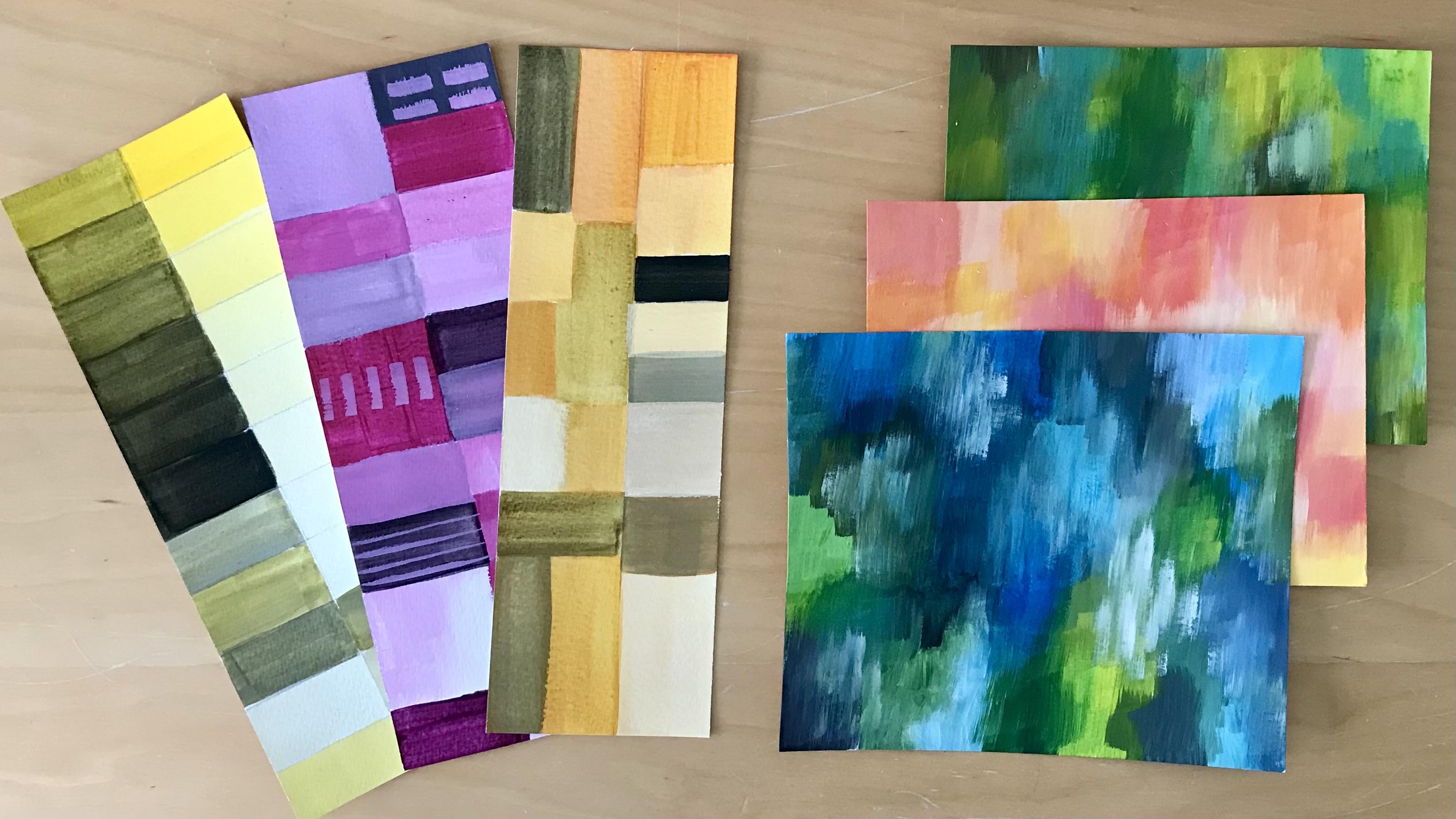
7. Painting with Yellow, White & Black (part 1): You decide how you want to play with your colors just now. You could do a little
grids like I've done here. You could do random patterns,
like I've done on there. You could go a bit more organized in a sense
of like doing grids, where you go from the main color and keep adding white
all the way down. Which is what I've done
there and on here. Now, what I've done here is I've created grids
to start off with, and then I've cut them up. You can see on here,
and then collage them because I just felt it made it look a bit more
interesting for me. I quite like doing that, but it's very easy to
do this as well. That's what I'm
going to start off with here with the yellow. I have literally
taken another page out of my watercolor book. I do beg your pardon. I did
say earlier on that it was 140 grams and I
meant to say pounds. It's 300 grams and 140 pounds. Is this weight here. What
I've done is I've literally just gone with the width of
the ruler all the way across, taken the width of
the ruler down. And then gone in the middle
of those lines as well to give me slightly
narrower grid lines here. I've got white on the palette and I've got the
yellow on the palette, and I'm switching
because I'm using grids, I'm actually switching to a square brush to a flat ended brush because that just makes
it a little bit easier. So again, dipping
it into the water. Now, what I'm going
to do here is take a little bit of white
on its own over there and pull a bit of yellow out and then add to
that white there. Actually, no, I'm not
going to do that first, so I'm going to
just switch brushes a minute because actually what I want to do is to have the
yellow right at the very top. I'm just going to
put that in there. Again, I'm not bothering about whether I'm going over
the edges or not. That's better. So that's my starting
color at the top there. So now I'm going to pull
in that little bit of white and I'm going to keep increasing the amount
of white that goes in it. And just pulling down the
grid, a bit more water there. Very simply keep going down each time with more white in it. Pulling some white out of there, putting it into that bit
again, and coming down. I mean, you get some lovely
shades going on here. So lovely tints very
creamy looking. It's almost like clotted
cream is this one. Obviously, depending on
how much white you add, well then depend on the tone or rather the
tint that you end up with. You can keep going and going and going until you're
almost at white itself. Now those two look pretty
similar, don't they? Actually, if I go back over there and
just add a little bit of yellow onto that
one, there we go. Not quite as dark as
the one above it, but a bit darker than
the one below it. A bit more white to that one. Okay. And that takes it
down even further. Of course, you can also add
more water to it that will make it less opaque. Now, I should just say
at this point that when you add white to it because white is an opaque color as
you can't see th it, then even though you might
be using your yellow, which is semi transparent, adding the white to it
will in fact make it very opaque, so very solid. That's something to
be aware of as well. I'm going to pull a bit
more white from there. We're down to cream now. Lovely pale cream. And if I add it more white
again to that pale cream. We're almost down to white. But of course it won't be. It can't be pure white because it's still got some of
that cadmium yellow in it. But you can see where
we're going with this. Okay.
8. Painting with Yellow, White & Black (part 2) : Now, I'm going to leave those on the palette there actually because I'm going to mix other
things into those as well. Let's just now go with black. Now I have to tell you this, do not need a lot of
black. You really don't. It's better to pull
in the tiniest bit first and then increase
as you go along. You'd be surprised at how sorry, what a difference Black
will make something. Let's just take some of
that yellow up there. Okay. And I am quite literally going to just
pull a tiny bit off look. That's all I've got on my brush
there, hardly any at all. Let's mix that in
there. Look already how that changes that to
this beautiful olive green. I mean, that's always
a surprise, isn't it? To turn that round. I mean, isn't that just
lovely. Beautiful. So we're going to do
the same again and just keep pulling off
a tiny bit of black again and adding that to
there a little bit more. Not much. Do you know, don't get too vigorous with it. I'm going to keep
doing down there, adding that little
bit more black. And increasing that tone. Generally speaking,
if we've added white, we generally call it a tint, but we're not going to
get hung up about these. If we've added a black,
we're calling it a tone, but it's not important that you even know that
or remember it. But you can see again how
subtle the differences are here in those tones
and darker again. Now, that's very
similar to that one, so let's just pull a
bit more black onto there and go over that
one. That's a bit darker. But who'd have thought
that from yellow, you could get these
gorgeous olives and shades. I like this color
olive with orange. Find it quite a
nice combination. That's the thing
when you're doing these kind of exercises that you get to really then find
out what colors you like, and what colors
you're intuitively drawn to a bit more
black into that one. Until you almost get it
to, you know, itself. But it will still always have that hint of Khaki about
it or olive about it. That's probably as deep as
I want to take that now. Just add a bit more water to that because my
brush is dragging. You'll notice that I
keep turning the page around so that I can easily have my brush
in my sight line rather than brushing in such a way that my hand covers it up and then I don't know where
I'm putting the line. That's always a useful
technique to have. What I'm going to do now is just mess with all these
colors that are on here now. Again, I could get very specific
and scientific about it, but I don't want to do that. I'm going to go into
there and see what produces there now that I
had that black on my brush, and I've added it into what
was the cream at the bottom. Let's see how that turns out. This is where it gets really fun then because
you really start to experiment with what
colors you can produce. I mean, that's a
beautiful green gray. That's very nice. Again, if
I added more yellow to that, it would come out
different again. Okay. So when you add the black
and white into the color, you get a whole
new set of colors. Now, of course, what I
could also do from this. Let's just take that
color there is, I could then put that
color at the top and start adding white to it
or black to it, which would give me a whole
other range of colors again. You see where I'm taking this. Let's just see what happens, if I take a bit of black there
and add it to that half. That gives me that color. If I just wash the brush. If I add white to that
other half of it, then that gives me
that lovely color. So what happens
now if I add some yellow to that one because I've got yellow on the palette. What do I end up with there? Another yellow altogether from what's coming down here because this has got the and
the white added to it. Let's add a bit
of black to that. Let's take some of that. In fact, let's just scoop
some of that up and add it to that black that was over there and see what happens there. So that's not dissimilar
to that one there, so let's put a bit more
yellow in there instead. And see what different tone
we can come up with there. So you could just
keep going for hours. You could fill this
whole page and more from these three colors. I'm going to add
some white to that. See what I get
there. Okay. Okay. When I'm decorating at home, I actually when I'm
painting walls, I very often mix my own colors until I get the exact
shade that I want. Because I just find
that, a lot of fun. Let's add a bit more
white to that one. No, more white
still. Then we go. And that's just a few colors of what we could
achieve by doing this. So I encourage you to take
the yellow with a black and a white and have a
play yourself and see how many tints and
tones that you can get. Feel free to paint them
in the same way that I have or however
you want to do it, cut them up into
strips, make them. You just have fun with it and see how you get
on with it all. I'll see you in the
next session where we have a look at
playing with orange.
9. Painting With Orange, White & Black (part 1): I'm going to put some more
yellow ontomalt there. And some of that magenta. I'm not going to
do all 12 sections because that would be
really boring for you. I'd be like watching paint
dry, no pun intended. But I wanted you to see the
yellow because that's always a real surprise to find that it goes into these
gorgeous olive colors. But I'm going to play
around with the orange because it is so vibrant and different from the ones that I've got
in the other book. I'm going to play around
with the orange and I'm going to play
around with the magenta and just have a look at what they come out because I've
not done those myself before. I think I'm going
to go for something like this to start with
as the main color. So let's see what I
need to mix that. Let's take some of that there. And actually, I want it
to be quite yellowy. I want it to be nearer
that color there. Let's just pull quite a
scoop of that out of there. Now you see there's a
bit too much there. Let's put a bit more yellow in. In fact, let's
just mix all those together and go from there. I'll use that as the main
color in this instance. There we go. I'll do. I'm going to play
with these slightly differently. Oh,
isn't that nice? I know I say that
about every color, but it is, very nice. I must say Yeah, that's lovely. Let's add a bit
of white to that. Actually, I've got a bit too much
water on my brush there. Just take some of
that water off. Put a bit more white in there
and drag that down a bit. Going to put another
bit of that here. I am quite literally
going to go through just exactly the same process
as we did with the yellow. But rather than do it
in a graduated grid, like I did with the yellow
like this one here, going, I'm just going to
do this a bit more randomly without the
horizontal lines. Because it just again, makes for a bit more of
a playful way to do it. I'm also going to
leave space in it as well to be able to add some of the orange
that's got black in it. And a bit more here. I think I need a little
bit more white, don't. They coming out with some
really nice shades there, some gorgeous shades, actually. I really like tints, whatever we want to call them. I do feel that color
is an instinctive. Yeah. Well, how can I put this?
It's an instinctive thing for want of a better expression. You either like a color or you don't like a color
and you don't need to analyze it and understand
why you do or don't like it. You just have to accept
that that's what it is. I'm getting more and
more white into this. And really enjoying these shades that are being created here. Very much so. Let's just clean it out and see what
happens when we add the black. Again, like before, pulling
off just a tiny, tiny bit. I'm going to mix it
into that bit up there. Now, we're almost getting an
olive color there as well, which is not
surprising, of course, because it's got that
yellow in it. Don't forget. Let's see that there. But it's not quite
the same shade as we're getting over here. This is slightly
earthier looking one. Was this has a bit more
lightness to it somehow. Although I guess
you would call that a bit earthy as
well, wouldn't you? We don't need to call it
anything really, do we? We just need to decide,
do we like it or not. Now what happens if I decide to paint over that with that color? I get yet another tone again. That's also another way
to play by over painting. What happens if I over
paint this one here? I let's just over
paint them all. Now that white was
still a bit wet, so that's coming through still. But I've just created something
entirely different there. Just by over painting. Colors that were already on the page with that color there. Let's take a bit more black
again, pop it into there. Pull a bit more of
that orange in. Let's go across
the way this time. If I look, that's a work of
art just in its own right there. That's so lovely. If you could imagine that
on a slightly bigger scale, and then either with some
pattern added into it or not, depending on what
your preferences, that's already created
art for your walls there. I'm going to add more
to that because I want a really deep color up in
that top corner there. Let's put more black
in that again. That's a bit too black. Let's just tone that down
with a bit of that orange. And bring that
across there lock. I mean, you can see
how easy it would be to create art for your walls, you know, to complement whatever color schemes
you've got going on. I'll see you in part two where we had the white and
the black together.
10. Painting With Orange, White & Black (part 2): So now if I start to
add some of this white, let's see what we get here. What kind of graze are
we going to get here? I'm pulling that white
there, but I want to take it back up
into this. Okay. That's just so lovely. So lovely. I think we're going to have to have
that down here as well. You know, we've gone
from that color there, I'm creating a shadow
here. Let's move that. We've gone from that lovely, vibrant color there into this. Where we've mixed the black
and the white in with it. And let's go there with that one and see what happens
there. Pull some of that. And a bit of that orange there. You can see how I'm just
literally pulling color in and really messing
here, can't you? Let's go that way. Now, that's quite similar. So I'm going to put
a bit more yellow on a little bit more yellow there and pull that one into there with a fraction
more of that magenta. A bit more yellow. Let's
go over there with that. It's got a burnt look to it now, hasn't it? Nice. Very nice. I think what I want
to do down here is just make a bit more
of that original orange. Pull that here. We've got a nice bit of vibrant
pop down here. Now again, those two
colors are the same. What happens if I overpint this one with this
orange, let's have a look. Okay. Be prepared to experiment.
You can't get it wrong. What you'll end up with
is colors that you like and colors that
you don't like as much. But that's changed that
from that now considerably, and given it quite
a different tone. I want to pull a bit of
that white into there. Pop that through. You can see what I
mean when I say that I really like orange
and olive together. I think it's a
great combination. Let's take a little bit of
that and pop that in there. A bit more white into
that one, I think. Very nice. Very, very nice. I'm going to clean
the par up again, and then I'm going
to keep that magenta on and have a little
play with that magenta. And let's see where that
takes us as well on this lovely magical unfold of these gorgeous colors
that we're mixing together.
11. Painting With Magenta, White & Black (part 1): I rather like the
randomness of this as opposed to this grid work here. I'm going to do something
similar with the magenta color. I'm just taking it
straight as it is. I'm not mixing it with the blue. I'm just going to
take it straight as the color out of the tube. So there we've got
the first color, and I'll take a bit of that up there and add some
white to that. Well, that's almost like
neon pink, isn't it? Cracky? Wow. Not as much when you actually
get it on the paper. Might do a little bit of
grading here as well, a bit of gradient painting and pulling it
through just to see, you know, it's an opportunity here to just play with
different techniques. Maybe what I need to do
is just put a bit of white on my brush and
pull that into it, and then use the opposite side of my brush that's still got that slightly deeper color in it and pull that into there. Let's come back to that magenta. Let's obviously still
got a bit of white there on my brush because it's not as vivid as
the original one. Gorgeous colors, though. I'm not really a lover of
well, no, that's not true. I was going to say.
I'm not really a lover of pink.
That's not true. I like pink as a color, but I notice I don't use it
very often in my own work. So this is quite nice, actually, to you know, have an opportunity to do
something a bit different here and to maybe start using it
a bit more. Here I go again. It's rather lovely.
Rather lovely. Pulling more white in. As you can see, Now, you can see here by doing that, I'm creating a very
soft effect here. Very soft. You know, by pulling in a
bit of white, a bit of pink. And sort of grading it to slightly by just blending
that a little bit. So not only am I
having an opportunity to actually experiment with
the color mixing itself. I'm having an opportunity
here to decide how to even apply that color. Okay. Okay. I mean, that's blended
really nicely. Let's go up the way here a bit. I'm bringing a bit more of that. Go back into that
pure magenta color. No, there's a lot
of white in there, so it's taking on that opaque
solid pink, which is fine. It's lovely. It's a nice color. I just want to get
back up to that. Plain magenta color again. There we go. You can see the transparency of that
compared to that one there. You can see that it's
it's almost like it allows light to
shine through it. Which is what's really nice about these transparent colors. I take that really down
to a very pale pink. Don't forget you can
add a bit of water just to make that a bit more fluid, and also a bit more transparent. I've got lots of mix in the
brush there, but that's okay. That looks rather nice. I'm even going to
leave that as it is. Let's bring a bit of that black.
12. Painting With Magenta, White & Black (part 2): Take some of that
magenta up there. Pinch a bit from there and add a little bit of that black. Wow, that didn't take much
to turn that, did it? For those of you that have watched any of my other classes, you'll know that color
has its own vibration. It vibrates like a
musical note vibrates. And we instinctively
respond to that. Whether we understand why
we've responded to it or not. And some colors have a
very high frequency, and some colors have a
much lower frequency. Depending on the
mood that wear in at any given time will respond differently to
colors at any given time. It's quite fascinating. Well, I must say those are
really rather splendid. In fact, let's add a bit more red there and bring you to here. You know, I quite like
happy accidents, me. So when you end up going
over another color, I like the fact that you've had an opportunity to create
something different yet again. Isn't life full
of opportunities. I don't care for that one there, so will I leave it
or will I change it? I think I probably will change it by
actually going into the white and adding a
bit of white over that and seeing what comes out. So we're getting
into the grays now. That's a slightly more
interesting color than what was there before. Let's add some of the white and the black now to these and see what other
colors we come up with. That's rather lovely as well. The thing is, when
you're working just from such a limited color range, everything will work together. It can't not because it all exists within the
same color range. So it can't be okay
if that makes sense. You know, it will
all be harmonious because It's all come
from the same as I say, the same limited color range. What what to look
for though then is contrast between light
and dark colors. So for example, I'll just
finish painting this bit, and I'll demonstrate
what I mean to you. So if I look here now,
this bottom section. If if I just put
let's not do that. Let's put that there instead. These three colors here are of a similar tone or what
we would call value. Okay. That one is a lot. That contrasts quite
nicely with that. But these three, if they didn't have that kind
of contrasting with them, could look a bit bland together. So this is something else
to just be aware of as to how do you create
enough contrast, enough value between
the colors to make it look interesting and
not all very smy. I am just going
to get some black there because I think we need a little bit more
depth. Here we go. Pop a bit more black
on that palette. If I take this
color now that I've just mixed and add a
bit more into that. That's giving me a
very interesting gray, and let's see what
that looks like here. Now, that's giving
me quite a different contrast to that color now. So we've kind of got, you know, going on down in this section here in this bit
just here alone. You know, this is
very interesting, even though I haven't
painted that one in yet because we've got a
very light color there. We've got a very
vibrant color there, and then we've got a
very dark color here. So we've kind of got light dark. And I wouldn't even
call that midway. It's it's it's a vibrancy
all on its own, really. So how do we make sure
that this section here remains, you
know, interesting. Without if I put another
vibrant color next to it, that's just going
to clash too much. If I put another
dark one into it, I think it's going
to overpower it. So these are the
questions to ask and the experimenting to do with your colors to
see what works tonally. You know, the tones or
a little bit too much? It's like having big everywhere. When you see rooms that are completely white with
no other color in them. Um I notice for myself, I always want to go and put some pop of color
somewhere with it. So, where are we going
to take something from? Let's just have a look
at this bit here. And pop that in there. Now, again, it's not that
different tonally to this one. What could I do to that to
just make it a little bit more less save me with this or what could
I do with this one? Maybe it's this one here
that I need to change by just going back and
adding more white to that. Let's see what happens
there when I do that. Put that into that
section there. Although I didn't want
it to look white. I still wanted it to look
pink. That's better. I I even that section there
from there downwards, that's very interesting
because you've got lots of different contrasting tones
and colors going on there, and this also plays
into it as well. But there's something
about this bit here that just does
not work for me. It's just too to similar. I need to either darken one of them or lighten one of them. I think what I'm going to do is going and
lighten that one there with some more white or turn it into a slightly
more pinky color. Because that's really. Although
the color itself is okay, it's really not working for
me in terms of its contrast. This is better. I'm not saying it's ideal,
but it's better. I hope you can see
that that it's brought a different element to that little composition there. I'm just adding a bit of pattern to add a little
bit of fun to it. Feel free to do the same. It's again, a nice way to
just experiment a little bit. Hopefully, as you've
watched the process of those three different color
palettes being created, it's giving you some ideas as to how you might want
to play with your colors. My suggestion now
is that you take a different segment
from the color wheel, each of the 12
segments and play in your own way with adding
the black and the white and seeing how
many colors you can get within that limited color
palette of each segment. I'll see you in the
next session. Okay.
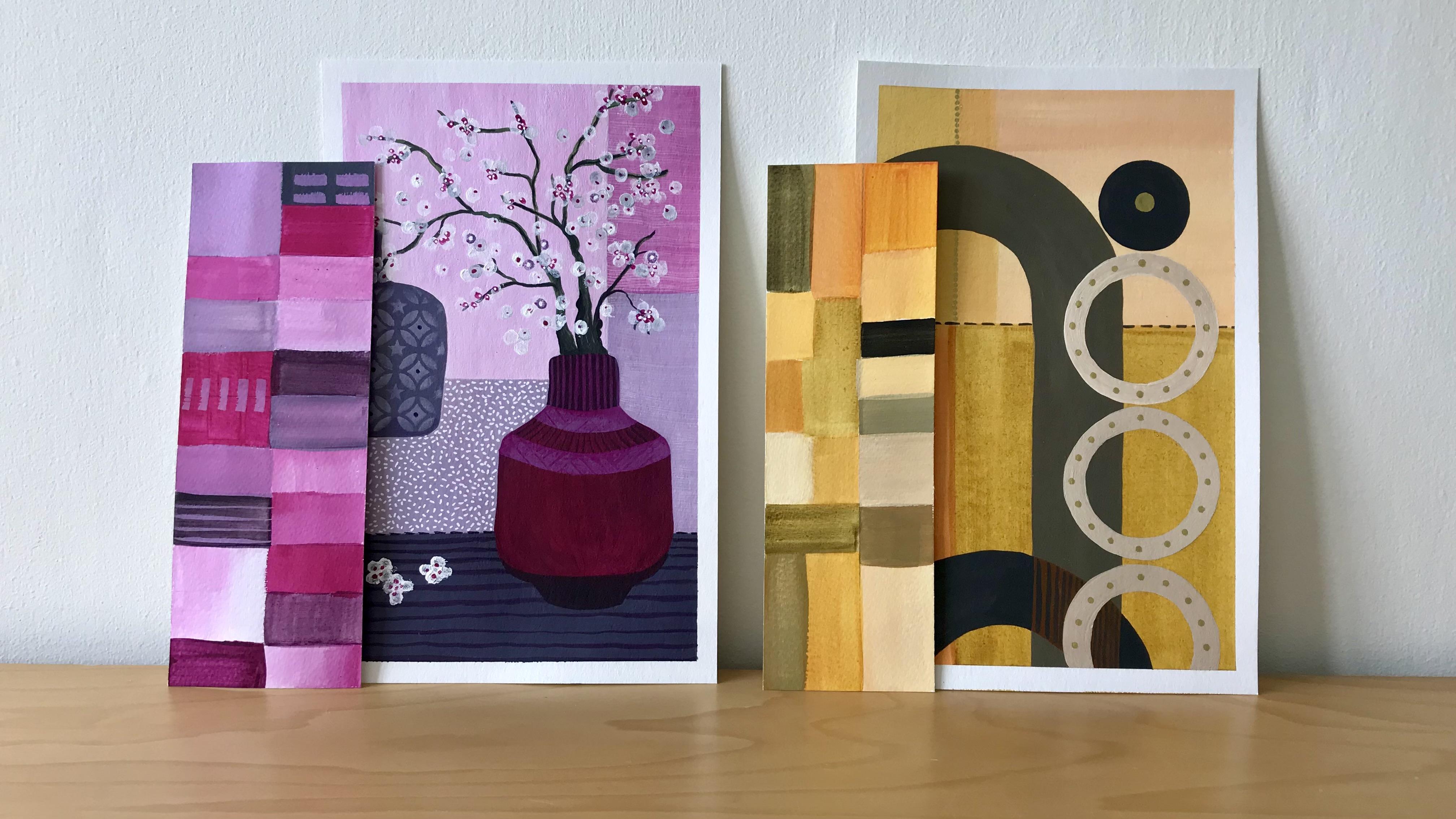
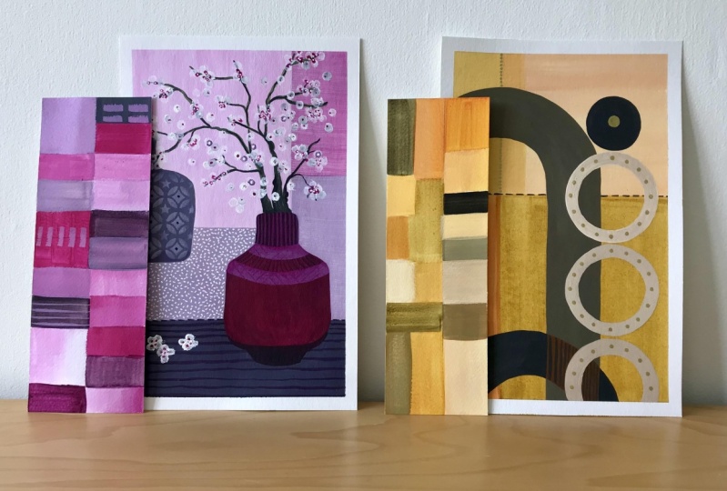
13. Abstract Composition (part 1): Here we've got the two
different compositions. I'm going to start off
with the right hand side one, the more abstract one, I'm going to treat
that one slightly differently to how I'm going to treat this one on this side. I'm going to use the whole
color spectrum here using the oranges in much
the same way that I did a bit of color
blocking and overlaying, I'm going to give
that I go on here. Now it's a complete experiment. I have no idea how
it's going to end up. I haven't got anything
in mind at all. This is literally just
a playful experiment to test out how some
of these colors, how they might work together, how they might overlay, how they might block together. Let's start off with this
one and see how we go on. Then I'm going to use
this color spectrum here on the left hand side, and I'm going to treat this painting slightly
more traditionally. Now that said, You
know what I'm like, I like to go with the floor, so it might be that
I changed my mind partway through and do
something entirely different. Let's just see how we get on. That's the quinacridone
magenta and the cadmium Mela medium hue on the palette along with
the white for the moment. I'm going to leave that without the black at the minute I
that later when I need it. I'm going to start off by
actually painting the whole of this section here even
over the different shapes. Again, I've not really
played in this way before, as I say, it's quite an
experiment for myself. Because I want that to be
a really vibrant orange, I've put more yellow
and less magenta. And I want that to be a
fairly palish background, so I'm going to bring quite
a bit of white into that. As you can see, I'm using
quite a flat wide brush here, which will just make
it a lot easier for you know getting those
straight lines down. So let's see. Now, because
I put the white in, that's made it
opaque straightaway, so it might even be that I
lose these shapes completely. So let's just give
it a go and see. Actually, I'm going to
water it down a bit more so that it has a bit more
of a transparency to it. Now funny enough, I
don't like that color. Straightaway, I don't
like that color. That's not going to work, is it. Let's get more white into that and make it paler with quite
a bit more water in it. I don't really want to paint
over those lines just yet. There we go, that's better. Okay. Now, as you say, I've put quite a bit
of water in with that. I can't really go
up to that just at the moment because I might end up getting
bleed, which I don't want. I'm going to look at
this section next down here and treat this
as a color block. I want a similar to
to that one there, but obviously not
the same color. I'm going to pull more
of that orange there. Again, keep it fairly watered down and see what I
think about that. That's nice. Just take that all the way
down to the bottom. As you can see, I'm painting right up to the edges
on both of these, and I've put the tape around
the edge so that I get quite a nice little
crisp white layer, you know, quite a
crisp white edging, I should say, around the
edge once that's peeled off. I want to get a color
similar to this one here. I'm going to bring in a bit more yellow and add a little bit of black and see if I can
get that one there. Again, I'm pulling in very
little of that magenta. In fact, that's really
quite yellow if you look. Actually, I've probably got a bit of white on
the brush there, so we'll just give
that a good rinse out because I want this to stay
again fairly translucent. Tiny bit of black
as we know before. Now, that paint has already
dried on my palette, so it's actually making. Can you see it's bringing in flaky bits,
which I don't want. I'm going to have to
remix that bit there. This is a thing with
working with acrylic, of course, that you need
to work fairly fast. I'm just going to wipe
that off the plate and start that little bit again. I've put some fresh
paint on there, and I'm just going
to keep bringing in that yellow until I get it
to the shade that I want to. Remember, just
keep going with it until you've got it to the
color that you want it to be. Don't be worrying too much
about proportions, et. Let's take a fraction
of that black again and pop it in there. What I could just test
out on this paper here is not quite black enough. Not quite olive
enough, I should say. That's better. That's a bit nearer to the
color that I'm after. Again, I'm going to keep that fairly translucent while putting a bit more water into it and pulling that
one down here now. You can see there that
I've already gone over that lovely orange
color on the left, which is then creating a
different color in the middle. This is what makes it
quite interesting for me. Let's just get that paint on and then I can scoop some
of it off again. As you can see, I'm going in
any direction at this point. Okay. But then I'm going to take my brush and
I'm just going to drag it down so that I kind of get a grain where the brush marks are all going in
the same direction. I'm going to turn
that around a minute. Now, the color that I was
after was that color there, and it's, you know, a darker shade of
that, but that's okay. So let's see if I
can get that one by coming up here and pulling
in some of that white. See if we can get a bit closer. And of course, this
is what it's like. When you're not using
specific how can I put it? You know, you're not
doing what I would call proper calculated
equations as to how much you should have of one paint and how much you
should have of the other. You know, this is guesswork. But I feel more creative
doing it this way. That's a bit nearer. That's
a bit nearer that color. Whoops. Look what
I've just done. I've just gone over
there by accident. Happy accident, again, let's pull it up and make it
part of the painting.
14. Abstract Composition (part 2): What next? Well, given that that's still a little bit wet and that one is still
a little bit wet, I'm going to go with
this section here. I quite fancy that being
a bit more ready orange. I I don't like it, I'll
just paint over it once it's dry and do it in
a slightly different color. But let's give it a go.
That's a bit too red. In fact, I'm going to pop even a bit of black into
that one. That's better. Yeah, that's better. Can you see I've swapped
brushes that round. I've swapped brushes to
one with a pointy end on a round brush that's got a
pointy end because again, that allows me to go
with that shape of the circle much better. When I was drawing this out, I did use things to draw around the bottom of a
candlestick, various other things. You could of course do it all
free hand if you wanted to. This is a little bit
awkward showing you this on camera because the
board is so big, to try and turn it around where I can actually see
what I'm doing. Slightly trickier. Then if
it was a smaller board, only had one painting on it. There we go. That's fine. I like that color. That's good. Actually, I like
that color so much. I'm going to mix more of that, and I'm going to bring
it into this bit here. Now, it might end
up being the same and it might end up being
slightly different. But let's just go with it. Like I say, this is
all, an experiment. Playful experiment. See that color looks
nothing like that now because I haven't brought
enough red into it, but let's see if I like
that color anyway. That's quite nice, actually. Let's just go with that and see what happens when I then
cross over these two colors. I'm trying to keep
the brush strokes. You know, I might be
putting the color on in different
directions to start with, but then I'm trying to
keep the brush strokes. Eventually, sort of going in
one direction because I just feel it helps particularly
with this composition. I've put a bit of fresh paint on the palette now because it was
beginning to dry up again. So I'm going to mix
some more orange. And that's quite a red orange when you look. Very red orange. A bit too red for me, so let's put a bit more yellow
into that. That's better. Take quite a bit of that
white on this one here. Then I'm also going to
put in a little bit of. Take a bit of black out of lock. See what color I'm
coming up with there. Now that's a bit
too bagish for me, little bit on the bage side. So let's bring a bit
more black into it. Okay. That's more what I was after. That's better. There we go. Now, I'm going to paint this
archway into that there, it's going to be a
bit tricky for me is this, turning it around. So I'm going to paint it and then bring you back
into camera with it. Now, as you can see, that's made a very bold statement in
that composition there. And what I was saying
to you before about how you make sure that you have enough contrast between
different tones, brightness, darkness,
you know, light colors, dark colors, whether or not it's quite a solid color like this or whether it's
quite transparent. So I feel that this isn't
really working now. It feels too light weight
compared to this great big Solid archway that's now coming. So I'm going to take some of that color there, which again, I've just mixed some more of
and given it a second coat. And I'm going to go
over this archway. Again, it is tricking me trying
to turn the thing around, so I'm going to paint it in and then let you see it
in just a moment. Here's the archway painted
with another coat of that. Look what it's done here. It's softened that
big solid archway. Of course, the paint that I've
got on my brush while I'm doing this is less opaque. It's more than
what that one was. That one is very
solid because it had both the black and the
white mixed into that, both of which are very opaque, solid colors in themselves, so you can see that that's why that's really, really solid. Now, I need to decide what or how or what color I'm going
to paint these with here. I think I want to go with
a really pale color. I'm going to just see
if I can get the mix I want with what's already on my palette if I can't,
I'll mix a new one. I'm going to take some
of this gray actually. Although it's starting to
dry up a little bit now, you can see it's drying
look. Let's get rid of that. Okay. Now having lost that color that I've
just been using. I'm going to create a new one. And I want it to be let's put a little bit
of black into this. And then take some
of that up there. Put bit more yellow
into there, I think. You can see I really
am just messing here. Totally messing. As you can see, I've
painted the three circles, and they took a bit
of doing actually, I'm not sure I'd do this
particular composition in a hurry again,
but there you go. Again, it's all to play for and just see whether you
like doing it or not. Once I painted those in, the two colors here just
did not work at all. So I decided to do
them in a darker gray, for me, that works now, that's a much
better composition. And whilst I got that
gray on my brush, because I could see the pencil
lines going across there, and I can still see
this one here as well. Decided whilst I got that
paint on my brush, though, just to do some simple, simple dashes going across that one. I'm probably also going to get my gold pen out
actually and just do a very faint line up there and possibly down
here with my gold pen. And then I think we can call
this composition finished. I'm going to finish it
off with the gold pen, take the tape off, and then let's see what
we've ended up with. I'm really pleased with
how that's turned out. You can see the correlation of colors compared to the
sample next to it. And by adding a few
little gold dots, few little details,
that's really elevated. I'm very pleased with it. I will see you in the
next session where we start to do the
botanical composition.
15. Botanical Composition (part 1): In much as the same way as I
did the abstract painting. This is going to
be an experiment. Again, I have no idea what
it's going to turn out like. I'm just playing with
it as I go along, seeing what works and
what doesn't work. It might all work, and
maybe none of it will work. But that's the beauty of again, just allowing yourself to play. As you know, I am going
to use predominantly this color palette here
for this composition. I also decided, actually, just giving it a little bit of further thought
and reflection. I'm also going to bring
in the green as well. I might just bring in the
green here with the foliage, with the botanical section, and I might bring in a bit
of green down here as well. Let's see. I've got my book here where I've got the
recipes, if you like. Here I've got the green, which is the mix of the
blue and the yellow, then it tells me
how much proportion of black I've put into each one. So I can very easily
look at these and think, right, let's try
and get that shade again. So that's what
I'm going to do. I'm going to use this
as a bit of a reference as well as this color
palette as well. So I'm going to start off with the pink and paint
this section here first in a very pale color and see where we go from there. Okay. So I've got
predominantly white on here and a little
drop of the magenta. I want to try and get it
as pale as this bit here. So let's take a
bit of that there, but add quite a lot of the white so that I'm really just getting
a hint of that pink. But you can see, can't you
how strong that magenta is. Because that does give
it a lot of color. Now, like I did with
the abstract painting, I'm going to water this
down a little bit. Because I've put the
whiting, if you remember, that's making it opaque,
in other words, solid. I want to make it a
bit more through, a bit more translucent. I'm even going to paint over this leaf shape here as well. Let's turn that round, actually, for the moment to make
it even more watery. Pull that down the
way like that. But because I know that when
I paint them with the green, they're going to have some
black and white added to them, that will make them
opaque anyway, so it'll go over this pink fine. Without me needing
to worry about the pink coming into the
green that won't happen. Okay. And that's
the first section done. That looks really nice. I want to get the background
in first and paint the two vases next and then
paint the foliage last. I need to decide what
I'm going to do here. I've already decided
that I want this to be a greenish gray color. And I think I'm going to also do that a similar color as well. Again, I'm just experimenting. I've not really got a
great plan in mind here. Let's just put a bit more
pink that magenta into there. Pull a bit more in and see what happens if
we pull that up here. You know, like I did with the other painting with
the more abstract one. If I don't like it,
I can paint over it. You know, that's the beauty
of all this, isn't it? It going to turn
that around again. You can see I'm using
this lovely flat brush because it's just really good for for being able to go
down with straight lines. Well, it would be if I had
enough water on my brush and stopped it from
dragging. That's better. I don't want it all to be the
same shade this background, so I am going to be just mixing it up a
little bit in terms of, you know, like there, it's a
bit paler than it is here. So I'm just going to do
a similar thing here. Pull a bit more of that magenta there so that it's got a
bit more interest in it. Maybe just down
there on the bottom. You're going from dark to light. Now, you can see there that I've already gone over that pit, so let's just neat and
that up a little bit. There we go. Bit wave, don't really want
that to be wave. You want it to be quite
a nice straight line. I want to paint the
bottom underneath the first bars in a similar color to
this color range here. What I need to do is to
go to the original color, which is a mix of the
blue and the yellow. I'm just mixing that right now and getting it to the green that I
like to start with. Now obviously, I can go
dark green, pale green, midgreen That's the color
that I've mixed there. It's not similar to that, perhaps a little bit
more blue in it, but it's a good starter. And from there then, I need to get it to
this stage here, which means adding a
bit of white to it. Of course, this is where it's useful for you to write down
how you've got your mixes. So you're writing down
your own recipes. Let's take some of
that white out of there. Mix that into there. Which takes me back down
nearer to that color then. That's just to have that on
its own in the composition. At this point, just
feels away a bit bright, so I want to knock it back or
dull it down a little bit, and that's where
the black comes in. Again, you know by now
the tiniiest amount, and that's then taking me
to this kind of shade. So let's have a look at that. It's a bit more lemon
than that one there, so I could put a
little bit black in. It's very nice. I do like it. Let's just see what
it's like with a little bit more
black added to that. Don't forget, I'm
using mars black. You can add ivory
black or you could use the pines gray
you could in fact, make your own black
like I showed you right at the very beginning
by mixing the red, yellow, and blue altogether. That gives you a kind of very deep gray color.
That's a bit nearer. We're going to go with
that one. So let's move this out of the way and
bring this back here. Again, what I'm doing is
just getting the color on and then I'll
add a little bit of shading where I want it. But I'm just basically getting the color
on for the moment. As I started to do a little bit of shading on this bottom bit, I quite liked that color, so I actually decided
whilst it was on my brush, I would
do that as well. I wasn't going to do that. I was going to leave that
almost to the last. But as I'd already got
the paint on the brush, I decided that I would
go with it. Okay.
16. Botanical Composition (part 2): I was also going
to do these bits here as in color the whole background
before I did this vase. But I'm not quite sure yet
what color I want those to be, so I'm actually going
to go with the vase. And I'm going to bring in
this lovely dark magenta. I always call the
paints lovely, don't I? Have you noticed that's
part of my language. Isn't this lovely?
Oh, that's lovely. But it is lovely. I'm going to go with that on
this main body here. And you'll see that along with my little jars that
I use for water, I also use them for keeping
the paint still workable. By just keeping the air out, it means that the
paints don't dry up. So I'm going to go straight
into that magenta there. I'm going to test
it to make sure it's bit's got no white in it. No, that's pretty good actually. And then add a small
amount of black. Test it out. And that's
close to that one there. That's close enough.
So I'm going to do the main body of this here. Wow. Look at that, isn't that lovely? Here we go again,
isn't that lovely? Okay. Now, my brush has got quite a bit of
water on it there actually. It's making it although
it's got the black in it, which is opaque in itself. It's actually feeling
quite transparent. It's looking quite transparent because I've watered
it down quite a bit and I'm ing that effect
just at the moment. Keep turning this
round so that I can keep it in my side line. I'm just loving
that color there. I want this bit here
to be quite a bit darker and that bit there
to be quite a bit darker. I'm going to add even more
black to that magenta. I'm just going to
try adding a bit of white to that mix to
see what effect I get. I want to put a couple
of highlights into this. So I've started off
with a magenta, I've added the bla and now
I've added some white to it. And let's see if I can get a nice curve going around here. I might be able to, and
I might not let's see. Now, then that's a bit wider really than it should have been. But we'll just stick with
it, I think for now. I could do is bring
that up a little bit. I'm just going to play with
this a minute off camera, see what I end up doing with it. I'll bring you back
in in a moment to see how it's ended up. There, you can see
that I've started to add a little bit
of detail to it. I might even add more to that. But I'll just leave that
just for the moment. But I think that's
also giving me a clue as to what color I'm going to do this
background here. That's the color that I've
got in my brush there, and I'm just going to add
a lot more white to that now or even add that
to the white perhaps. Which will give me
that lovely sort of pinkish gray color, which I think will
be good for these. It'll just help them to pop
without it being too dull. Again, I'm going to test
that out. On my paper. And yeah, I like that,
so let's get that on. Rather than you have to
watch me paint this, I'll just get that
color put through there and then bring
you back in again. As you can see, I've
done that background there and you'll also notice that I've totally
changed the color of this. It just felt that
it was too bright. And of course, the magenta
red has a lot of blue in it. It's a very bluey red. So I realized actually that what would fit better
with this would be a more bluey green
that had a bit more blue in it and torn the whole thing down
with the Marz lax. I've also used the magenta paint to go over those stripes that I put in so that they weren't
quite so in your face. And I've used this kitchen role to stamp over the top of it to give it a little
bit of texture. I've also done the same with
this vase up here as well. I've just over painted it with this color so that it knocked that bright
green back a little bit, and then I've
stamped over it with this just to give that a
little bit of texture as well. Now, I did say that
I was going to treat this all a bit
more traditionally, but I notice I'm not
really, and that's okay. Again, artistic
temperament, you know, change your mind
when you need to. What I notice now though, is that I actually don't
want to do leaves on here, even though I can still
see them around there. The whole thing has taken on a slightly oriental feel to it. And I think I'd rather have cherry blossom or something coming out
of there as well. But because I can now, I can still see the
pencil lines on there, what I'm going to have to do is to repaint over all of that, paint out the pencil lines and then go back into it
with the cherry blossom. So that's what I'm
going to do next. I'm going to paint that
out, and then I'll bring you back in ready
to do the cherry blossom. So I've painted in that section again there and
covered up the leaves, the pencil lines on the leaves. And I've put in fresh pencil
marks to suggest branches. I've mixed a nice
gray green that kind of is a cross between
these two colors here, so I know it's going
to work tonally, and I'm basically
just painting them in in this one color
to start with. And then I'll probably add a tiny bit of
high light to them. As I go once this is dry, I might add a bit
more shading to them. I've added a few nobles
here and there to make it look a bit more realistic, but as you know, I'm not really trying to make
it look hugely realistic. It's my usual stylized
version of things. So here we are on
the last bit now. I've done the branches. They've dried nicely,
and I'm taking a Q tip. I'm just going to dip it into
water, clean water that is. I'm going to take a bit
of that white paint. I'm just going to
do it with white because that
background is so pale. If I do it in a pale
pink, it'll be lost. I'm just going to
test it out on there, and that's basically
what I'm going to do. Here we go. It's
literally just So again, you can see how this
little composition has changed considerably from
my first concept of it. I've experimented with it. I've changed it. I've gone over colors if I
didn't like them. Basically, I've played. I'm just giving an impression
really blossom here. I'm not trying to make it a, you know, specifically
realistic. I think that's probably enough. I think we'll leave it at that. Then I will go in and
put the finishing touch, which basically is
the Magenta paint. I'm going to choose a
really fine brush for this. I'm just going to put a
tiny little like this in the center of each. Little white circle. Now then, will I end up adding
something with my little white pen or gold pen? I'm just going to have
a think about it. Bring you back in and then we'll decide whether the painting
is actually finished or not.
17. The Final Cut: So, here's the final reveal. There's been quite
a few changes. You probably won't be surprised. It's taken me a while
to really get to grips with using that color
palette, I have to say. So I've painted out
all of the green. And I've added texture here. I've added a little
stencil area there, and I've added some
more texture here. And I noticed that it's been
quite a challenge for me, actually, using this
particular color palett. I mean, I really
love the colors, but it's not my natural
palette that I paint with. So even, you know,
having to paint out the green so that I could
get it almost so it, you know, nearly with all
in this color palette and not bringing that extra
green one in as well. That's been quite useful. It's been a good
exercise for me. It really has, and I will
play with it some more, and I will play with it in terms of using the pinks with
other colors as well. In fact, I just had a bit of a rummage to see what other little pieces of artwork I had
with pink in them. And I've just found that in one of my little sample folders, which is a bit of a fun
thing to do, excuse me. But the only other thing that
I could find was this one, and that only has
a really tiny bit of pink in it interestingly. Usually, these are my
color palettes here, the blues and the oranges. Or using the blues and
the greens together. These were so much
easier to paint for me than the one underneath. And as I say, it's a
good exercise for me. It's been great fun doing it. Really good fun actually noticing my own
response to the colors. So I would really encourage you to have a play with
each section of your color wheel and see what you might come up with and also what you like and
what you don't like. It's a great way to find out and find out which colors
you prefer to work with. I really hope that class
has encouraged you to play. You know that's part
of my mantra, play, play, experiment, see
what results you can get. Some things you'll do and
you'll really love them, other things you'll do, and
you won't like them as much, and that's all part of
the process as you could see in my last session
using the pink palette. It's not going to
put me off though. I'd love to see what you
create. I really would it. If you'd like to pop what you create in the projects gallery, all you need to do is press the projects button and upload it, and if you'd like to leave
a review of the class so that other people can decide whether they want to take it, that would be really
nice as well. I'm in the middle
of a house move. In fact, that's why
there's so little left of my studio right now because it's been
dismantled day by day. I've got a busy few
weeks ahead of me. But I've already got the next class in my
head in the pipeline. So hopefully, it won't be too long before it ends
up in your inbox. In the meantime, as usual, just take care of
yourselves. Bye bye.
 Dawn Cawthra, Artist, Designer, Holistic Educator