Transcripts
1. Introduction: [MUSIC] There's something
mesmerizing about adding gold water color accents to form floral paintings that
makes the colors pop. It's an elegant combination that I am excited
to share with you. Join me today as we explore
a new color palette, and apply it to floral elements that we are already
familiar with. It is a good exercise to help you get out of an art block, or that time when
you just feel stuck. This class is suitable
for beginners or experienced artists who want
to try and use that [MUSIC]. Hi, my name is Joly, and I'm your
watercolor artist and online art educator based
in the Philippines. I have been painting
for nine years, and I've worked with
different famous art prints. My art revolves around painting
loose watercolor florals. I love how I'm able to make a creative interpretation
of nature, and put it on paper. A quick fun fact about me is
that I am a floral painter. The extra space gives
me so much freedom to move my hand and create
expressive strokes. Here on Skillshare,
my classes focus on breaking down difficult
watercolor techniques, and making them into easy
steps for beginners. In this class, I will
first share with you the materials that you need. Next, you will learn
how to transform your favorite colors
into warm autumn colors, and use that as a guide to create your own
floral color palette. If you are a beginner, don't worry as you will learn all the individual
flora elements to equip you in painting
the final projects. The different projects will have unique floral
compositions where you will learn how to incorporate gold accents in creative ways. At the end of the class, you'll be able to create
these beautiful paintings. [MUSIC] All the techniques in this class can help you achieve painting
other flowers too. Thanksgiving day is coming up, I'm pretty sure
these paintings will be great gifts to loved ones. I see this easily customizable like the
one that got wreath. That's it. I will see
you in class. [MUSIC]
2. Class Overview: Hi, there. This is going
to be a short class. If you have taken my classes
on Skillshare before, then you would probably
be familiar with the floral and leaf
elements in this class. But I assure you that painting these familiar elements with the new color
palette and an added gold twist will certainly
spark your creativity. Let's check out the projects. The first project is going
to be very easy to paint, it's a five-petal floral bouquet so we're going to
use fall colors. In this project, you will
learn how to spread the colors in a bouquet so that it
looks more balanced. You're also going to paint the gold accents
in different ways, such as veins,
berries, [inaudible]. This is definitely
one of my favorites. Next, let's move on
to this open wreath. This is a foliage wreath. You can see that we use different leaves in
different colors. Right here in the middle, I
just added a letter in gold, and then we added some gold
dots all around the wreath. You can customize this painting by changing the
letter in the middle. I think it's a great gift to loved ones for Thanksgiving Day. I think the clean
border in this project really looks so
beautiful and elegant, so you will learn how
to use masking tape for this project to create
that clean border. You can also write something in the middle of this painting. This is another idea on how you could incorporate gold
accents in your wreath. You can see that we
painted the foliage only on the half of this wreath, which saves you time. The other half is
just a gold border, which also makes
it very elegant. Another idea is to use five-petal flowers
for this project. Let's move on to
the last project. Of course, my class
is incomplete without a loose floral bouquet. So here it is. I really love the vintage
look of this painting. These are flowers that we're
already familiar with, but we use fall colors, and we added some gold
accents all around. So we added some gold
leaves, berries, and veins. That's it for the projects, they all look very exciting to paint with a fresh
color palette. I'm pretty sure that this class will spark
your creativity. Now, let's move
onto the next video so that you'll learn
more about the materials that you need. [MUSIC]
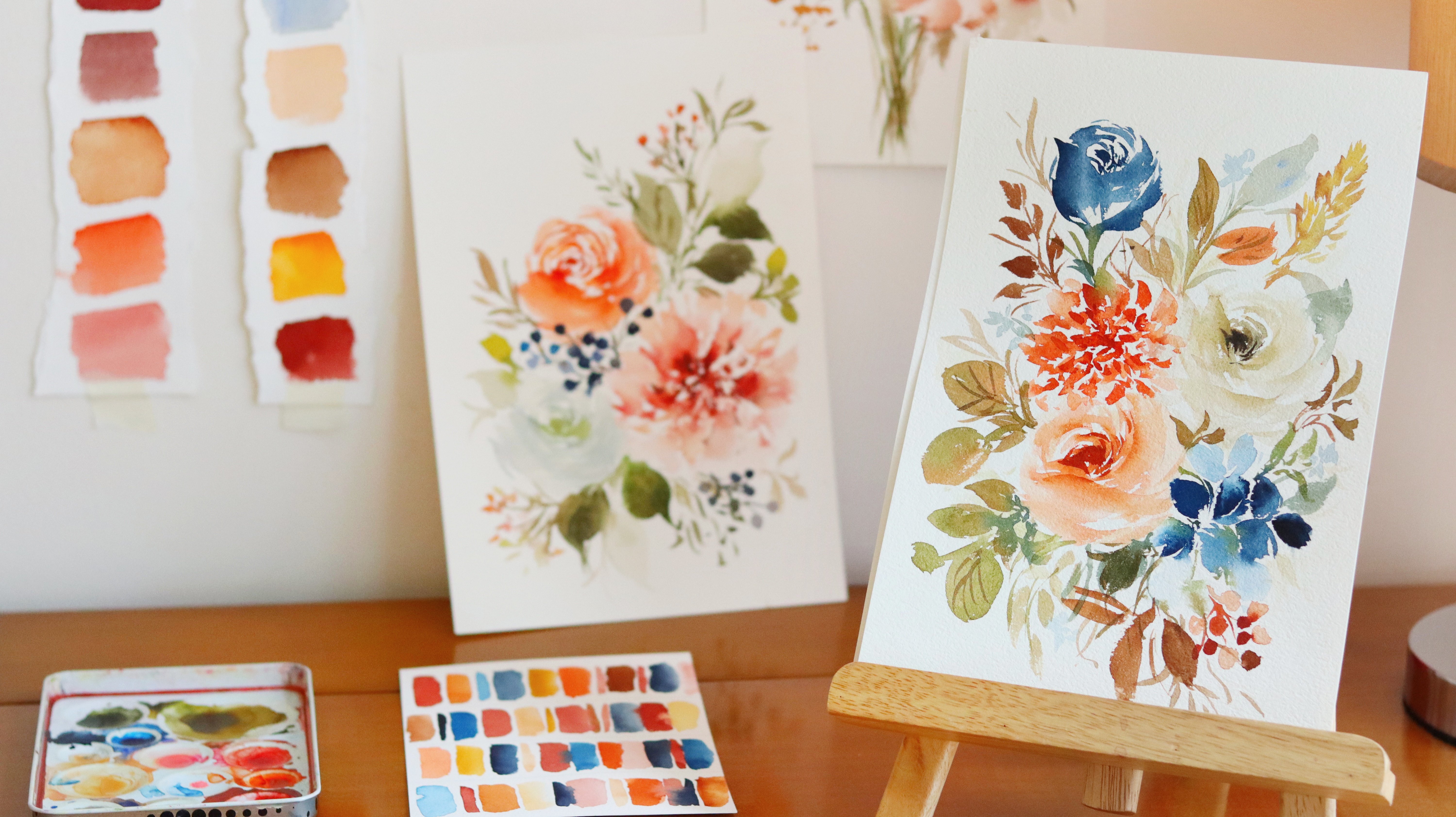
3. Materials: [MUSIC] Now let's talk about
the materials that we need. So the first one is a brush. We're going to use the black velvet round brush
in size six and eight. I really love using this
brush because it can hold a lot of water and
still keep its point. This is very important when you're painting loose florals. You want a brush that
will follow your flow and you want it to be quite soft with a little
bit of balance. This brush has a mix of
squirrel and synthetic hair. If I can only choose one, I would choose size eight
for you as a beginner. Next, we are going to use
our watercolor paint. I'm using the brand ShinHan PWC, it's a Korean
artist-grade paint. This brand comes in
tubes only and I would usually pour it into smaller
half pans just like this. The quality is still
the same even after you have board the paints
into the half pans? I just usually pour
them into these pans so that it's more
convenient to use. But if you like painting
large-scale paintings, I would suggest using the
paints straight from the tube. But of course, you
can definitely use any brand that you have on hand. You don't need to get
this specific brand. I just want you to enjoy
painting our projects today. The next thing that we
need is our gold paint. I'm using the Etchr Lab
Pearlescent Watercolor. These are metallic paints and they have different shades
of gold in this set, which I really love. Aside from golds, you also have bronze colors. I'm going to show you
some swatches over here. I personally love using
royal gold or pure gold, but you can definitely use any gold paint that
you have at home. You can use any other
brand with a gold paint. You can also use acrylic paint, gouache paint, or poster paint, and I also think calligraphy
ink that is gold in color is also suitable
for this project. So let's move on to the paper. I am using the BAOHONG
Artist's Grade paper. This is 100 percent cotton paper and I'm also using
cold press paper. Cold press paper is suitable for loose florals because you
have texture on the paper. Now this paper is
in a block form. It means that all the sides are glued except for this part where you can slide off a
sheet using a palette knife. From this angle, you
can actually see some of the texture
on the paper, so we do want that because
you want this paper to absorb the paint that
we are going to use. Now you might see
this other paper. It's also BAOHONG but
it's student grade. This is the BAOHONG Academy
Watercolor paper pad. This is different from the
BAOHONG Artist Grade paper, as you can see in the cover. If you are a beginner, you can try the BAOHONG Academy. I would say that
it's one of the best within grade papers
that I have tried. For all the projects, we are going to use a
7 by 10-inch paper. BAOHONG Academy or the
Student Grade paper has less tooth or less
texture on the paper. I'm going to show
you the difference between these two papers. On the right, I'm using
the Artist Grade paper. You can see that
definitely there is more texture on the paper and the paints are spreading
just more beautifully. On the left side, this is
the Student Grade paper, it's also really good, but you can see
more sharp edges. But given the price, it is
forgivable and I think that the painting will still
look very beautiful. Next, we need a mixing palette. So this is just the lid
of my watercolor tin. I'm using this QoR
watercolor brand, but the paints inside that
I'm using is ShinHan PWC. I really just love the tin. I love the little
wells in this palette. You can also use ceramic plates at home
or plastic pallets. More recently, it's
becoming popular to use these beautiful
resin pallets. But ultimately, just use
whatever you have at home. Next, we need tissue to blot out the excess water in our brushes, and then, of course, we need a water jar, any jar will do. We also need masking tape. I'm using regular
masking tape from the stationary or
office supply section. The width that I am using is 2 inches but you can definitely
use a different size. Let me show you a project where we will be using
this masking tape. You can see that very
beautiful clean line. That's because we
use masking tape. I'm really excited for you
to try out this project. That's it for our materials. Now let's move on to the
next video where we will learn how to mix colors for
our full palette. [MUSIC]
4. Color Mixing: [MUSIC] In this lesson,
we are going to swatch some colors, and mix them up so that we can
create our fall palate. Don't worry this is just
going to be very easy and all the colors are quite
common in most pallets. The trick with doing
a fall palette is simply to add brown colors
in your usual palette. For example, right here, I'm using permanent red and I'm just going
to add some browns. We have here burnt umber, I'm going to mix a permanent
red and burnt umber. Now let's see what will happen if we mix these two colors. I'm going to swatch it so
you can see the color. Now it has this
brownish-red color. I added more brown
in the first swatch. Right here, I'm
adding more red and you can see the difference
between these two swatches. Now I'm going to show you how to mix permanent red
and burnt sienna. Burnt sienna, it's a
beautiful bright brown color. Now let's mix permanent red and burnt sienna and
for this mixture, I'm adding more burnt sienna. You can also see a
brownish-red color, but it's brighter compared to the first swatch we
did with burnt umber. Now let's try adding more
red and this is the color. It looks almost like
a brick red color. Now let's try out vermilion. It's a nice red-orange color. I love using this for my fall palette because it makes my paintings
look brighter. Let's mix that
with burnt sienna. Because vermilion is a
little bit brighter, there are times when I
want to tone it down, and that's why I
add burnt sienna. For this swatch, there's
more burnt sienna. You can see that it's
on the more brown side, but you can also add more vermilion instead,
and let's see the color. It looks a little similar
here, but in person, it is brighter because
there's more orange in it. The next color that
I love using for my fall palette is Crimson Lake. This looks like a maroon color, but it just has more pink in it. I also love toning down this
color with some browns. Now let's mix Crimson
Lake and burnt umber. For this mixture, I'm going
to add more burnt umber. This looks like a
muted Crimson Lake. Now let's do another swatch, but this time let's
add more Crimson Lake. I want this to be more reddish. You can definitely
use this color for adding bold florals. Now, if you don't want your
florals to be too dark, you can use burnt sienna, which is a brighter brown color. Let's mix Crimson Lake and
burnt sienna, but this time our mixture will
have more burnt sienna. You can see it's more brown. I'm going to do another mix. This time we have more
Crimson Lake and I'm showing you just different
proportions so that you'll have an idea of which colors you might want
to use for your fall palette. An interesting color to use for your fall palette is violet. I really love adding violet and mixing it with orange
to mute it down. You can use any orange color in your palette just to mute
down this violet color. I think I'm going to add
a little bit more violet to this mixture. Let's try to swatch it. It almost looks like a
brownish-violet color. That's also perfect for fall for those leaves that are
about the turn brown. If you want a deeper color mix, violet with brain sienna, and you'll get this beautiful shade. It went by really fast. Now we're on to our greens. I'm going to be using sap
green for our projects. Let me just swatch
all the greens here. If you don't have sap green, you can also use hookers green. Again, the trick is just to
add browns to your greens, just to tone it down and
make it look more rustic. For the first one, let's use burnt sienna and mix
these two colors. I'm going to add more burnt
sienna in the first mixture. It's a beautiful color. You can see that there's
more brown in it. Next, let's add more sap green. This one has a more
natural green color. Next, let's make sap
green and burnt umber. For the first
mixture, I'm adding more burnt umber, and you
can see that the color is deeper compared to the color on top where we
added burnt sienna. This time, I'm going to add more sap green
to the mixture, and let's see what will happen. You can see that there is
more brown undertones using the burnt umber with sap
green and burnt sienna, you can see that the
colors are happier. If you want a really
more intense color, I would suggest mixing
green with sepia, it's also one of my
favorite colors to add if I want a muted or
a vintage look. Now let's add more
sepia in this mixture. Just from this mixture, you can see that it's
really dark in color. If you want to add more
contrast to your bouquets, so you can add leaves
using sap green and sepia. Of course, you can
always tone it down by adding more water. Now let's mix sap
green and sepia again, but this time I'm going
to add more sap green so you can see more of
the green color. What's nice about
swatching and mixing these colors almost
side-by-side, is that you can see
the progression. We added different browns
from burnt sienna. You can see it's the lightest
color than the sepia, which is the darkest
one so if you want really dark and
rich green leaves, you might want to add
sepia to your greens. I really hope that
this will help you choose the
colors that you want to add to your fall palette. I'm also going to show
you another mixture. This is the last one, is
Crimson Lake with yellow ocher. This is one way to add a muted, almost a pastel color, but still, it fits
in the fall palette. Right here, I added a little bit more
yellow ocher because I want it to look a
little bit peachy. Right here I added
more Crimson Lake. You can see it's more pink. Now if you want
this to look softer when it comes to
applying it to florals, what you can do is
just to add a lot of water in your mixture. Now let's try to swatch this. You can see that the
color is lighter. It's the same mixture but
we just added more water. Now let's try out
the other color. I'm adding more water. Again, you can see it became lighter just because
we added more water. We're done mixing our colors. You can definitely see
how we were able to tone down our usual colors just by adding some
browns and oranges. You can also use permanent rose. Just add some brown
to tone it down. Right here you have an instant fall palette,
and you can just choose colors that you want to use
for your florals or foliage. I hope that you enjoyed this simple color-mixing lesson and now let's proceed to
the next video. [MUSIC]
5. Autumn Foliage: [MUSIC] In this lesson we're going to paint some
autumn foliage. We're going to paint
our usual leaves, but we are going to
use our fall colors. We want to paint
some simple leaves, and so let's start. First, let's paint the
usual leaves that we do. We're going to paint
our thin stem, now from the tip, we're going to slowly
press our brush, and then lift towards the end. We can do it the
other way around starting from the
outer part going in, or we can do a double-stroke
leaf just like this. Now let's turn this
into a fall theme leaf. Now let's grab burnt umber, we're going to paint
a thin stem with some small hand sticking out. Next, let's grab
some yellows and oranges in our palette,
I'm using vermilion. We can just paint
a leaf over there, and then next I'm going
to use permanent red. We can add yellow-orange, or if you have yellow
ocher or raw umber. Right here I'm going to use burnt umber because it's
already on my palette. To add more contrast, I'm going to add
more red at the top. It's all about mixing
and matching the colors. Don't be afraid to experiment, we're just having
fun and these are just some exercises
for you to try. Let's move on to another leaf, this looks like a fig leaf. I'm using yellow ocher. Here we're going to paint
some loops just like this, and then paint one more, then another one at the top. We're going to do the same on the other side of this leaf. You don't need to fill in the inside of this
leaf right away. You can do the outline first
and just slowly fill it in. Wait, I think we can
add some more loops at the bottom part just to make the overall
shape look nicer. While this is still wet, it's the best time to
fix the overall shape. You can also add some raw
umber or maybe burnt sienna in some areas of the petals
just to make it look a little bit more realistic,
and more interesting. I'm using raw umber here. Let's just wait for this
leaf to dry and let's move on to painting
a simple filler. I'm using red here and
you're going to use the tip of the brush and
create some tapping motion. You'll be able to create these
beautiful organic strokes that will look like
small flowers. This is a good filler to add, if you want more contrast
in your bouquet, or add a pop of color in
different areas of your wreath. For the next leaf, we're going to do a
star-shaped leaf, so it's a cluster of leaves. I'm going to paint
five leaves here. Again, you really just want
to have fun and explore different shapes
using fall colors. I'm going to be adding some permanent red just to give
it a more lively look. On the other side, let's use yellow, orange. Next, you can add vermilion or you can also use burnt sienna. You can even add yellow. I'm going to go back and just fix the shape of the leaves. As long as it's still wet it's going to be
easy to do that. Now let's move on to
painting some green leaves, but we're going to add
some browns to our colors. I have here sap green
and burnt umber. Let's try to paint some
more expressive leaves. You can see I'm trying to wiggle my brush and have
that jagged edge. You can experiment by
adding different browns to your greens, and by trying to just wiggle your brush to create those nice
organic shapes. If the leaves are
too dark for you, you can always lift the color, so just grab a clean brush and just absorb all
the excess paint. You can do this while the
leaves are still wet. Another option you can do is while the leaves
are still wet, you can drop in
different browns in it, you can add some burnt
umber, burnt sienna, and you can see the beautiful
blending on the leaves. Another great filler
you can add to your florals are berries. Right here I'm just
using permanent red, but if you want it to
have a more fall vibe, you can add some
browns to your reds. You can also use
burnt sienna for the berries or yellow-orange. Let me just rinse my brush to create a lighter-colored berry. You do want to change
the values here, you'll want some darker-colored
berries mixed with some lighter ones just
so it won't look flat. Let's move on to the last leaf. We're going to do a
multi-colored leaf. I'm just going to load
my brush with green, this is sap green. Next, I will dip it in
this yellow-orange color, and next in this burnt sienna. Now let's try to paint
a leaf so you can see you have different
colors in one stroke. The trick is to dip your
brush in a base color, choose a light color
for the base color, then dip the tip of your
brush in darker colors. You can definitely do different
color combinations here, you can add some violets too. Now because this leaf is already dry I'm going
to add some veins, I'm using burnt umber. You can also use red or
other browns for the veins. We're done with our
simple fall foliage, I hope that you learned
many tips in this lesson. Now let's move on to the
next video where we will learn how to paint
fall florals. [MUSIC]
6. Fall Florals: [MUSIC] In this
lesson, you're going to paint fall florals. We're going to start with familiar florals that we
have been doing in the past. I'm going to start with a five-petal flower,
just like this. This simple five-petal
flower bouquet will be our first
project in this class. Let's grab raw umber, but you can use any other
color in your palette. I'm using a size 8 round brush. We want to really press our brush onto the paper to
create that broad stroke, after which you can use the
tip of the brush to create some thin lines, and to fix
the shape of the petal. Now, I'm going to
rinse my brush, tap the excess water, and start painting
another petal. When you're painting
five-petal flowers, it's all about trying
to change the angle of the brush to create
different organic strokes. You want to really fully utilize all the
parts of the brush. As always, leave white
spaces within the petal. We don't want the petals
to look too heavy, you want some movement. Now, let's leave
the center open, I did not paint
anything on it yet, but we are going to add a
dark brown center in a while. We're using burnt umber, I'm going to slightly
tap my brush onto the paper to create
these small dots, I want it to bleed
into the petals, and we also want a
really dark center, you can see right here. We're going to add
some gold details, and the only way for
that gold detail to pop up is to have
a dark background. We want a dark center
for the flowers. In the meantime, let's
move on to a new flower while waiting for the
first one to dry. I'm mixing Crimson Lake
with yellow ocher. We want a muted, peachy, pink color. Make sure that you dilute this
mixture in a lot of water. Now, let's try to swatch it. I think the shade looks good. There are many ways
to paint peonies, this is just a simple
interpretation. We're going to start with two petals at the
bottom of this peony. The left petal here is
bigger than the right one. Once we have these two petals, I'm going to establish
the petal at the top. It's pointing upwards, and you can see I'm leaving some space in
between the petals. Now, let's move on to this
petal on the right side. If the shape looks a
little odd right now, don't worry about it, we can definitely go back in to fix it or to extend some areas. When you're fixing the
shape of the petal, try to use just the tip of your brush to create
some thin strokes instead of one big broad stroke so that it doesn't
feel overwhelming. When you're painting
this flower, you want a letter U at the
bottom of this flower, so it looks like a cup. What I love about
painting this peony is that it always looks different
every time you paint it, and that's because we're doing some organic brushstrokes, and of course, every
stroke is different. You don't really need to
count all the petals, sometimes you have to improvise. What do you want
to focus on is to get the overall shape correctly. Let's try to fix this area. I'm going to use
a clean brush and try to absorb that excess paint. If we don't clean this up, it will look bad when it dries. While the petals are still wet, you can drop in
some darker colors. I usually add this in between the petals or where the
petals meet because that's where the shadow will
be and that's where the darkest part of
the flower will be. We're good. This is exactly the same flower that we will paint for our project. Let's move on to another
flower that you are familiar with if you've been following my Skillshare
classes for a while. We're going to paint a rose, but this time I'm going to
paint it in the fall colors. I mixed Crimson Lake, and burnt umber to create this
beautiful dark red color. I started with a
comma stroke and some thin lines or thin
C strokes all around it, and you can see I have some
spaces in between my strokes. Now, let's rinse our brush, tap the excess
water and just fade away the sides of
the outer strokes. I'm also painting some
bigger C-shaped petals as we're moving towards the
outer part of the flower. Just to brighten
up the color here, I'm going to add a little bit of burnt sienna so you can
see the color right here. I'm just going to
grab some more, and I'm going to really
paint some broad strokes. Now, this rose is going to
be a little bit chunkier than the roses that
we have tried before. You can see we have
big broad petals. I'm just going to clean up
the sides and some petals. Now, if it looks a
little messy right now, it's completely fine
because we're going to add a second layer just to
give it more depth. You can see that I'm also using the tip of
my brush to create some thin lines to close
off some weird gaps. Now, while waiting
for this to dry, let's try to paint
a simple rose bud. I'm using the same mixture of Crimson Lake and burnt umber. We want this to be
really concentrated. Just scribble some small
C-strokes in the middle. Next, rinse your brush, tap the excess water, and now we're going to try
to pull that color down. You can go back in, and try to fix the shape of this rose bud. You want it to look
like a shape of a bulb. Just use the tip of your brush
to create some thin lines. You can extend some
areas to fix the shape. The overall concept
here is you want a really concentrated center, and then you want the petals
to be light and airy. In case I just added a
small stem right there. Let's go back to our rose. I have here the same
Crimson Lake and burnt umber mixture,
but just darker. I'm going to paint on
top of the comma stroke, and then now we're
going to paint some thin C strokes
all around the flower. Don't be afraid, it doesn't
look that good right now, but it will after we
fade away the strokes. Rinse your brush, tap
the excess water, and start fading the strokes
to make it look softer. Aside from making it look soft, it's also a way for us to create more depth for this flower. We can see that the petals for the second
layer is translucent, you can still see the
colors underneath. For this part, you
do need to leave some spaces in
between your strokes. In some instances, you can
grab some more color from your palette to add it to
some areas of the rose. For more in-depth
tutorial on roses, you can check out my
class on Skillshare; I have a class that's
all about roses. Right now, I'm just adding
a few more details. You can see I'm using the tip of my brush to create
these thin lines. You can also drop off some darker paints in the petals just to
give it more contrast. Now, if you feel
like you've made a mistake and it looks too dark, you can always go
back in and lift the colors. This looks good. I'm going to go back to the
first flower we painted. Let's grab some gold paint. We want a really thick mixture, and we're going to add
that to the center of the five-petal flower. All the florals that
we have painted in this lesson will be
used for our projects. Just think of it as
a warm-up exercise, so don't feel too much pressure when you're painting
these flowers. You can immediately see the
gold dots in the middle, and that's because we added
a dark center on purpose. We're done learning
all the fall elements. Now, it's time to
create a project using all of these
flowers and foliage. Now, let's move on to
the next video. [MUSIC]
7. Project 1: Fall Floral Bouquet: [MUSIC] For our first project, we are going to paint this simple but
beautiful floral bouquet that is composed of five
petal flowers in fall colors. Let's start. Before we begin, I'm just going to prepare some colors that
we will be using. Let's get some raw umber, yellow ocher, and burnt sienna. When painting a bouquet, it's usually easier for
me to start if I put the first flower almost right
at the center of the page. You can start with a small
dot right there as a guide. I'm going to start
with the first petal. Just use the side of your brush and press it against the paper
to create a broad stroke. To make the petals look wispy and just to
add more movement, you can paint some thin strokes using the tip of the brush, and you can also
dip your brush in the water jar just to
lighten the color. At the same time,
you can also grab some colors from your
palette and add it to the flower so that it will become a multi-colored flower. Next for the center, we need a dark
burnt umber color, so we want this to be super concentrated like
what we practice. The reason for that is we want the gold details to pop up and
we need a dark background. Now let's grab burnt sienna. I'm just going to paint a flower diagonally across the
first one that we did. You can try to paint
the strokes in different directions to
achieve more organic strokes. Remember that it doesn't
have to look perfect, you want it to be just lose. While the base
petal is still wet, I'm going to grab burnt umber again and add it to the center. You can also use CPI if you want a darker color or you
can even use black. When you're painting a bouquet, try to vary the sizes
of the flowers, some are smaller,
some are bigger. Right here I'm painting a
smaller five petaled flower. Even if they are the
same type or same style, it will give variety
to your bouquet once you vary the
sizes of the elements. The color that I use
there was raw umber, but you can use other
colors in your palette. Right here I have burnt sienna
with a little bit of red. You can also use Crimson
Lake and burnt sienna. We want something that looks
like a brick red color. Depending on how
much space you have, some times you can really
paint five petals. If you only have a small space, three or four petals is okay. Now, for the center let's
grab burnt umber and just add it to this wet
flower so that it will bleed into the petals. We have a yellow flower on the lower left part
of this painting. I want to balance that and add some smaller yellow flowers in the upper right so that they are almost diagonally
across each other. Now let's start
mixing our greens. I have here sap green
with burnt umber. Now let's just attach some thin stems from
the flower going down. Just so that it doesn't
look too stiff, you'll notice that I'm painting the stems in a curved manner, so it's not really straight. Again, that's because
you want to add some movement to our bouquet. Now let's keep
adding some flowers. I'm going to make sprint sienna with a
little bit of vermilion. We can definitely play
around with the fall colors. You can add some yellow, orange flower, or red flowers. You can also change the
center of the flowers. You can use burnt sienna
or red or Crimson Lake. Now, I'm just going
to add another stem. You can see that the stem is going towards the
back of some flowers. Now let's grab yellow ocher. I'm going to paint a flower
that is on its side, so let's paint three petals and then the last petal
will be an oval shape. Then once we're done, we're going to add burnt sienna again in the center
of this flower. Sometimes we have
some small odd gaps and that's where we
will put our leaves. You can put some stem
sticking out as well. If you want this to have more of a warm autumn vibes feel, I would suggest adding
more brown to your greens. This is a mixture that
has more burnt umber, and you can also use burnt
sienna and paint some leaves. When I was starting
to learn how to paint a fall seem florals, it was weird to me to paint
leaves that are not green. But I quickly realized that it makes a big difference when you use leaves that are
orange or red in color. It will immediately
give a warmer vibe and it will give an impression that this is an autumn
floral bouquet. As usual, when you're
painting a bouquet, you want to vary the
values of your leaves. It means that you want
some leaves to be darker, some are lighter so that
it doesn't look too flat. You want some depth
to your painting. Right here I just
grabbed a permanent red and I'm going to paint
a red leaf over there. You can add some
deeper browns or reds near the yellow flowers. I have here the same mixture of burnt umber and sap green. We are going to
add some fillers. I'm just going to
do a tapping motion to create this filler. This is a great way to add
texture to your bouquet, so you can see those
beautiful organic strokes. You can add different colors as well and then don't forget to add stem and attach
it to the main bouquet. Now, I'm looking at my
painting from a far, this space right here where
I can put the fillers. I do want to make it
more balanced and scatter these fillers
all around the bouquet. Our painting needs
some darker flowers, I'm going to mix Crimson
Lake and burnt sienna. I'm going to add just a three
petal flower right here, so you can immediately see the contrast and the right
side of this painting. Now let's add some burnt
umber and add a stem. Look for some small gaps
where you can paint leaves. You can paint these
shadow leaves or these light colored leaves, and you can also add
some darker leaves. This is a mix of burnt
umber and sap green again, and I'm adding it near
the yellow flowers. Sometimes when you're
painting some colors will dry up lighter
than what you expected. You can always go back
in and add more color, just make sure that the
base flower is already dry. Right here I'm just
grabbing burnt sienna, but you can also
use burnt umber. Just adding some
color in the center. It's now time to add
our gold details. I'm using the royal gold
shade in this palette. Any gold shade will
do whatever you have, you can use it. You can see right here I'm
making sure that I have a thick mixture because I
want it to be really opaque. Right here I'm just painting some thin veins on the petals. Next, let's go to
this yellow flower, I'm going to add some
small gold dots. We can try to alternate
the details that we put on the flowers so that it's
not too overcrowded. Some flowers have gold dots, some will have just veins. You don't really need to add gold details on all the flowers, we just want this gold paint to complement the fall colors. We don't want it to
overpower the full bouquet. You can also add
some gold berries. I'm putting it on top of the dark leaves because
I want it to pop up. Another idea is to add
veins on the leaves. If you want a subtle gold color, you can also paint it on the
white part of the paper. We're almost done, we're adding some
finishing touches. You can take a photo of your
painting and look at it on your phone so that you can see your painting from a
different perspective. That will definitely help you
out whether you need to add some more details or
just leave it as is. We are done, don't forget to
upload your project in the project gallery
section after class. Now let's move on
to a new project. See you in the next
video. [MUSIC]
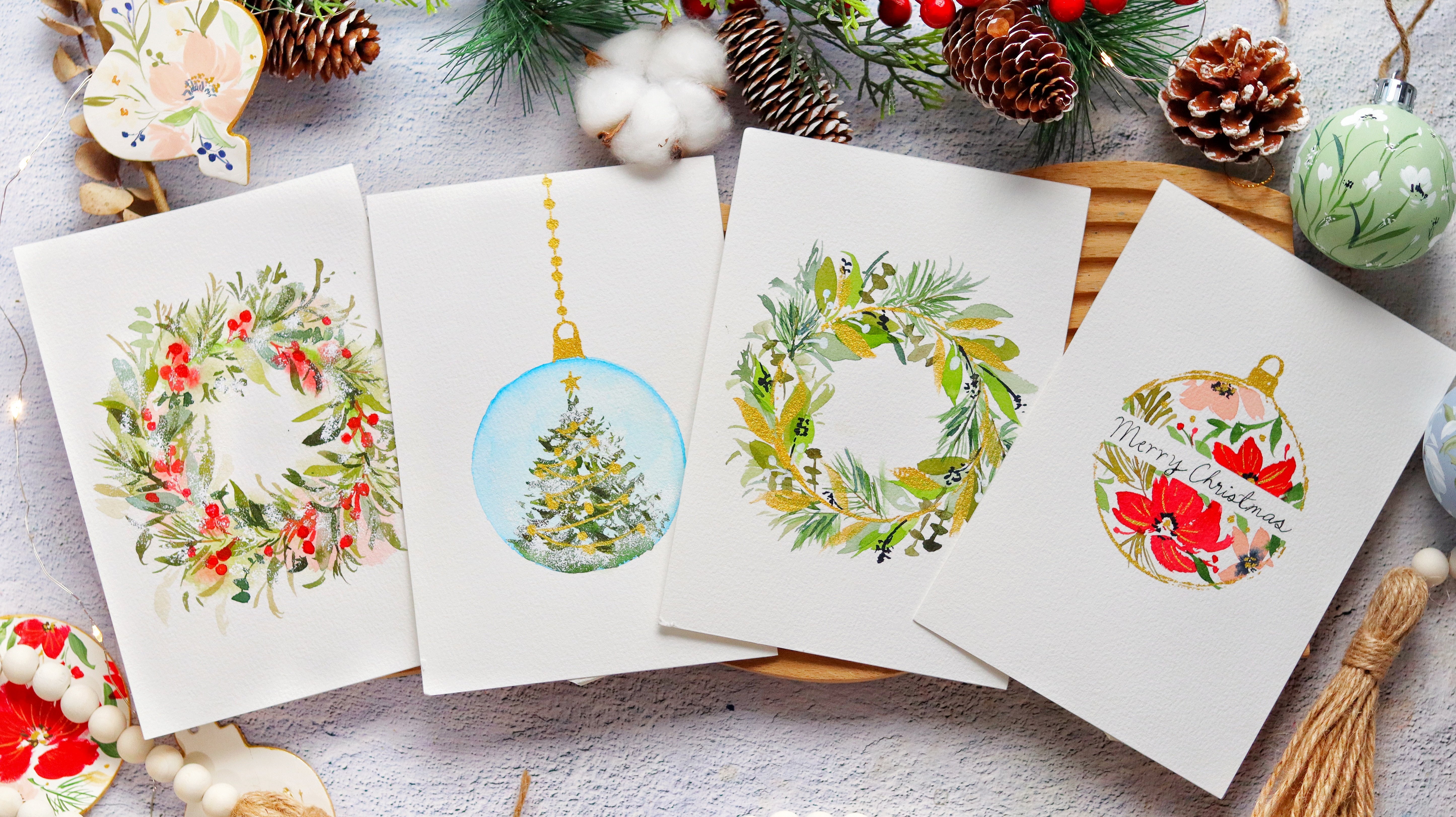
8. Project 2: Fall Monogram Wreath: [MUSIC] In today's lesson,
we are going to paint an open wreath with
lettering in the middle. What we need is we
need to draw a circle. Use any pencil that you have. I'm just trying to freehand it, but you can use
any round object. Then right here I'm going
to overlap the lines. That looks good. I'm going to just
prepare my paints. I have here vermilion,
burnt sienna, there is burnt umber, I have olive green and then permanent red with
a burnt umber. We are going to paint a
lot of leaves and it's better to prepare the
colors in advance. Just use all the four
colors that we learned in the color mixing
portion of this class. Now, we're going to paint
it little by little. I'm going to paint just a
short stem using burnt umber. Now let's grab this permanent red with burnt umber mixture. I'm going to paint just
a simple leaf over here. Now let's paint just
a small stem sticking out and you're going to
attach a leaf right there. I'm going to use olive green. You can see that I added the second leaf up diagonally
across the first one. It's also best to
paint the leaves that's facing in
different directions. That's because again, you
want movement in our wreath, we don't want it
to look too stiff. Now, for the fourth leaf, I'm going to grab
this color and dip the tip in this
olive green paint. This is a good way to experiment with strokes
and color combinations. Now let's just try to
extend this some more. I'm going to paint some
broken lines so we don't really have the paint
one straight line. This is just a guide for us so that we know where the
leaves are going to go. Now let's grab raw umber, I'm going to paint one
more on the right side. To make it look
more interesting, I'm going to grab violet and mix a little bit of
that with orange. You can see that muted color. While the leaves are still wet, you can add burnt
umber in the base of the leaves that's
attached to the stem. That will also give your
wreath more contrast. As we go near the
top of the wreath, we're going to paint
smaller leaves. This looks good. Let's now move on to the
other side of the wreath. You can see that the
leaves that we painted on the right side
looks a little sparse but that's okay because
we're going to layer it. I'm just waiting for it to dry. In the meantime, let's
go to the left side. Let's start with
a raw umber leaf. You can definitely start with any color that you
have in your palette. Sometimes it helps
to have a pattern. Sometimes you can
start with yellow then orange then red. Then
brown. Then green. Now that the leaves
are still wet, we're going to grab
some burnt umber and just add it
towards the base. You can see the beautiful
blending of the colors. Let's add some
more broken lines. Now I'm going to
grab yellow ocher and just paint some leaves. It's nice to add some yellow to our full leaf just to make
it look more cheerful. Now let's grab a little
bit of violet and add just a tiny bit of
orange to tone it down. It just gives more
character to our wreath. You can see that we're trying
to balance the colors here. There are brighter colors like the reds and oranges
but at the same time, we're adding some
browns and violets. Now if you want to
add some texture, what you can do is to paint just a light-colored
leaf just like this, and then drop in some browns and let it
bleed into each other. If you think about it, a fall leaf usually has
different colors in them. What we're doing now is we're filling in those white gaps. We're layering the leaves. When you are layering make
sure that the first layer is already dry before
you add a new layer. You can see that
you're overlapping on some of the leaves. When it comes to
choosing the colors for the second layer, just make sure that
you alternate them. Let's move on to the left side. Just use all the colors that you have in your mixing palette. Grab any color there. We're not going to
be strict about which color to use,
on which part. You can just follow
your instinct. If you see a light-colored leaf, you might want to put a
darker color beside it. Also, you might want to vary
the size of the leaves. Some are smaller,
some are bigger. I made a mistake here. It looks too intense, too dark. Let's just grab a
clean brush and just try to absorb
the excess paint. I think that looks better. Now, just to add some texture, we can add some fillers. I'm going to use
permanent yellow light. You can use other
colors as well. Just tap your brush to
create these smaller dots. To me, they look
like golden rods. To add more contrast
to this wreath, I'm going to use
permanent violet and mix it with vermilion. Now we're going to
paint clusters of small buds and we're going to paint it in different
sections of the wreath. Just try to scatter these small buds all
over this wreath. It is looking really good. Now we can add some veins
on some of the leaves. You can use orange or burnt sienna or maybe
some other brown color. My tip for you is when
you're adding veins, don't add veins on all
the leaves because again, we don't want it
to be too crowded. Right here, I'm going to
add just veins on some of the leaves and keep the
other leaves just as is. You can grab burnt umber
and extend this part. You can add some twigs sticky out and that will help
give more texture. You can see I'm trying
to just wiggle my brush to create these imperfect lines. It's now time to add a
letter in the middle. I am using just an
ordinary pencil. You can try to just
freehand this part. I'm going to draw
a letter A because that is the first letter
of my son's name. Now, I want the
lines to be quite thin because I want it
to look more elegant but of course it
depends on if you, if you want chunkier letter. I have here just my gold paint. This is the royal gold shade in the extra lab
metallic paint set. We're just going to fill
in the drawing that I did and as funny as it sounds, it really helps if
I hold my breath while I paint some
straight lines. I'm going to go over some
areas and just fix it. You can definitely do your own handwriting here so that it looks more personnel. At the last minute, I really feel like adding some more blink to
this fall wreath. I'm going to add some
small dots everywhere. I'm going to stop
right here so that I won't overdo this painting, I think it looks really good. It has a minimalist feel. I hope that you enjoyed
painting this project and don't forget to upload it in the project gallery
section of the class. See you in the next
video. [MUSIC]
9. Project 3: Fall Foliage Border: [MUSIC] Let's paint the
fall foliage border. For this project, we are
going to use a masking tape. I'm just using a
regular masking tape from the office
supplies section. This tape is two inches wide. You can also use washi tape. I'm just going to lay it flat on the paper and I'll make sure
to really press the edges. This is to ensure that you
have a clean edge at that the watercolor paint will
not seep through the tape. This is an easy project. It just takes a while to finish because we are going
to layer some leaves. Right now I am just sketching some leaves that will
serve as a guide. Now we only need to
sketch the main leaves. Draw lightly because once you paint on top of
the pencil marks, you won't be able to
erase it anymore. We're going to start with painting a cluster
of five leaves. This is the same set of leaves that we painted
in the exercises. Now let's grab some
colors that we will need. I have vermilion, yellow-orange, yellow-ocher, and
lastly permanent red. Let's grab vermilion first. I'm going to start
with a thin stem. Then let's just press our
brush and lift towards the end so that you get that
pointy tip of the leaf. I'm going to go back in with some more color because
it looks a little pale. For the second leaf, I'm going to grab yellow-orange and at the tip of the brush, I'm going to dip it
in the red paint. This is a good way to
create a two-toned leaf. You don't need to follow
the colors that I'm using. You can definitely
choose your own palette. You have here a little bit of burnt sienna and then
mix it with vermilion. Let's move on to the other side. I am just grabbing
here permanent red. I really want a bolder
color for this leaf. For the last leaf, we can
just use vermilion again. On the other side, I'm
going to use yellow-orange. While this leaf is still wet, I'm going to drop
in some reds and burnt sienna just so that I will have a beautiful
blending of colors. Then you can also use just burnt sienna alone
for the other leaf. Next, I'm going to
grab a bold red color. Don't be afraid to experiment
with the colors here. Just feel free to change it. You can even add some violet. The masking tape is
really useful for this project to get
that clean line. Don't be afraid to paint
on top of the tape because the paint will not
seep through the tape. We can also add just drops
of burnt sienna or burnt umber and some of the leaves
just to add some contrast. Let's move on to other leaves. Am painting a fig leaf. We're going to use yellow ocher. Let's just paint some loops. This looks a little small. Am going to extend the loops
to make it look bigger. Now while this is still wet, let's grab some
raw umber and drop it in different
areas of the leaf. Let's paint another
fig leaf that's diagonally across this
first leaf that we painted. Am just going to
rotate my paper. Sometimes it's better to rotate your paper so that you can
paint at a better angle. I'm using the same
yellow ocher mixtures. We're going to paint some loops again and try to
fill in the center. Make sure that you paint near the masking tape so that you don't have some more
white spots later on. I'm doing this freehand. That's why there are
a lot of adjustments. You can definitely try
to sketch it beforehand right here and trying
to really fill in the colors that
are near the tape. Now let's drop in
some raw umber. This will give it more depth. I'm going to rotate
the paper again. Now let's prepare
all our greens. I'm going to make sap
green and burnt umber. This is just more
convenient to do so that you can grab
the paint as needed. Next, we're going to mix sap, green and burnt sienna. You can do several mixes with different ratios of the paint. Now let's start
painting some leaves, going to start with
some thin stems. I think I want
something more brown, so I'm going to add more
burnt umber and my mixture. Next, let's grab
some yellow-orange. We need that base color. Then dip the tip of my
brush in that green paint. Now you can see different
colors in that leaf. You can also grab vermilion and mix it with a little
bit of that green paint. Let's just start to
fill in this side. I'm going to be using
yellow-orange with some green. We just want to establish the first layer of
leaves right now. If you want to add
some more contrast, you can add some
dark green leaves. Just add sepia to
your green color. Now let's try to add some dark
leaves on the lower right. Just to make it more fun, I'm going to dip this brush
in that vermilion color. You can see the
color in that leaf. I loved the blending
of the two colors. We can grab some yellow-orange
and add it right here. I am really just
trying to fill in those white gaps near
the masking tape. It's best to vary the sizes
and shapes of the leaves. Right here I'm just painting some smaller leaves
using vermilion. You can also try to add some
different brush markings. You can sway your brush. Flick your brush. Just have fun with it. If you're not satisfied with the leaves that you
are painting right now, it's okay because we
can always go back with the second layer
and fix some areas. Right now, I'm just
grabbing violet and mixing it with an orange
color in your palette. You can mix it with vermilion. It creates this shadowy look, which I really love. Just to add some contrast, I'm going to grab
this dark green color and just paint on
top of this leaf. This is already dry, we can start adding some veins. I'm using burnt sienna. I love adding veins
because it just gives more texture to our foliage. Now for this fig leaf, you can use burnt umber
or any dark brown color. In order to achieve
the thin veins, try to use just the
tip of the brush. It means that you have to put just a light pressure
on your brush. I have some leftover paint from the mixture of
violet and orange. I'm going to use that
to add the veins. It's slowly coming together. I'm just mixing permanent red
and burnt umber to create this maroon color and you're going to use this
for our berries. This color looks good. You can also use just
plain red or burnt sienna. Let's start some layering. I'm going to paint on
top of this fig leaf. Again, make sure that the
first layer is already dry before you add another
layer on top of it. We are also going to add some
berries that is diagonally across the first set of
berries that we painted. Adding these small
fillers is a great way to add a pop of color in certain
areas of your painting. It also gives your painting more contrast and more volume. It is now time to add
some gold details. I'm using the color royal
gold in this palette. If don't have a gold
watercolor paint, you can use gouache
or even acrylic. Now let's check this
green leaf over here. It's already dry, that's why I'm going to layer
a gold leaf on top of it. Now, don't be afraid
to paint on top of some of the fall leaves. We can also add some fillers
using this gold paints. I'm just tapping my
brush right here. You can add a stem, attach it to the main border. I think we can paint
one leaf over here. I'm going to make it
more translucent. You can also add some gold veins that
will look really good. These parts and add
space to fill in. I'm just going to
use some fillers. It's now time to look at your painting from afar
to check whether you need to add some more
fillers or leaves. I'm just going to add
some finishing touches and then making sure to just add more paint near the masking tape so that we have a
nice clean line. Now let's add some more green to this leaf just to add more
contrast in that area. Then you can also try to add some veins and some
of the leaves. When you're painting
this type of border, you do want to layer a lot
so that it looks very lush. It might be difficult to
imagine what it looks like, because there is a
masking tape right there. But trust me, it is
all about layering. You can add some more
red leaves over here. Just add a pop of
color here and there. There's a white space over here. I'm going to paint
just a small leaf. Again, we do want to fill in those small gaps near
the masking tape. I think we are done. Now it's time to take
out the masking tape. Make sure that the
painting is already dry before you peel the tape. When you're trying
to peel the tape, you want it to be as close
to the surface as possible. Don't peel it at a
90 degree angle, because you might risk
ripping off the paper. Right here, I'm doing
it slowly and it's so satisfying to see
that clean line. There you go. You have a
beautiful fall border here. You can write a greeting
in the middle or any code. I think this is a good gift
for thanksgiving as well. I'm just going to try to fix some areas because I want
a clean straight line. I think that we're good. Congratulations for
finishing this project. I hope that you had
fun doing this. Now let's move on
to the next video. [MUSIC]
10. Project 4: Autumn Gold Ring Wreath: [MUSIC] Let's start
a new project. For this wreath half
is going to be for the fall foliage, and then the other half is going
to be a gold ring, so we're going to
use a round object. This is just a tape
that I'm using. You can trace it all around so that you have a nice circle. I'm also trying to draw lightly because I don't want a lot of pencil marks in my paintings. Next, let's draw
our main elements. I have here a cluster of five petals, and then I'm
going to draw a fig leaf. These are leaves that we have
learned in our exercises. It's really important to
pinpoint the main elements in a wreath so that
you won't get lost. Now we won't really draw
all the details anymore, we're just going to keep
on adding and trust our intuition.
Let's start mixing. I'm going to mix permanent
red and burnt umber, so we want that dark red color. You can definitely use
a different font color. I'm going to put a
small dot right here as a guide and then
let's just gently press our brush onto the paper and create
this petal-like shape. Let's rinse our brush to
create a lighter shade. You can see that this
is a lighter color, now I'm going to add one
more leaf over there. Next, let's grab a
different color. I'm going to use a permanent
red only for this leaf. We can try to play
around with the strokes, it can make it look
more expressive. Add some jagged edges just like this or you can also
do some clean lines. Now let's grab vermilion again, you can use other colors. You can also use yellow orange
to make it look brighter. We have completed
all five petals, let's move on to another leaf. This is the fig leaf, I'm using yellow ocher. To make it easier
to paint for me, I'm going to just
rotate my paper. You can also do this. You can also paint
a curved line so that your leaf will
have some movement, it's not going to be
stiff and straight. I'm starting with some loops and I'm going to add some
more on the other side. If the leaf looks a little
funny right now, it's okay. We can always go back
and fix the shape. I'm going to just slowly
fill in those white gaps. Now let's grab some raw umber. I'm going to drop
it in some areas of this dish so that it will
have more dimension. I think we can extend this part a little bit just to
make it look fuller. This looks good, now let's move on
to the other side. I'm going to grab yellow orange. Now for this part, I'm going to add
some smaller leaves. You can see that the
first two leaves that we painted were quite chunky, now we want to vary the sizes of our leaves in the wreath so that it will look
more interesting. I'm going to just
alternate the colors, so I started with yellow
orange and now with vermilion and then I'm
going to add some red. You can also rinse your brush
to create a lighter color. Now let's try to have some fun. I'm going to grab sap green and then I'm going to
dip my brush in yellow orange, then we're
going to try to paint a leaf. You can see it will have
different colors in it. Dip your brush in
one main color and then dip the tip of the
brush in another color, so right here I just
use yellow orange. You can use yellow
ocher or you can also use red while the
petals are still wet, you can drop in
different colors. This is also a good
way of showing that a green leaf is now turning
into an autumn color. I'm mixing permanent violet
with a little bit of orange. This is a color that
I love adding to my wreaths because it
looks like a shadow leaf. It's also a leaf
that will complement all these bright
orange and red colors. In this wreath, you can
see that I'm adding it near the yellows
and the oranges. It's time to add some
contrast using fillers. I'm using permanent red, and I'm just going to paint
some small buds. These small buds are
great great way to add a pop of color in
your floral wreath. This is also very useful
if you need to fill in some odd wide gaps in between
the flowers or leaves. Just tap your brush
onto the paper to create different
unique brush markings. I think we need a little
bit of green in this area, so I'm also trying to spread
out the colors all around the wreath because you want
it to look more balanced. Now let's grab burnt umber,
and we're going to use this color to add some
twigs sticking out. You also love how this
brown color bleeds into some of the leaves while
the leaves are still wet. Next, we can add some
veins on this fig leaf. You can see that the strokes
are feathering and that's because the leaf is
still a little bit damp, but for this wreath it's
okay since we have a lot of elements you cannot really
notice this mistake. We're going to add
our gold ring. After we add this gold
ring we're going to go back and add some more
leaves to this wreath. What we did is we just laid out the foundation
of this wreath, so we just painted all
the bulky elements and then we'll go back in
with those smaller details. Now if you have a flat brush, you can also use that. A flat brush will
give you more control when you're painting
these types of lines, but because most of
you probably have just round brushes
I decided to use a round brush for this project. If the line isn't that
straight, don't worry. You can always go back
in and fix the shape. I'm just going to go back
in and fix some areas. Now let's start adding some
gold accents to this wreath. I'm going to paint some berries. Try to choose the
leaves that are really dark so that the gold
colors will pop up. Now we can also add some veins. Aside from veins, you
can start layering some leaves using
this gold paint. Now that we're done
adding the gold accents, let's go back in and
add some more details. I'm using this dark red
color to add some veins. You can go to the other green leaves, and
add some veins as well. These small details will make a huge impact in the overall
look of this wreath. Let's add some dark
leaves just to give this wreath more contrast. It's a mixture of sap
green and burnt umber, so I'm just going to add it near the colors that
are quite light. You want the violence of darker leaves and
light colored leaves. Don't be afraid to
layer your leaves. You can paint on top of the first set of leaves
that we painted. Another tip is to paint on
top of that ring of gold. It looks like the leaves are climbing onto the gold
ring that we painted, so we want the
foliage to connect to the gold ring we don't want it to look separate
from each other. Now we're going to add
some finishing touches. You can grab this dark red color and just add some fillers, so we want a little bit
more red in those areas. That's why I'm adding
these fillers. I think we need a
punch of color. I'm going to mix
permanent violet with a little bit of orange. You want this to be really
dark and concentrated, we're going to add some
really dark berries. You can also use black if you don't want to mix
anything anymore, you can also use indigo
for these berries. I'm going to add a
few more berries near the main elements. You can also take a photo of your painting so
that you'll know which areas need more
contrast. We are done. Congratulations for
finishing this project. Now let's move on to our last project where we are going to paint a
loose floral bouquet. [MUSIC]
11. Projoect 5: Rustic Fall Florals: [MUSIC] For the last project, we are going to paint
rustic fall florals. To start, we're going
to draw two circles. They are diagonally
across each other. Let's start with the rows first. I'm going to mix crimson
lake and burnt umber. I love mixing these
two colors because it gives me that nice vintage look. Now let's wash the color
first before we use it. You can see it has
more of that brown. If you want this
color to be brighter, you can use burnt
sienna instead. We need a very pigmented stroke for the center of the rose. I'm going to start
with a comma stroke. Next we're going to paint some thin C strokes
all around it. It's like hugging the center. This looks good.
I'm going to rinse my brush and then tap
the excess water. Now we can start filling
the outer strokes. As I tried to fade
outer strokes, I'm painting bigger C strokes. You can see that the
petals are bigger now. We can also add a
little bit more paint. I just grab more crimson lake and I dilute it in
a lot of water. I'm going to add some more
petals using that pink paint. You can see that we have really nice and big
and juicy petals surrounding the
center of this rose. I'm also leaving some spaces
in between the petals. If you want a little
bit more depth, you can grab some of
that pigmented color and paint some C strokes while
this flower is still wet. Let's wait for that rose to dry. Now let's move on
to another flower. We're going to paint the peony. This is a mixture of crimson
lake and yellow ocher. What you want to achieve is
a nice muted peach color. Now if you want this to be brighter instead
of yellow ocher, you can use permanent
yellow light. I'm just watching
the color here. You see right here
we have a cup shape. That will be our
guide for this peony. We're going to paint one petal first that is at an angle, then right beside
it we are going to paint the smaller petal. I'm not letting these two
petals touch each other. There's a space between them. Now let's move on to the
top part of this peony, I'm going to close it
off with one big petal. This is a simplified peony
that we're painting. You'll also notice that we
are building the petals. It's not just one big stroke. The top and bottom part
of each petal is pointy. It has that jagged edge as well. Let me just paint a
smaller petal right here just to close off this part
and then as we go along, we can extend some areas. What we're doing now
is we're building the general shape of this peony, but as we go along, we can, of course, adjust some areas. You can see this top part
looks a little short, so I extended it. What I love about this
simplified peony is that it relies on
our brushstrokes. Every time you paint this, it looks different and unique. You can see right here I'm just using the tip of the brush to create some thinner strokes. They extend some areas. We're finished with
the two main flowers. I'm going to move
on to the leaves. We need to mix sap green and burnt umber to create
that earthy green color. For this mixture, I really
added more burnt umber. You can see that the colors
here are more brown. I realized that if you want
to create a fall vibe, you do need to add more
brown to your leaves. We also added some
light-colored leaves. I just added more water.. A lot of beginners have a
hard time adding leaves. My suggestion is to add it
in-between the main flowers. It's also good to vary the
colors of your leaves, so you want different
shades of green. I'm going to make
sap green and sepia. You can try to drag you
the tip of your brush to create these nice rustic stems. Paint those stems first and then you can attach
some leaves to it. You can see I'm trying
to wiggle my brush to create a more
expressive stroke. Let's continue adding some
leaves in the bottom part. You can add some stem
sticking out too. We're going to paint
all around this rose to shape the form of the rose. So when you have a
pale rose like this, a light-colored
one, you do want to add dark leaves all
around it to make it pop. While the leaves are still wet, you can drop in a darker
color like sepia, just to give it more contrast. To make it more
fun, I'm just using permanent violet and then mix it with some greens in my palette. We're going to use that. You can also mix violet with any orange
color in your palette. Let's paint a small
bud right here. I'm using the same crimson lake and burnt umber in my palette. Let's paint some small
c strokes like this, and then rinse your brush. Now you want to pull
away those colors. Just press your brush
onto the paper. Keep on adding some
smaller strokes until you build the shape
of a rose bud. Then if you want more
contrast in the center, just drop in some more
paint while it's still wet. Then now let's attach
it to the main bouquet. To get the more
rustic vibe you can scribble some stem sticking out. Here we're going to
add some brown leaves. I'm using just a
diluted burnt umber. You can use diluted
burnt sienna as well. Again, it's very
important to vary the colors of the
leaves in your bouquet. Now we need to add some
berries to just add some contrast and a pop
of color in some areas. Now, I'm mixing crimson lake and burnt sienna because I don't
want it to be too dark. I'm adding berries on this
right side of the bouquet. Just paint some circles and
then attach stems to it. Diagonally across this
cluster of berries, we're also going to add some over here at
the bottom left. We also want to add some
movement and then we're adding berries that's why I'm adding it in different areas
of the bouquet. If you have some odd white gaps, you can use any
brown or green color in your palette and you scribble some wiggly lines that will look like
stem sticking out. This rose is already dry. We can start adding
a second layer. I'm mixing crimson
lake with burnt umber. Let's paint on top of that comma stroke to
make it look darker, then I'm going to add some small thin C strokes all around. You don't want to overdo this. We're going to add
just a few strokes and we also want spaces
in-between our strokes. It looks a little odd right now, but just rinse your brush
and fade away these strokes. We want to soften them and let it blend in with
the first layer. I think I want a little
bit more pink so I'm grabbing a little
bit of crimson lake. You can see that
it's very diluted. Now let's add a big stroke right here to add that pink color. You want just a hint of pink. The center needs
more contrast so we can drop in a
little bit more color. This looks good.
Let's now move on to adding this gold accent. I'm using royal gold
from this palette. You can use any gold color that you have in
your collection. I'm going to start adding
some veins on the leaves. You can see that the
leaves are really dark and so the gold
really pops up. You can add some berries, you can add some other fillers. When you're adding gold, you have to also limit yourself so that you
won't overdo it. Just add some details
in some of the leaves, you have to alternate it. You can also layer leaves, paint smaller gold
leaves just like this. In some areas I'm going to paint a translucent gold leaf just to fill in some
odd white gaps. Adding these gold
details is also a good way to cover
up some mistakes. We're done with the gold, we can go back in to
add some more details. I'm adding some dark veins
on some of the leaves. This is optional, but
I think we need to add more contrast in our rose, so I'm adding a third layer. Sometimes this happens when the watercolor dries up
lighter than what we want. We can always go back in and add another layer to
give it more depth. The strokes looks a
little chunky right now, I'm going to try and absorb those colors just
to soften them. Then you can paint
some more C strokes in the outer petals. Now for this peony, you can also paint a second layer if you want
to bring back the color. I'm using the same crimson lake and yellow ocher
mixture in my palette. I'm just painting on
top of the petals. You can see the big
difference now it has more life in it because
we added more color. You can separate these
two flowers by adding some green small lines in-between that will look
like stems or leaves. This looks too dark, so let's rinse our brush
and just fade it away. I think it looks better and it doesn't look
too dark anymore. We're done with
our last project. I hope that you enjoyed painting this and troubleshooting
some mistakes. I look forward to
see your projects in the project gallery section
of the class. [MUSIC]
12. Final Thoughts: We have reached the
end of the class. Thank you so much for watching. For our project, you can choose among the projects
that they have demonstrated in the class or you can create your own
floral composition. Look for reference photos
of all elements such as leaves to help you and create
the fall color palette. You can use any gold
paint that you have, such as watercolor, acrylic, gouache, or even a gold pen. The goal is for
us to explore and combine four colors
with gold accents. I hope to see your projects in the project gallery
section of the class. Just take a photo
and upload it there. Now let me show you how
to upload a project. You're most likely going
to be in the lessons tab. Just simply move to the left until you see the
Projects and Resources. Just tap on that and then tap on Create Project to upload
a photo of your painting. Once you tap on that, you can see project title, project description, and
then you'll see image. You click on that to
upload your painting. At the same time in the
projects and resources section, you can see the resources
area over here. That's where you can see
the photos of the projects, which I will be uploading so that you can
download the photo, save it in your phone, and use that as a reference when you're
painting the project. I'd be happy to give feedback and words of
encouragement to you. You can also tag
me on Instagram, just use this hashtag
so I can see your work. I believe that learning
is a continuous journey. I would love to
hear your feedback about how this class helped
you in your art journey. You may give a class review
after watching the class. Also, don't forget to follow me here on Skillshare
so that you'll be notified every time I have a new class or new
announcements. If you want to learn how
to paint more florals, I invite you to watch
my other classes. If you want more autumn florals, you can check out my
class from last year. If you want a daily challenge, I suggest the 15-day
watercolor challenge. All the projects are
about 15 minutes or less. Creating one painting
a day will help hone the muscle
memory in your hand. I also invite you to try
out the English rose class. It looks quite daunting
to paint this flower, but you can do that
in four easy steps. That's it. I hope to see you in my next class. Bye. [MUSIC]
 Joly Poa, Watercolor Artist