Transcripts
1. About the Class: When we think of autumn colors, the warm and cozy pumpkin
palette often comes to mind. I have discovered that
adding a touch of blue apparently brings out
another kind of beauty. Orange and blue are
complementary colors, and combining them in
a painting creates a stunning contrast that sets it apart from traditional
autumn themes. Together, they create
a harmonious balance to the viewer's eyes, with the warm colors, such as the reds and oranges
evoking passion and warmth, while the blues create
this sense of calmness. Join me today as we embark on a journey to learn the art of incorporating blue into your autumn watercolor
theme paintings. This last is designed to spark your creativity
and challenge you to craft a fall color
palette that's truly unique. Hi, my name is Charlie, and I'm a watercolor artist, online art educator and sculpture top teacher with nearly a decade of
painting experience. My art revolves around painting. Watercolor, flowers,
creatively capturing nature on paper in a loose
and expressive style. In my classes, I simplify challenging watercolor
techniques and to begin their friendly steps. We will first go through the
materials that you need. Next, you will learn to mix different autumn colors
that you can customize on your own by simply changing
the ratio of the colors. Also do a simple
and fun exercise to get acquainted with
a unique color palette. You will learn how
to incorporate blue in different
watercolor projects, such as adding it in a wreath to create
a harmonious flow. Using it as a secondary flower to complement the main elements, and adding it as a
filler to create a captivating contrast
to the bouquet. I will discuss the
thought process from the reference photo
to mixing colors, to arranging the floral
elements on the paper. I recommend this class
for beginner students who have been dabbling with
watercolor for a while, and for seasoned
artists who want to try a new autumn
color palette. If you're completely
new to watercolor, then I recommend
that you check out my other watercolor classes to learn more about basic
botanical elements. But feel free to still join
this class because it's so easy to follow along with
my real time tutorials. By the end of this course, we will have expanded your watercolor skills adding a different take
on autumn colors. Alright, so let's get started.
2. Class Overview: Welcome to the class overview. So before I show you the amazing projects that
we will be creating, I wanted to quickly share why
I decided to do this class. As an artist or a
watercolor enthusiast, I feel like it's important
for us to grow by trying new mediums or trying
new color palettes and just being out
of our comfort zone. That way, it will
spark our creativity and just inspire us
to paint some more. So that's why I chose to do a different autumn
color palette. And I really wanted
to share that with you guys so you can try
something new in this class. So I'm going to show
you this color wheel, and you can see that blue and orange are
opposite each other, and that means that they
are complementary colors. And it's the reason why adding blue in warm autumn
paintings really works. And it makes it
visually appealing. The autumn season
comprises of warm colors, such as oranges and
reds and yellows. And these feelings of
passion and warmth, on the other hand, the blue evokes the feeling of
calmness and tranquillity. Together, they create a harmonious emotional
balance in the painting. So this is our first project. It's a beautiful wreath. You can see what I'm telling you about the
harmonious balance. It has some warm colors, but we added some blue. So there's a little bit of that coolness and calmness
in this painting. In this project, it's like a warm up exercise
for you because we're just going to add
some very simple leaves. The difference that we're
adding different shapes. So we have elongated leaves, we have some smaller leaves. And then we also played
with the values, so you can see some
leaves are darker, some are lighter, even if
they are of the same color. And then you can see that
nice contrast that we added using a dark
blue color right here. And it just gives this
painting more character. We also added a little
bit of texture just by changing some of
the brush strokes. We're creating some small dots and then we're also adding
some softer strokes. So I really, really
like this painting. It's simple, but it
looks very elegant. So for this project, you can see that
we added contrast by using the blue as a filler. So we have some
dark berries here, it has that bluish violet color. And at the same time, I added
a secondary flower right here that's light blue or it's
like a bluish white color. And I love the softness that it added to this warm painting, so you can see that
harmonious balance. And we also added different texture by adding
different shapes of leaves. So you have some rounded leaves, you have some really
thin and wispy leaves. So this is another
project and what we did here was we painted again
some autumn florals. We have roses in autumn colors, but this time we
added a white flower, but it's a bit yellowish. And then for some
secondary flowers, we're adding some blue here
and here you can see it's diagonally across each other just to create
just that balance. And also, I added some leaves that are
light blue in color. That's one way to
add some calmness or coolness also in
your autumn painting. We can also add a little bit of some blue fillers right here. There are small flowers just
to fill in some white gaps. Okay, so here are
other projects now. Let's start and move
on to the next video.
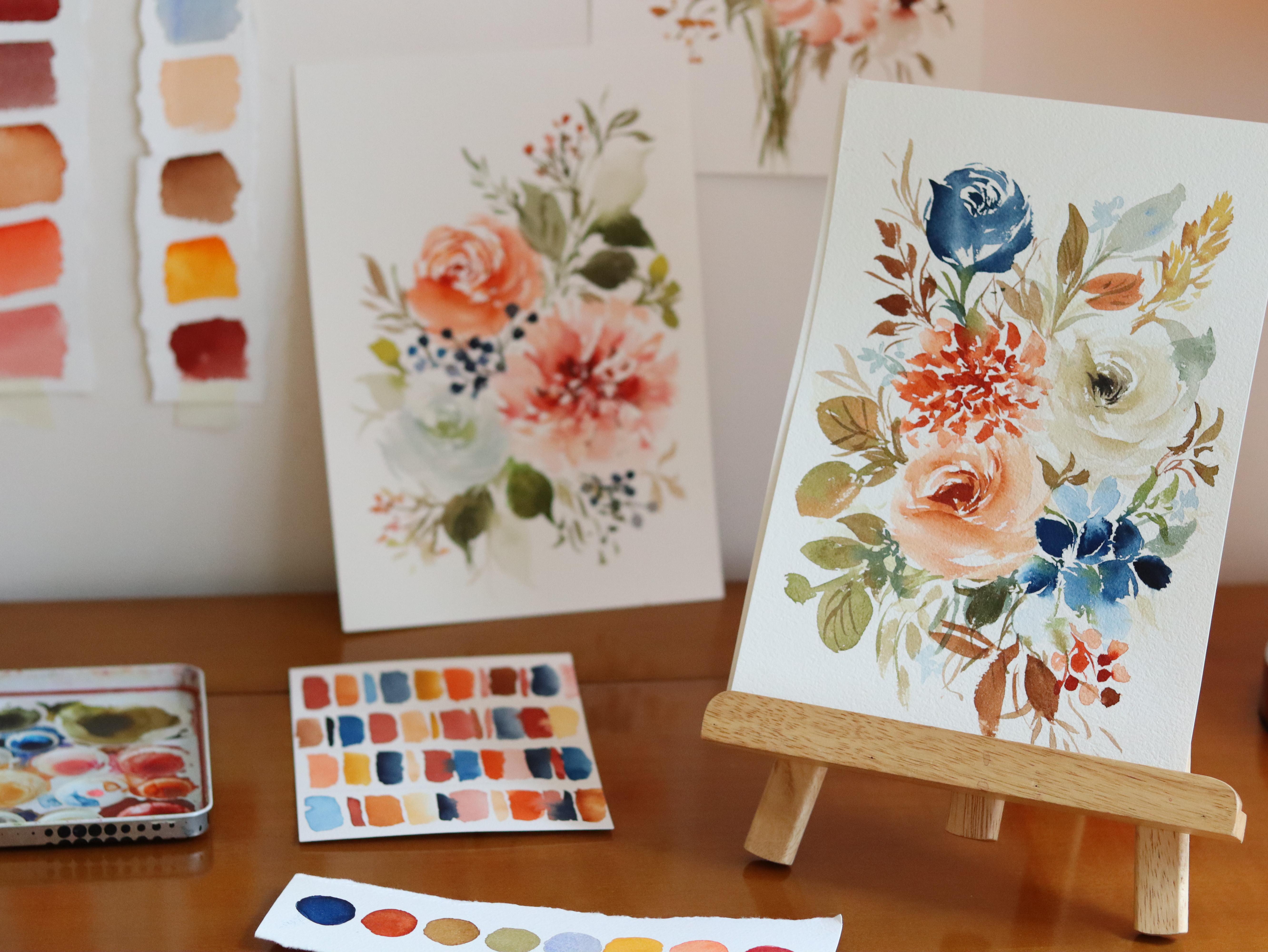
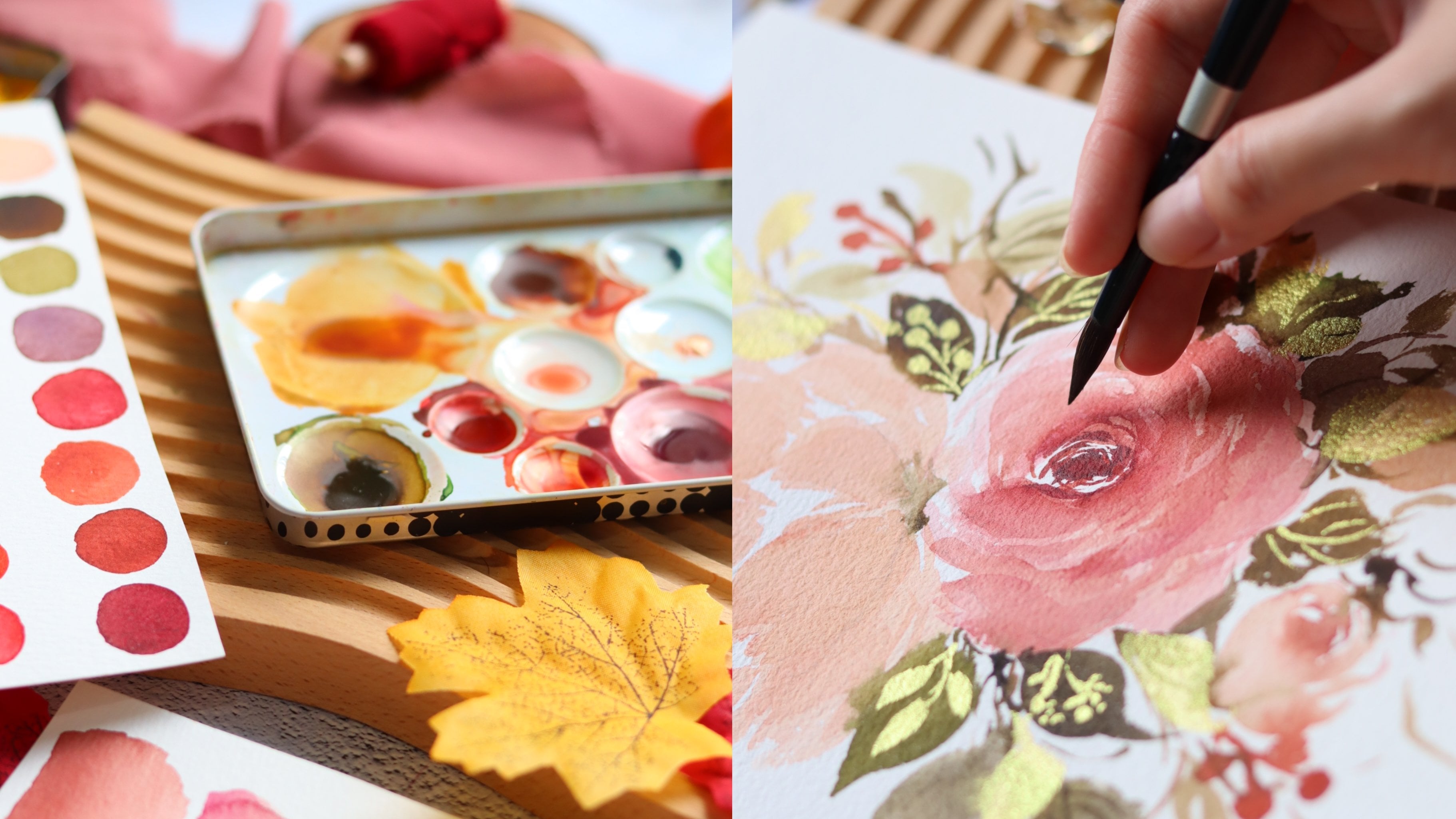
3. Materials: Okay, before we start, let's talk about the
materials that you need. The first one is paper, this is the Bow Hong artist
grade watercolor paper. And this is what we
will use in the class, but you can use other brands. What we need is a
cold press paper, and then this is also
100% cotton paper, and the thickness is 300 GSM. Now let me just show
you the texture. This is what a cold
press paper looks like. This will really absorb the
water or paint very well, especially for loose florals. This paper comes
in a block form. You can see all the
sides are glued except for this part
right here at the top. And I'm going to use a cutter, you can use a palette
knife as well. I will just slide
off this sheet. Remember that you have to
wait for the painting to dry before you take
it out of the block. I usually prefer painting
on a watercolor block because it helps keep the
paper flat as I paint. At the same time, it
also keeps the paper flat after it has
dried up like this. Next I'm going to show
you another version. This is the Bajo Academy, and this is their
student grade line. The size here is five x 7 ", and this is the artwork, this is Australly, something that we will be
painting later on. I'm going to show you
the texture up close. You can see it's not as textured compared to the
artist grade version. But this paper really performs well as a
student grade paper. I highly recommend using
this if you are on a budget. This paper is also
cold press paper, and the thickness is 300 GSM, and it comes in a
block form as well. For the brushes, I am going to use a size 6.8 round brush. This is from the brand
silver brush and it comes from the line
called black velvet. It's a mix of squirrel
hair and synthetic hair. Now this brush can
hold a lot of water, but still keep its point. Let me just show you, even if
I dip it in a lot of water, you can see the tip is
still very pointy and that's something very useful when you're painting botanicals. Now let me just try and
demonstrate painting a leaf. I also love this brush
because it's very soft and it really
follows my flow. So you can start with
a light pressure and then just press your brush. You can see the bristles
fanning out when using a brush. It really depends on
your preference as well. Some don't like the soft brush, some like brushes with a snap. For me, I like
brushes that are soft because it just follows my flow. But when it comes to size, I do suggest using a
size 6.8 round brush. Next for the paint, I am
using the Sheen hand PWC. This is a Korean
artist grade paint and they come in
tubes like this, but I just transferred them into small half pants that
you can see right here. It's just very convenient to use because the
colors are all in the palette and I can just
quickly grab some paint again. Feel free to use other brands. I will also be posting
the colors that we will use before we
start each project. We also need a mixing palette. This is just a lid of my watercolor tin.
It's from the brand. Core watercolor is
a different brand, but I just changed the
paints inside the metal tin. Anyway, I love this
palette because it has these little wells that
you can mix colors in. Another alternative is to use a ceramic palette
just like this, or you can use an ordinary plate at home to mix your paints. Next, we can also
use a white pen. This is the posca acrylic
pen and it looks like this. When you open the cap, we will use this to add some
highlights for the wreath, but you can also use a white gouache or if you
have a white poster paint, this is just a nice way to
add depth to your painting. Next, we need water and also tissue paper to blot out the excess moisture
and our brush. You can also prepare pencil. Any pencil will do
so that you can draw a guide on the paper. All right, that's it. Now let's move on to the next video.
4. Color Mixing: In this lesson, let's talk about color mixing for our
fall color palette. So I will be sharing how to
mix these autumn colors, as well as some
unconventional colors that you probably don't use for
an autumn theme painting. Okay, so let's start
with the first one. It's going to be permanent
red and burnt umber. The easiest way to actually create an autumn
color palette is to add some brown to
your usual colors. You can get your usual pinks
and just add some brown, and it will immediately
feel like autumn. Now I'm just going to
swatch this burnt umber. You can see it's a nice
neutral brown color. And going to mix
these two colors, this will result in a
brownish red shade that you can actually use for
flowers or even for leaves. Here I'm showing
you what it looks like if it's diluted in water. And then you can also
add a little bit more of that red in the mixture. You can change the ratio
of the paints so that you can call it your own
color right here, you can lean more on the
red or more on the brown. Now if you want a
burgundy color, you can add Hookers green. Adding this green will
darken this color, making it look more rich. I'm going to swatch
it right here now. It looks more like
an intense color. You can adjust by adding
more red, if you wish. Next, I'm going to mix
burnt sienna and vermilion. I love adding these two
colors because they just give that nice warm feeling when you see it in a painting. Burnt sienna is actually a
little bit bright already. But I also want to add
some intensity to it, that's why I added
this orange color. Next we're going to mix burnt
sienna and permanent rose. This is one of the
classic examples of adding some brown
to your usual colors. I love using permanent rose. It's my go to pink color. But once I add a little
bit of brown to that, it will tone down the color. The ratio depends on you. You can create a
more brown color by adding more burnt sienna. If you want it a bit more pink, then you add more
permanent rose. You can also try to thin down this color by adding some water. This is an example of a
painting using this mixture. So it actually looks
like a peach color, but it's more like brown
and has that autumn feel. Next I will introduce a
different color combination. So this is brilliant pink, yellow ochre, with
just a little bit of that burnt sienna. This mixture is going to give
you a pastel autumn color. And I really love this mixture. You just have to be
patient when mixing, because sometimes it
turns out too yellow, because the brilliant pink
has a bit of white in it. You can see that this color
that we mix looks creamy, a little bit opaque. You can thin it down with some water to create
this nice texture. Another color that
we will be using is this mixture of
CPA and yellow ochre. I'm going to use this
to paint white flower. If you've taken my
classes before, you probably already
know this combination. The trick here is that you need to dilute this mixture in a lot of water to create
that nice white color. This is what I
call a white color with a little bit
of yellow in it. You can also thin this
down with some more water. If you want it to be lighter, I'm going to use
it in this flower. It's also a great
color for fall if you want a more
rustic vintage look. Now, another color
that we will be using is burnt umber and
ultramarine blue. This color will create
a neutral gray color, but I'm going to add
more blue in my mixture, since the theme in this class is adding some
blue in our autumn paintings. Again, you need to
also add a lot of water to use this color. Just have a little bit of patience when it
comes to mixing. Going to grab this color
and add it over to another well and
add some more blue. This looks great. You can add some more water
when you swatch it. It looks like the light
neutral blue color. It's also nice to
add this color as a filler to your
autumn paintings. If you want a deeper color, this is what it looks like. Now, I forgot to tell you guys, I'm using just a scrap paper
to swatch these colors. You might see some
imperfections on the paper. Next we're going to
make some greens. I love mixing sap, green, and burnt umber. It just creates this
nice earthy color for a natural
looking green color. I suggest adding some
browns to your greens. You can use other
browns in your palette. Right here, I'm just
using burnt umber. But let me show
you what it looks like when you add burnt sienna. You can see burnt sienna
looks like a happier color. Let's mix that to our sap green and see what it looks like. Okay, so it just produces this lighter green color compared to when you
use apart Number. Another mixture I love to
do is CPA and sap green. Now if you want a
deep green color, you can mix these two colors. Okay? So let me mix
these two colors. And again, it depends on how deep the color you
want to look like. You can add more sepia. If you want a
darker green color, you can see that it's
a very intense color. But you can thin it
down with some water. Okay, I'm also going
to show you what it looks like when you make
sap green with vermilion. Vermilion is a nice orange color that we use for
autumn paintings. I do suggest adding the main color of your
painting into your greens. So if you have a pink flower, add that pink to your
greens so that you can create a more
interesting play of colors. Okay, this also looks like
a very beautiful color. It's an orange, green color. Okay, that's it for our
color mixing lesson. You can definitely create your own autumn color
palette, just again, by simply adding some browns to your usual colors
that you love using. Later on in the projects, you are going to
introduce some blues, such as Prussian
blue and indigo. And I'll be showing that
in the project itself. Now to get more acquainted with this new color palette that
you will be trying out, we are going to paint a simple exercise
in the next video. Okay, so let's check it out.
5. Simple Watercolor Exercise: The aim of this lesson
is for you to be more comfortable in using this
unique color palette. We are going to paint simple
strokes on this paper. We'll get inspiration using
this reference photo. As you can see, this photo has an autumn color palette
with a little bit of blue. I don't want you to feel
any pressure painting this. It's really just a fun
and simple exercise. To start, we need a
small sheet of paper. I suggest using just a four
by six or five by 7 " paper. And I'm just going to split
this into four parts. Again, this is the
inspiration that we will use. It's just a photo from painters. You can actually search for
different reference photos. I'm going to show
you how to grab the colors from a
reference photo. Again, I'm going to split
this paper into four parts. I'm just going to
line it using pencil. You can divide this into three
parts or even five parts, it depends on you. Before we start, let's mix
the colors that we need, so I can see this
brownish red color. I'm going to mix permanent
red and burnt umber Again, we're trying to grab the colors from this
reference photo. Next I can see this nice
light yellow color. I'm going to grab
this yellow ochre. I can also see some burnt
tiena in the leaves. Let's just mix that
in our palette. For the blues, I'm going
to use Prussian blue. And for the darker
blues, let's use indigo. Okay, I think we're
good and you can just make some colors
as we paint along. Okay, we're going to paint some single strokes
just like this. I'm using the side
of the brush and going to paint it in
different areas of the paper. You can also do some thin
strokes, just play around. This is actually a very
therapeutic exercise because you don't
really have to think. You're just going to lay down
the colors on the paper. You can see that I also added some water in my brush to
create a lighter color. You don't need to think
about the spacing. We're going to just fix
that along the way. Next I'm going to grab
my burnt sienna and just paint it beside
the first stroke. You can actually add
it in different areas. It doesn't have to be
beside a certain color. Again, the aim of this exercise is just for
you to be more comfortable in using this color palette
at the end of the exercise. It will also help you understand which colors work better
beside each other. Okay, I'm going to
grab some blue. This is Prussian blue, going to grab a
more intense color. So you can see that
this blue really makes the orange
colors stand out more. So you can just
rinse your brush, create a lighter blue color. And also you can let
the strokes touch each other so that the colors
will bleed into each other. Okay, right here I'm
adding a dark color. This is indigo. So
you can see adding a contrast also makes
the colors pop up. And this is the
technique that we will use in our project. Now let's add some yellow ochre. This is also a nice color
that I use for fall. It's a color that will lift up the entire look of
your autumn painting. It makes it look a bit brighter. This area right here needs
a little bit of orange. I'm going to add some
vermilion to my burnt sienna. You can also look at
the reference photo and see which colors are
beside each other. If you want to follow that, then you can also do it. Okay, so we're just slowly
filling in the gaps. I love that this exercise
actually looks like a beautiful abstract
artwork that you can hang on your wall and you can also do this in
different color palettes. Just grab a reference photo and use the colors
in that photo. In this painting, I'm going to grab some indigo
and add it in between this pale color. And it will instantly lift up this area because it
added more contrast. That's actually what they
do. If a certain painting looks a little flat, I add really dark color. If it's a bouquet, I add some dark colored berries and that will make
it look nicer. Sometimes when I oversee, I look at the reference
photo again and see which colors are beside each other.
I just follow that. I'm going to grab some
burnt umber and add that to this color palette. You can actually
use the color burnt umber for some
twigs sticking out. You can add that
to your bouquet. This area right here
needs a little bit of reddish brown color. So
we're going to add that. We are almost done. I'm just filling in some
of the smaller gaps. I am using Prussian blue here. In using this color palette, you still want the autumn
colors to stand out. The blue shades
are just going to complement the
oranges and the reds. We don't want this blue color to overpower the autumn colors. Okay, so that was fast. It's a really fun exercise. I hope you had a good time
painting this exercise again. Just choose any
reference photo that you want and just grab the colors
and place it on the papers. You can also paint some circles instead of
column strokes like this. Just try to have fun play around with different
shapes as well. I think that we are ready now. Let's move on to
our first project.
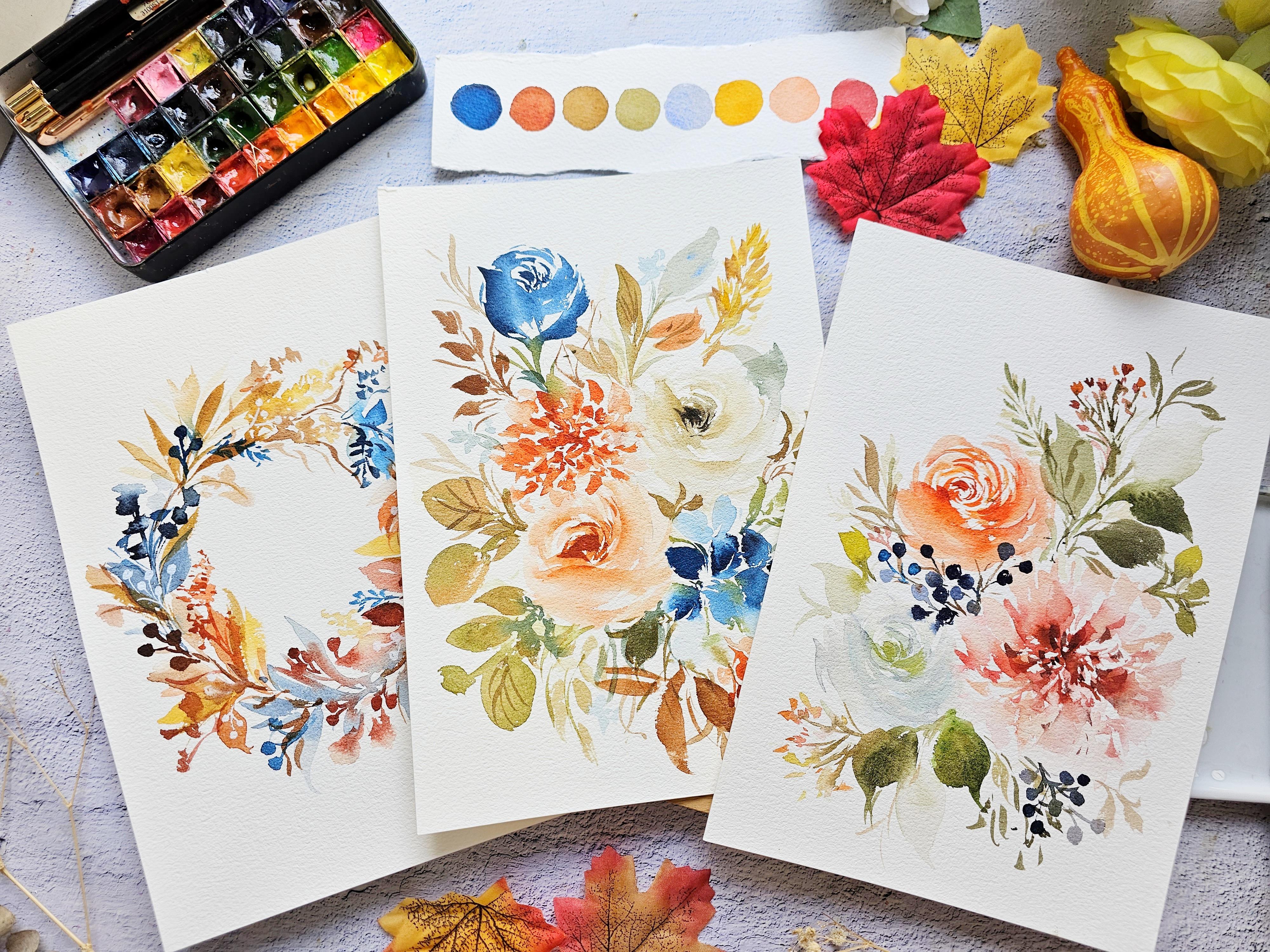
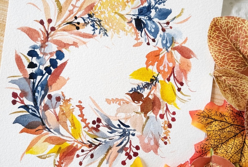
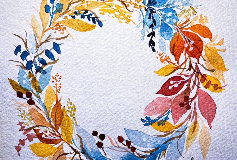
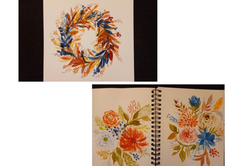
6. Fall Wreath with a Touch of Blue: Before we start, here are
the colors that we need. You can take a screenshot, but I will also be
putting this in the projects and resources
section of the class. Let me show you an overview of this project to prepare
you beforehand. We will be using
this reference photo for our project before we start, we also need to draw a circle on the paper as a guide
for our wreath. I'm going to start with
some basic leaf shapes and then we are going to it. Later on you can see I added some blue Eucalyptus and
also some elongated leaves. I'm also going to try and
alternate the colors. We have some warm
oranges and yellows, and then I'm going to
alternate it with some blues. I'm just grabbing the colors
from the reference photo. Now I'm adding a little
bit of that yellow ochre. It really brightens that wreath. To add contrast, I've added some red berries and also
these dark blue fillers. Fillers really make a difference when you're painting a wreath, because it just fills in those tiny gaps and makes
your wreath look fuller. Now I'm going to add
some twigs sticking out using the color burnt umber. You can also add
some white berries here using a white pen. You can also use gash. And right here, I'm just adding some finishing touches just to adjust the shape
of the wreath. Okay, so let's start. You can find the fern
reference photos on Pinterest. You can just type autumn
leaf wreath with blue. I settled for this
reference photo because it has that autumn color
palette that I'm looking for. And also looks
simple and elegant. You'll see other photos
here with a similar look, but these oranges
here are too bright. Again, feel free to
use the wreath that you prefer. Don't worry. I'm going to teach
you how to paint this wreath from
reference photo to your actual painting
using an ordinary pencil. Just draw a circle on the paper. I am using a seven
by ten inch paper. It is best if you can find a big bowl and just
trace the circle. But since I don't have one, I'm just going to
eyeball this drawing. It's best to prepare the colors beforehand since we're
painting a wreath. I'm going to start
with the burnt sienna and also raw umber. Let's look at the photo, you'll see different
browns and oranges. Also, we'll use burnt umber. Let me just mix
that on my palette. I'm also going to use vermilion
for that pop of color. Also prussian blue
for the blue leaves. For a deeper blue, I'm
going to use indigo. Let's analyze this photo. You can see that it's
mostly an autumn palette. So we have more of that
orange, yellows and browns. The blues are just
peaking out from behind. To make it simpler,
I'm just going to paint alternate leaves in orange and blue
or brown and blue. Let's start with burnt sienna. I'm going to paint some of
our usual go to leaves. Maybe we can paint two
or three leaves here. You can mix in a little
bit of that burnt umber. Now just feel free to mix the browns or oranges
in your color palette. I'm also trying to paint the leaves in
different directions. Okay, after this set of leaves, we're going to paint with blue. I'm going to use indigo. We can paint some thin stems first and attach
some leaves to it. I'm just going to
follow that circle drawing that we did in
the reference photo. There was a few
eucalyptus leaves. I'm going to paint them in blue. Try to change the values. I'm going to start with
a dark indigo color and then I'm going to
rinse my brush and add some lighter colored strokes to make it easier for you
in painting a wreath. Just follow the circle. You can see that it's a little bit curved
over here because I'm following the direction
of the curve in this circle. Okay, let's move on
to the next shape. I'm painting some
elongated leaves. I'm just dragging my brush
and I'm using the color raw, umber, but you can
definitely use a different orange color. I'm also painting some
thin stem sticking out. Now I want to add some
texture in this read. So I'm going to use
this filler right here, this light yellow color. And we're going to try to mimic that I am using yellow ocher. And we're just going
to tap our brush onto the paper to create
these tiny strokes. Make sure that you
have some spaces in between your strokes. You can rinse your,
continue tapping your now you have
different values. Here you have a color, you have a darker color and you can drop in
some browns as well. I'm adding the browns while
this area is still wet. We can also add
another set over here. Okay, Since that yellow
ocher color is a bit light, I'm going to add in
a darker blue color. This is Prussian blue, but I just made it
more pigmented. I'm going to paint
some short fat leaves. As you can see, we are trying to vary the shapes of the leaves to make it look more
interesting also, so that we can add more
depth to the painting. I'm just going to go back in and fix the shape of
some of the leaves. You can do this while the
leaves are still wet. Okay, let's move on to
the next set of leaves. I'm going to add this
bright orange color. I'm going to mix vermilion
with burnt sienna. So I feel like the colors I used before this
were a bit muted. So I wanted to add
a bolder color. Now, just play around, Just add some different
strokes, stem sticking out. All right, now let's bright
number with permanent red. I want reddish
brown color again, we are just trying to vary the colors in this wreath to make it look
more interesting. Okay, I want my leaves also face in different
directions so you can see. I'm trying to also sway my brush to make it
look more expressive. While it's still wet, you
can drop in a darker color. All right, so now we have
this small space right here which we will be
adding blue leaves. Let's add some elongated leaves. I'm going to use
the color indigo, but I wanted it to
be a bit lighter, so I'm going to add some water. Just drag your brush. You can try to
wiggle it as well. I'm just going to fill
in this white space. You can see that the leaves
are all still wet now, I'm going to drop in a
darker, indigo color. You can see we're
just trying to play around and make this
painting look more fun. Wet on wet technique
looks really amazing on autumn leaves. Now just to add that
punch of color, I'm going to use
bellow ochre and add a few leaves to
fill in some gaps. It instantly lifts up
the mood of this wreath. All right, it looks good. Now I'm going to add
some dark berries. This is a mix of
permanent red with some burnt umber and we
want a nice dark color. I'm going to add the
berries near the leaves, This leaf is still
a little bit wet, so you can see it's
bleeding into the leaves. And that is also a nice effect. I'm adding this near
the blue leaves because they also
look great together. Feel free to change the
color of the berries. You can also use brown. Here I'm going to show you, I'm going to grab
just burnt umber. And we're going to paint
our brown colored berries. It's really dark color and
gives that beautiful contrast. Okay, aside from the berries, we're also going to add
some dark blue fillers. I'm using Prussian blue. We're also going to
add dark berries. This time I'm adding it near
the yellowish brown leaves. You can also play around by adding some smaller
shaped leaves, or just simply stamp
your brush onto the paper to create a
different brush stroke. Okay, this is looking
really great. Now you can go ahead and grab any autumn color
in your palette. I'm going to use this
raw umber and just fill in the gaps with
some thin leaves. I'm just trying to look
around this wreath. And the one on the lower
right part right here, looks like it needs
more contrast. I'm going to grab this
brownish red color and add some berries. We can see that the base leaves are still a little bit damp. Some of the berries will just bleed into the leaves,
and that's okay. Another fun color
that you can add to your autumn palette
is greenish yellow. I'm going to add some fillers. I'm just going to tap my
brush onto the paper. Create these tiny strokes that will look like
small flowers. Don't forget to add a stem that will attach
it to the wreath. This is a great way to
fill in some small gaps. You can definitely
change the colors. Here I'm adding a little bit
of orange to my mixture, add some burnt sienna. Because if you look at
the reference photo, you can also see
different textures. We want to also try to translate
that into our painting. Now I'm adding some
twigs sticking out because I think
it looks more autumn. If you add these twigs again, it also adds some
texture to this wreath. Just make sure not to overdo it. Just add a few twigs
here and there. Okay, after this,
we are going to wait for it to dry
a little bit more, then we can add
some white details. I'm going to use this
Posca acrylic pen. And if you look at
the reference photo, you will see some white berries. And we're going to
try and copy that. Add some white berries
in our wreath. You can also use white. When you're adding
these white details, it's best to have a dark background so that
the white color will pop up. And I sometimes use this
technique to cover up some ugly patches
in my paintings. This white berry looks really, really nice on this
dark blue background. I think adding this white detail really gives a different
charm to this wreath. Okay, this is what it looks
like with the white details. You can see it looks fuller. But I still need to add some more leaves just to fix
the shape of this wreath. It's best to take a
photo of your wreath so that you can see it from
a different perspective. Just look at it on your
phone and try to see if you need to add some more
fillers or leaves here. I'm just adding
some more fillers sticking out because I
think it looks great. Doing this makes your
painting look less chunky. See, I'm trying to
extend those fillers. Now I have a light mixture in my brush and I'm
just dabbing it on the paper creating
this leaf shape. You can also try to do that
to fill in some small gaps. All right, so we are done. I hope that you enjoyed painting
this lush autumn wreath. Now let's move on to the next project as we
paint more flowers.
7. Fall Florals with Berries Part 1: Here are the colors
that you need. You can also take a
screenshot, but don't worry. I will put the list of colors in the projects and
resources section. Before we start painting, I'm going to give you an
overview of this project. We are going to
paint this bouquet with some blue fillers. This is our reference photo. We have three main flowers here. The first one that we
will paint is the dahlia. I'm going to start with few wispy strokes in the center and they're going to se my brush
and soften the outer petals. Next, I'll add a little bit
more of that brown color in my mixture and just add
that to some of the petals. I'm also making sure that I have some spaces in
between my strokes. Next, we're going to
deepen this color. I'm going to add
a darker color in the center while this
flower is still wet. The reason why I'm adding a darker color in the
center is because I want it to have an illusion that there's a shadow in between the petals. Next we're going to
paint this rose. I'm just trying to copy
from the reference photo. We're adding a lot of petals. I also decided to make it
a little bit more orange. Next we're going to add
this bluish white flower. It's going to soften
the overall painting. For the first part
of this project, we are going to paint
just the main flowers. For the second part, we're going to start adding
the fillers and the leaves. Here I'm mixing
the dark berries. This is blue with a
little bit of violet, but you can definitely
just use color blue. Now I'm adding these berries
in between the main flowers. Next, I'm slowly filling in the gaps with some more leaves and also small fillers to
make it look more balanced. I'm adding these dark berries
all over this bouquet. And you can see that
I'm also trying to look at the reference
photo from time to time. Next, we need to add the second layer to give
the flowers more depth. The flowers here
are already dry. As I'm adding the second layer, you can really see
the huge difference by adding a second layer, it just gives this
bouquet more depth. Okay, that's it.
Now let's start. Whenever you're looking
at the reference photo, try to find one flower
that really stands out, that is called the
focal flower for me, the orange flower on the lower right side
really stands out. I will start with
that flower first. To achieve that color, I'm going to mix permanent
rose with burnt sienna. With this project, you
can learn how to add some blue fillers to
an autumn bouquet. I think I like the
color here already. And we're just
going to swatch it. The flower and the photo has
so many layers of petals. We're going to try and achieve that in our
painting today. Let's put a small.in
the center as a guide that this is the
center of the flower. Now I'm going to just paint
some small, wispy strokes. Just use the tip of your
brush and try to sway and create these almost
like an S shaped petal. You can see that I am
trying to vary my strokes. Some are thin, some are thick, some are just dots, and make sure that you have
some spaces in between them. Okay, now I'm going to rinse my brush and tap
the excess water. We are going to fade away
some of the strokes. I'm also going to add
a few more petals for flowers that have layered petals like Atalia and also this
flower in the photo, the center is usually darker, so you'll see more shadows. All right, I'm going to add some burnt sienna and also a little bit of this
yellow ochre to my mixture. And let's add some more petals. The petals here have
a roughly texture, you can see that in order to
achieve that on the paper, I'm trying to do an
up and down motion and I'm trying to
wiggle my brush. We don't need to actually paint all the petals in this photo. We just want to choose
the ones that stand out. This spacing is also important. You can see that I have some tiny gaps in
between my strokes. Also, sometimes I use just the tip of the
brush and try to wiggle it to create these
beautiful ruffle texture. Okay, when you are satisfied with the
shape of the flower, you can grab a more
pigmented mixture and just tap it in the center. If you look at the
reference photo, you'll notice that there
are some darker spots. That's where the shadows are. Those are the little crevices
in between the petals. That's what we are
trying to mimic here. Make sure that the
flower is still wet so that you'll have
a more beautiful blend. All this is what it looks
like from a top view. Now let's try to look at
the reference photo again. We're going to add a darker
mixture in the center. You'll see in this
photo that you have some really dark areas
in the center and the outer part of the flower
is lighter and softer. We can grab Briena, I'm grabbing that Brent
Siena Street from my pan because I want it
to be a really dark color. Next we're going to
paint this rose that is diagonally across the first
flower that we painted. Let's grab vermilion or any
orange color in your palette. Next, I'm going to tone
this down by adding some burnt sienna so that
it's not too bright. Because if you use a
really bright orange, sometimes it will look
like a summer flower. Okay, so here I'm showing
you the spot it's diagonally across
the first flower. Guess I'm using my
size six round brush. I'm putting in a small tot as a guide that it's the center. Let's sorry, with a
comma stroke next. Using just the tip of the brush, I'm going to paint some
wiggly strokes all around it. So you can see that there are so many petals in the center. And I am just going
to follow that. If you try to squint
and look at the photo, the shadows will stand out. You can try to follow
those letter strokes. Now let's rinse, airbrush, tap the excess water. I'm going to fade away
the outer strokes. At the same time, I'm going to create bigger C shaped strokes. To better understand this, you want all the strokes to hug the center from one
point to another. It's going to the center. If you have been
following my classes, you probably are familiar with this style because I
teach this all the time. Okay, I'm going to rinse my
brush again and just add some fading technique because it's getting a little heavy. We want to soften the edges. I'm also trying to move
around this darker area. Again, it looks heavy. Let's leave that
rose for a while. I'm going to paint
another flower. You can see this white flower, but instead of white, we're going to turn
it a little bit blue. I'm going to use indigo. This is a very diluted indigo. And we're going to add a
little bit of that sap green, that it will turn
like bluish green. I'm going to start
in the center, we're going to use
the sap green. I'm going to start
again with a stroke. Next, using the
tip of the brush, we are going to paint
some tiny strokes. I'm going to use this
bluish green color. We are going to paint
some curves all around this center to make sure that you have spaces
in between your strokes. Now we can try to
look at this photo. You can see a lot of black
petals that are layered. If you want this flower
to be more blue, just grab a little bit more of that indigo and dilute it
in a little bit of water. Now I'm going to place
that color on the paper. This is a great way to
paint those white flowers. You can use indigo instead. Now to add depth, you want
the center to be darker, so I'm going to grab some of that indigo mixture and
add that to this flower. You can see that this flower
is still a little bit wet. The colors are just
blending with each other. Here I'm just showing you that
the flowers are diagonally across each other and
they form a triangle. So we're done with
the main flowers. Now we need to add
some contrast, some fillers and leaves. Let's now move on
to the next video.
8. Fall Florals with Berries Part 2: Okay, welcome to part
two of this project. Right here, I am just mixing
the colors for the berries. And this is just indigo with a little bit of that
permanent violet. In the reference photo, you will see the dark
colored berries and it's a great way to add contrast
to the autumn painting. The reason why the blue
looks really good against the autumn theme painting is because orange and blue
are complimentary colors. Adding them in a painting makes it look
visually appealing. Okay, here I'm just adding these small berries in
between the main flowers. There is a small gap there. Next I'm going to rinse my brush to just add a lighter value. You want to vary
the berries here. You want some to be
darker, some are lighter, and some are even bleeding
into the main flowers. Because this blue flower here
is still a little bit wet. Now, if your brush is too wet, you can always tab
it in a tissue paper before painting on the paper. Let's add some stems. I'm going to use Brent
Siena for the stems. Okay, so right here.
I'm just going to add a few more berries. My suggestion is when you're
adding these fillers, try not to add all
of them at once. You can try to paint
just a few once and then look at it from afar to know if you need
to add some more. Let's look at the
reference photo again. You can see that there are beautiful fat leaves here
and also these tiny fillers. We're going to try
and mimic that. Interpret that onto paper. I'm going to grab sap green
and also add a little bit of that CPA that's going to give
us a nice dark green color. Okay, so we're
going to add leaves in between these main flowers. I'm just trying to
wiggle my brush to create some
expressive leaves. Now let's rinse our brush
to paint a lighter value. It's always nice
to mix the values. Some are lighter,
some are darker. One way to extend an area is to actually add leaves and stems. Right now, you can see that all the weight is in the middle. Because of the main flowers, we want to move that weight. That's why we're adding
all of these elements, like leaves and fillers. Now let's extend
the bottom as well. We can add some more leaves. You can vary the leaves. You can paint some
elongated leaves or just paint some tiny leaves
just to change the texture. I'm going to rinse my brush
and just paint water here. I'm going to let that color just flow into this leaf and it
will look really beautiful. Okay, now let's look
at the reference photo again and you'll see
all these tiny fillers. They look like small flowers and I think we can add
that to our bouquet. Grab the color that you
use for the main flowers. This is a mixture of permanent
rose and burn sienna. Using the tip of my brush, I'm going to lightly tap
it on the paper to create these tiny strokes that will
look like small flowers. I'm going to add a cluster
of them at the top. And then add some steps that will attach it to
the main bouquet. Similarly, we're going
to add another cluster at the bottom so that it
just looks more balanced. You can see I'm also
changing the value. Some are darker,
some are lighter. It's going to make
it look better. Then we can add some stems to attach it again
to the main flowers. You can try to play around. You can change the color
of the fillers as well. As I'm going along
with the fillers, I'm also adding
some small leaves sticking out and also
some small stems. You can hold your brush
towards the end of the handle and just
create these tiny, wispy strokes that will
look like small leaves. What I'm doing now is I'm adding some texture just to
give it more variety. Okay, we have beautifully used the contrasting blue berries, but I feel like we can
add some more towards the bottom just to make these flowers stand
out even more. When you have some pale flowers, what you can do is to add some
contrast near that flower. It means that add darker leaf or maybe dark fillers
like what we're doing. We're adding dark berries here. Now I'm going to
grab greenish yellow and add some small pods. You'll also see this in
the reference photo. I'm going to add this
for some more texture. And also I love adding
greenish yellow in my bookcase because it just lifts up
the mood of the painting. Another way to add
depth to the leaves is to add some veins right here. This leaf is still
a little bit wet. But try to choose
leaves that are already dry so that the
veins will stand out. We can start adding a
second layer to this rose. I'm using the same
indigo mixture and just painting some thin strokes. Now we can also describe this
as a crescent moon shape. Now I'm going to just
fade it away using water so that the strokes
doesn't look too harsh. You can grab the screen is
yellow added in the center? Okay, that looks great. Let's move on to
this main flower. I'm using burnt sienna
with permanent rose, but you can see I have more
burnt sienna in my mixture. Again, look at the
reference photo. You'll see all of these
darker areas and going to copy those dark areas
and paint it on the paper. Just using the tip
of your brush, just create some quick marks. I feel like it
needs to be darker. I'm using this indigo and
adding in the center. If you notice in the
reference photos, there are areas that
are really dark. It almost looks like black. Now let's rinse our
brush and soften the area towards the outer
portion of this flower. Okay, it's looking really great. Now let's move on to the rose. I'm using vermilion and we want a really
pigmented mixture. And I'm going to add a little
bit of that print Sienna. We're also going to do the same crescent moon strokes
all around this flower. Now let's rinse our brush
and feed away the strokes. So this is a technique
that you can learn step by step also in my Rose
watercolor class. All right, congratulations for finishing this project again, this is our reference photo. And we only took the
lower right side of this photo as a reference. Adding the touch of blue really makes this autumn
painting stand out. Now let's move on to
our last project.
9. Fall Bouquet with Prussian Blue Part 1: Here are the colors
that you need. You can take a screenshot
or you can also check out the projects and
resources section later on. Before we start, I'm going to share an overview
of this project so that you'll be more
prepared before you paint. We're going to use
this reference photo I saw on printers. We are going to modify
the colors a little bit, but as you can see, this
is a round bouquet. We're just going to choose a
few flowers in this project, you learn how to add
the touch of blue as a secondary flower to
this autumn bouquet. I'm going to start with this
yellowish white flower, just going to, across it, we're going to add
an orangey color. This is also going to be a rose. You can see those small cluster of flowers that
look like hydranga. We are going to interpret
that and put it on paper, so we are going to use
a darker Prussian blue. Next, we are going to
add this orange flower. If you check out the
reference photo, you will see this flower. To distribute the
weight of the flowers, I'm going to extend
this part and put a small blue
rose bud right here. You can see it's a little bit detached from the main bouquet. That will help loosen up
this floral composition. All right, so here
I am just adding all the small
fillers and leaves. You're adding a bunch
of textures and also using different autumn
colors, like browns. We're also using yellow
ocher for some contrasts. I've also added these
orange berries. You can also turn that
into a blue color. Then of course, we need to add a second layer just to give
the flowers more depth. Now to give a sense of palace, I'm adding all these small
flowers in the shade of blue just to give some coolness and calmness in this
floral composition. Then we can also add some
more veins on the leaves. Okay, that's it. Now
let's start painting. This is our reference photo. So as you can see, it's a mix of whites, oranges, and blues. I'm going to start with
this white flower here, that will be our focal flower, and the others will be
just secondary flowers. I love the contrast between the whites and the other
colors in this composition. Again, you don't need to
paint all the details, just paint the things or elements that
catches your attention. Okay, right here, I'm just
mixing yellow ochre and CPA, this is going to be the
color for the white flower. For this mixture, I do
use more yellow ochre. Make sure that you
add a lot of water. Let's paint the signature roses In all of my classes, again, we're going to start
with the center, then I am going to add some
thin strokes all around it. Again, you want the
petals to hug the center? I'm going to rinse my brush. And then we will try to
soften the sides right there and also create
some bigger size petals. Let's grab some more color. You can see that I am making one sweeping motion for
some of the petals. This is also a rose that
is facing on its side. I will put more volume towards the bottom half of this rose. You can see I have
more volume over here compared to the top part. Let's grab a darker
mixture and just going to drop it in the center while
this flower is still wet. Just let it blend in
with the base flower. The center is always going to be darker because that's
where the shadows will be. You also see that in
this reference photo. Next, let's start with
the second flower. All right, let's mix permanent
rose with yellow ochre. I'm also going to
add a little bit of that burnt sienna just to add some hints of
brown in my mixture. Now this is your own painting, so feel free to also alter the color if you want it to
be more brown or more orange. Okay, let's choose
a spot that is diagonally across the
first flower that we did. I'm going to start
with a stroke and just slowly add all of these very, very thin strokes around it. It's almost like I'm
circling around the center. A side six round brush works really well for
this size of paper. This is a 710 inch paper. Okay, let's soften
this area next. I'm just going to
grab a little bit more from the palette. And let's grab some burn sienna and drop it in the center. You can see the center
is still a bit wet. This is also a rose
that is on its side. I'm adding more volume,
or more petals, towards the bottom
half of this rose. And it's also a rose
that's about to bloom. So you can see it's
in a cup shape. Now to add more tap, let's grab burnt sienna and add it in the center.
Just let it bleed. Okay, so we're done with
the first two flowers. Now let's move on to
painting the blue flowers. You can see here, there are some small four petal flowers, They almost look
like a hydranga. I also want to mimic
that intensity. In the photo, you can see
it's a dark blue color. Now we want a very
pigmented color. Let me just swatch
it for you guys. You can definitely use
any blue in your palette. If you don't have this color, you can use any blue. And then add a little
bit of black just to make it look more
intense and darker. Now I'm going to rinse my
brush and add a lighter value. This is very important. You don't want this
air to look flat. What we need to do is
to vary the value. It means that some
of the petals, so you're going to be darker, some are going to be lighter. Let's grab just water
and let that color bleed into the petal. All right? So this is sap green
with burn sienna. Let's start with adding some small stems and
leaves in that area. I'm just going to put it
in between the flowers, and then I'm going
to extend some areas with some stems and tiny leaves. Now we have that intense blue. I feel like we need to
add more autumn colors. I'm going to add this orangey
brown flower right here, just to fill in that
space and also give a more intense orange color. This is vermilion with
some burnt sienna. I'm going to try and mimic the petals in the
reference photo. This is going to look
like a small dahlia. Just stamp your brush
onto the paper and make sure that you have some spaces
in between your strokes. Next, rinse your brush and start softening the outer
part of this flower. I'm also going to
grab a little bit of color and add
some more petals. This is an easy way
to add a flower that looks like a small
dahlia with short petals. Hold your brush towards the
end of the handle to keep it loose so that you can create
a more free flowing stroke. As I'm looking at this
painting from afar, it looks a bit chunky
or square ish. What we need to do is
to extend an area to break that chunky
cluster in the middle. I will just add a small rose
bud in color, Prussian blue. I'm going to just paint
it above this flower, but you can see that
I'm not going to attach this flower itself
to the main bouquet. Okay, I'm just going
to rinse my brush and soften the sides of this flower. We are also going
to paint the body. This flower will have a cup
shape or a letter U shape. It's also important to put some white speces in
between your strokes. Okay, I'm adding some
darker blue areas right here just to make
it look more interesting. Okay, it's looking good. Now let's grab some greens, and I will attach this to the main bouquet through a stem. This is the end of part one. Now let's move on to part two of this project to paint
the leaves and fillers.
10. Fall Bouquet with Prussian Blue Part 2: Welcome to part two. Right here I am going to
add some rounded leaves. I'm going to use Princiena. We can also try to add a little bit of that
green in our palette. If you check out the
reference photo, you will see the rounded leaves. Okay, it looks like this. I think they are called $1
Eucalypt, I'm not so sure, but we're just going to mimic that and interpret
that in our painting. I'm now using a bigger brush. This is size eight,
because I want to paint some nice juicy leaves. You can also drop
in a little bit of that darker green color while
the leaves are still wet. That will produce a
beautiful effect. Because you're going for
an autumn theme painting, you can play around, have fun with the
color of the leaves. Right here I'm using burnt
umber to paint, lease leaves, you can use burnt sienna that will make it
look more autumn. Another tip is to add
some blue leaves. I just have some
blue on my palette. I'm going to try and
thin it out with water. Then we can paint it right here, so you can actually add
some more blue leaves in this bouquet that will help make the mayflowers
pop up even more. Okay, let's add another filler that I saw in the
reference photo. I'm using yellow
ochre and you can see this beautiful stalk. I'm just going to quickly
paint some small strokes and add this filler
to add more depth. You can add a little bit of
brown while it's the wet. I made a little mistake
with this stroke. It looks a little weird
in this painting. I'm using a clean brush and
just trying to fade it away, but I realized that it
still doesn't look good, so I'm going to use tissue
paper to blot it out. These are things that
I don't try to edit out in my classes
because I want you to also know how to
troubleshoot when it comes to painting
the wrong strokes. Let's just go back to
that area later on. Now we need to add some
variety to our leaves. You can see I painted
these small leaves using a brown color. You can try to paint
some two wigs sticking out using burnt umber or any
brown color in your palette. Next to complement
that orange flower, they are going to be across it. I'm going to add some berries
using the same mixture, but you can also use
million with burnt sienna. Try to vary the values. Some berries are going to be
darker, some are lighter. Okay. I think the area where I made a mistake
is already dry. I'm just going to
grab a green color and just paint on top of it so you can see that
now it looks a bit covered. I just added some nice leaves. I'm slowly filling in the gaps. Just take your time when
it comes to this part, because those tiny
details will make a huge difference or a huge impact in your
overall painting. I want to define the sides
of this white flower, that's why I'm adding
this leaf over here just to put a shape to that
side of the white flower. It's now time to add
the second layer. I'm mixing yellow
ochre with Pia. This is going to be
just about two or three shades darker than the
first base that we did. I'm going to paint
over the center and add some more thin
lines all around it. I do have a class
specifically on roses. If you want to take that to better understand
how to paint a rose, this is just a clean brush. I am just trying to
fade away the strokes, making it look softer. If the brush is too wet, you can always tab it in a
tissue paper just like this, so that it will be
easier for you to fade the strokes or paint a
new stroke on top of it. Now this is just CPA, and I want to add it
in the center just to create that nice dark contrast. Okay, for the second flower, I'm going to use burnt sienna. We want this to be a
very pigmented color. Again, I'm starting
in the center and just painting the thin
strokes all around it. We're pretty much
doing the same process as the first layer
With a clean brush, I am going to fade away this stroke to make
it look softer. Next, let's add a touch
of blue in some areas. But we don't need to
paint an entire flower. We just need to paint
small, cute fillers. This is just a diluted
Prussian blue. You can use any
blue color and just adding it all around
this autumn bouquet. Even though these
are tiny details, it really creates a huge
impact in this painting. Just to add some
feeling of looseness, you can add these small
flowers a little bit further away from
the main bouquet, that it will look like
extended or like hanging. Next, we're going
to add these veins. You can add these veins when
the leaves are already dry. You're almost done. What you
can do is take a photo of your painting and look at your painting from your phone to give you a
different perspective. That will help you
decide whether you need to add some more
leaves or fillers. I'm just going to add
some more stalks just to extend the bouquet so that it doesn't look too
chunky in the middle. All right, so I
think we're done. Thank you so much for
taking this class. I hope that you enjoyed
painting this project. So now let's move on
to the next video.
11. Let's Wrap Up!: We have reached the
end of the class. Thank you so much for
watching some of the class. We have learned
different color mixing for an autumn color palette. We also learned how to paint a floral composition
using a reference photo. And how to incorporate blue into our autumn theme painting
for your class project. You can follow the
paintings in this class, or you may download a
different reference photo and apply the techniques that you have learned
to your own style. Remember that this
is just the start. The real magic
happens when you take these techniques
and make them Your own practice makes progress, so don't be afraid
to experiment. I look forward to
seeing your projects in the project gallery
section of the class. Simply take a photo of
your artwork and upload it there under the Projects
and Resources tab. Hit Create Project To
upload or share your work, I'm excited to offer feedback
at words of encouragement. Feel free to tag me on Instagram using my handle Jolly Poa, and use this hashtag so
I can see your work. I would really appreciate if you could leave a class review. It would mean a lot to me. It will also help
others discover how this class help you in
your watercolor journey. If you're hungry for more
watercolor floral knowledge, then I recommend these classes
for you. So that's a rap. I'll see you in my next class. Don't forget to hit
the Follow button so that you'll be notified every time I have
class updates and also giveaways. Okay, bye.
 Joly Poa, Watercolor Artist