Transcripts
1. About the Class: I love Icelandic puppies for their delicate and
ethereal petals. They come in a range of colors, from vibrant red and oranges
to soft pinks and yellows. These unique creates
offer a great way to experiment with loose and
expressive brush strokes. And here's a
fascinating tit bit. Icelandic poppies
are often referred to as focal flowers
and a bouquet. So what does that mean
for us as artists? It means that they
command attention, becoming the visual anchor
that captivates the viewer. We can paint them
as single stems, a cluster of flowers, or be part of a larger
floral arrangement. Join me today as I guide
you through capturing the dreamy floral silhouettes of Icelandic poppies
in watercolor. Hi, my name is Jolly. And I'm a watercolor artist on line art educator
and a skillshare, top teacher with a decade
of painting experience. The art revolves
around painting. Watercolor, flowers, capturing nature on paper in a loose and expressive style. In my classes, I simplify challenging techniques into
pginlar friendly steps. In this class, we will
observe reference photos and do a quick sketch to better visualize the
shape of this flower. Get ready to explore
various angles. Brush strokes, and different techniques
that will transform your ability to paint any flower that catches your
eye. But that's not all. You're also diving into
shadows and layers, adding depth to those
delicate petals. I'll share a secret
technique to make the center of the
poppy stand out, elevating your watercolor
game to new heights. For our project, we
will start off with a vibrant small cluster
of Icelandic poppies. We'll also begin by doing a
thumbnail sketch to help you plan your painting and boost your confidence in painting
on a larger scale. After that, we'll step it up a notch and we
will transition to painting on a larger
canvas that will enable us to place
flowers more freely. This flexibility allows us to have a more
dynamic composition. This last is ideal for
beginners who are eager to enhance skills in painting
loose watercolor flowers. The methods and techniques
that you will learn in this class are not strictly
for Icelandic poppies. You can definitely apply it to painting other
flowers as well. I hope that you're excited
to paint a new flower, so grab your brushes
and let's get started.
2. Class Overview: Hi, welcome to the
class overview. I'm really excited
for this class. As we will learn new things, I will be guiding
you and showing you my painting process from the refer to painting the actual flowers
itself on the paper. What I'm also excited about
is that this class offers a tool kit for you to be able to paint flowers
in your own style. I will just quickly go through
the lessons in this class. We'll first start by observing reference photos and look at the features of
flowers that speak to us. Then we will do a
quick sketch to just simplify the details
of the flower. Our main focus is painting the silhouette of
the Icelandic poppy. Because it's really
perfect for brush work, it's going to be fun because you learn how to use your brush. We will mostly use the side
of the brush to create some broad strokes for
the petals of the poppy. Next, we will be
practicing how to paint this flower in
different angles. This is a good lesson
also for you to paint other flowers that are facing
in different directions. And then we'll also be practicing how to add the
details in the shadows. Again, don't worry,
because we will start with some warm up painting exercises before we dive
into our projects. Icelandic poppies are
focal flowers that can be used on its own or
be part of A, B, K. In this last, I decided to focus on
painting Icelandic poppies in a cluster so that you can
focus on this flower alone. Later on, you can add
this focal flower in a floral composition. We will paint a small
project first to get your feet to wet,
and when you're ready, we will move on to a
larger painting by using a thumbnail sketch first to
plan out our composition. All right, so that's it. I think you are ready to start. Let's now move on to the materials that you
need for the class.
3. Materials : All right, so let's talk about the materials that you
need for the paper. I'll be using the Ball
Hong artist grade paper. This is a cold press paper
and it's in a block form. All the sites are glued except
for this part right here, where you can slide off a sheet after you
are done painting. Also, I'll be showing you
the texture of this paper. It's a cold press, so you can see a little bit
of rough texture there. But that is really perfect
for loose florals. It's the style that we will
be painting in this class. This paper on my painting era is also made of bao hong paper, but it's a large sheet
that I just cut up into a custom size. You can do that and I'll cut up into smaller sheets so
that you can save money. Now this one is also boom, but it's the student
grade version. It's called Bajo Academy. The texture of the paper
is just slightly smoother. But I really recommend this paper for
beginners because it's not that expensive and yet
the quality is really good. It's almost the same as
an artist grade paper, which is really amazing. But of course, you can use any cold press paper
that you have, even if it's just
student grade paper. Next, I'll be using different round
brushes in this class. So I have sizes 46.8 but if
I only had two choices here, I will use size six
and size eight. These are my go
to round brushes. What I love about this
brush is that it can hold a lot of water and yet it
can keep a pointy tip. And also it's quite soft
so it follows my flow. I really love relying on brush strokes when it comes
to painting loose florals. Next I am using the silver ultra mini designer round brush. So this one is used for
those tiny details. But if you don't
have this brush, just use a smaller
round brush Again, you can use any brush that you have that you're
comfortable with. Next for the paint, I'm using the machine hand, PWC. It's a Korean artist grade paint and it comes in tubes like this, but I just pour them into
smaller half pants so that it's easier to use
and just more convenient. I love the selection of colors in this
artist grade paint, and also I love that
it's quite vibrant. Next, we need a mixing palette. This is my ceramic palette, but you can definitely use a plastic palette or even
just a regular plate. This class we're also
going to use a white. Gosh, this is the whole in
gah, in permanent white. And you're going to use that for the center of the
Icelandic poppy, which I'm going to
teach you how to mix this with water
color later on. Next, we need a pencil. Just use any regular pencil. We're just going to
use this as a guide. In some of the projects,
I'm going to be drawing the center of the
flower or the outline. Next, we also need water jar. I usually use just one water
jar, but you can use two. Then of course, we
need tissue paper to blot out the excess
paint in our brush. All right, so that's
it for the materials. Now let's move on
to the next video.
4. Observe and Sketch: In this lesson, we
are just going to observe different photos
of Icelandic poppies. And we're going to quickly
sketch them to better visualize how we can paint them and just translate
them on the paper. So we're going to look
for prominent features, we're going to look
at different angles. Okay, so let's start. So here are some photos
of the Icelandic poppies. And I really, really love
them because they're just so pretty and
dainty and elegant. And I also love the
vibrant colors. You can see that they have huge, huge petals that are freely and just have
that ruffled edge. So these are also called focal flowers because
they're quite huge and they are attention grabbing flowers in
a bouquet setting. They will be like the
star of the bouquet. And I think that
learning how to paint this is useful if you love painting flowers and if you love composing different
floral compositions. And we can just
try to play around with the shapes and the colors. He also like the long and
slender stems that are a little bit curved and they
look like they are dancing. So these are some of
the prominent features that I have observed and would love to
translate it on the paper and just share
some tips with you. Okay, so I think we can
try to start sketching. We're not going to go into
the detailed sketches, we just want to form
the basic shapes. This is a front facing flower. I'm just drawing the outline. You can see I'm doing
some jagged edge. I'm just trying to follow
what I see on the paper. And then once I'm done, I'm just going to
put the center, just draw a circle and put some small sticks all around it. Next you will see all
the shadows there. Um, so what we're
going to do is we're just going to draw some lines. Some will be thicker,
some will be thin. Sometimes I also draw these lines just to
separate the petals. Again, is just an
exercise for us to better visualize what this flower
will look like on paper. This is really just a
very chill drawing. It doesn't have to be perfect. We're also just using this as a time for us to
observe this flower. This is a method that
you can also use to apply when you're painting
a different flower. Right here, I just drew an
oval shape for the center. I'm also going to
draw the petals. We're going to do a flower
that is at an angle, You can see the left side has longer petals and then
on the right side, the petals are shorter. I'm just using this
photo as my reference. Then we're going to
separate the petals. We can add some lines for the folds within
the petal later on. You can use these drawings as a guide when you're
painting the actual flower. Okay, You can also
draw that stem. And then next you have this small flower right
here that's about to bloom. And it's also on its side. I'm just painting
the bottom petals that's a little bit folded. You can see I drew that
cup or that U shape, and now we're doing
the top part. For the center, I'm just
going to draw an oval just to let our eyes know that
this is at an angle. Again, we can just
draw these veins. Next you have flowers that
are facing at the back. These are flowers
just like this. You won't see the center
of the flower anymore. These are just petals. I am just going to paint
the petals one by one. Then draw the letter
U shape below. Then you can just
separate the petals. Some petals are in
front are further back. When you're looking at
the reference photo, you can easily spot
these tiny details. Also, of course, it takes
practice to do this. Don't worry about it if
it's your first time. Definitely, you will
get better with drawing as time passes by. The more you paint,
the more you draw. I will be providing
these reference photos in the project gallery
section of the class. You can download it. All right, I think you are ready for the next lesson now let's
move on to the next video.
5. Explore Floral Silhouettes: Icelandic poppies have
beautiful floral silhouettes. That's why in this lesson, we're going to practice
some brush stroke techniques that you can apply to painting
different flowers. You're going to learn how
to paint the silhouette of different angles
of this flower. You also learn how to paint the details in the
petals right here. I'm just going to
teach you how to paint some simple strokes to hold the muscle
memory in your hand. Just use any color and
simply press your brush onto the paper and start
to paint broad strokes. We are going to use
the side of the brush, mostly for the petals of
the Icelandic puppies. We are going to use
just the side of the brush to create some petals. Now, it's easier to move on the paper if your brush
is a little bit wet. Also, the paper I'm using here is just student
grade paper, so you don't really need to use expensive paper for
this practice piece. All right, so let's
do a silhouette of that flower that is on its side. So I'm doing the top first, and then we're going
to do the left side. I'm following that yellow
flower over there, try to observe how the petals
move or where it faces. Since this is at an angle, the petals on the right side
are going to be shorter. So this is a really nice
practice for you just to get the feel of painting the
petals of an Icelandic poppy. Now let's do a front facing one. So I'm going to
start with the top. I can also try to push by brush. You can see the tip is
creating that jagged edge. Since this is front facing
the shape of the flower, it's going to be circle. But you can try to change
the size of the petals, make some a bit longer, some are slightly shorter. Okay. Let's try another shape. This is another Icelandic
poppy at an angle, you can see that the shape
is a little bit weird, but it's always best to really look for different
reference photos. I'm going to start
with the left side and you can see you
have a longer top. So I'm just going to press my
brush and extend my stroke. And as I'm doing this,
you can see I'm leaving the center quite open
with a white space. Okay, so just simply
move your brush up and down to create that beautiful, organic stroke right here. I just decided to
add a second color, just to add some contrast or
just to add some shadows. Now, it doesn't have to
look exactly the same, so you can really put in your artistic
interpretation when it comes to painting
the base layer. Okay, so let's try another one. This one is also at an angle, but it looks like
a smaller flower, so I'm just going to
start at the bottom part. So this looks like
a folded petal. And then next we're going to
just fill in the top petals. So you can see that I'm also leaving a space
in the center. And then for the petals, you can add some tiny strokes around it to make
it look more loose. This is just a practice for us, so don't worry about small patches or blooms in
the petals. That's okay. So what we want here
is to really practice our brush strokes
for this flower. You can see that
there's a big front petal and that's what we're
going to paint first. I'm going to paint two petals, even though in the photo you can see it's just one huge petal. But I think I want to separate it so that it
doesn't look chunky. Next, I'm going to put about
two petals at the top. And you don't need to let
them touch each other first. All I usually start like this. And then I'm going to slowly add some smaller petals on the
side just to fill in that gap. You do want to slowly add these tiny details
or else you might accidentally overwork
painting aside flower for site angled flowers, it usually looks like a cup, so you can see the bottom part
has like a letter U shape. So that's another guide for you when you're painting
these types of flowers. So after learning how to
paint the silhouettes, we are now going to practice
how to paint the shadows. Or just the simple
strokes that we can add to give the
flower more depth, to make it easier
for us to practice. I'm going to simply
draw a flower. I just want the outline
and also the center. You can also try to do this
using a scratch paper, so it doesn't have to be
a nice watercolor paper. In fact, I'm using just
a student red paper here for practice. Okay, now let's grab indigo. You can use a different
color as well. I just prefer to use indigo because it's
a nice dark color. So what I'm going to
do is I'm going to follow the strokes that I
see on this white poppy. Okay? So what we're
going to use is just the tip of
the brush and I am going to do some curvy lines
and also broken lines. So we want to vary the
pressure in each stroke. So you can see that some parts are a bit thicker,
some are thinner. We're also going to practice painting these strokes
coming from the center, going out, or from the tip of the petal going into the center. So this is just a good
way for you to practice, to release that pressure
when you're painting the actual flower that we
will use for our project. I really want you to be more confident in painting
these strokes. Usually, this technique is also used to
separate the petals, because when you're
painting poppy like this, sometimes you cannot see the
separation of the petals. So we're going to use
some dark strokes to put in between the
petals. All right? Just simply look at the
reference photo and try to copy some of the veins
or folds in the petals. Just like in this area
going to start at the tip and just slowly make
my way down to the center. But I don't need to
paint one single stroke. I can do broken lines. This is also a good
exercise for tonal values. You can see some shadows are a little bit darker,
some are lighter. So it depends on where
the light is hitting. Sometimes if you have
strokes that are too bold, you can just grab a clean brush and blur it, or fade it away. Another tip, you can
grab a reference photo and convert it into black and white so that you can
see the shadows better. All right, here I'm just adding a really light colored
indigo mixture just to add some shadows. Okay, I'm going to add
a dark center as well. This is just for
practice purposes, but when we're painting
the actual flower, we're going to use
green and yellow. Right here, I'm using
a darker indigo just to add some more contrast. Usually I add a darker color towards the end of a painting. These are going to be like
finishing touches already. These small strokes will make the painting
look more alive. All right, You can go ahead
and also practice this with petals or flowers that
is facing on the side. I know it's probably difficult
to know when to stop. For me, this practice piece is a way to know when to stop. So usually you'd
probably overdo it. So when you overdo it, then you would know, oh, this has too many strokes
or too many veins. Next time I'm going to put
just less strokes instead. And don't worry, the
more you do this, the more it will be
easier for you to add some details on the flowers that you will be
painting Right here, I'm just showing you
some different strokes using the tip of the brush. I love practicing
with this because it helps me gain
more control of my, it holds the muscle memory in my hand and you can see
it's really just a tip that's moving on the paper and not the entire
belly of the brush. All right, I hope
that this lesson was very insightful for you and that you can apply it to painting even other flowers. Now let's move on
to the next video.
6. Warm Up Exercise: Painting Base: Okay, let's practice
painting some poppies. And I'm going to split
it into two parts. For the first part,
we're going to start by painting
the base layer. First, I have here
some reference photos. We are going to explore
painting different angles. Let's start with this front
facing flower over here. Just grab any color that
you have in your palette. I'm going to use yellow, orange, and just going to dilute
it in a lot of water. You can actually just use water for the base of the flower and just add some colors later on using the wet,
un, wet technique. But I'm going to put
some color in my brush so that you can see
what I am painting. The reason why we're doing
wet un wet technique is because we want a looser effect. I'm just going to show
you that in a while. I'm going to use the
side of the brush, move up and down to create
that nice frily petal. You can use the
tip of your brush, create some wily strokes. I'm going to add some
more water in my brush. When your brush is really wet, you can definitely move a
lot better on the paper. Again, just use the side of your brush and move
it up and down. And then you can
leave some spaces in between your strokes. Okay, I'm going to
grab some more color and just paint it on top of some of the
petals, all right? Because this is front facing, the shape of the flower
will be a circle, but it doesn't have to
be a perfect circle. Petals can be a
little bit longer. You can also do this by pushing your brush and creating
that nice jagged edge. I left the center open, or without any paint, because we're going to add
some details there later on. Right. You can see that there
is a lot of movement in this flower and I wanted
it to look very ethereal, just like how an
Icelandic poppy would be. Now I'm grabbing some orange. This is more pigmented. We want to add some
colors in between the petals and also near the center where
the shadow will be. That's why we did the wet on wet technique because we want the colors to blend seamlessly.
Now this is optional. I'm going to grab a very light, permanent violet
color and mix it. With that orange, you can get a nice shadow color that is going to look
really beautiful. I usually add this in between the petals or just
towards the tips, like hints of that shadow. You have to be just
careful because you don't want this
flower to look muddy. Okay, So you can
also go ahead and add an even more intense color. This is a vermilion
or you can use red. To sum it up, we use
a light base color, and then we added
a medium orange. Next we added a vermilion
or a red color. And then we also
added some shadow. All right, we can move on to a flower that is side facing. For this one, I wanted it to
be a little bit more dainty. We're going to use pink is brilliant pink with
a permanent rose, but you can also use
just permanent rose. Again, I'm going to start
with a very light mixture. It means that it has
more water in it. The shape of the
overall flower is going to be close
to an oval shape. I also put a small.in the
center using a pencil. It's just a guide for me. You can also try to do
this from the center. I'm going to move my
brush up and down and follow the petals that I
see on the reference photo, You can see it's a
very watery mixture. Next we're going to do
the petal On the side, you can see it's a
little bit longer. Feel free to adjust the
shape of the petals and add some jagged edge using
the tip of the brush, You can definitely play around. Let's move on to the
bottom petals again, using the side of my brush, moving it up and down. And also leaving some
spaces in between my strokes so that it will
look more interesting. The petals on the right
side are shorter, and that's because this
is a flower at an angle. It takes a little
bit of practice to paint flowers at an angle, but you can definitely
do it right now. I'm just going to add a
more pigmented mixture. It's the same brilliant pink
and permanent rose color. I'm adding it in between the petals and also
near the center. These are where the
shadows will be. If you want to add
some highlights, just simply lift the
color using a damp brush. Also using a tissue paper here. Okay, I think it looks good. I'm using a cold press paper, which is really good
for this technique. You can see I'm
using a lot of water and yet the paper
is still holding really well and I'm not getting a lot of puddles or blooms. It's really nice to use 100% cotton paper that's
also cold pressed. Okay, let's move on to a
different angled flower. I'm going to try and show
you guys how to paint this flower that's about to bloom and it has fewer petals. We want to start at the bottom part or the
part that's facing you. I'm just going to paint some
letter C strokes like this. It's going to form
a letter U shape. Next, we're going to add
the petals above it. I'm going to use a
really light color. Just make sure that you
have some white spaces in between so that it doesn't
look like a blob of paint. And then you can try to wiggle your brush to create
those jagged edges. Let's add more depth to this flower by
adding some shadows. I am using a darker pink. This is just permanent rose, and we're adding it in
between the petals. Also in front and near the center to make it
look more interesting. Can also add a little
bit of permanent violet. This is something
that I love to add to my flowers because it gives this shadow effect or like
that floating effect. I'm just going to add
that in between some of the petals and also
outside the petal. Just like what I'm doing here, it's just a subtle color. Make sure that you dilute
it in a lot of water. Next we also have flowers
that are facing at the back. Just like this flower here, you cannot see the center anymore because it's
facing at the back. This is just going to
be a bunch of petals. I'm going to mix old tra, marine blue and burnt umber. But you can also use just
indigo for that white color. I now have my gray mixture, and I want to make
sure that it's really diluted in
a lot of water. Now, I'm going to
paint the first petal. Make sure that you
have some white spaces in between your petal. Next, you can press your
brush onto the paper, and the tip is going to
create some nice jagged edge. Then just pull it down
to complete the petal. You're going to move to the
right and create more petals. It almost looks
like a fan shape. You'll see in the
reference photo that there are some shadows in the petals. So I'm going to add
some darker areas. All right, so to better visualize this flower that
it's facing at the back, we're just going to add a stem right here using sap green. Next, you can rinse your brush and dab it in a tissue paper. Make sure that it's not too wet. We're going to try and blur this part just to make
it look more seamless. Just use the tip
of the brush and move it near the
base of this flower. Now it looks really good. Okay, so that was fast. Now we're done with a paste. It's time to let it dry, and I'm going to add
some more details, which you can see
in the next video.
7. Warm Up Exercise: Adding Details: All right, so this is
quite dry already. Now I'm going to add the center. Let's just look at the
reference photo again. You can see in the center, it's a little bit green. We have some yellow
details as well. Now what we're going to do is
we're going to grab green. And I'm going to paint some
round shapes for the stamen. You can use a smaller brush for this to have more control. We're going to use
the color sap green, but you can also use other
greens in your palette. You can tap your brush just like this because
this is front facing. The center is going
to be circle. If you want a bleeding effect, you can add the center while the petals are all still wet. Right here, the petals
are already dry. So you can see that
the green color is not moving into the petals
because the petals are dry, I still want you to have
that option to explore. If you feel like adding
the center right away. Definitely you can do that. You'll have more bleed in the
center. Okay, Right here. I just picked up some of the
green because it's too dark. Next, you can grab
your yellow color. Any yellow paint
in your palette. I have here permanent
yellow light. And I just added a
little bit of that. Permanent yellow, deep. I'm going to paint
some thin lights all around the center. Again, if you do this while
the petals are still wet, it's going to bleed
into the petals. I think it's also
a great effect. You can also experiment
on that next. Just to add some more depth, I'm going to grab indigo. And I'm going to make sure that my brush is a little bit dry. You can dab it on
a tissue paper. Just create a ring of dots
all around the green center. As I'm adding this, the green center is
actually a little bit damp, so you can see the colors
bleeding into each other. If the indigo suddenly blends
too much with the green, whole center becomes blue. And that's okay, because you
can definitely blot it out. Sometimes that happens
to me as well. I'm really excited to add some details because it just
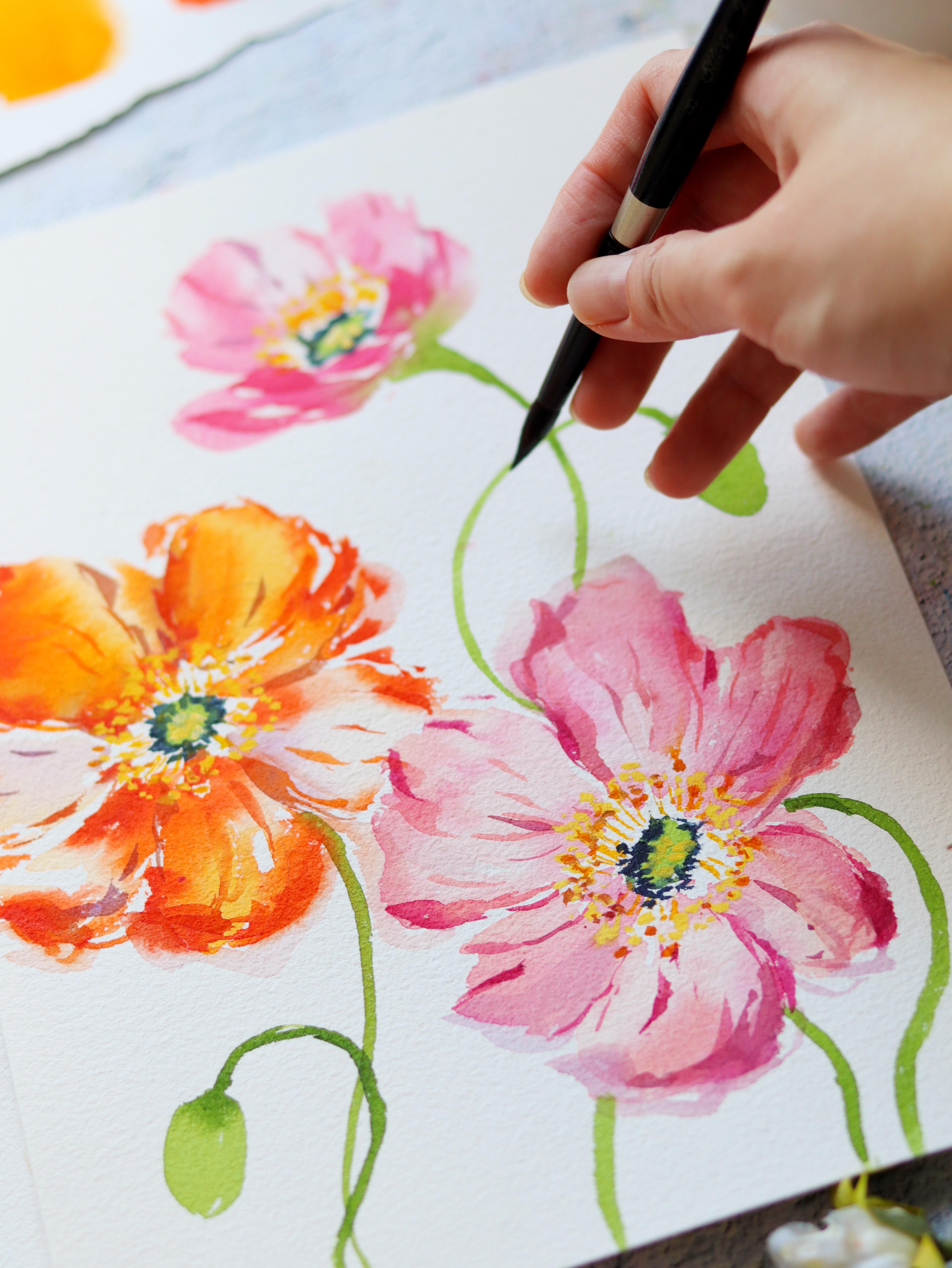
makes the flower look alive. I'm going to grab vermillion. This is a red orange color. Just using the tip of the brush, we're going to add some veins. I usually start in between the petals and also towards
the tips of the petals. If your brush is too wet, don't be scared to
dab your brush in a tissue paper because
at this point, you do want more control
over your brush. For these details,
I'm also using a size four round brush to
create some thinner lines. You can see that
I'm trying to add some wiggly lines towards
the tips of the petals. This is a way to separate the petals by adding some lines, and I'm also adding
some broken lines. You can also mix a
very light mixture of permanent violet and add
some veins using that color, it's going to give a very interesting effect
on the flower. It's a beautiful shadow
effect at this point. I think it's also important to look at your reference photo and observe the shadows or
the creases in the petals. Okay, let's just
look at this flower. This is a white flower, you can see those darker lines. Even if I'm painting
an orange flower, I can still use this
as a reference. Just paint the details that
catches your attention. I don't want you to
feel the pressure of really copying everything
from the reference photo. It's just a guide for you so
that you have a direction for painting from time to time. Try to look at your
painting from afar so that you can see whether
the lines are enough. Because it's so easy to
accidentally overdo the details. I think I just have so much fun adding all of these lines. Right here. At the bottom
part of this flower, there's a little bit of shadow. And we're going to
try and mimic that. Actually, I'm going
to do some wavy lines towards the tips of the petal, so it looks like it's
slightly folded. Okay, let's move on to this
pink flower at an angle. I'm going to use this
again as my reference. We're just going to mix the
same brilliant pink and permanent rose color if you're
using a different color, just about two shades
darker, the base color. Okay, So you can
see that there are some shadows towards the
right side of this flower. It means that the
light source is probably on the left side. Again, we start painting the veins in between the
petals and towards the tips. It's almost like I'm
doing an outline first. Before filling in the
petal with more details, let's paint a thicker
line right here, so that we'll give an impression that this part is a
little bit folded. Okay, We have this
permanent violet mixture and I also mix it with
a little bit of pink. And I'm going to add
that for the shadows, you can see the
difference that it makes. I feel like it looks
more three D by adding that permanent
violet color. Some people also like using the color blue for the shadows. I feel like it's
also a preference to give this flower
more contrast. We need a darker pink color. I'm going to use that to add
some really tiny strokes. Sometimes they're just
thoughts and it's going to make a huge difference for the overall look
of this flower. So we're adding that
darker pink towards the right side where
the shorter petals are, because that's where
the shadows will be. Okay, as I look at
this from afar, it needs more contrast. We can grab a little bit
of that permanent violet and just mix it with the pink and add it in
between the petals. As you can see, there are so
many layers on this flower. We're not using just
one or two colors. We're using about
three to four layers to make it stand out. Just have to be a
little bit more patient with this
style of painting. All right, we're done
with two flowers. Now let's move on to
the small flower. I'm going to use permanent rose, and we want it to be a
more pigmented mixture. Going to paint some strokes at the bottom part then
don't worry about it. We can start fading it
away if it looks too bold. Next, let's paint some really
thin veins on the petals. So I'm using really just the
tip of the brush to do this. That's why it's important to use a small round brush to
create these details. So because this is
a small flower, we're not going to add a lot of details because it will
look too cluttered. Next, I'm going to grab
my permanent violet. This one was already mixed with the base color of
this white flower. We're just going to paint some
thin brush strokes just to create an illusion of the folds and creases
of the petals. We can also do this to
separate some of the petals. Just look at this
reference photo, you can see some dark lines. That's what we are trying
to translate on the paper, even if it's not a
white flower like this orange one
that's also facing. At the back. You can also use
that as a reference photo. You can see the
shadows in the petals. Okay, Again, just use the tip
of your brush and lightly glide on the paper to create
these beautiful strokes. Try to vary the pressure in each stroke so that some are
thinner, some are thicker. Okay. So this is
looking really good. Now, I'm going to
teach you how to paint the center or the stamen
of the Icelandic poppy. We need some gas. Next, I'm going to grab some yellow watercolor
paint and this is going to create a nice
opaque yellow mixture. You need about 1212, maybe 2.5 water color paint. Just mix it like this
until you create a nice yellow color
that you like. Another option is actually
to just get a yellow gosh. If you have a yellow gosh, just use that straight
from the tube. But right now, I just prefer using a white
gosh and adding some yellow so that I don't need to get a new color of gosh tube. Okay, so just put
some small dots all around and just the
tip of the brush, make sure that you vary the shape or the
size of the dots, it will make it look
more interesting. You can also paint
some thin lines and you'll see this detail
in an Icelandic poppy. Okay. Now, let's add
this on this flower. I'm going to add this on just the upper part of the flower since
it is at an angle. Another round brush
that I like to use for these details is this ultra
round designer brush. It's a really nice pointy brush, Sometimes it still looks
a little bit flat. And what I do is I just
grab a different colors. We have here some orange
or burnt sienna color. I'm just going to mix that. We're going to add some
more dots using that color. It's going to give
a three D effect, but of course it is optional. If you want just yellow, you can definitely
use just yellow. You can see in the center, there is a star shape. I am going to add
that to the center of these flowers using
the yellow guash. Just paint some small
petals in the center. Now let's do some of
the finishing touches. I usually like going back with indigo to add more
depth to the flower. Because sometimes as
we add some details, the dark center gets covered up. So I usually like
going back and adding more color because
it's just going to give it more contrast and
just makes it look prettier. All right, so we are done. I hope that you enjoyed doing
these practice flowers. Now I think you are ready
to paint your projects. Let's move on to the next video.
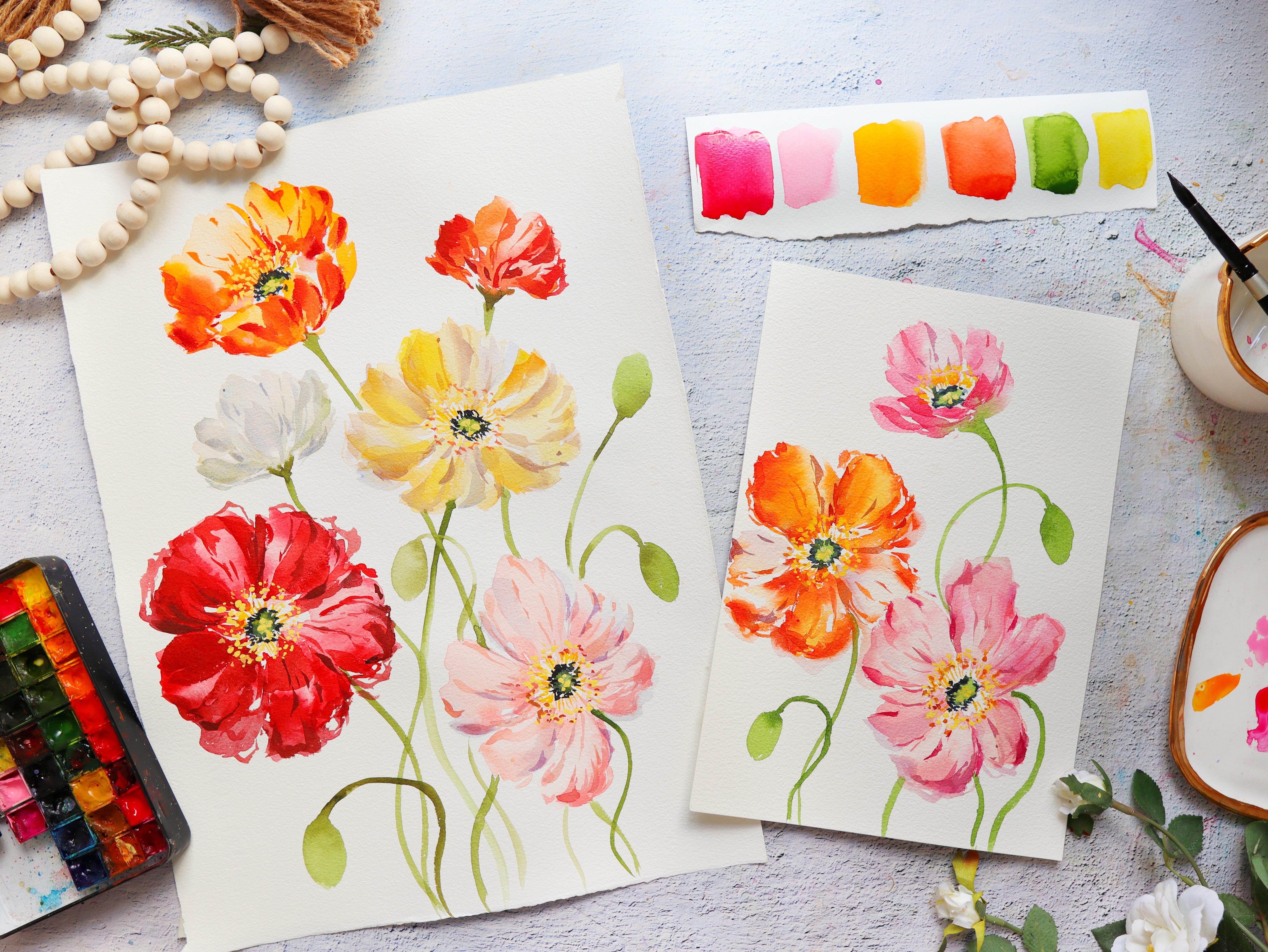
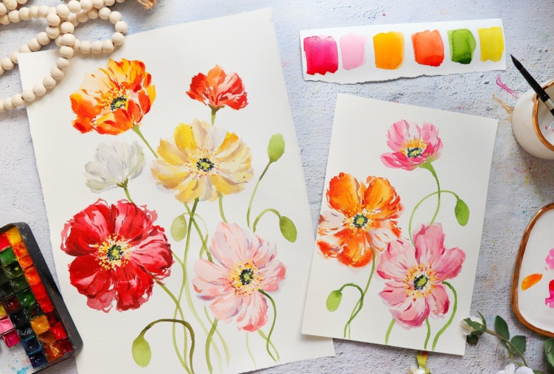
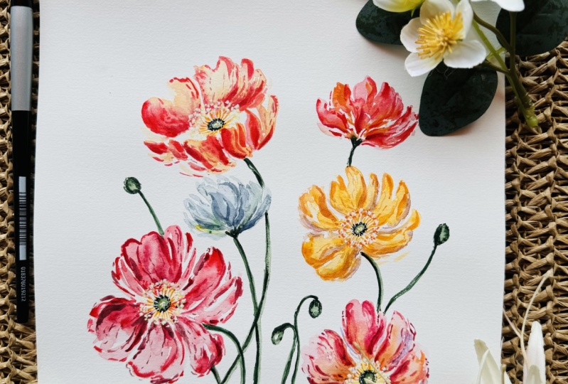
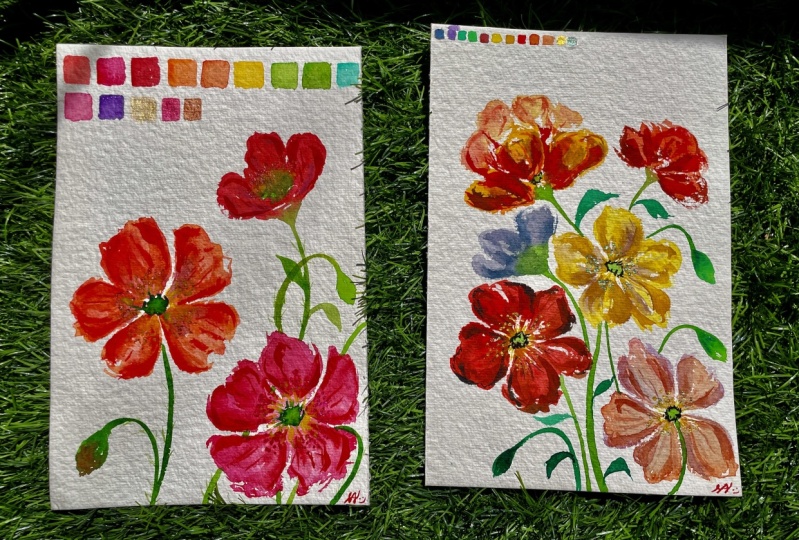
8. Project 1: Vibrant Icelandic Poppies: Now that we are familiar with
painting Icelandic poppies, let's now paint a
floral composition that forms a triangle
just like this. So these are the three
points of the triangle. Of course, we want to vary the angles of the flower so that it looks
more interesting. You have a side
angle flower front facing 1.1 that's
about to bloom. We also added some small buds that will fill in the
small white spaces. This project will be painted on a seven
by ten inch paper. Later on, we're actually going
to paint a bigger piece. But I wanted to
have the option for you guys to paint small
and also to paint big. For a reference photo, I'm using this book called
the Flower Color Guide, and I saw this
beautiful composition that we can use as inspiration. All right, On the bottom right, let's do a side angle
Icelandic poppy. I just drew the center
using a pencil. And you can also
draw the outline of the flower if it's
easier for you. Usually when I draw
using a pencil, I try to draw lightly because once you
paint on top of it, it's not going to erase anymore. So make sure that
you draw lightly. Okay. Now I'm going to add a few petals for the
flower at the top. For the first flower, I want it to be a dainty pink color. I'm going to use brilliant
pink with permanent rose. But of course, you can start
with other colors as well. If you have only
permanent roast, then you can use that as well. Just to add some variety, I'm using yellow ochre, and mixing it into the pink mixture to create
a peachy pink color. Using a very diluted mixture, it means it has more water. I'm going to start at the center and then slowly work my way up using the side of the brush to create
that petal stroke. Just make sure that you
have some white spaces in between your strokes. You can see that these
petals that we're doing now, it's not a really dark pink
color, it's very light. That's because we're going
to add some color later on. You can also push, you
use the tip of the brush, create that jagged edge
like what I'm doing here. You can also use the tip
of the brush to create some tiny strokes that will
make it look more organic. I also like to wiggle my strokes just to create
that beautiful petal. Because this is at an angle, the petals on the
left side are longer. On the right side, it's
going to be shorter. Just like in the
reference photo, that is going to suggest that
this flower is at an angle. You'll notice that I also
left the center open. It means I'm not painting
anything on it yet. Now let's grab a more
pigmented mixture of brilliant pink
and permanent rose. I'm just adding some more
color in between the petals. We're adding this color while this base flower is still wet. You can see that the colors are blending
seamlessly with each other. This is called a wet
on wet technique. Let's also add a bit more
color near the center. I'm usually adding
a darker color near where the shadows are doing. This technique also gives this flower a little
bit more depth. Because we're
changing the values, you can see that some areas
are lighter, some are darker. All right, let's move on
to the second flower. I'm going to use yellow, orange because I just
like this pop of color. And we're going to use this
for the front facing flower. Okay? So I'm just going to erase the center of the second flower. And that's because I painted
the first flower too big. So we have to adjust. Sometimes you really have to troubleshoot as you paint along. I need to move the orange
flower a little bit higher. Okay. Again, I'm
using the side of the brush to create
some broad strokes. You can actually
use just water to paint the petals and then
just drop in some color. That's something that
I would personally do. But for this video, I decided to add some color in my brush so that you can
see what I am painting. All right, so now
I'm trying to create some really wispy strokes and I'm holding my brush towards
the end of the handle. You really want
your brush to move up and down and you
want it to be quite wet so that it's easier to
move on a cold pressed paper. All right? I'm pretty
happy with the shape. We have some nice jagged edges
and also some full petals. Now I'm going to add
some darker orange. You can use vermilion or use the same
yellow orange color, but a little bit more concentrated than the
previous base that you used. This is also going to be pretty if you don't touch
all the petals. So you can see
some of the petals are still a little
bit light in color. I'm just adding in pops of orange and the
tips of the petals. You can use the tip
of your brush just to create some nice small strokes. Then this is optional. But you can add some shadows
using permanent violet. Just make sure that you use a very diluted mixture
to add more water. Sometimes I add the color of the flower to the violet color, and that's going to
give us a nice shadow. So try to add this in between the petals or towards the tips. All right, so I think
we need more contrast. I'm going to grab
Vermilion and just add some darker
red, orange areas. Again, you can look at the
reference photos and look where the darker areas
of the flower is. Don't worry, it
really takes practice for you to be able to develop this instinct of knowing where to put the darker
or lighter areas. All right, so to better
visualize what we're painting, I'm going to add some stems. And this is just sap green with a little
bit of burnt umber. So the stems of the
Icelandic poppies are quite stiff but they're also curved so they look
like they're dancing. And it's really nice to include in a floral composition
because there's movement. So now I'm just
painting another stem, where I will be attaching a small flower that's
about to bloom. So try to follow your instinct, because sometimes it's easier to paint the flower
first and then attach to the stem later
on, or vice versa. Okay, let's start painting.
That's about to bloom. I'm just painting some sea
strokes that will form a cup. So this is going to
be the base next. Let's grab a lighter
color and just create some fluffy
petals above it. All right? The petals in
front are petals that are folded because
it's at an angle. I know that painting
flowers like this, it's a little bit
challenging because we don't know how to
paint the front petals, but sometimes just
paint some C strokes and it will look like
petals that's folded. So you don't really have to copy the exact details of
a reference photo, you can definitely
translate it into your own artistic
interpretation. All right, so now I'm just
adding some small buds. This is just to fill in
some odd spaces where I can't really paint a flower anymore because it's
going to look too full. Instead, we're painting
some small buds. Okay, These big flowers
are already dry, except for the small
one at the top. I think we can start
painting the center. I'm just using for this one, I'm going to paint
an oval shaped because it's a flower
that is at an angle. For the front facing one, we're going to paint a circle. For this flower.
We're just going to paint a small oval shape. All right, now let's
add some contrast. I'm going to grab indigo
and you can dab it in a tissue paper to make sure that the paint is
quite thick and dry. That's because you don't want this color to spread
all over the place. You want it to be more
controlled on a wet surface. Okay, I think we did a good job. It's not spreading too much. Now, let's grab
some yellow paint. Any yellow paint is okay. And I'm just going to paint
some thin lines all around the center because the base
petals are already dry. You can see that my strokes
are quite sharp and clear, but if you paint this
detail on wet petals, it will mix with the wet petals, so you will see some bleeding. This small flower has
some damp petals. You can see the
yellow is spreading a little bit on the wet petals. That also creates a
beautiful effect. All right, I think it's
time to add some details. We'll start with
this pink flower. I'm using the same mixture of permanent rose and
brilliant pink. You might want to just mix about two shades darker
than the base color. I'm just using the tip of
the brush and creating some really wispy
strokes, thin veins. You can start in
between the petals and also near the tips
of the petals. I think I needed to be
a little bit darker. I'm just grabbing some
crimson lake and mixing it with the pink
mixture on my palette. And you can see now we
have a darker color. Just use the tip of
the brush and lightly glide it on the paper,
changing the pressure. You can see we have some
nice wispy strokes there. Also, you can use some really
diluted permanent violet. We're going to use that to add some shadow effect
on the petals. You'll see what I mean
in a while. All right? You see that very subtle effect, but it really makes
a huge difference. I'm adding it right here at the bottom part
because I want to give the illusion that this petal is slightly folded because
it's at an angle. I also like painting
some broken lines starting from the tip
going to the center. So you can see it's
not one straight line. So sometimes I'm just
painting small dots. Okay, so I think this
is good for now. We can come back to it later on. Let's move on to
this orange flower. I'm using Vermilion. It's just a nice
red orange color. And again, I'm
starting in between the petals and also
towards the tips. You can definitely
use other colors. Icelandic poppies are
really beautiful. They come in different colors. They are usually very vibrant. You can also choose different colors right
here at the bottom, just adding more
strokes or darker areas to suggest that some petals
are slightly folded. It's nice to look at
your reference photo from time to time to be able to copy some of the shadows
increases in the petals. Now let me just get
a little bit of that permanent violet and
mix it with my orange. Let's add some darker veins. Okay, So I really love to experiment with
the second layer. And I make sure that I have roughly about two to
three colors to add to the second layer so that
it looks more interesting. All right, as I'm
painting the orange, I suddenly noticed this
pink flower again, and it just feels like
it needs more contrast. I'm just grabbing
this pink mixture with a little bit of that
permanent violet in my palette, and I'm adding
these darker spots. I'm trying to focus on
this part right here, making sure I add
some dark strokes. That's going to give it
a little bit more depth. We want this flower to look
like it's a loose flower, but it also has more details. Now let's grab some
permanent rose. I'm just going to
paint some strokes at the bottom part just to suggest that the petals are folded. Now we can add some
veins at the top just to make it look
more interesting. Make sure that your
strokes are broken lines, it's not one straight line. Next, let's mix yellow
with white gah. This is a really
beautiful effect on Icelandic poppies
and this is one of the things that I'm really
excited for you to try. The mixture is
roughly about 50, 50, 50% and 50% water color. We're just going
to put some small right there in the center. If you want it to
be more intense, you can also use
a regular yellow. But I currently don't have
a yellow go wash with me. I decided to improvise by using my white gosh and
just adding water color. Now if you use just
yellow water color, it's not going to pop up in the same way
that this one does. Because water color, it's
a little bit translucent. Even if you get a
really opaque mixture, at least with white gosh, you are sure that it's
going to turn out opaque, it's going to pop up. You can even play around
with a second color. Sometimes I add burnt
sienna or a deeper yellow. Just like what I'm doing here, you can see that beautiful
two toned effect. This is a technique that you
can also apply to painting other flowers with like a similar center,
such as anemones. Okay, now I'm
describing some indigo. I usually add a dlarker contrast towards the end of the painting. These are small
finishing touches that will make a huge
impact on your painting. Sometimes we lose
some of the details, we have to go in and
add those details back. All right, so if you
look at the center, there's this detail that looks like a small flower
from the top. So we're just going to paint some small petals in the center. All right, so we're almost done. I'm just going to go back
into some of the flowers and grab this very diluted,
permanent violet color. Sometimes I like adding this just beyond the
petals that we painted. It's nice because
it's going to look like a really light shadow. Just try to observe the
difference that it makes. You can see this from afar. What I'm doing now is I'm just trying to add more contrast, create some deeper colors that's going to make
it look prettier. Okay, so I'm just going to put some small strokes right here, just to separate the two
flowers from each other and make it look like the orange flower is
behind the pink flower. Congratulations for
finishing your project. I know you're going to be
so proud of your work. And now let's move on to a bigger piece in
the next video.
9. Creating a Thumbnail Sketch: For this project,
we are going to explore painting on a
larger sheet of paper. But I know that it can be
scary and overwhelming. Don't worry, I will share with you a way to overcome that. We will talk about that
in a little while. Now, I'm just showing you
some of the reference. I don't really have an exact floral composition
that I will follow. I'm just going to put together different flowers from different photos
that speaks to me. All right, let's go back
to the thumbnail sketch. So I have here my
ordinary sketch book. A thumbnail sketch is a small quick drawing that can help you plan a larger painting. It gives you a visual
representation of the main elements
of the composition. It's also usually done
with minimal details. Right here, I just drew a rectangle that
represents the paper. And then now I'm going to
draw this side facing flower. So what I want for this
painting is to put together different Icelandic poppies that are facing in
different directions. Some are going to
be front facing, some are side facing. I'm also going to
put some small buds. I realize that creating
a thumbnail sketch reduces the pressure of
creating that final piece. I think it's because we can see the output right away
on this small sketch. Of course, it doesn't mean that we're going to follow
all the details here. This is just like a guide for us when we're painting
for this composition. I want the flowers to be
diagonally across each other. They are of different heights, as you can see in my drawing. That will give it more movement. Especially with
Icelandic poppies, they really look like
they are dancing. For the smaller spaces, I'm going to put some small buds or small flowers that
are about to bloom. Some people also try to color
their thumbnail sketches, but for this one, I decided not to
color it anymore. Since I already have a certain
color palette in mind. I just wanted to make some
soft colors and bold colors. And you'll see that later
on in our painting. You can definitely create your own thumbnes sketch
for this project. Now let's move on
to the next video as we paint the base
of the flowers.
10. Project 2: Painting Floral Silhouettes: As mentioned in the
previous video, this project is going to be painted on a large
sheet of paper. What I love about painting
on this large sheet of paper is that it has more
space for creativity. Also, you have more space for painting expressive strokes. Don't forget your thumbnail sketch before you start
painting this project. To start, we need a pencil, and we're just going to
put some small thoughts in our paper just as a guide to know where the
flowers are going to be. You can also draw
a cup like what I'm doing here, or a letter U. Just so that you also have an idea of how big the
flower is going to be. O. I'm going to start with
the bottom most flower. This is a flower
that is at an angle, and you can see my reference
photo on the top left. Let's mix brilliant
pink and yellow ochre. I want a peachy pink color
for the color palette. I do want to mix some
bold colors and then add in some really dainty
and pale colored flower. I think it's going to create
a beautiful contrast. I usually start by
painting from the bottom, going up, or from the
center radiating outward. This also helps me visualize
the composition better. Okay, we have a really
light mixture here, and I'm just painting
the top petal. And then moving my
brush up and down. I'm also adding more water in my brush while I'm painting. I'm also trying to look at
the reference photo and just trying to mimic some
of the petals that I see. We really want to
create beautiful, frily and jagged edge petals and we want to make
it look really full. I use the entire belly
of the brush and press it against the paper
to create broad strokes. And at the same time, I try to leave the center open. So I'm not going to paint
anything on it for now. Okay, on the right side, we're just painting
a small, cute petal. Just to add more contrast, we can drop in the
darker mixture in between the petals and on
the tips of the petals, you can also add it
near the center. I have some lavender
color here and you can add this to give some
more shadow on the flower. This is just a nice subtle color as you can see right here. It makes the flower
look even softer. This is one of my
secret mixtures because it instantly lifts the
entire look of the flower. If you don't have lavender, you can still use
permanent violet is make sure that you
dilute it in more water. Okay, I think we're
good with this. And now we can move
on to another flower. This is a front facing flower and I'm going to use the
color permanent red. We want to start with just
a light mixture here. Later on I'm going
to add more red. What we want is just
to really press our brush onto the paper
and move up and down, create that beautiful
full petal. You can also use the tip of the brush to create
some thin strokes. Let's just get some more. If you want to use just
water, that's also fine. But again, right here, I'm adding just a
little bit of color in my brush so that you can
see what I'm painting. Okay, I'm just going to use the side of a brush and
just press it against the paper and also try to wiggle it to create a more
expressive stroke. All right? You can
definitely go back in and fix the shape
of the petals. You can add some thin lines
and add some more color. We can quickly look at
the reference photo and you can see some darker
areas in the petals. What I'm going to do
is I'm going to just grab a darker red or
a more pigmented red. Just drop it in this flower
while it's still wet. The thing with red colors
is that for some reason, they fade a little bit lighter
compared to other colors. You definitely need to add
more pigment in your brush. And also we need to
add a second layer. Okay, right here,
I'm just adding some darker red color towards the tips of the petals and
also in between petals. But also make sure
that you leave some highlights or some
lighter areas in the petals. Now if you want a
more maroon color, you can mix permanent
red and Hooker screen, and you can immediately
see that darker red. And I also love adding different shades of red in
a flower because it just makes it look more
interesting and gives it more dimension just in
case you put too much red. Don't worry. You can grab
a damp brush and just lift the paint and dab
it in a tissue paper, Just like what I'm doing here, you can definitely
troubleshoot while the flower is still wet. Okay. So we are done with two flowers. Let's move on to the third one. And I have here
permanent yellow light with a little bit of
that yellow ochre, so that it's not a really
bright yellow flower. So you can see that the flowers are diagonally
across each other, so it's almost like
a zig zag pattern. I'm going to do this
yellow flower right here and paint the
top petals first. I want to mimic this
flower right here. It's a flower that is a little
bit at an angle as well. Okay, so let's start
again with the top part. I'm just going to
wiggle my brush to create some nice jagged edges. You can just grab a little bit more yellow
if you need some, and then add some
water to dilute it. Okay, let's change that angle
so you can see it better. I'm making sure I
have some spaces in between my petals so that
it doesn't look too chunky. As I'm painting this,
you can see that the petals have
different values. So you can see some
have a bit more color, some are slightly lighter. Just feel free to move
around your brush. Create these beautiful strokes. The petals doesn't have
to be in a uniform shape. They can be a bit
longer or shorter. Now I'm grabbing some
permanent violet and I'm mixing it a little bit with this yellow to create
some nice shadow. You can add this in between the petals or add it
towards the tips, or even near the center. I really like doing
this technique because it just creates, um, more dimension
for the flower. I think it looks
interesting compared to painting just a
single color flower. All right, we can grab
a little bit more yellow from our palette and also drop that in on this flower
while it's still wet. Okay, I think we're done
with that yellow flower. I'm going to move on
to another big flower. This is going to be
the last one we need, a yellow, orange color. Okay. We are going to
paint a flower that is a little bit folded so there's a petal
right here in front. Let's start with that
front petal first. I'm just going to use
the side of my brush, create one petal here. Instead of painting
one long petal, we're going to separate it into two or three petals that
are bunched up together. I'm also going to try and
wiggle my brush so that we have an irregular shape
here that will look nicer. Now let me rinse my brush, grab some more water, and just paint the top petals. You can see that it's
a really light color. That's because when you're
painting this flower, the front tends to be a bit
and the petals at the back. Okay, again, I'm trying
to split the petals. Instead of one long stroke, we're creating different petals just to make it look
more interesting. Now I'm going to
close up the sides. Just paint some strokes there. We can also grab some more paint just to add some
color to this flower. Now let's grab some Vermilion
and add some contrast. I'm adding this in between the petals and
it's going to look even better with adding
different colors. Also, it's nice to
leave some spaces a little bit whiter
compared to the others. You can definitely try
and blot out some areas. Okay, it's looking really good. Now we can add a
more muted flower. I'm going to mix up my white. And I love doing this by mixing ultramarine blue
and burnt umber. As you can see, it takes a
while to get the right color. I go back and forth to adding
more blue, more brown, and adding more water until I get the right gray
color that I want. This is going to be a flower
that is facing at the back. There is no center
for this flower. I'm painting just a couple
of petals bunched up together and they form a cup. I'm also leaving some white
spaces in between my strokes. You can see I'm delicately painting the strokes by holding the brush roughly in the middle or towards
the end of the brush. If you want a pop of color, you can grab a little bit of greenish yellow like
what I added here. So you can add it in different
parts of the flower, or you can add a darker gray
color for more contrast. Let's now move on
to the last flower. Sometimes as you paint
a flower composition, you feel a little bit lost. That's what I felt here. What I did was I just grab my pencil and I
tried to draw a stem first and just paint a little guide right there as to where the flower will be, just so I can easily visualize how big or how small
the flower will be. Okay, so I'm just using
my brush here to push out the edges and create the
jagged edge for the petals. I'm using this red orange
color called vermilion. You'll notice in this
entire composition, it's like a play between bold colors and
really lighter ones. Right here, I want
a bolder color since I already have that
white flower on the left side. Here's the top view. Right now I'm just
mixing up the green. It's sap green with
burnt umbers or adding a little bit of brown to give
that earthy green color. And we are just going
to add some stems. So I'm just going to start with these flowers because they
are still a little bit wet. And I want the green
to blend in with the wet petals so you can
do some dancing stems. Right here you can
see I'm painting like an S curve and it's just really so pretty
when they're all in one floral compositions. Right here, I have a really dark or pigmented
mixture in my brush. I just wash my brush in
the water jar to get that lighter green color towards the bottom
part of the stem. That's an effect that I
usually do just to make it look more interesting or so that the stem won't
look that flat. Now we're adding
a stem that goes behind this yellow
and pink flower. Now when adding stems for a
larger composition like this, I find it easier to start
at the bottom flower first, and then I work my way up or from one side
to another side. All right, so now we
have our base flowers. And now let's move on to
the next video where we will add more details
and give it more depth.
11. Project 2: Adding More Depth: Welcome to part
two of this video. Right here. We're just
going to add the center. I'm missing sap green. For the pink flower, we need an oval shape
since it is at an angle. For the red flower, it's going to be a circle
because it's a facing front. Now for the yellow,
it's also an oval. And then for this orange flow, it's going to be
like a semicircle. Now let's just grab
some yellow and add some thin stems all
around the center. You can use a permanent yellow
light or permanent yellow, deep, or any yellow
color is okay. The flowers here
are already dry. You can see as I'm adding
these yellow thin strokes, it's not blending
with the petals. But if you wish to add
these details while the petals are still
wet, that's also fine. All right, so now
let's add some indigo. And I'm going to
add this towards the outline of the
circle that we painted. And I add this because I want more contrast in the center
of the Icelandic poppy. Just make sure that the
brush isn't too wet so that it doesn't spread
too much on the paper. That's why I did blot my brush in a tissue
paper a while ago. But if you overdid that indigo, you can definitely blot it out, just like what I'm doing here. All right, so now
let's just rinse our brush and move
on to the next step. This flower is already dry and it's time to
add some details. I'm using the same mixture of brilliant pink
with yellow ochre, and we can add a little bit of brown as well like burnt sienna. We're going to add the
veins and you can add it first in between the petals
and also towards the tips. You can see that I'm
using a smaller brush. This is a size four round brush. It makes it easier to
add these tiny details. Okay, let's add a little bit of permanent rose just to
make it slightly darker. I'm going to add more shadow here by painting
some wobbly strokes. And that's because
I want this to have an effect that it's
slightly folded. We're just going to paint a few thin lines attaching
to that bottom part. And then we're going
to add a little bit more over here
in this petal. And when you look at
the reference photo, you will notice that there's
a shadow in that area. All right, so here is a more
close up shot so that you can really observe how
I paint these veins. I do like adding it from the tip of the petal
going in to the center, but it's always
like a broken line. Okay, you can see
the strokes here are a little bit darker
and that's because I added some permanent
violet to my mixture. This is going to add
that extra character to the Icelandic poppy. I love adding about
two or three colors for the second layer
of this flower. The mixture you see
here is lavender. Now again, this is just a beautiful color that you can paint as a second layer, or some people call it glazing. And I love adding it towards
the outer part of the petal. Here it is from afar. And you can see that it's just
a subtle color from afar, but it really makes
a huge difference. You can also apply this
technique to other flowers. Just make sure that
the mixture is really diluted in a lot of
water because you don't want like chunks of violet or purple in your flower. All right, so this looks good. Let's move on to the red flower. For the red flower,
you can see it lightened up quite a bit. I don't want to add in
the red color again. I'm using a size
eight round brush. So we're going to paint
bigger or bolder strokes. The color here is permanent red. Okay, let's try to paint
on that darker petal, but as I paint this, it looks just too light. I'm going to add a little bit of Hooker screen to
make it more maroon. Just a darker red
that looks better. And you can see that
beautiful contrast. Just leave some white spaces
in between your strokes. And don't paint straight
or one single line. You want it to be broken
lines and try to vary the pressure in your
stroke so that you can get thin and thick stroke. Okay? You can also look
at the reference photo where it's darker so
you can follow that. Okay, let me show you
a reference photo. You can see some of the parts of this flower a
little bit darker. And that's the shadows
that we want to mimic or just interpret
on the paper. Okay. That's a really
bold stroke right there. You can see it's quite
dark, but that's okay. That's where the shadow is. Now I'm going to move on to a different petal and
add some more veins. All right? So I feel like
we need a darker color. I'm gonna grab Hooker's
screen and mix it with red. So that's a really
dark red color. It's almost like maroon. And you can use this to
add some more contrast. And just to separate
some petals. Since this flower has
a bold red color, I also want to add just
bolder strokes as well. You can try to extend some areas by slightly wiggling your brush, like what I'm doing here, to create a nice jagged edge, you can definitely come back and just fix the
shape of the flower. I decided to have a
little bit of fun for this Icelandic poppy. I'm going to grab some
paint and just create some outline and it's going to look very
pretty and unique. I really suggest that
you try to experiment and just have fun and paint what feels
right at the moment. Next, I have my
yellow paint here. I'm going to add some details
on this pale yellow flower. I want to add a little bit of that violet just to
create a shadow color. I'm going to use that
to add the veins. I'm going to use this to
separate some of the petals. Just make sure that you
add just little bits of this color so that it's not overpowering
the yellow base. Okay, we're losing
a little bit of detail at the bottom
part of this flower, I'm going to grab some
darker yellow and just paint some stroke from the tip of the petal going in to the center. Okay, that's going to give
it more form for the petals. Now I just grab a
little bit more of that permanent violet and I'm just going to add some
darker areas again. We have my magical lavender
color and I'm going to just add a few strokes in
different areas of this flower. Okay, so for this orange flower, let's grab 1 million. So this is a more
pigmented mixture because I want some
nice dark lines. I'm just going to
separate some of the petals and add
some small veins. Right? Because this
petal is facing us, it's going to be darker. I'm going to just add
more color in front just to separate it from the back petal because
this is at an angle. All right. You can also
see a little bit of shadow near the
center of this flow. We can add some more orange
color near that area. Okay, so the lines here
a little bit harsh. And I'm going to rinse
my brush and fade them away to make
them look softer. Not to give it an
extra punch of color, I will grab permanent red just to add in
between the creases. So this is a nice way to give more contrast
to the flower. Just grab an even darker color. This flower is already dry. Now let's add a second
layer and I'm going to grab the same mixture of ultramarine blue
and Brent number. But another color that
you can use is indigo. We want this to be just
about two shades darker, but this is a bit dark. I'm going to ase my brush and just try to fade that color. I'm just going to
separate the petals, glide onto the paper to create some nice strokes that will look like they are layers of petals. So you'll notice that I'm
painting a broken line. And we can also try to fade
it away if it looks too dark. Another color I love
to add is green. So you can use greenish yellow just to give
it a pop of color. And you can definitely adjust the shape of this
flower as well. All right, so we're
onto the last flower. I'm going to use Vermilion. When you actually looked
at this from afar, it looks very pretty already. I love that some parts
base are darker, some has just white in it
and it looks really nice. But I think we can make it look prettier
with a second layer. I'm just going to
add some small veins just to separate some petals. And here is a more
close up view, so you can see
what I'm painting. You can observe that it's really just the tip of my brush here that's moving to create
those nice wispy strokes. That is something
that you can practice beforehand so that you can understand how
your brush works. It's almost like you're
dancing with your brush. You're using just the
tip of the brush, creating these wiggly lines. Now you can grab a darker color. You can add some violet
to your orange mixture. And you can see the huge
difference it makes when you add about two shades of oranges
in your second layer. Okay, this is what it looks
like from the top right. Now, I'm just going to
add some small buds that will fill in some
of the spaces here. And I'm going to start
with the stem first, create some S curves. When you're doing a big
composition like this, you do want to vary the
sizes of the elements. Some flowers are smaller,
some are bigger. You can see that it's also facing in
different directions that will make it look
more interesting. The buds are quite easy to paint because you're
just going to paint an oval shape while
it's still wet. You can just put some
darker green color towards the base part just to
give it more contrast. Leaving some white spaces
is also important. I'm not going to
add too many buds in all the white spaces left because we still want
the flowers to pop up. We don't want too
many details here. Let's now move on
to the yellow dots. I'm going to use and add a
little bit of that watercolor. You can do a 50, 50 mixture if you wish, or a 60, 40 proportion. It depends on how thick you
want the mixture to be. Just in general. I do
want the mixture to be creamy and I want
it to be opaque. The reason is that I want
the center to stand out, aside from the petals
of the Icelandic poppy. I think the stamen really
stands out as well. So we want to highlight that. The reason why I also
wanted to add a dark petal near the center is because we're going to
add these yellow details. And they will pop up if the
background is quite dark. You can use water color as well, but if you use color, it's not going to that much. It might just blend
in with the petals. But if you don't have go wash, you can just poster pain
that can work out as well. Try to also vary the dots
are bigger, are smaller. That will make it look
more interesting. With a smaller brush, I'm
going to go back in and just add those tiny
strokes right there. This is completely optional, but I feel like it faded a little bit as I
painted the petals. So I'm just adding it back now. I'm going to grab a
little bit of brown, or you can use orange
and just add some. Do. This will give the
center more depth. Because you have two colors, we can go back in with some more indigo or
just a dark color. You can also use black. I'm adding it back in
the center just to make it look more intense and
just make it up even more. It's just all about the
small details and just going back into some areas of the flowers to make
it look prettier. With that yellow colored gage, we are going to paint a
few strokes in the center, just like what we see
in the reference photo. It's time for the
finishing touches. You can try to take a photo of your painting just to
know whether you can add some more details
or if you need to stop taking a look at your
painting from your phone, gives you a different
perspective. Okay, so I'm just going to add a little bit more contrast
on some of the flowers. This is just red with
some hookers, green. I want a really dark
red color and you can see that nice dark strokes
will make a huge difference. But of course, we
have to be mindful. We don't want to
overdo this because it will look very crowded
and quite messy. Try to add these details little by little so you can control it. I'm going to add
some darker areas towards the tips of some of the petals just to suggest that it is a
little bit folded. I'm using a little bit of this permanent violet mixture
to add some contrast. Of course, you can
always go back in and fade away some of the
strokes that you don't like. All right, so now we are done. Congratulations for
finishing this project. I know it can be overwhelming to paint on a large sheet of paper, but you've done really great. I hope that this
project gave you confidence to
continue painting on larger sheets of
paper so that you can practice your
creativity even more. All right, now let's move on to the next video as I
share my final thoughts.
12. Let's Wrap Up: As you wrap up the class, I just want to thank you
for watching this class. To sum up what we have learned, we covered sketching the flower outlines from reference photos, mastered brush work
for Icelandic puppies, and practiced adding depth
with shadows and details. Also, you gain insights into composition for
larger paintings. For the class project, you will be creating your
own floral composition. Using Icelandic poppies can
be just a cluster of poppies. Or you can paint a beautiful floral
arrangement using Icelandic poppies as the
focal flower of the bouquet. I look forward to
seeing your projects in the project gallery
section of the class. Simply take a photo
and upload it there under their Projects
and resources tab. Hit Create Project
to share your work. I'm excited to offer feedback
and words of encouragement. Feel free to tag me on Instagram using this hashtag
so I can see your work. Leaving a class
review would really mean a lot to me and
it will also help others discover how this class help you in your
watercolor journey. You may check out my
other floral classes on Skillshare for
more inspiration. Don't forget to hit
the follow button to be notified whenever
there's a new update, a new class, or a new giveaway. So that's it and I will see
you in my next class. Bye.
 Joly Poa, Watercolor Artist