Transcripts
1. Class Introduction: Are you wanting to
get into watercolor, but finding yourself
discouraged? Do you find yourself looking
at your supplies where you'll ruin them or
feeling uninspired? Hi, my name is Madeline, and I'm so glad to welcome you to my skillshare class today. This class is all about getting
started with watercolor, especially if you're just beginning like many
people in 2020, I found myself at home
with my two young kids. I picked up watercolor that year and soon began
painting every day. My daily practice
has soon turned into one of the most fulfilling
parts of my life. Since then, I've had
the privilege of working with brands
such as Windsor, Newton, Paulina,
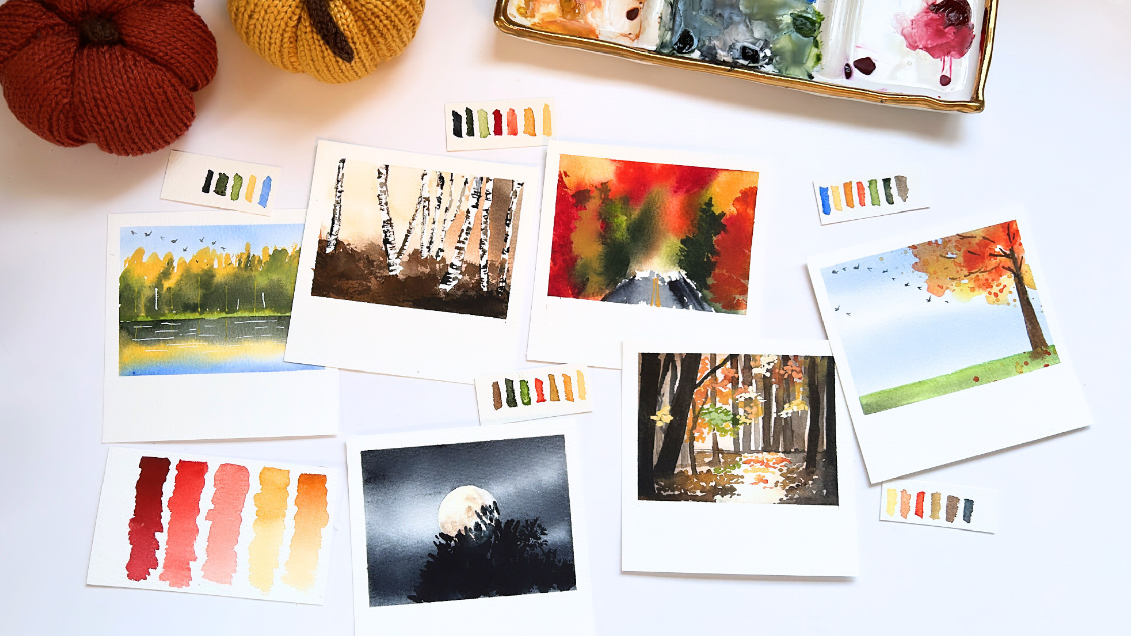
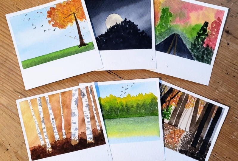
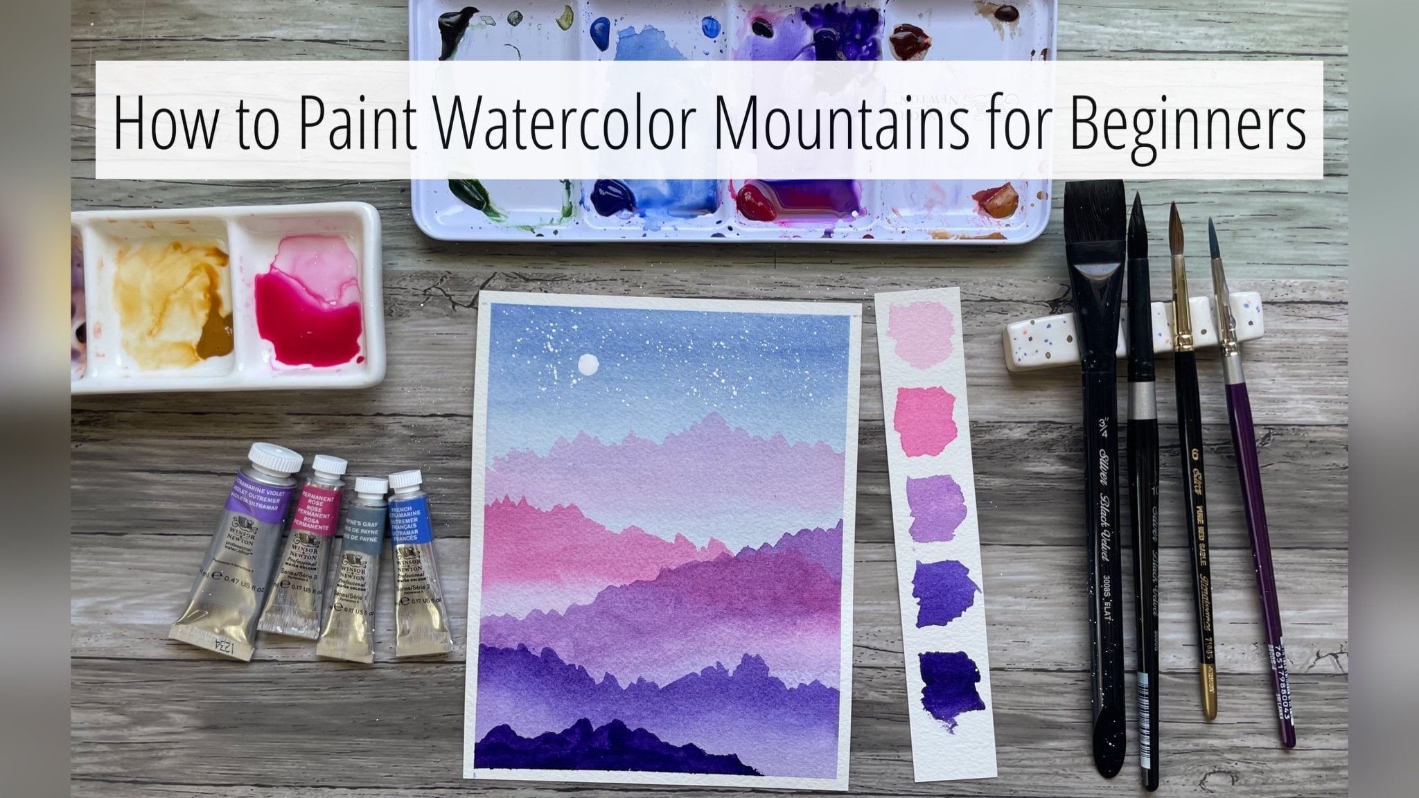
Bright, and Alone. In this class today, we will be painting six
bright miniature landscapes inspired by the beautiful
colors of autumn. I like to paint loose
and expressively. Here are just a few recent skillshare classes
that I've published. To give you a better
idea of my style, I find miniature
landscapes to be less intimidating when we're starting out with watercolor. I will also be sharing
in this class many of my favorite
watercolor techniques that we will learn
and incorporate. This class is designed to be short and sweet if
you're a student that likes to watch a class and paint all the class
projects in one day. But if you prefer to
take things more slowly, this class can be broken
up into a daily practice, with each lesson running
just five to 10 minutes. If that's all the time you
have to paint in a day. Here are all the
different class projects we will be painting together. The first few lessons in
this class will go over all the different supplies and getting set up and
ready to paint. And then we'll paint a
new landscape each day. Every painting is inspired
by a reference photo, which I will share at the
beginning of the lesson. I will also go over how I
simplify some of these photos. For the last polaroid landscape, we will utilize all the
techniques we have learned together and paint a more
detailed photo together. It will be broken
down into two parts. Let's get started. I'll see
you in the next lesson.
2. Supplies: Let's talk about supplies. In this video, we'll go over all the supplies that
I use in this class. We'll start off by
talking about paints. Here are the different tubes of professional watercolor
paint that I use. Naples, yellow yellow ochre
rociena, burnt sienna, autumn orange,
burgundy, red sap, green under green,
black green paints, gray and Van ****. I have a ceramic
palette here that I will be using for mixing colors. I'm going to separate the
paints by yellows and oranges, blues, greens and
grays and reds. If you don't have these
exact colors that I use, you don't necessarily need them. After I finish squeezing out all the paint
onto this palette, I will swatch out
these colors for you. So that you can use your existing paints and match them to the colors
that I will be using. I say this because
I have a tendency to always want exactly
what my teachers using. This is just a friendly reminder that it's okay to
use what you have. Very likely, a lot
of these colors will be similar across brands. One last note on color. While using the colors
that I use will help you to create a similar
painting to mine. Don't be afraid to use the
colors that speak to you and use your artistic voice to paint these in
your own style. I also forgot to mention
that I use Cobot Blue. I've added it as a last swatch. Right here, I will be painting with 100%
cotton watercolor paper. I will talk a little
bit more about the watercolor paper and the
lesson prepping our paper. Now I want to go
over the types of brushes that I will be
using in this class. This is a Motler brush, but it is also similar
to a flat brush. It's basically a big
brush that helps me to wet the surface of my
paper pretty quickly. If you don't have
a Motler brush, an equivalent would be like a
flat brush similar to this. This will also get the job done. Then the next type of brushes are plena bright round brushes. These brushes are
very absorbent, they can hold a lot of
water and a lot of paint. I like them for painting
my backgrounds, that first initial layer, because they just hold
so much paint and water. If you don't have these brushes, a good alternative might be a Princeton Neptune round brush. But any round brush
will get the job done. You might have to use a
few more brush strokes or more paint for a lot
of the background washes. If you don't have these brushes, you could also use a mop brush, anything that is very absorbent. The next brush I want
to talk about are these liner brushes by Da Vinci. The line of brush is Colonio. I really like these
liner brushes for my more fine line details. This is my makeshift tree brush. It is a very old, it's probably my first
brush that I've ever used. It's a Princeton
heritage round two. And what I did was
I've smashed the tip. Don't do this with your
favorite brush or a new brush. But what I've done is
I've smashed the tip. And it allows for really unique brush
strokes and textures. And this is what I refer to
as my makeshift tree brush. This is another brush
by Princeton Heritage. It's called a stroke. Brush size is 18 inch, but it's a very narrow,
long flat brush. But if you don't
have this brush, you don't need to
go out and buy it. You could also use a rigger
brush or a liner brush, but this brush isn't
too terribly priced. I do like it then. These blue brushes
right here are a brand. The brand is Princeton
Select There, I think the most affordable
line of watercolor brushes. And they are very
stiff made out of a synthetic brush hair. I love it for painting birds. This is my bird brush. This is one of the brushes
that I use for masking fluid. When working with masking fluid, I say it in the next lesson, but you just want to
be careful because it can damage the brushes. I always use a more cheap brush when I'm working with
my masking fluid. The next supply I
want to talk about is to help make a circle shape. This is a circle
tool that I have. It creates large and small
circles for me to trace. If you don't have this
or something similar, you can also just use a small washi tape
to trace the circle. For one of our lessons, the one where we
paint a full moon. Another supply that I use often and love
is my hot air tool. This was off of Amazon.
I can't live without it. It makes the waiting in between dry times just
so much more manageable. You don't obviously need this, but it's one of
those tools that I just have and love and
can't recommend more. This is also the brand
of masking fluid. I use and I use this jar of
Dr. ph Martin's whitewash. I also use this silver brush, Limited Renaissance
around six brush as another tree brush and
this set of Posca pens.
3. Techniques: In this class lesson, we are going to be talking about common
watercolor techniques. We will start with
wet on wet technique. Wet on wet technique is one
of the things that makes watercolor stand out from the rest of the
painting mediums. In my opinion, I have wet my
paper with just clear water. I'm taking my watercolor brush and I'm picking up
one single pigment. This technique literally means taking wet paint and
dropping it on wet paper. And you'll see after just painting a few brushes of color, I'm going to get my hot air
tool and dry this layer off. And you'll see that it creates
these soft, smooth edges. There are no hard
lines and it just looks so blurry and beautiful. And we're definitely going to use this technique
in this class. Another great thing
you can do with wet and wet technique
is blend colors. So I've wet this paper again and I'm going
to grab some pink. And while it's still wet, I'm going to pick
up some blue and I'm going to bring
that color upwards. And even as I'm
drying this layer, you can see that the two colors completely
blended into each other. This technique allows for the seamlessly
blending of colors. The next technique
is wet on dry, and this means
paint on dry paper. Unlike wet on wet, wet on dry leaves, hard edges, hard lines, and the paint
strokes are much more defined. A lot of times this
is nice because we want to be able to
see what we're painting, but it doesn't quite have the same soft and blurred feel as the same brush
strokes on wet paper. Wet on dry also allows you
to paint one layer of color on top of another layer of color without worrying about the
colors mixing into each other. I can paint this
blue building on top of the pink brushstrokes
that I painted earlier. And there's no bleeding or
blending of these two colors. The next technique I want to
talk about is masking fluid. Masking fluid is a liquid, gummy substance that you
can paint onto your paper. Either preserve the whiteness of your paper or to preserve whatever it is
that you're covering. I like the brand Pibillo. This is a very liquid
masking fluid. I like to generally use a
stiff and cheap paint brush. To paint the masking fluid with masking fluid can be very
damaging to your paint brushes. Always use a bit of soapy water before dipping your brush into
a bottle of masking fluid. I'm getting my brush nicely coated with the soapy water that I have in this
little tiny dish. And then I'm going to
pick up masking fluid, and I'm going to show you two
examples of what it can do. I'm going to paint over
white paper right here, and then I'm going
to paint over it. And I'm going to show you how it can preserve white paper. I'm also going to paint over
water color to show you how it basically preserves
anything that it is masking. After you've painted
your masking fluid, you either need
to wait for it to dry or dry it with
a hot air tool. After it's completely dry, you can paint over
it with water color. The beauty of masking
fluid is that it allows you to preserve
parts of your paper that you might not
want covered with either dark blue or whatever water color that
you're painting with on top of, it's the best way
to preserve light. Because in watercolor, the absence of water color
is how we portray light. And a masking fluid
is a lot of times used to portray or
preserve light. In this above example, I'm just painting a darker
layer of pink above the original lighter layer
of pink that I masked over. Just to show you that you don't have to preserve
just white space. You can preserve any part of
your paper that you don't want covered with water color. Once everything is
completely dry, I like to use a gum eraser. If you don't have this,
you could just wipe off the masking fluid or rub
it off with your fingers. This just makes it a little bit cleaner and
easier to remove. And with that, we have what was underneath
the masking fluid. And I just think
this is a really, really cool technique
for watercolor. The last technique
that I want to go over is painting birds. I get questions all the time about how I paint my
watercolor birds. I wanted to share it here. I love this blue Princeton
select size 100 liner brush. You want a synthetic
liner brush? And what that means is a brush that is pretty firm and springy, I always like to
get a dark color, such as pains gray or indigo. And the key is to get a really, really watery mixture
before you start painting. The first type of
bird I want to do is when the wings are facing down, it's just a upside down V
is how I would describe it. For the wings that are going up, I'd like to go
down and then make the very bottom of the V
a little bit chunkier. I'm going to do
upside down V again. And then when I go upwards
for that upward stroke, I really am just
making that body at the center of the V thick so that you get that really
effortlessly looking bird shape. I also like to paint
them in a upward diagonal going towards the upper left hand
corner of the landscape.
4. Prepping the Paper: Let's talk about
preparing our paper. I will be using 100%
cotton watercolor paper by the brand Bau Hong. This is their
student grade line. I will be cutting out paper from this block and cutting
them into smaller pieces. I have my paper cutter
right here and I'm just going to detach the
paper from the block, and then I am going
to cut them up into smaller sizes with my
paper cutter right here. The size of each little tiny
paper will be 4 " by 4 ". This is 10 ". I'm going to cut it at eight, and then again at four. And then I'm going to cut
them again the other way, so that I have four by four in little tiny pieces of paper. Then I'm going to go over how to tape them down
in just a moment. These are the
measurements that I use. You don't need to use the
same measurements as me. You could do three by three, or five by five, whatever size
you feel comfortable with. This is the perfect little, tiny size for me. I find that it's just big enough that I can sort of do what I want
with the water color. But it isn't so big
that I'm like worrying about my paper drying
too quickly on me. This is the size that I recommend you cut your
paper if you're unsure. What I will say is
I do think it's best to have a square shape. I know polaroids are
a specific shape, but I'm going to show
you in the next clip how I tape the paper down to
get that polaroid shape. Here we have our paper. I'm using a 1 " masking tape. And the way that I tape
this little tiny paper off is going to create
that polaroid effect. What I do is tape off
the top, the left, and the right side
like So I just leave a very tiny bit of paper
covered by the masking tape. That's going to be
sort like our outline. I wouldn't tape off too much more since this paper
is pretty small. Then for the last piece
of tape on the bottom, we're basically
going to tape off an uncovered part the width of the border that we used
on the other three sides. So you see that tiny bit
that I have exposed is the same thickness of the
outline on the other side, and this creates the
perfect polaroid shape.
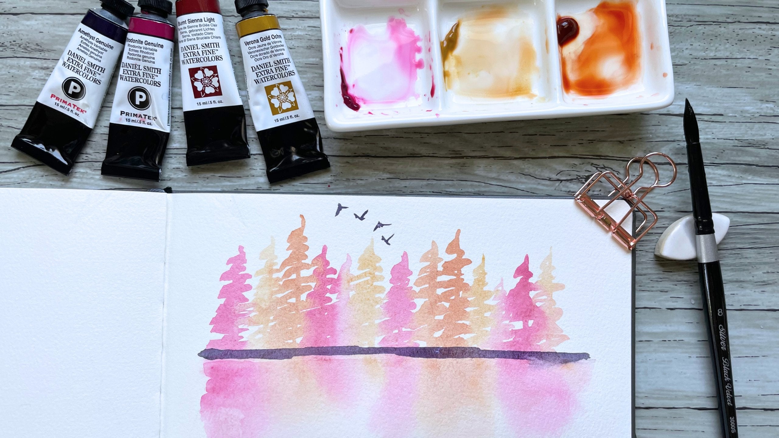
5. Day 1 Fall Park Days: Hi there and welcome to
day one, Fall Park Days. This is the reference
photo that we are going to be
painting from today. I'm going to simplify it just a little bit by taking
out that bench, but we are going to
capture the essence of this photo and
this fall foliage. Judge, my watercolor
paper is taped down and I'm just wetting the
paper with my flat brush. And we are going to
start off with our sky and a light wet on
wet background wash. I'm grabbing my
polina bright round one brush and some
cobalt blue and I'm adding some
blue to the top of our paper as well as
towards the bottom. The reason I'm doing wet
on wet is because it allows this blue to
blur into the white. And I'm not going
to have a hard line after I dry this layer. Now I'm going to
take my hot air tool and I'm going to dry it. Now you can see that the
blue and the white have sort of blurred and there
are no hard lines. Now I'm going to grab a
smaller round zero brush and some sap green. And I'm going to
paint the grass that we see at the bottom
of our landscape. Now I'm going to grab a
touch of undersea green, which is just a darker green. And I'm just going to
add a little bit to give this grass some depth and so that it doesn't
look too flat. Now, I'm going to
grab Van **** Brown and I'm going to paint the tree trunk of the tree
that we have in this photo. Now I'm going to
grab a spray bottle and I'm going to spray just the upper right hand side because I want our foliage, for this tree to really bleed together and we can get that bleeding when the paper
is just a little bit damp. I'm picking up some
naples yellow and I'm just dropping in a
little bit of yellow. Now I'm going to pick up
some yellow ochre and drop a little bit of
that darker yellow. Then now I'm going to pick
up some autumn orange. And I'm just going to add some orange to the
tips of the tree. Because the paper is damp, we get all that yellow and
orange bleeding together. And I just love how that looks. It just looks really
soft and loose. And we're going to
dry that layer. Now, I'm going to grab my 18 stroke brush and I'm going to pick up
some of that Vandy Brown. And I'm just going to paint some small branches to
our tree right here. I'm just going to darken our
tree trunk just a tiny bit. Now I want to add some
loose tree splatters. I'm going to grab
some scratch paper and a watery mixture
of yellow ochre. And I'm just going to pat splatters on our
tree right here. Now I'm going to pick
up a little bit of the orange and
splatter. Some of that, I'm going to add a
little bit more orange. The reference photo has leaves
on the ground right here. So I'm going to grab my
spatter scratch paper again and smaller round zero brush and I'm going to splatter a little bit
of orange so that it looks like we
have some leaves on the ground right there. Now I'm going to
grab my tiny liner and I'm going to pick up a watery mixture of panes gray and we are going to
paint a tiny flock of birds. I like to start in the middle
of our landscape and I usually make a diagonal
line upwards to the left. Now we're going to dry
everything one last time. Once everything is dry, we can peel our
masking tape off. This is day one, fall park days. I hope you enjoyed painting
this really quick and easy, fun fall scene with me. And I hope I'll see you
in the next lesson.
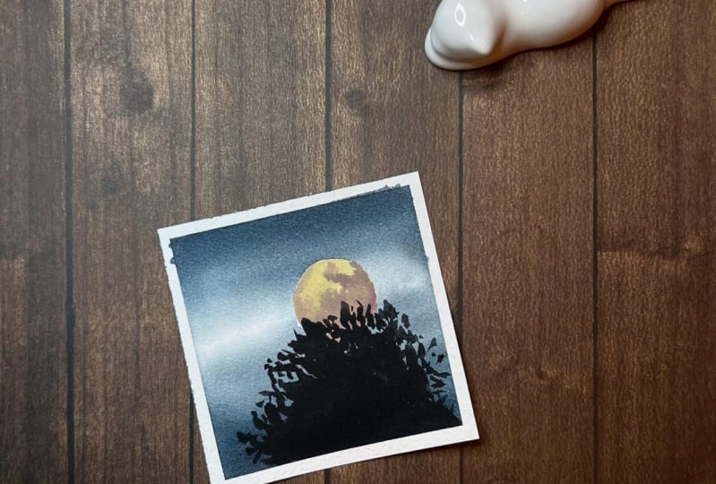
6. Day 2 Festive Full Moons: Welcome back to day two,
Festive Full Moons. This is our reference photo for today. It's pretty simple. We'll be using masking fluid for the moon and
we'll be utilizing wet on wet technique to sort of create a foggy, spooky sky. I'm going to start off
by using this tool. It helps me to draw a circle. I can sort of adjust how
big I want the circle. And I want to use a
pencil and just sort of draw off where I want
the moon for this piece. If you don't have this tool, you could just use a
small roll of Washi tape or any type of circular item
to make that circle for you. I'm going to use
an eraser and just lighten the pencil
sketch just a tiny bit. Since we are going to
be painting a moon, I don't want the pencil
line to be too harsh. Now what I'm going to do is grab some of my masking fluid. And I have a flat brush. Now I have my brush that I
like to use for masking fluid. I'm going to dip it into some soap so that it
doesn't ruin my brush. And I'm going to grab
some masking fluid and we are going to
mask off our moon. Once the moon is
completely covered, we can dry it off
with a hot air tool. Then now I'm going to grab my flat brush and I'm
going to wet my paper. We're going to start
with the sky wash. Using wet on wet technique
to paint the sky in this piece really helps to
create that spooky, foggy sky. I'm going to grab
some paint gray. I'm going to paint the top
and the bottom of our sky. I'm going to be mindful about leaving a little
bit of white space because the paint is going to flow when we dry this layer. Another thing to be mindful
of is that water color always dries a little bit lighter than what it
looks like when it's wet. Keep that in mind to keep
white space and to make sure you use enough water color to create a dark enough sky. Now I'm going to
grab my hot air tool and I'm going to dry
this initial wash. I just love how our sky looks. And I'm now going to rub
off the masking fluid. I'm using a gum eraser, but if you can also
just use your fingers. I'm going to grab some. We wash and we are going to continue with painting Our Moon. I'm going to pull out a dollop and I'm going to put it here on this little tiny
palette and I'm going to grab a little bit
of naples yellow. I'm going to mix that in with our white wash and
we're going to start painting our moon. I'm going to paint the upper half of our moon
with this light cream color. Then I'm going to
grab a little bit of the Van **** Brown mix that in also to get a darker tone so that we can create
some moon texture, I'm gonna grab a little
bit more white just to add a little bit
more lightness to it. Now we're going to
paint the trees that we see in
front of the moon. This is my tree brush. It's a very old Princeton
heritage round two that I've smashed and I'm going
to grab pines gray again. We're going to start painting the trees in front of the moon. I'm going to fully dry off
the moon so that I don't get, I don't want the pains gray
to get blurred at all. I want it to be pretty
crisp because I want tree silhouette to be painting. I'm just filling in
this bottom part, But at the very top of the tree, I'm going to try my
best to create like tree textures and branches that we see highlighted
by the moon. I'm going to dry all the layer, then once everything is dry, we can peel off
our masking tape. I just love this. I love how dramatic and
moody the sky feels. It almost feels like eerie. I hope you enjoyed painting this spooky sky with me and I will see you
in the next lesson.
7. Day 3 Autumn Road Trips: Welcome back to day
Three Autumn Road Trips. The reference photo for today's painting just brings me back to memories of having road trips in the fall
and driving through just a lot of really pretty
autumn colored foliage. I'm going to simplify
our photo today by capturing the essence of the fall tree colors rather than painting out
every single tree. And I'm going to use the road as our focal point in
the reference photo. We have a winding road, and I'm going to simplify
that by just having a short little road at the
very bottom of our Polaroid. That way we avoid the difficulty of getting the right
perspective of a winding road. I'm going to start off by just really lightly sketching
with the pencil where I want my road and then I'm going to grab my Motler brush and I'm going to wet
the entire paper, except for the road. Now I'm grabbing
my tree brush and some yellow ochre because
the paper is already wet, a lot of our colors are going to really nicely melt together. I honestly love this
about water color. Now I'm picking up
some burgundy red. And I'm just going
to add some here and there so that it feels
like that autumn foliage. Now I'm picking up
some autumn orange. I'm going to rinse my brush off because it still has a
little bit of red in it and the orange isn't
quite peeping through. Now, I'm going to pick
up a little bit of sap green and drop
in some green. And I'm going to pick
up a little bit of brown and drop just a
tiny bit right here. Then I'm going to grab
some undersea green, which is a darker green, slightly darker than sap green. And I'm going to add some to the bottom
closer to the road. Now that this is mostly filled, I'm going to dry off this layer. Then now we're going
to paint the road. I'm going to grab a watery
mixture of pines, gray. I'm just going to
water it down so that it's not too dark. I'm going to really
roughly paint the road. I'm going to be
intentional about leaving some white space. I feel like that adds to the looseness and I'm
just going to grab a little bit darker
bit of pines gray and I'm just going
to darken the sides. Now I'm grabbing a little bit
more of the autumn orange, loosely defining a tree, kind of like closer to us. I'm going to grab some sap
green and undersea green. And sort of give this
green blob right here. A little bit of definition also. And now I'm going to do the same on the left side with some red. Then now I want to define a
tree with some yellow ochre. What I'm doing is just giving like the loose
illusion of a tree. It's just a long
triangular shape with a point on the top. I'm going to add a little bit of undersea green next to it. Let's dry that layer. The last detail that I want to add are the yellow
marks on the road. So I'm going to grab a pretty creamy consistency
of yellow ochre. And I'm just going to paint two yellow lines on our road just like that. I'm
going to dry that. Once everything is dry, we can remove our masking tape. I love how bright and
colorful this painting is. All those fall colored
trees juxtaposed next to that little bit of road just really gives
me autumn vibes. Just a reminder that if you
paint any of these projects, please upload a photo
to the class gallery. I hope you enjoyed
painting with me. I'll see you in the next lesson.
8. Day 4 Birch Trees: Welcome to day four birch trees. This is our reference
photo for today. We are going to be playing
with masking fluid again. We are going to mask off these pretty white
birch trees and then come in with some dry brushing later to paint these trees. To start off with
my masking fluid, I have a little bit of soap and the brush that
I'm going to use, I'm going to dip the brush in some soap before dipping
it into my masking fluid, the way that we're going
to mask off these trees, I'm just going to roughly paint maybe six or
seven birch trees of varying thicknesses that it feels like some are in the front and some
are in the back. Then we're going to paint
the background over the masking fluid and then
we're going to come back. Once we take off
the masking fluid, the white of the trees
will remain and then we can dry brush the
birch tree texture. It's going to be very fun. I love painting birch trees going to dry the masking fluid. I'm coming in with my Motler
brush to wet the paper because we are going to be painting our background
wash wound wet. This is my Renaissance
round six brush. It is really good for
painting a lot of texture. I'm going to grab some Raciena, I'm going to start
dropping in some color. The reference photo on the left side is a
little bit lighter. We see more brightness on
the left side of the photo. On the right side, the depth of the trees is a
little bit darker. I'm going to grab some
burnt sienna and drop. Then in on the right, you'll notice that with my brush marks, I'm smushing the
brush onto the paper. That's the beauty of this
specific type of brush. It's made out of
real sable hair. It can take that
type of brush mark versus like delicately
illustrating a tree. This is similar to how I would
use my other tree brush. What I encourage you to
do is just to play with your brushes and
to see what types of different brush strokes and brush marks you can get
with the different brushes. I'm grabbing a little bit of the autumn orange and I'm dropping it in on
the bottom left. And then I'm going to
dry this first layer. We are going to paint
several layers. I'm adding some more
pains gray to my brown. The reason we're layering is to create the depth that
we see in this forest. There are trees really far back and there are trees closer
to us in the foreground. One way to avoid our water color landscapes from looking flat is to create depth. The best way to create
depth is to layer. We want light layers, medium layers, and dark layers. And the combination of, of the differing tonal
values of the light, medium and dark, that's what's
going to create the depth. I'm using all the same
colors for each layer. Burnt sienna, autumn orange, some vandyke brown, and some panes gray.
I'm going to dry that. And now we're going to come
in with our gummy eraser and erase off all
the masking fluid. Now to paint the birch trees, I have my liner brush and I am basically coming
in with some panes gray and Vandyke brown,
a mixture of it. I have a brown brushing. The texture of the
trees the trees have, we the itself is white. Those notches, by highlighting
and outlining the side of the tree and then rubbing my brush inwards to create
that tree bark texture. I'm coming in to
outline the side. The bringing my inward and making some short lines
to create that tree texture. We don't want the
paint to be too wet. I want it on the dry
side because that dry, like that tree texture that I feel like resembles
birch trees. For the trees further
away that are smaller, I'm going to be
making smaller marks. And I'm also trying to
vary the brush strokes. I don't want to outline
the entire tree, I want to leave some
white space on the side. I like varying between lighter brown strokes
and darker brown. With more paints, gray, I feel like the light and the dark contrasting with
each other looks really good. Now I'm going to continue to, I'm going to use the
liner and pick up some paints gray
and create some in the front here by creating some darker values of some foliage on the
foreground right here. I like how that looks. Once we dry this
layer completely, we can peel our masking tape
off once everything is dry. I think this might be one of my favorite projects
from this class. I just love how these
birch trees turned out. I hope you enjoyed painting with me and I'll see you
in the next lesson.
9. Day 5 Lake Reflections: Welcome back to day
five lake reflections. This is going to be our
reference photo for today. And I just love how the trees and the forest
are colored above the lake. The yellow and the green almost blend together like
watercolors do. So we're going to
be using wet on wet technique today
to achieve that. And we'll also be playing
around with some Posca markers. After I tape my paper down, I am going to wet it
with my Motlerbrush. We are going to start
off with just painting the very top of our landscape with just
a little bit of blue. We have a blue sky, but I'm not going to bring
the blue all the way down because I don't want it
to muddy the yellow. When we start to
paint the trees, I've dried that layer and
I have a thinner tape of washi tape that I'm going to use just to block off
our horizon line. I'm going to grab my tree
brush and some naples yellow. And I'm going to start painting
the tops of the trees. I purposely dried the layer, the blue layer
underneath this so that the yellow tree
tops wouldn't mix with the blue and create some
sort of green in our sky. Layering watercolor like that. Drawing one layer first before
moving on to the next is a really great way to
prevent our water colors from mixing and creating
colors that we wouldn't want. Now I'm going to
grab some sap green and I'm going to mix it in with the leftover pains gray that started running
on my palette. And I'm just going
to drop in some green a little bit below
the tops of the trees. We are going to let the green and the yellow blend together. What I did after I painted the yellow treetops
was I wet my brush a tiny bit and I pulled that
yellow color all the way down, but I left a really
tiny slither of white. Because I do want to paint the grassy field that we
have at the horizon line. Now I'm grabbing
some undersea green. I'm just creating some
darker color at the bottom. And I'm going to dry this layer. Now I'm going to
take my round brush and just paint that light green that we see at the very bottom. I'm going to dry that, pull off the tape that we have
at the horizon line, and I'm going to use
a yellow Posca marker just to draw in a
few tree trunks. Then now I'm going to use some white and draw in a few more. Now for the bottom
half, lake reflection, I'm going to grab my round brush and I'm just going to wet the bottom because
the lake reflection is going to be painted
entirely wet and wet. I'm grabbing some blue again and I'm laying it down at
the very bottom because that is going to be the sky
reflection and then I'm picking up some naples yellow and I'm just dropping it
right above the blue, making sure that I'm
not mixing them. And then I'm grabbing some undersea green and paints gray. And I'm going to
fill the rest of this lake reflection with
this darker green color. I'm being careful not
to mix the colors. I'm just letting them
sit next to each other. Then after I dry that off, we get that blurry feel. And then I'm going to draw in these little tiny
lake reflection, water ripples that we see
in the reference photo. Again, this is just
a Posca marker. If you don't have
a Posca marker, you can also use a liner
brush and some white guash. But I just really like those little tiny lake
reflection lines. I'm just using the yellow to draw in a few tree trunks
on the lake reflection. Then now I'm going to
grab my liner that I used to paint my
birds and I'm going to grab a watery mixture of
paints gray and just paint a few birds at the top
of our sky right here. And then after we've
painted our birds, we can completely dry
all of these layers. And once everything is dry, we can pull our
masking tape off. One thing I love about wet
on wet technique is just how beautifully water colors
can blend into each other. I hope you enjoyed
painting this with me and I'll see you
in the next lesson.
10. Day 6 Autumn Paths Part 1: Welcome back to Autumn
Paths part one. You have made it to the
very final class project. I'm so excited that you
are still here with me. This is the reference
photo that we are going to be working from. And I broke down this project into two parts just
because there is a lot of layering and I think it would
be just more manageable to do our background
layer first and then the foreground
and midground layer. In a second lesson, I want to start off
with a pencil sketch. I just want to mark off
where our background begins and roughly give
myself something to eyeball with regards to that
lighted path that we have. Now I'm going to wet the entire background and we are going to do some
wet on wet painting and we're going to lay down this initial
background wash. What I want to remember is to
keep that path area bright, I want to lay down
the background colors without getting
that path too dark. This is yellow, ochre, and some Van **** brown. I'm actually going to grab
a paper towel and just lift a tiny bit of color because I want that path just a
little bit more bright. Now, I'm going to grab
some paints gray. And I'm going to add it to our brown to make a
darker shade of brown. While the paper is still wet, I'm going to bring
in this darker brown to help create depth. I'm going to bring some
of that darker color on the right side to then. Now I'm going to dry all of
this off as our first layer. Now I'm going to switch to
one of my other brushes. This is the stroke,
one eighth brush. I'm going to start painting the trees that we see
in the background. This is that same mixture
of brown and paints gray. I'm just going to lightly painting the
background trees here. This is where that background, where the path ends and we see all those trees at
the end of the path, we have some darker trees,
some thinner trees. So I'm just going
to take my time and create those layers. Now, I'm gonna paint
some thinner trees alongside the thicker trees. Now I'm going to pick
up a little bit of the autumn orange
and I'm going to add some of the fall
colored foliage. We have some orange and
yellow and even green leaves like sparsely sprinkled among the trees in the
back right here. I really like how that looks. I'm going to dry that layer. I want to start painting
this tree on the right side. It's going to be closer to us than those initial
background trees. I'm going to make
it a little bit, then I'm going to grab even more pain to make
an even darker color. I'm going to start really darkening the trees
on the right side. The darker brown contrasted
with the lighter brown that we see at that background
end of the path. That's what's going to create the depth that we see the path. The last part that I want
to do for this layer is to paint some of the leaves that we have falling
on the ground. I have a paper towel with me
and I'm just going to vary the brown sprinklings
leaves on the floor. When I feel like the colors
a little bit too dark, I'm going to dab the paper, brush on the paper towel to help lighten
the color for me. And then this is going
to be the end of our first layer and part
one for this piece. The last thing I want
to do is just to darken this branch right here, and then I'm going
to dry this layer. And I will see you back
tomorrow for part two.
11. Day 7 Autumn Paths Part 2: Welcome back to day seven, part two of Autumn Paths. In the previous lesson, we painted the background and the right side of
our reference photo. And today we are going
to finish this painting by finishing off the left
side of the landscape. I've picked up some sap green
and I'm painting some of the brighter foliage that we see on the left side of our path. Now I'm going to grab a
little bit of brown and start painting the tree that these green leaves
are attached to. We want these layers
of trees to be darker than the initial layer that we have at the
end of the path. I'm using a darker
shade of brown. Now I'm going to pick up some
rosiena and start filling in some of the foliage that we have on the floor right here, picking up some green. Now just to add some
fallen leaves right here. And now I'm going to pick
up some yellow and orange, and I'm going to paint some of the foliage along our path. Now I'm going to grab
that darker brown that we have and I'm going to start painting the tree that we have on this left hand side, it is a thicker tree. Now I want to paint in more of the orange and yellow
foliage right here. Now, I'm going to dry this layer off with
my hot air tool. And then we're going to paint
the trees in front of it. We have another large
tree trunk right here. And then now I'm
going to fill in this floor area right
here with more. Now, I'm going to fill in some of the foreground right here. The foreground is always
going to be the darkest, and we do that to create depth. I'm going to fill
in the space right here with some more
trees in the background. And now I'm going to add a little bit more color
to the trees right here. I'm going to dry everything
off and now I'm going to grab some Ph Martin's white wash.
And I'm going to mix it in with some naples
yellow and yellow ochre. And we are going to add some brighter leaves
as highlights. The white wash makes
the paint a bit more opaque and it helps it stand
out a little bit better. I'm going to grab a
little bit of orange and add some pops
of orange up here. Now I'm going to grab some
yellow ochre and white gush and paint some brighter
yellow leaves. And I like how that looks. So I'm going to dry this
layer for the one last time. Now that everything is dry, we can peel our masking tape. I think this is definitely my favorite project
of this series. I'm so so happy that you finished this
skill share class with me. I hope you enjoyed painting these many landscapes with me. And stay tuned for
the next lesson. I will show you how to upload your projects to the
project gallery, as well as how to leave a class review and
where to go from here.
12. Next Steps : Congratulations on
finishing this class and for prioritizing
your learning. I really hope you enjoyed it. This lesson will go over a few resources I want
to share with you. Including how to upload
a class project, how to leave a class review, and where to go from here. If you are on the
class website and you scroll down to the project
and resources tab, I want to direct
your attention to the files here under
downloaded resources. Here will be all the reference photos
that I painted from. You can download the photos
and have them open next to the classes while they stream if you painted
along with me. I would love for you
to upload your work to the class projects
tab right here. To do so, you're going to hit the purple button that
says Submit Project. That is going to take you to this page for the project title. Feel free to put your name
or a title for your project, then hit the Upload
Image button. I recommend posting photos
that are in landscape format. Once you select the photo, you can crop it to your liking. And once it looks good
to you, hit Submit, and it will appear in
the class gallery. To leave the class a review, hit the Reviews tab and then hit the Leave
a Review button. I welcome any feedback and would love to hear what
you thought of the class. If you enjoy my
style of teaching, feel free to find my
Skillshare profile. Hit the Follow button
and you'll get notified when I publish
future classes. You will also see a list of my most recently published and popular skill share classes that I am currently teaching. If you enjoyed my class and post your work
to social media, don't forget to use the hashtag
polaroids with Madeline. Thank you again for
taking this class and I hope to see you again
in another class. Bye.
 Madeline Kerrii, Watercolor Artist