Transcripts
1. 3D Pixel Art Course Intro: Welcome to Pixel Art Boot camp complete Two D Retro
game master class. This new three D Tudor course
will be your one stop guide to mastering the art of Pixel
Design in the gaming world. Whether you're a
complete beginner or looking to
refine your skills, this comprehensive
online course covers everything you need to know to become a proficient
pixel artist. From the basics of pixel
art and color palettes to advanced techniques in
asset creation and animation. We've got you covered
into the hands on lessons where you'll be
designing pattern backgrounds, create intricate tile sets, and go as far as drawing
your very own character. You'll learn not only
the technical aspects such as layering
and grid assembly, but also gain valuable
insights into the aesthetic
considerations essential for compelling game design. And that's not
all. We'll elevate your skills by introducing you to the fundamentals
of animation in Sprite. A program that's a game
changer for artists like us. Pixlart Bootcamp complete two D Retro game master class will guide you through transforming real life photos into pixel art, ready to turn your
creative ideas into pixel art realities. Join us, exciting journey. So here's what we're going
to learn from the get go. This course is a
roller coaster ride through the exciting
world of pixel art. We'll kick start your journey by demystifying pixel art and exploring its various forms and applications in
gaming and beyond. Next, we'll discuss
why a sprite is the Holy Grail of
pixel art creation. We'll then dive
into the software, providing you with the
indispensable hints, tips, and tricks that can transform anyone from a
pixel art novice into a promising artist wondering how to pick up the perfect color palette for your masterpiece. We've got you covered.
You'll learn how to choose and apply color
palettes like a pro, a skill many veteran artists wish they had learned
sooner backgrounds. The unsung hero of
any visual piece or game your characters need
well to inhibit. Right? We'll guide you through
the crafting, simple, and aesthetically pleasing
patterned backgrounds. The fundamental knowledge
will prepare you for more intricate
designs down the line, and to take it up a notch, we'll introduce you to
parallax backgrounds, offering hands on
experience with layering and the
tiled view modes. Critical skills for
any game developer. Moving on, we'll
focus on game assets. Ever wondered how to make your adventure games
more engaging? Treasure chest are the answer. And they're not
just for pirates. You'll learn the
principles of pixel art, act creation while designing treasure chests that add mystery and allure to your games. Along the way, you'll
grasp advanced techniques like color exaggeration
and act weathering. But what's a
treasure chest about sparkling gems and
potent potions? You'll apply your
newfound skills to design gems that practically
glint off the screen. Plus, you'll learn how to create realistic potions using
shading techniques and color replacement tools. Your end game collectibles
will not just be items, but pieces of art. Characters are the
heart of any game and we'll ensure yours
are unforgettable. Whether you're aiming for a
retro vibe or a modern flare. You'll learn how
to draw characters that resonate with players, and we won't stop
at static images. You also get a crash course in animating your
characters in a sprite. Whether you're facing forward
or viewed from the side, your characters will look
the best at any angle and all within the constraints
of pixel art dimensions. And to wrap it up, we'll extend the pixel
art magic beyond the screen ever wanted to turn your real life photos
into pixel art. We'll show you how
by using an image of a dog provided in
our resource pack. As an example, imagine
turning your pet, your friends, or
even a scenic view into pixel art sensations. We'll do exactly
that in this course. Add sprite to your game
artist's toolbox and let your portfolio stand out
in new and exciting ways.
2. Understanding Pixel Art and Aseprite Basics: Hello everyone, and welcome to Pixel Art Boot Camp Complete Two D retro Game Masterclass. And this is the
very first lesson, An Introduction to Pixel Art. In this section, I'm
going to go over with you what pixel art is and more
importantly for Tool, we're going to be using a sprite and what that is as well. What you're looking at here is a pixel art image of a duck. Pixel art, as the name suggests, is art made from tiny
squares which form pixels, which are what you would
see on your screen. Of course, these
days, modern monitors have millions and
millions of pixels. But if we go back to
the Nintendo days, you will have far
less resolution. And therefore, the
art was much more restricted as to what
it could actually make. Using the limited space and
the limited resolution, people would have to make
pixel art to form games. This has become a
bit of a trend and people now use pixel
art to make art. As you can see here, this is
a very detailed piece and we also have something like
this, very, very beautiful. And even back in the
Haber Hotel days, we had something
along these lines. Now, of course,
people still make pixel art these
days and even use the limitations of pixel art to create a more
pleasing aesthetic. So here we can see
they use less colors. We'll go over color
palettes and what they can do for you later on
in the next section. But the color palette would have been important
because if we go back to the original
game boy days, you would have only had
four colors to work with. And of course, as time has gone by and more and more
colors were available, pixel art was still used, even in the main
line poker games, right up to fairly
modern entries as well. Of course, with that being
such an nostalgic feel, people have made pixel
art games such as Eastwood here, of course, Celeste Undertail, and
even Stardu Valley. These sorts of pixel art games, even to this day become very, very popular and are still
popular in game development. With that in mind, I'm going
to introduce you to Sprite. Now what you're looking at
here is a brand new file. Now Sprite is ideal for making pixel art
images and animation. And there are various
tools you can actually use and I'm going to go over
some of the basics with you. A lot of this will be
familiar to anyone who's ever used even something as simple
as paint back in the day. But there are some
complexities that make it more accessible
to pixel large users. If we look at, for example, on our left, we are presented
with our color palette. These color palettes
are varying and have different options depending on what you're going to go for. I will explain color palettes in a bit more detail in
the next section. You also have the option
here to change the color. You can, as you'd expect, make it darker and
lighter as you go along. You can change this view. So you can actually
use different colors. And you have the left and right, or the foreground
and background. If you were to, for example, use this as a background color. You can therefore draw
in one color with the left mouse and
another in the right. Of course, you can ideally
keep this transparent, and therefore you
can effectively use it to edit out
some mistakes. On top of this, we also have our rectangular selection tool, we can move things around. We have our circular or elliptical marquee
tool selection tool, the lasso tool,
polygon lasso tool, the magic one tool,
please help us select. With that, we can move
our drawing around. We can select it and delete it. We also have our eraser tool, our spray paint tool. We also have our
eye dropper tool, which is very important to
get what color was used. We have zooming in and out. And the hand tool, this
helps us move around. Ideally if you're on a laptop, but ideally if you
are using a mouse. You can also zoom in and
out using the scroll wheel. And you can also hold the middle button to
move around as well. We also have a
paint pocket tool, which is ideal for,
as you'd expect, filling up the background. We also have a gradient tool. Now a gradient tool, we'll take in what you've
already drawn and turn it into a very nice, pretty gradient between what
we've already got here. Say for example, let's just
use our selection tool. Press delete, and go back
to our gradient tool. We can make a very pretty
purple to transparent. We also have our line
tool, as you would expect. Now, if you hold shift, this will automatically
snap to alignment. Or if we let go of shift, we can put a line in any angle. Of course, it's probably
best practice to hold on to shift so that we don't
get ugly lines like this. We also have a curve tool, you will find likely not
going to be using that one very much as the line tool
tends to be more accessible. We also have our shape tool. A lot of pixel art
will be made up of different shapes and we'll want those different shapes to sometimes just be
a perfect circle. Again, we can hold
shift to make this a line or we can do
any shape we want. We also have some contouring and polycontols as well as some
jumbling and blurring. These ones, again, don't
tend to come up too often. The majority of the tools
we're going to be needing really will be our
pencil and our line. Now with this in mind,
when we are drawing, we can choose a different size. So we can have a slightly
larger pencil here. Now we can use the option here, as well as changing to
a square if we wish. It's easier to stick
to a circle generally, I think for drawing, but
that will be up to you. What you can do is you
can hold the control key, the mouse wheel,
and you can make the tool bigger or
smaller this way as well. You also have up here your
pixel perfect tool option. Now this is very
handy when you are drawing because when you are, it will automatically get rid of the jagged lines that you can see there
when it's unchecked. You don't want that?
I will go over that in more detail in
the next section as well. Now what you've got down
here is your layer tool. Layers are very
important for pixel art. You will often find when you're doing pixel art
that you may need different layers depending on the image you're
drawing some images, for example, this background. You may want it on
different layers because you may want to adjust certain heights
and certain levels without actually changing
the rest of your drawing. You can also turn
layers on and off. We also have a text tool which is available if
you actually go in here and go to the
insert Text option. However, pressing is
a preferred shortcut, that would be a lot
easier, but there are a lot of keyboard shortcuts. Generally speaking,
it is good practice to get ahold of which
ones are which. You can also adjust them
in the Settings menu. We also have other
options in here such as Bill, Stroke, Outline. These are all very
useful tools as well. If we want to
create a new layer, we go into layer, new layer. And then with that in mind, we can also order it, we can drag it up and down. Then for example, I were
to draw something here. We have a tool which will
allow us to outline this, which is through a shift. And we can also do a shift
and R to replace the color. For example, if we have this color and we
want to change it, this is where our background
and fork come in. We can change that color again. There are a lot of tools
and it will take some time. There is rotate, fill stroke, flip shift, transform, invert. There are a lot of
different things that I would recommend you spend
some time getting to know. I'm covering the very
basics at the moment, but there are different tools we may come across
in later lessons. And different tools such as, for example, how we see
the background here. If we are doing a
tiled background, we might want to
change our view. We can show a lot of
different things here, but what we can do is
change that tiled mode. We can see what that looks
like when it's tiled. Therefore, if we were
to draw something, now we'll see what that would be looking like
in that context. Is a little bit trippy,
but a lot of fun. As I said, what I'm doing
at the moment is just going over some of the tools. We also have a way of viewing, so for example, we have a
tile set here of grass. With this in mind, we can
actually use a grid view. If we go into view grid, this will help us, for example, if we're making a tile set, a platform, or a top down game. We'll need to understand the
differences between where the different sections of that ground piece might end
and turn into something else. In doing so, it's going to
help to have that tiled view. Now in future
versions of a sprite, they are planning on doing different tile set
views as well. But in the meantime, this is a very useful asset for when we are viewing things. There is also, again, tiled
mode symmetry options. And of course, we
also have frames. Now the frames are very
important for animation. If I show you here
this level animation we've got, that's beautiful. But we also have the option
to show onion skinning. Now for onion skinning,
for those who don't know that, we click back here. We've also got this
small option here. It will show the frame
before and after. Get rid of that dots.
It's intrusive. We can see the frames before
and after as they come in. That helps us with
animation as well. Of course, that doesn't actually
stay when we export it. That's just for our reference. If we turn that off, it makes it easier to see where the
animation is and was. We also have the
option to label. If we have different frames for different parts
of the animation, we can put tags on there. Say, for example, our first
ten frames is the falling, and then last ten
frames is the jumping. Therefore, we can just
play this one over and over, this one over and over. That helps us, for example, if we have one large image with various
different animations. And we can of course edit
that and change that around as well as we go along. Again, a lot of this is just playing around
with the tool, playing around with
different options. We have different availability. And it's very, very
useful to just look through the menus and see what sort of thing
there is that you will end up finding very useful. You can't break anything, certainly give it a good go find different things you
can play around with. For example, we've got our
sprite and canvas size. Our sprite size, for example, that has just made
it a lot bigger. Or our canvas size
that will take in the actual and see where that clips away that has taken in the
image and not resized it, simply resize the
canvas around it. There's also things such as crop trim properties,
color mode. There are a lot of things
to look around with. And in the coming up lessons, I will go over
different elements, different things you
need to be aware of. And also I'll go over some of these tools in a
bit more detail and how they will be implemented in the pilot that we're
going to be drawing. This is your
introduction to sprite. In the next section, I'm going to be showing you some hints tricks and color palette tips
when you are using sprite. And then we'll go
into some drawing and we'll show you how to get on
with the trial tool itself. And how to apply
what we've learned today into making
some real Pixilart.
3. Lesson 2 Pixel Art Design Tips, Tricks, and Color Palettes: Hello everyone and
welcome back to pixel art boot camp complete two D retro
gain master class. Now in this lesson,
Introduction to Pixilat, we've already covered
in the first section what Pixelat is, what a sprite is, and how to get
used to the tools. By now, I'm sure you're
eager to get going and get starting on drawing
some great pixelt. But before we do in
this section I'm going to go over
some hints tips and color palettes so that
you need to be aware of what to do when
you do start drawing. So by this point you'll be ready to start your
first project. And you'll be ready to go into file new to start
your new project. But when you do, you'll
be confronted with this. Now this is the very first thing you'll see which is
your new sprites, and you'll be asked
to pick a size. Now the size varies depending on what you're
actually going to be creating. Now, we don't want to
make pixel art too big because the idea
is it's a retro game, so you're going to be
covering small spaces and putting as much information
in there as you can. A lot of older pixel art games come from limitations
in systems, and these days, more
modern pixel art games replicate those limitations
by using smaller sizes. When we look at things
like the size here, it is usually good practice
to go for a multiple of four, and it's usually
good practice to go for quite a small size. I typically a multiple of
eight, usually 16, 24, 32, but depending on
what you're drawing, you can sometimes go for
something a bit bigger. Now, you'll also be given the option to pick a color mode. Unless you actually
want to do gray scale, it's not often an
option you'll go for. Index will be just using
the color options here, depending on your palette. And I'll go over palettes and a little bit more
information soon. But generally speaking,
we'll want to go for RGBA. Now, you can still pick a color palette using this option, and it's recommended you do
stick to a color palette. However, this gives us just
a little bit more leeway. If we wanted to add some
other options as we go along, we would also generally recommend a transparent
background. This is because if you are
importing it into a game, you'll want that level
of transparency, otherwise everything's going
to look a little bit blocky. With that in mind, we'll go into our new pixel art animation
or our new art piece. But before we do, we'll need to bear in mind
what size we're choosing. So I did say
generally a multiple of eight is a good
thing to start from. But if you can see here, looking at older
pixel art games, there is generally
a variation in size going up to our big Street Fighter
pieces and things like that, where they go up to about 100. But even at the lower end, good old faithful Pac Man
was only 13 pixels tall. Even red from Pokemon Red, Pokemon red and blue even, and Super Mario classical 16
Zelda was 22, Mega Man 24. Generally, they are
quite small pieces. And again, it's about using the limitation of that
space and filling it up as best we can to portray as much information in a
smaller space as possible. There are things
we need to bear in mind when we're actually
doing pixel up. First of all, choosing
your light source. Now however you plan
to draw your pixel up, it is always important to stick
to the same light source. The reason being
is consistency is the most important factor
in your pixel art. I typically go for this kind of light
source where you've got the dark on the bottom left and the lighter
shading on the top right. If you choose a different
style, that's totally fine. As I say, it's just
about consistency. Now, it's also
important to avoid jaggy lines when we go
into our brush tool. As I would have shown you
in the previous section, our pencil tool, we do have
the pixel perfect option. For example, if we untick this, you can see that makes some
really messy jaggy lines. If we tick this, that
gets rid of that. Obviously there is
a bit more to that. But jaggy lines, generally
speaking, we want to avoid, unless you're going from
that particular art style, it's quite a novel to do so. But as a good rule of thumb, I would try to avoid it also. And this is where it comes
into color palettes. We want to limit the color
palette we're using. We want to make sure that we're sticking to using as
fewer colors as possible. Taking this screenshot for
Mario, we can see here, we've got this with 44 colors, this is ten, this is four. Now generally speaking,
I tend to pick quite a large color
palette because I like a few shading
options as I go along. However, a sprite does automatically have some color
palettes mixed in here. And no matter what you choose, it's important to just
stick to the Stam style. No matter what you do, it's always important to
stick to consistency. Now if you want
to have a look at some palettes and get
some inspiration, there are various places
across the Internet to go for. I would usually use low spec, Lowspec.com They have
some good selections of palettes on here.
They're completely free. Once you do have
a color palette, if you were to go into
one, for example, and download it, this one, by way of example, I will show
you how to import that in. All we need to do is download it and then what we will do, I downloaded one earlier. I found here, which
is called juice. When you download
it, you see it comes across here just as a
selection of colors. If we take this, we can
drag it into a sprite, as you can see here, because
we've imported it here, it will automatically fill up this color palette with the
colors that we have here. Now once we have these colors, we can go in to our options
and save it as a preset. This was called Juice 56. I'm going to keep that name
and just call it juice 56. When I do that, we
go into our presets. You'll see here juice 56 is
a color palette selection. Say low spec is an
excellent website. There are others available. But it's good to just
have a look through. It's good to get some
inspiration as you go along to see what can be made
with these color palettes. Some people prefer to make a
game boy look, for example, and in doing so, they will typically stick to
four colors like this. Others want to go for a
16 bit or an eight bit, and they will use eight or
16 colors respectively. It's really up to you as
to what you want to do, but it's just about finding
that consistent style. It's also important to consider anti aliasing and lines lines. Generally speaking, we
want them to be the same. Consistency services are
one by one or a one by two. When it comes to doing curves, we don't want the curves to be to a point where they
look jagged or off. We need to make sure
that they are here. For example, we've got four, then we've got three,
and we've got 2211223. Or you see it goes reducing the width as the shaped curves and then expanding
the width again. Then if we wanted to, we can add some anti aliasing to give
it a softer rounded effect. The anti aliasing
would generally go on the side of objects just to make a curve or
a sort of half pixel. Because if we want
something to look as though it's out of place slightly, so it curves slightly without
it being very, very clear, without it being
very, very clear cut, we can use some in
between colors, some slightly darker colors
to make that effect. In later lessons,
I'll start drawing things for you and
you can follow along. And in those lessons,
I'll explain antialiasing in a
bit more detail and you can follow along. But here we go, for example, we can see an uneven line
and an uneven curve. Generally speaking, that's
what we want to avoid. So with that in mind, as I said, consistency, style and outline, for example, is important. So these are some images from different
games I have made. Each of them have
different styles. You see here, this has
got one outline and it's a darker color to what
we've used in this one. We've gone for no outline. You can see the anti list and elect slightly
here on the tiles. But we have also gone for
a thicker, darker shade. In this one we've gone
for a double outline. And that's consistent across various elements of the
actual game itself. And I've tried these different styles across
different games, each with varying
levels of success, and each with varying
levels of style. Again, it doesn't necessarily matter what style you choose. As long as you
choose consistency, that's what's going
to stand out. With that covered, you've now had an introduction to Pixel. You've now had an
introduction to some hints, trips, and palettes
as you go along. And you've also
been introduced to the various tools that we've covered over in
the first section. With that in mind, our next lesson we're going
to start drawing, so stay tuned for that.
4. Crafting Simple Patterned Pixel Art Backgrounds: Hello everyone and
welcome back to Pixel Art Boot Camp complete Two D Retro game Master class. Now in this lesson, backgrounds, I'm going to be teaching you, as the name suggests, how to draw some backgrounds. Initially, we're going to cover some patented backgrounds. These are very useful if you
are having, for example, a puzzle game and you
want the background to be nice and simple so it
doesn't get in the way. Or if we're doing something
like an options menu, where you might want
some different options. And like a score screen or
something where you don't want the background to be too intrusive in this
sort of situation. A patent background
is a good way to have something going on
that's not too involved, but also keeps the game vibrant and keeps it looking exciting. And then what we'll
do in the next section is we'll
show you how to do parallax backgrounds for more in game and involved sections, but we'll start with
patent backgrounds. Now in this example, I've
got a 64 by 64 canvas here. I'm going to go for the
dual color palette. The reason I'm going
to go for this one is because we have
different shades. And different shades are
going to come in very useful. For example, we can take
our line tool here, which we use a
keyboard chalk cut L, and we're going to draw a line. Now we want to go for somewhere
in the middle like this. If we hold shift, we'll draw a one by one pattern. As you can see. That
then fills in quite nicely and we can start
filling out this pattern. It all looks nice
and symmetrical. Now the thing is we want to check if this
actually lines up. Now if I use G, which is the fill tool here, the paint bucket, we
can fill this up. And then we can select a
darker shade to fill in the background that might look like a nice
lined background, but we'll see if that lines
up by going into view. If we go into view and
we check out grid, grid, tiled mode, we'll
want to tile in both axis. As you can see here, we have a slight problem because
this doesn't line up. If we were to do this
so that it lines up, we'll need to be a
bit more careful. I'm going to take the existing
line we already have here, and I'm going to just
complete this gap. When I do that, you can see
this lines up quite nicely. Now, we might want to also take this and take it into
a different direction. For example, if we
take it across here, then we might want to
also go a bit further along and make a nice
grid pattern this way. In doing so, when we
fill in the gaps, we can see here fill
in all the gaps. This makes a nice
little checkerboard. Now this is a little uneven, but it is a pattern background. I'm going to get
rid of this though, and we can start doing
some different patterns. These background pieces, these are automatically
here for 16 by 16. These give us a good
guideline so we can get an idea as to how much
space we're taking up. If we take, for example, a line piece like this,
we do a line here. We want to get the
outline first. It's always important to get the outline before we start
drawing because that gives us a better understanding
as to how much space we're going to take up before
we do in all the shading. It also gives us a good
idea about what sort of shape it makes it easier
to adjust as well, because we are going
to need to make some adjustments as we go along. If you have the full
shading and everything, that's going to be
significantly harder to do if we take this pattern. Now what we can do is
we can fill this in. And it'll be a bit more even now with the line pattern here. Because we're doing a
view in all angles, we're viewing in all axis, we can see that all line up. And we can then use
our paint bucket and fill it in as we go along. Then again, we'll use a
slightly darker shade, and again, we'll fill that in. And then we have ourselves
a nice pasting background. Equally, we can
do checkerboards. Checkerboards are a nice one, especially if you get
them moving at a pace. For example, if we
get them moving up or downwards or something
along those lines, it can create a nice
checkerboard effect. What we can do here is, unless we do have our grid
where we had our grid earlier, we set this to 16 by 16. It will automatically,
if you double click select if you hold Shift while you're
doing your selection. So your selection tool is
M. If you click this area, it will automatically
select that square. We can double click that, We can hold shift and
double click again. This then selects everything
that we collect here. And that will actually
automatically select a nice grid that we can then use our paint bucket to fill in. Once we've done that, we
can do control D to D select and then we can fill in this with
a darker pattern. Now if we don't
have our grid tool, it will automatically
select at 16 by 16. But for example, if we had
a larger one by 32 by 32, then it will select
the whole grid piece. But by default, it
will be 16 by 16. We turn a grid off for now. If we go into view and we turn
the show grid option off, we'll see we've got a
nice patterned background and we'll take that
and we'll also draw, for example, a
circular background. For this one, I'm going
to draw a circle first. Again, it's important
to get the outline. And then we'll fill it in. Let's say, for example,
with our circle to here, that is ellipse
circle. Same thing. We can draw ourselves
a nice circle because we're going to go
for a slightly darker shade. I'm first going to
copy this circle. Actually, before I do, I'll show you what
I'm going to do. We're going to do
some anti aliasing. Anti aliasing gives the circle a slightly more faded in effect, so it doesn't just
look too obvious. And it blends it into the
background a bit better. Might not look like that now, but when I fill this
in in the background, I'll select a 32 by 32 there
from the grid settings. If I use the selection
tool and fill that in, you can see that fills in a lot nicer and it looks a little bit more
naturally blended in. If we take that now
we'll copy this. That's control C, control V.
We can past that along here. We can do the same again. We
can create a nice pattern. And we can shift, we hold shift. When we're copying
and pasting it will automatically go
across as a line. But I copy and
paste and mend it. As you can see where that keeps this straight holding shift will make sure that we're not going who and it's
all out of place. Then if we fill in
the remaining colors with the dark pattern
here as well, we have ourselves a
nice circular pattern. With that in mind, there are different
patterns we can use. As I say, if you're
creating something like a puzzle game
or an options menu, that's going to make
it a lot easier. If we go back now and take
it off of tiled mode, we can see we've got
our options menu there. That'll go quite nicely. Obviously, I've made
that very small just to fit in for
way of example, but that'll go in quite nicely with our
pattern background. So for example, we had, going back to our previous one that will blend in quite nicely. Now of course, the pattern
background is all well and good for an option
or a title screen, or wherever we might
want to use it. But we are going to also show you how to do some
parallax backgrounds. Some parallax
backgrounds, for example, would be something like this, where you have different
layers making up a different parallax back
and different speeds, and that adds a real
interesting sense to them. For example, something like this where you've got a forest scene and we're all scrolling along. Or something like this where
we've got a mountain scene, we've got the background here, and we're all going
at different paces that will be shown
in the next section. And we'll start creating our
own parallax backgrounds. I'll see you in the
next section for that.
5. Designing Parallax Backgrounds in Pixel Art: Hello everyone and welcome
back to Pixel Art Boot Camp Complete Two D
Retro game Master class. In this lesson backgrounds, we're going to be covering parallax or scrolling
backgrounds such as these. Now parallax or
scrolling backgrounds are backgrounds that
are made of layers, which move at different paces to give a sense of
depth to your game. Now they can come in
all shapes and sizes, such as this example
here where we've got different layers making up different parts of
the background. And what will happen
is they'll scroll at different paces to give
a sense of this depth. And what we want to do is keep
them as simple as possible so that they don't
obstruct people playing the actual game itself. So we're going to form
this with layers, which I'm going to
show you how to do. If we keep the width at 64, what I'm going to do is
set the height to 160. That's the original height of a Game Boy
Advanced resolution. Of course, it's
really up to you. I would try and match
this with the actual, the actual height of the
game you're creating. But what we're
going to do, again, we're going to rely on our
good old dual color palette. But as it's always
down to consistency, it's really up to you
as to what one you use as long as it
remains consistent. If we use this particular
shave, for example, we'll use our background tool,
our gradient background. And we'll make a nice
bright daytime scene that on its own,
doesn't look like much. But what we're going to do
is start adding layers. So we're going to
name this one by double clicking it, Background. And then we're going to
start with our first layer. We'll add a new layer
in our layer tools. We'll go to layer new, and we'll just keep
us as layer one. What we'll do is start with this particular
color here and we're going to make a city silhouette. We're going to use our
line tool for this. And what we're going to do,
actually rather than this, we'll go with a darker color
and we'll build our way up. Now to use a city background, we want to keep
things for shape, we want to keep
fairly consistent. So we're just going to
make some lines and we're just going to
them stand out here. We're going to make some
city like buildings. Now what we want to do is, ideally we want to make
sure this all loops around. Now the way we're
going to do this, if I show you this
for example here, we're going to notice
a slight problem. Because if we go to view, now we're going to
go to tiled mode. Unlike the last section
which was in both axis, we're just going to do
this in the y axis. You can see it doesn't line up. Now if we keep our
secondary color a mask, we can use it to right click
and delete and correct. Then what we can do is if we
use the paint bucket tool, a short cut, we
can fill that in. And we can see here
we're starting to get a nice city pattern. Now what we can do as well, if we go into Sprite and
go for our canvas size, we can make this a
little bit bigger. Then what we can do if we
copy across our background, we want that to be consistent. We'll copy that across. Of course, where
it's layered across, it might not all fit
in straight away. But there we go, and we'll go
back up by pressing up onto our first layer and we can start making some
more building shapes. We can try and be a
bit snazzy with this. We'll make it a bit
different in shape. Obviously the main
thing is to keep the colors quite simple because we want it to all very much
blend into the background. Because this is our
background piece, it's very important
that we don't overshadow what's going to be
going on in the foreground. We're making
ourselves a nice city background here, That's
our first layer. We'll go and do the same
again and go to new layer, and we'll choose a
slightly lighter color. What we'll do is we'll take our rectangle tool and we'll fill in some
of the gap here. Now that's going to
look a bit peculiar, but if we start drawing our
next layer of city buildings, what we can do now,
again, we'll start, we'll go for some simple shapes, and then we'll also go for something a bit
different as well. We want it to be maybe a bit of a neo futuristicytyle city. The way we're going
to do this is just by making some random shapes here. We'll start experimenting
as we go along. Now obviously it's up to you as to how you
want to do this. There are different patterns
you can do as well. What we're doing, like I say, is just getting the
outline to begin with, so it doesn't matter if
our lines are a little bit off because we'll be
filling this in later. But we just want the
outline to begin with. And we want it to be
quite interesting. We want it to be
quite futuristic, but we're sticking to mono
colors because we don't want to overshadow
the actual gameplay. So we're going for a nice weirdly shaped future
sticky building. Actually, I think that one
might look a little too odd, so I'm going to make
that line a little bit less steep, less severe. So we can actually imagine
it being an actual building. Although if you've ever
seen the London skyline, there are some very weird
shaped buildings there. And as I say, it's down
to you and it's down to experimentation as to how
you want to implement this. We're going to put maybe
a few lines across here, so it all looks a bit woven
in, a bit interconnected. Now this overshadows
the last layer. So what we can do
here is reorganize it by selecting it
and moving it down. And in doing so,
you can see here, it's part of the background now, it's still quite high up. So if we hold shift and what we're doing is using
our selection tool, which is selecting the entire
layer holding shift and then down and map moves it down significantly so that it
blends in a bit nicer. So you can see now this
one would move in, obviously it's not
going to do that here, but we can save these layers separately and then they will be separate parts of the image when we import it into our game. And lastly, we're going
to go for layer three. With this one, we're
going to go again, a slightly lighter shade. And we're going to
start by filling up the scene so that it overlaps. And then we can start putting
in our city shapes again. We're going to move it
down slightly because we don't want it to
overshadow too much. And then we can start,
just as we did before, with some creative lines here to make it all look like it's
part of the same building. Make it's all part
of the same scene. And then when we program
it into our game, we're going to have some
different shapes and different layers
in the background so they all scroll
at different paces. And that's going to give it a
much needed sense of depth. Now we don't have to
do this for city, we can do it for any
manner of things as I've shown you in the
example in the beginning, we can do a jungle
scene, a mountain scene. It's really down to
what you're building and how best you can actually
create that in your game. But it's very important as a tool to give it a
bit of sense of life. So let's color these ones
in and see how that looks. Again, it's quite
futuristic now. We'll move this layer down as well and we can see it again. It's still slightly high up, so using our M select, we're going to take that, we're going to move
it down slightly. Then we have a interesting
background scene. What we're going to do now is export these as separate layers. First things first,
we're going to save it. Now what we're
going to do is save this as city background, and we're going to save
that as an sprite format, just in case we ever need
to go back and edit it. Now we'll turn all our layers invisible and take the
first one background. What we can do is export that as a PNG, we'll call that 11. Now we need to make sure
the layers only visible layers selected.
We can save that. Then we can do the same with this layer city background
two and 3.4 accordingly. Then of course, when we
do put it into our game, it's going to look
all the better for actually scrolling
at different paces. And that's going to fit
the scene very nicely. If I do that and
put this one here, 123.4 in such a way, then what we can do is, as you see here,
our separate pieces will make our background, we can actually
put them together. And I will show you how to do that when we actually
develop games. But in the meantime, I'll show you what it
looks like. There we go. As we can see, that is all
put together nicely and we've got a sense of depth with different scrolling backgrounds,
at different speeds. And that's going to cover the background portion
of the section. What we're going to
do next is cover some things to actually
put into the game. In game, items,
characters, tile sets. All of that still
to look forward to, but in the meantime, this
has been backgrounds.
6. Lesson 5 – How to Create Tilesets for Pixel Art Games: Hello everyone and welcome to Pixel Art Boot Camp Complete Two D Retro Game Master class. In this lesson, we're going
to be looking at tile sets. Now tile sets are a very
important part of any game. What I'm showing you
on screen now is generally the pieces
that make up a tile set. We can go more complex than this by using a larger tile
set such as this one. What we can find is when
we make these tile sets with the assets we create
with the ground pieces, we can actually use them
to tie together to make our world in the retro game
world that we're creating. We can actually make an environment using
these simple tile sets. And they'll actually look more
complex and more whole and complete as part of
the game itself. So I'm going to be
showing you today something along these
sorts of lines where we're going to create a very
simple ground based tile set that we can use in
things like platform games. Now in this one I'm going
to be making a tile, a sprite out of 96 by 80. The reason we're doing this is because what we're
going to need to do, we go into our view option here, is engage for grid setting, because we're going to
put this as 16 by 16, because each individual tile
is going to be 16 by 16. And when that comes together, that's going to form tile set. Now I am going to change
to the dual color set. Again, the reason I like
this one is because we've got different colors and
different shading options. It's really up to you as
to which tile set you use, but as always, it's
down to consistency. The first thing we're
going to create is our plan tile on its own. Now that's a one by one piece, which we're going to put here. Of course, we can always
move it around later. We're going to just create
a very simple ground piece. We're using our line tool here just to get some
formation going. We must remember to keep
it within this grid piece. What we're going to do is
once we get to the top, I've gone a little over there,
but we can delete that. We can actually then
create the ground itself. And what we might want
to do just to give it a bit of added depth, is put some extra
space here on the side so that the grass can
overflow a little. We can use this to
create a pattern. Now this is quite high up, I'm going to move
it down a little, but we're going
to move down now. And we're going to create a
bit of a ground piece here. We can change the style, we can mix it up, how we go. As I say, the main thing is
the consistency in style. I've done the lighting in the examples
previously where I've done them just going
to change to purple. Actually I'm going to use
shift R to color replace. What we're going to do
is get the outline going first and then we're going to start filling it in
with the details. We're going to use
darker in the bottom left and lighter
in the top right. This is what we've done in the past to keep it consistent, and we're going to
do that again here. Once we've got
this, we can start putting in some patterns. It's just about making sure, because what we want to
do is make this loop. When we put it
together, we want it all to link together
quite nicely. Now I'm going to show
you how to do that using the similar tools
that we used when we're creating the
parallax backgrounds. But I'll show you how to do that once I've created
the original piece. Here we're going for a
very simple pattern. This on its own, won't be much of a problem
because this tile set in particular is going to stand as an individual piece. But when we make for
larger sums of pieces, we want that to stand out. Also, when it comes to things like lighting, we
have to remember, if this glass is
overlapping here, then it's going to create
a shadow underneath. And we need to reflect that in the shading that we do here. What we'll do is we'll fill this in a lighter color
so that we have a middle shade to go in the middle and we
can put that in. We've started forming
a small ground piece. That ground piece on its
own is all well and good, but if we take this
and just put a new 16, 16 piece in here, you'll find if we do change the view and we put
that to the tiled mode, if we put that together,
that's going to look quite ugly as a tile set because
it's a one by one piece. If we want a bigger
piece of wall, we want that to stand out
and seamlessly fit together. All we can do now
is take what we've already made and duplicate it. And what we can start doing
is filling in the details. If we start going with a
longer piece like this, this will then change it so
that what we're actually doing is we're making
a longer piece here. We just carry along
this pattern. We can duplicate this and
overlay it like this, going to get a very
similar pattern. Now that doesn't quite look the same level
of consistency. What we might do is
change this piece here. Afterwards, we want, as I say, the main thing to
be consistency. If we start changing
this pattern now we can actually see this goes together a bit more seamlessly and we can
start copying this across. We want to alter blending quite nicely to take slightly
larger chunkter, It'll be a bit quicker to copy and paste the
pattern across. As you can see, that is
coming together quite nicely and that will go
together quite seamlessly. Now if I were to
take this piece, for example, if we forget
what we've got here, we'll change this
style mode back to just the x axis we can see now. That goes across
quite seamlessly. Now with this in mind, I'm going to take this and paste it over what
we've already got. If I delete this, I will
copy and paste this on here. But I'm going to delete
one part of this, and I'm going to copy
this bit instead. The reason I'm
going to do that is because you can see
that actually goes together nicely for
the singular piece on its own and the pattern
remains consistent. Now we're going to
have a similar thing with it going downwards. So we're going to,
again, copy it across. What we're going to do this time is take this and move it down. Then it's, again, just a case repeating the
pattern we're using, our selection tool, which is M, and we're copying and
pasting, as I say, it's just about making
sure the pattern flows seamlessly and keeping
this consistency as we go. Now, a lot of this will be just copying and pasting
our existing pattern, but as we're
developing it along, we'll see that it goes
together quite nicely. Then as long as we
keep that pattern, we can apply it to
different elements as well. So you see that doesn't
quite match up. The reason being, I've pasted
this slightly incorrectly. We're going to fix that
by moving that back up and we're going to
copy the pattern down. As I say, it's about keeping the pattern
seamless and consistent. Now we've got our length pieces. So if we take this
one for example, this is just a test and
make sure it works. I change the tiled mode and
put it into the y axis. We can see no matter
how long this piece is, it will tile
together seamlessly, and that's what we want. Finally, we'll take the same
thing we've learned before and we'll just copy across
a larger piece here. If I take this and move it
up, we're going to, again, go for the same
level of patterns, but we're going to make sure that the pattern is seamless, and we're going to
make sure this creates some larger pieces here as well. If I move that over here,
and again, like I say, it's a lot of
copying and pasting, but it's about making sure that the pattern is
seamless and lines up, and that's what we want
more than anything. We can see here, this
doesn't quite line up. Where we've got a
similar pattern. It's not too difficult
to replicate and it's not too difficult
to move it across. It's mostly down to making
sure the pattern lines up. And we can apply this to any
sort of game we're making any sort of pattern and
indeed any sort of tile set. Now as you're watching
this, we're using version 1.2 0.40 they are working on, which I believe will be in
a later version of Aprite, a tile set view, which will be quite interesting as you should be able
to see it come to life and experiment with
your tile set a bit more in a live situation. But for the time being, this grid format
very much helps us. So we can actually
see how this lines up in the grid when we
apply it to our games. This is a very simple one, but feel free to experiment and add some different
elements to it. And we will have a complete tile set there where the
pattern lines up Again, if we take this middle
piece and we can see we put the tile
onto both modes, both axis, that is a lined up pattern that
goes in quite nicely. We can also take
this for example, and apply a slightly
darker shade. Now I'll show you why we
might want to do this. If I take M the selection tool and
highlight just this area, we can use our color replace
by using the Dropper tool, which is compressing this, and using the right click
to make a darker shade, to select a darker shade. And then shift R to
replace the color. And we can do the
same to this one. I'll show you why we might want to do that in a later scene. But first of all, there we
have a very simple tile set. Now looking back on the
images we had earlier, we might want to apply
different elements, different tools to
different scenarios. But this will cover a
very basic tile set. And we can then
of course, change it to different needs
within the game, should we need to add different
areas as we go along. But let's see how this looks
when we apply it in game. You can see a
practical application of the tile set that we've just made using the background
that we made in the last lesson
with this tile set, we can see it's greater
than some of its parts by forming together a real
life application for, in this case, what's
turning out to be a cquircularor platform game. But there may be some
different elements we can use. If we consider, for example, top down tile sets. They're going to look a
little bit different because these are side facings and
we're looking straight on. In classic RBG's
such as Pokemon, we need to consider
different tile sets such as what we're
looking at here, which is a grassy tile set which has a top
down perspective, where you've got different
elements of grass and water that go into
a different effect. So we can imagine that as a top down perspective
and we can tie these together to form
thicker grass patches here or perhaps
lighter grass patches. There are different elements to consider depending on
what your task set needs and very
different experiments and different ways you
can play around with it. But generally speaking,
the main things to consider as always,
is consistency. But in this case, making
sure that they align so much so that they will loop together and not
look out of place. And that you've got all
the pieces you require, all the different
end pieces here, all the different lengths and widths that you
need to consider. And in doing so, you
will create a tile set. This is a very simple one, but there are different
expansions we can do. And we do so as I say, by remembering to use
the grid settings. Now I view 16 by 16, but depends on the
size you're making. And with that, you can put
together your tile set. In the next lesson, we're going to cover
different things we can actually put into our games, such as in game items. And we're going to look into character development in
later lessons as well. Now that we've built a scene, we can start filling it up
and make our retro game.
7. Crafting Pixel Art Treasure Chests for RPGs: Hello everyone and
welcome back to pixel art boot camp complete Two D retro
game master class. In this lesson we're
going to be covering in game items specifically. In this section we're going
to be drawing something. You find all the in game
items in a treasure chest. The treasure chests
are quite fun to draw. They're quite easy
to draw as well. There's a lot of different
varieties in which you can do. We're going to be
starting with a new file. I'm going to be putting
this one at 32, 32. I'm going to be
using RGBA color, something I would
recommend because even though we want to stick
to a color palette, we do occasionally want
to change things up. We'll keep it on RGBA for now
and we'll go for 32 by 32. As you can see, this
is our blank canvas. What we'll do is we'll use
the dual color palette. Now the reason I like
the dual color palette is because there is a lot
of different options here, a lot of different
variety and shading. We're not necessarily going
to use all the colors, but it gives us enough in our toolkit that we
have some variety. The first things we're going
to do is we're going to get ourselves an outline
of the treasure chest. Now the outline could
work in different ways, but I'm going to go for a
slightly different look. I'm going to go for one that's got a bit of a gold trim to it. And I'm going to do this
as a two by two trim, so it looks like quite a
big obvious gold trim. That's the kind of
look we're going for. We're also going to go for around a sort of top
down perspective. We're looking at the top of
the treasure chest here. We're going to run this one
up to about this level, possibly a bit less. The main thing is it's just about experimenting as you go. What we're going
to do as well, you see here this second color, we're going to put this to mask. The reason being is that
is our right hand click. If we go onto right click, we can delete as we go along. That way we can keep it updated. Let's go for a gold
trim looking like this. So we've got a small
gap in between. This can be then where the
wooden treasure chest part is. This is going to be forming the outline of our
treasure chest. Now, before we
start with shading, we're going to put
the colors in. If we go for this color again, we can change it as we go along. But for now, we just want to get a perspective of what
it's going to look like. Here we go. And we can
see that is starting to look more and
more like a treasure chest now, which is great. We'll go for a
slightly darker color on the outside again, it always comes down
to consistency. So when we talk about
consistency with pixel art, we always want to make sure
we've got the shading in the right place or
we want to make sure that we've got the lighting in the
right place as well. We want to go for
the same style. The reason being, if we
do different styles, is just no matter how
good the pixel art is, it's going to look out of place and it's going to look choppy. No matter what we're
doing, we're always doing the same style in this case. Because we're going for
a wooden treasure chest. I'm going to be adding
a little bit of a rough edge around the shading. This is because treasure
chests are very rarely spick and span
and spotless as it were. So we're going to add a little D and some
dots around here. It's quite an easy way
to make this effect. Again, I'm just going to
change the index slightly so that we can incorporate
some different colors. Mix of match. Again, it's just about playing around and experimenting and
seeing how it looks. So we've got the darker color. Let's go for now
the lighter color. And again, we're
going to go for a slightly rough around the edges. Look, we just want some
slight edging around here. Just so it doesn't
look too out of place and it doesn't
look too spick and span, because you wouldn't want a treasure chest that
looks like that. Realistically,
treasure chests tend to be a little bit beaten up. It's that wooden
effect around it. Going for some slightly spaced out shading with
some dots and dashes here, that's how we achieve a spaced out look what we're
also going to do, we're going to add
some lighting effects to our outline here. We're going to go for a slightly darker color in
the color palette. And we're going to fill this in that will appear as
though it's the lid. And we're going
to do just again. The bottom left hand
side is going to be where the darker colors
live, the lights. We can put some
shading in as well, so we can put a little
bit of shine to it, make it look all inviting
and nice and exciting. You can see we can put
some shading effects here. This is just going to make it look like it's got a bit
of a gold lining to it. To look appealing for the
players when they bump into it. Obviously, we're imagining
this is if it's in a game. So we're going to make this look nice and inviting
for the players. Now obviously, on its own, sure, that's a chest, but it's not really much
of a treasure chest. What we're actually missing
is the lock in the middle. We'll start a new layer now. And this layer is
going to be our lock. Now the lock itself is we're going to put it
as a silver color. We need to check and play around with the colors to
make sure that it does look like it stands
out without being too, without being too obvious. In the fact that in some cases,
we want it to be a lock. But we don't want to
look too realistic. We want it to stick in with
that sort of game feel. If we look at the way games portray things
like locks things, it's very clear that
it's not realistic. You know, you get those circles with the dashes on the end. That's not how a
real lock looks. So we're not going for realism here, we're going for game art. And the idea is to put as much information into a
small a space as possible. So that's why we're
going for this sort of look, this again. We can play around with it. We can go for a different style. We can go for something that
looks almost like a lock. But again, it's something
that just needs to be clear. It needs to put the message
across to the players. This is locked without
it being clearly a lock, because we can't draw
a very realistic block with the limited amount
of space that we have. What you can see I've
done here is I've put a slightly darker shading
actually on the bottom of this. That actually seems to not look right because we want it
to be the other way around. We want a lighter
shading at the bottom. The reason we want a lighter
shading at the bottom is because up until this point
we've used dark here. So this is an inverse
of the colors. That's going to therefore
make it look more like. That's where you'd put the key, that now looks more
like a proper lock. What we're also going to do
is use some darker colors. As you can see, that
doesn't look quite right. So we're going to
stick to block colors, but we will color in the edges to give it a bit
more of a rounded shape. We're going to use darker
color on the edges here. And that's going to
be a aliasing effect that makes it look a
little bit more rounded. Softer edges is the same as what we've done here with
this padlock here, that there is our padlock, and on top of that,
our treasure chest. Now the reason we did this on a separate layer
is because we can move this around a little bit because that was a
bit high up there, you see it didn't quite fit in. Also, we can then save it as a separate image
if we wanted to. For example, if we were to
do Alt to get a new frame, we can just have the treasure chest lock and just have the chest on its own. Now the reason we
might want to do that is because at
some point in game, you might run into
this treasure chest and you might want the lock as a separate image to sit on top so that as a
bit of an effect, it can do this off
goes the lock. And then it could open
up the treasure chest. Just by way of example,
when we save this, we're going to save as, going to save this
as treasure chest. But we're going to
keep pre format so that we do have these
two separate layers. When we export it as a PNG, it will combine the
layers together. But if we keep a sprite file, that way we have the two separate layers so
that in future, if we did want to,
we can always save them as separate images for when your player
runs into them. We're going to export that now. Treasure chest PNG
as you see there, it will format so it'll
all be one image. But that's fine. That's
what we want for now. Now if we look into
our treasure chest, we have a lovely image here, and that is our treasure chest. Join us in the next segment,
in the next section, where we can actually
start drawing things that will go into
the treasure chest. So things like potions, gemstones, all the sorts of
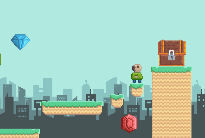
things you expect in a game. That'll be in our next section.
8. Lesson 7 Creating Collectable Gems in Pixel Art Games: Hello everyone, and welcome
back to Pixel Art Boot Camp Complete Two D
Retro game Masterclass. In the last section of
this lesson in game items, we drew a treasure chest. So in this section
we're going to draw some gems to go inside
the treasure chest. Now the treasure chest itself
we drew was 32, 32 pixels. So we're going to go by a little bit
smaller and go for 24, 24, so that it looks like they fit into
the treasure chest. So as you can see
here, we've got our canvas and just as before, we're going to go for
the dual color set. Again, the reason
I like the dual color set is because it's got a decent amount of colors and
shading options for each. But as you start
to draw your own, I would recommend different color sets depending on what you prefer and also depending on what fits your
game style best. The main thing, as it
always is, is consistency. To begin with, we're
going to start by drawing a gem and we're going to draw a few different
varieties today. The main thing we need to
do to begin with though, is draw the outline. What I'm going to
do here is start by drawing a line like this. In fact, I'm going to make
that a little bit bigger. We're going to draw a
diagonal line like this. If we keep our mask transparent, that's the most important
part for the outline. And we're going to
select all of this using our selectal and
control C to copy. Then what we're
going to do is just rotate 90 degrees, paste. And we're going to
do the same again. Rotate, paste. There we go. And then we're going to copy, and we're going to do a
vertical flip and paste. There we go, that has got
ourselves a consistent outline. And now we're going to
fill in the gaps here and start to draw
ourselves a gem. Now the gem, of course, can be different shapes and sizes. I'm going to show
you a few different shapes that we can work with, but as you do draw a bit more, you can just practice different styles and
different shapes as well. This one is going to be a octagonal shape and we're going to connect
it in the middle here. It all looks like it's
part of the same emerald, I suppose once we connect this, that is going to be
our basic outline. Now because it's a gem, we want to have a lot of nice pretty shading
effects on this one. So the first thing
we're going to do is, as we always have done, we will keep the darker
colors at the bottom left and the lighter
colors on the top right. We're going to cycle through
our different shades here, which we've got as
part of a dual colors palette and go lighter here. Now that's a good start, but what we want to do is take the darkest shade
color and actually move up one when we
move our colors up, when we move our
shading up here, we're going to use a lighter
shade as we move the gem. The reason being is that's going to stand out a little more and make it look more like a sort of shiny gem with different
shading effects. And that's going to make it all the better
for when we have our finished product
that covers the outline. And now we will start to
apply the actual shading. So if we take the
middle, for example, and we'll start with
the darker colors, and we'll just do
a singular line just along the bottom here. We'll also do the same
for this section, and it's just down to, again,
playing around with it. A bit of experimentation
to see what looks best. We're going to take the
lighter color and again, just one shade
darker just to apply a darker tone here to make
the lighter part stand out. But now here comes the fun part, because we're going to put not only a lighter shade
on these bits, but we're also going to do
a bit of a sparkly effect. And that's really
going to make it look more like it stands out as a gem rather than just a
plain object in of itself. The reason we wanted to
stand out as part of a gem and gather all sorts of sparkly effects is because it's something that your player
wants to collect in game. It's something that they
really want to go for. We want to make that
point very clear. What we're going to do is
take our lighter shade. What we can actually do here, if we have our line tool, which is three of a
keyboard shortcut L, we hold shift, it actually creates a diagonal
line like this. This actually creates then, some sparkly shine effects that actually look a bit more appealing than just as
if it were on its own. We can also apply this for further up here
as we go along. We can also apply it to
different parts of the effect. So we can take a lighter color even though it's
a darker outline. We can take the lighter color
here and we can really make it sort of stand out as
part of the shining effect. So it really sort of looks like an appealing gem that
people want to collect. What we're also going to do
is adding a few little specs, a few little dots just to again make it all
the more shiny. And then we have a nice
collectible, shiny gem. We can also, in game, add some shiny effects to it, but that will be part of
the actual game itself. Now that adds a nice effect
what we're going to do next, so I'll show you another
one is if we go for alt B. Now the reason we do alt B is that creates a new blank frame. If we do Alt, that just
copies the existing frame. We want a new one. Again,
the same as before. We'll start with the outline. In this case, we're
going to go for a gem. Now we're going to do this
again using our line tool. And we're going to start drawing as now you can see that's
a little bit inconsistent. And as we know, consistency is the
most important part. We're going to just make
sure these lines are even yet that lines up and we're going to the
draw it across down here. Now this is going
to be a little bit of a cross cross there,
but we can delete that. Therefore, it looks very, very nicely spaced out
with the gem as well. We can also do it lines up in the middle and we can also
put it in the middle here. These lines, even though they are just a little bit skewerth, they're not straight
or diagonal. It's all part of the effect. Again, when we fill it in, we're going to remember
darker colors on this side and we're going to lighten
the color as we go further. Right again, this adds a
nice sparkly effect to it. And we're going to
do the same as we did before with the outline. We're going to go for a
slightly darker color, but not the same color outline. Again, this makes it stand
out a little bit more, makes it look a bit
more desirable, a bit more shiny, a
bit more precious, rather than just
one simple object. The way we do this is
we take the colors. We can use our color tool, actually our color eyedrop tool, which is the eye drop ital here. We can see this is
the darker color. We can actually take
that and apply it to the shading here.
Again, same as before. We're going to go for a
shading on the bottom left, and then we're going to go for a slightly darker color and a slightly lighter color then, or the top right. Again, this makes it stand
out a little bit more. This also keeps it consistent because the star is consistent. That's the main thing
we want to keep here. We're going to go
for this color here, add a little bit of shading. Then what we're also going
to do is add a lighter color onto the top right. We can see here, this is the slightly lighter color
of the next one up and we're going to apply that to the top corner of the
outline as we go along. What we'll do, same as before, is we will add some sparkly
effects just to make it look all the more appealing
as part of the game. Again, going to go of shading. If we go for, in the middle
here, some lighter effects. We can just do these around. It doesn't necessarily matter
exactly where they are, as long as it stands out that
they are nice and sparkly. And it adds that sparkly
effect to it to make it look like a desirable
object that people want in the game. Again, it's all
about consistency. It's about making sure no
matter what way we do it, we just keep to the same style. Again, we can add some dots
to some lighter spects. We're going to keep the
lighter specs more on the top right side
as though the light was shining down on the
top right hand side of it. And then we have a nice gem
to go with our emerald. Then finally, if we go again
Alt B for a new frame, we'll go for like a ruby. This time what we'll do here is going to go for
a.in the middle. And the reason I'm going
to do this is if I go for keyboard selection, which is our select tool here, our rectangular, well, Markey
tool, our selection tool. If we select the
space to the left, we can see on the bottom right that that is 11 pixels across. You see that. There we go here. That is also 11 pixels across. We want to make
sure that it's in the middle and it
lines up quite nicely. Now if we hold shift
in our line tool, we can see it also creates
a two by one shape. A two by one line. Which is, it's very
useful in isymmetric art, but it's also useful for
making a Ruby shape, which is what we
want to go for here. Again, just like before, we want to make
the outline first, and then we'll start working on the shading in the middle. We've got our nice outline here, and we're going to
go for a ruby shape. Again, it's all
about consistency. It's all about even colors. We'll go for some darker
colors in the bottom. Slightly lighter one here, and then an even
lighter one on the top. Now what we can do with
this, same as before, is we can take the darker
shades of a bottom portion. And that way it'll all look
consistent with the lighting. And then we can add the
lighter effects afterwards. But before we do, just
as we did before, we're going to also take a lighter color onto
the actual shading. This way it stands out a bit. Now if we do this with
just the one shade down, it does look a little
bit out of place. But what we can do, as I say, is we can do a bit of trial and error and
see what works best. That's what it's mostly
about when it comes to pixel trying a few things out. Seeing what works best,
seeing what looks best. And we can go from there. I'm going to add the shading and we're just going
to carry it on a little bit just so it doesn't look too much like
it's washed out. We want it to still be very
clear as to what it is. We'll take the lighter
color here and apply it for the shading, slightly
darker than the. Lightest, but we'll have one shade darker for each
section or the shading. Then again, we'll take the
lighter color and we'll go for a sparkly
effect on this side. Same with the middle here. We'll go for a
slightly lighter color for the shading in
the middle here. Again with the darker side, we'll also go for just
one shade lighter. And that'll add some
nice sparkly effects. They'll make the gem
really pop and stand out. And something that the
players all want to collect. As I say, it is all
about trial and error. You may find you want
slightly less shading, slightly more shading. It's about finding your
own style and finding a style that works best for the game you're
trying to create. Here we look at other
pixelar style games. Some of them do use a much more thicker shading,
thicker outline. Some of them don't,
some of them use very block colors that seems to be popular
some places now, it's really just down to finding out what style is going
to suit you best. But then we have a
nice sparkly gem here. I'll add a couple of sparkles
on this side as well. Not too many, just
because we want to make sure that it
looks consistent, that the light is from
the top right hand side. And now you can see here we have three different
styles of gems. And we can save these
if we go to save As, we can save these as our gems. Now what we can do
when we go to export automatically because we
have more than one frame, that is effectively
considered an animation. So if we play the animation, that's what it effectively
thinks we've made. However, we want these to
be independent images. When we do go to file export, it will automatically go in as a gift and is not what we want. A gift will make it
all animate together. It will also take away
the transparency. And we don't want that either. What we will do is
change this to PNG. Actually, no, it won't take
away the transparency. But if you do have
any glowing effects, it will remove those. Just to clarify, for example, if we did want a
semi transparent, if we go into our RGB here and pick a semi
transparent blow, and we do that by doing shift, if we have that nice
effect going around, if we try to export
that as a gift, it will just change
that to a block color. But we're not going
to do the outline at the moment because we're just going to export
them as they are. We can always add that later. But if we export that, what we'll do is we'll
change the file format. If we get rid of that
and change it to PNG, what you'll see
here when it says, do you want to export
them in three files, one to et cetera, is when we agree to do that, we will actually now have three separate images
or our three gems. Now when we bring them up, we've got 2.3 that's our gems. In our next section,
we're going to look at other things we can
draw in game items. Let's have a look at some
potions in our next lesson, but for now those are some in game items that you can draw in next Two D, Retro game.
9. Designing Pixel Art Potions for RPGs: Hello everyone, and welcome to Pixel Art boot camp complete two D retro game master class. And as you can see
from the last section, we've been drawing some gems. Now those are great
in treasure chests, but we also want some potions. Let's draw some of them as well. If we go to a new file, again, we'll stick to the same
size as before, 24 x 24. And we'll also go for
the dual color palette. Again, I like the dual
color palette because it's got a lot of different colors and a lot of different shades. But the main thing is
about consistency. As long as you're
consistent with your style, you can use any sort of
color palette you like. But today we're going to
be drawing some potions. So let's show you how
we're going to do that. Let's start with a
nice blue potion. So this can be, is it blue for
manner and red for health, or vice versa? I
can never remember. But it doesn't matter. We're
going to draw both if I go onto our build ellipse tool. Now the reason we have selected this here is just
to show you where it is. But what we can do as a
shortcut is we can do shift. And you see that
changes there and shift you again. And
now it's filled in. So if we take a
circle to begin with, and again this is all about getting the outline
to begin with. And then going from there,
we're just going to check, but that's the same either size, that's four pixels, and
that's four pixels. What we're going to do is just
expand the shape a little. It's about playing around with it and seeing
what works best. We want to leave some room
for the nozzle as well. We can just move this
down ever so slightly, just as you go along
trial and error. It's just making sure
that the shape just looks ample for a nice potion. We do want the lines to
not be too different. We don't want to go
from say, like one, we had it like that, it would just look very out of shape. We want it to be consistent
in that style as well. Then we'll go for
drawing the nozzle, so we can see here again, we want it to be nice and
even that's quite slim. We'll do four sizes I, we'll do a four
width, and then we'll have a corkscrew on top. So we'll go for a
brown color for that. Again, it's just starting
with the outline and going from that
slightly darker color. Now, because this is a potion, we want it to look like
a nice glass bottle. So the first thing I'm
going to do is just take a little bit out so it
looks not full full. Because then that
will just look like maybe we hit fruit or something
and we don't want that. The next thing we're going to do is if we take our
outline to begin with, we'll go for maybe a
darker color here. Now we've done is
slightly different. What we had done before is just the outline and
filled the colors in. This time we've got fill
color and now we're going for the outline.
What we want to do. So you can see here, this is the color for the
main potion itself. We're going to do something
slightly different. We're going to actually use a lighter color and then
use our dark shading. This is because
we wanted to have a nice glass bottle effect. We're going to do this by achieving a little bit
of an outline first. This is because the way
the light would shine on a glass bottle would have a slightly lighter
reflective surface. And then we're going
to take this color. If we use our brush
tool, we can draw. And again, it's down to a
little bit of trial and error, making sure pixel
perfect is ticked. To assist us with
that, we can start to just add a little bit of
an outline as we go along. It's a bit more rounded. We want it to be
rounded so it looks like there's a decent amount
of light coming off of it. Then what we can do is add a
lighter shine on this side, again, using a lighter color. If for example, let's
go for even lighter. And then we can do a
slightly darker outline that almost looks as
though it's being reflected onto the
bottle itself. We can also use this
lighter color to add a little bit of a shine
effect on this side. We can also take a
slightly darker color and again go over
it on this side, so it has a lighter effect here. There you see a slightly different shading to
what we're used to, but this way it looks as though the light
is shining onto it and creating an effect around
the entire bottle itself. Now when we go to our actual
nozzle of the bottle, we're going to go
for a slightly more simplistic shading
style because this is, again, it's a glass bottle, We don't want it to be
just looking very flat, but it's not going to be too complex on the
actual lid itself because the main lighting effect is actually in the
bottle itself. We're just going to go for a slightly lighter effect here, just so it stands out without being too obstructive
of the main view. When we're doing pixel and we're working with small areas, the main thing we
want to do is put as much detail into the part that we want people
to focus on the most. The part where we want people to really draw
their attention to, which in this case is the fancy bottle when it
comes to the cork on the top. Again, we're going to
employ some very simple It is a corkscrew.
So we're going to do a little bit of
a dithering effect. And we're going to go for a
very simple shading style, just because we don't want
people to look at this bit. We want people to look at
what's in this potion bottle. This looks very elegant.
This looks very exciting. That's the bit we want to
stand out. That's our bottle. That's our first one.
If we now go for Alt, that creates a new frame. We're then going to
create a new bottle. Now what we can do is with
what we've already got, we can make a very
similar shape and we can then actually use the similar lighting effects
that we've already got. Now I know we're still in blue,
but what I'm going to do, complete the shading
first and then show you a nifty little trick so you can replicate different designs. It's really handy to use across different areas of
pixel art anyway. But what I will do
is I will show you, we take the same shape, just expand it out. This time it's a slightly
different shaped bottle. It saves creating
it from scratch, and it still keeps
the same effect. This looks very interesting. This is a similarly
shaped bottle, but it's maintaining
the original effect, but it's a bit more
squared off at the bottom. Now that's all well and good. So we've got two
separate potions here, but the problem is
this is all just blue. I'm just going to adjust
shape ever so slightly. Again, it looks a
bit more different. Now what we can do is we can do a trick
called color replace. If we take this dark blue as our left color and take this dark red and right click
it for the right color. We do shift R, we've got replaced color. Now if we work our
way down again, left click and right click, then left click, right click. We do this all the way down to all the different
colors of blue we've used. You can see now that is a red bottle that's
very different, but we have just
slightly less effect and slightly less effort. It makes it a lot easier to make replicas without having to go all the way into creating
a new sprite from scratch. It makes it a little bit easier. Then you can see we can
experiment with this if we take the shape of the
existing bottle again, what I've done is
I've pressed L N, so this creates a new frame. And we're just going to create a slightly olbusy
shaped bottle here. Just again, by starting
with the outline, we can work with this and we can add to it as
we're going along. We can keep the same
effect and we can keep the same shading and
we can just expand on it. Again, we take this shape and
just add a little bit extra here just so it looks
like it's sticking out. Again, we want to
keep to the outline just so it's very clear that this is a glass bottle with
some shiny effects on it. What we can do now is just
expand on this shine effect, so it looks like it's
going all the way down. We want that to be
slightly more centered. We'll just move
that along as well. Now we've got a slightly
unusual curved bottle. What could be in there?
Well, we don't know. Just expand on the shading just so it's again, consistency. Consistency is always
the most important part. Then we can just change
this ever so slightly. It's a mystery curved bottle
under what could be inside. Well, anything. Let's say if we go for the
color replace same as before. We'll use our Eyedropper
tool to select the darkest shade here,
which is this one. We can click, let's make
it a nice greeny color. We'll do that. Left
click, right click. And it's Shift R
click, right click, shift, left click, right click, Shift R. And we'll
do it again now. It's a mysterious acidy
drink that's exciting. We've got three
different bottles, all from using a very
similar effect and all from using a very
similar framework. Again, we'll save this
by going as Save As, and this can be potions
just as before. We want to export it as a PNG. If we go to export, because we've got three
different frames, automatically it will
default to gift. If we change that
and put in PNG, you can see, do you want to
export it into three files? If we agree to that
and we go and check, that will then become,
we eat potions, ptetion two, potion,
three again, it's just down to having
a play around with us changing some styles,
changing some shading. As long as it's consistent, you can create a lot
of different things just from one framework and using a color replaced tool and just changing the
shading as you go along.
10. Fundamentals of Pixel Art Character Creation: Allow everyone and welcome
back to pixel art boot camp. Complete two D Retro
game master class. Now in the lessons
leading up to this, we have covered
creating a background, creating a tile set, and drawing some in game items. In this lesson, we're
going to actually put some characters into
our retro game. Now in the last lesson, we covered for different
sizes that we've used, including our tile set, which was 16 by 16. The character we're going
to create is going to be similar sized so that
they fit into the scene. I'm going for 16, 24, just so we have enough room
to create our character. Now the first thing we're
going to actually do, again, I'm going to go
to the dual tile set. But there are different options, and again, it's down
to consistency. But the first thing we
need to do is draw. They're going to
look quite silly. Some blobs as it were. But you have to trust me,
what we're doing is drawing these blobs because we need a basic outline
of our character. Now when we draw small
pixel art characters, the main thing is to focus on
the most prominent feature. When we have limited space, we're actually working with a very small amount of space that we'd
actually need to make sure that whatever
we're focusing on as the most important part of a character needs to stick out. So when we draw these blobs, we're just initially getting
a sense of perspective. It doesn't necessarily
have to be precise here, we're just sort of giving
a rough idea as to where the parts of the body are going to be and
what we want here, I'm going for quite a silly, cartoony kind of character. So I'm drawing these
as quite rounded, squishy kind of blobs
so that we can create a rather silly looking
character that's going to go into our game and he's going to be quite
fun to play with. Now what we have to
remember, as I say, is that we're looking on
making the most consistent, most prominent
features stick out. If you remember the
original Mario game, the reason in the first
place he even has a mustache is because of a limited space
of the pixel art. And that would make his face
stand out a little more. So the first thing
we're going to do, like I say, is
create these blobs. And that's going to
be in this layer. And we're going to make the
layer slightly transparent. Just so we have a
bit of a rough idea as to where we're going
to put all the parts. Now if we go into a new layer, this is going to be where we
start making our outline. Our outline here. We're going to just choose a fairly
neutral tone. We choose a fairly
light skin tone. We're going to make
sure this layer is fully not transparent because we
need to see through this. And we're going to just
start drawing on top. Now of course, as I say, this is just the outline. We're going to be
editing this later, but we're just going
to get a rough idea. And what we can do as well, we can make sure
that this character is going to fit in with
how we're going to make it look in the
game initially. I'm just going to go straight up and just trace the outline, but I'll make adjustments
as we go along. You'll find as you go along, you'll want to make
adjustments too. And it's just about making sure no matter
what style you do, the consistency is there because there's a lot of fun
creating characters. But a character is going to be something unique
to your game and it's going to be
something that you want to stand out
more than anything. I'm just playing
around here to try and get a good shape of a face. We're going to try and stick to some very consistent rules
with the lines as well, to make sure that
they don't look out of place or unusual. And then what we're
going to start doing is filling
in our character. For example, here
we've got some legs. We're going to give him some
trousers. Here, some jeans. We're going to go for
just filling them in. And then we'll apply
shading later with the actual top itself.
Let's go for a red top. Let's give him a
nice rounded top. Now, I've made him a little
bit too rounded perhaps. I'm going to move
that in a little bit, but we're going to work on
that and we're going to, as I say, just play around with it and
see what we can do. We're also going to make sure he's got a nice
outline here for his face. If we pick a skin tone here, we can go for a rounded head. And I'm going to give this guy a little
bit of a mustache. The reason being is
that's going to be a prominent feature
and we're going to make sure that
he sticks out and stands out as a fun character. We're going to then start filling in the details
as we go along. What we're going to start
with is block colors, and then we're going to
apply shading later based on what we've already learned with different characteristics. Shading techniques, as
we've already done, my style for shading
is darker colors at the bottom and lighter colors
at the top right hand side. So we're going to be sticking to that style and we're going to make sure that that is
consistent with our character. The first thing
we're going to do is have a nice idle pose. So if I draw his arms here, then we're going to start looking at different ways we can animate him later on as we go through the
animation process. As we go through the process
of creating our character, the first thing we
want is a nice, simplistic, but ultimately
very fun character. But we want our people
to enjoy playing with. I'm going to give him a
rounded T shirt there. Yeah, I think that
looks quite nice. And we're going to
look at the skin tone here that makes our
mustache blend in a little. We're going to look at
some different colors. And we're going to use the color replaced tool here just to
make sure we have different. Skin tone to make the
mustache itself stand out? Again, it's down to
experimentation. It's down to how
you want to make your character stand out. You can do different features. He doesn't even necessarily have to have skin color color at all. It could be all manner
of shapes and sizes. It doesn't even necessarily
have to be human. It's all just about finding a character that fits
for game you're making. In this case, our mustache guy. We're going to make
the mustache brown so it stands out a
little bit more. We're going to
give him, actually we'll keep him bold. I
think it'll be quite funny. If he were bold, then we're going to make his
mustache stand out there. Now that I think looks
quite silly, quite fun. His arm here doesn't
necessarily look too visible. So maybe we can change that by giving him a slightly
lighter color T shirt. We're going to use control
the color replace, which is shift R. We
do this by selecting the color and then using the right mouse to select
the alternative color. There we go, we can see his arm stands out a little bit more. Now, his arm is quite thin, so I'm going to try and
bulk it out a little bit. Move it across here again, It's just trial
and error to make a character that fits for
scene saying with his legs, I think they're quite slim. So we're going to move
that along a little bit. We're going to make
that bit bulkier. We're going to remove that so
he's got more pointed legs. Now we're going to apply
some more shading. We're going to choose
some lighter colors to go on to the top here. And again, we're going to
go with a lighter color on the outline as well
with his face. We're going to start
putting in some eyes. They can vary depending on
what you're creating here. We don't want
something that looks too out of place
with this character. We want something very
nice and very simple. I'm going to move
his mouth down so his eyes are a little
bit more prominent. Now, we only need to have
one part of the eye here. Eye can be very, very simple because we're going
for a small character, if we're going for a slightly more larger or in
depth character. Or if we're going
for a character where the eyes are
more prominent, then we're going
to need to do that by adjusting the shape so that there's more
room for that eye. Again, like I say, it's about prioritizing which part of the feature we want to
stick out the most. In this case, it's a fun little mustache
that we're making. And we're also making sure that the face is quite rounded and pudgy and
he's a bit of a silly, fun character that
we're working with. Again, it's about consistency, making sure that the shading is consistent across the
character that we're making. And by doing so, it's going to blend in with
the game a bit more. Again, we're using our anti aliasing techniques
that we've discussed in former lessons just to make him blend in a little more
with the background. If we turn off shading
in the background here, we don't need our little
blob guy anymore. We're just going
to make sure that this is the only
part we're seeing. Again, we're going
to go with shading here to make sure
that he sticks out. It's more obvious what he is. We can see there, we've got a
fun little human character. I'm going to move that
leg back. There we go. We have a silly
little character, and that's going to look
quite silly, quite fun. He's just a happy
little, bold guy. Now what we can do as well
is we can add a new frame by doing Alt Alt N duplicates
the existing frame, but it also creates a
new animation frame, which is what we're
going to need for a bit of an idle stance. So you can see here, he's got
a bit of an idle weighting. Now, that doesn't look too good because the shading
is off there. So we can redo the shading
and that fits in a bit more. Now that does look a
little bit better, but again, when it
comes to consistency, we copy across some of the existing details and that's a good thing
to do there as well. So we've got shading
consistency. But what I'm going to do is I'm going to delete this frame. And the reason I'm going
to do that because what we actually need here is to
separate these layers. Separating these layers
ensures that we have different moving elements for when we do different animations. For example, I'm going to
control X to cut and then I'm going to go for a new layer
that is exclusively his head. Then with this layer
I'm going to do the same and do control, do a new layer again and paste. And that's going to be his body. Then finally I'm
going to this leg. I've just copied
from the body layer, we don't need to do that. Layer two, we're going
to take this leg and we're going to go onto
a new layer and paste. That's going to be,
I'm going to call it leg L for the left. And what's left, this
layer I'm going to call. Now the reason I've
done that is because in future when we do different
animation styles, we are going to
keep those layers separate because we are
going to need them. So for example, if we're
doing a walking animation, it's going to be
easier to maneuver one part without changing the
entire rest of this, right? That is our character created. In the next section, we're going to cover some
walking animations.
11. Basics of Pixel Art Character Animation in Aseprite: Hello everybody and
welcome back to Pixel Art Boot Camp Complete Two D
retro game Master class. Now in this lesson we're
covering character creation. In our last section, we made
the original character here, this fun, little
mustachioed fellow. In this lesson, we're going to cover some walking mechanics. Now walking animation is very different depending on
the style you're doing. There is no one right way to
make a walking animation. Some people use four frames, eight frames, 16 frames. Some people do different
elements, different sizes. What I'm going to show you
is a very simple one where the legs intertwine and it looks like a complete
walking animation. And we'll also up and down
the body in relation to how that would actually
affect when you are walking. Now, it is always good
to take some reference. So for example, if
you want to look at a walking frame or
a walking animation, just a general picture
of someone walking. You can just see someone
walking out in the street. You can look at a video
of someone walking. And it's the same with
not just walking, but generally any sort of
animation you want to do. If you want to look at
someone doing an attack, for example, if
they're doing that, it's good to record yourself
or someone doing that. So you can take those key
frames and animate that. But in walking, I'm going to show you a very simple
technique I use. So I'm going to go for
Lt for a new frame. And the first thing
I'm going to do, so if I press up all
down on the keyboard, I navigate through the layers. I'm going to start by moving different elements
of the left leg. I'm going to move up, I'm just
going to do the new frame. I'm going to move
this across and take the right leg across there. And I'm going to
repeat this process. I've got the right
leg moving back, the left leg moving forward. And I'm going to
just continuously change this so that it's
moving ever so slightly, you don't want it
looking like back. It's a bit of a Flamingo. Looks a little bit
out of place there. I'm going to move that one. I'm going to move this back Then we're going to
do the same again, where we're going to close
the animation frame. We want it to be very similar. It all lines up quite nicely. That looks a little
out of place. If I delete that,
I can see here, as far as walking goes, it looks quite clunky. So we might want to
move this leg in. In doing so, we actually make the walking
animation look a little bit more refined so that
it doesn't look like there's too much of a gap
between the walking now. That's all well and
good for the legs, but what we actually want to do now is move a body as well. Because when you walk, your legs do most of
the work obviously, but your body still moves
up and down as you walk. We might find that his
body partially lifts here. In doing so, we'll
move his head up a little bit and we'll
move his body. What we'll do is
we'll move it so that if we originally
just moved this part, we see that will
make a gap here, but we can fill that
in as we go along. Again, we'll move the head
and the body up a little bit. Again, it's down to
trial and error. Playing it as you go along
to see how it looks, we can see there's a little
bit of a body lift here. We try that again with
the head as well. What we might want to do, as
well as part of the body, is we might want to swing
his arm back a little. Obviously, we can
fill in those gaps. We can copy that across, we can make that move
forward a little. That looks more like an actual
walking animation there. Now obviously we've
got the gaps here. We want to deal with that.
This is the right leg. We're just going to put in
some more details here. We're going to do the
same on this frame. As you can see. We've got
a walking character there. We can add different details. We can make it more
or less complex depending on the type
of game we're making. We might want to
make, for example, his head face up a little bit. A good way to do this is just to move his
mustache up a little. Then maybe move it
down a little as well. So completes the animation. We'll just move it down
just a little bit. It might look a little uneven, but it's just for the one frame, we don't need to worry too much about it looking out of place. As I say, when we do pick slot, we're working with
limited space, so you'll find for a lot of it, people will fill in the gaps. Now that looks a
little bit silly, like he's moving his mouth. Perhaps we won't go without one. But again, it's down
to trial and error. We don't have to stick to that. We can undo and we can
just play around with it. It's most important
that you just play around and find out
what works best. In this case, I think
that might be better just sticking the head up and down and keeping
his movement going. His arms doing a little
bit of movement, but his legs are doing
most of the work there. We can easily change this as we go along so we can add
different effects. Maybe his chest moves up a little bit as he
moves along here. If we go into the body layer, we might want this bit to go up. It puffs his chest
out a little as he's going. We can do that. We can again, copy
this across, anything. In the meantime, we
can also fill in, but we want to make sure
that that's consistent. We want a few frames
of animation here. It's just about anything we can do that brings it to
life a little bit. We can take this and delete that and paste what
we've already made. Maybe his body slumps down
a little towards the end. Then as he completes
the movement, after all working with a silly
cartoony character here, he might want to be carrying
a bit more of a squishiness to him that add sat squishy
effect. That's quite silly. We want to hold that frame down for a couple of frames just because if we do it
for just the one, it looks like quite
a quick transition. We'll put that also onto
the first frame there. Let's make sure we're
on the right layer. The body layer,
copy that across. We want to move this down a little so it's a
bit more obvious. It's about exaggerated movements when we're doing animation. Not subtlety. Because subtlety
is a bit hard to spot. We want exaggerated movements. Now in this case,
we're going from right up there a little too quickly and that looks
a little out of place. We might want to
move this back to normal and keep the heightened chest
movement on this one. Again, it's about
experimentation. It's about trying
different things and seeing what fits best. In this case, we've put
that a little too high up, so we're not going to do that.
We're going to undo that. We want bird normal
body shape here, perhaps we've got a
little bit off here. It just looks a little bit
out of place at this point. Maybe we can delete that. Go for a normal shape instead. Well, the shape we started with, again, this one is also
a little out of place. The main thing is that we want the animation to not
just do one frame, unless it's transitioning
between one part to another. If we're doing
something like this, exaggerated movement looks best. I think I'll remove
this bit, then. There we go, that
looks a bit better. We've got a bit of
movement to him, to his whole body gives
them a bit of a sort of silly bubbly jelly
like kind of consistency. We're making a sort
of a fun character that we want to control
and play with here. Of course, depending
on what you're making, if you want to make a more
serious game, so for example, like an RPG or you want to make a more serious
platforming game, then we might want to tone
down the silly effects. And we might want to
go for something a little bit more serious
or more endearing. And the typical JRPG styles, they focus more on the eyes. What we mainly need
to take away here is what's the main feature
you want them to focus on, because that's the
part you need to draw. So we'll start with the blobs, then we'll fill
out into the body. And then once we've
done that, we'll do some walking animations. Now what we can do, it is a bit of a cheap trick, but if we select all
of our layers here, if we do want to make
him face the other way, we can simply flip horizontally. Now, that doesn't look
right based on our shading, but that would be the
first place to start. All we would need
to do after that is begin correcting our shading. If we're going for
an example where the shading is only
looking directly down, that will work quite well. However, where we've got down and left and top and
right for our shading, we're going to need to do
some correction before we actually export the left
hand facing character. We've started drawing
right with the shading. When we flip them left, we need to ensure the
shading is consistent. That's going to
take some editing. But in the meantime, we have a nice walking character here. We can also have
a nice idle pose, which we can do just by taking the first frame and just
moving it up and down. If we take, for example, the body and the head, take all of the body there and all
of the head up there. And we can take the legs
and just expand them. That's the left leg
and the right leg. We also have an idle frame. If he's just stood
still, he can do that. What we can do, this is always a useful thing
to know as well, is where we talk about
frames of animation. Because we've got our idle
frame and our walking frame, our idle animation and our walking animation
in the same sprite. What we can do is use tags. If we go into frame
and do our tags, 1-2 frame 1.2 we've
got our idle tag. You can see that
app is there now. Obviously that's a lot faster
than he would be in game. He's just jiggling
up and down of bit. Then we can take
frames free to eight and use that as our
walking animation. You can see free to
eight is the walk. One to two, we
double click this, we can change that milliseconds
to 500 instead of 100, and that's a bit better
for walking idle. That's our idle animation, then that's our
walking animation. Now I've made quite a
silly character here. It's all down to how
you want to do it. But it's always about keeping consistency and keeping
that shape for animation. And that style, depending
on how you're doing it, exaggerate the movements and highlight the most
prominent features. So now that we've
made this character, in the next section we can look at different characters
and we can look at different customizations
so we can start creating some
enemies, for example.
12. Creating Front Facing Characters in Pixel Art: Hello everyone and
welcome back to Pixel Art boot camp complete Two D retro
game master class. Now in this lesson we've been showing you how to
create characters. But what I'm going to show
you in this final section is how to create a
front facing character. Now what I'm going to do to show you the front
facing character, I'm going to go with 16 by 24. Same as our last
character is I'm going to be showing you a
process from start to finish. And this is going to be
useful for things like RPGs where you might want
a front facing character, or you might want a front
facing section of a character when they're doing
different walking styles and facing in
different directions. In this case, I'm going
to draw a skeleton just because I think for seen
we've been creating so far, he's going to have a fun
little presence as an enemy. So what I'm going to do first
of all the same as before, is start drawing the blobs. Now in this case,
we're going to want the character to be
quite exaggerated. So we're going to be, and again, we want that with all of them. We want a very exaggerated
character and that's how we get the most
entertainment out of pixel art. We want to draw attention to the parts that we want
to be most obvious. And we want to make sure
what we are doing is making anything that can't be seen with the pixel art the player will
fill in with their mind, that's what we want to achieve. We want to achieve
something that is clearly representative
of what it is. Because we have a limited
space without taking up so much detail so that we can actually use
our imagination. As we did with a lot of pixel
art back in the older days. What I'm doing here is I'm just creating a very simple blob. Now this blob as we've done
with the previous character, is going to be changed
as we go along. A lot of it is down to experimentation and just
down to trial and error. If we're creating a character
here, we've got the front. Now this is front facing. This is very looking
at the camera. What we need to consider
if we're perhaps doing an RPG is we might
be facing downwards. We might have a camera that
looks down on the character. If we see something like that, we might want to move the character in that
sort of perspective so that it's more of
a facing down on top of a character rather
than where we are now, where we standing up. But it's just about remembering what perspective we're using, and as it always is,
it's about consistency. So I'm going to create a
new layer with this layer. I'm just going to make it semi transparent so we can see
what we're working with. I'm going to start
making the outline of this skeleton now. The skeleton is going to
have quite bony features, we're going to make the
lines quite sharp here. And we're also going to
make use of anti aliasing. Because anti aliasing creates a good effect where
we have some gaps that need filling in here
where we have these ribs. We're going to look a
little bit out of place without the use of the aliasing and I'll show you
why in a second. But first of all,
we're going to go with a pelvis bone here. Then we're going to put
in now it doesn't have to be necessarily
anatomically correct. We don't have to have
every bone in the body. One don't have the space for it, but we'll fill in
the details here. I'm going to get rid
of this so I can see it a little clearer and
see what we're filling in. Now without the anti aliasing, this is going to
look quite blocky. And this is where a
very important part of what we've already
learned comes into play. I think our skeleton
here looks quite fun. Going to give him some angry
eyes when we're working with top down space that looks
a little bit like a robot. I think we're going to
make the angry eyes here. But again, Mrs.
Antiliaing a play. We're going to use
some darker shades on the eyes and then some slightly
lighter shades around it to insinuate a angry expression that creates a angry effect. Now again, we'll take
a lighter shade. What I might do here is use
our color replaced tool, which is shift R to make
the outline a bit darker. Then with a slightly
lighter shade, just going to fill in some
gaps around the edges. That's going to give it a bit
more of a sense of depth. It's also going to create a sense of what these
bones are interconnected. Again, it's all down
to trial and error. Seeing what looks best as we can see here from
our little preview. That's starting to
look a little bit more like it's some interconnected
interwoven skeleton. Rather than just
some block colors going to apply our shading, same as we have done before, with the bottom left
being the darker colors. And we're also going to use the shading here as a bit
of an anti aliasing effect. Again, this gives it a bit
more of a rounded skull shape. Now what we can do if we do
L n is we can give it a bit of a different pose as we move along from this perspective. He might look like
a bit of a jumble. But it's okay because he's
going to have a bit of an idle pose where he's popping
up and down a little bit. He might want to lower
his hand slightly there. This is using our select
tool or marquee tool, which is we have a little bit
of a two frame animation. I've realized I've
moved back in. If I move back down,
that looks better. As part of an animation there, we'll use our antialiasing again just to distinguish where this darker shade goes into lighter so that it
blends in a bit nicer. We have a skeleton from that. That's quite a fun little effect What we can do as
well as we can also make sure we can have some lighter colors in there just to give them
a bit of a shine. It looks a little
bit alien like, but again, it's all down
to trial and error. It's all down to
playing with this and playing with the idea of how we want to make this frame and how
we want to make him appear. The player will fill in
details as they go along. Even though this isn't
anatomically correct, it is very clearly a skeleton. When a player sees
that, they will know straight away what
they're looking at. Now this is all for making
front facing characters. Now what I did in the
last lesson was separate the different parts of a
body into different layers. I'm not going to do
that this time around. However, what I would say is if your front facing
character is going to have a lot of
complex animations, walking, moving around, talking, and the like, I would recommend doing that
the same as before. In this section, I've not done that just because what I've done is given him a very
simple idle animation. When you're doing very simple one off animations like this, you don't necessarily have
to separate into layers. However, it is good
practice to do so if you plan to go
back to it in future. Now what I'm going to do
here save as skeleton, and then what I will do is
export them as a gift or Jiff that will therefore
retain the animation. Now, exporting as a
gift or a jiff does work to maintain some
level of transparency. However, if I were to do this as a semi transparent skeleton, then it would not work.
Exporting as a gift. If you do have any animations or any animated sprites
you're working on and you are using some
level of semi transparency, you would need to export them as separate PNG files where they will retain their transparency. And then you can put them all together in the game
at a later point. However, because this
is one block color and there's no
semi transparency, it will work, exporting
it as a gift or a jiff. Now that we've done that, we're very close to putting
it all together. What I'm going to show
you in the next lesson, just before we put
it all together, is one fun little trick
we can use where we take actual photos and turn
them into pixel art. Join me for that and
then I'll show you what it all looks like and
it's all put together.
13. Lesson 12 Converting Photos to Pixel Art in Aseprite: Hello everyone and
welcome back to Pixel Art boot camp complete Two D retro
game master class. In this lesson we're going
to be having a bit of fun turning a real life
photo into pixel art. Now there could be multiple
reasons you want to do this. Perhaps you're making
an RPG and you want pictures of your
friends or family to appear, maybe as decoration or maybe
as characters in the game. And when a text bubble appears
with their face in it, you might want to use
a real life photo rather than drawing a
pixel art version of them. Just as a bit of fun or as a bit of an Easter egg perhaps, you just want to
include some photos just to fill out the scene, or even for whatever reason you might have just to be
a part of your game. So as you can see
here, we've got a lovely photo of
this adorable dog. And that's all well and good, but it's not pixel art, so we're going to turn
it into pixel art. Now the first thing
we need to do, so you can see
we've got a sprite open in the background here. We are going to take this dog and drop it straight
away into a sprite. Now the first thing
you'll notice, if you look at the
bottom left here, is this is an absolutely
massive image and we don't want
it to be that big. So what we're going
to do first of all is select using a rectangular
selection tool, just the face of a dog. That's where we're
going to start. And we're going to then
take Sprite and crop it. So we're going to sprite
and we're going to crop. Now that already reduces
the size of the image. We might want to do this
a couple of times just to make sure we've only
got the face in there. We don't want any unnecessary
background details, especially with it
being pixel art. A lot of a background
detail will be lost anyway. Now you can see at
the bottom left, the image is now
significantly smaller. We do want it to be
a square as well. What we can do now is going
to sprite canvas size and we can actually see here
it's 18 55 by 1909. If we change this
to 18 55 as well, and we're just going from
the bottom origin there, we'll have a square
image of just our dog. Now this is great, but of course we want it
to be pixel art. Pixel art is very rarely
1,900 pixels tall. So we're going to go into
Sprite and go to canvas size. Now with canvas
size, we can take, not canvas size, we're going
to take it to sprite size. Canvas size will
actually just crop V image as you can see there. But we don't want that,
We want to resize it. So we go into sprite
and go to sprite size. Now sprite size automatically lock ratio will be
ticked, that's good. We do want to keep it that way. We want to take it
down to 64 pixels. Now that's arbitrary. You can have it 32, you can have it whatever
size you'd like. But we're going for 64
in this instance and see that's 3.45% of
the current size. That's going to be
massively smaller. And you can see here and it's already looking a lot smaller. We'll zoom in and that is
starting to fit pixelar theme. Now of course, if we
look in the preview, this does still look an
awful lot like a photo. The next step would be to take this image and use a
preset color palette. Now of course, as we
discussed before, it doesn't really matter
what palette you use. But generally speaking, while I will often use a dual palette, we'll want to use a
smaller palette this time. Because what we're
going to do is change the color mode so that it utilizes all of the colors
within that color palette. For example, if I take this one, this is only 16 colors and you can see
they're quite bright, vibrant colors as well. Now if I take the sprite
and go to color mode, we'll change it to index. You can see that's
quite a bizarre result, obviously In this instance, that's not quite the
look we're going for. So I'm going to do control z. To undo that, we're
going to choose a 64 color palette because that's got a
few more color options. What we're doing is
when we're changing the color mode to indexed, we're actually making
sure that every pixel in this image is being changed to its nearest color
along this palette. If we take this now
and go to index, you can see it's
using all of these. If I say, if I hold the key, that is for the eye drop tool, you can see anywhere I select, it's actually changed at 21 of these colors,
which is perfect. Because that means it's going to fit in
with our color art, it's going to fit in
with our pixel art. Now, of course, we
can go a little more extreme if I, for example, pick a four color palette that's going to make it
massively different. Yeah, that's quite a good
black and white look. Maybe if we're going
for a game boy style, there's different options
we can choose here, different options
we can consider. But in this instance, I'm just going to stick to
what we had before, which was the 64
color palette here. But yeah, have a play
around with this. There are different
options we can do. We have now got a
pixel art version. Of our dog dog pixel. Now of course the Jpeg format doesn't support indexed,
so that's fine. What we're going to do, so
we're going to save it, is a sprite format. We'll save it in a sprite
format to begin with. And then what we do is
when we'll export it, we'll export it as
a PNG file instead. And then now as you
see, if we go into our file Explorer here, we have our lovely
little dog pixel. We can do various things with that depending on how
we want to do this. Say for example, if we have
a much bigger image here, we can have a bit of
fun with this and turn it into a little text box. If we take our dog image
and copy this across. Now of course, it is going to index two v's colors
to begin with. What we want to do is we want
to make sure we're actually closing that down and just opening up the picture
of the dog itself. We're copying it across with the current color information. That way, it won't
automatically change across, but we'll also keep to the
same color palette anyway. Say for example,
we have this here. What we could do
now is we can make a nice little text
box to go around it by using our text
box tools here. If we go into a new layer, now this layer is just
going to be text box. I'm going to use
the U tool which is the filled rectangle and I'm going to draw a filled
rectangle here. As you can see, that has
filled in the entire space. But don't panic because
that is because this layer, call it dog, is actually
on top of that one. Now we'll just have a new text box in the background and we'll put ourselves a new layer
in for the text as well. And we'll go for a
slightly lighter color. We want to make sure
that's readable. Let's see, what should
we have it say if we put this in here that's
a little too big. It's quite nice, isn't it? Will you help us save the world? Depending on how we
want to do this, we can have this
as separate layers or we can have it all as one. But that's all depending on
how you put it into the game. Just for now, we're just having a bit of fun with this one. I'm just going to make some
little text box options here. Of course, it doesn't really
matter how we're doing it at this point because this
is just how it looks. But at some point,
we're going to be obviously considering
how this looks in game. If we say for example, we're going to have an
outline of the text here. Now what I did there
is use shift outline. Actually, if I just do
this text and do shift, you can see here
we have ourselves a little darker
outline underneath and I think that gives
it a nice extra effect. I'll alt to copy the
image into a new frame. What I'll do is I'll just
put this across here. We change the colors over. We'll change, we'll put
it as a second each. The reason doing this is just so I can show you what it
looks like in the game. If we have this
here, there we go. A nice little text box. Wolf Wolf, will you help us
save the world? There we go. And that is what you can
do with a pixel art photo. And you can change around
as many times as you like. Try different color palettes. Try different approaches. And again, different sizes depending on the style you
want to fit in your game. But that is how you use a photo and turn
it into pixel art. With that in mind, this is the final product of
everything we've put together. We started by learning
what pixel art is and what a sprite is and how we can
use them to make pixel art. Then we started with
our backgrounds, making our parallax and
patterned backgrounds. We then made some in game
items such as treasure, chests, gems and potions. And we also made our characters, our front facing
skeletons there. And Mr. Bob, well, I've just named him Mr. Bob, now our main character of
the show for this game. We've also used our tile sets, which we've made in this case, for a platform game. But we can use what
we've learned to make it for our top down
games such as an RPG. And we've also learned
various techniques which we can then expand
into different elements. So we can make from this some more spike enemies or some more characters
that will move around. We've made walking
animations so we can create enemies
that walk around too. And we can create perhaps
some more bonuses. It's really up to you If you take the skills
you've learned today, you can create any sort of pixel art game in a retro style, just like we have today. And as I said, the main thing is pick yourself a color
palette and stick to it, keep yourself consistent
in your style, shading and lighting, and use that to expand your pixel
art skills even further. I hope you've enjoyed
the lessons I've given you today and
thanks for watching.
 3D Tudor, Bestselling Blender Author & 3D Educator