Transcripts
1. Introduction: Thank you so much for joining me in another artist
inspired series class. I'm Elisabeth, and
I love sharing all things art and art history with you in classes
here on Skillshare. I've been teaching here
on Skillshare since 2021, and I'm a professional
artist and art educator. So a lot of what I do
is online but also in person through different teaching avenues that I explore. In the artist inspired series, we are looking to different
artists and getting inspired by aspects of
their artistic journey, their practice, their
process, their materials. And in this class,
we are looking at the pop artist
Roy Lichtenstein. Most known for his pop
art cartoon images. He is best known for looking at comic strips and elevating
what is often seen as a low kind of everyday
pop culture imagery and elevating it to high
art by creating a really, really large scale, blowing
up these familiar images, really leaning into
primary colors, full black outlines,
experimenting with the Bande dot technique
that was used at the time for printing
in newspapers, and just really kind of
seeing what he could create. And I'm really excited to
share more about him in the about Lichtenstein video as part of this class for
our class project, we are going to be leaning into whatever aspects of Lichtenstein
you want to explore. There's a whole lot more to his body of work and his
history as an artist beyond the pop culture
cartoon images that he is often most known for. So I'm going to be sharing
a whole wide range of different snapshots of aspects of his journey as an artist. And looking at the ways
he explored color, the way that he
played with imagery, the graphicness of his images, and some really fun ways that
we can play around and lean into that dot texture that Lichtenstein included
in many of his pieces. In this class, you can kind of decide what avenue
you want to take. But for my class
project, I decided to lean into his color scheme. The abstract brushstroke series that he played around with
and played around with a lot of different fun with the Ben-Day dot
technique and creating those dot patterns
and how I could do that with paint
pens and stencils. This class is a really
nice overview of Lichtenstein's journey and many different
ways that you could get inspired by what he did and ways you could weave your own art
aesthetic into that. So just like all of our artists
inspired serious classes, you're going to get a little
bit about the artists, a little bit about
their process, get a whole lot of inspired. And see how I'm weaving what
I'm getting inspired by into my art practice as you get
inspired to put it into yours. So I hope you'll
join me in class as we explore the life and work of artist Roy
Lichtenstein. See you in class.
2. Class Project: For our Roy Lichtenstein
inspired class project, you can really go whatever
route you want to. I love Mixed Media collage. That's my happy place right
now in my art journey. So I'm going to show
you how I build up some really bold primary and black and white color
artworks using paper, playing just the simple
aspects of what we can do and how we can manipulate
construction paper. And then how do we then play
into that and lean into that and really push it more towards Lichtenstein's
aesthetics? So leaning into the
bold black lines, playing around with
different ways we can get the dot
technique in there, just having a lot of
fun and really kind of building my pieces
up intuitively, I chose to lean into the abstract side of
Lichtenstein's art history. But you can absolutely play around with
some cartoon images or even just kind
of recreate some of the images that
Lichtenstein created. As you practice
and experiment and explore all the different ways that he was working
as an artist, you kind of see what ones ring true to you and
get you excited to push them further
as you play with your own art aesthetic and
go on your art journey. So let's it over
to the next lesson to talk about what supplies
you might want to have on hand for class as we prepare for our Lichtenstein inspired
project. CSE one.
3. Materials: There's a lot of
different ways that we can approach our
class projects. What I really want to
focus on in this class is the different artistic
elements that Roy Lichtenstein was
exploring in his art. We have the cartoon side of
him that he's known for, and then we have some later
pieces that he really started exploring abstracting and leaning away from
representational, but also merging the two. There's definitely a flatness. One way to achieve
the flatness would be to use collage for
your class project. I have my primary colors, red, yellow, and blue, and then
I've got black and white. Colord pencil is
just a great way to get at color details. The collage is a way to
get the bold flat color. We get absolutely painted
on and explore it that way. You're definitely going to
want to have a pencil on hand, so you can sketch
out your ideas. I think I want to
play with collaging up some basic elements and then I think I want
to go back in with paint or paint pens
or colored pencils. I grab my colored
pencils in case, this would be an
optional one, Sharpies, some bold graphic elements on top of that so
that it builds it up and also defines more of
the imagery like he's doing. I found these really
fantastic stencils and he was working
with stencils too. I can take the acrylic paint, my stencil, and my toothbrush, and then I can work over that to transfer those dots just
like Lichtenstein was doing. So those are really
fun. But you could also paint on bubble wrap
and then stamp that. And that will also give you that pattern uniform dot
look that he was achieving, which was all to mimic bende dot technique from printmaking. Taking his small reference printed images and
then enlarging them to these giant canvases and trying to recreate the imagery of it, but with his own spin
and interpretation. So let's turn it
over to the next lesson to learn a little bit more about the artist Roy
Lichtenstein. See you there.
4. About Lichtenstein: Roy Lichtenstein is best
known for his comic book, large scale, primary color, bold black line bende
dotted imagery. And that period of
Lichtenstein's work is really phenomenal and was a huge
launching point for his career. Prior to that, he
was kind of playing with the abstract
expressionist way of life. It didn't really
feel genuine to him. I wasn't kind of his
happy place as an artist, but he was kind of doing
what artists do, right? Like, exploring
different techniques. A lot of what we're doing
in this artist series, trying out things that are happening and you're seeing
other artists doing to get inspired and to
kind of help generate new ideas for where you
want your artwork to go. The funny story about
Lichtenstein is it was all because of a challenge that
his son set him up with. His son pointed out a
picture of Mickey Mouse, a comic and said, I bet you
can't draw as good as that. To prove that he
could, Lichtenstein started drawing comic books. He did a projection
of a Mickey Mouse image on his son's room. He did a really large scale
piece of Mickey and Donald. The fun thing that you learn when you dig
further into these is Lichtenstein wasn't
recreating the comics. Like he was using
them as inspiration. So he would add his own
words in a thought bubble. He would change up the colors. Would really kind of
play around with it. Like, there's enough
familiarity there that we know what those
cartoon characters are. And that's kind of the
nice thing about it. Artists were starting
to lean into pop culture with the
pop art movement because in abstract
expressionism that it came before,
there was no imagery. It was about color. It
was about the brushwork. It was about line, it was
about design and composition. But none of that was familiar. And with everything in the world events
that were happening, leading up to that
period in art, people were kind of
craving what they knew. They were craving the familiar. So when Lichtenstein started presenting these
large cartoon images, people were really
excited about it. Like, this was a very big
shift in the art world, and he was kind of doing, you know, much of his own thing within the large scheme of what pop art can be
and was at the time. Comic books just bring back nostalgia and they bring
back your childhood, and they maybe make you
think of, like, you know, Saturdays at home with
your siblings, like, waiting for the next
comic to come out and just these really familiar
feeling characters. But he was really pushing
the bounds of that. So he's leaning into
the primary colors, which we can easily say is kind of like
stripping it back, which is a lot of
what Pitt Mondrian was doing too in his later work. So it's interesting that
they have that commonality, even though their artwork
is very different. And then the bold black line of the cartoons carries over. But then the cartoons
were printed and to do the printing process and
to get the different values, they would use Benda dots. The bende dot technique
was using dotted colors to create a lighter value
because they only had there were limitations
to printing at that time. So figuring out how
he could do that on this large scale because
he's taking something that's very tiny
and blowing it up to high or large
scale in your face, the mechanics and the
technical problem solving that would have
to go into figuring out how do you replicate that clean printed pattern in a large format is
really amazing. So there's all of that we
know Lichtenstein for, and then there's how he continued to play
around with that. He did ranch her back into abstraction, but he
did it his own way. He did it carrying over a lot of the different elements that he's known for for
the cartoon imagery. Then he explored a lot
of different things. He has huge bodies of
work that are series. We have the cartoon series, we have the Brushstroke series, which is the one that
really got me inspired. We have the interior
series where he's recreating interiors
from his homes, different ways that
he's continuing to explore and experiment and push and see what he
can do with these artworks. Then later in his career, it's kind of a mash up. Little bits of all
these things are coming together to create
these semi abstract, semi representational
images. It's really fun. So definitely pop on over to the projects and
resources and check out the Lichtenstein Google Slides presentation
I put together. It takes you from his
birth to his death, and you get to go on this amazing art roller
coaster and see the evolution. He's got so much work to give
you a really good idea of the trajectory of
his art career and all the things he explored,
but there's out there. So don't be afraid
to jump online. From the library and
do a deeper dive if you really get excited and want to know even more about Roy Lichtenstein's
life and his artwork. Now that we know more
about Roy Lichtenstein, and we've taken a
look at some of the different periods
in his art career, let's hand it over to
our next lesson to get started creating our Roy
Lichtenstein inspired artworks.
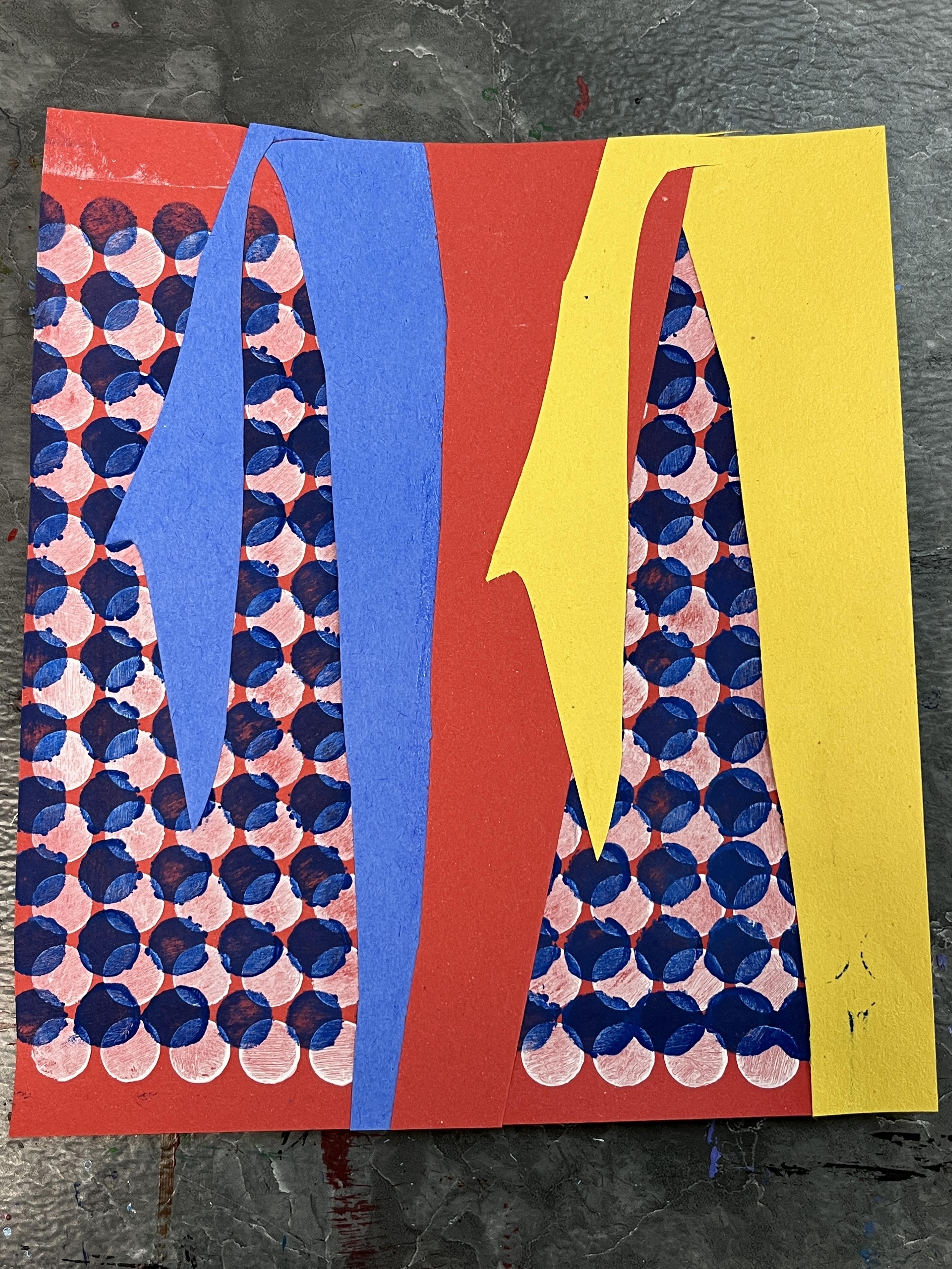
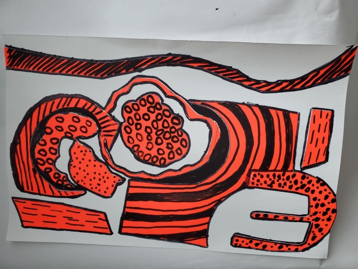
5. Demo Part 1: So I think with
my class project, I have this idea where
I want to go in and be a little bit more collage
based and kind of go toward more of his
later abstract works and kind of
play with that. I think that if I cut and glue, I can get a really
nice foundation. So I'm going to start with
white as my background color because I want to make sure that I have that brightness in there, even though I might put it back in through different
art media as I work. He's using kind
of bull blocks of color to represent the
paint brush stroke, and then he's putting the
pattern in the background. So I'm going to start, kind of creating sort of a
brushstroke type abstract. Then I'm going to cut that out. I just free ended
it just looking at the different ways that
he achieved that look. I'm going to build up
my collage and layers. What I like to do when I draw out my collage pieces
before I cut them, I like to draw it
on the one side, and then I will flip it
over when I glue it down. The tricky thing is
I often forget that, and then I end up with
images that are reversed. But there's a lot of
happy accidents that happen along the way as I'm exploring collage
and collage pieces and making the things
that I want in marriage. This is the gist of a brush stroke to do on
the white. I almost forgot. Let that be the starting point. Then I think I want to play
with overlap of color. So I'm going to cut
some of this off. I want this one to look
a little more drippy. I'm kind of wishing I'd gone with a longer piece of paper. Maybe the artwork's gonna grow. That happens sometimes. I kind of aim for something smaller, usually because I'm also
working on these classes as in person classes that
I love to teach at our local community center because we're working with
a limited amount of time, and it's a single session class. And we spent a lot of time
doing the deep dive into the background of the artist the focus is on learning
the art history, and then we make art inspired by that
artist for the fun of it. So just like we do in my
Skillshare class series, we have a limited
amount of time. It's an hour and a half long. This Google slide
show that I share as a resource for classes here on Skillshare is I talk through it. Like I present on all of it. So that takes up a good chunk of time, whereas in our class, we're kind of getting a
little bit of an overview, and then we're focusing on
the art making part of it. What I love about collage I love many things
about collage, but what I love,
one thing I really love is the positive
and negative imagery. So I was aiming for this shape, but as I cut it out, I started falling in
love with this shape. Which is really neat. So I think I'm going
to lean into both, and I do think my piece is
going to become larger. So I'm going to grab a
bigger sheet of white paper. I can always cut it down, but I'm definitely wanting to go bigger than what that smaller paper was
allowing me to do. I can also go vertical, too, which I think I might do. Even though a lot of his
pieces were horizontal. With my collages, I like to
kind of map them out as I go. Sometimes I'll sketch them
out, but more often than not, I'll have an idea on my head, and then I'll start
to create it, and then I'll build
it up on the paper. I love overlapping. Which Lichtenstein is doing too. When we look at the
brushstroke paintings, he's got swatches of brushstrokes that are
overlapping each other, but they do tend to stack. There isn't a ton of, like, in between each other happening. I think I want to lean
into all the colors. And I do know I'm going
to come back into this with black outlining details, I might I was originally
thinking that I would do intricate
collage and cut that out of a black paper
and then layer it on or I could go in
with a paint marker. Speaking of the positive
and the negative shapes, we've got some great stuff
happening here, too. I like that. I love that
yellow overlapping the red. I'm going to start making some committed decisions because I don't want to lose
what I'm creating here. I kind of feel like I should do the texture in
the background, but I think I'm I'm wait. I'm going to wait and see
and just kind of get it in. Going to do a little
bit of glue to attach my yellow
piece to my red piece because then I can treat it as one giant piece and
glue all of it down. I've got my scrap
paper for gluing, I can take this and I
can flip it over and get a lot of glue on here to make sure it's really
going to stick well. Now, the tricky thing is,
this is reliant on this. Now I'm going to
have to quickly get some glue on here
too because I'm also playing with overlap here. If you have a lot of
pokey little areas, you really want to make
sure you glue those well. Don't want anything sliding out. Now, I know that is lining
up with that corner. I know my yellow
is going on top. So now I can kind of
start to position things. You can use a scrap paper
or if your table's clean. You can just flip it over
and urnish the back of it, and that will make sure that all those glued areas
get stuck together. I'm loving this. This
is going to be so cool. This I know is going to go here, and chances are I'm going to cut my paper down a little bit. I am going to switch
it over too so that I get those
edges to line up, and then I'll trim
off that excess. But I do want some
blue in here also. Not all of his works
had all the colors. It's good to read very
differently when I get the black. I still want to get
some blue in there. I just really like playing
with primary colors. I like that combination. So let's start with
another long rectangle. I think I want to do
another dripping effect. I do want to make sure that
things aren't getting too repetitive and too
uniform. I'm not sure. I'm not sure I like it, but
I do think I like this. Yeah, I like that much better. But then I do feel like
I want something there. This is kind of
creating a frame now, and I also kind of want open this up a little bit.
This can come through here. Now, I kind of wish that
this was overlapped. And sometimes if it
hasn't stuck down too much yet, you can peel it up. Okay. So here's the tricky part when you make that decision,
this is already glued down. You've got to glue it in parts. Not impossible. We just have
to be a little bit more mindful because I don't want to get glue
all over my paper, my white paper, but I do want
this to stick very well. Just go little by little,
and stick it down. That one goes oh, actually, this one's going to
go over, isn't it? We don't want that
part to go down, but we do want this
part to go down. Now we need to glue
that yellow section. So we take our yellow section and this one isn't glued at all. This can go over
to our scrap paper to get lots of nice glue on it, which will then help
secure our blue section. So the blue is
going to get stuck down, yellow is stuck down. Then I can kind of get some of these pieces
that didn't get it. And then we can flip.
And we can burnish. If it starts to
get pretty sticky, this is where it's
a good idea to use another scrap of paper
and put that over the top of it because
the last thing you want is your artwork
sticking to your table. This piece, I'm
going to cut it off now because I glued to the edge, so that piece is now sticky and I don't want that getting
stuck on everything else. I do want to try to
minimize the glue getting everywhere because it'll impact the application of some
of the other media. I do need something here. It could take the flip side of this and have that come
down. I like that. I can make it longer by
adding in this piece, or I can have this piece
come up from down here, one way or the other, or it
can be separate over here. I think I like that, double check it before I
put the glue on it. The other thing you can do
if you're doing a lot of collaging, a lot of gluing. You can have what I like to do sometimes is
have a damp cloth or a half damp cloth where half the cloth is damp with
a little bit of water, and the other half
of the cloth is dry. Then as my fingers get
glue and get sticky, I can use the damp cloth
to wash that glue off. Then I can use the other half of the cloth that's
dry to dry it off because you don't
want to be working with wet hands and collage. Love this so much. Now, I also don't have to
incorporate the Bande dot idea, but I did buy the stencils. Intentionally for this class and this project and just
because I love stencils. I feel like I should
use them in some way. But maybe we should do
that next, actually. I want the black to
be my finishing touch to really pull it all together.
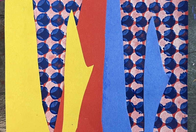
6. Demo Part 2: Because I'm not doing
a ton of painting, I'm just going to use my
folded up gluing paper. I do want to test this, though. I haven't tested this idea. So I'm going to scooch
this to the side. I'm going to grab that white
paper I started out with, and I'm going to
put down my stencil and get my tooth brush, load it up with a little bit of paint and kind of, you know, wipe it off so that it's
not I don't want it to bleed under kind of see if I do a scumbling over
this, how does that look? Oh, that's pretty great. I like how it goes out, too. See that? If I wipe across it, I think I'm going
to get a thick. Actually, it doesn't
really seem to matter. Awesome. Okay. What
I do want to do, though, I want to get a cloth so I can wipe this off as I go. I just want to make sure that
the side that's touching the paper isn't going to
get covered in paint. So I'm just going to wipe
it off a little bit. Let's start playing with this. See that dark blue? That's
going to look great. Oh, I could just do the dark blue on the
blue over the blue. That's great. I think
I like that better. Let's play with that. The
white I don't think is going to bother me once I
have all the black in there. This is going to be
very experimental. That's the other fun thing about these classes and these
artist inspired projects. We're exploring,
we're experimenting. We're getting inspired
through the doing, through the learning about the artist and their technique, but then mostly
through the doing and the applying of it and
how do we like it? Put this over the top
about paint on my brush. I'm just going to try to
go where my blue paper is. If it goes outside of
that, it's totally fine. My blue sections are
a little smaller. This is when you start
to realize that it's not an even uniform one. What I could do is, I could do it a couple
of different times. Like I can scoot it over.
I'm gonna let it dry first. I'm just gonna keep going.
I think I like this idea. I don't think I've completely Completely gone too far out. I think I'm just so used
to seeing the uniform, like Dunstein Bande dots that it feels a little weird that mine aren't I have an idea for that. So now I'm gonna go over these
bigger sections. Oh, dear. That's okay. Even though
it's paint on paper, I think I can get it off. I have a little bit of water. Water on paper is
not a great idea, but I think I'm careful. We'll see what happens
when that dries. But like you said,
it's an experiment. Maybe actually instead of being nitpicky about this,
I have a better idea. I'm going to embrace
the blue dots. I'm going to hold this down, and I'm going to
put them all over. Not all over. I don't think
I want them on my red, but I am going to embrace them. I just don't want to be
that nitpicky about it. I want to enjoy
this and not Oh no. Let's just see what happens. I put too much paint down, and that makes me really sad. Not a happy accident,
but that's okay. Here's what we're going
to do. We're going to get a paint brush, and
we're going to paint it. It's been a long
time since I've had an artwork that didn't
quite go to plan. I'm not loving what
happened with those dots. I'm going to paint
the section blue. So because I'm painting
a lot of my paper now, it's going to take a longer
time to get to the black, and I have the dots on
the blue on the red too. Put that under there so I can kind of keep my table clean, not have to paint so carefully. I will say every
time that I've had a piece where this kind
of stuff happened, things really went to a
strange, not enjoyable place. I have loved the
outcome in the end. The problem is, I really
loved this piece. I did that. But it's okay. It is for growth and exploration and trying out
another artist's take on things with my own spin. We are learning. We are
exploring, we are growing. Sometimes there's growing pains. That is what I'm experiencing currently, and that is okay. So that section's resolved. I do need to kind of keep going. I do like the dark blue, and I did accidentally get the blue paint
smudged on my paper, so I need to resolve
that anyway. And I think what I can
do is I can go in with my paint pens and I can clean up the parts where I
got the blue dots on the red. It's looking a little rough, but I think it's
going to be alright. Crisis averted. I'm going to wash my brushes and let this dry a little bit, and then I'm going
to come back in with some paint pens, I think. So I'm going to start by outlining the shapes that
I've created with the paper and then add artistic
flourishes as I go. Because I collage
this, there's going to be a little bit of like, where it doesn't quite fill in. But these are supposed
to be brushstrokes, so they would be a little
scratchy and a little rough. You can also use the
black line as a chance to exaggerate a little bit,
some of your shapes. If you're using paint
pen, just remember that the paint it stays wet for a little bit
because it's acrylic paint. Try not to smudge
your hand through it. So what I might do is I might go back over some of these
with some sharpie or a fine liner just
so I can really get into some of these crevices. And if your paper
comes up like that, once you paint or whatever, if you have anything wet,
just once that's dry, you can go back in and
glue that back down. Because my paint pen is
drying out a little bit. I can lean into that kind
of create some wisps. More scratchy dry brush effect. Then the last thing, as
far as this part goes, you just have to
make sure you kind of look it over a
couple of times, make sure you've got
all the parts outlined that you want that
you've got lid. Dry brushy brush stroke texture. We could also do this with
an actual paint brush. I'm going to go
ahead and just trace my original blue paper shapes, even though I painted
over them to hide my accidental dot situation. I'm really liking that texture, so I'm really going
to go for it. But I don't want it to be even even and symmetrical
and balanced. I want it to be more random actual paintbrush.
Strokes would have. Actually, I like
what happened there. That is working out okay. I want to put some more texture. The other great thing
about the texture lines is it kind of if you stick with the direction
of the brush strokes, it'll help distinguish
what's what. As far as which brush
stroke is which? Go on with my sharpie and
just crispen up a little bit. Any areas where I've got
a gap where the paper and the papers are layered over and I can see some of
the white through there. Try to fill that
in as best I can. I got the bold color. I've got the paintbrush
look, I've got some texture. His are much
cleaner. I've really leaned into a messier look. I could absolutely go in
and crispen these up. The other thing we can do is we can go over this
with colored pencil. This will mellow out some areas that might have
gotten a little muddled. It'll also be bolder
than the paper. Generally, it depends on
your construction paper. Mine is pretty pale.
But I think if I go over it with colored pencil,
I'm just going to darken it. I'm not necessarily
going to brighten it. I don't know that I want
to do that. I'm going to try to clean up
my red a little bit. As far as the black lines go. I'm liking this again. We kind of got through
that awkward part. So now I still really want
to have those dots in there. I think what I'm
going to do is I'm going to put them
in with paint pens, and I'm going to do the reverse. I have all this dark
blue with a light blue. I'm going to try
adding it by hand. I I'm careful, just go slow. It can be fairly even. So all I'm doing is
staggering them. I'm trying to keep them
pretty evenly spaced. I will say this is a
very relaxing process. I'm going to finish
this up, and then I'll meet you in the
last lesson to wrap up the class. Oh
7. Final Thoughts: Thank you so much for joining
me in this artist inspired series class as we look to
the artist Roy Lichtenstein. I hope you had as much fun
exploring various elements of Roy's artistic
practice and process and techniques and
imagery and color use, and that you are
feeling inspired and kind of finding
your own path. Weaving some of this
into your art journey and kind of leaning into a little bit of Roy and
a lot of bit of you. I'm so excited to see
what you've created. So I really hope
you'll hop on over to the Projects and
Resources section of class and upload some photos of what you've created
to the student gallery. If you want to take some time to share
some feedback about the class and share in a review how you think
the class turned out, I would love to stay connected
if we aren't already. So don't forget to
give me a follow on Skillshare to get notified
about future classes. Me over on YouTube if you want some little bonus stuff and check out things
on Instagram, I share all things over there, whether it's classes I'm
teaching here on Skillshare, classes I'm teaching in person, Art adventures I go on, the art projects that I'm
creating in my studio. I am having so much fun creating the Artist
Inspire series, and I have a bunch
more in process, and I've got a bunch
more ideas coming up. So there will be even more
of these classes coming. So thanks again
for joining me in our Roy Lichtenstein inspired class. I'll see you next time.
 Elisabeth Wellfare, Artist, Art Educator