Transcripts
1. Introduction: Hi. My name is Elizabeth. I'm a professionally trained
artist and art educator. I'm also a published author and illustrator with a
children's book, as well as an original
illustration coloring book. And I've been teaching on
Skillshare since 2020. I love art history.
I love it so much. I love learning about
the art movements, art styles and artists of
the past as I get inspired for ways that I can create art in the present and
in the coming future. And it's always so
exciting to kind of learn where the art styles come from, what their
influences are, how they're carrying through
different traditions and artistic characteristics
from past styles and trends, as well as ways that
they depart from it. So in this series of classes that I'm calling
artist inspired, I am looking to the artists of the past to find ways that I
can explore art techniques, art media application, and idea generation
and subject matter and stylistic considerations
as I create contemporary works incorporating my own artistic
style and practice. So in this series,
I really want to encourage you to join
me on this journey as we briefly look at specific artists and
their art styles and art movements to kind of see what
things we can use to shake up our own art
practice, get us inspired. And kind of challenge us to create in new
and different ways, all while still kind of
leaning on the things that bring us the most joy
in the creative process. So in this class, in particular, we're looking at the
artist Pablo Bicaso and the movement cubism. But we're going to go even
more specific than that. We're going to look
at his series of portraits that are part of
his weeping women series. I love the way that he
uses figural distortion, and he does it in a
bunch of different ways throughout his
cubist exploration. But in the weeping women, it's a play of different geometric and angular representations of
the human face, as well as some over exaggerated curves and
more organic approaches. So we're going to take
a look at a couple of different examples of
how Picasso did this as we then create our own as distorted figural
portrait representation. We're going to be
using collage and colored pencil and sharpie
to create our artworks. So very contemporary
art materials to represent inspiration from the past because as we know, Picasso was working
with oil paint and different found objects
for his collages. So he was actually
doing collage also, but we're going to be
using paper for ours. So I hope you'll join me
in this really fun class. We dip our toe into
what Picasso was up to with figural distortion and
some of his cutest portraits, as we create our own
unique distorted portraits with a little
contemporary twist. This class is intended for creatives of all
skill levels who really love kind of
digging back into history to get inspired
in the present moments. Let's send it over
to the next lesson to talk a little bit more in detail about our class
project. See you there.
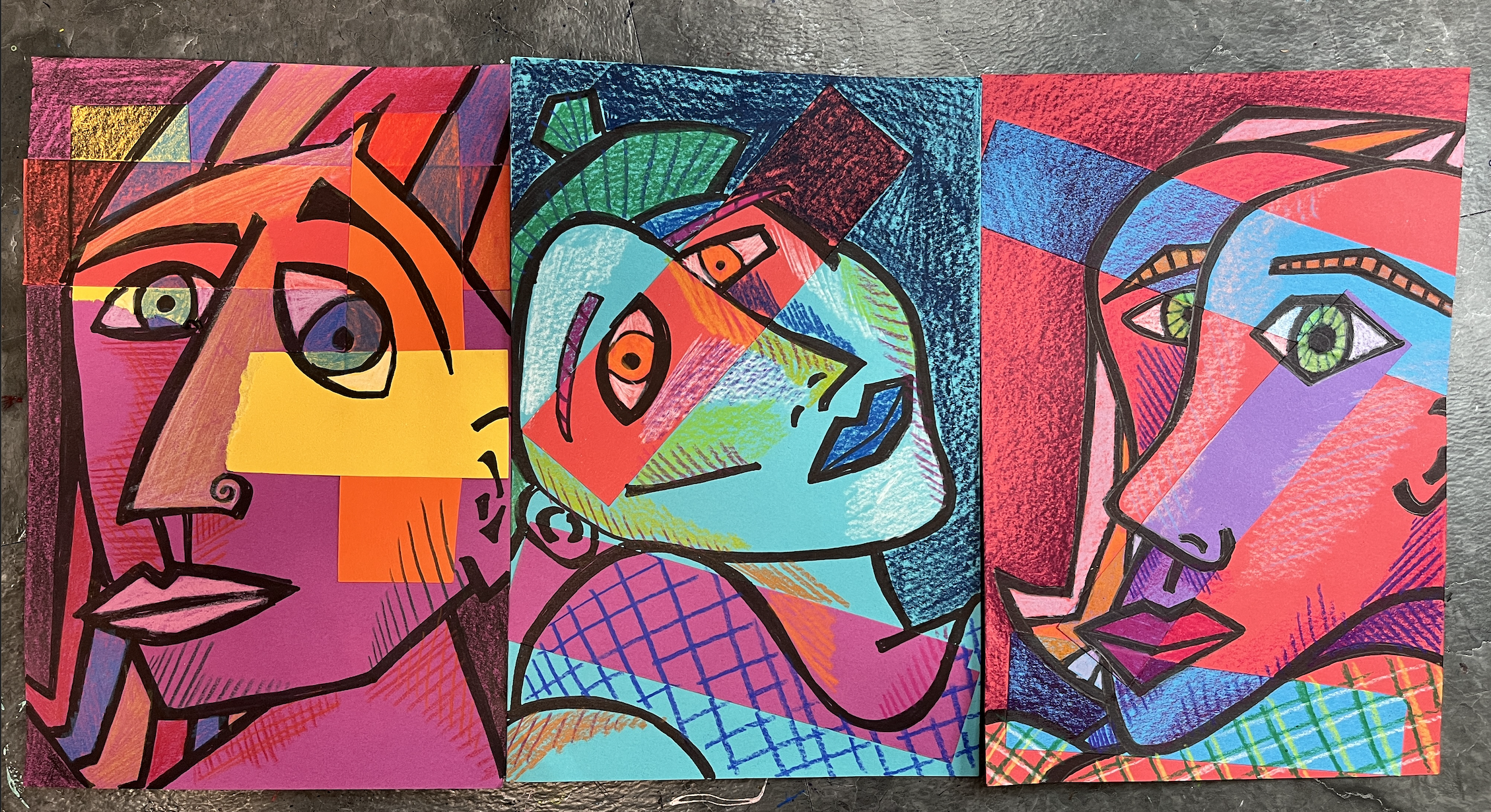
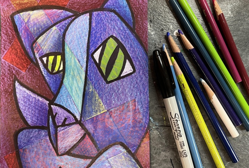
2. Class Project: For our class project, we are going to be creating
a mixed media collage, which is one of my favorite
ways to create these days. So I create a collage surface, and then I work
back into it with different mixed media materials. So in this particular case, we are going to be doing
the most basic collage you can possibly
imagine as we break up our colored background with some patches of color in
geometric rectangles or squares. Then we're going to draw
into that with pencil and then sharpie to create
the bold black lines reminiscent of Facaso's
cubist tendencies and especially his
Weeping Women series. Then we're going to go
back into that with colored pencil to
really kind of play with what happens when you layer a color of colored pencil
over colored paper? And then how do you use
color and value and texture and pattern to really
kind of define a figure. So in this case, a portrait on a collage background. It's
going to be really fun. Let's head on over to
the next lesson to talk about what materials
we'll want to have on hand for class. See one.
3. Materials: For our project, the materials
are very straightforward. We are doing collage, colored pencil, and sharpie. What I'm using for my
background paper is I'm using some of this nine by
six inch construction paper. I have a bunch of different fun bold colors that
bring me happiness. You could use any color
that you want to. You could also use
white, black, brown, whatever color you want,
but I really wanted to play with fun colors
that spoke to me. I wanted to put my
own spin on it. So I'm choosing
colors that I like. A color background
paper that you want to, working small is nice because
it's very manageable. This is on the bigger
end of small in my scale of artworks. This feels really comfortable
for a piece like this. I've got my background paper
and then for my scrap paper, these are just other
scraps of related colors. I can use whatever
colors that I want to, but if I was going
to go with a red, then I might want to have some
bull pops of other color. So the color you choose for
your background paper will impact the color that you
choose for the collage portion, but we're only gluing
down rectangles of color. So we're only going to need a
little bit of these scraps. Then I've got some scissors
on hand in case I want to trim up my rectangles
to better fit, and then I'm also going
to have some overhang, so I'm going to
clean up my borders. I've got glue stick
so that I can glue down my collage paper
and then glue is messy. I always have a scrap of copy paper on hand
so that I can do all my gluing here
and then paste it into my project and
keep my table clean. Then after we glue
and just break up the background with
some patches of color, we are going to then being and drawing our Picasso
inspired portrait. To draw the portrait part of it, I'm going to want to
have a pencil on hand. You can also go straight
in with the marker. I think I actually did go
straight in with the marker, but it's nice to have the pencil there too if you're
a little unsure. You could also do some
advanced quick drawings to get the idea of figural
distortion all a Picasso. You might want to have
your sketchbook or some scrap paper
on hand for that. Then I've got my sharpie
so that I can create the bold black line and then I'm going to
have a couple of different colored pencils. The colors you choose
for your color pencils will depend on the colors that you end up in your collage. But you can do related colors, you can do different colors. You can have a warm color
scheme, a cool color scheme, you can play with analogous and have colors that are next to each other on
the color wheel. You can do complimentary and do colors that are
opposite each other. The piece of color
for this project is truly up to you and
what you prefer. But a couple of color pencils are going
to be needed to add the finishing touches for a project, and that's
all we're going to need. Go ahead and pick
out your colors, grab some paper, get your
collage materials ready, and I'll meet you in the next
lesson where we will begin our Picasso portrait
inspired collages.
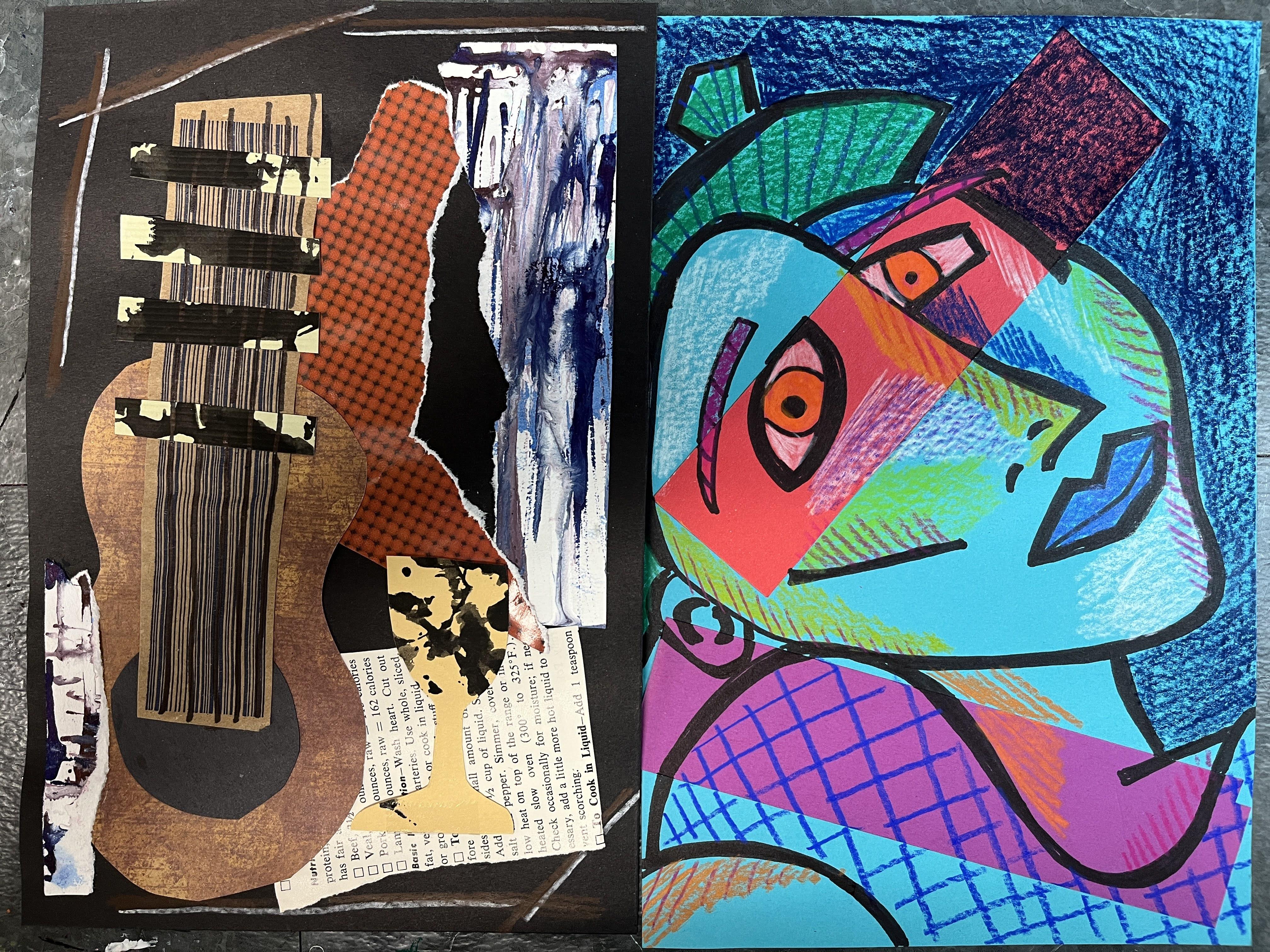
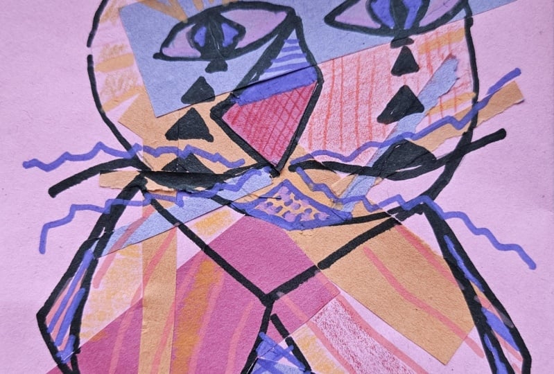
4. Collage and Draw: All right. So the first step to starting our class project is to just collage a band of
color to break up the space. So for these two examples, I ended up using,
let's see, this one, I started with, I've
got the teal paper, and then I did a band of
red and a band of purple. And then this one I
did the purple paper, and I did a band
of I did a band, two different
sections of yellow, and this one I wanted to kind
of go with the torn edge. Normally, I've used, you know, clean cut edge where I use
the scissors to cut it. So I've got the torn edge
of two yellow pieces, and then I layered up the orange the red and the orange to
kind of do this overlay. Pattern. And the great thing is the bands of color
really become secondary when we get into
the drawing part of this project, which I love. I love it. It just
becomes another color in the background and kind of
changes the way we do it. I did, here I intentionally
wanted a band to go across the eye area to
kind of really bring some focus to the eyes
of this female figure. This one, it just kind of
happened to be up there. So let's see what happens
when I do the rep one. So I have my red
background paper, and then I've got a lot of
different color options. If I go with the violets, it's going to be fairly close as far as brilliance of hue goes. They're not going
to stand out a ton. If I do the yellow, obviously, we're going to get
a very big contrast between the brightness of the yellow and the
darkness of the red. And then I also have
this blue that is also very bright compared to the red and kind of goes
nice with the yellow. Think what I'm
going to do is this is going to stand out a ton. I think I want to keep it a
little bit more subtle and do some brightness with the colored pencil
application instead. I'm actually going to
go with, let's see. I'm going to go with my blue
and some darker purple. I've got some interesting
line detail here. I do want to clean
this up a bit. I want to have the clean
edges of the rectangles. You don't have to go with geometric shapes for
the collage piece, if you want to have
something more organic or you really want to do more for that step, I don't
want to overthink it. I just kind of want to get
it down and then, you know, let it become, you know,
something something exciting. So I'm just gonna
randomly place them. I'm not really gonna
think much about it. And again, this is the one
we're doing for the Picasso inspired Pacaso portrait
inspired piece. So this is going to be similar to what he created
for his weeping women, which is a series of work
of his that is my favorite. I love the Weeping Women series. I love the play of line
and the geometric details. I love the distortion of
the face that he includes. I am going to overlap
this a little bit just because I
think that's fun. And part of me does
feel like it's a little too open down here. So I can always
repeat the blue if I want to maybe I will.
That sounds kind of fun. But like I said,
don't overthink it. Let this part just be kind of just an
intuitive go with your, you know, trust your instincts kind of part of the process. 'cause you could spend
all day collaging. We want to get to the
drawing part of this. The collage piece is just
to break up the background. So I do want to make sure
these are glued down really well because I'm gonna be
drawing over my collage pieces. Alright. So the collage
stop is done. That's it. So we can get rid of
our extra scraps, save those for something else. We can get rid of
our scrap paper. You don't need that, and we
can put away our glue stick. So and our scissors. So now, oh, actually, while
I have my scissors out, I am going to trim
up the edges because I do want to have
a nice clean edge. So anywhere my strips go off the page, I'm going
to clean them up. Scooch the scraps.
Great. Okay. Now you can look at different references of Picasso's women or you can
just kind of make it up. So if we look at these ones, this one, the eyes
are always askew. They're usually going
at different angles. The idea behind cubism
is that we're seeing multiple perspectives of
something in the same image. We're seeing a front view, a side view with a
three quarter view. The head is tilted
different ways. This one is a little
less distorted. It's got the three quarter view. If we didn't have this eye here, that it would be pretty straightforward except for
the fact that the lips are from the front view and the scale difference
is exaggerated, and then obviously this
eye is tilted down. This one, the head is back
at an exaggerated angle. And this one has the
geometric lines, so everything is very sharp and angled. This
has some of that. There's some geometric lines to the point of the nose
and in the mouth. But otherwise, the lines I've
exaggerated the roundness. So he did both of these things. So it is really interesting to kind of look at a couple of different ways that he
distorted the figure, especially in the
Weeping women series. So you can go any
which way you want to. I really enjoyed
making both of these, so I'm probably going
to do some sort of combination for
this third piece. But I do want to draw
it out in pencil first. I usually go straight in
with the pen or the marker, but for this one, I just
wanted to lay it out. Now, if I make a
mistake, mistake, while I'm drawing this
out, I can't erase very well on the
construction paper. There is that limitation to it, but I can incorporate
that into my piece. So I'm going to start with the line that
defines the nose. I do want to make it a
smidge and more angled, even though I started with a straight started with
a rounded edge rather. So now that I've done
a couple of these, I'm going to let this one be kind of a play a mix of
Picasso style in my own. What would my version of a distorted figure
inspired by cubism be? I'm going to bring that line up. I'm going to let
this intersect it. Then let's see. I'm going to let
this one go off. Actually. If you erase lightly, you can get it to come off and get your
lines to disappear. All right. Then what
do I want to do? I want to put one eye here. Really kind of going for the bold almond shapes that
we see in a lot of his work. But I do also want to
kind of see that break. And all these lines are
going to get thickened up. So you can draw them thick to
begin with if you want to. So you can kind of envision
how is it going to look. That's one, then I'm going
to define the rest of Oh, wait, but I do want to I really like seeing
the full mouth. I'm going to have
that edge be there, and then I'm going to
go ahead and put in an angled lip
exaggerate the scale. Then I'm going to let
this be really angular. Then I'm going to have the rest of the face
come down like that. But I do want actually, no,
I don't want to do that. I'm going to have
this come down. I'm going to come back
into that roundness again. But I'm going to let
it go like that. Then for this eye,
I'm gonna Whoops. Throw my pencil across. Thanks. I'm gonna
really exaggerate. A make it almost
a diamond shape. And then pupil. Okay. Then I want to thicken up this line so I can really see what I'm working with here. Then it'll just be a
matter of filling it in. Because when I add
that thick line, it's going to change
its appearance. Quite a bit. I'm thickening
the line inward, but you could also
thicken it outward too. I'm going to exaggerate the little indent
on the upper lip. And then I want
to give actually, I do really like doing ears. I'm going to go ahead. I'm going to squish
an ear in here. So there's that.
And then let's see. Um, I'm gonna have
some hair come down. I like the exaggeration
of kind of the Bob look. And then add some line details. Break that up a bit. We have here. You can have it
come up here some more too. Kind of allude to
the texture of it. And then let's see. Normally, let's
see. This allude. We can make this
defined as clothing. When we do our patterns. Then I think I'm
just going to leave my open space like it is. Then what we want to do
I wish I had nostrils. They're fun to do
with the block. I'm going to do this
nostril up high. Okay. I'm going to start
inking this in with my Sharpie and then that
will help me figure out if I want more details. I'm just going to
start outlining and filling in sections. And then I just keep going
through the whole piece. And then after I get everything aten that I've drawn so far, then I will decide if I need to add more before I move
on to colored pencil. So I'm going to go ahead
and speed this up, and then I'll be back
after I've gotten everything filled in and
boolded for my black lungs. The I have my figure. I think I forgot eyebrows. This is a nice opportunity to kind of add
some more texture, some more linework texture. It is totally fine to
vary your line weight. It can either just happen
naturally or you can intentionally use and create different thicknesses
for the black line. Okay. Awesome. Now, let me see. Is there anything
else I want to add? I put more black in the
background if I wanted to. But I do really want the
focus to be on the figure. I'm trying to figure
out if I should do a little bit more definition in here or just let it be. I could also do
another another curve. Alluding to more of the body.
Actually, I can also do. Okay, now I'm overthinking.
So now we're gonna stop. So that is the sharpie step. So adding black thick
bold line to your figure. Now we're going to
go ahead and we're going to add in colored pencils.
5. Colored Pencil: So for this step,
it's going to be a fun mix of adding
different patches of color. I like to play a little
bit with value to kind of define some of the planes of
my figure and their face. And then I can also add in
some different textures, line marks, whatever kind
of marks you want to do. It's completely up to you how you want to personalize
it from here, but the color on top of the colored pencil looks
really interesting. And then you can also kind of play with defining
things a little bit. So I do want my figure to
stand out from my background. I think the very first
thing I'm going to do is make my background a lot darker. But I want to do colors
that are kind of in the same family as what
I've got going on here. I have kind of an
analogous color scheme, you know, with the red,
the blue, and the violet. So I'm going to grab
maybe this dark purple, and I'm going to go ahead and
harken up the background. I don't want to lose the
red that's behind it. I just want to make it a
different a different shade of red or a different color
that still utilizes the red. That's also going to change
when it goes over the blue. So when one color goes over two different colors,
it's going to look different. But that's part of
the fun of it too. Now I could also play
with shading here. I can have it darker closer to my figure and then
let it fade out. That is a really fun way
to approach this and adds even more visual interest. Actually, I am going
to do that. It is a little tricky to go over the collage sections without having it create
some strange marks. But that is also another
interesting element too that you can just embrace, which is what I like to do. In some regard, we have created kind of sort of a cartoon image, and now we're kind of
filling it in with color. But we can do a lot with how we approach adding a colored
pencil to elevate it. So I love elevating the bowl
drawing and the idea of collage by working in some great art techniques
along the way. My background is done. I
could go into this more with some other colors. Maybe
I'll revisit that. For right now, I love it
because this is done, this is defined, my figure in the foreground
with my background. So now I'm defining my space. Now there's some
other really fun ways that we can do that. But what I want to
do first is I want to define some of the features. I find it really, really fun, even though we could use
any colors we wanted to, I like to still put white for the white of the
eyes because that just adds a really nice highlight
area to the piece. And really makes that
part of our portrait pop. Now, I do want to be careful. The white will show
up over the sharpie. So I do want to make
sure I'm staying inside my lines as best I
can so that I'm not racking. But if you do find that
your pencil goes over it, you can always go back in with your sharpie and clean
that up a little bit too. Don't worry about
that if you start to go over your black lines. I love doing unconventional
color for the lips. I also want to give the
hair a different color, and it's really fun to
make this wild and crazy. See the orange isn't
going to stand out a ton. She's pretty good. Then because I've got
the second section in, I can mirror that
down here and that'll help it give the
idea that the hair is where the hair is flowing. Then you can always decide
to push harder for some of the colors of your
construction paper that you're coloring
over if you want to. And when I get into the face,
I do tend to push harder with the colored pencil just to get that really bold richness. But that is also my tendency
with colored pencil to really build up
rich rich color there. I'm gonna go on
with this lavender. And the fun thing is, I mean, all the colors are going to
look a teeny bit different because we're coloring
over a different color. So the great thing
about my red background is it's really making this lavender a lot brighter compared to what I'm seeing
on a colored pencil. Even do a double
section of lavender. So then that orange is
kind of a highlight. This is a chance to
really play with color kind of test
out some fun ideas. Now, I'm gonna do just a teeny bit of
cleanup with my sharpie. My lavender did creep up on
my sharpie just a tiny bit. Here it is done. Eyes
are almost done. Let's figure out a
color for our irises. Um, something that's gonna be kind of I want it to stand out. I could do a light orange. Actually, let's do a lime green. Mm. So it's always kind of
fun to add that shock of another color that just feels like it came kind
of out of nowhere. But at the same time, you know, green, not this green, but green is a natural
color for eyes. There's more complexity
to eyes, right? So let's add a little
bit of texture in there. So besides adding, actually, this I thought I
grabbed a dark green. I grabbed an indigo blue. But over the green, it's looking bitter green. We did the details that we wanted to add
with the sharpie. It's really fun to go in and add some other details with
the colored pencil. So you can add as many
different lines and marks as you want to
kind of experiment with all the different
ways that you can incorporate color
pencil into this. And actually, now
that I've done that, I want to go back over
with the lime green. It just softens it a bit to add that layer of the green wax
on top of the darker color. Now I want to do the lips. I want them to really
be wanting to go with spchia we'll do it. 'Cause the whole vase
is gonna change when we start adding in
more to the face. Then I loses it a
little bit over there, but that's okay because we're going to do some
definition there. Now I'm going to go really, really bold and I'm going
to find my white again. Actually, before I do that, before I do that, I'm going
to darken up some areas. So I'm going to go back get dark because this section
is further back than that, I know that there's
some shadow there. So I can put that in with value, or I can put that in with line. I'm going to go ahead and add a couple different sections. Of the shadowing. I'm going to add a little bit of lightness where the
light areas are. So I'm going to do I'm gonna do a little bit of cheek
highlight, kind of a dusting. And then I'm going to
do some along the nose. Light blue, a little bit of
texture over the dusting. Just kind of breaks it up a bit. And then I'm going to
circle back to my purple. Just a little bit there. And then let's do I'm going
to take some of that magenta, and I'm going to
add a little bit of value that section down there
over here behind the ear. I'm just going to fade it
out super quick. Teeny bit. But along the jaw and
underneath the lip, a little bit under the nose. I'm going to do a tiny bit of here just to continue
to push that back. This is a stage
where it's really important to step back and take a look at what you're
doing and make some decisions. I want to distinguish this
section from the neck. I'm going to do a little bit of the purple over
my purple lines. Then I'm also going to blend
that with that fuchsia. This is great. I'm loving
it. I do want to add some color to the eyebrows. I'm going to go right over
the lines that I put down, and then I'm going
to go ahead and put that texture back
in over the top. It's just easier than coloring in between
each of the marks. Lean up the outer
shapes a little bit. Oh, I want to do something
with the closes down below. But I want it to be
something. I think I'm going to do the green so that it mirrors
that because that's just good art aesthetics. I'm just going to put
I'm going to do kind of like a fox plaid maybe. So I'm gonna put some
really bold lines. Going one direction. Then this one's gonna go the other way. And then I'm going to grab
a really light green, and I'm going to
kind of double up. I'm trying to create the
illusion of a textile so that it helps to find that
this is her clothing and not another
part of her body. Usually, there's
a white and flat. So if I kind of criss
cross this this way. It doesn't have to
be this complicated. I just have this
idea in my head that I really want to see. Come DA. There. Okay. So I did
the collage background. I drew out my Picasso
esque portrait. I added black line and kind of thickened that
up to define the face. And then I went in with
colored pencil to help define foreground
from background and different
planes of the face, and then to add some
visual interest with color and mark and value. I'll see you in the next lesson where we'll wrap up the class.
6. Final Thoughts: Ten. Thank you so much for joining me and
learning a little bit about the artwork
of Papa Picasso, in particular, his cubist figure distorted weeping women series. I hope you had as
much fun as I did incorporating his art style into your own artistic practice. I know I've got some
really fun ideas for ways that I can continue
to explore this later on as I continue to
weave more and more and more of my
artistic style and personal artistic
preferences and creative approaches into
the influences that I've picked up by looking at Picasso's weeping women and considering different
ideas of cubism. I would love to see how
your portraits turned out. So please take some
time to pop on over to the Projects and
Resources section of class to post your project
to the student gallery. It's going to be
so incredibly fun to see all these
amazing portraits, and don't forget to
check out the portraits of your classmates and kind of circle back to
the class to see what new other exciting
pieces get uploaded. Because the great
thing about our class is that it exists forever. So you can kind of
keep coming back to it as you're
looking to return to different artistic ideas
to see what others are up to and to see what feedback you've gotten
on your own project. Also, I would love it if you took the time
to leave a review. This artist inspired series is one that I have so
many fun ideas about, and I'm really excited to expand my skill share
classes by offering art inspiration and
artist inspiration into the creative practice that I already share
across the platform. So I would love to hear your thoughts about how
the class went. I would love to hear what
you think was working well, if you have suggestions
for artists that you would like to see me
explore in future classes, or any different feedback
that you can give me as I continue to grow as a teacher on this platform
would be wonderful. And now that the class is done, we don't have to stop connecting because
there's going to be a new artist inspired class getting uploaded over
the coming year. I have so many planned
for 2025 and beyond. You can also connect
with me over on YouTube by following
my channel there, where I post sneak peeks of what's happening
on Skillshare. I share different
artistic practices and approaches and
demonstrations. Take you on art journeys, too, especially as we get into the
warmer months and I start venturing out of the art
studio and out into the world, taking my sketchbooks with me on all sorts of fun art adventures also check out my Instagram page where I love to share
my artistic process, what I'm up to, what
I'm checking out on Skill Share as a
Skillshare student myself. And also, I love to share my students
projects and kind of get other folks excited about the classes
that I'm taking, the classes that I'm teaching, and everything art
and creative related. So let's continue connecting
on YouTube and Instagram and don't forget to follow me on Skill Share to get notified
for future class updates, especially as we
continue journey through the artist
inspired series. Thank you so much for joining
me in class and I'll see you next time. E.
 Elisabeth Wellfare, Artist, Art Educator