Transcripts
1. Introduction: Okay. Hi. My name is Elizabeth and welcome to the next Artist inspired
Series class. I am a professional
artist and educator. I have been teaching
students of all ages for my entire
professional career and I really love sharing my
passion for artists and art history and art techniques and approaches with my students. In the artist inspired series, we are doing a little dive into a variety of
different artists, getting inspired by the
work that they created, the journey that they took in their development as artists, the approaches and techniques
that they explored. Then we're looking at all of that as inspiration for
our own art making. I try to approach all
the class projects as ones where it's really
easy for anyone of any experience level
to get into it and have some fun and to grow as an artist and to try
out new things that maybe they hadn't considered
before in the art making. In this class, we
look to the artist Jasper Johns and get excited and inspired by the
technical approaches and artistic practices
that he explored. But in particular the repetition and the graphic imagery
that he looked to. In his number series
in particular, as well as in the ways that he incorporated various
letters into the artworks that he created. We're going to look
at how I start my mixed media projects often
by creating painted papers. This works incredibly well
when we look to John's because he was also starting
with treated surface, which is a great way to overcome the fear of the
blank page too by starting with a surface that's already been
treated in some way. In an optional lesson
that you can explore, we're going to be playing with
different ways you can use acrylic paint to create
painted surfaces. Then we're going to dig out
our stencils and play with different mixed media approaches to build up our
graphic imagery as we get inspired by
John's work and weave in our own artistic preferences
and tendencies and nuances of pull different elements from different pieces that
Johns has created to get inspired and have a
fun time with mixed media. I really hope you'll join me
in this next artist inspired class as we focus on the artist Jasper Johns. See again class.
2. Class Project: For our class project, we are going to be doing
a mixed media artwork. I show you how you
can start by creating a painted surface because he was starting with a treated surface. He would often collage
different elements, newspapers just to start with that texture background,
that pattern, background. In an optional lesson
that you can explore, we're going to be playing with
different ways you can use acrylic paint to create painted surfaces on
just found paper, recycled paper, any
kind of paper you want to work with to give
us a starting point. We're going to dig out our
stencils and play with different mixed media
approaches to build up our graphic imagery as we get inspired by John's
work and weave in our own artistic preferences
and tendencies and nuances. We're going to play with
graphic letters and numbers. We're going to
play with overlap, and we are going to play
with mark making and outline and just all
the different ways that we can explore this imagery and pull
different elements from different pieces that Johns has created to get inspired and have a fun time
with mixed media. It's almost like an
artwork sandwich because I start with a painted
surface and I end with a painted surface
in between that is all this beautiful
graphic imagery and mark making and
values and texture, and it's really a fun
artistic process to explore. We start with a
painted surface and then we go through
some different stages, working from painted surface to dry drawing techniques back into wet painting at the end as we create this really beautiful
mixed media artwork that is going to show you all these different ways
that you can really push your art tools and your artistic approach to creative mixed media art making. Let's en over to the
next lesson to talk a bit more about what
materials I'm going to be using and ones that you
might want to consider for your own mixed
media Jasper Johns inspired artwork. See you there.
3. Materials: Our arts advie for our class project are going to involve a treated
surface of some kind. So what I like to do is I do
altered bookmaking and I gut old vintage books
and turn those books into new sketchbooks
using the cover, and then I keep the insides for making decorative
paper for collages. So this is the inside of a
cookbook that I have gutted. And then what I'll do is
I'll take acrylic paint, and I'll just apply
it in a variety of different ways to give myself some interesting collage papers. Sometimes I let more of the text or imagery
underneath show. Sometimes it gets
pretty filled in. It just depends on where I'm at. A lot of this I'll do with
my leftover acrylic paint. Acrylic paint works
great for this. You can just brush it on. You can use different
techniques for applying it. You should check out some
of my other classes. Well, we create decorative
collage papers, both just from fresh paint, as well as from
repurfosing leftover paint on your palette then the other thing that we need for this class is the stencils. So these are just some letter in number stencils
that I've gotten. These were actually
ones that my sister in law gave me when she was kind of cutting back on her stash of art supplies when
she was downsizing. But you can get these at any
hardware store, craft store. They're just kind
of nice stencils. Then those create some of the graphic imagery that we're looking to from
Jasper John's work. Then the other thing that I like to work back into
this with is soft pastel. You start with the
acrylic treated page and then the soft pastels, as well as paint markers or permanent markers work great for working back into
that treated surface. You can also paint
back into it too. You'll see in the
demonstration all the different ways you
can explore this. But these are the core
art supplies that will come in handy for
your class project. If you start here, then you can expand beyond that as
much as you want to. Over to our next lesson to
learn a little bit more about the artist
Jasper Johns and get excited about what we're gonna be creating in our
class project. See you there.
4. About Jasper Johns: Jasper Johns was born
in 1930 in Augusta, Georgia and grew up in
rural South Carolina. The imagery that he created, he was really looking to
repetition of numbers and letters and really playing with how far
he can push art media. For example, in the flag series, a lot of those are
painted surfaces, he would layer over
collage elements. He would use
newspapers to build up a textured or pattern surface, and then he would go over that by layering over it with costic. So heated and cooled beeswax, which is really
interesting because works often look more so like paintings and
we do see a lot of painterly brushstrokes
and that is a part of it. But he was also playing with
encaustic and collage and how to combine those two to create really
interesting surfaces. When we look to the
number artworks, he created over 170 artworks, exploring numbers and how to represent those in his
artwork and his imagery. Repetition was a
huge part of it. Sticking with imagery
that was very familiar to him and
very comfortable, but really seeing
how much he could explore art media and
representation of that imagery. Really just repeating and
repeating and repeating. But all of these pieces, although they have
these connecting elements are very different. But you can still tell
it's by the same artist. He is a really fabulous
artist for really considering how far we can push a
basic subject matter and the ways that we can
continue to work into that repeated image in a myriad of ways through
different media, different representation,
tweaking things, color palettes, textures, there
really is no limit to it. That was something I
really enjoyed about creating a class
project for this one, was that I felt like I was
going on this art journey and the more pieces I played with more I was
growing as an artist, and that's always
my ultimate goal. How can I continue to grow and experiment and play and have fun and get to those moments
of discovery and excitement? He is a really
important artist too, because he inspired a lot of other artists in
many different ways, but his work was one of the elements that was a
precursor to pop art and definitely had an influence
on the repetition and focusing on common
ordinary imagery in a really extraordinary. The exciting thing about Jasper Jones is that
he's still alive. He's alive, he's
creating and he's a really phenomenal
artist for us to look to for artistic
inspiration. There's a lot of
different avenues you could go down as you explore how the work that he created and
the approaches that he had to art making can influence
your own artistic practice. I focus on the number
series and putting letters and some of the textural
elements in this class, but you are welcome
to do as deep a dive into Jasper Johns work and
his artistic processes to really find the part
of it that gets you excited and ignites
your creativity and wants you to get creative. Even more information about
Jasper John's life and a large selection of imagery of his different artworks that he's created throughout
his lifetime. Be sure to pop on over to the Project student resources
section and check out the Google Slides presentation
that I've linked there. It will really help you better understand his
artistic journey and the artwork that he has
explored and the imagery he's explored beyond what
we touch on in this class. Also added some
scanned resources for those of you that
want to work digitally. I have created files of different painted
papers that I've created, say if you're working in
Procreate so that you can get a lot of
what I'm showing you in the examples
through digital means to create some really dynamic
digital procreate projects. Lesson it over to
the next lesson to talk about how we can create our own textured and patterned
backgrounds to kick off our mixed media Jasper Johns inspired artworks.
See you there.
5. Painted Papers: So this part of the
class is optional. I always end up with
leftover acrylic paint from different projects that I'm working on different paintings, and we can let this go to waste or we can put
it to good use. And in our Jasper
Johns inspired class, we can put it to
lots of great use. I love creating sketchbooks and I love using old
books that I got, and I use those covers
to make the sketchbooks. I have a class about it. Check it out if
you're interested. But what do you do
with the inside pages? And then I use these inside
pages for collaging. I can use them ***. There's some pretty fantastic
stuff happening there, or I can use them as the paper foundation for
creating my own collage papers. In this one, I'm going
to show you a couple of different ways you
can approach doing this. There's a ton of different
ways you can do it. So I'm going to use
my palette knife. I'm going to scrape
up some color, and then I'm just going to start scraping it across the page. It's fun to let the text or the imagery or whatever
it is show through. It's also fun to
let it disappear. The more I scrape
over the same area, the more blend I'm going to get. Sometimes you love a
color combination so much that you decide you're going to put more paint on your palette, even though the
goal is to use up the paint and not have
morphine on the palette. Palette knife scraping
is a great way. And then I just put it
off to the side to dry. It will curl up a little
bit, but that's okay. I can get it to lay flat. I have an area in my studio
where I can lay these down, but you could also just lay them down on some scrap paper. Another way that we can do
this is with our paintbrush. So we can pick up some
different aspects of paint and we can do
some streaks down. We don't have to
fill the whole paper and we can absolutely let those fun photos or text or whatever it is
you're using show through. Because who knows
how we're going to use this collage
paper in the end. For this class, I'm going
to be working pretty big. I do want to fill
up the whole paper. I have a lot of collage paper that I've
made using leftover paint. It's totally okay if your
fingers get in there. This is a messy process. It's worth it. I can do vertical or horizontal
streaks of paint. I can also grab some paint and I can create different
qualities of line with it. I can mirror that and have that be another fun
element to my paper. Just adds another texture because you're going to get
the texture of the brush. It's just the nature
of acrylic painting. But I can absolutely use that to my advantage
and play with that. So wavy ones are
always really fun. Then another way that I can work with it is I
can use a brayer. I love brayers. I love having them on hand
for different things. This one, I'm going to pick up the leftover paint
by rolling it. My brayer has been well loved this summer at summer camps, so it's a little stuck. You need to give it a good soap. But I can have it
roll on a color too. And it leaves its
own kind of texture, the more I roll across it, the more it's going
to blend together. I can just roll and roll
and roll. To fill the page. I can pick up more color
if I want more definition. I can let it go over some
of these other colors and have some texture that way
however you want to do it. But this is going to give me a really great textured surface that's going to be
a great foundation for my Jasper John project. I'm going to set these
up to the side and let them dry and then
when they're dry, I can head on over
to the next lesson and show you how to build
up your Jasper John image. This step is
definitely optional. You could absolutely
find your own collage papers that
you have around. You could use any papers
that you have as is. But if you want to add
that little extra touch of mixed media and
textured work, it really is lovely when we move on to the next
stages of our project. However you decide you want
to do this part is wonderful, and I will meet you
in the next lesson, we'll take it to the next
level. See you there.
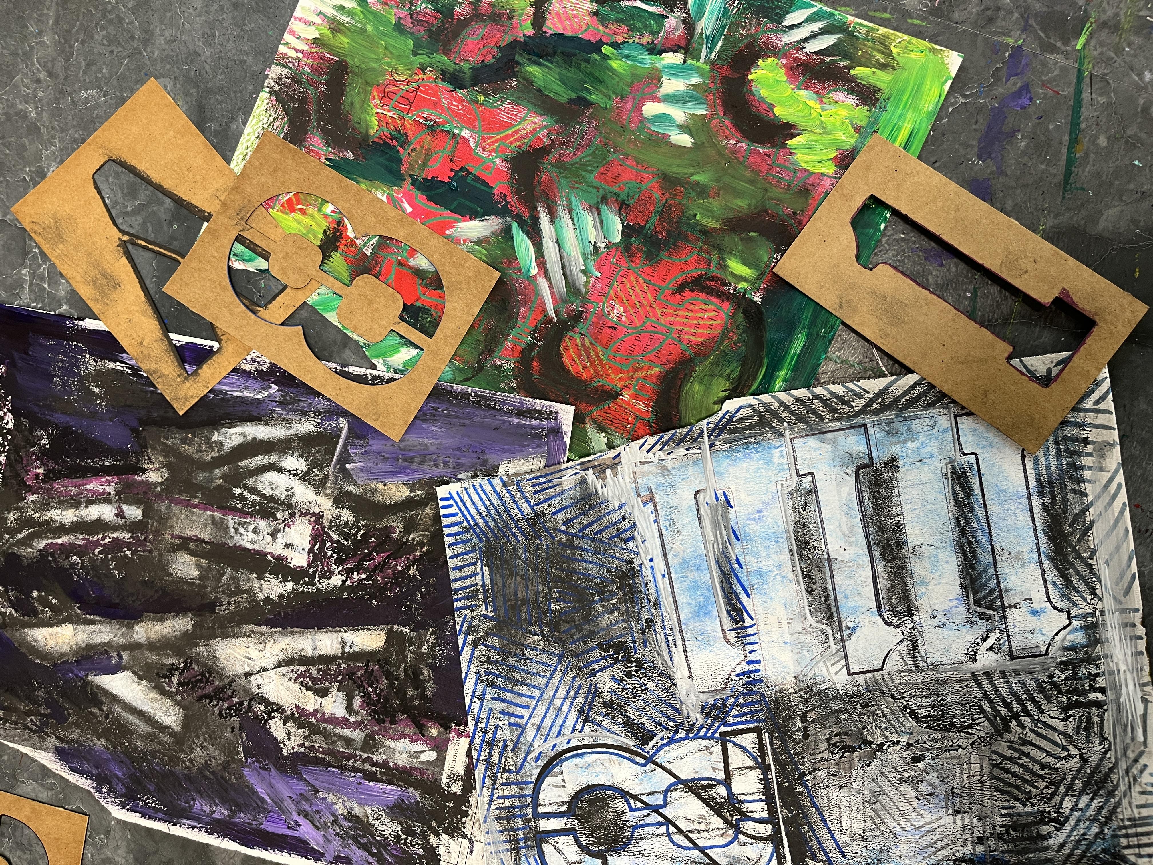
6. Example 1: To get started with this first Jasper Johns
inspired project, I've got my painted paper. I've got different stencils. I just kind of randomly
picked letters and numbers that kind of
spoke to me from my stash. And then I've also got some charcoal that I'm
going to be using. And then we'll kind of see what other materials come into play. So the first step is just
picking a painted paper to begin with and a stencil
that speaks to you. You can do the outlining of the stencil in any art
material that you want to. So for this one, I'm
doing charcoal because I really want the
bold graphic line. But then I'm also going
to kind of play with the crispness that
you can create with charcoal as well as
the smudging effect. So you'll see you can
kind of start rubbing it with your finger and
kind of getting it to fuzz out a little bit
and kind of create some really nice gradient
and value variation. It also gives it a
little bit of softness, even though the charcoal
is such a bold one. And then I love playing
with different overlap. So Jasper Johns was known for overlapping directly on top, and he's got several
different pieces that show different numbers, for example, layered
over each other. And he also used very large
stencils to create his. So his were filling the whole page in a
lot of his pieces. I'm going to work
with what I've got. And I also love the idea of giving it a little
bit of an offset. So occasionally, I am
going to play with overlapping the stencils and stacking up those
graphic images. But I also want to play with
how I can kind of create almost a pattern or kind
of a bold I don't know, a bold variation to it, because we're doing this
in our own style, right? We're getting inspired
by the artist, not necessarily totally
mimicking them, although you can absolutely mimic Jasper Johns as
much as you love to. It would be a fun art detective adventure to figure that out. I'm continuing on going
around my stencils. I'm not worrying about
it being perfect. You'll notice that A didn't
quite transfer as much. It's because I only had
paint on some of the paper, and the book that I gutted this paper out of has
more of a sheen to it. The painted sections give me the roughness that let certain drawing media
really show up well. But the actual paper itself, because of the sheen of the printing that they did
and the paper quality, it's not exactly transferring the charcoal as well
as I'd want to, but that gives a
ghost image where it hits the outside edges and then creates a nice
variation between the bold line and then
some lighter stuff. I loved the space that
I had created by laying down a bunch of different
letters by repeating that A. So I kind of went in with my
charcoal to really create some bold contrasts
between the lightness inside the letter and the
darkness on the outside. And between the image that
was printed on the paper, the texture of the paint, and now areas of the
charcoal going on, I'm really adding a gritty kind of graphic boldness to it. I love variety, so I kind
of wanted to play with what happened if I mixed up letters
and numbers for this one. So I chose the one stencil. And I'm going to go in with some oil pastel to
do the tracing. I'm also starting to add
some pops of color because the initial textured
painted paper is pretty muted for this one, and then I've got
the bold black, and now I'm going
to start adding in a little bit of purple. And I'm just kind of
varying where I put it, just kind of playing
with that overlap, continuing to fill the space, and trying to kind of see
what I can do with this one. I'm following the same trend that I did with the
charcoal by going into the negative
space that I've created with the tracing. But the oil pastel is adding a different kind
of texture because it's going to show the roughness of the
painted paper underneath, and I can't really
blend it out as easily. I could layer up a lot more oil pastel to get
a blended look, but it's going to
kind of stand out and create another texture. So at this point, it's a
pretty monochromatic piece. There's black, there's gray. There's a little bit of creamy beige from
the painted section. There's a black
and white image on the paper that was
printed there already, and then I've added
in my purple. The great thing about
oil pastels is you can do some really
bold in tense marks. So here I'm kind of
adding a nod to some of the different diagonal
lined abstract pieces that Jasper Johns created
both as a contrast to the blending and kind of a layering on top of
layering of textures. So this was really fun to
do. I really enjoyed this. And then kind of going
back and forth as I'm figuring out the piece
and what I wanted to do. Kind of going back in with my charcoal and really kind
of intensifying some of those sections and
kind of unifying it a bit as I kind of move from experimental play into more intentional design
and art making work. Often, one of the last steps in the mixed media process
of doing these pieces, inspired by Jasper Johns, for me, is going back
in with acrylic paint. Around the time that I was
working on this class, I had a bunch of
leftover palettes from some other classes that
I had taught in person, and this is a really
fantastic way to kind of use up those paints. So I'm leaning into the
monochromatic vibe. I'm leaning into
the use of purple, and I'm using the leftover
purple on my palette. The wet paint is going to
merge with the charcoal. Any of the charcoal
dust that's down, that's going to kind of mix into the paint as I brush it on. So if you paint back
into a piece that has charcoal or soft pastel
in it, it'll work great. I'll add a really lovely
textural component, but it will thicken the paint a bit and add a
different kind of texture. So just kind of know that
you're going to want to be especially mindful when you
wash your brushes in the end. And I love doing a ton of
mixing on my paintings, regardless of what
imagery I'm working in. So just kind of grabbing some of that white and
really playing in there and really trying to push
the values of the purple, just like I push the
values of kind of my gray scale in
the other areas. Was what I was going for here. Has a lot of really painterly
effects to his works. I mean, he was painting and letting the brush
strap stand on their own and letting it have
a real presence beyond the imagery
that he was using. Adding a painted element into your piece is a really
nice way to further lean into some of the
visual qualities that Jasper Johns was
playing with in his pieces. It's just really fun.
It's fun to paint back into a mixed media piece
and see where it goes. Notice that I started
working out dry and now I've moved into a wet media.
This was intentional. I could absolutely do
some painting work first and have a tainted canvas
beyond the painted paper that I started with and then let that
dry and then go back into it or go back into it while it's semi dry and kind of
see what happens there. But it's really fun
to have that painted element as far as
the surface goes, but just the painted paper and then really lean into
the drying process of this class project and then go back to the wet and
kind of see where it goes. You can also try drawing
back into your wet paint. That's what I'm doing
here with the charcoal. I don't have any qualms
about mixing my media and just kind of letting some fun
experimental things happen. Charcoal will go back over
the paint a little bit. It's definitely a possibility
you can work with. So let's head it over to the next lesson to check
out another way to explore the work of Jasper Johns in our own
style. See you there.
7. Example 2 : The for my second artwork
inspired by Jasper Johns, I'm beginning the same way. I have previously
painted some paper, and I'm working back into that. I've grabbed a stencil
that spoke to me. This time I'm tracing
it with colored pencil. I will say that drawing back
over painted paper with colored pencil or
graphite pencil is a little more complicated, but I did want to
play around with the different media and how they reacted to
the painted paper, as well as how bold of a line
I could get as I started tracing my stencils and building up the graphic
elements of the piece. For this one, I also wanted
to play with overlap. So I've traced the number eight, and now I'm going to position
my number two over the top. Very similar to what John's was doing in his number pieces
where he's stacking up numbers right on top of each other and I'm continuing
on with the same pencil. I'm going over it pretty hard, I'm using a lot of pressure, and I'm outlining
it several times in some cases to get it to show up. And depending on the numbers or letters that you choose
and how they get layered, aspects of those are going
to become unrecognizable. They're kind of going to emerge into some sort of
graphic element. And I love that. I love that. Sometimes in his work, you can very clearly see
some of the numbers, and sometimes they
get a little lost, depending on how the
curves line up and similar visual
characteristics of the different overlapped
imagery that he's doing. Many of his number pieces, whether he has them laid out
or he has them stacked up, he is very intentionally
going zero through nine, and they're even titled
zero through nine. He's really working up in
a very systematic way with the numbers and building
up the artworks either top left to bottom right
by laying them out in a sequence or the overlap of one number on
top of the other. And you can kind of think about the different fonts
that he's using for his stencils are then creating the different similar
lines that overlap, and then the ones
that stand out. If you think about
how, for example, a three and an eight
are going to have very similar curves or the seven that goes diagonal across. So you can kind of think of
the different ways that you can play with how you
overlap your numbers too and kind of some of the
ambiguity that might happen intentionally or
accidentally from that. I've played with the overlap
on the top left corner, and now I'm playing
with what kind of design I can create by repeating the number of
shapes and the bottom right. So I've turned my
paper a little bit. I've got the ones coming
in from the side, and I'm lining up those
tensils and using just a ballpoint pen to get the layout of
each of the ones in there to kind of fill
up and create kind of a horizontal bar ladder stacking up the
side of the piece. The ballpoint pen is working pretty well on
the painted surface. I just want to light
line because I haven't quite decided how I want to approach the rest of this yet. I'm also deciding how
many ones do I want? At what point does
it become more of a graphic element and less
of an obvious number, which works out really well
with this particular stencil. So now that I have broken up my background space with
those horizontal lines, I'm going to get
out my paint pens, and I'm going to lean back into those pieces that we
looked at in the first example, where there were the different
sections of angled lines, like diagonal lines,
kind of a patchwork. And the paint pen
is working great. My paint pens are well loved. So I am loving that they're not giving
me that super bold line. Like, I'm getting
a little bit of extra added texture by the fact that this paint
pen is drying out a bit. If you have art supplies
that are like that where your markers
are starting to go, but they're not quite there yet, different projects like this
are a great way to use them because they add some more
character to your piece. After filling in the top portion with my blue diagonal lines, I decided to switch
course a little bit, and I got out a
gray paint pen and started adding in
some additional ones on the bottom left corner. I loved the effect this created because I had the repetition
of the same pattern, but I was varying
up the color and the color value by changing
it from blue to gray. And then sticking with
the same idea and the monochromatic color
palette that I'm using, I decided to get out my
light blue paint pen. This is another one
where it's well loved, and I had to get it kind of
warmed up to get it going. But I loved that just subtleness it had because it's
drawing in the blues, but it's kind of helping
create a connection between the bolder blue and
the gray that I was using. And it's really nice because
it just kind of subtly starts to get those ones to
pop that I put in earlier. And then at this
point, I felt like that last number that I had traced with my
black paint pen on top of all of the lighter
ones that I was doing with colored pencil was really kind of dominating things a
little bit too much, and I really wanted
to bring in some more of the layered number look. So with a blue paint pen, I decided to trace the
eight on top of the two so that I could have a
little bit more balance there. And it just was kind of enough to tie in everything else that was happening color wise and to kind of bring the
values more in sync. I did start to
feel like I needed a little bit more
boldness, though, so I decided to go back over the ones with a Sharpie
and just kind of tie in the bold black line a little bit that I had ended up finishing my stacked numbers with with that bright two in
the top left corner. It was also great
because it gave some line weight
difference because even though I was using a
marker that was just as bold between the
Sharpie and the paint pen, it was a much finer tip. So there was still kind of
a nice variation there, and then it also kind of
worked well to start to unify the piece as far as all
the different kinds of line that I had been
incorporating into. At this point, I
really wanted to kind of lean back to what I had
done in the first example, because I really
loved the effect that the charcoal created, but I wanted to do it in
a much more subtle way. So I'm just kind of ghosting
it in a little bit in the negative space that I
created with the stencils, playing with the idea of areas
where I'm going to mellow out those diagonal lines and then areas where
I'm going to kind of let them show through. It's going to help create
a little bit of depth of deciding what comes forward
and what comes backward, but it also leans into the treatment that Jasper Jones did of his diagonal lines, too, because there's elements
of his pieces that incorporate those that
they really stand out, and they're very bold
graphic statement, and then other ones where
they kind of fall back. It is interesting, though, because the areas where I
had done lighter paint pen, it really picked
up the charcoal, and it actually made those
diagonal lines more apparent, which was a really fun thing to have happen because I
was thinking that it was going to mellow them out and they were going to become even less apparent and they
became more apparent, whereas the bold blue ones at the top became less apparent
when the charcoal went on. So it had a reverse effect, but it created for a
really nice variation. I decided I also wanted
to go back in and do a little bit of kind
of highlighting, unofficial highlighting
with my white paint pen. I didn't go over
the charcoal very well until I got
it really warmed up and going and then it kind of gave it a little bit
of a white line. It was kind of like adding the black of the charcoal
had been the shadow, and this was adding a little
bit of the highlight, if you can think of it that way. But it just gave a little
bit of pop and kind of helped clean up some
edges a little bit, where things were getting
a little muddled. Just kind of continuing to push the values and
kind of bring back some of that bright white that I had lost along the way
in this piece. I really love how the
second one turned out. I loved that I
could take some of the experimentation
and aha moments from the first example and try that in some new ways and kind
of lean into what I liked, but also test to see what
other things I could add. I'm excited to dive into
the third example with you. So let's head on over
to the next lesson to see how that one turns
out. See you soon.
8. Example 3: For my third piece, I wanted to play with a
bit more color because I've been wearing the
monochromatically for the first two examples. So this one I started with
a bright bold background of red and pink painted paper, and then I wanted
to play in with some other stencils that I had besides the letters
and the numbers. So going in with some
dollar signs and my green paint pen
because Money green, I think it was a
subconscious thing there. But I also really
love the play of contrasting colors and
complimentary colors. So putting the green with
the red made a lot of sense, red and green are compliments. And I'm moving around the page, just tracing the essays to create kind of an
unofficial pattern. I just kind of wanted
to fill the space. There's not a ton of overlap happening until I
get later into it, but I'm just kind of building up the dollar sign marks on top of the paper until I'm
happy with how they look. I also changed this one from the other two by going off the page. It became really
important to me to have the marks
because they were so overlapped by this
point and really lost a lot of the essence
of the dollar sign as a distinct symbol to let it really go off the
page all the way around and break the edge and have some partial dollar signs coming in and getting cut off
on all four sides. Then similarly to
what I did with the charcoal in the
other two pieces, I decided to go in with the paint pen and really
add some bold areas of green using the new shapes that were created by the
overlapping dollar signs. So they're kind of seeking out areas to fill in to kind of decide what's
going to stay red, what's going to go green,
and what's going to be that green line
over the red areas. And really kind of
building this up until it felt like
I had enough of that going on that
I can move on to the next stage of my mixed
media experimentation. Then I went in with some
green colored pencil. I'm staying with the same color, but I'm going with a
different value of it. This one's a much more
lime greenie compared to the true green
of my paint pen. I wanted to play with marks, and I wanted to do a non
to Jasper John's mark making by using those
same diagonal lines. But because there's so little
negative space in this one, they're just becoming
little passages kind of here and there
whenever there's kind of a bigger area where I could go in with different lines
going different directions. So it's definitely like
a further twist on that idea of his piece
and kind of pushing it in a new way based on the
imagery that I was working back into and what
I had already done to the surface of my
paper at this point. Then I continued on
with colored pencil and grabbed one of my breads
and wanted to try to see if I could really
help pull back and define some more of the actual outlines that I
had done of the dollar signs. I'm trying to give some
full solid layered in red areas to help figure out what's in the foreground and what's
in the background. It was more successful
when I went over the painted areas than when
I went over the bare page. But I did love the variation I got between the really
rich colored pencil. I could layer up on
the painted area and then the more see through
dusting of red that happened. This mimics what was happening in the second
piece where I was getting more value range between the charcoal
application that I did. I did the same thing with green. I wanted to really beef
up some of those areas. So this darker green on top of the paint pen is a way for me to really push
those values while still staying within
the same color family. I love using colored pencil
on top of paint pen. It's a really wonderful
combination of media. If it's something
you haven't tried, you should absolutely try it. This would be a great
project to play with that if you happen to
have paint pens or even just acrylic paint
that you can paint and let dry and then go back in
with your colored pencils. It is interesting because although red and green
are complements, when they mix together, they neutralize and
make more of a brown. And I'm not layering so much media that
it's becoming mixed, making a brown, but it is
leaning in that direction. And I really wanted
that contrast, but I really wanted
to intensify it. So I got out my charcoal and decided to go back
in and really kind of emphasize some of the parts of the graphic that I had created with the
overlapping stencils. So I'm getting a lot of
these different half circles and arcs and, you know, marks where I'm seeing things happening on the page and
choosing what to emphasize. And then this is really
helping push the depth. So I'm really getting some
nice contrast of value, but I'm also getting
some nice contrast of shapes and lines and
what's happening and then using my fingers to kind of smudge it out a
little bit so that I'm really kind of leaning into that beautiful dusty
quality of charcoal. And just really going
around the page anywhere that I kind of
see a line that I want to emphasize with
this bull black mark and then what it needs too. So it's a combination of decisions that I want to make in areas that are calling for it. And then naturally,
it was time to paint. So I'm using some leftover
paint again on my palette. I'm still leaning into the same color scheme
that I've got going on, really continuing to push
the values of my color. So the green that I
had on my palette was very dark rich green. So that's pushing even deeper the green
values on my piece. And then really playing with
the different texturizing that I can do working
with acrylic. I did want to warm
it up a little bit and find a nice marriage between the coolness
of the green and the warmness of red, and I wanted to lean into that limey color pencil
that I had used earlier. I used some of my yellow on
the palette to mix up some limey green and really
push that element, which is great because it works to unify what was happening
color scheme wise, but it also helped resolve some of the jarringness
that was happening between the charcoal
application that I had done and the paint pen and colored pencil crispness that
I had on the page. I'm just going back in
and painting and kind of continuing to add
pantly elements and fresh strokes and colors and
values as the piece seems to call for it until I get to a point where I've
decided I'm done. As one final touch, I did go
back in and add a tiny bit of charcoal just to kind
of help finish it off, and I love how this
one turned out. I'm excited to do more of these I feel like I'm getting to a very interesting
place in my process of working through the inspirations that I'm pulling
from Jasper Johns. But before I do that,
let's head over to the last lesson to wrap up
the class. See you there.
9. Final Thoughts: Thank you so much
for joining me in my Jasper Johns inspired
artist series class. I hope you had as much fun and creative aha
moments as I did, playing around with the
different approaches to mixed media artmking, use of sense of
graphic bold elements, and the ways that
we can play with color schemes and value
and mark making and texture and layering
all those up to create a beautiful sandwich of
artistic deliciousness. I can't wait to see how
your projects turned out. Please pop on over
to the projects and resources section of class and upload yours to
the student gallery. If you also get hooked on
this art process like I have, Feel free to come back
anytime and upload additional artworks that you
create related to class. It is really fun to
see the gallery grow and to see all the
different ways that we're each
approaching this, the stencils that we choose, the graphic elements
that we play with, if we try out the painted paper, if we use some other textured and pattern paper
we have on hand, and for the folks
that go digital. It's amazing what
we can create with digital artwork these
days as we layer up and achieve similar effects digitally compared to
traditional analog artworks. Besides sharing your project
to the student gallery, I really hope you'll take
the time to leave a review. I love it as feedback as I
continue to grow and develop additional artist series classes and other classes on Skillshare. I've been creating
on Skillshare for quite some time and I have
a large catalog of classes, but I am a very growth
oriented educator and artist. I love feedback from students about what they enjoyed
about the class, areas that they would like
to see added or enhanced, and anything that I
can improve upon and bonus it helps other students
consider taking the class. A lot of times we aren't
sure if a class is for us. But when we get the feedback
of those that have taken it, it helps give you an inside view of what a class is like and helps students decide if it's the right fit for
them and something that they might want to try out. I love staying connected with my students in a
variety of ways. Be sure to follow me on
Skillshare so you get notified of future classes that I am creating and coming
up in the future. Also, don't forget if you
have any questions to pop on over to the discussions page and post a question there. I'm very active as a teacher
and a student on Skillshare. So if you post a question
to the discussion board, you will get a very prompt
reply back from me. It's also a great
place for you to share other artists that you
would love to see me explore in future artist
series classes or any art techniques or approaches that you would love me
to do a deeper dive on. Because these classes we really skim the surface because
we're focusing on a very focused art
artist inspired. Way to approach our art making
and getting inspiration, but I love doing a deep dive in art techniques and materials. I'm very happy to create whatever classes you are
interested in taking. I would love to also
connect off Skillshare. Popping over to my
YouTube channel, I'm hoping to be much
more active there in the coming year
as I've got a ton of things that I want
to share with you that go beyond a
Skillshare class. I am very active
over on Instagram. Sharing what I'm doing
in class on Skillshare, my own artistic approaches
and art making that I'm doing art adventures that
I go on that I share there and on
my YouTube channel, as well as things that I'm teaching in person too
over here in Michigan. There's tons of different
ways that we can connect and I would love to continue to be part of your art journey and
your creative world. Thanks again for
taking the class and spending some time with me, and I hope to see you in the
next one Bel soon till then.
 Elisabeth Wellfare, Artist, Art Educator