Transcripts
1. Introduction: In this class, you
will learn how to paint a scene with a
beach and a palm tree, painted using alcohol inks. Hello beautiful people. My name is Trina Brandon. I have a passion for color
and a passion for people. That's why I love teaching
here on Skillshare. I have many identities. Among them. I am a children's book
Illustrator, a surface designer. I license my artwork. I'm a mixed media
artist and I'm also a founding contributor to
the alcohol ink Art Society. I just love coloring. My favorite art supplies is
whatever I have in my hand. And in this class I have alcohol inks in my hand
and a paper towel, which is the key to painting
a lovely beach scene. This art party is targeted
to those of you who like vivid colors and want to create a beach scene using the inks, something to add joy points
to your environment. If you have never
used the inks before, I recommend that you take my introductory course
on alcohol inks, which is available
here on Skillshare. You don't have to go
to the party first. You can come directly
to the after party. I'll share the basics
of using alcohol inks. In this class, I will
cover safety and supplies. How to safely use the inks, what to be aware of, how to create a background of a beautiful sky,
water and beach. How to paint a palm tree and foliage to add interests in
depth to your beach scene. I'll also show you how I find
references for my scenes. Creating vibrant and
interesting artwork with alcohol inks
is easy and fun. For the class project, you'll create a greeting card if you've taken
any of my classes, you know that I love creating greeting
cards as a project. It's a great size to
test out new techniques. It can be a nice gift to
add joy to your home. Practicing the techniques you'll learn on a small
surface gives you the opportunity to get to
know the techniques on a small scale and then
apply it to a larger scale. The techniques I'm showing
You can be used on other surfaces as well that
are friendly with alcohol, inks, such as metal and glass. You can use your new skill
to create a lovely artwork, to hang in your home, gift to others, or sell your
art pieces for extra care. Art is also a way of self-care
to help relax your mind. When you participate in class, you'll see how easy it is to
create a lovely beach scene. You'll get to experience how the inks blend and dance
around together. Each scene will be unique. It will be fun and interesting to see what everyone is making. So let's get started. I'll see you in the
alcohol ink after party.
2. Your Project: Hello, I'm glad you're here. In this project video, I'll tell you the steps to
making a greeting card for your project and also why I
chose this for our project. I chose a greeting card
for this project because it is something that is
functional and beautiful. A greeting card is a way to let someone
know that you care or display it as a
piece of artwork in your own space to create joy. If this is the first time you are trying to
use this technique, the benefit of trying out on the size of a piece of paper, the size of a greeting
card is that you can practice the technique
on a smaller scale, which can easily then be
applied to a larger scale. So let's talk about what you'll need to make a greeting card. You'll need acid
free glue or tape, scissors or a paper
trimmer and a piece of card stock cut to the
size of your base card. Your art piece will fit
on top of your base card. I used a five by seven inch
size for my art piece, which is a common size for
greeting cards in the USA. If you want to layer your card, you'll need a complimentary
color card stock. Once you finish your art piece, you'll trim it to fit
your base card and adhere it with the glue
or the double-sided tape. If you are giving it away, you can write a message inside. I do have a bonus
video included in the alcohol ink art party
class here on Skillshare, where I demonstrate
how I assemble my greeting cards and add a little details to
give a customer touch. As well as I share several tips on assembling
a greeting card. You can check out my Skillshare
profile for the link. There's also a direct link
in the student handout. Also in that bonus lesson, I share how I organize
my alcohol eggs. Please take photos or scans of your creations and share them in the class
project gallery. If you have any questions, please post them in
the discussion area. I'll be checking it often, as well as one of your
classmates may have the answer. So let's get started
with our lessons. Safety and supplies is
up next. See you there.
3. Safety and Supplies: Hello and welcome back. In this video, I
will be explaining the supplies used in class
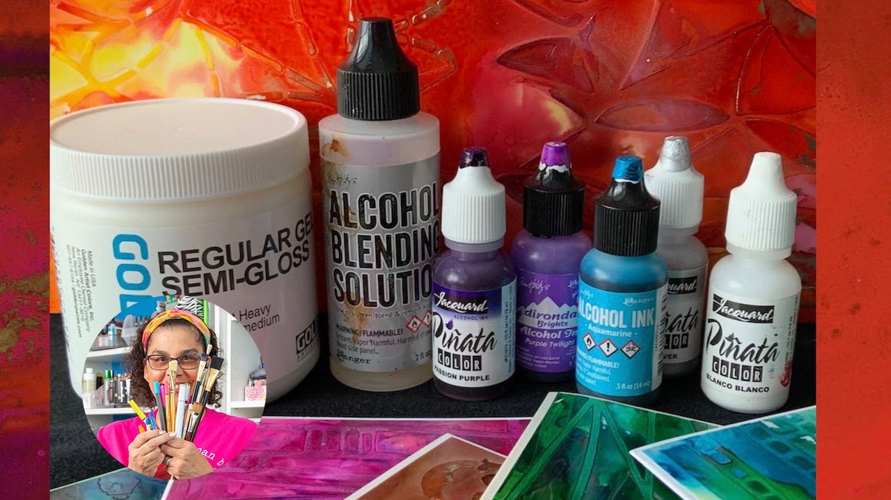
and safety practices. The supplies and products that
I'll be using in class are listed in the student handout
in the class resources. Safety first, the smell of alcohol can
sometimes be strong. So be sure to work in a
well ventilated area, open a window, or have
a fan in the room. The inks are very
pigmented and will stain. You will want to wear old
clothes and also gloves. Recover your hands
with a barrier cream. Cover your work surface. I use a reusable craft mat. I also will use an inexpensive
plastic tablecloth underneath which I can reuse. Never put the inks
into a spray bottle. There's resin in the inks and you don't want to get
that in your lungs. Do not use the inks
with things that come into direct contact
with food or beverages. And the other thing to be aware of is the incus flammable. Please be mindful of these
safety precautions as you use the inks when
it's warm enough. I set up a table in the
garage with the door open. I learned that from
my neighbor Nita. Of course you will
need alcohol inks. There are many brands of ink. I'll be using pin, yada, ranger, and Mirabeau. You can use whatever
brand you have. These techniques
will work the same. If you want to know more
about the different brands, please check out my alcohol
ink party intro class here on skill share. A few tips for your inks. The inks dry pretty quickly. The more ink you use in an area, the longer it takes to dry. Put the ink taps back on when they are not used for
long period of time. I usually close them after I'm finished working
with a color. If they do get clogged, poke a pin in the top
to clear the nib. Another thing I like to
do, color-code my top. This way, I will not put a black tap on my yellow ink
and contaminate the color. You'll need some type of paint palette to
drip your inks into. I just use this
inexpensive paint palette. You'll also need some
isopropyl rubbing alcohol. Alcohol comes in
different percentages. I'll be using 99% to add to ink color and a lower
percentage for cleaning. You can start with whatever
percentage alcohol you can find in your area. Just be mindful when you
use a lower percentage that could change the color
and intensity of the IQ. I pour the alcohol into smaller
bottles for ease of use. You go watercolor paper is the paper that
I'm using in class. It is a popular
surface for the inks. You can use the
front or the back. It's in the papers
section of the art store, but it's actually a
plastic you bought is my favorite service
because it is very forgiving with the inks
and it blends lovely. U-boat comes in different
types and different weights. I'll be using the white paper. You can also use the translucent
or heavy mixed media. All will produce a
similar results. I'm using a four-and-a-half by six inch piece of Bupa paper. A common greeting card
size in the United States. You can buy the paper in a larger size and cut it
down to the size you need. I often do this
because it's less expensive to buy the
larger size paper. You will need paper towels. Will use paper towels for
techniques and clean up. Here's a tip. Save your paper towels for collages or backgrounds
for other artwork. You'll see that
they're really pretty after you use them for clean up. You'll also need a paintbrush. I'm using a size one. But depending on what size
paper you decide to use, you may want to use a larger
size to seal your artwork. Use a water-based sealer. There are many different
types for this project. I'll use a spray
sealer if you have another water-based seal or
you can use that as well. It may also be helpful
to have a piece of scrap cardboard slightly
larger than your art piece. Other found items around
the house that you can play with to create marks and
make texture are welcome. To get started. You do not need all
the ink colors. You can just start with a few. Here's the slide with the
complete list of supplies. As well as you have this list in the student handout with links. I've also included a photo
of the color I used. You can take a
snapshot if you want. They are also listed
in the handout. If you have any questions, please post them in
the class discussion. The next video is a lesson. I'll talk about reference
photos and show you one way to paint a sky
for your beach scene. See you in the next video.
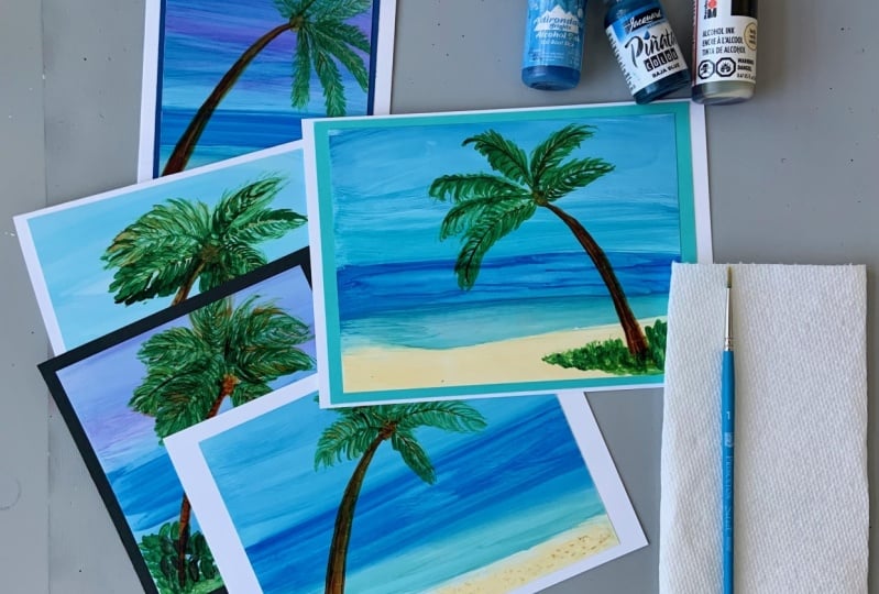
4. Paint the Sky: Hello and welcome back. In this lesson, I'll talk
about reference photos and also demonstrate one
way to create a sky. When I draw or paint
something new, I like to use a reference. It helps me to get to know the subject as well
as some color ideas. One of my go-to sites to
find references is Unsplash. It's a royalty free site. I added the link to the site
in the student handout. I found a few photos
of beach scenes and I updated them in the
Student reference section. The name of the files include the photographer's name
so they get credit. This first photo I'm using
for color inspiration. I noticed that the
colors gradually change until it gets
to the dark blue, which is the deeper water. And then changes to
the lovely light teal. That's the shallow water. Then at the bottom we have
the cream color sand. Basically you see
the colors change horizontally and the dark
blue is our horizon line. That's the effect I'm going
for in my little scene. My plan is to bring my sky
about halfway down my paper. Don't worry about the
strait water line. We'll address that
in the next session. Right now we want
to paint the sky. There are variety of ways to
lay down ink for the sky, creating the background with this technique
that I'll show you is easy and the results
give a really pretty sky. I want to have some
variants in the sky, so it's not one solid color. I'm using two shades of blue, a light blue and a medium blue. I have my window, open, my gloves on and my clothes
and cable protected. I put a small piece of
double-sided tape on the back of my tuple paper to adhere
it to this cardboard. That way I can hold the
cardboard when I want to move my scene without
touching my artwork. The first thing I
do is clean off the surface with the alcohol to make it free from dust,
fingerprints, and dirt. Now it's ready to
receive the ink. I have picked out my colors
for the background and remove the top so I can move
as quickly as I need to. I'll be applying a thin coat of ink so it will dry quickly. I'm going to drip color
on one side and use a clean paper towel
to move the ink across the piece of
paper horizontally. I'm right handed, so I'm
dripping on the left side. If you are left-handed, you may want to drip
on the right side. That way you are pulling the
color across the surface, which gives a more
smooth results. You can do whatever is
most comfortable for you. I start by adding a
little line of alcohol, which helps to spread
the ink smoothly. Using my paper towel, I pull the color
across off the edge. I returned and do it
again slightly moving, the sky flows nicely. I also created some movement in my sky by swerving a little. I continue this process until
I'm happy with the results. It's smooth and the color
goes all the way across. If I see anything I
don't like like a spot. I can repeat the process. Just be mindful that the
more alcohol you add, it will lighten your sky. The idea is to create some movement and
variance in the color. This technique naturally creates some lighter areas which matches what our real
skies look like. At this point. I'm happy with my sky, so I'll stop here. Don't worry about
the bottom of color. We'll address that
in the next lesson. In the next lesson we add the water and the
beach. See you there.
5. Paint the Water and Beach: Hi and welcome back. In this lesson, I'll
show you how to paint the water and the beach. We see in the photo that
the horizon is sharp. To get that sharp line at
the top of the deep fodder, I use the same method to
pull color across my scene, being mindful of the line, using the same technique
as for the sky. I pull color across with my
clean paper towel ready. I will make it as
straight as I can. I'm using dark blue
and teal colors, painting the shallow water simultaneously for a nice blend. Dark blue at the top and
the tail a bit lower. Add a little alcohol
also to make it smooth and flow
nicely across the page. Because I am working
on you Paul paper. A very forgiving surface. I can repeat this process
as many times as I need to. Adding a little more
ink as I need to. Personally, I don't
throw any paper away, although I have
decided to start over. I'll save that badly colored
surface for another project. Here I'm going to add
a little more ink to try to get a sharp line. I'm trying to pull straight. I see that my line is going
higher than I want to. So I'll drop in some more sky color to bring
that sky down a bit lower. Pulling across with
a clean paper towel. You will find it can
be a bit of back and forth until you achieve
the look that you want. If you are having a hard time
getting that straight line, try turning your
paper upside down or even vertically and
pull down the color. You may have better
results with that. By pulling the paper towel and color across additional times, I create some lines
and variance and the water that
naturally happens. My goal is to create enough of a color difference so
that you can see where the sky ends and
the water begins. Next, I add a little bit more
teal to deepen the color. To add highlights and the water, I'll add a small
amount of alcohol to the paper towel and
lightly swipe across. The beauty of using the
inks in combination with this forgiving
paper is that you can always redo the scenes. I really have not
used that much ink. And I'm still on
one piece of paper. Moving to the sand, I make sure I have a
clean paper towel and I'll drip vanilla along the
edge of the bottom while trying to leave a
little white space between the water and the sand to represent that little foam edge that you see between water and land. I want it to be a little darker so I add a little more ink. And then I let it set
just for a second. Then gently dab my
paper towel to create some texture from the
pattern of the paper towel. And now I have my sky, my ocean, and my sandy beach. My deep ocean is not as
dark as my reference photo, but I'm okay with that. Once I get the palm tree
up in the little scene, I feel like it will
all come together. So look at your background and
see if it makes you smile. If not, you can add more ink or wipe away or reduce
some sections. In the next lesson, I'll add a palm
tree to the beach. See you there.
6. Paint the Palm Tree: Hello and welcome back. In this lesson, I'll be
painting in the palm tree. I don't need gloves for
this next technique because I'm using a
paintbrush to apply the ink. If you have sensitive skin, you may still want to
continue using the gloves. For my palm tree inspiration, I'm using one of the other
photographs from Unsplash. I plan to place the tree on the left side of
my little scene. I take a moment to look
at the shape of the tree, the shape of the palms. I'm not going for realism, I'm just looking
for inspiration. And then I'm going to
paint in my own style, as I recommend to you, it's good to
understand the shapes and subjects in your art, even if you're not
going for realism, to paint specific objects, I'll use a more
controlled method for painting with the inks. I have a palette here with individual sections where I can drip the different colors. The inks are reactivated with alcohols similar to watercolor. With this technique, we
want to focus on using a small amount of ink
on our paintbrush. That way you have
control of how it flows. The good news is, if you
do make any mistakes, let it dry and paint over it. I encourage you to have
fun and experiment. I like to paint a guide of
my subjects very loosely. Make sure your
background is dry. I'm using a dark
brown for my trunk. Add a little alcohol into the brown of dried
ink to reactivate it. And then use a small
paintbrush to dip into the ink and draw the guide. I have my paper towels
handy so that I'll be able to dab off any extra
ink or alcohol. Use a very light touch when I paint the guide, my apologies. It may not show up on
the video very well. I'll try to make them
a little darker. I pick up my brush and
paint again lightly. The more pressure you use, the more ink and alcohol
that will be laid down, which could cause the ink to spread beyond where you want. I paint the trunk thicker at the bottom and
thinner at the top. Taking my time and dipping
into ink as I need to. I can tell when I need to because I run out
of ink or start dry brushing where my
smooth lines kinda skip. It's important to make sure
that your brush is not too wet with ink to avoid the ink spreading
beyond where you want. You can see I dab off on my paper towel is often
as I think I need to. As you paint with the inks, you'll get a feel
for the consistency of ink and alcohol
on your brush tip. Whenever I dip into alcohol, I dab on my paper towel. Clean your brush between
colors and alcohol. Before you paint on your scene, make sure you dab your
brush on the paper towel. For the palm leaves, I
dripped into colors of green. Plus there are likely some other greens in my
palette from past painting. That does not bother me. I'm just looking for a
variance and my leaves, the ink has dried, so I need to add a few drops
of alcohol to reactivate. I refer to my reference photo
again to see the shape of the leaves and the direction
and slowly add the lines. Adding more ink to my
brushes I need to, my plan is to paint
the leaves with spaces in between them on the first pass and
then come back on a second pass and
fill in more leaves. I encourage you to take your
time and allow yourself to practice finding the right
amount of wetness in your ink. I started the stem pulling in the direction to create
that palm tree shape. I'm getting a dry brush effect and I like that for the leaves. So I go until the paint runs out and then I dip
back into my ink. If you're ever concerned
that you have too much ink, dab it off on your paper towel. I feel like I need another
palm in that opening, so I draw it in and add leeks. I add drops of ink as I
need more in my palette. Be mindful not to drip
ink on your artwork. As soon as I open
that first bottle, I realized where I was
right over my artwork. Since this is fresh
ink out the bottle, I do not need to add alcohol. I dip into the ink and dab it on the paper towel since it's
right out of the bottle. I paint around for the
second pass of leaves. Next up, I'll finish
painting the palm tree.
7. Finish the Palm Tree: In this lesson, I'll finish
painting the palm tree. You can see in the photo that the palms also
have some brown leaves. So I'll come back in
and add brown leaves. My brown ink is dry, so I'll add just a small amount of alcohol from my
cleaning container. The ink is brown. The cleaning containers
brown. It's okay. Another thing to be mindful of, our drips of alcohol
that sometimes clean to the brush
above the bristles. Those drips could drip onto my art work and
cause a big blob. So be mindful of that and just tap it off on your paper towel. I add in some brown leaves, not everywhere, just
here and there. Oops, I had a little
bit too much alcohol. So I'm going to let that dry and I'll show you how
to cover that up. I'm glad that happened. Painting reminds me
of cooking is not how well the dish turns out when
it comes out of the oven. It's how well you can fix it
before it hits the table. I clean my brush because I'm
going back in with green. Here's a tip. Turn your paper
towel to clean off your brush so you're cleaning in a clean area and don't
pick up that old color. Whoops, area has
dried completely. I go back in and paint the leaves sharper
in small strokes. I fill in all that area
that had too much alcohol. I'll also add some brown. I'll be sure to tap off
when I think I have too much ink or
too much alcohol. I'm looking at my leaves. I want to bring up the
palm branch in front, so I add more leaves
to that branch. There's also a center
at the top of the tree called the crown stock? Yes. In case you were wondering,
I had to Google it. It's called I paint
in with a mix of sand color and brown following the shape from
the reference photo, I see that each branch
comes out from the stack. So I want to paint
that to match. Palm trees have those
little horizontal lines up the trunk. Depending on the
color of your tree, you may want to use a
darker color to add lines, or you can use alcohol to remove some of the trunk
to create those lines? I am going to use alcohol
because I have a dark trunk, a dip in the alcohol
and dab off excess on my paper towel and
paint in the lines. It takes a moment before
you see the effect. If you want more contrast,
repeat these steps. After I add in the lines, I just take a moment
to look at my tree, the overall tree
against the background, and I'm happy where I am, so I'm going to stop here. In the next lesson. We'll add some foliage and
details. See you there.
8. Paint the Foliage and Details: Hello and welcome back. In this lesson, I will
explain how to add painterly foliage and a few
details in the little scenes. Here's an opportunity
for you to use any found objects to add
texture to your scene. I'll be using my brush, but please feel free
to experiment texture. I will use the same greens from the palm tree to paint the foliage around the
base of the trunk. My plan is to paint in some loosely painterly foliage around the trunk base and
then add a little detail. I scribbled and dabbed the brush to create
a bit of background. Leave some space so you can see the SAM through the foliage and make it darker in the front, lighter in the back. Now add some leaf shape details. Another benefit of
the inks is that they create a natural
texture and blend. So you do not have
to work too hard. Next on to the beach. To add texture to the beach, I'm going to try to
spread the bristles with my finger and then
dip it in the brown. I'll just tap my brush around the beach
for some interest. I dab, dab, dab until I'm happy. Here are some other
scenes I painted. I'm planning to make all of
these into greeting cards. In this one, I put the
tree in the middle and painted a different shape
for my palm leaves. I added in foliage
and x scribbly way. I pulled the color in the sky, I added a little purple. And you can see I did not
pull across all the way, but I like the swirled in
the sky, so I stopped. And this is why the
trees in the middle, this scene, I created
more full palm leaves. I painted the foliage and
that same scribbling way. I disliked that technique. I like the look of that,
the painterly look. I also painted the
beach with a curve. That was just a matter of
how I pulled my paper towel. In this next scene, I put the palm tree
on the right and experimented with trying to get some highlights and the
water using a paper towel. Again, I used a small
amount of alcohol on the paper towel to create
some variation in the water. I think I went a
little overboard, but I still like
the overall scene. And then this one, I
added quite a bit of purple in the sky and
put in less beach. There's lots of ways to
make your beach scene. I encourage you to
have fun with it and put your own style into it. In the next video, I'll show you how to seal
your artwork. See you there.
9. Seal Your Artwork: Hi and welcome back. In this lesson, I
will be showing you how I see all my artwork. To seal ink, our work. You want to use a
water-based sealer. Spring varnish is a great
way to produce even results. Be sure to spray outside. You want to read the directions
on the can, follow them. You can set your painting
upright or flat. Spray three light coats. And the reason you want
to spray light coats is to reduce the
chance of pooling. Starting off the piece, I spray, let it dry, spray, let it dry. And one more time
spray and let it dry. I also included a
link to a video and the student handout for
how to sell your artwork. Be sure to let it dry completely
before you handle it. Up. Next is a video where I share
my reference journals with you and tell you how I
use them. See you there.
10. Bonus - Reference Journal: Hello and welcome back. In this bonus video, I will be talking about the benefits of keeping
a reference journal. A reference journal, holes, examples of different
techniques. You've tried. Things that you
can refer back to. You can add notes of the steps that you
took, what worked, what didn't, and any
other information you want to include. So here I have a couple alcohol
ink journals that I keep. This first one is a
mixed media journal. It's made by Canson. It was actually a
nine by 12 size, but I went to my local
office supply store and had it cut in half for
a smaller version. So what I've captured
here on these pages about my alcohol inks is once
I put alcohol ink down, what types of pins that I
have still work over the ink. And also, since these
pages were mixed media, I put down a jest so underneath to make sure that the inks
would not soak into the paper. That's one technique,
another technique you can use with your alcohol inks. If you don t have tuple paper
or like a glossy paper, you have a matte paper
or even watercolor. You can put Jess so on top of
it and then use your inks. It's not quite the
same results that you get with you or paper
or the smooth ER, papers. But it does allow
the inks to mix together and create some
interesting results. On this page, e.g. I. Dripped ink and then use the different pens that I had to ride on top to see
what showed up. Well, here, I stamped circles, then dripped ink and created this diary of all the different
ink colors that I have. Here's another example
where I just dripped ink. And as a reminder, all these pages were covered with Jess so before I
dropped the ink on them. So here I was just
making a record of the different colors for some
new inks that I purchased. Here again, I was
just trying out pins. So I, after I put the JSON, I tried dripping color and
using a paintbrush and a pen to create a little drawing here and then try different pens. So that's an example of
one type of journal. Another journal
that I have here. I actually have a binder
and the sleeves where I inserted different
pieces of art that I did and put notes in there. E.g. on the cover. This was a class I took and so I put the notes
for what I did in the class and how I created this little scene
as well as here. This was actually an
embossing folder that I put some UPA paper through and then send it
through the embossing machine. And it created
these like ridges. And then I use the alcohol
ink and dripped it inside and painted inside the little ridges to create this little scene. So that was a lot of fun. Here is when I first
learned about alcohol x. I don't have any notes because by the time that I started
keeping this journal, I had already a few
pieces of alcohol, ink projects just saved up
and I thought I need to put these in some kind
of journal so that I can keep track of all
these different techniques. I really loved how
these turned out, so I just have
them on the front. I know that this is when I
discovered Kenyatta gold and how beautiful the
gold is with the inks. This is another
example of some of the information that
you may want to keep. These are my Copic markers are alcohol-based and I also have some spectrum
Anwar markers. And so I created a color
wheel basically of the different markers that
created the color wheel. Here also I was
dripping based on the color wheel, the Ranger. At one time they were called Adirondacks and now
they're call Ranger, but it's the same manufacturer, all the different colors that I had and I just loved this strip. As a matter of fact, this is a strip that I use in the class. Here are just other examples
of trying it with glue, drying it with stencils, dripping alcohol on top, and getting these
different cool effects. I just basically
wanted to share this with you to show
you an example of what you could do with
a journal and the type of information that
you would keep and that you could look
back on later for the techniques you really enjoyed or the
things you'd think. I'm never gonna try
that technique again. Just to give you an idea
of some of the things you can keep in your
reference journal just based on the experience and the experimentation that
you do with alcohol inks, it's easy to save it so that you can look back later and think about what you
really enjoyed about certain techniques
or which techniques you never wanna do again. I hope this gave you some ideas. Up next, please join me for a quick summary.
I'll see you there.
11. Summary: Congratulations, you
have finished the class. I hope you learned
some new techniques, enjoyed painting your beach, and just had a good time. In this class, I covered safety using alcohols and supplies
for making a beach scene. Preparing your paper
to receive the inks. A simple and fun technique to paint a sky and water
background with a palm tree. And finally, how to
seal your artwork. I hope the bonus video gave
you some ideas for creating your reference
journal that you can use for the inks as
well as other mediums. Be sure to save the student handout with
a summary of the steps, the list of supplies with links and additional alcohol
ink references. If there's one thing that I hope you take away from this class, it's saying how easy
it is to paint with alcohol inks and create
something that brings you joy. Kindly leave a review. I'd appreciate knowing what you thought about the class as well as it lets others
know what to expect. Also, please follow me here on Skillshare so you'll know
when I release a new class, if you post your artwork on
social media, please tag me. I'd love to share your
artwork with my followers. My Instagram handle
is Trina Brandon. All one word. Thank you so much
for joining me. See you next time. Take care and stay positive.
 Trena Brannon, advocates kindness inclusion positivity