Transcripts
1. Introduction: Hey there, I'm Sabrina Gosling, a certified wildlife biologists, gone freelance illustrator
and Photoshop retouching. I've dabbled in several
artistic mediums and today I'll be teaching you
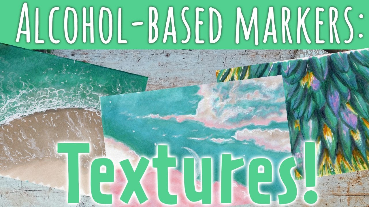
about alcohol-based markers, which had been a favorite of
mine for almost a decade. Now, in this smaller
scale class, I'll be showing you how
I go about rendering a gorgeous aurora
borealis night sky will be focusing
on one technique, blending, or should I
say, extreme blending. This project will get
you really working your rendering muscles
as it will force you to work fast and understand the importance of patients
and trusting the process. I would recommend this
class to those who have at least a slight familiarity with alcohol-based markers
and how they work. But you don't need to
have any drawing skills whatsoever as there will be
no base sketch involved. My hope for this class and future short form classes is to give people an
understanding of how alcohol-based markers
can be used on a larger scale for
the creation of complete illustrations
and scenes. When you've completed
this class, you will have gained some
thorough practice with extreme alcohol marker
blending and be able to create more intricate
works of art without having to rely on different materials to
get the look you want. So without further ado,
let's get coloring.
2. Your Project: In this class, we will focus on extreme blending
techniques to create a stunning and realistic aurora
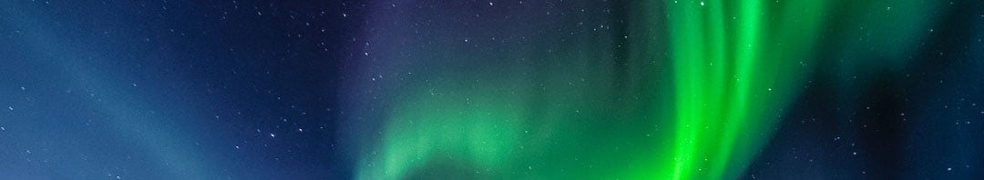
borealis night sky scene. I will provide you with the reference photo
you need and guide you through the tools and colors required
for this project. You could, however, also choose
your own reference photo. Unsplash.com and pexels.com are great options for
royalty-free photos. The northern lights or the perfect subject for practicing blending
with alcohol markers. As they are simplistic
in their form, really force you to develop
your rendering skills. We will start by prepping our markers and choosing
the right color palette. Then we will jump straight into rendering the
aurora borealis. No need for sketching. You will learn how to
blend colors to create a smooth and seamless transition from one color to another, giving your night sky a
gorgeous gradient effect. By the end of this class, you will have
created a beautiful unique illustration
you can be proud of. You will have also gained valuable skills and
experience with alcohol marker blending
techniques that can be applied to other
projects and subjects. Don't forget to share
your project in the project section of this class and comment
on other people's work. Your feedback and encouragement
can go a long way in helping your fellow
classmates grow and learn, and vice versa. So, let's get started and create a stunning aurora borealis
night sky scene together.
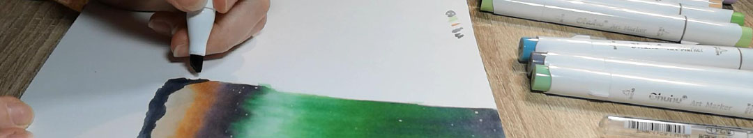
3. Recommended Materials: Excited to begin. Great. Let's start by going over the supplies that you'll
need for this project. First and foremost, you will, of course, need
alcohol-based markers. For this course, I'll
be using colors from Oahu whose set of 48
classic brush markers. If you already own markers
and the appropriate colors, which we will be going
over in the next lesson. Feel free to use what you have. I just chose to go with
this particular set because not only does it include
all the colors will need, oh, who, who markers are inexpensive and excellent
quality for what you pay for. Perfect for someone
who's just starting out or who doesn't have
that bigger collection. Next on the list is
a white gel pen. We will be using this for adding stars toward the
end of our project. I personally am a fan of the Sakura Gelly Roll
08 and uni-ball signal, UM, one phi three. But you can use
any white gel pen or any white medium
that you have on hand. Just make sure that whatever you choose is opaque
enough for the ink below not to show through and be able to create
small dots, of course. For paper, I'll be using oh, who, whose marker pad? Specifically the one
that is 8.9 by 8.3 ". It's a good size for
this particular project, has micro perforated
pages so you can easily remove your beautiful artwork to display if you so desire. It also works really well
with Oahu who markers, of course, as they're
meant to be used together. If you prefer to use
a different paper, just make sure that it's smooth, which is hot pressed thick, which is at least 200 GSM. And meant to be
used with markers. Bristol paper or
illustration board, which are also great for pen
and ink, are great options. Avoid using mixed media paper
as it may cause bleeding. Speaking of, you should
always test your markers on your chosen paper before committing to your
final illustration. This way, you can
test how the markers react to the surface and
how the colors show up. Optional materials include
a pencil and eraser if you want to sketch out your aurora borealis
before coloring. If you choose to do so, make sure to use an HB pencil
which can easily be erased. Now that we've gone over the supplies required
for this project, it's time to choose
the colors will need.
4. Choosing Colours: It's time to figure out
what colors will need to create our aurora
borealis illustration. I highly recommend having
a filled out color chart handy to help you identify
which colors you'll need. Because the caps on
markers are really not representative of the
inks actual color. Who, who provides
blank color charts with each of their packs. But if you have a
different brand, you can get your
own by searching whatever brand it
is on the internet. Or alternatively, you can
just create your own. Okay, I'll set, let's go. First things first. Let's take a look at
our reference photo and identify the
color groups we see. Breaking things down
like this will make it easier to pinpoint the
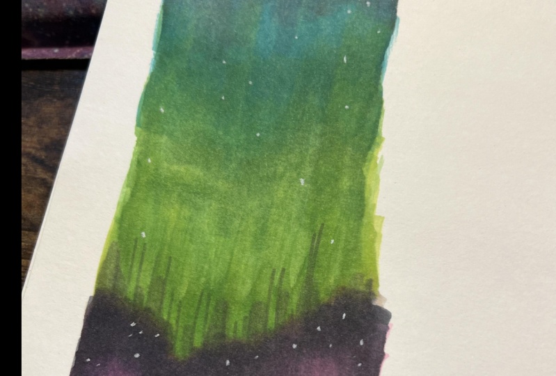
markers will need. We have greenish
northern lights, a purplish blue sky, and orange towards the horizon. There's also a touch
of blue towards the tail end of our
Northern Lights gradient. Now that we've identified
the color groups, we can start selecting
our actual colors. Let's start with the
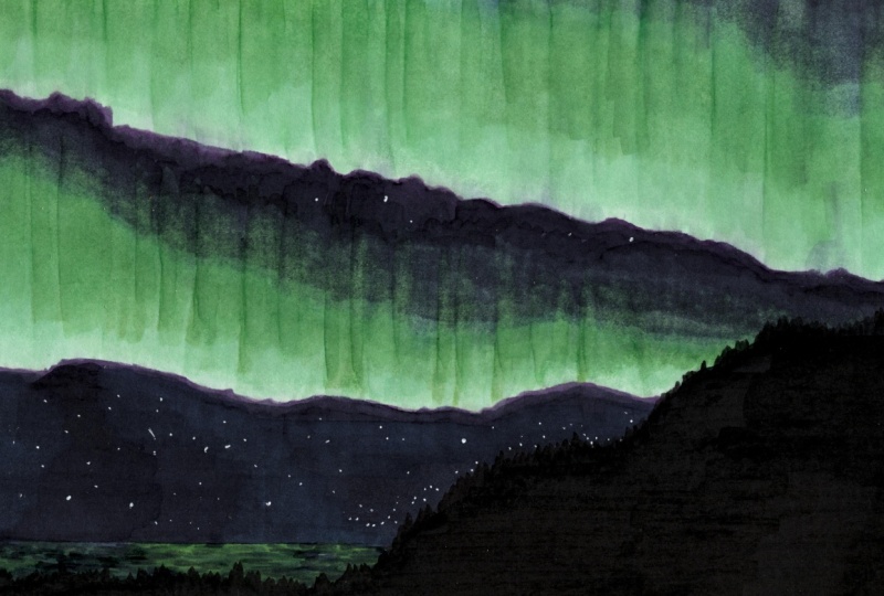
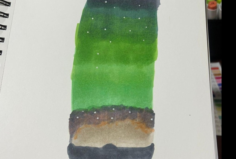
northern lights. To create the greenish
color of the Aurora will be using G8 glass green
as our palest color. G11, pale green,
G12, grass green, and G5 turquoise ink blue towards the end to help us
blend into the night sky. These colors will give us a
range of shades of green. We can blend together to create
a more realistic effect. Moving onto the night sky will be using our turquoise ink, blue to transition
into the night sky, followed by our
cool gray shades. Cg to zero for which
is cool gray to four. And C G27, which
is cool gray to, with these three colors, will be able to create a
subtle gradient effect. We can also use the colorless blender to
help blend the colors together and create a smoother transition
between the shades. For the orange horizon will be using WG zero-one,
warm gray one. B are three rows, beige, which we'll use
for a warmer areas. And are 11, move shadow, which is a cooler shade. These colors will give us
a range of tones to create a gradient effect that goes
from sunset tonight tones, like in our reference. Lastly, for the monotone ground, we'll be using are
cool grays again. Because we're keeping
the horizons simple. It won't overpower the
rest of the illustration. Now that we have our
colors selected, it's important to test them
on a scrap piece of paper to make sure that they work together and to get a
feel for how they blend. Remember to keep the colorless
blender close by two, as it will be an essential
tool for blending the colors together and creating a smooth transition
between the shades. Especially for this project as the Aurora Borealis
requires a lot of blending.
5. Illustrating the Northern Lights PT 1: Before starting
any illustration, I always make sure I have everything I think I'll
need within reach, preferably in an organized way. This includes my
handy color charts. And well, in this case, I'm using part of my actual
page as a test area. Normally, I'd have
an extra paper to scribble and experiment on. I suggest keeping
your color charts in a place where you're not likely to brush
against with your arm or hand while coloring or
reaching for a marker. For me, it's on the right side of my Canvas is I'm a lefty. So let's start with
our lightest green. For those of us
with the OH, who, who markers said I mentioned
in the materials section, this would be glass screen. Feel free to make a
light sketch of where you want to place
your aurora borealis. But it's not
absolutely necessary. For this project. I'll be using purely the chisel
tip of my markers because I want to lay down a
lot of color and fast. It's also perfect for giving
that layered sky look. Set the color down with quick upward strokes following
the shape of the lights. To be sure my
markers blend well, I'll be continuously adding
layers relatively quickly. It may look a bit
streaky at first, but things blend out
more with each layer. For this project, I'll be
using the blender a lot. So definitely keep it close. We really want those
northern lights to blend into the night sky. And at least with
Oahu who markers. The blender is particularly useful at achieving that effect. More high-end markers
like Capex and pro markers may not
necessarily need as much help with
the blender marker as they already blend
together extremely well. I would still keep
it handy though. As blending into the
night sky itself, which is quite a
shifting colors, may prove a tad challenging. It's also useful in
smoothing out streaks and transitioning colors smoothly
into an almost white, which for our Northern
Lights is super handy. Next up is pale green. You'll see that it starts off as a really harsh transition. But we're going
to refine it with our blender and lots and lots and lots of layering.
Just like before. We go in with quick
upward strokes. You'll see the blender really helps to smooth out
that harsh line. We still need to layer. However. Next step is grass green. You'll see I often go back over everything with my
initial glass green, our lightest shade to blend as well as keep the tones
overall similar. This may not have been
absolutely necessary, but I threw in a few dabs of cloud blue to delineate where we really start to
see the night sky peeking out from behind
our northern lights. Our next color, turquoise ink blue, basically overpowers it. As you see here. I use this color to cover
most of the night sky. It marks the transition
from Aurora Borealis to sky and is the lightest
shade of the night sky. Back to Larry to assure a
really smooth transition. Go over the gradient with
each color using the blender. When you notice a
particularly rough area, just make sure you don't go into the lighter areas with
your dark shades. Because the blender
can only do so much, so much to fix
mistakes like this. Back to this guy itself. Sticking to the markers
from our OU, who, who said, I use cool gray to four and cool great to use seven for the
actual night sky colors. These two actually really
blend well together. So there's not much
for the blender to do. Here. I'm trying to pull
the greens into the sky to give it that
fading Northern Light look. My strokes are long
and mostly upwards, but feel free to
pull down a bit to really blend the sky
and greens together. Trying to enhance that
effect with my grass green. This is also helpful
because it gives us some fresh ink for our
blender marker to take from. Just keep going with layers of long strokes until
you're satisfied. You'll see at the
end of our reference there is a hint of darker green. So I dabbed a few
spots of pale green where our Northern Lights meet the bottom part of the sky. And Blend, Blend, Blend. Be sure to go pass the
actual tip of the lights. As that will help to have a little bit of
smoother transition. We want the bottom transition
to be harsher than the top, but not a solid line either. I want our bottom sky to have a hint of sunlight
peeking from the horizon. So I went with warmer colors, starting with warm gray one, I cover the entirety
of the bottom. It's such a light
color that whatever goes on top of it
will overpower it. Using the blender,
I tried to get a bit of a dark to
light gradient. The next color we'll
use is Rose Bache, which starts off a super harsh. But behold again, the magic
of the blender and layers. Getting closer to
our night sky colors now we go with more of a shadow. And now to squeezing the 2 gy that make up
the darker night sky. You'll see later, I can shift
the whole gradient down a touch because I
didn't give myself enough space. That's fine. Since for this
particular project, we aren't following any
particular sketch or line art. For this area. My marks are more random and squiggly in order
to avoid streaks. For the Aurora Borealis, streaks were actually welcome, but not for this part. Now focusing on the edge between the northern
lights and the sky, I add a touch of glass green. You don't want to add too much. So go in with very
small squiggles. I then add a touch of FreshGrade in order to be able to
blend it into the greens. You can use a mix of Blender and glass
green for this part. The mix of the two make for
a natural looking edge. Now for a second, go at the bottom sky. This is where I shift
everything down a touch and we're using the same colors just in the opposite direction. Still with the
random squiggles to avoid streaks and keep
the gradient smooth. Before going to the next part, which is to add the ground, we have to make sure
things are dry otherwise, since alcohol-based markers
blend together by nature, our horizon will wind up
blending into the sky. So let's wait a couple of
minutes and come back to this.
6. Illustrating the Northern Lights PT 2: Okay, Now that everything
is nice and dry, we get to do our final touches. Let's start with the stars. I'll be using my Gelly Roll pen. But you can use
whatever white gel pen or pain you prefer. Just testing it out to
make sure it's working. And blue, blue random
stars everywhere. Be sure to make
some clusters and some lonely stars of different sizes to
make it look natural. Don't forget to add some in the actual northern lights too, because even though they're hard to see, they're still there. Finally, our horizon. You can add detail
to it if you want. But I decided to just go with a solid color for
simplicity's sake. I'll be using cool
gray to seven because I find plain black
is just too harsh. Feel free to create
whatever horizon you want. I made mine simple. But you can add trees, silhouettes of
people, buildings, whatever you feel like. There we go. Done. Feel free to cut it out to make a bookmark or keep it
in your sketchbook and scan it into
your computer as the design for all
sorts of projects.
7. A Few Last Thoughts: Congratulations, you did it. You learn the essential
techniques required to create a stunning aurora
borealis night sky scene with alcohol-based markers. Right now. Well, why not create a beautiful bookmark prints or even print on demand products featuring your amazing creation. Or you could delve further
with your new found skills, as this technique is
versatile and lends itself well to similar
textures such as clouds, rainbows, and even other
cosmic backgrounds. I hope you had fun learning and creating your masterpiece. Remember to share
your project in the project section
of this class, and don't hesitate to ask questions or leave comments
in the discussion section. If you enjoyed this class
and found it helpful, please leave a review
and follow my profile to keep up-to-date with future
courses and other news. Thank you so much for joining
me and keep creating.
 Sabrina Gosselin, Freelance Illustrator & Photo Retoucher