Transcripts
1. Introduction: Hey there, I'm Sabrina Gosling, a certified wildlife
biologists gone artist. I have diplomas in both graphic design and
digital photographic imaging, which means I'm a
professional photo shopper. And for the past several years, I've been working as a part-time
freelance illustrator. My main tools of the trade
include alcohol-based markers. And over the years, I've explored a variety
of techniques to get my illustrations looking
just the way I like them. In this particular class, I'll be showing you how I
render varying rock textures. Through following along with me. You'll gain the skills
and insight you need to render not only rocks, but a multitude of patterns
and textures throughout our world using alcohol-based markers
and colored pencils. The only requirement
to benefit from this class is a love
of drawing and nature. Whether you're a hobbyist who loves to try all the things, a professional illustrator
hoping to gain more insight into specific
marker texture techniques. This class is for you. By the end of this class. Not only will you have created your own super
cute illustration, but you'll have added to your
arsenal of techniques to develop and build your
future artistic projects. Looking forward to
seeing you in class.
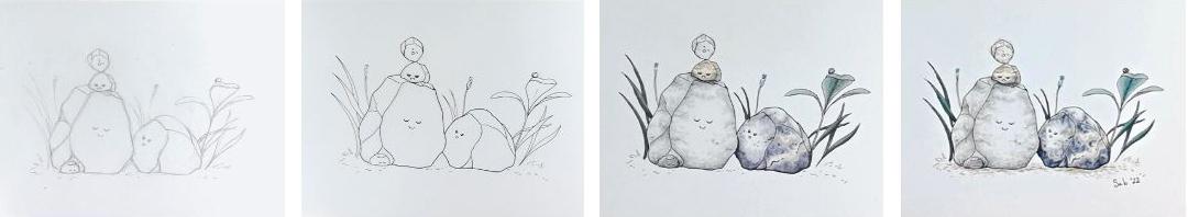
2. Project Intro: Your project will be to illustrate an
adorable Rock family. All supplies, some
reference photos in the resources
section of this class. However, Feel free to
gather your own photos, either on the web or actual
rocks from around your house. First, the prep work, I'll show you how I
go about choosing my references and specific
tools and colors. We will then go over the preliminary sketch
and line art phase. I chose a relatively simple
subject matter to draw as the focus of this course is
marker rendering techniques. Finally, rendering rocks makeup for the simplicity
of their shape, by the complexity
of their texture. But that's what we're here
to learn in this class. Follow along as I demonstrate
how I would render each unique rock texture in
this happy mixed family. After completing your project, you'll have expanded
your arsenal of marker and illustration techniques to include some of nature's most
prevalent textures. The methods we'll be using
to render our rocks can easily translate to other
subjects such as tree bark, dirt, all sorts of things. Go forth, experiment
and have fun. Please post your project as an image in the project
section of this class. And don't forget to comment
on other people's projects. Not only will you
brighten someone's day, but it will inspire
others to check your workout and
return the favor.
3. Materials: Okay, Before we begin, we need to get our supplies. Naturally, you're going to need some alcohol-based markers. There are several brands
of these floating about. The most recognized being capex. Now, CAPEX aren't
cheap and buying them individually can burn quite
the hole in your pocket. So for this particular course, I chose to keep to this newer, cheaper but still decent
brand called Oahu who? Their set of 36 gray
tone alcohol markers. Probably the simplest place you can get this set is on Amazon. But oh, who, who is available elsewhere from
what I've seen as well. If you happen to have
another brand on hand and don't want to invest in yet another pack of
alcohol markers. Feel free to use whatever
suits your fancy. Just remember that your colors
may not match up exactly. And you might have
to get creative, which is completely
fine and fun. Now, for this course, I wouldn't recommend strain from alcohol-based markers as we will need to do some
blending down the line. Next on the list are
colored pencils, which we will use for
our final details. These aren't a must-have, but I still highly
recommend them. I own a set of 36
during went color soft. And they've suited me just
fine. For this course. I'll be using them to add
a few touches of color since I'm sticking to a fairly
limited set of markers. For the liner, you'll need
at least one black pen. The most important thing to
note is that whatever you choose needs to be able to withstand
alcohol-based markers. I would recommend a fine
liner brand like Faber, Castell, Pitt Artist Pens, which come in several widths. Or you can even go
with a brush pen if you want more versatility
with your line work. For some reflections
and other details, you'll need a white gel pen. Personally, I like the secure a jelly roll 08 and
the uni-ball signal, which I use interchangeably, the secure a jelly
roll spreads easier. But the uni-ball
is actually more opaque and so they serve
different purposes. You of course, need a pencil
and eraser for the sketch. If you're going to go with
the basic lead pencil, I'd recommend HB as it
can easily be erased. Remember, this isn't about making a nicely
rendered drawing. This sketch is
only the blueprint for the final illustration. Lastly, you need
something to draw on. I recommend a smooth thick paper like Bristol or
illustration board. It should say somewhere if it's meant for Penn and marker. And I would be wary of mixed
media paper to be safe. All these tests
your markers before committing to using
your chosen paper. This way, you can not only test how they react
to the surface, but you can also see how
your colors show up. For an example of what
paper not to use. Here's a marker pad I use
only for Sketch purposes, as well as a mixed media pad where the markers bleed
through the fibers. For this particular
project, I'll be using oh, who whose marker pad, which was created by the company with their
markers in mind. You don't have to use
this exact marker pad. But I think it's a good size
for our Little Rock family. It's also almost square, which could be interesting
for those of you who posted it on Instagram
and other social media. Now that we have our material, it's time to move on to
gathering references.
4. Gathering References: Before we get to drawing, we need to gather
some references. Now you don't necessarily need
a reference to draw rocks. But since we're focusing on more or less realistic
textures in this course, it's probably best to have
something to look at, at least for the coloring phase. In fact, for the
final illustration, I used my gathered references
purely as inspiration. I'll include the
photos I've used in the resources section
of the class. But when looking for
your own references, there are many options
for you to choose from. If you want to use Photos. Google image search, and
Pinterest are great. But just be aware that a lot of the images you'll find will
be subject to copyright. If you want a safer bet. I suggest something like
Unsplash.com or Pexels.com. These are both great sites
for free stock photos. You can also take your
own photos, of course, or in the case of
something like our rocks, just draw them from life or
still-life. In this case. This works really well
as you can get the exact lighting an
angle you want. Okay, now we still need
to choose our colors. But first, let's come
up with a sketch.
5. The Sketch Phase: I'm going to mention it here, but before I start
any illustration, I brainstorm and doodle
a bunch of thumbnails to really get a clear idea
of my concept and layout. It's also important to note
that something that looks great in your head doesn't always translate well to paper. So this is a good way
to test things out. When starting a sketch. I start with very basic shapes, loosely placing my subjects to make sure they fit
nicely on the paper. A lot of illustrations require
more precise sketching. But because these are rocks, I wasn't too concerned
with the details. You'll notice I goes the page a lot before putting
a line down. This is kind of like preparing my muscles before
committing to my line. Almost a little warm-up. It's super helpful to imagine whatever it is you're
drawing as basic shapes. And in this case, the rocks are really just crooked rectangles. If you can imagine your subject using shapes like
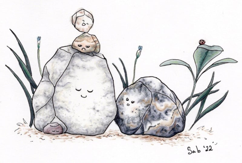
squares, cones, cylinders, and the like, it'll give your illustration more depth and believability. Now onto our faces. You can draw whatever kind
of expressions you want. But in my case, I
wanted the mama Iraq to be looking lovingly
up at our Big Papa rock. Initially, my idea was to have her saying
You're such a softy, which if you've got any
knowledge of geology, has a bit of a double entendre as based on their composition, rocks may be considered, quote, hard or soft. It's actually why
I'm planning on making Poppa Rock a white rock. Because a little trivia for you. The softest rock
on Earth is talc, which is indeed white. In keeping with the idea that our Poppa Rock is a big softy. I decided for him to have
a very tender expression. Of course, our little list
of rocks is smuggled close, carefree, and sleeping soundly. I went through a few expressions with the first server
troublemakers here. And that's okay. Sometimes what you think would look good, turns out not quite right. That's one reason we
have the sketch phase. So we still have the ability
to tweak and experiment. I opted for them to be surrounded by a
very basic setting. Just a few plants and grass. I'll upload the
reference I used for the first plant in the
resources section. But you honestly don't
really need to go off of anything but your imagination
for something like this. To ground them. I threw in some smaller details like dirt's and bits
of smaller grass. And to throw in a bit of color, I added a couple
of tiny blooms and a lady bug because I'm
a bit of a dog lover. Okay, So that's it. We've got our basic sketch down. Not the most complicated
of sketches, but we're focusing on our
marker skills in this class, not our drawing skills. And with that in mind, please don't worry about making yours look
exactly like mine. That's not our goal here. Are you ready for
the next lesson? Great. Let's get inking.
6. The Ink Phase: Before I start to ink, I go over my variety
of pens to make sure I choose the one or ones
that suit my needs. I have a good idea which
ones I'll be using. But I still like testing at least a small
group of them out. In this case, I'm
testing all my secure a Micron pens so that you have an idea of the variety of
line width you can get. And yes, it is definitely hard to see a difference
between some of them. This also depends on how
hard you press on the paper, which I should add is important to note
if you want to add some subtle variation to your line width without
having to change pens. My go-to fine liner widths are the secure and Micron 0305, or the small and fine tips if you're using
Faber Castile pens. This illustration is
rather small though. I've grabbed a 02
for the details. Before inking. I recommend using
a kneaded eraser to remove most of the
lead from your page. This will ensure less of
your ink will lift off when you erase it entirely
after doing your line art. Of course, if you
like the soft look, you can absolutely
skip this step. Now we ink. I'm starting off with the 05, being sure to only use
it for the outer lines. You can also create
a depth by using heavier lines the closer
something is to you. Now for the inner lines, I use the 03 and
even the 0 to four, the more delicate lines. You'll notice I'm mostly pulling the pen towards
myself as I draw. Normally, if you want
a straight line, It's better to draw
away from yourself. But I wanted my line
art to be a bit jagged and irregular to
give a more natural look. Another thing about linewidth, you generally want
your larger objects to have thicker lines than
your smaller objects, unless your larger
object is very frail. Or you want your smaller
object to look very dense. Like for our little baby rocks, I've used 0203 instead of 0305. Something to note, if you're drawing in a sketchbook
or pad of paper, you can turn it around to get a more comfortable
drawing angle. Sometimes you may have to go over your lines a bit
to touch them up. There's nothing wrong with that. You'll notice here
that I'm using my finest pen for the
plants in the background. There's two reasons for this. One, because they
are further away, and two, because plants
are less dense than rocks. Just like when I was sketching, I often goes to page before putting down my
line with line art, of course, since it's permanent, it's even more important to
get your marks down right. For the faces. Well, I use this 02 for
the puppy Iraq's face. I whipped out my 01 for the
rest of them as they are so small and I wanted to make sure their expressions
didn't look off. I could've used a
02 for the mom, but I wanted her to look
a little dainty here. So that's the inking phase done. Now we get to pick our colors.
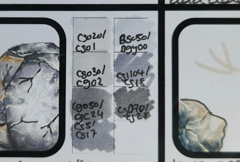
7. Picking Colours: As I mentioned earlier, I chose to go with oh, who, who's 36 pack of grace. So we have a limited number of colors to work with each other. Who, who marker set comes with a handy color chart
for you to fill out. But if you're using markers from other brands are
multiple brands, then I suggest creating or printing out your
own color chart. Here you can see that even if this is considered
a great pack, we still have a variety
of hues at our disposal. Our final illustration
will just be more muted. We're also going to add a touch of extra color with
their pencils. As a final step, let's take out our
illustration now and decide which colors
we're gonna go with. I have my reference
photos handy too, so that I may be inspired
by true to life patterns. We're going to start
with Papa rock, whom I've decided is going
to be essentially white. Even though he's white. I actually take out
quite a few markers. Most of my neutral
and cool grays. I may not use all of them, but at least they'll have
them handy if I need them. Since there is quite a bit
of shadow and texture. I also take out my
colorless blender because that's going to
act as my pure white. Mama. Iraq is our most colorful. There's going to be some overlap with pepper rock of course. And actually to be honest, I wind up taking most of my set by the
end of this lesson. Anyway. If you look closely, you can see mama rocks
grades are definitely on the cooler side,
almost blue actually. I took out the rest
of the cool grades as I wasn't sure how
dark I was gonna go. Remember, we don't have to
copy our references exactly. And this is only
for inspiration. She also has some
gorgeous bands that I'll be using a couple of
my warm grays for. As for the white
areas will be leaving those areas blank
or if necessary, we have our trusty gel pen
to help us out later on. For grumpy here, I wanted him
to have some bright colors. Not only because
I thought it'd be an interesting contrast
with his personality, but also to make
sure his expression was very easy to distinguish. I chose some similar colors
for our little trickster, kind of to show that they
were siblings of a sort. Lastly, because baby rock
is so small and simple, I kept the color symbol as well. Plus her little eyelids would likely get lost if I
were to add a pattern. You can also choose your
colors for your background. But because it's so simple, I didn't bother taking
anything specific out. There's not much left
in my bag of markers, but I'll be keeping it
close just in case I do need to reach for when I
haven't already taken out. Now we finally get to color.
9. Colouring Mama Rock: Mama rock is our most
intricate and we'll be using a comparatively large
amount of colors for her. She's mostly dark gray, but I wanted her adorable
little expression to be very visible. So I imagine the sun to
be shining on her face, allowing me to keep that side of her bright and highlighted. I started off in
the same way I did Papa rock with the colorless
blender as my base layer. In this case, I didn't
cover the entire surface because I just wanted the
center of her face highlighted. This was personal preference. You can color how you see fit. Just make sure you give yourself only one light
source to work from. Unless of course, you want
this scene to be from an alien planet that
has more than one sun. I mean, it could make sense considering these
rocks are alive. With my next layer, I go further into the face, but still making sure to create randomize
squiggles as I go. Pop Iraq is casting
a shadow on her. So just below her face, I'm going to make her darker. It also gives an extra slot to Earth's surface and
therefore add some interest. Just like Papa rock, I'm going one surface at a time, so none of my layers
dries while I'm working. Remember that with every layer you should put on less color. If you feel the need to later, you can always add more, but you can't remove it. So take your time to build
your darker layers up. I mentioned it while I was
working on pepper rock, but I usually do at
least two passes of every layer when I'm working
on a blended texture. You'll see with mama rock here, there are more layers involved
since she's a darker gray. Please note how I take my time as I get to my darkest layers. I tried adding some
subtle freckles, but I'm not sure how
well they turned out. Feel free to come up with
your own ways to use rocks, variable textures
to your advantage. Freckles, facial hair, a scar. If you're going for
battle-hardened luck, have fun and experiment. You can really see
the shadowy area. Now. It's clear there's a slant
below her face to make it more natural and rock-like
as opposed to man-made. I added a bit of a dent in it. This is something to note. Be sure to keep things
rough in crooked. Otherwise it'll look unnatural. For this side of her. I wanted to add some
bands of warm gray. And so before starting
with my base layer, I went in with a couple
of placeholder lines. This is particularly important to do when your
main color is going to be significantly darker than that of your
smaller elements. Whether they be bands, spots, or color changes. They were a bit sharp, so I soften them up with
my colorless blender. Now to go in with my
lightest gray again, making sure to leave
the bands alone. I also wanted to
leave a bit of white. As we can see in the reference. There's signs of white here and there
throughout the rock. If you color over a part, you want it to leave
white. That's okay. We can fix that at the end
with our white gel pen. Repeat the layering
steps as before, making sure that your scribbles don't go over the
warm gray bands. Because mama Iraq is more
intricate and variable. I try to add more
natural looking patterns and markings as I go. It's always handy to
have your reference as inspiration for the
design you create. Our reference photo has a darker line running through
one of the warm gray bands. So I decided to sandwich when in There's no right or
wrong here, just fun. I use my darkest gray to create a contact shadow where
she meets the ground. And so it's not
such a sharp edge. I blend it in with one of
my Medium Cool graves. Like I mentioned before, I build upon my layers slowly. And you can see now
she's starting to get close to the reference in
terms of how dark she is. Cute little indent there. The shadow created where there's a shift in
the surface and go has a much sharper edge because it's where
two sides meet. Tried to not only create interesting patterns
while you color, but also surface irregularities
like bumps and cracks. When you do, be sure to follow your base layer
as you change markers. When I'm done, I usually wind up going back and
making adjustments. One last shadow touch-up
and we're done.
10. Colouring the Baby Rocks/etc: I'm using a mix of
warm and green grades for the first of our
so-called baby rocks. Same as always. I start with the
lightest of my shades, but in this case, it's the lightest warm gray. In this case, I felt
him out entirely. Then came in with the colorless
blender to pull away some of that color in order
to create a white band. Bayesian myself off of
our reference photo, I added a few darker bands
along said white band. Because he's so small, we don't have much
space to work with, so try to keep
patterns relatively simple and not too contrasty. If we didn't have this
face to worry about, this wouldn't matter so much. But we don't want
it getting lost. Also, like with our other rocks, try to keep darker tones away from the
center of his face. For the same reason. Our little goof ball here is almost as wide as pepper Iraq. So we start with a base
layer of colorless blender again to make them look related to but not an
exact match to his brother. I use some warm grays to add some patches of
color here and there. I went to pick dark
towards the end there. But that can be fixed using
the colorless blender. Not only will it help
to smooth out colors, but it can lift them off to, I use it to remove some excess color that
went past the line art to, it's not perfect, but it'll do. Our last little baby rock is going to be a purplish color. Her expression is very basic. So personally, I didn't think it was necessary to keep
her face bright. Her back is to the sun. So it look weird anyway. Here I'm using the blender
again to lift away some of that color on her backside so that it appears the
sun is shining on it. Also remember that
after all of this, we're going to be going in with her pencils to add
some extra color, texture and final details. Normally, I would use
slightly brighter colors. But because I want it
to stick to my set of 36 Oahu who markers. I'm using the greenest grays I have for the grass and plants. If you do have and want to use more natural colors,
go right ahead. But I'll be keeping
my illustration in the muted tones
for this exercise. The process is very
similar to the rocks, except that we're dealing with an entirely different texture. These plants are smooth, so we need to adjust how we
create our marks accordingly. No need to do random
squigglies here. Just basic smooth lines and
the direction of the plant. Because there's not much
surface area to cover. I decided to do the
whole thing at once. Being mindful of where light
hits and shadows are cast. Normally leaves are
actually darker on top. But I realized my
little mistake a bit too far and so
I decided to just roll with it. For the grass. There also wasn't a lot of
surface area to work with. And so I decided to do
them all at once as well. And kept things
very simple since I don't want them
distracting from the rocks. Be sure to go with a light
touch so you're able to get that fine point at the end
of each blade of grass. I didn't have much to work
with for our little bug, but I did what I could
with my red grace. I'll be going back in later
with some pencil anyway. Look at that. We're
done with their marker's looking
pretty darn cute. But I think we can
push it even further with colored pencils.
So let's do it.
11. Final Details: We're down to the last step. This one is kind of optional, but I highly recommend refining your illustration
with colored pencils. Like with my markers. I have a color chart
for my colored pencils, which I found by
scouring the Internet. I'll also be adding a hint of white gel pen in the end for a few highlights
and patterns. For Poppa Rock, I'll use
mostly my dove gray, which is on the warm side, and so lends itself well to
most wildlife and nature. Again, like the markers, I'm going a bit squiggly
with my markers, starting off with a light touch just to enhance
what's already there. You can create some
really nice cracks in your rock texture if that's
the look you're going for, as well as make your rock's
texture look more porous by adding some light spots
and specs here and there. Feel free to add a touch of color like I did
here with my cream. But be sure to use
a light touch if you still want your
rock looking white. Mama rocks pattern and colors
are a little more complex. So I pinpoint and gather all the colors I think I
may need before starting. Her gray tones are cooler
than our Papa rock. So instead of a dove grade, I use mid gray, which is more neutral. You can see here, you can kind of erase
colored pencil, which I actually sometimes used as a tactic to soften lines. I find too harsh. Same strategy as before. Light squiggles only to enhance
the marker made texture, along with a few
cracks here and there. It's very rare that I
use my black marker, but for pencils, it can act as a very dark gray if
you go in lightly. Here, I'm lightening my texture
as I found it too harsh. It won't disappear entirely, but it can be softened. I used her multiple colors to
my advantage and decided to add some blush to her cheeks and the color of her
pretty little bands. I think it's kind of cute. This is a fun way to
add some character to your illustrations using
elements that are already there. For such a small rock or a little grumpy pants
has a lot of colors. Like before. I'm just
emphasizing what's already there and bringing out his beautiful teal tones
a little bit more. For His cheeky little brother, I wanted to make sure
he stays quite pale. So I used a very light touch to avoid adding too
much extra color. In fact, I wonder bad in a bit too much even
though I was careful. So just remember that
if that happens to you, it can be fixed with the eraser. Just bringing up the
shadows and baby rock. I mentioned this in
the previous lesson, but the markers I had for
green tones were quite dull. So now I'm just adding an
extra hint of green to the plants so that
they're not so muted. The dirt below them could have been accomplished
with the markers. But I chose to go with
pencils because actually, at first I wasn't even sure I wanted to add any color at all. But also pencil marks can create a more accurately dirty look since they have sharper tips. I'm using a variety
of my brands, namely pale brown
and brown earth. I use a combination
of light and harder, rough strokes to get
that dirt texture feel. Don't think too much
about this part. It's supposed to be
simple and minimal. I kept the lady bug and
muted red to otherwise, she'd be grabbing the
attention away from the rocks. That's actually
something you should be wary of in your illustrations. Red catches the eye, so use it with extreme caution. If you made a mistake
like I did here, going over the lines and the blender
doesn't do the trick, then you can try a gel pen. N yes, spots like
these may happen. But oh, well, I guess it
kinda makes it look real. One of my favorite
parts is adding the final touches with
my white gel pen. It adds even more pop. If your faces aren't
showing up well enough. You can strategically
placed lighter bands or marks on your rocks to
bring those pieces out. If you want your rocks to
have a bit of sparkle, this is the time to do it. If you find that a mark you've done is a touch too bright, debit lightly with
your finger before it dries to tone
it down a touch. Such a cute family
brings me back to my childhood when I had hordes of rocks instead of Barbies. And yes, they all had
personalities and names. Anyway. That's it. We're done.
12. Conclusion: Alright, thank you. Well done. You've created your very own
adorable illustration to be proud of a fame
mine and hang it up. Maybe make some cutesy cards. How about you? Whatever you decide to do
with your new creation, please share it on the project section of this class so that
we can all see it. Maybe we can get our own little digital walk
collection going. In summary, this
course focused on alcohol-based marker
techniques to render common textures seen in nature. We honed in on rock textures. But as I mentioned earlier, you can apply these methods to many subjects and not just
those found in nature. Please don't forget to post your project in the
project gallery. We would all love to see it. And if you have any
questions or comments, please feel free to
either add them to your description
or alternatively drop them in the
discussion section. It would also helped
me a lot if you could leave a review and if
you enjoyed this class, feel free to follow my profile as there are many
more in the making. Thank you so much for
joining me in this class. See you next time.
 Sabrina Gosselin, Freelance Illustrator & Photo Retoucher