Transcripts
1. Introduction: Hey, there, I'm Sabrina Goslin, a certified wildlife biologist, turned artist with diplomas
in graphic design, digital photographic
imaging, and UX design. I've spent the past
decade working in photo retouching and
freelance illustration, where my primary medium
is alcohol based markers. In this class, I'll guide
you through my process of rendering three
different textures with alcohol based markers. We'll explore
techniques to capture the unique qualities
of each texture, allowing you to bring
them to life on paper. Following that, I
encourage you to take this class a step further with an open ended texture challenge. The goal is to explore as
many textures as you like, and from any theme
that inspires you, whether you want to recreate the delicate texture of flower petal or the rugged surface
of a stone, or both. The choice is yours. The goal here is to have fun experiment and
expand your creativity. By the end of the class. You'll have created a
personalized set of texture swatches
that will serve as a valuable resource for
your future projects. This class is perfect for artists of all levels
who want to improve their rendering skills and gain confidence using
alcohol based markers. I'm so excited to embark on this creative
journey with you. I can't wait to see the incredible textures
you'll create. Let's dive in and unlock the endless possibilities of texture together.
See you in class.
2. Project: Welcome to the project
overview of our class. I'm thrilled to
have you join me in this exciting exploration of texture rendering using
alcohol based markers. In this class, we'll embark on a fun and open ended challenge to master a variety of textures, giving you the freedom to
explore and experiment. To start, we've
got the prep work. We'll begin by
discussing some of my recommended materials and how to choose your references. I'll provide you with
the reference photos I'll be using for
my sample textures, as well as where
to find your own, whether it be online or
real life inspiration. The goal is to create
a diverse palette of textures that you
can use in your art. Then we'll be prepping
texture swatches. Once we've gathered our
materials and references, we'll prepare our
texture swatches. This involves creating
a basic layout that will allow you to experiment and explore different rendering
techniques on a single page. And finally, I'll
demonstrate how to render and take notes on
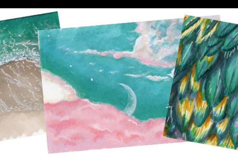
my three chosen textures. One, a beach shoreline with vivid green hues and
thick foam, two, and almost fantasy
esque pink and green cloud scene, and finally, a close up of bird feathers, showcasing intricate patterns
and vibrant gradients. Now for the texture challenge. After learning how to
tackle these textures. It's time for your own
creative exploration. This open ended challenge
invites you to try your head at rendering any textures that
catch your interest. From the ruggedness of tree
bark to the shimmer of wet stones or the delicate
surface of a flower petal. The possibilities are endless. Feel free to do as
many textures as you like and push your
creativity to new heights. Your challenge may just be to accomplish the three
textures I'll be going over. But I encourage you to try
your hand at experimenting. Once you've completed
your texture swatches, please share your work in the project section
of this class. Posting your progress
is a great way to reflect on your growth
and receive feedback. I also encourage you to comment on your fellow
students projects. By engaging with others, you'll find
inspiration and build a supportive creative
community. Let's get started.
3. Materials: Ready to gather your materials. Let's go over what we may need. First off, you'll need
something to draw with. I'll be demonstrating
how to create three different textures
using alcohol based markers. If you want to follow along, that's what I recommend. As to what brand, it's up
to personal preference. I'll mainly be using Ou set of eight
classic brush markers, which can be found on
Amazon among other places. I also have a couple of markers
from another Oho Hu set, as well as a few pro markers. I'll add a swatch
set to the resources tab for you to see exactly
which colors I've used. Another useful tool to have
on hand are colored pencils. They're not required,
but I highly recommend having at least a small set
for extra details and color. I use Derwin Color soft
and I own their set of 36, which has so far
suited me just fine. Another useful but not
absolutely required tool is a white gel pen. Personally, I recommend the
secura jelly roll in size 08. I also own a pack of
Uni Ball signals, but they have been a bit
underwhelming lately. With a white gel
pen, you can add plenty of pop and shine
to your textures. The important thing is
that your chosen pen is opaque enough to be seen
over your marker layer. If you want to throw
in some line art, you'll also need at
least one black pen. For this class, I
won't be using one. But when I do add line
art to my illustrations, I'll like the secura
pigma micron pens, and Faber Castel
Pit artist pens. The key thing when
choosing what brand to go for is that it is labeled as alcohol proof or design to be used with
alcohol based markers. When in doubt, just test it. Depending on the complexity of whatever texture
your rendering is, you may want to have a pencil
and eraser on hand too. For example, Imagine
illustrating a whole patterned rug free hand. For sure, it can be done, but it doesn't have to be. This little guy here is a needed eraser and is
super helpful because it removes most of the
pencil marks while leaving just a hint of
the original sketch. You'll have no worries about led bleeding into your colors. Arguably the most
important material on the list is paper. For alcohol based markers, it should be smooth, thick, and meant for Pen,
ink, and marker. Bristol is a good
choice, for example. A good tip is to experiment with paper that is the same or similar to what
you would use for your usual illustrations
or final projects. You can use whatever size
you're comfortable with. I'll be using a nine
by 12 inch pad, which I'll divide into sections. Last little thing you need is
something to take notes on. I cut out some index
sized papers that I'll be sticking on the back of my texture swatches
as I create them. Got all that. Great. Let's get talking about
gathering references.
4. References: Wondering where to get some
good texture references. No worries. I've
got you covered. I'll share the photos I used for my demo videos in the resources
section of this class. But when looking for
your own references, you've got a ton of options. One of the most
obvious options is to look for photos of
textures on the Internet. Because this is just
texture challenge, you don't necessarily have to worry about copyright issues. Feel free to use Google
image search, and Pinterest. My go to sites for
reference photos are unsplash.com and pexels.com. Another option is to
take your own photos. Even just skimming through
your current photo albums, you're sure to find
some great subjects. You don't even need to
take any photos, really. There are plenty of amazing
textures all around you from your desk to the curtains or bring in some cool
nature finds to study. The possibilities are endless. Lo ad, have fun exploring, and we'll meet back here for
a few demos. See you soon.
5. Page Setup: I'm just going to show
you quickly here how I go about setting up my page
for texture swatches. My plan is to keep them all in an index card box I got
from the Dollar store. I want to make
sure they're about the size of traditional
index cards, about five by 3 ". In my case, the
page is nine by 12. Dividing it in half widthwise, and four heightwise to
get sections measuring 4.5 by 3 " works pretty well. This makes for a good size as it offers a decent sized
area to practice your techniques while
being small enough to keep your focus
on one texture. But it's not a role, and you can work with whatever size
you're comfortable with. Once you're done
dividing your page, feel free to cut them to size. Personally, I prefer
keeping the page intact until I fill
it up because I find it makes it easier
to color without having to hold the piece
of paper in place. As for going over the
lines accidentally, it's not a big deal,
since these are just reference swatches and
not final illustrations. Now that that's done,
we can get coloring.
6. Demo 1: The Beach: For our first demo,
I'm going to go over how I'd render this
overhead view of a beach, complete with wet
sand and foamy waves. This is going to
be a lot of fun. But first, let's take a look at what colors
we might need. Now, one suggestion I
have when it comes to choosing colors is when
in doubt, take it out. What I mean by this is if you think you might need a color, but you're not sure, go
ahead and have it handy. You're not scrambling for it when you're in the
middle of coloring. I usually have more markers out than I usually
wind up using, especially when
I'm experimenting. All the colors I'm using
are hu Hu markers from either their 36 set of
grays or 48 color set. But I'll leave a swatch list in the resources section so you can match with
whatever brand you have. You can also feel free to try your hand at picking
colors yourself. The trick is to focus on
each color group at a time and really pay attention to
the subtleties of the tones. For example, for the seawater, you're mainly going to
be using turquoise. But there are hints of neutral blues and
dark green as well. I'll delve deeper
as we go along. I'll start with the sand, where I've chosen warm
gray one as my base color. As a general rule, I go from
lightest color to darkest one coloring because you can always make things
darker if need be. You can't make things lighter by adding more of
your lighter shade. In fact, adding more of the same color will actually
make the area darker. Because it's a very
simple subject, I didn't bother
starting with a sketch. Here, I'm using my
brush tip to draw out an approximation of where the
sand will meet the water. It doesn't have to
be too accurate, especially since this is an experiment and is meant
for technique reference. Once I'm done with
those guidelines, I start filling in the
area with my base color. Because I started with the lightest color
present in the sand, I don't have to worry
about accidentally going over an area that
will later be shaded. Here you'll see how going over the same area twice
will darken your color, and I used it to my advantage to create the shadow
between sea and land. Moving on to my next shade, which is warm gray 05, similarly to how I created
a guideline for the sand. Now I'm going to do the same, but for where the beach
is wet. Thus darker. It's actually a
very similar step, and I finish things off by further darkening
the waves shadow. And even more with my next
darkest color, warm gray four. To blend it altogether smoothly, I go back to my first shade. Because I want to keep the drier sand as
light as possible. I keep to the wet area and continue to smooth things
out with my warm gray 05. I often do a final pass with my lightis color if I feel like it's not quite
blended enough. You can use either
your brush tip or chisel tip for this part. Depending on the marker and how old and dried
out each end is, one will work better
over the other. Now on to the water. It starts off very green, so I go with a tie closer
to the edge of the sand. As you move away from the
shore, things get darker, so I move on to my Cloud blue, which is basically a
darker bluer version of my original turquoise. Right now, I'm not
too concerned about streaks because I know I'll
be latering quite a bit, which helps smooth things out. To blend the two
colors together, I go back to my base color. Wo starts off g, doesn't it? No worries, we got this. To avoid darkening
things too much, I move on to my very
light blue gray 02, to smooth things out a bit more using quick
circular motions. The area where the waves meet the shoreline doesn't look too realistic, does it, though? Let's fix it by adding
some warm gray one, the lightest shade of sand
to the edge of our water. And blend some more. But this time with
a darker blue gray. Just a reminder,
your method, colors, or layering order may
not match mine exactly. Different markers, pen swipes, et cetera lend themselves to different ways of reaching
the or similar result. Take this as a guideline. After going over the majority of the water with
my turquoise again, I improved upon where the sun meets the waves by
adding some more layers. I flipped between my lightest sand color, my lightest blue, and my slightly
darker sand color until I was more
or less satisfied. And then added depth to the shadow itself
with my warm gray 05, which is my second
shade of sand. Again, lots of layering, which, by the way, is
a good time to note. It's very handy to have some protective layer
between your pad of paper. My hou markers came with a
plastic sheet, for example. There's a bit of a darker area in the upper corner
of the water. I went in with my darker
shade of turquoise to add a little bit more depth
to our little spot of ocean. I originally colored the
area with cloud blue. That's what I started
blending with. Followed by my turquise base, and finally, my lightest blue to really smooth things out. Looking pretty good now, we're about ready
to get into one of my favorite steps,
white gel pen. Usually, I'd wait a while for the colors to
dry completely. But to show you
how it looks when you don't wait for
your colors to dry, I'm going to start
this step right away. It's not terrible as alcohol markers do dry
very fast in general, but you can see that my little gel pen is
struggling a bit. All that layering has
made the paper quite wet. Because I'm using it to
create the foam, however, and I don't actually
want it to be completely opaque until I'm working on my final layer of foam,
I'm okay with it. If you do find your
gel pen is too opaque, one way of reducing its strength is by dabbing
gently with the finger. The technique I used
to create the foam is tiny swirls along the edge of the water in no
particular pattern. Make sure the edge isn't
a straight line and that you have some squiggles and lines sticking
out here and there. I use a similar technique for adding some foam
to the wet sand, but in more of random line
shapes and dots instead. You'll see I occasionally dab the gel pen where I
find it's too opaque. Just look to your reference
photo for inspiration on how the foam should
look and go from there. It doesn't have to
match perfectly, but remember to keep it random and in the
direction and shape, so to speak, of the water. In the case of the sand, it's like the bubbles are being pulled into the
ocean, for example. Go back to the actual waves. Here the squiggles
and marks you make should bunch up towards
where the water meets the shore and get looser and fewer as you move out
towards the open sea. You don't necessarily need
to use a white pencil, but I wanted to see if it would help the
look of the foam. I personally think it adds
some nice depth to the waves. I use it in a similar
fashion to the gel pen, but it's not opaque, so there's no need to dab. Also, I don't have
it fully sharpened, so it gives a
broader softer line. I also use it to emphasize
some of the marks I did with a gel pen and subtly build upon the foam layer
towards the edges. D D One more pass with the pen, especially around
the areas where the foam is thickest
and most opaque. When you're doing
your final layer, try to avoid completely
straight lines and let your natural hand
shakiness take over. One way to tone down Gel Pen, if you find an area a bit too intense is to go
over it with marker. Okay, our first texture demo
is done. Hope you had fun. Next up, we have to make
a couple of notes for ourselves to make this a
worthwhile reference. But
7. The Beach: Notes: For the notes, you can organize
them however you like. I wanted to be able to glue them onto the back of my
texture swatches. I prepared a bunch of index car size papers from
an old dotted notebook. It's always useful
to put a title in case your notes and your
swatch gets separated. I would say one of the most useful pieces
of information to put in your notes is what materials you used
to create your texture. I'll be putting the names of the colors I used
along with a swatch so I can easily find an alternative shade
should the need arise. I also find it useful to add which colors were my base
or foundation colors. Along with any other small
bits of info I wanted to add. Along with the marker colors, I include whatever other tools I needed to create the texture. In this case, white gel
pen and white pencil. Next to this list, you can write whatever useful
notes you can think of. I came up with a few examples
of what could be written. For example, wait for markers
to dry before going in with pen or potential
alternative colors. Come up with whatever
you think is useful for you personally as these
are meant to help you out. Another option, by the way, is to either record yourself creating your texture swatch, take work in progress photos, or have a note taking
app or piece of paper next to you to take
down notes as you go. Whatever suits your
personal preference. Okay. Now that that's done, let's move on to our next demo, which are some
fantastical pink clouds.
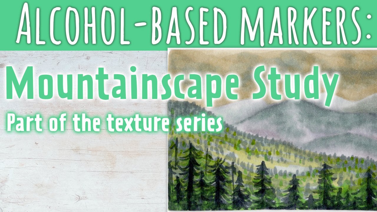
8. Demo 2: Clouds: Welcome to the
second texture demo, where I'll be showing you
how I went about rendering some whimsical pink clouds
in a green blue sky. I'll be honest, I was a little more nervous
about this one. Since I had a feeling, it
would be tricky to get that translucent area
looking believable. Let's see how this goes. Remember, even if
whatever it is you're attempting to do winds up not quite looking
the way you want, you'll still have some notes in the end to help your
future self out. Although not
absolutely necessary, sketching out an
outline of your clouds may help you feel more
confident when coloring. I use a needed eraser to remove
most of what I've drawn, leaving only a hint of
the underlying sketch. I didn't have the right
huu markers in this case, so I needed to break out some of my pro markers for
this illustration. To start, I'll be using my
favorite pink pro marker trio, pale pink, followed by pastel pink and
finally cocktail pink. They're the perfect
set to capture that whimsically pink
glow of our clouds here. Just like the previous
texture demo, I start with my base shade, which in this case is pale pink, making an outline
of where I want to color before starting
to fill things in. In this case, I use the
chisel tip for filling in because my other option with my pro markers is the fine tip, and the fine tip is meant for
details, not large areas. When laying down color, try your best to follow the shape of whatever
it is you're coloring. In the case of the clouds, they're fluffy and rounded. My strokes are quick and
circular to match the texture. Already, you can
see there's a hint of cloudiness to what
I've colored in. I push that further
using my pastel pink, adding some shadow
where I see fit. Remember, you don't have to
follow your reference to a T, but at least base your
choices on what you see, so it stays believable. Cocktail pink is quite vibrant, so I use it sparingly. Just enough to add
a touch more depth. Feel free to adjust
to your tastes. If you notice in our
reference photo, there's a hint of
a darker outline around the clouds in areas. I emphasize that with
my darkest pink. Finally, when I'm satisfied
with the amount of shading, I blend things together
with my original pale pink. Also adding some extra shadows here and there to
top things off. There's also a hint of
neutral purple in the clouds. I go in with my lightest
shade of purple, which is lavender, to give a subtle purple
hue to some areas. If you don't have a purple, you can experiment
with a very pale, cool gray, or a red gray. There's a lighter cloud
above the main one that I'm going to address
before working on the sky. For this one, I start off the same way by outlining
with my lightest pink. But if you notice, the cloud itself has an almost
beige hue to it. I'm going to add a teeny
touch of my huo warm gray one before blending it all together with my
colorless blender. As far as blenders go, in my experience, all
brands work well together. To add a bit of
vibrance to the area, I use my huu warm gray zero. Another reminder here that if you don't have
all these markers, I'll have a swatch list in the resources
section to help you out when picking from
your own colors. Or you can pick
from the reference. For the sky, I'm
actually starting with the same base color that I used for the water
in the beach photo. That is Oho Hus
turquoise green light. To make sure I don't
go over my cloud edge, I make an outline along the border where the
sky and clouds meet. Once that's done, I color in the sky using quick
circular motions. The sky gets a little brighter as we move
away from the clouds. At this point, I move on
to P markers turquoise, which I have as a brush marker, but is also available as a
regular chisel and fine point. You can also probably just get away with adding
an extra layer or two towards the end of your illustration with
your chosen base color, which in this case is
turkise green light. I'm not a huge fan of how
P Markers brush tips feel. I eventually switch
to the chisel tip. Because the top clouds
are translucent, I added some splotches
of sky here and there. I'll be going over it with white pencil later on to
tone down the intensity. Now to blend the sky together using my
original base color. To help blend things smoothly, I flip through my
two sky colors. I also decided to add a bit of a bluish tint using
my hu pastel blue, which also helps in blending. Top clouds are duller
than the lower clouds. I'll be starting with
my beige shades. To start, I'll use
warm gray one, quickly going over clouds with
some loose squiggly lines. The pink coloring is actually
caused by reflections. It'll be mostly present around the bottom of
the higher clouds. I tone down everything a
bit with my hou gray 20, including the sky a bit. Then go over the entire
area with the blender, in the hopes of softening
things up a little bit. You can see it helps a bit, but the real change
will be when I add gel pen and white pencil
over top of a Dal. Just trying different colors
now to see which ones work best at adding a pinkish
beige hue to the sky. I finally settled on pastel
pink for the most part, which I used to add a bit of
depth and shadow as well. And blender again.
Just so you know, most alcohol marker sets
come with a blender. You can see I'm checking to
see how dry things are before going in with my gel pen for some highlights
and final touches. Starting off with the
moon because that area was the first I worked
on and essentially. You can see the texture of
the gel pen lends itself well to being used for the
moon's uneven surface. For the shadowed side, I go with a lighter hand
and to the lighter side, you might need to go
over it a few times. Possibly even wait until the gel pen dries
and go back again. To enhance the translucent
look of the topmost clouds, I use my white pencil
and with the side of it, go over the sky area with
quick circular squiggles. At the same time, I add
some more opaque marks using the tip of the pencil around the edges of the clouds. I also add some smaller, fainter clouds fading into the sky to help give
a sense of realism. The white pencil
is also useful in creating soft highlights
in the lower clouds. More contrasting highlights,
we'll use the gel pen. These, I mostly save for
the top of the clouds. If it's too opaque, remember, you can dab
it to soften the look. Just keep at it until
you're satisfied. The gel pen is useful in
adding small opaque clouds. I use it to add some
tiny highlights to the clouds I drew
in with my pencil, which also helps to make
them more noticeable. I also added a few extra details and puffs to the inner
area of the top clouds. I wanted to keep the bottom
clouds looking softer, so I didn't add too many
intense highlights. You can always go back with any one of your mediums if
you feel the need to. Like here with my pencil. A few extra highlights
and some clouds and adding a bit of a soft
outline to the lower clouds. With pencils, you can't necessarily complete
what you've done, but you can reduce the
intensity of your marks. For fun, and a little whimsy. I also added a few
stars because, you know, why not? Since I already went over,
take notes previously, I'll just show you what I wrote for this particular
texture study. Remember, the notes are
for your personal use. Whatever is useful to you. All right. Ready
for our last demo. Let's get to it.
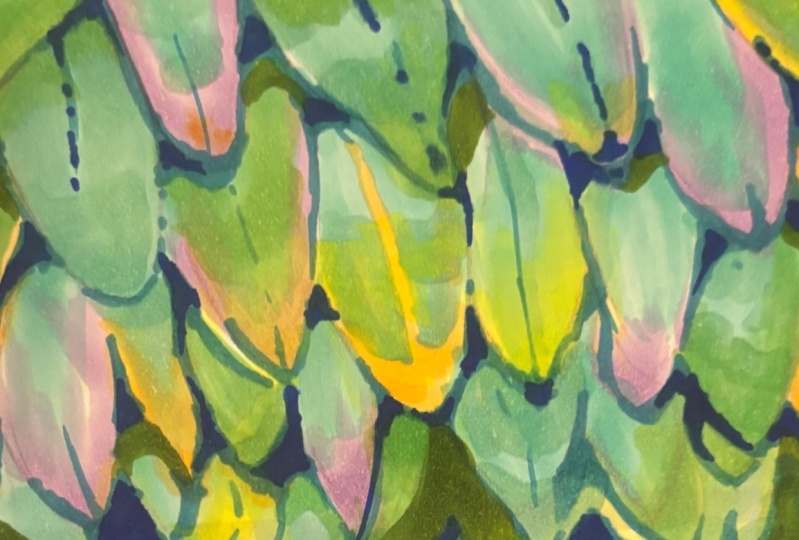
9. Demo 3: Feathers (pt1): Our last demo is going to
be a bit more involved, mostly because it involves
a bit more detail. We're going to start with
a sketch for this one. While it doesn't
have to be exact, it's useful to have a basic idea of how you want your
feathers to be laid out. I start by drawing out the direction I want the
feathers to be pointing, which changes as we go
from left to right. It's rounded, so I created a globe like
blueprint to follow. Now for drawing the feathers. Like I said, not exactly
following the reference, but more or less the same idea. I like this reference
photo because there's a good variety of feather
shapes and colors to work with. There are some aspects of the reference I definitely
wanted to keep. I made sure to draw them out. Otherwise, I just winged it. No pun intended. Care to guess what bird
these feathers belong to. I'll give you three chances. Believe it or not, these
are rooster feathers. Did you guess right? Let's wrap things up here by lightening our sketch and move
on to the fun part. See you in the next video.
10. Demo 3: Feathers (pt2): You might want to get a
cup of tea or coffee for this one because
it's going to be the most tedious of our demos, which also means
it's great practice. The nice thing about this
photo is that you'll only need Ojuu's 48 marker set and a gel pen for
those final details. There are three major
color groups here, yellows, purples,
and greeny blues. We're going to start
with our yellows because they're the lightest of our colors and need to be mapped out so we don't accidentally
color over them. I start by laying
down a foundation of my lightest yellow,
which is a knees. I go over where I think
I want it, in this case, more is better because you can color over the yellows
with the dark greens, but not the other way around. Once I lay my base layer down, I go in with my next yellow, which is sunflower, to
start adding the shadows. To do this, use light strokes in the direction
of the feathers. The yellow feathers are unique in that they
are very thin. Try to keep that in mind
while working on shading. Keep your strokes
from thick to thin by using a technique
appropriately called feathering, where you can start with
a slightly heavier touch and gently lift off the page
as you create your line. If you think you need it, practice a few strokes on a junk piece of
paper beforehand. Once you have your
yellow in place, and just a note here, we'll be coming back to it
to add more details later. The next step is purples. Because the purple is also
in very specific areas. It's a good idea to map it out before moving
on to the greens. My base purple is move shadow. Like the yellows, I
know it'll be easy to go over the purple with
green, if need be. I'm not being particularly
careful when mapping it out. The greens also have quite a bit of purple hue to them anyway, if you look closely. I'm also using the purple to start marking where the
feathers shafts are. You can see the
individual feathers starting to take shape nicely. It's important to be aware of the different
feather shapes too. We see with the yellows how
obviously unique they are. But there is a variety
within the others as well. Some are quite pointed, while others are
much more rounded. The size to varies. The next purple
is pastel violet. It's more vibrant
than move shadow. So I'll use it to add some gleam to our purple
areas where it needs it. Uh huh. We're going to work on the
purples again later, but now it's onto the
greens and blues. Coincidentally,
the base green for this texture is also
turquise green light, just like our other two demos. It's probably going to be a bit nerve racking when
you start shading in, but trust in the process, and remember, there's a lot
more layering to be done. You can see I'm
doing a mixture of feathering and filling in
depending on where I'm at. For example, When I'm
coloring near the yellows, I'm careful to keep the
feather shape intact. My goal at this point is to
fill in most of the space, but also taking into consideration the fact that
it's not the last step, so white space is okay. Something to focus on is
shaping the feathers. The original sketch we did earlier will really
help with this. But Once you're finished with the first of your greens and have your base layer ready, it's time to move
on to the shadows. The next of my bluey
greens is cloud blue, and following my reference, I start filling in the shadows. There's a dark outline
around each feather, so that's what I start with. The outline is actually a partly caused by tiny little barbs sticking out from the feathers. But for now, this
is a good start. Oh, Once I get everything outlined, I blend the greens
with sky blue, so it's not so harsh. This blue is on the purple side. So I went over some
of the purple areas as well to give it a
little bit of variety. It's a good color
to start working on the actual shadows
between the feathers. There are certain feathers that are more blue than others. I add a blue tint using pastel blue where I
think it needs it. With every color I use, the shadow gains and more depth. Moving on to turquoise ink blue, we're really getting
into the dark shadows. I use it sparingly to start around the corners and
undersides of the feathers. You can always build
on your shadows later. I decided to use
my lightest gray, which is cool gray, two, zero as a blender this time, because I could use it to subtly darken areas
at the same time. Because it's basically neutral, I'm able to use it to enhance the shadows
for every color. For the darkest areas, I emphasize the shadow using
the next gray in my lineup, which is cool gray two, four. Like with the
turquoise ink blue, I start off sparingly, mostly in the corners. Now, the darkest
gray, cool gray 27. With this one, I also add
shadow to the darkest corners, emphasizing the round
shape the feathers follow. As I usually do, once done
with the darkest shade, I go back with my lightest to smooth things out
where necessary. Now it's time to revisit
what we've done. To start, I use
my barium yellow, which is a middle gram
between the two yellows I originally used to add
to the yellow feathers. Following that, I also noticed the feathers
could use a little green. So I add a hint of glass green to some of
the tips and edges. Yours might need some
different adjustments. So play around until
you're satisfied. It's time for final details now. Using my white gel pen, I add some thin lines leading
from the yellow areas, reminiscent of the strands
in the reference photo. Some of the shafts are bright, so I decided to add a subtle white streak
to a few of them. Now to define those edges a bit. I opted for a dark green pencil. But you can try a
different color like black or even a very thin pen. If you opt for a pencil, make sure that it's well sharpened because
these barbs are small. I chose not to do
every single barb instead hinting at them by adding a few lines
here and there. I also cut into the
larger feathers to show that they aren't solid and
are made up of many barbs. I kept it low key as I didn't want to overpower
the marker layer. In the end, I felt that the shadows could use
a bit more emphasis, which I did using my graves. Lastly, even more improvement
upon the yellows. This time, I took out Mary gold, a significantly darker shade to really make things
pop and almost shiny. Blending it with my
second darkest shade. Fixing a few things up. Oof, I felt like I could
go on forever, honestly. It's so easy to get carried
away. But let's stop here. Like my previous demos, I'll add my page of notes
to the resources section. And what you look at
that? We got three demos. Pat yourself on
the back. You did.
11. The Texture Challenge: Now it's your turn. Like I
mentioned in a previous class, this is an open ended challenge, and there are many
ways to go about it. You can stop at the three
textures we saw in class, but I suggest trying out at least one texture
study on your own. If you're feeling motivated, you can even make it a
daily challenge for a week, a month, once a week, for a month, however you
want to go about it. This is for your
personal growth, so it needs to be
comfortable and fun for you. I'm going to let
you in on a secret. I am absolutely terrible at
keeping up with challenges. I like to make it attainable by aiming for a minimum
number of illustrations, studies, whatever it is, in a certain amount of time. That way, if I find myself super busy one day,
I don't feel guilty. If I can't accomplish whatever
it was, I set out to do. Another way to help motivate yourself is to share
your work as you go, such as the project
section here where you can edit and update or
on social media. If you'd rather not
share it online, you can show your work to
someone you know personally. This accountability can
help keep you on track. Here are a few extra tips in relation to this
challenge in particular. If you find yourself wanting to attempt a particular texture, but don't have the
right colors for it. One option is to use a
photo editing tool to swap the color range for something in your
roster of markers. You can even make it
gray scale to really focus on the texture
rather than the colors. Don't forget that
textures are everywhere. You don't need to focus on stock photos you find
online seriously. There are so many
cool things to draw, even in the comfort
of your own home. You may want to make things
fun by sticking to a theme, such as different manmade
materials, fur types. You can even go for
a hike and pick up a collection of
materials to study. Don't forget that to make
this challenge useful, you should take notes either during or right
after your study, and keep note of all
the colors you use, and if possible, record yourself or take work
in progress pictures. One last suggestion. After completing
several studies, revisit one of your
earlier pieces with fresh eyes and
new experience. Try recreating it from scratch. Take note of any changes
in your approach. Celebrate any improvements you notice and acknowledge
how far you've come. Good luck and have fun.
12. Conclusion: T hank you so much for
joining me in this journey of exploring texture rendering
with alcohol based markers. I hope you enjoyed the class and discovered new techniques
to bring your art to life. We've gone over quite
a bit in this course. You learned how to gather the
right tools and references, setting a solid foundation
for your artwork. Having the right materials makes a big difference in how effectively you can
capture textures. We briefly went over preparing texture swatches
in order to make the best of your paper
when exploring different rendering
techniques and textures, along with how to organize your reference textures
for future use. Then the juicy center
of our course, texture demos, where I went over three unique textures to help get your creative
juices flowing. Finally, you went
off on your own, exploring various textures in an open ended
texture challenge to develop your skills further
and push your creativity. Now that you've
completed the class, I encourage you to
keep experimenting and explore even more subjects. Textures are everywhere. Keep your eyes open
for inspiration. Be sure to share your work in the project section
of this class. It's a wonderful way to
celebrate your progress, gather feedback, and
inspire your peers. Take a moment to engage with your fellow students by leaving
comments on their work. Your encouragement can uplift and motivate them
to keep creating. Thank you once again for
joining me in this class. I can't wait to see
the incredible art you'll create in the future. Happy creating and
see you next time.
 Sabrina Gosselin, Freelance Illustrator & Photo Retoucher