Transcripts
1. Introduction: Hey, there. I'm Sabrina Gosson, a certified wildlife biologist
go freelance artist. Like many artistic
professionals, I've taken on many
creative exploits and have achieved diplomas
in graphic design, digital photographic
imaging, which is just a fancy way of saying
photo editing and UX design. Over the past decade or so, I've been slowly growing my
freelance illustration career where my primary medium
is alcohol based markers. This class is part of a series where I
demonstrate how I go about experimenting and
creating texture swatches for reference in
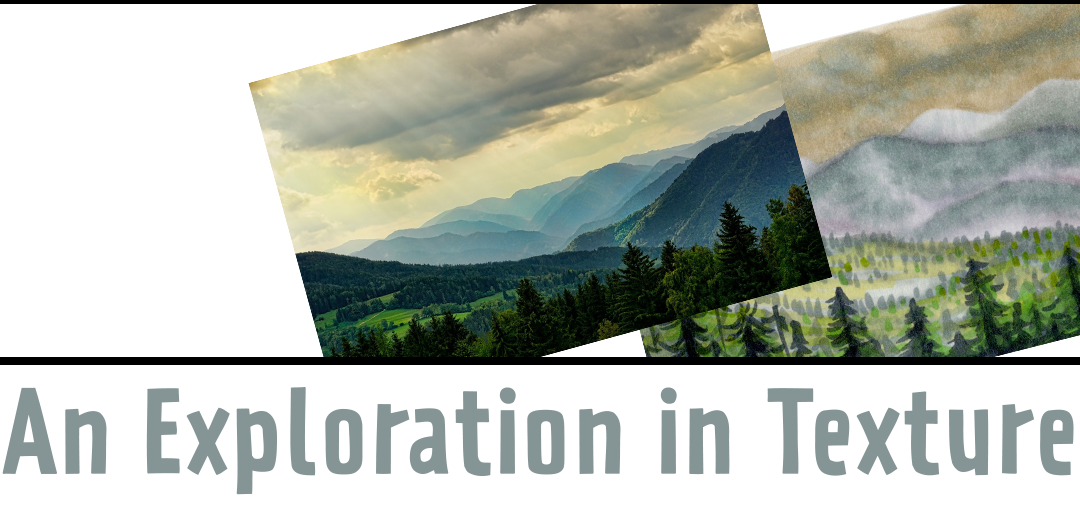
future projects. In this particular class, I'll be rendering a
misty mountainscape, complete with sky and trees. It's a perfect
opportunity to stretch those artistic muscles and practice a number of
rendering techniques. This course can be
taken on its own, but also acts as a follow up to my original texture
challenge course, which you can find
in my class list. I highly recommend it if you're interested in learning
more about textures. By the end of this class,
you'll have yourself a cute little landscape that
can be used as decoration, as well as for reference for any future creative projects. Let's get started.
2. Project & Materials: Today's experiment is fairly straightforward and
requires minimal material. You'll find the materials you'll need in the class resource list, where I've included
a swatch list of the markers I've used. At a bare minimum, you'll also require some marker
friendly paper to color on. Cut to the size of the cut to the size that you want for your
texture swatch. Personally, I like
them index card shaped because I can fit them in this practical
little storage box. But that's by no
means obligatory. And if you want to
draw out your subject, you'll definitely
require a pencil. I've also included the
resource photo I've used in the class
resource section. Now, are you ready to
dive in? Let's go.
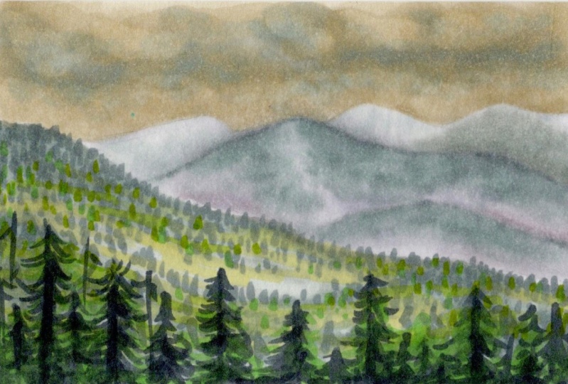
3. A Misty Mountainscape: Before we get started, you'll need to have
your supplies ready. For my little
texture experiments, I have started a
collection of what I call texture swatches that are about five by 3 " or the size
of a typical index card. There are two reasons for this. One, the smaller size allows me to really focus on a
particular texture, and two, it makes
for easy storage. For more on developing a collection of
texture references, please check out my
texture challenge class. There's a lot of useful
tips in that one. But back to the task at hand. You'll also need your
color swatch references, as well as your
actual markers and a pencil and eraser if you want to start
off with a sketch. Unless the subject
is very detailed, it's not absolutely necessary
to sketch things out, but I wanted to create a few guidelines
to make sure I had enough layers of
mountains to practice going from background
to foreground. If you have a needed eraser, it's pretty useful in removing just enough of your lead
so that you'll still see a hint of your sketch
without the lead bleeding into your markers
when you start coloring. For this texture, I had
printed out my reference, but you can have it
on your screen, too, whether it be your
computer, mobile, whatever. Whatever's comfortable for you, it's very useful to have all the colors
you need at the ready. And while you can't see them, I do have my markers prepped
just off the screen. I'm using colors from both uhuhus 36 gray marker
set and their 48 color set. I'll include a swatch list for you in the resources
section of this class. If you don't have huh markers, you can match with
whatever it is you do have or try your hand at
choosing what colors you use. The sky wasn't the
focus of this exercise, so I just did a quick
render of it for practice. Starting off with
yellow gray 04, I just went over the
entire background with quick scribbles
to fill it in. After that, I added some dark
clouds with green gray 02. There's no need to follow
the reference exactly, especially for something
experimental like this, feel free to just try things out and see what techniques give you results
that appeal to you. To blend the colors evenly, I went back with my yellow gray 04 to create a nice transition. Always with a circular
motion in this case, following the shape
of typical clouds. Adding a touch more depth, then I use my handy
blender marker to really smooth things out. To get things looking
the way I want, I often go back and forth between colors
to fill things in, add shadow or a touch of color. You'll see here I have a
piece of scrap paper to test colors or try out techniques before committing them to
my actual illustration. It's super useful
to have on hand, and I highly recommend always having a scrap
piece of paper nearby, preferably of the same
or similar quality as what you're drawing on. For the background mountains, I start with my lightest gray, which is cool gray to zero. The background mountains have the least detail
and are the least saturated because colors appear less vibrant the further
you are away from them. I also make a point of going slightly over the edge because
in the reference photo, there is a slight outline where
the sky meets the ground. After filling everything in, I go in with my green gray 02, which is my least
saturated green gray. With it, I darken the lower areas of my
background mountains. It's looking harsh now, but our blender will
take care of that. Something that I should
note about the blender, it's not always my go to option for creating smooth
transitions between colors, as it often creates a grainy texture or
pulls away too much ink. For the mountainscape
here though, I do like the effect. Just goes to show why
experimentation and creating texture swatches
is really good practice. Now for the next
layer of mountains, we start again with
the cool gray 20. To cover more ground faster, I use the chisel
tip of my brush. If you notice on a reference, the mountains have
a reddish tint, so I go in with
red gray 11 next. Both tinting and darkening
where necessary. I've also added an extra
little mountain for fun. Now back with green gray 02 again to build upon
the darker areas. We need to blend everything
together in the end, too. These mountains are darker
than the ones behind them, so we add an extra step, green gray three to pull them away from
the background layer. With this one, I paid a little more caution
to where I put it, adding hints here and there to create a sort of
topographical effect. Because this layer is still
very far in the distance, we need to blend it
well in order to create a softened,
almost misty look. While the ink is still wet, I go back in with my lighter
gray green followed by cool gray 20 because the
transition is still too harsh. On top of which the
blender took away a bit too much of the
color, that's okay. This is what
experimenting is for, and it's easier to put colors back on than it
is to take them away. I decided to also add a
layer of green gray one, which is a slightly
more saturated green to pull this layer even further away from
the mountains behind it. I avoid adding it towards the bottom of
the mountains where it appears lighter due to how thick the air is
versus at the top. As a final step, I go back with my
two lightest colors, the cool gray and the
lightest green gray to blend things even more. If you want to smooth
your color transitions, but don't like the
effect of the blender, I find that going back to the lightest color
you've used will do the trick with minimal impact on the darkness of your shades. If you notice something
you've already done needs adjusting,
go ahead and fix it. Here I decided to add an extra little mountain
with green gray three between our two mountain ranges because I felt it
was a little barren. I should also mention, you shouldn't feel
obligated to follow your reference photo to a
T unless that's your goal. I prefer, especially for these little texture
explorations, to use my photos as inspirational guidelines
for the most part. For the last layer of mountains, I start much in the same
way with my green gray 02, as I want to keep the
colors consistent. They are, after all, part
of the same mountainscape. It's a good idea to outline your shape
before filling it in, to make sure you don't go over
the edge with your marker, especially if what's next
to it is a lighter color. I know I'm going to be
adding a lot of layers, so I'm not too concerned with
all the streaks I'm making. Just quickly filling things in as this is meant
to be a quick study. With my green gray one now, I'm a bit more selective
with my strokes using it to create the idea of depth variety within
foreground mountains. Just like before, I'm making sure the lower areas are
brighter than the top. Blending things with
a trusty blender. I mentioned earlier, but I really like the textured
effect it gives, which works well in implying
rough and rocky terrain. Now, the trees. Using green gray three, I make quick short strokes in a random pattern with my brush tip to suggest the idea of trees
being in the distance. Be sure to keep them
spaced just far enough to not become
a solid blob, or you'll lose the
effect we're after. I decided that there'd be a forestless valley
within the mountains. So as we go down, I reduced the amount
of marks I made, building them back up
again where I hinted at a mountaintop with
my green gray one. When you're creating your trees, try to follow the topography you've created with
your previous colors. As we get lower, be sure to slightly increase the
size of your brush strokes, since the trees are
closer to the viewer, while still keeping some variety as not every tree
is the same height. As we get even closer, you can start making slightly more obvious
tree shapes by switching your single marks into a few
diagonal brush strokes. M. I didn't bother
going all the way to the bottom because I knew I was going to go over this area with our closest foreground, a bunch of big trees next. To add some saturation
and color variety, I went in with some
brighter greens. Starting with
absinthe, I threw in a few extra trees in
there before going over some of the field with
yellow green to really make the foreground pop and stand out as being closer to us. If you look at the reference, there's an almost
yellowish tint. So I added a hint of it with gentle quick strokes
using a knees. Now for our big trees, to really pull them apart
from the background, I used green gray 06, a very dark muted green. To start creating the shapes I made several lines
of varying lengths. These are going to
serve as our trunks, which we use as anchors to
create the tree's branches. For this, we started the
trunk pulling our stroke diagonally downward in
short quick motions. Remember, it doesn't
have to be perfect as this isn't meant as
a final illustration, but it will be good
practice to get the feeling of how to create this type of marker
stroke in the future. Just keep going and feel free to add more trees as you see fit. It can be a full forest or
just a few sparse trees. I noticed some were looking a little
scrawny in the middle, so I thickened them up with a quick squiggle down their trunk in order
to beef them up. After I had my basive trees, I added some depth to them
using my green gray one. Basically just going over
some of the branches here and there to get
them looking fuller. I also added some extra
trees in behind to enhance the effect of there
being a forest and not just a random line of trees. Then I moved on to
a brighter green, pale green to bring
in some vibrancy. Uh Finally, I added just a touch more
depth to the shadows by adding hints of an even
darker green green gray five. I also used it to
fill in some of the gaps I thought looked a
bit out of place and empty. Just keep going until
you feel satisfied. I decided I need to
add even more depth, so I went back with
my green gray one and green gray three to add an
extra layer of smaller trees. One more look. A few more touches. And Yep, I'd say that's an acceptable texture swatch
for a little mountainscape. Now let's take some notes on it.
4. Taking Notes: For the notes, you can organize
them however you like. I'm building a collection
of texture swatches, so I wanted to be able to
glue mine into the back of my little illustration
for easy storage. Normally, I would use an
index card to take notes, but in this case, I
didn't have one handy, so I just cut out a
scrap piece of paper. I would say one of the most
useful pieces of information to put in your notes is what materials you use
to create your texture. I'll be putting the
names of the colors I used along with a swatch so I can easily find an alternative shade
should the need arise. I went a little
hastily this time, but I also find it useful to add which colors were my base
or foundation colors, along with any other small bits of potentially useful info. Along with the marker colors, I include whatever other tools I needed to create the texture. In this case, I
only used markers, but some examples of
other materials could be gel pen or fine liner pens. Next to this list, you can write whatever useful
notes you can think of. I came up with a few examples
of what could be written. For example, I found the blender extremely useful when
rendering the mountains. Also, be wary of adding the appropriate vibrancy or saturation depending
on if it's background, midground, or
foreground elements. It's up to you to
write down what you personally
would find useful. Another option, by the way, is to either record yourself creating
your texture swatch, take work in progress photos, or have a note taking
app or piece of paper next to you to take
down notes as you go. Whatever suits your
personal preference. I also suggest writing a title
to both the texture swatch and the notes so that in the case that
they get separated, it's easy to match them back up. That's a fun little experiment in texture rendering.
Hope you enjoyed.
5. Conclusion: Thank you so much for
joining me as we added another fun texture experiment to our ever growing collection. How many do you have now? If you haven't checked out my previous classes on textures, feel free to visit my
skill share profile. I have a number of
courses available, including a texture
challenge class where I show you how to render three
other similar swatches. Before you go off on other
creative adventures, please be sure to
share your work in the project section
of this class. It's a wonderful way to
celebrate your progress, gather feedback, and
inspire your peers. Take a moment to engage with your fellow students by leaving
comments on their work. Your encouragement can uplift and motivate them
to keep creating. If you have any questions, feel free to drop them in the discussion section
of this class. And if you want to keep up
to date with future classes, please give me a follow. It's really appreciated. Thank you once again for
joining me in this class. I can't wait to see
what you come up with. See you soon and happy creating.
 Sabrina Gosselin, Freelance Illustrator & Photo Retoucher