Transcripts
1. Intro. Class overview: Hey, they're experienced
designers or who have just started or
want to start their careers? Innovators and creators. I'm Kate and I've been a product designer for
the last ten years. Welcome to my unique class
about user experience design. In this class, we are going
to experiment and see how creativity meets technology to shape future digital
experiences. I want to show you how can
you quickly draft user flows for any application from scratch and
start a new project, just in 20 minutes? I'm sure you've been there. You have an idea or you got the first requirements
from a client. You are sitting and looking
at your computer or paper and thinking about where should
I start. But you know what? This problem doesn't
exist anymore. With common technologies
and AI helping tools, you always have
something in your hands. You don't need any experience in UX or UI designed
for this class. At the same time, I believe
that those of you who already work in the industry will be getting some cool tips as well. Okay, what are we
going to do together? We will explore how
artificial intelligence and large language models can contribute and accelerate
our design process, allowing us to generate
user flows and wire frames. With just a few simple prompts, we are going to check several AI tools and
basic free features. To start straight away, you will learn how to write good props to get the
expected results. Once we've got our generated
user flows in written form, it's time to roll up our sleeves and bring them to life
using Figma software. Don't worry if you'll
never use it before. I'll guide you every
step on the way. You will master how to create low fidelity wire
frames to build user flows based on
generated ideas. The last step in this process, we will be connecting
screens into path. The draft concept for the
application is almost done. A very last tip, I'm going to give you a couple of bits of advice on how to test your idea as AI
is not a real human. Not yet. I hope we have to
test our prototypes and use them with real people to understand problems
and what we've done, right or wrong as a project. At the end of the class, you will create an idea or feature for a mobile
application using AI tools and a set of components for wire
framing in Figma. Those components, I will
give them as a gift so you can use them in the future for your
projects and portfolio. You don't need to
create your own. Okay guys. I can't
wait to start it. And I'm so curious
about what ideas and applications you will
create at the end of the class. Happy designing and
welcome to my class.
2. Free AI tools and platforms overview: Welcome back, Designers
and Innovators. In this video, we are stepping into the existing
world of AI tools. We are about to
explore some game changing platforms that will help our design processes
from a different angles. Now you might be thinking, where do I even
begin with AI tools? Don't worry, I've got
you covered today. I'm going to introduce
you to three available and completely
free AI platforms. You can create an account
in just three clicks using Google account or
set it up with an e mail. First up we have Cha GPT, the first and super popular, I'm sure you've heard of it. With char GPT, you can
dive into the world of natural language processing and generate user flows,
personas, scenarios, guides for user interviews,
workshop agendas, and basically everything
that you need for a good UX process Using
just a few simple problems. It's like having a conversation
with your work assistant. Next on our list is
Gemini from Google. It has the same
features and you can use it for the same task
I mentioned before. It's powerful and I found it has less unexpected AI
hallucination in the results. Last but not least,
we have perplexity. A hidden gem in the
world of AI tools. I really like this model as it also gives you a list of
references and resources. It gives you an idea of
where it created the results and where you can go and read more information
about the results. I actually think it's
great and it should be done by all the UI
tools, in my opinion. Now there is a cool part. Why not try the same prompt across different platforms
which I mentioned, and compare the results. You can use all
mentioned before and see where the results will be more satisfying for your needs. Whatever you are using a
GPT, Gemini or perplexity, there's never been
a better time to harness the power of AI
in your design process, But it's nothing
without a good prompt. Let's create a and meaningful
prompt in the next video.
3. Creating an enriched prompt: Now you might be
wondering what exactly is a prompt and why
does it matter? When I think of writing it, I always imagine the situation when I'm talking
to my colleague, or a husband, or even my mom. I'm explaining the task to AI tool in a way I would explain it to a
human being person. The prompt should
have a good amount of important details and also answer the predictable
questions. Prompt like please create and
write down user flows for a node app definitely won't
be enough for a good result. What you should focus on first and what those high level requirements
for any prompt. It's clarity, specificity,
and imagination. First up, let's
get crystal clear on our apps purpose
and target audience, whether it's a productivity tool or a social platform
for pet lovers. Our prompt should
reflect the essence of our app and speak directly
to our users needs. Next, let's think
in some context. Think about the scenario in
which your app will be used. Are we solving a
problem or fulfilling a desire or simply adding a touch of joy to someone's day? The more context we provide, the better our AI body
can tailor its response. Finally, let's leave
room for creativity. Don't be afraid to
think out of the box and inject a bit of
personality into your prompt. After all, we are not just
designing an application, we are crafting an experience. Let's try the question approach for the future.
Work with prompts. I prepared several questions
by answering those. You will generate and write
a really good prompt, which can be then passed
into the AI tool. The first question, what
is the main plot or story of the idea of your application?
What is the purpose? For example, I would
like to design a simple mobile application
for tracking expenses. It's beneficial to
mention the platform are doing that for web or mobile. The next question, who is
going to use the application? For example, the application will be used by broad audience. Mostly young and
middle aged people working who wants
to keep track of their spending and
they want to plan their budget and
see how can they save more money and be better. Next question. What kind of functionalities can be in the first simple
version? Make it simple. Don't list hundreds of
different functionalities. Be really precise
but also effective. You can also ask
about monetization, but it's again, adding
more complexity. Let's stay simple. Example can be something like main functionalities
would be logging, adding and removing regular
recurring expenses per day. Having different categories
for expenses, calendar, account settings,
dashboard, some analytics where user can see a summary
of all past expenses. Then the next question. Last one, how to present
a result of the AI ideas. Be precise. For example, please the actual task for AI. Please create user flows for the application
I just described, so I can use them to design wire frames to test the
application with future users. At the end, as I mentioned, we have three to four
simple questions. What, who, and how. Sum up all the answers from those questions and
also split a paragraph. It helps to get better results with you got your prompt,
let's try it out. In the next video,
I'm going to show you how different platforms generate three different results
with the same prompt. And then we will pick one
of them and use further.
4. Generating user flows with AI: In this lesson, we are going to use the example
prompt I gave you in the previous video to finally see the AI
generated results. As I said, I'm going to use all three platforms to compare the results and pick
the best from them. The first one is char GPT. I'm using a free account
copy pasting my prompt and I want to generate user flows for an
expensive striking app. I'm providing all the
details, the purpose, the audience, the
my functionalities, and the task itself. As I explained in
the previous lesson, let's see the results. What we're going to have here. We have an onboarding short
flow as well as login. Which is a good dashboard
with a summary as a home screen flow for adding
expenses with some details, viewing your
expenses, analytics, user account Logout In general, the result is nice,
but for building the designs I would need
a bit more details. We can always regenerate
the response later, but I would like to try
other tools as well. The next one is Gemini. I'm using the same
prompt and just copy and paste it
again. Let's see N I see we have a bit more
details for our further work, which is Great Gemini
splits everything into several main flows like login and add an
expense, and so on. And even mentioned error
messages which is helpful. Right. What I like
is that we see screens descriptions and even buttons and
textfield labels. That's very good.
Okay. What else? The app displays the at
expense screen fields for entering the amount, category, date,
and optional node. That is what we need
for our prototyping. Perfect. Okay. The last one I would like to
try is perplexity. The tool is powered by
open eye and it also gives you a lot of additional references from the Internet for
the related topic. As I mentioned before, I'm doing the same action, adding my prepared prompt
to see the result. Okay, what are we
going to have here? The result has fewer details
than the previous tool. Here we can see a high level of flaw with a short
description of each screen. I don't think it will be
enough to really start the designing the user account has a bit more information, the ability to manage
identification as well. Now I would like to come back to the previous tool Gemini, and ask to add more
details to the response. I need more information to build I using prepared fire
frame components, something like buttons,
text fields, and so on. Okay, let's see. The result looks like he is
deeply thinking. Yes, X is not that easy, right? Oh, wow, that looks
promising and amazing. Now we have everything to just mimic those ideas into
the user interface. Let's copy the responses
and just add them to figma. See you in the next lesson, where we are going to
start actual designing.
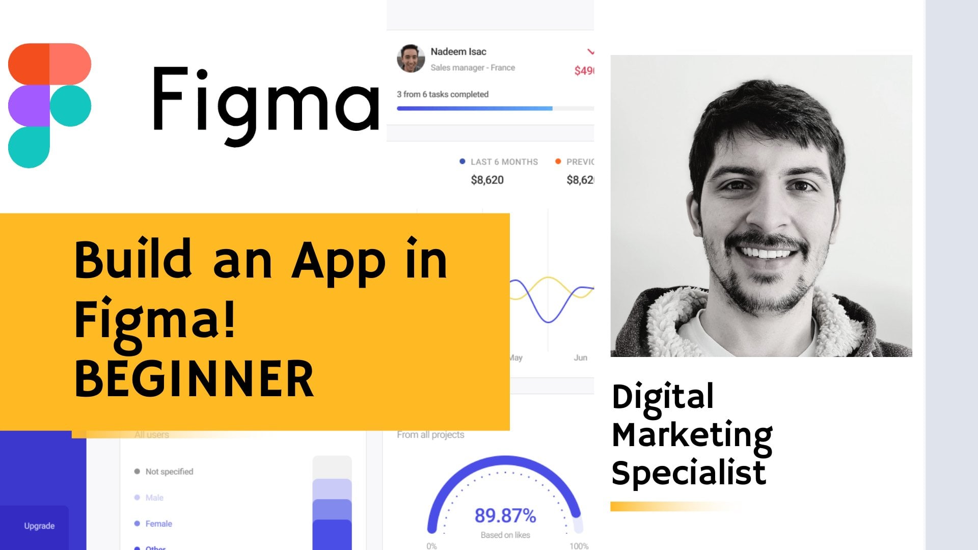
5. Creating screens in Figma based on the provided AI user flows: Welcome to the Figma
portion of the class. In the next 10 minutes, you'll learn how to
create wire frames based on AI generated flows. If you don't already
have an account, you'll need one to use
the free wire frame set I prepared specifically
for this class. Here is how to access
the file head over to the Figma community website and search for a wireframe
blueprint kit. Alternatively, you can
use the link provided in the class description on the
shared community file page. Click on the open
in Figma button. This will create a
copy of the file in your drafts ready
for you to use. I'll already open the file
for the demonstration. Let's explore what's inside. The first page contains a brief description and
some screen examples. You can navigate to the file using the
panel on the left side. The file is organized
into three main pages, Description,
components, and cover. I've also created an additional
page called My Project. Feel free to name
it differently. In this page, we will
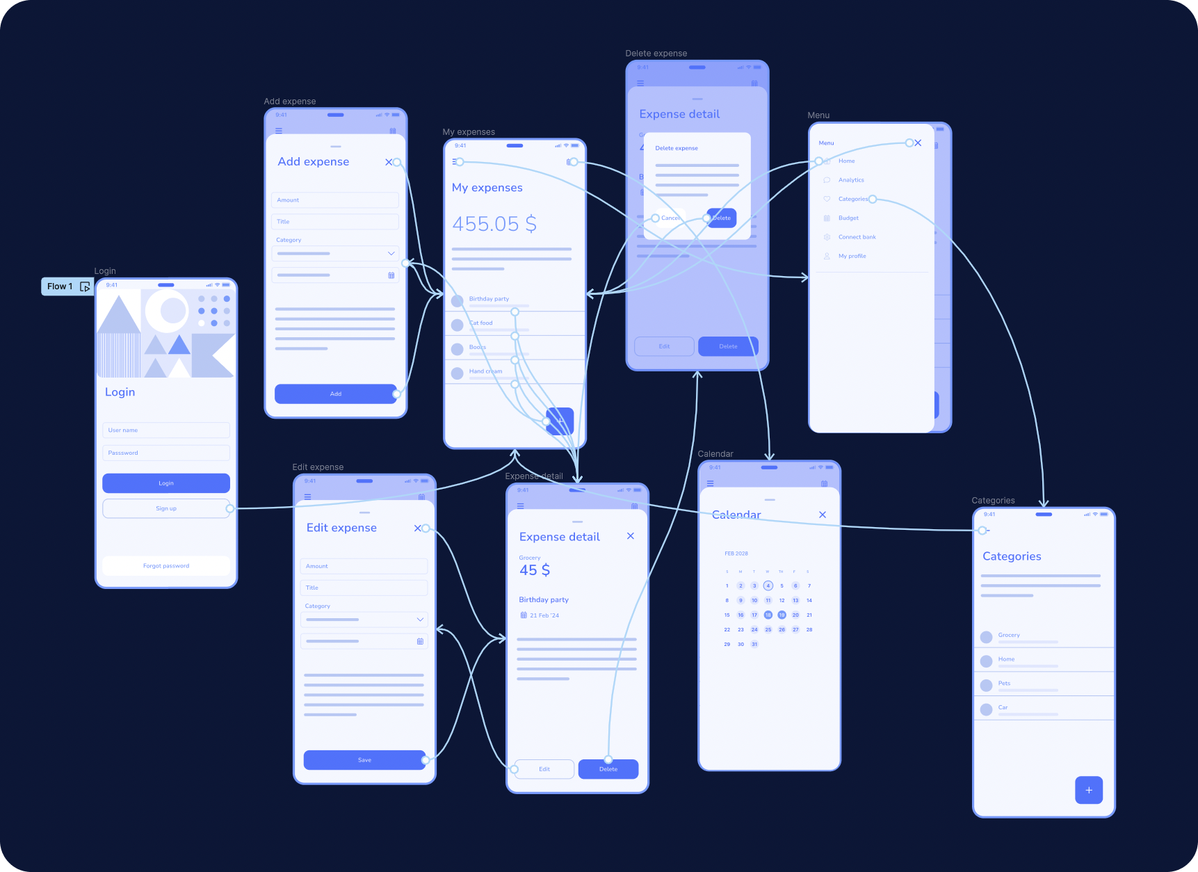
be building our flaws. You can create new pages by clicking the plus icon in here. The Components page holds all the building blocks you need to design your wire frames. Some components
have placeholders, while others have prepopulated texts for titles and buttons to access them
Quickly navigate to the left panel and
go to the Asset tab, where you'll see a list of
components with previous. Okay, good. Now let's switch to our newly
created page, my project. I've already copied and pasted the AI generated
response from the previous video
and split it into sections representing
different screens. This structure was
also provided by AI. As you remember,
we'll begin with the login screen To add
elements to the screen, I'll open the assets panel and search for the appropriate
screen component. Remember, you can personalize
this experience by naming your pages and exploring the components to tailor
them to your project. Let's begin our quick
prototyping and wire framing. I'm grabbing the screen from the left side of the Figma
interface from the assets. Let's quickly check what
I did provide for us. The login screen will
consist of text field, subtitle, and a
couple of buttons. The first field is the username, AI, also advised,
and the password. Of course, let's search for buttons. We need the primary
button login. We also need a secondary
button sign up as usual, you can find it in almost every application
when you started. Also, artificial
intelligence advice to have a forgot password button,
which is understandable. Let's grab header for the screen and use it for
providing a title. I'm removing the background,
we don't need it, and icons from the top see
how it's easy to do it in the control panel of the
component on the right side, We call it login and maybe we can make it a bit more
personalized and add some. Please hold at the top just
to make it a little bit more feeling like it is a starting of the user
journey of the application. I'm doing some adjustments
of the layout. Of course, we are not doing any pixel perfect design here. We're rather just collecting
all the items on the screen. I'm not measuring anything and I'm not making that really. Even putting that all into the frame and naming the frame that we would
need for the future. Prototyping and connecting
all the screens. Okay, the first screen is done. Let's see what else
we can do here. Dashboard? Yeah, probably
we need to continue with the home screen which
called dashboard in this. Text from AI. Again, we're searching
for a screen on the asset panel to start
building the user flow. What else we need? Of
course the header. As it's a home screen, we would need something
like icon for opening a menu with other
options for the user. Probably a calendar. We saw it also in the
AI provided details. Yeah, let's call it my expenses. I think I was calling it
something differently, like my finance, but I think
expenses sounds better. Also, in the description, I mentioned that we can
add a couple of more Yes, we need of the add button, which I also grabbed
from the panel. Yeah, let's use some
placeholder for just showing that there
can be some more details. There was also a summary in
the AI flow description. Amount of summary we
spent or user spend. We need to show the
de screen as well. Okay, Let's check it out. Hmm, Recent expenses second,
but in more details. Okay. We can skip it for now. And let's see, because we
already have a list item, you can click to the list and then the detail page
will be opened. I think this looks good. Let's make some small
adjustments to the layout. I think this screen
is good to go, as we already did the Add
button to my expenses. Let's do this screen
at a new expense. Don't forget to call your frames so we can
connect them later into the flows at expense screen. I'm going to use probably a
backdrop component for that, but it also can be
a separate screen. We need to group the background because
the home screen became a background here. Going to asset panel search
for a backdrop component. I'm sure you saw it many times
in different applications. Now, it's very
popular to use it and almost all systems have it. Okay, let's change the
title and expense. I think we can remove
those elements as we will be adding our own
several text fields. I advised to add also
selection of the category for expense like grocery or home
or something like that. I'm going to start with that and the text
fields, That's good, that in those components, even though it's wireframes, we can see some labels so we can actually market for future
testing with the real users. Users will understand
what those means, the add primary pattern. Also with the label
I think we need to add amount that's was
in the AI suggestion. Some title like a name of the expense drop down with all the categories
from the list. There's also an
advice to have some, a note for each expense. Yeah, we can skip it
too detailed for now. And maybe just have it as
those placeholder text. Of course, we need
the calendar picker because we would need
to set up the expense, depends on the day,
months, and year. As we already did the
ad expense screen, I think we can also create a detailed page of the expense. Let's quickly check if
we didn't miss anything. I'm copying the screen. I think the detail page
of the expense will basically the same as ad
expense in the backdrop. I'm changing the title. Okay, let's quickly
check what we have. Basically all those fields we just add into the ad expense. We need to convert
them into labels. I advised to have
two buttons delete and added makes sense. User can delete the
expense or added some details and then he would go to the previous
screen we created. We just copy all the fields we have from the previous screen. From the ad expense, we need the category, but it's already
selected by the user. We need the amount of the
expense and some title or name. Let's call it Birthday party. Yes. And submitted date where? That's 21st of February 24. Yeah. Basically, all the
information we need for the very first draft
of the screen is here. Let's do some small
adjustments even though it's not
necessary because again it's a by frame and we just testing the flaw and
idea shouldn't be any thoughts of the layout in general because we
can change it later. Okay, let's check what we have. Expand detail, category, date with keeping a
node. Yeah, looks good. Let's continue to the next. I don't forget to change
the title of the frames. It's easy to navigate later as we would like to create further connection
between screens. Let's quickly add the pop
up and for delete expense, when you click to the button, delete, we can show this pop
up and then if you click it, we can show the previous screen. I would continue with the menu. As I advised to have
several items in the application like analytics and calendar and
changing category. We definitely need some menu. There is a component for that. It's a draw navigation drawer. Yeah, let's change the icon. As you can see, it's very
fast and quickly with a component settings as
suggested in the text. Let's have home
analytics categories, budget, connect, bank. Yeah, that could be a cool
feature in my profile. Yeah, the icons are a bit
not fitting to the labels, but that's fine, as, again, it's our draft wireframes. I think it would be nice to
have also a calendar screen. And we have it in our
description as well, because we have this
icon at the top right. You click there and
you open a calendar. Yeah, it could be in
a backdrop as well. I think it's better to
have similar component, similar behavior for
similar actions. In the application
from this page, there is a calendar simply
added here so you can swap between days and see
expenses for each day. There is also a suggestion from the text that we are going to have
categories and add them, which also I think makes sense. You would like to, as a user, add some more categories, not just like a standard one, having your own, for example, for leaving, maybe study
or something else. Let's have it as well
here quickly we are using the same list component
title and yeah, let's change some labels
for that purpose. We still need the plus button, the adding button to that. Well, we created all
the screens which were provided by AI to
add to the flow. I think those are main
screens to have for the small expense or tracking
expense application. Of course, it can be
a lot more details, but for the first, for the first filing,
it's definitely enough. Let's connect all the
screens into the flows in the next video and try to test it with the users
and see how it works. See you in the next video.
6. Connecting screens into paths: Guys, this is the last
lesson in this class. In this lesson, I would like to show you how you can quickly, using the prototype
tool in Figma, connect all the
screens we created. One screen was missing from the lesson from the
previous video. It's added expense
and I just copy a expense screen and change the button label because it's
basically the same screen. I will be able to connect the aided button from
the detail page. The prototype tooling
appear from the right here. You click there and then the feature looks like
you select one of the components and you with small arrows
connect the screens. Like here from login, user appears into
the home screen when when the user log into the application and
provide his credential. He can immediately see after that the home
screen which we designed, we won't forgot password
because we didn't create the screen for that
at button at expense. We connect with the
screen at expense. Then while clicking to the collection button at you again appear to
the home screen. What else we can connect? Let's do the menu by clicking to the
Burger Camburger menu. User opens the menu drawer, and of course he can close it and come back to
the home screen. Let's also connect the
calendar view from the top, so all the top navigation will be done to the calendar screen. By clicking to the, by selecting one
of the list items, user opens the detail page as we designed it in
the previous list. Of course, he can come back
to the home screen again. Almost all our screens
leads to the home screen. After you use it, we connect diet with dot screen, delete. We connect the delete
with the delete screen. Delete pop up. From here you can basically
delete the expense. And after that user leads to the home screen and
the cancel button. We'll just close
the pop up and you show the previous screen
which is detail page. What else we can
have in the menu, we can again connect
the home screen with our my expenses screen. And from this menu we also created a category screen where you change categories at or remove them from
category screen. Again, you can come back to the main screen
with the overview. Yeah, I forgot to connect the calendar view with the home screen so user can come back and close
the calendar. I feel like it will
be easier if we will just add this cross button to each of the
backdrop components when we are going to
test it for user. It will be easier to
understand how you can can close this screen and come
back to the previous state. I think those list items
also quite misleading. Let's provide at
least some text here that showing that users submit some expenses
birthday party, but else we can type cat food. Maybe some books I
bought recently, hand cream, that looks
a bit more natural. Yeah, when you select
the prototype tool, those all arrows looks
overwhelming and busy. But actually, once
you start doing that, you will see and find
that it's super easy. You just need to connect all the interactive components with some screens and then test
your prototype first, of course, you rather
testing that on your own. I'm going to show you
how to do that in Figma. You have the ability to open
it in a separate window, which looks like a small phone. Here, you click on
the play button, you try it out, you click to all the buttons we connect
and see how it works. If needed, screen is appearing, if it works like expected. What else you can do with Figma? You can download the Figma
app to your mobile phone and open this prototype very
easily on your mobile phone, which will look almost the
same like a real application. And give it to some of your friends to test
your prototype and see what is to do
that you just give to your participants some task. Please create an expense or change the category again
to the application. And then you
immediately see what is missing or what is not
really clear for the user. You observe how user behaves or what he wants to
click or what he can't find. And then you immediately see the weak points
of your application. That was the last step of
this lesson, the class. Now let's jump into
the project and create user flows and user experience
for mobile application. With the help of AI, let's dive into the
project description video.
7. Project: We've come a long way on our UX design journey
and now it's time to put our new found skills into a project for our final project. I'm tasking you with a
mission that will unleash your inner innovator and
showcase everything you've learned so far in this
class. Are you ready? Here it is. You'll be creating a user flow for a
mobile application or a feature within an
application using the power of
generated user flows. Think of any application, maybe you are holding
a great new idea, or you can just use any well known features or mobile application
you're already using. It doesn't matter as we
are practicing here. Then you'll need to come
up with a good prompt that encapsulates the
essence of the idea. Once you've got your Pront, it's time to put
it into the AI and generate user flows for your mobile application
or a feature. Then take your results, add them to Figma. Use components I shared
with you to create screens. Remember, this isn't
just about creating pretty screens or high
perfect wire frames. It's about crafting a simulus
intuitive user experiences. Don't be afraid to iterate and refine after first
or second results. If you want, you go further
connect screens with the prototyping feature in Figma and test it with your
family or friends. You already got my tip on how to run effective
user testing. Please add your projects as a screenshot under this class. I'm super happy to comment and give you
a piece of advice. Thank you for being
here till the end. Happy designing and I'll
see you on the other side. Bye bye.
 Katerina Liebich Blik, UI & Product designer | UX researcher