Transcripts
1. Introduction: To create a work of art, you need to use various
possibilities of creative imagination to create even the simplest and
unambitious image, you need rational thinking, which can be developed with
the help of exercises. Hi guys, my name is Kate Liebich
and I'm a product designer, photographer, and a hunter of harmony and beauty in the world. In the past 15 years, I've been working in
different creative areas. But what I learned during
my professional journey is that composition is the key to any visual forms
and expressions. Artist or designer
might spend a lot of time seeking optimal
layout composition. And I'm sure you are familiar with the feeling.
With this course I want to introduce the basics
of artistic composition, but I won't be talking
much about theory. That's boring. We will do practice work to
boost your sense of harmony. You know, the more you
train your muscles, the more your body
becomes strong. The same with creative work. I believe that the sense of composition can be
trained and improved. We will exercise
your imagination and increase your
inner spirit through different tasks which
you can perform using only scissors, black market
or any convenient tool. The more you abstract and try to solve form problems using
your inner instincts, the more you train your
creative abilities by developing them. This course will be
very helpful if you are a beginner designer,
illustrator, or photographer. Or maybe you just want
to boost your creativity. So no drawing
experience required. In the final project,
we will create an abstract composition
which you can paste into one of the
prepared design templates. You will see how only
simple black forms can tell the story and increase the
meaning of your artwork. Let's get started.
2. Inspiration: Let's talk about composition as the first communicational
method for an artist. What kind of
compositional principles can help us in our
practice work? When you are
creating an artwork, which means you create
a visual harmony, it is necessary to
fulfil two conditions. The first one is balanced
and the second is unity. Balance is a set
of form when all forms in the layouts somehow
communicating to each other. This forms dialogue depends on the location of the main
message, on the composition, on their organization,
on the composition center, on the plastic, rhythm construction and
on its proportion. There are also two ways of the architecture of
composition. The composition can be
symmetrical and asymmetrical. Symmetry alone is not a guarantee
on the right balance, but it is easier to achieve. After all, a person seeks
towards a balance of forms. And correctly found
symmetrical composition is perceived more easily. Person reads it immediately. The asymmetrical
composition requires a more
longer comprehension and understanding. Balance and harmony are
more difficult to achieve. But still, what is harmony
and how can we find it? This is such an abstract term. I think that the
harmony in the artwork exists when various parts somehow connected
to a single hole. This connection can be achieved through
different techniques, such as rhythm, motion, contrast, and all these
techniques we will train in our practice work.
For inspiration. I want to show you
some constructivists and suprematist artworks
of 20th century. Some of them you might know, some of them you might don't
know, It doesn't matter. I just want to prepare
and tune your vision. So we can achieve similar goals
in our practice course. Truly speaking, the
20th century is full of interesting and
unusual composition or ideas and even revolutionary, unexpected ways of
forms, dialogue. El Lisitsky. Time traveller. Look at this artwork. All masses of shapes
in the centre. There are random
shapes and no meaning. But you probably
start in the middle of the construction and then go down to this orange triangle. And then through the
circle to the top right, you feel gravitation and
also the flight Movement to the top right. Next, Ilya Chashnik. Suprematism. This is very simple
artwork at first sight. It is symmetrical composition, but with a small
shift of forms. It feels that these parts
have magnets inside. They have that tension
and force coming. Kasimir Malevich. Suprematism. yes, they didn't think
a lot about titles. This artwork has a
lot of movement. I can imagine that
someone throws these shapes into the
Canvas from the left side. They will fall down in a second. You can search for yourself, some other constructivist
and suprematist works to find inspiration. And let's go further
to the next chapter.
3. Golden Ratio: Of course, you've heard about the golden ratio and I
just wanted to remind you of the main principles and how to apply
them to your work. In simple terms,
the golden ratio is a specific rule of proportion
that creates harmony. When we do not violate
the specific rules, then we get a very harmonious
and perfect composition. The golden ratio has been known since the time of
ancient Greece. However, there is an
opinion that the Greeks themselves spine on the
golden ratio from Egyptians. Because many works
of ancient Egypt are clearly built according to
the rules of the golden ratio. But besides that, the golden
ratio is pure mathematics. It has specific numbers
and specific formula. Many mathematicians
consider the formula as a pure harmony, and they call it
asymmetric symmetry. The formula sounds, minor part refers to the more significant same as the prominent part refers to the whole. This isn't easy to understand if you haven't done math for a long time. There are several
ways to draw and find the golden
ratio on the page. Let's start with the
simplest one and most known. Draw wto equal squares. One side of the squares
is common to both, then add another square
to the right and make the court border common to two sides of the small squares. The same action is
at the top side. Again, we are drawing a
square on the left of the construction with the
common side to existing courts, the last one in the row, we will draw at the bottom. I think you recognize
that you can draw further and further
till the infinity. The next step is the
Golden Ratio Spiral. To create it, connect the corners of the
squares with an arc. Such as spiral can be found
not only in drawings, but also in the wildlife. Flowers and stems, shells, and even hurricanes. The golden ratio is closely
related to Fibonacci numbers. This is a series of numbers
each equal to the sum of the previous
0,1,1,2,3,5,8,13 and so on. The further this series continues, the closer the ratio
of numbers to 1.6. But you don't need to memorize
all of this information. Just know that you can split your artboard into three parts. And around the second line, you can build your
compositional center. If you split this string
into three parts again, you will find the spot to place a culmination that
catches the eye.
4. Tools: In this chapter, I
want to talk about tools you can use to
perform further tasks. First of all, I want to mention that actually you can use anything you feel
comfortable with. For example, for a
warm-up exercise, we will use your
smartphone camera later for more
creative exercises, you can choose one
of these tools, my favorite one and first, White and black papers, scissors. These tools will help you
start with a search of composition and change from
one version to another. Very quickly. It's easier to move parts around
and begin to train your brain and eyes and seek the right feeling of harmony when the layout is succeeded. The next tool could be just a
black marker and white paper. In that case, you have to think before you start
to draw something. Of course, you can get through bad tries as much as you want. But the paper's permanent forms will still force
you to think upfront. What actually do you
want to perform before you start to
touch the paper? Also, I will be using a brush and black ink in some
of our exercises, which is very similar
to a black marker. From my point of view, it's just a bit more
flexible and creative. For sure, you can use any software to do
the same as on paper, Adobe Illustrator, or
Procreate on iPad. If you don't have any
subscription for paid tools, you can use free software. For example, I personally
like Figma very much. It's free with certain features. And you definitely
will be able to draw compositions with shapes and letters and much
more for your work. This is not an
advertisement and it's just a tool that I found
most easy to use and free. I even use it sometimes
for presentation creation. The last one, use anything which might help you to concentrate and turn on your creative mode. This intense feeling inside, using motivation and
satisfaction in the same time. This might be anything
special music, special place, maybe outside or at your balcony near a very nice view or at the
top of the hill. Also, you can boost
your inner feeling of the right composition by
browsing any artworks. You can find them on Pinterest,
Behance, or Dribbble. I'm sure you're
already doing that. A professional
designer, illustrator, photographer has to observe
and check other projects. That is one of the main
rules to be a better artist. Find your creative spot, and let's start with our
first warm-up exercise.
5. Warm-up Exercise: Let's warm up and
try to abstract your vision and push
your brain to think Subjective. Keep in mind
the golden ratio principles. Grab your smartphone and take pictures of what
you see around you. Remember to stay in a
good mood and high level of your creative
vibes inside you I have to tell you there are no correct or incorrect images. We just want to try out our inside vsion with
this warm-up exercise. How can we distinguish
some usual things around us and create
a sharp composition? I will be more precise
and we'll give you some hints and ideas on
what you can achieve. Let's pick specific topic and try to take as much
pictures as you can. The topic will be 'Rhythm". Tried to find some objects in your flat or where you are now, and take some pictures which will represent rhythm
of composition. I will do that with you
so that you will have the right direction
while searching for anything visually
rhythmic around you. Think about electro
music or hip hop music. Imagine these drums
rhythm inside you. How does it sound? It is something repetitive,
something replicative. Listen to your heart. Now abstract from music and
think what visually can reflect that patterns,
repetitive shapes. It can be noise and chaos too. You can always remove colors and convert your pictures
to black and white. If you think that colors
disturbs the composition. You can find one or two
objects and play with different positions
while making your shots. Try to find the harmony and
the best balanced layout. When you are ready, you should pick only
three to five pictures which you think are the best. And see you in the next chapter.
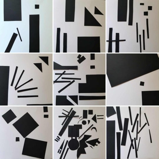
6. Lines and Space: Okay guys, now it's
time to practice. Don't worry, this will be very simple and it should give you an understanding of what
kind of tasks we will perform in the
following exercises. You can use any materials. In my example, I will grab
scissors and black paper. I just feel more freedom
with this kind of tool. In this exercise we need to balance the
line and the space. Let's take our tools. I need to cut a bit more
stripes for my composition. What we're going to do, we will arrange black stripes
on the white background. We need to group them
in such a way so the black forms balanced
the white areas. Please follow me. But just for an example, do your own composition and
your own creative idea. While I'm doing my composition, I want to give you some
helpful advice. Keep in mind that the spot is heavier if isolated from the
surrounding objects. Vertically positioned forms are heavier than oblique ones. Irregular and clear
geometric shape is heavier than irregular
and blurred. If we think about
circle and a square, circle, we'll look weaker than the square
of the same size. The gravity also depends
on the size of the object. Under similar conditions, a
larger element is heavier. This also depends, of course, on the contrast with
the background. I finished my first composition and I will start another one. Try to create
several versions and take a picture of
each with your phone that will help you further
to see which one was better. Look at your designs
and think if you have achieved a balance
between black and white forms When your artwork is balanced, you will feel comfortable
and satisfied. My second composition, I decided to balance
left and right side. As you can see, I didn't
use a lot of stripes. I just put two heavier spots on the left and a little bit
weaker on the right side. But let's go further. I will create another one. This exercise is perfect for
training your inner eyes. The more you train
the easier will be achieve harmony and
balance in your work. I can give a parallel between this exercise and when
artists draw sketches. Use this technique daily. And in any creative field,
photography, illustration, and graphic design. That will definitely
improve your results. I balanced this artboard by making a centre a
bit more clustered. The width of shapes is the same, but length is different, which gives a bit of rhythm to layout. Guys don't forget to take pictures of
all your results. And please take your time. And I'll see you in
the next exercise.
7. Contrast: In this chapter, I want
to talk about contrast, the most common and
expressive technique. We won't do any practice work, but I want to show you
different contrast types. Contrast is a sharp difference
in composition elements. A combination of opposite
characteristics. High and low, lines and
spots, dark and light, warm and cold, sharp and blunt, more and less, and so on. You can put opposite
to each other, anything you can imagine. Contrast is a powerful means
of enhancing expressiveness, As opposing
characteristics emphasize and set off each other. Contrasting shapes tend
to reinforce each other. Light next to dark seems lighter, elegant next to rough
seems even more refined. Therefore, with the
help of contrast, it is easy to highlight
the compositional center. In our exercises, we are using black shapes on
a white background, and they already have a
very strong contrast. Anyway, having contrast
in your artwork is the first step to
a completed composition.
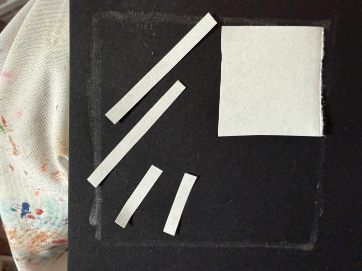
8. Dominant: For this exercise, I decided
to use ink and the brush. The brush size is ten, but it is not necessary. Use any brush you have
and any tools you want. I prepared three small
square artboards. You can use a bigger artboard. That's also fine. This time, we're not just going to
compose random spots. We will try to
convey the idea in a dominant composition. But
what is dominant actually, it is very easy to recognize. Dominant is the first thing that your eyes catch when
look at the artwork. It is kind of emotional center of the composition and it
could not be in the centre. This is a paradox. It also could be a
small spot against larger or several shapes
being in contrast to others. But the main goal we
have to achieve here, tie the entire composition
into a single whole. At my first art board, I will create a larger spot
against smaller forms. I can say that most often a
larger spot is introduced to a composition in order to combine several smaller spots, they will be less cluttered. My next idea, I want to
create a composition with a dominant that's smaller than other spots in the art board. You can find this
technique in the works of Constructivists or
even in the architecture. I think it is very spectacular. In my idea, I will put a very
small spot between larger. They are not just
large their giant. And you can feel it because
they go out of Artboard edges. By the way, if you need to show that the object
is very small, place a larger one next to it. And if you need to show
that the object is giant put a smaller
one next to it. I hope you get the task idea
and now your turn to train. Create a composition
with a dominant. Try to position
shapes in a way where the visual attraction will
be recognizable very easy. And remember, the internal
organizing principle in the composition
is at first glance revealed due to the
presence of the dominant. It is a semantic center where
the main action is tied, the main connection arise. Their perception of the artwork
begins with a dominant. It is a reference point
and the emotionally, semantic, and
structural center. I finished one more composition. I think my second
idea looks more confidently and
earnestly than others. Please try to create
several versions. Pick the best ones, and don't forget to take
pictures with your phone. Take your time, and I'll see
you in the next section.
9. Static and Motion: Well, I hope you are full
of energy and have a lot of motivation for the next task
because it will be amusing. Now, we will train a basic and simple
variety of composition. The task. We will create
two types of composition. The first will be static, and the second will
represent motion. I already cut black paper into different random shapes,
squares, triangles, rectangles. You can do that too or
use your favourite tool. We start with static. But in that composition,
I would say, use mostly vertical
lines because diagonals are full of motion. While I'm doing my layout, Let's think a bit together. What does it mean 'static'? I would say that the
main feature of static, it has no direction of movement. All forms seem to be
motionless and frozen. You can think of a stil day, with no wind, all trees and plants
do not sway. They point straight up. Another advice would be
that the emphasis of the composition should not be pushed to march from the centre. Please do your versions of static composition and don't
forget to take pictures. You can see that in my version I used also previous
learning technique. You can observe a dominant in the center, this big square. Look at architecture
of this layout. These shapes floating in
the space of the artboard. They don't fall down and
don't move anywhere. So we can say it's a
static composition. I'm sure you get the idea. Please keep working
on your own versions. And I will quickly
create one more as well. For this layout, I took a lot
of small and even elements. I balanced the black
and white spots. Too long lines point
to opposite sides. They could represent
motion in some cases, but I stopped them by adding two squares behind these lines. Move out to the side
shapes you used for static layout and
clean the artboard. Now, 'motion'. Before we start, let's do the following. Please close your eyes and concentrate on the
words I will tell you. You should imagine and
think of likenesses. Acceleration, storm, hurricane, rocket, bullet, fast, wind, fall, jump, speed, rain, open your eyes. What did you imagine? Probably that was different
objects moving from left to right or
from top to bottom. In most cases they are diagonal. And that's what we need
for our further work. Grab your cut shapes and
create motion composition. You probably will
add diagonals and the centre of the
composition can be pushed. I already finished
the first example. This one is very simple. It shows the obvious direction from the left top to
the right button. Also, movement is enhanced
by scaling the shapes. While you are working
on your own ideas. I'll do several examples more. This one, I wanted to show a movement of jumping
or something like that. Please don't forget
to take pictures with your phone before you
start the new idea. In my last example, I wanted to do a bit more
complex and abstract layout with a lot of elements. While I'm doing that, I want to ask you, why did we do that actually? And how could this method
help us in the future? I'm sure you ask this question. You can use these
techniques to add emphasis to your creative idea. Make the work
balanced and still place the dominant in
the centre, add static. Or maybe you want to
express the dynamics and action, diagonals, motions, and asymmetry to
make your concept more emotional, bolt and sharp. After you finish the task, check all your ideas. Pick the best ones. I'll see you in the next exercise.
10. Tense, Bold, Congested: Tense, congested and bolt. In this section, we
will talk a bit about subjective abstract terms
So our artworks should show one of these meanings
and be self-explanatory. You already have in your pocket techniques
we discussed previously. Please use them to
perform this exercise. I will grab different tools, marker, black paper, scissors. Also, I prepared small cute Square Artboards to
show each of three terms. The task is not very straightforward and you need
to boost your imagination. The first abstract artwork
will be about tense. What is that, tense? Maybe it's something
uncomfortable, stressful, difficult,
nervous, strained. Under pressure or strong up. You need somehow to show these
feelings in the artwork. I will create one example so you could understand the idea. It's not that easy to work
with such a small artboard. In this example, I added the
kind of unfinished action. The architecture and
construction is very unstable. You feel this tense that everything will fall
down in a second. As always, please
don't forget to take pictures of your results. Next term we will
perform will be 'bold'. And it is even
more abstract term. But again, first, let's think about
what is 'bold'. Which characteristic we can
think of: brave, heroic, gorgeous, gritty,
unafraid, maybe valiant. gutsy. How can we show it in the
simple shapes in our layout? Probably we can try it through contrast or tense of
space in the layout, or somehow highlight
the elements that is different from others. I'm finishing my
bold composition. Please take your time and
make your own versions. Next topic, congested. What kind of words or feelings
came up in your mind? Something like rude
uncomfortable, tight. Full, stuffy. Keep in mind these feelings and terms and create a composition
that will show this emotion. I'm using marker again. And I drew
a lot of elements that kind of
annoying each other. They intrude to
each other's space. We finished three
abstract compositions. I hope this exercise was unusual and force you to
think a bit out of the box. We learned various techniques
and compositional tips. So we are ready for
the final project. And I'll see you
in the last part.
11. Final Project: Now you are ready to create something complex and emotional, but we still will be using
the same techniques. Please remember to Keep in mind golden
ratio, motion, dominant, contrast ways of arranging shapes in the layout. I want you to think about
the composition about 'Jazz'. Take white paper
and your favourite technique, scissors, black market
or anything else. And let's stick to
black and white colors. But before, please close your
eyes and think about Jazz, which shapes and arrangements
came up in your mind. I imagine noisy, uneven
asymmetrical, full, redundant, scattered, fluid,
sharp, irregular, flashy. I believe you can show some movement of your
figures on paper. And they can probably
be with sharp corners. But with this task, be free to use any
compositional ways. When you finish, look
at your artwork. Do you hear Jazz? Take a picture of your work
and put into a template. I prepared a file
in Figma for you, which you can download to
your personal account. You will find it in the assessment materials
of the course. I want to remind
you that you can create your Figma
account for free. After download the
file to your account, open it and find
the first artboard pased your completed
composition to this artboard. Just drag and drop from your files directly to
the Figma artboard. On the right side you
will see the results. Three versions of the
poster with your image. Pick the best version
that matches your image. Of course, you can adjust some parts of the
layout if needed. For example, you can
move text around. Then you need to export
the result. It's easy. Find the export panel in the right bottom corner
and adjust parameters. Then click Export. I created three compositions and each of them looks good in
one of the poster templates. The last one I created in Figma, with letters and shapes
and you can do that too. If you feel comfortable
with the software. I hope you enjoyed this
course and train your eyes. Keep watching others artworks. This will be definitely helpful for your further work and tasks. Please don't forget to upload your results and
your compositions. And I'll see you in my next courses.
 Katerina Liebich Blik, UI & Product designer | UX researcher