Transcripts
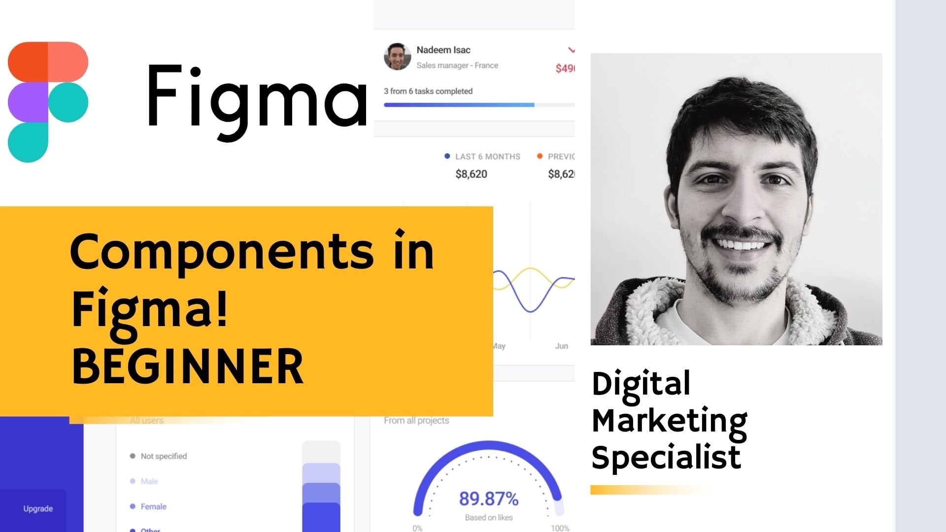
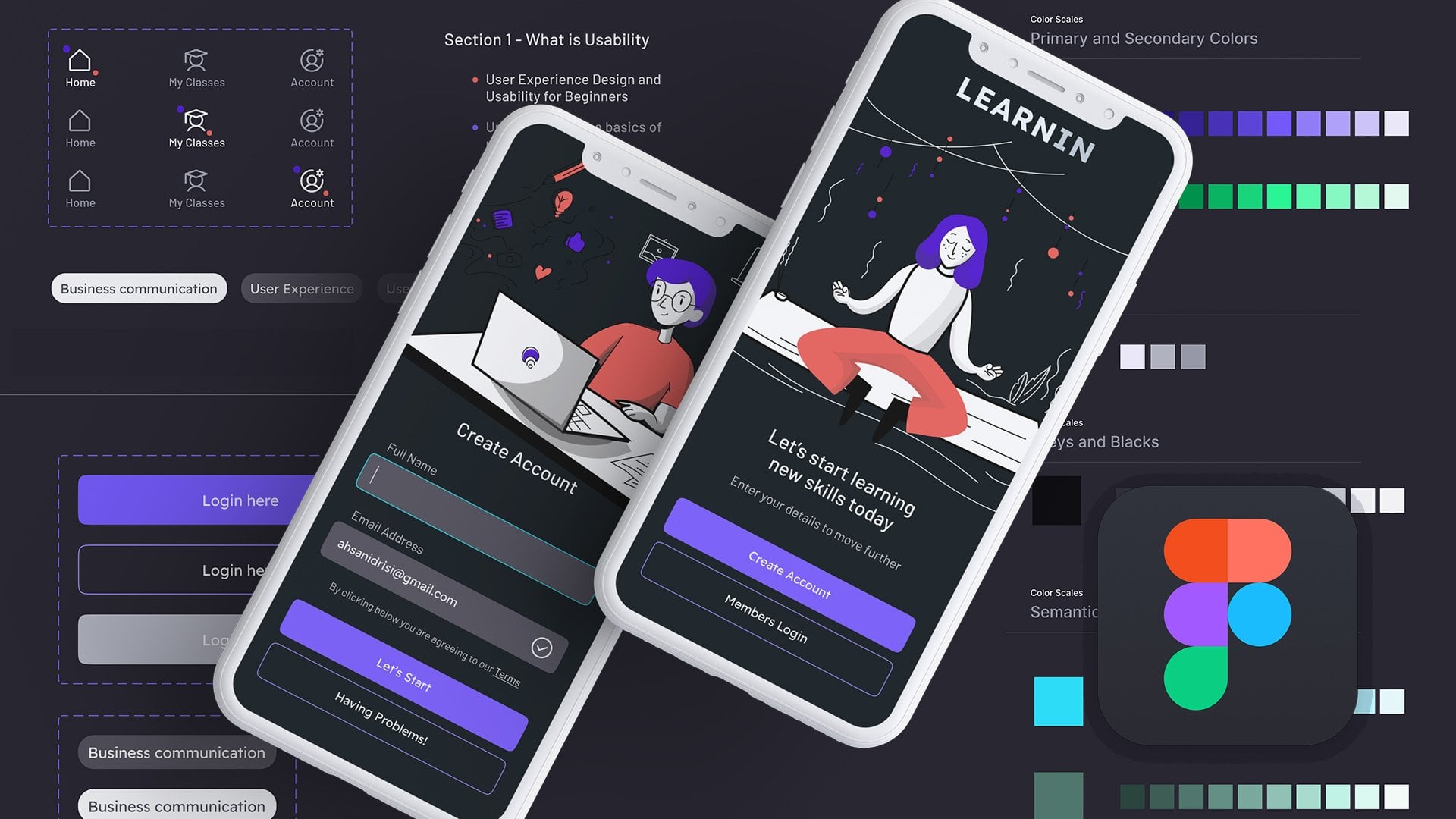
1. Welcome to my beginners UX Design Figma course: Hi, welcome to my Figma
class on Skillshare, where we're gonna be looking at the wonderful world
of UX design. Now often when people
enter the UX design space, they really wanted
to start making applications and
absolute your phones and getting really creative
with their design concepts. And often one of the most
overlooked things when it comes to UX design or
the micro animations or the smaller aesthetic
changes that UX designers add into their applications
to really add some flair. And one of the things
that we can be doing in this class in general is going through different
techniques that users can implement to really enhance
the UX design experience. This is an open-ended class, which means I'll be consistently
adding in new videos every week based on feedback and any questions
that come through. And so far I've
put three classes together within
this figma lesson. And they're going to look
at three main components. So at the moment as it stands, we have how to create
hamburger buttons, which are essentially
menu options which morph into circular
close buttons. So clicking on this will
change it into this icon. We are looking at sliders. So when you click
on an off switch, it's slides to the on and etc. Then lastly, we have this nice mobile interface that I've created called pictorial for the purposes of this class. And how to make a
horizontal messenger style social networking bonds. So an example like this
would be here where you can scroll and see what
friends that maybe online. So this is what we
have at the star. And during this
class, afterwards, I intend for you to be able to recreate what you see
here are friendly view. And obviously as I
make more classes, more things will be added in. So make sure if you do choose to enroll in
this class that you stay and you watch
out for any emails. I post that in the discussions. Again, if you like what
you see and you're interested in joining
me in this course. Definitely enroll now and I'll
see you on the other side.
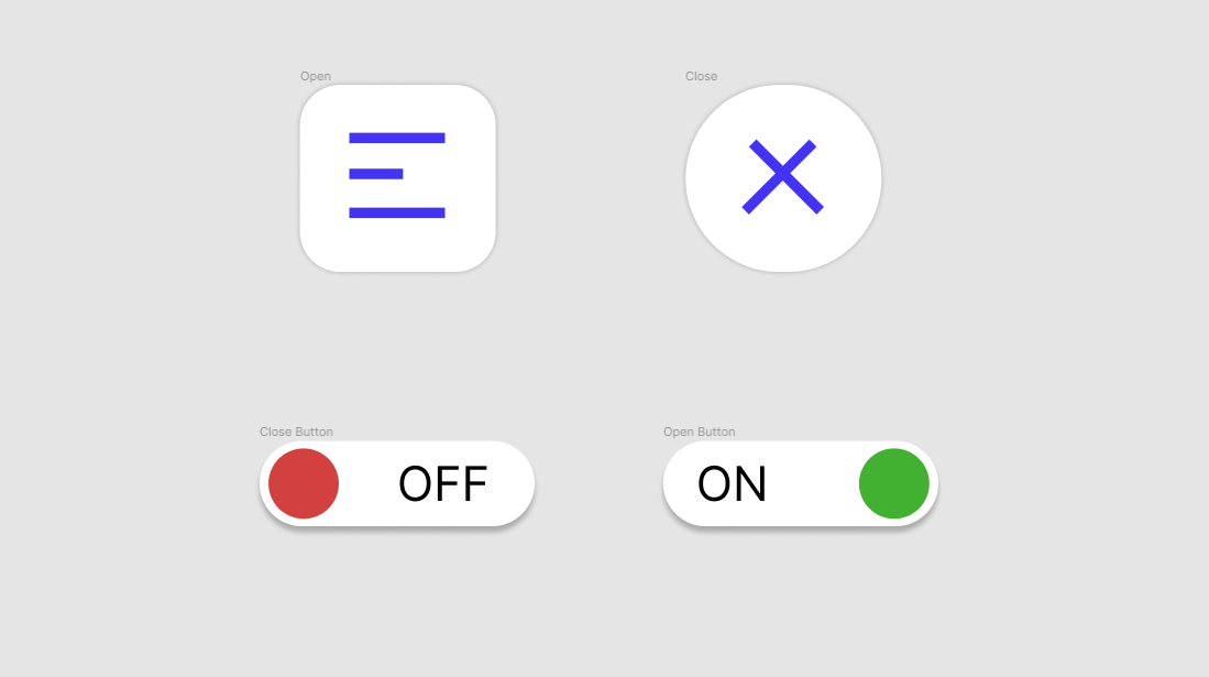
2. Making the menu hamburger button: Hi. In this short class, we're going to be using the UX designing
software known as Figma. This is a very versatile
and complete tool for allowing you to
create prototypes, wireframing, and different
user design interfaces for your apps,
desktop, mobile, etc. And in particular in this
class is gonna be a short one. And we're going to
target specifically at micro animations. Now the four images you
see in front of you are essentially two flows
as the code and Figma. And they are a button types. So the top one is what
you'll all be familiar with, which is a typical
hamburger menu style. And then the habit open
when you click on that, we want it to be changed and moved into the
circular close button. And same goes here at the
bottom where we have one of those classic slider buttons where you click the
off at turns on, it, click the on and turns off. So these sliders reverse tile. They often can be used in different mobile
applications or dashboard interfaces for the modern-day
softwares and services. Just to get going,
Let's start off with a demonstration to show
you what these look like. Go to page one,
which is essentially clicking the plus button
on the top right corner. You'll see the two flows here. So if I click on this, you'll see how it animates back-and-forth from
an off to an on. And same goes to this
one as well, off and on. Now once obviously
you create these, you'll be able to put them into your own dashboard interfaces or mobile applications
within Figma. Or if you're using
any other software like Adobe XD or Sketch, they'll be similar
processes in that as well. But a video later on that. Let's break down
what we have here. So what we're gonna
do is start off with the hamburger menu systems. So let's get rid of those two buttons and focus
solely on these two here. On the top left corner you
will see different icons. If you have the
Move Tool framing, you have the assets
panel where you can obviously choose the
different types of shapes. Pen text, hand moving so you can pan around the canvas
and add comments. In this particular one, we are going to start off by recreating these buttons
and the animation flows. So let's start by
doing that. Shall we? First things first we're
gonna start off with a nice rectangle and
we want a nice square. By holding shift, you
can get a nice cube. And we're going to make
this here automatically. You will see, but Tango three pop-up here
on the top-left. And this is essentially
going to be our new button. So now we're gonna work on the CSS or the aesthetics
of the square. On the right-hand side here, what we want to do is try and keep these as whole numbers. So I'm gonna put this to 130. And that's going to
automatically go to 130 because we've
changed linked at that. We're going to give a border. On this particular one. We have a board a value of 27. Let's do the same
on this one here. So we're going to click on
this square, this rectangle, click here and put it
as 2772, sorry, 27. Now we have a nice curve, a square, rounded edge,
sort of cube-shaped. Now let's change the color so we want to make it
nice and white. And in order to give it
that standard effect, we're going to give
it a drop shadow. So if I go to Effects, click on this and by default it will always give
you a drop shadow, which you can then
edit by clicking on this sunburst icon which
has the effect settings. I click on this. We want to make sure that
this button has equal dropped shadowing around
all of the sides. So we're going to
make this y-axis 0, which you can see here, profit. Now, what we're gonna
do is we're gonna convert this button
into its own frame. Now a frame allows you to do prototype flow animations
into another frame, either by clicking, dragging, hovering, entering a mouse, moving the mouse
around the port. That essentially
allows you to create the animation where you click on this and it goes to
that frame here. So you can click here,
right-click frame selection. We're going to call
this hamburger. Then we're going to
add in some lines. So let's go here to the
shapes tool choose line. Then let's drag
this across here. We can essentially
do is make sure these emerged into the center. Then copy paste three times. And we're going to bring
this across here as so. Now we have three
lines and just to make them a bit bolder, let's increase the
weight tier to around five and then drop them down
to the center. Perfect. Now to match this, we're going to make
this a bit smaller. Hold Shift to keep it in line. And we're gonna put
it around halfway. Now what we have is a
menu hamburger icon. Now, what we're gonna
do now is make, to make sure that when
you do in the animation, in the prototype setting, that it does that
transformation morphing effect is we're going to copy and paste this entire hamburger frame. So copy paste and then
drag it to the side so we have some clear
area between them. Now we're going to edit
this one so that it, Figma automatically
recognizes that you're using the same shapes and
lines and you're going to want to animate and
move those down the line. If I go here and rename
this to close icon, now have this frame
called close icon. Now, the fun part. Now we get to mess around with
this frame and change it. So if I lock the hamburger one, that way, we're not going to accidentally touch this button and we start working in here. So let's make this
into a circle. We can do this by simply dragging this corner
radius all the way to infinity rarely, because it's always
gonna be a nice circle. Now we're going to work on making sure these
turn into crosses. One of the easiest ways to
do that is select all three and click centralized
and online center. But obviously we know that this one was on the
left-hand side. So if we add angles,
these lines, they won't line up properly. We have to make sure
we sent them as well. Now what we do is we just
one-by-one add angles. So let's make this 45 degrees, make another 145 degrees. And then make this one minus
45 that we have across. We can actually give some
color to these icons. So if we go to the
hamburger tool, hold, shift and click, we can make
these a nice green color. And we can make this
cross a red color. So now we have green and red, and we cannot get to
the animation process. Let's click on this
hamburger frame. Go to Prototype, click onclick. We want to navigate
to close icon. Click on Smart Animate because
it will automatically give a really nice sort
of morphing effect and then choose ease
in and out back. This will allow the icon to have that springy animation before it morphs into the circle which
you will see in a moment. Let's make this
650 milliseconds. That way we're giving
it enough time to have a nice fluid animation and you don't miss it
when you click it. And we can repeat the
same process for icon. Now you have the option to go to a prototype and click
here on Add plus. But another way to do
it is drag the arrow to the previous frame and it'll automatically click
the hamburger. Choose my animate. It is in an app back 650
MS. Then there you have it. So if you go and check this out, nice fluid, it morphs, looks good and looks
modern and sleep for your apps and your
dashboard interfaces. That was the first one. We're gonna do is focus on the second one which
has a slider button.
3. Making the slider button and closing remarks: Now if I put all these hidden and we
looked at these here, these are essentially
a series of rectangles with curved edges and circles and small animations. Now obviously looking
at the first one, you can see how easy this
one's going to be as well. You can get more complex
micro animations, which we will do
in a later class. But for this one, we're
going to stick to basic smile animations
just to get you started and to
have a good feel. Now, we're going to
replicate the lock this so we don't touch those and essentially recreate this. First thing we're gonna do
is put in a new square. I'm going to try and try and
make these the same In lens, but it's okay if not. And we're gonna go to Design and similar to
the previous button, we're going to give a radius. And in this case
we're gonna make it 100% because we want
a nice cylinder. So look. Let's change the color. Let's make it white
and a drop-down. Now, for this one, I'm
going to keep the drop down below because normally
buttons and sliders, buttons, they have a
drop-down shadow effect on the lower half. To really elevate it from the dashboard interface
that they're on. Now we're going to
add in a circle, which is gonna be the,
the button or the switch. If you hold Shift, except
you can see here it makes, it makes a nice whole circle. And we're going to
place this in here. Zooming control. Perfect. What are we going to
do is make this red because that's the off switch. That's actually
really, really bright. Let's make this a bit less. There we go. If you want, you can use the eyedropper tool, but we're gonna assume that you haven't made
one of these before. We're also going to
put in a text box. So let's call this off and
put us in the center here. This is our off switch. To quickly make
this process easy. That's copy and paste, drag out. We have the circle change
to a nice green color. So that's going to obviously
represent the on switch. And if I close these two, so then we can just work
with these two options here. We're going to animate
these now accordingly. So first things first, we have to make these
into frames so that we can nicely animate them. So I'm gonna select all
these right-click frame. This is off slider. Same goes for this one
right-click frame selection. I'm going to call
this on slider. As we did before. They're going to click
here, got a prototype. Drag this arrow to this frame. And you will see because we are working within the same canvas, it will save the
previous animation. And we're gonna
do the same here, get this arrow, and put it back. Now obviously, we may not want to have a small animations. We may want to have
linear animation is very simple animations. We may not want to have
the ease in and ease out. So for a button it doesn't
make much sense to have a springy button before it's
swipes left or swipes right. So let's just make ease in and make this one also have
the same effect is in. Now, if you do a practice run, this is flow for flow for. Click on it. You'll see how it's worked. But the button hasn't moved. So all we have to
do is go back to the design area shift and move this text to the left shift
and move this to the right. That way, the button will
now have a morphing effect. This is an ease out
works very well when you obviously looking for a switch of some sorts and icon. But you'll probably
notice because it has just an ease in it doesn't have that swiping effect the
same way that this one does. So if I just lock this, number two, you'll see
how this moves across. That's only because we've chosen a different type of animation. In this one, you will see
here how we chose to have small animation is
in and back out. That is why we have
this button effect. Whereas inflow for it
was simply a slide. It was, I didn't have that
effect, so we can add that in. So if we come here to flow four, come here, choose
these in, ease out. And then saying for this one, go here, the flow, flow four. You'll see how it
works quite nicely. Then. Again, these are just two options that
you have to make it for making buttons and the different
animation styles as well. Yeah, I hope, I hope you found
this lesson interesting. In future lessons, we're
actually going to work on making an actual
user interface which we really exciting. And I hope to see you there. And if you have any questions, definitely leave them in the feedback section of this class. And I look forward to seeing your projects as one of
the deliverables that I would like to see in this class is you have your own interface, or at least at a basic level, just having a canvas
with all these buttons on and giving me the Figma file and I can
open them or you can post a video and we can go through it and I'll provide
some feedback. If you have any
questions, do feel free to leave them in the
comment section below. Thank you very much
and take care.
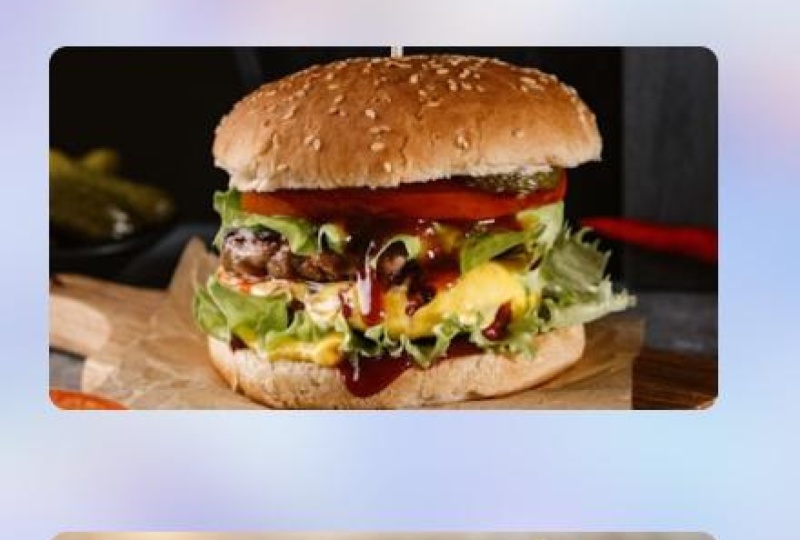
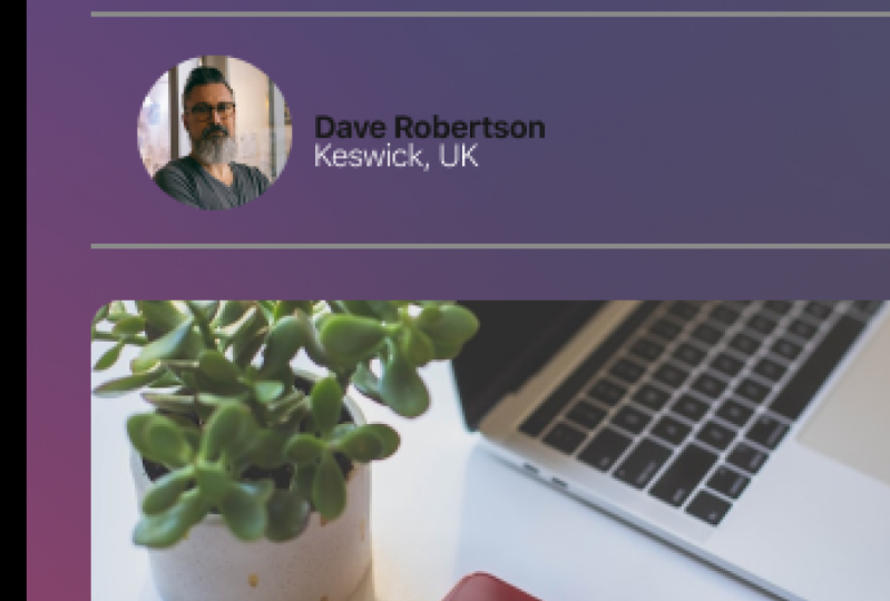
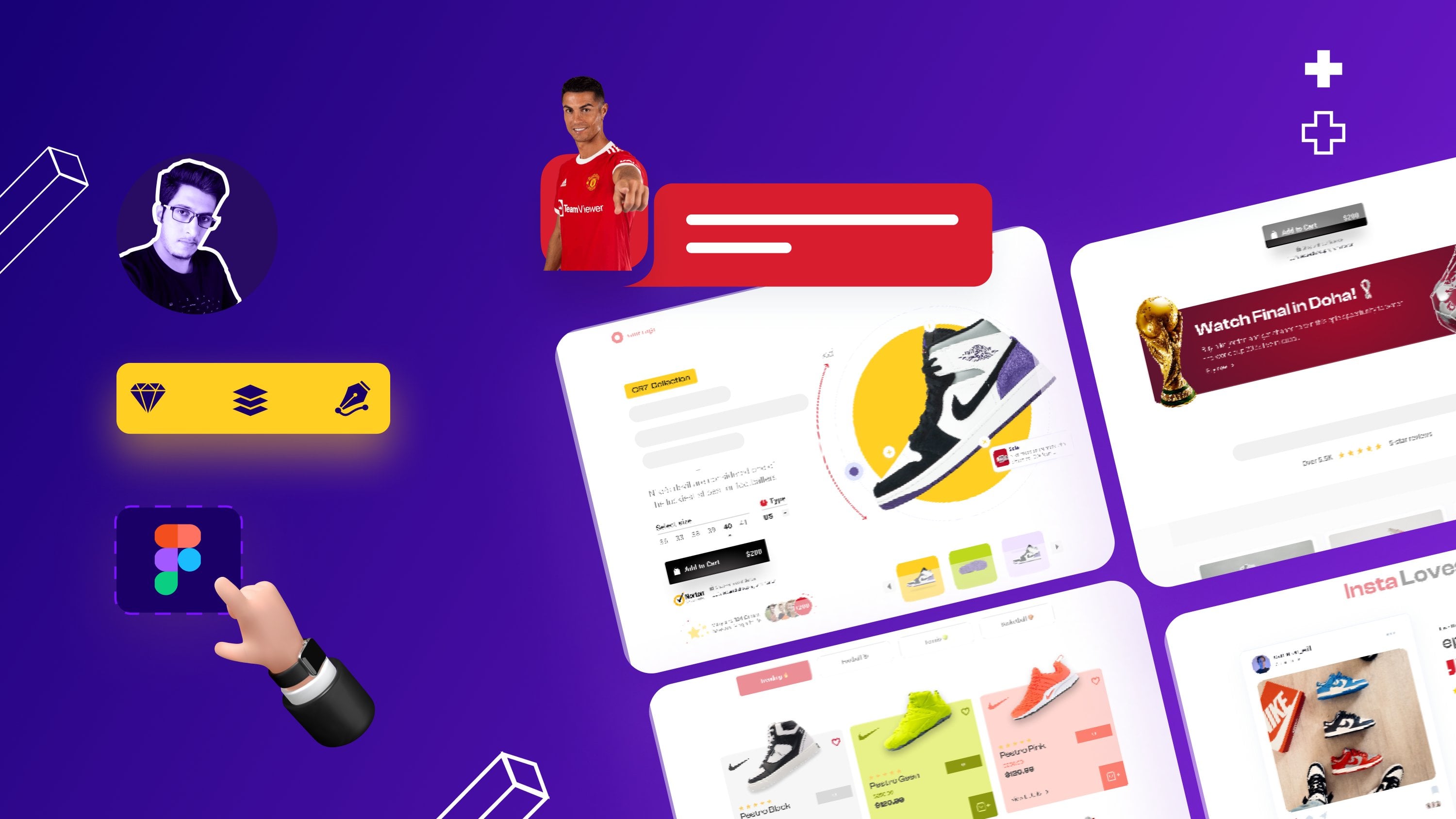
4. Creating a Horizontal Scrolling Messenger-Styled Social Portrait Bar: Hi. In this class we're going
to be looking at creating an interactive
horizontal scrolling bar on an app or service
or dashboard. And this is going to have icons of people's portrait
voters in there. And as you can see here
in the fluid animation, you can see how
nicely scrolls across different people in that
part of the top there. One of the really useful things about this is it
allows you to really manage your real estate
of your app sufficiently. To start off with,
we're going to make a frame and we're
going to choose the iPhone 13 Pro Max as this is quite a
common phone these days. And we're gonna add in some
rounded edges to around that. Now the next thing we're
going to do is we're going to put in some sort
of lines at the top. So this is going to replicate the hamburger menu button which we made in the
previous videos. So you're welcome to import
that and if you want to. But for the purpose
of this exercise, we're just going to make a static duplicates
sort of menu option, which obviously doesn't have any flow animations with them. Let's say we're going
to increase the stroke volume a bit there so that it looks nice and
visible from further away. Next thing we're going to do is we're going to
create a search bar. So search bars, obviously
very common in mobile apps, will add some rounded
corners there. So it makes like a long
cylinder sausage shape. We're going to change the colors to make it more
resembles a search bar. So in this case, having
some nice drop shadows, which are very common, so it
stands out above the page. Next, we're going to add
in some dividing lines. So these are obviously
very good to help separate different
palettes of a dashboard. And the reason why we're
making all of these things is because in order to make that horizontal scroll
experience nice, we want to give it at least
some context in there. So now we're going to start making the actual
horizontal scroll. So we're going to make
a series of circles all equal rents and
distances from each other. And we're going to
create a few of these that go off the page that we can actually have
that scrolling effect. Now one of the things I like to do is group them altogether just so we know
where they are and where they're going
to sit off the page. But more importantly, we are going to put them
into a frames that we can add a prototype
scroll animation to just that particular frame. At the moment you can
see we've clipped and we go in to get the frame. I'm dragging it to the
area of the phone so that any other circles that are in that frame beyond
it will get clipped. And as we move horizontally,
they will show. First thing is we're gonna do, is gonna go to the plugins area. If you haven't got this, go on market managed plugins and find any
plugins I'm using Unsplash as it's just very good place to
get free photos, which is already free. We can choose two images here. I'm just gonna
choose some random portrait images which will be helpful and nice for this particular
horizontal scroll in status or online profile
interface that we're making. One of the things to
realize this is we're making a horizontal
version here. But if you were to make a
vertical scrolling option, the process is very much the
same where you have a frame. Within a frame you can
tell all of the assets, the shapes, the images, the lines, the text, wherever you want to
include in that frame. And then you can
choose to either make it horizontal
scrolling or you can choose to make it
vertical scrolling. Which obviously is what the
main aim of today's class is. If you haven't made the hamburger tools or you haven't made
the buttons before. Do watch the other two videos
in this class to learn more about that as
actually helpful. So now what we're going to
do is we're going to make the images smallest
that we can actually work with these and
mask the images. So you put an image
on top of the shape, select them both together
and go use as mask. Then you can drag the image
and place it in the center. And then what we're gonna
do is we're gonna repeat this process for the
remaining images. As obviously, it
gives a really nice, almost like Messenger,
facebook vibe. Instagram stories, wherever
you are making this fall. It's about making
sure the images fit nicely within the
circle, the shapes. So as we go through this, you'll see how it
slowly starts to resemble one of those
more social apps, which let's be honest, is very common these days
to have this sort of scrolling circular
horizontal bars, which either represents stories, feeds, online, users
and things like that. You'll see on the
left-hand side here how we have different
masks groups. Now, masks groups are obviously you can make
those in any sort of shape. We've chosen a
circular shape here. But you'll see how the masks currently a hidden
behind that frame. Let's take them out
of the frame. And. Mass an unframed them. Sorry, what did you
just go flatten? If you ungroup them
all, they'll pop out. And what we're gonna
do is we get a mask, these two circles
which off-screen, then put them back into
the original frame. So uses mask, drag that over. Let's make it fit in nicely. And now we're gonna
drag those two circles, those two masks and put them
back into the iPhone 13. And just to make sure all
of those massed objects are framed, right-click
frame selection, and then make sure that I
clipped that just give a nice background name their content. Shorten the frame to the
extent of the visible window, and then align at the bottom
to show that as a divider. And then wallah, you
have a region on the screen which represents
a horizontal split the bar. Now, obviously at
the moment there is no animation and then
flowing in this. So just to obviously make
everything else look legit, quickly add in a box below. So imagine this is like
an Instagram post or something where we just want
to have an image there. Now we're gonna go
back to that frame. We're going to go to prototype. And we can choose a
scrolling method, and we're gonna choose
horizontal scrolling. This will allow
that frame to move left and right off the screen, as long as it's clipped and the frame was in
within the window, this will work perfectly. So we'll show you
that in a second when we click the Play button and let me come
here and you will see how give you a moment. There we go. We have
a bar which has a nice scrolling animation. Now obviously this is the
most basic of scrollbars. You can have different
animation effects you can make. You can add as many flows
as you wanted to this. But in a nutshell, that is really how to make
a vertical or horizontal, in this case scrolling bar. These are obviously very
useful in all sorts of parts. Now, if we were trying to make this a chatting function
or status function, you could go and make little circles and
put them on the top. So this is something like
what messenger does. Wear. Green obviously
means they're active. And the orange or
a red means that busy or the other way or gray normally means
if they're offline. You can see here by grouping
them with the circles, you can make a little
grid colored icons to reflect the fact that these uses that either online or
in this case right now. Going to be a way by just changing the color
to something a bit more resembling of
the traffic light system. You can see here how they work. Now another object you can do is add some tooltip functions. So tooltips are basically hover effects where if
you hover over something, when you click
something, it will create will have a
pop-up tool tip. So in this particular case, we can put something
like online. So if someone hovers over or clicks on the user,
it will basically slave. It'll basically say whether
they're online or not. Which again, is really useful
if you're trying to make a social app which has interactivity and social
chat and messaging. You may not have that. So this part of the class
maybe completely relevant, but it's always good
to know how to do these things and
how to incorporate prototype animations
and connect them to moving animations
are moving scroll bars, as you can see in the
app on the screen. Here, just making the text
and the shape on the left, the right size, giving it a nice drop shadow and center
and aligning everything. And this may be a bit small. Potentially. We might
have made it bigger, but we can, we can check
and see what it looks like. In the prototype viewing area. We're going to
frame this so that we can actually make those. In this particular
case, let's make them components because we
may want to duplicate this component to all of the other images
later down the line. And what we're gonna do is make an introduction
on the green bar, where the green circle while, while we are hovering or while we're tapping
in this particular case, open the overlay
and we're going to choose that online tool tip. And then we're gonna
make it manual so we can choose where
that tool tip comes when you hover over it
or click it and dissolve, that makes a nice slow fade
in fade out animation. You can click on that and
you'll see how it opens now, as we said, too small. So let's make that
a bit bigger so the user can actually
see what's going on. That's nice, big on there. And then let's head over to the design tab and
change this to, let's say 11 because that work, Yeah, that looks that
looks quite nice. You may have to align
that in the center. Because the online looks a
bit too high at the top. To the bottom. Again, it is sometimes
can be a bit fiddly, but that now will be a lot
bigger. So you can see here. But currently we have an always
on what we need to do is enable the user once they click away from
that green button. That close when clicked
on the outside. That means that when
someone clicks on the outside, it will go away. There you have it. You have a nice
scrolling bar which has online offline animations. You cannot delay effects and
things like that to this. But in this particular case, we just wanted to
make a scrolling bar. And we've added some
extra little bits on top there to make
it look more like a social experience app. Obviously down afterwards,
what we're going to do is move onto glass
morphism is the term. So basically you probably
notice on the left as an app with all these images
which I've now removing. But in the background
you can see that nice blurred
purply blue effect where all of the assets
and layers are above it. And it looks quite cool. So definitely watch out
for the next video in this class where we're
going to talk about glass morphism and how
to make that very easy. And just take care.
5. Making Glassmorphic Backgrounds to Applications: Hi, welcome to the next class in this figma Skillshare class. Now, previously we looked at creating horizontal scroll bars, and today we're going to
look at glass morphism. Last, morphism is this effect which many apps and
software is used these days to help
add a layer of depth to a software
or an application. In this particular case,
we can see here we have our instagram type
app called pictorial. And we have this nice blue
and purple background, which has a nice blur or
glass morphic effect. And it really helps
make the images and the profile stand out
on this application. What we're gonna do is focus
on creating this today. And it's a really
easy technique and it really helps bring out and make your app
looks more creative. So if I just turn off this here, you will see we
have this frame of this iPhone 13 Max Pro. And you can see how adding
this glass morphic effect can really add that additional
depth to the image. What we're gonna do is
we're going to open up what our previous
phone that we made, which had all of the
hamburger buttons and the scrollbar
buttons on there. And we're going to apply
a glass morphic effect to this phone. Let's just dive right in
and I'll show you this isn't a very complex tutorial. In fact, it's very easy to do. And I'm going to show you
exactly how to do it now. One of the first things
we want to do is bring in an image which we
think is going to look really cool for the
background of this phone. So if we go here and go to
plug-ins, I'm using Unsplash. There are many other
plugins you can use, so I can always make
a video later on how to do that and how
to add plugins to there. But we're going to use Unsplash, which has free
images that you can use and you can actually
commercially reuse them as well. Considering we're making an
app which hat is focused around the user and is
a social experience. We want to make sure the image isn't too distracting
at the back. Normally things like
abstract architecture, space, wallpapers, our
textures are really good. So let's have a look and see
what wallpapers we have. So these are great. But you can see how most
of them are located more towards a desktop experience. So I'm not too sure
personally about that one. So let's go to textures. Here we go, These
look a bit better, but we want to find
something which has a lot of vibrance in there. If we keep scrolling down, we might find something
really useful. I will put this image into the project folder of the class as well in case you
want to reuse these. But if not welcome to use
any image of your choice. And obviously that
helps you make things a bit more personalized. Why do we try this one? This one, obviously,
there's a lot going on. So let's click on
this and bring it in. One of the first
things we're going to do is scale it down. So hold shift and scale it
down accordingly so that we it fit the diameter and the
dimensions of the mobile screen. The next thing we're
gonna do is we're going to create a triangle. Triangle, sorry my
bad, a rectangle. We're going to mask that into the iPhone 13 Pro Max
real estate area. So let's make a rectangle and just make it fall in line with this
and stretch it out. So if we go back
to the prototype, we will see that we have
a 34 border-radius. So if I click on this
rectangle and make this 34, you'll see how now it nicely, nicely fits within
this area pivot. So now what we can do is drag it out of the frame and
we're going to mask it. We're going to
mask it with this. But, but before we do that, we're going to want to
copy and duplicate it. I'm going to put this
on the other side and I'm gonna make this one white. As this is gonna be an overlay
over the masked image. Let's come back here and
select this abstract image and the image behind
it with Shift and hold right-click, use as mask. If you click again, it
will allow you to move the image anywhere in
this masked image. That looks pretty cool. Now, What we're gonna do
is we're going to get this image and drag it on
top of this masked image. So we have rectangle 18 here. Let's call this
glass morphic panel. And we're going to
drag this on top of this masked image
and pull it over. Now what we're gonna
do is go ahead over to effects and change drop
shadow to blur background. Now we've done that yet there is nothing happening here yet. This is where we go
to this image here. And we change the
fill to around 25%. Now you can see here
that we have a overlay. Which is so nice
and translucent, but at nicely fits
over the image. But you probably
wondering, that's kind of blurred but
not blurred enough. If we click on the
glass morphic panel, go on to this icon here and change this and
increase the blur. Let's say we call it 50. Now you can see
how it's blurred, basically the image behind it. And it gives a very nice opaque or translucent glass effect, which is why we call
it glass morphism. Now, this looks cool,
great, amazing. But what if we wanted
to add a complexity? So what if we wanted to
add more images on this? So the first thing
we're gonna do is we're going to group this or frame it. We can do this together. And we're going to call
this glass morphic pain. One. We're going to
drag this inside the iPhone right
to behind and drag in and then put this
right at the back. That way we have a nice
background effect. Basic terms. This is it, This is the glass, the glass morphic effect. If I head over to
the previous iPhone, you'll see how similar
it has the same, same sort of look and feel. Naturally, this image here has a white white panel at the top, which, which obviously gives that nice distinct break between the menu
area at the top. But in reality that's
essentially the same thing. And once you learn how to do
this glass morphic effect, you can actually add more
and more layers to this. Obviously, if you wanted to have a layer which separates
that layer at the top. As an example, we can go here and go to Unsplash
and find another one. Let's find it
another quick image. Which might go well with this. So let's bring in this image. One of the cool things
you can do is actually edit the image that
this gets mixed into. If we go here and make a
square so same as before. We actually edit the pane here. So let's put this down here and put this up here
and make it bend. So what we can do is mask
this into this wrong way, round it, bringing
this to the front. So right-click, I'm right-click and center
front and the mascot. Same as, same process as before. And now you can see here what
we've done is we've added, given this an extra
dimension, an extra layer. And what we're gonna do is get another square
rectangle, same as before. Draw over this iPhone. Make sure it's the right width, the right scale. This is 34. Make sure this
rectangle is also 34. Then we're going to put this
on top of this image here. Amazing. And we're going to add
a background blur, make it 50, and
then make this 25, and then make it white. Now obviously, you can see
here how it doesn't exactly go over the edges because quite a bit
naturally we haven't. I can make this 34 as well. That's basically making the mask rectangle have
an edge as well. And I go over this as so. Now what we can
do is group this. I know I've gone through
this quite quickly, but it's just recapping
what I've already done. And we're going to add
this to the shape. We may want to, we may want to drag this a bit further down. Apologies. Because we can always
drag this down, but for the purpose of this, we can drag this shape into
here and then drag this down. So now we have two
glass morphic effects. What we can do then is work
and class morphic two. And now we have
both these paints. We can actually work
on them differently. So we have this panel here, which we can change
so we can make this one either more translucent
or less translucent. So it may be 15% and
then make this blur. Twenty-five that
way where having more emphasis on the front page compared to the previous one. But again, necessarily
doesn't look the greatest. But the whole point
of this class is just to show you
what you can and can't do and you can get really creative with glass morphism. So what I would like you
to do is I'm gonna put in both of these images
into the project file area. And I would urge you to
actually find your own images, but definitely try
this effect out and see what it looks
like in your apps and your dashboards
and you make in Figma. I hope you enjoyed this class. Very easy, very simple. Only ten minutes in length, but hopefully you found
some useful techniques. And I look forward to seeing
you to the next class, which will be out next week. Just Thanks.
 Saad Bhatty, GeoTiktoker and UX/UI Designer