Transcripts
1. Welcome to the Figma Course - Creating Components: Hey, welcome to the class. My name is sidebars and I am a marketing and
product designer. And today we're gonna be
talking about components. And I'm going to show you how to make these really
dynamic modules. And then Figma,
which helped make your design process a lot
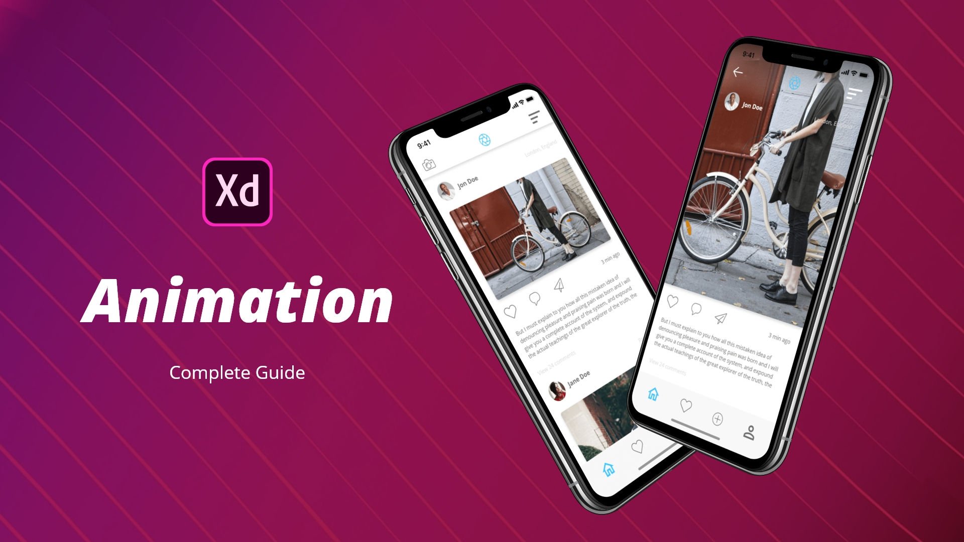
more efficient and effective. Here we have a fake
social feed website and we have some buttons on the right-hand side
which are pre animated. So you can see when
you hover over them, they change to a stroke, outline, white
infill compared to a noStroke and blue infile. Now these obviously represent
buttons and in this class, I'm going to show
you how to make the individual
components necessary to create this effect. When you're designing
your apps or websites or any
sort of programs, you have the knowledge to create really valuable
dynamic components which can make your
design process look good, more polished, and
most importantly, saves you a lot of time. So if you're looking for
a very easy to follow class and you may have been a subscriber to
my previous ones. You will know that
I tend to take a very lighthearted
approach to teaching. And I look forward to seeing
you in my Skillshare class. If you decide to enroll, don't know what you're
doing right now, but if you want to join me, feel free to follow and we will make some of
these buttons together.
2. Creating the first asset for Components : Welcome to the first lesson
in this Skillshare class, we're gonna be making buttons
which have hover effects and are created using the
component function of Figma. So first thing to do is we're going to
design our buttons. So we're gonna go to
the rectangle tab, create a rectangle, and rename this shape one. Now by default, you will see the natural color, this a gray. And we're going
to want to create this and make it
the button color. So if we go here to the
square and choose Solid, and then choose a color,
we're gonna go for a blue. And then we're going
to round the corners because we can
make a button with solid like angular corners, but round buttons have a nice feel and it worked
well in modern day apps. So we click on the box and
we come to this tool here, which changes the corner radius. I'm going to make this four. And you will see
here how we've got a slight curve now depending
on the size of your button. So if I shrink this down, you will see how the
radius will change accordingly and make it bigger. It looks more like
a rectangle and make it shorter and it will have a larger ratio
of corner radius. So depending on how
big your button is, you might want
to change that. And you can again do
this by either typing in a number or you can actually
drag the radius here. So you can see by dragging, it makes the radius more graded. So now that we've done that, we're going to design
this button in a frame. Now, the way to do that is if I write right-click on the square, you'll have the option
to frame selection. This will make frame one
and top-left corner. You can see how this shape
fits under this frame. Now, we're going to name this button that we know
that it's a button. And then we're going to add
some text to this frame. Hit the Text button and
then hit the inside. And we're going to
call this next. So this example,
this is gonna be a next button to go to a new page or a different
part of the app. Now obviously that text
is a bit too small, and even though it says 18, clearly our buttons
are very big. Button, this will be ratio according to the
size of your button. If I click here and
click on Thursday, that's still not
quite big enough. Let's go 45. Stretch the box open. And now you'll see
how this next text is within the button frame. Now, what I'm gonna do
is I'm going to center this text in the text box
itself. So click here. And then this entire section needs to be centered
in the button. You will see these
icons up here, the alignment icons,
I'm going to click on vertically aligned
and central line. That is now Central.
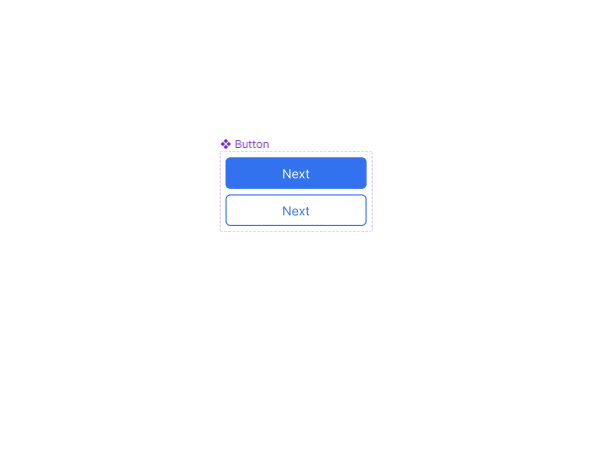
3. Creating Component Variations: So what we're gonna do
is click on the frame. And we're going to convert
this into a component. So if I right-click, you will have create component. Now this will automatically turn the frame into a component. And you can see this
as it's colored purple or look in the layers
tab on the left. Now, in order to get the
hover effect where it changes depending on whether you enter or exit the
shape or asset. We're going to create a
variation, a variation. And you can have
multiple variations depending on how complex
your component is. So if you click on
this, on the top, you will see Add variant uses
mask or union selection. We want to add a
variant and you'll see how it automatically
creates a copy, which we can then change to make it have the desired effect. The dashed outline just shows you the extent
of the components. And if you click on
this plus button, it will add another variation. So we've got the default button at the top and then
variant to underneath it. So now let's change the
aesthetics of this one. So what we wanna do to
make it obvious that that's been hovered over, we're going to
change the colors. So what we're gonna
do is double-click. And when you double-click,
it will automatically choose the lowest tree item within
that selected asset. Shape one, which
is the rectangle. It's got a blue color and
we're going to add a stroke. Now, this stroke is going to be the same color as the infill. So if we click here, click on the eyedropper tool, hit the inside, you
will see now that it's done a blue outline. And then if you make the make
the thickness a bit wider. Obviously we can't see what that looks like because
of the same colors. We can change the
fill color to white. We go. Now we have a white
infill and a blue stroke. And you can see that the text is disappeared because
the text was white. So what we're gonna do
is make this text blue. So click on this, the
eyedropper tool there. So now we have essentially
an inverse button, which we can then use
as our hover effect. And now that, that's it. That's basically the
main components part or the main components done. And now we need to just work on the actual flow of the button.
4. Adding Flow Actions to the Component: So if you go to the
top right corner, you'll see prototype. Now prototype allows you to add motions and animations to
objects in a linear order. So with this prototype area selected and I
click on a button, you will see how we
have little plus icon. Now with Figma, you
can drag and drop. If I click this and drag down, you'll see the automatic, automatically
clicks and attaches itself to the built-up
component variant. Let go. And then a
pop-up box appears. Now, if what we can do
here is choose how we want this to interact with
our mouse or our touch, or however you're using and
what device is using it on. At the moment, by
default, it has clicked. But we want to have
it because women, when the mouse
enters the button, we want it to change
to the other variant. And when it comes outside
the compound complex, the container of the button, we want it to go
back to what it was. So click while hovering. It changes from property
one to variant to. Now, you can choose
to have an instant, you can choose to
have it dissolves, have a bit of a fade there,
which we're going to do. So what that does now is
whenever you enter this button, it will show this button. And when you leave this button,
it will show that button.
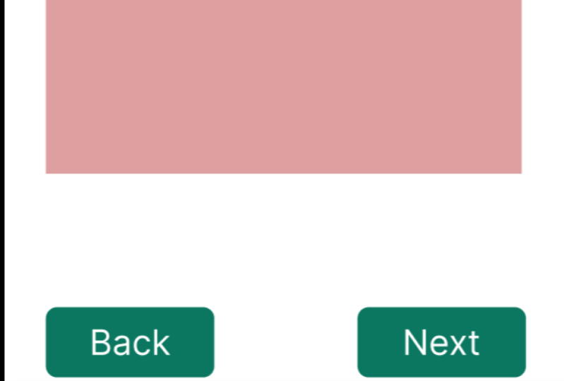
5. Testing the Components: Now to test this,
we're going to create a very quick frame. So we can imagine
this being a monitor. And this monitor is, we're going to put this,
put this into a frame. So right-click frame. And we're just gonna make this. We can make what
you want in there. So you can imagine
this is the app. And we're going
to want to put in the component now
into this app area. So what you do is you go
to Assets and you'll see, because we created a component, it's made this a local
component asset. Now you can drag
this into the area and you will see how we
can then stack these. So if this is a button
in isolation, great. This could be a next
button and a back button. So if we try the output, do this, copy paste. And now we have two buttons. And we can call this
one, this one next. And we can double-click
and make some back. Now you will notice how with the assets that you've
selected internally, you can actually change
the text of these without affecting the
original component. What it will do is keep
all the animations, keep all of the flows
as we did before, but it will retain the text
that is really useful. So you haven't got to make ten versions of the
same component. You can make one
version and then keep changing it in your
main working area. So this is our back button
and our next button. And obviously you can design
your app area how you wish. I'm just going to keep it
nice and simple so we can put a little bar at the top so that it looks like some sort
of a header of a website. Change the color. So maybe, maybe we're
making some form. Maybe this, maybe
this is a form. So let's make this white. You can add an effect. If you click it, by default, it shows a drop shadow. We can add some radius. Again, all the things you've learned already in the class. And if I go back to layers, you'll see how it sits
within the frame. So if I click on
the alignment tool, it will automatically go
center of that frame. Now, again, you can imagine
this being some sort of form. And just to showcase
it being a form, I'm going to put in some lines. So this is where
you'd have your name and email, et cetera. And now we're going to test it. So this is the
part where you can see how your animations work. So if you click on the frame one and then you go
to this play icon, it will automatically load this into an app
like environment. So if I click Play, and
let's zoom out a bit, Let's fit to screen, because obviously we've made a very
big, big application here. But you will see here
how we have the buttons. And if I go over these buttons, you will see how they now
have those animation effects. Now again, best
makes the process of designing components
very, very easy. Because as you can
imagine, if you had to manually make all these
buttons and manually make all those flows for
every single frame of your app, it
would take forever. And in this example you
can see how if I go a copy and paste,
make a second frame. And just to show how this works, you can go here and change, change this background so that it's a different a different
page, if you will. So we'll remove
this, remove these, and we'll change the background so that we can see that
it is a different app. We can actually animate these buttons to work the same way. So if I click this
and go in prototype, I can actually make
this Habits own flow. So not only will it remember
the original component, animations and flows,
but you can also add extra flow and prototype directions to the actual
interface you're working in. So if I go to prototype, you'll see how it already
has the hover interaction, but you can make it
where it clicked, it would do something else. So if I do this
and drag it here, you will see how it adds
in a second interaction. You have to vary interaction and in your have your
one that you're doing. In this one we're
saying onclick, navigate to the second frame. And then in this frame
we want to be opposite. So if we click back, this goes back to that page. So let's see what
that looks like. I go here, click Next. It opens up the new frame. Back. It opens up the previous frame.
7. Class Conclusion: Really easy, really
simple to do. And you can quickly
see how you can create some really useful and
time efficient designs very quickly by using the
components and Figma. And what I would
like to see is you create a map of your own or an app or adapt
an application, a dashboard, and just
create a few buttons. And let's see how
those animations go. And I'll be following those in our project area of the class. So make sure once
you've done that, you take some
screenshots or upload some videos so we
can see how you do. And if you have any questions, feel free to leave them
in the questions area. And the review was
always very helpful. Thank you for
watching this class. And if you like me to go
deeper into components, we can make some really, really complex ones which
have lots of variants and lots of flow prototypes. Thanks, and I'll see
you in the next class.
 Saad Bhatty, GeoTiktoker and UX/UI Designer