Transcripts
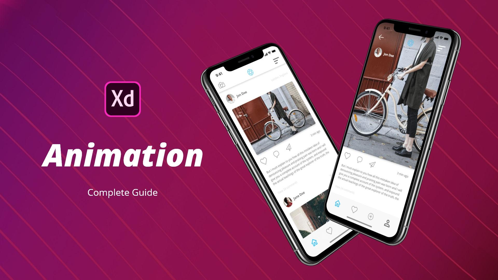
1. Class Intro: animating you. Re white design is important because it shows you're thinking process better than just a static image showing your clients animated design is going to help them understand it better and speed up the process dramatically. Animating in Adobe X'd is simple because the app is free, easy to learn and all in 12 Hi there. My name is Alex and Discourse. You learned differences between nations how toe animate icons, bottoms, forms, text sliders, Sharp's effects and more than apply that knowledge to plan, draw and create wire frames at images, icons and shadows. To create a design. Use the techniques you learnt to create prototypes. Share the work with your clients to get feedback and finally, how toe export your assets. For developers, this course is for everybody, whether you're just starting out or you are a pro looking for some extra tips in Adobe X'd . I hope you're ready to learn Adobe X'd in awesome animation features. It has to offer, and I'll see you in class
2. Class Introduction: Hey there. And welcome to the course. My name is Alex, and in this course, you will learn everything you need to know about animation inside off Adobe X'd as well as how you can share that animation with your clients as well as with your social media following. So what we're going to do in this course is we're going to run through 60 different videos with 60 different effects in eight different categories. So we're going to go through icons, bottoms, form texts, image sliders, charts, effects and other effects that you can easily then apply to our your design work. Now how this all looks like, let me quickly show you. So we're going to go through icons and you're going to get an eggs defile separate file for each of these different eight sections. So, as you can see right here, we have different icons from easier ones to more complex ones. Then we're going to go and move on to different buttons, so we're going to go through basic buttons as well as however buttons and so one. Then we're going to go through forms. So from basic subscribe forms, two more complex email forms and so on were going to go through some text effects from basic counter effects to some different effects. Overlays and so on were going to go through image sliders from basic sliders all the way to more complex ones. With more images inside, we're going to go through different charts and how they animate as well as with some different effects. So from loaders, toe flipping effects all the way down toe parallax effects. And finally, we're going to go through other song. Great, sure, different sliders different that bars, image, pop upside menus and someone. And finally, we're going to get through our project where you're going toe, receive a design brief. We're going to go through some projects. Exploration as well as with some wire frame drawings were going to go through our style guide how you can created why it's important and what's contained inside of the style guides. Then we're going to design wire frames using our paper right frames as our reference. Then we're going to move on to design at different images, shadows, different colors to make the design pop. As the clients like to say, we're going to go and design different menus, profile screens and so on. And finally, we're going to move on to prototype where we are going toe apply some animations onto those different designs were going to create multiple states off the same screens and add different effects which are goingto make our app designed really interesting and really modern looking as well as make the client easily understand our design, Our intention behind everything which is designed in the design process as well as the developers which are going toe easily understand which effects do they need to apply later in cold? And how should they use those effects and how it should they use a debt file structure that you have created for their development purposes. So I'm really excited to share all of this information with you. I really hope to see you inside of the course, and I really hope that you're going to apply everything you learned in this course into your own future. You I designed work, so I'll see you in class
3. Why do we animate: main reason were animating. Are you wise to get the point across to our viewer so they can understand our concept better when you're working with the client just because you have it in your head? How some elements will move and interact with each other does not mean the client will understand that design in the same way you do. It's easier to them to understand what the CD animations rather than just static image, because that's how the app eventually will look like. Also, when you're sending the files to developers, it's easier for them to understand what they have to animating quote when they have the reference animations, rather than to think which animation would go well on which screen and which interaction is better for which element. All of this speeds up the process off design in Adobe X'd because inside one up you're able to design prototype share, get feedback and erate fast without the need of fusing external APS or some other software
4. Different UI Animations: most of the time, when you're animating your you y you will come across to different animations. 1st 1 is for the big elements. So for the sliders, for example, and if we check out this example, you can see how that looks like. If I click right here when it loads, you will see this examples of this nice big slider. You can see all of these different elements and some smaller elements. So, for example, this step bar, this is what it's called micro interaction. So you're just focusing on some small part off the overall U Y toe animated and to show it toe potential wearers how it will look like and toe show it to decline. So they can better understand all of these different elements. Because if you just showed them this as aesthetic image, they will not know. So they might ask you some questions. For example, will this I can change when you tap on it? How this will look like when you click right here, what will happen next? So, for example, you will have to then create I don't know for this one maybe 56 10 different images just to show this effect. So it's a lot easier to create animation from the start and then send that animation to your clients. And they can then iterating on that animation and tell you, for example, I don't like how this rotates. Maybe we can add a drop shadow once it's it's clicked. Maybe you can change the spacing a bit and just give you a proper feedback. That will be a lot better to you so you can deliver to them a better design. Tow them so they can understand their concept and their drawings and their ideas better, and finally, to developers to round everything up because they will be able to understand how all of these different elements are going to interact with each other. And what should they put inside their coat to mimic that so they will know which technology should they use. So, for example, should use JavaScript should use some other technology just so that they can get that animation looking right, and they can better portrayed that concept off yours inside off code. That's why we're animating R u Y. And that's why there are a few different off these you animations. But majority of the times. You will work with these smaller interactions, and you will then show how the different screens are transitioning between each other. It doesn't matter if it's a mobile app. If it's a website, if it's, ah, some sort off dashboard design or something like that, you will always work on some of these smaller you animations and this micro interactions. So you will show this check marks and this'll, odors and bottles, which are changing colors, these elements flying in from all of decides and so on. So that's what you will be doing for majority off the time. And that's why eggs is great, because in just a few our ports, you can show all of these concepts well, and then you can send them up to developers, and they can see inside of the designs back, which we're going to cover in a bit later. With your what should they be using? They can export CSS straight away. They also have some plug ins, and they can export HTML if that's something they need and they can get started right away with their job. And that's the most important thing here. You are saving time for yourself because you will have to do, Ah, fewer interactions like that. You're saving time for the clients because they will understand faster your concept that you're trying to put across. And it's easier for developers as well because they know in at once what they should be trying toe achieve inside of the quote. Which technologies should they use and how should they implement that design into the cold ? Because now they know how all of those different elements are going toe interact with each other.
5. Adobe Xd's Prototyping Features: in this video, I wanted to cover eggs the prototyping features, but not in details. That's why we have the rest of the course. I just wanted to show you how everything looks like, where everything is located and what you can expect from this prototyping features. So right here at the top, we have designed in that part you are designing your ey. You're designing all of your screens elements, putting images, shadows and so on. And when you're finished with that design and you want to add some movement to it and some animations, then you are clicking to this prototyping tab and right here on the right, you have some options. But first you want to select what the users will click, what will happen and after each time and so on. So if I click on this one, you have this blue handle and when you move that blue handle from screen to screen, this will pop up and interaction is going to happen. So right here you can select your triggers. So what will user due to trigger and this behavior next you have action. So which action is going to happen once this trigger has been activated. You have preserved scroll position. If you want to preserve scroll position from the screen to the next screen, you have the destination. So just imagine you have 200 or 300 of these different our ports. Then you can select here easily from which are too, which this interaction is going to happen. We have the animation or right here, and you can choose from the variety of different animations we have easing. So how the effect is going to happen between these two are ports is going toe. Ease out is going to happen immediately. Is going toe fade out or fade in and something like that. And finally we have the duration. So how long is this effect going to be? And finally, we have fixed position when scrolling. So we have fixed positions, crawling for example for some elements for the headers, for the bottle menus, something like that. Just imagine you have the website right here, and you have the main menu on top, which is going to stay fixed. Then you click right here. And that element is going to stay fixed while you scroll the rest of your U y. So let's quickly run through some of them. We have tap. So when user taps, either with their mouth or with their finger, that's way, and that's where the interaction starts. We have the drag, so basically the same thing, but you have to click hold and then drag either with your mouth or your finger. We have keys and game bad, which is basically, if you're designing and prototyping for games, you can include X box controller, for example, or PS controller, and then using those controls, you can choose which interactions are happening only which commands. So you can include those commands using those gate keys and game pads. And finally we have the voice. So this is, for example, when you're per snapping for a Muslim Alexa, or for Google or something like that, and you're using your voice to issue different commands for some interactions. Toe happen. Next up, we have action, so we have transition, just a regular transition. We have auto animate, which is eggs, these amazing feature, and they were working on this feature a lot, and they're using artificial intelligence and machine learning to create these interactions because they're trying to understand how some elements are going to interact with each other and main. An important key feature for this auto animate feature is for you to have your layers named properly and to have the same layers basically in both our ports. That's when Exit is trying to look the difference between each our ports and which layers have changed. So did they changed in size? Did they change in color in a pasty and so on? And it will try toe also animate. Basically, those changes between the our ports. We have the overlay. All a is mostly used in you. I especially in Adobe X'd for the menus. So just imagine, have that side menu or top menu or something like that, or you want toe overlay an emergent or from something you can use that feature and just included, and it will overlay on top off. These are ports. We have speech playback. So you can, for example, when you're using voice from right here, you have this speech playback and it will play back that speech. Eso, for example. You can ask it a question. You can give it an answer, and when you ask, it a question. It will give you that answer. And that's useful. Van you're designing as a set for Amazon Alexa, for example. And you said Okay, Alexa, what's the weather like today? And you give it that speech playback and it will show you and tell you debt speech playback . And finally, we have previous airport, which is just going to transition to the previous our port destination. You can choose which destination and is going toe go to. And as I said, just imagine, have 100 or 200 screens. Then it will transition toe those destinations you choose right here we have animations. So we have just some basic animations We have dissolved, which is basically a fading or fade out. We have slide left, right, slide up and down. We have pushed, left, right, push up and pushed down and we have none. So you can even choose not if you don't want any transitions between those screens and it will just switch immediately from one screen to the next easings we have is in out easing and is out snap, wind up and bounce. And all of these are a bit different. So he's out will, obviously is out of the animation is in will do opposite. Easy. Now it will do. Boat Snap will do what it says. Wind up is basically going to be some. Some sort of combination between Snap and the bounce and the bounds is basically just about so. It will bounce in place when you click that finally we have the duration, which is really important, and you can change these values. So, for example, I can type in three percenter, and it's going to last for three seconds. And that's when you can really adjust how all of these different elements look like, Obviously, if you want the transition, Toby shorter, you're going to choose sharp the time from here. If you wanted to be longer and longer than one second, you can choose for example, four. And it will last for four seconds. Finally, when you want toe added something, anyone to premiere it. You're going to use this desktop preview and this window is going to pop up, and you can clearly see how your transitions are going to look like inside often that screen. So in a click right here, you can change. You can see changed to this art port. But when I click right here and bring this arrow back, you can see it's preserving all the same in directions in all the same elements we chose to go from here to. Here now is just using the same interactions to go back to this previous screen. And that's why Adobe is these great because it remembers all of the different elements you chose from right here. And that's especially important if you have, for example, 100 different our boards and you have few interactions, so you can just imagine User can click on this image. They can click on this title. They can click on this text. Maybe there is a bottom right here. Maybe there is a menu I call so you cannot possibly remember all of those different transitions. You included 50 screens in, and you will have to then go back and copy them and paste them. But if you're using same interactions, you can then simply drag this little blue handle to the next screen, and it will keep the same interactions you chose for this one and with each update and they're trying to release monthly updates, and so far they did a fantastic job with those updates. With each updates, Ecstasy is getting smarter and smarter. So in a few years time it will be just amazing what it can do and what it can bring to the table when it comes to you. I designed a new animations, so I really like it for it because inside of this one up you can do design prototype share . You can collaborate with your client and your developers. You can send designs, packs you can send prototypes, receive comments, package everything up, export everything nicely save everything is videos. So they really thought of everything. And they really created this nice little equal system for us. Toe really enjoy our design process because it makes it a lot easier and, as they say, designed at the speed of thought.
6. Icon 1: in this video, we're going to create this check mark, which you can use on your website APS confirmation buttons to let your users know that they have successfully completed the task that you ask for them. So let's get started. So we're going to start with an art four or 500 by 500. And if you don't know how to create it, you can hit home. And here on the custom size, you can enter 500 with 500 press, enter or return, and you will get to hear we're going to use the mental. So click on it. Click here, then here he escaped to escape out of this election and click here on the round kept because we want our edges to be around, increase the size of the stroke to 10 percenter and then I'm going to simply hover over it right here and click somewhere around here toe Add one more point and I'm going toe klik Somewhere outside selected. Hit this middle one, this middle one to place it down below in the middle, click and double click so that you can air enter this edit mode. Click on this one and simply move it to here. Then click on this one and move it to some around here so that you can create this check Mark selected places in the middle like so. And now what you're going to do is we're going to make some copies. So zoom out a little bit Hit control D D and in D once again. Now we're going to use these copies toe animate everything. So we're going to start from the no point on this one right here. I'm going to double, click, click on this one, drag it all the way to here until they meet in the center right here and then click on this one and move it until you get this circle like so and I'm going to lower their base date down to zero. Now, on this second state, we want to extend it to here. But not to hear. So DoubleClick once again, and then simply move this one toe here until you get this circle like so. And on the 3rd 1 it's going toe extent. And finally, on the last one, I'm going to click on it and tap 02 times or you can simply use the slider. It'll over the a pasty down to zero. And now let's animate everything. So click right here, use prototype, then simply drag this arrow toe here. Used time also animates, and we're going to use is in out on this one. Click on this one dragons, and instead of ease in out, we're going to use Snap because we wanted to snap from disposition to disposition and then finally click right here, Then drag this arrow to this last one. And instead of snap, let's use is out 0.3 seconds because we wanted to fade to zero. And finally, you can drag this one old way to here and use the same settings now to preview it. Click on this 1st 1 click play and this nice check mark is showing, so it's really easy to create it. As you can see, it's just one single line, but playing around with these dots and reposition around to get this shape and then simply animated. And this is the result you're going to get, so I'll see you in the next video
7. Icon 2: in this video, I'm going to show you how you can animate this heart icon. So a new tap on it is going toe appear as you have liked something. So this is taking inspiration from Instagram, obviously. So when you click these sort off light rays jump out off this heart to indicate that it is light. And I'm also going to show you in this video how you can change the color. So it's great. But when you click on it, it will become red. So let's get started. So I have this heart icon I'm going to click on the Our port once again is 500 by 500. I'm going to click right here on the Great and I'm going to choose square. If you have a layout like so, simply click right here and change it back to square. Now what I'm going to do is use the pencil. I'm going to zoom in a little bit, click right here and perhaps some around here hit escape, click right here to round the cap and perhaps increase due to 10 percenter and let's reposition it a bit better, so I'm going to have it Perhaps this is fine. So we're going to have these two squares to the top and perhaps have one empty square, like so perhaps like this because the heart occupies right here. Hit control the duplicated click right here to rotate it and position it to here. So once again, we want to have one. Well, because icon is a bit whiter. It's going to be somewhere around here. No, select. Both of them had control deed duplicated once again, and then click right here to flip them vertically. Hold your shift key and down Arrow moved him down. And with your shift key selected until they snapped like this, you will know that you have exactly the same spacing between old. So I'm going to hit control D and controlled the once again. And what we're going to do now is we're going toe, select all of them and click one by one to remove and these squares because we don't need it anymore. Now, on this 1st 1 we're going toe double click on this line, then click on this dot and move it until it meets right here. Click right here, Do the same. So click right here and move with upwards towards the heart. Like so. And I'm going to click on the 1st 1 whole shift. Click on the last one. They'll click my zero, or you can lower your Bay City right here. Now what we're going to do in this 2nd 1 is click on the heart, hold shift, Ault and Left Click so that you can enlarge it. So somewhere around here and then finally on our 3rd 1 were going toe. Have them extent toe here. So I'll click right here and do basically the opposite. So normal with in this direction until they meet in the circle like so and finally do the same for this last one. Like so. Then click on the first hole shift, click on the last one and lowered your basic down to zero. Now we have to animate him so quickly. 1st 1 and I'm going to click on my heart because we want people to tap this heart. Change it to prototype from design, drag it to here. We're going to choose Step Auto. Animate is in 0.2 seconds, and then we're going to click on this one. Drag it toe here, and we want to use time instead of tap. So for this 1st 1 you used a tap. But for this 2nd 1 we're going to use time or toe animate. And perhaps he's out is with a better choice. So let's see what we have come up with. You can click on this 1st 1 click play, and when you tap, you can see how it looks like. So if you think it's too much, you can off course do the same. But let's over the wit off these lines so you can select him from here and simply all over them to here. So maybe five percenter and do the same for this one, so you can select all of them. Click five here and you can see we lower them down and finally do the same for the last one . So select all of them Q five, and what we're going to do in this final example is we want to choose the heart so final our port. We want to drag it to start Choose time is out 0.2 seconds because you want it to circle back to this 1st 1 so click when this one click play and when you tap on it This is how it looks like now And is it circles back to the 1st 1 Now finally, let me show you how you can change the colors. So when people click on the heart, it will become a red. And you can do that simply by switching back to the zone. Choosing your heart, click right here. Choose the right color, which are we want. Perhaps this one Choose this final one click right here and then right here toe use the same color jump back to prototype and when you click, it will become red And because it circles back to this 1st 1 As you can see, it went from red back to great. And we also want to change the ray color. So let's select them to here and click right here to call a picker and do the same for all of them. So, like this and you can know circle back to prototype and see how it looks like. So, as you can see, it now is red as well. And it goes from great to red and back to gray again. So that's it for this one. And I'll see you in the next video
8. Icon 3: in this video, we're going to create this pulsating dot icon, which may be used for, for example, when something s streaming or somebody went live and you can use this icon corresponding with the color. So, for example, it can be read to indicate that the person is life or that the streaming is going live. So that's what you're going to create in this video. So let's get started. So I'm using our port or 500 by 500. Same like on all the other videos. I'm going to choose the circle. Dry, agonized big circle maybe used 100 by 100. Press enter positioned in the middle and in the middle. Click right here, Control. See to copy this color. Click right here. Control V press enter, and I'm going to remove the border for this circle. Next up, I'm going to select it. Hit control D and I'm going to make a copy. I'm going toe. Enlarge it a little bit. Include border. Remove the film and for the border. Maybe I can include 60 off the thickness and then simply move it below our first circle. I'm going to hit a shift old and left click so I can position it in the center and over the size, like so and because it's in the back, it really doesn't matter because it's hidden by this first circle. I'm going to select the airport, hit control de to duplicated and then select Eclipse two and hit shift old and left click toe Enlarge it so some around here and reduced border size toe one press enter. And as you can see, this is how it looks like. And I'm also going to lower their pasted down to zero, and that's basically it. Now it's animated. Click on this one hit prototype drag, and we're going to use time. Transition is going to be auto animate is in out, and the duration is going to be one second. And let's use the delay. Time off one second this well, because it's going to give us a bit of time between these two. Now let's click on the 2nd 1 drag it all the way back, and we're going to use the time once again. But right now we dont remove this delay and have it be a zero. But you have to type in 0.0. Press enter so that it knows you want to be zero. Click right here, do the same. So 0.0 press enter, so it's going to be zero. But instead of action or to animate, you're going to choose transition and it's going to be dissolved as per usual click right here, kids play. And as you can see, we're now having this nice, pulsating animation, and you're going to use it as a set for streaming for when somebody goes live. Or if you want to draw attention off your users, toe a particular thing in your you I work. If you think that this background circle goes out a bit white, you can reduce it by reducing the size right here in this second our port. But it's basically up to you also. You can change the colors, so if you wanted to be read, you can change the color off this circle as well as the background circle. Do the same in this one, and that's basically it for this video. I'll see you in the next one
9. Icon 4: in this video, we're going to create a simple hamburger menu icon, so when you click on it, it will become one line and then switch toe X so that you can close it. So when you click on X, it will switch back, toe one line and then change to menu once again. So here we go. Once again, you can click on it. It becomes X click on the X, and it becomes menu icon once again. So let's get started. So let's start by creating our line. I'm going to use the mental once again. Click here. Whole shift click here. He escaped to get out of it. Click right here typing 20. So that's our thickness angry crowd here so that we have around Gap. Position it in the middle. So selected click right here, then right here and we're going to make duplicates of it. So this is going to be number two Hit control D Hold shift an up arrow. 123456 Something like that. Then click 2nd 1 once again, hit Control D and it's going to be our 3rd 1 And this is going to be our 1st 1 So double click on the name press center. And on the 3rd 1 hold shift and down Arrow. 123456 to position it, Toby. Basically the same as the top one whole shift. Select all of them. Hit control G to group them dull. Click right here, typing menu presenter. And then click right here and then right here to position them in the middle. Click right here. Hit control de to duplicate the entire our port. And now what you're going to do is we're going to move them down to center so you can hit control and click on this 1st 1 to click into it. Hold your shift key until it snaps like this. Do the same for this 3rd 1 Hold your shift key and with your mouse, move it to here. And then finally, what we need to do is click right here, Hit control D and click right here on this 2nd 1 we're going to reduce Dupay City 20 And on this 1st 1 we're going to rotate it so you can click right here on these degrees. Type in 1 35 like so, click on disturbed one and click right here typing 45 like so and now we have our X. So what we need to do now is to duplicate this one control D and finally duplicate this one control de because we're going to go from menu tow line, Toe X, back the line and then back to this one once again. So let's start animating them. I'm going to hit control zero. To snap into place like this changed the prototype click on this menu, and that's why we grouped it so that we can click on it, dragged this handle to hear you're going to you step also animate. And instead of snap, we're going to use is in out and maybe 0.4 seconds. Now click on this our port dragged to here, and we're going to use time or to animate. And instead of is in out. We're going to use snap now back again. We're going to use this same one so we're going to use step or to animate is in out. So click on the X drag it toe here so tap or to animate instead of snapper. When to use is in out and use zero point for everywhere just so that we can keep things simple and finally do the same for here. So click here to see what we did. So we did time or to animate and snap. So click here to select this one. Drag it so we have time or to animate and we have snap like so And finally, to go back to here simply dragged the handle to this 1st 1 We're going to use time instead of snap. We're going to use none because we're going from this icon back to this basically same icon . And we're going to lower this down to 0.2. So are waiting. Time is lower. So now let's preview it. I'm going to click right here, and you can tap on your icon and you can see how it looks like. Click here to change it back and click here to do the same. Basically, once again. Now, one thing we missed is very going to jump back to design. We're going toe klik right here. Select the number two and all over the obesity down to zero and to the same one, This one. So on the number to lower you basically down, and now it's preview it like so and now you cannot see it when it disappears, as you can see, So that's basically it. We have finished creating our menu icon and you can see it's really easy and really simple thing to do, and I'll see you in the next video.
10. Icon 5: in this video. We want to create this download icon so you can see when you click on it. This arrow will go down toe. Indicate that the download has started and you can incorporate this in your buttons or on your website or on your app. So when people are downloading, they can be sure that the NAL only has started. You can also change the color. So when they click on it and download starts, this next icon can change the color as well as this bottom line. So let's get started. So once again have my our port at 500 by 500. And I also have this arrow icon and let's create the line at the bottom. Saw Ali was the mental click somewhere around here and hold shift, Click somewhere around here, hit escape once again hit round cap and hit 15 like, so Now we're going to zoom in a little bit closer. Select both of them like so hit in the middle circle, position them in the middle and position the arrow right around here until it meets with the top line off this bottom line, basically like so and what we're going to do now is dragged his down. Call it line like so and we're going to position them so hit control G to group them, position them in the center like so right Click on group and you're going to duplicate our arrow. So hit control de in position. It's somewhere around here. It's good. Now group the arrows hit control G little click right here. Type bean arrows like so And we're going to use the rectangle tool. And you're going to draw one rectangle like this and ruin to cover our bottom arrow and go all the way down to the edge. So you consume it a lot closer to cover it up nicely. So, like this and went to remove the border and you're going to call this mosque and see how we done. I think we need to move it just a little bit to the top so you can press your, uh, top arrow key when your keyboard and you can move in this bottom barrow Just one pixel up like so. And now what we're going to do is we're going to select the mosque, hold shift selector, arrows folder and right click and Jews mosque with shape. Or you can use shift control em or shift gland. And if you're on a Mac to mask it and basically you got this shape. Now click right here, hit, controlled the to duplicate it. And now what we need to do is jump insider mask, click on our arrows. Hold shift, Hold your left mouse, click and position this group down into place. And you can also use your arrows to somewhere around here so that we can see it. And when you click outside, this is what you're going to get. So that's basically it for the design part. Let's now prototype and so click right here. Click prototype and what we're going to do is we're basically going to tap right here so you can drag the handle off. The entire are bored. So we went to choose a tap or to animate. Easing is going to be easy in out and duration off one second and now on the 2nd 1 drag it toe here instead of tapper when to use time. Easy note and here we're going to type in 0.0 seconds and it's going to be is in out same. And make sure you have the delay off zero, and you should have it by default. Click right here, Hit, play. And when you click somewhere around here, this is what happens. And then it's going to transition from this 2nd 1 back to 1st 1 So when you click on it, it's going to look basically exactly the same because it has the delay off. Zero seconds from 2nd 1 to 1st 1 is going to switch to the 1st 1 immediately so you can keep clicking, and it will keep showing you this. And finally, I'm going to show you the second trick, which is? It went to color basically this second arrow, which is this one to a different color. So, for example, it's just blue or something like that. Maybe I don't know something like this, perhaps a bit lighter, like so, And then when you click right here, hit preview. As you can see, the doll owed has started. So if you want, you can create another our port, and then make sure that the blue stays blue on that 2nd 1 and then switch back to the 1st 1 If you want to, but I think it's not necessary to do this at all because people will know what you have done because you showed them that this second arrow is moving down. So basically, when they click on it and see the second, they will know instantly that the dollar has started. So that's it for this video, and I will see you in the next one.
11. Icon 6: in this video, we're going to create this Bell notification icon, so when you click on it is going to ring two times, right circle is going to pop up and a number off notification is going to bounce in from the side. So let me quickly show you once again. So obviously, this won't happen. This step trigger is going to have a time trigger when you implemented into your app or to a website, because it's going to show after certain time that user has notifications. But I just wanted to show you when it's implemented on tap, because it's easier to show that on the video. So once again, when you step on it going to ring two times, this red circle is going to pop up and number three is going to come in from the side. So let's get started. So here I have this bell notification icon, and I'm going to create a quick circle so you can see we have the bottom and the top part. So we're going to include a circle on just going to hold my shift key and where it says feel I'm going to click right there and hit based, and I'm going to use this color e b five f 67 press enter and then removed the border because I don't need it, really. And as you can see, it's a really nice red color. They're going to increase that to 50 make it around nice and clean, and I'm going to position it a bit nicer toe here until it meets with the right touch off the spell and until it meets with the right top edge off this belt as well. Step right here. Call it Circle like so and use me text tool. Click somewhere inside Top three, for example, because we want to use the numbers off notification, you can use any number you want. I'm going to use open Sense 24 position it in the middle like so and like so So it's a position correctly, and you can also click on the number of their whole shift. Click on the circle to select both of them. Click here than here, and it's going to position them in the center both horizontally and vertically. So I'm going to include these two inside our bell, like so and then position are Bell like So So to be perfectly in the middle. Like it is, I'm using Art Board 500 by 500. Same like in all the other videos. So now we can get started with our animation. So first things first. Let's make some changes. So I'm going toe, jump inside and click on the number. Hold shift and just position it to around here. So it's not visible double tap to make it obey city at zero because that's our first stage for the circle. I just want to use one with one, so it's extremely small. It's somewhere around here, and you can leave it here if you want, or you can position. It's somewhere around here. If you want to appear that it they come in from the center, you can step zero double times and to lower the Obey City 20 And basically that's our first stage. So what we want to do next is to jump inside and then group the bell by itself. So control G with both layers selected and quality belt because we want to make it be separate from these two items, and basically that's our first stage done Hit control D on this, our port and he'd control the one more time. What you want to do for this 1st 1 is select the bell like so and hit 10 right here where it says rotation press enter Then click on the 2nd 1 on the belt once again hit minus 10 because we wanted to go to the other direction. Then duplicate this one hit control in the and hit on the bell one more time and type in zero right here because we wanted to go to the first stage. Now, finally, what we want is control d one more time to duplicate it once again. And now we want the circle to appear. So I'll jump inside, click on our circle, increased Dubay City toe 100 change it back to 50 and 50 right here. And I'm going to position it where it was so aligned with the top edge off the bell as well as with the right edge off the belt. Like so. And now finally, we can jump in right here, locate our text, increase your pay city toe 100 and then simply nudge it back to the center like so. So it's going toe appear complete right here. As you can see, we have how maney two for six different our ports for this one. But if you want to make it look nice and clean, then we need this many art boards. So let's get started with our prototyping. No, for this 1st 1 as a show, you I'm going to use step. So I'm just going to drag it right here. Tap for the easing. Let's use is in because it's going toe ease into the animation for the 2nd 1 we're going to use time and leave everything as it is. You can just have this easy and out to make it nice and simple is in out. Make it look the same and simply believe it like this. And for this final one, I wanted to bows like, so because I want this number 32 bounds from right to left when it arrives at this place. So let's test it out. Click right here. Look mean logic. This a little bit when you click on it is going toe bounce left to right circle is going to appear. And then number three is going toe appear once again, let's test it out once again. As you can see, left right circle appears and then number three bounces and you can change this number three Toby at the top so it can bounce from the top down because it's white right here. And this whole icon is white. It can jump from left. It can jump from bottom using mask or however you want. But I think this looks nice so we can leave it like so. Or we can just have it suffer from this first our port. You can just pull this handle right here and go from here to here using time. So now when you preview it, it's going toe jump in straight away and show you that notification, a notification animation. But once again, as I said, I like to use the tap trigger because it's going to be much simple to show that to your clients because that way they can see the animation as it was intended, but not to just the final product. So it tested out once again. Let me large it when you click on it is going to bounce from left to right number is going toe appear from the right and bounce into place. So that's it for this one. And I'll see you in the next video.
12. Icon 7: in this video, I'm going to show you a days. Three dots animation like the ones you see on social media, especially on the messenger APS. So Facebook Messenger, if you're using Viber, what's up and so on? You can see these ones as people are typing and you're waiting for the early pry. Here is what basically, you are seeing. So these three dots to let you know that the other person is typing so that you can wait a little bit to receive their message. So without any further ado, let's get started. So once again, as usual, I have 500 by 500 our port. I'm going to use the Ellipse stool simply hold my shift key and draw a circle. And it can be any size you want. Let's use it. For example 70 with 70 and I'm going to click right here. Hit control C so I can copy this color. Click right here. Control the second based it. And finally I'm going to remove the border. Click right here so that I can position my circle in the middle, then hit control D. You can also use the repeat. Great, but I found this to be a little bit easier. I'm going to position emptory pixels apart, Hit control the once again. And finally, we have 30 here as well. I'm going toe double click right here and call this circle. And this is number three. This is Circle number two. And finally this is Circle number one. It's important that you name your layers because also, animate feature does not work. Well, if you're layers are named differently. So I'm going to position these ones a little bit differently. So number one will come to the top and number three to the bottom. I'm going to home a shift key, hit control G so that I can group them and called this, for example Circles. I'm going to click right here, then right here, Toe. Position them perfectly in the middle and this is going to be basically our first state for our second state. I'm going to click on yard, work it control due to duplicated and hit control. Click so that I can click on the circle one. Hold the shift key and up arrow two times so that I can move with 20 pixels up. Click right here. Hit control de once again now hit control, click on the second circle and holds shift an up arrow four times. So 1234 so that you can move with 40 pixels up and click on the 1st 1 hit Shift down Arrow one, too, so that you can bring it back to the original position. Click right here, Hit control D and we're going to move the circle to down two times or shift down arrow two times. But this time we're going to move. Circled 3 40 pixels up. So shift 1234 and finally hit control D. I'm goingto bring this one down. So shift 12 and shift 12 and that's basically it. You should have four art boards like this because this is our beginning of state. Dot number one is going to move up. Then 2nd 1 then turned one. And while the 3rd 1 is coming down, all of them have come down already. So let's animate it. I'm going to choose prototype, click right here on the blue handle, drag it to here, and we're going to use time because all of them will be time based and for the action. Let's use photo enemies easing. We're going to use none. And for the duration, let's use 0.2 seconds. Simply drag this down old way to here and finally on this last one. Let's drag it all the way to the front and use the delay off 0.2 seconds because we want this last one toe wait just a little bit before it goes all the way to the beginning state . So let's click right here. Hit our preview and you can see how it looks like. So basically, this last one is going toe. Wait just a little bit before it goes all the way to this 1st 1 But I really don't like how it looks, because let's click right here that remove and time delay. So I'm going to click 0.0. Press enter because I wanted to wait from this one to this one, not from this one to this one. So let's click on this 2nd 1 and on it, let's use the delay and hit preview once again. And now, as you can see, it looks much cleaner because when it arrives to this, first state is going toe weights 0.2 seconds and then start the animation all over again. And now it makes a lot more sense than for its toe weight from this one toe the 1st 1 Rather, it's going toe weight from the 1st 1 to the 2nd 1 so you can see it looks very smooth because we chose easing none, because for this particular animation, if you choose any off these easings, these dots are not going to look natural, and they're going to bounce and wind up and snap into position. But we want them toe be as natural as possible. So as you can see, they are in this case. So that's it for this video, and I'll see you in the next one.
13. Icon 8: in this video, I'm going to show you this search close icon. So when you click on the search icon, align jumps inside turns in tow X, and when you hit on, the X is going to close and jump back to the same position and then give you the ability to do the the animation once again. So once again, when you click on it, it's going to turn into clothes. When you get close, it's going to go back to search, and this circle is going to distort a little bit. So let's get started. So, as usual, I have my are poured at 500 by 500. I'm going to use the Ellipse. Still draw a nice big circle. Let's give it a 240 weeks, 200 for the height. Position it in the center like so and for the border. Let's use for example, five. I think that works well. You can use more if you want to. If you want to make the icon look a little bit more attractive, perhaps, but I usually use five. But what you stand in this case let's see how that looks like. I'm gonna call this circle. All right, so I'm going to use my pencil click right here in the middle. Draw, too. So we're around here, he'd escape. Click right here to round the cap. And if I type in 10 as you can see is going to look exactly the same as this circle and you can select it and then position it in the middle. Like so we're going to call this line one kid control D and called but one aligned to like so And I'm going to group these two lines. So control G call it aligns and group the entire thing and call it icon like so. So for this 1st 1 let's create our search icon. So I'm going to grab the lines and I'm going to hover right here. Rotate them just a little bit to someone around here and position this toe around here. That cycle it looks like it looks good and you can position the icon to be in the center like so And finally, what I want is to hit control, click inside of the circle DoubleClick wants again and hover over somewhere around here so that I can add one more point. So let's do that again. Use the circle, double click inside and you can click on these dots and then add one more dot to somewhere around here because this is the area which is going to distort when this line is going to go in sight off our search icon. So that's it for the first States. So the original state let's use a 2nd 1 So he controlled the two duplicated. Now we're going to select thes lines and we're going to position them just insight to somewhere around here. Let's see. And once again, I went to the click on the circle Click on this new newly created dot that we just created and simply distorted to somewhere around here. You can play around with this angle if you want to. So, for example, you can created to be a little bit more dramatic to something like this. If you want to. Yeah, that looks good. I'm going to close this click right here. Hit control D Now what you're going to do with the lines is we're going to open this up, use the lines, hold our shift, keep, and then simply position them to be in the center off our icon. But before we do that, we have to select this first circle simply selected from here. Hit control C close this jump in sight. Delete this circle and hit control V because that is going to position to circle in the exactly the same position as this 1st 1 We're going toe, move it back So the lines are in focus and now we're going to select both of them. Click right here, then right here to position our lines in the center off this icon. So that's it for this stage control de to duplicate it once again. And now we have toe rotate these icons to make a close icon. So let's use this orange juice 25 or choose 135 like so and on the 2nd 1 Let's use 45 and basically that's it for the creation we have or are all our states. And now basically, what we're going to do is click right here, hit control de to duplicate this one. Click right here, control DE to duplicate it, and this is going to be a first state. This is going to be our end state because we want to create a close and finally from close toe back toe this icon, we're going to have the loop and we can be able to click on this icon once again and then create all of these icons later. So let's start prototyping. So let's click right here. Select. Our first are poor, but we're going to select the icon dragged a blue handle to step for the transition shoes or toe animate. He's in out from here and do 0.2 seconds because we want to make everything look nice, clean and fast for this one. We're going to use time so didn't are are poor to here. We're going to use easy now 0.2 and simply go from here on this one. We're going to use the tap because we want to have exactly the same settings as this one for this one. We're going to use time and finally, for this one, we're going to use time as well. So let's check it out. Click right here in large it a little bit. When I click on it, you can see that this small distort happens. X is going to appear when you click on the clothes and you can see that the store it happens again. Click right here. And as you can see, it's very subtle, but it's nicely looking as well, so that's basically your icon. You can use this icon to animate your search fields, for example, so if you have a search field on your website or on your mobile app, you can use it that way just to bring a little bit more attention to the field and just a little bit more interest towards that field. So when users click on it, they can be able to notice the difference between just regular so it filled and the one with the site animation. So that's it for this video, and I'll see you in the next one.
14. Icon 9: in this video, I'm going to show you how you can create this responsive icon, which is going from the phone to the tablet to the desktop and back to phone again. You can use this on your website or on your mobile app, just to present to your users that your app or website is responsive and that they can use it on all off their devices. So let's get started. So as usual, I have 500 by 500 our port, and let's use the rectangle tool. You can hold your shift key to draw a rectangle and let her go to somewhere around here, make the corner radius 20 and make the border with five just so that we can have a nice big border toe play around with. You can get this down and make it just a little bit smaller because we're going to go from phone all the way up to the tablet. And what we want here is to create a small button. So use the ellipse toe and created like so maybe you can increase the border stroke with to two. I think that looks good. Position it in the middle make sure you are on the line with this bottom shape. Press shift once and top, Pero so that you can move it 10 pixels up. And finally, let's use a rectangle tool once again and draw a nice big rectangle. I'm going to click right here, control, See, so I can copy this color. Click right here, control V and enter so that chicken paste it in and I'm going toe remove the border, and if we quick back on the rectangle that we created, we can see it's at five. So I'm going to click on this shape that we created and for the height, use five so that we can have the same height as this border is stick and finally click on this background shape and you can see it's 136 in wit, so I can click on this one and type in 136 row center press here to be in the middle, lining up with the circle for a shift and top era once so that we can position it evenly from the bottom and the circle. Now let's name them. We're going to call this one a line this one bottom and finally this one we're going to call shape now. What we also want is to create two more additional lines to go here to the bottom because we're going to use auto animate and has explained multiple times throughout these videos you have to have exactly the same layer structure in order for auto enemy toe work correctly So you can duplicate in this line two times by hitting control D. This is going to be a middle line and finally, this is going to be a bottom line for our desktop. And we're going to move these two lines down until they meet with bottom off our shape, move both of them below the shape. And for the wit, we can use something like 50 and position all of them in the middle, like so. And you can use all three and click right here so it will position all of them in the middle like so. Now you can grope all of them. Hit control, G contact Inform like so and once again, make sure it's in the middle. Like so it is so we can hit control D to create a tablet so What you're going to do in this case is simply enlarge it. So I'm going to turn off responsive, very size because we don't need it and you're going to use shift bolt and left click in one of the corners. Let's increase it to somewhere around here. I think it's good, and we're going toe reposition some of these elements so it can jump inside. Click on the bottom and position it toe right around here. Shift our pere once and finally do the same for the line shipped off heroin once and now, let's just quickly check if anything has changed to Quicken shape, you can see the sights is still five, and I can click on the line and see that the line height is now seven. So change it back to five and do the moving once again. So shift a barrel wants, and that's basically it. And we can do the same for these two. If you want to hit five and just make sure they are in the bottom edge off this shape. But because our shape has a white color Whitefield color, it really doesn't matter because they're positioned below. So that's it. for our tablet and let's position it in the middle like so. And finally, let's create a desktop so he'd control deep and what I want to do. Here you can click insight, and I want to hide our buttons. So simply click right here. Or even better, you can lower. Do you base it it down. So you contempt 02 times or move the slider all the way to the left, and what we want in this case is toe. Enlarge this shape as well as the line so you can hold your control key. Select two of them. Click when you're old key and then click in one off the sites. So go somewhere around here. I think it's good. And finally move these two lines down. So Celik, both of them had shift 12 and hit shift 12 for this part one. Now this part of one, because it's going to be a stand, is going to be a bit bigger. So instead of 68 let's use something like 90 press enter or even better, 120 just to make it a lot bigger. And finally, you can reposition it to be in the center like so and there have it. We have our desktop. So we're going toe position it in the center like this. And now we have all our three shapes ready to go. Now what we can do is click right here, choose prototype. Simply drag and choose time delay. We can choose one second choose auto animate and you can use easy now easy in whatever you want and do the same for this one. Just make sure you have to delay right here as well. So we want it toe Wait one second between each animation so that users can see what it actually is and what it actually does so that he'd preview to see how that looks. And you can see it enlarges nicely and this button disappears and line stroke stays consistent throughout these icons. And as you can see, it all looks very nice and clean. No one final thing that we can do. As you can see, these icons are around it. But these two bottom lines are not. So we can change that. Simply select both of them or click one by one and then choose stroke, maybe 20 or maybe even 50 just to make it a bit more clear. Something like this. It works well and let's check it out once again. As you can see, it changes to phone to tablet. And as you can see, these two lines are now nicely around it, so that that's it. Basically, for this video, I hope you liked it. And as you can see, it's really easy to create these transitions. Just you have to create the icon. We did the transition in mind. So as you saw, you have to keep all of your layer names consistent and you have to change them accordingly . So they fit between each transition and just make sure to leave the time delay between each animation at one second, so that you have a bit more space and users can then determine. Okay, so this is a phone. This is a tablet, and finally, this is a desktop computer, so that's it for this video, and I'll see you in the next one
15. Icon 10: in this video, I'm going to show you how you can create this play pause icon. So when you hit on, the play is going to switch toe one line and then split into two creating oppose icon. And when you click on the Pose icon, it will jump back, toe one line and then switch back to the plate icon. So let's get started. So once again we are at 500 by 500 for the airport size. I'm going to use the Ellipse Tal draw a nice big circle. Let's use 200 by 200. Same liquid it. In some of the previous examples, analysts use five for the stroke with Now. What you're going to do is we're going to zoom in a little bit closer like so, and you're going to use the pencil and we're going to draw one simple part. Like so he escaped. Click right here typing five and click right here to run the camp and make it nice and around. Now select it and position it in the middle like so, and I'm also going to position it a little bit to the right. Like so. If you think it's going to be too high. Simply double click on it. Click right here to lower it down just a little bit like so and then reposition it to middle like this. Now, this is going to be our first line so we can just call it line on line one hit control D and controlled the one more time. So this is going to be lying to and finally this is going to be lying three. And finally, we're going to make two more copies off this first line. So he controlled the and control the once again This is going to be line to and you can group these two hit control G and called Dispose. And these three call please like So now you can hide the post or simply lower it down below plate and used a line one and line to, for example, and we can just rotate them. So when you hover over closely, you can see these two arrows and you can simply a rotate it like so, and you can position it to the top like this end of the same for the line to but in the other direction. So something like this and position it just to make sure it's on the corner like this. And now you can simply reposition these two so you can double click on this one and make it like this. For example, you conduct weakened this one and connected at the end like so. And there we go. We have our play icon, and if it doesn't look as you want it, you can simply lower these two. Or you can don't click on this 1st 1 and maybe make it a lot more closer like this and a likely conditional on so you can really play around with it. And also, one more way is to simply select this. So select the circle and let's go in circles and simply draw one guideline from here to the middle like this, and you're going to see that if it's in the middle or not. So because it's not, let's double click on its analyst, position it like so and then click on the 2nd 1 and let's position it like so until they are connected. And now you can be sure that it's proper triangle so you can remove this line and leave it it's really up to you. But that's the first stage for our design. Done. You can click right here. Control detail picketed our port. And now what we're going to do is we're going to make some changes. So use line number one, double click on it and you can move this dot until it meets right here. Look like right here as well. Move this line right here until it meets in the middle and make sure it's in the middle. Like so as well. Make sure they are all properly lined up like so and simply move just a little bit toe right like this until you have basically one straight line. And now what you're going to do is going to move, play and pause icons in the middle so we can choose. The circle is well positioned, everything in middle like this, and now we're going to jump in and create another one. So he control D and jump back quickly on this one. And when you hit play, you can lower your Bay City down like so, and you can click on the plate here as well and lowered your Bay City down as well and now undisturbed one. Let's use the post, and you can sort of split them so you can click on line one hit shift and left arrow key one to end of the same for the line to also one to just to make sure that you have the same spacing when you have created they suppose icon. So now what we need to do is duplicate this 11 more times to hit control D, and that's basically it, because it's going to go from here to here to here tap and then here, back to here. So let's test it out. And what we're going to do is we're going to prototype it so you can click prototype right here. We're going to choose this, as are beginning stage. So we're going to drive this handle you step for the transition. We wouldn't use auto animate. What use is in out and 0.3 seconds. That's good for this one. We're going to use time instead of top 0.3 easing out. And for this one, we're going to use tap once again, so tap or to animate, easy note. And for this one, we're going to use time because it's going to go back to the 1st 1 so it's quickly tested out. See how it looks like. So when you click on it, as you can see, it's nice and smooth. When you click on it again is going to jump in front in the middle line to two lines for the pose and once again for from the middle line back to the triangle. Once again, you can play around with different settings. You can choose different easings. You can use bombs here if you want to, but if you don't want to, you can just leave it as it is so coming from ease in out two in different states. But if you want to, you can do that as well. Also, if you want to, you can change the colors off these strokes. So, for example, this should be one color, and when you click on it, it changes to pause and in this particular moment, so into this stage stays the same. But at this stage is changes color so it can be blue, for example, and on this stage is going to jump back to the original color and it's going to be original color at this stage as well. So as you can see, it's really nice, simple, clean animation. Really, there's no not too much going on, but it's really going to spice up your you Why, especially if you're sharing, for example, a mobile app with your client and they're going to be able to see, for example, you can create an animated the bar right here at the top Animal Progress Bar. And when they click on it, the Progress Bar is going to stop at that particular point when they hit. Play once again is going to continue and go to the end so you can really spice up your work like that and create a bit more visual interest to your users. So that's it for this video, and I'll see you in the next one
16. Icons Xd File: in this video. I just wanted to show you how you can use the icons. Eggs defile here. As you can see, we have all our icons that I already covered in these videos. So you can follow along if you want to. Or you can check it out later or before you get started just so that you can check out some of these animations. And if you want to, you can see the animation. And if you like it, you can follow the video. Or if not, you can skip that video and so on. You can also check out if you missed something because, ah, lot of the times people come back to me and ask me questions. But here you can check out the original file and see if you got everything correctly. If you want to preview some of them, you can simply click on the first art board on any of them. He'd play right here. The animation is going to start and you can check it out and see for yourself inside of Theodore B X D file for that particular icon that I created during thes videos so you can check them out, you can go back and forward. You can see how they look like, and you can preview of them just so that you can see what you're working with. Also, one more thing you can use any of these icons that we created for your particular project. You can use them for personal or commercial projects free of charge. Because, as you saw, we created almost all of them from scratch. And once I didn't create it, I took from Free. Resource is which I'm going to link in the last video off discourse, and you are going to be able to download all those icons for your projects and use them free of charge for both personal and commercial projects. So that's it. Check out this file, play around with it. He'd play on some of these icons and see how the animation looked like, and I encourage you toe test him out for yourself and to create them for yourself as well. Following these videos,
17. Button 1: in this video, we're going to create his bottom menu, which you can find in most APs. So we have this bottom in the middle, and when you click on it is going to turn from plus. Still, X is going to spit out all of these icons to the top, and when you hit close, it's going to close and rotate back to plus. So once again, when you click on it or X spit out all off these icons that top when you click on it again is going to bounce back to the mill, bounce old way down and turn back to plus. So let's get started. So here's what I have here I have these three bottom icons, so if I click on some of them, you can see we have home. We have our ad and clothes inside. We have add or close icon and as well we have this background circle, and finally we have this wallet icon all the way. It right and at the top we have three icons, which are just a little bit smaller than these three at the bottom, because these air primary icons and these are secondary icons and they are just a little bit smaller so that they can accommodate to be inside of this circle. So we have a camera icon, image icon as well as video. I can't right here. So what I want to do first, please select this ent close. I'm going to duplicate this circle and you're going to get these files so you will be able to follow along this entire video and I'm going to duplicate this circle and position it somewhere around here. I'm going to make two more copies. So he'd control De control de once again and I'm going to separate them like So Now, finally, I'm going toe. Add all of these icons toe the circles. So I'm going to drag image just above this middle circle. I'm going to click on it, make sure it's in the middle. It is, and I'm going toe simply Move it right here. Select the image using control key Hit control G to group There. No, quick right here. Typing image like So next I'm going to use this circle for the camera. Located the camera. Here it is. Drag it just about the circle hit control G and call this camera, and finally we have the video as the end, and I'm going to position it right here. It controlled G called this one video like So now, even though image is in the middle and it should be in the middle right between camera and video, I'm going to leave it at the top because it's going toe jump up first and then from behind . These two are going to show up. So let's first group all of them, like so it controlled G. And I'm going to call them, for example, top Aiken's because they're going to go to the top off these bottom icons. Next up, I'm going to select all icons and change their color. So holding my control, G click right here. Click to the white background color. And now, finally, I'm going toe. Simply position them Toby in the middle, like so I'm going to do the same for this camera and finally do the same for this video. So I'm selecting both of them and hitting right here to position them Toby in the middle. And that's basically it for the creation process off this video. What I want to do next is to open up this folder, select all three in click right here so that I can position them in the middle. Then click right here so it can be perfectly in the middle like this icon and simply move it all the way down until it meets. Like so until it's perfectly behind this ad close icon. So that's basically it for our design part. I'm going to click right here on the airport, Hit control D, and you can duplicate them as you go along. So first, what we're going to do is click inside this ad close icon, select this plus and rotated way holding shift to about 90 degrees or minus 90 degrees so that we can have this X next. I'm going to closed it. Hit control DE to duplicated once again. And what I want to do now is move these stop icons to the top so you can hold a shift in our peril to nudge them above then lined bump like this hit shift and apparel on 234 times , for example, so that you can have it at 40 pixels up from this one. Next, what? We're going to do is hit control de once again, jump inside these ones and then select the camera. Hold shift on left arrow, select video, whole shift and right arrow a few times and then moved them, for example. Let's have them at 40 pixels. So somewhere around here and with same for this one. So if we zoom out a little bit, hit control zero to see what we did. So we're starting with this state. Next up, we're going to move to this state. Once a person clicks right here, then these icons are going to jump out from behind this X icon, and they're going to split into three and show this icon. Now, what we also need is a red color so that we can indicate that people can close this Mex icon. So I already have a color. I'm going to jump insight and hit me Control key. Click right here. And instead of this blue color, I'm going to use this red. So it's e 53 c 85 percenter, and I'm going to do the same for this one. Click right here. Control wheat based exactly the same color. Now what you are going to do next is to finish up in this state. So we need to copy this one. So control D and finally copy this 1st 1 so controlled the once again. So we're going to go full circle from here all the way back to here, and we can then click toe, come back to this one. So now we're going to start prototyping and adding some motion. So let's click right here for this 1st 1 We're going to click on the button, drag this blue handle we're going to use step also animate. We're going to use these in out and 0.3 seconds is fine. Next up, we're going to choose time for this one because we wanted to appear for, uh for a certain time. So we're going to use time auto any meat and instead of is in out. We're going to use wind up because we want this toe wind up to the top. Just a little bit for this one. We're going to use time as well, but we're going to have a little bit off delay, so we're going to have a 0.4 seconds, and instead of wind up we're going to use bounce. So here it is, right at the bottom and we're going to extend it just a little bit to 0.6 because we want toe wait just a little bit as it arrives here before it splits into three. And we also wanted to bounce, So these two outer icons are going to bounce into place. Next up, we're going to go to this one, but we're not going to use time. Rather, we're going to use step. So we're going to click on this button because it's going toe close ones to use their hits on it. Same liquid it with this 1st 1 to open it up in the first place. So we're going to you step auto, animate. And instead of bounce, we're going to use snap and 0.3 seconds so you can type it right here 0.3 percenter to have the 0.3 because we wanted to snap back into the original icon, not bounce or wind up or anything like that because we wanted to snap into position into this middle position. And finally, what we have here, we're going to drive. This broke handle and what we're going to do is we're going to use time and for the delayed , we're going to use 0.4 seconds because we wanted to have just a little bit off delay before it goes down to the X. We're going to use also animate and instead of snapper went to use is in out. And instead of 0.3, we're going to use 0.6 seconds. And finally, we want to go from this last one all the way back to the 1st 1 So I'm going to select the entire are part. Drag it right here. We're going to use time delay 0.4 seconds and we're going to use snap. Finally, you can have this at 0.3 just so that we can have a little bit more off consistency. So let's hit preview. I'm going to click on his 1st 1 click right here. I'm going to enlarge it just a little bit, so when you click on it is going to rotate, spit out all of these three at the top. They're going to split into three bounds into place when you click X as you can see there is just a little bit off a delay before they go down. And finally, this turns back to blue color as it originally. Waas. So let's do that. Once again, you can click on it as you can see the bombs into place when he's close and they're going to jump back in turn back to plus. So that's it for this video, and I'll see you in the next one.
18. Button 2: in this video. We're going to create this bottom, and when you click on it, it's going to change from one text to another, and a slight reflection is going to go from left to right just to spice things up a little bit. So if I switch it back once again when you click on it, you can see how it looks like. So let's get started. So here Havenaar Portable 500 by 500. Same like in all the other examples, I'm going to use my text. Ochlik right here. Bean sent message. Make sure it's in the middle. I went to use open sense free cool front when to place it like. So next up, I'm going to use rectangle tool drawn eyes. Big rectangle Matthews 2 to 5 with 70 and let's use 50 for the rounded corners. Double click on the layer name and call it VT and position just below are send message and make sure it's in the middle as well. Next up, I'm going to use without border. Ah, feel color off three e. C. Six ff presenter, and I'm going to use white for our text, going to simply click right here, and I'm going to group these two and call this button like so next up. What I want to do is to duplicate this text control D. I'm going to hide and let's see a portion, and I'm going toe typing success like so and just make sure it's in the middle like it is right now. And while I'm going to do is high this. Show this and I'm going to create one more rectangle right here in the middle, something right here, for example, and call disc mosque because this is going to be our mosque for the text. I'm going to position it in the middle, like so in the middle, like so removed the border. And what I also want to do is you can simply just leave it as it is, or you can lower your pay city down if you want to, just so that you can see your text. But let's no, no, no. Let's leave it at zero and see how that works. And what I want to do now, for the success is to move it just above that mosque. So somewhere around here, let's see. Yeah, because if I hover right here with my bottom arrow key. You can see that it hits the top mark off our mosque. So let's leave it there. So maybe not just one pixel up like so. And what I want to do is select all three and right click and choose mosque with shape. Or you can use shift, control em or shift, command them mosque with shape. And as you can see, the mosque has created. But what happens is this success from the top is going to disappear, and we're going to see just the sent message text. So let's don't look right here and call disc, desk, text mosque like so And what I want to do know is to create a rectangle over everything like So I'm going to move it just above our folder, and we're going to call this one reflection like so, and I'm going to reduce its weight to somewhere around here removed the border because we don't need it, and I'm going to double click on it. I'm going to select these two dots at the top, hold my shift key and simply move them toe somewhere around here, and I'm going to click on this one, hold shift one to just to narrow it down a little bit. Click on this one whole shift 12 to narrow it down a little bit more, and that's basically it. We have created our reflection. You can play around with it as much as you like, but I found this to be good enough. So what I want to do now is to duplicate this button so he control D and place it just above our reflection. And what we also want is to select these to right click and mosque with shape and this is going to mosque are reflection. So what you can do at this point is you can lower the opacity off this reflection, or you can leave it at 100%. It's really up to you. And let's call this one mosque like so So at this first state, what you want is toe move the reflection out off the bottom, so I'm going to click on it, hold my shift key and simply move it outside to somewhere around here. And then what we want is to duplicate this our board circuit control D and for this one. We want the reflection to go all the way across and go outside offer button like so, and we also want to change the button color. So I'm going to use a nice green color like 55 d 466 Once again, you will have all of these in the practice files, so you can use them as much as you want. And what we want at this point is to remove this send message outside. So I'm going to hold shift in bottom Arab. I'm going to press a few times until it's hidden from you, like so. And I'm going to place the success right here in the middle off our button so you can hold , shift and position it like so. And when you click outside, you can see on Lee success. So next up we have to animate it. So it is. You can see we only have to our ports, so I'm going to click prototype, click on a button and drag it toe here and only one a step. Also, any meat is in out. And for the duration, let's use something like 0.6 seconds, or you can use one second. It's really up to you. So when you click right here, can you Roger, just a little bit when you click on it. As you can see, a nice reflection is coming across, and this success is coming from the top. So let's check out once again and you can see how that looks like. I think it really looks clean and simple, and it really shows the point because it goes from blue to green and as well as from send message to success. So that's it for this video, and I'll see you in the next one.
19. Button 3: in this video. We're going to create this button. So when you click on it is going to change the text, change this icon and change the icon and text again and basically go from animated toe waiting. As you can see, this is loading and finally to activate it. So let's get started. So what I have here is the art port or 500 by 500 same Michael in all the other videos so far, and I'm going to create the button. I also have these two icons because they're going to save us just a little bit off time. So I'm going to use the color off three e c. Six FF center. I'm going to remove the border. What I want is to have grounded edges 50. And for the size, let's use 2 to 5 wheat 70. So I'm going to position that button in the center, call it right here in Bt and center, going to move it below, and I'm going to use my textile and typing activates like, so make sure it's from the left. I'm going to position it to be in the center like so, and I'm going to move it, for example. But see 12345 allergies, 50 from this edge, or we can maybe even go it 60. I think that's good. Let's use white color for it. Controlled the two duplicated. I'm going to hide this one. I'm going to call this one waiting. And finally for the turtle one. Let's duplicate this one. Hide waiting. And for the 3rd 1 let's call this activated like so. And I'm going toe basically select all three and moved him down below, like so. And I'm going to select all of this heat control G and cold, this button like this. And now we need to create a mosque. So to do that, I can use the rectangle to, and I can draw a nice big mosque to something like this, and I'm going to position it to be in the center off our button like this. I'm going to remove the border, loading up a city 20 I'm going to call this mosque like, so move it inside off our folder, Select all four and right Click and Jews Mosque with shape. I'm going to call this mosque and finally, let's move this text around, so first is going to be activate and the last is going to be actuated. So I'm need toe on group the mosque just so that I'm able to do this. I'm going to move activated to the top because activate is going to be a 1st 1 Waiting is going to be a 2nd 1 and activated is going to be our third and final one. So let's select off them now. Jules mosque with shape. Call this mosque like so And I'm going to quickly move these two out of the way. So move them out to the top, for example, like so. And as you can see, we now only have activate and we're going toe now create these other elements. So let's create a circle I'm going to is a lip stole with something like here. It's good position to be in the center, called it circle, and we're going to have the border off whites and three like so, and I'm going to position it to somewhere like 123 So Third picks is from the left. This is going to be our circle, and we're going to use this icon simply position it to here. I'm going to make this icon blue and let's move it to be in the center off everything like this. I think that looks good. And maybe we can make it just a little bit smaller. So something like here. Next up, I'm going toe position the check mark just above it, and I'm going to drag it inside and let's make sure they are roughly the same size. So something like this, I think, works well. Next up, what we're going to do is position this check mark to be in the center like so make sure the arrow is in the center as well it is. And this check mark is going to have a different color. So I'm going to quickly sample that color right now, so we're going to have a nice green color. So we're going to use this color, which is 55 D 466 Press enter And I went to hide all of this quickly, and what I want to do now is to have in these circles be in their separate groups. So what I want is to duplicate this one, So control D and we're going to group this check Mark so controlled G and call this check mark. Like so. And I'm going to lower. Do you pay City 20? We're going to have the 2nd 1 for the arrow. So control G, this is going to be our Arab, and we're going to position them as they move along with this. So I'm going to duplicate the circle once again, and I'm going to position the circle just below our arrow like so I'm going to quickly hide the arrow for the moment because what we want is to create this shape which is going to go around. So what I want for it is maybe we can call it shape like this and what I want is to remove the fill color and we're going to add a dash off 50 and gap off 50 as well. Like so. And we're going to click around Gap because we want these edges to be around basically. So that's it for the creation process. Now it's timeto animate everything. So I'm going to include the arrow back. I'm going to hide the shape I'm going to click right here, hit control D and for the second state. What I want is to move the arrow up a little bit, so that will create the illusion that it's going up. And we'll also goingto reduce you pay city off this arrow and we're going toe include a shape basically, but in the first state shape should not be hidden. That's my mistake Shape should have under up a city off zero. So basically, as this moves up, this shape is going to appear, and right here instead off activate. We're going to move it below, But we're going to include waiting like this, make sure they're in the same place like so and simply move, activate and down below. So this is going to be our second state. And at this state is basically going toe Wait, um, a little bit. And then in the Sturtz State, this is going to start spinning just a little bit. So we're going to use this shape and we're going to rotate it so you can hold your shift key and rotated to something like this, for example, and we're going to have one more state. But instead of duplicating this one, I'm going to duplicate this 1st 1 like so And finally, what we need is the final state. So in here we're going to have that green color. So 55 D 466 like so instead of waiting, we're going to have activated. So make sure you move it down below until it meets in the middle. Like so, make sure move waiting down and what we want for this one is we want to hide the shape, but we want to include the check mark back like so. And as you can see, we have five different our boards as you should, and it changes from activated toe waiting. It's going toe Wait a little bit. This is going to spin, and it's finally going to show activated at the end with a green color button. So no, it's timeto animate it, and I'm going to show you how you can do that. So it's really simple. You can click on the prototype, even click on the button, dragged these blue handle right here. We're going to have tap. Also animate for the transition is in out and duration off 0.6 seconds. Now for the second state, you're going to use time, so choose time and for the delay, we're going to choose 0.6 seconds. Easing is going to be easy and out and duration is going to be a 0.6 seconds. Do the same for this one and finally do the same for this one. And let's check it out. Let's see what we have created. So when you click on it is going to change waiting. This is going to rotate left and right, and it's going to show actuated, so it's really easy. It's really simple. You can do a bit more with it. So, for example, we can Maybe when you click on this, it's going toe hide in this arrow when you create a mosque just above same liquid it for the text. So it's going to hide the arrow, and then you can change this circle Togo from filth, color to stroke. And then this shape is going to turn up so you can add a bit more variation to this design . But I think this is really a good starting point for you. It's really nice, clean, easy, simple to create, and you can then add on from here you can even mosque this shape so it can appear from here . You can jump back, toe Icahn section off discourse and you can see that we have created this icon and you can include that animation into this button animation so it can really build on it. And you can create something completely different from what I've have created in this video . So that's it for this video, and I'll see you in the next one.
20. Button 4: in this video. We're going to create this drop down menu and you have this arrow inside of the circle, and when you click on it, it's going to expand and the arrow is going to turn toe X so you can close it. And you have this menu items inside off this box. So when you click on the clothes box is going to collapse back into circle and the X is going to turn back toe down arrow once again. So let's get started. So, as usual, I have the art board at 500 by 500. Let's create a quick circle. I'm going to use this color hit control C control weight based in and I'm going to remove the border because we don't need it. And we're going to use the size of 54 by 54. I thing that works well, I'm going to position it right here and call it circle like So Now let's create our X man. Let's click right here and then right here using the mental. I'm going to hit escape animal to hide the circle so you can see how it looks like for it. Let's see what we can do. We can use the size of three like so, and we can use around Kip so we can around it up. It's called this line one like so he controlled the and bottom one. We're going to call a line to the stock. One. We can rotate at 1 35 like so and what want? Let's rotate at 45 like so, and we can have a nice X and we can hit control G to group them and call this close like so . And we can turn the circle back and we can no changed the color off these lines toe white. I so? And we can group this too. But before we do, we can click right here that right here toe, make them be in the center. You can even ungroomed this if you want to. It's really up to you. But let's keep group and call this close like so. And we're going to group these two and call it close once again. Let's see. Yeah, that looks well, Now what we need to create is a rectangle. So what I'm actually going to do is duplicate in this circle or even better. Let's create a brain new rectangle and let's used size off 235 with 235 like so I'm going to remove the border. Include the same fill color. And for these rounded rectangles, let's use 30 for the corner radius, and I'm going to move on this rectangle That's good. That's moving below, and what I'm actually going to do is align it up with this circle so you can hit three, for example, just so you can lower your pay city of it and position it Toby, align with the top edge of the circle as well as with the right edge. So what I want to do now is toe add some text. So what's at, for example, home control, The A. Let's use Old Princess like we did. What you can do is you can line it up with the circle like so lining up to here. 1234 and 1234 Maybe you can use to like so control D and move this bottom one and let's call this one shop, for example, like so, and make sure it's at 40 for if you think it's too much. Let's let's use 20 just so that we can keep things simple. Move this one down. This is going to beat Blawg like so, and just make sure it's a 20. It is, And what we want to do now is move all of that below, hit there on your keyboard or increase your pay city. All right, so and what I want to do and now is to hit control. D and I want to call this one mosque because it's going to be the mosque for the entire thing. So I'm going to click on it whole shift. Click on the rectangle hit right click and mosque with shape. So as you can see, basically nothing has happened. I'm going to call this mosque, and on this mosque I'm going toe over your base ity down just a little bit, and that is going to be all, basically for our designing part. And as you can see, we now have this mosque and want to do Finally, is to change the color off this text toe white like so, and that's basically it for the creation process. Make sure everything is nicely aligned as it is, and What you can do is group these two and simply move them in the center. Off your our ports. I'm going toe. Unwrap them now and this is going to be our end state, basically. So I'm going to hit control de on the airport. I'm going to leave it like so for the second state. And for the first state, all you really have to do is take your mosque, hold your shift key and simply make it a lot smaller until it basically fits right here in this circle. And then you click somewhere outside. As you can see, it has hidden this mosque. So what I want to do next is double click inside and they'll click once again on this line . One I'm going to position. It's somewhere around here, let's say, like so why did I click on the line to and position it until they meet in the center like so? So that you can have this nice arrow shape and finally, what I want is to move it in the center off the circle like so, and that's basically it for the creation part. Now it's animated. You can hit prototype and you can click on it, drag the blue handle we can use tap big news. Auto animates what use is in out and maybe 0.6 seconds and use the same properties for the back. So let's click right here, and when you click on it, as you can see, it jumps out. Arrow turns toe X, and when you click on it back, it jumps back to the original state. So that's it for this video. I hope you liked it and I'll see you in the next one.
21. Button 5: in this video, we're going to create this nice floating button, so when you click on it is going to turn toe X and this menu is going to pop up and when you click on it back, it's going to turn back toe plus change the color and go to the middle. And if I click on it once again, you can see this slight animation as thes items are coming in took place. And when you close it, you have that same animation once again. So let's get started. So to save a little bit of time on this video, I'm not going to show you how I created everything. Because you can check that out in the previous video because we have the same size for this bottom. We have created this ex a t exactly the same way like we did in the previous video. We have this background. We have this mosque inside, and this rectangle is exactly the same size as in the previous video. I just added one more item right here for the contact, and I included these icons right here. And if I select all of them and show you the spacing. So if we hit shift and left arrow 12 you can see there at 20 pixels from the left edge and for the text if it had shift one to their 20 pixels from this icon. All of these icons are positioned in the middle because the home is the largest icon. And all of these are in the middle, adjacent to the home icon. We have this mosque on top. So basically the same mosque we used in the previous video. So basically, I duplicated this erecting layer, placed it on top, selected everything right, click layer with mosque and everything is now inside off this mosque. And finally we have disclosed. So basically, as I said, exactly the same set up as in the previous video so you can watch it and learn how I created everything. So basically, this is going to be our end state and we have to create our first state. So to do that, I'm going to hit control. D. So as I said, this is our end state. This is our first state. So I'm going toe hit control and click Insight. I'm going to click right here, typing three e so three e c six ff presenter to have this nice blue color and what actually going to do with this is I'm going to rotate it. So I'm going to hold at minus 45 press center to get this plus icon. And what I also go to do is click right here, then right here, toe position it right in the middle off our our port. Next up on going toe, hide it quickly so that I could show you what I did with these items. So, as you can see, all of these items are now in the place at second our port. But in the first start board, we're going to space them out just a little bit so that we can have that nice animation as they're coming into place. So you can click on the 1st 1 which is the whole Michael. And once again, you will get all of these in the practice files and you can play around with him so you can select everything. But I'm not going to select all Michael and home soon going toe Hold my control key. Click and click so I can de select them and on the rest of them I can hold shift in bottom arrow 1234 for example. Like a whole controlled toe, the selected these to shift both marrow 1234 and controlled the select these two and finally shift 1234 just so that I could have a little bit more spacing between each of these items. And now what I have to do is I'm going to select all of them. So I'm going to click on the home icon. I'm going toe click on the contact, and what I also going to do is basically nudge them all down and the severity off. Your effect depends off how much you push them down. So I'm not going to actually push them all the way down. I'm just going to place him, for example, here and finally for the mosque. It's include the clothes back. I'm going to click on the mosque. I'm going to hold shift old and left click, and I'm just going toe over, decides to here, and when you click somewhere outside, everything is going to be hidden, as you can see right here. So that's basically it for our design. I'm going to close this and move to prototype. I'm going to click on our button and dragged toe here. We're going to your step or toe animate Easy an out and duration 0.6 seconds. If you want this toe last longer, you can use, for example, 0.8 or one second. What? I found this to be working well and drag the same handle back. And if I click right here to preview it and you can see how it looks like so all of them are jumping into place. You can click right here, and as you can see, all of them are coming in the same place and you have this nice animation, and this plus rotates toe X and changes color nicely now. One last thing I forgot to mention is I added a slight shadow. So if I click in the circle inside of this close, you have this shadow. So it's at 036 and if I click right here, it's using this 000 so basically black color at 16%. Or pay city, and to reduce or increase your bases, you can just move this lighter, but let's keep it back at 16%. So that's basically it for this video. I hope you liked it, and I'll see you in the next one.
22. Button 6: in this video, we're going to create this toggle switch so we have the X right here, and when you click on it is going to change the color and go to check Mark. As you can see, it kind of morphs into check Mark, and when you click on it back, it changes back toe X. So once again from X to check mark from Jack Mark back to ex, any changes caller as well. So let's get started. So, as usual, I have my our port at 500 by 500 when to use the mental click right here and then right here, I'm going to hit escape. He used three for the size and click right here to add the round kep. If we zoom in a little bit closer, you can see how that looks like. And I'm going to call it Line one Control de and this is going to be a line to in the first time. Let's use 135 on the 2nd 1 Let's use 45 like so, and I'm going toe make a nice circle or 54 by 54. So, like this, I'm going to call it circle like so, and I'm going to make sure that everything is in the middle like this. I'm going toe move on these two lines in the middle, like so. And what I'm actually going to do now is select this color hit control C click on the field Control V, and I'm going to remove the border from the lines. I'm going to choose the color off White like so, and I'm going to group all of them and called them circle like so. And what I want to do now is make sure it's in the middle it is, and I'm going to use the rectangle tool. And for the height, we're going to use 54 so basically the same height as the circle. So for the height like this and for the wit, let's use double. So that use 108 like so and we're going to use corner, radius or 50. That works well, position it to be in the middle and called this one, but no biggie, like so. And for this first state, we're going to move it to this left edge like so until the meat right here So that's basically our first state. We're going to hit control Dion Yard poor to create a second state. And for this one for the circle color, let's use three pc six f f press center and what I want to do now is rotated a little bit like this, for example, like so. And I'm going to move it all the way to the edge like this. And what we want to do now is to die a little bit deeper and to create a check mark. So I'm going to double click on this line. I'm going to move it somewhere around here. I'm also going to extend it just a little bit. So somewhere around here, let's see something like this in a way to talk leak when this other line make sure they meet in the middle like so, and I'm going to click on this line and simply reduce it to somewhere around here. I think that looks well, and I'm going to select both of these shapes. Make sure they're in the middle off our circle like so, and if you don't like it, you can change it. You can make sure that you select and shape you want and you can move. These points are about as much as you like, but I think that looks well. Now. Let's animated. I can click on the prototype, click on my total switch and dragged the handle right here. You're going to you step or to animate for the transition. Easy now, and we can use 0.6 seconds, and we can use the same action to go back and let's see how that looks like. So when you click on it is going to change the color and to morph back, tow this check mark icon, and when you click on it again, it's going toe more from back to the X. Now you can play around with different mosques, and, for example, you can create a background mosque toe here, so it's going to change as you change this. So let's quickly do that. And, for example, we can choose the color Toby the color off this and for the circle. We can use the border color off white, for example, like so, and for this circle, we're going to use border color off white as well. But for this one, let's use this color so you can quickly sample it from here and for the border. You consume Plett as well, like so if you like how that looks like and now let's quickly preview woods, so when you click on it is, you can see changes color if that's something you want. If not, you can even change the background colors. So, for example, you can change this Toby a lighter color, and then it can go from lighter color to this white color. But it's really up to you and you condemn experiment with this, so that's it for this video, and I'll see you in the next one.
23. Button 7: in this video, I'm going to show you how to make this button, which says make payment and has this blue color. When you click on it, it changes color. This text appears with these dots changing and finally changes color once again to success . So let's see that one more time. So when you click on it, these dots are changing. As you can see, it changes color once again, and it changes stacks to success. So let's get started. So once again I have my our ports set up at 500 by 500. Let's create a button. I'm going to use rectangle tool, Dragon Eye's rectangle and we're going to use 2 to 5 weight 70 say, like in all the other examples. And for the corner readies, let's use 50 Let's remove the border and let's use this color. So see, once he wants he want nice gray color, and we're going to call it Bt and now that use the text and for the text. Let's writing something like make payments, make sure it goes from the middle. It's a 20 open sense seem like in our other examples, we're going to change the color of the text whites, and you're going to position it in the center like so make sure they're bored boat in the center. So now basically, we have these two. We have button and we have the text. Now let's hide the text for a moment and let's work on our bottom so we're going to make a few copies of it. So let's use control D to make mean copy and I'll call this button mosque. Like so. And for these two. Let's call this blue button so and I'm going to hold my old key and enlarge it just a little bit. And this is going to be our blue button. So we're going to use the color three e c six f f press center. And as you can see right here in the background, it's now blue. I'm going to make another copy of it and call this green So green button. And for this green color, let me quickly check my color. We're going to use this color so 55 D 466 And once again you will have this in your practice files. But as you can see, it is right here. Now I'm going to select all of them and what I actually going to do is select everything and hit control. G to make main group So bottom no. I will select all off our buttons. Right. Click in Jews mosque with shape or shift. Control em or shift. Command them however you want. And I'm going to call this bottom mosque like so. And what we actually are going to do is we're going toe, I believe the main color, Toby Blue. So leave it at here and I'm going to move the green color right here at the top. So somewhere around here, and then it click outside. You can see we have this nice blue color. Now let's work on our text. So we have make payment, I'm going to make another copy Control D and I'm going to call this processing like so And let's create our three dots. So I'm going to make just nice big circle removed the border and called the circle one hit control. De called this circle too, and hit control. De called this Circle three like So I'm going to move these two and I'm going to have them be at five, as you can see and finally do the same with number three. So if we move this number three with my left arrow key, so 12345 As you can see, it's five pixels from this border, as well as five pixels from this border. So I'm going to move all of these circles and just below processing. Select the processing as well as the circles and make sure they are in the middle off our bottom, like so they are, and make sure they are in the middle like this and make sure all of these circles are in the middle as well. Or if you don't, you can move them Toby somewhere around here. So basically just at the bottom edge off our text, I think that works a bit better. And finally, let's maybe move them to something like 10 or 20 pixels. Let's see what works better. Yeah, let's move them. It's 10. Select, uh again and make sure it's in the middle like so Now Finally, let's hide all of this so that we can see this Make payment hit control de once again, position it all the way up at the top, hide to make payment and this going to be our success like so and make sure the success is in the middle. Same like all these other ones. So what we're going to do now is include everything back and we're actually going toe create a new shape just above this is going to be our mosque. So you can call it a mosque like so and make sure that shape is in the center off our circle, like so. So what I'm actually going to do with the mosque is high the border hide the field because we don't need it. I'm going to select the mosque, hold shift, select everything else below, right click and mosque with shape. I'm going to call this text mosque like so. And what actually going to do is remove everything except make payments. So I'm going to hold the shift key and up arrow. No, not everything outside off our mosque. And when I click outside, you can see we're only left with this make payment text. That's exactly what we want it. So what we are going to do now is duplicate this our board so I'm going to click on it, it control and D, and now we're going to start making these changes. So inside of the text mosque, we have to position the processing as well as these circles in the center circle shifting bottom arrow until they meet in the center like this and simply move. Make payment down below until it's out of sight. And for the bottom mosque, let's use blue color. We're going to remove it all the way down like so. And if I click outside, we're now left with this great button. So that's it for this state. And we're going to have another one and another one. So in this 1st 1 we're going to rotate these dots. So I'm going to locate Circle number two and number three, Select boat off them. Hover over here with my mouse click called My Shift Key and rotate them like so, so full circle. You can close this and now in our last one right here, you can do the same again. So inside of the text mosque. But now we circle one and circle, too, so I'm going to home a shift key, rotate them full circle like this. I'm going to close this and finally make a final state. So this is going to be our green button so you can open everything open text, mosque, click on the success, position it in the middle like so And now I'm going to select processing circles and move them out of sight like so. And finally, I'm going toe open the mosque and click on the green button and position it in the middle like myself. If I click outside, you can see we now have this green color, and that's basically it. So now we have to prototype everything. So what I'm going to do is click on our button and drag it to here. And from here, I want to use auto animates like so I'm going to choose ease in out 0.6 seconds. Like so Now for this next three states. I mean, four states, actually, we're going to use time, so drag like this. Use time now for the delay, when to use 0.6 seconds. Easy an out. So everything is as it should. And for the duration, you can leave it at 0.6 seconds. So you can click right here, dragged the blue candle click right here, dragged the blue candle once again to this last state. And if we hit preview right here, if I enlarge it and click on it, you can see we have that nice animation and it now shows success at the end. So if I click once again, you can see we have this nice animation and it has success at the end. So that's it for this video, and I'll see you in the next one.
24. Button 8: in this video, I'm going to show you how you can create this ad bottom, and when you click on it, it's going toe basically split into four parts, and we're going to be left with this X in the middle. And when you click, when the X everything is going to collapse back in tow, one button and the X is going to change back to plus. So let's get started. So what I have right here is I have four different icons, basically the same ones I used before. And I have this plus in the middle, basically the same plus as we used before in the previous video. So, as you can see, we have these two lines and I'm going to rotate them a bit later and we have the circle. And for a circle, we have 80 with 80 and for these other circles there a little bit smaller. So 72 by 72. So they're going toe. Add that a little bit more off that visual interest when they split from this main circle, so I positioned them 20 pixels up, so shift 12 As you can see in all directions and we're going to start animate everything. Now, as usual, you have this in your practice file so you can open their practice file and use these icons for your other projects. Our experiment with it a little bit more. I'm going to click right here, hit control and D for this second state. And for this first state, basically, I'm going to select all of these icons. So click on the 1st 1 called Shift Click on the last one and click here and then here to place them all in the middle. And they're all behind this ad bottom, basically. And in this second state, they're going toe expand to here. But what we're going to do now is we're going toe lower the opacity off this circle, and we're going to rotate our lines like so make sure you includes the opacity before you switches from plus toe X so, like this and we're going to change the border color off this extra blue like so. And now we're going toe lower the opacity off this, and that's basically it for the design part. And for the prototype part, you can simply click right here, drag it you step. Use auto animate you can use is in out. And, for example, 0.6 seconds works well and finally for the back. Let's use the same button, and it's going to keep the same settings. So when I click right here, hit preview and click inside, you can see it splits into four different buttons that user contain click, or if they don't want to click, taking click right here, and it's going to jump back to the original bottom. You can play around with it. You can rotate these if you want to, so when they come up behind this blue button, they're going to rotate a little bit. Make a full circle, for example, and then a land in the exactly the same space as this one. So you can really play around with him. You can make some more effects. So, for example, you can leave this toe, have a border, and then you can increase that border to, for example, this wait right here, but not of the entire button but off the circle itself. So use the border, used the same color off this excluded, filled and then increase the size. For example, like so so that you can combine all of them, for example, And then let's see how that looks like. So maybe I can then position everything behind, like so, and let's see how that works. So as you can see, it kind of splits in tow for different icons and then basically collapses back in tow. One icon so you can make these kinds off changes if you want to, but I think this works well enough on basically, I think it shows the intention behind this button. So that's it basically for this video, and I'll see you in the next one.
25. Button 9: in this video, I'm going to show how you can create is Donald Bottom. And when you click on it, you can see this kind of green progress and the check mark at the end to indicate that the Donald is completed. And if a player back one more time, you can see how that looks like. So let's get started. So, as usual, we're starting with er port of 500 by 500 I'm using this icon. I'm going to use the rectangle tool dragon I speak rectangle, and we're going to use seem like we did for all the previous buttons. So we're going to use to five with 70 like so. And I'm going to use the corner radius off 50 and I'm going to position it in the middle Dragon below called his bte Dan by so and I'm going to make a duplicate er it. So I'm going to hit control d call this green color like so and hit control de once again called this one mosque and for this green color, I have the color already selected, so let me quickly copy it. So it is going to be this color so 55 D 466 And if I go ahead and hide the mosque, you can see how that looks like. So on this mosque, we're going to hide the border and the field as well. And for this green color, we're going to hide the border like so And we're going to select these to right click and mosque with shape, like so going to call this mosque. And what I want to do for this green color is hit my old key and simply extend the sides went to hold my shift key in lower it all the way down like so. And when I click somewhere outside, you can see that this mosque has been created. Now that the bottom is complete, what we need to do is to create a check mark. So let's first group all of these items to get her called this button like so. And I want to create a nice big check mark. So I'm going to maybe simply copy these shapes or use my pen tal to somewhere around here. Maybe it escaped. I'm going toe around kep for the size and reduced to, and that's basically it lets called his check mark like so, and I'm going to position it to be in the center. So I'm going toe, make it like this. It's high, this now load. So it's not confusing to us. Position it in the middle like so. And that's basically it for your design. We're going to move the check mark just below to download. We're going toe, reduce the opacity like so. But maybe we can include the border Toby White because this check mark is actually going to be white once revealed. So that's basically it for 13 designing process. Now I'm going to close this button and I'm going to make a quick copy. And in this one, what I want to do is to simply over Do you pay City off on this Donald icon? We can hit control de once again. What I want to do in this one is to bring back that color, so I'm going to include it back. So it's click on it like so, and I'm going to position it to be in the center like this. As you can see, bottom is now green, and what I also want is to hit control D And now let's work on a check Mark. So at this stage, we're going to double click inside and we're going toe maybe not even edited at the moment . So let's make first duplicate it Control De. So basically, this is going to be our Aunt state, and this is going to be a middle state. So now I'm going to know Click on it. I'm going toe, bring this point toe here. And on this 1st 1 we can also show it for now, Double click, and we're going to bring these two points up to the beginning point like so, until you get the circle, I'm going to lower your pay city down to zero. And what I want is to copy this layer. So I'm going to hit control C. I'm going to close this and I'm going toe basically based it in all other layers so that we have the same layer. So it goes below the download so that when we start animating it, it will work correctly in all states trill d like so And let's quickly check if we got everything correctly, you should have five our boards. So as you can see we have five off them. So now let's start prototyping. So I'm going to click on a prototype click right here. I'm going to drag it to here and for this one. What we want is we're went to use the tap trigger. It wouldn't use auto any meat. We're going to use easy and out like so And we're going to use 0.3 seconds now for this second state. We're going to use the time. And for the time right here, we're going to use the delay of 0.6 seconds. Also animate. Easing out and direction is going to be one second because we want to give it some time until it fills out. And it reveals this green color. Now for this next state. We also want to use the time 0.6 as the delay. Easy and out. But here we're going to use 0.4 seconds. And finally, for our less state, what we want is also to use time for the delay. We're going to use 0.0 seconds. So basically zero seconds easy. An out and duration off 0.4. So let's get a preview a sequel. It looks like as you can see, we have our bottom. I'm going to click on it. It's going to disappear. It's going to fill. And now we have this check mark. So let's see that once again is going to fill out. And we have this check mark to indicate that the doll old is finished. So that's basically it for this video, and I'll see you in the next one.
26. Button 10: in this video, we're going to create this social share bottom, so when you click on it, it's going to expand and these icons are going to appear. And when you want to close it back, you can click right here, and it's going to close back and reveal to share icon once again. So let's get started. So as usual, we have our port or 500 by 500. And to cut something short, I based it. Some of these icons in tow increase our speed. First things first, Let's create a circle. So I'm going to choose the Ellipse stool. I'm going toe. Place it at 80 by 80. Make sure it's completely in the center like so I'm going to remove the border included filled blue color three d six c six ff Press center and I'm going to basically move it right here. I'm going to call it a circle, and I'm going to place the share icon in sight, and I'm going to make sure that they are in the middle like so Next I'm going to change the color off the share icon to this white color. I'm going to group them and call this one button like so Or you could go share button however you want next up, we're going to create the X. So somewhere around here to somewhere around here would hit escape That would be a three. Or maybe it's too. Yeah, two is good round Kep. I'm going to call this one line one Control De and on this bottom wonder when to use line to both of them should be white and agreed to hide a share for now When this 1st 1 Let's use 135 And on the 2nd 1 Let's use 45 like so And I'm going to position them in the center like this and like this. So to be perfectly in center off this circle, I'm going to include the share I come back, put it on top and I'm going toe reduce your pay city off this ax for now. Next up, we're going to create our rectangle, which is going to go around all of these icons. And to do that, we're going to use rectangle tool and we're going to check back on our button and see circle is 80 by 80. So we need to be 18 height series and for which we can you essentially 3 20 or something like that. We can use 50 for the corner radius and for the color, let him quickly choose this color already created. So it's nice, soft gray color and it's B E B E B E. Next up, I'm going to position it to somewhere around here until it meets with the left edge off our , uh, button. It's going to call it beachy like so position it below everything, and what I want to do now is, for example, we can with 40 pixels, so select all these social media icons. Hold shift. 1234 The D Select Facebook do the same for this one. So 1234 they select Twitter and finally do the same for this one. So 1234 and that's basically it. So now we can start our second state. But before we do its first group, all of these together control G called this icons like so. And if you think that this color is a bit too dark, you can lower your pasty. But what I like to do is simply choose my icons to be white, and now everything works as it should. And of course, you can position everything to be in the center like this. But on this first state, let's first use this like so and let's change it. Hit control D And now let's create our second state. So to hear that's a second state. But make sure that everything is in the center it is. And make sure you line everything correctly on this one. And on the 2nd 1 we're going to include the lines back, and we're going to reduce your pay city off our share icon like so that's basically our end state. And for this first state, we're going to place the bottom in the middle like so. And what we also want is to reduce the opacity off these icons like so and to move this BG icon to be in the center off our circle somewhere around here so it doesn't matter which kind of shape you have, so if I hide this, you can see it's not a complete circle. It really doesn't matter. But it matters that it's in the centre hidden by this icon, basically. So now Let's quickly prototype everything. So what I'm going to do is click one prototype, click on the icon, drag it to here. We're going to use step. We're going to use auto animate, easy and out from here invigoration of 0.6 seconds. And we're going to use the same interaction for here. So Teppo to animate Easy now in 0.6 seconds. So now when I jump back here, click preview, click right here. You can see how it looks like. So it basically reveals itself. Changes back Toe X, and when you click to close, it changes back to share. So that's it for this video, and I'll see you in the next one.
27. Buttons Xd File: in this video, I wanted to show you the buttons. Exe the file. This is the file where all the animations are contained. So on emissions from all the videos in this section off the course, and you can quickly jump inside. Check if you got everything correctly. You can copy icons from this file if you don't have them or if you don't want to download them anywhere else, you can use them from here for personal and commercial projects. You can copy and paste in these animations and then make changes later into your own files . And you can also use them in your U Y or UX work. It's really up to you. But I give. I'll give you full permission to use this file however you want, basically for your personal and commercial work. And what I also want to show you is this. So I created these assets right here. So these air old colors were were using throughout this section off the course so you can quickly access these colors and copy them from here, paste them into your own work. If you want these same colors into your own design and finally what I want to share with you is you can click on any of these. So, for example, this one and you can click play right here to preview how it looks like so you can click on it and you can see and be reminded off the animation that we created in this section off the course. So basically, for any of these, you can quickly access these animations and check if you got everything correctly. And if you want to use them, you can do from here. So that's it for this video, and I'll see you in the next one.
28. Form 1: in this video. We're going to create this subscribe form when you click on the email field is going to fill out the email and then when you click on the subscribe is going to say subscribed and change the color to green. So let's get started. So have here in our port off 800 with 800 I'm going to quickly create the input. Let's used 300 with 70 that's called it input. That's going to be our input for the email. Let's use, let's say, eight for the corner radius. He'd control D and this is going to be our button and for the bots. And we're went used 2 to 5 with 70 and we're going to swiftly move it up to here. We went to use the fill color off three E C. Six f for the bottom, and you're going to remove the border goingto make them a little bit closer. Hit shift. 1234 to the right, Select both of them, grouped them and then positioned in the middle Here. Hate group. Now for the input. We're going to type in your email like so we're going to use 20 and open sense, like so. Position it in the middle, move its shift to the right 20 pixels. And we're going to use D d d presenter because that's going to be sort of this light gray color. I'm going to duplicate it, move its to here, make sure it goes from the center and typing. Subscribe? I think so. And I went to use the white color for it and position it in the center. Off this button hit control de once again. And on this one, I'm just going to add de because it's going to say subscribed like So. Then I'm going toe. Move these two down like so and make a duplicate off this button. I'm going to call this one green button and this bottom one. You can leave it like this, or you can call it a bubble button. And finally, I'm going to group all of them. Call this button and we're going to create a mosque. Just use normal rectangle. Draw a rectangle removed border, and you can reduce your pasty to zero. Double click right here called this one mosque like so and you're going to select the text and the mosque, right click and mosque with shape. You can also use shift control Amolsch if commend them, and we're going toe named this one mosque like. So finally, we're going to open the mosque and move the subscribed text, which shift an up arrow out of the way. And we're just going to be left with this subscribe text and for the input. Let's close this one quickly. I'm going to hit control DE to duplicate this text, and let's use this color for it. So I'm just going to copy and paste this color double click, and I'm going to type, being, for example, designer at email dot com. Lie so and we're going to create a mosque for it as well. I'm just going to quickly mosque it to somewhere around here. Let's see, I'm going to call this one mosque like so, and I'm going to remove the border like this. I'm going to select these two right click mosque with shape, and because it didn't do anything like this, let's quickly call this one mosque like this. What you're going to do is actually move this mosque to the left, so to somewhere around here and move the right edge all the way to here. And as you can see, it now hides the text. So we're going toe animated to go to here, and then it's going to reveal our text. So when you click outside, it's going to hide and email text, and we're going to group this hit control G and call it email like so. And finally, what you're going to do is stop being some text here. So it really copy that text from my other our port and you're going to move it. Let's say you want to 34 60 pixels up to the top, and it's going to be open sense at at 28. So it's going to be just a little bit bigger than our original text right here. And that's basically it for the design part. Now let's make a first copy, Heat control deep and what you're going to do in this copy. We're going to click on your email and we're going to lower and you pay city to zero because that's going to happen when somebody clicks right here is going to lower Dear Bay City of it, and now we have to make another copy, and in this copy, we're going to reveal the email. So as if somebody has types in their email. So just move this mosque to the right, like, so toe, reveal the entire email. And finally, in this last copy, they're going to click on this button. So we have to make the final state. So in this one, we're going toe open this mosque, move the subscribed text below until it meets with our original subscribe text and subscribe. We're going to move all the way down below, out off the way. And finally, we're going toe include this green button back. But what I actually forgot to do is I forgot to include the color off this green button. So I'm going to do this now. Quickly. So what I'm actually going to do is select this green button and I'm going to use the color . Let's see, what is the color off the screen. So it's 55 D 466 I'm going to press enter and I'm going toe lower. Do you pay city or it? So let me quickly Right, click copy, and I'm going toe lower your base city down. I'm going to hold my control and quick inside right click based appearance, and I'm going to lower your basically down right click based appearance lower. Do you baste it down and right click based appearance and it's going to be at 100%. So all of these three, it's at zero. And on this final one, it's at 100%. Let's quickly check if everything is correct. I think it is. So let's quickly close everything like so and now it's time to prototype it, So I'm going to click on the prototype. First User will have to tap on this email field because they want to enter their email. So let's drag it out. We're going to use the tap and for the transition. Let's use auto enemies easing out and 0.4 seconds now on the 2nd 1 We want to use the time because we want something to happen after a certain time, so we're going to have a slight delay off 0.4 seconds. Auto animate is in out, and the duration is going to be at one second now. Finally, we want somebody to click on the subscribe button because they enter their email and they want to subscribe. So we're going to click on the subscribe You step or toe animate. Subscribe. He's out. And finally, what we want for the timing is 0.4 seconds. So let's hit preview and see how everything looks like. So when you click right here is going to wait for reveal the email and then when you click , subscribe is going to change the color and over this subscribed text over the subscribe. So let's see that once again. So when you click right here, email comes out when you click. Subscribe, it says subscribed. So that's it for this video, and I'll see you in the next one.
29. Form 2: in this video, we're going to create this signing form. We have email and the password, and finally a button below. When you click on the email, it's going to feel out the email and this line is going to become green. We have the password is going to do the same thing for the password. And finally, when you click, this sign in button is going toe. Have this check mark to indicate that you have site in, and then you can imagine that transition is going to happen after the screen to the next one. So let's get started. So we have in our port off 800 by 800. And let's add some text, someone to type in, signed in, use open sense right here. Like so and for the size. Let's use 28 i myself. Or maybe we can even use 30. It's good. Make sure it goes from the left. Next we're going toe hit control deep, duplicated and drag this bottom copy below, and now we're going to create a field. So let's first create text writing your e mail selected. Let's use 20 for it and for the colonists used DDT presenter. Now we have to create our line. So let's create a line below. Let's have it at 400 for the color that used this color, so used it for the film. Remove the border. And for the height, let's use one pixel or maybe even two. One is just to 10 and we can select everything in line. Everything to the left may be used like this. This is going to be a line, and we're going to drag it just below our email. And let's position it, for example, 40 20. I think it's good enough. Now let's duplicate your email. He'd control D. I'm going to hide the top one. And on this 10.1, I'm going to type in designer a female not to come, for example, and you're going to use this color for the field color like so. And finally, let's create our mosque. So let's use a mosque something like this, for example. But let's extent that rectangle just a little bit, or we can have it be, for example, it 10 pixels who can hold shift and left arrow just so that we know how far we extended it . Now this is going to be our mosque, and we can remove the border if we don't want to, and you're going to place it just right here. Next up, we're going to select the stool, right click and mosque with shape. And this is going to be our mosque and finally seem like in the previous video, we're just going to move this mosque to the left toe, hide the text and we're going to position your email below this mosque and finally weaken. Group everything together like this. Hit control G. And you're going to call this email hit control detail to get this folder called Shift and Bottom Arrow, and we can position it to here 1234 so that we can have it at 40. And this. We're going to position it at 60 just so that we have a bit more space right here. Call this one a password like so and opening up. And instead of your email type in your password, like so and finally inside of the mosque, you can hide your password for now, you Condell click inside and hit zero. Just let me selected first, so hit dot space that space Lord space, not space. And I'm going to select everything Hit control C because I'm lazy Hit control V so that I have eight shots in a row. Patrol E and I'm going to select 44 here. And this is going to be our possible basically. So you can click somewhere outside. You can see your password. And finally, what we need is a button. Select quickly. Choose this. Your possible texted controlled the to duplicate, and I'm going to move it outside of this folder. Got to move it down and I'm going to type in side in here because that's going to be our text for the bottom. Now for the bottle itself. Let's use, let's see, maybe 2 to 5 with 70 like so, use eight for the corner radius and for the color we can remove the border. We're going to use the color off three e c six ff toe. Get this nice blue color. Call this one button like so with just below, and you're going to position it 60 from this bottom line. So So shift 123456 They're going to use the signing. Select the white color and position it to be in the middle off our button like so And we're going to group it like this. So called this one, Botsan like that. And finally, what we need to create is a check mark. So we're going to use the pencil. You can click somewhere outside hold shift. So it goes at 45 degrees, click and then click once again hit, escape. And for the color off this border, we're going to use white size is going to be, too. And finally, ground kept. So we around our edges off and it's going to be our check mark like this. And finally, what I want is to position that Jack Mark somewhere in the middle off our button so you can click. Check mark, click a button click right here than right here to position it in the middle. And finally, you can hide this signing. So click on the check mark. Click on these two dots like so you can select them and then move them. Silver out here and we're going toe. Basically, have this be at 0% so double click your zero key or you can lower your pay city right here , and that's basically it for our designing part. Let's quickly just include the signing. And now comes the fun part, which is the prototyping part and what we want right here before we start prototype. Let's talk everything, kid control G, the group, everything this middle one, this middle one. And we're going to simply just more with 10 pixels to the right, because if you remember, our mosque extends to the left 10 pixels. So let's on group everything. Now we have our form and we're going to hit control D Now on this 1st 1 we're going to hide our email so you can click on your email and lower do you place it down to zero hit control de once again, and in this one we're going to reveal our email. So click on the mosque and extend the mosque all the way to here. And finally we're going to click on the line, and we need to give it some color. So for the color lets you something green with 55 d for 66% and that is going to be our green color for this line, and I can simply copy this because you're going to need it a bit later. Now, when the email is filled out, we need to click on your passport. So we're going to leave it like this for this state hit control deep because we clicked on it in the previous screen. We're going to hide it in this one. So your password simply lower. Do basic do it and hit control de once again. And in this one, we're going to reveal it. So for locate your mosque and extend the mosque to here, for example. And in this one, choose the color off this line so he enter. And finally, when people click on this one, we're going to hide the signing in the next screen. So located the signing. We're going toe lower the basic Here it and finally includes our check mark back with our first dot and click on this one more time in this one. We're going toe extend our check mark so you can select this dot Maybe we can even hide the signing in this one, and it's going to be a bit tricky, but you have to click on it and you have to basically extend it down like so Hold your shift key to somewhere around here. You can zoom a little bit to somewhere like this and just make sure you selected all off your dot So something like this position it to be here and finally he to control the one more time because we're going to extend our final dot toe go outside. So when we select our check mark, we can select it like so and make sure it goes outside. You can hold shift, line it up just a little bit and just zoom out and see if that looks good. Yeah, I think that looks OK. So now it comes to timeto animate everything. So click prototype and we can zoom in a little bit closer. We can click on this first field. They're going to use the tap auto. Animate is in out and aeration off 0.4 seconds. When this one we're going to have the time. So use time delay we're going to have at 0.4 seconds, for example easy an out or toe animate. So next up we have the top for this one so used to tap or trying to meet. Everything is the same on this one. Used the time like this. So in this next one, we're going to use the tap on the bottom because we're going to click on the bottom and the animation is going to happen. So tap or to animate is in out 0.4 seconds. And on this one, we're going to use time delay. We're not going to have any delay, so it's going to be 0.0 duration zero point foreign. That's good for now, but we're going to check it out and see if it looks good. Heat Control zero and click on this 1st 1 click play. I've been large it a little bit. When you click, your email is going toe. Type out an email, and this line is going to become green when you click on the passport is going to do basically the same thing. And finally, when you click on the button is going to show this check mark. So that's basically it for this video, and I'll see you in the next one
30. Form 3: in this video, we're going to create this signing form when you click on your email is going to jump out and up. Type in your email, then is going to do the same thing when you click on your password. And finally, when you click this button is going to jump in the middle, extend all the way out and say, Welcome back. So let's get started. So to get started, we have on our port off 800 by 800 going to use the type told and typing sign in Control E . I'm going to use open sense like so, and I'm going to use the size of 30 like that, and we're going to duplicate it so he'd control the one more time. And on this one, we're going to typing Welcome back. So make sure it goes from the middle and make sure you select the color off white like that , and we're going to position it in the middle and in the middle like this and we're going toe reduce the you basically down to zero because that's going to be our final screen now for the signing. Let's leave it here for now. Now let's create our button. And for the button, let's use let's see 2 to 5 with 70 presenter and we're going to use blue So three E C six ff for the color and we're going to use, let's say, without border and let's say, for example, 50 for the corner radius to have it be nice and round. I'm just going to quickly type in button right here and copy and paste in an arrow I already used in the example. So I'm going to position them to be in the middle like this. Hit control G to group them, Call this button like that, move it down below and button is going to go above our form. But it's going to be located below everything. But it's going to go above our form here because we will have to create that blue jump out , and that's going to be on top off everything. So I'll going to show you a bit later, and you will be able to understand that the better. So I'm going to hit control de on designing to duplicate it. I'm going to move it down just a little bit, and on this one. We're going to take me in your email and you're going to duplicate it or bury it. Let's let's create everything and then we're going to duplicate the field itself. Now this one is going to be 20 end. It's going to be at the D. D so light great, like so let's leave it there for now. Now let's use a rectangle tool and we can have, for example, for hundreds for the wits. I like that, too, for heights, and we're going to use this color so control see for the field and we're not going to use the stroke at all. I'm going to position it left, aligned it we two texts and I'm going to place it at maybe 20 down like that. Next, I'm going to call this one line, and I'm going to move it below your email, and I'm going to group them and called this one email like that. Next up, we're going to duplicate your email text and you're going to hide this top portion, and we're going to call this, for example, designer at gmail dot com. That's going to be our email, and we're going to use this color for the field color like that. And finally, what we need is a mosque. So we're going to draw a rectangle nice and big, something like this, and that's going to be our mosque. So it's quality mosque like that. And finally we're going toe. Place it just on the left edge off here. I'm going to hold shift and maybe use my left. There are two times, and then I'm going to move it below. Select these to hit mosque with shape, called this one mosque like that, and I'm going to move the mosque out off the way, like so. And finally, we're going to use your email but moving just below, and that's basically our email field. Now let's hit control deeds duplicated, and on this next one, we're going to call it password like that and went to move it below. Like that inside were not going to write in your email, but your password like that and finally, inside of the mosque. Let's hide a possible instead of designer. Let's extend this mosque so we are able to see what we're doing. Instead of designer, I'm going to use dots spaced out space dot space, for example, Create for control, See? Duplicate him, control a and increased the size off 40. Just so they're nice and big. Move the mosque around here and include your password back. So that's basically it for the creation process. Let's now start an order. Everything up. So what we want for this one is we want toe place it here and then lower it down. 80. So 12345678 Like that holding shift in bottom arrow and do the same for this one. So basically extended to be at 18 like that and finally moved the button right here and will be at 80 as well. Just move it to here. And that's basically our form. You can group everything so hit control, G. But leave the welcome back text out of it because it's going to stay where it is. I'm going to position in the centre and hit shift two times to the right because if you remember, our mosque went 20 pieces out the left. We're going toe on, group everything and leave everything as it is right now. So there's basically it for the designing part off this video and now we're going to movinto prototyping part so you can click on our port hit control D And on this 1st 1 we're going to move this your email up. So where to click? 1234 Now, in this stage, we're going toe Wait. So he control D on this airport? And now, at this stage, we're going to reveal our mosque and show our email like that, and we're going to do the same. So basically, we're going to click on your password. At this stage, your password text is going to jump out. So 1234 and we're going toe weight. At this stage, soak it controlled the one more time and now we're going to reveal our passwords. So just move the mosque to the right. And once again, if your computer confused about any of this, you can examine the practice files and you can see exactly what I did, what I created. And you can use those same files for her personal and commercial projects. So finally, now we have to click on the button and we want to click control de certificated. So in this one user is going to click on the bottom now the button is going to move in the middle like so we're going toe, make it be circle. So 70 by 70 and the arrow is going to go inside like that and finally click right here to position this right in the middle. On this next one, we're going toe, have control on D. Click on the button and we're going toe hold a shift bolt and left clicking one of the corners and extended all the way out until it feels out everything. And we're going to hide the arrow at this stage. And finally we have to move the button above everything. So basically it will be welcome back and the button below, so I'm just going toe, swiftly click on all of them and position the button above everything. So let's do that real quick because we need that blue color to cover everything except for welcome back that's going to be above so once again, when they click, it's going to become circle. Then it's going toe expend and finally, in this one, we're going to have our welcome back text revealed for the first time, so that's basically it. You have 2468 our ports in total. And once again, if you are confused about anything, you can check out the project files and see everything for yourself. Now let's prototype it so in conflict Prototype. So on this 1st 1 they're going to click on your email. So we're going to use step auto enemies and for the easing gluteus is in out. And finally, let's use 0.6 seconds. For example, on this one, we're going to use time. So time and delay let's used 0.60 point six for declaration as well, and it's going to land on two here. Next up, we're going to click on your password. So tap or to any meat, same settings. And on this one, we're going to drive the Blue handle. We're going to use time, so basically the same delay and everything until it fills out the passport. And finally, we're going to use tap for this one easy notes, and this is going to be time. So let's have the delay a bit bigger. One second, for example, that you 0.6, and on this one, let's used 0.6 and 0.6 and see how that looks like. So I'm going to click on this first start board click preview. So when you click, your email is going to jump out and the designer is going to reveal your password when you click is going to do it the same thing. And finally, when you click on the bottom is going to jump in the middle, expand out and we're going toe. Have this welcome back text. So that's it for this video. And once again, if you're confused about anything, you can check out the project files and learn more about the dimensions, the spacing and everything inside off that project file. So that's it for this video, and I'll see you in the next one.
31. Form 4: in this video, we're going to create this form fields with the selector on top. So when you click on any of these, these fields are going toe expand or collapse. Like in this case and text is going to change inside of the bottom as well. And it's going to correspond with whatever you have clicked on top, so you can see signing right here. Then sign up and finally race it password. So let's get started. So we have an airport off 800 by 800 I'm going to use my title and I'm going to type in, Sign in and I'm going to use open, says B 20 regular. And I'm going to hit control DE to duplicated. And on this one, I'm going to type in, sign up and finally, I'm going to have one more, and this last one is goingto be reset for the passport. Now let's start creating our fields. So for the field, let's use for 100 with 70. Like so and for the rounded corners. Let's use something like eights and nice and clean, and I'm going to move this in the middle like so, move deciding all of a to hear, sign up. Let's bring it close and whole shift and maybe move it. I don't know, 20 or 40 pixels. Let's use 30 and finally reset. Moving to this edge, duplicate this one and dragged below and move it just above the rectangle. Here. We're going to type in input like so and signing so we can group them and call this email so more all of it below and inside of the signing text more with 20 pixels to the right and we're going to write in your email like so next up, we're going to duplicate it and move this one down like so let it be at 20 pixels, like so And this is going to write in possible because this is going to be our password like this and rename it the password like so And finally, what we need is a repeat password. So he'd control D on this one and maybe more, which 20 pixels down like so and we're going to call this repeat password like so and low click inside and typing. Repeat like that. And finally, what we need is a button. So let's do that. Hit control D, and we're going to call this one bottom like that's and we're going to move it. Don't 20 pixels. So it's going to be the same, basically, for all of them. And inside this one. First positioning Toby center aligned, and you're going to write inside in like that for the import. We're going to change it to bottom because it's going to be our bottom now removed border. And for the filter when Jews three e c. Six ff like that and signing text is going to be white like that finally positioned them to be in the center like this. We're going toe. Duplicate the signing circuit Control de And on this one, we're going to write inside up because that's going to jump in from the top like so and make sure it's in the middle. So select sign up, Hold control. Select button. Make sure it's in the middle hit control de Hide this one. And finally, for this one, we're going to type in reset password because that's going to be for our final selection or top. So that's a reset. Possible it. You do the same, so make sure it's perfectly in the middle like this and show all three. Use rectangle to draw on. I speak rectangle. Call it the mosque. You can select the text from here, hit control C and finally select everything right? Click and Moscow its shape. Double click inside Control V and just call it mosque. Now Finally, we're going to move in recent possible and sign out outside off our mosque like so and we're just going to be left out with Sign in. Finally, what we need is a triangle. So we're going to create a nice big triangle like this using distal and for the height, let's use turn, for example, for the film. We're going to use this color like so, and finally you can align it with this edge like so make sure it's in the middle off signing and on this 1st 1 let's just leave it like this. So let's call this one selector So in position just below our text like that. And finally, what we want is to select all the text and maybe position it at 20. So we have everything coherent and looking nice. Finally select everything his control. G position it in the center like so right. Click and grow parroting. And this is going to be our design completed. Now let's create our state. So we're going to need three states, so I'm going to hit control D two times. So you have two copies now for this 1st 1 I'm going to select. Sign up. Hold shift. Select. Reset. Click Right here. Typing de de de presse spent, er So I'm going to have it be at this light gray color. And finally, what we want is to position the button just above these fields. Like so And for the signing. We only want your email and password, so I'm going to position. Sign in button. Just hear and repeat possible. Lower the Bay City down to zero. Now, on this next one, we're going to move the selector to sign up, to be in the center like this. We went to select signing and reset. Click right here. D d d percenter toe. Make it lighter. Great. Now, on this sign up. We're going to have these fields like this, and finally, we're going to move this sign in text below like so. But we're going to position Sign up to be in the center like this and then move side being just below you can close the mosque and finally, let's jump into this stirred state. So we're going to move in the selector, Toby in the centre off the reset and select the stool. Click right here, D d d press enter and finally moving the button to be just right here, and we're going to position it above everything. Make sure you do that with every single one of these. So it's about all of the fields. And finally, for this one, we're going toe hide, password and repeat passports who can select them and lower your based down. And on this one, what we want is to jump inside the mosque and lower the repeat password all the way down in the center like this, and finally move signing all the way down and move Sign up, down as well like this. So the repeat password is in the center, so that's basically it for our design and to prototype. It's it's really simple. So click on a prototype and I'm going to zoom in just a little bit closer and what you're what you want to do is to connect everything so that users can click between between these three screens. So finally, let's click on the sign up. It's going to take us here. We're going to use step or to any meat. 0.6 seconds. Let's say click on the reset, do the same. Click right here on the signing is going to contain the same effect. Click right here to jump into the reset and finally do the same for this one. So this is the sign up, and this 1st 1 is the sign in. So that's basically it. Let's preview. Everything that's in large is just a little bit. So when you click on the sign up, it's going toe expand. Change the text to sign up. Click on the reset is going toe reset Password right here and move all the fields toe become blank like sign up signing. As you could see, everything is working correctly and you can change and add your own touches. So, for example, you can highlight in this triangle and these fields. If you want to, you can make these other colors. You can add drop shadows in the background. It's really up to you. You can even change the background color off these fields. So, for example, they are white. It this one. They can be like create this one that can be dark. Read this one. So it's really up to you and higher structure this design. So that's basically it for this video, and I'll see you in the next one.
32. Form 5: in this video, I'm going to show you how you can create this created password failed, which you can then integrate into your forms. So when you click on create parse words is going to disappear, then it's going to start typing password, and it's going to show you strength of the password, and these colors right here below are going to correspond with everything. So if I played at one more time, you can see that it starts with four, then six characters and finally ends up in eight and shows a strong password with a green color below. So let's get started. So what we have here is in our port off 800 by 800 I already went ahead and created somewhere. So what? Here we have created possible Open says 20 and we have the password in fulfilled. So we have a mosque create password hidden, which is this icon, and finally, in inputs and inside off a mosque. We just have some regular thoughts like I already showed you. So if I reveal the mosque, you can see how it looks like, and these dots you already saw in some of these previous videos. So that's basically our field, and now we're going to create the information below. But first, let's start with the text. I'm going to duplicate this one. I'm going toe drag it right here below, and I'm going to position it. It's something like 20. I'm going to make it go right. So to be right aligned, go to the right edge and this one we're going to write into week, like so with below, control de to duplicated. I'm going to hide this stop one. This should write, could be stronger, like so And finally, I'm going to get control De and on this bottom one. That's right. Strong prospects, like so So those are our three stages, and now let's create a mosque for them. So it's used a rectangle. Make sure it goes to the right edge like so, and make sure it's in the middle off the text like so because it's going to be easier for us to position it a little bit later. And let's move the mosque toe here, for example, you can lower your pay city. It really doesn't matter because it's going to be our mosque like that. And finally we're going to select everything, right? Click mosque of shape or use this shortcut. So shift control and big Windows or should command them on Mac. Now, this is going to be our mosque, like so And finally, I'm going to move all of this text outside off our mosque like that, and let's close this mosque. And as you can see, we cannot see anything right here. So finally, what we're going to do is we're going toe, actually, um, group the mosque and we're going to group it a little bit later and I'm going to show you why Just leave everything as it is. We need this in order for us to position these ones down below. So let's start creating our colors. I'm going to use a rectangle tool and I'm going to write a something like this. So let's used the weight off. 90 heights 19 height off. 11 Analysts use corner radius off eight like so And for the color. Let's use DDT like this. Position it like so and in the middle off this mosque. So, like this. That's why we needed the mosque. And now you can jump ahead and group this mosque once again. So let's select everything. But we have to bring the text back to the center, like so So it's wit. Let's just move it right here so that we can see what we are doing. So like this. And let's move the mosque right here on top, right click and mosque with shape finally, and this is going to be our mosque and finally jump inside the mosque and move everything outside of it like that. Now finally, make two copies of it, but first call it empty that control the control de. Now, on this 1st 1 you can hit control G to group it quality, right, because that's our first color control G. Call it blue. That's our second color and violent control. G called this one green like that, and you can open all of them, hit control de and then renamed them as these colors because these colors are going to correspond with the strength of the possible. So controlled. The end finally called this one green. Now for the colors for the red. Let me quickly copy in that color. So for the Reds, you're going to use E 53 c 85 for the Blue, we're going to use 366 f f. And finally for the green would typically select that color as well. We're going to have this color. So finally, let's now move them so you can select these to hold shift and right arrow and positioned him somewhere like maybe 10. It's good and finally do the same for the green, so keep it a 10. That's good. No, let's make some changes to them. So all of them are going to have the week off one, because we're going to start and then expand them like so and overdue pasty to zero for all three. You can close all of this down, and that's basically it for our design. So as you can see, it's really easy and simple to make. Now, let's start creating some copies of it so he'd control the now on this second state. When somebody clicks on this field, create password is going to disappear. So let's lower the apace it you it. But before we do, let's first order some of these layers before we make any other changes. So what we have we have great possible and possible at the top. Then we have these three and finally a mosque on the right. Now we can copy it. So he controlled the And on this first stage, as they said, we're going to lower the apace city off, create possible to text and on this second state, that's no jump in sight and expend this mosque and we can expand it to four dots. For example, For this first state for this second state, we're going to expand them to six. And on the 3rd 1 toe eight. So that's it for the password. Let's choose red obesity as 100 you can click right here and see the wit is 90. So you have to do the same for here. So 90 is going to fill in and finally for the mosque. What we need is the text which says too weak. Position it in the middle like so next is going toe. Wait a little bit. Then he controlled. The user is going toe right in. Two more characters like so and we're going to do the same for the blue. So 100 at 90 like that and we have to change the text once again. So two week is going to go down or you can leave it and include could be stronger in the center and then move it outside because it's easier for us to line it up that way and finally hit Control D and we're we're going to expand the mosque all the way to the edge like so and finally include the green color. So it's 90 and 100 for the opacity. And finally, for the tasks you can includes strong password in and could be stronger, you can move it down below. So that's basically it for the creation part. You should have these five our ports, and now what we're going to do is prototype. It's a click right here. Click on this field. So when user taps, auto animate is going to happen and we can choose, for example, 0.6 seconds, I think that will work quite nicely now for this 2nd 1 Let's draw it out, and what we want is to have the time delay of 0.6 seconds or to animate 0.6 is good and he's in out. We can leave it at that just make sure you have easing out area, so I'm going to change it here as well. No for disturbed one. Let's drove it out to here. We're going to have the time. So once again we just move it like this. So time delay is going to be one second and easy notes and finally one second here as well . Now, on this last one we're going to drag into here, we're going to use basically the same settings so time one second easing out and one second as well. Well, it's now tested out and see what we did. So I'm going to click on this 1st 1 click play, enlarge it just a little bit. So when you click inside, it's going toe height, create passwords, show these four dots, then six and all of this is going along. So when I move it once again, when you click inside is going to hide, then show for dots, then six and finally eight and all of this down below is following. Now keep in mind you can create this as just one bar and then include sort off a Grady int , for example, and then use the same text, as we did in this example, but just moved the Grady int along the line so background off this field should be a light gray. So dd the same color like I used in this example. But for the Grady int, you can position it Toby, for example, at three. And then you can move this one along and then have it be it green, or do just whatever you want with it. You can also, for example, color this input Toby Greene to correspond with this and also change the colors off the text. So every text corresponds with each off these fields. So it's really up to you if you want to make any additional changes. Those are just some of my ideas, and you can also explore some other example online. And finally, you can include the clients colors inside so you can call her the cycle. For example, Destexhe right here, though those changes that I showed you right here. So really options are endless when you're working on a project and it's really up to you, your client and your imagination toe put all of this in tow work. So that's it for this video, and I'll see you in the next one
33. Form 6: in this video, I'm going to show you how you can create this form. So when you click on the name is going to become blue, it's going to do the same for the name email and finally, message right here. And finally, when it feels out all of the fields, when you click sent, it's going to disappear and then swiftly show you thank you, and we'll get back to you shortly Message. And that's how you know you sent the message. So let's get started. So here I have the airport off 800 by 800 to save a bit of time, already created the design so quickly run through it with you. But something like this we already created in one of her previous videos. So every one of these fields off her name, email and message has exactly the same set up. So if I zoom in a little bit closer inside, we have the mosque. So if I open up the mosque, we have in the name for this particular one. So you're going to expend the mosque to the right to reveal the name same like we did in some of our previous videos. We have your name which is going to disappear and finally we have this line which when somebody clicks on it, it's going to become blue. Then text is going to type out in full and then it's going to go back to its original color . So that's what we have for these three fields. And finally we have this bottom at the bottom. So if I open it up, we just have the scent and the bottom which is at 2 to 5 with 70 same like all of our other buttons. Finally we have contact us, which is open, says at 30 all off the rest of the text is at 20 and finally we have to thank you. So if I select all of these low earlier base ity, select the thank you and increase its opacity. So what we have inside we have the check mark. So we have the circle at 70 by 70 and let's call it circle. So and finally we have this check mark icon inside, simply colored in white. So nothing really special. Below that we have thank you text which is open, some sturdy. And finally we have will get back to you shortly. Open sauce 20 at this lighter color. Same like the color in our fields. So I'm going toe all over the UK city of it. Select all others, and the reason I lowered the apace city of it is it's going to appear in our final screen, so it's going toe become fully visible at the final state off this animation. So let's get started with our prototype. First things first. I'm going to click on the airport, hit Control de to duplicated. And on this 1st 1 when somebody clicks right here, the name is going to disappear. So let's load up a city 20 and the line is going to become blue Sercan. Just simply click right here to select the blue color. So that's it for the first state for the second state, I'm going toe kid control and click toe jump right inside. We're going to change the color back to this great color, so let's quickly see which color is is it? So it's 70 70 70. So this sort of dark great and finally we're going to reveal the mosque like so just so to reveal the name next up. We're going to click right here for your email, So let's duplicate the art port. Let's click inside and lower your email opacity and change the line color toe blue like so . And that's it for this state. And in the next state, we're going to change in the line color back. So I'm going to choose this on dark gray color and open up the mosque so we can reveal the designer email in this case like so. And finally, somebody is going to click right here, and we're going toe over the opacity off your message on this one. So it slowed your pace city down. Let's call her in the line blue to indicate that somebody is typing. And finally, let's duplicate this one for our final state For the text. Let's change in the line color back to this dark gray and is explaining some of our previous videos. You can simply copy and paste these hex codes in if that's easier for you, or you can just use this color picker tool and simply pick whichever color you want. So that's basically it for our creation process off everything on this last state user is going to tap on this sent bottom and what's going to happen next? We're going to get control on D. Now. We're going to select all of it. Except for the thank you folder. We're going to lower their pay city down to zero. And finally, for our last state, we're going to increase the opacity off the text at the top. So this Thank you. We're just going toe increase the obey city like so. So that's basically it for the entire creation process. As you can see, there is quite a lot off fields Toby created. But everything is really quite simple. Everything is basically the same. You're just repeating these steps. So blue blue blow and then reveal really, really well, basically, that's it. And finally usable click on the bottom. So it started to prototype. We're going to jump in on our 1st 1 and we're going to click on this field. We're going to you step or to any meat is in out n 0.6 seconds will work just fine for these arrests off the fields. You can you step for some of them if you want to, but toe increase the speed off this interaction. I'm just going to use time. So instead of tap, we're going to use time. We're going to leave the delayed at zero use auto animate, easy an out and 0.6 seconds so that we have exactly the same set up. So I'm just going to drag these blue handles because it's going to simply copy and paste the same settings that we used for that 1st 1 And it's just going to fill out everything for us. Now. Finally, on this last state, we're going to you step on the send button, so we're going to simply drag it. Also, animate easy now 0.6 seconds. And on this final state, we're just going to use time. Also animate, easing out, or you can use fades, or you can use whatever you want. So maybe we can use bounds to see how that looks like or snap. But I think that looks really nice and just use is in out just to have the consistency between all of them. So it's quick on the 1st 1 click play. I'm just going to enlarge it just a little bit and let's see how that looks like. So when you click, your name is going to become blue, failing blow feeling on everything. And finally, when you click on the send button is going to fade out and then fading this thank you text . So that's it for this video and I'll see you in the next one.
34. Form 7: in this video, I'm going to show you how to create this simple contact form. So when you click on the bottom, the image in this text with a job title jumps out of the way into the top to reveal the email and the message fields. So when you click on the email, field is going to fill out everything and then when you click, send message is going toe flip from send message to message sent, and it's going to gray out these fields to let you know that you have actually sent the message. So if I click on it one more time, you can see how everything looks like. And finally, it's going to write in Message sent. So let's get started. So we're using the airport off 800 by 800. Same like in all the other videos, and what I have here is the designed to save a bit of time. So let's kick off with image. This image is freed from an splash dot com and its at 80 great 80 So perfect circle and finally it has a shadow, just a basically full shadow off 03 and six and the color is fully black at 16%. Same like in one of the previous videos. So we have this text and job title. So this main text is open sense and 20. So basically the same Texas, this one just I use the darker color. So this is D D. D. And this one is 70 70 70 and it's positioned just slightly bits up. So 10 pixels up from this job title. An inside job title. We have the title tag, which is it? 80 by Turkey. And finally we have you, I designer text, which is open sense again at 10 and just basic blue color. So those two are located. So if I hit shift 1234 they're located 40 pixels to the right off this image, and they're located in the middle. So if I home a shift key like this with my left mouse key, you can see that they're in the middle off. This image and image itself is positioned 20 pieces up from this field. So the field we have email and the message, but first things first. The order off all of these elements. So first we have image on top, and then we have designer to the right. Then we have the bottom because these two email and message are going to jump out behind the bottom. So it's important to position everything correctly before you create your animations in order for everything to work properly. Now we have email is a said. We have your email, which is open, says 20 at D DD full capacity of 100. And we have this client and email if I hide this over the opacity at zero, so basically the same text. But at 70 70 70 Open says 20. So basically the same as your email, and if I zoom in a little bit closer, you can see it's just a difference in color. So at this state, it's a lower D opacity at zero. We did the same for the message. So we have this one, and we have in this one at the back so basically the same deal as the ones above. Now for the fields in itself, this input is at 400 with 70 and the bottom one is at 400 with 1 80 And as they said multiple times throughout this course you will get the practice files and you will get toe play around with it and you can make some with your own. You can include different colors. If you want to use these particular designs for our clients, you can choose their colors and so on. But I just wanted to explain the process in the logic behind it. Finally, we have the bottom. So if I open up the bottom, we have the mask insight. So inside of the mask, if I zoom in a little bit closer, we have contact us up on top. Send message right here and message sent just below. So these mosque is created basically the same way as all the other mosques in this course, so will not go into too many details about it. So let's hit control de to duplicate this our boat. But because this is going to be our second state, we're going toe work on this first state. So let's start with this image. It's going to be at 1 20 with 1 20 so, like this, so you can simply enlarge it in here and I'm going to position it toe lining up perfectly. Wit and this stop edge off in the email field, and I'm simply going to click here to position it in the middle. Next up, we're going to open up the designers folder. Use the name hit shift and left click until it's in the middle. Off this you are designer. Then position everything in the middle like so and then move it just below the image. And now I'm going to position it. So shift in. Bottom Arrow. 1234 So maybe at 40 old let's Let's just keep things simple because we have 20 pixels gaps between everything. So we have 20 pixel gap here and 20 pixel gap here, so let's get it here as well. So let's leave it there. And finally we have to move email and message out of the way. That's why we have the bottle on top. So when I moved him, like so you can see they're going behind the bottom, not above it. That's why the animation is going toe work properly. So let's first move everything 80 pixels. So shift in bottom arrow. 12345678 and then we can move the message as well, so 12345678 And if you want, you can move them even further. So 12345678 on everything. And finally, with both of them selected, simply lower the opacity to zero. And then in the next state, which is this one. When they click this button, it's going toe. Appear right here. Now let's change this texts on going toe hit control and click Insight on this 1st 1 is going to write in Contact me so I can lower it down and I'm going toe hit on send message and move it out of the way below like so. And I can position it to be a zero with this message sent text. So what we can do next? Because we have created our two states, we can start our animation so we can first create our screens or start animation like this basically, But let's first create our screens. So I'm going to hit control. Indeed, to duplicate this our port and on this 1st 1 people are going to click here. So let's start from the beginning. They're going to click. Contact me this is going to appear, and then they're going to click right here where it says your email. Now, on this second state, we're going toe over the opacity off your email and increase your pay city off. Uh, this email text next, they're going to click on your message so your message is goingto be at zero or Pacenti, and we're going to duplicate it. And inside were going to increase the pace ity off this text and finally in here, they're going to click sent message. So let's duplicate it one more time. And these two texts are going toe change the color. So basically, I'm going to select the both of them using mind control keep and I'm going to click right here, hit the D d press center to change the color. And finally I have to change the text inside. So the text is going to write in message, sent like this, position it in the center and send message. We can move it out of the way like so. So there's basically it. We have three different text inside our button. We have two different text for each of these fields, and we just moved these two out of the way. So let's start with the animation. I'm going to hit on the prototype. Zoom in a little bit closer so people are going to tap on this button. So we went to you. Step orto. Any meat is in out and 0.6 seconds for the transition. Next up, we can do the same for this one so we can click your email so right here to initiate the animation. So we're going to a step or two. Any meat, Exactly the same settings? No, from here to here, we're going to use time because it's going to feel out everything for us so time or to animate. Easy now. And you can use 0.8 seconds if you want the animation to be just a little bit longer. And finally they're going to click send message so dragged out tap or tournament is in out N 0.6 seconds so that we can have consistency with all of them. So let's click on the 1st 1 click play I can larger, just a little bit, and when you click right here, you can see how that looks like. So if we jump back, you can see that this image is shrinking toe 88 80. And this is moving to the right in that exact position that we created it in the first place. And these two fields are jumping from the bottom to the top and going into their original position as well as this text is changing in the bottom so you can see it really looks nice , clean and smooth, like so. And finally, when they click here is going to type out everything and when you click, send message is going to change the text message sent, and it's going to gray out this text to let you know that you have indeed sent the message . So that's it for this video, and I'll see you in the next one.
35. Form 8: in this video, I'm going to show you how we can create this simple contact form. So when you click on your name is going to fail out, when you click on, your email is going to fill out this Well, finally, when you click on your message is going to fill out the message. And then when you click on this button icon is going to disappear, Blue is going to expand and you will get a thank you message. So let's get started. So as usual, we have the our port off 800 by 800 toe save us a little bit of time. I included the design already, so to inspect it a little bit, and once again you will get it at the eggs, defile and you can copy it. You can do whatever you want with it, basically use it for personal or commercial work, and in that file, you will be able to inspect it in a bit more detail if you want to, so to check the spacings to check the text sizes and so on. So let's get started. Send me a message is open, says 30. I will get back too soon. It's possible is open, says 20. Any for home? A shift key, an up arrow. You can see its position 20 pixels from Send me a message. And this one is 40 pixels down from these two fields for the fields we have named email and the message and all three have exactly the same set up. And you saw this set up already in these videos. So what we have here is a mosque mosque is showing the name. So we're going to reveal the name like so and below that you can see your name, which is going to disappear once you click on it. And it's basically the same story for all three. Now for the sizes. Input is 300 with 70 and we have 20 pixel gap between them. Same thing is for your email and for the message right below. If I click on the input, you can see it's 6 20 with 1 50 we have the message in basically two rows. If I expend the mask like so So that's it for this set up. And finally we have the bottom down below. We just have a regular sent icon with ah white color and the bottom is 70 by 70 and the bottom is position. If I just hover. It's 40 pixels down from all of this fields and text. And finally, what we have at the top is a thank you text which is going to appear at the end because it's white. Let me quickly sample. It's become blow so you can see it's thank you. I'll get back to you as soon as possible and if I jump inside thank you. Text is a 30 I will get to a soon as possible is at 20. So I'll just make it white again. Lower the opacity zero. And as for the set up, this is how it looks like. So this white thank you text is on top because it's going to appear at the final state off . This animation bottom is just below it because this thank you is going to appear just above the blue color off the bottom. So that's why the button is right here. Then we have sent me a message, Al, get back too soon as possible and then these one in order. So let's get started And on this 1st 1 I'm just going toe. Quickly make a copy. So control Andi. And on that one, people are going to click on your name right here. So it's going to disappear from here, and the mosque is going toe. Reveal it itself, so it's going to show the name. Then they will click on your email. So let's make another copy. So your email we're going to lower the Bay City 20 and we're going to show the mask something like this. Then they're going to click your message. So we're going to hide your message text, and we're going to reveal our mosque like so. And finally, they're going to click on this button in this state. So in this state, we're going to simply move the icon outside somewhere around here and lower the opacity to zero. So as it moves outside of the circle, it will lower the apace it down to zero, and then we're going to have another state. And in this state, we're going to increase the size off this circle. So I'm going to open up and choose the bottom, and you could hold shift old and left click on your mouse and simply enlarge it like so until it fills out everything and when it does simply select everything below it, like so with your shift key and a lover do pasted down to zero. So when it expands to fill out the entire screen all off, the rest of the information is going to disappear, basically as it moves toe blue and finally on the last state shift nd and I'm going to increase the opacity off this thank you text toe 100. And this is our last state and our message. So that's what they're going to receive when they feel out everything. So let's start with the prototype. So when a user clicks on your name, we're going to to step auto. Animate is in out from here and 0.6 seconds. It's good enough, and it's going to fill out everything. Next, they're going to click your email, and we're going to use the same settings. Next, they're going to click on your message. So basically again the same settings, and finally they're going to click on this button so we're going to use step or 20 meat. Same settings. But between these two, we're going to have the time trigger like so and we're going to choose 0.8 from here all off. The rest of the settings are going to stay the same. And finally, we're just going to drag everything to hear. But remove the delay. So 0.0 presenter. So you get zero for the delay and is in out 0.6 seconds, so everything stays the same. So why we did this? Really? So basically, when people click right here, this icon is going to disappear into white space. It's going toe, wait a little bit, then expand these blue color and finally, that this text is going toe appear on top. So let's check out. I'm going to hit play to preview everything and enlarge it a little bit. So when you click right here, your name is going to disappear and the name is going toe up here, saying, when you click for the email saying when you click for the message and finally, when you click right here, icon is going to disappear. Blue is going to expend and tank it. Text is going toe appear again, so let's check it out one more time. So your name, your email, your message and finally, right here. Icon is going away. Blue is expanding and tanking text is appearing Now, obviously, as we all off these other examples, you can do this with your clients colors. You can include clients. A logo. So, for example, distinct. You local can appear from here, it can jump in from the top. It's really up to you, your particular project and your imagination to put this example into good use and to make some good use of it. Basically, when you send it back to the client, this is just for you to understand the mechanics and the logic behind it and to understand the structure, how issued structure all of your elements so that you can achieve the perfect animation. So that's it for this video. And I'll see you in the next one
36. Form 9: in this video, I'm going to show you this quick and nice transition between contact me and message me. So when user clicks on contact me, message me is basically going to collapse down and reveal all of this information about the user or the company which they want to contact. And when you click message me, it's going toe. Expand these message fields, and they can then enter their name, their message, and then send the email. So once again, when you please contact me, all of this is going to collapse down. And when you click, message me. All of this is going to collapse up. So let's get started. So here have to our ports 800 by 800. And I'm just going to show you finished design because we only have to our ports. So on this 1st 1 let me quickly zoom in a little bit closer. What we have is a phone icon and then contact me. So, princess, at 30 any fractured shift and left arrow, you can see its position 20 pixels to the right. So that's what we have here. Then we have message me because it's going to appear just below it. As you can see in this second state and inside, we have basically the same set up. So we have email icon and message me text which is open science at 30 as well. So when I collapse it, we have contact information and we have masked insight so high did this. If I zoom in a little bit closer, you can see So I have all of these tax. So it's open, says 20. So just a little bit smaller that in these titles and we have all of them just laid out like so And finally I placed the mask so white color with border. Or you can place a mask without color of without border. Really, it really doesn't matter and I placed the mask just above everything as you can see right here. So all of these text layers are below and the mask is placed on top as you saw in multiple videos before this one. And finally I selected all of them, right click and Jews mosque with shape. And so I got this mosque and finally below. We have the mosque for the name message and the buttons. So basically all of this that you see right here. And I did exactly the same thing as with the Contact Information Mosque. So I first created these fields. So same like we did with in all the previous videos. So the field for the name one for the message and finally just the regular buttons. So if I expand them, you can see we have your name input, your message input and sent and bottom blue buttons of basically all off the same set up like a show doing in previous videos. Just in this one, input is at 6 20 just to match the message input below it. So it's at same wit as that one. And for the bottom, we have to to fight with 70. So basically the same as all the other bottoms. And as I said, I placed the mosque just about all of them. And in this one the mosque is collapsed, as you can see right here. So it's right down below and in this one mosque is expanded. So if I click on it, you can see the entire mosque. Soto hide it on, just going to simply drop the mosque down as it is in the first state right here, and when you click outside, it's just simply going to hide everything. And when you expand it up is going to reveal everything which is inside the mosque and on this one is you can see in contact information. We have exact opposite, so the mosque is collapsed and if I click inside of the mosque and expand it down, you can see that it's going to show the text. So that's basically it for the design. We have these two mosques working exactly the same way and doing basically exactly the same thing. But one of them is positioned just on top and one of them is positioned below now is for the layer. Organization is you can see we have contact me at the top because it always stays at the top. Then we have message me because we need it to cover this text when it jumps toe here in this second state and finally we have contact information, which is this here just because we have message me on top of it right here, and it's going to cover this in the second state, and then this mosque which is this mosque for the fields is going toe expand to the top. That's why is at the bottom. So if I start animating them when I click prototype, you can see that we have these two states. But I'm just going to break them down. So when you click, contact Me is going to expand this when you click. Message me is going to expand this. So we need to click on the message me in order for it to show this. I'm just going to simply drag two here. We're going to step or toe animate easy now 0.6. And finally we're going to click Contact me, drag it to here and use the same settings. So that's how easy it is to wire this thing up. So when you hit preview, I'm just going to enlarge it a little bit, as you can see when contact me is clicked. This information is showing when message me is clicked. As you can see, it expands to the top. Hiding the contact me text and revealing all of this information. Then when you could contact me, is going to push everything below and revealed this information and vice versa for message me. So that's it for this video. And if you don't know how I did any of this information, it's going to be contained in the X defile, which you're going to get for this section of the course. Ercan jump inside. You can inspect spacings for yourself. If you missed something like a color or the text size or different, you can inspect that and you can copy it and paste it into your own design. You can also use this for your own personal or commercial work. You can do this, for example. Let me give you a quick example. So what it says, Contact me. You can put one background image behind it, and when it says message me, you can put the image behind that. So basically it's going to show two images side by side. Right here. You can also use a different background colors. So, for example, you can choose a green color for the background behind. Contact me and blue color for the background behind. Message me so you can basically collapse these two colors next to it, so one above the other, and you can do that to spice this design up a little bit. I just wanted to show you the bare bones in the mechanics behind it. And then it's really up to you, toe put it to work in any design you have or you have in mind. So it works for you in your particular project. So that's it for this video, and I'll see you in the next one.
37. Form 10: in this video, we're going to create this form. So when the user clicks on, your email is going to disappear and then type out an email and highlight the input field toe become green. Same thing will happen with the password. And finally, when they have to repeat the password, they're going to make a mistake. So it's going to shake, jump back to characters, and then when they corrected, it's going to become green because it will match this, possible it on top. And finally, when they click create account, it will show them success. So let's get started. So, as usual, have the airport at 800 by 800 and they're all really created the designed to save a bit of time. So at the top, we have created count, which is open sense at 28. Then we have these three fields, and finally we have a button below. So for the fields, if I zoom in a little bit closer, we have the smaller text on top. Enter your email. It's open sense. And 14 we have a mosque, which is the same mask, basically as you saw in the previous videos, especially in the section of the course. So we have this mosque, which we're going to reveal later. And below that we have the text, obviously. But below the mosque we have your email, which is open sense at the DDT light, gray color. And finally we have the input, which in this case is at 400 by 70. So if I zoom out a little bit, we have these two fields basically exactly the same as this 1st 1 And finally we have create account bottom, which has a mosque and two buttons. Basically. So we have the blue button, which is this basic button We have the green button with the opacity a lowered, and the green color is the one we used throughout discourse. Or it's 55 D 466 And as I said multiple times throughout this course, you will get this wild on inside off that extra file. You can then inspect all of these elements and copy cats. Koji feel like these colors to use them in your work and finally in the bottom. We have the mosque went to text inside, so basically the same as I showed you in some of the previous videos. So we have First State, which is create account and Final State, which says success and it's going to go down from disposition to disposition. So let's get started and we're going to duplicate this our port hit control de. And on this 1st 1 we're going to simply ill over the Obey city off your email all the way down. Then we're going to hit control the one more time, because on this First state users are going to click to enter their email. Then your email is going to fade out. And then in this state, we're going toe change the color off this input. So let me quickly open it, and we're going to use the green color of which are bottom is so we can quickly select the green collar from here. So I'm just going to simply click control C on this one to copy the color and where it says input. You can click right here on the border, not on the film hit Control V to paste it, and we're going to reveal our mosque to show that the email has been entered and has been entered correctly as you can see right here because these forms can detect if you, for example, missed thistle at character or you misspell, for example, Gmail or you have missed the daughter. Something like that. They can detect that and indicate in red that you made a mistake. Or if you don't it correctly they can indicate in green that you have done it correctly. Then they're going to click right here on your password. So basically the same thing as for the email. So we're going to hit control a D and on the passport were going toe all over there based it down, hit control the one more time and then inside here we're going to reveal the mosque, and these dots are open sets at 40 and we're going to do the same for the bottom one later on. And finally we have toe based the color off the input border. Same like with it with the previous one. So next up, they're going to hit repeat password, so we're going to duplicate that one. So when they click, their repeat password is going toe all over their Bay City down. Basically, we're going to get control of the one more time and now in this one is going to become red and they're going to start typing in their passport. So first, let me enlarge this a little bit. So good hit 40 to make it the same. So for this one, they're going to start typing in their passport like so. And it's going to show a red for the input and the threat color is e 53 C 85 like so. So it's going toe basically show that they have missed their passport because they entered it here and then they didn't repeat it correctly right here. So we're going to duplicate this one hit controlled the and now on this one, what we want is to locate this input, and we're going to hit shift and left arrow to move it. 10 pixels toe the left. Then we're going to hit control, do you? One more time. And on this one, we're going toe basically move it back in the middle, like so. So shift 10 pixels to the right, and then we're going to move it basically one more time, or you can leave it like that. So if you wanted to shake in both directions. You can do it straight from here, so when they start typing and finished typing, it will become red. Then it's going to shake left, then back into position. Or you can just make it go right over. It's really up to you. How do you want to display that shake? Really? So in this next one, we're going to lower this down. So this mosque we can lower by three characters down like so and in the next one when they start typing again, like so, we're going to change the input color toe that green color so you can simply choose this color. Make sure it's yeah. 55 D 466 So it's basically the same color as all of these other ones, and finally they're going to click, create account. It control D. And in this final state, what we want is this bottle will become green and this mosque is going to show success. So just make sure they're on the same line they are, and we're going to move, create account down at the bottom. So that's basically it for our states. And now it's time for us to prototype it, so I'm going to get control. Zero and I went to zoom in a little bit closer. I'm going to select this entire field. Users are going to tap. We're going to use auto. Animate is in out and let's say 0.6 seconds. I think it will work well enough now on this next one. We want to have the time because it's going toe transition. Basically, between these two are boards and for the time we're going to use, let's say, time delay 0.8 seconds. Also animate, easing out. And finally, let's use 0.8 seconds so that we have a bit of consistency. Now on this next one, they're going to click right here. So we're going to use step autonomy TZ note 0.8 seconds. Bulletin, Quickly. Check on this 1st 1 We used 0.6 seconds. Let's use 0.8 on all of them, so it's really up to you if you want it to be shorter or longer. So 0.8 or toe animate. Now on this one, you're going to use time. So time 0.80 point eight Easy. An out on this one. They're going toe tap like this or to any meat easing out. And finally, what we want for these ones because now they're going to start shaking. We're going to use time delay off zero seconds because we wanted to jump straight away to this one. Then on that we're going to use time DeLay 0.8. But we're going to use bounce instead of ease in out like so and on this one well, into is the same settings. So times it'll 10.8. Or maybe we can use Yeah, let's use your appointed to see what it does Bounce 0.8. And finally, for this one, we're not going to his bounce. You're going to use easy an out because it's going toe basically be in the same place as this one. So is going to jump back into its original position. We're going to stymie zing out, and DeLay lets you 0.8 see how that looks like. And finally we're going to click on the button, drag its you're going to step photo enemy, easy note and 0.8 seconds. So now that we wired everything up, let's check it out. See how it looks like he to play in large It click right here is going to disappear. Type out an email and become green for the password is going to disappear. Type out an email, become green. Repeat password. As you can see, it bounces goes back into position and now it shows original dots. Now we have a small bug right here, which I'm going to fix. But let's first check this out. And finally we have success. So as you can see, I change the size off these dots later on when they are revealed. But not before that. So that's why we have this weird boggy for jump once again showing the entire animation. So we have this. We have this and now check this out because these ones are at 40 and these words are a bit lower. So when you click right here as you can see the sort off widen from first position toe this last position. So I'm going to jump in and fix that now. So I'm going to hit back on the design, see where they are. So here are all of them at 40 I'm going to jump in right here. Mosque dots. And we're going to click right here. 40 like so. And I'm going to do the same thing basically, for all off them in the other, our ports. So right here in the mosque, 40. Thanks. So maybe we can right click and then hit Copy on this one. Right click on this one hit based appearance. And as you can see, it changes to 40 right here. You can do the same here, right? Click based appearance changes to 40. So you don't have to type every time. So simply located here, right, click based. And on this 1st 1 right click based. That's why I'm saying that you have to have the same settings throughout your design. So in all of your our ports and you have tow, basically name your layers correctly in order for everything to work properly. Otherwise it just won't work as you should, as you intended to me. So let's check it out quick. Right here. This looks nice. Click right here, Waits reveals. Click right here. And as you can see now, it looks correctly it's going to jump back, bring back a few dots than type out again. As you can see it. Become green and violate. Create account success. That's it for this video. I hope you liked it and I'll see you in the next one.
38. Forms Xd File: in this video, I wanted to show you forms X'd file. And these are all the forms that we were creating in this section off the course, Sirkin, quickly jumping, inspect some elements and mentioned multiple times throughout this section of the course. And inside of these videos, you can really inspect all of them for your own creation process. So, for example, you forgot how big the botany is. You can jump inside. You want to use the same color, you can copy it if you want to use the same front or the phone size. You can do that as well. For this particular example, where we use image. Maybe you don't remember how some transitions work. You can quickly click prototype, and you can click between them and see you, for example. Okay, Will you step or to animate? Easy now 0.6 seconds. So when you get a preview, you can see how that looks like so you can do all of those things inside of this file. You can copy and paste these forms into your own designs, and then you can use them for your personal and commercial clients. And finally what I want to show you is this assets panel. So when I click right here, you have all the colors right here. So you can right click and copy this color, for example, if you want to use it into their own design and finally, if you want to change it somewhere around here. So, for example, we have this blue in majority of the designs you can right click edit and, for example, I want to use this purple color. As you can see, it's going to change everywhere on every single instance where we have this blue color. So it's really up to you what you want to do with this file. You have my full permission to use any of these forms in any other elements in this course in your personal and commercial projects. And as for the links, for example, for the image and the front, I'm going to leave all the links in the final lesson off discourse where I'm going to show you the video file which you're also going to receive an inside that pdf file. All the links will be located toe download and use all of these re sources which are free for personal and commercial use. So I'll see you in the next video
39. Text 1: in this video, I'm going to show you this counter effect with the text. So when you click current or after a certain time, it's going toe cycle through all the text and then land on a certain numbers. So let's get started. So I'm going to use in our port off 800 by 800 on when to use the type told. Click somewhere outside and we're going to use open cess at 90. I'm going to type in zero Press center. 123456789 So if I click somewhere outside and zoom out, you can see how that looks like I'm going to double click, control a control, see? Then click on the text, move all the way down press, enter based and then press Venter and based again. So if I zoom all the way down, you can see that we heard three rows off numbers going from zero tonight. So that's our 1st 1 And I'm just going to swiftly use a rectangle tool. Someone like this, and I'm going to position it toe here, so to be perfectly in the center, and then I'm going to position this just above this rectangle. So maybe to somewhere around here, then I'm going to copy the text so he'd control D. Move it to the right. Let's say 20 pixels like so And he had controlled the one more time and moved that 1 20 pixel to the right as well. Then I'm going to group the text so he'd control G, move it in the center like so I can on group it, then use this rectangle and reduced wits of it to something like here. I'm going to call this mosque, and then I'm just going toe order the text. So this is 1/3 1 from left to right. This is the 1st 1 This is the middle one. Then I'm going to select all of them using my shift key, right? Click and mosque with shape. I'm just going to call this mosque counter and this is going to be our first state. Then I'm going to hit control de to duplicate this our port. I'm going to jump inside the text and I'm going to hold shift and move this first text to this Number seven. Something like this. Make sure you try tow line all these numbers up, So something like this, then I'm going to use the 2nd 1 And now I'm not going to use in the first number seven. So not this one, but rather the second number seven. So just keep scrolling up until you reach number seven and try to line it up with this 1st 1 like so And finally, we're going to do the same for this turd one. But we're going to use the third number seven, So go old way down to the third number seven. So the last one in this counter and here it is, so you don't have to use the same numbers. You can use random numbers. So let's use, for example, 78 night. So basically, it's really helped to you which numbers you're choosing and make sure you see if they are all lined up, they are Maybe just this number nine just tied up eight. Just a Ted now. So something like this, I think, works well. Yeah, this process is a trick. You can use guides, but I'm trying toe show you this in else little estar time. It's possible. No. Let's prototype of heat prototype. I am going to use step, whatever what you can use time. So after a certain time, this is going to happen. So let's use time delay. I'm just going to use one second. Also animated. Selected Easy now in duration is at three seconds. So let's see how that looks like. So after one second is going to start and reach 789 now, you can also go back if you want to, and it's going to count all the way to zero. You can have as many numbers as you want. Just make sure you cycle through them or if you want to cycle one by one, then you can have them. For example, we want a 789 You don't have to cycle through three lines of text like we did in this video . You can do it with just one, but you'll don't achieve a different effect. So this is basically the base for you and your projects. So build up from here. So that's it for this video, and I'll see you in the next one
40. Text 2: in this video, I'm going to show you how we can create this text effect that you usually see in headers, for example, or in websites or in some areas off the website, where you want to draw attention. So when I click on, it is going to zoom in a little bit closer to the image and bring the main focus on the image in focus. So it's this deer in this case, so if I switch it back one more time, tap on it. You can see how that looks like, so let's get started. So here have the airport at 800 by 800 when to use the title, click Bean Nature, select everything and choose open sense from here and for the size. Let's choose something really large, for example, on 50 and positioned in the center. Make sure it's in the middle like this, and instead of regular, you can use extra bolt so that we achieved this really bold text effect. Next you have to right click on it goto part, then convert toe part because I like a photo shop where you can just mosque this inside of your layers panel. You cannot do that in Adobe X'd so far, at least not at the making off this video. So that's position it in the center. No, and maybe in the future update they are going toe. Add that option. But as I said, for now, you cannot do that. So I had to convert it to pot. Let's call this parts text like So next I'm going to swiftly dragon an image from my computer. I'm going to position it in the pack, and I'm going to call this image so And I'm going to zoom in, for example, something like here. And let's quickly Mosque Day stoop so you can select both of them. Quite click mosque with shape or your shift. Control em or shift commander on the Mac, and you can see now they are masked. Now let's make a duplicate it so he'd control the and on this one, let's use our shift and left arrow key. Don't bring the size and down a lot something like this and you condense or the disobeyed better. So, for example, somewhere like this, so that we had to see the head of the deer like this, and on this 1st 1 we're going to go really, really big, so you can click on the image hit, shift control and left, click and enlarge it as much as you want. So, for example, something ridiculous like this, and finally, time works really well with this trigger. But I showed you how it works with step so you can click on this, our port drag a handle. And instead of top use time, we're going to have a delay of 0.8 seconds transition or to animate, easing out and duration. You can set it up at resemble three seconds so he could play. It's going toe wait a little bit and then is going to zoom in a little bit closer toe the main focus off this video. So that's basically it for this video, and I'll see you in the next one
41. Text 3: in this video, I'm going to show you how it can create this loading text of fact. So when I click on it is going to start loading weight and then reveal the text entirely. So you fight please again. You can see it starts, stops and then reveals the text entirely. So let's get started. So as usual, we're starting with the not port off 800 by 800. I'm going to click on the textile. And so I've been loading like So I'm going to make it open sense. And for dis ice, let's choose something big like 1 20 And instead of regular, let's choose extra bolt like this, make sure it's center aligned and make sure you position it in the center like So Now for the color, we're going to use that blue colors or three E C. Six ff. And finally, let's use pencil because we're just going to draw a nice, simple shape. So let's start with bottom line like this. Just hold shift and maybe can create a car like this. So just click and hold and then released to somewhere like here, and then maybe we can create occur like this and you can get technical with this. You can go into many details and create as many or as few off these curves as you want, just so that you can achieve the effect that you actually do want. So, for example, right here now that we created that parts, what's call it, for example, shape like so And let's mosque, both of them to get our Sercan, select them right click and mosque with shape, and what I'm going to do is click on the shape and simply lower it down like this and we're going to call this mosque. So that's our first state. Let's hit control DE to create our second state so you can select him and we're going to move this shape a little bit. So can hold shift and move it somewhere like here. And you can click outside and see. Call your shape looks like. So if you want to make some additional changes, you can and finally create our third state. And in this state we're going to reveal our text. But not just that. We're going to change this shape a little bit, so I'm going to double click. So I can jump inside and I can drag some of these dots around. So, for example, this one and I can drag. It's to somewhere like here. I can drag this one as well outside. So maybe somewhere like this drag this 12 here and make sure all of the other ones are following. So something like this is good. So everything is basically revealed and you can see the entire text. So, no, let's create a prototype. You can click and choose tap or toe any meets, easing out and duration ALS. Give one second for the 2nd 1 Let's use time. So time delay. We can use one second or to animate easy note and one second for the duration. And let's preview what we have created. So when I click right here, you can see it starts and then reveals the entire text. So, as I said in this second state, if I jump inside one more time, it's really up to you how you can create the spot and you can edit it at will. You can even do this straight. So, for example, if we choose the rectangle, you can create a rectangle just like this and then reveal it to the top and reveal the entire text if you want. But I think it's a lot more interesting when you're using mental in creating these shapes, and I think it gives it a lot more value. For example, you can even use logos and combine clients logos into this loading animation. So, for example, when it finishes loading or made way like here, you can bring logo to the back. You can reveal the logo with the loading text. So, for example, logo can be right here on top, and it's really up to you how you can achieve this. But it's important that you included inside of this mosque. So, for example, if you want to include the logo, you can maybe put it right here just below this shape or on top. It really does matter, and then when you reveal everything, logo will come right here at the top. So that's it for this video, and I'll see you in the next one
42. Text 4: in this video, I'm going to show you this morphing text, which goes from one image to the background image and morphs back into place. And if you see it one more time, you can see how that looks like, and you can use these for headers. When your website or mobile laps you can use them to bring attention toe a part of the design that needs more attention than the others and so on. So let's get started. So have an airport off 800 by 800 went to use textile type in mountains and useful consents . Maybe 1 20 like so, maybe even 100 ones when he might be too much. And we can use something like extra bolt go from the center, position it in the center. I can right click on it, thought converts to part, and then simply position it like so you can choose text like that. And finally, I need an image of a drag and drop in image. This image is from on splash dot com, and I'm going to position it and lower it size down to somewhere around here. I'm going to call this BG image because it's going to be our background image. I'm going to duplicate it for hit Control D. And this is just our image, which we're going to mosque with this text. So so, like both of them, right Click mosque with shape. And as you can see, nothing really happened here. But now comes the fun part. So this is our first state hit control D. This is going to be our second state, so you can do this in many ways. You can assume it on. Zoom it. You can, for example, do like this or simply move it toe on area off lighter. Focus on. Maybe like this, you could see how that looks like, and that's basically it for the design part. Let's come prototype it. So click on his 1st 1 You can choose time delay off one second. Transition is auto animate. Ease in out from here and finally duration literally three seconds. For example, click on the 2nd 1 dragged handled back. It's going to contain the same effects, so when you click right here, it's going toe weight, then show you this text and reveal basically and then jumped back into place. You can make it be larger or smaller, come from inside or outside Drillers matter, and you can even use the apace city. So on this 1st 1 up a city off, the text can be zero, and on the 2nd 1 it can be 100 so it can really add to the effect, and you can use it. As I said in your headers or in the areas of the website or mobile app, you want to bring more attention in. So, for example, you can write in the product name and you can place the product itself inside of this text and then reveal the product as, for example, user scrolls by or when they click somewhere, and the next state of that clique should be the product reveal. Then you can reveal the product this way and make it a little bit more interesting. So that's it for this video, and I'll see you in the next one
43. Text 5: in this video, I'm going to show you this warping text effect. You can use this while loading or when you're transitioning, or when you want just to draw a bit more attention to our area or a section off your website or an app. So let's get started. So Havenaar board off 800 by 800 going to use my textile into typing play open says 100 extra bold. And I'm going to use border without any film. So if you have feel selected as usual, simply uncheck it here. Next up, I'm going to right click on it, part over to part, and I'm going to place it here and here. So to be perfectly in the center next up, we're going to create a duplicate so he'd control D to make a copy. And on this one, you're going to double click inside and simply play around with these dots so you can position them everywhere in next chief Adult like it will convert from straight points to ground point so you can really play around with it, and you can expand it or collapse it toe however you want. Just don't add more points because that will mess up the entire auto animate feature. And, for example, you can create something like this, so sort off wavy effect. So all letters should be waived. So maybe something like this, for example, and it's really up to you. How many off these you want to create, and what effect are you trying to achieve? So perhaps like this? Maybe it's good enough? Yeah, And let's keep it like this. But maybe do the same here and finally on this. Why character? Let's do this and perhaps do the same for these two, but extend them the other way around. So I'm going to click on it and perhaps create something like this, so really a wavy, kind off effect. So as you can see, it really does look different than this one. And when it comes time to prototype, simply select the entire our port drug use time delay of zero or to any meat is in our duration of one second and simply bringing back one more time. So when I click plea, you can see that it morphs into districts that we just created, and you can use this as I said, while loading. Or if you want to draw attention to a certain part of your website or in up, you can incorporate this effect. You can also do this with your clients logo, so you can, you stat for loading, and you can use it in basically multiple ways. You can place a mosque on top and more of this into an image, so it's really up to you in your imagination. So that's it for this video. I'll see you in the next one.
44. Text 6: in this video, I'm going to show you this text effects. So when you click somewhere is going to type out a word start. So let's get started. So, as usual, had the airport at 800 by 800 let's start typing are letters. So I'm going to typing s using Oh, process 100 extra bolt with the position in the centre, like so controlled deep and I'm going to talk thing t like so make sure their boat aligned like so and then hit shift and right arrow key so that you can move it 10 pixels to the left Control. Do you one more time the same typing a. So make the same spacing like so control Do you one more time and then create an R like so And then finally control de To create a T like this, you can select all of them. But what I like to do is to order there because it's easier for me and then to know which one is which. So, like this, you can group them position in the centre like so, and what you can do is create a nice big mosque like So position that mosque in the center like this. I've been mosque and you can select everything Mosque with shape. And now all of your characters are mosque like this. So what we need We need an empty state and we need an end state. So let's duplicate these are boards a few times. So this is going to be our empty state. Yes, t a are t and this is going to be our end state. So what we're going to do, basically, is we're going to jump in right here inside of this mosque and over all of them down for simply hold shift in your bottom arrow. Then you can jump inside here and leave justice inside and hit shift in bottom arrow a few times until we move everything outside down. This is for rt, so S and T are going to stay inside. You can move everything else down here. We'll we'll have a name. So are nt are going toe be down like so And here we're going to keep our but just removed t And finally, for this final one, we're going to keep everything like so So let's start prototyping. So on this one we're going to use step or to animate snap 0.4 seconds. And for the rest of them, we're going to use time or to animate snap 0.4 seconds. Now we want to use the snap because we want it to snap into position. And if I click on his 1st 1 click play, I'm going to tap. And as you can see, they snap into position like so So that's basically it for this video, and I'll see you in the next one.
45. Text 7: in this video, we're going to create this loading text effects. So if a click right here, it's going to load and then drop back down. If I click again, you can see how it looks like. So it basically animates the outline off the text and then drops back down toe white. So let's get started. So as usual, have the airport 8 800 by 800 going to use the title I've been loading use open sense, and maybe we can use 100 sika That looks like, Yeah, I think that looks good, but Jews extra bold. Or maybe we can even choose something light. Or so, for example, which shows Bolt and let's choose border inside instead off the field like so we're going to right click on it part converts to pot so that we can animate it. Position it in the center off our our board, like so and what we will also want is I'm just going to go back a few times because I want to make a duplicate er it. So I'm going to get control D so select control D to make a duplicate and now I'm going to hide this one and turned this one into parts. So convert the pots. Now I'm going to select both of them and position them in the center like so hide the original text. As for the part, I'm going to make another cop. You're it. Select both of them, and I'm going to use the border off three e c six f f like so and want to increase that border to maybe five. Yeah, I think that looks good. And I'm going to right click on it. Mosque with shape. So now what you're going to do is we're going to simply move this top one down like so include the loading and for the loading, we're going toe include feel color off white like so And we're just going toe may be moved slightly. 1234 pixels to the left or something like that. Finally, we're going to do control de on the airport, select everything, and now we're going toe. Move this back into position like so. And as you can see, it's already showing the effect and you can click on the loading and maybe position it a bit differently. So maybe something like this so you can move it with your arrows up and down and see. Find the effect that you like. So perhaps maybe here, Yeah, maybe it's good, and you can also do is place a regular text on top, or you can even go bigger than that. You can all over the size or increase the size. It's really up to you. And now, finally, with loading clicked, I'm going to hit control C because we moved that and I'm going to click this one deleted hit Control V so that we have exactly the same text in both our ports. So now hit prototype and you can do time. Or you can do Tep. Let's use time delay of maybe one second or two animates. Ease in out from here and duration. Let's give it one second and finally, let's bring it back to 1st 1 so it looks when I could play. You can see how it looks like, and it's going back toe white. It's going back up loading and is going back down, so that's how easy it is to create. And that's it for this video, and I'll see you in the next one
46. Text 8: in this video, I'm going to show you this typing effect. So any click you'll see this curse or blinking, and then it's going to start typing letter by letter and and fishes. It's going back to zero, and it's going to fade out. So let's get started. So once again I have on our port, set up at 800 by 800 when to use the title Bean. I think so. I'm going to use open sense, and I'm going to use something being like 100. I think that looks good and weaken. Don't use, maybe even bolt, like so position in the centre, and I'm going to create a rectangle which is going to serve as a mosque. Sloan just quickly mosque it like so call it mosque like this, and finally, I'm going to create one more rectangle. So maybe something like this, with the position in the middle, used exactly the same fill color, and this is going to be our blinker like so, So make sure it's in the center. Make sure it's positioned somewhere outside. So, for example, maybe right here and finally bring back the mosque, select mosque and typing and create mosque with shape using shift control M order shift. Command them if you're on a Mac So this is going to be our mosque. Finally jump inside and bring the mosque back to the left so you can hide all of the characters. Like so. And in this 1st 1 we're going to simply click on the blinker double type R zero key. Or you can lower your pay city here to zero. Next up, we're going to click control D to duplicate the airport. Select everything right here. Use blinker. Increased your pasty. The 100 control d Selling the blinker again. Lower your pace, team Jodi, select the blinker again from here. Increase your pasty. And in the next one, we're going to start revealing our text. So let's use our mosque, reveal Artie just to hear, then simply moved the blinker to here. Next up, we can duplicate this one and do the same so we can start reeling. Are letters like so control De and we can reveal this one as well. So speak control. De as you can see, this process can be a bit tedious, especially if your word is a bit longer But if the effect is satisfactory, especially your clients, then it's worth pursuing. Especially if you're giving this to the developers a bit later so they can know which effect can they achieve in cold a bit later and what you had on your mind for the design process. So finally, once it has finished, we can do one more. So like the blinker and lower the A pasty down to zero. Now let's start prototyping. You can click prototype jump right here, and we can use steps so that we can initiate the animation we can use. Auto animate, easy now and zero points. That's a six seconds is in out here Now for this one, we're going to use basically the same settings, but wait time so time, or to animate Easy. Now 0.6 do the same for this one, but for this one, we're going to use snap instead of is in out. So we're using time. One cm delay, zero seconds also animate snap and 0.6 seconds. So we're going to use snap for all of them. So let's move them along. And finally, for this last one instead of snaps, we're going to use is in out now let's see how that looks like. I'm going to click on his 1st 1 click Play. Step Somewhere is going to blink two times, and it's going to start typing and revealing our letters and finally disappear. You can also include a delay on this last one so you can include your late off, maybe one second. Or maybe it's too much to 0.8. So once again, when I click right here, it's going to blink two times 12 Then he's going to start typing all for letters and is going to wait here and then fade out. So it's good effect tohave, especially if you have something, for example, in your header. So you want to draw a bit more attention to reduce the bounce rate, and you want to keep those visitors a bit longer on your webpage to show them a bit more additional information. You can also do mosque inside of the mosque, so when you type in this text, you condone, reveal the image in the background and really possibilities are endless, and especially after the design process has finished, developers can then easily incorporate that into the design into the final quote. Sorry, because they know what you wanted from the first place. And that reduces friction between the designer, you and the developer who has to call to that design. So that's it for this video, and I'll see you in the next one.
47. Text Xd File: in this video. I wanted to show you this text Eggs defile the same. Like in the previous sections off the course. You have this x'd file for this particular section off the course, and you can quickly jump in and see the animations. And you can also jump in and see, for example. Okay, I have the three text layers inside so I can know what to do. You can also jump in, select some colors. You can, for example, because we have the image you can double click the image and see, But I placed it so you can know where you can place it as well. You can check the obey cities off some layers, for example. Okay, this one is a 100 but this 10 And finally, you can also play these animations so you can simply click on the first are part off the animation you want to choose hit desktop preview. This is going to launch, so you can know. Okay, that's what I saw in that video. And you can then jump inside and then further examine it and see for yourself. How many off these layers do you need? Which are the layer colors. So, for example, if a click on the spot toe, you could see that it has border off five, and it has the color off blue so that you can simply copy and paste that into your own design if you want. And same as with the previous sections, you can use this in your personal or commercial work. So for yourself or your clients, and you can incorporate it any way you want, you have my full permission. So that's it for this video, and I'll see you in the next one.
48. Image Slider 1: in this video, we're going to create the school slider, which is going to switch between the cards. So in a click and drag on this one, you can see that the middle one is becoming a little bit smaller, and that 3rd 1 is disappearing altogether. And when I'm bringing back, it's going to go back to its original position, and this one is going to go back where it was, and this one is going to appear once again. So let's get started. So what I have here is this card, and if I open it up a little bit and zoom in a little bit closer, you can see that I have this text right here at the bottom and the image is right here at the top. Now, if we look here a little bit more closely, you can see that the image has a corner radius off 24 left and right corners. These are the corners in question, and for the bottom left and right corners, you can see that the corner radius is zero. While for the text which is below, we have the text. BG, which is just a white plane layer and shape layer, and it has the opposite. So it has the bottom right and left corner radius off 20 so that we have in this entire selection looking like this. Next we have nature Norway, which is open science bold and 17. And we have learned more, which is open science regular at 17. And it has this blue color off three e. C. Six ff. Now why I placed the text on top off the image is because if I click away, you can see that it has this slight drop shadow. And if I placed them differently, you can see that now image is coming on top off this white background, and its shadow is coming on top off this text background. So that's why I placed it on top so that we have basically two shadows acting as one. And as for the Shadow is just a basic shadow. I showed it already in few off the videos in discourse, So we have the shadow here off 03 and six, and if I click on the shadow color, you can see it's completely black at 16%. So whenever you hit on the shadow for it to appear. You will get this default shadow off course, you can play around with it. And for example, you can include the blue shell if you so choose, or if your client has any other color, you can do that as well. Safe. A click right here in typing three e c six f after a center. You can see that now we have these blue shadow corresponding with this blue text, but I'm not going to do that. And let's not bogged down with some of these details. Let's duplicate this cart. So I'm going to hit control D and I'm going to place it right here. Hit shift and left a rocky two times so I can position it 20 pixels from this one. I'm going to leave responsively size on as you can see right here, and I'm going to hold shift in one of the corners and I'm simply going to lower the size of it. For example, right here, I'm going to click right here to position it in the middle. Just make sure that it's 20 pixels from this one. You also want to make sure that this one is in the middle it is, and this is going to be our card one, and we're going toe hit on it so he'd control D to make a duplicate going to position this one all the way down to the bottom. Make sure that it has the same distance between its itself and this middle one, and I'm going to call it card three like so next up, I'm going to drag an image inside so you can select the image layer. I'm going to locate the image. Simply drag and drop it inside. It's going to populate instead off this image way to double click inside and simply move it to somewhere around here. I'm going to change the text so it corresponds with image. So let's call it a day in Paris, for example, like so. And finally, we're going to do that for the first images Well, so you can hit control and click to jump right inside. I'm going to locate that image, and these images are from on splash dot com, so they're free to use for both personal and commercial projects. So that looks fine and we can say something like ancient Roman history. For example, like so and finally we have are designed completed. Now what we have to do is group all of them. So I'm going to select all them. He'd control G to group them and call it cards, because this TERT card in the next state is going to disappear from the airport. And when it does, it goes to this empty space. So where there are no our boards and we cannot animated like that. That's why we created this group so that we can animate all of them in all our ports. I'm going to select this foot first. Our port hit control deter duplicated. Next, I'm going to select card one. I'm going toe hit my shift key and with my left, most click. I'm just going to make sure that it's the same size as this middle of and I'm going to hold my shift and left key and position it Toby in the middle. Next up, I'm going toe over the size off this 2nd 1 until it meets with the top edge off this start card, and you can move it so that you can see it. So I'm going to whole shift, like so and finally move it to the bottom as well. I'm going to position it in its place like this. And finally, I'm going to move this card number three. And, as you can see, if we didn't because I'm going toe put 20 picks. Also shift 12 It disappears from this our port and goes into this gray screen gray area, which is called Spaceport. But because it's in the group it still contained within this our port. So it's not outside of it, and we can still animate everything properly. So when it comes to animation, click prototype, you can click right inside, so double click your left mouse. Keep to select this card. I'm going to drag it to here. We're going to use drag, so not tap, but drag because we want to drag between these two auto animate slider is this nation. And for the easing, you can choose easy now to recon, leave non. It's really up to you. And finally, for this we can also choose this same one, and we can drag it back. It's going to contain all of the settings that we chose for the 1st 1 and I'm going to click preview, and when you drag it, you can see how it looks like. But as you can see, this start cart does not change the opacity. It stays at 100%. You can leave it like that if you want to. But what I'm actually going to do is I'm going to jump right here. Click on the desire located a card number three. I'm going to lower their pay city 20 So when we preview it now, you can see that once it goes away, it lowers the opacity automatically all the way down to zero. So it basically disappears from the screen and when and bring it back, you can see that it starts to appear and goes all the way back to 100. So that's it for this video, and I'll see you in the next one.
49. Image Slider 2: in this video, we're going to create the slider. So when you click on these arrows at the bottom, slides are going to change. And on this final one, this arrow is going to lower down onto your base ITI. And if I go back to 1st 1 you can see that now this is lying down in a base ity to indicate that there are no more slights on the left and when you click toe disturbed one, this one indicates that there are no more slight on the right. So let's get started. So I have here the our port off 800 by 800 completed, designed to save a little bit of time. So what we have here is an image. So if you opened this up, you can see that the image is at 400 weight to 50 and we have corner radius on 20 on all of the corners. And finally we have that default shadow right here at the bottom. Next up we have San Francisco from above, which is open sense 20 bold and these three e c six ff color. And finally we have this text right here, which is again open since 20. But at this default gray color. And finally we have these two arrows right here at the bottom. This right arrow is the color off. B two b two b two so really light. Great. And this left Tero is the same color. But you pay city is at 40% Now. We created this design because we need to have all three slides. If you remember from some of the previous videos, we have to have complete slider at the beginning so that we can know where we can position some off the elements. And also these i rose are going to stay outside off this group that we're going to create in a moment because we're going to click. And this is going to transition between the slider and this slider. So we need these arrows, Toby below. So, for example, they cannot be right here because they're going to be covered by the text from these slights. Also, these images are from the website called debt to stock photo dot com, and you can go to them and download their free images. They're free to use both for personal and commercial use and I'm going to leave the link in a pdf in the final lesson off discourse so that you can access that website easily so you can just click on the link and access the collection off their images that they have at the time. Or you can use basically any image that you want for your clients or for yourself. Now let's get started. I'm going to create a mosque, so I'm going to click on the rectangle and draw a nice big mosque over the image and over the text I can lower their base deal with just so that I can see what it is. I'll put it in the middle like self, and I'm going toe simply bring this a little bit down to somewhere around here and do the same for the bottle one like, So I'm going to call it Mosque like this, and I'm going to position it just below our arrows. I'm going to select everything right Click mosque with shape. I'm going to call this mosque, and as you can see, you cannot see these two sliders because they are hidden inside off this mosque. But we're going to deal with it just in just a second. So now I'm going to position left and right arrows to the bottom so that he had the mosque on top and the arrows at the bottom. Now I'm going to click on this left arrow, tap my zero key on the keyboard so it jumps back to 100 for a city, and this is basically going to be our second slide. I'm going to click on the airport Heat control D control the one more time, and if you're confused about any of this, as for each section off the course, you will receive sliders. Eggs defile, in which you can access all of these elements. And you can then further inspect everything that you didn't understand or you missed inside some of these videos so that if you skip something, will you miss something? You can always jump back to that file and see, for example, which transitions have used which colors I have used funds and someone so that you have that at your disposal at all times, and you can off course use that file for both personal and commercial projects. Now let's get started with this one. So this is our third ball are going to firstly click on this right arrow hit four on my keyboard to lower the opacity down to 40 I'm going to jump inside off the mosque and on this one. What we want is if I jump back. So this is the middle one. This is the 1st 1 and this is going to be our 3rd 1 So let's start. Actually, from the start from the 1st 1 I'm going toe lowered the bass down to 40 and we're going to move this mosque in the middle. But I'm going to hold my shift key like so you can also use guides. But it's easier for me this way. I'm going to select number two or number three and I'm going to move them until they meet with the right edge off this image. Like so. Then hold shift 12 with my right arrow key to move 20 pixels to the right and once again because they are in the group and inside off the mosque. If a jump inside, you can see that all of them are contained within this our birthday don't go to the passport because they are inside off this mosque group? No. So this is our first line. And as you can see, we cannot go anymore to the left. Because this is the first slider. This is the second slider. And finally, this is the third slider. So let's move the image number three to its place. I'm just holding shifts until it meets, like so, going to select the still hold shift left arrow key until the meat right here. Their whole shift 12 to move 20 pixels to the left. And basically we are left with this slider. Now let's prototype everything. So what I'm actually going to do is click on this arrow right here. So can you zoom in a little bit closer so you can see it? Drag it to here? We're going to step or toe animate. Easy now and 0.4 seconds, I think works really well. Now, on this one, we're going to click on this left arrow. Drag it to here, use the same effect, click on this right aero drag to hear, use the same effect, and finally, in disturbed one. We just need to animate this turd arrow because it's going to go this way, and this right one will not do anything same like this. 1st 1 right here. So when I click here hit, play and click on these arrows, you can see that it transitions nicely to here. You can also add a few more effects. So if you remember from one of the previous videos, you can lower the opacity off these sliders as they're going away. So, for example, on this middle one, as you can see right here, when you want to go to the right, it can lower the pace ity as it goes to the right, and when it jumps back to it, it can bring it back to 100%. And it's going to load the bases off this turn one and so on, so you can really play along with it. You can also create cards, as we did in one of the previous videos, so you can bring all of this information into one single card, and then you can slide them around in and out. Basically, it's really up to you and your project. So that's it for this video, and I'll see you in the next one
50. Image Slider 3: in this video, I'm going to show you this slider. So when you click on this arrow, these images are going to change. This text is going to change as well as the background color. So on a cliff again, you can see all of it in action. So let's get started. So what I have here is an airport off 1000 by 600 because I wanted to create in our port a little bit wider for this one. And here we have this next set up. So we have images folder, text folder era, which is this bottom arrow, and we have B G, G two and G three, which are just different background colors for different slides, because we're going to have three slides now. Let's start with the text because it's much simpler. So we have this visit London, which is open, says 100 regular, and we have text mosque. You already saw this mosque in multiple videos in this course, but basically I created these three texts with a mosque on it. So if I hide the mosque, you can see how that and these texts look like they're simply positioned right here at the top. And when you click on this arrow to change the slides, they're going to slide down to reveal the next text. And they're going to land in exactly the same position as this one. Now all three texts has two lines of text, so they're going to complement each other really well. Now for the images. Things are a little bit more complicated, but nothing too major. So right. Three. Here we have two images, so image want an image to now image one, which is this stop. One has dimensions on 1 61 with 1 92 and I just want to mention once again really quickly. You have this slider in your sliders, eggs the file so you can access it at any time. And look at these dimensions. Look at the positions. It's really up to you if we want to do that and jump inside and see what I did. Images are once again from that's the stock photo dot com, and I will leave the link to that website in the final lesson off discourse, Sir can easily access these images. Now that's the first image, and the second image is to 15 which to 56. I positioned the image number one on top off the image number two. You can include shadows if you want to. But I didn't include any shadow in this example. And these two images, if I select them, are located in the center off this our port. So in the center like this. So basically exactly the same space as you have right here on top is exactly same space right here at the bottom off these images now below them, we have image number to, uh if I open up the folder. Image number three in image number four. Exactly the same. Set up exactly the same dimensions. Exactly the same spacing. So everything is exactly the same. Basically, I created one and two duplicated them to create three and four and duplicated that once again to create five and six. So you can see these are five and six as well. Now all of them are located right here for this first slide, and we're going to change their positions. I just wanted to show you how everything was structured, so that's basically it for the entire structure. This arrow is located 40 pixels from this bottom edge and located in the center, often our port. And that's basically it. So now let's start animating. So for this first slide, let's first duplicate all for all three slides. So hit control de control de. So now we have three slides, and that's exactly what we need. Because when people click, this arrow is going to change to this second slide, and it's going to change to this third slide now for this one. What we want is we want these images Toby below, and one off them is going to go above. But let's first work with this 1st 1 So I'm going to position two and three just below. Now. All of these folders are located within this main folder. So 12 and three within this main one. Because if we didn't do it like that when I move them along, they just they will just go to the baseboard and they will not stay inside off, dismayed our board. And that's not something that we want. So for this 1st 1 let's locate all of them below. So this is number three. This is number two, as you can see, they're not jumping into the baseboard because they're still contained within this main images folder. Now, for these ones, I'm just going to simply move this down a little bit, then move the entire folder off number three down a little bit and do the same for the number two. So I'm just going to move it down and you can move this one down as well, just so that you can achieve that fly in effect if you want. Now, for this 2nd 1 what we want, we want number two Toby located below. But let let me quickly delete this one, Billy, this one as well. And I'm going to now duplicate this first our birth because we already created these images . So not to repeat ourselves, locate the number to grab it, hold, shift, move it all the way up until it meets with the top edge off this image. Like so Like that. So when it reaches zero, and as you can see, we now have this image which is sticking out. But you can remove it from the folder, hold shift, position it in, displaced like so and then moved back into folder number two. And now we have to move number one doing exactly same things. So we're moving it up and I'm going to move this one up. Ah, lot like so. And once again, you can move the entire folder up. It's really up to you How big off the effect you want to achieve in this case. Now what we need, we need to change the background color so you can simply all over the Bay City off this one , and it's going to change to this one. I so and we need to change the text. So text mosque. And this is the architecture. So great architecture. It's this one just going to simply move it like so until they're all lined up and city of history, we're just going to move it out of the way. So now we have this text in place. So that's it for slider number two. Let's move it along. This is the slider number three, and basically we're going to do exactly the same thing. We're going to lower their pay city off the 2nd 1 locate this text, bobs and clubs are going to go into disposition. Great architecture. We're going to move it out of the way like so. And finally, let's work on our images. So number three, you can simply move it like so. And finally, this one. You can grab it, drag it out, position it into place like so bring it back and now do the same for the number two. So let's first draw the entire folder out like so, and then you can simply position it to somewhere around here. So that's basically it for the design part. Let's now prototype it to prototype. Everything is really simple because we are just going to focus on this arrow because users are going to click there in order for transition to happen. So we're going to do step or to animate, easing out one second, and we're going to do the same for this one. And because we don't have the top hero Togo back, we're just going to simply work with this one arrow. So when I click dispersed one click preview and when I click this arrow, you can see this nice transition. So images air moving text is changing, and this background color is changing as well. So for click one more time you can see how that looks like. So if we jump to the 1st 1 M player back a little bit faster, you can see so these images have just a little bit off delayed. That's why we split them apart. So when they're coming into place, you can see that they're going. So this 1st 1 is going 1st 2nd 1 is following and doing the exactly same move. Next, images are coming into place so you can see right here. So that's it for this video, and I'll see you in the next one.
51. Image Slider 4: in this video, we're going to create this image slider. So when you click on the arrow text is going to change and this image is going to appeal up and away. And finally, when click right here, it will go back and this text will go back. And these arrows also fade out to indicate that there are no more sliders to death side. So you cannot click right here. As you can see, nothing happens because there are no more sliders That way you have to click right here and then you can see all off the slides. So let's get started. So for this video, this is are set up. So we have the airport at 1000 by 600. Then we have this layout. So we have the text right here. Arrows, that image, one image to be G, which is first background and digital, which is the second background. And they're going to change between these two slides. So for the text, if I click on our project, you can see that it's open sense 100 we have the text mosque, so same mosque, like we use in basically a majority of the videos in this course, but the differences instead of going from top to bottom, it's now going from left to right. And we have these two text corresponding the images that you're going to see on the screen below that we have the arrow, so he have right arrow and we have left arrow and left. Tero is 40% of pasty, as you can see because, as I said, it indicates that there are no more slides to the left. Then we have image one in tuba before I get to them. I just want to show you that here are our backgrounds. So they're going to change between the slides as what? The images. We have just a mosque when the image so basically exactly the same set up as for this text . So if I open it up, you can see that we have the text and we have the mosque area on top. So same thing happened here. But instead of creating the mosque area, I first created a blank rectangle using this rectangle tool position it Toby aligned with top bottom and right edge and gave it some spacing right here on the left there would make cop your it and in the bottom copy. In our case image, I included the image while top copy state filled with color. So nothing really changed their and I simply selected both of them right click and masked shape I make duplicated it and we created our second image, which is this image right here. And to show that image, I first need to expand this mosque. So I know that my our board is 600 in wit. So I'm just going to type in 600 like so and make sure that it's coming to the top like this so you can see it like that. And that's basically our second image. So if I click through them, you can see how they look like, so they're basically going to change between the slides. Once again, you can access this in the eggs, defile for this part of the course, and you can explore a little bit more to see these sizes to see these spacings a en. If you missed some element, you can also see that as well. So let's snow start making our design set up for the animation, so I'm going to select the support hit control D to make a copy. And on this one, I'm just going toe first move the text. So I'm just going to click on these bottom texts moving along. So with shift and left arrow key until it meets like so And then I'm going to move this left text all the way out of the way like this. Then I'm going toe over the BG or pay city So opacity of this background like so and finally I'm going to change these arrow. So this one is going to be at 40%. This one is going to be 100%. So at this stage, it indicates that you cannot click rights. And on this stage it indicates that you cannot click left. So how we're going to do this? It's really simple. We're just going toe created this mosque. So let me click on the mosque on this image number one, and I'm just going to move it out of the way like so. And if I click somewhere outside, you can see that this image is showing and let's see how that looks like. So basically, on this 1st 1 We're going to do the same, but we're just going to go to the bottom. So on the image number two in the first slight, I'm just going to click on the mosque and bring it all the way down to the bottom until it meets with the bottom edge so that we do that one more time. So I'm going to go all the way down upto here. Click somewhere outside and you can see that it is showing still. But you can lower their basically 20 and we're going to lower the basically 20 here off this slight. So basically it's fades out as it goes along. So no, we can show image number one. Everything looks correctly. So now it's prototyping, quick prototypes, and we only care about these arrows so it could hold control to click inside this arrow. I'm going to drag it easy now two seconds, or to animate, and we're going to your step and finally willing to use the same effect going back. If you think the effect lasts too long, you can lower these down, but it's really up to you. I'm going to hit preview right here in large it. And when I click this arrow, you can see we have this nice slider effect. Arrows are changing. Text is changing. Going from left, right? Perfectly Codus Arrow. You can see that we have exactly the same effect going the other way around so you can really switch between them and see how they look like. I really think it looks nice and the background color really changes. We can also select the background color, for example to be one of these. So it corresponds better with the overall design. But I think it looks nice. So that's it for this video, and I'll see you in the next one.
52. Image Slider 5: in this video, I'm going to show you how you can create this slider. So when you click on this pagination dots is going to change, text is going to change. Images are going to transition between each other. When you click on this, one is going to change down. You can also go back, see how that looks like. And finally, when you reach, they stirred one. When you click on, it is going to reveal and the text is going to come down in the middle. So let's get started. So here, here on our board off 1000 with 600 seem like in some previous videos. And if I jump inside, you can see that we have these two separate texts. They're both open sends 100 regular, but this stop one is left lined, and this bottom one is right, aligned in a just positioned them a randomly toe cover, some portion off the image, so there's really not much going on here. As for the images themselves, let's cover pagination first. It's simple. We have just three dots right here, so dots are at 16 where 16 1st one has both feel and stroke. Both of them has this color 70 70 70. So dark gray, this second circle has the field off white border off this 777 color and finally circled three is exactly the same like circle through to Now. As for the images, we have these three images and I created this shape with 10 dots. So 10 sides on this sign Kout and I simply used this Pollock gentle draw a polygon click 10 right here. And I got this shape, and in it I simply pasted the drug dragged and dropped an image. So if I quickly select one image of a, select this one and simply drag and drop it inside, that's how I placed the image right here. No one and two are basically the same, and we're going to change the text. But this 3rd 1 is a little bit different. So basically we have this shape same like an image to an image three. But we didn't include any image inside of it. It's just a basic shape. As you can see right here, this image is the background image. So how I did this, let me quickly on group this mosque Now this image goes all the way to the back so it feels the entire our port and this shape stays where it is. And I basically selected both of them, right Click mosque with shape and I can quickly I've been mosque, and basically, this is what we're going tohave as a mosque so you can basically move it as you would with these two images right here. But basically, that's how easy it is to create it. If you're confused. As I said multiple times throughout this course, you can access the file. So image ciders file dot eggs D. And it's going to be in your package that you are going to download with this course, and you can also access all of these elements. You can inspect them further. You can click through about anything that you're confused with. So basically to help you along with these videos. So now let's start with our animations. So for this 1st 1 we're simply going to have image one and two. Sorry, image two and three move down below. So I'm just going to hold my shift and bottom arrow key, and it's important to have them be in the same folder, because that way they're going to stay inside of this our port and not go into baseball. Mentioned this multiple times throughout these videos. Now select the airport hit control D. And now, when you duplicated, let's now type in that second text. So this going toe type in, roll on these are not the real brands, by the way. I just simply made some of this stuff up. I'm going to position the image number two in the middle, some just holding shift in my up arrow key until it reaches middle. And in this one, we're just going to move this number one all the way up on the way. We're finally going toe click on this pagination and we're going to click and click right here to select the same failed. And for the circle one, we're just going to simply select the white color. So that's it for this 2nd 1 Let's create a turn one. So on this stirred one, let me quickly typing here like this and just simply going to move this text in like so and here is going to write in table. So as you can see this one is typing from left to right. This one is typing from light, right? The left. It really doesn't matter. You can have them vote type from the center. It's really up to you. But I like to keep things simple just if I can. So I'm just moving this image Number three into place. A moving image Number two Out of the way. This is goingto be this color, and the 2nd 1 is going to be white. So that's basically it for this one. And now let's make a final one. So let's quickly run through them before we do. When people click on these dots, they're going to change between these three images, and they they are going to be able to go up and down through them and see these products. And finally, when they click on this one, they're going to reveal and find out basically what it is into a bit more detail. So I'm just going to hold control, click on this mosque to select this mosque called Image three, and I'm just going to simply rotate it a little bit. So something like this just using my left mouse click and in one of the corners. It does matter which one you can hold. Shift old and left. Click on your mouse to scale it out evenly and simply drag until it covers the entire our ports. So somewhere around here is good enough. Just make sure you don't see white around the corners. You can then click when it's going to reveal the entire image. Now let's select these two, and I'm just going to simply move it right around here. Make sure they meet boat in the center like so and edges like this called shift 12 maybe, maybe in for something like this. Group them. So control G this middle one, this middle one and I'm going toe unde group them like so, And that's basically our design completed. Let me quickly real what we have done. So we have started with this one. Next, we're going to move on to this one and next up, we're going to move on to this one, and finally, when you click on this image is going to hide a pagination and reveal the entire image, and this text is going to go in the middle. So now let's start protecting. And when we're at prototyping, I didn't want to create mosques for this text. I just wanted for you to see that there is this option as well. You saw plenty of mosques in these videos in discourse. So if you want toe, you can simply include one of the mosque. So either one coming from the side or coming from the top You saw that in all of these videos. Now it's quickly Creek right here. So I'm going to click on this middle one, drag it to here. So this state second state, we're going to you Step auto. Animate is in out. And let's use, for example, two seconds. I think that will work quite nicely. Now we're going to click on this. 1st 1 is going to use exactly same settings. Click on the 2nd 1 like so and finally, we're going to click on this one if you want to go back. And if you want to reveal this image, we're going toe klik right here on this mosque and dragged his blue handle You step or toe animate easy now to two seconds. And now let's preview and see what we have created So in a quick preview, it will open up everything. And as you can see, you can click right here. It will change in because it's two seconds. It gives us plenty of time to go between these two texts and this image. As you can see, it looks really nice and smooth and easy. And finally, when it comes to this one, we can click is going to rotate, reveal the mosque, and it's going to come down to this one. So if I switch back to this one, or if a click again, you can see it looks really smooth because we created that duration off two seconds. So it really shows the effect nicely. You can play around. Obviously, I didn't want to include any design details because you can create all kinds of textures right here. You can add some more elements off. Example. Some arrows or circles in the background. It's really up to you how you want to spice this design up. I just want to keep things simple, and as I mentioned multiple times you can access this design. You can use it with my full permission for both personal and commercial projects. you can adapt it however you want. You can include or delete anything you want. Just make sure you have all of your layer names. Uh, consistent and named consistently. So, for example, you can have image 123 right here. But image 246 Right here. Things just won't work properly as they should. So that's it for this video, and I'll see you in the next one.
53. Image Slider 6: in this video, I'm going to show you how you can create this slider. So when I click right here, you will see that this process bar goes along, changes to this text as well as this image, and finally switches to third image as well as the turd text. So let's get started. So what I have here is the airport off 1000 with 600 let me quickly show you the set up. We have the explore our rooms, text right here the top. It's open sense 36 bold. Next. Below that, we have the mosque, which is the images insight, and we're going to get to it in a second. But before that, we have the progress and progress blank. Now the Progress blank is just this bar right here at the bottom. Off the image and the progress is the one on top. So it's currently at one pixel with while the problems blank fills the entire width off the airport at 1000 and its height at four pixels, and if I click right here, you can see that it's a really light great off DBT BTB. And as we move along the slides, this blue is going to expend and feel the entire progress more. Next we have images. So we created these images. So I simply use the rectangle tool Draw a rectangle dragged and dropped images inside and I made three copies. And finally, this is a mosque with just the color on top. So it's this color e b e b e b. So once again really light great. I selected all of them, right click and a mask for its shape. So that's why you see this mosque and at the moment all of them are located in the same space. But we're going to play with it in just a second. And finally we have these texts right here at the bottom. So all of them are the same. This one is in the middle. And this these ones are on the left and right. And if I jump inside, you can see that this text at the top is all processed 20 bold and it's blue at three e. C. Six ff. And finally, this one is open sense. Regular at 20 at this regular gray color off 70 70 70. So that's basically it for our design set up. And once again, as in previous videos, if you don't remember all the details, if you get stuck somewhere, you can check out the image sliders, eggs defile and inside of it you can find this lighter and play around with all of the details I'm talking about in this video so you can follow along with the video as well as with the practice files. So let's get started. I'm going to create one copy so going to hit control D and in this copy, let's first order up some of these images. So I'm going toe jump inside the mosque. I'm going to move these two images, so I'm just going to simply select image to an image three hold shift and right arrow key on my keyboard. I'm just going toe until I see it snapped like this. That's where our know that they are at the far right edge off our port, and because they're inside of the mosque, which is basically a folder, they will stay inside off this our port and not go inside off the baseboard. So this is basically our first slight, and it's going to initiate When I click on this classic room, I'm going to get control D And in this one, all I have to do is extend the Progress bar. So I'm just going to click right here and type in 1000 like so. And as you can see, it feels the entire our port like so next up, we're going to create a copy. So I'm going to click right here, hit control D, And on this one, we're going to make some changes. So first things first Progress bar, bringing back toe one. Like so. And we're going to click right here. Click fill three e c six ff to change the color off this text toe blue. And I'm going to click right here. Change the color off this text to this gray. So once again, 70 70 70. And this is to indicate that people have clicked right here. But we're going to make a time trigger Justo, increase the speed a little bit, but you can play around with tap as well. Finally, let's move these image out of the way so I can select image one and two Holdeman control key Hold, shift left. Most click and position it to here. So it's going to change to family room, click on the airport, hit Control D to make another copy, and I'm going to feeling the Progress bar. So 1000 like so? So it feels the entire screen. Next, we're going to make another duplicate on this one. Bring the Progress Bar back to one. We're going to change the image once again. So I'm going to select all three images in this case and move them along toe here. I'm going to select the deluxe room three C six FF and I'm going to click on this one. Click right here, and because this is the same color, we're just going to sample it from here. And finally, let's finish off. So controlled the one more time. And in this one, all have to do is bring the Progress Bar all the way out to 1000 like so, and that's what finishes up our design. So as you can see, we have six different our ports. So now let's click on the prototype and let's start prototyping. So what I have to do is click right here toe, initiate the animation, and with the dried blue handle Rent you step or toe animate, easing out and duration. Let's give it a three second duration for this one because they're switching from filled toe empty. We're going to use time delay of zero seconds and you're going to use something like 0.4 seconds for the next one. From empty to filled, we're going to use the duration off three seconds once again without delay or to animate his own. And the time trigger now from filled toe empty, we're going to have it be at 0.4 time. Everything stays the same. And finally, for this last one, we're going to have it be at three. So let's test everything out. So when I get a preview, enlarge this a little bit. When I click right here, you can see that the Progress Bar is going. Images are changing nicely and finally disturbed image. Now, if you think that this 0.4 seconds between changing these images so this right here, if you think that that's too fast, you can then in make a change, even there so it goes from filled toe empty, so maybe we can put it 0.8 seconds. So from here as well, let's choose 0.8, for example. And finally, let's give it a preview. So in a click right here, you can see it goes all the way out. So three seconds, 0.8 and now it has a much cleaner transition. And if you don't like that, either you can play around with the lying toe it even more so that's it for this video, and I'll see you in the next one.
54. Image Sliders Xd File: in this video, I wanted to show you image sliders. Exe the file so inside of it, you can see all of the sliders that we covered in this section off the course. So whatever you want to check out whatever you want to inspect, see for yourself. Or just if you forgot something, you can always jump back to this file and inspect how we created it. So, for example, you can preview it. Let's click on this 1st 1 desktop preview, and if I click on this arrow, you can see that this changes. And if you want to see how that's done, you can simply click on the layers right here, jump inside and say, for example, Okay, this is open, says 100. It's this color and so on, so you can really jump inside and inspect all of these elements and see for yourself. If you have missed something during these videos, so that's it for this video, and I'll see you in the next one
55. Chart 1: in this video, I'm going to show you how you can create this animated chart. So when you click from daily spending toe, monthly spending chart is going toe update as well as the number right here, as well as the dates right here. So at the monthly spending, we have the months right here and at the daily spending. As you can see, it changes two days. So when you switch between them, you have this nice little animation. So let's get started. So I have here the our ports off 800 by 800 I have two of them and a finished design because I wanted to show you the difference between these two. So let's first jump into this 1st 1 So if I click on had been zoom a little bit closer, let's run through what's included inside and as well as with all the previous lessons in parts of this course, you will get this chart eggs defile, and inside of it you can inspect all of these elements, and you can see how all of them look like spacings between them phone sizes, colors and so on. So same like in all the previous lessons and parts of discourse. So let's start from the top. So what we hear right here is we have daily and monthly spending, So if I open up daily folded, you can see it's open. Sense 20 and all expenses included is open since 18 but it has this lighter color. So it's DDT and this is three E c six ff. So same blue like we used for majority off discourse. And right here we have exactly the same text. But this right here, this monthly spending is 70 70 70. So we have these two and they're positioned evenly from each other right here. So they're basically aligned with this left edge and aligned with this. Write it off this bottle blind. Speaking of it, we have this bottom line which has the feel color off F f f. But let's change it to this color like so, and I'm going to remove the stroke because we don't need it. So wit is 600 height is two and this is the fill color. So 70 70 70. So next up we have this line and I'm going to delete it in a second and show you how you can create it and we have this number and if resuming a little bit closer, we have three elements inside. So we have the text which is open sense, bold. At 20 we have number, backgrounds and number BG, which is just a regular rectangle with a corner radius off 20. And we have the circle with the field color off white so that it can correspond well with the white background and we have the border. So this blue 3 60 c six ff with the size off to finally, we have to repeating Great. So if I zoom in a little bit closer, here is the repeating grade for the daily. So these are the days. As you can see, we have exactly the same spacing between each of them. I'm going to show you how to create it in a second. And in this 2nd 1 what we have is monthly. So basically the same deal with a little bit less off spacing between each of these text elements and they're going to change between each other. So on the 2nd 1 daily is at zero opacity, and at this 1st 1 monthly is at zero opacity, as you can see right here. So let me quickly create it. I'm going to click right here. I've been Monday, for example. Let's use that. Used this color So 70 70 70 like so I'm going to use regular analysts. Use 18 for example, just so that you can see. So once I have created this first item, I clicked. Repeat grid. I placed them something like here, for example, then a double clicking site, typing Tuesday, typing Wednesday, Thursday, Friday, Saturday and finally Sunday. So if I don't click inside, here is how it looks like. But as you can see, it ends here. But how can we get to this state? So it's simple. You can click outside toe exit, repeat grid, then click on it. So you have to click like so. And finally, it ends right here so you can move this handle right to here so to Sunday and then simply hover over here and increased the spacing between all of them. So simply click and move it until you're happy with its up. For example, something like this, it will contain even spacing between all of these text elements and simply click right here , toe position it perfectly in the centre off the page. So that's how I got to this repeat great text and this one as well. So this one is exactly the same. Just reduce the spacing between each of these text elements. And that's how I got there. So now let me show you how you can create this line. So I have two great setups. So if I click on the our port itself, I will click on the layout. I have seven columns because I have seven days in a week and right here I have got through it at zero. So if I, for example, places five, you can see that color. It is this spacing between the columns. So we have seven columns and the spacing is five between all of them. But if I reduce it to zero, you can see that there is no gutter spacing between them. But you can clearly see these lines coming from it. And you have lines for all seven columns. So how to create that line? Simply click on a pencil, going to click right here because it gives me the edges. You can see because it's coming to the left edge off the Monday So I'm going to click, hold, shift and maybe release it somewhere around here. And then you can simply hit escape to escape out of the selection. And then you can simply hover and click where these lines are safe. Assuming a lot closer. You can see this line and this next line because those are the lines off our great. So I'm going to click on that line. Click once again, click once again, and each time you click your adding these dots toe this line, and all of these dots are straight. So if I try to move it, you can see they're moving in a straight line so they're moving in the right angle, for example. And if you want to change that to have the curved line, you can simply go ahead and double click on each of them, and it will turn it from point toe curve, and you can then simply move them around. So to do that, simply click on each of them and simply drag it outside boil, making sure that you stay on this line like so and we're going to make a few more changes in just a second. But for example, somewhere around here and let's finish it off with here, let's click right here. Type in five, for example. Toe have nice big border three C six ff is for the color. I'm going to click on around, kept to round off the corners like so. And finally, I will position this part just below this number. I will click on the our port to remove the grid like so. And I'm simply going to position this number just a little bit lower. Like so. And if you're not happy with how this chart looks like, you can always reposition some of these elements. So, for example, I can move it like so maybe move this just a little bit down like this. Maybe move this even further down, Maybe move this like so. And you can even move this down if you want to suggest to move it a little bit below this beginning line. But I'm not going to do that so you can see that's how we got this line. So I will delete it from here. I'll jump in right here. Name it line like so hit control C Click on this one, Click Control V and right here. What I did is the same thing for the great, so I'm going to click on a great As you can see, we have now 12 columns like, So we got rid off zero so you can play around. Add few more dots if you want to, so you can reposition this for each month. So if I double click and click right here, I can add another dot. Maybe I could move this one just a little bit. Now you can double click toe make it are round or straight. It's really up to you. And you can position these handles however you want, so you can play around with them and you can expand them or bring them back to the original point. So it's really up to you how you want this chart to look like. So, as I said, you can add multiple points. You can even play around with these points and align them to this new grid. So, for example, somewhere around here, maybe this can go just a little bit down. Let's bring this up even more like. So as you could see, you can play around with these handles to achieve exact look you want. And you can, for example, position. It's somewhere around here. Yeah, I'm kind of happy with how that looks like. Maybe I can add one more here, double click to make it around something like that. And let's call it a day moving just below the number I'm going to click on the Our Ports name. I removed the grid layout and finally, what I want is to position this just a little bit better. So I'm going to position it somewhere around here, and that's basically it for the design of process. So, as you can see, it's really simple to design this, and it's going to animate just fine. So when I click on a prototype, what we have right here is let me quickly remove them so we can do it all together. So we have to click when this 1st 1 to go on monthly spending and it will go right here. So we're going to you step or toe animate. Easy out in one second For the duration, you can have a bit longer duration if you want to have this animate a little bit slower, but I found one second to be just good enough daily spending. We're going to do exactly the same thing and move it to here. And you can also lower the pacenti off these ones if you want to. So, for example, let's click this daily spending here. Go back to design. We can tap 40. As you can see, it goes all the way to 40% if you want to achieve that effect. But if not, you can leave it like so. And finally, what I want to show you is once again. So on this 1st 1 where we're showing daily spending, we have the days on this. 2nd 1 will have monthly spending were showing the months. But on this one, the days if I click right here are zero, and on this one months are at zero opacity. So just reduce these two so they're switching nicely between each other. You know, it's finally preview how everything looks like. So if I click monthly, you can see that this chart animates and these dates right here are changing. So from daily to monthly chart is animating nicely, as you can see. But what I didn't include right here is the line. So I'm going to fix that now. So I'm just simply going to click on his bottom line. Click Control See Click on this one because it has a white field went toe, delete it. Control. We took, pasted in the way the position. It just right here. And when I get to preview once again, click between as you can see now. Line stays exactly the same, but the's charts are moving. You can also move this if you want to toe follow exactly where the line is, so, as you can see now, moves just a little bit. But you can move it to here, for example, if that's the highest value. So, for example, on monthly here, but on daily maybe could be right here so you can move it all the way to here and have a bit more animation if you want to. So that's it for this video, and I'll see you in the next one
56. Chart 2: in this video I want show how it can create this line chart. So when you click daily it will change and this selector is going to move you click Monthly is going toe update once again. And then when you click today, it's going to drop back and show you just today's values. Sirkin nicely cycle between them, and as you can see, they have this nice radiant on them as well. So let's get started. So have these are ports at 800 by 800 let's break them down. So if I zoom in a little bit closer conceded, we have this election on top, and we have today daily monthly and selector. So for the text, we're going to use open sense like so. And I'm going to do the same for these two. So open says like this. And finally, for the selector, we have it at 52 for the wits for for the heights and 50 for the round corner radius, and I'm going to basically do the same. So I'm going to hit control. C moved to here and went to delete it because I want to show you how you can applied to different selection. So 1st 1 is today. 2nd 1 is daily, so let's click on it. I'm going to click on a daily click, this color picker. I'm going to select this blue color. And for the today I'm going to click political and click right here because that's our default color. Next up, I'm going to move the selection to the left edge of the text and move it to here like so. And finally, let's do the same for the monthly. Someone to click right here. Use the color picker tool. Choose the blue click today, click right here and then right here. I found it much easier to do it this way. And finally, let's do it. So, for example, to here and let's call that selection done. I'm going to hold shift and simply lining up to this bench. I'm going to do the same for this one and finally, for this one. Now let's break down this So we have this background, which is basically a shape layer. It's a 600 by 300. It has this field color off DDT. Rounded corner is at eight. So that's our corner radius and finally we have horizontal lines and vertical lines. So these are inside of the repeat grid. And to create the mucus, simply draw a line. So go from the top. Hold shift all the way down to the bottom like so and he tribute. Great. And it's up to you how many lines you want to have. So let me check. Have 1234567 lines. So I'm going to hold it 1 to 4, 567 So that's basically it. And you can position this repeat grades. So I have it to be here and simply going toe, line them up like so and have it be at 73. I'm going to click right here, selected to be white, and that's how I created this one. As for this one, I did exactly the same thing. So for the horizontal lines made a line like so hit repeat grid. I want to have 1234567 lines. So I'm going to click Mary Pitt Grid 23456 So one more seven. I'm going to make a spacing, but let me first move it in line with this one. So somewhere right here, I'm going to make a selection and selected to be something like this. And that's how I created thes horizontal and vertical lines, Not for the lines at the bottom. Let me show you. How did that? So if I click on it, you could see it has the feel. It has border. And it has the stroke with off five as well as the round it kept. So I'm going to click on my pencil. I'm going to click right here in the corner. And I'm simply going to click some around here making sure that I'm sticking to these lines from our great. So that's why we created the grid so that we can follow it. And on this one, I'm going to go all the way down. You could hit escape. So what we have here is five we had around Kep and for the film, Let's have a Grady in. So we have a linear Grady in from here, Simply click this little arrow Jews, the linear ingredient now, in this case and just simply going to show you with the black and white because already created them with our colors. So what I'm going to do is rotate this. So I'm going to click on this bottom dot Click on this stop dot and simply rotate them so the lighter color is at the bottom like so make sure you try to align them to go perfectly straight down following this line, and you can click on the white and simply click right here to lower the Bay City all the way down to zero. And that's where you're going to have this effect going from the color old way down toe, no color. As for the lions, we're going to double click on the spot. I'm going to double click on each of these dots. Same like in previous video. You're very solid, and you can add more dots by simply clicking anywhere. So if you want to adopt here, you can add it and simply pull all of these up as you want to. And you can move these handles if you want to change how the angle is going to look like. So, for example, like here, I'm going to double click right here as well you can with all the way right here at the top . You can move this one down. You can really play around with them. And that's how are created these two. Now to start, we're going to double quick on each of them, so we have to have them go perfectly straight. And then at some point, move for the daily. As you can see right here. Sorry for today. As you can see right here. So how to do that? Jump inside, double click on each of them again to make them straight once again. And then simply move all of these lines to follow the bottom line. Like so, make sure they're straight like that. No click on this one. And if it's not straight, you can simply convert it from around it. Two straight back again. And you can simply go follow them like so. And until you're happy with it, you can even move these lines. So, for example, if we want to move it like here, you can do that. And finally, for this one, you can have it be something like this. So maybe it goes from this line, and maybe it can go a little bit lower somewhere like here. And as you can see we now have this shape now for the second and the 3rd 1 Your just simply going to reverse the process other way around. So going to double click on all of these dots and then move them back again, toe whichever process you want and whichever place you want and make sure you are trying toe online. All the dots toe this grid. That's why we created it. And that's how I created these lines. So now let's start with animation. I'm going to do it on the spot because we don't need it anymore, like so, and we have our blue and green parts now for the green. This is the color so 55 D 466 And for the blue, it's standard three e. C. Six f f. You will have this practice file off course in the charts X defile when you download the practice files and you can open it, open it up and play around with it. If you missed something out now, let's start for the animation. I'm going to click prototype and I'm going toe on zoom a little bit. All we have to do is animate these right here at the top. So for the monthly in this 1st 1 I'm going to drag it right here to the monthly tap auto animate, easy note. And one second for liberation for the daily. Going to click right here is going to contain the same effect today and monthly. And here we're going to choose today and daily, right? So all of it using the same effect from here. And if I click on the 1st 1 click preview and when you click through them, you can see that they're moving nicely and they're having this nice little transition and going all the way down to zero. Now, of course, you can manage this design up and make it even more pretty by adding the numbers right here on the site as a shoulder in previous example. So you can make ah basically copy off the previous example based it into here using repeat great as well. So, for example, you can have hours for the daily so hours can be right here. Minutes can be right here. Sorry for today. For the daily you can have it be ours, for example, and maybe even seconds or It's really up to you and for the monthly. You can have it be, for example, days and hours and place them below and on the left. So that's basically it for this video, and I'll see you in the next one.
57. Chart 3: in this video, I'm going to show you how you can create this bar chart. So when I click right here, you can see that all of these bars are getting filled to the values and they are intending to. So let's get started. So here have to our ports off 800 by 800 design is already completed. But as I mentioned in the previous videos, you can get the full design at charts X'd file, and you can inspect it further into details. But I'm just going to quickly show you how I created all of this. So let me duplicate this our board, for example, and let's go ahead and delete everything. So I'm just going to choose a rectangle tool and start drawing it. Make it 600 like so positioning to be even read thes two numbers. So maybe maybe go somewhere like this, but it doesn't matter, and I'm going to make it for example, 20 something like that, and let's position it to the top of this number. Let's go ahead and duplicate this number right here, and we're going to type in one because these are going to represent thousands off dollars. So what's going to type in one like so? And I'm going to move the one just below it. This is going to be empty like So we're going to remove the border. And for the film, we're going to include D DD So light gray. I'm going to get control D and this is going to be filled and it's going to be three e c six ff like so 10 is going to have a height off one, and I'm going to select it and the empty click right here, and it's going to position it to the bottom line off this empty state, as you can see right here. So that's basically it for the creation process. I just then selected all three, like so clicked repeat grades and created 12 different ones. So But in count, 2345678 9 10 11 12 So we're going to finish at this one, and now you can simply space them out so you can simply hover right here to get this pink space, and you can simply hover them on, move them between each other so you can have this nice space however you want, you can then position it in the center or move it wherever you want. And then finally, simply double click inside like so and you can type in two. You can double click inside type in 3456 and all the way out to 12. When you're finished, you condense simply right. Click on group grids. You will get all of these elements and you can run through and name them all correctly. And once you've done that, so this is going to be a number one so economically can name it. This is number two. This is number 34 56789 10 This is going to be 11 and finally 12. As you can see, it takes us only a few seconds to do this. And we have to do this and on grouped in like this because we have to create these blue ones and enlarge them so basically move them out to the top. So I'm going to hit control the duplicate this our port jump inside, pick the blue one and you can do this with all of them, So let me quickly do it. So you can select all of them like so. So select field, field field, select all of them move down. So it's really simply just holding control and we kill mouse click, you can simply click down and here it is. You can't find the middle point where the middle point is and you can then simply, for example, position to hide at 20 like so and then simply moved all of them tow. Line them up with this bottom edge. Then you can simply power over the middle point, extend into here and then you can morehead and select one by one. So double click inside. Simply move it like so And you can move all of them however you want. Once you finished all of that, let me quickly do eat these too. Once you finished all of debt, you can have something like this. And of course you can have values however you want, you can add multiple values here. So this is fault fell RVers total spending. So, for example, you can go from here, even go 11 10 98 all the way down to zero and this is basically be going to be your zero point and you can then align them with those numbers, So this could be, for example, 10. This is at 11. This is at seven, and you get the idea. You just get this as a basic concept in this video, and it's up to you than toe. Implement it into your own design. You can include your own colors and to switch colors easily. You can simply don't click on this one. You can jump right here to the assets panel. Click on the caller to select it. Then you can right click at it and you condense which it because it's going to switch instances off all of these colors that were blue before. Now they're going to be this color. So, for example, you can enter your clients hex code right here, and it's going toe, um, instantly include them into this design so quickly. Go back a few times and let's now animated, so it's important to have them both have exactly the same layer names, so as you can see, it starts from one right here, ends up in 12. So this is number 12 as you can see, and in this one they are exactly the same. So starts with number one ends with number 12 and these are exactly the same in both our ports. So now toe animated, it's really simple. I am just going to click right here, drag toe here. We're going to your step or toe animate. Easing out and duration is going to be two seconds because we wanted to have that smooth animation so all of them are failing smoothly from the bottom to the top. So let's click preview, see how that looks like. So in a click right here, you can see because we had it at two seconds, they're feeling and smoothly. If you want to fill it faster or slower, you can simply change this duration time to, for example, four seconds. If you want it, Toby slower or if you want it to be Foster, you can have it at 0.2 seconds. But let's check it out. You can see just snaps into position, so I really don't think it looks that well. I think two seconds is sort of a sweet spot for this animation, so that's it for this video, and I'll see you in the next one
58. Chart 4: in this video, I'm going to show you how to create this craft charts. So when I click right here, it's going to expand. As you can see, it has this nice light radiant, and it fills out all of these lines basically. And when I click on it again, it will jump back to the starting point. So let's get started. So what I have here is to our ports off 800 by 800. And if I jump into the 1st 1 let's break it down. Once again, you will have this at your charts. X defile Sercan, jump inside and inspect it a little bit further. But here we have the opus s 20 Bolt. We have this 12 hours and K open says 18 same like in the previous video. And we have these two lines. So this is the left line with its four and high 86 32 And finally we have this bottom line so but exactly the same, but in reverse. So witness four and height is 63 to finally, we have this horizontal lines, so they are basically one line so 6 30 at two. Using rectangle tool and I'm just simply using, repeat great and lining them up like this. So as you can see there at 45 pixels distance. So now I have this evenly spread out across this section and you can add numbers. So this will be 11 10 98 all the way down to zero, which will be right here. And you can also add the numbers for the thousands right here at the bottom if you want. But once again, this is just example off the overall design. Now, as for the part as you can see, pot is hidden down here and it's expanded right here. So how can you create it? So let me quickly show you that in this 1st 1 let's use the mental. We are obviously going to go right here in the corner. But I'm just going to go right here not to mess with the original part. And I'm just going to simply click and click right here. You have to make sure that all of these lines are straight, so it magically click right here. Hold your shift key. Click right here and then bringing back toe original point so you can see, It's really quite simple. You can have it be it five, for example. And let me quickly click right here. Right click copy. I'll click on this part right click based appearance so that we get this Grady into copies from the original. And if we jump in right here, you can see that we have the Grady int at the blue three say six FF and blue color is on top, is going down toe white and white is at 0% off base city. That's why we have that effect. So this is what you're receiving right here. But how can you get to it right here? So I'm going to show you that if I click on the original parts and hide it And if I jump right here crude, conditional part and hide it as well, we're going to use our part toe animate this so I can simply kid control. See? Click on this next one. Hit control V is going toe. Pace it in tow. Original position. So how can we do this? It's really quite simple. So this is going to be our ending part, and this is going to be our starting part. Now, for the starting part, you have to select all of these dots and bring them to the starting point. So how can you do that? Simply double click on your part, click on the start and simply blink. Bring all of them back or you can bring them upto here, for example, Let me zoom just a little bit so you can bring them all to this same point. Like so it depends of how many parts you have. Sorry, how many dots you have is going to take longer or shorter. And then once you finish that, you can simply select all of them like so we two left mouse click and bring them back to the original point. And finally, when you're done that you can simply click on this not right here, and you can bring it back to the starting point, which is right here, and that's basically it. That's how easy it is to create. I'm going to click right here, choose prototype and already wired him up. But let me bring this back so that we can start all over again, like so. So what I want to do is click on this text. I'm going to drag herbal, handled you step or toe animate. Easy Now duration is two seconds and click right here so that I can bring it back. That's it. That's how easy it is to create this. So if I click right here, click on a preview. As you can see, we cannot see anything. But when I click right here is going to expand and you're going to get that effect. And when you click back, it's going to bring it back while keeping original settings and original position that you can see the dot right here if I zoom in a little bit closer. But you can, of course, move that dot so select everything and simply move it back toe here. And you can also reduce the size maybe 24 and it's going to blend in to the background really nicely. So that's it for this video, and I'll see you in the next one
59. Chart 5: in this video, I'm going to show you how you can create this donut chart. So in a click right here, some values are going to change. As you can see, Soifer jump back to the 1st 1 You can see that the text is going to change. So this text in the middle three texts right here at the bottom are going to appear out of nowhere as well as the donut chart itself. So if you check it out once again, you can see that everything filled in nicely and smoothly. So let's get started. So what I have here are two our ports off 800 by 800. And as you can see, we have this beginning state and we have this end state. So let's explore some of these elements. And once again, before I get started, you have these charts at your chart eggs deep practice file, so you can inspect them a bit further if you missed something here in this video, and you can get into a bit more details about how everything was created. So let's get started. As you can see, here is hard. The order looks like, so we have your spending today Text right here. It's open since 20 Bolt below that we have center text mosque which is just this mosque. And if you remember from the previous videos is just three texts in this case because 00 and 98 are going to change while these dollar sign is going to stay in place. So how I did this I created three texts and this dollar sign is left the line. And these two are right The line, as you can see right here that enabled me to delete the lower sign from these two. And I simply created just basic rectangle for the mask Selected all of them and click create mosque with shape layer. So basically, that's how I created this text mosque. Before we get into circles, let me show you dissent setting below. So we have the food we have circle which is 2020 and it has this Bluefield color. We have coffee basically the same circle once again. But now it has this green color 55 d 466 and finally same for the sweets. So we have the circle 2020 as we can see and it's e 53 c 85 deaths are red color now for this text. So food, coffee, sweets. We have open sense, regular at 20. So this is bold. This is regular, and I forgot to mention inside of this center text. This is open science 36 Bold, because I wanted to make it just a bit bigger because it's the main focal point off this chart. And finally we have this text mosque at the bottom. So we have open says 20 regular, these three texts. And as you can see, we have the rectangle, mosques, the same mosque like you have right here. We have it right here. But I just moved these three text below the mosque and in the next state, we're just going toe position them inside of the mosque and position them in the center horizontally. So if I jumped back right here, let's do a deal with circles. So circles are a bit more complicated, but they're nothing to be feared about. So as you can see, we have this main circle as you called it back. It's to 50 by 2 15 It has border without any Phil and the border size is 20. I mean, stroke with is 20 and if I click right here, you can see it's the D. D. So it's really light color. And as you can see, I position it to be out or stroke around Kip and around joint. You don't have to do this, but I simply sometimes like to do that because it makes some things a lot more simple to work with. For example, the spots and you can double click on these dots to make things a little bit more simple. Now, what I did next is I made three copies off these back circle, so I hit control D three times toe get red, green and blue circle. So they're exactly the same as this back circle. But they're in color, and I went ahead and created mosques for each of them. So if I click on this one, you can see how this mosque looks like. So I went with the center. So first things first how I created these lines. So you have these guys right here at your left and at your top. So because I know that this is 800 by 800 I need to position my guides at 400 by 400. So to be perfectly in the center, off this circle, so high did this Basically, you just click right here and move them inside until you see the same distance from both sides. Like so you can see it on the top. You have 400 by 400 you can do the same for this one. And obviously, when you're working on your design, as you can see right here, it's in the mill. When you're working on your design, you have tow. Calculate these numbers for yourself and your particular project, but for this presentation, it's at 400 by 400. But just make sure that you positioned these guides in the centre off the circle. That's it you have to worry about. So let's get back to these mosques. So basically, Howard create in the mosques. I clicked on a pencil click right here, so somewhere outside of the circle, click right here in the middle, Then click right here holding my shift key. So it follows this line. I create, click something right here and then jumping back to the center and next I selected in the blue and the spot, right click and mosque with shape. And that's how I got this mosque. And you will see this mosque looking like this. So that's basically that mosque. Now, for this first state, we don't want to see the mosque. So how can we do this? We can simply double click on the spot, and it's a little bit trickier to get into that part because it keeps getting outside of it all the time. So you have to be really careful and click on the part itself. So like this. And once you select the pot, you can simply click on this dot for example, and simply move it right here. You can click outside ends going toe, mosque the shape completely, and you will not see it. And it will basically look like this. So you cannot see that shape like media like this one. And I did the same for the 2nd 1 So here is the Green Mosque. So blue is starting from here. It ends here. So basically at something like the center, basically, yeah, so 1/4 off the circle is the blue and green is coming after it and because green folder is below blue fuller mosques in this case. So just imagine this as a folder. So we have a main folder. We have Blue folder green and Red one. All of them are position below each other so that we can get this effect like you see right here. So blue is coming out first. Green is coming out after and the red is coming out finally, and I positioned blue on top because it's first green is below blow because it's coming out second and finally red is below all of them because it's coming out first. Now for these mosques. If jumping right here, you can see how they look like. So I'm asked this portion off the green, so they stopped portion and bottom portion state as it is. So when I click somewhere outside and you fight, click on the green and increased the opacity of it, you can see how it looks like. So this is basically our mosque, so it covers the blue part. Basically, it comes below the blue part and in this section are just going to extend the mosque. So if I click on this green mosque. So circles green mosque. You can see how this mosque looks like. So I basically went from disposition to disposition, using the same method I showed you for the blue one. So you can simply jump inside your mosque. Let me see what it is. Here it is. And I recommend you zooming a little bit closer. Double click inside so that you can really get to your mosque nicely. And as you can see, here it is I just simply move this dot to right here. And if I jump outside, here is how it looks like. So that's basically it for the Green Mosque and for the red mask. Looking quickly, bring this to zero opacity for the Red Mosque. I did exactly the same thing. So if I bring it up all the way up, you can see it starts from here. And it's extremely small, so you cannot really see it. If I click on it, you can see it's basically one line because I wanted it so and they're coming right here. So they're meeting at this point, so if you click somewhere around here, you can see it. But if I expand it to go all the way right here to the top. You can see now how it looks like now. Red is also at zero opacity. So you cannot see it at this state. And blue one is 100 obesity because we collected it right here at the top. So we basically joined it right here. We're using our two lines. So you can imagine this is the first line of the mosque. This is the second line of the mosque and you have two dots right here and right here you can click on this start and simply bringing back to here toe collapse them and make basically one single light. And that's how I created this blue. It's a little bit complicated, but you can dive a little bit deep into this charts xz file, and you can jump inside if something is not clear to you. And on this next one, I included all of them so basically moved all the mosques and, for example, for this green one, you can extend this mosque to hear how much, however white or told you want, because it really doesn't matter because it's covered by this blue mosque saying goes for the red. It's covered by the green mosque because it's right here below the green one. So if I just used to extend this green one to hear it will cover in this red one nicely and because we lower the opacity off them right here. So if a jump inside, you can see that the green is at zero. Pay city red is with zero opacity that will give it some time until the balloon fills out and they'll start to appear and everything will look smooth and clean. Now for the text. I moved everything into position. So if I jump inside and show you center text mosque, if a job beside you conceded, I moved these two zeros on the top dollar side state the same and 98 just came into position. Saying goes for this mosque right here at the bottom. So all of these numbers are in the centre horizontally with this mosque shape, and finally I expanded the circles toe. Feel out there designated locations, and that's basically it. Once you get the hang of it wants to get started. It's really quite simple to do this, but let me quickly show you in one additional case. So let's hit control in D and I'm just going to delete everything. And I'm just going to jump in right here and see my circle. So it's 2 50 by 2 50 Let me hit control C Hit Control V. Make sure it's that in the centre, and I'm just going to show you how to create that one. So let's call this one blue and we're going to choose the blue for the borders. Three c six f f like so. And now I'm just going to show you how to create that. So click right here and then right here. Then right here. Click somewhere around here and close it off. Like so. Now remove the border. Include the film. This is going to be our mosque and select mosque and blow Right click and mosque with shape . That's basically it. Now this is going to be our second state. So it's going to appear like this. And in the first state, I'm just going to double click on the mosque, you consuming a little bit closer so that you are able to click on it and what I'm actually going to do is just move this point all the way to here until it meets with this middle light. When you click outside, you cannot see the blue color anymore. So when I jump into prototype click tap to hear or toe animate Easy Now one second, and if we click preview, you can see how that looks like. So basically, just imagine this process and you can repeat it for all three. Just make sure that the green comes below blue one and red comes below green one, so they appear as one basically single line. So let's delete these two and let's jump back toe our original design. So that's basically it for the design. Let's click right here. Hit prototype. What I'm actually going to do is basically the same as I showed you. So tap or to animate down a sharp, easy note. One second when I click preview, you can see right here that we're at this empty state. So when I click, summer is going to fill in and because they're fading in from zero, it looks nicely with this sort of ease in our transition, and this text is coming in nicely right here, both at the bottom. So you can see it looks really nice. And finally, once again, this is how it looks like. So once again, I encourage you to check out charts, eggs, defile, toe. Play around with this file. If you found something is not correct or found, something is not clear. So you can really see how I created them and how you can create them yourself. So that's it for this video, and I'll see you in the next one.
60. Charts Xd File: in this video. I want to show you charts X'd file. So I mentioned this file multiple times throughout these videos, especially in this section of the course, because majority off, especially young designers, found the these charts heart to design and hard to understand. But they're really not. They're really quite simple once you get the hang over them and wants you designed a few. So here is the file. You can jump inside, you can check out anything. So, for example, I want to see how this animates. You can click on this first our board click right here and then you can click between them and see how it animates. And then once you saw the animation, you can jump inside. Click right here on the layers panel and you can really jump inside and see. Oh, OK, These are worth clients. These are horizontal lines. You can open this repeat grid. You can click on the line and see how big it is, for example, and you can see OK, this is the blue one. But he has something like this. So something like a Grady int you can click, See? It's linen ingredient. It goes from white zero pay city all the way to blue and you can see that the blue is on top and the white is at the bottom. That's how I got this effect So it can really jump inside and inspect every single element you see right here. And as usual, you have my full permission to use this file for both personal and commercial projects for a limited number of clients. So you can basically copy these colors. Copy these effects, copy these transitions and use them in your work completely free of charge. So that's it for this video, and I'll see you in the next one.
61. Loader: in this video, I'm going to show you this loading spinner, and while it's loading and spinning, these dots are changing as well. So let's get started. So have the airport off. 800 by 800. And let's create our text. I'm going to type in a loading, make sure it's open sense. Same like everything else we created in the score so far. I'm going to place it in the middle, and I'm going to create my three dots, going to draw a nice dot for examples. I'm doing this. So six by six and I'm going to select the border color. Remove the border color itself. I'm going toe Place it right here and place it, for example, from the bottom to the top. 12345 was in just my top arrow key. Next, I'm going to position it right here. Hit shift and move it. 10 pixels to the right hit control deed duplicated and position it five. Then hitch control. Deter duplicated once again and position it five right here. Next up, I'm going toe. Order them like so. So this is going to be circle one. This is going to be circle, too. And finally, this is going to be circled three, like so going to move them below, group everything together, Call it text. So and I'm going to position it here and here to be perfectly in the center. Next up, we're going to create our circle, so I'm going to create it as 2 50 with 2 50 like So I'm going to give it a border color off DDT like so and remove the film. I'm going toe used stroke size off 20 and I'm going toe position it in the center like So next up, I'm going to click center, stroke around Kip and around joint, and you will see why in a second I'm going to make sure it's perfectly in the centre, and I'm going to call this one back. I'm going to get control de to duplicated, and I'm going toe call this one spinner like so going to click on the border color. Make sure it's three e c six f tough like so, and we can now remove the back. So I'm just going to hide it for now. Next up, I'm going to double click right here to enter the edit mode. I'm going to select these two dots right here. Hold my old key and press delete. That's why I'm going to delete these points and next up on just going to select these two hit delete. And now I just got this shape next up, I'm going to bring the back back and I'm going to over it so pasty, down to zero, I'm going to select Thies to hit control G to group them and call this one for example, Spinner like so And that's it for our first state. For our second states, I'm going to get control de to duplicate this are bored. I'm going to select the spinner Click right here. Enter 3 60% and I'm going to jump inside the text and make some changes. So I'm going to hit, control, click and select these two, and I'm going to rotate them like this. And you remember this effect? If you watch the previous lessons, I'm going to hit control the once again to create 1/3 1 I mean, going to make sure that it it's at 3 60 once again and finally I'm going to select these two now and I'm going toe rotate them using my shift key like so and that's basically it for the entire effect. Like quickly. Go ahead and check. If old Fullers are close, they are. And now comes the time for prototype. I'm going to click on a prototype dragged blue candle, use time used auto animate for the transition, is in out and one second now for the 2nd 1 and just going to use exactly the same settings . And for the 3rd 1 let's bring it back to front like so we're going to use time transition and we can use Dissolve. Easy now in duration is going to be zero seconds, sir. Contacting double 0.0 breast center and you're going to get this zero seconds. Now what? This That it's bringing back from this effect all the way down to the start. So dots are going to change here. It's going to spin. Dots are going to change here as well is going to spend one more time and then with the delay off, zero seconds, I mean duration of zero seconds. It will go straight back to this one and then start all over again So let's preview. It's like the first time click right here and you can see it starts spinning, and these dots are changing as well. Now you can leave it like so if you want. But you can, for example, create another one and create a blue doctor rectangle in the middle. For example, let it be in all three at zero opacity and then make it really small like one pixel by one pixel at zero opacity. And then in this final one, when it starts a stop spinning, this spinner and text will fade out to zero and that blue will enlarge to fill the entire our port. And then you can transition that way to your next screen. So from loading screen took next screen using that blue color. So that's it for this video, and I'll see you in the next one
62. Card Flip: in this video, I'm going to show you how to create this card product flip. So we have this product right here, and when user wants to click to learn more, it will flip and reveal a little bit more information. And then we have this back arrow. So when you click on it, it will go back to the original card. So let's get started. So here have toe are birds off 800 by 800 a finished design. But let me quickly show you how to create these shoes. So both these shoes are P and G's, which means that those images have transparent backgrounds. So let him Could we pull in those images if I zoom out just a little bit? These are actually my shoes, So I meet some photographs off them and cut them using photo shop. As you can see, they're not studio quality, but they will do for this video. I'll simply then bring in this image inside. I will over it right here, but not inside the card to but right here in the card one. So let me do that one more time. I will bring it all the way back outside, like so. So it's now outside in the pay sport. I'll click on the card one and then bring the image inside. So as you can see, it's in the card one, and I'll simply hold my shift key and lower the size of this image. Zoom in a little bit closer, for example, to somewhere around here. Let's see. Make sure it's in the middle of this circle as well as this card, and I'm going to do the same for the image number two. So I'm going to click on it Dragon position it into place like so I can even rotate it a little bit. So, for example, like this, make sure it's in the middle and, for example, position it somewhere around here. Make sure when you cut your P G's that you don't have the excess space, especially in this image, so you can imagine that your entire original image was this stall. So up to here, for example, when you're cutting in out, make sure to crop it down to here so you don't have access waste space basically around that image. So now that I've done that, like I could show you in the original design. So here I have the card. And as you saw the images right here below that, we have the circle, which is 2 30 by 2 30 And it has this color off a seven, a 578 and Holly got this color is I simply sampled it from these letters right here on the shoot below that we have the name of the product which is open since 20 Bolt and below that open sense 20 irregular. We have just the basic description off the product. Finally, we have the bottom, which is at 3 50 with 70 and learn more is open, says 20 regular and white. Finally, we have this background. It's white corner radius off 20 and we have this shadow. So once again, all zero so old black shadow it 16%. But now we have it at five and wide x y axis and this blur off 20 so it goes just a little bit further outside. So that's our card number one. And as for the car number two goes, let me weekly check. If this circle is the same color as this one, it should be. It is. So we have this arrow on top and you saw this arrow in the previous videos. And simply position it right here. We have the same circle. We have the shoe and finally we have the paragraph text right here. If you don't know how to get paragraph, you can simply click on the text. Click somewhere around here, for example. Hold your left mouse click and then dragged the area where you want to type in your text as well. The text itself. I took it from Adidas official website for this product page, so I just based it insight, and that's basically it for the text. Now let's move on and I'll show you how to design this card flip effect and one final thing I forgot to mention. As you can see, we don't have the white color for the our port, but rather this light gray color, which is once again, DDT. I just wanted to bring the card a little bit forward so that you can see how it looks like now for this effect toe work properly, we have to make a few changes. So first change is I'm just going toe make a duplicate off this background, and I'm going to drag it outside to somewhere around here. And then I'm going to select the card, click on this BG Original one and remove the shadow like Tell and I'm going to do the same for the car to so controlled the to duplicate the BG. Drag it outside to hear, move it below and remove the shadow from the original background like So Now why we did this is we need to export these designs as being juice, so as images with transparency so that we can bring them back to this original design. And I'm going to show you how in a second so you can click on this 1st 1 So Karlan hit control E or commanding juice PNG. From this drop down menu, you can use the design. Make sure you have the export settings very want to export. This image is in my case, it's just desktop and I'm going to click export and it's going toe export this card as a PNG image without the shadow because this background copy has the shadow and we don't want this one to have a shadow, so I'm going to do the same for the car to so just selected hit control E. And I'm going toe export it once again to my desktop as a transparent being jeep. Now what we're going to do is we're going to hide the card one and the car to I'm going to make one copy off the cards to make sure you know which one is which. So I'm going to select these two and simply move them a little bit and are going toe make a copy off this card one as well. I'm going to bring this to back a little bit. Make sure to have the same spacing between them. So it's 70 like so. So once again, d still are card number one. And these two are card number two, and you can check it out and see for yourself. It's car number one in car number two. Now what you're going to do is we're going to bring in those images. So for the card number one, I'm going to select it right here. I'm going to bring in car number one and simply drag it and drop it somewhere around here. I'm going to position it into place, and you can click right here and right here to make sure it's in the position. Next, I'm going to hit control. C. Click right here, hit control V paste it in and they're going toe. Move it just a little bit. So it comes below this folder. Now this part doesn't really matter, but I like to organize my layers. Now let's quickly do that for the car number two, so I'm going to drag it in from my desktop, position it into place, make sure it's in the middle and do the same for this one, so make sure it's in the middle as well. Now, as you can see, we now have duplicates, and this is important to have, and I'm going to show you why in just a second. So in order to get that car to flip effect, what we have to do is we have to skew this image. That's why I exported it as image as a PNG, because to skew it as a design in Adobe X'd, it's really difficult to do, and you're going to have these weird effects. So, for example, this shoe won't look proper. This circle is going to look weird, especially the text and so on. So it's really easy toe export. It s P and G and then work with PNG images. So for these copies, so second copies off each one, what we're actually going to do is we're going to make the wit off one. So as you can see now, the wit is 445 So I'm going toe actually hit one right here, press enter on my keyboard. And if you get this sort of weird effect, that means that you have tow unlock this aspect. So I'm going to click right here to lock it. I'm going toe hit one now. And as you can see, height now stays at 671 as it should click on the BG and do the same. So hit one and make sure select both of them and make sure they're in the middle like so. Or you can simply position it like this one by one If they don't want to behave properly and finally reduce the opacity off card number 120 like so, and leave the obesity off BG at 100 because it should stay like that next up. We're going to do the same for this card too. So I'm just going toe. Order them like I did for the card. One so selected. Make sure it's locked. Click one and do the same for the BG. So he want. Like so move the VG in the center, move the card in the center and that's basically it for our design. Now let's start prototyping. And as you saw, I left the cards inside. So at any point, if you wish to make any changes, you can jump inside. Change the cholera as include new images and someone. Just make sure if you want to present your designs your client in this using this effect, make sure to export it. SPG Then bring it back like so. And then you can hide the original design and then do the design. Then do the prototype once again. So for the prototype itself, I'm going to click somewhere. So on this card I'm going to drag it to hear you step or toe. Enemy easing out and 0.4 seconds Now on this one, we're going to use the time like so auto animate easy now 0.4, and on this one because it's going to flip from here. Toe this. We're going to use this back arrow, so tap or to animate Easy. Now 0.4 seconds and finally, on this one, we're going to use time once again. So let's check it out. See how it looks like. So, as you can see, here are, here's our card. I'm going to click right here is going to flip and skew and then show us this information. And when I click right here, it's going to flip and shows disinformation once again. So it's not a perfect card, but it gives it this sort of illusion off flipping and then revealing. And this next card. So it really works very well, especially if you have consistent background colors. So it does look really nicely, but I think her for guts toe lower. Do you pay City of it here? Yeah, so let's do that one more time, like so and now it looks a lot more cleaner. So that's it for this video, and I'll see you in the next one
63. Article Scroll: in this video, we're going to create this article and in this article will help the slider. So in a click and drag the slider down, you can see that the text is moving down, and when I click and bringing back up, you can see that it brings it back up. And you can do this to illustrate, obviously to your clients how some articles on the page might look like. And you can also illustrate this inside off the mobile APs by creating thes drag trigger, which will mimic the drag trigger with your finger that you actually make on your mobile phone. So let's get started. All right, so this one is super easy to create, and all you have to do is create an image placeholder so you can use a rectangle to just draw are nice big rectangle. Remove the border and just drag and drop the image inside. And once you do once it did, you can double click on that image and then position it. However you want inside off that image police holder. Then you can rename it image like I did here, and my dimensions are 800 by 300 because my our port is 800 by 800 in this case. So it gives you this nice big heather rectangle. Next up we created the shadow. So for the shadow, I'm using 000 so full black, but this time at 10% off base ity because I found it 16. It's just a bit too much. Also, I'm using zero for the ex 10 40 y and blur off 10 as well to get this nice looking shadow. Next up, I created the text. So for the text, I have mountains off Norway, which is art title text open Sands 30 bolt and it's left aligned. I position it 40 pixels from this left edge and I created this paragraph text which you saw in some of the previous videos. How you can create what? Let me show you once again so I could control DE to duplicate this, and I'm going to quickly delete all of these elements on the page. I'll just drag a nice rectangle, something like this or nice square for the text and typing just a few letters. I will click outside to get this selection, and you can position it like. So, like any other element inside of the airport, and I'm using a plug in. The plug in is free. A lot of Epsom. It's cold. And if you don't know how to install the plug in once you click right here in the plug INS panel, you have this plus sign you can click on it and you can click right here to search. You can type in Lauren Gypsum and just simply click install, and after you do it will show up right here. So you have to do is to create this text layer, then selected click load of gypsum filled with placeholder text, and you can use any off these options. I'm using this Cicero English and click insert text. That's it. It will insert the stacks nicely into this bounding box, and you have this nice paragraph that you can play around with. Next up, I will show you how to create this slider. So all I did is I created these two shapes, so this background shape is just a plain rectangle. 12 is the wit for 44 for the height, and it goes in size and in height with this mountains off Norway title. So it goes up to here and it just randomly goes up to here. But you can, of course, be more specific if you want to. And finally I have the slider, which is I just duplicated. This background created this lighter and height is at 60 and the color is 70 70 70 while the background color is D dd. So that's basically it for the entire design. You can see how really simple it is. And for this paragraph, all I did is I extended it all the way down to here, and I simply selected in the part with text because a lot of members who ended right around here you can select this part of the text hit control C and then press space and then control V control V control. We toe make a few more copies down the line, and that's basically it now for this sex second state. What I did is I moved this slider all the way down to this part image. I moved it the text all the way to here, and the title is going all the way to here. But if you remember from the previous videos. If you make a group like I did for the text, it will be contained within the airport. It will not go to the pace more because if the mountains of Norway was outside off this text group, for example, it will go to the passport and the animation would not work. All you have to do now is prototype it so I can click on this slider, drag the handle. I'm going to use drag, auto, animates, easing out, and finally do the same for this one so selected from here, and simply drag it back and it will contain the same effect inside. So when I hit preview, you can see how it looks like, and you can go as slow as you want to mimic that article reading experience, or you can go as fast as you want. It really doesn't matter, and it's really up to you. You can, of course, add a few more effects. So, for example, you can bring the time. So when this article was published, you can bring the water so we can put it right here. And you can of course, slided this image to make it look sort off parallax effect so you can make it smaller at this stage, or you can make it even bigger than it is right here. It's really up to you, and you can don't bring all of those details into focus with your article. And you can, of course, for example, bringing a button, which was contained just below this text and when they click the button right there. They condemned, for example, shared this article or move on to another article or go back to the home page or whatever the option is. So that's it for this video, and I'll see you in the next one.
64. Value Slider: in this video, I'm going to show you how we can create this value slider. So when I click on this arrow, it will flip and all of these other options are going to snap into position. Then I can change in these values and move around these sliders and I can bring them back to their original positions and one and done. I can hit right here to bring it back. So let's get started. So what I have here is the finished design and all these are boards are at 800 by 800 elopement. Quickly check this one, which is expanded, and I'll get to this one which has collapsed. So here is how they look like So if I click right here, you can see all of these layers inside. But let's dissect just this one, because all of them are exactly the same. So here have ringtone media alarms and calls at the bottom. So if you open up the ringtone, here is how it looks like. So we have this arrow right here, which is just a narrow icon, and then we have these icons right here. Now this one is ringtone icon next up, we have ringtone text which is open since 25 in this case, and 70 70 70 for the color. And finally we have BG for the background now for the slider already showed you this in one of previous examples, we have the circle which is feel with white color, no border shadow. So default black shadow 16%. And in this case, values are two exposition to Y position and 10 for the blur. And that's how I got this blur effect for the background below that we have the mosque. So it's the same mosque like already show you in number off previous videos and you can see that I move this slightly toe here. And if I want, I can simply bringing back to here. Click outside and then it has no mosque at all. And obviously this circle will follow left and right, and you can just hold shift and move it into position. And finally, what we have here is empty, which is just this background light grey layer, and it's at DDT. Color now for the sizes. Background is 700 with 1 28 and this empty slider is 5 20 at 12 foot height and the mosque and filled layer, obviously very as you move it along Circle is 30 by Turney, and that's basically it for the set up. Now I created all of these copious right below change the text and icons to correspond with the values in question. And finally, this arrow is going to rotate. So if you see right here, it's pointing up and in the first example is pointing down. Now, as for the prototyping, part goes, what you have to do is in this first case, I just moved them. So all three of them I selected them, Move them in place with this one and lower. Do you pay City 20 in this one? They're going toe expend with 20 pixels between each other. Right here. That's the spacing. And opacity is obviously 100 because they're going to snap into position next up. I just created three more copies for these three sliders. So I moved this 1st 1 then moved the 2nd 1 and finally moved the stirred one all the way up to 100% on the position. And finally, when you prototype it, you can bring it back to its original position. So it will go from here, Tohir. And then you can move these lighters down into position. Now for a prototype in part, if I click on a prototype, you can see what I did. So I clicked on this arrow to go to this second our port I used tap also animate and snap into position. And 0.4 seconds was the duration. And when you click on the arrow to go back, I changed it a little bit. So I used exactly same settings here. But I used ease out and 0.2 seconds because I wanted for it to ease out writer rather than snap and for the duration, Toby a little bit shorter. So instead of zero point for it 0.2 because I wanted it to go back a little bit faster. So if I click preview, you can see that. So we have these out for the back and we have snap so they snap into position. You can also use snap, but it will go just above the stop edge just a little bit, and you can see that kind of ghosting effect That's why I used is out and 0.2. So you don't see that effect now for these sliders? What I did is, for example, I clicked on this dot and move it toe this our port and for it we used drag auto animates and is in out because I wanted to ease in and ease out off the animation. And basically I did exactly the same thing for all these rest off the dots and our boards. So, as you can see, we have exactly the same set up for this one and for this one, and I went back for each of them to bring them back to its original place using exactly the same settings. So if I click on the 1st 1 click preview and I will enlarge it just a little bit. And I included in this light grade background for the airport itself because I wanted this to stand out just a little bit better because you can find these in your mobile devices, for example, and usually have blurred backgrounds. So these white backgrounds off the items themselves are going to jump out a little bit better against that blue background so when you click on it, it will expand. You condone collapse it if you want to. And the arrow is going to flip, obviously. And you can move these sliders around and the mosques will follow because I just extended the mosques all the way to here and moved the circles back so you can move them back to their to their original position. And you can, of course, play around with it. You can go all the way to zero, but I just wanted toe show you how you can create it this way as well. So that's it for this video, and I'll see you in the next one.
65. Search: in this video, I'm going to show you how you can animate the search field. So when you click right here, it will expand type in Paris, and these cards will flying from the top. So let's get started. So I have this for our ports right here, and all of them are at 800 by 800 I'll quickly run through with you on the design. So what we have right here is the text. So search for anything is open since 20 regular, and we have the search, which is just above search for anything. Text, because in this next our port, it's going toe expand and cover over search for anything and for it. I didn't create it using a lip still, but I created using rectangle to also, if a click on the input, you can see that the corner radius is 100 body fight lower that 20 You can see that it's just a basic rectangle. What that will allow us to do is we can then create this expanded rectangle, and it's going to have this nice big corner radius to indicate that it's expanding from the circle. You can achieve this as well, by using the rectangle as a separate element, then in Put it Inside over mosque and then expand the mask towards the left. But I found this to be just a bit tedious, and this is just super simple to create. As for the search icon, it's not really an icon, but a circle and the line, and this line is a you can see 70 17 and one for the wit for the field. It's at 70 70 and this circle is the same, but it's a 23 23 to indicate this search icon now in this next screen, as you can see right here with did some major changes. So for the line, as you can see, Circle is now at zero opacity on this next, our port for the line are rotated. 45 degrees is you can see it's right here at 45 degrees minus 45 and right here, if I click on it, it's at zero. But its size also increased from 17 toe Turley, as you can see right here, and I position it Toby in the middle horizontally with this search field so as it rotates right here. It moves all the way right here to the left, and it's going to expand in size as well from 17 attorney and this circle is going to disappear all together. Now, once again, I just want to mention that you have this example in your effects X'd file so you can check it out at any time if something is not clear during this video. So, as I said, this field is going toe expend in cover search for anything now in this next our ports search wearing anything is still at 100 opacity, but you can lower it down to zero if you want to, to make that effect even smaller. But I didn't do so because we have this background color and it's the same color as for search for anything text. And that way it just blends in nicely with that background, and this search feel has the shadow as well. So if I click on the input, you can see the shadow it 05 10 same color, so full black and 16% 40 opacity. So as you can see just a basic regular shadow and it's going to expand and cover over here . What we have next is the text mosques. So if I jump inside, I'm just going to hide this for a second. What we have for the mosque is basically exactly the same way, like I showed you in multiple videos. Throughout this course, we have the text. We have the mosque, so it's basically a shape over a text. You can select off them, right click mosque with shape and then simply move this mosque over to hide the text at the beginning. State off your animation and finally we have the cards. But let's cover them. Let's first cover color overly so because our our board is 800 by 800 this background color overly is exactly the same dimensions, so 800 by 800 and that this first state opacity is lowered at 0%. So when the user clicks, search field is going to increase the 100 as you can see right here while everything else is happening. Now, let's go for the cards. So if I jump in right here, cards are basically one single element. So if I showed you, it's are just regular rectangle with the 20 corner radius Size is 3 40 with 235 and I have 40 pixels in between. Each of them. Just nice spacing. So 40 from here. Here, here. And you can add a few more here if you want to include drag gesture from this one as well. But I didn't want to include it at the moment. Now, finally, because users are typing in Paris, as you can see right here, this line moves. So from here, as you reveal the text, it moves to here and it stays there in this final our port, and because they're typing in Paris, is going to spit out all the Paris results, as you can see right here in chronological order. So this one is three minutes ago, six minutes ago, nine minutes ago and 13 minutes ago. Now, if I jump inside and click that, you can see three minutes open sense 10 regular and a out in Paris open sense to any regular. I just double clicked inside, selected this portion off the text, click on the color and added the blue color, which is once again three e. C six f f. So that's how I created that. As for the image, instead of giving it a corner radius of 20 all around, I gave it corner radius off 20 to the top left and top right corner, while bottom left and bottom right corner are at zero corner radius. So that's why we have this straight line going across. Next step was just to include an image, and all of these images are free. And from an splash dot com, that's basically it. That's House employees to create this design. And for this state, I Just When I made this, I made a copy of it. And in this one original one I created let me include you pay city back. I just moved these cards out off the way and move them around so you can move them however you want. I did it this way. So they're coming from the top down. You can do it the other way around like they're coming from the bottom up. Or you can maybe include two off these ones on the left to go on the left, two of these ones on the right to go to the right and in this screen they're coming in from both sides and meeting in middle at this point right here. But what's crucial is once you created all of these cards in your last our port to make a copy of them and duplicate them and paste them basically in all of your other our boards. So when I did this, I'll over the apace City 20 hated control C and based them in in exactly the same locations on all off these other our ports. And that's basically it for the design. It's super simple, super straightforward, so just basically expand this circle Togo to rectangle. Move this line to go from 45 degrees to 90 degrees, increase it in height from 17 to 30 and then simply when users starts typing, it will reveal the Paris text, and this line will move over to the end. As you can see right here as well. And all of these cards are will go from zero opacity toe 100 basis T and go back to their original positions. Now, as for the prototyping, it's extremely simple. Click on the prototype, and for this 1st 1 I created a tap gesture right here for this 1st 1 So if we inspected, you can see it step or toe animate. Easing out in 0.6 seconds Now for the 2nd 1 because when they tap, we want something to happen. So in this case, this form field is going toe expand toe here. So that's why we're going to use time. Give it a delay off 0.6 seconds. So it's going toe weight once you tap 0.6 seconds and then during this one second duration is going to ease in, out off the movement and expand all the way to here. So this whole interaction is going to last 1.6 seconds. Basically, So 0.6 for liberation and the duration itself is one second sorry for the delay 0.6. Then in this next one, what I did is created time once again. So from this point, when it reveals the entire search field toe this point when it types out Paris and this indicator moves to the right, we're going to have basically the same delay. So as you can see right here, we have the delay of 0.6 seconds duration one seconds time or toe animate and is in out because we wanted to ease in on the animation and is out, out off the animation. And finally, in this one, we have all of the cards in place, so that's basically you can include. Maybe once this circle goes toe fade to zero, as you can see right here when I hover over it. So it's still here, but it's at zero pay city. If I jump back to design, you can see it right there instead of it. You can then maybe include a close icon right here. So once that fades out, this moves over. Perhaps at this state, while users starts typing, you can have this sort of X icon, but maybe they can click somewhere outside or tap somewhere outside. That's really up to you and your design. So it's not hit preview. I'm going to select this one click play toe, preview it, enlarge it a little bit, so when I click here, it will expand. Wait a little bit. Type it Paris, and then these cards are going toe flying from the top. So if I switch it back one more time, you can see the entire animation once again. So Paris weights and then these cards droppin angered you once again to check out effects eggs, defile of which you are going to get in discourse. Take a look at it. If something is not clear, inspect some of these elements and see if you missed something. If you're confused about something, that's why I'm making these eggs defiles for each of these sections off the course so that you can inspect all of these elements after you watch these videos, or even better, during your watching off these videos so that you can make sure that you got the effect. You want it right from the start. So that's it for this video, and I'll see you in the next one.
66. Popup: in this video, we're going to design some of those boring pop ups that everybody hates. So imagine you're at the product page and you're trying to buy something. But maybe you changed your mind. So as soon as you try to leave the website, the up up jumps out, and when you try to close it, it will jump back down. So let's get started. So here I have to our ports at 800 by 800 you will recognize some of these elements because I reuse them, especially from this section. So we have this show. We have exactly the same text we used in this example for the shoe. And finally we have this bottom. So it's same bottom we used from the show. I just made it bigger. So in this next one, we have this pop up and let me go one detail at a time. So first things first, we have pop up above everything, so you fight. Zoom a little bit outside. You can see that it's bigger right here, but we'll get to it in a second, and we have called overly, which is basically this color. But at 0% Pacenti. I just made a rectangle shape at 800 by 800 lower do pasted zero in place it just above this shoe. So in this next screen women transition to it. You will see that it's at 90% off Base City, so below the shoes, he said. We have the text, so right here we have a superstar. We have, um, this text below and all of it if I select him from here, it's open sense to any bold for the title and the name of the product, and these two are open sense 20. And you already saw that in the previous video. And for the bottom, we hear the button it 3 50 with 79 finally, the price is open since regular and white color. So there's basically it for this 1st 1 Now for the 2nd 1 let me walk it through. So I already told you about the pop up in the color overly, and if I hide the color overlay, you can see we have exactly the same elements in the background as they are here in the 1st 1 but they're just hidden using this caller orderly So for the pop up itself. If I open it up, you can see that we have closed icon right here we have this text which is open since 20. Bold position just in the middle off this pop up, like so. So just in the middle horizontally we have email, which is just an input and regular rectangle, and we use that in the forms. Example. So exactly this same one and we have your email, which is open, says 20 once again D d. D for the color and the input is 300 with 70 white for the color, eight for the corner radius and finally border off 77. And what a button we have 2 to 5 with 70. Subscribe is white Open Sense 20 and it's positioned in the middle is you can see right here and finally we have districts will not spend you, we promise is open since 18. So I made it just a little bit smaller to fit right here. And we have to be at ite Alec just to spice things up a little bit. And it's at DDT just so it's not that visible because that's the point off these pop ups. Finally, I created the car BG. So if I hide the image, you can see it's at 700 with for 16 and it's white corner eighties off 20 and just a regular rectangle shape. Nothing special. And finally I duplicated it, and inside of it I positioned this image because I lower the opacity off the image to 40% so that we can see in these letters a bit better. And that's why I created the duplicate off the card PCI. Otherwise, you can just include your image inside off this original layer, and that's basically it for the pop up. Now, how do you get this effect already showed you a little bit. So if I enlarge it right here and increased your pasty back to 100 and if I click on it, you can see all I did was I enlarge it a lot using shift old and left click in one of the corners. So something like this, and you can enlarge it as much as you want. It's really up to you, and all I did is I position it just one or two pixels from this bottom edge off our are part, so it stays inside off our our port, and I just simply lower Did you paste it down to zero? And I did that after I created it right here in the 2nd 1 So I found it easier to do than the other way around. So you will first create your element and then move back to the first our port, and then just increase its size. I found that to be much simpler than to increase its size here and then added it back right here. So now comes the time to prototype everything. She control zero, so to snap into place so you can see it better. So when I click prototype, all I did right here is I created something like a tap. Usually people will try to move their mouths up here to close the webpage or try to scroll up on your mobile phone, and this annoying pop up will pop up. But I created a tap trigger just in order to show you what it's going to happen. And for this step, trigger are just simply clicked right here. So nothing really special. So if I show you that I'm going to hit right here. You step or toe animate, Easy out and 0.6 seconds. And in this 1st 1 let's go back to the design. Opacity should be at zero. So that's it for the 1st 1 And for the 2nd 1 I clicked on this X icon, connected It used exactly the same settings so that we have exactly the same motion going from this one toe, 2nd 1 as well as from the 2nd 1 back to the 3rd 1 So if I click on this one hit preview, this is what we're going to get. So just imagine you're trying to escape this page, and the pop up is coming your way. So they're trying to entice you to leave them your email so that they can send you this promise code as well as future promo codes, and then try to get you as a buyer. When you want to close it, you will close it and it's going to go down and up in size because that's how we created now. You can go the other way around. You can create the pop up here to be a lot smaller than this. So, for example, Toby, even smaller than this button move it down below seem like a did in our case. And then it's going to expend to this size, and then we hit X is going to go back and back to that size. So if I preview it once again, you can see color overly jumping in nicely as well as this pop up. So when I click on it to close it, you can see how that looks like. So that's it for this video, and I'll see you in the next one.
67. Parallax: in this video I'm going to show you how you can create this parallax effect. So I have created the mock up off this landing page. So when people landed and after a certain time this is going to go down, text is going toe appear from the background and able to everything will come into perspective if I show you once again. Here is how that looks like and everything is coming into perspective after a certain time . So let's get started. So what I have here are two our ports off 1000 with 600. Ofcourse, the website is going to be bigger. But for the purposes off this course, I wanted to keep the sizes off the our port somewhat similar with the rest off the our ports. I already showed you. So this is how it looks like. But in order for you to understand, I first have to show you the Photoshopped file. So if I jump into my four shop, this is how the file itself looks like. So here on top we have this text which I'm actually going to move just below this foreground. Blair, we have do now, which is going to be on the top and it's just a logo. I just made up some logo really does matter just for the purposes off this video and right here we have the navigation. If I pressed E, it's open sense. Regular 14 and rightto line is you can see right here, and it's just illustrated. This is a website now, below that, we have a few layers, but before I show you those layers, let me quickly turn everything off so that I can show you the original image I will actually hide. The text is, well, just for now. So this is the original image. It's from on Splash, and it's the image off Tuscany region in Italy and you condone Aled this image for free, and I'll make sure to live link to it in the Pdf file. So what I did is I cut some off these layers up toe, include a bit off movement and to include a bit of depth into this image. It's already shot beautifully, and it already shows the depth between these bushes at the front, this field in the middle and this perfectly aligned background. But I wanted toe make sure toe animate that inside of Adobe X'd, So I had to cut all of those parts. So what I did first is I'm going to hide the image and then show you. I cut the foreground. So this is the foreground, and you can be as precise as you want or not at all. It's really up to you, your image and your project. But what I did, I use the pen tool and just simply click through all of these. And it is a bit messy, but for the purposes off this video, it's fine, especially because we're using the original image as the background anyway, So I cut the background. Then I did the same for the foreground, including the bushes right here. Then I cut the bushes themselves, and finally, I just added, Some go simpler to these bushes. So I went right here to filter blue and then go shin blur. And if I bring him back to here, you can see it's at 3.4 pixels, and that's basically my coach. Simpler, and this is going to be foreground element as it disappears. This foreground actual foreground element is going to appear, then the background is going to stay the same. And finally, text is going toe pop up from this foreground player. So that's basically my Photoshopped file. I did all of this in photo shop. You can do this actually, in Adobe X'd, especially if you want to use the pencil and then you some mosques. But because I already have for shop, I found it's much easier this way. What I did then is event here to file savers saved this as a Photoshopped file and then I went ahead and opened it up in adobe eggs. So here it is in Adobe X'd and you can see if I click right here. All of these layers are right here, so I included them all inside off this Photoshopped file. Then I could hear hit control C to copy this our port going to close this for now and then jumped inside this file and hit control V to paste it in. You don't have to do this. You can do that in the original file when you open it up in other B x d. But I did it anyway. So this is the image you saw inside off the four shop if I jump in right here. But the thing that's missing from this original image is the blurt foreground right here. As you can see, you don't see those blurred bushes. That's because I moved them down, as you can see right here and everything has come into place in this second image. But in this first image, blurred bushes are right here and I enlarged them a lot. You can see the bounding rights right here on the left and right. You can see how big they are also, if I hide them, I also moved this foreground a lot to the top. You can see how it originally looks like right here. I just went ahead and moved it up really a lot. And then in this next one is going to go down and the text is going to go back up. Now, one thing you don't see right here that you saw in the original for shop file are these original bushes because I cut them out and then created this blur effect. You don't see them right here. If I hide them. It's just original for grand Lor because I found they were obsolete. Basically, they're a bit much in this image. So all I did then for the prototyping because basically, you're done here. You can click on the prototype and all I did. You can use time. So after a certain time when the user lands on this page and I recommend you do that in your client project file after a certain time, auto animate will happened and is in out is what you should be using because you need the animation toe ease in. And then he's out to this final result in the duration off the entire animation is four seconds. So if I click on this first our board click preview, you can see it wait a little bit and then everything is coming into place. So, as you can see right here, it's moving from this to this duration is four seconds, and because we set it up, toe is in out. You can see how it looks like. So once again, this foreground element is moved to the top. These bushes are enlarged a lot, and they're going to move all the way down below this our board, as you can see right here so they're basically going toe disappear. Actually, from this page and finally this is the result. When you click on it and the text is going to appear, you can be even more dramatic. You can, for example, reduce the size of the text in the first our port, and then make it original in this second are part, so it will have a sort of skew effect and it will go from smaller text toe, bigger text, and then your effect will be a march more dramatic. You can even include some clouds, for example. So the clouds will disappear from here and revealed the background here. So there really is no limit. And it all depends off your project and your creativity basically. So just keep that in mind that you have to have all of your layers named correctly and ordered correctly in order for this parallax effect toe work properly And of course, same like with all the other effects I showed you in this course, you can use them both for your website projects as well as your mobile projects. So that's it for this video, and I'll see you in the next one
68. Effects Xd File: in this video, I wanted to quickly run through the effects X'd file. So it's the same for any other parts. Off the course. You get this ex defile with everything you saw in sight off the videos so you can play around with it and inspect it in tow. A lot more details. So if you're not sure about anything from these videos, you can click right here on the layer special. You can check it out and you can jump inside. Open all of this up and see how everything was created. You can dive deep. You can use these colors you can click through and see which size of the text I use. So, for example, here it's open sense toe an irregular, and you can really dive deep and see everything that interests you from this part Off the course. You can also preview all of these animations, and you can see for yourself how all of them look like, and you can simply copy and paste all of these elements into your own designs. If you so wish, finally, you can use these designs for your own personal or commercial use, and you have my permission. So, for example, just imagine you want to use a pop up for your client's website. You can use this exact pop up if that's something you want and paste it into your client on design, and then you can adapt it toe those colors. And those funds, for example, to make make it look like that personal touch has been added to them. Finally, if something is not clear, you can always check and jump inside. You can watch videos and while you're watching, you can open this file and inspect everything I was talking about inside of those videos, and you can learn a lot better that way. So that's it for this video, and I'll see you in the next one.
69. Value Slider: in this video, I'm going to show you how we can create this value slider. So when I click on this arrow, it will flip and all of these other options are going to snap into position. Then I can change in these values and move around these sliders and I can bring them back to their original positions and one and done. I can hit right here to bring it back. So let's get started. So what I have here is the finished design and all these are boards are at 800 by 800 elopement. Quickly check this one, which is expanded, and I'll get to this one which has collapsed. So here is how they look like So if I click right here, you can see all of these layers inside. But let's dissect just this one, because all of them are exactly the same. So here have ringtone media alarms and calls at the bottom. So if you open up the ringtone, here is how it looks like. So we have this arrow right here, which is just a narrow icon, and then we have these icons right here. Now this one is ringtone icon next up, we have ringtone text which is open since 25 in this case, and 70 70 70 for the color. And finally we have BG for the background now for the slider already showed you this in one of previous examples, we have the circle which is feel with white color, no border shadow. So default black shadow 16%. And in this case, values are two exposition to Y position and 10 for the blur. And that's how I got this blur effect for the background below that we have the mosque. So it's the same mosque like already show you in number off previous videos and you can see that I move this slightly toe here. And if I want, I can simply bringing back to here. Click outside and then it has no mosque at all. And obviously this circle will follow left and right, and you can just hold shift and move it into position. And finally, what we have here is empty, which is just this background light grey layer, and it's at DDT. Color now for the sizes. Background is 700 with 1 28 and this empty slider is 5 20 at 12 foot height and the mosque and filled layer, obviously very as you move it along Circle is 30 by Turney, and that's basically it for the set up. Now I created all of these copious right below change the text and icons to correspond with the values in question. And finally, this arrow is going to rotate. So if you see right here, it's pointing up and in the first example is pointing down. Now, as for the prototyping, part goes, what you have to do is in this first case, I just moved them. So all three of them I selected them, Move them in place with this one and lower. Do you pay City 20 in this one? They're going toe expend with 20 pixels between each other. Right here. That's the spacing. And opacity is obviously 100 because they're going to snap into position next up. I just created three more copies for these three sliders. So I moved this 1st 1 then moved the 2nd 1 and finally moved the stirred one all the way up to 100% on the position. And finally, when you prototype it, you can bring it back to its original position. So it will go from here, Tohir. And then you can move these lighters down into position. Now for a prototype in part, if I click on a prototype, you can see what I did. So I clicked on this arrow to go to this second our port I used tap also animate and snap into position. And 0.4 seconds was the duration. And when you click on the arrow to go back, I changed it a little bit. So I used exactly same settings here. But I used ease out and 0.2 seconds because I wanted for it to ease out writer rather than snap and for the duration, Toby a little bit shorter. So instead of zero point for it 0.2 because I wanted it to go back a little bit faster. So if I click preview, you can see that. So we have these out for the back and we have snap so they snap into position. You can also use snap, but it will go just above the stop edge just a little bit, and you can see that kind of ghosting effect That's why I used is out and 0.2. So you don't see that effect now for these sliders? What I did is, for example, I clicked on this dot and move it toe this our port and for it we used drag auto animates and is in out because I wanted to ease in and ease out off the animation. And basically I did exactly the same thing for all these rest off the dots and our boards. So, as you can see, we have exactly the same set up for this one and for this one, and I went back for each of them to bring them back to its original place using exactly the same settings. So if I click on the 1st 1 click preview and I will enlarge it just a little bit. And I included in this light grade background for the airport itself because I wanted this to stand out just a little bit better because you can find these in your mobile devices, for example, and usually have blurred backgrounds. So these white backgrounds off the items themselves are going to jump out a little bit better against that blue background so when you click on it, it will expand. You condone collapse it if you want to. And the arrow is going to flip, obviously. And you can move these sliders around and the mosques will follow because I just extended the mosques all the way to here and moved the circles back so you can move them back to their to their original position. And you can, of course, play around with it. You can go all the way to zero, but I just wanted toe show you how you can create it this way as well. So that's it for this video, and I'll see you in the next one.
70. Tab Bar: in this video, we're going to create this step barb. So when you tap on these icons, you can see that the color is changing from the dark gray to the blue as well as this selector is moving, indicating what it's selected. So let's get started. So this is what I have here I have for our ports off 800 by 800. And if I zoom in a little bit closer, I'm just going to show you one, because all of them are exactly the same. I just created this one and then made multiple copies. So we have B G, which is just the background and its light. Great as you can see off this color, E C E C E C Corner radius is 20 and dimensions are 6 50 with 1 27 And as you can see, it's just there to serve as a background, and you can imagine that this will go on the bottom off your mobile device screen. Next up we have the selector, which is just once again, this rectangle at the bottom and its line up in the center off these icons as it moves along. It's with His 55 height is for corn or eighties is a 20 color is three C six ff, and finally we have the icons and the icons are exactly the same. So if I jump inside, all of them are exactly the same in terms off structure. So as you can see, we have the mosque. So we have just a basic layer right here. So just basic rectangle on top off the icon. And we have home I concolor in this case and we have home icon, which is this dark gray color. But as you can see, opacity is at zero. Now, for the color, I use three C six f f. And for this one I use this 70 70 70 for just the regular color. So I created this icon. Then I made a duplicate. It included the color, so this blue color then created mosque, selected the mosque and this blue color right click and mosque with shape. That's why I got this mosque and I included the original icon and this mosque inside of the folder using Control G. And finally this selector is going to follow wherever we click. That's basically it for the setting off this. As you can see, it's really simple. All of these other icons are exactly the same. It's just mosque is moved at the top. If I zoom in, for example, on this Jets I call this is our mosque and its simply moved right here to the top. And when you click on some other screens and selected this icon, for example, this mosque is going toe expand down to the bottom to reveal the blue color. And this Jets icon original is going to go to the zero off base city so that we have this nice blue icon presented. Now, when you're done with it, you can simply click on the mosque and simply move it out of the way. And as you can see, it's going to select back the original icon and the original color. Now I have four copies in Total because we have four icons. And now, if I click on the prototype prototype is exactly the same for each of these icons on just going to show you one. So, for example, I'm going to click right here to go to this screen. I'm going to drag my handle back. As you can see already have these two selected to go toe the third and fourth our port. But if I select this icon, I know that it's going to go to this our ports. So I'm just going to drag my blue handle and these are the settings were going to use User is going toe tap. Action is going to be also animate because all of them are exactly the same. Between our boards layer names are the same setting is the same So everything is the same we're going to use is in out and a short duration off 0.3 seconds. So when you hit preview, this is what's going to happen. So for example, when you click from this one to this one selector is going to change This mosque is going to go up revealing this icon. This mosque is going to go down revealing discolored icon This original color I concert this dark gray is going to go to zero in a pay city and this one is going to go back to 100 in Kobe City as you can see right here. So for click here, click preview So this is what's going to happen. So when you click here is going to change as you can see and you can go back between these two, for example, and you can see it's going from dark gray back toe blue, and it's going from blue to dark. Great when you switch to these other icons. So as you can see, it's really simple. You're just moving mosques up and down and reducing or pacenti off these original dark grey icons to zero when you land on that particular icon. And, of course, in this selector, down here at the bottom is going to follow and be positioned at the center off each of these icons. So that's it for this video, and I'll see you in the next one.
71. Side Menu: in this video, I'm going to show you how you can create this side menu interaction. So when you click on the icon, it will jump down and a lower in size as well. Introduce this background shadow, and then when you click on it again, it will go back to its original position. So let's get started. So this is what I have here. This is the design I created a few months back, and this is actually one of my design products which people can actually buy. But I'm giving you this freebie for this lesson. So here's how it looks like if a jump inside we have the status bar, which is the status bar right here at the top. And if I hide it, you can see what's inside. So we have status, bar and background if you want to include it. But I chose not to. Then we have the screen itself, which is just all of this right here. And finally we have this background. So I chose this are poor first of all, So the our board is for the iPhone, X r x s so 375 wait 8 12 and If I click right here, you can see what it consists off. So it's just this light blue color off B C E zero f d. And of course you will get this in the others. Eggs defile. You can jump inside and inspectors in a lot more details. But I'm just giving you the gist, basically what's located here. So we have the logo and with few of the components for the logo as well as this text. And finally we have these menu items, so all of them are open sense. And all this text insight off the screen is open Cessnas well, so you can follow up easily. You can just install this one fund and have basically everything ready. Now all of these menu items are 20 and they're white and they are left lined with this logo , and then everything is selected and position to the middle vertically like So now if I jump inside the screen, you can see it consists off together. So we have profile, Menu Icon and BG, which is this background with a slight shadow, and once again you can inspect all of these elements into a lot more details If you want to accept, we have the person. So it's this image name and their location. We have a follow button and message button. They're both the same size. But this is white. This is this sort of blue and finally we have the taps. So we have favourites, gallery selector and about and we have the night bar which is this Never bar and you will notice it's linked to my original design. But if I, um I will only get a bit later so you don't have to worry about it in your designs so you can use it straight away without any worries. And finally we have these images right here below. So we have nine images. All lay down on a great and just I just included some images and finally we have this background which is 375 with 8 12 which is the size off our our ports. And I included that so that I can lower it down in size as you can see right here. So how I created this If I jump inside, I'll just go right ahead and, uh, so like this. So it's 10 10 20. So that I can know what to include. Now. I'll go ahead and delete it. I will choose in this entire screen hit control C Click right here, Hit Control V and what I'm actually going to do is hold shift, Ault and left click on my mouth, and it's going to scale down evenly, both horizontally and vertically. Everything and responsive resize is turned on. So when you re size this eggs is going toe. Try to do its best to align everything as it was originally. So it's going toe. Make some constraints, is going to try to keep everything in order as it was, and it's going to try toe a line everything as asses closely assed possible to this original screen. Next up on just going to hold the shift key and move it Somewhere around here, I'm going to click right here to position it were thickly and let's jump in sight like so, and I'm just going to move it just below status bar because that's how it was. Here is you can see it goes status bar screen, local menu items because states bar states here, no matter what, I'm going to click right here and I'm going to jump inside, open up BG and click on the Shadow, typing 10 and type in 10 here and finally typing 20 right here. So if we choose, something's going a bit weird, like so as you can see, we now had this nice looking shadow I'm going to increase in the Bay City right here. And you can see how that looks like now for the prototyping itself. I'm just going to click right here on this menu item and I'm going to choose tap auto Animate, Easy now 0.6. And I'm going to do the same for this one. So I'm just going to home and control click inside this menu icon and I'm just going to drag these blue candle back and we're going to have the same settings. So tap or toe animate is in out n 0.6 seconds and finally, once again before I hit Pretty. You can find this in your others xz file and you can inspect it in a lot more details. And you can use, of course, all of these elements in your projects, both personal and commercial. So let's preview it and you can see how that looks like. So it jumps down into disposition. It covers everything up and the tap. This temper stays the same right here at the top, so it doesn't change End. Right now we have this nice drop shadow covering this background nicely. So it stands out against it. And when I click right here, it will go back to its original position. So that's it for this video, and I'll see you in the next one.
72. Enlarge Image: in this video, we're going to design this simple interaction. So here have the image gallery, and when I click on the image to enlarge it, you can see that it snaps into position. This slight, radiant appears as well as this close icon. So when I hit the clothes icon, you can see it goes back to its original position, radiant and the clothes disappear and you can see that it contains its rounded corners. But when I click on it, those corners disappear and it goes back to straight. When they click to close it, you can see it goes to rounded corners once again. So let's get started. All right, so this was super simple to create and to set up. So if I zoom in a little bit closer, you can see what we have right here. So we have the text that the top images, which is open Sands Bold 70 70 70 For the color. We have people, which is open sense, regular and 18 so just a little bit smaller than this one. And it's at DDT, and it's the same story for the nature right here below. For the images they are 1 37 with 1 98 20 pixels. Space like this 20 light this 20 like this and like this, as well as with these elements. So it's 20 pixels from here to text and from text to image, as well as from image to the bottom and basically 20 pixels on all sites. How I created these, I just use a rectangle tool. And if I click on ones, for example, this one, you can see that I mentioned what's again. So 1 57 with 1 98 a rounded corners are 20. They are filled with white because those were the rectangles and the original color was white. I just removed the border, and that's basically it now for this one. As you can see, there is a slight Grady int right here, as well as disclose icon. Close Icon is basically self explanatory, but for the Grady int, you can see how that looks like. So I chose. Instead of solid color, I chose linear ingredient, and by default it gives you this ingredient. So if I switch back to solid color, choose black, for example, go back to lean ingredient. You can click on these dots and you can move them around and you can lower the apace city right here. So, for example, if I move it toe white as it originally was, have a lower the opacity of it. Zero I'll then switch these positions so the darker color and goes to the top lighter color goes to the bottom and you can do it for example, like this, or it can move it like so. And then you can play around with the colors for from where the Grady int is coming, for example, and you can click on this darker color. You can reduce your pay city, and you can really play around with it to get the desired look that you were going for. And you can, of course, move this left right if you want the greedy int to come from these angles but because I don't want to Oh, I wanted to come straight from the top off position. It's something like this and maybe lower their pay city of it just slight now for the image itself. What I did, I will show you right here so it could control DE to duplicate it. And what I did basically a just enlarge it like so. And because image is contained within that basic mosque, when you drag and drop the image inside off the shape you conduct, click and hold, shift and move the image. So, for example, right here, if you want that to be your focal point and you can, of course, move it however you want and what it finally was. I just jumped in sight and I bring back the corner radius to zero. That's how I got this image. So for the prototype, it's extremely simple once again. So one thing I have to mention is we have the Grady int and close icon right here but Kobe City off both off them, is it Zero, as you can see right here and right here is at 100. Icahn is on top off the greedy int, obviously, because otherwise you won't see it. Well, now for a prototype, it's extremely simple. Just two states, so you can click on this one dragged the blue handle and we're using tap auto, animate, easy and out and 0.4 seconds now to come back. You can click on this close icon and use exactly the same settings. So in a heat to preview, this is how that looks like. So as you can seek radiant and clothes are disappearing. And while this image takes some time to come right here, Grady Int and Close Icon will appear in that time. As you can see right here and when you click back, it's just a smooth transition. Now you can do this in many ways. You can, for example, show Let's do that as well. So if you jump back to design, you can double click, you can increase the size. So, for example, right around here, let's see. And when we hit privy and now you can see how that looks like. So it zooms in and zooms out, bounces into place if that's something that you would like to explore. But I think this works really well. So when the Heat preview it just enlarges in this image so that we can see it a bit better and it jumps into place. So that's it for this video, and I'll see you in the next one
73. Others Xd File: in this video, I'm going to show you the others X'd file. So, basically, is the same file as with all the other previous lectures and you saw in the previous sections off discourse and these eggs defiles are here to help you along and toe, perhaps bring you a little bit closer to the details. If you missed something during the video so you can jump inside, you can really dissect it. Jump into details and you can, of course, use all of these elements elements for your personal and commercial use. You can also copy and paste these images if you so choose to use them in your own personal projects. And finally, you can use these colors and icons, images and buttons and so on in your personal projects. Now, finally, if I jump in right here to the assets panel, you can see all of these colors which were selected from, and these are parts and designs, and you can use these colors again, simply right click copy this color and based it into your own design. If you so choose, you can also dissect and the designs a little bit further so you can jump right here. You can open up the screens and you can jump. Besides, see that they mentioned. See the colors, the effects and you can if you like this effect, for example, of this drop shadow, you can simply right click on this copy and paste it into your own design if you want. Finally, you can preview all of these animations so you can just click on this. First our port off, whichever are part you want. You can hit preview and you condemn, inspect and see what I did. And you can also jump into prototyping mode and zoom inside and click between these screens and see which interactions I used so that if you missed something only really like this interaction, you can use exactly the same one on your designs. So that's basically it for this section, and that's basically it for these animations sections. In the next section of the course, we're going to jump and design a mobile up from scratch, and we're going to implement everything we have learned in the course so far in the creation and prototyping off our mobile app. We're going to design an app with multiple screens. We're going to create custom interactions between elements and we're going toe put in tow work everything you have learned so far in this course. And we're going to move from static designs, toe beautifully animated designs that we're going to then present to our clients and to get feedback for them. So I'll see you in the next video.
74. Design Brief: in this video, I'm going to share with you the design brief I got from the client. And I'm going to give you this template and you can use it for your own projects if you want to. You just have to change this text according to your own clients and the information you got from them and the information you're going to get from your clients, you can find inside of this design brief. So let me zoom in a little bit closer. What we have right here is the shutter mobile app, and the client is shatter mobile app. And the deadline is December 12. Now, right here we have the company profile. So there are a small company from Belgrade, Serbia, and their goal is to create a mobile app for the users to share images they have taken with their phone or professional cameras. Then to share those images with the community off amateur and pro photographers. So they they can get some tips and tricks about how to improve their images and become better photographers there A small team of five people and they just got the first round of funding before they proceed to the next round, where they will try to secure funds for the website development and to expand their team further. They have won office and all of the stuff is located in that office in Belgrade, Serbia. Now what this tells us is everything you need to know about the company itself, about their main goal and about what you need to create for them, which is a mobile app for the amateur and pro photographers where they can share their images with the community below that we have the project Oreo. So that's the project in itself. So they need a mobile app created and if they secure funding website as well, which means we're going to start with the mobile app first and then if funding is secured, they will then ask us to create a website as well. They're trying to create a community off amateur and pro photographers who are going to share their passion with the community while getting tips and tricks off more experienced photographers. So that's the main thing. They're trying to build a community off people who are just interested in photography itself, so they're not trying to get people who want to share their meals and their cat videos and someone they just want photographers, amateurs and pros to share their love for photography. Inside of this community, goal of the APP later would be to pay the pro membership and to get hard by clients is a photographer to the wedding ceremonies, fine art interiors and cetera. For the 1st 12 months. They just want to attract specific people passionate about photography, toe their app before they start to push for those changes once they have enough users on the platform. So basically, in just broad terms, this is going to be a free app designed, so it attracts photographers to it. It's free up. So anybody get against started and when they started using it, when I start loving in 20 Creator community, then they will roll out those changes and includes the option to become professional member off this app. And then you will unlock those those features like getting, for example, discounts on your gear, getting some recommendations about very. Can you purchase that gear and as well, the main important thing right here is to find a job so people will be able to hire you through this app, and you're going to be able to work as a photographer. Next up, we have goals and objectives. So they want to attract as many dedicated people. It's possible to the app and dedicated is the key word right here. Keep them engaged and signed. More people over the next 12 months goes to get 10,000 users in the first year and to expand to 20,000 in second year before they're all of those changes. So that's basically maintain. They just want as much users as many users as possible to this app. And then, when they're all out, the changes to try to keep those existing users, as well as bringing more and more users to the APP. Main objective is to create a mobile app that look simple and clear and to be easy on the eye before they make those big changes in here, too, and then introduce new design elements like pricing tables offer job quotes because all of those new design elements are going to change the design of the APP dramatically. So that's why they want version. Want to be extremely simple, extremely easy to use, and a native so basically to look like Instagram, Pinterest, Facebook, all of them combined. Maybe in Twitter. And just roll out as soon as possible to get those new users and to attract them to the app below that we have target audience So middle aged people looking for a dedicated place to share the passion for talk for photography. Ages between 24 65 Gentle gender is 30% female, 70% male Country of President Serbia That's for now. City of residence. Belgrade Again for now, at the beginning, workplace People who have a day job but looking for a side job as well. Media consumption habits. 60% on instagram. So they really like their photography 30% of new to. Maybe they're looking for some tips and tricks about how to maybe even investor a little bit more into their gear, how to improve its photographers and so on. And finally, 10% of Facebook. Maybe they are visiting some Facebook groups and getting some tips and tricks. They're finally we have daily habits, so busy individuals with creative oriented lifestyle, which means they are working on their day job. As you can see right here but they have that as a whole, be off photography. Or maybe they're professional photographers, but looking to kind of let some steam out, using a dedicated mobile app for photographers below that we have design requirements, so they need an iris Mobile. App designed Android version will come later. They believe that Iris users will pay more than Android users, especially in this community where people are spending a lot of money on photography here. Acid dimensions. So resolutions are iPhone X at the start. Other versions to be created later if needed. This means that they're going to test and see how many users are downloading their app. Then they're going to roll out a small survey and asked them, for example, Do you know somebody who has in a bigger iPhone or a smaller iPhone, all older version or a newer version, and then they will be able to tell? Okay, so we got this user. Maybe we can start roll out a bigger iPhone or a smaller iPhone, something like that before they get to switch to Android version, and then they will do the same all over again. So, for example, when did all on the up, are they? Some? Some users are the worry users or something like that. And then they're going to be able to adapt that up to those Pacific users below that we have file formats. So Adobe X'd is the main project file, and the assets are going to be in SPG and PNG, and I would show you how you can export videos as well require Qala palette. We're going to create one for them for now. And then in year two, we're going to change it completely imagesas to be included. So free images before users start uploading their own content when we're going to use free images to design this EP and finally associate copy documents, David deliver final copy before we launch the APP basically and place or lose Toby, including instead. This means we're just going to use a lot of ipsum text in these placeholders. Finally, we have budget and schedule, so budget is broken into trees parts. Same is the project itself. So we have iris, then we have website and finally we have android version. So 2400 for the exploration, planning, Iose design and Preparation 3600 for full website design and creating for Responsive because it will have a lot off pages. And that's why we need toe get as much of their attention as possible and to create a responsive website from the start and finally, 2400 for the Android version, because it will basically look exactly the same as Iris but adapted for Android 50% up front, 50% after assets delivery. So this means when we finish the project and we're ready to deliver the final files to the client, they will. They pay us those 50%. So after acid delivery planning, it will take five days. Research. Three days audience research, three days design, four days presentation. Today's revision five days and delivery total is in 22 days. So what all of this information means is we know who the client is for. From all of this information that we gathered, we know how big their what they need their target audience. Who exactly are they trying to target, Who, exactly, they're trying to make use their app basically what they're going to expand, how went and where. So we know all of those details so we can start designing right away. And in the next series of videos, I'm going to show you ah, design process that I adopted basically almost 10 years ago and I'm using for all of my projects and we're going to get to it in the next video.
75. Project Planning: What I like to do for every project is project planning. This means I can plan all of the screens basically that I need at the start, and then obviously all of the screens can branch out to different screens later on. But these are just a means starting point for me so that I can understand which greens don't need to design and how much time do any to dedicate toe this app basically, before I can get toe ah, bigger scope of the project and jump inside all of these different screens and elements and then dissect them a bit further and then go into a lot more details because all of these projects can take months to create, especially when you get started. You think you have like, for example, 10 different screens, but Indian. You end up with 100 so it's really important toe. Get this project. Planning started before you send the design brief to the client in before you send your pricing to the client, because you can really cut yourself short at this stage before you even know how big the project actually is. So it's really important to get down to a piece of paper and eggs in this case, and just write down some of the main screens that you're going to design and then go from there. So what we have for the start is loading screen. So that's when they opened the app, and obviously they're going toe jump inside the up and down log in with their Facebook or with their email. But we're not going toe border with this. At the moment we have home screen, which is the main screen, and that's basically where their feet is. And it will look a lot like Instagram because that's what client wants us to create. Next up, we have image opened from home, so they're going to click on the image and open it right here. We have add new image because it will be a tab bar at the bottom off these screens, and they're going to be able to add new images both from gallery. As you can see right here and from the camera. We're going to design gallery because we're not going to bother with the camera because it's just a basic IOS camera default, so it will open that. But we're going to just quickly designed this gallery edit image. Few screens, So we're going to design a few sliders. So for Indy, for example, brightness, contrast, maybe sharpness and so on. Then we're going to design a crop screen, so they're going to be able to crop this image. And finally we have image description and published. So after they clicked at New Image, added from Gallery, edited the image completely. Then, before publish, they're going to add image, description and tags and then click publish. We'll have likes because they're going to be able to see the likes they received profile. So their profile in their images on the profile and they're going to be able to include, for example, social media icons there. They're just basic description. So on we're going to have the dashboard and in sight of the dashboard. They're going to be able to see the total number off likes, for example, the When our day in their images most liked at once times of day at which day, for example, and so on. And finally we're going to have the site menu, which is just going toe, basically entice all of these different screens together and it's going to pop from decider from the top. You're going to see that in the design process itself. So there's basically it for the project planning. As I said, this is just a rough start. So from this home screen, for example, you can design five different screens. Basically, from this image open, you can even go a bit further and design a lot of different screens. But these are just your starting point so that you can wrap your head around about what's important to design at this first stage.
76. Sketching: in this video, I'm going to show how you can sketch our years on toe just plain piece of paper. But before I do, I wanted to show you this. This is going to be our project structure. So as we move along these lessons and these videos, we're going to add more and more, and then we're going to move on to fill out majority off this space. But before we do, as you saw in the previous videos, we have the design brief. We have the project planning that we already covered, and now we have these sketches. Now, these are just the sketches and that I sketched on toe a plain piece off white paper. I scanned the main using my scanner. But if you don't have a scanner, you can just snap a photo with your phone and just included inside your ex defile. And they're really helpful because you can just draw some of your ideas onto paper before you fire up. X'd basically, and you can just block out some of some of the white pieces and majority of the elements that you want to include. So perhaps you have some ideas you inspire yourself on the these design websites, for example, dribble or be cans or something like that, and then you just want toe. Put those ideas onto paper before you start designing. So I really recommend this because you can just spit out all of your ideas onto paper, see what works, what doesn't. And then you can start designing in Adobe X'd. So, as you can see right here, I have 12 screens, as I already show you in the previous video with the project planning. But now what we have here is a loading screen, which is just going to be their logo, and we're going to include a nice bit of animation onto that loading screen. We're going to play around with some backgrounds and so on before transitions to the home screen. Here, we're going to have the top bar with the back arrow and menu back. Arrow is obviously not going to be here, but I just included it everywhere because it's easier for me then to just draw and move along. This because this is meant to be as a quick process and not a lengthy process. So you just want to put as many ideas as you want onto the paper. So, for example, on one paper you have 10 different home screens and just do some basic design exploration. See what works, what doesn't and then move along all of these screens using the same techniques. So here are going to have user image or are bitter. I'm going to have their name, location off the image or the timing stamps. So, for example, Dispose posted 23 minutes ago or something like that. We're going to have the image itself. We're going to have some basic icons right here, and then we're going to have the location or the timing stamp. So I'm just going to decide that we're going to have the text, which is the description for this image and finally comments below that. We're going to have the top bars you see in many of these screens, and they're going to contain the main icons and the other menu items are going to be here inside of this menu. I call which when you tap it, it's going to display this side menu with X for the close, and you can tap all of those other items to go inside those other screens. Here we have the image open, so when you click on this image, it will open it to be a bit bigger, and you're going to explore the comments there. Basically. So we're going to determine that with the client a bit later if they want to show the comments immediately right here on this screen or should they be hearing and then have another screen dedicated, as Instagram does. So when you click on the comments, it will open up that screen, and then you can read all of the comments bill that we have at New Image. So one of these icons at the bottom on the top are is going to have this add new image icon . So when you tap on it, it will open up this scream. It will contain illustration, and I'm good show where you can get the free illustrations for the screen and we're going to have gallery and camera. So years there can be a debt able tap one to gallery to open up the image from their gallery or open up the camera straightaway than snapping image and then included in tow. This app below that we have the gallery, so when they click right here, they will go to the gallery and select the image they want. Image will load on this added image screen, and they're going to be ableto have all of these sliders. Perhaps we're going to have a save icon right here and to have maybe split screen icon or something like that to show us the before and after this image that it has completed. And we're going to have the back arrow so they're going to be able to jump back into gallery and to include some more images there. Below that, we were going to have the crop. So we're going to move on. Basically, when you could save it will show you the crop. If you want to crop, you can. If not, you can just get safe and then go to this description slash published screen. Very. We're going to be able to see her image Toe added the text. You want hashtags and so on. And to add a location off the image if the location is included and majority off, these new forms, especially iPhones, have that feature so you can use that location or you can search the the location inside the APP, and you can add a different location if you want to. And then we have the button, which is basically a published button, and when you should publish, it will take you back to the home screen. And it will replace this first image with your image image that you just published below that we have Dashboard, which were going toe access from the side menu and dashboard is going to show you different charts. And it's going to show different information where, for example, you can access the most liked times off a day to post. So, you know, went to post your images next and those sort of information. So, for example, our users, women or men who are mostly like in your photos which photos are more popular portrait off landscape or something like that. We're going to explore that in the design part off discourse. Then we're going to have, like so people can access likes from this step bar, and they're just going to see basically the image user who has liked that image and the times them so they will be able to tell When was that image liked? We're going to have profile, which is, ofcourse, access from this step bar. So we're going to have the user image, their name description, maybe social media icons right here, as well as their images they have posted to this app. Finally, we have side menu, so all of the items which are not inside off the stop our or the tap bar are going to be located in this aside menu, and they're going to be ableto access all of those items using this icon. This X or close icon is going to pop up and then they can close it and this screen is going to disappear. And we're going to use some overlay techniques when we include the screen on top. All of these other screens, which have that option for us so that we can click onto the side menu icon and this side menu is going to pop up. So those are basically are just basic starting wire frames. They're obviously going to change, especially in the second round off this project, when we get started and includes some new features in Year two from now. But for the start there just a good starting point and we can get started with our wire frames, and that's what we're going to do. In the next series of videos. We're going to go and turn the sketches in tow wire frames, using the description from the design brief that the client gave us. So the iPhone X in our case for the starting point. And we're going to turn these sketches into fully fledged wire frames and then more want to include images include different colors and shadows to create a finished design before we move on to prototype and animate all of those screens up and before we send them back to the client. So that's it for this video, and I'll see you in the next one.
77. Creating Wireframes 1: in this video, we're going to start preparing for the wire frames, and as you can see right here, I added quickly. Ah, style guide and I included some icons that we're going to use in this project. And I call this style guide because we're going to include colors, forms, an illustration we're going to use a bit later. And we're going to lay down everything right here to be easily accessible for their developers and for the client if they choose to pick and choose and copy and paste some of these icons elsewhere if they want to. So to quickly recap what we've done so far, we have the design brief in which we have all the relevant information that we need to include inside our design. Then we have project planning, which are just the main screens you're going to design. After that, we have created our wire frames on paper, using just a simple pencil with scandal mean and we included them inside a far Adobe X'd document, which we're going to reference a little bit later because we're going to use some of these names inside are off our our ports and finally we have now in this style guide, which I included with the icons and just this basic logo that they sent right here. Now, if I click on it, you can see this is the shutter logo and it just has one part. So everything is merged together. But when we get O animating, we're going to animate some of these because we need to include them and then sort of de select them. And I'm going to explain that a bit later when you get to animating this, but it's not going to stay in this looking like this. So now let's start adding some our ports, and we're going to include 12 of them because we're going to have 12 screens for our design to include a new our board. You can click right here and we're going toe. Add iPhone 10 and 10 s from right here, and I'm going toe call this one loading screen like so simply double click on this text right here at the top, and you can then add your name off the airport. I'm going to make some copies. 23456789 10 11 12 because we're going to have 12 different screens. Let me quickly countered. So for 8 12 like so I'm going to double click right here and typing home. This is going to be image opened. This next one is going to be at new image. No, this one is going to be at from gallery. This is going to be added image. This one is going to be description slash publish because we're going to have a published bottom right here. Next, we can create a dashboard like so we're going to create likes for the list off likes we're going to create a profile. We're going to create side menu and let me quickly counting once again. So to for 68 10 11 by missing one more I need to add crop here, so I'm going to add group. Then after that comes image description slash publish After that comes in dashboard and then likes for a form and finally side menu. So that's basically it for this creation part. I'm just going toe slightly separate them from the rest off our ports. So perhaps something like this, maybe 200 pixels from these ones, just so that we can have a bit more space. These are going to be our wire frame. Second Presti, click right here outside in the baseboard and you can type in wire frames. You can hear control a open sand sand. Let's used 200. Nice, big and weaken. Position it to somewhere around here and maybe to around here. So now we that we have our wire frames set up. I just wanted to add one more quick thing inside of this video, and that is a status part. I'm going toe based it from here. And let's do small letters right here. And I'm going to simply hit Control V. And I took this from another app, and if you don't know how to find this, you can go right here to home. You can go toe adults. You can go to you. I kits, and when you click right there, it will take you to their website. Simply download Apple's official IOS. You like it? Whichever it is at the moment you're watching discourse. So, for example, at this moment they have IRS 13 bait up. But I will not download that beta version because it still has some bugs in it, and they still didn't squash those. But I'm going to use IOS 12 because it's already full fledged and shipped in all of their devices. But if you want at later point, you can use IRS 13 as well. Those just some let's say menu changes. They're not that big, but you can download it. If you're using eggs E on your Mac, simply open it up and you can have that you Iike it opened. If you're using it on your windows, you have tow. Unzip it because it comes at as a DMG image, and you can unzip it Using seven zip, for example, you can simply right click and unzipped that on your desktop, and when you unzip that this is how it looks like. So this is the original and official Iris. You like it from Apple themselves, so you can really dive deep right here, and you can click right here to the assets. You have all of these official colors. You have all of these official funds, symbols, icons and so on. But what we are interested is just to stop, are sick and click on it from anyone off these screens and you can simply dive deep insight and let's see, state is were you can right click here or hit control C, copy it from here and then simply paste it into your own. Our ports. That's what I did right here. And I can hit control C on this one and zoom out a little bit. Select the rest off my our boards hit Control V And there you go. It's basted everywhere, but before I do that, I want to click on it, hit control, command K and make a symbol. And if you're jumping right here, you can see it. Added that to the components. So we have the status bar component right here and you condense. Simply hit control C. Then select everything except for the menu, because we don't need it in the inside of the menu. Hit Control V, and it's going toe. Pace them in right here, and it's going to paste them as a child components. So this is the master component because it has this diamond right here, and all of these are child components. You can make changes to this child components irrelevant off this master component. But once you make a change. So the mosque component is going toe applied that change toe all off the chill child components. So if I jump in right here and, for example, changed this time style from black to red, perhaps you can see it changes to read in real time across all of these, so that basically it for this video, and that's basically it for our preparation. And in the next video, we're going to jump in and start designing our wire frames, and I'm going to show you how we can laid out or some of these elements. Heiken use guides in higher can cope Ian Pace on these elements to make your work for a lot easier and a lot faster.
78. Creating Wireframes 2: Let's not start creating our wire frames and I'll jump inside our style guide. Click on the logo hit control C. Click on the loading screen. Hit control. We going toe. Place it below stairs. Barb hit this middle one, this middle one end. That's it for now, because it's just going to be a loading screen. And in the next section of the course, when we start prototyping and add animations to this, then we're going to include some animations and player on with it. But for now, let let's just stay there. Now Let's jump inside a home screen and let's start creating that. So I'm going to use my rectangle tool, and I'm going to draw a nice big crack tingle, which is going to be 375 with 88 like so, and I'm going to add it to the top. Move it below, and I'm going to call this never bar B G. So I'm going to include a slight drop shadow. Position it here and remove the border, and let's leave it at net. Now let's create a text or weaken. Simply add a local right here in the center. Let's do that I'm going to click right here. Hit control C it control V And I'm going to hit shift control and left Click on my mouse, and I'm going to position it somewhere around here for the start. What, Maybe 20 pixels from this bottle match. Position it there. And now what we need earned. These two icons are going to hit control C to copy them. Jump inside right here. Hit control V and I'm going toe. Position them like So this is going to go right here. This is going to go right here. Hold shift 12 to position in 20 pixels from the left. Hold shift one to position in 20 pixels. And then I'm going to select camera menu and the shutter all at once. Click right here to position them in the middle and then move them, for example, 10 pixels from this bottom edge. And I think that looks good. Let's give this some color, and we're going to use those same colors area for using in the previous videos. So three C six effort, like so and let it be blue. And that looks good. Now let's group all of these. Let's move status bar out off the way. So we have a camera we have shutter, which is our logo menu. And never Barbie G went to select. All of them, had control G and called this naff bar like So now it's design taps at the bottom. Goingto go and choose my rectangle to once again simply draw a nice big rectangle. I'm going toe. Remove the border and you can include the shadow if you want to. But I'm just going to change the color of its slightly to somewhere around here. Maybe just so that we can see it. And for its dimensions. It's 375 and height is 83. I'm going to move it down to the bottom like so, and then I'm going to simply select home indicator from my other screen. I'm going to paste it in place, and this home indicator I took from the IOS official kit I really don't like this color. What changes to this color? Yeah, that looks better. It's just a nice big gray color. And let's use some of these icons. So let's use these four hit control C. I'm going to jump in right here. Control movie and I'm going to move them on down. So let's see, they're in a group so we can position like so So they're in the middle and maybe we can use a rectangle. Go to the top edge off this background, draw big rectangle, then select this group positioned in the middle, like so went toe. Delete this rectangle and I'm going toe. Move all of this down with having rectangle home indicator. This is going to be tab bar B G like So this is home indicator, and these are just are icons. So let's move them outside off this group going to delete the group and what we need is to reposition some of them. So let's move these three, for example, 20 pixels more 20 and this going to be 20 as well, Then maybe we can group them, move the group in the center, and I think that looks great. Now I can ungroomed them or I can leave them inside. It's really after me, but I am going toe. Unwrap them because it's going to be ah, lot easier to select a bit later now, because this is our home screen. We're going to change its color toe. Three C six ff, like so, And you can add this to your color swatch so you can save it like that. You can apply that color swatch, and you can also click right here on the assets. Click on the colors and you can choose this color because that's our main great colors to 70 70 70 if you remember from the previous videos, and you can use that color if you want. Now I'm going to use that same color for this. So it's 70 70 70 and let's click right here and select this color. I'm going to move it all the way down, and maybe we can select this white. But let's deal with it a bit later. When we have the finished design, then it's a lot easier to select all of these colors. Now let's liked everything hit Control G, and this is going to be our 10 bar. I think so. Now it's time to create these other elements, so we're going to create this card, which will go in the center, and we're going to duplicate that card later, using repeat grid now to get a star. It I'm going to use the lips. But before I do, I'm just going to simply move these guides to help me position these elements a bit better . So if you have a right here, you can see this selection and you can see it at the top as well. That's for the guide, so you can simply, however, right here, click on it and then apply the guide toe the left edge off this icon. And now we have 20 pixels right here on the left. I can do the same with this menu icon, but as you can see, there is none right here. You have to select it from this edge, so it's basically exactly the same, like in four shop. If you ever use for shop, you know that you can apply these guys and you can right click copy these guides and paste them into all other our boards, and I'll ensure that a bit later. But now let's create that cart. So if I select nice big circle, I'm going to call the Salvator for now, going to move it just below never part right here. And let's keep it small. 40 40. Like so and I'm going toe Move that to hear his shift. 12 So 20 pixels from this edge right here. I'm going to select my textile and I'm going to type in Joe John until, for example, and we're going to fill it in with this color. We're going to use all princess like so and let's see, maybe we can use, you know, 14 Bolt. So 14. And let's use bolt typing from the left, and I can position it right here. Maybe more it 10 pixels and within the center, like this hit control D, and for this copy, we're going to use that other color. So let's just see, maybe we can use 12 like so we can use regular and we can use DDT like so, And you can add that color to a color swatch, and you can also click right here and add it to here. Now let's position it, and it's going to be right aligned. Make sure it's in the center with this text so you can use your arrow keys to somewhere around here and you can position it obviously, to this edge double click, and that's going to be our location like so. And maybe I can add a coma right here like that. And below that, we're going to create our image. So I'm going to simply draw a nice big rectangle. We can use the corner radius off, maybe five. We can have it without border, include the shadow. And we're just going to use this default shadow. And for the height, let's use 200 like so position in 20 pixels. So one to like that and below that, we can add some off the text. So maybe we can click on this one hit control on D, and maybe I can move it down and it's going to be a time stamp. So let's call it three minutes ago like that. So I ferreting and we're going to use this color, and we can also add it to the swatches right here. And I already added, Right here toe are color components and honestly, that there this is going to be our image and what we need right here are some icons. So let's use some of them what, you're going to use our the heart so I can select the heart we're going to use the comment and we're going to use share. So hit control C and I'm going to jump in right here. Zoom a little bit closer. Hit Control V. This is going to line up to here. Move it here and then 20 pixels down. And between each of them, maybe we can add some space. Let's see 1234 Because we have in this nice spacing and 40 pixels between these ones as well. And now simply move this in the center off these icons like this. And finally, what we need is a paragraph. So let's see. We can use open sense 14 once again to create a paragraph, you can simply click right here, Then draw a paragraph and you can type in something inside. Then you can jump in right here to plug ins, Lauren Ipsum and you can click on it filled with placeholder text insert text. And there you go. I'm just going to make it look left aligned like that. And if you don't know how toe install some of these plug ins, especially a lot of gypsum, you can click right here on this plus sign like right here, typing a lot of gypsum here it is, and you can simply click install, and when you do, it will show as installed like So no, it's open sense. 12 regular, But let's make it a little bit smaller to me before lines of texts like so and then what we're going to create is, for example, that instagram system for the likes. So we're going to use this one hit control and D, and we're going to simply place it right here and make sure it's left aligned. And perhaps the view. 24 comments control a click right here and then simply select this DDT color. As you can see, it's really simple to choose. So 1 to 20 pixels and let's see this 1123 we heard at 20 pixels. So everything looks the same and everything is that 20 pixels like that. And now let's simply order some of these. So first we have our avatar. It's at the top. Then we have joked dough. Then we have London, England like this. Then we have our image. Below that, we have these icons we have three minutes ago. We have our paragraph text and finally we have view 24 comments. I'll select everything he'd controlled G, and this is going to be our cart like So now that's it. Basically, we have created our card, and now what we can do is click on the car, click repeated grids, and we can simply draw a few more off these cards down below and that's going toe. Create an illusion for the scroll. So perhaps I can end somewhere around here. Let's say Just see where the comments are. Here they are, so I can end it right here. And then we have three posts, and then when we get a prototype, we can simply click right here and then move it on down like so, and to create a better illusion. Because cards are now covering everything below. You can move this step bar above the cards, and when you scroll down, this step bar is going to stay fixed, and it's going to add this illusion that all of these cards are going below it. And maybe we can even include some drop shadow. But we're going to see about that a bit later. Inside off the design part, this is just a wire frame part. So let's just keep everything nice and simple. So that's basically it for this video. I'll see you in the next one when we're going to create image opened, so I'll see there.
79. Creating Wireframes 3: Now, as you move along and start designing its best idea to save your files. As you can see, this little star is showing right here. You can simply it control s or commanders on the Mac, and it will say your project. So let's now start creating this image opened. I'm just going to click right here. Hit control C hit control V position this below. Click right here. Hit control C Control V. And as you can see, it's going to show me everything because this is still a home page. Basically, just has this image opened. But right here, we need to create a back arrow. So let's select it from here. Here it is, control. See? And I'm going to simply click right here, control V on the camera, and I'm just going to position it where it is. So right here. Make sure it's in the middle off everything, or as the top edge. At least click on a camera hit delete. And you can also do a right click on some of these and you can copy these guys. But I don't think we need them in all of our our ports. So let's just believe it like it is. And I'm going to move that their bar down at the bottom. Now, what we need for this one, we're going to use some of these elements. So let's copy one of these cards and you can hit control. C click right here. Hit control V. You can on group the grid. And as you can see, some of these cards went outside. So we're going to delete to the 2nd 1 It's this one, and we're going to click on the start one, which is outside on the baseboard, and we're going to delete it as well. Now, what we want is to move some of these elements. So I'm going to click right here and move everything 20 pixels up from this bottom edge. And what I want is to extend these. So I'm just going to open it up. I'm going to select out our name and location. I'm going to dry it outside off this folder on. I'm going to position it some around here. Next I'm going to jump inside. Might naff bar and height and this never Barbie Gee or even better, I can lower your pasty down It's easier and easier later for prototyping as well. But as you can see, you can keep it here and it will look nice and simple, but I think it's going to add a bit more visual interest like this. But let's keep it below. So let's select these ones, see if it works. It doesn't, and maybe we can keep it Here. Let me jump inside this one. I'm going to select these three hit control C Click right here. Hit control V is going to place them in exactly the same position. And I'm just going toe. Order them back into card. Now What I want with this image is I wanted to extend toe these address toe here and to hear as well I'm going toe, remove corner radius, keep it at zero, and simply extend my image all the way up at the top. This is going to cover everything, and it's going to show me the image. And finally, when we get to the design part, maybe we can add a slight drop shadow right here. Or perhaps some Grady int. I think that will be even better idea. So ingredient will cover basically what this naff bar background to covers right now. But let's just keep it like this. Nice, clean and simple. And let's move on because we're going to deal with all of these details a bit later when we start designing and start adding some of the illustrations and shadows and colors, including images and so on. So that's it for this video. I'll see you in the next one when we're going toe ad new image, and we're going to include a nice little illustration.
80. Creating Wireframes 4: let's known design add new image. But before we do, I'll click right here to the NAB our hit control C hit control V to cope e it right here. And I will just remove this back arrow outside of the folder because that's all we need for this screen now, below that, we only need in this home indicator So should control see click Control V. And now we're going to add some text right here and which simply based in from outside. So this is open, says 14 just so I don't have toe right in, so I'm a little bit lazy like that. I'm going to drag this below and drag this below to hear. Now, here on top, you're going to have one illustration, so I'm going to pay Started as well. Now, this illustration is free to use. And if you jumping right here to the plug ins, it's from andro. So you can click on this plug in and you can see you can switch the night illustrations or you can click right here and maybe taken typing photographer like so and it's going to search. And here is that illustration. You can click on it. And when it's done, you can simply hit done, and you can go somewhere outside to hear. For example, hit Control V. And it's been took based in that illustration. You can enlarge it, and because it's worked there illustration, you can see how that looks like. If you want to change some of these colors, you can click inside. We can hold shift, select everything. Maybe we can click to some off our colors like so maybe you can use this one. You can use that one. Maybe you can increase and decrease the opacity and so on. And when you're happy, you can simply drag it inside one of your our boards. And then it's going to look like this. Let me jump back to my menus, and what I need to create next is I need to create two selections because we need people to be ableto make selections from the gallery as well as from the camera. So let's make that selection right here. We're going to create it a small rectangle. No, we're going to add that drop shadow. We're going to add corner. Radius five is going to be maybe square so 1 40 with 1 40 like that, and we're going to remove the border because we don't need it. Really? No. Its position. It's a bit nicer. So maybe 40 pixels down, like so. And this is going to be our gallery BG, because people are going to be ableto add new images from the gallery hit control Andi to duplicated and this is going to be our other ones. So camera BG, because they're going to be able to add from the camera as well like So I'm going to move its maybe 20 pixels from this one like so and make sure they're both in the center like that. I'm going to duplicate this text. I'm going to move it right here below, and I'm going to move some of these around. So this is going to be our irregular text like, so make sure it's at 14 and we're going to simply write in from gallery like this, and I'm going toe position that in the center off this one like that and maybe move it well , let's let's keep it here for now. He'd control D on this one, and we're going toe ad from camera here like this. Make sure it's in dissenter as well, and we need to icons right here. So I'm going to quickly select these still. So those are the two right here, and I'm going to simply move them right here. So Control V, this is going to be our gallery, so make sure it's in the center. This going to be our camera like that, make sure they're both, for example, 20 pixels like that. And we can maybe select all of them and then simply move them in the center like that and let's know, order some of them. So this is from the gallery, and we're going to group everything from here and call this gallery, and this is going to be from the camera and group all of it and quality camera. And just for the last, let's select the stool. Click right here and simply select this color. Now I don't need this color because it's basted from this illustration, so I'm just going to keep it nice and simple and use just our color, and that's basically it. We have created this screen, so we're going to animate this a little bit when we get toe prototyping a part of the course. And people are going to be able to select from gallery and from the camera. And we're going to quickly select and design this wire frame from the gallery because everything will be quite simple. And we're going to simply use in this never Bar hit control C Click right here. Hit control V M. I'm going toe. Remove this shutter logo. I'm going to select this text Hit control C Click right here, Control V. And make sure you writing gallery right here like debt. And I'm going toe position it in the center and in the center off this as well, like so. And you can even select these three in click right here and is going to make sure that you are in that in the center. No, what we need are some images, and we're going to simply use a repeat grid. And what I can use is a nice rectangle, for example. So maybe I can let's first create our guides so I can click on this icon and drag on guide from here all the way to this left edge and click on the menu icon and do the same for it as well. So make sure it's like that. And finally, what I want is to create these squares. So before I do, I want to click right here and make sure this is at 100%. This is going to be our image like that, and we're going to give it some dimensions. So make sure it's it. For example, 99 with Sadie to that looks good. And let's used five for the corner radius like that. Make sure it's 20 pixels from here. Control D and let's move this one to the center and he'd controlled the one more time. And let's move this one to this right edge like that. So all of them have exactly, since pacing between them. Weaken group this call this images or even better. Yeah, let's group them and simply hit repeat grid. We could move everything down to here, for example. And what I want to do is perhaps, yeah, let's keep the border for now. But let's give it some other color. Maybe this one to keep it just a bit lighter. Yeah, like that. And that's basically it for this screen as Well, as you can see, you can just create one off them, then copy them, duplicate them and position them in their spaces. And when you did, you can simply click repeat grid, and you can draw these rectangles down and it's going to duplicate them. You can hover right here, and you can increase or decrease the spacing between each of these elements, both horizontally and vertically as well, if you want to. And then you simply get this nice repeating great, which is really easy to create as you saw, and it really saves you a lot off time. Now, in the next video, we're going to design this edit image screen, and I'll see there.
81. Creating Wireframes 5: it's now designed some of these other screens, so I'm going to use the now borrow once again, Control. See control. We right here moving below the status bar. And what I want is the save icon right here. So I'm just going to move to hear, select my say icon, Hit control C and move all the way back to here. What I want right here is just these icons Soul. Let me quickly based it in. Position it into a place like that and I'm going to move it to this left edge. And I'm going to move back arrow and save outside of this folder and simply hit Delete. You can leave it like this, or you can group them inside of their folder. It really doesn't matter. And what I want right here is an image. An image is just going to use this image from here, so locate image hit control C. Look right here, Control V. I'm going to move it below everything right here, and I'm going to use the dimensions off. 375 weeks. 532 like this. And let let's let's leave this shadow. A zit is And what we want is to create some sliders below here because people are going toe be selecting images from the gallery. Then they're going to be getting this edit image screen. If they're happy with their image as it is, they can hit, save and move straight to a description and publish or to this other screen if they want to crop it. But if they're not, they will have the sliders at the bottom to play around with, and then they're going to be able to make those changes. Now we need some text right here. And let's use open Sense 14 for example, and let's find it. It's right here should control, see, and I'm going to place the right here, hit Control V, and we're going to use those guys once again. So let's draw a quick guide to here and let's do one, for example, right here as well. Something is not right right here, so let's give it that and let's liked this icon as well and draw a nice guide to here. Salt. Let's position just to hear, make sure it's left the lines and make sure it's regular, and I'm going to write in brightness. I'm going to make a duplicate it. I'm going to write. In contrast, hit control, do you? One more time. This is going to be highlights, like so And finally, we're going to have shadows. Now let me position some of them, so brightness will be at the top. Highlights will be right here, and all of them will be below our image. So I quickly moved some of them down because I'm going to position a bit better. So 20 pixels and I'm going to create a rectangle toe go from this guide to this one. And now we're going to start creating our sliders. So this is going to be a slider BG like that. And let's use that color. So we're going to remove the border and for the color. Let's use Let's use this one. And we're going toe for the corner radius. Have 50. And for the height, let's use eight, for example. Yeah, I think it looks good. And I'm going toe position everything, For example, right here. Next up, we're going to create a circle, so just draw a nice circle and use maybe 16 with 16. Nice and small like that and for it. Maybe we can use that blue color so that and maybe we can use border color off white. That's going to be a circle, and we're going toe. Make a duplicate of this one hit control D, and it's going to be a color or a slider color even better. And we're going to give it a feel color off blue, and maybe we can move it to here and then position this to hear, perhaps because people are going to be able to play around with it a bit later and then adjust their images accordingly until they happy with the result. Now, that meeting group, all of this so which select all three heat control G district to be a slider and you're going to move the slider on below Bright. And let's position it to here with 10 pixels down. Just contrast. Position it to here and move its 20 pixels down. Now we can duplicate this slider, move it to here and make sure it's them pixels down as well. Make sure this is a 20 and I went to move this down a little bit so he'd control D and move the slider down, so make sure it's at 10. This is going to be at 20 and finally, let's use one more copy off this slider and let's move it down on make sure it's at 20 as well, or just 10. And I think that looks nice now is you can see it's quite difficult to read. That's why we're going to change. The are poor color itself. So from this color we can choose this color. And now you can clearly see these sliders a lot easier and a lot cleaner. Now we can position this color and, for example, choose all slider BG colors and we can choose white. And if you think that's too harsh, maybe we can bring it back to here, and we're going to play around with it a bit later. Now let me quickly select all our texts and for the color, they're just going to use white color. So now, as you can see, you can see this text a lot clearer and a lot easier than before. Now what I'm going to do is select these two icons hit control C. Click right here, hit control. We make sure that this has the same arbor color as this one, and what I'm actually going to do is create an illusion off crop. So let me jump inside and and these two are going to now change color toe white because you can see them better like that. Now we're going to create an illusion off crop right here, because people are going to make some changes right here. Then click Save moved to this screen where they can crop if there until. If they don't want toe, they can simply click the save icon, and it will move them straight to publish where they're going to be ableto include their description, for example, and simply move along from there. But let's just focus on this screen for now. And let's create an image. So we're going to create a nice big image. So let's go from edge to edge. So 375 and for the height, maybe we can use 532 for example. So Toby, same as this one. And maybe I can even call Peyton this one. Just to make things even simpler, move everything below, place it in the middle like this, and maybe for it we can use? I don't know. So color overlay. Maybe so. Let's see how that looks like. Maybe I can hit control and D and create this nice color overlay. Maybe I can move it to here. And finally, maybe I can create some kind of image crop area. So maybe I can use this image that's first removed in these shadows because we don't need them for now. So this is going to be a color overly, and this is going to be now our image crop area. So it mean duplicate this one he'd controlled the were to hear remove the fill. Include the border water is going to be white, and let's make it a bit smaller. So, for example, something like this, maybe. And let's play around with the settings so me before 50 and maybe we can give it gap off. 10. So now, as you can see, we have this nice image crop area and let's call it that like this. So this is basically going to be our image crop, and we're going to play around later in the design part of this course when we include the actual image that we're going to crop right here. And I'm going to show you how you can mosque some of these elements and really make sure that this image stands out and perhaps in the same park. Maybe we can include some other colors, like maybe we can crop it at one by one. Order at 16 by nine. And we can maybe include one other option right here, before and after, just so people can see that. And we can include that option here as well, so people can compare images between edits. So we're going toe, think about it and maybe included a bit later. But for now, that's it for this video. And in the next one, we're going to move on to description and to publish. And I'm going to show you how you can add some different elements right here.
82. Creating Wireframes 6: that's not designed description published screen. So what I need is in this back, I concern just going to select it from here so he'd control see quick hit Control V. I'm going to move it below, because people are going to be able to either go back and make these additional changes or to publish, and we're going to create a bottom in just a minute. But first, let's use some of these other elements I'm going to use out are John Doe and perhaps image as well, so it control. See and or not. Let's use it from here. Actually, John Doe in image hit Control C. And I'm going toe basted in right here hit Control V in exactly the same spot. And maybe I can even move it a bit further. So, for example, 20 pixels from here. So 12 like that and move everything down and on this image, let's have it be at 1 18 like so, and I'm going to make a duplicate or its heat control on D. I'm going to position this a bit down on hit, make sure they're lined up like this shift 12 and what I want for it. It's going to be our input. So let's call it that put, we're going to remove into shadow include the border and for it. Let's have be at 1 30 for example, because we don't need it toe beaten that big? No, let's use some text. We can use this paragraph right here and I get basted in sight. Maybe I can move it. 1212 Maybe something like that. And maybe I can bring this in. For example. Maybe I can give it a 10 and keep it like that. Copy this text hit Control C hit Control V, and I'm going to move it all the way down to here. Make sure it's left the line it is, and I'm going to position to hear it. Shift 12 and we're going to write intact people because users are going to be able to attack their friends, for example, or people who were there with them on that day. Now let's use some of this, So let's use input. For example, hit control C Patrol V, and I'm going to move it all the way down once again, and this is just going to be our dividing line. So what is going to stay the same? But the height is going to be one. And we're going to move that line. For example, 20 pixels down from this text. And finally, we're going to select these two items Heat control D to make duplicates off them, moved in below and position this So 1 to 20 pixels down. Move this dividing line a lot more. And I'm going to add that location here as well. So I'm going to select it from here, for example. So used this one hit control C and I'm going to move right here. Hit Control V and I'm going to position it. First of all, to be left lined, Toby Right here, Toby, 20 pixels down. And this line is going to be 20 pixels down from this text as well. So 12 And finally, let's create our bottom. So we're going to use a rectangle to earn drone is big button, and we're going to give it a weight of 200 the height of 50. And let's give it a board radius off eight like that, we're going to include this feel color We will not have any stroke. Sorry border, and we're going to include a background shadow as well and went to position it to somewhere around here. But it's with proper. So 1234 40 pixels and let's used this text hit control in the unit with below moved button all the way down. This one should be our button and distract people. Text is going to actually write, publish like, so make sure it goes from the center. Position it in the center like this and like this, make sure it's whites and let's let's keep it regular like that and simply repositioning if needed. I think that looks good. Hit control G group. It's and call it button, and that's basically it for this screen. So let's walk through once again. So in the click right here, let's go to here. So when they click toe, add new image to this icon, it will take them to this screen at New image screen, and they can choose from gallery or from camera. Or they can choose from camera there like three from here. If they choose from gallery, it will take them toe ad from Gallery screen where they can choose images from their own gallery. When the Jews the image they will, goto added, image where they can change all these different values. When they hit save, they will go to crop. If they want to crop, they can crop it. If not, they can click, save toe, come to this screen where they will see the preview off their image. They will be able to add descriptions, attack people and at tax right here at the top, and they will be able to change locations. So at location right here and app will automatically add location if it's founded inside off the image manner data because phone images and camera images keep moderator inside. So it will take that data and show, For example, London, England right here and they will be able to publish that. That's basically it, because when they publish it with all of this information, it will take them back to home screen, where it will push all of this down and it will display in that new image right here at the top. So that's basically our work full for this app, and in the next video we're going to move on design dashboard. And in the next few billions we're going to finish the design off our wire frames and then in the next series of videos, move toe the actual designing off our app.
83. Creating Wireframes 7: No, it's designed the dashboard screen and I'm going to choose this one. So hit control C click right here. Hit Control V and I'm going to position below status Par jump in sight to the back arrow and I'm going toe move in this guide right here and moved one to here as well like So I'm going to delete back Carol because we don't need it. And this going toe, right, dashboard like so And make sure it's in the center it is. And we're going to need a tap mark right here so we can choose this one. For example, Hit control C it control the and you can select the home icon and click right here and choose this color close Everything moved that part down. And now let's create our dashboard. So I'm going to simply choose to texts from the one already created on my other screen just to save us a little bit off time. But if I jump inside, you can see that both of these are open sense 14 regular, and I just say the time off creating this text. Now let's duplicate this one, so I'm going to hit control de move it outside, position it right here below and make sure it's left lined like this. Move it to here and make sure it's 20 pixels down from this one, and it's going to write in type. We need one more and we're going to call this one likes. And finally we need the dirt and last one, and it will be best times to post like this and this is going to go somewhere around here. Now let's create a rectangle like this, and we're going to call this type of VG like So move it to here and make sure it's 20 pixels down from this one and make sure it has corner radius off. Five. No border default Shut up and it's 1 57 wits 200 and no, let's move to hear someone to hit control de toe, make a copy of it, and this is going to be a likes BG and simply fluid to here until it snaps into position to here and move the likes. Toe the line to this left Etch. Now what we need for here are some elements. So let me choose this text. I'm going to get control in D and movies right here. We're going toe right in portrait like so and I'm going to it Control de one more time, and we're going to call this landscape like this and make sure they are at 12. So select both of them, hit 12 and make sure they're center aligned. And we can, for example, divide them so I can moved him like this. Shift 12 Make sure they're 20 pixels apart and move to the center like this. And I can maybe even position them 20 or 40 pixels from the bottom. But let's keep it 20 just to keep things simple. Now let's create a circle. So give you a circle off 10 by 10 like this, and maybe we could move this circle, for example, 10 pixels up. Make sure it's in the center like this. Remove the border, and for the failed, we're going to give it a blue field color. Now let's greet a copy, but let's first name it's or circles, and I can move it just above portrait hit control D one more time, and I'm going to position this in the center off Island Escape like this and this is going to have that green color. So I'm going to click right here toe based in that color. So it's 55 d 466 and views that already in some of our other videos. Now let's create a nice big donut chart. So let me quickly create a big circle and let's give it dimensions off. 90 by 90. And let's use, for example, just a border. And let's used border off 20 like this and I'm going toe position it in the center like this, make sure it's same distance or maybe even 20. Let's see how that looks like. I think that looks good. Call this one circle or the main circle like this and now make two copies of it so he'd control de Control De this is going to be blue. This is going to be green like this and give them their colors. So this is green. This is blue like so And finally, let's creates a mosque. So I'm going toe maybe choose mental like this quick click right here. And then maybe right here, I'm going toe mosque it in. Call this one mosque and I'm going to position it just above this blue one. And I'm going to hit shift control M toe, make a mosque and this going to be blue and now do the same for the green ones. So make sure you go from the center like so upto here, make sure you cover everything up like so this is going to be our mosque and position it just above green. Select everything. Shift control M a shift Commander. If your Mac and this could be green like so So now that we have that I can group everything , just make sure everything is where it should be. It is, and I can select all of them and I just have to select type PG as well Move it. Just to hear type should go all the way at the top Type P. G's at the bottom and hit control G to group them. And this is going to be our type like so. And just make sure that Type PG is there. It is, and these are our mosques which are going outside now we can move on down, and this is going to be at the top, just above type and let's create likes. So what we can do is choose these two. So circle portrait circle escape hit control indeed. Move everything outside off this folder, select them all again and make sure they're in the center like this because we need those same they mentions like So now let's create our rectangle. Make sure is 90 at height, and you can do a little trick by going into type, moving this right here and just making sure that it aligns with our main circle. It does then move it outside. And this Let's call it Barbie. Gee, like so, And let's give it color off this gray removed border. And maybe I can add a soft corner radius of five, for example, just to keep things simple and interesting. Move to the center of here. Hit control D one more time, and this is our blue bar. Let's give it a color off blue, and we can move it down like so. No. So, like both of them, he's control D, and you can move them down toe here, for example. Hold your shift key and move them to here, and this is going to be our green bar like so and you can extend this a bit up. Maybe we can move it a bit down, for example, and on Green Bottle has changed the color to this color. And now let's group all of this up. So this is going to be likes all at the top. And these circles should go below bars like so, And let's group everything to get her. So just more like BG right here likes everything is selected Hit control G. And this is going to be a likes. Move it below type. And now let's focus on best time to post. So it will be 20 pixels down like so And now let's create a rectangle. But we can use this one. For example. Just hit control D with outside, Move it below like so hold shift. Make sure it's 20 pixels from here. So 12 and let's call this times B G. And for it. Let's see. We can give it a bit bigger, they mentioned. Or let's keep things simple. Let's just increase its size two here and let's keep it at 200 so that we have the same consistent look across all of these. So let's now include some text. What Use open sounds. 12. So let's choose this one. Heat Control D to make duplicate. Move it above and this is going to be open sense valve. First of all, it's going to write in from the left, and it's called this a M like so And let's hit control de move this a bit down on Let's Call this PM like so and let's move them to hear his shift. 10 pixels from the left edge. And now let's create some lines. So I'm going to create a line like this. Call it left line, like so, and for this left line, I'm going to choose in this field color. I'm going to remove the border for the corner radius. Let's use five. And for the size, let's use 1 50 for heights. And for the witless used to like so analysts. No position it. So let's move it to here until it aligns with our text and with the top edge off RBG like this shift 12345 Millikan with 15 and then shift and right so that we can move it like this and then we can reposition this So here move the PM all the way down to here, for example. And now let's create a different line. So let's may be duplicated. This one hit control D and this is going to be our bottom line, like so engine. Simply hold your left Most click whole shift to rotate it and make sure you align it correctly like this. Just make sure that you don't see any off the edges like that. And for the wit, we can use something like to 81 and just make sure you align them correctly. So to here, for example, and now not to lose any more time. I will simply copy the text from another are part that I already created. But I basically used this text with me Hit control D and I used repeat grid and then I simply created multiples of it. So 2467 For the days. This was Monday. This was Tuesday. This was Wednesday, and so on. And then I simply hovered over it like so and then increased or decreased the spacing between them until I got something like this, like me deleted. And now what we can do. I'm going to move this and just below here, I'm going to create a nice chart. So let's use a pencil and just going to simply draw something like this. So maybe here to hear Perhaps I would say it went all the way to here. Maybe. No, it went down here, here, here. And finally it went down to here, hold the shift key and connects them. And now what we can do is we can include the field color. I can remove the border now for the field color. I will include blue, but I'm going to use a linear ingredient. So I'm going to choose the darker color, which is this one, and choose this for this one. I'm going to choose whites and I'm going toe reduce your basically down to zero. Then I'm going to flip it around. So make it go like this and make sure that it goes all the way up to here. And now I'm going to include the border back. And now you see how that looks like. So this is the trick. Always show you in one of the previous videos when we animated are dashboards, but that basically it so we can call the speak times, for example, like that, and I'm going to position it somewhere around here. Let's say just below our bottom lines and we can increase the thickness off this border. But I think it looks well enough, and we're going to animate it a bit later. But for now, that's it for the dashboards. And in the next video, we're going to design a likes, and we're going to move on later to profile and finally finish up everything with the side menu, so I'll see you there.
84. Creating Wireframes 8: No, let's finish up our design and I'm going to click right here. Hit control C to copy this tab are hit Control the hit Control V right here as well, and we're going to make some changes. So I'm going toe select and the likes Ike one. I'm going to change its color to blue and I'm going to do the same right here. But I'm going to select the profile icon and change that color to blue right here. Next up, I need a top bar. So I'm going to choose this one hit control C and select both of them like so he'd control V. And that's why I love Adobe X'd, because you saw how fast that was. So with really a few copies, he you can really make a nice design. Extremely, simply. So now let's focus on the likes, and I'm going to choose this icon, and I'm going to drag a guide to here. As you can see right here at the top, it says 20. So you can clearly see how far you're dragging and that, and you can see 20 right here as well, and you can do the same for here, but I really don't think that's necessary. But let's create a rectangle like So let's move 20 pixels from here. So 12 and let's call it image. But move it to here and let's give it some dimensions. Often 99 with 82 like So let's give it the corner radius or five. And let's keep the field and border for now. Maybe we can even add a slight shadow. So that's going to be our image. And then we can remove the border because we don't need it anymore. And now let's include some text. So I'm going to simply Corp it this and perhaps this text. So hit control C. I'm going to get Control V right here. So we're going toe typing a name right here. So, Jane. So let's give it, and we can position that in the center off this image. I'm going to move this out of the way so like this, and I'm going to position 20 pixels like this and let's see what we can write right here. So this congee time stamps or three minutes ago, make sure it's from the left and let's give it to 12 like So analysts choose this light gray color, and I'm going to position it right here and maybe, I don't know. Let's see 10 pixels. Yeah, that works well. He'd controlled the unit, and I'm going to position that competing down so old shift 10 pixels down and this is going to be our identification. So, like your image. And perhaps we can select this text and choose this color but select image from here and choose blue color for it. That's basically it. We can select this, move it in the center, looks good and group everything together. Let's call this image and move it below tap bar because we're going to create a repeat great all the way down. And it's going toe go just above the tab are or we don't even have to weaken. Would like this click on repeat Great. And we can maybe stop right here. Or perhaps we can even create one like this and then move it below that bar so people can actually scroll up and down. And that's our like screen done. We can make additional changes later in the design section off discourse, but for now, that's it. Now Let's focus on the profile screen and I'm going to create circle. I'm going to call this one avatar, and I'm going to remove the border. Include a shadow. Make sure it's in the center and for the dimensions. Let's use 80 by 80 like so, and I'm going to position it 20 pixels and down from the top, and I can jump right here, and I can copy this text. So hit control C hit Control V right here. Make sure all of them are in the center, and what I'm going to use right here is the name. So for the name, let's position it in the center and let's move 20 pixels down. Let's give this one a location. Longs in England like, so make sure it's in the center. Position it right here, and if I hold my shift key, you can see the same spacing like so so that future is really nice in Adobe X'd, because you can know that you have positioned some elements using same spacing from here to here to here, so everything is the same. Now I'm going to copy this text from another screen, so I'm just basically using a lot of gypsum and I have two lines of text and this is supposed to represent a description off this person. So where they are, what they're doing and so on. So basically some kind of their personal CV for this app. Now, let's use some social media icons, so I will select him from here. Hit control C and I'm going to go right here. Hit control V. Make sure they are in the center. But first group them. Call this social the media because position it in the center like this Shift 12 everything is exactly the same as for the spacings. And for the color of its given this color now, on Lee thing we need are images. So we're going to use the same images from this screen. So I'm going to hit control C on this one. Zooming right back Control V and I don't need that many. Maybe I can use this many so as you can see how simple it is, toe create these elements and you can move them right below Tab are and I'm going toe Move everything just below knave bar. So keep everything nice and organized and you can see help. Nice and simple. This looks now. All of this will look a lot better when we include images inside, because images are going to create a nice contrast between the stab a bar and everything else. But now, finally, let's create a side menu, and that's going to be extremely simple. But first things first. We need to make some changes toe this our board. So instead of 8 12 for the height, let's choose for 77 like this because we're going to use overly feature and everything you see everywhere you see in these menu icons were going toe actually position this aside menu and is going to come from the top. But everything will become a lot clearer when we get started with the prototyping. But first things first. Let's create some texts. So let me quickly choose this text. For example, Hit Control C Control V right here. I'm going to write in home, make sure it's in center like this, and I'm going to position it right here, hit control D, and I'm going to move this a bit down, and I'm going to give it a name Off likes so basically everything they have in this tap bar right here. They will have right here as well, but they will have that option toe. Just be right here. Everything should be accessible at one place. That's the main point off this site menu, so let's give it some spacing. So 1234 Make sure it's at 40 when, so I bought off them, move them a bit up to give myself so space when he'd control the one more time. And this is going to be profile. So basically, we are listing everything you saw in the tap bar, but we're giving it the side menu option as well. He'd controlled the one more time and this is going to be dashboard. So this is how they're going toe access their dashboard from here. Make sure it's in the center had controlled the one more time. No, this is going to be settings like so. And finally, let's just give it the same spacing. Finally, we're going to have a log out at the bottom like so and make sure it's at 40 as well. Now we need that icon so quickly located, I'm going to use disclose I couldn't hit control C and quick right here. Hit control V. Position it into place. Now, let me quickly copy this. Never Bar Control V. And I'm simply going to use this icon and move its Toby at exactly the same location as this manual icon. So, like this, like so And I'm going to move it to the right edge right here. I'm going to move outside of this folder hit, delete. And that's basically it. As you can see, we don't have status bar because this is additional screen. And when you click this menu icon, this screen will come from the top down, and it will come just below the status bar. So these existing status bar are going to cover it anyways. So let's just finish this up and move it to here. For example. 1234 And what we need is a background. So I'm just going to use one of the images. So hit control C control V paste it in place. And what I want is to position it to here, make sure coronaries is at zero. I'm going toe. Move it to the edges. Position to here 1234 because I just want that background shadow off this image, and this is going to be our menu BG. And you can include image right here if you want. But I'm just interested in this background shadow for now because it's going to look nice when you click right here is going to jump from the top down and it's going to have in this background shadow. So it going toe overlay on top off these existing elements. So there's basically it you can hit. Control s because you have finished creating your wire frames. Now the next section off this course is going to be designed, and we're going to turn these wire friends into fully fledged designs. We're going toe, add different images. We're going to play around with the shadows, maybe even with few colors, and after we have created are full of flesh design. We're going to move on to prototyping and finally add some animations and finish up this project, so I'll see you in the next video
85. Creating Design 1: in this video, we're going to start creating our designs. But before we do me toe, organize a few things. Here we are in our project X defile. And if I zoom out all the way, you can see that X'd starts from the center. And then when you start adding files, it starts moving to the right. So we're going to fix that and you will notice that these wire frames are going to stay in position. That's because this is just the image that's being dragged and dropped inside off obesity. And it's not a regular. Our port you can fix that by dragging in tow are poor. But it's way easier for me this way, so I'm just going to simply select all of it. I will soon as much as I can, and I can move them, for example, up to here. And then I can move this paper to its position and this text right here at the top so I can zoom in a little bit closer, and I can see they are all at 70 that distance. So let's check this one out as well it is, and I'm going to move this wire frames, text somewhere around here. Let's say that maybe this is the middle, for example. And now if I zoom all the way out, you can see how much space I have right here for my design for my prototypes. Maybe later on, I can add a website design right here. Econet Android app design and so one. So this is a really great feature to have. You can even go all the way right here to the top. And when you get control or command zero on your keyboard is going to snap right back into a position where you left off and you can design from there. So now let's start creating our designs. And to do that I'm going to duplicate this wire frames because I want the clients to be able to check out these wire frames as they were as we designed them. And then when we move on to design in this section of the course, I want him to be able to see what has changed from wire frames to designs so you can select everything he'd control D. And I'm going to move them just a little bit so that I can have this extra space from here to here. And I'm going to hit control D on this text, and I'm going to double click right here, type in design, and I'm going to move it right here in the center. So, for example, somewhere around here, let's say Yeah, I think that works well. And that's basically it for the preparation. And now we can start adding our images, and I'm going to start with the loading and you can see that it added this one extension. You can change that extension by double clicking on the our port name, and you can type in design, for example, like so, and you can jump in in tow. All off these different our boards and typing design. I'm not going to do that at the moment. I'm just going to leave it at Extension one, because later on, when we start prototyping this, we're going to duplicate it once again, and then it's going toe. Add another extension off to, and then we will know later on which one is which. So the original lease wire frames this one with one is designed and the one which to his prototypes, So let's start with the loading screen, and I'm just going to drag and drop some images inside. I downloaded these images from on splash dot com, so they're all free to use. And you will get these images once you download this project file and once you start using it so I can move it right around here. I can access my layers panel right here, and I will move this image all the way down to the bottom like so. And when I'm happy with the position, for example, right here I can type in one on my keyboard and that's going toe over the Bay City down to 10% as you can see right here, because my objective was to have some kind off visual interest right here in the background . And maybe we can add some animation later when we can, maybe increase of decrease this opacity off the background and I'm going to show call. We're going to change this logo and to create a nice bit of animation for the loading screen. Now let's want to home screen, and when I click right here, I will access this card Repeat grade. You can our group it, or you can simply edit it like it is right here. I also have some images I downloaded from on splash dot com, and they're just images off some people. I'm just going to drag and drop it onto this circle is going to become blue, as you can see right here and when I let go, is going to populate those circles and those circles on Lee because I hovered over them. Just I'm going to remove the border because we don't need it, because if you remember, we just had this border around our images. We're going to remove it, and at this point, with the this repeat great selected. You can select this avatar image, and you can add, for example, drop shadow, and it's going to add the drop shadow across all of your images, as you can see right here. I'm not going to do that because I don't think that's necessary for this image. But let's move on and add new images to this image section. So once again, when I drag and drop them inside, it will populate these images, and it's best idea toe. Name your images accordingly, so I went ahead and named this image one. This was number two. This was number free. So then it's going to add them in that particular order. I'm going to do the same for these images. So these are 0102 and 03 Now I'm going to go ahead and change some of these names so this could be Jane Doe. All you have to do is simply double click on the name and it's going to change that name. Let's call this, for example. You know, Paris, France. Let's see and let's move one down. And this is going to be four minutes ago because it's moving on from the most recent one all the way down to the later ones. So let's move this at, for example, six minutes ago. Just that. A bit of visual interest. And let's call this guy. I don't know James, though. Let's say like that, and we're going to leave it at London, England, for this keys. You can also change how many comments each image has, but I'm not going toe do that. Maybe I can do it for this one. So real. 18 comments and the 3rd 1 is going to be 24. So that's basically it for this one. And we're going to move on to the next screen in the next video, so I'll see you there.
86. Creating Design 2: let's now designed this image open screen and because we already know the name of this person. Let's just open up that card located avatar, and I'm going to drag and drop that image inside. But you have to be careful not to drop. Drop it onto this image, but onto this image, and you will see these blue highlight when you sweet between them instantly letter go. We're going to remove the border because we want to keep consistent with this one, and I'm going toe change the color off the text toe white. You'll see why in a second. I also want to change the color off these icons at the top song Inside Back Arrow, Homer Control Select menu, and I'm going to change the color toe white as well. Also, what I want to do right here is go ahead and reduce your pasty to zero as it is right here , because we're going to place a nice bit of radiant right here. Next up, let me drag and drop my image inside, so I'm going to simply select the image right here and drag and drop it from my desktop. So it's this image right here, and you can keep it a disposition. It's going to zooming at the center. If I double click, you can see what it does or you can double, click and then hold your shift key and then move it left or right if that's something you want. But I think that works well enough, you can have it like it is right here. Or you can add a slight radiant and that's what I'm going to do and went toe add a bit of radiant toe, maybe around here. And if our Lord you base it is just a little bit so that we can see it. Maybe the Grady in can end here, for example, something like that at 1 60 and what I want to do is remove the border, click on the field color instead of solid color, choose linear ingredient, and what I want to do is actually toe flick them so the darker color will go at the top. Lighter color will go at the bottom so like this, and I'm going to choose a dark black right here and for the white. I'm going to lower the pay city right here 20 and then went toe. Maybe even move this a touch, too here and click on the black color and then all over it. So basically down just a little bit. So you have this slight radiant right here at the top and all off the other icons stay as they were, so you can even move it to here. So just slight, radiant. We don't need anything special, and you can move this white color as much as you want to the top if that's something you want and you found necessary. But let's keep it like this. For example. Let's call this radiant, and we're going to place it just above our image and just below the text and all these icons and status bar so it does not corrupt with our design. So there's basically it for this screen. You can even change the color off this logo, but I think it will work quite well, depending off off your images that you include insight, and I encourage you to experiment with different images for this project. So you will get this project file and you can jump inside a news exactly the same images you see from here so you can double click inside, locate the image hit control C. And on some of these next screen, you can hear patrol be news exactly the same image I used. But I really encourage you to practice with your own images so that you can get different results. And then you can post this into your portfolio. Now for this screen and new image. We're not going to change anything because inside of the prototyping section of this course , we're going to play around with this background and we're going toe. Add slight animation here before users click add from gallery. But from at the gallery itself, we need toe on group the grid and locate the image number one, which is this one. I'm just going toe. Remove it all the way to here, just below now Bar and I'm going to delete everything because in orderto include images using repeat grade, you have to start with one, not with three, as I showed you in the design section off this course, but it's really simple to create like this. So you just have one image instead of three in a row. Then you hit repeat grid and I checked It was 19 pixels between them. So I was zooming a little bit closer, closer pit great right here and have a lower right here and choose 19. And as you can see it touches are a great in this case. So all I have to do now is simply drag this green handle all the way down to the bottom like so. And now I can add my images so I'll definitely quite here images, and I can remove the border from it because I don't need it anymore. And I have some images already downloaded from an splash dot com. I'll grab all of them, drag and drop them inside of our repeat grid. And as you can see, it's going to populate our repeat Great with those images so you can double check if you got everything correctly. So, for example, I can double click right here, and I can maybe reposition this image. Maybe this looks touch White or not, you can double click on any of them, and you can reposition them if you need to. So, for example, we can move this upto here maybe, and this is out of place on. Maybe we can position to hear this one as well. To hear I conduct like right here in position. This Ah, little bit various. It can hold your shift and your arrows arrow keys. And you can reposition in these images however you want. I can maybe moved its touch above and perhaps position the 1st 1 right up to here and let's see this one. Yeah, it's good. So let's call this and done And let's say that we populated all off our images. And in the next video, we're going to start with Adit Image, and I want to show you how you can select these images and for the simplicity purposes. We're just going to use the first image from our grid. And in order for our protect Stover correctly, we need to on group discreet because we need users toe be able to click on this first image and not the entire grid. So I'm going toe ungh, rope the great hit Control G once again and called these images because now we have separate images right here. So I'll see you in the next video when we're going to start designing on the rest of these screens.
87. Creating Design 3: So here we are with the edit image screen and what we have to do as explaining in previous video. I'm just going to use this first image so you can locate the image right here and you can drag and drop it from your folder. And now you can reposition it however you want. I'll double click right here because you can see it's a landscape image and opposition it right up to here so, these believes, are a bit from this inch. As you can see, this a is in focus, and perhaps maybe I can move it like this. But it's easier for in the next screens toe. Do it like so, and I'm going to leave it like that. All of these images can state as serial these icons can state as they were, and now we're going to move on to this so I will locate image, hide my color. Overly. I will drag and drop the same image inside, although click once again reposition it to the same position. So that's why I am using these leaves because there are great reference point so I can move them, for example like so and I can now click on the color overlay bringing back and maybe you can reduce the size of Sorry, Do you pay city of it toe maybe 60% of Sunday night that so that users can see what they are cropping or maybe even 50%. So you can click right here, hit five on your keyboard, and it's going to lower. Do you base city off to 50%. You can also play around with these blend mode so you can use dark and you can use called burn, for example. But I'm not going to do that at the moment. I'm just going to use a pasty at 50% because we have this image crop area and then once you are ready to publish, So if you choose to crop this image, you can crop it like so. But if you choose not to, you condense simply have it as it is right here. And that's what I'm going to do. I'm just going to double click right here and now I can enlarge this image a lot. Well, for example, right here and here it is. That's basically how is going to look like on our feet and later on we're going to copy this image in the prototyping mode. We're going to add it there so you can add some icons right here. And that's what we're going toe ad next. So I have this image. Sorry, I have this icon selected. I'm going toe jump in right here. Zoom in to where this I could is I'm going to hit Control V and I'm just going to reposition it a bit better. But turn off responsive resize because I don't want it to toe responsively resize the entire icon, just goingto home a shift key up to here. And maybe I can position it 20 pixels to the left and move it where it should be. So here it is, and I'm just going to use the same color. Maybe I can even move it 40 pixels, but I think 20 pixels works well, but let's check it out at 40. Actually, 40 is even better because you can imagine this is a really small space on your phone, and user has to tap that with their fingers. So let's use it at 40 pixels. So I'm just going to hit control. C jumping right here, hit Control V. It's going to paste it in the same location, and I'm just going to use this white color for it here. You can also play around with more details right here and add, for example, if you want to crop this image at 16 by nine or one by one, or for instagram and so on, and you can add that to be scrolling bar right here at the bottom. But I'm not going to do that in this case because I spoke with the client. They just want to keep things simple as much as possible for this first round and then in the next round, we're just going to play around with more details because they don't have the locked in, um, format off images that insulin has, for example, because Instagram really likes this square type off images, while Facebook really likes this sort of landscape type off images. So that's why they chose not to go with each one and then just let users upload whatever they want and then see how everything works out. And if it later stage, they want to make some changes regarding that they will. But now at the beginning stages. They just don't want toe overload their users with this kind of information. They just want as many users as possible from the start. So now let's just quickly finish up this one. And I'm just going to add image off our avatar right here, going to remove the border to keep it consistent. And then you can tack people right here. But we're not going to do that at the moment. And let's just type in So hashtags right here. So what I'm going to do is extend this text toe here, and I'm going to double click inside and simply hide everything from here. Mento ended with the dots, and I'm going to type in some aspects. So let's see what we have in our image. So maybe we can type in, for example, minimal interiors a for example, decoration and, for example, minimalist like so, and we can select this text, we can click on the color. We can change it to blue just to add a bit more visual interest for these tags, and you can also play around with this and explore a little bit more. But just make sure that you update this once. You based it right here. So we're going to do that in the prototyping section off discourse. We're going to use exactly the same settings as a showed you, and we're going toe pay place. This image that we just created above this one and then we're going to make prototypes. So I'll see you in the next video when we're going to finish up our designs.
88. Creating Design 4: let's now finish up our designs and we're not going to touch the dashboard at all because I think that works quite well for this project. But we're going to move on to likes, and we're going to make some changes right here. So first things first, looking quite here. I will open up the image and I will select few images from here, and I'll simply drag and drop them in sight off here. And as you can see, they populated this repeat great nicely. Just let me check. If they repeat each other, they don't. And right now I'm going to jump inside and change. Some of these states starts. So this was three minutes ago. This was maybe also three minutes ago. This was, let's say, five minutes ago. This was, let's say, 15 just to make things a little bit more interesting. So it's called this 20 and to change this last one. Let's hide the tab bar and this will be a 25. Let's say this is Jane. This is I don't know, Frank, This is Mary. Yeah, let's say this was frank as well, and you can obviously include different names using this repeat great function. So let me call. Yeah, let let these Toby Jane you can add create just a regular text layer and text file and just simply enter some off the default names you find online, and you can then drag and drop the text layer right here onto your text, and it will update them in real time so they can quickly create just a basic text documents . So if I open it up, you can see how that looks like. So it's called this frank dough. It's based in a few times, like so, and you can call this mark. You can call this next one. Jane. You can call this one, Let's see. And Mark, let's this be. I don't know, Jenny, and let us be frank as well, and you can exit. You can do this, obviously, on Windows and Mac as well. And then you can take their tax document drag and drop it onto these names, and it will populate in real time so you can do it like that, or you can do it like I already showed you. But it's going to change the name to new text document because I didn't change the name off this so you can change it, for example, user names or something like that, and it's going to update in real time. You can do this for any text layer you find right here, especially if they're repeating. So, for example, if you have something like locations or you have I don't know these three minutes, four minutes, five minutes and so on. You can do this for all of these text layers, but just make sure to name that file because it's going to update the file name and the Layer name right here. So let's bring the tab. Are back. Let's move on to this screen. And this should be John just to keep things consistent. And if we check right here it is John, and we're going to drag and drop that same image of the user right here and Onley thing. We're going to change right? Here are these images, but we're going to do the same. As for the ad from Gallery were going toe on group to great. We're going to locate the first image, which is this one. I'm going toe. Move it right here. I'm going to select. Everything should delete Klay quite here. Hit. Repeat. Great. And I'm going to make three instances zooming a lot closer. Close it to here and I'm just going to make it 19 as it is right here. And you can position to be in the center and all I want to do is now high. The tab are there, and I'm going to extend all the way down till perhaps here. Yeah, that works well. And against whom? In a little bit closer, To close it right here and be precise. And what I can do is then select all of my images and then drag and drop them inside their going to populate. And it's important that this is the first image that we're using because that image is going to populate right here. What you can also do is duplicate this great because it's exactly the same. And then simply drag and drop it into position. And maybe we can do that. You conceivably hit control C and then jumping right here. But I wanted to show you this option as well, and I'm going to hit Control V and I'm going to just move these images right here because if you remember, we change some of the position off these images and to make everything look consistent, we're just going to keep it that way. Now we're going to move it right here. Delete are a bit grid, and all I want to do from these images is simply jump ahead and delete some of them. So I'm going to start from the bottom and delete these ones and delete this last one as well. And no one includes that bar back. You can see it looks nicely. You can also order these images if you want, and this should be image one into even street and so on. Or you can simply export them like this. But that's going to be another matter. May become toe prototyping, and I'm going to show how you can change them in your prototypes later and how you can export them for easier access. But now let's finally deal with the site menu screen. All I want to do here is to include one more image on went to use that same splash image, so I'm just going to drag and drop it inside, and I'm going to include a background blur when all I want to do here is increased the apace iti just slightly. So, for example, maybe 5%. Or let's keep it at 6%. So everything is still visible. And that's going to add just a bit more visual interest as it comes down from the top edges off our screen. And that's basically it for the design. I'm going to see you in the prototyping section, which comes next in discourse, and we're going toe. Add a few changes in few tweaks here and there. We're going to include several other screens. I'm going to show you how you can change some of these images because we have this sliders right here. We're going to change them and make them do some changes to this image. And then we're going to update those changes onto this and onto this image. And finally, I'm going to show you how you can preview this image onto your home screen right here, how it's going to pop in and move all of these images down and so on. So we're going to play around with that, and we're going to play around with some of these images names because we're going to then export all of this for developers and for our clients. So we'll have to do that in a later part off the course. But I'm not going to do that right now because it just goingto take a lot of time. And we're going to make duplicates off these layers anyways. And we're going to show that toe our clients later when we get to prototyping stage off discourse, so I'll see you in the next video.
89. Prototyping 1: in this video, we're going to start creating our prototypes. And to do that, I'm going to make a duplicate off all of these designs because if I can't zoom all the way out, you can see that we purposely placed everything we created so far right here at this left corner off our pace board. And we will now duplicate them and then simply placed them here on the right. And now let me zoom in a little bit closer. I will select all of these screens. He'd controlled the toe, make a duplicate and then simply move them toe somewhere around here, for example, at 200 so that we have the same spacing between thesis style gate wire frames, design and finally prototypes. Next, I'll simply duplicate this design text and double click right here and typing prototypes or simply protecting and move the text here because we'll have a lot more screens in a moment . But for now, we're just going to leave it. A zit is first things first. Let me select all of these screens because I'm going toe work on the loading screens first , and what I'm going to do is click on it and then make two copies. And for this first copy, what I'm going to do is rotate this 360 degrees. Like so. And for this one, I will delete it and then duplicate this one because it's easier because we rotated 360 degrees, then to simply copy this one instead. And then what I want to do is simply enlarge it home. A shift old and left click. Old way to here, for example, something like this. So just have a little bit of it left right here, inside off your screen. And I'm going toe also, lower your pasty to zero. Next, we're going to do the same for our image. So zooming all the way to here, for example? Because I want to have this black bit covering this white bit. So going toe on, zoom a lot and do something like this. So until get basically something like this. So it's covering all of your screen. Yeah, something like that. And now comes the time for us to prototype it. So what I'm going to do isn't going to click on this one. Quicken prototype. I went to drag my blue, handled to here. We're going to use time delay off 0.6 seconds. We're going to use auto and meat. We're going to use easy note and finally, for the duration we're going to use two seconds. And now, after that, we need to connect this and this screen. So what I'm going to do, and I'm going to do that a lot in this section of the course, I'm going to move these screens back and forward, because now we have these three screens. And to keep the consistency, I will just move them right here. So what we have for the first screen we're not going to do for the second screen. So I'm going to click and drag the blue candle right here. We're going to use time 0.6. Also animate, easing out. But for the duration, we want to use 0.6 seconds. And finally, for the stirred are poor. What we're going to do dragged blue candle to hear use time and for the delay, we're going to double tap are zero. Keep presenter toe, have a delay of zero seconds. Auto animators. Well, easy note and 0.6. And let's know, preview it. I'll click right here. You can see through rotates in largest and it fades away and presents us with this screen. So if we check it out once again you can see the rotates and rotates One more time fades out and presents us with today Scream in the next video. We're going to start working on the home screen, so I'll see you there.
90. Prototyping 2: Let's no work on our home screen, and I'm going to switch to the design tap right here, and I'm going to do that thing once again. So I'm going to select all of our other screens, move it, and I'm going to simply make a duplicate with here, and then I'm goingto bring them all back to here. We're actually going to have more off these home screens in the next videos. But for now, let's just keep it like this. So for this one, let's first start with this. So if I jump inside the layers panel, you can see that we have this card. And what I want to do in this one is I want to simply hold my shift key quick and then move them all the way to the top. Then once they are aligned with our tab, are you can hit shift in our peril twice to move 20 pixels to the top. So now when we switch back to the prototyping moat, I can simply click on it and drag this blue handle to here. And instead of tap, I'm going to use drag. And for the easing, you can use easy and out just to keep everything consistent and then simply bringing back to here. So once we preview it, you can see how that looks like. So everything could be dragged up and down like so, and it works flawlessly. Now the think with this is we're going to upload the new image in some of these other screens, and then we're going to make those changes a bit later. But for now, let's just keep it like this. Now let's double click right here inside of this image, and what we want to do is drag this to here. We're going to you step or toe animate, easy and out. Let's see, Maybe we can use, for example, 0.4 seconds here, and what we want to do right here is to double click one, this one, drag it here and use the same settings because we want people to be able to drag this up in town to scroll up and down. And then when they click here, it'll also animates to this one. And when you want to go back, you can click right here, and it will take you right back. And what I also want is. I want to click on this image that I want to go all the way to profile screen so you can locate the profile screen right here. You can simply drag this blow handle and use the same settings. And what I want so want is from here. I want people to be able to click on this image and then to have the same experience as here. What we also need to do is connect some of these. So I'm going to call my control, keep and click inside to this likes icon. I can close the car because I don't need it anymore. And when I click on the likes, I want to be able to go on the likes screen right here. So I'll just simply drag this blue handle to here. And then I want to click right here and then dragged Toe added This new image. We will have the same, uh, same effects for all of them and finally click on the profile, and I want to be able to go to the profile screen right here. And this is the most boring part because it's so tedious to do. But you really have to do it, because otherwise this just won't work properly. So this is for the likes. You can hold control and click inside, but have to zoom in a little bit closer because this one is covering it. You can click on the add, and it will take you to this screen. And finally, when you click on the profile, it will take you to the profile screen. And let's just do it one more time for this one. So old double click right here. Hold on control and click inside to select the cycle and other located likes. Simply drag a little handle and it will click right here to the ant, and I will drag it to here and finally hold the control click and then simply drag it to profile. So once you pretty with once again so he'd play with this year, you can drag to scroll up and down. You can click on this one, and when you click right here, it will take you to the profile screen so that basically it for this video in the next video, we're going to start with image opened and we're going to add some effects. So when people click here to like this image, it will change and add a nice, subtle transition and change from this empty toe a red heart, so I'll see you there.
91. Prototyping 3: Let's not play around with this image open screen. I'll jump back to my design tab and Samos before I'll select all of the's our ports and simply move them out of the way for now. And on this 1st 1 what I'm going to do is jump inside and locate the likes icon. Here it is, and I'm going to hit control D to make biblical tow it. I'll call it Likes Field, for example, and I will hide this for now. I'll double click right here, and you have all of these dots and all these notes are forming this spot. So when you delete them, it will cover everything, and you'll just be left with the flat shape and filled shape. Actually, if you haven't Aiken that has this field as well as, ah, stroke shape, then you use them. But if you don't, this is the method you can use. And finally, for the fill color of simple pasting, the color already chose, and it's this red color and let me quickly add it here to the color swatch and also jump right here and added to here as well. I'll jump back and on dislikes filled in this first screen will keep it at zero or pay city . I will bring this back and what I'm going to do is duplicate this. And on this second state, what I want is to bring the heart back. So I will bring it back like this. I'll bring this down to zero and a lot of dryness in just a little bit. So you can hold, shift old and left click so I can enlarge it to here, for example and what we want to do now, instead of copying this one, I'll simply copied this 1st 1 because it has all original heart inside and I will jump inside, kid My likes, like so and lower Dupay city of this 20 So it will transition from being invisible in here , toe being visible and large and then coming back to its original position and size So I can close this. I'll also close all of them if they're open. They are right here. So what we have to do now is jump inside and prototype everything. So what I want for here is Ochlik right here. Then click on the heart icon and dragged the blue handle toe here and what I want a step or toe animate, easing out and 0.6 seconds. No, I will simply click on this entire our port a drag, my blue handle toe here and what you want to use this time delay off zero seconds. Auto enemies is in out and 0.4 seconds because we want to have this slight delay when people click right here. We want this action to happen using the trunk time trigger and it will change, then tow this original size and this original shape. So let's quickly preview it so people can jump right here. Open this image up, and if they want to like as you can see, it looks really nice. It's sort of jumps from this place and using time trigger, it will then go back to this one. So if I switch it one more time when you click on it, it will sort of jump out and then go to its original position. So now what we can do is simply jump ahead. And because this was a time trigger, I will not use it. But you can click right here and the whole tap on one of these and you can see it's easy in out and 0.4 seconds and we can do it for all of them right here. So I conduct click right here, locate my likes. It is in this one and 0.4 seconds, and I can click right here toe ad. And finally I can click right here to profile jumped a profile because once again, this is a time trigger and it will fly by in just 0.6 seconds, and it will land on this one so you don't have to create the steppe areas on this one. So that's it for this video. And in the next video, we're going to jump inside and start working on adding new image, image gallery and finally added image. We're going to start this screen because it will contain a lot of different screens once we get to it. So I'll see you in the next video
92. Prototyping 4: in this really all. We're going to continue where we left off and start working on at New Image because I'm going to have one more screen. Let me quickly move these screens to the right, like so, and I'll jump inside my design mode, Hit control V toe, make a duplicate of it and what I want to do right here. I want this to be my final state, so it will be as eight worse originally. But for this one, I will simply jump inside and move some of these parts around so I can move this a little bit to the right and can move this a little bit to the left. This goes to the right. This goes to the left, and what I can also do is simply a rotate. These leaves just a little bit like so because I want to make just a bit of visual interest . So when people land on this screen, which is the screen when very relent, from whatever they click on this, add new image button, then development this screen. A slight animation will happen in transition to this screen, and now they can click from gallery and then it will take them to the calorie or from camera, for that matter, and it will take them to the camera. So now let's jump back toe prototyping moat. I'll simply drag my blue candle from the entire our port, and I'll use time. Zero seconds for the delay. Also animate easing out and the duration is two seconds because I want this to be able to transition nicely. So when I click preview, you can see what it does. It just basically rotates these leaves and comes back into its original position. So if I preview it once again, you can see how that looks like. So just a slight, small little animation that we're going to play around when people land there now, because we don't have to add any more screens weaken, jump back and make this toe their original position. And what we want from this one is we want people to click on the gallery. So when I click right here, we will drag this blue handle. Will you step instead of photo enemy to? We're going to use transition and for the animation we're going to use slight up. So like this and the duration is going to be 0.6 seconds, like so easy an out Because we want people to be able to click here, and then this entire screen is going to slide up from the bottom. So when I click right here, hit preview, click add from gallery, you can see how that looks like and now people are going to be able to click right here, and it will take them to this screen. So now let's work on this quickly, and I'm going to make one more copy off Adit image. So what I'm actually going to do is simply move in these red the rest of these screens out of the place, like So I'm going to click on this one and make a duplicate it like so. And what I want to do right here is when people transition from this to this screen, I want this to slight up from the bottom, for example. So what I'm going to do is I can even jump back in duplicate Sorry, deleted this one, and I can select all of these and hit control G and call it sliders like so because it's going to be easy for me toe. Move them as a group. Now I'll hit control D and in this first screen will simply move this out of the way all the way toe here, for example. But just making sure that some of it stays inside off our port, and I'm simply going toe all over their base. It it down. Now. What we can do is we can click right here and click on our first image. This is going to jump out, and after a certain time, this is going toe pop up from the bottom. So let's see how to do that. Let's jump into prototyping mode. I will click on this image, drag my blue handle to here and whatever actually wanted to add right here Step also animate for the transition. Easy an out and 0.4 seconds because I want this to happen quickly. And now, after that happened, I want to be able to jump from this to this. So I'm actually going to use the time trigger. Like so. Delay is at zero seconds auto animate easy. An out and duration 0.6 seconds. So when you click right here first of all, let's go back or all the way to this one. So when I click from gallery, it will take us to the gallery. You can click on the first image, and as you can see, it opens this first image, and these sliders jump out from the bottom. So if a preview it once again, you can see this slight glitch Nets because this are poor is white color. And this our port is gray color. That's why we have this slight glitch. So that's basically it for this video. And in the next video, I'm going to show how you can add different images right here, and we're going to move some of these sliders around so that users can actually make changes to these images in real time. So I'll see you there.
93. Prototyping 5: let's know, make changes to this screen. But before we go, let's quickly work on these ones because I forgot to add them earlier. So I'll double click right here on this back arrow click right here and you're going to you step and instead of auto Enemy to we're going to transition. And here we're going to do, for example, slight left. See how that looks like. So when we click right here, hit preview from gallery and in slight left. But we'll have to reverse engineer it, so I'll click right here. It's sliding up, so I will simply put it slight. No, I So to bring it back to this original position. So if I click preview, click right here and then click back, it will take us to this screen. So that works well. And for this one, we can simply click from this arrow to go back to the screen and you we can use sleight left so transition and then slight left. See how that looks like. So let's preview this screen, and when you click on this arrow, it will take you here. But I think slide right actually might work even better. So slide right? Heat preview? Yeah, it works a lot better, so that's easy. Think about Adobe X'd. When you forget something, you can easily jump back and make those changes and tweaks in a matter off seconds. So because we're going to add a few more screens right here, let me quickly move all of these out off the way. So first screen I'm going to add is going to be called Brightness. So double click right here and I will call this brightness. So let me quickly do it from here and the let's move these sliders slightly. So double click right here because we're going to trigger brightness from this screen. So let me double click right here. Slider color. I'm going to move it, for example here. Then click on the circle, hold my shift key until you see this cross right here. Which means it's in the center from this slide color. And now when we did that, we can make another to procure to it. We're going to call this one contrast. So when people move the contrast slider right here, it will update right here as well. So we conduct week right here on this slider for the contrast and move it to here, for example, just slightly. And then move the circle toe. Here. You can close this. Make another duplicate heat control, do you? This is going to be highlights. Just delete this and for the highlights. I want to go a bit lower because usually with the's light images, you want to go lower on highlights because highlights are already really strong there. And finally, let's work on our shadows so weak right here and include shadows, insight like so and for the shadows. I want to be able to open up the shadows because it's already really light image to somewhere around here. Perhaps, maybe just that back, and didn't simply move this circle into position. So once you did that, you need images toe include to correspond with these changes. So this is our original image that we took from our gallery at it image tree and are purposely called them like this because I already prepared these images. And if I bring them back to here, you can see that I called them brightness, contrast, highlights and shadows. What I did is I opened them up in photo shop. If you don't have four shop, you can use any other software he wants. And basically, I adjusted brightness for this image. Saved it out. Adjusted contrast. Saved it out. Highlights say that out of shadows and so on. And if I double click toe, open up these images, you can see when I switch between them, you can see a slight change because I did made those changes. So what I'm going to do now is for the brightness. I'm going to use brightness for the contrast, contrast and so on. So let's do that. So here we are as the brightness. I'm just going toe drag and drop my image inside. And for this particular image you have toe know your placings. It's 49 pixels to the left. So from this edge, what I'm going to do is whole shift 12345 and then simply bring it one pixel to the right. Then I'm going to use the same for the contrast. So I'm going to place the contrast image right here, and I'm going to move it into position here. 123451 I'm going to do the same for the highlights So quick. 123451 and finally into the same for the shadows. So, like this 12345 and then one to the back. So as you can see, it's really easy to do this, and it really does not take you that long. It's really a few seconds when you position your images correctly, and now let's jump inside a prototyping time because we need to make a few changes to these images. So what I want is I'm going to click on this brightness slider in the edit image. So I'm going to dull click right here on this circle. I'm going to drag to hear, use and drank or toe animate. And for these English use is in out. Now click right here on this circle. Bring it back, then double click right here and then right here. Never click right here on the highlights. And don't look right here so that we're able to bring it back if necessary. Now click on this one and finally no click on this one. So now let's quickly test that out. I'm going to go from this screen and click right here. It will transition and then you can simply move this slider and you can see the effect is happening in real time. And it's applying those changes and that we made in those images. So you can, for example, make one. So let's say this first screen and then include these four images insight for even smoother transition. Keep them all it 0% of pay city, and then when you switch between them, fire up your base city back to 100. So, for example, this brightness is at 0% here. When you move the slider, it will become 100 for these other ones doing the same as well. So that's basically it for this part. And now what we have to do is we have the crop. But before the crop, let's make before and after. So jump right here hit control D, and this is going to be called compare. Let's see, because we want to the user to be able to compare what happened before and what happened after. But instead of using this image, what I'm going to do is that's just publicly quite here. Copy this. So I don't have to write in again. I will use this image hit control the because it contains original image and values this image because it contains final image. So I'll do control indeed, locally, quite here toe based in my title name My our port name. This is going to be after and this is going to be before. So what I'm actually going to do is locate the image off the shadows because that was the last image we used right here. And I'm going to drag and drop it right here on the image after. And what I'm going to do is double click and then simply move it to here. Let's say just so that we are able to see some of these changes, perhaps like this, so people can see those changes, and you can, of course, use mosques if you want to. But I think that works well. And now what we have to do is we have to click on this icon right here at the top, and we have toe create these transitions from the compare icon. So I'll click on the icon right here because this is our last screen for shadows and want users toe be able to compare images from here and then go back if they're satisfied with it . So I'll drag it to here. We're going to use tap auto, animate, easy now, and 0.3 seconds when the click right here it will take them back. And finally, when they click on this safe icon, we want them to be able to go to the crop. So we're going to use this to here step or to animate. Easy now 0.3 seconds and let's bring this back to 70 like so and use the same from this image here. So drag step or China meat? Easy now to 0.3 seconds. And now let's preview everything and see how everything looks like. So in a clique, for example, on this screen, let's start all over again. We have the slight animation we can click from gallery. We can click on this image. It will fade in from the bottom. Then we can make these changes, so apply contrasts, lowered highlights and maybe open up the shadows. And when I click preview, this is what's goingto happen. But as you can see, I made a mistake with these sliders, but we're going toe. Fix it in a second. But you can see this happening and showing us the difference between these images in real time. And finally, when you click here to save, it will jump back to here. But now let's quickly make that change. So I'm jumping to design tab, and what I want is to click on these sliders, delete them, then click on the sliders. Hit control C control V right here. Move them all the way down to the bottom. And now when I click right here, hit preview and then compare them. You can see that the sliders are staying put and they're not moving anywhere. So one last thing that has to be done is you can do this further. If you want to make crops, for example, then you can make square crop or rectangle one or whichever one you want. But I'm going to skip it for this position. I'm going toe jump inside. The prototype went to jumping right here. Te Porto enemies. So we're going to use all of these. So when you click right here, preview, you can click, Save it will take you back here or it will take you back to this compare screen, but I'm not going toe. Send it to the compare screen. I'm going to click right here and then simply reposition it to this our port, because I want this to be my last, our boat before coming to this screen. So let's quickly Prewitt click Save. And when I go back, it will go back to this one, and you can see it has this nice bit of animation, and what's left for us finally, is toe. Create the connection between the save and this description. Publish, so we're going to do that. Next. Let's click on it, drag and drop it to here, and we're going to use basically the same settings as we did right here. So when you click right here, for example, preview, click, save, save again and you can see it snaps back into position. So that's it for this video. And in the next video, we're going to work on the description slash published screen, and I'll see you there
94. Prototyping 6: Let's no work on the description slash published screen. I'll jump back to the design moat and moved back to 70 like so, And then I will move all of these screens out of the way for now, and I will make some changes to this particular screen. I'll jump inside the text, and what I'm going to do is simply create a rectangle, create a rectangle like this. Call it a mosque like so, and I'll put it just above our text and all select both of them and hit shift control em or shift commander. If you're on a Mac locally, cried here, call it a mosque. And on this first screen, and on this first state, I'll simply move it like so all the way out of the way like this. And I could maybe move it like this to just make sure that everything is covered. So this will mimic actually when users start typing. And I already showed you that in the text area off this course, and for this button, let's use a darker color. Or maybe we can even use this lighter color. So this is unclipped state, and once they are able to click It will become blue So now let's get control d to make another duplicate it and I'll jump inside this button turning bath to blue and also jump inside this mosque and extended all the way to here like so. But now, once you click publish, where do you go? So what we have to do is actually create more home screens, so I will jump all the way to here. You see how many more we have for the prototypes? 10 for a design and we'll have a few more screens. But that's the way with prototypes in a no bxe, it will have to make more copies. So let's select everything but these home screens right here. And I will hold the shift key and move them out of the way. And what actually want to do is click right here, hit control D to make a duplicate of it. I'll jump inside, are on repeat great click on group. Great. And you can see that this card left out off the screen. I was simply bringing back toe here so it jumps inside off this home for our board. I'll don't move it to here locate the number one. Here it is. Number two. Here it is. But instead of calling this card number one, I'll call it car number two. This should be card number three. This should be card number four and I'll make another duplicate it off this 1st 1 and call this card number one like so And then I'll group all of them together, hit control, G calling cards like so And I will move in the street down. But before I do, let me quickly click on this last one, and I'll line it up like this. And as you can see, there are 20 pixels between each of the cards. And now, finally, I can grab these three and moved them down. So home a shift key all the way to here and make sure they are at 20 like the rest of these cards. So, like this and this is going toe actually be our new image that you just uploaded. And let's call this one minute to go. And instead of this image we have to look locate the shadows image because if you remember , Shadows was our last image that we uploaded right here and that was the last change. So other located the shadows image right here in my folder. Simply zoom in a little bit closer, select image, drag and drop my shadows inside. I'll double click to enlarge this image to somewhere around here, perhaps, and I will move it in the center like so, and that's actually going to be our new image. And because it's a brand new image, let's give this maybe six comments something like this, because it's brand new and what we want is to make another dope accurate. So heat control D and jump insight here and then move them all out of the way to here and then shift one to sum over 20 pixels up from the stoppage off the top bar. And that's going to mimic the drag gesture. So jump back to the prototyping moat and I can click on this, cards a layer, drag my blue handle and then use in drag, and here use easy an out and then click right here and bringing back because I want to use exactly in the same style. And when I click preview, you can see it went all the way to here. So here is our new image and we can jump back to this one and you can switch between them if you want to. As you can see, I did this image open screens for this image. But if you want, so you can change it back. And you can simply leave it like this so you can change it. Toby, this image to be in this new image so users can preview it there you can simply switch it. So here and then you can still have these animations that we already created. But if not, you can leave it like this. So now let's connect our two new home screens with these published screens. So what I'm going to do is I'm going to select these screens home a shift key and bring it back to 70 and I'm going to click right here toe animate these ones. So what we actually want is to click on this text field, drag it to here, and we want to use step or toe animate easy an out and 0.8 seconds, for example, because we want to give it just a bit more time to reveal the text And then when we click on the publish button, let's bring it back toe our home screen, our new home screen, for that matter. So let's click on it and drag it toe our new home screen, which is this one. I hope you can see it. So it's this one with the new image and for it we can use tap. Now we can use transition Home for is on the screen, and we can use push up, for example, or slight up is in out and 0.8 seconds. So let's preview these two, or we can go from the crop screen a za matter. So when you click, say it will jump back to here. When you click here, it will type out of the text and the publish will become visible. And when you click right there, it will take you back to the home screen, where you can slide up in them and I will go right ahead and connect these icons same way I did with the original home screens. But I'm not going to bother you. Once you Donald R Project file, you can jump inside and remind yourself about which transitions I have used for these screens. If case you forgot something in the next video, we're going to deal with the dashboard and I'll see you there.
95. Prototyping 7: Now let's start working on our dashboard screen and go ahead and select it. Move it to here, then jump inside the design hit control D to make a duplicate of it. And I'm going to bring these screens back to here. Why I created the duplicate is because we need to create our starting point and an ending point. This is going to be our ending point. And for the starting point, we need to create some changes toe all of these charts. So let's start with this chart. I'm going toe open up it and you can see that we have two masks, one from the green, one for the blue. Now you can double click on the Blue Mosque right here, and you can zoom in if you cannot click straight in. And what I actually want to do is to bring these points back so weak right here. Then I'll click right here, for example, and all position this toe here all the way to center. And when I click outside, you can see that we're left with these great background. Now we have to do the same for the green, and it's not going to look perfectly. You can circle back to the charts videos and see how I did this for the charts, for the perfect result, because we are only going to have to our ports. And you need to have at least three in order for this to work properly. But we have these other charts inside off the screen. So if I create three screens, for example, it will look weird just for this chart so you can circle back to this to that video and see how I created it. But for now, let's simply move it out of the way. And I will do it in the other direction, for example, for this one. And I'm going to move it up to here, for example, going to move it all the way right here to the top. I'm going to move this one out of the way as well. This I'm going to move right here, and when I click outside, it will become great. Now let's close that one. Move on to the likes. So once again, you can circle back to that video to see how I did it, for the perfect result. But for this one it's not going to be basically perfect as it could. So let's lower this down toe one in height, lower. Do you pasted down? I'm going to click on the green bar and do the same thing like so already a paste, you know, And let's open up the last one. So best times to post you know why this isn't in a group. So let's make that change. So best time to post I this quality times and I'm going to do the same for this one. It should be in a group quality times as well. And for this original state, let's simply make the change so okay to peak times and you can double click and move these points around. So I will move it, all of them to here. And make sure there are lines up with this dot and you can also find this video inside off the charts section off this course and you can see how I created it there. And we also have one more variation toe this effect if you want to create another effect which is trying to be different than this one, but it really creates a different outcome If that's something you are after and I'm going to click on this one, I can bring it all the way to hear. Zoom a lot closer. Click here and then select all these dots and then simply bring them here to this starting point and not let's animate this. So when I click right here, I'll click on the prototype. Drag my blue candle to here, and what I'm going to use is time. We're going to use the delay of zero seconds or toe animate, easing out and one second for the duration. And because people are accessing this dashboard screen right here from the menu and not from anywhere else, it will basically be the starting point once they click menu. So here, for example, and then click dashboard here. This is going to be the starting point for this, so let's preview it, and you can see how that looks like. So once again, these two work well, but this one not so good. But again, it has that sort of visual interest so people can look at it and understand what it does. So now let's quickly move onto likes because it's really simple to create. I'm going to move these two screens out of the way for now, going to click My likes hit control D to make a duplicate of it. And because we have our original image right here that we edited and included all I have to do for this one, they simply move it to here back. So and then whole shift one to bring it 20 pixels up, and I'm going to click on the prototype. Click on the image itself. Dragons use and drag auto animate and easing. Use easy now because we used it in the rest off our videos and simply bringing back to this one as well. So when I click preview, you can see how that looks like. So that's basically it for this video, and you can even expand it further. So, for example, if you opened this new image instead of this one right here, you can don't jump right here to the likes. And when you click on this image right here because you can see that's our new image when you click on it, it would take you right here because instead of this image we used this image so you can really flip them around, and you can really create your own pot about how you're going to use these screens. But I found this one works properly for me in this case, but once again you're getting our project exit file, and you can include your own images. I even encourage you to do so and to play around with your own custom images. You can make different changes from these sliders. You can even create crop effects right here, using some of the other effects in discourse and then really get a different outcome. You can also create a few more screens for the dash More toe. Achieve a different result right here. But it's really up to you. That's why you're getting this our project file. I really encourage you toe build your own screens, using this file, as well as making changes to the existing fun. So in the next video, we're going to deal with the profile screen just a little bit and not going to create too much effects for it and finally deal with decide menu because it's goingto be an overlay to the screens and you will see we're going to get a nice effect. In the meantime, I'll simply jump in sight and connect all of these other icons same way like like I did for the home screen. And once again, if you don't remember which off those transitions were, you can also jump inside and click on these icons. So when you're in product prototyping mode, you can click on this bottom, for example, and you can see right here what settings are used for that effect, So I'll see you in the next video.
96. Prototyping 8: let's now finish up our prototypes with the profile, and the only thing I want to do here already did is I connected all of these stepping points except for this one, and this one is for the menu. So if I click control and clicking site to select my menu, I can simply drag and drop it to here and what I what? I want to use this step and instead of also animate I want to use over late because it's going toe overlay this screen on top off this scream, and you can use this handle to move it all the way right here to the top, and you can hold shift key if you want. And what I want to do is choose slight down because I want this to slight and down from the top on all of the screens which have this menu icon. And finally, I want to use easy an out, and the duration is going to be 0.8 seconds. So when I click right here, click on this icon, you can see that it slides down from the top, and if I do it one more time, you can see how that looks like, and because this has a background blur, you can see the image. But on whichever screen this is presented, it will look slightly different because it's blurred and it has lower or basically so it'll sort off, be translucent somewhat and look just a tiny bit different. Then onto here, you can off, of course, use and ah, white background, black background, any other sold color and it looked the same on all the screens. But like this just adds a bit more visual interest this way. Now, finally, what I want to do is I want to connect these menu items with the screens. So, for example, I can click on to home and I can jump all the way right here, and I want to connect it with the home, which is in this screen, and what I want to use right here is step. I want to use transition. I want to use dissolve, so it's right here at the top, easing out and 0.8 seconds, and now I can jump back and do the same for all the screen. So here are the likes. I can simply drag it to hear it will have exactly the same settings. This is my profile, and my dashboard is going to be this first screen. So this is where you access the dashboard. So whatever you can click right here, it will take you to the dashboard. We don't have settings, we'll have log out. So that's basically how it looks like. So once again, when we click preview, we can click on the menu icon. It will jump from the top, and when I click dashboard, for example, it will show you the dashboard screen. So now what I want to do is go in and basically create what I did for the profile screen and this menu. So I'll jump inside right here and show you for a couple of them. So I will simply connect my menu. I come and offer you step. I will use overly, and it will overlay it right here on the top. And you can also jump back right here and use the same setting. So slide down, easing out and 0.8 seconds. So here we are, instead of dissolved. Slide down easy now 0.8 seconds. And now, when you double click right here on any of them and drag it to hear it will have exactly the same settings, and I will not go ahead, jump inside and change it, toe all of them. And once I did, I will come back to. So now that I did that and connected everything, we can perhaps jump inside and preview entire prototype. So here we go. We're going to start from the beginning, and I'm going to enlarge this a little bit so that we can see the entire project in action . So let's remind ourselves we used a drag trigger right here, and we have these capable elements. So when I click right here, for example, and I want to preview this image of a click right here, maybe until I'd alike. So this how that looks like. And perhaps I want to go back to the home screen from this icon. But let's add, for example, a new image. This is going toe move just a little bit and let's click from gallery, and maybe we can use first image. These sliders are popping in from the bottom and let's make some changes to this image. So perhaps here. Maybe a chlorate is down. Maybe I can increase this all the way to here. Perhaps I want to see before and after that. Looks good on you Could save. Yeah, I found the crop to be satisfying. And I want to move on and let me add a description. And Ochlik published right here. And here we are at the beginning, on the home screen and, for example, I want to check out my likes and see that somebody has liked my image from here. And let's check out profile really quick. And here it is. That image is here as well. Let's check out some other things. So, for example, let's check out Dash Word. And here is our dashboard analysts quickly go back to home from here. So that's our entire prototype. That's the prototyping part done. And in the next video, I'm going to show you how you can share this prototype with your client. And in the next section, off the course, we're goingto make a few tweaks here and there, and we're going to share this with our clients as well as with their developers. So I'm going to show you how you can do that and as well how you can export all of these assets toe Finally share them with your client and the developer. One last thing I want to do in this video. They simply click back on the design and move this text somewhere around here. Toby. Perhaps a bit more in the middle. Maybe right here. And if I could control zero, you can see how far this has reached, and you can always select all of these m, for example, Move them down here below if that's something that you want. But that's why we gave it so much space so that we have a lot more space left right here. If you want to play around with it a bit more and more screens or more effects, or make few changes or in the future at Android and Web versions as well. So that's it for this video, and I'll see you in the next one
97. Creating Style Guide: before we get to share are designed with declined and finally retire developers. We have to finish up our style guide. And to do that, let me quickly zoom in a little bit closer. As you can see, we only have their logo as well as the icons. But we want to include many more items here. So, for example, I want to include that illustration. Here. I want to include colors. I want to include drop shadow that was included. We have one button which needs to be included right here so everything can look properly as well as the funds. So let's start from the beginning. Let's first jump inside. I'll Presti on my keyboard and let me include the layers back so that you can see what I'm typing on. So let's typing a logo right here. We are at open sense. 14 analysts used in this color, and let's put this text right here at the top. So it's organized this a bit better, so I'll put it right here and let me quickly move everything down so maybe we can move everything by and before the pixels or 60. So 1234 yeah, for He looks good. The select logo. 1234 Now I'm going toe duplicate the logo text. So control D And I'm going to move this down and going to call these icons like so. And I'm going to move in these icons as well as the front four pixel down. So 1234 And finally, let me de select the text. Align everything with our icons Text 1234 And what I want to do now is to include our funds . So we hit control D and move this all the way down, align it with this text and call this funds like so And because we only have one fund for this project, it will be really quite simple to use everything. So 1234 So what we have is open sense. And if we jump right here into our home screen, if I double click inside or you can open up this card, what we have right here is open sense. 14 we have open since 12 and in this color, and we have open since 12. And in this color, so we only have one front in these 33 styles, So we're going to do that. So to do that, you can simply click right here and use character styles. So we'll add this one. Then we will add this one because it's the same color. And finally we can add this one. So we created all three right here, and we have components right here. But you can add multiple components. So, for example, you can jump inside and add every single icon you see right here. You can add them, toe the components. You can add the bottom as the separate component. If that's something you want, you can add this step bar as different components. So because we have four icons, you could have four different tab bars. You can add this right here, Toby. A tab are so everything you want you can add as a separate component. And that way it will be easier for you to design later if that's something you want. But for now, we'll just keep it like so. So we will have these three character styles and will only have status bar as one component . So let me quickly add these phones right here, so I will duplicate the phone to text hit Control D and move it down 40 pixels. So 1234 and we'll jump right here and called this open since 14. Bolt like so. And you can, for example, do control D and move that Bottom Corp eaten down. Just a touch like this. 12 maybe 20 pixels. And you conduct like, right here typing numbers. So from 0 to 9, that may be hit space. And then you can type in the entire alphabet if that's something that you want, So a B c the and let me quickly pause the video here while a topping everything. So here is entire alphabet as well as with numbers, and you can also add the signs if you want. So maybe you can an explanation sign common dots and so on. But I'll just keep it simple and keep it like this. What I want to do next is select these two. You can do it from here as well. He'd control D, and you can move those two down the whole shift and move it 20 pixels down like so and then I just wantedto apply this next one to it. Or maybe I can even click on this one because it's the same color as this one. So maybe we can keep it 20 pixels down like so. And if I click on this one, it's regular, So I'm going to change it here. So it's regular and it's open sense. 12. Like so And now, Finally, let's make a turd copy, so I'll jump here. He'd control Indy to make a duplicate, move them both down, and I'll just simply do this. And for that I can click on this one, and it will change the color and you can see it's still open. Stance 12 regular. But it's distinct color, so I can make the same spacing like it was before. So 20 pixels and it's 20 pixels here as well as you can see. So now what's left for us to do is to add those colors, so that's pretty simple as well, so I can move everything down. And as you can see, we're missing that green color right here. So I will simply jump inside our dashboards, for example, hit control and clicking site and then simply add that green color right here. So Those are all the colors we were using. And then we can simply jump here and include those colors so I can use one of these texts. For example, this one hit control D and I'll don't move it all the way down. And now we can start creating these groups so I'll duplicate the phones as well move the funds right here like so and then moved this text all the way down to here and of a group. All the funds hit control G and called this funds because it will be a lot easier for us to process everything. These are icons. And finally, this is our logos or group it as well, like so And finally, what we want for this is colors like that. Let me make it 40 pixels down. So what's into it? One more time from here. So long. 234 And we can just use this for the tax colors. Now for the colors. I can simply grab one of these images from our wire frame. So let me locate one of those images. Maybe I can use this one. For example, hit control C. I'll go all the way to here hit Control V and then opposition it right here. Maybe it can go 20 pixels or even better for the pixels down. Not to complicate things further. And let's know, start adding our colors. So our primary cause are this great. And we'll also move the blue right here. Then this lighter gray and this sort off even lighter. Great. Then we hear green and the red finally. So let's start from from the beginning. We can move this one, maybe 20 pixels and let me select both of them and I remove their shadows so I can position them right here. So we have to for six colors. Let's make six copies. So this is for five right here and then six, like so and then you can simply jump right here and start adding all of these colors up like so And then one final thing that's left for us to do right here is you can create the hashtags before and hex quote. So 707070 That's the color for this. Great. And we can use white color for the text so little quickly select white from here. And if I jump inside and move this above these images so we can call this color selected and then double click and hit control V or command V toe based it on toe. All off these, and you can also move them around. So this is 1st 1 second, 1/3 1 4th 1/5 1 and violate. This is the 6th 1 So you can easily create this by simply hitting control on D. And you can position these in the center off each color, like so. And obviously we're going to change the color off this one to this. And we can duplicate these ones like so position them in the center like this. And then finally, what you can do is you can jumping right here, double click and simply type in these colors three C six ff that's for our blue. The next color is de de de de de de. This color is, um, F eight F eight F eight. This color is 55 D for 66 And finally, at the end. This color is E 53 C 85. Now we're creating this for our developers as well as for our clients so that they can understand at a glance what colors indeed V use So we can group everything. You can go color by color and make them in their separate groups. But I'm not going to do that. It's like this is just fine. So we're going to call this colors. So what we can include right here are those shadows. So because we only have one and it's that default one, we can duplicate this color as well as this, so he'd control D. And we're just going to position it all the way to here like so. And maybe we can push it 40 pixels from this one. So 1234 for example. And we can move this text. Let me select it one more time so we can move it to here, lining up to the left with this shadow. Make it make the name shadow. All right, so and we're going to make this white, but just include the background show, and we're going to call it Shadows simply shadow because we only have one. And now we can include buttons right here. But I'm not going to do that. Let me select everything actually. And I'm going to position for pixels like this as well as like this. So that we have the same spacing. I'm going to call this shadow and what we want right here. I'm going to include those buttons. So let me duplicate this text, and I'm going to position it to the right off this shadow so that we have some space. So this is going to go and called bottles like this? Let me position it 40 pixels from this one. So 1234 and let me select our buttons. So I'm not going to select it from wire frames or a design. I'm going to select it from prototypes. So I'm going to select these two holding, shift hit control C. And I'm going to jump in all the way back to our style guide hit Control V. But it's just selected the buttons. So let me do that one more time. I'm going toe. Select this as well as this. So hit my shift key Hit Control C. Hopefully now it will select and based everything right here. So hit control V Yeah, here are our buttons and you can simply click right here to put them both in the middle. And what I want to do is move these buttons around so that I can see which one is which. So you can lining up with that shadow just so we can see where is that shadow? So perhaps here is good, but let's move it. Simply 40 pixels down. Someone took 34 Now it will be aligned with this shadow. Do the same for this one. So 1234 And we can call this bottom clicked. And just call this bottom or empty state. Or however you want to call these and you can speak with the developers just so that you can be sure which names should you use in your layer names. So these are buttons like so and finally, what we need is to include that illustration. So I'll move this text some so to hear, and then position it for the pixel. So 1234 and we're going to include our illustration like so, and let me locate that illustration. Here is hit control C hit Control V and now we're just going to position it right around here, and I'm going to move it to here. 1234 down. And I'm going to simply double click and extend the our port in both directions so that it can meet the requirement off our illustration. And that's basically it for our style guide. You can hit control. That's to say about your project, but let me quickly group these ones as well. So this is our illustration. And now, once it finished saving out because it's quite a large project, as you already saw. So we have the preparation files we have on the wire frames. We have designed prototypes, so we have every single thing inside off this file, and if I check it out on my desktop, it's still 75 megabytes, which is amazing. Just imagine if you're doing a project is biggest this inside of four shop. It will be surely a few gigabytes in size, so 75 megabytes it's really small file sizes really manageable. You can easily send it out to your client, and that's what we're going toe cover in some off the next videos. But in the next video, we're going toe cover how you can share this project with your client and how you can receive feedback before we get toe exporting our design assets and sending them to developers. So I'll see you in the next video.
98. Sharing With Client: in this video, we're going to cover how you can share your prototypes with the client, and it's really extremely simple oil have to do is zoom in to the first screen, which is this one, if you remember from our prototyping section so you can jump into the prototype and you'll see this home icon, which indicates that this is the first screen and you can simply click share. If you want to invite somebody to the document, you can simply do that toe here, and they can then make some changes to it. You can share for a view, and that's what you're going to click to share with your client. If you're on the free free plan with Adobe X'd, you only can share one prototype for the clients to review, and you can have only one prototype inside off online library. If you're working with multiple clients, you can wait and finish with one of them. You can delete these prototypes from your plan, and then you are still able to share only one prototype. But if you're really serious about this, or if you have already purchased Adobe's Creative Cloud, then you have unlimited number off these projects you can share so I can work on multiple project at the same time and then share multiple projects with multiple clients. Next up we have shared for development, and that's where you're going to share with your developers and that that way they can see different spacings between elements, different colors. You have used different forms which are inside, and that file is extremely helpful for them because then they can know what sort of margins and patterns they can include inside of their coat. And what kind of transitions should they use? Because they see all of these animations you have created inside of Adobe X'd headache and planned in advanced what they can put inside of the coat in order for everything to work properly. Finally, we have managed links. That way you can manage all the links you have shared previously with your previous clients . So just imagine you have worked with some clients, you know, six months ago and you want to delete that project because that project has already finished. They have pay you and everything worked well. But you want to free up some space inside off your online library. that where you can simply click there, it will take you to your account, and then you can delete those previous projects you have worked on. And finally we have a record video. So that way you can record a video off all of these prototypes, or it will launch a prototype. So same way like a click right here. Toe preview my prototype in this window, and it will start recording it and you'll then you can then have the option off exporting that video. So everything you see right here will be inside off the video. So everything click and move, and then you can share that video either on online platforms such as Big Chance or Dribble to show everybody else what you have been doing. And you can put that video, for example, inside of four. Shop inside of the more cups, you can use static more crops, which is just basically static images. Or you can use animated more cups, which are more more popular. A za fleet, and you can present those more cups in a moving way. Basically, for Windows, you have that basic gaming recording option, so that way it will keep this text right here at the top. So, for example, preview our project and medically cried here. It will show this dis text right here and disclose icon everything else. But you can also enlarge it. It will be right here at the center, and then whatever you you're doing, it's just showing here at the center. And then you can cut it out inside of four shop, for example, or after effects or richer, softer you're using. And then you can present it that way, if that's something that you want, if you're sharing with declines, you can simply send them that video, and that's it if they want to see a video and they don't want to click for themselves. But if you're on a Mac, things are a lot simpler, so you can just simply hit that record or hit right here, and it will record a prototype without this bar at the top. So it it really is. The main difference between Eggs D on Windows and Mac is that record video function, because it will record a video just off this screen. But on Windows, we still don't have that option because off how windows is created in structured, so we still have this bar at the top. But as they said, you can simply enlarge it. Import this video like this inside off your photo shop file, and you can then cut it out and make sure that this bar at the top disappears. So that's basically it for the recording part. So now let's share our project with the client, so I'm just going to click right here. Click share for review Anybody with the Lincoln View or you can only invite people you want that can view this project. So if you have signed an nd A with the client, this option is extremely helpful. So only people inside of the team, for example, or some big important stakeholders can see this project. You can give it a name right here, so we have a shutter up so we can call it like that. You can allow comments, and I recommend it. If you want to receive feedback directly on Adobe exit the website, you can show hot spot hints, which is really important because sometimes clients get stuck. They don't know where to click, so hot spot hints are extremely helpful you can show navigation controls, which are the controls at the bottom, off the screen, and they condone be able to switch between the screens, and they will then know where they are. At the moment, you can open in full screen. If you do that, show navigation controls will disappear automatically, and finally, you can require a password. If this is some kind of secret project and you want to keep it a secret, you can require a password and anybody with the passport can enter. And then, for example, comment and see all of these hot spots and everything else. All you have to do right here is create a link, and it will start loading. And depending on how big your project is, as well as how fast your Internet connection is, this can take anywhere from a few seconds all the way up to a few minutes. So I'll see you when it gets to 100% and when it's published. So once it's published, here is how it looks like If you make any change to this prototype, you can click update, and it'll update that link, and you can then send that new link to our clients and that updated link. I mean to the client, and they can then check out the changes. Or you can simply copy link copy in bad cold. And you can embed this into representations that something that you want or you can simply click on this link, and it will open that up in side off the new window. When you are opening it for the first time, it will take some time to load, so just keep that in mind. As you can see, animation has already started, and here we are on the first screen, and all the animations are working. Fine, as you can see right here. If I click on the menu icon, for example, you can see how that looks like. And if I click on this image, it will enlarge it. So everything we have done previously it has created right here. But you're going to see some glitches from time to time because you have to walk through these in our case, 29 different screens, which you can see right here. And then you are going to be able to view all of the animations smoothly once you've run through all of these 29 different screens. So if I click right here, you can see that we have are different animations. And if at any point I want to jump into home, I can simply click right here, and it will take me to the first screen. Now, when it comes to commenting, you can simply drag this pin. You can place it, for example. Let's say right here and let's writing a comment, for example, and you can click submit, and it will submit it. And, for example, I can switch through all of these different screens. Let me quickly check. Maybe I'm on screen 20 and I want to remind myself, Where was this comment left? I can simply click on it, and it will take me to this screen, and it will highlight like this. You can places many of this pains as you want. So, for example, you can type, maybe change this image and it will update in real time, and you can always go back to it and find out where these comments were. So, as I said before, maybe you're on this screen. You can click right here, and it will take you to this screen. So it's really easy. Really simple toe. Get feedback to make changes toe update your prototypes right here and then to check them out once again with the client and see if everybody are on the same page with the design. And then finally, you can deliver everything you have worked on previously to your client to their developers so that they can develop this design at the end. In the next video, I'm going to show you how you can prepare everything and export assets for developers and how you can package them for easier sending to developers as well as to the clients. So I'll see you there.
99. Exporting Assets: Now it's timeto export our assets and send them to the developers as well as to the clients . So how we can do that? We're not going toe export prototypes because all of these elements are already contained inside off our design screens. They're just moving about and changing here and there. But for example, we have these dashboards right here. But we're going to export finished ones. And we have these two buttons, so we're going to export them like that. So how you can actually export? What I recommend you do is that you create some sort of structure. So, as you can see right here, we have four, 68 10 12 different screens inside of the design section and different variations off those same screens right here. But for example, this image is exactly the same on all of these three screens as well as this icon. They're just changing in size. So why should I export these three where I can export just this one also, I will not export this icon from here. I will simply jump to the style guide and export all of these assets from here. Same as with the bottoms So as you can see, style guide is extremely useful for that as well. So how you can go about exporting is you can create a file structure. So here is my file structure right here. So you can see how that looks like. Basically, I have in the folder for each off these screens. You can see them right here at from gallery crop dashboard and so on. And also, I have Icons folder, which is my folder for all off these icons right here from the Sal Guide. Because if you remember, we just I copied them from the screens. So these are original sizes as they appear on these, where's screens as well as with the logo. So how you can go about it is you can export all of these icons right here. You can export the logo in eight separate folder or outside off all of these folders you can go about. So, for example, I know that these published buttons are from the publish screen, so you can located here. It is description published, and you can then export them there. So, for example, let's export icons. First, I'll select all off these icons from here. So I'll hold my shift key, select everything and then hit control or command E. And it will show me this export assets penalty. So I will choose SPG for the icons. And before you export anything, I advise you to speak with the developers and ask them what kind of files do they need? I always do this when I'm creating my project brief. And you can read that inside of the brief so that I can know in advance. What kind of files do they need? What kind of sizes do they need? So we know that they need iPhone 10 sizes to get started and to get started with this project. So that's Onley size that were going toe export for the IRS. Worsen for now. If they want something done later, we will then correct these sizes for the bigger devices and then export the assets again. Or if they already have SPG acids, which are infinitely scalable because they're rector file format and X T is elector tool so they can use those SVG files as they were exported at the beginning. But for example, for P and G's for J Peg images we will have to export them once again. So once you have selected in the format, you can have in different stylings. But you can having internal CSS if they want to copy CSS from these icons. But I recommend that you always leave these settings as they are, unless developers asked for in different export settings so you can have them embedded or as links optimized, unified. So that's extremely important and great option to have, especially when you're designing websites, because if you click, optimize, it will optimize these SVG icons even further. So then they will load even faster and open the website even foster, which is extremely important, obviously for S CEO and for search engine optimization in general. But let's just keep things simple for this video and just keep everything as it is. And finally you can export to, and you can create change and we can locate our icons. Here it is, and I can select that folder and I can simply click export, and it will export all of those different assets as separate icons. So if I open up that folder right here, so here it is, the icons you can see that it exported every single icon separately right here into this icons folder. So I content more about an export all of these different assets from these different screens. So I will not waste your time and export each and individual asset. What I can recommend is that you export this illustration as it is. But once again, if you remember, we just cooperated from here and simply paste it right here into the style guide. So for this particular screen at New Image, you can simply export this illustration from here. Or if you want, you can simply jump in and export it from here because we already export that. These icons, you can simply export these placeholders and that's basically the end. Do it. So let's export these images. So what I can do because this is a repeat crit I can un group descript and what I get right here is the card. But as you can see, it basically moved. Discard outside, off and our port. So you can remember that we had a similar issue with one of the previous videos. So what I can do is group all of these cards so they are contained within this our port and I can simply call it cards like so. And I can position the start card, which is this one. I could move it all the way down. Sorry, it's actually in this one, I think. Let's quickly check which one is which. This is car number one. So let's position it just above This is card number two. Yes, it is. So I'll simply name it Car number two. And this is card number three. So I'll move that cart all the way down. So move it to here and have it be 20 pixels. So same like, and these spacings. So I can open up all of these cards and you can see we have exactly the same names right here. So what you can do is jump inside and call this art or one. This is a bitter too. And finally, this at the end, is out. Our three and you can do the same with images. So this is image one. This is image to and finally this down here is image three. Now, because you have exported these icons, they can use the icons as they were right here. so they can jump inside the Icons folder and take them from here because they are this exactly the same size and if you share it with them for development. So if I click right here, you have tow upload these assets for download and you can simply create a link. And it will create that project for the developers and inside of there. And they can see the difference beddings and margins and so on. And they can see different spacing that you used and everything else. And they can then start and create this app. They also have Adobe X'd. They can open it up and see for themselves these difference basing that you use in various different places. But in order for us to export anything, we can select these images and you can hold control while you're selecting it, or Commander Mac and you can select all these different images. Then hit control Command E. And instead of festivity, you can choose PNG. In this case, you can choose design or you can choose IOS and it will selected. It will export selected assets at one x two x and three x and I really recommend you do that, it's designed at one X, so it's designed at original size and it will scale up in case they need for for bigger devices later so they can use it like so. And finally we can hit change because we want this to be exported to different folder so you can click right here and locate the home. So here it is. I will select that Faller Aaron, a hit export. It will export all of my images as PNG's. And if I find home right here, you can see how everything looks like. So we have a water 11 that's two X and one a three x And it did exactly the same thing for the rest off our images. So next thing you can export are never bar in Tab are. So let me quickly close everything down so you can click right here to the nab our and to the tab are. That's why we were giving in those the names like this so you can select both Never bar and tear bar hit control or command e select as PNG and hit export because we want them to be ableto overlay. These as PNG's on top off these different elements. And finally, what you can export from right here is the status bar. But status bar is usually coming by default inside off a less so I really don't see the point off exporting the status bar. It's here just for spacing. So everybody are on the same page as toe where the elements are coming. The same thing is with this home indicator, it's the default option inside of Iris. So there really is no point off exporting it because it will come when developers wanted to come in. It's here just for the reference. So they know what kind of spacing should they use? Because once again, this home indicator as well as the status bar are coming from the default IOS. You like it made by Apple, already talked about it in one of the previous videos. So, you know, you go to go because you used exactly the same spacing as Apple themselves. So you know you are on the good start. You don't export text because they are going to include text inside off the coat, so they're going to see inside right here. If you share for development. They're going to see different spacings once again. So between, for example, this after image and this image. And between this image and these icons and so on, they're going to see what kind off size you use for the text. How many paragraphs do have and so on and so forth so they will know everything. So you just basically export images and these different placeholders. So for me not to go inside each and every single screen, letting quickly run through and tell you so, once again you're going toe export these two images and you're going to export the stab are at the bottom right here. So I'm talking about our project. Obviously you're going to export this illustration or if you already have done from the style guide, you can then simply skip this step. But you can export it from here. You're going to export these placeholders so gallery BG as well as camera BG, because there are different elements and their clickable. In this case, you already exported the icon, so you don't have to worry about it in this screen. You're going toe export all of these different images. If that's something that you want because you want to export it and these dimensions. You can also include them in a separate folder so the clients can have original size. For example, this image was citing 5000 by 3000 something like that. But in my opinion, you should export all of these images directly from here because that way developers will know which sizes should they use from here. Next up, we have added image and I'm not going toe export this image in these different states. As you can see right here, I'm only going to export this original image. Now for the sliders, you're just going to export these three elements. So circle, slider color and slider Bijie, you're going to export them as separate PNG's did that way. Developers are just going to simply copy this slider so you don't have to export them multiple times. You can just export to this one, and then they can simply copy them because they can get this share for development link and they can see the different spacings and so on. Right here you can export this image crop area, but once again they can include the original IOS cropping feature. So, for example, they can include these custom icons. But the original cropping feature off the IRA system itself, so there is no confusion there. Finally, for the description and publish, you can obviously export this image, this image, and you can export this text area. These lines and for the bottom already show you buttons are inside of the style guide, so you can export them that way. Now for the charts of themselves, they can use the default charts and that the IOS offers and they know with sharks they should use to mimic these ones. But just in case you can export these charts as either s veggies or PNG's, just for their reference, you don't export text, and once again you're going toe export. These BG's so type of BG likes BG and finally, best times to post VG because those are your placeholders. You're also going toe export these lines, and that's basically it for this screen. For the likes. You're going toe export images once again top bar and the never bar for the profile. Same thing once again. So these two, as well as all the images you see and Finally, for the side menu, you can export this icon, but once again it's located in the style guide so it can export from There were like we already did, and finally, you can export this image as it is but exported as PNG. So every time they included inside of the menu, it will be transparent PNG. So it will get all of those nice effects that already showed you inside off our videos. And that's basically that that's basically that for exporting. And finally, when it comes the time to share it with your client, all they have to do is you can simply select all of these. And on Windows I can right click WinZip and add to shutter app zip. And once it does that, it's going to create a simple and easily shareable zip file. So, in my case is, you can see it's on Lee six megabytes in size, and you can save this our project file and send it separately if you want. But in our case, as you saw, our ZIP file is just six megabytes, so we can send it to our client, and they can easily be shared were email you can share them were air dropped, for example, you can share them via WhatsApp Viber. Whatever your clients are using may be communicating through slack so you can send them via Dropbox and so on. And they can easily open this zip file both on Windows as well as on Mac, and have this folder structure right here inside. You can also share it like that with their developers, and they're going to be ableto open up all of those files and use them as they their intended toe.
100. Conclusion: congratulations. You have reached the end of the course. I really hope that you found it useful. Any to found some of these techniques useful and new and informative, and that you're going toe apply them into a future work. I really hope that you are going to put this knowledge to the test and that you're really going toe apply at least portion off what you have learned in this course into the future work and that all of this information has improved your work at least to some degree. And now let's quickly recap what have what we have learned and what we have done inside of this course. So first thing source. We have run through all of these eight different categories. So we went from images through charts, buttons, effects and so on all the way to others. And we have completed various different effects. And we have learned how to animate everything from icons to form to text and so on. And then once we completed debt, we have created our project. We have started from the design brief. We included the project planning. We have included some wire frames that we draw on paper then we have created our style Guide created our wire frames and planned out the entire project. Then, once we completed the wire frames, we went through with the design. We included different variations off those wire frames. We include the different images, created some different drop shadows, and we created thes dashboard screens and someone. And then once we have completed our design, we then moved on to the prototypes, created multiple states off all of those different screens. And finally, once we created the prototype, we shared that with declined with the developers. And I showed you how you can package all of that, Toby easily digestible both for your clients as well as for their developers. So that's basically it for discourse. Thank you. Once again, So much for taking it. And once again, I really hope that you picked up some knowledge in some valuable tips from it and that you're going toe, apply them in your future work in the last video of this course I'm going to share with you some links. And resource is that I mentioned in discourse where you can find funds where you can find images always using where you confined. Nice, good free icons where you can find those illustrations that we use and someone till I'll see you there.
101. Links And Resources: Finally, I want to share links and resource is with you. So you're going to get this links and resource is pdf you can open it up and simply click on these links wants to click on them. It will prompt you with this message. You can click allow so you can be able toe get toe that link immediately. So here we have open Sense Fund, which is free from Google fonts, and we were using that in all off our work, you can download free images from on Splash and that the stock photo So you can basically click on these blue words and it will take you to these links. And finally, you can download free icons from Google's material design and they're free to use both for personal as well as commercial use. Finally, you can always contact me if you have any questions. Why are these platforms so either skill share or you to me wherever you're taking my course or my other courses? And I will always gladly respond. Thank you once again for taking this course, and I really hope you found so value in it. And I really hope you're going to apply it to a future. You I design work so until next time, be creative and take care
102. Adobe Xd Update Components: Hey, Designer Alex here. And I just wanted to give you a quick update on Adobe X'd overall. Ah, while back adobe eggs, the team launched an update for the components, and now you can create a component out off your buttons, images, forms and so on, and then you can interact between those components. So I just wanted to create an update for death because I wanted to wait and see what they will include inside of those components. Because, as you know, adobe eggs, the team is launching updates every single month. So, basically, I just wanted to give you a quick run down and how you can use these components if you want using techniques I taught you in this course. So first thing I want to mention is you do not have to use them, but it's beneficial to you to use them because you will create your work faster and you will finish your work faster than before because this update is really important. So to get started, I will show you what I mean. So let's create rectangle. It's use something like too early with Colonel 70 for example, let's position it in the center. Let's give it a corner radius off 50 for example, just to create a nice, simple bottle. Let's use the color So three e C six staff F without a border. And let's include, for example, loads more text. Insides with me include open sense like so 20 East. Fine. Make it center aligned and opposition it in the center like so, And I will also make sure that is white. Select both of them and simply click right here. Hit control G to group them. And as always, I'll name it Bt end and I'll jump inside and call this Bt and B G. Now what can you do with this button? It's quite simple. We always had component creation inside of adobe is D, so you can simply hit control or command K, and you will create a component. And if I jump right here, you can see that we have components and we have BT in, which is this component I just created. This filled out diamond means that its master component, which basically means it's the first component you created off this instance, and you can create as many instances as you want to use throughout your our boards and throughout your design, all you have to do is simply drag and drop from here. And you can see if I click on this one that this diamond is filled in and this one is hollow inside. If resuming a lot closer, you can see what I mean. So this is hollow and this is filled out, which basically indicates that this is the master component. And this is the instance off this master component What that means again. In practice, for example, I click right here and typing, for example. I don't know search. You can see that it updates, but you can jump in right here in the 2nd 1 and I've been blowed more. And you can see that because this is the instance off this monster component. Once again, you can see that it's updated, which means that it has. It has a change compared to the master component because now you can see that this diamond is not hold anymore. But it has this dot in the middle. What this means is basically eggs the searches for your changes and it can see that color off this monster component is blue and off. This instance is blue as well. So, for example, if I want to change this color to some other color, hateful update instances throughout. But if I type in right here and click, learn more, you will see that it doesn't update to this component below this instance because we changed this instance separately from this monster component. So basically, whatever you create, it's going to a show below. If you wanted to show, or you can override those features by simply using these instances and simply updating what you didn't change in your master component, for example, we can change the corner radius. So let's use 20 and you can see that is going toe update. In both instances in real time, you can also choose border because we didn't change the border abated and play with it. You can play with these settings, for example. You can include whatever you want right here. You can extend it so lectures for 100 for example. You can see how it extends in wit and all of those things you can improve. You can include if you want to, and it's going to update in real time. Across your instances. But just remember, when you create an instance from your master components, it's going to update however you wanted toe update. So once again, if you want toe all right, this instance and just keep the blue color in this example. I can click right here, and I can type in 20. And you can see now instance is updated while the master component is still like this, still in its original form. And if I click right here and change this to 20 for example, or even less, Lieutenant, let's say, as you can see, it's not going to update instance. It's just going to update the master component. So in the next video, I'm going to show you what all of this means and we're going to play with states, and I'm going to show you how states will evolve your prototyping process. What are the strengths and as well What are the limitations? Because this does have some limitations, and you're going to still have to use multiple our ports for some animations. Not for all, but for some animations. So I'll see you in the next video where we're going to explore that
103. Adobe Xd Update Component States: so, as he said in previous video, this does have some limitations, and I'm going to show you which ones. But before I do, let me quickly explain what this is. So as you can tell from the previous video, we have created a component and that's always been inside of off Adobe X'd. It was just called simple before. Now it's called components. But what's different is this. So you have right here on your right component, master, and here you have default state so you can click right here, toe, add a state, and when you do, you can. You are going to be presented with a new state or hover state. As you can see, it has this Tonder icon, so new state you can call it however you want. So let's call it clicked, for example, and you can add it now. This clicked state however you want, so I'm going to jump in right here to my BT and BG, and I'm going to change the color. For example, it's used some dark color just, for example, something like this, and you can now change between your styles and you can see default. State is this nice blue in clicked is this dark gray color. So how can you use these states? Is real simple. You just need to go to a prototype moat and simply click right here, and it's going toe point to the same our port as you can see and you're going to choose trigger. For example, tap transition. Let's use also animate destination, and you have to choose a state because now you have states, and you can add as many off these states as you want. For example, empty hover, clicked, error, success and so on so you can add as many of these states as you want. So let's simply use Jews. State clicked because those are the states that we have easing so basically same as before . Let's go with easy now duration 0.3, and that's basically it. So now when I click right here and click here, you can see that it changes to this click state. So if we do that one more time, you can see when a click it quickly changes to that state because the only thing that really changes is the color in this case Now, how all of this translates to our animations. I'm going to show you in the next video when I'm going toe. Explain some strengths and limitations because this, as a set in the previous video, does have some limitations. And the key one is right here. So when you're choosing interactions, you can see that we don't have time. So basically, I'm going to explain in the next video, you can do a lot of the things with this, but there are still some limitations, so I'll see you there.
104. Adobe Xd Update Component Animation: The main limitation with these components is basically the time. So if I jump in right here, toe our buttons file and you can also download this file, it's provided already. You can see that wherever we have the time so you can see time trigger. We can use it with components if it is like this, so we can have a multiple interaction between components when we have the time, but we cannot use it when it's the 1st 1 I don't know why. So, for example, if you want that loading animation which I show you, which starts with the time trigger, you cannot use it because you cannot use the 1st 1 to be time. Sometimes it will also not give you the option to use the time trigger for these second and turn ones and so on. But usually you will. But let's explore debt, so I will use this as an example, and I will jump back to the design so I'll copy this one. So hit control or command deep, I'll jump inside, and you can see instead off having thes folders like South and having to our ports. For this animation, let's quickly use Control Command K to create a component. And let's call it dropped down, for example, So and as you can see, we are now on the default state. But let's choose new states and let's call it closed. And for this new state, let's simply open up the mask, choose it and simply hold your shift key to close it in. And that's basically that's all you need to do once you have your design. So it's important you have to have your design first in order to have this selected. So as you can see, I have this animation or right here as well extended. But I'm not going to do that for the sake of time. I just want to show you what you can do with it. So when you want to prototype this, all you need to do is click on a default state jump to prototype, click wherever you want. In this case, I'm going to click right here. Simply click here to extend it. You step, and this is what I was telling you. As you can see, we don't have the time trigger. So if the time trigger is the 1st 1 you cannot use it. So let's use the tap and let's juice closed. Easy now 0.3. That's fine. Now what you need to do close this. It's simply head on over to the close one, and then you have to click right here and juice step. You can see we still don't have time here. Easy now 0.3 and choose the our port off default state And now, once a hit right here to enter the prototype mode. Click here. You can see it extends. Click here. You can see it closes, but as you can see instead off to our ports, we only have one. And as they said, you can have as many of these states as you want, so you can have 50 states 60. It doesn't matter, however, is another state, so you can add a harbor state as well. You have to choose the default state, for example, or closed. Let's choose the fold state and ah, hover. Let's go. It, however state. And now what you need to do is simply change Woods. Go with the mosque rectangle. Let's add a drop shadow that's extended to 55 so 20 for example, like so, And let's extend our mosque even more so that we can see how these drop shadow actually looks like. And if I click right here, you can see we are on a harbor state. But here we are, default state. So when I click preview is, you can see how it works. But when you try to close it and do the animation, it doesn't work. But let me go to the default state. Click once again, you can see we have the power, but we cannot close it. Why we cannot close it because there is a difference between the harbor state and the default state because inside of the horror state, we extended the mosque and adobe eggs cannot work the auto animate feature because the mosque is extended. But you get the idea one. When you start designing, start including these things while you're designing, and then create components after you finished with your designs. So first, create everything and then create component and then at different states to your components . So you are not. You don't end up with situation like this, so basically you cannot have different elements between your different States. All of your elements have to stay the same if you want to use auto enemy, so that's basically it for these components. As you can see, they can save you a lot of time. So basically, when you have our boards like these, they will not work because they're the time. And when you have our ports like these with basic states, they will work. One more thing is when you're changing places, for example from here to here, they will create some glitches sometimes, especially in cases like these when you're changing colors. So from blue to red it will create some kind of a glitch when it changes position from here to here. So just please keep that in mind. This system is really not perfect, and I will always recommend that you test it before you commit to it. So, basically, see if it works like this. If it does, then fantastic. And it will always look like this with some basic animations. So, for example, in cases like these, it goes from one side toe the other and simply changes color and changes the shape off this icon so it will work always in those cases. But in thes complicated cases, perhaps it's always best to use multiple our ports, especially if you have toe to many of these steps, like 1/2 in some of these. For example, in this one where we have this Donald process and so on in cases like these, it will always work fine so you can use it to save yourself some space and some time inside off Adobe X'd. And besides, everything I said I will always recommend is you use components because components are a fantastic way toe. Increase your speed and to improve your workflow, because with components you can do many things. As you saw in previous videos, you can change colors separately. You can include different funds. You can include different corner radius, drop shadows and so one for different components states, for example, so you can really play around with it. As for the animation part of it, just make sure to test if it doesn't work with just one art boards, and with everything combined in that single our port, then you can always go back to this principle and simply copy and paste your our ports and simply go between those are ports because, as you saw, you have much more options, especially with the time trigger and with the voice trigger when you have multiple our ports than just with one single our port.
 Aleksandar Cucukovic, Improving lives, one pixel at a time.