Transcripts
1. Class Introduction: If you want to learn affinity
photo, this is for you. Today, I'm excited to
announce my brand new course, Affinity Photo for beginners. This course has been designed
for complete beginners. Even if you've never
done any photo editing, you'll still be able to
easily follow along. We'll start off by learning the foundational skills
of Affinity Photo. After watching just the first
few lessons of the course, you'll already know how
to make incredible edits. But we won't stop at the basics. After you learn the foundational
skills of affinity, we'll build on that foundation
as we learn how to make dramatic changes to your images to really bring out the
best of your photos. You'll be a photo editing master by the time you
finish this course, but we won't just
learn photo editing. We'll also learn how
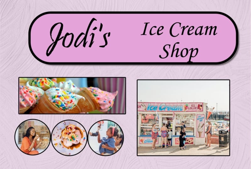
to use affinities other tools like adding shapes and text as we create a flyer for a fictional
ice cream shop. We're going to learn a lot
throughout this course. But one thing that we'll really focus on is how to use masks. Masks are difficult
for everyone, and you might not even
know what a mask is. But I promise by the
end of this course, you will be a mask master. Using your new
understanding of masks, you'll be able to
do incredible edits like replacing the sky on a dull photo or even giving your photo a
brand new background. We'll definitely be learning about a lot of new
tools in this course, but we won't just learn
how to use each tool. We'll also learn why and
when you would use them. That's why we'll
complete a series of real world projects
throughout this course. As we begin each project, we'll spend some
time making a plan of all of the edits
that we want to do. By making a plan,
you'll be able to see why we're making each edit. That way, you'll
know exactly how to do the same thing
with your own photos. Each project in this course, has been carefully
designed to bring together all of your
affinity skills. By the time you finish
these projects, you'll feel completely
confident in your affinity abilities
and you'll be ready to take your new
skills into the real world. But before we dive
into affinity, I want to mention that
this course comes with example photos that we'll be
using throughout the course. I encourage you to download and use these photos
because practicing what you learn is
the best way to retain all of these new skills
that you'll be learning. You can download these
photos in the next section, and then you're ready to start
your journey of becoming an affinity photo master.
Let's get started.
2. Download the Class Files: Before you begin this class, I recommend you download
the exercise files. These files will be necessary for you to follow along with the tutorials to
download the files, come to the project
and resources tab. Then click on the download link. The files will
then be downloaded to your computer and you'll be totally prepared to follow along with the
rest of the class.
3. Affinity Photo Overview: In this chapter,
we're going to learn the foundational skills you
need to use Affinity Photo. We'll start from the
very beginning and work our way up to
editing a simple photo. This is going to be a lot
of fun and I know you're going to learn a lot.
Let's get started.
4. Opening Photos, Saving, & Exporting: Welcome to Affinity Photo. When you first
open this program, your screen will look
something like this. In this video, I'm going to show you how to open up a photo, how to save all of the work that you've
done on that photo, and how to export
your final product. To begin, we'll need
to open a photo. Let's go to the
top of the screen and then click on
where it says file. Then you can come on down
here to where it says open. Now you can navigate to the
photo that you want to open. Right here, I'm in
the exercise files that are included
in this course. You can download
these exercise files in the second lesson
of this course. Each of these folders represents
a chapter of the course. Right now, we're in the Affinity
Photo overview chapter. I'll go ahead and double
click on that folder. Now you can see
all of the photos that we'll be using
throughout this chapter. If you want to open
a photo in affinity, all you need to do is select
it and then press open. Or if you want to open
more than one photo, you can hold down shift on your keyboard and select
multiple photos to open. Then you can press open. Great job. Now we've opened both of these
pictures in affinity, but we only see one
photo right now. That's because affinity opens each new photo in
a separate tab, similar to how your
Internet browser will use multiple tabs
for different websites. We can jump back
and forth between these two tabs by
clicking on them, or if you want to
close one of the tabs, all you need to do is press on the x that appears on that tab. If you're on a Mac, your x
will be over here on the left, and if you're on a PC, your x will be over
here on the right. I'll just click to
close this one. Now we're left with the photo that I wanted to
use for this video. Throughout the rest
of the course, we'll take a deep dive
into how to edit photos. But for right now, we're not going to go into too
much detail with that because I just want to show you how you
can save your work. For demonstration purposes, I'm going to come over
here to our adjustments, and I'll quickly add a
black and white adjustment. Now I've done an
adjustment to our work. How can I save this
file just like this and then come back to
work on it some more later. That's where saving
comes in handy. To save your work,
all you need to do is go to the top of
the screen to file, and then click on Save as Now you can navigate to where you want
to save it on your computer. You can give it a new name, and then you can go ahead
and save your work. By saving an affinity file, all the edits that you've done to your photo will be saved, and you can come
back to continue editing at any time
that you want. All we need to do to reopen that file is to come up to the
top of the screen to file, then press open, just like we did with the
picture previously. Then you can navigate
to that edited picture and open it up. You can see that all of our
edits are still intact. This is super useful when you're working on a big project and you want to be able to
come back right into affinity and pick up
where you left off. Saving is great for coming
back to finish your work. But if you're done editing and you want to share
your finished work, all you need to do is come
to the top of the screen, click on file, and then come
down to where it says port. This port menu will pop up, and it will give you a
few different options that you can adjust
for your photo. From here, you can choose
which file type you want. By far, the most common file
types are JPEG and PNG. PNG is used when your photo
has a transparent background, which we'll learn about
later on in the course. A JPEG is what you'll use
most of the time though, because it keeps photos
looking nice and sharp while reducing
their file size. I'll go ahead and select
JPEG for this one. You can see that the
estimated file size for this photo is 1.28 megabytes, but we could actually
reduce the quality slider. I'll reduce bind to 95, you can see that now our
photo is 700 kilobytes, which is quite a bit smaller. This will take up less
room on your computer. If you zoom in here,
our photo still has quite a bit of detail
and looks really good. I'd actually be surprised if
you could see a difference between 100% quality
and 95% quality. I like to do this to
photos when I want to save space because it's really hard to tell
a difference in that file size just saves a lot of space on your computer. Once you have all of these settings edited
the way you want, go ahead and press port. Now you can choose
where you want to save the photo and you can rename it. Then press save. After you've exported the JPEG, you can share your beautiful
photo with anyone you want. That's the very basics
of how to open a photo, how to save your work,
and how to export it. Now that we understand
all of that, let's set up for the next video. I'll come to the top of the
screen to where it says file. Then I'll come down to open. I'm going to open up
photo number two. Okay. And now that that's open, we don't need this one anymore. I'll go ahead and
close out of this. Sure, I'll save that
work. All right. And now we have our next photo. With all that setup, I'll
meet you in the next video.
5. Affinity Photo's Workspace: Let's learn about affinity
photos workspace. We have four main areas. We have the photo
workspace in the center. We have a tool bar at the top. We have the studio
panels on the right, and the tools on the left. The photo work space in the center is pretty
straightforward. It's where we can see the
photo that we're working on. But let's take a closer look
at the other three areas. Here, we have all of the
tools in Affinity Photo. We'll learn how to use these
tools throughout the course. But for now, I just want to highlight one important concept, which is that each
tool comes with different settings
that you can modify. These settings will change
up here in the toolbar. As I click on these tools, you can see these
settings change. This tool bar is
changing based on the different options that
are available for each tool. Along with these settings
that change up here, we also have this toolbar up here and we'll go over
this a bit more later on. Finally, let's take a look
at our studios over here. This area is very
full and a little bit messy and hard to
understand. But don't worry. We're really going to simplify
this for this course. There are around 30
different panels in affinity photo and they offer a wide range
of functionality. You can navigate between them by clicking on their
name up at the top. Here's just a few of those. You might be thinking, this
doesn't look like 30 panels, and that's because they're
not all displayed here. You really won't use
most of the panels. By default, affinity
hides most of them. In fact, throughout this course, we really only need to
use two of the 30 panels. The two panels that I
like to keep out are the layers panel and
the color panel. Let me show you how to set up your panels the way
I like them set up. First, I'm going to click
on one of the other panels. Then I'm going to
drag it out here. Then I can press on the
x to close out of it. So now we just have the
color panel up at the top. I'm going to
continue to do this, getting rid of all
of the panels. Okay. Until we're just left
with the layers panel. Then we actually don't need any of these panels down here. You might be wondering though how to get those panels back. If you ever want to add a panel, just come to the top of the
screen and click on window. Now you can see all of the different panels that
are available to you. Let's say you want to
use the brushes panel. All you need to do is click on that and now it
appears right here. If you wanted to, you could put it right up here next
to the color panel. I'll go ahead and
remove that though, but that's how you add
your panels back in. If you ever want to completely reset the studio panels
back to the default, go to Window, Studio,
reset Studio. One last thing that I
like to change about my studios is I want to
adjust the color panel. We'll go over this
more a bit later on, but I'm just going to come
up to this hamburger menu here and I'm going to change
it to the color wheel. If your wheel looks a little
bit different than mine, sometimes it might
look like a square. Just come up one more time to the hamburger menu and
select the triangle. I almost always keep my panels
looking just like this. Once you've set up your
panels in this way, affinity will remember
how you like them. Every single time you
open the program, it'll look just like this, which is super nice. To make following
along with me easier, I suggest that you also change your panels just like
this on your computer, the way I have it set up here. Once you've done that, I'll
join you in the next video.
6. Mac vs. PC: Let's talk about Mac
versus PC computers. Now, I don't want this to be any controversial video pitting one computer user
against another. But I do want to mention
before we get too far into the course that I
am working on a Mac. If you're working on a PC, affinity photo will look ever so slightly
different for you. For example, we already saw
that when closing a panel, Mac computers have
the X on the left, and PCs have the X on the right. Or when we talk about
adjustment layers later on in this chapter, you'll see that to
close the dialog box, Mac computers have a red dot that you click on to close
out of the dialog box, and PC computers have
an x on the right side. Both of these do the
exact same thing, which is close the dialog box, but the buttons are just styled
a little bit differently. The biggest difference though, is with keyboard shortcuts. We won't use too many
shortcut keys in this course, but there are a
few important ones that we'll practice using. If you're on a Mac, you'll
often need to press the keys Command or option to
use shortcuts in affinity. These buttons are right next to the space bar
on your keyboard. If you're on a PC,
you'll use control or Alt Command on a Mac is the same as control on a PC and Option on a Mac is the
same as Alt on a PC. Throughout this course, I'll say the key for both
operating systems. I'll say something like press
Command or Control zero. Meaning that you'll
press command zero, if you're on a Mac or control
zero, if you're on a PC. I really wish that the
Mac and PC versions of affinity were 100% identical, that would make
things a lot easier. But now you know the
difference and you shouldn't have any problem following
along with this course. In the next video,
we'll learn how to use a few navigation tools in
affinity photo. Okay. What?
7. Navigating in Affinity Photo: Let's learn how to navigate
an affinity photo. If you have a track
pad on your computer, then your track pad
will work as expected. Just zoom in and you can
zoom out in the same way. If you use two fingers, you can move around
your document. Now, if you're just
using a mouse, that's no problem at all. But there are a few
keyboard shortcuts that would be important
for you to know. One is zooming you can press command or control
plus to zoom in. Once you're zoomed
in, you can use the hand tool to click and drag around your
document to move it. Or if you have a
different tool out, you can press and hold on the space bar to bring
up the hand tool, and then you can click
and drag just as before. With any tool out, just press on the space bar to Zoom out, you can press command
or control minus. If you want the entire image to fill your screen perfectly, you can press command
or control zero. I use command or control zero, even though I'm
using a trackpad. It's nice to be able to
see the whole image again. If your mouse has a
mouse wheel on it, you can actually use
the mouse wheel to zoom in and out
of your document. If you'd like to
use this feature, you'll need to change your
tool preferences. On a Mac. This means you'll go to
the top of your screen, you'll click on the
name of the program, and then you'll click
on preferences. If you're on a PC,
you'll go to the top of the screen and press on edit,
then press preferences. Once you're in the
preferences menu, go ahead and select
the tools section. Then you can check on
Use Musewheel to Zoom. Now that we know how to
navigate around in affinity, let's talk about layers
in the next video.
8. Layers for Beginners: In this video, we'll
learn about layers. Layers are a very important part of affinity photo because they allow you to work
with multiple photos in a single affinity file. To help you understand
this better, I've made this collage. This collage is made up a
bunch of different photos, all placed on a single
piece of paper. In this collage, I can
move around any of the photos without
affecting the other photos. I could even grab one of the photos and drag it
completely off of my paper. But if I wanted it back again, I could drag it back on. I could even re
arrange the photos so that some of the photos
are underneath others. This collage is an
excellent representation of how layers work
in affinity photo. In affinity, we can place a
bunch of different photos, which we call layers onto
a single piece of paper, which we call a document. In fact, this collage I've
been showing you is actually just a zoomed in screencast
of an affinity photo file. Here in affinity, you
can see that each of these images has its own layer over here in the layers panel. Just like with the
actual collage, we can move around any layer in affinity photo independent
of the other layers. To do this, I'm going to grab the move tool with the layer that we want
to move selected, I can click and drag to
move the layers around. We can also turn any
layer on and off whenever we want without
affecting the other layers. To do that, just press on
this little checkmark. Now you can see that that
image does not appear, but we can turn it right back on when we want to
add it back in. We can even re arrange which layers are on
top of each other. All we need to do is click on a layer and then drag it
underneath a different one. Make sure that a
little blue line has appeared
underneath the layer. Then you can release your mouse, and now that layer has appeared underneath the other layer. This little blue line will indicate where the
layer is going to go. Now you can see that
this fire layer is underneath this car layer. We'll learn more about
moving layers and removing photos backgrounds
later on in the course. But I hope you're beginning to see how powerful layers are. The ability to edit
individual layers without affecting the other
layers is extremely useful. We'll be using layers all
throughout the course. One last thing that I want
to mention in this video is that you can have layers that
cover the entire document. A layer that covers
the entire document will affect all of the
layers underneath it. On the top of our
layer stack right now, I have a layer that's
covering everything. This layer is a photo
of a piece of plastic, if I turn it on, you can see how this layer affects all of
the layers underneath it. Because it covers
the whole document and it's the layer
that's placed on top, it's affecting everything else. But what if we don't
want the plastic to affect all of the
photos in the collage, as we've already seen, you can rearrange the layers by bringing one of the
layers above the plastic, you can see that this layer
is no longer being affected. Remember that each
of these layers is independent of
the other layers, but each layer will affect
all the layers underneath it. In the next video,
we'll learn about a special type of layer
called an adjustment layer. These layers cover
the whole document similar to this plastic and will affect the color and lighting of all of the
layers underneath them. Go ahead and keep this document open because we'll use
it in the next video.
9. What are Adjustment Layers?: This video, we'll learn
about adjustment layers. Adjustment layers are the bread and butter of affinity photo. These layers are how we change the color and the
lighting in our photos. They affect the appearance of all of the layers
underneath them. They're very powerful and are the most common type of layer that you'll
use in affinity. We'll be using them a lot
throughout this course. To see how adjustment
layers work. I'm first just going to select this plastic layer and I'll press on this
trash can to delete it. We won't be needing that now. To apply an adjustment layer. I'm going to click on
the adjustments icon, which is this little
half gray circle here. Now you can see all of the
adjustments in affinity photo. You don't need to worry
about what each of these do right now because for now, we're just taking a look at
how adjustment layers work. For our example, I'm going to
apply a vibrant adjustment. We'll learn a lot more about working with adjustments
in the next video. But for now, all I'm going
to do is I'm going to click on this saturation slider and
bring it all the way down. What this has done is it's removed all of the color
from our document. Every layer has become
completely desaturated. But that's only because this
vibrance adjustment layer is on top of everything. If I didn't want the word
camp to be black and white, all I would need to
do is click and drag it Until it's above the
vibrance adjustment layer. We can also move the
adjustment by clicking on it and dragging it
underneath other layers. Now you can see what's
being affected. The camp and fire layers are both on top of the
vibrance adjustment, so they both still
have their color, while everything underneath the vibrance adjustment
is in black and white. This is exactly what
happened when we moved the fire picture above the
plastic in the last video. We could take this
a step further and move the vibrance
adjustment layer until it's underneath almost
all of our pictures and only the hiking photo
is black and white. That's because that's
the only layer that's underneath the
vibrance adjustment layer. Just like any other layer, we can turn this layer
off if we want to see the color again and
we can turn it back on, if we want to apply
that adjustment again. We'll be working with layers and adjustments a lot
throughout this course. But for now, just remember
that adjustment layers affect the color and the lighting of all of the layers
underneath them. In the next video, we'll take a closer look at how to
use adjustment layers.
10. Working with Adjustment Layers: This video, we'll take a closer look at how to
use adjustment layers. We'll learn about more powerful adjustment layers in
the next chapter. But for now, we'll
practice working with adjustment layers by applying
two simple adjustments. The first adjustment
we're going to apply is the brightness
and contrast adjustment. The brightness slider will
brighten or darken your photo. I think that a little bit of brightness looks pretty
good for this photo. The contrast lider adds
or removes contrast. You can see this as you
slide the slider up, the dark areas of the photo get darker and the bright areas
of the photo get brighter. If you move it the other way, the image becomes more flat, so the darks get lighter and
the light parts get darker. I think every photo looks pretty good with a little
extra contrast. I'll go ahead and move that up. As we saw before,
Mac computers have a red circle on the left to
close the adjustment box, and PCs have an x on the right. They both do the same thing, which is closing the dialog box while keeping all of the
changes that you made. Just so you know,
there's no save button. All your changes
are automatically saved when you close the box. We can check this layer off to see how our
image looked before and we can check it back on to see the difference that
this adjustment is making. The brightness and contrast
looks pretty good right now, but I think we can make
this photo look even better by enhancing
the color as well. Could we can apply as many
adjustment layers as we want. Let's go ahead and apply a
vibrance adjustment next. We have two sliders here,
vibrance and saturation. The vibrant slider
will make all of the less vibrant colors in
your photo more vibrant. As I bring this up, you can see that duller color areas like this duller green
color in the back becomes more saturated
as I raise this up. It's a much more subtle slider. We also have the
saturation slider, which is much more intense. Unlike the vibrant slider, the saturation slider
will make all of the colors in the image
more vibrant and saturated. You can see that this makes a really big difference
with our colors. Think I'll raise this
up a little bit. I'll also raise the
vibrant slider. Then I'll close out
of this dialogue box, and we can see the difference. Here's the before,
and here's the after. We made our adjustments and
they both look pretty good. But what if I want to
change the sliders again. All you need to do is
click on the adjustment layers icon over
here on its layer, and then it will reopen the dialog box with
all of the sliders. I think I made this
a little too bright, so I'll just bring down
the brightness slider. This is very useful
because it lets us go back and improve any of our
changes whenever we want. I want to show you
the difference that both of these layers made. You can select
multiple layers at the same time by clicking
on the top layer, then holding shift and
clicking on the bottom layer. Now I can turn them both
off to see the before, and here's the after. As you know, we can turn layers on and off
whenever we want. But if you want to
completely delete a layer, you can delete a
layer by selecting it and then clicking on the
trash can as we did before, or you can have the layer selected and then press
delete on your keyboard. To undo that because I
did like those changes, I'm going to press
command or Control Z. I've pressed it twice, so now we have both
of those layers back. This was a great practice
for using adjustments. In the next video, we'll take everything that
we've learned so far in this chapter and
we'll put it all together in one
beautiful project.
11. Practice Makes Perfect!: Let's practice what
we've learned. We're going to start from
the very beginning in this video and go through the whole process of
editing a photo together. The first thing we need
to do is open a photo. I'll come to the top of the
screen and press on file. Then I'll press open. Then in this chapter
is exercise files, I'm going to click on the photo that says practice
makes perfect. Then I'm going to open that up. To make this photo
look a little better, let's apply a couple
of adjustments to it. First, I'll come to our
adjustments and I'll apply a brightness and
contrast adjustment. Then I'll go ahead and brighten this photo and I'll
add a bit of contrast. That looks pretty good. Here's what it
looked like before, and here's the after. Next, I want to adjust
some of the colors. I'll come to our adjustment and apply a vibrance adjustment. I'll start by bringing
up the saturation. I don't want to
take this too far so that her skin
looks too bright, but maybe about there. Then with the
vibrance adjustment, I'll go ahead and increase this. Here's what the colors
look like before, and here's the after. I think before I'm finished, I want to adjust
the brightness and contrast adjustment
a little more. I'll click on its icon
right here to open that up. Then I'm going to brighten
this photo a bit more. Yeah, that looks better. I think I need to reduce the contrast. Sometimes I personally
take the contrast a too far because contrast just
makes photos so better, but it's important not to take
your adjustments too far. I think this looks really good. I'll go ahead and select both of these layers by
selecting the first one, holding down shift and
selecting the last one. Then I can turn these
off to see the before. Here's the after. Wow,
that looks so much better. With just two adjustments, we've completely
transformed this photo. Next, I'm going to save my work so that I can
work on it later on. I'll come to the top
of the screen to file. Then I'll click on Save as. I'll go ahead and rename this practice. Then
I'll press save. Now I can go back at any time and re open this affinity file. That could be useful if I decide I don't
like how it looks. But right now, I think
this looks really pretty. I'm going to go ahead
and export this. I'll come to the top
of the screen to file, and then I'll come down to export I'll make sure that
I'm saving this as a JPEG. Then I'll go ahead and
bring the quality down. Right now, this is 4 megabytes. Let's go ahead and
bring that down. Now it'll only be 1.6 megabytes. Then I can go ahead
and export it, and I'll go ahead and
keep that named practice, and then I can press save. Great work on completing this first chapter
of the course. It's so exciting to see what
you've already learned. In this chapter, we dabbled
a bit with adjustments, but in the next chapter, we'll learn how to use even
more adjustments. Okay.
12. The Most Important Adjustments: In this chapter, we're
going to learn about the most important adjustments
in affinity photo. Now, that's a pretty big claim. There are a lot of
adjustments in affinity, but a lot of these
adjustments have overlap and they do
very similar things. We're not going to
cover them all. Instead, in this chapter, I'm going to show
you the best bang for your buck adjustments. The adjustments
that are the most simple to use well still being very powerful.
Let's get started.
13. White Balance: Let's learn about the
white balance adjustment. First, let's apply
the adjustment. I'll come to the
adjustments icon here, and then I'll apply
the white balance. The white balance
adjustment is meant for fixing images that have
color cast issues. Most of the time, the
yellow blue slider we have here is all you'll
need to worry about. But sometimes manmade
light sources can have green or
magentitans to them as well. When in doubt about whether your photo needs to have the
white balance corrected, try moving the slider back and forth to see
what looks good. As I make this warmer, we can see that really
doesn't look right. But as I make it cooler, it actually seems like
her skin tone is more natural and the atmosphere
around her looks more natural. This is what it was before, and I think that's
looking a lot better. We can also try adjusting
the tint slider, even though I don't think
we should move it too far. Here's going toward magenta and here's going toward green. I think I'll move it slightly
toward green because this tree behind her doesn't look green enough in
the original photo. I think I'll move
the white balance a little more toward blue. With that done, now you can see what this
looked like before, and here's the after. That looks so much better. Sometimes it can be
tricky to see if a photo needs the white
balance adjusted. But just applying the adjustment and playing with the
sliders a little bit can usually give you
a pretty good idea on if this will
improve your photo. If it's not improving it,
don't worry about using it. But this is a great tool
to have in your tool belt. In the next video, we're
going to learn about a very exciting adjustment,
the HSL adjustment.
14. HSL: This video, we'll learn
about the HSL adjustment. The HSL adjustment is similar to the vibrance adjustment,
but it's better. Let me show you how this works. I'll apply in HSL adjustment. In this dialog box, we have three sliders, hue, saturation, and luminosity,
otherwise known as HSL. Each of these sliders
has a different purpose for adjusting the colors. For the hue slider, this will completely
shift the colors. You can see as I
drag this around, all of the colors shift. To place it back in the center, I'll double click on the node. Next, we have saturation, which we've seen before in
the vibrant adjustment. As I increase the saturation, all of the colors get
boosted and as I decrease, it desaturates the colors all the way until
they're black and white. Last, we have the
luminosity slider, which makes colors
lighter or darker. For this photo, I
think I'll bring the saturation up a little bit. But here's where things
get interesting. What makes this better than
the vibrance adjustment is that you can edit each
color group separately. For example, we could increase the reds in this photo
and decrease the blues. To get into each of
these color ranges, you need to select
its color channel. I'll start by going
into the red channel. As I go into each
of these colors, the very first thing I
like to do is bring up the saturation slider so that I can see what's
being affected. You can see in this photo
that the red slider is mostly affecting her skin and
the wall behind her. I think I'd like to increase the saturation but
not quite that high, just to boost the reds. I can also adjust
the hue slider. Now, for skins, this
can get pretty tricky. But if you adjust it a
little bit to the left, you start to add a bit more
yellow and green to the skin. As I shift it a little
bit to the right, it starts to add more magenta. If the skin is looking
at off in color, this is a good slider to use. I think I'll adjust it just
a tiny bit over to the left. Next, I'll go into the yellows and I'll bring this
slider all the way up. What might be surprising
is that all of the green plants have quite
a bit of yellow in them. This actually happens a lot in nature where you see green
grass or green trees. A lot of it is actually
yellow and green. I'm going to go ahead and increase the hue to bring
out the color of the plants. But I'm going to
shift the hue of these yellows to make
them even more green. You can see that as I
shift it to the right, the plants become more red. As I shift it to the left, the plants become more green until they eventually turn blue. I don't want to take this
too far because you can see this is starting to affect
her skin and her hair. That's one thing to be careful of with the yellow channel. Often, the skin tone
is red and yellow. I'm just going to shift
this over just like that. Next, I'll go into
the green channel, and I'll bring the
saturation all the way up. We can see that
this is affecting the other parts of the plants. I'll go ahead and
increase that saturation as well to boost those colors. I think I'll go ahead and
make this a little bit more green by shifting the hue
over to the left side. In addition, I think this is the first time I want to
use the luminosity slider. I don't often raise the
luminosity because it tends to wash out your colors and make them a little
bit unnatural looking. But I think I will darken a bit just to add a little
bit of depth to those areas. Here's what we have going
so far before and after. You can see that by individually
adjusting each color, it's already starting
to boost the colors. Let's move on to the
cyan channel next. I'll increase the
saturation slider. You can see that this is
mostly affecting her clothing. I think her clothing is
a pretty big focus in this picture because she's
really dressed up quite fancy. I'm going to go ahead and
increase that saturation. But I don't think I
want to adjust the hue. I want this to how it's supposed
to look for this photo. Then I'll go over to the blue
channel and raise this up. You can see that
again, this blue is mostly affecting
her clothing. I'll go ahead and increase
that saturation as well. Last, I'll come to the magenta
channel and raise this up. Not all photos have
all of the colors. In this case, the
magenta is really just showing that one area
on her clothing. I think I'm going to double click to reset
that back to zero, and I'll leave that alone. At this point, I've adjusted
every single color channel. Now we can see the
complete before and after. The colors have really become much brighter
in this photo. But it might be a
little bit too intense. This is something
that beginners to affinity photo have a
bit of trouble with, and even I still have a
bit of trouble with this. Sometimes I get so excited about my adjustments that I
make them really bold, but it doesn't actually
look that natural. A quick trick to just keep
yourself in line a little bit. Is lowering the opacity
of your adjustment layer. Lowering the opacity will
help your layer to appear a little bit more transparent so that your adjustments
aren't quite as intense. You can do that by coming
right here to where it says opacity and make sure you
have that layer selected. Then you can click and drag on the word opacity to lower
the opacity of your layer. As I lower this,
you can see that the opacity of that layer
becomes less and less visible. Another way to adjust this is to click on this arrow
and use this slider. But I find it faster just to
click on the word and drag. I'll go ahead and lower
this down just a little bit to make my adjustment
a little less intense. In addition to
lowering the opacity, keep in mind that if
you ever want to go back and change anything
about your adjustment, you can click on the icon to open up the dialog box again. However, one thing
to keep in mind when you reopen your dialog box, especially in the
HSL adjustment, is that the last
color channel you had selected will still be selected. Honestly, I find this very frustrating because
I'll often want to go back and just lower
the overall saturation. But when I do that,
nothing happens, and that's because the magenta color channel is still selected. Just make sure that you're
in the right color channel, and then you can go ahead and make any adjustments
that you need to. We're all done
with that. I think this photo looks really nice. In the next video, we'll
learn about how to make beautiful black
and white images.
15. Black & White: Let's learn about the black
and white adjustment. So far, we've been
working with color. But what if you don't
want color in your photo? Let's go ahead and apply a
black and white adjustment. Okay. So just like that, we have a black and white photo. But you can see
that the dialog box has quite a few sliders in it, so we can actually do a
bit more customizing. Each of these sliders
represents a color, and you can adjust how dark or bright different colors
look in your photo. For this farm photo, you can see that we
have a red barn, lots of green nature
and a blue sky. As I adjust these sliders, we can keep that in mind. I can make the red parts
brighter or darker, which is mainly just
affecting the barn. I'll go ahead and
brighten that a little bit to make it more
of a focal point. Since I made the barn brighter and I want this to stand out, I think I should make all of the surrounding areas darker. This will create contrast and really help it
to stand out more. You can do this opposite
as well by making the barn darker and
everything else lighter. But in this case, I
think I'll just go ahead and keep the barn
looking nice and bright. Then we can move on to yellow. So as we saw before, yellow often can affect
a lot of nature colors. So a lot of the green and nature is actually a
bit of yellow as well. To make this barn
stand out more, I'll go ahead and
darken the grass. Next for the green, I can
bring this up and down. And we can see that again, this is affecting all of the
nature parts of this photo. I'll go ahead and bring
this down a little bit. Next, we have Cyan, which you can see is
affecting the sky. As I make this lighter, a lot of the detail of the cloud
starts to disappear. As I bring it darker, you can see a more intense
ominous looking sky, which I think looks pretty cool. I'll go ahead and
bring the slider down. For the blues, this is
also affecting the sky. I think I'll go ahead and
make that darker as well. Let's see if this
photo has any magenta. I'm not really seeing anything, so I'll go ahead and
leave that just set to its default 100%. Now we can go ahead and see, here's what our image
looked like before, and here's the after with our beautiful black
and white adjustment. This was super simple to
customize each of the colors, and I think that
this is a lot better than just bringing
down the saturation. We're able to really pick out what areas we want to stand out. In the next video, we'll move on and learn about the
levels adjustment.
16. Levels: This video, we'll learn
about the levels adjustment. There are a lot of lighting
tools in Affinity Photo. We've already learned about the brightness and
contrast adjustment, which has two sliders,
one for brightness, one for contrast, and
it's very simple to use. But my favorite
lighting adjustment is actually the
levels adjustment. The levels adjustment
does a great job of balancing simplicity
and control. So unlike the brightness
and contrast adjustment, the levels adjustment gives you a lot more control and has
quite a bit more sliders, but it's not too
difficult to use. I find that I'm
gravitating toward this one quite a bit as
I'm editing photos. The levels adjustment allows you to adjust the
bright parts of your photo and the dark parts
of your photo separately, which is very useful. When you first open up
the levels adjustment, you're greeted with
this dialog box. At the top, we have a histogram, which represents
the distribution of colors and light
in your photo. The red green and
blue is the colors while this white part
represents all of the lighting. Then underneath that, we
have five different sliders. We'll go over each
of these sliders in this video and why you
would want to use each one. First, we have the
black level slider. As I bring this over, You can see that the dark
shadows get even darker, we're adding black to the
darkest parts of our image. It's creating a
beautiful contrast. You might notice that here, it looks the best. If you look up at the histogram, that lines up exactly with this darkest
part of our image. All of the darks are
represented over here and all of the lights
are represented over here. As I dragged that in, we've closed into this darkest
part of the histogram. And that's actually
where it looks the best. This is a very useful
starting point and you can continue to
adjust in that range. But usually, you'll want
to pull your black level over until it's touching
this edge of the white. That's the black level slider. Next, we have a white level,
which is the opposite. This adds white to the
brightest parts of the image. Again, I think I'm going
to drag it to about there. Right where it starts to touch the white part of this graph. I find this really helpful and it's just a nice guide
to keep in mind, if you're having a little bit of trouble with these
first two sliders. The next slider is
the Gamma slider. This slider will brighten or darken the mid tones
in your image. This slider works as an extension of the black
and white level slider, and it might act a little bit
differently than you think. When we pull the black level
slider over to the right, it's darkening the photo, which is the same
thing as when we pull this gamma slider
over to the right. It begins to darken the
mid tones of the image. When we pull the white level
slider over to the left, it brightened the image, and that's how the gamma
slider works as well. This gets brighter to the
left and darker to the right. I think this image
actually looks pretty nice with a
little bit of darkness, so I'll pull that over. Last, we have two more sliders, the output black level and
the output white level. These sliders are
the exact opposite of the black and
white level sliders. Instead of adding
black to the image, the output black level
actually takes away black. As I pull this over,
we start to get a more flat grade out image. The same thing happens as I pull the output white
level slider over, we start to get a
darker duller image. I tend to not really touch these sliders for the most part, but they actually
do have a use later on in the course when we
learn about compositing. But for now, I would
say to not really touch these sliders as they do take away contrast and
flatten out your image. Mainly, you're just
going to worry about these first three sliders. In this case, I think
it really improved the image. Here's the before. Here's the after. I love
adding contrast to images, and I think this looks so good. If you feel that this
looks a bit too strong, remember that you can
always lower the opacity of your layers to
reduce the effect. All right. Great work
on this chapter so far. Now you know how to use four
very important adjustments, the white balance adjustment, the HSL adjustment, the
Black and White adjustment, and now the levels adjustment. For these last two
videos of the chapter, we'll use all of
these adjustments to complete two projects. We'll start with
a black and white project in the next video.
17. Black & White Practice: In this video, we'll complete a black and
white project together. Let's start by adding a
black and white adjustment. For this image of the rabbit, I want to make the rabbit
stand out from its background. Right now, it's really
blending into the background. Just like with the farm
picture from earlier, we can make the rabbit nice and bright against a
dark background, creating contrast,
or we can make the rabbit darker against a
nice and bright background. I think generally I like to make things brighter
to stand out. For this image, I'm going
to make the rabbit look nice and bright and the
background look a bit darker. For each of these sliders, I'm just going to
slide them down and up to see what
the difference is. This is affecting part
of the background. I'm going to drag this down and I'll also
drag down the yellow, and I'll drag the green
down just a little bit. I don't want to drag
it so much that it's a black background because
that looks a bit unnatural. But I'm just trying
to do a little bit of darkening for the cyan. It looks like this is affecting
the rabbit a little bit. I'll go ahead and bring this up. The blue slider is also affecting the rabbit
and I'll bring that up. It looks like the magenta is affecting this part
of the rabbit's ear. I had to slide that
up and down quite a few times to see what
was being affected. I'll go ahead and
bring that down. I wanted to use this
picture because it was harder to see the colors
than the farm image. In this picture, we have
brown, green, and gray. All of those color
sliders were a little bit tricky to predict
what was going to change. In the farm picture, we
had a very clear red, green, and blue area. It was a lot easier. But for this one, we
just needed to slide the sliders to see what parts
of the photo were affected. This is usually what
you need to do, and that works great. No worries if you're
not exactly sure what part of the photo will
be affected by each slider. We can easily just slide the sliders back
and forth to check. To finish off this project, let's apply a levels adjustment
to adjust the lighting. The black and white
adjustment allowed us to affect each
color by itself. But now with the
levels adjustment, we can affect all of
the highlights at once and all of the
shadows at once. This gives us more control
as we affect the image. I'm going to bring the black
level slider over to add a little bit more
contrast and I'll bring the white level slider over to brighten up the
photo even more. Okay. And with that,
I think we're done. Here is the before and after of this beautiful
black and white project. The next practice project
will be a little bit more of a challenge and we'll use three different
adjustments to fix it up.
18. Multiple Adjustments Practice: Let's use the adjustments that we know to fix up this photo. Right now, this photo
looks very dark and dull. Let's start with the
lighting to brighten it up so that we can see what's going on a little bit better. Go over to our adjustments, I'll apply a levels adjustment. I already know that I
want to brighten this up. I'm going to start by
moving the Gamma slider over and you can see how that just brightens
everything overall. Then I can come in here and
adjust the black white level. You can see the
histogram already has the black level really
pushed over to the edge. If I move this over, it very
quickly gets very dark. But I do think
I'll bring it over just a little bit to 1%. Then I'll move the
white level over. And you can see that makes
a really big difference. I'll move it to
right about there. Now we can see so far, here's what it
looked like before, and here's the after. Now that the picture is brighter and we
can see it better. I can tell that we
have quite a bit of blue going on in this image. I want to use a white
balance adjustment to fix that color cast because
there's a lot of blue. I'm going to bring it over to the orange yellow side
to add some warmth. I think I also want
to add a bit of green since there's quite a bit of green going on
in this picture, and I think that
looks pretty good. Now here's the before and after. I think her skin looks
a lot better now. To finish this off, let's add an HSL adjustment to
boost these colors. My goal for the image is
to draw more attention to our subject and less
attention to the background, especially this area
that's really far away. Starting in the
main color channel, I'm going to increase
the saturation overall. That looks pretty good. Then I'll go into
the red channel. It looks like the red channel
is affecting her skin, the dress, and a little bit
of the flowers around her. I'll increase the saturation. But I think I want to change
the hue of the dress. Using the hue shift slider, we can make it more purple or
we can make it more orange. I personally am a
big fan of orange. I'm going to nudge it over
to the left just a bit. I think I might have raised the saturation a bit too high, so I'll just scale
that back a little. Going into the yellows. The yellow channel has a lot of this greenery surrounding her, I think I actually want
to desaturate that a bit. I'm also going to nudge
it over more toward blue. I think I also want
to darken this area. Using the luminosity slider, I can make this into
a darker green. I think I like how that looks. Let's go into the greens next. Similarly, I'm going to shift
this over more toward blue. Maybe not quite
so far this time. I'll desaturate, wow, you can see what a
difference that makes. Maybe I'll just
desaturate a little bit. I'm also going to nudge the luminosity over to
darken those greens. With all of those
greens desaturated, you can see our model
really stands out. Moving on to the cyan
channel, I'll raise this up. Not much is being
affected that I can see maybe the background
a little bit. I think I'll go ahead
and leave that slider alone because I'm not
seeing too big of a change. Then I'll go to the
blues and raise this and we can see the
flowers are being affected. I think I want the flowers
to look a bit different. If I bring it over to the right, they turn a bit more if I
bring it over to the left, they look more pink and
I really like that. I'll bring it about there. I think I will raise the saturation just
not quite so high. Last, we have magenta, which should affect the flowers and a little spot of
her hair, I guess. I'm just going to raise
up the saturation and nudge them over to the left to make them look a
little bit more pink. I'm noticing a few areas back here that look
a little strange, and I think that
might actually be in the cyan color channel. I'll go back to that and desaturate and
darken this channel. I think that looks a bit better. With that, I just did a
lot of color adjusting. Let's see if that looks good. Here's the before,
and here's the after This was a little bit
of a different approach. I didn't brighten and
saturate every single color. It was a bit more strategic
by brightening up our subject and the flowers and then
desaturating all of the green. I think this made a
really big difference. I do think that I do want to lower the opacity of this layer. I'll just bring that down
to make it less intense. Now I can go ahead
and select all of my layers by holding
shift and clicking. Now you can see the complete
before and after. All right. Wow. Great work on this project. Look how much you
could already do. These adjustments
are so powerful. They're so useful and can
improve your photos so much. In the next chapter, we'll take everything
that we know about adjustments and learn how to apply adjustments to
just part of a photo. I'll see you in
the next chapter.
19. Applying Adjustments to Specific Areas: Let's say you have a photo where you really want to
brighten up the model, but keep the rest of
the photo the same. How do we only affect
part of the photo? Knowing how to selectively apply adjustments is the
key to great photos. Lucky for us, affinity has a nifty trick for applying
adjustments to specific areas. You're going to be
amazed at how simple this is. Let's get started.
20. More Than Erasing: This video, we'll take a look at how to remove part
of an adjustment. For this example, I'm going to come down
to our adjustment, and I'm going to apply
a recolor adjustment. Now, this isn't a very common
adjustment that you'll use, but this is just to
make it easier to show you what we're going
to do in this video. I'll close out of
this dialogue box. Now you can see that this
recolor adjustment has made our entire image,
this red color. But let's say that I
don't want the center of this image to be
recolored. What can we do? Well, let's just erase it. I'll grab the eraser
tool right here. Then I'll go ahead
and click and drag to erase over the
center of the image. But let's say that later on, we want to bring that red
color back. How do we? Unfortunately, there
isn't an unerased tool, but affinity has given us a different tool
that we can use, and we actually already have a hint on the screen
for what we should do. Do you see our recolor
adjustment layer? Right next to it, we have
this little icon here with a white area and a big
black spot in the center. That black spot represents
the area that we just erased. In fact, that black spot
is telling affinity not to display the recolor adjustment
and that blackened area. What if there was a way
to make that area white again to fill in
that black spot. Could we bring back part of the recolor adjustment
that we just erased? Yes. Yes, we can. All we
need to do is use the paintbrush tool to paint in white paint over
that black area. We'll cover the paintbrush tool in depth in the next lesson. But for now, you can just watch. I'm going to select
the paintbrush tool. Then I'm going to make sure
I'm painting in white paint, and I'll go ahead and paint to reveal the recolor
adjustment again? Now the icon next to the
recolor layer is totally white, and the recolor adjustment is visible everywhere
on the photo again. But here's where things
get really interesting. Not only can we bring back erased areas by
painting in white. We can actually erase areas
by painting in black paint. I'm going to switch my
paint color to black, and now you can see that I'm erasing the recolor adjustment. So now we've seen that the
paint brush can erase parts of an adjustment and bring
back erased areas. The paint brush can be used as an eraser and an un eraser. It's two tools and one. Knowing that you might wonder why you would use
the actual eraser. If you could just use the
paint brush for both. Well, to be honest,
the paint brush is so powerful that you'll actually end up
using it in place of the eraser for the vast
majority of the time, which is pretty cool. The only tricky part to remember is which
color of paint to use. Black and white paint is the language that
Affinity speaks, and it might take you a while to remember Affinity's language. Like to remember it by
thinking about how everything at night is black and
you can't see anything. In the daytime, everything is bright and white and visible. Black paint will hide
your adjustment, just like the blackness
at night hides things, and white paint will
reveal your adjustment, like how bright
white sunlight will make everything appear
visible in the daytime. Go ahead and keep
this image open. We're going to use it
in the next video. I'm just going to delete
this recolor adjustment. The next video, we'll learn how to control the
paint brush better. Then after that, we'll practice
using the paint brush to apply adjustments to
specific areas. Okay.
21. Paintbrush for Beginners: Let's learn how to
use the paint brush. First, let's get out
the paint brush. You can find this
tool right over here. Every time I bring up
the paintbrush tool, I like to add a new
blank pixel layer, which you can do by
pressing on this button. This will add an empty blank
layer and you can use this to paint on top of rather than painting directly
onto your image. Right now, we have a white
loaded into our paint brush, but you can change this
color from the color panel. Right within here, you can change this to any
color you want. You can click and drag on
this little circle right here and you can change
it to black by coming to this side
of the triangle, and you can see that
update right here. You can also change it to a bright red color if you want
and any color in between. To change the hue from red, you can click on this
outer circle here and bring it around the color
wheel to choose a new color. I'm going to change my
color back to white. You might be
wondering why there's a black circle behind
our white circle. That black circle is just a secondary color that's loaded into
our paint brush. You can access that color at any time by pressing
x on your keyboard. This will automatically
switch between those colors, and you can press x again
to bring up the white. This is super useful, especially when
you're erasing and unraing like we were
doing in the last video. You can have your
color set to white to erase and you can have it
set to black to erase. Before I talk about
these next settings, I'm just going to change my color to this
nice purple color. Now, let's talk about a few of the settings up here in
the context toolbar. There are a lot of
different settings you can use for
your paint brush, and I'm going to show you
the most important ones. First, let's start with width. Width is the size of
your paint brush. Right now, we have a
pretty large brush. If I wanted to, I could
change the width right here. I could click this and then
drag down on this slider. Now we have a much
smaller brush. We could also click and
drag on the word width, just like we clicked
and dragged on the word opacity earlier
to change the brush size. But the way I usually change my brush size is by using the bracket
keys on my keyboard. These keys are found next
to the letter P. You can use the right bracket key to increase the
size of your brush, and you can use the
left bracket key to decrease the size. This is a super easy quick way to change the size
as your painting, and I find myself using these
bracket keys quite a bit. So far, you know how to change the color and you know how to change the
size of your brush. But there's a few extra settings here that can really change
the look of your brush. I'm just going to make
my brush larger again. Then I'm going to show
you what hardness is. Right now, hardness
is set to 100%. That means the edges
of our paint brush are very hard and sharp. But if I drag this all
the way down to 0%, we now have a very soft brush. The edges are so
fuzzy and feathered and it can really help if you're trying to blend what
you're painting. I'll often have my
brush set to 0% if I'm doing a little bit more of
a free form flow painting, and I'll have a harder
brush if I'm trying to maybe write a word down
or something like that. Another setting
you might want to change on your brush is you might want to change
how much paint is being applied to your canvas, you can use opacity and flow
to change these settings. But I would only recommend
using one of these at a time because they do
totally different things. If you lower the opacity, and then you begin painting, you can see that only
a very small amount of paint is being applied. If I lift up my brush
and paint again, more paint is being applied. Every time I lift up my brush, I'm getting more and more paint, but you have to lift up
your brush to do this. I'll raise that back up to
100 and lower the flow. Flow is a bit
different and I find myself using flow
a lot more often. Because with flow, you don't need to lift
up your paint brush. You can just
continue to paint in the same area to make
it darker and darker. I find this to be a little
bit more natural feeling as someone who has
used paint before. The more you go over an area, the more color will be added. I find myself using
flow quite a bit. I'll go ahead and
bring this back up. I think I'll just leave
the hardness down for now. All of the settings
that we've talked about here are very useful and you'll probably
find yourself changing these settings for
a different situations. It can take a while
to get used to all of these different settings and find what works best for you. But after using the brush
throughout this course, you'll feel a lot more
comfortable with it. That's how to use and
customize the brush, but I still have one
more tip for you. I personally use a walkm
tablet when painting. I find it easier to paint with
than a mouse or trackpad. Now, buying a tablet is definitely not necessary
for this course, but it can be
helpful if you find yourself doing a lot of
painting while editing. This is the one that
I have from Amazon. Tablets can be a little
bit pricey, so again, it's not necessary, but it
is helpful to photo editing. Now that you know all about
using the paint brush, we'll use it as we do
some example projects in the next videos. Okay.
22. Lightening Part of a Photo: Let's lighten up
part of a photo. In this photo, I want to draw
more attention to the girl jumping and help separate
her from her background. To do that, I want
to brighten her up. Let's start by applying
a levels adjustment. First, I want to brighten her, so I'll go to the gamma slider and pull it over to the left. That's quite a bit brighter, but now the shadows look
a little bit washed out. I'm going to bring
the black level over just to bring
the shadows back. I think I'll also adjust the white level just to
brighten things up even more. Right now, our entire
image is getting brighter, but I only want the
girl to be brighter. I'm going to paint in black to remove the adjustment from
the surrounding area. I'll grab my paint brush. Then I'll make sure
that I'm painting in black paint to hide
this levels adjustment. I'll use the bracket keys on my keyboard to
increase the size. Now I can go ahead
and paint in black, and you can see that the
adjustment is being removed. Now I've removed the adjustment, but I think I accidentally
removed too much. Now the girl isn't quite
as bright as I wanted her. I'm going to paint in
white paint on our model now to add the
adjustment back to her. With a smaller brush, I'm just going to come in here
and make sure that all of her hands and her her backpack, just to make sure
all of these areas are nice and filled in. Remember that if you
ever paint too much, you can switch your color by
pressing x on your keyboard. This is a super fast, easy way to quickly erase and un erase from
your adjustments. I think this is
looking really good. Here's the before and
here's the after. It looks like I painted a
little too much right there. I'll switch my color back
to black by pressing and I'll just remove that
brightening from that area. Okay. All right. Let's see how that looks. Here's the before,
and here's the after. Our model looks so much brighter and that was
pretty easy, right? Just a little bit of painting on the adjustment can make
a really big difference. Let's do another practice
in the next video.
23. Adding a Bit of Saturation: Let's add a bit of
saturation in this video. I love this beautiful picture, but I think that the skirt
could use a bit more color. It looks too muted right now. Let's add an HSL adjustment. I'll go to the adjustments and
apply that HSL adjustment. Whenever I need to carefully
paint an adjustment onto an area like we're
going to do in this skirt, I like to make the adjustment a little more extreme
than I normally would so that I can better see where I'm painting
on my adjustment. I'm going to go ahead and
increase the saturation quite a bit so that the
difference is more obvious. Now, we only want one small area to have the adjustment
applied to it. Do we really have to
paint away all of the rest of the image just to have the
skirt a bit brighter? That's so slow. Well, we actually
don't need to do this. We just need to invert
the adjustment, press command or control. Now you can see
that the adjustment isn't being applied to anything. If you look over here
in our layers panel, you can see that the adjustment has a black mask applied to it, meaning that it's
fully not visible. By the way, this
black and white area that you can see on our
layer is called a mask. We're going to talk a lot more about masks later
on in this course. But I just wanted to let you
know that this is called a mask and you'll hear me call
it a mask as we go along. Like I said, the mask
right now is black, meaning that it's fully not
visible to reveal it again. All we need to do is paint
and white on this layer. I'll go ahead and
grab my paint brush, and then I'll change
the color to white. Then I can just zoom
in and begin to paint. Remember that you can
use the bracket keys on your keyboard to adjust
the size of your brush. If you ever paint too much, you can always press x on
your keyboard to switch your color to black so that you can erase from
the adjustment. Then you can press x again
to begin painting in white. My strategy when painting
an area like this is to use a small brush to paint an
outline around the entire area. Then I'll go back
with a bigger brush and fill in the middle. I just finished my painting. I think this looks really good, but a bit too saturated. Now we can go back and click on our adjustment icon to
open up the dialogue box, and I'll just bring
down the saturation. I think I like how it
looks about there. Let's see how this looks. Here's the before and after. Now, it does look like she's
sitting in some shadows. Maybe I should lower
the opacity of this layer just to
reduce that even more. Here is the before and after. Beautiful. Good work
on this practice. We'll do another one
in the next video.
24. Darkening Part of a Photo: Let's darken the
edges of a photo. I want to darken the edges
of this photo to help our subject and the fruit that she's picking to
stand out a bit more. Let's start by adding a
levels adjustment to darken. I'll go ahead and bring the gama slider over to the right
side to darken this. Now that everything's
a bit darker, I'm going to balance that by bringing the
white level over, you can see that that just
adds a bit of contrast, but the edges are
still nice and dark. After darkening with
that levels adjustment, you can see that the
whole photo got, but we don't want
the center to be darkened. What should we do? Well, let's go ahead
and erase the center. I'll grab the paint brush. And to hide this
levels adjustment, I'll make sure that
I'm painting in black. Then I'll begin to
paint over our subject. This might seem a bit
strange at first. As we paint in black paint, our photo becomes brighter, and if we paint in white, our photo becomes darker. That's because
painting in white or black on an adjustment has absolutely nothing to do with making the photo
brighter or darker. White and Black are simply
affinities language for erasing or un erasing parts
of an adjustment layer. Since this adjustment layer
is darkening the photo, painting in black
will erase that darkening and make
the photo brighter. I know that's a
little confusing, but that's why we're practicing. The more we practice this, the more natural it
will feel to you. Let's take a look at our photo. Here is the final
before and after. I love the contrast
that this adds to the photo and it really helps
our subject to stand out. In the next video,
we'll learn how to gradually paint on an
adjustment using flow.
25. Adding Gradual Light: Let's add gradual
light in this video. By using a low flow paint brush, we can gradually paint
light onto areas. In this picture, I want to
brighten up the face and add even more brightness to the hair so that we can
see the detail better. Let's go ahead and add
a levels adjustment. Whenever I know that I'm going to use a low flow paint brush, I like to make a very
extreme adjustment. That way I can paint it on and build up the
effect more and more. Let's make a very bright levels. I'll bring the gamma
slider over quite a bit. I'll bring the white level over a little bit to balance it out, I'll bring the black
level over slightly. Since I only want to paint
this on a few small areas, I'm going to invert
this adjustment with command or control. Now our adjustment is being applied to nothing.
It's fully black. I'm going to grab
the paint brush tool and I'll make sure that I'm
painting in white paint. Then I'm going to bring
the flow down quite a bit. Now that we have
our very low flow, I can gradually paint
on our subject. I'm just going to lightly
go over the face. I'm only going to
paint on it one time. I think that gradual
light looks pretty good. Here's the before and after. But I don't want to
brighten the lips too much. They're starting to
blend with the face. I'll switch my color to black and using a
small paint brush, I'll just paint this
off of the lips. Switching back to a white paint. I'll press x on my keyboard. Now, I'm going to gradually build up
light in a few areas. I like to do this with hair by painting on all of the
highlights that I see. On all of the bright
areas of hair, I'm just going to go
back and forth with my small paint brush to add even more light
to those areas. This is going to add some
nice contrast to these areas. The dark parts will
look even darker because the bright parts
are so much brighter. Then I'm just going
to go in here and add a bit more
light here and there, and I'll add a bit more
light to the beard. Now we can see here's
the before and after. This is a very subtle change, and I like how much control we have to paint the light
only where we want it. Now that you know a lot more
about painting adjustments, we're going to do a bigger
project in the next video.
26. Applying Layered Adjustments: In this video, we'll paint
on multiple adjustments. We aren't limited to painting
on just one adjustment. We can do as many
adjustments as we want. I'm quickly going to write out a plan for what we're
going to do in this video. I have a new pixel layer here, and I have a paint brush
with full flow and hardness. In this picture, as usual, I want our subject to stand
out from the background. I'm going to darken
the whole background. I also think that
I want the grass to appear a little
bit more green. I'm going to add some
green to the grass. I also want to brighten up our subject to help her
to stand out even more. We'll go ahead and brighten her. I really like the
detail on her shirt. I'm going to make
sure to add contrast here so that we can see all
of these beautiful details. Now we have a pretty good plan. I like to think things
through like this before I dive into
a big project. We're going to use
quite a few layers, and I just want
to make sure that I'm going in the
right direction. Let's start by selecting
the background layer. Let's go ahead and
darken the background. I'll add a new
levels adjustment. Then I'll go ahead and darken the gamma slider by bringing
it over to the right side. Another trick you can use
if you want to darken an area is to use the
output white level slider. Since this grays out your
brightest parts of your image, this will also add
some nice darkness. I just want to bring
this a little was down. Right now, this levels
adjustment is darkening the entire photo and I want to remove it
from our subject. I'm going to make sure I
have my paint brush out. Then I'm going to lower
the hardness all the way. I'll go ahead and
keep the flow up. Then I'm going to
change this color to black so that I have black
and white paint here. I'm just going to paint
in black paint over our subject to remove this
dark levels adjustment. I'll just turn this layer off to make sure that
this looks good. Now we have a beautiful
dark background. Let's check in with our plan. We darkened the background. Next, I think I want to
do the HSL adjustment. I'll go ahead and add that in. Now we're going to
adjust the grass. I want this grass to
be a bit more green, a bit less yellow. To do that, I'm going to
go to the yellow channel. You see how this is
affecting most of the grass. I don't want it to
appear this yellow. I'm going to bring
the huge shift slider over toward green. I think I also want
to desaturate this. I don't want it to stand out
as much as it is right now. I think I'll also darken this. This is only supposed
to affect our grass. But as you can see, there's
more yellow in this picture. The whole image is getting a bit washed out,
especially our subject. I'm actually going to invert this adjustment with
command or control. Now it's being
applied to nothing. I'll go ahead and paint
in white paint on our black mask so that this is only affecting the grass
where I want it to. I want to be extra
careful around our subject because I don't
want her to become green. I won't paint this over
this area back here, even though these
are green trees. I like that they have
a bit of yellow to them from the sun
shining on them. I think this looks pretty good. Here's before and after of
making the grass more green. Next, let's use a low flow to paint brightness
on our subject. I don't want to brighten
every area, the same amount. I mostly want to brighten
up her hair and her skirt. I'll go ahead and add
a levels adjustment, and then I'll bring the gamma
slider down to Brighton. I think to add some
more contrast back in, I'll bring the black level
slider over a little bit. I don't want the shadows of her skirt and hair to
become washed out. Since I'm only applying
this to a small area, I'm going to invert this adjustment with
command or control. Now with white paint
and a lower flow, I'll just bring that down. I can go ahead and apply this
gradually to a few areas. I'm going to add
some brightness to her hair so that we can see
more of the texture here. And then I'm just very lightly
going to go over her face. Then I'll go ahead and
brighten up her skirt. With a smaller brush, I'm going to go
over the highlights of her skirt, a
little bit extra. Anywhere where I
see a brighter spot from the wrinkles or
anything like that, I'm just going to add a little bit more
brightness to that area. This will be subtle,
but here's the before and after of that. And as one last adjustment, I want to add more
contrast to our model, especially to her
beautiful shirt. I really want to see all of
those details stand out. I'll add another
levels adjustment. This time we're trying
to add contrast. I won't worry about
the Gamma slider, but I will bring the black level in to darken the shadows, and I'll bring the white level in to brighten up
the highlights. I don't want to bring
the white level too far over or we start to lose detail. You see how these highlights
are now blown out. I'm just going to bring
it over a little bit. Then I'll press
command or control I to invert this so that I can paint it just over her shirt and maybe a
little bit on her face. I'll bring the flow
up all the way. Then with a bit of
a larger brush, I'll go ahead and paint this over the details of her shirt. Here's the before and
after of her shirt. I think that looks really nice. Now with a lower flow, I think with a larger brush, I'll just click once on her
face. Maybe one more time. This will just add a
little bit extra contrast so that we can see all of her facial features a bit better. Here's the before,
and here's the after. It's very subtle,
but I do think that that does add something
special there. I think I've added
everything that I originally wanted
to for our plan. Now it's time to go back through our layers and make sure
that they look good. For example, I
think that I missed a few spots around her
legs for the green grass. I'll go back to
the HSL adjustment and with white paint
and full flow. I'll go ahead and
use a smaller brush to add those areas in. It's important to
remember that you can always go back to adjust
any of these layers. I think that looks a lot better. As a reminder, make
sure that when you're going back to adjust
any of these things, to have the right
layer selected. It's a super common mistake for new users to not have the right layer selected
while painting. Double check every time to make sure you're painting
on the right layer. Now that I'm looking at all
these adjustments again, I think I want to
bump up the contrast even more on our last
adjustment here. I'll click once on this
levels adjustment here. I think I'll bring the black
level over a bit more. Just to highlight the shirt. And I'll bring the white level over a little bit more as well. With that, we are done. What a huge project. I'll select all of the layers by holding shift and
clicking on the last one. Now you can see it
complete before and after. Now you're really starting
to edit like a pro. Painting on adjustments is
so powerful and so fun. I really hope that you
enjoy this chapter. In the next chapter,
we're going to learn about some very
important tools to know.
27. The Most Important Tools: In this chapter,
we'll learn about some very unique and
important tools. We'll cover quite the
range of tools here from learning about shapes to
adding text and more. This will be a fun, different
chapter. Let's get started.
28. New Documents: Let's learn how to make
a blank new document. Before we learn about the
tools in this chapter, I want to show you how to
make a blank document. A blank document
will be very useful in demonstrating
these upcoming tools, and it's a great skill for
you to have because it lets you start off with a
blank canvas to work on. To create a new document, go to the top of the screen
to file, then press new. There's a lot of
buttons in this window, but here are the ones that
are the most important. First, you can change
your pre set category. Each of these
categories will create a document that's perfect
for a specific situation. For example, in the
print category, you can choose between documents that are different sizes, and all of them will be perfect for printing on
your home printer. For press ready, these
are documents that are ready and formatted to be printed on a commercial printer. In photo, these
documents will be the typical sizes
for printed photos. In web, this will be sizes that websites
will commonly use. And these last two,
I don't really use, but if this is important to you, we have a category for
commonly used device sizes. This will have screen sizes of devices like iPhones or iPads. Last, we have architectural, which uses sizes that are
commonly used in architecture. If I click on one of
these categories, it will bring us down
to that section, and then you can choose your
document size from there. This is a way to jump
around to the sections. But as you can see,
you could just scroll on this to get to
each of the sections two. Once you find a
size that you like, you can click on it, and
then move on to down here. Down here, we have a few more specific settings we can change. If you don't quite
like the size of this, but it's pretty close, you could click in this box
and type in a new number. The document will
automatically update up here. Let me do a more dramatic
difference to show you. Now you can see I made
the width much wider. This shows you the
exact dimensions that will appear once you
create your new document. You can also change the
document units if you'd like. Right now, we're using a
document from the web category. By default, it's using pixels. But if you wanted to, you could also see what
this equates to in inches, or millimeters. Another section you can
alter is the color section. This will automatically update depending on which
preset you use. In most cases,
this will say RGB, but it might say CMYK, which is for
commercial printers. You can change that
there if you need to. You can also check on transparent
background if you like. This is perfect for if you're
making a design that has a transparent background rather
than a white background. For our purposes, I'm going
to go to the print category, and I'll go ahead and choose A four Then I'll press Create. Now we have a blank canvas
to work with where we can add text and shapes
or even photos. For example, to add a photo, you can come to the top
of your screen to file, then place Then you can select a photo
you'd like to place. Press open. Now you simply can click and drag to add your photo
to your document. But I'll go ahead and delete
this so that we can have a blank document ready to
use for our next video. We'll learn more about layers, shapes, and text in
the next videos.
29. Working with Layers: This video, we'll learn
how to work with layers. For demonstrational purposes,
I'm going to select the rectangle tool and make three rectangles and give
each of them a unique color. We'll learn more about
shapes in the next video, but these will work well
for demonstration purposes. To move each of
these layers around, you can use the move tool. The move tool is
super useful for moving shapes as well
as resizing them, and we'll take a look
at that in a minute. But right now, as
you move the shapes, you might notice the shapes
snapping to each other. You see these red lines
guiding my shapes around. This is because I have the snapping feature
turned on up here. This allows me to line
the shapes up perfectly, and we can even center them in the document
if we want to. You can turn off snapping if you want to move your shapes
around more freely. Once you like how your shape is positioned in your document, you can lock it in place
by pressing the lock icon. This will prevent you from accidentally moving your shape, but you can still select and move the other shapes
that aren't locked. If you want to unlock your shape so that you
can move it again. You can just press
on this lock icon right here in its layer. Now you can move
the shape again. As I mentioned before, you can also use the move tool to resize and
reshape your layers. You can do this by using all of these little nodes on the edges. You can click and
drag on these nodes to reshape and
resize your layer. This is a very free flowing, easy way to resize your layer. But if you want to lock it proportionally to
where it started, you can press on shift. Now your layer is locked in
this proportional shape. Again, just hold down
shift as you click and drag and it will stay
perfectly in proportion. If you want to rotate
your shape around, you can use this
node right up here. Once your cursor turns from your normal cursor
into these two arrows, you can click and drag to
rotate your shape around. If you want your shape to turn exactly in 15 degree increments, you can hold down shift, and this will lock your shape
into those exact angles. You can have your shape
be exactly 90 degrees or exactly 45 or exactly back
to where you started. Holding down shift is
such an easy way to keep things very proportional and
in line with each other. I find myself using the
shift key quite a bit as I use the move tool to resize
and move things around. If you want to make a
copy of your layer, all you need to do is have
your layer selected and then press command or
control J on your keyboard. I like to remember
this like J four jump, you have a duplicate layer jumping out of the
original layer. It's a shortcut that
you just need to remember because it
doesn't make much sense. If you can't remember it, all you need to do
is right click on your layer and then
press on duplicate. If you want to delete a layer, I think we've already done this, but you can have
your layer selected and press on the trash can, or you can press delete
on your keyboard. Now that we know how to resize, duplicate, move
our shapes around. I think it's time to look at the layers panel a little bit more to see some of the options
that you can customize. All you need to do is come up to this hamburger menu and you can see quite a
few different options. In this course, I'm going
to have my thumbnail set to large thumbnails so that
they're easier to see. But you can shrink down your thumbnail size if you have a lot of layers
you're working with, and you just want more
room to see them all. Another option you can change is you can actually get rid of these little symbols that are on the left side of your layers. Just click on the Hamburger menu again and then turn
off show object type. You can do this if you
just want to simplify your layers and only
see your layers here. I'll go ahead and
turn that back on. One more thing that
you can change is the background of your layer. You can change the
thumbnail background to checkerboard background, and I believe this
is the default. This will just show you
that your layer has only this yellow part in it and the checkered background
represents the transparent part. I personally find this a
little bit distracting. I'm going to go back to
thumbnail background and turn off
checkerboard background. But you can leave that
on if you'd like. Those are a few important
tips for working with layers. Now that we understand
layers a bit better, we'll take a closer look at the shape tools in
the next video.
30. Shapes: Let's learn about
the shape tools. To start off, I'll make a rectangle by selecting
the rectangle tool, and then I'll go ahead and click and drag to create a rectangle. Affinity actually has many more shape tools,
but where are they? Well, to open more shape tools. All you need to do is click
on this little gray triangle. This will open up all of these different tools
that you can select. Just so you know, this actually occurs a few more
times down the tools. If you see a little
gray triangle, just click on it,
and now you can see even more tools
that affinity has. Back to the shapes. Once you have all of these
shape tools opened up, you can go ahead and select one. I'll go ahead and select
the Ellipse tool, and then I'll go ahead
and click and drag. To make a perfect circle, remember our trick from before, hold down shift
on your keyboard, and this will create a
perfectly proportional circle. This can happen with
any of the shape tools. If we go back to
our rectangle tool, and then I hold down shift before I start
clicking and dragging, we can create a perfect square. This works with every
single type of shape, hold down shift
before clicking and dragging to create
a perfect shape. Some of our shapes have
different customization tools up in the context toolbar. For this rectangle tool, for example, we can
switch the corner type. I'm going to switch my
corner type to rounded. Now you can see we have a
beautiful rounded rectangle, and we also have this new
orange circle that appeared. If I click and drag on
that orange circle, I can adjust how
rounded the corner is. This orange dot
only appeared after we changed the corner
type on the rectangle, but some shapes have this
built in automatically. For example, if I click on the arrow tool and then
click and drag out an arrow, you can see that
we actually have a few orange dots placed
around our shape, and each of these dots can
change a part of the arrow. As I click and drag on this one, we can make this a little
bit skinnier or fatter. We can also change this
part of the arrow. And this part. Whenever
you see these orange dots, you can go ahead and
click and drag with them to see what's
being affected. I want you to keep
in mind, though, that these orange circles
are only visible if you have the shape layer selected and
you have the shape tool out. If you have the move tool
out, these dots disappear. To get them back, make sure you have a shape tool selected, and then you can go
ahead and alter these. Just as you saw me do
in the last video, you can also change the colors
of each of these shapes. With the shape layer selected, you can go ahead and
choose a new color by just changing the
color in the color wheel. You can quickly do this
with all of the shapes, just selecting their layer
and then changing the color. And that's how to access and
customize these shape tools. You can go ahead and
play around with a few of these different
shape tools on your own, if you'd like to see how you can customize
and change them. In the next video, we'll
learn about the text tool.
31. Text Tool: In this video, we'll learn
about the text tool. First, let's go ahead and
select the text tool. Once you have that selected, all you need to do is
click and drag and this will create the size of text that you're
going to create. Then you can just type out
whatever word you want. You can use the move tool to resize and position your text. If you want to change the
font and look of your text, you can press on the
text tool again, and then you can change your
font to whatever you want. To see this update in real time, make sure you have
your text highlighted. Then you can go through the list and see your text change. Just as we've done before, anytime you have
a layer selected, you can change its color up here in the color panel. Okay. I'll go ahead and use the move tool to move that over here. Now we can create another
text box if we'd like, select the text tool again and then click and drag
to create your text. Then you can type
whatever word you want. I'll go ahead and resize and position it
using the move tool. Now that we've
moved on and I have started working
with a new layer. You might wonder how
we can go back to this layer to alter its text. All you need to do is get
out the text tool again, and then you can just click in the box and change the word. If you want to change a
specific part of your word, you can just highlight
one part of it, and then you can change
anything you want about it. Or you can use the
move tool to select the entire box and change
everything at the same time. That's the basics
of the text tool. Now we know how to
make shapes and texts. In the next video,
we'll work with an exercise file to learn about some special layer
effects that you can use.
32. Layer Effects: Let's learn about layer effects. Layer effects allow us to add special effects to
an entire layer. To start, let's select
the rectangle layer. Then to add a layer effect, all you need to do is
press on this F x icon. This dialogue box will
open and show you all of these different layer
effects that you can apply. Let's start with a simple blur. I'll click on the Gaucian blur option and
then check it on. Then I'll just move this box over and our document
over so that we can see it with the Gaucian blur
selected and checked on. All we need to do is raise the radius to blur
that rectangle. We'll go ahead and close
this dialogue box. As you can see, that was nice and simple to add that effect. Let's add an effect
to the text next. I'll select the text layer
and then press on F x. This time, I think I'll go
ahead and add an outer shadow. I'll select that option
and check it on. Here we have quite
a few options that will all affect how
the shadow appears. First, we can raise the radius, which will make the
shadow appear larger. If we increase the offset, this will move the
shadow to one side, if we raise the intensity, this will make the
shadow much harsher. You can also change the
color if you want by clicking here and
adjusting the color. You can also adjust
the angle so you could have the
shadow coming from a different direction
if you'd like. In general, when I'm applying
an outer shadow to things, I like to raise all of these
sliders and then adjust them afterward so that we can really see the
difference that it's making. Then I'll go ahead and close
out of this dialogue box. You can also add multiple layer effects to a single layer. To do this, I'll
select the star layer, and then I'll press on F x. I'll just move the document over so that
we can see our star. First, I'll go ahead
and add an outline. Then I'll check it on
and increase the radius. You can change the alignment. By default, it's set to outside, but center can also look nice. If you put it on the inside, this is what it looks like with much sharper outside edges. I'll keep mind set to center. You can also change
the color here. I'll go ahead and
select a new color. That looks pretty
nice. Okay. Now I've applied my first layer
effect of an outline. Then I'll go ahead and
add an outer shadow. I'll click on that
and check it on. Then I can go ahead
and raise all of these sliders and adjust them. I'll close out of this and recenter my document with
command or control zero. Now you can see that all of our layers have layer
effects supplied. If you ever want to go
back and edit the effect, all you need to do is press on the F x icon that's
on that layer. Then it will re open
up those options and you can continue
to adjust the effects. Okay. So that's how
to use layer effects. There are quite a few
different ones that you can mess around with to
see what they all do, and they're all
pretty simple and easy to add to text and shapes. Go ahead and keep this
document open because we'll use it in the next video. Okay.
33. Layer Groups: This video, we'll learn
about layer groups. To start off, we'll
use a shortcut that we already know to duplicate
the star layer. Do you remember the shortcut? It's command or Control J, J as in jump. Then I'll select
the move tool and move the star so that you
can see both of them. With so many shapes
and text boxes, how can we stay organized? Well, affinity has a nifty
little way of letting us put our layers into groups like folders to keep
things organized. To do this, we just need to select more than one
layer at a time. You can select strings of layers by selecting
the first one, then holding shift and
clicking on the next one. Or if you want to select individual layers that
aren't all in a row, you can hold down command or control to select
more than one layer, and you can also
keep holding command or control to unselect layers. In this case, I'm going
to select the stars. I'll select the first one, hold down shift, and
select the last one. Now we'll group them. To make a group, all
you need to do is press command or control
G, G as in group. This is a lot easier to remember than as in jump for duplication. Now we have our
stars in a group. We can open and close this group by pressing
on this arrow here, and then it drops
down and you can see all of the layers that
are within that group. With layers group together, this gives a couple
of advantages. First, it takes up less space in our layers panel over here. In addition to that, if we
have our group selected, we can use the move tool to move all of the layers
at the same time. If you want to move just one
of the layers independently, all you would need to do
is click on that layer, and then you can
move it like normal, or if you have the group
selected and you click. All you need to do is
double click on that layer, and now you can move
it individually. It's very important to make sure that you have the
right layer selected. It's pretty easy to be messing
with a different layer, and then you want to go
back and move the stars around and accidentally
have the group selected. Just make sure that you have the exact right layer selected
before you do anything. To remove a layer from a group, all you need to do is click on that layer and then drag it
until this blue line appears. Then you can release it and now it's outside of the group. To add something to a group, you can click on the layer, and then drag it until the group is
highlighted like this. Now the rectangle and star
are both part of this group. Using groups is very useful as you get more and more
advanced with your editing, and you have lots of layers
in the layers panel. We'll learn even more about groups and a special
ability that they have in the
next video. Okay.
34. Child Layers: In this video, we'll
learn about child layers. Child layers are a
special layer group where one layer lives inside of another layer,
it's parent layer. This is very useful
for a lot of reasons, and we'll explore a few different scenarios
in this video. First, let's take a
look at how we can use child layers to crop a photo. Right now, we have
this model photo and it's placed
underneath this circle. Let's say that I wanted this
photo to be cropped into this circle shape to make the photo appear
inside of the circle. We need to make the photo a
child layer to the circle. To do that, let's click
on our model layer and then drag it so that it's
on top of the circle layer. Once it's on top, you can
go ahead and release, and now you can see that our model has been cropped
into the circle shape. The parent is the circle, and we can open and
close this group using this arrow here
and see our model. Let's try doing the same thing, but this time we'll place this image into
this heart shape. With this heart
model selected here, I'll go ahead and
drag this on top of the heart. Where did it go? We can see that it's a
child layer to the heart, but it's not visible. Well, if I select my move tool, we can see that the
model is over here. It's not going to appear
inside the heart. Child layers are only visible where the parent
layer is visible. I'm going to move this
child layer over here, and now you can see her
appear in the heart. Once you have this parent child relationship
with your layers. There are different ways of
moving all of the layers. Similarly to a layer group. If we have the parent
layer selected, we can move the parent and the child layer
at the same time. But if you wanted to adjust the layer that's inside
of the parent layer, this child layer, you would
need to select its layer, and now you can go ahead
and move this layer around. Again, it's always important
to make sure you have the right layer selected so that you're
achieving your goals. If I wanted to shrink this down, I need to make sure that I
have this layer selected. If I wanted to adjust the heart, I would need to make sure that
I have the heart selected. A one last example, I want to keep
everything visible here on this little
birthday picture. We're not going to worry
about any cropping this time. Instead, I want to
change the color of the balloons without affecting
the photo beneath it. I'm going to select
the balloon layer, and then I'll put an HSL
adjustment on top of that. If I move the hue shift
slider to adjust the colors, you can see that both the boy and the balloons
are being affected. But I only want the
balloons to be affected. If I move the HSL adjustment
beneath the balloons. Now you can see that the
boy is being affected, but the balloons aren't. Because of the order
of layers here, there really isn't
a way to not affect the boy unless we
use child layers. I'm going to click on this
HSL adjustment and drag it on top of our balloons to
create a layer group. Now, the HSL adjustment is a
child layer to the balloons, so only the balloons will be affected as I move
the hue shift slider. Even though the
HSL adjustment is technically on top of everything
else in this document. Only the balloons are affected
because of child layers, which is super helpful. As we saw with layer groups, you can always remove
a layer from a group by dragging it above and
out of the group like this. That's just something
to keep in mind. You can always adjust these
layers after the fact. Child layers are so useful, so we'll be using them
throughout the course. In the next video,
we're going to take a look at cropping images.
35. Cropping: Let's learn how
to crop an image. To crop an image, we first
need to select the crop tool, which you can find
right over here. Once the crop tool is out, cropping your image
is as simple as moving in these nodes
to bring in your crop. Then you can press apply. There's a couple of really cool features of this crop tool. The first one is that
cropping is non destructive. You might think that
all those areas that we just cropped out
don't exist anymore, but that's actually not true. If you select the
crop tool again, you can crop those
edges back outward and then press apply
to reveal them again. Another great thing is that after you've
cropped your image, you can also unlock
your layer over here, and then use the move tool
to move your image around. You can even resize
it to make it larger and adjust
your crop that way. I'm just going to bring
in the edges like this. Let's take a look at another
feature of the crop tool. I'll select the crop tool again. Let's come up here to
the context toolbar because I want to show
you a few things up here. The first thing we can
change is the mode. Right now, by default, it's an unconstrained mode, but you can actually
change this to custom ratio to lock the crop
to a certain ratio. For example, maybe I want this image to be a
four by six ratio. Now we have a four by six ratio, and as I drag in these edges, it will stay locked
in that ratio. In addition to
changing the ratio. There's another
option you can change up here called overlay. By default, we have
this third grid here, which is really helpful
for centering things. But you can also change this if you'd like to these
other options. We have the golden
spiral and diagonals. But generally, I like
mindset to third, or if you don't want any lines, you can switch it to none. I'll just change
mine back to thirds. One last thing that
I want to show you is that you can straighten images using the
context toolbar up here with the crop tool out. Just click on straight in. Then you can click and drag a line for what should be
straight in your image. In this case, I think the lines on the air balloons
should be straight. I'll go ahead and
click and drag a line. Once I release, the
whole image will tilt in that direction to
make those lines straight. You can actually do this
as many times as you want. Just click on straight
in and then click and drag a line to straighten
out your image. You can also do this without the context tool bar by covering your cursor over the corner until your cursor
turns into two arrows. Then you can click and drag
to rotate your document. I'll go ahead and press apply. As you can see, the crop tool is super easy to use and has quite a few useful features
that can really come in as a quick and
basic way to edit. We're almost done
with this chapter. In the next video, we'll
use what we learned in this chapter to complete
a project together. Okay.
36. Ice Cream Shop Flyer (Part 1): In this video, we're going to create a flyer for
an ice cream shop. We'll complete this project by using everything that we
learned in this chapter. To start off, let's
create a new document. I'll come to the top
of the screen to file, then I'll press new. For this project,
I'm going to go in the print category and
choose the A four size. Then I'll press Create I want to start this
project off by making a little bit of a plan
here on my document. I'm going to create
a new pixel layer. Then I'm going to grab
my paintbrush tool. I'll go ahead and
increase the hardness and flow all the way. I have a nice hard
brush to write with. Then I'll go ahead and decrease my brush size using the
bracket keys on my keyboard. Now I'm just going
to draw out my idea. My concept for this is to create a flyer for
an ice cream stand. I'll name the stand after me, and you can feel free to name it after yourself
if you'd like. At the top here, I'll add
some fancy text that says, Allie's ice cream shop. To make it look more
like a fancy logo, I'll make the name of
the stand a bit larger, and I'll make the
rest of the text a bit smaller and off to the side. Underneath that,
I think I'll add a layout of different pictures. Maybe I'll make a square over here with a few circle
cropped images, and then maybe a
larger one over here. In all of these boxes, I'll put pictures that look
like an ice cream shop. Maybe I'll have some
actual ice cream and some customers enjoy the ice
cream, something like that. While we're at it, having fun
with all of these shapes, I think I want to frame out this text using a
rounded rectangle. If you remember earlier, we made a rectangle and then
altered its corner type. We'll do something
like that here. Of course, we'll add in
more details as we go. But this is the general idea for what we're going
to do in this video. I always like drawing
a rough design so that I know where I'm going
with my design beforehand. With this layout, I think we can create a really beautiful flyer. I'll go ahead and turn
off this pixel layer. Let's start by adding
the main text. I'm going to grab the
artistic text tool. Then I'll go ahead and click
and drag out some text. I'll start by just writing
the name of the shop, which I want to be a bit larger. I'll go ahead and type
this out in all caps. Then I'll go ahead and highlight this text and choose a font. Over here in our fonts, you can change this to
whatever font that you want. I think I'm going to use
something a little bit curly and fancy for
this first word. If you don't have this
exact font, that's okay. Just use whatever you want. Over the many years of
using this program, I've downloaded quite a few
extra fonts to this program, and I'm not exactly sure what the default
fonts are anymore. Any curly fancy font will
do just fine for this. I'm thinking this word
is a bit hard to read, but I do like how the A looks. I'll highlight the rest of this text and change
it to a simpler font. With our first word done, I'll grab the move tool and move this whole
text box over here. Then we can create
our other words that are going to be a bit
smaller off to the side. I'll grab the text tool again. I'm just going to drag out a
bit of a smaller size text. Then I'm going to type
out ice cream shop. I think I'm going to make
this all caps as well. Then I'll press
return or enter on my keyboard to drop down to the next line and type out shop. I actually like how
this text is looking, but feel free to change it
to any other font if you'd like to make these words line
up with each other better, I'll grab the move tool, and I'll just shrink down this text box until this looks like it's
about the same height. I want these to line up better, and I think I'll just
use the arrow keys on my keyboard to bump
this down slightly. I think that looks pretty nice. I'll move this word
a little bit closer. You can see the snapping was helping me out there
with that line. I think that looks really nice. To finish off this text area, let's add a rectangle
behind the text. I'll go into my shape tools by clicking on this little
gray triangle here. Then I'll select
the rectangle tool. I'll click and drag
this over our text, and I'll make sure that this is at the bottom of our layers. Let's go ahead and
change the color to a nice light pink color
like strawberry ice cream. To make this a little
more interesting, let's change the corner type of this rectangle to rounded. But and we can alter this
as much as we'd like. We can really bring it
in to make it super rounded or we could make it
a little more squared off. I like how it looks very rounded, so I'll
leave it like that. Then I'm going to
make sure that this is centered in our document. To do that, drag it until this green line appears all
the way down your document. Then to make sure all
this text is centered. I'm going to select
the word alleys and then hold down command or control and click the other one. Now we can drag all
of this so that it lines up perfectly
in our rectangle. All of this snapping
is really only working because I have this
snapping option turned on. If these lines aren't
showing up for you, make sure that you
have that clicked on. This is looking
really good so far. The next thing we're
going to do is add in the shapes for
all of our images. If I click on this
pixel layer here, you can see that I wanted a layout that looked
something like this. As we drag out our shapes,
I'll keep that in mind. I'll just turn off
this pixel layer. Now we can begin, starting
with the rectangle tool. I'll go ahead and
click and drag out a longer skinnier rectangle here to leave room for
all of those circles. Then lined up with
it on this side, I'll create a larger square. Then I'll go into my shape tools again and select
the ellipse tool. I want to create
three perfect circles underneath this rectangle. To create a perfect circle, remember that all you
need to do is hold down shift and then
click and drag. To make all of these circles
the exact same size, I'm just going to duplicate
our first circle twice. With that circle selected, I'll press command or
control J to duplicate it. Then with the move
tool selected, we can move all
of those circles. After some dragging around, it looks like those lined up
perfectly with my rectangle. If yours didn't work
out quite as nicely, which is very possible. It happens to me all the time. You can hold down shift to select all of these
circles at the same time. Then you can resize
them together, but make sure to hold down shift so they stay
as perfect circles. Then you can click and drag
them to shrink them down. I do think I want to shrink
these down a little bit, and I'll move this rectangle inward to line up with those. Then I'll go ahead
and drag this square outward and down to line up with the bottom
of those circles. I think this looks pretty nice. Now I have the
basic layout that I want to do for this
ice cream shop flyer. I want to make sure
that everything is perfectly centered. I'm going to delete
our plan layer first. I'll just press delete
on my keyboard for that. Then I'm going to
select everything at the same time by holding
down shift and clicking. Then I'm just going
to drag this so it's perfectly centered
in our document. This means we'll see
a green line going vertically and a red
line going horizontally. Now that we know everything is lined up and our shapes
are all laid out, we're ready to start adding
our images into these shapes. But this is turning into
a very large project. I think I'll go ahead
and end this video here. In the next one, we'll
continue on with this project.
37. Ice Cream Shop Flyer (Part 2): This video, we'll complete this ice cream shop
flyer project. Let's go ahead and
add in our images. To do this, I'm going to come to the top of the screen two file, and then I'll press place. Within the most
important tools folder of our exercise files, I have another folder called
ice cream Shop Flyer. Go ahead and open that up. We have so many images that I want to include in this project, so that's why I made
their own folder. Go ahead and select the first
one and then press open. Then I'll click and drag with
this loaded into my cursor. This is the very first
image of my ice cream shop. Look how adorable it is. We're right on the beach and
we have so many customers. It's very successful. Please ignore this little
sign here that says Kelly's. That should say
alleys because it's my ice cream shop. Moving on. Since this is a very
important picture for our advertisement, I want to put this in
the largest rectangle. I'll just move this over here so that it's in line
with that rectangle. Then to crop that
into this square. We need to make this picture a child layer to that
largest rectangle. I'm going to click on
this layer and drag it so that it's on top of that
rectangle layer like this. Then I'll release. You can see that it's perfectly
snapped in to that rectangle. I think I want to
resize it a little bit, maybe zoom it in a bit. I'll go ahead and
resize it here. I think that looks pretty nice. With that cropped in place. Let's continue this process
for the rest of the pictures. Let's go back up to
the top of the screen to file, then down to place. I'll select the next picture, and I'll click and
drag this right here. By default, it's been added as a child layer again
to that rectangle. But for this one,
I want this to be a child layer to the
other rectangle. I'll click on this
layer and drag it on top of the other rectangle. Once I've released that, I can go ahead and resize this. This picture fits
pretty well here. I'll just make sure that
it's lined up nicely. Now you can see the
delicious ice cream that we serve at
my ice cream shop. All continuing this process
up to file and place again. We'll get this
third one and place this one into this
first circle here. Again, by default, it's been
placed as a child layer. I'll click on that layer and drag it on top of this circle. Now you can see it's been
placed as a child layer here. I'll go ahead and increase the size. That
looks pretty good. Again, let's do this
again, file place. We'll select this picture, which has a lot of
delicious ice cream in it. I'll just click on
the first layer and we can see the
whole picture here. There's a lot of
different ice cream to choose from in this picture. This one is shaped in a
perfect circle already. I think I want to use this one. I'll go ahead and line
that up down here. Then I'll make it a child
layer to our second ellipse. It looks like I
chose the wrong one. In the process of
duplicating these layers, they got a little out of order. I'll just click and drag this on top of the other ellipse. Perfect. Now it's a child layer. I'll just shrink
it down so that we can see that beautiful dessert. I'm trying to line it up, but snapping is making
it a little difficult, so I'll turn off
snapping for now, so I can more freely move this. I'll make it a little bit
smaller so that we can see the pretty candy
confetti that's going around it. That
looks pretty good. One last picture, file, place, and I'll select this one. Then I'll select our top
layer and drag this one out. In this picture, we
have this girl holding an ice cream cone and her mom is holding her up and
we have this arm. There's a lot going on here. As I crop this in, I want to focus on the little
girl and the ice cream. I'll go ahead and drag this
on top of our ellipse. Then I'll make sure it's
cropped so that you're mostly focused on her
and the ice cream. I think that looks pretty good. Now that I have all of
these photos placed. I'm noticing that this
picture looks quite a bit darker and more contrasted
than the rest of the pictures. Before we move on,
I want to edit this picture so that it matches the rest of
the pictures better. The rest of the photos have a very light and airy feeling. Let's try to fix this. First, I'll make sure all
of our groups are closed. Then I'm going to select
the layer with the girl on it and go into our adjustments and apply
a levels adjustment. I want her to appear brighter. I'll move the gamma slider
over to the left to start. You can see this is
editing all of our layers, which I mostly just
wanted to affect her. To do that, I'm going to
click and drag this on top of the circle and this
will add it to her group. You can see as I turn
this off and on, it's only affecting her layer. Now we can see how this picture compares to the other ones. I might have made
it a bit too light, so I'll drag the
gamma back a little. That's looking pretty good. I do want to desaturate
it a little more because this orange is
standing out a bit too much. I want pink to be
the focus here. I'll go into our adjustments again and add an HSL adjustment. Because that levels adjustment, which is a child
layer was selected, this has automatically
been placed as a child layer, which is perfect. I want to decrease the
saturation of this orange. I'll go into the red channel and then I'll decrease
the saturation. I think that picture
has a much more light and airy look to it. Here's the before,
and here's the after. At this point, everything
that I originally planned to put in this
document has been placed, and I think it's
looking really nice. Now it's time to add a
few finishing touches. First, I want to add some color and texture to this
plain white background. To do that, I'll select
the rectangle tool. Coming into our tools, I'll click on the
little gray triangle. Then I'll select
the rectangle tool. I'll click and drag this. I'm starting above the
document outside of it. Then I'll click and drag until this rectangle fills the
entire document here. This has been placed
as a child layer and I want this to appear
underneath everything. I'll go ahead and drag this
all the way to the bottom. There we go. Right now
it's this pink color. I think I want to make it
a bit lighter so we can still see our main sign there. That looks pretty nice. Now you can see we just added a little bit of color there. Before moving on, I
just want to lock this layer in place so I
don't accidentally move it. Since this is just
a solid background. I'll go ahead and
press the lock icon with that layer selected. Let's go ahead and
add some texture to this background as well. I'll go up to the top of
the screen two file, then. Now I'm going to place
this last picture. I'll click and drag
this out. Okay. Because it's vertical right now, I want this to match up
to our picture better. I'll hold down shift while rotating to make it a
90 degree angle there. Now you can see we have
this beautiful texture. I think this is a wall cement texture or
something like that. But it could look like some
ice cream or something. We're going to use that. I see a bit of a seam here
that I don't want. I'll just make this a bit
larger so you don't see that. We've added our texture, but I want the color
to still show through. What I'm going to do is actually lower the
opacity of this layer. Now you can see the
texture is a bit softer and the color
is peeking through. I think that looks pretty nice. I'll go ahead and
lock this layer. At this point, I like
how the texture looks. If you want to, you can click on this rectangle layer again and you can still
alter its color. If you wanted it to
look a little bit, a little more saturated, you could move that now. A one very last step. Let's add some layer effects. I want to add some
nice borders and maybe an outer shadow to
a few of these shapes. Starting with our pink
rounded rectangle here, I'll select that layer
and then press on F x. This is the main image with the logo and
name of our shop. I want this to be quite
bold and stand out. To do that, I'm going
to add a border. Click on outline
and check that on. Now I can increase
the radius to add a border I have to bring
it up quite a bit. I think I want the
thickness of this border to be similar to the thickness
of the name here. I think this looks
pretty good for that. This is something that
I forgot to mention earlier in the layer
effects video. But if you want to see a before and after of your layer effects, all you need to do is uncheck
this square right here. Now you can see that
before and after. Sorry about forgetting
to mention that, but that's how you can quickly
preview the difference. Next, let's add an outer shadow to this ice cream shop sign. I'll select outer
shadow and check it on. Then I'll increase
all of these sliders. I think I want the radius to
be larger so we can see it. I'll reduce the offset a little bit and make this a
softer intensity. I'm going to select
the hand tool because all of this
is a bit distracting, all of the blue outlines. With the hand tool,
those disappear. Now you can see the
before and after of that subtle outer shadow. As one last layer effect, I want to add an outline
to all of our pictures. Here's a nice little
shortcut for that. If you want to add
a layer effect to multiple layers at once, we can select all of the layers
that you want to change. Just closing up all
of their groups here, I'll select the first picture, hold down shift and
select the last one. With all of these
layers selected, I'm going to group them
with command or control G. With all of those
layers in a group, we can apply a layer effect
to the entire group. I want to add an
outline to all of them. I'll click on outline
and check it on. Now as I raise the radius, you can see that
all of our pictures are being affected and they all have the exact same thickness of this outline and they're
all the same color. This is a very quick easy way to add an effect to
multiple layers. I want this to look a little bit softer than the main sign. I'm going to change
the color to white. I'll drag this little
circle here down to white. I think I want to make
this a little bit thinner because I don't really like how it's
looking right now. I'll just reduce this
radius a little bit. With that, I think we've
created a very pretty flyer. It looks super cute. Great work on this project, and we're done with the
entire Tools chapter. In the next chapter, we're
going to learn about some special personas that
Affinity Photo has to offer.
38. Personas for Beginners: You've probably noticed by now, but affinity is a big program, a really big program. In fact, there are so
many tools in affinity, that affinity has hidden some of the tools
so that you don't get overwhelmed by having too many tools on your
screen at a time. Affinity organizes
these extra tools into different work
spaces called personas. Each persona has a
unique set of tools and panels that you can
use within that workspace. To enter a persona, all you need to do is click on its persona icon
at the top left. As an example, I'll click on
the Liquefy persona icon, and you can see that our
workspace instantly changes. Now we have a brand new set of tools and panels to work with. So far in the course, we've only worked in the
photo persona, which is where you'll do
your work 99% of the time. However, we also have
the liquefy persona, develop persona, tone
mapping persona, and the port persona. I really like how affinity uses these different work
spaces because a lot of these tools are
useful some of the time, but not all of the time. Having them neatly tucked away is really nice
for organization, but you can easily access
them whenever you need to. Now that you know what personas are, throughout this chapter, let's learn about
why you would use each one. Let's get started.
39. Liquify Persona: In this video, we'll learn
about the liquefy persona. Before we jump into
the liquefy persona, we need to do one thing in
the photo persona to prepare. With our photo opened up
in the photo persona, I'm going to duplicate
our image layer. I'll press command or
control J to do that. The reason I always duplicate
my layer is so that I'm not destructively
editing my original photo. That way, once I'm
done liquefying, I can come back in
here and turn this on and off to see the
before and after. With that duplicated,
I'll come up here and click on
the Liquefy persona. As you can see, the
liquefy persona is pretty similar to
the photo persona. We have tools over
here on the left, we have a context toolbar up here and panels on the right. The very first thing
that I always do in the liquefy persona is I turn
off the show mesh option. I find this grid overlaid on
our image a bit distracting, so I'll just check that off. So there are a lot of
tools in this persona, but there are just
three tools that you'll use 99% of the time. The first tool is the
push forward tool, which is open by default. This tool lets you
push pixels around. If you have a larger brush, you'll push more of
the pixels at once, creating a more dramatic effect. I'll just do that with
command or control z. With a smaller brush, you're able to do more detailed work. I'll just show you how I
typically use this tool. Generally, I use this tool to smooth out bumps in clothing, just to make things a
little bit more even. After I've smoothed
all the little bumps, I'll use a larger brush to
reshape the whole thing. I think I'll bump this
shoulder out just a little bit and push that
out a little bit. I'll do this on the
other side as well. Pushing and pulling to smooth out all of the little bumps
and wrinkles we have here. You don't want to
take this too far or you'll start to get
ripples like this. I'll just undo until that
disappears. There we go. You can also use
this for the hair, which is pretty useful. If you want a bit more
volume in the hair, you can click and drag out. Just to bump that
out a little bit. As you go, you can use the reconstruct mesh slider
to see the before and after. If you click it in
this direction, you'll see what the image
looked like before, and here's the after. You can continue to
slide it this way to make your effects
even more dramatic, but I generally don't do this. You start to get strange
areas like this. I'll just bring
that back to 100%. There's a couple more
tools that you might use. The first one is the pinch tool, which makes things
appear larger. You can find the pinch
tool right here. All you need to do to
make things appear larger is to click
and hold on an area. I'll make my brush a
little bit larger and I'll click and hold to make
this yarn appear larger. You can see that before
and after of that, how the yarn just
looks like it's a bit more voluminous and full. You can also do this with
other areas of the photo, small areas like the eyes. Just click and hold
to enlarge an area. I'm going to do this with
command or control Z. The last tool that I want to
show you is the punch tool, which makes things
appear smaller. You can click and
hold on the tops of these kitty needles
to shrink them down. Since she has snow in
her hair, this is fun. With a smaller brush, you can click and
hold and it appears like the snow starts
to melt, which is fun. Once you like how
your image looks, you can press apply, and now you're back in
the photo persona. Because we made a
duplicate copy, I'll check this off
to see the before, and here's the after
with our edits. Now that we're back
in the photo persona, you can continue to edit this photo with adjustment layers. This is what my picture
looks like now, and I really didn't make any extreme changes, even
though I could have. That's because I have pretty
strong feelings about altering someone's natural
appearance in a photo, especially without
their consent. Please be careful as
you use this persona. You don't want to make
too many changes to people that severely
alter how they look. Personally, I only use this persona for the types of things that you
saw me do here, evening out the bumps
on the edges of the clothing or making objects in the photo larger or smaller, or even giving the
hair more volume. My rule of thumb is that
if you could have changed it in a few seconds before
taking the picture, like smoothing out the jacket
or adjusting the hair, then that's totally
fine to change. But making her eyes bigger
is not actually possible, so I would definitely
avoid doing that. Now you know the basics
of the liquefy persona. In the next video, we'll take a look at using the
export persona.
40. Export Persona: Let's learn about
the export persona. Now that we've learned
about the liquefy persona, I'm going to jump over
here to the last persona, the export persona, because it's a little easier than the
middle two personas. Go ahead and open that up. The export persona gives us
advanced exporting options. However, as a beginner, you'll probably never need
to use the export persona, honestly, I rarely use it. But I'll still show you
my two favorite parts of the export persona in case these two options are
useful to your workflow. Over here, we have
the slices panel. This is where we
can choose parts or slices of our photo that
we'd like to export. By default, there's
already one slice made, which is a slice of
our entire photo. But let's say that
you want to export a specific part of your photo
and not the whole thing. For that, you can
use the slice tool, which you already
have open by default. All you need to do is click
and drag to make a slice. Once you release your mouse, you can see that a
slice has been created. You can make another slice
by clicking and dragging, and you can continue to do this making as many slices
as you'd like. You can also adjust your slices by selecting it in
the slices panel, and then adjusting these
nodes on the side, similar to using the move tool. Once you have your slices made, you can also rename them. You can rename a layer by
double clicking on it. I'll rename this first
one, curving umbrellas. And I'll rename this
one, single umbrella. Then you can export your slices. I'll go ahead and put it in
this exports folder here. And now they've been exported. Now you can see
that they've been exported into that
exports folder. That was cool and all, but here is my favorite
part of the export persona. Let's say that you edited this photo and then need to
export all your slices again. Well, affinity can actually do this for you automatically. All you need to do is
turn on continuous. I'll just go back into the photo persona to show you this. I'll apply a black
and white adjustment. Now our photo is in
black and white, and without doing anything, coming back to our folder, you can see that all
of our images have automatically changed
to black and white. This can save you time
by constantly keeping your exported file up to date every time
you make a change. But normally, I just
export my photo again. That's just simpler for me. However, now you
know that this is possible to do if you're
interested in that. So that was a very brief video because I don't use
this persona very much, but I just wanted to give
you that little overview. In the next video, we're
going to learn all about the tone mapping persona. Okay.
41. Tone Mapping Persona: In this video, we'll learn about the tone mapping persona. This persona has
one main purpose which is to edit HDR photos. HDR means high dynamic range. HDR allows us to
capture detail in bright highlights
and dark shadows by combining multiple
images together, while taking the best bright and dark spots from each image. In this sunset photo, we have a very bright
sky and dark foreground. Capturing detail
in the shadows and highlights can be
tricky for cameras, but HDR can save the day. The first step to making HDR images is to take about three to five
photos of your subject, giving each photo a
different exposure. I took three photos
of the sunset on my phone while setting
the exposure for different areas in the
scene each time by tapping on different parts of the scene while
taking the photos. Once you have all your
images on your computer, you can turn them into an
HDR photo in affinity. To do that, come to the
top of the screen to file, then press new HDR Merge. I like to keep these
automatic settings turned on. Here we have automatically
a line images, which is good in
case I might have moved a little in
between each photo, and also this option
here that says perspective also can help to make the photos
line up better. Once you have this
dialog box open, all you need to do
is click on Ad. Then you can navigate
to where you have all of your photos saved. In this case, we have a tone
mapping persona folder. Then we can go ahead and select all of them by
clicking and dragging, or you can hold down shift on your keyboard to
select them all. Then go ahead and press open. Once all of those
photos have been added, you can go ahead and press on. This process takes a
little bit of time as Affinity tries to
figure out how to line up these photos and how to
take the best bright spots and dark spots from each photo to create a beautiful HDR image. Now all of my photos
are combined, and we're automatically taken into the tone mapping persona. We won't spend too long here because I like
to do my adjustments in the photo persona where we can have all of our
different adjustment layers. But the only slider you
might want to use in this section is the
local contrast slider. The local contrast
slider can give that classic HDR look by
bumping up the contrast. You can see here's what it looks like when you
really bring it up. My one tip is to be very
careful when using this slider. A little local contrast can
be nice for your photo, but it can quickly become
a little bit cringe. I'm just going to
bring that down. Maybe I'll just use 2%. Once you've done that,
you can press apply and you'll be brought right back
into the photo persona. Now we can continue editing our HDR image,
however we'd like. First, I think I want to darken the left side
of the field over here and lighten up the right side of the field just to even these
two things out. First, I'll come
to my adjustment and apply a levels adjustment. Let's start by
darkening that side of the field to darken, I'll first start with my game a slider by bringing it
over to the right side. We can also add a
bit of contrast here by bringing the black level over I think I'll bring the
white level over as well. Then I'll invert this adjustment
with command or control. Now we have a black mask
applied to this adjustment. I'll go ahead and grab my paintbrush tool and I'll make sure that I'm
painting in white paint. I'll bring down the
hardness all the way. I'll go ahead and paint
with a pretty low flow here so that I can
gradually add this effect. Then I'll go ahead
and increase the size of my paint brush using
the bracket keys, and then I can begin painting. I'll just start by
clicking and dragging over this area to gradually add
a bit of darkness here. I think I'll also
darken this area right here just so that it's not
drawing so much attention. Now we can see the before
and after of that darkening. Next, I'm going to lighten
this area of the field. I'll go ahead and apply one
more levels adjustment. This time, I'll go
ahead and lighten the Gamma slider will move
over to the left side. Just so that I can see
the area I'm affecting, I'll go ahead and move my
document over like this. We can see I've just
brightened up that area. I think I'll go ahead and add a bit more contrast to by
bringing the black level over, just not too far there. I'll bring the white
level over as well. Then I'll press command or control to invert
this adjustment. Then I can gradually paint in white over the area that
I want to brighten up. I'll go ahead and select both of these layers so that
you can see the before and after of just evening out the
lighting on the field. Last, I think I just want to add a bit more contrast
overall in the foreground. I'll go ahead and add one
more levels adjustment. Then I'll go ahead and
bring the black level over and the white level over Then I'll press command
or control to invert this. I'll go ahead and
increase the flow a bit. Then I will paint
over the field. Now you can see the
final before and after of our
beautiful HDR image. I think this looks
so much better than any of the three images
that we started with. Now that we understand
this persona, let's prepare to learn about the last persona
in the next video.
42. What are RAW Photos?: In this video, we'll
learn about raw photos. The last persona
that we'll learn about is the developed persona, which allows us to
edit raw photos. But what are raw photos? The photos you normally
take on your phone have had a lot of edits done to them
without you even knowing it. Raw photos are images that have not had these
edits done to them already giving you
much more flexibility in how you edit the image. Raw images are also larger and have more information
stored in them, allowing you to bring
back more detail from the shadows and
highlights of your image. This is different from a JPEG, which will compress all of the
information in your photo. With a JPEG, this makes the
file size much smaller, but also makes it so
you can't recover as much detail from the
shadows and highlights. Just look at this difference. We can recover much more detail from the shadows
in this example. Smartphones and cameras
can both take raw photos. If you want to take a raw photo, your device has these
settings available. Just Google how to take raw photos on whichever
device you have. For taking your own raw
photos, here's a tip. It's easier to make photos
brighter to recover detail in shadows than it is to recover
blown out highlights. Keep that in mind when
shooting your photos. In other words, it's better if your photos are too
dark rather than too bright because it's
easier to make photos brighter than it
is to make them darker. I thought it was important to give you a bit of background on raw photos before jumping
into the developed persona. Now that you know
about raw photos, let's learn about the developed persona in the next video.
43. Develop Persona for Beginners: Time to learn about
the developed persona. To get into the
developed persona, we need to open a raw photo. Go ahead and go to
the top of the screen to file, then press open. Then I'll go ahead and click on our developed persona
exercise file, and I'll go ahead and open that. Once that's opened, you'll be taken directly into
the developed persona. A raw photos open right here
in the developed persona. When I'm in the develop persona, the first place I go is over
here to this basic tab. This panel is full of
powerful sliders that allow you to really customize the lighting and
color of your image. It's divided into sections. We'll go over each of these
as we edit the image. First, we have the
exposure sliders, which focus on light. Now, this first exposure
slider is very extreme. As you raise it up, the photo gets a lot brighter
and as you bring it down, the photo gets a lot darker. And you can see as
I move this slider that the histogram
up here changes. I'll go ahead and bring this up just a little bit so that I don't overdo it and push our
highlights over the edge. One of these other
brightening sliders is the brightness slider, which is much easier to use because it brightens
much more gradually. That's because the
exposure slider makes every part of
the image brighter. Well the brightness slider just brightens the mid
tones of your image. It's not going to harm
the highlights as much. You can see as I bring this up. It's just a much more gradual
way to brighten or darken. I'll go ahead and raise
that all the way. And last, I skipped
over this one, we have the Black point, which adds just a bit more
blackness to the image, similar to the
black level slider and the levels adjustment. This image already has
quite a bit of black, so I'll just leave
that slider alone. If you ever want to see a
before and after of a section, all you need to do is click
on this checkmark right here and you can
see what it looked like before, and
here's the after. Next, we have the
enhanced sliders, which affects
contrast and color. First, we have contrast, which adds more of a difference between the bright and
dark parts of the image. You can see this
as I pull this up. The dark parts of
the photo get darker while the bright parts
of the photo get even brighter and you can also reduce the contrast by
pulling it the other way. I think every image looks good with a little bit
of extra contrast. I'll go ahead and race the
slider just a little bit. Next, we have clarity, which I generally don't
like to use with people because the clarity slider
adds a lot of edge contrast, which means that every
edge gets a lot sharper. For people, this can
emphasize any lines, wrinkles, or bumps on the face, and it just doesn't
look very good. To rest a slider, you can double
click on the node, and it will return to
its default state. Next, we have two color sliders,
saturation and vibrance. Saturation will make all of
our colors more intense. As I pull this up,
you can see that. I think I'll just raise
this a little bit. The vibrant slider will make the more muted colors
more saturated. As I bring this up, you can
see that's much more subtle. I'll just go ahead and
bring that up a bit. So far, this image
looks a lot better, but we can do even more
to improve the photo. I'll go ahead and check on
the white balance section. This section is just like the
white balance adjustment, and it lets you adjust
the temperature and tint of your images. I don't think that this image needs any of these adjustments. I'll go ahead and
check that off. Now this next section
is very important. This is the shadows and
highlights section. Here we can adjust the shadows and highlights individually, and it can really help you
customize the lighting. First, let's take a
look at the shadows. In this image, our
shadows are very dark. But if I increase
the shadow slider, you can see that a lot of the detail in her coat
is revealed again. I think I'll just
bring this there. I think this is an
incredible difference. This is the power of raw images. You can bring back
so much detail. Now for the highlight
slider, generally, I like to bring
this down to make the highlights a
little less bright. This will bring back a
lot of their detail. As I bring this up and down, you can see the
main areas that are changing are her white
shirt and the sky. To add detail back
to her white shirt, I'll go ahead and bring
this down quite a bit. After I've adjusted the
shadows and highlight sliders, I'd like to go back and
adjust everything up here in the exposure section one last time to make sure that I like
how bright everything is. I think I can go
ahead and brighten this exposure slider even more. Now that our highlights
are a bit darker. With all of that
basic panel done, you can go ahead and
develop the photo. Then we can continue to work in the photo persona and add any other adjustments
that we'd like. My goal in the develop
persona is to get my raw photo looking
about 90% good. Then I'll do any
fine tuning that I'd like in the photo persona. My primary concern
in the develop persona is to make
sure that all of the highlights and shadow areas have as much detail
as I can get back. Now that we're back
here, let's add a few adjustments to
enhance the image. First off, let's
fix up the lighting even more with a
levels adjustment. I'll start by increasing
the contrast. You can see in our histogram here that I can
bring the shadows over quite a bit more to add blackness back
into the image. But because we've brightened
the shadow area so much, this isn't making her coat
too dark like it was before. I'll also bring the
white level slider over. Now that our subject
is nice and bright, Let's darken the edges of the
photo to draw the eye in. I'll add another
levels adjustment, and then I'll go ahead
and darken this. I'll bring Gamma
over to the right. Then I'll go ahead and bring
the output white level down to add some extra darkness. Now, I'll just
invert this levels adjustment with
command or control. Then I can grab my paint
brush and I can paint in white paint to reveal this adjustment on the
edges of our photo. Here's the before and after of adding in those dark edges. If I select both of these
layers by holding down shift, you can see the complete before and after of the lighting. I think now that the
lighting looks good, we can go ahead and
fix up the colors. The first thing I'm
noticing is that her lips are very saturated. Let's start by desaturating the lips with an HSL adjustment. I'll go into the red channel
since her lips are red, and then I'll decrease the
saturation quite a bit. I just don't want them to
look like they're glowing. Then I'll invert
this HSL adjustment with command or control. I can go ahead and paint with
a much smaller brush over the lips to reveal this
decreased saturation. Here's the before
and after of that. With that fix, now we can
adjust the rest of the picture. I want to adjust the skin
and the grass separately. Let's go ahead and start by
adding an HSL adjustment. Then let's adjust the
skin a little bit. First, in the red channel, I'll go ahead and adjust the hue slider to see if this
makes the skin look better. If I nudge it over here, the skin starts to
turn a bit more green. If I bring it over here, the skin turns more of
a magenta red color. I don't want to
alter this too much, but I do think a
bit more redness looks nice for this picture. Then I can increase the
saturation a little or decrease it depending
on what looks better. I actually think I'll
leave this alone. Now that the reds
have been adjusted, I'll go into the yellow
channel as well, since there tends to
be yellow in skin. I can adjust the
hue slider again. You can see that this doesn't
affect the skin too much. Just a few areas on the
skin are being affected. I'll double click on this. I think I'll go ahead and leave the yellow channel
alone for this. To make sure that
the skin adjustment is only being
applied to the skin. I'm going to make sure to invert this adjustment with
command or control. Then I can paint in
white over the skin. As I was painting, I did notice we have a bit of
green going on here. I think I'll go
ahead and click on the HSL adjustment and see if the yellow channel
is what's being affected there and it is. I'll go ahead and increase
the saturation and then bump the hue shift slider
over a little bit to the right side to add
more redness there. I think we'll keep the
saturation raised as well. I think that just looks better, removing a bit of that green that's reflecting
from the grass. And last, let's do the grass. Personally, in this image, I find the grass to
be a bit too bright. I think it's taking
away from our subject. I'm going to add
another HSL adjustment. This time, we'll go ahead and start in the yellow channel, since the grass has quite
a bit of yellow in it. I'd actually like to
reduce this yellow. I'll start with the hue
slider and bring it over to the left just to
add a bit more blue to it. Then I'll decrease the
saturation quite a bit. I think I'll also decrease the luminosity just
to darken the area. To make sure that only the
grass is being affected, I'm going to close out of this. Then with my paint brush, I'm going to paint
in black paint to remove this effect
from our model here. I'm mainly just
painting over the skin to make sure that no blue
has been added there. With that, we can select all of our layers and see
the complete before and after of all of the edits that we did
in the photo persona. This looks so good
from where we started. This is just incredible. You wouldn't be
able to make this huge of a difference on a JPEG. Raw images just hold
so much information. We were able to recover so much from the shadows
and highlights, and it just turned out so good. In the next video, I want to show you a few extra features of the developed persona that could help you in
specific situations.
44. Develop Persona for Intermediate Users: Let's go over a
few more features of the developed persona. In the last couple of videos, we talked about how
the developed persona is perfect for raw images. My first tip for you is
that you actually can use JPEG images in the
developed persona and use all of those
sliders on a JPEG. With this image open,
this JPEG image, I'm going to come up to the top of the screen and click on the developed persona to bring it into the
developed persona. Now, you might be thinking, why would I want to bring a JPEG into the developed persona. Well, there are a few features within the developed persona that can be pretty helpful for certain issues that
your image might have. This image is actually
a perfect example of one of those issues. Because this is a selfie image. A lot of times your lens
can get distorted and whatever's very closest to the camera will
appear quite large. In this case, her nose
and chin are angled at the camera in a way
that makes them look larger than they
would naturally be. You can actually fix this
in the developed persona. Normally, we stick
to the basic panel. But to fix this lens
distortion issue, let's go into the lens panel. When you bring a
photo into affinity, lens correction is
automatically applied. But sometimes, as you can see in this picture, this isn't enough. We can use some of
these manual controls here to try to fix these issues. As I click and drag
on these sliders, we can see the difference that these lens corrections can make. As I increase this, her
head gets even larger, but as I decrease it, it starts to appear a little
bit more natural because we're increasing the distance between our subject
and the lens. I think this looks pretty good. I think I might pull it back
just a little bit more. I'll go ahead and use some of these other sliders to see
if this will help as well. With the horizontal slider. We can shift the camera
from one side to the other, and you can see how shifting it can affect how these
arms look here. If I pull it over here, her arm looks a bit
smaller on that side, but now this one looks larger. I don't think that looks
right for this picture. I'll go ahead and double click
on that node to reset it. You can also do this vertically, having her look down at the
camera or up at the camera, which could be a little
bit helpful in this image. If I have her look
up at the camera, this will shrink
down the size of the lower part of her
face a little bit more. I think I'll just reduce
that a little bit, but I do think that helped. You can also affect
the rotation. I'll just undo that. Last,
you can affect the scale, which is basically
cropping your image in. I want to get rid of
these transparent edges. I think I'll go ahead and scale that until those
edges disappear. Now I have one last tip for you, and that is how to
see the before and after of all of your edits. We've already seen that
you can check and uncheck these little panels to
see the before and after. In the basic panel,
you can do this for each one of these
little sections. However, that doesn't
really help if you want to see the complete
before and after. To do this, you can
come to the top of the screen and you can select these different
view options. You can use this one
to see a split view. You can use this slider to
see the before and after. You can also do a side by side view so that you can
see your entire image, and you can see the difference that everything
you've done has made. I use these options
quite a bit in the develop persona
to make sure that I didn't overdo any of my edits. To be honest, I
think that's about all I want to show you in
the developed persona. Even though there are quite
a few different tools and panels in this persona. Most of these tools
you won't actually use because the photo persona
has the exact same tool, and working in the
photo persona gives you layers which
are super valuable. With that, let's do a practice project with the developed persona
in the next video.
45. Develop Persona Practice: Let's finish off this chapter
with a practice project. You won't use most of
the personas very often. But if you do take raw photos, you'll use the developed
persona quite a bit. In this last video
of the chapter, let's practice using
the developed persona and the photo persona to take a raw photo from fresh off the camera all the
way to exporting. To start, let's go ahead
and open our image. I'll go to the top of the
screen to file, then open. Then I'll go ahead and select our last image here
and I'll press open. Because this is a raw image, it will open automatically
in the developed persona. Now, as you can see, we have quite a few issues
with this image. We have a very bright
area right here, and our main subject is
really in the shadows. This is going to be
quite tricky to fix, but that's why I chose it as our final project to show you what's possible in the
developed persona. To start, let's come over
here to the exposure area. Let's try to brighten
up our subject. I'll bring the exposure
up just a little bit, but you can already
see that some of these highlights are
getting very bright. I want to be careful with that. This picture also seems
a little bit gray to me. I'm going to add a bit of black by pulling over
the black point. Last, I'll bring the
brightness all the way up. Now we can start to see
our subject before she was so dark and you
really couldn't even see any of the
detail on her clothing. But now she's bright
enough that we can start to focus on our subject
and improve the colors, which brings us to
our next section. Let's start by adding
a bit more contrast. I'll just pull this up a bit. Again, I don't like using
clarity with people, so I'll move past that one. Let's add a bit of saturation. Now you can see as
I raise this that our subject is slightly
getting brightened up, but there are some
areas in the background that are really becoming bright. I think I'm just going to
pull this over a bit and we'll do a bit more color work in the photo persona after. I'll also bring up the
vibrant a little bit. I think this looks pretty good. Moving right along.
I don't think we need to worry about the
white balance this time. Let's just jump straight into
the shadows and highlights. Now, this is where
we can really make a difference as we target
these separate areas. As I bring down the shadows, you can see that this really darkens things and
as I bring them up, we can really start to see
detail in her clothing here. I do think I want to raise it, but maybe not quite so much. Now for the highlights, we have this area here
that's pretty blown out. I don't want this to
be such a distraction. I'm going to pull
down our highlights. As I pull this down,
you can start to see some details come back in
this building and the street. That's so interesting that raw photos have so much
information like that. I'll go ahead and drag
it all the way down. And now we can go ahead and
see our before and after. This is such a big difference. Before it was so dark, you could hardly
see our subject, and now you can see
her face very clearly. But I think there's more
work I'd like to do. Let's go ahead and develop this. Then in the photo persona, we can do a bit
more specific work. With our photo developed, let's layer on some
adjustments to improve the lighting first and then we'll go ahead and take
care of some of the colors. Starting with the
lighting, I'll go ahead and add a
levels adjustment. I think I want to start by brightening up the
photo a bit more. I'll pull the gamma slider
over to the left to do this. The more I brighten it, the more washed out our subject becomes. Let's go ahead and add back in some contrast by moving
the black level over. I think we can actually
pull this over quite a bit. Then let's go ahead
and pull over the white level
just a little bit. Okay, that's looking
pretty good. Here's the before
and after of that. I think I want to add
even more of a contrast. Let's go ahead and do
this one more time. I'll layer on one more
levels adjustment. This time, I'll go ahead
and brighten it again, and then I'll pull
over the black level. Now I've added a second
levels adjustment and selecting both of those, you can see that
before and after. I love the extra contrast
in detail we have here. She was very gray out
before and now you can start to see a lot more of
sharpness in the details. Now that the overall
levels looks really good, I want to brighten up our
subjects face a bit more. To do this, let's go ahead and add one more levels adjustment, and we're going to paint
this right on her face. I want to brighten up her face, so I'll start by pulling
the gamma slider over to the left and then so that we don't lose
too much contrast, I'm going to pull the
black level over. You can see the more
I pull this over, the more we can see the lines of her eyebrows and her lips.
That looks pretty good. With that done,
I'll go ahead and invert this layer with
command or control. Now that we have a
black mask applied, this levels adjustment
is not showing anywhere. I can go ahead and grab my
paint brush and paint in white paint on this black mask to reveal this brightness
on our subject's face. I'm just going to pull
up our flow all the way so that we can really
see where we're painting. Now you can see what
this looked like before, and here's the after. This is quite subtle and I
think I overpainted a little. I'll press x on my
keyboard to switch to Black I'll just remove this from the areas
I painted too much. This brightening helps,
but I think I want to add a bit more
contrast on her face. Let's add another
levels adjustment. I'm trying to be careful
to not overdo it by layering on multiple
levels adjustments, we're really able to customize them and delete them if
they become too much. This is just a safer way to work so that you
don't overdo things. For this one, I'm
trying to add contrast. I think I'm actually
just going to pull over the black level. Then I'll close out of this and invert this with
command or control. Now I'm going to paint in white paint to add
contrast to the face. Now, I don't want to
bring this everywhere or her face will
become quite dark. I'm actually just going to use a small brush and I'm going to paint it
over her eyebrows. Her ses of her eyes. Maybe over her
lips a little bit, just to emphasize those areas. I want her facial features to look a little
bit more defined. Now, this looks
very intense to me. I think I'm going to
decrease the opacity here. But you can see
that by doing that, we've really helped to define
her facial features better. I think that looks pretty good. Now that we've done a
lot of work on her face, let's zoom back out and take care of the
rest of the photo. I want to draw attention
to our subject. Right now, she's very dark and the background
is very light. I think I want to reverse
that a little bit and darken the edges to
create a vignette effect. I'm going to go ahead and add another levels adjustment first. We'll go ahead and
darken the edges. I'll pull the gamma slider over to the right
side to darken. Then I'll bring the output
white level over as well. Now you can see how dark
all of these areas became. I'll go ahead and invert this
with command or control. Now that we have a
black mask here, I'll use my paint brush
to paint in white paint. I'll go ahead and lower
the flow so that I can softly paint just
where I want this. Okay. I just darkened all of our edges. Here's
what that looks like. Now that we darkened
all those edges, I really want to
brighten up our subject more to help her to
stand out even more. I'll go ahead and add one
more levels adjustment. This time we're brightening, so I'll bring the gamma slider over to the left side so
that we don't wash her out, I'll bring the black
level over a little bit. Now we can paint
this on the subject. I'll press command or control
again to invert this layer. Now with a low flow, I'm going to paint in
white over our subject. I think all of these adjustments have made this look
so much better. I want to show you the before
and after of our lighting. I'll select all of these layers and now you can
see what it looked like before. Here's the after. We can really see our
subject better now. She's clearly the
focus of this image. I think this just looks so nice. Now it's time to move
on to the colors. There's not a ton that I want
to change in the colors, but I do think that we could add a little bit more
color to her face. I'm going to select
the top layer. Then I'll apply an
HSL adjustment. Then in the red channel, I'm just going to
increase the saturation. You can see how this already has given her face a bit more color. To make her skin appear
a little less green, I'm going to pull the
huge shift slider over just a little bit. Okay. You can see that before her skin just looked a little bit more pale and washed out. Now we've added a
bit more blood flow and color to her face. In the yellow channel, I'll go ahead and increase this as well. Now the yellows are a
bit more saturated. I think her skin looks
a lot better like this. Here's the before and
after of her face there. I think I'll just leave
it on the whole image. Now I'm going to go back
and fix these trees. They look extremely yellow and bright and I don't want them to stand out quite this much. I'm going to go in and apply
another HSL adjustment. And we're already in
the yellow channel. I'll go ahead and adjust
this yellow color back here, we're going to be painting
this on the trees. Don't worry too much if
her skin changes here. I'm going to bring the hue
over more toward green. Then I'm going to desaturate
the trees and darken them. You can tell I like
to do this a lot. I've done this in quite
a few pictures now, but I do think that we need
to emphasize our subject more and just decrease how
neon yellow that looked. With that done, I'm going to invert this layer with
command or control. Then I can paint this over the green areas
behind our subject. On our black mask, I'll
paint in white paint, and you can see how
this just desaturates those areas and brings more
attention to our subject. This area still
looks very bright to me compared to the
other areas of green. I think I'm actually
going to switch my color to black and remove this effect from these trees
to even out that coloring. I'm really proud
of this project. I want to show you the
complete before and after. Now we're ready to export. I'll come to the top of the
screen and click on file, and then I'll go down
to where it says port. Here we are in the export box. You can see that this would be 7 megabytes if I
exported it like this. But remember that if you ever want to reduce the file size, you can always reduce
the quality just to around 95% and that really
lowers down at the file size. Then we can go ahead and export Great work on this project. Now you know how to
take a raw image and completely transform it
into a finished project. You know all about all of the personas that we've
covered in this chapter. Now that you know all
that. In the next chapter, we're going to learn how to
clean up and retouch photos.
46. Retouching for Beginners: This chapter, we're
going to learn some great techniques
for retouching photos. We'll do a little bit more
work with lighting and colors, but we'll also
learn how to remove unwanted blemishes or
objects from your photo. We're going to have so
much fun as we bring out your photos natural
beauty. Let's get started.
47. Shaping Light: In this video, we'll talk
about shaping light. Lighting is such a powerful
way to shape the photo. It can draw the eye
into an area with lightening and darkening
the surrounding area can also help to achieve this. Let's start there
with this photo. First, we'll lighten
up our subject. Right now, she's really
blending into her surroundings. Let's go ahead and add a levels adjustment and
we'll brighten her up. Now, whenever I need to carefully
paint on an adjustment, I like to make the adjustment a little more extreme than I would normally so that I can more easily see
where I'm painting, and then I'll go
back and make it less extreme after
I'm done painting. Let's start with a gamma slider. Since I want to brighten her up, I'm going to make this
very extreme and pull it over quite a bit to the left. Then I'm going to invert this
with command or control. Now that we have our
black mask here. I'm just going to grab our
paintbrush tool and I'm going to make sure
that I'm painting in white paint on our subject. I'm also going to increase
the flow to 100%. Then I'll begin to carefully
paint around our subject. Remember that if you
ever paint too much, you can press X on your keyboard to switch your color to black, and then you can paint away
whatever you over painted. A reminder, my strategy
for this is to paint around all of the edges of our subject and make
it look really good. Then I'll just fill
in the center area. Now, this painting is a little
bit tricky with the loom. Just paint around it
the best you can, don't worry about
making it perfect. We're just trying
to focus on making our subject a little
bit brighter. Right now it looks very
extreme and obvious. But if you miss a spot,
it's actually okay. We're not going to
brighten her so much that it really
matters that much. Just try to do your best
as you're painting around, not to over paint around
the outside edges. But if you paint on the loom
a bit, I think that's okay. I've now painted
over everything. We can go ahead
and check in here. Here's the before and
after of my painting. I didn't worry about
all the flyaway hairs. I think that that's
okay if we don't brighten every
single little hair. But the main part of our subject looks really good and bright. I'm just going to click right here on our levels adjustment, and now we can do the
real version of this. I still want her brighter, but I'm going to pull the game a back quite a bit because
that was a bit too bright, and I think that
looks pretty good. Then I'll go ahead and
bring the black level over and the white level. Now you can see the
before and after of that. Now that our subject
is brighter, let's darken everything else. I'm going to come down here and add one more levels adjustment. This time, because I want
to make things darker, I'm going to go ahead and move the gamma slider over
to the right side. Then because I just
want this to be applied everywhere that
our subject isn't. I'm going to go ahead and invert this layer with
command or control. Now the darkness is hidden. I'm going to grab my
paint brush tool. Then I'll go ahead and paint in white paint to
reveal this darkness with a larger brush
and a lower flow. I'm just going to paint on
the edges to darken them up. I'm going to avoid painting on this weaving here
because I don't want it to look like one area is very dark and the
other is very bright. I want this to still
seem like it's in focus and nice and bright. Now you can see the before
and after of that darkening. So far, I think this
looks really nice. We've been able to brighten up our subject and darken
the background. Now that we have the eye
drawn more into our subject, we can use even more
light layers to draw more attention to the most
important parts of the face. Let's start by brightening
up the face overall. I'm going to add another
levels adjustment. I'll go ahead and
pull the gamma slider over to the left to
brighten up the face. I'll also bring the black
level over because you can see the shadows are starting to get a little bit grayed out. Then because I only want this
to be applied to the face, this small area, I'm going to invert this layer
with command or control. Then I can paint in white paint over the face to brighten it up. I'll go ahead and paint
this on the neck as well. Now that we've
lightened up the face, another way to draw attention to an area is to add more contrast. We have a lot of
light on the face, so we can add darkness
to areas that we also want to add
contrast to like the eyes. To do that, I'm going to add
another levels adjustment. Then I'll go ahead and darken the gamma slider by moving
it toward the right. Then I'll invert this layer
with command or control. Now I can just paint it over
the areas that I want to enhance because these areas
are so surrounded by light, adding more darkness is just
another way to add contrast. So now you can see
that before and after of adding in that darkness
to her facial features. To finish this off just for fun. Let's say that I want to
enhance this necklace. Right now, we have a dark
necklace on a dark shirt. I could go about this
one of two ways. First, I could
brighten up her shirt, if I want this
necklace to stay dark, or I could lighten up the necklace against
this dark shirt. Be I'm already seeing some beautiful highlights in shine on this shiny necklace. I think I'm going to opt for that route of brightening
up the necklace. Okay I'll add another
levels adjustment. Okay. Then I'll go ahead
and brighten this up, and I'll come back and
adjust this more later. This is just going to
help me as I paint. I'll invert this by pressing
command or control. I'll just use my bracket keys
to shrink down my brush. I'm going to paint
and white paint over the necklace to enhance it. Now, this necklace is pretty
dark and in some cases, the beads are so dark, it's really hard to tell
what their shapes are. Just do your best guessing. It's okay if it's not perfectly
perfect in this case. Remember, you can always switch your color to black if
you've painted too much. So far, I've brightened
up that necklace. I'm just going to click
on the levels adjustment so we can adjust this even more. I'm going to reduce the
brightness that I've added. Then I'm going to increase the white level
to add a lot more shine because the white level makes the white
parts even brighter. This is really just enhancing the highlights of this necklace. To add a little more contrast, I'll just bring the black
level over as well. Now you can see that before
and after of this necklace. Now would be a great
time to go back and clean up any edges
that are standing out. I'm going to switch
my paint to black. Then I'm just going to erase some areas that have
leaked onto her skin. I love that you can
always go back and adjust your adjustments and
your painting at any time if you made a mistake. That was a lot of layers. I'm going to select them all by holding shift and clicking. Then we can see that
before and after. I think this looks
so much better now. You can really see the subject
and focus on her better. Now that we've brought
her into the light, you can use as many
levels adjustments as you want to shape the perfect
lighting for your photo. Even though we've
already used some of these techniques in
previous videos, I think it's good to keep all of these powerful
techniques in mind. In the next video,
we're going to learn more about
bringing colors to life.
48. Bringing Colors to Life: Let's bring some colors to life. We've already looked
at colors earlier, but coloring is very important. We'll review and expand on what we've learned
in this video. Let's start off by adjusting the overall colors
in this photo. I'm noticing right away that the colors are quite
dull in this photo. I think livening
them up could really help to enhance the beauty
of this natural photo. Starting right here, let's go ahead and add an HSL adjustment. I'll just move our picture over so that we can
see the whole thing. Starting in the
main color channel, I'll go ahead and
increase the saturation. The more I increase this, the more I can see what colors are already
quite saturated. For example, as I drag this up, one of the first
things that starts to glow are these green trees. Then comes the road and
this mountain back here. I think I'll just
raise this a little bit just to boost the colors. Next, let's go into
the red channel and see what's being
affected here. The red channel actually
affects a lot of this picture, mainly the road and these
red rocky cliffs over here. Because this is such a
large part of this photo. I think I actually
want to affect these separately on a new
HSL adjustment. I'm just going to reset
this back to zero, and we'll come back to that. Next, let's go into the yellows. As usual, these green
trees are being affected. Now, we have a couple
of options here. We could make them a little bit more blue green
like we usually do. Or we could blend
them into the rocks, which for this photo
actually looks pretty cool. I think I'll just pull it
over a little bit toward red, and I think I'll keep
the saturation up. Next, let's go into
the green channel. I'm not really
seeing much there. I'll go ahead and reset that
in the site and channel. We have her skirt
being affected here. We also have this area
over here being affected. But let's go ahead and focus on the skirt since this
is our main subject. I do think that I want to
increase the saturation here. The more I increase
the saturation, the more you can
start to see the little floral pattern here, which I think looks pretty nice. We can also shift this hue
slider to change the color of the skirt if we want
it to be a little more green or a little bit
more purple blue. But I think I like it how it is, so I'll just leave it there. Next, in the blue channel, as I pull this up,
you can see we have quite a bit of
blue fringing going on. I think I'll actually
decrease the saturation on this so that this
doesn't stand out so much. In Magenta, we're mainly affecting that
mountain back there. We can shift the hue and see
if that makes a difference, and it does make a little
bit of a difference. I think I'll pull
it over more toward the red side and just keep the saturation
about where it is. Let's see before and
after of our work so far. I really like how everything looks except for this
area right here. When I increase the
saturation of that cyan, it's making that area
stand out in a bad way. I think I'm actually going
to grab my paint brush. Then I'm going to
paint in black with a low flow over that area
to start to remove that. I think those are supposed to
be green trees back there, but now they look a little
bit strange because of all of that that's
been added back there. Maybe I'll increase the flow a little bit more as I paint. Just to remove that.
Let's see how that looks. Here's the before and after. I do think that looks better. Now that we've done that, I think I want to
help the rocks to stand out even more and to
become more vibrant and red. Let's add another
HSL adjustment. Going into the red channel here. Let's go ahead and
increase the saturation. I really like how
these rocks are looking as I increase
the saturation. Maybe I'll change the
hue a little bit. If I shift it to the right, they turn more purple. I don't think that looks right. But as I shift it
over to the left, they start to turn more
of a yellow orange color, which I think looks pretty nice. I really like how those
mountains are looking. But I think the road
looks quite strange. Roads like this
are usually quite gray and not very
colorful like this. I'm going to go ahead and
mask this off of the road. To do that, I'll make sure my paint brush is
still selected. Then with black paint, I can
remove this from the road. While I'm at it,
I'll go ahead and remove this effect
from our model here. Again, with low flow, I'm just going to
softly paint over this orange dirt over here
to reduce its redness. All right. Now we can see
what that looks like. Here's the before and after. I think those mountains just
look really beautiful now. I'm a little bit concerned
about this stripe here. It looks like it's being
surrounded by blue and that might have come from
this first HSL adjustment. I'll turn that off to see that, yes, it does look like
it's glowing a little bit. I'm going to select our first HSL adjustment and
with black paint, I'm just going to
paint over the stripe. I think this might just
be part of the road, and there's nothing
we can really do about that right now, that strange, darker strip, I'll just leave that alone. But here's what we have so far, and the colors are
really starting to pop. Next, I think I want to work on the road a little bit more. It still has a bit of
a purply red tint. I'm going to add
another HSL adjustment. This time, in the
main color channel, I'm just going to
desaturate these colors. Now, I don't want everything
to be desaturated, only this small
area of the road. I'm going to invert
this HSL adjustment by pressing command or control. Now that we have
a black mask and this HSL adjustment is not
being applied to anything. I can paint in white to
reveal it just on the road. Be careful not to paint on your model here to
avoid doing that. I use the bracket keys
on my keyboard to make my brush a bit smaller
as I paint around her. Remember that if you
ever paint too much, just press X on your keyboard
to switch your color. Now that I've decreased
that saturation, I think this road
looks a lot better, but the yellow line in the middle now looks like
it's black and white. To bring that back,
I'm going to use black paint to cover that up. I'll just use a
very small brush, and I'll paint a little bit here to bring back
that yellow color. To finish this off, let's focus
back to our subject here. I want to increase her saturation just to help
her to pop a little bit more. Let's add one more
HSL adjustment, and I'm just going to increase the saturation here to
give her more color. Then I'll go ahead and invert this with command
or control eye. Now I can paint
in white paint on this black mask to
reveal that saturation. I'm mainly going
to paint this on the girl's skin and make
sure not to forget her legs. Now we've painted
that on the girl, and I think she looks a
little bit sunburned. Let's go ahead and reduce
that saturation just a bit. We can also tweak the
hue if we want to. We can bring it over more
toward green or red. I think I'll just bring it
a little over to the right. With that, we are done. Let's go ahead and select
all of these layers so that we can see that
before and here's the after Using multiple
HSL adjustments really allows you
to fine tune all of the colors in your
photo beautifully. Great work. Now we're done
reviewing light and colors. In the next video,
we're going to learn a powerful new
tool for cleanup.
49. Clean Up: In this video,
we'll learn one of the most magical things you
can do in affinity photo, which is to remove unwanted
things from your photo. I already have
everything set up right now and I'll show you how
to do this in a minute. But here's what we'll be
able to do in this photo. You see this little piece of nature right here
that doesn't belong. You can simply paint
over it. And it's gone. Magic. If you see the
before and after, you can see just how
amazing this is. Let me reset my Affinity studio and then I'll show
you how to do this. To set up and use
this amazing tool. The first step is to add
a blank pixel layer. We'll use this blank
layer to paint on. Next, we'll get out the tool. This tool is called the
painting brush tool, and it's actually hidden under the other healing
tool right here. This is the healing brush tool. Just click on the
little gray triangle to open up all of the tools, and then you can go ahead and select the painting brush tool. We have our layer, we
have our tool out. Now let's go ahead and paint. And nothing happens. This is a very common mistake. I make it all the
time. We actually have one more setting that we need to change whenever we
get out this tool, and that's up here in
the context tool bar. We need to change it
from current layer to current layer and below. I really wish that current
layer and below was the default since I need to
change it every single time. But it's not. Don't
forget this step. Now we can go ahead and paint to remove any
blemishes that we see. By painting on a
new pixel layer, you can turn this layer
on and off at any time. This editing isn't destructive. You can always undo
and remove from this layer if you've painted too much or your painting
looks strange, which is very important. If we were doing this
directly on this layer, then there would be no way to
get that information back. In addition to that, by
having a new pixel layer, you can also lower
the opacity at any time to gradually
bring blemishes back. Now, that might sound
a little strange, but this actually
comes in handy, especially if you ever want to paint over wrinkles on a face, and then bring them
back a little bit to keep that natural
skin texture. You've seen this magic trick. How does this magical in
painting brush do this? Well, the brush takes information from the
surrounding area. So wherever I'm painting, I'm telling Affinity that that area does not
belong in this image. And it will take any
surrounding information it has and it will
fill in that area. Because it's taking
surrounding information, that means it could be
tricky in a few cases. For example, here we
have a pile of sticks. If I want to remove one of
the sticks in the center, it only has the surrounding
area to sample from. It's not going to do
a very good job of removing all of that and
creating nice smooth sand. Instead of just diving right into the center of
this pile of sticks, one way to get around this is to start from the outside
edges of the pile, where we still have some
nice area to sample from. Then slowly work your way inward to the
center of the pile. As you're painting,
you might get areas of repetition like this. If that happens,
it'll look pretty obvious that some kind of
editing was done to the photo. Just make sure to paint
over it to remove it. If you're trying to paint
over it and it's not working, I would suggest painting
over the entire area. If you paint over everything
that's been repeated, then affinity won't be able
to sample that area anymore and it will stop with
the repetition. Okay. Here's an example of that. I just painted over an area
and it repeated twice. I'm going to go ahead and
paint over both of those, and now it's unable to sample
that and it will disappear. The in painting brush
is quite magical, but it can definitely take
some practice to get right. To finish this video off, I just want to give you
a super important tip. In painting always be done underneath your
adjustment layers. Let me show you why. Let's say I have a black
and white adjustment layer, and then I do a very
wrong thing and add a pixel layer on
top of that to paint. Now if I begin to paint, affinity will be sampling and removing all
of the blemishes. But it's using this black
and white layer to sample. Right now, that
looks like it's just fine and nothing's
wrong with that. But let's say that later on, I decide I don't want this black and white
adjustment anymore. If I turn this off,
you can really see this problem because it's sampled from the black
and white layer. Now we have this
permanently ruined area and we have to start all over. Even if we wanted to keep the
black and white adjustment, but we decided to alter
some things about it. Those little areas would
still be distorted. Make sure you always keep your pixel layer underneath
your adjustment layers. If I have this pixel
layer here and I put the black and
white layer on top, then with that pixel
layer underneath, I can still go
through and paint. Now if I turn off that
black and white layer, you can see that
that was just fine. Just to explain this
in one other way. When we change this to
current layer and below, that means that affinity uses this pixel layer and
all of the layers underneath it to sample from Because this black
and white layer is on top, it's not affecting anything
that we're sampling here. Just make sure to always have your pixel layer underneath
any adjustments, and we'll continue to practice this throughout this course. But this is something
very important that you remember so that
you don't waste any time. To help myself avoid this, I will always paint before
adding any adjustments. That way, all of my adjustments automatically are
applied on top. This is something that I
just keep in my workflow, like I said, we'll be doing this together
throughout the course. This is a very exciting tool and I hope you have fun
playing around with it. It can definitely take a
little getting used to, but it is the easiest
and quickest way to remove blemishes. It's worth learning.
In the next video, we're going to learn
about filters.
50. Filters for Beginners: Let's learn about filters. I'm going to reuse this
exercise file for this lesson. Filters are very similar
to adjustment layers, but they typically affect things other than
color and light, like how adjustments do. One example of a filter
effect is a blur. To show you this, I'm going to have this fire layer selected. Then I'm going to come down to our filters and apply
a Gaussian blur. You can see all of
the blur filters are right up here in
this first section. We're going to learn
even more about the Gaucian blur filter
in the next video. But for now, I'm just going
to bring up the radius. Now you can see that
that layer that we had selected is now blurred. If we come over here
to the child layers, you can see that the
filter actually has its own layer that can
be turned on and off. Because we had the
fire layer selected, that's the layer that
became the parent layer and the Gaucian blur was placed as a child layer
underneath that layer. This is different from
adjustments which automatically have their own separate
layers on top of everything. Any of the filters will
automatically be applied as a child layer to the
layer that you had selected, and similarly to
adjustment layers. You can also click
on the Gaussian blur little icon here to reopen
its dialog box at any time. Again, similar to
adjustment layers. You can also paint on these
layers to remove the effect. If I grab my paintbrush tool
and paint in black paint, I'll just increase
the flow here. You can see that I can
remove from this blur, and if I paint in white
paint, I can bring it back. You can see that
filters are very similar to how we use
adjustment layers. One difference is that
filters typically use a lot more computer power
than adjustment layers. For that reason, I try to apply filters near the end of my
work while editing a photo. Otherwise, my computer might
slow down while editing. But if you're only going
to apply one filter to an image or if you have
a very fast computer, this probably won't be
much of an issue for you. That's the basic of filters. Now that you understand how they work and
how they're applied, we'll take a look at
two common filters in the next lessons.
51. Gaussian Blur: Let's learn about the
Gauciu blur filter. There are times you will
want to blur your photo and the Gauciu blur is
the easiest way to do it. I'm going to go ahead and
apply the Gauciu blur filter. Then I'm going to raise
the radius all the way up. The more you raise the radius, the more blurry your
image will become. I just wanted to quickly
point out that for the Gusciu blur filter and for all other sliders
you see in affinity. It only looks like
you can raise it this much to 100 pixels, but you can actually click in this box and type in any
number that you want. You can see now this is
blurred by 300 pixels. That's just a quick little tip I wanted to throw
in there for you. One setting that I
always check on when using this filter
is preserve Alpha. You can see we have
this checkerboard here creating transparent edges. But if you turn on
preserve Alpha, the blur will be
taken all the way to the edges and you won't have
any of that transparency. That's pretty much it. There's
only preserve Alpha and the radius slider
that you need to worry about in the
gaussian blur filter. Now I want to show you
a few ways that you can use this filter in
more realistic edits. The first is to create a
blurry vignette effect. This photo, we have
our subject here, she's being surrounded by quite a few people
and buildings, it might be a little
tricky to focus on her. One way to add more focus to her is to add some
blur around her. This is similar to how we add darkness around our
subject to draw the in. To start this effect, I'm
going to bring the radius up and I'll bring it
to around nine pixels. Then I'll invert this
gaussium blur layer. You can see that we have
that selected already. I'll just press command or
control to invert this. Now we have a black mask
applied to our gaussian blur. We can go ahead and grab
our paint brush tool, and we can go ahead and
paint in white paint around our subject
to reveal the blur. I'm just going to
lower the flow of this so that I can gradually
build up this effect. Then I'll begin to
paint in the blur. With a smaller brush, I'll go ahead and paint closer
to our subject. One trick I have for you
to make this look more realistic is to remove this effect parallel to
where she's standing. When cameras focus,
they focus on a certain point of
depth, right now, we're focused on our subject, and so we should
also be focused on the ground that's parallel
to where she's standing. With even lower flow, we'll go ahead and reduce
this effect for the area a little bit behind her and a
little bit in front of her. I'll also make sure to
paint in black paint all over our subject so
that she stays in focus. Now you can see
this blur effect. Here's the before and after. Now, I think this
looks pretty extreme. I'm going to click on the little icon here
and the layers, and I'll just reduce the radius. But this is still
created a nice effect, blurring the background details so that our subject
stands out more. Another example of
using this blur is to blur some sloppy in
painting on a photo. Here's our other example
file for this lesson. Let's start by doing
some in painting. I'll add a new pixel layer. Then I'll grab the
in painting brush and change it to current
layer and below. Then I'm going to go ahead and remove some of the trees
in the background, and I'm just going to do
a very sloppy job here. You can see that didn't
turn out very good. There are some trees that
are halfway still there, and it just doesn't
look very good. One trick you can
do is you can add a gauciu blur to blur that area. I'll go ahead and
add a Gauciu blur. This has been added as a child
layer to that pixel layer. Now if I bring up the radius, that painted area will
become extra blurred, but it looks a
little strange next to all the other trees
that aren't blurred. One trick you can do is
you can actually take this blur and bring
it above every layer, and now everything will be blurred that you have
in this document. I'll just check on
preserve Alpha. Then I'm going to press
command or control to invert this layer and we can
go ahead and paint in white paint over the
area that we want to blur. Just make sure to change your
brush to your paint brush. Then we can go ahead
and paint in white. Now you can see the
before and after. Here's the before of that sloppy painting and
how blurring it now looks. This is especially helpful to do when your background
is already blurry. That way you can
blend things together very easily using
the gaussian blur. Those were the two examples. There are a lot of ways to use a blur filter and you can
really be creative with it. In the next video, we're
going to learn how to sharpen a photo using filters.
52. Sharpening: Let's learn how to sharpen. Sharpening is the opposite
of blurring your photo. It makes your photo pop more. A little sharpening is good, but too much can look bad. I like to add
subtle sharpness to areas where we want
people to look at more. I usually do this to
the eyes in photos. There are a lot of filters
to sharpen an image, but the one that I like to use best is the high pass filter. This filter gets great
results and is easy to use. To use this filter, all you need to do is raise the radius. Once you start to see the object that you
want to sharpen, your radius is raised enough. If you take it too far, the whole image will
have sharpness applied, and that won't look very
good because we'll have too much skin texture and
noise that become sharpened. I like to just raise it just enough to start to see the eyes. In this case, I'm just going
to raise it one pixel. You might be noticing that
we have this gray overlay, which we definitely
do not want to keep. The way to get rid of this
is to change the blend mode. We haven't really talked
about blend modes because they're pretty advanced. But all you need to
remember with sharpening is that the blend mode that I like to use is called soft light. Soft light and sharpening
both start with S. If that helps you
remember, that's great. I'll just go ahead
and select that. Then I'll zoom in here and
we can see the difference. I'll just drop this down so that we can see our high pass filter, and now we can see
that before and here's the after before. After. I feel like I'm
at an eye doctor office. Can you see the difference? The difference is so subtle that you might not
actually see it. If you want this
sharpness to look more extreme, here's
what I would do. First, take the high
pass filter and bring it above your layer so that
it's on top of everything. Then to make sure
that the sharpness is only being
applied to the eyes, I'm going to press
command or control eye to invert this layer, and then with my paint brush, I'll paint in white so that it's only being
applied to the eyes. I have full flow and hardness so that my effect will
be fully applied. Then I'll go ahead and paint
over the s of the eyes. I also like to
emphasize eyelashes. I'm just going to paint over this eyelash area
on top and bottom. I tried to avoid painting on the whites of the
eye because that tends to emphasize any red
lines or noise that's there. Now that I have
the eyelashes and rises beautifully painted over, all we need to do is duplicate
this high pass filter. I'll go ahead and press command
or Control J three times. Now I'll go ahead and hold down shift to select all
of these layers, and I'll press command or
control G to group them. This is just to keep
our layers organized. Now if I zoom in here, you can see the
before and after. You can especially see it in the eyelash area where
the dark eyelashes are popping against her lighter
skin tone before, after. This also brings out some
beautiful detail in the irses. It lets you see all of
the colors a bit more. I think that looks pretty good. You might be wondering, why
not just make the radius bigger rather than duplicating all these high pass filters? That is a great question. With this filter,
the radius slider works a little bit differently
than you might think. With filters like the
gaussian blur filter, the more you raise the radius, the stronger the blur becomes, but that's actually not how
the high pass filter works. With the high pass filter, the more you raise the radius, the more areas in the
picture become sharp. It's not actually increasing
the amount of sharpness, it's just sharpening more areas. To actually increase the
amount of sharpness. The only way to do
this is to duplicate your layers so that the effect compounds on each other
and becomes more strong. If that's a lot to take in, just remember that multiple
small sharpening filters is better than one large
sharpening filter. Okay. And with that, now you know how to blur and
how to sharpen great work. To finish off this chapter, we'll do a retouching
project together from start to finish. Okay.
53. Retouching Project - Make a Plan: Let's bring together all of our retouching skills and make
this photo look fabulous. Okay. Let's start off
by creating a plan. I'm going to add a
new pixel layer. Then using my paint brush, I'm going to make sure I
have full flow and hardness so that I can draw on this
document to show you our plan. I'll just use a brighter color
and use a smaller brush. The first thing that
I want to do for this photo is I
want to crop it in. Right now, I feel like our model is in an awkward position, she should be pushed over
more to be centered, or we should just get
rid of some of this to bring her more into
the rule of thirds. I think I'm going to start
by cropping it in here. Then after that, we'll go
ahead and do some cleanup. There are a few things that
need to be cleaned up, including this wire right
here and potentially a few of these strange
branches that are sticking out
coming from nowhere. Once our image is
all cleaned up, we can start to work with
some adjustment layers. Starting with lighting. I think there's a few things
we can do with lighting, doing some overall levels
for the whole picture. Okay. And we can also brighten up our subject and darken
the surrounding area. After we've completed
the lighting. I think that would be a good
time to work on the colors. I can see right away that this
image is very warm toned. I'm thinking we need to cool it down with some white
balance adjustments. Just to practice
what we've learned, I think we'll finish
everything off by doing a blur around the outside to draw attention
to our subject. There's already quite a bit
of blurring in this picture, but I have a feeling that adding a bit more
blurring could make this look even better.
That's our plan. This is a loose plan, and this is just to help
us get on the right path. Anything could change as we go. In the next video, we'll get started on the very
first thing of our list, which is cropping
in our image. Okay.
54. Retouching Project - Crop & Clean Up: Let's crop and clean
up this image. Our first step is
to crop the image. I'll just turn this pixel layer off so that we can
see our whole image, and then I'll go ahead
and select the crop tool. I mentioned that I want her to line up with the
third line better. She lines up with that. I'm just going to
bring it in until her eye matches up
with that line, and I think that
looks pretty good. I'll go ahead and press Apply. If you wanted to, you could also crop in the top or bottom. But I think I'll
leave mine as is. Since that was so
easy and quick, I decided to also add our
next step into this video, which is to clean up
areas in this image. The main areas in purple
that I circled where this wire right here and
these branches down here. I'll go ahead and start by
turning off this pixel layer. Then I'll go ahead and
add a new pixel layer on top and I'll just bring that
beneath our plan layer. As I go, I'll leave
the plan layer on top of everything so that we can always turn it back on and refer to it at any time. With this new pixel layer, we're going to
paint on top of it. I'm going to come over here and select our painting brush. Then I'll make sure to set the context toolbar to
current layer and below. Now with a nice small brush, I'll go ahead and
paint over this wire. Then I'll go ahead and
paint over these branches. I think that that
turned out pretty well. There was some
trouble spots over here where I couldn't quite
get it to look very smooth, but I think we'll go ahead and
blur that in a later step. But for right now,
we can see that before and after of
our in painting. We're off to a great
start in the next video. We're going to fix up the
lighting and colors. Okay.
55. Retouching Project - Global Lighting & Coloring: Let's make some global
edits to this image. For this video, I want to get the overall image looking
better with a few adjustments, and we'll fine tune specific
parts of the image later on. We won't worry about doing any painting on of adjustments. We're just going to apply all of these adjustments over
the entire photo. To start, let's work
on the lighting. I'm going to add a
levels adjustment, and I'm going to make sure that this levels adjustment appears on top of that pixel layer
that we did in painting on. Then I'll start to
adjust the levels. You can see in our histogram that we have quite a
nice bell curve here, but I do think we can bring in the black level and
the white level, just to add a bit more
contrast to this image. I'm going to drag the
black level inward. I'm also going to zoom out so I can see the whole
image as I do this. I think that looks pretty good. Then we'll do the white level. This image has some
pretty bright areas like these flowers here. I think I'm only going to bring the white level
over a little bit. Now that I've adjusted the
black and white levels, I think this overall
image looks very dark. I'm going to move the
gamma slider over toward the left side to
brighten things up. Okay, and I think that
looks pretty good. We're going to continue to
finesse the lighting later on by brightening up our subject
and darkening the edges. But right now, I think
this levels adjustment has made a really good
difference for this photo. Next, let's work on
the white balance. Right now, I think this image looks very yellow
and green toned. Let's go to our adjustments
and apply the white balance. Now, this can be a little
bit tricky because there's no exact way to know if you have the
perfect white balance. But because I do think this
looks a bit yellow and green, I'm going to move my sliders
the opposite of that. Instead of making it more warm, I'm going to bring the
white balance over in this direction to cool it down. Okay. Since I am seeing
quite a bit of green tones, especially because the green in this image is
reflecting on her skin, I think I'll also
bring this tint over just to add a bit more magenta
to counteract that green. Now you can see that
before and after. By cooling down this image. I think her skin tone looks
a lot more natural and all of the white parts of this image aren't
looking quite so yellow. Last, I think we should do an overall HSL
adjustment to boost saturation of certain areas to start I'll add
the HSL adjustment, and I'll make sure that I'm
in the main color channel. I'll try raising the saturation. I'm not sure if this
particular image needs extra saturation. Maybe I'll just bring
it up a little bit, and then we'll move on
to the red channel. If I raise this,
you can see that the red channel is affecting
her dress and her skin. I do think adding a bit of
saturation looks good here. Next, let's go into the yellow
channel and raise this up. This is affecting
her skin a bit, but it seems the
entire background is included in this
one color channel. This means that we have
quite a bit of power here. I think the first
thing I want to try is adjusting the hue. If I move it to the left, we have a bit more
of a green blue, and if I move it to the right, it starts to become more red. I think I'll just bring it
over to the left a little bit. I don't want to lose too
much of its natural color, but I do think taking out a bit of the yellow
tones looks pretty good. I think I also
want to desaturate this because this
is the background. I want to bring more
focus into the subject. Last, let's see how the
luminosity makes this look. We can lighten it
up or darken it. I think the darkness
actually looks pretty good here because she has such
a light colored dress. This just adds more contrast between the background
and her dress. That was the yellow channel. Here's the before
and after of that. Moving on to the green channel. Let's see what's being affected here as I raise the saturation. I can see fringing
around some areas. These areas seem a
bit distracting. I think I'm just going to
desaturate those a little bit. Then going into the channel,
let's raise that up. Again, we have some of
these fringing areas that aren't really
adding to the picture. I'll go ahead and
desaturate those as well. In the blue channel, I'm only seeing some
areas on the dress. I'll just desaturate that
in the magenta channel. You can see that this
affects her dress a bit. At this point, since
we have a lot of the detail on her
dress being affected, let's play with the hue. We can make the dress
a bit more orange toned or more purple toned. I personally am a big
fan of the color orange. I'm going to move it over
more toward the orange tones. Then I think I want
to desaturate it. Some of these areas just seem so saturated, they're
almost glowing. I'm just going to bring
down the saturation here. I think I also want to
darken these areas. Okay. That was a lot. Let's see how this looks now. Here's the before and
here's the after. I think mostly we've desaturated and deepened the
color in the background. We also changed up the dress to make her stand
out a bit more. Now I'm going to select all of the layers
that we added in this video so that
we can see the before and here's the after. Okay. I really like how the white balance
has changed this photo, and I think the colors
look really nice overall. So that's it for this video. In the next one, we'll
work on darkening the edges of this photo. Okay.
56. Retouching Project - Darken the Edges: Let's draw attention to the
subject of our photo by darkening the edges
to darken the edges. I'm going to add a
levels adjustment. Let's go ahead and make this
levels adjustment darker. I'll bring the black level over. Then I'll slide the
gamma slider over to the right side to
darken even more. I'll also adjust the
output white level to darken the whites. Now we can go ahead and paint in black to
remove from this, or we could invert this
adjustment and paint in white. Either way works just fine. For this one, I'm just going
to grab my paintbrush tool. I'm going to make
sure my paint is set to black and white. Then with 0% hardness
and a lower flow. I'll make my brush
nice and large. Then I can remove this effect
from parts of our image. Since I want the
edges to be dark, I'm just going to paint over our subject first
to brighten her up. Then I'll go ahead and brighten a bit more of the center area. And now you can see the
before and after of this. It's creating a bit of
a spotlight effect. I think I'm actually going to click on the levels adjustment again and just to reduce the
intensity of this effect. I'll do that by lowering the gamma and raising
the output white level. This will just make
it blend better. Now you can see that
before and after. I think I want to draw even more attention to our subject. I'm going to show you one
more technique to do this. What I think I want to do is desaturate the edges
of this photo. I'm going to grab
an HSL adjustment. Once that's supplied, I'll go into the main color channel, and I'm going to
go ahead and fully desaturate just so that we
can see where we're painting. Then I'll go ahead and paint in black paint to
remove this effect. Now the main center area
is not being affected as much and with a lower flow, I'll lightly paint
over the edges. Just to bring back
a bit of the color. Now I'm going to go back and
adjust that HSL adjustment, just to bring some
of the color back. But you can see that we
still have it desaturated. Here's what that looks like.
Here's the before and after. There are so many ways to draw
attention to your subject. These are just a couple
of ways that are very simple and
make a big impact. Here's the before and after of everything that
we did in this video. Now that we've darkened up
the edges in the next video, we're going to lighten
up our subject.
57. Retouching Project - Brighten the Subject: Let's brighten up our subject. In addition to darkening the edges to bring the
focus into our subject. We can also brighten
up our subject. Let's go ahead and add
a levels adjustment. Then we can begin to brighten. I'm just going to bring the gamma slider over
toward the left side. I'll just do that a little bit. Then I think I'm going to add a little bit more
contrast to her, and maybe a little
bit more white level. Now she's looking
nice and bright, but I only want this
to affect our model, not the whole image. I'm going to go ahead and
press command or control. That way, this adjustment
is no longer being applied, and if I paint in white paint, we'll be able to see
the adjustment again. The areas that I want to
brighten include her face, and I'll just increase the flow. I forgot I had it that low. I'll go ahead and paint
this over her face, the rest of her body, her arm. I think I also want to paint it over the branch
that she's holding. Since that's in focus
as well as her, I think that whole area
should be nice and bright. Now we can see what
that looks like. Here's the before and after. As we saw in the last video, one way that we can also
draw attention is affecting the saturation of the colors
because she's our focus, I want to saturate her so
that she stands out more. I'll go ahead and add
another HSL adjustment, we're starting to get
a lot of layers here. With this HSL adjustment. I'm going to go to the
main color channel, and I'll just increase
this saturation. I'm going to bring it nice and bright so that I can
see where I'm painting. Then I'll invert it with
command or control eye. Now that we have a
black mask applied, I'm just going to paint in white paint over
our subject's face. I think I'm just going
to focus on her face and I'm going to switch my
color to black using x, and I'm just going to remove
it from her ear and hand. I do think I want to add a
bit more color to her neck. I think that looks pretty good. The reason why I painted it off her ear and her hand is because those areas tend to be more red naturally and they already
have more color to them. But the face, I think could
use a bit more color. I'll go ahead and click here. I'm just going to
lower the saturation to make this more natural. I think around 20% looks
pretty good for this. Okay. Now I've added some brightness and I've
also added some saturation, and we can see how
both of these look. Here's the before and after. I feel like this has added a
lot of warmth to our model, and I think this
looks really nice just having more
color in her face. Now we're just moving right
along with our adjustments, and I think this
looks really good. But I do want to
organize our layers. Like I mentioned, there are
quite a few layers now. I'll go ahead and select all
of the layers that I used to brighten and darken the
surrounding areas of our subject. Just these four layers here. Then I'll group them
with command or control G. Then I'll go ahead and rename this group
by double clicking on it. I'll go ahead and call
this targeted lighting. This is just going to help us stay a bit more organized with our layers because we do have a few more layers to add
before we're finished. Turning back on our plan layer. So far we've cropped, we've cleaned up, and we've done the lighting
and the colors. But I still have one
thing on my list here, which is to add a blur. Now that I'm looking
at our image, I don't think the background
needs much more blurring, but I do think I want to add some blurring here
where we painted. We'll go ahead and do
that in the next video.
58. Retouching Project - Add a Blur: This video, we'll add a blur. I want to add a blur to smooth out the area
that we painted, while we're at it, we
might add a little bit of extra blurring to
other areas of the photo. Let's go ahead and start
by going to our filters, and I'll go ahead and
apply a Gaussian blur. This has been added
as a child layer to the layer that
we had selected. I'll just open up this group and drag this to the
top of everything. That way, we're affecting
every part of our picture. Then I'll go ahead
and zoom in to this painted area that just
looks a little bit splotchy. As I raise the radius, I'm going to watch this area to see when it starts to soften. And I think about there
that looks pretty good. I'll go ahead and turn
on preserve Alpha, just to make sure the
edges don't become transparent and
then I'll go ahead and press command or
control to invert this layer so that it's no longer being
applied to anything. Now with our white
paint and a low flow, I'll go ahead and gradually add this painting to this area. Anywhere where you see
that splotchiness, I'm just going to paint
over that to remove it. If you weren't sure what I
was talking about before, now you can see the before
and after of that area. I'll go ahead and
continue to paint this across because
I think there's a few more splotchy areas that little wire was
pretty hard to remove. I'll come down here and see if the area where we
had branches looks okay. I'll go ahead and paint over any strange areas down here too. I think that looks a lot better. Now, if you'd like, you can
make your flow even lower. Then with a larger brush, you can go ahead and lightly
paint around the edges of your photo to add a little
bit of extra blurring. This will create a subtle
blur vignette effect. I'm not sure if we'll be able to see much of a difference, but here's the before and after. You can add as much blurring or as little blurring
as you want. I don't think I want to do too much for this picture though. So that was a very quick video. In the next one, we're going
to add our final touches onto this project. Okay.
59. Retouching Project - Finishing Touches: Let's do some finishing touches. I think our photo
looks really good. But let's just take a minute to evaluate if anything seems off. Stepping back, I can see that this area looks
way too bright. I think that it's just
catching the light and any brightening that we did is making this stand
out even more. I'm going to go back
through our layers to see where we went wrong with
that really bright area. Starting in the first
levels adjustment we did, I'll just turn this
off and back on. I can see that this did
contribute to that brightening. With that levels
adjustment selected, I'll make sure I have
my paint brush out, and I'll paint in black paint
to remove this brightness. I'll just go ahead and
paint over the area. The sleeve still looks
a little bit bright. I think next, I'll go into
the targeted lighting group, and I'll click on this
levels adjustment, which brightened
our whole subject. This also brighten the sleeve
a little bit too much. With black paint,
I'll just paint over that area to remove
that brightness. That sleeve looks a lot better. One other area that I'd like
to change is the darkness of the shadows of her hair
right here and right here, they've become so dark
that they're starting to lose any detail
that was there. To adjust that, I'm going to do the same
thing that I just did. I'm going to go back through our adjustments to see
where that went wrong. Starting with this
levels adjustment again, I'll turn this off and back on. Whatever we did in that
levels adjustment, it was probably changing
the black level. It really did darken that area. With my low flow paint
brush set to black, I'm just going to paint over those shadow areas to bring back a little
bit of that detail. In addition to
those little areas, now would be a
great time to look at the overall image to see if we need to adjust any of the brightness or
any of the colors. One thing that I'm
noticing is since we added so much beautiful coloring to her face back when we
added that HSL adjustment, her hand actually looks a
little bit pale in comparison. I believe that was put in the targeted lighting
area right here. If I turn this off, you can see her face used to be
as pale as her hand. But now we've added that
beautiful brightness. This looks like I painted white
in that area to apply it. I'll just change my
paint color to white, and I'm going to lightly paint this over
the hand as well. It's important to pay attention
to little things like this that will make it look like your image
has been edited. Now that our whole skin
tone looks better, I think that we're done
with this picture. Feel free to change anything else that you'd like to change. But for me, I think
this looks so good and I'm really excited to see the
complete before and after. I'm just going to select all of these pictures and
are you ready? Here is the before
and here's the after. What a huge difference. We've layered on these
adjustments so beautifully, and I think this image
just looks so much better. Great work. I'm so proud of you. We are done with the
retouching chapter. The next chapter is
going to be a lot of fun as we learn about
selections and masks.
60. Selections & Masks for Beginners: This chapter, we're
going to learn about selections and masks, which allow you to apply edits to specific parts
of your photos. But wait a second. Isn't that what we've
already been doing as we paint black and white
on adjustment layers? Yes, it's exactly like that. In this chapter, we're going to take all of that knowledge that you have painting
black and white on layers. We're going to do
even more to give you more control over your
edits. Let's get started.
61. What is a Mask?: This video, we'll
learn about masks. Let's say that you want to remove the background
of this photo. Well, you could get
out the racer tool. And then you could begin erasing and you can see that I'm
removing the background. But what if I paint too much. How do I bring that
back? Well, that's easy. You just grab your
paint brush tool and paint and white
paint, right? But that just paints white
paint onto our photo. I wish we could
paint with black and white to erase and un erase, like we've been doing
with adjustment layers. Well, good news, we can. All we need to do is add
a mask to our layer. I'm going to press
command or Control Z a few times to do what I painted. To add a mask to our layer. All we need to do is press on this little icon here that
looks like a Japanese flag. Now you can see, we have a
mask added to our layer. This mask is fully white, meaning that the layer
is fully visible. Now if I paint in black paint, I can erase from the layer. But I can easily switch my paint to white by pressing
x on my keyboard, and then I can bring
the layer back. How is this different
from painting in black or white on an
adjustment layer. Well, actually,
that's the trick. It's not different. In fact, it's exactly the same. The only difference is
that adjustments and filters have masks
pre built into them. But we need to manually
add masks to photo layers. The only reason masks are pre built into adjustments
is because erasing and un erasing parts of an adjustment is
super common to do. But since it's not as common to remove the background
on photo layers, affinity doesn't pre
add the masks for us. That's the basics
of how masks work. Just as we've done before, paint in white and
black paint to remove or add back
in your photo. But there's one last thing
that I want to show you, which is a super common mistake that new users to
affinity can make. Notice how our photo layer now has this little arrow here. If I click on that,
you'll see that the mask layer is actually a child layer to
this photo layer. We can see that these layers
are two separate layers. There's a photo and a mask. This is different from
adjustment layers which have the mask
built right into them, so there's only one layer. Why does this matter
for one simple reason? Before you begin painting, please make sure you have
the mask layer selected, not the photo layer. If the group is closed and I click on the whole
layer like this, and then I begin painting, we'll just begin to add
paint onto the photo. Instead, we need
to make sure that the mask layer is selected and then we can begin painting. At some point as you're working, you will probably accidentally have your photo layer selected instead of the mask and you'll be confused why
your mask isn't working. Every new user runs into
this problem at least once. I just wanted to show you
the problem and the solution right from the beginning so that you don't get
frustrated later on. If this does happen to you, remember command or Control Z is the way to do
what you've painted. Okay, so now we know a
bit more about masks. Let's do a few
examples together. Go ahead and keep
this image open. We'll use it in the next video.
62. Mask Example 1: Let's do an example together. Now that we know how masks work. Let's use a mask to remove the background
from this photo. I've already applied a mask, but I'll go ahead and delete
that and we'll start fresh. I'll click on the
mask icon here, you can see that a mask
has been added and it's automatically
selected, which is great. Now we can go ahead
and begin painting. I like to have my
paint brush with 100% flow when I'm removing the background so that I
don't need to paint over the area multiple times
to build that up. Right now, I also
have 0% hardness, but you might want to
have 100% hardness to get a very clean edge. If you have a lower hardness, your edge will look a bit
more feathered and will blend better into wherever
you're going to put this. But a hard edge might
look good in some cases. Just keep that in mind and play around with the
hardness as you go. Remember, you can
always press X on your keyboard to
bring back some of that that we've lost there and x again to
begin removing again. This is where the shortcut
can really come in handy. I think for this one,
I'm going to bring my hardness somewhere
in the middle. This feathering is just
a bit intense for me. I'm going to go
ahead and add that back in and then remove again. I think that looks
really nice for this. Every picture will be a little
bit different because of how big the picture is or how
much feathering you want. Just keep that in mind that your brush settings might be different from
picture to picture. Just like when I'm applying
an adjustment to something, I'm going to create an outline going around this pomegranate. Then I'm going to go ahead and paint through the rest
of the background. Once I have this
outline established. The smooth part of the
pomegranate is pretty easy. But as we get into
these spiky areas, go ahead and take your time with it and just keep your finger on your bracket keys and
shift the size as you go. I also like to outline
and then fill in any small areas like this because when I go through
later with a larger brush, it'll be hard to
fill in those areas. Okay. And it looks like we have some
disappearing area here. So I'll switch my color to white and I'll add that back in. All right. That
looks really good. So now I'm just going to take a black brush and I'll go ahead and remove the
rest of this background. Once you have all this painted, I like to do a little
trick with my layer to make sure that I've completely
removed the background. This little trick
involves holding down Alt or option
on your keyboard, and then clicking on
the mask layer icon. This will transform your layer into a black and white layer. You're seeing the
white area where it's revealed and the black area where the background is removed. In this case, it looks like
I did a pretty good job, but there are a few stray
areas here and there. I'm just going to go in and make sure they're
all taken care of. A lot of times I'll
have one large area up here that I need
to go back and fix. That's the reason why I do this. Sometimes it's hard to tell if you've completely
filled in an area. And to get your
normal view back, select any other layer. I think our layer looks really
good. I'm happy with this. Now I'm going to give you an example of when you
would use a layer, that doesn't have a
background like this. First, we need to
save this as a PNG. I'm going to go to the top of my screen and click on file. Then I'll go down to
where it says port. If I save this as a JPEG, you can see that all of
that background digest removed will be
replaced with white. We don't want that. We want
this to stay transparent, so I'll switch it to PNG. Now you can see that we have the pomegranate standing
alone on this background. Then I'll go ahead and export
this and I'll save it. Now, I have a blank
new document here. I'm going to grab
my rectangle tool, and I'm just going to click and drag to create a background. Now I'm going to change this
to any color that I want. Let's go with a
pretty pink color. Now I'm going to add that
PNG image to this document. I'll go to the top of
the screen to file, and then I'll go down to place. Then I'll select that P
and G that I just saved, and I'll go ahead
and open that up. Now I can add this
to our document. I can resize and position
it how I'd like. You can see that because the
backgrounds been removed, we can place this anywhere in the document and it
stands on its own. We can layer anything
else we want with this. For example, I could layer
another rectangle here. Now you can see that we can
just place this wherever we want and because the
backgrounds are moved, this creates a really
cool cutout effect, similar to that scrapbook image that we've been using
throughout the course. Now that we know how to
remove a background, there are so many possibilities, and we're going to
go ahead and explore another possibility
in the next video.
63. Mask Example 2: Let's do another masking
example together. Before we jump into
our next example, I just want to
quickly show you that you can add a mask to any layer. We saw in the last video that you can add a mask
to a photo layer, but you can also add a
mask to a shape layer. You can also add a mask to text. You can also add a
mask to a group. Why would you want to add
a mask to a whole group? That's what I'm going to
show you in this video. Do you remember that sharpening that we did in the last chapter? I'm going to open
that photo again, and we're going to apply
sharpening to the eyes again. I go to my filters and
apply a high pass filter. I'm going to go ahead and take this high pass filter and bring it to the
top of our layers. Then I'll go ahead and raise up the radius and change the
blend mode to soft light. We've already done this before. To apply this just to the eyes. I'm going to press command or control y to invert this layer. Then using my paintbrush tool. I'll go ahead and paint in white paint with a 0%
hardness and full flow, and I'm just going
to paint this over the iris and the
eyelashes of the eye. Now we have this
applied to the eyes. I'll go ahead and duplicate this three times
like we did before. Then I'll go ahead
and select all of these layers and group them
with command or control G. Now we can see the
before and the after. But now, let's say
that we wanted to change which areas
are being sharpened? Well, we would need
to go back and add white paint to each
one of these layers. That would take
quite a bit of time. But instead, what if we added a mask to the group
and then we could just paint that mask on and adjust the entire
group at the same time. To do that, I'm going to
first delete this group, and let's start fresh. I'll add another
high pass filter. I'll bring it to the
top of everything. I'll raise up the radius, and I'll change the blend
mode to soft light. I'm going pretty fast because
we've already done this. This time, instead of painting, I'm just going to
go straight into duplicating this three times. Right now, the sharpness is
being added to everything, but that's okay. We're
about to change that. I'm going to select
all of our layers by holding shift and
clicking on our last one, and then I'll press command
or control G to group these. Then here's the fun part. I'm going to add a mask
with this group selected. This mask has been applied
to our entire group. Now I can go ahead and invert this with
command or control, and all of those layers are now not being
applied to anything. If I paint in white paint, I can reveal that
sharpness wherever I want. I can add it here and here. I can even add this sharpness
to a few other areas. Maybe I want to define the
eyebrows or show off the lips. Now we have the power to do
that or undo that at any time because we have this whole mask here that's affecting
every layer in this group. Group masks can be really
helpful and save a lot of time when you want to apply multiple adjustments
to a single area. There's another masking example. We're going to do one more masking example in
the next video.
64. Mask Example 3: Let's use a mask to remove the background of
this dog drawing. The first step to remove the background is
to apply a mask. I'll come over here and
press on the mask icon. Now we can see that this
has been applied as a child layer and the
mask layer is selected. Now all I need to do is come over here and
get my brush tool. Then I can go ahead and
switch my paint to black. For this drawing, since
the edges are very harsh, I think I'll bring my
hardness up all the way so that we can have
a nice crisp edge. Now all I need to do is paint in black to
remove the background, and if I paint too much, press x on my keyboard
to switch my color, then I'll paint in white
to add that back in. I'll go ahead and
begin painting. This is going to
take a long time and it's pretty imprecise. I keep having little
squiggly areas, and it's just hard to get right. There must be a better
way to do this. Actually, there's
a much better way. Let's go ahead and delete this mask and go ahead
and keep this image open. We're going to
learn about making selections in the next video.
65. What are Selections?: Let's learn all
about selections. Up until now, we've
been painting with black and white paint to erase and un erase
parts of a layer. But if there was a way that
we could tell affinity, Hey, I want to keep this dog
but remove the background, that would be a lot easier. Lucky for us, there
is a way to do this. All we need to do is make
a selection of the dog. A selection is how
we tell affinity, which parts of the
photo we want to keep, in which parts of the
photo we want to remove. To make a selection, first, let's get out the
selection brush tool. This tool works similarly
to the paint brush, where you can adjust its
size using the bracket keys. Then you can click and drag
to paint over an area. This painting will start
to create a selection. As I paint across this dog, you can see that the
selection brush tool will snap to the
edges of the dog. Once you've made your selection, just go back and make sure
you've selected everything. I forgot his nose right here. I think that looks pretty good. Now, all we need to do is
press on the mask icon. Just like that, the
background is removed. That was way easier than needing to paint an
outline around our dog. Right now, we still have
the selection made. You can still see
these little marching ants to remove those, press command or control D.
Now, nothing is selected. When you make a selection
and then apply a mask, your mask will make
everything that you have selected stay white or visible and make
everything outside of your selection
black or invisible. You can see that in the
layer thumbnail right here. Selections are just a
different and quicker way of painting white or
black onto a mask. I'm going to delete
this mask though and show you a different way of
removing the background. We selected the dog before. But what if we selected
the background instead? You can use this special tool here called the
flood select tool. The flood select tool
selects areas that are all the same color like
this pure white background. All you need to do is click once and the entire background
will be selected. Then we can apply a mask. Now, this is the opposite
of what happened last time because we had the
white background selected, that stayed visible and
the dog became invisible. This is the opposite
of what we want. I'm going to deselect by
pressing command or control D. Then with this
mask layer selected, I'm going to invert the mask. This will make it opposite. I'll press command or control. Just like that, our
mask has reversed. Now the dog is visible and
the background is invisible. There are a lot of ways to make selections in affinity photo. But for this course,
we're just going to focus on the two most
common selection tools. In the next two lessons, we're going to learn
more about how to use the flood select tool
and the selection brush.
66. Flood Select Tool: Let's learn about the
flood select tool. The flood select tool is used. When you want to
select a large area, that's all the same color. For example, you'd use the flood select tool to
select a nice blue sky. You could also use
the flood select tool to select a green
screen background. However, the color that
you're selecting needs to be different from the color of the area that you're
not selecting. For example, you couldn't use the flood select tool to
remove the background from this notebooks photo because the notebook and the background
are all the same color. The flood select tool wouldn't be able to tell the
two areas apart. For our first flood
select practice photo, let's select this desert sky. Selecting skies is
a very common use for the flood select tool, so it's a good
thing to practice. I'll go ahead and grab
the flood select tool. Then I'm going to go ahead and click the top right of the sky. Unfortunately, this only
selects half of the sky. If I click down here to
select the other half, that just selects
half the sky as well. In the real world like this, things are not just
one pure color. You can see that
this sky starts off darker and then becomes
lighter and lighter. When colors have
variations like this, sometimes you'll need to add up multiple selections to
combine them together. To do that, we can come up to the context toolbar and change
the mode from new to add. Once you've changed
it to add mode, you can just click
on the part of the sky that's
still not selected, and now you have a full
selection of the sky. Now that we have
the sky selected, I'm going to apply an adjustment
to the selected area. I'll come down here
to our adjustments and apply an HSL adjustment. Then I'll go ahead and
change the hue shift slider. Let's make this a nice
orangey yellow color, and I'll decrease
the saturation. Because this guy was the only
thing that was selected. That's the only thing that was affected by this HSL adjustment. Selections are great for masking areas and
removing backgrounds, but I tend to use them more for making
adjustments like this. Once you have your
adjustment in place, you can deselect the area by pressing command
or control D, D as in deselect. Adding this adjustment layer while we had the selection on is the exact same thing as when we applied a mask after
making a selection. Everything that was
selected stayed white like it was on the mask, and everything else was black, meaning that the
adjustment wasn't applied. Let's go ahead and
take a look at another example of using
the flood select tool. For this photo, I want to remove all of the white parts of the photo and only keep the
black lines of this dog. I'm going to grab the
flood select tool. If we click in the white
background to select it, we only have this
outside area selected. Then we could change the
mode to add mode and click in all of these little
white areas around the dog. Unfortunately, this
is quite tedious because there are quite a few white areas around this dog. But luckily, there's
a better way to make a selection of
areas that aren't touching, but are still the same color. All you need to do is
turn off contiguous. I'll change this
back to new mode and D select by pressing
command or control D. Now nothing is selected and I just
unchecked contiguous. Now, if I click, Every area that's this white
color is selected, even if it's separated
by these black lines. Contiguous is a
very useful setting because sometimes you only want to select an area that's all the same color in one part of your photo like the sky, and other times you have
situations like this where you want every single white part
of your image selected. Now that I have the
white area selected, I'm going to apply a mask. Then I'll deselect by
pressing command or control D. Right now, our mask is the opposite
of what we want. With our mask layer selected, I'm going to press command
or control to invert this mask and now we just
have the black lines visible. Now that we have that,
we could export this as a PNG file to keep that beautiful
transparent background. Let's do one last example. Let's try to select the logo. We want to remove all of the
dark green in this case. I'll grab the flood select tool, and then I'll click on the logo. Unfortunately, the flood select
tool selected everything because the background color is very similar to
the logo color. In this case,
you'll want to turn down the tolerance in
the context toolbar. The tolerance measures
how different a color can be and affinity
will still tolerate it, adding it to the selection. If you have a much
lower tolerance, affinity will be very picky and will only add colors that
are nearly identical. If you have a very
high tolerance, this means that affinity
will be very tolerant and understanding of
different colors and add them all
to your selection, even if they are
pretty different from the color that
you clicked on. In this case, I want to lower the tolerance
because these colors are very similar to each other. I'll lower it to 5%, and then I'll click right here. Now, affinity has recognized that these are two
different colors. I'll go ahead and apply a mask. Since that logo was
what I had selected, the background has
completely gotten removed. I'll deselect by pressing
command or control D. As a final tip, once you have a
background removed, you could add a new
background if you wanted to. I'll go over here
to our shape tools and select the rectangle tool. Then I'll click and drag a rectangle and I'll place
this beneath our layer. Now instead of that
dark green background, we could have a white background
or any color in between. And that's the
flood select tool. This is a very useful tool for situations
with solid colors. There are a few
different settings that you can change about it in the context toolbar
to make it work better for whatever situation
that you find yourself in. Now that we know how to
use the flood select tool, let's learn about how to handle tricky situations with
the selection brush tool.
67. Selection Brush Tool: In this video, we'll
learn how to use the selection brush tool while making a color
splash effect. The selection brush is
used to select objects, not areas of color. In this photo, I want to make a selection
of this giraffe. I'm going to grab the
selection brush tool. By default, Snap to
edges is turned on, and that's what makes
this tool work so well. Affinity will automatically
see where the edges of your object are and will snap your selection
to that area. In addition to snap to edges, I also like having
soft edges on. This gives your edges
a feathered look and can really help you to
blend out your selection. To select this draft, you have a few strategies
that you could use. You could use a larger brush to try to select most of the
draft all at one time. Or you could use a
smaller brush to go a bit slower and more detailed
with your selection. As you're clicking and dragging
to make your selection. You might end up selecting
a little bit too much. If this ever happens to you, there's a really great keyboard shortcut that you can use. All you need to do is
hold down Alt or option, and then you can click and drag and remove from your selection. I find this super because a lot of times the selection brush
does a pretty good job, but you will need to
go back and refine. Again, that's holding down
Alt or option as you're clicking and this will
remove from your selection. To create this color
splash effect, what I want to do is
keep the draft in color and make all of the surrounding areas
black and white. To start that, with
the draft selected, I'm going to come
to our adjustments and apply a black and
white adjustment. Now, this has made the
draft black and white, but we can reverse this. First, we'll need to deselect
by pressing command or control D. Now that
nothing selected, we just have a bit
more free range as we move through our document. With the black and white
adjustment selected, we can invert this with
command or control. Now you can see that we have this beautiful color
splash effect. We can also click back on our black and white adjustment
and adjust these sliders. Now we have this beautiful black and white
color splash effect, and that was super quick, thanks to the selection tools. Now, the selection tools and affinity are far from perfect. It's not uncommon that
you'll need to go back and adjust some
of your selection. In this case, I can see we've missed a few areas
here and there. What I'm going to do is with the black and white
adjustment selected, I'm going to grab
my paint brush. Now, if you look at this mask, the black and white adjustment is being applied outside of this draft and the draft has
no black and white applied, meaning that it's
represented by black. With my paint brush, I'm going
to paint in black paint to remove the black and
white adjustment from areas that it seems
to have stayed on. I'm just going to go through
here with black paint, and I'm just going to
go over these areas. And I have a pretty
low flow right now. I think I'll just go
ahead and bring that up. Okay. All right. With that, I think we are done. The selection brush really sped up this process of
creating this effect, and after that, we
could go back in and do fine detail work
to clean it up. Here's the before,
and here's the after. You can do this effect with
just about any picture. Just select your object
and follow the same steps. In the next video, we'll
step it up a notch with multiple selections
and masks. Okay.
68. Using Multiple Selections & Masks: In this video, we'll fix up a photo using multiple
selections and masks. As we go through this video, I just want you to
keep in mind that this process we're
about to start is pretty similar to layering on multiple adjustments like
we've done in the past. The only difference is
that we'll be using selections to help us
along this process. Before we were doing
a lot of painting over areas to add
adjustments to them. If that's not really your thing, then selections can really help you to speed
up this process. My goal for this photo is to make it feel more
colorful and warm. Let's start by making
a selection of the sky to enhance
this blue area. I'll grab the flood select tool. First, I'm going to check
in with our settings. I'm going to check
on contiguous. This will make it so only this blue area will be selected, and none of the blue
areas that are down here in the sand will
end up being selected. Then I'll go ahead and
increase the tolerance. This blue area has quite a
few different blues in it. I think a higher
tolerance might be good. Let's go ahead and try that out. Oh. Unfortunately, these
colors are pretty similar. I'm going to lower
the tolerance down. Then I'll go ahead and
click. That's pretty good. Let's raise it up
a little bit more. We have quite a bit selected. I'm just going to
change it to add mode. Then I'll click in
a few more areas to add to the selection. Hmm. That didn't
turn out very good. Let's lower the tolerance
to 5% and try this again. I still have it set to add mode. Now I'm just adding in
a few more areas. Okay. And now we have the selection. Sometimes the flood
select tool can be a little finicky
with the tolerance. But like I just did, all you need to do is try out a few different percentages to see what will end up working. I think this looks pretty
good for our selection. Now I'm going to add
an HSL adjustment. Since this area is selected, it will only affect that area. I'll just go ahead and stay
in the main color channel. Then I'm going to
shift the hue over to a more warm toed blue. I'll also increase
the saturation. Okay, I really like this color. Now I'll go ahead and D select
with command or Control D, and we can see the
before and after. This is already starting to feel like a warmer, sunnier day. Next, let's select this shell
and give it more color. Now, there are so
many variations of colors here that I think the selection brush tool will be a better option for
selecting this object. I'll just increase
the brush size by using the bracket keys. And then I'll go ahead and start selecting This isn't snapping to the edges. That's not good. I have snapped to
edges turned on. Well, I do have that, but I have the wrong
layer selected, I'll D select with
command or control D. I need to make sure I have
my shell layer selected, so the affinity knows
what to snap to. With this layer selected, the only reference it has is this mask and the shell
isn't included in that. I'll have the
background selected. Now as I begin to
click and drag, we start to snap to the edges of the shell. That's much better. Okay Remember to hold down Alt or Option and click to
remove from your selection. Remember that you can always adjust the brush size as you go. I now have the shell selected, and I think that
looks pretty good. I'll go ahead and add
an HSL adjustment. And I want this to
be more bright. I'll start by just
increasing the saturation. Let's see what happens
when we adjust the hue. We can make it more yellow
green toned or more red toned. I think I'll just
bring it over to the right just a little bit
to add some redness. I think that looks really good. Let's go ahead and
turn that on and off. I do like that difference. Okay. Let's go ahead and press command or control
D to D select, and now would be a
great time to check in with our selection and see if
we need to do any painting. I think we're
looking pretty good. That was a pretty
good selection. I don't think we need
to do any cleanup. But if we did need to do
cleanup by adding more, all you need to do is select your paint brush tool and then paint in white and black paint to add and remove
from the selection. The next thing I want to do
is enhance the foreground, which in this case, is
everything except for the sky. To do this, we need to make a selection of everything
other than the sky. Now, we already made a
selection of the sky earlier. Is there some way that we
can use that selection? Yes, we actually can.
Here's the shortcut. All you need to do
is hold command or control and then
click on the mask. This will load that
mask as a selection. Right now, this area
is being selected, I'm going to go ahead and apply a white balance
adjustment to it. Then I'll just warm
up this slider. Now obviously, this isn't
what we want to happen. We want this to be
applied the opposite. I'm going to deselect by
pressing command or control D. Then with that white
balance adjustment, I'm going to reverse it
with command or control. Wow, look at that. I think I
added a bit too much warmth. But you can see that by using
that sky layers selection, we were super easily able to flip it and select
the foreground. I'll just click on the
white balance adjustment and I'll bring down that warmth. That was a bit too much. Okay. The last thing I'm going to do is to
lighten up the image overall by adding a
levels adjustment on top of everything. Then I'm just going to
add a bit of contrast. I'll bring the black level
over and the white level over and I'll bring the gamma slider
over to the left to brighten everything
up even more. Okay, here we are. Let's lit all of these layers. Now we can see the
complete before and after. Like I said before,
this is pretty similar to what we've been doing all throughout
this course. We just use selections
to speed up the process of adjusting
specific areas. Great work on this chapter. We've learned so many important masking and selection skills. These will be very important
for us as we go into the next chapter and learn how to make beautiful
composite images.
69. Compositing for Beginners: Let's do some compositing
in this chapter. Compositing is taking
multiple images and combining them
into a single image. T hroughout this
chapter, we'll work on two examples
of this together, and we'll learn
three simple steps for compositing along the way. These steps include
applying a mask, adding the new photo, and matching the two photos. It's really fun to
composite and has endless possibilities.
Let's get started.
70. Apply a Mask: Let's apply a mask
to our first photo. My goal for this composite is
to replace the sky because this photo was
accidentally taken on a day with a pretty
gloomy looking sky. Let's start by grabbing
the flood select tool. I'll make sure that I have
contiguous checked on, and I'll go ahead and increase the tolerance back
to its default 20%. Then I'll click in
the sky to select it. Now you can see we
have our sky selected. Let's go ahead and apply a mask. Then I'll deselect with
command or control D. Because the sky was selected, that's the only thing
that stayed on our mask. But we can invert this mask
to remove the sky instead. I'll press command or
control to invert that. Now you can see we
have our sky removed. This is like we've cut
a hole in our photo. We could place anything
underneath this. As an example, I'll just
go ahead and make a shape. Then I'll drag the star to the bottom of the layers panel, you can see that now our
star is beneath this. It's poking through that little
hole that we've cut out. I can make this really large, taking up the whole sky. As you can see, we still have this entire star shape here, but because we've
expanded it in that way, it looks like it's
taking up the whole sky. At this point, we can place
anything inside of this hole, resizing it to position
it the way we want. We'll go ahead and add our brand new sky in
the next video. Okay.
71. Add the New Photo: In this video, we'll
add a new sky. We'll go ahead and start by
deleting this star layer. That was just for an example. Now we have this cutout here and we can place any image
we want behind it. I'll go up to the top
of the screen two file, and then I'll click on Place. Then I can go into our
exercise files and click on this photo
called add the New Photo. Then I'll press open. Now this photo has been loaded
into my cursor and I can click and drag to stretch
it across our canvas here. Next, I'm just
going to drag this underneath our original photo. Now you can see that it fits perfectly in
that little cutout. Now I can go ahead
and adjust it. I don't think I want to include
all of these trees here. I'm going to make this bigger. We can make this as large
or as small as we want. I think that looks pretty nice. It's super easy to replace
the sky in this image. But where did I find
this better sky photo? Where am I finding all of these images in the first place? Well, I use free
stock image websites for all of my videos. That way, I can
share them all with you and save some money. There are three websites
that I go to to find photos. They are Pb splash and Pexels. I'll leave all of these websites
linked below this video. To use these websites, just type in a word that
you're looking for. Then when you find an
image that you like, you can go ahead and press on the download
arrow right here. Each of these websites have
it slightly different. You might need to
click on the image. But on all of the websites, once you've
downloaded the image, it will automatically
download to your computer and you
can use it for free. Stock image websites like
this are so nice and can really help you to
find great pictures to practice new techniques on. That's it for this video. We've now replaced the sky. In the next video,
we're going to make this look more realistic by matching up the lighting and the colors of these
two images. Okay.
72. Match the Two Photos: In this video, we'll
match the two photos. I want to make this cloud image, match our original image. To do that, I'll
apply adjustments so that both of their colors
and lighting match up. To start, I'll go ahead and
add a levels adjustment. Then let's just try
adding a little bit of contrast here or a
lot of contrast. I just want to show
you that if we keep the levels adjustment
on top of everything, then it will affect everything. But in this case, I only
want to affect the sky. I'm going to click and drag on this levels adjustment until it's highlighted on
top of the sky layer. Then I'll release it.
Now you can see that the levels adjustment is
a child layer to the sky. That means that any
adjustments we do with this levels adjustment will only affect the sky
part of our photo. Now, the original image
is very gray and faded. I'm going to reset this here
by moving the sliders back. Let's start by making the sky look a little bit
more gray and faded. Instead of adding contrast, I'm going to come down here to our output black level
and output white level. As a reminder, the
output black level will make the black parts of your image more gray out and light in the output white level, we'll make the white parts of your image more
gray out and black. This is a great way
to decrease contrast, and I really only use
these sliders in cases like this where I'm trying
to match up two images. To start on this one, let's
move the output black level down you can see that this has faded out
the shadows of the clouds. Then I'm going to move
the output white level as well because the whites in this image are very bright and we can't forget
about the Gamma slider. We can use this to make the
sky even darker or lighter. In this case, since
the bottom of the photo looks quite
gloomy and gray. I think I'm going to go ahead
and lighten up the sky like this so that the shadows
don't pop quite as much. With that, we've now
added a levels adjustment to the sky to make
it less contrasted, and I think this fits with
the image much better. I just want to point
out that right now my goal is just to get
these two images to match. I'm not trying to make this look finished and
beautiful quite yet. Let's go ahead and add a white
balance adjustment next. Because my levels
adjustment is selected, this adjustment will be
applied on top of that, so it's automatically
been applied as a child layer, which is perfect. If your adjustment was
placed on top of everything, just drag it down so
that it's a child layer. I think I want to add a little
bit more blue to the sky. I think that looks pretty good. To me, this field has
quite a bit of blue in it, especially in the shadows. Adding a bit more blue here will decrease the
warmth of the sky. Last, I think I want to
make this a little less saturated since the whole image doesn't have much color to it. To do that, I'll add
an HSL adjustment. Again, this is placed as a
child layer, which is perfect. I'll go ahead and make this
a little less saturated. We can also play around with the hue to see if this helps. I think I'll just drag
it down a little bit to the left to make it a little
bit more purple toned. With that, we can see the before and the after of
the HSL adjustment. Now I'll just go ahead and
select all of these layers, and we can see what the
sky looked like before, and here's the after. As I went through all
of these adjustments, I tried really hard to just
make the images match. I started with lighting
because to me, that's the easiest
place to start. I went ahead and
reduced the contrast, which I think actually made probably the largest
difference in this photo. Then I went through the
colors just to make sure all of the colors looked
natural for this setting. Now that we have the two
images matching perfectly, we can go ahead and edit the whole image to make it
look great in the next video.
73. Continue Editing: Let's finish up these edits. Now that these two images
match beautifully. We can go ahead and apply adjustments to the entire image, and since the two photos match, these adjustments should
look very natural. I'll go ahead and
select our top layer. Let's go ahead and start
with the lighting. I'll come to our adjustments and then apply a levels adjustment. Now, as I said before, this image is very faded. Let's start by adding contrast with the black
level and white level. I'll go ahead and
drag this over, and I'll drag the
white level over two. I think that looks a lot better. Here's the before and after. Then I'll go ahead and add an HSL adjustment to
adjust our colors. Let's start by increasing the
saturation of this image. Okay, I like how that looks. Let's adjust the hue and see
what difference it makes. Oh, I like how this looks pulling the hue slider
over to the left. I'll just reduce that slightly. This looks really pretty. Okay. Now I think our lighting and colors
looks really improved. Here's the before and after. As one final tip for
this particular image. I think I want to blur
the clouds a little bit. The clouds in the distance
like this shouldn't be so sharp and in
focus as they are now. You can really see all of the little edges and
puffs of clouds here. But if we blur that, I think
this will look more natural. I'm going to go ahead and
select the sky layer. Then I'll apply a gaucian
blur filter to it. I'll come to the filters
and apply the Gaucian blur. I'll make sure to check
on preserve Alpha. Then I'll go ahead and
increase the radius. I think that looks pretty good. Now I'll go ahead and zoom
out so that you can see the before and here's the after. I think this looks pretty good, but I do want to reduce
the blur slightly. I'll click on its layer icon here and I'll just
reduce the radius. We have a lot of
layers going on here, and I really want to show you
the final before and after, but it'd be hard to
select all of the layers. I'm just going to do a
little work around here. I'm going to select our original layer and I'll duplicate it with
command or Control J. Then I'll drag it to the top of everything and I'll
delete the mask layer. Now we have this original copy
of our layer here so that you can see the before and
here's the after Okay. This looks so good. We've really improved the sky and the colors in
the photo overall. Now that we've completed
one composting project, let's do another example
in the next video. Okay.
74. Example 2 - Apply a Mask: Let's apply a mask. For this project, we're going to give our model a new background. Our first step is to apply a mask to separate our
model from her background. That way, we can put a
new background behind her. To make a selection. In this case, I'm going to
use the selection brush tool. Make sure that you have snap to edges and soft edges turned on. Then you can use
the bracket keys on your keyboard to adjust
the size of your brush, and you can begin to paint to make a selection
of our model. Remember that if you
ever paint too much, you can use the short cut Alt
or option on your keyboard, and then you can paint away anything that you
selected too much of. I think the selection
looks pretty good. I'll go ahead and press
on the mask icon. Then I'll press command
or Control D to D select. Now you can see we have our mask applied here as a
separate layer, and it's a child layer. With that selected. I want
to clean up this mask. It did a pretty good
job of selecting her, but there's always trouble
areas with people, mainly with the hair. Hair is always a little bit
of a booker to work with. It's hard to select it. A lot of the time,
you'll need to go in with your
paint brush tool. I'll go ahead and select that. Then you'll need to paint
in white and black paint to add and remove
hair from the area. I'm going to go ahead and
switch my paint color to white. Then I'll zoom in here
and I can begin to make little paint strokes to
reconnect that hair. I'm working with a
very small brush that's about the same
size as our hair. This just makes it easier to
make this look more natural. Okay. At this point, I've filled in most of the hair. There are some patchy
areas like this for areas like that that I don't really want to fill
in completely, I'm just going to
switch my paint color to black and I'll
just remove that. It's okay to remove hairs, if that will make your
selection look better. I'll just go ahead
and move over to the other side and I'll
switch my color to white. Then I'll continue to add to our mask with a
very small brush. Make sure you're
always painting in the direction that
the hair is going in. If you paint across like that, it will obviously stand out. Right now, I'm just trying to paint up and downward strokes. All right. I think our mask
is looking pretty good. I'm just going to go around the edges to double check here. I see a little bit of
bumpiness on this hat. I'll make my brush
a little bit larger and I'll just fill
in a few areas here. Now, I have 0% hardness, and I think that's giving
this a nice feathered edge. I'm going to keep
it set to that. But if you happen to
have your hardness up, I would suggest lowering it to keep this nice soft
edge that we've created. Okay. And this leather jacket was pretty easy to select
because it was so smooth. Okay. All right. With that, we've created a very beautiful
selection of our subject. So now that we've applied that mask and she separated
from her background, we're going to add a new
photo in the next video.
75. Example 2 - Add the New Photo: Let's add in a new photo. We could at this point, add any background
that we wanted, but not every background
will look good. To show you this, I'm going
to place in a new picture. I'll go up to file, and then I'll go down to place. Then I'll select
this beach photo. With that loaded into my cursor. I'll go ahead and click
and drag to place this on our document. There we go. Then I'll go ahead and drag this underneath all of the layers. Why did I use this
one as a bad example? Well, this background doesn't exactly make sense
for a few reasons. First of all, the
background is very sunny and bright
with harsh lighting. You would expect that our
subject would be very bright with some harsh
shadows on her face. In addition to that, she's definitely not dressed
for the occasion of being at the beach with her jacket on and
her cup of coffee. It definitely seems
more like she should be in a city scene
than on the beach. Because of all of these factors, this will very much look fake. Even though we can
match her lighting and colors to make her
look a bit better. The context just
doesn't make sense. I'll go ahead and
delete this layer. Instead, let's go ahead and place the other exercise violin. I'll go ahead and click on
this one and open it up, and then I'll drag it
across the background. As I mentioned, with her leather jacket and her
cup of coffee in hand, it makes a lot more sense for
her to be in a city scene. I really like this
city scene because it puts the city at a distance
like she's overlooking it. It also has soft lighting, which will match up
to our subject better than the bright harsh
lighting of a beach. I'm going to drag this
underneath all of the layers. Conveniently, our
subject is large enough that she'll cover
up the girl behind her. I'm just going to make
a couple adjustments here to make her fit with
the background better. First, I'm going to resize the background and just
shrink it down a bit. There we go. Then I'm going to go ahead and
select our model layer. Now, because this was the
original photo in our document, her layer is locked right now. I'll go ahead and click
on the lock icon. Now I can move our model. I'll just shrink
her down like that, making sure that she's fully covering that girl
in the background. I think that looks pretty nice. Before we finish this video, I want to point out
an annoying quirk of affinity that
you might run into. I really wish this wasn't
an issue that affinity had, but I'm just going to show you what it is and how to fix it. First, I'm just going
to select this layer, and this is just for
demonstration purposes, but I'm going to
drag a rectangle out over our background. Then I'm going to make this
rectangle black. Okay. So you might see it right there. We have a white line
above our subject. For some reason, it
goes in and out, but here we have this white line and a white line going
down here as well. This happens sometimes
when you apply a mask to a photo and then you
re size that photo. In this case, we
applied our mask and then we shrunk
down her image. This is because the
mask only removes about 99.9% of the background, and for some reason, it keeps this very thin
annoying border here. If this happens to you
and it probably will, the way to fix this is
to select the mask. Then grab your paint brush tool, and with 100% flow and opacity, you really want to make sure
you're covering it here. Go ahead and paint in
black paint over the line. This will just tell
the mask, Hey, I don't want this
part to be white, I don't want it to be
visible, please remove it. Once you've done
that, you can go ahead and delete the
black rectangle. That was just to help
us see the line. I'm not sure why they
haven't fixed this yet. It's been a problem for a while. If this happens to you as you're making masks, that's
how to fix it. Now we have our background
and it's placed nicely. In the next video, we're going to match up
these two photos.
76. Example 2 - Match the Two Photos: This video, we'll match
these two photos. These two photos don't
match right now. The model is a lot more
warm and saturated and she has a lot more contrast between the shadows
and highlights. While the background is a bit
more dull and blue toned. Let's change the background
and try to get it to match the coloring and
lighting of our model better. I'm going to go ahead and
add a levels adjustment. Because I only want this
to affect our background, I'm going to make it a child
layer to the background by clicking on this layer and dragging it on top
of our background. Now you can see
that's a child layer, and whatever I do, will
only affect the background. Like I said before, it
looks like our model has quite a bit more
contrast between her shadowy and
highlighting parts. I'm going to go ahead and
increase the contrast. I'll start by dragging
the black level over and I'll also drag
the white level over. Now, you might be tempted
here to really crank the black and white level to get the city background to
match her contrast. But in this case,
I'm only trying to get this wall to
match her contrast. This looks like it's naturally a more foggy day back here. I mostly just want
the area where she's standing to match
her contrast better, and it's okay if this
area is a little less contrasted because
of fog and distance. Now that I'm looking
at it though, I do think I want to
make this even darker. I'm going to move the
gamma slider over. Maybe I'll back the black
level off a little bit. Okay, now you can see
that the highlights and shadows here look a lot
more similar to her jacket. I think that looks pretty good. Now that we've
done the lighting, let's move on and fix
the white balance. I want to make this more warm
tone similar to our model. I'll go ahead and
drag this slider up to introduce a bit
more of this orange tone. I think that looks pretty good. Next, I think I want to add an HSL adjustment to
adjust the saturation. I'll go ahead and add that in. Let's go ahead and
adjust the saturation. As I increase the saturation, things start to look
a little strange. Especially in the sky here, you can see that it starts
to get a little bit green. If I reduce the saturation, that looks a little off
because she's quite saturated. I think what I'm going to do is use this to mask the saturation. I'm going to go ahead
and desaturate, Then I'll invert this so
it's applied to nothing. I'll press command or control. Then I'm going to paint
this desaturation over the sky since that
was our problem area, that this HSL adjustment
becomes applied to the sky. I need to paint in white
paint over the sky. I'll make my brush
nice and large, and then I'll just
paint over the sky. Blend this out more.
I'm going to lower my flow, and then paint here. Okay. Here's the
before and after. Okay, I think that looks better. That green color just looked
a little strange to me. This is already
looking pretty good. Here's the before and
after of what we've done so far. That looks pretty nice. You could stop here, but
when matching photos, there's always more and more you can do to make it look better. Let's keep going a
little bit more. To fine tune a few
of these areas. I'm going to mask on
some adjustments. The first area that I want to mask is this area of the wall. Right now, it's a lot brighter than the other
side of the wall, and I find that a
bit distracting. I'm going to add a
levels adjustment to try to get those sides
of the walls to match. Right now, it's quite bright and it has a lot of contrast. I think what I'm going to do is reduce the
output white level. This will take away some
of the white highlight. I'll also darken it with the gamma slider by
bringing this over to the right Now the blacks
are looking very dark. I think I'll also bring
the output black level over just to gray that out. Then I'll go ahead and invert this with command
or control eye. Now I can paint in white to reveal that darkness
over this wall. I don't know if you notice this, but you might see
some white popping in here and there on the edges. I think again, that's
coming from our mask, which is super annoying. I'm going to go back
to our mask layer. I'll switch my paint
color to black. I'm just going to paint in
over the edges with full flow. Our model isn't over here, so it's fine to paint a little
more roughly on this side. Then I'm just going to paint as close as I can to her
without removing her. Now those white lines
should go away. It might just be
glitching a little bit, but I think we've removed
any white lines that were there and back to
what we were doing. Here's what we just darkened, here's before and after. After adding that darkness, I think the color of this wall looks a little bit
too red toned. I think I also want
to adjust the colors. With that same levels
adjustment selected, I'm going to add
an HSL adjustment so that I can reduce
that redness. I'll start by just desaturating. I like how that
desaturation is looking. I'm also going to shift the
hue slider over to the left. This is adding a little bit of yellow tone to
the highlights, which will match the yellow toed highlights in her jacket. I think that looks pretty nice. I'm going to invert this layer
with command or control. Then I'm going to paint
in white paint to reveal this coloring
just over the wall. Since this is a child layer, I can paint this on top of our model and
nothing will happen. This will only affect
the background layer. Now you can see all the work
I just did on the wall, here's the before,
and here's the after. I think that looks pretty nice. The next thing I want to
change is the city background. Right now, I think it
just looks a little too bright and I want to darken it up a little bit so that we can see some of the
detail of the buildings. To do that, let's add
another levels adjustment. Then I'll go ahead and darken the city by moving
the Gamma slider over and you can already start to see
some more detail there. We can add even more detail by bringing the
black level over. I'm not trying to bring the
contrast all the way up, but I do think adding a bit more contrast looks pretty nice. Now, I really like how
this background looks, but I don't like what this
is doing to the wall. Instead of inverting,
I'm just going to paint in black to remove this
adjustment from the wall. Now you can see the
before and the after. I think I've done just about everything I can for the
background at this point, but I think our model still
looks a little too warm. One thing you can
do with compositing is you can match the
background to the subject, but you can also
reverse your edits and edit your subject to match
the background a little bit. That way, they meet
in the middle and their colors and lighting
will just match a lot better. To do this, I'm going
to select our subject. Then I'm going to apply
a levels adjustment. I'm going to make this a
child layer to our subject. I'll drag this on
top of her layer. Now this should only affect her. I'm going to brighten up
our subject by moving the gamma slider
over to the left. I think that looks pretty good. Here's the before and after. Just to brighten her up to
match the surroundings better. Next, I think I want to
desaturate her a little bit. I'm going to add
an HSL adjustment to desaturate her colors. I'll go ahead and
bring this down. Remember, since we had the
levels adjustment selected, this was automatically
applied as a child layer. Now that I've lowered
the saturation, I think her colors in lighting look a lot better for
matching the background. Here's the before and
here's the after. And to see the difference
of the background. Here's all of those layers
turned off and back on. This was a lot of layers. I hope that wasn't
too confusing. But to break it down
for you, first, I always do the lighting, then I just the colors. If I see any areas that
still look strange, I'll just add more lighting and color adjustments until all
of the areas look good. I think these pictures
match so much better in the next video. We're going to finish off this project by doing
some finishing touches.
77. Example 2 - Continue Editing: Now that our photos match, let's make the overall
image look even better to adjust the
entire image as a whole. I'm just going to close up this group here and
close up this one. Then I'll select our top layer. Then I'll go ahead and apply a levels adjustment on top of everything because the
images match so beautifully. Any edit that we now
apply to both of them at the same time should
look very natural. I'm going to go ahead and start by adding just
a bit of contrast. I'm going to move the
black level over, and I'll move the
white level over. That looks pretty nice.
Here's the before and after. Next, I'm going to add a
white balance adjustment. Now, at this point,
we can really adjust this either
direction we want, making the picture more warm
toned or more cool toned. For this city scene, since it looks like a
bit of a gloomy day, I'm going to opt for making
this more cool toned. I think that's about
all I want to do here. Here's the before and after
of those simple edits. Now we can see a complete
before and after. I'm just going to duplicate this layer with
command or control J, and I'll bring it to the top. Then I'll go ahead and delete the mask and I'll delete
these two adjustments. Now we have the original picture sitting on top of everything, and now we can see
the complete before, and here's the after. Creating composites like this is one of the best parts
of affinity photo. I really hope that you've
enjoyed this chapter. For the final chapter
of the course, we're going to do
the impossible. We'll take everything
that we've learned, and we're going to put it
all together to complete two beautiful start
to finish projects.
78. Final Projects: We've learned a lot
throughout this course. In this chapter, we're going
to bring everything that we've learned together
into two final projects. These projects will show you how everything you
learned fits together, and it will also
prepare you to edit your own photos once this course is over. Let's get started.
79. Winter Portrait - Make a Plan: In this video,
we're going to make a plan for one of
our final projects. To start off, I'm going to add a new pixel layer
to paint on top of. Then I'll grab the
paint brush tool. I'm going to make sure that
all of these are set to 100%, and I'll make my
brush a bit smaller. The first thing that I want
to do is do some cleanup. There are a few odd branches
sticking out here and there. But mainly, we have quite a bit of debris
on the ground here. I think this image would
look a lot better. If we just soften this up, I don't know if
we'll spend the time to completely remove everything, but I do think taking
care of some of the larger chunks of twigs and leaves that are
here would really help to draw the eye in
more toward our subject. I think I'll also reduce
some of these leaves here, and whatever this is. Once we've cleaned up, we're ready to start
adding adjustments. To start, we'll work
on the lighting. Now, this photo is very
bright with all of the snow, but our subject actually
looks a little bit dark. I think I want to make our
subject brighter and maybe darken up the background
a bit. That was a fancy. Once the lighting is done, I think I'll go
ahead and work on the color. For the colors. I think I want to desaturate some of the greens
that we see here. Since this is supposed
to be a snowy scene, I think that green is just
a little bit out of place. We'll also probably work on some of the colors on our subject. But after we've brightened
up our subject, I'm not sure which colors
will need to be changed. I'll just write a general
colors across her. Last, I think I want
to add a bit of blurring in this image,
that's not a good color. Darken that. I want to add
some blurring in this image. We're going to do
a lot of painting. I think that some of these areas might end up needing
to be blurred. In addition, this will just
create more of a focus on our subject if we blur some of the background
a little bit more. That's my basic plan, and we'll see where
this image takes us. I think this will
be a lot of fun, especially practicing
all the cleanup. This image has so much to
clean up that you can really take your time with and practice using the
painting brush, which I think is a
super important tool for any photo editor to master. With our plan all set up, we're ready to begin our
cleanup in the next video.
80. Winter Portrait - Clean Up: Let's clean up this portrait. In this video, I'm
going to focus on doing some cleanup with
the painting brush. I'll start by turning
off our plan layer. Then I'll select the
background layer and put a new pixel
layer on top of that. We'll use this new pixel layer to do all of our in painting on. Then I'll come over here and
select the painting brush. Then I'm going to change
the setting up here to say current layer and below.
With that, I'll set up. Now I can begin painting. For this image,
as I said before, there's a lot to clean up. Feel free to take a lot of time with this and
practice using the brush. I personally like to take
my time and just put on some music and paint paint paint until everything looks good. Or if you'd prefer, you can
just take care of a few of the biggest problem
areas and then be done. Either way, doing this
step will really help to clean up the image and bring the focus back
to your subject. If you're ever painting and it's not turning out
quite how you'd like. You can always press
command or control Z, and this will undo
what you've painted. As a reminder, if
you're ever painting in an area that has quite
a bit of debris, I would recommend
always starting from the outside edges and working your way toward
the middle from there. That way, affinity
will have something nice to sample from
on the outside of the debris and you can bring that nice sampled area
in toward the center. Oh. Okay, I sped that
up quite a bit, but I've been doing that
for about 20 minutes. If it takes you a while, that's about how
long it took me. Now I can show you
what it looked like before. Here's the after. It's pretty amazing how much
the painting brush can do. I mean, this area was
completely full of twigs before and now totally clear. I think the only way
this was possible was by starting from the outside edges and working my way inward. Go ahead and give this
a shot for yourself. I think this step just makes a really big difference
and can really help you before and after to look a lot more
dramatic and beautiful. Now that we're done
with the cleanup. The next thing we're going
to work on is working on the overall lighting and
colors in our photo.
81. Winter Portrait - Global Light & Color: Let's do some global lighting and color edits to our image. In this video, I really want to focus on the overall image. Then in the next videos, we'll work on painting on
adjustments to specific areas. Let's start off
with the lighting. I'll go down to our adjustments and apply a levels adjustment. Now, I think this
photo is a little bit dark for such a
bright, snowy day. I'm going to go
ahead and brighten this up using the Gamma slider. I'll pull this over to the
left to brighten things up. You can see that this
is mainly affecting the mid tones or our
subject in this case. I don't want to blow
out the whites, so I'm going to keep the white
level pumped over there, but I will bring the black level over just to deepen the blacks. I think that looks pretty good. Here's the before,
and here's the after. Next, I think this photo could use some white
balance adjusting, especially because I'm
getting quite a bit of warm tones from
our subject here. Generally, on a cool day, we should have cool tones. I'll go ahead and add a
white balance adjustment. Then I'm going to pull the white balance over to the left. You can see how this just
adds some more blue tones. I don't want to
do too much here, but just a little bit. Now you can see that
before and after Last, let's do some work
with the colors. I'll add an HSL adjustment. For this image, I think
I'd like to go into each individual color channel to adjust how the colors look. Let's start in the red
channel and I'll pull up the saturation so that we
can see what this affects. This is mainly affecting
the skin of our model, but also her hair,
clothing, and her boots. I'm going to increase the
saturation a little bit, and I think that
looks pretty nice. Next, let's go into
the yellow channel and increase the
saturation here. Now, this affects the trees
and also her clothing. I like how that looks,
bringing that up. I'll increase the
saturation there. Then let's go into
the green channel. This is really affecting
only the trees. I don't really see anything
changing on our model. Now, I don't want the trees
to stand out quite so much. I think I'm actually going
to pull the saturation down. Then we'll go into
the channel. Oh, wow. This is affecting a lot of the surrounding
areas of the trees. I think I'll go ahead and
pull that down a little bit. And then we'll go
into the blues. Okay. And I'll pull that down a little
bit and the magentas. Magenta doesn't
really do anything, so I'll just leave that at zero. As I was adjusting each
of these color channels, I pulled the sliders in whatever direction I
thought looked good, but I just wanted to
mention that there's no right way to edit a photo. This is just what
I thought looked good and if you pull
your sliders in different directions
or want to adjust the hue slider,
that's totally okay. Now that I'm done with
that, I want to see if I lower the opacity,
how that looks. I do think this
looks pretty good. I'll just leave the
opacity all the way up, and now you can see the before
and after before, after. I like how this has boosted the saturation of our subject, but decreased the
saturation of the trees. Even though these were
subtle adjustments, I do think this
looks pretty nice. Now I'll just select all of the adjustments we made
in this video so that you can see the complete
before. Here's the after. Okay. All right. Great work so far. In our next video, we're going to do some
painting with light. Okay.
82. Winter Portrait - Painting with Light: This video, we're going
to paint with light. Painting with light is just
a fancy way of saying, I want to darken the edges and brighten up our
subject in this video. Let's start by adding
a levels adjustment. I'm just going to drag this
underneath the pixel layer. I think I actually can just
delete this pixel layer. I think we know what
we're doing here. I removed everything from the red circles and
that looks pretty good. From here, I think we got this. I'm just going to delete this layer, so it's
out of our way. Then I'll open up this
levels adjustment. Let's start by
darkening the edges. I want to darken the edges, but if we raise the black level, this just adds more contrast. Instead, let's use
the Gamma slider. I'm going to pull this
over to the right, and you can see how this
begins to gradually darken. Again, this isn't
doing very much. Because our background is white. We need to pull out
a special slider, the output white level
to darken the whites. Now as I pull this down, you can start to see
how dark it becomes. Let's start by just
pulling this down. That way, I can see
where I'm painting. I'm going to go ahead and invert this with
command or control, and now it's applied to nothing. Then I can grab the
paint brush tool and I'll just make a
few adjustments here. I'll lower the hardness
and I'll lower the flow. Then I'll switch my colors
to black and white. We have a mask here. I need to paint in white paint to reveal this
darkness on the edges. I'll go ahead and make
my brush a bit larger, and then I can begin painting. To me, this looks a
bit harsh right now. I think I'll lower the flow even more to blend this in
toward our subject. Now we can see the
before and after there. I think this is very dramatic, but I do like the placement. Now that we've
painted it nicely, I'm just going to
open up the levels again and we can make
some adjustments. I do like pulling down
the output white slider, but I'm just going to bring it up so it's not
quite so dramatic. Then I think I'll pull the
gamma slider over to darken. To me, this looks quite subtle, but if I turn this off, you can see what it
looks like before, and here's the after That
did make quite a difference. I think I like how that looks. Now that we're done
darkening the edges, let's do some more painting with light by brightening
up our subject. I'll add another
levels adjustment. This time, I'm
going to just pull the gamma slider over to
brighten up our subject, and this is very bright
to help us as we paint. I'll invert this layer
with command or control. Now I can paint in white
paint over our subject. I'll just raise the flow, and then I can begin painting. I just painted over our
subject and here's how that looks. Pretty nice. I'll go ahead and click
on the levels adjustment, and now we can officially
adjust these things. I'll bring the game a
slider over to make it less dramatic
but still bright. Then I think I want to
increase the contrast. Especially down here on her pants, where
we've brightened. Things are looking a
little bit bright. I'm going to move the
black level slider over to introduce a bit
more darkness again. And I think I can move the white level just
a little bit to brighten up the highlights.
Here's how that looks. Here's the before and after,
and that's quite subtle. But I think when you put these two subtle
adjustments together, we'll have quite a difference. Here's the before and after. This is looking so good so far. We have a few videos left
and in the next one, we're going to zoom in and
focus on editing her face. Okay. Okay.
83. Winter Portrait - Focus on the Face: This video, we'll
focus on the face. The edits that we've
done so far have made her lips look neon
and very bright. I think I want to tone
down the color there. While we're working on her face, we may as well add some
sharpness to the eyes. Let's go ahead and start
working on the face. To start, I think we should use our selection knowledge
to select her lips. I'm going to grab the
selection brush tool. Then I'm going to
make sure that we have the right layer selected. I'll come over here
and select her layer. Then with a smaller brush. I'll go ahead and click
to select the lips. That was nice and easy. Now I'm going to add an HSL adjustment so that
we can tone down the color. I'm going to go ahead
and drag this above the pixel layer before
I make any changes. With all of that set up. Now I'm going to go into
the main color channel, and I'll go ahead
and desaturate. Now I do want to keep
some of the color. But I think this more muted tone matches the rest of
the picture better. I'll go ahead and D select by
pressing command or control D. I think this
looks pretty good, but let's go back in
here and adjust the hue. I can make it more
purple toed or more orange toneed I think you already know what
I'm going to choose. Let's make it a little
more orange toned. I like how this matches her hair and her
coat a bit better. Now, you can see that before
and here's the after Now, I might have gone too far here. If that's the case,
you can always lower the opacity
to bring some of the original color
back before and after. I think I like how that looks. I just lowered the
opacity to around 60%. Now we're ready to
do a few more edits. I think I'd like to add
some sharpness to her eyes. Right now, they don't look
like they're very in focus. By adding some sharpness, we can make them pop
a little bit more. I'm going to come over
here to our filters, and I'm going to apply
a high pass filter. Now, this filter automatically becomes applied
as a child layer. I'll just open up that group and I'll drag this to the
top of everything. That looks perfect. Now
I can raise the radius. I'm just going to
raise the radius. To about there. Then I'm going
to change the blend mode. Remember, sharpness
starts with S, and so does a soft light. I'll change it to soft light. Then I'll close out of this. I'm going to go ahead
and duplicate this. I'll press command or
Control J three times. Now I can go ahead and group these layers by clicking on the first one and then holding shift and clicking
on the last one. Then I'll press command or
Control G to group them. With the group selected, I'm going to apply a
mask to this group. Then I'm going to invert this mask with
command or control. That way, none of
these adjustments are applied to any
part of this photo, and I can paint with
my paint brush tool in white paint to reveal that
sharpness to certain areas. In this case, I'll just
decrease the size of my brush. I'm going to paint this
over her eyelashes, over the iris of the
eye on both eyes. I think I'll also paint
with a larger brush, but a lower flow over her
eyebrows. I'll undo that. I think I want this
flow to be quite a bit lower. There we go. There are a few areas that
look a little strange here. With a very low flow, I'm going to switch
my color to black and I'm going to softly remove
those grainy areas. Now I can turn the group off and we can see what this
looked like before, and here's the after. Now, to me, this still
looks too intense. I think I'll select one
of the high pass filters, and I'll just delete that. Just to soften the effect. Remember that it's important
to apply your filters like these high pass filters
toward the end of your edits because they take
up so much computer power. Speaking of filters, we're going to apply another filter in the next video as we create
a stylized blur effect.
84. Winter Portrait - Stylized Blur: Let's make a stylized blur. I think this photo is a
great candidate for making a stylized blur to draw attention more
toward our subject. The reason why I think this is a great candidate is because
we did so much in painting, and I'm sure there's
areas throughout our image that could
use a little bit of blurring to soften up some of the harsh edges that we might have created
through in painting. To start, I'm going
to go to our filters, and I'll add a Gaussian blur. This blur is automatically
applied as a child layer. I'll go ahead and come in here
and find it. There it is. I'll just drag this to
the top of everything. Now I can go ahead and
raise up the radius. I'll make sure to
check on preserve Alpha to preserve our edges. With our blur added. I'll go ahead and invert this
with command or control. Then I can grab our paint
brush tool in white paint, I can go ahead and paint on this black mask to
reveal the blur. Now, right now, I
have very low flow. I'll go ahead and increase that I'll make my
brush a bit larger. Now I can go ahead and
paint over the edges. Now that this blur is
applied everywhere, I think this looks extra unrealistic to make this
look more realistic. We need to remove this blur from the same plane as
where she's standing. This area right here, I'll switch my paint to black
and with a very low flow. I'll go ahead and softly
remove from this area. And I'll fade a little bit
toward the background. You can see how much
more realistic it looks when you've
created more of a focus where she's standing
and it gradually gets blurry as we move farther and
farther from our subject. Now I'll turn this off
and you can see the before and here's the after. Even though I removed some of
the blur from these areas, there still is a
bit of blurring, which I think helps
with all of that in p. Here's the before and after. To keep this even more subtle, I'll go ahead and click on
the Gaucianlur layer icon, and I'll go ahead and
lower the radius. I don't want this to
overpower our image. I just want to give
this a nice effect. Now that we're done creating this beautiful stylized blur, in the next video, we're
going to go through our image and put on any finishing
touches that it needs.
85. Winter Portrait - Finishing Touches: This video, we'll do a
few finishing touches. I think our photo looks great, but let's take a minute to evaluate if anything
can be improved. As I'm looking at our image, I'm noticing that her lips
are still very bright. I'd like to go back to that HSL adjustment wherever it was, and adjust that a little bit. I'm just going to
go through here and check on and off layers. I found it. It's right here. I think what I want to do
since I lowered the opacity is just raise this to reduce
that color a bit more. I think that looks pretty good. The next thing that I want
to adjust is I want to add a little bit more
contrast to our subject. Mainly, I want to add more
contrast to her face. To do that, I'll go ahead
and add a levels adjustment. Then to add contrast, I'll move the black
level slider inward, and I'll move the white
level slider over as well. Then I think I'll
move the gamma slider over to brighten up the face. So I like how this contrast
looks on her face. I don't really like how
this looks on her pants or other areas that
already look too dark. So I'm going to invert this
with command or control eye. Then I'm going to
get my paintbrush and with white paint
and a low flow. I'm going to gradually add
this effect to her face. I think I also want to
add this to her hair. Now you can see the before
and here's the after before after adding just a little
bit more contrast and brightness to the
face can really help to draw the eye
in to that area. At this point, I think our
photo looks really good. I think I'm done
adding adjustments. I'll go ahead and select
the top adjustment and then scroll all the way down and while holding shift, I'll
select the bottom one. Then we can see the complete
before and here's the after This difference
is so huge. We've done so much work
to improve this photo, and I think everything
looks a lot more bright and vibrant and really focused
in on our subject. Great work on this project. We have one more project
for this course. I think you're really
going to like it. We'll go ahead and start
with that in the next video.
86. Summer Portrait - Make a Plan: In this video, we'll make a plan for our final
project of the course. To begin making our plan, I'll go ahead and add
a new pixel layer. Then I'll grab the
paint brush tool and I'll bring up the flow
and hardness all the way. Then I'll go ahead
and change my color. This is a beautiful photo that we're just going to
make look even better. To start, I really want
to replace the sky. I think it'd look beautiful
if it was a nice, cloudy day with some blue skies. Just to add a little bit more
visual interest up here. After that, I want to
do some cleanup work. Now, this image
definitely doesn't have quite as much
debris as the last one, but there are still a few
things here and there that if removed could really help to
improve this picture. After that, we'll go
ahead and work on light. I think we could definitely add some contrast to this image. Especially with our subject. I'd also like to
work on the colors. I think we could definitely
add more saturation. Okay. Here's a really fun part. We're also going to change
the color of the dress. I think this dress is
a very pretty color, but I think we could add
a different color to add more contrast between
the dress and the grass. I want this to maybe be
a red color or a purple, something like that to just help her to stand
apart from the grass. I'd also like to do a little
bit of targeted light. To do that, I think I want
to brighten up our subject. And darken the edges. Of course, we'll also
have a video where we do any finishing touches to really
pull this image together. This is going to be a
really fun project. We're going to pull together so many skills that we've learned. In the next video, we'll
start by replacing the sky
87. Summer Portrait - Replace the Sky: This video, we'll
replace the sky. Before we do anything
else in this photo, I really want to
replace the sky. Let's turn off this pixel layer and select the background. Then I'm going to
make a selection of the sky so that we
can cut it out. Now, this is a perfect
one color sky. I think we can use the flood
select tool to select this. I'll go ahead and
click once in the sky. Now you can see it's
selected with that selected. We can go ahead and add a mask and then D select
with command or Control D. Then with
the mask selected, I'm going to invert this mask by pressing
command or control. Just like that, we've
cut out our sky. Now we can place any
sky image behind here. I'm going to go to the top
of the screen to file. Then I'll go down to place. Then I'm going to
select this image. This is the same sky image that we used in a
previous video, but I think it'll work
very nicely here as well. I'll go ahead and open that up and with that
loaded into my cursor, I'll click and drag to
add this to our image. Before I start resizing it, I should probably put this at the bottom of our layer stack, and now I can stretch it
out and make it larger. Okay, I like how that looks. Feel free to use whichever
part of the sky you'd like. There's quite a few really
pretty parts of the sky here. Maybe I'll use this part. The main thing is just
don't include those trees. It'll look a little
strange if you do. But I think that
looks really nice. I think we can already
see that this sky is just a little bit too intense
for this overall image. The old sky was pure white. This really intense sky
looks out of place. I wish that we could take this sky layer and
lower its opacity, but then we just start to
see this transparency. One way to combat
this is to select the rectangle tool and click
and drag out a rectangle. With this rectangle
color set to white, I'm going to go ahead and
drag this beneath everything, and now we can lower
the opacity of the sky layer to make it
gradually appear more white. This is just creating
a much softer sky. I think that's a
pretty cool trick. Before I finish this video, I think I want to make a few
more adjustments to our sky. With the sky layer selected, I'm going to add a white
balance adjustment so that I can add a little
bit more blue to the sky. Now, I only want this to
affect our sky layer. I'm going to drag this on top of the sky layer to make it
a child layer to the sky. Then I'll go ahead and move the white balance slider
over toward blue. You can see we're adding a
lot more blue to the sky. I think that looks pretty good. Here's the before and
here's the after. Next, I think I want to
add a levels adjustment. I just want to increase
the contrast a little bit. I don't want to fully bring back all of the contrast
that was there, but I do think that adding a bit more shadows and a
little bit more highlight. I think that looks pretty good. I'll also brighten the sky a little bit using
the Gamma slider. Now we can see the
difference here. Here's the before and after. We've brought back a bit of
the contrast of the clouds, but the sky still looks
very soft and light. I'll go ahead and select both of these adjustments to see the complete before and after
of those adjustments. Now that the sky looks so
much better for this image. Here's a quick before and after. I think this image
looks really nice and the sky and the original
image match very nicely. In the next videos, we can edit the
image as a whole, and it will all look really
nice and stay matching. But we're not quite there yet. Okay. According to
our plan layer, the next thing that we need
to do is clean up our image. So we'll go ahead and do that
in the next video. Okay.
88. Summer Portrait - Clean Up: This video, let's do a
little bit of cleanup. I'm going to start by
adding a new pixel layer. I'm going to drag
this pixel layer on top of everything except
for the plan layer. That way, I can sample from
everything beneath it. Then I'll go ahead and
grab the painting brush, and I'll change it to
current layer and below. Now I can go ahead
and paint over any imperfections that
I see in this image. As I zoom in here,
you might notice that this horizon line looks
a little bit strange, but I don't want you
to worry about that. We're going to fix that later
on in a different video. For now, we're just
going to paint over any little problem areas
that we see. Okay. Like I said, there aren't quite as many problem areas in this photo like there
were in the last one. But I do think that doing this cleanup can make
a great difference. With that said, here's the
before and here's the after. We're moving right along. In the next video, we're going
to do a few global edits to fix up the lighting
and the colors. Okay. No.
89. Summer Portrait - Global Lighting & Coloring: Let's make our global
edits to this image, and then later on, we can finesse specific
parts of the image. Let's start by
adjusting the lighting, I'll go over to our adjustments and I'll apply a
levels adjustment. Remember that it's
important to keep all of your adjustments above
your cleanup layer. Now, earlier on, we
adjusted this sky and had some adjustments and these are beneath
this pixel layer. That's not a problem as long as we don't edit
those adjustments. If we were to edit these
adjustments now, Okay. Then you'll be able to see
those areas that we painted. So I'll just drag that
back up to where it was. So that we can have more
flexibility with our edits. I'm going to keep
our adjustments above this pixel layer
from here on out. I'll just click on
this to open it up. Now we can add a bit more
contrast to this photo. I'll start by dragging
over the black level, and that already
looks so much better. Then I think I'll
bring the white level over just a le bit. To brighten up this
photo even more, let's pull the gamma
slider over to the left side.
After brightening. I don't think the black level looks quite as good anymore. I'm going to pull
that over a bit more just to keep those
shadows nice and dark. Here's the before and after of that beautiful
levels adjustment. This already looks so good. Let's move on to adjusting
the colors next. Let's add an HSL adjustment. I'm going to go into each
individual color channel to adjust the colors. Let's go ahead and start
in the red channel. I'll pull the
saturation slider up, and we can see that
this is affecting her skin and it's affecting
the blanket a little bit. Hoops. I do think I want to increase that saturation to bring a little bit more
color into her skin. Then let's go into
the yellow channel. Now, this yellow channel is affecting a lot of this image. You can see it's
affecting the grass and it's affecting her
dress a little bit too. We're going to adjust her
dress separately later on. Right now, let's just
focus on the grass. I think I want to
decrease the saturation here just to tone this
down a little bit. I think I'll also pull
the hue shift slider over to add a bit more
blue green to the grass. After we change the dress color, this will help it to contrast
even more with the dress. Next, let's do the green. Surprisingly, the green really
isn't affecting anything. That's because in this photo, the grass was very
yellow and not green. I'll go ahead and
leave that one alone. Go into the sky and slider. This is affecting our sky. I think I do want to add a bit more saturation
to the sky. Then moving into
the blue channel. This is also affecting
the sky just a bit. I'll go ahead and increase
that for the magenta. I don't see this
affecting anything. I'll double click on
that node to reset it. Now we can take a
look at the before and here's the after of
that HSL adjustment. I'm already liking
the added contrast between the color of the
grass and our model here. To finish off this video, let's just add a white
balance adjustment and see if this can
help our image. As I warm this up, the clouds start to look a
little bit strange. But as I cool it down, I think that actually
does look pretty nice. I'm just going to cool down
the image a little bit. Now I can select all of the
layers we did in this video, and we can see before. Here's the after.
That looks so good. Now that we've done
that, let's focus on changing the color of the
dress in the next video.
90. Summer Portrait - Change the Dress Color: Let's change the dress
color in this video. Before I begin with
changing the dress color, I want to organize
my layers better. With all of those layers selected that we had
in the last video, I'm going to press command or control G to group
them together. With that a little
bit better organized. We're going to change
the dress color. But to do that, I want to make a selection of
the dress first. I'm going to make sure
that I have her layer selected so that
the selection brush can snap to the
edges of her dress. This is really
important to remember. Then I'll grab the
selection brush, and I'll go ahead
and zoom in here. With a small brush,
I'll begin to click and drag to
create a selection. Now, it's okay if your
selection isn't perfect. We're going to go back
and refine this later on by painting on this mask. But for now, just get a
pretty good selection going. If you select way too much
like I just did, remember, you can hold Alt or Option and click to remove from
your selection. This looks pretty
good, but again, this doesn't have to be perfect. With the selection now made. I'm going to add
an HSL adjustment, and this is what we'll use to change the color of the dress. But I need to make sure to drag this above our pixel layer. I'm going to drag this
on top of everything. Then I can go ahead
and shift the hue. I'm going to pull this over
quite a bit so that we can see where we're painting
as we fix up this mask. Then I'll press command
or control D to D select. Okay, I pulled this on top of everything to
avoid pixel layer issues. I'm also going to delete this plan pixel layer
because I think we're done with it now
and our layers are getting a little
bit wild over here. Okay. Now, let's go ahead
and fix up this mask. I'm going to grab
the paint brush. Then I'm going to switch my
colors to black and white. That way, I can paint
in black to remove this color and white
to add the color. But before I begin painting, let's go ahead and adjust
the brush settings. I'll bring the hardness
all the way down, and I'll paint with a
bit of a lower flow. Now we can zoom in here
and I can begin to paint. Now you might have this yellow haloing going around this dress, and that's because the dress originally was
this yellow color. I'm going to use a
very soft brush and I'm just going to paint
over all of that haloing. It's okay if your magenta bleeds a little bit
onto the edges. As long as the haloing
is covered up, I think this is going
to look a lot better. Okay. I'm just going to paint
around all of the edges. And remember that
if you ever want to switch your color to black, you can press x on your keyboard to quickly switch
between black and white. Now I've painted and all
of our haline is gone, and I think that
looks a lot better. Even though that took some time, getting rid of that
yellow haline, we'll just remove all evidence that this dress was ever yellow. Now we can click on this
HSL adjustment icon, and we can choose the
official color of this dress. I'm just going to
pull this HSL slider over to choose a
red orange color. I think I'll also desaturate
this a little bit. I love how this contrasts
with the background better before she blended in. Now she stands out
from the grass and you can see the pattern
on her dress even better. I think this looks really good, but I do want to
alter this a little bit using a levels adjustment. That way we can
emphasize the shadows a little bit better and just
enhance the contrast. I want to use a shortcut though. I want to use this selection
for the levels adjustment. To do that, I'll hold
down command or control, and then I'll click on this mask and this will load
it as a selection. Now as I add a
levels adjustment, with that selection loaded, you can see that we're
only affecting that area. Now that I've made a change, I can go ahead and deselect
with command or Control D. Then I can go back in here
and adjust just the dress. I like to deselect so that
those marching ants disappear, and I can better
see what I'm doing. Like I said, I want to
enhance the contrast here. I'm going to pull the
black level slider over so that we can see a bit more of the shadows in this dress. I think that looks pretty nice. I do think I want to lighten
the dress just a little bit. I think that looks really nice. Now I'll select both
of these layers, and we can see the
before and the after. This is such a good change. I think this looks a lot better. I'm going to group these
layers with command or Control G. Then I'll double click on this layer group
so that I can rename it, and I'll just call it dress and I'll rename the other group. We'll call this
global adjustments. This image is really
coming along. I love all the adjustments
we've done so far. Now that we have our image
in a pretty good place, we can start to get
fancy with it and paint with light in the
next video. Okay.
91. Summer Portrait - Painting with Light: In this video, let's
do some painting with light to paint with
light in this video. I think I want to
darken the edges and add some contrast to our subject to help
her stand out more. To start, I'm going to
select our top layer here. Then I'm going to add
a levels adjustment. Now for this levels adjustment, I just want to
darken up the edges. I'll pull the gamma slider over. Then I'll close out of
this and let's go ahead and invert this adjustment
with command or control. Now that it's not being
applied to anything. I'm going to paint
in white paint over the edges. There we go. With a nice large brush,
I'm just going to paint. You can see how this
has beautifully revealed this darker adjustment. Here's the before and after. The next thing I want
to do is I want to add a little bit more
contrast to our subject. I think it would look
nice if her skin just had a bit more contrast between the shadow and highlight areas. Let's go ahead and add
another levels adjustment. Then I'll go ahead and pull
the black level slider over and I'll pull the
white level slider over. I think I'll brighten
up the skin a little bit using
the Gamma slider. I think this looks
really pretty. Now, I only want this
applied to the skin. I'll press command or
control eye to invert this. Then using white paint, I'll just paint
this over the skin. Now that I think about it, adding a bit more contrast to
the hair always looks nice. I'll go ahead and paint
this over the hair as well. Let's take a look at that.
Here's the before and after. Her skin looks a lot more glowy, and I think that
looks really pretty. Adding that contrast
and darkening the background has really helped to highlight our
subject even more. Here's the before and
after of this video. Now, I think I could do
a little bit better of a job with this first
levels adjustment. I can see some bright
spots here and there that probably should be dark with
the rest of the background. I'll just select that layer
and with white paint. I'm just going to paint
a little bit closer to our subject to fill
in those areas. Okay. I think that
looks a lot better. We are almost done
with this project. In the next video, we're
going to sprinkle on a few finishing touches to
finish off this image. Okay.
92. Summer Portrait - Finishing Touches: Let's do some finishing touches. This photo looks great. Are there any finishing
touches we should do? Well, I think we could
go back through some of our global adjustments and
change a few of the sliders. Let's go ahead and start in
the white balance adjustment. Right now, I have it set
a little toward blue. But I could set it more toward blue to cool down
the image even more. I think that actually
looks pretty nice. I'll just pull that
over a little bit. Going into the HSL adjustment. I think we could
increase the saturation overall just to make the
image pop even more. I won't go too far
with this though. Go into the levels
adjustment last, I think I'd like this to
be a little bit brighter. I'll pull that gamma
slider over a bit more. Another thing I want to
adjust is I want to add a bit of a blur to the clouds
like we did last time. I'm going to select
the top layer, and then I'm going to add
a gaussian blur to it. Then I'll open up the layers and pull that Guscian
blur to the top. Now let's go ahead and
blur up these clouds. I'll just raise the radius here and I'll make sure to
turn on preserve Alpha. Now, I don't want to
take this too far. I just want to add a
little bit of blurring so that the edges of the clouds
don't look quite so sharp. I'll go ahead and
close out of this. I'll invert this gucian blur
with command or control. Actually, now that I think about it, I don't
need to do that. I'll just undo that with
command or control Z. Since the clouds are
their own separate layer, I could just make this a
child layer to the sky. I'll pull this on top of the sky layer and
then I'll release. Now you can see that only
the sky is being affected. Here's the before and after. Before and after. Well, that was easy.
I thought I'd have to paint that on, but I didn't. Now that we've
blurred up the sky, we should do the opposite
and sharpen the model. I want to sharpen a
few facial features. I'll go ahead and select
the top layer again. Then to sharpen, I'm going
to add a high pass filter. I'll pull this to the
top of everything. Then I'll zoom in and
raise the radius. I only want to raise this until we start to see the
facial features appear. I'll just raise it
to about there. Then I'm going to change the
blend mode to soft light. Now I'm going to do our trick
where we do a grouped mask. First, I'm just going
to duplicate this, I'll press command or control J, and I'll just do that twice. Then I'll hold down shift to select all of these layers
and I'll group them together with command or
control G with that group made, I'm going to apply a mask. Then I'm going to invert
this mask with command or control With that sharpening
being applied to nothing. I can now paint in
white paint over the model's facial features
to add this sharpness. In this case, her
eyes are closed, but I do think I want to add sharpness to her eyelash area. I'll add it to her eyebrows. We can also add it to
other areas like her hair, her lips, her dress, whatever you think looks good. I really love the
texture of her hair. I'm just going to paint it
over her hair to enhance that. I'll also add this to her lips. Okay. Be careful when adding sharpness to
the lips, though. If your subject
has chapped lips, this can really enhance that. But in this case, I
think this looks okay. I'll just remove any
graininess that appears. I think that looks pretty nice. With that done,
here's the before and here's the after of
that added sharpness. Now, as I was painting this, I noticed that we have a
bit of her face missing. I think this might have been a highlight area on her face, and when we removed the sky, this came along with it. I think that is a good see into cleaning up our selection. To clean this up, I'm
going to come back down here to our
main image layer, and then I'll select the mask. This is the mask we
used to remove the sky. If I paint in black on this, this will continue to
remove our subject. But if I paint in white, this will add areas back in. I'm going to go
ahead and paint to reintroduce that area of
her face that was removed. I don't want to bring
it back too much, so I'll just remove this
white part that appeared. But I think I should probably paint this along the
rest of her face. This is really softening
those pixelated edges, and I think this
looks pretty nice. Okay. And with that fixed, now is a great time to address this horizon line and her hair. Let's start with
the horizon line. Originally, the sky was white, and now we've changed
it to blue with clouds. If I paint over
this horizon line, and add back in those areas. This will soften up
the horizon line and add a bit of
whiteness to the sky. But I personally
think that's okay because we already have
white areas on the sky. Now you're starting to see that we're just adding
that grass back in because there's
clouds in these areas, this is really masking
this in nicely. I'm going to do the
same thing with her hair and just subtly add
back in a few of the edges. Now, this isn't perfect. We're having a bit of
white haline going on. To combat that, I'm going to make my brush nice and large. And then with a very low flow, I'm just going to lightly remove This is brightening
up that area of the sky, so this blends better. Now, unfortunately, we had
some in painting done here. I think we can go ahead and
go back to that pixel layer. I'm just going to erase on
that pixel layer actually. I can see that little blemish that we tried to remove earlier. I think now on this pixel layer, I'm just going to grab
the painting brush set to current layer and below, and I'll just repaint over that. Now you can see that we've faded the mask into the new sky. I might have gone a little
bit too far with this, but this is a great
way to add back in that horizon line and just
clean up any strange edges. Selections can be tricky. Any shortcuts you
can take like this, I would just go ahead and take. I think this looks a
little unnatural just because the sky is
fading so quickly. I'm going to go
back to the mask. Using my paintbrush,
I'm just going to paint softly in white paint to
blend this even more. I think this looks pretty good. With that finished,
I'm going to select all of these layers that
are above our subject, and we can see that before. Here's the after Now, that's just the before and after of all of those adjustments. I'm going to select
our subject and duplicate her layer with
command or Control J, and then I'll pull
her to the top. Then I'll delete this mask
and we can actually see the official before and after. This is such an amazing
transformation. The picture was already
really beautiful. But now we've just added even more contrast and color
and detail in the sky. Great work on this
final project.
93. Class Conclusion: Congratulations. You've made it to the end of this course. I'm so proud of you.
You've learned so much. Now you can go and have fun
editing your own photos. Thanks for watching
and I'll see you in the next Affinity
Revolution Tutorial.
 Affinity Revolution, Affinity Instructor