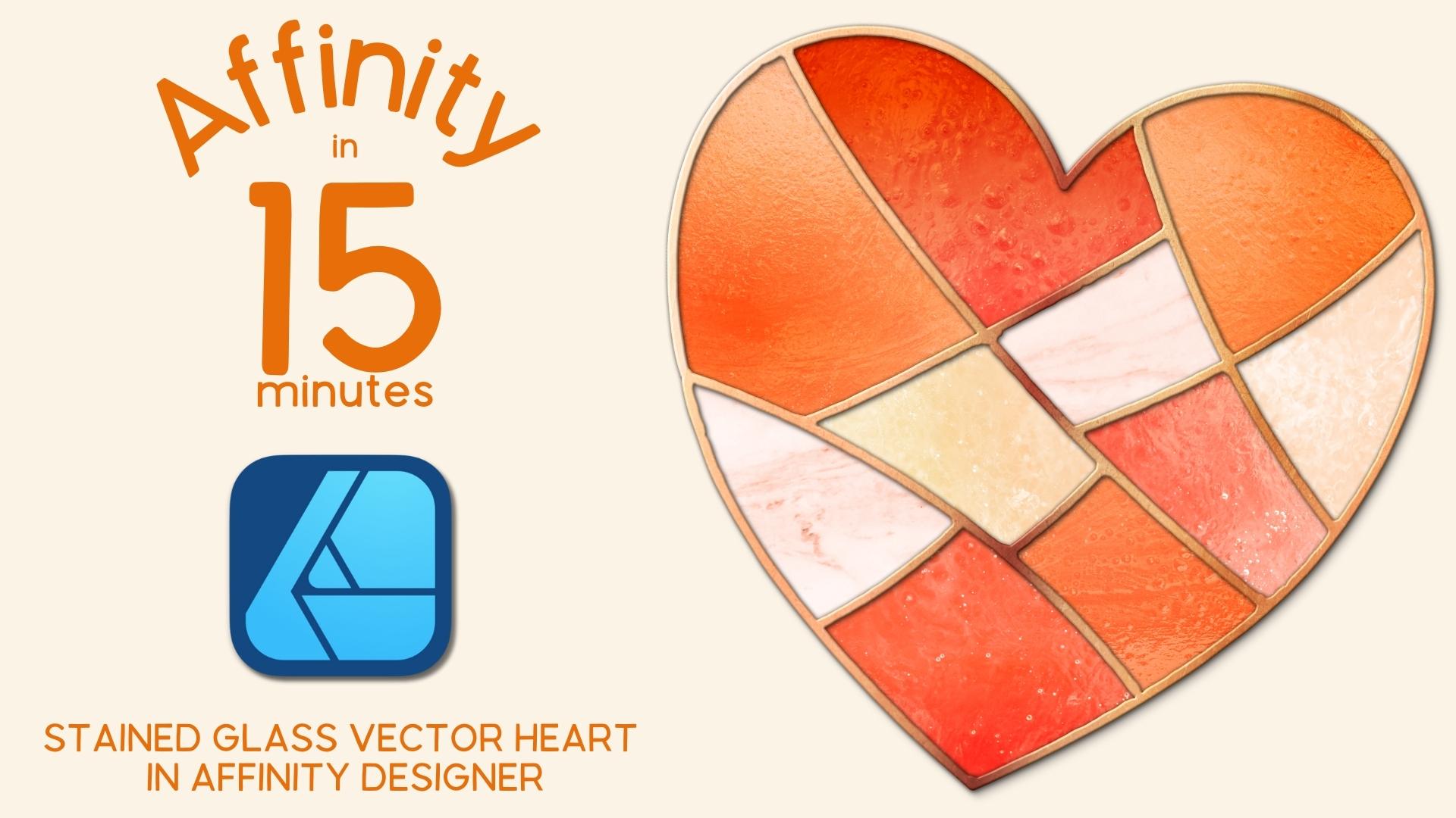
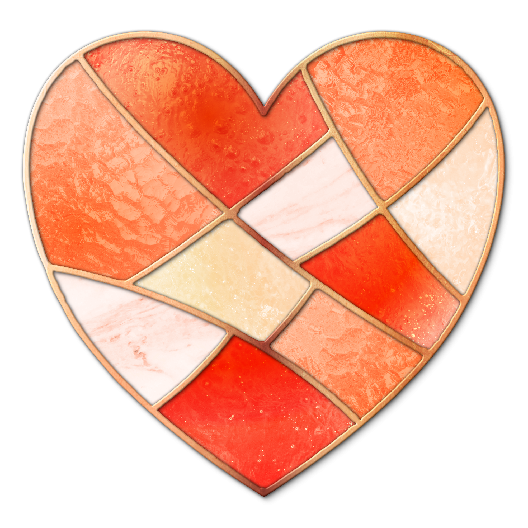
Affinity Designer V2 | Stained Glass Vector Heart Shape
 Tracey Capone, Illustrator, Photographer & Designer
Watch this class and thousands more
Watch this class and thousands more
Lessons in This Class
-
-
1.
Welcome to Class!
0:44
-
2.
Creating the Stained Glass Heart in Designer
13:59
-
-
- --
- Beginner level
- Intermediate level
- Advanced level
- All levels
Community Generated
The level is determined by a majority opinion of students who have reviewed this class. The teacher's recommendation is shown until at least 5 student responses are collected.
224
Students
25
Projects
About This Class
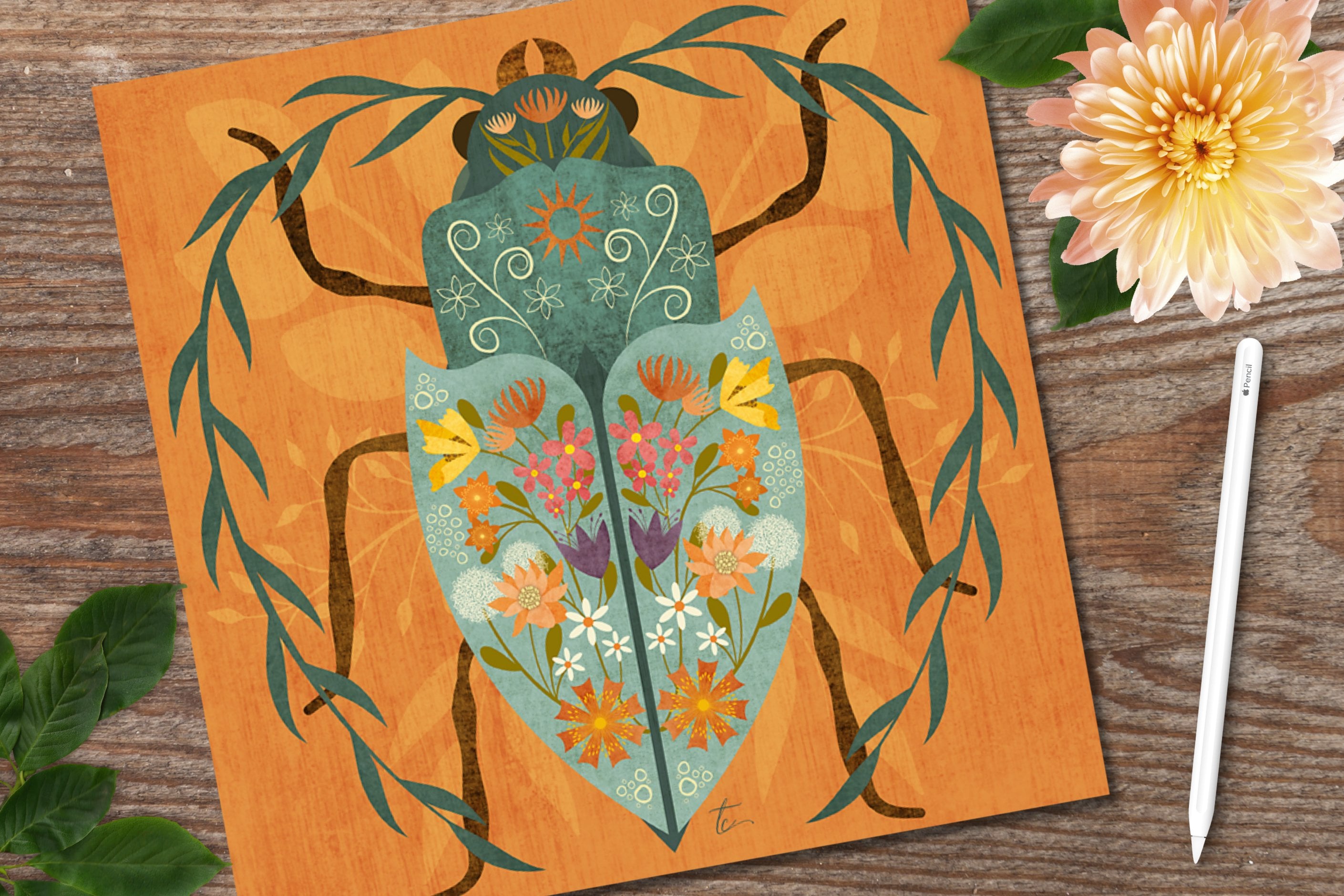
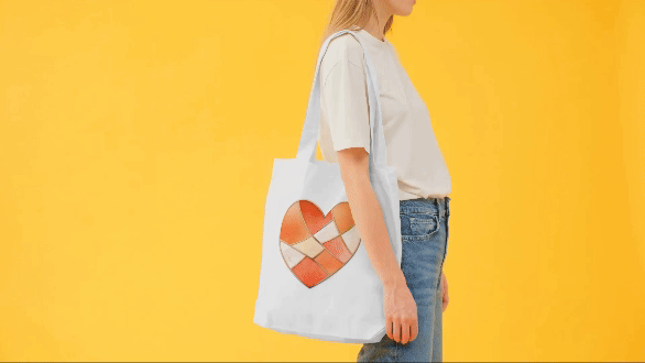
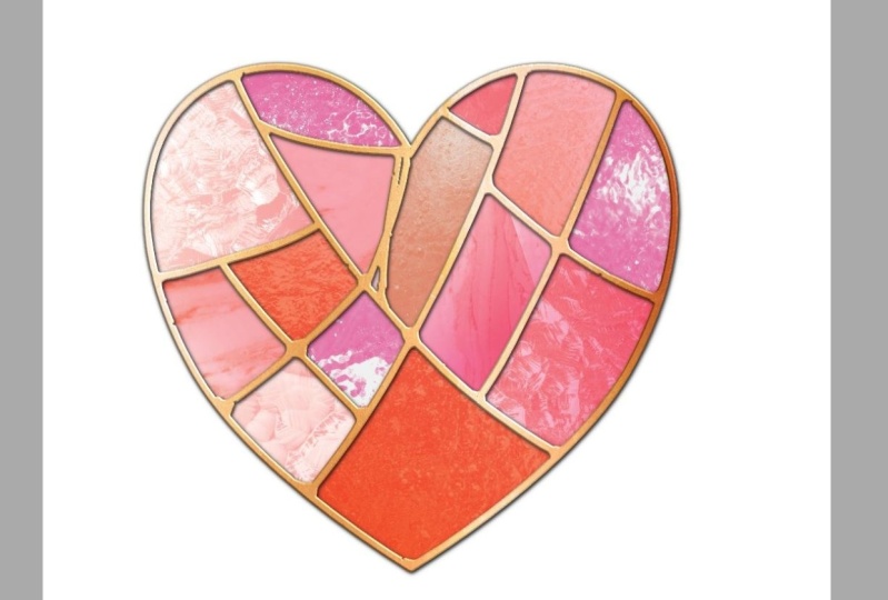
Welcome to Affinity in 15, a series where we'll create quick projects in Affinity Designer, Photo or Publisher. In this lesson, I'll show you how to create a fun, stained glass vector heart shape that's perfect for greeting cards, digital stickers, surface pattern design motifs and more.
Hi there! I'm Tracey, an artist, designer and Affinity pro. I love learning the ins and outs of the Affinity suite so that I can make the tools do what I need them to do (even if it's not always what they were intended to do).
In this series of classes, complementing my longer form classes here on Skillshare, I'll share everything I know about the three apps, both the desktop and iPad versions, in bite size classes, so that you walk away with a quick, fun project and tons of knowledge so you can work efficiently, and effectively, on your own.

- The two ways you can use the Knife tool, including how to cut a shape up in to multiple parts. I'll show you how to drill down in to smaller selections so that you can slice exactly what you want, to get the shapes you want quickly.
- How to use the Gradient tool to add solids, gradients and bitmap textures. This allows you to add fills from the Stock Studio, Assets panel and your external files, quickly and efficiently.
- How to create and use vector clipping masks. These will allow you to use duplicates of your original shape to clip away anything outside the bounds of your original shape, making it a perfect way to mask groups of shapes as well as vectors where you need to control the opacity of your textures.
- How to use the Appearance Panel to add multiple fills. This studio makes it really easy to add multiple, different, fills, including bitmaps, and give each fill it's own blend mode adjustment.
- How to add drop shadows and 3D effects to groups of shapes. We'll also cover things you want to consider when adding effects so that your objects look more realistic.
- How to break up a perfect line with vector brushes and Sculpt mode on the Pencil tool. When you're aiming for realism, sometimes, the slightest adjustment to a perfect line can make all the difference. I'll show you how to use the Pencil tool and vector brushes to break up the soldering lines on the stained glass, giving them a more realistic effect.
By the end of class, you'll have a handful of tools in your creative Affinity arsenal that will help you create designs well beyond the simple heart shape we're creating in class. Don't want to create a heart shape? No problem! The steps I show you can help you create any stained glass design in Affinity Designer V2.

I'm using the desktop version of Affinity Designer V2. However, if you're on the iPad version of Designer V2, you're welcome to join the class. As long as you know where the tools are located on the iPad, you can easily follow along.
Please note... This class is specific to Designer V2, not Photo or Publisher, as some of the tools mentioned above are only available in Designer.

This class is beginner friendly, all are welcome, even seasoned Affinity users. Please note though, it does assume some familiarity with Designer V2 for desktop, as I will not be reviewing the user interface during class. If you are brand new to the app, I recommend watching a beginner class in Designer first, to get the most out of this one.

You will receive the Affinity swatch palette I created specifically for the class, including solids, gradients and metallics that will allow you to follow along without having to worry about what colors to choose.
I've also bundled up the free use textures I'm using in the class in an easy access folder so that you don't have to hunt down your own!
You can find links to everything in the Projects and Resources section of the class.

Hi there! I'm Tracey. I'm an illustrator, designer, and photographer located in the Chicagoland area. You can find more information about me, and my work in my full profile. (find the link above) I've been a full time artist for over a decade, after leaving the corporate world behind in 2011. In addition to teaching, I am a full time creator who sells my work on my own site, as well as print on demand sites like Spoonflower, Etsy and more.
I've been using Affinity products for the last several years and love to learn as much as I can about the tools so I can not only use them the way they were intended to work but make them work for me; and I love sharing that knowledge with my students! I've had the privilege of being spotlighted by Serif, the company who created the app, twice as a go to teacher for their apps. You can find links to the spotlight articles, as well as a Creative Session I've created for their YouTube channel, on my profile page.
If you have any questions about the class, or would like feedback on your project, please feel free to let me know in the Discussion section of class, or by emailing me at hello@traceycapone.com.
I look forward to seeing you in class!
Music Credit: "Coffee Stop," by Aves on artlist.io (license on file)
Meet Your Teacher

Hello and welcome to my Skillshare channel! I'm so happy you're here!
My name is Tracey. I'm an illustrator, photographer, teacher and self-proclaimed digital art nerd who loves all the apps, and sharing everything I know. Being able to help students understand more complex applications, like Affinity Designer, and hearing about that moment of clarity when everything came together for them is truly satisfying.
not just the how, but also the why... I believe understanding why I take certain approaches, or use particular tools, will help you absorb what you learn and better prepare you to work on your own later. to embrace the perfectly imperfect... in my mind, it's the best way to develop that sometimes elusive creative voice!
and finally... See full profile
Hands-on Class Project

The downloads for class include an Affinity swatch palette I created especially for the class. It includes solids, and both regular, and metallic, gradients that will give you everything you need to create the class project. The attached PDF includes information on how to import the palette in to Affinity.
I've also included a link to a Google docs file with the free use textures I will be using from Texturelabs and Unsplash. You can find the downloads at the bottom of this page.

The project for this class is to create your own stained glass heart shape, or any shape you would like! When creating your design, try utilizing the various tools we cover in the class:
- Knife Tool
- Gradient Tool
- Appearance Panel
- FX Studio
- Vector Brushes
I would love to see what you create, and sharing your project allows future students see what they'll learn when they take the class! I've included step by step instructions on how to upload you project in the PDF provided with the class. I can't wait to see your stained glass design!


Class Ratings
Why Join Skillshare?
Take award-winning Skillshare Original Classes
Each class has short lessons, hands-on projects
Your membership supports Skillshare teachers
Learn From Anywhere
Take classes on the go with the Skillshare app. Stream or download to watch on the plane, the subway, or wherever you learn best.