Transcripts
1. Welcome to Class!: My love of drawing space illustrations began in the 3rd grade. I was a super shy and quiet girl. I began creating them with my big crush as a way of communicating with him. As it turned out, I had a lot of fun. Fast-forward to today, and I haven't seen him since high school, but I still love drawing space illustrations. I'm Chicago Area artist and teacher, Tracey Capone and welcome to my class, where I'll share that love with you and teach you step-by-step how I created my phases of the moon illustration. We'll start by building up a beautiful textural background using a mix of shapes, a storybook, a pixel brush, and some fun textures which I created especially for the class. Everything else you're going to need is already built into Designer. Next, I'll show you how to create a realistic earth and moon shape using a combination of the ellipse tool, and free use images from the built-in stock studio. From there we're going to add beautiful atmosphere of elements to both the earth and moon, and I'll show you how to quickly and easily create the remaining moon shapes using the power duplicate function in Designer. Finally, the main focus of the class is all about the versatile transparency tool which you're going to be using to create shadowing on our moon phases. I'll show you how to prepare your moon shapes. Then evaluate which type of transparency you need to create the perfect shadowing effect on each phase. Now while this class is beginner-friendly, it's intended for students with at least some experience in designer. If you're brand new to the app, I recommend starting with my beginner class, textured florals in Affinity Designer. In that class, I'll take you through the entire app, showing you all of the tools and studios, explain how each works and then show you how to use a selection of them to create beautiful textured floral shapes. Now for this class, I'm going to be using the iPad version of designer. But if you're using a desktop version and you know where the tools are located, you can easily follow along, and both the brush and textures I'm providing with the class who work on the desktop version as well. I can't wait to see what you create. Grab your iPad and Apple Pencil and let's get started.
2. Downloads & Resources: The downloads for the class can be located in the projects and resources section of the class itself. You'll need to access this through a browser, not through the Skillshare app. Once you are there, go ahead and click on the link here at the top of the page. You'll need a password to access it, which I'll put up on the screen right now. Once you're in the downloads page, you'll find the links to the various downloads about halfway down. There's a link to the Starry Bokeh pixel brush that I created for the class, as well as three lunar textures that you can use to help add dimension to the background of your illustration. Then finally, I'm including the color palette that I'm using for my illustration if you'd like to use the same one. I've included two different types, one for the iPad version of the app, as well as one for the desktop if you're following along there. Now just a note; there are two different ways to load the color palette depending on which version you're using; desktop or iPad, and I've included two quick tutorials right beneath the links as to how to load depending on which one you're using. Now all of these links are automatic downloads. If you have Dropbox on your iPad, they're going to download there, and if you don't, go to the downloads folder on your iPad. Either way, make sure that the files are saved somewhere that you can access from within Affinity Designer. The pixel brush needs to be imported while you're in the app, you can't import it any other way. I'll show you how to do that in a moment. But again, just make sure that the files are easily accessible from Designer. Let's head back over to Designer, and I'll show you how to import the pixel brush. I'm back here in Designer, and I'm specifically in the pixel persona as we're going to be loading a pixel brush. I should mention my screen is flipped for a left-handed person, if yours isn't, our tools are simply opposite of one another, but they're exactly the same. If you ever can't locate an icon, just tap and hold on the question mark here at the bottom, and these handy labels will pop up. Go ahead and locate your brush studio. Now, I've already loaded this brush into my app, so I'm not going to reload it, but you'll go to the burger menu at the top, click on Import Brushes, locate the file wherever you saved it, click on it and it should automatically import. Once the brush is in place, if you need to find it in the future, you can always tap in the middle and use the flywheel or use the back and forth arrows here as well. Now, as far as the three texture files go, as long as they're in a file that you can access, you're all set there. You don't need to import them in right now, we're going to be using those to build up the background elements in the next video, and we'll be using the Place Image function under the Documents menu to do that. Let's head on over to the next video where we're going to go ahead and start building our background using the brush that we just imported, as well as those textures. I'll see you there.
3. Creating the Background: Hi. We're going to begin by building up the background elements in our illustration. We're going to do that with layers using the brush that we just imported, as well as at least one of the textures I provided with the class, and our rectangle tool. Now I have a new document here setup at 10 by 10 inches at 300 DPI. You can set yours up to whatever size you'd like. Just keep in mind these will not be flat vectors. There's going to be a lot of texture in this illustration, which means you need to think ahead to your final output. If you plan to print this, you want to make sure that your DPI is at least 300, and that you size your document to the largest size you plan to print. That will help you avoid any muddiness, or textures and pixelation. Again, I have a 10 by 10 document here at 300 DPI, but go ahead and set yours up to whatever size suit your needs. The first thing I'm going to do is add a dark blue background. I'm going to go ahead and access my color palette here. I'm going to choose the dark blue for a fill, and I'm going to turn the stroke off. I'll go over here to my rectangle tool and make sure snapping is on. I'm just going to drag up a rectangle here. I want to go ahead and lock this in place. If you don't see the little lock in your layer studio here, just go to the burger menu at the top, and then turn on show unlocked. That's the easiest way to turn on and off the lock on your layers. Now, this is obviously very flat. I want to add a little bit more to this. I'm going to go up to my Documents menu and we're going to place one of the textures that I provided. Mine are saved in the Cloud here. You can use any one of these. I'm going to go ahead and use the nebula one. I'm going to drag it large. In Designer, whenever you're pulling something like this in, make sure you drag large, release it, pick it back up again and then size down. You don't want to go in the opposite direction. If you go from small to large, you could run into issues with pixelation. I'm just going to go ahead and size this the way I want, and place it where I want. Now I just need to go ahead and change the blend mode of this. I want this to add a little bit of Cloud effect to my background. I'm going to go ahead and first clip this to the rectangle just so it stays together. Then I'll go into the layer options and I want to change it to soft light. I'm not going to drop the opacity of this at all, actually like that. But I want to add a little bit more. The first thing I'm going to do is go to my vector brush tool. I'm going to go into my acrylic express, that which is built into Designer. If you've taken any of my other classes, you know that I love using the glazing brush to add a clouded background. I'm going to go ahead and use the textured acrylic to glazing brush. I'm going to grab this teal color from my color palette. I'm going to flip that over to the fill and again, turn off my stroke. I just want to bring my brush up a little bit larger. I'm just going to make two little solutions here. Just make sure that the color is right. I'll go back to my layers studio, now it's already clipped to the rectangle because of where I was in the layer stack. But I'm going to go ahead and group these together so that I can change the blend mode together. I'm going to change these to soft light as well. I'm just trying to add a little bit more dimension and a little touch of color. I'm actually going to pull the opacity on just slightly. I don't want it to be too much. Again, it's just something in the background. Next thing I want to do is add the story Boca brush to the background here. I'm going to go over to my pixel Persona, and I'm going to locate that brush. I want to use that awful weight color. Let's make this a little bit sort medium-size brush. Now I do want the stars to distract from the overall illustration. The main focus of the illustration, of course, are the moon phases. But I want something in the background. I'm going to go ahead and I'm going to add a pixel layer just above this group. I'm automatically adding it myself because I don't want it to clip inside that group. I'm going to go ahead and do that. I'll just add some stars here at the top and then here at the bottom. Now everything's on the one layer, and I'm going to go ahead and just drop the opacity of this a little bit and change the blend mode to screen. Again, I'm not looking for it to stand out, but I'm looking for it to be a background element. I might find once I create the moons that I need to adjust my opacity or something like that. But I'll leave this as is right now. One last thing I wanted to add to the background is a slight gradient coming from the side that gives us the hint of sun. Ultimately, the phases of the moon happen because of its relationship to where the sun is at. I'm going to go ahead and have my coming from the left. You can create yours coming in from the right. Just keep in mind, the actual direction of the phases depends on where the sun is coming from. If you decide to do yours on there, right, make sure that when you create your phases they run hot opposite of mine. I'm going to go ahead and I'm going to select the rectangle tool. I'm back in my designer Persona, and I'm going to select this fill tool. I'll just drag it out a little fill here. Now, this is pretty but it's not what I'm looking for. I actually want some sun. The first thing I want to do is reverse this because I want the majority of it to be that dark blue. I have a little hint to that blue coming in here. I'm going to tap on this, and I'm going to change this to the yellowish color I have here. I don't want this to be too intense. I really just want a hint of sun and go ahead and use this little slider here. This provides a nice gradient. Now you could play around with the different types of fill, the elliptical, radial and things like that. I find that the solid or linear work just fine for what I'm doing here. But again, go ahead and experiment with the different types down here at the bottom. I'm going ahead back out of this and just see how this looks. I'm going to go ahead and call that done. I may end up adjusting it. The great thing about using the fill tool is, I can always go back in and adjust it, it's non-destructive. But I like how this is looking for right now. Let's go ahead and start creating our earth and our main shape and we'll do that in the next video. I'll see you there.
4. Creating the Earth & Moon Shapes: Now that we have our background in place, we're ready to create our earth and moon shape. We only need to create one moon shape and we're going to use that to duplicate and create the rest of the phases of the Moon. Let's start with the Earth. I'm going to go to my Rectangle tool and grab the Ellipse. I want to choose this teal color for my fill and no stroke. I'm going to drag out a perfect circle. I'm holding my finger down. I'm making this a lot larger than it needs to be just so that you can see it. We're going to end up sizing this down. The next thing I want to do is, add the Earth texture to it. I'm going to do that using a free use image from the Stock studio. I will go to my Stock studio and I'm going to tap Earth. I want something that has a black background. I don't want anything that has distractions around it like this one with the clouds. I already have my background layer. What I'm looking for is the actual face of the earth. I'm going to go ahead and choose this one. It's really important that you use free use images for this, there is a lot of astrophotography out there and great images of the moon and the earth but you want to make sure that you're using images that you're allowed to use. When you use the ones from the stock studio, you can do that knowing that every single one of them is free use and you have the right to use them. I'm just going to make this a little bit smaller and I'm going to clip it to the ellipse just so I can see where it's at. What I want is this to cover the entire ellipse and have none of that black coming through, so I'm just going to adjust that. I'll zoom in and just check my edges. Everything looks fine. Now I don't want this to look like a photograph, I actually just want the texture of it, but I want that teal to come through the back. With it selected, I'll go to my layer options, and I'm going to change this to overlay. I'll just drop the opacity, just a touch. Now we have the nice texture from the image, but we have that teal coming through the back but this still looks like a pretty flat disc. We need to add a little bit more dimension using highlights and shadow. I'm going to do that with one of the air brushes in the Pixel Persona. I'm heading over to the pixel persona here, I'm going to go to my brush studio, and I want to find the sprays and spatters category, which is built into Designer. I'm going to go ahead and choose airbrush one. I'm going to keep this teal color, but I'm going to drop the light value, so it's really dark. I'm just doing that by dragging down from the dot. I want to go ahead and add a pixel layer right above my image here. I'm doing that manually just so that I have control over where it's being added. I'm going to go ahead and make sure my brush is rather large. Since my sun is over here, I'm going to put the shadow over here. I'm just going to start running this along, you get a little bit more intense on the very edge, and a little lighter as they come in. I'll change the blend mode to multiply, which is the perfect blend mode for shadows. I'll drop the opacity a touch. We're one step closer, but we still need some highlights.The highlights are going to have a different blend mode, which means I need to add a second pixel layer because you can't have two different blend modes for one pixel layer and Designer automatically adds all of your pixel information to the same layer. I'm going to go ahead and add a new one myself. I'm going to grab that sunshine color that we used here and I'm going to keep that same brush and just start hitting the sides here. I'm going to make my brush a little bit bigger. Again, I'm just adding some sunshine here. I'll go ahead and change the blend mode to screen and just drop the opacity. One final step, I want to take because if you have a globe like this, you're inevitably going to have some breakthrough highlights here at the very edge. I'm going to go ahead and I'm just going to turn this around real quick, it makes it a lot easier to do this. I'm going to stay on that same layer, that pixel layer for the highlights. I'm going to make my brush a lot smaller and just sort of hit the very edge here. You can see, it's just sort of breaking through there. I'm making it a little bit more intense right in the middle, and I'm bringing it out at the edges. Let's go ahead and bring this back to the right rotation. I like how that looks. It has a nice dimension. One final thing I want to do for the Earth's shape is to give it some atmosphere. There's a couple ways that you could do this. You can either drag out a new ellipse right below that or you can just duplicate the original one and then go to the bottom and just remove what you just did, so that leaves us with just the ellipse. Again, you can approach that however you'd like. I just find it easier sometimes to duplicate and remove. I have About center on, I have that ellipse behind the Earth's shape, and I'm going to hold my finger down and drag out, so I get a nice even line around the edge of the earth. But of course this looks nothing like atmosphere. We want it to have a nice blur to it. I'm going to go to my FX Studio. I'm going to tap to turn on Gaussian Blur, tap to get the Contextual Menu and tune and drag up to about 50 to 60, somewhere in there. Now, I don't want the earth to stand out too too. I don't want it to be the main focus because our phases of the moon are supposed to be. Go ahead and change this to about 55. I'm actually going to drop the opacity of this blur a little bit, just to give it a hint of atmosphere. That's our Earth's shape. Let's just make it a lot smaller, so we have some room. First I'm going to go ahead and group these two together. I'm going to rename that group, just so I can keep track of it. I'll go ahead and go into the layer options tab at the top here, and I'll type in Earth. I'll just go ahead and make this smaller and place it in the middle. I'm just holding my finger down just to keep the proportions, so right about there, I'm just going to make sure it's in the very middle of my canvas and you can do that with snapping on. Let's go ahead and create our moon shapes next. Now that our Earth's shape is in place, we're ready to create our moon and we're going to follow the same process. I'm going to go ahead and select my ellipse tool. I'm going to choose this off-white color for my fill and no stroke. I'll go ahead and drag out a circle and I'm going to go into my Stock Studio and just type in Moon. Again I want something that doesn't have anything distracting like, clouds or like that. In this case, I want something that shows the face of the moon really well because you're going to be adding shadowing. I want that to show through nicely, so I'm going to go and choose this one because it looks nice and defined. I'm going to clip this right into place because it's about the size we need. I just want to make sure it's in the right place, let me grab my Move tool. Now again, we want to make sure that none of the black is showing around the edge, so I'll just move this up, and I'm going to drag this out a little bit. Again, it doesn't have to be perfect. I'm not going to change the blend mode of this because again, since we will be adding shadowing to this, I really want that nice texture of the moon to come out and I like how bright it is, so I'm going to keep this as is. I think, I'll lock that image in place. We're going to be adding a little bit more to this when we create the full moon, but I'm going to leave that off for right now. We're going to be adding a glow just like we have with the atmosphere of the Earth. If I do that now though, it's going to duplicate that, glow all the way around, and I don't actually want that. We're going to call this done for now. I'm just going to move this into place here and I want it to be centered perfectly vertical on the canvas. You can tell, usually you'll will get this red line, I'm going to use the power duplicate function and I'm going to duplicate it around the exact center of the canvas to get our other phases. I just want to make sure this is in line. I'm going to make this a little bit smaller and place it right about there. We have our two shapes here. In the next video, we're going to use the power duplicate function to create duplicates of this moon shape to add the remaining phases of our moon, so I'll see you there.
5. Using the Power Duplicate Function: Now that we have our earth and our moon in place, we're ready to create the remaining phases of the moon. The great thing is we don't have to reinvent the wheel each time, we're just going to make duplicates of that. But we need to take a few steps first. The first thing I'm going to do is create a background ellipse for all of my additional phases. We don't want to need one for this one because this is going to be the full moon and there's not going to be any shadow on it. The reason I want to create it for the remainder of them is because ultimately the phases of the moon are simply shadows. Let me just drag out an ellipse and you can see what's going to happen. If I were to grab My Transparency Tool to create the shadow effect and I just drag this across, it truly does make it transparent so you can see the background through it, or in reality, you wouldn't be able to see through the moon because the moon shape itself remains. It's simply the amount of light that we can see on the moon that changes. I'm going to create a background ellipse that's going to keep the shape of the moon and then we're going to use the Transparency Tool to create the actual shadow. It's probably going to make a lot more sense once we actually get into it but for now, let's just go ahead and create our background disks. This particular moon shape is 2.2 inches. I know that by selecting it and going into My Transform Studio. I want my disk to be that same size, I'll select My Ellipse tool, the dark blue for my fill and no stroke and I'm just going to drag out a shape. I'll go into My Transform Studio and just check the size. To make sure that lock is on, I need to add a little bit to it to 2.2, and now it's added it to both. Now I have a background the same size as my moon shape. I'm going to go ahead and move this over. I just want to make sure those are aligned. I'm going to select both of them, go back into My Transform Studio and I'm going to do a vertical and horizontal alignment. Now, the next thing I need to do is give this a moon phase because this is going to remain, this is ultimately going to be our full moon. I needed to duplicate this group and then drag it up above my ellipse shape. Again, I just want to make sure everything stayed aligned. I'm going to go ahead and group this together. This is the layer that we're actually going to duplicate around. The first thing I want to do is I want to move this duplicate 45 degrees from my full moon. I'm going to do that using the Move Tool and My Transform Origin Point. It is little bulls-eye here, you can see it showed up in the middle of the moon here. I'm just going to drag this into the middle of the canvas and we're snapping on and your finger down, it makes it really easy. You can see the exact middle of the canvas. I think our Earth might be off-kilter a little bit. There we go. That's why that looked a little weird. I'm going to go out and make sure that it's in the middle. Now, I'm going to go ahead and grab this and start rotating it around. I'm going to grab the handle and I'm going to rotate, I'm going to hold my finger down and it's going to snap it in 15-degree increments. I want 45 degrees. Now, I need to make one more duplicate of this before I can use the power duplicate because I had released it back here. I'm going to go ahead and duplicate this. I'm going to go ahead and rotate again 45 degrees. Now I can use the power duplicate function all the way around. I'll hit "Edit", "Duplicate", and I'm just going to keep doing this until I have a total of eight shapes. There you go. A couple of things about this. The first is our new moon here on the left, we actually don't need this moon phase because ultimately, the new moon is closest to the sun and it's between the Earth and the Sun, which means it's completely in shadow. We actually can't see any of the phase of that Moon. The reason I went ahead and made it anyway is the power duplicate function remembers the last move you made. If I had duplicated this one, skipped this, and brought it to here, which would technically be 90 degrees, it would automatically duplicate at 90 degrees here and skip this one. Sometimes when it comes to power duplicates and things like that, just go ahead and create something knowing that you're going to remove it. I'm going to go ahead and find that layer and I'm just going to remove that particular phase. I'm also going to drag this one down above my full moon. The reason I'm doing that is in a little bit, we're actually going to use something that we create for the full moon to finish off our new moon and it just makes it easier to keep it where it's at. The next thing I want to mention is, in reality, the actual moon phase doesn't rotate. The moon itself doesn't rotate, it just revolves around the Earth, everything should remain in this direction. I'm just going to go into each of these layers. I'm going to turn off my transform-origin point. I'm just going to go ahead and rotate this just so that all of the phases of the moon are in the same direction. Now, we have all of our shapes in place. We have all of the background layers in place. The next thing we want to do is start using the Transparency Tool to create the shadows on various phases but before we do that, we're going to add a little bit more to this full moon and finish off our new moon, and we'll do that in the next video. I'll see you there.
6. Finishing the Full and New Moon: All right, so we have all of our moon shapes in place, and we're ready to start adding our shadowing to these. But before we do that, I want to finish off our full moon and our new moon because those are the two easiest to complete. Now the reason I didn't finish off the full moon before it, anything that I created will automatically going to be duplicated. I just went ahead and left it as is knowing I was going to go back in. I want to create a glow around the edge, just like the Earth, because I want it to be a nice bright full moon. I'm going to go ahead and select it. I'll duplicate it, and again, just like with the earth, you could simply drag out a disc behind it in another ellipse, but I'm just going to go ahead and select that second one, and I'm going to remove the image from it so that all I have is that off-white ellipse. I'll make sure that about centers on dragged out to get a nice solid line around it, and now I want to go ahead and add a blur to it. I'm going to go to FX, turn my Gaussian Blur on, tap to get the contextual menu, and I'm going to bring this up to about 55. I'm not going to drop the opacity of this because again, since the moon phases are the star of our show, I actually want that to be nice and bright. Now we can actually use this to complete our new moon. Before I do that though, I want to go ahead and group these two together, and I want to rename this full moon. Again, it's really important that you keep track of your layers, especially when you have something like this because you really can't tell the difference as of right now, they all look exactly the same. But each layer is going to be treated differently as far as the shadow. If you work, do the work upfront to rename your layers, it makes it a lot easier. I've labeled that full moon. Now we're going to go ahead and create our new moon, which is going to be here. The only thing that we need to do for that is grab that fuzzy ellipse we just created for the full moon. Duplicate it. I'm going to drag that up to that group just to get it out of the full moon one. Grab my move tool, and I'm just going to drag it across, and if you hold your finger down, it'll keep it in a line. Again, I just want to make sure that's in with that group. In reality, you're not necessarily going to see a fuzzy glow around the new moon. It's just going to be black. But for the purposes of the illustration because we don't want just some void there, we're adding the glow again just for illustrative purposes. But I want to go ahead and do one more thing to this. This ellipse is too perfect, it's too solid, so I want to break that up a little bit. I'm going to go ahead and select the ellipse. Go to my FX Studio, turn on my Gaussian Blur, and I'm going to tap in here and just type four. I just want it to be a slight blur. I don't want it to be a lot. I don't want it to blend into the glow, but I want to break up the edge a little bit. All right, so let's make sure we have all of our shapes together here. I'm going to go ahead and group those together, and I'll rename this new moon. Now those three are done, and now we're ready to start using the transparency tool to create the shadowing on the remaining six, which we're going to do in the next video. I'll see you there.
7. The Transparency Tool: We're all set to start creating the shadowing on the remaining six moons in order to give us our phases. But before we do that, I want to take a closer look at the transparency tool itself just so I can show you how it works. I've turned off my other layers, and I've created this large ellipse. You can simply follow along, or if you want to go ahead and create your own on your end, go ahead and do that. I'm going to go ahead and select the layer and grab my transparency tool, which looks skeletal wine glass. I'll just drag out a line. Now if I keep my finger down, it's going to go in a nice straight line. If I don't, I can move it in angles. I'm going to move this all the way to the left and this handle all the way to the right. Now if you look closely, you have a white and a black handle. Everything under the white and beyond is transparent and anything under the black and beyond is opaque. You have this little slider in here that's going to allow you to create gradients. Now, I can drag this out and in. I can rotate it. I can also use the rotate function down here. Or I can hit reverse. Now I have opaque on the left and transparent on the right. This is a linear transparency. If we needed to create something like the half-moon rather, for example, this is perfect for that. You can't change the color of either of these dots. But in certain cases you can add additional notes, and if you look closely, it's adding in various shades of gray that get lighter between the black and the white, and then it also adds additional handles. I If you need to create something that have a shutter effect like this, you can do that. I'm going to go ahead and back out of that. Now there's additional types of transparencies which you'll see in the contextual menu at the bottom. Let me go ahead and choose elliptical. That's going to give you two handles and let me just make this smaller, so you can see how this is working. It's a circular transparency pattern. Again, just like the other, everything under and beyond the black is opaque. Everything under the white is clear or transparent. I can reverse that. The black is in the middle and the two handles on the outside are white. Then the one handle, I have the slider for the gradients. I can also add notes to this one. I can't add them to this one. That's just a secondary handle. Let me go ahead and reverse this again. I can move this around. I can drag these out and I can also use to rotate. Now, the radial looks a lot like the elliptical. I can just drag this in and out. Again, it's creating a transparency or opaqueness in a circular formation. I can hit reverse or it can rotate it. Again, I've said that one handle, but I can use this gradient on it as well. The final one is conical. I personally haven't found a need to use this at all. But what it does is create what looks like almost a 3D transparency on top. Let me go ahead and change this back to none. Now, a couple of things that I want to note about when you first start using the transparency told just a few tips. I recommend starting small and then going larger. What I mean by that is, evaluate what you need to create. For example, in the case of the shadows or the moon, if we need something like a crescent of light, we need something around it. We already know from that, that the linear is probably not going to work. If we don't need it to be 3D like we don't need the conical, we'll try, let's say, the elliptical. I'll go ahead and drag out to make sure I have that selected. Create the elliptical. I'm going to drag this into the middle and start small. Now I know that I need a crescent of light on the outside, so I'll reverse it. You can see that of course it has the opaque on the outside and the transparent on the inside. What if I start dragging this around? You can see that the opaqueness from the ellipse gets a little bit more. I can start dragging these out and I can start dragging this to get that shape that I want. Because I started small, I had a nice starting point, and then I can start dragging around. If you just start large, you're not necessarily seeing the exact transparency that the tool is creating. Now that's fine once you start using it more. At some point you just start realizing that the elliptical is going to create a certain thing, etc. But when you're first starting to use it, start small and just get larger. Of course, the next tip is, evaluate the type of shape that you need. If you need something that has a nice curvature here, then of course the elliptical or the radial are going to be your best bet. Linear is not necessarily going to give you what you need. Just sit there and just figure out what exactly you need. We're going to see that in action here in the next section where I'm going to show you how to add the shadows to the phases of the moon.
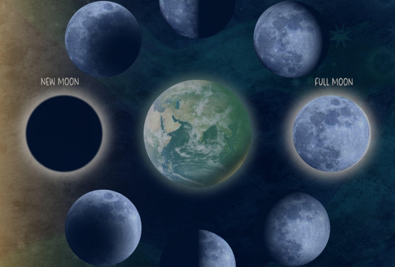
8. Creating the Phases of the Moon: We have all of our moon shapes in place, and we have our full moon or Earth and our new moon done. We're all set to start adding our shadows to the remaining moon phases. Now, just a little background on how the phases of the moon works. It's basically just varying degrees of illumination from the sun on the phase of the moon. At the top here we're going to have what are called waning moons. That just means that the illumination is becoming less. We'll decrease the amount of light on the phase of the moon here until we get to complete darkness here with the new moon. Then the bottom ones are waxing moon, which means it gets bigger. Waxing means it's larger. Obviously in reality, the actual moon is not getting larger, but what we see, what is actually illuminated gets larger. The shadow will become less and the light will become more until we get to our full moon. Again, if you've created your sun on the other side, you're going to want to create your phases opposite of mine. One thing I've done is gone in and I've added names to all of my layers because right now all of these look exactly the same and it's really hard to keep track of that because we need to add different shadowing effects to each. In order, of course, I have the earth, the full moon and new moon. Then we have the waning gibbous, the last quarter, the waning crescent, the waxing crescent, the first quarter, and the waxing gibbous. Again, if your sun is on the other side, just do the opposite. I'm going to go ahead and keep this up on the screen for a moment. Just go ahead and pause. I recommend labeling your layers. Now that we have everything labeled, let's go ahead and start adding our shadowing. We're going to start with our waning gibbous. I'm going go ahead and select it. Now there's a couple of things I want to note about how the Transparency Tool works. You're going to remember that we created a background layer here. We actually don't want to add a transparency to that at all. We just want to add it to the moon phase. We want to leave that out of it and just add it to this layer. Now, the issue with that is if I simply choose the ellipse layer and I go in and I grab my Transparency Tool, it doesn't actually look like it did anything. The reason for that is it's only impacting the ellipse. It's not impacting the image layer. If I turn off that image layer, you can see that the ellipse has a transparency on it. But if I turn it back on, nothing changed because the image itself doesn't. Go ahead and change that to none. What we need to do is basically trick Designer into thinking that it's a group of something. Even though this is clipped, it's not going to treat it like a group until we turn it into a group. I'm going to go ahead and select my ellipse layer. We can go up here, tap Group, and it looks exactly the same. But what's going to happen is I'm going to choose the group level. Now when I add a transparency, it's adding it to both the image and the ellipse, and it leaves that background layer behind. Now, I've already done that on all of these. All that you do is go in, again, just select the ellipse layer. I'll just ungroup this so you can see. Let's go ahead and ungroup that. Select your ellipse layer, leave the other out of it, the background, just the phase of the moon, tap Group. Now we're going to add the transparency to the overall group layer that includes the ellipse and the image. I know it seems really funny, but you basically just have to trick Designer into adding it to both rather than just one. Let's go ahead and add our shadowing to our waning gibbous. I have that group layer selected. I have my Transparency Tool. Now the waning gibbous is going to be a crescent of shadow on the very right side. Let's evaluate that. We need a crescent, which means we need something rounded. Linear is not going to really work for us. Let's start with elliptical. Let's bring it into the middle so that we can see how that starting. Now right away, I can see that I have a nice rounded shape here. I'm getting that rounded shadow, but I have it over here too. Let's go ahead and just rotate this around. I want it right there, but not here. If I start dragging this away and I start dragging these handles out, it's taking that shadow away from there, but it's keeping it there. I'm just going to drag this slider. Again, I have some nice illumination and some shadowing on the very edge there, such as backup. That is a nice crescent of shadow on the right side. Again, I started small. I started with it in the middle. I evaluated what shape I needed. Then I went ahead and dragged it out from there. Let's go ahead and do the last quarter. I've already changed this in new group for the rest of them. Again, I just went ahead and I selected the ellipse layer hit Group, and now I can add my transparency to that. Now, the last quarter is a half moon, which means it's very linear. I'm going to go ahead and choose my linear. I want a linear shadow on the right side, so it's already giving me the correct direction. I'm just going to move this in a little bit just to give it more of a shadow. I don't want it to be too harsh of a line, so I don't want to just drag this all the way over. I want it to have a nice little gradient there. Let's just drag this over a little bit and back out. That was super simple. We have a nice shadow that background ellipse here is keeping the shape of the moon for us. But the Transparency Tool, it's giving us a nice gradient here that's helping really give us the effect of the shadow. That's our last quarter or half-moon. Now we need to do a waning crescent, which means the majority of our moon is going to be in the shadow and we're just going to have a crescent of light here. It's basically opposite of this one. Again, I've already changed this to a group. I'll select my Transparency Tool. Again, I need a crescent shape, which means I need something rounded. Let's go ahead and choose our elliptical. Now, this isn't quite what we want because again, we want a crescent of a light, not shadow. Let's go ahead and hit Reverse. We're getting a step closer there. I'm going to drag this out and I'll drag these handles out a little bit more. Then I'm going to go ahead and play with this slider here, drag this in a little bit. I think I somehow bumped out of place so my background is showing a little bit. Let me go ahead and make that a little smaller just to get that out of the way. I did that a little too much. Let's grab our Transparency Tool again. Just play around with this until you get exactly what you're looking for. We're basically looking for the opposite of this, but we'll light instead of shadow. I want it to be intense on the very edge. Again, I started small. I evaluated what I got with the tool that I selected and then I started moving it around. It makes it a lot easier to figure out what you need. I'll just bring this out a little bit. I don't want too much light there. We have a nice crescent of light here and everything else is in shadow. We can probably adjust this a little bit more. Again, you can always use this slider too. Again, there's the opposite of that, but light rather than shadow. Our new moon is already done. We don't need to do anything to that. Now we need to create our waning crescent, which is the exact opposite of this. We're going to have a nice sliver of light on the right side. Let's go to our waxing crescent. Choose the group. Again, make sure you're not choosing the overall group, you just want to choose the group with the actual moon phase. Your Transparency Tool again, I'm going to choose elliptical. This isn't quite giving me what I want because I don't want shadow on the outside, so I'm going to go ahead and hit Reverse. I'll go ahead and adjust this and bring this down. I'm going to drag these handles out to get some nice shadow here. Just play around with the various handles. There we go. Start small, drag your handles out, move this around and use that slider there to get the look that you want. The next one is going to be our first quarter, which is also a half-moon, but it's going to be opposite of this. Let's go ahead and select the group, the actual phase of the moon. This time I want linear, but the shadow is on the wrong side. I need it to be on this side. I accidentally added a handle there. Let's go ahead and hit Reverse. I'll just drag in my white here. I'm going to hold my finger down so it keeps it straight. I'll just drag my slider just to intensify the light over on this side. It's really that simple. Once you start figuring out what type you need and just manipulating different handles, it's really simple to use. You just need an understanding of how each type works. Again, I always recommend starting small and going larger. Our last one is our waxing gibbous, which is going to be the opposite of this. We're going to have a sliver of a shadow over here. Let's go ahead and select the group for the phase of the moon. Again, I want to go ahead and select the elliptical. I want a nice shadow over here, so that's working nicely for me. Let me go ahead and drag these handles out a little bit and then play around with the slider here. Here we go. I'm dragging this slider really close to the white because I want it to be nice and intense and bright here and shadowed here, but have a little bit of a softness there. We have the exact opposite of that. Now we have all eight phases. All we had to do was evaluate what type of shadow we need and choose the right type of transparency for the job. Just to recap, always start small and go larger until you get used to each of the types. Evaluate what type of shape you need and choose the right tool for the job, and then go from there. In the next video, we're going to go ahead and add some text to these just to finalize our illustration and make it more of, let's say, an educational illustration. I'll see you there.
9. Adding Text as a Finishing Touch: We're going to go ahead and add some text to this just to label our various moons. Now one thing about this is, I created my moons relatively large and my earth is large. I actually want to give myself a little bit more space and I'm going to show you a really easy way to do that. I'm going to change the size of my canvas and I want to make sure that my canvas changes and not the overall document. I'll go into my document menu, hit ''Resize'' Again, it's 10 by 10. I want to go ahead and resize my canvas. I'm going to change this to say, 12 by 12. Then I'll go ahead and hit ''Apply''. Now it's giving me a lot more space there. I'm going to go here and grab my rectangle. I just want to unlock it. I'll just drag this out and pop this in place. Turn off about center, that'll let me drag it better. Now I have a little bit more room to work. I'm going to go ahead and move all of these into the middle of my document again. I'm going to grab the group of my moon layers, hold my finger down to keep them proportion, and to drag them up. That's going to give me a little bit more space here at the bottom and the top where I can add some text. Now, you don't have to add text to these. I'm going to show you how I did it for my other final illustration. It's totally up to you if you want to take this step, if not, you can skip right to the next video. I'm going to go here and tap. I'm going to tap again and type in full moon. Obviously, we can't see that because it's not a good color. Let's go ahead change that. I'm going to use my move tool to drag this out. I don't like using the actual text tool to change the size, I find it difficult. I just want to go ahead and change this to a different font. I'm going to choose this Clarence font. This is just a font I had on my system. You can use whichever one you want. I'm now going to tap and type each one. I'm just going to go ahead and two-finger tap and drag and add the label all the way around. Then I'll just change the name of each. Two-finger tap and drag to duplicate. Bring it down here. Here see, here we go. Now, I'm going to move this one up above here, I think. Maybe that there. If you have a snapping on, it's going to tell you how far away you have each one. I like that, but obviously, these are not all full moons. I'm just going to go in here. I'm going to tap to select all of them. I'll drag to select all of them, get my keyboard. Again, this is waning gibbous. We have the last quarter, we have a waning crescent. See if I'm spelling that right. Waning crescent. Actually, I just need to change this one. That's going to be a new moon. We have a waxing crescent. Sometimes you just don't hit it the right way and its ties with it. Let's go ahead, first quarter, and then waxing gibbous. All right, so let's just go back and make sure that everything is spaced the way we want it since it's bigger text now. Again, snapping is going to help you see exactly if it's lined up or not. I like that. I'm not going to label the earth. We all know what that one is. That is a complete illustration. Again, just to recap, we created our earth and our moon shape using a combination of the Ellipse Tool and free use images from the Stock Studio, always important use for use images. We also added some shadows and highlight to our earth, and we added a nice glow to the full moon. We use that glow to help complete our new moon. We created the remainder of the phases simply by making a duplicate of the full moon, and we added a background just to help us keep the shape of our moon as we added the shadow. Then finally, we used various types of transparency in the Transparency tool to create that shadowing effect based on which phase of the moon it was. We went ahead and finish everything off in this one by adding some text. In the next video, we're going to touch on what your class project is going to be. I'll see you there.
10. The Class Project: The project for this class will be to create your own phases of the moon illustration. You can create yours in the same color scheme that I did using the palette I provided or you can have fun with it and create something really out there with some wild and fun colors. Whatever you do, use the transparency tool to create your shadows so that you can practice using that. I'd love to see what you create, and it's always helpful for prospective students to see what they'll learn when they take the class. So I hope you'll consider sharing your project to the class projects section in the class itself. I'm going to show you a really easy way that you can do that. You can simply take a screenshot right from your iPad simply by swiping up with your Apple Pencil from one corner to the other. It's going to give you this little bounding box. You can just go ahead and drag in and create a nice illustration there. Hit done and you can just save it to your photos. Then just upload that right to the class projects section. In the next video, we're going to go ahead and wrap everything up. See see you there.
11. Thank you!: Here we are at the end of class. Thank you so much for trusting me with your time and your creativity. I hope you enjoyed creating the phases of the moon illustration, and have a greater appreciation for how you can use a transparency to all your future creations. If you have any questions about anything you watched, please don't hesitate to ask in the discussion section of the class below. If you share your illustrations on social media, please feel free to tag me at the handle on the screen, as I'd love to share your creations in my own feed. If you love textural digital illustrations as much as I do, please consider joining my Facebook group dedicated to all things digital texture, where you can ask questions, share tips and tricks, and share your work all in a friendly, non-judgmental environment. Finally, I'm going to be adding a ton world-class content to my Skillshare channel. Be sure to hit follow on my profile and you'll always be notified whenever I post a class. Thank you again, and I'll see you in the next class.
 Tracey Capone, Illustrator, Photographer & Designer