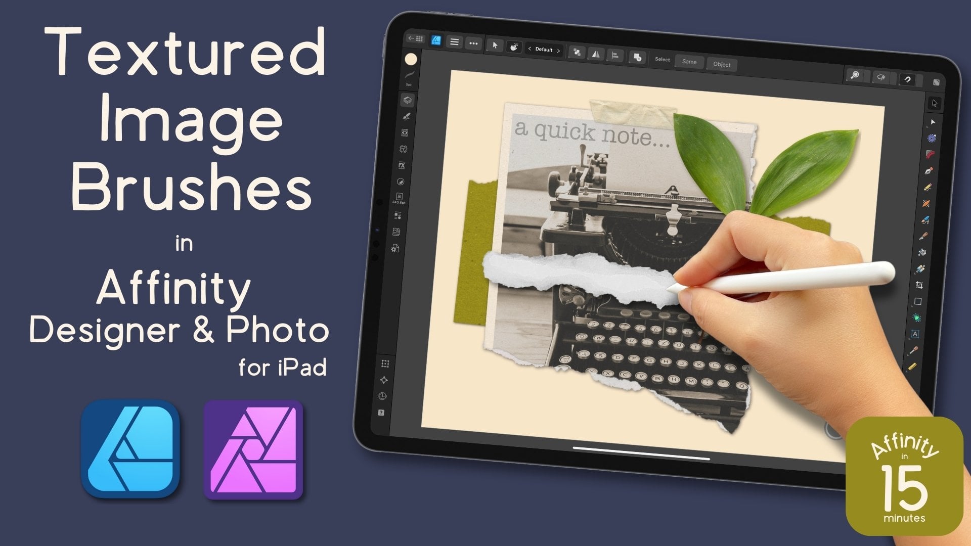
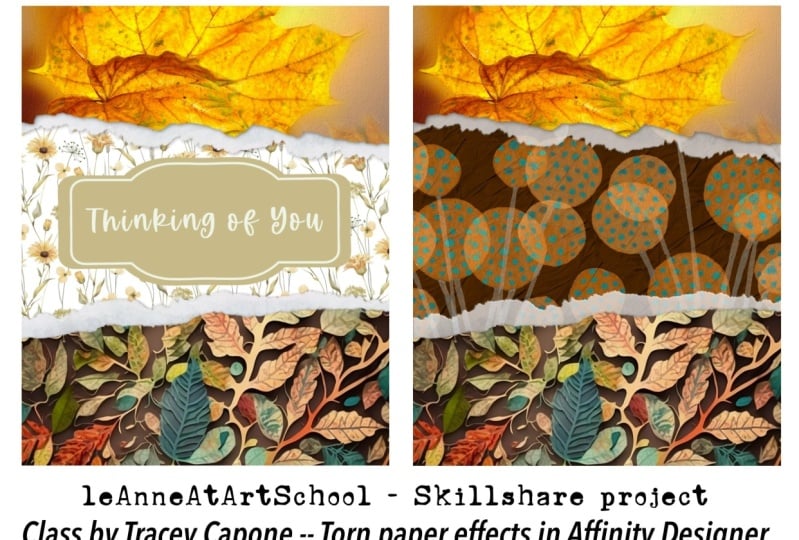
Affinity Designer V2 for iPad | Realistic Torn Paper Effect
 Tracey Capone, Illustrator, Photographer & Designer
Watch this class and thousands more
Watch this class and thousands more
Lessons in This Class
-
-
1.
Affinity in 15 Torn Paper in Designer Intro
0:43
-
2.
Affinity in 15 Torn Paper in Designer Lesson
12:49
-
-
- --
- Beginner level
- Intermediate level
- Advanced level
- All levels
Community Generated
The level is determined by a majority opinion of students who have reviewed this class. The teacher's recommendation is shown until at least 5 student responses are collected.
209
Students
13
Projects
About This Class
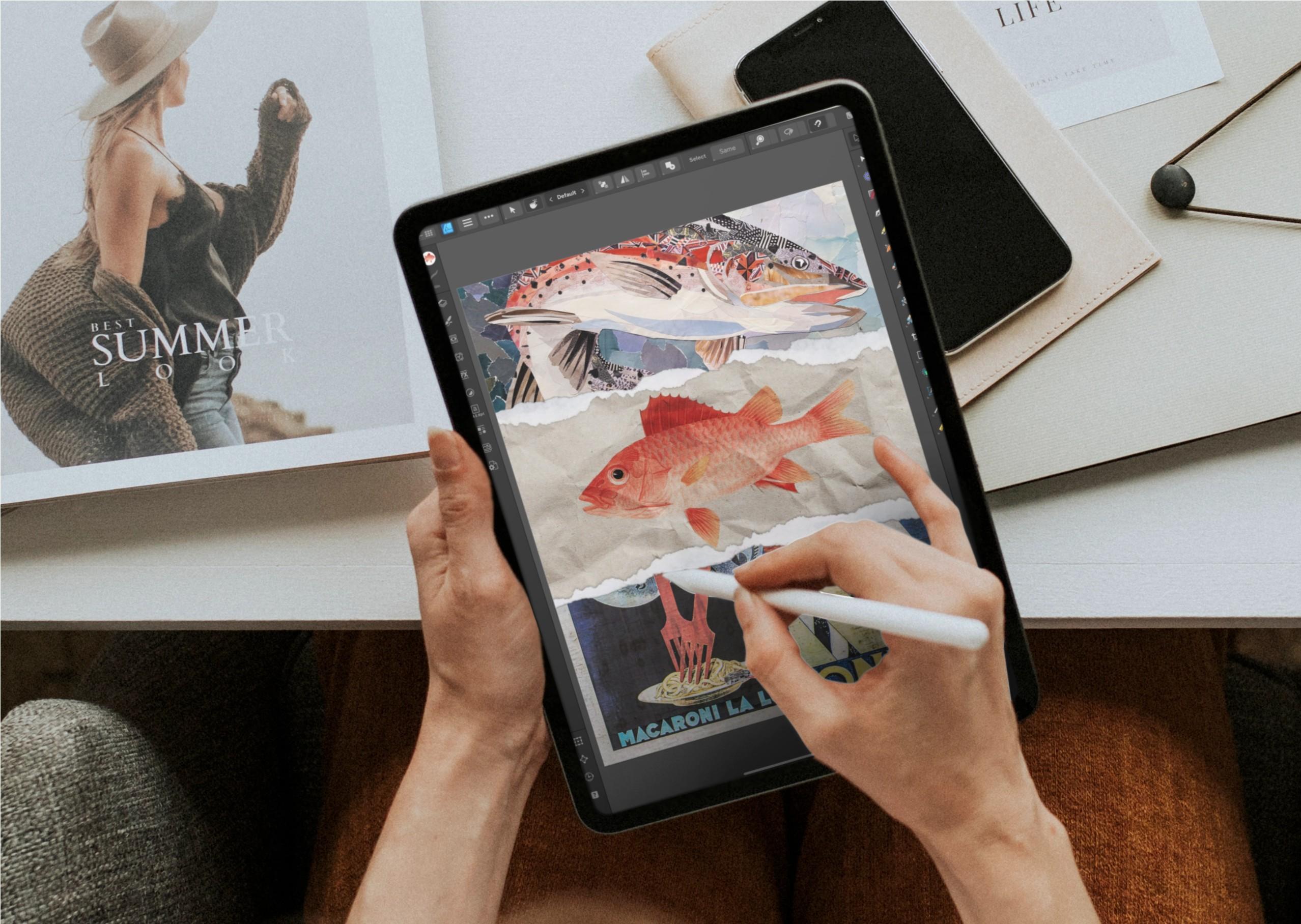
Welcome to Affinity in 15, a series where we'll create quick projects in Affinity Designer, Photo or Publisher. In this lesson, I'll show you how to create a fun, realistic torn paper effect using Designer for iPad. Best of all, everything is created using non-destructive edits, so you can save your design as a template to use over and over, and easily adjust your elements with a few adjustments to the masks.
Hi there! I'm Tracey, an artist, designer and Affinity pro. I love learning the ins and outs of the Affinity suite so that I can make the tools do what I need them to do (even if it's not always what they were intended to do).
In this series of classes, complementing my longer form classes here on Skillshare, I'll share everything I know about the three apps, both the desktop and iPad versions, in bite size classes, so that you walk away with a quick, fun project and tons of knowledge so you can work efficiently, and effectively, on your own.
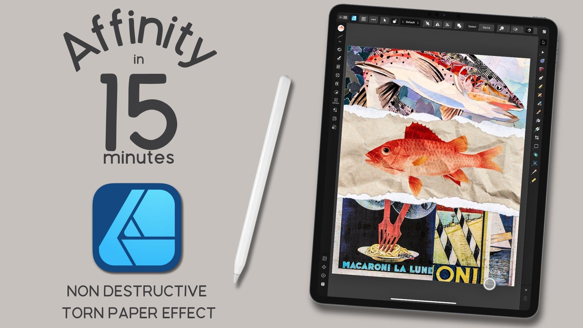

- How to create masks using pixel selections. I'll show you how to create pixel selections from transparent pngs of real torn cardboard, with it's jagged edges, and little fibers, and turn them in to editable masks.
- How to use the Gradient tool to add solids, gradients and bitmap textures. This allows you to add fills from the Stock Studio, Assets panel, and your external files, quickly and efficiently.
- How to use the vector crop tool. Sometimes, clipping masks aren't an option, but how can you deal with things hanging outside the canvas? I'll show you how to use the vector crop tool (psst... it's not just for vectors!) to crop right up to the edges of the canvas, even if they're sitting diagonally.
- How, and more importantly, where to add shadows to the torn paper. The paper texture isn't enough. So let's add some shadows to our torn paper to give it that extra boost of realism.
- How to use blend option shifts, in tandem with blend mode changes, to dial in the opacity, and vibrance, of your colors. Using blend option shifts, in addition to blend modes, can help you achieve laser focus on the luminance values of individual light and dark points in your illustration.
- How to stack duplicate layers, and use different blend modes. This can help you add a boost of color in to your illustration, without affecting the blend mode shifts you've already added.
- How to save your final design as a template to use over and over. Working non-destructively with vectors means you can work more efficiently. The more efficiently you work, the more time you save, and that's more time to create!
By the end of class, you'll have a handful of tools in your creative Affinity arsenal that will help you create designs well beyond the torn paper illustration we're creating in class. Plus, what you create in the class can be used for anything from wall art to print on demand products!

I'm using the iPad version of Affinity Designer V2. However, if you're on the desktop version of Designer, you're welcome to join the class. As long as you know where the tools are located on the iPad, you can easily follow along.
Please note... While this class is taught in Designer, the same process also applies to Affinity Photo and Publisher.

This class is beginner friendly, all are welcome, even seasoned Affinity users. Please note though, it does assume some familiarity with Designer V2 for iPad, as I will not be reviewing the user interface during class. If you are brand new to the app, I recommend watching a beginner class in Designer first, to get the most out of this one.

You will receive three high resolution, transparent pngs that I created especially for the class. I will show you how to use the two torn pieces of cardboard to create a pixel mask and how to add an additional touch of realism to your torn paper creation with the scan of torn paper pulp.
Everything else for the class will come from the built in Stock Studio, where you can pull free use images for your designs.


Hi there! I'm Tracey. I'm an illustrator, designer, and photographer located in the Chicagoland area. You can find more information about me, and my work in my full profile. (find the link above) I've been a full time artist for over a decade, after leaving the corporate world behind in 2011. In addition to teaching, I am a full time creator who sells my work on my own site, as well as print on demand sites like Spoonflower, Etsy and more.
I've been using Affinity products for the last several years and love to learn as much as I can about the tools so I can not only use them the way they were intended to work but make them work for me; and I love sharing that knowledge with my students! I've had the privilege of being spotlighted by Serif, the company who created the app, twice as a go to teacher for their apps. You can find links to the spotlight articles, as well as a Creative Session I've created for their YouTube channel, on my profile page.
If you have any questions about the class, or would like feedback on your project, please feel free to let me know in the Discussion section of class, or by emailing me at hello@traceycapone.com.
I look forward to seeing you in class!
Music Credit: "Coffee Stop," by Aves on artlist.io (license on file)
Meet Your Teacher

Hello and welcome to my Skillshare channel! I'm so happy you're here!
My name is Tracey. I'm an illustrator, photographer, teacher and self-proclaimed digital art nerd who loves all the apps, and sharing everything I know. Being able to help students understand more complex applications, like Affinity Designer, and hearing about that moment of clarity when everything came together for them is truly satisfying.
not just the how, but also the why... I believe understanding why I take certain approaches, or use particular tools, will help you absorb what you learn and better prepare you to work on your own later. to embrace the perfectly imperfect... in my mind, it's the best way to develop that sometimes elusive creative voice!
and finally... See full profile
Hands-on Class Project

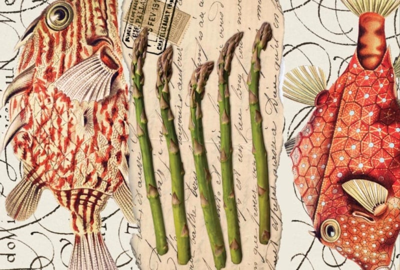
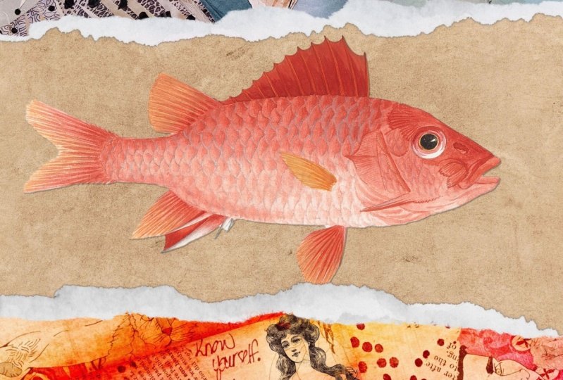
The downloads for class include three high resolution, transparent scans of torn paper: 2 pieces of cardboard and 1 piece of torn paper pulp. We’ll be using the cardboard to create our masks and the torn pulp to add to the realism of the overall design. I've also included a class guide, PDF form with links to other elements not provided in the downloads, as well as additional information about the class, and how to reach me!
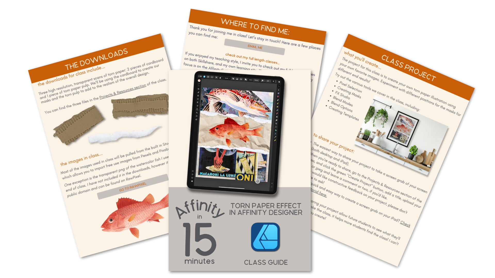

The project for this class is to create your own torn paper illustration using the process covered in class When creating your design, try utilizing the various tools we cover in the class:
- Pixel Selections
- Creating Masks
- FX Studio
- Blend Modes
- Blend Options
- Creating and Importing Templates
I would love to see what you create, plus, sharing your project allows potential students to see what they'll learn when they take the class. I've included step by step instructions on how to upload your project in the PDF Class Guide I've provided.
Happy Creating!
Class Ratings
Why Join Skillshare?
Take award-winning Skillshare Original Classes
Each class has short lessons, hands-on projects
Your membership supports Skillshare teachers
Learn From Anywhere
Take classes on the go with the Skillshare app. Stream or download to watch on the plane, the subway, or wherever you learn best.