Transcripts
1. Class Introduction: You're ready to take
your affinity designer skills to the next level,
then this is for you. Today, I'm excited to
announce my brand new course, Affinity Designer
beyond the basics. This course is for
anyone who already knows the basics of
affinity designer, but wants to take their
skills even further. We'll start off the course with the most important tool in affinity designer, the Pen tool. This tool can be a
little tricky at first, but it's going to
be your best friend by the time you
finish the course. We'll start with the basics
of the pen tool and then create a fun little design to put our new
skills to the test. But here's the little secret. Once you've learned
the pen tool, you can make anything. After learning the basics, we'll build on our pen tool
skills as we learn to take an ordinary photo and turn it into a beautiful
vector design. Vectorizing photos is so
much fun and I'll show you easy ways that you can put your own personal style
into your designs. But we won't just
work with photos. I'll also show you
how you can take a sketch that you've
drawn on a piece of paper and turn it into an
amazing piece of vector art. Turning a hand drawn sketch into vector art is my favorite thing to do an affinity designer. There's just something
magical about turning a little sketch into a
beautiful piece of art. Even if you don't think
you can draw very well, you'll still be able to turn simple drawings into
amazing vector designs. All of these projects are a
lot of fun to make and you'll be learning so many great skills as we create them together. After doing these
projects with me, you'll be totally
prepared to make beautiful art all on your own. Then to finish the course, we're going to
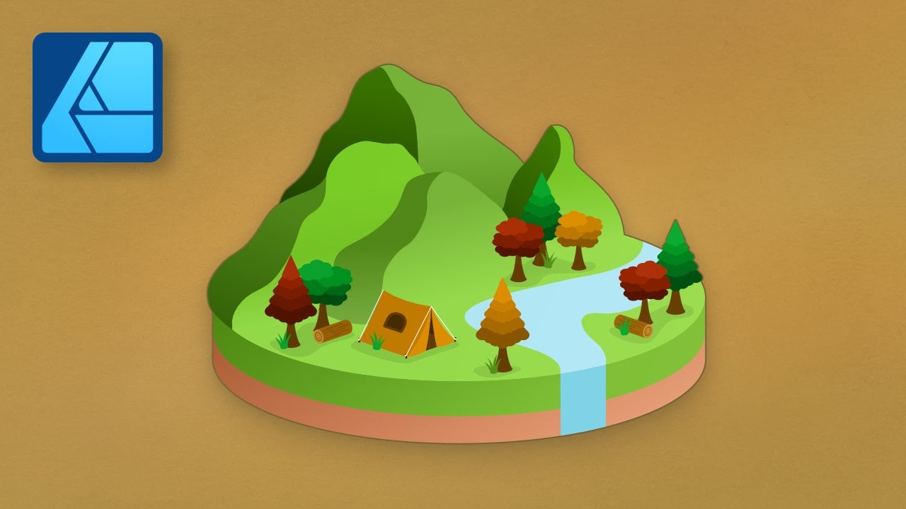
learn about one of the most incredible things you can do in affinity designer. Making three D art. We'll start off by
learning the basics of three D art as we create
this simple design. This is a fun way to get
started with three D, but of course we
won't stop there. After we've learned
the basics of three D, then we can create some
really amazing designs. Just look at what we'll
be making together. No, these aren't photos
that I'm showing you, yes, you will be
able to make them. You'll have all the skills you need to make these with me, and then you'll be
totally prepared to make three D art
all on your own. But before we dive
into affinity, I want to mention that
this course comes with a few example files that we'll be using
throughout the course. I encourage you to download and use them because practicing what you learn is
the best way to retain all of the new skills
that you'll be learning. You can download those files in the next lesson and
then you're ready to begin your journey to becoming an affinity
designer master. Let's get started. Okay.
2. Download the Class Files : Before you begin this class, I recommend you download
the exercise files. These files will be necessary for you to follow along with the tutorials to
download the files, come to the project
and resources tab. Then click on the download link. The files will
then be downloaded to your computer and you'll be totally prepared to follow along with the
rest of the class.
3. The Paper Cutout Effect: Let's start off this course with a fun design technique that I'm calling the paper cutout effect. Notice the beautiful curving
lines of this design. We'll use the pen
tool to create those. This is going to be
a fun way to review designer and warm
up for the rest of the course because
we'll be using the pen tool a lot.
Let's get started.
4. Layer Effects: Let's talk about layer effects. Layer effects are so useful
and throughout this course, we'll mainly use them to add
shadows and blurs to layers. I know that we
already learned about these a little bit in
the beginner course, but I want to make
sure that we review these two effects that we'll be using throughout this course. To start reviewing
how these work, we'll need a layer to work on. I'm going to add
a shape. And then I'll make it a
nice bright color. Now we're ready to add
some layer effects. I'll come right down
here to the F x icon. I'll click on that, and we have this huge dialogue box
open up right here. Now, like I said, we're
mostly only going to be using shadows and blurs. We'll stick to these
two down here. First, let's take a
look at Gaussian blurs. Since they're the most simple. All you need to do
is raise the radius, and just like that, we
have a blur added to our shape. It's pretty simple. Gusciu blurs will really come in handy in our three D chapter. In flat design, it's
not used quite as much. Next, let's look
at outer shadow. I'll turn off this gauciu blur. I'll click on outer shadow, and then we can take a look
at a few of these settings. First, offset. As I drag this up, the shadow becomes, wait for it. More offset. I'd like to raise this first to see where
our shadow is placed. Then I'll come over
here to where it says angle and I'll adjust the angle. Once you like the
placement of your shadow, you can soften this
with the radius slider. I'll increase this and you
can see that softness there. The last slider is intensity, and I don't usually like using the intensity slider because I find that it just counteracts
the radius slider. As I bring this up, the
shadow becomes harsher again. Mainly the three settings
you need to worry about are radius, offset and angle. That was pretty easy. To demonstrate this next part, I'm just going to lower the radius and I'll close
out of this dialogue box. Now, watch what happens
as I adjust the shape. I'll grab the move tool and
then I'll increase the size. Notice that the shadow
looks less offset. It seems closer to our shape, and as I decrease the size,
you can really see this. The offset is way
offset from our shape. This is weird, I wish that this wouldn't
happen, but we can fix this. I'll undo by pressing
command or control Z. Then I'll come back over
here and I'll click on the F x to bring up
this dialog box again. With this open, I
can come right down here and go to
scale with object, and I'll just check that on. Now, the shadow will keep
its offset distance, no matter how big or
small we make it. I honestly wish
that the scale with object setting was
on by default. It's pretty frustrating
that it's off the default because I forget
to turn it on sometimes. If you forgot to turn it on and your effect isn't scaling properly, this is
how you fix it. I have one last tip
I want to show you, and that's the quick
effects panel. To show you this, I'm just
going to create a new layer. I'll make it a new
color just for fun. Now, I want to show you how you can quickly add layer effects in a different way to access
the Quick effects panel, you'll need to come
up to Window and then down to where it says
Quickeffx. Click on that. Now we can tuck this window
right over here next to our layers panel.
And there it is. The way this works is first, you need to have
your layer selected. Then come right over
here to quick effects, and you can actually apply
any of these layer effects. Watch what happens as I check on Gaussian blur and
bring up the radius. This works exactly the same
as the layer effects panel. But it's just a little quicker. You don't need to
bring up that huge dialogue box every time. But this does come
with some drawbacks. You can see this in the
outer shadow setting. I can bring up the
offset and radius. It's missing the
intensity slider, but that's okay because I
don't really like using it. You can still adjust the angle. But notice that there's no
scale with object setting. This is really the
only downside to using Quick effects to access
the bigger dialog box, you'll need to click
on the gear icon and then click on
scale with object. Now that should work just fine. But honestly, in my workflow, I really like using this
quick effects panel anyway. It's a lot faster and easier. I love that this
huge dialogue box doesn't come up and
block the entire screen. Because I like the
convenience of this, we'll be using the
Quick effects panel quite a bit in this course. Go ahead and add it
to your workspace. Okay. All right. Now that we've reviewed
the layer effects, I want to show you some
cool layer effect tricks, and we'll do that in
the next video. Okay.
5. Duplicating Layer Effects: Let's learn how to
duplicate layer effects. You can duplicate
your layer effects across multiple layers, and it's actually really easy. I actually recently learned how to do this, and let me tell you, I don't know why it
took me so long to figure this out and it
saves so much time. Before I would apply
one layer effect, memorize the numbers that
I used in the settings, and then punch them in
to every single layer. It's actually a little
embarrassing to talk about. I actually found that there's
three different ways to apply the same layer
effects to multiple layers, and you can use whichever
method works best for you. To start, let's add
the same layer effects to all of these heart layers. I'll hold down shift to
select all of the layers. Then I'm going to press on the
FX button right down here. Because all of these layers are selected at the same time, you'll affect them
all at the same time. I'll add a gaussian blur and you can see all of them
have that effect added. You could also do the same thing using the Quick effects panel. I just want to note
though that if you use this method and you want to go back and change how
the effect looks, you need to have all of
your layers selected again. Then make sure that you click
on the FX right down here. Do not click on the
FX next to the layer. If you do that, you'll only
be affecting the layer. I'll click on FX down here, and then I can adjust this. The next method is to drag the layer effect
onto another layer. To show you this, I'll select
this first little cloud. Let's go to the
quick effects panel, and I'm just going to
add an outer shadow. I like this effect and I'd like the other
clouds to have it. All you need to do
is click and drag on the F x and apply it
to the next layer. Now they both have the
exact same settings, the exact same shadow. You can only do this
one at a time though. If you have a lot of layers,
you'd like to do this two, this might not be
the best method, but it is pretty fast. The last method
that I want to show you is to simply copy and paste. To see this, I'll apply an outer shadow to
one of these stars. Then with that layer selected, I'm going to press
Command or Control C. Then I'll select one of the other star layers
and I'll paste the effect. To do this, press Command
or Control Shift V. This is a different shortcut than simply copy and pasting. Command or Control Shift V, means that you are
pasting the style only, which you can actually see right up here in the edit menu. To paste, you do
Command or Control V, and to paste the style,
which is what we just did. It's Command or Control Shift V. If you're copying and
pasting like this, you can do this to
multiple layers. I'll select both of
these and then press Command or Control Shift V.
I really like using this, but I do want to point out one problem you
might run into. If you paste the style
onto another layer, you're pasting the
layer effects, but you're also
pasting the colors. If I were to copy the star layer and then paste it on
one of the hearts, command or control shift V, you can see that all of
the style was copied over. It's lost its gaussian blur, it has a shadow and it's yellow. This is just something
to be aware of with this method. All right. With that, you now
know how to apply layer effects and how to
duplicate them super easily. I wish I had learned how
simple this was sooner, but at least I can share it with you now and save you some time. In the next video, we're
going to dive into learning more about the pen
tool and the node tool.
6. The Pen Tool: In this video, we'll do
some pen tool practice. We'll keep it pretty simple and just focus on curved lines. We'll work more with adding sharp corners in
the next chapter. Go ahead and select
the pen tool. You can find it right here. Now, in the beginner course, we only stayed in polygon and smart mode because those are the most simple
for beginners to use. But in this course, we'll
only be using pen mode, which is the default mode. Pen mode is much
more customizable. You can make any shape
that you but with it. Along with being in pen mode, I always like to turn
on rubber band mode. I always work in this mode
because I really like having a preview before I lay
down my next points. One last setting, make sure that you don't have
snapping turned on. Your button should
look just like this. Now that we have the proper
settings on our pen tool, let's go ahead and start
with this first shape here. When you use pen mode, it's a good idea to click and drag as you lay down
your first point. This will just make it easier to adjust the node later
on if we need to. Go ahead and click and drag that first point
to get it started. Then we can lay down our
next point right here. When you're laying
down these points, you can click and drag
more to make the line more curved or less to
make it less curved. When you get to the
end of your line, go ahead and press escape, and this will end the line. Now, for this first shape, you'll notice that
I have markers down for where you're supposed
to lay each node. Notice where these
are positioned. They're positioned in the places where the line quickly
changes direction. Of course, when you're
tracing out a pen path, you won't have these
little markers, but you can imagine
the markers are there. Let's go to the next
shape to try this out. I'll start here and
I'll click and drag. Then I'll go to about where it changes direction and
I'll click and drag. I'll just guess it
changes about here. Then I'll do the last point
and I'll press escape. Sometimes you might get your node placement
wrong and that's okay. It's super easy to change
where the node is placed, and even how much you
dragged the node out. We can use the node tool to
fix any of our problems. You can find the node
tool right here. Then we can adjust the nodes. I'll click and drag on them to adjust where they're placed. If you want to change how much the node has been dragged out, all you need to do
is select the node, and then you can see
it's two handles. That's what these little points are that's around the node. You can click and
drag on those to adjust the curviness
of the node. Okay. This verse line
I did wasn't perfect, so I think I'll
adjust this as well. For this next shape, I'll
get out the pen tool. This time, I'll use a shortcut. I'll just press P on my
keyboard to get it out. It looks like we're still
connected up here to this node. I'll press escape on my
keyboard to end that line. Now we can go ahead
and start tracing it. Now, this one is a
little bit trickier, whenever I'm tracing
a trickier shape, I like to adjust
my points as I go. It doesn't always
make sense to end the shape and then go back
and adjust the nodes. Sometimes it's easier to adjust
it during the process of tracing it out. I'll
start right here. He click and drag a
bit and then I'll draw this next point here
and this next point here. This looks pretty good, but it looks like I placed
my node wrong. A quick way to bring
up the node tool is to actually hold down command
or control on my keyboard. Then I can quickly
adjust the placement. I can even adjust the handles
a little bit if I want to. All right. That looks
good. I'll lift up on command or control, and now we have the
pen tool again. I'll continue to do this. Oh, and that doesn't
look very good. I'll close the shape
and then we can go back and adjust that node. This time, I'll just get
out the proper node tool by pressing A on my keyboard, and I'll bring that
in a little bit. I'll also adjust this
line right here. All right. I think
that shape looks good. Okay. Very nice. As we traced out that shape, we had a lot of
helpful guide points, but let's try tracing the shape again
without those points. I'll press P for the pen
tool and we can get started. If I were to trace this without knowing where any of
those guide points were, I think I would place
my points like this. I think I'd set this one here, and then maybe one right here. I think I might place my
next point here honestly. Then maybe here and here. I think I'd place a point here, and then I'll end it like that. Notice that the shape turns
out pretty much the same. Even though I place the points in a totally different way. We have an extra
node here and here. This is placed way higher
up here than this last one. This just goes to show
that you don't need to stress too much about where
you place your points. As long as the line lines up to where you're
tracing the object, your shape can still be accurate even if your points have
been placed differently. I know that this pencil can
be tricky to get used to. But the more you
practice it yourself, the more natural it
will begin to feel. I've been using it
for a long time now and I feel
pretty good with it. I definitely still make mistakes as you could see in this video, and I'm sure you'll see me mess up more as we work through
this course together. But even though I make
mistakes sometimes, I still feel confident that I could trace out any
shape that you put in front of me and you'll feel the exact same way by
the end of this course. It just takes some practice, but I know you can do it. To continue practicing
the pen tool, we're going to do a mini
project in the next video. This mini project will
be our first look at this paper cutout technique that I was telling
you about earlier. I'll meet you in the
next video. Okay.
7. Avocado Mini Project: This video, we're going to
do a quick project together. We'll make this super
cute avocado design. We'll use the techniques that we've been learning
throughout the chapter to make the shadows and create this cutout effect.
Let's get started. To start off, let's make a rectangle to fill this
background with color. I'll grab the rectangle tool, and then I'll click and drag to fill the entire background. Now, to make things easier, we have an exercise file that we can place
in our document. I'll go over to the
Place Image tool, and then I'll select
this file right here, the Afcado mini project file. I'll open that up and then
I'll place it in our document. These are the colors
that we can sample as we go to make our
ovocado really pop. For the background. I think I'll select this
lightest color here. I'll grab the color picker
over here and sample that. With the rectangle
selected, I'll apply it. For our main ovocdo shape, I'll grab the pen tool, and I'm roughly going to
create the shape of an vocado. Before I do that, let's just make sure we're in pen mode with rubber band mode turned on
and snapping turned off. Then we can go ahead and
trace out the shape. I'm just going to roughly trace the shape of an ovcado
laying on its side. After you've traced the shape, you can grab the
node tool if you'd like and refine your
shape a little bit. But I like that it's
a little imperfect. I think that makes
it a little bit more funky of a design. Then I'll grab the
move tool and I'll just make it a little
bit more centered. With that traced out, I'm going to choose
the darkest color. I'm going to apply that here. Now, by default, we have a
black stroke on the shape. I'm just going to select that
and tell it not to apply a color. There we go. We're off to a good start. Now we're going to make a few
layers to fill this vocado. This is where things get easier because we already
have the main shape. We can just trace a
smaller version of the shape for the
inner two layers. I'll grab the pen tool
again and we'll do that. I think I'll grab the node tool and just fix this
up a little bit. You can make this as close to the edge if you
want this to look even more like it's the
peel of the avocado. But I think I'll just space mine out a little bit like this. All right, looking good. Now we can go ahead and select the
next darkest color here. Let's do this one more
time for another layer. I'll undo that. I
messed up a little bit. Here we go. All right. These inner layers are
getting a little bit more funky as we're running out
of space, but that's okay. I think this one just can't have quite as many
nodes as the last ones. I'm going to delete this node by pressing delete on my keyboard. All right. I think that
looks pretty good. It doesn't perfectly follow the shape, but I think
that's all right. I'm just going to apply this lightest color
to the inside. To finish off this design, you might be curious
what this color is. This is for the avocado pit. I'm going to grab
the pen tool and I'm just going to trace a
little pit right here. We could have used
the ellipse tool, but I think it's fun to trace a more imperfect
circle for the pit. Then I'll sample that
color and apply it. I think I'll grab the
move tool and just make this a little bit more
centered in the avocado. Now we no longer need
the color swatch, so I'll turn that off. I think this already
looks really nice. But we do have one
more step we need to do to give this
the cutout look. I'm going to select all
of our vocado layers, so I'll hold shift
and click to do that. Then I'm going to apply a
quick effect shadow to them. I'll check on outer shadow. Then let's bring up the
offset quite a bit. Then we can bring up the radius just to soften it a little. For resizing reasons,
I'll just click on the gear icon and turn
on scale with object. And there we have it
O beautiful avocado. After working through
this project, you might be wondering why
I didn't just duplicate the original avocado shape and decrease the size
for the inner layers. I agree that would be
easier and faster. But to make this effect really look like it's cut
out pieces of paper. I think it's more realistic if the shapes are
slightly irregular. It's a stylistic choice, but I thought I should
probably explain that. After all the work that you've done in this chapter, it's time. You're ready to wrap up this chapter with a
big beautiful project. I'll meet you in the
next video. Okay.
8. Colorful Map Project: This video, we'll
make this beautiful, colorful project that reminds
me of a topographical map. I really like all of the layers, and I think this will be
a fun way to practice using the pen tool.
Let's get started. This project is pretty free form since the shapes are
just curvy blobs. We don't need to
worry about having a sketch or making
these shapes perfect. But I do have another swatch
of colors for this project. I'll go to the place image tool. I'll select this
swatch right here. Then I can go ahead and
place this in the corner. To start off, I'm going to
grab the rectangle tool and make a rectangle to fill
the entire document. I'll just bring this watch to the top so I can
sample the color. Then with that
rectangle selected, I'm going to sample this orange color and then I'll apply it. I think I'll turn
off this watch for now just so we can begin to trace the shapes
without worrying about that blocking our view. The next step I want to
do is I want to make the largest shapes
that we're going to have in this
topographical map. I'll grab the pen
tool and I'm going to trace out a few large blocks. These can be as free
form as you want. Don't worry about
them being perfect. And I forgot to turn
on rubber band mode, so I'll do that. Just have a little fun with
how you're making these. Try to make about four blobs. Okay, I have all my blobs made. I want them to be a
little bit more centered. So I'm just going to select this one and I'll bring it up. I'll bring them all
up a little bit. There we go. We want
to leave some space on the outside because
we're going to create a frame of other layers. You'll see that in a moment. But for now, here we have
our four main blogs, and we have the rectangle
underneath them. With all of these shapes made, I want to subtract them
from this rectangle. If you remember in
the beginner course, we actually used the add and
subtract operations quite a bit and we'll be using the subtract operation
a lot in this video. I'm going to select
all of the layers, our blobs and this
background included, but not this watch. Then I'm going to subtract them. Now, just as a reminder, when you use the
subtract operation, all of your layers will be subtracted from
the bottom layer. As you can see that
worked out just fine. We now have that cut out and I want to fill
in that space. I'm just going to grab
another rectangle. I'll click and drag it out. I'll place it beneath
the cutout layer. Then with our swatch turned on, I think I'm going to select this nice blue color,
and I'll fill that in. Just so that we can
start to see what this effect is going to look
like, let's add a shadow. I'm going to select
this cutout layer, and then I'll go
to quick effects. I'll turn on outer shadow, and let's just give this
a little bit of a shadow. Now you can start to see
what I'm going for here. This blue area
looks like they are little lakes that have been
cut out of the orange Earth. I think that looks pretty nice. We're off to a good start. But before we go any further, I suggest that you
save your work. It's so important when you're working on large
projects to do this. I forget to do this all the time and I have lost some
of my work before. It's really frustrating and I don't want it
to happen to you. Get into the habit of
pressing command or Control S. Then you can go ahead
and save your work. It looks like my document
got a little off center, so I'll press command or
control zero to recenter it. Now we're going to continue. I want to fill in these blue
areas with little islands. I'm going to grab the pen tool. Then just like with
our avocado project, I'm going to trace along
the inner area here. Now, this is a
little bit tricky. Rubber Band mode is on, but because it's blue, it's blending in with
this blue color. This will only be a problem
for this first layer. Sorry about that. All
right. Got that done. I'll just continue to do
this for all of the blobs. If you ever make a mistake, remember that you
can always press command or control Z to undo, or you could always press on the node tool to
adjust your points. Now that we have all
of those traced. I'm actually going to
select all of these by pressing shift and
clicking on them. Then I'm going to group them together with command or control G. This will make it easier to change their colors and
properties all at the same time. With that group selected, I'm actually going to sample this outside color orange and I'll apply it
to all of them. Now they all have this
nice orange fill. I see that they have a
black stroke though. Just click on this to make
sure that that goes away, so there should be no
stroke and an orange fill. In fact, I forgot to check. Let's see, yes, this one
also has a black stroke. I'll remove that. This one, it doesn't matter because
it's covered on the outside, if there's a stroke, we
couldn't see it anyway. I'll continue to fill in these shapes with
a few more layers. With that top group selected, I'll just continue to trace
them with a pen tool. Remember that as you're tracing, you could always hold down
command or control on your keyboard to
adjust your nodes. With all of those
done, I'm going to select them all and
then group them with command or Control G.
Then I'm going to turn on the swatch and I'm
just going to select this red color here and I'll
apply that to all of them. I think I want to do
this one more time, one more little island. I'll continue to do
this with the pen tool. I don't think there's
enough space on the smallest island here
to put another layer. I think I'll leave
that one alone. Then I'll select all of these. I'll group them together. This time, we're actually
out of colors on our swatch. I want to show you
what I would do. If I wanted just a
slightly altered color. I'm going to apply
this red color that we had on the
layer beneath it. Then I'm going to
change this from a color wheel into sliders. Then I'm going to
make sure I have HSL slider selected
right up here. Now, if you want a slightly
lighter or darker color, all you need to do is change
the luminosity slider. If you wanted, you can make
this a slightly darker color, I think that looks pretty cool. Or you could do a
slightly lighter color. I also think that looks cool, so I think I'll keep it
at the lighter color, but either way it
looks really pretty. I'm going to be using the
HSL sliders quite a bit in this course to get slightly
lighter or darker colors. I really like using
the color wheel, but I think this is
just a little bit easier for those fine
tuning of colors. I will keep my color panel set to this throughout
the course. Go ahead and change
yours if you want to follow along a
little bit easier. At this point, we can
do a little bit of a sneak peak here and apply this layer effect
to these groups. This is pretty fun. I'm
just going to click and drag it and apply it
to the entire group. I'll do that for
all of our layers. You can already see this
beautiful paper cutout effect. To finish off this project, I want to add a
few more layers to the surrounding area so that it looks like a frame of layers. But this is a little bit
tricky. Let me show you why. If I trace out the shape that I want to frame these layers, I'll just quickly do that. Then I apply a color to it. I think I'll go with this red
color we already sampled. Oops, that doesn't look right. It's covering all of the
work that we just did. We'll actually need to
do some subtraction. I'm going to grab the
rectangle tool and I'll trace out a rectangle over
the top of everything. With this layer that we
just traced placed on top. I'm going to subtract
it from our rectangle. I'll select both of those layers and then use the
subtraction operation. Now you can see we have
our beautiful frame. This was a little bit of a
puzzle for me to figure out. That's just the way
we're going to do it for these last few layers here. I'm going to do that
again. I'm just going to trace another layer
around this one. I'll follow along the outside. Then I'm going to fill it
with the lighter red color. Then I'm going to have
to cut it out again. I'll take a rectangle
across everything. I'll put our cutout layer on top and then
I'll subtract it. This looks really nice.
I'm just going to do this one more time
with the pen tool. For this last layer,
I'm going to go outside of the
document a little bit. There isn't quite enough space to fully do it on the inside, but I think that's just fine. For this last layer,
we're going to bring this orange color back in. I'll apply that. I'll do a
rectangle across everything. I'll place this layer on top, select them both and subtract. Okay, take a look at this. This looks really nice. Everything is now in place. I'm actually going to
select all of our layers. Then I'm going to apply a
shadow all at the same time. Go to our quick effects panel, I'll first increase the offset. As you can see, this is affecting all of our
layers at the same time, even the ones that
already had a shadow. This is overriding that, and now they'll all have the exact same shadow
that I'm giving them because all of the
layers are selected. I'm just going to mess around
with this a little bit. I think that looks pretty good. We can also change the
angle if we'd like. You can see this really
affects the effect. This really makes it pop. You can choose whichever
angle you want. I like it going to
the bottom area here. I think that looks really nice. Even though I don't
anticipate resizing anything, I do think it's good practice to turn on scale with object. I'll do that. With that, we've completed the first
chapter of the course. I think this was some
really good review, and it will lead really
nicely into our next chapter. Where we'll start working
a little bit more with the pen tool to create
beautiful flat designs.
9. Using Photos for Flat Design: So you want to turn your
photo into a vector. Well, you're in the right place. This chapter is the perfect
way to really refine your pen tool skills and
B we'll be using photos, you don't even need a
well designed sketch. We can just jump right into vectorizing. Let's get started.
10. Finding Reference Images: This video, I'll
walk you through where to find reference images, and what type of image to look for to create an
interesting design. First, let's talk about
where to find images. There are a few different
websites that I like to go to for
reference images, and they are Pixabay,
splash and Pexels. I'll leave all of these
linked below this video. All of these websites let you
download images for free, which is so useful for
practicing and designer. If you've ever taken any of
my affinity photo courses, these websites might look
familiar to you because we use them a lot for reference
images and photo as well. Now to find your images, all you need to do is come right here and type in whatever
you're looking for. I'll just type in woman,
then I'll press Enter. Now you can see we have so many wonderful images
to choose from. Here's what I look for,
especially in designer to find a picture that will be interesting to turn
into a vector. First, I try to look for
an interesting pose. If you have your model just sitting straight toward
the camera smiling, it might not look quite as interesting for this technique. Try to look for someone who is posing in an interesting way. These pictures
will come across a little bit better
for your design. Even this with her
hand up a little bit, that'll look a little
bit more interesting than just sitting
there straight on. Another thing I like to look
for is interesting colors. These colors could be a
good jumping off point. For example, this yellow against the green
looks really pretty. Try to look for an
interesting pose and interesting colors, and you should come up with
a really pretty design. Once you've found a
photo that you like with an interesting pose and
interesting colors, all you need to do is
download it just like this. This little pop up will come up, you can donate if you
like, but it's free, so you don't have to, and then you can use that
photo and designer. Now that you know these
criteria that I look for, let's try searching for a
more simple subject and see if we can still find an
interesting picture here. I'm just going to type in fruit. Now, fruit already comes in
so many beautiful colors. That's pretty easy to check off the interesting colors box. But it can be a
little tricky to find fruit that's posed in
an interesting way. A lot of times the fruit
is just sitting there, but maybe with it cut open, that's a little bit
more interesting. I think it'd be pretty difficult to trace all
of these blueberries. So keep that in mind, or all of the detail of that kiwi would be
pretty difficult. But maybe a more simple
orange cut open, and avocado, little throw
back to the last chapter. This is interesting,
pineapple wearing sunglasses. That could be fun. Even when your subject doesn't seem
to be that interesting, there can still be interesting
ways to pose them. Now, I really like
this image right here. I think the colors really pop. There's a lot of monochrome
yellow going on, which I think looks really
pretty in a design. In addition, the banana looks a little bit
more interesting. It's laying on a
plate and peeled, which maybe gives
you a little bit more to work with as
you're designing. I think I'm going to go with this banana and I'll
press download. Now, I had to scroll pretty
far to find this banana. So if you don't see
it, no worries. I made sure to include it
in the exercise files. We're going to trace
out this banana in the next few videos. So go ahead and
open up designer, and we'll begin working with
it in the next video. Okay.
11. Adding Reference Images: This video, we'll learn how to set up a reference photo in your document in a
way that will make it easy to trace without
it getting in the way. First, we'll need to
place our image with the place image
tool. I'll do that. Once you have it placed
where you want it, it's a good idea to lock your layer over here by
pressing on this lock icon. That way you don't accidentally move it as you're working on it. An optional thing you can
also do at this point is sample any of the colors if you think you'll want
to use them later on. For example, maybe
I want to sample this light color of the
banana. I'll just sample that. Then I'll trace out a
little rectangle up here and I'll apply
that color to it. We can do this for the other colors as
well, if you'd like. I'll just grab the
move tool and I'll hold down command or control and shift that will duplicate it and keep it nice and in
line with the other shape. Then I'll sample the
color of the yellow peel. Then let's do this
one more time, command or control and shift. Let's just sample the
background color. Now we have the color sampled, which is good because now we're going to adjust the opacity of this reference layer and the colors won't show
up quite the same. I'm just going to come up
here and lower the opacity. You can lower it a
different amount depending on the
contrast of your photo. This photo doesn't have
very high contrast, I think I'll just lower it
a little bit like this. Lowering the opacity, we'll
just make it easier to see our pen tool as we're tracing
a path around the banana. Usually, I'll lower the opacity a
little bit more than this, but like I said, there
isn't much contrast here, so I think this
should be just fine. That's it. That's how you
set up your reference photo in your document and get
it ready for tracing. This video was short and sweet and now we have our
reference image ready to go. In the next video, we'll dive
into tracing this banana.
12. Pen Tool Sharp Corners: Let's learn how to work with sharp corners with the pen tool. So far, we've really only been clicking and dragging
to make curved lines. But making corners and
being able to quickly change direction is crucial
when tracing out designs. Let's look at how to naturally do this as you're
dragging out a line. Before we trace this banana, I'll just turn off this layer so I can show you my strategy for changing direction really quick. I'll grab the pen tool. I'll make sure we're in pen mode with rubber band mode turned on. Then I'm going to
increase the stroke of this line just so
we can see it better. Then I'll begin
clicking and dragging. You already know that we click and drag to make a smooth line, leading the bezier handles here in the direction
that we want. Wherever we place the handle, that's where our line is
going to curve from next. If you want to quickly
change direction, all you need to do
is hold down Alt or option as you're
clicking and dragging. Then you can see
the handle break and now we have a sharp node. Now you can put that handle in whichever direction
you want to go next. Then you can lift
up on alter option and continue to trace your line. It's really important that while you're clicking and dragging, you hold down alter
option the entire time, then you release your cursor, and then you release
alter option. That might sound a
little complicated, but all I want you to
know is that you need to hold down Alt or option
the entire time. That way, the node stays
sharp as you adjust it. As I'm tracing, I keep my finger hovered
over alt or option. That way, I can quickly press it down and change
direction as I go. Another thing I want
to point out with sharp nodes is if
you just click, it will automatically
be a sharp node, and then you can continue
to change direction. But the downside
to just clicking is that you can't customize how curved it is before you hold down alter option
and change directions. I would suggest
just holding down alter option to
change direction, not just clicking, but
sometimes that could work too. I know that was a little messy. Let's see this in action now. I'm going to have this layer selected and I'll
just delete it. Then I'll turn back
on the banana layer. Let's start by tracing
the peel of the banana. I want to trace all of the parts of the banana separately. Starting right here, I'm going to click and drag
for my first point. Then I'll come down here, just clicking and dragging
all along the way. Then it looks like
we have a little bit of a sharp change in direction. I'll hold down Alt or option and then I'll move my handle in
the direction of the change. I'll lift up on my cursor, then I'll lift up
on alt or option. Then I can continue
to trace these out. I'll hold alter option
again for this curve. Then we can continue to trace. To end my line, I'll
just press escape. All right. That wasn't too bad. Let's do this piece
of the PL next. I'll click and drag
to start this. Then I'll just click and drag in the direction of
the curvy lines. It looks like if I
just click right here, this curve is actually
perfect for the pal. I think I will just click
to lay down a sharp point. Then I'll click and drag to
continue tracing this out. As a reminder, if
your points don't look exactly the same
as mine, that's okay. Remember that as we were learning about
using the pen tool, sometimes your nodes might not be laid in the exact same place, but you can still trace out
your shape just as well. All right, let's trace
out this next part. I think I'll do this one next. I'll click and drag
to get it started. I'll hold Alt or option
to change direction, and then I'll continue on. I'll press escape
to end my line. Let's just trace the
main banana now. All right. This is
looking really nice. Last, let's just trace this
last part of the p here. Okay. All right. And it looks like I overdrew
a little bit right there. I'm just going to press
A for the node tool. I'll click on the banana, and I'm just going to
move this node upward. Now that I'm done
tracing the banana, let's go ahead and
trace the plate too. Because this is a
perfect circle. I'll just use the Ellipse tool. I'll click and drag
while holding Shift, and then I'll resize
this will holding shift and place it
right over the plate. Now, right now, we have a fill. I'll just say no fill, and I think that lines
up pretty nicely. Maybe I can bring this
in a little actually. Now that we're done with
that, we can turn off the reference layer and
see what we just traced. I'll also turn off the color
swatches because we're not going to worry about filling in the colors for this video. We're actually going
to learn more about filling in our designs
in the next video. No need to worry about
that for this design. To wrap up this video, I just want to tell
you that it's so important that you
get comfortable using the pen tool because
it really is the cleanest way to
create smooth designs. I know it is a
little intimidating. That's why in the
beginner course, we mostly made our designs using the pre built shape tools. But this isn't the beginner
course anymore and I'm confident that you'll feel comfortable with the pen tool. The more you practice
alongside me. If you want even more practice, there's actually an online
game that you can play. I'll leave that linked below this video if you want
to check that out. This is the Bezier game. This game helps you practice the different shortcuts
that you need to use to use the pen tool and
quickly change direction. Using the skills that you
now know about the pen tool, you're ready to
dive into a little bit harder of a project as we learn how to trace a rose and fill it with color
in the next video.
13. Fill Color Strategy: Let's learn some strategies for filling your
designs with color. Now that we know
how to draw lines that match up perfectly
with the design, I want to show you some strategies that
you can use to color your design in a beautiful
flat design style. But before we can
get into coloring, we first need to add
our reference image. I'll press the place image
tool and select our rows. I'll add this to our document. I'd like this stem to go off of the document a
little bit like that. Then we can just lock this in place and sample some
of these colors. Since we will be filling
in the colors this time, this is a pretty important step. First, let's sample the yellows. I'm going to sample this
lightest highlight yellow color, and I'll grab the rectangle
tool and draw out a little swatch and fill it
with that sampled color. Using the move tool.
I'll just hold down command or control and
shift to duplicate that. Then I'll choose a few more versions of
this yellow color. Let's go with this
slightly darker version. I'll duplicate it again. Let's go with this
darker version. And one last time, let's find the very darkest color that we can somewhere in the shadows. All right. Very nice.
Next, let's do the greens. I'll hold down just
command or control to duplicate the square and
I'll place it down here. Let's do the same
thing. I'll choose the brightest green
color I can find. I'll duplicate it. Let's
choose a little bit darker of a color.
Maybe this one. Again, maybe this color. That already looks pretty dark, but let's see if I can
get an even darker color like that one. Oh, wow, that's
very dark. Perfect. We now have all of the
colors swatched out. I'll just group those together since there's so
many layers there. I'll press command or control G. And then with
the row selected, I'm just going to lower
the opacity here. I think around 50% looks
pretty good for this. Now we can begin tracing. I'll grab the pentle and
let's go ahead and start. Now, I want to trace each
part of this row separately, so we have the leaves, the
rose petals and the stem. Let's start with the leaves,
and let's start with the very back leaves and then
work our way to the front. I'll start right back here. Okay. I'll click and
drag for my first point. I'll make sure rubber band
modes turned on. There we go. Then I'll click
and drag to trace this too quickly
change direction, I'll hold Alt or option down. Once I release my mouse, I can release Alt or Option
and then we can continue. This rows will have quite a
few changes in direction, especially if you choose,
and this is optional, if you choose to trace over
some of these spiky parts. I personally think tracing over these spiky parts looks really
cool in the final product, but feel free to do
whatever you want. If you want to just skip over those areas, that's
totally fine. However, it will be
really good practice if you do choose
to include them. I do encourage you to give
it a shot if you'd like. I'm also going to
come over here and trace this one in
the very same shape. These will be the exact
same color anyway, so I think it's just fine if
we include them together, holding Alt or option to
change direction there. Now, you might be wondering
why I'm choosing to overlap so much and that's because these leaves
are behind the rows. All of this extra
area right here, it will all be
covered up, so it's totally fine if I
overlap it there. Now, I'm just going to
fill this area with color. I'll choose this nice dark color here and I'll apply
it to the fill, but I'll remove the
stroke of the shape. That's a pretty good start. I'm just going to
drag this underneath the rows so that we can
still see the rows. In fact, for right
now, I think I'll just turn off this layer
because next, I want to trace the
main row shape. We'll go back and add pedal
details more later on. But for right now,
I'm just going to roughly trace over this rows. One thing I like about tracing objects that are very
natural in shape. They have a lot of variation is that you don't have
to be quite as perfect as you're
tracing them out. It's okay if
sometimes your lines are a little farther
away from your subject. Keep that in mind
as you're tracing, it's okay if it's not perfect. But do try to get it as close
to your subject as you can. With that, I've now traced
all around the rows. I overlapped it a
little bit with these leaves that are
going to go in front of the rose because if I tried tracing this rose
right along this line, and then I came
back and tried to trace the leaf right
along this line. There's a good chance they
wouldn't line up perfectly, and maybe we'd have some
white space peeking. By overlapping, we're
ensuring that the colors will line up nicely together without any crack
showing through. I'm going to apply a
yellow color to this rose. Let's just go with the
second color right here. This is looking
really good so far. Because of this rose is
sitting on top of our leaves, you can see that all we see of the leaves is
what we should see, which is just these parts here. This is going
really good so far. Next, I think I want
to trace the stem. I'll just turn off
these other two, so I can fully
focus on the stem. I'm actually going to
start my trace down here. I'm going to overlap
with the rows. I think I'll place
this behind the row, so I think that'll be just fine, and I'll close my shape. For this one, I'll choose the lighter green
color like that. Then with my petal
layer turned on, I'm just going to
move this to the top, you can see that that stem
sits right underneath that. Okay. Let's finish
off the last section, which are these leaves that
overlap in front of the rows. Actually, now that I'm looking
at this leaf over here, it looks like this leaf is
tucked behind the petals. Maybe I'll trace that first
and place it behind the rows. I'll go ahead and do
that. I'll turn off the rose layer so I can
see it a little better. Then I'll begin
tracing this leaf. Now this leaf has quite
a few little spiky guys, I think I am going
to trace those. This is where alt or option
will really come in handy. In this case, there's
a lot of times where also we could
just click to lay down a point and change
direction. Either way works. I'm going to overlap
with the petals here, and then I'll apply
this green color, and I'm going to place
this behind our petals. That way, they don't show
up. That looks really good. Now it's time to do
the very last leaves, these leaves that
overlap in the front, they actually look like
they connect to each other. Here, let me turn all these off so we can see that better. Oops. It looks like these
leaves are connecting. I'm going to trace
them all in one shot. I'll go ahead and start down here and I'll begin
tracing these. Now, this is going to
take me quite a while, so I'll probably speed up
this part of the video. But I'm going to be using
Alt or option quite a bit as I trace all of
these little spiky parts. I know this process takes
a really long time, but it's really good practice, and I think the end result
is going to look pretty. A lot of times when
I'm tracing things that I know are going
to take me a long time, I'll put on some music or put on a little
show to watch in the background or listen to in the background because I'm probably watching
what I'm tracing. But make sure you
just relax and enjoy yourself as you try
to trace this out. It will take a lot of time. But that's okay. That's
all part of the process. All right. That took
me a very long time. As you can see, toward the end, my tracing got a
little less precise, but I think that's all right. I'm just going to apply
a nice green color to that I'll place this on top
of all of my rose pieces. Let's go ahead and
turn all of those on. Then we can turn off
the reference layer and see how we're
looking so far. This already looks really good. I love all the
spiky leaf details. I do think that
turned out nicely. However, I think we need to change of the
colors to make this more interesting and more
true to the reference photo. To start, I think I'm
actually going to work on the stem in the reference photo, you can see that the left side
of the stem was in shadow, and the right side has
this big highlight on it. For our SEM, I'm going to use child layers to add
in that bright spot. To start, I'm just going to
click and drag on this side, then I'll bring it
around like this. Then I'll select this
brightest green color over here and I'll apply it, and I'll make this
a child layer by clicking and dragging it
on top of the stem layer. Now you can see what
that looks like. For the main stem, I think I should actually make
this a little bit. I'm going to select
this darker color here. That looks pretty
dark. Maybe I'll bring this up a little bit
with luminosity slider. Okay, I think that
looks really nice. Next, I think I want this leaf
to be a little bit darker. I'll just select that one. With luminosity slider, I'll
just darken it like this. For these leaves in the back, I honestly think they look
a little bit too dark, so I'm going to brighten
them with luminosity slider. At this point, I
think the leaves look really nice and they're pretty true to how our
original photo looks. But you might notice that
the yellow petals really should have a lot more detail
than what they have now. Well, using child layers, we're going to be able
to really give this a little bit more dimension and use some of these other yellow colors that we had sampled. I'll turn on the reference
layer so we can begin. With the rose layer selected, I'm going to start by tracing this main highlight
petal right here. I'll just bring it
around like that. I'm going to apply this
brightest yellow color here and I'll make it a
child layer to the rose. Now you can see this is only
showing up on the rose. That looks pretty nice.
Let's do that again. I'm going to create
another child layer. Let's start actually
right here in the center. I'm going to make
this central part of the rose a bit of
a darker color. Let's go with this
one right here. This has also been
placed as a child layer because the last layer we had selected was also a child layer. This should go pretty fast now. With that looking
good, I think next, I'm just going to
trace this petal here. I am just scooching around all
of these different layers. Actually, I think
I'll trace this all along the outside here. Then I'm going to come right in here for this darker area. I think I'll just
connect it like that. For this one, I think I'll just make this
slightly lighter. Then I'm going to trace
this main petal right here on top of everything. I'll trace this
along right here. Going outside of the rose a little bit here, and then
I'll bring it back in. And then I I'll actually
overlap it with this yellow part
because I think I'll move this yellow
part to the front. I'll make that a
little bit lighter. I'm going to move this
brightest yellow piece to the very front of
these child layers, and then I'll turn off
our reference layers. You can see what
we have going on. Sorry if that was a
little confusing. It can be hard to
explain when I'm trying to just layer layers
on top of each other. But basically,
what we have going on are all of these
different layers. As they layer on top of each other, they cover each other up. We have this center. We have this petal that's
off to the side. We have this petal
covering up both of those. So you can see how that looks. Then we have the main
yellow highlight. Now these colors really don't
look right at the moment, so I'm just going to
alter them a little bit. I think I want this main
color to be more true to this second color right here. Maybe a little bit lighter. I'll move the luminosity
slider up and the saturation slider up. That
looks pretty good. Next, we have this more brown
looking area right here. I'm going to raise the
saturation and the luminosity. And maybe bring the hue slightly more to the
right so it's more yellow. That looks pretty good. Then for this part, I want
this to be a bit darker. Then you see this more sickly
looking color right here. I think this is
actually the main rose. I'm going to adjust that color. I'll raise the saturation
up, darken it. Maybe let's make it a
little more toward orange. After all of those child layers, I think this looks a lot better before we had a bit
of a yellow blob, but now we have some
refined details. With that, we now have our
beautiful flat design. I think this turned
out really nice, even though it took
quite a bit of time to trace all of
these shapes out, I think the effect
is quite striking. Now that you've done that, and
you've really practiced up on using Alt option
to change direction. You're ready for the next
video where we'll use this very same technique
to trace a person. Okay.
14. Flat Design Model: In this video, we'll create
this beautiful flat design. Notice the interesting pose of our model and the
contrasting colors. These two elements make
this design really pop, and I can't wait
to create it with you. Let's get started. First things first,
we need to bring our reference image into
our document. I'll do that. As I trace this out,
you might notice we have this large lighthouse
in the background. Now, we're not going
to be tracing that. We really are only going to be focusing on our model here. I'm going to make this a bit larger and I'll
center the model. I think that placement
looks pretty good, maybe a little smaller. Now I'm going to lock my
layer and lower the opacity. I'm not going to sample
the colors in this image this time because I don't think
they're very interesting. We can choose our
own colors later on. Okay. With that I'll set up, I'll grab the pen tool, and I'll make sure
we're in rubber band mode so that we can get started tracing. Let's
start with the head. For the head, I can see three
main areas I want to trace. The back of the hair
right here that's going behind the face, then the face. Then the hair that's
overlapping with the face. I want to trace all
of these elements separately so they can stack
on top of each other nicely. Let's go ahead and
start right over here. Since I know this hair and the head are going to be on
top of this part of the hair. I'll make sure to
overlap the hair that I'm tracing right now
with those areas. For this hair at the bottom, I'm going to make it
a little bit spiky by holding down alt or option
and moving the handle inward. I'll just do that a few times. And then I'll overlap it with her head and close it like this. This image is a little
bit pixelated and fuzzy. It's a little hard to tell where to put these hair
details that I'm adding. Just give it your best guess. I think this should
look pretty good. Right now, we have
a black stroke. I'm going to remove
that, and I'm going to add a nice yellow
color for her hair. I'll bring up the saturation and the luminosity so we
can see this better. I actually think that
color looks really nice. I'll just move this layer to
the bottom of everything. Then we can continue
our tracing. I'll do the face next, and that will include
her ear here, but I won't worry about
tracing her neck yet. This time, I need to
make sure that I do a good job tracing
this side of her head. I'll use Alt or Option to
change direction on some parts. Remember you can always press command or control
Z if you mess up. And where we're going
underneath the hair. It doesn't really matter
where you place your points. Just place them anywhere
to close out the shape. To get the color
of her skin right, I'm going to start by
sampling her skin color here and I'll apply
that to the shape. Then I'll turn off
the reference layer so we can see how that looks. Actually think that color looks pretty nice, so I'll keep it. Now we can move on to tracing this main part of her hair
that overlaps with her face. Because nothing is
overlapping on top of it, we're going to be very careful with where we're
tracing our lines. I don't know if I
like this piece of hair that's overlapping
with everything. I'm going to ignore that
and just continue downward. Just like with the hair
on the other side, I'm going to make these
hairs a little bit spiky as well by using alt to
create these spiky edges. Okay. With that done, I'll turn off our
reference layer and I'm going to sample
this yellow color here. But to differentiate this
section of hair from the other, I think it would look nice if I lighten the hair
just a little bit. Maybe let's increase
the saturation as well. All right, there we have it. We now have the head done. I'm going to come back to fill in the face details
a little bit later. But for now, I think
let's move on and continue tracing the
different pieces of the body. Next, I think I'll
just trace the neck, which seems to be
behind everything. This is actually pretty easy. I'm just going to trace
around like this. Great. This will go
underneath everything. I'll turn off the
reference layer for now, and I'm just going to
sample the skin color. But I'll make it darker since this area should be in shadow. Maybe I'll decrease the
saturation a little. Nice. Next, let's trace
the shirt and the jacket. Now, these two pieces should
probably be separated, and it looks like the shirt
is underneath the jacket. We'll start there. I'll start up here and we'll place this layer underneath
the hair layer as well. It looks like the shirt goes behind the jacket right here, so I'll just do that and
bring it back around. Okay. And then I'll
just bring it around. Now here we need to
make a decision. Are we going to
place the shirt on top of the pants or will
the pants be on top. If we place the pants on top, then we don't need to
worry as much about this edge here because the
pants will just cover it. But as I'm thinking about
the placement of our layers, I know that the jacket will need to be on
top of everything. The shirt and the pants don't really matter which
order I put them in. I think I'll try to
stick the shirt on top. That means I'll need
to trace this nicely. Now I'll just close
up the shirt. Making sure that all of
this part is included. Then with the
reference photo off, I'm just going to make
this a really light color Now I'll go ahead
and trace the jacket. Now, this is just going to be
the outline of the jacket. We're going to
come back later to include all of the
jacket details, including the pocket
stitching and the cuffs here. Let's just do the entire
outline all in one shot. Since this will be on
top of everything, even the hands and the pants. I need to really
make sure I trace this following every detail. We don't have any
room for overlap, so we'll make sure to really stick to the lines
of the jacket. I With one part of the jacket done, I did notice that up here we are overlapping
with the hair. Just make sure to raise
those points enough so that they are fully
overlapping with the hair. I'll just use the node
tool to raise them up. Now we can choose the
color for the jacket. Now, this is a good
starting point. Let's just choose one of
these shades of blue here. I'll use that as the fill. Then I'll turn off
the reference image. This color is pretty dull, I think I'll raise
the saturation up and maybe push the hue a
little bit more toward green. Okay. All right. I think that's a good
color. I'm going to use that for the other
side of the jacket as well. So I'll begin tracing that now. Okay. With that done, I'll just sample the
color of the other side of the jacket and
I'll apply that. We're really starting
to come along now. You can see we have the
entire top part of the body. Oh, except for the hands, let's trace the hands, and we're going to place this underneath the jacket layer. I'll just turn the
reference back on and also the layer
underneath the jackets, we can start the hands a
little bit higher so they overlap there. All right. With the hands done,
I'm just going to use the face color for them. It's been nicely placed
underneath the jacket, but if you look at
our reference image, we actually have an area
right here that should be hollwed out. I'm
going to trace that. Then I'm going to
use subtraction, also like this layer I
just traced and the hand. Then I'll use the subtraction
operation to remove that. Now you can see that's gone. Let's do that with
the other side now. It looks like we'll have some
areas to subtract here too, so we'll keep that
method in mind. Now I'm just going to
trace over the hand. I'll use our sampled color
to add that color in. Then I'm just going
to remove this part. I'll select both of
those and subtract, and I'll also remove this
little part right here. Okay, now we officially have the entire top
half of the body done. I think this looks really nice. Now, as a reminder, make sure you press save. This is a really large project, so you do not want to lose your work and have
affinity shut down. This doesn't happen a lot,
but it does happen sometimes. Okay. Make sure you
do that as you go. Now, I'm noticing here that the hand should be
overlapping with the hair. We may need to adjust
some of these placements. If I move the hand
on top of the hair, you can see that looks good, but it overlaps with the jacket. If we move the jacket on top, well, now that overlaps
with the hair. We have a bit of a problem. I'll move the jacket back down so it's underneath the hair. Instead, let's refine
it right here. I'll turn the reference
layer back on, then I'll grab the node tool so we can adjust these points. With this point selected, I'm going to hold down Alt or
option and I'll break that, so it becomes a sharp node. I'll move this node up, adjust that handle.
Move this here. I don't think we need
this node anymore, so I'll just press delete.
That should look good. However, we need
to make sure that it lines up with
the jacket nicely. I'll just turn off the reference and select the jacket layer. Now, because this jacket is
now underneath the hand, we can just raise it up
so it overlaps like this. That way we have
no white spaces. I'll try my best to
line up the corners. I think that looks pretty good. Now we have the hand
overlapping with the hair, and the jacket area looks good. That was a little
bit of a puzzle, but I think that looks nice. Let's move on to
tracing the pants. I'll turn our reference back on. Now, these pants need to
go underneath the jacket. I'll just select a layer
that's underneath the jacket. Actually, I think we
can place it underneath the shirt since we did
such a good job there. Actually, we don't need to worry about any of
the area up here. We can just trace it around. We don't need to be too careful. But I'll make sure to
trace these areas nicely. Now that I'm looking
at the pants, I think I'm going to trace
the legs separately. Let's start with
the back leg first. I'll select the
lowest layer here, and then we can begin
tracing right up here. There are a lot of
wrinkles in these pants. I don't know if I
want to include all of those in my design. I think I'll actually smooth
out that area a little bit. Then I'll just guess where
these pants are lying. It needs to end here. All right like that, I'm going to close out
my shape like that. Now we get to choose what
color the pant should be. I don't want to make them
the white color that's in our reference image or she's really just going to blend
into the background. Instead, I was thinking we could make them a bright yellow color. Let's sample the color of her
hair as a starting point. Then we can make
it and maybe more saturated. I do like that color. Let's turn the reference
image back on and then we can trace the pant leg that's going over the one
we just traced. For this one, I'm going
to start it up here. Then I'm going to come
right along the seam line. I'll just trace all along here. Okay, I just traced that pant leg. I'm going to turn off
the reference layer, I'll sample this
color and apply it. Now, right now, it looks
like she's wearing a skirt. To differentiate
these two pant legs, I'm going to make this front
pant leg slightly lighter. Okay. All right. We're almost flattening
in the colors. To finish off, we're just going
to do the pants leg area. If I turn on my reference image, we can see we have
a few parts here. We have the leg, the shoe, and I think I would
like to trace the bottom of the
shoe separately, add a little bit of detail. Let's start with the ankles. These ankles will be placed
underneath the pants. I'll start it right up here. Let's overlap with
the shoe as well. I don't want to have to keep turning off my reference layer. Instead, I'm going to sample the face color right from
our layers like that. Just save a little bit of time. I'll make sure
that this ankle is placed underneath
our pants layers. I'll do the same
thing on this side, overlapping with everything, and I'll use that
same sampled color. Now let's trace the shoes. I'm not going to
trace the laces, so don't worry about that part, but I am going to try to outline it the best I
can other than that. And I'm going to overlap
it with the sole of the shoe here. All right. I think that looks pretty nice. Now, we could use this color for the shoes. That
looks pretty good. But to make things
more interesting, sometimes I like flame
with black colors and making them maybe a little
bit red toned or blue toned. Let's see how that looks. If I make this a dark red color, I think that looks pretty nice. But I do like the dark
navy. Let's do that. It's not a perfect black. It's a little bit
more interesting. Perfect. I'm just
going to sample that color for the other shoe. Now we can turn the
reference layer on and trace this other shoe. And I'll apply that blue
color that I sampled. Now we can finish off the
shoes by tracing the soles. Now, I'm going to place
the soles on top of the shoes so that they
overlap with this part. Let's go ahead and start that the shoe is coming out
of the picture a little bit, so we will have to
guess where that is. In fact, let's just start there. I think I'll just
place it like that. Okay. For the sole of the shoe, I think it would be fun to
use another yellow color. Let's sample the
yellow of the pants, and then I'm going
to darken this. I think that looks pretty good. Now, I'm just going to trace the sole of this
side of the shoe. I'll start it somewhere
in the middle here and bring it around. I want this yellow color. I'll sample that let's
check in with the design. Over here, I didn't
overlap it properly. I'll press A for the node tool, and I'll just move
this part of the shoe like that. That's better. I think this area looks a
little funny without having a shadow to differentiate
what we're looking at here. I'm going to turn
the reference photo back on and using the move to. I'm going to trace
out an area that will put a darker sole to the shoe. I'll trace it out like that. I'll use this yellow
color but make it darker. Then I'll make it a
child layer to the shoe. Let's turn off the
reference and check in. That is way too bright. With that layer selected,
I'm just going to darken it even more and decrease
the saturation. All right, so now we
have the colors in. Let's just save it with command or Control S before we move on. Now, I'm realizing that this project is taking
up quite a bit of time. I think it'd be a good
idea to take a break here and when we come
back in the next video, we're going to add
more details into this design by adding details
to the jacket and the face. I'll see you in the next video.
15. Flat Design Model (Part 2): All right. Welcome
back to the project. In this part two video, we're really going to finish off this design with
some finer details. To start, let's look
at our jacket here. I think this jacket
would look pretty nice if we made the
sleeves a darker color. Let's turn on the
reference layer, and let's select
one of the sleeves. Then I'm just going to trace right along where the sleeve is. I'll end it here and here. Then I'll bring it
around. Now, turning off the reference layer. Let's sample this blue
color, but make it darker. I'll make this a child
layer to the jacket, you can see it snaps
right there nicely. I think that looks really nice. Let's sample this
dark blue color and we'll do the same thing to
this other part of the jacket. That's a really good
start to the jacket. Next, let's add some
stitching lines to the jacket and we'll do this by using stroke instead of Phil. Let me just get some
stroke settings before we get started. I'll
trace out a line. And with stroke selected, I'm going to use that dark
blue color that we had for the jacket sleeves and I'll increase the
width of the stroke. Oh, this has been placed
as a child layer. That's why we can't see it.
I'll place this on top. Now we can see the
width of the stroke. I think that looks pretty good. With those settings saved, I'm just going to delete this curve. I'll turn the reference back on, and now we can do some tracing. Any areas where you see
a lot of stitching, you can go ahead
and trace those. Feel free to include more or less than
what I'm doing here. It's all up to whatever
you think looks good. As you go, make sure you press
escape on your keyboard to end your lines before
you start another one. I'm going to turn off the reference to see
how we're doing here. Good. All those lines matched up really nicely, but
I will press A, and I'm just going to move
this line a little closer to the edge, as well as this one. I think that amount of
detail looks pretty nice. Let's see what else
we could include. I think I want to include
this line right here. Like that. Maybe
I'll also include this button hole.
Okay. Let's check in. That's lined up nicely. I think that button
hole looks good. Okay, I think that's nice. I'm going to mimic the same
thing on the other side now. Okay. All right. Those lines were placed
on top of everything. I'll just turn off
the reference. Make sure they all look good and then I'll select
all of those layers and I'll lower them down to where the other
ones are sitting. Something that's throwing me off with this jacket
is that we can't see the cuffs or this
collar piece right here. I think what I want to
do is I want to use child layers to make those
areas stand out better. I'm just going to trace
where the cuff is. I'll make this a
child layer too. The jacket right there. I'm going to group all
of these lines together. That was really hard to
find where the jacket layer was fs command or
Control G to group them. Now we can focus
back on the cuff. I'm going to turn off the
reference once again. I'll use this arrow to fill this with color and
take away the stroke. But this color
should be lighter. I'll use the luminosity
slider to bring that up. I like how that color looks. I'll just sample out
for the other cuff. In fact, I can see
where the cuff is. I can see where these
little corners are, so I'll just line that
up, bring it around. Ops. I'm holding command or
control to adjust that point. Then I'll fill it with color and make it a child layer
to the other sleeve. Oh, that looks so much better. Let's do the same thing, but we'll do it with
these collar pieces. Then I'll just go
around the outside. I'll use that light blue color again and I'll make sure it's a child layer
to the right sleeve. Perfect. Let's do the other one now just to finish things off. Okay. Turning off the reference, once again, I can see we have a little bit of
a problem area right here, and this area is actually
a child layer as well. If I place this on top of that collar piece,
that looks better. Although I think I should
move that point in a little. The cuff should be on
top of everything. There we go. We have
cuff, sleeve, collar. Perfect. I really like
to look of this jacket. Now that that's done, the
finishing touches for this project will be to add
some details to the face. If I turn on the reference, we can see what those
details should include. We have some nice
eyebrows, the eyes. We'll trace out her
nose best we can. It will be a little tricky, but I'll give you a technique
that you can use for that. We have the lips and teeth. That shouldn't be too hard. We'll use the pen tool to trace out stroke lines
for all of those. I'll just make sure that this is placed on top of the face. Then I'll grab the
pen tool and we can start with the eyebrows. I'll just trace a
line like that. I'll press escape. Then with the reference layer turned off, I'm just going to adjust
how our stroke looks. The stroke width, we can make these pretty thick eyebrows if we want them
really to stand out. I think that looks pretty
nice having them be thick Instead of black, this is a little funky
but stick with me. I think I want to change the stroke color to this dark blue. Okay. Yeah, I like
how that looks. Let's do the same thing again. Trace a line and press escape. Lily, where I have
my layers placed. This has been placed
underneath the hair. If yours isn't
underneath the hair, just make sure it's right
there. This looks good. Next, let's do the eyes. I'll trace a line out
and press escape. Wow, this really needs
to be a smaller line. Let me just bring that down.
I think that looks good. I'll do the same thing
to the other side. Next, let's do the nose. For the nose, this is
a little bit tricky. We could trace the
entire thing like this, but I don't know if that would be the most
flattering look. Instead, I think I'm
just going to trace a line following the
bridge of the nose. Actually, maybe I'll do it a
little off center like this. Then I'm just going to trace this bottom part of the nose. Actually, I just
realized I don't know what the bridge of the nose is, which part of the nose that is. Let's just trace out
this lower part, the nostril part and this part. I need to study
up on my anatomy. Turning off the reference layer, you can see these lines are very dark and they stand
out in a bad way. I'm going to slick
both of those layers by holding shift and
clicking on them. Then I'm going to sample
this neck color here. I think I'll also
decrease the stroke. In the stroke panel, I'm
just lowering the width down. There we go. I really like the color of those lines and how they're looking. I think I want to add
them to the upper eyelid. Just to emphasize
that her eyes are closed. Using the pen tool. I'll just trace that out. And then press escape, and I'll do the same thing
to the other side. Let's see how that looks. I like that. To finish,
let's do her smile. Now, this is a bigger area, and I'm not sure if using
the stroke would look quite as good as if we just traced out the entire
shape of her lips. Let's start. I'm going to
trace just the upper lip. That shape got a
little bit messed up. I'll use the node tool to
adjust these points a little. All right. Then we can choose
a color from the lips. I'll just sample the
darkest color I can find. I'm going to say no stroke, but fill it with this
dark color. Okay. I want this to be brighter. I'll do that, maybe
a little darker. Now we can do the same thing
tracing the bottom lip. Using the pen tool. I'm just going to go ahead and
start right here. I'll make sure that
it's overlapping with where these lips are, and then I'll bring
it down like this. Turning off the reference, I'm going to sample
this dark lip color. I think I'll make the bottom
lip slightly lighter. And I'll make sure this layer
is underneath the top lip. Okay, and this last
part is pretty easy. I'm just going to fill this
whole area with white teeth. Okay. I'm not going to make
them perfectly white though. I'm going to sample this
color of the shirt, and I'll apply that and make sure it's underneath
all of the lip layers. Look at that. Isn't
she beautiful. We now have all of
the details done. I think our model looks so good and very true to the original. We adjusted a few colors and added our details
in our own way. But, I think that
looks really good. To finish off our design, I don't want her to just be standing in a blank white space. I'm going to add a little bit of a background color detail, and I'll do that using
the rectangle tool. Now, to make things a
little interesting, I'm going to click and
drag out a rectangle. Then I'll make sure that
it's beneath everything. Let me just group all
of the layers for our design and then bring this rectangle
underneath everything. I'll change the color of the rectangle so we
can see it better. What I want to do is I
want to adjust it so that it looks like she's stepping
outside of the rectangle. I think I'm going to turn
snapping on just for a moment so I can make sure this is centered
in our document. I don't want it
centered with her. I want it centered
with the documents. Let me just turn her
layer off. There we go. Nice and centered. Now I can turn her on and lower this down. I think that looks really good. But I don't like the color. I think instead I want
it to be a pink color. I'll just move the
hue slider over. Maybe toward purple. I'll desaturate this. Make it a. Maybe a
little more toward red. Okay, I think this looks good, but I think I want to add a little bit more
detail. Of course. Let's grab the pen tool
and make a little bit of a squiggle going across the document. Then
I'll close it out. I'll make it this pink color, but lighter, and then I'll make it a child
layer to the rectangle. I think I'll actually raise
the child layer a little bit. I don't want there to
be just this triangle of dark color there, so I'll just raise it so
that's fully covered. I'm not sure if I'm
crazy about this shape. I think I'd rather be a
little simpler maybe. Yeah, there we have it. With that done, feel free to adjust any of the colors
and layers as you'd like. I think this turned
out really nice. Great work on this project. Now you know how
to trace humans, actual people in
affinity designer, which is a huge accomplishment. It's a really tricky
skill to learn. Now that you know how to trace objects and use the
pen tool better, you're ready to move on
to the next chapter, where we'll learn how to turn your sketch design
into a vector.
16. Turning Sketches Into Vectors: Okay. We've used photos
to make our designs, and we did a little bit of free handing to create designs
in that first chapter. But now it's time to take your very own sketches and turn them into
beautiful vectors. I can't wait. Let's
get started. Okay.
17. Sketching: This video, I want
to briefly walk you through my process of
creating a sketch. With almost all major projects that you work on in
Affinity Designer. It's actually easier
to start with a hand drawn version
of your design. That way, you don't need to
worry about starting write in affinity designer
and using all of the technical tools to
create your design. Instead, you can simply
sketch it out with a pencil, take a picture of your design, and then open it in
affinity designer. Here we are with
a blank sheet of paper. Where do we start? Well, I suggest that
you begin by picking a subject matter and then
looking at references. You can use the same websites
that we previously used, or you could just use Google images to search for pictures. In this case, I'm going to
search for pizza Then we can start to see some different
images that come up here and we can start to narrow down
what images that we like. These are just for inspiration. We're not going to be
tracing these images. As I'm looking here, I like the look of an individual slice. I also think it's more interesting when
there's more toppings on that gooey cheese
is pretty fun. As I'm scrolling through these, I'm just collecting ideas. I'm looking at the shape. After that, after I've narrowed down the qualities that
I want my pizza to have, I can go and sketch the pizza. Once I've narrowed down what I want the
sketch to include, I can draw out a really
quick, rough sketch. Here's what I came up with. Now, I just want to
note that I will not be teaching you how to
draw in this course. That's a whole other skill. But I just want to give
you a few pointers for creating a sketch that's
useful in designer. Notice how messy this is. I drew a lot of different lines so I could get the
shape just right. But this would be very difficult
to trace and designer, which lines would you follow?
There are just so many. Once you have your messy sketch, it's time to create a
cleaned up version. You can do this by completely
redrawing the sketch like I did or by just
erasing the extra lines. But in the end, you want a
sketch that looks like this with just clean lines that you can easily trace
with the pen tool. Once you have your
sketch cleaned up, you could add a few
shaded areas to your design to represent where some shadows
would go later on, but that's not completely
necessary to do. The next step after you've
drawn this is taking a picture of your design and then bringing it into
affinity designer. Go ahead and start a document that's the size you want to use. Then you can place
your sketch into the document using
the place image tool. Now, I've included my sketch
in the exercise files. Go ahead and open that up. Then we can trace it out and
place it in the document. Once you have it placed
in your document, you can go ahead and set it
up for tracing by locking the layer and
lowering the opacity. Now we're ready to begin tracing this sketch and turning
it into a vector. We'll begin doing that
in the next video. I
18. Knife Tool: Let's learn about
a really fun tool called the knife tool. Now, the knife tool is
really simple to use. To show you how this works, I'm going to start tracing
the outline of our pizza. I'll grab the pen tool. Let's make sure we're
in rubber band mode and make sure to
turn off snapping. Now we can go ahead and
start tracing the outside. I'm just following
along my lines here. I'm going to go right
through this cheese drip. I'm just going to continue
following along here. I'll go through this
pepperoni as well. Now for this change
in direction, I'll just click and
drag and then hold Alt or Option and
bring it around. Just like that, we've
traced the outside. Now I'm going to
adjust the stroke just to make it a
little bit thicker and easier to see. All right. Next, I'm going to trace right
along where the cheese is, and I'll include the
cheese drip in that. I'll start right on the outside, and then I'll bring this around. I'll use Alt to make that bend. And then I'll end it along here, and maybe I'll even go a
little to the outside. I'll press escape to end that. Now we can use the knife tool. I'll select it. It's right over here. It looks
like a knife. Once you have that selected, you can use the
knife tool to slice your line into two to
create multiple layers. For example, right here
where my lines overlap, I can hover until
the cursor changes into a little pair of
scissors, then you can click. Then using the no tool, you can now see that this has been turned into
two separate lines. I can just delete this
part that I don't need. Maybe I'll move this in
a little bit, like that. This works even better for areas like this cheese
strip right here. I want to cut this line, so I'll make sure
to select that one. Then I'll grab the knife tool. You can also just press k on your keyboard to quickly
get out the knife tool. Then I'll just cut right here, and I'll cut right here. I'll press A to get
out the node tool. Then you can see that
this is a separate line, and I've separated it
over here as well. Now we can just press delete on our keyboard to get rid of that. Last, we have this one last
area where it's overlapping. I'll select this line,
and with the knife tool, let's just make a
cut right there. I'll press a for the node tool, and it looks like I
selected the wrong side. I'll select this side
and press delete. Then I'll line that back up. And easy as that. That's
how I use the knife tool. Let's do this one more time up here with this pepperoni slice. I'll grab the pen tool
and I'll trace that, but I'll need to press
escape first. There we go. Now I'll just trace this around. Okay, I'll grab the knife tool and I need to cut this line. I'll make sure to
select that layer. Then I'll just zoom in
here and make a cut and make another cut and
using the node tool. I'll just grab that node and
then I can press delete. The knife tool works really
well with strokes like this, but it also works really
well with solid shapes. I'm just going to
come over here to the side and I'll grab
the ellipse tool, and I just want
to show you this. To start, I'm going to give this a brighter color so you
can see this better, and I'll remove the
stroke for now. Let's see how the knife
tool works on a shape. I'm going to cut with my knife. You can see over here
in the layers panel that now this is two
separate shapes. If I grab the move tool, I can select just
one of the shapes, and you can see that,
they're perfectly divided. Let's do that one more time. But this time, I
want to show you what it looks like if
you have a stroke. I'll just make that
black stroke there. Then using the knife tool, I'll cut this circle in half. You can see this has become two shapes just
like the other one, and both of these
shapes have a stroke. Right where I cut,
there's still a stroke. It's just like any normal shape. Now you know how to
use the knife tool. You won't use it all the time, but it can come in handy. With that all finished, I'm just going to delete
these shapes here. Then in the next video, we're going to continue
to trace the shape.
19. Pen and Node Tool Review: This video, we'll do
a little review of pen tool and node tool features as we finish tracing this pizza. I know you already know how to do so much with the
pen and node tool, and all of this really
will be a review. We won't be learning
any new shortcuts, but that's because you already
have everything you need. Let's go ahead and continue
tracing this pizza. I'm going to grab the pen tool. Because I want to keep all of the toppings grouped together
in the layers panel, I'm just going to pick
up where we left off and I'll continue to
trace the pepperonis. Now for the
pepperoni, I think it would be nice if we added a little bit of a
area like this. Just to show that it's a
three D piece of pepperoni. I'll press escape
to finish off that. Then I'll continue to do
this with this pepperoni. Here's our first review. You can press A to get out the node tool and adjust
your nodes at any time. To keep things organized, I'm going to select all
of these pepperoni layers by holding shift and
clicking on the last one. Then I'll just press command or control G to group
them all together. Let's move on to the next
little topping here. I think I'll do these
little more squared off peppers next. Grabbing
the pen tool. Now, this one has
sharper corners. I'll click and drag to start, click and drag and then hold Alt or option to
change direction. Alt or option again, and then I'll finish
it off like that. I'm going to continue to do that with all of the
little pepper pieces. I'm noticing that
it's a little hard to start on an area where
you want it to be pointy. I think you might have seen me struggle a little
bit with this one. Since I didn't start
with a sharp node, this just gets a little
twisted and strange. I actually think sometimes
it's better if you start with a more curved area and then work your way around and get all
those sharp nodes later on. That's just a
little tip for you. The things don't
get so twisted up. I have one more pepper
I'm going to do, so I'll press P
for the Pen tool. And what did I
just say? Start on a curved area,
bring that around. All right. With the
peppers all done, I'll just select all of those
and group them together. Now we're going
to do the olives. I'll group all of the
all of us together, and then we can come over here and finish this crust area. For the crust, I
wanted it to look like this was curving
around like that. I'm going to try and best
to connect it right here, and I might need to
adjust this later. I definitely need
to adjust this. I'll press A for the
no tool and make sure that this
curve looks right. Then make sure that this
is nicely tucked in here. Last we have this
little curve here. I'll just follow this around. I think that looks
a little strange. Using the no tool,
I think I just will lower this down a little
bit, maybe shorten it. Okay. My last pen tool lines, I'm just going to press escape. Then I'm going to trace these
little outside areas here. These are just fun
little lines to emphasize the pizza,
frame it out. Just following the
curves of the pizza. You might also
notice these lines. Don't worry about those. Those were just
included in the sketch, but I have a different idea for adding detail to the
pepperoni later on. Now that we finish
tracing out our pizza, in the next video,
we're going to work on making our strokes
look even better.
20. Stroke Pressure: In this video, let's
learn how to taper the ends of your strokes
using stroke pressure. Let's just start here by grouping these last
lines that I made. These are all of
the outer lines. I'll group those. I'm also
going to turn off my sketch. Stroke pressure is something you can find in
the stroke panel. It's right down here
where it says pressure. To start, I'm just going to zoom into one of these lines here, and I'll make sure that
I have it selected. With the line selected, all you need to do is
click right here on pressure and this little
graph will pop up. Now, on this graph,
we have two points. These points represent
the ends of your stroke. The first one is wherever
you started your line, and this one is wherever
you ended your line. It doesn't actually line up
to this one equals this one. It's actually this one
is wherever you started. Just keep that in mind. Now, to adjust the
pressure of these lines, all you need to do is click
and drag to adjust this. Now you may be noticing that it's going down
at the same time. This isn't actually
tapering your lines. That's the default. I never actually like to
use it this way. Instead, I like to use a shortcut to make
this more useful. Hold down Alt or option and then click and drag
on one of the points. You can see we're
starting to get that tapered line action
that I was talking about. Only one of the sides is getting smaller because I used
this first point, that means I started tracing
my line on this side. If you wanted the other
side to be tapered, you could just go over here and while holding Alt or option, you could click and
drag on that line. Another thing you can
do with the pressure is you can actually taper
both sides of the line. The way you do this is you add a point by clicking
right in the center, and then you can click and drag without holding
anything down. There's no shortcuts here. Just click and drag to lower
them both at the same time. Now you can see, we have a nice tapered
outline on both sides. Once you've done
this, you can move the midpoint to
change which area is. You can see as I move it over here, that changes the look. You can still hold down Alt or option if you just want
to affect one side. Maybe I want one of the
sides to be a little larger. There's a lot of customization
that you can do in this. Let's see it in action
with this design. I think I'll delete this point by selecting
it and pressing delete, I think I will just taper
the one end of the line. Now I'll just quickly go through and do this
to the other lines. With the pressure panel, I'll hold down Alt or option. You can decide it doesn't really matter which side you shrink. On these outer lines,
I think it just looks nice to mixes
it up a little bit. You can see that
this is just making those outer lines look a
little more interesting. Let's move on and do
the next lines here. Let's zoom into the crust. Here we have this nice line. I think this line would actually look nice if we
tapered both sides. I'll click a point in the
center and then bring them both downward. That
looks pretty good. For this next line here, I want to make sure that
I just tapered this side. If I tapered this side, you
wouldn't be able to see it very well since it's already connecting to the
crust like that. I'm going to open up
my stroke pressure, and then I'll hold
down Alt or option, I believe that I started
this right along the crust, which means I ended it here. I'll hold down Alt or option and drag it down on this side. Oh, good, I was
right. There we go. Moving on to our next one, we actually have a group
and it's all of the olives. Now, the olives are a little bit interesting because
they're a closed shape. When you open up the
pressure and you hold alt to adjust
just one of the sides, you can see that it
looks a little strange. But in this case,
I actually think this looks cool for the olives. I'm going to do this
to all of the olives. Now, I wouldn't normally do this because it is a strange effect. But I'll show you
what I normally do on the next layers here. Here we have the peppers. Usually when I have
a closed shape, I do the technique where I add a point to the middle and
bring down both sides. You can see this means that
wherever I started my line, it looks a little bit skinnier, I think that looks
pretty nice and natural, so I'll
leave it like that. I'll just do this with
all of the rest of them, adding a point in the middle
and then lowering each side. I just wanted to point out here that if you don't like how the pressure is looking by doing it in the middle and
bringing the sides down. You could also do
the opposite where you leave the sides up and
bring the center down, and that will just
reverse the effect. I think I liked how it
was, but I just wanted to point that out that
you can do the opposite. In fact, I think I might want to do the opposite on this shape. The perspective looks
a little funny having the thicker side be farther
away from the camera. I'm just going to
drag these points up and then bring
down the other side. Okay. The peppers all
look really nice. Let's do the
pepperoni next. Okay. Now, for the pepperoni, keep in mind that these
are all two pieces. We have the lower piece
and the main circle. In this case, let's
see what looks good. Maybe I'll add a point to the center and bring
down both sides. You can see that looks a little strange because the
sides are overlapping. Maybe instead, I should
bring down the center. I think that looks pretty good. Now I'll do the circle, adding a point and
bringing it down. Now we're running
into a little problem where it's overlapping there, that looks a little strange. Maybe if I move it over,
it will look okay. Or maybe if I don't bring
it down quite as much. Hmm. Maybe if I reverse it. All right, so this is not turning out exactly
how I had hoped. I think I'm going to
go back to this line. I think I'll hold
down Alt or option to adjust the one side
that's having a problem. Looks like they both went
down, let me redo that. Alt or option. I'll continue to hold alter option until
both sides line up nicely. It still has some
tapering with it being skinnier in the
middle right here. But now they just line
up a little better. I think to avoid this
problem in the future, I'm going to actually start
with the main circle. I'll adjust how that looks. After that's adjusted, I'll
go back to this line and make sure this lines up properly as I adjust the pressure. I'll just started in
the middle there. I actually think that
looks pretty good. Maybe tapering the edges on this line is
actually a good idea. I think that looks pretty good. Let's do this last one here. I'll click a point in the
middle and bring it down. Then I'll taper the
ends of this line. Oh, that turned out pretty nice. I was getting a little worried there with our first pepperoni. We have a few layers
left to go and that is this cheesy layer
and the outer layer. Now for these ones,
I actually think I'm going to select
both of these layers, and I'm just going to
increase the stroke width. With it a little thicker, it just makes it stand out a little bit better
from the toppings. Now as we adjust the pressure, the lines won't look
quite as skinny. Going to my cheesy layer, I'll open up the pressure, and let's see what looks good. If I bring down the center, you can see what
that looks like. It just gets very
skinny in the center, or I can taper the
lines at the end, which I think looks a
little better in this case. Then for the main pizza layer, let's see what this looks like. If I taper the ends. This is a little interesting. Notice that wherever
we broke the line, it's getting very skinny, here by the pepperoni and
here by the cheese drip. That's interesting. I think I like how that looks. I think I'll do it that way. But keep that in mind. Wherever you break lines, that will be a new end to your line and the stroke pressure will
treat it like that. After messing with all of
the pressures of the lines, it's a good idea to grab the no tool and just
zoom in and make sure everywhere
where your lines are meeting up still
looks all right. You don't want any areas
that look like this where it's bumping out
because we've changed things. Go ahead and look around. I think I want to adjust
this point actually. There we go. I think that
actually looks pretty nice. Now we're officially done with the strokes of all
of these objects. What I'm going to do is I'm going to select all
of our strokes. Then in this stroke panel, I'm going to turn on
scale with object. This means if we ever
choose to resize our pizza, everything will be scaled properly with the
stroke pressure, the size, all of that. Then I'm going to
group all of these together with command
or control G. This will just keep
things organized better because in
the next video, we're going to start
coloring our design.
21. Placing Colors Behind Strokes: In this video, we'll
color in our design. Now, for coloring in
this particular design. We have a lot of strokes here and some of them are
overlapping with each other, meaning that it would
be pretty difficult to fill in the pizza
in a normal way. For example, if I selected
this layer right here, I went to the color panel, and then I tried to
fill it with color. You could see it would not be filled in a normal way because the lines are split in different areas. This
just wouldn't work. Instead, I'll remove that fill. We are going to trace out
new shapes underneath our stroke lines
to fill this with color like a coloring book. Also like the sketch
layer so that our layers go underneath
all of these lines. Then I'm going to
grab the pen tool. To start, I'll go ahead
and trace the crust. Now something I want you
to keep in mind as I'm tracing this out
is that it's okay to overlap because
the colors that go on top will hide any imperfections with the way we've
traced this out. I could cut across
this, no problem. Now I'm going to remove
the stroke and add a fill. Now I want this to be
a nice crust color, so I'll make it brighter, maybe a little darker. I think that looks pretty nice. Let's just make sure
that it's fully covered. That looks pretty good.
Now that I've done that, let's go ahead and
do the cheese next. I'll press escape
to end my line. Then we'll begin again tracing just around this cheese area. One thing I like about having such thick stroke lines is you don't need to be as exact as you're tracing
out these lines. In fact, in some areas, you could probably just click click click without
clicking and dragging. All right. Now we
have our cheese. Let me just make
this a yellow color. Let's make it brighter,
more saturated. Looking good. Let's do
the pepperoni next. I'm going to color the
entire thing the same color. Later, we're actually
going to go back and shade these pepperonies and
shade the different parts. They might end up being a
different color in the end. But for now, let's
just trace around the entire pepperoni and choose a nice dark
color for them. Actually, maybe not too dark. I like that color,
so I'll sample it and use it for the
rest of the pepperoni. All right, I'll do
the peppers next. I think it'd look nice if
they were a green color. I'll just trace
around. Like that. Then let's turn these green. Maybe a yellowy green. Not quite so saturated.
Yeah, I like that. I'll sample that color and use it for the rest
of the peppers. All right, all of our
colors are filled in. I think this looks really nice. Feel free to change any of
the colors if you want. I think I'm just
going to desaturate all of these greens
a little bit more. Maybe make them a little
more yellow. Okay. Once you have your
colors, how you like, we can go ahead and add a
little bit more detail. Remember that I mentioned,
you don't need to trace that line on the pepperones
that was in the sketch. That's because I
think I want to add detail in a different
way by using the ellipse tool and then tracing out little
circles on the pepperoni. Now, these circles
should be a red color. Let me just sample the color of the pepperoni and then make it. These little spots will
just add some nice texture. I made one circle to start
and now I'm going to use the move tool and while holding down command or control, I'll just click
and drag and then rotate them around to give them a little bit of variety
as I fill in the area. All right with one done,
I'll just continue dragging it over here
with command or control. Just like that, we are done. I think this looks really good. I'm going to group all of these little pepperoni circles together because there
are so many of them. Then I'm going to group all
of our color layers together. Now that I'm seeing
it altogether, I don't really like the
color of the cheese. I'm just going to adjust
that really quick. Colors can be tricky sometimes. Now that I'm done
with that, we're going to continue to
add more detail to this design in the next video as we learn how to
add shadows. Okay
22. How to Shade: In this video, we'll
learn how to add basic shading to a flat design. Shading is something that
definitely takes practice. But for a flat design like this, it's not too difficult to figure out where
to put your shading. All we need to know is where our light source is coming from. I actually already
planned the light source. When I made my sketch, let me just bring this to the top so we can see it better. When I was making this sketch, I put shading here
where the crust is, and then on this side over here. If there's shading
going on here, we can infer that
the light source is coming from this direction. This part should be lit up, the top of the pizza
should be lit up, and maybe there's some shadows going on underneath
the toppings. Once you know where your
light source is coming from, you can start adding shadows based off of that light source. I'm going to click
on the color group so that the shadows
show up on top of that, but still underneath
the stroke layers. Then I'll grab the
pen tool and we can begin to add in our shadows. To start, I'm just
going to trace here. Actually, I think I'll end
it right at this point here, I'll hold down Alt or option, and I'll follow
this crust around. I'll shade this whole
area down here. In fact, now that I'm
thinking about it, it might actually
look good if we shaded underneath
the pizza as well. I'm going to try to
follow the curves of the lines as I do this. I'll bring it down here. If the light is coming
from this top area, it would be shining
down like this. We should have a little bit of shadow under this pizza drip. I'll continue to follow
the curves of the lines here and I'll
finish it off here. Now we can start to
shade the actual pizza. I'll bring it up like this. Again, I'm just following
right along the curves here. I'll dip it down a little
bit for this pizza drip. Okay. Then holding
Alt or option, I'll make a turn and I'll just add a little
bit of a shadow here. I'll follow the stroke
here and connect it here. You can see all of
those areas I shaded. Now I can lower the fill color. You can make this black or you could make this a tint of color. I think I'll make mine
slightly brown like this. Then so that this blends
better with our pizza. I'm going to lower the
opacity of this layer. I think I'll lower
it quite a bit. Now you can see what
that looks like. Now that we've added that, I'm just going to make
sure that I remember this brown color
for later because we're going to add
a little bit of shading to the toppings. Let's start with this
topping right here. If the light source
is coming from here, that means we'd have light here, but the pepper
itself would block the light from coming
in right down here. I'm just going to add a
little bit of shading here. I'll bring it around to
the front area here. I think I'm just going to
shade underneath the pepper, not the actual pepper itself. I'll add this brown color. We can come back later to
lower the opacity of that. It looks like this
has been placed on top of everything. Let
me just lower that. Then we can continue.
I'm going to add shading to the same
area of this pepper. And I'll make it brown. Now
for this olive right here, I was thinking that since
it's a hollow olive, maybe what we can do is add the shading to the same
side as the peppers, but then bring it around so that the inside of the olive
is also shaded like that. Now for the pepperonis, I think I'm going to add shading to the same
side as the peppers, so a little bit on this
side and then bring it up. Then I'm going to shade it so that this extra piece of the pepperoni is in shadow, and I'll add the brown
color like that. I'm just going to
continue to do this, adding the shadows
to the same side on all of these
different shapes. With that done,
I'm just going to select all of these
brown layers, and I'm going to lower
them the same amount that I did for the other
shadow on the pizza. I think that was around 30%. Let me just check
that. 31, perfect. I'm going to group all of
these shadows together. Then I just want to quickly
show you the before and after because I think shading makes a huge impact on design. Here's what it looked like
before, and here's the after. Okay. Now that the
shadows have been added, we're going to learn how
to add highlights to our design in the
next video. Okay.
23. How to Highlight: Let's learn how to add
highlights to our designs. Just like shading,
highlighting can be tricky. But I always like to do highlighting after
I've added shading. That way, I can already see where the darkest
part of my image is. Then I can just add highlights
to the opposite side. Generally, I don't like to add too much highlighting
because it can make things look a little
too shiny and plasticky. I'd just like to add a little bit of highlight
here and there. To start, I think
I'm going to add a highlight to the opposite
side of the cheese here, which would put it
right over here. I'm just going to start tracing and I'll bring
it right along the edge. This will look
like rim lighting. And then I'll end it about here. I'll bring it back around. No need to go outside
of the pizza, the backgrounds white, and I think that would look
a little strange. Now I'm going to go ahead and make it a super light color. You could make it white
if you wanted to or you could give it a little bit
of a tint to match the area. I think this looks pretty good. I'm just going to
drag it underneath. It's on top of the shadows, that should be just fine. Then I can go ahead and lower the opacity just like I did for the shadows. That's
pretty faint. I think I'll increase
it just a little more. You can see that's just
giving a little bit of shine. That looks pretty
good. I'm going to save this highlight color. Keep in mind this is 52%. We'll try to adjust
it about that. For this last highlight,
I'm going to add. I'm going to add a highlight
to the crust right up here to make it look
a little bit shiny. To do this, I'm just
going to trace out a little circle shape like this. That turned out a
little strange. Let's just fill it. Then
I'll grab the node tool. Okay. I think that
looks a little better. Now I can lower the opacity
to make it blending better. That was some very basic
shading and highlighting, but I think it's made a really
big impact on our design. Now we're actually done
with this pizza design. I'm going to select
the shadows and the highlights so that you can see what this
looked like before. Here's the after. I think this pizza looks so good and I hope you enjoyed
this little project. Now we've collected all of the skills that we need
for this technique, and we'll do a project together
in the next video where we'll turn a sketch into a
vector from start to finish.
24. Teapot Project: This video, we'll make this
colorful teapot and cup, going from sketch to vector. We'll do everything from drawing the stroke to adding the
shadows and highlights, and this should be
pretty fun to put together. Let's get started. Here's what my original
sketch looked like. You can see we had
the basic shapes, but there were quite
a bit of extra lines, and this would have
been confusing to know where to
place our pen paths. I made a cleaned up
sketch. Here it is. You can see we have much
better defined lines, and you can see I also
added a little bit of shading here so that I can
reference that later on. Over here in affinity, I have my new document, and I'm just going
to add the sketch using the place
image tool. Okay. I'll click and drag to bring
that into our document. And once I like
where it's placed, I'll go ahead and lock it
and lower the opacity. Okay. Let's start by
making the pen paths. I'll grab the pen tool. I'll make sure we're
in rubber band mode and that snappinss turned off. Now, looking ahead, we
know that later on, we're going to want to change the pressure of these lines. That means we need
to pay attention to where we start our line, that'll just make it easier to manipulate this
a little better. Usually, that means
you want to start your shape at the bottom
or the top of your shape. That way, the perspective will look nice once we
shift the pressure. Let's do that. I'm going to start right down
here at the bottom, and I'll start by just tracing out this main shape
of the teapot. With that traced, I'm going
to go to the stroke panel and I'll just increase the width here so we can see
our line better. As I'm tracing this out, I just want to remind
you that you can always use the knife tool to clean up any of your strokes, or you can use the node tool to simply adjust the
placement of the nodes. As always, remember that there are a few shortcuts you can use. You can hold down
command or control to quickly bring up the node
tool and adjust your points. You could also press
A to switch to the node tool or P to go
back to the pen tool. Now you can also press K
to get out the knife tool. Those are just a
few things to keep in mind as I'm tracing
this out here. And of course, I
can't forget about my very favorite shortcut
command or Control Z. You can use that to undo any
point that you set down. Now that I've finished
tracing out this design, I'm just going to
press command or control S to save my document. Now we can begin to adjust
the pressure of these lines. We no longer need the
sketch layer though, so I'll just scroll
down and turn that off. Then I'm going to start
at the very top of our layers and I'll work my way down to adjust the pressure. First, I have this
part of the handle. I'll bring up the pressure, and let's just see
what looks good. I think maybe it would look
good to taper the ends. Or it might also look
good to taper the center. I think in this case,
I'll taper the ends, and I'm just going to skip down here to this layer
and I'll taper the ends of this one as
well, the outer handle. Nice. Now we have all of these lines that are in the
middle of the teapot here. I think I will taper these
on each end as well. I have a feeling
we're going to be doing this a lot with the lines. This is a really
quick and easy way to add pressure to your lines, and I think it usually
looks pretty nice. Moving on down here.
I think I want to do the same thing to this
one, tapering the ends. Nice. Now we have
our full cup shape. Now, I started my
line right down here. I can add a point to the center here and bring this down if I want the points that are fest away from my starting
point to be th. In this case, I think
that looks pretty nice. I'm going to quickly go through my project and taper the
ends of most of these lines, and I'll pause if
there's any places where I'm going to do something a little bit different
to the lines. For most of these, just taper
the ends just like this. I could taper the ends or I could do what I
did on the pizza sketch and bring down just one of the sides. I
think I'll do that. I'll just bring down
the edges here. Very nice. All right. In this one, I think I
want to do the opposite. I'll just bring down
the center point. That way, this area is thinner than where our
starting points are. Okay. And for the main teapot, I'm going to bring
down the center point so that this area
stays nice and thick, the area where we started, and the area farther away
over here gets smaller. That was the last one.
Now we can just zoom in here and bring out the node tool to adjust any of these points, making sure everything
still lines up nicely. I'm having a little trouble with this spout line right here. I think what I'm
actually going to do is decrease the width. That way, it just blends
in more right there, and I'll bring this
node in like that. That looks a lot better. Let's double check
everything else. Now we can move on to
coloring our design. I'm actually going
to select all of our layers that we have
here other than the sketch, and I'll just group them
with command or control G. With those all grouped up, now we can begin
coloring our design. I actually have a
swatch for this. I'll go to the place
images tool and select our swatch and I'll bring
it into the document. I'll just place
it right up here. Then I'll select
our bottom layer and I'll grab the pen tool so that we can begin to color this design like
a coloring book. I'm going to use
this orange color to fill in this teapot. First, I'm just going to
outline the entire thing, and then I'll fill it in
with other colors later on. Go ahead and trace out
this entire kettle. Okay. And if you're getting
a really thick black line as you're
tracing this out, just go up here and make sure that no stroke
is turned on. That way, you can see what
you're doing a little bit better for these
thinner lines. I'll just select this
orange color here. I'll apply it and
you can see that looks pretty good except
for this area right here. I'm just going to trace
around this area, and then I'll use
the subtraction operation to get rid of it. To introduce a few more colors, I'm going to use this
dark brown color to add a few accents
to this piece. First, I'm going to make this bottom area right
here, the dark brown color. To do that, it's pretty easy. I'm just going to trace right along this line and then
bring it around like this. Then I'll sample the
brown color and apply it, and I'll just move it
down as a child layer. I'll do that for
this part as well. I'll roughly trace around
this and fill it with brown. Now for the scalloped areas, I thought it would be fun to introduce some
other colors here. I'm going to use this color
for this middle area. For this one, I will need to trace it a little
bit more carefully. Let me just bring
this around here. Okay. All right, I'll sample this light
orange color and apply it. And then I'm going to apply even lighter
color to this top part. If you want to save
a little time here, you can just bring
it around like this. Then select this color
but brighten it up. I'm just going to place this layer underneath
the other one, so it's tucked in like that. Now you can see those
colors look pretty nice. Now to mix it up, I wanted to make this t cup a blue color. I'm just going to trace
this entire t cup and apply that color to it. I'll make sure to select the
entire group right here. That way, these layers
are placed on top of it. All right. Once again, we have
this little handle area that I need to remove with
the subtract operation. Now, to bring up some
color variety here, I think what I'm
going to do is take this top area inside the cup and make it
a little bit darker. Ops. There we go. I'll bring it around, I'll select the blue color
and make it darker. Then I'll make it a
child layer to the cup. The colors are added, which
means we're almost done. I'm just going to press
command or control S to save. Now we can begin to add in
our shadows and highlights. I'll just group these two
color layers together and we'll select the entire group so that the shadows go on top. Now, in our sketch, I actually put where I
wanted the shadows, and that was right on this side, wrapping around like this. I also have a little bit of
a shadow tucked in here. From this, we can say the light is probably coming
from this side, this side should be lit up. Maybe they'll be a little
highlight right there, and we'll do the same down here. Now, just like with the pizza, I want to add a little
bit of a shadow onto the background to make it look like the teapot and cup are both sitting
on a surface. We'll also add in a little
bit of a shadow like that. To start, I'm just
going to start right up here and I'll bring a
shadow down this way. I'll curve it around and
bring it over like this. Then I'll make sure
that this whole bottom area is in shadow. Once I get to about this point, I'm going to bring
my shadow out like this to begin to create
that shadow on the surface. And then I'll bring it up again. I'll go ahead and include the handle in this and we'll use the subtract operation later to remove it from
the middle area. I'm just going to
use the node tool to adjust this point right here. I'll use Alt or
Option to break it. I don't really like how
these nodes turned out. I think I dragged a little too farther. That should be good. Now, I'm just going to
make this a dark color. I think I'll just
select this brown color and make it even darker. Before we lower the opacity, I'm just going to grab
the pen tool with P. Then I'm going to trace around this handle to remove this area. I'll select both of these and
use the subtract operation. Another area that I want shadowed is right
here under the lid. What I'm going to do is
trace right along here. I'll overlap with this shadow. I'll come down like
that, and then I'll just bring the shadow up like this. I'll apply the brown color. Actually, I need to sample
this one since we darkened it, and now they're the same color. Now these are two
separate layers, which means that if I
lower their opacity, you can see that the
overlap area is darker. To avoid that, I'm going to select both of these
layers and then I'll add them together using
the add operation so that they become
one solid shape. Then you can see
that the opacity isn't affected in this way. Okay. We're almost done here. I'm just going to add that
little shadow right here. You can see that this shadow was the brown color I
sampled and it's at 57%. I'll make sure to
use those settings. Once I'm done tracing this out. All right, I'll apply the
brown and make it 57%. I'm going to do the
same thing over here, adding a shadow to
this little cup. I'll start right down
here and I'll just trace out the shadow it's casting. And then I'll curve
it around like this. Now for this one, I think I'm going to use a dark blue color. I'll sample that
blue and darken it. This has been placed
on top of everything, so I'll just lower
this down like that. I like this blue
color, I'll sample it, and I want to add a shadow to the inside of the cup
as well, right here. Then I'll select
both of these layers and we can lower the opacity. I think this looks
a little strange, actually, having the
shadows different colors. I think instead,
what I'm going to do is I'm going to
use this brown color. I'll just sample that I'll make both of these
tcup shadows brown. That way, the shadow here on the ground is the same color. Now that I've done that though, I'm not sure I like how it's
reflecting on this teacup. I think actually,
I'm going to trace around everywhere
where the shadow is here, other than the outside. Then I think I'm going
to make this the dark blue color that
I wanted to use. I'll select the blue, make it. Then I'm going to
make this a child layer to the teacup shadow. Oh, this was a separate layer, so I'll need to do
that one more time. I'll just trace around, make it blue, make it dark, and make it a child layer. Now you can see that's a much better color
for the tea cup. But the shadows that are on
the surface still match. Now it's time to add
some highlights. I'm just going to add a
little highlight right here and right here on
this side of the tea cup. I'll make it white. I'll make sure that this isn't
a child layer. I'll just drag this up here. Then I'll lower the opacity. That looks pretty good. We have 38% opacity and I dragged it all the way
over, so it's white. I'll just do the same
thing over here. I think our shadows and
highlights look really nice. I'm just going to select them all and group them together. Then we can see the before
and here's the after. What a huge difference. To add some finishing touches, I'm just going to add a
background color to this. It's going to be
some variation of this blue color. I'll
just sample that. I'll turn off that swatch. Then using the rectangle tool, I'm going to click and
drag out a rectangle. I'll make it blue and
drag it to the bottom, and then I'll make it
quite a bit lighter. Okay. Okay. As one
last finishing touch, I'm going to go
into our strokes, and I'm going to find these
two lines right here, I'm just going to
make them white so they look like steam. I'll select the stroke color and bring the color all
the way over to white. At this point, you can adjust any of the colors that you want. In fact, I think I want to
make a few adjustments here. In my shadows, I am not liking this brown shadow
on this blue background. Instead, I'm going to
select all of these layers, all of the shadow
layers we have here, even the blue ones, and I'm just going to
make them black. Then I'll adjust their
opacity all at the same time. You can see that just looks a lot more consistent
between the two. You can still see the
orangish brown color because the opacity is lowered. Black has mixed with
that orange there, and Black has also
mixed with this blue. I think black actually looks
a lot better in this case. If you wanted to
adjust any of this, make sure that with
your stroke selected, you go to the stroke panel and check on Scale with Object. Great work on this project. Now that you know how to
go from sketch to vector, we're going to spend some
time learning how to add some extra style to
these types of designs. We'll get started with
that in the next chapter.
25. Adding Style to Vectors: This chapter will take your flat designs
to the next level. We're going to focus on creating a hand drawn look like you
just sketched out that vector. Hopefully, by focusing on
this more free form style, you'll feel like
it's easier to put your own personal style into your vectors. Let's get started.
26. Loose Sketching: In this video, I'll give you a few quick tips for
creating a looser sketch. Here's the sketch that I
created for this chapter. It's a little duck and he's
dressed up like a detective. You might even call
him a duck tchive. I'm going to walk you
through my thought process as I created this sketch. Now, the main difference
between this chapter and the last chapter is
that in this chapter, I'm inviting you to
have a little bit more looseness to create
a more hand drawn look. It all really starts right
here with our sketch. You can see that I didn't
connect all of my lines. As you look throughout all
of the details of this, you can really
start to see that. Now, there's this
temptation in creating vectors where all of your lines need to
match up perfectly. That way, it's easier to
fill it with color later. But I would challenge you in this chapter to try a
more open approach. Now, this doesn't mean
clothes lines aren't allowed. I still did close this tie here, and this hat is pretty closed. But I just mean that you can incorporate a little
bit more open lines, don't worry, the coloring
later on will still look nice. This is just a way to add a little bit more flavor
and style to your design. This really isn't too different from our previous sketches. I'm just trying to embrace more imperfections for a hand drawn look
with this technique. Like before, I did add a little
bit of shading here that you can see and a shadow
on the floor here. We can refer to that later on. Now that we have this
loose sketch prepared, we can bring it into designer. Okay. I'll lock the layer and bring down the opacity. And then we can get started
with tracing all of these lines in the
next video. Okay.
27. Open Strokes: Let's learn about easily
creating open strokes. Because we're using open
strokes throughout this design, we're going to change
up our strategy just a little bit as we're
tracing this sketch. To quickly practice,
I'll grab the pen tool. I'll make sure we're
in rubber band mode, and then we can get started. I'm just going to
go over here off to the side so we can
practice a little. First, I'm going to click and drag and I'm just going to
draw out a little squiggle. I'll go to our stroke and
let's just adjust this now. I'll make this a bit
larger like that. Then you can see here,
I need to press escape to end my line.
Let's do that again. Squiggle squiggle.
Escape. One more time, squiggle squiggle, Escape. As you can see, with
these open stroke lines, we need to press
escape quite a bit, which will change
up our strategy a little bit as we're tracing. You might want to
keep your finger hovered over the
escape key and then bring it back down to alt or option as needed when you
need to change directions. That practice was
really just to show you that we need to
press escape a lot. I'm just going to
delete these lines. Then we can get started
with our tracing. I think I'll just start
right here at the bottom. Then I'll press escape
to end that line. Now so that we can see our sketch better as we're tracing, I'm just going to move my tracing lines
beneath the sketch. Then we can continue
to trace all the way around pressing
escape as needed, moving the finger
back down to alt or option as needed
to change direction. I'm just going to quickly go through and trace these lines. Now, for areas like the ti, remember that we're going to be changing the pressure later on. It's a good idea to
start at the top or the bottom that way the
pressure looks right. In this case, I think I'll
just trace this like that, but this top part of the ti, I'll start right down here. We have another
close shape right up here with the beak
and with the hat. I'll just make sure to start at the bottom of those shapes. For the feet, I did one version where I held Alt or Option
to change direction, which created a more
sharp look to the feet. Then for this one,
I just smoothed it around putting a node here
that was lightly dragged out. I think that actually looks at. I'm going to delete that
other curve I made, and I'm just going
to redo that now. With that, I believe
we are done, other than the eyes right here. Now, for the eyes, we
could just draw a line, but I think it would
look better if we drew a shape and then
filled it with black. I'm just going to
trace that out now. Then I'll switch the fill and
the stroke color like that. I'll just do that one
more time over here. Now that we're done
with that, I'll just turn off the sketch layer, and you can see all of our
beautiful sketch lines. Now, I think it's time to adjust the pressure of
all of these lines. I'll just go through these and begin adjusting the pressure. For a lot of these, I'm probably going to do the same
thing I did last time, where I just taper off the ends. But I'll pause if I decide
to do anything different. I'm already pausing. For
all of these leg lines, I'm just going to select
them all at the same time, and then I'll adjust
just one side of them. I'll hold Alt or
Option to do this. I think that looks pretty cool. Then for all of these
lines in the hat, I'll just select them all, and I think I'll
do the same thing. I'll just bring down
one of the sides. I think I'll bring down
one of the sides for this hat line as well just
to mimic these lines, and I'll do that for the other
side as well. All right. You can see they all get smaller as they get closer to the top. I think that looks really nice. For this hat, I'll just
bring down the middle. That way, it's closer to the camera and
gets farther away. I'll do the same for the beak. Let me just continue
here, tapering the ends. In fact, if I know I want
the rest of these tapered, I could just select all of them and then taper them
all at the same time. That saves quite a bit of time. With all of that done, I'm going to select
all of the layers. Then I'm going to
turn on scale with object and I'll group them
with command or control G. Now that we finish
the outline of our, we're ready to move on and pick out our colors in
the next video.
28. Color Hunt: Let's create a color
palette for our design. The more I've gotten into
creating digital art, the more I realize
how tricky it can be to choose nice
colors for your design. I have a tendency when working digitally like this to choose colors that are faded
and desaturated because the bright colors on a computer screen can strain
my eyes while working. Also, this happens because I'm quickly choosing
colors as I go, just winging it and
hoping for the best. Because of this, a lot of times
my designs can look dull. I like to get some help choosing color palettes before I
begin applying my colors. And this is where the
color hunt comes in. Now, we briefly learned about this website in the
beginner course, but I find myself using
it more and more, as I've used it, I've
actually realized that it's even better than
I originally thought. You can actually come
up here and search for specific colors that you want
included in your palette, and you can add as many
colors as you need. This is so useful
when you already have a color in mind that you
know you want to include. For example, if you know you
want a certain skin tone, maybe you want to choose Big. Now, every example
has some variation of beige in it that you could
try to use for a skin tone. If you want a
specific hair color, maybe you're going for
a orange red head look. You can see that now
all of these palettes have beige and orange, so you could incorporate
these colors. Now, for our duck, I'm just
going to get rid of these. I know that I want my
duck to be yellow, let's just put in
yellow right now. Also, I think I want
orange just so we can color in the beak and
the little webbed feet. Last, maybe I have an
accent color in mind. I think it would
look nice if the tie was a blue color. Let's
just put that in. Look, we still have so many
palettes to choose from. I was very specific and I
put in a lot of colors, but we still have a
lot of options here. Now I can scroll down and
try to find one that I like. I really like that
the color hunt is limited to four colors. I like the constraint of this, like you've already seen, we can easily
darken and brighten these colors to create
shadows and highlights. Even though it's
just four colors, we can still adjust these shades to create an interesting design. I actually think this palette
would look really nice. I'm going to select it, and then I can download
it as an image. By the way, this
exact palette is in the exercise file, so
you can find it there. As we've gone
through this course, you might have noticed that
we've already been using color hunt palettes for a
few different projects. Now you know exactly how I found those palettes and you can find beautiful
palettes for yourself. I'll leave the color hunt
linked below this video. Now that we've
chosen these colors, we can use it to add colors to our design in the next video.
29. Adding Color Hunt Colors: Now that we've
chosen our colors, let's add them to our design. I'll use the Place Image tool to bring in this color palette. Then I'll just place
it right up here. Now we can begin to
add these colors. I'll just select the pen tool, and I'll begin by tracing
our duck right here. I'll just begin somewhere like this and then I'll
start to trace. Now, for our open strokes, just follow your
line down like this. I'm also going to start
tracing the body as well, and we'll just place
the tie layer on top. I'll also place this like that. You can see that
where I'm placing the color lines up
perfectly with these lines, that should look pretty nice. Okay, now I'm on the left
side of the duck's body. I decided earlier and
you can see this in the sketch layer
that the duck was going to have shading on
this side of the body, meaning that we'd place
highlights on the left side. Now, keeping this in mind, I want to introduce
you to a concept that I'm calling open highlights. Instead of adding
highlights at the end, I'm actually going to only trace the colors onto our design
partially like this. Now I'm going to apply
that yellow color. You can see what
this looks like. I'll just make sure
that that's on and underneath everything. This means that we're
taking a looser approach and we're letting the background act as a highlight for our duck. Now I can still go in here and adjust where these
lines are placed. But as you can see, by
only partially tracing, it's just going to save us
some time later on down the road and it creates a
pretty interesting look. Now, as I'm tracing this out, I just want to let you know
that there are actually two ways to do these
open highlights. One way is to plan ahead like I did with the yellow
of the duck's body. But another way is to
just trace out your shape normally and then change it after by moving your
nodes with the node tool. I actually end up doing
this a lot because sometimes I forget to include
these open highlights. I'm just going to
go through here and I'm going to fill in the
rest of these colors. For the legs down here, I just connected the lines
as if they were connected, and I think that
looks pretty nice except right over here, I think my sketch was
a little bit off. I'd like to move
this line a little closer so it doesn't
look so wonky. I'm just going to grab the
node tool and then I'll select this line and I'll
just bring this in like that. There we go. Now I can
adjust the color layer. All right, much better. Now I filled in all of the colors, but I want to show
you a little issue that you might run into
with this technique. The issue is, if I wanted to add a colored background,
let me just do that. I'll close up this group. I'll put all of these
color layers in a group. Now I'll apply a background and place it under everything. Notice how this looks. Let me just change
the color really quick to make this
easier to see. You can see right now all of our highlights
are still white, so they look pretty nice
and normal for a highlight. But as you make
the color darker, you can see this starts to
look a little bit strange. Since no color was
applied there, it just turns the same
color as the background. So if you want to do this, we'll need to manually add
white back into those areas. I suggest as you
add these areas, you keep these layers
underneath the color layers, so you don't mess up the edges. Just tuck these layers
right underneath. Now you can see, even though we have a
colored background, the highlights still look nice. We just had to go
in and make sure that area was all
filled with white. Okay, our colors are done, and this ductective
is looking so spiffy. In the next video, we'll
learn how to spice up our shadows by
using blend modes.
30. Blend Mode Shadows: Let's add some shadows
using blend modes. We already know that we can use darkened colors to add shadows, but I want to show you another option that you have to get really interesting
looking shadows and we'll do that
with blend modes. But to start, let's add some shadows on top
of these colors. I'll select the color
group with my pen tool, I'm just going to trace
out some shadows. Now, the shadows are going to go on the right
side of the body. I'll just start right up here and I'll begin
tracing it down like this. Then I'll just trace the
lines to bring it back. Now, because we
have open strokes, it's a little tricky to follow it exactly right
along this line, but just do your best
to get it close. All right, I'm
just going to grab my node tool and I'll break this by holding Alt or
Option. There we go. All right. And now, I'm just going to fill this with black. Okay, I'm just going
to continue to trace a few more shadows
on our duck here. Okay, I just finish tracing out all of the
shadows that I wanted to do. I'm just going to
group them together. I'll also close up this
stroke group. There we go. All right. So with all of those, I'm just going to quickly
lower the opacity. We can see if we have
any problem areas. I know that I had some overlap with this piece and this piece. It doesn't seem to be a problem, but I'm just going to add
them together just in case. I think everything
looks pretty good. I tried my best to line
up all of these shapes. You might see a few little problem areas like this and you can feel free to adjust those and make them a
little bit better. But it can be tricky. No worries if it's something
super small like this. I think I'll just leave
that. Okay, perfect. Now, I'm just going to select the whole group
and let's bring up the opacity so that I can show you all of these
different blend modes. Now, blend modes are found right up here in
the layers panel. I'll just select this.
Then I'm going to go down here and show
you the difference between all of these
different blend modes. As I scroll through these, you can see that
the colors change. By using overlay,
you can see that we get some pretty
bright colored shadows, but they still look
pretty interesting. This keeps colors very
saturated, so I like this one. Another one that I
like is soft light. These colors aren't
quite as saturated, but I think they still
look really nice. Okay. And you can go
through this list. Not all of them act
quite the same. But you can still get some
pretty interesting looks. Reflect looks pretty nice too. I'm going to apply overlay. Then I'm just going
to lower the opacity. I also want to show
you that if you chose a color instead of black, this could also affect how these things are
blending together. Right now, I just
changed my colors to a blue shadow here's green, red. You can get all sort
of interesting looks. The red actually looks pretty cool. I guess this is purple. If I darken this. Yeah, that
looks pretty interesting. I think I'll just keep
it set to black for now, but there's a lot of different
variations that you can come up with changing the colors and changing the blood modes. I invite you to try that as you're making shadows
for your designs. Now that the shadows are done, you can see that before
and after of adding those shadows. I'll
just turn that off. I just realize that I forgot to add a shadow
underneath our duck. I'm just going to
quickly do that. I'll just select this layer
underneath the shadows. Actually, this needs to go underneath all of the
colors, doesn't it? I'll select the very last layer. Then using the pen tool, I'm just going to
trace out a little circle underneath
the duck's feet. I'll bring it more
over to the side here. And bring it around like that. I'll fill this with black. Then I'll change the blend mode. I think I'll go with soft light and I'll just lower
the opacity down, so it's a little softer. Then we can use the node tool to adjust any of these points. All right. I think that
looks a lot better. With that, we're done
with this project. Isn't he so cute, our little duck tchive? I really like how
this turned out. Now you have all of the skills you need to do this
technique again. We'll finish off this chapter in the next video with
a final project.
31. Extra Blend Mode Practice: Let's do a bit more
practice with blend modes. After we finish the
duct tective project, I thought it would
be a good idea to cover blend modes even more. Blend modes are so great
and I don't think I explained them well enough
or praised them enough. Let's take a look
at some other ways to utilize blend modes. Here I have a few
different circles and each one uses a different color overlapping on the circle. We'll use these to
better visualize how blend modes can affect
different color combinations. First of all, what even
is the blend mode doing? I don't think I explain
that very well. Basically, a blend
mode is taking a layer and telling it how to blend with the
layer beneath it. Blend modes will let you
make the layer darker, lighter, blend the
colors together. It'll do all these
different things, and depending on what
blend mode we choose, we really can do a lot
with the individual layer. Now, let's start here
with our first circle. I have a black layer that
I lowered the opacity of, so it's at 50%. This is pretty reminiscent of what we did with
the Doc project. As I go through the blood modes, I think you can guess
what will happen. Pretty much nothing. These darker blood modes
aren't affecting it. The lighter blood
modes just disappear, and nothing happens until
we get to overlay and soft light and we can finally start to see some
blending happening. Now, the reason for this is
that we have a black layer. It has zero hue. If this were a colored layer, we could play with these a bit more and have more variation. But since it's just black, just pure black, nothing's
really happening. Because of this, if you really want to
play with blood modes, I suggest you
actually use a color. Otherwise, overlay and soft
light still look pretty good. I think I'll just apply
overlay to this one. For the rest of these circles, I used an actual color
at full opacity. I did not lower any of these, and we can see what
it looks like when we have a color blending
with another color. For this next one, we have a dark red blending with
a normal red color. When I come here,
you can see that this first section makes the semicircle look even
darker as it blends. But some of these blend in
a slightly different way. This is dark but
still saturated. This is very saturated
but not as dark, you can just scroll through here and see all the differences. These are great for adding beautiful shadows
to your designs. Now, this next
section is a little funny because it
lightens your layer. Even though I have
a dark red here, you can see that it becomes a lighter red as I
scroll through these. That's a little interesting. I think I would stick to using these sections more
for highlighting. But once you go lower than that, all of the rest of these affect the lighting and colors
in various ways. I'm not exactly sure how to
categorize all of these. But basically, as you
scroll through here, you can see what a difference all of these different layers makes a lot of these are
pretty vivid and saturated, which I find interesting. You continue to scroll
through down here. You can see we get
some weird ones. I don't think I really
ever used these ones. That's pretty much
it. Honestly, usually I just stick to these
first three sections, but you can see how
different it is when you use an actual color
versus using black. In this one, I actually
think I'll use a multiply because I really
like using that for shadows. I think that looks
really pretty. Next, I want to show
you what happens when you have a lighter color. Now, similarly to the last one, these darkened blend modes
will darken the layer, even though it's a
light red color. That's a little strange. I don't think I'd use
that for a highlight. But since I have a light red,
I'm probably highlighting, and you can see that all of these lightened blend
modes look really pretty. Of course, we have
overlay and soft light, which still look really nice. But since I'm trying to
highlight this circle, I think I would stick to
one of these other ones. I think screen looks really pretty, so I'll
stick to that one. That's how it works
when you're working with colors that
are very similar, just a little lighter or darker. But for this next row, I want to show you
how cool it is when you use a
contrasting color. Here we have a blue
circle on top of red. As I go through darken, you can see it does
darken the layer, but a lot of these have
a bluish tint to them. You can see that
especially in multiply, which I think looks really cool. You can also lighten.
In this case, I think it's interesting
that it pulls a lot of the blue and mixes with the red to make
this purple color. That's pretty interesting.
Then the rest of these will just
blend the two layers together in different ways. You can see how that looks. I think I really liked some
of these lightening ones. I think I'll go
with color dodge. I think that's a really
pretty combination. Next we have blue and yellow, so we can see what
this looks like. I think these darkened
ones are very interesting because it just
makes it a green color. It actually doesn't
look that dark, but I think that's
just because the yellow is such a bright color. Now the lightens pretty
much just turn it white, which I think is
also interesting since it is such a light color. But I really like how soft
light looks on this one. That green is just so pretty. And last, we have red
on top of yellow. You can see as we darken this, we have this really beautiful
orange color forming. And we have some
really beautiful orange colors down here. I think I'll go
with vivid light. That looks really pretty. Now you can really start to
see how cool blend modes are. You can get so many really
interesting color combinations when you use actual colors
instead of black or white. Now, these examples we're all just a really quick
look at blend modes. But I want to show
you another example next where you use multiple
colors in a design. I'm quickly going
to delete these. Then I'll just drop a
really quick design. I'll use the rectangle tool and then I'll apply
some stripes to it and I'll make all the stripes different colors and I'll make them child layers. Then I'm just going to drag out a rectangle on top
of everything. This has been applied
as a child layer, but a child layer that's
on top of all the stripes, and that's perfect for this. I'm going to make this a blue color and then I'll
make it nice and dark. Using this dark blue, I'm going to try to apply a shadow to all of these colors, and I want to see
what it would look like when it's combined
with red and yellow. Can we make this look good? Let's take a look. Go through these darker blend
modes up here. You can see darken
looks really bad. It looks okay on
the yellow colors, but on the red, it just
combines in a really weird way. But multiply, I think
actually looks really nice. I think if I were to use
multiply on this layer, I would lower the layer's
opacity a little. But look how nice that looks. It's blending with all
of the colors so well. Let me just bring the opacity back up and we can take
a look at a few more. Okay. Now, I'm not
trying to lighten, so I think I'll skip through
this section pretty fast. As usual, overlay
and soft light, always look really pretty.
They're very subtle. I think that's a pretty safe
bet to keep your colors looking good but still have
a little bit of a blue tint. I think I'll stick with
overlay for this one. But then I want to show you how changing the color
can affect the look. If you bring it to
a warmer color, you can have warm tone shadows, which I think look
really pretty. It reminds me of shadows
at sunrise or sunset. But if you want a
cooler tone shadow, This also looks really nice. You can see how all of these different colors
blend together. Honestly, I think
overlay and soft light usually look pretty good
when you're blending layers. If you're going through all of the different ones and you're
not finding one you like, I would say those two
are your best bet. That's a more in depth
look at blend modes. They can be really
fun to play with, and if you use actual colors, they can really make your
layers look interesting. I hope that clears
things up better, and now we can move on to the final project of the
chapter in the next video.
32. Rainy Day Project: In this video, we'll do the final project of this
chapter from start to finish. To start off, let's add the
sketch to our document. I'll just bring this in
and make it nice and big. As you can see, I made
this sketch here. I actually modeled it after
my husband, Ezra, so cute. You can see that I made sure to keep a lot of the
lines nice and open. In fact, the entire
bottom area is open. This will be interesting
as we color it in. I also added a bit of
shading as a guide. I thought it would be nice
if the light came from this direction and you could see his shadow on the
umbrella like this. We'll work with that later on. But for now, let's lock this layer and I'll just
lower the opacity of it. With the sketch in place. It's time to trace our design. I'll grab the pen tool, and then we can begin tracing. Make sure you have
rubber band mode turned on and that snapping is turned off and you can feel free to adjust the stroke to
whatever width looks good. As a reminder, keep your
finger hovered over the escape key to quickly
enter lines as needed, and then bring it
back down to Alt or Option to change
direction as needed. I'll just quickly
go through this. Once you finish off tracing, make sure you press command or control S to save your work. Now it's time to adjust
the stroke width. I'm just going to
turn off the sketch, and then we can start to take a look at each one
of these widths. I think to start off just
to make this faster. I'm going to select all of them, other than these two,
these are just the eyes. I'm going to select all
of these layers though, a whole shift to do that. Then going to the stroke panel. I'm just going to taper
the ends of all of these. Let's see how that looks. I actually think this
looks really good, and it really speeds
up the process. I think for the stroke width this time, I'm
just going to do that. Then I'll turn on scale
with object and I'll group these together with
command or Control G. That was super quick. Now it's
time to color our design. I have a swatch for this, so I'll bring this
into our document. There we go. Now for this watch, I searched for peach
and brown palettes. That way, we would
have a skin tone and hair color that
I would want to use. Now, I actually originally
found this other one, and I liked most of the colors, but decided to switch out
one of the colors like this. The color hunt is just
there as a guide, not as a strict rule
that you need to follow. I feel totally fine
changing up these colors. I'm going to grab
the pen tool and we can get started
with these colors. I'll start by coloring
in the skin tone. I'll just trace right
along the edge here, I'll connect these
lines like this. Oops, like this. Perfect. I'll just continue
that all the way around. I'm going to add
this peach color. Then I'll bring it to the
bottom of everything. Now this is very typical. I forgot to do the
open highlights. I'm just going to grab the node tool and make
some adjustments. Now in this design, for
the first time ever we're having the light coming
from this direction. I'm going to come over
here to the right side, and I'll just drag these nodes in to create that
open highlight. I like to select a multiple
at a time just to make this a little bit easier. There we go. I think I want to adjust
this a little bit. This looks very jagged. I'm going to have this node selected and I'm
actually going to convert it right up here
into a smooth node. I'll convert this one
to smooth as well. I think that just looks
a little bit nicer. There we have it, our open
highlight on that side. I think I want to drag this
one over a little more. Perfect. Okay. Now I'm
going to color in the hand. Now, this hand is
going to be in shadow, so I can cover the
whole thing with color. I don't need to worry
about the open highlight. I'll just quickly do that. Next, I want to
do a tricky area. I want to do the hair
with open highlights. Now for this, I'm
going to keep this a little bit messy since
the hair is messy. I'm just going to trace right along like this.
I'll bring it in. I think I'll actually start
the highlight right here. I'll bring this over like
this and end it here. Then I'll select this
brown color and apply it. Now I'm going to
do this section. I'm actually going
to keep this in two sections with a
part line right here. I'll just here. I'll keep it right
along these lines. Then I'm actually going
to highlight it and just squiggle my brown color
all the way up like this. Then I'll apply the brown. You can see we didn't follow all of these
curves perfectly, but I think that's going to look really cool for our highlight. I'm going to continue to
add colors in this way, keeping in mind the
highlighting on the right side, and I'll catch up with you
after I'm done with that. I just finished
coloring everything in. I just used the swatch
for most of it, but there were a few areas
I needed another color. For example, this pole right here of the umbrella
and the zippers. For that, I just took this
maroon color and I made it a bit more desaturated
and a little lighter. You can see that. Then for the shirt underneath the jacket, I just made it the
same green color as the jacket but made it
d and less saturated. Now that I'm done
coloring everything in, it's time to give our
design some shadows. Now, for this image, quite a bit of it
will be in shadow. I'm actually planning to
start it from the zipper and just follow this
line all the way up, bring it onto the face and
behind him on the umbrella. Pretty much everywhere,
other than the top of the umbrella and the right
side of the body right here. I'll go ahead and get
started with that. But first, I'm going
to group all of these color layers together
with that group selected. I'm just going to layer the
shadows on top of that. I'll grab the pentel and
get started tracing. I just finished
tracing all of that. I'm just going to apply
a dark color to it, and then I'm quickly
going to go in here and remove it
from this area. It's time to play with
the shadows a little bit. I think this time, I want to give it a nice fun color so that we can actually utilize the blend modes in a
more interesting way. I'm going to sample
this brown color. I'm going to make it more
saturated but darker. Now let's take a look at
how this looks as a shadow. Go through the blend modes. I love how multiply looks. I think if I lowered
the opacity, it would just look a
little more subtle. But I really like
the warmth that this brown color is
adding to the image. If I went for more
of a blue color, you could see how this changes
the mood of the image. Now it looks like
it's nighttime and maybe a street lamp
is shining on him. Whereas with the orange, it looks like it's
a sunny sunset and it just happens to be
raining, something like that. I'm a big fan of multiply, but we can continue
to go through these and see if we
like any other ones. Honestly, I think
multiply is the best one, so I'm going to stick to that. Before I finish, I think
I just want to add a few additional shadow details to make this pop a
little bit more. I'm going to do this by
applying an extra shadow to the hand and to this area behind him
just like in our sketch. I'm going to start right
there in our sketch, we just drew it right along here and down and I'm going to do
the exact same thing here. Starting here, just going to lay down a point
and then bring it all the way down like that. To apply the same brown
color that we used here, we could turn this on, increase the opacity, change it back to a
normal blood mode, do all of that to
get the exact color. Or I'm going to let you
in on a little secret. Once you've applied a color and you move on to
do pen mode stuff, the color is actually
stored right here. All you need to do is single click on one of these points, and the same brown
color will be applied. I'm just going to
lower this down and place it on top of
the other shadow. Then I'm going to
change it to multiply. I think that looks so nice. I'm just going to do that
same thing right down here. We've got some pretty
intense shadows going on. I think they look really nice, but feel free to adjust
the opacities of these just to make them a
little bit more subtle. With that, we're done. I don't think I'm going to add a
background to this one, but you can see how
nice this one looks. I think it turned out really good and it looks just like Era. The resemblance is uncanny. Great work on this chapter. In the next chapter,
we're going to learn about a really
fun technique to turn your designs into a
stained glass look. Okay.
33. The Stained Glass Effect: This is going to
be a fun chapter. We're going to
learn how to create stained glass
designs in designer. This is going to be a lot of fun because it's actually pretty simple to create this effect
and it looks really pretty. Let's get started. Okay.
34. Shape Builder: Let's learn about
the shape builder. This is a new tool from the Affinity Designer
Version two update, and I'm really excited to share how this tool
works with you. Now, in Affinity
Designer for beginners, we used the geometry
tools right up here whenever we wanted
to combine shapes. These tools are very similar
to the shape builder tool. They're easier to understand, but the shape builder tool is a lot faster once you
get the hang of it. Let's see how this works. To use the shape builder, we first need to select the layers that we
want to effect. Over here in our layers panel, I'm going to select
the first rectangle. Then I'll hold shift and
select the last one. You can see we have all
of these rectangles over here selected. So now that we have that, we can select the
shape builder tool and we can start to
affect these shapes. Now, using the shape builder, you can actually do three
different things with it, depending on which setting
you have selected. Let's start and add mode. Add mode is exactly
what it sounds like. All you need to do is select
areas to add them together. To start, I'm just going
to click and drag to add this entire row
into one piece. Then I'll just add these
little areas to it. Now, you can see
this whole shape is in one piece like that. We've added them all together simply by clicking
and dragging on them, you can see in the layers panel, this has all become one layer. Next, let's use subtract mode. Again, this is just
what it sounds like. You can use this
to remove areas. You can just click, click and all of those
areas will disappear. Just so you know, you can also do this while you're
still in ad mode. All you need to do is hold down Alt or Option and then click. That way, you don't
need to switch between the two modes
if you don't want to. Just hold Alt or Option and
you should be good to go. The last mode right here, we'll make duplicate
copies of new shapes. To use this one,
just turn it on. Then all you need
to do is click on an area and it will become
a new copied layer. So I just clicked right up here. Using the move tool, I can now show you that this
is a separate layer. This is a super easy way to
quickly duplicate things. Okay. Now, when you get out the shape builder
tool by default, none of these will be selected. What that means is you can go ahead and click on
whatever you want. Let me just select these again. What that means is you can
click on whatever you want. For example, I'm just going to click on all of these
little sections here, and then you can
click on the mode. This is just another
order you can do it in. It doesn't really matter. But
with all of those selected, I'm going to click on
the Create New shape. Now you can see, I
just created this all new shape with
separated sections, which is pretty interesting. That's the basics of
the shape builder. But there's even more
to it than that. You can use the shape builder
to fix overlapping lines. Remember how we were
using the knife tool to snip these lines
and delete them. Well, it's actually a lot
easier with the shape builder. To start, I'm going to select the entire stroke lines group, and then I'll grab
the shape builder. Now, using this, I'm just going
to go into subtract mode. Then you can see as I
hover over these areas, each of these are divided
into little sections. I can just go through here with the strokes and clean
all of these lines up. That looks so much better. Over here in the layers panel, you can see that
each of these lines is its own individual shape. But if you wanted to
create shapes out of these sections, you
could actually do that. I'm going to go into add mode. Then I'm just going to click
in each of these sections. Now you can see that
instead of lines, we have individual shapes
that we've created. Now, why would I do this? Well, now that I've done this, I can fill each of
these areas with color individually to quickly
fill in my design. You see how quick that is. Using the shape builder is so
nice for things like this, cleaning up lines,
creating new shapes, even deleting
sections of shapes. That's the basics. It's
a very useful tool, and once you understand
all of the modes, you really can do
so much with it. Now that you understand
that, in the next video, we're going to shift focus and learn about adding
color with gradients.
35. Gradient Fills: Let's learn about
gradient fills. In the beginning course, we learned how to add gradients. They are so nice to add gradual color changes
to your design. Even though we learned
about gradients, we mostly use them to add a pretty background
to our designs. But in this course, I
want to show you how to fill a small area with
a colored gradient. Here we have our
beautiful exercise file that we'll practice
this technique with. Before I start filling
this up with gradients, we have a few things we need to do to prepare our documents. The first thing is, I'm going to select all
of these layers, and then I'm going to use this shape builder to
remove some of these lines. I'll select the shape builder
and go into subtract mode. Then I'm just going to delete all of these little
extra lines on the corner areas and all of
the lines in the center. I design this exercise file to look like a
stained glass window. I just want to clean
this up to make the effect a little more
prominent, I guess. With that all cleaned up. Next, I want to create
shapes using all of these sections right
now in the layers. You can see these are all just individual little stroke lines. I'm going to go to add
mode and then I'll just Click on each of these sections to make
them their own layer. Once I've done that, we can come over here to the layers and see that all of these have been turned into individual shapes. Now, I think I messed
up a little bit. There's a few extra
diamond shapes, so I'll just select
those and delete them. I think the rest of
this looks good. Now that all those
shapes are created, we can fill our design with flat color to to
create gradients. Now, I actually have an
exercise file for this. Let's select this little swatch and I'll just bring
it in right here. I'll make sure this is
on top of everything. There we go. Now I can start to fill these
shapes with color. Now, it can be a little tricky
to select the shapes in our document since all of
the lines are connected. I suggest you just come
right over here to the layers to select all
of the different shapes. I'll start with this
light pink color. I'll make sure the
fill is selected, and then I'll start applying these colors to some
of these shapes. Once your colors look
something like this, feel free to change up the order of the colors. It
doesn't really matter. But once they look like this, we're ready to add gradients and really turn this into a
stained glass window design. I'll start by selecting
this diamond in the center and then I'll go
and select the gradient tool. Using this tool,
I'm just going to click and drag to
create a gradient. Now to really make this
look like stained glass, I think I'm going to turn
this into a radial gradient. And then I'll stretch
it out a little bit. The dark yellow is just
on the very edges. By filling just a small
area with a gradient, you can see this is a
much different look than just filling the entire
background with a gradient. We're really able to manipulate
each color individually. I'm just going to do this
for the rest of the pieces. Having them selected, clicking from the center
and dragging outward, and then turning it
into a radial gradient. Then for these last
pieces right here. I'm actually just going to keep this as a linear gradient. I'll just click and drag, and I think that
looks pretty good. I'll do that for all of them. All right, and with
that, we've created a beautiful glass
design all with the help of the shape builder
and the gradient tool. In the next video, we'll
use these new techniques to create a full stain
glass project. Okay.
36. Snow Globe Project: Let's make this beautiful
stained glass snow globe. Because this chapter
was a little shorter. We're going to have two projects to round out this
stained glass chapter. We're going to
start in this video by making the snow globe design. To start off, I already have my exercise
file right in here. The layer is locked and
the opacity is lowered. We're ready to just jump right
into tracing our design. Now to begin tracing, we actually have a
circle in our design. This is up to you, but I think what I want
to do is create a more perfect smooth
circle by using the ellipse tool. I'll
just get that out. Then I'll click and drag. I won't worry about holding
shift because we'll need to adjust some of these edges.
I'll just bring that out. I'll lower it so that I can
see the snow globe sketch. Then using these points, I'm just going to make
some adjustments. I know my sketch definitely
wasn't a perfect circle. I don't know if I could
actually do that. But we'll just follow the
lines the best we can. Once you like how
yours is positioned, go ahead and come up
to the color panel and remove the fill. Then I'm going to go
to the stroke panel and increase the
width of the stroke. I think that looks pretty good. Now that we have
this main outside area of the snow globe, I want to continue to
trace the outer lines, and we'll do that by tracing
this base right down here. I'll press P to get
out the pen tool, and then I'll start right
down here at the bottom. I need to get rubber band
mode out. There we go. Then I'll just trace
this all the way around trying to meet
up these lines here, but we can go back and fix those later if they don't
line up perfectly. There we go. And
bring it around. I'll press A to get
out the node tool, and I'll just make sure that
these are lined up nicely. That actually looks pretty good. Here's where the shape
builder comes in. I don't want this line. I wanted a more flat
line like this. I need to remove this line
by using the shape builder. I'll select both of these layers by holding shift and clicking. Then to get out
the shape builder, I'm actually going to use it
shortcut because we're going to be using the shortcut
as we do this project. That is S for shape builder. Up in the context toolbar, I'll put it in subtract mode, and then I can delete
this extra line. You're really going
to get used to these three shortcuts
in this video, S for shape builder, P for pen tool, for some reason, it's a for the node tool. That one, I guess you'll
just have to memorize. I'm going to press P to
get out the pen tool, and now I'm going to trace this more flat line like
that. I'll press escape. Then I want to cut off
these end points here. I'll select all of my layers. I'll press S for
the shape builder, and it's remembered to be in subtract mode,
which is very nice. Now I can just click
on these lines. We have the entire
outline of our project. We're off to a great start. I'll press P, and we can continue to trace
some of these lines. Now for this next
step, there are quite a few lines
to trace in here. I'm going to start by just tracing all of these
background lines. Then we'll come back
and trace all of these inner details later on. To start, I'm just going to trace this horizon
line right here. Then I'll press escape, and I'll do the same
to this horizon line. I'm trying to overlap all of my lines so that I
can go back later on and clean them up and make sure that they're perfectly
aligned right there. So go ahead and do this,
overlapping every single line. I'm just going to quickly go through here and trace
out everything I can. Remember, you can hold down Alt or Option to change direction as usual. Okay. Okay. At this point, I have quite a few of the background
lines done. I didn't do the tree yet and I didn't do some of
the other details, but that's okay. I'll
go back to those. For now, I'm just
going to select all of our layers and then I'll press S for the shape builder so that I can begin to remove
some of these lines. I'll start by just removing these outer lines
outside of the ellipse, and then I'll move inward. We can just remove
any of these little sticky out lines that you see. If you mess up, remember
you can always press command or control Z to undo. I ran into a couple of problem areas where my lines
didn't overlap enough. I'll press A for the node
tools, you can see this. You can see this line didn't overlap enough to
connect points. I'm just going to lower
this down a little bit more and I'll bring this
up a little bit more. Then I'll press S for
the shape builder, and you can see now I
can remove this point. If I zoom in here, you can see we have a few extra
points like this. I'm just going to remove
this top point here, and I think this roof line
looks pretty good now. You can see now as I hover
over each of these areas, they're all separated nicely, which will come in handy later as we're doing our coloring. This is looking pretty good. I can see we have quite a
few overlap lines here. I'll just remove one of those. But you can see we have some
nice sections going on. It's a good idea
just to check in and make sure our sections
look good as we go. All right. I'm going
to continue on. I'll press P for the Pen tool. Let's do the tree next. For this tree, I'm going to overlap quite a bit
for this tree trunk. I'll just close out that shape, but we'll delete it later, so it doesn't really
matter what you do. I'll need to hold Alt or Option quite a bit for
these pointy areas. There's a lot we'll need to
fix there, but that's okay. Let's just continue
on tracing this tree. Now, I suggest that
you try to keep your lines apart in
areas like this. If I clicked up here, traced along this and
then brought it down, it would be pretty difficult to remove the extra line later on. Instead, I'm just going to trace my line out and bring it lower. That way, I'll be
able to see which line I need to remove better. Okay. And we have a little
bit of snow right here, but I'll come back
and do that later. I think we have enough
lines to deal with. I'll press shift to select everything and
then I'll press S, and we'll remove some
of these extra lines. This is looking good. All of those shapes are
nice and separated. I'll continue on now. We don't need this
line right here. Perfect. Our tree
looks really good. You can see as I
hover over here, all of these are separated
shapes that we'll be able to color in very nicely. I'll press P, and
we can finish this off tracing this
little snowy area. Then I'll press escape to end that. We're doing pretty good. I have a few more details on this house that
I want to finish. Let me just go in
here really quick. Oops. There we go. I'm just going to trace
out this chimney with its little snow and I'll trace the outline of
the windows and doors. Now, the windows and doors
are actually going to be a little bit tricky
for this project. Just trace the outlines for now. Don't worry about the
window pane lines or the little extra
lines on the door. We're going to go back and
do those at the very end so that those lines don't get in the way of our
coloring later on. Then I'll just go
through and trace all of the little falling snow circles. This should be pretty quick, two little nodes and
bring it around. I'm going to select all of the layers so that we
can clean them up. I'll press S. Then
I'm just going to go through and remove any
of these extra areas. We have some lines overlapping
with the snowy clumps. Then, any lines interfering with any other parts
of the design. Just go ahead and
remove those now. Now, I think I have just
about everything traced other than the window pane lines and these lines of the door. I'm just going to
hover my cursor over all of these
different sections. Oh, it looks like I missed that. Let me just remove
that. I'm just making sure that the whole area gets filled with
these stripes to make sure that I can make them
individual shapes later on. Okay. I think we're good. I think we're ready to move
on to coloring our design. Now before we do
that, make sure you press command or Control
S to save your work. We've done a lot of work to create this so we
don't want to lose it. Now I'll go over to
the Place image tool, and I'll just add
in our color swatch here and I'll open
that up right here. Now, we don't actually
need this sketch anymore, so I'll turn that off. We will use it later on
as we trace these lines, but we don't need that right
now as we're coloring. Now using these colors, I'm going to fill in my design. We have quite a few colors. This is going to
be used for snow. The light blue is
going to be used for the sky. This is for the tree. This reddish color, I'm actually going to use
for the chimney and the door just to create a little contrast with
the next color brown. The house is going to be brown to look like a
gingerbread house. We'll also use the brown for
the trunk and for the base. Last, we have this
nice yellow color that we'll use to
fill in the windows. Keeping these colors in mind. I'm going to go through
and turn all of these different strokes into individual shapes
that we can color in. With all of those selected, I'll get the shape builder out, and I'll change it to add mode. Then I can begin to make
these all into shapes. Now, as I'm doing this,
I'm going to keep in mind these colors over here and I'm going to try
to arrange them in a way where all of the
layers are organized. For example, all of the blue sky layers are
right next to each other. Let's just start
there. I'll click on all of the sky pieces. Okay. That looks good. Next, I'm going to click
on the Cloud pieces. These clouds are going to be the pinkish color of the snow. I'll just click on those as well as these two snowy pieces. Next, I'll do the green tree. Then I'll do the pink. That's just the
chimney and the store. Next is brown,
that'll be the house. I'll click on this and this. I won't click on the
roof. I'm actually going to make that
a white color. I'll click on the tree trunk and the base of the snow globe. Then for a yellow, I'll just
click in these two windows. Now, I mentioned
that I'm actually going to make this a white roof, these snow capped
areas here and here, and all of the falling snow, I'm actually just going to
keep a plain white color. But before I do that, I notice that I missed
an area right here. I'm going to get
out subtract mode, and I'm just going to
delete this line and delete these little extra
lines. All right. Then I'm going to go back to add mode and
I'll click on the roof. These snow peaks. All of these circles
should actually already be they all are. They're already grouped together and they're already
closed shapes. I don't think we need to worry
about clicking on those. I think we got everything. We can always go back and
make some adjustments later on if I missed
clicking on anything, but I think we're good to go to begin filling all
of these with color. I'll start right
at the very top. I see here we have
our white snow. All of these I'll
select and then I'm going to go to color
for the fill color, I'm just going to make
this a pure white color. You can see in the layers that they've been filled with white. It's a little hard to
tell since we have a white background,
but there you go. Next, I'll select
the two windows, and I'll just sample this
yellow color and I'll apply it. Next, it looks like we have
all of the brown pieces. I'll just select all of those. I'll sample the
brown and apply it. Perfect. This is
looking really good. Next, I can only see the door. I think I might have messed up a little bit as I was
arranging this chimney and the layer got misplaced or
just completely deleted. I'm not sure where it went. I'm actually going to select
all of my layers again. Then using the add operation
on the shape builder. I'll just click right on the chimney to
create that shape. It's automatically been applied with a pink color,
which is perfect. That's actually what I wanted. Now I'll just continue
on with our shapes. We have all of the green,
so I'll sample that I'll continue to just color in all of these different areas. Okay. I've come to the bottom and realized that I clicked ad mode
on these windows, but they were already
closed off shapes. We actually don't
need these layers. I'll just press delete. Now you can see that I filled
everything with color. Oh, except for one area, it
looks like I missed one. I'll select all of
my layers again. I'll go back into Ad mode, and I'll just click right there. This should be a sky blue color. With the blue color selected
and that layer selected, I'll just fill it with blue, and now we have all of those areas filled in
with beautiful color. Now that we have the colors, we can go through with
the gradient tool to make this look
like stained glass. I'll just grab the
gradient tool, and then I can go
layer by layer and change these colors up to make them look more
like stained glass. To do that, I'll
click and drag from the center point on
all of the layers, and then I'll turn it
into a radial gradient. I really like how the
radial gradient looks. But if there's any
areas where you just want to keep it
a linear gradient, that's totally fine.
Feel free to do that. I think I'm going
to do that a little bit for the house because the sloping line of
the roof looks a little nicer if it's
just a linear gradient. Feel free to change
it as you want. Actually, as I'm
going through here, I'm noticing that I'm using
linear gradients quite a bit just to add shading details
to some of these areas. Yeah, feel free to do
whatever you want. It doesn't really matter, but I think that this look is
turning out really nicely. Continue through layer by layer. I don't think I'm going to
add gradients to all of the falling snow because I
like how they look just as is. There's one last
detail we need to add, and that's the lines for
the windows and doors. I'm going to turn
our sketch back on. Then I'll select the top
layer of our design, and then I'll press
P for the Pen tool. That way, the lines will
just go on top of that part. I'm just going to
click and drag to trace overdrawing these lines. With that done, I'm just going to select
all of our layers. Then I'll press S to get
out the shape builder, and I subtract mode, I'm just going to
quickly go through and remove all of
these little lines. Remember if you mess up, press command or control Z. Okay. With that, we're done with our beautiful
snow globe project. Feel free to adjust
any of the colors, however you want, adjust
your gradients around. To do that, all you need to do is have your layer selected. Then grab the gradient tool, and then you can click
and drag to adjust it. I think I do need
to adjust this. That pink color was looking
a little too intense. Now with that, we're done. I hope you really enjoyed that. I think it turned
out very magical. To finish off this chapter, we have one more stain
glass project in the next video where we'll
make a rose design. Okay.
37. Rose Project: In this video,
we're going to make this stained glass rose design. We're going to follow the same steps that we did last time, first tracing out our lines, using the shape
builder to remove any excess lines and then filling it with
colored gradients. Let's get started. Here I have my exercise
image already set up. It's locked with a low opacity. I went ahead and brought
in our color swatch that we'll use later on to fill
in the colors of the rows. We don't need that
right now though, so I'll just turn that off. Then we can get started tracing these features of our rows. I'll press P to get
out the pen tool. I'll make sure we're
in rubber band mode with snapping turned off, and then we can get started. Last time with the snow globe, we traced the outside
and worked our way in. But I want to show you
another way you could do this and this time we'll work
from the inside out. I'm just going to start right at the very center of the
rose and then I'll add petals on and use the shape builder to
remove the extra parts. I'll start by tracing
right in here. This is actually how I drew the row starting
from the inside out. I think this is a
nice way to do it. Next, I'm just going to go to the stroke panel and
increase the stroke. That looks pretty good. Then we can continue with the
next outer petals. I'm just going to start
right inside of this one. As a reminder, we're
doing this so that all of the rose petals will match up nicely where they intersect. If I tried really
hard to line it up, it might not be perfect. We might have some overhang. By doing it this
way, we just ensure that when we clean it up with
the shape builder later on, it'll all look really
nice and seamless. I'll select both layers and press S for the shape builder, and I'll make sure
it's in subtract mode. Then I'll just remove these two nubs and we're good to go. I'll press P, and we'll
continue tracing these petals. I think I'll do this one next. I don't think I'm going
to do the shape builder every single line. Okay. I think I'll do
it at this point. I'll select all of my layers. I'll press S, and then I'll remove all of the extra lines. All right, we're
looking really good. Let's keep going and
I'm just going to continue this for the
rest of the rose petals. I really like how
forgiving this rose design is because the petals are
all very organic shapes. Feel free to switch up how
they look a little bit. They don't all have to be perfectly aligned
with the sketch, and I think that's a
really nice way to quickly get a design done if the shapes don't
have to be perfect. I just finished my rose petals. I'm just going to select all of the layers and then
using the shape builder, I'll just clean it
up really quick. Remember, if you ever mess up, command or control Z is your best friend,
go ahead and use that. Now that I'm done with
that, I'm just going to hover over all of the
parts of the rose, double checking that
they're all closed shapes. It looks like we are good. I'll just press P
for the Pen tool. Next, I'm going
to do the leaves. Now, I'm just going to trace the outside edges of the leaves. Don't worry about
the inner vein part of the leaf quite yet. We'll get back to
that. All right. I'll just clean up these leaves. And now comes the leaf vein. The reason I saved
this is because it's connected to some of these
outer lines that I'm going to use to create stained glass panels
on the outside edges. I'm just going to press
P for the pen tool. Then I'm going to
trace the leaf veins. Keeping in mind that some
of these are used for these outer panes
I'm just going to continue the line all the way
off our document like that. I'm trying really hard to
line it up right here. Try to get that as close to this point of the
leaf as possible. I'll just continue
to do that now. I just finished and I don't love how all of my lines look. Before I clean up
their little edges, I'm just going to press A
to get out the node tool, and then I'll make sure that I like the curves of these lines. Okay. Now that I have my
lines where I like them, I'm just going to make
sure I have all of them selected and I'll clean them up. I'm just going to go through
and check my leaves now, making sure they're
all closed shapes. And we're looking good. But
as I'm hovering over these, I'm noticing that these
parts aren't lighting up. They're not closed shapes. You can see that we have
all of these edges, but then it just disappears
off of the edge. To create our closed shape, we're going to need to create a rectangle along
the outside border. I'll grab the rectangle tool
and I'll trace one out. Then I'll remove the
fill by going to the color panel and
clicking right there. Now for this, you
could turn on snapping and bring it all
the way to the edge if you really don't
want to see this line. But I like how it looks. I think I'll bring a mine
in just a little bit, and then I'll hover until my cursor looks
like this so that I can reposition it right in
the center of my document. Now, these should
be closed shapes. I'll select all of my layers, and then I'll press S
for the shape builder, and I'll just remove
these ends right here. Now we should see these light
up nicely, but we aren't. It looks like I didn't connect
this line all the way. I'm going to have to redo that. I'll just press A
for the node tool. Then I need this
line to be moved. I'll drag this node inward
so it's overlapping. There we go. Now I should be able to
select everything and use the shape builder
to remove that part. With all of our shapes
selected, good. It looks like that fixed it. I think I started this
line right on the edge instead of overlapping.
That was my mistake. But now it looks
like we're good to go so we can go ahead and turn all of the parts
of the rows into individual shapes that we
can fill in with color. With the shape builder
still selected, I'm just going to
change it to add mode. Then I'll begin in the center. Now, this centerpiece is
already a closed shape. You can see that in the layers. I'll leave that one alone, but I'm just going to
click around all of the other petals to make them into their own shapes so
that I can color them. And then I'll do
the same thing for the leaves and the outer parts. With all of those turned
into individual shapes, I'm going to turn on our swatch now so that we can
color them in. As I was filling in my colors, I noticed I have a layer that
represents the entire rose. I really don't know
where that came from, so I'm just going to ignore it. But I'm just going
to continue on. Next, for the leaves, I'm
going to fill it with green, and then I'll fill the
background in with that orange color that I
have there on the swatch. We have all of our colors, so I'll just turn off the watch. Now we can go ahead
and turn these into gradients to make them look
more like stained glass. To start, I'm going to work
on these outer panels. I'll grab the gradient tool. Then with one of those
panels selected, I'll just click and
drag like this. Now for this particular
stained glass, I wanted to be a lighter
color on the other side. I'm just going to lighten that. In fact, I'm going to make
it all the way to white, so we'll have it fade
from white to orange. I think that'll
look pretty nice. I'll just do that for all
of these other panels. I think that looks really nice. Next, let's go ahead
and do these leaves. Now, for the leaves,
I'm actually going to change the default gradient, it looks like I have
snapping turned off. Let me turn that off. I'm going to change
this default gradient from going to dark
green to light green. Instead, I want
this outer handle to be more of a yellow color. You see how nice that looks? It looks like light is
shining in from behind it. Also, a lot of leaves are
more of a yellow green. I think this looks really nice. I'm just going to continue
to do this for all of them. Clicking and dragging
the gradient from the center outward, and then making this outer
point more of a yellow green. You can see this is a little bit more tedious that I need to do every individual leaf
on each side of the leaf. This is a similar thing
I was talking about with the window panes
in the last project, where if we save these
lines for the very end, then I wouldn't
have to go through each individual
section and color it. I could just color
the entire leaf or the entire window
at the same time. But in this case,
there's so few leaves that I don't think it's
that big of a deal. That's just something
to keep in mind as you're coloring
with this technique. These leaves look
really, very vibrant. Next, I'm going to do the rose and I think I'll start
from the center. So far we've just been
using linear gradients, and I actually really
like how this looks. I think I'll continue to
do that on this rose. Now for the rose, I'm just
going to click and drag. You can see by default, we have this darker color here. Now throughout this rose, I'm actually going
to be changing this outer color into a
few different shades. I'm going to be changing it
into a more orange color, but also into a
more purply color just to create some variation with all of the
tones in this rose. For this first one, I
think I'm just going to make the outer color
slightly more purple. Then as I continue through here, I'll mix it up a little bit, maybe this one will make more of an orange color and
more of a light color. Feel free to change all
of the sliders on these. It's really okay to mix
it up a little bit more. I think I like the purple, but I don't want it to be quite so purple if that makes sense. I think instead I
want it to be more of a dark maroon looking color. I'm going to go
back to my center one and I'm just
going to adjust that, making it a little more
red and a little darker. There we go. I'm going to
continue this going all the way to all of the petals on the rose and changing up their
colors in this way. Okay, so now you can see my finished colors here. I really like the
variety in the rose, but to be honest, I think these leaves are a little
bit too neon for me. I think I'm just
going to go back and adjust their colors
a little bit. Maybe bringing down
the saturation of this outer yellow green. I think that will look
a little bit better. I think the leaves
look a lot better now. I went through and reduced the saturation on
the brighter color. I also went to the other side, which was our swatch color. I just made that a bit darker. I think that just looks better
overall, more realistic. I think we are. We're now done with this rose project and we're done with this
stain glass chapter. I think this stain
glass design is so pretty and it was actually
pretty easy to do. For the next chapter,
we're going to learn all about creating
three D designs. This is pretty
exciting that we're finally ready to jump into that, and even though it's tricky, it's going to be a lot of fun. I'll see you in
the next chapter.
38. Creating 3D Designs: Okay. It's time to
tackle three D designs. I know this seems
like a big jump from where we were
just designing, but trust me, you have all the skills you need
to create these designs. Just stick with me.
You're going to be great. Let's get started.
39. The Importance of References: Let's talk about how
important references are. It's always a good idea to use reference pictures as you
sketch out your designs. But with three D, it's
completely necessary. Unless you're some
genius prodigy, I don't think it'd be
possible to create a realistic three D design
without a reference handy. Because it's so complicated
to create these designs, I strongly suggest that as
you're getting started, you focus on trying to
replicate your reference photo. Don't try to do it from scratch until you've practiced
replication. In addition to
practicing replication, I suggest that you stick to
replicating objects that have smooth surfaces like objects
made of plastic or glass. Textures can be pretty tricky
and take a lot of time. Keep that in mind as you look for photos
to practice with. Now, where are you going to
find good reference images? Well, I have some suggestions
of places you can search. I have three different
websites here. I'll leave them
all linked below. These are all great for
finding inspiration. Now for this first one, I'm
just going to click right in here and type in
three D character. You can see that
we have all these different three D characters. I really like how
smooth they all look. They all plasticky and they
don't really have texture. That makes it very
easy to replicate. These characters are
also really cute. You can see we have
quite a few different inspiration images we
can pull from here. We could take a
screenshot of it, bring it into affinity designer
and try to replicate it. These are all really nice. Except you see how this one
has a lot of texture on it. This would be super difficult
to replicate and designer, and I do not suggest
that you try that. Or creating something
hyper realistic. Instead, these clay
looking models here are actually going
to be quite a bit easier. You can see we start to
get very complicated. I don't think we're
quite ready for that, but maybe this little potato
wouldn't be too hard. This website, B haunts, B Hans, whatever it's called. You can go ahead and use that to look up any three D characters. I think this is a
really great website. Another one is
called deviant art. For this one, I'm just going
to type in three D mug. I find using different dishware is also a really good place to start because it all has a
very glass or plastic texture. You could practice
making the reflections. I think these would be great reference images to
practice off of. The last one I have here
is called free pick. We'll go ahead and search here. This time, I'll type
in three D food. You can see all of the
food items that look like clay toys or plastic
toys for a child. These would all be very
good ones to replicate. They don't have tricky textures. This sushi has trickier texture. I wouldn't suggest that one, but these carrots look like they would be a great
place to start. Now, these places are
really great to find references to work with
specifically for three D designs. Like I said, I'll leave them
all linked below this video. However, in this course, I'm going to use
images that I found on Pixabay, Pexels, and Unsplash. That's because those
images are free for me to share with you
in the exercise files. That's why we'll be working with photos throughout this chapter. Now that you know where you
can find reference images, we'll get started with a super simple three D design
in the next video.
40. The Basics of 3D: Let's learn some basics
of three D design. You found your reference image. It has a nice smooth surface. It's pretty simple, low detail. This is a perfect
starting point. Let's start to break it down. As we practice, we're going to practice making
this mat ornament, as well as this
reflective ornament. Notice the difference
in detail here. This one is going
to be a lot easier. We'll start here, but we will move on to doing
this more reflective one. This will just give
you a couple of different techniques you can use to create a different look. Starting right here,
our first step is to fill it in
like a flat design. This means that we're
just going to trace out the shape and give
it a basic color. Usually, I would do
this with a pen tool, but we're pretty
lucky in this case, we can just use
the Ellipse tool. I'll click and drag
while holding Shift. There we go. Then I'll
drag it to the bottom. I want to be able to
see the edges here. I think I'll drag this
one in just a little bit, but that's looking pretty good. As a side note, we will be directly referencing
this image quite a bit. I'm not going to lower
the opacity of it. I want to see its full color and full detail as I'm
trying to replicate it. Make sure that this
layer just stays on top the entire time and we'll turn it on and off as needed to see our
design down here. Now, I need to fill
this with a color. I'm just going to remove
the stroke of this ellipse, and then I'll sample
the blue color. I think I'll just
go for this color right over here.
I'll apply that. Then before I forget,
let's go ahead and apply the background color
to this entire background. I'll sample this gray color. Then using the rectangle tool, I'll just click and
drag out a rectangle and make it the gray color, and I'll drag it to the bottom. So far, here's what we
got. Pretty simple. Now that we've filled it
in like a flat design, our next step is to create
a gradient on our shape. For this step, I just want
to add a little bit of detail by adding a colored
gradient to this circle. As you can see in our reference, we actually have
quite a few different shades of blue throughout this. But the main thing that I'm
noticing here is that we have a light spot right here that
fades into a darker blue. I think I'll go ahead
and turn this off. With the ellipse selected, I'll grab the gradient
tool and then I'll drag from that point outward. Then I'll go ahead and make
this a radial gradient. And you can see what
that looks like. I think I'll drag this
out a little bit more. But you can see that we've
mimicked that light spot, here's what it looks like here, and here's our image. It's already starting to look more three D just with
a simple gradient. But to make sure that this
is nice and accurate, I'm just going to sample
this darker color. Then with this ellipse
tool selected, I'm just going to make sure that that outer color matches. In fact, maybe I
should make sure that this inner color
matches as well. I'll just sample this
lighter blue color. I'll select this, and I'll
make it the lighter color. Now you can see the colors are pretty much a perfect match. Step number three
is adding shadows. The gradient helps quite
a bit to add dimension. But with this rounded object, we now need to add a
more rounded shadow. You can see down here, we have extra shading that
we need to create. I'm going to grab the pen tool, and with our reference
layer still turned on. I'm just going to click and
drag to trace this area here. I'll bring it all
the way around and then I'll bring it to
the outside like this. Then I'm just going to sample
the darkest color here. I'll apply it. And
then I'll make it a child layer to
our circle. Okay. I'll turn off the reference. Now, here's where
things get real fancy. We're going to add a
blur to the shadow. With the shadow layer selected, I'll go to our quick effects. I'll open up the gaussian blur, and I'll just bring
up the radius. You can see the
more I bring it up, the more blended
this shadow gets, and I think that
looks really nice. During this step, you can also experiment with
changing the color, lowering the opacity, or experimenting with
different blend modes. In this case, I think
I'll just lower the opacity just a little bit, but you can see what
this looks like now. We're off to a really
good start here. But before I finish
up with the shadows, I can see that there's
a slight shadow on top right up here. I'm just going to
quickly trace over that. I'll bring it around. I'll sample this color
and I'll apply it. Then I'll make it a child layer, and we can go ahead and
blur this one as well. I think this color needs
to be a little darker, so I'll just change
it right up here, dragging down the luminosity. All right. But there we go. Isn't this looking more and
more like a three D sphere? Now, before I finish
this shadow section, I think I want to add a shadow to the outside of this image. You can see in our reference, we have a shadow going right
underneath it like this. I'll just quickly trace that. Okay. And I'll bring
it around like that. Then I'll just sample
this dark color here, I'll apply it. Then I'll drag this underneath our ornament but above the
background layer like this. Make sure it's not in the group. It's right underneath
our ornament. Then I'm just going
to soften this blur. I'll apply a gausin blur
to it to soften it. Then maybe I'll
lower the opacity just a little bit,
so it blends in. Here's what the references
and here's what s is. Maybe it should be
a little darker. I think I'll bring
the opacity back up. And that's looking pretty good. Step number four
for really bringing this three D shape to life
is adding highlights. Now, this is pretty
similar to shadows. Let's turn on our reference, and I'm going to start right up here with this top
highlight that I see. I'll trace right along the edge. And then I'll bring it
around the outside. I'll zoom in so I can
sample the color better. I'm just trying to find
the lightest shade I can and then I'll apply it and make it a child
layer to our ornament. I'll turn off the reference
so we can see that. Now, I'm just going to blur this just like I did
with the shadows. Now, I don't want to blur
this one too much or it starts to spread over
the entire ornament. You could see in our
reference image that this was just a thin
sliver right at the top. I'm going to try to mimic that. Instead of blurring it too much, I'm just going to
lower the opacity a little bit to blend it. I think this is
looking pretty good, but it's a little bit
too dramatic still. I'll press A for the node tool and I'll just move this point up a little bit so that we're just hitting the very
rim of the shape. That looks a lot
better, I think. I'm just going to brighten
the color a little bit more. Then we can move on to apply the other highlight that I
see, which is right here. Now, for this one, I'm seeing
a few different colors. I see a purple color that's
a little bit larger. Then as you go inward, I'm starting to see a little bit of a lighter spot in the center. I'm just going to
quickly trace this. I'll press P for the Pen tool. I'll bring it around to the whole area that I
see that purple color, then I'll sample the
purple, I'll apply it. Then turning off the reference, I'm just going to
quickly blur this. I think the blur needs to
be brought up quite a bit, but I think that
looks pretty good. Here's the reference
and here's what we got. I think I might need to raise
this layer a little bit. I'll grab the move tool and I'm just going to raise this up. I think that placement
looks a little bit better. Now, I'm just going to trace around this inner bright spot. I can actually see
two bright spots, one here and a
brighter one here. With the pen tool, I'm just
going to trace both of those. This one, I'll make
that same purple color, but a little bit brighter. Then I'll trace this
little one here. Again, I'll make it that purple
color but even brighter. Now with those two
bright spots selected, I'm just going to drag
them down as child layers. Then I'm going to
increase the radius of the gaussian blur
to blend them in. I'll just turn off the reference so I
can see that better. I don't think I
want to blur them too much because
in the reference, they didn't seem that blurred. I think I just made them
a little bit too large. I'll grab the move tool and shrink these down
a little bit more. Then I think I'll lower their
opacity. Just like that. Now you can see here
is our reference and here is our final result. I think this looks pretty good. I think I just want
to lower the opacity of this top highlight
a bit more. Maybe even more than that. Okay. All right. There's our
Matt style ornament. This looks really good. It was actually pretty
simple to recreate this using just a few
blurs and gradients. Next, I want to do a little
bit of a trickier one. This one right here is
actually pretty tricky. You can see we have a lot of highly reflective details here. I'm going to try my best to
mimic all these details, but this will take a while, so we might use a few
shortcuts to speed this up. But let me just show you To create this more
reflective ornament, we're actually going to follow very similar steps
to the last one. We'll just tweak a few of
the steps along the way. I'll select my
ornament and then I'll trace it with the ellipse
tool right on top like that. I'll make sure all of
these line up very nicely. Perfect. Then we can fill it in like a flat design, just like with the last one. I'm just going to
sample a color here, and I think I'll go with this
inner color. I'll apply it. Now we can move on to
applying our gradient. Now for this one, I want to
do a similar gradient where it starts lighter in the center and gets
darker on the outside. You can see that pretty
clearly on this one. I'll just sample
this dark color. With that sitting right up
there in the color panel, I'll just turn off
our reference, I'll grab the gradient tool, and then I'll click and
drag outward like that. With this outer one selected, I'll apply this darker color, and I'll make our
gradient radial. Now, for this one, you
can see quite a bit of it is very bright and then it very harshly transitions
to the darker color. I want to mimic that by moving this midpoint
out like this. You can see that
looks pretty good. We have quite a bit of this lighter color and then it very quickly turns into
this darker color. In fact, we can bring it in
even more to make it harsher. But now we're starting
to get banding. You can see a very
distinct line. I don't really like
how that looks. I think I'll just bring it
in a little bit like this. Our next step is just the
same as the last one. We're going to add shadows. Now for this one, I
can see that it's a darker blue color down
here than it is up here. I'm just going to grab the
pen tool and I'll quickly trace along that edge to
create more darkness. I'll just bring it
around like this. I'll sample this darker color. I'll apply it and then I'll make it a child layer to our shape. I'll press A for the node tool. I think I just need
to adjust this point so it's a little smoother
of a transition. There we go. Then I'll turn off the reference
so that I can blur this shadow. That
looks pretty nice. Let's finish adding the shadows by adding the outer shadow now. I'll trace it with the
pen tool really quick. I'll bring it around like that. Then I'll sample this
very dark color here. I'll apply it, but then I'll bring it down
beneath the ornament. With the reference turned off. I can go ahead and blur this. I wanted to look pretty
similar to this one. I think I'll blur it
about the same amount. That's looking pretty good. Step number four is adding
highlights to our ornament. You can see that
the highlights in this ornament are very harsh. They're actually so harsh
that you can pick up on the details of what's
going on in this image. We have a window
reflecting here as well as the person taking
the picture, which is funny. This time, because the
highlights are so harsh, we can't just trace them and blur them like we did
for the last one. We're actually going to
take quite a bit of time to trace all of these
as exactly as we can. But before we get to that, I want to make sure that any softer highlights that we have, I quickly trace over. In this center of this ball, we can see quite a bit of a highlight just right
in the center point. I'm just going to
trace along that. I'll sample this lighter
color and apply it. Then I'll make it a child layer and we can go ahead
and blur that. By doing the softer
highlights and shadows first, it just makes it a
little bit easier. I think I'll lower the
opacity of this layer. There's the before
and after there. Just adding a little bit
more of a highlight. I think I'm actually going
to decrease the size of this with the move tool and I'll just move it more
central like that. Now we have all of the softer
shadows and highlights. It's actually looking
pretty similar to our mat ornament up here. But now it's time to trace the more intense
highlights here. I'll select one of the inner
child layers right here. Then with the pen tool, I'm going to begin to trace over all of these
different shapes. This is pretty time consuming. Go ahead and put on some music and take your
time with this. We're going to start by tracing all of the white
areas that we see. So I can see what I'm tracing. I'm actually going
to place all of these layers on
top of everything, and I'm going to make
them a pure white color. Later we'll go back and make them a child layer
to the ornament, but this will just
make it easier to keep track of what
you've already traced. Okay. Tracing harsh
highlights is no joke. This really does
take this much time. It's the easy version of
adding texture to something. Adding texture, if
you can believe it takes even more
time than this. You really have to
get in there and trace all of the
little details of the fur or hair or
whatever texture it is. But in this case, we're just
tracing the highlights. They don't have to be
perfectly perfect, but try your best to trace them as close to the
original as you can. We're just tracing all of the
white highlights right now. We'll go back to
the other colors, so you might see a little
bit of pink or light blue. Go ahead and skip those for now. We'll come back to those.
Sorry that this takes so long. Honestly, I think it's going to take me quite a long time. I'll just pick this up at the end when we're ready to
move on to the next colors. Here I am quite a while later. I've just traced all of the
white spots, as you can see. Next, I think I actually want
to go through and do all of these more faded
colors in the background. You can see we have some faded white going around
a lot of these dots, this faded line right here. I'm just going to go
through quickly and trace through some of
those faded areas. Now, this whole center area
looks like it's a faded area. But if I turn off the
reference layer really quick, you can see that
this light color is actually going to
stand in for that. Instead later, we're going to go through and trace
these darker colors, this darker outline
of this person, some of these darker smudges. Don't worry about tracing any light spots you see
in the very center. Instead, I'm just going to go around to the outside edges, and I'm just going to
trace some of these areas, sampling the colors as I
go and filling them in. I want these lighter colors to be underneath all of
these white ones. I think I'm actually
just going to quickly group them together. That way, I can place things below them a little bit easier. I'm just going to
quickly do that. While I'm at it, I
may as well do some of these blue smudges
and pink smudges. I think I'll just quickly go sampling the colors
and filling in the rest of these outer
details before we move on to the inner
details on the inside. I just went around and filled in all of the rest
of those colors. Now, I'm just going
to quickly move into the center of our shape. I'm just going to trace a few of these darker
areas right here. I'll just sample their
colors and apply them. I'm just going to
quickly do that and then we're almost done. Let's just go ahead and
do that really quick. With that done, I'm going to select all of the layers
that we just traced, including that top
white group there. Then I'm going to add
a slight blur to them. Just a little bit of a blur. Don't go too crazy or you'll
lose all of your detail. Just a slight blur. Then I'm going to change
the blend mode to soft light so that it blends
in with the background. With that done, I'm
just going to make them all a child layer
to our ornament. Then I'll turn off
our reference layers. You can see what we are
working with right now. I think I might have given
it too much of a blur, so I'll go back and
just reduce that. It should just be a
little bit of a blur. All right. Here's what we have. It's not a perfect replication. But you can see a lot
of the detail there. We're actually going to
make this look a lot better in the next
video because we still need to learn one
more type of gradient that will really help us to
bring this to the next level. We'll do that in the
next video. Okay.
41. Transparent Gradients: Let's learn about
transparent gradients. Before we dive into learning
about transparent gradients, I just want to clean up
my layers a little bit. I'm going to select everything
that we traced over. Other than this blotch, which I think is
just this center one and this dark shadow. I'll just select all
of these layers. I'm actually going to turn them back into a normal blend mode, and going into the
quick effects, I'll turn off their
gaussian blur. Now they're just
how we traced them. Then I'm going to group them
with command or control G, and I'm going to apply all of those different effects to
the entire group as a whole, just to keep things a
little more organized. Going back to blend modes, I'll make it soft light and using the quick effects panel, I will add that blur back. Just make it less intense. We just want the
very edges to be blurred, not the entire thing. Now that that's set
up a little better, we're ready to learn about
transparent gradients. Now we've already
seen that gradients are so important
with three D design. Transparent gradients are
super important as well. Now, we briefly learned about this tool in the
beginner course, but I just want to
show you the context for how this tool is
useful in three D designs. Let's start by taking a look
at the difference between our current design and
the reference photo. Reference photo, you can see we have a lot more
fading going on. Just take a look at the window. It's brighter on this
side and it fades out to a lighter color over here or a lot of these
spots that I traced. You can see there's
a big spot here, but it fades out as it
gets closer to the edge. All of this fading can
be tricky to replicate, but not with the
transparency tool. Let's start. I'll just turn
off a reference layer. We're going to go
through this group and try to mimic this fading effect. I'll start in the whites
group we have here, and I'll just go layer by layer. I'll grab the transparency tool. Then we can see how this looks. Wherever I lay down
my first point, our layer will stay
fully visible, but as I drag it out, it
becomes more invisible. I'm going to do this dragging
it out just a little bit, keeping it close to the layer. That way we can see that fading. I'll just quickly do this
for all of our layers. Now, it would take a
lot of time to do this and keep turning on and
off the reference layer. Instead of doing it that way, I'm just going to give
it my best shot and make a guess for how I think
these layers should fade. We can go back and
fix them if any of them are glaringly different. But I think this
is a good way to just quickly go
through and add some fading to make this
look a little more realistic and true
to the original. While this does take some time, it's a lot quicker than tracing all of these individual
shapes with the pen tool. I actually find this
part a little bit fun because you're
really starting to see your design come together. If you're having trouble finding your next layer
as you select it. Just look for the blue outline
going around your shape. That should make it pretty
obvious where the shape is. For areas where the spots are overlapping with the very
dark colors of the circle. I'm definitely
fading them so that the light side is away from the dark side. If
you know what I mean? That way, the colors just fade a little more gradually
into that darkness. For some of these
shapes, you might not want to blur them
out much at all. If that's the case,
feel free to just add a very subtle blur
to the very edge, that's totally fine to do. Okay, going layer by layer like that took
a very long time, but you can see this looks a lot better with a little
bit of fading added. The transparency tool is super simple to use and it really
makes a big difference. Now to finish off this project, I'm actually going to select these two shapes that
I traced and I'm going to make them a darker color just so they stand
out a little bit better. Then I think I want to add a little bit more shine
to this project overall. To do that, I'm going to select the entire group so that this
layer gets placed on top. Then I'll grab the
ellipse tool and I'll hold shift and just drag
out an ellipse like this. I'm going to make it
a bright blue color, so I'll make it very saturated, very blue like that. Then I'm going to change the
blend mode to vivid light. This is a very
intense blend mode, as you can see, but now I'm just going to add a
bit of blurring to it. You can see just the
shine that that adds. I think that's really pretty. I'm going to adjust
the color though. You can make it lighter, darker, maybe less saturated, maybe
a little more green toned. Play around with it until
you like what you see, but I think that shine
is really pretty. Maybe I'll make it. Here's the before and after of adding
that little bit more color. Now that I'm looking at it, I think I want to adjust
this a little bit. I'm going to select this layer. Then using the
transparency tool, I'm going to click from
the center outward, and I'll make it a
radial gradient. You can see now
that the brightness is only in the center
and it fades out. I actually want to reverse this. Up here in the context toolbar, I'm going to click
reverse gradient. What this has done is
it's turned it into a reverse doughnut where it's
not applied to the center, but it is applied out here. Just to make it a
little bit more subtle. All right. There we go. You still have that blue color, but it's not quite so intense. I think that looks really nice. Now that we're done with that,
we're finished with this. You now know how to create
both mat and shiny objects in three D. Make sure you
zoom out of your design. I feel like when
you're looking so close to your
design for so long, it really starts to look weird. But as you zoom out,
you can really see that this really does look like
a reflective ornament. This was a great start
to three D design. But before we move on to the
next big three D project, I want to quickly teach
you about how to use artboards in the
next video. Okay.
42. Artboards: Before we move on to our final
projects of the chapter, I want to introduce
you to artboards. What is an artboard? An artboard is basically
the document workspace. But what makes it unique
is that you can create multiple workspaces
in a single document. To do this, just select
the Artboard tool. It's right up here, and then
click on Insert Artboard. You can see right
before our eyes that our document has
been transformed. Now it's been labeled
artboard one. If I click this
again, you can see we've inserted another artboard that we can use to work on. You can also click and drag with the artboard tool out to create a different
shaped artboard. Or if you wanted to duplicate an existing artboard with everything that
you've done in it, just hover over it and
hold command or control. If you hold Shift, it'll snap right in line with
your last artboard. That's just another
way you can do it. Art boards are useful for
a few different reasons. First, you could create a
new artboard while making a project to separate out
the different progress. You can see in this example
that we went from a sketch to flat colors then to adding shadows and highlights and
the final cleaned up version. Another way we can
use them is for creating multiple
versions of a project. If you like what you've made, but you want to
make some tweaks to the colors or other elements. You can replicate
the artboard using command or control and
clicking and dragging. Then you can try out your changes to see
if they look good. Now, to be honest, I don't
use artboards all the time, but they can come in handy. We'll try using artboards in the next project so that
you can see them in action. Let's do that in the
next video. Okay.
43. Game Piece Project: I'm so excited for this project. We're going to create
a game board piece. We're going to replicate
this image, and in the end, you'll be surprised
that what you created isn't a photo.
Let's get started. All right. Even though this
shape that we're going to be tracing is a little bit more complicated
than the ornament. We're still going to use
the exact same steps to replicate this one. Step number one is filling
it in like a flat design. I'll press P for the Pen tool. Then with rubber
band mode turned on, I'll quickly trace
out this shape. I'm just going to start right
here with this blue piece. We'll ignore the
other pieces for now. We'll come back to those later. With that traced out. I'm just going to sample the blue color. Then I'll apply it
to the fill and I'll make sure that
the stroke is removed. I'm just going to
lower this layer, so it's underneath
our reference photo. Now we can add a gradient, which is step number two. Now for this shape,
I'm noticing that we have some shadowing
going on down here. I think I'm going
to add a gradient going in that direction, ending in a darker color. I'm just going to sample
that darker color. All right. And
then I'll turn off the reference photos that we can see as we're tracing
out our gradient. I'll just click and drag and end it with this darker
color that we sampled. I think that looks pretty good, bringing it over to the side
like this because you can see this whole area or
right down here is darker, which is similar to
our reference photo. Now that I'm seeing our photo without the reference
photo on top of it, I can see that we
have a little bit of lumpiness right up here. I'm going to grab the node
tool and I'm just going to make sure that these points
are nice and smoothed out. I think maybe I need to bring this one down a
little bit like that. That looks better
to me. Now that we have steps one
and two finished. I think now would be a good
time to add a new artboard. I'm just going to grab
the artboard tool, and then I'm going to
click Insert Artboard. Now you can see both
of those layers are included in
this one artboard. With this entire
artboard selected, I'm going to grab the move tool. Then while holding command
or control and shift, I'm just going to duplicate
the entire thing, bringing it over like that. Then I'm just going to
rename this artboard. Let's just call this
one artboard two. With that taken care of. Now we can move on to
step number three, which is adding some shadows. I'll just zoom in, so we're only looking at
this artboard two. I'll go ahead and turn
on our reference photo. Looking at this reference, you can see we have quite a few different shadows on here. I think I'll start by tracing this shadow that's over
here on the right side. I'll press P for the Pen
tool, and then I can begin. I'll just trace right
along that edge, bringing it around around
the bend of the piece. I'll bring it down
like that and then I'll just bring it
around to the outside. I'll sample this dark shadow
color and I'll apply it, and then I'll make it a child
layer to our game piece. Let's turn off the reference image so we can see this better. I'm going to go to our
quick effects so that I can add a gaussian blur to
this just to soften it a little. Let's check in. It looks like our reference has a bit less of a
shadow than that. I think I might have sampled a color that was a bit too dark. I'm just going to
select that shadow and I'll just bring the
color up to lighten it. Going back to our reference. Where else can we see a shadow? I think I can see another
shadow right under here. I'm just going to
trace that next. Bringing it around like that, and bringing it
around like that. I'll sample that color, and I'll apply it,
and I'll make it a child layer to our game piece. Then I'll turn off
the reference photo and going back into
quick effects. I'll just raise the radius so
we can blur that a little. Now, in this project,
I'm actually going to be taking this game piece
and replicating it, and this will involve
some re sizing. I actually think it's
very important that we go to all of our layers that we have applied a
quick effect to. Go into the layer
effects down here. And make sure scale with
object is turned on. That way, as I adjust the shape, things will just scale properly. Our shadows are looking
very good so far. Turning back on the
reference layer, I'm noticing we have
a little bit of a shadow underneath our
game piece right here. In fact, it might
be just reflecting right on the game
piece and beneath it. I want to replicate
those shadows next. I'll zoom in so I can
trace this better. Then I'll just trace
right along this edge. And I'll bring it
down like this. Then I'll make it this dark blue color that I sampled before. I'll make this a child layer, and I'll turn off
the reference photo so that we can see this better. Now I think this color should be slightly darker so we
can see it better. I'll just darken it with
a luminosity slider. Then going into quick effects, I'll just turn on
the gaussian blur. You can see how nice that looks just a le bit of gradual
shading down there. I'll press A for the node
tool because I think I want this midpoint
to be a bit higher. But I think that
looks really nice. I think I just want to
add one more shadow. We'll go back and turn on scaling with object in a second. But the next shadow I want to trace is just a small shadow, contact shadow going right
underneath our game piece. I'll grab the pen tool so
that I can trace this out, starting in the piece like this. Then I'll bring it around. I'll bring it all
around this bottom part and bring it into
the piece again. I'll make this one a dark
dark color like that. Then I'm going to make
sure that this is actually down here like that. I still want it in
the artboard group, so make sure that it's
still in the group, mine isn't, so I'll
just put that back. But I want it to be
underneath this game piece. I don't want it as
a child player. I'll position it just like that. I'll turn off the reference. Now we can go ahead and blur
this with quick effects. I personally think this is
looking a little bit strange, maybe less if a blur
would do better. Then I'm going to grab
the node tool and I'm just going to move
these side points inward and bring this
whole thing up more. I just want this to
be a contact shadow, which means that the
shadow is only right where the shape is making
contact with the surface. It should be very
subtle like that. I'll go into the layers, and
I'm just going to reduce the opacity of this just to
make it even more subtle. I think that looks a lot nicer. We've added this shadow as
well as the shadow right here. I'll hold command so I
can select both of those. I'll go into the layer effects, and I'll just turn on
scale with object. I need to make sure I remember to do that all along the way. I don't think I've
been doing that very well throughout
this course, but it's very necessary
in this project. I think our shadows are done. Our shape looks really nice. Step number four is
adding highlights. Let's get started with that. There are a lot of
highlights on the shape, but I want to start with the
most subtle highlights and then work my way forward to
these more harsh highlights. When I'm talking about
subtle highlights, I'm talking about these very
light stripes that we see, and you can see these in a
few places on the shape. Grabbing the pental, I'm just going to start
adding those. Also likeect the
topmost layer and the child layers so that our layers
go right on top of that. Then I'll begin to trace some of these more subtle highlights. As I go, I'm just going
to sample the colors. Most of these are this
light blue color, so I'll just sample
that and apply it to all these
different highlights. Similar to the ornament, I'm having trouble because I can't see what I've
already traced. I'm going to select
everything I just traced and I'm actually going to bring it on top of our reference layer. That way we can just
keep track of it better. There we go. Now we'll be able to
see it and we'll later come back and put it as a
child layer to our layer. I'm just going to continue to add in all of these
little highlights. Over here, I'm noticing we have a few donut shaped highlights. I'm actually going to
cut out the center of a few of these highlights using
the subtract operation. To do that, I'll just select both layers and then subtract. That will create
that donut shape. Okay. I'm also noticing a few colored reflections right down here that are
red and yellow. I'm going to trace those and
I'm just going to sample their colors to make sure that I get them looking just right. Now for these ones,
they're also donut shaped, but because there's
multiple colors, I think I'm actually just
going to trace each of them and just layer them
on top of each other. We have this more reddish
color in the center, and then I'll go around
tracing the yellow area. I'll sample the yellow. I'll apply it, and then I'll drag it underneath
the more purply one. I'm just going to continue to do that for all
the rest of these. Okay. And later on, we're going to make all of these child layers to our shape. So it's okay if some of your layers go
outside of the lines. That's totally fine. Once we make it a child layer, that'll all be taken care of. Okay. That just took
me a long time. At this point, I suggest you press command or control
S to save your work. The more of these highlights
that you trace over, the more realistic your
shape is going to look. So far, I've done quite
a few of the highlights, but I left some of the
harsher highlights, which you can actually
see underneath these. We'll go back and do those. But before I get to that, I'm noticing we have some
interesting highlights on the left side of the shape. We have this outer highlight, which is a rim light light that's bouncing from
right behind the shape, and we have this more frontal
highlight right here. This has a dark line going
right in between both of them. So what I want to do first is I want to do this
more internal one, and I'll just trace
all along it. I think it goes to about there, and then I'll bring
it back down. Trying to trace that
line pretty close. I'll just close that
up and I'll sample that color. I think
I'll try that again. I want it to be a little bit of the lighter version
of that color. There we go. Then I'm going
to do this rim lighting. Now for the rim lighting, you can see this is on the
very edge of the shape. It fades out toward
the bottom here, but it goes all
along the very edge. Now, because my
tracing of the shape might not have
been 100% perfect, I'm actually going to turn
off our reference layer. Then I'm going to trace it
all along where I saw it, so it's down here a little bit. Then I'll trace all the way up, just trying to stay
on the very edge. Remember that as we
add any blurring, this will spread a little bit. It's okay if it's very
close to the edge, it might end up spreading
a little more than that. I'm just going to trace
it all the way up. Let me do that one over again. Stay very close to the edge
all the way to the top area. Then I'll just bring
it around like this so that we can
close up the shape. I'm going to use the same
blue that we sampled. Then I'll turn on
our reference layer. I can see we have
a little bit more highlighting right up
here at the very top. I'll just trace over that now. It even carries
over to over here, so I'll continue that and
then end it over here. Then bring it in like that. I'll do that blue color as well. Very last, we have the
brightest spots on our shape, which are these white areas. Now, so that I can
see these better. I'm actually going
to group all of these different highlights
that we've already done. I'll hold shift to
select them all. Then I'll press command or
control G to group them, and I'll just quickly make them a child layer to our shape. That way we can have
those tucked away, and now I can quickly
trace over all of these very bright white spots which are just right
here and here. I'll quickly trace
over those and sample the white
color to apply them. Okay. With that, I've now traced over all of the different highlight areas. I'll turn this layer off so
that we can see them all. Now, right now, they're
looking pretty extreme, but I think we can clean
this up a little bit. Actually, turning the
reference layer back on, I'm noticing I missed
this entire area. Whoops. Let me see. There's some green
spots over here that I need to make sure I
quickly trace over, so I'm just going to do
that before we move on. All right, that's better.
I'm just going to select all of those
layers that I just traced and I'm going to
add them to our group. This is all of the
highlight group. Then we can adjust how some
of these are positioned. For example, I trace some of these areas on top of
this blue highlight, but I think that blue highlight really should be on top of them. I'm just going to quickly
go through and make some adjustments
here. All right. I like the order of all
of these highlights. Now it's time to make
some adjustments to them to make them blend
in a little bit better. With the entire group selected, I'm just going to go through a few blend modes
to see which one looks best to blend these highlights into
the dark blue shape. I actually think average looks
really good for this one. I'm going to turn average on. What this is doing
is it's pretty much just blending 50 50, the highlights with
the background, and I think that
looks really nice. Now that I've done
that, I think I want to blur this entire group. With the group selected, I'll go into the quick effects, and I'll just bring
up the radius, just a little bit to blur them. I definitely don't
want to do too much, a bit. That looks pretty good. Then with the group selected, I'll go into layer effects
and I'll just make sure scale with object is
turned on for all of those. All right. We're
looking pretty good, but I think I want to make
a few more adjustments. For example, we have this really big highlight going along the entire
side of our shape, and I can't really
see it right now. I want this to be a
little more prominent, so I'm going to
brighten the color. Okay. I think because we're
using the average blend mode, it's really making
it hard to see this. I'm going to duplicate
this layer with command or Control J
to see if that helps. It doesn't really. I
think I'm going to drag this duplicate copy
so that it's no longer in the highlights group. Now you can see
that a lot better. I don't want it
pure white though, so I'm just going to lower
this down a little bit more. That looks pretty
good, and I'll add its own quick effect blur to it. Just very subtle and I'll make sure scale with object is turned
on for that one. Okay. We're looking pretty good, but a few of these highlights, I don't want to stand
out quite so much. I'm just going to quickly
go through all of them, and I'm going to
reduce the opacity of the ones that I don't want
to stand out quite so much. Mainly, I want the main
highlights to stand out, which are all of
these white spots. Right now, they're not
looking very bright, so I think I'll
bring them outside of the highlight
group so they can stand nicely on their
own, looking very bright. I'll blur them all slightly. I'll make sure scale with
object is turned on for those. That already looks a lot better. Now I'm just going to quickly
go through this group and reduce the opacity of
a few of these layers. All right. There we go. I
think this looks a lot better. I just reduced the opacity
of quite a few of those, and it's really helping
these main highlights to stand out a lot more. Okay. I think this
is a good place to p. We've done a lot
of work so far. So go ahead and save your
work and I'll meet you in the next video where we'll
finish off this project. No.
44. Game Piece Project (Part 2): All right. Welcome
back. We're going to finish off this
project in this video. To make all of these
different highlights look even more realistic. The next step I want to do
with them is I want to add transparent gradients to them so that they blur out nicely. I'll grab the transparency tool, and then I'll go layer by layer, fading these out to make
them look more realistic. Now, this is actually going
to be pretty tricky because the outline highlighting
which shape it is is blue on a blue background. I'm very sorry this is going to be a little bit hard to see. Maybe we can temporarily
change the color of our shape. I'll grab the gradient tool, and I'm just going
to temporarily make the shape a
different color. Maybe let's make it red or something so that we
can see the shape better. I don't know. Hopefully
that will help. Let's see. Yes. Now I can see that.
That's a little better. Oops. Using the
transparency tool, now I can quickly go through
and see what I'm selecting. Yeah, that does make
a good difference. Okay. Okay. I just finished adding all of those
transparent gradients. I think it's time to change
the color of the piece pack. It looks pretty
ridiculous right now. I'm just going to
select that node there. With the reference
photo turned back on, I'll just sample the
blue color and apply it. Perfect. All back to
normal. All right. The piece is really good. All of those
transparent gradients made such a good difference. I think this looks really nice. To finish off this design, instead of tracing over all of these areas
of the gameboard. Instead, I'm just
going to duplicate this entire game piece and make it into a reflection
underneath it. This is just a stylistic choice that will be a lot easier. To do that, I'll have the game piece selected and then I'll press command or control
J to duplicate it. I'll select the lower layer. Then with the move tool, I'm just going to
flip this vertically. I can select that right
up here actually. There we go. Then I'll hold shift so that
I can move it in a perfectly straight
line and place it right underneath
our piece like that. I don't want it to just
be touching like that because then we have
all those strange white areas on the sides. Instead, I'm going to make it so they're
touching like this. All of the bottom
edge is overlapping. I think that looks really good. Then I'm going to blur
this piece slightly. To do that, I'll just use
the layer effects panel. And I'll bring that up and
turn on scale with object. Then I'm going to use a
transparency gradient to fade this reflection out. Starting right up here,
I'll just fade it. Okay. And then I think I'll lower the opacity
of this entire layer. And I think I want to boost
the blur a little bit more. We really don't want to see
too much of the detail. Maybe that was too
much of a blur. If I'm being honest,
the highlights are looking really strange
to me right now. I think I'm going to select all of the highlights in our shape. I'm just going to turn
those layers off. That way we can only see
the outline of the shape. I think that just looks
a little bit better, so we don't see all
that detail there. Okay. We have our shape and we have it
reflecting down there. I think now is the time to
duplicate this artboard again. With the artboard tool selected, I'll select the
entire artboard two. Then I'll hold down command
or control and shift. I'm just going to duplicate
this over here to the side. I'll rename this artboard three. Using this last artboard. I'm going to duplicate this
game piece over and over again to mimic the amount of pieces that are in
the reference photo. Opening up this artboard. Let's turn back on
the reference photo so we can see how
many we have here. I can see we have
one more blue one. I think I'm going to group this entire piece
into one group. This includes the piece, it's reflection and the shadow. Then I'm just going
to use the move tool to duplicate this with
command or control, and I'll bring it over
to the side like this. To make sure this
is placed nicely, I'm going to decrease the
opacity of the reference layer. That way we can make sure
this lines up perfectly. I'm just shrinking in
the sides a little bit. Okay. Making sure the
edges line up nicely. I think that looks pretty good. Turning off the reference layer, we can see now we have two
identical pieces side by side. But in the reference photo, you can see here, let's turn that
opacity up again. You can see that this
duplicated game piece is actually more fuzzy. As the pieces get farther and farther away from
this main piece, they get less and less in focus. To mimic that effect, I'm going to apply a blur to
this game piece. With the entire
gamepie selected, I'm just going to go
to our layer effects. And I'll bring up
the radius to add that blurring and I'll
put on scale with object. Now you can see this mimics the reference a
little bit better. Let's do this again.
I'll just press command or control J to
duplicate this layer. Then I'll turn on the
reference layer and I'll lower the opacity again
using the move tool, I'm just going to
bring this one back here and I'll make
it a bit smaller. Okay. To make this piece look like this green color
that we can see here. I need to make an
adjustment to this group. Right now it's blue. I could just change the
color of the piece. But then all of the
different highlights that are blue are going
to look really strange. Instead of just changing
the pieces color, I'm going to change the color of the entire group by going
to our adjustments. Then I'm going to apply
a recolor adjustment. What this adjustment does is it recolors the entire piece, so everything becomes a
shade in this case of red, but I could move the hue to
make it that green color. Turning on our reference, this green color looks a
little bit more blue toed, so I'll shift it a little
bit more toward blue. I'll make it a little less
saturated and a little darker. Let's see how that compares. I'd say that looks really nice. I'm just going to
move this piece so that it's underneath all
of our other layers. Then I'm going to take this layer effect right here and I'm going to
blur it even more. With each piece
that we duplicate, I'm just going to
keep increasing this gaussian blur until it's very fuzzy for
the back pieces. I'm going to continue to do
this, duplicating pieces, recoloring them with a
recolor adjustment and making them more fuzzy until we have all of
our pieces added. To make it so these yellow
pieces are all the same color, I'm actually going to delete
this recolor adjustment. I'll go to the yellow piece that has a better recolor adjustment, and then I'll just duplicate it and drag it into that group. Now they have the exact
same yellow adjustments. All right. I'm just going to save that because
we are now done. Look at our beautiful
game piece project. I think this turned out so good. All the highlighting
looks really good. It looks like it's three D, and this reflection
is a nice touch. You can see our journey here. Using art boards, we can
see how far we've really come from tracing just
the simple shape, adding all the details, and then duplicating it
for our final project. I honestly think blurring the
pieces as they get farther from the camera really helps to make this
look more realistic. I really hope you
enjoyed that project, and I hope that you're proud of yourself for recreating it. We're going to do one more
project together to finish off this course and we'll start
that in the next video.
45. Cake Project: We're going to recreate
this beautiful, tasty looking cake
in this video. This is the final
project of the course, and we're going to bring all of our skills together
to complete it. Just like with the last
project we did, in the end, you'll be surprised that what
you created isn't a photo. Let's get started
with our first step, filling it in like
a flat design. Now, there are a few different
pieces to this picture. We're going to trace
them all separately. First, I'll start
in the far back and trace this little piece that's holding up
the cakes stand. I'll press P for the Pen tool. I'll make sure we're
in rubber band mode, and then we can get
started with that. Now, just like with
the last project, I'm going to keep our
reference photo at full opacity so that we
can see what we're doing, and we'll just turn
it off as we go. I'm just going to
sample the color. There are a few shades here. We're going to come back
later and do a gradient. I'll just pick a
color in the middle and I'll apply it and then
I'll remove the stroke. I'm just going to bring
this underneath our cake. Now it's tucked out of the way. Next, I'm going to
trace the cake platter with huge smooth
shapes like this. The less points you use, the more smooth and nicer
shape is going to look. I suggest trying to use
less points if you can. Then I think I'm just going
to bring it around like this. I'll use that same color
that we sampled before. Now I'm going to trace
the actual cake. Now, I didn't cleanly
trace this edge, so I'll need to make sure that I do that with this cake layer. I'll just start right down
there, so I remember that. Then I'm going to bring
it up nice and high, and I'll bring it
around like that. Now, I'm just going
to sample any of these colors here
and I'll apply it. Last, we have the trickiest
part, which is the frosting. Now, I'm actually not
going to trace around all of these little crushed
up chocolate bits on the top. This would be very difficult. This is the type
of tricky texture I was talking about earlier. Instead, I'm just going to make this a smooth topped cake. I'll start with the
chocolate drips and then I'll
finish off the top, making it nice and smooth. This is pretty tricky to trace because there's
no sharp edges. You really need to make
your lines very smooth. Keep in mind the shortcuts
command or control Z, that'll really come in handy, as well as the shortcut of holding down command
or control to temporarily bring
out the no tool and fix any mistakes
that you've made. I know I'm going to
use the shortcuts quite a bit while tracing this. I suggest you do
the same if you do find yourself making
little mistakes. With that all done,
I'm just going to sample one of these brown
colors and I'll apply it. Then we can turn
off our reference and see what we have so far. I think before we finish, it's important to add
a background color. I'll just grab the
rectangle tool. I'll click and drag. Then I'll bring this to the very bottom. Turning the reference
layer back on, I'll just sample this color and I'll apply it
to that rectangle. Okay, so here's what
we're working with. The next step is
adding gradients. Now, I think I made this a step in this
process specifically for this project and all of the other projects
we've been doing, we've only had to
focus on one shape. Adding a gradient probably was silly as a step on its own. But when you have so many
pieces like this cake project, it really is important
to one by one add gradients to make each part
of your design just right. Let's go ahead and start with this little base
piece down here. You can see it goes
from dark to light. I'm just going to grab
the gradient tool and I'll click and drag. Now, this is being applied
to that piece because I have it selected,
but we can't see it, which is actually perfect
because I want to make sure I sample these more true colors. I just sampled that really
light color and with this strange green color
selected, I'll apply that. Then for this other side,
I'm just going to sample the darkest color over
here and I'll apply it. Now as I turn off
the reference layer, you can see that
that's translated very nicely onto that piece. We can make any adjustments
we want from here. I think I'll move this over
just a little bit more. All right. And that
looks pretty good. Maybe a little bit more. All right. Next, we're
going to do the platter, I'll turn the reference
layer back on. Then I'm going to click and drag out a gradient like that. I'll sample the lightest
color over here, which it seems like the lightest color stays for most of this. That's why I started
the gradient a little further back. Okay. I'll go ahead and apply that and then I'll sample
the darkest color. I'll select that
color stop and I'll apply it. Now we
can just check in. Here's what our flat
design looks like. I know there's a lot of
other details like this highlight up here that
we'll take care of later. But just for this main shape. I think this looks pretty good. I might move this one back
just a little bit more. But I think those
colors look nice. Now we're going to do the cake. I'll just repeat these steps for the cake and the frosting. Okay. All right, and with that, I finished the gradient step. Our next step is to add
shadows into our design. There are quite a few
shadows in this design. We'll go through
piece by piece and add shadows to each
of the pieces. So I think I'll just
start right down here with this little
pedestal piece. Turning the reference
layer on and off. I think we're
actually doing pretty good on this with
just the gradient. If we wanted to, we could add this little
sliver right here. Oops, I'll undo that. With the pen tool, we can add this little
sliver right here. Bring it around the
outside like that. I'll just sample
this darker color. I'll apply it to the shape, and then I'll make this a child layer to our pedestal piece. I think because our
gradient was so dark, that isn't really
showing up as a shadow. Let me just lighten our
gradient a little bit. There we go. Then
turning this back on, it doesn't look like it
needs much of a blur. I think I'll just
leave it as is. Next, let's do the
plate of our platter. I mostly see highlighting
going on on this platter, but I do want to cover the
shadows that are over here. You can see in this
area right here. We have a bit of a
shadow going on. Using the pen tool, I'm just going to trace
right around that. Okay. I'll make this a
child layer to the platter, and then I'm going
to make it the darkest color right here. Turning off for a reference, you can see what
that's looking like. Maybe I'll choose a little
bit more gray of a color. In this area, you can
see that it's dark, but then it goes into
light right here. I'm going to grab
the gradient tool and making sure that
layer is still selected. I'm just going to click and
drag from up here, down here. Then I'm going to
sample this light color that's close to the cake
and I'll just apply that. Now you can see, we go from a darker color to
a lighter color. I'm just going to adjust
this a little bit. Not bad. That's a pretty good
start. I'm going to bring the gradient
down a little bit more. Very nice. Maybe I'll
bring it over like that. Then you can see in
the reference that we actually get a little
bit lighter toward the top. I'm going to take this
piece and I'm actually going to apply a
transparency gradient to it, starting from here
and then fading out. Now you can see it fades to white just like our
reference does. We've applied multiple
gradients to it, but I think this actually looks really nice for this area. Another shadow that I
see on this part of the cake is actually
right in here. I'm going to select
that child layer. Then I'll select the pen tool. I'm just going to cut
in here like this. Then holding Alt or option. I'm just going to turn my
curve around like that. Then I'll bring
it out like this. Now, this curve, I'm just
going to make a darker color. Let me find that
darker gray color. All right. Now we can see
what that looks like. This is a bit harsher looking. I think what I need
to do is either blur it or apply some gradient
to make it less obvious. I think I'll just
blur it a little bit. With that piece selected,
I'll go to quick effects, and I'll add a little
bit of a Gaussian blur. Now, I'm not planning
on resizing this cake. I'm not going to worry
about turning on scaling with object
in this project, but feel free to do
that if you'd like. With that little blur
added, let's check in. Yeah, I think that
looks really good. Last, we can see we have
highlighting going on over here. I'm not going to
worry about that. I think it's time to
move on to the cake. Now, for our cake layer, we've already added this
beautiful gradient to it. I think the only shadow that
we really need to worry about is the shadow that the frosting is
casting on the cake. With the reference
layer turned on, I'm just going to
go through here and I'm going to make sure
that I trace over all of those cake shadow frosting areas overlapping into the frosting for anything that I
don't want visible. Okay. Then I'll bring it
around the outside like this. I'm just going to sample
this shadow color, and I'll apply it to that layer. I'm going to make this layer
a child layer to the cake. Now we can turn this off to
see what that's looking like. I think I traced it pretty well. Now I just need to soften this so it looks
more like a shadow. With that layer selected, I'll go into quick effects, and I'm just going
to soften this. I think that looks good. Let's check in with
our reference. Okay. I think in some
parts of the cake, the shadow is even more subtle. Over here, it's blending in with the darkness of the cake a
little bit more and over here, it seems to stand out more. How can we mimic
that on our cake? Well, I think a good way to do this would be to
select the layer, and then get out the
transparency tool. With that shadow layer selected, I'm just going to click
from somewhere over here, and then I'm going to fade
it in this direction. Now you can see that
that's subtly fading out and I think this matches
our reference a bit better. Last, we need to add
any shadows that we can see on our frosting layer. Now, this frosting
actually has quite a bit of shadowing and
highlighting going on. This is going to take
a little bit of time. But I'm just going to grab the pen tool and
I'm going to see if there's any obvious shadows that we should make
sure that we cover. I think this shadow
is pretty obvious, but here's something
to think about. We also have highlighting
going on right next to it. We could approach
this one of two ways. We could try to trace over every single shadow and
every single highlight, or we could just make
the entire frosting a darker color and then mostly
focus on the highlights, which I think is what I
want to do in this case. But I do still
think that there's a few areas that we could
add some extra darkness to. I'm just going to quickly
go through and add a little bit more darkness to a few of these curved
areas right in here. So that they're
emphasized nicely, and then later we'll go back
and add those highlights in. But to start, I'm just
going to go right in here. I'm going to sample
this super dark color and I'll apply it and make it a child layer
to our frosting. Let's see what that looks like. You can see it's a darker
color than the frosting color. I'm just going to blur this out to make this look
a little more subtle. But I think that'll
look really nice in all the curves
of the frosting. I'm just going to do
this wherever I see it. Applying that super dark color, making sure it's
still a child layer. Then I'm going to apply
the same blur to it by clicking and dragging
on the previous blur, and I'll just add
it just like that. Other than those little shadows, the other main shadow I
see on the frosting is where the frosting is creating
a drip right over here. I'm just going to trace
over this area really quick and add that
extra darkness in. This is a bit of a
lighter color though. I think I'm going to
sample this color directly and then apply it. But I'll add the same blur. Let's check in to
see how this looks. I think on a few of
these later ones because the cake frosting is
getting lighter over here. The color seems a
little too harsh. I'm just going to select
all of those layers, and then I'll make
the color a little bit lighter. All right. There we go. With
our shadows done, now it's time to
add our highlights. At this time, it'd be a
good idea to save our work, so press command or
control S to save it. In fact, I think this would
be a good time to take a break in the video
because we've done a lot of work and the next step is
actually going to take up so much time that I should probably give it its own video. In the next video, we're
going to finish off this project by adding some beautiful
highlights to this cake.
46. Cake Project (Part 2): Okay, welcome back to the video. In this one, we're
going to finish off this cake by
adding some highlights and some extra special details that we'll add at the very end. Let's get started with
our highlight step. I actually went pretty quick through all of those other steps because the main challenge of this image is creating
the highlights. As you can see in
the reference image, the highlights are
hyper detailed on this frosting because
it's so reflective. Lucky for us, the
rest of the cake, including the actual cake
and the cake platter, are more of a mat finish. We don't have quite
as many highlights to worry about with that. Let's start there where
it's a little bit simpler, and then we'll work our way up to these harsher highlights. Let's go ahead and start
right down here with this little pedestal
thing. Turning this off. I actually think this
looks really nice. I don't want to
add anything here. Let's move on to the
plate of the platter, where I do know that we want to add some special highlighting. I'm going to select the child
layer that's right here. Then I'm going to add the
highlights on top of that. We can see we have some
beautiful highlighting going on right down here. I'm just going to
trace over the area. I'm going to bring
it all the way over and then I'll
bring it around. I'm going to sample
this lightest color. There we go, and I'll apply it. Let's check in. This looks a little strange because we
have a gradient going on. It's funny because this layer
is actually all one color. But because of the
gradient and because of the way it's interacting
with the background, it looks like it's going
from white to brown. But that's just not the case. This is actually all one color. To make this look more like
a reference photo though, I do think we need to
make a few adjustments. First, I'm going to hold
down command or control, and I'm just going to make
this a bit closer to the edge. There we go. Checking in
with our reference layer. You can see it's very
light over here, and then it does
get a little bit darker but not quite as dark
as it's showing up here. To start with our adjustments, I'm just going to apply
a bit of a blur to it, which I think helped
quite a bit actually. It's blending a lot
better over here. Checking in with our reference. I actually think this
looks really nice. I think I'm just
going to move it a bit closer to the edge. I'll do that. Okay. All right. There's that highlight
taken care of. Let's do the next highlight. I'll just select
that layer again. Then using the pen
tool, I'm just going to trace right along the edge
of this top piece here. Then I'll bring it
around like this. I already have that
very light color selected, so I'll
just apply that. Then we can check
in with our layer. Now, again, we have a light
to dark situation going on. In addition to that,
we've lost our shadow right here because this layer
is placed on top of that. I think I'm just going to take that shadowy layer
and I'll move it to the top so we can
still see it. Good. That looks a lot better.
Then I'm going to take this layer we just
traced and I'm going to apply a blur to it to
see if that helps. I think it does.
Let's take a look. Here's what it should look like and here's what
it's looking like. I think it's still a
bit too dark over here. I think I'm going to apply
a gradient to this layer. With that layer selected, I'll grab the gradient tool. In fact, let me just
turn the reference on. We can sample the color
directly from here. We're going from
this lightest color, and then I'm going to sample this white color and
I'll apply that. Let's check in. I think I'll move this over
a little bit more. But I think this
looks really good. Wow. I think we did a great job replicating
this cake bladder. I think we need to add a little bit more darkness right here. Go to our main cake
platter layer, I'm just going to move
our gradient over, so more of that
darkness shows up, and then we see it contrast with this light
area right up here. Turning on our reference and
then what we've created. I'd say this looks really good. It's not an exact match, but doesn't it look three D? I think that looks really nice. As one last step, I'm just
going to grab the node tool, and I'm just going to push this a little closer to the edge. After we added a blur to it, I think it just became a
little bit too spread out. Just going to move
all of those in. Okay. All right. And there's our
cake platter done. Next, we need to add a
highlight to the cake. Let's select the cake and
see what we need to do here. The gradient did
a really good job adding highlighting to the
right side of the cake, but I can see even more of a highlight scooping
down right here. I think I'm going to
grab the pen tool, and I'm just going to start
right up high and then I'll bring it down like this
and then bring it around. Then I'm going to sample a
super light color and I'll just apply it and then make
it a child layer to the cake. But I'm going to
place it underneath our frosting shadow
layer because I want to make sure that
shows up on top of it. Turning off the reference, we can see that that
is way too harsh. It looks really extreme. I'm going to do is let's
go ahead and apply a blur to it, make
it very blurred. I'll just bring it all
the way up for that. Then I'm going to grab
the transparent gradient tool and I'll just make it, that was a gradient tool, the
transparent gradient tool. I'm just going to make this
a little bit more subtle. That fading looks pretty good. Let's check in with
our reference. I think this is making the color over here look a bit too bright. I'll select that layer and then I'll lower the opacity of it. I think that did the
trick. You can see this highlight is just
scooping right down here. It's very subtle. But I
think that's really good. Now you might be
noticing we have a bit of texture
going on right here. We could add a
highlight right here, but I'm actually going to save the texture of the
cake to the very end because I have a super sneaky
way to apply texture to it. Don't worry about that. I think
we're done with the cake. Now we're going to move on to
highlighting the frosting. To start as usual, I'm going to start
with the highlights, the soft highlights,
and then I'll move forward to the
harsher highlights. Starting with the
softer highlights, there are a few
soft highlights on this side that I'm just going
to trace with the pen tool. Let me just select one of the child layers
to our frosting. Then I'm just going to trace over a few of these soft areas. I'll sample the color as I go. Similar to all of
our other projects, I'm going to move the highlights
on top of everything. That way, I can see
my work as I go. For this first one,
there's a few little holes in it that I'm going to cut out with the subtract operation. So I'll just quickly do that. All right. And now you can see my
first soft highlight. It's super subtle. But as I turn on our
reference layer, you can see what
that looks like. Okay. I think the
frosting underneath it actually needs
to be a little bit darker for this to
stand out more. I'm going to select the
entire frosting layer. I'll select the gradients. With that gradient selected, I'm just going to make that
side a little bit darker. Just a little bit. Our first
soft highlight is down. I'm just going to
make sure that's still on top of our reference. I'm going to go
through and trace all of the soft
highlights that I see, and I'm going to
sample their colors and blur them all along the way. We'll come back to doing the
harsh highlights after that, but I just want to
get all the soft back most ones finished first. Then we can layer the
harsh ones on top of that. At about this point,
I'm realizing that blurring along the way
is taking way too long, so I'm just going to
continue to trace all of these and I'll
blur after the fact, just to save a
little bit of time. A lot of these will need the
same amount of blurring, so I think it's fine just
to wait a little bit. Okay. Okay. So I just finished doing
this side of the cake. I just want to show
you how this is going. I'm going to blur all of these layers that I was
waiting on blurring. Then I'm going to select all of our layers that
we've done so far. I'm just going to
move them down here, so they're a child
layer to our cake. Then we can turn off the reference to see
what this looks like. Honestly, I think some of them
I blurred a bit too much. I'm just going to
go back and reduce the blur of a few of them. Okay. I think this one
needs a bit more blurring. I'm just going to make
a few adjustments here. I think this process
is going pretty well. I'm just going to
continue adding soft highlights to
the rest of the cake. This probably won't take too
much longer because we have the very detailed highlight on the other side of the cake. I don't really need
to worry about adding soft highlights
to that area. I'm just going to
quickly go through and add soft highlights to the rest of these little cake drips and then we'll go back, make some adjustments, and then we'll tackle those
harsh highlights. All right. With
those layers done, I'm just going to select
them all and I'll bring them down so that their
child layers to our cake. Then I'll go ahead
and blur them. All right, I think we're
off to a really great start with all of these
soft highlights done. Here's what this
is looking like. To finish adding
soft highlights. I think I actually want to
add a soft highlight to this entire top portion
of our cake here. I'm just going to
trace along here, and then I'll bring it around
the outside like this. I'm going to sample a lighter
color, maybe this one. I'll apply that and make
it a child to our cake. Then I'm going to add a
transparent gradient to it. I'll start right down here, and then I'm going to fade
out rather quickly like this. It's a little hard
getting it nice and straight. There we go. Okay. And this
looks a bit harsh, so I'm just going to blur
the edges a little bit. Okay. I think I'll also lower the opacity just
this blends a little better. That's all we're going
to do for the top. I know this cake has
a lot of detail, but we're not going
to worry about that. I think this is
looking really nice. Our next step is adding
the harsh highlights. We'll start from
right over here, and any of these bright
white spots we see, I'm just going to
trace over them. I'll do all of these
lower ones and then we'll work our way to this
massive highlight. Now the reason why I've
been stalling getting to this point is because it
is a little intimidating. This highlight has a lot of broken lines that you
can see through here. To really make this
look realistic. We want to mimic that and try to get that texture
looking just right. This is going to
take quite a bit to trace through all of these. I think we'll trace the main
shape and then we'll go back and use the subtract operation to remove parts of it. But this is going to
take quite some time. Let's start with all of these other little highlights and then we'll move
on to that one. Again, I'm placing these
highlights on top of everything. That way, I can make
sure that I don't go over areas that I've already
added highlights to. I'll go ahead and
go through this and I'll meet you when we're at the complicated highlight. All right. Here we are
at the scary highlight. To start, I'm just
going to start with this little area over here and I'll show you how
I'm going to do this. Let's go ahead and do this part. Then I'm going to
sample this color. Now to create the texture, I'm going to start
cutting parts out of it. I'll go ahead and go right in here and just cut it
all the way across. Then I'll select both
of those layers and use the subtract operation
up here to remove that. I'll do that a few more times with some of the bigger chunks. I'm not going to go through in hyper detail and do
every single crack IC, but some of these really
do need to be cut out to make it look more real. I'm just going to do this
with the main ones I see. Once we're zoomed out and we're pretty far
away from the cake, you won't notice that we've
missed a few of them, but the main ones really
should be cut out. Okay. With that, you can now see we
have this little piece with all of its cutouts. I'm going to repeat this process throughout this entire thing. Yes, this takes forever, but it really is worth it. The final result is going
to be so beautiful. I'm just going to quickly
speed doing all of these, using the subtract operation, tracing out all of these. I'll meet you when
we're done with that. Part of me feels a little
bit evil making you do this project because it
really does take so long. But we're trying to go
beyond the basics here. I want you to really get used to seeing what you can
actually do in designer. Maybe this is something you didn't even think was possible. I know I didn't
really think it was possible when I first
opened up designer. But making threes is so cool. It's so rewarding to see
what you've made in the end. I do apologize that this is
going to take a long time. But at the same time,
I think it's good. I think it's a
really good project to learn all of these
different skills. A great thing about cutting out all these little details is that they're going to be so far away from what your viewer can see that they don't really need to line
up exactly perfectly, which definitely
speeds up the process. If you feel free to take some
of your own liberties here, adding lines where
you think looks nice. I think that's a totally fine
thing to do in this case. The more detailed something is, the less I feel the need
to replicate it perfectly. I just finished with that.
I'm sure you can hear my computer fan buzzing
because it's very mad at me. All right. Now we're going to
finish off all of these different
layers that we just traced and we're
going to blur them. So we'll start doing that. I think I started
right over here. I'll just quickly go
through and blur these. I think turning off our reference layer
actually will help to make this a little bit more
visible as I'm blurring. I'm just going to do
that. I'll quickly go through and
blur all of these. Okay. For the harsh highlights
that we traced, I'm just going to blur
them a little bit, and I want them all to be
blurred about the same amount. I made sure to select all of their layers at the same
time as I blurred them. Now, I'm just going to
select all of those layers, and I'm going to make them a
child layer to the frosting. Now they're all in one place. Who there are so many of them. This as really nice. I'm really excited about
how this is turning out. To finish off these highlights, I'm going to go through
layer by layer, and we're just going to add
transparent gradients to make them blend a little bit better with
their surroundings. Now, to start, I
actually want to start with these more
complicated highlights because I want to show you how I'll use the transparency
gradient on these. I'll go ahead and have
that layer selected. I'll grab the
transparency gradients, and I'm just going to start in the center and drag
outward like this. I want it to fade a little
bit more on the edges, and by doing it at a diagonal, it'll be fading on all of
these parts right here. Let's see how that looks. That's pretty good. I'm just going to do it on
these ones next fading in that same direction. You don't want to fade too much or you'll lose all the detail. All right, with those
main ones done, I think I'm just going
to go through now and do all of the smaller
ones that we've done. I'll quickly go ahead
and do that and then we'll come back to
make some refinements. All right, so I added
transparent gradients to all of these different areas, and I think this
looks really nice. Now, I'm just going to turn on our reference layer so we
can see how this is looking. So here's what it and
here's what it's like. I think this looks really nice. I'm really excited about it. I'm just going to go through and make a couple of adjustments. I see this area is so much brighter and wider
than this area. I'm just going to
select that layer and I'm going to lower
its opacity so that it blends in better. That
looks a little better. If we wanted to, we could also experiment with some lend modes. I could take this layer
and see if any of these other blend modes would
make it look even better. I'm actually interested
in lighten or screen. Both of those are giving
some nice warmth to our layer. Let's see, screen. I think screen
looks pretty good. I think I'm going
to apply that to the other harsh shadows
that we traced. I'll just select the layers and then I'll change it to screen. That looks really good.
Okay, at this point, we definitely could stop here. I think this looks really good. But I want to give
you another option. Usually in designer, we're
trying to create vectors, but you could add a photo
texture to this image, if you're okay with introducing
some raster elements. All this means is,
once you've added a raster element,
a photo texture. When you zoom in, you'll
start to see pixels. But if we leave it as is, there will never be pixels no matter how far in you
zoom into this image. But just to see what
this looks like, I think it'd be pretty fun to add some texture to this cake. To start with our texture, I'm going to go to
the place image tool. I'm going to first start by applying this very first
image we have here. We actually have three
different images that I'm going to incorporate to add
texture to this cake. Starting with this first
one, I'll open this up, and I'm just going to click
and drag it right out here. You can see this image has some beautiful swirly
texture in it. I'm going to use this to
add texture to our cake. I'll just close up
the frosting layer and I'm going to make this
a child layer to our cake. I think I want this child layer to be the lowest child layer. That way we can still see all of the other shadows and
highlight layers. Then to make this blend
in with our image. The first thing I'm
going to do is I'm going to make this a
black and white layer. Going into our adjustments, you could do this
one of two ways. You could just add a black and white adjustment or you could go into the HSL adjustment
and lower the saturation. Either way works just fine. Once you've done that, with your full layer selected here, I'm going to go into
our blend modes, and I'm going to change
the blend mode to soft light now you can
see what that looks like. We have the beautiful colors
of the cake shining through, but we also have the swirly
texture of our image. I could move this
image to change how the texture is
affecting the cake. I'm just going to make sure that this image is fully
covering the cake layer. You can see I missed
a spot up there, so I'll need to move
it up a little bit. Just to keep things consistent. I think this looks
really pretty. Now that I've done
that, I'm going to apply one more
texture to this cake, and that's this
texture right here. This texture is actually
a concrete texture. I thought it'd be nice to add a little bit of graininess
to this frosting, just to give it a
little bit more of that texture that frosting has. I'm just going to shrink this down to make the
graininess even smaller. Then we can go ahead and change the blend mode to soft light
just like the last one. This just lets the colors. I think I'm also going to
lower the opacity. Like that. Maybe I'll even blur it because this still looks a
little harsh to me. I'll go into our quick effects, and I'll just raise this blur. You can still see
the graininess, but now it's a lot less defined. With that, we've
added some beautiful texture to our cake. Here's the before,
and here's the after. Now that I've finished
that, I think it'd be fun to add some texture
to our frosting. I'll go into our
place image tool and I'll select this
last image here. I'll open it up and then I'll drag it on top of our frosting. This has some beautiful
swirling textures. Similar to our other layer
that had color in it. I'm just going to remove
the color by going to the HSL adjustment and I'll
just lower the saturation. I'm also going to make this a child layer to our frosting, but I'm going to
make sure that it's placed underneath all
of our other layers. That way, they still
show up very nicely. It's on the very bottom
of this layer stack. Now, I'm just going to change
the n mode to soft light. Look how beautiful this is. It introduces some really
pretty marbling texture. I really like how that details. I think I'm just going to lower the opacity a little bit
to make it less intense. Maybe I'll also
blur it slightly. At this point, feel free to move this around to get
a different look. I can see there's a
lot more stringiness up here for this
top of the picture. As you bring it
down, you can also get some more cloudy look. I think that looks pretty. I think I'll leave it like that. However, it's not covering
the entire frosting, so I think I'm just going
to make it a little bit larger. There we go. With this beautiful
texture added, I just think this
makes the whole cake look a lot more realistic. With that, I think we're done. Here's what our cake looked like and here's what
our cake looks like. It's definitely a bit different. It has its own spin on it, but I think this turned
out so beautifully. With that, we are done with this project and we are
done with this chapter. Great work. I know that took a lot of effort and
you really should be proud of yourself for
following along and taking the time to create all of those very intricrate
details of this project. I think this turned out so good. There are so many
other possibilities of designs that you could create using these same techniques. I hope you get out there and try replicating your own three
D design using these steps. I know it takes a lot of time, but I think the
end result really makes this process all worth it.
47. Class Conclusion: What a journey we've been on. This has been such a wild ride, and I hope you've
had fun with it. I'm so excited for
you to get out there and create your
own beautiful designs. Great work, and I'll see you in the next Affinity
Revolution Tutorial. Okay.
 Affinity Revolution, Affinity Instructor