Transcripts
1. Class Introduction: You want to learn
Affinity Publisher, then this is for you. Today, I'm excited to
announce my brand new course, Affinity Publisher
for beginners. This course has been designed
for complete beginners. Even if you've never used
Affinity Publisher before, you'll still be able to easily follow along with
these tutorials. We'll start off by learning the foundational skills
of Affinity Publisher. After watching just the first
few lessons of this course, you'll already
know how to create simple documents in
Affinity Publisher. But we won't stop
at just the basics. After you learn the
foundational skills of Affinity Publisher, we'll build on that
foundation as we learn how to create even more
interesting designs. As the course continues, your skills will
continue to improve. It won't be long
before you're ready to make this annual
report with me. Just look at those
beautiful columns. After that, we'll work our way up to making this
cute little book. You'll have all of the
skills that you need to make this book from
beginning to end, including how to add a table of contents and page numbers. You're going to learn so
many amazing skills as we go through this course and
to finish everything up, we're going to bring
together everything that we learned to complete
one final project. For the final project, we'll be making a library magazine. This will be the perfect way to review everything that
you've learned and for you to see how all
of affinities tools work together in a
real world project. But before we dive
into affinity, I want to mention that
this course comes with a few example files that we'll be using
throughout the course. I encourage you to download and use them because practicing what you learn is the
best way to retain all of the new skills
that you'll be learning. You can download these files in the next lesson and then
you're ready to begin your journey of becoming an affinity publisher
master. Let's get started.
2. Download the Class Files: Before you begin this class, I recommend you download
the exercise files. These files will be necessary for you to follow along with the tutorials to
download the files, come to the Project
and Resources tab. Then click on the download link. The files will
then be downloaded to your computer and you'll be totally prepared to follow along with the
rest of the class.
3. Affinity Publisher Overview : This chapter, we're
going to learn all of the foundational skills
of Affinity Publisher. We'll start from the very
beginning, keeping it simple, and we'll work our way up to completing our first
project together. It's going to be a lot of fun, so let's get started.
4. Starting a New Document : Welcome to Affinity Publisher. When you first
open this program, your screen will look
something like this. To begin working in
Affinity Publisher. The first thing we need to
do is start a new document. To do that, go ahead
and come up to the top of your screen
and go to file, and then press new. This dialog box will appear, which has many options
that we can use to customize what our
document will look like. Over on the left side, we have some pre built
settings here. You can click one of
these presets and you can see how your document
will change over here. For example, you could
choose the letter preset, which sets up your
document to 8.5 by 11 ", which is the standard size of
an American piece of paper. You can also change
the orientation of the paper right up here. But you don't need to use
one of publishers defaults. You could change any
of the settings you want right over here
on the right side. We'll learn more about some of the more advanced
settings later on. But for now, I just
want to mention a few of the settings that
you need to be aware of. The first setting
that you can change is the document units. Right now we're
working in inches. But if you click
here, you could also change this to pixels
if you wanted to. Now you can see the
pixels over here. I'll go ahead and change
that back to inches. Over here, we can manually type in the page width and page
height that we'd like. All you need to do is click
in the box and then type in a new number and press
Enter on your keyboard. Now you can see how
this preview updates. It's pretty nice that
this preview updates, you can visualize what your document will look like better. Another thing you can change
right here is the DPI. This stands for dots per inch. This is really only important if you're going to print
out your document. Go ahead and keep it set to 300, since 300 is a great DPI
for most of your projects. Later on in the course, we're going to
learn about all of these different other
settings that you can change. But for now, I'm just
going to make sure that I have facing
pages checked off, and I only have one page here. For color, I'm going
to make sure that the color is set to RGB eight. For margin, I'm just
going to check this off. Then for bleed, I'm
going to change this. All of the bleed is set to zero. Now you can see in our preview, all of those lines
have now disappeared, and we just have a
simple piece of paper. Now that we have this
clean document here, I'm going to press Create, and now we're taken into our very first affinity
publisher document. Great job. Go ahead and keep this document open
because in the next video, we'll use it as we learn how affinity publishers
workspace is organized.
5. Affinity Publisher's Workspace : Let's learn about Affinity
publishers workspace. I know there's a lot going on here and it looks a
little bit intimidating. But don't worry. This actually isn't quite as
complicated as it looks. In the very center here, we have our document work area, which is where I we'll work on the project that
we're designing. Over here on the left side, we have all of the
tools that we can pull out to use on our document, and we'll learn how
to use each one of these tools
throughout this course. But for now, I just want to highlight one important concept, which is that each
of these tools comes with different settings
that you can modify. These settings appear right up here in the context toolbar. I'm just going to show you
as I click through these. You can see that these
settings will change up here. So right above that
context toolbar. We have a regular
toolbar up here, and this tool bar has some important buttons that
are always there. They don't ever change. We're going to learn about a few of these buttons later on. But for now, I just want
to quickly mention that if you purchased Affinity
Photo or Affinity Designer, you can actually access
those programs tools by clicking on their
respective logos up here. Okay, and finally,
let's come over here where we have all
of our studio panels. In addition to these
panels on the right, we also have a few panels
over here on the left. Now, these studio panels, you can quickly jump through by clicking on
these little tabs. And each of these panels have different options
that you can use. Now, there are over
30 different panels in Affinity publisher, and they all offer a wide
range of functionality. But you might be thinking, this doesn't look like 30 panels, and that's because
most of the time, you won't need most
of the panels. By default, affinity actually hides some of the
lesser use panels. In fact, throughout this course, we won't even need to use all of the panels that are
out by default. Let me show you how
I like to set up my panels to keep things
a little simpler. To remove a panel. All you need to do is click on its name and drag it outward, and then click on the
little x to close it out. For this course,
I'm only going to keep the color and
stroke panel up here. I'll keep all of these
panels right here. Then I'm going to remove
all of these lower panels. Over here, I'm also
going to remove the assets and stock panels. To finish tidying
things up here. I'm going to click on this
little arrow right here to close up master pages
and to close up pages. We're going to work more
with those panels later on, but I find them a little
bit distracting right now, so I'll just close those up. Just in case your color panel looks a little bit
different from mine. I just want to show
you how you can make it a color wheel like this. Go ahead and click on this hamburger menu and
make sure that yours is set to wheel and also make sure that
it's set to triangle. We'll learn more about
colors later on. But I just wanted to show
you now so that you can have your workspace looking
just like mine. I needed. You can also hover over
the edges of your studio, and then you can click and drag to stretch out the panels. I like to drag mine
out until you can see the full word textiles there. It'll abbreviate sometimes
and I don't really like that. I'm just going to
click it like that. I really like how our
workspace looks right now. It's a lot less intimidating. But you might be
wondering how to get those panels back
after removing them. Well, this is
actually pretty easy. Go ahead and come up to the top of the screen and
click on Window. If you come down here to
where it says assets, all of these are the panels that we have in
Affinity Publisher. We even have some
that pop out here, so there's a few extras tucked
in some of these arrows. To get these out, all you
need to do is click on one of them. Then it will appear. You can drag it around, you can tuck it into the panels. And you can close it
just as we did before. If you want to fully reset your studio back to
the original settings. All you need to do is
go to Window Studio, and then click on Reset Studio. None of the changes
that we made in this video are fully permanent. But if you change your studio to look like mine right now, every time you open publisher, it'll look just like this, which will be perfect
for helping you to follow along with
this course better. Go ahead and update your
studio panels just like this. Once you've done
that, I'll go ahead and join you in the next video. H.
6. Mac vs. PC : Let's talk about Mac
versus PC computers. Before we get too far
into this course, I wanted to mention that
I'm working on a MAC. If you're working on a PC, affinity publisher will look ever so slightly
different for you. For example, when
closing a panel, like we did in the last video, the x is on the left
side if you're on a MAC, but the x is actually on the right side if
you're on a PC. That's just a small
difference though. The biggest difference is actually with
keyboard shortcuts. If you're on a MC, you'll
often need to use the keys command or option to use
shortcuts in affinity, and if you're on a PC, you'll often need
to use control or t. All of these keys are right next to the
spacebar on your keyboard. Command on a MAC is the exact
same thing as control on a PC and option on a MAC is
the same as Alt on a PC. Throughout the course,
I'm going to say the key for both
operating systems. I'll say something like press
command or control zero. Meaning that if you're on a MAC, you'll press command and zero, or if you're on a PC, you'll press control in zero. That will be important
to know as we start using keyboard shortcuts
in the next lesson. I wish that these keys were the same on both types of computers, so I wouldn't have to say
command or control every time. But I'm going to go ahead and say that so that everyone can follow along easily no matter what type of
computer you're on. Now that that's out of the way. Let's continue on
with the course.
7. Navigating in Affinity Publisher : Let's learn how to navigate
an affinity publisher. To show you how to navigate
around with your document, I've included a file with the exercise files that we're going to use
for this video. To open up one of
your exercise files, go to the top of your screen, go to file, and then press open. Now you can click on
the file that has the same name as the video
that you're watching. Then just press open. Using this file, I want
to show you how you can zoom in and out
of your document, as well as moving around. If you're using a track pad, this works just as expected. Just move your fingers
in to zoom in. Use two fingers to drag around, and you can pinch out
with two fingers as well. But if you're just
using a mouse, this is no problem at all. You'll just need to learn
a few keyboard shortcuts. The first shortcut is
that you can press command or control
plus to zoom in. Once you're zoomed in, you can use the hand
tool right here, and then you can click
and drag to move around. If you have another
tool out though, you can actually quickly pull up this hand tool by holding down the space bar
on your keyboard. Then you can just click
and drag to move around. Once you're in, you can press command or control minus too. Or you could use Command or Control Zero to fit the
document to your screen again, which is a shortcut
that I use quite a bit. Now that we know how to navigate around our document in affinity. Let's talk about layers
in the next video.
8. Working with Layers : Let's learn all about layers. This simple design was included
with the exercise files. Each element in your document will come with its own layer, which you can see right over
here in the layers panel. This is a layer, this
is a layer and so on. Layers stuck on top of each
other like pieces of paper. You can click and drag them up and down in the layer stack. You can see now this large rectangle is
covering everything, or I can drag it
downward like this, and now it's
underneath everything. As you click and drag, you can see a little blue line up here. That just shows you where
you're about to drop the layer. You can turn these layers
off and on whenever you want by clicking on this
little button right here. Or if you want to completely
get rid of a layer, you can just press on it, and then press on this
trash can down here, or you could have
a layer selected and then press delete
on your keyboard. Now, I actually want
those shapes back. I'm going to teach you
another handy shortcut. You can press command or
Control Z on your keyboard, and this will undo any
action that you've done. I use command or
control z so much. I think that's an
important one to know. Sometimes you want to look at
your design without having a layer selected because when a layer is
selected like this, it has this blue
bounding box around it. If you want to de
select a layer, all you need to do is press the escape key on your keyboard. Or you could click
just outside of your document right
here in this gray area, and I will also deselect. It can be useful to keep things organized with your layers
by giving them names. To give a layer a name. All you need to do is double click on the name of the layer, and then you can type in
whatever you want to name it. This can be super
handy when you have a lot of layers that you
want to keep track of. In addition to
naming your layers. You can also change the
size of your layers. To do that, just come up
here to the Hamburger menu. Then you can change the size
of your layer thumbnails. You can have them a lot smaller if you have a lot of layers, this might be nice, or you
could make them quite large, which makes them easier to see. I personally think
medium is just fine. I'll go ahead and click on that. We're going to learn more about the move tool in the next video. This is the tool right here. But for now, just know
that we can use this tool to click on items in our
document and move them around. If you want, you
can lock layers, which means that you won't
be able to move them around. I'll just select the
background layer, and then I'll press
on this lock icon. Now, no matter how
I click and drag, this will not be moved. This is really
useful when you have a background layer like this, but I can still move around the other layers, which is nice. What if you wanted to move
multiple layers at once? Well, all you need
to do is select a layer and then hold down
shift on your keyboard. This allows you to select
multiple layers at once. You can also do this over
here in the layers panel. Just select a layer, and
then while holding shift, you can select multiple
layers like this, and I'll select all
the layers in a row. Even though I didn't
click on the triangle, while holding shift, I can
select all three of them. Sometimes you'll have a group of layers like this that you always want to move together because they're connected in
some way in your design. Selecting every
single layer like this over and over
can be annoying. If you want, you can actually group these
layers together, and this will make them so
that they always move as one. To group your layers, just have them all selected and then press command or control G. Now, you can see we have
a single layer. It's called a group, and you
can move this group around. We can also turn it on and off just like any of
the other layers. But if you want to work with an individual layer again,
you can still do that. Just click on this arrow
right here and it will drop open and you can see all of the layers
that are involved. You can click on a layer and you can still move
it individually. You could also take any of these layers out of the group at any time by clicking on it and dragging it
above the group. Now you can see this
group is only those two, and this layer is
all on its own. Or you could just right click on the group and then come down
here to where it says group. Now you don't have
any groups anymore. Those are just some tips
that I have for you for how to organize and work with your layers a little bit better. Now that you know the
basics of how layers work, go ahead and keep
this document open. We're going to use
it in the next video where we'll learn
about the Move tool.
9. Move Tool : This video, we'll learn
all about the Move tool. Before we start though,
I'm just going to delete this circle and I'll
also delete this square. That way we just have
a cleaner work space for this demonstration. With the Move tool selected, I'm just going to show you a few things that you
can do with it. The main job of the
Move tool is to select objects and
move them around. If you want to get fancy
with moving things around, you can hold down shift as
you click and drag objects, and they will move in a
perfectly straight line from where they started. You can also resize things with the move tool using these
nodes here on the side. Just click and drag them and you can stretch out the
triangle or make it larger. If you want your layer to be exactly proportional
to where it started, just hold down shift. This will lock your layer so that it's perfectly
proportioned. You can also rotate your
layers using the move tool. Hover over this area until your cursor turns
into two arrows. Then you can click and drag
to move it around like this. You can also hold down
shift and this will lock your layer into
15 degree increments, which can be pretty useful
if you want to turn it all the way upside down
or put it on its side. A really fancy trick
that the move tool can do is it can duplicate
your layers. Now, this is pretty fancy. All you need to do to duplicate a layer is hold down command or control on your keyboard as you click and
drag out a layer. You can see that
this extra triangle now has its own layer over here. We have an exact copy. In addition to
using the shortcut, though, if you like
keyboard shortcuts, you can also use
command or Control J, and this will also
duplicate your layer. You might have noticed that when you move your layers around, sometimes these lines appear. These are snapping lines. They help you to center your
object in the middle of the document or line it up with one of the
edges of your document, and I can even help you to line up your layers
with each other. Snapping is really
helpful most of the time. But if you ever want to move your object a little
bit more freely, you can easily turn
the snapping feature off by clicking on
this magnet up here. Now you can more freely move without those
snapping lines. I'll just turn it back on
though and line this back up. One last thing is that if you have an object selected
with the move tool, you can use the arrow keys
to move your object around. This will move it
one pixel at a time. If you hold down shift
and use the arrow keys, this will move your object
in ten pixel increments, which means you can
move it a lot faster. If you look at the
numbers that appear, this is the distance, the number of pixels between your objects. Now you know all about the. I know that was a
lot to take in, feel free to practice some of these
shortcuts on your own. Once you've done that,
in the next video, we're going to learn
about adding text.
10. Artistic Text Tool : This video, we'll learn about
the artistic text tool, which allows us to add
text to our document. I'll be working in a
new blank document, just that we have
a clean work area for demonstration purposes. I'll go ahead and get out
the artistic text tool, which you can find
right over here. It has a little A with a
blue outline, very artistic. To use this tool, all you
need to do is click and drag, and this will specify the size of the text that
you'll start to type. Once you release your mouse, a cursor will appear, and you can begin to type. After typing, you can use the move tool to resize
and position your text. With the move tool still out. You can also change
your text color by coming over here
to the color panel. Then using the color wheel, you can select any
color that you want. Up here in the context tool bar. We have quite a few more
options to customize your text. You can bold your text or
use italics or underlines, not all fonts have
these options, but you can actually see all of the available options by clicking right here
next to the Fonts name. This will open up
a list of all of the different options
that you can use. Okay Let's change up the font. I'll click here, and
this will open up a ginormous menu that gives you all of these
different font options. I'll go ahead and
pick a new font. Once you've made all these
adjustments to your text, you can go back and
continue to type. All you need to do is
select the text tool again, and this cursor will appear
and you can continue typing. Then you can get
the Move tool back out to resize and position this. I have a few tips for you
while using the text tool. Tip number one is
that you can double click in this box while you
have the Move tool out, and this will bring
you back to type mode. You can see that
we've been switched to the artistic text tool. I like doing this double
click method because it's a super quick way to
get back into typing mode. Tip number two is
that you can actually move your text box while
you're in typing mode. You don't actually need
to select the move tool. All you need to do is
hover over the edges of your textbox until
this cursor appears. Then you can click and drag
to move the text around. Just be careful to wait until your cursor
changes like this. Otherwise, you'll
create a new text box, and Tip number three. If you ever want to
modify any of your text, you either need to select the text while you're
in type mode like this, or you need to get the
move tool back out. We're going to learn
some other tips and tricks for working
with text later on. But for now, all you
need to know are these foundational skills for
adding text your document. In the next video, we're
going to move on and learn how to add images
to our documents.
11. Adding Images : Let's learn how to
add some images. Every good design
needs some photos. Fortunately, it's very easy to add photos in
Affinity Publisher. There's actually a tool for this called the Place Image tool. It looks like a
landscape painting. Go ahead and press on it, and then you can navigate to the adding images folder
here in the Exercise files. Then we can select a
photo and press open. Then all you need
to do is click and drag to add this photo
to your document. Then you can use
the move tool to adjust the size and
positioning of it. If you want to add
multiple photos, this is super easy two. Just click on the
Place image tool. Then you can select
multiple photos like this, and then press open. You can see all of the images that we have to place
right over here, and you can click and drag to
add them to your document. You can see which
one is up next here, and you can also
change if you want to add a different one in a
different order like this. And just like that,
we've added all of our images as a bonus tip. Once you have them, all
lined up how you want them. You can actually
click and drag with the move tool to select
all of your images, and then you can center
them in your document. That was a short video. I just wanted to show
you how simple this is. Go ahead and keep this document open because we're
going to use it in the next video as we learn how to save and export our work.
12. Saving & Exporting : This video, we're going
to learn about saving and exporting. Lucky for us. Saving and exporting
and affinity is very similar to most
other programs. It should feel pretty
intuitive for you. To save your work, come
back up to the file menu, and then click on Save As. You can enter a
name for your file. And then you can save it. If you click on this drop down here, it'll show you where
you're going to save it and you can adjust
where you want it saved. Then press save. This will save your work as
an affinity file, which means all the
work that you've done in this document
will be saved, and you can reopen this file, an affinity publisher
and continue to work. If you want to open a
file that you saved, all you need to do is go
back up to file open. Then you can select that
file and open it up. Now, I already have
this file open, so nothing changed on my screen. But if your program
had nothing opened, then it would open like this with all of your
layers still intact. If you keep working
on your design, maybe you move
some things around and you want to
resave your work. All you need to do is go to
file and then click Save. Now this will be saved to that file that you
previously saved. Saving is great for coming
back to your work later on. But what if you're done
with your design and you want to share your finished
work with someone else? In that case, you want
to export your work. To do that, go to file. Then click on Export. This export menu will appear, and it has a few options
that you can adjust. For example, right up here, you can decide if
you want to export a PDF or a JPEG file type. JPEG and PDF are the most common file types
for affinity publisher. You'll probably want to
choose one of those. This export dialogue box has some more advanced settings
that you can change, but we'll actually
take a closer look at those later on in the course. For now, I'll just press export, and then you can choose
where you want to save this exported version,
and then press Save. After you've exported the file, you can now share your beautiful design with anyone
that you want, including sending your
work to a printer. That's the basics of how to
save and export your work. Now, this might be a
little hard to believe, but using all of the skills that we've already
learned in this course, we're ready to complete
a project together. We'll go ahead and
get started with a Super cute wedding invitation project
in the next video.
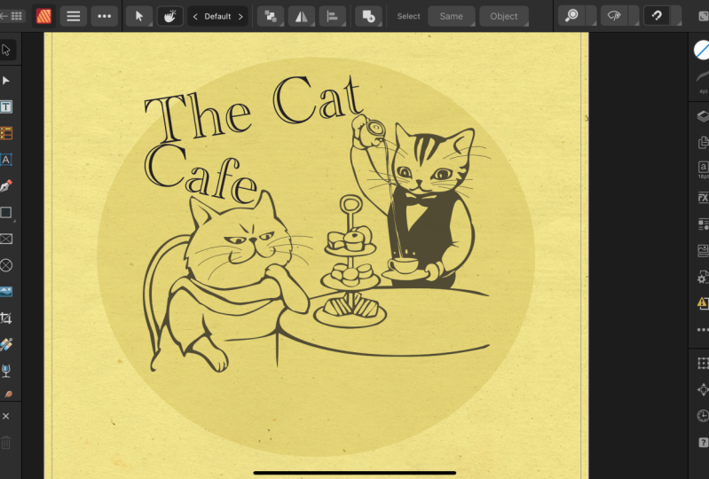
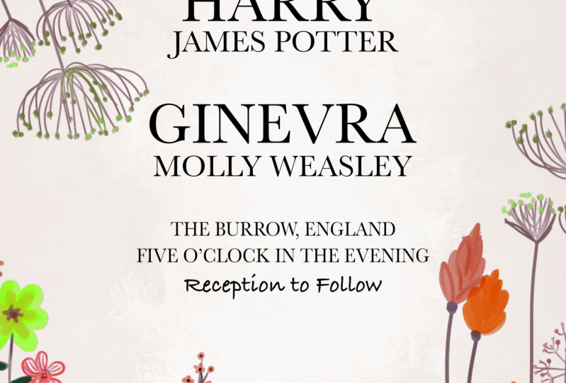
13. Wedding Invitation Project : All right. To practice everything that we've learned
so far in this course, we're going to make a
wedding invitation. Just for fun, I'll make mine a wedding invitation for Harry and Jenny
from Harry Potter, but feel free to use whatever names you
want for this project. Let's go ahead and get started. To start off this project, I'm just going to
create a new document. I'll come up to the top of
my screen and go to file, and then I'll press now. Now, similar to what we've been doing throughout
this chapter. I'm just going to use an 8.5 by 11 piece of
paper for this. But you can use any
size that you want. Make sure that you
have your DPI set 2300 since you'll probably
print out this invitation. We'll also learn more about
these settings later on. But just as a reminder, I'm going to set mine
to one page with facing pages turned
off for color. I want this to be RGB eight. For margin, I'm going to turn
off margins and for bleed, make sure that your
years is set to zero. With that all set up, go
ahead and press Create. By default, whenever you
make a new document, you'll have a layer over
here called Master A. Go ahead and delete
that for now. We're going to learn more
about master pages later on, but for now we don't
need that layer. Let's get started with the text. I'm going to grab the artistic
text tool right here. This is going to be a
beginning line up here. I'll just drag out
a small letter. Then I'm going to type
in all capital letters. Please join us.
Using the move tool, I'm just going to adjust this. I'll start by centering it. Then I'm going to
change the font. I've actually downloaded
quite a few fonts. I'm not sure if you
have this font. I'm going to use
this one right here. If you don't have
it, just choose a similar one that
looks nice and fancy like this. Don't worry. I'm going to actually
teach you how to add fonts to affinity publisher
in the next chapter. Go ahead and resize
and position this. I think I'll make it
quite a bit smaller. We have our first line of text, and we can come back and
edit this more as we go. But for now, I just
want to add more text. This is going to say, please join us, and then underneath, it's going to say,
for the wetting of, and I'm going to change up
the font for this part. But I'll go ahead and
duplicate this layer by holding down command or control while clicking
and dragging. Now with this text box, I'm just going to double
click to enter type mode. I'll go ahead and
delete everything here. Then I'm going to type
for the wetting of. Then I'll go ahead and
get out the move tool. This time, go ahead and choose
a font that looks fancy, maybe like cursive writing. I'll go ahead and
go with this one. Then I'll just resize
and position this. I think this one will
be a little bit larger. With that nice and centered up, I think that looks
really nice so far. Let's go ahead and
do that again. I'll just select this
top text frame here and while holding command or
control, I'll click and drag. This one is going to
be a much larger text. This is where we're going
to put Harry's name. I'll just double click. As a tip, if you triple click, you'll select all of the text so you can quickly
delete it all. I'm going to type
in Harry and ACAP. We could use the move tool
to resize and position this, but I'm going to be
a little bit tricky and I'm just going to
hover over the edges here to resize it and
position it in the center. With his name nice
and big like this, I'm now going to duplicate this layer and just to practice duplicating
in another way. I'm going to press
command or Control J, and now we have
this extra layer. I'll triple click here just
to select all of the text, and now I'm going to write
his middle and last name. I'm going to make this
quite a bit smaller. To write Jenny's name, I'm going to do something
pretty fancy here. Over here in the layers panel
with James Potter selected. I'm going to hold down Shift
and click on Harry's name. Both of those layers
are now selected. Then I'm going to press
Command or Control J. This will duplicate
those two layers. Now with the, I can drag this. Now as I type out Jenny's name, her name will be the exact
same size as Harry's name, which will look
really nice here. And now using the Move tool, I'll just reposition
these text boxes. I want them to be centered. But I don't want to
resize the text because then it won't be the same
size as the first text boxes. With that centered up, I
think that looks pretty good. Now, you might
notice that we have this red underline
under her name. That's because my spell check
is turned on right now. Even though this
is her given name and that's how it's spelled, I think, we can
actually turn this off, so this red line disappears. To do that, come up to
where it says text. Then you can go ahead
and go down to spelling, and then check off check
spelling while typing. We'll just need to remember
that we turned that off because checking your
spelling is important, but just in this case, I don't
want that red line there. I'm just going to
quickly continue to add a few more text boxes
to the bottom of this. I just finished typing the Borough England
for the location, 5:00 in the evening, and then underneath that,
I put reception to follow. I think that's good
for all of our. The next thing I want to add is a few images just to
spice things up here. To add the first image, I'm going to click on the P Then I'm going to select both of these and I'll press open. This first one is
a paper texture. I'm just going to click
and drag to add this here. Then I'm going to
bring it underneath everything like that. Now we have this really
pretty paper texture. I think that looks nice. Then I'm going to
add these flowers. I'll click and drag
to add the flowers. And I'll go ahead and
reposition these. Now, right now, these layers are overlapping on the
sides of our document, and that's really
no problem at all. But your document
might look like this. If you have overlapping
sides like this, that's because there's
an option called clip to Canvas that
you need to adjust. Just come to the top
of the screen and go to view view mode, and then check on
clip to Canvas. This will get rid of anything that's spilling over like that. I just find overflowing
images like that, a bit distracting since they won't even
print out like that. Go ahead and change
that if you need to. Then I think I'll go ahead
and lock the texture layer. Then I want to
adjust some things. I like these flowers down here, but our text is
overflowing on top of it. I'm just going to quickly
adjust the positioning of all of this text so that
everything fits together nicely. To fit this to my screen, I'll just press command
or Control zero. Now you can see our beautiful
invitation is finished. Let's go ahead and
save this just in case we want to come back and
continue working on it later. I'll go to the top of the
screen two file, save as. And I'll call this
wedding invitation and then I'll press save. Now we can go ahead and export this so that we can share
this with other people. I'll go to export, and I'll go ahead and save
this as a JPEG image. You can see a nice
little preview there. It looks so cute. Then you can go ahead
and export your work. Okay, this was a
super fun project. I hope you enjoyed it. It's pretty cool that after just one chapter in this course, you can already
create a project like this and there's a
lot more to come. In the next chapter,
we're going to learn how to add more style
to your designs. I'll see you in
the next chapter.
14. Adding Style to Your Design : That you know the basics
of Affinity Publisher, I want to show you
how you can make your designs more stylish. We'll learn about fonts
and images and shapes. It's going to be a lot of fun, so let's get started.
15. Adding New Fonts : This video, we'll
learn how to add new fonts to Affinity Publisher. In the wedding
invitation project, I mentioned that I would show
you how to add new fonts, and that's exactly what we're
going to learn right now. When you want to change
a font for your text, you'll come right
up here and see this amazing list of so
many different fonts. Now, these fonts
are all fonts that are already installed
onto your computer. In this video, I'm going to show you a great
place you can go to download new fonts and then install those
onto your computer. A great website to download New fonts is called de font.com. You can search for fonts by category by coming
through these. Once you find a
category you like, go ahead and click on it. Then you can scroll down here and see all of
these great fonts. Now, these fonts are sorted
by popularity, which is nice. You can see there's just so many and there's such a
variety of them here. Once you find a
font that you like, all you need to do is come
over here and click Download. But before you do that, I
want to give you two tips. The first tip is that you
can type whatever text you want right up here
in this preview area. Then press Enter. Now that text that you typed in
will appear here. You can see exactly
what this font will look like with
your chosen text. This is super
helpful if you have a specific title or name
that you want in this font. For me, personally, I
find it really useful. The other day, I wanted to make a YouTube thumbnail that
said Affinity revolution. But I found myself downloading
fonts over and over, trying to get the letter
R to look just right. But then I realized
that if I just type affinity revolution
right up here, I can quickly scroll through these fonts and find exactly
what I'm looking for. Another tip that I have
for you is that some of these fonts are free
for personal use only, and some of them are 100% free. If a font is 100% free, that means you are free to use it even in commercial work, which is pretty useful. Now, if you only want
to see fonts that are 100% free right down here, all you need to do is come
right here to more options, and then check on 100% free. This will also check on public
domain, which is perfect. Go ahead and hit some mint. Now, all of the fonts
that you see down here are 100% free. Once you've found a font, go ahead and press download, and this will download
it onto your computer. After downloading a font, you'll need to install it. If you're on a Mac computer,
here's how to do that. Go ahead and double
click on this file. This will unzip the file, and now you'll be
able to see a folder. Go ahead and double click
on that folder to open it, and then select the text file. This is a TTF file. Go ahead and double click
on that to open it up. Then all you need to do
is press Install font. Now that font is installed
on our computer. Go ahead and close
out of these and you can actually delete these files
now. You don't need them. That's how to do it on a Mac. If you're on a PC, this is actually a very similar process. But unfortunately, I don't own a PC to demonstrate this on. I'm going to leave
a link underneath this video where you can watch a super quick
YouTube video. This video will show you how
to install fonts on windows. You just need to
watch the video from about a minute 30 to 3 minutes and he'll show you how
to easily install fonts. After installing the font, it's immediately available
for you to use and publisher. You don't even need to
restart the program. Just come up here to the font and to quickly find the font, start typing the
name of the font, and I'll come up right here. We'll go ahead and
click on that. So cute. If you really like this font and you know you're going
to use it a lot, but you don't want to lose it. All you need to do is click right here on this
little heart icon. This will mark it as
one of your favorites. To see all of your favorites, just come right here, and here is where you can store
all of your favorite fonts. As one last tip for you, there's another
website that's great for downloading fonts
onto your computer. It's called Google Fonts. All of the fonts on
Google Fonts are 100% free for any use. That's another great
resource for you. Beneath this video, you're
going to find a lot of links to different font websites
answer that YouTube video. I suggest you check
those out and see for yourself how
easy it is to use these. Once you've done that, you can
move on to the next video, where I'm going to show you
a great resource to get free photos and graphics
to use in your designs.
16. Free Photos and Graphics! : In this video, I'm going to show you another great website where you can get
free photos and graphics to use in your designs. This website that I want to show you is called pixabay.com. I'll leave it linked
beneath this video. First, type in whatever type of image that
you're looking for. Once you press
enter, you can see that you have so many
images to choose from. Once you find an image you like, go ahead and click on it, and then come over here to
where it says Free Download. Go ahead and press on that, and then you can
choose whichever size you want for this image. Then go ahead and
press download. Once you've downloaded
your image, you can come back into
Affinity Publisher, and then you can use
the place image tool to place that image. Lovely. Okay. That's one way
to download an image. I just want to come back to
Pixabay really quick and show you how you can find photos that have their
backgrounds removed. These types of photos
can help you create a more interesting
design rather than only using photos that are
squares and rectangles. So coming right back up here
to where it says trees, I'm going to click in that
box and press Enter again. Now we're back on that
page where you can see all of these
lovely tree pictures. To only see images that have
a transparent background. Come right up here to
where it says color, and then check on transparent. Then click on G. All of the images that
you see down here now have had their
backgrounds removed. But you might notice
that a lot of these images are
drawings, not photos. That's because
Pixabay lets you get free photos and free drawings. If you want to specify which
type you're looking for, come right up here to
where it says images, and then you can choose. In this case, I'm going
to click on photos. Now you can see that all
of these images have had their backgrounds
removed and their photos. Let's go ahead and
download one of these. I'll choose this nice fall one. Then you can go
ahead and download it just as we did before. Now we can go back to publisher. Using the place image tool, I'll just place this
image into our document. Now you can see that because
its background was removed, we can place this on
top of other images, and it creates a
cool collage effect. Pixabay is a great place to
find and download images. I use it all the
time for my designs, and I hope this video has
helped you see how easy it is. Go ahead and find a couple of images and place them on
a document like this. In the next video, we're
going to learn a little bit more about how affinity
handles images.
17. Linked vs. Embedded Photos : This video, we'll learn about
linked and embedded images. While we're on the
topic of photos, I thought now would be
a good time to tell you the difference between
linked and embedded images. But to help explain
the difference, I want to ask you a question. You see these photos of
trees in my document. What would happen
if I were to delete the tree photos from
off of my computer, Will these trees still
appear in publisher? Well, the answer is it depends. It depends on whether these images are
linked or embedded. A linked image is
an image that is linked to where the photos
are on your computer. Meaning that the photos in
your publisher document are dependent on the photos still
existing on your computer. The benefit to this is that it keeps your publisher
file size small. Embedded photos live
inside the publisher file. This makes your publisher
file size larger, but it also means that you could delete the photos off
of your computer. We can see what type
of images these are by going up to the top of
your screen to window, and then going to where it
says, resource manager. From here, we can
see a table that shows all of the images
in our document, as well as their status for if they're
linked or embedded. Now, both of these
images are linked, and that means
that the photos in this document are
only able to exist. As long as those photos stay in the same place
on my computer. If I deleted these tree
photos from my computer, they would no longer be
in this publisher file. If I wanted to, though, I could select both
of these images and then click on embed. Now these images are
permanently in this file, so I could delete them from my computer and nothing would happen to this
publisher file. If you want to change
whether images are set to linked or
embedded by default, you can just go to file, and then click on
Document Setup. In here, you can change
this from prefer Linked to prefer embedded
if you wanted to. This option also appears
whenever you make a new document, right here. You could change it there
if you'd like to as well. Now we know the difference, but which option
should you choose? Well, normally, I like
to use linked images. Before I start a new project
in Affinity Publisher, I like to just make a
folder on my computer for where I'll keep all of
the images for that project. Then I'll leave
all the photos in that folder as I make
the publisher project. I don't typically
use embedded photos because if you embed
all of your images, the publisher file will become very large and it will take a long time to load each time
you save or open the file. But even though I
prefer linked images, you need to be aware that if
you're using linked images, you need to make sure you
don't move the photos on your computer or affinity
won't know where to find them. However, if you do
accidentally move a photo, it's an easy fix. As an example, I'm just going to use the
place image tool, and then I'll go
ahead and select one of our exercise files, and I'll place it
in our document. Now if I come up here to
Window resource manager, you can see that this image is linked while the other
two are embedded. But let's see what
happens if I move this photo to a different
folder on my computer. I just moved that photo to a different spot
on my computer. Affinity no longer
knows where it is. This photo looks
terrible in my document. Affinity can only display a rough preview of what the
photo used to look like. If I come back up here to
Window Resource Manager, Affinity tells me that the status of this
photo is missing. Now, lucky for us, it's actually pretty
easy to tell affinity where the photo is
by pressing re link. Then you just need to
find that image again. Once you've found it, you
can select the folder, and this will re
link that image. Now if I go back
into my document, you can see that the preview
is nice and clear again. Now you know the
difference between linked and embedded images
and you can use which every type of image
works better for you. With that all done. In the next video, we're going to learn how to create shapes. Hey, there. Before we move
on to the next lesson, I just wanted to give a
quick update to this video. After filming this video, Affinity made a little bit of an update for how
document setup looks. Now, if you want to change whether a document links or
embeds images by default, you'll go to file document
setup just as before. But now, you need to go
over to the documents tab. From here, you can change whether a document links or
embeds images by default. But remember, you
can also choose this when you're first
making your document. This is exactly the same as I showed you earlier
in the video, but I just wanted to remind you that under the Layout tab, you can choose the default
image placement behavior. I know this update is
a really small change from what I showed you
earlier in the video, but I still just wanted to explain this to you
so you don't get too confused. Back
to the course.
18. Shapes for Beginners : In this video, we're going
to learn about shapes. Previously, we worked
a little bit with shapes and we did this
with the move tool. But in this video, I want to show you how to create shapes, and I want to show you a few
extra options that you have. Let's start by
coming over here and clicking right here on
the rectangle tool. With the rectangle tool, I'll go ahead and
drag this out and you can make this long and skinny
like this or like this. But you can actually keep this perfectly square if
you hold down shift, and that will lock it
into a square shape. I'll go ahead and give this a color over here
in the color panel. Make it a nice red
color like that. As we learned about before, you can use the move tool
to move the shape around, to snap it to places, and you can resize it while holding shift to keep
it proportional. There are quite a few
other shape tools in Affinity Publisher, you can find those
by clicking on this little gray
triangle right here. This will open up so many
different tools here. To show you some of
the special options that some of these tools have, I'm going to select
the star tool. Then I'll click and
drag out a star while holding down shift to
keep it proportional. Once you've dragged out a
star, you can give it a color. Now, a lot of shapes have different options up in the
context toolbar, right here. These options allow you to
alter the shape a little bit. For example, right here
where it says points, you can click here and change
this number to give it a lot more points
or fewer points. A lot of different shapes have different options right up
here that you can change. Because there's so
many shape tools, I don't want to go through
and show you all of these. But this is just to
give you an idea of the types of
options that you have. Remember, if you have
a shape tool out, you can still alter your shape if you hover over
the edges like this, or you could just
use the move tool. That was a really short
video about shapes. But I just wanted
to show you how you can create and
alter these shapes. In the next video, we're going to dive a
little bit deeper as we learn how to alter
these shapes even more. Oh.
19. Fill Color & Stroke : In this video, we're going to learn a little bit
more about color. I'm going to use
this exercise file from the first chapter
of the course. Go ahead and reopen that, or you can just practice and create these shapes
all on your own. Every shape that you
make has two colors. It has a fill color
and a stroke color. The fill is what
you can see here. It's the shapes main color that fills the
center of the shape. The stroke is the color
of the shapes outline. Now, right now, we don't
really have an outline here. But if we click
on this triangle, you can come up here
to the color panel and see that we
have a blue fill, and then this
followed out circle represents the stroke
or the outline. Because we don't have
a stroke right now, this actually shows no color, so you can see that it has a
red line going through it. That means that no
color is being applied. We already know that it's pretty easy to change the fill color. Just make sure that you have
the fill color selected, and then you can
use the color wheel here to move this around. This works exactly the
same for the stroke color, just select it, and now we can choose a nice
color for the stroke. I just set the
stroke to white and you can barely see it.
It's pretty small. We can make the
stroke a bit bigger, and there are a few
ways to do this. With some tools
like the move tool. When you have it selected, you can come up here to
where it says stroke. Then right next to
that, right here, we can change some of the
options for the stroke. If I click on this,
I can go to where it says width and I can
increase the width, and now you can really start
to see the stroke here. You can change the
stroke from up in the context
toolbar like this, or there's actually a
stroke panel right here, which you can get
out at any time, no matter what
tool you have out, and these options you see here are exactly the same
in both places. I personally like using
the stroke panel, so I don't need to worry
about which tool I have out, but feel free to use whichever
one works better for you. Back in the color panel, you can press on this
little circle here to remove the color from
the fill or the stroke. Now you can see I
just made it so there's no fill and
a white stroke, which creates a
pretty cool effect. With the color panel,
I just wanted to show you that so far we've been
using the color wheel. If you wanted to, you could
change this to sliders. Then you could change
the color from here. Now, the color here is changing, but our triangle isn't changing. Well, that's because we don't
have that layer selected. If something in your
trying isn't working, always make sure that
you have the right layer selected. I'll just select that. Now you can see that
we can easily change that and it works here and here. I'm going to change
it back to the wheel though because I
prefer that method, but feel free to use
whatever you want. To explain this color
wheel a little bit better. I'm going to select
this yellow square, and then with the
fill color selected, I'm going to change the color. You can change the hue by moving this outer circle
around this ring here. Once you have a hue selected, you can come into
this interior area of the triangle here and
move this other circle. If you move it to this corner,
it'll change to white. If you move it to this corner,
it'll change to black, and if you move it
to this last corner, your color will be
fully saturated. This is something
you can play around with a little bit and try to get used to the different
color combinations that you can come up with here. For example, if I move it
along this line toward white, we get a much lighter
version of this blue color. If I do the opposite,
moving it toward the black, it'll become a
much darker color. Can take a little bit
of getting used to, but once you have it down, you can see that
the color wheel is pretty limitless and you can come up with any
color that you want. Now that you know a little bit more about fill and stroke. Go ahead and keep
this document open. We're going to use
it as we learn more about color
in the next video.
20. Matching Colors : Let's learn how to match colors. I love the color of the square. How can I make the other two
shapes the exact same color? Well, there are two
ways to do this. One is right over here. The color panel
will keep track of the last ten colors that
you've used in your document. You could just select the circle with its
fill color selected, and then press on the blue
color. That's pretty easy. But let's say that you've used 11 colors and you've
lost this blue color. Well, in that case,
you can just use Affinity's color picker,
which is right up here. To use this color picker, just click and drag
on the color picker. Now wherever you
release your cursor, that color will be sampled. Now that color is right up here. I'll go ahead and
select the triangle, and then I'll make sure that the stroke color is selected. Then I'll apply that color to
it by clicking on it here. Normally, you just want to use a few colors throughout
your document because using fewer colors
will keep your design looking clean, consistent,
and professional. Sampling colors makes this super easy to keep those
colors an exact match. Go ahead and keep this document open because we're going to
use it in the next video too.
21. Stroke Panel : This video, let's learn a little bit more about the stroke panel. I want to spend a little
bit more time with the stroke panel to learn how to customize the
stroke even more. But first, let's practice
giving a shape a stroke again. I'll click on the square, and then with the
stroke color selected, I'll go ahead and give
this a nice white stroke. Then I'll go to the
stroke panel and increase the width so that
we can see it better. I'll go ahead and zoom in here. Now coming over to
the stroke panel. I want to show you how
to use these options. There are a lot of
different buttons here and you really don't need
to worry about all of them, but I just want to review the most important
ones with you. The first thing
you might want to change is the join option. The join is where
your two lines meet, so right here on the corner. Right now, we have
a curved join, but you can change
it to a sharper join by clicking on this
button right here. Now we have a nice sharp corner. I use this option quite a bit, so I thought that would
be important to know. Another option that you can
change is the alignment. Right now, the stroke is going into our
shape a little bit. This is even more apparent if you bring the
width up even more. You can see how the stroke is
swallowing the shape here. Well, this won't be as much of a problem if you
change the alignment. Right now, the stroke is
centered on this line, the outer part of our shape. But if you click on this button, this will align it to the
inside of your shape. Now as I change this, you can see it's only staying on
the inside of the shape, or you could change it to
this last option here, which will put your stroke on
the outside of your shape. It depends on what type of
design you're working with. But this is a good
option to change. The last important
button that I think you should know is
scale with object. With this option turned off, we can make the
square very small. We can see that the stroke
is staying really large. It's not proportional to
the original square shape. I'll just undo that with
command or control z. If we turn on scale with object, this will change that up. As I decrease the
size of the square, you can see that the stroke
also decreases in size, which makes a lot more sense. I like to keep scale with object turned on whenever I'm
working with strokes. Those are the most important
buttons in the stroke panel. But one last thing
that I want to mention is that you can actually
add a stroke to anything. We've been working with
shapes in this video, but you can also add a stroke to text or even to a photo that you've
placed in your document, and by using the stroke panel, you'll be able to style your stroke just
the way you want. And that's it for this video. We don't need this
document anymore. In the next video,
go ahead and open up a clean blank document and we'll use that to
learn about the Pen tool.
22. Pen Tool : In this video, we'll
learn about the Pen tool. We won't use the pen tool
very much in this course, but there is one
very important thing that we want the Pen tool for, and that is making lines to
show you how to use this, let's go ahead and
get out the Pen tool. Then up in the context toolbar, I'm going to change the mode to line mode. Using line mode. All you need to do
to make a line is click and then click
one more time. Now you have a beautiful line. The lines that you
make with the pen tool actually don't have a fill. They have a stroke,
which means that you can use the stroke panel to
adjust things about the line. For example, I'm just
going to increase the width here so we can
see the line better. Then just for fun, let's go
over to the color panel, and with the stroke
color selected, I can go ahead and give
this line a nice color. With the Pen tool, you
can click as many times as you want to make
little lines like this. There's a few shortcuts that you can use while you're
making lines. One useful shortcut is if you
lay down your first point, you can hold down
shift and you can make another point that's exactly straight down from
your first one, or you can make one that's
straight to the side. Once you've made a line, it's also nice that you can adjust your lines super easily
using the move tool. I'll go ahead and select that and show you that you can
move your lines around. You can rotate them and you can make them
longer or shorter. One last thing to know
about making lines is that you can use
the stroke panel to adjust them even more. Now, notice that the end of this line is rounded right now. This is similar to
when we were using the stroke panel with
our shapes earlier. By default, the corners on
shapes are rounded like this. We needed to change the
join to a sharp join. However, this doesn't work with lines because this isn't two lines meeting up
and creating a corner, the join actually isn't
what you need to change. Instead, you need
to change the cap. I'll go ahead and
make it this one, and now you can see we
have a nice sharp end and just like how the color stuck around as we
were making new lines. Once you've changed something, made this a nice
blunt end there. You can make more
lines that have the exact same settings as
the one you didn't before. Now you know everything
you need to make beautiful lines in
affinity publisher, which you can use
in all sorts of ways to stylize your designs. In fact, in the next video, we're going to do
a little project together where we'll use a stylized line and we'll use a few of the other
things that we learned throughout this chapter. I'll meet you in the next video.
23. Plant Gallery Project : In this video, we're
going to create a flyer for a live
plant gallery. Now, my concept for this is it's like an art
gallery opening, but instead of artwork, it's a bunch of live plants. That's what we're
going to create. I know it's a silly idea, but I thought it would
be fun and I think this flyer is going to
turn out really beautiful. Let's go ahead and get started. To start off making our flyer, let's first put the
background image in place. I'll come over here to
the Place Image tool. I'll select the Plant
gallery Project image. Then I'll press open,
and I'll click and drag this out until it covers
the entire background. Now, I think I want the plants
to be a little bit larger. I'm going to stretch this out. Once you have it at
a size you like, go ahead and lock
this layer in place. We don't want to
accidentally move it as we're creating our design. The next thing I'm
going to do is I'm going to add the main
title for the flyer. I'll grab the artistic text tool and I'll drag out some te, I'm going to type live plant. Then I'm going to press enter or return on my keyboard
to drop down a line. Then I'll type gallery. Using the move tool,
I'll just center this. Then we can go ahead
and adjust this text. First, I'm going
to make it white. Then we can go ahead and
choose a nice font to use. Now for this, I'm going to use a font called dream orphans. I found this font on defont.com. You can go over
there and download this font if you want
to use the same one. Otherwise, just find a font that's nice and bold like this. I forgot to mention that I typed this in all
capital letters. Make sure that ears is
all capitals like this. Then I'm going to
make this bold. There we go. With that
nice and centered up. I think I want to make this
a little bit easier to see with such a busy
background image. It's a little hard to
make out these letters. I'm going to use
the rectangle tool, and I'll drag a rectangle. I'll make it black,
and then I'll drag it underneath
the text layer. Now it's a lot easier
to see our text, but it's completely
covering our background. A trick I'm going to use is
I'm actually going to lower the opacity of this layer so that it becomes
semi transparent. To do that, come on up here
to where it says opacity. Go ahead and click here, and now we can go ahead
and lower this down. I lowered it about halfway, but I think I want it to
be a b less transparent, so I'm just going
to raise this up. I think I like how that looks. Now that we can see the
text a bit more easily. Let's go ahead and finish
adding texts to this text area. I'll grab the artistic
text tool and I'm going to drag a little
bit of a smaller font here. Then I'm just going to type
in the date and the time. With that all typed up,
I'm going to go ahead and grab the move tool so that
I can change the font. I think it's nice
to use a couple of fonts whenever you're making
a document like this, just so they contrast
each other a little bit. The font that I'm
going to use for this is called railway. You can download
this font off of Google Fonts if you want
to use the same one as me. I really like this railway font. If you come right here
next to the Fonts name, there are so many options
you can change to make it just the right thickness and
italicization that you want. For this one, I think
I'll use medium. And I'll make it a bit smaller. To finish adding our text, I'm just going to
select this one, and then while holding
command or control, I'm just going to
drag it down here. The reason I s that is because I want to use this
exact same font. I'll just click in here and
delete all of the text. Then I'm going to
type in the location. This is going to be
at the plant store. I'm just going to
decrease the size here. Then I'll grab the move tool
so I can reposition this. Then while holding
command or control, I'll duplicate this layer down. In this textbox, I'm going
to type the address. With that all typed out, I'm
going to grab the move tool, and I'm going to line this
up with the edges here. Then I'm going to shrink
this text down until it matches up to the other
edge where it says store. This text isn't the
exact same size, but it does line
up on both sides, which I think looks pretty nice. Now that I've shrunk
down this address, I'm also going to
make this regular, which shrunk down the text, I'm going to stretch
it out a little bit. Now we have the store
name and address there. I think I'm just going
to lower these down. Now we can make a few more
adjustments to our document. The first thing I want to
do is I want to add one of those stylized lines I was talking about by
using the Pen tool. I'm going to come over here
and grab the pen tool. Then in line mode, I'm going to draw a line
starting with the first point, matching up to the very top
of where it says Saturday. Then I'm going to
hold down shift, so it's perfectly straight, and I'm going to drag it down to where it says eight
to 10:00 P.M. I'll go ahead and make
the stroke color white, and I'll go to the stroke panel so I can increase the width. I think I'll make the
width two points. That thickness
looks pretty good. Now I'm just going to adjust the positioning a little bit. But before I do that, I
think I want to change the cap from this rounded
cap to the blunt cap. There we go. Now I'm going to use the move tool to move all of these
things in place. Starting with this line,
I'm just going to hold down shift so it moves
in a straight line, and I'll line it up
with the text here. Then we holding shift, I'm going to select the line and this text so that I can move it in and line it up with
the edge of this right here. Holding Shift to
select both of those. I'll hold shift and drag it in. Now it's perfectly
lined up there. I think I like how tight it is, but I think I'm
going to space it out just a little bit more. I'll select both
of these layers. Then using the arrow
keys on my keyboard, I'm just going to
bump it down one. I think that spacing looks good. I think I'm going to select
all of the top text though. While holding command or
control on my keyboard, I'm going to select the line, the date and time, and the
main name of the document. Then I'll go ahead and
move them all down. This is looking really pretty. I'm just going to add
one more little detail, which is a fun way to
frame out your text. That is using the
rectangle tool. I'm going to go ahead and drag
out a rectangle like this. Then in the color panel. I'm going to remove the
fill and the stroke, I'm going to keep it white. Then in the stroke panel, I'm going to make sure that
it's two for the width. Then using the move tool, I'm just going to center this. Now you can see we have a nice
little frame for our text. I think this looks really
cute and stylized and fancy. With that, I think we are
done with this project. Great job. As you can see, simple designs can
look really nice. You do not need to
go overboard and add a lot of things to make
an effective design. In this flyer project, the beauty is in the simplicity. With that, we are done
with this chapter. In the next chapter,
we're going to work a little bit more on
customizing our text.
24. Working With Text : This course, we've
already learned the basics of how to add
text to your documents. But in this chapter, I want to build on that and
teach you more powerful tools that you can use to stylize
your text. Let's get started.
25. Character Panel : This video, we're going to learn about the character panel. The character panel gives
you some advanced options for modifying text to get
it just the way you want. But before we dive into that, we need to create some text. I'll come over here and grab
the artistic text tool, and then I'll drag
out some text. I'll go ahead and
type. I love to use, then I'll drop down a line. Affinity Publisher. I'll use the move tool to center up this text
in the document, and now we can go ahead and
open up the character panel. You can find the
character panel right over here next to
the layers panel. At the top of this panel, you can change the
font and font size. I typically like to just
use the context toolbar, but you can do
that here as well. Then below that, we have a
section for decorations. I'm just going to close this up because the main
area that we want to focus on is the positioning and
transform area right here. Using this area, we can adjust the positioning of
all of our text. Let's go ahead and start
right here with the shearing. The shearing is just what
it looks like right here. It's Lancer text. This is a way to give a custom
amount of italicization. This even works on fonts
that don't normally have an italics option,
which is really nice. I'll click in this box. Then I'll type 25 and
I'll press Enter. Now you can see how much
italicization we've added. I'll go ahead and press command or Control Z to undo that. Now I'm going to show you
a couple more options. This option down here
is pretty important. It's called letting override. This allows us to control the spacing between
the lines of our text. If I click on this
drop down arrow, you can see what a small amount of letting
override would look like, and you can see what a larger
amount would look like. 99% of the time, it's important that you
keep this set to auto. Auto will change
the letting amount based on the size of your text. This is a good thing
to keep on auto. The last two things I
want to show you in this panel are
kerning and tracking. You can find these right
at the top right here. These are pretty similar, but the differences
with tracking, this change the spacing
between all of your letters. Kernin will only change the spacing between two
individual letters. To show you this, I'm going to start right here
with tracking. I'll click on this
drop down here, and then you can see a
smaller amount of tracking, will bring all of the
letters closer together, while a larger amount will
spread them out more. I'll set it back to zero, and now I'm going to
show you Kerning. But to do that, I need to
click in our text and choose where I want the letters to be spaced farther or
closer together. I'll go ahead and click right in here between the P and
the U of publisher. I think those would
look nice if they were a little bit
closer together. I'm going to come back
over here to the kerning. Now I can go ahead
and adjust this. To bring them closer together, I'll use a smaller percentage. I think negative 30 looks
pretty good for this. Now, Kernin is pretty specific and I really
only use it when I'm working on maybe a main title or logo because Kernin is so particular and between only
certain letters like this. While we're in type mode, I
just wanted to mention that you can highlight any
word in this textbox, and you can change anything you want about just that word. With Love highlighted here, I'm going to come back
here to the shearing, and I'll go ahead
and type in a number to give that some italicization. Then I'll go ahead and
change the fill to red. Let's go ahead and
make this bold. T. Since I did some shearing, you can see that the letters are a little bit
more spread out. With that highlighted, I
think I'll go ahead and lower the tracking a little
bit of that word. There we go. The
character panel is great. It has so many options in here and I didn't go
over all of them, but I just think these ones are the most important shearing, letting override, and
tracking and curning. We're going to continue
to practice some of these options as we go through
the rest of the course. In the next video,
we're going to continue to learn
more about text. As I show you a brand new tool that we haven't used before, called the frame text tool.
26. Frame Text Tool : Let's learn about
the frame text tool. Far in this course, we've used the artistic text tool whenever we've wanted
to create text. But there are actually
two text tools in affinity publisher. We have the artistic text tool, and we have the frame
text tool right up here. The artistic text tool
is represented by an A, A for artistic, and the frame text tool is
represented by a T for text. I don't know why they
didn't use an F for frame to differentiate
them, but whatever, So the difference between these two tools is that
you'll generally use the artistic text tool for headlines or small
amounts of text, while the frame text tool is used for larger
amounts of text. Let's go ahead and select this. Then we can click and drag
to create a text frame. Once you've created
your text frame, you'll see a cursor
blinking right here. It's ready for you
to add text to it. We could just start typing
to fill in this frame. But for demonstration purposes, I've already prepared
some text for us to use. You can find this in
the exercise files. This text is just
gibberish text. It doesn't actually
make any sense, but it will work for
demonstration purposes. Now to place the text, what you need to do is come up to the top of the
screen to file. Then click on place. Then you can go ahead and
click on this document. Then press open. Now,
all you need to do to place this text is click in the text box
where you want it. So you know, Affinity
Publisher only lets you place Microsoft Word
documents into a textbox. It doesn't work
for documents that were saved in Apple pages. This method of going to File Place really only
works for word documents. Otherwise, you'll
just need to copy and paste your text from
wherever you wrote it. Now that we have our text, let's see how we
can work with it. Let's use the Move tool
to resize this text. Okay. This isn't working. Why isn't the text
getting any bigger? Well, what we're doing here is actually making
the frame bigger, not the actual text. If we want to make
the text bigger, we need to come up to
the context toolbar and adjust the text from here. At this point, you
might be wondering why you would ever want to
use the frame text tool. So far, it just seems like a more annoying version of
the artistic text tool. But I want to show you
where the magic happens. As we resize this text frame, the text reflow
to fit the frame. While the artistic text tool is nice to quickly and easily resize the text and make it look just the way
you want for a heading. The frame text tool is nice because as you
resize the frame, this text will reflow, which is perfect
for long strings of text that need to be
resized and positioned. There's a few more things to
know about the frame text. You see this red eye right here, That means that we
have text inside this text frame that
isn't visible right now. Probably because this
text frame is too small. I'll go ahead and resize this text frame until
that red eye disappears. Now you can see all of
our text is in the frame. This is really nice just to make sure all your text is visible. Now, a little problem
that you might run into is centering your text. If I center this text
frame in the document, you'll notice that the
text frame is centered, but the actual text has more space down here
than is necessary, which means it's not
actually centered. To fix this, I like to
make the text frame just small enough that all
the text is showing like this and then
center our text. If we have way too
much room down here, the centering just
won't work right. So make sure your text frame is very tight snug against your text before you
center anything. One last trick I
want to show you is that we can resize the
text frame as you've seen, and we can resize the text by coming up here to
the context toolbar. But we can actually combine these two things using this floating handle
right out here. If I click and drag on this, this will increase the size of the text frame and increase
the size of the text. Or it can do the opposite
and make the text a lot smaller along
with the text frame. We'll be working with
the frame text tool more throughout the
rest of this course. But now you have some
foundational skills to add large amounts of
texts to your documents. Go ahead and keep this document open because in the next video, we're going to learn
how to stylize paragraphs in this text frame.
27. Paragraph Panel : This video, we're going to learn about the paragraph panel. The paragraph panel is actually pretty similar to
the character panel, except it's used to stylize
large paragraphs like this, not individual letters
in the paragraphs. For demonstration
purposes, I'm going to use the text that we
placed in the last video, and I just went ahead and
made the font a bit smaller. Now it's 16 Now let's go over here and open
up the paragraph panel. Just like the character panel, this panel has a lot
of different options. Many of which are pretty
technical and advanced. In this video, I'm
actually just going to focus on the options that are most important
to know about. At the top, we can set
paragraph alignments. Right now, our text
is left aligned, which means it's pushed over to the left side. We can
see that right here. But we can also change
this if we want to to make it right aligned or centered. We can also make
it justified left, which means that the text will stretch across to
fill up both sides. This reminds me of a
newspaper or magazine column. It nicely fits on both sides, and it's doing this by changing
the tracking and between the words to stretch out
the spaces in some areas. These options are here
in the paragraph panel, but you can also find them right up here in the context toolbar. The next thing I
want to show you is this spacing area right here. The very first option
right here is letting. Now, using letting, we can change the space
between lines of text. We can do this
based on font size. Or if you come up to the top, we can do this by percentage. Then we can change it to 200% if we want it to
look double spaced, like a school paper. I'll go ahead and change
this back to 100%. This option is just like the letting override option that we used in the
character panel lesson. But most of the time
you want to use the letting option in
the paragraph panel, not the override option
in the character panel. The character panel letting is overriding the paragraph
panels letting, which means that it can create some unexpected spacing in your paragraphs if you use
both of them at the same time. I suggest just using this version of letting
in the paragraph panel. But maybe you don't
want double space text. You just want a bigger space between each of your paragraphs. In that case, you
can use space before or space after
paragraphs right here. I like using these options and you can use either
one if you want. For this one, I'm just going to change the space
after the paragraph. I'll go ahead and type
in a larger number here. Now you can see we have a
little bit larger of a space. I'll go ahead and
make this a bit larger using these arrow keys, so you can really
see the difference. The next thing I want to show you is actually not
in this section. I'll go ahead and
close this up and I'll close up all of
the rest of these. You can see we actually
have quite a few here. I'm going to go to the
hyphenation category. This hyphenation category allows you to add hyphens to
your text like this, which is really good
for when you're justifying your
text on both sides. If auto hyphenation
is turned off, you can see that there's
a bit more spacing in your words as it tries to
fill the space of each line. I'd like using auto hyphenation
to make the spacing a little bit more compact
and normal looking. This is a good thing
to check on if you're ever using
justified text. Those are the most
important options that you can find in
the paragraph panel. But I wanted to highlight one
last useful thing to know. You can apply these
paragraph changes to the entire text
frame if you want to, or you can apply these changes
to individual paragraphs by having your cursor blinking anywhere in that paragraph. You don't actually need to
select the entire paragraph. Just have your cursor blinking
in one of the paragraphs. Then we can come over
here to the spacing, and I'm just going to increase the spacing after paragraph. And you can see that's only affecting this first paragraph. But just like before, if you want to modify individual
words in the paragraph, you need to go ahead
and select those. All you need to do
is select the words, and then you can go
ahead and change those words just like
we were doing before. You can still individually
to your text. But the paragraph
panel just gives you more options for these
larger blocks of text. Great work on this video. Now you know the basics of how to work with the
paragraph panel. We didn't cover all of the paragraph panel
options in this video, but we'll learn about
a few other options it has throughout this course. In the next lesson,
we're going to learn how to combine
the power of the paragraph panel and the character panel
to make text styles.
28. Text Styles : This video, we're going
to learn about textiles. To see textiles in action. I've already placed
a word document from the exercise files
into this text frame, which gives us some nice
texts to play around with. Textiles are a way to save all the style that
you've added to some text and then easily apply those changes
to other text. To show you how this works, let's go ahead and give
this first title here a little bit of style.
I'll highlight this. Then let's go ahead and
give it a larger font. Then we can give it a fun font. Go ahead and choose
anything here. Then go ahead and
give it a color. Up in the context toolbar, I'm just going to center this
to give it one more change. Let's go ahead and bold it. Let's say I like how
this title is looking, and I want the other
three titles in our document to look
exactly the same. Now, I could highlight
each of these titles and format them the exact same way as I
did for the first one. But who has time for that? Let's use textiles to save
the formatting of the style, and then easily apply
this to the other titles. To do this, we need to
use the textiles panel, which you can find
right over here. This textiles panel comes with some default styles that
you can use on your text. But instead of using
the default styles, I want to update one of these pre existing textiles to look the way that I formatted
this text right up here. I'm going to click to have the cursor blinking
within this right here. Then I'm going to come
over here to Heading one, and I'm going to update this
to match this textile here. To do that, I'll use the
hamburger menu next to it. I'll open that up. Then I'm going to click
Update Heading one. You can see that heading
one has just shifted around a little bit
and looks different. That's because now it's adopted the exact same things
that we have here, the font, the color, everything. We can apply this to
other headings by having the cursor blinking in
one of these paragraphs, and then applying it to it. Text styles act like
paragraph styles, which means we don't need to highlight anything that
we're trying to change. We just need to have the
cursor blinking like this. Wasn't that so easy? We didn't have to go
through and change each of these titles manually. We could just apply
heading one to it. Let's practice this again. This time, we're going to make a textile for our body text. I'll go ahead and highlight this entire text here so that I can make
some changes to it. Let's go ahead and
add a new font. Then I'm going to justify
this text to the left. Then in the paragraph panel, I'll just come in here and I'm going to increase
the leading. Let's go ahead and
increase it just a little bit. There we go. I'll go ahead and increase the space after
paragraph as well. With all that stylization, let's go back to text styles. This time, let's go ahead
and update the body style. I'll click next to it
on the Hamburger menu. Then I'll click Update Body. This body style has
not been updated, and we can apply this to
the other three paragraphs. And now you can see we've
easily done that as well. Textiles can save
you a lot of time. But we're not done yet. Let's say we changed
our mind and we really want a new color for
our paragraph headings. Well, all I need to do is
select the first title. Then let's go ahead
and change the color. Now, all I need to
do is go back to heading one and update
it one more time. Just like that, all of the
textiles have changed. Text styles are just a
really smart way to work. You don't need to edit
the text in a text frame. Instead, you can just
apply a text style and edit that style,
just like we just did. This will make things way easier if you ever need to
change things later on. Like if you wanted
to change the font of 100 different chapter titles. Let's practice
updating styles again. But this time, I'm going to show you an even faster way to do it. I'm going to highlight all of the text in this paragraph here, and note that up here
in the context toolbar, it says we have the body
style applied to it. Just for fun, let's go ahead and change the
color of this text. We'll go ahead and make
it a nice and dark green. Now up here, it says body plus. This means that
the text did have the body textile applied to it. But now we've modified this text beyond
what the textile is. It has a little plus button, meaning that there's a little bit more style applied to it. If we want these plus changes applied to all of
the other ones, all we need to do is click
on this button right here, and this will automatically
update the text. This button is the exact same
thing as if we were to go to the text styles and
update the style here. But this is just a much
faster way to do it. I'll go ahead and click that. Now you can see all of these
textiles were updated, Well, almost all of them. This one up here didn't
change. Why did that happen? Well, this is because we
didn't actually assign this text, the body textile. We alter this text, we changed the font, and we
based the style off of it. But because we didn't actually
apply the textile to it, it didn't update
with the other text. This is a really
simple fix though. All we need to do
is have the cursor blinking in this paragraph, then we can apply the
body style to it. Now you can see it
updated just like the rest of them,
from here on out, if we were to change anything else about these paragraphs, maybe I want it to
be blue instead. I can update the
style and all of them will change because now
this one is connected, it has the same textile
as the rest of them. If you ever wanted to remove a textile from some of the text, all you need to do
is have the cursor blinking and then
click on No style. This will completely remove any textile that was
previously applied to it. Okay. I know that textiles can be a lot to
take in at first, but they really are so useful and can save you a lot of time. Great work on this video. We're going to
continue to practice using textiles as we
go through the course. In the next video, I want to spend a little
time to clear up any confusion with how affinity handles changes that
you've made to your text. We'll go ahead and do
that in the next video.
29. Maintaining Text Changes : This video, I want to talk
about how to maintain your text changes from
text frame to text frame. I want to spend a little bit of time clearing up
any confusion about how affinities
handles which changes will be carried over to
your next frame of text. To start, let's
go ahead and make a text frame with
the frame text tool. We'll go ahead and drag one out. Then I'm going to type in. I hope you are
enjoying the course. I'm going to get
out the move tool, and let's make a few
changes to this text. First, let's go ahead and
give it a nice fun font, something that looks a
bit different like that. Then I'll go ahead and give
the font a nice fun color. Let's go ahead and increase
the size of this text. We've made a few changes. Let's go ahead and make
a new text frame and see if any of these changes are carried over
to this next one. In this one, I'll just type in. Affinity is So much fun. Notice how all of
our text changes are kept in this new text
frame. That's pretty nice. I'm going to go ahead and
get out the Move tool. Let's alter this text
a little bit more. This time, I'll go into
the paragraph panel, and I'll go ahead
and center the text. I'm just going to move
these around a little bit. Let's drag out one
more text frame. Then I'll go ahead and
type some more text. This time, the text
wasn't centered. Why is that? I made it
centered in the last one. Well, here's the trick. Affinity will only maintain character changes that
you make to your text. This includes things
like the font, the font size, the color, but it won't carry over
any paragraph changes, changes which you could make
in the character panel, like how the
alignment is set up. If this is true, affinity only carries over character
panel changes. What would happen with textiles? Will affinity
maintain any textiles that you've applied
to a text frame? Well, let's go ahead and see. I'll go ahead and highlight
I love cute cats, and then we'll go ahead
and go to our textiles. I'll go ahead and apply
heading one to it. Take note that now
the font is aerial, it's bold, it's 20 for font
size, and it's black now. I'll go ahead and
make a new text frame and see if these
changes carry over. It looks like we have
aerial bold, 20 point font. But if my cursor is
blinking in this text, it says there's no
style applied to it. Why is that? It looks the same, but it didn't carry over. Well, this is
because text styles act like paragraph styles, which means that they're not
kept in your new text frame. All the other changes
to your text were changes that could be done
in the character panel, like the color and font.
Those were carried over. I know this is a
little bit confusing, but just remember that the character panel changes are maintained when you
make a new text frame, but paragraph panel
changes are not kept. Hopefully, knowing this will
help you to demystify some of Affinity's behavior
as you make text frames. Now that we've
clarified a little bit of that in the next video, we're going to learn
about something that we've had closed up
this entire time, which is the pages panel.
30. Pages Panel : Let's learn about
the pages panel. Far in this course, we've been working on a single page only, but you can actually add as many pages as you want
in Affinity Publisher. A great place to do that
after you've already created your document is right over
here in the pages panel. I'll go ahead and come
to where it says pages, and I'll click on
this dropdown arrow. Here you can see an overview of all of the pages
that you have. Now, right now, we
only have one page, so we just have a
preview of that one. If I were to draw a
rectangle on this page, You can see that this
page updates over here. Not only does it show
you the amount of pages, but it also shows you
a little thumbnail of what's on that page, which can be really useful as you scroll
through your pages. To add more pages
to our document. All we need to do is press on this little page button right
here that has a plus sign. Go ahead and click on that
and this box will pop up. This will show you how
many pages you want, where to insert them, and which page to put
that before or after. You can read this
like a sentence. In this case, let's add
five pages after page one. Then go ahead and press.
And now in the pages panel, you can see that we've added
five pages after page one, and now we have a
total of six pages. Once you've scrolled
through all your pages and you've found the
page you're looking for, all you need to do
is double click on that page and you'll
travel to that page here, or in this document area, you can just scroll upward like this to get to the
different pages. Let's go ahead and double
click on the very last page. Just to make it
easier to see that we really are on the last page. I'm going to draw
another rectangle here. Let's go ahead and give
this one a different color. Just as before, the pages
panel automatically updates with the new
rectangle that I just drew. Another thing that
you can do with the pages panel is you can
actually duplicate pages. I'm going to click on this last page so that it
gets highlighted in blue. Then at the top of
the pages panel, I'm going to click on
this button right here, which will duplicate the
page that I have selected. Now, if I scroll down, you can see we have two
copies of that page. If you want to duplicate
multiple pages at once, you can hold down shift
to select multiple pages, and then you can duplicate
them in that same way. With these pages selected, I could duplicate
them all at once. But this time, I want to
demonstrate how you can delete pages that you have selected
in the pages panel. To do that, go ahead and
click on the trash can. Now those pages are deleted, and you can see we just have our first page, two blank pages, and our last page
in the pages panel, similar to the layers
panel over here. We can also rearrange
the pages by clicking and dragging on
them to move them up. I want to share one
last tip with you. I want to show you how you can quickly navigate to
different pages. I'm actually going to add a
very large number of pages. Let's add 1,000 pages after page four. I'll
go ahead and press. Now you can see down
here that we have 1004 pages in our document. That is quite a lot and it
would take a very long time to scroll through all
of these pages and get to one of
the later pages. Instead, we could use
the pages navigation bar right down here where you
can see the number of pages. Using this bar, we can jump to the very first page
by clicking here, or we could jump to the very
last page by clicking here. In addition to
using these arrows, we could also just
click here and type in whichever page
we want to go to. Once you press enter, you'll
be taken to that page. This is super useful
for large documents. I'm glad that we have
this little toolbar down here that we
can use for that. And with that, now you know
how to use the pages panel. This is really going to
come in handy with a lot of different projects
that we'll work on as we continue this course. In the next video,
I want to go over some page setup options that you can change when you're
creating a new document. We'll go through those
in the next video.
31. Page Setup : Learn how to customize
your page setup. To begin, let's make a
new document by coming to the top of the screen
to file and then new. From here, I want to go
to the pages section. You might be in the
layout section right now. Go ahead and click on pages. From here, we can actually
set the number of pages that we want before we've
even created our document, which can be nice if you already know the
number of pages. Of course, we saw in the
last video that you can easily add and remove
pages in the pages panel. But this is good for
doing it beforehand. Another important
setting is facing pages. Through the magic
of video editing, I'll show you what
facing pages looks like. Facing pages are what you
normally find in a book or magazine where you have a
left page and a right page. On the other hand, if you
have facing pages off, then each page will
stand on its own, like how you see most PDFs. Each page of the
PDF is by itself. There isn't a right
and left side. Depending on your
particular project, facing pages may or may
not be what you want. I'll keep mine turned on right now because I want to show you one more
important setting. With facing pages turned on, you can choose if
your first page appears on the right side
or on the left side. In more practical terms, this means you're deciding whether or not you want to have a cover page that
stands on its own. L et's make a six
page document with the first page starting on the right and facing
pages turned on. Then we can go ahead
and press Create. As you can see it, page one
starts on the right side, and because there's no page
before the first page, this will stand on its own, acting as a cover page
for our document. If I go back up and create
a new document with the first page starting on the left side, Then
I press Create. You can see that now
every page has a partner. It has a left side
and a right side. The pages are facing each
other from the very beginning. Whether you start your
pages on the left or the right is totally up
to you and your project. But before we finish this video, I want to show you that you can change this setting if you change your mind after you've already started
your document. The way to do that is
go back up to file. Then you're going
to come down here to where it says document setup. This box will appear and it gives you the same
options that we had in that pages area as we were setting
up the new document. From here, you can turn
facing pages on and off, and you can also change if it starts on the
right or the left. Those are some nice
options that you have as you're creating
your document. Now that you know
about facing pages, we're going to use this and the other things that
we learned throughout this chapter to create a restaurant flyer project
in the next video.
32. Restaurant Flyer Project : All right. In this video, we're going to create this
adorable restaurant flyer for a cat cafe, a cafe that makes cat food, and cats run the cafe,
and it's adorable. It's pretty much the movie
at Tui, but for cats. This project is going
to be a lot of fun. We're going to use a
lot of the skills that we've already learned
learning about working with multiple
pages as well as some of the text options that
we've been learning about. Let's go ahead and
jump right in. To start, let's go ahead and make a new document together. For this document,
I need two pages. I'm going to turn
facing pages off. That way, we have a
front and back side of the flyer and they
both stand on their own. I'll also make sure that I still have my page width and height to 8.5 by 11, and
this looks good. I'll go ahead and press Create. I'm going to come over
here to our layers panel, and I'm just going to delete
where it says Master A. We're going to learn more
about master pages later on. But for right now, let's just
go ahead and delete those, so we have a tidier
layers panel. Then I'll double click on the first page, so
we can start there. For this first page, I want
to create a background color, and I'll use the rectangle
tool to do that. I'll click and drag
out a rectangle to cover the entire page. Then we can go ahead and
change the fill color. I want this to be a
faded yellow color, like a parchment color. Once you have a
color that you like, we can go ahead and add
some paper texture. I'm going to do this with
the place image tool. In our exercise files, go ahead and open up the
restaurant flyer project. You'll see we have quite a
few different images and even a few text files that we'll be using to
create this project. Go ahead and select
the paper texture. I'll open that up and then I'll drag this
across the page. Go ahead and stretch it until it's covering the entire page. Then go ahead and lower
the opacity of this layer. I still want to see the
yellow color from behind it. I need to make this a
little bit transparent. Coming up here to the opacity, I'll just go ahead
and lower this down. I think that looks pretty nice. You can still see the
little spots and texture, and you can also see the
color that we chose before. I'm going to go ahead
and lock both of these layers so that we don't
accidentally move them. Then I'm going to select both of these layers by holding
shift and clicking. Then I'll press command or control C to copy these layers, and I'll come to
our second page, and I'll just press
command or control V. Now these layers are
pasted onto the second page. Both of the pages will have the exact same texture and color. When I copied and
pasted those pages, they became unlocked
on the second page. I'm just going to go ahead
and lock those layers. With our backgrounds done,
let's go back to page one. You can see these layers are
still locked, just fine. Everything is how we left
it, which is perfect. Let's go ahead and start
by placing an image. I'll use the place image tool. Let's go ahead and use this image right here
of the two cats. I'll double click on
that to open it up. Now we can go ahead
and click and drag to place these
cats in our document. I want them to be centered
in the document like this. Now to make this look a
little bit more faded and rustic looking like
the paper texture, just trying to create a
restaurant atmosphere here. I'm going to lower
the opacity of this layer as well to
make it more faded. I'll go ahead and bring
this down like that. Now you can see that black isn't quite so striking of a color. To add some style to our design, I want to add a circle in the background
behind this photo. I'll do that using the
ellipse tool right over here. I hold down shift as I click and drag to make a perfect circle. Then using the move tool, I'll make sure that this
covers the cats completely. Then I'll drag it underneath
the cat layer like this. I want this circle to be
a darker yellow color. I'm going to come up
here to the color panel, and I'm going to change the
fill color to a darker color. I think a color like
this looks pretty good. I'm just going to lower the
opacity of this as well. I just want this to be a
subtle frame around our cats. I think I want to make the
circle slightly larger. While holding shift, I'll just enlarge this a little
bit, and then I'll rec. With this all finished. I want to add a little bit of information here at the bottom. I want to add in the address and the phone number
of this cat cafe. To do that, I'm going to use the artistic text
tool since this isn't very much text.
I'll click and drag. Now let's go ahead and do the
first line of information. I'll go ahead and
type out an address. I'll press enter or return on my keyboard to drop down a line. With the address all typed up, I'll grab the move tool, and then we can choose a font. Now, I previously
used this font. It's called railway. You can download this font on Google Fonts if you
want to use the exact same one or you can choose whichever font you want.
It really doesn't matter. I'm going to change
the thickness here. Let's go ahead and
make it light, and I'll decrease
the size to 20. I think I'm going to keep
the opacity at 100% for this layer so that
you can easily read this text in
its black color. Now I'm going to
duplicate this text. With a move tool still out, I'm going to hold down
command or control, and then I'll click and
drag to duplicate that. Then I'll just
click in this box, and I'll go ahead and click four times to highlight
all of the text, and then I can go
ahead and type in my new information. I'm
just going to type in. We do takeout. How exciting. Go ahead and drop down a line and I'm just
going to make up a phone number for the cat cafe. Oops. I think I'll put spaces in between
this hyphen here. This looks pretty good. Because
we copied and pasted it, it has the exact same
font and font size. We don't need to make
any other changes to this text, which is perfect. I'm just going to
go ahead and use the move tool to
select both of these. I hold shift to
select both of them. I'll go ahead and center
this up in our document. Now, I want to create a bit of separation with a line here. To do that, let's pull
out the Pen tool. I'll set it to line mode. Then I'm just going to zoom in here and I'm going to start my first point at the top
of where the text is. I'll hold shift, and I'll go to the bottom of where the
phone number is. I'll click. Remember that this
is the stroke. The stroke is already set
to black, which is perfect. I'll just go to the stroke
panel to increase the width. I want to see this a
little bit better, but I don't want
to make it thicker than the lines of the text here. I'm going to try to find a
sweet spot in the middle where the line looks about similar
to how thick the text is. With that done, I think
I actually want to bring this side in a little bit. I think that's lined
up quite nicely. We have all the information I wanted to add at the bottom. Now we can go ahead
and add the name of the cafe right up
here at the top. Now, for this one, let's go ahead and grab the
artistic text. I'll click and drag some text, and I'm going to
type out the cat. I'm going to put cafe
on another line. But we'll do that in a second. First, let's go ahead and grab the move tool and
change the font here. The font I'm going
to use for this is called James stroker. This is a free font
off of de font.com. You can get it there if you want to use the same one as me. But basically, I want to use
a font that looks fancy. It has a little bit
more movement to it and looks a little
bit more hand done. With that, I'll go ahead and make this a little bit larger, and then I'm going to rotate this text to give
it some style here. A Now that I've done that, I'm going to duplicate this text by holding
down command or control. Then I'll click and
drag down here. I'll select all of the
text by triple clicking. Then I'm going to type in cafe. Because this is a
separate textbox, I can position this
wherever I want. I think I'm just going to
put it right under here. I like the spacing
between the words, but I don't like how close
this is to the other cat. Using the move tool,
I'm going to hold down shift to select both
of our textboxes, and I'll just move
those both upward. Maybe I'll move this one
to the side a little bit. This looks really cute. I think I want to move all of
these layers upward though. I'm going to do a little trick. I'm going to click and
drag with my move tool out until all of those
layers are highlighted, and then while holding shift, I'm just going to move
them all upward a bit. Just to give a little
bit more space from the text at the bottom. Now that I'm looking at this,
the text looks very dark. We lowered the
opacity of the cats and I'd like the text
to be a similar color. I'm going to select both of these cat layers and I'll just decrease the opacity to make them a little
bit more faded. But you might notice something here because the letters
are overlapping like this. We have a darker
spot right here, which looks a little weird. Maybe instead of
lowering the opacity, we can just change the
color of the text. With both of those
layers selected, I'll go to our color panel. Then using the color picker, I'll click and drag and I'm going to sample the
color of the Cat's vest. Then with the fill color selected on both of
those text layers. I'll click on this
color to apply it. Now it's the exact same
color as the cats. It looks just as faded, but we didn't need
to worry about the opacity of that
strange overlapping. All right, and with that, we're finished with the first page. Now, I recognize that this is turning into a
super long project. Feel free to stop here, save your work, take a rest. Otherwise, if you're
ready to move on, you can meet me in
the next video, where we'll tackle the
second page of this project.
33. Restaurant Flyer Project (Page 2) : Okay. Great work. The front of our flyer looks really good. Let's move on to
the back side by double clicking on this
second page preview here. Now that we've
jumped down to that. Let's start off by adding a stylish border
to this back page. To create a border, I'm going
to use the rectangle tool. I'll click and drag out
a rectangle like this. Then I'll go ahead and make sure that it's nice and centered. Then I'll come over here
to the color panel, and I'm just going
to remove the fill. Then with a stroke, I'm
going to change it to the exact same
color that we just sampled for the
front of the flyer. Then in the stroke panel, I'm going to increase the width. I think that amount
looks pretty nice. Then I'm going to change
the join to a sharp join, so we have nice sharp corners. To give this a little
bit more flare, I'm going to duplicate this rectangle to
duplicate the rectangle, I'll press command or control J. Now we have a duplicate
copy of our rectangle here. I want to shrink the top and bottom and the left
and right sides, the exact same amount. I'm going to hold down
shift while resizing it. Then using the move tool, I'm just going to center this. Now, you might notice something. It looks like this
side right here is closer together than the
top and bottom side. I held shift, but it looks like it's not
the exact same amount. I think that's because
this isn't a square, so I messed with the dimensions
and the sizing here. But I do have a solution for us. Let's go ahead and
press command or control Z to undo the resizing. Now, both of our rectangles
are the exact same size, we're going to use a
panel to get these to shrink down the exact
same amount on all sides. I'm going to go up
here to window. Then I'm going to open
up our transform panel. The transform panel
will allow us to change the positioning or the sizing of whatever layer
we have selected. In this case, we have
the rectangle selected, and we want to change the
width and the height, the exact same amount. To do that, I'm actually
going to use some math. I'll click in this box until
the cursor looks like this. Then I'm just going
to type in -0.3. Then I'll press
enter. This rectangle has just shrunk 0.3
" on that side, and I'll do the same here. I'll click until the cursor
is blinking like this, and then I'll do -0.3. Now it has shrunk by that exact same amount
on the lower part. If I click and drag
this to center it, you can see that now we have exactly proportional sizing
around this entire border. That was all thanks to
the transform panel. I really don't use
this panel often, but it can come in handy
for situations like this. With this inner
rectangle selected, I'm just going to reduce
the stroke a little bit. I think 2.5 looks
pretty good for this. Sorry, that was a
little bit complicated, but I just wanted
to show you how to troubleshoot that problem and get your border looking perfect. The next thing we're
going to do is we're going to add
another image. I'll use the place image tool, and we can go ahead and
select this cat with cart. I'll open this up,
and I'm going to click and drag to add it
to this top corner here. Then I'll lower the opacity of this layer to make
it look more faded. As a quick tip for you, if you want to flip
your layer around, you can actually come up here
to this toolbar up here and you can flip things horizontally or vertically if you want to. I want this cat to be
facing the other way. I'm going to flip
it horizontally, and that was super easy. Now the cat is facing toward where we're
going to put some text. Let's go ahead and
drag out a text frame. We're going to put a block
of text right over here. With the cursor blinking. Let's go up to file, and then place and go
ahead and place text one. I'll click in the text frame. Now we can go ahead
and alter this text. I'll make sure the
move tool is out. Then we can go ahead
and change the font. Now, I want to use the
railway font again. I'm actually going to click
on where it says recent. This has all of the
recent fonts that we use. I'll click on railway. Then I'm going to
change this to light. And I'm going to
increase the size here. You can adjust the size of
the text box if you want to. I'm just going to move it
down a little bit because I actually want to add a title
above this block of text. For the title, I'm going to
grab the artistic text tool. Then I'll click and drag. You can see that this is
the exact same font that we used for the cat
cafe at the beginning. But I think I want to
use a different font. I'll grab the move
tool, and this time, let's go back to
where it says all so we can access
all of our fonts. I'm going to use a font
called Grutch shaded. This is another font that
you can find off of D font. Go ahead and click on that, and you can see it's this
really pretty blocky text. I think this looks really
cute and hand drawn. Let's go ahead and use that. I like the color.
It's the same color as the Cat's vest
from the beginning. I'll go ahead and resize
this and place it like that. I really like how this looks. Let's go ahead and
hold down shift to select both of
these text boxes, and then I'll hold down command or control and drag
them down here. We have a little bit more
text we want to add. But before we do
that, let's go ahead and change this text right here. I'm going to instead
type cafe today. Then in this textbox, I'll delete all of this text, and I'll go ahead and place the second text that we
have in our exercise files. Go ahead and click in the box. Unfortunately, the text
lost its formatting, which is a little
bit frustrating. But to quickly change it to look exactly the same
as this text box. I'm going to click
in this textbox until this cursor is blinking. Then I'm going to
go to text Stiles, and I'm going to
update the body text. Now, the body text is the exact same style
as this paragraph. I'll go ahead and click on body to apply that style
to this paragraph. Then I'll click in this box and apply the body style to it. Now, unfortunately, this
is two paragraphs here. Clicking didn't change
all of the text. I'll go ahead and click
in this last paragraph and add that formatting as well. I think I'd like to remove this extra space
we have up here. I'm just going to
go to before where it says in and I'll just
delete to bring that up. Then I think I want
to add some extra spacing in between
these two paragraphs. I'm going to click right here. Then I'll go to the
paragraph panel and add space after paragraph. I'll just click on this arrow
to increase it. All right. I think this is
looking pretty good. The very last thing I
want to add on the back here is a little reward
that this restaurant got. Let's go ahead and place the last image,
this award image. Go ahead and open
this up and then click and drag to
add this award. I want this to look like it was just stamped onto this menu. I'm going to rotate
it like that. Then I think I want to make
it a little bit larger, so it's partially
overlapping with that text. Then I'll go ahead and
go back to our layers, and I'm just going to
decrease the opacity of this award to make
it look more faded. Now that I'm looking
at our flyer, I think I want to adjust these text boxes a
little bit more. I don't really like all of
this spacing on the sides. I would rather them be
justified to the left. I'm going to click on
this first textbox, and I'm just going
to click right up here to the justified
left setting. Now you can see it
says body plus. I'll go ahead and update this. I think that looks a lot better. Now it's time to do
some finishing touches. Go ahead and use the move tool to adjust where
everything is placed. I think I'll just
lower this down, make all of this a
little bit tighter here. I think I want to
lower the opacity of this award a little bit
more, so I'll just do that. I think I want this text to not overflow from this text box. You see how it's over the
edge here of this side. I'm going to shrink this down so that it fits perfectly here. I think that looks
a little better. Maybe I'll go ahead and decrease the size up here as well. With all of that, I think I
actually want to hold down shift and select all of
these text boxes here. As well as this cat here. I'm just going to
make sure that these are centered like that. Perfect. Now that we've
repositioned everything, everything's looking really
good, and we're done. You could save this file to work on it more in the future, or you could export your work. I'm going to come up
to where it says file, and then I'm going
to click on Export. We got a pre flight warning. That means that our document has some errors that we need
to go back and check on. So Let's check this out. I'll open pre flight. Now over here, you
can see some of the mistakes that we've
made in this document. Most of these are
spelling mistakes, but that's because
I made up words in this document to
make it cap famed. Those errors are just fine. But there is one error that I definitely
need to check out, and that's the
overflowing text frame. It looks like as
I was rearranging things and changing
up the fonts, we have some overflowing text. To check on that, I'll
double click on the error, and it'll take me
to that text frame. Yep, I see a red eye right here. I need to stretch
out this text frame, so all of that text is showing, and now that error is gone. I'll go ahead and close
this preflight panel. Now we can go ahead
and export our work. We have a few options here that we can export our work as. We can do it as a JPEG. This will export each page
as its own separate image, or we could do a PDF, which would put
these images into a single document
with two pages. Either one works just fine. And we are done. Great work on this project.
I know that was a. It was a pretty big project, but I think it
turned out so cute. I'm glad that we could put everything that
we've learned so far in this course together to create such a cute project. Okay, with this chapter
all wrapped up, we're ready to move
on to the next one, where we're going
to learn how to add lots of text
to our documents.
34. Adding Lots of Text : Far we've worked with text, but we haven't worked
with lots of text, like pages and pages of it. In this chapter, we're going
to focus on working with large blocks of text.
Let's get started.
35. Spell Check : This video, we're going to
learn about spell check. Now, before we dive into working with large
amounts of text, I want to start off with
something a little bit simpler, which is checking your
spelling in your work. Now, this is a very
important step whenever you're working
with a lot of text. I've already placed a file from the exercise files right
in here into a text frame. As you can see, we have quite a few misspelled
words in this text. If you want to turn these
red lines on or off, all you need to do is go
up to where it says text, then go down to where
it says spelling. Then you can check and
uncheck where it says, check spelling while typing. I'm going to leave
this turned on so that we can see where our
misspelled words are. But feel free to turn that off if you don't want to
see the red lines. Like most other programs, all you need to do is well, first get in type
mode like this, so the cursor is blinking. But then you can right click on a word to see the
correct spelling, and you can change it from here. However, if you want to
get a little bit fancy, you can actually pull open a dialog box that
will let you easily scan through your
document to see all of the misspelled words and
correct them in one place. To get to that fancy dialog box, just come on right up here
to where it says text, go to spelling, and then
click on Spelling Options. As you can see, this dialog
box will appear here. Using this box, we can
go through each of the misspelled words and decide what we
should do with them. Right up here, we can
see the misspelled word, and then right down
here, we can see the suggested
corrected spelling. If we want to change it to
the first word in this list, all we need to do
is click change. If we want to skip over a word, we don't want to deal
with it right now. You can just click on Find next and it will skip to the
next misspelled word. I'm going to do this a couple of times so that I can show you that sometimes it will suggest multiple
spellings of a word. Right now, if I click change, it will change to
this first spelling. But if we want to change it to a different spelling
in the list, all you need to do is click on that spelling and
then click on change. If you get to a word
and you say, Hey, that is how I want to
spell it in this instance, you can click on Ignore. Click in on ignore will let you keep that spelling in
this one instance, and Affinity will pretend
like that spelled right. However, if you get to
a word and you say, Hey, that is spelled correctly. I want affinity to
learn this spelling. You can click on learn and
this will make it so in this instance and
all future instances where you spell
the word this way. Affinity will recognize
this word and say, yes, that is the
correct spelling. In this case, though, I'm
going to change it to the correct spelling and
I'll do the same here. Once you're done, go
ahead and click Close. Now you can say, all of
these words are spelled correctly or how I want
them to be spelled. I just wanted to mention
that there are a couple of strategies with spell
checking your work. You can keep this checked
on so that the red lines appear and you can correct
the spellings as you go, or you can turn this
off like I usually do so that you don't see any
red lines as you're working. I just find the red lines to be a little bit
distracting as I work, and then you can spell
check afterward. This does come with
the risk though that you'll forget
to spell check, so just be aware of that. With this simple
video out of the way, we're ready to move on
to the next one where we're going to learn
about text columns.
36. Text Columns : 's learn about text columns. If you have lots
and lots of text, you might want to split your
text frames into columns. To show you how to
do this, first, let's get out the
frame text tool. Then I'll go ahead and make a
large text frame like this. Now, for demonstration purposes, we could place another word document into
this text frame. But I want to show you
a nifty little trick. Have your cursor blinking in
the text frame like this. Then right click on the frame, and then you can click
on Insert filler text. This can be a handy
trick for when you're making a mock
up of a design, but you aren't quite sure
what the text will say yet. One tip I have for though
is to turn off spell check because all of these
filler text words will probably be spelled wrong. To add columns to
this text frame, we can come right up here
to the context toolbar, and go ahead and
click on this arrow, and now you can change the number of columns
that we have here. By default, we have one column. But I'm going to go ahead and change this to three columns. I'll type three and
then press Enter. Now you can see we
have three columns here, which is really nice. We can also change this to any number of columns, I'll
just change it to two. You can see what
that looks like. Below that, we can also change
the size of the gutter. The gutter is the space
in between the columns. You might want more or less
breathing room between these. I'll go ahead and increase
the size to show you that, and I'll bring it back down. I think what it was at
0.33 looked pretty good. I'll go ahead and
set it back to that. So even though we
have columns now, this text frame will
work exactly as normal. You can still resize the text frame and
the text will reflow. But something to take
special note of is that the text will reflow
between the two columns. Go ahead and look at
the text down here. It says, morbid. Look at those two words, and see what happens
as I shorten this. Now you can see MreB
tcdant is right up here. The text will reflow
into the next column, which is really nice. Something to be aware of
though is that even though this text frame is
using multiple columns, it's still just one text frame. For better or for worse, if you have your
text frame selected, any changes that you make will affect all of the
text in this frame. I'll go ahead and
grab the move tool and we can change the
text to a new color, and you can see that both of
these columns are affected. If you wanted these columns to be independent of each other, you would need to just make
two separate text frames and place them together so
they look like columns. Now you know how to add
columns to text frames. In the next video,
we're going to learn how to connect multiple
text frames together, which is a very critical skill for working with lots of text.
37. Linking Text Frames : This video, we'll learn how to connect multiple text
frames together. For demonstration purposes. I've included this document
in the exercise files. Go ahead and open it up. You'll see that on page one, we have two text frames and
two images here. So cute. On the next page, we have one
text frame and two images. Then down here on page three, we have one text frame
that's been split into two columns like we learned
about in the last video. On the last page, we just have a single text frame like this. Let's go ahead and select
the first text frame, and we can go ahead and play
some text inside of it. I'm going to use
the word document that's in the Exercise files. I'll go to File Place. Then I'll click on
the document that's called Linked text frames. I'll open that up and I'll click to add it to
this first text frame. This text is a bit
too small to read. Using the Move tool, I'm going to change the
text size to size 16. If we look at this text frame, we can see the red eye again, which if you remember, means that there's more text than is visible in
this one text frame. If we click on it,
we can actually see all the
overflowing text here. I'm going to click on that
to turn it off for now. What I want to show
you is how you can connect this text
frame to the next one so that the text will automatically flow into
the next text frame. To do this, all we need to do is click on this triangle
next to the eye. Then click on the
next text frame that you want to link it to. Just like that, the
red eye disappeared because this text is being
redirected over here. There's still more texts though, which we can see because we
still have this red eye. Let's go ahead and connect the second frame to the
third frame over here. I'll click on this
triangle again. Then I'll click on
this third text frame. Now you can see we don't
have an I over here, and we have a line
connecting from the first page to the
second page like this. It's super nice that you can
connect your text frames easily like this and they
can span across pages. Let's go ahead and continue
to connect this text. I'll click on the
triangle again, and I'll scroll down
to the third page. You can see that the entire text frame is being lit up here. It looks like these are
two separate text frames, but they're just
split into columns, and we learned in
the last video, that means this is all
just one text frame. I'll click to add this text, and you can see this line
connecting them here. And let's go ahead and
connect it to the last frame. We've run out of text frames, but there's still
a lot more text that's not visible here. You can see if I
click on the eye. We still have a
little bit more text here. What could we do? Well, we could make
another text frame and then connect that
text frame to this one, the same as we've been doing. But in even faster way is actually clicking on this
connecting arrow right here. Then we can click and drag
out another text frame, and that text will
automatically be filled in the new text
frame that we're dragging. This is a pretty
cool fast method to get all this text added. That's the basics of
connecting text frames. But I just want to share
a few more tips with you. First, notice all these lines that are connecting
the text frames. These are affinities visual way of quickly showing us which
frames are connected. These lines are helpful to see what's going
on in my next tip, which is what happens if
you delete a text frame. Let's go ahead and delete
this third text frame here. I'll have its layer selected
and then I'll press delete. What just happened? Did
that text disappear? Well, if I click on one
of these text frames, we can see that no, the
text didn't disappear. Instead, it just skipped
over that text frame, and the text flowed into
this third page down here. Affinity is so smart this way. It didn't delete the text. It knew that this text was
supposed to be connected, so it just continued and
pushed it into the next frame. But let's say later that I changed my mind and I want
this third frame back. Well, all I need
to do is click on the output triangle here
on the second text frame. Then I can go ahead and
click and drag out a frame. This will reinsert
this text frame in this string of texts
that we have here. It's so nice that affinity can intelligently flow
all of this text. It really makes it easy to
connect all of these frames together. One last tip. I want to show you how you
can easily edit all of the text in all of these text
frames at the same time. To do this, click
in one of the boxes and get into type mode so
that this cursor is blinking. And then click
Command or Control A. This shortcut will
select all of the text. With all of the text selected, you can make any edits to
the text that you want. Just to quickly show you
I'll change the text color. Now you can see that all of the text was changed
to this blue color. This will even work
if you have text that's overflowing outside
of the text frame. That text will also
update this new color. Connecting text frames is so useful and we'll be doing a lot of it throughout
the rest of the course. You'll get plenty of practice. In the next video,
I'm going to show you a fancy magic trick called
automatic text frames.
38. Automatic Text Frames : In this video, we'll learn
about automatic text frames. In the last video, we learned
about linking text frames, which is a wonderful
tool to have. But it can be tedious to
link together hundreds of text frames if you have a large document that
you're working with. In that situation, it's better to use
automatic text frames. As you can see in this document, I've already set up
a text ram here, and now I'm going to place
a nice long file into this. I'll go up to file place, and then I'll use our automatic
text frames document. I'll open that up and I'll
click to add it here. Now, this text is way too small, so I'm quickly going to adjust
the font size like that. So we already know that we could click on
this output arrow, and then we could draw
out a new text frame. But to make enough
frames for all of this text would take
a very long time. Let's have affinity do
the heavy lifting for us. We can use this feature
called auto flow, which is when affinity
automatically makes a bunch of connected text frames based
on how much text is in here. To do that, all we
need to do is hold down shift and then
click on this arrow. Okay. Wow, that was amazing. But what just happened? Affinity has made additional
pages and text frames until all of the text that was inside the text frame
is now visible. Depending on how
long your text was, affinity can add a few more
pages or even thousands. Each of these text
frames has been linked together just as we learned
in the previous video. One important thing to note though is that each of
these text frames is the exact same size as the very first original
text frame that I made. If I had made this
first text frame long and skinny instead, then all of the next text frames would look exactly like that. You should also know that
after you've used auto flow, you aren't able to easily change the size of all of
the text frames at once. You could change
individual text frames, but they won't all
change at the same time, so just be aware of that. Now you know how
auto flow works, but I want to show
you one more thing before this video ends. You see how there
isn't much space here between our paragraphs. In fact, it's hard to tell
where paragraphs even are. Well, let's go ahead
and enter type mode, and then I'll press command or Control A to select
all of our text. With all of the texts selected, I can go ahead and change the spacing between the paragraphs. I'll come over here to
the paragraph panel. Then I'll change the
space after paragraph, and I'll just use this
arrow to increase that. Now this spacing
looks a lot better, but if we go to the
end of our document, we now have overflowing
text again. But this is really easy to fix. All we need to do is hold down shift and click on this
arrow one more time, and it will automatically
create more text frames. Using automatic text frames
is as simple as that. It can be extremely useful. We're going to practice
using this feature in a real world project
in the next lesson.
39. Annual Report Project : Okay. For this project, we're going to create
an annual report for the generic company. This company has
a wonderful CEO, so we're going to have
a little page for him. We're also going to
have some beautiful stock images throughout
this report. As we go through this document, we're going to be using columns which we've
learned about. Also, we're going to
fill these columns with text using the
auto flow feature. In addition to that, we'll
also be using text stiles and a few other things that we've been learning
throughout this course. This will be a nice project
to wrap up this chapter. Let's go ahead and get started. To start, let's go ahead
and make a new document. I'll come right up to the top and I'll go to
file and then new. Now in here, we're
going to make sure we're still set to 8.5 by 11. Then over here in pages, I'm going to make sure
facing pages is turned on. I'm also going to make sure
that we're starting on the right side because I want this document to
have a cover page. I'm also going to
put the number of pages at five pages
just to start, and then we can go ahead and press create Let's go ahead and start with
this single page. You can see this is the only
page that's standing on its own because this
is the cover page. Let's go ahead and start by grabbing the place image tool. Then I'm going to go into our annual report
project folder. In here, I'm going to select the cover page and I'll go
ahead and open that up. I want this cover page to
fully cover this page. I'm really going to
stretch it out like this, and then I'll reposition it. I think I like the people standing off to the
side like this. With that background
image in place, we need a place to put the
text for our title and then a little tag line down here to make this
text easier to read, let's go ahead and use
some rectangles for this. I'll grab the rectangle
tool and then I'll click and drag out a
rectangle right up here. I'm going to fill this
rectangle with black. Then I'll grab the move tool and we can hold down
command or control as we click and drag to put a rectangle at
the bottom as well. With those rectangles in place, we're ready to add our text. I'll grab the artistic text, and then I'll click and drag to add some
texts to the top. Now this entire document
is an annual report, so I'll go ahead
and type that in. Now, we can't see this because
the text is set to black. To change that, I'll
grab the move tool. Then I'll change
the fill to white. Now we can adjust
how our font looks. I'll come over here, and I think I want to use
the railway font. I'll go back to our
recent fonts since that's a font we've been using
and I'll click on that. I think I want this actually
to look italicized. Let's see what some of
these would look like. I'm going to go with
semi bold italic. I think that looks really nice. Now we can go ahead
and reposition this. I think I'll make it a
bit smaller and I'll just bring it over like that. If you're having
trouble centering it, it's probably because this isn't fully snapped
to our document. Make sure that your rectangles are snapped to the edges of your document so that you
can easily recenter things. Now we should have no
problem centering this. Let's go ahead and add some
texts down here as well. I'm going to grab the
artistic text tool again and I'll just click and drag
a smaller letter here. Then we can create
our little tag line for this annual report. I'm just going to
type in building a generic tomorrow together. I'm going to shrink this text down so we can see all of it, and then I'll recenter
it in this box. I think this is looking good. I just want to add
one more detail. I want to place a line
underneath annual report. I'm going to grab the
pen tool in line mode. Then I'll go ahead and click
once on one edge here, I hold shift, and
I'll click again once it's lined up to the edge
of where it says report. I'm going to change the
color of this to white. Then in the stroke panel, I'm just going to
increase the thickness. I can see that we
have a rounded cap, and I want to change
this to a blunt edge. I'll just change
the cap to that. With that, I think we're
done with page one. This looks like a
really nice cover to a really boring report, so
I think that's perfect. Let's go ahead and move
on to the next page. This page is going to
be an ode to our CEO. It'll have a picture of him
and then a brief description. Let's go ahead and grab
the place image tool, and we'll place our CEO into
this area. I'll press open. Then I'll click and
drag like that. I want him to be
centered on the page, but in the top half of the page so that we have
room for text down here. I'll go ahead and grab
the artistic text tool. I'm just going to
type out some text. This is going to say R Leader. This text is set to white since that's what
we have been using. I'll grab the move
tool so that we can change the color to black. I'll make sure the fill is selected and then I'll
change that to black. I think I want to
change this font. I don't want it to be
italicized anymore. I think I'll just
change it to light. And I'll make it a bit smaller. I like how it's lined
up with the edge of the picture like that,
so I'll leave it there. Now we can go ahead and
add some text under here. I'll grab the frame
text tool and then ops. That wasn't supposed to happen. I'll press command or
Control Z to undo that. Then I'll go ahead and with
the frame text tool selected. I'll just click and drag
out a frame text box. I like how both of the edges of this frame text box are
lined up to the picture. Make sure yours looks
like that as well. I'll just make it a bit shorter. Before I put our text in here, I think I want to
give this columns. I'll come up here to
the context tool bar and change the number
of columns to two. This will just
break up our text, and we'll also be using columns throughout the
rest of our document. I thought this would look nice. With the cursor blinking. Let's go ahead and go
to file and then place. Then we're going to insert
our CEO text into that spot. I'll click to add that text. With the move tool selected, I can adjust how
this text looks. Let's make it quite
a bit larger. Let's go ahead and change
this font to something even more generic
than the aerial font. I was thinking of
using Ts New Roman. This is the standard font that at least where
I went to school, every essay was typed
in times New Roman. I thought this was nice and appropriate for such
a boring company. This looks good. I'm just
going to shrink down the text box so that there's about even
text on both sides. Now to finish this off, let's just add a line
underneath our text. I'll grab the pen tool again. I'm just going to click
once on this side. I'll hold shift and click
again on this side. This time, I need the
color to be set to black, so I'll select the stroke
and make it black. I think that line
is a bit too thick, so I'll change the width. Like that. This is really
coming along nicely. Let's go ahead and move
on to the third page. This page, similar to the CEO page is another
introduction to the company. It's going to be the
name of the company, another little tag line, and a stock image. Let's go ahead and get started with adding the
title to this page. I'll grab the artistic text. I'll click and drag, and then I'm going to write
the name of the company. Generic oops. I think I want this actually
to be all capital letters. Generic company. I'll shrink this
down a little bit. Then with the move tool, I'm
going to adjust this text. I'm just going to
change the boldness. I think I want it to
be semi bold here. Now we can create a
little tag line with the artistic text tool
again. I'll click and drag. Then let's go ahead and type out Challenging today,
Reinventing tomorrow. So inspirational.
Let's grab the move. This one, I think I do
want italicized again. Maybe light italic
would look nice. Then we can go ahead and
shrink this down quite a bit. Go ahead and reposition the
text, however you'd like. Now we can go ahead
and place our image. I'll grab the place image
tool and the stock photo. I'll open this up and click and drag to add
this to the bottom here. I think I do want this
to be more centered, but there's a lot of white space over here and not as
much on this side. We need to guess where it
would look the best centered. I think that looks pretty good. With that, we have all of the introductory pages
to this project. You can see we have
this beautiful cover, our CEO, our leader. We just love this guy and this introductory page to
introduce our company. With that, I think I'm
going to close out this video because this is
going to be a long project. Feel free to take a break and come back to
this project later. Or if you're ready to move on, I'll go ahead and meet
you in the next video, where we're going
to add a lot of tet columns to the
rest of this document.
40. Annual Report Project (Part 2) : All right. If you're
watching this video, that means that you already
finished the first one, where we made the
first three pages of this annual report project. In this video, we're
going to move on, and we're going to
create some text columns to fill up the rest
of this document. The first thing I'm
going to do is I'm going to place a text
frame right in here. I'll grab the frame text tool. Then I'll click and
drag out a text frame. Now, you may notice that we already have columns
in this text frame. That's because up here, we made columns in this text frame. Affinity publisher
remembered that and gave us columns here. I'm just going to center this. Then I'm going to go
ahead and place our text. I'll come up here to
file and then to place. I'm going to insert this
main text document. Now I'll click to
place this text. As you can see, this text is pretty small and I'd
like to edit it. But in order to do that, we actually need to select
all of the text. There's text that isn't
even visible in here, so we need to do
this this special way of double clicking
to enter type mode. Then I'm going to
press command or Control A to select
all of our text, and now we can go
ahead and edit this. I'm going to make the font times New Roman like we've been using. Then I'll go ahead and
increase the font size. I think that looks better. Next, I think I want to apply
a textile to this text. We're going to be using textiles for the different headings
and things like that. But before we do that, let's
go to where it says body. I'll click on the
Hamburger menu next to it, and I'm going to
update the body. Then I'll click on body to apply a text style
to all of the text. Now you can see as we have
all of this text selected, it says body up in the context
toolbar, which is perfect. Now that we have that all done, make sure that you like
the placement and size of your text frame because we're going to use the
auto flow feature. Go ahead and hold down shift and then click on the red triangle. Wow, just like that, we
have all these pages added, and all of the text
is in columns, just like our first
little section up here. All of these text varums are the exact same size.
This looks great. But now that I'm looking at
all of the text and columns, I think I'd like this
to be justified text so that we don't have so
much gapping on the edge. I'm going to click in
one of the paragraphs. Then I'm going to justify
the text to the left. Then I'll go ahead and update the body style so that
all of the text updates. Perfect. This looks much better. Now that we've refined the
body a little bit more. It's time to move on to the different headings
that we have. The first heading we
have says quarter one. I'm going to apply
heading one to that. Go through the document and look for anywhere where
it says quarter. There should be quarter one, two, three, and four. Go ahead and apply heading
one to all of those. Then when you get to the end, there's going to be one heading. That's called future outlook. Go ahead and click on that one and make that
heading one as well. Then let's go back to the start, and there are going
to be three words in each of these sections, revenue, expenses, and impact. Click on each of these words
and make them heading two. We're going to alter these
headings more later to change up their font and
size, and things like that. But sometimes I
like to just apply these te styles directly
to the document. That way, as I update
the different styles, I can see how that
looks in real time as it updates all of the headings in the
document at once. At this point, I've applied
a textile to all of these different headings,
and that's great. Let's go ahead and start
customizing a little bit. I'm going to start by
customizing the heading two. For this one, I'm going to
highlight the word revenue. Then I'm going to
change the font. Let's make this times New Roman. I like the size 14 font, but I'm going to unbold it
and underline it instead. One more thing I want
to change about it is I wanted to be all
capital letters. I could just retype the word, but that wouldn't affect the rest of these
different headings. A quick way to quickly
capitalize all of the letters is actually going
to the character panel, and then go down to where
it says Typography and click on this button right here to capitalize all
of the letters. One last thing I want to change is in the paragraph panel. I'd like there to be
a little bit more breathing room
before this heading. I'm going to come over here and increase the space
before the paragraph. I'll just click on this
arrow to increase that. I think I'll also
increase the space after the paragraph
just a little bit. Actually, maybe I'll
just keep it set to 14. With that spacing
looking better, I'm going to update heading two up here and you can watch as I push this button that all of these different headings
will change as well. Now they're all capitalized
with an underline, just how we formatted this one. Let's move on to stylizing
the main heading up here. I'm going to highlight
it to select it. Then I'm going to
change the font. I think I'd like this
one to be railway since that's a font that we already used in this document. I'm going to make it regular. That way, it's thick enough
that you can easily read it. I'm also going to increase
the size of this font. I like that it's centered,
so I'll leave it like that. Then I'm going to capitalize
this one as well. Going back to the
character panel, I'll just click on this button right here under Typography. Then in the paragraph panel, I'm also going to
add some spacing. Let's just increase
the space after paragraph. Just a little bit. The last thing I
want to update is I want to update the
flow settings. What I mean by this is I don't want the main headings
to look like this, where it starts at the
bottom of a column. I think that doesn't
look very nice. To fix this flow, you can come down here to
where it says flow options. Go ahead and open that up,
and then where it says, start, change this to
in the next column. I'm going to update
the heading now because that was everything
I wanted to change. You can see that now quarter two starts on its own column. As you scroll down, you can see we have a
space here because quarter three has
been pushed onto the next page in this
next column here. I think this just looks
a little bit cleaner and nicer to organize the
sections in this way. But because we added all of these different column breaks
and all of this spacing, we actually no longer
have enough text frames. Look at that. Good thing we actually know this isn't
too bad of a problem. Just hold down shift and
click on this triangle and this will fill in all of the text
frames that we need. Okay. With that, I think all
of the column text is done. I think this looks really nice. All of the headings
look really good. I actually have one
last page I want to do. This is going to be a
final closing page. I'm going to go ahead and add that one more page
in the pages panel. I'll click on Add pages. I'm going to add one
page after page 11. Then I'll press ok. Here
we have our closing page. Now on this page,
this is going to be similar to our
very first page. I'll double click
on the first page. On this page, I'm actually
going to select a few of the layers to copy
onto the last page. What I mainly want to copy
over are the text boxes. I'm going to click to
select the first text. Then I'm going to hold down shift to select the other one. Then I'm going to
press command or Control C to copy
these text layers. Then I'll go down to
this page and I'll paste them with
command or Control V. I'm going to make both of
these text layers black. I'll select the
fill and make them black, and there we go. The reason why I wanted to
copy these over is because this text is going to say the exact same thing and I'd
like it to be the same size. It was just easier to copy them. I'm going to go ahead and leave those as is for right now, and I'm going to insert
one last picture, so I'll grab the
place image tool. I'll click on where it
says back page here. I'll open that up. Then I'll click and drag to add
that to this page. I'm just going to
center this up nicely. Then we can go ahead and
reposition our text. I think I'll make this
text a little bit smaller so that it lines
up with the edges here. And just like that, we
finished the final page. Great work on this project. I know that was a lot of work, but I'm happy that we were
able to practice more with using columns and auto
flow and even text styles. Hopefully you enjoyed that. Now that we're done
with this chapter, we're going to move on
to the next chapter. We're going to learn a
few technical things that will really help you as you're creating your designs.
41. Getting Technical : This chapter, I want to cover some technical and maybe a
little bit boring stuff, but it's all very important. Don't worry. I'm
going to keep it nice and simple. Let's get started.
42. RGB vs. CMYK : This video, we'll learn about different color
formatting options. To get started, let's
create a new document. I'll go up to file and then new. Then we're going to come
over here to the color tab. Now, so far, I've just told
you to stick to RGB eight, but there's actually a few
other options in here. The main difference
that you need to know with all of
these color options is the difference
between RGB and CMYK. We're going to take a little
time to explain this. RGB stands for red,
green, and blue, which are the three colors that computer screens combine
to create every color. This means that if
your final document is going to be viewed
on a computer screen, then you need to set your
colors to RGB eight. On the other hand,
we have CM YK. CM Y K stands for cyan, magenta, yellow, and key. The key color is just a
fancy name for black, since black is such an important
key color for printers. This leads to the fact
that can magenta, yellow, and black are the
colors that printers makes together to print
every other color. If you're making a document
that's going to be printed, you need to use CM Y K eight. No matter which color
format you use, you actually won't notice
much of a difference in affinity publisher
as you're working. But if you don't use the
correct color format when setting up your document, then your colors will
look ever so slightly off when you export your work
to share it with the world. Please remember to use
the correct color format when you're starting
a new document, just so you don't run
into that problem. Now that we know a bit
more about the color tab. In the next video, we're
going to move on to the next tab where we'll
learn more about margins.
43. Margins : This video, let's
learn about margins. Margins are the name of the buffer area that goes around the edges
of your document. Take a look at this
piece of paper. Notice anything
strange about it. I think it's pretty easy to
see that this paper looks terrible because the words go right up to the
edges of the paper. But now take a look at
this piece of paper. It's the exact same words, but notice how much
better it looks. That's because this
document has margins, which is the buffer zone that
I've highlighted in blue. There are a few
reasons you should add margins to your document. Number one, it
just looks better. But number two, think
about what would happen if your text went right up to the
edge of the paper. How would people
read the words on the edges if they have to
hold the piece of paper? Their fingers would
cover up the words. This is an even bigger
problem with books and magazines where words can get lost in the center
crease of the pages. Because of this,
you should always add at least a little
bit of a margin. I would say the
absolute minimum margin that you could use is
an eighth of an inch, which is about 0.125
" or 3 millimeters. But you should probably use more than that most of the time, like 1 " or 25 millimeters, will often look pretty good. I'm going to check on
include margins here, I'm going to make
sure that I have 1 " on all sides to give
myself a nice buffer zone. If you have this lock turned on, it will change all of these
numbers at the same time. For example, if I
put two in here, you can see all of these
numbers will update. I'll just change it back to one. But you can unlock
this if you want to adjust these individually. Up here, you can see a
preview of your margin now. So far we haven't
been using margins, but now that we've
checked them on, we can see this
blue box right here representing the margins
our document will have. If you press Create, you can see your margin right
here in your document. If you want to go
back and change your margin size afterwards, you can actually come
right back up to file, and then go down
to spread setup. Right in here, we
have the margins category where you can go
back and change your margins. Now that you know
more about margins. In the next video, we're
going to move on to learning about bleed. Hey, there. Before we go to the next video, I just wanted to do a quick
update to this lesson. After filming this video, Affinity made a little
change to the program. They've now combined spread
setup with document setup. Now, if you want to change
the margins of your document, go to file document setup. Then you can go to
the margins tab. From here, you can enter a new margin size for your document. After this update
through affinity, now there's no
more spread setup. Everything is in document setup. I actually really like
this change because now everything is in
one convenient place. Now that you know about
that little update, let's go back to the course.
44. Bleed : Let's learn about bleed. You can think about bleed
as the reverse margin. Unlike a margin, which tells you to keep things inside
of your document. The bleed is the area for putting things outside
of your document. But wait, that doesn't
make any sense. Why would you put anything
outside of the document area? Well, here's the little secret. Printers can't print to the
edges of a piece of paper. Whenever you print something, even on the fanciest
printer in the world, there will always be a
small gap between what the printer can print and the
edge of the piece of paper. But take a look
at this magazine. Notice how the cover photo goes right up to the
edges of the paper. How is that possible if printers can't print to the edges
of a piece of paper? Well, I'll let you
in on the trick. Let's say, we want our magazine
cover to look like this. Let's say this final
piece of paper is supposed to be 8.5 by 11 ". Well, to make the
cover look like this, the print shop would
actually print your design on a
larger piece of paper. As an example, they might
print it on a piece of paper that is nine by 11.5 ", meaning that there is
a half inch bleed area going around our design. Then after printing on this
larger piece of paper, the print shop will cut
off the bleed area, so that all we're left with is this beautiful cover photo
that goes from edge to edge on an 8.5 by 11 piece of
paper, pretty clever, huh? Now coming back to affinity. What does this all mean to us? Well, if you plan on
printing your design and want parts of your design to go to the very edge
of your paper, then you'll need to
use a bleed area. Most print shops want you to use 3 millimeters or an eighth
of an inch of bleed. But when in doubt, you should probably ask the business
that you're printing with, and they can tell
you exactly how big of a bleed they
want you to use. In this case, I'm
just going to use a half inch of bleed so that
you can see this better. I'll type in 0.5 and
then press Enter. Because this lock is on, all of them will update
at the same time. Now up here, you can see this bleed area going
around our document, and when you press Create, you can see this bleed area represented outside
of our document. But remember, your
actual document is still the same size, regardless of what
bleed you set. Our document is
still 8.5 by 11 ". It just has this bleed
on the outside of it. I'm going to grab
the place image tool so that we can see
how this works. I'll select this image
and then open it up. When you're placing an image, you actually want to start
your image in the bleed area. Notice how this document
is visible outside of the document area up until
the edge of the bleed line. If you want your background
photo to go all the way up to the edges of
your printed design, then you'll need to extend
your photo all the way to the bleed line and then
they'll cut parts of it off. This make sure your final design goes edge to edge
when it's printed, even if the paper shifts slightly during the
printing process. If you need to change
your bleed at any time, you can go up here to file, document setup, and then
go to where it says bleed. From here, you can change
the size of your bleed, and you can even
change the color of it if you want these lines
to appear differently. One other thing to note
is in the export process. If you're using bleed, you need to make sure
that when you go to file export and then you
export your document, you need to make sure that
you're including your bleed. I'm going to export this
as a PDF so I can show you that there's this little box right here that
says include Bleed. Check that on, and then when
you export your document, your file will be
ready to be sent to a print shop with
the bleed included. Now that we know more about
bleed in the next video, we're going to
learn about guides.
45. Guides : Let's learn about guides. These margin and
bleed lines are great for helping you to place
things in the right area. But what if you want to
make other guiding lines like this and place them in
other parts of your document? Well, to do this, all
you need to do is press command or Control
R. As you can see, this has brought up this ruler on the sides of your document. Using this ruler,
all you need to do is click and
drag on the ruler, and then you can bring a guiding
line into your document. I'm just going to place
this at the halfway point. Then pulling from
this other ruler, I'll place this
also in the center. When you're done dragging
out these ruler lines, you can just press command or Control R to put away the ruler. These guides can be
a great way to help you accurately place
things in your document. Because as you move
things around, affinity will snap to all of these different
guiding lines. To add guides a little
bit more precisely, we can also use the
guides manager, and you can find this if you go up to the top of
the screen to view. Then click on Guides. This dialog box
will appear and it allows you to put guides
into your document. Right now, we can see we have a horizontal guide that's at 5.5 " and a vertical guide that's at four and
a quarter inches. If you want to make this
a little bit more clear, you could also turn
this into percentages and see that each
guide is placed at the halfway point at 50%. You can use
percentages or inches, whichever is easier for you. We can add another guide. Let's go ahead and add another horizontal guide
by clicking here. Then you can double click
and change the amount. I'll make this 25%. Now over here in our document. You can see we have another
horizontal guide added. We can also delete guides if
we don't want them anymore. For example, maybe we don't
want a vertical guide. All you need to do is
click on the guide and then press on the trash
can to get rid of it. Now you can see in our document, we no longer have that guide. In addition to adding all
of these different lines, we can actually also
add columns as guides. Over here, I'm going
to add two columns. Now you can see
their outline there. Just like when we
created columns previously using the
frame text tool, we can also change
the gutter here. I'll go ahead and
increase this to 1 ". Now you can see what
that looks like. I quickly wanted to mention that these columns that you see here don't work the same way as the frame
text tool columns. When you use columns with
the frame text tool, your text will automatically
flow between the columns. But here, these columns
are just a guide. As you lay down a frame of text, you can use these
columns as a guide for where to place
your text frames. But they don't work exactly the same as the frame text tool. So guides and columns can
be very helpful as you try to organize and position
everything in your document. But right now our document is starting to look a
little bit cluttered. Is there a way to make our workspace look
a little cleaner? Yes, yes, there is. We'll learn all about that in
the next video.
46. View Menu : This video, we'll talk
about the view menu. Coming up to the
top of the screen here, we have the view menu. From this, we can
change a lot of things about how we
view our documents. As you can see down here, we have show bleed, show margins, show guides, and all of these are
checked on right now. But we can easily turn
this off if we want to, and you can see those
guidelines just disappeared. I'll go ahead and
turn those back on. Because personally, I actually don't like to use the view menu all that much to individually
turn off these guides. Instead, I like to use preview mode to show you
how preview mode works. I'm first going to make a
few shapes and a text frame. Now you can see I made
a few rectangles, a text frame, and I filled
this with filler text. As I work, sometimes
I want to see what my document would
look like without all of these lines and guides. To do that, all we need to do is press this button right up here. It looks like a
windshield wiper. Go ahead and click on that. Now you can see all of the
guides have disappeared. Now the only thing
that's visible are the actual layers that
are in our document. This preview mode is
giving you a preview of what your document will look
like once it's exported. This can be really handy to
quickly turn this on and off. If you want to see
your guides again, you can go ahead and
turn preview mode off, and now all your
guides are back. I really like using
preview mode because it's a lot faster than going
through the view menu. But feel free to use either
one of these strategies. They both work just fine. In the next video, I'm going
to give you a few tips on easy ways to get help as your working and
affinity publisher.
47. Getting Help : In this video, I'm going
to show you how to get help when you're working
in affinity publisher. To wrap up this chapter, I just want to say
that I know the things we've been covering can
be pretty confusing. In fact, all of
Affinity Publisher can be a little tricky when
you're first starting out. I thought now would be a
good time to tell you about a wonderful resource
that you can use called the Affinity Forums. The Affinity Forums is
an active website where people in the Affinity community come together to ask
each other questions. There's so many great
people on these forums and they love to help
other affinity users. You can scroll down here to see all of the
previous questions. You can even sort by the
most recent questions, or you can come up to
the top of the screen, and you can actually
search right here. Then you can scroll
down here to see a lot of the other
questions that other people had about that particular tool or a thing that you're
trying to search for. I'm just going to go back
though because right here, you can start a new topic. Here, you can put a title, your e mail address, and your question right here. You can even attach
files if you have screenshots of whatever
your question is. Just make sure that
any of the questions you ask are clear and concise, and then you'll have a helpful response in no time at all. I'll leave a link to this
forum below this video. With that, we're done
with the chapter. In the next chapter,
we're going to do a lot of work with
large documents.
48. Working With Large Documents : Now that you know how
to add large amounts of text to your document, your document might
start to look a little bit overwhelming
for your reader. To fix that, in this chapter, I'm going to show
you ways to help your reader navigate
your documents better by adding things like a
table of contents and page numbers. Let's get started.
49. Table of Contents : In this video, we'll learn how to make a table of contents. To demonstrate this. I've
already set up this document, which you can open from
the exercise files. This is a very long document. I have a cover page here. I have an area where
we have a little quote and an area for the
table of contents. Then if you go into
the actual document, you can see we have quite a
few different sections here. I have the main
heading, which I've assigned heading
one for textiles, and down here, the
smaller headings are all set to be heading two. As you scroll through
this, you can see it's quite a
long document with quite a lot of different
sections. That's pretty fun. All the text is
gibberish, unfortunately. I'm sure this would be a
very fascinating read. I'm sorry. But once you have a
document that's set up like this with all of the different
sections and headings, you're ready to create
a table of contents. I've already made a text
frame on this page, which is perfect,
and this is where we're going to place
our table of contents. This is actually
pretty easy to do. The first thing we need to do is come up to where it says Window, and then we need to go down
to where it says references. And then click on
Table of Contents. This will open up a
little panel over here. Using this panel, we can
insert a table of contents. Go ahead and enter type
mode in your text frame, make sure that
cursor is blinking. Then all we need
to do is press on this button to add a table
of contents to our document. Clicking that button
was like Magic. Here, we can see all
of the headings and subheadings are listed in
this table of contents, along with their page
numbers over here. But how did affinity do this? Well, the trick is that
we use tech styles. Over here in the table
of contents panel. We can see that affinity
is adding everything that's been marked as
heading one and heading two, over here in the
table of contents. If you want to, you can
turn off one of these, for example, I'll
turn off heading two. We can see that now only
heading one has been added to the table of contents
with their page numbers. I'll go ahead and turn
that back on though. I just want to mention that
you could also include any of these other
textiles if you wanted to. For example, if you
had three different headings or something like that, you could check on whatever that textile is and it will
be added right here as well. But by far, because
heading one and sometimes heading two are
the most common textiles, Affinity will automatically add those to the table of contents. Once you've inserted
your table of contents, you might like to
style the text, and this is pretty easy. All we need to do is click and right now I'm
on a Heading one. This was the great outdoor
section down here. It was labeled as Heading one. You can see right up here, it's called Table of
Contents Heading one. This is actually separate
from this heading one, which is why it looks different. But we could adjust
this textile and change it as we would
any other textile. I'll go ahead and
highlight this. Then I'm going to go ahead
and change the font. I'll just change it
to times New Roman. I'm going to increase the size. Then I think I want to make
this all capital letters. I'll come right over here
to the character panel. Go to the Typography section
and turn this button on. Now we can see it's
all Capital letters. I'm going to update this
text style by clicking here. Now all of those
other heading ones are updated in the
table of contents. Next, let's work on
this Heading two style. I'll go ahead and
highlight this one. For this one, let's also
make this times New Roman. I'll go ahead and increase
the size as well. In the paragraph panel,
I think I actually want to increase this
indent that we have here. We already have a little
bit of an indent. But if we go over here
in the paragraph panel, we can actually
increase this indent. I think I'll increase this to
half an inch. It says 0.5. Perfect. Then something that I think most people
would want to add is the dot dot dot connecting this
name to its number. That way it's just
easier to look across the page and see which
page number this is on. To add those dot dot dots. All you need to do is
in the paragraph panel, go down to where it says
tab stops. Open that up. Then you're going
to want to click on this third little
button right here. There's these gray buttons. Click on the third
one. Then where it says Tab stop
Leader character. Click on the one that has the
little period right there. Now you can see we've added
all of those dots there. I'll go ahead and
update this one. And look at that. Now we have a beautiful table of contents. As a little bonus tip. I think it would look nicer if the main headings actually
didn't have a page number. Only the dot dot dot
headings have a page number. To remove that page number, it's actually pretty easy. All you need to do is come over here to the table
of contents panel, and where it says Heading one, open the Hamburger menu, and then check,
include page number. Now you can see we have this
beautiful table of contents. There's no page number there, but we do have page numbers
on all of the subsections. I think this looks
really beautiful. That's the basics of how to
make a table of contents. But let me just give you a few more tips that might
come in handy. First, how can we place
a long table of contents like the one we have
in this document across multiple pages? Well, we'll need to go
to the pages panel. And then we'll need
to add a page. But as a quick tip,
you can actually right click on the page and
then press add pages. You don't actually have
to come here every time. Once you've done that,
you can add your pages. I'll go ahead and add one
page after page three. Now you can see we have
an extra page here. Then I'm going to use auto flow on this table of contents here. I'm going to hold
down shift and click. Now you can see that we have added text into this
second page here, and this text frame is the
same size as this one. Because of that, we have
a bit of space up here. I think I want to add this
table of contents text to that page as well just so we can see that
it's continuing. I'm going to grab the move tool, and with this text
frame selected, I'll press command or
Control C to copy this. Then I'll return to
the fourth page, and I'll press command or
Control V to paste it. Then I'll just move it
over while holding shift, and I'll center it on that page. I think that looks really nice. But here's one little problem. Because we added this new page. All of these page numbers are
the wrong page number now. You can see fresh air is
supposed to be on page four. But if we go to page four, this is the table of contents. Fresh air is actually
on the next page. This is because the table
of contents does not update automatically when you make changes to your document. To fix this, it's
actually pretty easy. All you need to do is go to
the table of contents panel. And then click right
here where it says date. Once you click on
this, the page numbers will update to the
correct page number. I have two last
things to show you. Number one, you
can manually edit any of the text or numbers
in the table of contents. For example, if I
come right down here, I can go ahead and
click in this box, and I can actually
change the words here. I can even alter how it looks. For example, I'll just
highlight this and make it red. You can even change
these numbers. Just be aware that
if you ever go back and update your
table of contents, all of these changes
will disappear. Now it's back to normal. One last thing I want to tell you is that when you're
exporting your document, you need to make sure
you include hyperlinks. I'm going to come
up to file export. Then I'll come
down here and make sure that include
hyperlinks is checked on. This works when you're
exporting this as a PDF. Now, once you have your
exported document as a PDF, you can go to the
table of contents, and you can actually click
on these different parts of the table of contents
to jump to these pages. This is super nice. I love this part of table of contents. It makes it so easy to navigate
these large documents. With that, now you
know everything you need to create your
own table of contents. In the next video,
we're going to finally learn what
a master page is. I know we've been deleting master page layers
this whole time. But you'll finally
get to know what master pages are all
about in the next video.
50. Master Pages : This video, we'll learn
about master pages. Master pages allow you to
place an item on a page one time and have that item appear on every page
in your document. Right now, I have a document
set up with ten pages, and I went ahead and turned off the margin and bleed
for this video. Let's say that I
want every page in this document to have a blue banner going across
the top of the page. Rather than making
that same banner, over and over again, I can just use a master
page to place it one time. Go ahead and open
up master pages by clicking on this arrow, and then double click to have
the master page selected. Then let's go ahead and
make that blue banner. I'll grab the rectangle tool, and then I'll click and
drag across these pages. I'm going to fill this
with a nice blue color. That looks pretty nice. As you can see, if you go
down to our document pages, every single page has this blue banner going
across the top. This updated instantly, and it's so amazing because it can
save you so much time. Let's see what else
master pages can do. I'm going to use the
artistic text tool now. I'll go ahead and
drag out a letter, and I'm just going to type
in Affinity revolution. I'll go ahead and use
the move tool to change the font. That looks good. I'll go ahead and shrink
this down a little bit. Then I'll place it on
the bottom of this page. Notice that we've placed
this on the left page. Over here in our document. Every left page has affinity revolution
at the bottom of it, but the right pages
remain blank. That's because when
you have master pages like this with facing pages, each page will have specific things that you
can change about it and it will only affect that side or that page within
your document. Another example of something
you might want to add to a master page are guidelines. I'll go ahead and
press command or Control R to bring up the ruler, and then I'll go ahead and add some guidelines to
the right side. There we go. I've placed guidelines in the
center of that page. I'll go ahead and put away the ruler by pressing command or Control R. Now we can go
back to our document. Now we're in the main
document and you can see the guidelines that
have been placed here. They're represented
by a dotted line because these guidelines
are on the master page. Just as a reminder,
remember that we can always turn off
guides at any time by coming up here to the preview mode and turning that on and off or going to the view menu and
turning off guides here. But while we're here
in our main document, I want you to take a
closer look at how master page elements are
applied to our pages. We can see master page elements
are applied as a group. You can open the group here and see that we
have the text here, and we also have this
rectangle banner. Since these master page
elements are layers, they can be covered up with other layers if we wanted to put something on top of that. I'll grab the rectangle
tool and I'll place a rectangle on top of where
it says affinity revolution. You can see anything can be placed on top of
the master pages. By default. The master page is applied to all of the
pages in our document. But maybe there's a few pages that you don't want
it applied to. I'll go ahead and select
the first few pages by holding down shift and
clicking on all of these pages. Then I'm going to right click. Then I'm going to
press clear masters. As you can see, now the
master page elements are removed from these pages, and they also don't have that
master page layer anymore. But if I scroll down here, those master page elements are still existing on
the other pages. If you change your
mind and you want to add a master back
to these pages, all you need to do is select
all of the pages again, I hold down shift to
select all of those. Then right click. Then you can go down to where
it says Apply Master, and you can apply Master
A to all of those pages. It looks like I accidentally
didn't select page five, but you can see that
all of the pages I have selected now have that
master applied to them. I'll go ahead and apply the
masters to this one as well. Or actually, why don't I show you that you can also
have a page selected, and then you can
click and drag on the master to apply
it to that page. That's another way that you
can apply these master pages. Master pages are so
useful for adding these consistent design elements throughout
your document. It's really great
that we can remove these elements from
individual pages. But what would be
really nice is if we could add master page elements
throughout our document, and rather than removing those
elements on certain pages, we could edit those elements. That's exactly what we'll learn how to do in the next video. Go ahead and keep this document open because we'll be using
it in the next video.
51. Editing Master Page Elements : In this video, we'll
learn how to edit master page elements
on an individual page. For demonstration
purposes, we're going to continue to work
on the same file that we started in
the last video, Let's go ahead and start off on page two of this document. I like how the text says
Affinity revolution throughout the whole document. But let's say that I
wanted it to say something else on just this page.
How could we do that? Well, if you want to type
something new in this textbox, all you need to do is click
in the textbox and start typing But here's where
we run into a problem. I'm going to grab the
Move tool and you see how this text box
isn't centered anymore. It has all these xs around it. When I have the move tool out, I can't even move it. This isn't like a
normal locked layer because over here in
the layers panel, there isn't a lock icon. What do we need to do to make it so we can freely move this? Well, the trick is to detach this element from the
master page group. To do that, go ahead and right click on where
it says Master A. And then click on it detached. Right now, we're editing
in detached mode, which means that I
can go ahead and select this text
and move it around. I'll go ahead and
re center that now, and once you finish, you can go ahead and
click on Finish. Now this is still part of the
master page element here. It's still all connected, but we've edited it so
that it can be centered. However, because we edited
this in detached mode, it's important to note that once you detach
something like this, that element will no
longer change if you go back to that element on the
master page and change it. For example, if I come
in here and change the affinity revolution
font to something else, You can see it's updated there, Let's go ahead and make sure
this is nice and centered. Yeah. We edited that. Now you can see
that this has been edited on all of
the other pages, except for the one
that we just edited. However, if you only change that one master page element while working in detach mode, then the other
element we'll still be able to update along with
the rest of the document. Let's go back to
our master page, and I'm just going
to change the color, and you can see that this
is updated on every page, even the one that
says so Long Adobe. So that's a good thing to note. Okay. Now that we've seen
how useful master pages are. In the next lesson, we're
going to learn about one of the most common
uses for master pages, which is how to
add page numbers. Keep this document open because we'll be using
it in the next video.
52. Page Numbers : This video, let's
add page numbers. To demonstrate this, we're
going to be working on this same file that we've been using for the last
couple of videos. To add page numbers, let's start by going to
the master page. To make room for page numbers, I'm just going to delete
this text down here, and you can see in our document that this text disappeared. It even disappeared on page two. For a moment there,
it was still visible, but you can see that
even that was deleted. With all of that
text cleared off, we're ready to make
our page numbers. To add a page number, it's important that you
use the frame text tool. Don't use the artistic
text tool for this. With the frame text
tool selected, go ahead and click and
drag to make a textbox, and then right click on the box and go down to where
it says Insert field. Then click on Page number. Page number has just
appeared in the box. I'm going to grab
the move tool and now we can edit how
this text looks. We can increase the size if we want to and we can
change up the font. I'll just make it
times New Roman, and I think that size
looks pretty good. I'm also going to center this in the box and center
it on the page. Now if we go down
into our document, you can see that we
have a page number on every left hand page. Let's go ahead and add it
to the right side as well. Coming back into
our master page, I'm just going to
click on this box, and then I'm going to type
in Command or Control J. Then while holding shift, I'm just going to move this
over and center in the page. Now when we go
into our document, you can see that all of the
right sides have numbers. As you can see, it's
super fast and easy to add page numbers when
you're using master pages. But I have three
additional tips for you. Tip number one, is that we use the frame text tool and made the box really large. By centering the
page number inside of the text frame,
that's way larger. No matter how many pages we add, even if this document
had over 1,000 pages. The page numbers would
still be perfectly centered and fit in
this text frame. If we had used the
artistic text tool, then only the first number
in the page number would be centered on the page and the rest would spill
over to the side. That's why we had to use
the frame text tool. Let me just show you this. You can see. I'll go
ahead and make it. Nice and big. I'll right click
and insert a page number. Using the move tool, I'm just going to center
this on the page. Then I'm going to come
down to our document, and I'm going to add 100
pages after page ten. Now if we jump to the last page, you can see that this is
completely off center. Only the first number is
centered. I'll just undo that. I just wanted to show you
the reason why we had to use frame text and
why we centered it. You can see here the frame text underneath it is
perfectly centered. I'll press Command or Control Z a few times just to undo this. We're back to where we started. That was tip number
one, make sure you use a frame text tool and center it. Tip number two. Let's say
that you're writing a book. The first few pages
of your book have the title page and a table of contents
and things like that. Well, we don't want page
numbers on those pages. I'm going to shift click
on the first three pages. Then I'll right click
and say Clear Masters. Now these pages are blank. But if I come down here, it still says this
is page number four. W maybe we want this
to say page one, since it's where our story
is actually starting. Well, here's the
solution to that. You can actually use sections. I'm going to select page
four in the pages panel. Then I'm going to open
up the section manager, which you can find
right up here. This section manager
allows us to make separate sections to restart the numbering on
particular pages. I'm going to make a new section by clicking on this
button right here. Then I'm going to tell the
section to start on page four. You can see right here,
pages 1 through three, are their own section. Then Section two starts on page four and goes to the
end of the book. Then I'm going to
click right here where it says restart page numbering, and then I can
close out of this. Now you can see,
even though this is technically page four
of our document, it's re numbered these pages to start on page one right here, and then it goes from there. Tip number three is
that we can also use these sections to stylize
our page numbers. To see this in action, I'm first going to add a few more pages. Let's go ahead and add five
more pages after page ten. Then I'll press k. Let's
say that after page ten, we have an appendix to our book, and we want this to
have different types of page numbers than
the rest of the book. Maybe we want it to have Roman numerals or
something like that. With page ten selected, I'm going to open
this section manager, and I'm going to add
another section. Because I selected page ten, it says that it starts on page ten for this new section,
which is perfect. I'm going to click on
Restart page numbering. Then I'm going to change
the number style. We can have basic numbers,
large Roman numerals. I'm going to go ahead and click on small Roman
numerals for this one, and then you can click Close. Now you can see that we
have normal page numbers, that start on page four, and then down here
in our new section, it restarts with Roman numerals. Okay, now that you have all of this information and
those three tips, you are a page number master. Congratulations. We're going to practice using page numbers
more in our next lesson, where we'll practice
putting together a book.
53. Mary Trotter Project : In this video,
we're going to make this adorable children's
book called Mary Trotter. We have illustrations sprinkled
throughout this story, and there's also
multiple chapters. We'll get to use the
table of contents option. This is going to
be a lot of fun. We'll be using textiles and different things that we've
learned like page numbers. This should be a lot of fun. Let's go ahead and
jump right in. To get started, let's create
a new document together. I'll go to file, new. This time we're going to do something a little
bit different. I'm going to scroll up here and I'm going to use
the A four size. Now, so far, we've
been using 8.5 by 11. But A four is
another common size. I just wanted to use this
one to mix things up. Then over here, let's
go ahead and go to pages and make sure that
facing pages is turned on, starting on the right side. Let's go ahead and
start with 20 pages. But it doesn't really matter since we can always
add more pages later. Go into the color. I'm just going to change
this to RGB eight. Since I want this to be a
book that's available online. Computers will be reading this. Go over to margins. The default margin for the A four file size
is 25 millimeters, which is 1 ", except
for the bottom, where it's th
millimeters because sometimes we want a little
extra room for page numbers. I think this all
looks really good. Let's move on to bleed. Actually don't think we need bleed because I'm not
going to print this. With this locked like this, I'm just going to type zero in this box and then
I'll press enter, and now we no longer
have a bleed. With all that setup. Let's
go ahead and press Create. These first few pages are
going to be reserved for a cover page as well as a table of contents and
a few other things. Let's actually skip all
the way down to page nine. I'm going to double click. Then I'm going to grab
the frame text tool and I'm just going to click and drag out a text frame like this. Then I'm going to
go up to the top of the screen to file and place, because we're going to place the text document that I
prepared into this text frame. Let's go into the folder
that says Mary Trotter text. Then I'm going to
click on body text and I'll open that up and place
it in this text frame. Now, all of these
words are gibberish. It's just Lum Ipsum, which is a commonly
used filler text. If you have spell
check turned on, every word is underlined. Let's go ahead and go up
to where it says text, spelling and check
spelling while typing. Now that we have this
first text frame, I'm going to hold down shift and click on this
triangle so that it auto fills every page with this exactly same
size text frame. Now as you scroll
up, you can see, wow, we have so many
pages of this document. Going right back up to the top, let's go ahead and stylize the text that's in
these paragraphs. First, I'm going to double
click so I'm in type mode. Then I'm going to press
command or Control A. This will select all of our text and now we
can edit it all at the same time. To
edit this text. I'm just going to go over to
where it says text styles, and I'm going to apply the
body text to all of it. Now that body has been
applied to everything, let's go ahead and update the style of one of
these paragraphs. Then we can update
body after that. With that paragraph highlighted, I'll just come over here and
Let's use times New Roman. Then I'm going to
increase the size. I think I'll go with 14, and I'm going to
justify this left. Okay Let's go over to the
paragraph panel next. Then down here, there's a area where we can change the
first line indents. Now, I think I want
every new paragraph to have a little bit of spacing. I'm going to increase this, and I think I'll increase
it to 10 millimeters. As you can see, there's also
quite a bit of spacing here. That's because as I was
creating the word document, I added a line break in
between each paragraph. But because of that, we
have quite a large space. Let's go ahead and
adjust the settings so that there's not quite
so large of a space. Over here in space
after paragraph. I'm actually just going
to change this to zero. Now that looks like a
much better spacing. The last thing I want
to do is I want to make sure that we have auto
hyphenation turned on. I'm going to close up
all of these tabs, and then I'll go down to
where it says hyphenation, and I'll check on
auto hyphenation. You can see a
slight change here. But all this is doing is it's allowing us to break
up our words so that we have less
spacing in between our words with this
justified text. That looks good, and
with that taken care of, let's go ahead and update the
body style right up here. As you can see, all of this
text has now been updated. Now that the body text
is taken care of. You can see right up
here that I have a space where we have the chapter
and Chapter name. I want to apply heading
styles to these and apply them throughout
the entire document. Let's go ahead and start by just applying some text
styles to these. I'll go to the textiles panel. Then I'm going to click on
where it says Chapter one, and I'm going to go ahead
and apply heading two to it. Everywhere where you see the
word chapter and a number, go ahead and click on it. You don't even have
to highlight it, just have your cursor blinking and change it to heading two. You might be wondering why we're using Heading two
instead of heading one. But we'll talk more
about that later as we do the table of contents. So next, I'm just going to click in the name of the chapter, and I'm going to apply
heading one to that. And I'll go ahead and do that
throughout the document. With that all finished, let's go ahead and head back
to Chapter one, and we're going to go ahead
and stylize heading two. I'll go ahead and
highlight this. Then I'm going to place it in
the center of our document. I'm also going to change the
font to times New Roman. Let's go ahead and
increase the size. I think 30 looks good. Let's go ahead and unbold this. Go ahead and click on where
it says Bold to do that. Then we can go ahead and update Heading two right up here. Now that that's done, let's go ahead and stylize Heading one. I'll highlight
this. Let's change the font two times New Roman. Let's increase the font size. I think 36 looks pretty good. Then we can go ahead and update heading one right up here. The next thing I want
to do is I want to prepare our document
for adding and images. There are five chapters
throughout this document, and each chapter has a corresponding image that I'm going to put on the
left side page. Because of that, we
actually need to modify heading two from
the paragraph panel. Go ahead and highlight
heading two. Then go to the paragraph panel, and we're going to
change the flow options. If you remember before when
we made the annual report, we made it so every new section
started in a new column, and we can actually do
this with pages as well. With Heading two selected,
where it says Chapter, I'm going to change
the flow options to start on the next odd page. This is because you
can see over here that this is starting
on page nine. I want this to start on
the next odd page so that this evenly numbered page
has space for the picture. Let's go ahead and update
Heading two right up here. You might not have
seen a change. But if we scroll down
in our document, you can see that now
every chapter page has a page next to
it for the picture. However, if you still need another page break for
some of the chapters, then you can actually add
that yourself manually. In this case, we do
need to do that. To do that, I'm just going to click right before
where it says chapter, so see my cursor is
blinking right here. Then I'm going to
insert a page break. I'm going to come up to the
top to where it says text. Then I'll go down to
where it says insert. Then go down to where
it says breaks, and then go to where
it says page break. I know that was a lot
of different ones. Again, that's text, insert
breaks, page break. Once you click on that, you can see that this say
drop down a page, because of the text
style that we have here, it also skipped this
even numbered page. Now we have even
extra spacing here. Just going to scroll
down here and oops. It looks like some of our
text has disappeared now. I think that's
because of all the page breaks that we've added. All we need to do is click
on this last text frame. Then I'm going to shift click on this arrow to auto fill
the rest of these. Now we have Chapter five
back and Chapter four, and both of those look good. We don't need to add
a page break there. Now each chapter has a space. This is perfect for
adding our images. Let's go ahead and do that now. I'm going to scroll back all
the way to the very top. Then I'm going to use
the place image tool. I'm going to go back to the
Mary Schroder images folder. Then I'm going to select all of these images and
I'll press open. Now, as you can see, we have our place images panel up here. This allows us to quickly
click through and choose which images we want
to put in which area. But in this case, I
ordered them nicely. All you need to do is click and drag to place them
in our document. I'll go ahead and click and drag and this should
fill the whole page, and there's our cover page. Then if you scroll
down to page three, you can put in this
page. Very nice. Now, go ahead and skip these pages and where
it says Chapter one, we have the Chapter one image. Go ahead and place this one. Then place Chapter
two and so on. All right, and
with that, we have all of the images
for this document. I drew all these images myself. I worked really hard on them, so hopefully you like them. All right. I can
already tell that this is going to be a
pretty long video. So I'm going to go
ahead and end it here. Go ahead and go take a break. Or if you're ready, go
ahead and move on to the next video where we'll
finish off this project.
54. Mary Trotter Project (Part 2) : I you're watching this video, that means you've
already watched the first part where
we began this project. Let's go ahead and keep going. We have our cover page and a
little interior cover page. On this next page, I want to add some copyright information to make this look all official. To add this, I'm going to
drag out a text frame. And with that cursor blinking. I'll go up to the top
two file, then place. Going back to the text folder, I'm going to click on where
it says Copyright page, and I'll just open that up
and click here to add that. With that added, I'm just
going to stylize this. I'll go ahead and
highlight all of this. Then I'll change it
to times New Roman. And I'll go ahead
and change the size. I think ten looks
pretty good for this. Then let's go ahead and
center all of this. Actually, now that
I'm looking at it, I think I want to make
this slightly larger. Maybe 12 looks pretty good. With that, I'm just going
to resize this text frame. I'll make sure it's completely
snapped to these edges. Perfect. Then I'll go ahead and lower this so that it's
centered on the page. Remember to make sure something
is perfectly centered. You need to line
up the text frame with the bottom of the text. Then you can go
ahead and center it. This looks pretty good. Next, I thought on this blank page, let's go ahead and add a
little quote to add the quote, I'll just click and
drag out a text frame. Then I'm going to place the
quote that I've prepared. We have opening quote here. Go ahead and open that up
and click in this box. Perfect. I'm just going to highlight all of this so
that I can change it. Let's make this one
times New Roman as well. I'm going to increase
the font size, so we can see it better. Then I think I actually want to italicize the person
who we're quoting. Let's go ahead and italicize that and I think that
looks pretty good. Let's go ahead and
make this a little bit tighter and then
center this on the page. There we go. That took me a minute, but
now it's centered. I think I actually do want it to be a little bit
higher than center. Now you can see what
that looks like. We're moving right along. This looks really good. The next thing I want to
do is I actually want to zoom all the way to the
bottom of our document. Then I want to go ahead
and add a page here. This Extra last page is going to be about the author page. Let's go ahead and
right click on this last page and
then press Add pages. I'm going to add one
page after page 36. Go ahead and press k on that. Now we can go ahead and click and drag to
make our text frame. Then I'm going to insert some
author information here. Go to File Place, and let's open up
about the author. I'll click in this
box to add it. Let's go ahead and
alter this text. We'll change it to
times New Roman and we'll go ahead and
increase the font size here. I think I want this whole
thing to be italicized. I think that would look nice. I think this looks pretty good. Go ahead and place this
wherever you want it. I think I like it near the
top of the page like this. Now that we've done that,
the next thing I want to do is let's add page
numbers to this book. I'm going to go to our
master pages to do this. Then I'm going to
grab the text frame, not the artistic text
tool, the text frame. Then I'm going to click and
drag a text frame down here. I'll go ahead and right
click in this box, and I'll go down
to where it says, Insert field, page number. With the move tool selected, I'm going to go ahead
and center this. I'll also change it. I want
this to be times New Roman. I do not want it
to be italicized, and I think I want it to
be a little bit smaller. I'm just going to
change it to size 14. Then I'm just going to
reposition this box. I want it centered
in the document, but I don't want it right
up against the text, just in case the
text comes all the way down to this last
area right here. I'm just going to
lower this a bit. That should be better.
With that done, I'm going to press
command or Control J. Then we holding shift, I'm going to click
on this and drag it across the page
until it's centered. With that, we can go back to our document and check
out those page numbers. I think that's a good
amount of space between the final lines of text
and the page number. This looks really nice. Now, we actually don't
want page numbers on these first pages or on
the chapter image pages. What I'm going to do is I'm going to click on
the first page. Then I'm going to go down to page eight and while
holding Shift, I'll click to select
all of those. Then I'll right click
and press clear Masters. Now these pages don't have
page numbers anymore. I'm going to scroll down here. These chapter image pages
actually don't have a page number because the
image is covering them up, so that's just fine. But coming down here
to the very last page, I don't want this
about the author page to have a page number anymore. I'll go ahead and
select that page. I'll right click and I'll press Clear Masters
on that page. Okay. Let's go back to the
top. We are almost done. I'm going to click here so we can be on page six and seven. Here we're going to add
our table of contents. I'm just going to grab
the artistic text tool and I'll click and
drag out here, and I'm going to just type
in table of contents. I'll go ahead and shrink that
down so it fits the page, I think I want it left aligned. I'll also make this
times New Roman, but I need to
highlight it first. Let's go ahead and do that. Highlight times New
Roman. That looks good. Now we're going to use
the frame text tool to drag out a text frame for
our table of contents. To make a table of contents. I'm just going to go up
to Window references, and then I'll click
on Table of Contents. I'm going to insert this right next to where it says pages. With that cursor still blinking, I'm going to click here to
insert our table of contents. Now we can see this beautiful table of contents over here. Because heading one and Heading two were both included in this, you can still see where it says Chapter one and
the best birthday, the name of the chapter. I don't want Chapter
one, Chapter two, all of that to be in
the table of contents, and we applied
heading two to that. I'm just going to
turn off heading two. Now you can just see the cute little names of the chapters. That's perfect. Let's go ahead
and alter how this looks. I'll come up here and change
this to times New Roman. I'll increase the size. I think size 16
looks pretty good. Then I want to add
the dot dot dot. Let's go over to
the paragraph panel and where it says tab stops. I'll click on the third button and use the one
that has a period. Perfect. This looks so good. But wait a second. The very first beginning
part of our book starts on Page nine.
That's not good. Let's go back to
the pages panel. Let's go ahead and click here. This is page nine
in our document, but I wanted to
actually say Page one. I'm just going to double click on this page and
have it highlighted. Then I'm going to go to
the section manager. Let's go ahead and start
a new section here. It says it's starting
on page eight. I actually wanted to
start on page nine. We're going to restart
the numbering at one with the normal
number style, and then I'll go ahead
and close out of this. Now you can see
this is page one, which is exactly what I wanted. Now we can go right back up here and with the
table of contents. I'm just going to go to the
table of contents panel. Let's go ahead and update the table of contents
using this arrow right here. Oh, my goodness. I just realized I
made a big mistake. I didn't update the table of content style when I
changed all of that. Let's go ahead and press
Command or Control Z. Our table of contents
is back to how it originally was with the
wrong page numbers. Then I'm going to
come up here and I'm just going to update
this paragraph style. Now let's see if this works. Date. Okay good. I don't want to lose
all the style digested, and now it starts on page
one, which is perfect. Always make sure to
update your text styles. It can be really
easy to forget that. With that, I think we're done. Let's go ahead and
turn on preview mode. Now we can quickly scroll through here and see
all of our work. Oh, this looks so good. I'm so glad we learned how
to add table of contents. This looks really
nice and we have all these beautiful page
numbers sprinkled throughout. I think this all
looks really good. As a reminder, whenever you export something with
a table of contents, make sure to turn on
include hyperlinks. With that, we're done. Let's just make sure that
our hyper links are working. I'll go to our table
of contents, and ye, we can click right here and go to that page.
That's perfect. Great work on this project. This was a pretty fun one, and I hope you enjoyed it. In the next chapter,
we're going to work on a few last things
that you should know before we completely
wrap up the course. I'll meet you in
the next chapter.
55. A Few Last Things to Know : Great job. You're almost
done with the course. But before we wrap
up the course, I just have a few last things
that I want to teach you. I know you've already
learned so much, but stick with me
just a little longer. You won't want to miss
these last lessons. Let's get started.
56. Hyperlinks : In this video, we'll learn
how to add hyperlinks. You can go ahead and open up this mini travel brochure
here from the exercise files. In this brochure, our first page has four different
travel locations, and then the next pages has a page for each of
these locations. Now my plan for this video is to add a couple of different
types of hyperlinks. On this first page, I want each of these words to link to its corresponding
page in the document. When I click on London, I want it to take me
to the London page. Then once you're on that
page for that destination, I want this line of text down here where it says,
Learn more here. To link to the website that corresponds
with the location. Now you know the
plan. Let's dive into adding these hyperlinks. To start, we first need to
get out the hyperlink panel, which you can find
by going to Window. Then come on down to where it says references,
then hyperlinks. As you can see, we have this little hyperlinks
panel pop up right here, and using this, we'll be able to add hyperlinks to all of
these different words. I'm just going to
go ahead and stick this right up here
for easy access, and then we can start
adding our hyper links. To start, I'm just going to
highlight the word London. Then I'll go ahead and
add a hyper link to it by coming right down here
to this little plus button. Once you click on
that plus button, this dialog box will pop up here and you can go ahead and add
the hyperlink from here. Now, the first thing
to notice is there are different types
of hyperlinks. There's page, which means that this will link to a different
page in your document, which is exactly what we want. But another popular type
of hyperlink is URL, and you can use
this one to type in the exact URL that you
want this word to link to. But we'll get to
that a little later. For now, I'm going to
do a page hyper link. I want to link the word
London to its London page, which right over here,
you can see is page two. I'll change this to page two. Down here, we can change
the character style. Now, by default, this is
set to hyperlink style, which I think is exactly
what it sounds like. It will turn your text
blue and underline it, which is a pretty general
indicator that you can click on that word and
it will link to something. But if you want to,
you can click in this and you can
change how this looks. For example, you can
put this on emphasis, which will italicize your word, or you could put it on strong, which will bold your word, or you could do a
combination of the two. I'm not sure why these options
are repeating right now. Ignore that. But the
other option that you might notice is this one right up here that says No style. If you click on No Style, your word will remain unchanged. I'll go ahead and do
the hyperlink style, and then I'll press k. Now you can see what
that looks like. Now this word will link
directly to that page. I'm going to go ahead
and continue this for the rest of the words
on this first page. I'll just highlight this. I'll add a hyperlink. Our settings are already set
up here from our last one. It's a page type and
hyperlink style. I'm just going to bump
this up to the third page because that's where New York
is, and then I'll press. I'll go ahead and do
this for Rome as well. That's on page four. For our last one, just
to mix things up. I'll go ahead and add a
hyperlink to the fourth page. But this time, I'm
going to change the character style to no style. Wow. It's really
repeating that now. That must be some glitch. But that's okay. I'll go
ahead and click on no style, and then I'll press
k. Right now, the word Tokyo didn't change
like the rest of them. But if you wanted to,
you could still go back and change how this
looks however you want. For example, I could still
underline this text, and I could go to the color
panel and change its color. That's just a way you
can customize your link. This still looks
like a link to me, but it's not the typical
default blue color. With that all done, let's
go ahead and hop down here and add in our
hyperlinks to this page. Let's go ahead and start
on this London page. Then I'll go back to
the hyperlink panel and I'll add a hyperlink. Now, this time, I want
this to be a URL type. Then I can click in
here and type in whichever URL matches
this destination. For example, the
travel website for London is called
visit london.com. With that typed in, I'll
go ahead and press. It'll be in the hyperlink
style, which is perfect. Now we have a link. I'll go
ahead and continue this. I'll highlight the
New York learn more. I'll press the plus button. This website is called
visit new york.com. Then I'll go ahead and press. Coming on down here,
I'll do the Rome one. This is a nice and simple one. This is just called rome.com. Last, we have Tokyo. I'm just going to click
on the Plus button. This one is a little
bit different. It's called goo. Then there's a forward
and E N. That way, the website is in English. Then I'll press. Just like that, we've added all of our
different hyperlinks. If you come over to
the hyperlink panel, you can actually scroll
through this list and see all of the
hyperlinks that we've added. There's a few more options
here that can help you to navigate through your document
and find these hyperlinks. For this first one, I'm going to click on
the word London. Then I'm going to
come down here. Here we have two options. This first button will jump you to the original word London. And the second one will jump you to wherever it's linking to. I'll click on this first
button and you can see that it jumps as right
here to the first page. The way we set up this hyperlink is if I click on
the word London, it will go to this
page right here. That's one way to easily navigate through
your hyperlinks. You can jump to the source, and you can jump to the target. That's pretty easy.
Another option I want to show you is
that right down here, you already saw we can add a hyperlink by pressing
the plus button. But you can also press
the trash can if you want to completely get
rid of a hyperlink, or if you want to
edit a hyperlink, you can just click on this
empty circle right here. This will open the same dialogue
box that we had before, and you can change the page
or style however you want. One last thing that I want to remind you of is
that after you've put on all this work to add your hyperlinks and
you're ready to export, make sure that you check
on, include hyperlinks. I wish this was on by
default, but it's not. Just make sure to check on, include hyperlinks, and then you can go ahead and
export your document. I just exported
this document and now we can see how all of these different
hyper links work. To start, I'll go
ahead and click on one of these words.
Let's go with Rome. Yeah, that works just fine. It jumped us right
to the Rome page. If I click on this link, it should take us to
the Rome website here, which you can see. Wasn't that so easy? It's actually pretty
simple to add hyperlinks and
affinity publisher, and I think this turned
out really nicely. I hope that was helpful
for you for your projects. Now that you know
all about adding different types of hyper links. In the next video, I'm going to show you how to use
picture frames.
57. Picture Frames : In this video, we'll learn
about picture frames. Picture frames are exactly
what they sound like. They are digital frames that
we can put photos inside of. When you place a photo
in your document, sometimes it's not quite
the right dimensions, and maybe you want to
crop part of that photo. To do that, we can put any
photo into a picture frame. Then using the picture frame, we can cut off parts of the
photo that you don't want. I'm just going to
show this to you. Over here, we have two
picture frame tools. I'm going to click
on the square one. Then while holding Shift, I'll make a perfect square. Now coming up here to
the context toolbar, I'll just click
on Replace image. I'll go into the
picture frames folder, and let's go ahead and use the first picture
here. I'll press open. Now you can see that this image has been placed in
this picture frame. We can zoom in and out of this picture using this
bar right down here. We can also use this
area right here to click and drag to
move our picture around. In addition to that, we can also resize the picture frame. You can see I can move these
nodes around right here. We can cut it in a little
bit if we need to. Or if we use this outer handle, we can go ahead and resize it to make the image
larger and smaller. In addition to using a
square picture frame, you've already seen
right over here, we also have a circular
picture frame. I'll go ahead and
click on that tool. I'll go ahead and
click and drag. I'll just make this
an oval shape here. Once you've dragged out
your picture frame, just come right up here and
click on Replace Image. This time, I'll go ahead
and choose this elephant. Now you can see we've
placed the elfin right here into
this picture frame. Again, we can do the same
things we did last time. We can increase the size, we can move it around. Lovely. In addition to placing images
into the picture frame, we can also give it a stroke to add to this
picture frame effect. To give it a stroke, I'll come right up here
to the stroke panel. You can already see we
have a black stroke here, and I'll just go ahead
and increase the width. And I'll go ahead and
change the alignment to the outside that we're not
swallowing the picture here. In the color panel, you can change this to any
color that you want. I have one last tip for
you with picture frames. You can actually set
up picture frames before you're ready to place in your photos to help you figure out how you want
your document to look. This is really useful for
making mock ups of designs. I've already set
up this document with five picture frames. I use the picture
frames to figure out exactly where I wanted
to put all of my photos. Now that everything set up, I can easily place the
images that I want to add. Using the place image tool, I'll go ahead and select all of these images and press open. Now I can place each one of these images into
the picture frame just by hovering over it and clicking when I
find the right one. I think that looks pretty good. I'll go ahead and
place that here. This nice and tall
alpaca can go there. Put the elephant here. Maybe put the ducks
down there in the cat. Once I've placed all of these, I can go back and adjust them to make sure they fit into
their frames nicely. Picture frames are a great way to plan out where you
want your photos to go, and they allow you to easily
crop parts of your image. Now that we've learned about
the picture frame tool, in the next video, we're going to work a
little bit more with images as we learn
about text wrapping.
58. Text Wrapping : Let's learn about text
wrapping in this video. You can open this document
from the Exercise files. In this document, you can see we have this beautiful
Ducks document. It has all of this text
and a few images here. Now, these images are currently sitting
on top of the text. But you can actually adjust your images so that the
text wraps around them. You can do that by
coming right up here to this toolbar and clicking
on this button right here. This will open the
text wrap settings. You can change the rap
style right up here. I generally like
to go with tight. This makes it so that the text hugs the edges of your image. If you want to make this
less tight looking, you can actually change the
distance right down here. For example, I'm just going to lock these numbers together. Then in this box, I'm just
going to type in 0.25. Now you can see we have
a little bit more space coming off the edges here. If I move this image around, you can see we have space
on all of the sides. You can even change these
independent of each other. For example, you
could unlock this and put more space at the
bottom if you wanted to. This is pretty cool. I'll just
close out of this and show you that right now the text is wrapping very
tightly on this side. We have a nice straight
line of text going down. But this side is a
little bit more jagged. To change that, all you need to do is turn on justified text. I'm just going to
select the text frame, and then I'm going to
justify this text. Now you can see that each of these edges is very
evenly spaced. However, the words are
all spaced out strangely. Just be aware that
that could happen. But if I make this picture
a little bit smaller, I think that looks a bit better. Text wrapping can also work if we've put our picture
in a picture frame. In this case over here, I have a round picture frame and I placed an image
inside of that. With this image selected, I'm going to open up
the text wrap settings. Then I'm going to
change it to tight. Now you can see the text is tightly going around the edges, and I'm just going
to add some spacing. I'll lock these
numbers together, and then we can go ahead and add a little bit of
spacing on each side. And that looks pretty good. Now we can go ahead
and adjust this. If you want this image placed
over to the side like this, but you don't want
the words to be singled out on these edges here. You can actually change
that by going back into the text wrap settings and changing it to say largest
side instead of both sides. Now you can see the text
is all over on this side. Text wrapping even works
with an image that has its background cutout
like this one right here. If you need a refresher on finding photos that have
their backgrounds removed, you can go back to
the earlier video in the course where
we learned about Pixabay and the free photos and graphics lesson
of the course. I'm going to select
this image here. Then I'm going to turn
on tight text wrapping. With these values
locked together. I'm going to change
this to 0.15. Now you can see that the words
are going around the duck, and even though the duck
is in irregular shape, the text is still wrapping
around it nicely. You can even resize this duck and you can position it
in different places. This wrapping will still work. I think I actually want
to flip the duck around. I'm going to flip
it horizontally by clicking right up here. Then I'm going to put
this duck down here. Now, remember that if you
don't want words singled out, you just need to click
on largest side. Just like that, we have
all of our images in this document nicely
wrapped with the text. Text trapping is
such a fun way to give your designs a
little bit of pizzazz. I hope you enjoyed this video, and I hope it was
useful for you. Okay, everyone, this is it. You've learned so
many affinity skills, and in the next chapter, we're going to bring together
everything that we learned, and we're going to complete one amazing final
project together. I'll see you in
the next chapter, which is the final
chapter of this course.
59. Final Project : This is it. The final
project of the course. We're going to put
together everything that we learned to make
this magazine. Just look how cool it is. This magazine has a
beautiful library theme. It has two articles in
it and we'll work with textiles to create a table
of contents for those. Throughout the magazine, we have beautiful pictures and quotes
sprinkled throughout it. This is going to be
a lot of fun to put together. Let's get started.
60. Document Setup : This video we're
going to start off our final project by
setting up our document. Let's go right up to the top of this green two file
and then click on new. Now for this document, I'm going to use the A four setting. This is just the size that I thought would
be good for this. Then I'm going to go into pages, and I'm going to make
sure facing pages is turned on for our magazine. I'm going to start
it on the right side so that we can
have a cover page. I'm going to go ahead and
change the number of pages to 12. With that set up. Let's move on to color. Now, I'm going to keep this at CMYK because for magazines, you typically print these. We'll go ahead and
leave that as is. Then going over to margin, I'll make sure that include
margins is checked on, and I like the
distances we have here. We have 25 millimeters for
these first three here, but then the bottom
is at 30 millimeters. I think that looks pretty good. Then moving on to bleed. I
think 3 millimeters is great. We want to print
out this document and sent in the magazine. We'll have images going from
edge to edge of our paper, and this is only really
possible if we use bleed. I think this will be perfect.
With all of that setup. Let's go ahead and press Create. Now, before I begin,
I want to make sure that preview
mode is turned off. That way we can see all of these different guides
that we've placed here. If you don't see these guides, just come on up to view and
make sure that you have your bleeds and your margins all turned on so that
you can see them. To continue setting this up, I'm just going to go
to our master page here and I'll
double click on it. Then I'm actually going to
put three columns in here because that's going to
be the general setup that we use throughout
this entire magazine. To add these three
column guides, I'm going to come
up here to view. Then I'm going to come down
here to where it says guides. Remember that this
is where you can place your own guides here. We use the ruler
generally for this, but this is that same window. I'm just going to change
the number of columns 23. You can see
that right there. I think the default gutter
of 8.5 millimeters looks pretty good. I'll just
close out of this. Then still on this master page, I'm going to insert
page numbers. I'll select the frame text tool. Then I'll click and drag
a text frame down here. I'll right click Insert
field, page number. Then with the move
tool selected, I'll go ahead and
change the font. I'll go ahead and use
times New Roman for this. I like 12 point font. I think that'll be good
and then I'll center this. Then I'm just going to move this bottom frame
around a little bit. I want this centered on the page and a little lower on
the page like that. Then to duplicate this
for the other side, I'll just press
command or Control J. Then while holding shift, I'll click and drag this until it's centered on the other side. And now we have our
master page done, and I think this is going to be a really great start as
we go into our document. Now if we go into
our regular pages, you can see that
they all have page numbers and guides on them. Now, not every single page
will need these column guides, but I think this is
going to be very useful as we begin to
create our document. With that all set up,
in the next video, we're going to add our front
cover to our magazine.
61. Front Cover : In this video, we'll make the front cover for
this magazine project. I'm just going to double
click on Page one, and we don't need these master page guides or the page number. I'm just going to delete
the master A layer, and now we can go ahead
and make our front cover. The first thing I
want to place is the image that's going
to go in the background. I'm going to grab
the place image tool and I'm going to click on
this front cover image here, and they'll go ahead
and open that. Now I want this to go all
the way from edge to edge. I'm going to start in the bleed. Then I'm going to drag this out until it hits the other
edge of the bleed. I think that looks pretty good. Now, you might have your image spilling out over the edge here. If that's true, just go up to view view mode and make sure clip to
Canvas is checked on. If not, it will look like this. Just make sure that's
on, and then we can go ahead and move on
to adding some text. Now that I've used
the bleed already. I'm just going to
turn on preview mode, so those lines disappear. Now we can add our text without all those lines
being a distraction. I'll grab the artistic text tool and I'll click and
drag out a letter, and I'm just going to type
out the name of the magazine. Now, this magazine is
all about libraries. This magazine is
called Library Ts. Using the Move tool, I'll just adjust this text a little bit. To start, I think I'm
going to make this white. Then we can go ahead
and center the text. I'm going to make
this times New Roman. I think this size looks
pretty good for right now. I'll just go ahead
and center this. Then we can add a little
bit more text underneath. I'll go ahead and grab the
artistic text tool again. This time, I'm going to drag out a little bit of
a smaller letter. Then I'm just going to type in some extra information
about our magazine. This is the 56th volume. I'll go ahead and
write Volume six. And then I'm going to
put a little comma and this is number six. I don't really know
what any of that means, but it makes our magazine
look more official. I'll drop down a line, and then I'm just going
to type in the month. This is going to be the July
to August edition of 2022. With all of that out of the way, I'll use the Move
tool to adjust this. I want this to be a different
font than the main title. I think I'm actually going
to use the railway font. I want this to be thick
enough that we can read it. I'm going to go in here and
change this to regular. Then I'll just center the text, and I'll make this
a bit smaller. You might have noticed that it's hard to read our text right now. But we can easily fix this by adding a black rectangle
to the background here. I'll go to the rectangle
tool and then I'll click and drag out a rectangle and I'll
change the fill to black. I'm going to drag this
underneath our text, but still above the
front cover image. Perfect. Then I'm
just going to lower the opacity of this layer so that we can still
see the background. I think this looks pretty good. I think I'll make the rectangle
just a little bit larger. I think that looks perfect. I want to add a few more
details to this front cover. I'm thinking, I want to
add a few little frames going around library times just to emphasize it even more. To do that, I'll grab
the rectangle tool. Then I'll click and drag
out a rectangle like this. I'm going to make it have
no fill and a white stroke. Then going into
the stroke panel, I'm just going to
increase the stroke. Let's bring this
up quite a ways. Then I'm going to change
the joint to a sharp join. Now I'm just going
to reposition this. I want this to be centered. I think I actually
want it to be a bit smaller. Like that. Make sure that's nice and
centered up, perfect. Now I'm going to duplicate this. We did this once
before where we made a border and then
had an inner border. When we were making
the Cat cafe project, and we're going to do a
very similar thing here. I'm going to press command or Control J to
duplicate this layer. Then I'll go ahead and bring
out the transform panel. I'll go to window, and then I'll come down
here to transform. Using the transform panel. I'm just going to shrink
this other layer. To do that, I'll click in this box until my
cursor is blinking. Then I'm just going
to type in -20, and I'll do the same
to the height -20. Now this has shrunk down
equally on both sides. I'll close out of
this and center this. Now you can see we have even spacing around all
of the sides here. I think I just want to lower
the width of the stroke. All right. I think this
looks really nice. I'll just go back
to the color panel so this all looks normal again. Now we can really start to
see this come together. I think this looks really
professional and fancy. There's one last thing
I want to add to this. It's a little logo for
this library association, and we can actually find this
logo in the exercise files. I'll select the
place image tool and I'll select this
logo and open it up. Then all you need to do is click and drag to place this logo. Now, this logo has had
its background removed, so we don't need to worry about any weird spacing with
white edges or something. As you can see, you can see through this logo a little bit. It has a lower opacity. I think this looks really nice. I'm just going to place this
in this top corner up here. Like that. Now
that that's there, I think I want to
lower everything else. I'm just going to click on this first layer and then hold shift and click
on this last one. Then I'm just going to
lower everything down. I think that added space
looks nice right there. With that, our front
cover is done. While we're at it, I
think we should go ahead and make our
back cover as well. Let's go ahead and
come over here. Now, we could scroll down to the last page or we could
click on this arrow here. Now we're on the very last
spread of this document. I'm going to delete
master A here. Now, right now our
guides are off. This page should look like this, but I'll delete the master
because we don't need that. I'll go ahead and
turn off the guides because we don't need
them for this one. This back page is going
to be super simple. I'm just going to use
the artistic text tool. Then down at the
bottom, I'm going to type out a
little bit of text. I'm going to type out copyright and we can't see
what we're doing. The text on the first
page was all white. The artistic text
tool remembered that. I'm just going to
grab the move tool and I'm going to change
the fill to black. That way we can see
our text again. And while we're at it,
let's go ahead and make sure we have
railway as our font, and go ahead and make
sure it's set to regular. I think that looks pretty good. With that I'll set
up, I'll just double click in this box to
return to type mode, and then I'll continue typing. Copyright 2022, Library
Association, Perfect. Now, I want to add a
little copyright symbol to make this more official. This is actually
pretty easy to do. I'm going to click right here where I want the
symbol to appear. Then I'm going to right
click on this area, and I'll just scroll down here. If you see right here, we can
insert a special character. We can insert a symbol. Here we have quite a
few different symbols that we could insert here. One of these is the
copyright symbol. I'll just click on
that to add that in. It looks like that replaced
where we said 2022. I'm just going to retype that. Perfect. This looks really nice. I'm just going to make
this a little bit smaller. Now to finish this off, I'm just going to
insert the library logo on the back cover as well. Using the Place image tool, I'll just select that. I'll click and drag to add
this to the back page. I'll center it right here. Then as one last detail, I'm just going to come
over here and use the rectangle tool to add a little bit of a
rectangular background here. I'm going to change the fill. I want this fill to be a
similar color to the logo. I'll just sample that
color and apply it. I'll drag this
underneath the logo. Then with that rectangle
layer still selected, I'm going to lower the
opacity down a little bit. It's the same color, but now it looks like a
lighter version of that color because the opacity has made this layer a
bit more see through. Just like that, our
back cover is done. Now we have our front
cover and our back cover, and I think both of these
covers look really nice. Now that that's done.
In the next video, we're going to add the
magazine's text. Oh.
62. Adding Text : Add our main body text
to this magazine. Now, before we get
into adding text, I notice down here that
we have a yellow symbol. This means that we
have some warnings. Usually this is green if
our document is fine, but if we have a problem
in our document, it will turn yellow or red. Let's go ahead and click on
this to see what's wrong. You can see here we
have three issues, and they're all bleed hazards. What this means is that the placed image in this area doesn't go all
the way to the bleed, which could create problems
with printing it later on. If we print it just like this, and then our printer
cuts the page, but it's not perfectly aligned, then we might have a
strange sharp cut off here. I'm going to go ahead and
fix these bleed hazards. It looks like we have
two on the first page, and then we have one on this last page where we need
to extend this rectangle. So that we can see the bleed, I'm going to turn
off preview mode. Then all we need to do is click and drag these rectangles. That will not be
a hazard anymore. Then going back to
the first page, we need to make sure
that this rectangle is all the way to
the edge like this. It still says we
have a bleed hazard, and it looks like this is
a bleed hazard right here. But because this is a
transparent background, that's actually not a problem. I think I'll leave that as is. Now that we've
taken care of that, let's go ahead and make
a plan for this video. We're going to add
some text here. For the second and third page. This is going to be a quote on this side and a table of
contents on this side. Then our text will
start on this page. Now for this page, I want to
have an image on this side, and then I want the main text
to start right over here. I'm going to go ahead and
grab the frame text tool. Then I'm going to
click and drag out a text frame for this
area right here. Now, just to be fancy, I'm actually going to
have this image spill over onto this page. I'm actually going to
start my text frame in the second column
right over here. Using these columns as guides, make sure that you're lined
up on this edge right here. Now we should have two
columns like this. I started it a little
bit lower on the page so that I would have room to
put a title right up here. Then I'll go ahead and turn this text frame
into two columns. I'll come right up here
to the context toolbar. Then I'll change the
number of columns to two. The gutter is the default size. It fits perfectly into this
guide that we have here. Now that we have
this text frame, I'm going to place in
the word document. I'll come right up to the top
two file, and then place. Then I'll go ahead and
add this text document, and I'll click in the text
frame to add this in. Before we move on to adding
this text to other pages. I'm just going to
styleze this text. With my cursor blinking
inside of the text. I'm going to press
Command or Control A. This will select
all of our text and now we can go ahead
and adjust this. First, I'm going to
apply a text style. Let's go ahead and
apply the body style. I'll click on that to apply it. Then I'll go ahead and
change up the font. Let's go ahead and
use times New Roman. I want it to be Size 12, and I think that
looks pretty good. I'll go ahead and update
the body right up here. Now we have a textile applied and the font
is what we want. With that all set up,
I'm going to start making some connected
text frames. Because in this document, I have a very specific
design in mind. I'm not just going
to shift click. Instead, I'm going to do this manually to connect these
text frames together. To start, I'm going to
click on the red triangle. Then I can go ahead
and click and drug out a text frame
on the next page. Now for this one, I wanted
to take up the entire page. Then with that text
frame selected, I'm going to make it
three columns since now it's spanning across all three of the guide
columns that we have. Now that we have
those three columns, I'm just going to
continue this process. I'll click on the
output arrow again, and I'll go ahead
and click and drag out another text frame
on the next page. Then I'll continue to do this. Go ahead and skip page eight. This is going to be an image and we'll start a new
article on page nine. Go ahead and start this one
about halfway down the page. We want to leave room to have
a title to this article. Then go ahead and
click the arrow again, and we'll just complete this. Placing text on
the full pages of the next two pages.
This looks great. Your document should look
something like this. Each article is about 2.5 pages. Now that you've added
our main body text. Now it's time to add
in those titles. To do this, I'm going to
grab the artistic text tool. Then up here on page five, I'm going to click and drag and now we can go ahead and type out the name of our title. This one, I'm going to call
creating the atmosphere. Think I'll make
this a bit smaller. I do like the railway font, but I think I want to use that for the name of the author. Instead, I'm actually going
to use the Move tool, and then I'm going to
change this to times New Roman. There we go. I think I want to
change the color. With the fill color selected, I think I want to change this to an orange color. This
looks pretty good. Now, I think I want this
to be a text style. From the text styles panel, I'm going to go down to
where it says heading one. Then I'm going to click
on the Hamburger menu and click Update Heading one. Now Heading one will
be in this style, and I can apply Heading
one to this text. With this text selected, you can see it has heading
one applied to it. Let's do the same process
for the by line down here. I'm going to grab the
artistic text tool. Then I'll click and drag. This is going to say By
Affinity Revolution. Perfect. Using the move tool, I'm going to change this
to the railway font. I'll make it regular. Then I'll go ahead and make
this quite a bit smaller. Now, I want this to be
a text style as well. Let's go over here to
where it says Heading two. I'll click the Hamburger menu, and I'll update Heading
two to this style, and then I'll apply
heading two to it. To create a title and byline
for the second article. Here's a fancy trick to do that. Let's just go to
our layers panel, and while holding shift, I'll select both
of these layers. Then I'll press Command or Control C to copy these layers. Then we can come right
down here to page nine, and I'll press Command or
Control V to paste these in. Then I'll go ahead and
drag these over here. This one will be called
organizing your library. I think I'll keep
this all on one line since we have a lot more
space on this page, and I think it
looks pretty good. Since we copy and
pasted these titles, you can see that these
already have heading one and heading two
applied to them, which will be perfect later on when we make a
table of contents. I want to make another style for all of the
article subsections. You can see right up here, we have a few
subsections in here. We have the beginning. Then as you go through here, we have still more words,
lots of gibberish. These standalone
lines, I want to give them a style so they
stand out in the article, and to create another style, let's just go over
to tech styles. I want this one to
be heading three. We don't have a
heading three here, but we can actually
click right down here to create a new
paragraph style. This one by default
will be called Heading three, which is perfect. It looks like it will be
based off of heading two. It'll be the same
style and all of that. I think that's fine for now. Let's go ahead and press.
Now we have heading three. Let's go ahead and
update this text right here and we'll turn that
into heading three later on. I want this to have the times new Roman font, so
that's perfect. Then I want it to be bold. I want to turn this
to a nice blue color. Perfect. Then I want this
to be all capital letters. Let's go over to the
Character panel and click in the Typography
section on the symbol right here. All right. Then going back to our textiles, let's go ahead and update
Heading three by clicking on the Hamburger menu and then clicking Update
Heading three. Then we can click to
apply that heading. That looks a little strange. I think that was a glitch
that just happened, but I'm just going to quickly change it back to what
it was supposed to be. It's times New Roman. I want it to be size 12, and I want it to be bold. It's already all capital
letters, so that looks good. I think I want a little bit more spacing between the paragraphs. I'll go to the
paragraph panel and I'll increase the
space after paragraph. Then I'll update Heading
three right here. Now that I've updated it, it should be applied and
it should stay like this. That was a strange glitch there. Now that we have heading three, we can go ahead and apply it to all of the other
subsections in this article. I'll just go through here
and with my cursor blinking. I'll click on Heading
three to change the style of all of these
different subheadings. Now that I've finished adding in all of these
different headings, I think I want to change the
spacing a little bit more. I want there to be a little bit more spacing before
this heading, just to separate it from
the previous paragraph. I'm going to go ahead
and highlight this one. Then in the paragraph panel, I'm going to increase the
space before the paragraph. Maybe I'll decrease
the space after paragraph, just a little bit. I think that looks a little
bit better so you can tell that this title goes with
whatever comes after it. With that, I'm just going
to update Heading three, so all of them will change, and I think that
looks a lot better. That was a lot of work, but
I'm happy to say that now we have all of the different
textiles right in here. Oops, I just noticed something. It looks like this
change to heading three. Let's just go back
to the textiles and apply heading two to that. I'm not sure how that happened, but I think everything
looks good, and that's fine. Perfect. Sometimes textiles can
be a little bit finicky, but now you know how to
add a brand new textile. And I think this is
looking pretty good. In the next video, let's
go ahead and add in some images to our magazine. O.
63. Adding Images : Let's add some images
to this magazine. So Before we add in
our actual photos, I think it would
be a good idea to put in a few picture frames. That way, it will be
very easy to place the images exactly where
we want very quickly. Let's go ahead and
start by grabbing the rectangular
picture frame tool. On this first page here, this is right after
the cover page. We're going to have a quote
and a table of contents. I thought it would be fun
to have an image that spans across the entirety
of both of these pages. I'm going to start right
up here and I'm just going to click and drag all
the way across like this. I'll make sure that this
is snapped nicely to the bleed. That looks good. That looks pretty nice. Let's go ahead and come right down here. I'm going to start from
this top corner up here, and then I'm going to bring it to where the first column ends. I'll make sure that it's in the bleed on all of the edges. I think that looks pretty good. Let's keep going. On the
sixth page right here, I think it would be fun
to have a circular frame. I'm going to grab the
circular frame tool. Then while holding shift, I'll click and
drag out a circle. We don't need to worry about
its placement quite yet. Just drag out a picture frame. Then on page seven, I think I actually want to
move the text frames do. I'm just going to do that,
I'll drag them down halfway. Then I'm going to drag a
picture frame on top of that. I'll grab the rectangular
picture frame tool. Let's go ahead and start it in the bleed and then
bring it down halfway. Actually, if you bring it down halfway, it'll touch the text. Maybe I'll bring it a
little above halfway. Then coming down
here. Now this page, this is going to be
a full page picture. Let's start up in the bleed and bring it all the way down. Perfect. Then moving
on down here. I think for pages 10 and 11, I'd like to do something
similar to what we did right up here where there's a picture
taking up half the page. To do that, first, I'll
grab the move tool and I'm just going to
adjust these text frames. I'll bring this one up halfway, and I think I'll bring
this one down halfway. Then we can add in our
rectangular text frames. I'll make sure to extend these
all the way to the bleed. This is looking really nice. Now that we have all
of our text frames, we can go ahead and grab the Place image tool
and place images into all of these frames. Let's go to the
Place image tool. Let's double click on the
adding images folder. Then we can select
all of these images. We can open them up and place
them into our document. This first frame,
I thought would be a really nice backdrop
for the table of contents, so I'll put it there. Then I thought this one was
really nice for creating the atmosphere article.
I'll click there. This cartoon looking one, I thought would be fun in
the circular text frame. Then I'll just place the
remainder of the images. Now that I've placed
all of these, we can go through
all of these images and adjust them as we want. For example, I think I might want to move this one
around a little bit. I'll zoom it in a little and move it so you can see a little bit more of
the light bulb. I think that looks nice. You can do that with all of
the images if you'd like. I think I might adjust this one. I like the sizing
of all of these, but now I want to adjust
this light bulb one. I want this to have
nice tight text wrapping all around it. To do that, I'm going to come up here and
click on this button. Then I'll go ahead
and press on tight. You can see the text wrapping
nicely around there. I think I'll go ahead
and lock this together, and I think I want
to increase this to 2 millimeters going
around all the way. I'll close out of this
and we can adjust this a little bit
using the move tool. I'm just going to hover on the edges and drag this upward. And using this outer handle, I think I want to make the
whole thing a bit smaller. All right, I think this
looks really nice. Now we have beautiful images sprinkled throughout
this magazine. In the next video, we're going to add some
quotes to some of these pages to add a
little bit of extra flare.
64. Adding Quotes : Let's add a few quotes
to this magazine. There are three different
quotes that I want to spread throughout
this magazine. The first ones are going to
be right here on this page, the page that's right
after the cover page. Now, this page is going to
be our table of contents. I thought it would be
fun to stylize this a little bit by adding
two big circles here. One circle will
hold the table of contents and the other
will have a nice quote. To create these circles, let's go ahead and come
over here to our shapes, and I'll click on this
little gray triangle, and then I'll select
the ellipse tool. While holding shift,
I'll go ahead and click and drag to
create my first circle, and then I'll click and drag
to create a second one. I was thinking it'd be
something like this. I want to have plenty of room
for our table of contents. Maybe I'll make
this even larger, and then I'll hover on the
sides and move this inward. Right now I'm ignoring where
the center of the page is. But maybe I'll just have
it overlap a little bit, just the words
don't get cut off. Then for this smaller circle, maybe I'll make
this a little bit larger while holding shift. Something like that. Let's go ahead and adjust the
colors of these. I'd like the table
of contents to be on a white background,
so it's easy to read. Let's go ahead and change
the fill to white. We don't need a stroke for
this, so I'll turn that off. Then for this circle, I'm going to also turn
off the stroke. Then I'm going to
use the orange color that we used for this heading. Feel free to sample
this, if you'd like. But I can see that this color is still saved right over here, so I'll just click
on that swatch. We don't need these
columns in this page. I'm just going to delete the master page layer right here. With those circle set up, now we can go ahead and add our quote. I'm going to add our quote
in this orange circle here. First, let's go ahead and
grab the frame text tool, and then I'll click and drag
to create a text frame. Now, right now, it's
set into three columns. Let's come right up here to the context tool bar and set
the columns back to one. Now we can go ahead and place
our word document here. I'm going to come
to file and then place Then I'm just going to
go back to adding quotes. We have a folder right here, and this will be
the first quote. I'll go ahead and click
here to add this quote. Now I'm going to get
out the move tool so that I can adjust
how this quote looks. First, I'm going
to turn the text white so it's easier to read, and then I'll go ahead
and change the font. Now, the font I'd
like to use for this is called Stat leashes. I'm going to start
typing this in S T A, and then I have it right here. Now, I can't remember
if we've used this in the course yet,
but if we haven't, it's a font that you can find on Google Fonts and I'll leave
it linked below this video. I'll go ahead and
select that one. Then I'm going to increase
the font size quite a bit. There we go. I'm just going to make
sure that this doesn't have any text style
applied to it. It says it's normal,
that's good. If it has heading three up here, just make sure to come up here and maybe just click
on No Style actually. I'm going to make sure neither
of these have a style. That way, as we update headings,
this won't be affected. Now we can go ahead and
adjust how this looks. I think I want
this author's name to be a little bit smaller. I'll just highlight the
name and shrink that down. I think this is
looking really good. Go ahead and resize the
text ram if you'd like. If you have a little bit
of hyphenation going on, feel free to turn that off. You can come right over here to the paragraph panel to do that. Just go down to where it says hyphenation and turn
off hyphenation. There we go. All right. I think this looks really nice. I'm just going to make this text box a little bit tighter so
I can center this better. I think this looks really nice. Now that we've done that, let's
move on to the next page. On this page, I
thought it'd be fun to overlay a little quote
over this image. To do that, I want this to look like the quote just
popped in from the side. I'm going to create
a shape right over here that brings this
quote into the page. To do this, I'm going to come
right over to our shapes. For this one, I want to use
the rounded rectangle tool. I'll click and drag
out a rectangle. Then you see this little
orange node right here. Go ahead and drag
that in and this will create this rounded
rectangle shape. Drag it in as far as you'd like. Then I'm just going
to extend this side. That way, we can only see the
rounded edge on this side. I think I want this
rectangle to be the same color as these
blue subsections here. I'm going to come
right over here and adjust the color by
clicking on this one. I think that looks really nice. Now that that's nice
and positioned, I'm just going to come over here and grab the frame text tool. Then I'll click and drag
out another text frame. Then we can go ahead
and place our quote. This will be the
second quote here. Go ahead and open that
up and place it in. Using the Move tool, I'm just going to change a few
things about this. It's already set to white, which I think looks good. I'll just come up here
and change the fonts, and I'm going to use
that same font that we just used, the Statics font. Go ahead and select that. Then you can increase the size. I think 30 looks
pretty good for this. Again, I think I want
the person's name to be smaller, so
I'll highlight that. Then let's come over here
and make this smaller. I think this looks pretty good, but because it's a
larger block of text, I think I actually want
this to be justified left. I'll come up here
and click on that. Now each of the edges
is nice and straight. I think that looks a
little bit better. I'm just going to make
this text frame a bit tighter and then
I'll center it. I'm having trouble snapping it, so I'm just going to grab the. Then I'm going to
select the shape. This is what I
wanted to snap to. Sometimes it just
needs to be reminded. There we go. Now that
that looks good. Let's go ahead and move on to our last quote that
I want to add. This quote is going to be on the other article
side picture here. For this one, I want to add a white rectangle to
the background of this. I'll come over to our shapes and using the rectangle tool. I'm just going to click and
drag out a large rectangle. I think I'll keep
it the same size as the guide we have here. You can see we have
the margin guide here. I think that looks like
a pretty good size. Then I'm going to
turn this white Then coming back to
our layers panel, I'm just going to
lower the opacity of this so that you can still
see the books behind it. Before we add our text, I think it'd be nice to add
a frame going around this. I'm just going to duplicate this rectangle with
command or control J. With this duplicated rectangle, I'm going to go ahead and
make the opacity 100%. Then I'm going to give this
no fill and a white stroke. Then so that we can
see this better. I'm going to make this larger
using the transform panel. Go up to Window, transform. Then I'm going to click right
here in the page width, and I'm just going
to say plus 15, and I'll do the same
for the height. Now that that's
larger, we can go ahead and center
this on the page. I think I want to go into the stroke panel and just
adjust this a little bit more. I'm going to increase the size and change the join to a
sharp join if it's not. Now we have a nice little
frame going around the quote. I just want to make sure
that this is centered properly. There we go. Now we can go ahead
and add our quote. I'll use the frame text tool and I'll click and drag out
a large square for this. Then I'll go to file place, and I'll add in the last quote. Then using the Move tool,
let's make a few changes. I'm going to change the
color to black this time. Unfortunately, we had
our stroke selected. I'm going to remove
the stroke and instead change the fill to
black. There we go. I'll use the same font that we've been using for
the other quotes. Then I'll make the
font nice and large. I really like how large this is, but now we can't see the
author's name anymore. I'm just going to highlight
the author's name, and I'm going to make
this quite a bit smaller so that it fits here. There we go. Then
I think I want the spacing right here
to be a little bit less to bring the
author's name up. I'm going to click right
before the author's name. Then going into paragraph. I'll just scroll up here. I'm going to lessen the
space before paragraph. It's already set to
zero. Maybe instead, I'll change the space
after paragraph. Hm. There we go. I just removed the line
that was in between them. Now these are butted
up against each other, and now I can just
increase the space after paragraph. There we go. Now we can customize how
far away the name is. I think that looks good. H to do a little bit of
problem solving there. But now you can see
we have this lovely, it's positioned nicely, and I think this
looks really nice. And that wraps up this video. Now we have these
beautiful quotes. I really like this one. I think it's fun when a quote takes up an entire
page like this. This one's pretty fun because we got to use the
rounded rectangle. This one was a little
bit out there. In the next video, we're
going to add this table of contents to finish out
this page and hopefully, you'll start to see the vision of what I was thinking
for this page. I'll meet you in the next video.
65. Table of Contents : Let's make a table of contents. This is going to be
a pretty small table of contents because we only have two articles in this
magazine, but that's okay. Let's go ahead and make this cute small table of contents. To start off, I'm going to
use the artistic text tool, and I'm just going to type out table of contents right up here. Then using the move tool, I'm just going to
change the font. Let's use Times New
Roman for this. I do like this orange color. If yours isn't set to orange, go ahead and use that
orange color there. Then I'm going to grab
the frame text tool and I'll go ahead and
drag out a text frame. Then let's go ahead
and come over here to the table
of contents panel. I'm just going to add a table of contents by clicking right here. It looks like it's
including all of the different extra section
headings that we have. I'm just going to turn
off heading three, and I'm also going to turn
off Heading two because that's the line that says
by Affinity Revolution. Let's go ahead and
turn that off. Then it looks like since I did a line break in creating
the atmosphere, it's decided to put those
on two separate lines. To fix that, let's
go ahead and come down here to where it says
creating the atmosphere. This is a glitch that happens. It happens when you press enter or return
on your keyboard. Instead of doing that,
let's press delete. And then press shift return. That should fix the problem. Then click in the
word and let's go ahead and apply
heading one to this. Going back to textiles,
apply heading one. Now we're back to how
it looked before, but I did shift enter instead. Now if I update the
table of contents, it's all on one line. I'm not sure exactly why
you need to do shift return on these
types of headings, but that's the way
to fix that problem. Now it's time to stylize
this table of contents. I'm going to change the font. Let's go ahead and change
it to times New Roman. Then I'm going to
change the size to 20. That looks nice and large. I'm going to add the dot dot by going to the paragraph panel, going down to where
it says tab stops, clicking on the third button
and clicking on the period. With that, I think we're done
with the table of contents. The last thing to do is
just use the move tool to move all of this around and make sure we
like how it looks. I think I'll center
this a little bit more in the circle since
we have so much room. I don't know if you
noticed, but when I dragged out this text frame, I made sure to line up this edge with the edge of where it
says table of contents. That way, it's tucked
underneath and it just looks a lot
more clean that way. And I think this
looks pretty good, but I'd like to turn off all of these guides just
to double check. I'll turn on preview mode. And yeah, I think that
looks really nice. Okay. With that, we're done
with the table of contents, and in the next video, we're going to wrap
up this project by doing a few
finishing touches.
66. Wrapping Up : In this video, we're going
to wrap up this project. To wrap things up, I just want to look over
my document one last time and make sure everything looks exactly
how I want it to. Let's go ahead and
turn on preview mode. Then we can quickly
scan through here and check for any errors that
we might have missed. One thing I can
see on this page, that's a little strange. Is the page number is
centered on the page. But since this page is a little different with only two columns. Maybe we want to change that. One way we could change
that is we could edit this page number,
coming over here. Let's right click on
the Master page layer, and then click on it detached. Now I can go ahead and
I can move this number, and I'll just hold shift while I do that to keep it
in a straight line. Then I can move it right in between these two text columns. That's one way we
could fix the problem. But I think in this case, maybe would just look better if we didn't have a
page number at all. I'm actually going to
select the master pages, and I'm just going to delete it. I think that just looks
a little bit cleaner. This page is already
pretty busy. Let's see anything else. All of our headings
look really nice. The quote looks really good. And we have our
final page there. I think the last
thing that I want to do before we
completely wrap this up is I want to make sure we check our pre flight
warnings down here. I'll click on this. Before I do, you can actually see
this little pop up here. It says, we have two
errors and 1885 warnings. According to publisher, we have a pretty messed
up document here. But as you can see, most of
these are spelling mistakes, since this is just filler text, so that's why it
looks like that. Going through these mistakes
here. Let's first start. We can see we have a table of contents thing that
popped up here. We'll check on that in a minute. Scrolling through all of these different
spelling mistakes. Wow, there are so many. I just want to make
sure there aren't any other mistakes here. Then at the bottom, we have
two more real mistakes here. We have an overflowing
text frame. It's saying that this last
text frame is overflowing, and that's because we actually have quite a bit more text. If I click on this I, you can see the text is supposed
to be continuing here. But because this is
just filler text, we can go ahead and ignore that error because this text doesn't actually
matter for this. However, if this were
a real magazine, I would definitely want to add another page to make sure
all of our text fits. The other hazard we have here is the bleed hazard from page one. We already saw that in a previous video and since this is a
transparent background, this actually overflowing
like this isn't a problem. The only real mistake would be that table of contents
warning at the top. I'm just going to scroll
all the way back up. Double clicking on it doesn't send me to the
table of contents, which is a little strange. I'll just scroll down to
the table of contents. It says, one or more table of contents entries needs updating. If I click on my table
of contents here, it looks like we've
updated the style. That all looks good.
If I click on Fix, nothing changes, so
that's a little weird. If I go to the table of
contents and update it, That error is still there. Now, this is a little bit of a glitch in affinity
publisher at the moment. I'm not really sure
why it's doing this. But as we can see,
these page numbers match our document perfectly. We like the style of
this table of contents. I don't really see any reason that we need to
fix anything else. Once we export this document, everything should
work just fine. I think we'll go ahead
and ignore that warning. Now we can go ahead and
export our document. It's same we have
pre flight warnings because we have
unresolved errors. But we actually saw that
all of those errors have a reason for being
there, so it's fine. Let's go ahead and
ignore and continue. Now we can go ahead and
export this as a PDF. Remember that whenever you
have a table of contents, you need to make sure that
you turn on hyperlinks. In this case, we want to include the bleed so that as we
send this to a printer, that bleed will be
printed with the paper. With all that, now we can
go ahead and press Export. Once you've exported
your document, it should look
something like this. Now we can see how beautiful our little magazine turned out. Even though we had that
pre flight warning, our table of content
still works just fine. If I click on creating the
atmosphere, here we go. We're on that page. If I click on organizing
your library, it jumps us right down
to that page as well. I think this project
turned out super nicely. I really like all of the
different ways we were able to incorporate the things
we learned in this course. I hope you enjoyed
creating this magazine, and I hope you
enjoyed this course.
67. Class Conclusion: Great job. You made it to
the end of the course. I hope you enjoyed
everything that you learned from all of the different
projects that we completed. Now you can take
those skills and apply them to your own projects. Thanks for watching,
and I'll see you in the next Affinity
Revolution Tutorial.
 Affinity Revolution, Affinity Instructor