Transcripts
1. Class Introduction: Want to learn Affinity
Designer, then this is for you. Today, I'm excited to
announce my brand new course, Affinity Designer for beginners. This course has been designed
for complete beginners. Even if you've never used
Affinity Designer before, you'll still be able to easily follow along with
these tutorials. We'll start off by learning the foundational skills
of Affinity Designer. After watching just the first
few lessons of the course, you'll already know how to
make simple pieces of art. But we won't stop
at just the basics. After you learn the foundational
skills of affinity, we'll build on that
foundation as we learn how to use Affinity's
most important tools, allowing you to create even
more interesting designs. You're going to learn so many great affinity skills
in this course. But we're not just
going to learn what a bunch of
random buttons do. With every new tool
that you learn about, we're going to see how that
tool works in the real world by completing a start to
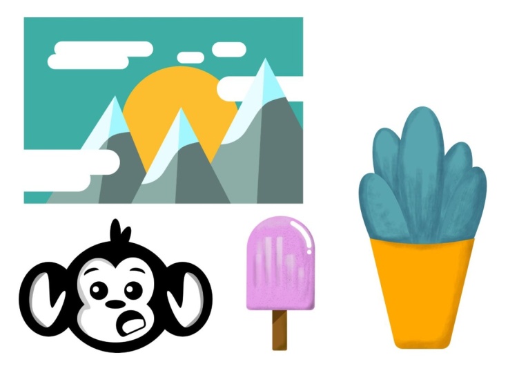
finish project together. We'll make this fun little guy to review the shape tools
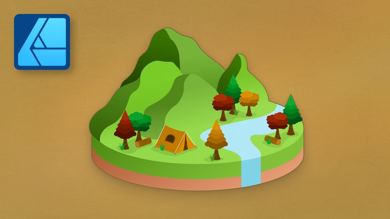
that we learn about. Then later on, we'll
make this camp poster to review text
tools and layer effects. Further into the
course, we'll put our paintbrush skills to the test as we make this
delicious ice cream. Everything in this course
builds on each other so that you can quickly improve
your affinity skills. At the very end of the course, we'll take everything that
you've learned and put it all together to complete
three final projects. These projects are
the perfect way to solidify everything
that you've learned throughout
the course and just look at them.
They're beautiful. By the time you finish
these projects, you'll feel totally prepared to make beautiful designs
all on your own. But before we dive
into affinity, I want to mention that
this course comes with a few example files that we'll be using
throughout the course. I encourage you to download and use them
because practicing what you learn is
the best way to retain all of the new skills
that you'll be learning. You can download those
files in the next lesson, and then you're ready to begin
your journey to becoming an affinity designer
master. Let's get started.
2. Download the Class Files: Before you begin this class, I recommend you download
the exercise files. These files will
be necessary for you to follow along
with the tutorials. To do this, you first
need to come to the project and Resources tab. Then click on the download link. The exercise files will then be downloaded
to your computer and you'll be
totally prepared to follow along with the
rest of the class.
3. Affinity Designer Overview: This chapter, we're
going to learn the foundational skills
of affinity designer. We'll start from
the very beginning and work our way up to completing a simple design
together. Let's get started.
4. New Documents, Saving, Exporting: Welcome to Affinity Designer. When you first open up
this amazing program, your screen is going to
look something like this. Now, I know there's
a lot going on here, but don't be intimidated. We're going to take it nice and slow as we go
throughout this course, and in no time, you'll totally understand everything
that you see here. To start off in this video, I'm going to teach you how to open up a brand new document, how to save your work, and how to export it. Let's go ahead and get started
and create a new document. Go ahead and come on up here
to the top of the screen, press on file, and then new. This dialogue box will pop up and this just
gives you lots of different options you can use to customize the sizing
of your document. Over here, you can scroll
through this list and see that we have quite a few different sizes that
you could choose. But personally, I like
to just come over here and manually put in
the size that I want. Start customizing. I
like to come over here to where it says page
width and page height. Now you can see a preview right over here for
the dimensions. But if you want to change these, all you need to do is
click in this box, and then you can type
in any number you want, then press Enter, and you can
see it update right here. Here we have a nice
vertical facing document. I'll just go ahead and
choose a larger number, and now you can see
it's more horizontal. It's super easy to change
up those dimensions. But so far, I've been
working in pixels. If you want to change
the document units to something a little more
understandable and concrete, you can go ahead and change
it to inches or millimeters, centimeters, any of these here. Then once you've updated that, you can go over here
and change that number. I'm just going to
stick to pixels, and that's how you
customize the size. Now there's a few other
things you can customize. This was just the
layout section. If you come over here to color, you can change the color format. Now this is a little confusing, but just know that RGB
works in most cases. The only time you
wouldn't want to use RGB is if you're going to take this design to a commercial printer. For example, let's say
you're going to go to a business and have them print
off 1,000 business cards. In that case, you
want to use CMYK. But for most other cases, if you're going to
share your work online or if you're going to print it on
your home printer, go ahead and use RGB. One last setting that
you can change in the color area is you can check on
transparent background. By default, you will
have a white background, but you can check this on and the background
magically disappears. This can be pretty
useful for some designs. Go ahead and check
that on if you want. I'll go ahead and turn that off. Now we have three
last sections here, margin bleed and scale. These sections have
more advanced settings that we're not going to
get into for this course. But I did want to point
out that if you ever see blue lines appear here on
your document, that's margin. Go into margin and make sure include margins is turned off. If it's turned on,
you'll be able to see blue lines
surrounding your document, and those will still be there after you've created
your document. They work like guides for placing things
in your document. I'm just going to turn that off. Let's go back to layout. I'm going to use
the same page width and height throughout
this course. I'm going to type in 1,500 here. For the height, I'm
going to use 100. This is just a dimension that looks nice on my
computer screen. Feel free to change this
up however you want. But I'm just going to keep
using this exact same size, so you can do the
same if you'd like. Once everything set
up exactly perfectly, you can go ahead and press
Create. Congratulations. You just did something
in affinity designer. We now have our
beautiful new document. Throughout the rest
of this course, we're going to
learn how to create beautiful designs
in your documents. But for now, I just want
to keep it simple so that we can practice saving
and exporting our work. I'm just going to for
demonstration purposes, make a really quick design. With this new design, I'm going to save this work. Saving and exporting
your work in affinity is pretty similar
to most other programs, this should feel
pretty natural to you. All you need to do is come up to the top of the screen to file, and then you can
press on Save as Then you can go where you
want to save your file. You can give it a name. Okay. And then you
can press save. This will save your file as an affinity designer
file on your computer, which means at any time, you can go ahead
and go back to it and open it up and
continue working. If you want to do that, all
you need to do is go to the top of the screen
to file, and then open. Now you can see here's where
we have our practice file. All you would need to do is select it and then press open. Now, I already have it open, so my screen didn't change. But if you just barely opened the program
and then opened it, this is what your screen
would look like after that. Let's say that you keep
working on your design. You move some things around, maybe you change some colors, and you like how this looks. Actually, I don't like
that color. Let's see. There we go. Let's say you
do like how this looks, and you want to save your work. Since this is already
saved as an affinity file, all I need to do is go to
file and then press save. As a quick side note, if you go to file and then open. This is also how
you can open any of the exercise files
throughout this course. Just go into one of the folders, click on the file you want to
open, and then press open. Saving your work is great if you want to come back
to your work later on. But what if you're done
with your design and you want to share this finished
work with someone else? Well, in that case,
it's time to export. Go ahead and come to the top. Click on file, and
then click on Export. Similar to creating
a new document. This dialog box will pop up and has some settings
you can change. I generally don't like
to change the settings. I think the defaults
are perfect. But if for some reason, you want to change
the file type, you can change it right up here. Now, just so you know, PNG is a pretty commonly used file
type for designer files, and this works really well. I personally suggest
you just stick to this. But if you do want to change it, this is where
you can do that. All you need to do
now is press port. You can give your file a
name and then save it. After you've exported your PNG, you can now share your beautiful design with anyone you want. That's the very basics of how to start a brand new design, how to save your work, and how to export your
finished product. Great work. Now that we
know these very basics, in the next video, we're ready to learn about the affinity designer workspace.
5. Affinity Designer's Workspace: Let's learn all about
Affinity Designers workspace. There are five main areas
in Affinity Designer. We have our main document
workspace in the center. All of our tools are
on the left side. We have studio panels
on the right side. We have a toolbar at the
very top underneath that, we have a context tool bar. Now, this document workspace in the very center is
pretty straightforward. It's where we'll
work on our design. But in this video,
I want to take a closer look at the
other four areas. Over here, we have all
of our amazing tools. We'll learn more
about how to use these tools as we go
throughout this course, and a lot of these tools have their own video
dedicated to them. But right now, I just want to highlight one important concept, and that is that each tool comes with different settings
that you can modify. Now, these settings
will be found in the context toolbar
right up here. As I click on each
of these tools, you can see that these
settings change because each of these tools have different settings that go
along with them. Because this tool bar changes based on the context
of the situation. It's called the context toolbar, right above that, we have
our permanent toolbar. Now these buttons never change, and we'll learn
more about a few of these buttons later
on in the course. Now I want to spend
some time talking about the studio
panels over here. Each of these panels
can be accessed by clicking on the
name of the panel. There are three
different rows here, this top row, this one,
and this bottom row. Now, there are actually
over 20 different panels and affinity designer, and they all offer a wide
range of functionality. But you might be
thinking there aren't 20 panels here and you're right. That's because most of the time, you won't need most
of the panels. By default, affinity hides some of the lesser used panels. Actually throughout this course, we won't even need all of the panels that are
out here by default. Let me show you how to
set up your panels the way I like to
because personally, I like a cleaner
simpler workspace with only the panels
that I actually use. Let's remove a few
of the panels. To do that, all you need
to do is drag on its name. Once it's dragged out here, all you need to do is click
on the x to remove it, and just like that, it's gone. The only panels
that we'll need in this course are these
top panels here, which are color
swatches, stroke, and appearance, and we'll
also need the layers panel. But other than that,
I'm going to click and drag to remove all
of the other panels, even these bottom
panels down here. This is how I like to
have my panels set up, but you might be wondering, how can I get these panels back? If you ever want to access
any of these panels again, all you need to do is go to the top of the screen to window. Then down here, we have a
list of all of the panels in Affinity Designer to
add a panel back in. All you need to do is
click on its name. Now you can use the panel from
here, or if you wanted to, you could click and drag it to add it back where
it was before. I'll just remove that again. If you want to get
everything set up back to how it
was originally, all you need to do is go to
Window, Studio, reset Studio. To make following along with me easier as we go
through this course, I suggest that you change your
panels the way I just did, and once you've done that, I'll go ahead and join
you in the next video.
6. Mac vs. PC: This video, let's talk about
Mac versus PC computers. Now before we get too
far into this course, I just want to mention
that I'm working on a Mac. If you're working on a PC, affinity designer will look ever so slightly
different for you. For example, in the last video when we were closing panels, the x to close the panel is
on the left side for a MAC, but the x is actually on
the right side for a PC. Now, that's just a
small difference. The biggest difference is actually with
keyboard shortcuts. Keyboard shortcuts are
something that I love, and we're actually
going to be using them as we go
throughout this course. If you're on a Mac computer, you'll often need to
press the keys command or option to use the
shortcuts in affinity. These buttons are right next to the space bar on your keyboard, if you're on a PC,
you'll use control or these buttons are also
right next to your space bar. Command on a Mac is the same
thing as control on a PC, and Option on a Mac is the
same thing as Alt on a PC. Just to make sure that
everyone can follow along. Throughout this whole course, I'll say the key for
both operating systems. I'll say something like press
command or control zero. Meaning that you'll press
command and zero if you're on a Mac or control and
zero, if you're on a PC. This will be important
to know as we start using keyboard shortcuts
in the next lesson. I wish that the keys were
the same for both computers, so I wouldn't have to do this. Hopefully, this isn't
too confusing for you. But now that we have
that out of the way, let's continue on
with the course.
7. Navigating in Affinity Designer: Let's learn how to navigate
around an affinity designer. For demonstration
purposes, I included this fun file in the exercise
files of the course, and you can download those
in the first chapter. Then once you have
them downloaded, all you need to do to open it, if you remember, is come to the top of the
screen to file, and then press on open. Once you have this file open, you can go ahead and
follow along with me. As I teach you how to move
around in a document. First, if you're
using a track pad, this works just as expected. Just move your fingers to zoom in and move your
fingers to zoom out. Once you're zoomed
in, you can use two fingers to move
around your document. But what if you're not
using a track pad? If you're using a mouse instead, that's no problem at all. But there are a few keyboard
shortcuts that you should probably keep in mind
for zooming in and out. The first one is zooming in. You can zoom into a document by pressing command
or control plus. Once you're zoomed in,
you can click and hold on the space bar and you'll see
this little hand appear. Then you can click and
drag to move around your document to zoom out. All you need to do is press
Command or Control minus. Or if you want to
completely zoom back out, press Command or Control zero. Even though I'm
using a track pad. I like to use command or
control zero quite a bit, just to zoom all the way back out and see the entire
document again. I find the shortcut very useful. If you're using a mouse that
has a mouse wheel on it, you can actually use that
wheel to zoom in and out. That could save you
some time if you don't want to use the
keyboard shortcuts. But if you want to do that, you'll need to change
your settings. The first thing you need to
do is get the move tool out, press escape on your
keyboard to make sure that you don't have any
of your layers selected, and then click on where
it says preferences. With that opened, go
ahead and go down to tools, and then check on. Use mouse wheel to zoom. Now you should be able to use your mouse wheel to
zoom in and out. That was just a
quick video on how to navigate around and designer. In the next video, we're
going to talk about layers.
8. Introduction to Layers: This video, let's
learn about layers. This simple design that you see here was included in
the exercise files, and we'll actually be using this document throughout
the next few videos. Here you can see we
have a few shapes. Each of these shapes
is its own layer, and you can see that over
here in our layers panel. We have a layer for the circle, the triangle, and so on. Each of these layers stacks on top of each other
like pieces of paper. If I take this really
large rectangle and put it on top of all
of the other layers, you can see that now it
covers everything up. I'll go ahead and bring
that back underneath. That's how you can
easily re arrange layers and decide
what goes on top. You can also turn off
layers if you want to by clicking on the little
circle that's next to them. Now you can see we still
have that circle layer, but it's just invisible. I'll go ahead and
turn it back on. If you wanted to completely
get rid of a layer, just have it selected and then press delete
on your keyboard. Or you could have
the layer selected, and then you could press on
this trash can down here. But I actually want
to bring those back. I'm going to use a
keyboard shortcut to bring them back to use this shortcut. All you need to do is press
command or Control Z. Command or Control Z is
a super useful shortcut. It lets you undo your
previous action. I personally find myself
using this all the time. It's easy to make a lot of mistakes as you're
working with designs, but command or control really comes in handy to
undo any of those. Let's say you don't want to completely get rid of a
layer by deleting it, but you do want to
make it less visible. In that case, you can reduce the visibility of a
layer by using opacity. Just click on this arrow here
to bring up this slider. Now as I lower this slider, you can see the circle becomes
less and less visible. You may have noticed
as I was sliding that, that the circle was
getting less visible, but we also have this blue
bounding box around it, which makes it a little difficult to see
what's happening. If you ever want to look at your layer without
that bounding box, all you need to do
is press escape on your keyboard to remove
that bounding box. This will deselect
all of your layers. You could also click anywhere outside of your document here. And that will make
it so you're not selecting any of your layers. Another thing that
you can do with your layers is you
can give them names, you might be wondering why
you'd want to do this. But later on, when
you start making designs with dozens or
even hundreds of layers, naming your layers can be really useful for keeping
things straight. I'll go ahead and rename
this bottom layer. I'll go ahead and double
click on the layer, and then I can type in
any name that I want. Okay. Then I'll press enter. Now that layer has been renamed. In addition to
renaming your layers. You can also change
the size of them. To do that, come up here
to this hamburger menu. Then you can choose the size of the thumbnails
that you're using. If you want to see
your layers better, maybe you want to use
large thumbnails. Or if you know you're going
to have a lot of layers, maybe using small layers
could be more helpful. For this course, I'm just going to keep medium thumbnails, but I thought that I would
show you what that looks like. As one last tip, I want to demonstrate using the move
tool with your layers. Now we'll learn more about the move tool later
on in this chapter. But for now, just
know that using this black arrow tool helps you to move things
around in your document. All you need to do is
select your object, and then you can go ahead
and move it around. If you don't want to
accidentally move a layer, say you accidentally move your background and
that makes you angry. All you need to do is
lock your layer in place. Go ahead and select your layer and then press on
this lock icon. Now you won't be able to move it if you ever want
to unlock it again, just go ahead and
press on this lock. If you want to move
multiple objects at the same time,
here's how you do that. Select one of your layers, and then while holding Shift, go ahead and select
your other layers, and now you can go ahead and move those all at the same time. You could also do this
from the layers panel. Select one layer, and
then while holding Shift, select this yellow square. You can see that while
I was holding Shift, this top layer and all the layers in between
the bottom layer, were all selected at once. You could also use a
different keyboard key. You could hold down command or control to select
multiple layers, even if they're not right
next to each other. Selecting multiple objects
like this can be tedious. If you want to keep moving
the same thing around though, the solution, grouping. Keep this document open
for the next video, where we'll learn all
about layer groups.
9. Layer Groups: Let's learn about layer groups. Groups, allow us to
keep our layers panel organized by grouping
layers together. Once layers are
grouped together, they also act as a single object that you can move
around all at once. To group layers together. All you need to do is select the layers that
you want to group. I'm going to go ahead and
select this first layer, and then while holding Shift, I'll select the yellow square. With all of those
shapes selected, I'm going to put them in a group by pressing command or control G. Now you can see over here, we have one layer called group. This group behaves as one layer. We can go ahead and turn
it on and off all at once, and we can also move it around. But what if you want
to work with one of the individual layers again? Can you still do
that? Yes, you can. Let's go over here and
click on this arrow. This will drop open your group, and now you can see every layer that's a
part of the group. Once this group is opened, you can go ahead and click on the layer that you
wanted to move, and then you can move it around. Once one of the layers inside
of the group is selected, you can just click on
any of the other layers directly in the document and
move them around as well. However, if I click
on an area outside of the document so that
nothing is selected. Then I go back to click on
an object in the group. This will select
the whole group. But a neat trick is
that if you do this, nothing selected, and then you want to select
this shape here. All you need to do
is double click. Now you have that
shape selected and you can quickly select the
other shapes again. Back over here in
the layers panel. You can move layers
outside of the group if you don't want them to be
a part of the group anymore. All you need to do is click and drag on the layer and then place it so that you can see this blue line on top
of the group layer, then you can release, and now it's no longer a
part of this group. Or if you don't want
to group at all, just select this group layer, right click on it, and then you can come down here to
where it says on group. Now we no longer have
a group anymore, and all of our layers are on
their own just like before. Groups are so useful because you will have lots
of layers while making designs and they make working with objects in
your design much easier. Go ahead and keep
this document open. We'll keep using it as we learn more about the move
tool in the next video.
10. Introduction to the Move Tool: Let's learn about the move tool. We've used the move tool
a little bit already, but the move tool is the most used tool in
affinity designer. Let's learn a little bit more about this
awesome little tool. First, though, I'm going
to delete this circle and the square just so
I can work with one shape at a time as I
demonstrate this tool. The main job of the move tool
is to move things around. You've already seen this, but I want to show
you a few more fancy features of the move tool. The first one is that if you're moving a shape and then
you hold down shift, I'll go ahead and move the shape in a straight line
from where you started. Go ahead and move your
shape and then hold shift, and it'll lock back
to where it started. You can also resize things with the move tool by using
these nodes here. I'll go ahead and
click and drag and you can see how we can
resize the shape. But if you wanted to
stay proportional, you can hold down shift. This will lock it into
its original shape. You can also rotate shapes
using this node up here. Just click and drag on this one, and you can move your
shape all around. If you want to lock it
into 15 degree increments, you can hold down shift. This is pretty
useful if you want a 90 degree angle or you want it to be completely
turned upside down. You might have noticed that with everything I just showed you, we hold down shift to keep our
movements more structured. Shift is like a super short cut, and you'll use it quite a bit. Using shift tells affinity
that we want to snap our object to certain
dimensions or movements. While shift is a
super great shortcut to pull out when you need it, affinity actually has
a built in snapping feature that will snap your
shapes to your document. You might have noticed that
when you move your shape, Sometimes these lines appear. These lines are snapping lines, and they help you to
center your object or even line it up with
the edge of your document. This can be really
helpful most of the time. But if you ever want to move
your object more freely, you can actually
turn snapping off. All you need to do is come up to the toolbar and click
on this magnet icon. Now I can move the object more freely and it won't
snap to anything. But if you do want
to snap again, you can just click
on that magnet and snap your shape
wherever you want. That was a lot of snapping talk, but the move tool
can do much more. A really fancy trick with the move tool is that it can
actually duplicate objects. The way to do this
is you need to hold down command or control
on your keyboard. Then click and drag
on your shape. Notice how each of
these triangles become their own layer. Now you know a lot more about the move tool and
it's many shortcuts. We're going to be using it a
lot throughout the course. Make sure you practice a few of these shortcuts and
in the next video, we're going to
learn about shapes. Now to prepare for
this shape section, let's delete these triangles so that you can
learn how to make your own shapes in
the next lesson.
11. Introduction to Shapes: Let's learn about shapes. Affinity designer comes with many pre built shapes
by default over here, we have the rectangle tool, we have the Ellipse tool, which you can use
to make circles, and we have the rounded
rectangle tool. I'm going to go ahead and
select the rectangle tool. To make a rectangle,
all you need to do is click and drag
to make the shape. You can also hold down
shift if you want to make a perfect square with
this rectangle tool. That's pretty easy to go over here and select
one of these shapes. I'm actually going to delete
this rectangle though, because I want to show
you where affinity hides all of its other
pre built shape tools. You see this little
gray triangle next to the rounded
rectangle tool. That's actually a special
secret drop down menu. If you click on that
little triangle, you can open up all of these other shapes
that you can use. I'll go ahead and select
the trapezoid tool. Then I can go ahead
and click and drag and now you can see that
we have a whole new shape. This trapezoid is great in all, but wouldn't it be nice if we could tweak the way it looks. Luckily, affinity gives us so many options to
adjust the shapes, even these pre built shapes. In fact, almost all
of the shapes in affinity designer come
with extra settings that you can modify and these settings are right up
here in the context tool bar. For example, the trapezoid has a left point
and a right point. You can adjust this percentage to change the angles
of your trapezoid. If you wanted to, though, you could actually just click and drag on the orange nodes
that you see on the shape. Let's go ahead and practice another example so that I can
show you a few more tricks. I'll go ahead and press Delete on my keyboard to
get rid of that. Let's go ahead and
grab another tool. I'll click on that
gray triangle again. This time, I'll go
ahead and select the donut tool delicious. I'm going to click and
drag and then hold Shift. You can see we have a
perfect donut shape. Up here in the context toolbar, we have quite a few different
options that we can change. As a little sneaky shortcut, you can actually just click
and drag over the name here, and this will increase or decrease the radius of
this hole in the middle. This is called scrubby sliders, and you can actually
do this with so many of the different options
in the context toolbar, as well as the
opacity over here. If I click and drag
on the word opacity, we can quickly
change the opacity. I like using scrubby
sliders because I find they save time and I
just think they're cool. Go ahead and do that to adjust
this radius if you want. We have a few other
different things we can adjust up here
like the start angle, the end angle, the
overall angle. Honestly, sometimes these get a little confusing to me with
all their different names, but it's pretty easy to see these orange nodes
here that we can go ahead and click and drag
to make a custom shape. Each shape comes with these unique settings that
you can modify. By using the context
toolbar to get more exact measurements or
just using the orange nodes, you can customize any of these
shapes however you want, which is so useful. As a final tip, I want
to teach you a way that you can easily move and
resize your shapes. We already know that you can use the move tool to resize
and position the shapes. But if you're careful, you can actually move and resize the shapes with the
shape tool still out. Just be careful to click
on the right area. What I look for
here is I wait for my cursor to change
into this arrow shape. Now I can go ahead
and adjust the size. Once my cursor changes into this little cross
hair arrow icon here, you can click and drag to
move your shape around. But if you're not
careful and click outside before your
cursor changes, you'll just create
another shape. That's everything I wanted
to show you about shapes. We'll be working with shapes a lot throughout this course, we'll definitely get plenty of practice using all
of these tips. For now, let's move on to the next video where
we'll learn about color.
12. Introduction to Color: Let's learn about color. I'm going to use this
exercise vile again. Go ahead and reopen that, or you can just practice and create these
shapes on your own. The specific colors
don't really matter. I just want to use
these shapes to demonstrate all of the different ways we can change color. Every shape in affinity designer
actually has two colors. It has a fill color
and a stroke color. The fill color is what
you can see right here. It's the shapes main color or the color that fills the
center of the shape. The stroke is the color
of the shapes outline. If we click on this
triangle here, we can actually see both of these colors up here
in the color panel. Right now, we have
the fill color represented by this circle here, and you can see that
this color matches. Right here, we can
see the stroke color. Now, right now, it's a white circle with a
red cross through it, and that actually
means that no color is applied to choose the
fill or stroke color. All you need to do
is click on one of these circles, then
to change the color. All you need to do is come
over here to the color wheel, and you can drag on this outer
circle to change the hue. That's pretty easy to
change the fill color. Next, let's go ahead and
give the stroke a color. I want the stroke to be white. I'm going to use the
center circle here, and I'm just going
to drag it toward the white corner
of this triangle. Now you can barely see the
stroke on that triangle. Let's make it bigger with some
tools like the move tool. You can actually change
the stroke right up here. You can see we have the fill and stroke colors right
next to that, we have this long line here. If I click on that,
you can see we have quite a few settings here
that will go over more later. But the main one that affects
us right now is the width. If I click on this
to increase it, you can see our
stroke gets bigger. You can use this feature
when the move tools out. But if you have any of
the other tools out, you can actually
adjust the stroke from the stroke
panel right here. Just click on it and you can adjust the
width here as well. The stroke panel
and this panel up here are the exact same with
the exact same settings. Just use whichever one is
more convenient to you. Back in the color panel. You can press on this
little circle here with the cross through it to
remove one of the colors. If I click on this, you can
see that just like before, we no longer have a stroke
applied to the triangle. I can also do this with the fill to remove the fill color. I'm going to click on the stroke again and I'm going to
give it a white color. Now you can see we have this
cool outline effect here. With the color panel, you can use the color wheel
like I've been using, or you can use sliders
if you want to. Just come up to the
Hamburger menu here, and then you can
click on Sliders. Then you can use these
sliders to adjust the color. But wait, why isn't
the color changing? We can see that the color
circle is changing, but the triangle is still white. Well, it looks like I deselected the
triangle at one point. Now since that layer
isn't selected, the color isn't changing. This actually happens
to me quite a bit. I forget to have the
right layer selected. If this ever happens to you, just make sure you have
your right layer selected and then whatever you're trying to change should work just fine. I'll go ahead and click
on that triangle, and now you can see that the
colors are working again. Personally, I really
don't like these sliders. They are a little
confusing to me. I prefer to use the color wheel. I'll go ahead and
change that back, but feel free to use the sliders if that's
easier for you. In addition, you might notice that I have a triangle here. I'm not sure if this
is the default or not. You might have a square instead. If that's the case, you
can always go up to the hamburger menu and
change it to a triangle. That might make it easier
to follow along with me since that's what I'll be
using throughout the course. So far we've talked
about changing the fill and the stroke color. But I want to get
a little more in detail with how to
use this color wheel. I'm going to select
the yellow square, and I'm going to
select its fill color so that we can
change that color. The reason I really like
using the color wheel is because you can easily change the hue from this outer ring, and then you can pick a shade of that color from
inside the triangle. I'm going to change the hue by using this outer circle here. Let's go with a
nice green color. Then you can change the hue
using this inner circle. If you have this all the way
close to this outer circle. This is the most saturated
version of this color. If you bring it to one
of these other points, you can see that now
we have pure white or we can click over here
and make it pure black. If I drag it in between
pure white and pure black, we'll have some gray color. If I drag it between pure
white and the saturated color, we get a light shade
of that color. If we drag it between the
saturated and darkest points, we'll just get a nice dark
version of that color. Of course, we have
everything in between if we drag in the
middle of the triangle. I love the flexibility of
using the color wheel. It might not be the
most accurate way to get the perfect color, but personally, I like this more free form way
of choosing colors. My last tip for you is
to always double check whether you're
working on the fill or stroke of an object. It's a very common mistake to think that you're working
on the fill color. When you actually have the
stroke color selected, and if you have a very thin
stroke applied to your shape, it might look like
nothing's happening. That's just something
to be aware of. It's important to
make sure you always have the right layer selected, and it's always important
to make sure you have the right stroke
or fill selected. With that, we're done
with this video. Now you know a lot more about how to change the
colors of your shapes. In the next video,
we're going to use a brand new exercise file to learn all about child layers.
13. Child Layers: This video, we're going to
talk about child layers. Before we do our first practice project
in the next video, I just have one last
important thing about layers to show you and
that's child layers. Child layers are a
special layer that lets you put one layer
inside of another layer. This means that the
child layer will only be visible where the
parent layer is visible. I'll show you this,
I'll go ahead and use the move tool to move this circle inside of
this other circle. To make this layer a child
layer to the bigger circle. All you need to do
is click and drag on the child layer and place it
on top of the parent layer. Once you release your cursor, you can see that
now that circle is only visible where the
parent layer is visible. This works like groups. If I open this up, you can see that we have our main
layer and the child layer. There's still two
separate layers, but now they're connected. Once you have layers in this
parent child relationship, you can use the move
tool to move and resize the entire group
at the same time. If you want to move where the child is placed within that, all you need to do is select
that child layers layer, and now you can freely
move that layer around. This is similar to objects
that are in a group. If we have nothing selected
and then we click, the parent layer
will be selected. But if we double click, you can select that child layer. In addition to making this parent child
relationship with our layers, we can actually give a ch layer
a child layer of its own. I'm going to make
the smaller circle a child layer to
our other circle. To do that, I'm going
to click on its layer, and then I'm going to drag it so that it's on top of
the other child layer. Once I release my mouse, it looks like this
object has disappeared. But that's actually
because it's only visible, where its parent is visible. All I need to do is move this, where its parent layer is. Now you can see that we have a multigenerational family here, we can move this
whole group as one. Or you can click inside
to move the group around. You can double click again to move the smallest
child layer here. Just like with layer groups, at any time, we can take a
child layer out of a group. I'll select the smallest circle here and I'll move it
on top of everything. Now you can freely move that outside of the parent
child relationship. It might not really
seem like it now, but child layers are actually very useful in a lot
of different cases, and you'll see that as we go through some of the
projects in this course. Now you know all of the basic
tools in affinity designer. In the next video, we're ready
to make our first project.
14. Mountain Practice Project: His video, we're going
to bring together everything that we've learned
so far in this course, and we're going to make this
cute little mountain design. Now, this might look
a little advanced, but you actually already have
the tools you need to put this together.
Let's get started. First, let's make
a new document. I'll come up to the top
of the screen two file, and then I'll press new. I'm going to use
the page width at 1,500 and the page
height at 1,100, and then I'll go ahead
and press Create. With this document made, let's start by
making a background. I like to use the rectangle tool to give our background
a nice color. I'll go ahead and
select that tool, and then I'll click
and drag to make a rectangle that's large enough
to fill the whole space. Now, we're going to make
a sunset design here. I'm going to go
with orange tones, but feel free to choose
any colors that you want. You could do purples and blues or anything like
that if you want to. But I'm going to
go ahead and make mine a nice soft orange color. Since this is a
background layer, I'm going to go ahead and
press the lock icon to lock it in place so that I
don't accidentally move it. With our background in place, let's start making
some of our mountains. To make the mountains. I'm going to come over here and click on this little
gray triangle. Then I'm going to select
the triangle tool. I'll click and drag to
make my first mountain. Now, right now, it's the same
color as the background. That's not very good. I want to be able to see
what I'm doing. I'm going to choose a light
gray color for our mountain. The next thing I want to do to make this look even more like a mountain is I'm going to give it a little
snowy cap up here. Now, this is where you can get a little bit creative
with your shapes. You could use a circle
to do this or any of these other rounded shapes
to give it a rounded look, or you could even use
the star tool if you wanted your snow to be a
little bit more spiky. I'm going to use the tear tool. I'll click and drag to
create a tear shape. Then I'm going to make it white. Then to make it so that it's only visible where the
mountain is visible. I'm going to make
it a child layer. But first, I'm going to go
ahead and grab the move tool. With snapping turned on, I'm going to make
sure that this is centered to our
mountain right here. With that tear drop centered, now I'm going to make
it a child layer. I'll drag on this layer and bring it on top of our mountain. Now you can see that
you can only see the snowy peak where
our mountain is, which is very nice. To make this look a little
bit more dimensional, I think this will look nice if this mountain had a shadow. Let's make one. I'm going
to grab the rectangle tool. Then I'm going to click and drag a rectangle so that it's
covering half of the mountain. I'll make sure
that this is right in the center of the mountain. Then I'll make this
rectangle black. I don't want this to be
outside of the mountain. I'm going to make it a child
layer to our mountain. I'll click and drag
this on top of that. Then I want to make this
layer a little bit less visible so that we can
still see some of the snow. I'm going to lower the opacity. With that rectangle
layer selected, I'm going to just click and
drag over the word opacity. Now you can choose how dark or light you want the
shadow to be. Okay. Now I'm going to
grab the move tool and I'll select our mountain. Now you can see we can move our mountain wherever we want. We can make it
larger or smaller. We can even adjust
the height of it if we want it to be a
little bit more short. And I'm going to go ahead and center that in the document. Using the move tool, we can
easily make more mountains. All we need to do is hold
down command or control, and then click and drag on the mountain to make a
little friend for it. I want to make a couple of
mountains in the background. I'm going to go ahead
and shrink the size down so that it appears
behind our first mountain. I'm going to go ahead
and drag this so that it's beneath the
other mountain group. Now you can see in our document, it's behind that first mountain. I'll go ahead and select
this background mountain and let's duplicate this one. I'll press command or control. Then I'll click and drag and
place this one over here. Again, we can adjust
the size of it. We can make it a little
more skinny if we wanted to just so that they don't
look all perfectly even. This makes it look slightly
more realistic, I think. Now we can reposition
them however we want. I think we're actually done with the mountain part
of this project. The next thing I want
to do is I want to set the scene and make it
look like it's sunset. I want to add a sun
behind these mountains. To create our sun, I'm going
to use the Ellipse tool. Now, we actually haven't
used this tool yet, but it works pretty similarly
to the rectangle tool. I'm going to click and
drag and then I'm going to press down shift to make
this a perfect circle. Then I'll go ahead and tuck this behind the mountains here. I'll bring the layer behind
the mountains as well. Now we can give it a
nice sunset color. I think I want to give
it more of a red color, but I don't want it
to be that bright. I'm going to click and
drag on this circle here, and I'm just going
to pull it back a little bit to desaturate it. Now we can go ahead and adjust where it's positioned
if we want to. We can make it a little
lower, like that. But I want to keep it centered. The very last thing I want
to do is I want to create some clouds just to add a little bit more
going on in the sky. There are a lot of ways
to make cloud shapes. You can make very
big fluffy clouds or a little bit
more simple clouds. I think for this video, I'm
going to keep it simple, and I'm going to come
over here to our tools. I'll open up our shapes, and I'm going to use the rounded rectangle tool to
make our clouds. I'll start by clicking and
dragging a rounded rectangle. Then to make the
edges more rounded. I'm going to click on
this orange node here and I'm going to bring it in all the way as far as it can go. Now you can see we have a
very rounded rectangle here. The next thing I'm
going to do is I want to choose a color
for these clouds. I think white clouds
would look nice, but I think just to give it
a little bit more interest, I'm going to pull
it over ever so slightly to give
it a slight tint. Now, this looks a
little pink right now. I think I want to pull
it over more toward orange so that it just
looks a little bit peachy. I think that looks pretty nice, a very nice soft cloud. Now that I have this base shape, I can create clouds with it. I'm going to press
on the move tool. Then we can go ahead and adjust
the size however we want. Then what I'm going to
do is I'm going to press command or control to
duplicate this layer, and then I'm going
to place it like that to give a cloud
shape up here. I'll hold down
command or control to continue to duplicate it. Just as a tip, when you're duplicating something like this, make sure that you
hold down command or control first, click and drag. Then lift up on your mouse before you release
command or control. If you duplicate something, but then lift up on command
or control before you stop, you'll just move your shape. That's just one
little tip for you. In fact, since we're
duplicating so many clouds, I would suggest
just keep holding down command or control
the entire time. Don't even lift it up until
you're done duplicating. I really like these clouds. I just think I want to place this one right here
behind the mountain. I'm going to find its layer over here in the layers panel. Then I'm going to click and drag to place it behind our mountain. I think this looks pretty cool. I think I'll just
make a couple of adjustments to our clouds. Okay. I think this is
looking really nice. At this point, we have quite
a few layers over here. If you wanted to, you could group some of these
clouds together. For example, these two
layers are one cloud, but there are separate
layers right now. I'm going to hold down shift to select both of those layers, and then I'll press command or control G to group
them together. I'll just do that just
to clean up our layers. It's good practice just to make sure that all your
layers are nice and organized so that it's easy to go back and see what
all of your layers are. At this point, I think I really like the
placement of everything. If you wanted to at this point, you could go back and change any of the colors that you want. I just want to share one
little trick with you. You can actually recolor
all of the layers in a group if you have
the group selected. For example, I have this
cloud group selected. I could make both
of these layers, any color that I want.
I'll just undo that. I just wanted to
show you that it's very easy to recolor everything that's in its own group.
With that, we're done. Great work on completing this first chapter of the course and this very first project. It's so exciting to see everything that you've
already learned and how it can all work together to create a beautiful design. Now in the next chapter, we're going to learn a
few more powerful tools that Affinity Designer has, which allows us to create
even more types of designs.
15. Curves for Beginners: Far in this course,
we've already seen that affinity comes with some
amazing pre built shapes. But in this chapter, we're going to learn all about curves. Curves allow you to make custom shapes that
look however you want, simply by connecting
dots together. It's actually pretty
cool. Let's get started.
16. Pen Tool for Beginners: Let's learn about the Pen tool. You can find the pen
tool right over here. Go ahead and select that we can get started learning
about this powerful tool. Now this tool can be a
little tricky for new users, but we're going to keep it nice and simple in this course. With knowing just a few of
the basics of the pen tool, plus good knowledge of shapes that we learned
about in the last chapter, you really can
create amazing art. Let's start off using the
pen tool and polygon mode, which you can find
right up here. Polygon mode allows you to lay down points to
create your shape, and all of these points
will be in a straight line. These points that you
see are called nodes, and we'll be working more
with that in the next video. But for now, just click
to lay down a few points. Then to close your shape, just click on your first point. Once you have a closed shape, you can give it a
fill and a stroke. Come on over here
to the color panel. Let's start with the fill. I'll go ahead and give
that a nice color. For the stroke, it
looks like it's already black. That
seems pretty good. But I'll just come over
here to the stroke panel, and let's increase the
width. There we go. Changing the fill and
stroke works pretty similarly to the other shape tools that
we've already seen. Once you have your shape
all made like this, you can go ahead and
grab the move tool and you can move the
shape however you want. You can re size it,
move it around. This is pretty much just like any of the other
shapes at this point. I'm going to go ahead
and delete this. So that we can have a
clean work space for the next pen tool mode that
I'm going to show you. Go ahead and grab
the pen tool again. This time, we're going to work
in smart mode right here. This is pretty similar, but now instead of
straight lines, we'll be making curved lines. Again, you can click
on the first point to close up your shape. The pen tool is drawing
the outline of the shape, which we already learned
is called the stroke, Affinity will always keep the same stroke settings that we set on the last
shape that we drew. You can see that we still
have that thick black stroke. But if you did want
to give it a fill, you would have to come over here and choose a color for that. I'll go ahead and give
this fall for now. Now I want to show
you a couple of tips and tricks that you
can use with the pen tool. We already know
that you can close your shape by clicking on
your first point again. But if you ever don't
want to close your shape, and you just want a line. All you need to do to finish your shape is press
escape on your keyboard. This will end your shape and now you can go ahead and edit the stroke and move it around with a move
tool, however you want. I'll go ahead and change
the strokes color on the shape just to show you that. Getting the pen tool back out. I want to show you a
couple other things you can do with the pen tool. The first thing
you can do is you can turn on rubber band mode, which I find to be
pretty helpful. Rubber band mode will
give you a preview. You can see right
here, this blue line that shows you what
your line will look like, once you've laid
down your point. You can see here, we're seeing that a new
curve will be added. And we can see how
that curve will be affected where we
lay down that point. This can be pretty useful. I personally like using rubber band mode. I
think it's pretty nice. Another thing you
can do is you can actually change modes mid shape. So far we've been in smart
mode doing our curved lines, but you can go ahead and
change it to polygon mode, and now you'll be working
with straight lines. And if you're in polygon mode, you can hold down shift
to lock your line at a 90 degree angle or straight up and down or a
45 degree angle. That can be pretty useful if you ever want perfectly
straight lines. I'll go ahead and
close the shape. Then I want to show you how
you can modify your shape. You can modify all of these different nodes
by using the node tool, which you can find
right up here. Using the node tool, you can
click and drag on any of these points at any time to change the way
that the shape looks. You can do other things
with this tool too, but we're going to
learn more about the node tool in the next video. Go ahead and create a few shapes on your
own and then keep this document open for
the next video. Okay.
17. Node Tool: Let's learn about the node tool. In this video, I want to show you how to
use the node tool. Make sure that you
have a few shapes drawn up here so that we can manipulate some of
their points or nodes. I'll go ahead and
grab the node tool, and then we can get
started learning a few of these extra features
that the node tool has. You already saw that
you can click and drag on any of the nodes to adjust where
they're positioned. If you want to, just like moving any of your
shapes around, you can hold down shift, and then you can click
and drag and you can see that your node will only
move in a straight line. In addition to moving
the nodes around, you can actually click and drag on a line in between
the two nodes, and you can move
the line that way. If you just single click
on one of the lines, you can add a node, and then you can go ahead and
move that node around. In addition to moving
and adding nodes. You can also select nodes
and then delete them by selecting it and then pressing delete
on your keyboard. With the node tool
out, you can also use the context toolbar to
convert your nodes. For example, maybe you
want this node to be more of a straight angle instead of this
curved node here. I use smart mode
to make this node, but we can actually convert this to a sharp node right up here. Now you can see that that
node is nice and squared off. And you can do the opposite, you can click on a node and convert it to smart
mode to make it curved. Then you can adjust
it however you want. Now, you might have noticed that the smart nodes have these little handles coming
off the sides of them. We're not going to go
too deep into these because they're a little bit
difficult for new users, but just know that if you click and drag on these handles, this works like magnets, and you can drag it in and out and see how it
affects the shape. As I pull this out, the
line moves with it. These help you to control and stretch out the
angle of your curve. Now that you know
all about all of the different things
the node tool can do. Here's one last bonus tip. If you have the pen tool out because you've
been making lines, you can actually hold
down command or control, and this will temporarily
bring up the node tool. Then you can move your nodes just like the node tool would. This is a very nice shortcut. You can very quickly switch
between these two tools. Okay, so we have pretty
good building blocks here, knowing about the Pen
tool and the node tool. So in the next video, we're going to move on
and learn how to edit Affinitys pre built shapes
with the node tool.
18. Turn Shapes into Curves: In this video, we'll
turn shapes into curves. So far in this chapter, we've been using the Pen
tool to create curves, custom shapes that we've
created all on our own. When you create a curve, you can see over here
in the layers panel, that this type of layer
is called a curve. This is different from
our shape layers. When you create a shape, you can see that the name
of the shape appears here. This is a completely
different type of layer. Because shapes are so different, they have different
functionality with them. For example, they have
these orange nodes which you don't really have when you create curves like this. But curves also have different
functionality as well. You can use the node tool on
them to edit their shapes, and they just have a
lot more flexibility. But wouldn't it be
cool if we could edit the nodes on
the star shape, like how we can with
our pen tool paths. Well, we actually can. But first, we need to
change the shape into a curve layer to convert
this shape into a curve. All you need to do
is come up here to the context tool bar and then
click on Convert to curves. If you don't see this option, that just means
you probably have a smaller screen than
I do. That's okay. Just come over here and once you've opened
up this option, you should be able to click on Convert to curves right in here. Once I click on
Convert to curves, this star will change. It will no longer have
these orange nodes, and the name of the
layer will change to curve. I'll go
ahead and do that. You can see curve and
no more orange nodes. What this means is now our
star is basically a curve, and I can use the node
tool to affect any of these nodes just like we
did in the last videos. I can move any of these nodes
in or out. I can add nodes. I can even convert these
nodes by clicking on them, going up to the
context toolbar and changing these sharp
points into smart mode. Now we have a urounded
part to our shape. One thing to note though is that after you convert
your shape to curves, you need to make sure
that you're using the node tool in order
to affect all the nodes. If you have the move tool out, you won't be able to see any
of the nodes or affect them. Just make sure you're
using the right tool. Turning shapes into curves like this is a great way
to customize them. But we can actually
do even more. In the next video, I'm
going to teach you about another unique tool that you can use to alter your
shapes and your curves.
19. Corner Tool: In this video, we'll learn
about the corner tool. The corner tool is a special
tool that lets us round out any sharp corners
of a shape or a curve. Let's start with a shape. I'll select the star tool again. Then we'll hold in shift. I'll go ahead and click
and drag to create a star. Then I'll get out
the corner tool. Once you have the
corner tool out, all you need to do is
click and drag on any of these nodes to round
out the sharp edge. I'll go ahead and move this one. Now you can see, we have a
nice rounded corner here. You can click and drag on these points right
here in your document, or you can come up here
to where it says radius, and you can type in any value. In addition to rounding
out these sharp edges, you can also round out
this inner area here. I'll just click and
drag and you can see now we have a more
curved area here. One thing to note about
the corner tool is that this tool automatically
transforms any of your shapes into curves. We're working with
individual nodes now. This is a curve instead of
the original star shape. You no longer have
the orange nodes, and you can also use the node tool to move any
of these nodes around. That's just something to note. Going back to the corner tool. Another thing you can
do with it is you can actually move multiple
nodes at once. If I click and drag, I can select more than one node. Then as I move them inward, you can see them move together. In addition to altering
shapes with the corner tool, we can also alter
pen tool paths. I'll go ahead and put my pen
tool in the polygon mode, and then I'll create a shape. Now I can select
the corner tool. I can round out any
of these edges. The corner tool only works
on sharp corners like this. If I had made my pen
path using smart mode, You can see that the corner tool will not work on that node. What I want you to get
out of this is that shapes and curves are a
little bit different, but you can alter
shapes and curves using the corner tool and the node
tool as much as you want, there's just so much
flexibility with this. You might not always find yourself using all
of these tools, but I just wanted to show you that all of these things
are possible to do. Now that we know a lot
more about curves, in the next video, we're
going to go back to shapes, and I'm going to show you a really cool trick where you can combine shapes together
like puzzle pieces. Okay.
20. Combining Shapes: Let's combine some shapes. This exercise file will be perfect for our
practice in this video. A lot of great
designs are made by just combining shapes
in creative ways, and we can use the
geometry operations right up here to do that. The first thing you need
to do is you need to select both of the layers
that you want to combine. I'll go ahead and hold down shift to select both
of these layers. Now you can see that all of these geometry operations have lit up and are available
for us to use. For this first one, I'm going
to use the ad operation. Once you've clicked
on the add operation, you can see that both
of these shapes are now combined into
one single shape. One thing to note is
that this operation, as well as all of these
other geometry operations will automatically turn
your shape into curves. We will be able to use the
node tool to alter the shape. You can see that here.
I'll go ahead and grab the move tool again and let's select this
next set of shapes. Instead of selecting them
from the layers panel, you can also click and drag. Once the whole shapes
are covered like this, you can release your mouse and see that both of those
layers are selected. You can select shapes
either way from the layers panel or right
in the document like this. For this next one,
let's go ahead and use the subtract operation. This operation will
subtract your top shape, which in this case, was the
circle from the bottom shape. Now you can see we have
this nice little cutout. Let's go ahead and
do the next one. We're going to use the
intersect operation here. This one will only keep the area where the
shapes were intersected. This contrasts with
the next operation. I'll go ahead and
select our next shapes here, and then I'll select it. You can see that
unlike this one, this keeps everything except for where the shapes
were intersecting. Finally, I'll go ahead
and do this last one. We have the divide operation. At first, this looks
like nothing happened. But once you move
these layers around, you can see that the
shape has been divided. It divided where the shapes intersected and created
its own shape there. Now we have three separate
layers in the layers panel. I'm going to undo this
with command or control Z because I want to show you an advanced trick
that you can do. Now we just have our red circle
and blue rectangle again. This time, I'm
going to hold down Alt or Option on my keyboard. Then I'm going to click on
the subtract operation. Now, this is pretty tricky. What's happened is that now
we have a compound shape. This means that we
actually have kept the red circle and
the blue rectangle, what has happened is that now we can still move this
circle around. But now this circle
is transparent. Wherever we move it, it's still like this blue rectangle
is being cut out. This just gives you a little
bit more flexibility. But one thing to
keep in mind with this compound shape
is that these are still shapes,
they're not curves. If you want to work with
the individual nodes on this compound shape, you'll need to
convert it to curves. But that's a little
complicated and I don't usually use
compound shapes. If that's a little confusing, no worries, I don't really
use this very often. I just thought I'd
show it to you. To finish off this video, I'm going to select
all of these shapes and I'm going to
delete them because I want to show you a little
bit of a demonstration of how you can combine
shapes to make new designs. To do this, let's
create a house. I'm going to grab
the rectangle tool, and then I'll click
and drag while holding Shift to make
a nice little square. With that centered in
the document nicely. Let's go ahead and give
this house a roof. I'll come over here
to our other shapes and I'll select
the triangle tool. Now we can make a
little rooftop. To make these one shape, I'm going to go ahead
and select both of them, and then I'll use
the ad operation to combine them together. Now you can see
they're one shape, they move together, and
that's pretty nice. To continue to modify this, I'm going to go ahead
and create a doorway. To do this, I'll use
the ellipse tool and I'll just click and
drag to create an ellipse. If I cut this door
out right now, the bottom curves in like this and that looks
a little strange. I'm just going to
make it so that only half of this
oval is showing. Then with that oval
placed on top, I'll select both of these, and then I'll use the
subtract operation. Now you can see this is
still all one shape, and now we can pull
out the node tool and we can adjust this
shape however we want. We can make the doorway
a little bit bigger. We could stretch out the
roof if we wanted to. I'll select all of these nodes, and you can see how we
can modify it that way. Putting shapes together
like this is so freeing. You can really
create any shape you want by piecing together
multiple shapes. The next video, we're
going to do a project together where we'll really
practice this technique.
21. Character Practice Project: In this video, we're
going to create this adorable character
design by combining together everything that we
learned throughout this chapter about combining shapes and using the corner
tool and all of that, it's going to be a lot of fun. Let's get started. To
start off this project, I have this clean
blank document here. The first thing we're
going to do is we're going to create the
head for our character. I'll come over here
to our other shapes, and I'm going to select the
rounded rectangle tool. Then I'll go ahead and click and drag out a rounded rectangle. I'm going to pull
this orange node to create this nice
rounded shape. Then I'll drag it downward a bit to create more
of an oval shape. Now we can go ahead and
give it a fill color. I'll go ahead and go
into the oranges and then I can go and give
it a nice skin color. Next, let's go ahead
and create the body. I'm going to grab the move tool and I'm going to duplicate this first shape we've made by holding
command or control. Then I'll click and drag, I'll release my mouse, and I'll release
command or control. I'm going to make this first
shape a little bit smaller. Then we have the body down here. Now, using this body, I'm going to create a tank
top on our character. To do that, I'm going to use multiple different shapes
to create the effect. First, let's get out
the rectangle tool and I'm going to draw a
rectangle on top of our shape, leaving space on each side of this rounded rectangle to
create arms for our character. I'm going to grab the move tool, and I'm just going to
make sure that this is centered with this shape right here. That looks pretty good. Then I'll go ahead and give
this tank top a color. I think I'll go
ahead and go with a nice light blue
shade. There we go. Next, I want to create a
cutout for the neck hole. To do that, I'll go ahead
and grab the circle tool. I'll hold shift
while dragging out a circle and then I'll place
that circle right here. Now, because I want this
to be a neck hole area, I want to cut this
out of the rectangle. With that circle placed on top, I'll hold shift to
select both of these. Then I'm going to use
the subtract operation. That looks really good. Now you can see we have
this nice cutout shape. To make this tank top only appear in the
rounded rectangle, I'm just going to make
it a child layer. Now you can see that
that looks pretty good. We have our nice tank
top and head here. This looks good so far. I'll go ahead and
position this here. Then I want to create a shadow right under the
head to create a neck. To do that, I'm
going to go ahead and grab the rounded
rectangle again. I'll click and drag one here. I'll make it super rounded by dragging this all the way in. There we go. And with it centered with
the body like that. I'm going to make this a
darker skin tone shade. I'll click right here to
apply the original shade. Then I'm just going
to make it darker. Then I'll place the head
on top of everything. Now you can see that
we have this neck area and we can go ahead and
adjust where it's positioned. I think I want the head
a little bit lower. This is looking pretty good. We have the head and the body. Now it's time to work
on the face details. To start, let's make the eyes. Now, you can make the eyes any shape or color
that you want. I've used ellipses in the
past to create circular eyes. But to make him look a
little bit more smiley, I'm going to actually
use the crescent tool. I'll click and drag
to create a crescent. Then I'm going to adjust
these orange nodes. I'm going to pull this
one down a little bit. Then I'll rotate
it while holding shift so that it's
perfectly on its side. Then I'll go ahead
and place this. Now, this looks very
large at the moment. I'll cover my cursor over
this corner node here. I'll just shrink that down. I think I want the eyes
to be a dark brown color. I'm going to go ahead and
adjust the color now. I'll bring it over toward red a le bit just to warm it up. Okay, I like how that looks. Next, I'm going to grab the move tool and I'm just going to duplicate this I by holding
command or control. Then I'll click and
drag to place that I Once you like the
spacing between the eyes, you can select both of them and then center
them with the face. You can also adjust where
they're positioned. I suggest putting them slightly lower on the head than
you would expect. This creates a more
acute and youthful look, and it's also going to create
space to add hair later on. I think I like how
these eyes look, but I do think I want
to make the color. With both of them selected, I'll go ahead and
adjust the color here. I think I also want
to make them smaller. I'll select both of them, and while holding shift, I'll go ahead and
shrink those down. Then I'll adjust the spacing
again and center them up. Next, let's go ahead
and create the mouth. I'll use the
crescent tool again. I'll go ahead and
click and drag. This time, I'm going to pull this node all the
way up like that. Then I'll put it on its side by rotating and holding shift. Then I can place
this on the face. I'm going to change the fill
color to a nice red color. I think that looks pretty good. I'm just going to
grab the move tool. Then I'm going to
click on the head. Then I'll click on
the mouth again, and I'll just make
sure that it's nice and centered with the head. There's so many snapping
lines going on. I'm having a little
bit of trouble getting it centered
with the head. I'm first going to
select everything, and I'm just going
to make sure that it's centered with
the whole document. Then I'll click on
the mouth again and make sure that this is
centered with the document. This is a little bit tricky. I'm having some trouble here. What I'm going to do is I'm
going to turn these eyes off, and then I'm going
to center this. Now it's not snapping
to the eyes. It's perfectly centered
in the document. Turning the eyes back on. I think I'll go ahead and select both of the eyes
while holding shift. I'm just going to move them
upward using the arrow keys. Now that we have that
nice and centered. The next thing I want to do to this mouth is I want to round out the
corners of the mouth. I'm going to grab
the corner tool, and then I'm going to select both of the corners
of the mouth. Then I'll just drag them in to make this a bit more rounded. Let's keep adding some
detail to the mouth. The first thing I'm going to do is I want to add some teeth. I'm going to come in
here to our shapes. Let's use the rounded
rectangle tool to do this. I'll click and drag
out a rectangle up here, I'll round it out. Maybe not all the way, but just a little rounded. I'll make sure that
it's nice and centered. Then I'm going to make it white. Then I'm going to make
it a child layer to the mouth so that it's only
visible where the mouth is. I'll click and drag
this layer on top. Now you can see it. You can only see the teeth right
at the top there. As one last mouth detail, I want to add a rounded
rectangle to make a tongue. I'm going to click and drag with this rounded rectangle
tool still selected. I'll go ahead and drag
it out like that. Then using the orange node, I'll go ahead and curve this. I want the tongue to
be the same color red, so I'll click right here
to select that color. Then I'm just going to
make it a bit darker. Okay, this is
looking really good. What a cute little face. While we're still up here
working on the head, I'm going to quickly
add some ears. I'm going to click and drag using this rounded
rectangle tool. I'm going to fully
round this out. I'm also going to
make sure that this isn't a child layer
to our mouth. I'll go ahead and click and drag this above everything for now. Then I want to use the same darker color that I
used on the neck. I'll go ahead and
select that here. Then I'm going to drag this so that it's beneath the head. Now we can adjust where
this is positioned. I'll make sure that this
is centered with the head. I think I want the ears to be
a little bit more rounded. I'm going to select the
rounded rectangle tool again and I'm just going to make sure that this is
pulled in all the way. Okay, this looks so good. He looks so happy. The next thing I want to do
is I want to make some hair. We're going to combine shapes and have a little
bit of fun with this because I want to make a
swoop effect with the hair. To start, I'm going to grab
the rounded rectangle tool, and I'm just going to create
a base right up here on top. I'm going to pull in this
orange node all the way. I'm going to make this the
same color as the eyes. I'll go ahead and click on
the darkest brown color here. I'm not worrying about
centering it quite yet. I'm just trying to create
this nice shape here first. We have a rounded rectangle. The next thing that I want
to do is I want to use a crescent tool to
create the swoop effect. I'll just click and drag
to create that crescent. Then I'll pull this orange node all the way over like this. Then I'm going to flip it around by rotating it while
holding shift. Then I'll go ahead and
place it right here. I want this to line up nicely. I don't want you to see
any corners jutting out. If yours is looking
a little bit off, just make sure that you've
lined it up nicely. I think I want to
make this a bit taller and a little bit wider. Just checking in on
the bottom there. I think I got to pull it in. I'll use the arrow keys to
just bump it up a little bit. Okay. I'm going to turn snapping off for a moment just so I can get this
lined up properly. That looks pretty good. I'll go ahead and turn snapping back on. Now we have this nice
shape for our hair. Next, I want to combine
these shapes together. I'll hold shift to
select them both. Then I'll use the add operation. Now this is all one shape. We can go ahead and make it taller or shorter,
however we want. Now, I think I'm ready to
create the swoop effect. I want this to be more curved. I'm going to use the
corner tool here. I'm not sure why there
are two nodes here. I'm going to select
one and delete it. Then using this node, I'm just going to pull
outward like this. Now you can see we have
that nice swoop effect, and I think that
looks pretty nice. I'll pull out the
move tool again and make sure that I like
where this is positioned. I can put this higher up
on his head or lower down. I think I want to make it
just a little bit smaller. But I think that's
looking pretty cute. Let's go ahead and finish with some finishing
touches here. First, I'm going to grab the ellipse tool and I'll just click and drag
by holding Shift, I'm going to place this guy in a little circle here
just to frame him out. With that nice and
centered like that, I'll go ahead and
pull this circle underneath everything just
so we can see better. I'm going to make the fill
color a nice dark blue color. That looks pretty good. Then I think I want to
give this a stroke. Selecting the stroke color here, I'm going to select this dark color that we used for the hair. Then I'm going to go
to our stroke panel and I'll increase the width. I want to place him inside of the circle right now he's
overlapping with it. I'm going to actually
select all of the layers except for the circle
by holding shift. Then I'm going to group them by pressing command or control G. With them all
grouped together, now I can place this as a
child layer to our circle, and you can see that now
he's inside of it like that. I'm just going to make
him a little bit larger, I won't hold shift while
I'm resizing because he's in a group right now and that just messes things
up for some reason. Now with him centered
in the circle. Let's do one last
finishing touch by giving this guy a
little shadow behind him. To do that, I'm going to first come in here and I'm going to duplicate this group to
duplicate this group. I'm just going to use the
move tool and then I'll hold down command or control
and I'll click and drag. Then we have two copies
of our character. Then with this whole
group selected, I'm going to select every
layer in this group. Then I'm going to use
the add operation to put it all together. Now, there was a
child layer in here, but I'll just go ahead
and delete that. We don't need that right now. Now we have a duplicate
copy of our guy, and now he's all one color. I'm going to come back
to the color panel and I'm just going to make
this a nice dark color. I'll select this
blue color here. I'll make sure that I'm
applying that as a fill. There we go. I'll just make
that a little bit darker. To make this shadow appear like it's beneath our character. I'm just going to click
to close up this group. Then I'm going to place it
underneath our character. Now you can see we have a
nice shadow behind him. I'll go ahead and select our whole circle and
I'll just center it in the document. Now we're done. I know that was a lot of work and parts of it were
a little bit tricky, but I think our character
turned out so cute. I hope you have fun creating
this project on your own, and I hope you
enjoyed this chapter. Now that we're done with
that. In the next chapter, we're going to focus
on mastering color.
22. Mastering Color: We already know how to quickly change the color using
the color panel. But in this chapter,
we're going to dive a little bit deeper
and learn how to apply color in some
different and unique ways. Let's get started.
23. Fill Tool: In this video,
we'll learn how to add gradients using
the fill tool. Go ahead and get this
exercise file out, and then we can get started. To add a gradient,
all you need to do is select the
fill tool over here. Then select the layer that you want to give
your gradient to. In this case, I'll just choose this background rectangle here. Then all we need
to do is click and drag and you can see we have
this lovely gradient here. I want to show you all the ways you can customize this gradient. The first thing you
can do is you can actually hover over
these nodes on the end and you can click
and drag if you want to make subtle adjustments to how your gradient is positioned. You can also just click and
drag to make a new gradient. While you're clicking
and dragging, you can actually hold
down shift if you want this to be in a
perfectly straight line. That's pretty nice. Once you like how your gradient
is positioned, you can change the colors by clicking on the color
stops on the end, and then coming over here
and adjusting the color. I'll go ahead and give my
color stops two new colors here. That looks pretty good. Using this midpoint here, you can actually change how
quickly the color transitions from one color to the other. You can just click and drag on this and you can see now that the gradient stays
yellow for a lot longer and then quickly
becomes this orange color, or you can do the opposite. You can also add
another color stop to this line by just
clicking on it. By default, this
will just become the color that was at this
point in the gradient. But you can come over
here and change this to an all new color to introduce another color
to your gradient. You can also click and drag on this color stop to change
where it's positioned. If you've added
another color stop and you don't like
how that looks, you can always select it
and then press delete or backspace on your
keyboard to remove it. Up in the context toolbar, we have a few more
options that we can change about our gradient. The first one is right here, you can flip the gradient
around to change where the colors are. That
can be pretty useful. You can also change the
type of gradient here. The two most common types
that I use are linear, which is what we have here and radial radial gradient will make your gradient the
shape of a circle. One of your color stops
will be the central color, and then you can fade it
out into a different color. I think these colors
are too similar. I'm just going to
select this mid color here just to show you this. You can see we have red in the center and it
fades out to yellow. Or maybe this is more
obvious if I turn it white. We have this nice white glow in the center that
fades outward. Let's practice by applying
one more gradient. I'll select this
other rectangle here, and then I'll go ahead and
I'll click and drag downward. Now you can see we have this
really pretty blue color fading into this darker blue. I think I like how that looks, so I won't change
the color stops, but feel free to play
around with this, adding gradients to
both of these shapes. Once you like how
those, we'll go ahead and move on
to the next video.
24. Stroke Panel: Let's learn more about
the stroke panel. I'm going to select
the move tool. Then I'm going to select our first rectangle
here in the layers. We can come right up here into the context toolbar
to give it a stroke. I'll click here and I'll
increase the width. By default, it's set to Black. I think that looks pretty good. I'll just raise this up. You can see that
this is basically what we've been doing so far, increasing the width
of our stroke. But we actually have
quite a few more options here that we can customize. Now, personally, I like to use the stroke panel
that's over here, because no matter
what tool I have out, I can always quickly come over
here and make adjustments, but feel free to use the move tools stroke
panel or this one, they're both exactly the same. This panel has quite a few
different buttons here, but there are only a few
that are the most important. I'll just keep it simple
and show you those ones. The first thing you might
want to change is the join. This will change the way the
corners look on your stroke. Right now we have a round join
and you can see that here. But if I change it to a sharp
join or I guess mit join. You can see we have nice
sharp corners here. You can also change the way your stroke aligns
with the shape. Right now, it's aligned
right in the center. You can see this blue line is
the outside of the square. If I change this and
align it to the inside. Now we're on the inside area of the square or we can
change it to the outside. I personally like changing it to the outside because
a lot of times when it's just centered like this and we keep
raising up the stroke, it really starts to
swallow our shape. But if it's aligned
to the outside, we can make it as big
or small as we want, and it won't affect the
size of the interior shape. This last one is pretty
important to know. It's called scale with
object. With this turned off. If we make our
square really small, you can see that our
stroke stays really big. I'll just press command or
control Z to undo that. Now if we turn on scale with
object and then resize it, you can see that
the stroke will get smaller along with our
shape, which is really nice. I usually like to turn
this on for my strokes. I know there are a lot
more buttons here, but these are the
most important ones to know adjusting the size, the join alignment,
and the scaling. Now that we know more
about the stroke panel. In the next video, I'm going to show you the appearance panel, which also helps you
to affect your stroke.
25. Appearance Panel: Let's learn about the
appearance panel. The appearance
panel allows us to add multiple strokes
to an object. Just make sure you have
your object selected, and then come over here
to the appearance panel, you can easily add a new
stroke to your object. I'll go ahead and
click Add stroke here. Now, by default, this
stroke is invisible. We can come up here and select the stroke and then we
can give it a color. I'll click here, and I'll go ahead and make
the color white. Then we can come right here
to where it says one point. Click on that, and
now we basically have the stroke panel for
this individual stroke. I'll go ahead and increase
the width all the way. Then I'll go ahead and
make this a sharp join, and I'll align this
to the outside. Right now, this stroke
is on top of everything. This is similar to
our layers panel. Whatever is on top
will be visible. Because this is a larger
stroke than our black stroke, we can't see the black stroke. But it's pretty easy
to reorder these. Just like the layers panel, just select your stroke and then drag it to
change the order. Let's go ahead and
add one more stroke. I'll select the top stroke, and I'll apply another
stroke on top of that. Then I'll go ahead and
apply color to it. I think this time, I'll go
with a nice purple color. Then coming over here, I'll click on where it
says one point. I'll go ahead and
increase the width. Now, I want to increase
this with quite a bit, but it only goes
up to 100 pixels. Well, lucky for
us. Affinity lets us type in any number we want. I'll just click in this
box and I'll type in 200 and then I'll press
Enter on my keyboard. I'll go ahead and make the join sharp and I'll align
this to the outside. Again, this was placed
on top of everything. I need to drag it
underneath all of our other strokes so that we can make sure
everything is visible. Before I forget, let's
just go back in and turn on scale with object for
all of these strokes. As a side note. A finity
designer currently has a bug here where the stroke width will sometimes change if you
turn on scale with object. But we can go ahead
and open any of these strokes and see that
we still have 200 here. This is something to do with
the way things are sized. But we can still see that the strokes are still set
to the correct amount. Now we can go back
and change any of the colors or sizes,
however we want. I think I'll reduce
this stroke here. Maybe let's do one 50.
That looks pretty good. I think I'll change the color. Okay. Using the
appearance panel is a super easy way to add
multiple strokes to an object. This can really come in handy. In the next video, I want
to show you how you can use the color picker to sample any
color that you want. Okay.
26. Color Picker: This video, we'll learn
about the color picker. The color picker allows you
to sample a color and part of your design and apply
that color somewhere else. I love this tool and I
use it all the time. I'm excited to show you this. Affinity has a color
picker tool down here. But normally, I
just like to go to the color panel and use the color picker
that's right here. Now, for demonstration purposes, I'm going to select
the ellipse tool, and I'm just quickly going
to draw out a circle here. I'm going to remove its
stroke and select its fill. Now, let's say that I wanted to make the fill of this circle, the same color as this
outer stroke here. To do that, all we need to
do is come over here to the color picker and
click and drag on it, and you can see that as I
drag it over these areas, a color will appear
in this circle. All I need to do
is hover it over this purple area,
then I'll release. In this color has
now been captured or sampled right here
by the color picker. To apply this color to the
fill, just click on it. Remember, if you
ever click on this, just to make sure you
have the right fill or stroke selected. This color picker
is super handy. I know in the last project, we were using these
swatch squares, and I find these
really useful as well. But this is a little
bit limited because it only samples the last ten
colors that you used. But with the color picker, you can always go
into your design and sample any of the colors
that you've ever used, which is super handy. Speaking of the swatches,
in the next video, we're going to dive deeper into the swatches and we're going to take a look at the
swatches panel.
27. Swatches: Let's learn about
the swatches panel. In the last video, we saw how
useful the color picker is. But sometimes in your designs, you want to keep using the same colors over and
over and it can be a little bit frustrating
if you need to continue to use the color
picker over and over. In that case, you can
actually use swatches. Swatches allow you to save
colors and use them later on. Now in this watches panel, you can see that we have
our recent colors that we've used throughout this
document right up here. This is similar to what you see over here in the color panel. And it only saves the last
ten colors that you used. Below that, affinity
actually comes with a few default
watches that you can use. Right now, you can see
we're in the grays. But if you open this up, we actually have quite
a few different ones. I'll go into the colors. Now you can see we have all of these different color swatches. We can easily apply a color to any object that
we have selected. I'll just go ahead and select this circle to show you this. Then we can choose
any of these colors. But the main reason
why I want to show you this swatches panel
is because you can actually create
your own swatches. First, we need to make a palette to store
our swatches in. To do that, come on up
to the Hamburger menu. Then you can go down here
and add a document palette. Document palettes will
add swatches that are stored in just this document
that you're working on. If you save this affinity file, later on, you can still
access this document palette. It also means that if you send
the file over to a friend, they can still see the
swatches that you've saved. You can also add an
application palette. These swatches are saved in affinity designer and
will be available on all of your affinity
designer documents. This is pretty useful. If you ever find
yourself needing the same colors over and over. Every time you open up affinity, all your colors will
be right there. If you're on a Mac computer, you also have a system palette, but you really don't need
to worry about that. Let's go ahead and add
a document palette. Right away, you can give your
document palette a name. I'll go ahead and just
name this demo swatches. Once you press enter
on your keyboard. You can see right here, we
have a new demo swatches category to add a swatch. All you need to do is select an object that has a
color that you like. In this case, I'll go ahead
and just select this circle. Then all you need to do is click right here on this button. This will add your current
color to your palette. Now, for demonstration purposes, I'm going to have the
Ellipse tool out, and then I'm just going to
make a few circles over here. Then I'm going to
select this top circle and I'm going to apply
a unique color to it. I'll go ahead and
make that blue. Then going back into
our swatches panel. This time, instead of adding
it as a regular swatch, I'm actually going to
mix it up a little bit. I'm going to click on this
second button right here. Once I do that, this color has been added as a global color. This color is an editable color that can be applied
to multiple objects. Just to show you this, I'm going to select
these other circles, and I'm going to apply
this color swatch to them. Now, you might notice
that this swatch has a little triangle on it, and that just means
it's a global color. Go ahead and double
click on that swatch, and now watch what happens. Now you can see that I can change the color of that swatch and all of your shapes that have that color applied
to them will change. But you might notice that only three of the
circles are changing. That's because this first one actually doesn't have
this swatch applied. We sampled the color from it, but in order for
this also to change, we need to select it and actually apply
this swatch to it. Now it can join the party and it can change along
with the other circles. A two last tips, in this hamburger menu, you can actually import
and export palettes. I'll share some color palettes with you later on
in this course, and you can see what
that looks like. As one last tip, you
can actually change the appearance of your swatches to make them bigger or smaller. I'll go ahead and show
you what this looks like when your swatches
are nice and big. They can get quite large, or if you have a lot
of different colors, you can change this
appearance to small. Now, this makes it a
little hard to click on, I generally like to keep
my swatches set to medium, but feel free to
change this if you'd like Okay, that was pretty fun. Now you know how to
create your own swatches, your own palettes,
and that's so useful. In the next video,
I'm going to show you a few color resources
that can really help you out with your designs. Okay.
28. Color Resources: In this video, I want to
share some color resources with you that will be pretty
helpful with your designs. Now, before we start, I
want to reset this document back to how it originally
was as an exercise file. To do that, I'm
actually just going to hold down command
or control Z, and now we can just watch as
everything resets itself. It's pretty cool to see
everything that we've done to this document. There we go. To show you a nice
color resource. In this video, I
want to show you my favorite website for finding
beautiful colors because knowing how to apply
colors and knowing which colors to apply are
two very different things. This website that I want to show you today is called color. I'll leave that linked
below this video. On this website, you can see so many amazing palettes and you can sort these palettes
by brand new palettes. You can see the most
popular palettes here. Or you can go into these categories to choose
a category that you like. I'll go into the warm category, and you can see all these
beautiful color palettes. Once you find one that you like, you can go ahead
and click on it, and then you can
download this as an image. Go ahead and do that. Then we can head back
over to Designer. Now that we've saved that image, I want to show you
a really cool trick where you can bring those
colors into affinity. Go ahead and head over
to the Swatches panel. Then go to the Hamburger menu
and go to where it says, create palette from image. This dialog box
opens up right here. Just go to select image
and then navigate to wherever you save that
palette, and then press open. This will automatically
pull the colors from your image to
create a palette. Because there's only
four colors here, it was very easily able to select the exact
colors from this. You could do this with
an actual photograph, but a lot of times photographs have so many colors in them. It can be tricky to get the
exact colors that you want. But by using this website, you can easily pull
out these colors. Down here, we can choose
if we want this to be a document palette or if we want it to be an application
or system palette. Since this is just
for this video, I'll go ahead and load it
as a document palette. Then I can press create
and easy as that. We now have this beautiful
color hunt palette here, and we can use any of these
colors for our image. I think I'll go ahead
and do that now. I'm going to select the
background rectangle. Let's start by giving
this a gradient. Maybe I'll do a radial
gradient again. I'll come up here
to where it says type and I'll change
it to radial. Then I think I want
this center color to be this light yellow. Then I'll change
this outer color to be orange. That looks fun. I'll pull the midpoint
out just a little bit. There we go. Next, let's give this
rectangle a new color. I think I'll go ahead and
make it this yellow color. Then I want to give this
rectangle a stroke. Coming over here to
the color panel, we should be able to
give it a stroke. But right now we have
the fill tool selected. We can't see our stroke. I'm going to select
the move tool. Now we can go ahead and
select the stroke color. Then I'll go back
to our swatches and I'll go ahead and apply
this last color here. Then I'll go into
our stroke panel, and I'll increase the width. Let's go ahead and
give the sharp corners and align it to the outside. Just like that,
we've used all of the colors for our new palette. I find the color hunt
website to be super useful because people have
loaded up these palettes, they already all agree that these colors look good together, and all you need to do is
pull them into your design. Now that you know how to
load up your own palettes, in the next video, we're going to move on to a different topic. We're going to learn how
to make adjustment layers.
29. Adjustment Layers: Let's learn about
adjustment layers. Adjustment layers
are special layers that you can add
to your document. They allow you to
quickly see what your final design would
look like and all sorts of different color styles that you might not have
even considered before. Let's select the background and let's play around with
changing its color. To add an adjustment layer, all you need to do is come down here and click on the symbol. Now you can see we
have quite a few different adjustment
layer types here. Now, by far, the most common
adjustment layer type that you'll use an affinity designer
is the HSL adjustment. The others are a
lot more common for photo editing and
affinity photo. I'm going to apply
this HSL adjustment. By default, you can see
over here in our layers. This adjustment has been
applied as a child layer, which means it will only affect the layer that
we had selected. Now in this dialog box, we can make some adjustments to the colors of the background. We can use the hue slider. As we slide this around, you can see that the
entire color changes. If you shift the
saturation slider, your colors will get a lot
brighter or a lot more dull. Last, we have luminosity, which affects how light or
how dark the colors appear. Now, like I said, right now, this has been placed
as a child layer, but we can actually
pull this on top of everything so that everything is affected at the same time. Now to go back in and
continue your adjustments. All you need to do
is click right here, and this will open
the dialog box again. You can continue to play
around with these colors. I think that looks pretty nice. I'll go ahead and close
out of this dialogue box. I just wanted to finish
this off by saying this layer is just like
any of your other layers. You can turn them on
and off just like this and you can delete them
just like any other layer. Remember to go back and edit, just click on this icon here and you can
continue your edits. Okay. With that, we are done learning about
color for this chapter. We've learned so much about the color panel and all of
the panels at the top there, swatches, stroke,
and appearance. Now that we've finished all
of that, in the next video, we're going to do a
super fun project that brings together all of our color skills
along with some of our shape skills to create
a really fun design.
30. Monster Practice Project: In this video, we're
going to complete a super adorable
monster project. This is a really fun project that you can customize
anyway you want. I think you're really
going to enjoy this one. Let's go ahead and get started. To start off here,
I've already created a new document that's
one 1,500 by 100. Once you have that setup, the first thing we're
going to do is we're actually going to
import a palette for the colors that we're
going to use for this project to
import this palette, go to this watches panel. Then click on the
Hamburger menu, and then you can go on
down to import palette. I'll just download this
as a document palette. Then you can navigate to the mastering color folder
and the exercise files, and you can click on
this palette file here. Go ahead and open that up. Just like that,
we have our acute monster project
palette right here. These are all the colors
that we're going to use. Now that we have all our colors, we can get started
creating this monster. I'm going to come over here and in our other
shapes for the body, I'm going to use the tier tool. Now, this tool has a
pretty nice shape here. I'm just going to create an
elongated tier tool shape. Then I'm going to
flip it upside down by rotating it while
holding shift. Then I'll go ahead
and give it a color. I want to use this
fourth color right here. I'll click on that, making sure our fill is selected here. Then I want to refine this
shape a little bit more. I don't really want this to
come to a point like this. I want this to be a
bit more rounded. Now you might think
you could just click on these orange handles
to bring it in. But the orange handles
in this case are actually just moving the
shape around like that. In order to actually
round this out, I need to use the corner
tool. I'll select that. Then I can click and drag on
this node to round it out. I think I like how that looks. I'm just going to select the move tool and make a
couple more refinements. I think I want this
to be a little slimmer and taller just to
give more room for the body. I think this looks really nice. Now we have our body. The next thing we're going
to do is we're going to create a big eyeball
right in the center here. I'm going to grab
the ellipse tool, and then I'll click and drag
to create a perfect circle. I'm holding down
shift to do that. Then I'll go ahead and center it and I'll bring it
down a little bit. Now, for this eye, I want to
give it a fill and a stroke. Starting with the fill selected, I'm going to make
the eye this color. It's not a perfect white, it's slightly gray, and I'll show you why that
is and a little bit. But for now, go ahead and
select that light gray color. Then for the stroke, I'm going to go ahead
and select that. I'm going to use a darker
green color for the stroke. I'll click on that
darker green color and then to make the stroke
appear more visible. Let's go on over to
the stroke panel. I'm just going to
increase the width here. I'll go ahead and align
this to the outside, and I'll also check
on scale with object. I think I want to add one
more stroke to his eye, just to give it a
little bit more detail. I'm going to come over here
to the appearance panel. I'm going to add a stroke. Now for this stroke, I'll go ahead and click on its color. Then to use our swatch colors. I'm actually not going to
use this color section. I'm actually going to
come right here into our swatches so that I can select one of
these other ones. Now for this other stroke, I'm actually going to use
this last color here. I'll click on that. Then
we can adjust its size. I'll click right here.
I'll increase the width, I think that looks pretty good. I'll just turn on
scale with object. Now we have the outer area
of the eye all completed. I'm going to add one more circle to the center here
while holding Shift. Now, this center circle
is going to be his is. I want to remove the stroke, I'll go to the color panel and I'll have the stroke selected,
and I'll just remove that. Then I'll select
the fill circle. For the inside of this circle, let's go to the swatches panel, and I'm going to select
this darkest color. I'm going to make
this a little bit wider while holding shift. Then I'll carefully
hover over here so I can move it and I'll make sure
that it's nice and centered. Actually, I think I'll make
it a little bit larger. Our eye is really
coming along now. Now the reason why I didn't make this pure white in the
background is because I actually want to create
a few little eye sparkles to his eye
that are pure white. Let's do that now. I'm
going to click and drag. We holding shift to create
a perfect circle here. I'm going to make
this perfect circle, this lightest color here. Then I'll click and
drag will holding shift again to create a
second circle there. Now you can see how
these little circles just give a little
bit of a highlight, a little bit of a shine to
our little Alien fella. The eye is looking really good. But the more I
look at this body, the more I feel that I don't
really like the shape of it. I'm going to select the
corner tool one more time, and let's just drag this
in a little bit more. I don't want there to be
such a huge difference between the top and bottom. I think that looks pretty good. Then I'll use the move
tool to stretch this out. I think I like that better. There's still a little
bit of a larger part to the top of his body
and then it narrows down, but it's just not
quite so dramatic. Now that I like that shape, I'm actually going to
duplicate this tier shape. To do that, I'm going to hold
down command or control, and then I'm going
to drag downward to duplicate the body. For this duplicate layer, I'm actually going to
move this underneath the original body and then I'm going to give
it a darker color. I'll choose this slightly
darker color there. You can see that this is
just giving a shadow effect. You can move this
inward a little bit more if you don't want it
to be quite so extreme. I think that looks pretty nice. As I'm going, I'm trying
to create moments of three D effects like these little ice sparkles
or this shadow here. Just to give it a little
bit more dimension and to make him not look quite
so flat as a character. To continue working
on the body here, I want to give him a couple of little hair tuffs right up here. I'm going to use the
ellipse tool to do that. I'll go ahead and click and drag and I'm not going
to hold shift this time. I'm just going to click
and drag like that, making a little bit of
a skinnier oval shape. Using the move tool, I'll go ahead and move how
these are positioned. I think I want them to
overlap just a little bit. I want this to blend
in with his body. I'm going to use the same
color as his body for the fill. Just like that. Oh, he looks so cute. Now, our layers are getting
a little bit confusing. I'm going to select all of the layers by holding shift
and clicking like that. Then I'm going to
press command or control G to group
them together. Then I'm just going to drag the eye on top of
everything for now. Back to the body. I just added this shadow layer and
these two hair tuffs. Next to give a little
bit more detail. I'm going to add a few
spots on his body. Using the ellipse tool again, I'm just going to click and drag to create a
few oval shapes. I'm going to make
these oval shapes, this lighter color right here. I'll go ahead and rotate these
and using the move tool, I'm going to hold down
command or control and click to duplicate a
few of these spots. Now, snapping is giving
me a hard time right now. I'm going to turn that off for now so that I can freely move these spots around the
body. There we go. Once you like your spots and
how they're placed in size. The last thing we're going to do for the body is I'm going to add a bit of a shadow
going across his body. Now to do this, I
actually want to merge this body layer with
the two hair tuffs. Go ahead and find
your hair tufts and move them so that
they're next to each other. Then select all of
them with the body, and I'm going to merge them together using the
add operation. I wanted to merge them into
one shape so that the shadow will affect the hair tufts and the body all
at the same time. To create a shadow,
what I'm going to do is I'm going to
select the Pen tool. Then I'm going to trace out
a path. I'll start up here. Then I'm going to
make sure I'm in smart mode so that this can
be a nice curved shadow. I'm just going to click.
I think I like that. Then I'll go ahead and close out my shape going
around the outside, and I'll close it like that. I'm going to make the fill
this second color right here. Then I'm going to make
this a child layer to the body by clicking and
dragging it on top of the body. Then I think I'm going
to lower the opacity of this layer just to give
it a more subtle effect. I think that looks really good. Now we have the e and
all of the body layers. I'll go ahead and group
all of the body layers by holding shift and
clicking on all of them. Then I'll press
command or control G to group them together. We just have a few
more details to add, but this is already
looking so good. The next thing I want to add is I want to give him some legs. I'm going to come over
here to our shapes, and I'm going to select the
rounded rectangle tool. I'll go ahead and
have that selected. Then I'm just going to click and drag out a rounded rectangle. I'm going to round these edges. I'll go ahead and
bring that inward. Then I'm going to
reposition this. I don't want his leg to
be outside like that, giving him a strange lump shape. I'm going to place it like this so that it's more
aligned with the body. Once I like that, I'll
go ahead and grab the move tool and I'll
press command or control. Then I'll click and drag
to duplicate that leg. I'll go ahead and rotate it, so it looks somewhat
similar to the other one. It's okay if they're not
the exact same angle. The next thing I want to do to his legs is I want to give him little feet and I
had to be a little bit creative here with how
to get the right feet shape. What I'm actually going to use is I'm going to use
the tear drop tool. This might sound a little weird, but go ahead and click and drag. Then move it to
the side like this and then move it in
place. You see that? It looks like a foot. Go ahead and line that up. Then we're holding
command or control, go ahead and click and
drag and you can go ahead and rotate it to
create the other foot. These shapes don't line
up perfectly perfect, but I think this
looks pretty good. You can go ahead and play
around with it a little bit to try to get this edge
to be nice and smooth, but I think that
looks pretty good. I think I'll just
leave it like that. Now I'm going to group these leg layers together
with command or control G, and then I'll drag it
underneath the body. Now that he has legs, let's go ahead and
give him some arms. I'm going to grab
the pen tool again. Then I'm going to make
sure I'm in smart mode. I'm also going to turn
on rubber band mode so that I can see
what I'm doing. To give him these arms, I'm thinking that I want to give him noodle arms where there's
not a clearly defined elbow, but it's just bending smoothly. To do that, I'm going to
start inside about here. Then I'll go ahead and place
a point out here like this. Then I want to create a bend like that so that it looks like his hand
is behind his back. To make sure I like
how this looks, I'll just press escape first. Then I'm going to give
this curve a stroke. I'll select the stroke here. Then I'm going to
give it a color. Let's choose the fourth one
so that it matches the body. Then in the stroke panel, I'll just increase the width. This looks a little bit
too dramatic for me. It's coming out a bit too far. I'm going to hold
down command or control so that I can temporarily
have out the node tool, and then I'll just
move this node inward. And I'll press escape again. I think that looks really nice. Let's give him another
arm over here. I'll start on the inside again. Then I'll click out
here and I'll click up here like that.
I'll press escape. Then let's give
him some fingers. I'll click here and here,
then I'll press escape. Then I'll click here and
here, and I'll press escape. These arms are very neutly. I think they could be
a little bit thicker. I'm going to select
all of these layers, and I'm just going to
increase their stroke at the same time. There we go. We'll go ahead and select
the node tool to make a few adjustments to
raise that a little bit. Maybe bring this up a bit. And bring that inward. This looks really good. I'm just going to
group these all together with command or control G. Then we're going to
give him a mouth next. I'm going to select
the eye layer so that this is on
top of everything. To create the mouth,
I'll go ahead and select the rounded
rectangle tool. Then I'll go ahead and
click and drag out a rounded rectangle and I'll completely round
in these corners. Right now, it looks like he
has a pretty thick stroke. I'll go to the color panel and I'll just remove the stroke. Then going into our swatches, I'll select the fill, and I'm going to make
it the darkest color. Then using the move tool, I'm just going to
adjust this here. I'll make it a little
bit wider and thicker. Then I'll go ahead and turn on snapping so that I can line this up here. There we go. Now we have this
nice mouth right here to make this look
even more like a mouth. I want to add a couple of teeth. I want this to be a
little pointy teeth. To do that, I'll come to our shapes and I'll
use the triangle tool. Then I'll click and drag
to create a triangle. I want to change the
fill to make it this lightest color here.
I'll click on that. Then using the move tool, I'll hold command or control
to duplicate these teeth. Then I'll hold down shift and I'll click on
this other tooth, and I'll just make sure
that these are centered. And I'll drag them
downward just slightly. Our monster looks
so cute right now. To give this a finishing touch, I want to add a shadow
underneath him. To do that, I'm just going
to grab the ellipse tool. Then I'll click and drag to
create a oval shape here. Then I'm going to use this darkest gray color as the fill, and I'll just drag
this underneath him. Feel free to play
with the opacity a le bit if you want it to be
a little less intense. And as one last final touch, I want to add a gradient to the background to add
a floor detail here. To do that, first, I need
to add a background. I'll click on the
rectangle tool and I'll just click and
drag out a rectangle. I'll drag this
underneath everything. Then I'll grab the gradient tool and I'll click and drag
to create a gradient. I want this first color stop to be the lightest color here. Then I think this dark
color looks pretty nice. I'll just lower
this down a little bit and drag this
outward a little bit. Actually, this fill looks
a little bit too dark. I'm actually going to fill
it with this second color here and I'll make sure that this one is
the lightest color. This is looking a
little bit too subtle. I wanted this to
be a darker gray, but I didn't want it to be
darker than the shadow. You know what, actually
that looks pretty good. I'll use this last color here. I'll just make
sure that it's low enough that this gray is still. Okay. Okay. I hope you
can see what I mean. I was just trying to create
a bit of a gradient. Here's the before
and after of that. Now, I think we're
done with our monster, but I want to give
you a little tip. If you wanted to,
you could actually duplicate this monster
and create another one. I'm going to group all
of the monster layers together with command or Control G. Then I'll go ahead and
move him to the side. Then I'll hold down command or control and I'll click
and drag out another one. So that the shadows
don't overlap. I'll go ahead and make this
one a little bit smaller. Then to make him his own
unique little monster. I'm going to use the HSL
adjustment to change his colors. Let's go over to our adjustments here and then apply an HSL. Then we can use this hue slider to make him any
color that we want. Oh, I like that blue color. I think I'll increase the
saturation a little bit. And just like that. We have
two adorable little monsters. This project was two
for the price of one. Now that you're done
with that, I hope you understand how to
use swatches better. I hope that this was
fun practice using some of the other tools that we learned throughout this course. Now that we're done
with that, we're going to move on to
the next chapter, where we'll learn about
some powerful tools that will give your
designs a real boost.
31. Powerful Tools to Know: Chapter is mishmash of a bunch of fun and unique tools that you can use
in your designs. They don't neatly fit
under one single umbrella, but all of these tools are
really important to learn, and I think you're
really going to enjoy this chapter. Let's get started.
32. Master the Move Tool: In this video, we'll learn
all about the move tool. Now, we've already learned
about the move tool, but I want to teach
you some extra tips. But just to start
off, let's review. We already know
that the move tool can click and drag to
move objects around. You can hold shift to keep your objects
in a straight line. You can also re size objects, and you can hold down shift
to keep them proportional. You can also rotate your objects and you can
hold down shift to rotate them and snap them into 15
degree increments, ops. We already know you can
hold down command or control and click and
drag to duplicate it. We know you can click
and drag to select multiple objects at once
and move them around. Just as a reminder,
make sure that your selection completely
covers both of your objects. There we go. But now, we're going to learn
some new things. I'm going to hold
down command or Control Z to undo until
we're back to the beginning. Here's a new shortcut. If you want to resize something, you can hold down
command or control, and this will resize it
from its center point. Normally, this looks like this. You're resizing it and it's
moving off to the side. But if you hold down
command or control, your object will stay
nice and centered, if you combine this with shift, you can resize from center
and keep it proportional, which is usually how
I use the shortcut. Another thing you can do with the move tool is once you
have an object selected, you can use the arrow keys on your keyboard to move your
object one pixel at a time. You can also hold down shift
and then use the arrow keys, so you can move your shape a
little bit faster that way. If you look at the
numbers that are appearing as you're
moving your shape, you can see numbers
right up here. This is telling you how
many pixels away your shape is from the next nearest
object or in this case, from the outside
of the document. To see an example of where you would want
to see these numbers, I'm just going to shrink down this heart with command
or control and shift. Then I'm going to
duplicate it twice by holding command or
control and shift. Then I'll select all of these objects and I'll center them. Right now, I just free handed how far apart
these hearts are, and you can probably tell
they're not perfectly even. But if I use the arrow keys, I can see that right now it's 40 pixels away from
this other heart. I can use that
information and move this heart so that it's
also 40 pixels away, and now they're nice and even
with those evenly spaced, I can select all of
them and center them. Doesn't that look
nice. Next, I'm going to delete these hearts, just to show you another thing you can do with the move tool. When you have something
selected with the move tool, you can actually go up to the context toolbar and you can actually hide
your selection box. You can do that by clicking
on this little right here. Now as I move this around, the selection box
will disappear, which could come in handy. Of course, when I release it, the selection box is back. But this might be nice if
you find the selection box a little bit distracting as
you're moving things around. Another thing you can
change up here in the context toolbar
is you can click on this cross hair icon and
you can move where this is. Now, why would you
want to do that? Let me explain. This
cross hair icon right here is the
point of rotation. As I rotate this hard around, it will rotate around
that center point. However, I could actually move this crosshair icon and I'm just going to move it
to the bottom of the heart. Now as I rotate around, you can see that I'm rotating from the bottom of the heart. I'll just move it
back to the center. But it's pretty
cool that you can change the rotation point, and this is actually
really going to come in handy a
little bit later. That's all I wanted to share with you about the move tool. Now you can walk
away from this video and know that you are the
master of the move tool. Congratulations. Go ahead and practice a few of
these shortcuts. They really come
in handy for me, especially holding down
command or control and shift while resizing something
from its center point. Anyway, go ahead and
practice some of those and I'll see you
in the next video.
33. Flipping and Transparency: This video, let's learn about
flipping and transparency. In addition to
using the move tool for what we saw in
the last video, you can also use the move
tool to flip objects. Just make sure you
have the move tool out and then select your object. Then you can go up to the
toolbar at the very top and you can use these two buttons
to flip your object around. Using this first one, we can flip our object horizontally. And using this one, we can
flip our object vertically. To show you one reason you might want to use this feature. Let's do a little mini project by giving this
dinosaur a reflection. To start, I'm going to raise our dinosaur up
just a little bit. Then I'm going to hold down
command or control and I'll click and drag to make a
duplicate copy of our dinosaur. Then I'll come up to the top and let's flip this
dinosaur vertically. Go ahead and reposition your dinosaur so that the
little feet match up. Perfect. Now we're going
to make this a reflection. The way we're going to do
that is we're going to use a brand new tool, the
transparency tool. Go ahead and click on that. The transparency tool is
like the gradient tool. But instead of making
a color gradient, it as a transparent gradient. What you want to
do is you want to click where you want it to stay visible and then drag out to where you want
it to disappear. Over here in the color panel, we can adjust the opacity
of these color stops. With this first one selected, you can see right here
that its opacity is set to 0% and this one right
here is set to 100%. If we wanted to, we could
change that opacity here, making it more visible. Like that. I think I'm actually going to
keep this one at 0%. Then I'm going to change
this first color stop, and I'm just going to decrease this because this
is a reflection, it shouldn't be perfectly clear. Now with that all lined
up and looking good, I'm going to group these
dinosaurs together. I'll just hold shift to click and then I'll press
command or control G. I was thinking this dinosaur looks
a little bit lonely. Yes, he has his reflection, but why don't we give
this dinosaur a friend? I'll just move this
dinosaur to the side. Then while holding
command or control, I'll click and drag to give the dinosaur a duplicate copy. Then I'll go ahead and
flip this horizontally. To make this dinosaur look
a little bit different, I'm going to apply
an HSL adjustment. Then I can adjust the hue to give this other
dinosaur a new color. Now I'll just select
both of them. Using the move tool,
I'll just make sure they're nice and centered
in the document. Just like that, we've completed a fun little mini project
for these dinosaurs. I know you won't always
use the transparency tool, but it's nice to
know that it exists, and I really do think
that flipping things horizontally and vertically can be really helpful
in your designs. Now that you understand
how to do that, in the next video,
we're going to master the art of snapping.
34. Master Snapping: This video we'll
master snapping. As a reminder, snapping lines
are the lines that we see when we snap an object to the center or
sides of a document, or if we snap an object
to other objects. We already know that
we can turn snapping off by clicking on
this magnet up here. But how can we manipulate the way things are
snapping to each other. All you need to do is
click on this drop down and this menu will open up. Now, there are a lot
of options here, but here's the most
important ones. First, we have screen tolerance. As we make screen
tolerance higher, snapping will become more
and more aggressive. Just to show you how
aggressive it can be, I'm just going to
click in this box, and I'm going to
type in 100. Okay. And now, I'll just close that up and you can see how
aggressive this snapping is. I can hardly move
the square around. It just automatically will snap to anything
that's around it. Now, this is pretty
aggressive and the default number eight
works pretty well for me. I'll go ahead and
leave that there. But you can feel free to
adjust this however you want. The next thing you can change is the number of candidates. Now, by default, there
are six candidates. You can see that here, what
that means is affinity will only snap to the last six layers that
you've had selected. To see this, I'm
going to try snapping this yellow square to
the purple square. You can see that
it's not snapping. That's because while I
was making this document, I had a bunch of other squares
that I ended up deleting. But because of that, it's been a while since I had the
Purple square selected. All I need to do is click once on this Purple
squared to select it. Then I can immediately
come back to the yellow square and
it will snap just fine. By clicking on that
purple square, it became a candidate. Usually the six candidates works pretty well for me because it gives you quite a
few things to snap to without becoming
overwhelming. If you bring the
number too high, then you'll end up snapping
to way too many things. I don't recommend
that you raise this. The next thing is only
snap to visible objects. I like to keep that turned on so that if you ever
turn off a layer, affinity won't snap to it. Don't worry about the
rest of these settings, you can just leave them
at their default setting. As you can see, Affinity
default snapping works well for most people, but now you know
what it's doing, so you can tweak these
options however you want to make it work
better for you. As one final bonus tip, if you ever want to
temporarily ignore snapping without needing to completely turn it
off and on again, all you need to do is
start moving your object, and then hold down Alt
or Option and you'll be able to freely move your object without any
snapping happening. I'll lift up the
alt or option key, and you can see that now it immediately begins
snapping again. I find the shortcut
pretty useful. Now that you understand a
lot more about snapping, we're ready to move
on to the next video. Where we'll learn about
a really fun technique called Power duplicate.
35. Power Duplicate: Let's learn about
power duplicate. We've already learned that if you have an object selected, you can hold down command
or control and then click and drag to
duplicate your object. But there's actually
another way to duplicate. All you need to do
is have your object selected and then
press Command or Control J. I like to
think of J as in jump, the new layer is jumping
out of the original layer. I'll go ahead and
move this circle. You can see we have
two copies here. These two ways of duplicating seem like they do
the same thing, but there's actually one
important difference. If you duplicate with
command or control J, affinity also gives you the
ability to power duplicate. Power duplication allows you to duplicate an object,
change its size, position, or rotation, and then duplicate the object again with all of your
changes repeated. To show you this,
I'll just delete these duplicate
hearts and circles. And then I'll select
the original heart. To power duplicate, first, make sure your
object is selected, then press command or Control J. I'm just going to
move it downward. Then I'm going to press
command or Control J again. You can see that this
new duplicate layer is moved the same distance as the first layer and you can keep duplicating as
many times as you want. But if you click
off of the object, this power duplication
will be broken and you'll need to start a new chain of power duplication. You see how that didn't
power duplicate that time. This works for more than
just changing the position. This also works to change
the size and rotation. To show you the size one, I'll just select
this circle here, and then I'll press
command or control. This time, I'll
move it downward, and then I'll increase the size. I'm going to increase this
from the center point by holding down command
or control and shift. Now let's power duplicate, I'll press command or control J, you can see that the distance and sizing has all
been duplicated, and I can do that one more time, and now it's off the screen, but you can see that it
got a lot bigger too. And last, I want
to show you that this also works with rotation. I'll just zoom in here to this
little stick that we have. I'll select it, and then I'll duplicate it with
command or control J. While holding Shift, I'll
rotate this 15 degrees. Now I can press
command or control J. You can see that we have this rotation repeated and it creates this nice
little pattern. Now we've seen that power
duplication works for distance for size,
and for rotation. I'm just going to select all of the layers that we have here except for this bottom
one and I'll delete them. Now I want to show you one final demonstration of how powerful power duplicate is. To show you this, I'll
select the heart tool, and then I'll click
and drag out a heart. I'll hold shift
while doing this. Then I'll bring it
up to the corner and I'll change its fill. Right now, we have this heart and I'll just select
the move tool. Now I want to cover this
whole document with hearts. To do that, I'll press
command or Control J, and then I'll move it downward. Then I'll press command
or Control J to power duplicate all the
way down the document. Okay. Now I'm going to click and drag to select
all of these hearts. Then I'm going to duplicate this column by pressing
Command or Control J. Then I'll move this
column to the side while holding shift
to keep it straight. And watch this. This
is pretty cool. Now I'll press
command or Control J, and we can duplicate
that entire column. Now, I'm just going
to select all of the hearts and I'll go ahead and center them
in the document. Just like that, we were
very quickly able to duplicate all of these
hearts across the page. To finish off this video, I just want to give
you a couple of tips. I'm going to select some of
these hearts and delete them. To power duplicate, I
just wanted to point out that you must use
command or Control J. If you simply click and drag with command or
control held down, this won't power duplicate. You're just moving
them freely around. Make sure that you
use command or Control J to start your
chain of power duplication. Now, sometimes you don't want power duplication
to happen. In that case, all you
need to do to break the chain is click
off of that object, then click back on it and use command or Control J
to duplicate again. Hopefully, that all made sense. This power duplication trick
is super handy and we're definitely going to use it later on as we complete projects. Now that you know about
that, in the next video, we're going to move on and
learn about layer effects.
36. Layer Effects: Let's learn about layer effects. Layer effects allow you to apply special effects to any
object in your document. All you need to do is select the layer that you
want to effect, and then come on down
here and press on F x. This dialog box will
appear and it has many options of different
effects that you can apply. I'm just going to show you a
few of these in this video, but it's pretty easy to
apply these effects. Let me just show
you this first one. All you need to do to apply the Gaucian blur is click
on it. Then check it on. Now, all you need to do
is raise this radius, and you can see this Gaucian blur effect being
applied to the star. To see this a little
bit more clearly, I'm just going to
remove the selection. Now you can see how
that was applied. You can also select the star, and you can turn off the
gaussian blur by checking right here and you can turn off the
effect on and off that way. Next, I want to show you
how to do an outer shadow. I'll just click right
here and turn that on. Outer shadow is a
pretty popular effect. I want to make sure
that I show you this. Now here, there's quite
a few options to change. But what I like to do is I like to just drag everything up. To add that outer shadow. Then I'll adjust these sliders to change how this effect works. You can see as I bring this
up and down that the radius is changing how smooth
and large the shadow is. I think I'll keep that up. I like this fuzzy edge. You can also change
how fuzzy this looks by decreasing
the intensity. The intensity really just
adds harshness to it. The offset will change how far away the shadow
is from the star. If it's closer like that, you can see what
that looks like, or you can move it far away to make the star look
like it's floating. You can also change the angle. If you'd rather the shadow
go a different direction, you can just click and
drag right in here. That's how the
outer shadow works. Last, I want to show you how to apply the outer glow effect. I'll go ahead and click on
that and I'll check it on. Then I'll increase the radius. You can see I could raise
that quite a bit to 100. But just like any of the
other sliders in affinity, you can always click in this box and give
it a larger number. Now you can really
see that glow. You can also change
the color of the glow. If you want to give it a little bit of a
different effect. While you can apply these
effects one at a time, you can also apply
multiple effects to an object all at once. I'll keep that outer glow on and then I'll check
on the Guscian blur. Now you can see what
that looks like. If you ever close
out of this and want to go back to
adjust it more, click on the F x right here, and this will open up
the dialogue box again. Another thing that you can
do in this dialogue box is you can turn on
scale with object. This will make it so
the layer effects will change their size and intensity as you make the
object bigger or smaller. At any time you can go back and change how
these layer effects. Layer effects are
just a super nice way to quickly add an
effect to your layer, and there are a lot of
other effects here, and you can easily
check them on and play with the sliders if you
want to see how they work. But I just wanted to show you the most common
ones in this video. With that done, in
the next video, we're going to learn how to
add text to your documents.
37. The Text Tool: Let's learn about the text tool. Go ahead and just open
a blank document. We don't need an exercise
file for this one, and then we can go
ahead and get started. The text tool is
found right here. Go ahead and click on
that to select it. To add text to your
document, it's pretty easy. All you need to do is
click and drag and you can see a preview of the
size that your text will be. That can be a pretty
good starting point. Then once you've
released your mouse, go ahead and type in
whatever word you want. After typing, you can get
the move tool out and you can resize this text however
you want and reposition it. I'm just going to
move mine to the side and you'll see why
in just a minute. But first, let's go ahead
and change the text color. To change your text color, just have it selected
with the move tool, and then come over here. Now you might think you need to change the stroke since these are all skinny lines and
that's similar to the stroke. But don't be fooled, we actually
need to change the fill. Go ahead and choose a
new color for your text. Then we can go ahead
and change the font. To change the font, just have your text selected
with the move tool, and then come right up here to the context toolbar and
click on this drop down. Now you can see why I
move my text to the side, just for demonstration purposes. I want you to be able to see
all the different text fonts that we can change this to. All we need to do is hover over these different fonts to see a preview of what our
font would look like. There are quite a few default
fonts here in affinity. Go ahead and explore these
and pick one that you like. I'll go ahead and just pick
a random one. Here we go. Once you've changed the font and you've changed the color, you might want to go
back and do more typing. If you want to do
that, go ahead and get the text tool out again and this little cursor
will pop up here, and then you can
continue typing. Okay. Then you can
get the move tool out and you can reposition and resize this text,
just like that. I just want to clarify
why I'm changing tools. You use the text tool to create the text to
type it all out, and then select the move tool if you want to change the color, the size, or the font. Just to throw in one more
advanced tip for you. If you select the text
box with the move tool, you can hold down Alt
or option and then use the arrow keys on your keyboard
to change the kerning, which is the space between
the individual letters. This might come in handy for
you with some of the fonts. I just wanted to mention that. And just like that, now you know how to add text to tier designs. In the next video, I want
to expand on this a little, and I'm going to show
you how you can add brand new fonts into
this program. Okay.
38. Adding New Fonts: Let's add some new fonts
to affinity designer. Affinity will use any of the fonts that are already
installed on your computer. But did you know
that you can super easily add fonts
to your computer? The website I like
to use for this is called defantm This, in my opinion, is the best place to get all the fonts you want. They have a huge variety, and it's super easy to use. If you come down to
this red box here, you can search by category, you can choose a font
category like this. Once you find a
category that you like, you can go ahead and scroll down and see all of
these different fonts, and these fonts are
listed by popularity. You can see that this
one was actually downloaded 1 million times, which is pretty impressive. If you find a font
that you like, all you need to do
is press download. But before you do that, I
just have a couple of tips for you that will help you
to find the right font. My first tip is that you can actually type in some
text right up here at the top. Then press Enter. Now all of these fonts will
appear with that text. This is really useful
for me personally. The other day, I wanted to make a YouTube thumbnail that
said affinity Revolution. But I found myself downloading
fonts over and over, trying to get the
R to look right. I guess r is just
a tricky letter. But then I realized if I type affinity revolution
right up here, I can quickly scroll through this list and find just the
right font for what I want. Another tip I have
for you is that some fonts are free
for personal use, and others are 100% free. If a font is 100% free, that means that you can use
it for commercial work. If you want to filter and only find fonts that are free to
use for commercial work, all you need to do is come up here and click on more options. Then check on 100% free, and then go ahead
and press submit. Now, all of the fonts
that you see here are 100% free for
commercial use. Once you download a font, you'll need to install
it on your computer. If you're on a Mac, go ahead and double
click on this file. You'll then see a folder. Go ahead and open that up. Then go ahead and select
all of the font files. If there's more than
one, just click and drag, and then double click. Then you can press Install font. It looks like that's
been downloaded. Now you can go ahead and
close all of these folders, and you can also go ahead
and delete the font folder. On a PC, it's a very
similar process, but I actually don't own a PC computer to
demonstrate this. I'm going to leave a link
underneath this video to a quick YouTube video that shows you how to install
fonts on windows. You just need to
watch the video from a minute 30 to 3 minutes and he'll show you how to
easily install fonts. After you've
installed your font, you can go ahead and select
your text and you can see that it's immediately
available for you to use. If you remember what
the font is called, you can also just start typing. It will automatically
come up right here. That was pretty easy. Now you have the power to add
as many fonts as you want and you can really
get the specific font that you need for your design. In the next video, I'm going to show you another
great resource that you can use for finding
free photos and graphics.
39. Free Photos and Graphics!: In this video, I
want to show you another great website where you can get free photos and illustrations to use in
any of your designs, even for commercial work. That website is
called pixabay.com. Go ahead and type in whatever
you're looking for right here. Then press Enter. Then we can scroll down through all of the images
here and we can download these images to download an image,
just click on it. And then click right here
where it says free download. Here you can choose any
size that you'd like. I'll go ahead and
press download. Once you have this downloaded, you can go ahead and open
it in Affinity Designer. Back in Affinity Designer, just come up to the top of
the screen and click on file, and then you can click on pen. Then I'll go ahead and open up this image that I've saved. Now we have it and we can
use it for our design. Or we can make a new document. And then we can press Create. We can add this dog image to our photo by using
the place image tool. This tool looks like a
landscape photo right here. Go ahead and click on that, and then you can select
the image and press open. Then all you need to do is click and this will place
the image in your document. Now, this image is large, so I'll go ahead and use
the tool to resize this. Now you can use it
in your design. Once you have your photo
as a layer like this, you can also add a border
to it if you'd like. Just click on the stroke color. Then go ahead and add a color. In the stroke panel, we
can increase the width. Now our little photo has
a nice little border. That's a super easy
way to add any photo. But let's say you're looking for something a little
bit more specific. Maybe you want to add
a vector graphic. Let's go back to Pixabay. And right up here
where it says dog, I'll just click on that and
I'll press Enter again. Now we're right
back here to all of our dog photos to filter this and make
it a vector graphic. All you need to do
is click on photos, and then click on
Vector graphics. Then you can scroll down
here and see that all of these are vector
graphics you can use. I'll go ahead and
select this one. Then I'll press on free download
and then make sure that you click on Vector graphic.
Then press download. Back in affinity, I'm going to open this
as a new document. I'll go to file and then open. Then I'll go ahead and select that vector graphic
and I'll press open. If this dialogue pops
up, that's okay. Just press open. Now you can see our beautiful
design here. But what's interesting about this is that all of these dogs have their own layers associated with them over here
in the layers panel. I'll click on this to
open that up and wow you can see just how many layers are involved in the
single document. If you want to clean
up these layers a little bit and make
it more manageable, this is actually
pretty easy to do. Just make sure you have
the move tool selected, and then click and drag to
select one of the dogs. Then you can group
all of these layers together by pressing
command or control G. You can do this for all of
the dogs in this document. I like to do this
just to clean up the layers a little bit and
make it easier to work with. Now that I've done that, I'll go ahead and select
one of the dogs, and I'll press command
or control C to copy it. Then I'll go back into our
other dog document here, and I'll press command or
control V to paste it in. Now we have both of our adorable dog images all in one place. You can go ahead and easily
resize and position it. As I make it smaller though, you can see that this
isn't resizing properly. I'm going to undo
all of my resizing. Then I'm going to go
to the strokes panel and I'm going to check
on Scale with Object. Now as I resize it, it
should resize just fine. That's how you can easily add any photos or vector
graphics into your designs. I think Pixabay is a wonderful resource for this and can really
help you out. Now that we're done
learning about that, we're almost done
with this chapter, and we're going to
wrap it all up in the next video by completing
a beautiful project.
40. Adventure Poster Project: In this video, we're
going to create this adorable adventure poster. We're going to use so many of the skills that we learned
throughout this chapter. And I think this is going
to be a lot of fun. Let's get started. To start, let's make a new document. I'll come to the top
two file and then new. For this document, I'm
going to make it a width of 1,000 and a height of 1,500. That way, our document
looks like a piece of paper that we printed
this poster out onto. I'll go ahead and
press Create. Okay. Now to start, let's go ahead and give our
background a color. I'll grab the rectangle tool, and then I'll click and
drag out a rectangle. I'll go ahead and
give it a color. I think I'll go ahead and
choose a nice yellow color. Since this is our background, I'm going to press
on the lock icon so that we don't accidentally
move this background. Next, let's make some trees. To make these trees, I'm going to stack triangles on
top of each other. I'll go ahead and click and
drag out a triangle here. I'll give it a nice color. Let's come over here and go to our greens and I'll go ahead and make this a
nice dark green color. Okay. Because I want
multiple triangles, I'll select the move tool. Then I'll hold down command
or control and I'll click and drag to duplicate
that out a few times. Now, I think this looks
a little top heavy, so I'll select the top triangle here and I'll just
make that smaller. Once you have a tree
shape that you like, go ahead and select
all of these layers and then use the add operation to combine them all together. Now we have one
single shape here. I almost forgot we need
to add a tree trunk. I'll come over here and use
the rounded rectangle tool. I'll click and drag
out a rectangle. Then I want to curve this
just a bit like that. I'll go ahead and
give it a color. I think I want to use the orange shoe and
I'll just drag this back a little bit to make it a dark desaturated brown color. Then using the move tool, I'm just going to center
this with the tree and I'll drag its layer underneath the other
part of the tree. I think this tree
looks really good. I'm just going to select both of these layers and I'll
group them together with command or control G. Now
that we have our tree, I want to use this
tree to create a pattern of trees being
duplicated around a circle. To start, I'm just
going to resize this tree to make it
a little bit smaller. Then I'll center it
in the document. Then I'm going to
grab the ellipse tool and I'll click and drag
out while holding Shift, to make a perfect circle. I'll center it
with the document. I'll make sure that it's
lined up with the tree. Okay. I think I'll actually make the circle
a little bit bigger. But I'm going to make
sure to hold down command or control and shift while I do that. Then
I'll lower it down. This should work nicely. The reason why I chose to
add a circle is so that we can move the rotation
point of this tree down here. That way it rotates
around the circle. To do that, I'll select
the tree and then click right here so that I can
see it's rotation point. Then I'll drag this down, so it's centered in the circle. Now that we have the
rotation point I'll set up, I'm going to duplicate this
tree with command or control. Then while holding Shift, I'm going to rotate this
tree 30 degrees like that. We've done all the prep
work. Now's the fun part. I'm going to press
command or control J multiple times until we have
trees all around the circle. With this all set up, we no longer need
this circle layer. I'll go ahead and delete that. I'll go ahead and click on this cross hair icon so that we no longer see
this rotation point. I think this design
looks really cool. To give it a little
bit more flare. I'm going to change the
color of every other tree. Starting with this
one, I'll click in here and I'll select
this green part, and I'm going to make
it a blue color. I like this color, so I
think that's what I'll use. From here on out,
I'm just going to click twice on this green part. Then I can go ahead
and come over to our swatches and I'll
just click on that color. I'll double click and click on that color for every other
tree around the circle. Now that we have
that done, let's organize our layers
a little bit. I'm going to close up
all of these groups. Then I'm going to select all of these tree layers and
I'll group them together. Now I can reposition this
group however I'd like. I just want to make
sure it's nice and centered in the
document like that, and that it's on the top half of the document to make room
for our words down here. Next, we're going to add a little something extra
to our design by using a vector graphic coming
over here to Pb. I'm going to type in the word sun You can see we
have a lot of photos, but I want a vector graphic. I'm going to come over here to images and al select
vector graphics. Now we have all
these really cool vector graphics that we can use. But I'm looking for
something maybe like that. Actually, I think
I like this one. I'll go ahead and click
on that and then I'll download it and I'll make
it a vector graphic. I'll go ahead and press
download on that. Back in designer. Now we can
go ahead and place this. To do that. Let's
go to file open. I'll select that vector
graphic and then I'll press open and open. Then I'll just copy this
with Command or Control C, and then I'll paste it into our document with
Command or Control V. I'll go ahead
and resize this. I'm going to position this right in the center of
all of our trees. Now that I have the sun in here, I really like its colors, but it clashes with
the background. Let's go ahead and
adjust our background. I want to do that by
selecting the rectangle and let's apply a radial
gradient behind the sun. I'll get the fill tool out. Then I'll click and drag from
the center point outward, and I'll change this
to a radial gradient. I'm going to sample the
colors of the sun to make this blend nicely
with this new image. I'll select the center point. Then using the color picker. I'm going to sample
this yellow color and I'll apply that color
to this color stop. Then I'll select this
outer color stop. I'm going to do the same thing. This time, I'm going to
sample this outer color right here and I'll apply that. This looks really pretty. It blends a lot
nicer with the sun. I think I do want to adjust
that gradient though, so I'll click on the
fill tool again. I'm just going to
stretch this out. And we can adjust the
midpoint as well. Okay, I think we're done
with the design at the top. Now we can go ahead and
add some words down here. To create a point of separation, I think I'm going
to add a couple of lines here using
the rectangle tool. I'm just going to click and
drag a skinny rectangle here. I'm going to change
the fill color to this orange color that
we got from the sun. Okay. I'll center that. Let's do this one more time. I'll hold down
command or control, and I'll click and drag
to create a second line. Okay. Now I'll add our
text underneath that. I'll go ahead and
select the text tool. Then I'll click and drag. Let's type in the
word adventure. I think I want to look
for a new font for this. Let's head on over
to For this text, I want to go in the
typewriter category because I want this
to look like it was a poster that you
just see hung up on a camp bulletin board
or something like that. I'm going to use
this at right here. It's called JH typewriter. I'll go ahead and download that. Now over here on the desktop, I'll just double quick.
I'll click again. This time, I'll go ahead
and select all of these, I'll open them up, and
then I'll install them. I'll close all of that
and delete these. Now back over here and designer, we can go ahead
and use that font. With a move tool selected, I'll come up here to our fonts, and I'll just start typing in J H. Now that font should come up. I think that font
looks really cool. I'll just make sure that this is nice and centered
in our document. It looks like these rectangles aren't centered, so
I'll just move those. Okay. Okay. Okay. I think I want to adjust the
curning of these letters, so I'll hold down Alt or Option, and I'm just going
to make the space a little bit wider between them. Then I'll recenter it. I think I want to
make this text white. That looks pretty nice. To make this text pop from the
background even more. I think I'm going to
add a layer effect. I'll click right here. I think I want to add a bit
of a drop shadow. I'll click on outer shadow
and I'll check that on. Then I'll raise up the radius, the offset and the intensity. Once you've adjusted these
settings, how you like them, make sure that you
turn on scale with object, and then you can close. As one last detail, I'm going to add a little bit of extra text underneath this. I'll grab the text tool, and then I'll click and drag
a smaller version of this. This time, I'm
just going to type explore the great outdoors Okay. I'll go ahead and shrink
that down and line it up. A trick that I like
to do is I like to line up my text with
this text here. Then I like to shrink it down until it lines up
with the other side. This just frames it nicely because the text is
lined up on both sides. I'll go ahead and
change the fail next. I'll make it a dark gray color. Now we can go ahead and
reposition everything. And I think that's
looking really nice. So with that, we've completed our adventure
poster project. I hope you enjoyed using all of these skills that we've accumulated throughout
this chapter. Now that we're done
with this chapter, and the next one, we're going to learn about the pixel persona.
41. The Pixel Persona: Affinity Designer
has a little secret. In addition to all of these tools that we've been
using throughout the course, affinity designer
also comes with a whole other set of
tools that you can use. These other tools are what
you would normally find in a photo editing program
like Affinity Photo. These tools are accessed in
a whole different workspace, which you can get to by clicking on this
button right up here. As you can see, we
have a whole new set of tools over here
on the left side, and we have new panels over
here on the right side. This new workspace is
called the pixel persona. Persona is just AffinitysFancy
term for workspace. This is the pixel workspace. If you ever want to get
back to affinity designers, regular workspace, you can do that by pressing
on this button. This normal workspace is
called the designer persona. It's pretty special that
affinity designer offers this whole separate workspace
so that you don't get overwhelmed by
having so many tools on your side bar at once. Go ahead and go back
to the pixel persona, since that's where we'll be
working in the next video. Also, I'm going to remove
a few of these panels like I did back in
the designer persona. Since the only ones we'll be
using are the layers panel, the brushes panel, and the color panel. I'll
just quickly do that. I'm also going to move the
brushes panel up here. That way we can quickly navigate between the color and brushes, and the layers panel can
always stay visible. As a reminder, you can
always add more panels back into this by going up to the
top of the screen to window. Then you can click here to add any of those
windows back in, or you could reset your studio. Now that our work space
is all cleaned up, let's jump in and see what the pixel persona can
do in the next video. Okay.
42. Paint Brush Tool: This video we'll learn
about the paint brush. In the pixel persona, you can do basic photo editing. If you're familiar with
photo editing tools, the pixel persona
is where you can access affinity selection tools, which are crucial to
advanced photo editing. But photo editing isn't really
the point of this course. What we're interested in is the Pixel persona's paint brush. We can use this paint brush to add texture to our designs. With the paint brush selected, I'm going to go ahead and
add a new pixel layer. I'll click this
button right here. This pixel layer is a blank layer that our
paint will go onto. Now we can go ahead and paint. The paint brush has
quite a few options up in the context toolbar, and the two that are
most important to worry about are the width
and the flow. The width is what controls
how big your paint brush is. You can type in a number here. To have a smaller brush. You can also use the drop down to adjust the
size of your brush. You can use scrubby sliders to click and drag over the word. But my personal
favorite way to adjust the size is to use the
bracket keys on my keyboard. These keys are found
next to the letter P. If you click the
right bracket key, your brush will get larger. If you click the
left bracket key, your brush will get smaller. Sometimes I just
find this easier to quickly use the bracket
keys as I'm painting, rather than come up here
and change the width, but feel free to do whatever
works better for you. The other option I want you to pay attention to is the flow. Flow changes how much paint you're applying with
each paint stroke. If we make it a lower number, Then each paint stroke will only apply a little bit
of paint at a time, and you can slowly build it up the more you
paint over the area. 100% flow is what we
were already working in. That's 100% paint. It allows you to very quickly
add paint to your canvas. But sometimes you
might just want to carefully blend in painting, and that's when you'd
want to lower your flow. The paint brush has a
lot of other settings, but those are the only two
that you need to worry about to make beautiful
designs in this course. If you come over
here, you can change the color of your brush
using the color panel. Finally, let's take
a look at this beautiful, amazing
brushes panel. This brushes panel has a wide variety of different brushes that you
can choose from. Right now we're in
the basic area. You can see all of these are pretty normal standard
round brushes. But if you click here, you
can see we actually have so many categories of different
textures that we can use. If I go into this
watercolor category, you can see, wow, there are so many different ones
here to choose from. I'll go ahead and just pick one. Now you can see that
as I'm painting, it looks like watercolor,
which is pretty cool. Let's try one more. Maybe
let's do sprays and splatters. These look pretty cool. You can go ahead and paint
with those two. This is what I
would generally use the paint brush for
in affinity designer. These textures are
so cool and they can really help to add a little
bit of spice to your design. Now that you understand a bit more about how the
paint brush works, we're going to explore
more of the different ways you can add texture
in the next video.
43. Adding Texture: Let's add some texture. I'm going to start this video off with this blank
document here. Then I'll go into the
designer persona. Now I'm going to
create a circle shape, so I'll select the ellipse tool. Then we'll hold in shift,
I'll click and drag, and I'll go ahead and center
this in our document. Then I'll give it
a color. I think I'll choose a nice
blue color here. Using this circle, we're going
to add some texture to it. To add texture, let's go
back into the pixel persona, and then we can get out
the paint brush tool and add a new pixel layer, and we can go ahead and add some paint right
on top of this. To add our texture, we can really use any of the
brushes that we want. Let's go into a new
category, the textures. I'll just scroll through here. I think I'll go ahead
and go with this one. Then without brush selected, I can go into our colors
and choose a new color. I think I'll go with
this blue color, but I'll just make
it a bit darker. Now we can go ahead and
paint over our circle. Right now, our paint
is spilling over the sides to prevent
that from happening. All we need to do is make this pixel layer a child
layer to that circle. Now you can see it
beautifully snaps into place. We have this nice crisp edge. I think this looks
really pretty. It reminds me of the moon. All right. That's a very easy, simple way to add
texture to shapes. Basically, that's it.
Let's go ahead and do one more practice example by opening the exercise file
that came for this chapter. Okay. Huh. With
this exercise file, I want to add some texture
to make the plant pot and the plant itself a
little bit more interesting. Especially with a
shape like this. All of these leaves
start to blend together, even though they're
all separate layers. By adding a little bit of
texture here and there, we should be able
to make each of these individual leaves
stand out a little bit more. But I'm getting ahead of myself. Let's start by just applying
some texture to this pot. Now, automatically, this has opened in the designer persona. We need to move
over to the pixel persona and then select
the paint brush tool. Then I'm going to
go ahead and add a new pixel layer and I'm going to make this a
child layer to our pot. Now you can see
that there. Now we can add some texture to our pot. I think I want to
go with a color that's a little bit
darker of an orange. Then I'll go into our brushes. Again, we can choose
any brush that we want. I think I'm going to go back
to the sprays and splatters. I think I'm going
to use this one, the finest spray tilting. Yeah. With that brush selected, it looks like it
automatically is quite small. I'm just going to
increase the width. That looks pretty good,
maybe a bit larger. I'm really bumping up the
width here. There we go. Because this is a child layer, I can paint right
on the edge and it will only appear on
the edge of the pot, which is pretty nice. I'm going to continue
to add some spray. Right now, this is
looking a bit harsh. I think I'll lower the
flow of this brush so that we can softly blend
the spray into this pot. I added a bit of texture, adding a bit more texture
on this right side. That way, it's a texture
and shadow effect. I think I want to give this a little bit more color though. Going back to the color panel, I'm going to choose a
lighter orange color, and I'm just going
to add a little bit more lightness to this side. Maybe make it even lighter. Just to give a little bit of a high light effect
on this side. I think I went too
far. I'll press command or control
Z to undo that. But now you can see we have this really pretty
era cada looking pot with even a little
bit of shading. It was as simple as adding some texture and
changing up the colors. Here's the before and after. Let's do the same process, but this time we'll
do it on the leaves. Starting with this
far left leaf, I'll go ahead and add
a new pixel layer and I'll make it a child
layer to this leaf. Make sure you have your
pixel layer selected here. I think I want to
use this blue color. I'll go ahead and sample
that and select it. But I'm going to make
it a bit darker. With the plant pot, we made
the darker side on the right. I'm going to do the
same thing here, adding this darkness
to the right side. I like adding the
texture all over, but then just building
it up more on one side. I think that looks pretty nice. I'm going to continue this
with all of the other leaves. Let's move on to
the middle left. We'll add a pixel layer
and make it a child layer. Then we can do the same
thing over here. Okay. And remember, you can
always adjust the flow of your brush if you want this
to be a little less intense. All right. There we go. I just finished adding
texture to all the leaves. I think this looks really nice. Now you can see just how
simple adding texture can be. As one final tip, I want to remind you
that at any time you can access the HSL adjustment
and change up these colors. For example, I'm going to come
into the plant pot group, and I'm just going
to select the layer. Then I'll add an HSL
adjustment to it. Then I can shift the
hue of the texture, and you can see just how
much we can change that up. We can change it just slightly. Maybe I'll make it a little
bit more red but a little less saturated and
a little darker. I just wanted you to
keep that in mind. At any time you could
change up the colors. As simple as that, we've
added some beautiful texture. I know this was a
very short chapter, but we're actually
ready to move on to the final project of this
chapter in the next video, where we're going to create a super adorable
popsicle design. We'll get started with
that in the next video.
44. Ice Cream Practice Project: This video, we're going to
do the final project of this chapter by creating
this super adorable ice pop. It's going to be a lot of fun, and I think this
looks really cute. Let's go ahead and get started. Starting with our
blank document, I'm going to make the main
body of our popsicle. I'm going to go ahead and
grab the rectangle tool. I'll click and drag to make
a long rectangle like this. Then I'm going to
use the corner tool. Now, the reason why I want
to use the corner tool is because I only want to curve
these top two nodes here. I'll click and drag
to select them both, and then I'll bring them both in until these circles
overlap like that. Now you can see we have this
cute little ice pop shape. We can also select
these bottom nodes and round them
just a little bit. Now we can go ahead and
give our rectangle a color. I think I want this to be
an orange cream cycle, but feel free to do
whatever you want. Now I'm just going
to use the move tool to make sure this is
nice and centered. I'll just raise this
up a little bit to make room for the
popsicle stick. This time, I think I'll just use the rounded rectangle tool. I'll click and drag out
a rounded rectangle. Then I'll go ahead and curve the stick in just a little bit. I'll make sure this is centered and as long as I want it to be. Then I'll go ahead
and give it a color. This time, I'm going to go
with a brown color like that. I'll just drag this underneath
our popsicle. All right. Next, I'm going to add
a few more details to make this look
more realistic. First, I'm going
to give a shadow to our popsicle stick down here, I'm going to use the
pen tool to do that. I'll select the pen tool. Then I'm just going to
click here and here. Then I'll go ahead
and close it up here. I've created a shape like that. I'm going to give
this a black fill. I'll go ahead and bring it
underneath our popsicle layer. Now we can go ahead and
adjust this however we want. Using the node tool,
you can see we can drag this downward to make
more of a shadow. But I think I'm just going
to keep it small like that. Then I'm going to lower the
opacity of this shadow. Next, I'm going to add a
little bit of a highlight. I'm going to use a
different tool for this. Go over here toward tools, I'm going to select
the doughnut tool. Then I'll click and drag
out a doughnut shape. Now, you don't
need to hold shift or keep it proportional. Because in this case,
I want to try to match the curvature here
of this ice cream. I think I'm actually
going to make it a little bit flatter. You see how that matches
up on that side. We're just trying to get
the curves to match up, and I think that
looks pretty good. Now, I'm going to change
the fail to white. Now here's where these orange
nodes will come in handy. I'm going to drag
these orange nodes around to make this look
more like a highlight shape. There we go. Now you
can start to see it. We have this little highlight
coming around here. I think that looks pretty good. To make this look more
rounded and natural, I'm going to use
the corner tool, and I'm just going to select this shape and highlight
all of the nodes. Then I'm going to bring them all inward until they're
all super curved. Now you can see what
that looks like. Your highlight might look a little bit different from mine, and that's totally okay. As long as you have
a highlight here, I think the effect
looks pretty nice. Now I'm going to
select this curve, and I think I'm just going
to lower the opacity a little bit to give
it an orange tint. Now it's time for
the grand finale. We're going to add some
texture to this ice pop. I'll go ahead and go
into the pixel persona. Then I'll grab the
paint brush tool. And I'll add a new pixel layer. Let's go ahead and
start by adding a texture to the popsicle stick. I'll make this a
child layer to that. Then we can go ahead and select which brush we want to use. Now, there's no right
or wrong texture. Feel free to use
whatever you want. In this case, a
brush that I think looks pretty good for this is a watercolor brush and I'm going to select
the fourth one down. Then I'm going to
change the color. I'll go ahead and sample
this brown color. But I'll make it a
little bit darker. Okay. And now with
a nice big brush, I'm just going to do one
pain stroke downward. Okay. Now you can see
what that looks like. Here's the before and after. I really like the texture
that this is added, but I think I want this
to stand out a bit more. I'm actually going to
have that layer selected and I'm going to add an
HSL adjustment to it. Then I'm going to
shift the luminosity down and you can
see how this just makes it pop a little bit more by darkening
that color even more, we're getting more contrast. I think I will increase
the saturation a bit and maybe nudge it over a little bit toward red by moving the hue slider
over to the right. Okay. That popsicle stick really does look like a wooden
popsicle stick. I'm really proud of that. Now we can go ahead and add some
texture to the ice cream. I'm going to add a new
pixel layer and this time, I'll make it a child
layer to the ice cream. I'm going to go ahead and sample the orange paint
color right here. I'll apply that to my brush. This time, I'm just going to
make it slightly more red. Then I'll go into our brushes and we can choose a
nice brush for this. I want to give this some texture like it has some iciness to it. A brush that I tested and
really liked for this is in the sprays and splatters and
it's the very bottom one. Go ahead and make the
brush nice and big. Then you can go ahead and
paint over this popsicle. I think I like how this looks, but I want to adjust the
colors a little bit. I actually think
I'm going to add another HSL adjustment
to this texture here. I'm going to make
it slightly less red by moving the hue
slider to the left. Then I'll increase the
saturation a little bit and I'll just make
it a little bit darker. I think I like that better. You can see that
before and after. It's a little bit subtle, but I think this looks nice. Maybe I'll make it a bit. Okay. And with that, I think our texture
looks really nice. Let's go back to the
designer persona. Here in the designer persona. I'm going to select
the move tool and I'll select
all of the layers. I'm just going to center them. To finish off our design, let's give the
background some pizzas. I'm going to go ahead and add the rectangle tool and I'll just make a rectangle
in the background. Then I'll drag it
underneath everything. I'll just close up these groups. There we go. With
this background, I wanted to go from more
of a white color in the center to more of a
peach color on the outside. I'll use a gradient to do that. I'll select the fill tool. Then starting from the
center of the popsicle, I'm just going to click
and drag outward. Then I'll make it
a radial gradient. Let's start by adjusting
this center color. I want this to be almost white. Then with this outer color stop, I'm going to make this
a light peach color. Just make it a
little bit more red. I really like how that looks. The very last thing I want
to do is I'm actually going to add some texture to
this gradient background. Coming back into
the pixel persona. I'm going to add one
more new pixel layer, since it's on top
of that rectangle, it'll only affect the
rectangle, so that's perfect. I'll go ahead and
make sure I have the paint brush selected. Then I'll make sure that I
have some nice orange paint. Then I'll go into our brushes. Now, I want to create a swirly
texture to the background, and I think the watercolor brushes are really
good for this. I'm going to scroll
down and I'll select the second
to last brush here. I'll go ahead and make
this nice and large. Wow, that's very big.
Maybe a little less. Okay. Now I can go ahead and
paint across the background. Now you can see we have
this nice shirley texture. Here's the before and after. Feel free to adjust
this however you want. Maybe you want to lower the opacity and just keep it subtle. Maybe you want to add
an HSL adjustment to make the colors different. Feel free to do whatever
you want to that, and then we are done. I think this turned
out super cute. I really like how this looks. I hope you enjoyed this project. I don't know if
you believe this, but we're actually almost
done with this course. We just have one more
chapter left where we're going to complete a
few final projects together. Go ahead and get ready for that, and I'll meet you in
the next chapter.
45. Final Projects: 's bring together everything that you've learned
throughout this course. In this special
project based chapter, we're going to complete three different
projects together. We'll start by making this
super adorable monkey head. Then we're going to create this really cool
explorer badge and we'll finish off
this whole course by making this rocket ship. These projects are
really fun to complete. Let's go ahead and get started.
46. Monkey Head Project: Okay. In this first
final project, we're going to create this
adorable monkey head design. This is going to be a lot of
fun and we're really going to be working with combining shapes together to create this. Let's go ahead and get started. To start, let's go ahead
and grab the ellipse tool, while holding Shift,
let's make a big circle. I'm going to go ahead and
center this. There we go. I'm going to make
the fill black. Now, this will be the
base of our monkey head. Go ahead and make this
as large as you'd like. I think I'll make
mine slightly larger, so I'll just hold down
command or control and shift, and I'll drag to do that. Now we have the head. Now, we're just going to create two ears. Instead of holding shift, I'm going to just drag out
an oval shape like that. Then I can go ahead
and place the ear. I think I'll make mine a
little bit larger like that. You can adjust the position
on the head how you like. I think I want to
keep it pretty well centered, maybe
slightly downward. With that looking good,
I'm just going to grab the move tool and while
holding shift and command. I'm going to drag this
across to the other side. And now we have our basic
monkey head outline. I think this looks
pretty nice so far. Once you like the placement
of how this all looks, go ahead and select all of
the layers and then use the add operation
to make them all nice and consolidated
into one shape. Next, let's go ahead
and make the face. I'll grab the
ellipse tool again. Then we'll hold in shift. I'm going to click and drag
a little circle like this, and then I'll turn it white. Now, this little
circle is going to be for one of the areas. I'll go ahead and hold down
command or control and shift, and I'll go ahead and drag that out to make a second area. Then I'll go ahead and
select both of these. Using the move tool, I'll just make sure these are
nice and centered. It looks like it's snapping to two areas the head and the
center of the document. That means that this shape must not be perfectly centered. I'll go ahead and
center that up. Then I'll center up these eyes. That's better. Now
with the ellipse tool, I'm just going to do
this one more time, dragging out an oval shape
for this bottom area. I want to stretch it so
it's the same length as these other two circles so that they match
up on each side. I'll just drag this down a
little bit to round it out. With that looking good, I'm just going to select all of
these white circles, and I'll use the add operation
to put them all together. Now it's time to add
a few face details. Using the ellipse tool. I'm going to click and
drag out a oval shape, and this will be
used for the nose. I'll make it black.
I'll go ahead and center it like that. Now it's time to make the eyes. I'm going to click and
drag while holding Shift, and you're going to want to make these a little bit
smaller than you think. Something like that. Then while holding command or
control and shift, go ahead and drag that
to the other side. This looks like it's lined up perfectly with the
nose, which is great. I'll go ahead and
leave those as is. Now you might be thinking,
we have this whole eye area. Why not center it
with that eye area. But the reason for
this is I'm making a more compact face to make the monkey
appear and younger. You can feel free to adjust
the positions if you'd like. But that's just why
I'm doing that. To give the eyes a
little bit of life. I'm going to click and drag with the ellipse
tool while holding shift to make a small circle and then I'm going
to turn it white. This small circle will be
like a little highlight. I'll just make that
a little bit bigger. Then we can place that
wherever we want, whichever direction
you put it in is the direction that it will look like this monkey is looking in. Go ahead and reposition that. I'll hold command or
control and shift, and then I'll move
this to the other eye. And I think that's
looking really good. Now that I finish those eyes, just to keep things organized, I'll select all of
the eye layers, and then I'm going to group
them with command or Control G. Now to fill in some
of this top area, I'm going to give our little monkey
character some eyebrows. Let's go into our shapes and see which shape
would work for that. I think the crescent tool
would look pretty good. I'll select that. Then I'll click and drag a crescent shape. I'll go ahead and make that
black, then I'll rotate it. Okay. I think I want this monkey to look
a little bit surprised. I'll keep the eyebrows
raised like that. Then I'm going to duplicate this while holding
command or control, and then I'll click and drag. I want this to be
a perfect mirror. I'm going to use the flip
horizontal option right here, and then I'll move it in place. Our monkey already looks very surprised to add a little
bit more surprise. Let's go ahead and
add his mouth. I'll come over to
our tools again. This time, I'll go ahead
and use the segment tool. Then I'll click and
drag out a segment. You can already start to see that he looks a
little bit surprised. That's pretty cute.
I want this to look a little less harsh
on the bottom though. I'm going to use
the corner tool. I'll select both of
these lower nodes and then I'll round them inward. If you haven't already,
go ahead and use the move tool to rotate
the mouth a little bit. Now I'm going to add a
tongue to his mouth. To do that, I'm just going to go to the ellipse tool again. Then I'll click and
drag an oval shape like that, and I'll
make it white. I'll go ahead and make this
a child layer to the mouth. You can see we have a
slight stroke right here, but I want this to stand
out a little bit more to create some separation between
the mouth and the tongue. To do that, I'm actually going
to select the mouth shape, and I'm going to
add a stroke to it. We already have a
black stroke here. In the stroke panel, I'm just going to
increase the width. Now you can see we have
a bit more separation. I think that looks
better. This is looking so good so far. Let's add a little
bit more detail to our monkey's face by giving him a little bit of
a shadow detail. To do that, I'll go ahead
and grab the pen tool. Then I'm going to
make sure that I'm in smart mode so that we
have curved nodes. Then I'm just going
to use the pen tool to trace the left
side of the face. I'll start nice
and high up here. Then I'll click
inward, here and here. Inward here and here. Then I'll just go around
to close up the shape. I'm going to fill this
using the color panel. I'll just click on the fill
color and I'll make it black. Then I'll go ahead and lower
the opacity quite a bit, just to make this a
very subtle shadow. Then I'll go ahead and make this a child layer to the face. I think I like how this looks. I think I want this node to reflect the pointiness
of his face right here. So I'll select that node and
convert it to a sharp node. Then I think I'm just going to drag everything in a little bit. Okay. Okay, I think
this looks pretty nice. This is just adding a
little bit of detail there. And I don't really
like this top one intersecting with the eyebrow. So I think I'm actually
going to pull that back a bit. That's looking pretty good. Now the next thing we need to do is make the inner ear area. Right now, they're just black, but I'm going to use
some white circles to add in some more detail. I'll go ahead and select
the ellipse tool. Then I'll click and
drag out an oval shape that looks similar to the
shape of the ear already. I'll go ahead and
make this white. Then I want to make some
alterations to this circle. Go ahead and get the shape
how you like it first. Okay. And then I'm going
to convert this to curves. Now, using the node tool, I'm going to add a couple of nodes to create the ear shape. I want to create a indent right here to mimic the
shape of an ear. To do that, I want to
move this node inward. However, if I grab the
move tool and do that now, then the whole oval will move. We won't have a sharp
indent like I'm thinking. I'll do that with
command or control z. Instead, to create the
indent that I want, I need to add another node. I'm going to add a
node above and below. Then I'll go ahead and
drag this node inward. Now you can see we have
a nice indentation. I like how that
ear looks so far. I think I want to
add a shadow to it, similar to the face shadow. I'll grab the pen tool, and I'm just going to create a little bit of a curve here. I'll close it up
around the outside, and I'll fill it with black. Then I'll make it
a child layer to the ear and I'll go ahead
and lower the opacity. Now, I want the opacity of this shadow to match
the face shadow. I need to go back to
the face shadow layer and see what its opacity is. It looks like this shadow
has a 12% opacity. Now going back to the ear, I'll just make sure
to lower that to 12. Now I'm going to select
the move tool and I'm going to select this ear layer
with the shadow included. Then I'm going to
duplicate this. I'll press command or
control J to duplicate it. Then I'm going to flip it horizontally using
this option here. Then while holding Shift, I'll click and drag to place
this in the other ear. At this point, you can adjust any of the placements
that you want. But I actually think
mine looks pretty good, so I'm going to leave it
as is, and we're done. Great work on this project. I think that was a lot of fun. It was a really great
final project for this course. With
that one finished. You're ready to move on
to the next project, where we're going to
create a rocket ship.
47. Rocket Ship Project: In this video, we're going to complete a rocket ship project. Now, this project will be
pretty fun because we'll get to experiment with
different ways of putting shapes together
and cutting them out. We also get to use
a color palette that I already prepared
for this video. Let's go ahead and jump
into Affinity Designer. Starting here, I already
created a new document. It can be any size
that you want. Let's start by importing those
swatches that I prepared. Coming up here to
the swatches panel, I'll go to the Hamburger menu and then we'll go down
to where it says, import palette, and I'll go ahead and add this as
a document palette. Little sneak peek. We have
one for the next video too, but let's go ahead and
click on the rocket colors. Then we'll press open. These are the colors that we'll
use in this rocket. I kept it nice and simple
with just five colors, but this will really create
a really pretty design. To get started, we're going
to make the rocket body. To do this, I'm going to
grab the ellipse tool. Then I'm going to click and drag a long skinny oval like this. I'll go ahead and center
that in the documents. Then I'm going to fail this
with this light color here. Then I'm going to add a
black stroke to this shape. It looks like we
already have one, but I'll just select that
and use this swatch color. Then we'll go over
to the stroke panel and I'll go ahead and
increase the width. I think I'll increase it
to around ten pixels. Now to refine this shape
a little bit more. I'm going to convert
this oval to curves. The reason why I'm
doing that is because I want the top to be a
little bit more sharp. I'm going to come over here
and select the node tool. Then I'll select this node, and I'll make it a sharp node. Then just to balance it out, also make this a sharp node
down here at the bottom. Next, I want to cut
out a little bit of a notch here at the bottom. To do that, I'm going to
use the Ellipse tool. I'll go ahead and select that. Then I'll click and drag
out an ellipse shape, and I'll make sure
that it's nice and centered with this rocket. Go ahead and pull it up as high as you want
your notch to be. I think I like that
shape right there. Now with that selected and
the other layer selected, I'm going to go ahead
and cut this out by using the subtract
operation right up here. Perfect. Now we have
the rocket body, you can totally
see the shape now. Now we get to add all the little extra details to this rocket. To start, I'm going to create a rocket blaster nozzle to
the bottom. I don't know. I'm not a rocket scientist, but let's go ahead and
grab that rectangle tool. Then go ahead and
click and drag out a square like that and make
sure that it's centered. I'm going to go ahead and
go to the swatches panel, and I'm going to make
the fill of this one, this purple color right here. Then I'll go ahead and drag
this underneath our rocket. This is where our smoke
will come out of. I think that looks a
little bit too tall, so I'll just shrink that down. The next thing I'm
going to create is a few wings to come
off of the rocket. I'm going to use the
crescent tool to do this. Come on over here to our shapes and select the crescent tool. Then go ahead and click and
drag out a crescent shape. I'll go ahead and make the fill of these wings, this red color. Then I'll go ahead and
position these on the rocket. I'm just going to rotate this. I think I want this to
be a little bit flatter. I'm just going to curve that in or maybe just make
it skinnier like that. I'm going to curve
it in a little bit. Then I'm going to place
it underneath everything. Go ahead and adjust the
wing, however you'd like. And make sure that it's nice and lined up with
the bottom here. I think I like that shape. Now I'm going to duplicate this, I'll hold down command or
control J to duplicate it. Then I'm going to
flip it horizontally and I'll go ahead and drag
this to the other side. I made sure that the
tips of these are both lined up with the very
center of the document. That way, they're the
same distance apart. But I think they're a little
bit too wide that way. To make sure that they stay
evenly space like this, I'm going to hold
down shift and use my arrow keys to move
these a certain amount. Let's go ahead and see
what this looks like. I'll hold shift and I'll
use the arrow key to move it inward, one, two, I think two times is good. I'll just do that
to the other side. I'll hold shift and
use the rokeys one, two, and now they should be the exact
same distance apart. I'm going to make a third wing
right here in the center, but I'm not going to
use a crescent tool for this since this
is a different angle. Instead, I'm going to use the ellipse tool and I'll just click and drag out a
skinny ellipse like this. Then I'm going to use
the same technique that I used to create the body. I'm going to convert
this shape to curves. Then I'll select
the node tool and I'll change this top
node to a sharp node, and I'll change the bottom
one to a sharp node as well. A looks pretty good. I think I like how this looks. However, I do think I want to stretch out the rocket
body a little bit more. I'll select the move
tool, and I'm just going to drag this out
a little bit to make a little bit more room because the next
thing we're going to add is a little bit of a cone shape right
up here at the top. To create this little
cone shape section, I'm going to grab
the ellipse tool, and then I'm going to click
and drag while holding Shift to create a
super large circle. I'll put this on
top of everything, and all you should
be able to see is just this little top
section of the rocket. Now this is all we want to keep to create this cone
shape at the top. But if we subtracted the circle from the rest of the
rocket right now, then the whole rest of the
rocket would disappear. Instead, I'm going to go ahead and select
the rocket body, and I'm going to duplicate
it with command or control. Then I'll go ahead
and drag this up here and I'm going to subtract
the circle from it. The circle should be on top, go ahead and select
that body layer, and then use the subtract
operation. And just like magic. Now we have this
separate shape here. You can see this is a totally
different layer here. We still have our original
rocket and this piece. I'll go ahead and make the fill of this piece, that red color. Now you can really start to
see this rocket coming along. The next thing I want to add is a little window for our
astronauts to look out of. To do that, I'm going to
grab the Ellipse tool and then I'll click and
drag while holding Shift to create a
perfect circle. I'll make sure that's
nice and centered. And I'm going to make it
nice and large like that. Then I'm going to create
an interior window as well to add the glass
part of the window. I'm going to select the
circle layer and I'm going to duplicate it with
command or control J. With this duplicate copy, I'm going to resize it
while holding command or control and shift so that it resizes from
its center point. Then I'm going to make the
fill of this purple color. I think I want the window
to be a little bit larger. I'm actually going to select this wing and I'm just
going to drag it downward. That way, I can select
both of these layers. I'll go ahead and resize
them while holding shift, and then I'll center them. I think I'm going to
make this internal circle a little bit bigger. I'll hold command or control
and shift. There we go. Actually, I think
I made it too big. Proportions are hard. Sorry. That took me a
little bit to get right, but I think that window
size looks good. The next thing that I'm
going to do is I want to add a shadow to give this rocket
a little bit more dimension. I'm going to do that by adding a shadow to half of this rocket. To do this, I'm going to
grab the rectangle tool. Then I'm going to
click and drag out a rectangle across the entire
right side of this rocket. I'll make the fill
this black color, and I'll make sure to
remove the stroke. Then I'm going to make
this a child layer to a few different
parts of this rocket. Starting with the rocket body, I'll just drag that on top. Then I'll lower the opacity. I think I'll lower
it quite a bit to around 20%. Maybe
a little higher. I changed my mind. I think
I like how 30% looks. Now, that's only being applied
to the body right now, so it looks a
little bit strange. I'm going to duplicate this
with command or Control J. Then I'm going to drag it and make it a child
layer to the wing, just this middle
wing right here. Now you can see that's being
applied to this center wing. I'll duplicate it again
with command or Control J. I'm going to make
it a child layer to the little cone
shape on the top. Now you can see we have
it applied to this shape, the body, and this wing. It looks like we're
just missing this wing. I'll go ahead and duplicate
it one more time. Then I need to find
that wing. There it is. I'll just drag that on top. Now you can see we
have a shadow on the right side of
the entire rocket. I think this looks pretty good. I didn't want to apply it to the window because window glass. I'm not really sure how the
shadow would look with that. I think this looks good.
I'm just going to do that. Now that I'm looking at it, I think the shadow on the body looks a little bit too dark, but I like how it
looks everywhere else. I'm just going to come
to the body layer and with its child
layer selected. I'm just going to
lower the opacity a bit. I think I like that better. At this point, I think we've built our rocket very nicely. I'm actually going to
group everything together. I'll hold shift to
select everything, and then I'll press
command or control G. Now with everything
selected and put into a group, I'm going to go over
to the stroke panel and I'll turn on
scale with object. This means as I resize and
move our rocket around, all of the strokes
will scale with it and they'll stay
the proper size. I'll go ahead and make
this a little bit larger, but I'll make sure to
keep it in the center. This is pretty exciting. We're done with the rocket now. Now we just get to add a few
little environmental details to really sell the fact
that this is a rocket. To start with these
environmental details, I'm going to create a circle
shape for the background. I'll grab the ellipse tool
and then we'll holding shift. I'll click and drag out
a circle like that. I want the rocket to
peek out of the top of this circle like it's
blasting out of it. I'll go ahead and drag
this to the bottom though. I'm going to change the fill of this circle to the purple color. Oops I had my stroke selected, I'll just make that
the black color. I'll select the fill and
make that the purple color. Now that I'm looking
at it, I think this is a little bit too much
black stroke going on. I'm going to select
the ellipse and I'm actually going to make the
stroke this purple color, but I want to make
it a little bit lighter than the
internal purple. I'll go to the color panel. I'm just going to make
this a little bit of a lighter purple color. That looks pretty nice. Now it's bothering me that it's
not centered anymore. I'm going to select
both of these, and with the move tool,
I'll just drag it up. Perfect. We have our rocket and we have a little bit
of a frame as a last step. I'm going to add some smoke that's coming out of the rocket, and this is where we
finally get to use this last swatch
color, the yellow. To start adding the smoke, I'm going to select
the Ellipse tool. Then I'm going to click and drag out a circle by holding shift. Then I'm going to
remove the stroke, and I'm going to change the
fill to this yellow color. Then I'm going to
select the move tool. This is where we can get fun and creative and you can place these circles wherever you want. What I'm going to do is I'm going to make this circle a
little bit smaller first. Then I'm going to make
this a child layer to our circle so that it's
locked into the circle. Now with that circle
layer selected, I'm going to duplicate
it and move it around to create
this smoke shape. I'll press command or Control J, and I'll go ahead and
move that around, or you can just press
command or control, and you can just keep that held down as you duplicate circles. I don't really like that
these circles are snapping. It's making it hard
to move them around. I'm going to temporarily
turn off snapping. Then I'll continue
to move them around while holding down
command or control. As a tip, if you have a big
area like this at the bottom, you could just fill it in with a larger circle.
That's totally fine. Once your circles have covered
everything at the bottom, we're going to add
some smoke that's coming directly out
of our rocket ship. I'm just going to
zoom in here so that we can see the area that
we're working with. Now, to create the smoke
that's coming out, I'm going to use
the rectangle tool, and I'll go ahead and click and drag out a
rectangle like this. Then I'm going to
convert this to curves. I'm going to do something a
little bit tricky here to create a shape that
looks like this with the sides coming inward. I needed to convert
this to curves and then alter a
few of the nodes. To start, I'm going to
grab the node tool. Then I'm going to click
and drag out this point while holding shift to
keep it nice and straight. Then I'm going to
click and drag on this line to curve it in word. I like how it looks
on this side, but I don't think I
could duplicate it perfectly symmetrically
on this side. Instead, I'm going to
show you a little trick. Go ahead and position
this how you want it. Then I'm going to duplicate
this with command or control. Now we have two of those layers, and I'm just going to flip this horizontally and I'll go ahead
and position it over here. Now, both of these
smokes are coming out perfectly at the same angle. I think that looks pretty good. I'm just going to reposition
this circle here. I think I'll make
it a little bit larger just to cover
that little space. I think I actually want to
move both of these inward. I'll just select
them both and make sure they're nice and
centered with the document. It's not snapping to anything because I have my
snapping turned off. I'll go ahead and
turn that back on. Then I'll select both of
them and center them up. Then if you want to get fancy, you can go ahead and
merge all these shapes together if you wanted to
just to clean up your layers. But they're already a child
layer to this circle, so I can just close that up. Now you can go ahead and
see our final version of this rocket ship. I think this project
turned out so cool. All these different
ways we subtracted shapes or converted them to
curves and made them sharp. I just think this
looks really cool. I hope you enjoyed
it. We're actually almost done with the course. We only have one more project. Go ahead and get ready for
that in the next video. Okay.
48. Explore Badge Project: The very first project
that we did together in this course was a Sunset
Mountain project. I thought it'd be
fun to finish off this course by making
another Sunset mountain. But this time, we'll
see how much better we can make it with all of the new skills that
we've learned. This is going to be
a really fun way to finish off this course, so let's get started. To start off, I've already
made a new document, and I also went
ahead and imported those color swatches that we'll be using for this project. To get started, I want
to create a badge shape. It'll look something like this. To do that, I'm going to
use the rectangle tool. I'll click and drag out
a nice long rectangle. Then I'm going to select the corner tool so that
I can curve the bottom. To do that, I'll
just select both of these bottom nodes and
I'll drag them in until their circles overlap.
That looks pretty good. Next, let's go ahead and give
this rectangle some colors. I think for this rectangle, I'm going to make it
stroke this brown color. Then I'm going to
give it no fill. To see this better, let's go
over to the stroke panel, and then I'll
increase the width. I think I'll increase
it to 20 pixels, and then I'll make
sure that we have a nice sharp join and I'll
turn on a scale with object. With that finished, I'll
just grab the move tool and I'll make sure that this is nice and centered in our document. Now we're going to begin to fill in the details
inside of the badge. To start, I think it'd be
good to make our mountains. To create these mountains, I'm actually going
to use the pen tool. I'll make sure that
it's in polygon mode so that we have nice
straight lines. Then I'll just
create a little bit of a mountain landscape here. Then go ahead and close it up. I'll go ahead and
give this a fill. Coming over to the
swatches panel. I want to give this a
brown fill and no stroke, pretty much the opposite
of what we see here. As a little bonus tip, you can actually
click on this arrow right here to switch
these colors. Perfect. I think
I want to adjust some of these nodes
because some of these mountains look
a bit lopsided. I'm going to grab the node tool and I'll go ahead and make
a few adjustments here. Once you like how your
mountain peaks look, go ahead and make it a
child layer to this curve. I think our mountains
look pretty good so far, but I want to add a little
bit of snow on top. To do that, I'm actually
going to use the pen tool. With the pen tool selected, go ahead and zoom in here and
add a little bit of snow. To add the snow, I'm going to
do this as a stylized snow. I'm just going to
click and click. Then I'll go ahead and
click here, here and here. Right now, this curve
has no stroke or fill, and I want to make it the lightest yellow
color for the fill. I'll go ahead and click on that. Now you can see how that looks. You can see it's a
little bit stylized, but I think it's a
pretty cool effect. I'm going to continue to give these mountains snow
similar to this. I'll grab the pen tool
and do this again, and I'll fill it with the
yellow color and one last time. At this point, we can adjust
any of the nodes we'd like. Remember that when you
have the pen tool out, all you need to do is hold
down command or control to temporarily have the node tool out and move the points around. Just to keep these
layers tidy over here, I'm going to make all of
these snowy peaks right here, a child layer to our mountains. I'll go ahead and do that now. Okay, so we're done
with our mountains. I think this already
looks pretty cool. However, I think I do want
to move our mountain layer. Using the move, I'm actually going to use
the arrow keys and shift on my keyboard to
bump it down a few notches. I want there to be
enough room to add a sun and some text up here. I think that spacing works
a little bit better. With our mountains done, the next thing I want
to add is the sun. I'm going to grab the
ellipse tool and then I'll hold down shift to
create a perfect circle. The fill of the sun should be the same color as the
snow, this looks good. I'm going to place the sun
beneath the mountain layer. That way it's just
peeking out from behind. But I want this to
still be in the group. I'll just make sure that
it's underneath like that. If yours is fully
under the group, it won't be inside
this group at all. Make sure that it's dragged a little over to
the side like that. Then it'll still be part of this group. Here's the fun part. I want to create
multiple strokes on this circle to create
the nice sunset colors. To do that, we're going to
use the appearance panel. Starting right here
with this first stroke, I'll go ahead and click it. I want to change the color. I'll go over to our swatches and I'll choose this
color right here. Then I'm going to click right in here so we can change
some of the settings. First, I'm going to
change the alignment so that the stroke is on
the outside of our sun. Then I'll go ahead
and change the width. I want this to be
nice and large. I think 90 pixels looks
pretty good for this. Then I'll make sure scale
with object is checked on. I'm going to do this
a few more times. Let's go ahead and
add another stroke. This time, I'll change
the strokes color to the next color right here. I'll go ahead and
increase the width. Now, keep in mind that
this stroke is still a stroke to this
original yellow circle. We actually need to make
this a much larger width. The original stroke is 90
pixels. I need to double that. This is going to be 180 pixels. Make sure to align it with the outside or it'll
look like this. And make sure scale with
object is turned on. Then I want this to be underneath
this first stroke here. I'll go ahead and drag
it underneath like that. Let's keep going. I'll
add another stroke. I'll change the color and we'll go ahead and use
this next color here. This time, I'm going to add 90 pixels to that last amount. The last amount was 180. I'll just add 90 pixels again, so we'll go with two 70. I'll align this to the outside and I'll scale it
with the object. Then I'll drag it beneath
all the other strokes. Wow, this is really
starting to come together. Let's do this one more time, just to finish
filling out the sky. I think we're on this color. We'll go ahead and
add 90 to two 70. We've made it all
the way to three 60. I'll align it to the outside
and scale it with object, and I'll drag it underneath
all the other strokes. I think this looks really nice. At this point, I'm going to grab the move tool and we can
actually reposition the sun. I think I want this a little
bit lower in the sky. We can also resize
it if you want to. Since we turned on
scale with object, this should work perfectly and keep all of our
strokes looking good. I'll shift and just make
it a little bit smaller. Okay. Okay, and I think
this looks pretty nice. Now we have our beautiful
sunset and our mountains. The next thing I want to
add is a little banner right up at the top that we'll say the word that
we want to say. Before I do that,
I think I'll just make this slightly bigger. Now, let's go ahead
and add that banner. To do that, I'm going to
grab the rectangle tool. Then I'm going to click and
drag out a banner right here. Now you might be
wondering what's going on? This
looks really weird. Well, right now, this banner has a stroke similar to the
last stroke that we added. You can see we actually
have a 360 pixel stroke. To get rid of that. Let's go ahead and go over to
the swatches panel, and I'll just say
no stroke for that. I'm going to make sure this
rectangle is a child layer to our original badge and it looks like it is. That's perfect. Now, let's go ahead and add
some text to this banner. I'll go ahead and
grab the text tool, and I'll click and drag
to start our text. I'm going to type out
the word explore. Okay. Now, right now,
this text is black. I'm going to grab the move tool, and then I'm going to change the fill color right here
to this brown color. Now we can choose a fun font. Let's come over
here to our fonts, and you can really choose
any font that you want that you think fits the
vibe of this badge. I think I'm going to go
with this one right here. I think that looks pretty nice. But feel free to use whichever font you want,
it really doesn't matter. Once you have your
font, you can go ahead and resize
it and center it. Actually, now that
I'm looking at it, I don't really like
the way the ese look. Maybe I'll choose
a different font. Oh, that one looks good. Perfect. I think since I chose a font that's a little
bit more condensed down. I'm going to move this
rectangle in to shorten it. Then I'll select the text
and I'll center it again. I want to add a line here. To do that, I'll just
use the pen tool. Go ahead and make sure
it's in polygon mode. Then click on your first point and click on this
point right here. I want this to be the same width and color as this outer border. I'm going to select the stroke. I'll make it that brown color. Then in the stroke panel, I'm going to make it the same thickness as the outer stroke, which was 20 pixels. This is looking really nice. Okay. Wow, I really like that. To add a little bit of sparkle, I'm going to add some
stars to the sky. Now, I know this isn't entirely
realistic during sunset, but I think it has a cool look, so we're just going
to go with it. To make some stars, I'm going to use a new tool coming over here. I'm going to use the
double star tool. I'll go ahead and click and
drag while holding Shift. Wow, that looks
really interesting. Right now, it has a stroke, I've actually never
seen that before. That looks really
cool. That's not exactly what I was
going for though. But hey, if you want to give your tiny little star
a really big stroke, I guess that's what happens. Very interesting. I'm actually going to make sure that
this has no stroke. Now we have a tiny star. I want this star to
have a yellow fill, so make sure you have that. Then selecting the move tool. I'm just going to make
this a bit larger. I think I actually want to
reduce the number of points. Right up here, it says
we have five points. I'm just going to reduce
that to four points. I think that looks a
little bit better. Now we can add as many stars
to the sky as we want. I'll just hold down
command or control, and I'll click and drag
to create more stars. Once you like how
your stars look, we're going to make
all of these stars a child layer to the badge. I'll select all of them
while holding Shift. I'll go ahead and group them together with command or Control G. Then I'll make them a child layer to
this original badge. Everything should be
inside the badge. Okay, now to finish this off, let's create a really
nice looking background. I'll grab the rectangle
tool and I'll go ahead and click and
drag out a rectangle. I'll make sure that
this is underneath everything and
outside of the group. I'll go ahead and
lock this layer. Now we can go ahead and add a nice gradient to
the background. I'll grab that fill tool. Then starting from the
center of the document, I'll click and drag outward
for the center color. I'm going to use the
lightest orange color. Then for this outer color, I'm going to use the next one. I think this looks nice, but I'm going to make this a radial gradient so it's even
coloring all around. In addition to adding this
really pretty background, I want to make the badge
stand out a little bit more. To do that, I'm
first going to start by giving our badge
another stroke. With that layer selected, go ahead and go to
the appearance panel and then add another stroke. I want this stroke to be
underneath our original stroke. Then I'll go ahead and
click on the color, and I'm going to make it
this light yellow color. Then I'll click on
the stroke settings, and I'll go ahead and
increase the width. I think I'm going to
make this Actually, first, I'm going to
align it to the outside. Then I'll make this
about 30 pixels, and I'll give it sharp corners. Of course, I'll turn
on scale with object. I think that looks pretty nice. To separate it from its
background even more, let's go ahead and
add a drop shadow. I'll select the badge layer, and then I'll go to the F x. I'll go to outer shadow
and I'll check that on. Then we can go
ahead and give this a nice little shadow
off to the side here. I'll make sure scale
with object is turned on and then
we're good to go. Because we were turning on scale with object all along the way, if we resize this, everything
should resize perfectly. With that, we're done. Congratulations on finishing the last
project of this course. I think this turned out a lot better from our first project, and I'm really of
all the work that we put into this. Great job.
49. Class Conclusion: Great job. You made
it to the end of the course. I'm so proud of you. You've been able
to learn so many different designer skills
throughout this course, and now you're ready to go off and create
your own projects. I'm really proud of all
the work that you've done, and I'll see you in the next Affinity
Revolution Tutorial.
 Affinity Revolution, Affinity Instructor