Transcripts
1. Welcome to Class!: What if your best
photographs could double as the most thoughtful
gift you've ever given? What if you could reach
a broader audience with a collection of
your original artwork? Whether you're putting
them together for personal reasons or to generate more income from your art through
print on demand, calendars are a
great way to pull your memories and creativity together in a functional way. Have you always wanted to create a calendar featuring
your own artwork, but you weren't sure
where to begin? If so, welcome to class. Hey, everyone. I'm
Chicago area artist and teacher Tracey Capone. For the last several years, wall calendars with my artwork have been one of my top sellers, but I used to find
the process of creating them cumbersome
and inefficient. So I set out to find
a way to create templates and Affinity
that allow me to generate a variety of
calendars quickly and easily year after year
using data merge. In this class, not only am
I sharing that process, I'm sharing the data I use to create the
calendars as well. We'll begin in class talking about considerations
when researching calendar options and download templates to help us
create our initial guides. Next, we'll talk about how Master Pages can help
us create set layouts, including guides and margins once to apply to
multiple content pages. We'll follow that up with
a look at the tools that will help us create our
calendars more efficiently, text and picture frames, text styles, and the
data merge layout tool. From there, we'll take
a deeper dive into the data merge panel so we can get our data hooked
up to our templates, making the process
work in minutes. Now, don't worry, I have
you covered with the data. As a thank you for
taking the class and providing an Excel spreadsheet
with all of the data you'll need to create wall
calendars with both a Sunday and Monday start between
now and the year 2040. Yep, 2040. For this class, I'll be using
Affinity 3 by Canva, the unified desktop app. If you're following long on
Publisher V Version two, you should have no
trouble completing the class as long as you know where the
tools are located. This class is intended
for Affinity users with some experience with
either the Unified app or Publisher V Version two. We won't be covering the basics of the user interface and tools, so to have a
successful experience, I do recommend a
basic understanding of how things are laid out. I've shared some resources
to get you up to speed in the PDF
provided with class. Are you ready to pull
your artwork together in a fun and functional wall
calendar using Affinity? If so, let's get started.
2. The Class Project: The project for this
class is to create your own calendar template using the tools and process
we cover in class. Whether you use Gelato, Printify or another
print on demand site, the basics of calendar creation taught in the class
are the same. Just make sure that you find out the specs for the company
you plan to work with. Try out the following. Create master pages
for common layouts, so you only have to
create them once. Use those layouts to
set up guides based on the templates that you download from the print on
demand company. Set up textiles for ease in changing the aesthetics
of your calendars. Use tables to create a grid
layout for your months. Use the data merge tool to create placeholders
for your dates, making it easy to recreate
the calendar year after year. Use picture frames to
quickly add and swap your images for each
calendar and save your designs templates
so you can use a clean copy anytime and any year you want
to make a new calendar. I'd love to see what you create, and sharing your project helps other students see what to learn when they take the class. Please consider sharing yours to the projects and
resources section. I've shared tips on sharing your project in
the PDF provided. Coming up next, we'll talk about considerations
when choosing a print on demand company and downloading templates from the
company of your choice to make sure you're
creating the exact calendar that you need. I'll
see you there.
3. Print on Demand Templates & Options: Before you begin
creating a calendar, I recommend exploring
different print on demand options to determine what will best fit your needs. There are a number
of options out there with printers in various
regions around the world, so be sure to do your
research before making your final choice because
it's not one size fits all. You're also not
held to one print on demand company if
you don't want to be. If there are a few
different styles of calendars you'd like to offer from different distributors,
most online shops, including Etsy, will sync
with multiple companies so you can pick and choose which products you want
to pull from each. Now, one word of caution when you're researching
the options. Unless the listing images
explicitly show you what your final calendar will look like based on your selections, I recommend jumping
into the design studio. Looking at how it's laid out. The calendars here on Gelato are a good example
of why I say that. I use Gelato to create a
vertical calendar for my shop. Instead of a traditional
coil with a hole, they have a wired
hanging mechanism that has a half
loop in the middle. So these are the two
options for North America, and on the surface,
they look like the same calendar layout. If I click into this first one, you can see that in
addition to orientation, I have several size options
available to me, as well. The vertical calendar has that non standard coil
that I just mentioned. If I click into the horizontal, let me go to this
second listing page. You can see it's more like
a traditional calendar. It has the standard
coil at the top, and it has a hole for hanging, which means that's going
to cut into my design. Let me open this one up
in the design studio. For this option, the images and grids are on
two separate pages, but you can see that
the image doesn't bleed to the edge of the page, so I would have to crop. The other thing that
I'm not sure about with this one is the back
page can't be printed, and I really like to
create something that has thumbnails on the back as a
preview of the images inside. The second option doesn't
give me a size choice. It's all 8.5 by 11. The vertical looks just
like the other one, but look at the horizontal. It's the same. It has that
same hanging mechanism. Now, you might think that
would work better for me because there's no hole
to take into account, but that's not necessarily true. If I open up the design
in the design studio, you can see that
both the image and the grid are on the same page. And because it's horizontal, I have a lot less room for both. My image is going to be
very severely cropped. My calendars, I want to offer as much space as I can
for a person to write out their events while
also giving me plenty of room to share my
photography and illustrations. But I wouldn't have necessarily known that until I opened it up here in the design studio
or pulled in the template. With all of that said, for the calendars I'm
creating in this class, I've decided to use the
horizontal calendars and Printify because I think
that'll fit my needs best. They offer a full page for
both the image and the grid. I have a choice of sizes. I can also edit the
back page to create an array of thumbnails as a preview for the images inside. I'm selecting the
blank wall calendar because in addition to
adding my own images, I want to create my own grids so I can control how
they're set up, as well as the
aesthetics of them. Ultimately, I'm going to
create one in each size, but for this class, I'm
going to go with 14 by 11.5. Now, I can fill all
this out later, but right now, what I want to do is download the template. Printify, you'll find that under the Start Designing and under
this little eye icon here. So you can just go ahead and download the design template. It's actually going to
download all sizes. You don't need to pick
which one you want first. So I'll go ahead
and download that. Make sure the zip files expanded so I'm
all set to load it into Affinity and set my guides up once we
get to that point. Before we create guides, though, let's first take a look at
Master Pages and Affinity and how they can
help us work more efficiently when
creating layouts. They're going to play an
integral role in setting up guides using the templates
that we just downloaded. I'll see you in the next video.
4. Master Pages in Affinity: Master Pages allow you
to create set layouts with multiple types of elements such as picture
and text frames, shapes, tables, and more, and apply them to groups of
content pages all at once. They also give us
the base for data emerges and allow us to apply similar guides and margins across a
selection of pages. While they aren't
always necessary, they give a distinct advantage
when you want to create a multi page layout like a calendar quickly
and efficiently. Let's take a look, starting
with the panel interface. Master Pages can be found
in the pages panel, which is a default panel
in the layout studio and can be added to any other
studio both default and custom. Master Pages are going to
allow you to create a layout once and apply it to one
or more content pages. While a single master page can be tied to multiple
content pages, creating a common layout, you can add additional layers to those content pages to set
them apart from one another. Master Pages just
makes it easier and therefore more
efficient to create any common layout elements one time and apply it
across multiple pages. This is the calendar I'll
be creating in this class, and you can see that I have
a few different master pages set up here at the top. To for the front
and back covers, one for the inner photo, and then two for
the monthly grids, one for a Sunday start calendar, and the other for a
Monday start calendar. These are all set layouts
that I've only had to create once and then apply to the content pages
at the bottom here. Once the data merge is run, all of the content that
you see here is going to flow into the merge document. Before we dive more deeply
into how master pages work, let's look at the
overall panel layout. The pages panel is broken
down into two windows, master pages, and then the
content pages at the bottom. Both windows can be collapsed
for additional space, and you can also drag the
middle bar here up and down to provide more
space for either window. You can change the size of your thumbnails up here
in the drop down menu. You have a choice between small, medium, large, and
extra large thumbnails. When you have extra large
thumbnails selected, the more you drag out the panel, the larger the
thumbnails will become. As you drag in, they'll
become smaller, but they're always going
to remain a single column. Large, medium and small
thumbnails are always going to remain the same size regardless of how much
you drag the window out. However, dragging out, we'll
stack them in an array, which comes in handy when you have a large number
of pages that you want to select or move around while seeing
all of the others. To toggle between
pages on the panel, whether it's a master
or a content page, you want to fast double
click on the page, and you'll see a gray line appear around the selected page. Now, it's important that you actively select the page
that you want to work on. Watch what happens if I
single click on this page. I still have this front
cover master page in my pasteboard, which is completely
different and you can see that
gray line is still around if I were to start
adding anything here, it's going to add it to
the layers for this page. If I want to use this page, I need to fast double click until you see
it in the pasteboard, and I have that gray line around that
particular thumbnail. There are a couple of ways
to create master pages. Creating a new
document from scratch, you have the option of either
setting up an artboard or a multi page layout which
can include a master page, but you can't set up both. So right now, I have
artboards toggled on. When I go down here
and try and click, it doesn't allow me
to turn that on. Once I toggle that off, I can go back down to multipage, and now I can set up a
multi page document, which includes setting up a single default
master page as well. If you set up a document without setting up a default master
and you change your mind, you can simply click on
this icon to add one. It's going to allow
you to name it, set the parameters,
and click Okay. Once you do this,
you do need to tie that new master page to any existing content
pages that it applies to. It's not automatically
going to do that. You've already added content
to your content page, but you'd rather have it in the Master page that
you just created, you can cut it from
the content page. I'm going to Command or
Control X to remove it. I'll double click into
the Master page and I can command or Control
V to paste it. If you don't have
the content pages tied to that master
page already, you can see that
it's not flowing in. Going to right click
Choose apply Master. I'll make sure that cover
is selected and click Okay. And then once I do that, that content's going to flow
into that connected page. If you add a Master
page during setup, it's going to show
up as Master A, and all content pages
are going to have that master applied
to it by default. If you create more
than one master page, you can selectively apply
them to your content pages. So let's say I create
another one that is background and I want
it to apply to page two, I can right click on page two. Choose apply Master, go to the drop down
and choose background. And anything I add
to this master page is going to flow into
page two automatically. You can name a Master page when you add it here in
the dialog box, or you can name it in
place in the panel itself. To do that, you want to slow click twice on the
Master page name. So I'm going to click once, wait to beat, click again, and it's going to
allow me to change it. Remember, fast DoubleClick
is going to change the page. So let's say that
I'm here on page one and I want to change the
name for the Master page. If I fast double click on this, it's just going to
select the page. It's not going to
allow me to rename it. So I need to click, wait
to beat, click again. The other option is
to right click on it. Choose spread properties, and that dialog
box will come up, so you can change
the name there. Now, it's important to
note you can only rename master pages, not content pages. They are always going
to be page one, two, three, and so on. When you want to add
more master pages, you can simply add
one with a first icon or you can select one
and choose duplicate. When you add one from scratch, remember that dialogue
box is going to pop up allowing you to select
options for your master pages, again, including the name. I do want to note that
something is missing here, and that's because of the
way the document is set up. This document is not set
up with facing pages. In other words, side by side spreads or top
to bottom spreads. It's actually set up as
an ambidextrous document. So if I click on my move tool and I open up document setup, you can see that facing
pages is toggled off. That means is I don't have
the option when I click here to add a facing
page Master page. Let me take you
to this one here. So this one, if I go
into Document Setup, is set up with facing pages,
and you can see that here. I have two side by side pages. If I wanted to add a two
page master page for this, I could go up to the top here. And because that's how
the document is set up, you can see that I have
another option here, page layout, and I can
either choose Ambidextros, which again is a single
page or facing pages. And when I click Okay,
it's going to add that. To add contanPages, you
can either use the icon at the top or select an existing
page and choose duplicate. If you're adding a new page, select the page where you
want to insert a new one. So I'm going to
select pages 2 and 3. I'll just drag across. I'm going to choose plus, and it's going to ask me
where I want to insert it. So I want two pages that I want to insert after page three. I'll click Okay, and it's going to add a two page spread there. Can reorder content and master pages simply
by dragging them. So if I drag this one up, you can see that green
line shows up there. When I release, it's
going to move that order. Sometimes it helps
to have them pulled out and have your
thumbnails set to large, medium, or small because you can see them a little
bit more easily. And you can do the same thing
with master pages as well. Let's talk about how
master pages work. These are texture
digital papers that I created here in
Affinity, and right now, all of them are tied to
this first master page, which has a textured
off white background. On the content pages themselves, I've added tables to these
to create the paper look, but everything in
the background is based on this master page. I have two other
master pages here, one with yellow and
one with Beige. Let's say that I want to
create some additional pages, but using the background
of the yellow one. I don't have to
duplicate these and then go one by one
through each page. What I can do is just
select my pages. I can duplicate them, and then I'll select
what I just created. I want to select page 12, hold down Shift and
select the rest. And then I can right
click with those selected, choose Apply Master. And then choose yellow, and it's automatically going to apply to all of
those duplicates. One of the great things
about working with master pages is that
any changes that I make to the master
page are automatically going to be applied to
the pages tied to them. So let's say that I want to change this yellow
to something else. I'm going to double click
to select the yellow, and I want to go into
the layers and make sure that I have the
yellow rectangle selected. I don't want to choose this
one that's my texture. So I'm going to select
the yellow rectangle, and let's say that I just
want these to be pink. When I go back to my pages, you can see that it's
automatically applied, the pink, I still have the texture, and all of my tables are in place making up the
various digital papers. In addition to write cooking on a content page and
choosing apply Master, you can also drop and
drag to change the master for a single content page,
and this works two ways. I'm going to select
page 16 here, and let's say that
I want to swap out the pink background
for the beige. I can drag this down over
the thumbnail and release, and it's automatically
going to change it. Or I can drag it
over the pasteboard, and I actually get a preview, so that allows me to see what
it's going to look like. If I choose not to do it
and I pull it back out, it stays the way that it was. But if I pull it in and release, it's going to change
it here in the panel. Now, I can also use
the master pages to apply margins to my
content pages, as well. And where this comes
in handy is when I'm creating content pages for my calendar and want to set margins based on the type
of page that I'm creating. So for this calendar, I created red guides
for the print zone, according to the template I received from my print
on demand company. For the blue guides,
that's my safe zone. So anything like text and images that I don't
want to get cut off. Because this is on
my Master page, if I double click into to the content page
that's tied to that, you can see those margins
flowed into that. So I don't have to set up a
margin for each content page. I can just do it right
on the Master page, and it's going to flow into any content pages
applied to that. Another benefit of
doing it this way is that if any of the
margins are different, you can simply set
up a different master page to apply that. So here, for the inner photo, everything is flipped because the coils are on the bottom, the margins are
slightly different. So I was very easily
able to apply different margins to my inner
photo page than the rest. These are just a
few examples of how master pages can be beneficial when you're
setting up a layout. You only have to create it one time and you can be
assured that it's going to be consistent across the pages that you've tied to
that particular master. Now, for this lesson, I've kept everything
pretty high level. But in upcoming classes, I'm going to do a
much deeper dive into more complex uses
for master pages, especially when it comes to creating things like
digital planners. We're going to talk
more about master pages as we go through the
class, but for now, let's head into an actual
document and talk about setting up grids and guides for our calendars. I'll
see you there.
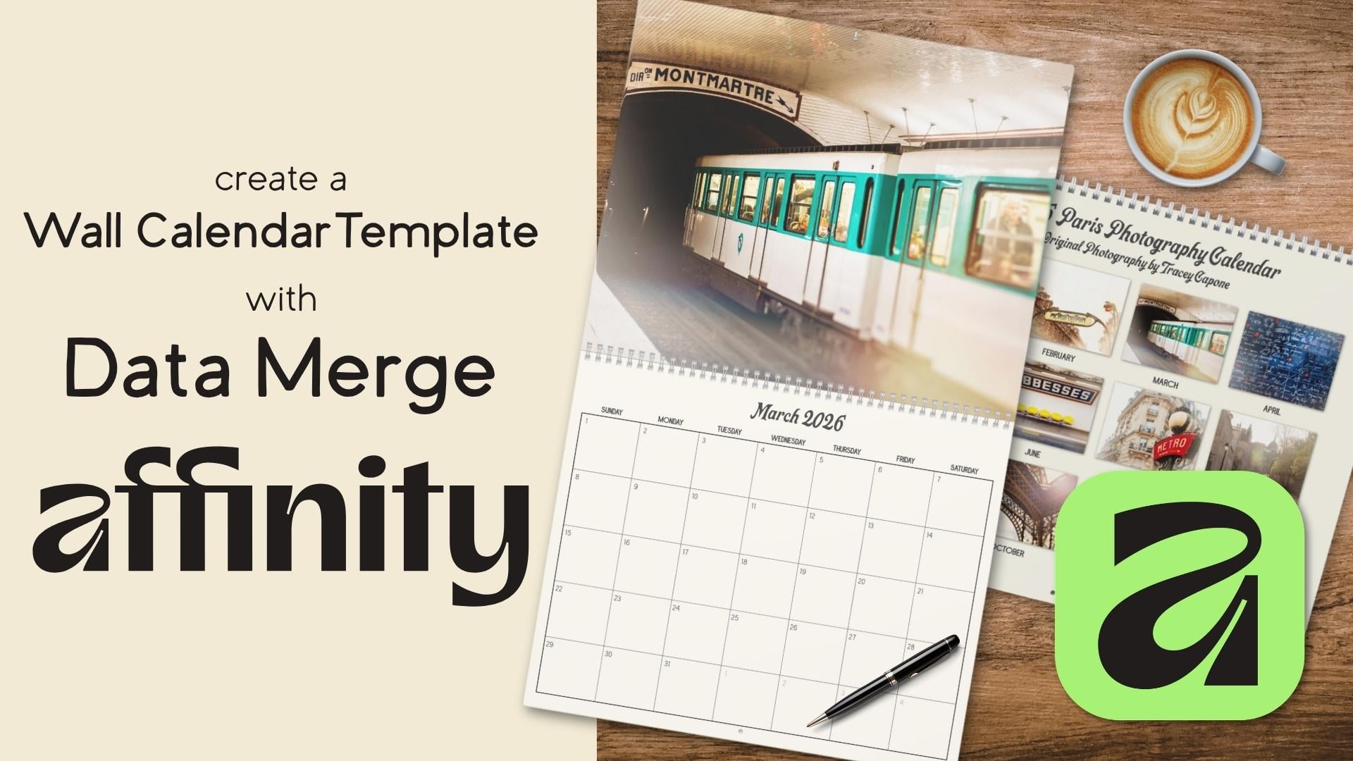
5. Setting Up Guides: When creating guides
for your calendars, using a template
from your print on demand company to set
up guides will ensure you're staying within
print guidelines and won't end up with
any unwanted surprises. In this lesson,
I'm going to show you how you can use
Master Pages to set up margins and guides that carry through to any content
pages tied to them, making it an efficient way to set yourself up for
a successful print. Let's take a look.
There are a couple of options when creating the
document for your calendar. You can start with a
fresh document from the home screen and
pull in a template for the guides or open the template directly in
Affinity and go from there. If you choose to start
with a fresh document, you can set margins and bleeds from within
this dialogue box. But when I'm creating a
new document from scratch, I tend to leave
those options blank. By waiting until my new document is open to set the
margins and guides, I can set everything
up on the master page. Typically, though, if I already have a template to work with, it's just as easy to open the template directly in
Affinity and work from there. An additional advantage of
doing it this way is that most templates are set up
with the correct color space, which isn't always the
same between companies. For example, Printify who I'm
using here, asks for RGB. While Gelato who created my other calendars
requires CMYK. Of course, you can set color space from here in
the document dialogue. I just find it
easier to start with the template and go
from there because I know I'm setting up exactly
what the selected print on demand company needs. Case of my template,
it's first broken out by size and then broken into
four separate pages, the front and back covers, and two inner pages, one for the image,
and one for the grid. Now, if yours is multiple pages, don't assume that the guides are all going to be the same, especially when dealing
with something like this. It has a coil and a
hole for hanging. In my case, the placement
of the coils and the hole for the inner photopage are different than
the other three. Therefore, the guides
themselves are different. I'm going to start by opening
the front page template, so I'm choosing the 11.5 by 14 front cover, and
I'll click Open. The first thing you'll notice
is that it opened it up as a content page with
no Master page. So that's what I'm
going to start with. I'll go up to the top here and I'm going to click
on Add Master. I'll call this front cover. The size is based on the
template that I pulled in, so I'm just going to click Okay. Now, I want to move the template from the content
page to the Master page. So I'm going to double click
into the content page. Go to the layers, and I'm
going to cut it with a Commander Control X. I'll head back to the
Master page again with a double click and then Command
or Control V to paste it. Now, remember, if you add a Master page after you
create your document, any content pages in place
aren't automatically tied. So I need to tie this
to this master page. I'm going to right click on
it, choose apply Master. You can see there's the front
cover, and I'll click Okay, and as soon as I do
that, the guides are going to flow
into that page. I also want to set up
another master page to pull in the template
for my inner photo page because remember, my guides for that are
going to be different. So I'll go up to the
top and once again, choose New Master,
and I'm going to call this inner photo. I'll click Okay. And this time I'm going to use the
Place Tool to add it. You can see it's blank.
I'll go to the Place Tool. It's standard in
the layout studio. I click on Place,
and I want to choose this 11.5 by 14 month,
and I'll click Open. Now, because this is
based on the template, all I have to do is click, and it's going to add the
exact size of the template, and I'll just center it up. Once that's in place, I'll
add a content page for it. So I'm just going to
click on ad pages. I want to choose the master page for the inner
photo, and I'll click Okay. Now, once all of my
guides are in place, I'm going to use duplicates
of the front cover for the back cover and monthly grids because the guides are the same. But for now, I'm
going to stick with these two master pages and add guides starting
with the front cover. I'm going to double click into the front
cover Master page. I want to add all of my
guides to the master pages, not the content pages, and I'm just going to
temporarily click on that to close it so
I have more room. For this template, the
red mine on the outside is the full document size
that needs to be uploaded, so I need to make
sure that my design goes all the way to the
edges of my canvas. Solid line just next to
that is the print zone. While the design itself has to go to the edges
of the document, the actual print area
is within that space. Now, whenever you're working
with something printed, like a calendar or a
professionally printed image, there's always a margin of error when it comes to the cut, and that leads us
to the last zone. The area within the dashed
line is the safe zone. So anything that I don't want
to lose when the calendar is cut needs to stay
within the dashed line. We're talking about text,
important parts of an image, and the grids for the
calendars themselves. Anything outside
of that gray area is considered the bleat, which means content that
could potentially get cut. The likelihood of it being cut that much is very, very slim. But you're always better
off keeping everything important inside of the
safe zone just in case. While we're making sure that our design goes to the edges of the canvas to avoid
any unprinted areas, it doesn't mean visible content has to be pulled to the edges. In my case, my calendar grades,
the month and the year, are all going to stay
within the safe zone, and I'm going to add an off
white background behind them, and that's what goes to
the edge of the canvas. Now, my images will be pulled
to the edge of the canvas, but any important parts
that I don't want getting cropped are all going to
stay within the safe zone. Set up my guides, I'm
going to use margins for the print zone and
guides for the safe zone. Again, I don't need
anything for the edge because that's the actual
edge of my canvas. I'm going to start with
the outside print zone. This template doesn't have any information on the exact
settings for a margin. But if I zoom in really
close to the guide, I'm just going to zoom in here. You can see that I get a grid, and that's going to give
me something to snap to. Now, it looks like the
center is right about there. I have nine cells across, so about 4.5 would be where
I want to place the margin. I'm going to check that before I start by pulling in one
of the guides first. Now, if you don't see your
rulers here at the top, you can go to view
show and choose rulers or you can
command or control R. I'm just going
to drag a guide in, and I'm going to first
snap it to here, which is 42 pixels and snap it to the second
one, which is 43. So halfway between those
two is 42.5 pixels, and that's what I want
to set my margin to. I'm going to hover over that
guide and just drag it off. I don't need it
anymore. And I'll go up to view again down to
margins and guides. I want to key a margin in here, but first I want to
change the color. The guides and the margins
right now are by default, the same color, and I want
to differentiate them. So I'm going to change
this one to red. Now I have this locked, which means anything
that I key into one is automatically going to
get applied to the rest, which is exactly
what I want because the margins are the same
all the way around. So I'll just key in
42.5 and hit tab. And if I close that, I'll go to the
layers and turn this off and you can see
there's my margin. The next thing that I want
to add is the safe zone. So again, I'm going
to zoom in really close so I get that grid. I actually want to keep this on the inside of the safe zone. I'd be fine putting
it in the middle, but just to play it safe, I'm actually going to
snap it to about here. Now, this time, I am going
to use guides, not margins. So I'm just going
to drag this in, and I'll snap it to about there. And I want to do that
all the way around. So I'm just going to back out. I'm going to focus right here. And wherever you
hover your cursor, when you zoom in, that's where
it's going to zoom in too. So again, I'm just
going to pull it to the edge of that
black line there, and I'll do that
all the way around. Before I move on to the master
page for the inner photo, one last thing I want to add here is a guide for the whole. It's inevitable that
the hole is going to end up cutting
into the image page, but having a guiding place
is going to allow me to set my image so that nothing important is being
cut off by the hole. The same goes with
the monthly grids. So I'm going to
temporarily place an ellipse shape that bumps up to that dash line and then remove it before
I export for print, because it's important to
note margins and guides don't print the whole wheel
unless you remove it. So I'm just going to
grab the ellipse shape, and I just have a red color selected here just so
that I remember it. And with command or
control shift held down, I'm just going to
drag that hole. Next, I'm going to
double click into the master page for
the inner photo, and I want to do the same thing. Now, the margins
are really easy. I just need to go
up to the top to view margins and guides. Again, I'm going
to make this a red color and changes to 42.5. The margins are
exactly the same. The difference comes in
with the actual guides. Because the coils are down here, you can see that this margin is a lot deeper than this one, and it's flipped from what
it was for the front page. So I just need to set them
a little bit differently. I'm going to zoom
in here, and again, I'll pull a margin or I'm sorry, a guide down, snap
it into place. Now while I'm here, I can do the ellipse for the
whole, as well. I'll command or Control Shift, and I'm just going to
drag that up to there. And then I'm going
to place the rest of the guides around
the Master page. With that done, I'm going to duplicate the Master
page for the front cover twice and relabel one to back cover and the
other to monthly Grid. I'll select the front cover
and choose duplicate. I'm going to do that twice. And for this one, I'm going
to change it to back cover. I'll click, wait for a
beat and click again, and I'm going to change
this to back cover, and this is going to
be a monthly grid. Now, you don't have to reorder your master pages if
you don't want to. I prefer to keep mine in
the order of my calendar. So I'm going to take the
back cover and move it to the end and take the inner photo and move
it after the front cover. So I have front
cover, inner photo, monthly grid, and back cover. One final thing
that I want to do before I create my
content pages is to make a slight adjustment to the guides on the monthly grid. I want to make sure
that no part of the table that I have in place for the calendar is cut off. Well, the print zone
is technically well outside of the safe zone,
and it should be fine. Just to play it safe, I'm going to bring the two
vertical guides in 25 pixels. So with my move tool selected, I'm going to hover
over one of them until I get that double hero. I'll double click, and
that's going to pull up the Margins and
Guides dialogue. So for this one, I'm going
to just click into there, and I'll go to the right
and key in plus 25, and that's going to move that
to the right, 25 pixels. I'll click into here, and
this one is going to be -25. You can see the one on the
right moved left, 25 pixels. Now, I haven't decided if I want the bottom of my calendar to
be above the whole or not. I'm going to leave this as is. Before I do the
final data merge, I always do a double check of everything before the merge, and I'll decide then if
I want to change that. But for now, I'm going
to leave this alone. With all of my master
pages in place, I want to make sure that I have content pages set up
and tied to them. So my front covers all set. For the inner photo,
even though I'm going to end up with 12 photo pages, I'm going to be using
data merge to add them, which means I only
need to add one here. I'm going to set up one
for the monthly grid. Now, I do plan on creating a
Sunday and a Monday start. So ultimately, I'm
going to end up with two content pages, but I'm going to
create everything for the one so that I can just
duplicate it into the other. That's a lot faster. So I'll
go ahead and click Okay. And then finally, I want
one for the back cover. Now that our guides and
content pages are in place, it's time to start adding the placeholders
for our data merge, starting with picture frames. I'll see you in the next lesson.
6. Picture Frames in Affinity: Picture frames create a
drop zone for content, usually an image either from an external source
or the stock studio. In addition to images,
you can pull in a PDF, an Affinity document, and
even in design document. They come in handy in layout
situations like magazines, books, calendars and
other scenarios. They're also an important
placeholder when using data merge to
pull in bulk images. There are two built in picture frames that are
standard in the layout studio, but they can be pulled into
the other default studios, as well as those you
create yourself. Frames are created the
same way that shapes are. You can select the frame
tool of your choice and either drag one out or
with the tool selected, Command or Control click on your canvas and key in
the width and height. When dragging out a frame, you can use keyboard
modifiers to control the aspect
ratio of the frame. Holding down shift
while you drag is going to create a
perfect square or ellipse. Shift and command or
control is going to create a perfect square or ellipse
from the center of the frame. Command or control by itself is still going to create
the frame from the center, but allow you to control the overall aspect
ratio of the frame. Holding down the space
bar is going to allow you to move it around
before you place it. Holding down Shift and the space bar will allow you to move it at
specific increments. Just like shapes, holding down the mouse key and then
using your arrow keys to tap will add an array of frames either side to side
or top to bottom. Holding down the arrow keys is going to help you create
space between those frames. In addition to creating an array of frames
using the arrow keys, you can also use the move
duplicate dialog box to create duplicates and move them either horizontally
or vertically. So I'm going to hit
Duplicate on this. I'm going to move it 550 pixels and create a total
of five frames. I can go ahead and move these over and with them selected, go the other
direction. 550 pixels. Going to hit Duplicate and
create a total of five. Once a picture
frame is in place, it's going to have an
X inside of the shape, and you'll also see a named picture frame in
your layer stack. And if you hover over the icon, it's also going to label
it as a picture frame. In addition to built in frames, you can create custom
frames from any shape, both built in shapes and those
you create with the pen, pencil, or bla brush,
as well as text. I'm just going to hit
P on my keyboard to select the pentel and
just tap out a shape. And I'll go ahead
and complete it. Click that last node. If I right click on the shape, I can go down to the bottom and choose Convert to
picture frames, or I can go up to
the top here and choose layer convert
to picture frame. And you can see it gets
the X in the center. So now it acts as a frame. If I want, I can add a stroke to this just like any other curve. So right now there's black
selected for the stroke, but it's set to zero. So I'm just going to drag
up on the stroke up here, and you can see that in
addition to the frame, I also have that stroke. I can go into the
stroke panel and I can change this to a
dashed or dotted line. I can also use the
path brushes to create a textured stroke around
the edges of the frames. I'm not going to be creating custom picture frames
in this class, but do know that it's
an option if you want to use those
for your calendar. Let's take a quick look at
how picture frames work. I'm going to select the
elliptical picture frame, pull down Shift and
commander control. Now, it still has
that stroke on it, so I'm just going to go into the Stroke Studio
and turn that off. But you can see I have
the X in the center, which makes it a picture frame. I'm going to go to
the stock Studio and pull in this flower picture. So you can see all I
needed to do was just drag it from the stock studio and drop it, and now
it's in the frame. If I go to my layers
and I toggle this open, you can see that there's
the picture frame, and I have a child layer, which is the actual image. That's the image clipped
inside of the picture frame. This is a non destructive tool, which means that I can
swap images out or delete them easily without
losing the original frame. In order to use the tools
that are built on the frame, I need to have that
layer selected. So if I have her over here,
you can see that I have a handle that allows me
to move the image around. I can additionally use the
slider here at the bottom. To scale it up and down. In addition to this handle, I can double click in, and it's going to automatically
select the image itself, and I can move it around
that way as well. To change an image,
you can either drag something else in
from the stock studio. You can use the
Place Image tool. You can pull something
in from your files, or you can go up to
the contextual menu and choose replace Image. Let's take a look at the
rest of the contextual menu. Properties are going
to allow you to set the aspect ratio of your image in relation to your
picture frame. So scale to max fit is going to scale the image up
to fill the frame. However, that may end
up cropping your photo. So you can see here
at the bottom, I have a little bit of
my background showing. I can use the
handle to move this around until I no
longer see that. Scale to minimum fit
is going to maintain the aspect ratio of the
image and not crop it, but it may not fill the entire frame like
it's doing here. Stretch is going to stretch
the image to fill the frame. Therefore, the aspect ratio
may not be maintained, and you may get some
warping like I have here. Then the final option none means there's going
to be no scaling. I tend to leave all of my images set to none and use handles and sliders on the tool
to scale images as I just find they have
more control over it. One additional handle
I want to show you on the tool is this one
at the bottom right. If you use this outer handle, you can maintain
the aspect ratio of the frame and scale
the image with it. The exception to that is if you hold the space bar
down while you do it, it's actually going to
lock that child layer. And while you can
maintain the aspect ratio of the frame and
scale it up and down, the image is going
to stay where it is. Same thing will happen
if you toggle on lock children in the
contextual menu. Without any keyboard modifiers, if that's toggled on, you can see that that
child layer is going to lock and only the frame is
going to scale up and down. So if you want this handle to
work the way it's intended, make sure you don't
have the space bar held down and lock children
is toggled off. You can also change the frame by using the
inner handle here. If I hold down shift, it's going to maintain
the aspect ratio. If I hold down command
or control shift, it's going to maintain
the aspect ratio and scale from the center. If you want to set a frame
to a specific aspect ratio, you can also use the
Transform panel to do that. So let's say that
I want to create placeholders for the thumbnails on my back page of my calendar, and I want them to specifically have a four or five ratio. I can do that right here
with the Transform panel. The first thing I'm
going to do is make sure that the aspect
ratio is unlocked. I only want to change the
height and not the width. I'll go ahead and
click into the height. And what I want to key in is W, which is width divided
by four asterisk five, and that's four or five ratio. And if I tab out of that, you can see the top and
the bottom moved in, and now I have a four
or five ratio image. So let's say that
I wanted a three, four, I could go
ahead into height. And again, I'll do width
divided by three asterisk four, and it's going to move the
top and the bottom back up. And the reason it's doing
evenly on the top and the bottom is because I have
this set to the center. Another way you can
change the size of the frame is scale to fit the image that you bring in rather than the
other way around. So let's go back to the
contextual menu here. I'm going to click on size picture frame to
content, and if I scale out. You can see this picture
was rather large. So the frame itself
is rather large. I can scale this down to fit it. And now the aspect ratio is
maintained for that image. So this image was tall
rather than wide, and now the frame
matches it exactly. In addition to the front
cover and inner photo, I want to add a grid
of picture frames on the back cover so that I can add thumbnails of
the photos inside. Before I do that, I'm going to add an off white rectangle as a background because I'm not adding a full
image to this page. Remember, the design needs to go to the edges of the canvas. I'll select my rectangle tool, and I have an off white
fill with no stroke. I'm just going to drag out a rectangle that covers
the entire canvas. I'll drag it down to the
bottom of the layer stack. And then toggle on lock just to make sure
it stays in place. I want to add thumbnails
that will only show what doesn't get cut
off in the print process. It doesn't have to be perfect, but I want it to
be pretty close. To get the right aspect ratio, I'm going to start by creating a picture frame using the
print sona as my guide, so the area between
the margins here. I have my rectangular
picture frame selected, I'm going to start
at the top left and just drag down
to the bottom right. And having snapping on makes
that a whole lot easier. If you don't already have it on, just turn on up here at the top. With that in place,
I'm going to scale it down to about 900 pixels wide. I want to add four frames across with 100 pixels of space
between each frame, and then three rows
down with 200 pixels of space between each row so that I can add labels for my months. If I need to, I can
always change it. With the picture frame selected, I'm going to go down
to my Transform panel. And I want to make sure
that the aspect ratio is locked so that the height
shifts when I change the width. I'll go ahead and key in 900 and then I'm just going to
drag this out of the corner. I don't need to place
it perfectly yet. I'm going to create
all of the frames, and then I'll center them up. I'm going to use the move
duplicate dialogue to add the rest of my frames quickly
and with even spacing. But I need to do
that in such a way that my layers run bottom up. So the picture frame
for January is going to be on the bottom
of the layer stack, and the one for December
will be at the very top. The reason for this is
later in the class, I'll be using
autoflow to quickly add my 12 images to the frames, and they need to be in bottom up order for that
to work perfectly. We'll talk more about that
in the upcoming lesson. I'll start by creating
my first row. Again, I want 100 pixels of space between each
frame horizontally. I'm going to hit Enter,
and I'll key in 1,000. So that's 900 wide plus 100. I'm going to tab over, and then I'm just going
to turn on duplicate. I want the number
of copies to be three because I already
have one in place. And I need to make sure that insert new items in front is on. That way, they'll be added
above the first frame. I'll click Okay, and there you can see they're
added in my layer stack. Once those are in place, I'm going to select all four frames, and I want to temporarily
group them up using Command or Control G.
By grouping these up, I can control exactly
where they'll end up in the layer stack
as I duplicate them. Once again, I'm going to use
the move duplicate dialog. I'll hit Enter. And this time, I'm going to go on the vertical. Now, the height of
this is 738.9 pixels. So I'll start by keying that in. And I want to add 200
pixels for my space. So I'll hit plus
200 and hit Tab. I'll toggle on duplicate. And this time, I only need
two additional copies. Again, I want to make sure that the insertion mode is
insert new items in front. And I'll click Okay.
Before I ungroup these, I want to center
them up on the page. Go to leave enough
space for my headers at the top and then some space at the bottom for
copyright information. So I think that's
good right there. I'm going to right click
and choose Ungroup A. And when I go to my layer stack, you can see when I click
on this bottom one, that's the January frame. If I click on the top
one, there's December, and it's going to go
in the order that I need for the autoflow later. Now that we have a handle
on creating picture frames, let's take a look at
another important placeholder frame,
the text frame. I'll see you in the next video.
7. Frame & Artistic Text in Affinity: In this lesson, we're going to take a look
at the two types of text tools in Affinity,
frame and artistic. We'll talk about the
differences between the two, as well as the advantages
and disadvantages of both. Let's take a look. There are two main text tools in
Affinity, artistic and frame. Can both be found in all of the default studios and can be added to custom studios
that you create yourself. While both allow
you to create text, and their contextual
menus are the same, there are different
use cases for them. Let's start with the
artistic text tool. This is what I would call
a one and done tool. You're going to select the tool, create your text, and move on. It's great for creating titles, a single word, or a phrase. But it doesn't act as a
placeholder for text, so we're not going to use
this for our data merge. Create text, you can
click on the Canvas, and it's going to
add your cursor at whatever size is set up
here in the textual menu. The same goes for the font. The first time you
use it in a document, when you click the font and font size will be whatever
you have set as your default. After that, it's whatever
you've used last. Can also drag out to set
the size of your cursor. Again, it's going to use
whatever font you use last unless it's the first time you're using the
tool in the canvas, in which case, it
will use the default. Once you have text in place, you can make changes
to it up here in the contextual menu
or used text styles, which we'll talk about
in the next lesson. We'll be using the frame
text tool in this class, specifically to create
the placeholders for data merge for
our month and year, the days of the week,
and any headers and sub headers on the
front and back pages. The frame text
tool allows you to create a drop zone for text, whether it's a single word,
a phrase, or a paragraph. It's especially helpful when using data merge
because it gives the data merge
elements a place to land once the merge
is generated. Use the tool, just start
by dragging out a frame. And when I deselect this, you can see that I get
this line around it. That's a guide as to
where the frame is. If you're unable to see your
frame when it's deselected, go up to the top to view down to show and
choose text flow. And that's going to add
that faint line around it, but it won't print on
the final document. I'm going to right, click on this and insert
some filler text. Unlike the artistic text tool, the scale of the final frame doesn't determine the
scale of your text. The first time you drag out
a text frame in a document, it's going to have your
default font settings applied. Go to right click and
choose Expand field, and that's going to
allow me to edit individual words or
phrases in my filler text. This only applies
to filler text, not text you create yourself. You can edit your own text immediately without
having to expand it. To change individual words, click somewhere within the
word that you want to change. So I'm going to
click right here. And I can go up to the
contextual menu at the top and change
just that word. To change several words
within a text frame, select the words that
you want to change, and once again, you can
make changes to the font. You can change the
size of the font. You can also use a textile
just on those words. If you select the frame itself, so I have my move tool selected, I'm going to click
and select it. You can make changes
to the entire frame, and it's always going to
remember the last one used. Again, in the next
lesson, we'll be talking about text styles, which can also be used to
quickly change the font as well as other attributes
of a single text frame, as well as a group of them. One thing to note is
that frames don't automatically expand to
fit any overflow of text. So I always prefer drag out a little bit more than
I expect to need. That's important to
remember when you're creating placeholders
for your data emerges. Example, for the
months on my calendar, May would need much smaller
frame than November, but since it won't automatically
adjust with each month, I'm going to create a
frame that's going to accommodate all months
regardless of length. It's easily fixable once
you run your data merge. If you don't do that. It's just something
to keep in mind. Let's look at what happens when text overflows your frame. Typed out a few sentences here, and you can see
that part of it is getting cut off
after the word Hue. If I select the frame, you can see that I have
this eyeball here. And that means there
is text overflow, and Affinity is currently hiding anything that's outside
the bounds of the frame. If I click to turn that off, you can see that's where
the overflow went. I can hide it again by
clicking on the eyeball. I want all of my text to
be in a single frame, there are a few ways
that I can adjust this. I can, of course,
adjust the font size to bring everything
into a single line. I can pull down until
all lines show, and you can notice that the
eyeball has disappeared. I can also pull the text
frame out to the side and it adjusts the placement of it so that you can
see the entire thing. With this selected,
you may notice another handle down here
at the bottom right, and this is very similar to
the picture frame handle. If I drag this out, it's going
to scale the text frame. It's going to keep
the aspect ratio, but it's going to
scale it up and down, and you can see that my text
is going to scale with it. If I drag this
inner one, though, of course, it's not
going to scale the text. It's going to adjust
only the frame. In addition to
changing the font, you can also change
the alignment, the letting of the paragraph, the color of the frame, both stroke and fill, as well as make a number
of other adjustments, either by using the
contextual menu here or clicking on
the text frame icon, which will pull up
the text frame panel. I don't keep my text frame
panel open standardly, just as a default because I know that when I have
a text frame selected, I can always click
here and open it up. We'll be using the text frame
tool to create our frames. You can also create a
frame from a custom shape. I'm going to go to my shape tool here and
just grab the Cloud tool, and I'll drag out sort
of a flower shape here. If I right click on it, I can convert it
to a text frame. I can also go up to
the menu at the top, go to layer, convert, and convert to text frame. From there, you can
format the text the same as any
other text frame. One thing I want to note, if you want to change
the color of the frame, you wouldn't do it here
in the swatches panel, you would need to go to
the text frame panel. And right here, you
can see I can change the fill color of my frame. I can add a stroke if I want. So let's just turn that on. I can make it a dash stroke, but I need to do everything from within the
text frame panel, not the swatches panel. One last thing I want
to show you is how you can create a multi
column text frame. Now, this is
something that would be handy in publication, like a magazine, something
that has multiple columns. We're going to use it
for our days of the week on our monthly grids. To create a multi text frame, just drag out a frame to start. So I'm going to drag
that out to about there. I think that would fit
days of the week nicely. Go up to the contextual
menu at the top, you can see an option to choose the number of columns.
The default is one. I'm going to set that to seven for seven
days of the week. Now you can see that it
took the frame that I created and it broke it into
columns within that frame. If I want it to stretch out, I'm just going to drag this out. And I'll drag it to
about here on this side. And I have a little
bit more space here, but you can see
that I have gutters here in between each one, and that's this number here. If I want to change
the gutter width, I can bring it up or
I can bring it down. I'm actually going to
change it to zero, so there's no space
between each one, and I could easily add my
days of the week here. Can format a multi
column text frame just like a single text frame. But case alignment is going to happen within each
individual column. If I'm clicked into
the text frame, the same goes for
adding a textile. If I want all columns to be centered vertically
and horizontally, I'll select the entire frame, go up to the top, and I can
change my alignment options. I can change the font, I
can change the text style, and everything will have
the same one set for them. So if I click in here, if
I hit Return or Enter, you can see it's tabbing
between each and they're centered vertically
and horizontally. I want a single column within the multi column frame to have a different alignment
or textyle, I would click into
it and change it. Let's bring it. So you can see this
one's on the left now, but if I click into this one,
it's still in the center. Every other column is
going to be left alone. We'll be revisiting
the frame text tool as we set up our calendars
for the data merge. But for now, let's head into
the next lesson and talk about character and paragraph
styles. I'll see you there.
8. Text Styles in Affinity: Textiles offer you one of the most efficient ways to not only format text
throughout your project, but easily adjust
it later if needed. In this lesson, we're going to first take a look
at the textiles panel and then talk about
the difference between the various formatting
options. Let's get started. Textiles allow you
to add attributes to your text and create
a preset of sorts. So this could be the font, the size of the
font, the alignment or spacing, among
other attributes. Styles can be
modified at any time to quickly adjust any text
that it's applied to, whether it's an artistic text, text frame, or a
group of text frames. And it all depends on what
type of style you're using. Before we get into the
types of textiles, let's first take a look at
the textiles panel itself. This is a default panel
in the layout studio, but it can be added
to any other studio, both default and custom. If you don't see it in
the panel that you're in, go to window down to text
and choose text styles. You can leave it free floating or dock the panel.
It's all up to you. The first time you open the
panel in a new document, you'll see a number of built in textiles already in place. I actually like to delete
these because honestly, I find it easier and
cleaner to build my own styles rather than
edit those already in place. Also like to save my calendar templates with no
styles in place. So when I create a new
calendar from a template, it opens with the defaults, and I can start fresh with the
textiles that I've set up. We'll talk more about
that in a little bit. In order to cleanly delete
all of the default styles, I need to erase these
before I add any text. I'm going to go up to the
carrot at the top here and choose delete unused styles, and that's going to leave me
with two no styles styles. One is a paragraph style, the others character style. There are actually three
types of textiles, paragraph, character, and group. So let's start
with group because this type doesn't actually
get applied to text. It works as a container for the other two types of textiles. They aren't required,
but you can use them to save textiles for
use in other documents. And I'm going to show you how to do that later in the lesson. I can just go to the bottom here and click on group style. And I'll just name
this the Mordent. That's actually the font that I'm going to be using
for my calendar. And that's all that I need to do with this group style.
I can click Okay. Paragraph styles
define the properties of a paragraph as a whole, not just a single word. Let me show you on
this text frame that I have some filler text in. I've gone ahead and
set up two styles. One is a paragraph style, the other is character style. I've used the same
font and size, so they look identical
when applied. If I click into a word within a paragraph and I apply the
Mordent paragraph style, it's going to apply the style to the entire paragraph because, again, I've chosen
that particular style. Character styles define
individual words and sentences inside
of the paragraph. So if I click inside of a word here and I go ahead and
choose the character style, it's the same exact
font and size, but it's only
applied to the word. The same goes for a combination of words that I might
choose, so a full sentence. I'll just choose this here
and choose character, and I can just change
those that I selected. As an aside, if I simply select the text frame itself and don't click into
a specific word, whether I choose paragraph
or character style, it's going to apply to
the entire text frame. If I want to bring that back
to the default setting, I can click on No style, and it'll bring it back to the default that I
have set for the app. I tend to create all of my
styles as paragraph styles, but if you're creating
something with a great deal of text like a book
or a magazine spread, being able to apply
a style to a word rather than an entire
paragraph can come in handy. Before we get into
creating textiles, though, let's talk about
local formatting first. In addition to using styles, you can format your text by using the formatting
options up here at the top, even if you've already
applied a textile to it. Just like the artistic
textol, this is one and done. If I don't save this
as a style, later on, I would either have to remember the settings that I used or use the style picker tool
to sample attributes from one piece of text
and apply it to another. And that can be time consuming. When it comes to something
more extensive like a planner, it's a good idea to
create a set of styles upfront that you can easily
apply across the project. For consistency and efficiency. So let's talk about creating paragraph and character styles. I have two text frames here, and I want to use them
to show you how you can create a textile
from a text frame, as well as go the
opposite direction and create it right inside
the text styles panel. So just like previously, I deleted all of my unused styles, so I'm left with the two
default no style styles. My two text frames are
completely unaltered. The font and font scale are default aerial 12 point and
the alignment is top left. Before I create my textiles, I'm going to start
by creating a group. So again, I'll just
create a group called the mordent
and then that's it. I'll leave this as is. To create a textile
from a text frame, I'm going to select
the frame itself, not a specific word, and I'm going to set the
font and the font scale. So go up to the top here, and I'm going to find the mordent choose
that and regular. And I want to set
this to 18 point. Also going to set my
alignment to center, so I'll go up to the top here, and I'm just going
to click on this, and it's going to
center that up. Now, vertical
alignment, so top to bottom is not a paragraph
or character attribute. It's a text frame attribute, so it's not going to get
captured in a text style. I'm actually going
to center that here, but just keep in mind
when you're setting up your text frames
as placeholders, if you want them to be
vertically aligned, set that up when you
set up the text frame itself or update
it after the fact. This in place, I'm ready
to set up the textyle. Again, I have a choice between paragraph and character styles, and aside from how
they're applied, the only difference
between the two is that paragraph styles
have more options. With the text frame selected, I'm going to start
by clicking on character style because I want to show you the difference. Under style name, I'm just
going to call this mordant. I could call it header, medium header,
whatever I want to do. We'll do more of this
later in this lesson. Going to base it on the
group that I added, so I'll click on based on
and choose the mordant. And you can see here it
shows type character. On the left here, you can
see the options I have. So font color
position, and more. Now, if I go to font, the font style and size are already selected
because I'm using a text frame to set this. I don't need to change anything. One thing that you
won't see here when using the character
style is the alignment. So even though I chose
central alignment, there's no option for that here, but watch what happens
when I go back to style and change
this to paragraph. If I go under paragraph or
under paragraph spacing, I have alignment right there. Now, it says no change because
it's already in place. But if I click on the dropdown, you can see that I can set
this to whatever I want. Those are the only
two things that I want to set in my textile. So I'm going to click Okay, and you can see now I have a paragraph style
called Mordent. So if I click on this text frame and choose that paragraph style, it's going to apply the font, the font scale and
the center alignment. Again, remember, vertical
alignment isn't part of that, so I would actually need
to actively change that or make sure that the text
frame is already set that way. I'm going to Command
or Control Z to bring that back
to where it was, so I can show you how to do that in the opposite direction. I can do this without selecting
the text frame first, but I actually prefer to
select it first and then go to the panel to
create it because it allows me to see the
changes as they happen. So you can see that right now I still have the default
style in here. I'm going to go
right to paragraph. Again, I tend to set most
of mine up as paragraph. It's still set as the default, but if I go through here
and start making changes, you'll see the changes
happening here. Under style, I'm going to call this mordant two because I
already have mordant in place. I'm going to base it on the
Mordent that's the group. It's a paragraph
type for the font. Right now, it's
showing the default. So I want to change this to
that mordentFont regular. And I want my font
scale to be 18 points. I'll go right down
to space in here and I'm going to change the
alignment to center. And again, I can't capture
the vertical alignment. So that's all that I'm going to change right now.
I'll click Okay. I do want to mention if I hadn't changed the
text frame first, I would need to go back and
select the text frame and then apply the text style because it's not automatically
going to do that. An important note
about textiles is that they're document specific,
not application wide. So if I open a new document, I'm not going to be
able to go back to my textiles panel and
still have them in place. You can pull a previously
saved document in and anything that's in
that document will automatically apply to
your current document. There's actually a much
easier way to do that, and that's using assets. Saving your textiles
as assets means you can pull a saved group
into any document, and they'll automatically be applied to your textiles panel, even if you delete that group. So let me show you
how I create that. The first thing I'm
going to do is pull in this set of text frames, and I'm basically
going to recreate the textiles that I did
a little bit earlier. All this is is a group
of six text frames. They're already aligned
vertically and horizontally, so they're centered
up both ways. And I've labeled
them large header, large script, medium header, medium script days of the
week and monthly grid. These are the basic
textiles that I set up for any planners, calendars, notebooks,
and things like that. So for the particular calendar that I'm going to be creating, I know that I don't have
a script version is font, so I'm going to
get rid of those, and all I need are
the four remaining. So these two are going to be for any headers and subheaders. This will be for the days of the week for my monthly grid. And then this is going to be any basic text as well as the numbers on
the monthly grid. Again, I can either create
it from the panel itself or I can go to the text frame. I'm just going to
move this over. And I'll just create it
from the text frame. So I'll click on paragraph, and my style name is
going to be large header. The font is going to
be the mordant font, and it's going to be regular. And because this
is a large header, I'm going to set it at 48. I can always change
it if I want to. Again, my alignment is already
set, so I don't need that. I'm not actually going to
set up a group for this one. I don't think I need
it. So I don't need to apply it or do it
based on anything. I'll just click Okay, and there you can see I have
my large header. So I'm going to select
the medium header. Again, I'm going to name
this the same, so medium. Header. The font also going to be the mordant
font in regular. This time because
it's a medium header, I'm going to choose 30,
and I'll click Okay. So you can see I
have it right there. Let's go the opposite direction. And this time I'm
actually not going to choose the text ring. I'm going to choose
the paragraph style, and you're gonna
notice because I don't have this selected, it's not going to change. This was going to be
days of the week. And the font, I'm going to
choose this Instance story. The font scale, I'm going to set that at I think 20 points. I typically end up changing it, but I'll go with 20 for right
now, and I'll click Okay. Now, again, because I didn't
have this selected first, even though you can see it here, it's not applied to this. So I'll select it. Click
on days of the week. Now, it didn't actually
apply the center alignment, so I'm just going to click. Now, watch what happens
when I do that. You can see I get this
little sync button here, and that's because
I made a change to the thing that I applied. The reason the center
alignment didn't actually get applied is because I didn't select the
text frame first. So I would have
needed to manually do that, but it's fine. I've gone ahead and changed it. I'm going to go up
to the top here, and if I click on this,
it's going to update it. So now, anytime I
use this style, the center alignment
will be in place. Okay, so for my last
one, I'm going to select the text frame, choose
Create paragraph. Again, I want this
to be smaller. So this is going to be
basic text monthly grid, and the font family is going
to be the Insta story, but it's going to be smaller. I'm going to go with I
think 14 for right now, but again, I can
always change it. Now, because I have the text frame selected and
it's already center aligned, that's already in place, so I can just click Okay. So I have my four
text frames here, and I want some way
of knowing what I have in place when I pull
them from my assets. First thing that I'm going to do is select all four, and I'm
going to group them up. So I'll command or Control G, and I'm going to name the group, whatever fonts I use. So this is going to be the
Mordent and Insta story. I'll go to my assets, and I have my text
styles category set up. Now I'm only using
two fonts here, so I'm going to put
this in my font duo. I'll select the group, and I can just drag it in to my assets. It's going to do a
little thinking first, and then it's going to
place it right there. So let me delete this, and I'm going to take this back to deleting unused styles. Again, I'm back to
the no styles styles. And let me show you how
I would pull this in if I were opening
up a new document. So right now, I have
no styles in place. If I grab this
asset and drop it, you can see that
those textiles that I have here are already
in my textiles panel. And even if I delete
them, they'll remain. So as long as I don't
go up to the top here, to delete unused styles
before I begin adding text. These will stay in here and I can use them in this document. So even though textiles
are document specific, if I save them to my assets, I can pull them into
any new document and have them at the ready. Now that we have a handle
on text frames and styles, let's head to the next lesson
where we're going to create our text placeholders Master
Pages. I'll see you there.
9. Adding Text Placeholders: Now that we have
an understanding of how text frames
and styles work, let's create placeholders
for our data merge, as well as our headers and subheaders on the
front and back pages. Setting up placeholders not only makes the data merge
process more efficient, it means we don't have
to start fresh with each calendar anytime we
want to create a new. Let's take a look.
I'm starting here with a front cover,
but before I begin, I want to note that
I haven't pulled in any text styles yet because I want to save this
as a template before I do. At this point, I'm just placing text frames and adjusting
their alignment. Once I open up the saved
template to create a calendar, at that point, I'll pull in the textiles that I want to use for that specific calendar. That way, I'm truly starting
with a fresh copy each time, and I don't have to
swap anything out, which can lead to errors. I'm only placing
two frames here, one for a header and
one for a subheader. Now these are not going to
be a part of the data merge. But by creating text frames
here on the Master page, I can easily update
the information on the content
page once the data merge is run and then use text styles to make
any aesthetic changes. I'll start with the
header just drag out a nice long text frame, making sure to stay
within the safe zone. Going to drag this
down a little bit. Now, I need to adjust
the alignment. Remember, the vertical alignment doesn't get adjusted
by textiles, so I want to make sure that I do have it centered vertically. And then I'm just going to
center align it horizontally. I like to put something in here just to tell myself
what this is for. So I'll put insert
calendar name. And I can just duplicate this
to create the subheader, so I'll command or Control J to duplicate and then drag down. I'm not going to worry about
changing the label here, because, again, once I run the template through
the data merge, I'll adjust everything then. I might find at that
point that once I add the text and
the text style, I might have to
adjust the size of the text frames
or the placement, but for now, these are
just placeholders. Going to select both of them
and Command or Control C, because I'm going to use them to paste them on the
back page next. Here on the back page, I'll
command or Control V to paste those frames that I
just copied and just drag them up to the
top, middle here. And I want to use a copy
of one of them to create a copyright frame down
here at the bottom. Now, this doesn't
have to be as big. It's going to be a
much smaller text. And I want to left align this. So I'll go up to the
top and left line. And this one, the text itself
isn't going to change, but the text style will. I'm just going to key in
copyright, Tracey Capone, photography, and Illustration,
and then a date. Then finally, I'm going to add text frames for each month under the images using the same width
as the frames themselves. Again, I'll grab my text frame and just start dragging out. And I think 100 pixels
is actually fine. Again, I might need to adjust it once the calendar is run, but for now, this is fine. And I just wanted to
center this one up between the two frames here. If you find yourself
having trouble centering, even with snapping on,
go up to the settings. Sometimes I find
changing candidates to all layers is much more helpful when it comes
to something like this. So from here, I'm
going to use Move duplicate to duplicate
across. I'll hit Enter. And remember, the frame
is 900 pixels wide. There's 100 pixels of
space between each one. So I'll just key 1,000. Click on duplicate, and then the number of
copies is three. And I can manually duplicate these the
rest of the way down. So I'm going to hold down
Alt or option and drag down. And just play set in the center, and then I can power duplicate with Command or Control J next. Now, for right now, I think what I'm going to
do is select all of these. So all of those text frames
plus the picture frames. I'm going to hold Shift Down to keep them centered horizontally, but move them up slightly vertically just to give a little bit more space
between the bottom, as well as bridge some
of the space here. So I think that's actually good. And then finally,
I'm just going to key in the months of the year. I could also use autoflow, but since I'm only
doing 12 here, I'm not going to do that. It's going to take much
longer to do that. One thing I didn't do, though, is center up my text. So I'm going to select
all of my frames, center that up, and then I
can just key in my months. And finally, I'm going to add a placeholder for
the month and year, as well as a text frame for the days of the week to
my monthly grid page. I'm going to start with the
month and year placeholder. Now, this will be a
placeholder for data merge. So this is going to
get set up slightly different than the
other text frames. I'll select my text frame, and I want to give
myself plenty of space in case I have a longer month name or
something like that. You can see it's already
centered out vertically and horizontally because it
remembers whatever I did last, and I had already placed
sum and through them up. I want to give myself some
placeholder language here, and the way that I'm
going to do that is type left carat,
month, right create. I want to put a
space between them, and then left carat
year right carat. It's important that
you put the space there because data merge is
not going to do it for you. So however much space you
want between those two, you want to hit your space bar before you create the next one. The carats on either side
indicate this is a placeholder, and that's what
I'll be adding to the data merge field once
I begin that process. And finally, I'm going
to add a text frame with seven columns for
my days of the week. I'll just drag out a text
frame within the safe zone. So right now, I have
a single column, and then I'll head
up to the top, change this to seven. I don't want any spacing
in between those. I'm going to change
the gutter to zero. And I can just start typing
out days of the week here. And you can just hit
Enter when you're done. Sometimes you might have to
hit Andrew more than once, depending on the height
of your text frame. Now, I've created a
Sunday start here, but I'm also going to create a Monday start calendar
for those who prefer it. And this is where you have
to think ahead a bit. I have a choice when it comes
to creating my templates. I can either create
both the Sunday start and Monday start calendar in one template and
just run them as two separate data merges
within a single template, or I can create two
separate templates, one with the Monday start and the other with
the Sunday start. Personally, I prefer to keep everything
within one template. So later in the class, when
we run the data merge, I'm going to show you how to
set it up so that you can run two separate calendars
using a single template. For now, I'm going
to leave this as is and duplicate it to create the Monday start
once my table and data merge layouts are in
place for the grid itself. With my text frames in place, I'm going to move
into the next lesson, where I'll finish off the
rest of this master page with a table for the calendar
itself. I'll see you there.
10. Creating the Monthly Grid Using Tables: Tables in Affinity aren't just for presenting data points. They're also a great
starting point in planners and calendars for
things like digital papers, daily schedules, and monthly calendar grids like
we'll be creating here. In this lesson, we're
going to finish off the master page for
our monthly grid by adding a table that will
not only act as a guide for the data merge layout
tool to add in the dates, but as a background in our
final printed calendar. Let's get started. I'm still in the Master page for
the monthly grid, and the only thing
left to create at this point is the table
for the monthly spread. The table itself won't have the data merge added
directly to it. You can add merge data directly to a table,
but in this case, in order to get Affinity
to automatically add the additional 11 pages that we need to automatically
add our dates, we're going to use
the data merge tool. The table that we'll
be adding here is going to provide the
guides for that layout, as well as the background on
the final printed calendar. Select the table tool and
begin to drag out a cell. I need seven columns for
the days of the week. So I'm going to click on the arrows here
and key in seven. Next, I need to add my
rows for the weeks. I'm going to set this to six by clicking on the bottom
here and keying in six. And then I want to drag
the table out so that it spans the entire area
left in the safe zone. So I'm going to grab
my move tool and just bring this up
to this corner. I'll drag this side out
and then the bottom down. Before we continue,
let's talk about why we need six
rows and not five. Dates in these
calendars are going to automatically be
added by the data merge, and the placement is going to depend on the year set
in the spreadsheet. In this case, 2026. We want to set this
template up so that it's reusable time and again
without manual intervention, which means adding a
little more than we need to accommodate
shifting dates each year. Order to ensure
that the dates for any given month in that year
are in the correct place, there needs to be
a certain number of placeholders in each month. In this case, that's 42. Now the reason it's
42 and not 31, which is the most
days any month is going to have is
because every year, there are two or three
months that start much later in the first week and therefore end
in that sixth row. Those months vary year by year, so we need to take
that into account. If there aren't enough
placeholders on a grid to accommodate the
shifts between the months, as well as the shifts
between the years, I'm going to have problems with incorrect dates in my grids, and it's going to
mean manual cleanup. Additionally, you
have the option of including leading and trailing
dates in your calendar. In other words, the days from the prior or upcoming months that fall within the
same week as the first and last of that month. When you're working with a
single page calendar like this where you can't see the
prior or upcoming month, having leading and trailing
dates can be helpful. It clearly shows what dates
the first week began on, even if they're
from a prior month, and what dates from
the upcoming month are included in the final
week of any given month. If you don't want to include
leading and trailing dates, you're never going
to hit 42 sales, and even if you do, it's rare. But again, in order to keep
this whole process automated, I'm going to provide
Affinity with more placeholders than I
need rather than less. Once the data merge is run, I'll show you how to
clean up each calendar quickly so that you're not
left with a bunch of t boxes. This is one of those things
that's going to make a lot more sense when we
actually run the data merge. So if right now you're a bit confused,
please don't worry. It's going to be much clearer
in an upcoming lesson. So for now, let's set up our 42 cells and
format the table. I mentioned earlier,
while the table itself won't have data merge information
added directly to it, it is going to print
in the final calendar, so I do want to
format it a little. Going to select the table, make sure that the
table tool is selected. You can also double click
it so that comes up. I'm going to select the
entire table by clicking in this first cell and then dragging all the way down
to the bottom right, so it's all lit up in blue. Now, once your table toool
and your table are selected, you'll see options up here
in the contextual menu. I want to click on
this downward a carat, and you can see that
this gives me all of the options for selecting
areas of this table. So, for example, if I click
the horizontal inside, it's going to select every
horizontal inside stroke, and it's going to light it
up in a double thick line. I want to start
with the outline. So I'll go back up to that
menu and choose outline. And now the entire outside is
lit up in a bold blue line. Under the stroke
settings, I'm not going to change
anything but the width. I want to set this
to 1.5 points, so it's a little bit
thicker than the rest. Next, I'll go back to
the stroke settings, and I'm going to choose inside, and you can see
those all light up. And I want to change
those from 0.2 0.2 0.5. I just want them a
little bit thicker. And when I deselect
and tug off my guides, that's what my final calendar
is going to look like. One final thing I want to do is place an off white rectangle at the bottom of the
layer stack that matches the one that I
use for the back cover. Again, my design needs to go
to the edges of the canvas, and none of the information on here stretches to that point. So I'm going to select
my rectangle tool. Now, since I had just created
one for the back page, I can command or control
click on my canvas, and it's going to give me
the exact size I need. So I'll click Okay, and
then I want to center this up on my Canvas, hit Apply, and I'll go up to the
layer order here, and I'm just going to click
to send this to the back. With the master pages complete, let's move to the next
lesson where we'll look at the data merge tool and get the monthly calendar ready for the final merge.
I'll see you there.
11. Data Merge Layout Tool: In this lesson, we're going to take a look at the
data merge layout, which we'll be adding on
top of our monthly grid. This is going to help
us automate the process of adding our sequential
dates within a given month. As well as add new pages for each subsequent month until
we have all 12 in place. Let's take a look. The data merge layout tool is standard in the default layout
studio and can be added to any default
or custom studio. This tool is a go to when creating what's called
an end up print layout. For example, printing
multiple business cards in a grid on a single page, mailing labels on a single
sheet, or in our case, a grid of dates
that we want placed across and down the page
in sequential order. Using the tool is optional. You can use data merge
directly on a page or a table without
using repeat layout. But in the case of the
calendars that we're creating, that would mean manually adding
12 pages for our months, then tying a data field
to all 504 cells across 12 tables in order to ensure our data is added correctly and without manual intervention. Instead, we're going to add a data merge layout to
a single monthly grid, and that layout is going
to automatically populate our dates as well as add the necessary pages for
the additional months. Going to select my monthly
grid content page, so I'll double click. You always want to add your data merge layouts to
the content page, not the master page. In this case, it's going to
duplicate the page as many times as it needs to until
the data is completed. In this case, 11 pages so that
you end up with 12 months. You don't want to add 11
additional master pages, and in many cases, it
wouldn't even work anyway. So just make sure that you
select your content page. Tool works similarly to the table tool in that you
start to drag out cells, but it's always going to
start with four cells. So I'll go up to my
tools here and select that and begin to
drag out from here. So you can see I
have four cells. I'm going to drag this out first and then add
my additional cells. So I'll bring this
down to the bottom. I want to set the cells in
this to match my table. So I'll go up to the top. I don't want any sort of
gap between my cells. And for the vertical, I want six rows. And for the horizontal, which would be the weeks
or the days of the week, I'm going to add seven. You can see now it's
matching my table. When you do that, you
want to make sure that preserved cell size is toggled off and then
change your numbers. If you leave that toggled on, it's going to add cells in whatever size
you've dragged out first rather than maintaining
what you had in place. Let's take a quick look
at the contextual menu. I want to leave record
offset set to zero because I want my data merge to start on the very first cell. Record advance is
going to stay set at one because I don't want
it to skip any cells. I'm going to temporarily
toggle on Show record order, and you can see
these arrows pop up. I'm going to use that to
show you the record origin. So this is going to tell Affinity where you
want to start. On the layout and where
you want it to end. So right now I have
it set to top left. So it's going to start in this first cell,
work its way across, go down the table
and keep working its way across until it gets
to the bottom right corner. And that's exactly how
I want it to work. If I were to change it
and watch the arrows, if I set to the top right, it's going to go in the
opposite direction. Bottom left, I'll start down here and work
its way up to here. And then, of course, bottom
right is opposite of that. So I'm going to set
this back to here. For the layout order, I can either set it to
do columns first, which is what it's going
to do here or rows first. So you can see that it's
going to start here, go down the row, go back up. That's not what I
want. I actually want it to go columns first. If you're ever not sure if you
have your setup correctly, just toggle on show record order so that you can see these directional arrows. So we've placed the layout itself, but we're
not quite done. In order for this
to work, we need some sort of data
place holder inside. In this case, a text frame
that's going to show the date. The benefit of using the layout
tool is that I only have to place one data place
holder in the first cell, and it's going to repeat
it across all of them. Let me show you
the filled shape. I'm going to select
the data merge layout so that it automatically
clips my shape inside. I'll select the rectangle tool, and I just have a
fill selected there. When you drag out a square
over this first cell here, remember, the layout tool is matching the table behind it. And you can see that
when I do that because this rectangle is clipped
inside of the layout tool, it's repeated across and then down the rows to the last cell. The calendars, we're going to add a text frame for our dates, and then the date emerge we'll add the actual date information. So I'll select my
text frame tool. I have the layout selected. I find it's easier with
a text frame to start outside and then move it
into the actual square. So even though it's
clipped inside, I'm going to start
on the outside here. I'll hold Shift down to get a square and then just drag it into place
in the top corner. If I click in here, you
can see that because I had already used
text frames here, it's already center
and vertically align, but if yours isn't, make
sure you're doing that here. And if I type a number in here, you can see that it's
repeating across and down. Now I'd like to start by typing a number
in just so that I can check if I want to
move the alignment at all. So let me key in 31 because
that's the largest number. If I like where this is placed, which in this case, I
do, I leave it as is. If I want to, though, even though I have it center
and vertically aligned, I can adjust the spacing a little bit using
the text frame panel. So I'm going to
click on this icon right here and you can
see that you have insets. If I find this is set
too far out, say, from the left side or the right, I can push some of
these numbers up. Let me actually bring that back, deselect the aspect ratio. And then you can see
I can push it to the right without
impacting everything else. I can change the right side and maybe put 50 pixels in and
it's going to push it. Actually like it centered up, so I'm going to
leave it as it is, but just know that
you have the option of making some minor
adjustments here using the insets if you select the text frame and then
open the text frame panel. Now that I know my
numbers look fine, instead of having
a date in there, I'm going to put left carat
D right carat for date. Once I tie the fields to this, it's going to update that with the information
and the data merge. Again, I'm going
to add a textile once I have the template
pulled in, but for now, I'm just going to keep this
centered up vertically and horizontally with the
default font and scale. Once I run the data merge, it's going to run
through all 42 cells on this layout in the record order that we
set up at the top. If a record on the
spreadsheet is blank, it's going to leave
that text frame blank. As it runs, if it gets to the last record on a
page, but data remains, it's going to add
another page with another layout and continue the process until it
runs out of data. So in this case, it's
going to run through 504 records with dates on it. In the end, we're
going to have 12 pages for January through December that look just like this with dates added and
applicable records. Now, I want to note, this is the only place that I'm going
to add a data merge layout. Remember earlier I
mentioned that you can add data merge fields directly to a page without
using the tool. That's what's going
to be the case for the text frame up at
the top of the page. I don't need a data
layout tool for that because the page is already
being repeated by this one. Now that everything is in place on the Sunday Start
and Master page, I'm going to duplicate it
and rename it Monday Start. The only change that I need to make is to
the days of the week. So let me select this one. I'm going to hit Duplicate. I could also right click
and choose Duplicate. And I'll come back to the
Monday start in a second. I want to rename
this while I'm here. This is going to be Monday
Monthly Grid Sunday Start. And then this one is going
to be Monthly Grid Monday. And I need to click in here and change the days of the week. And the way that I'm going to do this is just delete Sunday. I'll select Monday
and hold down Shift. And I can click in,
and if I double click, it's going to select each day. And then I can Command
or Control X to cut it, pop into this first one, Command or Control V to paste, and then all I need to
do is type out Sunday. Next, I want to
add a content page for that new Monday start page. So I'll select page three, and I'm going to hit Add Page. Under the Master page, I'm going to change
this to Monday. It's going to add right
after page three. I'll click Okay,
and I'm all set. We'll talk more about
these two content pages in a little bit when we begin
tying our data merges to them. We have our data merge
layout in place. Let's head into the next video
and open up the data merge spreadsheet to take a look at the data that will be
driving our final calendar. I'll see you in the next video.
12. A Look at the Data Merge Spreadsheet: Before we pull our spreadsheets into the data merge panel, let's take a closer look
at the data provided and talk about how it's going to
drive the final calendar. I'll also show you the one
and only thing you'll need to update each year when
making a new calendar. Let's get started.
The spreadsheets that I provided has two
tabs at the bottom. One includes the information
for the Sunday starts, the other includes
the information for the Monday start calendars. If you're opening this in Google Sheets,
numbers, LibreOffice, or any other spreadsheet
program other than Excel, you may find the
formatting slightly off, but it's still
going to work fine. You'll notice there are long dates and days of
the week on there, and that's because
I pull these from a much more detailed
spreadsheet that I've created for an
upcoming planner class. The long dates are going to drive the short
dates, though. All dates are ultimately drawn
by the year and see A two. I don't recommend moving or changing anything unless
you're experienced with Excel formulas because any changes can result
in broken formulas, which can result in incorrect date information
on your calendars. Again, in a little
bit, I'm going to show you the one thing that
you'll change each year, but that's the only thing
you should need to change. I provided date information
through the year 2040. Two of the columns that we'll
be using in this class, in addition to the
year in cell A two, are the short dates with leading and trailing
dates in column E. And the short dates without leading and
trailing dates in Column L. It's up to you which type of calendar
you want to create. If you want complete rows
on all of your calendars, where the month either
starts after Sunday or Monday or ends before
Saturday or Sunday, then use the data in Column
E. That's going to pull in leading dates from
the prior month and add trailing dates
for the upcoming month. If you only want the
dates that are in a given month with no
leading or trailing dates, then use the information
in Column L. The only exception
in this column is January and December. January is going to
have leading dates if it doesn't start on
a Sunday or Monday, and December will
have trailing dates if it doesn't end on
a Saturday or Sunday. You can manually remove them
from the calendar itself once the date emerges run if you prefer not to
have them in there. For my calendar, I'll be
using column E because I do want to add leading and trailing dates on
all of my months. Again, since these will be
single month wall calendars, I like to provide leading
and trailing dates because the prior and upcoming month can't be seen alongside of it. If this was a year
at a glance calendar where all of the months
are on a single page, I wouldn't include leading
and trailing dates. The data merge is going to
run through all 504 rows on this spreadsheet and
bump it up against the 42 cells that
are in the data merge layout that we added
to our monthly grid. As I mentioned in
the last lesson, it's going to add a new
page for each month, each with that same 42
cell data merge layout, and keep doing that until it
gets through all 504 rows. That's why the data merge
layout is important. If it didn't exist, it
would add way more pages than we would need to
accommodate the 12 months. The other two columns that
we're going to be using on this spreadsheet are
in columns P and Q. So let me just move over here. And you can see that it lists a year and a month with a lot of space in
between each one. The formula that's in both of these columns is
counting out 42 rows for each month and adding the year and month on
the next row after that. That's going to allow
the data merge to place the data on the 12 pages
that are being created by the day data in the other two columns without creating more
pages than needed. If I have the year and month
listed in every single row, rather than just adding it
to the top of the 12 pages, it's automatically
going to create 504 pages to accommodate that. Again, this is a lot of information all at
once that's going to make a lot more sense once we begin to run the data merge, but I do want to show you
how this is laid out. As I mentioned earlier, there's only one thing that you're going to need to
change each year, and that's the year
here in Cell A two. Cell A two is included on both the Sunday start
and the Monday start. If you click on the dropdown, you can see that I've
included dates through 2040. All of the data in the
other columns are going to adjust automatically
when you change the year. It's even going to take
leap years into account. So I think 2028 is a leap year. If I scroll down,
you can see that it's automatically
included February 29. If you're creating both a Sunday and Monday start calendar, make sure that you change
the year in both tabs. That way, when you pull it in, it's going to be
correct in Affinity. Again, you can use any
spreadsheet program to update this cell, make sure that the final
export is an Excel format. If you're in Excel to update it, all you need to do
is save the file. You can use the same
spreadsheet for as many calendars as you'd
like to make in a year. The only time you need to make this change is when you're
creating one for a new year. Since this spreadsheet
has already set up with 2026 for both the Sunday
and Monday start, it's good to go. So I'm going to clue
out of here and head back into
Affinity so we can take a look at the
data merge panel to finish setting up the data. I'll see you in the next lesson.
13. The Data Merge Panel: The key to automating this process as much
as possible and making the calendar template reusable each year without a lot of manual intervention
is the data merge. The data merge panel is
in the layout studio by default and can be added to any other studio both
default and custom. The panel is going to connect your data source, in this case, the spreadsheet,
to the fields on your layout and combine
them into a new document. So the data merge isn't going to happen on the
original document. It's going to leave
that untouched and generate a copy that merges
the data with the layout. Everything that you create
here in the original, including all master
and content pages, layers, filters, et cetera, will carry over to that copy. This allows you an original
version to go back to if the data merge
doesn't run as planned. Let's start with a basic rundown of the options in
the panel itself. When you first open it, it's going to give you the
option to add a data file. So I'll click on that,
and I'm going to bring in the spreadsheet that I provided with the
downloads for class. Once your spreadsheets in place, you're going to see it
up here at the top. The plus line next
to it is going to allow you to add
additional data sources, which we're going to be doing in this class to create
our Sunday and Monday start in two separate merges
within the same document. The trash can will
show up next to each source so that you can
delete them individually. Vial will take you to your
files wherever it's saved. Replace is going to
allow you to replace an individual spreadsheet or relink it if you've
moved the file. If you make a change to the original spreadsheet
and save it, Refresh is going to
update your source here in Affinity with
the latest changes. For your data merge,
you have the option of using a text file like a CSV, a JSON file or a spreadsheet
like the one I provided. If you're working with
a spreadsheet and have individual sheets setup, you can select the
individual sheet here. If you plan to use
a spreadsheet, regardless of what program
you created in, again, make sure that you
export the file in Excel format because that's the one most compatible
with Affinity. It's going to allow you to
use the separate sheets within the same spreadsheet like we'll be doing
in this class. Once your data is selected, you have the choice of
using all records to run the data or
limiting it to a range. For example, if I
only wanted to run a monthly grid for January
but not the other 11 months, I would click on Range
and change this to 42. That's going to limit
the data merge to the 42 rows at the top of the
spreadsheet, and that's it. If I wanted to add
February to the merge, I would then enter 84 and so on. When running our calendars
here in this class, we're going to run all records
so that it goes through all 504 rows and
creates all 12 months. Not going to be using advanced
data tools in this class, but this allows you
to create filters, set up your merge to run in
a particular sort order, and even add scripts
to the merge. Under repeat here, you can tell Affinity what pages a
particular merge applies to. I'm going to go into more detail on this in a little bit when we set the merge up
because it's going to make a lot more
sense that way. So let's skip to the next. Preview with record
is going to show you a preview of the data
once your ranges and fields are in place
so that you can double check it before
you generate the merge. Run the merge, we need to add fields to our
placeholders, so here. And you can do that
either by choosing Insert field or by
opening the fields panel. You can do that by
going up to Window, down to references
and choosing fields. We pull this up here and expand it so you can
see the difference. Difference between
these two is that if you're adding a lot
of fields at once, the panels a better option as Insert field because this closes each time you
make a selection. This stays open until
you decide to close it. And finally, once your data merge is in place and
you're ready to run it, you can click on Generate. Again, it's going
to create a copy of your document and merge your data with your layout while leaving the
original here intact. Now that we have a
better understanding of how the data merge
panel is broken out, let's head into the next lesson where we'll tie the data from the spreadsheets to
the content pages set out for them.
I'll see you there.
14. Data Merge: Creating the 12 Calendar Pages: Our data merge layout is in place along with the
placeholder for the dates, but one final step we need to take is to connect those
to our spreadsheet. In this lesson, I'll show you
how to connect your data to your monthly pages
so that the merge automatically creates the additional pages
for the months, as well as loading the data for the days, months and years. Let's get started.
As a reminder, I have two master pages
for my monthly grids, one for a Sunday start calendar and the other for
a Monday start. Each has its own content page. I'm going to run
two separate merges within the same document, one for each calendar version, and I'm going to set both
merges up ahead of time. Affinity gives you
the ability to toggle specific merges off so that they don't run with
others that are set up. Each merge is going to
be run on a copy of the original document and open
as its own separate file. Now, one thing I want
to note is there's no built in way to turn off a specific content page
before running a data merge. For example, I can't turn
off the content page for the Monday grid before I run
the Sunday Start data merge, which means the Monday
Grid content page is going to carry over
into that Sunday merge. There won't be any
actual information tied to it because that
merge is turned off. The layout itself is going to show up in the copy
generated by the merge. It can be done using a script, but that's for an
entirely different class. The easiest way to deal
with this is to simply delete the pages that I don't
want once the merge is run. In this case, that
would work well because I only have
one page to delete. Now, if I were working in
a much larger document, like a fully dated planner with hundreds or
thousands of pages, where I would have lots
of extra pages to delete, I would most likely create
two individual documents, one for each version. There are other manual options like swapping out master pages, but they're all prone
to manual mistakes, so I don't necessarily recommend them for
larger documents. For this class, since I'm working in a less
complex document, I'm going to stick with deleting the unwanted page once
the data merge is run. Let's go ahead into
the data merge panel and link up the spreadsheet. I'm in content page three, which is the monthly
grid that's currently tied to the Sunday
Start and Master page. I've already pulled
my spreadsheet in. I'm going to go up
to the top here and select monthly pages Sunday. I want to keep this set to
all records because, again, I want it to run
through all 504 rows of data to create and complete the grids
for the 12 months. I want to make sure that this
is tied to only page three, because that's the
only page that I want duplicated until all 504
rows are run through. So under repeat, I'll
click on page Range, and under From I'll keep three. And when I hit tab, it's going to change the other
to three, as well. If I were to leave
this set to all pages, it would duplicate
every content page, which is why I need to
lock it into page three. Now, right now, I don't have anything tied to
the page itself, but I'm going to toggle on preview with record
so that when I do, I can see that it's working. In order to see a
preview of my data, I need to tie a field to the text frame that's sitting inside of my data merge layout. Remember, I only need to do that once because it's going
to repeat it across and down all 42 cells automatically because of
that data merge grid. I'm going to double click
into this first text frame, and I want to select all
of the text inside of it. Now, I could pull
in my fields panel, but I'm only selecting
one bit of data. So I'm just going to
click on Insert Field. I'm going to choose
short date LT because I do want leading
and trailing dates. When I do that, it's going
to have 28 show up in all of the boxes because January started on
Thursday this year. So the calendar is going to
have the leading dates of the 28th through 31 December
once the merge is run. Now, right now, it's
only showing number 28 because the merge
hasn't been run. But I can go to the preview
here and I can click through, and you can see
that it's going to change the numbers
as I go through. Once the data merge is run, the actual dates
are going to show. Until then, it's going to use a single number
as a placeholder. In addition to the
days in the calendar, I want to tie the month and the year placeholders to
the data merge, as well. Since the data for these is
on the same sheet within the spreadsheet and on
the same content page, I can do it using
the same merge. Click into the text
frame and select the word month along with
its carrots and once again, go to Insert Field, and I want to choose
month Monthly Grid. And you can see
that's changing it to January because I
have preview on. I'm going to do the
same thing with here. I'll select the word and the
carats, choose Insert Field, and then click on Monthly Grid, and it's going to
change it to 2026 because that's what I have
selected in the spreadsheet. I can generate this right now, and it's going to run the Sunday Start calendar
as a separate document. Before I generate
anything, though, I want to add the data merge for the Monday Start
version as well. First thing I'm going to
do is go to my pages, and I want to make
sure that I'm on page four for the Monday start. I'll go back to the
data merge panel. Now, because the data for the Monday start is
on a separate sheet, as the Sunday start, I need to treat it as an entirely
separate merge. So I'm going to go up to
the top, click on plus, and I'm going to
pull another copy of that spreadsheet
in click Open. You can see it
breaks it out here. So this top one is the Sunday. That's tied to page three. This is the one from Monday. I haven't tied anything yet, so it says whole document. Sheet, I'll choose
monthly pages Monday. I'll keep this set
to all records. And again, I need to
lock this to page four, so I'll click on Page Range
and change from to four. Going to toggle on
preview with record, and just like with
the Sunday Start, I need to tie my fields. I'll double click
into this text frame and select all of the text. Under Insert Field, I'm going to choose short date
leading and trailing, and you're going to see
the number 29 showing up because for the
Monday start calendar, the year started on the 29th if you're using leading dates. I'll select the month, and I'm going to click
on Insert Field. Choose months. And then do
the same thing for a year. Once my fields are in place, I'm going to save this document one final time before the merge. It's always a good idea whenever you're doing
data merge to make sure you have a saved document
somewhere just in case. You can always tell when you have updates that
need to be saved because you see an asterisk next to the information
up here at the top, as well as down at
the bottom right. So I'm going to command
or Control S to save. And once I do that, you
can see that disappears. Before I run my merge,
I want to go back into my data merge panel here and
toggle off the Monday merge, because, again, I
don't want that data merge to run at the same
time as the Sunday merge. When I do that, you can see
the fields are still there, but the preview is toggled off, which is exactly what I want. With the spreadsheets in
place for the monthly grids, I'm ready to save this as a neutral Affinity template
for future calendars. We'll look at
templates and how they work in the next lesson.
I'll see you there.
15. Saving a Neutral Calendar Template: With the image text, and data merge placeholders
in our layout, it's time to save
them as templates. Doing so is going to open a clean copy every time we
want to create a new calendar, ensuring we don't
have to do a lot of manual cleanup or correction from old data being in place. Let's take a look. Well, I have placeholders in my layout. I'm keeping this as neutral as possible by leaving some
things out for now. Again, I have no text
styles in place, so everything is set up with no style styles here
in the textiles panel, and it's set to my
Aerial 12 point default. I'm leaving the data merge for the image pages out
of the templates, and I'm going to add them to
the calendar specific data merge once I open
a new template. I'm also leaving images
out of the front and the back cover because I want them to be specific to
the calendar that I create. Before I export
this as a template, I'm going to do a final double check just
to make sure that all of my layers are named and
grouped where necessary. Before we save our templates, let's take a quick
look at how they work. So templates are organized
by folders and can be opened from the M templates section
here on the home screen. Ultimately you drive
how they're organized. You can set up a
single folder for everything or create subfolders
like I've done here. So I have an overall
Affinity templates file that's an easily
accessible Cloud file. There are no templates save
directly inside of this file, but rather individual sub files that are broken out by type. Affinity establishes a target
folder as a template file. In this case, that's my
Affinity Templates folder. Anything inside of that folder
is treated as a template. Now, that includes
documents that have been saved with an AFI
file extension. So you don't necessarily have
to export it as a template. It's going to be treated
as one regardless as long as it's housed
in the target file. You aren't limited to one
target folder, either. You can set up as
many as you'd like, and each one can have
its own subfolders. To create a target file, just click on the plus sign at the top left of the
M template screen. This is going to open up
your browser so that you can find and select the
specific folder. Subfolders need to be
created within your browser. So anything that you add to
that target folder there in your browser is automatically going to sync with
Affinity and show up here. So when I set up my target, this is the one that I set up when I clicked
on the plus sign. All of these were set up
within the finder on my Mac. Only target folders can be deleted through
the Affinity app. You'll select the folder
and choose the trash can. Subfolders need to be deleted
through your browser. The easiest way to get to where they are is
to right click on one of the templates inside of them and choosing
Reveal in Finder. I'm back in the calendar
template I set up, and I have two options to
save this as a template. The first is to go
up to the top to file down to export and
choose as template. That's going to open up
my finder where I can locate that Affinity
Templates folder. I have a subfolder
set up for calendars, so I'll double click into that, and I'm going to
name this something like calendar neutral template. And I'll click Save. I go back to my template screen and click on the calendars, you can see that
it's right there. The second option
would be to take this calendar template
AF file and move it into the subfolder under that
Affinity templates file. Then it's going to be treated
like any other template. Opening up a new template is as easy as double clicking
on The thumbnail. You can right click on it and also choose Open as template. When you do that,
you'll see that all of the original
master pages, the layers, the content pages, and the picture
frames are all there. You're also going to
notice that it's untitled, and that's because this opens a fresh copy of that
original one every time. So the very first
thing I want to do is name and save this and
then create my calendar. If you decide you
want to make changes to an existing template, right click on the
thumbnail and choose Edit. That's going to open
up the template. You can make any
of your changes. Choose File and savor, simply use the keyboard
shortcut Command or Control S, and then next time you
open the template, it's going to be updated
with your save changes. Now that my layout is saved as a template and I've
opened up a fresh copy, I'm ready to get the rest
of the data merge set up. Coming up, we're going to
set up the data merge needed for the image pages.
I'll see you there.
16. Data Merge: Creating the Image Pages: In this lesson, we're
going to add data to our merge to create the 12
image pages for our calendars. The final merge will generate at the same time as
the monthly grids. There are a few differences
when it comes to setting up the merge for images.
Let's take a look. As a reminder, I had
saved this part of the data merge for when I was in the calendar specific template. By adding these to a clean
copy of the template, I don't have to swap or delete any images which can
potentially cause errors. I've opened the
template created in the last lesson and
saved it as an AF file. So you can see up
here at the top, I've named it the 2026
Paris Calendar Sunday, and I've named it pre data merge because this is
the original copy. Remember, the data
merge is going to be completed on a copy
of this layout, but I want to make sure that
I save this just in case I have a system issue or the merge doesn't
run as expected. I also need to be
able to come back to this to run the Monday
version as well. Over the next few lessons, I'm going to update
various aspects of this pre-merge file starting
here with the image pages. The data that you
provide with the merge will be links to
the image files. So you'll need to make
sure that the links are available when the
merge is generated. You can either provide
links to the files in your browser or URLs to
images housed online. I have my images
together in a file, and you can see that I've used alphanumeric labeling for them. For the data merge,
the numbering isn't necessary
because it's going to add the images in whatever order they're
listed on the spreadsheet. However, in the next lesson, I'll be using these
same files to fill in the picture frames on the back cover using autoflow, and this is going to
help add them in order. I need to add these
to a spreadsheet so that each image link
is on its own row. You can add this to the
spreadsheet that I provided under a new sheet or you can add it to an entirely
new spreadsheet. Regardless of which you choose, the data merge for the image
photos are going to be tied separately from the data merge for
the monthly grids. I'm in my Excel
spreadsheet and I've added a new sheet
called Paris Images. If I keep my image data
on separate sheets, anytime I create a calendar, I can add a new sheet, and that calendar's
image data is always going to be available
in case I decide to create a calendar in
a different format or size or use them
again in the future. At the top of my spreadsheet, I've created two headers, image number and image path. Really only the second one is necessary for the
data merge itself, but I like to have the
numbers there just to keep track of them as I'm
adding them to the spreadsheet. There are a few ways that I can bring the info into
my spreadsheet, but I'm going to show you the
most straightforward way. Now, I'm on a Mac, but the
process is similar on a PC, so you can still follow this. I'm going to right click
on this first image, and when I hold down
Alt on my keyboard, you can see that this changes
to copy as path name. So I'll go ahead
and click on that and go back to my
Excel spreadsheet. Go to this first row and
Commander Control V to paste it. I want to do that
with all 12 images. Now, if you're on a PC, I believe the same
process applies, but instead of holding um Alt, you hold down shift. So I have all of mine in place. One final step that I
need to take is to remove the apostrophes from either
side of the image name. If you don't remove those
from around the image paths, Affinity won't be able to read the path when you bind
it to the data merge. And I can do that as a
simple find and replace, which should work similarly
between all spreadsheet apps. Excel, I'm going to select
all of my image rows there. And under Fine and select, I'm going to choose replace. I'll find the apostrophe and then replace
it with nothing. So I'll go ahead
and do a replace A, and it's made 24 replacements, so you can see that now all
of the apostrophes are gone. Could also add additional
information on here, like a column for the image name if I wanted to add
that to my calendar, but I'm going to
leave this as is and save it so that I can
pull it into the data merge. I'm back in Affinity, and
since the image info is on a different sheet and
applies to a different page, I'm going to need to add another spreadsheet
to the merge. I'm in the content page for my image page in
this cage page two. And I don't want to tie this to the picture frame
on the master page. It needs to be in the content
page so that the data merge duplicates the pages to
accommodate the 12 images. I'll click on the plus sign, and I'm going to select another copy of that same
spreadsheet because remember, that's where I added
my image paths too. You can see it's right there.
So there's Sunday Start, there's Monday Start, and
here's the one for the images. I want to select Paris
images from the dropdown. I'm going to keep all records selected because I want
it to use one through 12. I don't need to add
anything to advanced data. Now, the page range should
be two because I want this to attach to the picture
frame on content page two, and it will add 11
additional pages until I have 12 images total. So I'll click on Page Range
and from change to two. I'll preview with record. When I do that, you can
see that nothing happens, and that's because under field, I need to select
the picture frame on page two and then bind it. So I'm going to select
the picture frame, and you can see that change
from field to bind field. And I want to choose Image path. Remember, I only put image in there just so I had
numbers to keep track. I want to choose Image path. And when I do that, it's
going to place a preview of the very first one
in the first row. That's all that I
need to do with this. The data merge
itself will generate the additional image pages
for the rest of the month. Once that's run, if I want to move my picture frames
around individually, I can do that, but I'm not
going to do that here. With the merge for the
image pages in place, I'm going to save my file and
move on to the back page. In the next lesson,
I'm going to show you how to take your
image files and autopopulate an array of picture frames using
autoflow. I'll see you there.
17. Autoflow Images in to a Photo Array: In a previous lesson, I showed you how to
create an array of photo frames to create thumbnails for your
calendar images. In this lesson, we're going
to head back to that page, and I'll show you
how you can quickly use the same list of images from the last lesson and automatically populate those
frames using autoflow. Let's get started. Let's start by talking about
what autoflow is. So autoflow is going
to allow us to use the place tool or
place function under file to quickly place
multiple images in our frames in the order they're loaded into
the place panel. This is where numbering the
images comes into play. I have my files numbered
based on the month that I want to use them in so that when I sort the files by name, they're automatically
in sequential order, regardless of the actual
name of the image. Affinity isn't
reading the numbers, but the sort function does. In this case, we're
adding all of our images to multiple
frames on a single page. However, if we wanted to, we could have also used this process to create the image pages from
the last lesson. Just like data merge, if I only had one picture frame in place, it would create as many pages as I need to complete
the autoflow. It's important to
note, though autoflow will only work on content pages. It will not work on master pages or documents within artboards. Once the images are in place, I can edit them individually
if I don't quite like how they land in the
frame using autoflow. When we were setting up
these picture frames, I mentioned that I would
talk a little bit more about layer order when
we get to this point. So before we move any further, I do want to talk about that. Notice that I didn't reorder the frames so that the top was January and
the bottom was December. I left it in bottom up order
the way that I created it. And again, that's
because I select all of my images and click on
this first picture frame, which I intend to be January. And Affinity is going to read the layer stack
from the bottom up. Any frames that are beneath January in the stack are
going to be ignored. So if I had reordered these, so it was January
down to December, Affinity would add more pages and add the rest to that page. This is a separate
document that I set up to look just like the
frame array and the other. The difference is that I
reordered my layers so that January is at the top and
December is at the bottom. Don't worry about recreating
what I'm about to do. This is just to show you
the issue with the layers. I'll go through
this process much more slowly in the
actual calendar. With nothing selected, I'm going to click on
the Place Tool, and that's going to
pull up my finder. I'm going to select these first
12 images and click Open, and that's going to open
up the Place panel. Once that's open, I'm going
to click into the first one and Command or Control
A to select all of them. I could also click on
the first and then Shift click on the last.
I'll do the same thing. Watch what happens when I click into this first picture frame, which is supposed
to be for January. So I'll click, and I'm
going to go to my pages. If I scroll up, you can see that it filled in that
first picture frame, but it left all of these empty and added
pages for the rest. The reason for that is
because it couldn't see the other picture frames because they were beneath January. The way that autoflow works
is it reads bottom up. If my other layers had
been above January, it would have put
everything within the same array on the same page. So again, when you're
creating your picture frames, make sure that you keep
layer order in mind because the order there is going to determine how your
autoflow adds your images. Let's jump back into
the other calendar, and I'll show you the process
again more slowly this time with the layer stack in the original order
that I created them. I'm back here in
the content page for my back page, remember, you need to make
sure that you're on a content page and
not a master page. I have nothing selected. You want to make sure that
you've deselected everything. Autoflow can be initiated either by going to
the Place tool, which is standard
in layout studio or by going up to file
and down to place. That's going to open
up your finder. Now, this is out of sort order. I want it to be in the order
that I want it to be placed. And in this case, I want to do it by the numbers that
I have in the name. So I'll click on
Name. I'll select one through 12 and click Open. Both options to place images are going to open
up the place panel, and this is where you're going
to run the autoflow from. I will note, though, that the place panel
is only going to open when you use either
the Place tool or function. It isn't a standard panel that you can leave sitting
open in your studio, but it's going to automatically open when you use
either of those tools. Once again, I'll click on the
first image and Command or Control A to select all of them. I'm going to hover
over the first image because I want January
placed here and I'll click and it's
automatically going to add all of my images to
the 12 frames because, again, January was
on the bottom, and then Affinity was
able to read that there were 11 frame layers above that. If I go to my pages panel here, you can see that it didn't
add any additional pages. Everything is on
that single page. Once all of the
images are in place, they can be edited individually. For example, this one
is sitting a bit low, so I'm going to use the
handle to drag them up. I can go through and do
that with each one of them. If I need to swap an image out, I can use Replace Image
up here at the top, or again, I can use
the Place Image tool. In addition to autoflow, you can also use the Place
Tool or Place function to add single images to a frame, and that's what I'm going
to do for my cover image. I'll double click to select the content page for the cover. Using the Place Image tool, I'm going to locate that
file and click on Open. Once it's pulled in, if I
hover over the picture frame, you can see that I
get that preview, and I can just click and
it's going to place it. I might adjust this
more after the merge. The one thing I do want to do
here, though, is flip this. This image is going
to look exactly like this on the inside
of the calendar. But for the cover, because I have my text frames over here, I think that they'll read better on the blurred area here. So I'm going to go
into my layers, select the image itself. I'll go up to the
contextual menu to transform and
flip horizontal. I'm also going to select the
picture frame and click on it and just use the handle
to move it up slightly. Again, I can make additional changes once I run the merge, but for now, I'm going
to call this done. With all of the images in place, I want to update my
pre-merge template with some textiles
that I've saved. That's coming up in
the next lesson, and I'll see you there.
18. Adding Text Styles to the Pre Merge Template: Remember those
textiles that we set up and saved as assets
in a previous lesson? In this one, we're going to
pull them into our template and get all of our texts squared
away for our data merge. Let's get started. By setting up all of your text prior
to the data merge, you only have to update four or five content pages as opposed to a full
calendar post merge. Plus, if you're creating
variations like I am here with the Sunday
and Monday starts, you only have to set them
up once for all variations. So that doesn't lock
anything in place, you'll still be able to edit
them once the merge is run, but we're getting a good head start by setting them up now. Earlier in the class,
I had set up a group of textiles and save
them as assets. Now, as a reminder, my
textiles panel currently shows the two no style styles because I saved my templates
with the defaults. I'm going to pull that
group of text frames in, and as soon as I do, you can
see the textiles update. Now, I don't need to
keep this group in here. That's just to add the
textiles to the panel. I can safely delete that group, and as long as I don't choose delete unused styles before
using them in my document, those are going to stay put. So I'm all set to start using these throughout my template. I'm going to start with the
content page for the cover, so I've double clicked
to make sure that it's active in my
pasteboard here. I'm adding all of
the textiles to the content pages,
not the master pages. Head over to the layers here, and there's the Master
page for the front cover. Now, master pages within a
content page are locked, but there are some
exceptions to that. If I open this up, you can see I have my two text frames
here in a picture frame. Any placeholders
like that can be updated even without
detaching your Master page. I don't need to go up to the
Master page and change them. I can change them right here. So I'm going to click to
select that first one, and you can see I get
those little Xs around it. And that's because
I can't change the size of this text
frame right now, but I can change the
actual text and style. So I'm going to hit
T on my keyboard, and that's going to
put the cursor inside, and I'll change this to 2026
Paris Travel wall calendar. And then the subheader
is going to be original photography
by Tracey Capone. I like to add the text to
my text frames before I change the text styles so I can better gauge
what it looks like. I'm going to select
the main header and choose large header, and you can see it
automatically disappears. If I toggle off the eyeball, I think this might be
just a touch too big. Even if I scale the text frame, I think it's a
little overpowering. So I'm going to go up to
the top here and just hit decrease font size to
maybe right about there. And that's actually
going to place it just fine, left to right. But you can see the
eyeball is still there, and that's because the
text frame is too short. I'm going to fix
that in a second, but before I do that, I want to make a couple
other changes. I think that the black is
a little harsh for this, so I'm going to click on this charcoal gray and just
lighten it up a touch. Now, those two changes, the scale and the color, have caused this
little sink button to show up here at the top, as well as this plus. That means that an
update has been made to the text style,
and at this point, I have a choice of whether
I want to sync it to save those updates or I
want to move on. I think that 42 points is probably better
for this header, and I like the charcoal and I want it to carry
through to the rest. So I'm going to click that you can see
those two disappear, and that means anywhere that
I use this large header, it's going to apply
the charcoal color, and it's going to set it to 42. So I'm going to go
to the subheader. Let's click on medium header. The size is just fine, but the color is not. So I'm going to choose that
charcoal again, and again, you can see that sink button
shows up here at the top. Now, again, I do want
this charcoal color to apply throughout
the document, so I'll go ahead and sink that. So I just need to take care of the text frame size so that
this doesn't overflow. Way to do this is to detach this page from
the Master page. I don't have to go up to the
Master page and change it. I want to detach
this particular page from the front cover
and do it that way. So I'm going to right click
and choose Edit detach, and you can see I
get this little teal bar up here at the top. And now those
little Xs are gone, and that means that this is currently temporarily unlocked. So I can select the text frame, and I'm just going to make
the height just a little bit bigger and the
eyeball disappears, which means it's all set. So I'm going to click Finish. So again, just to recap, you can make updates to the
placeholders where you change the text and the color
and even the size. But when it comes to
the text frame itself, if you don't go up
to the Master page, you need to unlock or detach the page from the master
page and change it here. I might make more changes to this before I
do the data merge. I always do a final
check, but for right now, I'm going to call that done
and move to the back page. I'm here in the back page, and I want to change
the text again. So it's 2026, Paris
Travel wall calendar, and this one is going to be original photography
by Tracey Capone. This time, instead of
using the large header, I think that I'm going to use the medium header
for both of these. But what I want to do is make the second one
slightly smaller. So I'm going to select
the top one and click to add the
medium header textile, and you can see that color, the charcoal color
is applied to it. And then I'm going to
do the same thing here, but I want to make
it slightly smaller. So again, I'm going
to go up to the top, and I think I'll move
that down to 24 points. Now, I don't want to
update this header to 24 points because 30
works just fine normally. I only want to have that here. Even though this
sink has shown up, I'm not going to sink and
I'm going to leave it alone. Alright, next, I'm going to
pop down to the bottom here, and I'm going to update the copyright information with the textile for the basic text. And I think I'll
make that slightly smaller, maybe 12 points. And then I want to change
the alignment to left align. Now, I don't want to
change the textile, so once again, I'm not
going to sync this. I'm only doing it for that. One final thing I do
want to do though is change that to
the charcoal gray. Then finally, I want to change the labels for the thumbnails. I'm going to go to the layers. It's going to be a little bit easier to do them all at once. I'll select all of
the text frames for the labels here and
I'm going to choose, let's see the days of the
week one and how that looks. I think that looks good. The scale is good. I'm
just going to click on the charcoal and
let me toggle off. The guides here and
just take a look and see if there's anything
else I want to change. I feel like maybe this top one could be a little bit bigger, and I think I could
move this one up. So once again, I need to
detach the text frame. I'm sorry, detach the page
from the master page. And then I'm just
going to move this up slightly and make this
one slightly bigger. I can close this. I don't actually need that
open to do that. Just going to click on Plus, and I think 34 is good. Let me just turn off the preview again. Like how that's looking. I'm going to move into the
grids for the calendars next. I'm in the Sunday
Start calendar, and the great thing about
both calendars having the same textiles is if I do adjust any of
the textiles here, it's going to be a lot easier
to apply them to Monday. So I'm going to start with
the month and the year, and I'll click on the
large header for that. I think that looks good. I
think 42 works fine for that. It's not overpowering. I'll go ahead and select
the text frame for the days of the week and
click the charcoal is there. I think I might make this 24, though, and just make
it a little bit bigger. In this case, I do want to
sync this because I want to be able to apply it to
the Monday grid, as well. So I'll click sync, and that's going to update it. And then finally, I need
to update the actual days, but I only do that in
the first text frame. So I'm going to click into that, select the text frame, and I'm going to choose
basic text monthly grid. Now, it's changed the font, but I think I want
to make it bigger. So I'm going to bring
that up to probably 18 and I want to make
sure that it's charcoal. So I'll click on that
and then of course, update the text styles so I can easily
apply it to Monday. So that's all I need
to do for Sunday. I'm going to move over
to the Monday calendar. Now, the Monday calendar, the
preview is currently off. I find it a lot easier to
temporarily turn this on. I just need to make sure that
I remember to turn it off again before I run
the data merge. So I'm just going to
double click into here. And with the preview on, it's a little bit easier
to see everything. So I'm going to go up to the top here and choose Large header. I'll go into the
days of the week, and that scaling that I did
on Sunday is already applied. And then finally,
I want to click into here and choose basic text, and you can see the
size is perfect and it's charcoal gray, as well. And I'm just going
to run through and make sure there's nothing
else I need to change. So I don't need to
add anything to my photo page, so I'm all set. With the textiles in place
and the data linked up, I'm all set to generate
my data emerges, which I'm going to do
in the next lesson. I'll see you there.
19. Generating the Data Merge: It's the moment of truth. It's time to take the layout and the data and put it all together
by generating the merge. In this lesson, I'm
going to show you the steps you need to take
to run separate merges from the same
document so you can easily create variations.
Let's get started. Before I run the merge, I'm
going to take a last look at my content pages just
to make sure that there's no further adjustments
that I want to make. I can always adjust the
merged copy, but again, it's a lot easier to adjust four or five pages here rather
than the full calendar. This is also going to make the adjustments for the Monday
Start calendar, as well. Starting with the front cover, the image is fine. I like
the placement of this. The only thing I want
to do here is go to the master page for it
and remove that ellipse. The guides and the
margins won't print, but that was a
shape that I added. So I want to make sure
that I remove it. I'm going to do the same
thing for the image page, and I'll double click back
into the content pages. So this looks good. I
think this is fine. I'm probably going to adjust the placement of the images
once everything is run. But for now, that looks good. And then for the grids, I'm going to skip
these two for a second because there's
actually a few changes that I want to make. Let me go to the back page. I think everything
there is good. I just want to go into the master page and
remove that ellipse, and now I'll head back to
the Sunday Start Grid. So the first thing
that I'm noticing is that the days of the
week for some reason, were not updated to
the charcoal gray. You can see it's showing black, and it looks like the entire paragraph style is set as black, which means the Monday
start grid is the same way. So I'm just going to click
on the charcoal gray, and if I click on the
update paragraph style, it's going to update
it for Monday as well. I'm not going to change
anything else with the table. What I do want to do is I did decide that I'm going
to move the bottom of the table up above
the ellipse here. So before I remove that, I'm going to go
to the two grids, and I'll just zoom in here. And the first thing
I want to do is take that margin and
I'm going to pop it just to the top of the
ellipse just as a start. And having snapping on
helped make that easier. I want to move this
ten pixels above it. So I'm going to hover over
it with my move tool and you can see I get that double
arrow. So I'll double click. And I want to change
this to minus ten, and that's going to move
it just slightly above. And then I'll take the bottom of the table and just drag it
up until it pops to there. So there's the Sunday start. Now, I'm also going
to have to go into the content page and
adjust the layout. So let me grab
this, drag it out, and now everything
is aligned again. So it is possible
to make changes. After you put things in place. You just need to understand
what you have in place on the master page versus the content page and
adjust accordingly. Next, I want to adjust
the Monday start, so I'll double click into the master page and
adjust the guide first. So again, I'm just
going to drag this and snap it to the top
of the ellipse. I'll double click on it, and this is going to
be minus ten pixels, and then I'll take the
table and move that up. And then finally, I just need
to go into the actual grid and just adjust that
data merge layout. So I'm just going
to push that up. Going to remove the ellipses
now that I've done that. I want to save this
one final time now that I've made
those changes, so I'll command or control S, and you can see that Asterisk
disappears up there. Now, I'm ready to run the
merge, but before I do that, I want to direct your
attention down here to the bottom where this
little red X is. This is live preflight, and if I click on
it, it's going to open up the preflight panel. Pre flight is doing live checks in the background as
I create my layout, and it's going to tell me if there are any issues that might cause a problem either
with my export or emerge. So I have that red X, and if I open up the panel, I have four errors
and one warning. Now, the four errors all have to do with
the Monday merge, and that's because right now I have that toggled off
because remember, I don't want that to
run with this one. So if I go back to these errors, you can see that what
it's saying is there's no data source that
covers that monthly grid. There are overflowing
text frames, and that's because with
that data merge off, there are actually overflowing text frames because the
preview can't work. So if I go back to this
pre flight live check, these are all correct errors, but they're not
errors that I need to correct before I
run this data merge. Because if I were
to toggle this on, you can see those they're
going to disappear, but I don't actually
want them to. I want them in place because I don't want my Monday
merge to run. So I'm going to go ahead
and turn that back off. This last one is not
necessarily an issue. I find this pops up a lot, and I'm not entirely
certain why. Sometimes it'll disappear
if you click FIX. Sometimes it just stays, but it doesn't actually
prevent you from running it, so I'm actually
going to ignore it because I know my
data merge is fine. It's always a good idea to
at least look at pre flight, just to see if there are any errors that you
need to correct, especially if they're going to prevent the merge from
running properly. If you don't see
anything down here, then just click to
open the panel, and you can see
there's an option of never export and Live. If you want it to run in
the background the whole time you're creating your
layout, just turn on live. If you turn it off, you're not necessarily going to
see anything down there until you do toggle
it on and choose check now. Alright? With all of the
double checks done and looking at my pre flight and giving it all
clear on the errors, I'm ready to generate
my data merge. So I'm going to go to the bottom here and I'll click on Generate. Now, sometimes you're
going to get a message that says that the data
merge is outdated. You can just click, and
it's going to run through. Now, depending on your system and
how much you're running, it might take a minute or two. It's also potentially
going to ask you if you want to link images. Rather than embed them, my document is set up with embedded images, and
I'm fine with that. So I'm going to click
No and let it run, and it's going to pop open the copy with the
data merge complete. So my Sunday start is run and ready to
finalize for Export, which we're going to
do in the next video. But the first thing
I want to do is go into my pages panel, and I want to remove that
extraneous Monday page. So I'm going to click on
it and click on Delete. Once that's done, I'm
going to save this right? I'm back here in the
original document. I'm going to go back
to the data merge. I want to toggle off Sunday
and toggle on Monday. I'll just look at
my pages just to make sure there are no issues. So you can see that the Sunday start calendar is
now toggled off, which means that these
are overflowing, so I'm going to get errors. There is the Monday
Start calendar. Everything looks good with that. So I'm going to go back
to the data merge, and I'll click on Generate. The same things are potentially going to pop up,
so I'll click yes. If it asks me if I want to link, I can say no or yes, depending
on what I want to do. Okay, I'm in my Monday
start that is run. I'm going to go up here. And get rid of the Sunday
start calendar on this one, and then I'll go
ahead and save it. While I'm going to be
making some changes to these two calendars
before I export them, I want to make sure
that I save both of them so that I have a
starting point to go back to. I've also gone ahead and saved the original document
and closed that out. At this point, I don't need it, so I might as well save it
and get it out of the way. Now, before we wrap
this lesson up, I want to take a look
at the Layers panel, post merge so that I can show you how
everything shook out. This is important
to know if you want to make post merge adjustments, which we're going to be
doing in the next lesson. Everything for the master
page for the monthly grid, including the text frames
for the month in the year, are still inside of
that master page. Again, in order to make
any changes in here, you either need to
change the master page, which is going to
change the content for every page attached to it, or you need to detach the individual page to make changes to
that specific page. Again, we're going to be doing some of that in the next lesson. So for now, let's
just set this aside. Data merge layout that
was put into place to add the dates to the
table is sitting above that, and it's now a group of text
frames with masks attached. So each individual date is
here in its own group layer, and it can be edited or deleted, again, something we're going to be doing in the next lesson. Let's tad into the next
lesson where we'll go through our content pages
and make adjustments before we export.
I'll see you there.
20. Making Adjustments Post Data Merge: While a number of
edits were made to the template prior to the
data merge being run, there are some changes
that need to be made post merge once the additional
pages are in place. I'm going to start with
the monthly grids. There are a few
things that I want to do to these now that the data merge is complete and all
of the pages are in place. The first is that I want to go through each month and clean up the tables to remove
any unnecessary rows and Bank data merge information. Remember, in order to
get these calendars to run each year without
manual intervention, we added tables with 42
cells for each month. Now that the merge
has been generated, you can see that there
are several months that don't need the full table, and those rows can be removed. Now, if you prefer
not to remove them, you can also merge those cells together and create
a notes section. I don't tend to do that because it's not going to be
uniform throughout the calendar because
a few of the months are going to use all six rows, and in some cases, February
doesn't need more than four. Instead, I'm going
to run through all of the grids and delete the
rows that I don't need, then resize the table so that the remaining rows
take up that space. I also want to change the opacity of leading
and trailing dates, so they're set apart from the regular dates for that month. In the interest of
time, I'm going to make my changes to the Sunday
start calendar on camera and make all of the same changes to the
Monday start off camera. When it comes to
adjusting the tables, I need to change each individual calendar page because changing the master page
that they're tied to is going to affect
every page the same. Remember, some months use the
exact same amount of rows, but there are others like
February that only used four. In the case of 2026, May uses all six. Now, technically, I could create two additional
master pages, one with four rows and
one with only five, and then tie them accordingly. But I'd still have to adjust the data in the
data merge layout, and it's easier to do
it with the table. For the sake of these,
I'm just going to update each page individually. Make my updates in specific
order so that I don't miss any changes as I go
through the 12 months. The first thing I'm going
to do is make sure that I'm in the content
page for January. I'll go to the layer stack, and I'm going to start with
the data merge layout. Remember, once the merge is run, that data becomes
a collection of individual groups that sit
outside of the master page, which means that I can easily
make adjustments to it without having to detach
it from the master. Going to start by removing any data groups that have
no information in them. In this case, the groups
that sit at the end of the calendar in the row
that I'm going to remove. When the data merge runs, it adds everything
in bottom up order. So the beginning of the month is at the bottom of
the layer stock, and the end of the
month is at the top. You can see the first few groups here have no
information in them. They have a blank thumbnail. So I'm going to
select the first one, shift click the second
one, and delete them. Next, I want to adjust the opacity of the leading
dates on this page. There are no trailing
dates, only leading. Again, the beginning
of the month is at the bottom of
the layer stack, so I'm going to head down there, and you can see
28, 29, 30 and 31. I'm going to select
the first one. Shift click to select the last, and I'm going to hit
four on my keyboard. That's going to
change the opacity of all four of those to 40%. With the data merge
curves taken care of, I'm going to move on
to the table itself. Since I'm not adjusting
the master page, but rather the individual pages, in order to adjust the table, I'm going to detach each
page from the master page, make the changes, and
then attach it again. To do that, in my layers, I'm going to select
the Master page, and I can either right
click and choose Edit detached or as long as I
have my move tool selected, I can click on Detached
up here at the top, and you can see it
at the teal bar that says the page
is now detached. The first thing that I want
to do is remove row six. So I'm going to select my tabletol and select
the table itself, and I'll just drag up
to remove that row. I want to move this
down to this line, but you can see if I
do that by itself, the data stays where it is. So instead, I'm going
to keep that selected. I'll command or control click to select the data merge group. I'll hover over that
control point t, up and down arrow and then
just drag both down until they snap to that safe zone
line at the bottom. Once that's done,
I'm going to click Finish to reattach the page. And let me turn the preview off here and you can see that's
how the final page looks. I'm going to double
click so that I'm in the content
page for February, and you can see that
it's only taking up four rows on this
Sunday start calendar. Now, that's not always the case. If I hop over to the
Monday start calendar, you can see that because Sunday is now at the end of the week, and there's the first, because
this is later in the week, it's pushed all
other dates down, and it's taking
up the fifth row. Moving back to the
Sunday start calendar, removing two entire
rows presents a bit of an aesthetic challenge
in that the boxes for this particular page is
going to be taller than the others once I move everything
down to that safe zone. Now, since it's on its own page and there's nothing next
to it to compare to, I'm not going to
worry about that. It's easier to have boxes
be slightly different than the others than adjust the entire table as well as the data just
for this one page. I head over to the layers. Now, there are no leading and trailing dates for this one, so all I need to do is
adjust the table itself, but I do need to remove
those empty rows. So I'm going to open up the data merge group and select
all of these blank ones. Well, click and then Shift click to select the
other and delete. Then I want to go right into the table and
adjust the table itself. So I'll select the
table and right click, choose Edit detached
and click on the table. I can drag both of these up
so that I only have four. And then I want to
command or Control click to select the
data merge group also and drag these down. I'm going to drag
them down until I pop to that safe zone
and click Finish. Let me turn the preview off. So you can see that the
boxes are a lot taller. But it's not significant enough to make it worth
the effort to actually create a master page
just for February and adjust the scale
of all of the boxes. I'm going to leave this as is. I'm going to speed up
and create the rest of the month so you
don't have to watch me go through each
individual one, but before I do that, I
want to show you May. This is one of the months that
used all six rows in 2026. In this case, I have no
empty boxes to remove, so I don't need to
adjust the table. The only thing that
I need to do is adjust the opacity of the
leading and trailing dates. I have no blank spaces that
I have to remove either. August is actually going
to be the same way. So I'm going to go
back to March here and I'm going to go through the rest of the month
as a time lapse, and I'll see you
on the other side. Alright, all 12 months are done, and you may have noticed about halfway through that
I wasn't physically going up to the top
here and clicking on Finish to close the master page. You don't actually have to do that if you're about
to go to another page. So all I really
needed to do is go to my pages and double
click into the next one, and that automatically reattaches
the page to its master. So with my month grids all set, I'm going to go ahead to
the pages panel and expand it so that we can take a look at the sort order
of the calendar. I've gone ahead and changed my thumbnails and my
pages panel to large, and I've dragged
this out so that you can see the entire
calendar at one time. This is where that
comes in handy. So the first thing you're
going to notice about the calendar is that
the pages are out of order because the
data merge created it in the order that I
created the template. Now, in my case, my print on demand company has me
load one page at a time. So technically, I can
leave this as is. However, if I sort it now, even as individual files, it's going to export in whatever
order I place them here. And that's going to make
it a lot more efficient to upload my files on my
print on demand site. If you're working
with a print on demand company that
allows you to upload a complete file with all of
your content pages as a PDF, sorting your files prior
to export is important. And again, this
is where the size of the thumbnails matters. So I have this set too large so that I can drag them out and they stack on
top of one another, because remember,
if you keep them as extra large thumbnails, it's only going to increase
the size as I drag out. To reorder the pages, I'm just going to click and
drag on a page to move it. I'm going to move away
from the table tool and scrap my move tool. You just have to determine
which is easiest. There's the cover
page, that's January. So I'm just going to take
my January month grid and move it next to it. And I'll just keep
doing that with each month until I've moved
everything up to December. Okay, my sort order is in place. And the next thing I
want to do is make sure that all of
my picture frames, the image inside of it is
placed where I want it. I've gone ahead back to my pasteboard here
rather than using these. Now, the cover sheet the cover image rather,
I had already placed. So this one is actually fine. I'm going to double click into the individual image pages and just see if anything
needs to be moved around. Know this image needs
to be moved up, so I'm just going
to drag that up, but I don't want to
drag it to the left. I want to keep it
straight. If you hold Shift down
while you drag up, it's going to keep it in line. I'll double into this next one, and I think this one's actually
fine right where it's at. I just like to run
through each one and make sure that nothing's
getting cut off. If I need to, I
can scale this up. So I don't want any part of
this sign getting cut off. You can see that it's
not in the safe zone. So I'm just going to drag
this over to the left. I'm not so much worried about the edge of
this getting cut off, but I don't want any
of the letters being cut off. All right,
so that's good there. This one, I think is fine. I'm just going to
run through all of the image pages and then head to the back page
to do the same thing. Okay, I'm here on the
back page, and basically, I'm going to do the
same thing with each individual
picture frame that I just did with the
image pages themselves. Those are all set. I didn't
have to be as careful with where I was cutting
things off with this one because these aren't going to the edge of the page, but I still want
to make sure that they look as close as possible to the images inside since they're intended as thumbnails. Again, I'm going to make
all of the same changes to the Monday start calendar that I did here in the
Sunday start calendar, but I'll do that off camera. Now that we've gone through
our calendars to make sure everything looks
exactly as we want it to, and in next lesson,
we're going to export our files to load onto our
print on demand sites. I'll see you there. And
21. Exporting the Final Calendar: With our calendars run
and all adjustments made, we're ready for export. As I mentioned in
the last lesson, the import for Printify
is page by page. So I'm going to need to export single pages rather
than a full document. I plan to export my calendars
as high resolution JPEGs, and I can do that all at once. And Affinity is going to save
them as individual pages. Now, if you're using a print on demand company that allows
you to upload a PDF, in other words, the
full calendar combined, make sure that your
pages are in order, and then you'll follow
the same process I do using PDF as
your export format. There are two ways to
export your document, either by using the
Quick Export button in the top right of the toolbar
or going up to the top, choosing file, going
down to export, and then choosing Export. That's going to bring
up the main dialog box. Now remember, I
said I'm going to export mine as high
quality JPEGs, so I'm choosing best quality. That's going to pull
up a set of presets on the right here that I'm going to run through and make
sure they're correct. So the width and the
height are fine. This was based on the template. I want to make sure that
the aspect ratio is locked. I want to make sure that
the area is all pages, not just the current page. Quality should be 100%. For the color format, I want it to use the document
preset because remember, I used the template, and
that was already set to RGB. In this drop down, I can save it alongside the
original document, but I actually want to place
it in a different folder. So I'm going to make sure
that ask for location is on. And I'm going to leave Show
and Finder toggled on, because as soon as
the exports complete, the finders going
to open it up and I can check and make sure
everything looks okay. If you're on a Windows PC, it's going to open up your explorer. Before I hit Export, I want to go over
to the PDF options. If you do need to run
a full PDF because you're able to upload a
combined document, again, make sure everything is
in the right sort order, and then you're going to use PDF for print if you're using
a company that has RGB. If you're working
with a company like Gelato that uses CMYK, you want to set this
to PDF press ready. Run through all of the
options here and again, make sure that it's
showing all pages, and then you're
going to follow the same steps at the bottom. If you want it to save alongside
the original document, you can do that, or have
it ask you for a location. I've gone ahead and hit Export. I have a folder setup in my calendar folder
for final calendar. I'll go ahead and hit Save. And as soon as it exports, it's going to open up my
finder to that exact folder. My Sunday star calendar has
successfully been exported, and it's here in my finder. You can see that it added it to the final calendar
folder that I created. It's named it. However, I name the overall calendar and then
added a number at the end. I could rename this
if I wanted to, but I'm going to
leave that as is. What I do want to do, though, is create a separate
folder for these. So I'm going to
select all of them. And I'm going to say Sunday,
start Paris calendar. And then while I'm here, I'll create a new folder for
Monday start Paris calendar, and I can select this when I go back to export
the Monday start. With my calendars exported, I'm all set to import them into my
print on demand company. Now, each company has its own method of
import and uploading, so make sure that you check the guides for the company that you've selected to
determine best practices. If you plan to sell your
calendars like I do, check out the help guides for
information on how to sync your calendars up with your
platform or platforms. Again, each one is different, so it's important to check the specific instructions for the company that
you've selected. With our calendars complete, it's time to wrap up class with some final thoughts.
I'll see you there.
22. Final Thoughts: We're at the end of
class, and as always, I thank you for trusting me with your time and creativity. I hope you've enjoyed learning how you can efficiently create calendars year after year by creating templates
using Affinity. I'd love to hear your
thoughts on the class. So please consider leading
review as it lets me know what I'm doing well and where
I might need to improve. Plus, leaning a
review and sharing a project not only help future students see what to learn when they take the class, it helps more students
find the class. In addition to my
Skillshare channel, I also have a YouTube
channel where I share short form tutorials that complement my suite
of classes here. You'll find the link
to it in my profile, as well as the PDF
provided with class. And finally, I
welcome you to join my free community for digital creators, the Creator Collage. We're a group of creatives
of all skill levels with experience in a wide
range of digital applications. You can ask questions,
share your work, learn new tips,
or share your own all in a friendly, non
judgmental environment. You can find out
more at the Link in my profile or again
in the class guide. If you have any questions about what you learned in class, please don't hesitate to
reach out to me either in the discussion below or
at the email provided. Again, thank you so much
for joining me here in class and happy creating.
 Tracey Capone, Illustrator, Photographer & Designer